Bill Peckmann &Illustration 13 Apr 2012 05:54 am
Jack Davis’ Don Quixote
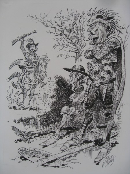
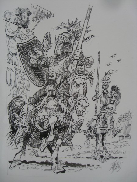
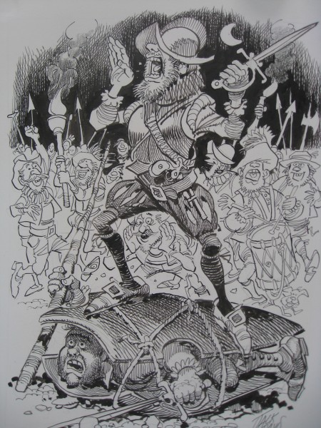
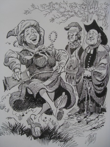
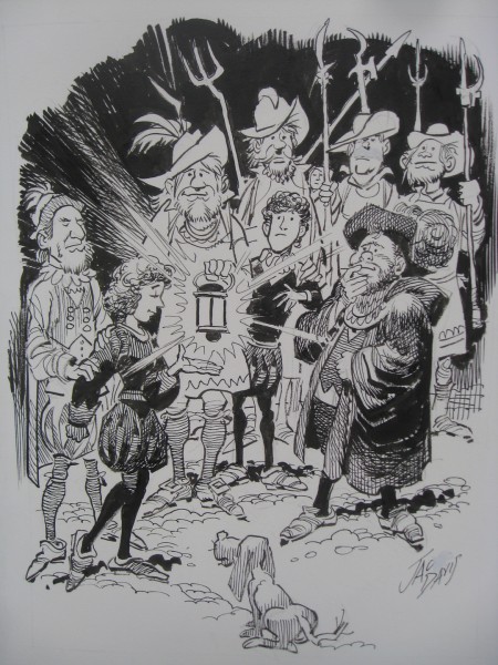
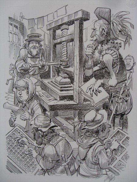
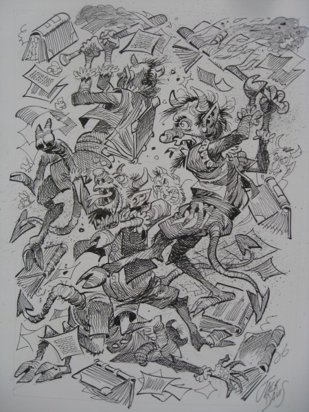
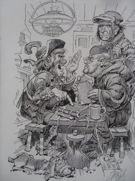
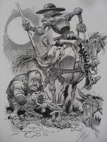
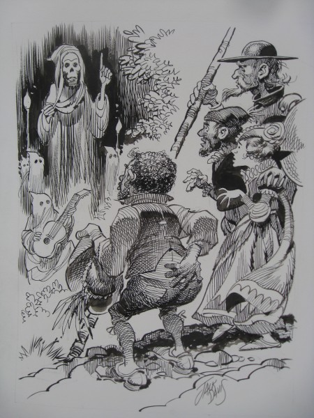
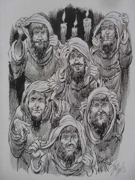
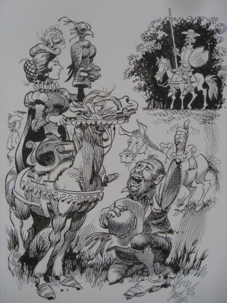
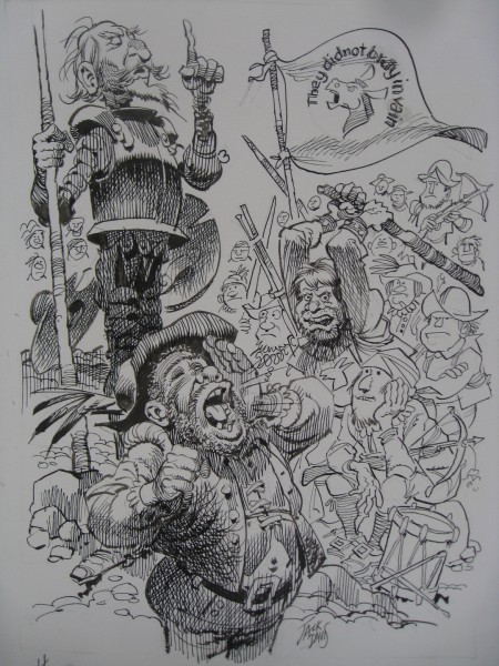
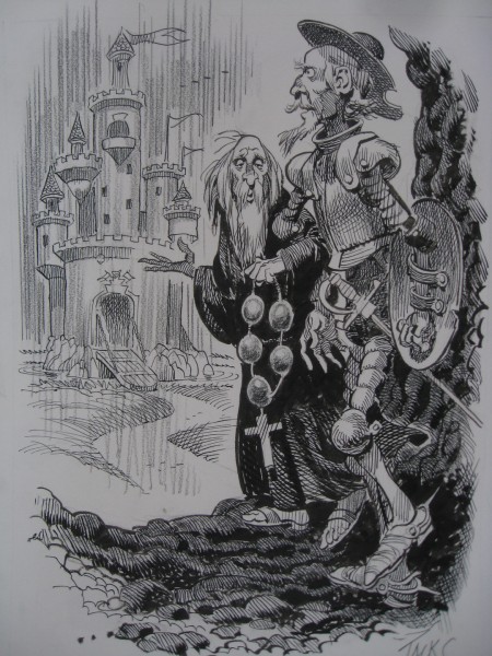
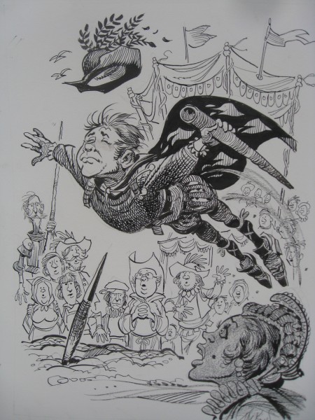
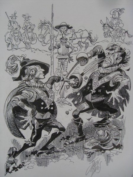
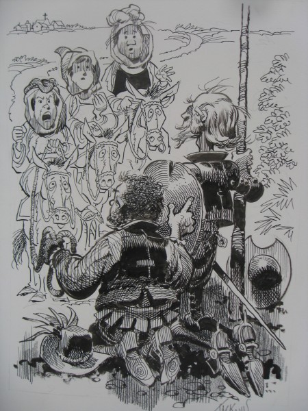
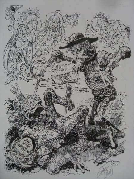
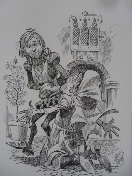
Recently, Bill Peckmann sent me the following B&W illustrations by Jack Davis of Don Quixote. These have no real relationship to the color illustrations that are part of the book currently on the market, The Misadventures of Don Quixote. They exist for themselves, alone, and they’re pretty darn good.
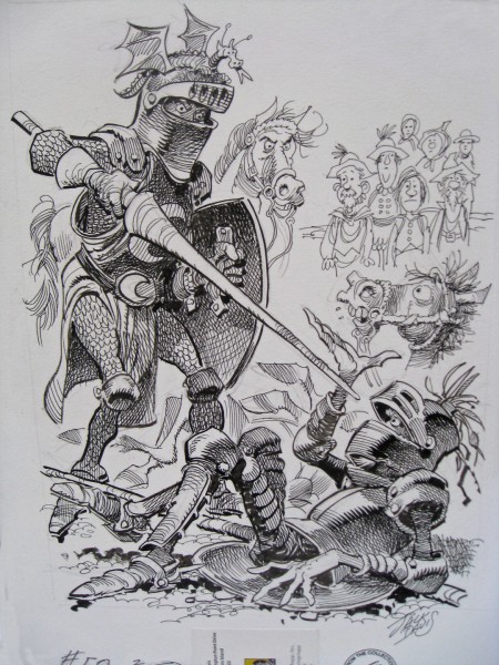 1
1
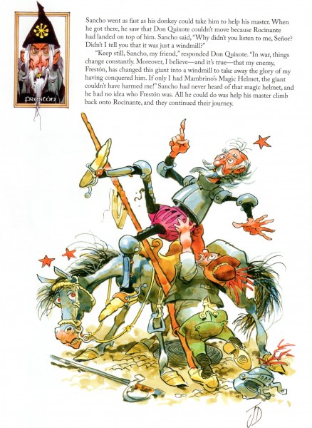
Here’s a sample color page from the book that was published.

on 13 Apr 2012 at 7:51 am 1.Gijs Grob said …
The style of these illustrations is quite reminiscent of that of French comic author Alexis (1946-1977). I guess he was strongly influenced by Jack Davis.
on 13 Apr 2012 at 9:02 am 2.Pierre said …
These are just wonderful, like some kind of fanciful version of Gustave Doré’s Don Quixote illlutrations. It seems strange that the inked drawings are against grey. I’m curious if that’s how the originals were done or whether that was a printer’s decision.
No matter, these illustrations are incredibly inspirational.
Pierre
on 13 Apr 2012 at 12:37 pm 3.Eric Noble said …
These are beautiful illustrations. These help to bring the story to life. There is personality and life in each line. An inspiration to all.
Makes me want to read the novel.
on 13 Apr 2012 at 12:53 pm 4.Don Cox said …
Very fine indeed.
Do we know the size of the originals?
on 13 Apr 2012 at 1:26 pm 5.Tyler Williams said …
Wow, these are very impressive. Davis does some beautiful work.
on 13 Apr 2012 at 6:00 pm 6.The Gee said …
Pierre,
“It seems strange that the inked drawings are against grey. I’m curious if that’s how the originals were done or whether that was a printer’s decision.â€
I might be very wrong but the gray paper color might be a result of scanning, not the printer’s choice or the paper used for the originals.
–
They all look great. I love looking at his hatching and it’s Jack Davis…what else can you say? It is all inspirational.
And, it makes me think that someday I’m going to have write my own book before I ever get a chance to do illustrations that are that fun to draw.
on 14 Apr 2012 at 4:13 pm 7.anik said …
Wonderful draftsmanship, but some occasional Disneyesque character features (especially #05, #16, #20) slightly dispel the unique charm (for my taste).
Maybe the gray backgrounds were used to make the look closer to Gustave Doré’s engravings?
on 15 Apr 2012 at 12:21 pm 8.Don Cox said …
If the backgrounds are really grey, and it is not just a scanning artefact, a likely reason would be that he intended to add some white highlighting, but changed his mind or never got round to it.
on 15 Apr 2012 at 12:27 pm 9.Don Cox said …
Looking again at the first one, it shows part of a stick-on label at the bottom. The tone of this is the same grey as the background.
It is unlikely that a label would be grey, so I think the tonal range has been set in the scanning to make sure the very faint pencil lines are not burned out.
on 15 Apr 2012 at 6:43 pm 10.The Gee said …
Don, Yes. The first one does have that aspect.
Another thing is looking at the upper right hand corner. It almost looks like the paper isn’t exactly flat up there.
The thing is that is a consistent element which led me to further consider that it might be a scanning issue. Not a major issue, mind you.
White on that shade of grey would pop rather nicely. And, if anyone would use white judiciously, Davis would.
Still, it is great Jack Davis art. No disputing that.
on 15 Apr 2012 at 11:55 pm 11.Michael said …
The grey is in the art; it’s not a scanning issue.
on 16 Apr 2012 at 3:03 pm 12.The Gee said …
“The grey is in the art; it’s not a scanning issue.â€
Okay. Thanks for clearing that up. So the paper is grey.
Hm.
on 23 Feb 2013 at 12:09 pm 13.Tom Lathrop said …
These are some of the 55 illustrations that Jack Davis did for my translation and current Spanish edition of Don Quixote. I am wondering who this Bill Peckman fellow is and how he came to have these illustrations. Something does seem a bit fishy. Maybe you can let me know.
These illustrations were done on bright white boards . How they turned out gray, looks like they were photographed after taking a light meter reading on the surface of the paper, and that setting was used on the camera. Photographers know, or should know, that light meter readings are generalized to reduce all light to an 18% neutral gray image, so that anything white will turn out 18% neutral gray. Thus, you need to increase the exposure eight times to restore the white.