Search ResultsFor "Mogubgub"
Commentary 22 Jun 2013 03:11 am
A Week that Was
Academy Screenings have come at us this Summer in a hot and heavy fashion. I can’t say that all the films are worth watching, but then you’ll get a week like this where there were several positive adventures as opposed to last week when you had duds on top of duds.
On Tuesday, Brad Pitt came to us in 3D with World War Z. Quite some time ago, I had read that it was a film about Zombies and had forgotten. If I’d remembered I wouldn’t have gone to see the movie, and I might have been sorry. The story is a bit simplistic, but the metaphor is a good one. People, for some medical reason gone awry, turn into killers destroying each other, by bite, without reason. From the first 10 minutes in the film, right to the end I was sitting on the edge of my seat. The tension was formidable.
It was basically about Brad Pitt trying to save his family and in doing so resolve the problem for the world. It all seemed possible (given all the horrendous medical mishaps we’ve seen – from AIDS to Avian Flu to whatever else we could imagine.) Pitt’s one of the only actors I can think of who can relay confidence as a father to his two daughters (and a boy they pick up along the way) as well as a leading consultant working for the UN. The story resolves things in the way Mr. Pitt would like to see. A positive and hopeful ending.
Having seen Superman (Man of Steel)a week ago, it was good to see something with more heft on its mind than aliens.
Monsters University was a piece of garbage that could have stayed on the shelf. More like one of those Disney reworks (Remember: Bambi 2, Peter Pan 2, Aladdin 2, Pocahontas 2, Lady & The Tramp 2 et. al.) This thing, Monsters University, was a total piece of waste. At least the other 2D animated films had originals worth trying to live up to. It’s a tough chore to compete with the original Bambi that the off shore studio tried hard. The original Monsters Inc. was easy to compete with. Nothing to do with the art of animation and all to do with padding Disney’s pockets. (Coming up next week is Despicable Me 2. Who cares? I couldn’t make it through the original.) Pixar, doing Monsters Inc and now Monster U, should be ashamed of this work.
The Attack was an Arabic film that capitalized on the endless war between their two cultures. The 100% rating for The Attack might have been more deserving of half that.
So far, too many battles this summer. All tedium.
Same Old Sad Song
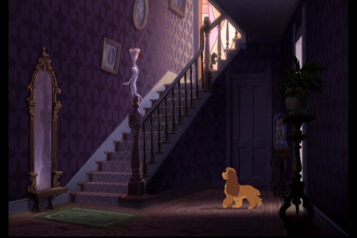
Back in 1955 I was nine years old. There were five kids in my family (including me and an older sister who never would’ve hung out with the rest of us.) Up the block was a larger family of cousins – all girls (at the time). Lady and the Tramp was opening, I wanted to see it on opening day – a Wednesday, and there was no stopping me. In the end, it meant I was supervising 7 kids if I wanted to see this film on it’s first Manhattan screening.
My mother had give me enough for the 8 admissions: 15 cents each for admission ($1.20) plus cash for popcorn & sodas. I had it all worked out and was set to buy something for every one. But the theater got smart! They raised admission for anyone under 12.($.25 cents!) Now, instead of being $1.20 for all of us to get in, it’d cost TWO DOLLARS for admission. We had enough to get in, but forget the candy. There wasn’t enough.
I explained it to my siblings and my cousins. My big fat, old-enough-to-know-better cousin started crying while we waited on line. We needed another quarter, and we could all share popcorn. How was I gonna get that! We were on line and she wouldn’t shut up.
I just wanted to see the movie. I didn’t care about candy or popcorn. Yet the fake-ish crying got louder. They were starting to sell tickets.
The theater manager came over to me to ask what was wrong. When I said we didn’t have enough, he thought I meant admission. He had to stop the crying. It was bad promotion for opening day at his theater. He gave me a dollar!
We suddenly had enough candy and popcorn for all of us, and we had no trouble getting into the theater in plenty of time with lotsa extras. The only problem was that my cousin was hooked onto her crying and she wouldn’t let up on it.
In the end, we saw the movie, ate the candy and had a good time. Of course, before we left, that same cousin had lost her glasses and she started crying again until we found them.
That big wide C i n e m a s c o p e screen. It was great, and I refused to ever go to a theater with my cousin again. I figured out a way to go again the next day with just my younger sister. We sat through Lady & the Tramp twice.
Nowadays, you’d have to put half those kids up for adoption to get enough for entrance and popcorn and 3D glasses. And the movie wouldn’t be as good. (See Monsters U about that one. They didn’t even offer 3D version to the Academy members; that’s how much it mattered.)
New Old Favorites from John Canemaker
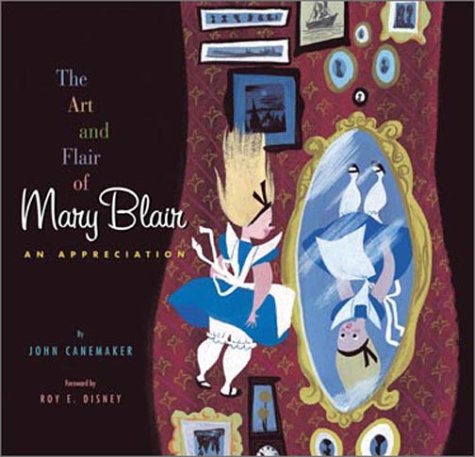
Recent news I got from John Canemaker was that they are going to republish all of his Disney art books with a fresh approach. I believe they’ll be doing one book a year with The Art and Flair of Mary Blair to be the first to be published anew. It will have better color matching supervised by the Disney archives to equal the originals by Mary Blair.
The second book from the Canemaker canon to go this route will be Walt Disney’s Nine Old Men and the Art of Animation. In the end all of his great books should look fresh and bright, possibly even better published than the originals.
For once a publisher does a positive service to the history of the medium.
Speaking of which, I’m reading John’s Paper Dreams for the first time. It’s a pretty fabulous book, and I’ll have a lot to say when I finish it this coming week.
More on Mogubgub
Ed Grant on his site, MediaFunhouse, has devoted some space to the late Fred Mogugub. The material in the article seems to have been culled from work written by Mogubgub;s friend, Richard O’Connor as well as from my site.
The rehash is worth the reread; I can assure you. Artists need to be recognized.
James Gandolfini
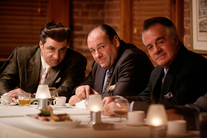
At only 51, James Gandolfini (center above) seems to have left us. Thank god for The Sopranos. That show gave us a clue as to was a fine actor he was. I’m unable to turn on an episode, and episode and to quit so quickly thereafter. I feel compelled to watch the entire show regardless of the fact that I’d seen it many times already. Like a great movie, not a TV show.
As it happens, in the past year I seem to have run into Gondolfini more than my fair share of times. Twice I saw him with other “Soprano” members at David Chase events and three times I saw him at HBO events which celebrated documentaries about to be aired. I am amazed at how fit he looked all those times that I’d seen him. He was an actor who carried some weight (I don’t mean physically but dramatically), someone I would have cast in a moment’s notice no matter what I was filming. He was a talent to be reckoned with, someone who’d have brought real character to your film.
Photos 31 Mar 2013 07:02 am
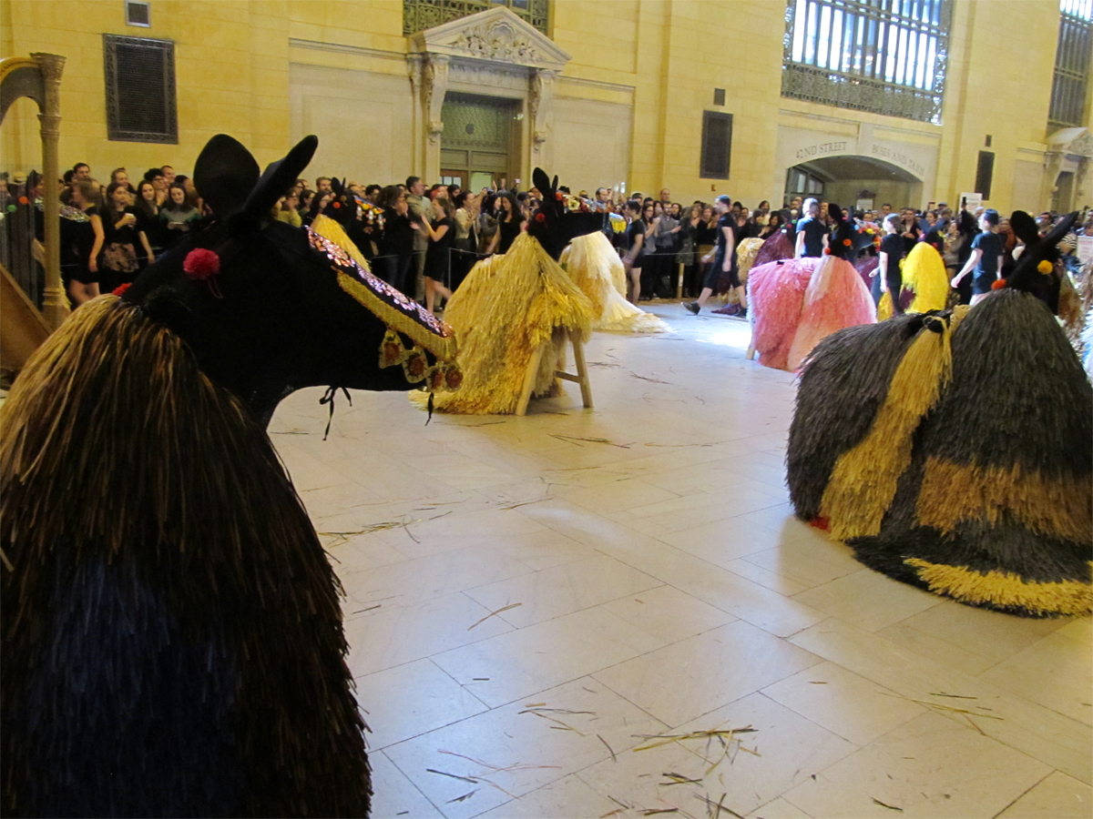
Easter with Horses in Grand Central
___________________
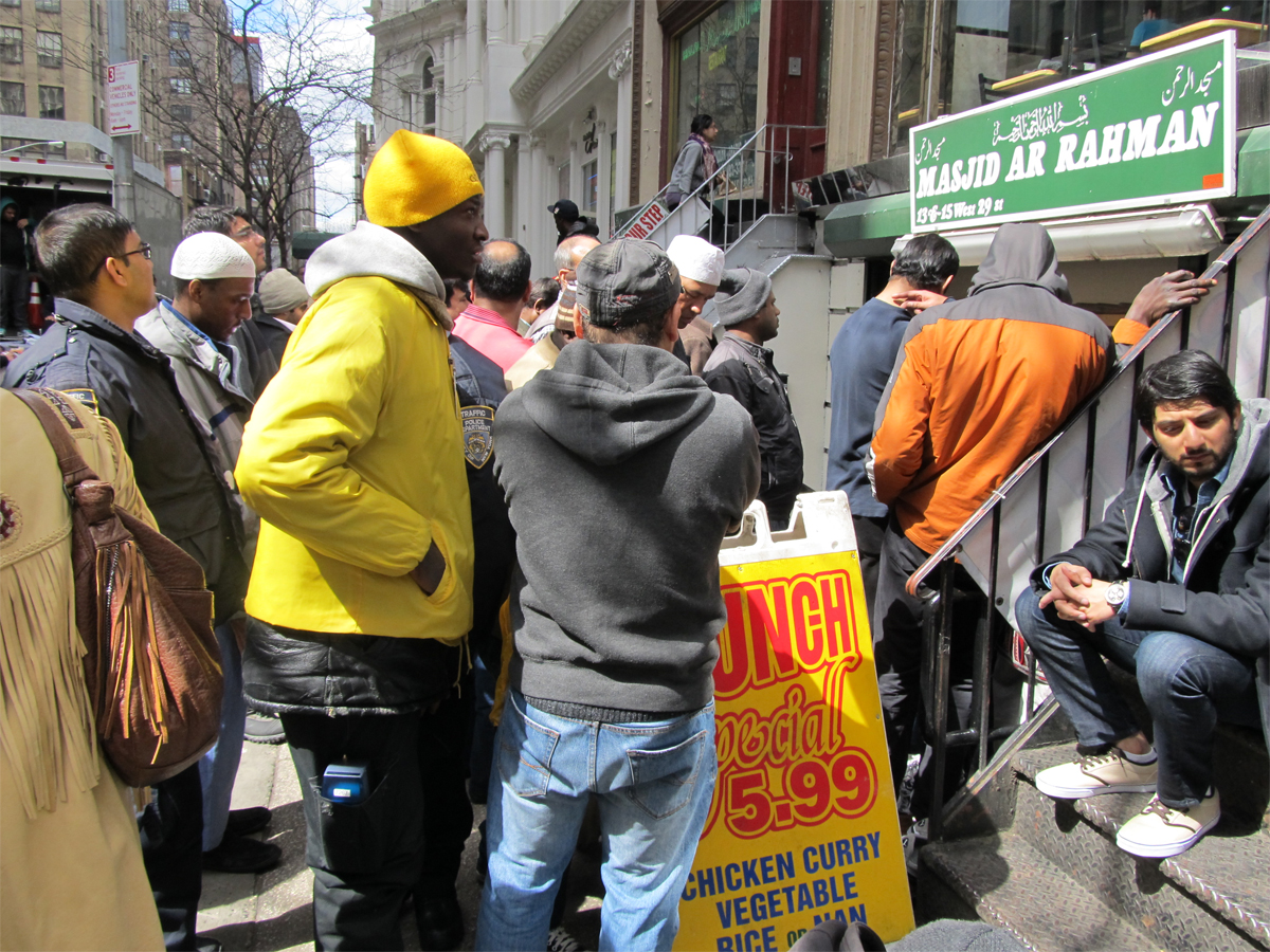
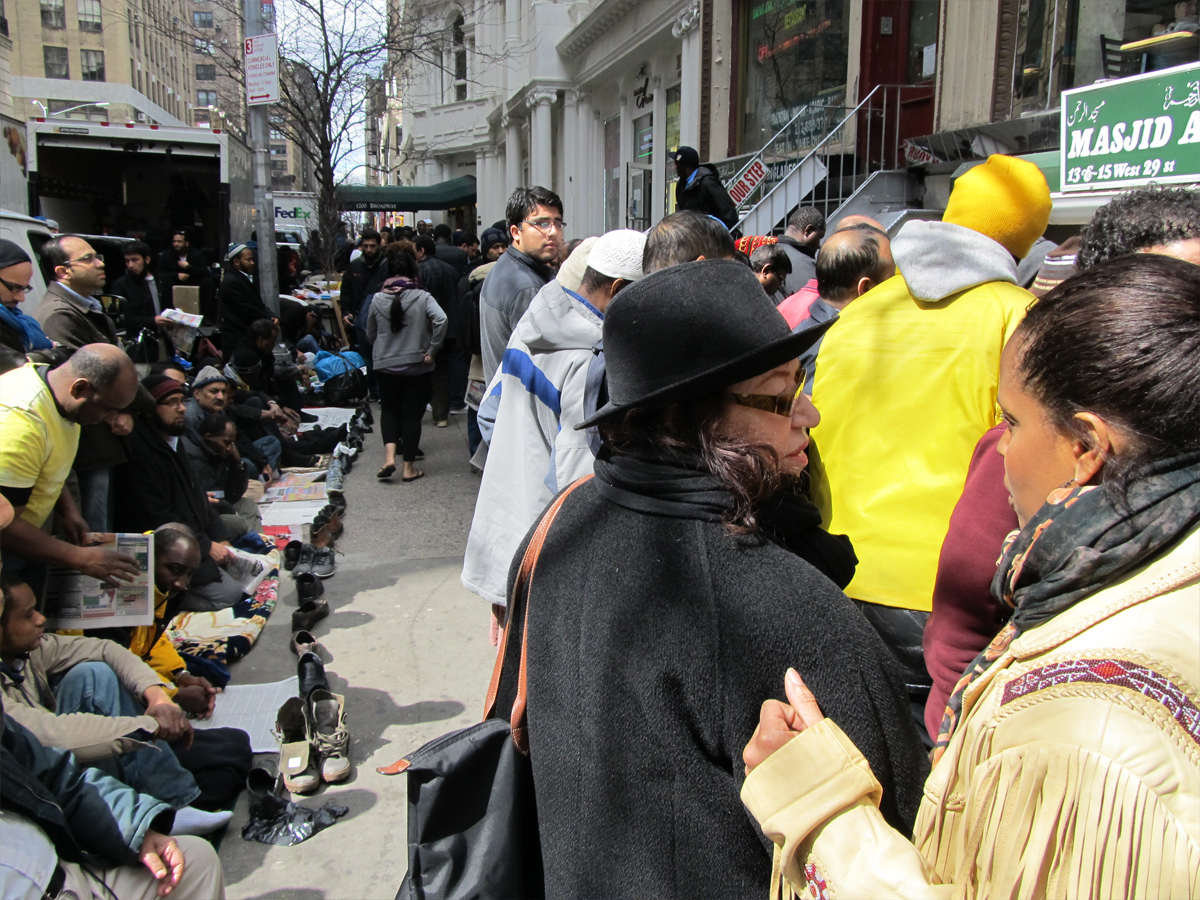
 I was on my way, this past Friday about 1:15pm to Richard O’Connor‘s studio, Ace & Son, to photograph the Fred Mogubgub paintings (see yesterday’s post). All at once, I came upon a small stretch of 29th Street where a couple of hundred males (I saw only one female – covered and in pants) gathered with shoes off sitting on towels and kerchiefs that they had brought. They all faced the same direction, North – uptown. Out of one store, a store which seemed to arrange air flights and trips, a loud voice spoke somewhat harshly. I wasn’t paying attention to the
 commentary from the loud speakers, but neither were most of the males in attendance.
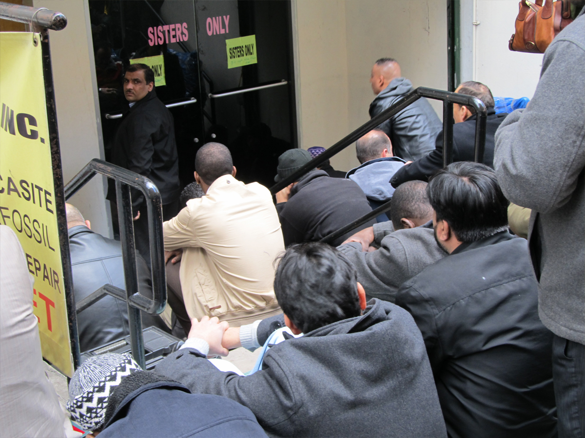
I asked a street vendor – there were a number of them who wouldn’t give up their space on the sidewalk for a sudden call to prayer – what was the occasion. Obviously, they were outside their improvised mosque and performing their religious duty.
The vendor said that this happened every Friday. There’s something to learn about this city every time you turn a corner.

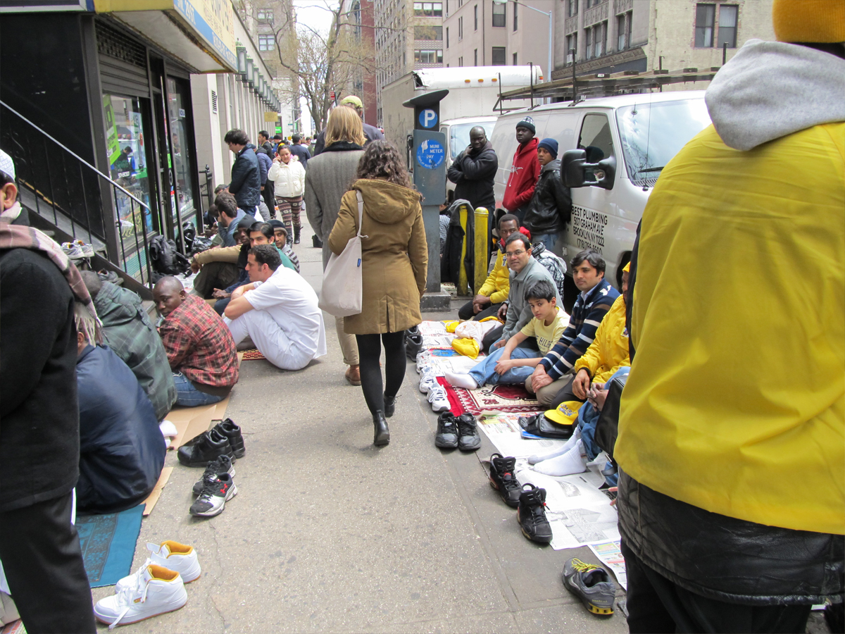
On the way back, 30 minutes later, no one was on the sidewalk.
A large group stood within the airline sales shop, praying.
They were tightly packed.

____________________________
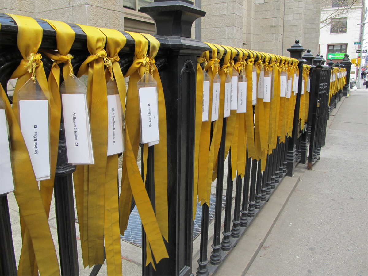
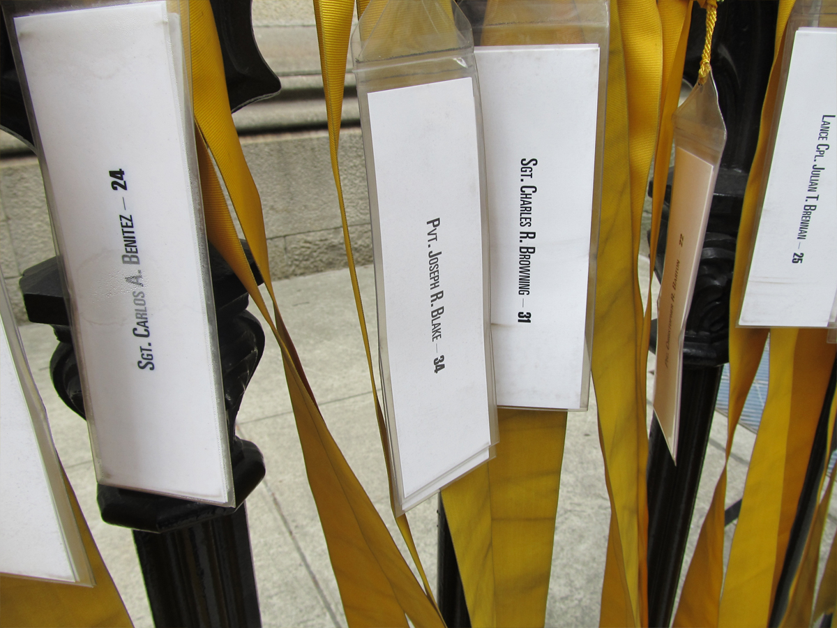
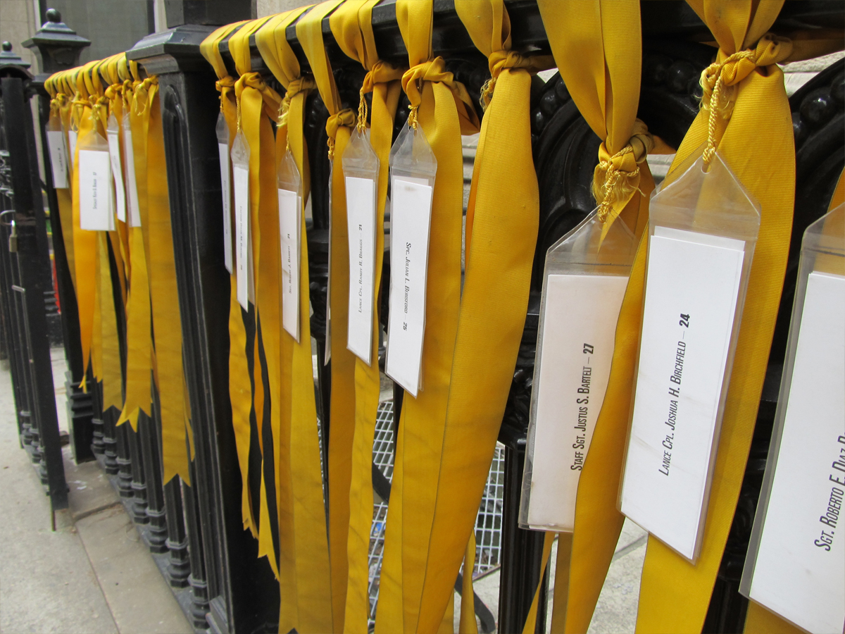
Naturally, I passed Marble Collegiate Church which continues to display yellow ribbons for the soldiers who died in Iraq and Afghanistan. Appropriate for Good Friday.
____________________________
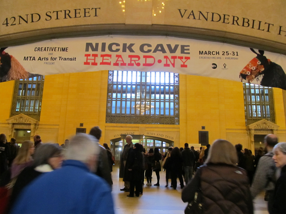
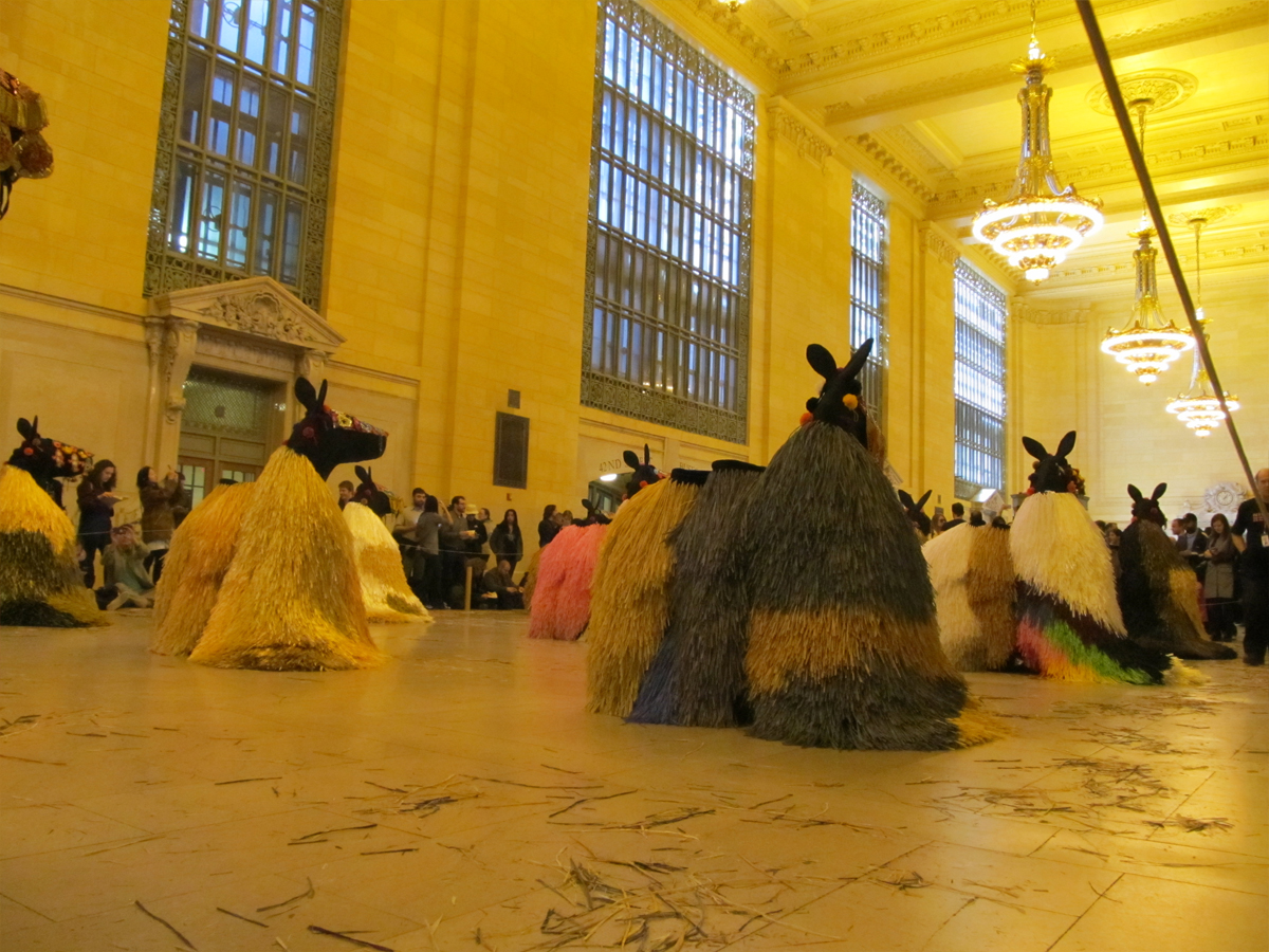
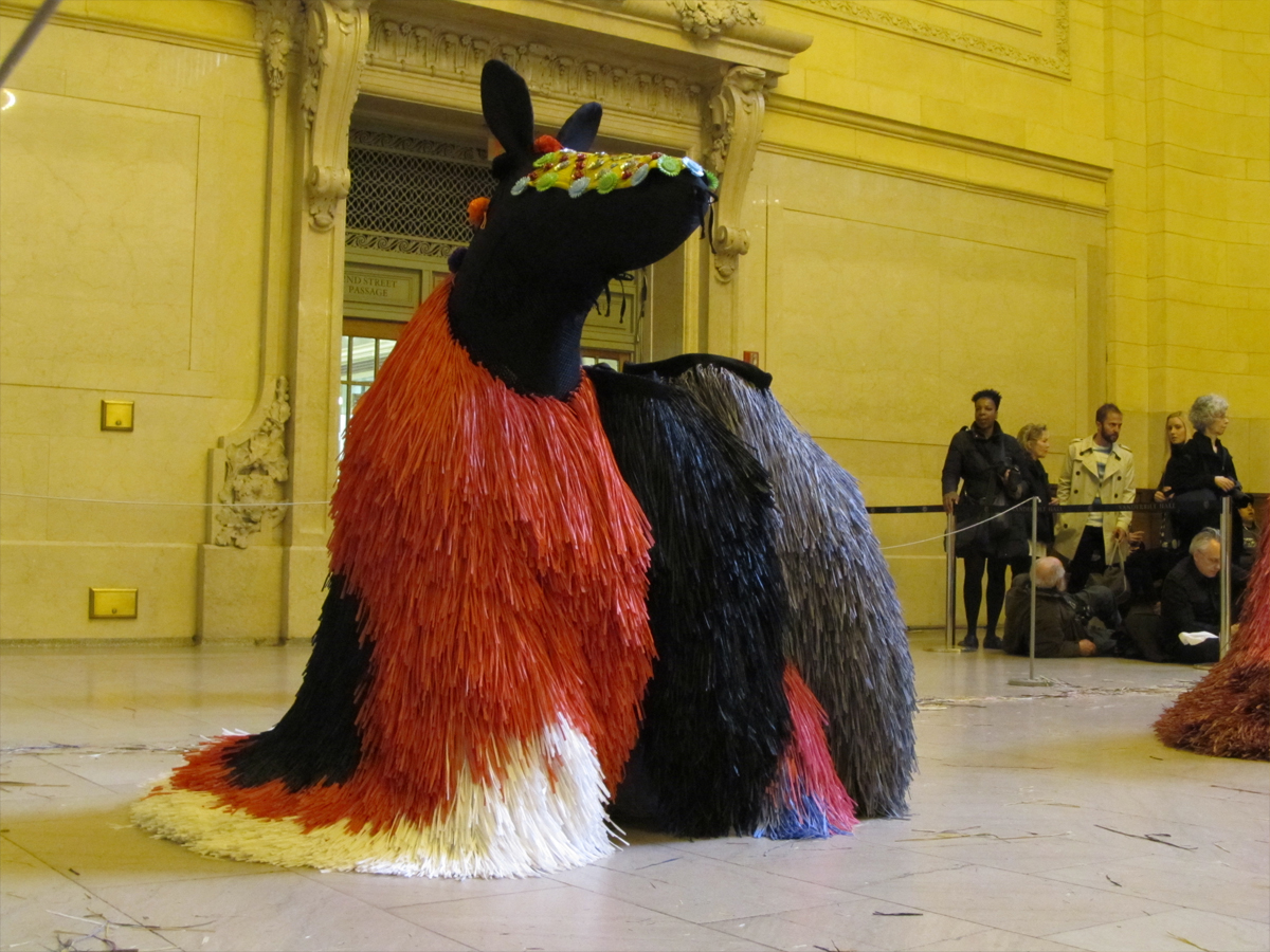
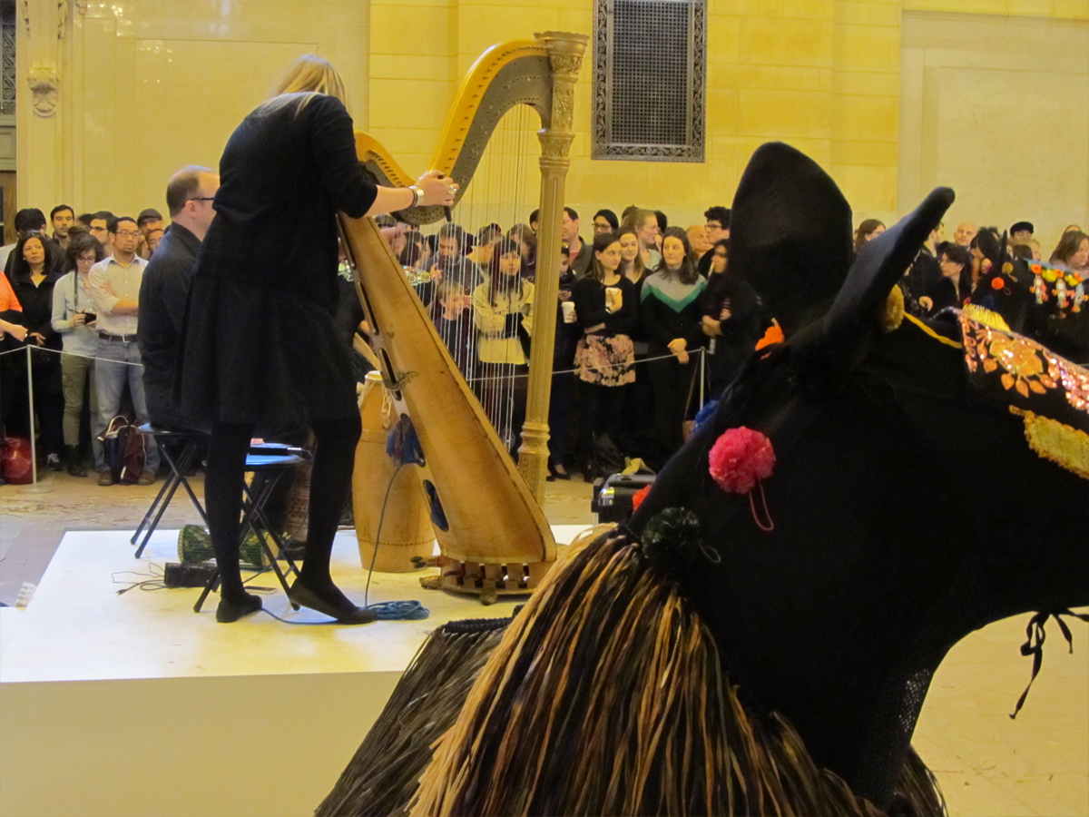
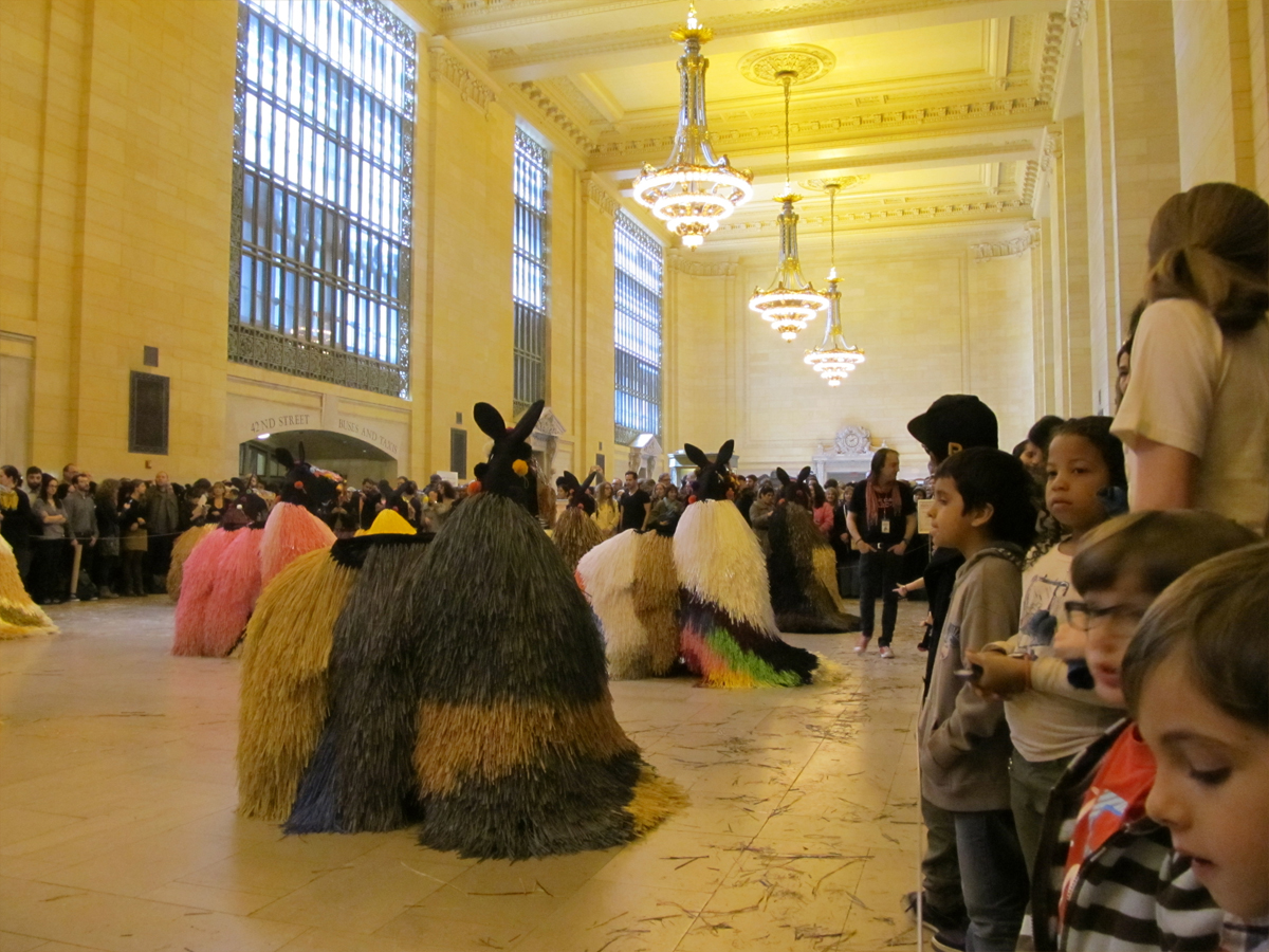
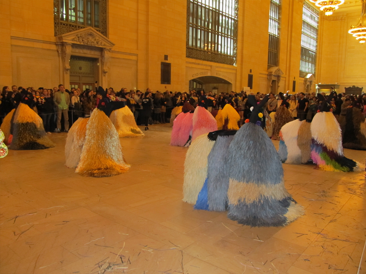
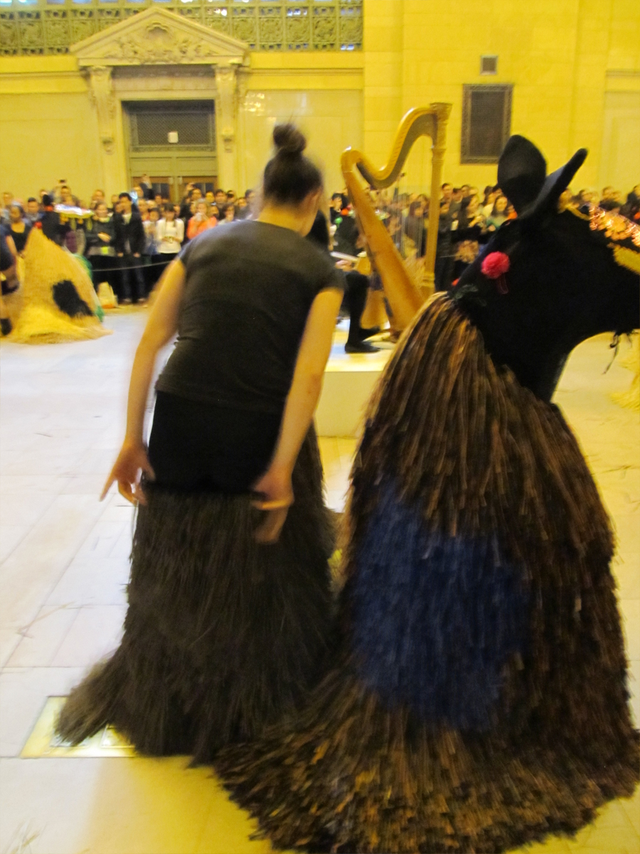
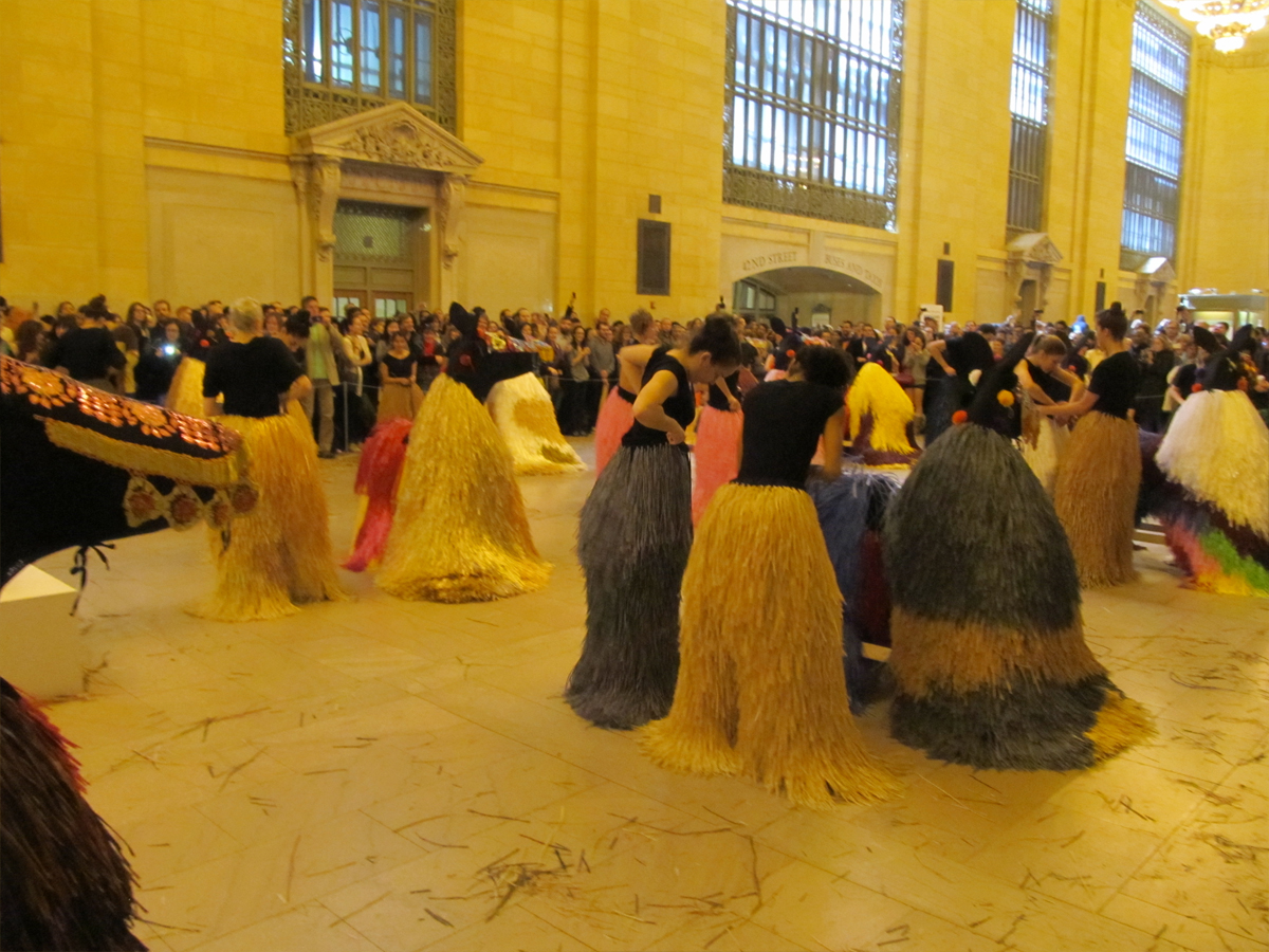
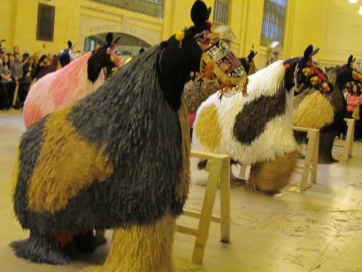
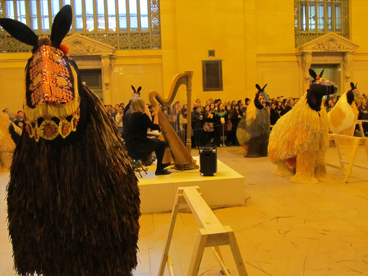
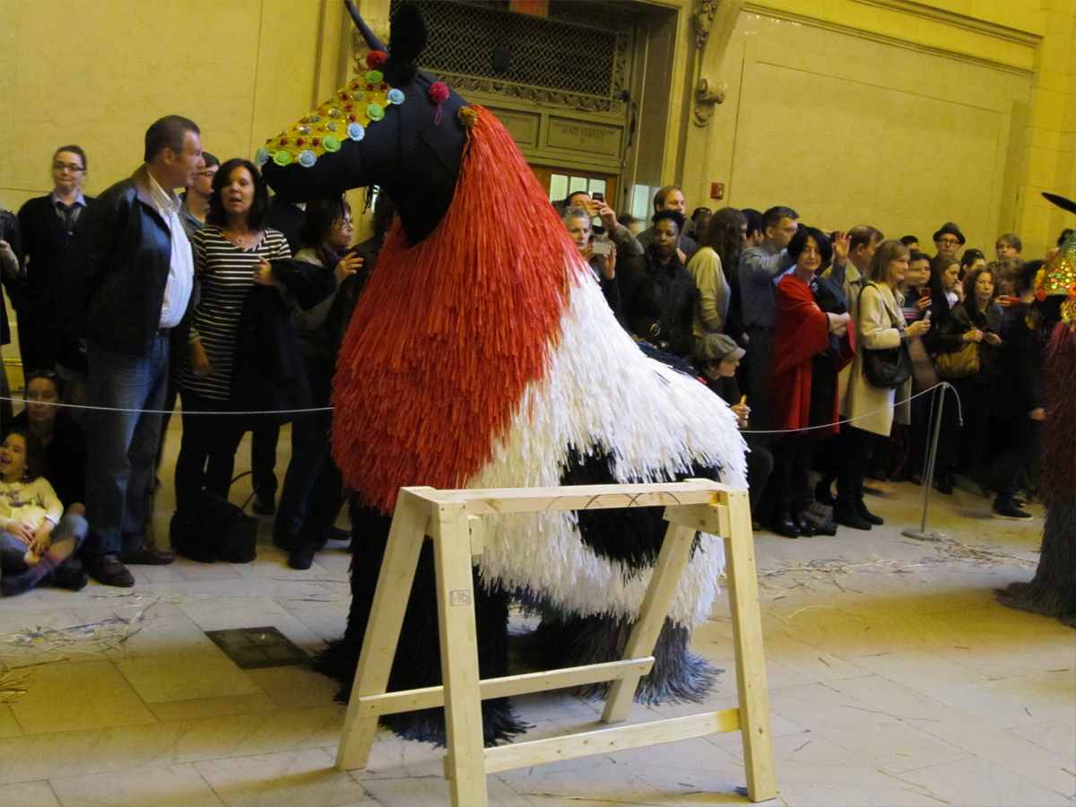
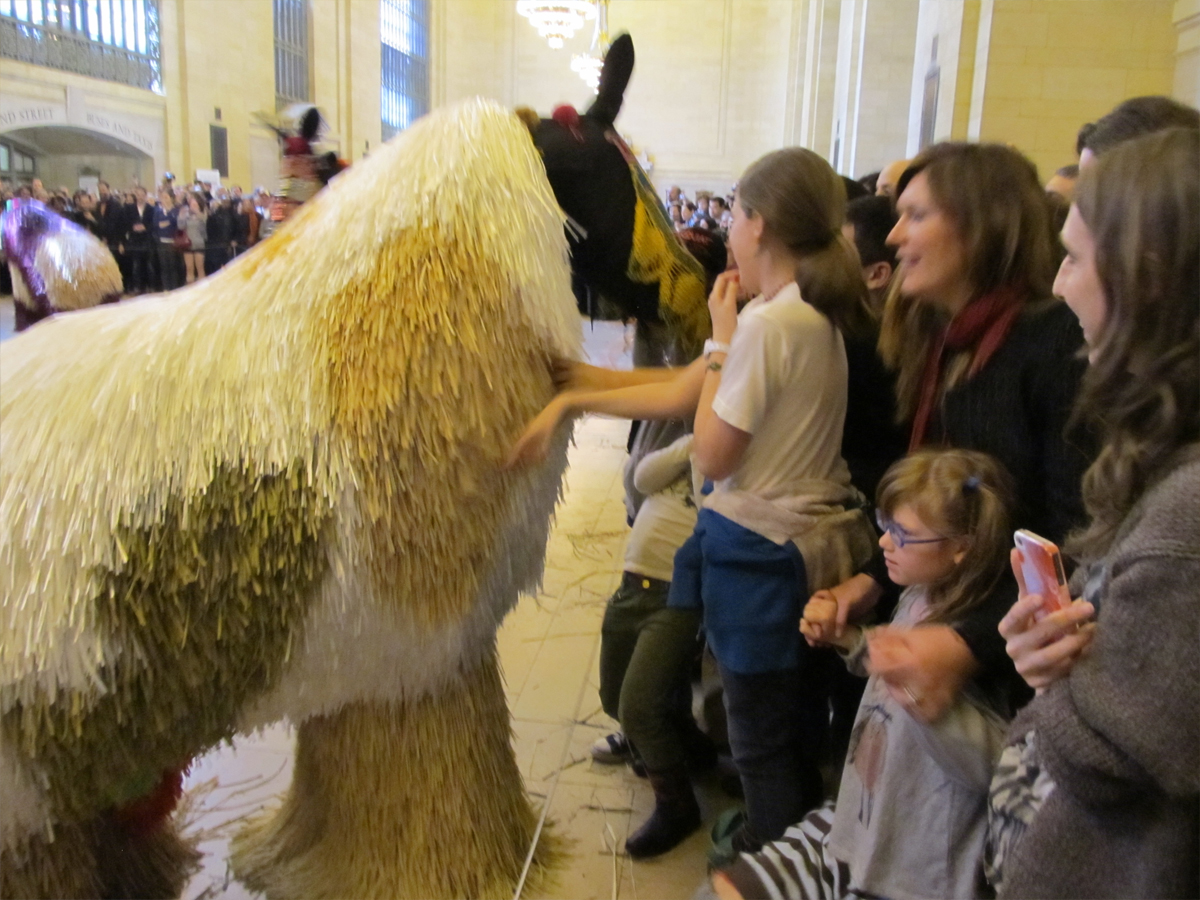
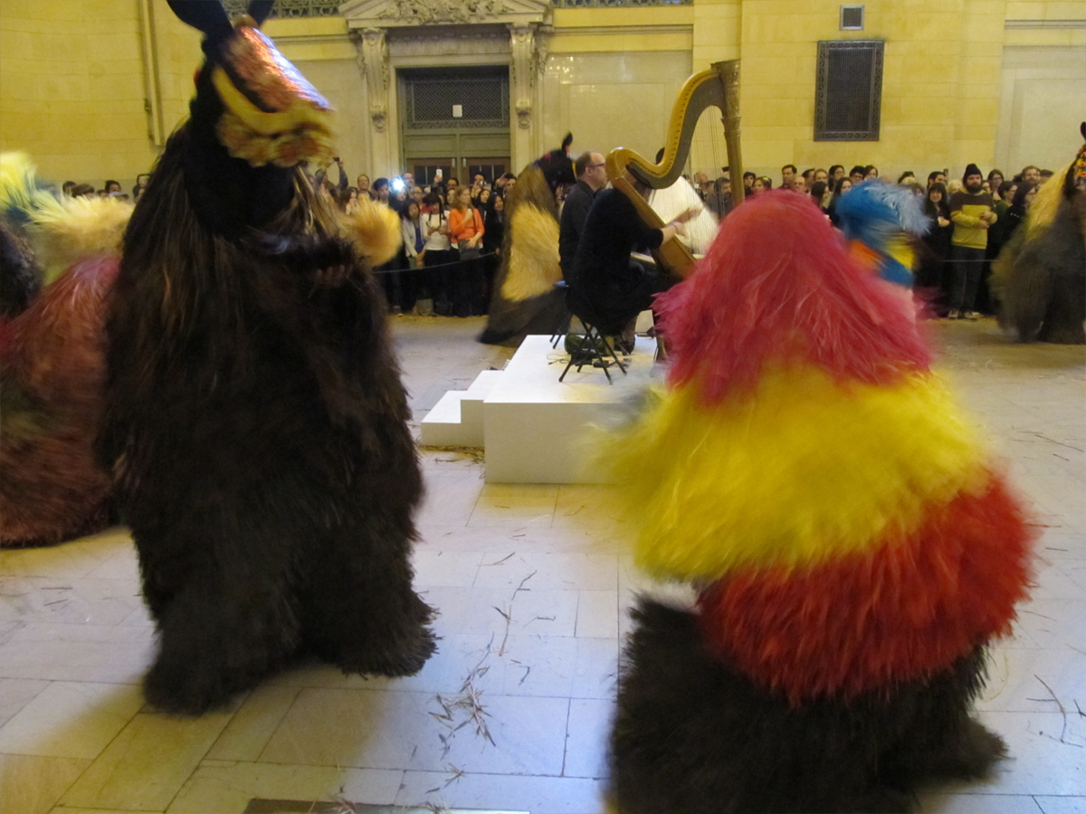
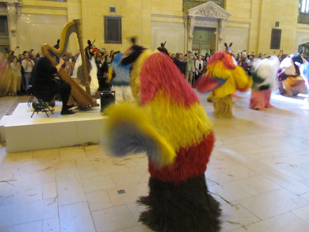
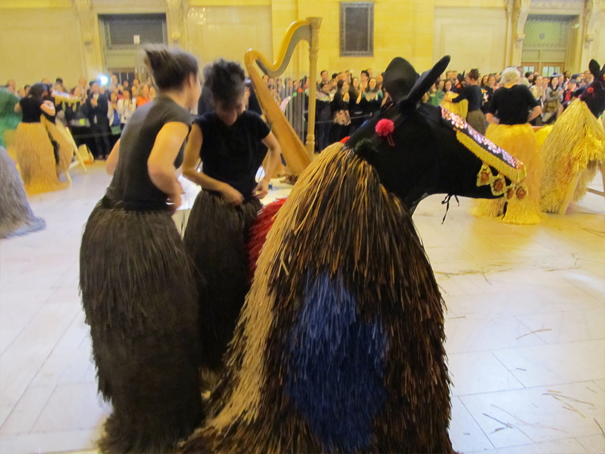
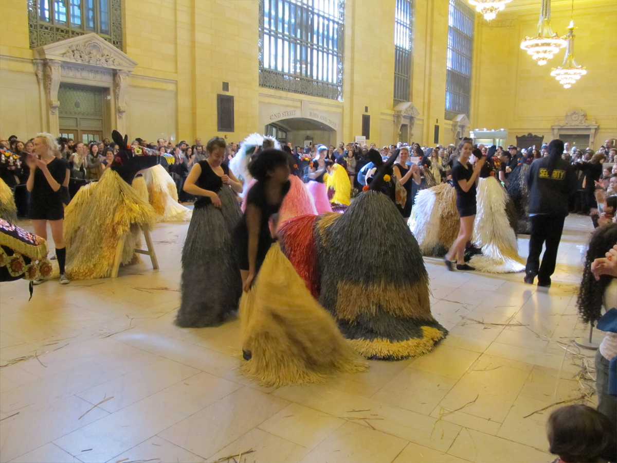
Heidi and I went to Grand Central Station on Saturday to watch a program of dance (lasting about 20 minutes.) She was actually more excited about going than I, but it was great fun and I’m glad she pulled me into it. We’d actually gone on Friday but found that you had to get there much earlier.
We arrived an hour early for it on Saturday, and even though Grand Central was not crowded, there were a lot of people attending for the dance program.
It was devised, choreographed and composed by Nick Cave. This wasn’t the great rock musician, Nick Cave, but another person from LA who produces excellent shows like this one. Glasto make the acquaintance.
It was also a good photo event.
 1
1This is the official entrance. We came in the back door.
We were about an hour early though
the doors closed on newcomers soon after.
 2
2
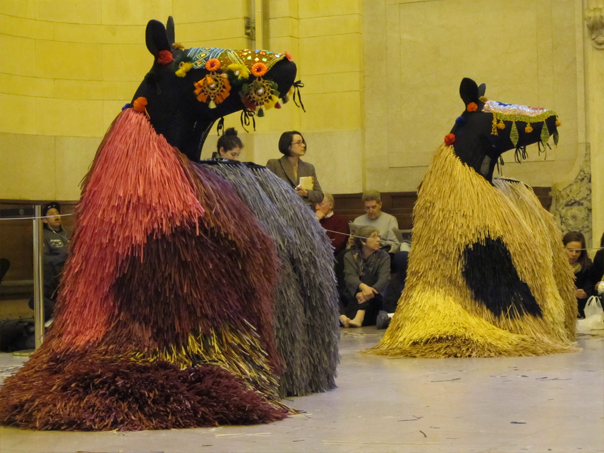
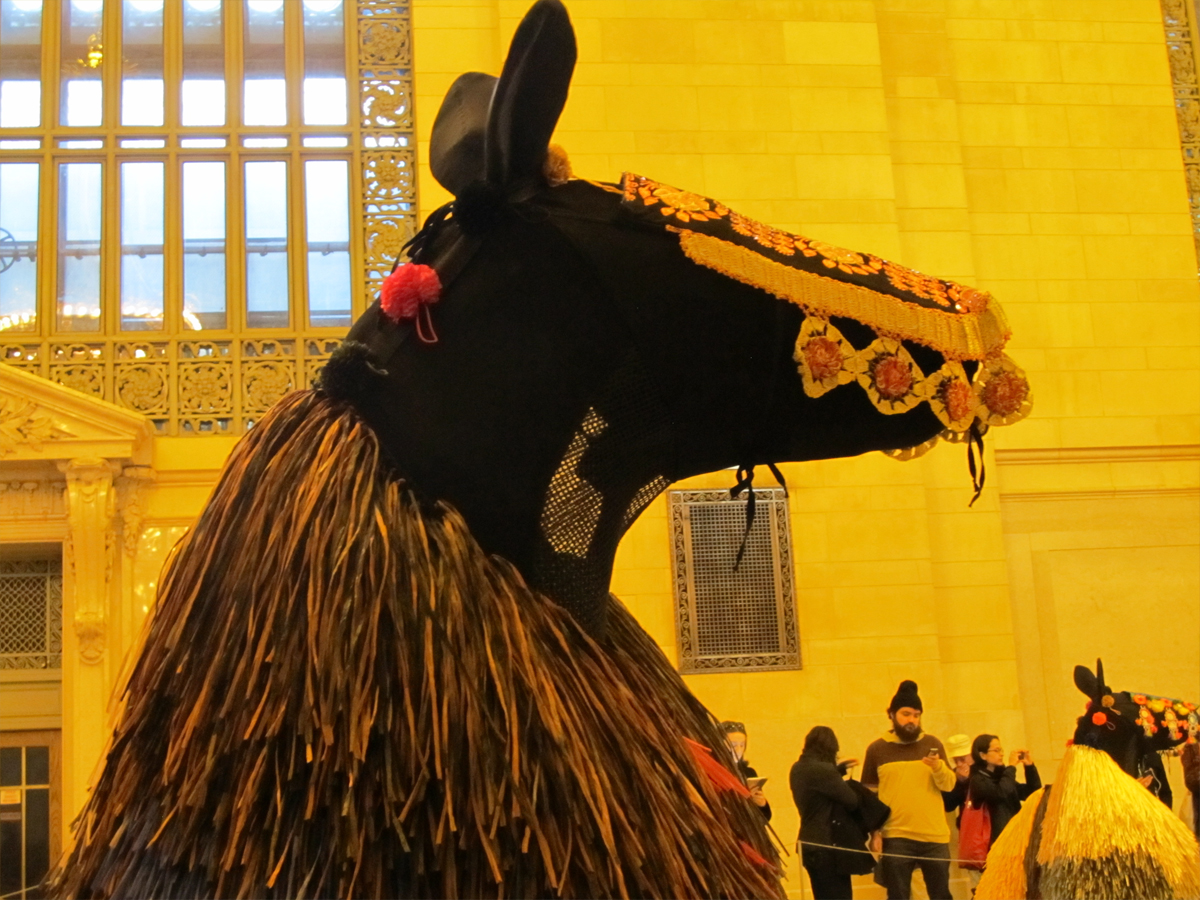
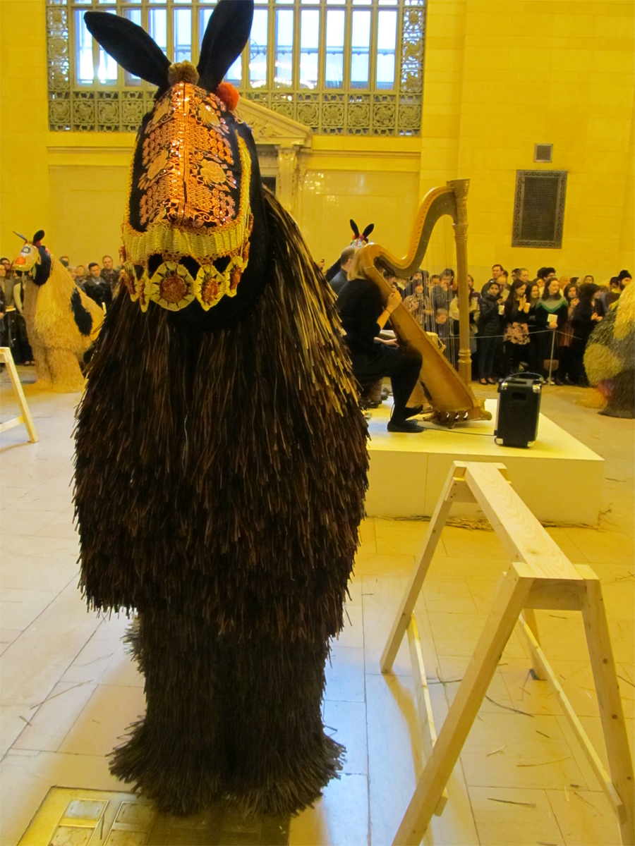
The horses are set up already as we enter.
 3
3
They’re just costumes set up about a “sawhorse”
without life until the dancers enter.
 4
4
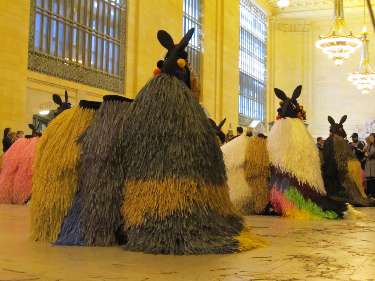
We have a great spot to watch.
 5
5
 6
6
 7
7
You can see the netting in the neck out of which
the dancers look out. I’ll guess they don’t see a lot.
 8
8
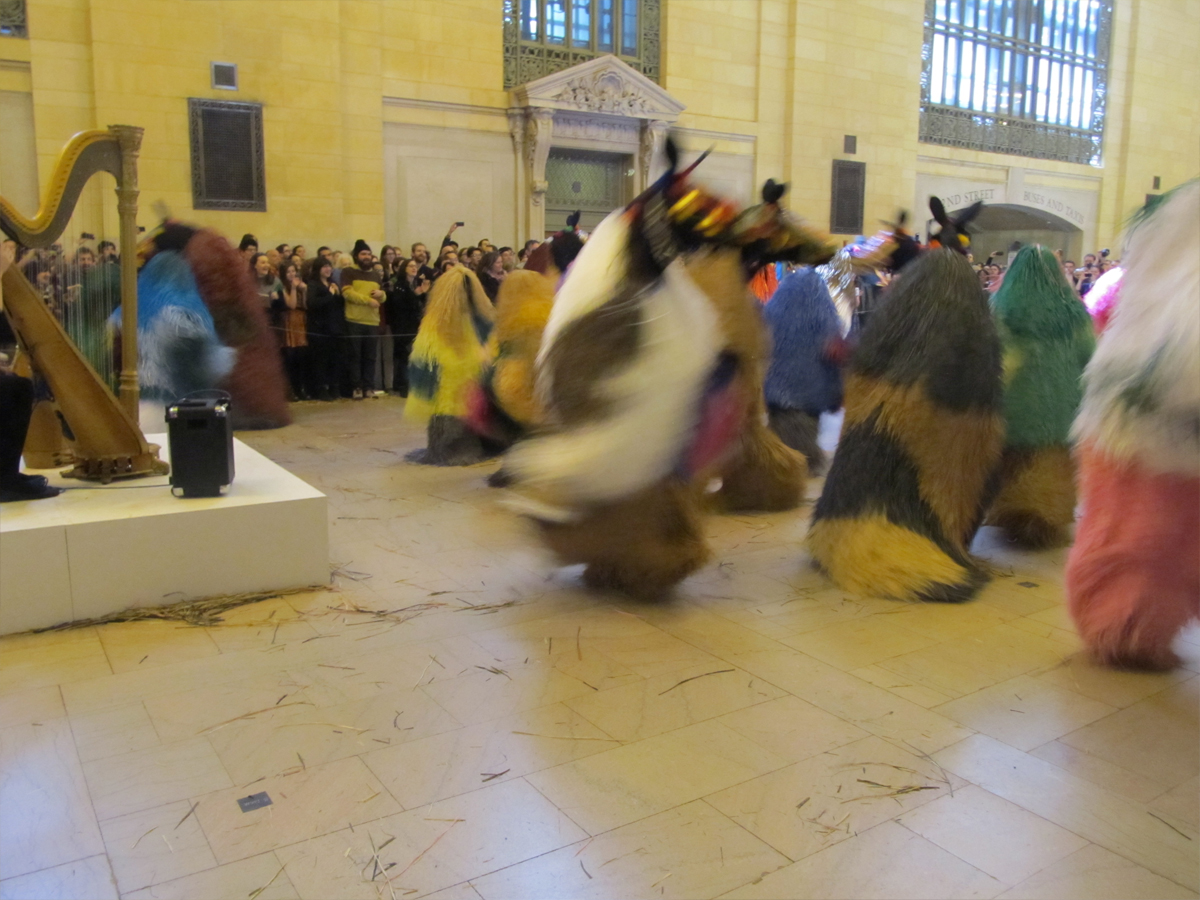
A harp and a drum. They come out to tune up with each other.
 9
9
There are two groups: the heads and . . .
 10
10
. . . the tails. They’ll also break apart
mid-dance when the movement goes very fast.
 11
11
Dancers put on the costumes.
 12
12
They work in small groups to help each other move quickly.
 13
13
 14
14
They help each other prepare to become horses.
 15
15
The dancers have their costumes on.
 16
16
The music’s about to start.
 17
17
The dance is about to begin once the “sawhorses” are removed.
 18
18
Silence as a group of the crew comes in to remove the “sawhorses”.
 19
19
Some of the horses go back to the kids.
 20
20
The last number begins wild drums.
 21
21
The horses really rock their fur.
 22
22
They rock out this last number.
 23
23
The dancers break apart and begin to undress
 24
24
Another round of applause including
the dancers who applaud as well.
It was fun
 25
25
The horses dress the “sawhorses” again and people startt exit.
Commentary 30 Mar 2013 04:35 am
Brewing Sqwiglies
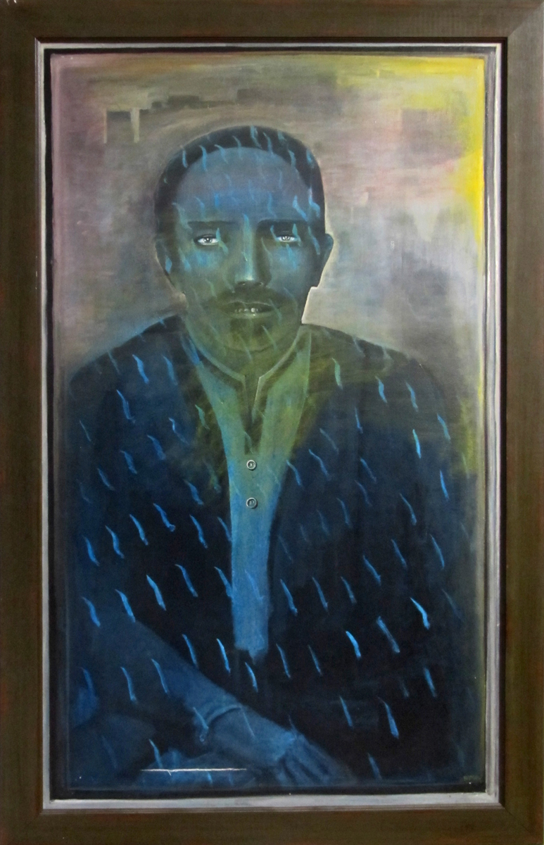
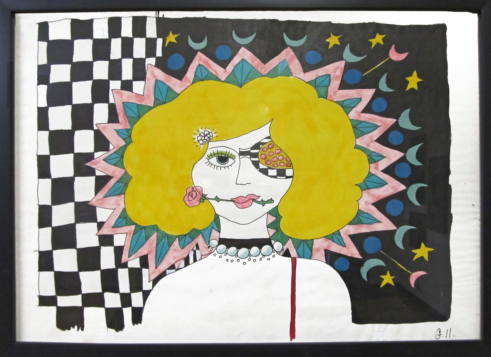
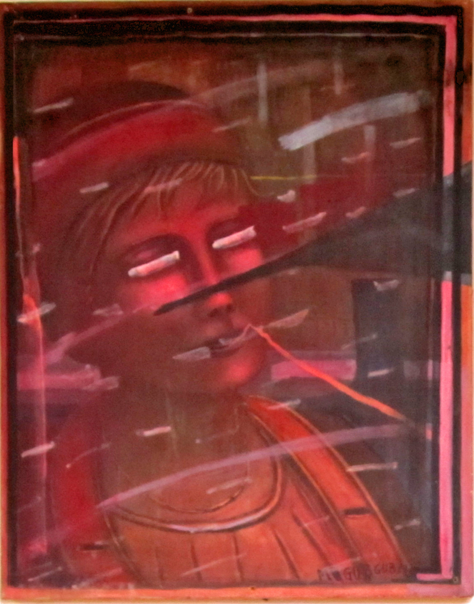
- Richard O’Connor turned his animation studio, Ace and Son into an art gallery this past Thursday night to celebrate the art of Fred Mogubgub. Fred was something of a wildly eccentric genius who rode the animation studios from the forties through the eighties. He was know publicly in animation for Enter Hamlet a short that used the voice of Maurice Evans performing the “To Be or Not To Be” soliloquy from Hamlet, while funny drawings pass in front of the camera.
Fred was an artist, and Richard owns many of his works of art. A large number of oil paintings, watercolors and animation pieces. I’d seen Enter Hamlet in 1965 as a young animation enthusiast, and I knew Fred’s work from The Big Blue Marble which was wildly popular in NY.
The event was a wonderful party where I met up with George Griffin, Liesje Kraai, Lee Corey, Larry Ruppel, and Elliot Cowan among others. Richard went to the trouble of searching out for wine from Lebanon which he felt was appropriate in Fred’s Lebanese honor. As my astute wife, Heidi Stallings, pointed out, it was very much like the old days when people actually socialized with each other. I miss the mingling, too, and it was nice to get out to something other than for a holiday event. And how much better than to toast an extraordinary artist like Fred Mogubgub.
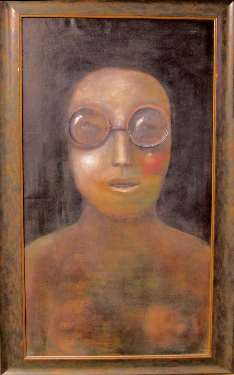
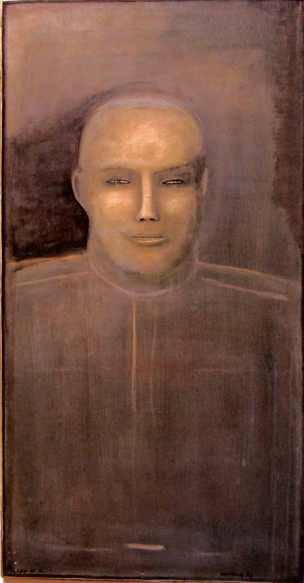
Unfortunately, I didn’t properly mark down the titles of the paintings. I’ll try to fill those in later in the day. Here are the pictures:
 1
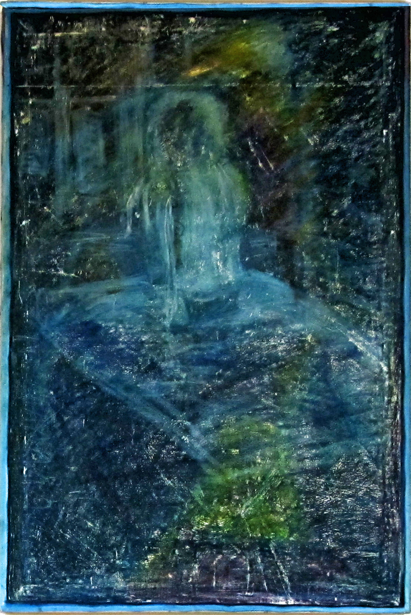
1Spirit #4
 2
2
A cel setup from a BeechNut Gum ad.
 3
3
Who Cares?
 4
4
Untitled
 5
5
Jockey Club
 6
6
George and Frédéric Depart to Spain
 7
7
Untitled [possibly unfinished as it's unsigned and undated]
 8
8
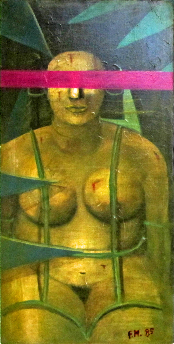
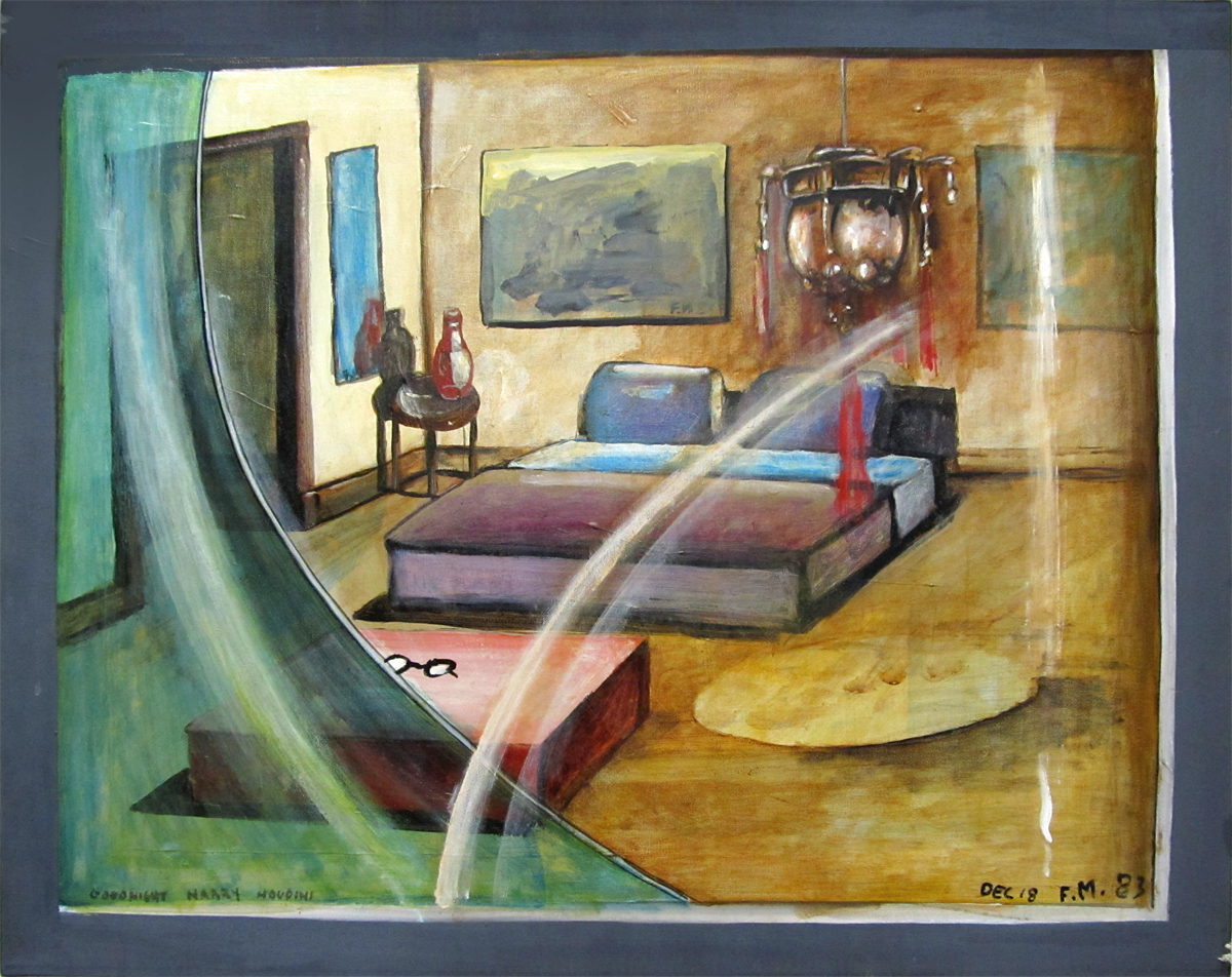
“Goodnight, Harry Houdini”
 9
9
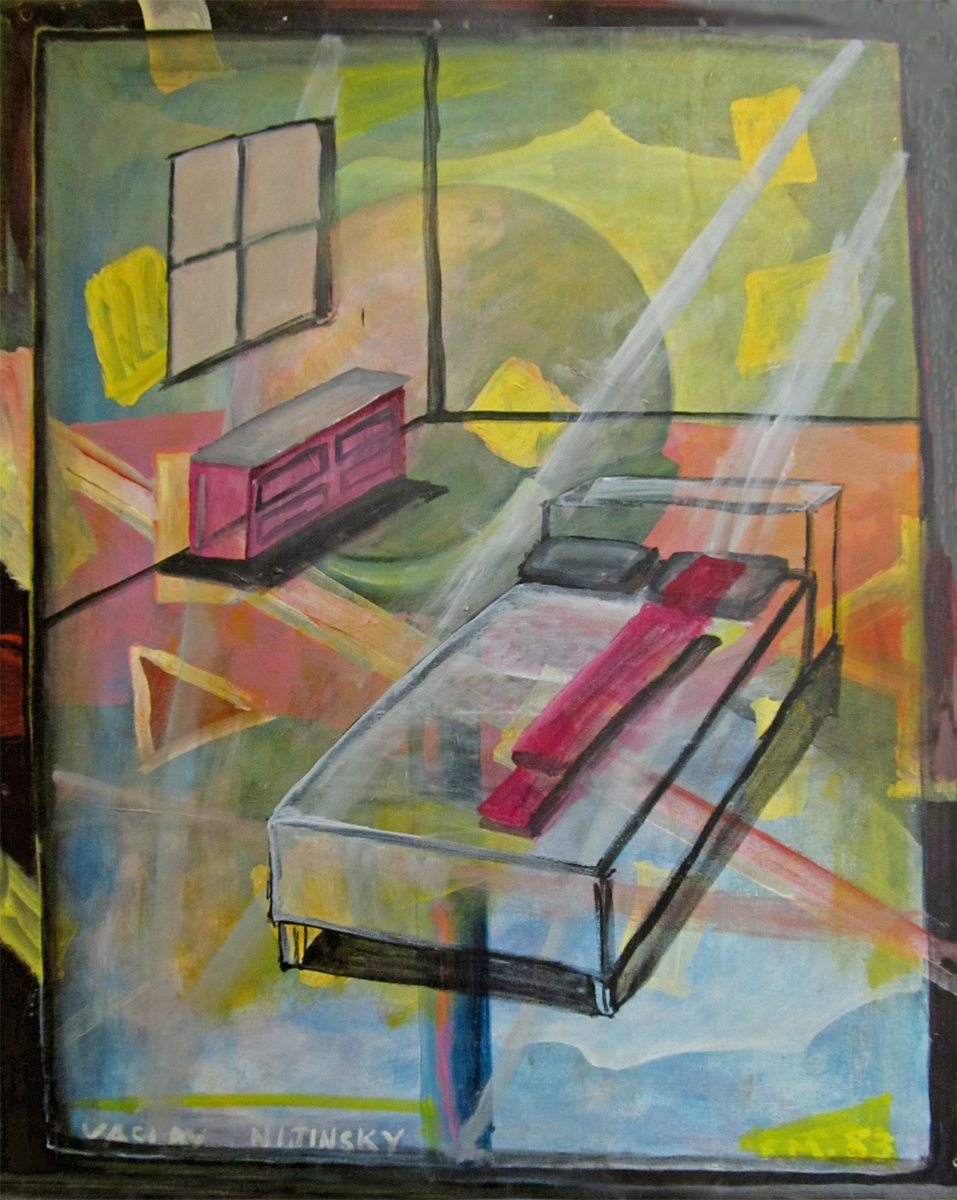
“Vaclav Nijinsky”
 10
10
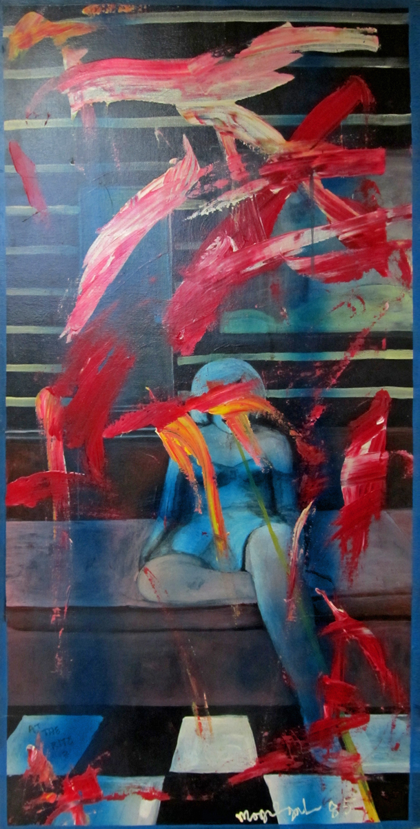
At The Ritz
 11
11
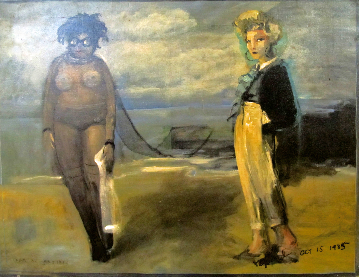
Olga at Antibbes
 12
12
Spirit #1
 13
13
Spirit #2
 14
14
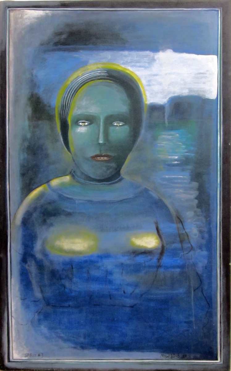
Spirit #3
2 Miyazakis on Poppy Hill
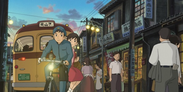
- This week I saw The Croods (and reviewed it here) and From Up on Poppy Hill. I really wanted Poppy Hill to be a small masterpiece, but it wasn’t. It was just a trek. I wanted Goro Miyazaki to have a glimmer of the old man in him; it’ll be hard to let go of Hayao Miyazaki when he retires or decides to end his enormous career. This film was supposedly written by Hayao in collaboration with the son, Goro. I didn’t feel the spirituality of Goro in this movie; That’s what I love about Hayao’s films; there’s a spirituality. All those films (at least since Totoro) are about so much more than what’s on the surface. What’s on the surface is usually good, too. And lately the animation has been getting better. If there’s any spirituality in Goro, it didn’t make it to the big screen, and the animation was first class TV work. No magic there, either.
It’s the second film directed by Goro Miyazaki. Tales from Earthsea should have jump-started a new career. The film was just dull. I assume the artists at Studio Ghibli want things to go on, as well. Poppy Hill had some of the elements of a Ghibli production; it just lacked the magic. First rate styling, fine character design (they all do look a bit like, at times), and a human story.
Although the story had too little in it. It was quite subtle and for a sophomore director to pull it off was too much to ask. The animation rarely had a spark. The characters always did what they were asked to do, but they didn’t really have much of a lifetime within them. The director needed a LOT of experience within him to pull it off, needed a lot of animation experience to be able to pull stronger performances out of his animators and needed a stronger connection to the story to make us care about those characters. Zer0 for three.
Don’t get me wrong; I’d take this over The Croods any day, but I’d prefer to have something good rather than either of these movies.
Crood Surfacing
 I saw this interview with “surfacer” Animator T.J. Nabors on line and I thought I’d share it with you. She sought work as a textile designer and taught herself computer art and animation from an Amiga on up. Several design jobs later, from millinery to Laika commercial division, and, before you know it, she is a supervising surface animator for Dreamworks. Her specialty on this film was the creature pictured above.
I was attracted to the article about a “surfacer” because that was one aspect of the film that really caught my attention. It does from time to time in these cg films. There was one elf (I don’t know Hobbit or something) in the Hobbit that had lots of hair. But the surface of his skin was, to me, stunning. I looked forward to shots of this guy so that I could look into his cheeks. It was  extraordinary work, in my opinion, and I’m pretty sure it had to have been done with computer enhancing. You can’t get that with latex. In The Croods I was wholly taken by the surface of the girl’s skin. She was most definitely a thick skinned character, slightly darker than other characters. It remained consistent for the entire 90 minute journey of the film. I hated the expressions on her face, most of the time as the penchant for “cute” is too strong for most Dreamworks animators, however the skin of that girl was something to behold. She truly felt like a “cave woman”, and I found that impressive. The same was true of the father, Nicholas Cage’s character. The voice reading kept turning me off, but the character built into the animation wa most impressive. With him, though, it wasn’t the “skin” that I paid attention to, it was the subtle motions that kept him 20% Neanderthal to his 80% human. He was most definitely something else.
This is aside attraction I find with these cgi features. The “animation” means something else again in these films. It’s part of the reason I have to think of that medium more as digital puppetry than as animation, in the same sense that a 2D person (me, for example) would think of it. I don’t think I’m putting anything down; I’m just trying to get past the roots to look more closely at the follicle, itself.
Anyway, never mind my hang up. Enjoy the interview. I’d like to see a lot more like these rather than the generic animation artist interview. As much of a puff piece as this is, I’ve been able to learn something from it.
Actually, Life of Pi gave me new found respect for the work done by these folk. In my mind, the work in that movie is the reason why cgi was invented. There’s the art. It may hae taken a lot of features like Toy Story and Monsters Inc. to get there, but Pi is where the form was finally and properly used.
In Show
Here are a list of the U.S. films that have made it into Annecy or Anifilm competition screenings. Only two US features seem to have made it – Consuming Spirits and It’s Such a Beautiful Day. Congrats to Chris Sulliven AND Don Hertzfeldt.
in competition at ANIFILM
Consuming Spirits | Chris Sullivan | USA
It’s such a beautiful day | Don HERTZFELDT | USA
Feral | Daniel SOUSA | USA
Sidewalk | Celia BULLWINKEL | USA
And/Or | Emily HUBLEY | USA
in competition at ANNECY
Independent films:
Drunker than a Skunk | Bill PLYMPTON | USA
Feral | Daniel Sousa | USA
Fight | Steven SUBOTNICK | USA
Marcel, King of Tervuren | Tom SCHROEDER | USA
Education:
What Makes a Hero? | Kirill YERETSKY | USA
Congratulations to all those who made it. It’s a tough game these days.
(I didn’t include TV series or TV Specials, because that’s just
big business, and I’m not too interested in congratulating some company.)
A History of Computer Animation
(Is there a history already?)
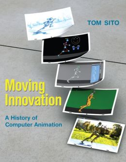
Here‘s an interview with my friend Tom Sito on his new book, a history of computer animation. Moving Innovation: A History of Computer Animation.
It should be interesting since Tom has been a fantastic 2D animator. I’m curious as to what he has to say about the machines.
Art Art &Commentary 23 Mar 2013 04:23 am
Gawking
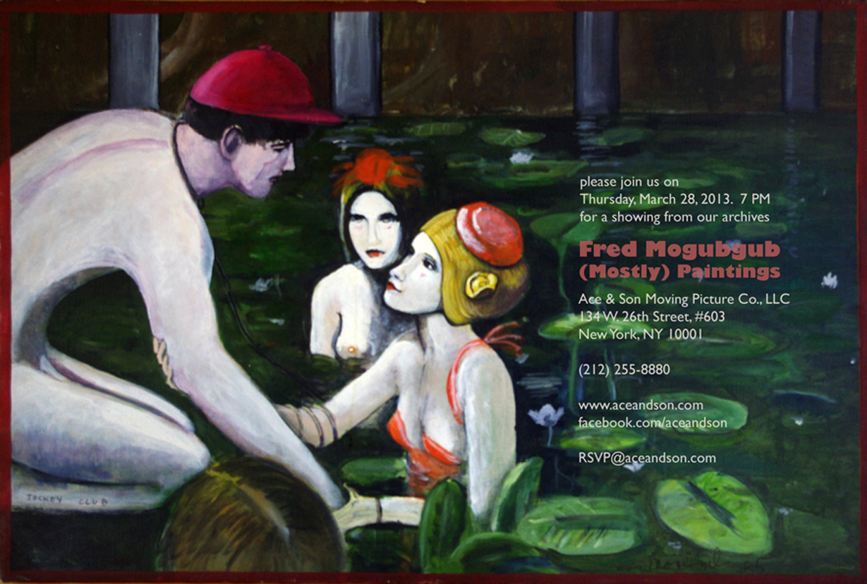
I can’t think of many artists who have supporters as solid as is Richard O’Connor toward the brilliant artist, Fred Mogubgub. Certainly Fred deserved and deserves the attention and support and pleased I am to see it given.
Richard will exhibit some of Fred’s bits of genius in the studio of Ace and Son. This coming Thursday, March 28th at Ace & Son. 7pm. RSVP@aceandson.com
How to Animate the Fleischer Way
Ignacio Carlos Ochoa recently placed this video on his blog. He said he wasn’t familiar with it. I saw the video about a year ago and thought it really nicely done. I’m not sure why I didn’t share it back then, but Ignacio’s comments make me feel like I should post it now, as he has already done. (By the way, his is a good blog and always worth a visit. Keep it in your eyesight; I put it on my sidebar.)
Crood Reviews
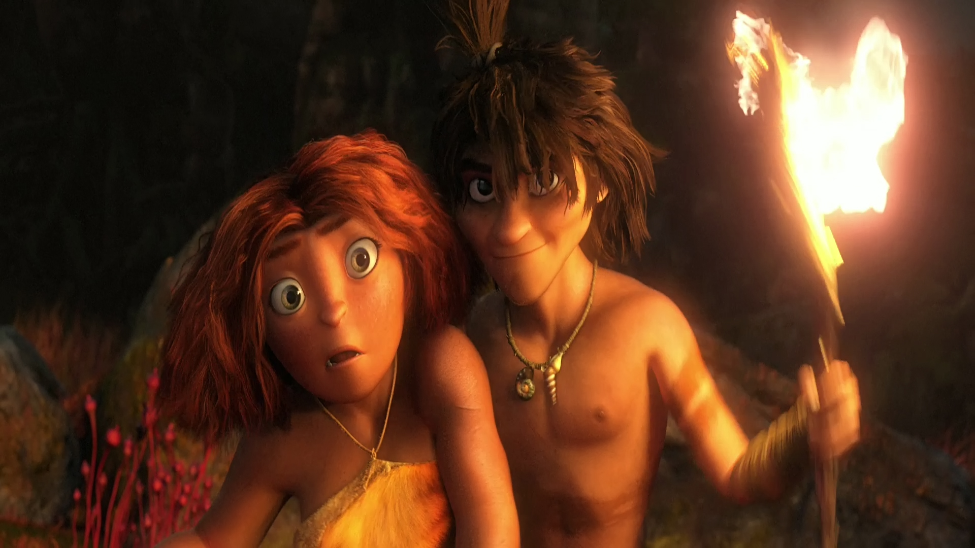
I guess Dreamworks’ The Crood opened on Friday, yesterday. The reviews felt so after-the-fact that I almost didn’t notice it in the NYTimes. The reviewer Neil Genzlinger wrote that “The Croods” is “. . . colorful and has an appealing central character and — who knows? — might even give the little ones something more challenging to think about than its tired main plot.”
Not the sort of review one might hope for. It contines that “. . . the movie is at its most interesting and amusing when riffing on how cavemen might have reacted to new experiences and ideas, like fire and shoes.”
 Flintstones . . . meet the Flintstones . . .
How many remember the Fleischer series called Stone Age? 12 shorts that couldn’t keep the Fleischer brothers together.
Great ideas just keep living on. I was a bit surprised a while back when Iwent to a party for How to Train Your Dragon; Chris Sanders said he’d be going on to The Croods, which was having a bit of trouble getting started. I thought his talent will probably not be best exploited there. But I don’t know. I can’t review the movie until I see it; that will be on Tuesday – that I see it. I’ll try to say something shortly thereafter. The film has to be better than Rise of the Guardians – talk about wasted material. I truly hope The Croods will be the bright spot of my coming Tuesday.
The NYTimes has a slide show about the design of the film. A violently colored watercolor toward the end of the slide show piqued my interest.
The review in the NY Daily News: “There’s a peculiar violence in the comedy in this CG-animated family film, similar to watching a loud, slapstick football game played by extraordinarily ugly plastic figures.”
“The film is best when speculating on the origins of human nature. Why, for instance, do we keep pets or love watching the horizon? When it gets past the Stone Age humor, this weird film manages to find some gentle revelations.”
The NY Post writes: Nothing Prehysterical Here – 1 star – “I’d like to take back all those times I said Nicolas Cage was one of the most annoying actors on film. It turns out he’s equally terrible when he’s only on the soundtrack.
And yet Cage is the least of the problems with “The Croods” . . .
63% from Rotten Tomatoes. That’s not too good. But then Oz the Great and Powerful got a 61% and has been the blockbuster these last two weeks.
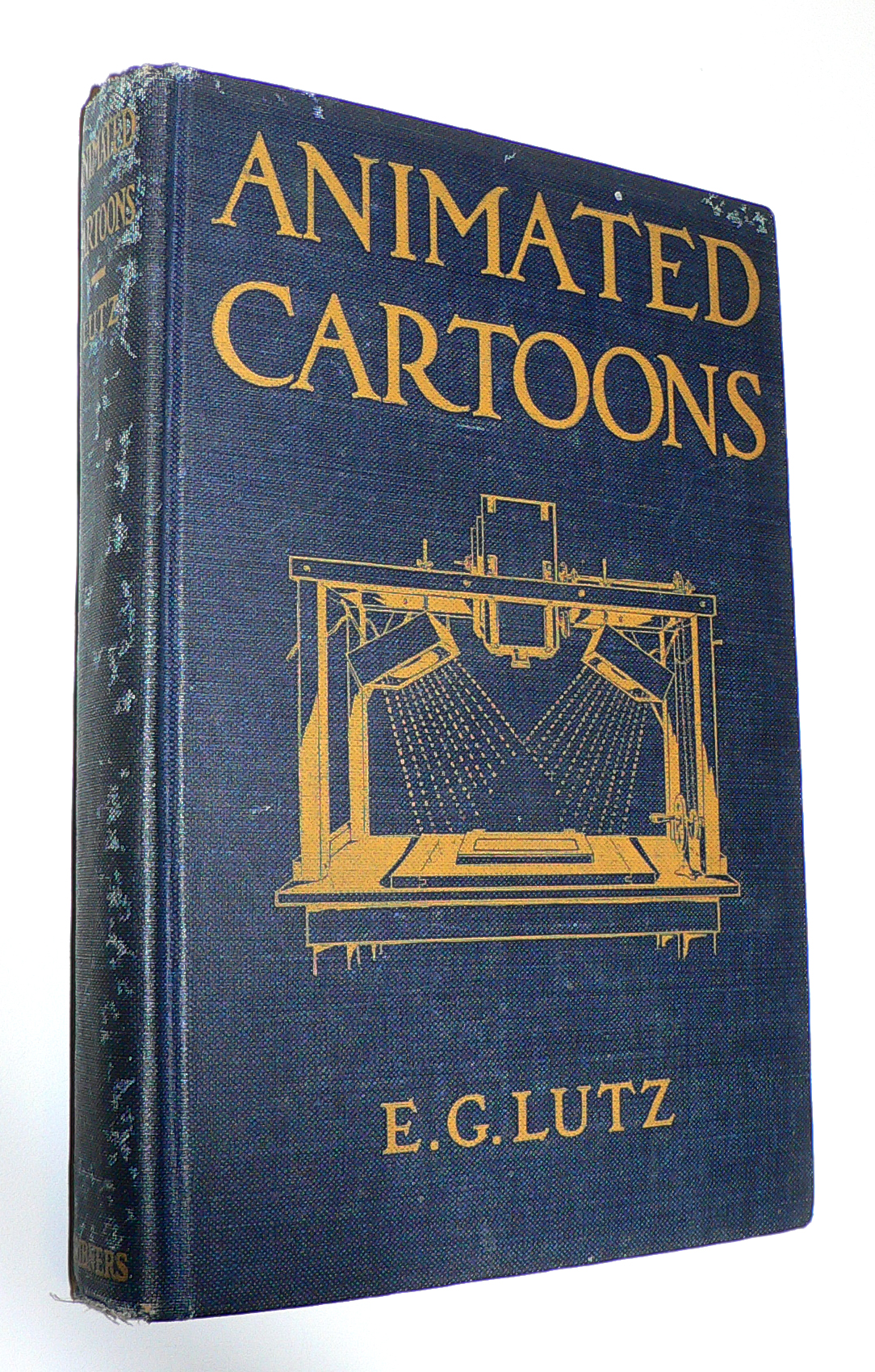 J.J. Sedelmaier has posted everything you want to know about the E.G. Lutz book, Animated Cartoons: How They Are Made (including a scan of the entire book).
The article, actually, is called How Walt Disney Used His Library Card, which is a more appropriate article, because it shows us other books that Disney probably checked out of his local library when growing up in Kansas City.
With some material borrowed from Mike Barrier‘s book, The Animated Man, we get a good picture of the young Mr. Disney staking out the world of the animated cartoon in the early thirties.
A New Face for an Old Effect
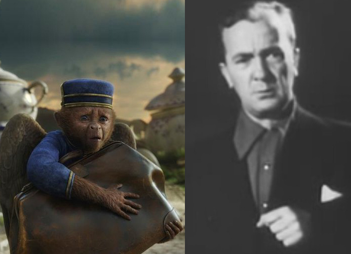
Finley, the flying monkey – Billy Bletcher with natural colored lips
Recently while reading Post Magazine in an article about the Effx for the new Wizard of Oz movie, Oz the Great and Powerful, I stumbled upon something interesting. Actually, it was only interesting because that same day I’d read a small piece in Mike Barrier‘s Hollywood Cartoons, and I found an interesting juxtaposition of the one story to the other.
According to Barrier’s book, back in 1934 Disney had chosen a Silly Symphony to direct, The Golden Touch. It would be the last animated film he’d take credit for directing. Disney had the two best animators of the day, Norm Ferguson and Freddie Moore scheduled to do all the animation in the film. A lot of time was given to every stage of this movie. When it came time to record Billy Bletcher as King Midas, they painted his lips white and filmed him so that Ferguson could use his lips in animating the character. The animation took a particularly long time and didn’t go well. Disney, himself, called the film “a tremendous flop.”
They didn’t paint his lips white, but they did photograph Walt Disney acting as the voice of Mickey Mouse when he did the track for “The Pointer.” The stills were used by Frank Thomas for the one big dialogue scene in the short, and Frank spoke several times, when I knew him, of this tactic.
Jump almost 80 years to shooting the monkey sidekick of the Wizard, James Franco, as he travels down the yellow brick road, seeking to become the Wizard of Oz. The two of them have a long conversation. The film’s visual effects supervisor Scott Stokdyk talks about the flying monkey partner of James Franco‘s wizard.
“Finley is the monkey who becomes Oz’s companion on the journey. He’s played by Zach Braff. The modern way for doing a CG character is to have them on-set, interacting actor to actor, and then paint out the stand-in actor and replace him with CG. We tried to do that whenever we could. But our CG Finley was three-feet-tall and had wings, could fly around, and was very active. So we couldn’t put Zach’s face where the monkey’s was.”
“We came up with this thing called ‘puppet cam.’ We had a puppet with a rod, and a monitor and camera on the end of it. We had Zach in the same booth that Joey was in, and he was interacting. We set up a virtual video conference, but it was executed through a monitor on a stick on-set. James had an ear rig, and he could talk to Zach, but was looking at a video monitor on a stick, put in the place of where the monkey’s head would be. And in the monitor he’d see Zach’s head in the booth. It gave us a proxy for having Zack on-set with his head in the right place.â€
All the time that has passed and not much has changed. They don’t paint Zach Braff’s lips white, but they do paste his video image onto a cardboard puppet on set. It all amounts to the same thing; it just costs a lot more money.
As a matter of fact I also think about the cardboard cutouts that James Baskett dealt with when shooting the live action sequences for Song of the South. It sounds very similar to what they did on the new movie.
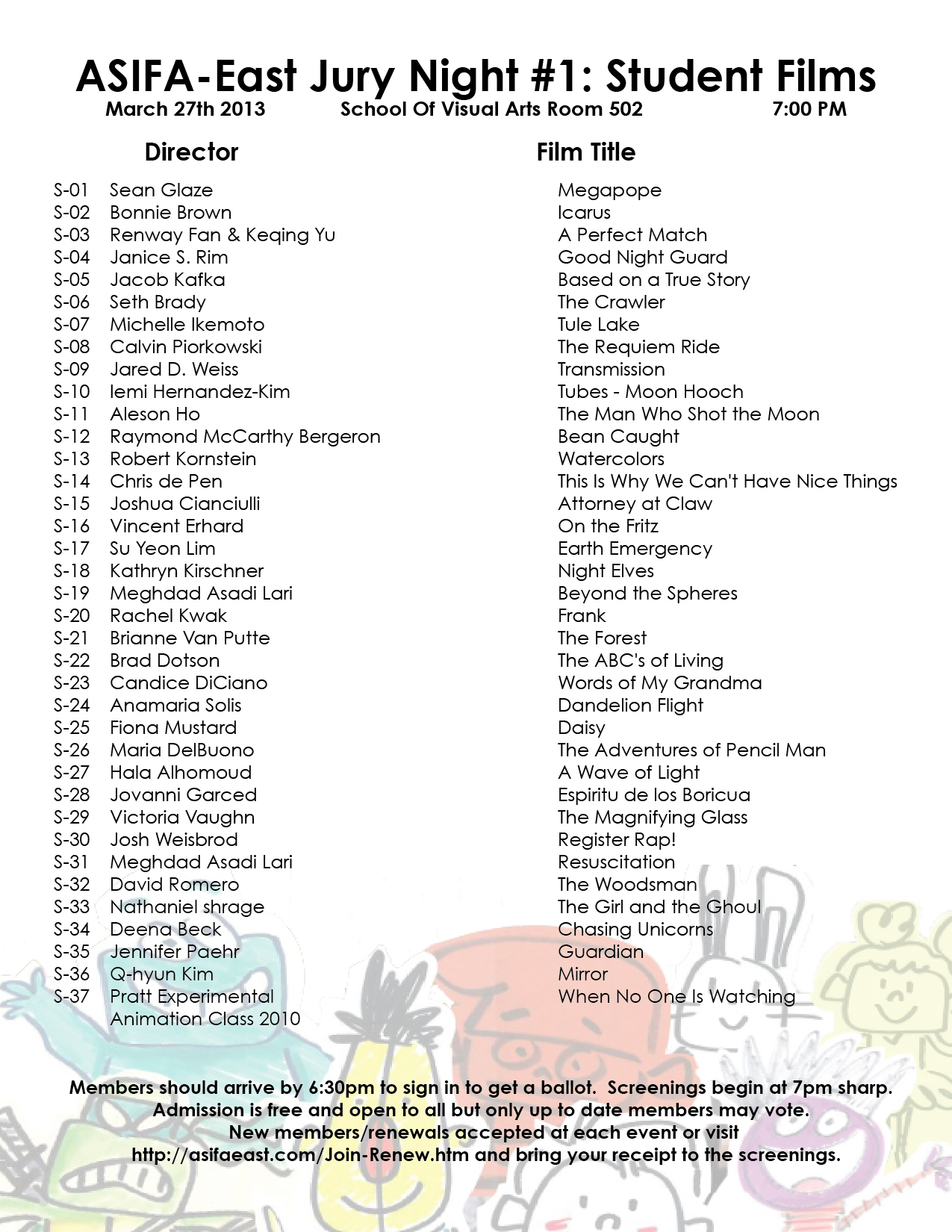
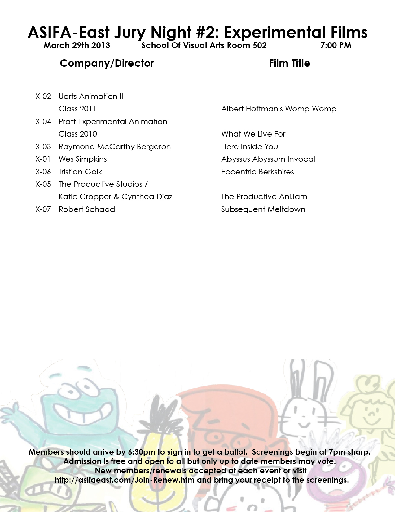
ASIFA East Festival Judging Screenings
This week several nights will be devoted to judging the entries for the ASIFA East Festival. Remember that all members of ASIFA East are eligible to vote for the awards from the films to be screened. Get out the vote.
There will be four screenings:
1. Wed., March 27th – 7pm – Student films
2. Thurs., Mar 28th – 7pm – Commissioned Films
3. Fri., March 29th – 7pm – Experimental Films
4. Tues., April 2nd – 7pm – Independent Films
These are the films competing:
 1
1 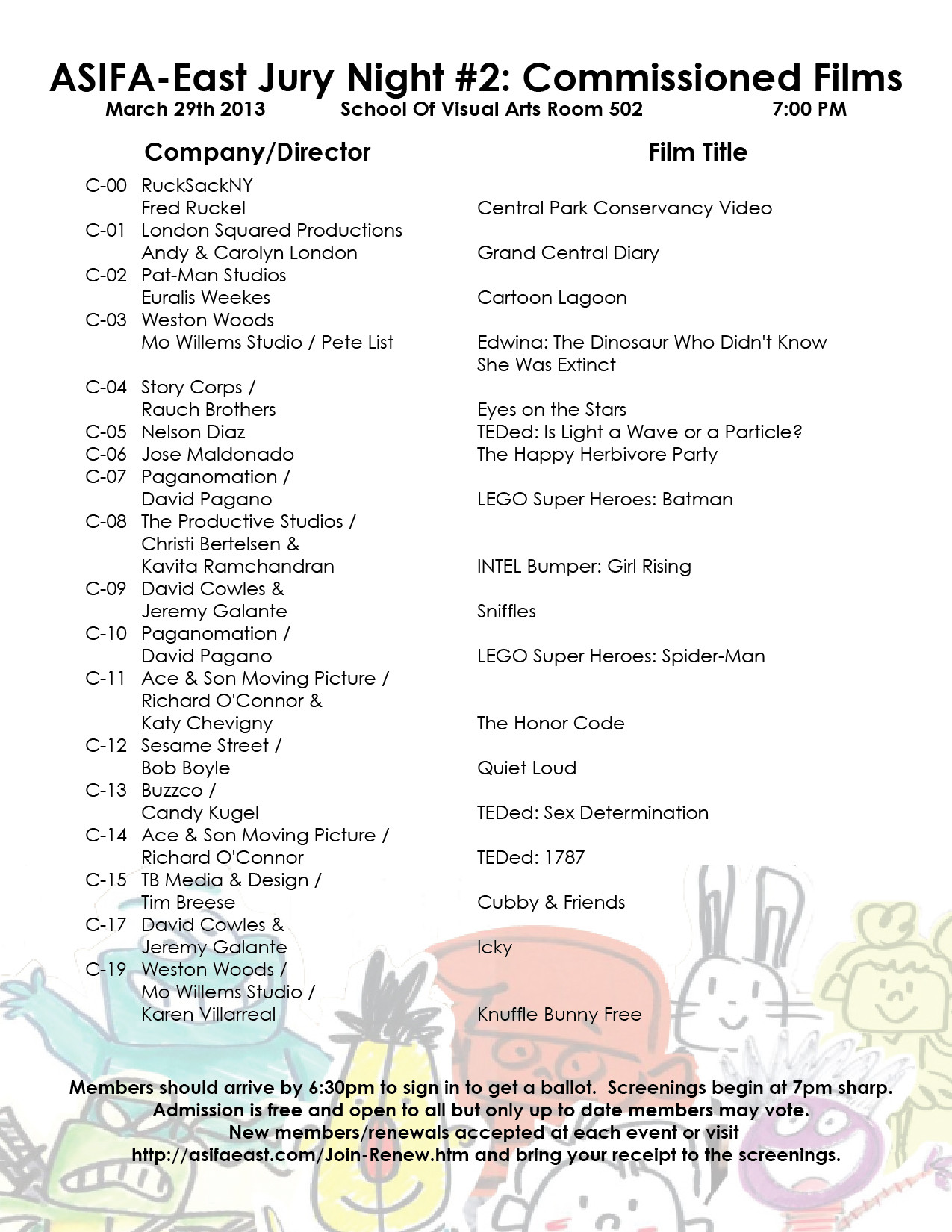 2
2
(click on any page to enlarge for legibility.)
 3
3 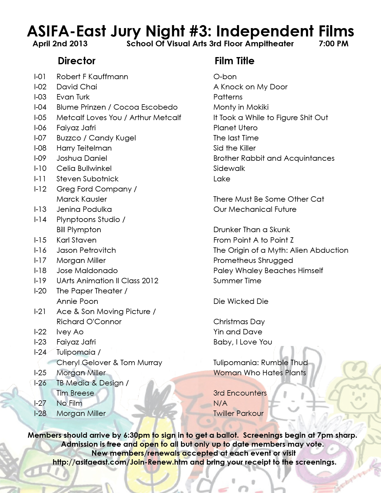 4
4
As an extra added attraction today, here’s a paper that was distributed at the Disney studio in early 1934, which outlines how their productions will move forward through the studio. They’re merely trying to set up some kind of organization, and they start by telling everyone how it will operate.
This document came from someone who would like to remain anonymous, but we thank him, just the same.
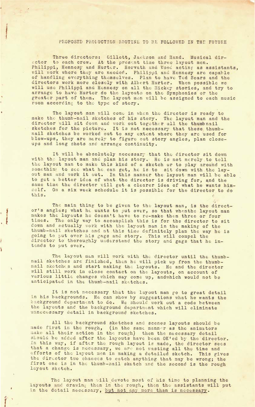 1
1 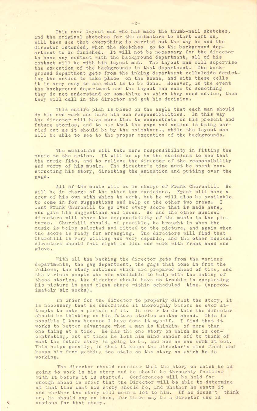 2
2
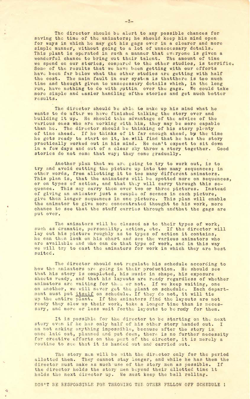 3
3  4
4
Daily post 14 Nov 2012 08:30 am
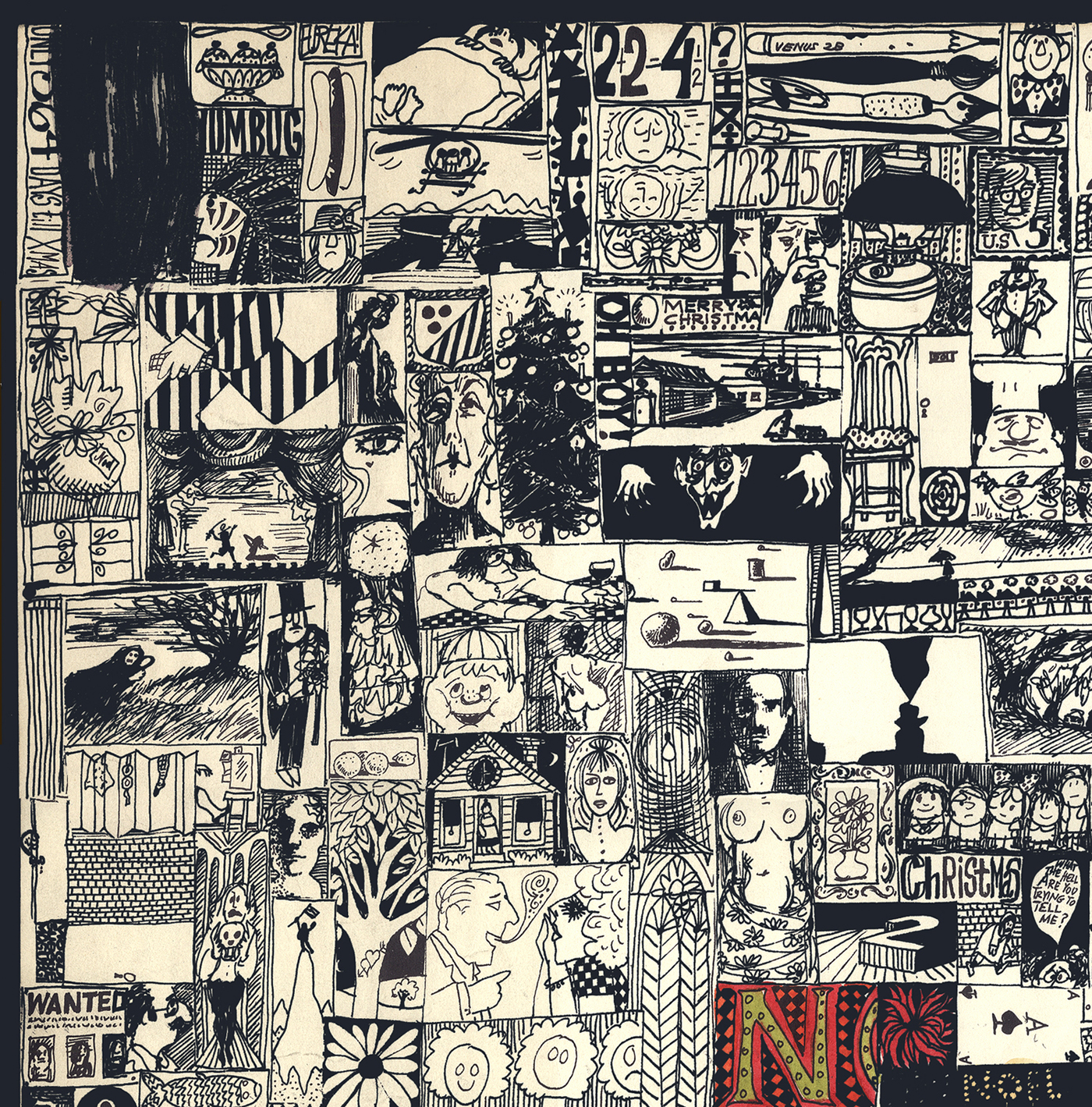
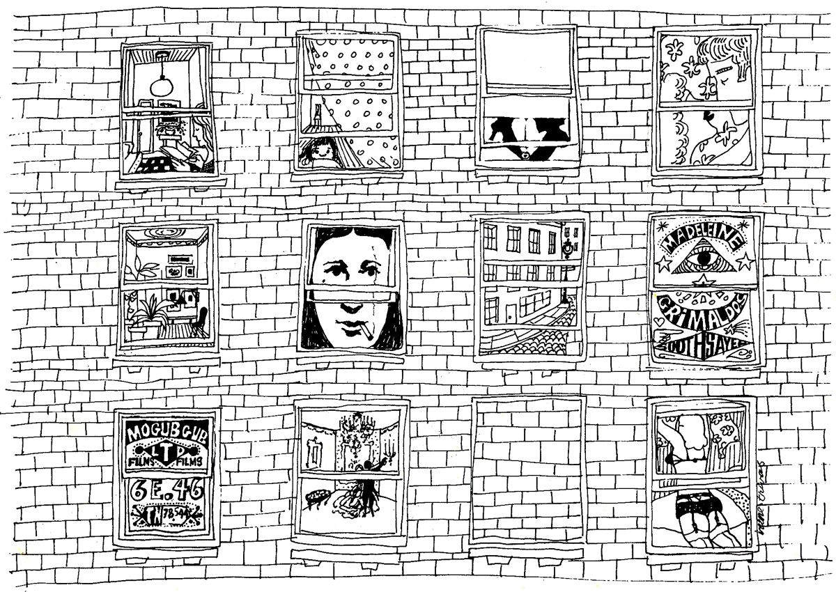
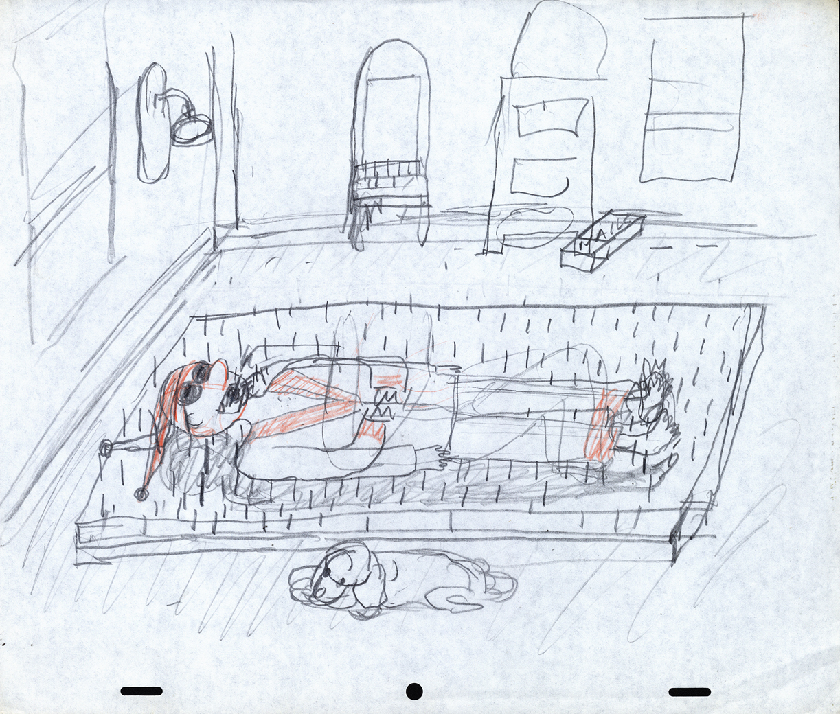
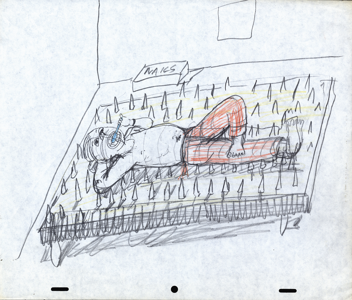
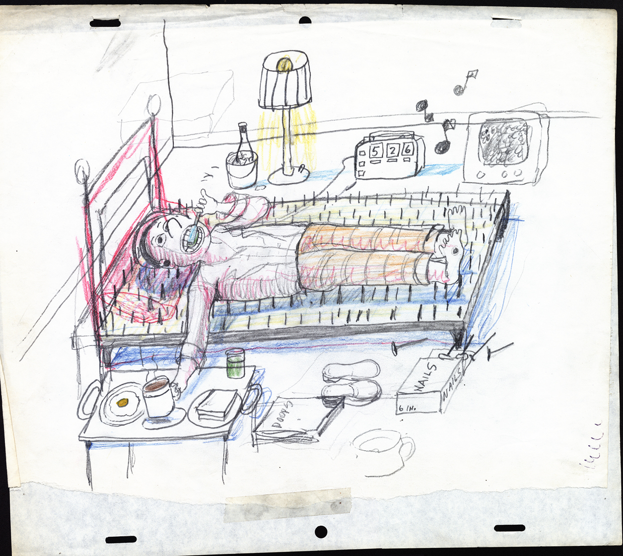
Mogubgub 3
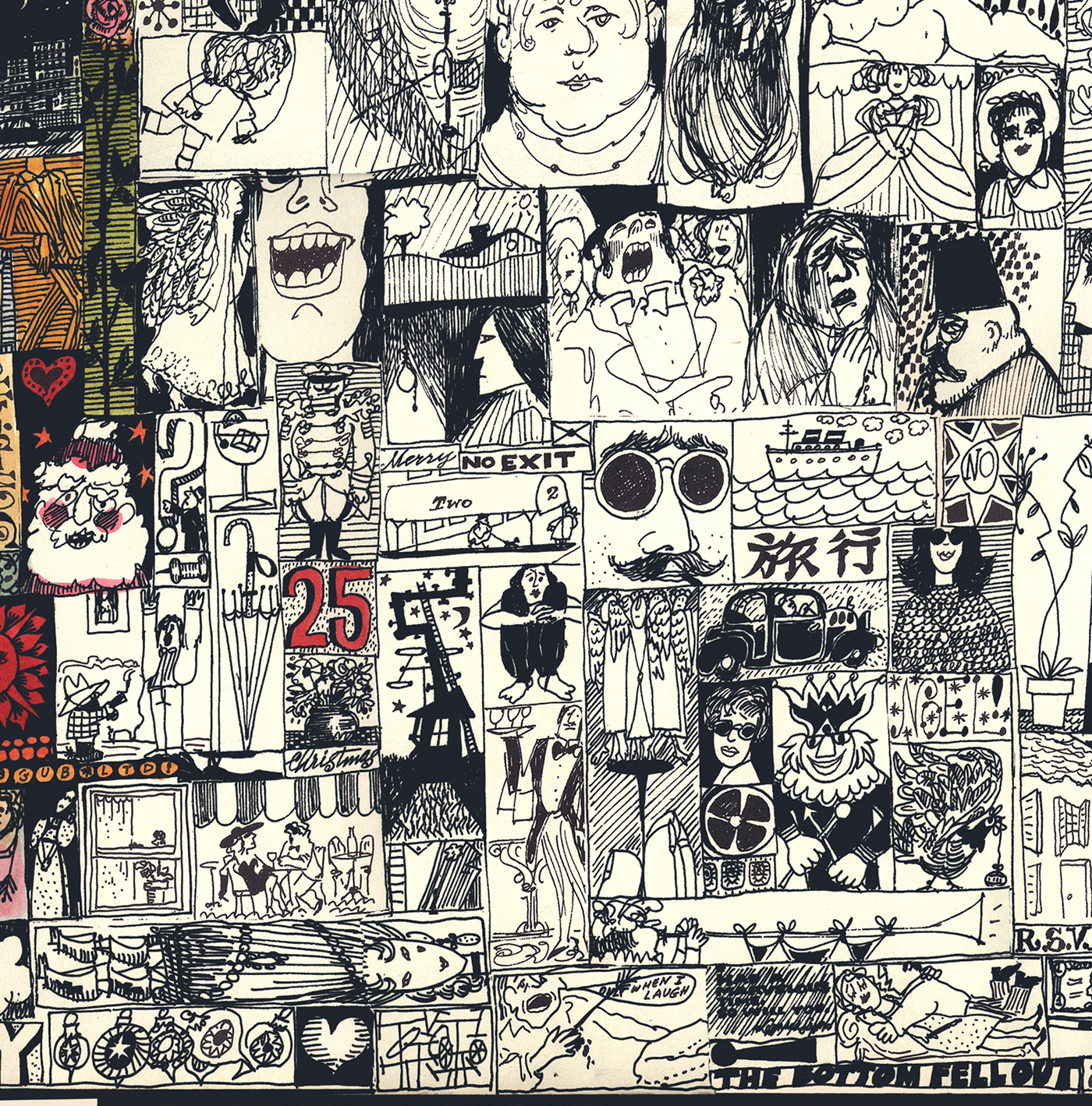
- Fred Mogubgub did a lot of varied work. Here are three pieces which were done large. In all three cases I’m posting them in the full format and then breaking them up to allow you to see them in a larger size.
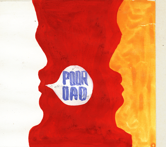
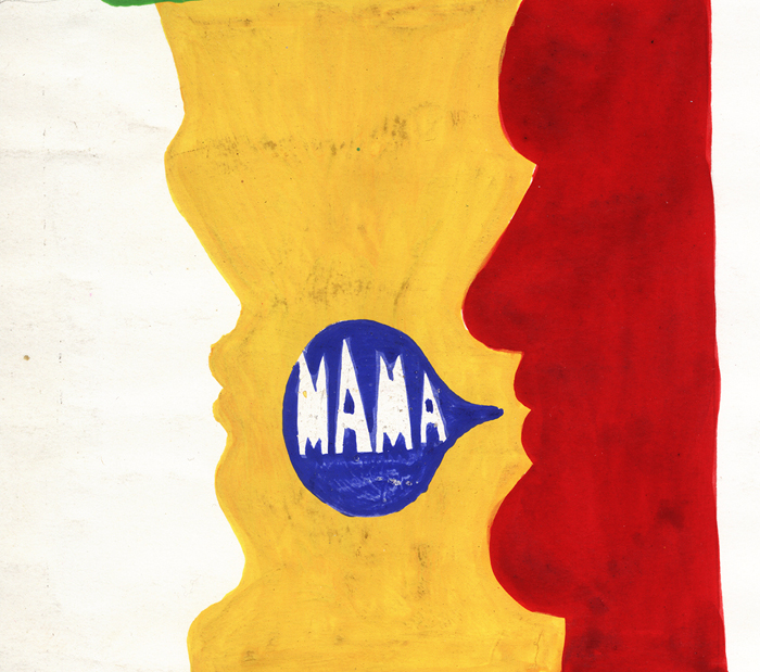
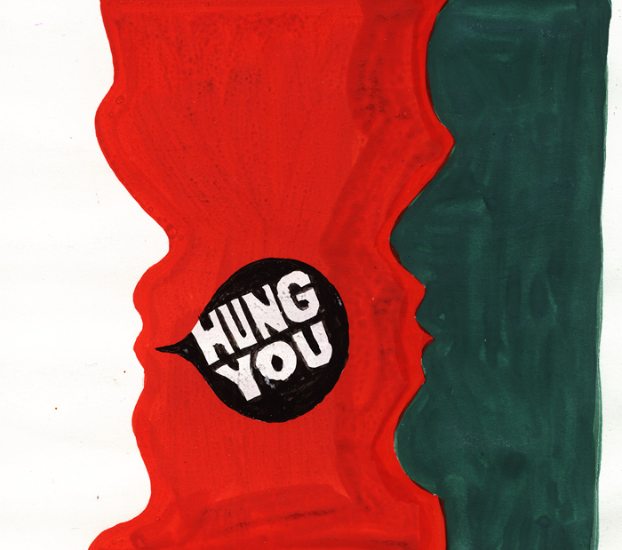
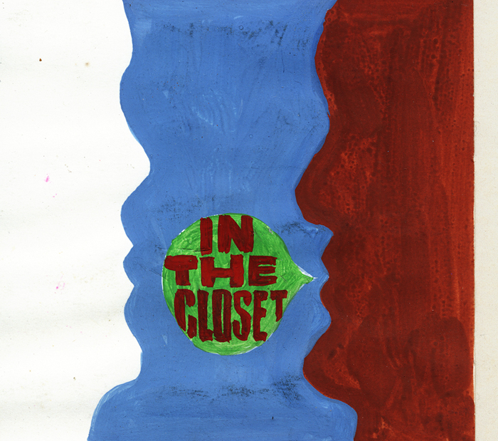
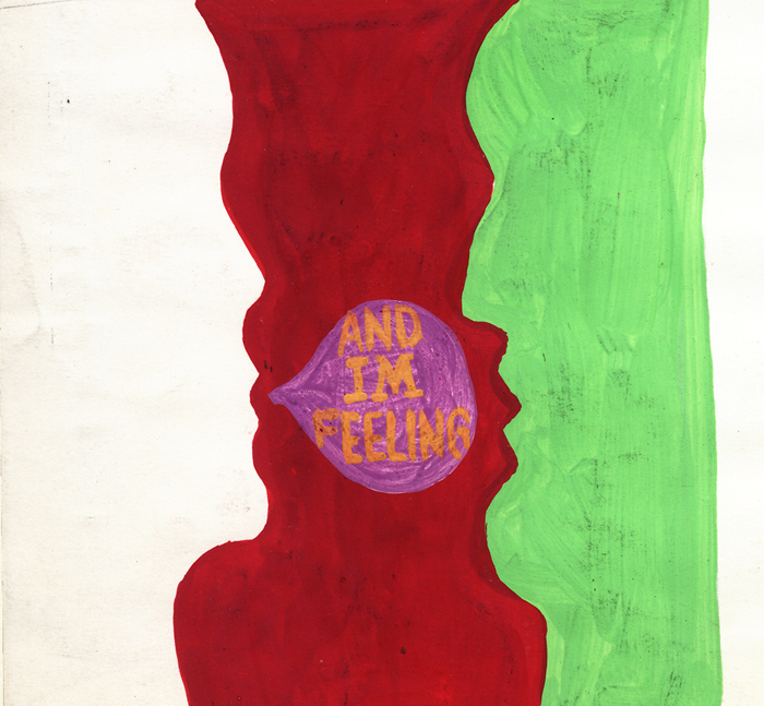
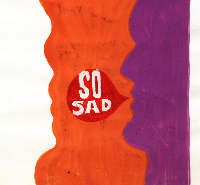
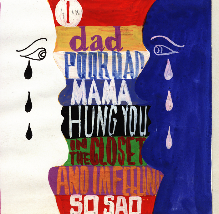
Here is what, undoubtedly, was a storyboard opening for the Broadway show, Oh Dad Poor Dad Mama’s Hung You In the Closet and I’m Feeling So Sad, Arthur Kopit‘s furst play; it opened on Broadway in 1963 for 47 performances. The show was directed by Jerome Robbins, and the animated prologue was done by Fred Mogubgub and Pablo Ferro. This is only one of three animated films done for the Broadway stage. This piece accompanied music written by Robert Prince. (The other animated films were both done/directed by me for Woman of the Year, a number of segments that incorporated dialogue as well as a musical duets between a character and a stage actor. The third film was an animated overture done for Meet Me In St. Louis, animated archival-looking postcards, animated. The final one turned into a live setting of the town ice skating.)
This is Oh Dad, Poor Dad, a full image of the board:
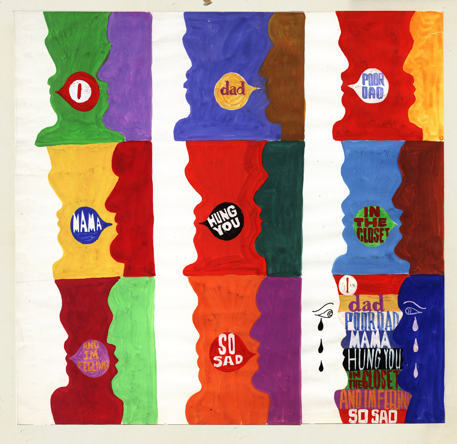
The final art used flat colors.
This is the same thing broken down into panels
to allow you to see them in a larger format.
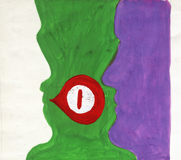 1
1(Click any image to see them at a larger size.)
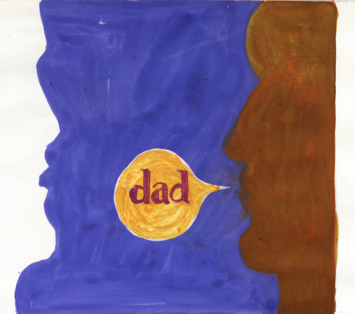 2
2
 3
3
 4
4
 5
5
 6
6
 7
7
 8
8
 9
9
__________________
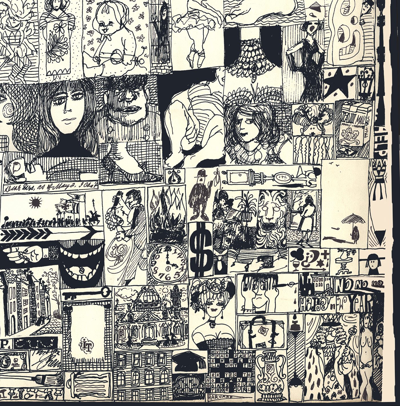
To follow that famous piece, there is a Christmas card, or it seems to be a Christmas card. The thing is so large it took a lot of work in photoshop to put it together. The whole is 30″ x 24. I’m posting it twice. Once full size, then in pieces so you can see/read it.
The full thing
(Click any image to enlarge.)
 1
1
The six parts of the card. Top Left
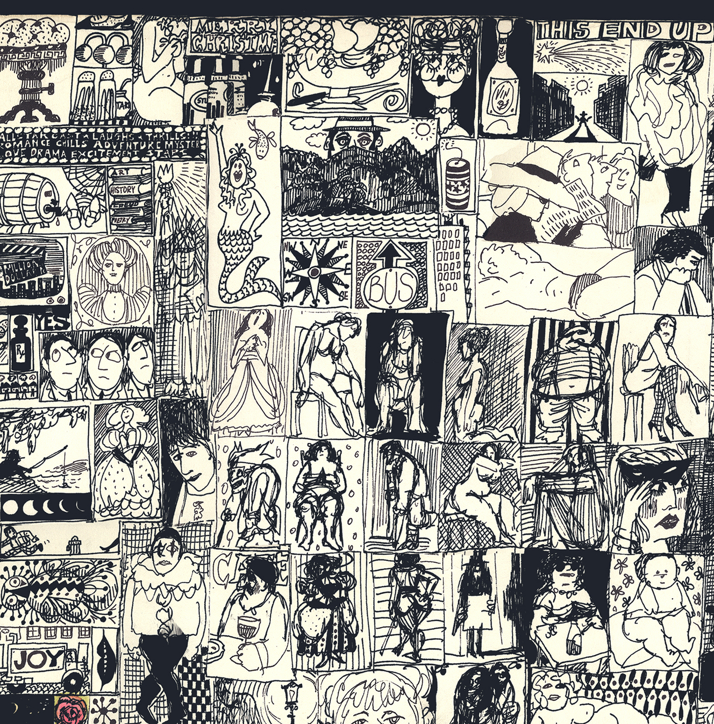 2
2
Top Center
 3
3
Top Right
 4
4
Bottom Left
 5
5
Bottom Center
 6
6
Bottom Right
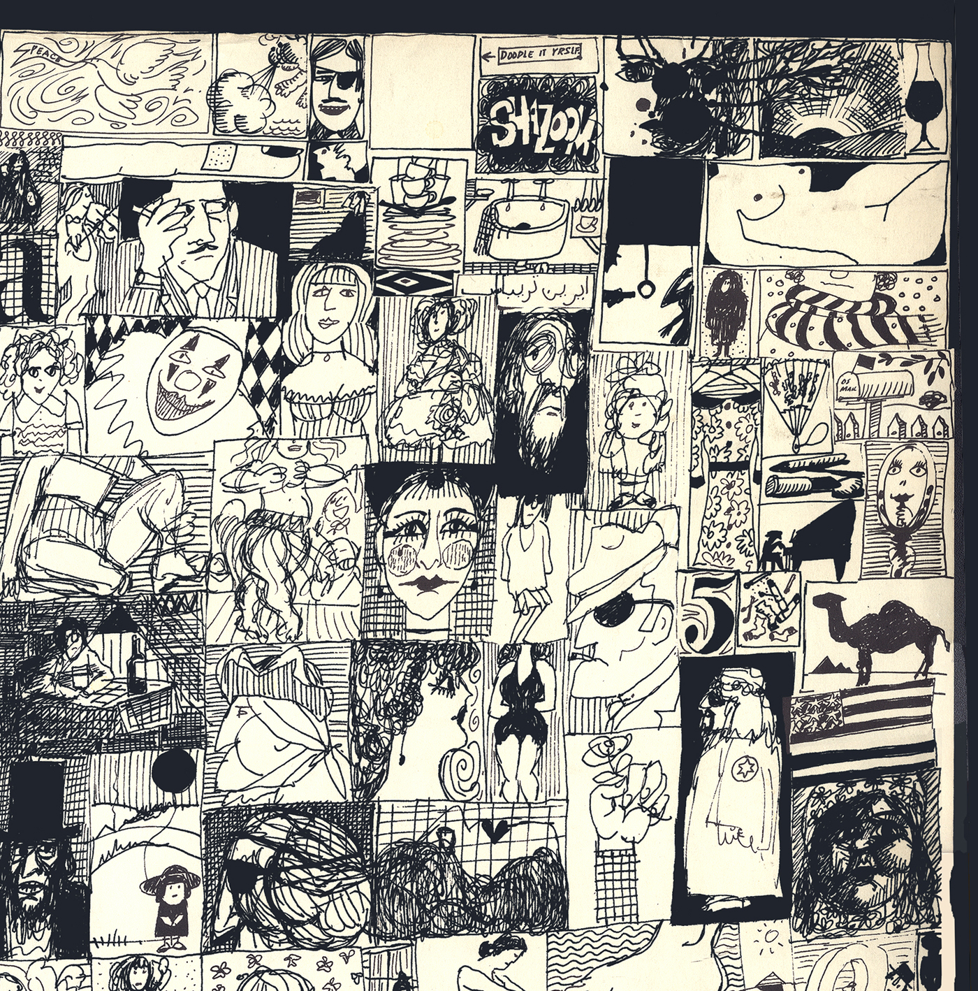
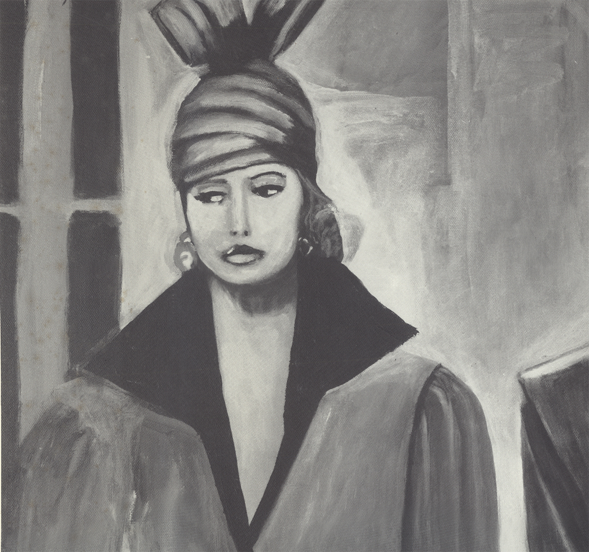
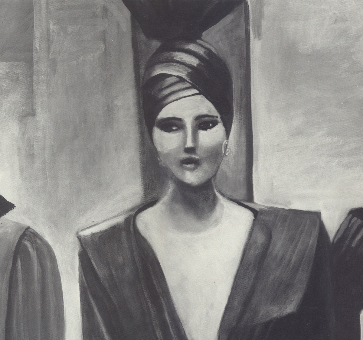
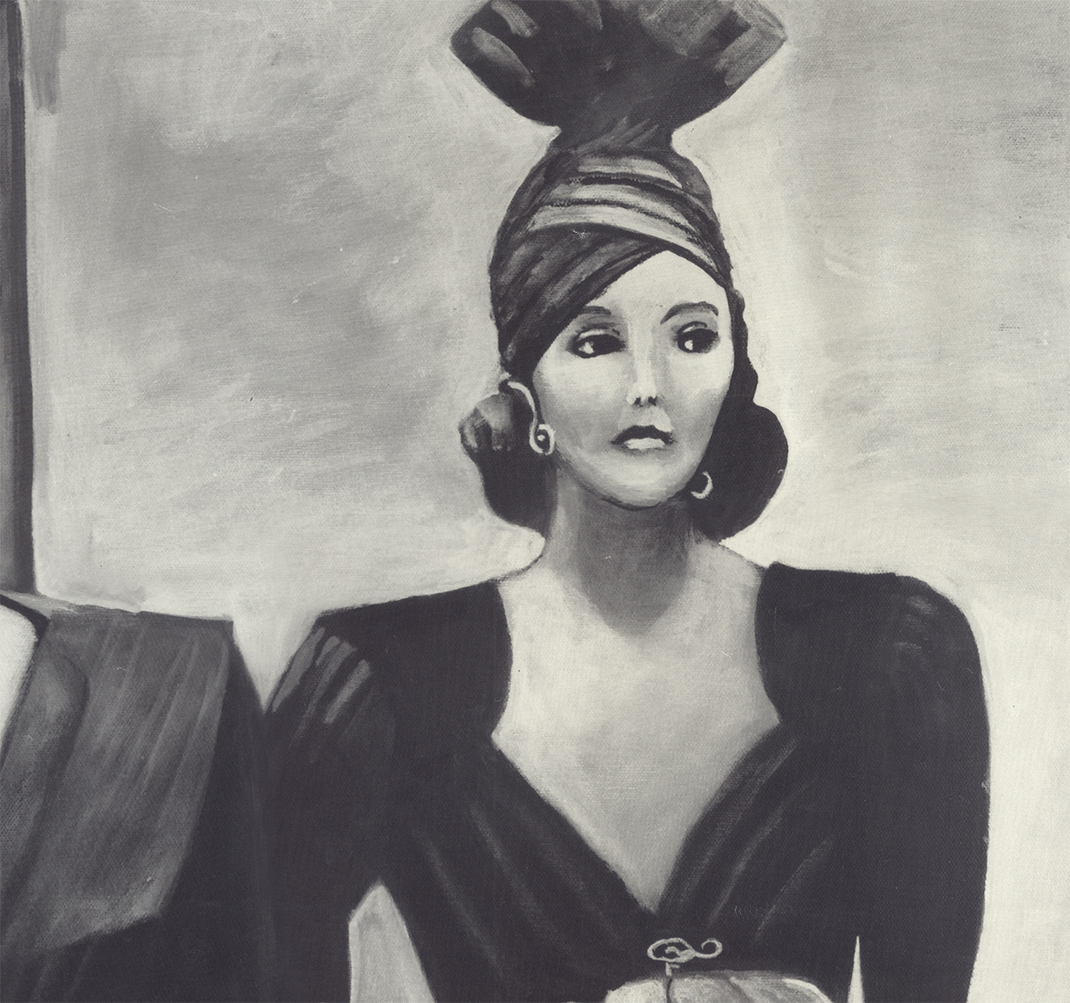
- Another large piece by Fred Mogubgub is a painting from which he created 500 photographic prints. It was a major part of an exhibit Fred had, and the prints were sold by the gallery. As with the other large pieces, I’m posting it whole and then again, in parts.
The painting is entitled, “Paris Streets.”
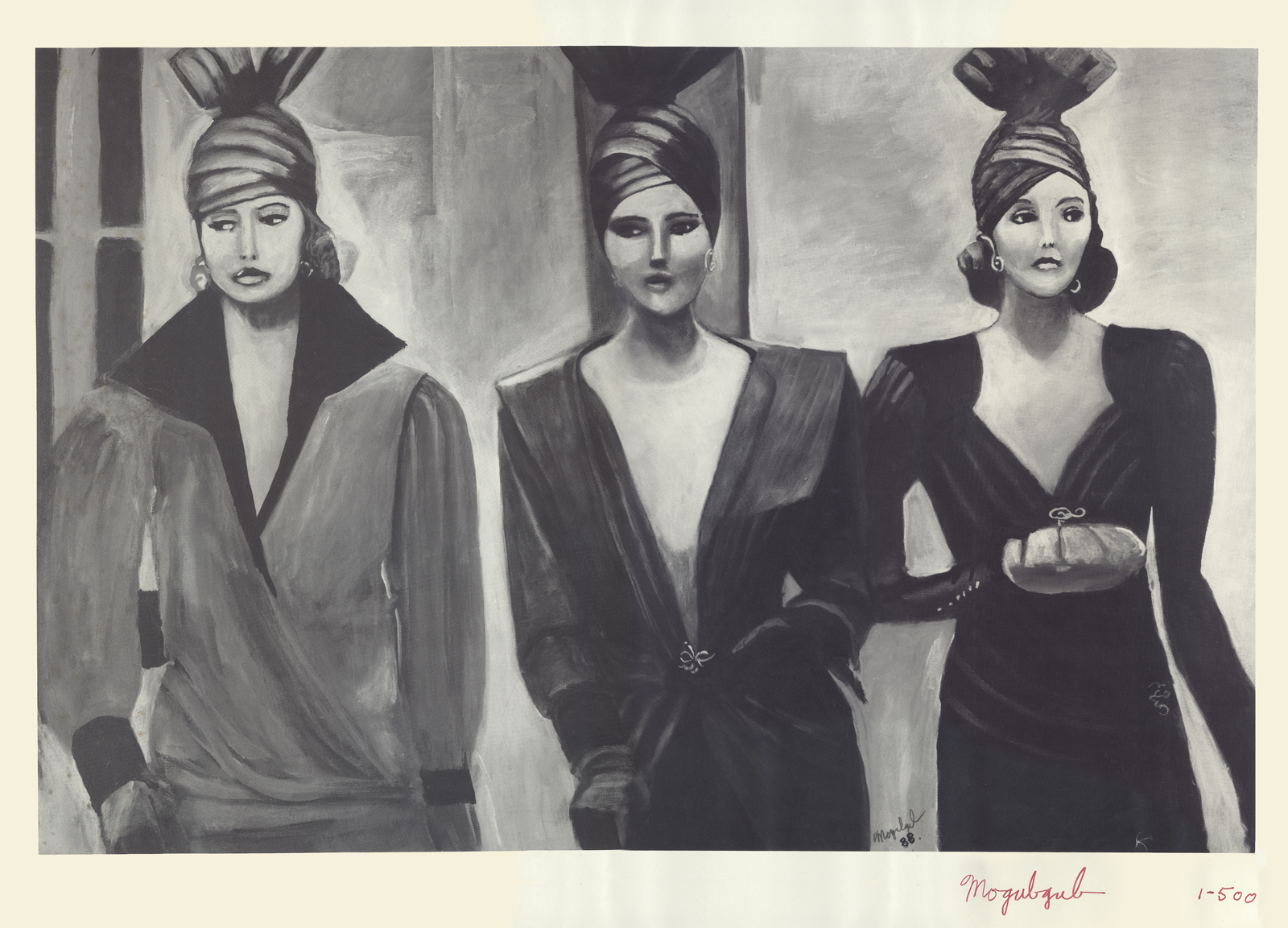
The full image
 1
1
The first woman on the left.
 2
2
The woman in the center
 3
3
The woman on the right.
.
__________________
.
An ad for the company drawn by Irene Certas.
Very interesting. She was a brilliant checker, inker,
production coordinator who, for years, managed a
number of small studios including J.J.Sedelmaier‘s.
She is also Janet Scagnelli’s sister.
Obviously, brilliance runs in that family.
Bill Peckmann &Comic Art &Illustration 09 Nov 2012 06:40 am
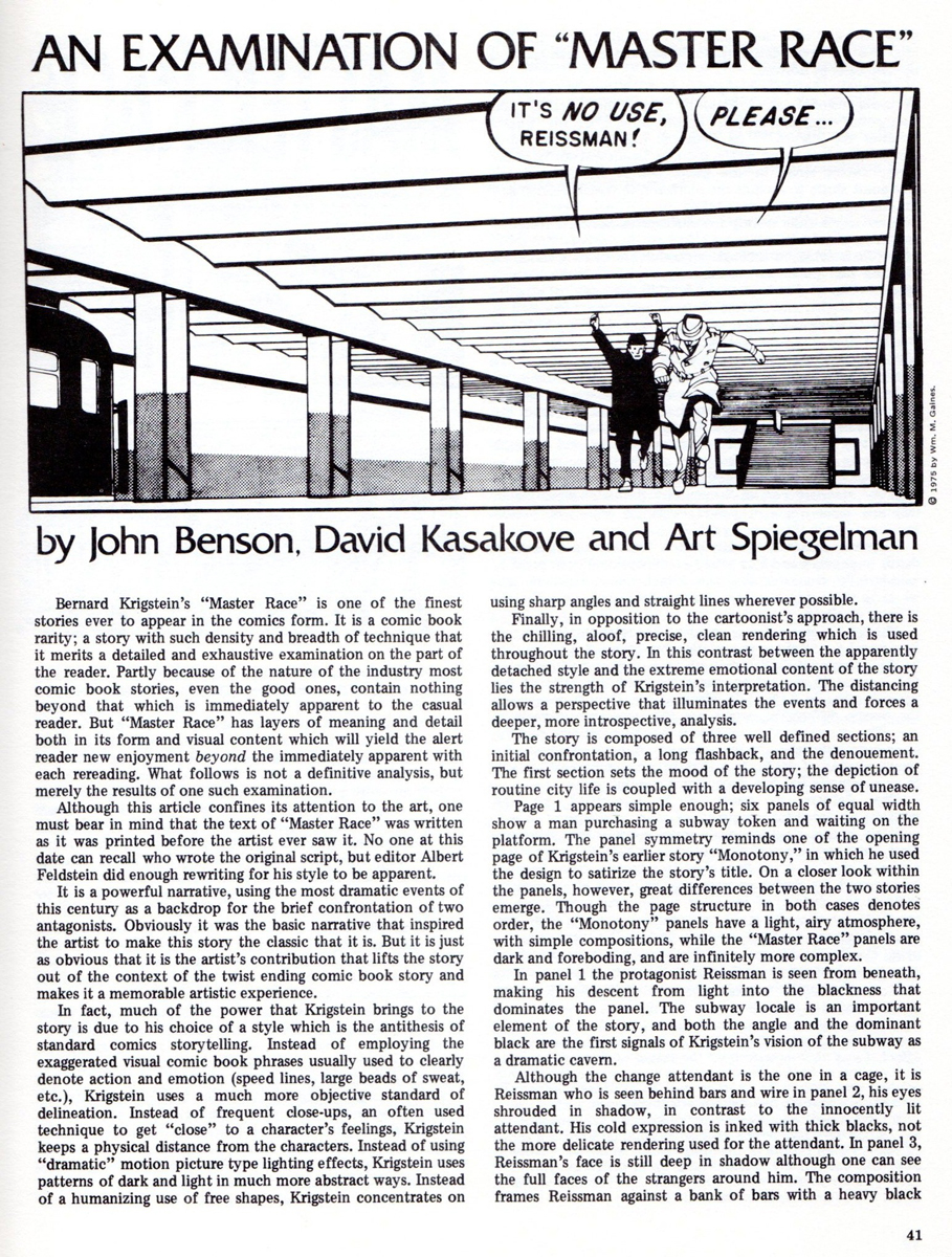
Bernard Krigstein’s “Master Race”
Bill Peckmann continues to introduce me to new and interesting artists. Here’s what he wrote abot Bernard Krigstein:
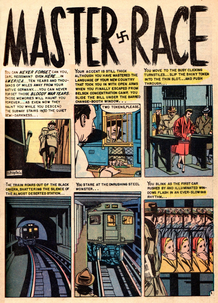
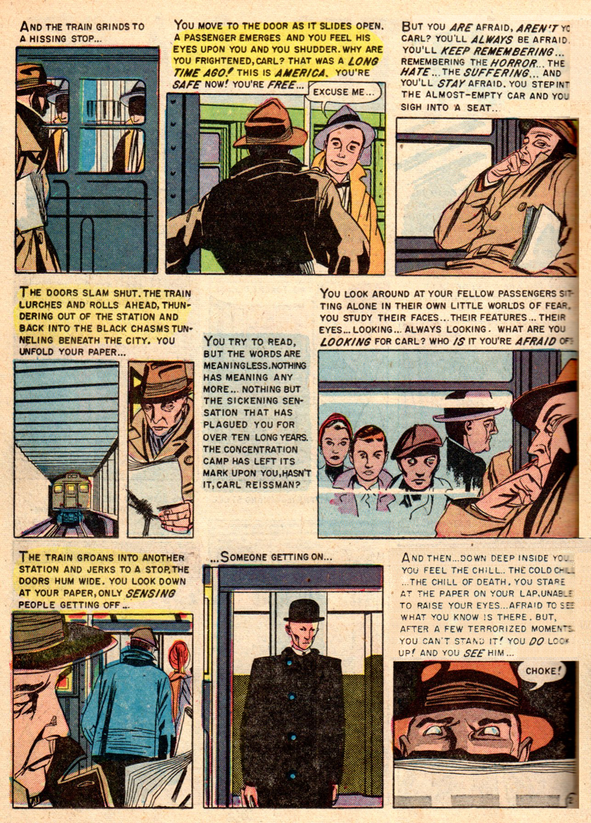
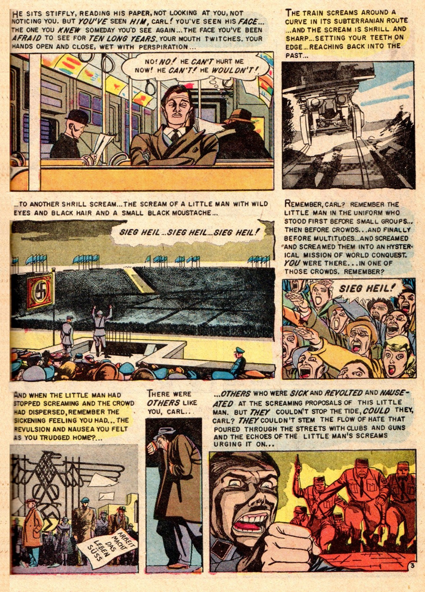
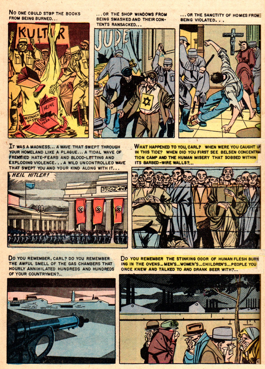
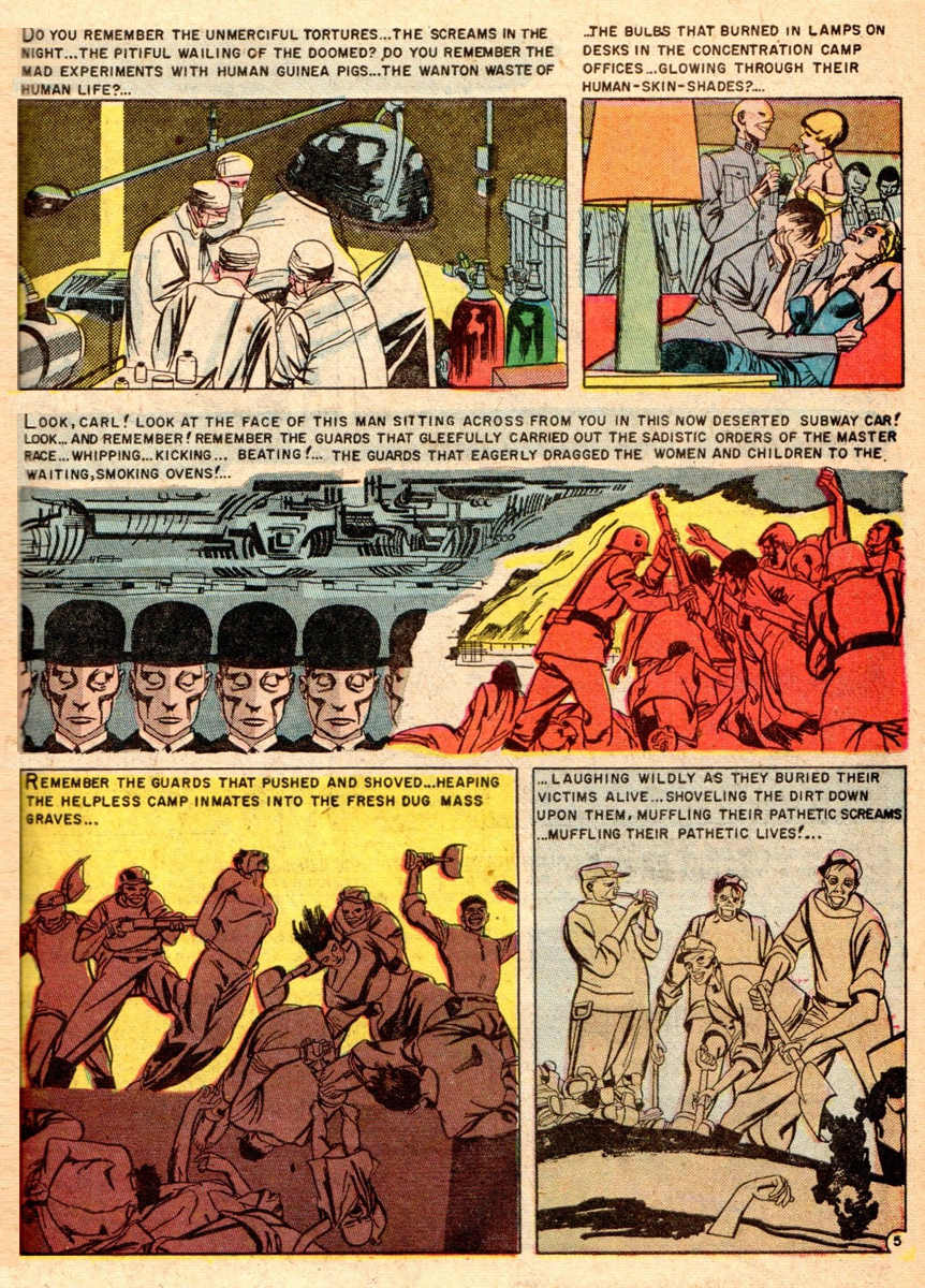
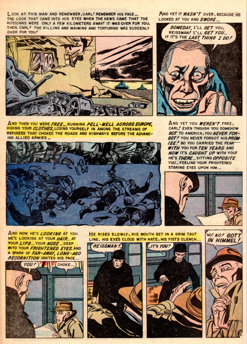
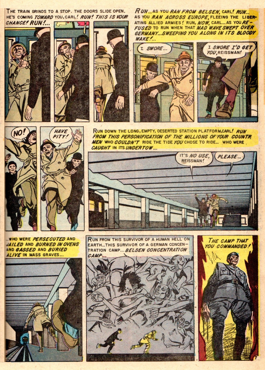
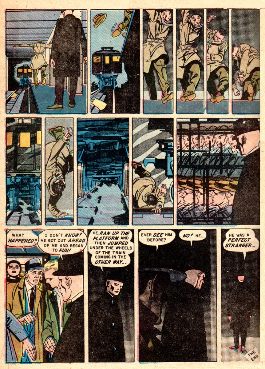
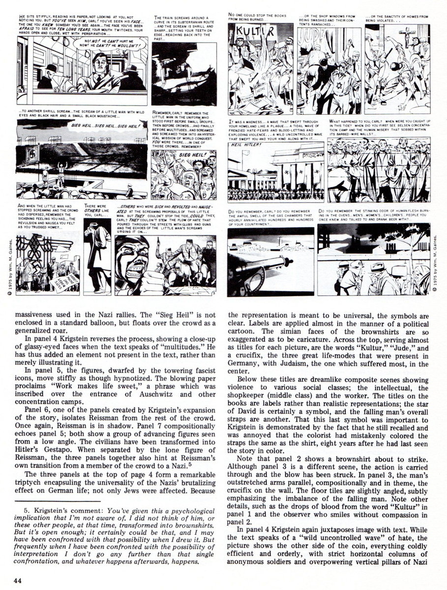
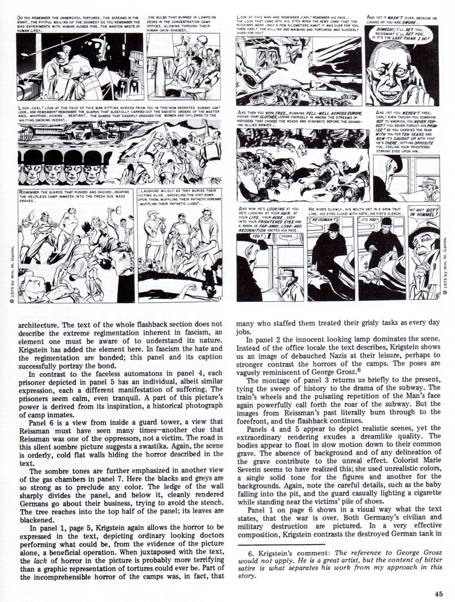
- Comic book artist Bernard Krigstein, like animation artist Fred Mogubgub, was ahead of his time. In the 1950′s, Krigstein’s page and panel designs with their distinct breakdowns set the pace for comic book art that followed later in the century.
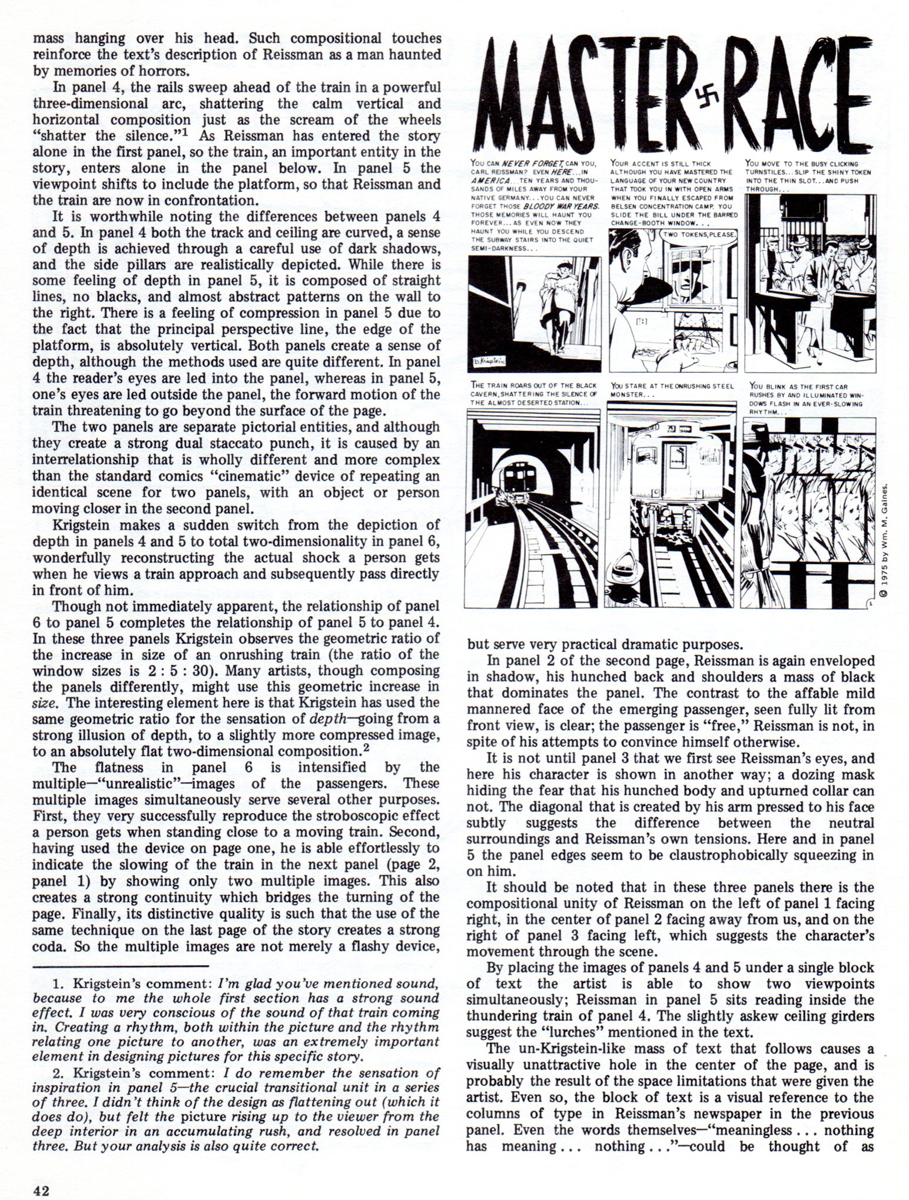
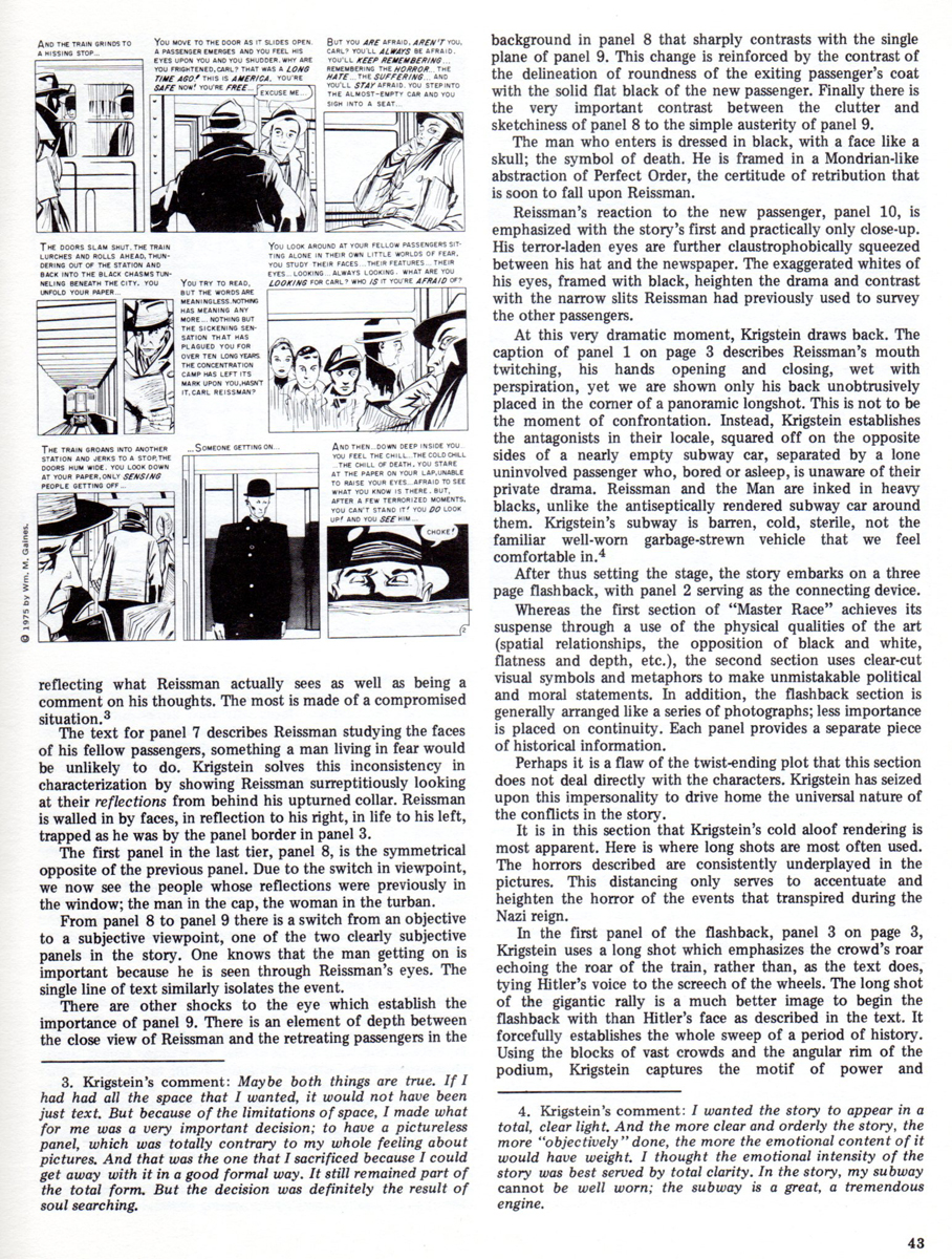
Here from the original 1955 comic is his most reprinted story, “Master Race”. It appeared in the first issue of EC Comics’ “Impact”. It will be followed by an excellent essay/examination of that story which appeared in the EC fanzine “Squa Tront”, in 1975.
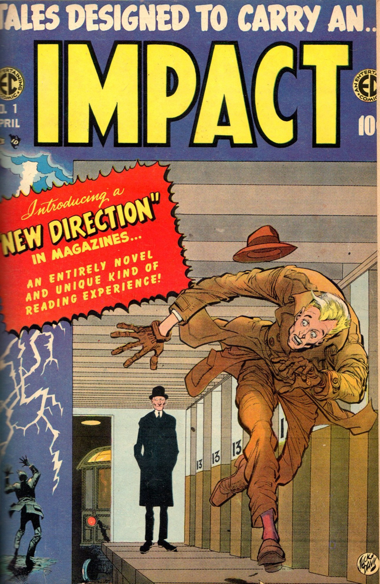
This is the cover of “Impact” No. 1 drawn by Jack Davis.
 1
1
 2
2
 3
3
 4
4
 5
5
 6
6
 7
7
 8
8
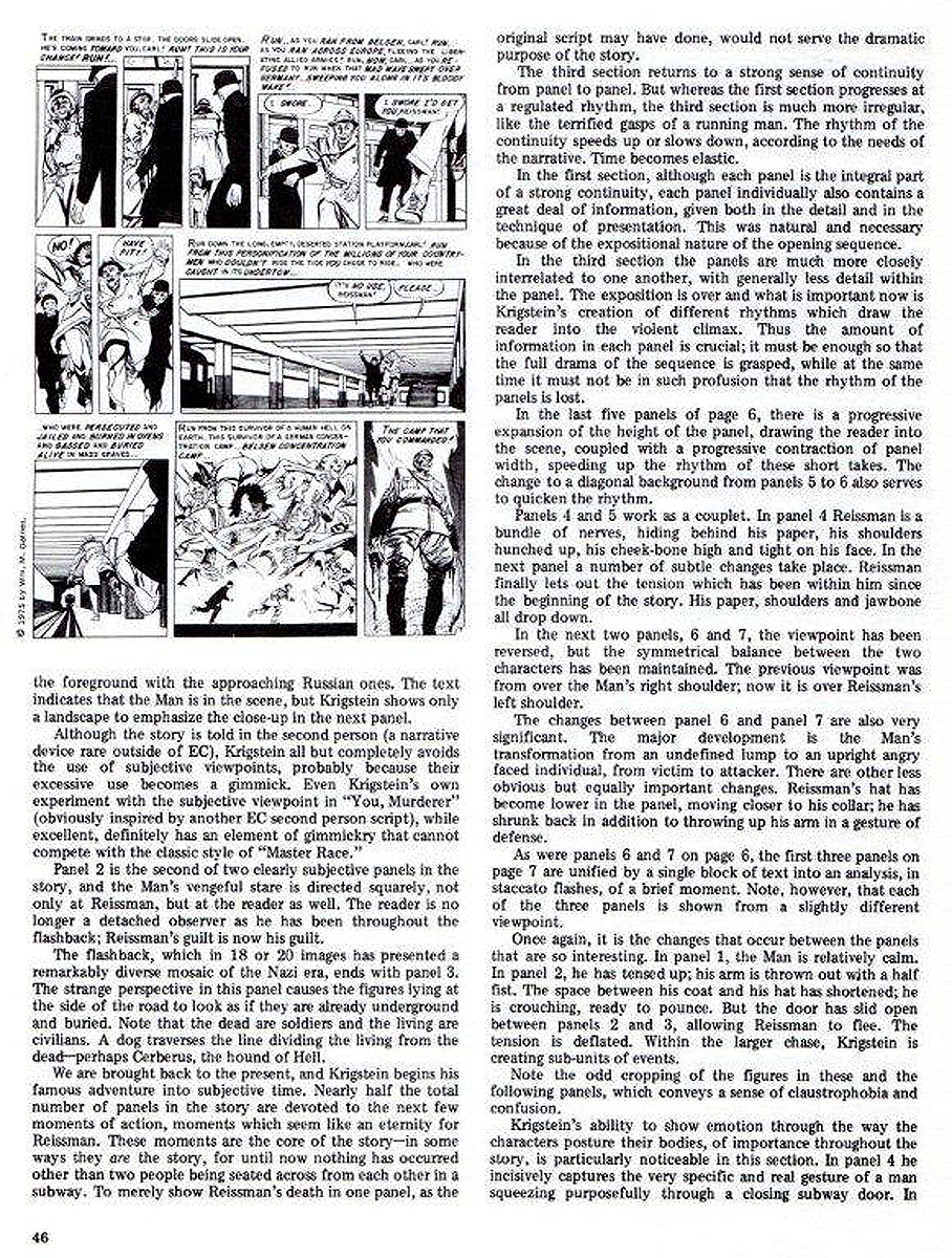
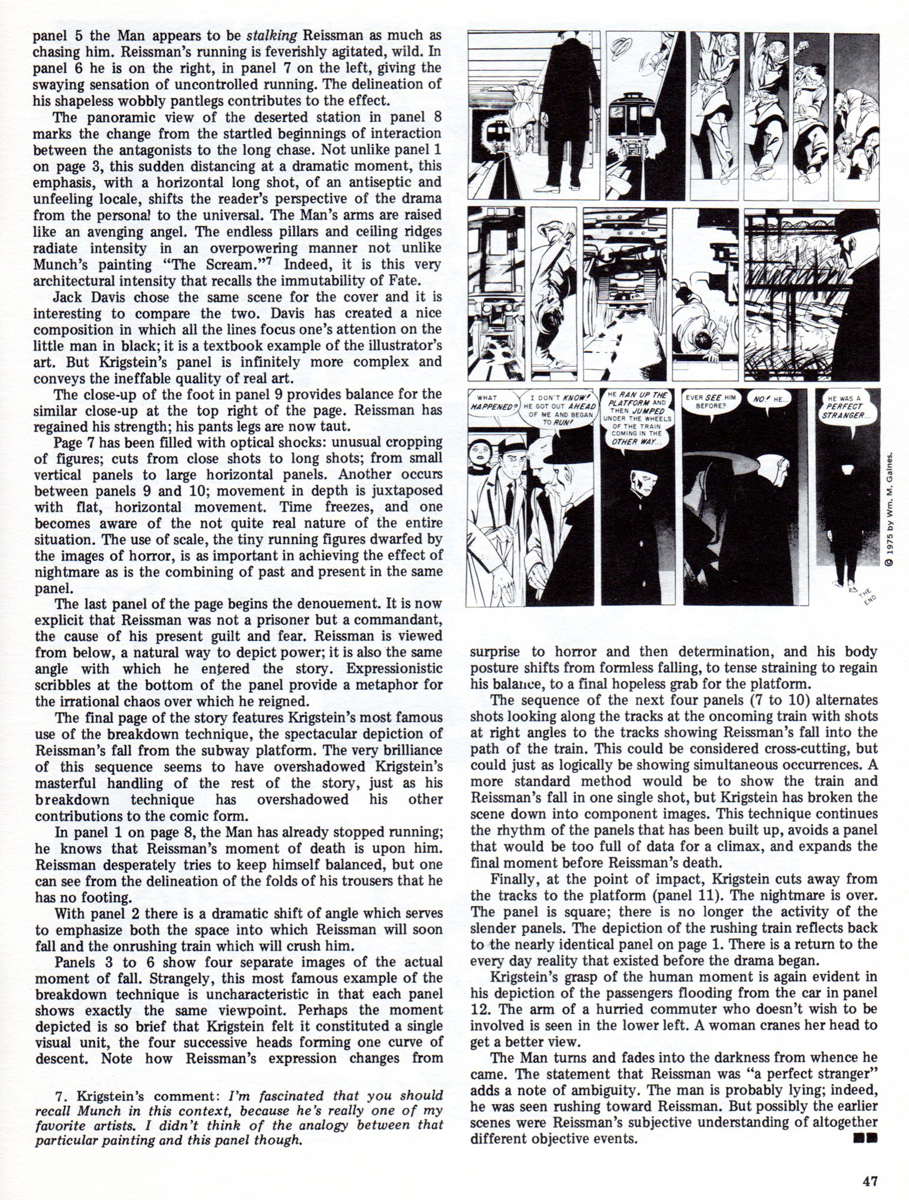
Here is an article which appeared in the fanzine, Squa Tront in 1975:
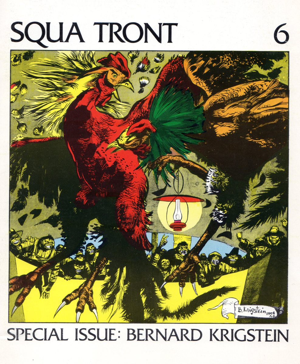
The Squa Tront cover
 1
1
 2
2
 3
3
 4
4
 5
5
 6
6
 7
7
Animation Artifacts &Art Art &commercial animation &Layout & Design &Models 17 Oct 2012 06:21 am
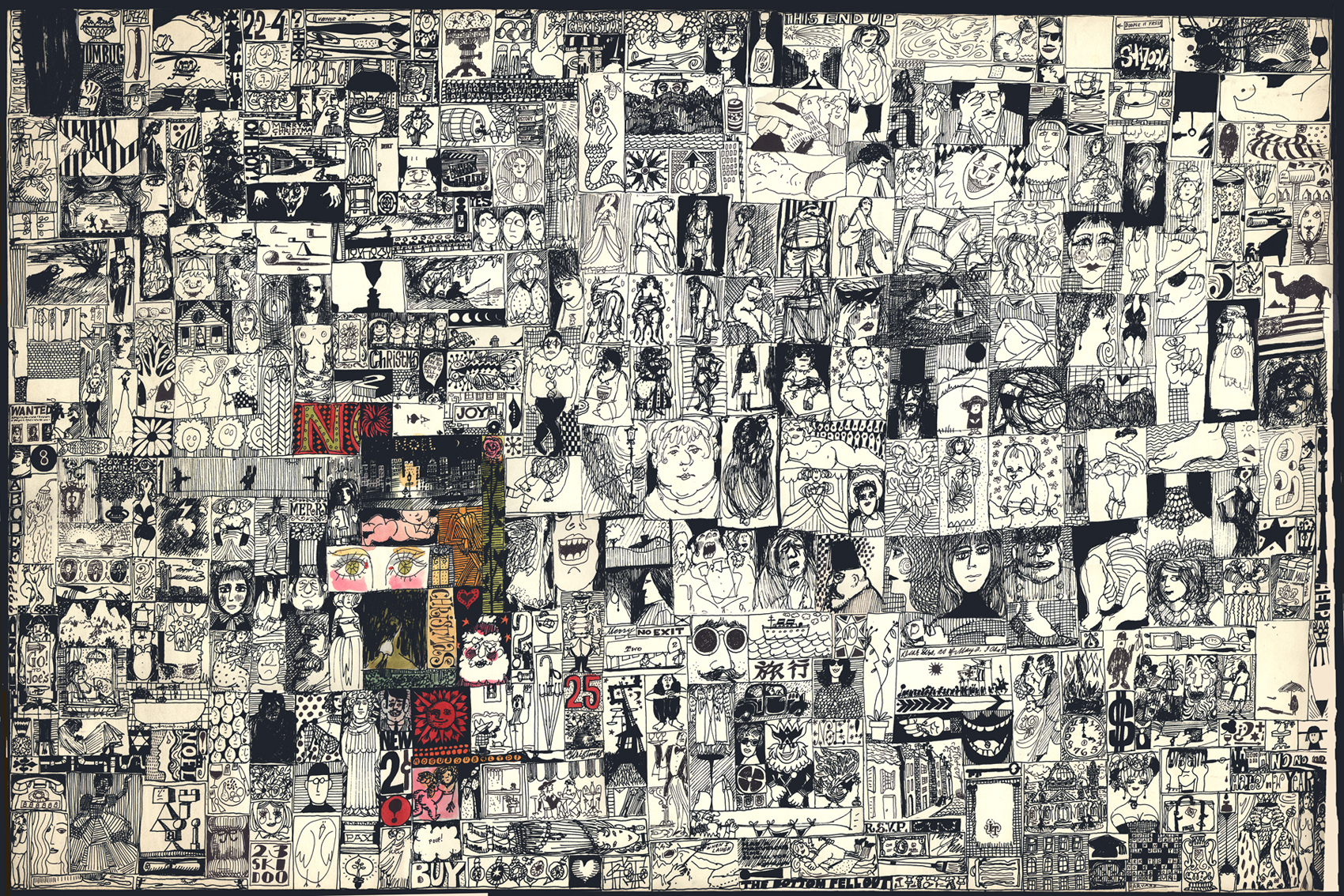
Mogubgub 2
- Fred Mogubgub was a rare bird in animation. He was truly out there. Maybe today we’d say he was ahead of his time.
He was a close friend of Vincent Cafarelli’s and did some creative work with their studio. He also left a residue of artwork behind him. I located a folder of layouts and such artwork.
There’s also the program for his Memorial service. I’ve decided to include that here in this post.
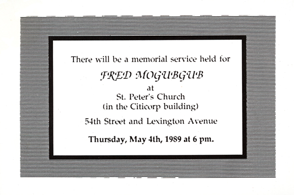
Invitation to the Memorial Service.
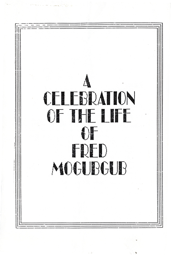
The cover to the Xeroxed program.
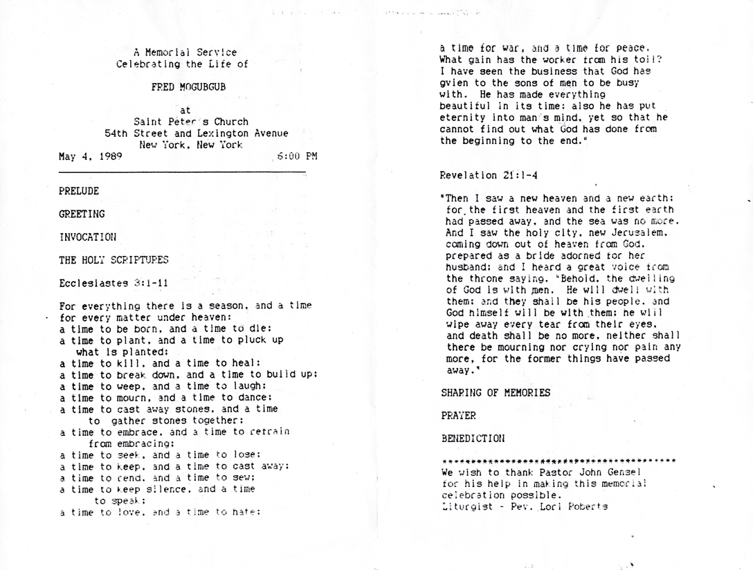
The program, itself. Undoubtedly a Catholic service.
Here are a series of drawings Fred did for a Yakov Smirnoff “Funfacts” piece for ABC tv. These were 20 second spots for the network.
 1
1
 2
2
 3
3
 4
4
 5
5
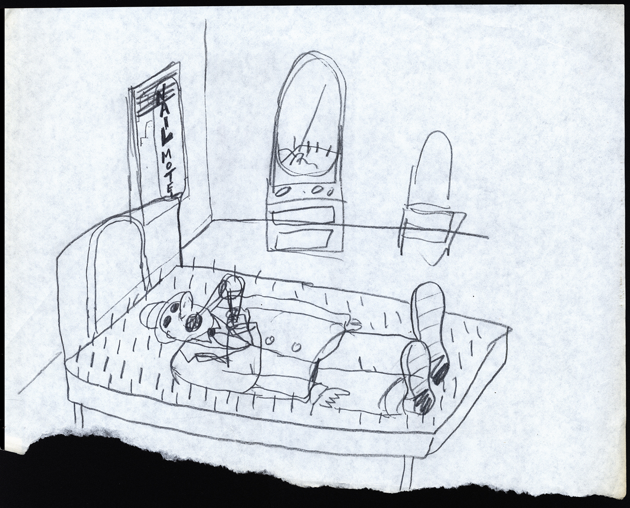
Here are some randy gags Fred drew – studio gags.
 1
1
 2
2
 3
3
 4
4
 5
5
 6
6
Fred had to balance the commercialism with the art.
Animation Artifacts &commercial animation &Layout & Design 03 Oct 2012 06:46 am
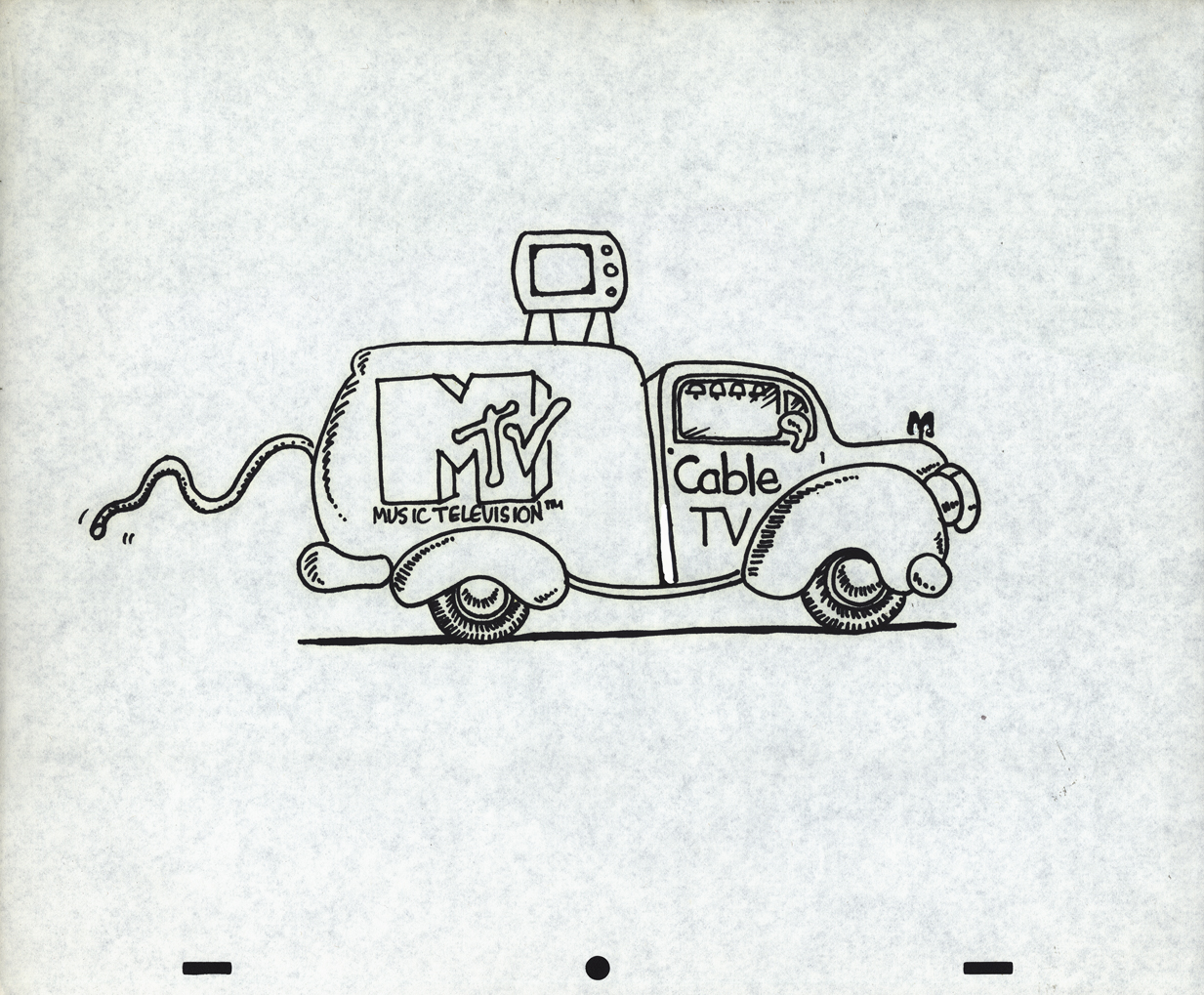
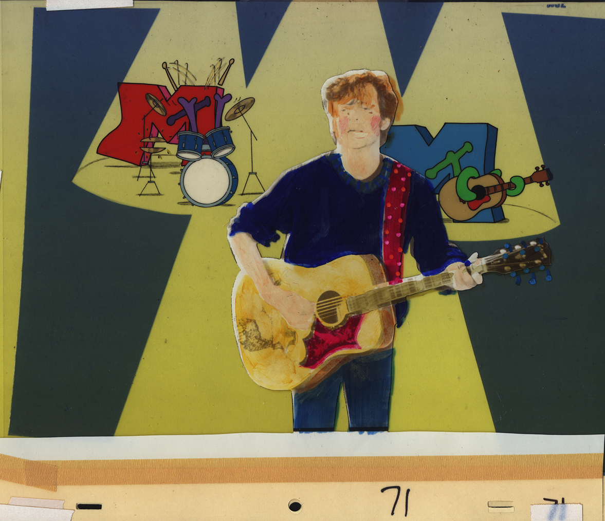
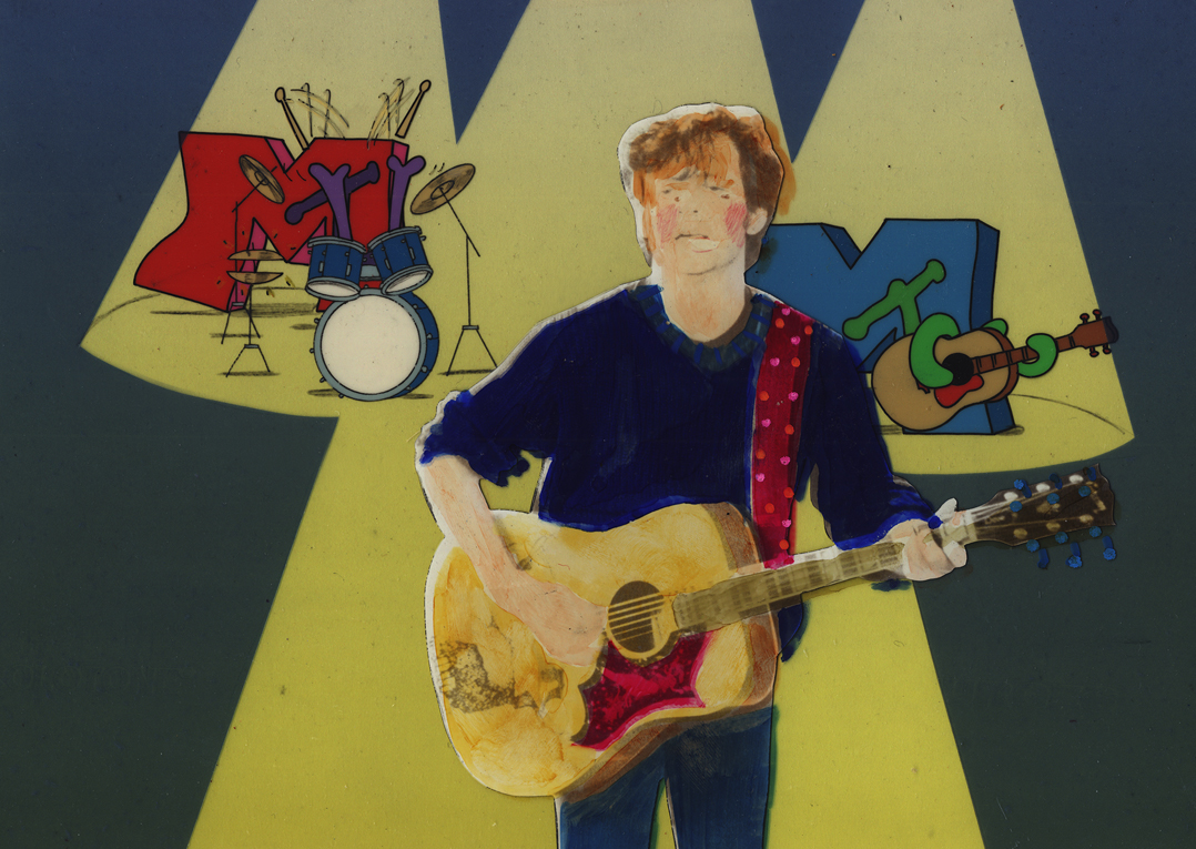
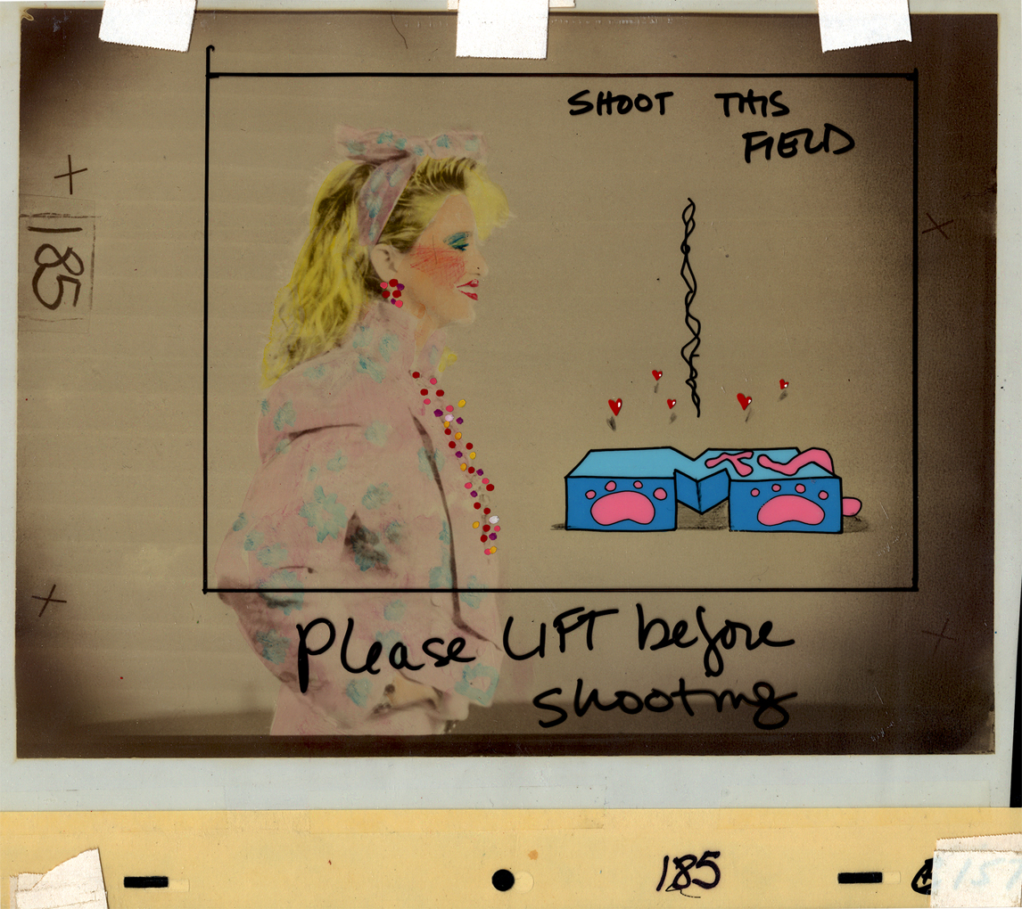
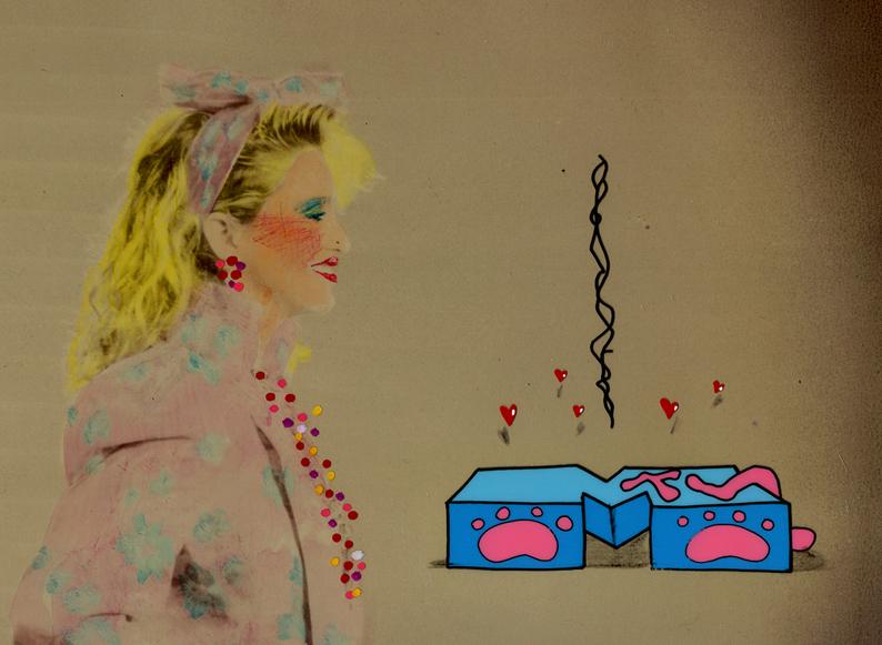
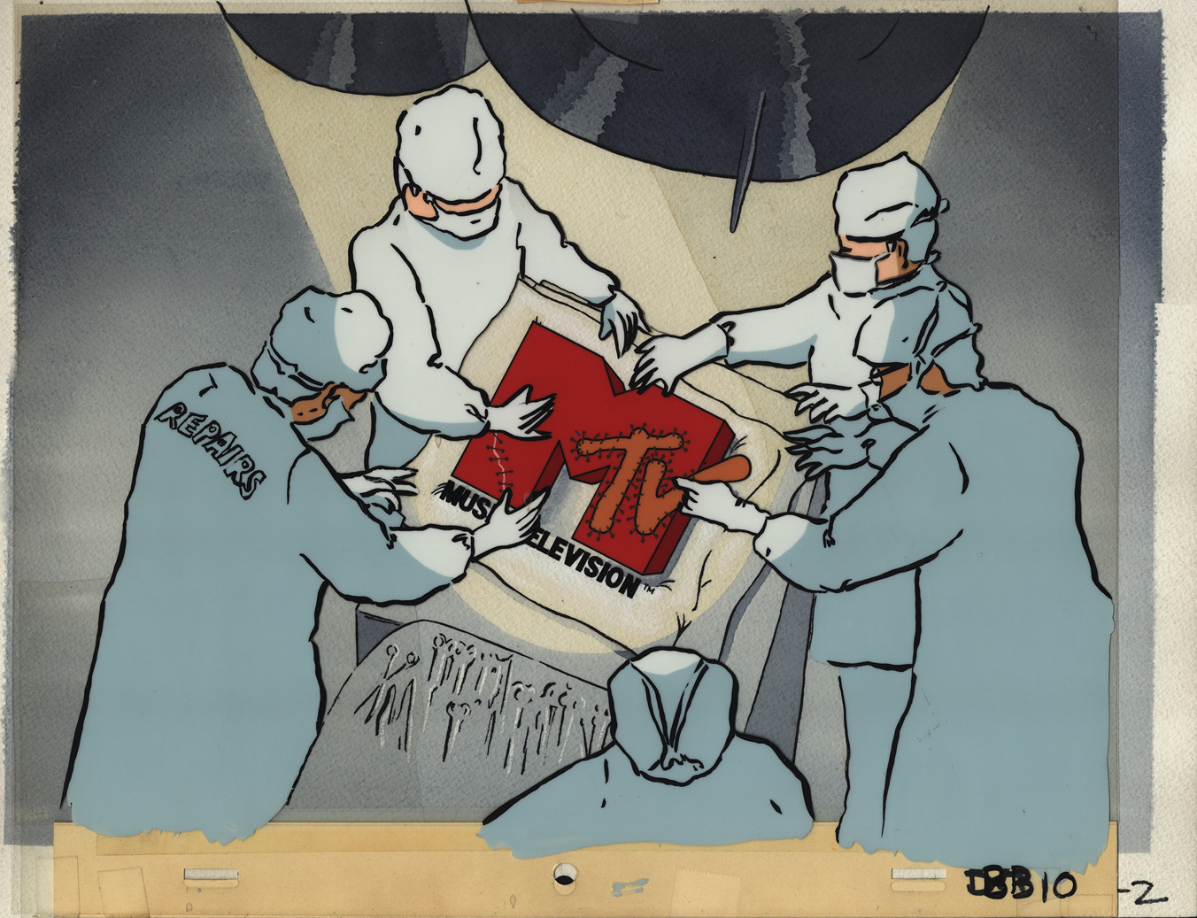
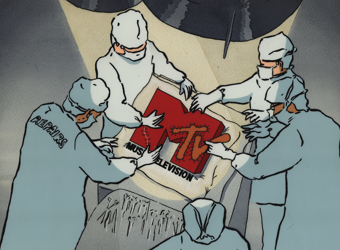
I want my MTV
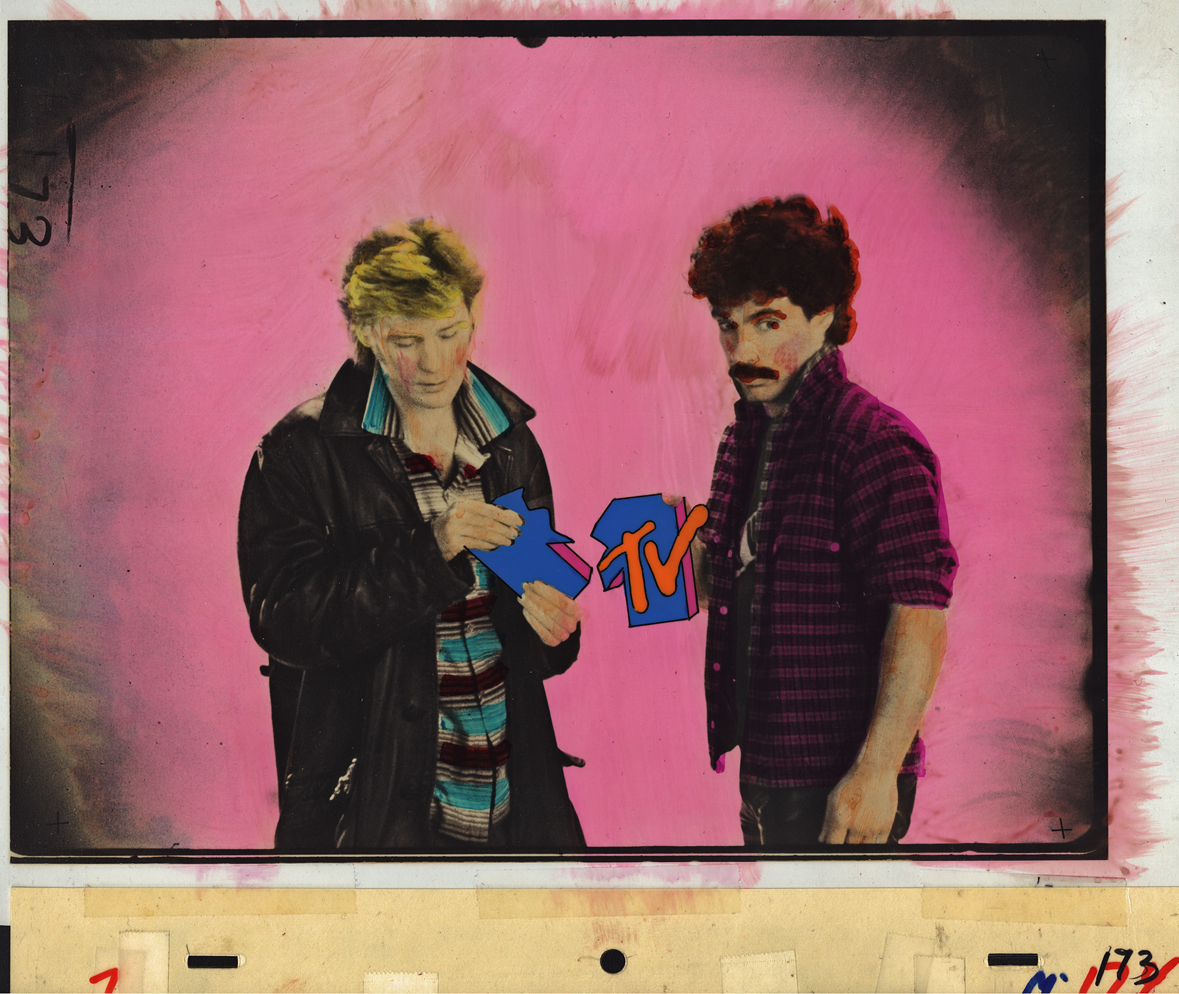
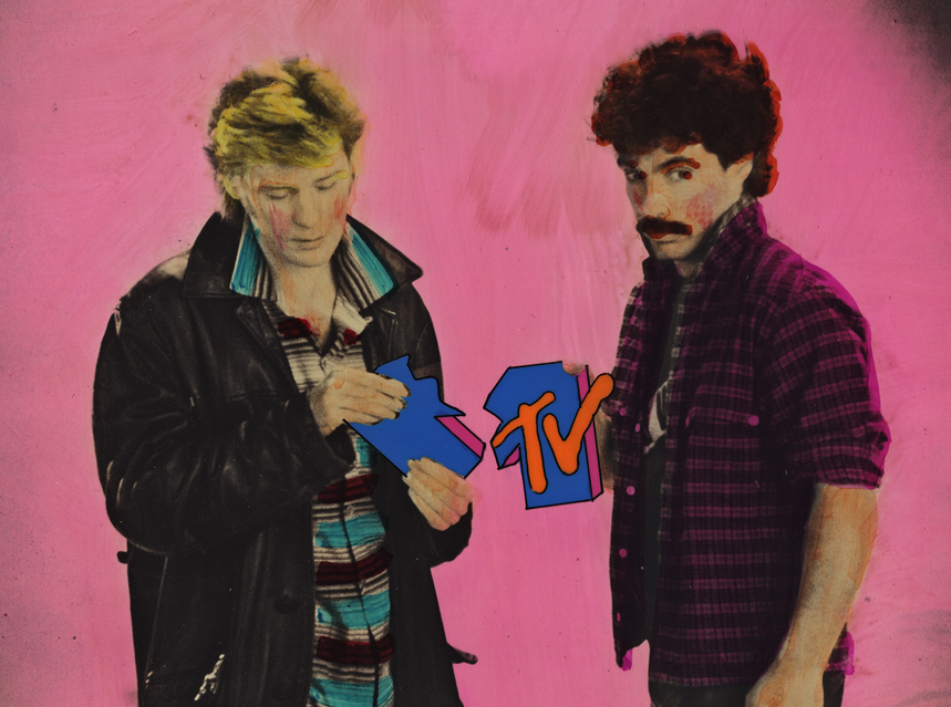
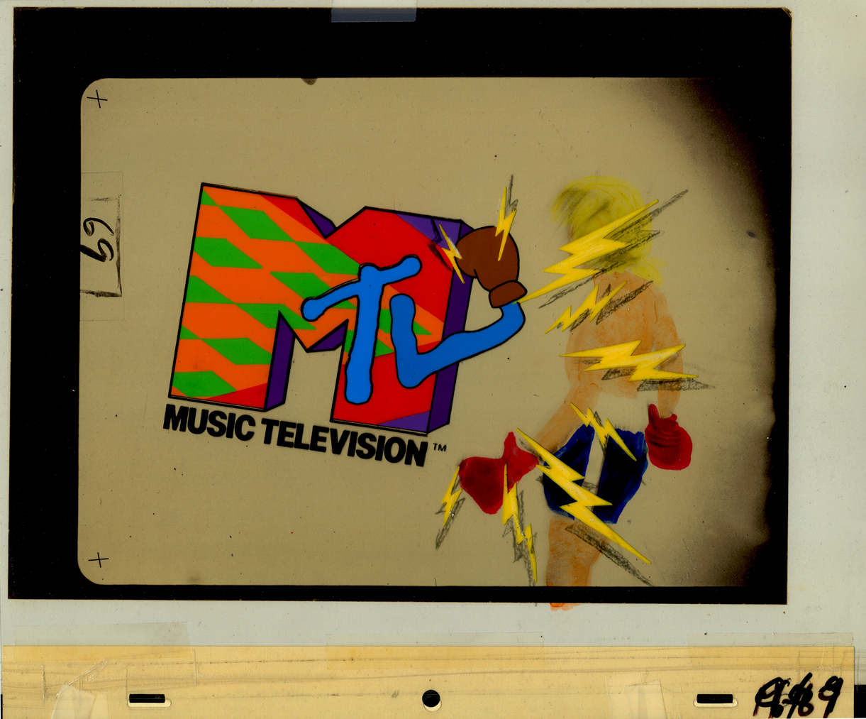
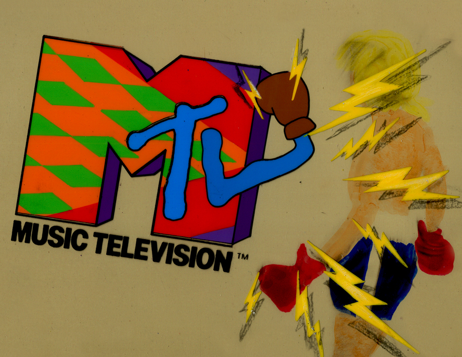
- In searching through the archives of work at Buzzco, where Vince Cafarelli‘s collection is housed, I came upon some MTV artwork. Some of you may remember that MTV had some wild art bumpers when they first started out. Buzzco did the lion’s share of these early logos. Candy Kugel did the artwork for them, and Vince Cafarelli wasn’t involved. These were done when Perpetual Motion was breaking up and Buzzco was coming into being. Buzz Potamkin would pull Candy into another room and give her the new assignment so that no one at Perpertual knew what she was up to. Once the split happened, Buzzco kept the account.The colors have deteriorated a bit in some of these. I’ve done some minor photoshop adjustments to brighten the colors a bit.
But first let me show some rough sketches for the very first promo for MTV in 1982. This came before the MTV campaign, “I want my MTV.” I vaguely remember this, but am not sure of it. I wasn’t a confirmed MTV watcher in those early days.
 1
1Drawing by Candy Kugel
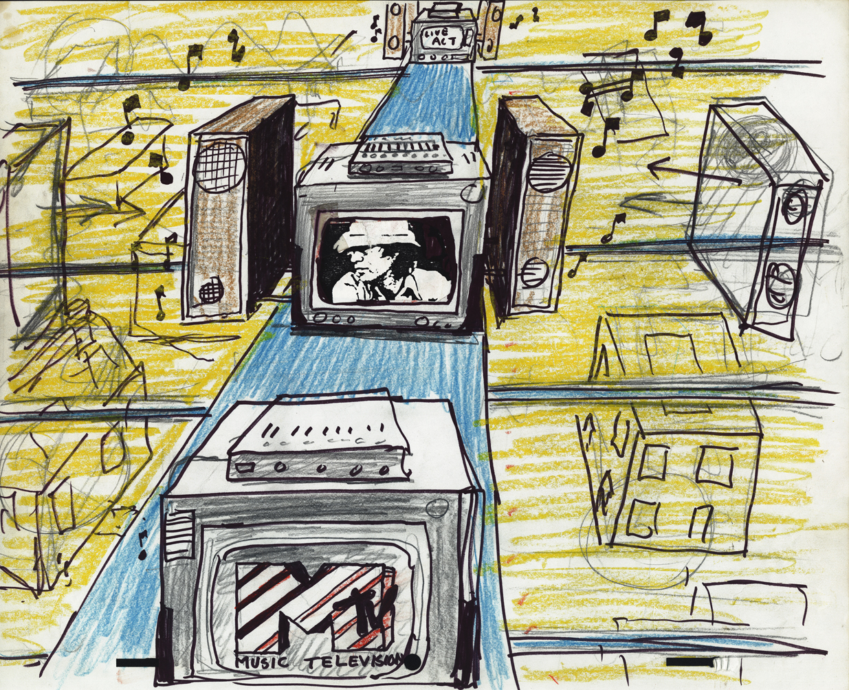 2
2
Drawing by Fred Mogubgub
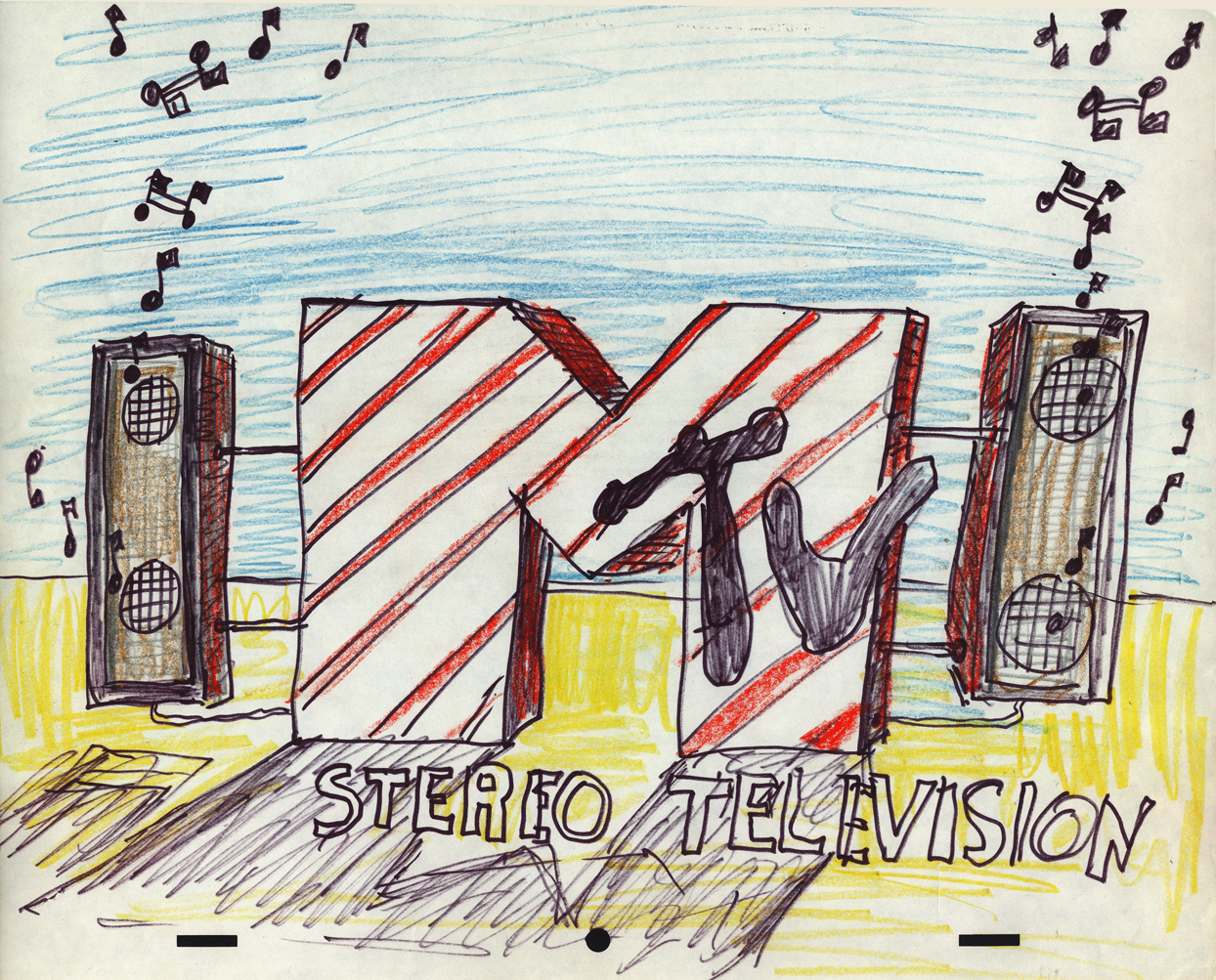 3
3
Drawing by Fred Mogubgub
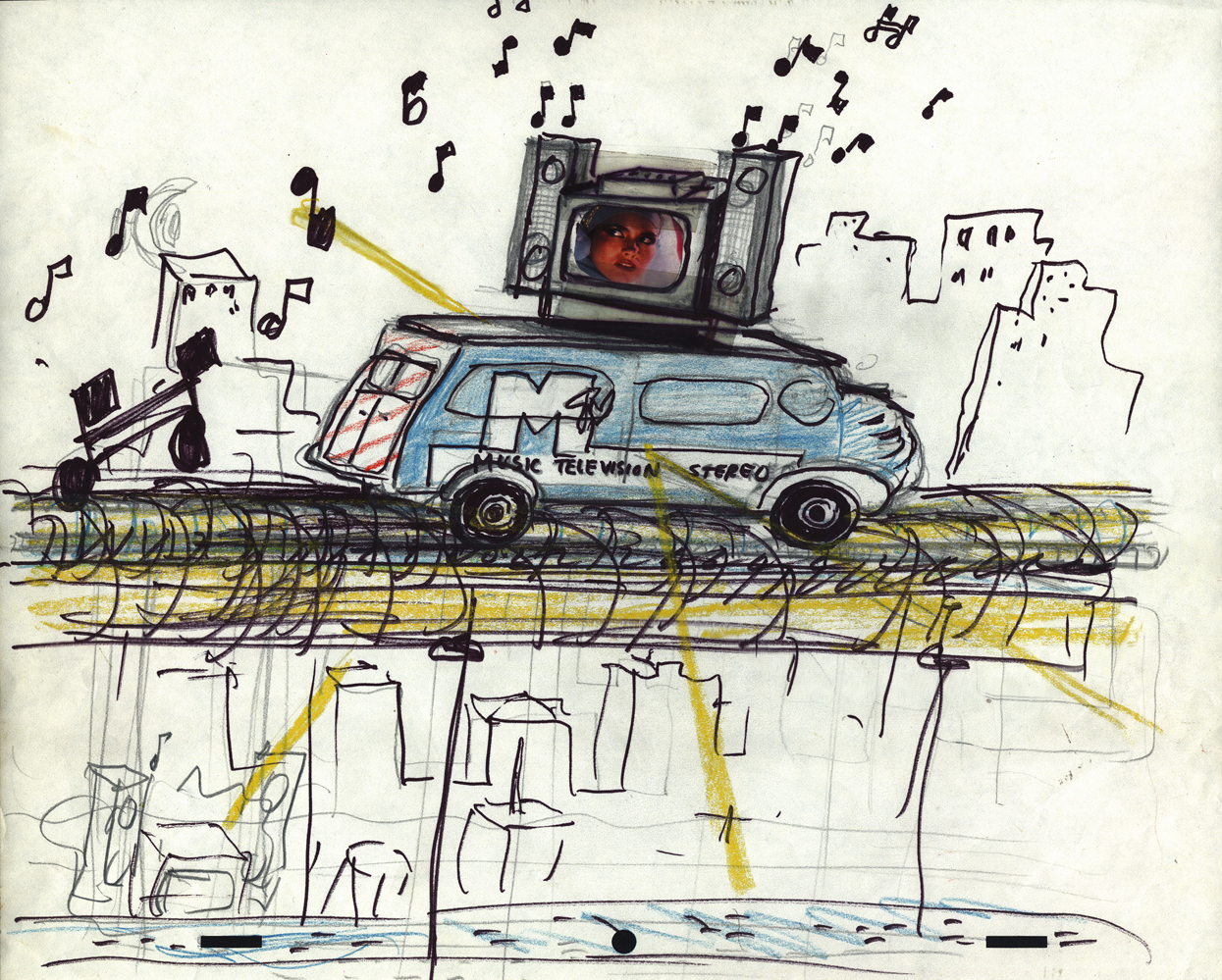 4
4
Drawing by Fred Mogubgub
 5
5
Drawing by Candy Kugel
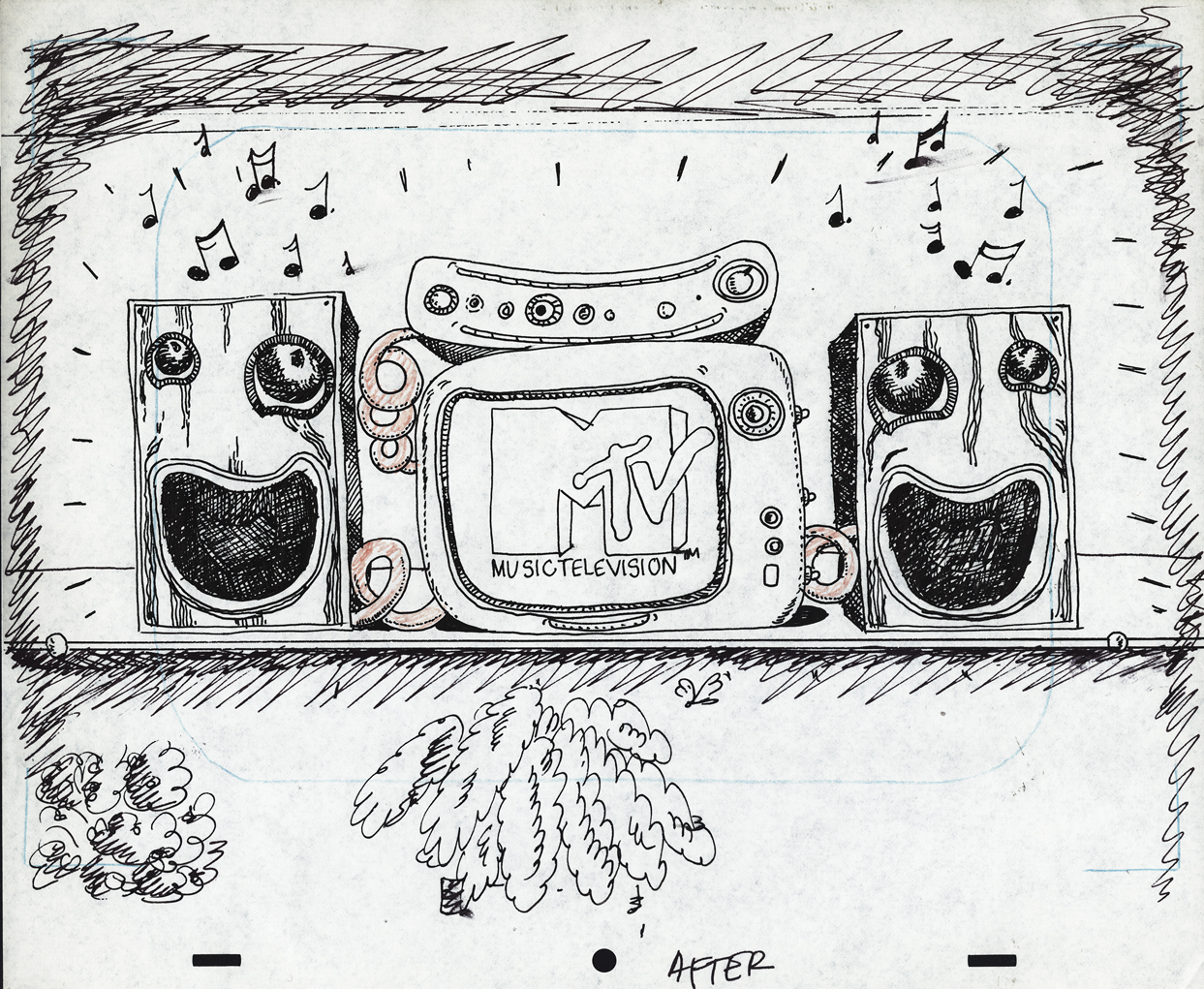 6
6
Drawing by Candy Kugel
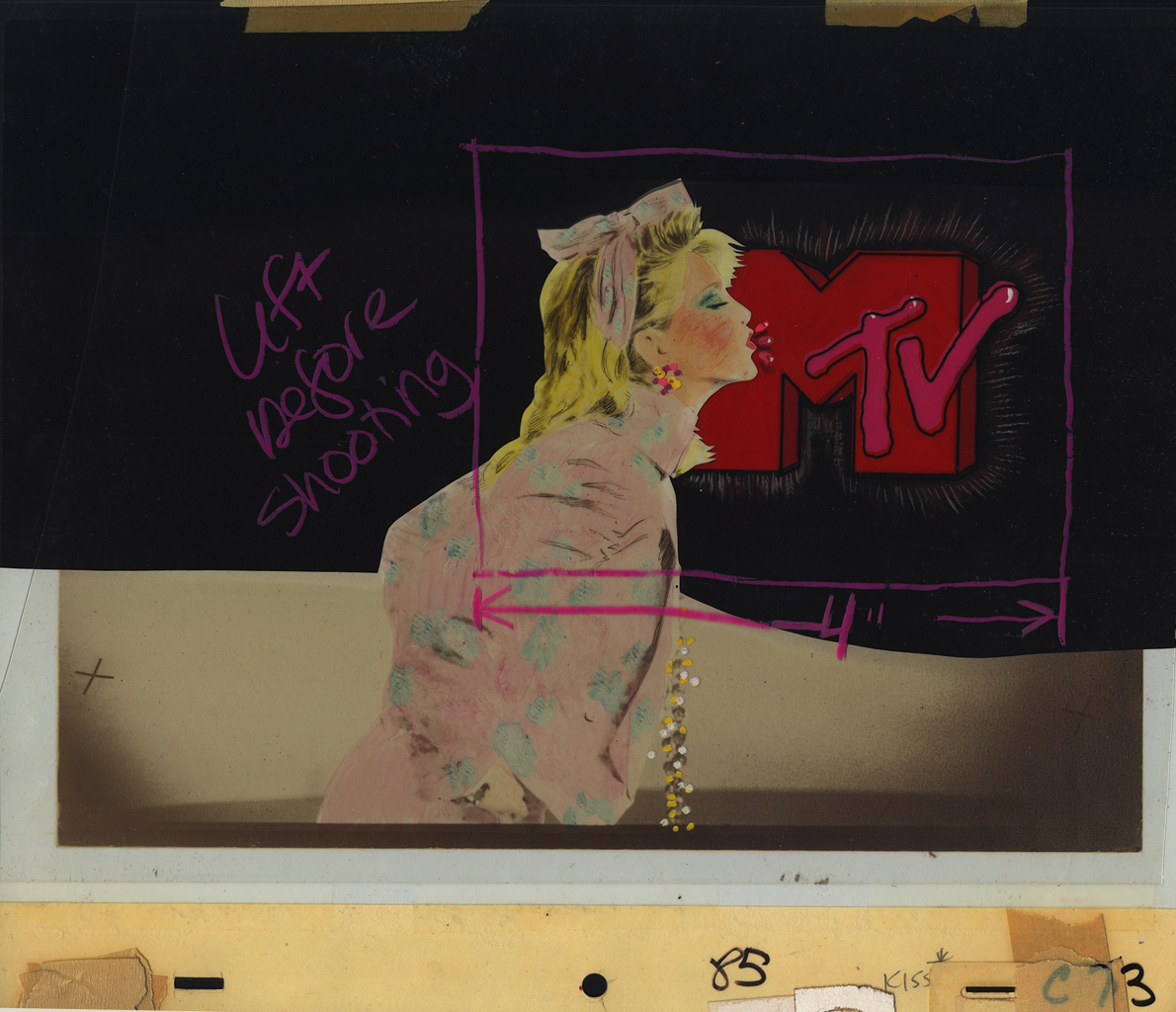
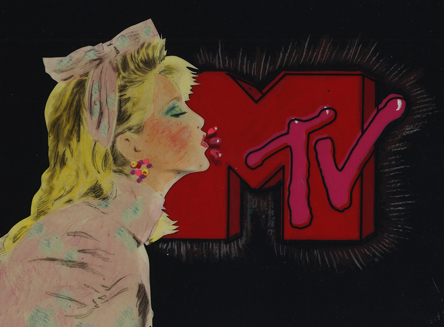
Here are eight of the color pieces. I’ll display two versions of each setup: the full artwork first, then the screen-sized art following so that you can see the proper framing.
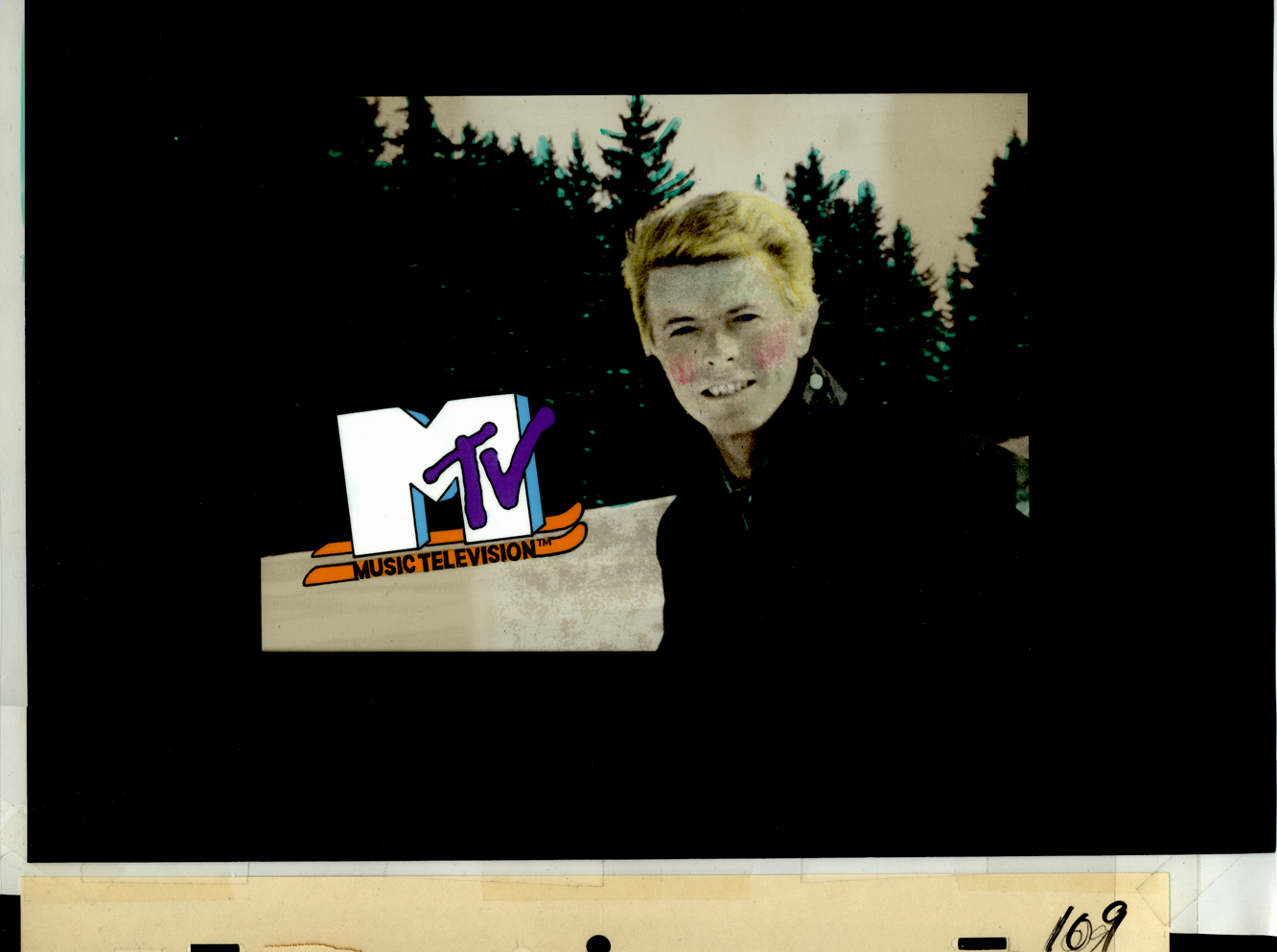 1a
1aDavid Bowie
 1b
1b
 2a
2a
Madonna
 2b
2b
 3a
3a
John (Cougar) Mellencamp
 3b
3b
 4a
4a
Madonna again (she was popular)
 4b
4b
 5a
5a
Hall & Oates
 5b
5b
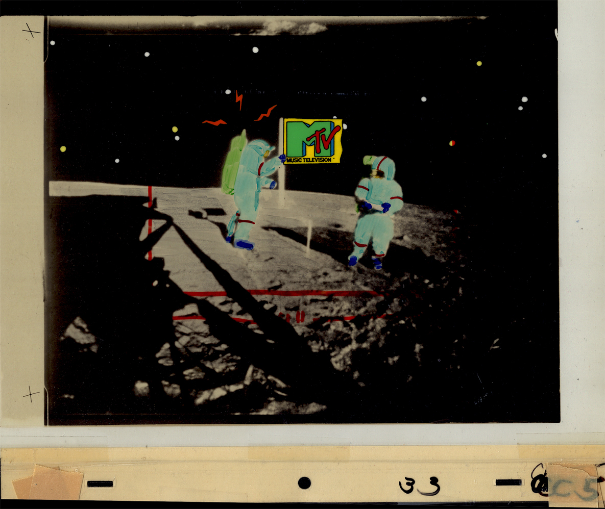 6a
6a
The famous Moonwalk
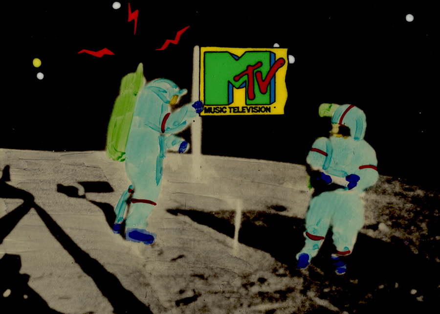 6b
6b
 7a
7a
 7b
7b
 8a
8a
Joe Elliott of Def Leppard
 8b
8b
Animation Artifacts &commercial animation &Illustration &Models 05 Sep 2012 05:40 am
Odds & Ends from the Cafarelli collection
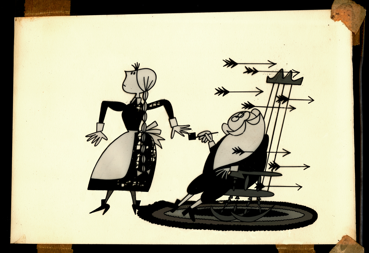
- Going through a stack of boxes searching for genuine animation, one tends to find a number of gems that represent animation past but don’t nicely link to other pieces. The end result is that you hold a lot of odds and ends in your hands and you seek a way to post them. That’s certainly the case with Vinnie Cafarelli’s collected works.
I’ve located a lot of pieces that interest me, but I don’t necessarily know where they come from or why they were saved. So today I’m posting a number of these bits of art.
Here we have Layouts, cel setups, photos, models and more than a small share of invitations and Christ cards. Here they are:
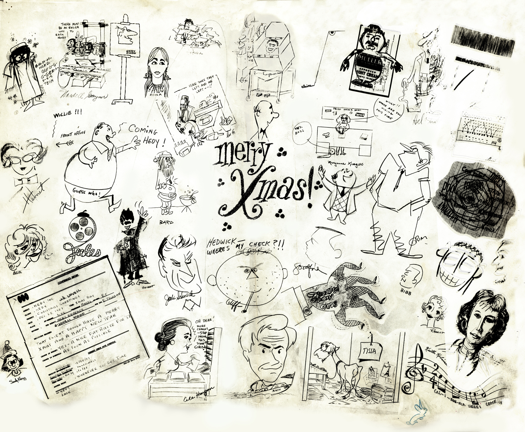 1
1A Christmas Card from the NY-UPA Studio.
Many of the employees signed it.
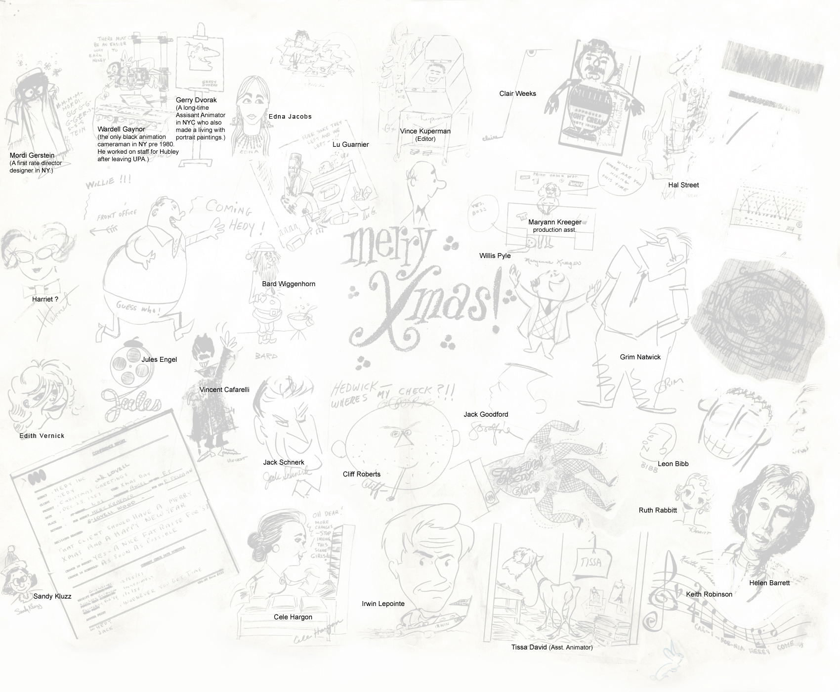 1a
1a
A guide to many of the names
of those who signed the card.
(Click to enlarge)
I had a scanning problem on the upper
right and will try to correct that.
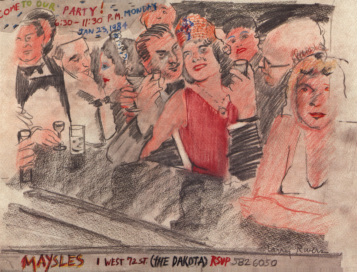
An invitation to a Christmas party at the Maysles Bros
studio. Certainly only for a member of the elite.
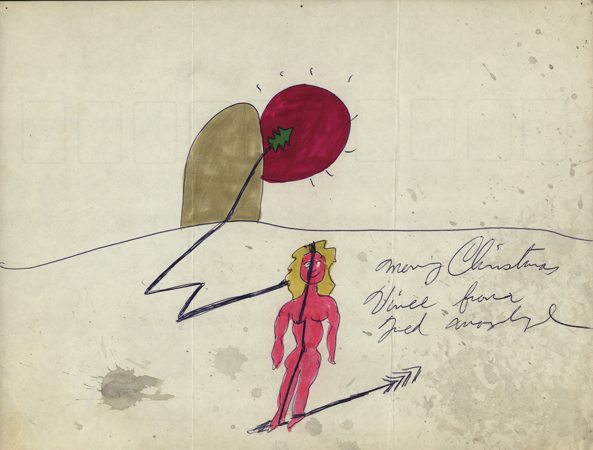
A Christmas Card from Fred Mogubgub.
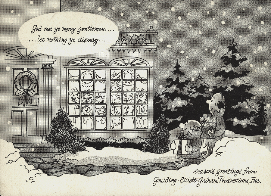
A Christmas Card from the Goulding-Elliott-Graham Prods.
Ray Goulding and Bob Elliott, together with Ed Graham formed
this studio to do Piels commercials. (Bob Goulding & Ray Elliott were the
voices and held onto ownership of the characters. work dried up soon
since one commercial product & client couldn’t maintain the studio.)
A finished setup from a Yellow Pages commercial.
This was done at Gifford Productions.
Pablo Ferro during UPA days.
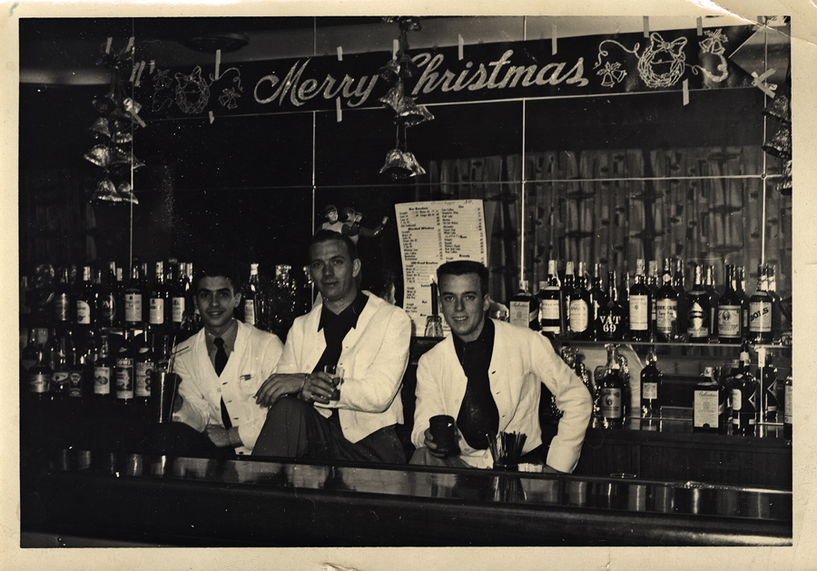
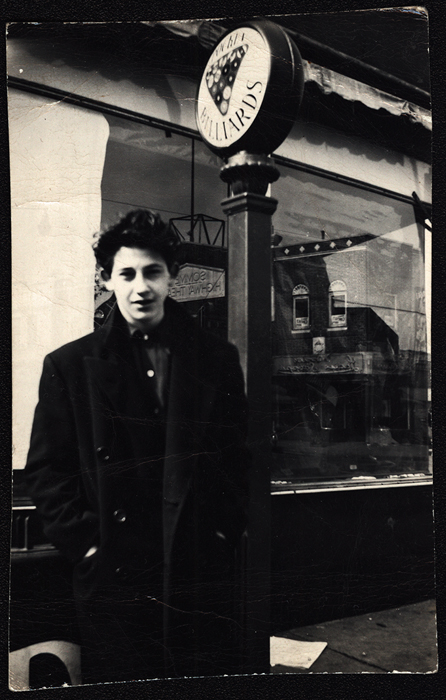
Vince Cafarelli (far left) while in the military at
Fort Benning, Ala. made extra money as a
bartender. These are the days just prior to his
workng at UPA.
A small racy sketch among the art.
We’re not sure who drew it but guess
it might be Vince Cafarelli’s work.
All that remains of a pitch for an antacid spot.
Obviously drawings 1 & 2 are missing, but
these two were interesting enough for me to post.
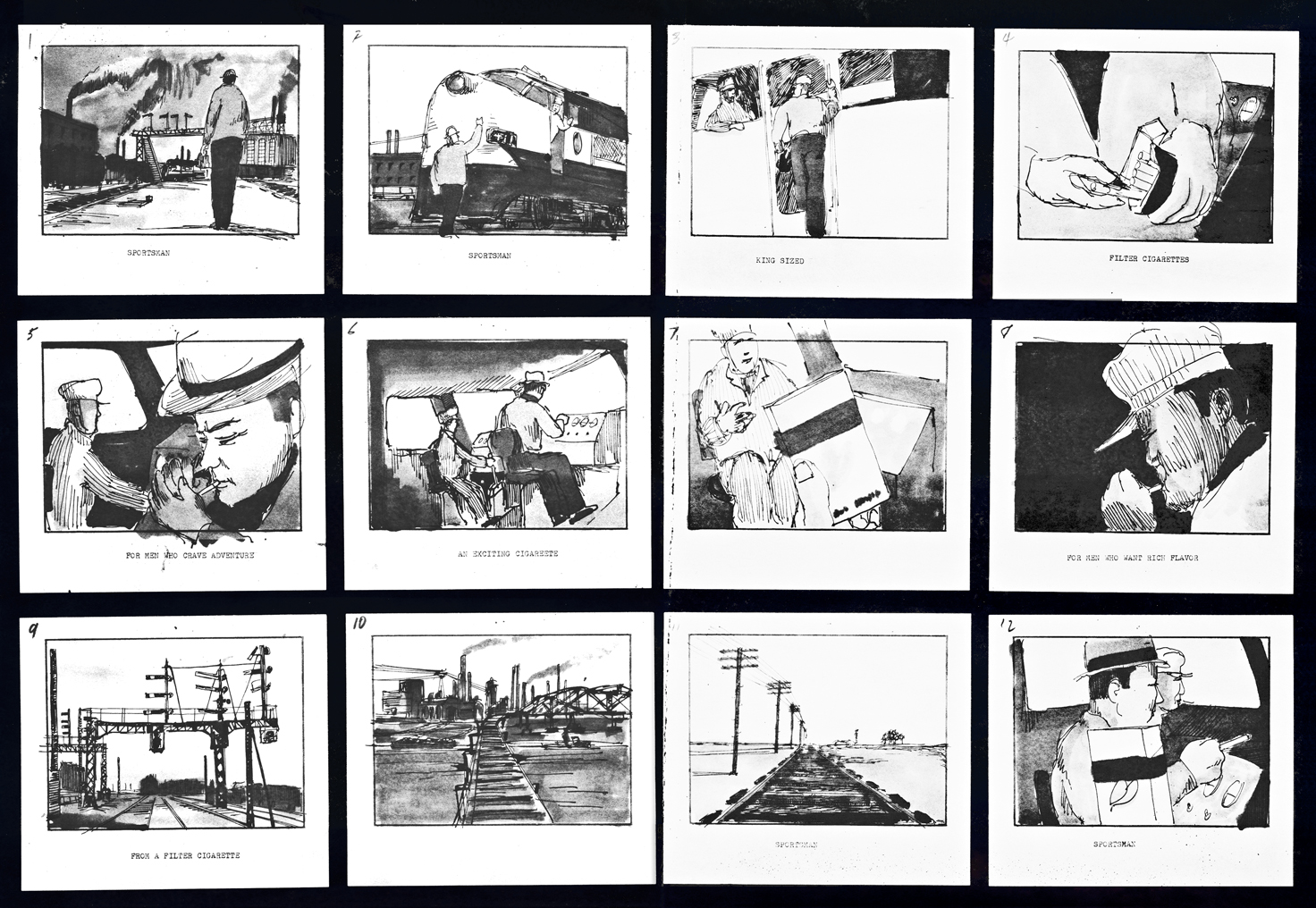 1
1
A storyboard (3 pages) for a cigarette company
(Sportsman Cigarettes?). Obviously a sample board.
Is it a live action spot? Probably for Gifford Studio
which also did live action spots.
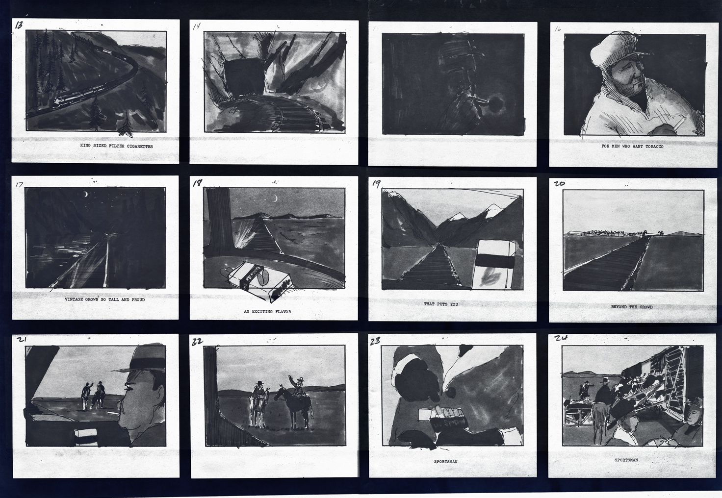 2
2
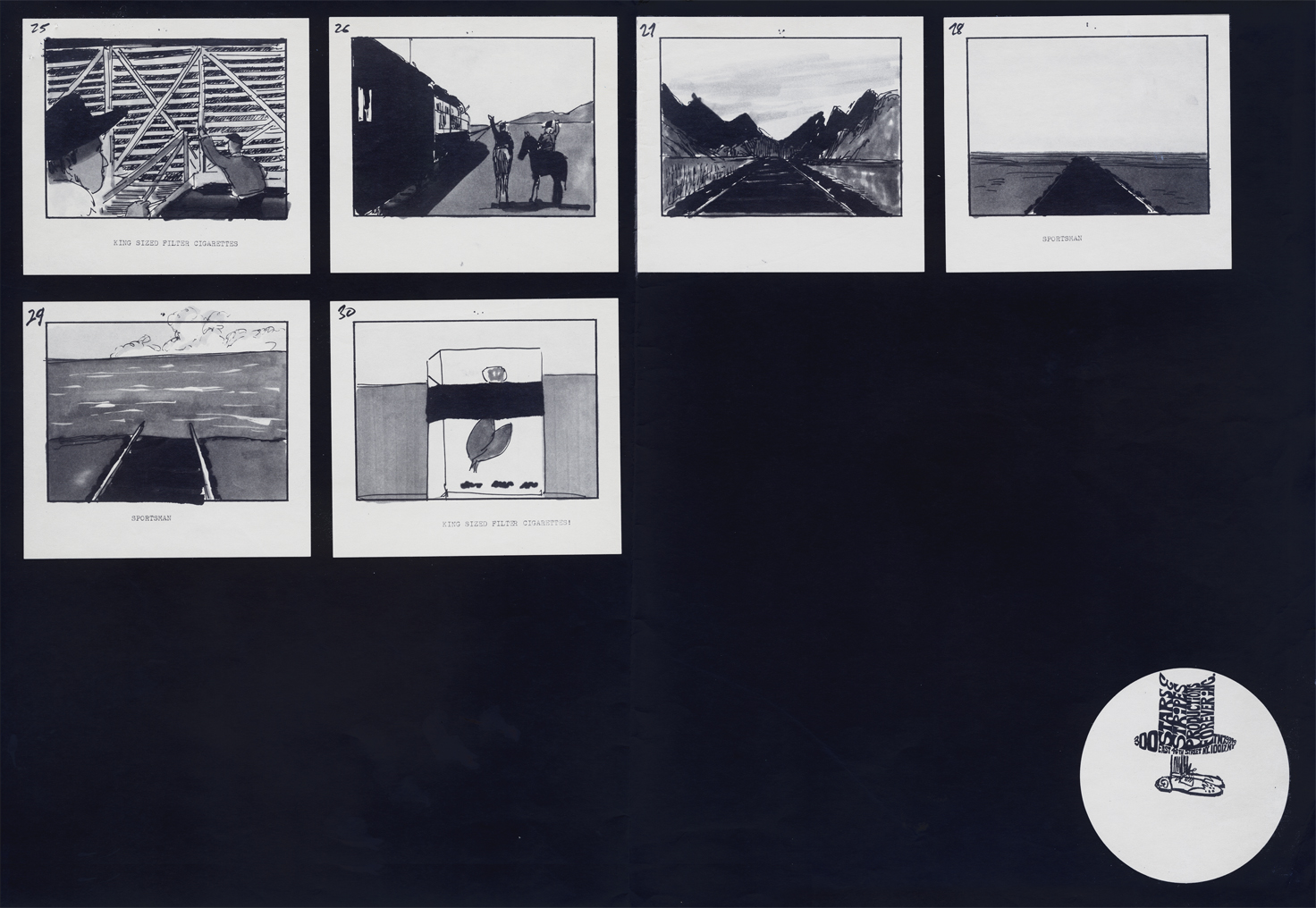 3
3
Animation Artifacts &commercial animation &Layout & Design &Models 29 Aug 2012 07:45 am
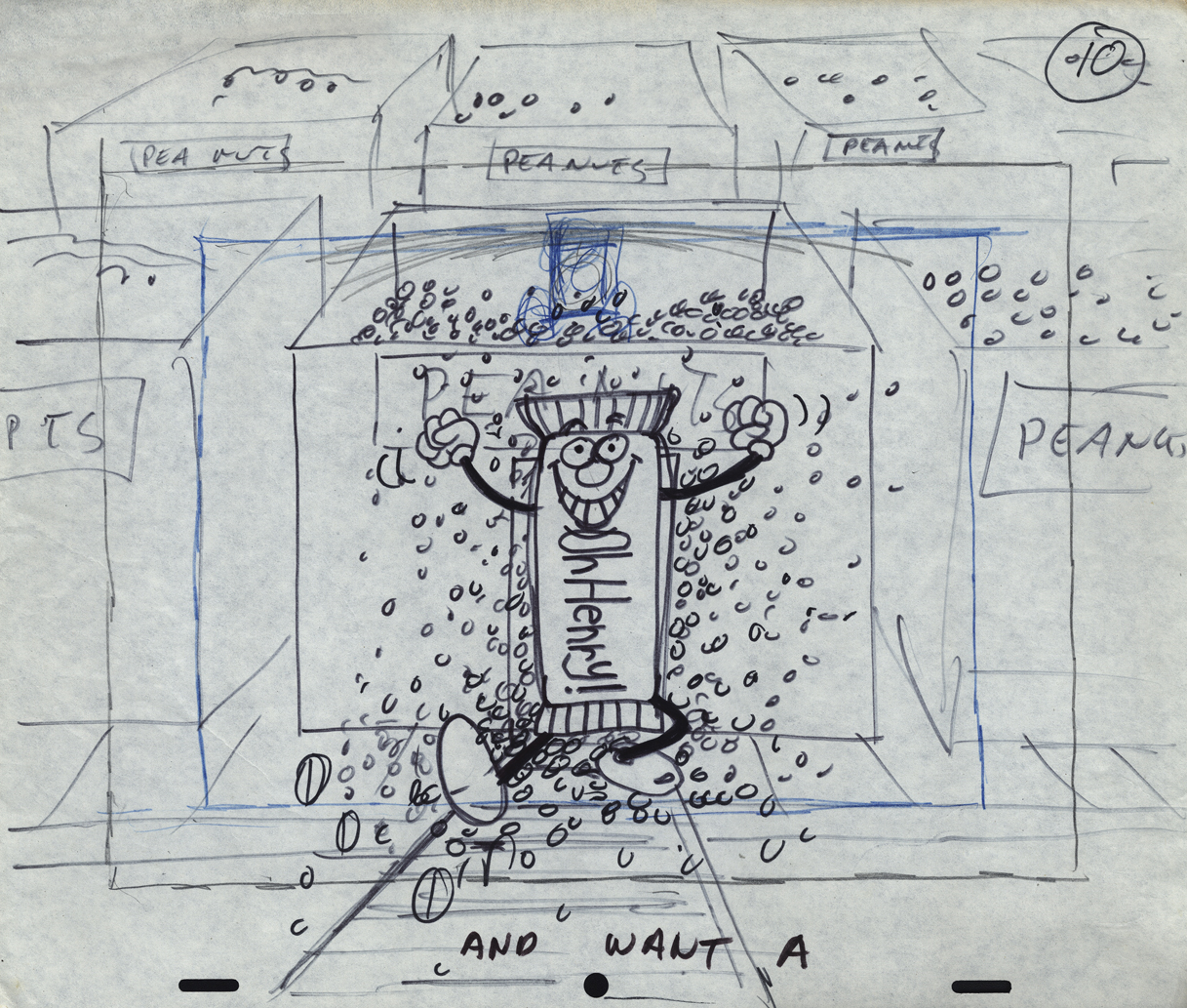
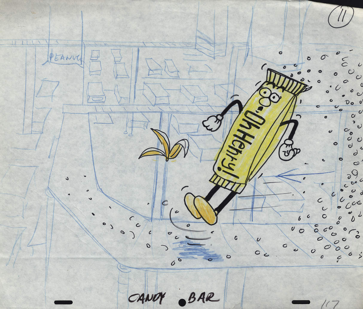
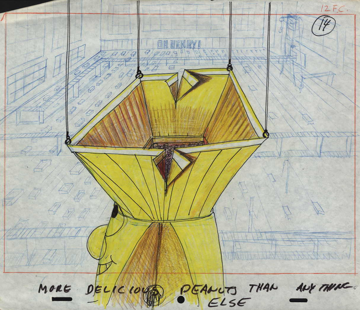
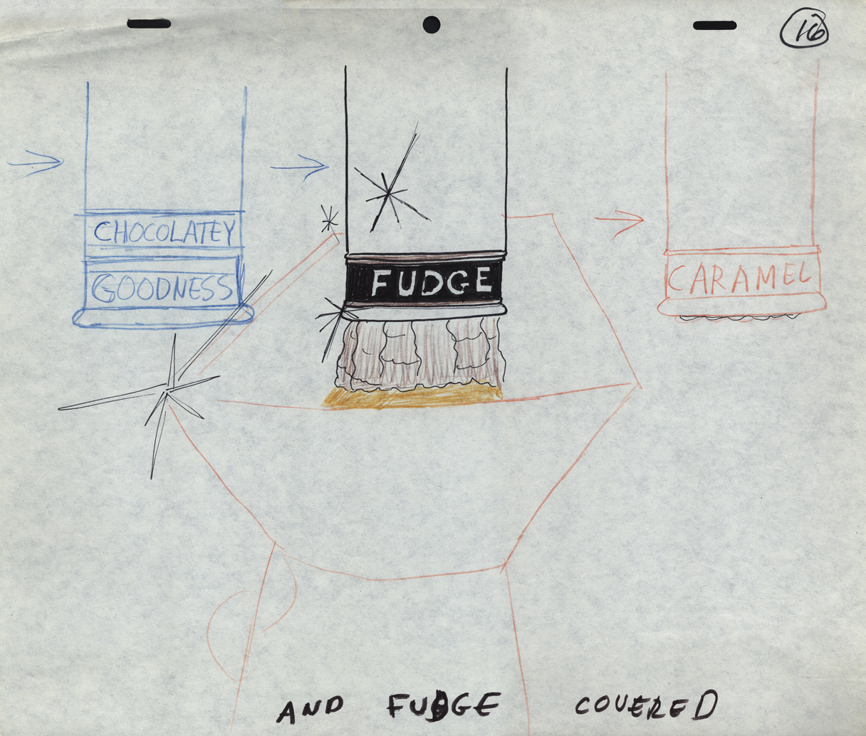
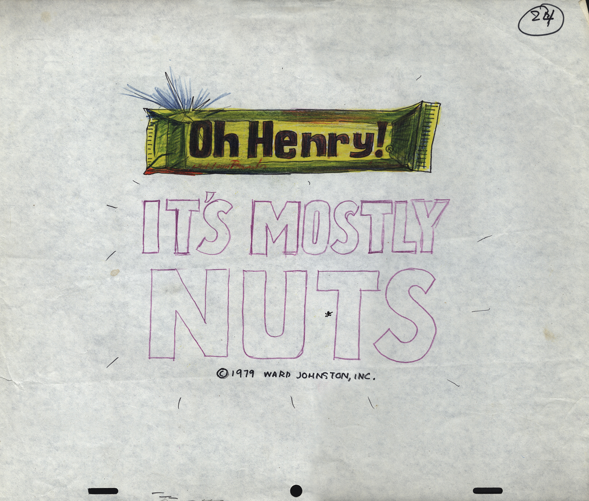
Mogubgub’s O’Henry Bar
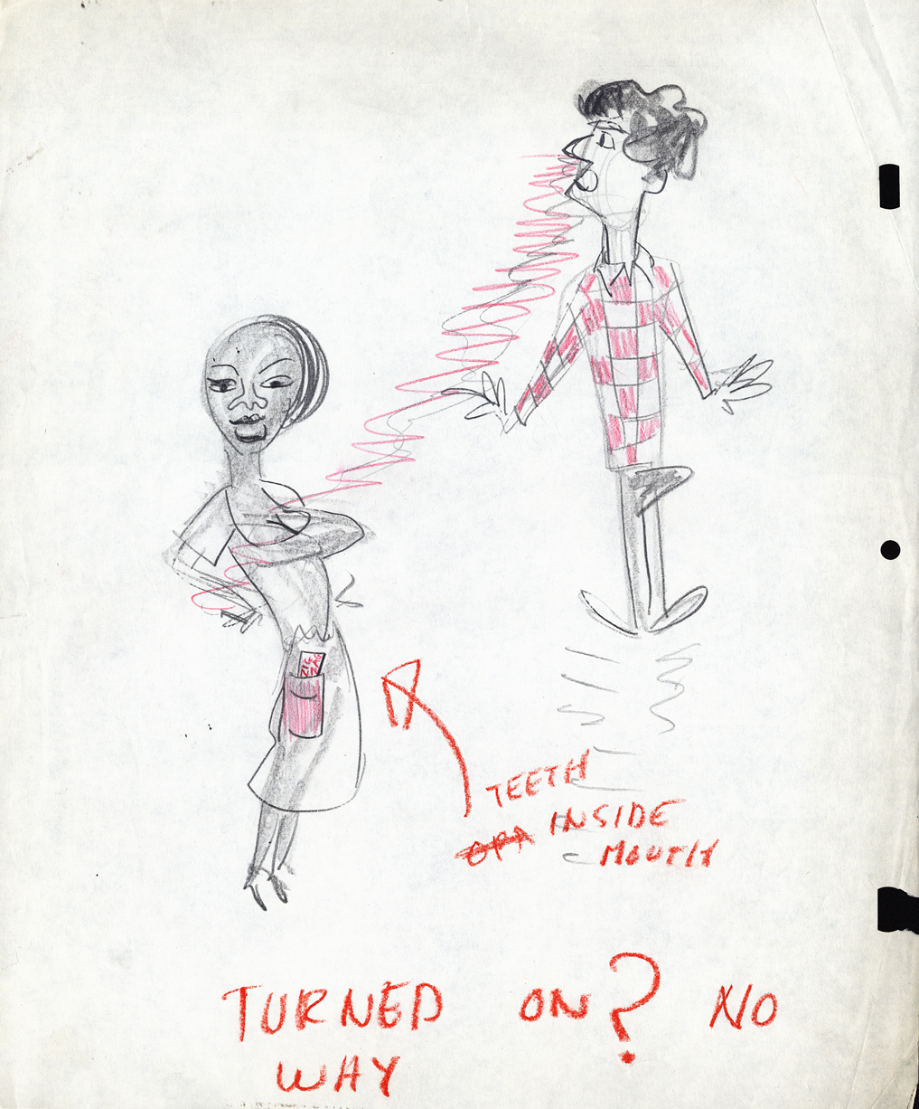
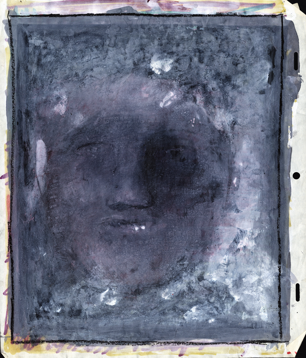
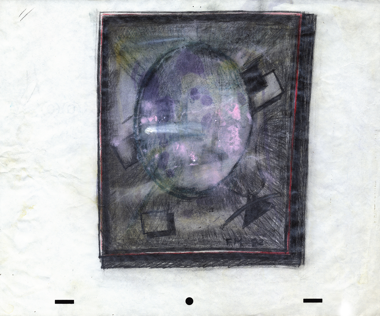
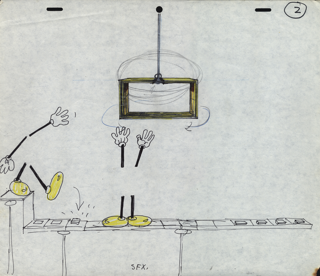
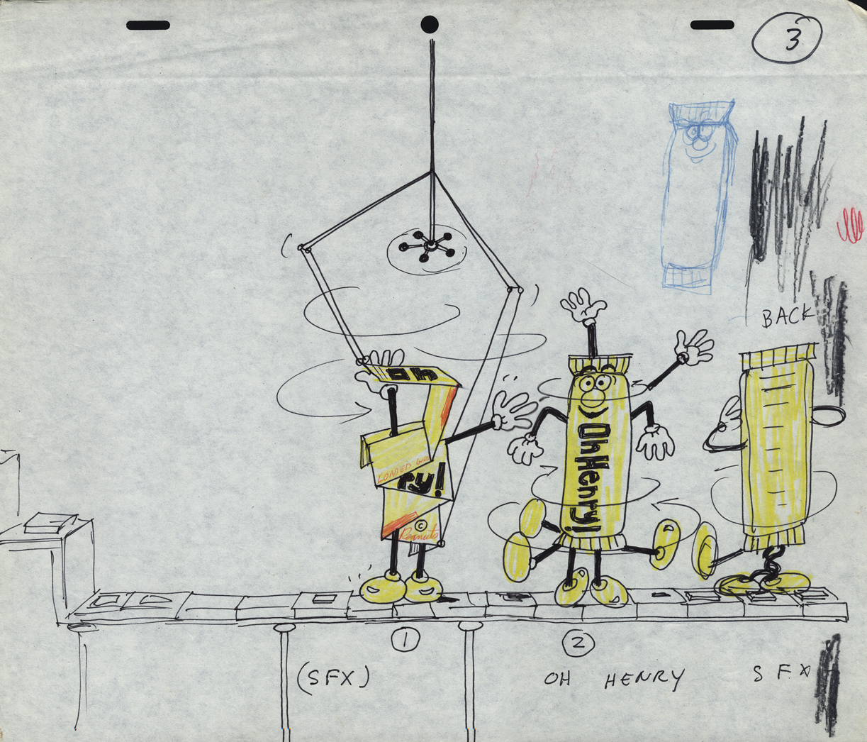
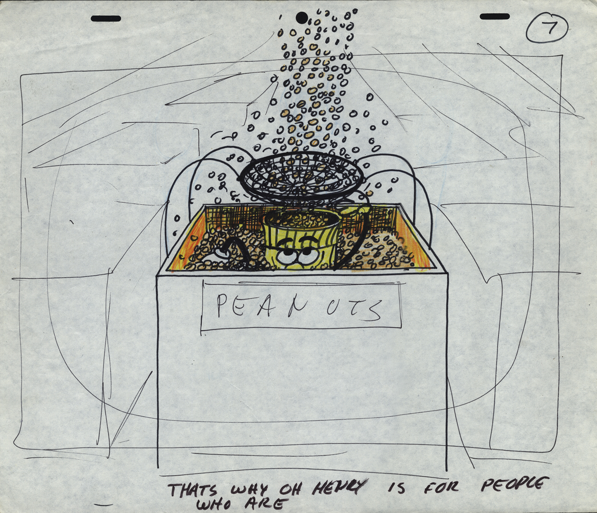
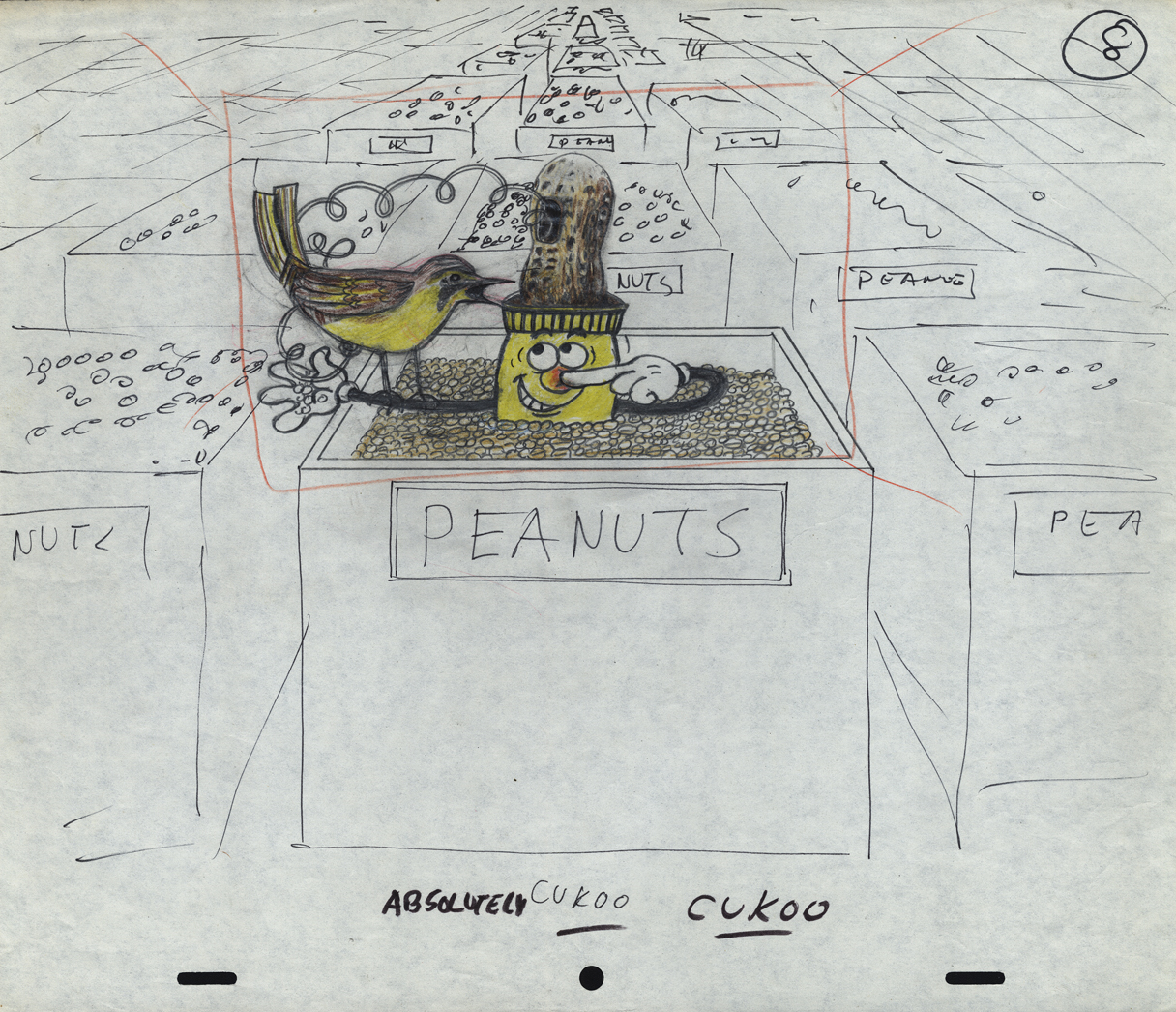
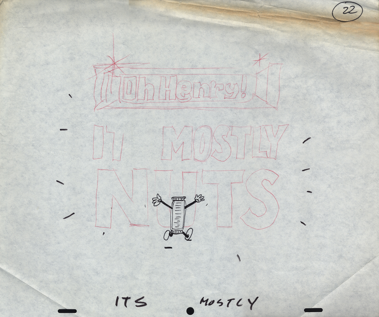
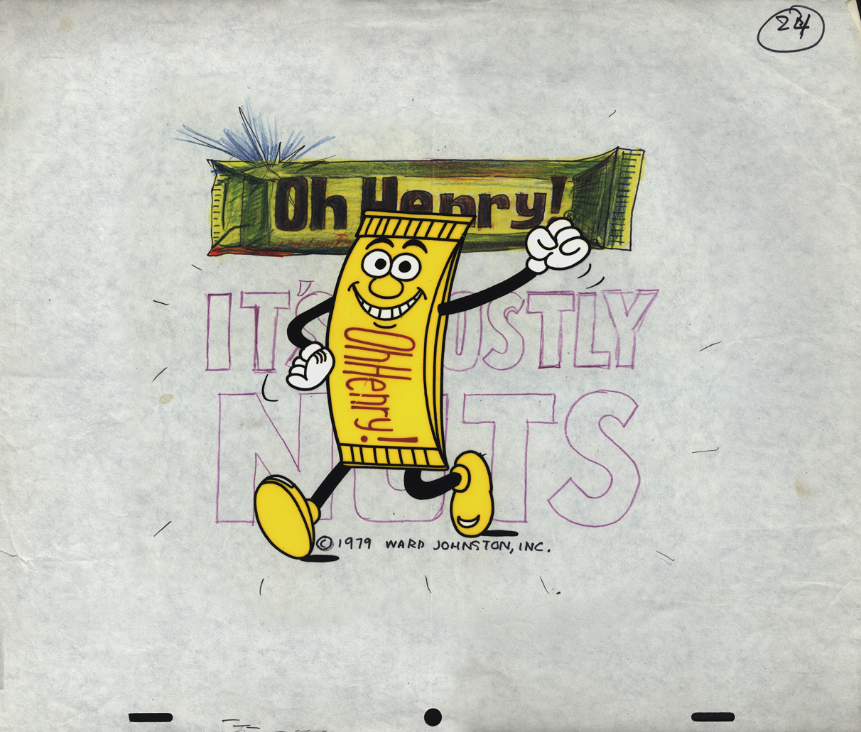
- Sifting through the boxed archives of Vince Cafarelli‘s saved material, there are quite a few pieces of art from a number of commercials. One that stands out includes the LayOut drawings of Fred Mogubgub for an O’Henry Bar animated commercial. The spot comes from the early days of Buzzco, 1982 or 1983 when Buzz Potamkin was still the principal in the company.
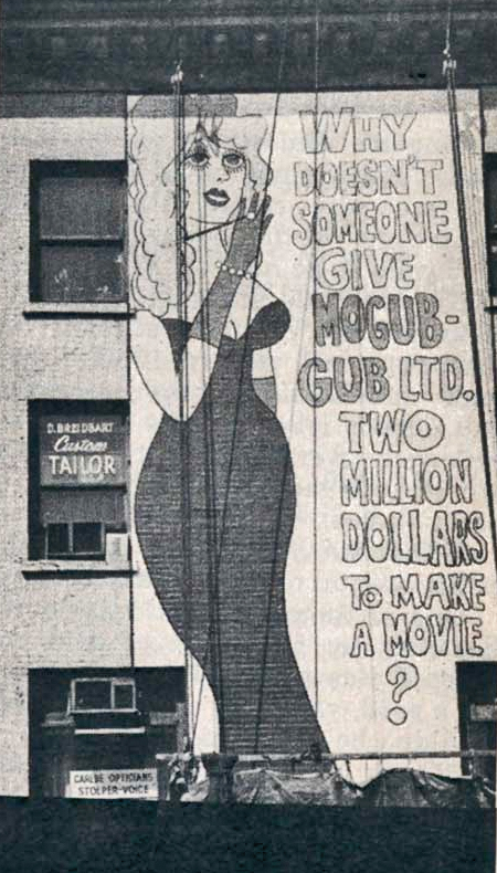 Fred Mogubgub was enough of an eccentric that I would be attracted to his artwork. (In case you’re unfamiliar with Mogubgub‘s work, here’s a four part series including his bio and some films.) I remember – as an art student in NY and desperately wanting to get into animation – the sign on 46th St and Sixth Ave: “Why Doesn’t Someone Give Mogubgub Ltd. Two Million Bucks to Make A Movie?” I asked Fred if he’d had any response. He said that ABC contacted him, and he gave them a script that was about a thousand pages big. It was about the contents of an ashtray. The characters were cigarette stubs, ashes and matches. To illustrate the script, he’d attached some used butts and matches within. They didn’t give him the money; you might have guessed.
On Blechman’s The Soldier’s Tale, there was a PT section of the animatic that Fred had done. We had to prepare this for a big screening for PBS trying to sell it for Bob. To get it into color, Fred and I would literally color the film, itself. He started at the head of the scene and I started at the end. We met in the middle. That piece of film had a life that was just too great. It couldn’t retain what we had done when it went to completion. Very exciting work and a fun afternoon coloring some footage with Fred.
Here are the Lay Outs Vinnie had saved for the past 30 or so years:
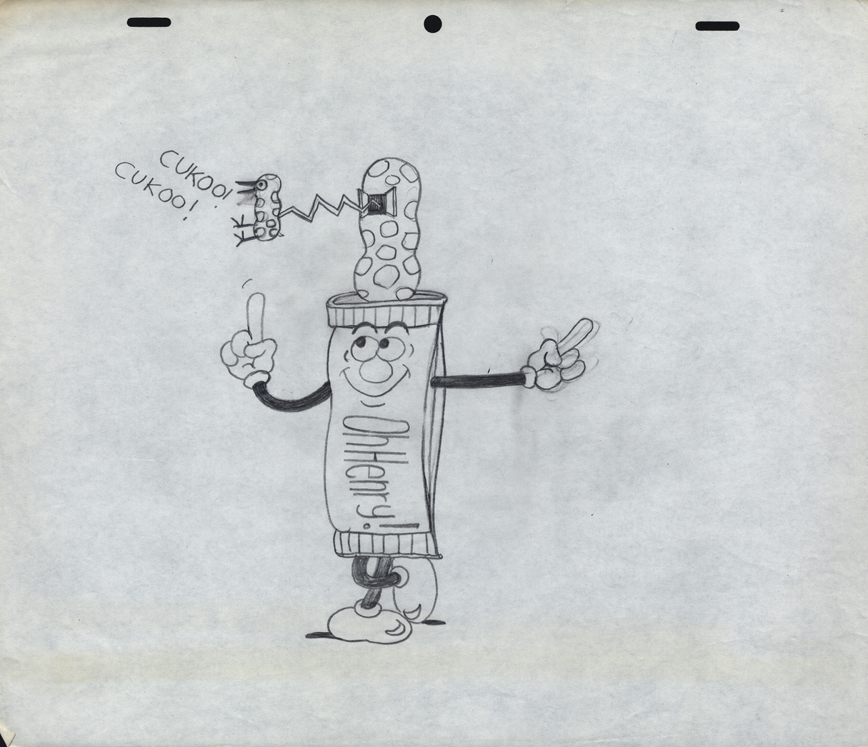
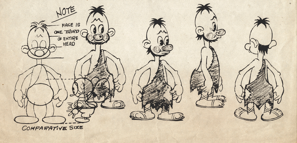
Our Lead Character – a model
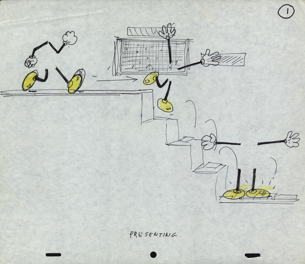 1
1
There seems to be no rhyme or reason
as to when things are top or bottom pegged.
 2
2
The pegs shift from drawing to drawing.
 3
3
 7
7
 8
8
 9
9
 10
10
 11
11
 14
14
 16
16
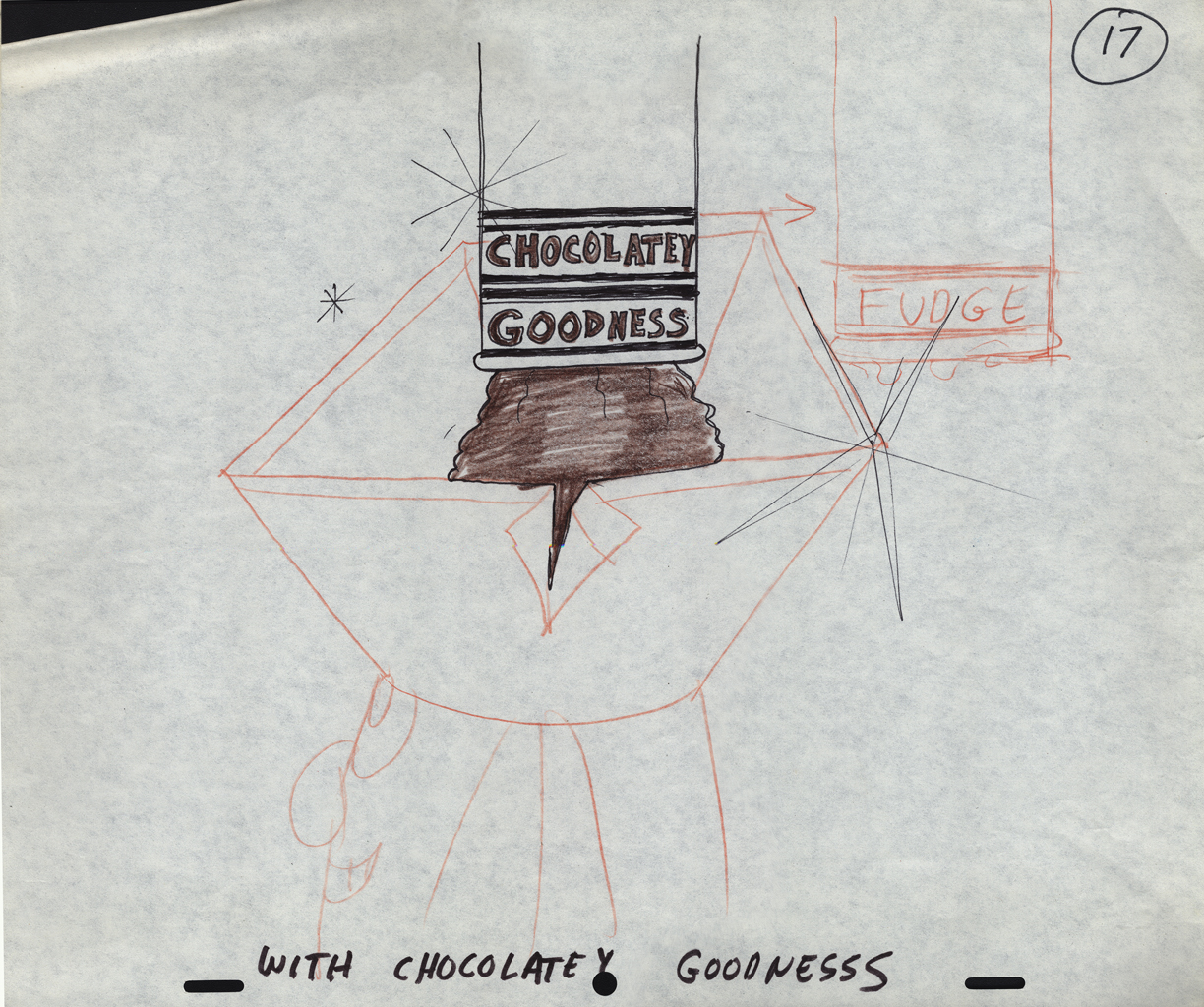 17
17
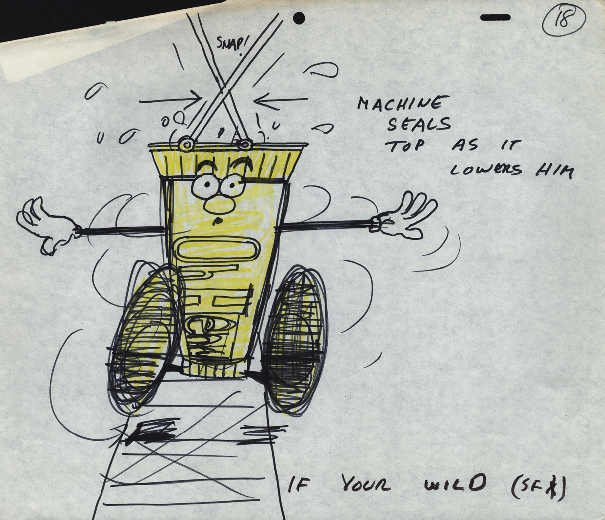 18
18
 22
22
 24
24
A cel setup.
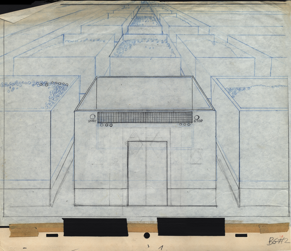
Bg LO 2
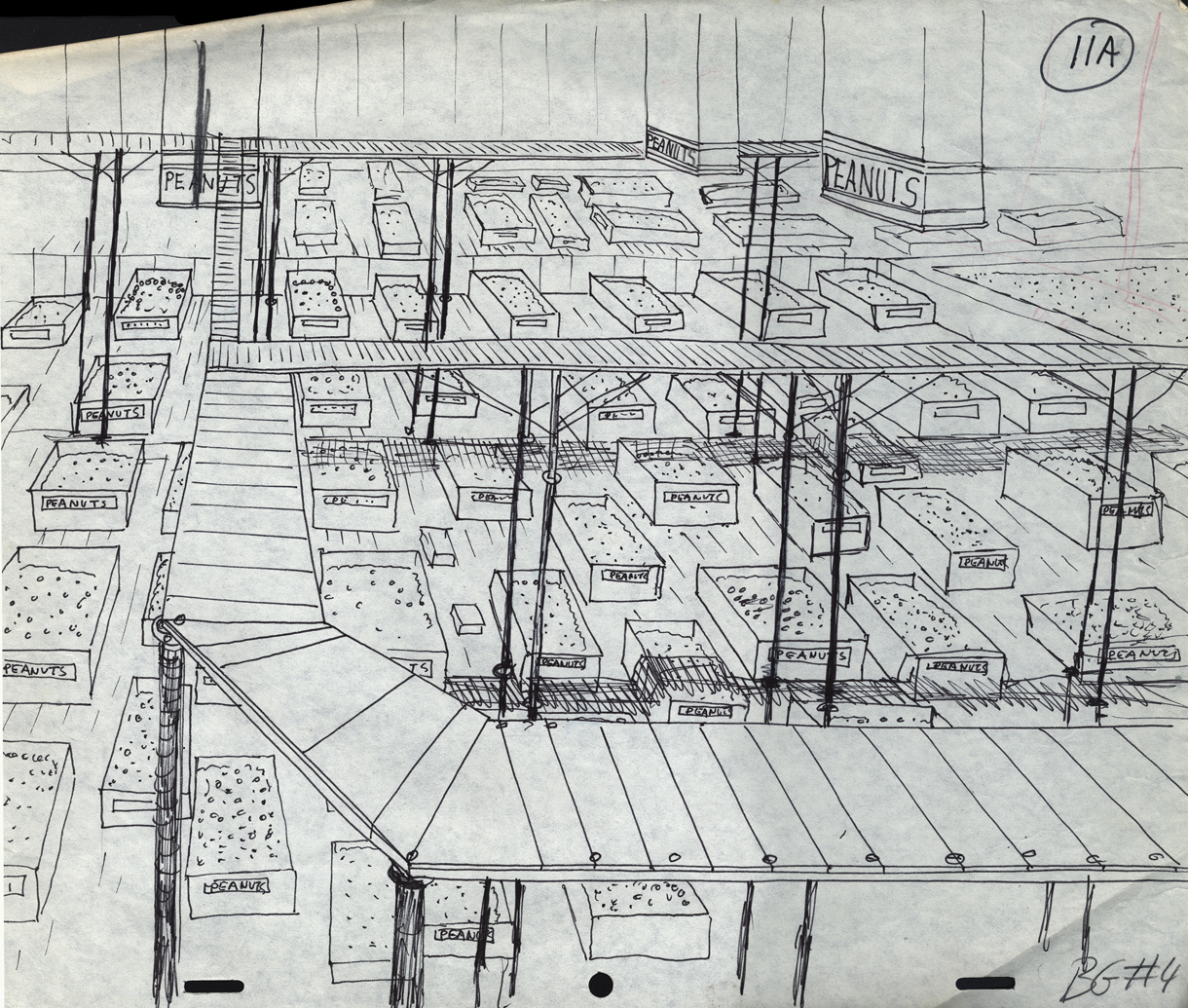
Bg LO 11
Bg LO 24
