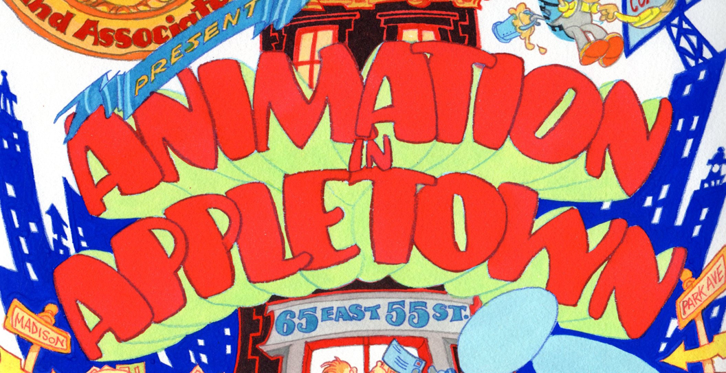
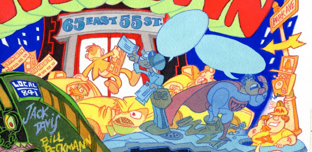
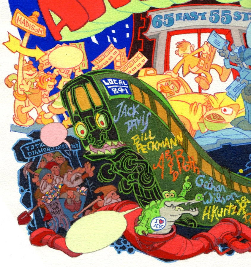
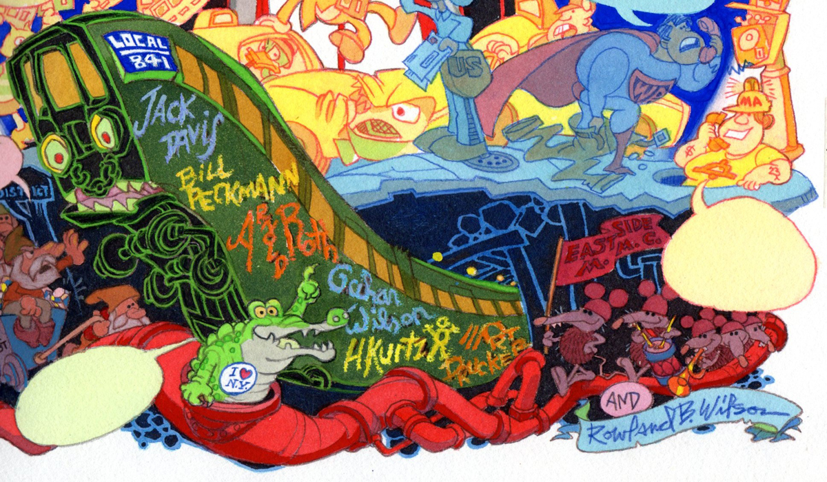
Search ResultsFor "Rowland B. Wilson"
Daily post 15 Aug 2013 05:32 am
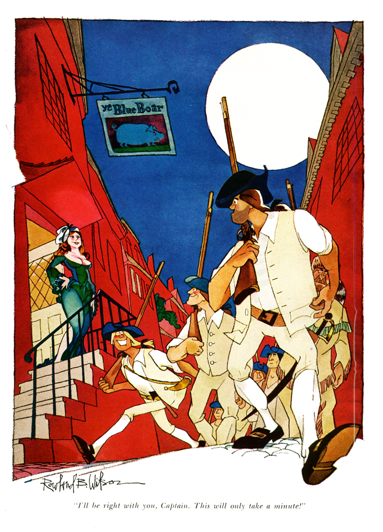
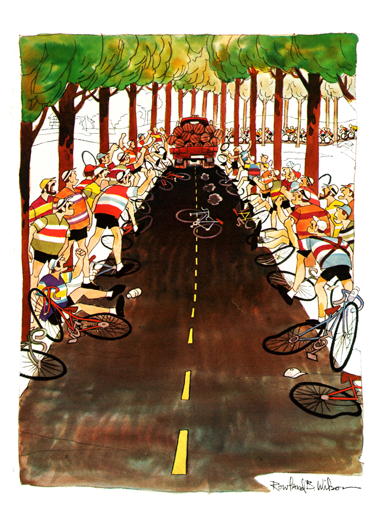
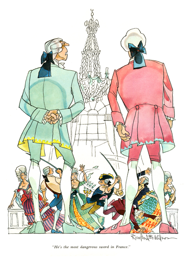
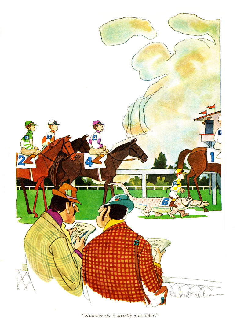
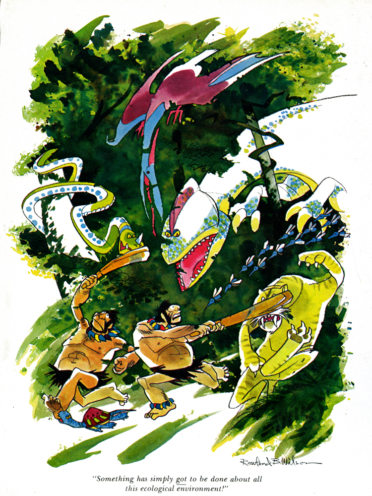
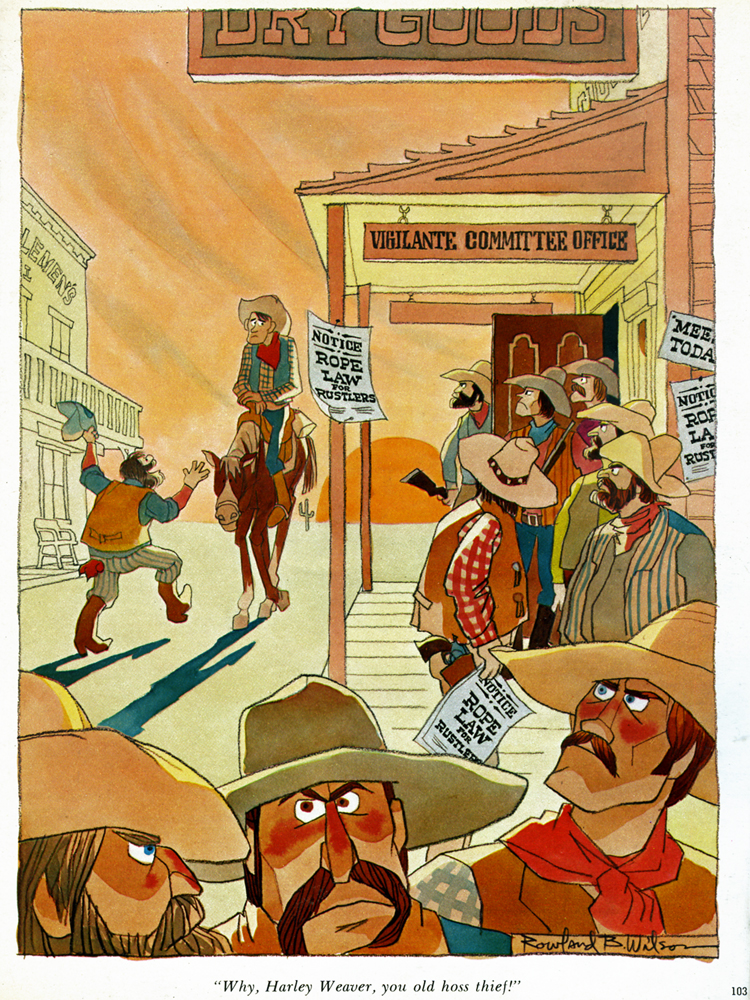
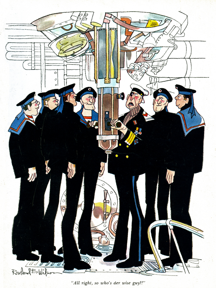
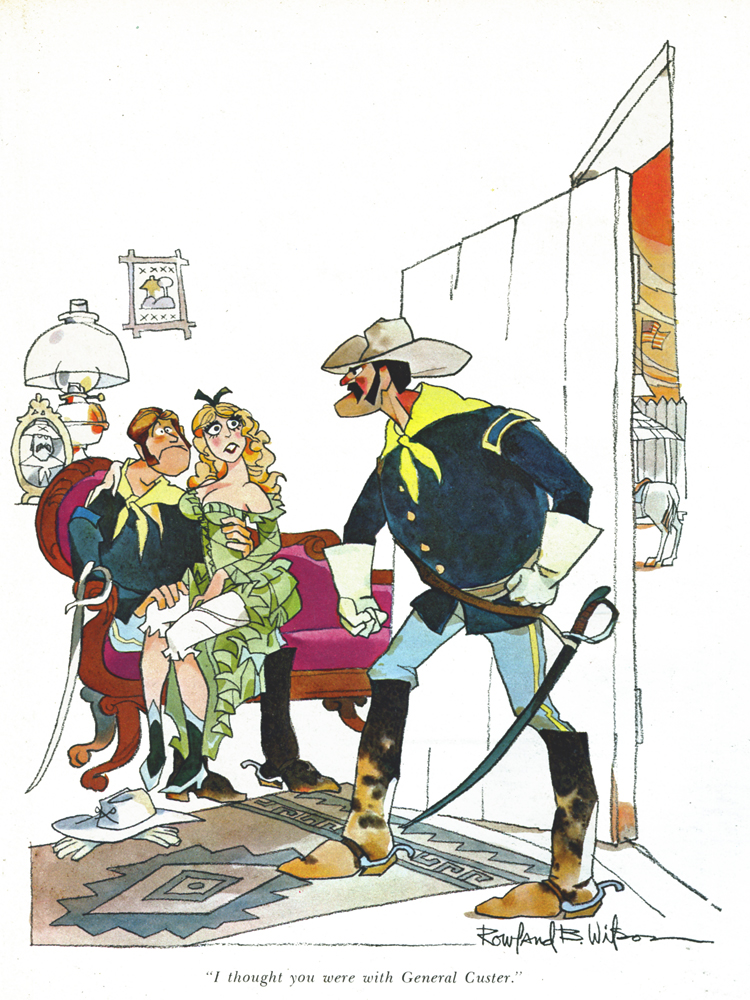
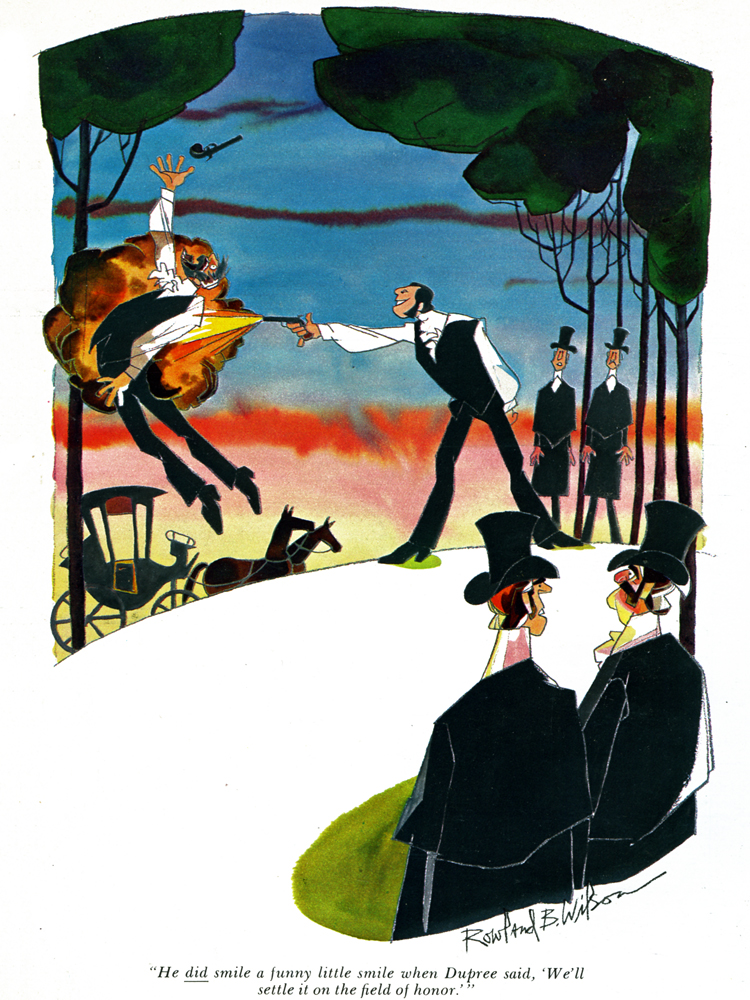
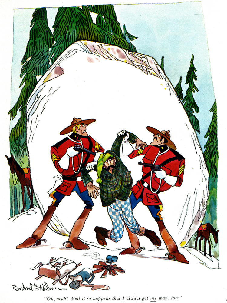
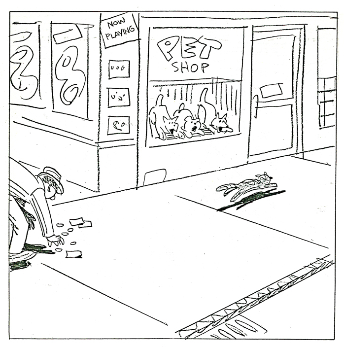
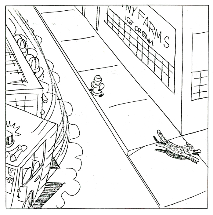
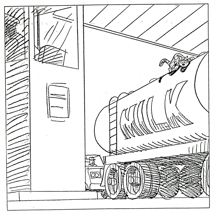
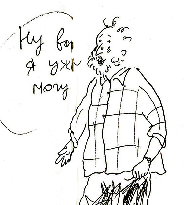
Rowland Wilson rerun Gags – color
- It’s time to take another look at some of Rowland B. Wilson’s great cartoons. I’ve chosen one that’s more color than not to viw again. Here it is.
I’ve dedicated a number of posts to the artwork and cartoons of Rowland B. Wilson.
I have been a fan of his work for a very long time. Years before I had the opportunity of inbetweening on his Scholastic Rock designs at Phil Kimmelman & Associates which was back in the early ’70s.
Bill Peckmann and I seem to share a lot in appreciating a number of artists and their artwork. Rowland is high on the list. Bill has loaned many works for posting, and I’m certainly indebted to him for contributing all of these RBWilson pieces.
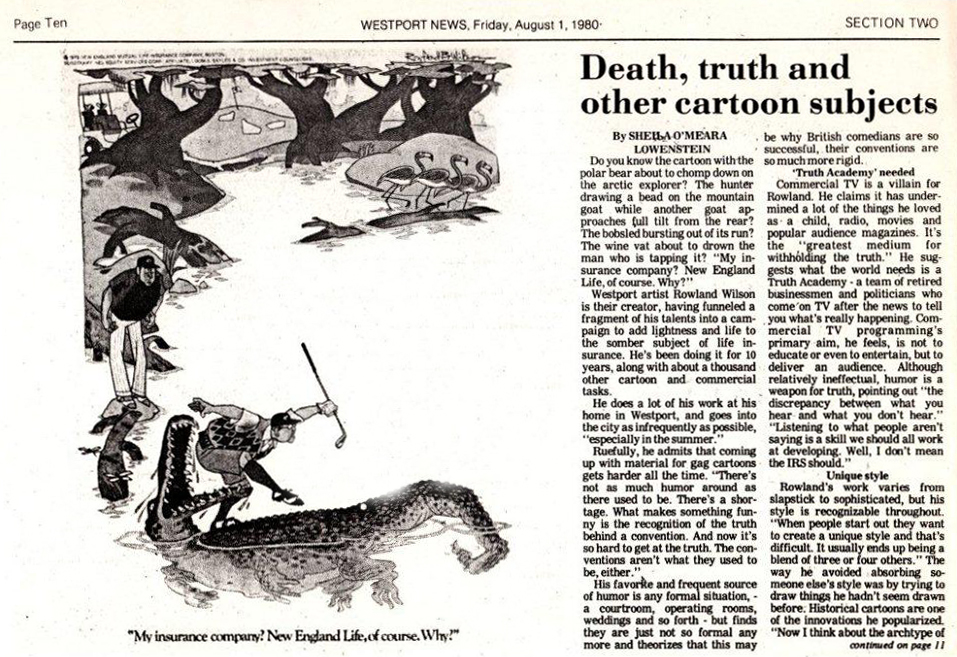
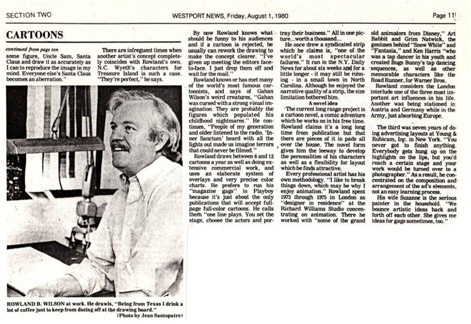
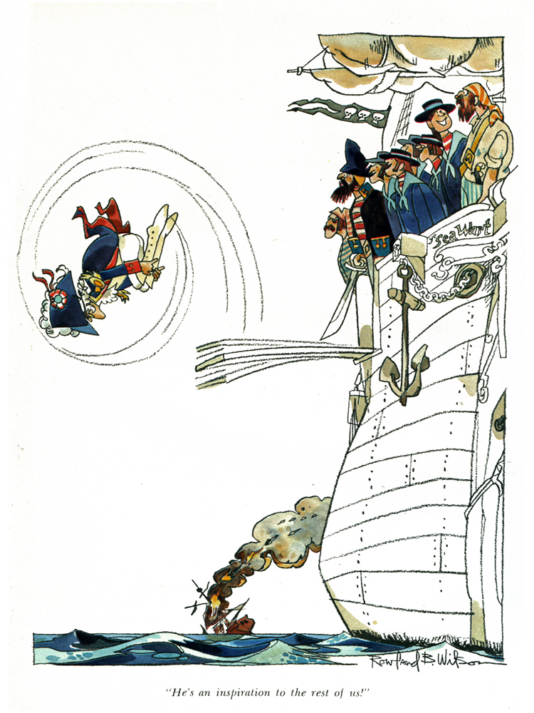
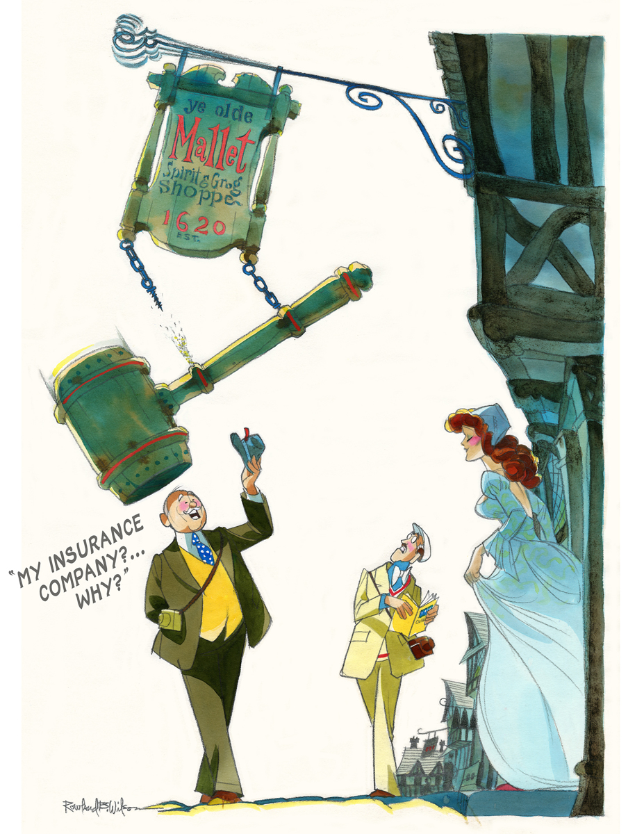
Here are more of the cartoons of Rowland B. Wilson, starting with a news article written about him for the Westport News.
(Click any image to enlarge.)
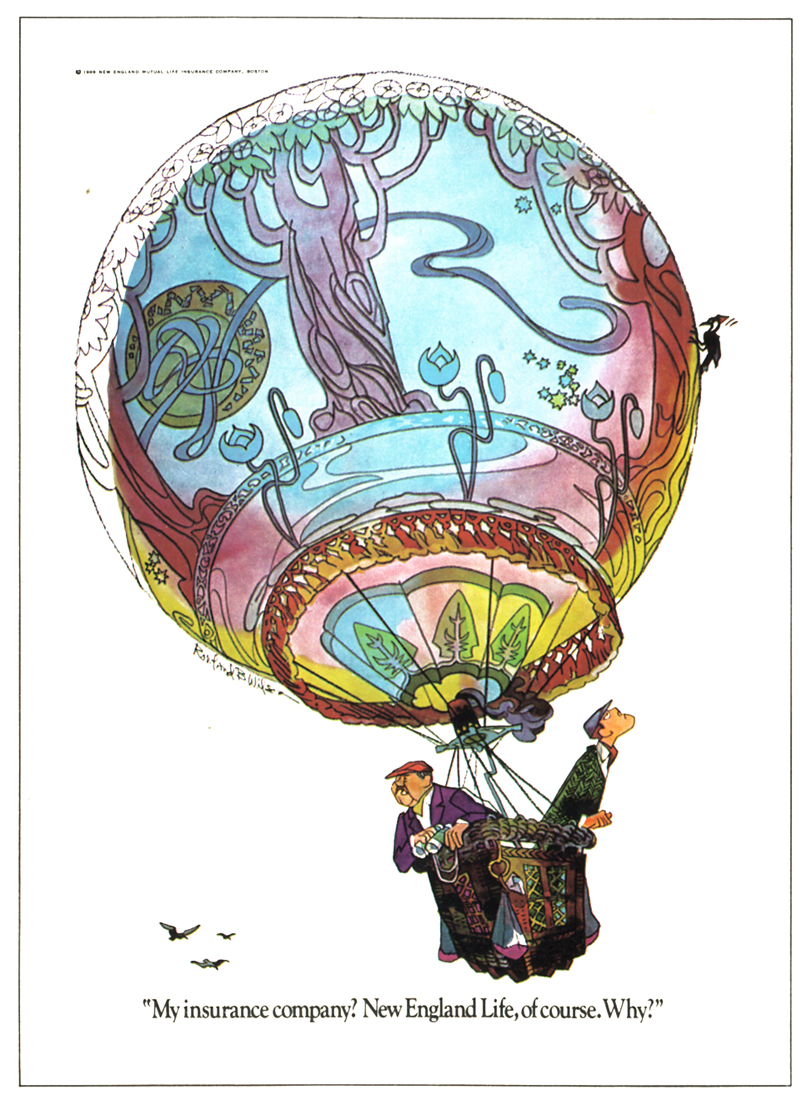
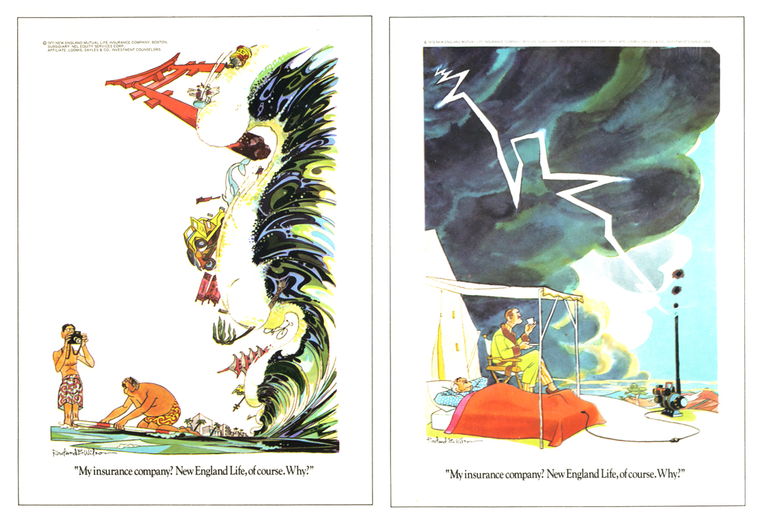
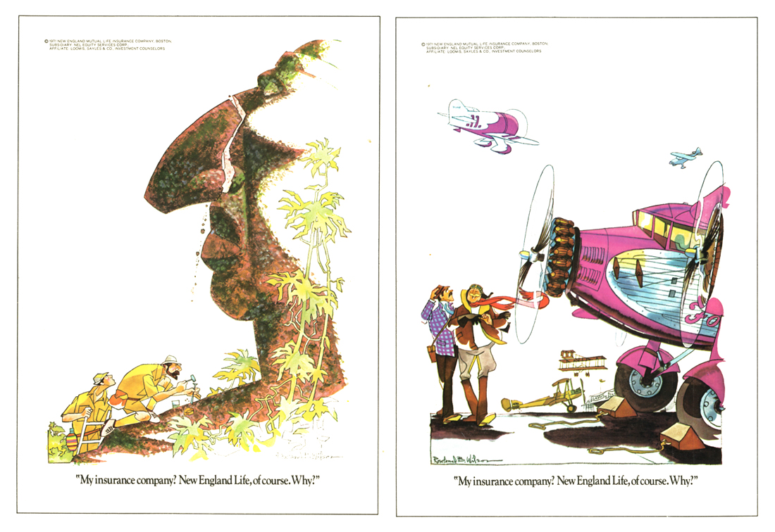
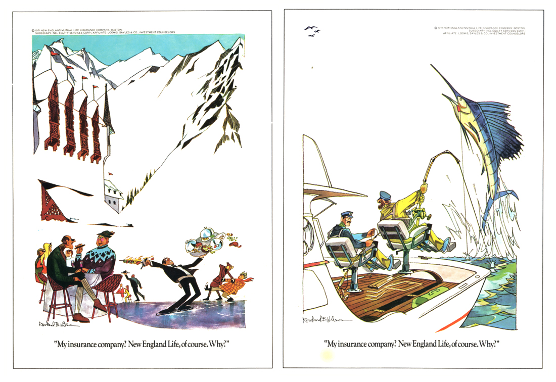
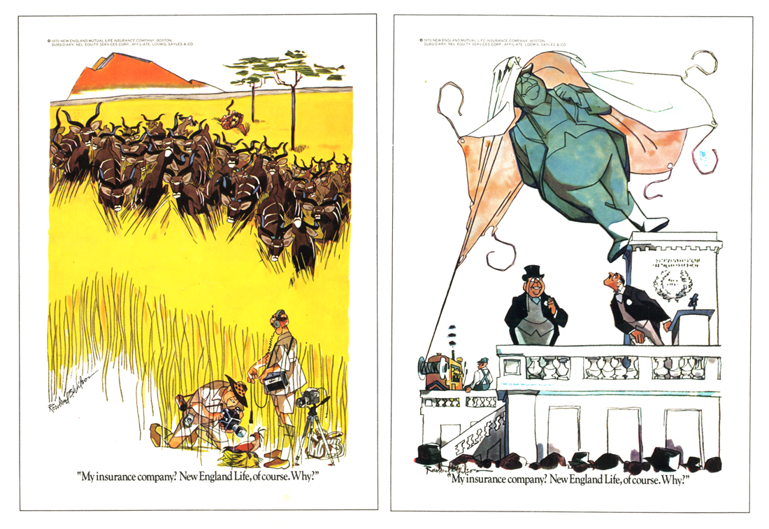
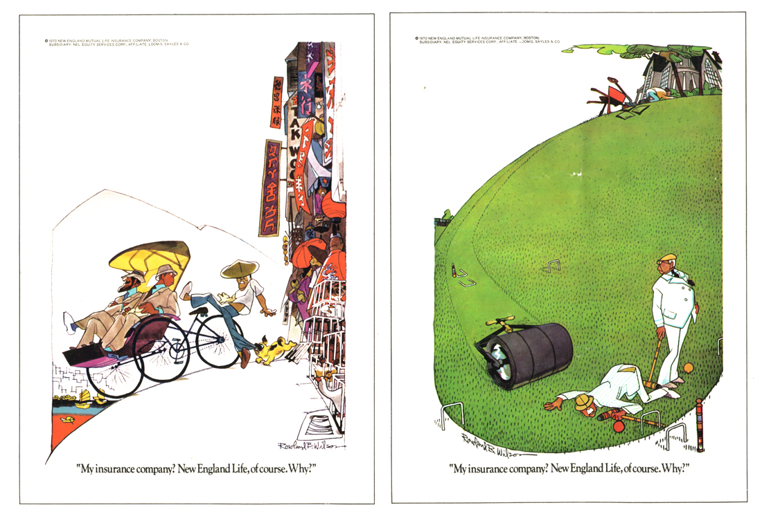
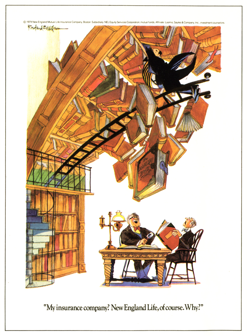
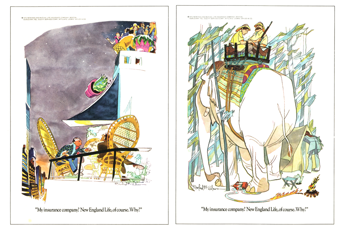
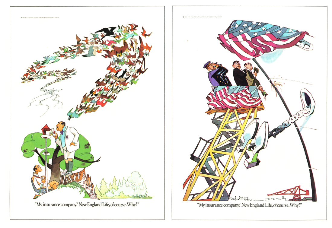
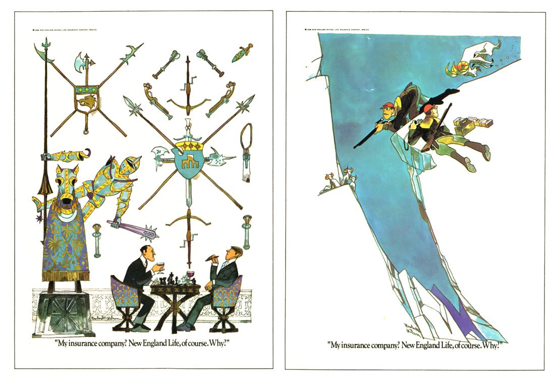
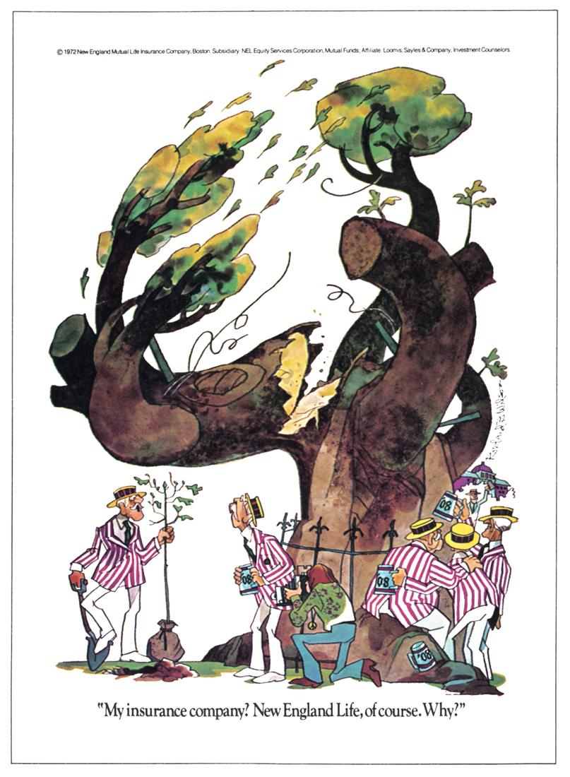
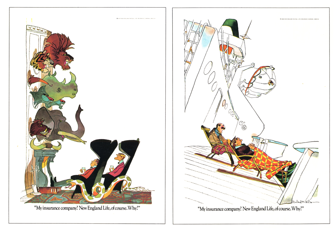
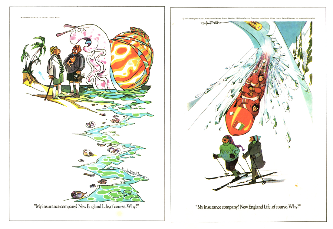
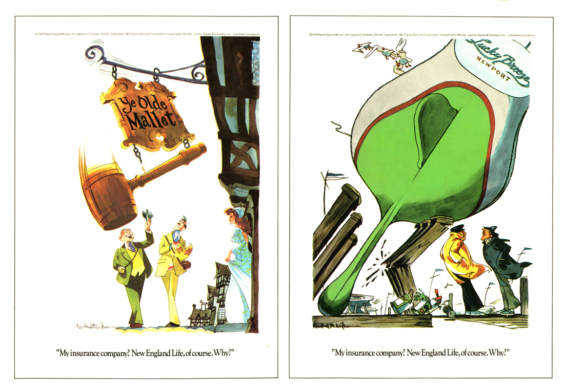
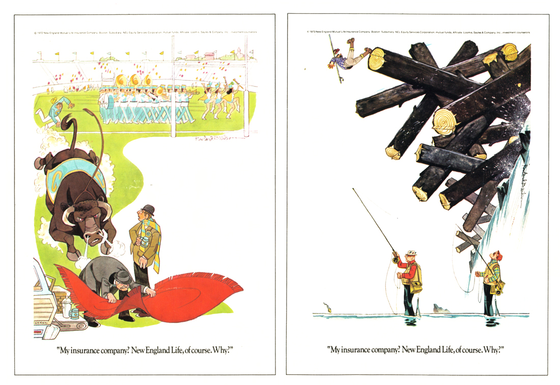
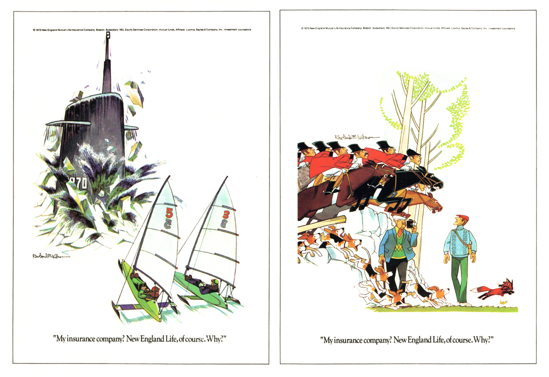
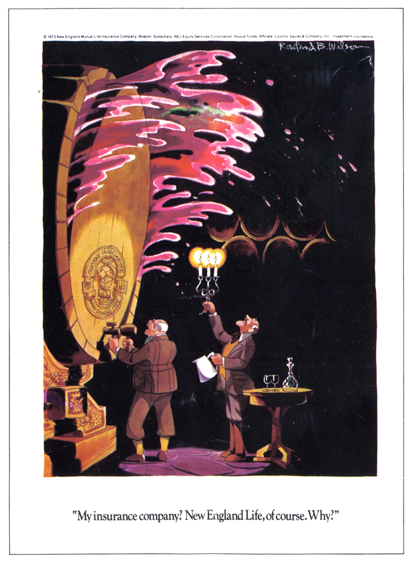
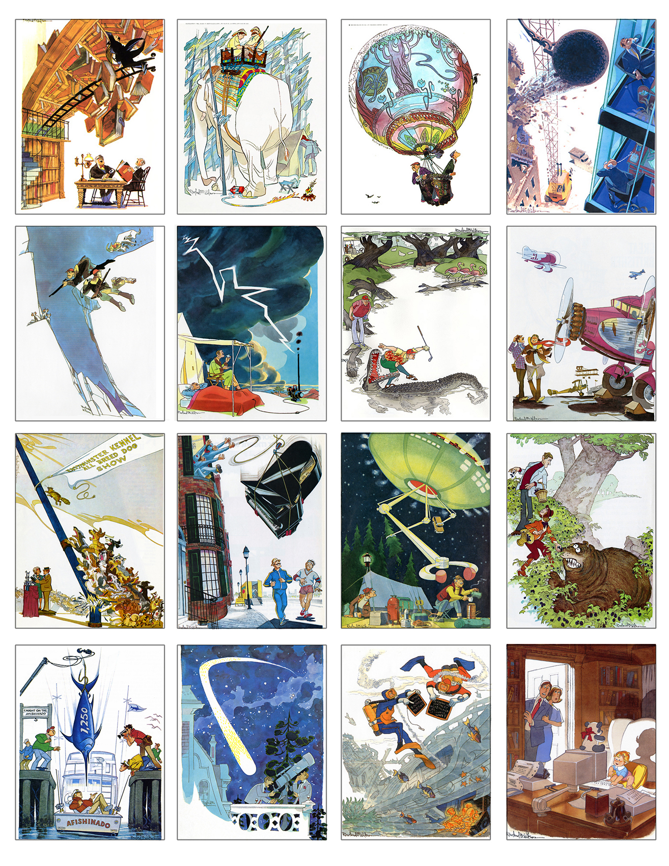
Let’s start with the New England Life advertisements. RBW did quite a few of them:
 1
1
 2
2
 3
3
 4
4
 5
5
 6
6
 7
7
 8
8
 9
9
 10
10
 11
11
 12
12
 13
13
 14
14
 15
15
 16
16
 17
17
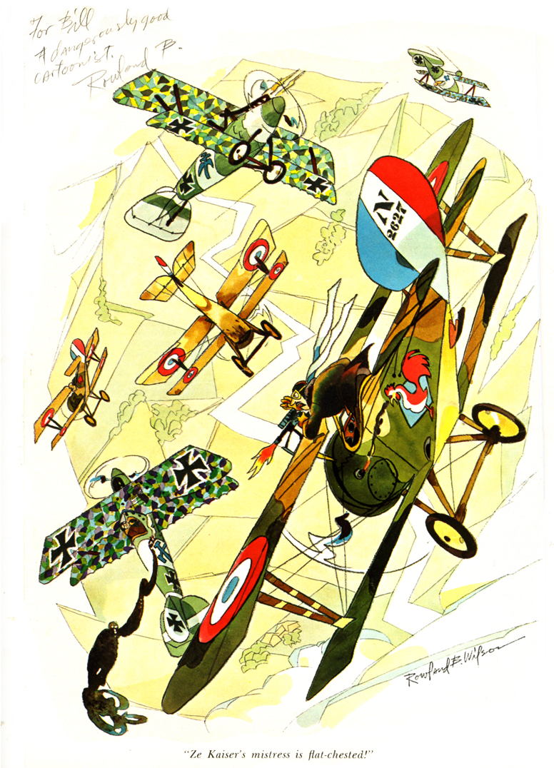
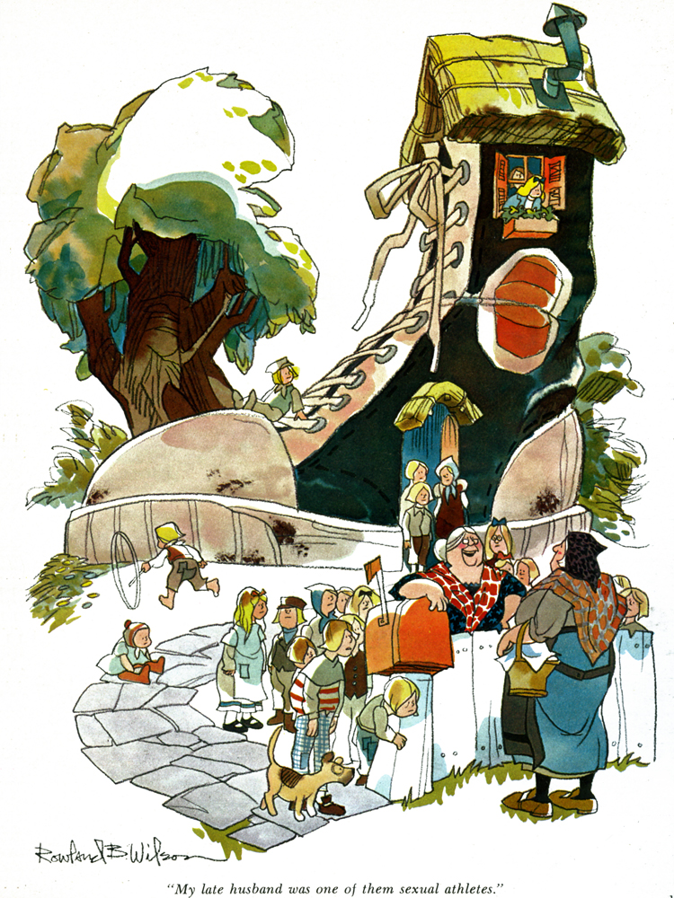
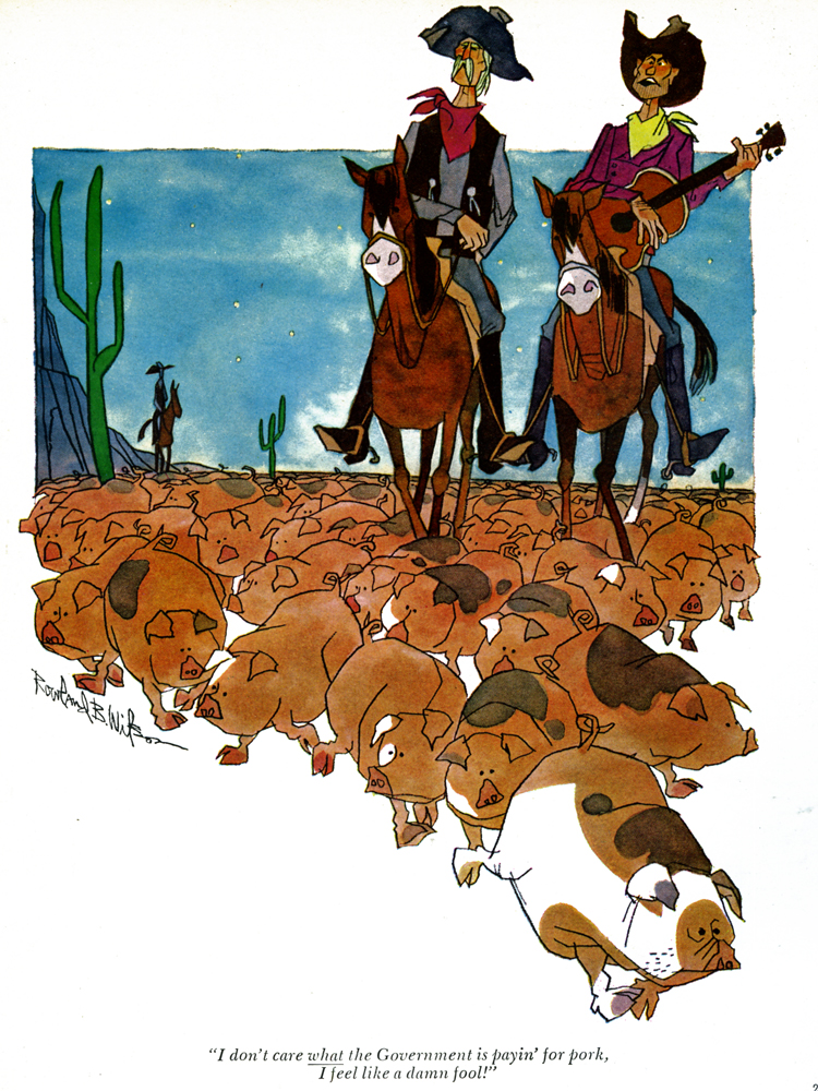
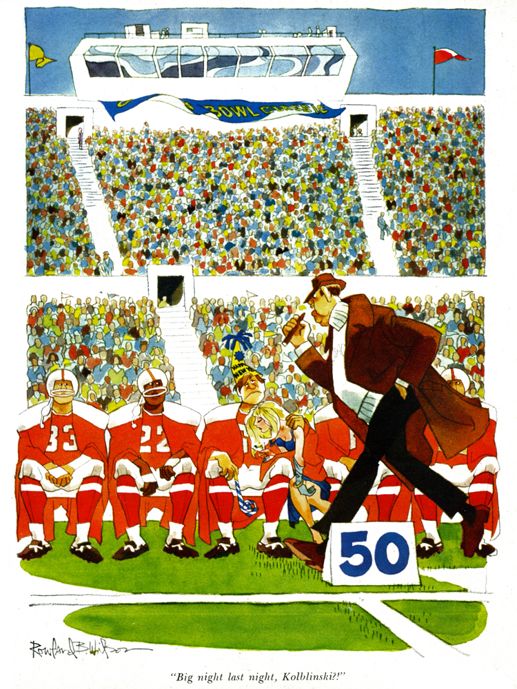
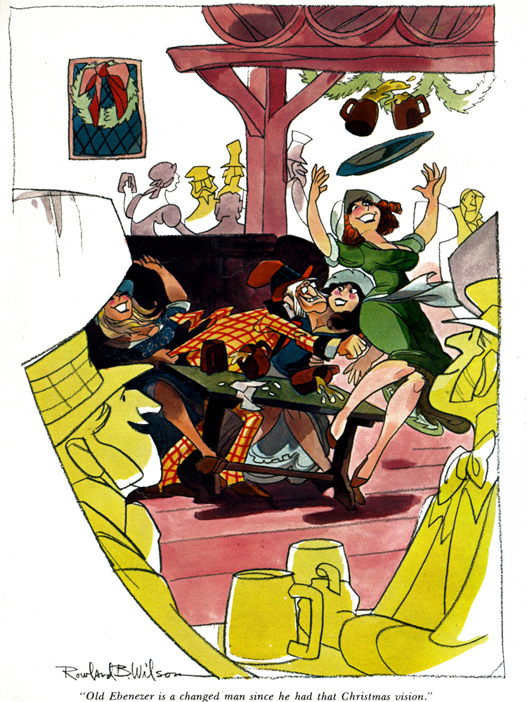
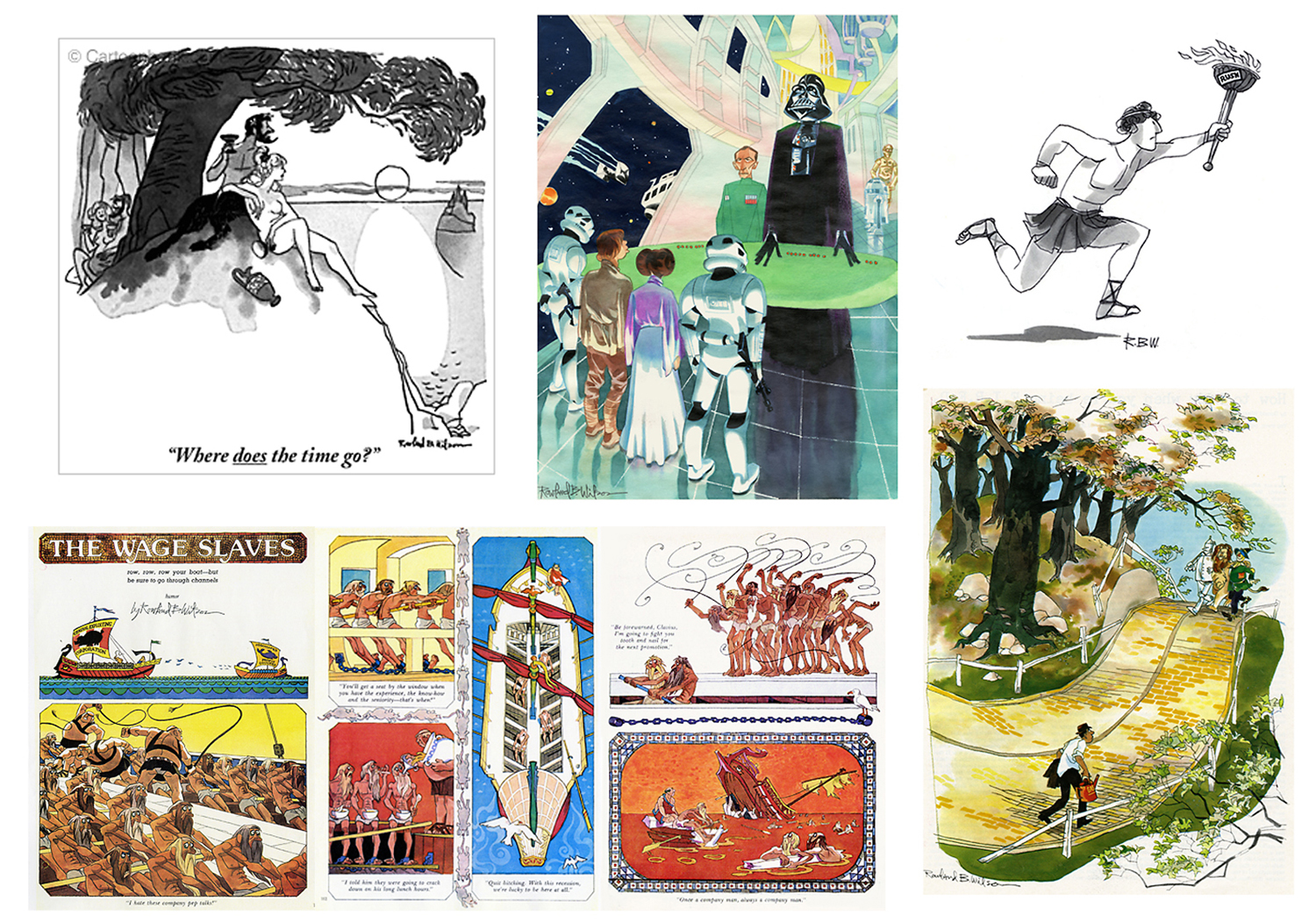
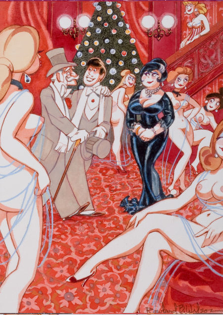
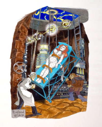
We finish this post with some more Playboy cartoons:
It must have been a treat for Bill to see his name in this cartoon.
 1
1
 2
2
 3
3
 4
4
 5
5
Personalized, no less.
 6
6
 7
7
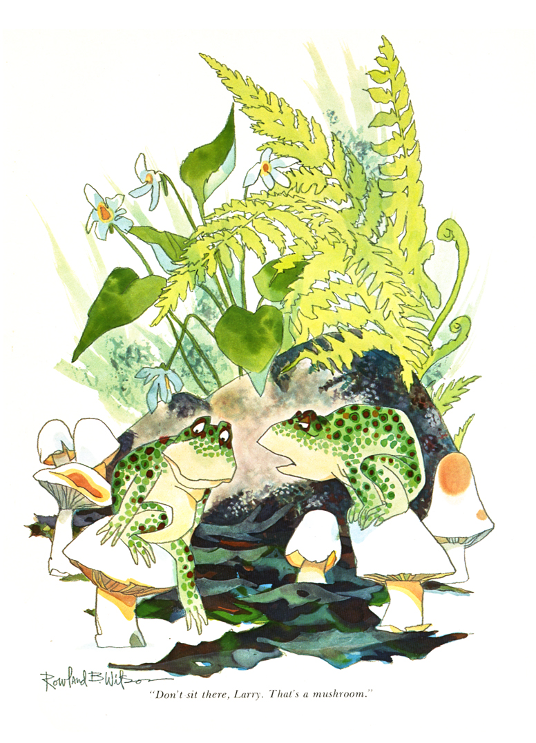
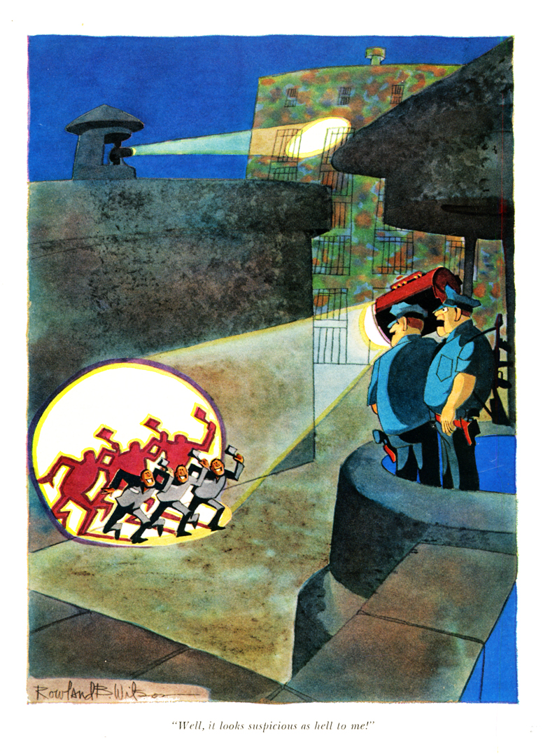
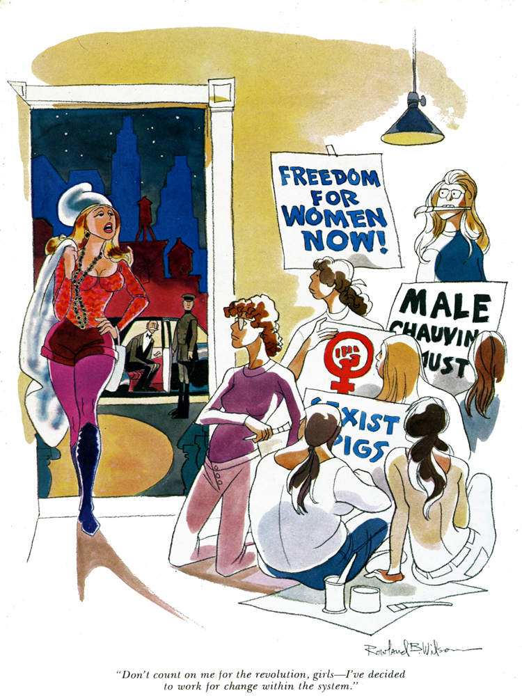
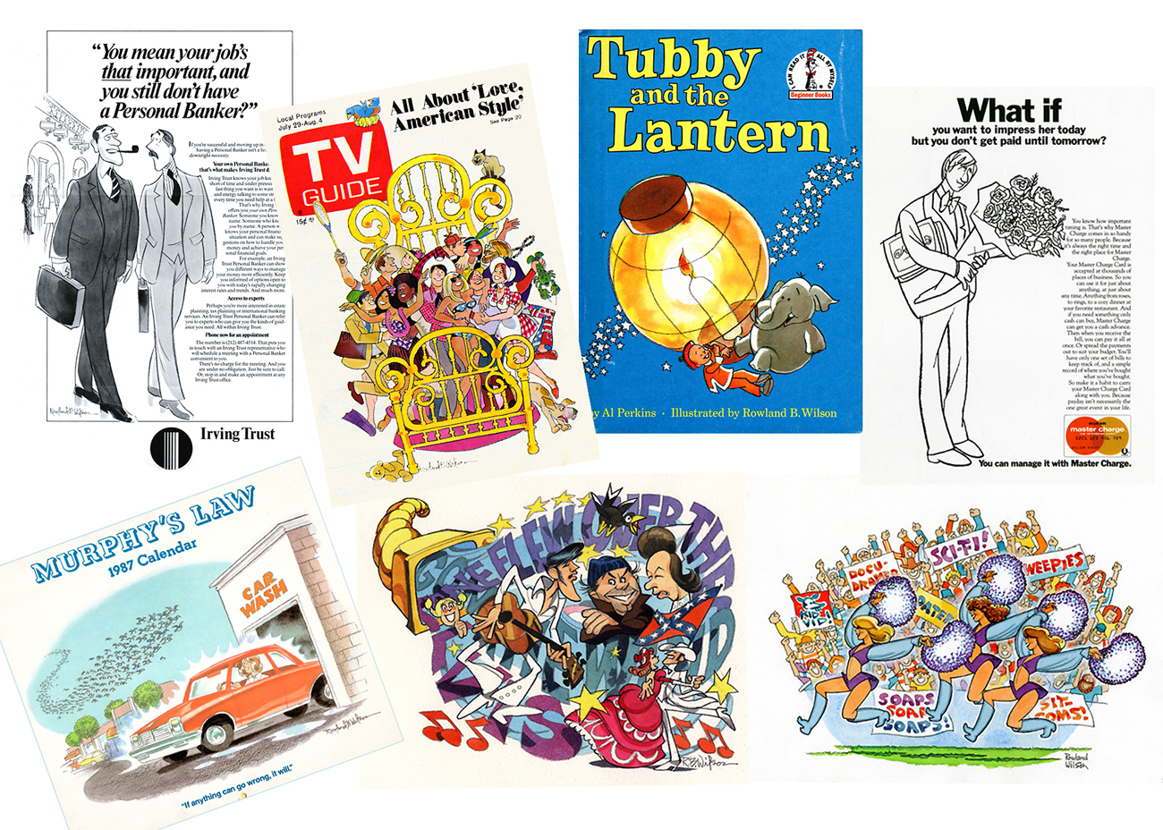
- Back in the innocent years, the joke was that one read Playboy for the articles, not the pictures. In my case (and I’m sure it was true for many others), that wasn’t much of a joke. I did thumb through Playboy and it was for the pictures – the pictures by Rowland B. Wilson, Gahan Wilson and a couple of other of the great cartoonists of that magazine.
Bill Peckmann has saved a number of Rowland Wilson’s cartoons, and I’m eager to post them. It’s my pleasure that Bill has a small archive of Rowland’s material. He was an enormous source of inspiration for me, and it’s my joy to see a lot of these again. It’s amazing how many I still remember after all these years.
 1
1(Click any image to enlarge.)
 2
2 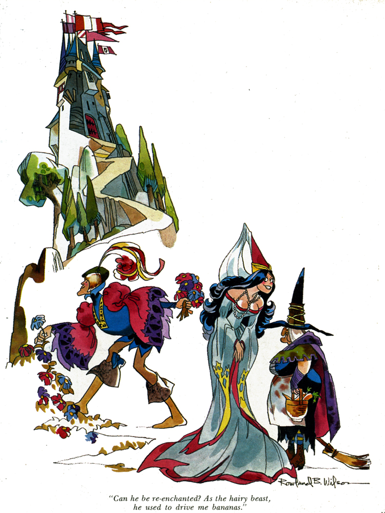 3
3
 4
4 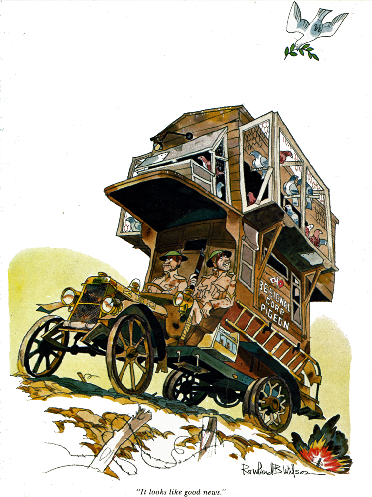 5
5
 6
6 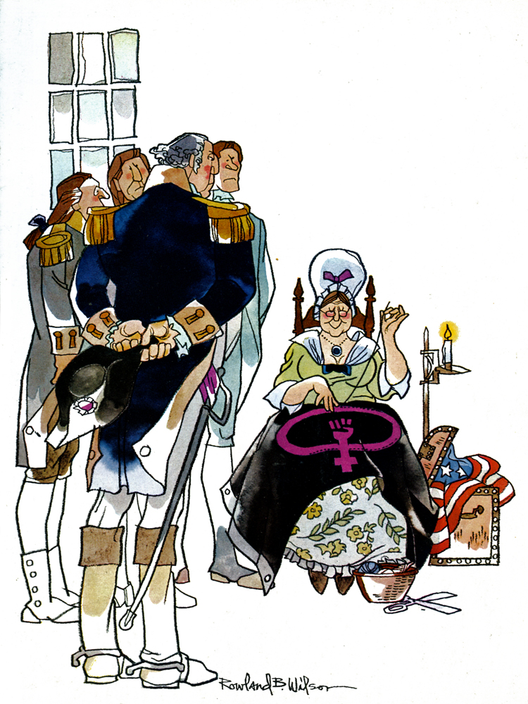 7
7
 8
8 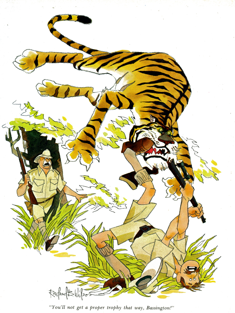 9
9
 10
10
 11
11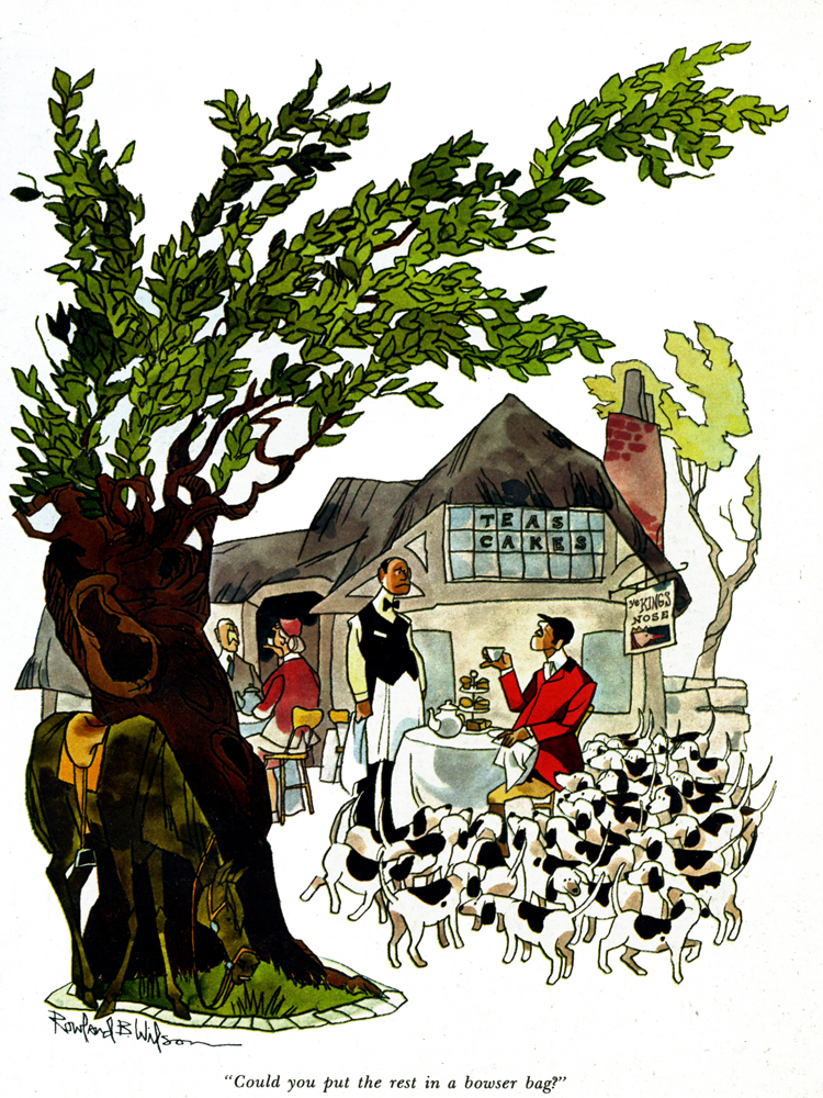 12
12
 13
13
 14
14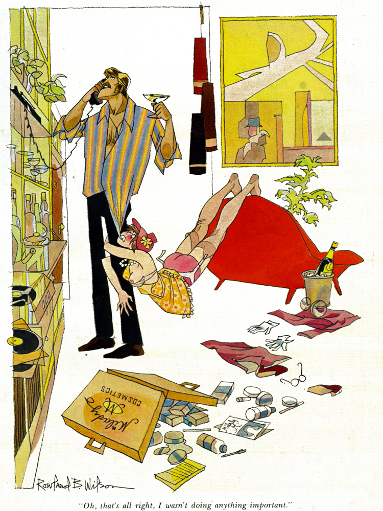 15
15
 16
16
 17
17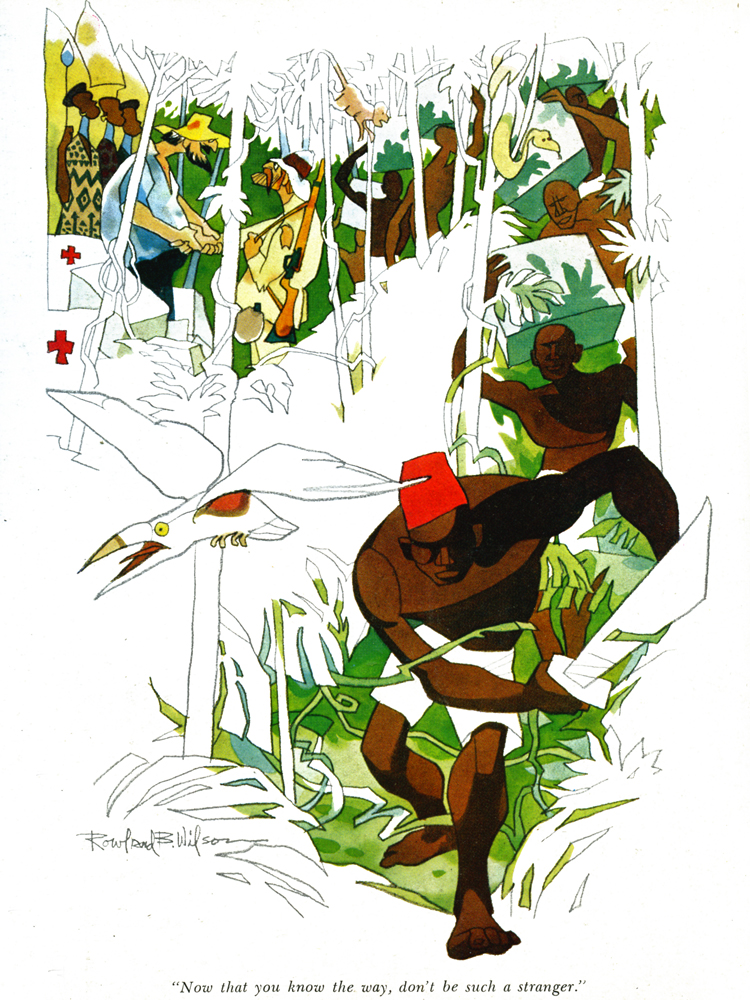 18
18
 19
19
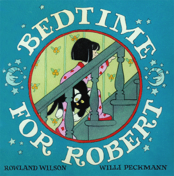
Bill Peckmann &Books &Rowland B. Wilson 31 May 2013 05:28 am
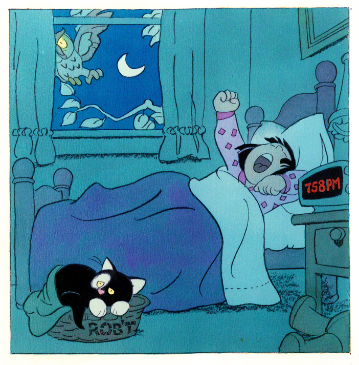
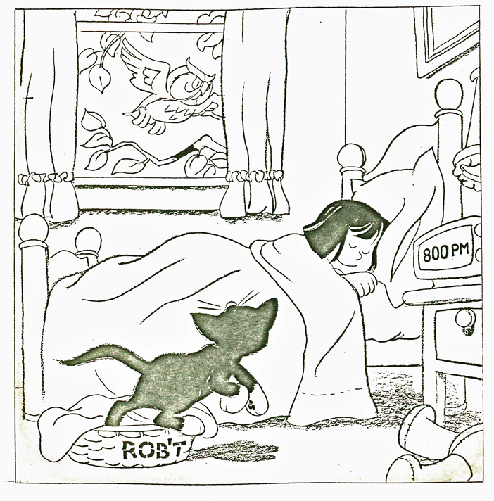
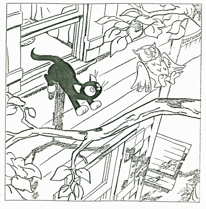
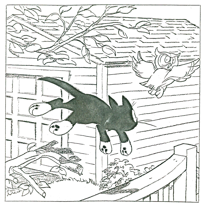
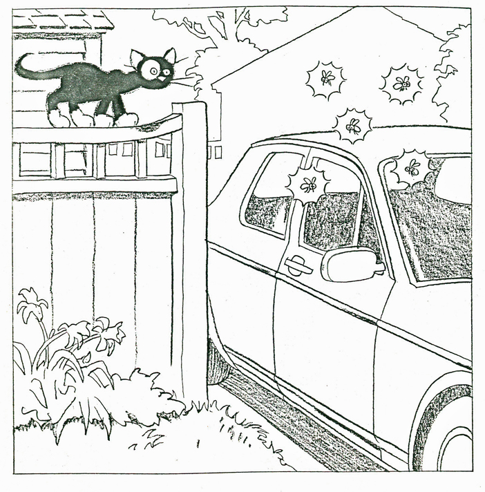
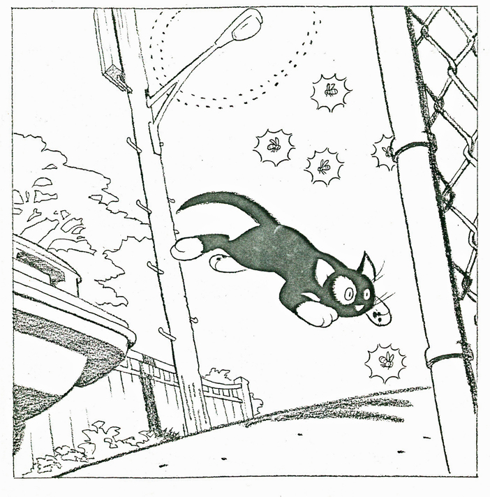
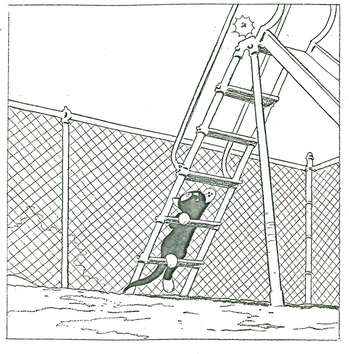
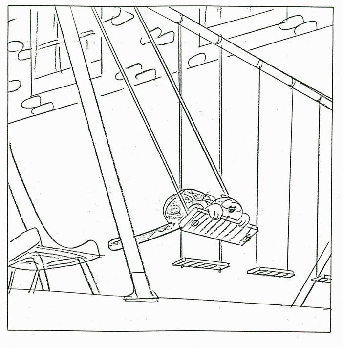
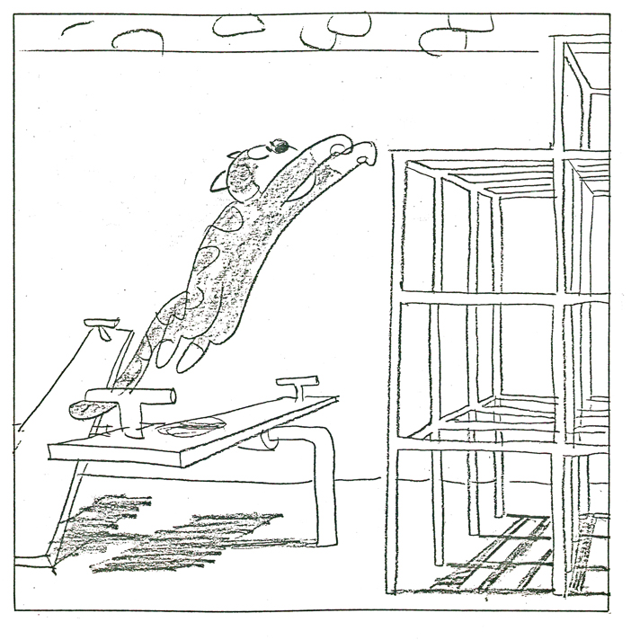
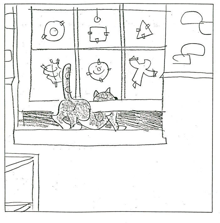
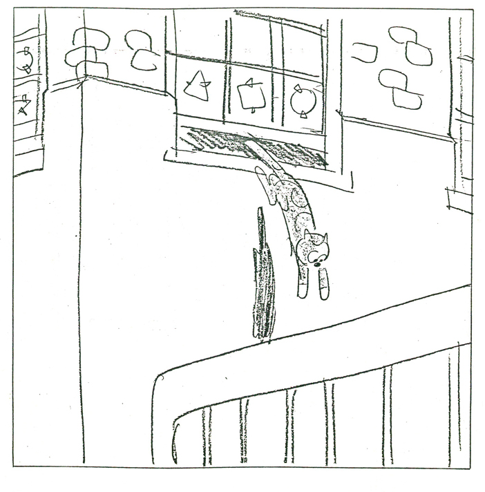
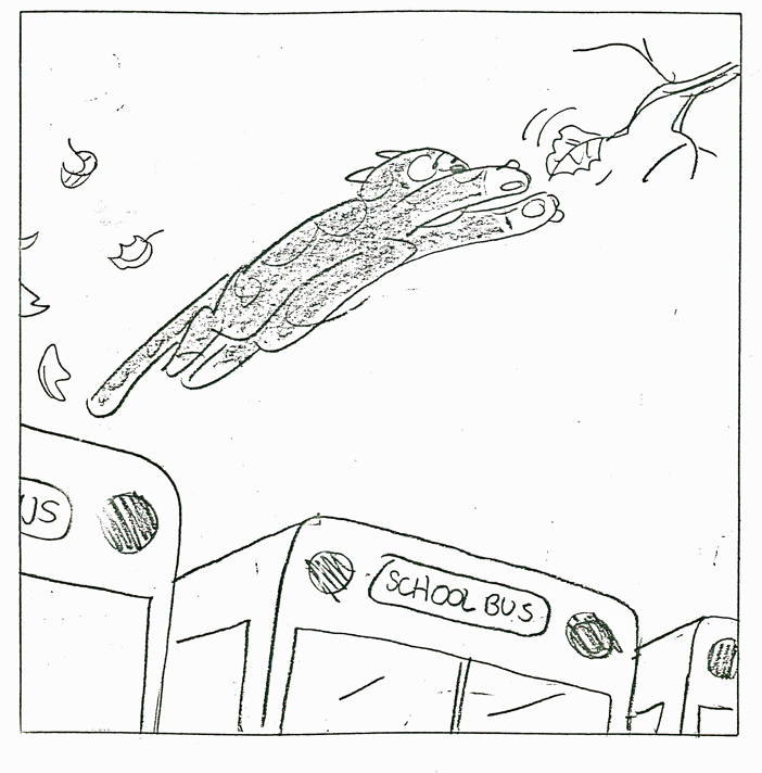
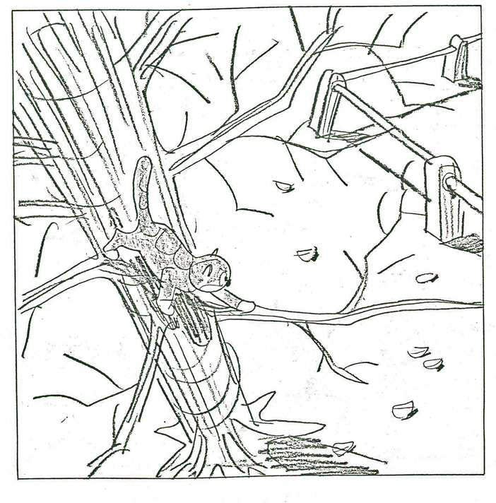
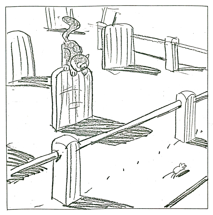
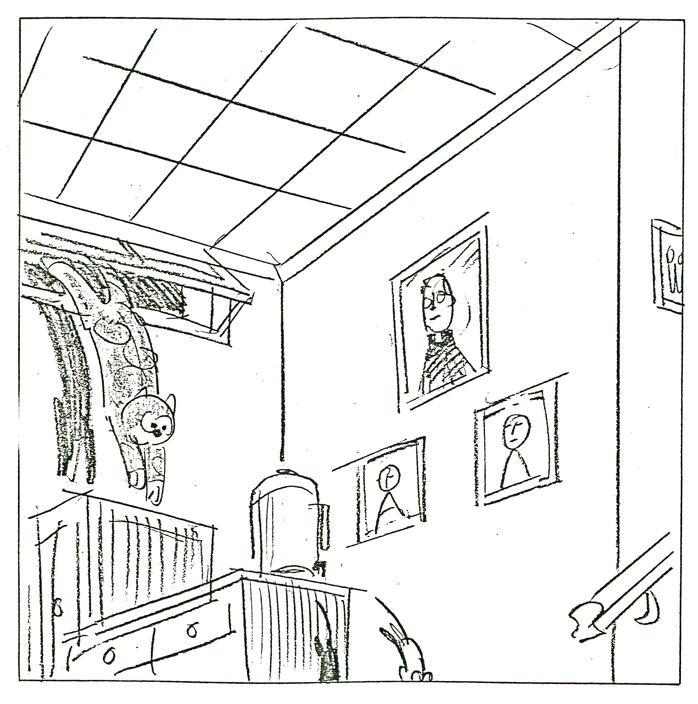
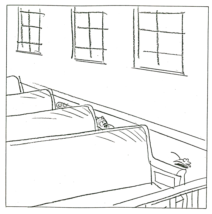
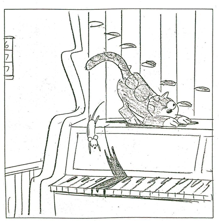
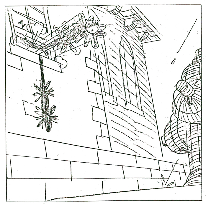
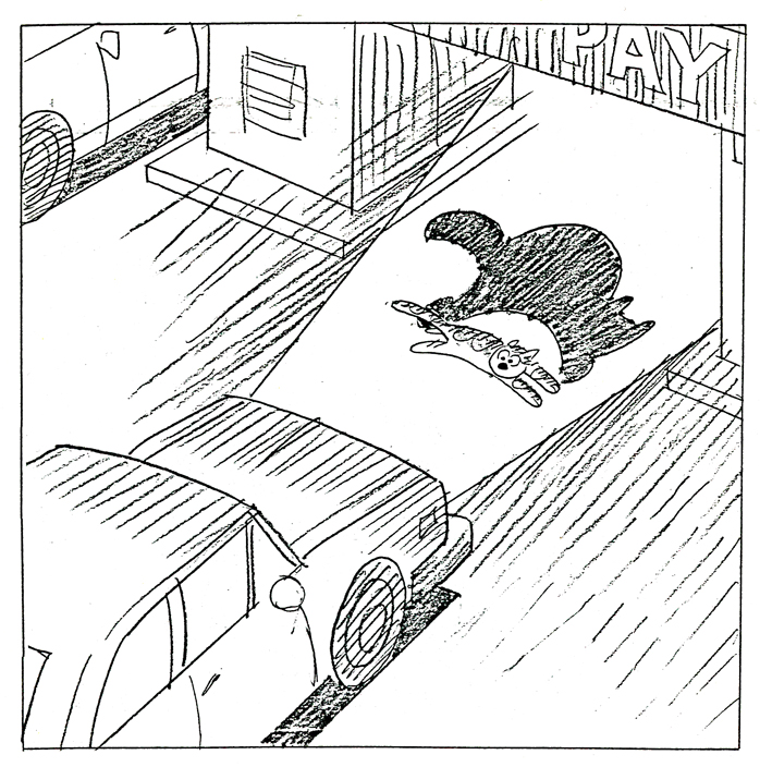
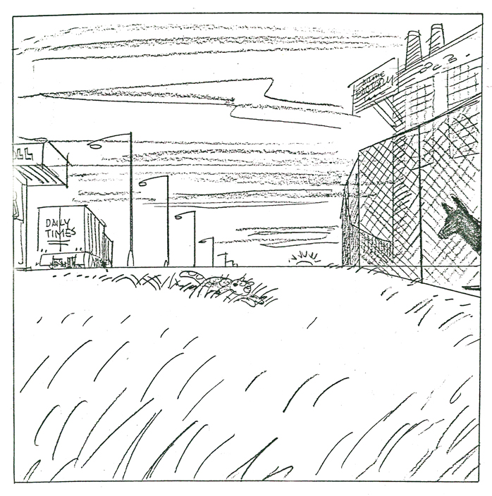
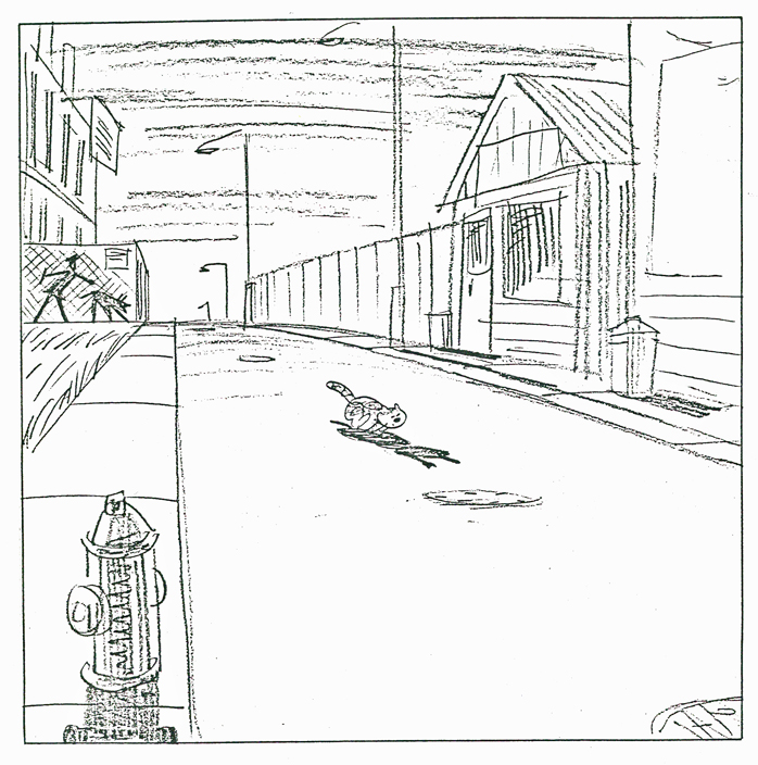
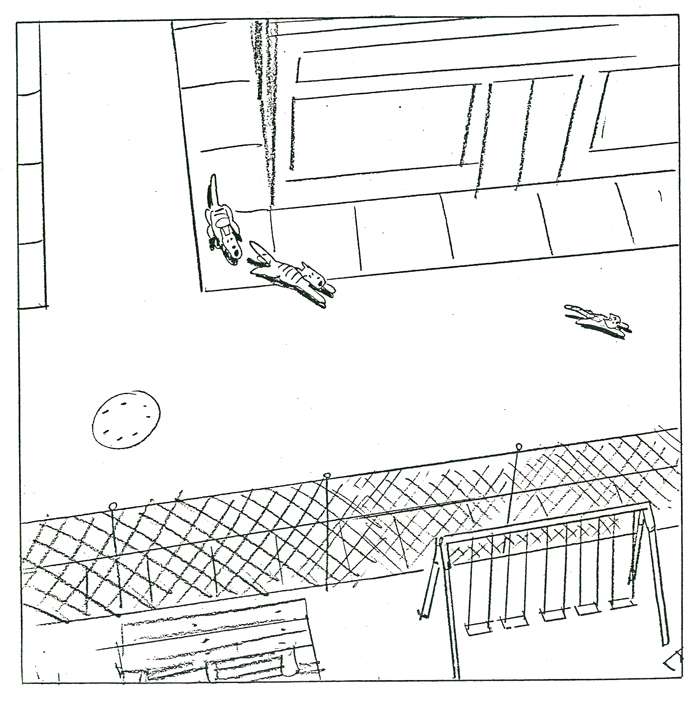
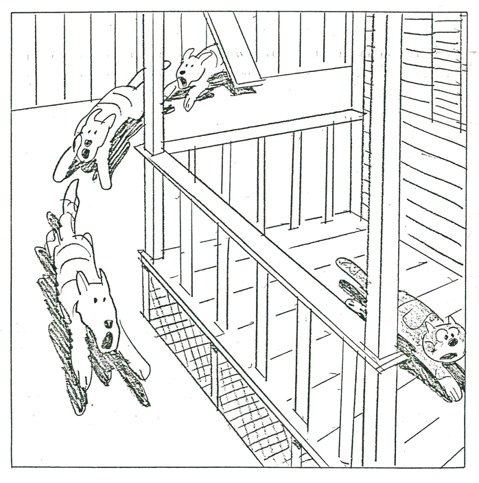
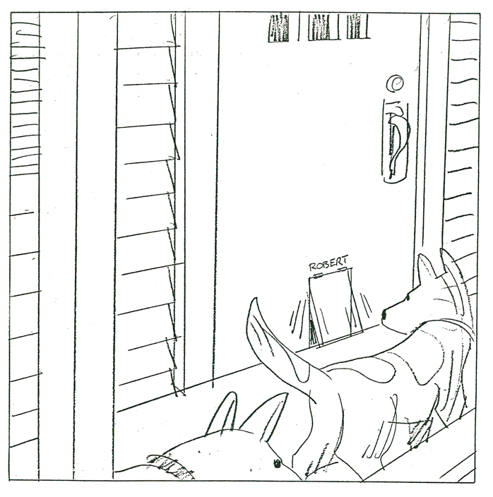
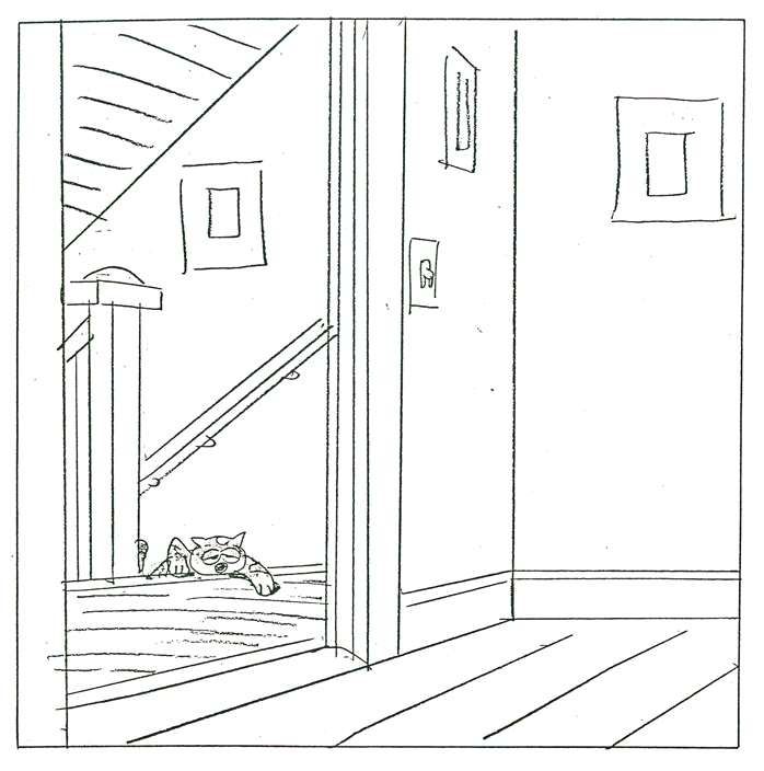
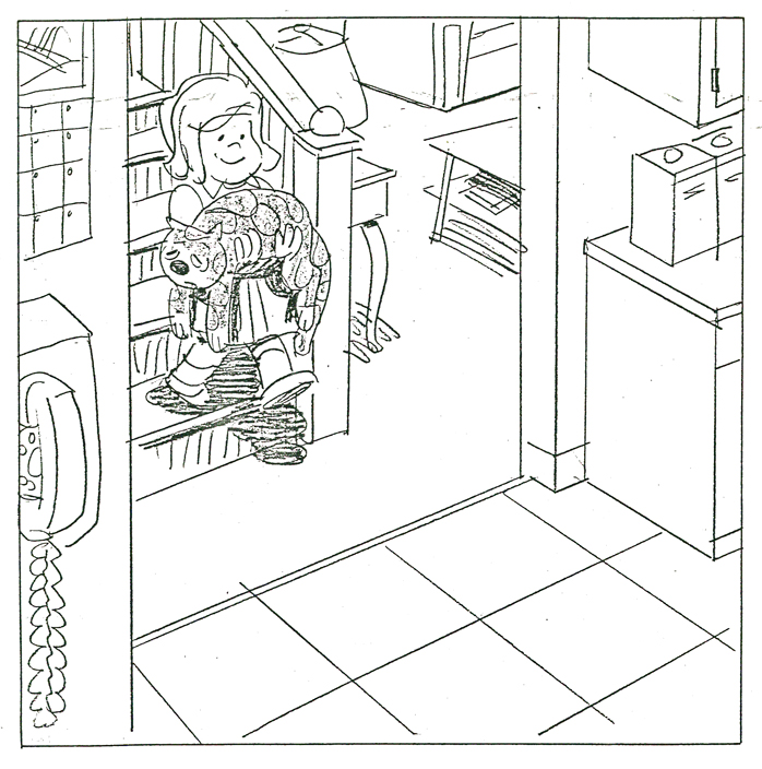
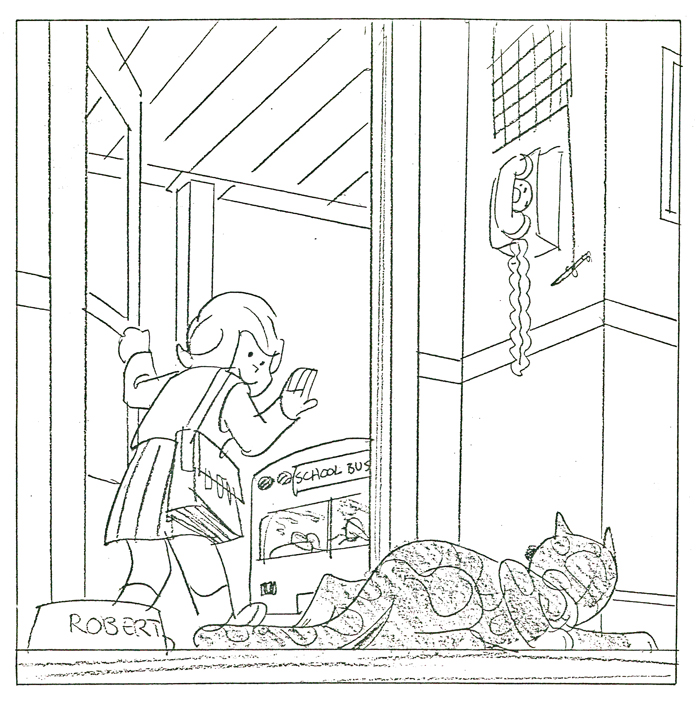
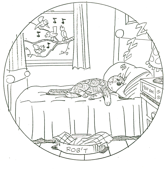
Bedtime for Robert
- Bill Peckmann collaborated with Rowland Wilson, back in the early ’80s, on a charming little book for children that never found a publisher and, consequently, never was completed. Bill had a bound copy of the book – in a mockup form – and sent it to me. I, naturally, would like to share it.
First, here’s the note on the inner sleeve of the cover:
- ABOUT BEDTIME FOR ROBERT, A WORDLESS BOOK
Bedtime for Robert is intended to bring to small children an early experience of the special personal relationship one has to a book; the availability and flexibility that a book enjoys over a fixed-time medium such as television.
Being wordless, the book needs no translation. The child has access to it at any time without relying on adults. This early exposure to the physical reality of books will, we believe, enhance the experience of reading later on.
The story combines the pull of a narrative with information that appeals to a child’s curiosity: in this case what goes on at night in the adult world. Although the child must go to bed (reluctantly), Robert the cat’s curiosity leads him into this forbidden adult world. Robert is all cat with cat qualities, not a little person in a cat suit as most cartoon cats are. The child can project his own emotions into the character.
The authors are booklovers with extensive experience in both print and film. We have both won Emrnys and other awards for our animation designs for educational TV.
We believe this is the first book to utilize the principles of film continuity in a printed form. This continuity is vital to the understanding of a narrative without the aid of words.
The use of film pacing supports the unfolding of adventure and humor in a wordless story.
The book is planned to be in color. The pages up to 17 are in finished linework and the rest is in rough layout form.
Robert is conceived as a series. The character and structure would remain constant. The variables would be in the cat’s adventures in various places, seasons, times of the day, and occupations.
Please contact either of us at the addresses below. This is a simultaneous submission.
Yours truly,
Rowland Wilson
Willi Peckmann
You’ll see immediately how original this book is:
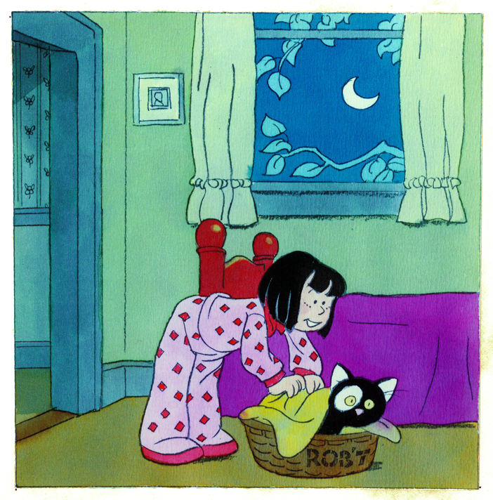 3
3(Click any image to enlarge.)
 4
4 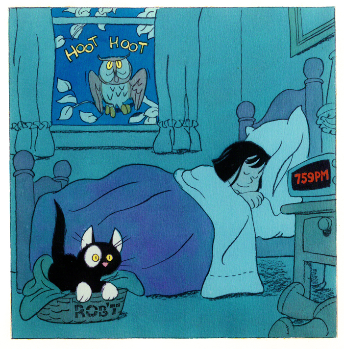 5
5
 6
6 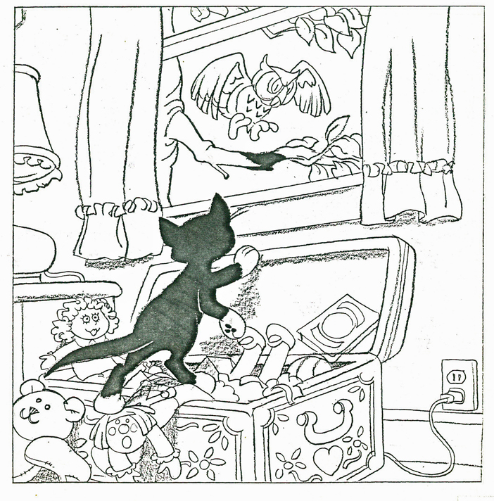 7
7
 8
8 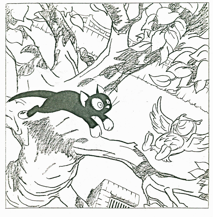 9
9
 10
10 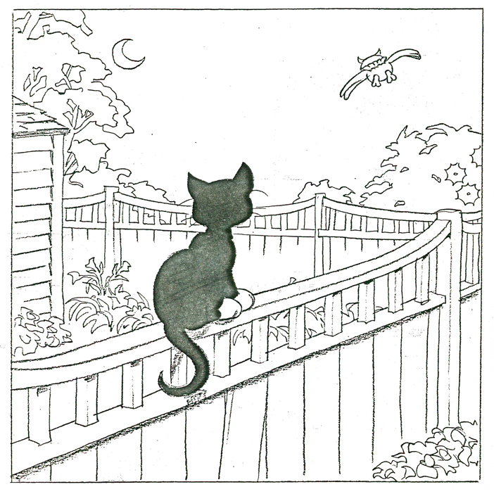 11
11
 12
12 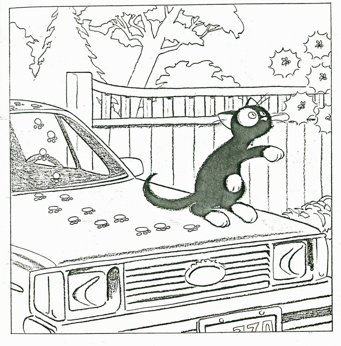 13
13
 14
14 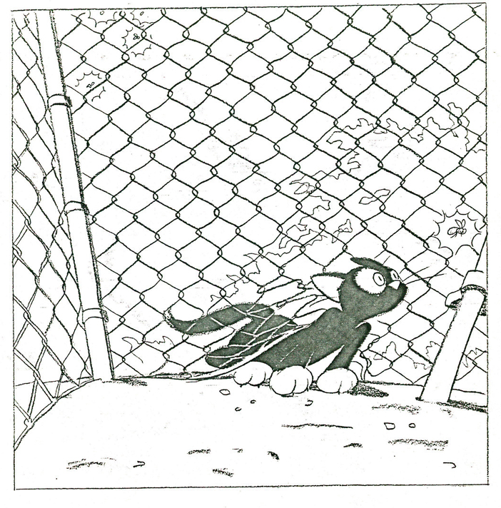 15
15
 16
16 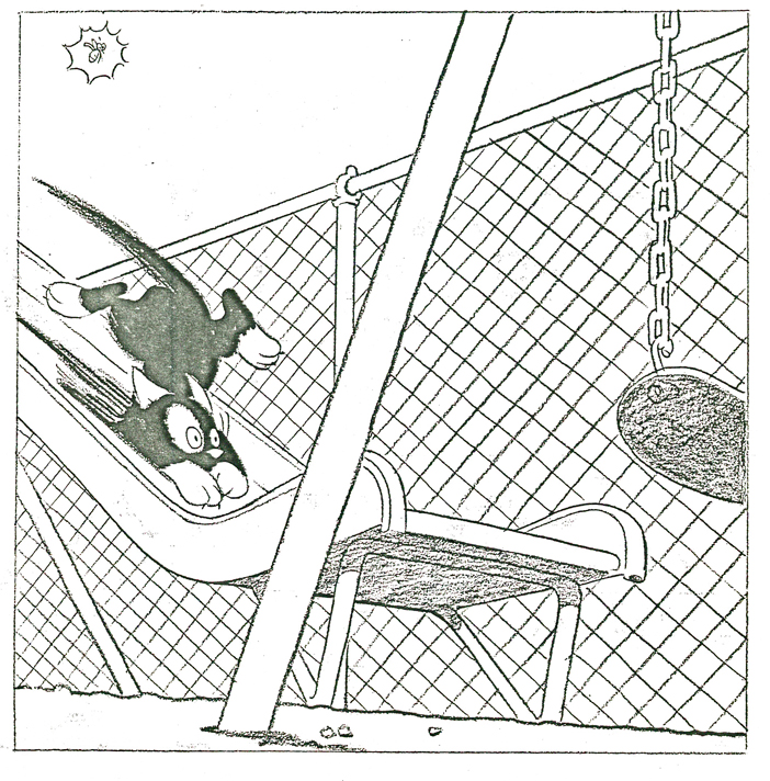 17
17
 18
18 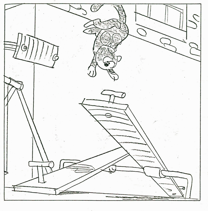 19
19
 20
20 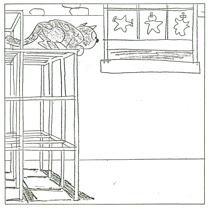 21
21
 22
22 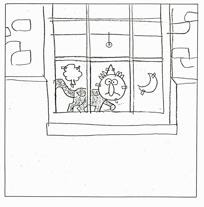 23
23
 24
24 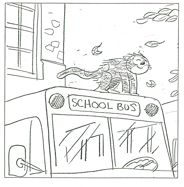 25
25
 26
26 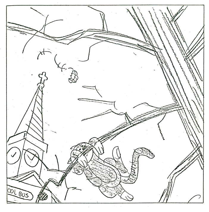 27
27
 28
28 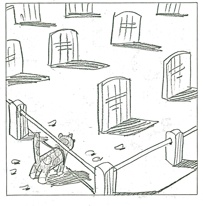 29
29
 30
30 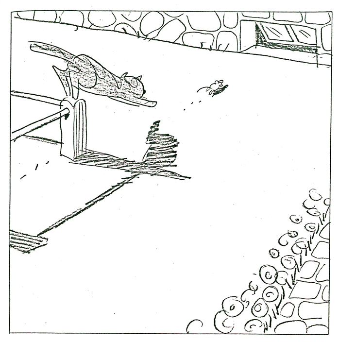 31
31
 32
32 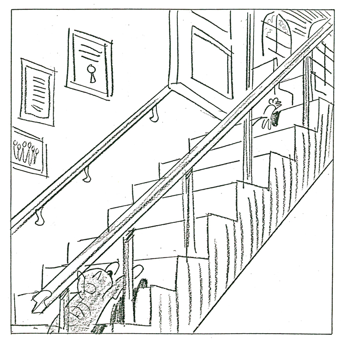 33
33
 34
34 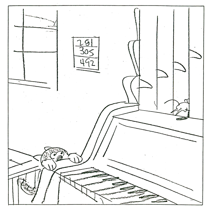 35
35
 36
36 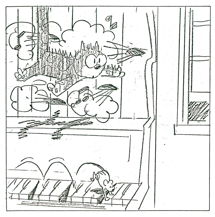 37
37
 38
38 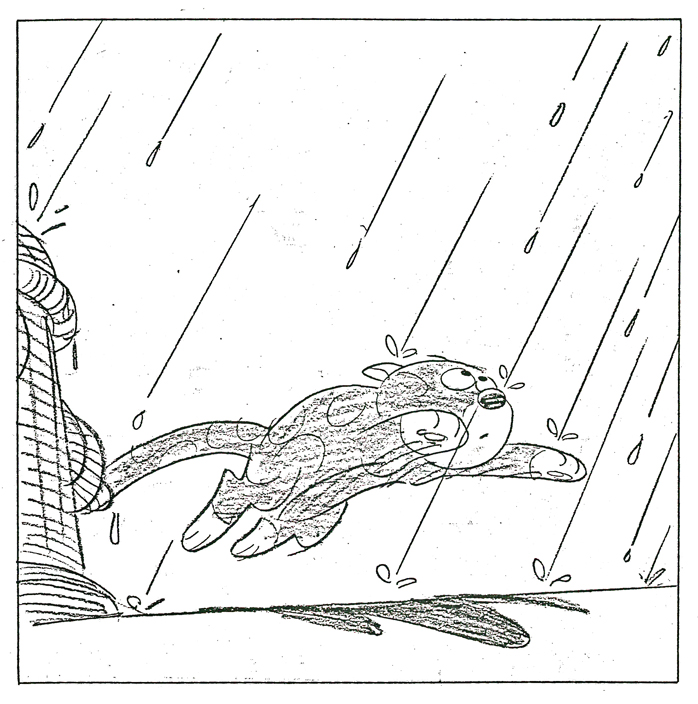 39
39
 40
40  41
41
 42
42  43
43
 44
44  45
45
 46
46  47
47
 48
48 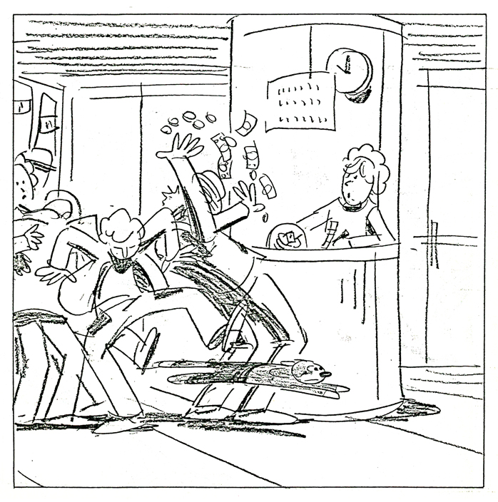 49
49
 50
50 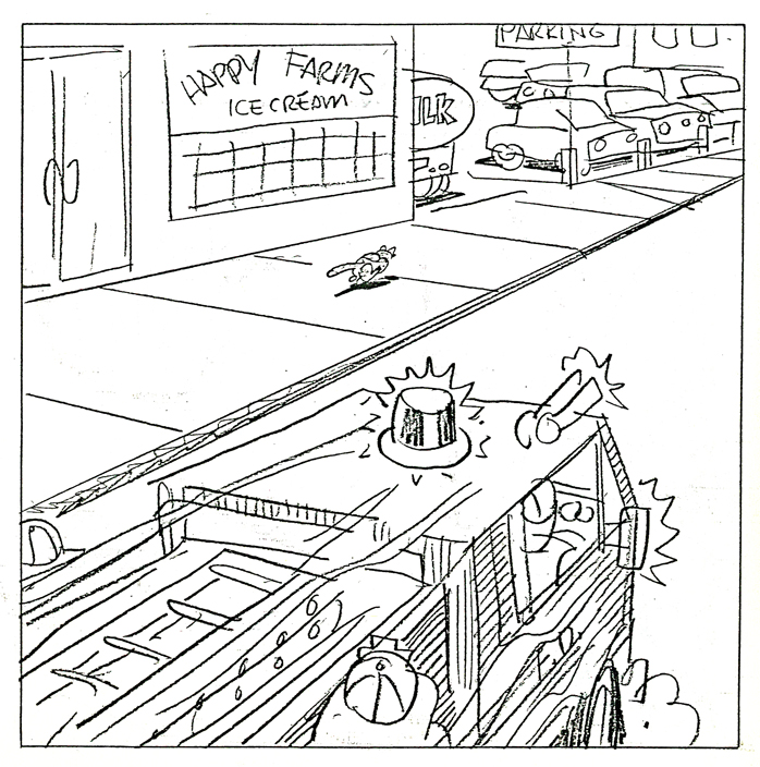 51
51
 52
52  53
53
 54
54  55
55
 56
56  57
57
 58
58  59
59
 60
60 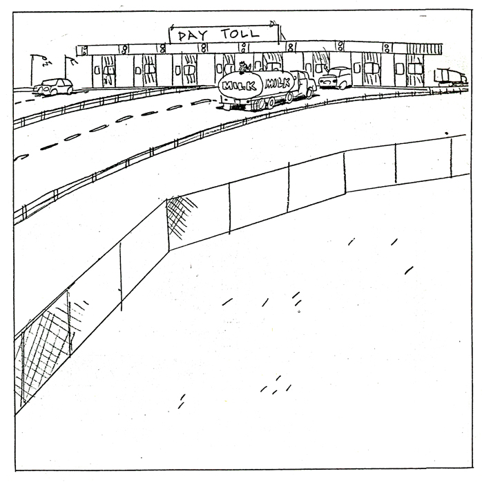 61
61
 62
62 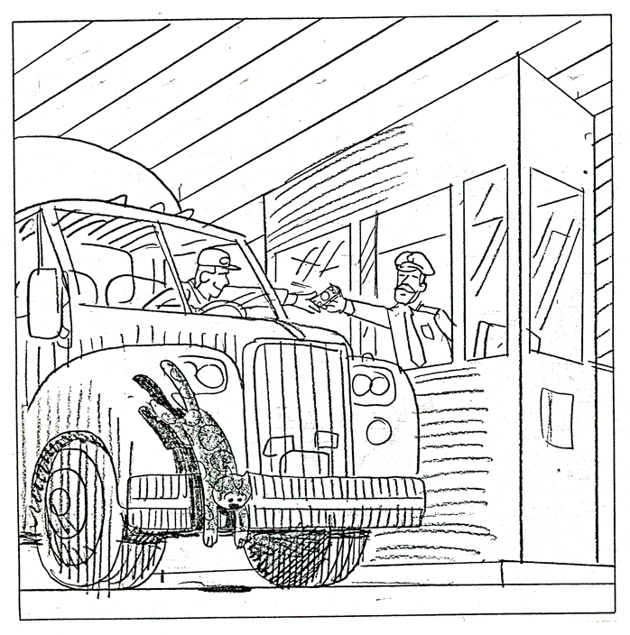 63
63
 64
64 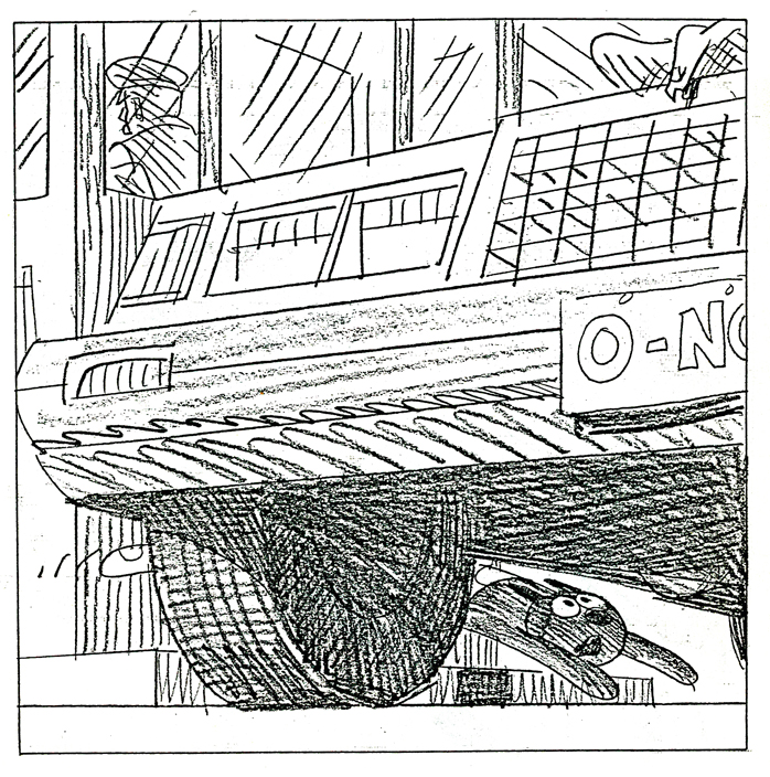 65
65
 66
66 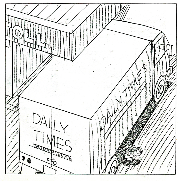 67
67
 68
68 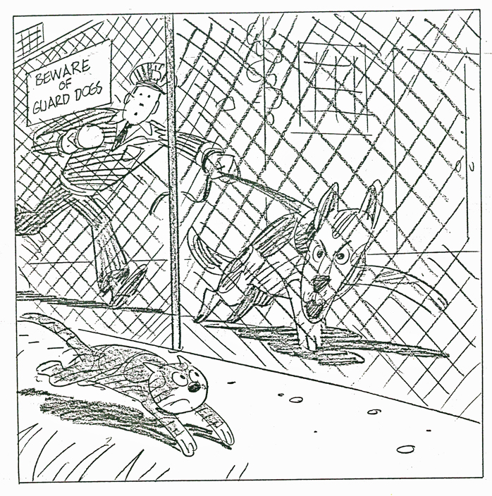 69
69
 70
70 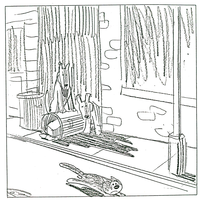 71
71
 72
72 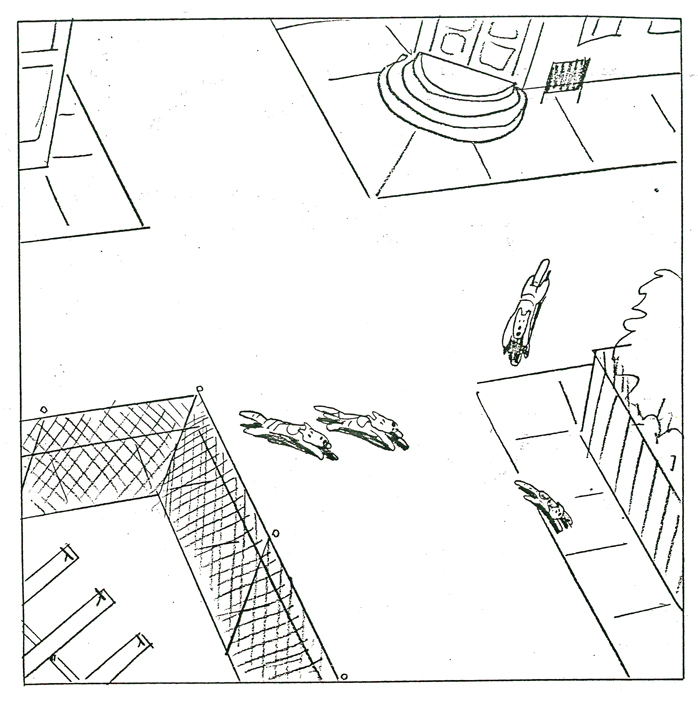 73
73
 74
74  75
75
 76
76  77
77
 78
78 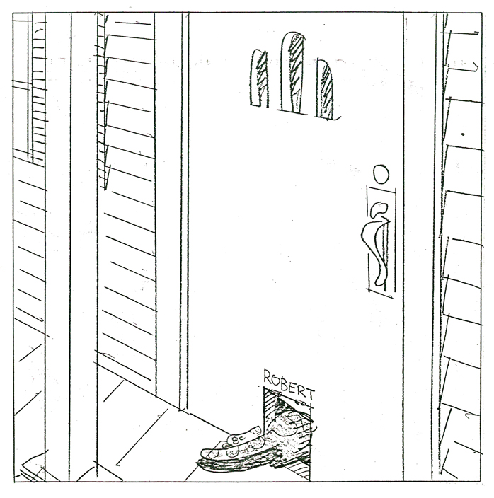 79
79
 80
80 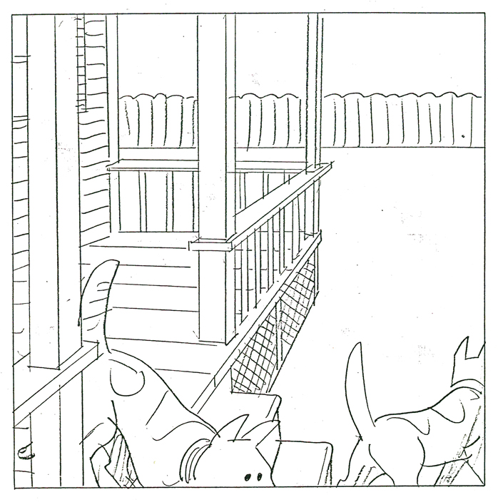 81
81
 82
82 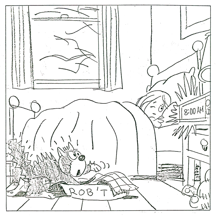 83
83
 84
84 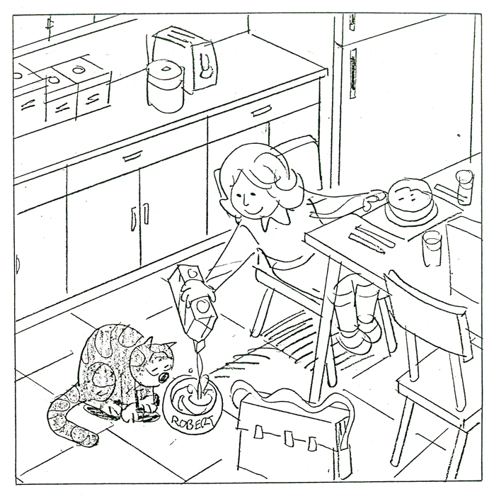 85
85
 86
86 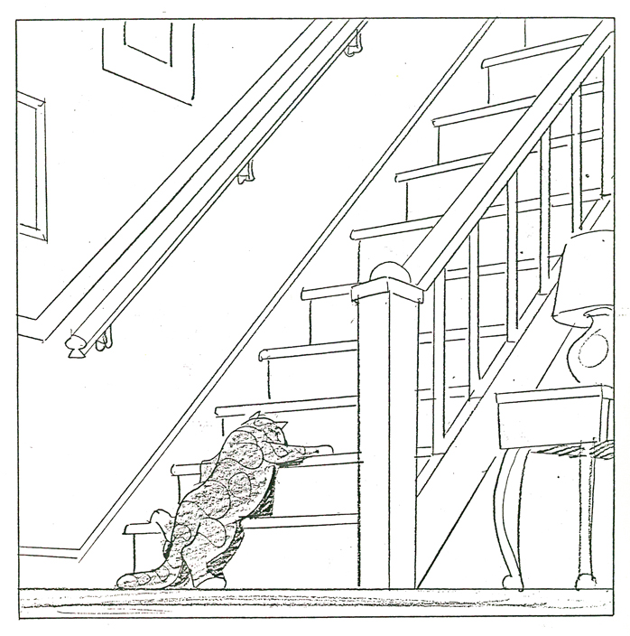 87
87
 88
88
And just to put everything in proper perspective, here’s a letter they received from Houghton Mifflin rejecting the book. He was Rowland B. Wilson, for god’s sake!
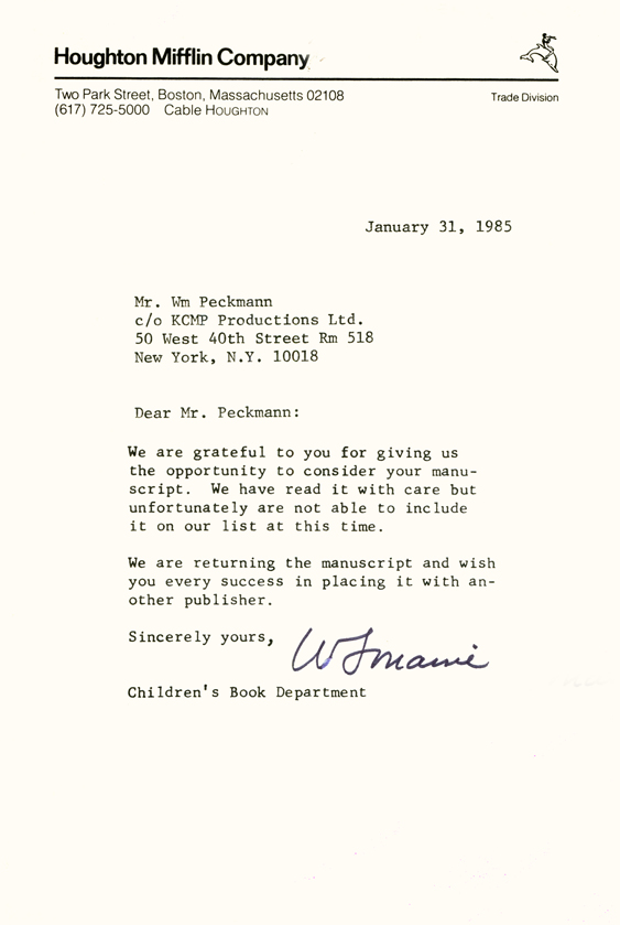
Bill Peckmann added this background info: “The rejection slip from
Houghton Mifflen really hurt the most because our thinking at the time
was that since they were publishing Bill Peet’s books (my all time
favorites), we thought they would understand the concept of “Robert”
better than anyone else. Go figure”
John Canemaker &Layout & Design &Models &Photos &Rowland B. Wilson 05 May 2013 05:55 am
More Raggedy Ann Photos – 2
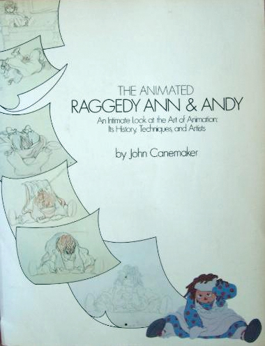 - Last week, I posted a stash of photos taken by John Canemaker for the book he wrote called, “The Animated Raggedy Ann and Andy.”
John Canemaker took all the photos, himself, which led to a more intimate look at an animated film. There were no photo decisions by committee; it was decided to use a photo if it told the story John was trying to relay. For that reason, the book really is one of the best “Art of . . .” type books on the market. (I’m not just saying that because there were photos of me in there – though that would be a good reason, too.)
The book was as exciting – in the making – as was the film. Too bad at the last minute the train of a film ran wildly off the tracks. In a way, I wish the book were written after the film was completed so that we could read the true story of what happened in those last six months of chaos.
The decision was slow in growing and fast when it finally fell, that the movie was enormously over budget. I was in on all the morning production meetings where managers and supervisors and directors would all meet. Those had started off nicely, at the beginning of the film, and went insanely wrong before long. There was the time when I was ordered to fire – that day – two inbetweeners. I was told that we had to give the staff a lesson that they had to work harder. (That might have been hard to do since everyone was giving it their all.) It so happened that one new inbetweener, on her first scene, ignored my instructions (and her immediate supervisor’s) by erasing all of Jack Schnerk‘s drawings. She felt she could animate the scene better, and she set out to prove that.
One down. The second person to fire was someone I was told (by Dick Williams, himself,) that I had to fire. It was obvious that there was a personality conflict since the guy was a great artist and definitely someone who should have stayed on. I was able to arrange for him to be switched to the BG department, thus fired by me from doing inbetweens and hired by them, in the same day, to do watercolors. He continues on, even today, working at a top position in design at Blue Sky. I don’t know about the woman, but I hope she gained a little humility that day 30-something years ago. That story didn’t make it into the book.
What there was in the production was a great first year of production where the art of animation was treated in its highest form. We were all out to make the greatest film of all time and bring it to the big screen. We had some of animation’s finest animators gathered to work on it. Assistants and Inbetweeners in New York were offered classes, after hours, which tried to teach animation to the new. With teachers like Tissa David and Art Babbitt and more experienced Assistants; a lot was conveyed. I was usually too busy to make it to many of these classes, but I always kept a close eye on what was taught. It really was fun and incredibly valuable to many of us.
At some point along the way, the LA studio was closed and key people from there came here. All of our space was overcrowded and uncomfortable. The Xeroxing in NY, a sweet grey line that took a while to construct, was replaced by a thick back line, when management sent work to Hanna-Barbera to outsource the xerography and some of the painting. Shadows were eliminated. Color copiers were rented. Scenes that had been animated in a non-photo blue pencil on 16 fld paper were being copied and reduced, at the same time, in B&W so that they could use 12 fld cels to color the art. A penny saved is a penny gained; I guess. This meant that a number of my inbetweeners were used to put 4 sets of crosses on the animation drawings so that there’d be some form of registration on the reduced artwork. Certainly the registration went all to hell in the process, thus allowing the latter half of the film to have a lot of slippage on the big screen. Lots of weaving animation in scenes that were rushed.
Emery Hawkins‘ amazing taffy pit took a big hit when it was animated more like a limited animation movie. All that beautiful rolling motion Emery had created on the cinemascope screen suddenly hits the wall and stasis sets in. The film was never going to be a classic of he silver screen, but it should have been a hell of a lot better.
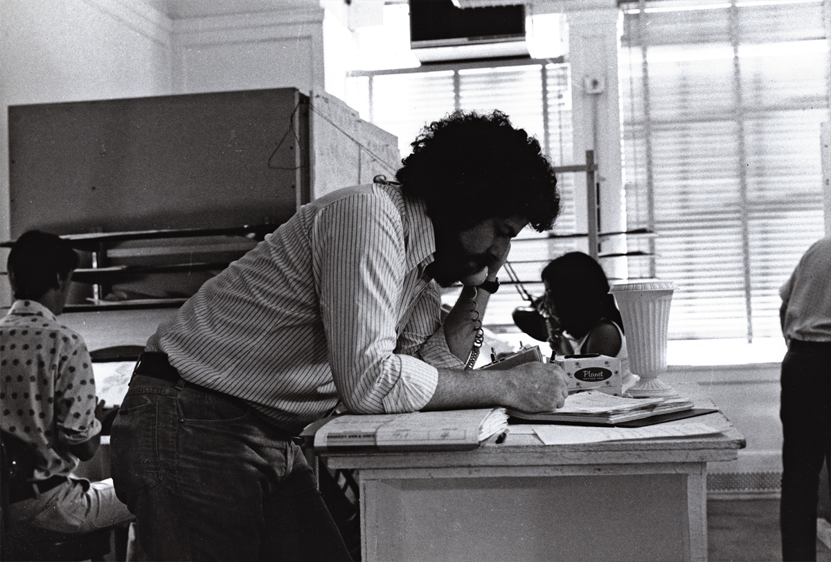 1
1Here I am doing what I did most of the day.
I talked on the phone. Ennervating stuff.
A young Kevin Petrilak is in the rear left. He was an inbetweener
in the Taffy Pit. Dan Haskett ran that group of people.
 2
2
Here’s Art Babbitt teaching. He loved doing that. Dick tried to
recreate the classes he’d had in London a couple of years earlier. We – all New York -
sure appreciated the two weeks of lessons. I have Dick’s notes from these sessions.
 3
3
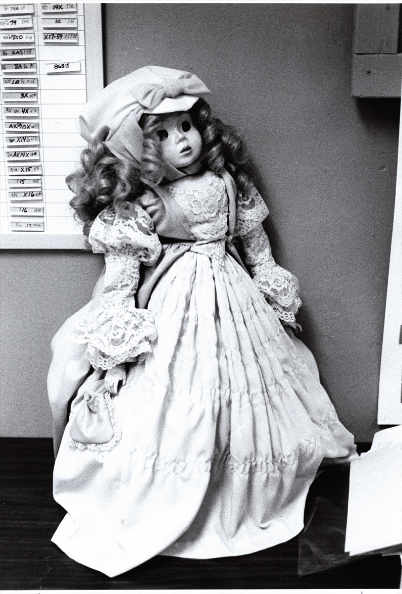
This is a beautiful doll. Babette. She was at the film’s center.
The Pirate kidnaps her and takes her to sea. Raggedy Ann & Andy
take off in pursuit of her to bring her back to the playroom.
 4
4
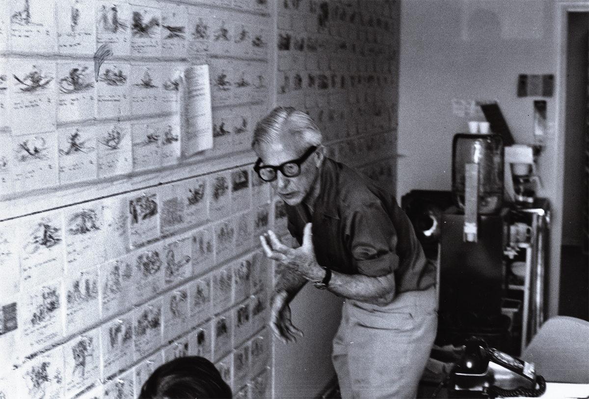
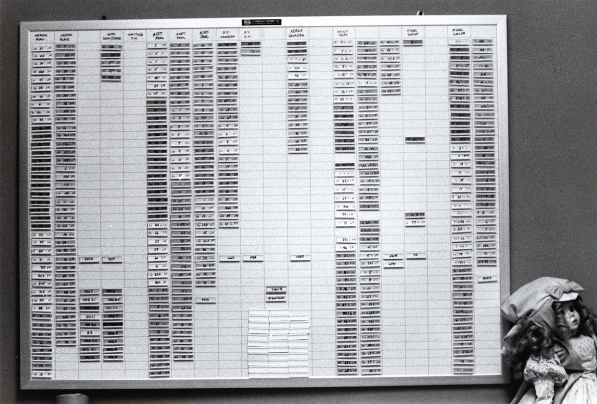
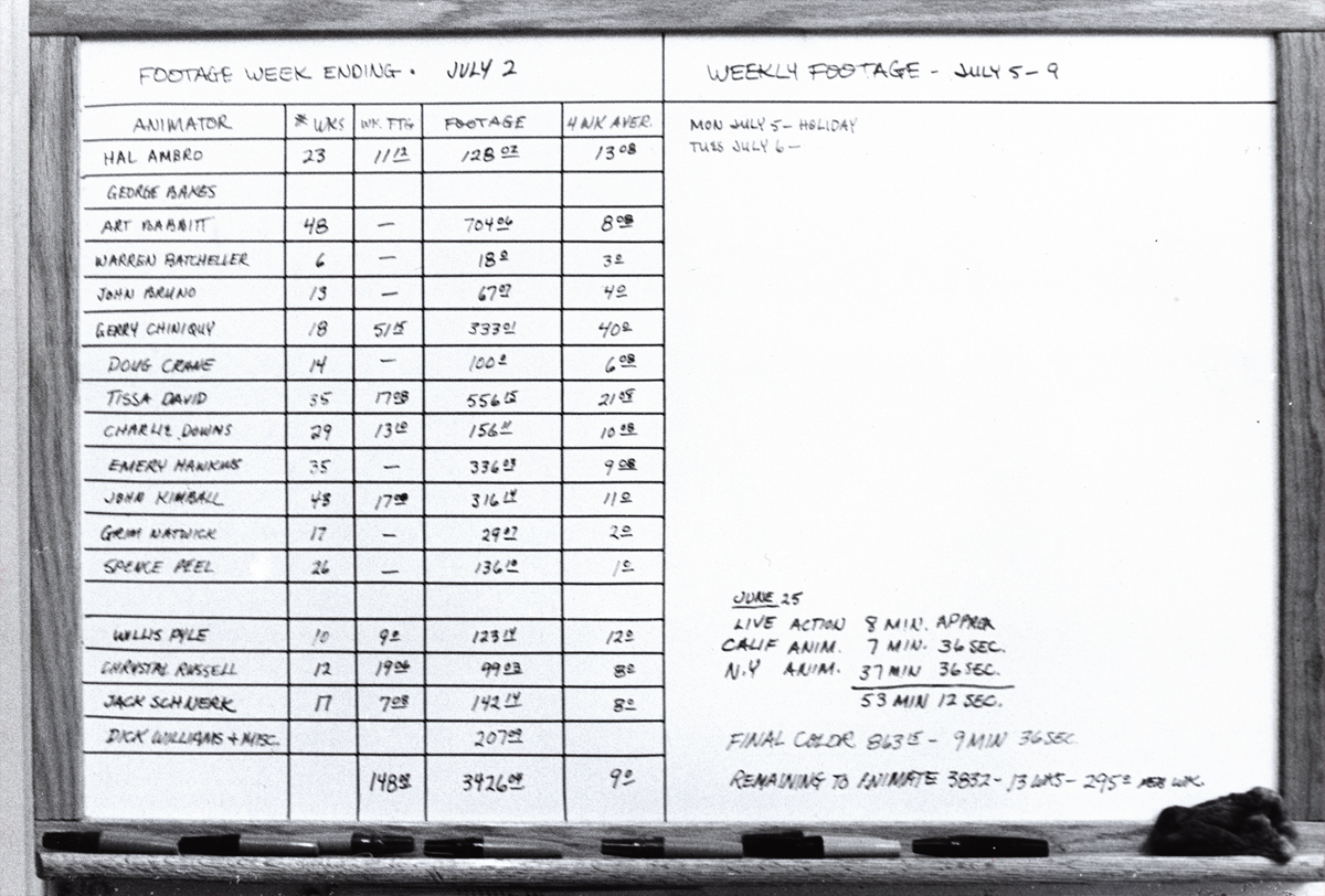
This is a wall of stats. It represents footage counts produced in
every department working on the film. This hung in Mike Sisson’s office.
He was the production manager who tried to usurp the entire production.
A couple of weeks before everything changed, managerially, on Raggedy, Sissons
approached Cosmo Anzilotti and me at lunch. He saw us at the restaurant and came
over to us. He wanted to lead a take over cutting Dick out of the film and
putting Cosmo in to finish directing the film. I’d be made Cosmo’s assistant.
I had no intentions of being another Iago, and said as much.
 5
5
This chart covered the animators footage counts. A running record.
I told Cosmo that Dick had brought me onto the film, and I’d do anything for
him. If it meant leading a large group to quit the show, I’d do that. Cosmo
seemed relieved. He wanted to do the same and we both told Sissons how we
felt. He greeted our news with an ass’ smile and thanked us. We were no
longer on the winners’ side, and I watched closely to know when to exit.
 6
6
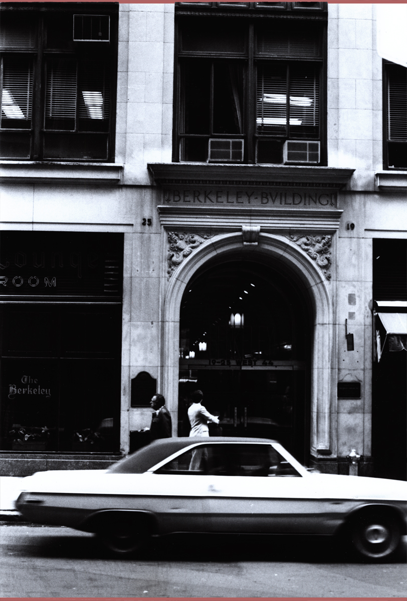
This was where the NY headquarters were planted. In the middle of 45th Street.
Most studios in the forties and fifties had places on 45th Street. Paramount,
Hal Seeger’s studio, lots of other smaller studios such as Pablo Ferro or Ray Seti’s.
 7
7
Didi Conn was the actress who voice Raggedy Ann. When the VOs were coming
to an end, Didi worked late and her mother was with her. They needed help
getting home (Long Island.) The mother was afraid to drive. I volunteered
and drove them home. I took the Long Island Rail Road back to the City.
 8
8
This is Sue Butterworth with Dick Williams. She was the watercolorist who
led the BG department and designed the wc style of the film. I thought her
work a bit inconsistent and often lacked the dynamic look good BGs require.
 9
9
Here’s a picture of Dick Williams with his daughter,Claire.
Claire played the part of Marcella, the little girl at the film’s start.
They shot the live action in Boonton, NJ during the first days of the
production. All those hours they were out filming, I watched the shop.
Alone in an enormous darkened most of the time in the enormous office,
I could only spend time reading and rereading the script and sketching
my idea of some of the characters.Infrequently, the financial manager
of Lester Osterman Prods., the production company, would pass through.
 10
10
George Bakes was a fiercely independent animator who worked a short
while on the film. He must have started at Disney on Sleeping Beauty. He’d often
show a lot of Milt Kahl drawings he’d had from that film.
 11
11
Baskes animated many of the cereal commercials of the day -
Trix, Honey Bee, Sugar Crisp bear, etc. For Raggedy he did the “gazooks.”
 12
12
Gerry Chniquy was a brilliant animator straight out of WB.
He’d done a lot of Yosemite Sam animation for Friz Freleng.
It wasn’t far to go to cast him as the blowhard of a King, King Coo Coo.
Marty Brill voiced the character. Gerry Chiniquy,of course, did a fine job,
 13
13
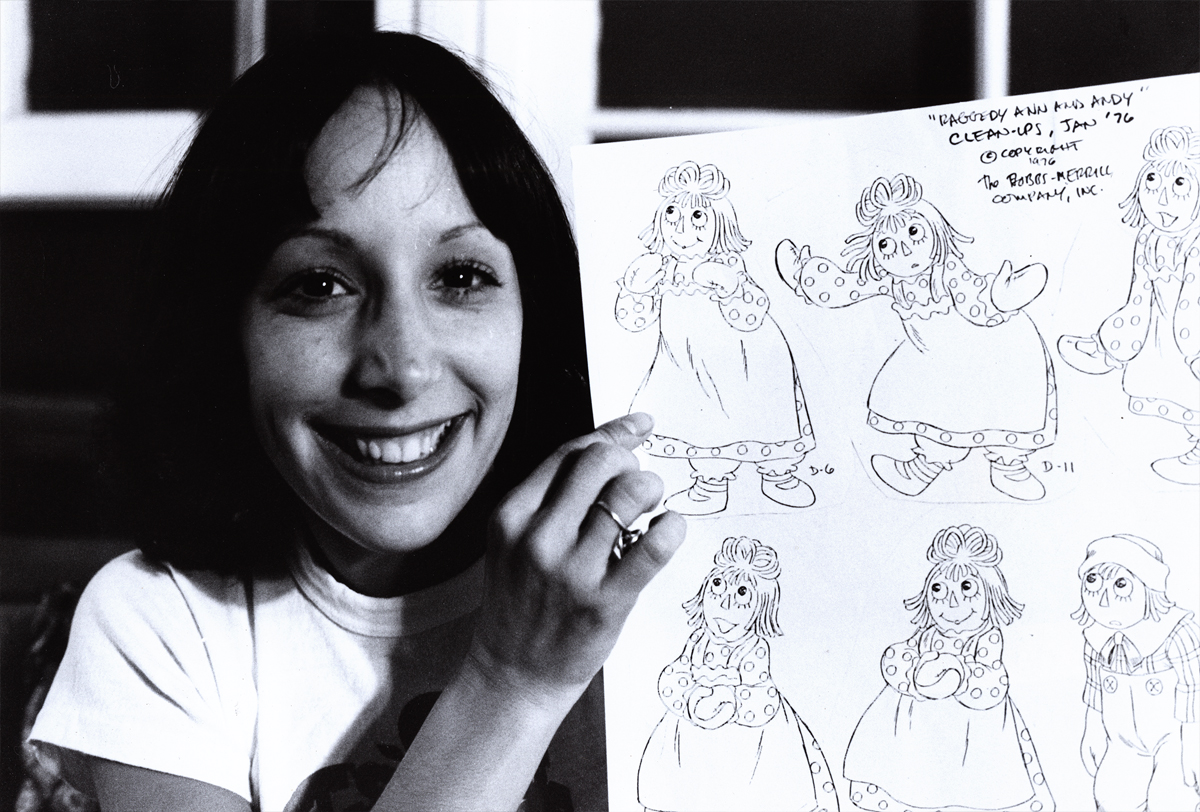
John Celestri had a style all his own although he idolized Bill Tytla.
Not a bad person to pick for a role model. John was an Assistant on
the film. Here he’s working with inbetweener, Amanda Wilson. Amanda was
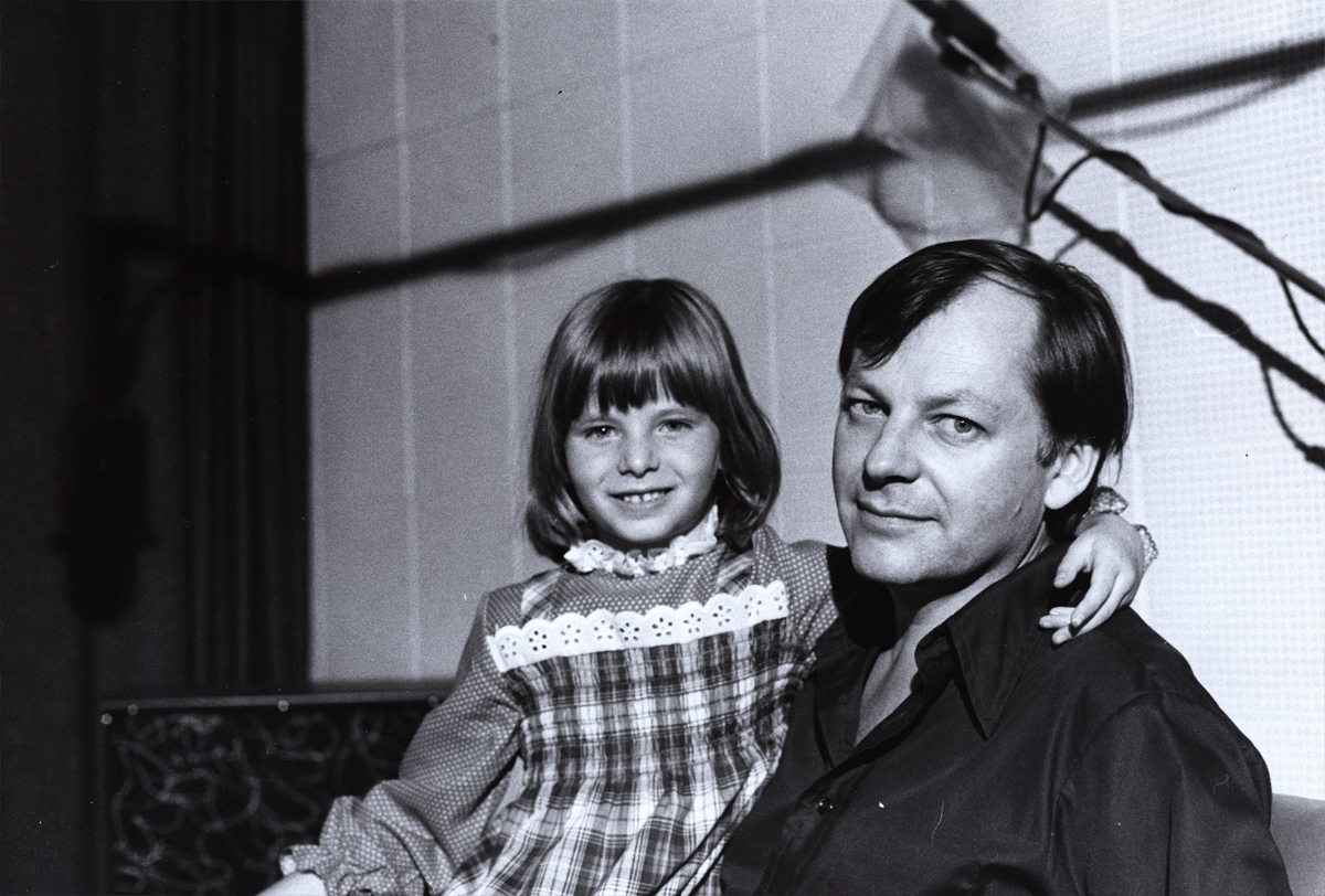
the daughter of the great cartoonist and animation designer, Rowland Wilson.
The last of these photos will come next week. Many thanks to John Canemaker for the loan of the images. Any opinions tossed about here, are all mine and John is not to blame for them.
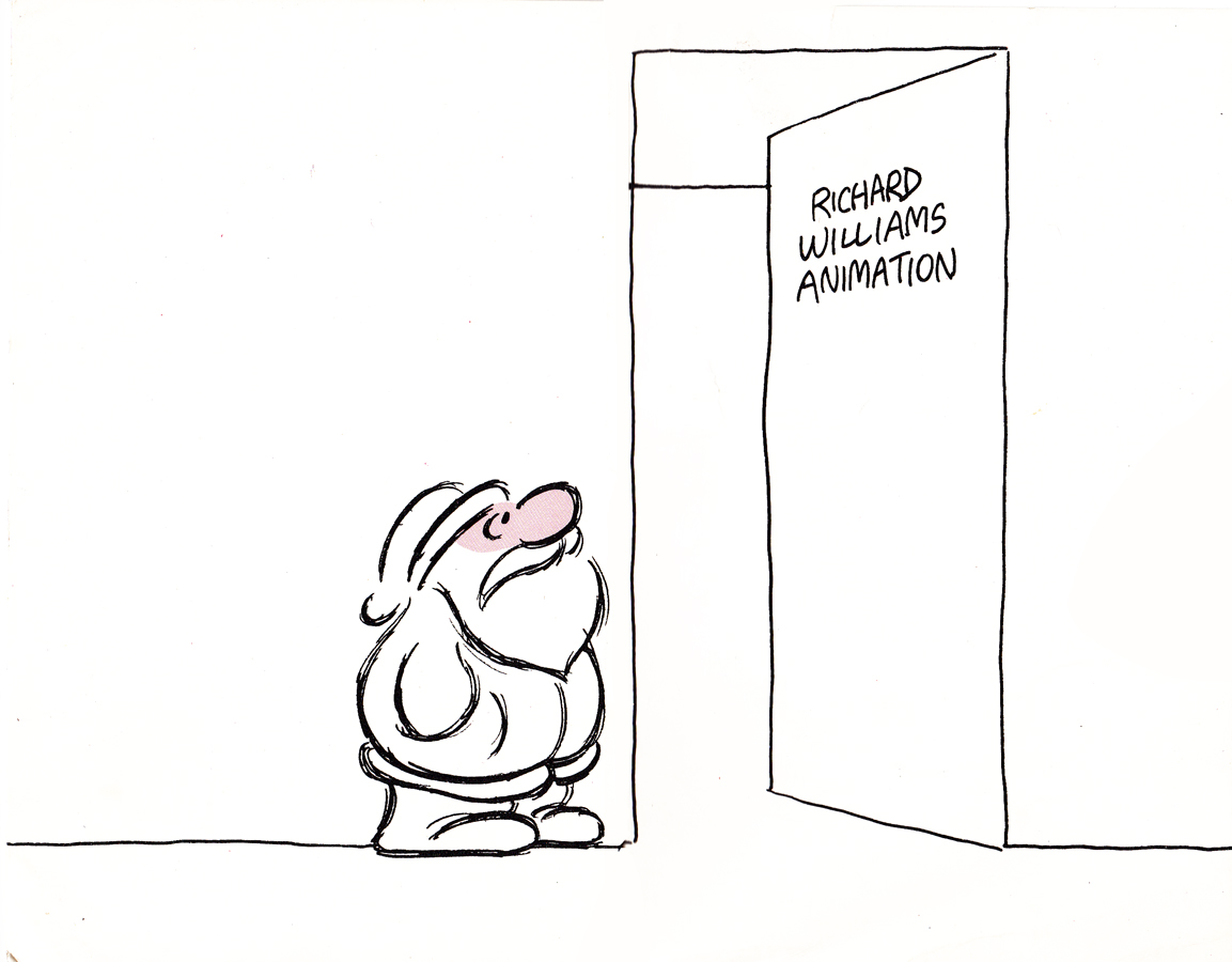
commercial animation &Errol Le Cain &Illustration &Independent Animation &repeated posts &Richard Williams &Rowland B. Wilson &Tissa David 10 Apr 2013 05:55 am
Dick’s Christmas
Richard Williams, when he had his own studio, was known for doing everything in a LARGE way. All of the commercials, title sequences, shorts were all done with a large, elaborate vision.
The Charge of the Light Brigade was a collection of 19th century graphics that are completely wrong, stylistically, for animating. All those cross-hatched lines. God bless the artists that pulled that off. The same was true for The Christmas Carol.
If the rendering style wasn’t impossibly difficult, then the animation was complex. Think of any of the scenes from Dick’s dream-feature, The Thief and the Cobbler. The many scenes where backgrounds were animated, with those backgrounds complete with complicated floor patterns or an entire city to be animated. Raggedy Ann was covered in polka dots and Andy was clothed in plaids. Both of the characters had twine for hair with every strand delineated. The commercial for Jovan featured a picture-perfect imitation of a Frank Frazetta illustration. Even the mountain on the background had to be animated and rendered.
Well, when it came to Christmas cards, Richard Williams was the same. Enormous and beautiful cards were printed and signed by anyone who knew the recipient of the card. You were lucky being on the receiving line for these stunning cards. Tissa David once gave me a number of these cards. I held onto my copies of the cards until my space was flooded and the cards were damaged. I thought I’d post a few.
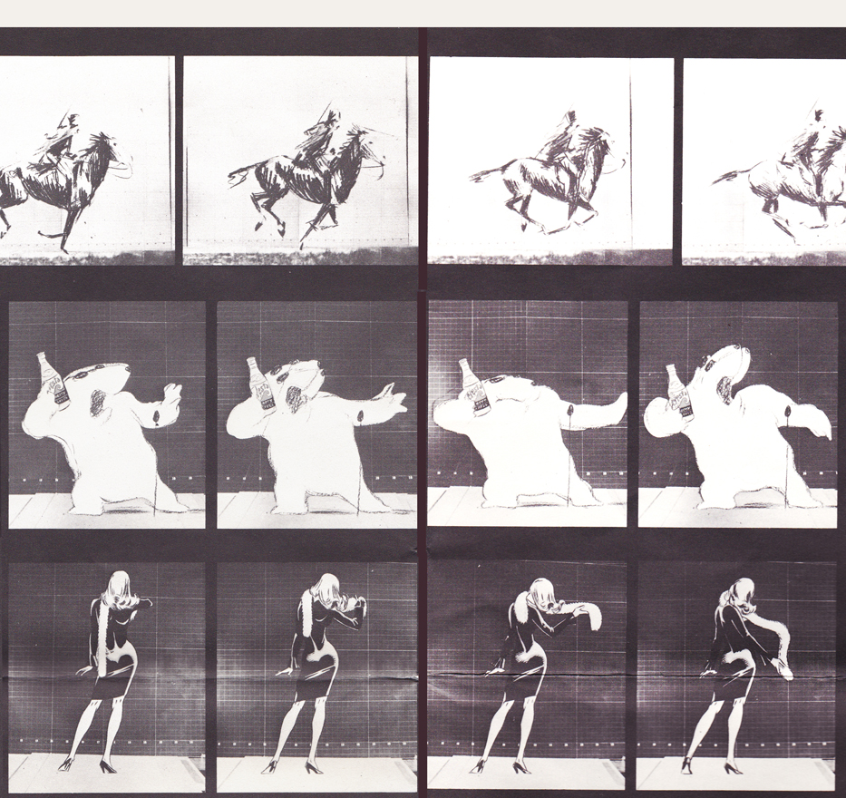
With card #1, a take-off of Muybridge with frame grabs from several of the better Williams commercial spots from that year, capped off by a number of key staff personnel positioned to continue the Muybridge motif.
(Here, I first post the entire card, followed by a break up of the card into sections
so you can more ably see the details.)
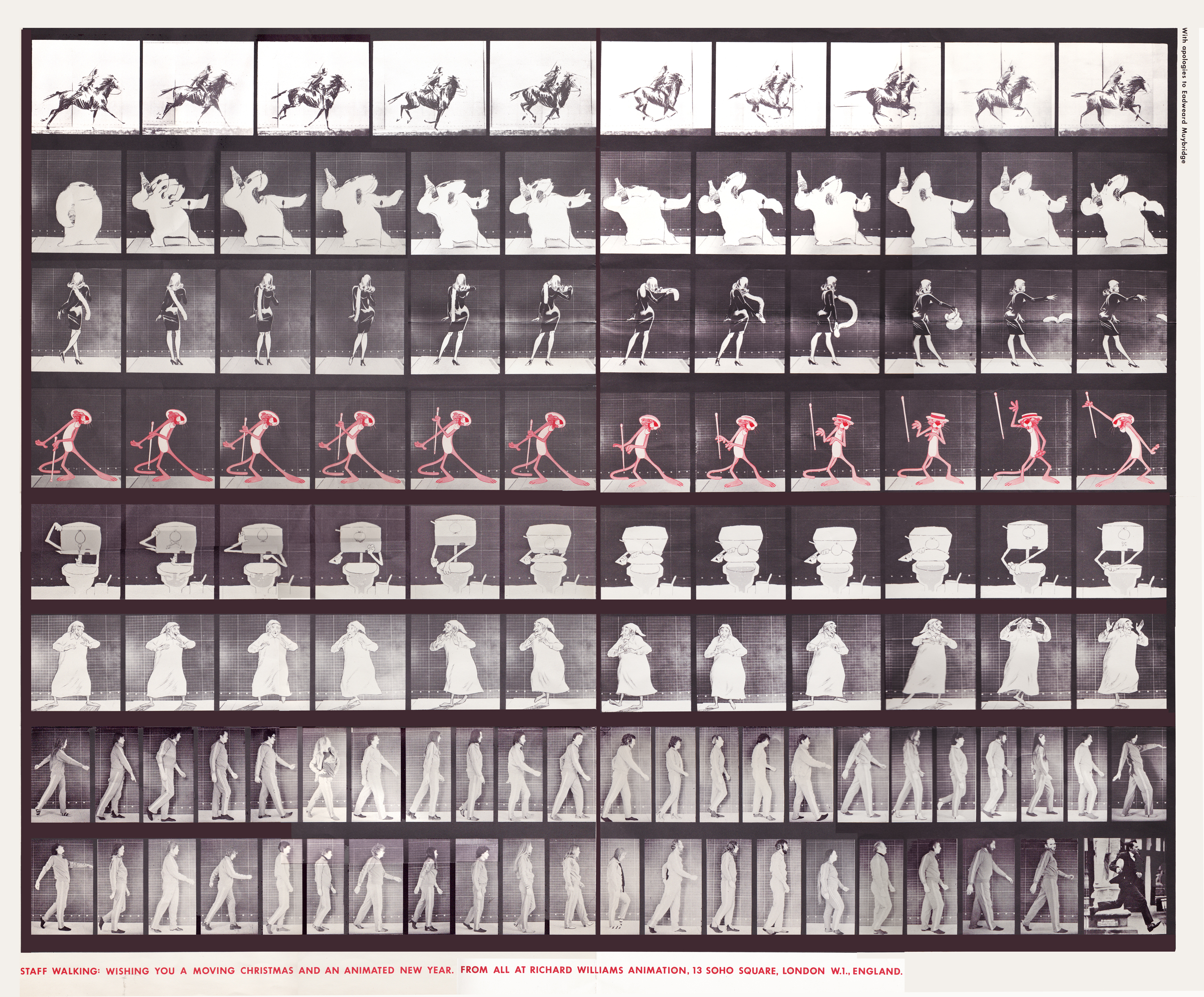
The entire card.
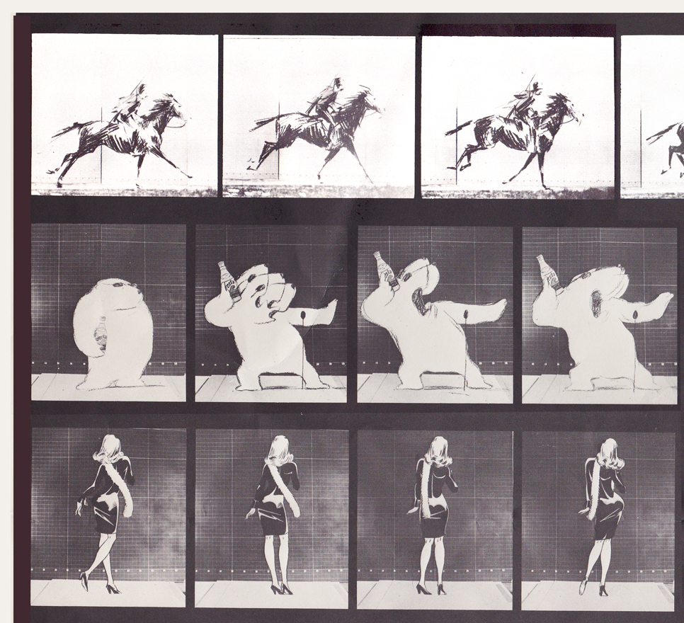
Top rows left side / Row 1: Pushkin Vodka ad
Row 2: Cresta Bear ad / Row 3. Tic Tac ad
Top rows center
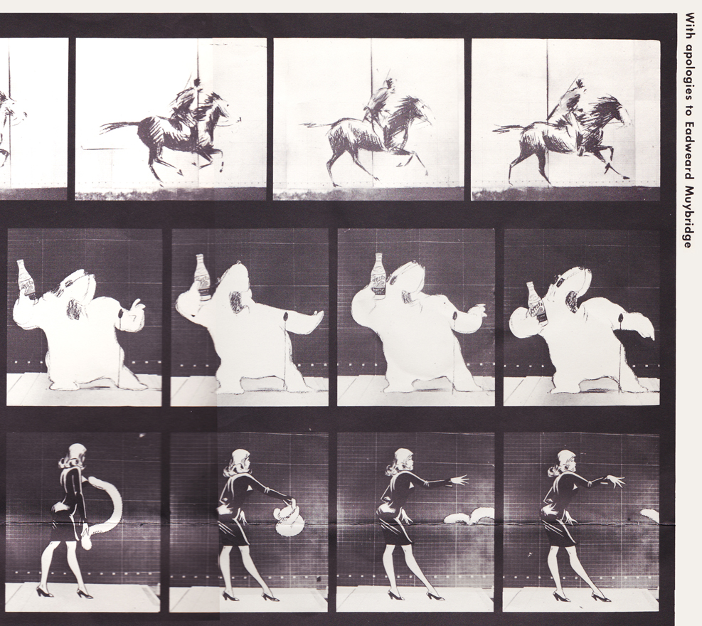
top rows right side
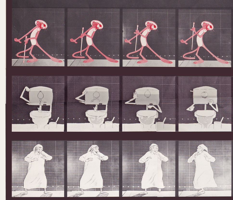
Middle rows left side / top row: Pink Panther titles
Middle row: Bloo toilet cleanser ad / Bot row: The Christmas Carol
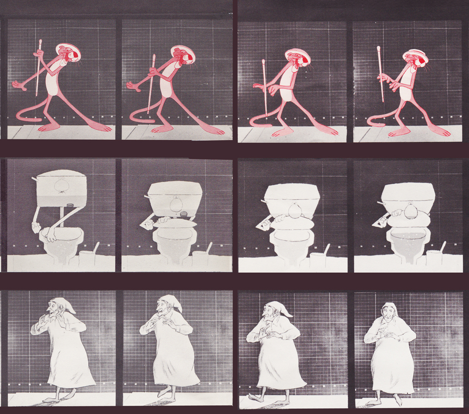
Middle rows center
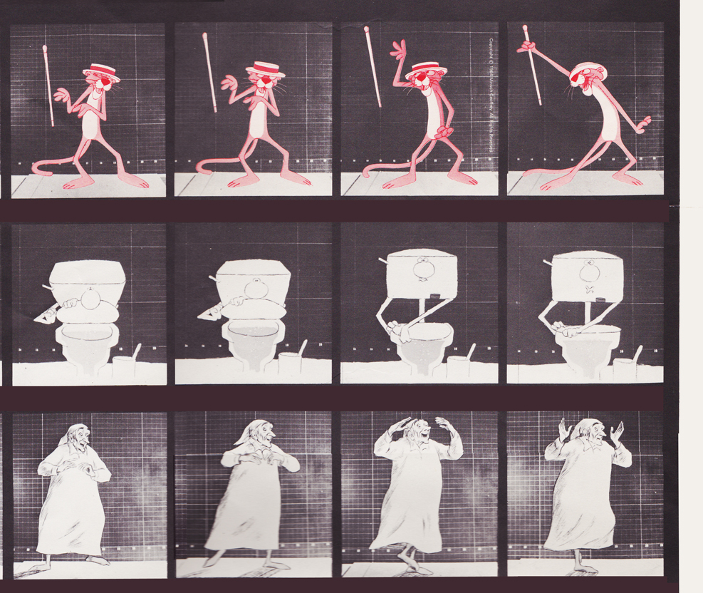
Middle rows right side
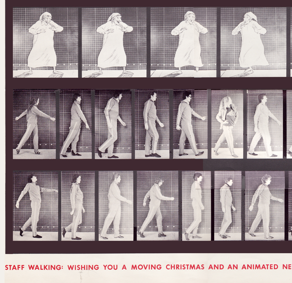
Bottom rows left side / top row: The Christmas Carol (repeated)
Middle row: staff / bottom row: more staff
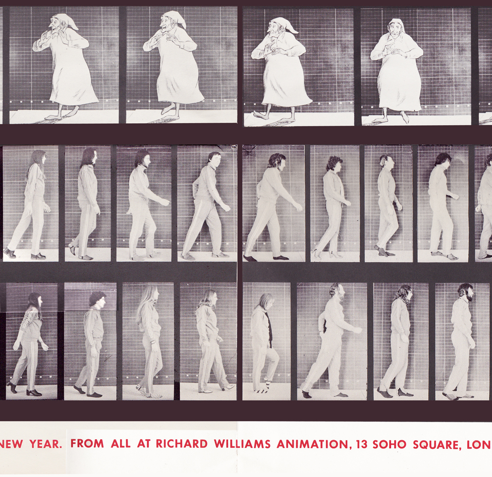
Bottom rows center
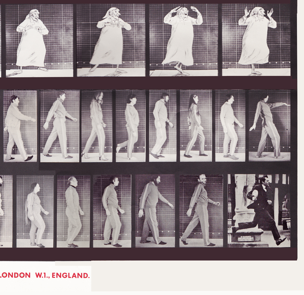
Bottom rows right side
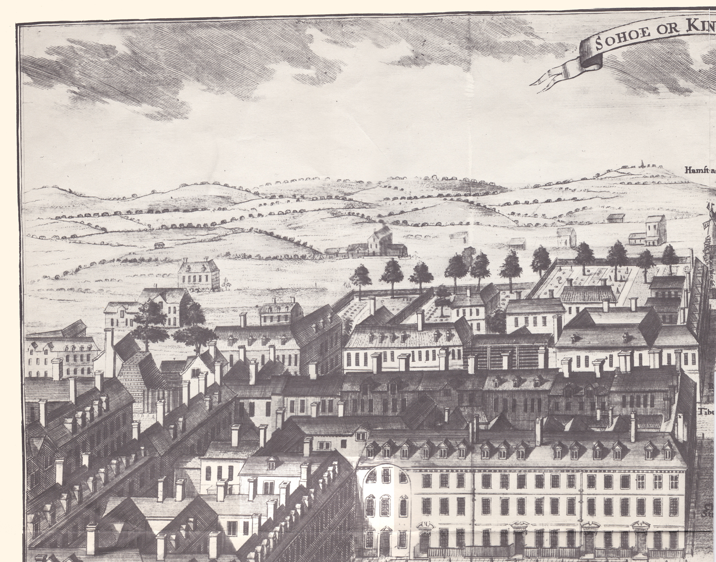
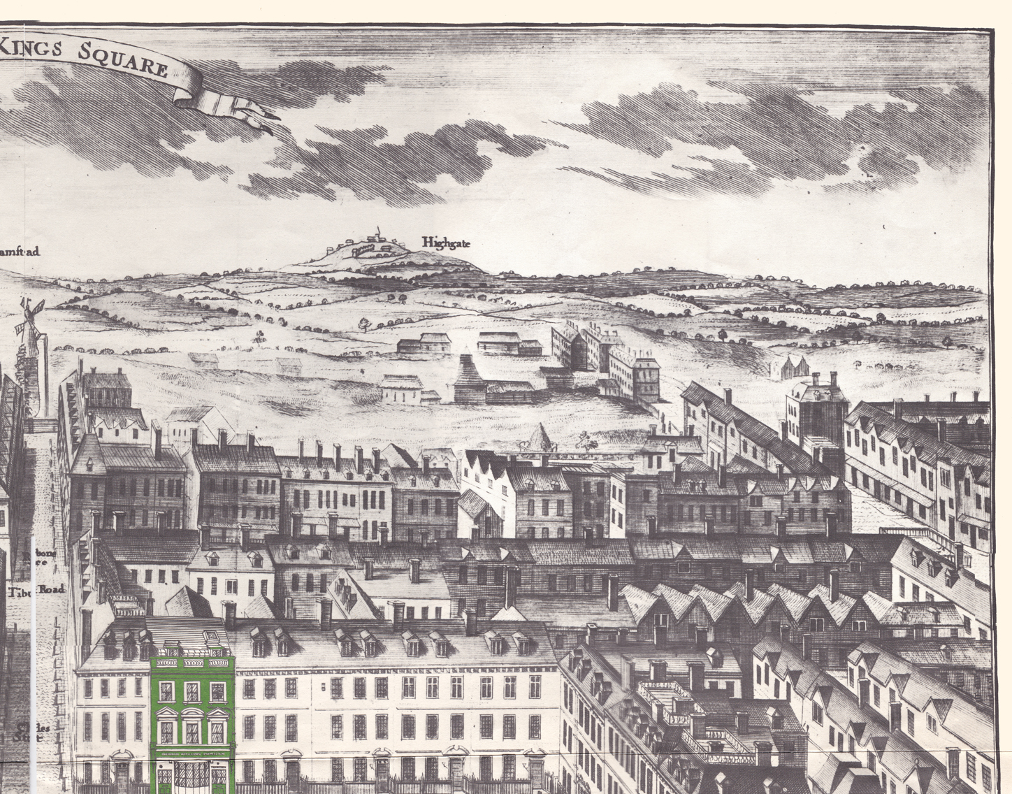
With card #2 we see Soho Square. The green front door
marks the location of Dick’s studio at 13 Soho Square.
(As with the first card, I posted the entire Christmas card,
followed by a sectional divide so you can enjoy the details.)
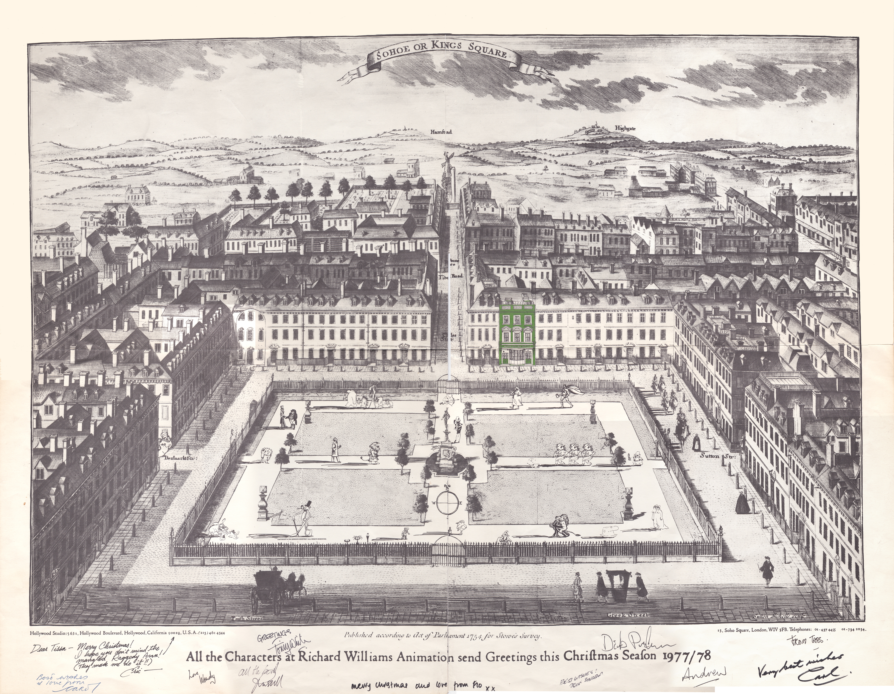
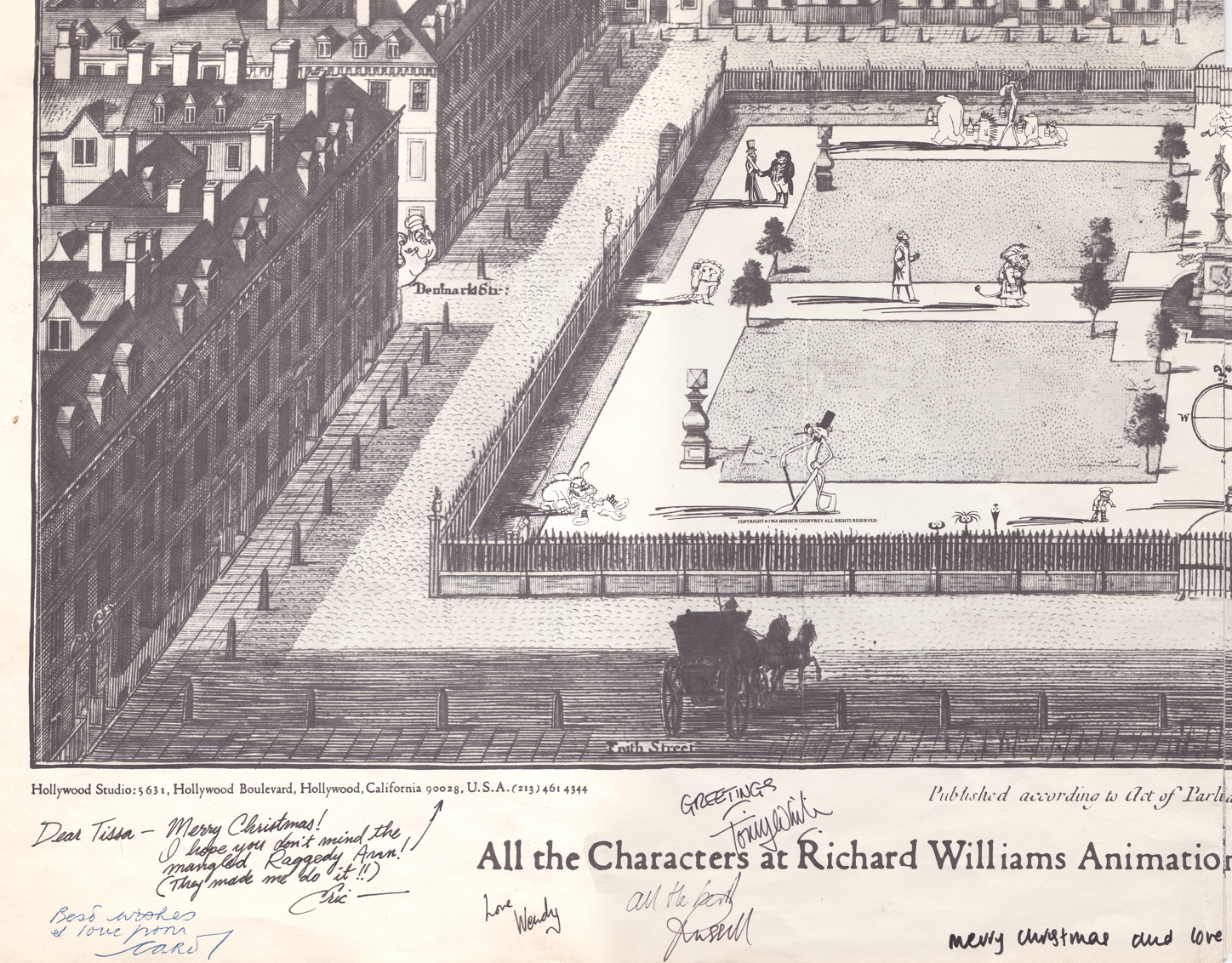
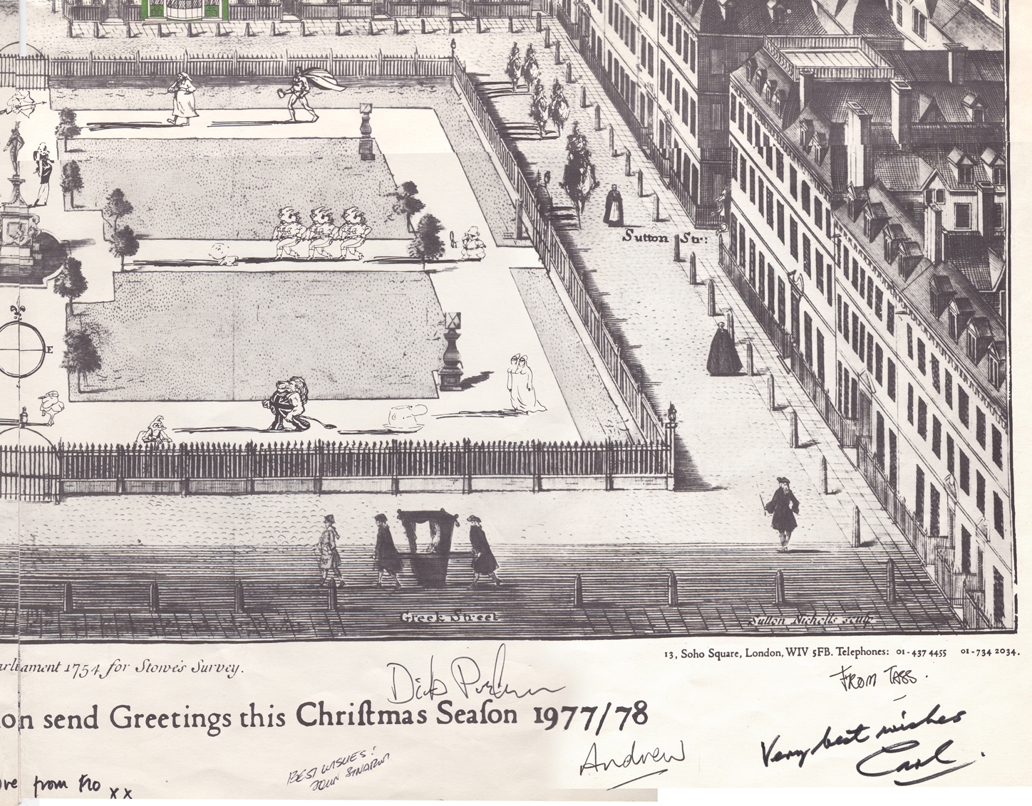
This is a folding card.
It comes folded so that you see the far left of the card
revealing part of the far right.
The card comes folded like this.
The left side (Santa up to doorway) is on the left side of the card.
The right side, on bottom, reveals the empty office.
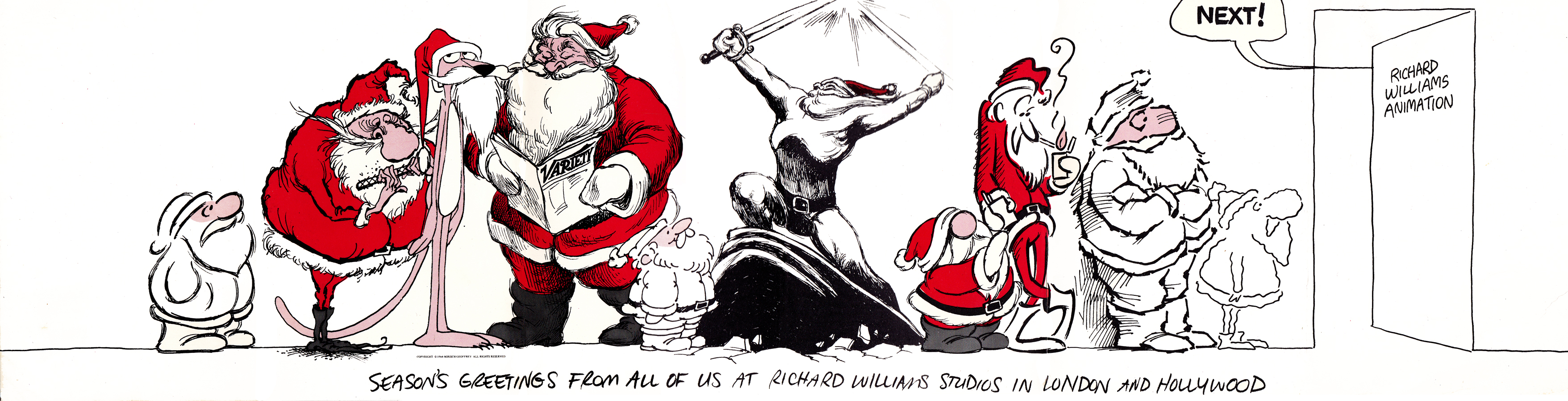
It unfolds to reveal this long line of Santas.
Each Santa is in the style of the many illustrators’ styles
of those who designed ads for the studio in the prior year.
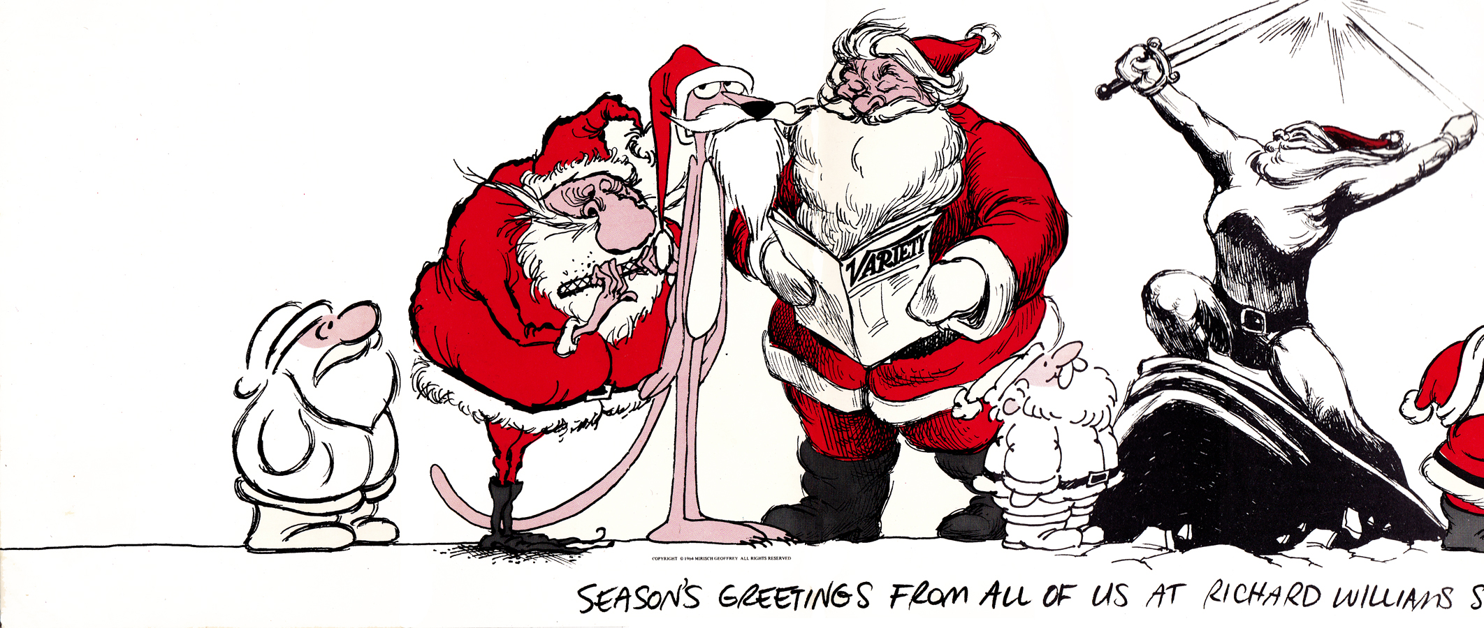
This is a closer view of the left side of the card.
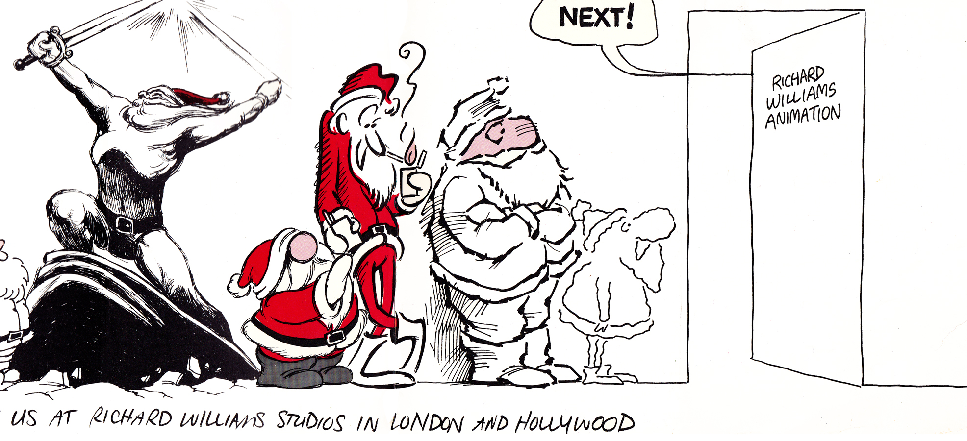
This is a closer view of the right side of the card.
Suzanne Wilson sent in a Pink Panther Chistmas card; it was drawn by her late husband Rowland Wilson:
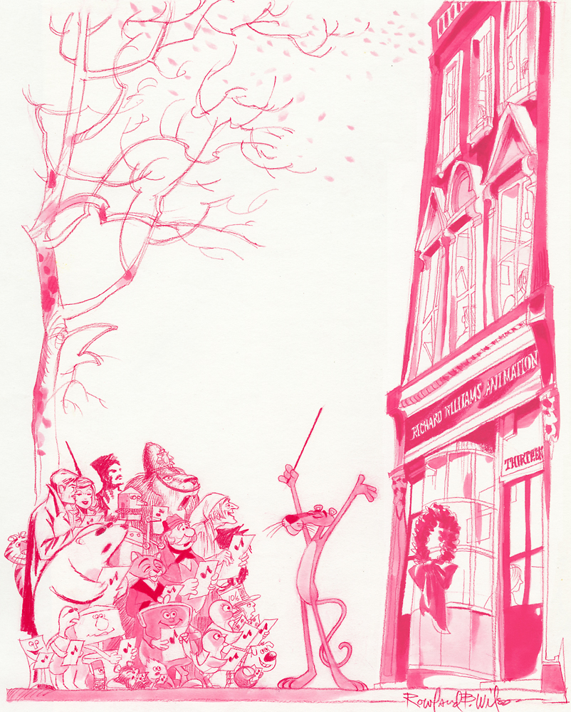
Below is a close up of that same card.
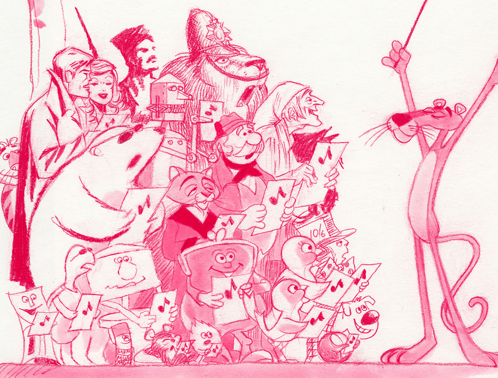
And this is the final card:
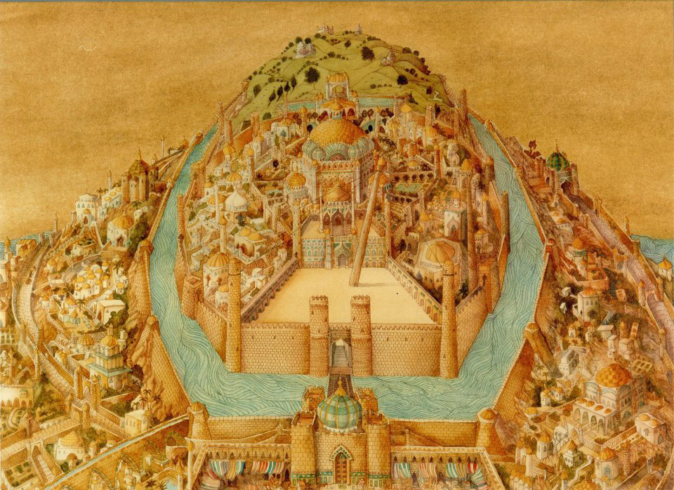
Here’s another full card.
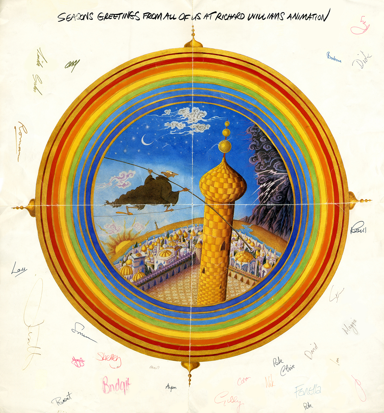
This one is designed after the McGuffin of Dick’s feature,
three golden balls over the city.
from The Thief and the Cobbler.
Commentary 02 Mar 2013 05:15 am
Shows
- I was asked by Kevin Schreck to introduce, on Thursday at the 92Y Tribeca; it was the second of two evenings celebrating the work of Richard Williams. The three day program was timed to celebrate Dick’s 80th birthday. On March 19th he becomes an octogenarian.
Kevin is the film maker who has produced and directed a documentary about the history of Dick’s magnum opus, The Thief and the Cobbler. Kevin’s documentary, called Persistence of Vision, was unveiled on Friday night.
 AS I said, I introduced Thursday’s program (commercials, movie title sequences and the short, The Little Island) with a short telling of how I first heard of Dick Williams, then came to meet him, work for him, befriend him and, finally, sit at a distance from him. Dick’s one of the more interesting personalities I’ve met in my life. He’s one of those few characters you get to know who lights up a room whenever he walks in. Energy just overflows the room, and everyone is happier for their presence. In all my years I’ve known possibly three people who filled this description, and it always was enriching for me. Bedazzling.
 The program included a number of sample reels from Dick’s Soho Square studio. Mostly humorous commercials, all excellently animated. I wish there had been some of the earlier ones mixed in; the Pushkin Vodka commercial shown was not the one I think of as genius; it was the 2nd of two spots they did. The original 2 minute spot was everywhere back in the 70′s; now you can’t see it. The film that was shown is well done but doesn’t soar like the original. Both were designed and animated by Rowland B. Wilson and Russell Hall; they did a bang up job on it. Several of the commercials animated by Eric Goldberg were among those screened; naturally they were funny pieces. There was the cat who uses 8 lives trying to get his hands on a beer product (can’t remember the brand). There was the baby, animated by Russell Hall, and his Q-tips commercial; done in a thick/thin line with watercolor. These are brilliant when compared to today’s live action babies speaking for E-trade.
 The spots turned into the title sequences for Charge of the Light Brigade. The print for this was significantly better than that of the commercials. This was followed by other title sequences including What’s New Pussycat?, and Return of the Pink Panther. No Murder on the Orient Express newspaper sequences with the glorious music by Richard Rodney Bennett; no Prudence and the Pill. I’ve always had a small problem with Williams’ work on title sequences. It’s hard to read the titles/credits on display. That’s the purpose of the job, and yet the type is always at war with what’s behind it. It’s all beautifully, no . . . brilliantly done. Except for that legibility problem.
This show ended with the half hour long The Little Island. A very good print, this was the short Dick did virtually by himself with the help of Tristram Cary‘s strong musical score. The film is at least twice the length it should be, and feels somewhat dated. However, one can understand its success when it was originally screened at the early animation Festivals where it won many awards and brought Dick Williams some fame.
 Then last night we saw Kevin Schreck‘s documentary, Persistence of Vision. This was the story behind Dick’s feature, The Thief and the Cobbler. A 70 minute tour back through more than a decade’s worth of history on the making of an animated feature that never really was completed. Some patches and staples were added at the end so it could be released in the most shameful way possible, but that’s the way Dick’s “master piece” ended up.
Not all of the footage in the documentary was of the best quality. Some of the shots were a bit on the dark side. The information passed on was wholly there, though. Very good. The film gives us interviews with a number of truly fine artists. Roman Modiano, Richard Brett, Greg Duffell, Julianna Franchetti all spoke with Schreck’s camera about their history and involvement with Williams feature. They paint a relatively positive pickture of Dick Williams, though somehow bits of his blustery side come across clearly.
The film only barely touches on Omar Ali-Shah‘s financial games on Dick’s studio. He cooked the books, and didn’t do a very good job of it. Everyone was aware of his discrepencies. A hurtful separation with the Idres Shah (Omar’s brother) who wrote the book on Nasrudin which Dick had illustrated and was now animating as an animated feature. They left with any permission to do a feature starring their character. Dick had to completely overhaul his animated feature and rework the script as well as most of the completed animation. A setback.
The Thief and the Cobbler emerged, and Dick worked his tail off, destroying several marriages in the way of his work. He worked through The Christmas Carol, Raggedy Ann, Ziggy and Roger Rabbit all in pursuit of financial stability. He finally got the budget he asked for to produce The Thief, and sure enough, it wasn’t sufficient. Dick ran out of money without completing the movie, and the insurance company, the Completion Bond Co, was forced to step in and take possession of Dick’s movie, which now belonged to the Completion Bond Co. They hired 2nd rate all the way to rework the film, trying to make what they felt would be a success out of it. A friend who was a final checker on the movie, had to visit the morgue for drawings that could be reused. She came upon a mass of broken and crushed boxes with artwork spilling out covering the warehouse’s entire cemnt floor. This was the artwork that took many hours to color since its rendering was so delicately done in England.
 That, to me, was the sad ending. Tissa David had worked for more than a year animating the twin sisters, Yum Yum and her twin sister, Mee Mee. Tissa was left behind, and Dick cut Mee Mee from the film, reworking some of Tissa’s animation. I sat next to Tissa watching the Fred Calvert version of the film; I was aghast. Tissa was quietly sad as if a friend had died. It was a bit reminiscent of our watching Watership Down together after Hubley had been fired and had died of heart complications. We both cried during the “Bright Eyes” sequence of that film. Watchya gonna do?
Kevin Schreck captured the feeling of that film -The Thief and the Cobbler, I mean -in all its disappointment. He’s a young film maker, and seems to have caught Dick Williams in this documentary. That’s plenty.
Ursus
Signe Baumane shared this film with me yesterday; a friend of hers in Latvia. had sent it to her, and she wanted to see what I thought. The film went to Clermont Ferrand and 70 other festivals. It’s a real beauty and I couldn’t help but share it with you. I hope you enjoy it as much as I did.
Crood History
 Jim Hill has a piece in The Huffington Post about The Croods talking about its history – when it was to be done by Aardman and was co-authored by John Cleese. How and why it’s changed is revealed in this article.
Though in one sweeping sentence Hill says, “… Aardman Animations stepped away from its five-picture deal with DreamWorks Animation.” I question whether that’s what happened and if it can be so casually dismissed for the purpose of this puff piece. But it’s Jim Hill, so we’ll not get a full story.
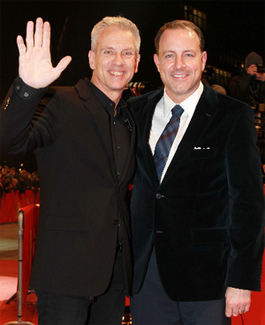
Pictured to the right The Croods directors, Chris Sanders and Kirk DeMicco.
Speaking of Dreamworks, they are performing a “crood” measure. They’ve promised to lay off some 350 of their 2200 employees by the end of the year. I doubt this has anything to do with what is happening in Washington, but certainly that isn’t helping. Perhaps Katzenberg can help get some of the idiots in congress to “lose their jobs” by 2014. Maybe that’d help our economy. This news of the layoffs came from a Hollywood Reporter story and really has all to do with the poor performance of The Rise of the Guardians.
Commentary 05 Dec 2012 07:00 am
December 5th
- Yes, today is Walt Disney‘s birthday anniversary. He would have been 111 years old. It’s also the anniversary of this Splog. It’s seven years old today; my 2,552nd post. They’ve gotten a lot longer than the initial posts. They’ve also gotten more verbal rather than visual, though my attempt is always to keep it visual. I like putting up pictures, especially if the pictures are ones you see so infrequently.
Yesterday, was a first. I had prepared a review of the new McKimson book, I Say, I Say . . . Son!; I’d spent a hell of a lot of time putting it together. And I was supposed to post it yesterday morning. But I forgot. I never put it up. It’ll be posted tomorrow, but I can’t get over the fact that I’d forgotten to send it out there. Mark Mayerson caught it. This was the first time that I did that, and he checked in to make sure I was OK. Maybe I am, maybe not. Could be Alzheimer’s, could be I just forgot it. I have had some time with that review, and a lot of stuff has gotten in the way with it. I’ll be curious to hear any of your comments on it.
Over those past seven years, there are some posts that I’ve been particularly proud of having run and others that were just filler. It’s interesting how I get pleasure from some posts that you might not expect.
I certainly like posting things that one rarely sees on the internet and enjoy putting out material that every animator should own.
 For example, I like putting up storyboard images such as these from Pinocchio: this was composed of photos from animation pencil tests from Pinocchio. Bill Peckmann and John Canemaker contributed.
Some of the actual board was here. The coachman’s ride.
I also enjoyed posting the board from Mr. Toad’s Ride, excerpted from The Wind in the Willows.
Or there was Dumbo takes a bath here.
There was also all the material from The Sword in the Stone as I posted not only the board from mad Madame Mim’s section of that feature, but I included some great artwork by Bill Peet from that film.
I also liked the walk cycles from 101 Dalmatians, here.
I’ve written often enough about his work for you to know that I’m quite a fan of Yurij Norshtein.
 There were the chapters from that wonderful little book about Yurij Norshtein:
Norshtein Comics – 1
Norshtein Comics – 2
Norshtein Comics – 3
Norshtein Comics – 4
Norshtein Comics – 5
Norshtein Comics – 6
As a matter of fact, there were a whole string of posts I did about Norshtein when I was reading Claire Kitson‘s brilliant book Yurij Norstein and Tale of Tales: An Animator’s Journey.
for example there was this post on Norshtein’s Battle of Kerzhenets.
Or there was this post about a breakfast I had arranged in my studio for Norshtein and Feodor Khitruk. It was a wonderful morning for me, and I enjoyed sharing it on my blog. (It was sad to note that Feodor Khitruk died this week, December 3rd. I’ll try to put together a proper post to note his life’s work.)
I have been enormously influenced by Norshein, the Hubleys and other animators, such as Tissa David or Jiri Trnka or Bill Tytla. It gives me pleasure to talk about such influences. You can just go to the blue names to the right of the blog to click on those names that are well represented.
Some of these stories really stand out for me. For example, there was this story about Finian’s Rainbow, a Print Magazine article by John Canemaker. I can’t tell you haw many times I’ve gone back there, myself, to look at the material again.
I also enjoy continuing a dialogue I see on the internet. If it gives me a chance to expound on animation, film or acting it often brings me pleasure. There was this post and others about it, thanks to a series by Mark Mayerson, that gave me time to think aloud on this blog.
 I have a strong love of design in animation, and I can’t help but call attention to it. George Cannata is a brilliant artist and deserves all the attention he can get. See here and here.
Or T. Hee was brilliant. See here or here.
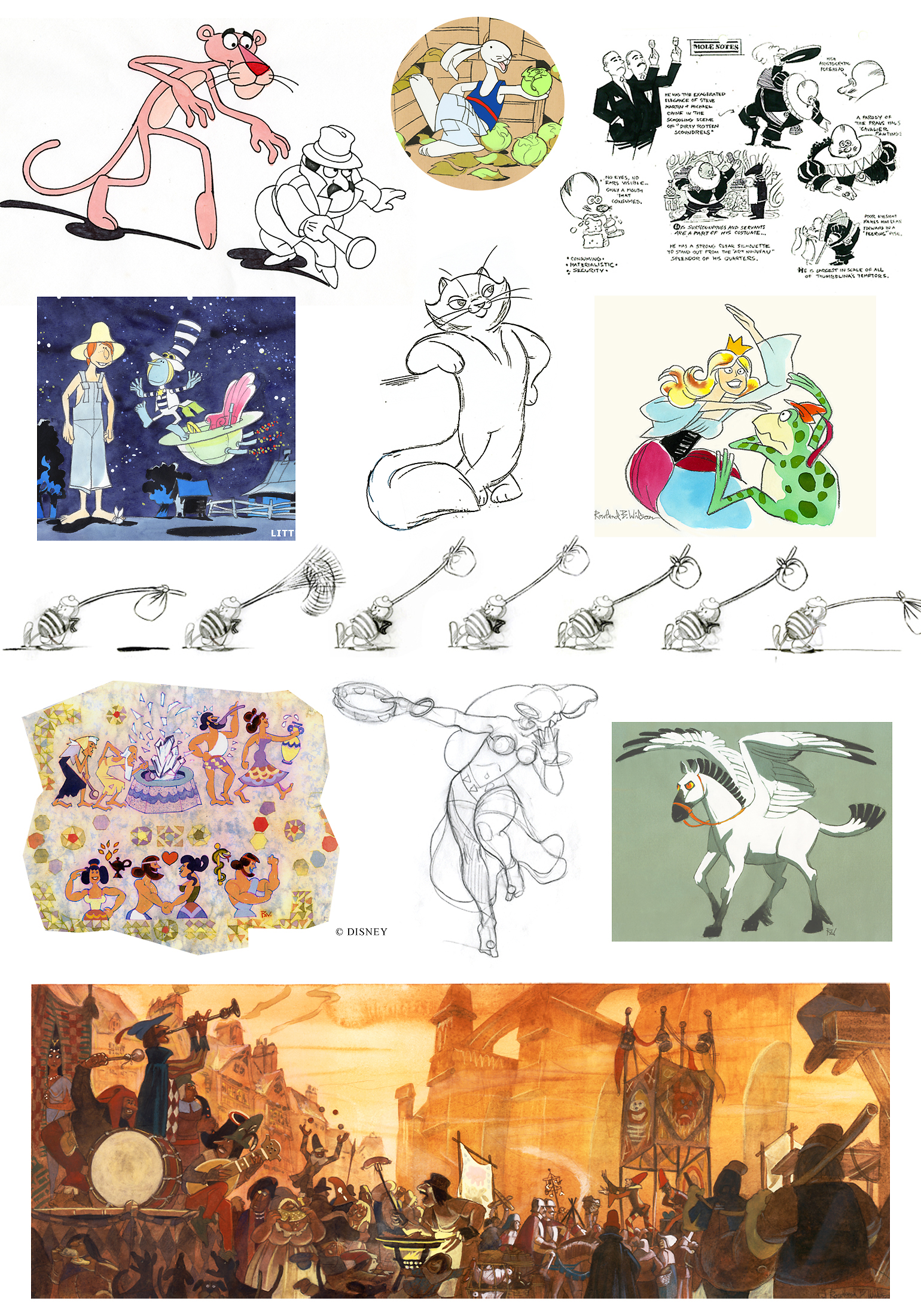
I also have a wealth of artwork and plenty of information on Rowland B. Wilson. Start here or here or here.
You know, there’s just a lot of material here.
I haven’t even gotten into the wealth of material on loan from Bill Peckmann with his stunning collection of illustration and comic art. It’s just magnificent, and I am so proud to be able to post whatever he sends me whether it’s Rowland Wilson or Harvey Kurtzman, Gahan WIlson or Dick Moores. There’s just a bounty of artwork, and it all demands viewing. What a treasure is there. What a pleasure to post it.
All I can say is that I intend to keep it up. There’s so much more to post, so much more to enjoy,
Bill Peckmann &Books &Guest writer &Illustration &Rowland B. Wilson 12 Nov 2012 07:26 am
The Secrets Behind Trade Secrets
- Suzanne Lemieux Wilson, wife of the late Rowland B. Wilson, just sent me a guide to how she, with information from Rowland, put together their invaluable book of notes called Trade Secrets. Seeing the skeleton come together for this book is quite an informative document, and I couldn’t be happier that she trusted my blog to relay the information..
Some of these illustrations and pictures have passed across this blog before, but they take on a very new meaning here, so I’m glad to post them anew. I have to thank Suzanne for the gift of this post especially given some of the hard work I know it took to scan and send documents that are large enough to work here.
By the way, if you don’t have this book, you should. The book offers an enormous amount of information about his design for animation as well as for the printed cartoon and illustration trade. How ofen does a genius of his craft offer such a guide to the “trade secrets”? Trade Secrets is an invaluable book.
May I suggest that you click any image as you go through to enlarge them and get a better look at the illustrations and the type. It’s great stuff.
 1
1
 2
2
 3
3
New England Life
 4
4
The insurance campaign ran for eighteen years–
 5
5
Rowland also drew cartoons for the New Yorker, Esquire,
The Saturday Evening Post, Playboy and others.
 6
6
As well as illustration and advertising.
 7
7
Rowland’s first and last jobs were in Animation, with many
interspersed throughout his career.
 8
8
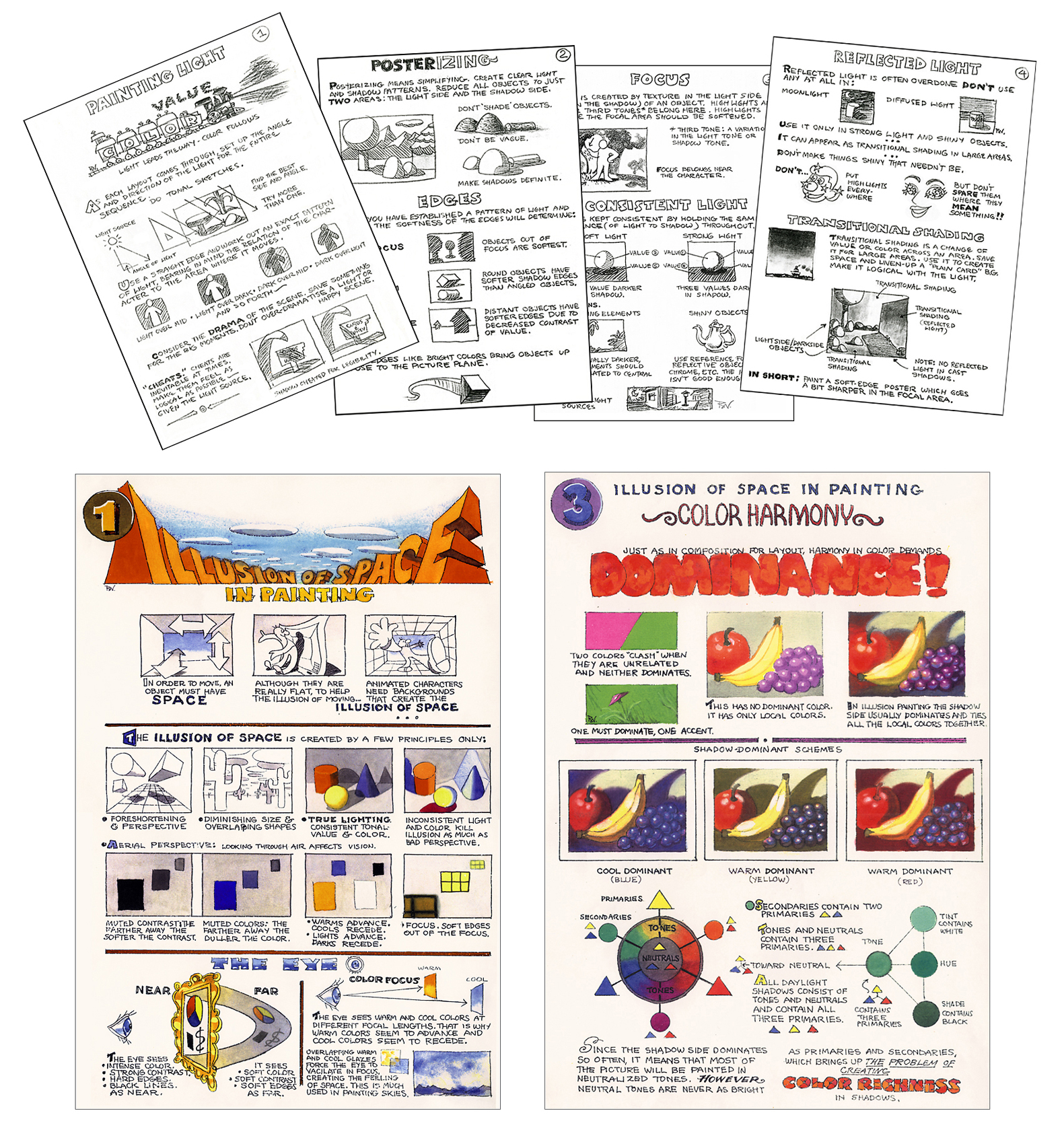
Rowland devised illustrated instruction pages as quick reference
guides for the Layout, Background and Animation staff when he worked
at Don Bluth and Walt Disney Studios.
 9
9
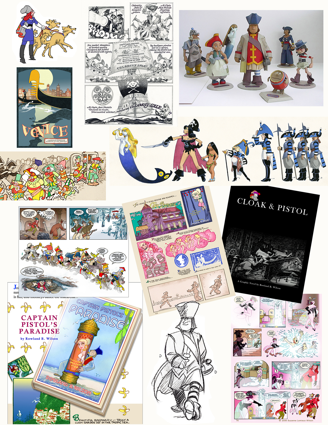
He worked on the Captain Pistol series of cartoon novels
from the 1970′s onward.
Captain Jack Pistol was a Retired Pirate and Rich Man who met with a
series of misadventures as he moved through various literary genres,
from swashbuckler to romantic comedy to spy thriller
to Western to science fiction.
Rowland sculpted three-dimensional models of the characters.
Rowland endeavored to apply the principles of drawing to life.

He created an artful environment to work and live in–
He designed and constructed a sunflower gate for the garden.

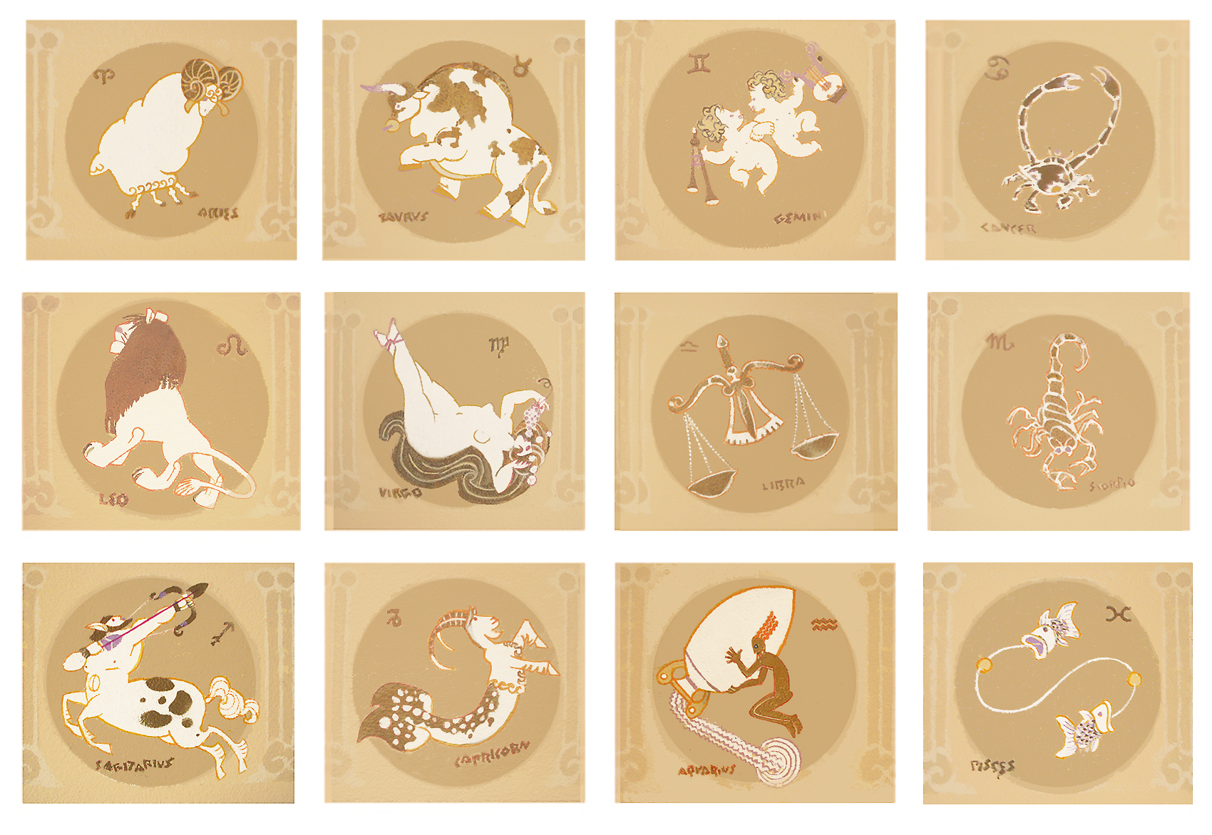
He painted the signs of the Zodiac around the base of a vaulted
ceiling…
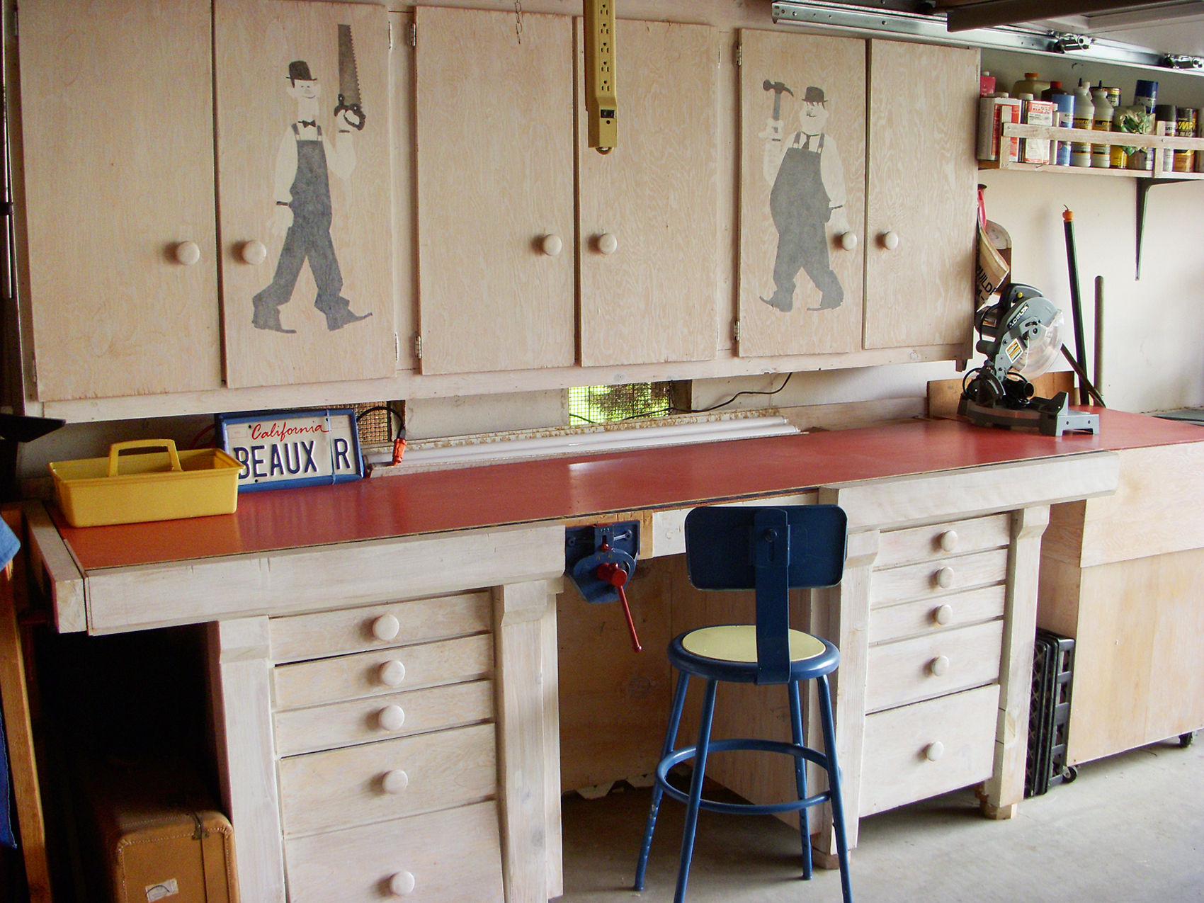
He built a workbench for his woodworking projects and decorated it . . .
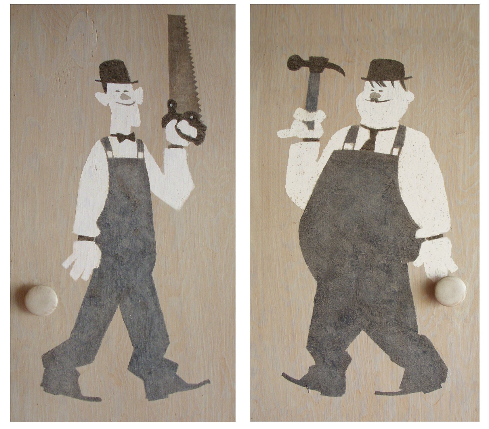 15
15
. . . with caricatures of Laurel and Hardy.
Because he worked in a variety of disciplines, Rowland sought
solutions that would apply to all of them and save him from “solving
the same problem over and over again”.
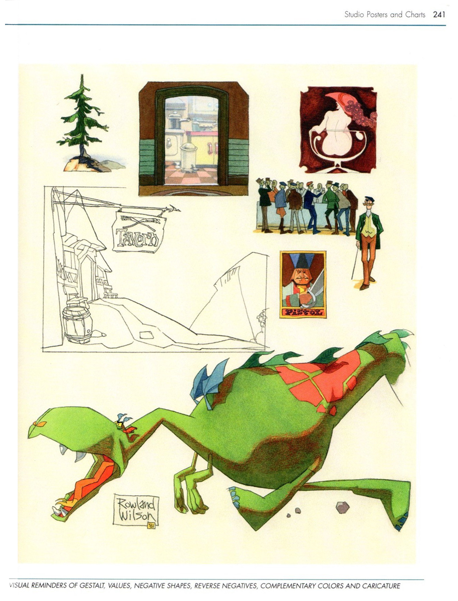
He consolidated the information into charts and hung them in his studio,
whether it was in Connecticut, New York, Ireland or California.
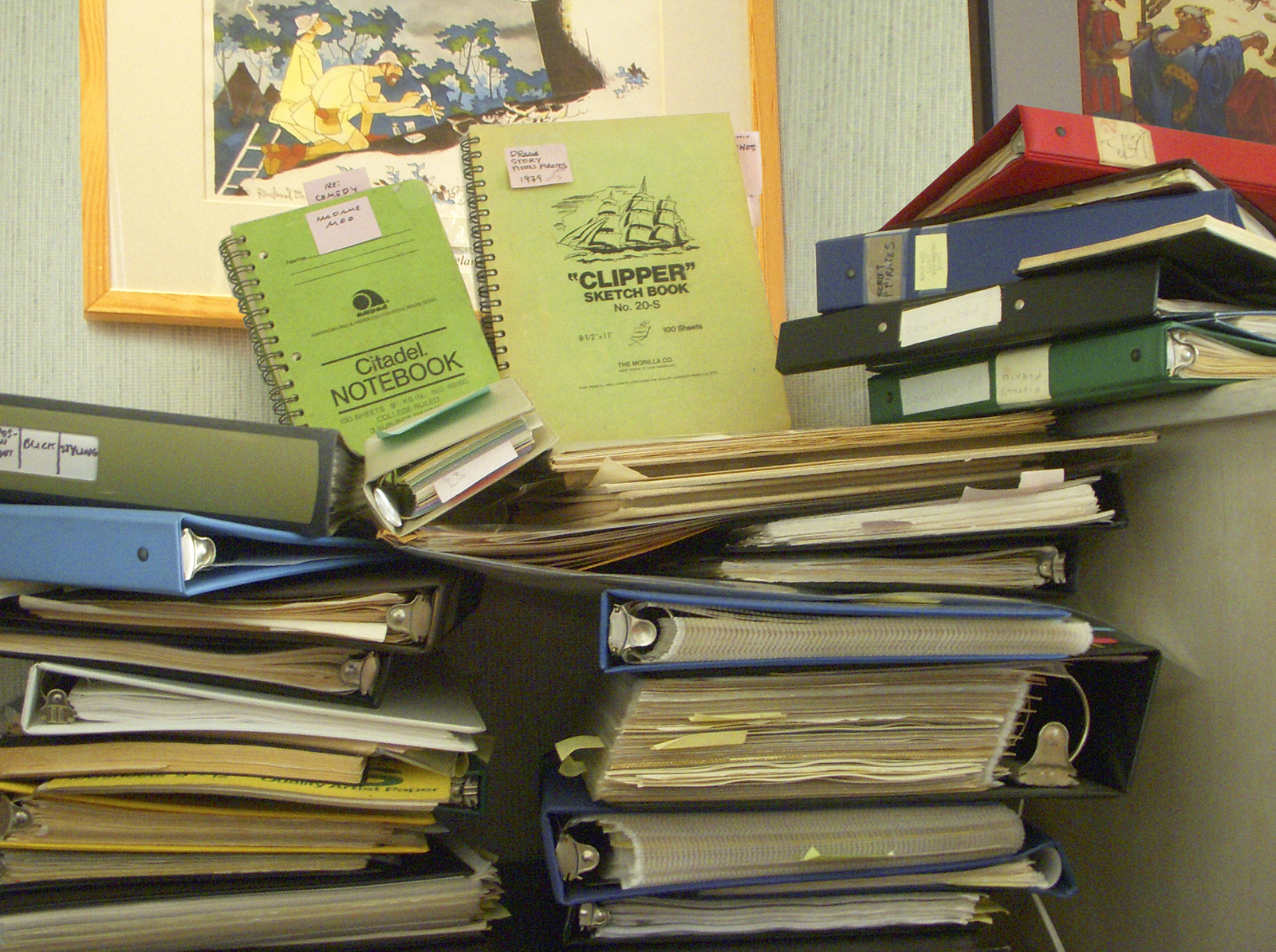
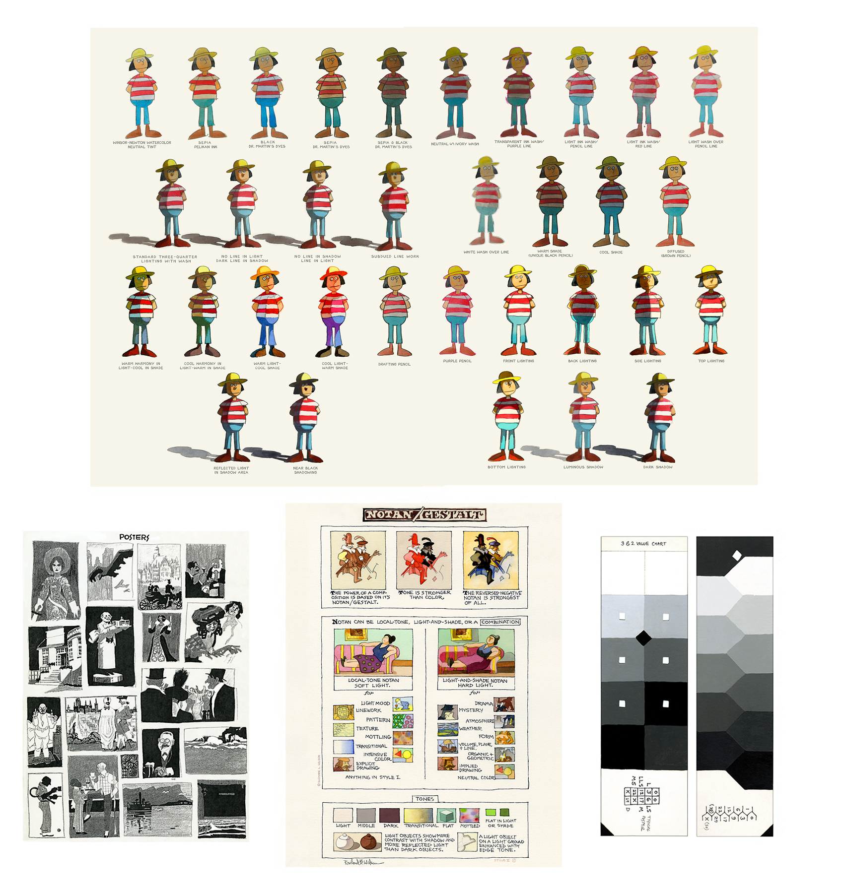
Rowland documented many techniques and observations.
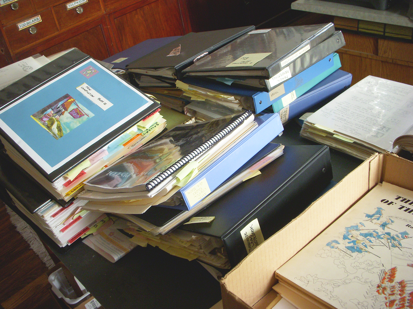
The writings and illustrations filled dozens of
notebooks, binders and sketchbooks.
Much of it was xeroxed and consolidated into two giant binders as
resources for the book entitled Rowland B. Wilson’s Trade Secrets.
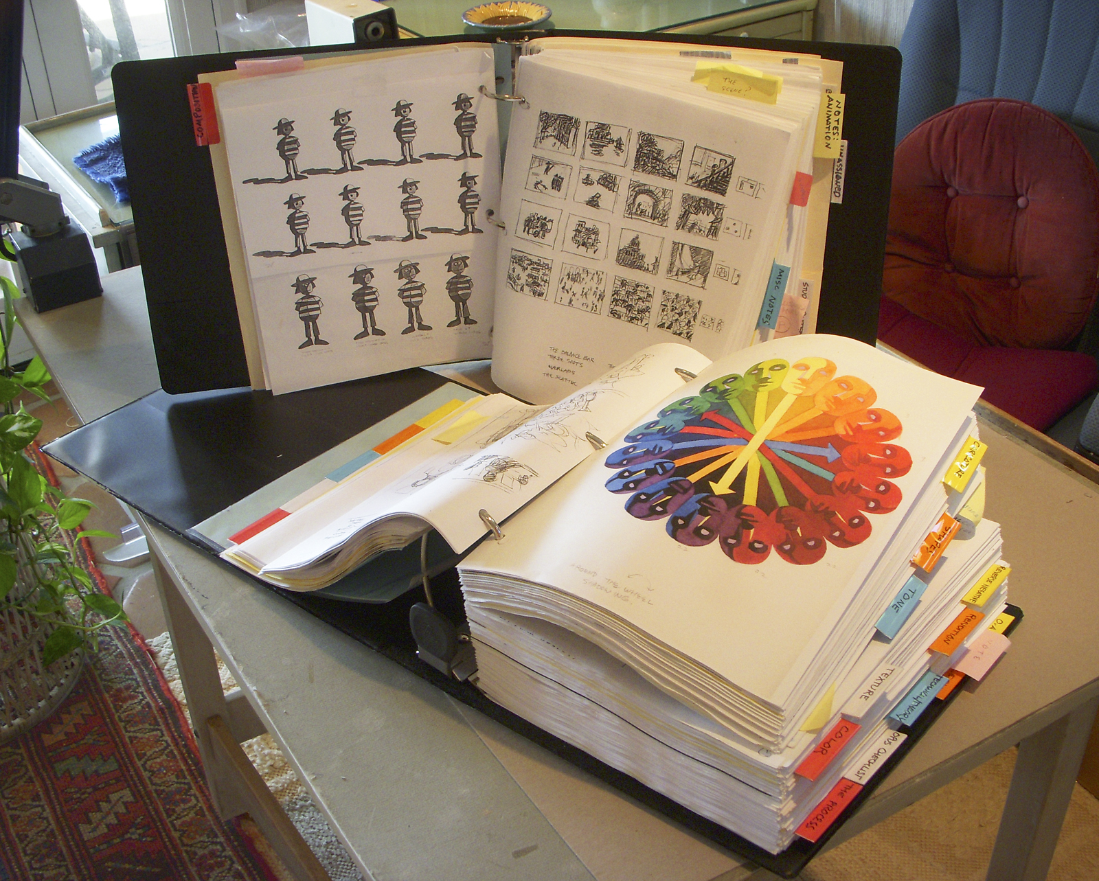
But the genesis for all of the notebooks and for Rowland’s oeuvre
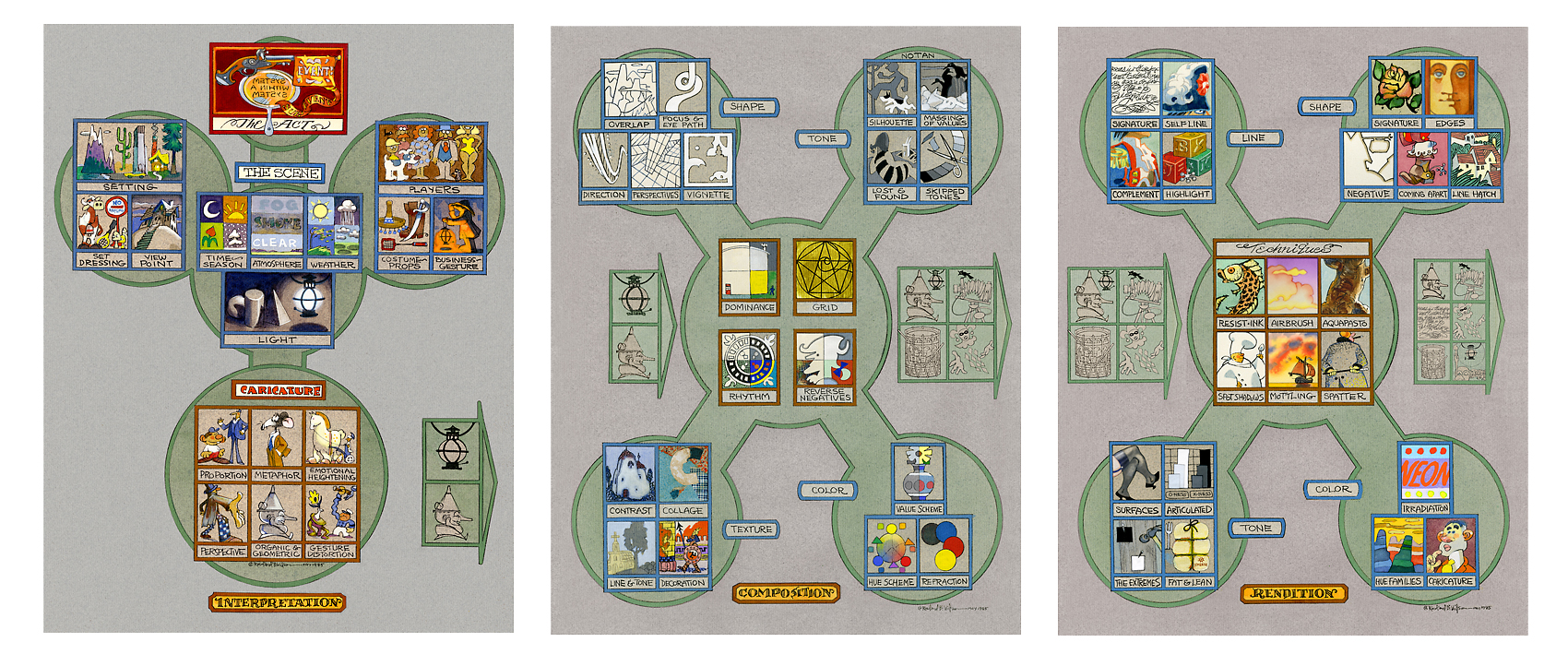
were three flow charts that outlined procedures
that could be applied to any project.
 22
22
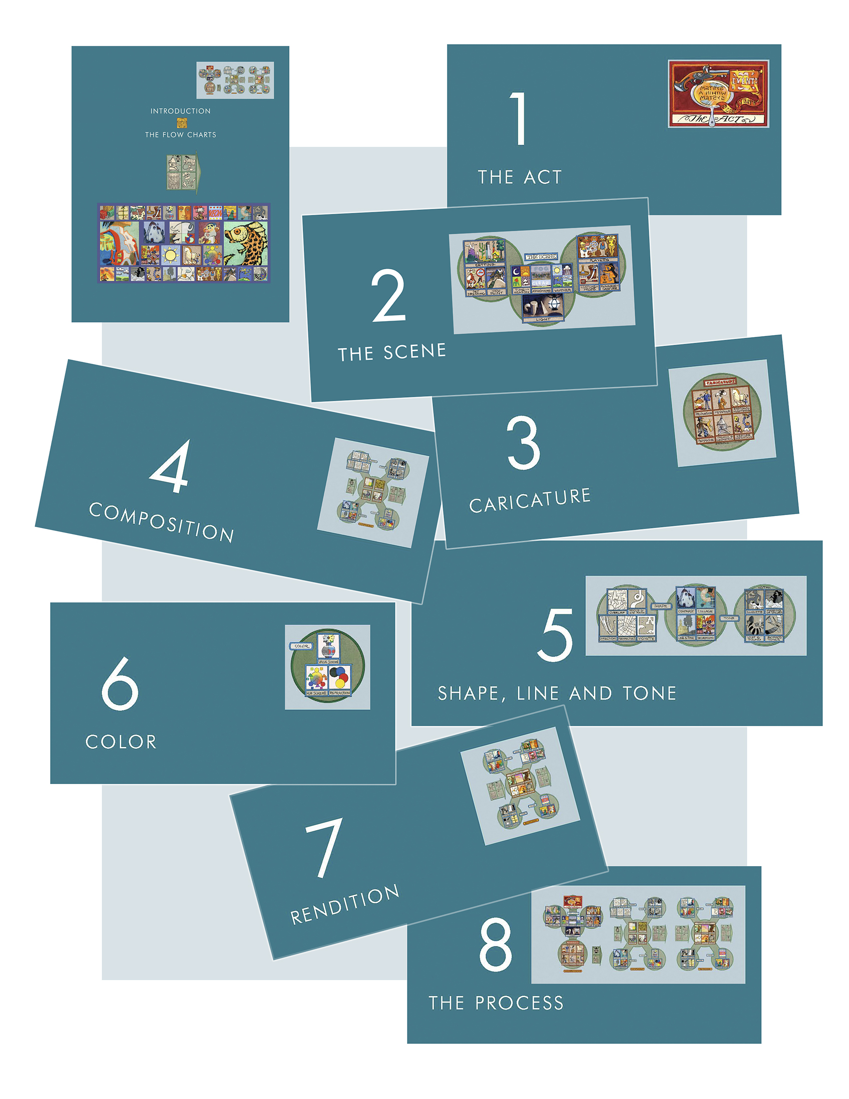
The Introduction of Rowland B. Wilson’s Trade Secrets describes the
Flow Charts in general. Then each chapter is based on an aspect
contained in them. The logo at the top right shows what aspect is
covered in the chapter.
 23
23
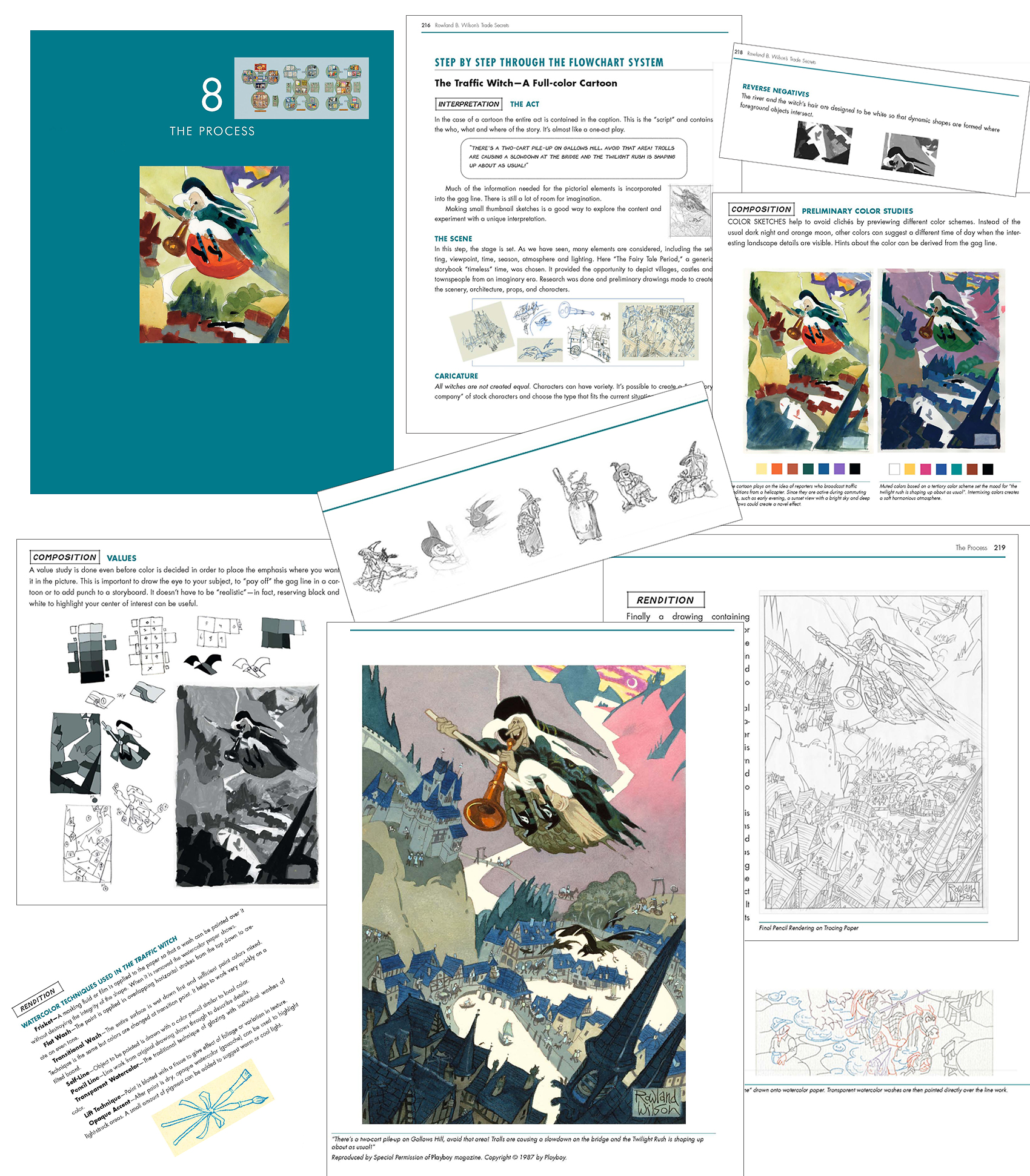
Chapter 8, the Process, follows a project from idea to finish
as it progresses along the Flow Charts.
Chapter 9 presents many of the charts and posters
that actually hung on the studio walls.
 25
25
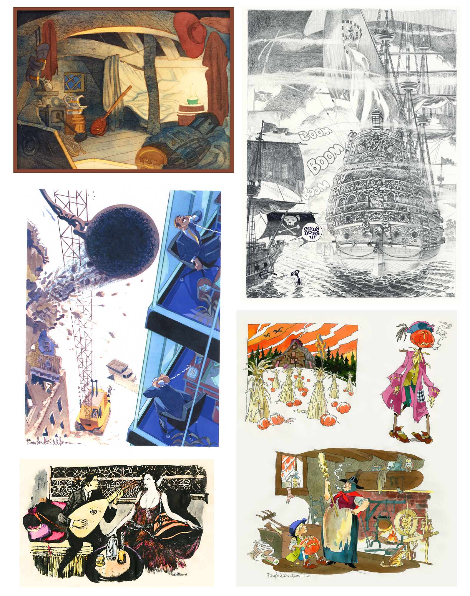
Chapter 11 shows a gallery of artwork throughout Rowland’s career,
including well-known images and some of his personal art,
never before published.
 26
26
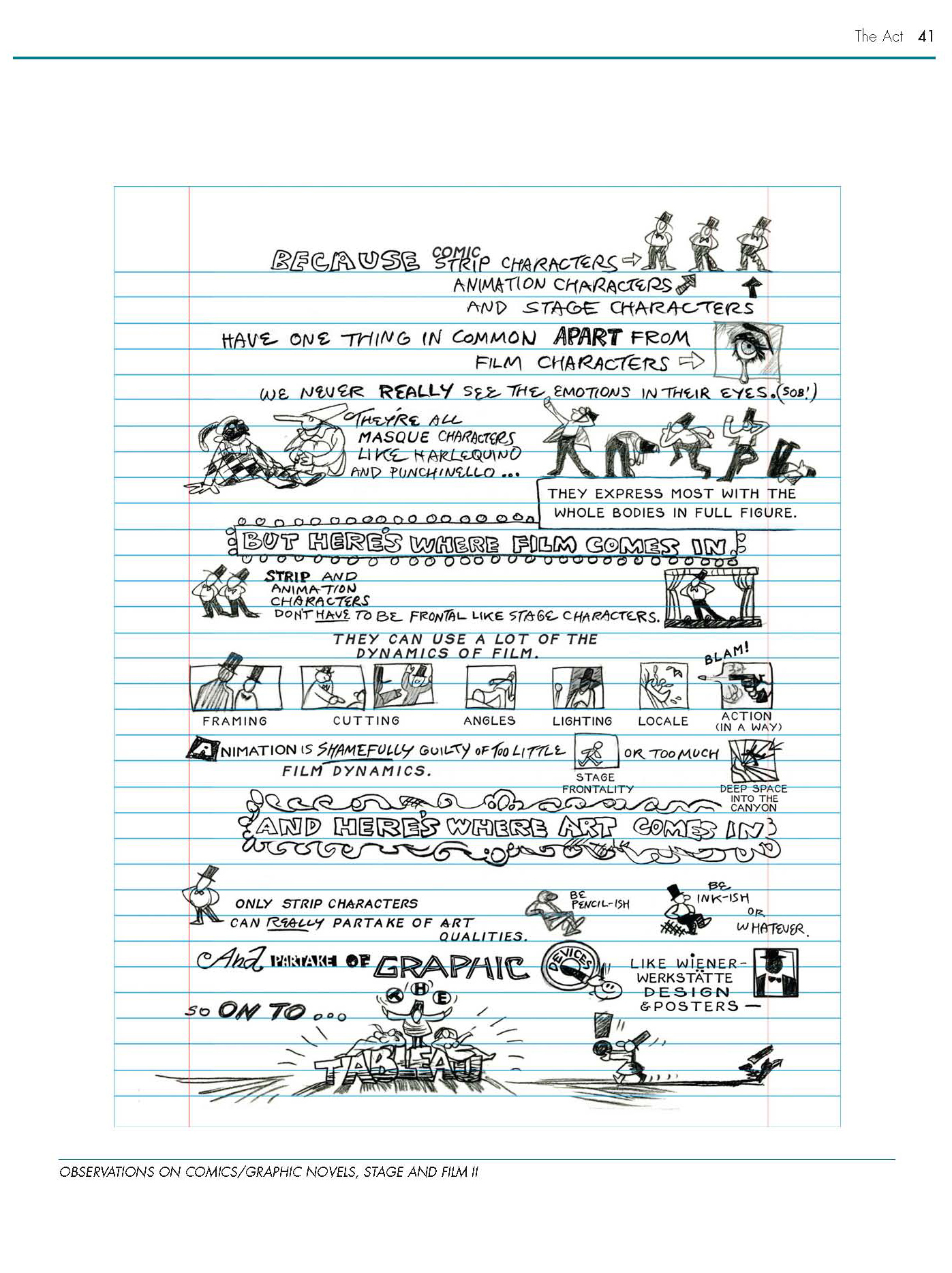
A page of observations on comics, graphic novels, stage and film:
 27
27
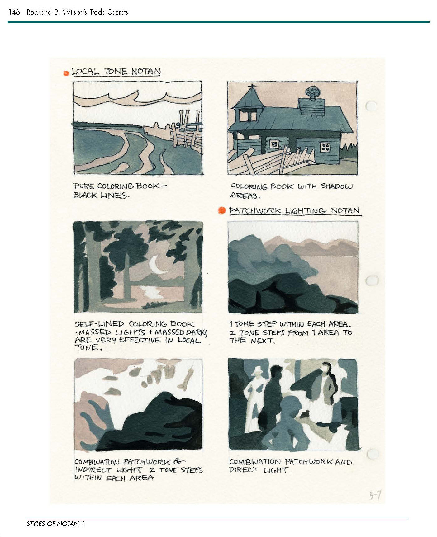
One of three pages illustrating Styles of Notan:
 28
28
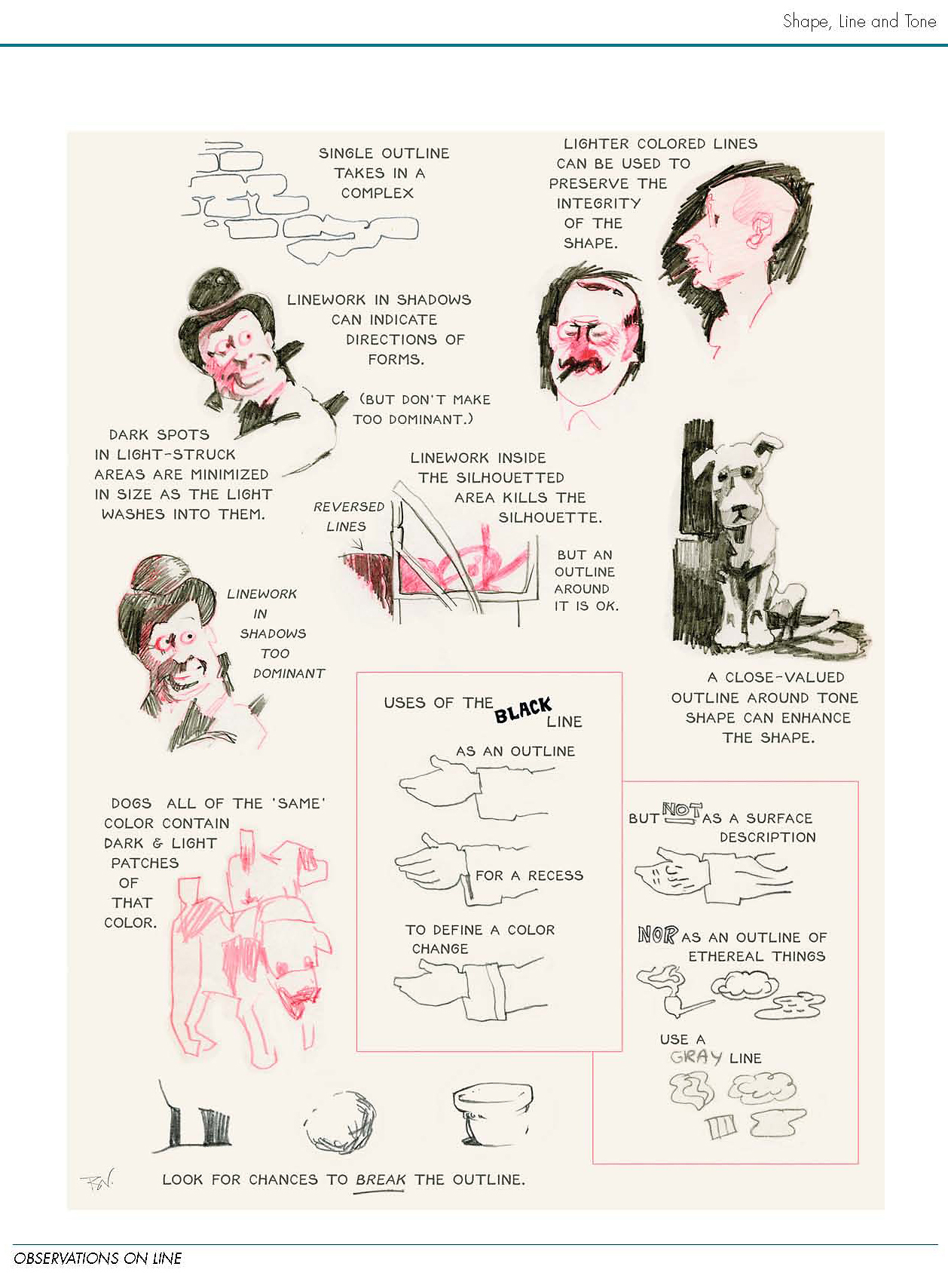
A page showing notes on various aspects of Line:
 29
29
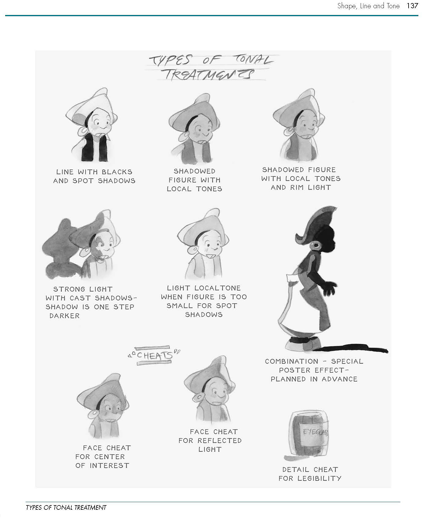
A page depicting various types of Tonal Treatments:
 30
30
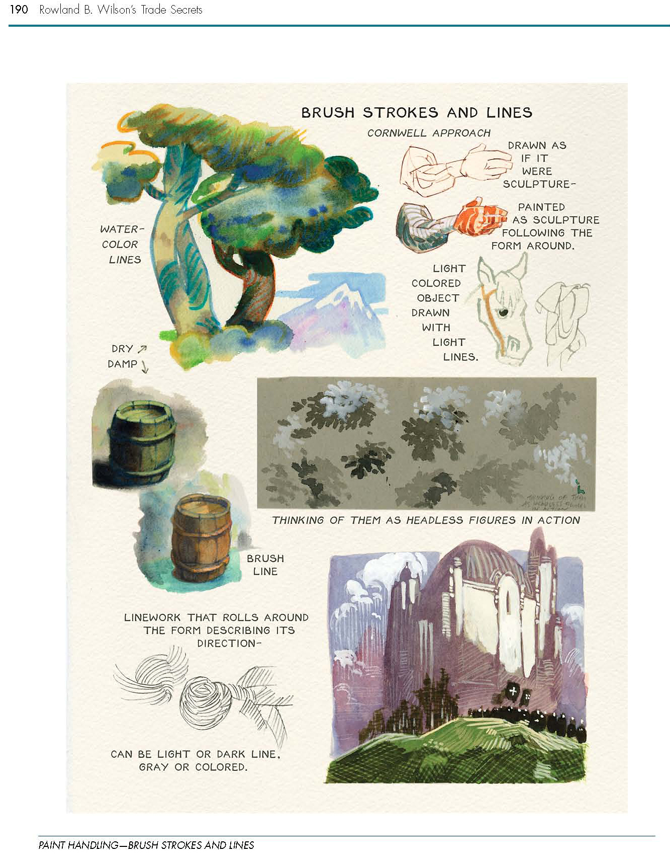
Demonstration of watercolor techniques:
 31
31
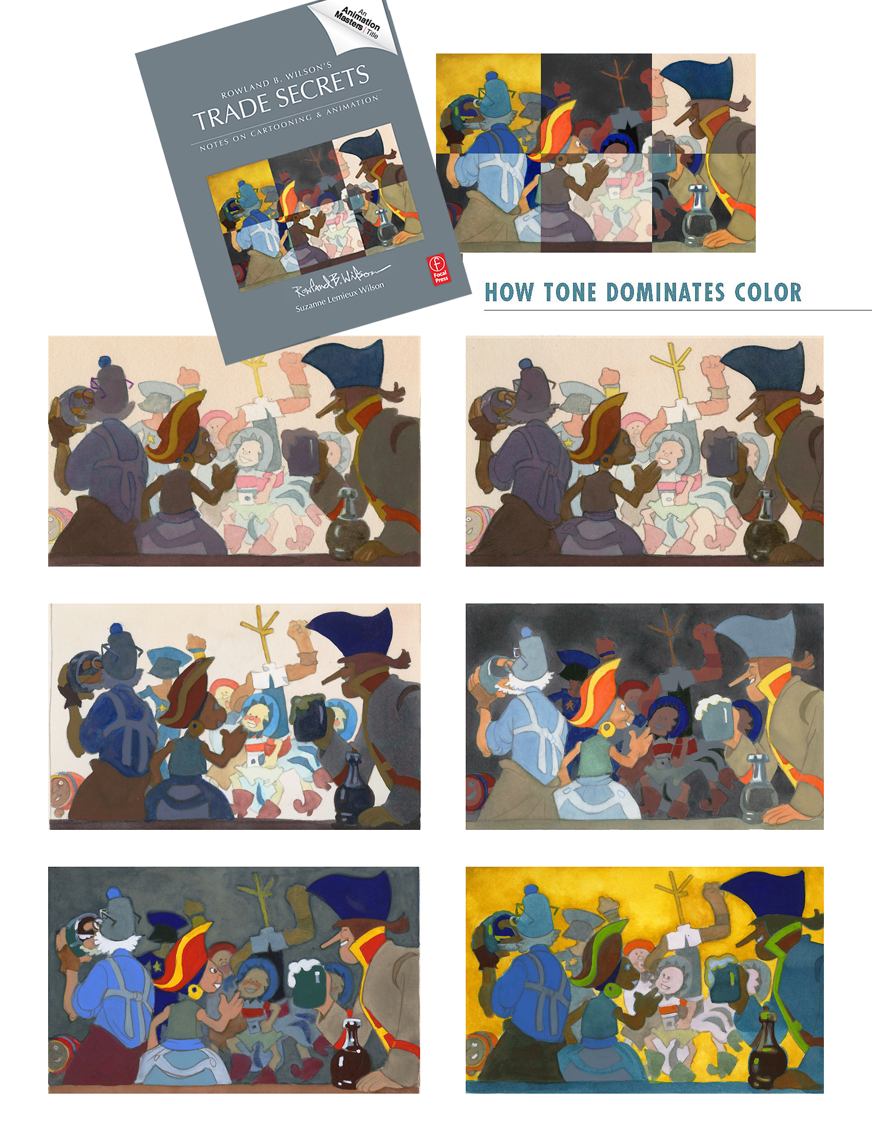
The cover image is a composite of 6 Value Studies showing the
dominance of Tone over Color:
We hope you enjoy Rowland B. Wilson’s Trade Secrets and find
inspiration within.
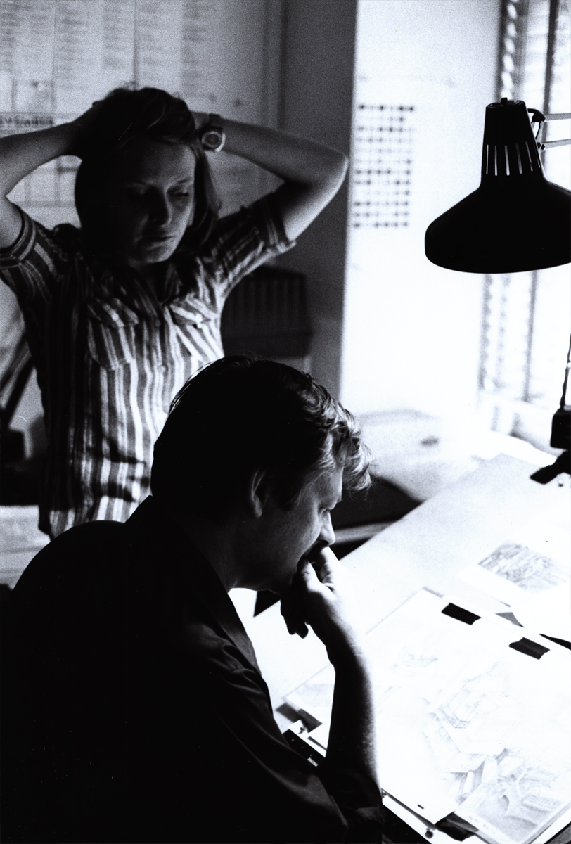
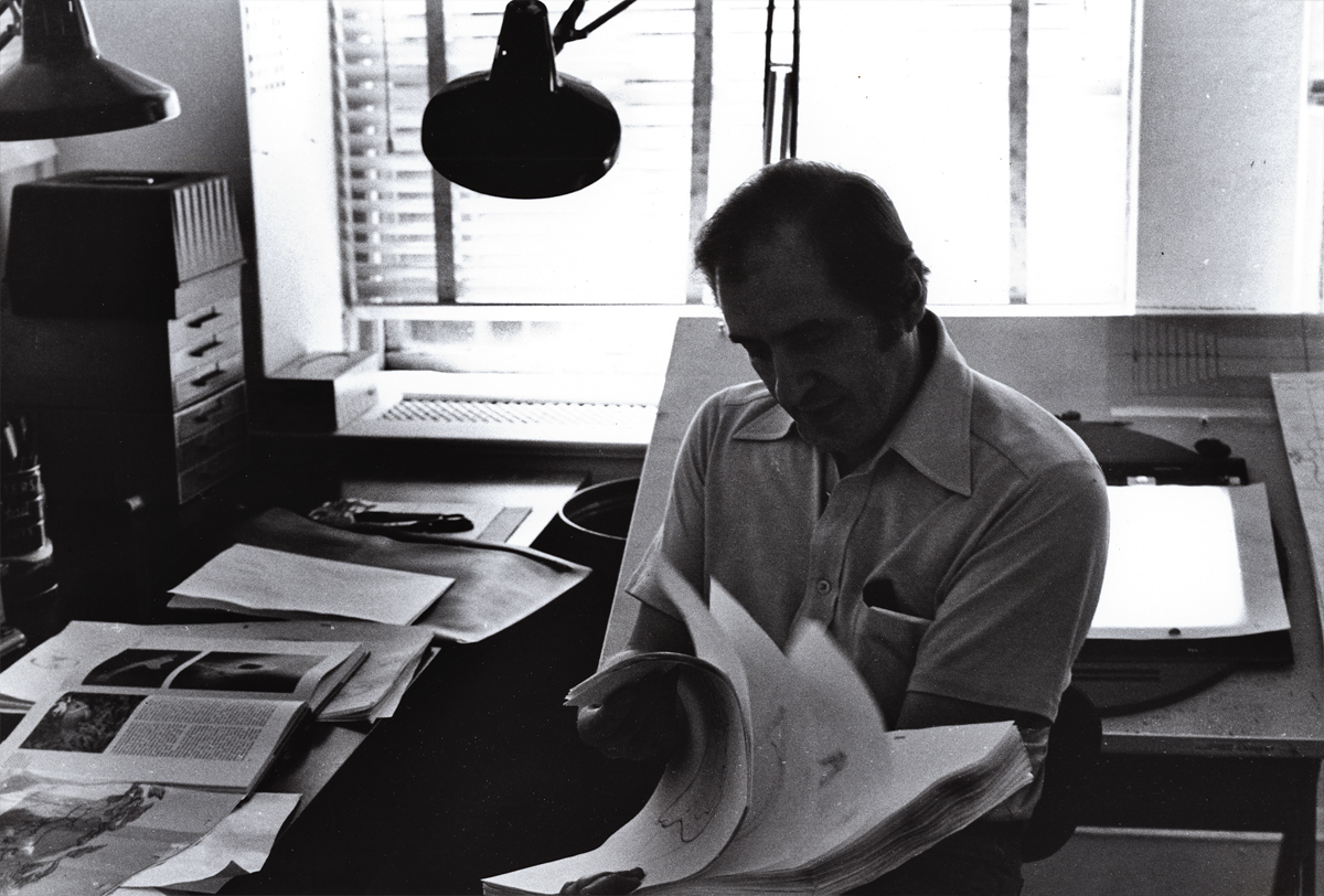
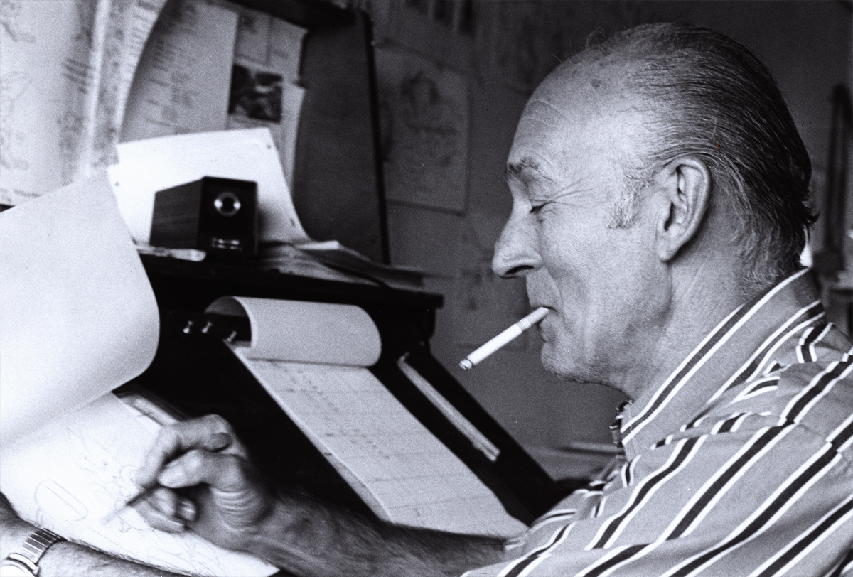
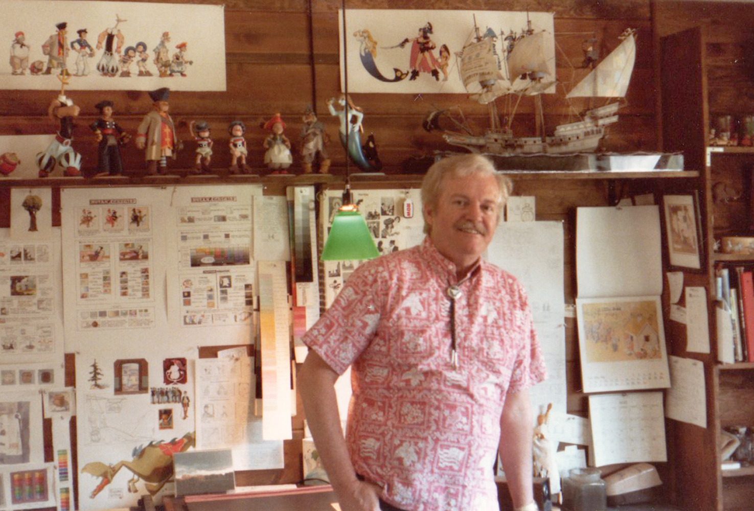
With Special Thanks to Bill Peckmann for photograph of
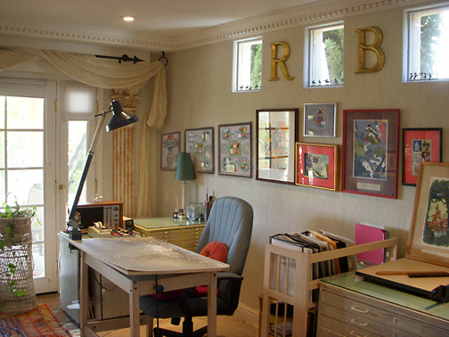
Rowland B. Wilson in his studio.
_______________________
And as a bonus to this post, here are some drawings RBW did on a napkin at a lunch with Dick Williams.
Suzanne wrote:
- I discovered some vintage Rowland B. Wilson “doodles”, sketched on
napkins at Mario’s Restaurant in Westport, Connecticut–thought you
might enjoy them. The caricature of Suzanne and Rowland (image 2)
looks to me like the RBW take on Richard Williams’ drawing of us (image 3).
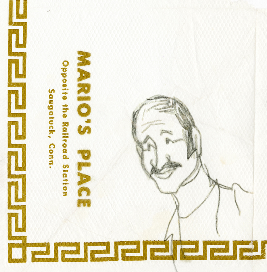 1
1Mario
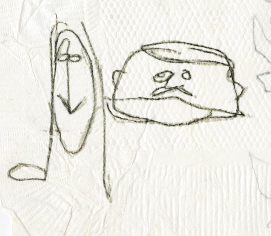 2
2
Suzanne and Rowland caricatures
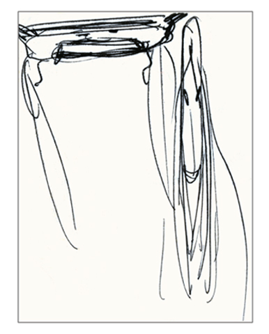 3
3
Dick Williams’ caricature of Suzanne and Rowland
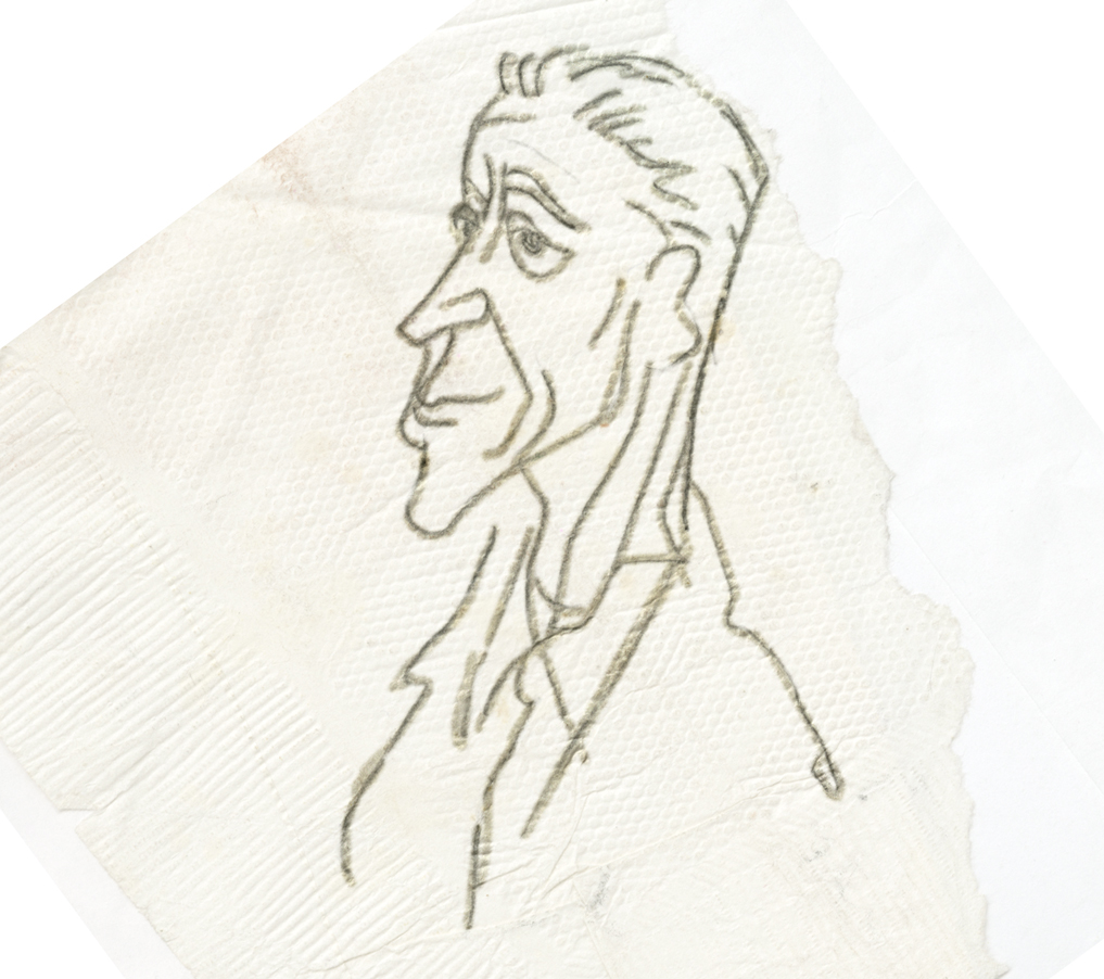 4
4
Man
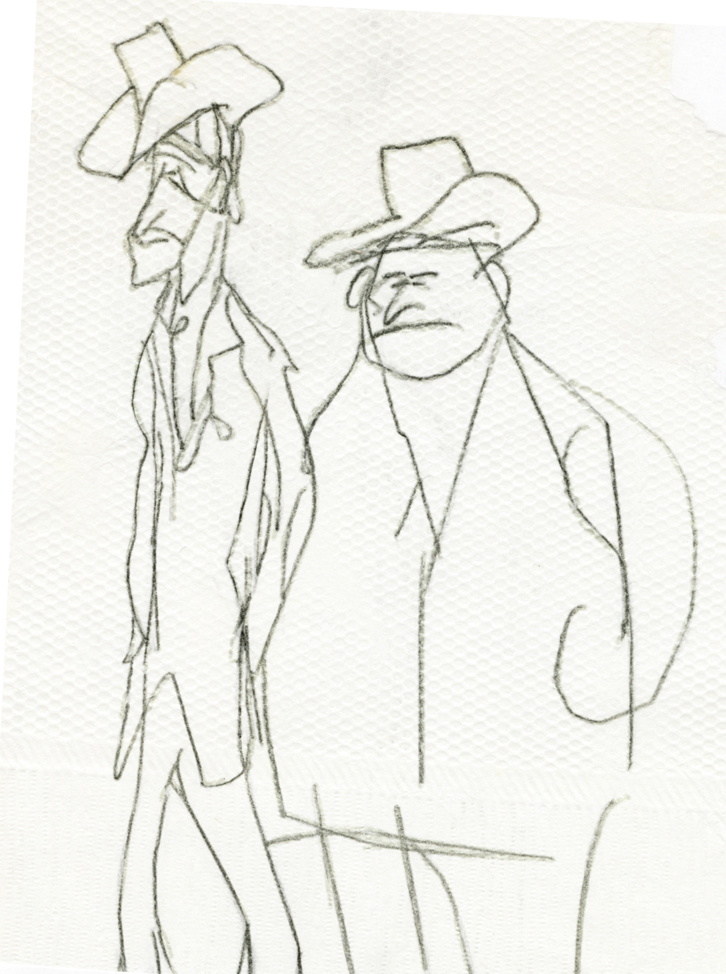 5
5
two Dudes
Bill Peckmann &Commentary &Daily post &Rowland B. Wilson 21 Sep 2012 05:19 am
RBW at Auction and otherwise
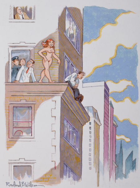
- If you’ve ever wanted to own a Rowland B. Wilson cartoon, now’s your chance. A number of Playboy cartoons by Wilson are up for auction via Heritage Auctions. The auction will end on Oct. 13th, and you can make a bid now, if you like. I’ve posted the cartoons available below with some of the descriptive material from the auction house. Good luck.
 1
1“This Year I’m Putting in a Provision For Good Big Boys Too!”
Playboy page cartoon illustration, January 2002
 2
2
“A Toast to the New Year!
May It Be Another Prosperous One For Atilla and All Us Huns!”
Playboy cartoon illustration, January 2003
 3
3
“We’ve Added a New Kink to the Piñata Tradition!
Playboy cartoon illustration
 4
4
“At Long Last, Grandfather, You’ve Taken Me to See the Nutcracker”
Playboy cartoon illustration, January 2000
 5
5
“If I Can Bring This Lovely Creature to Life,
She Will Bring Me Everlasting Immorality!”
Playboy cartoon illustration, November 1981
 6
6
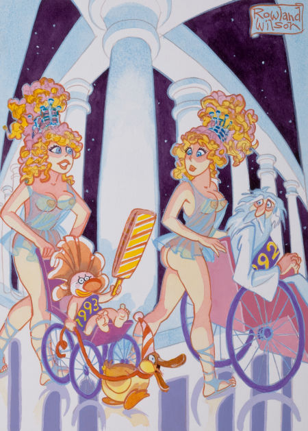
“I Have a Feeling ’93 is Going to Be a Very Weird Year”
Playboy cartoon illustration, circa 1993
 7
7
“Miss Perkins Has a Perfect Record in Dealing with Potential Suicides”
Playboy cartoon illustration, May 2003
______________________
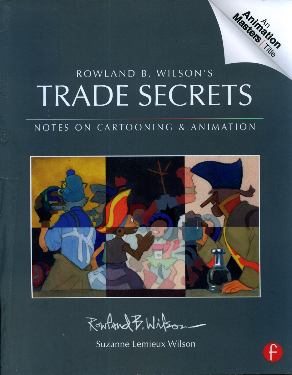 And as long as we’re talking about Rowland Wilson, I can’t pass up the chance to tell you, yet again, how great Trade Secrets is. Subtitled, “Notes on Cartooning and Animation,” the book is so much more than that. It’s a lifetime’s worth of invaluable notes, advice and commentary about illustration, cartooning and (most importantly to me) animation. I’ve read large chunks of this book over and over again. It all seems so basic and simple, when you’re deep into it, but the book is thick with brilliant comments about the art of drawing and painting. You’ve got to get your hands on it just to see how rich the material is. Once you do, though, you’re going to want to own it. I feel not only indebted to Rowland for the material but to Suzanne Lemmieux Wilson for having finished the book and making sure it looks as perfect as it does. It’s a treasure.
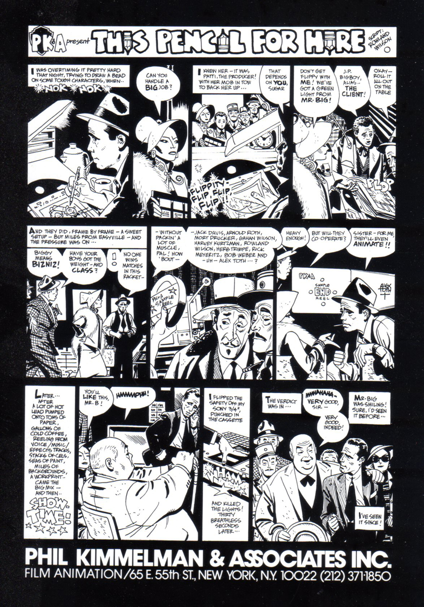
To give another view of some other advertising work done by Rowland Wilson, Bill Peckmann forwarded these pieces. Here’s Bill:
- I thought maybe you would enjoy seeing the original art of two Phil Kimelman & Ass. house ads. The first one is all Rowland Wilson, both concept and finished art, the second one is a collaboration of Rowlie and Alex Toth.
We’ll start with the printed ad as it appeared in Millimeter magazine in 1979, and then do close ups of the original art.
The full sized ad
CU of the upper left
No lettering in the word balloons, that was done on a separate over lay.
The second PK&A house ad was written by Rowland Wilson, Alex Toth did the finished black and white art and then Rowland colored it with his water colors.
Here’s the black and white.
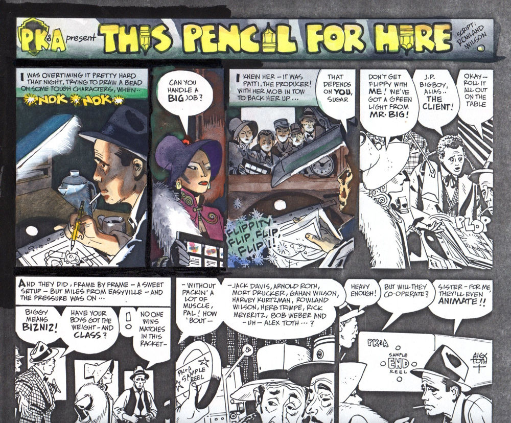
We took Alex’s original art, xeroxed that on to kid finished
Bristol board, the paper Rowland always worked on.
Here is an unfinished, experimental start by Rowland.
The only time the ad ever ran in color was here
in the 1982 International Film Guide paperback.
Here’s the original art.
Hopefully all will enjoy these panels in their large format
and be able to see how each one works by itself
in the drawing and the coloring.
Here is a small footnote to the history of the ‘Pencil for Hire’ ad.
It’s my rough that started the ball rolling. I was hoping to entice
Alex into doing a take off on a Milton Caniff type Sunday comics
page for our house ad. Fortunately, Rowland was looking over
my shoulder and thought it was time for a rewrite!
The 1982 Film Guide also contained this page, the “Irving Trust” commercial
and the “Dr. Henry” series were designed by Rowland, the “Honeycomb” spot by me.
PS: I wanted to end on this button. For all of us who
still remember “Local 841″ and green subway cars!
Animation Artifacts &Bill Peckmann &commercial animation 31 Aug 2012 05:51 am
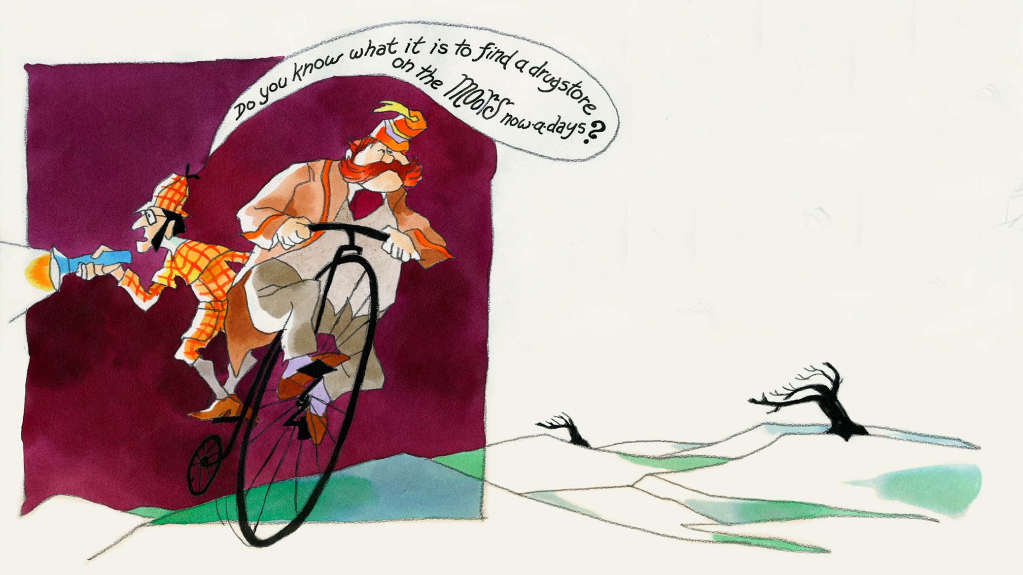
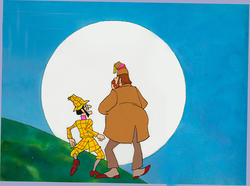
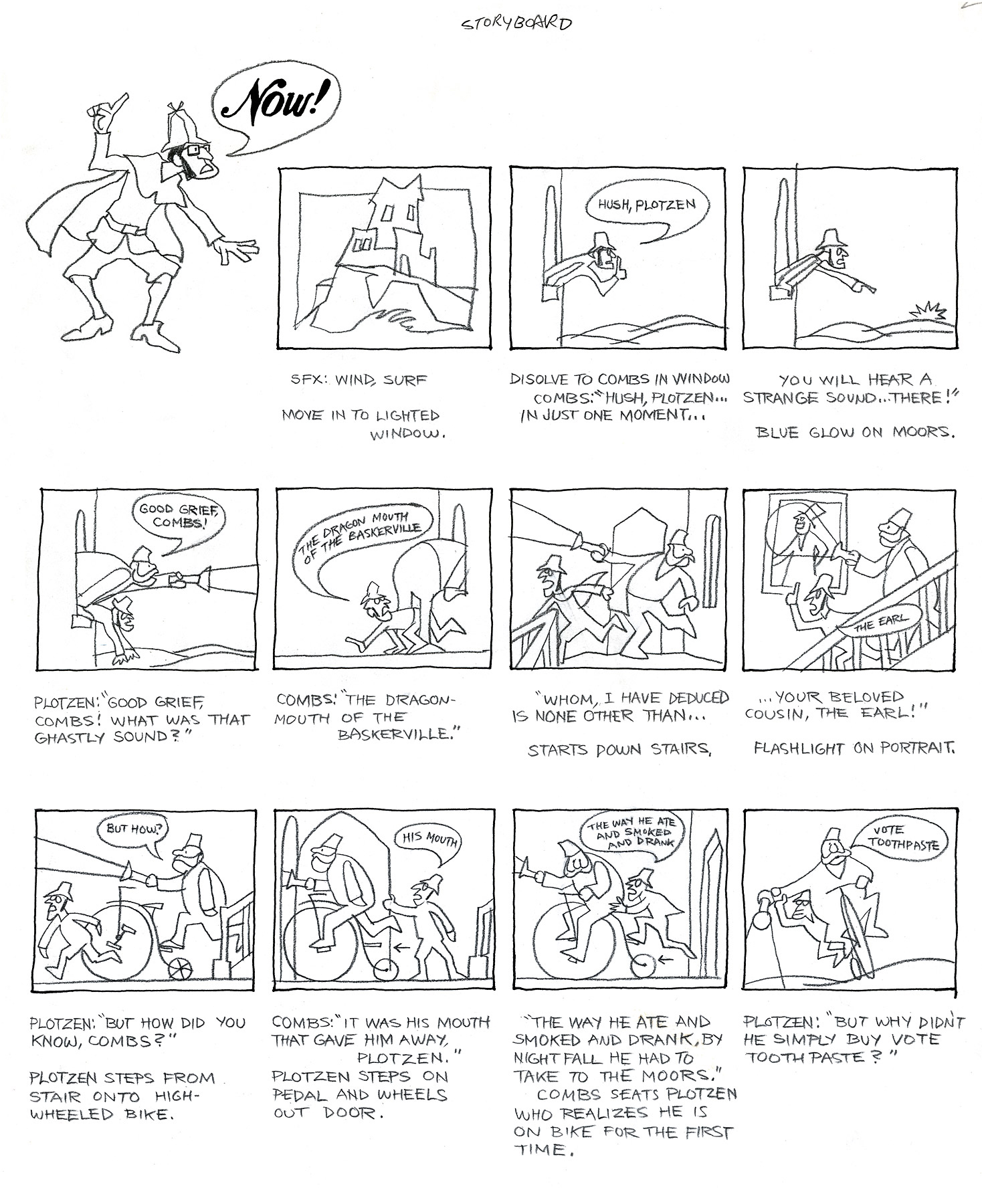
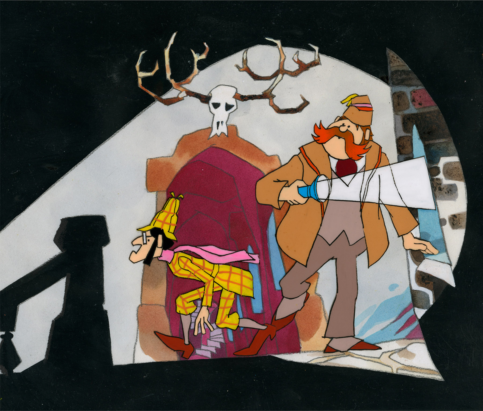
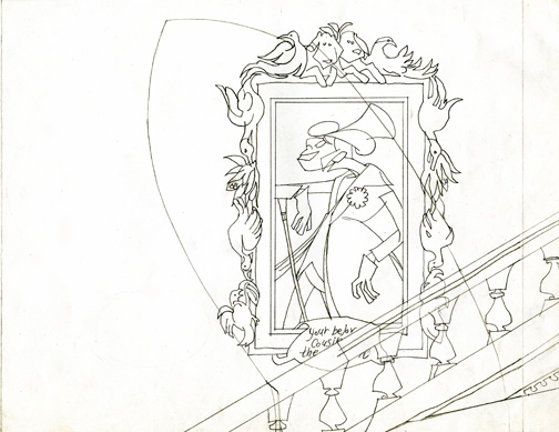
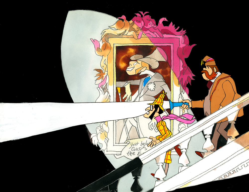
Combs and Plotzen – Part 2
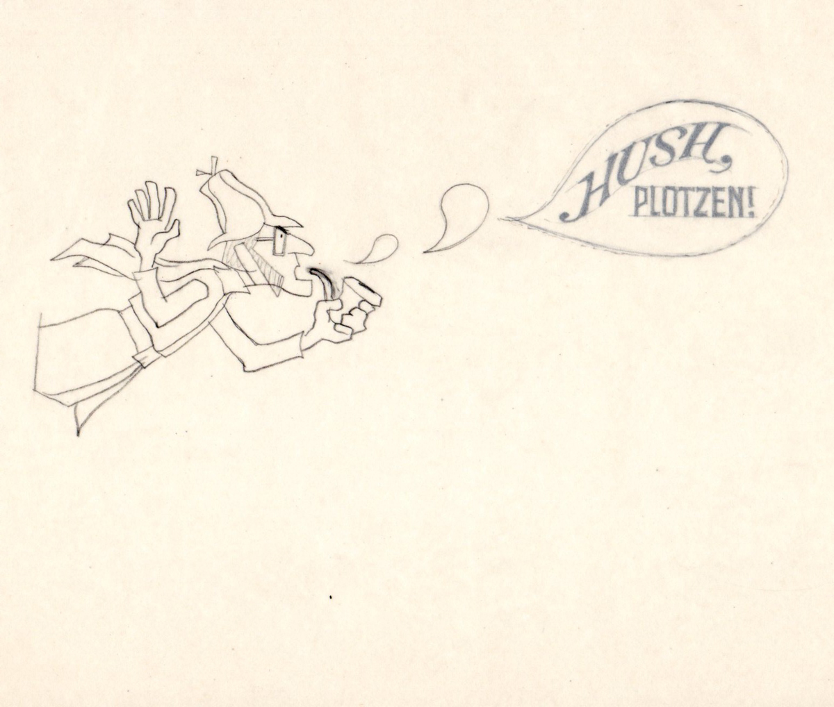
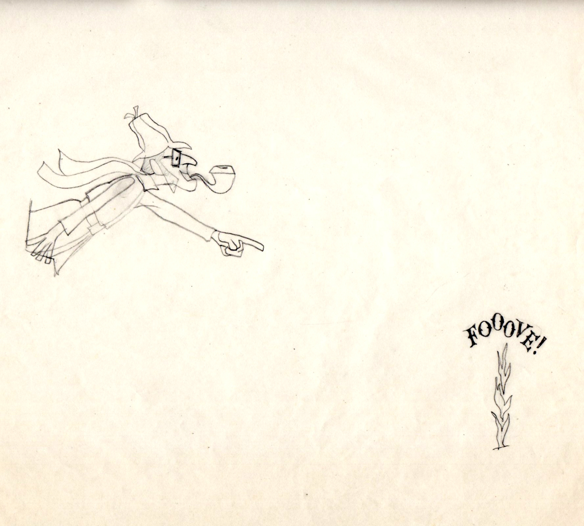
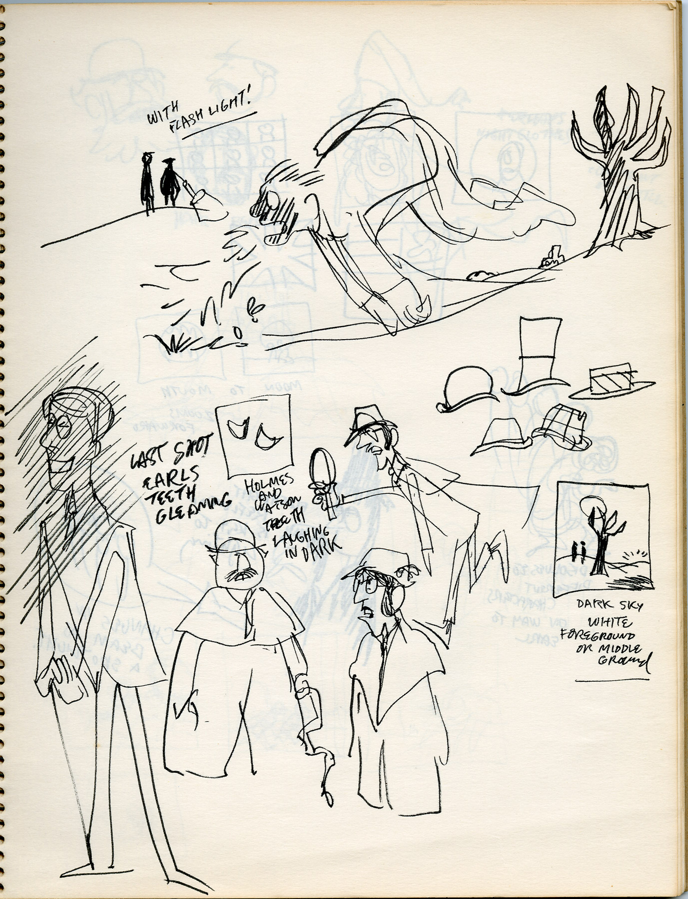
- Last week, Bill Peckmann forwarded a number of pieces of art by Rowland B. WIlson which was preliminary work for a commercial at Phil Kimmelman and Associates. The commercial, for Vote Toothpaste, was a parody of Sherlock Holmes called Combs and Plotzen. More art surfaced this week for that spot, and I thought it worthwhile to extend the post for a second part. (See Part 1 here.)
Bill Peckmann writes:
- Combs & Plotzen was the second TV commercial that print cartoonist Rowland B. Wilson designed in 1969 and his grasp of the animation production steps was truly amazing. No crash course in storyboarding, model charts, Layouts etc. was necessary. It was like he was doing it all of his life. We were in total awe.
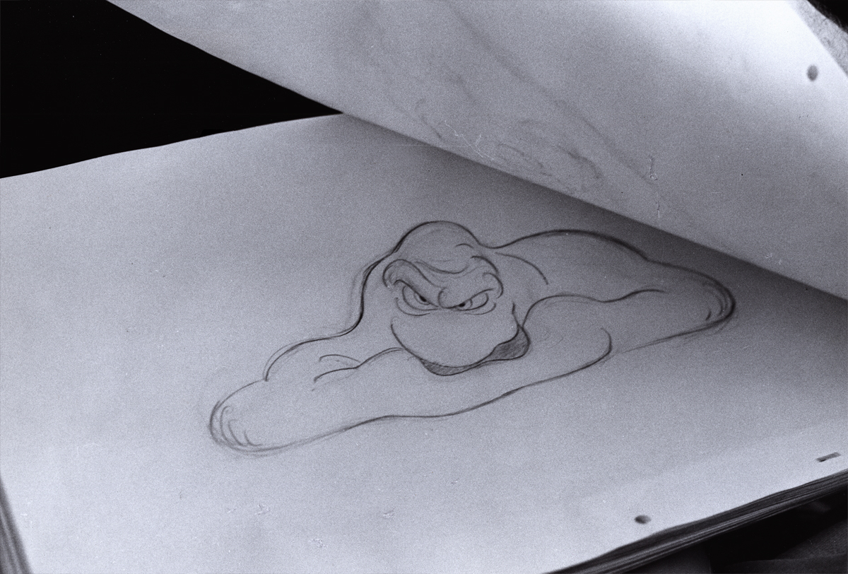
- At that time, Rowland was always very comfortable doing his animation drawings on the paper he knew best, tracing paper. He would work up roughs on layering tracing paper panels without having the need of a light box. No pegs for him in those days.
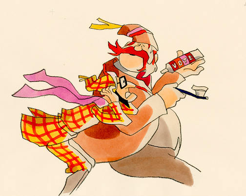
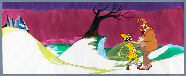
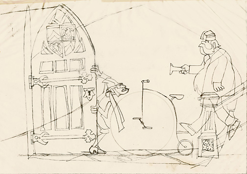
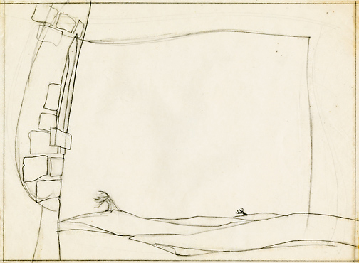
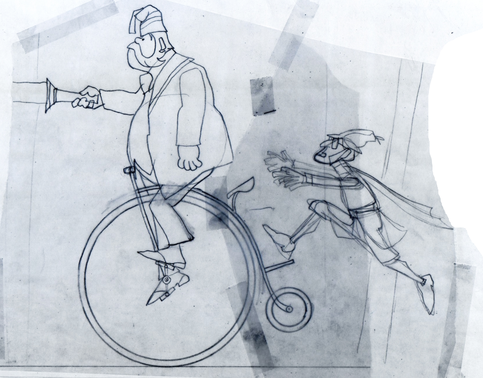 1
1These first five drawings are Layouts by Rowland Wilson.
 2
2
 3
3
 4
4
 5
5
 6
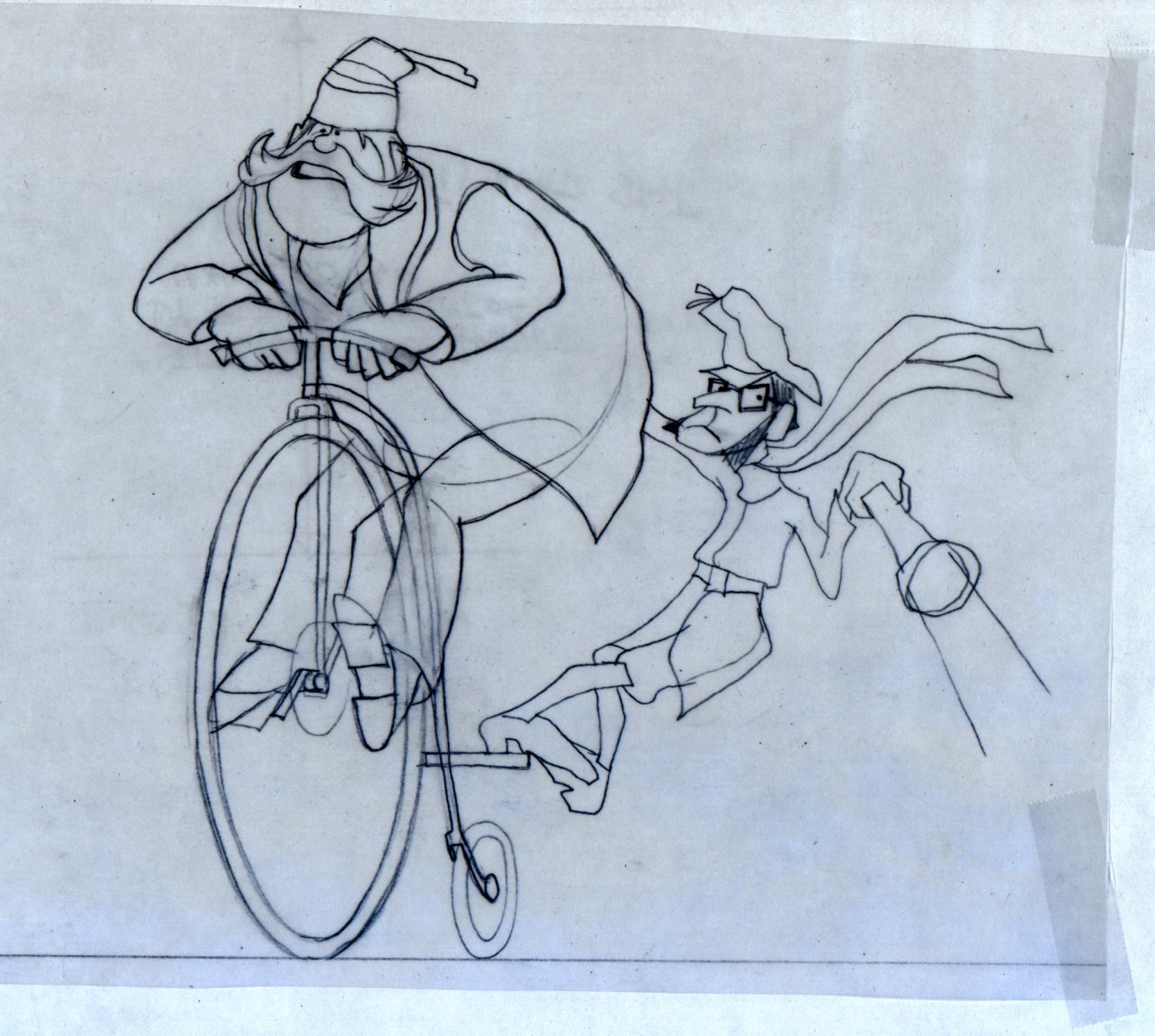
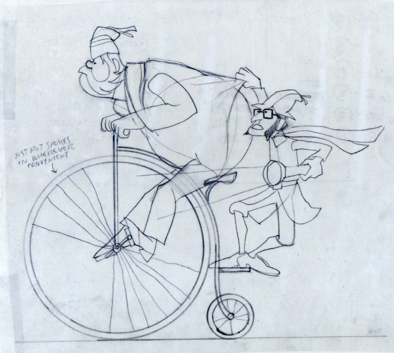
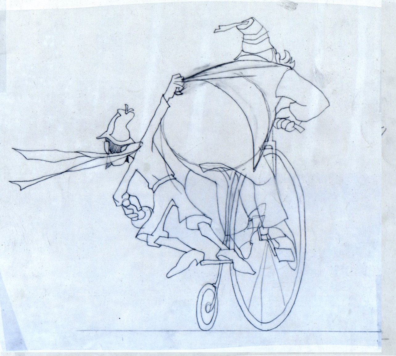
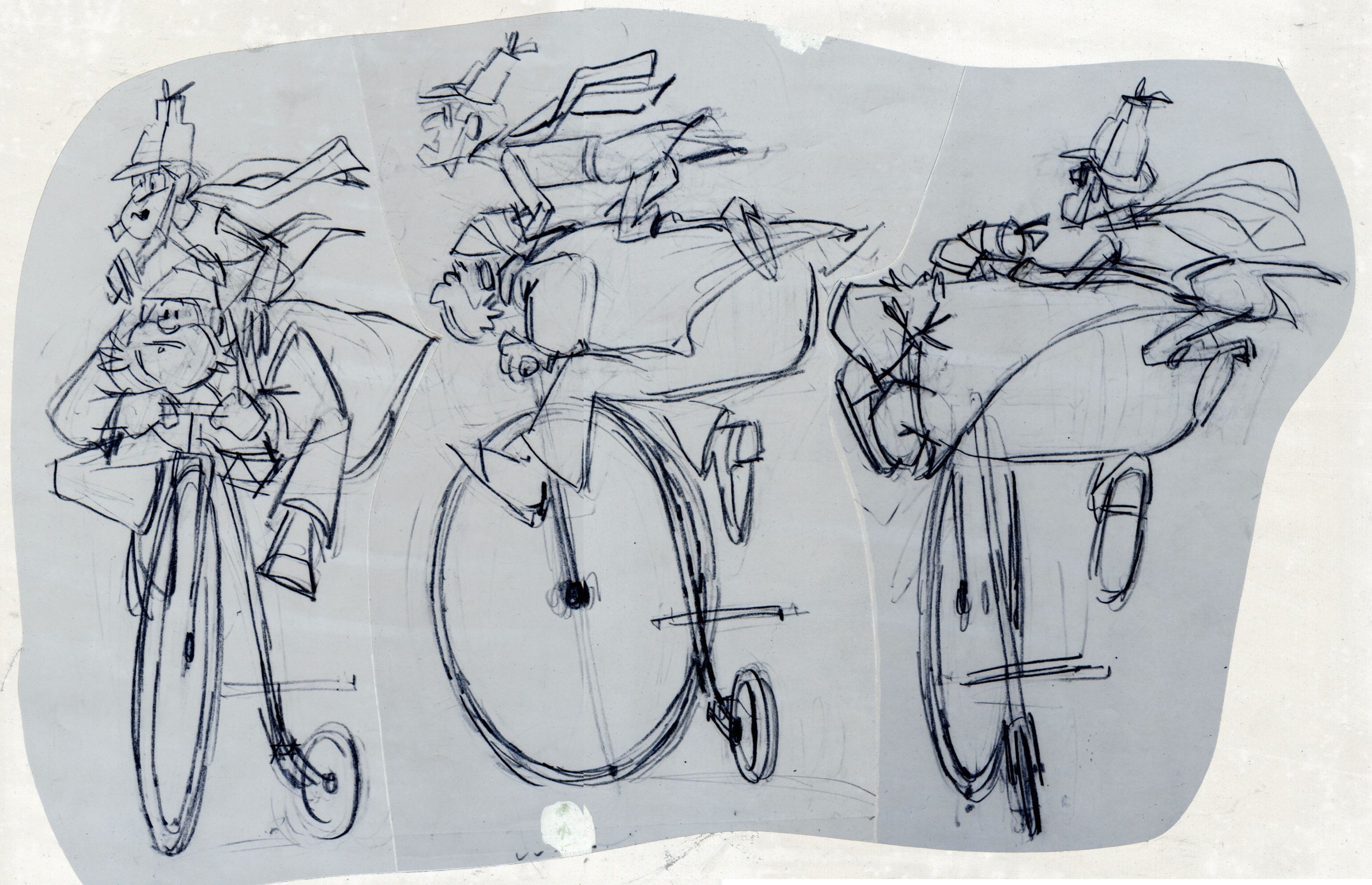
6
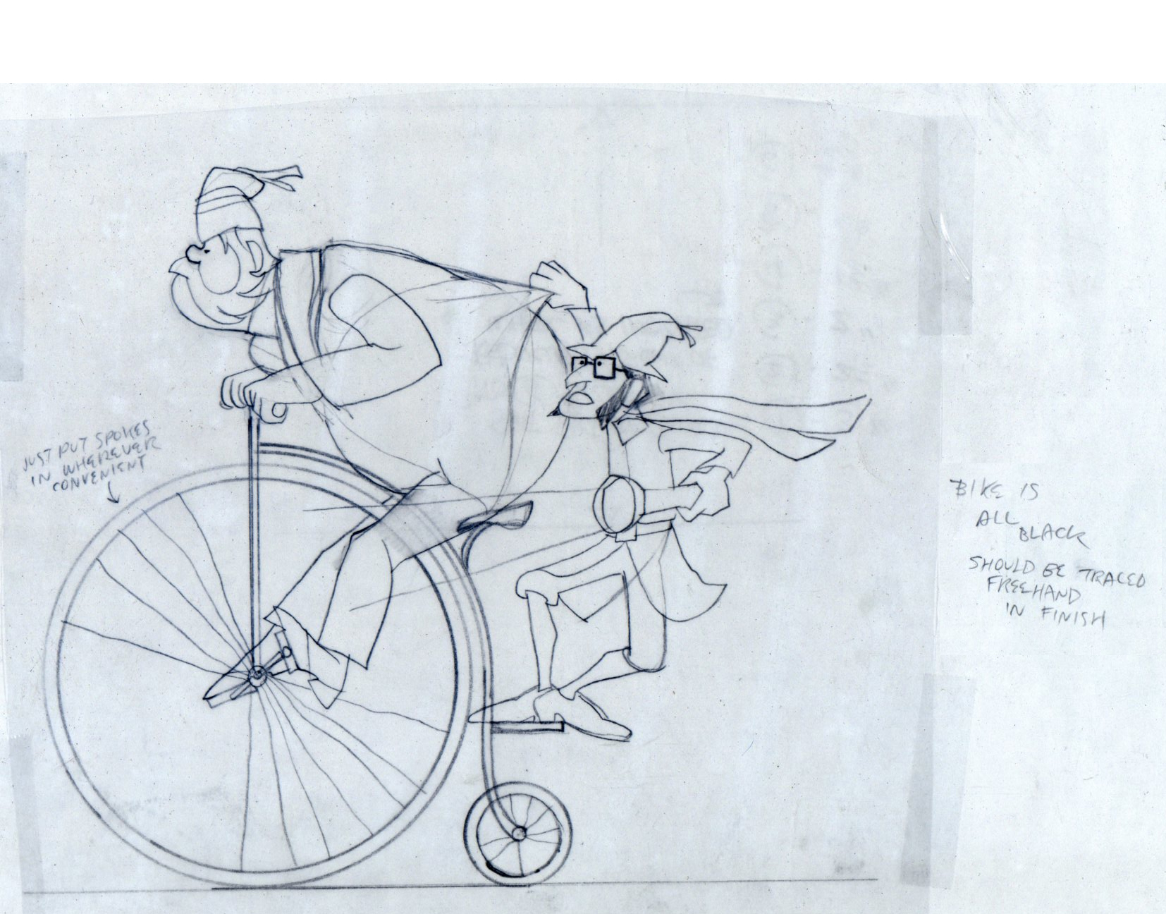
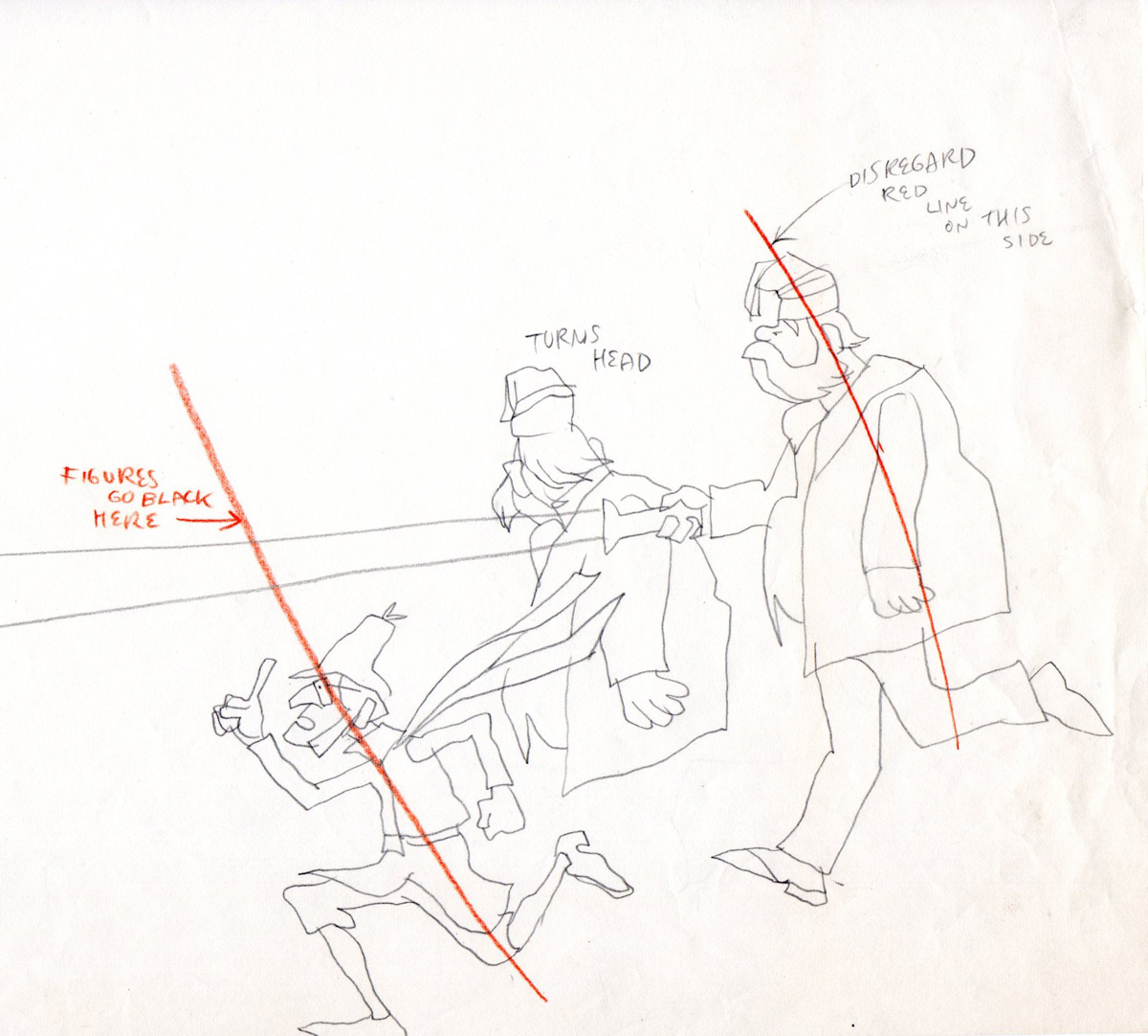
These are Jack Schnerk‘s roughs of the bicycle scene.
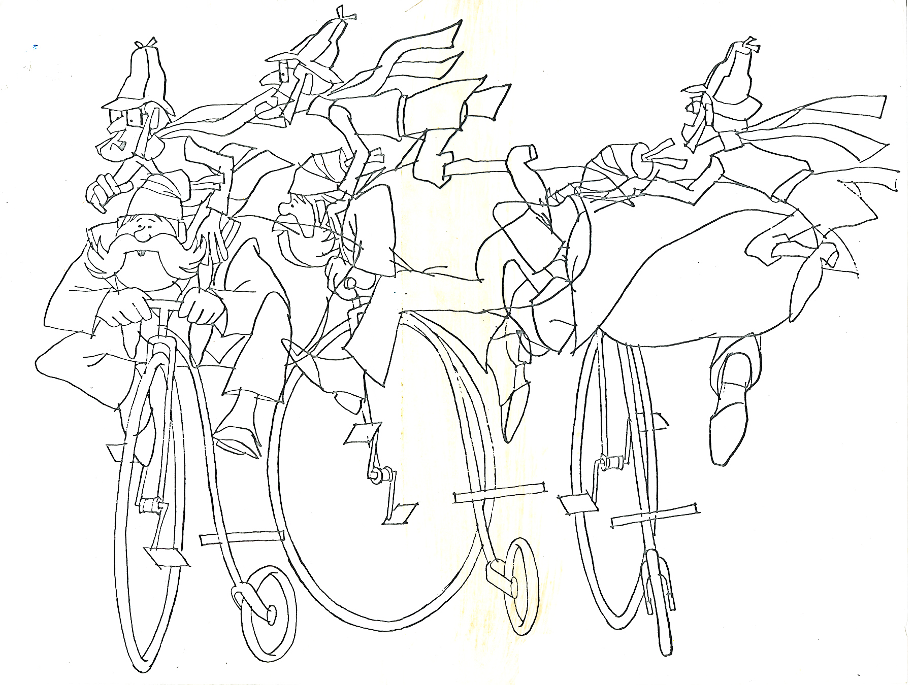
These are Bill Peckmann’s clean ups of Jack’s roughs.
 8
8
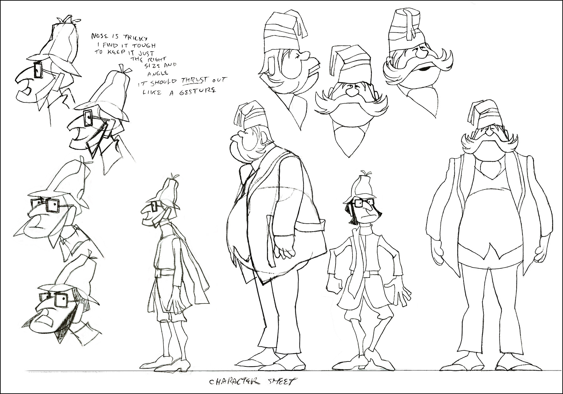
A model sheet from Rowland Wilson.
 9
9
These three color sketches are in the new book,
Trade Secrets, by Rowland Wilson and Suzanne Lemieux Wilson.
 10
10
 12
12
 13
13
 14
14
Row’s rough for pan scene.
 16
16
 17
17
 18
18
A ‘Combs’ cel.
 19
19
an unpainted model cel.
I found the original drawing I did of the crew that worked on Combs & Plotzen
way back then. It’s Vic Barbetta commenting on my lunchtime eating habits,
Jack and Phil’s anticipating the most important part of the day, the coffee wagon
bell, and Agnes hearing the good news of not having to draw anymore tiger stripes.
.
At the time that Rowland designed his Utica Club Beer ‘Mountie’ spot, he also did another U. C. Beer spot where the two adversaries were a Knight and a dragon.
Unfortunately the only remaining piece that
I have from it is this stat of the Knight.
As for the dragon, all I can do is show you this page from
Suzanne Wilson’s ‘Trade Secrets’, where Rowland didn’t
forget his old friend from that commercial and gave him a
new coat of paint. One of his best character designs ever.
The tavern panel is a bg. from the same spot.
The Vote spot starts at 0:37 on this Jack Schnerk sample reel.
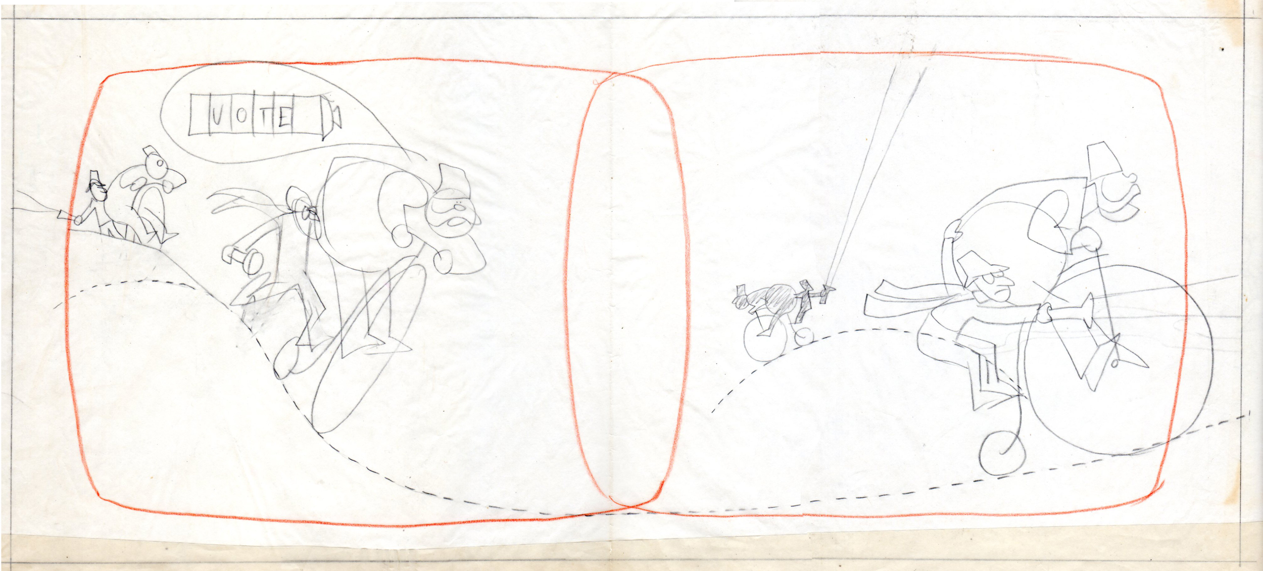
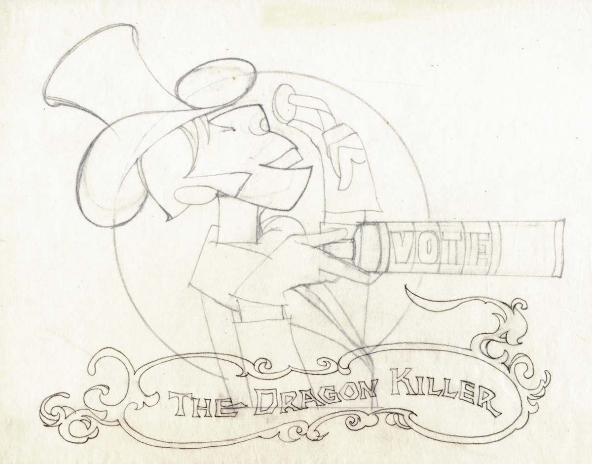
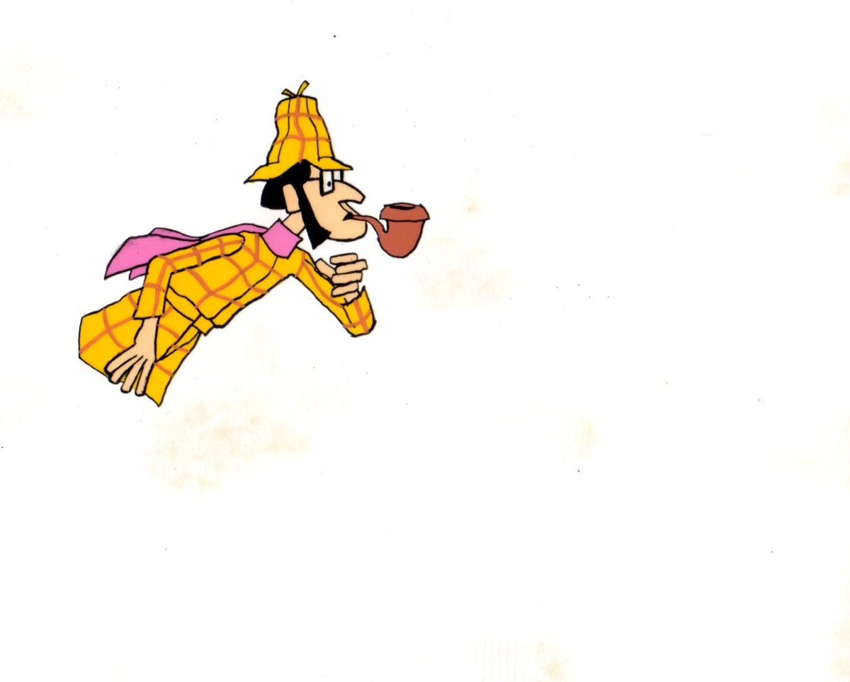
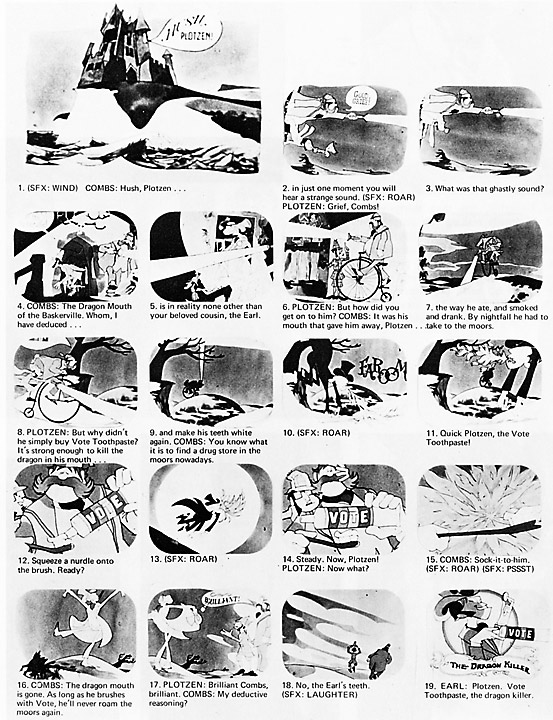
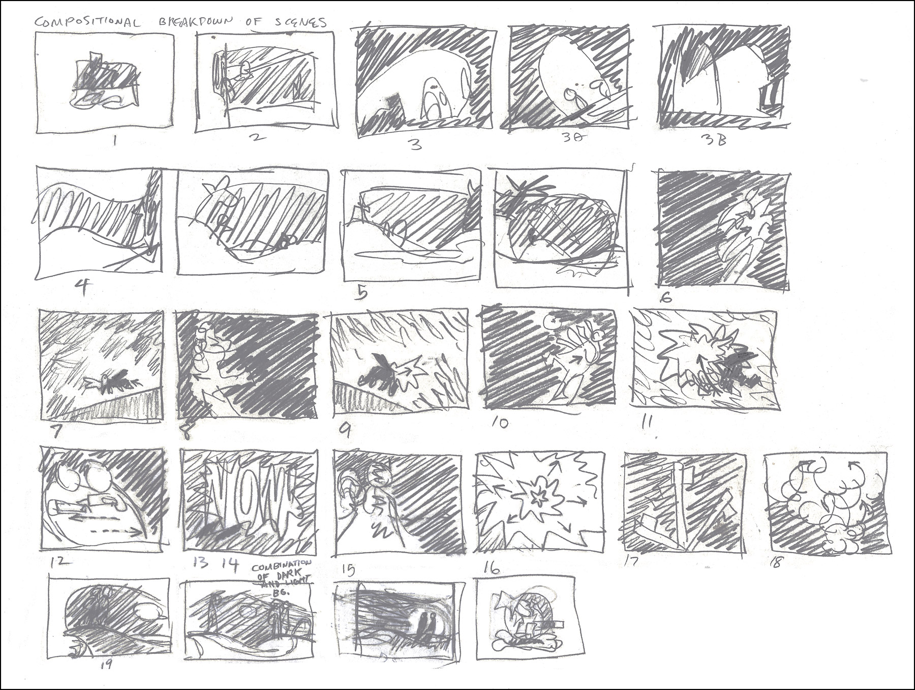
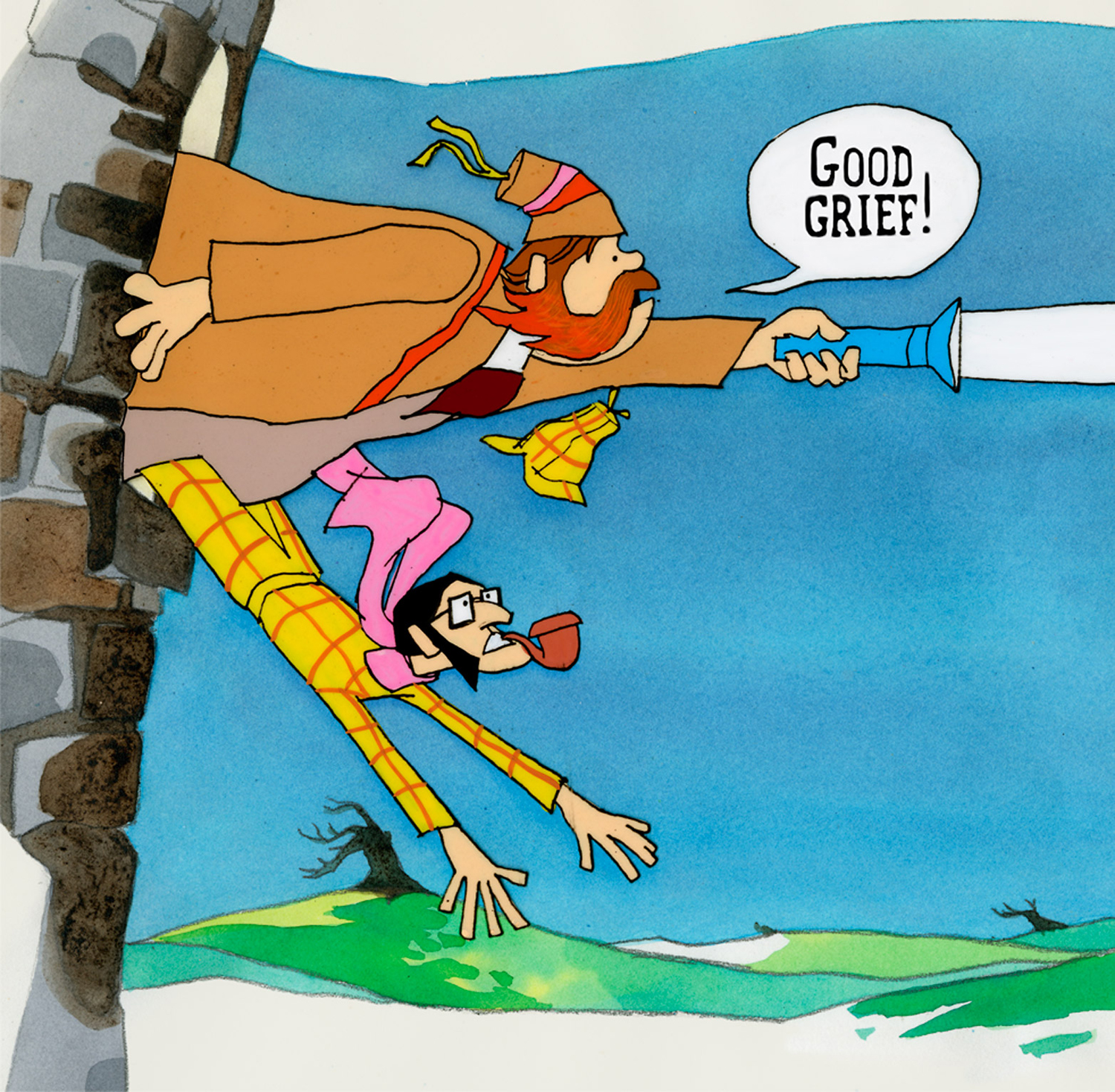
Animation Artifacts &Bill Peckmann &commercial animation &Illustration 24 Aug 2012 05:05 am
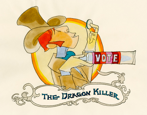
Rowland Wilson’s Vote Toothpaste
-If you’re a brilliant designer, you get there by doing the work that’s necessary. If you’re as great as Rowland B.Wilson was, you take the opportunity of a fine commercial spot, and you research it, plan it, and sketch it out. That’s just what Rowland did with this spot for Phil Kimmelman and Ass. back in the 70s. Vote toothpaste had a gem featuring “Plotzen” and “Coombs”. They just look like Sherlock and Watson.
Thanks to Suzanne Wilson, here’s the prep work Rowland did for this commercial. Many thanks to Bill Peckmann for getting it to the Splog and for additional artwork.
 1
1
 2
2
 3
3
 5
5
 6
6
 7
7
model sheet
 8
8
 9
9
The characters turn 180º in this animation model.
This was animated by Jack Schnerk and cleaned up by Bill Peckmann.
 12
12
 13
13
B&W BG Layout for the color image to follow.
 14
14
 15
15
 16
16
B&W Bg Layout for the following image.
 17
17
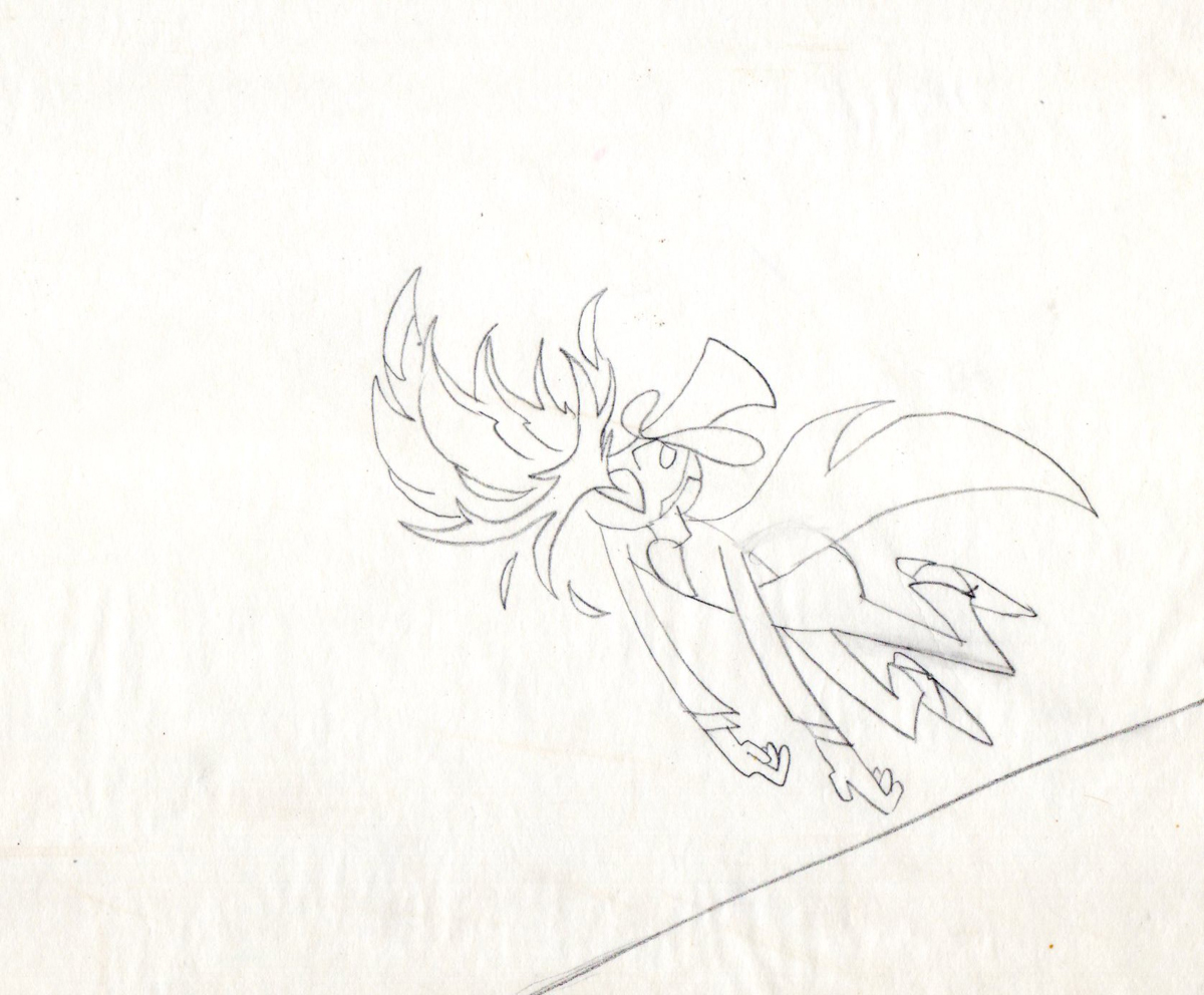
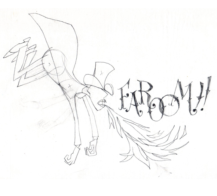
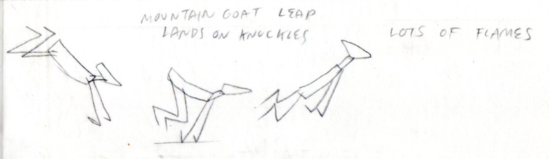
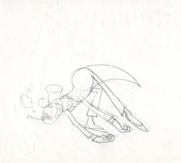
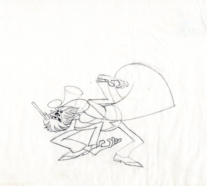
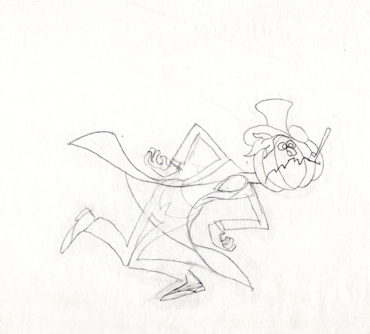
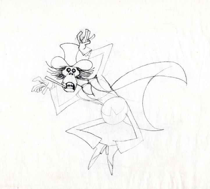
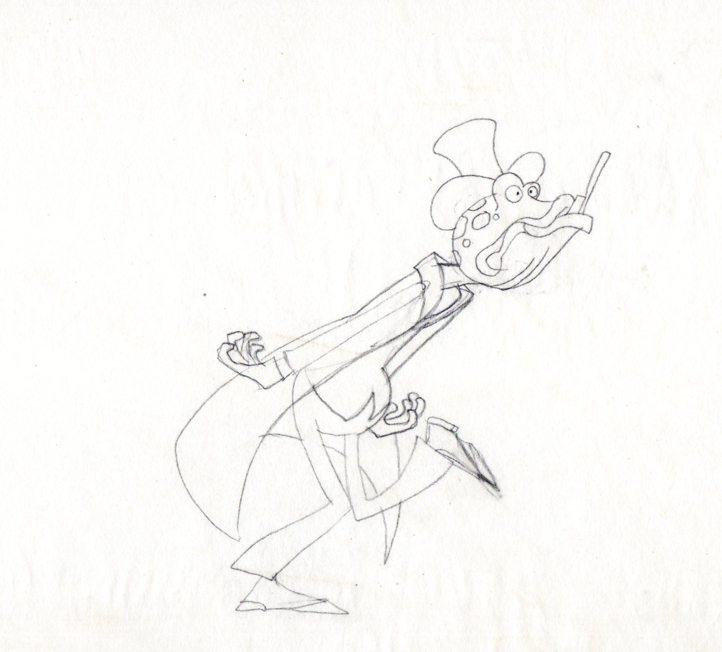
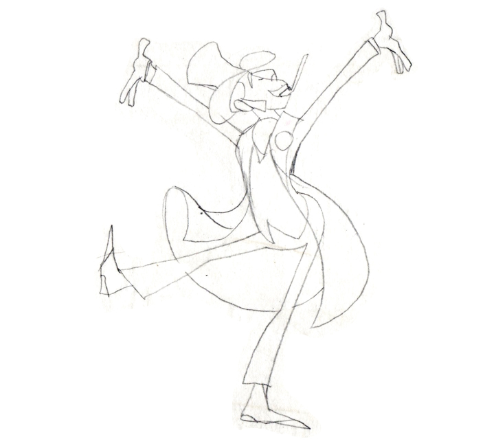
Finally, here are some rough sequential drawings that Rowland did
for a sequence where the villain transforms via Vote toothpaste.
The object in his mouth is a toothbrush with toothpaste on it.
 1
1
 3
3
 4
4
 5
5
 6
6
 7
7
 8
8
The Vote spot starts at 0:37 on this Jack Schnerk sample reel.
