Search ResultsFor "snark"
Books &Commentary &Illustration 22 Oct 2013 06:20 am
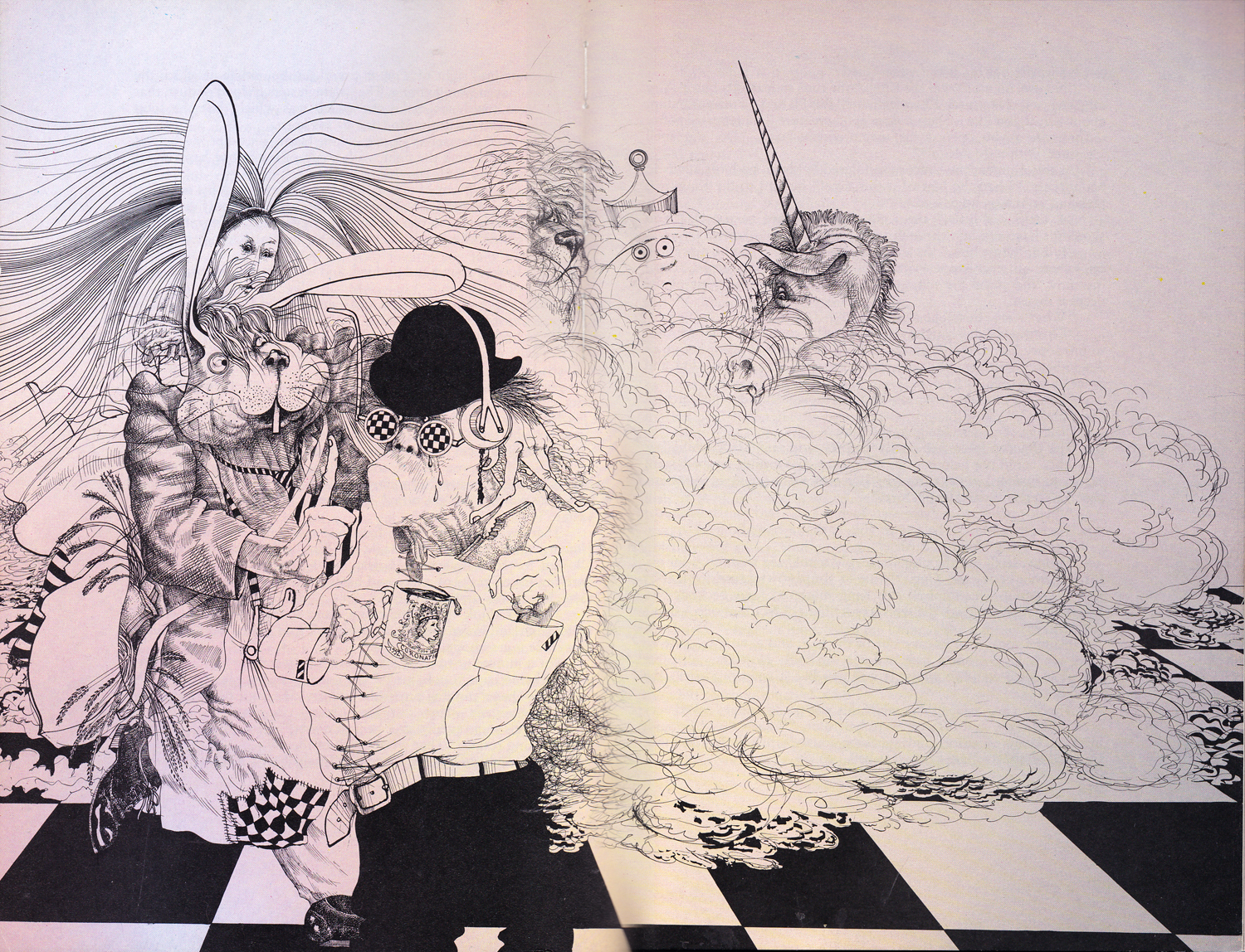
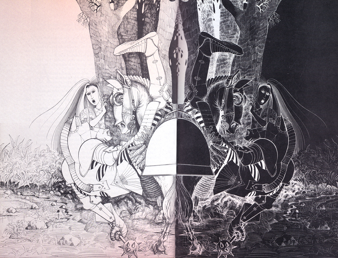
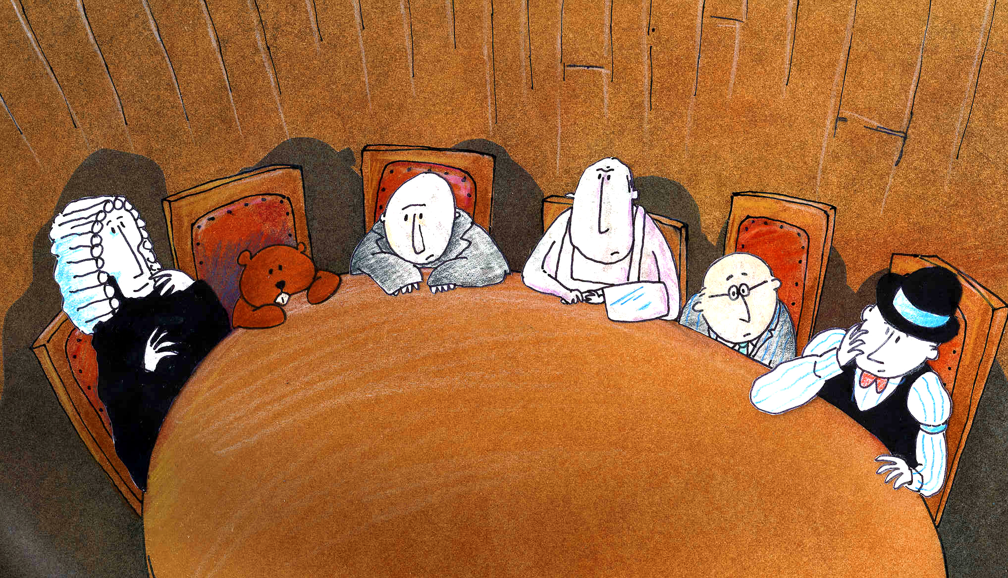
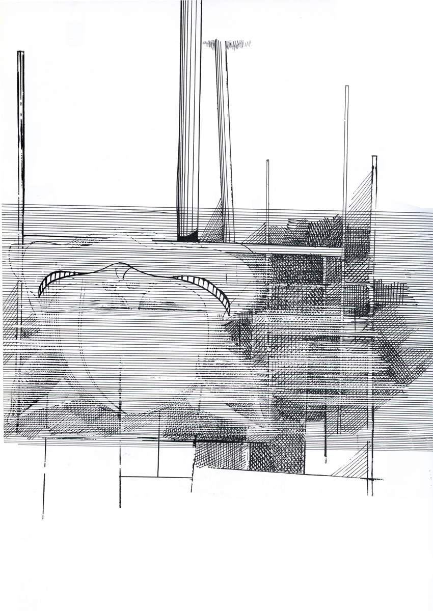
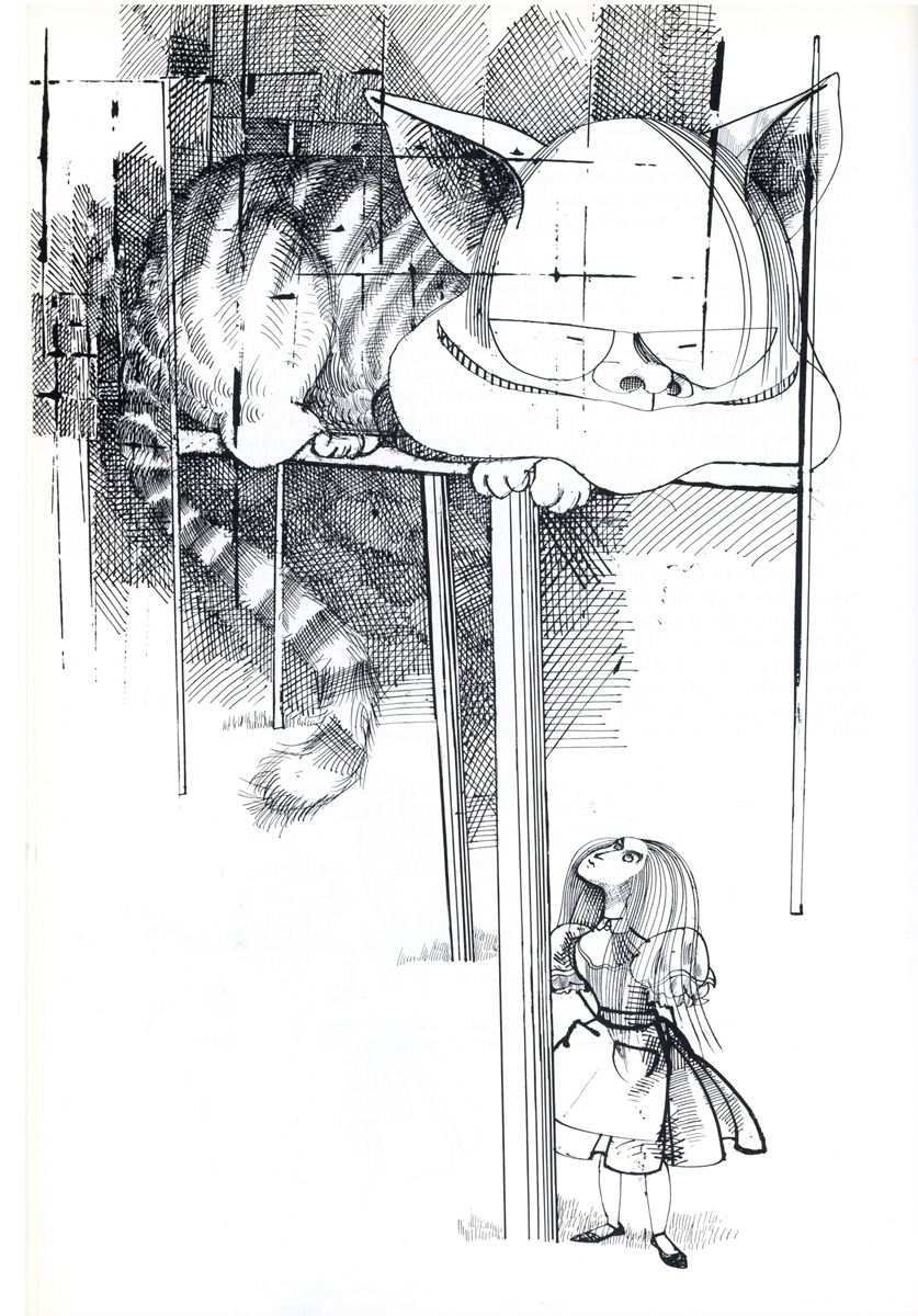
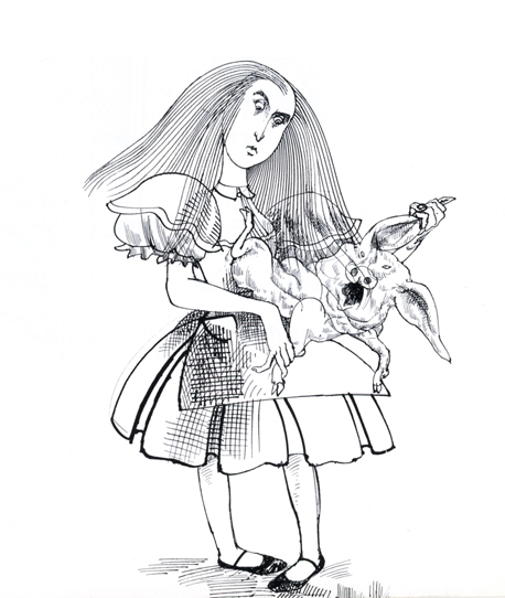
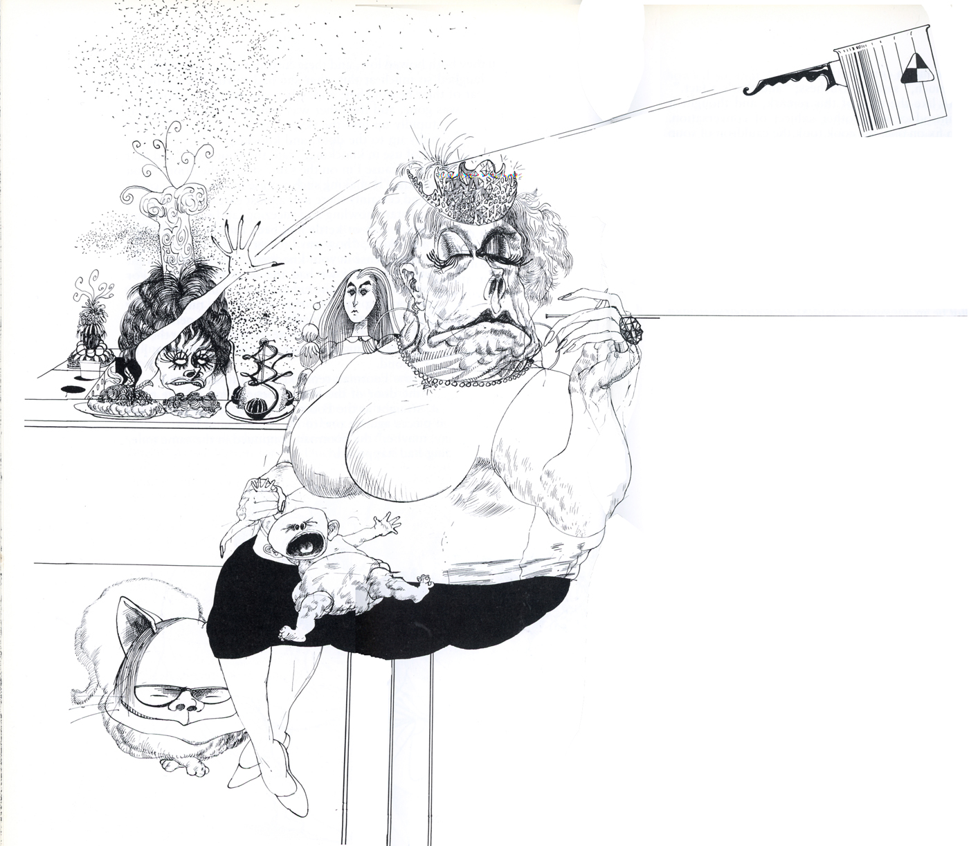
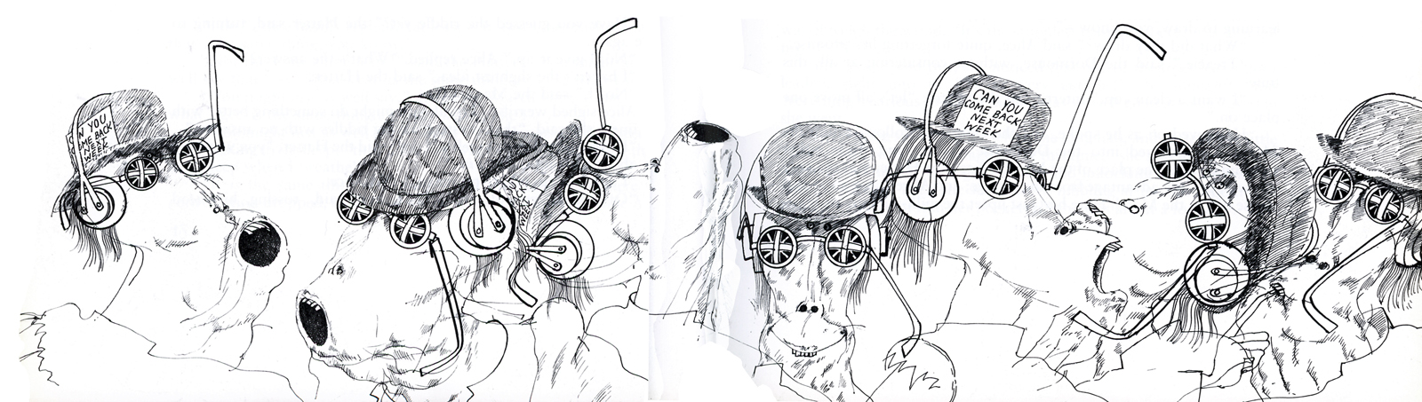
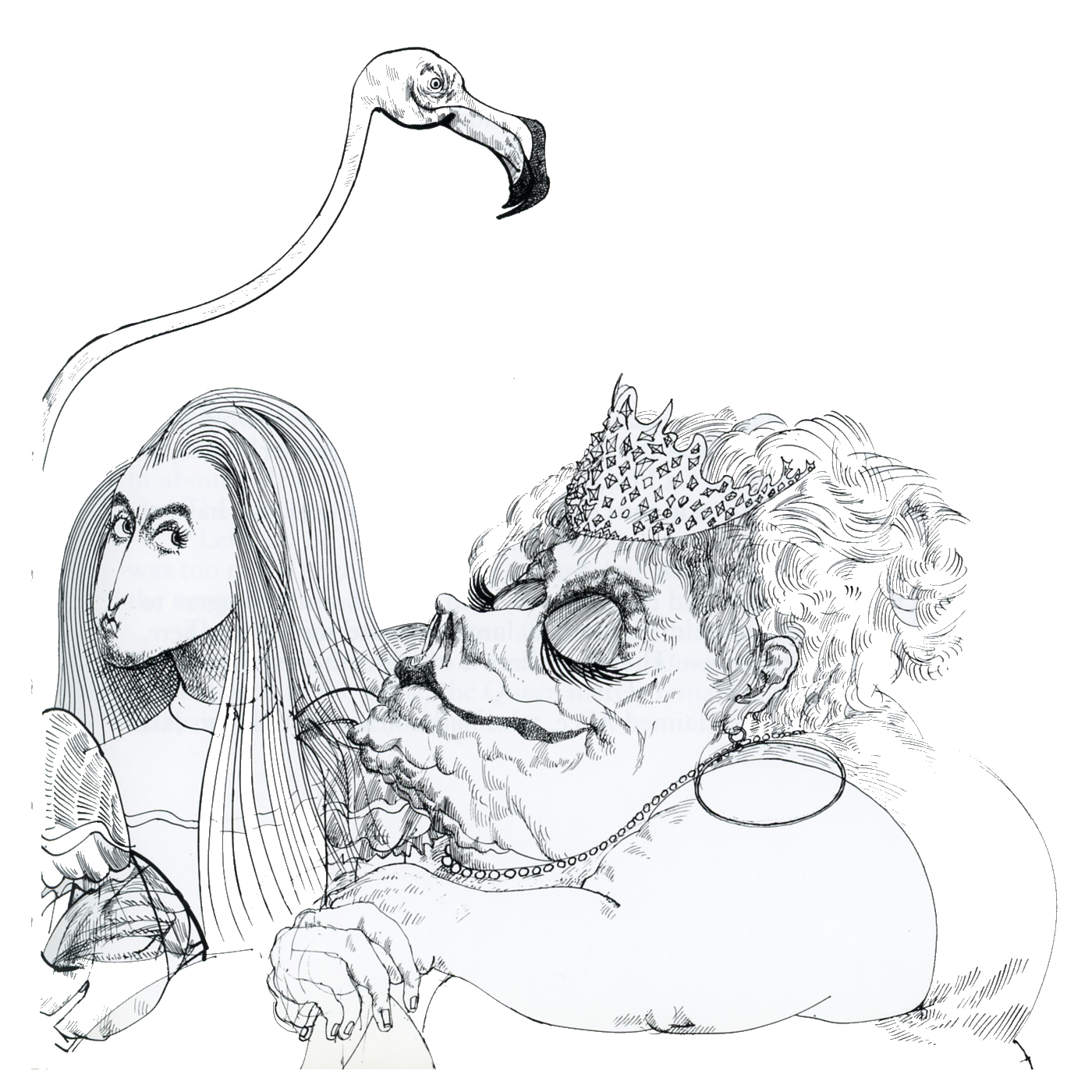
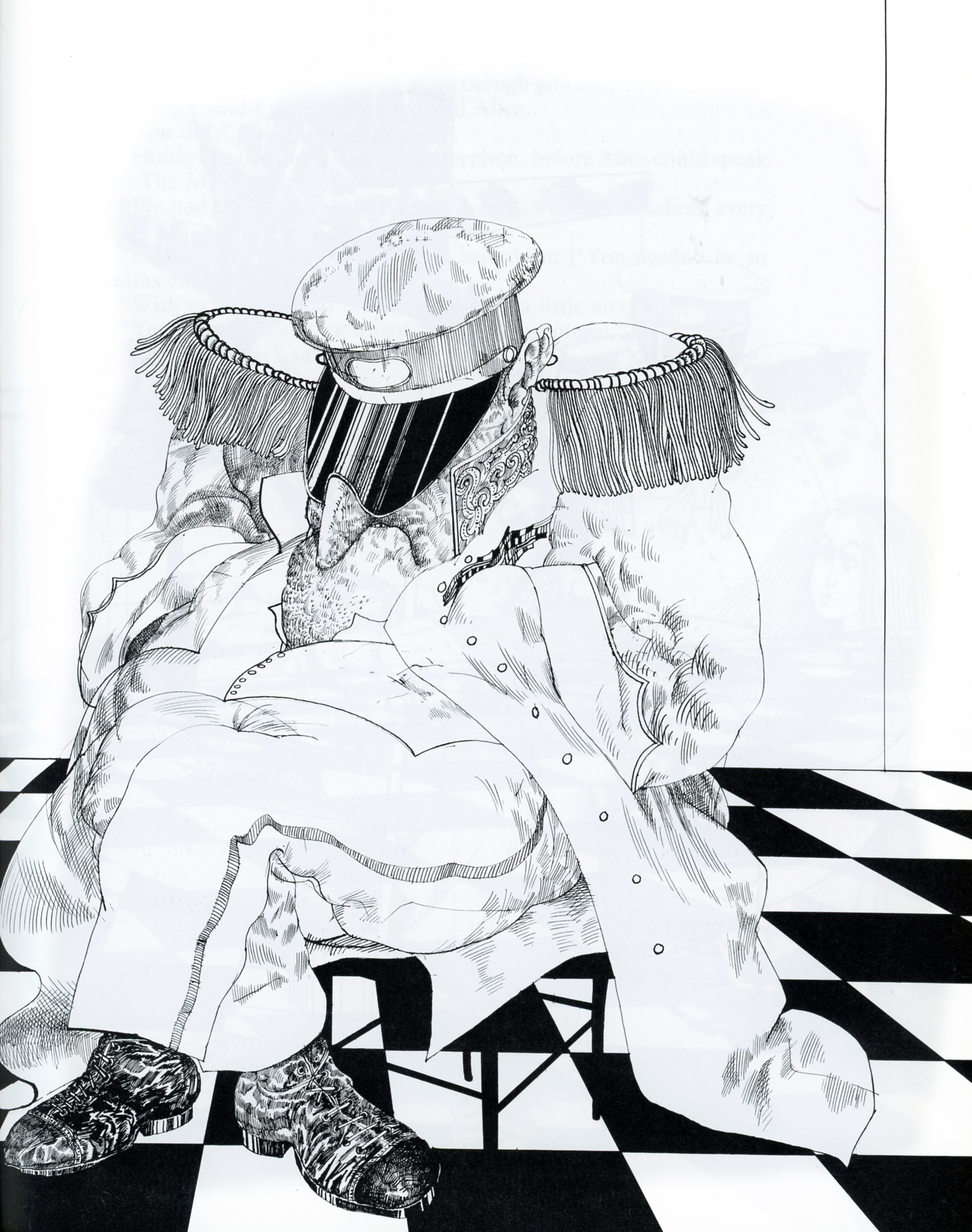
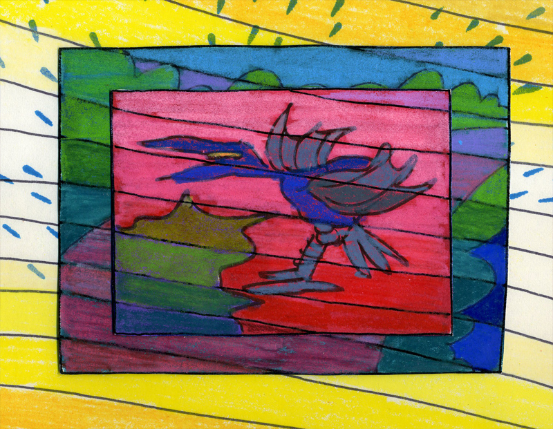
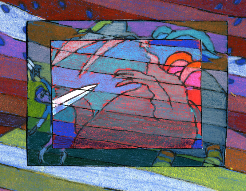
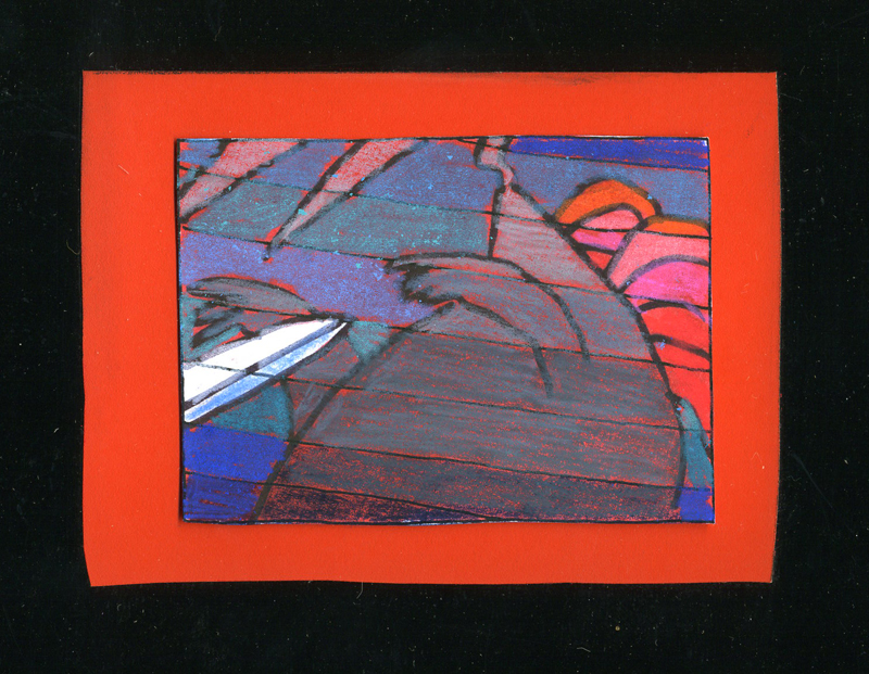
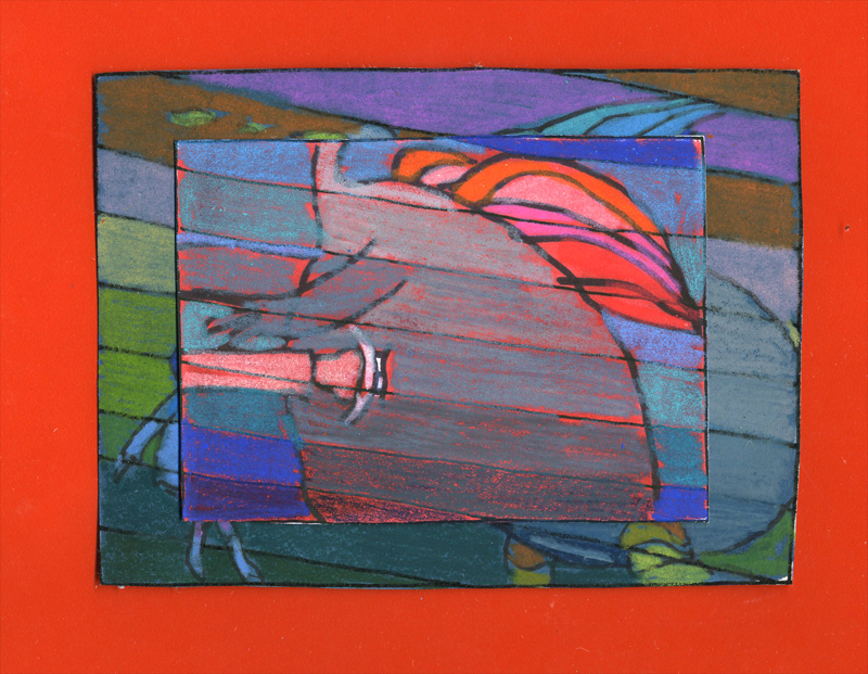
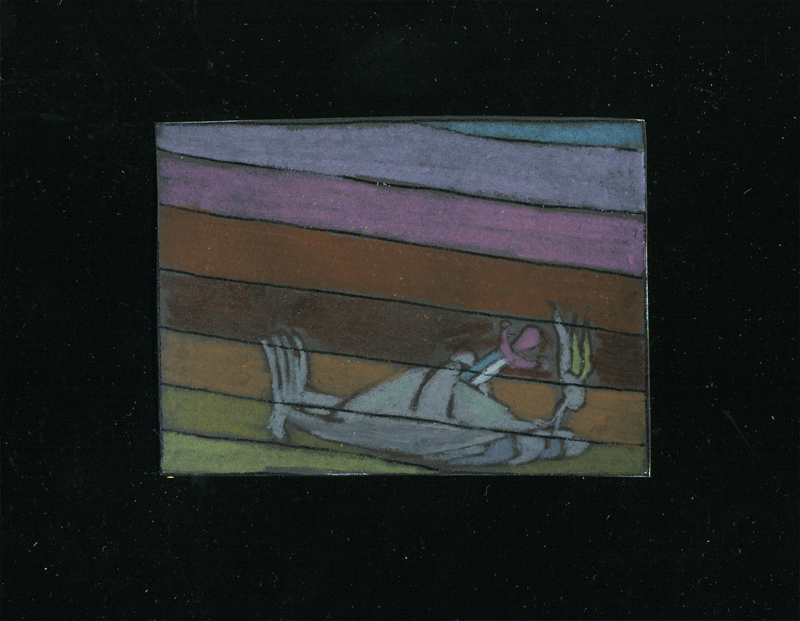
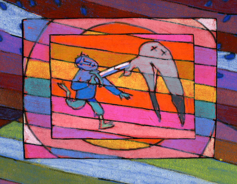
Steadman meets Jabberwocky
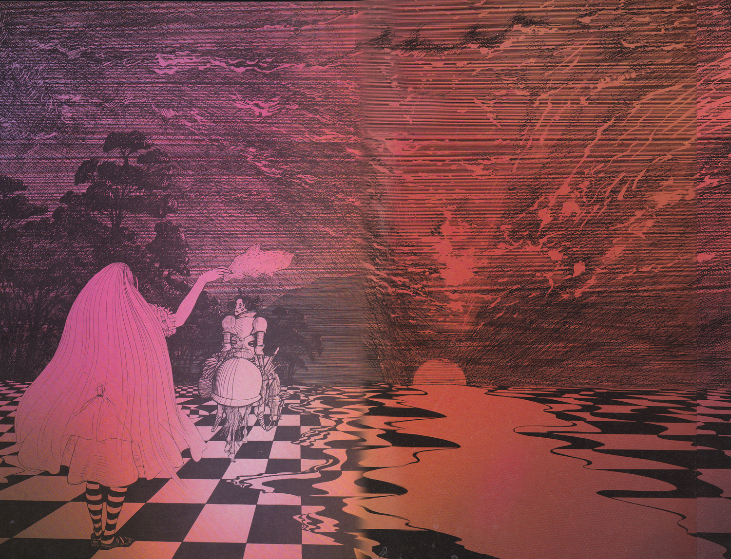
Ralph Steadman has reached the White Knight, who gets to recite Jabberwocky for the first time.
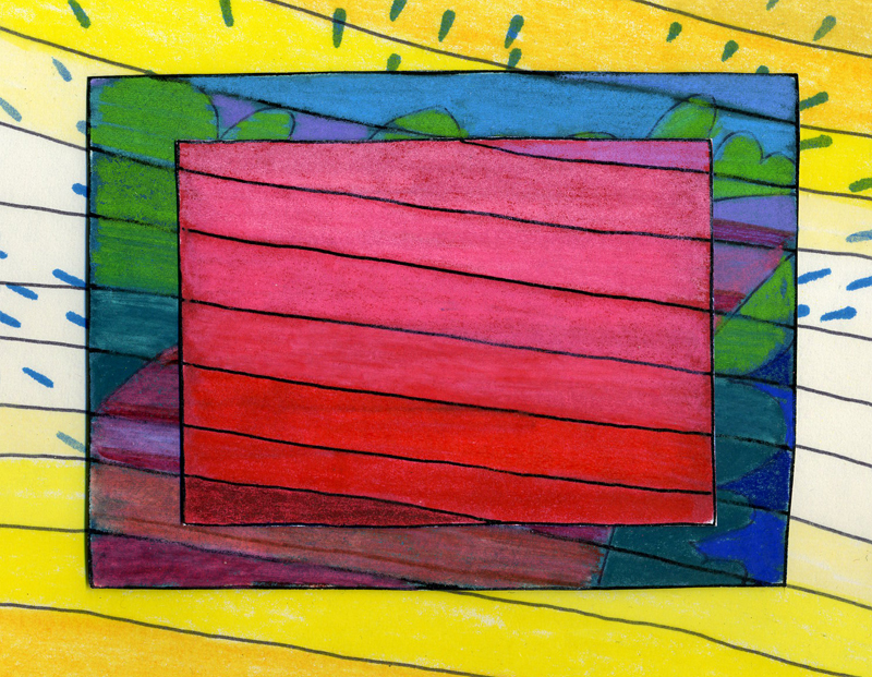
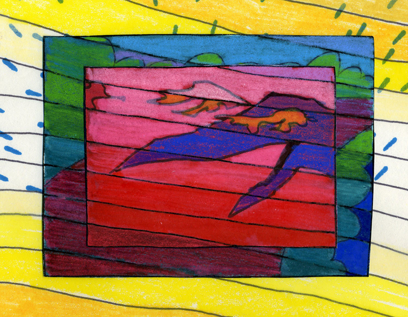
It’s a brilliant delight, of course, and the illustrations are completely up to the task. But this is from a wholly different book. (It’s published out of order within this volume. If it weren’t out of order it’d be too long to fit dramatically, here.) I believe I may have once posted Jabberwocky or some of it, anyway. I can’t find it just now. I also have the version by QUentin Blake which I know I didn’t post. (THAT book is a rarity.) I really do love Lewis Carroll’s work.
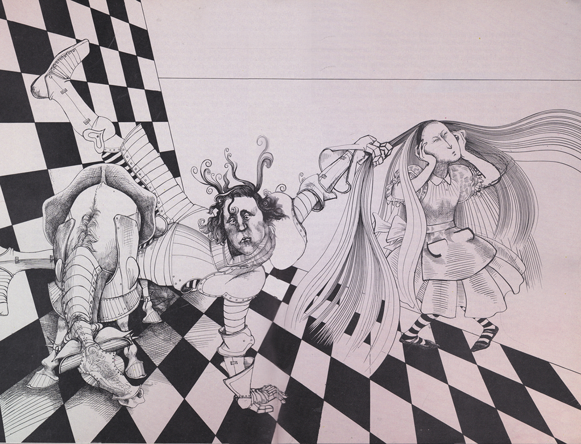
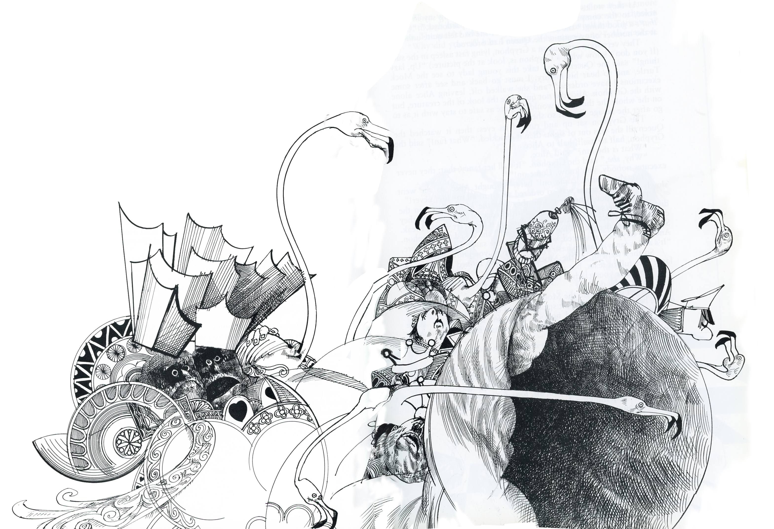
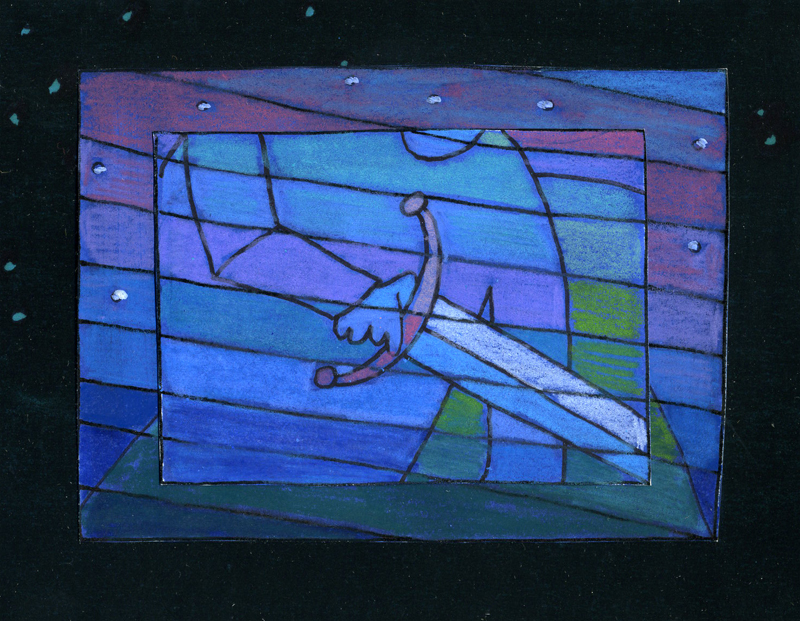
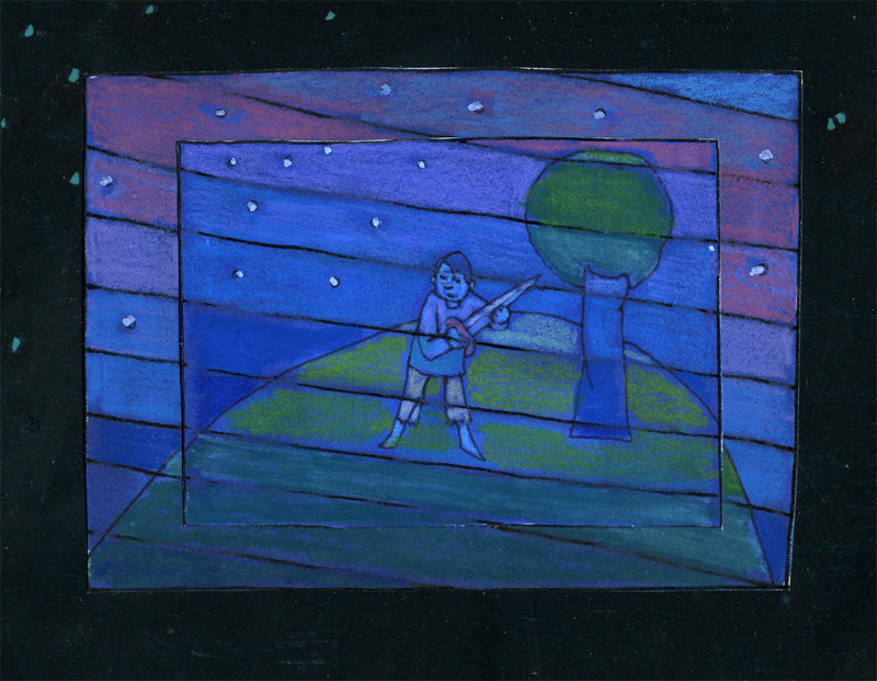
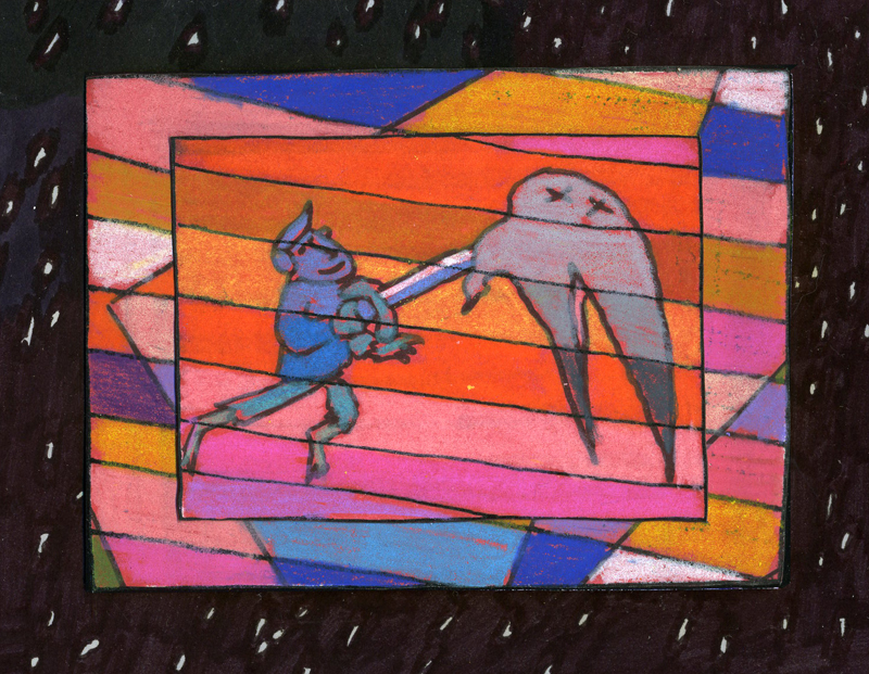
Soon after the White Knight is defeated by the young, imbalanced Red Knight (don’t ask, read it), the Red Knight tries to recite his poem but has a bit of difficulty. He has to keep time with his right hand while trying to stay in balance on his horse.
However, he keeps falling off the horse when his isn’t reciting. The man has a problem.
Tell me, don’t you think the Red Knight looks a bit like a young Prince Charles? My thought, of course. Would Steadman be that rude to treat his royalty so?
Here, uninterrupted, are the illustrations:
 1
1
 2
2
 3
3
 4
4
 5
5
 6
6
 7
7
 8
8
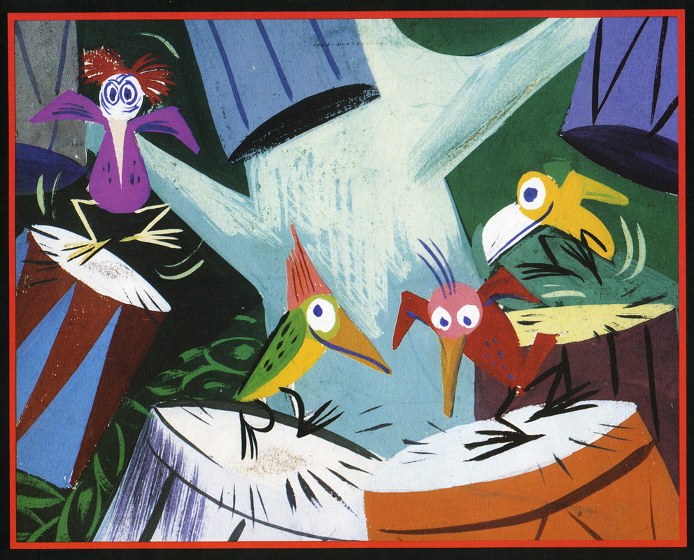
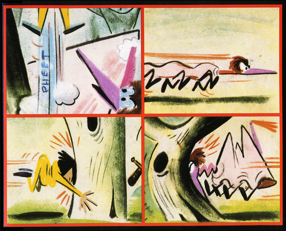
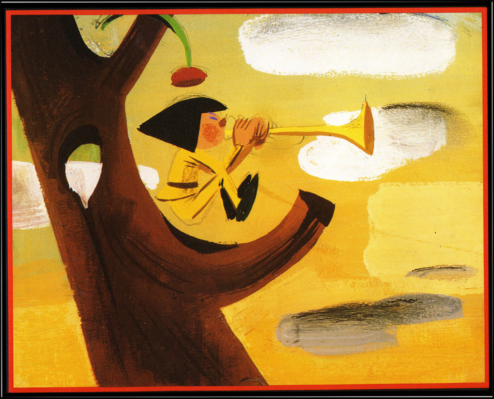
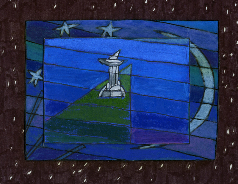
Starting today, I’m going to end a lot of my posts with images from Michael Sporn Animation Inc films. I have to say, in all the years of making so many films, too infrequently have I posted pictures of the work we’ve been doing. It’s about time.
Michael Sporn
Sporn images
from
The Hunting of the Snark
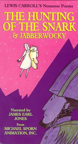
The individually wrapped video box from First Run Features 1
 2
2
 3
3
 4
4
 5
5
Books &Commentary &Illustration 16 Sep 2013 07:45 am
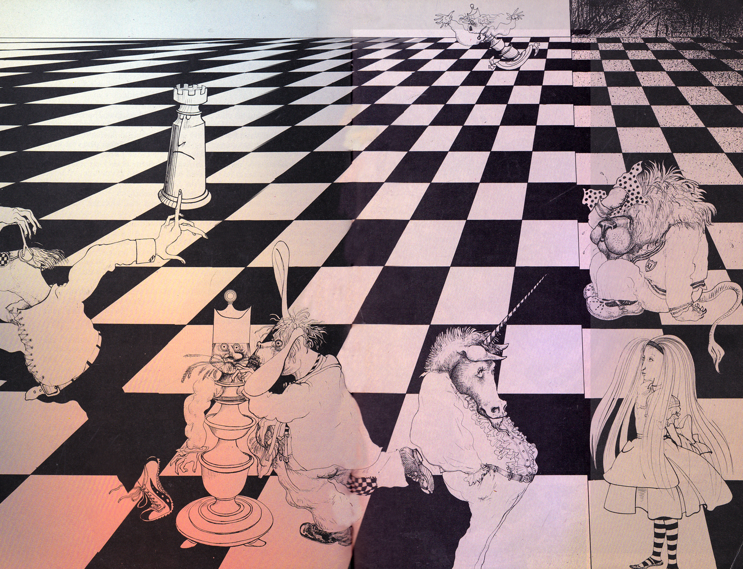
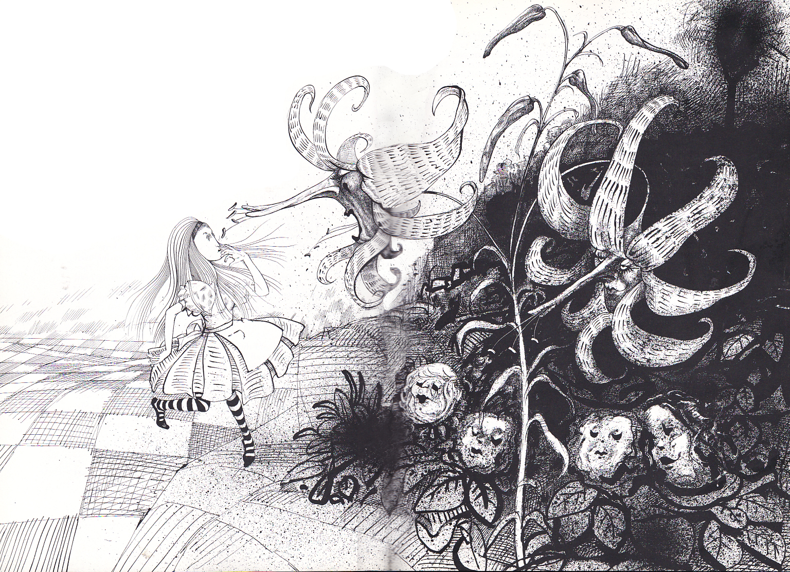
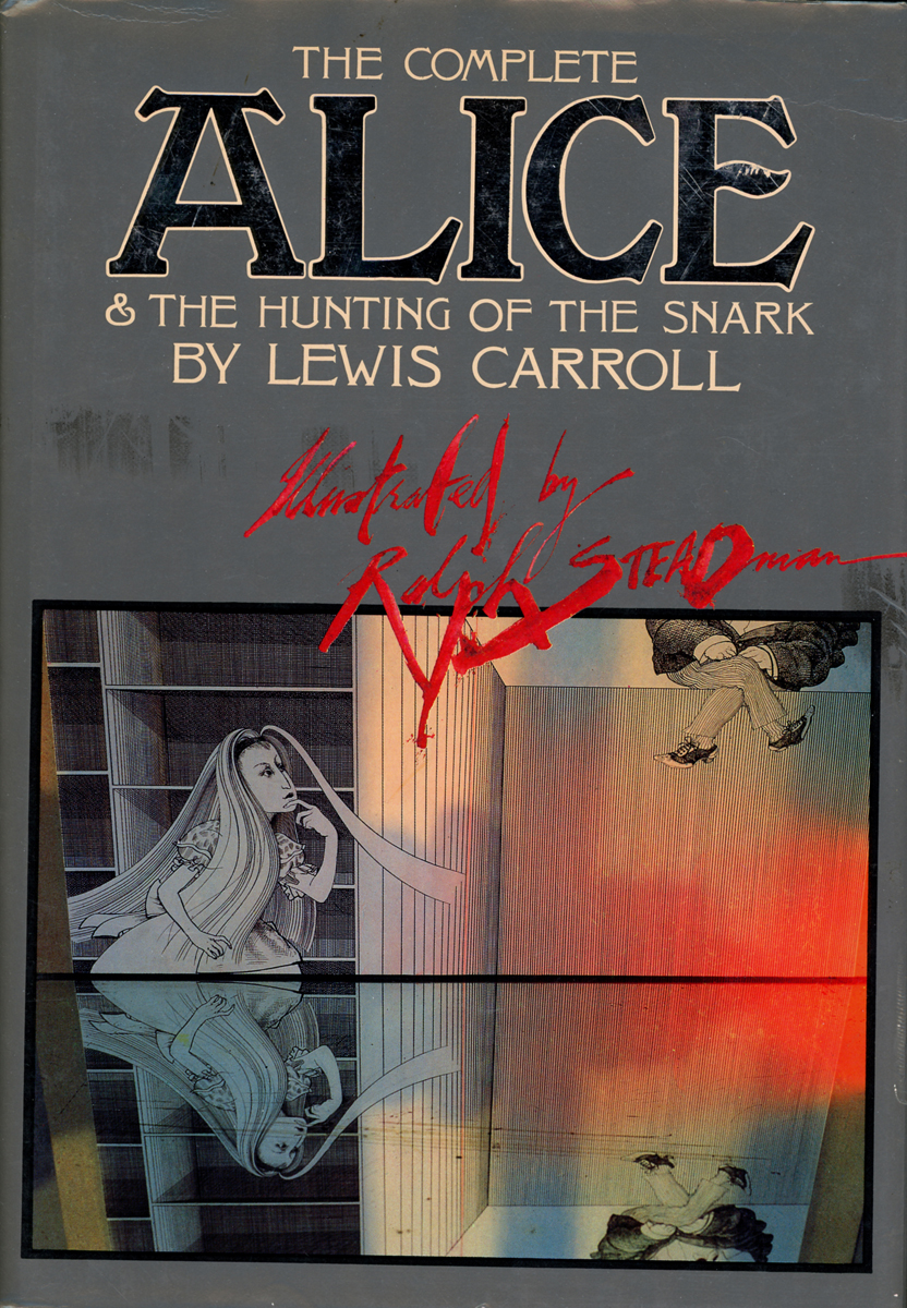
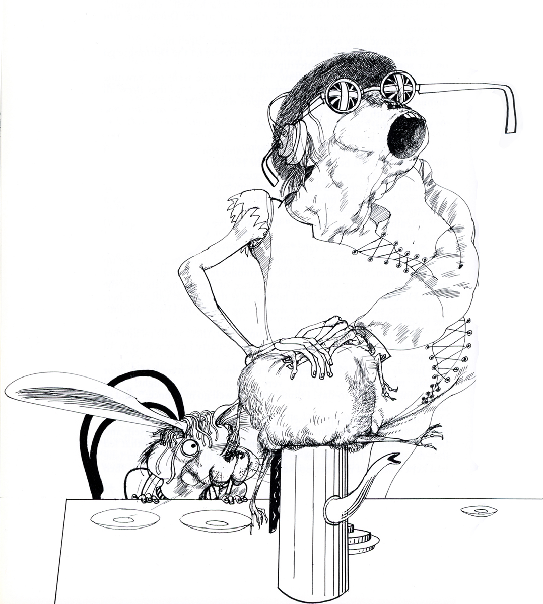
More of Steadman’s Alice
Here are a few more pages of Ralph Steadman‘s Alice In Wonderland. This takes us up to Tweedledee and Tweedledum. Major scanning coming up, so I had to break here.
 1
1
 2
2
 3
3
 4
4
 5
5
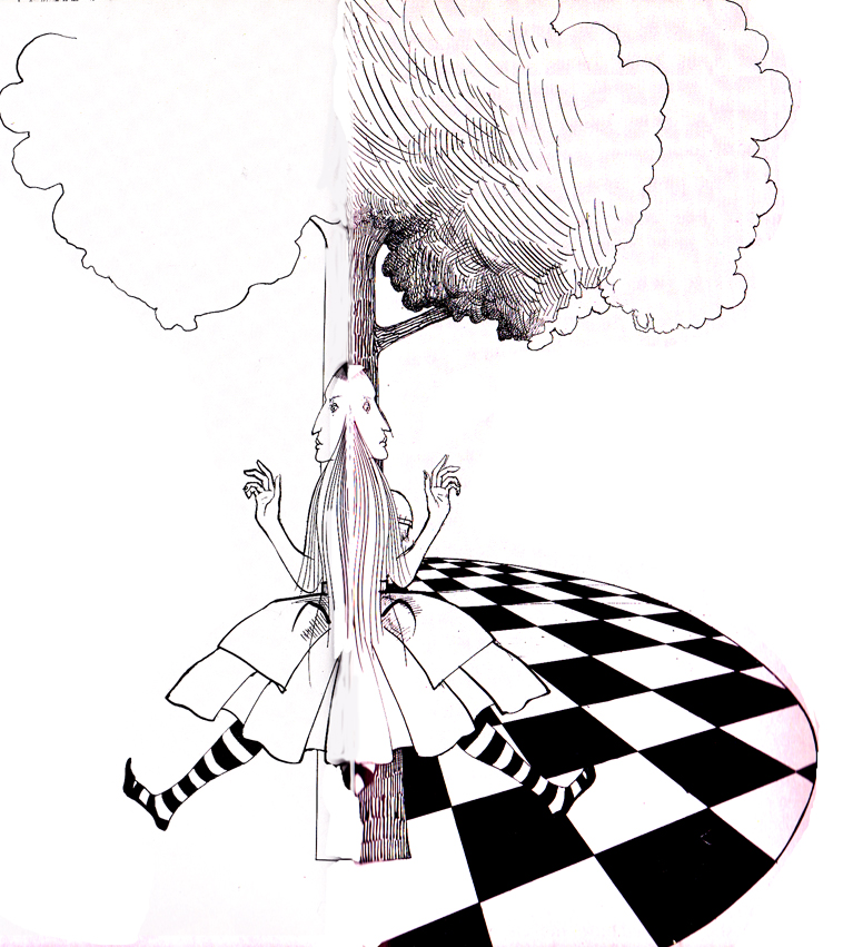
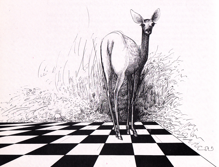
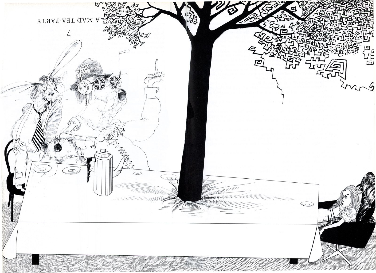
Books &Illustration &Models 16 Jul 2013 05:15 am
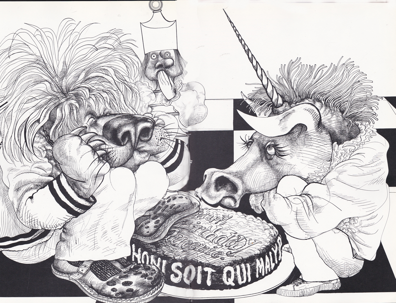
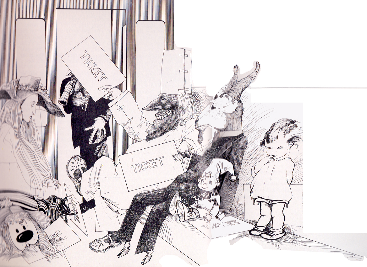
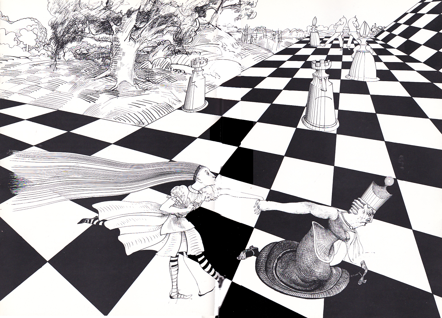
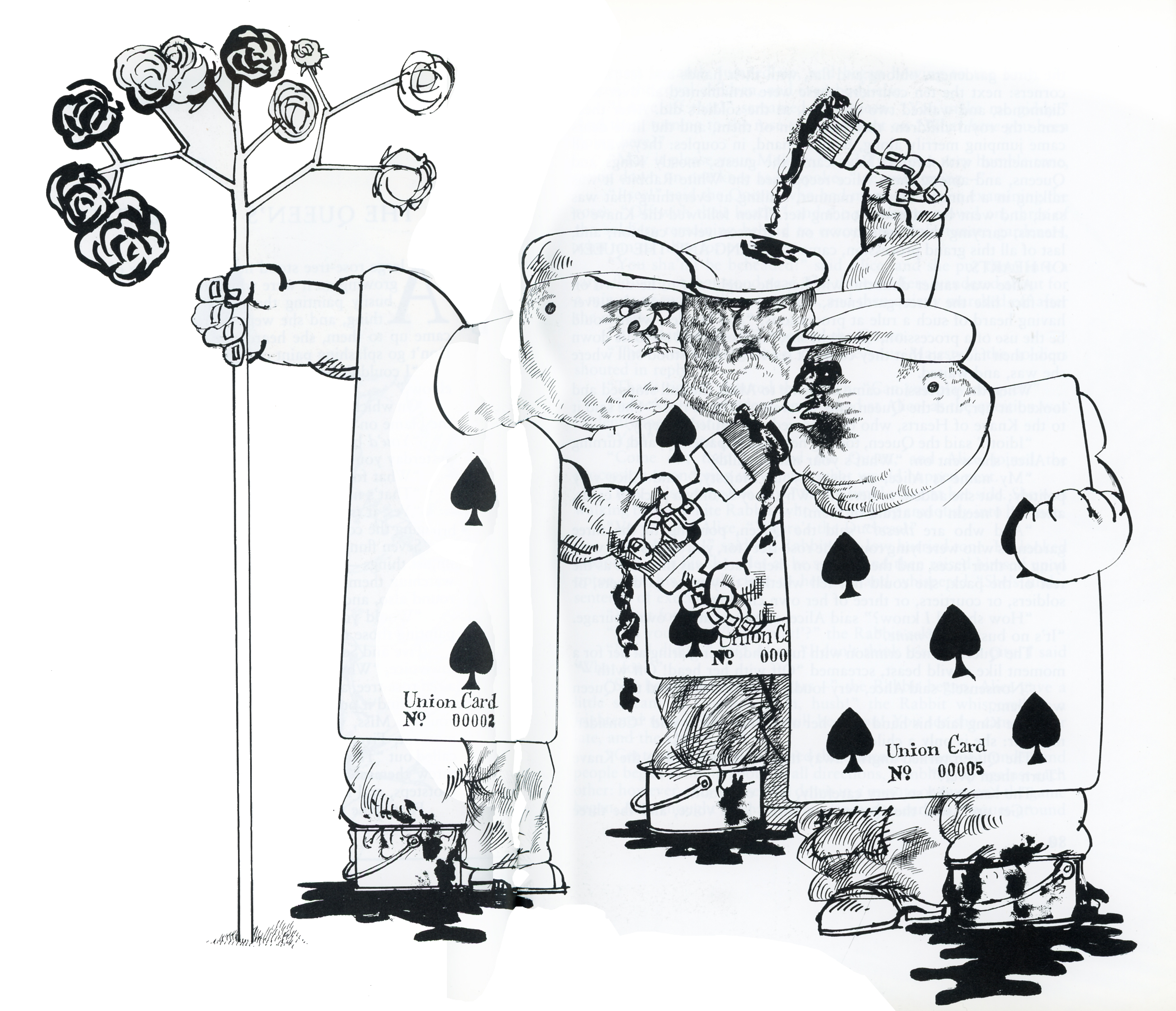
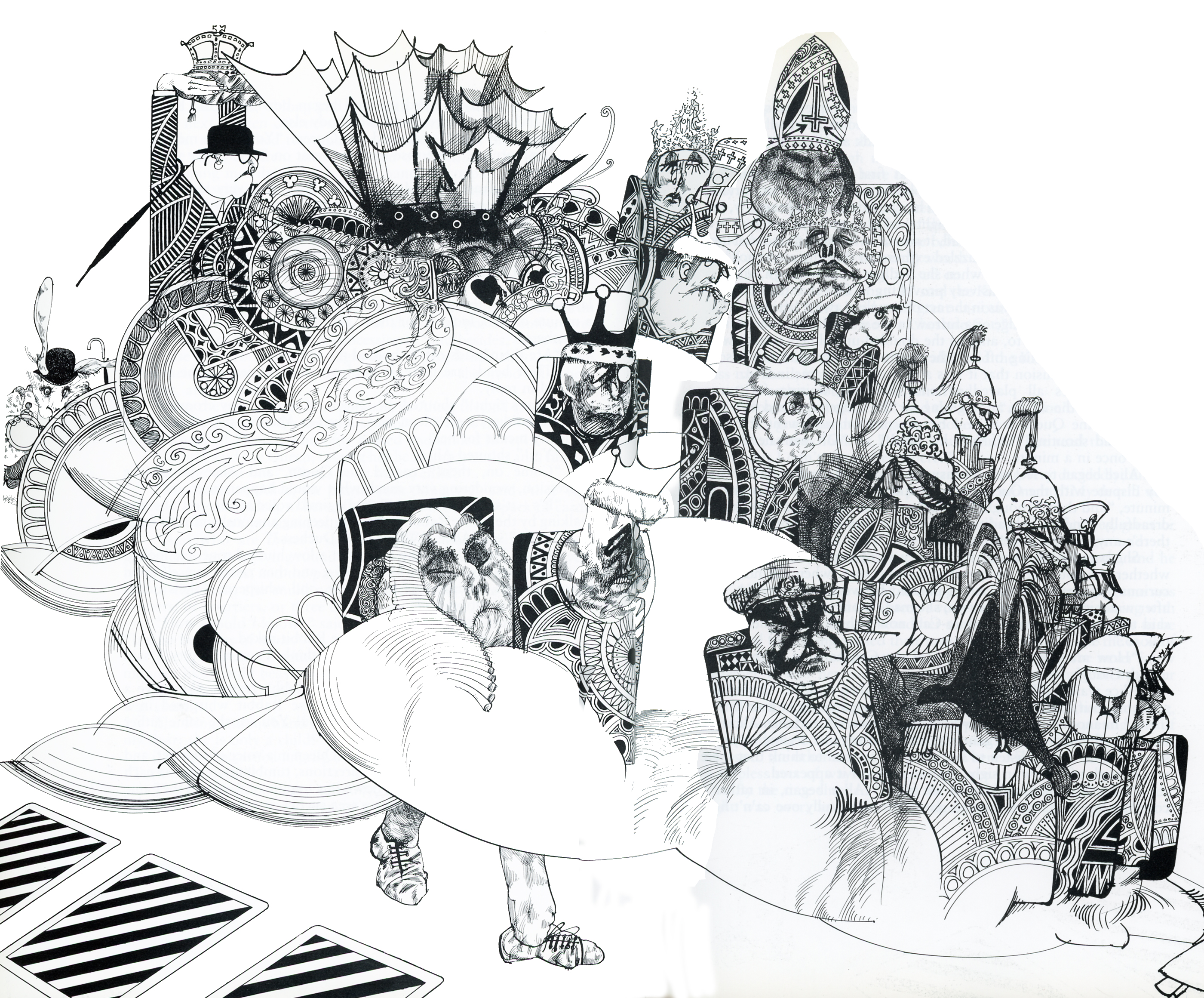
Alice Via Steadman – 2
The book’s cover
As I’ve pointed out in this series, Alice in Wonderland is my favorite children’s book. and Ralph Steadman one of my favorite illustrators. His work is so intelligent; his art so British and sophisticated, these two were the perfect pair. I think Charles Dodgson would have selected Steadman, himself, had his art been discovered back then.
Here then is part 2 of some illustrations taken from Steadman’s book:
 1
___________
1
___________ 2
___________
2
___________ 3
___________
3
___________ 4
___________
4
___________ 5
___________
5
___________ 6
___________
6
___________ 7
7
Daily post 02 Jul 2013 12:38 am
Alice via Steadman 2
The book’s cover
As I’ve pointed out in this series, Alice in Wonderland is my favorite children’s book. and Ralph Steadman one of my favorite illustrators. His work is so intelligent; his art so British and sophisticated, these two were the perfect pair. I think Charles Dodgson would have selected Steadman, himself, had his art been discovered back then.
Here then is part 2 of some illustrations taken from Steadman’s book:
1
___________ 2
___________ 3
___________ 4
___________ 5
___________ 6
___________ 7
Animation &Animation Artifacts &Books &Comic Art &Layout & Design &SpornFilms &Story & Storyboards 28 Jun 2013 05:40 am
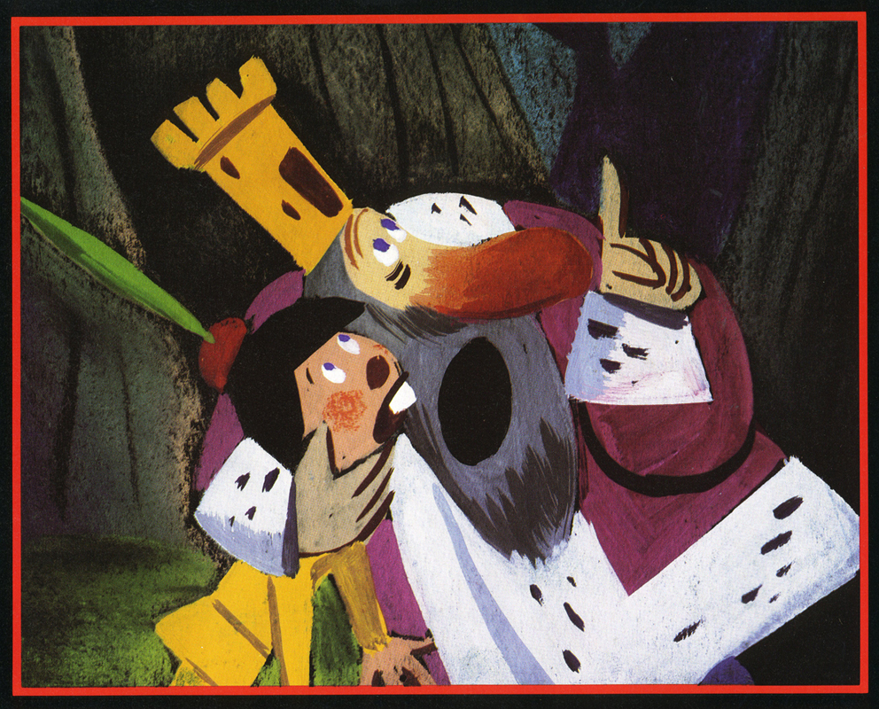
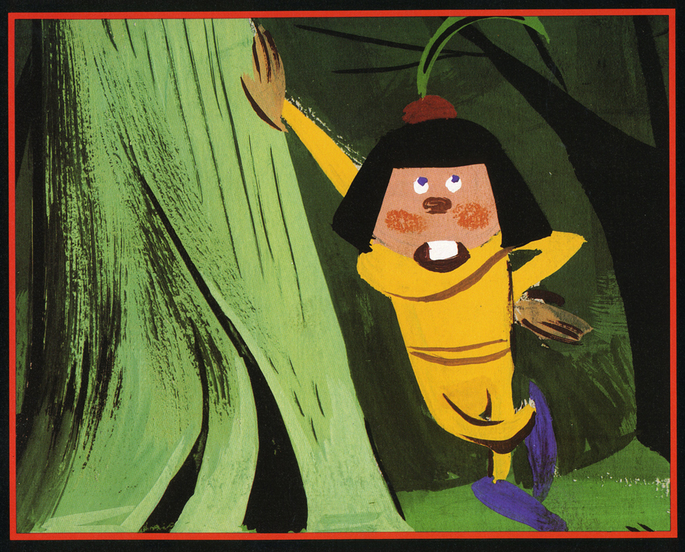
Jabberwock – repost
- To me, Lewis Carroll‘s nonsense poem, Jabberwocky, is one of the most brilliant pieces ever written. It’s always been important to me, and I’ve collected many versions of it in illustrated versions. Now that I mention it, let me confess that I’m a Lewis Carroll addict, and Jabberwocky is one of my favorites among his many poems.
In film, you have the one live action feature by Terry Gilliam; it’s a good film with a clunky monster in the end. In animation, professionally, I know of only two versions completed. One was by Jan Svankmajer done in 1974. I did a version of it in 1989. Mine, of course, sticks closer to the poem even though it is pretty “arty”.
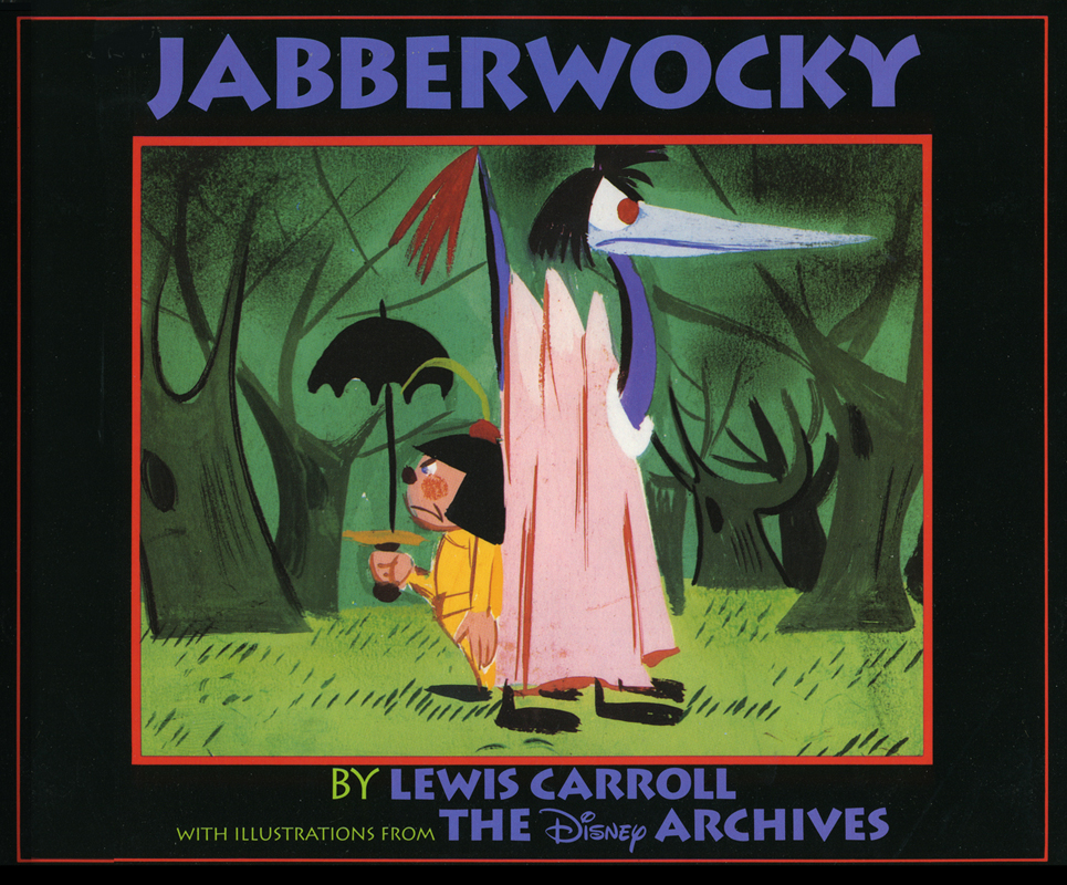 Apparently, there was also a version Disney was preparing as part of Alice In Wonderland. A book was published, credited to the “Disney Archives,” with illustrations from the preparatory drawings of this sequence. It’s obvious that the final versions of these drawings were done by one person, but there’s no record in the book of who did the finals. I’d read somewhere that Marc Davis had a lot to do with it, at one point. Though he obviously was most involved with Alice, herself.
I’m not in love with the images in the book. I like the technique used, but I find the images too cute. Though, it’s amazing how current they look.
(Click on any image to enlarge.)
I’m going to give you a number of the book’s pages today and, in comparison, will follow it up with images from my version tomorrow.
‘Twas brillig and the slithy toves
Did gyre and gimble in the wabe;
All mimsy were the borogoves,
And the mome raths outgrabe.
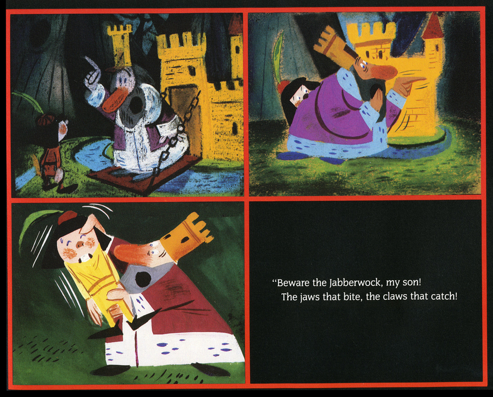
“Beware the Jabberwock, my son!
The jaws that bite, the claws that catch!”
“Beware the Jubjub bird, and shun
The frumious Bandersnatch!”
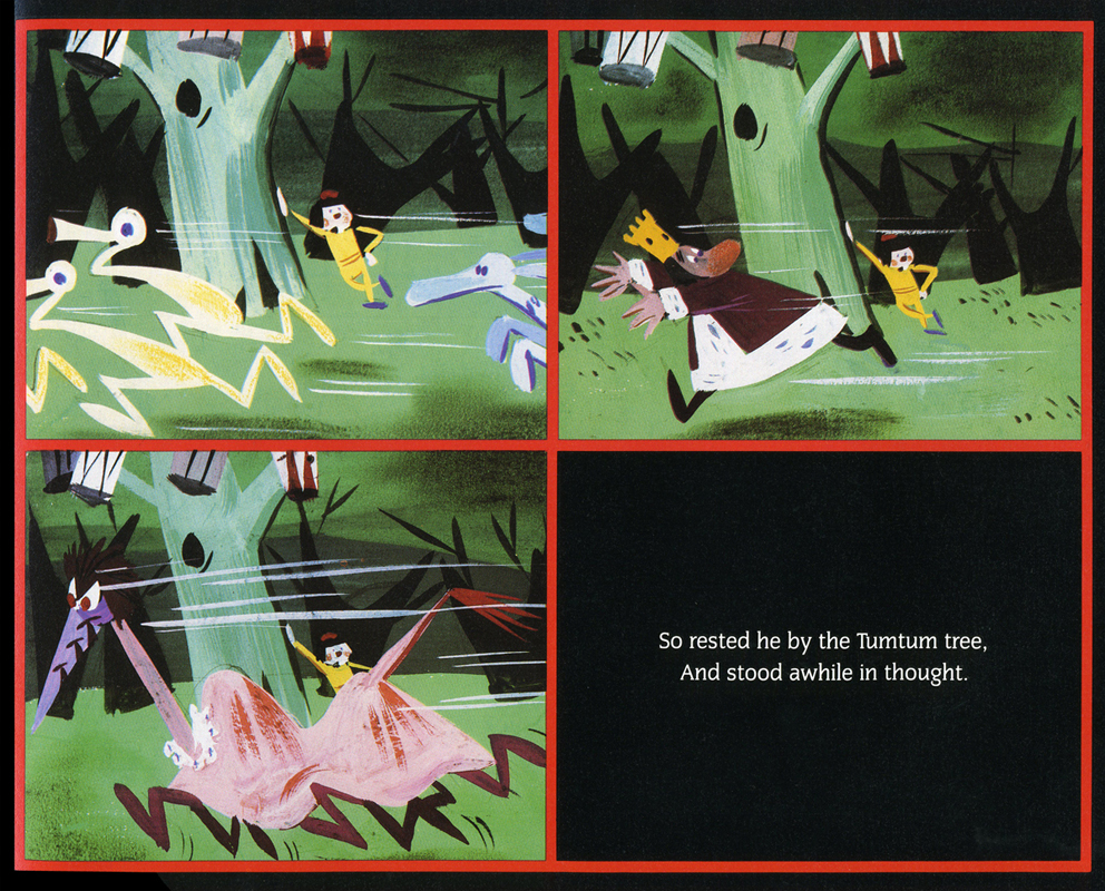
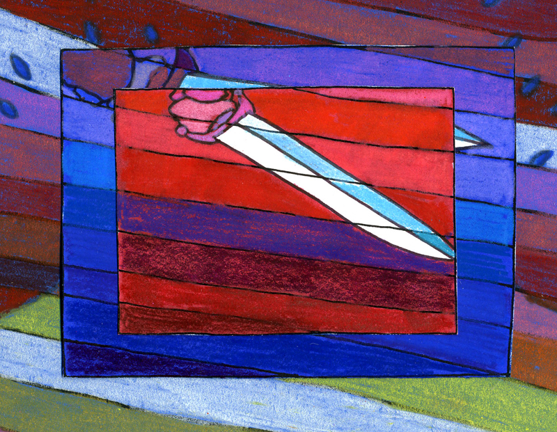
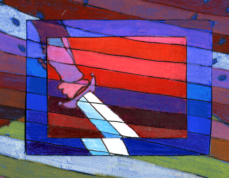
He took his vorpal sword in hand;
Long time the manxome foe he sought -
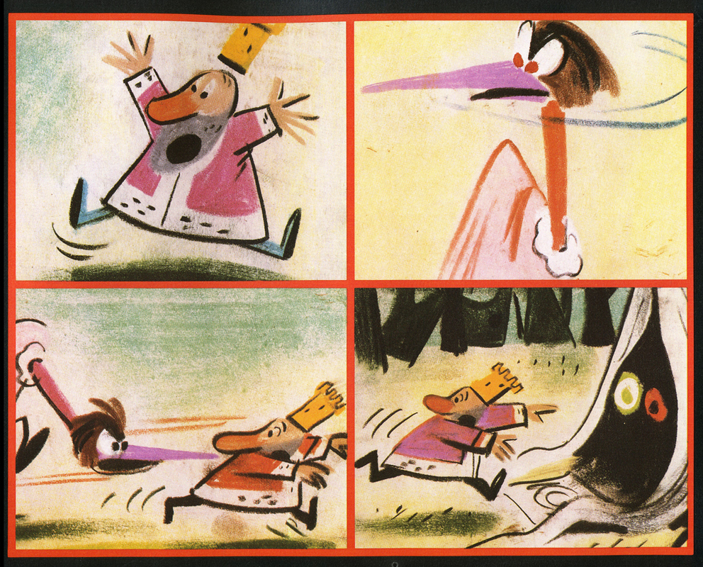
So rested he by the Tumtum tree
And stood awhile in thought.
And as in uffish thought he stood,
The Jabberwock, with eyes of flame,
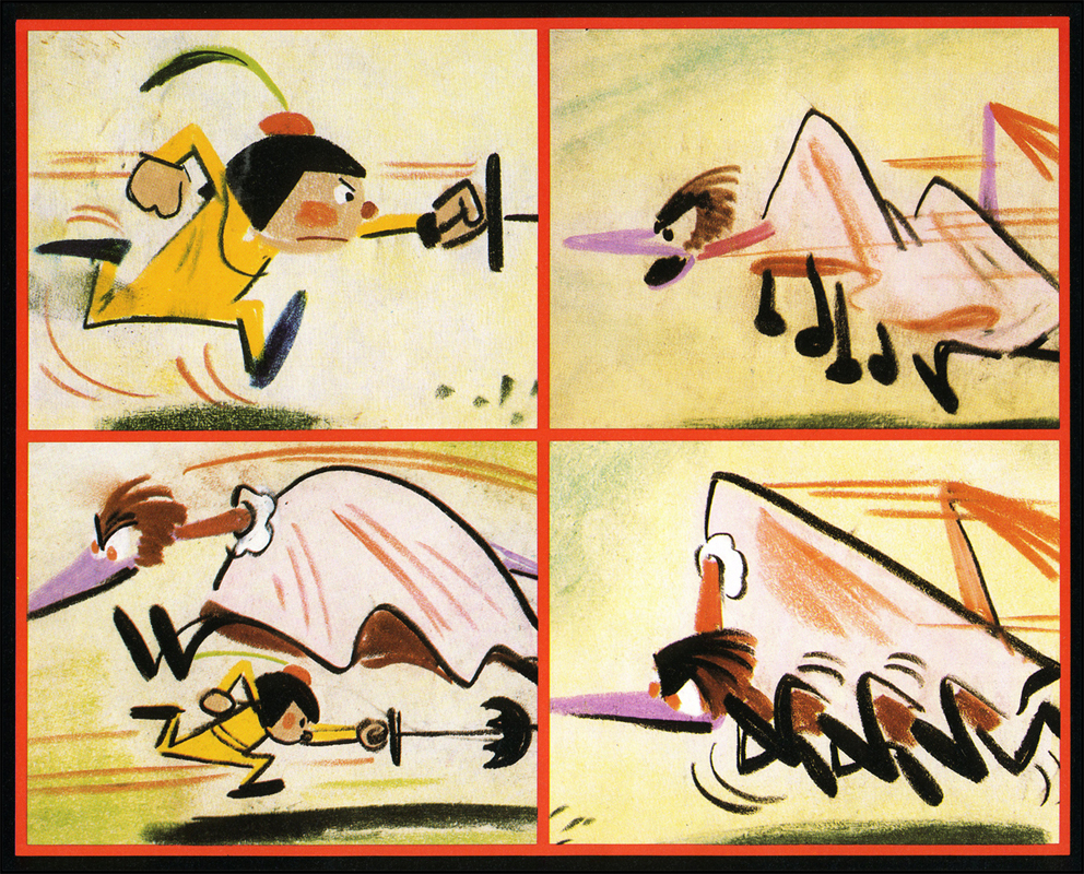
Came whiffling through the tulgey wood,
And burbled as it came!
One, two! One, two! And through and through
The vorpal blade went snicker-snack!
He left it dead, and with its head
He went galumphing back.
“And hast thou slain the Jabberwock?
Come to my arms, my beamish boy!
O frabjous day! Callooh! Callay!”
He chortled in his joy.
Jim Hill talks a bit about this book on his site in a letter response. here.
For amusement, you might check out this site for translations of this poem into 58 other languages, 23 parodies of the poem, and 10 explanations trying to define what Carroll meant by it.
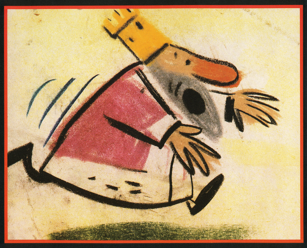
I’d like to post here a few of the images from my short adaptation of the Lewis Carroll poem, Jabberwocky. In doing the film, I tried to mimic a style I’d used in my oil paintings and felt it was a bit successful. I don’t think the filmed version is all it could be – it was rushed to complete a package which included the 19 min. film, The Hunting of the Snark, as well as an animated documentary done about Lewis Carroll’s nonsense poems. Of course, the video package wouldn’t have made sense without including Jabberwocky.
(click any image to enlarge.)
But I’ve scanned these images from the actual artwork and realize how well they’ve held up. I’d like to redo the film digitally someday and see where I can go with it.
Here are some of the images:
‘Twas brillig and the slithy toves,
Did gyre and gimble in the wabe;
All mimsy were the borogoves,
And the mome raths outgrabe.
“Beware the Jabberwock, my son!
The jaws that bite, the claws that catch!â€
“Beware the Jubjub bird, and shun
The frumious Bandersnatch!â€
He took his vorpal sword in hand;
Long time the manxome foe he sought -
So rested he by the Tumtum tree
And stood awhile in thought.
And as in uffish thought he stood,
The Jabberwock, with eyes of flame,
Came whiffling through the tulgey wood,
And burbled as it came!
One, two! One, two! And through and through
The vorpal blade went snicker-snack!
He left it dead, and with its head
He went galumphing back.

“And hast thou slain the Jabberwock?
Come to my arms, my beamish boy!
O frabjous day! Callooh! Callay!â€
He chortled in his joy.

‘Twas brillig and the slithy toves
Did gyre and gimble in the wabe;
All mimsy were the borogoves,
And the mome raths outgrabe.
Commentary &Layout & Design &SpornFilms 10 Mar 2013 03:18 am
Bridget’s Art
It’s time to put up some more Sporn Studio art. I had a couple of posts that celebrated BG art of Bridget Thorne. I’m putting a couple of these together and posting anew. Personally, I love this stuff and can’t get enough of it. I want to see Bridget doing BGs again; it’s been a while.
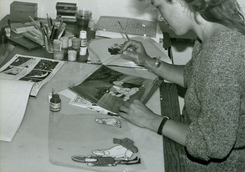
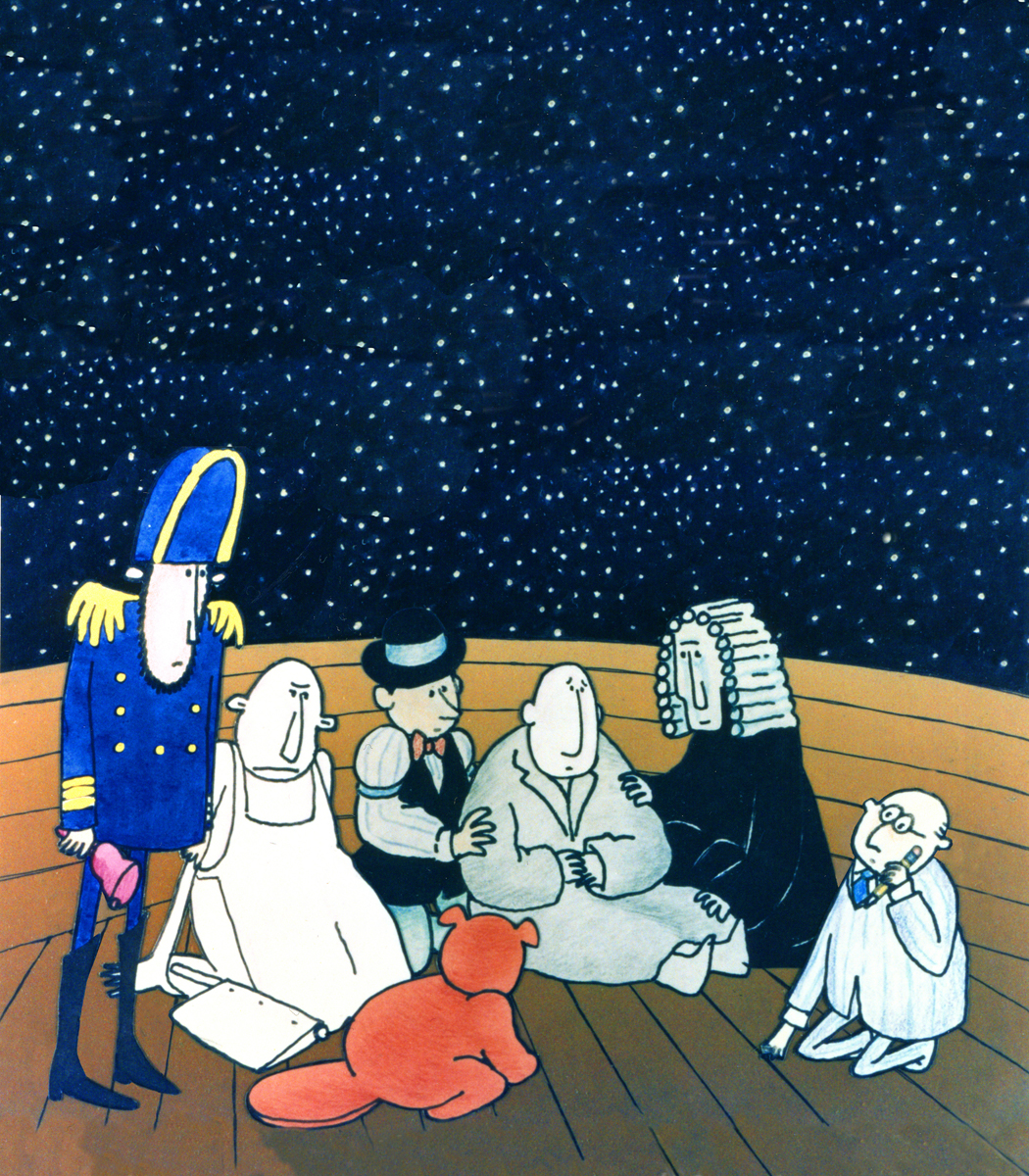
Bridget Thorne did the storyboard for
The Hunting of the Snark with me back in 1980.
We didn’t finish the film until 1989. She also painted the
backgrounds for the last third of the movie.
Bridget Thorne is someone who has been an invaluable part of the history of my films.
She has been an extraordinary Art Director and Background painter on quite a few of my favorite films produced within the studio, and I’ve put together a random sampling of some of those films.
(Click image to enlarge) Lyle, Lyle Crocodile (1987)
This painting is a key transition point in Lyle, Lyle Crocodile. The film had a looseness  that Bernard Waber‘s original book art had engendered. I felt very much at home in Waber’s style, and I think Bridget did as well.
She worked out a color scheme for the film, and we both agreed to follow it closely through the film. Liz Seidman lead the character coloring. Bridget, of course, had a strong hand in all those character models, as well.
The scene pictured above follows the introduction of Autumn on “East 88th Street”, and the background brings us full force into it as we get “the girl’s first song” – Mrs. Primm’s report on what it’s like to have a crocodile living in your house.
 – Ira Sleeps Over was the second children’s book by Bernard Waber that we adapted. This is a very sweet story which involves a sibling rivalry; it focusses on a teddy bear and a sleep-over party. I pulled composer, William Finn, into the film and he wrote some great tunes for it. Prior to doing the script, I gave him the book and asked him to figure out where he would like the songs. In a week he had already written all the songs for the film, and they were brilliant. It turned out he used all the words of the book in his songs, and now I had to find a way of telling the same story using past, present and future tenses, as he did in the songs. It was a good challenge that worked out well and created a fabulous construction for the story.
 The style in this book was, if anything, looser than in Lyle. Waber did a lot of his illustration featuring duplicating printing techniques. Lino cut enabled him to repeat decorations throughout the settings. Bridget played with the lino cuts and was able to succesffully duplicate the technique in the backgrounds. In this one bg, at the beginning of the film, the foliage is a good example of this technique, printed over watercolors. The characters are markered paper drawings cut out and pasted to the cel overlays.
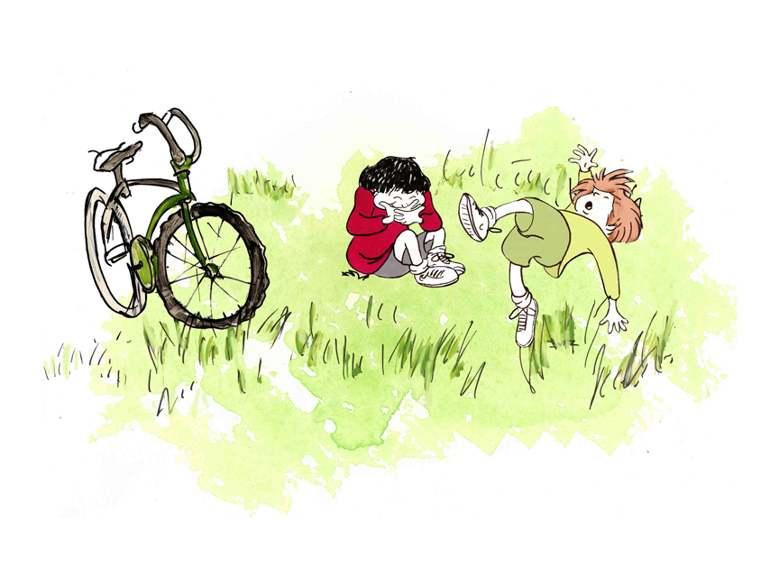
The book, like Lyle, featured a lot of white space, so we followed suit. When a book’s been in circulation for over 25 years, you have to realize there’s been a reason for it; find the reason and the heart, and take advantage of it. This use of white space made the actual backgrounds oftentimes little more than abstract shapes of color with a solid object on the screen. Here, for example, we see Ira and his friend, Reggie, playing against a blast of green and a bicycle.
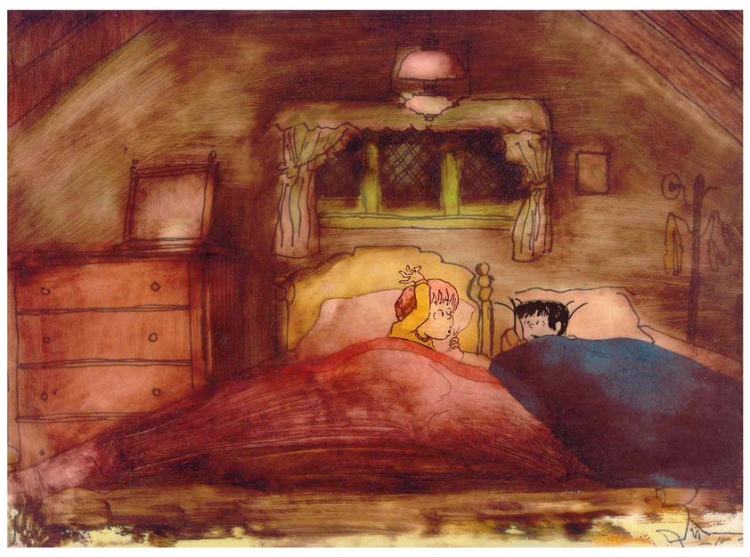 – At the end of the film, Ira and Reggie talk in the dark at the sleep-over. To get the look of the dark Bridget had to come up with something clever. The book resorted to B&W washes of gray and wasn’t very helpful. She came up with some dyes that were used for photo retouching. By quickly painting these lightly onto cel levels with a wide brush, she was able to get translucent cels with the brush strokes imbedded in the color overlays. By placing these overlays over the characters and backgrounds, we got the desired effect that let it feel connected to the very loose style of the film.
 -Abel’s Island is one of the few films we did that I treasure for its artwork. Bridget’s work on the backgrounds was, to me, extraordinary. The looseness I love was developed into enormously lush backgrounds using shades of green that I didn’t know could be captured in the delicate watercolors.
This film was a complicated problem that seemed to resolve itself easily and flow onto the screen without much struggle. The book had won a Newberry Award as best children’s writing of its year. It was not a picture book but a novel. The more than 120 pages featured fewer than 20 B&W spot drawings by author/illustrator, William Steig. We were on our own with the color.
 However, we had adapted Doctor DeSoto and The Amazing Bone as shorter films and could use what we’d learned from Steig on Abel. Bridget topped herself.
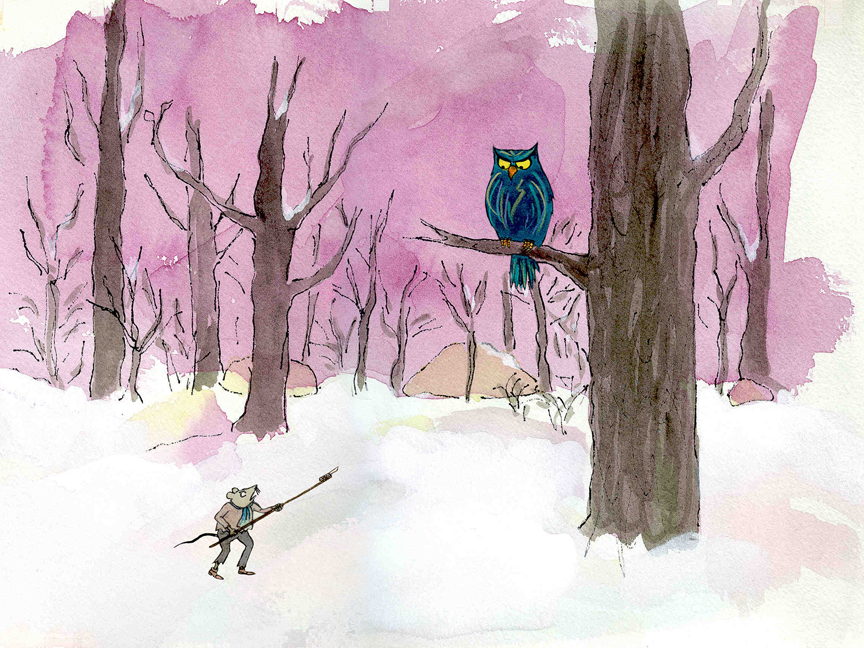
Several of the animators gave us more than I could have expected. Doug Compton‘s animation of Abel sculpting his statuary and living in his log was heart rending; Lisa Craft‘s animation of the big pocket watch, the big book and the leaf flying sequences was nothing short of inspired; and John Dilworth‘s animation of the owl fight was harrowing. This was all set up and completed by Tissa David‘s brilliant animation of Abel in the real world with wife, Amanda. She established our character.
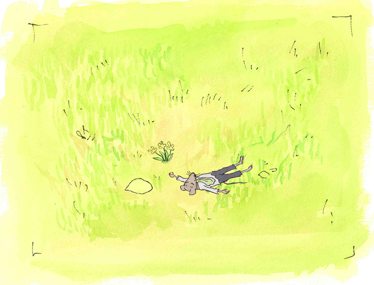
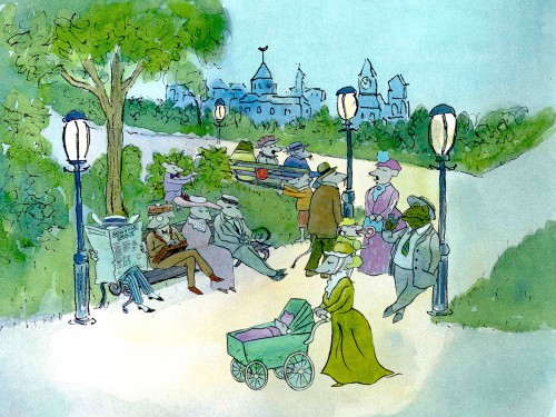
 – At the end of the film, Abel, who has been separated from his new bride, trapped on an island for over a year, finally gets to come home. He sees Amanda in a park at twilight but decides to hold back. He races on ahead of her to greet her, privately, at home. The park sequence has a busyness as an acute counter to the lonliness we’ve watched for the previous 90% of the half-hour program. Setting it at early evening gave an opportunity for rich, royal colors. Bridget took full advantage of the opening, and underscored it all with a regal green not seen earlier. It was stunning and is one of my favorite backgrounds in the film.
Here are two more films Bridget Thorne designed for me.
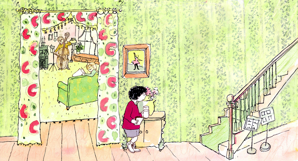
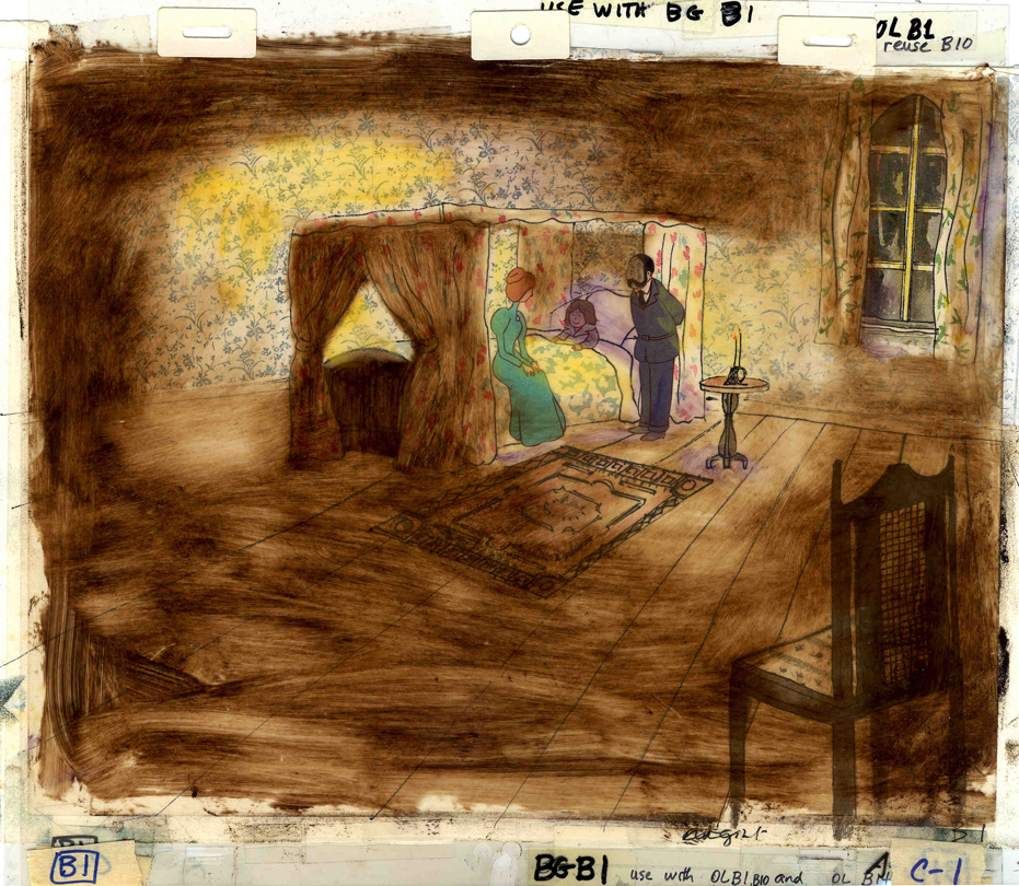 A Child’s Garden of Verses presented new and different problems to explore.
It was a project generated by HBO. Charles Strouse and Thomas Meehan were going to write the book and song score. We met several times trying to discover a way into the book of poems. I’d suggested we use the verses in Robert Louis Stevenson‘s book to illustrate the author’s early childhood.
(Click on any image to enlarge.)
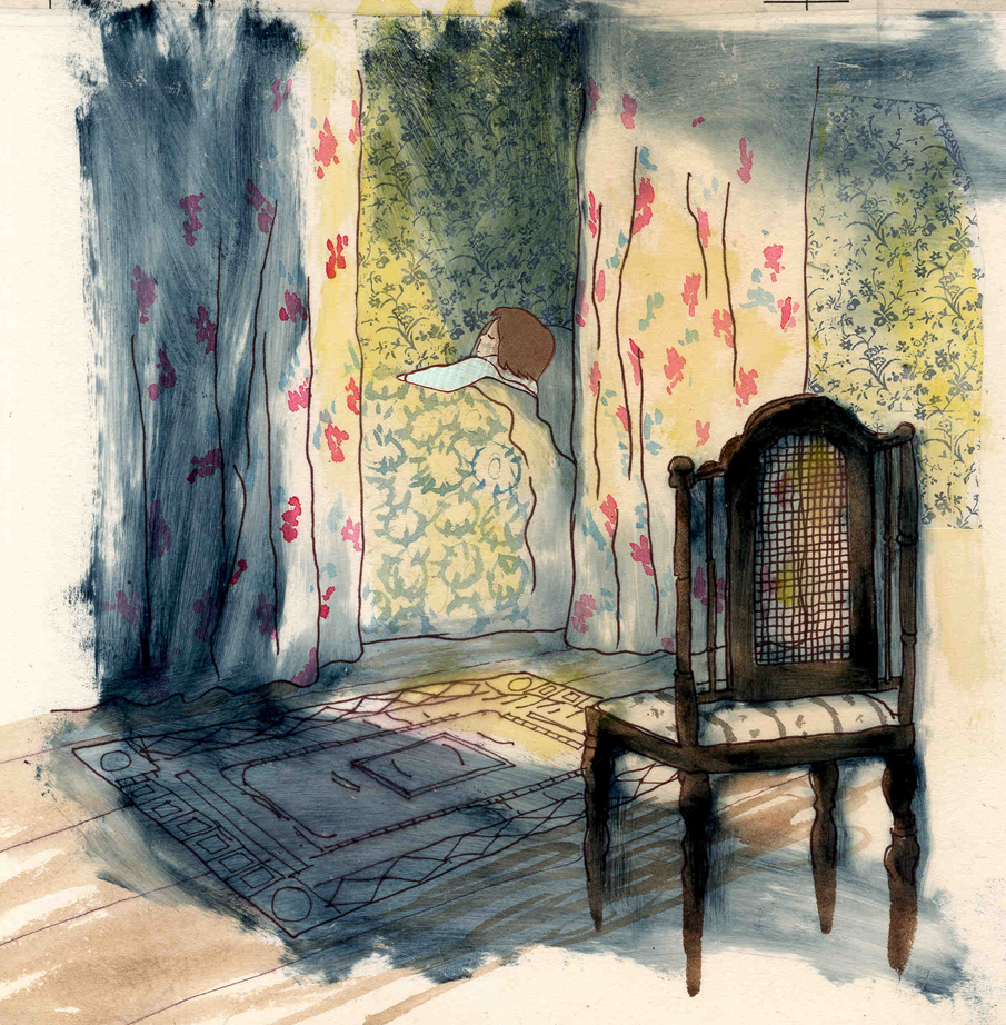
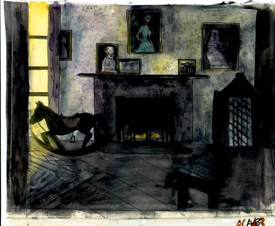 Stevenson was a sickly boy who was always confined to his dark room. He was not expected to live long. The only visitor for days on end was his overprotective mother.
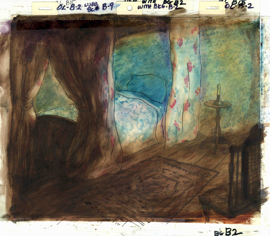
For much of the film, we had only the dark, child’s bedroom to explore. Artistically, I asked Bridget to delve deeper into the photgraphic dyes that she had discovered and used so well in Ira Sleeps Over. These dyes would allow us to keep the style, once again, loose while exploring dark areas and brush strokes to simulate the darkness “Robbie” lived in.
For the wallpaper throughout the house, Bridget used real wallpaper which was photostated; scaled down and reshaped to fit the backgrounds. Then watercolor washes colored these backgrounds and overlays were mixed and matched to get the desired results.
 I was never quite pleased with this film. The elements that worked well worked really well. Bridget’s work was a highlight. The acting was extraordinarily good. Heidi Stallings performed with an enormous amount of emotion yet barely raised her voice above a whisper. Jonathan Pryce was brilliant as Robert Louis Stevenson, the narrator and even sang a song when asked at the last minute. Gregory Grant as the young “Robbie” was vulnerable, sweet and all we could have hoped for.
However, there was too much of a rush given the delicacy of the piece, and the exterior backrounds done by me for the end of the film are poor. The animation is also hit and miss. Oddly enough, my favorite sequence used little actual animation but intense camera work. Ray Kosarin was the animator in charge of it, and it’s an impressive sequence.
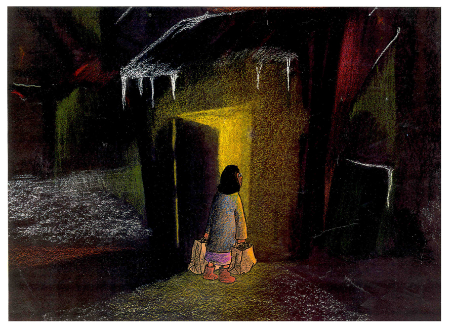
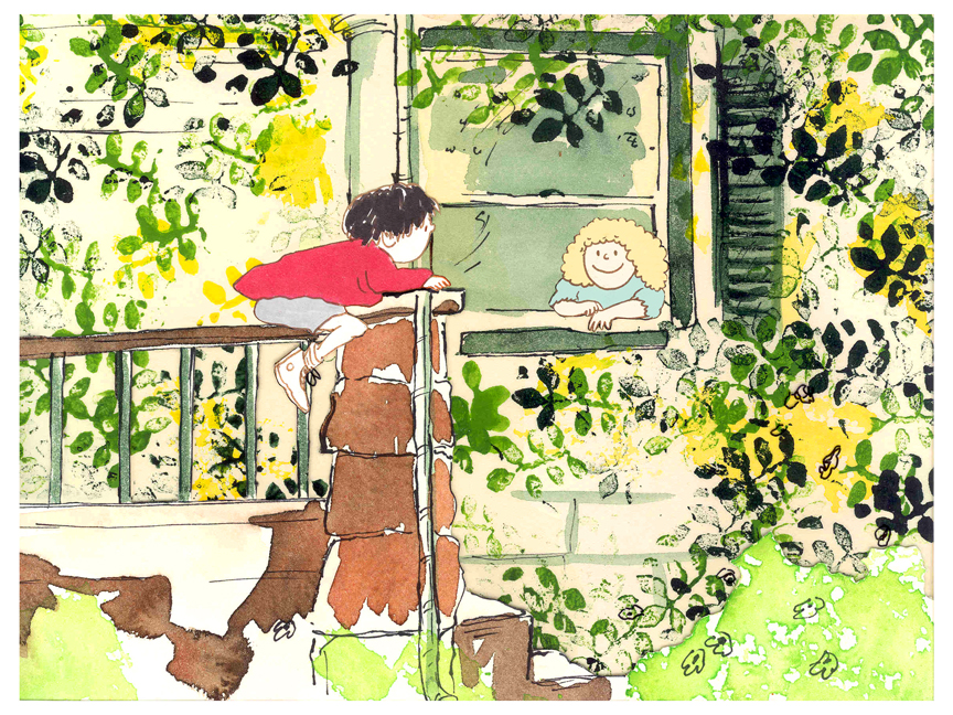
- The Talking Eggs was done for a PBS series called Long Ago & Far Away. It was an adaptation of a Creole Folk Tale which Maxine Fisher updated for me. (Lots of discussion between WGBH, Maxine & me about what distinguishes a Folk Tale from a Fairy Tale. It seriously impacted the story we were telling and I wanted what I wanted and got.)
Bridget chose to use pastels and we searched for a paper that would bring out the most grain. I loved the end result. The characters, to match the look of the Bgs, were xeroxed onto brown kraft paper and colored up from there with prismacolor pencils. This was cut out and pasted to cel.
 Danny Glover was the narrator, and we chose to make him an on-screen character appearing intermitently in the film. His narration was recorded on a rush as he stopped off in LA from SF on his way to direct a film in Africa.
There’s a focus in these backgrounds that matches the content and mood of the piece, and it worked wonderfully for my purposes. I always like it when the medium is front and center; I want audiences to know that they’re watching animated drawings, and texture usually helps to do this. Of course, I also want the films to have a strong enough story that the audience gets past the point of knowing, to enter the film. It works some of the time, and I’m in heaven when it does.
 Bridget altered the color of the paper on which she was coloring with the chalks, and the different colored papers represented varied moods from sequence to sequence.
Naturally, there were some problems with the chalks under camera. All the fixative in the world didn’t stop the chalks from bleeding onto the cels or platen on the camera. (Lots more cleaning involved than usual.) We heard constantly from our cameraman, Gary Becker. The extra effort was worth it; the look was unique and successful.
The following is a short interview that we did in a publication I generated back in the ’80s.
Behind the Scenes with
Bridget Thorne
Interview by Denise Gonzalez
Bridget Thorne is a background designer who has been an important part of Michael Spom Animation for more than fifteen years. In that time she has enhanced the look of MSA films with beautiful backgrounds that are, in a way, part of the characters rather than just a scenic backdrop.
 DG: How long have you been working with Michael Sporn?
BT: I first started working for Michael in 1979 on Byron Blackbear And The Scientific Method, a fifteen minute short for the Learning Corporation of America. It is actually one of my favorites. I started out as a scenic painter for plays. I worked with a designer and basically dressed the set. We’d paint the exteriors, lay in wallpaper, marbleizing floors, etc. I started at Williamstown and at Playwright’s Variety in New York, I did a lot of off Broadway and off-off Broadway.
DG: Do you see background painting as a complete picture or as a supplement to animated artwork?
BT: It’s a supplement.
 DG: How do you take that into consideration when you start the backgrounds?
BT: Ideally, I take into consideration how the characters are designed. I like the characters to be part of the picture, not stand out like they do in Saturday morning cartoons. It all fits into a stylistic sensibility or pace more than anything else. I’m not a cartoon snob, I’m more of a two dimensional artist than a filmmaker. I design my backgrounds and line style according to the way the characters are designed. What I used to try and do was color the backgrounds, to match the colors of the characters. You work out of your home rather than at the studio. What are the benefits or drawbacks of working this way? I’ve just started doing this and yes, there are benefits. I can get into my own head, and I take off more with ideas because I’m not interrupted as much. But I like being in the studio and staying with the rest of the production as it goes along.
DG: Do you prefer working on original stories or from an existing book?
 BT: It depends on the story. Let’s say IRA SLEEPS OVER, it was great working out here on that because with an existing story you have a style to imitate, and it is easy for a whole bunch of people to follow that when they’re all working in different places. So as far as production goes, that makes it easier. The great thing about original scripts is that they allow for an incredible amount of individual input. What do you take into consideration when designing the look of a film and what preparation is involved? It depends on the story. I tend to have a knee jerk reaction at first or an impulse. I have a Fine Arts background, and I tend to rely on painters. I find fine artists are more in tune stylistically with Michael’s films than the more hard-edged graphic cartoons. (Though I will look at Disney inspirational drawings.)
Then I look at the layouts and the character design, so I sort of work on intuition and impulse. Then I look at the existing elements and put those all together and come up with a design. As far as preparation goes, what I consistently do is make 5×4 sketches of design ideas. For ABEL’S ISLAND I did lots and lots of little paintings of winter and fall and spring.
First three illustrations pictured above:
1. BYRON BLACKBEAR AND THE SCIENTIFIC METHOD.
2. A CHILD’S GARDEN OF VERSES.
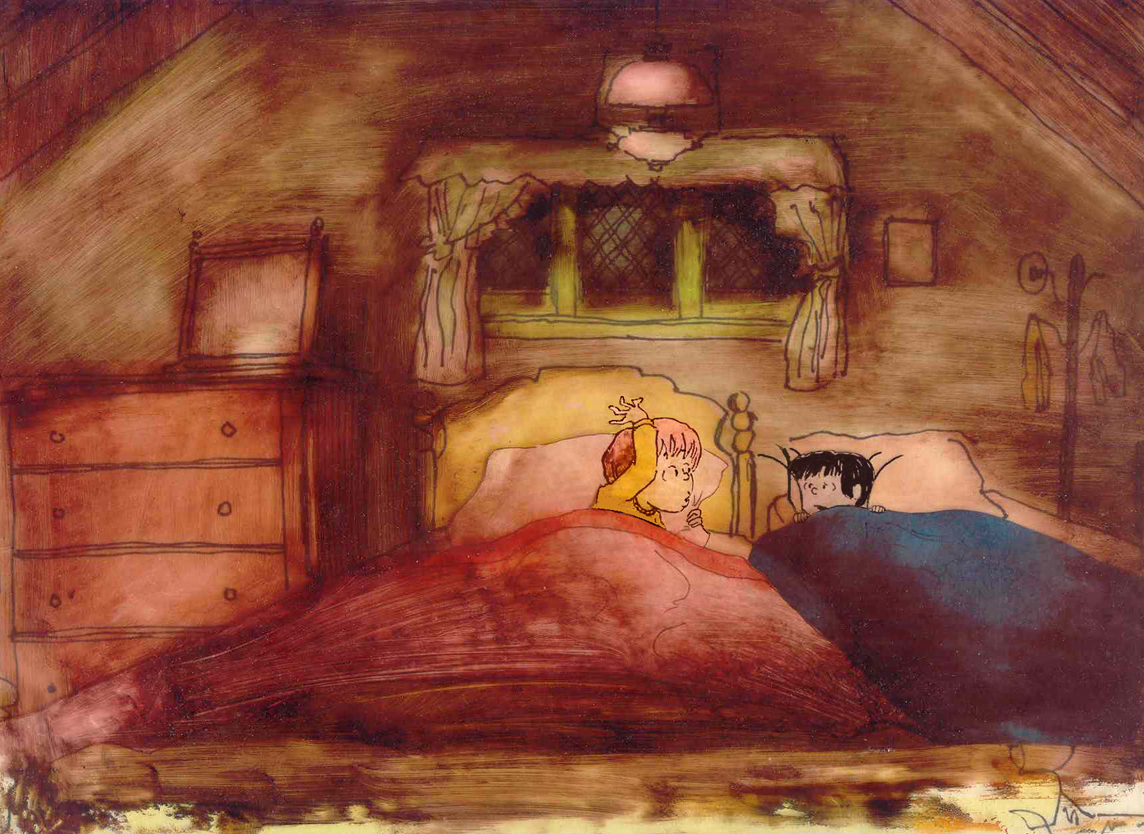
3. IRA SLEEPS OVER
DG: When designing the film do you take into consideration that this will be seen by a child?
BT: I’m not a cartoony person so I don’t think about that. I tend to think more — sometimes I run into trouble this way — I think of it in a frame and ideally what I really want is a balanced look on the screen. A lot of times that’s hard because what I see in front of me is so different when it is filmed.
DG: What do you consider to be the best example of your work thus far?
BT: I guess ABEL’S ISLAND. I was able to abstract a little. I wasn’t confined to chairs and bureaus. I was able to match the mood of the movie to the backgrounds. If Abel was in trouble, I could put colors that indicated that, or I could abstract it. If something was calm I could paint it calmly. Abstraction, or looseness, is more my personal style. This is true of Michael’s style, as well.
A scene toward the end of ABEL’S ISLAND.
DG: Have you ever worked on a film you couldn’t connect with?
BT: I’d say yes. It’s a hard question to answer off the top of my head. I sort of think of movies like they were kids; they are either noisy or funny or quiet or sad. They all have their own characteristics, and it is really the process of making the movie that attracts me to animation. I tend to have different feelings about each movie. But yes, sometimes a story irritates me or something comes in and it doesn’t suit my style or what I imagined. It can be very difficult. That’s an interesting thing about animation; there is really a sense of compromise; you are compromising all the time.
A scene of the narrator at the end of THE TALKING EGGS.

A background from A CHILD’S GARDEN OF VERSES.
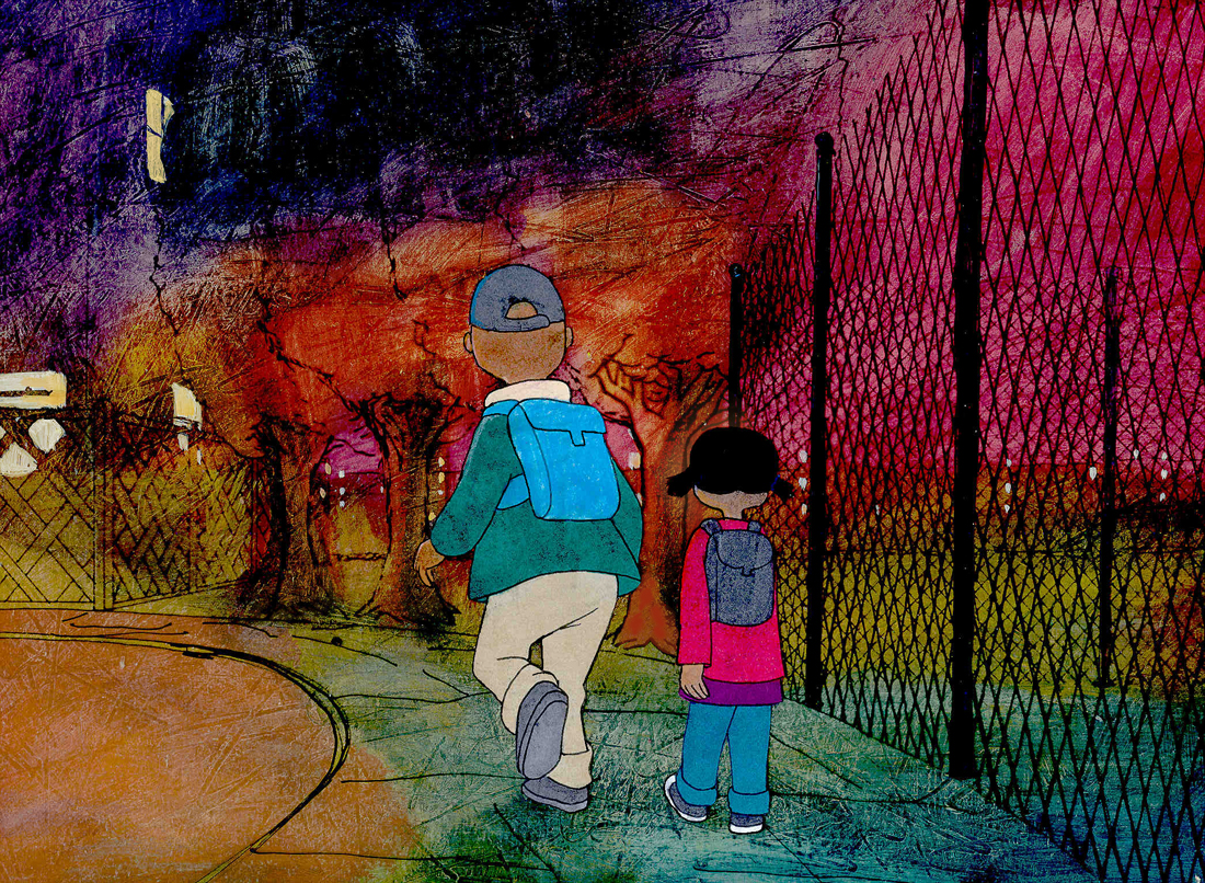
home from school in WHITEWASH.
Commentary &SpornFilms 24 Feb 2013 04:39 am
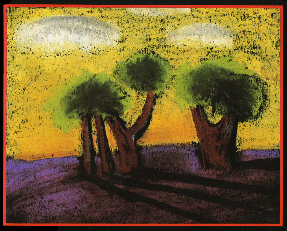
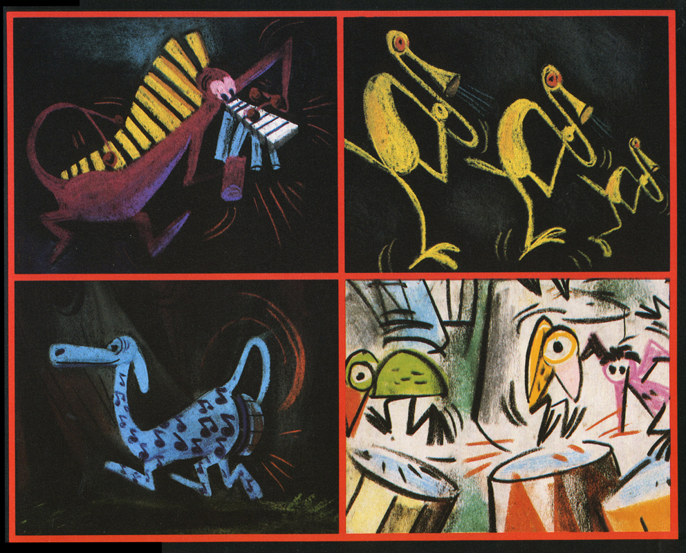
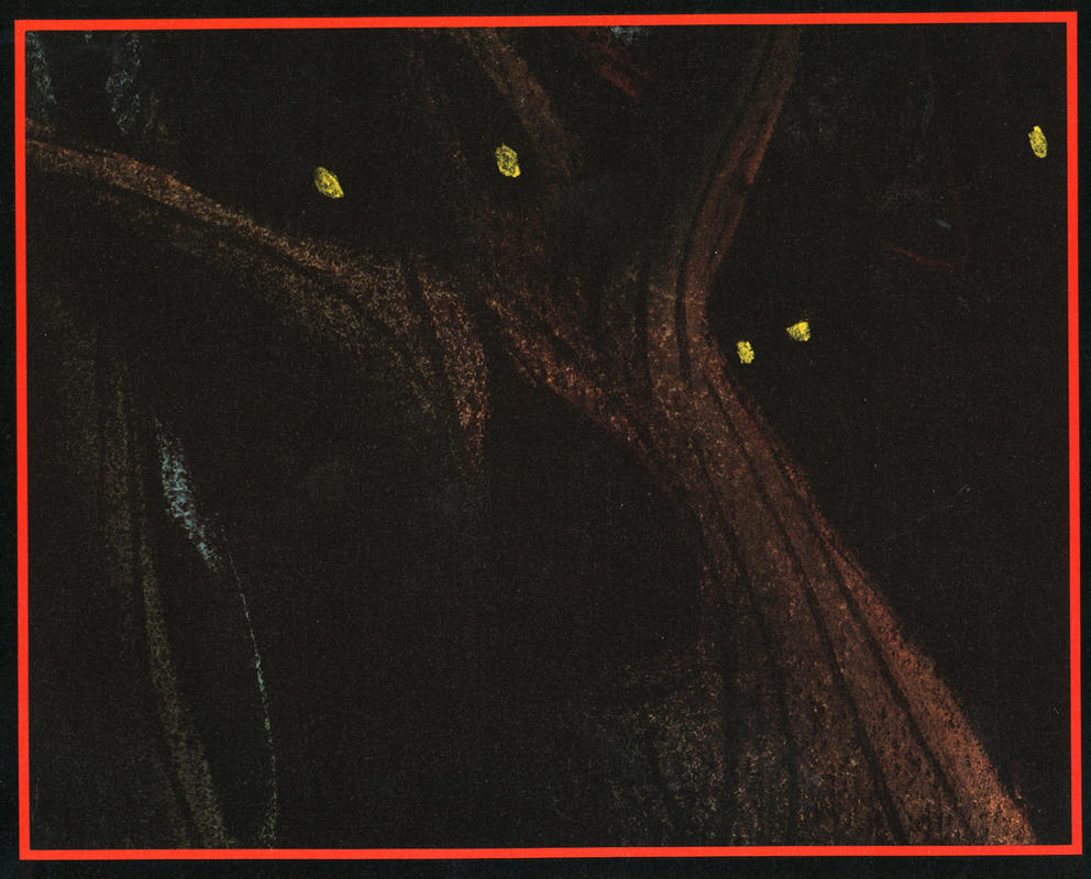
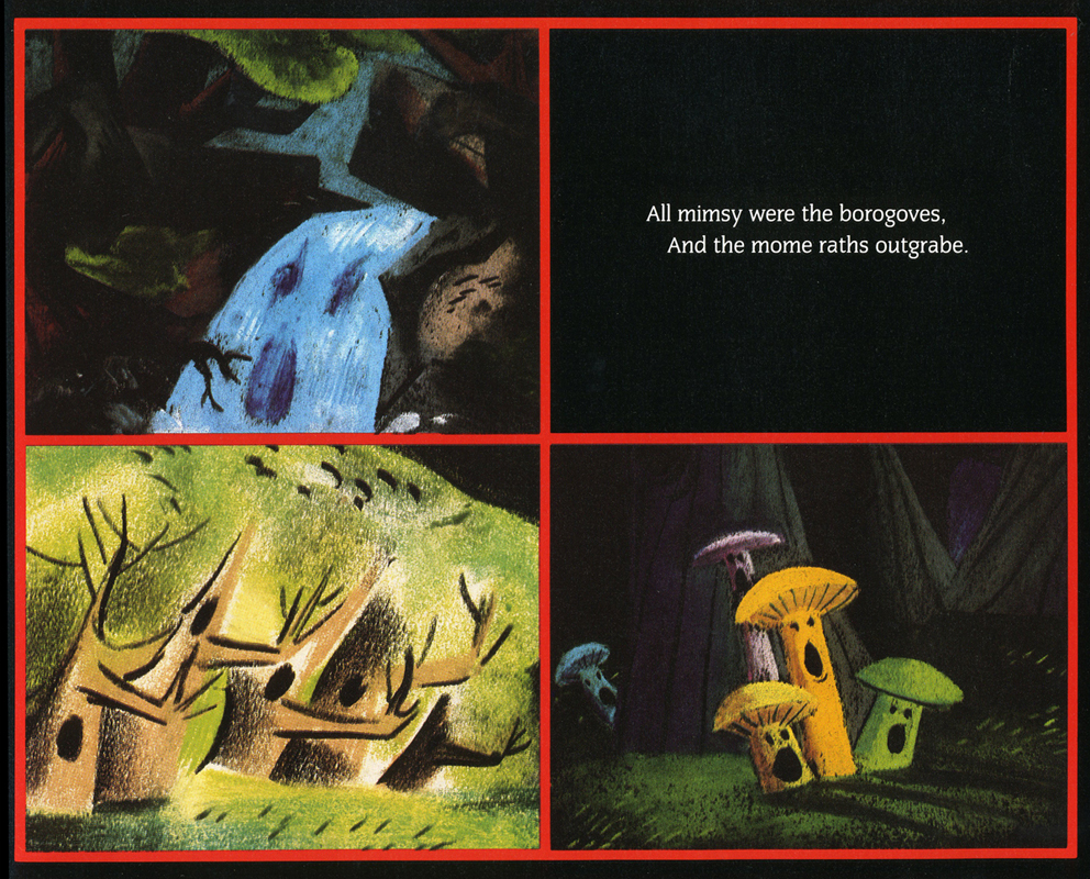
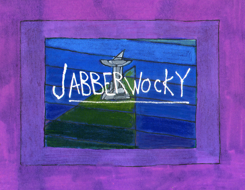
Jabberwocky
- To me, Lewis Carroll‘s nonsense poem, Jabberwocky, is one of the most brilliant pieces ever written. It’s always been important to me, and I’ve collected many versions of it in illustrated versions.
I’d like to post here a few of the images from my short adaptation of the Lewis Carroll poem, Jabberwocky. In doing the film, I tried to mimic a style I’d used in my oil paintings and felt it was a bit successful. I don’t think the filmed version is all it could be – it was rushed to complete a package which included the 19 min. film, The Hunting of the Snark, as well as an animated documentary done about Lewis Carroll’s nonsense poems. Of course, the video package wouldn’t have made sense without including Jabberwocky.
(click any image to enlarge.)
But I’ve scanned these images from the actual artwork and realize how well they’ve held up. I’d like to redo the film digitally someday and see where I can go with it.
Here are some of the images:
‘Twas brillig and the slithy toves,
Did gyre and gimble in the wabe;
All mimsy were the borogoves,
And the mome raths outgrabe.
“Beware the Jabberwock, my son!
The jaws that bite, the claws that catch!â€
“Beware the Jubjub bird, and shun
The frumious Bandersnatch!â€
He took his vorpal sword in hand;
Long time the manxome foe he sought -
So rested he by the Tumtum tree
And stood awhile in thought.
And as in uffish thought he stood,
The Jabberwock, with eyes of flame,
Came whiffling through the tulgey wood,
And burbled as it came!
One, two! One, two! And through and through
The vorpal blade went snicker-snack!
He left it dead, and with its head
He went galumphing back.
“And hast thou slain the Jabberwock?
Come to my arms, my beamish boy!
O frabjous day! Callooh! Callay!â€
He chortled in his joy.
‘Twas brillig and the slithy toves
Did gyre and gimble in the wabe;
All mimsy were the borogoves,
And the mome raths outgrabe.
______________________
In other film versions, you have the one live action feature by Terry Gilliam; it’s a good film with a clunky monster in the end. In animation, professionally, I know of only two versions completed. One was by Jan Svankmajer done in 1974. I did a version of it in 1989. Mine, of course, sticks closer to the poem even though it is pretty “arty”.
Apparently, there was also a version Disney was preparing as part of Alice In Wonderland. A book was published, credited to the “Disney Archives,” with illustrations from the preparatory drawings of this sequence. It’s obvious that the final versions of these drawings were done by one person, but there’s no record in the book of who did the finals.
I’m not in love with the images in the book, and I know I would have hated the animated version (especially if it looked like this.) They’re trying too hard to make sense of the poem. I find the images too cute, though, it’s amazing how current they look.
‘Twas brillig and the slithy toves
Did gyre and gimble in the wabe;
All mimsy were the borogoves,
And the mome raths outgrabe.
“Beware the Jabberwock, my son!
The jaws that bite, the claws that catch!”
“Beware the Jubjub bird, and shun
The frumious Bandersnatch!”
He took his vorpal sword in hand;
Long time the manxome foe he sought -
So rested he by the Tumtum tree
And stood awhile in thought.
And as in uffish thought he stood,
The Jabberwock, with eyes of flame,
Came whiffling through the tulgey wood,
And burbled as it came!
One, two! One, two! And through and through
The vorpal blade went snicker-snack!
He left it dead, and with its head
He went galumphing back.
“And hast thou slain the Jabberwock?
Come to my arms, my beamish boy!
O frabjous day! Callooh! Callay!”
He chortled in his joy.
(Boy, do I like my version better! – MS)
Jim Hill writes a bit about this book on his site in a letter response. here. (Scroll down to middle of page.)
For amusement, you might check out this site for translations of this poem into 58 other languages, 23 parodies of the poem, and 10 explanations trying to define what Carroll meant by it.
Commentary &Illustration &Independent Animation &repeated posts &SpornFilms 29 Dec 2011 06:49 am
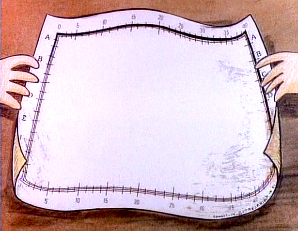
Blank Maps – repeat
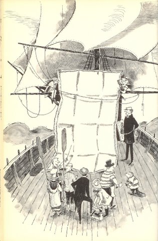
 - One of my favorites of my films is The Hunting of the Snark. I adapted this from Lewis Carroll’s poem. It was an enigma to the audience when it was first published – Carroll refused to explain its meaning, and it’s an enigma now.
I remember screening it with an audience of fifth graders – about 200 of them along with a number of their parents. The program, in Chicago, was part of a retrospective of some of the children’s films I’d done at the time. I made the decision to show the Snark, even though I wasn’t sure the audience would sit still for it.
The response was amazing. The adults, during the Q&A period, had a lot of questions. The kids had no problems. When, finally, one parent asked me what it was supposed to mean, I decided to turn it around. I asked if one of the kids could answer the question. A lot of kids raised their hands, and the first one gave me the appropriate answer.
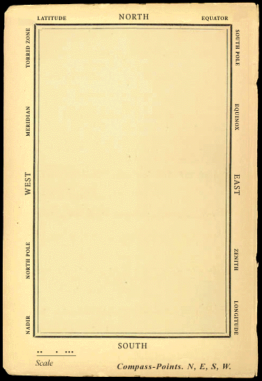
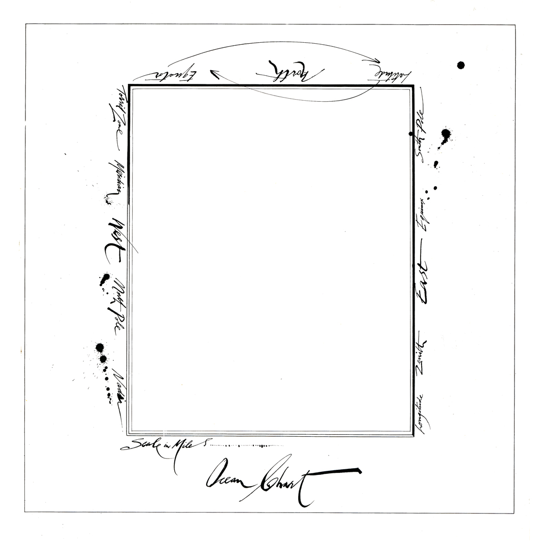
A bunch of guys go hunting for a monster________This is how the map was illustrated by
that’ll make them disappear, and one of_________the original illustrator, Henry Holiday.
them catches it. For all intent and purposes
that IS what it’s about.
I love showing this film as part of my programs. It’s easy for me to discuss, and I’m proud of it. I don’t think most animators like it, but that doesn’t bother me.
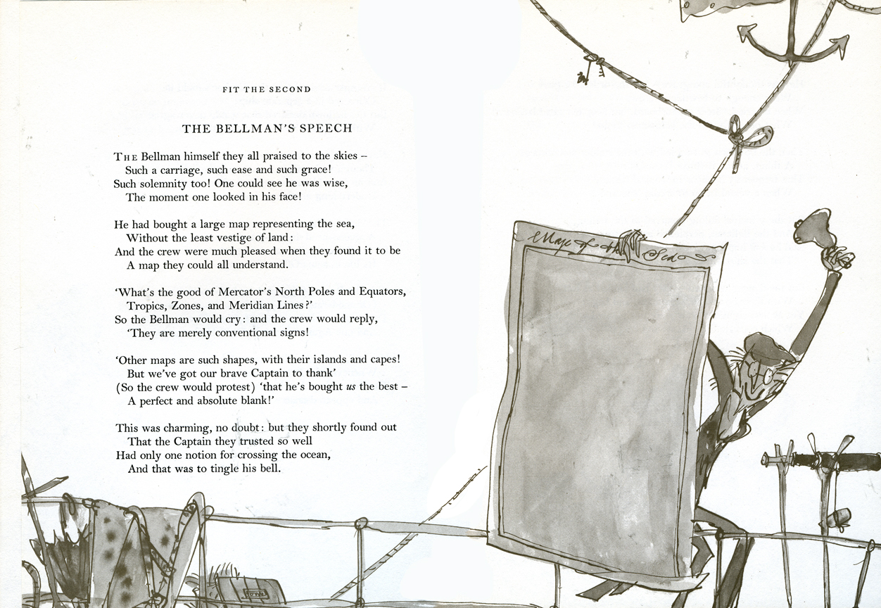
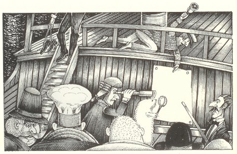
During the story there’s one key part that all illustrators love to illustrate.
But we’ve got our brave Captain to thank:
(So the crew would protest) “that he’s bought us the best–
A perfect and absolute blank!”
_
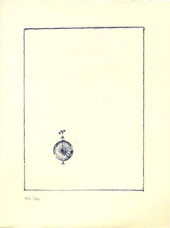
A blank page! What could be easier to illustrate? A couple of illustrators have cheated such as this map found on line:

Figure One: Bellman’s Blank Ocean Chart
Barry Smith at the University of Buffalo dept of Philosophy uses this map – a blank slate – to treat it as a map of heaven. Carroll was an Evangelical minister, but I’m confident this is not what he had in mind when he conjured up the lines in the poem.
____________________________________________
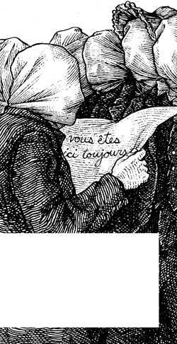 Mehendra Singh has a website which is slowly illustrating the entire poem. His illustration for this passage appears to the right. This is part of his comment accompanying the illustration.
- Yet another shameless Magritte pastiche, and not the last one to grace these pages, I’ll wager. Shameless — the 10th Muse of Protosurrealism!
Even more shameless — this insistence that the crew of the HMS Snark use the French language for navigational purposes when it is clearly evident to anyone who has ever been lost at sea that English is the natural language of confusion. This is easily verified. Stand on a streetcorner in any francophone city and ask a stranger: where am I? If necessary, pull at shirtsleeves and wave your arms, speak very slowly while pronouncing every phoneme at the utmost decibel level.
Singh has a curious and interesting site in its own right.
Let me encourage you to check it out for all the original illustration on it.
____________________________________________
_
This is how Quentin Blake chose to illustrate it in his version. Since he obviously was nervous about just showing the blank map, he illustrated the Bellman holding it.
______________
This is Ralph Steadman’s version. He went for the gold and just showed the map.
Yet, it’s still, obviously, a Steadman.
______________

This is how I chose to depict it in my film. Showing hands and table behind it,
gave me the opportunity of trucking in to white to transition to the next scene –
an image of the sea, itself.
Doug H. in Australia responded to the material, above, with an e-mail full of other wonderful illustrations of the same part of the poem. I’d like to post some of these illustrations with many thanks to Doug. With respect to all of the illustrators, about half of whom
are unfamiliar names to me. They merit a good look.
___ Just scroll down. Click any image to enlarge a bit.)
 1
1  2
2
______1. Frank Hinder (1989)_______________________2. Harold Jones (1975)
______
__ 3.__
3.__ 4.
4.
______3. Michael Capozzola (2005)_________________4. Kelly Oechsli (1966)
 5.
5.5. John Lord (2006)
______
______
______
6._________________________________7.
______
______6. Max Ernst ((1950) _______________________7. Jonathan Dixon (1992)
 8.
8.8. Helen Oxenbury (1970)
Commentary 16 Jul 2011 06:54 am
Classics
A memorial tribute film to Karen Aqua
by Lisa Crafts, music by Ken Field
- Last Sunday, July 10th, Ken Field held a memorial celebration of the life of his wife, the brilliant animator, Karen Aqua, who passed away last May. I wasn’t able to attend the tribute in Somerville, Massachusetts, but I was glad to learn that it was well attended and very much appreciated by those who were able to go. The speakers included Julie Zammarchi, Grey Held, Jeanée Redmond, and others. Ken, of course, had comments of his own which can be found on his Facebook page.
He also has intentions of creating a DVD compilation of Karen’s films and is trying to decide how many to produce. Here’s the note he sent me:
- There have been a lot of inquiries about how people can buy a dvd compilation of Karen’s animated films.
I am in the process of putting together such a dvd, and am arranging for a distributor for it. But it would be helpful to have some sense of how many to initially make.
To that end, I have put together a survey that you can answer online. If you think you might want to buy such a dvd, please go here to fill in the number of copies (1 is a fine answer) that you might want to purchase. The cost will probably be around $20, plus shipping, and the dvd will include all of Karen’s personal animated films, including Afterlife (but not any of her Sesame Street work or any of the workshop films we directed together).
I’ll tally these numbers in a few weeks, and send out a note when it becomes possible to order a dvd.
With all best wishes,
-Ken
The tribute ended with a second line procession that left a sweet note to the sad day.
![]()
- I thought it might be useful to point out that on my studio website, MichaelSpornAnimation.com, there is a place where you can see the schedule of Sporn films that are airing or playing around the country. Most often this means an HBO monthly schedule of Sporn films. There are, naturally enough, other goodies on that site.
By the way, I’m pleased as punch to have our most recent film, (an abbreviated version of our HBO show) I Can Be President, selected for competition in the Ottawa Animation Festival. I will be there and hope to see a lot of you there as well.
- I very much like Oscar Solis‘ idea for a new art blog. Covering the Classics is dedicated to his designing book covers for famous classic pieces of literature. Already he has done a number of beautiful illustrations. Kwaidan is beautiful and Moby Dick has strength in its simplicity. I hope he’ll keep it up.
My only complaint is that I wish the original size of the art could be a bit larger so that we can enjoy it a bit more.
- Robert Kopecky is a designer. He’s designed for quite a few animation shows (Nate the Great, Codename: Kids Next Door, Daria et al.)
He’s created several blogs: one for animation design and another for his overall design. The latter includes a number of illustrations he’s done for publication.
Personally, this is my favorite of all the artwork displayed. There’s a lot of personality in all of this print design. Obviously, with his animation work he’s been given a specific styles to work in, and this reduces the slight edge I find in his illustration. I’d like to see some animation he designs from scratch.
His animation blog can be found here.
His design blog can be found here.
It’s worth keeping an eye on what he’s up to.
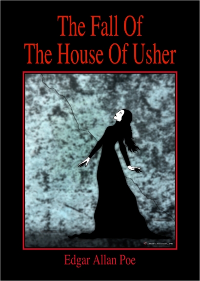
“The Tell-Tale Heart” which was part of the original proposal for the
POE feature we’re doing, but is no longer part of the film.
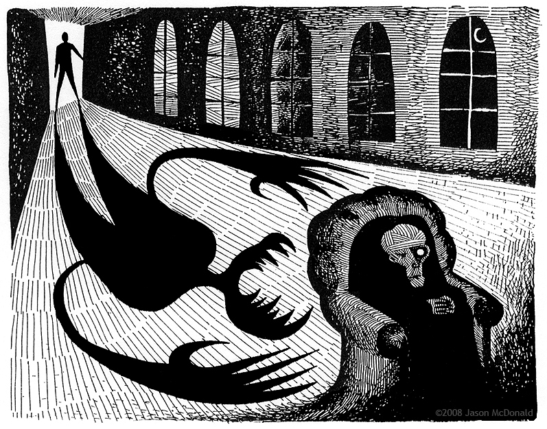
- And while I’m mentioning blogs of animation designers, I have to plug one who worked for me for years. The brilliant Jason McDonald has two blogs he publishes. One is for his design work, both animation and just-plain-Art, and the other is for a comic strip he does on line, My Living Dead Girl. (It’s a strip about zombies.)
Jason has done a substantial amount of design and storyboard work for my studio over the years (including quite a bit of work on developing some of the stories for the POE feature we’re trying to get going. His artwork is fun to animate and has a real sense of design to it, yet it’s not a look anyone else is doing. It’s original. He also has a great sense of daring in all the backgrounds he’s done for my films. I can’t sing his praises highly enough. As a matter of fact, though I’ve done a post or two about him, I think I probably owe him at least another one. (That way I’ll get some attractive Sporn art on my blog again.)
Champagne Bgs,
Nonsense,
Nonesense and Lullabyes (sic)
Jason’s animation design blog can be found here.
My Living Dead Girl can be found here.
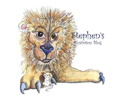
- And I’d also like to give a shout out to Stephen MacQuignon‘s illustration blog. Steve worked with me for a million years coloring many big efforts such as The Red Shoes, The Hunting of the Snark, Whitewash, and Lyle Lyle Crocodile. After leaving my studio, Stephen started illustrating books and has been fairly successful at it. You can see lots of samples on his web site.
Commentary 14 May 2011 06:58 am
Left overs
 - Anthony Lane has written an expressive and interesting piece for The New Yorker Magazine. I felt the article about Pixar intelligent and well-worth reading. Perhaps the fact that I haven’t visited the Emeryville factory, made the piece informative and amusing to me. This is something written for the general public.
I was first informed of the story by George Griffin who wrote: You might want to read the Anthony Lane article on Pixar in this week’s New Yorker. “It’s from a bemused outsider POV, a bit condescending, yet often witty and even insightful. It reminded me of why I distrust the emotional core of the brand: just change the eyebrows and voila!”
No sooner had I received that email, when I’d found that Amid Amidi had already written not one but two nasty bits about it on Cartoon Brew here and here. He calls the article “fawning” and says it, “. . . has convinced me that it is next to impossible to write anything of substance about the studio at this time.”
Perhaps Amid read a different article than I have or perhaps he’s written often enough about the studio (2 books on the market so far) that he just doesn’t have more to say. That is, unless he goes negative which Lane isn’t trying to do.
Anthony Lane has a distinct style in all his writing, and it rises to the top in this article. That style carries the article, at least, for the first half. Like his best movie reviews it’s not the deepest thinking, though there are some good observations I would’ve missed had I not read it. (Yet, how many reviewers these days are deep thinkers. You might find a handful if you work hard at it. Gone are the days when Pauline Kael would argue with Andrew Sarris in their columns over philosophical differences about a movie. Today it’s all thumbs up or down and five Rotten Tomatoes out of ten.)
The piece for the New Yorker was intended as a puff piece, and it delivered. Those, like I, who are not completely sold on Pixar’s eternal genius would hope for more, but I accept the article for what it was and enjoyed it as such.
Rather than take anyone’s word for it, I suggest you try to read the article yourself. It’s not on-line (unless you have a subscription to The New Yorker) but can be found on newstands or in libraries or in friends’ hands. The search is worth the read, despite the snarky reviews of it on line.
- Speaking of Pixar, the Vancouver based school, VanArts is holding a Pixar Artists’ Masterclass in Animation and Story Development. Matthew Luhn (Head of Story) and Andrew Gordon (Animator), both from Pixar Animation Studios, will be the instructors. The program will travel to several cities – with two days in New York, June 24th and June 25th. Geared for professionals and students alike, the classes are now 60% sold out, but have some availability if you’re interested.
Check it out.
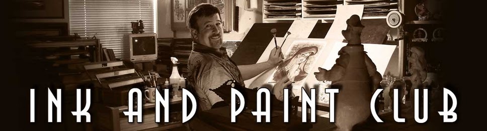
Through an email comment sent me by Mike Peraza, I went to his blog, The Ink and Paint Club, and found it quite interesting. There’s a particlularly good piece about Don Griffith, nestled in some older position a few pages back; there is also a three-post-piece about The Black Cauldron that’s worth a read. You’ll find plenty of bits like this:
- As Cauldron was screened for the new management, Jeffrey Katzenberg proceeded to ask for “… cover shots” during sweat box meetings not fully understanding that extra shots to “cover” a scene was only done in live action. In animation, we DREW each shot as they were needed depending directly on the story board/workbook. Multiple animated variations would have made the already expensive process out of financial reach even for Disney.
Scrolling through the blog, if you’re a Disney fan, you’ll find something that appeals to you. Take a look.
I’ve added the site to my “blog roll” to the right.
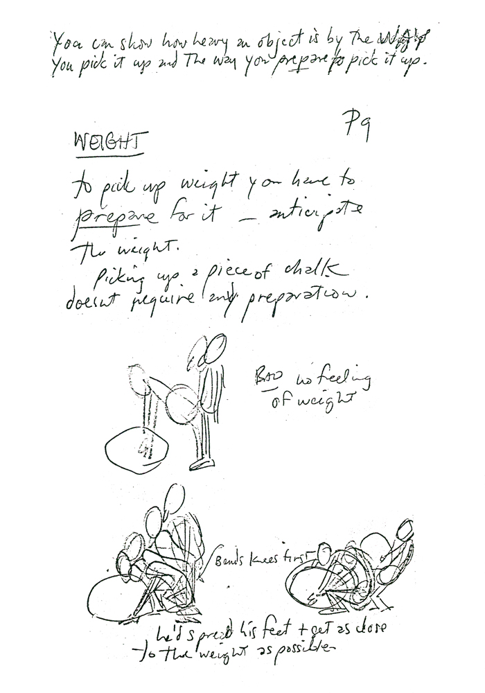
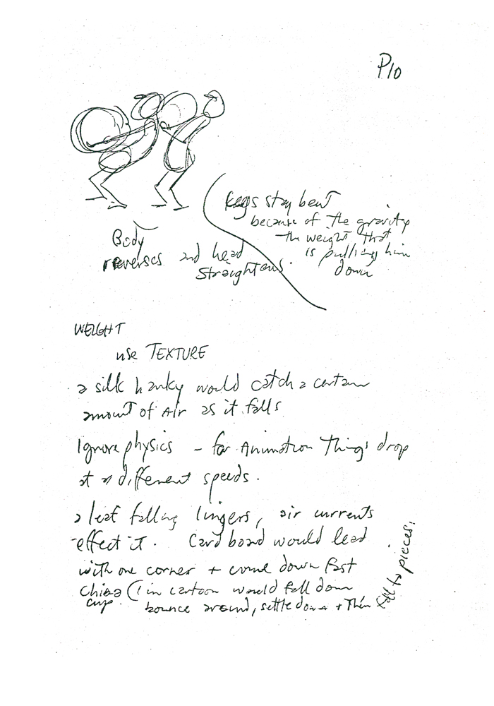
- Jake Friedman has a big article on Art Babbitt’s involvment with animation education going all the way back from the Disney golden age right through to his lectures at Dick Williams’ studio. The piece can be found at AWN.
This reminds me that I’ve meant to run some more of the Williams notes on the lectures. It eventually became Dick’s book, The Animators’ Survival Kit, but there’s something innocent about the rough quality of those notes. I’ll post more of them soon.
 9
9
(Click any image to enlarge.)
 10
10
