Search ResultsFor "toot art"
Animation Artifacts &Commentary &Independent Animation &John Canemaker &Layout & Design 08 Dec 2012 06:23 am
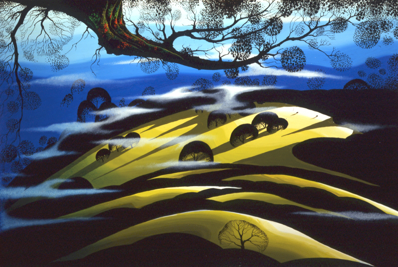
Elements, Chemistry and Odd Bits
Oskar Fischinger, still from Allegretto, 1936-1943 © Center for Visual Music
- On Dec 16 in Amsterdam there will be a major exhibition of the work of Oskar Fischinger, a pioneer of animation film and abstract cinema. This opening will be an exhibition featuring various items including the films, the animation drawings, process material, the documents, correspondence, clippings, color charts, sketches, diagrams, patent drawings, and some of the sketches done (but not used) for Fantasia. Also exhibited will be notated graphic scores, material from the making of An Optical Poem, unshot animation drawings, and various other materials.
John Canemaker wrote about Fishinger for the New York Times, “Decades before computer graphics, before music videos, even before Fantasia (the 1940 version), there were the abstract animated films of Oskar Fischinger (1900-1967), master of “absolute” or nonobjective filmmaking. He was cinema’s Kandinsky, an animator who, beginning in the 1920′s in Germany, created exquisite “visual music” using geometric patterns and shapes choreographed tightly to classical music and jazz.’
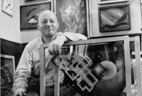
Oskar Fishinger in his Hollywood studio with panels from “Motion Painting”.
Consuming Sprits
Art Under Camera
This coming week, Wednesday Dec. 12th, Christopher Sullivan’s independent, animated feature will make its New York premiere with a week-long run at the Film Forum.
 Described in the Film Forum’s press material: “The animation took 15 years of work… The characters were hand-drawn onto layers of glass which were then moved with needles and pins. The film seamlessly combines cutout animation, pencil drawing, collage, and stop-motion animation to create the haunting atmosphere of a self-contained world… (most of whose) characters walk shakily between self-medication and a bad trip… ugly characters (who) make up the most beautiful spectacle you’ve ever seen.â€
I’ve been looking forward to seeing this film for quite some time. Finally, I’ve been able to confirm arrangements to see it, and I will review it. I’m ready, given all the mediocre work I’ve seen lately.
Meet the film maker
Christopher Sullivan will be there IN PERSON! at the following screenings:
December 14 | 6:30pm
December 15 | 6:30pm
MoMA in Europe
This week, upcoming, the Museum of Modern Art will present a program of older European animation, and quite a few great classics will be screened in one very powerful program that will be shown three times. Trust me, if you don’t know these shorts, they are brilliant – all of them – and there is not one you should miss. Here’s a list of the films in the program:
Animation Abroad, 1946–59
 Arie Prerie (Song of the Prairie)
1948. Czechoslovakia. Directed by Jiri Trnka. 21 min.
A Litte Phantasy on a 19th Century Painting
1946. Canada. Directed by Norman McLaren. 3 min.
Fiddle-de-dee
1947. Canada. Directed by Norman McLaren. 4 min.
Charley’s March of Time
1948. Great Britain. 1948. Directed by John Halas and Joy Batchelor. 9 min.
A Phantasy
1952. Canada. Directed by Norman McLaren. 8 min.
![]() Blinkity Blank
Blinkity Blank
1955. Canada. Directed by Norman McLaren. 5 min.
Thumbelina
1955. Great Britain. Directed by Lotte Reiniger. 11 min.
Concerto for a Submachine Gun
1958. Yugoslavia. Directed by Dusan Vukotic. 13 min.
Les Astronautes
1959. France. Directed by Walerian Borowczyk with Chris Marker. 13 min.
Program 87 min.
Wednesday, December 12, 2012, 1:30 p.m., Theater 2, T2
Thursday, December 13, 2012, 1:30 p.m., Theater 2, T2
Friday, December 14, 2012, 1:30 p.m., Theater 2, T2
Nest week, and I’ll post the list next Saturday, there will be a number of Hollywood Cartoons that will be screened. Chuck Jones, Robert McKimson, Hanna & Barbera, Jack Hannah and Ward Kimball. They’re all represented.
Pups for Sale
 – As of yesterday, Friday, the Pups of Liberty became available for sale to teachers as well as the public, If you go to izzit.org or Amazon.com, you’ll see the assets that are available; indeed, they both link to an educational video, entitled The Pups of Liberty.
Perhaps you’ll remember the posts I published a while back on this short film produced by Bert and Jennifer Klein. I put those several articles together into one here to best showcase the story of this video. With the help of an all-star animation team (artists including: James Lopez (Hercules, Emperor’s New Groove, Flushed Away and Princess and the Frog), Eric Goldberg (Aladdin, Fantasia 2000, and Princess and the Frog), Barry Atkinson (Prince of Egypt, American Tail and The Lion King), and Mark Henn (The Little Mermaid, Beauty and the Beast, Aladdin, Muland and Princess and the Frog) Jennifer and Bert created this Revolutionary War-based film. It offered history as entertainment and allowed audiences to learn from a very entertaining series.
Now, the Kleins are not only making the video available for sale but have a new activities website which expands on that video.
This is a smart idea as Bert and Jennifer Klein seek to develop a new market and a new way to sell a creative product. If you’d like to learn more, take a look at these few clips of the animation. Here or here or here.
This Week’s Films
The schedule continues with our watching a lot of films on the run up to the Oscar nominations. By “us” I mean the people of the Academy, those who elect to see the films on a big screen before they vote. I’m sure a lot of members take the easy way out and watch DVDs of the current movies. I won’t hear this way out. As a matter of fact, they’ve asked us to accept the films via download. We’d watch the movies – the movies we’re voting for as Oscar contenders – via download over the internet. Sort of like NETFLIX. I still want to think of them as “movies”, I want the burden of going to a theater to watch them in a public place with other differing viewers, all inconvenienced at the same time. That is part of the experience, isn’t it?
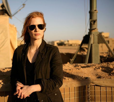 So, anyway, this week started off with Zero Dark Thirty. (I guess that’s supposed to mean 12:30 am – or half past midnight, in the dark.) On Tuesday the movie got the NYFilm Critic’s award for Best Film of the Year. I was hot to see the movie.
Turns out, to me, it was just one step above a TV movie version of the raid on Osama Bin Laden campsite to capture the guy. This film had no poetry in it and wasn’t about much other than the raid we watched. I didn’t like it. Dull. I did like Kateryn Bigelow’s last film, The Hurt Locker. But this film wasn’t that. I thought Jessica Chastain was miscast even though I am a big fan of hers. In fact there’s a Thursday luncheon where I’ll meet Ms. Bigelow and Ms. Chastain. I’m looking forward to that but have to lie if they ask what I thought of the film.
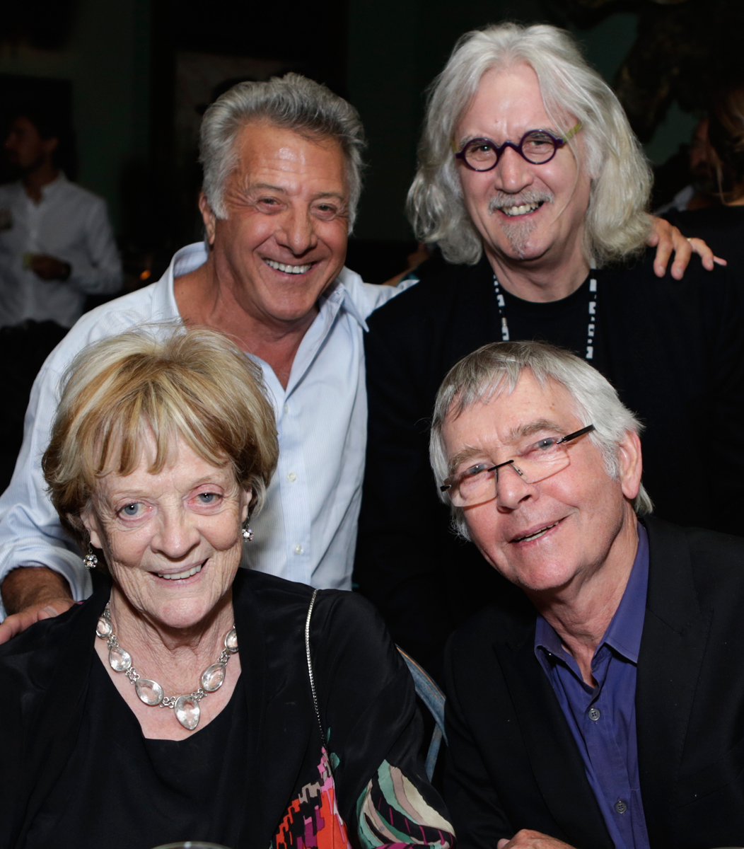
top – Dustin Hoffman, Bill Connolly
bot – Maggie Smith, Tom Courtney
On Wednesday, there was the fllm directed by Dustin Hoffman, The Quartet. This one was great. No miscasting here. Maggie Smith and Tom Courtney were brilliant. Billy Connolly couldn’t have been better, and it was easy to love Pauline Collins. She’s always great. The script by Ron Harwood from his own play was sparkling and always alive. The film was funny, warm, about people and always alive. Just great and human. Top drawer work. After the screening there was a penthouse cocktail party with a nice view, good free vodka or wine, and a chance to tell Dustin Hoffman and Billy Connolly about how good they were. Heidi told Mr. connolly how much she hliked his voice work in Brave, I just told him he was great, great, great. If I didn’t realize how stupid I sounded, I probably would have said a couple more “greats”. See this film for all the brilliant talent on display and the fun you’ll have watching it.
UPA
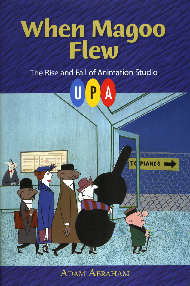 – Thursday night, I skipped the screening of Hyde Park to attend the lecture across town. Adam Abraham was speaking on the back of his book, When Magoo Flew: The Rise and Fall of Animation Studio UPA . The book was remarkable to me, and I was looking forward to meeting the author. At first there were very few people in attendance, but it soon filled up. I was happy to see friends, John Canemaker and Amid Amidi there.
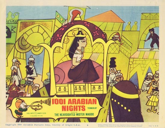
Adam’s talk was well done and ended with the screening of five films: Gerald McBoing Boing, Magoo Express, The Tell Tale Heart, Rooty Toot Toot and a rarely seen live action promotion for Magoo’s 1001 Arabian Nights, called: A Princess for Magoo.
I enjoyed the program and was pleased to meet Adam after the talk. Amid Amidi and I walked the few blocks to the subway and went home. A nice evening.
Back to the Routine
 – On Friday, I attended a luncheon for the film Argo. Ben Affleck, and several key people from the film attended and answered our questions about the movie while we ate at the Four Seasons Restaurant.
The movie is promoted as some kind of recreation of actual events, and I’m sure it is. However, the film we see on the screen works just too well as a typical action-adventure sort of film, that it’s hard to accept its believability, regardless of how much is true. The climactic scene as the hostages are flying away from the Iranian police is just too Hollywood to be a reality, and Mr. Affleck admitted as much, making a joke of the idea. As an action film it works, but I wished for it to dig a little deeper.
A quick steak lunch and a return home. There was a screening of a documentary called West of Memphis which I was scheduled to attend last night, but I just didn’t feel up to it. So I stayed home. Enough movies for one week.
Commentary &Daily post 23 Oct 2012 06:32 am
Inspired Perspiration
 Before getting into it, let me remind those living in NYC, there will be a memorial service for Tissa David who passed away last month. Tissa was something of an original, a female animator who could draw with the best of them. She animated plenty of footage for the Hubleys, Dick Williams, R.O. Blechman and my studio, Michael Sporn Animation. Clips will be shown from many of her films, and five speakers will talk about Ms. David.
It starts at 7pm at the
Academy Theater at the Lighthouse,
111 East 59th St, lower level.
There’s no charge.
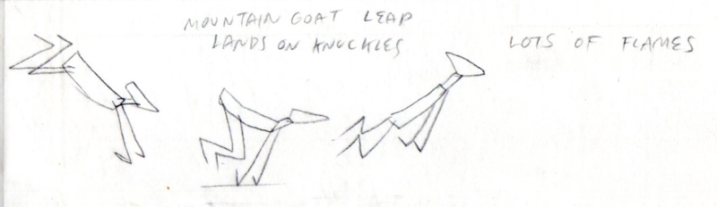
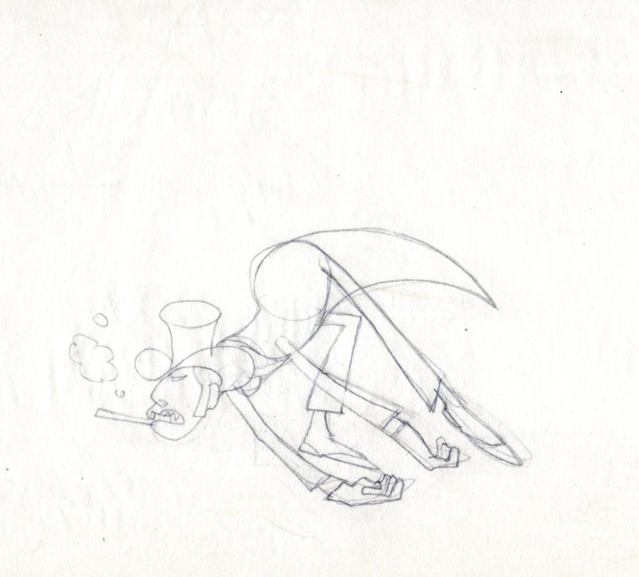
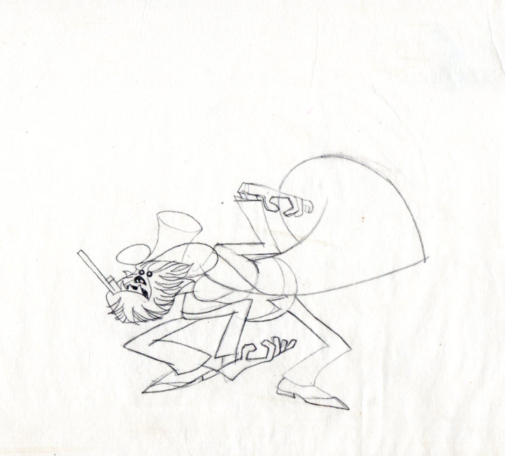
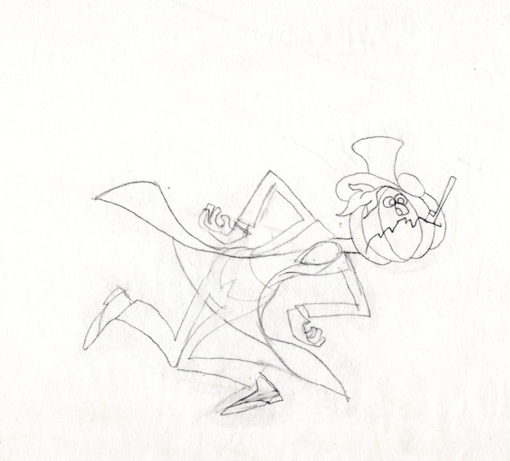
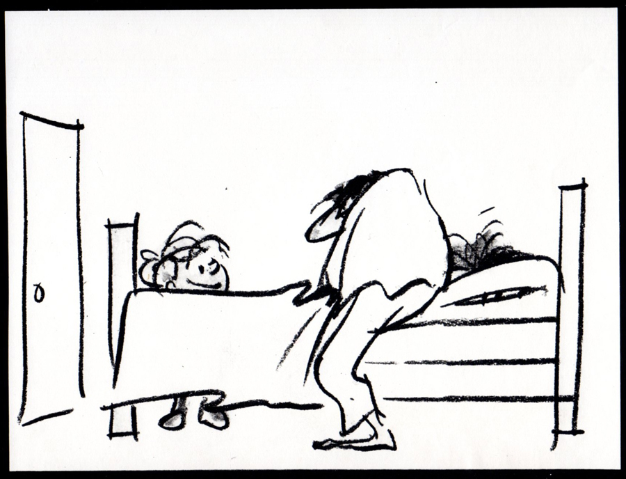
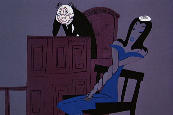 -I was thinking about Rooty Toot Toot the other day. Actually, I wasn’t, I was thinking about some of the ugly designs that came out of other lesser UPA films. Some, like Rooty Toot Toot, were those of animation’s greatest design ever done. The bad ones had characters borrowed out of 19th century illustration, and they didn’t blend in with the 20th century art that others were designing for the very same films.
I think of characters in several of the Art Babbitt directed films at the studio. They just didn’t work. Brilliant backgrounds of Paul Julian just didn’t have the support from the unattractive characters. The characters just didn’t approach the same level of design; in fact, they fought the Bgs which tried very hard to work. Actually, Babbitt’s films don’t seem to fit into the canon of work that came from the studio at the very time they were being developed.
A quick mental jump, and I was thinking about John Hubley and the characters in Rooty Toot Toot. They’re definitely the outgrowth of some modern approach to character design in illustration. Ben Shahn had his influence there, as did Thomas Hart Benton and Saul Steinberg.
Hubley was a working artist. He spent time looking at, working with and studying other artists religiously. He never lost his curiosity when I knew him and applied it to his art. When he did the 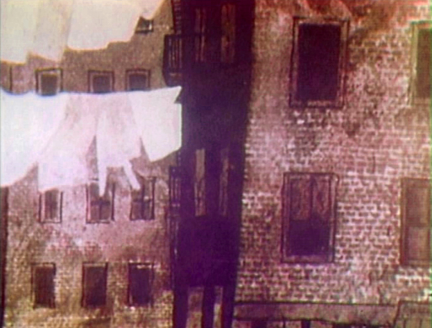 Letterman gig for The Electric Company, he pulled out Paul Klee and studied all those Klee’s with cross-hatching and mottled watercolor. Then he turned to George Herriman and Krazy Kat. During Carousel there were plenty of artists to study and John did. He wasn’t looking to steal from the greats; he just wanted to understand how another artist had solved a similar problem. This was second nature to Hubley. Gregorio Prestopino‘s design for Harlem Wednesday.
,
In the fifties and early sixties, John was taken with the work of Gregorio Prestopino , and brought him into the mix. A 10 min short film evolved, Harlem Wednesday (1957). At UPA, the younger Hubley sparkled with intelligence and purpose in his design, and he acted as a force at UPA when things got big.
Hubley loved many other artists. Who knows what the reference was for Rooty Toot Toot, but we know that there was a group of artists that got Hubley rowling, and the end result was rich.
At the Disney studio a different sort of reference was pulled out for study. Disney brought illustration designers like Frederick Horvath and Albert Hurter to the studio. Dsney reached deeply into the European fairy tale illustrators. If he had been able to bring Edmund Dulac or Arthur Rackham into the studio, he would have. As it is, he brought the best he could find.
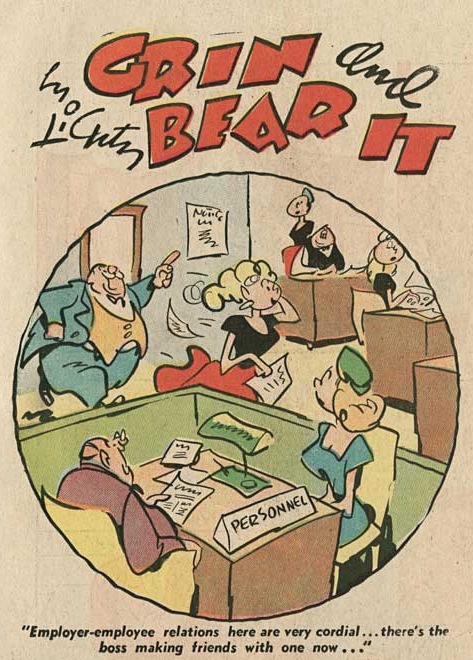 Heinrich Kley and Wilhelm M. Busch. 19th century artists whose principal focus is on the body and physical gesture, this is the strength of animators. Anyone can appreciate their strong work, but animators are particularly attuned to such reference material. Many other animators look toward other cartoonists. Rod Scribner was in love with George Lichty‘s comic strip “Grin and Bear It.” He studied Lichty, religiously, for inspiration, and the result was that great style.
Both types of reference are important. As long as it gets the mind to the next step. Art means you’re trying to continue making art; cartoon references means you’re trying to make a cartoon. Is it necessarily true that if you’re referencing “Art” you’re going to end up with “Art” and if you reference cartoons it means your end work will not be “Art”? No, the answer is no. Who knows what kind of reference Jim Tyer was going for, but some of the animation he did takes animation to another level, one that only Tyer can reach with his uniquely individual style.
Actually, let’s move down another generation. All the Don Bluth films analyzed, studied and reworked the Disney classics while those animation workers told themselves they were in homage of the Disney classics. When the end result becomes a Thumbelina or Gnome in Central Park, you’re not going to find much “Art” in the film. But then Disney animation took it lower.
Is it live or is it Memorex? Or maybe Romnesia?
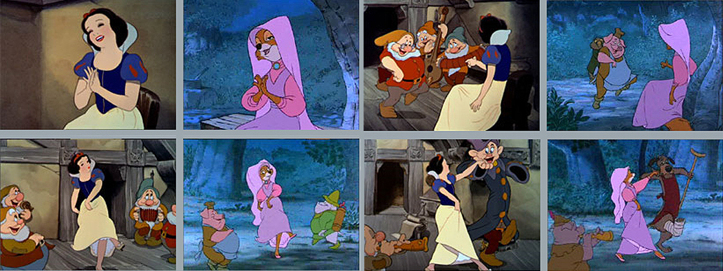
Woolie Reitherman‘s reuse of so many scenes from the Disney classics makes us wonder if there was still talent in the studio. Where was Ken Anderson, Milt Kahl, Frank Thomas and Ollie Johnston when Woolie was trashing Disney? Why didn’t those bosses speak out against it? Sure, they wanted to cut costs, but did they have to take that route? How many
 times do we have to see Snow White dancing with the dwarves – I mean Maid Marian dancing with small animals – to realize that we’re looking at bad animation reuse. It’s not an homage, it’s just cheap. But then Woolie Reitherman was chockablock with cheap ideas as a director. That disco sequence in The Aristocats couldn’t have felt any more bankrupt, just when Disney animation needed to be at the top of its game, Woolie brought it to its lowest point.
Taking inspiration from animators or animation classics doesn’t necessarily pull you to the bottom of the junk heap. Bakshi pushed John Kricflusi into the genius of Jim Tyer‘s scenes, and a new style emerged. Granted it isn’t always art but it is original. John K has spawned a whole new world of wildness among many of the younger people. I’m not sure that’s good, but I am sure that some of the work he, personally, has been doing is rich and inspired.
Woolie Reitherman was just looking for a way out of a tight budget; John K uses his tight budget as a way of taking Jim Tyer to another level.
Books &Daily post 29 Sep 2012 06:55 am
Egos, Books, and Michel Ocelot
There’s been a relatively short conversation going on at the comment section of my blog for an older piece I’d repeated this past week. The discussion has been about Eyvind Earle. The first few visitors who commented all wanted to express their dislike of this film (particularly the story) and Eyvind Earle’s design work, in particular. “Scott’s” dislike of Mr. Earle’s work extends to his personal attitude while working on the film. He, according to “Scott”, was thick headed and wouldn’t listen to any requested changes to his designs, allowing his ego to take charge of the work. (I’m not sure that I see that on the screen, nor did I really feel that when I met the man when I got to spend an afternoon with him as I accompanied Mike Barrier on an interview. I admit it is possible though.)
In fact, I think the ego is essential in breaking new waves and advancing the art form. Adam Abraham in his book When Magoo Flew writes about the ego of John Hubley in running his productions at UPA. If he wanted a specific blue, that’s all that he would settle for. The report is that he was oppressively insistent on it being his way only. I worked for Hubley for years and never got to see that side of the man. Oh, there was a well deserved and big ego there, but it never got in the way of the art being created.
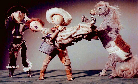
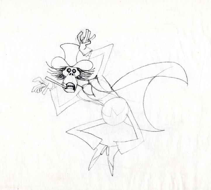
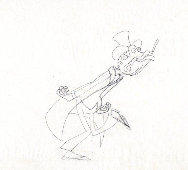
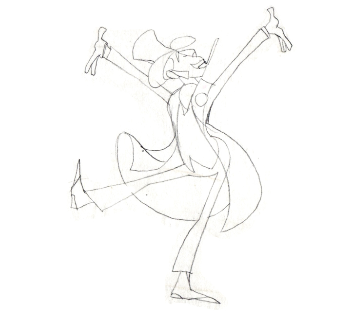
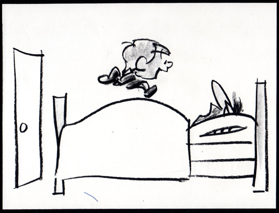
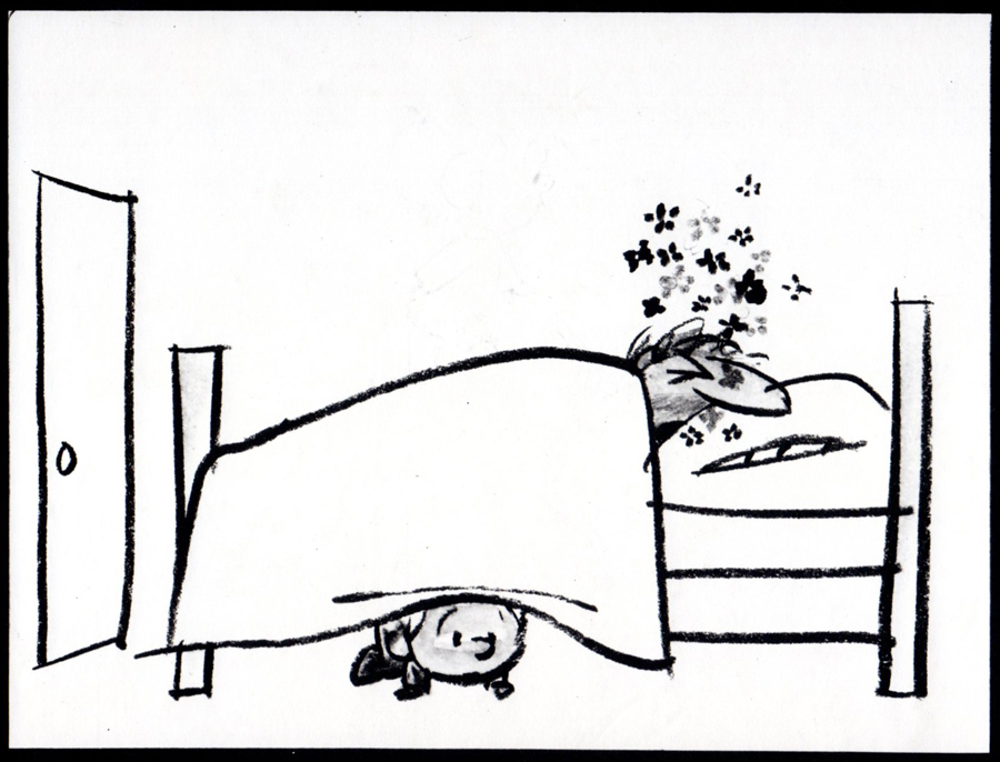
Rooty Toot Toot
We’ve seen Bill Peet complain about Bill Tytla‘s use of his (Peet’s) drawings while working on Dumbo. According to what I’ve read, Peet complains that Tytla took full credit for the sequence of baby Dumbo running in and around his mother’s legs, when Peet felt it was his scene, his key drawings that made the scene the perfect piece that it was.
Chuck Jones, while working briefly for Disney (on Sleeping Beauty), told Walt that he had to leave the studio. When Disney asked what job Jones really wanted at the studio, Jones said, “Yours.” He felt that only Disney’s job was suitable for him. Talk about ego. The ego was even larger than that when you realize that it was Jones, hmself, that told me that story – however real it actuall was. The egos of Jones and Clampett and even Freleng vie over who created what character.
Egos are necessary in an industry of craftspeople and artisans, especially when an artist is trying to get something brilliant out of them. Thomas, Johnston, and even Kahl were brilliant actors with amazing abilities of draftsmanship. But the film, the bigger picture, needed a direction which Earle gave it. Just look at the wretched Reitherman films to see what Thomas, Johnston and Kahl turned out without the strong, smart director who was also an artist. Tytla took animation to another level, he was truly an artist, himself, but look at the miserable little films he directed when he left Disney’s studio. Even the support system of that studio wouldn’t have helped Leprechauns Gold or Snap Happy. (Mind you, I love Snap Happy, but it has no relation to art.)
Here’s a small piece David Parfitt wrote:
- Tytla was a tough guy who used abusive language and irritated his fellow animators. Ken Anderson (Disney Legend for Animation and Imagineering) went to Walt Disney to express frustration at the way Tytla treated his coworkers. Walt Disney replied, “What do you think of Chernabog, the God of evil, in ‘Fantasia’? What do you think of Stromboli in ‘Pinocchio’?†Anderson (the art director for both films) replied, “They are some of the most powerful and vicious villains we’ve ever done.†Walt Disney looked at Anderson and said, “Where do you think all that anger comes from?†Vladimir Tytla was a maverick who needed to release anger and energy to manifest some of the most powerful imagery ever produced by the Disney Studios. A maverick is difficult for a company to grapple with because of their abrasiveness and the way they go against the way things typically run. Yet out of the agitation and irritation often comes a new direction that could secure a company’s future.
Sleeping Beauty changed the Disney studio forever. The animators and artists there, with the exception of Ward Kimball and a few others, fought against the use of 20th century graphics in their films, yet UPA’s influence slowly crept into the mix. Finally when Walt Disney, himself, chose Eyvind Earle and put full support behind him to design this film as he saw fit. The animators all fought Earle and continued to bad mouth him to the end of their days. Yet Earle’s style, as well as Tom Oreb‘s great character designs for that film, are frequently copied by the new generations of artists. The backgrounds and some of the character design are stolen directly from Sleeping Beauty. Even though the SB art is a play on 15th Century manuscripts and art, it was used for the Pocahontas forests.
Painting Sleeping Beauty
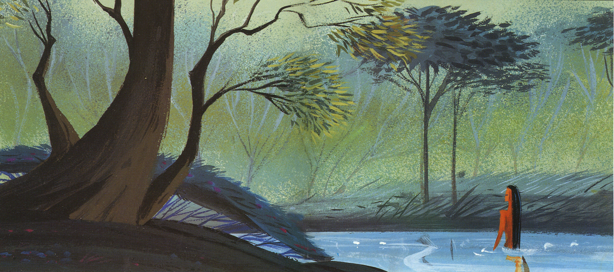
Pocahontas
Nothing at Disney, with the possible exception of Bedknobs and Broomsticks went back to the past to illustrate their films henceforth. Until, of course, today’s new artists in animation who just steal from other past films. Bluth‘s Small One or is virtually without style. Tim Burton is possibly the only exception I can see of this current view of the state of animation. The regurgitated past of other artists who deservedly had egos aglow. We go on. Perhaps someone like Genndy Tartakovsky will bring some of the panasche he brought to Samurai Jack.
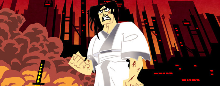
Samurai Jack
By the way, there’s a good interview with Tartakovsky on this week’s on-line version of the Village Voice.
Books
.
- There are a couple of books I’d like to write about.
.
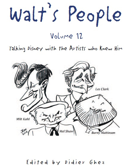
- Let me mention Didier Ghez‘ latest volume of his interview series, Walt’s People.
Just released is Walt’s People – Vol. 12. Just the idea of 12 volumes of any book in print, is quite extraordinary, and amazing feat for Didier Ghez to pull off.
I own about a half dozen of this series and have read all of them at least twice. Most of the interviews are exceptional, some are smart, and the rest are just very good. In all there are those interviews that give us some real insight into the process and history of the making of animated films by the professionals who did it. Les Clark, Larry Clemmons, Charlie Downs, Al Eugster, Sammy Fain, Milt Kahl, Burny Mattinson, Paul Murry, and Mel Shaw are among the many who are interviewed in depth for this new volume. Some of our greatest historians (Robin Allan, Michael Barrier, Albert Becattini, John Canemaker, John Culhane, Pete Docter, Chris Finch, J.B. Kaufman, Jim Korkis, Dave Smith, and Charles Solomon among others) conduct the interviews.
It’s just another great volume in the series. You should own them all; I should own them all, to be honest, and I will.
Ganesha’s Sweet Tooth
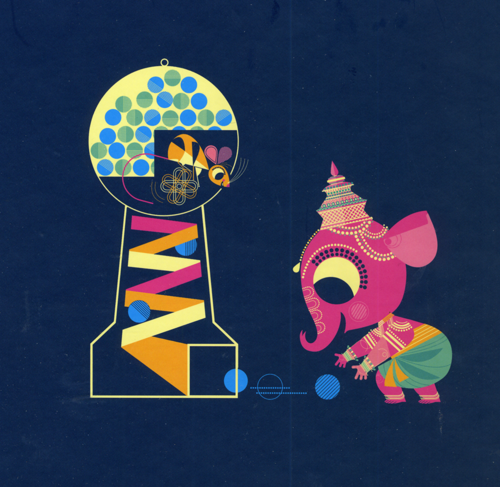
- As previously reviewed on this blog, Sanjay Patel will see his first children’s book, Ganesha’s Sweet Tooth released this week by Chronicle Books. I have a sore spot for Mr. Patel’s work. He’s an artist who works by day at Pixar and is an artist, with his own very defined style, working extensively after hours.
I’ve reviewed many of his books and have a real fondness for The Ramayana. Were I you, looking to explore this artist’s work, I’d buy Ganesha’s Sweet Tooth. Once you have it and want more – you will – go for The Ramayana. It’s a brilliant masterwork.
Snow White x 2
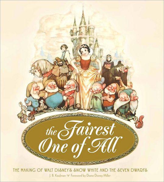
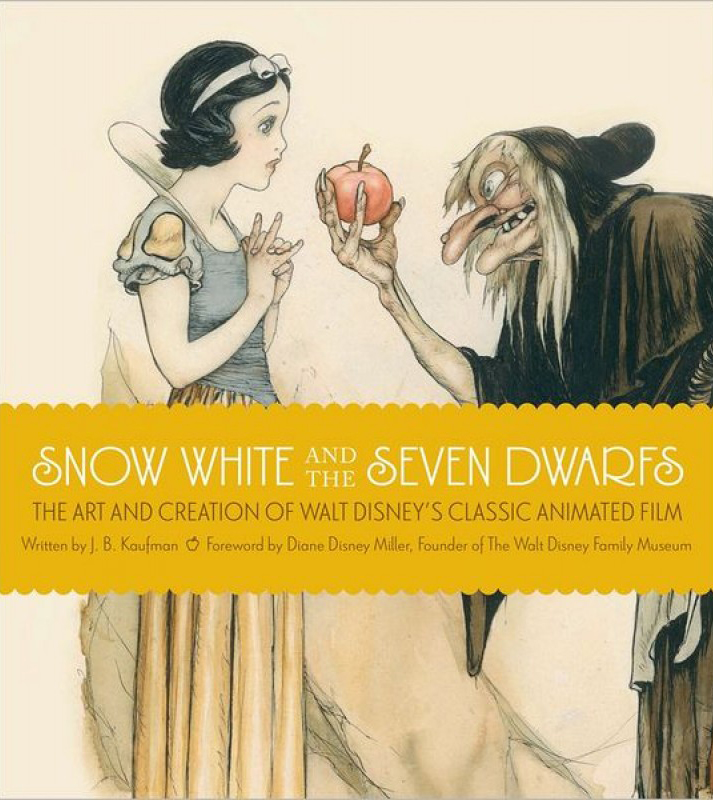
- Unless you’ve been hiding under a rock, if you’re an animation fan, you know that the brilliant historian, J.B. Kaufman, has not one but TWO books on Snow White about to appear on the market.
The Fairest One of All: The Making of Walt Disney’s Snow White and the Seven Dwarfs and
Snow White and the Seven Dwarfs: The Art and Creation of Walt Disney’s Classic Animated Film
are the two titles by Kaufman that focus in great depth on that film and its development. This is to celebrate the 75th anniversary of the feature, and will coincide with a display that will appear soon at the Walt Disney Family Museum in San Francisco.
Both books come from the Walt Disney Family Foundation in conjunction with the Walt Disney Family Museum. I’ve seen the Art of Creation book, and was completely taken with it. I will most definitely own both books. The film means much to me, and I want to own anything Kaufman writes. It’s a no-brainer – double my pleasure.
By the way, part of the reason I’m looking forward to reading these two books is to compare it with Michael Barrier‘s amazing writing on this period at Disney’s studio. In Hollywood Cartoons, there’s a large part of the book dedicated to the development andcreation of this particular film. Then in The Animated Man: A Life of Walt Disney Barrier tells the same information but from a different perspective entirely. This biography of Disney is wholly involved with Walt Disney, the man and artist. It’s a unique turn that we only see in the poorly written Diane Disney Miller book, The Story of Walt Disney. As Walt’s young daughter she could see the story no other way than from his perspective. While waiting for the Kaufman books to come out, read either of Barrier’s books for the best, to date, version of the Snow White story. It’s strong writing.
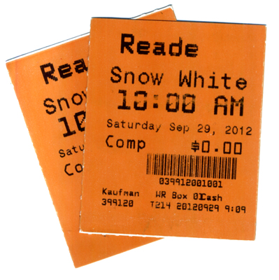 It’s appropriate that I was invited to a 10am screening of Snow White at Lincoln Center this morning. It’s part of the NY Film Festival’s 50th anniversary celebration. Eric Goldberg introduced the film with a brief and smart little talk about the animation. Talking about The Old Mill as a test run for the Multiplane Camera, talking about the Three Little Pigs first offering characters that looked alike but had characterization defined by their animation (as did the dwarfs), talking about The Goddess of Spring being an enormous failure for Ham Luske who succeeded animating Snow White. It was nice to say hello to Eric prior to the film. We haven’t seen each other in about five years. It was nice also to see the film projected. I saw the movie on tv/dvd only a couple of weeks ago, but it’s a very different experience on the big screen. The digital transfer was glorious, merciless and disastrous. The ink lines were so sharp that you could actually feel how deeply the crow quills cut into the cels. However there were many points where individual frames had slight digital distortion to hurt the ink lines, and the magic mirror actually had the detritus of digital compression across the center of the mirror. Someone should have been there to supervise the transfer.
Paperman played prior to Snow White. It was animated cgi, then flattened and lines were added atop the flattened drawings. I can’t for the life of me understand why it wasn’t just animated by hand. It would have cut the cost in half and had more life to it. Sorry, I don’t think it worth the Oscar. Though you never know it may be the best film, this year.
Tales of the Night
- Michel Ocelot has received another excellent review from the NYTimes. Tales of the Nightis reviewed by Andy Webster in the Times, and is Ocelot’s latest feature length animated film – his first in 3D – and the reviews are sensational. It’s screening as part of the Children’s International Film Festival and plays at New York’s IFC Theater through next Tuesday. This is a silhouette film in brilliant color.
His films are beautiful and deserve to be seen in a theater. I’d heartily recommend getting to the theater if you have the chance. Hopefully the distributor will submit this one for Oscar consideration. Though the look is 2D, the graphics are done via cgi as was the case with his past films, including Azur & Asmar, Kirikou et les betes sauvages, Princes and Princesses, and Kirikou and the Sorceress.
Some amazing animation is coming out of France these days.
More Reviews
 Now to the bigger release for the smaller film department:
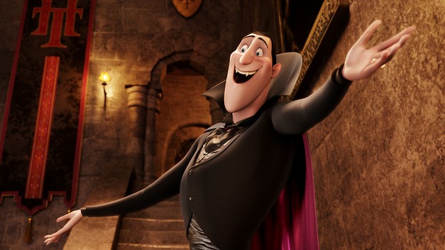
Adam Sandler‘s second animated feature, Hotel Transylvania, opened to mostly poor reviews by 2nd string reviewers.
NYTimes sent Neil Genzlinger to give his negative review. The most positive line is: “The movie loses its originality as it rolls toward its predictable conclusion, but it’s still lovely to look at.”
Someone named Sara Stewart reviews the film for the NYPost and gives it a middling 2½ stars. “Director Genndy Tartakovsky (“The Powerpuff Girls,†“Samurai Jackâ€) is a natural fit for this kid-and-parent-friendly flick. The animator’s wit and attention to detail enliven a collection of well-known ghosts and ghouls. (Though Tartakovsky’s more traditional TV-cartoon style is still superior, as evidenced by his playful closing credits.)”
Joe Neumaier, the 2nd rate first stringer of the NYDaily news gave it a mostly positive 3 star review. “This being a Sandler movie, the humor skews toward the infantile (fart jokes, peeing baby werewolves). But the sleek visuals are rich and glossy, placing the characters, who look like Halloween door decorations, in baroque hallways or secret passageways.”
I enjoy the reviews in The Onion, and their review for this film by Tasha Robinson doesn’t disappoint. A C+: “Tartakovsky gets a long way on wild design and visually daring sequences. His work has always been adventurous, experimental, and conceptually creative, and he hasn’t lost any of his energy or capacity for staging a memorable setpiece.”
Whatever happened to the feature length version of Samurai Jack that J.J. Abrams was going to produce wth Tartakovsky directing?
commercial animation &Disney &Illustration &Independent Animation 25 Sep 2012 05:29 am
Eyvind Earle – recap
 – Let’s talk a little about Eyvind Earle. This is the artist who rose to fame when he was selected by Walt Disney to set the style for the long-in-production feature, Sleeping Beauty. The animators disliked his art direction and openly protested it. Walt remained true in his stance and supported Earle to the end; though it could be said that Walt was more involved in Disneyland’s construction and gave too little attention to the in-fighting at the animation studio.
I remember Frank Thomas, specifically, stating that he had done everything possible to supercede Earle’s style after he, Thomas, had animated the Merryweather scene as she creates Aurora’s dress and cake in honor of her birthday. He felt that the black bodice that Earle had designed took all the lightness out of his character’s delicate dance.
(Click on any image to enlarge.)_________________________________
L to R: Al Dempster, Dick Anthony, Ralph Hulett and Eyvind Earle
Thomas publicly attacked Earle at the Lincoln Center celebration of Disney animation back in 1973. I’d already read something similar, and heard it privately. None of the others on stage at Lincoln Center – Woolie Reitherman, Ken Anderson or Ollie Johnston – countered in support of Earle.
 Sleeping Beauty was such a drastic change in look from the other Disney features, that I think it took deep hold in the minds of a lot of Baby Boomers growing up around this feature. Earle became a strong target of interest, and I think his reputation has grown annually.
I have to admit it was odd seeing the backgrounds of Pocohontas trying to emulate Earle’s Sleeping Beauty style, but in some ways it seemed fitting. The studio had been ripping off the films of the past for so long that it was only appropriate that they’d focus on someone who was such a dynamic force.
For a short period after he was released by Disney, in the post-Sleeping Beauty layoffs, he worked with John Sutherland Productions where he designed the short, Rhapsody of Steel. Then he formed his own studio, Eyvind Earle Productions, Inc. He did an animated trailer for the film, West Side Story, under the supervision of Saul Bass. He did an animated title for the Kraft Suspense Theater, and he did a Christmas Special for Tennessee Ernie Ford.
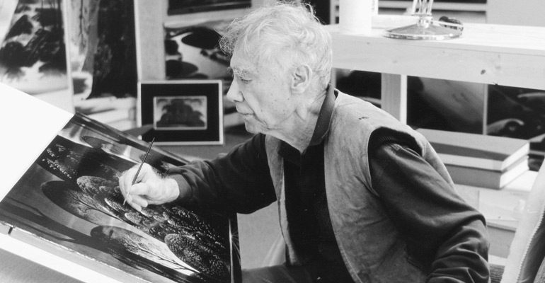
Ultimately, Earle made a success of his own art after leaving animation. He’s been represented by a number of very large galleries and has sold a lot of popular art in a style all his own. Here are a couple of examples found on line:
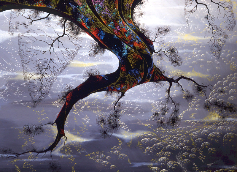

I’m not always a big fan of the color schemes in his graphics, though he always makes them work, but I have to give credit to Earle for his originality and the dynamic approach in his art.
His autobiography, Horizon Bound on a Bicycle, is a must for all real fans.
This is his animation resume:
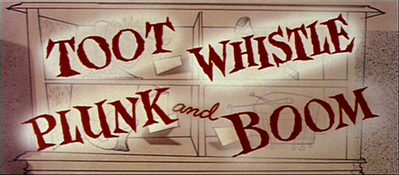
- 1951 Started with the Walt Disney Studios as background painter on: FOR WHOM THE
__ BULLS TOIL, MELODY, and the Academy Award winner for “Best Short of the Year”
__TOOT, WHISTLE, PLUNK and BOOM which also received a Cannes Film Festival Award.
__Production Designer, Color Stylist and Background Painter for the DIsney animated __classic SLEEPING BEAUTY, as well as, PIGS IS PIGS, GRAND CANYONSCOPE,
__PAUL BUNYAN, LADY AND THE TRAMP, LONDON BRIDGE, and WORKING FOR PEANUTS.
__He designed 5 murals for Disneyland.
1958 Joined John Sutherland Motion Picture Company in Los Angeles.
1960-1966 Created 24 sheet poster for Hamm’s Beer.
__Started motion picture animation company, Eyvind Earle Productions, Inc.
__Created animated commercials for Chevrolet Motors, Chrysler Corporation, Marlboro
__igarettes, Motorola Television and the Kellogg Cereal Company.
__Created animated trailer for WEST SIDE STORY for United Artists.
1961 Created animated television special THE STORY OF CHRISTMAS starring
__Tennessee Ernie Ford and the Roger Wagner Choral.
1962 Created animated television special THE EASTER SPECIAL.
__Created title for the KRAFT SUSPENSE THEATER.
__Created the logo trademark trailer for Universal Pictures.
__Produced and created the theatrical short DEATH AND SUNRISE
You’ll find a lot of merchandise including all the books listed here, on the Eyvind Earle website.
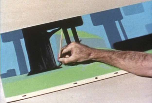
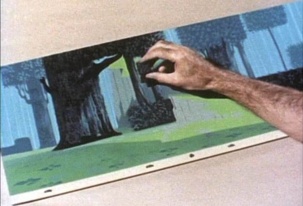
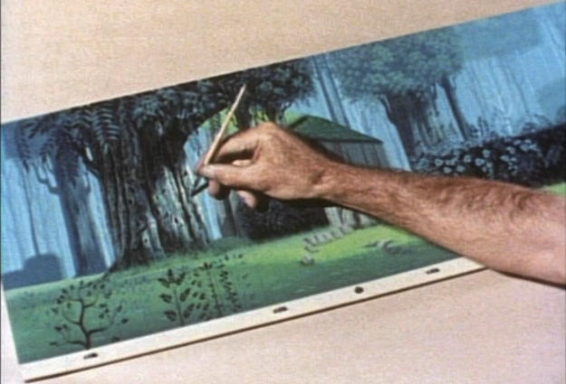
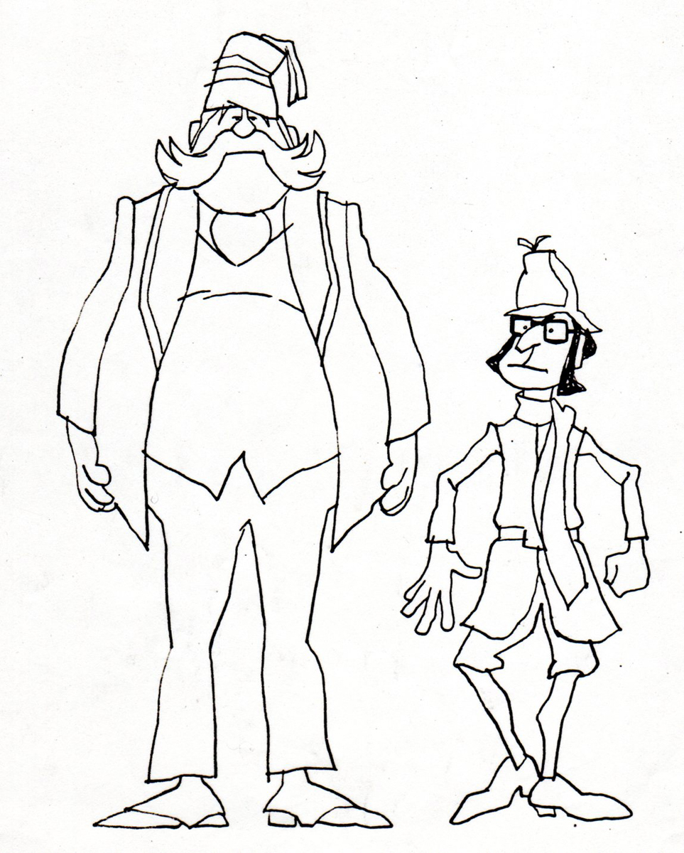
Animation Artifacts &Bill Peckmann &commercial animation 31 Aug 2012 05:51 am
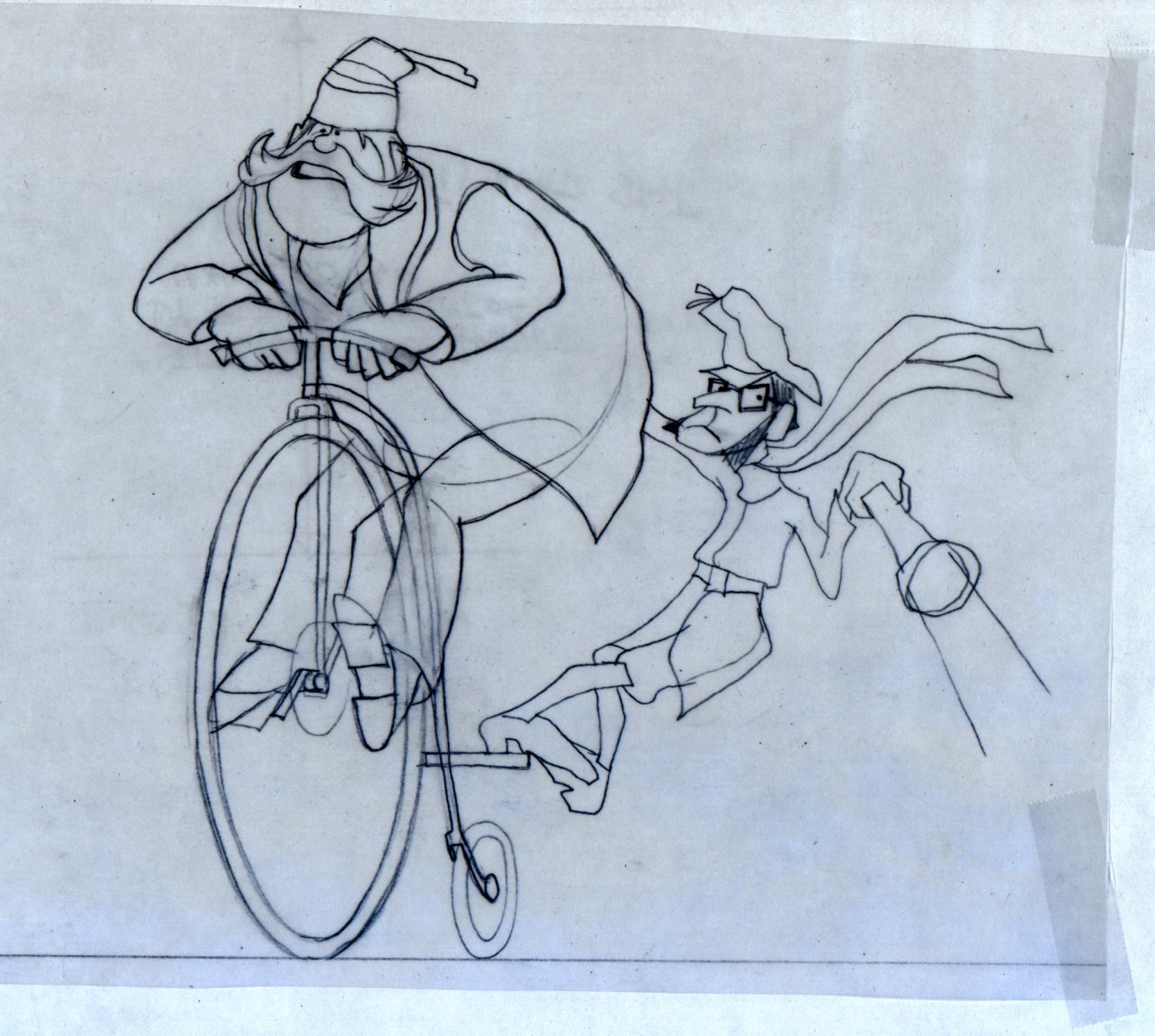
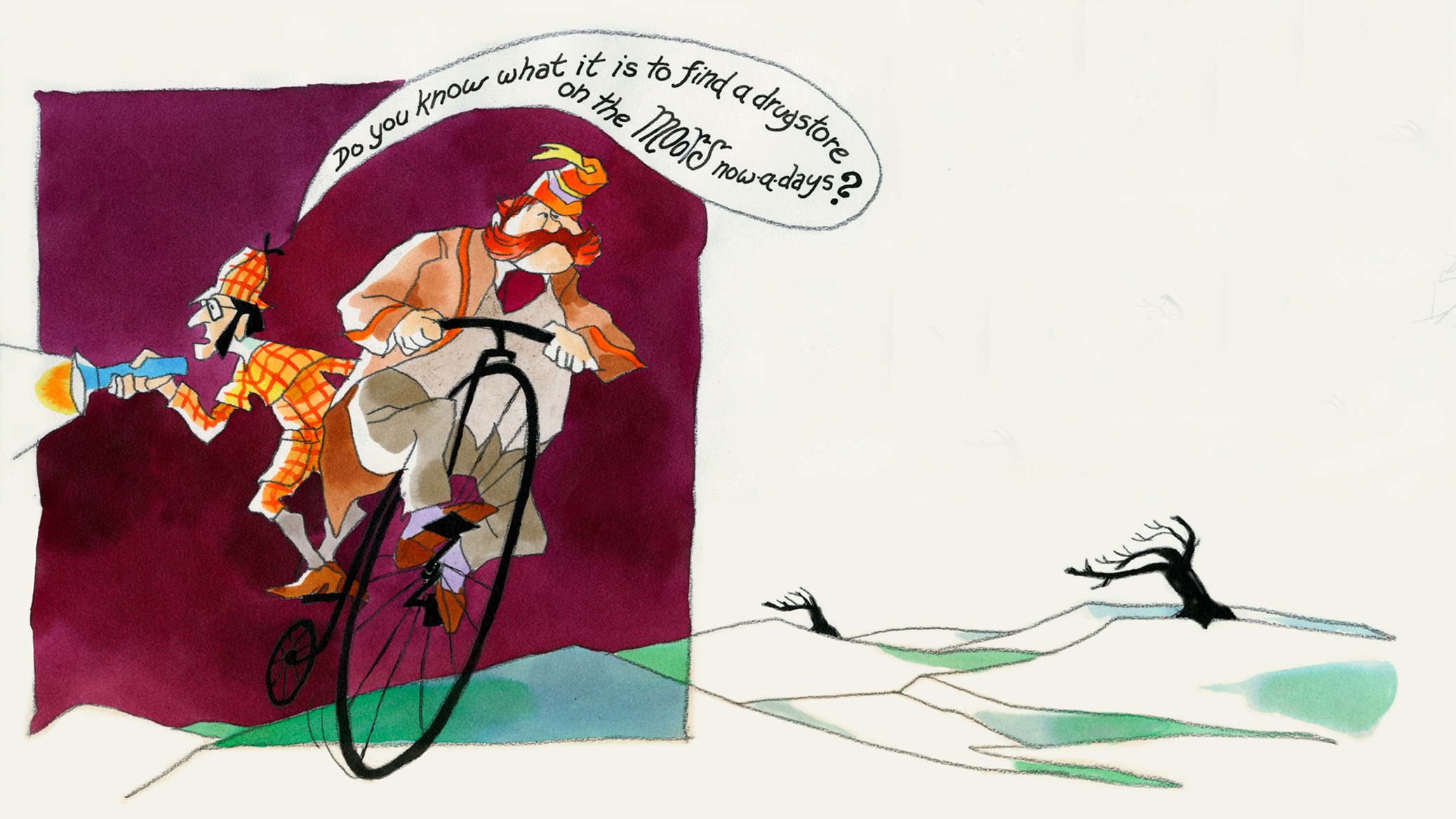
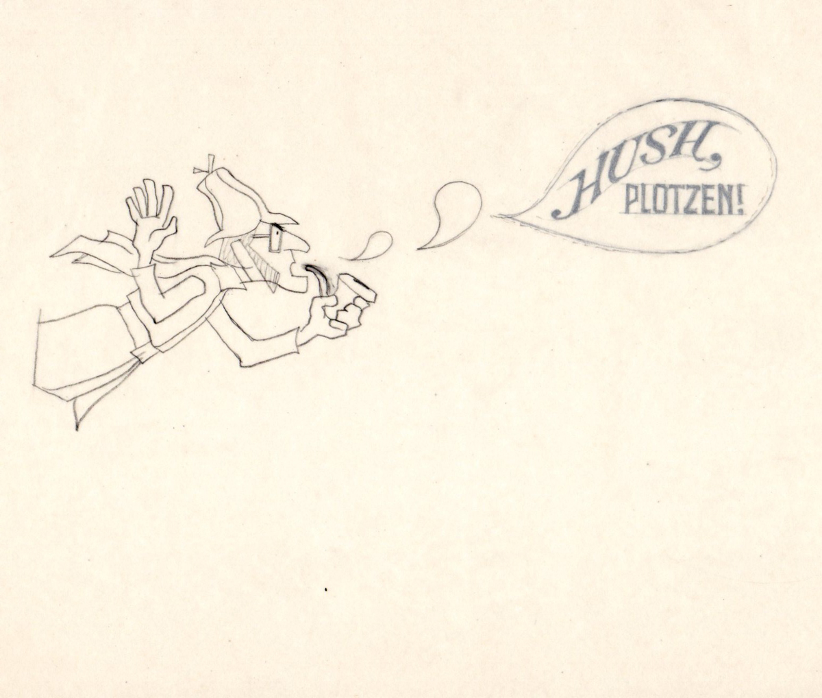
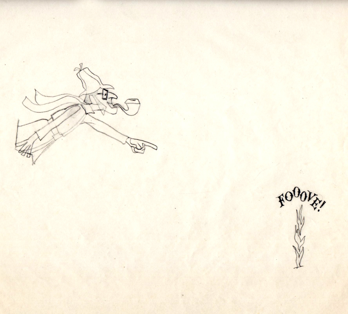
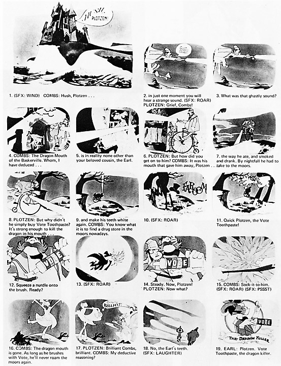
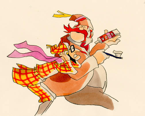
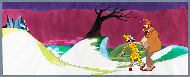
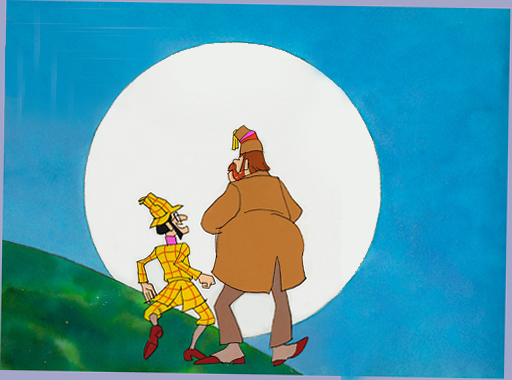
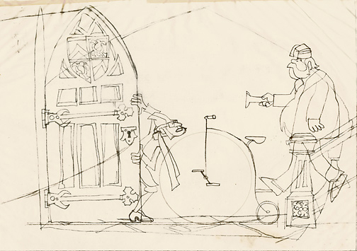
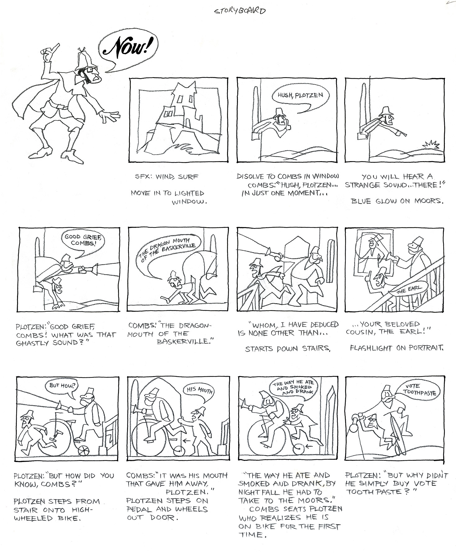
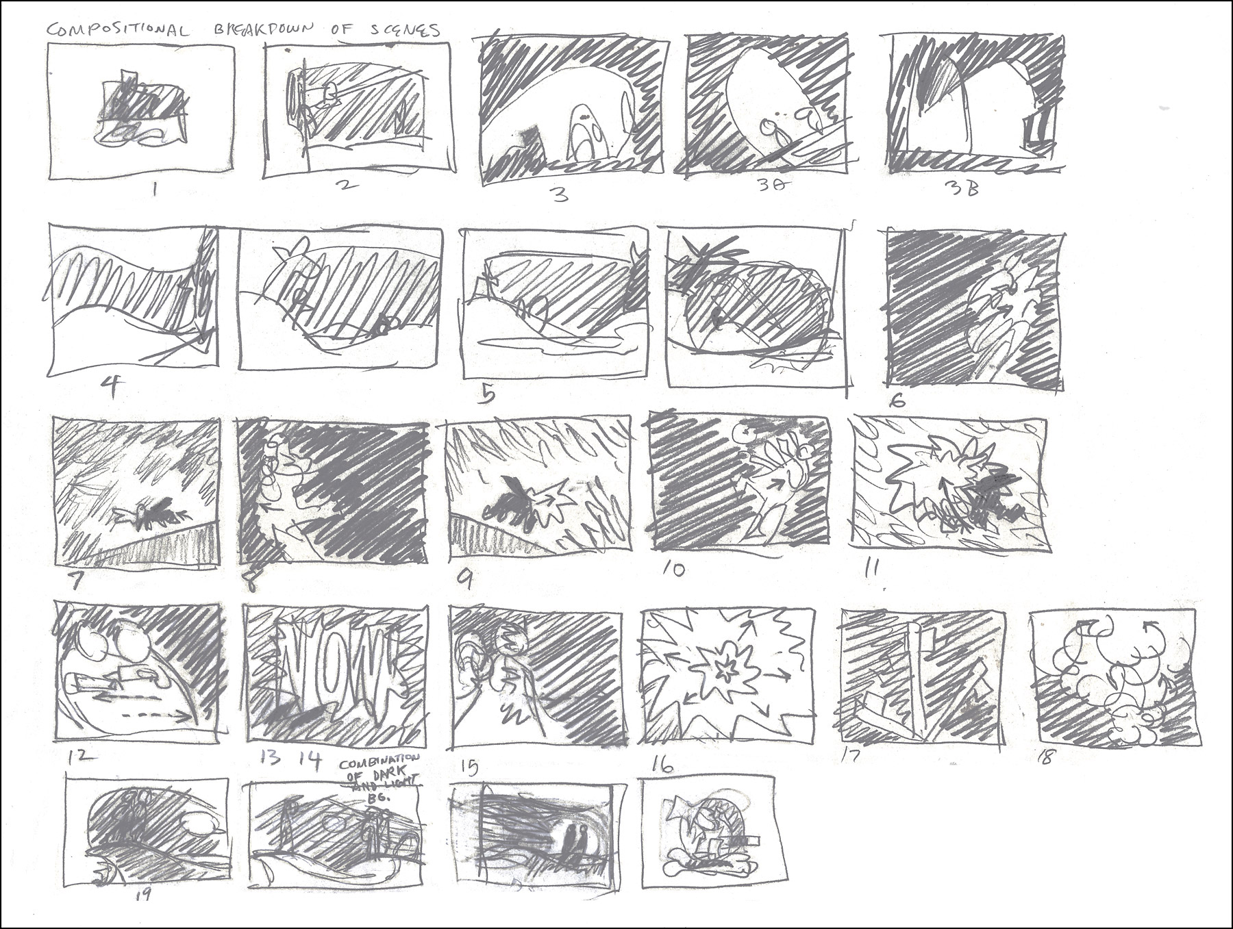
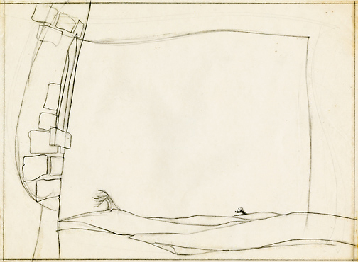
Combs and Plotzen – Part 2
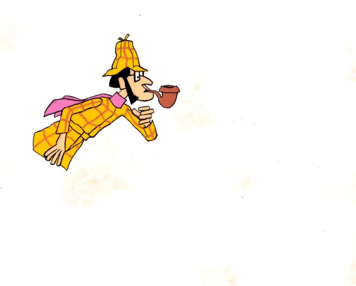
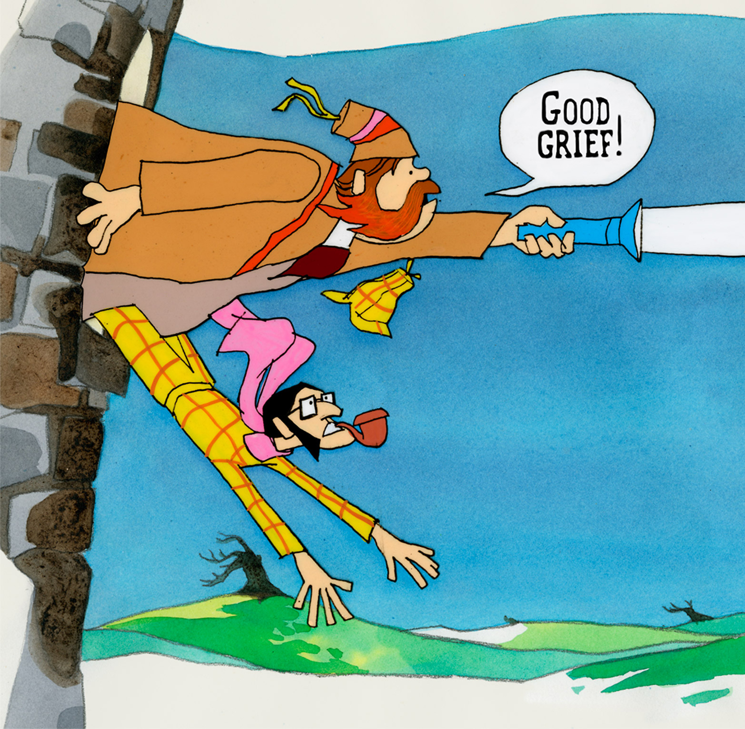
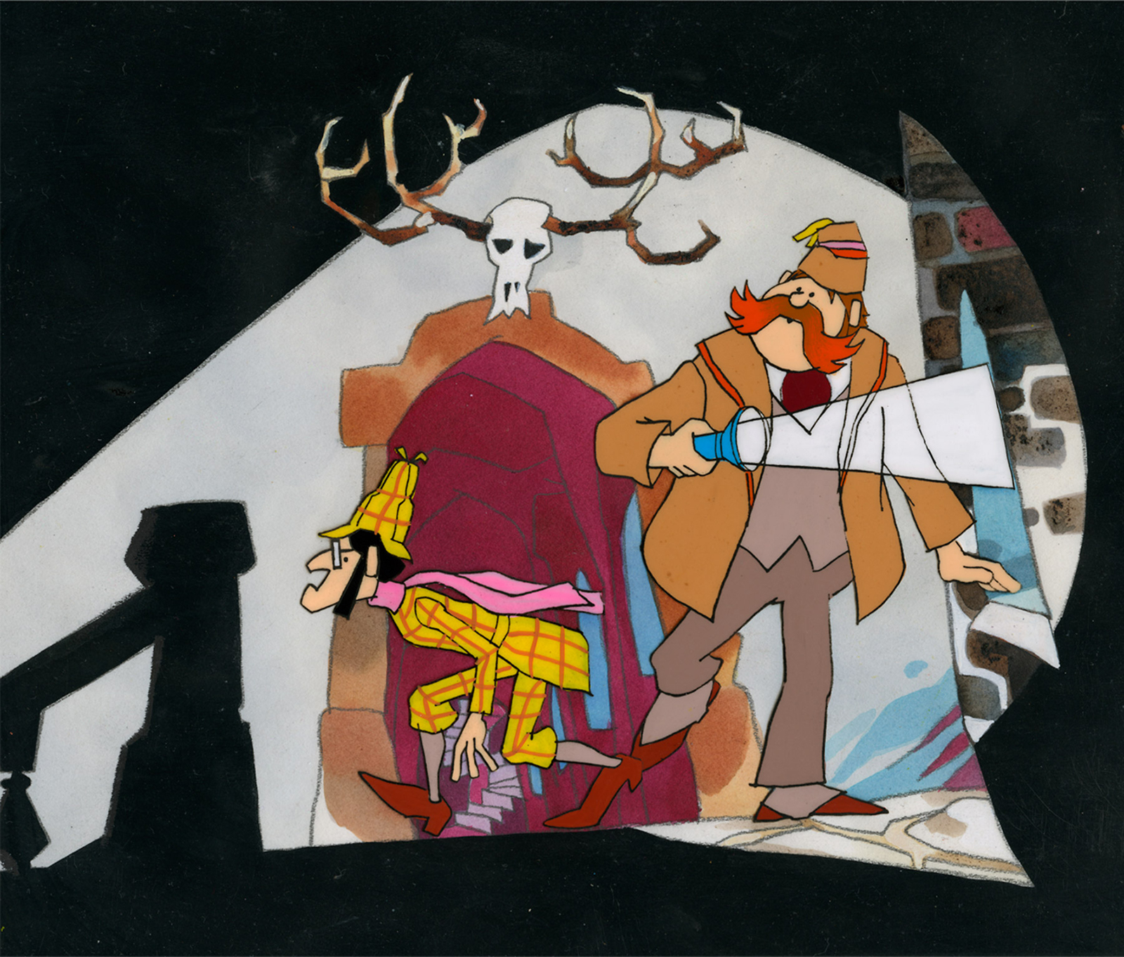
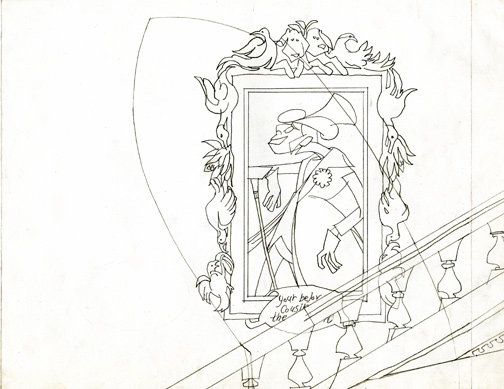
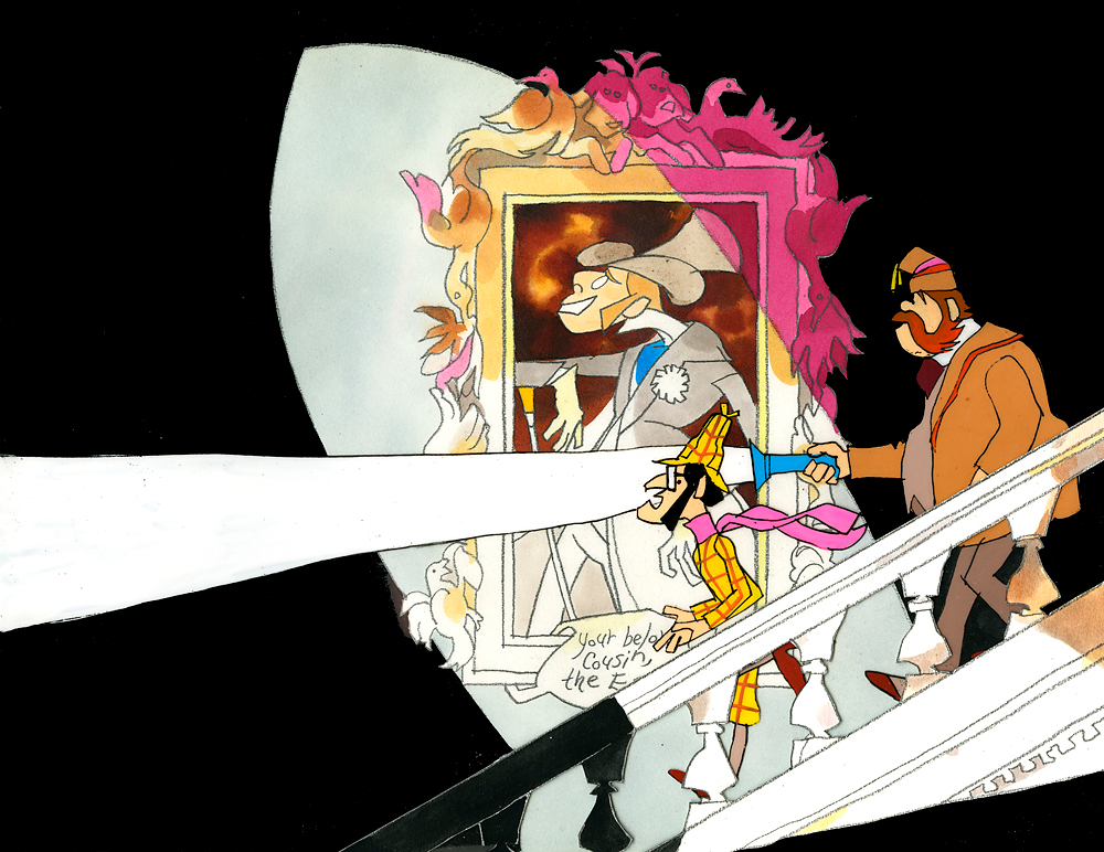
- Last week, Bill Peckmann forwarded a number of pieces of art by Rowland B. WIlson which was preliminary work for a commercial at Phil Kimmelman and Associates. The commercial, for Vote Toothpaste, was a parody of Sherlock Holmes called Combs and Plotzen. More art surfaced this week for that spot, and I thought it worthwhile to extend the post for a second part. (See Part 1 here.)
Bill Peckmann writes:
- Combs & Plotzen was the second TV commercial that print cartoonist Rowland B. Wilson designed in 1969 and his grasp of the animation production steps was truly amazing. No crash course in storyboarding, model charts, Layouts etc. was necessary. It was like he was doing it all of his life. We were in total awe.
- At that time, Rowland was always very comfortable doing his animation drawings on the paper he knew best, tracing paper. He would work up roughs on layering tracing paper panels without having the need of a light box. No pegs for him in those days.
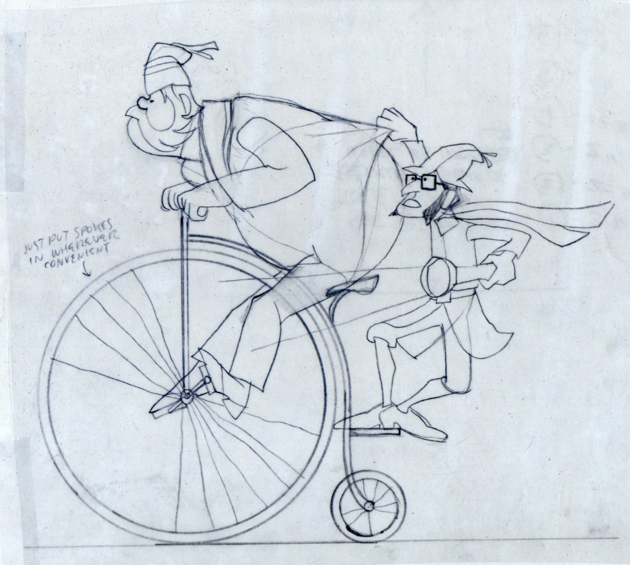
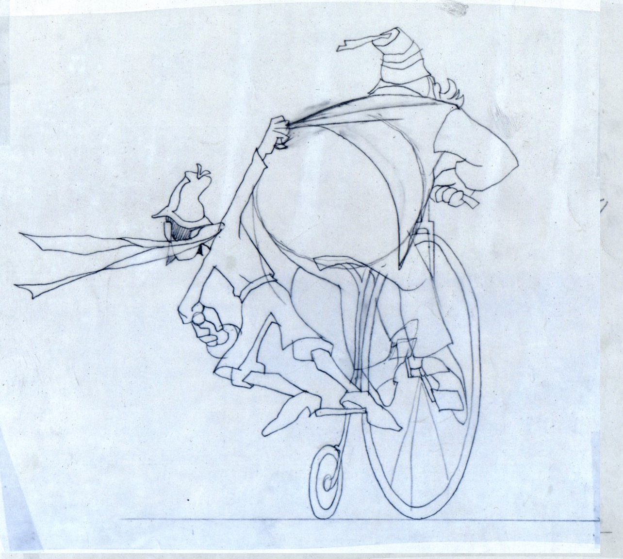
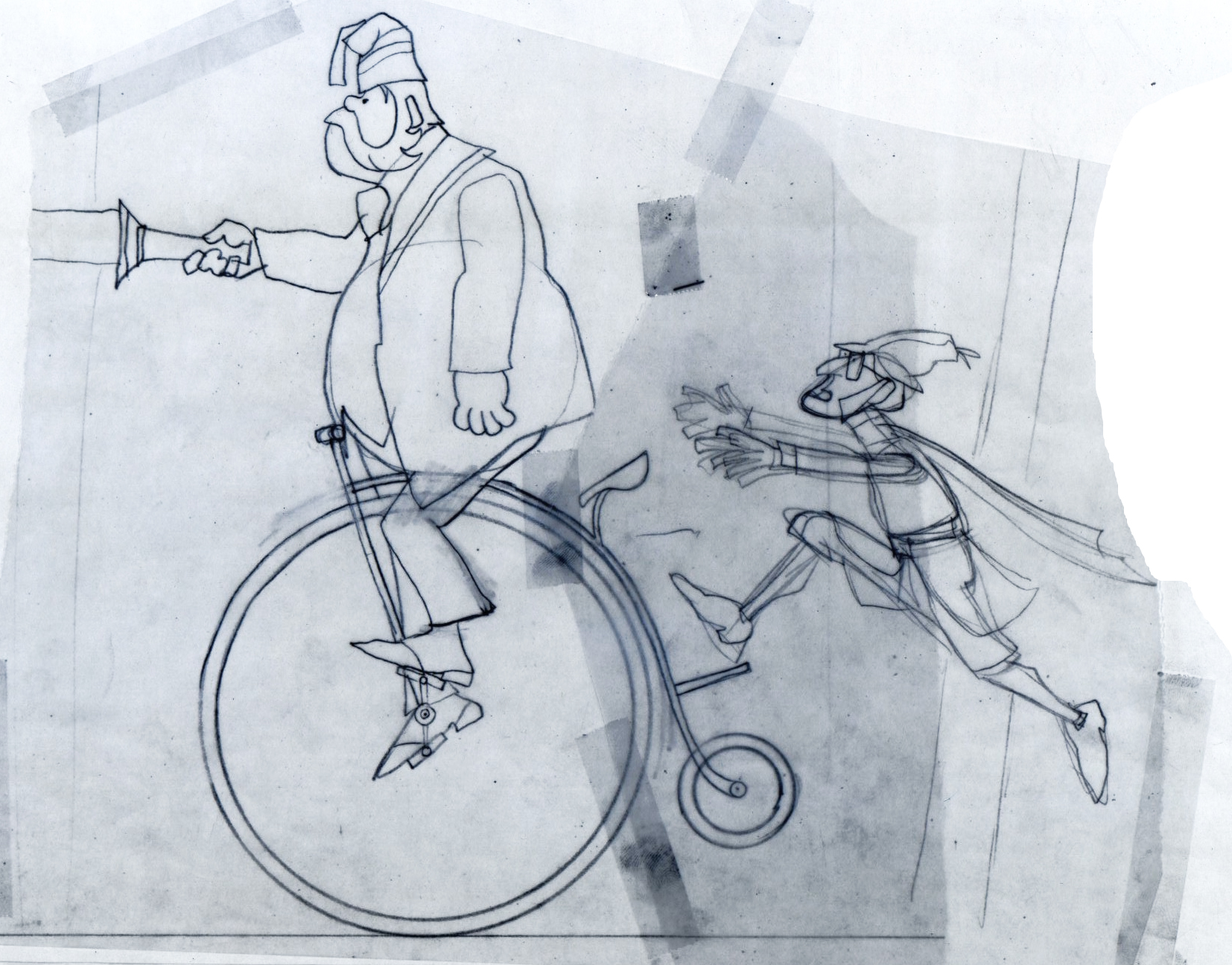 1
1These first five drawings are Layouts by Rowland Wilson.
 2
2
 3
3
 4
4
 5
5
 6
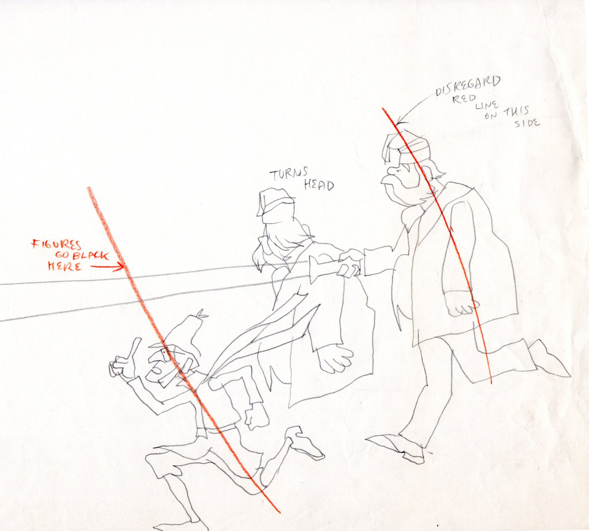
6
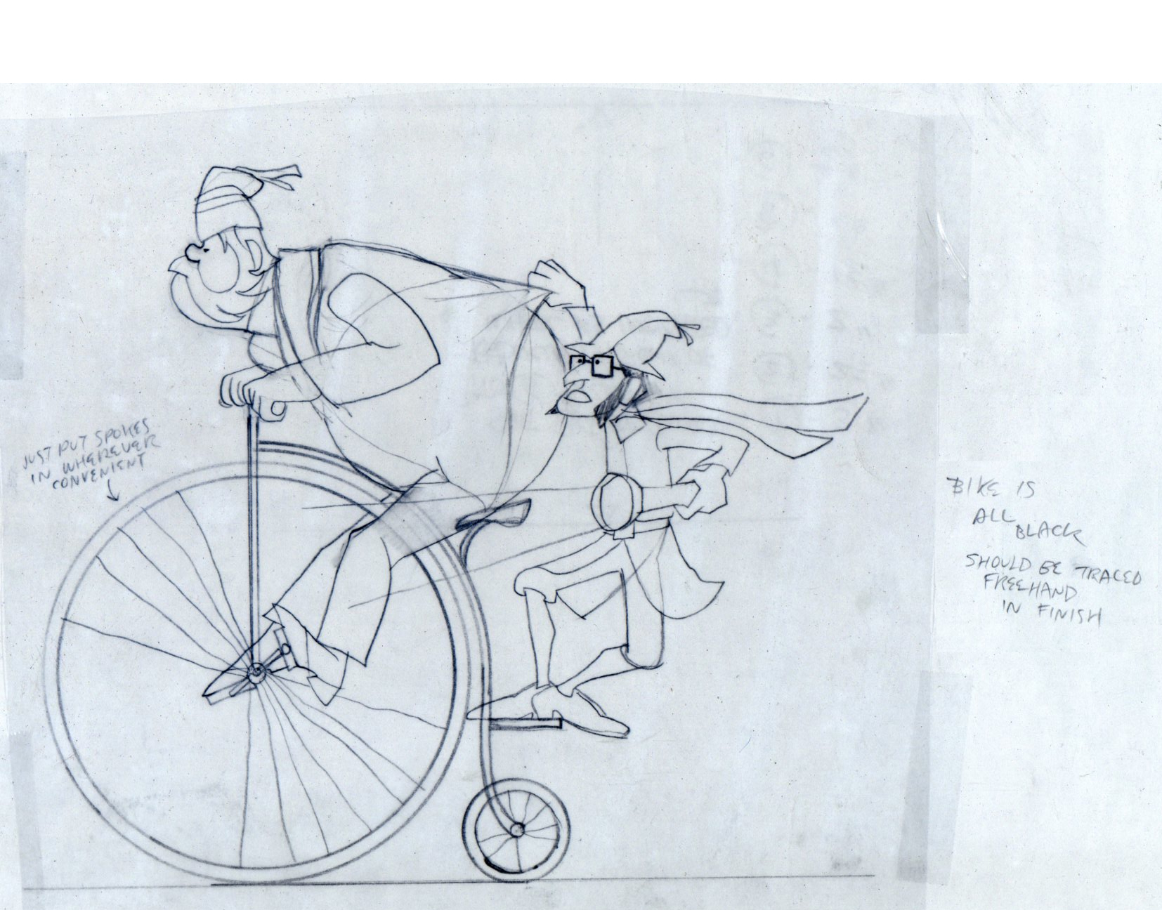
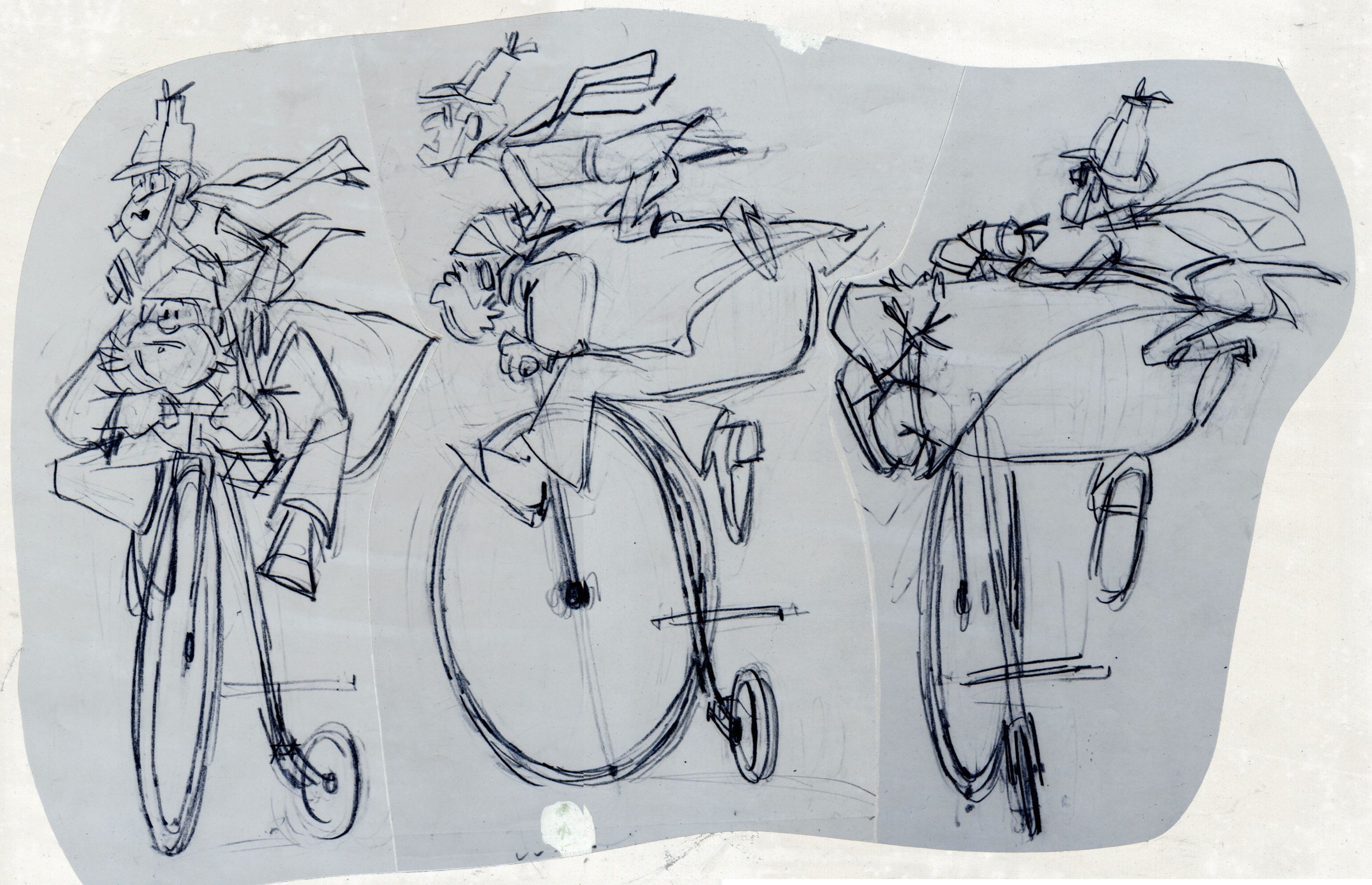
These are Jack Schnerk‘s roughs of the bicycle scene.
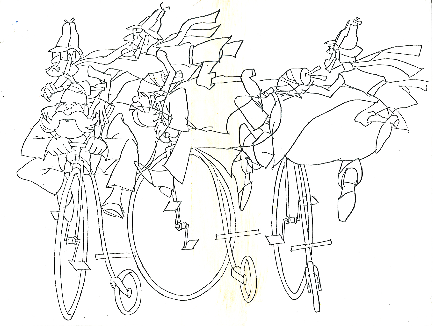
These are Bill Peckmann’s clean ups of Jack’s roughs.
 8
8
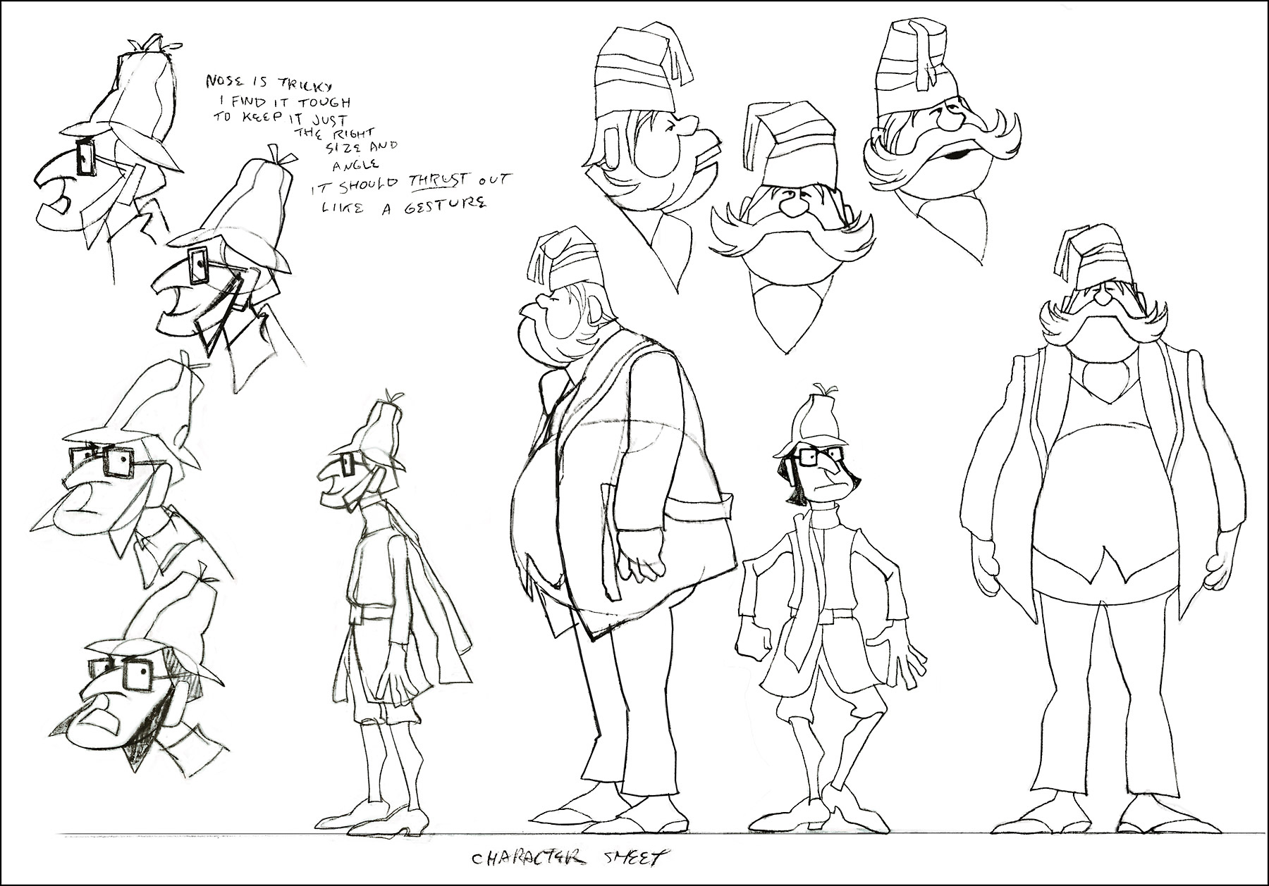
A model sheet from Rowland Wilson.
 9
9
These three color sketches are in the new book,
Trade Secrets, by Rowland Wilson and Suzanne Lemieux Wilson.
 10
10
 12
12
 13
13
 14
14
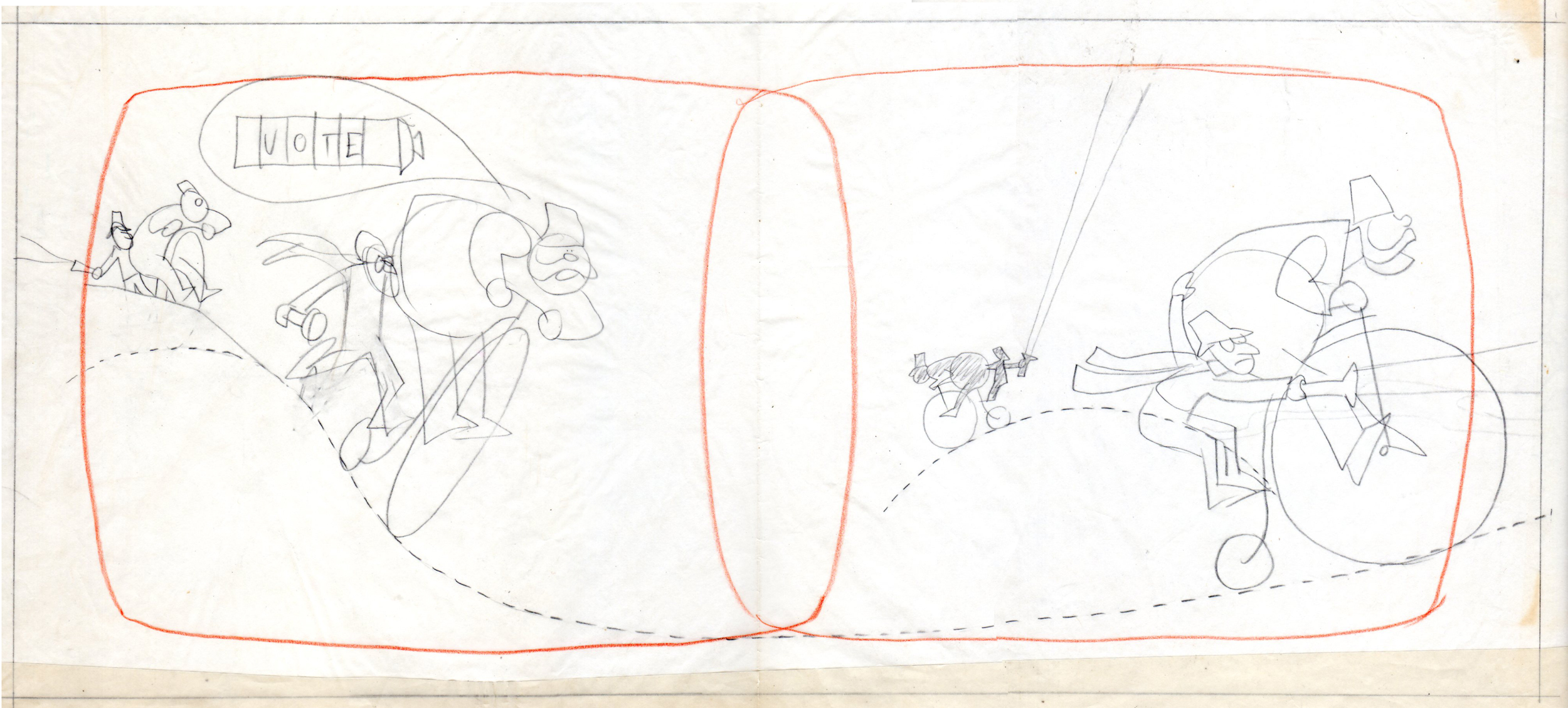
Row’s rough for pan scene.
 16
16
 17
17
 18
18
A ‘Combs’ cel.
 19
19
an unpainted model cel.
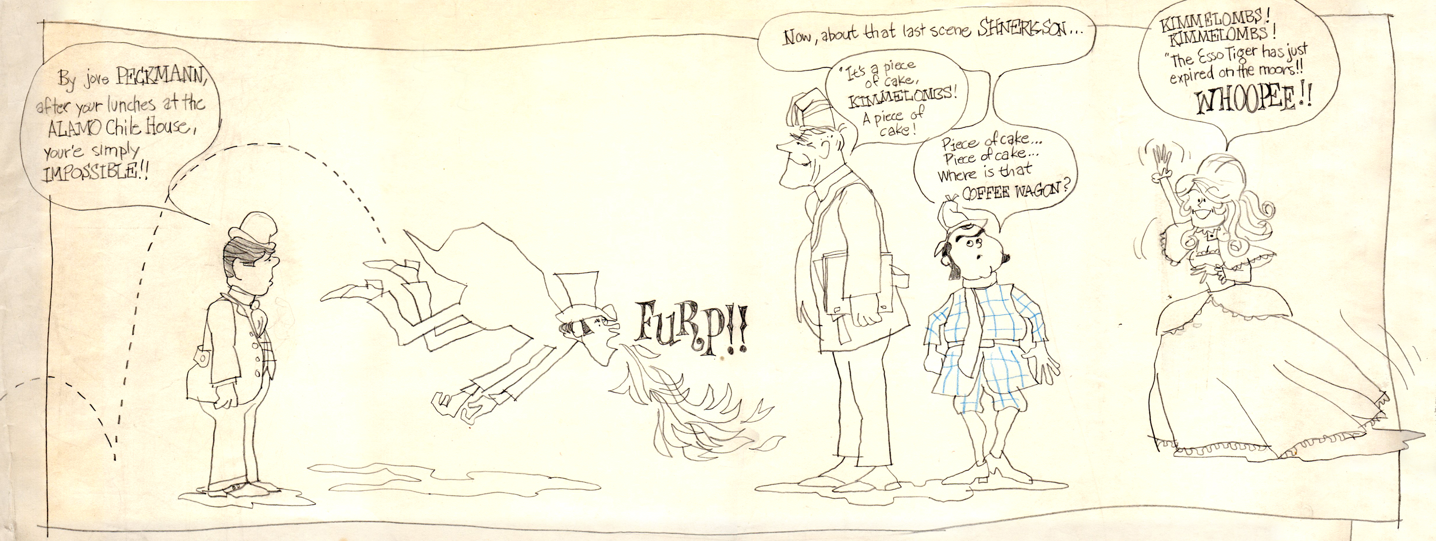
I found the original drawing I did of the crew that worked on Combs & Plotzen
way back then. It’s Vic Barbetta commenting on my lunchtime eating habits,
Jack and Phil’s anticipating the most important part of the day, the coffee wagon
bell, and Agnes hearing the good news of not having to draw anymore tiger stripes.
.
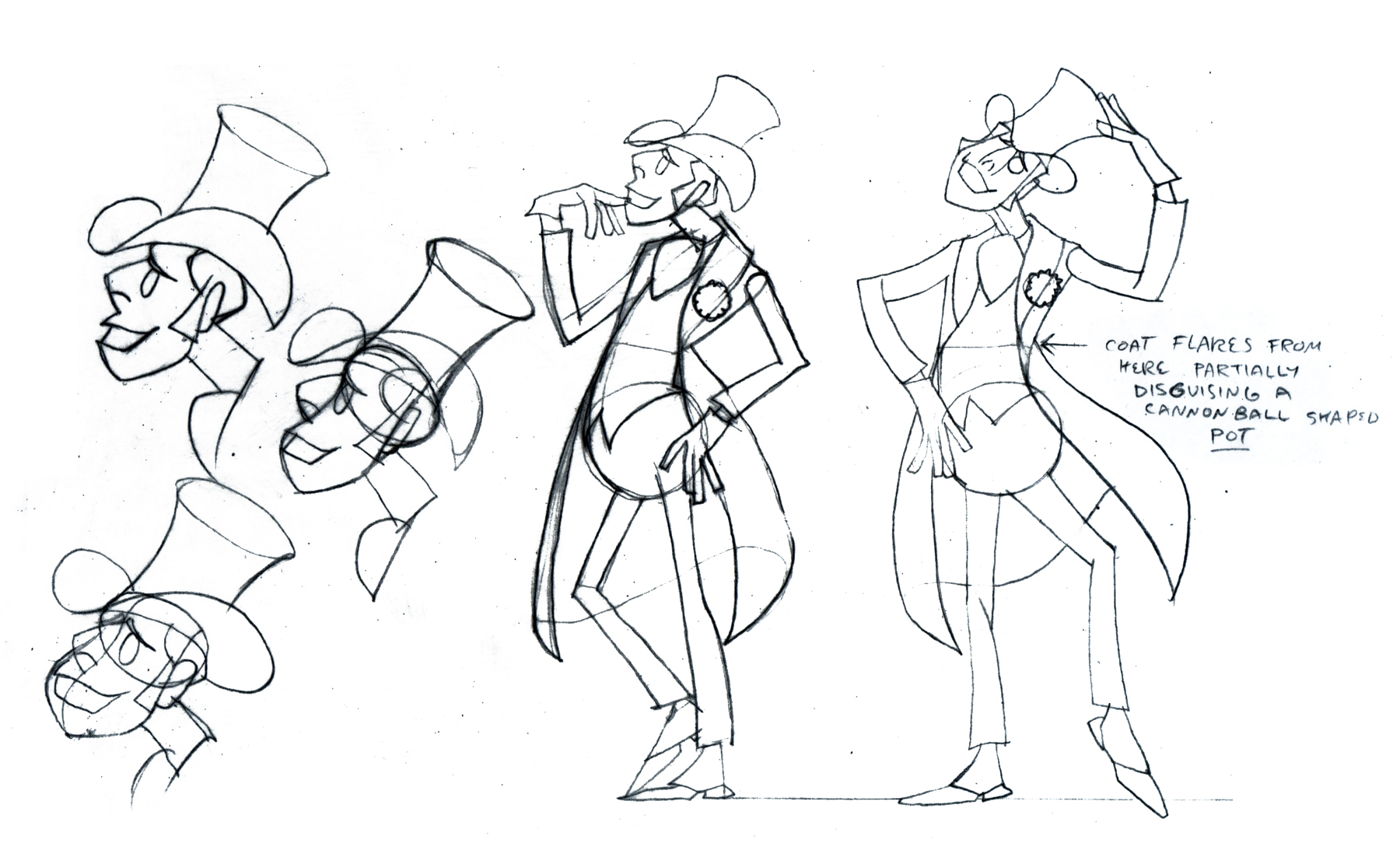
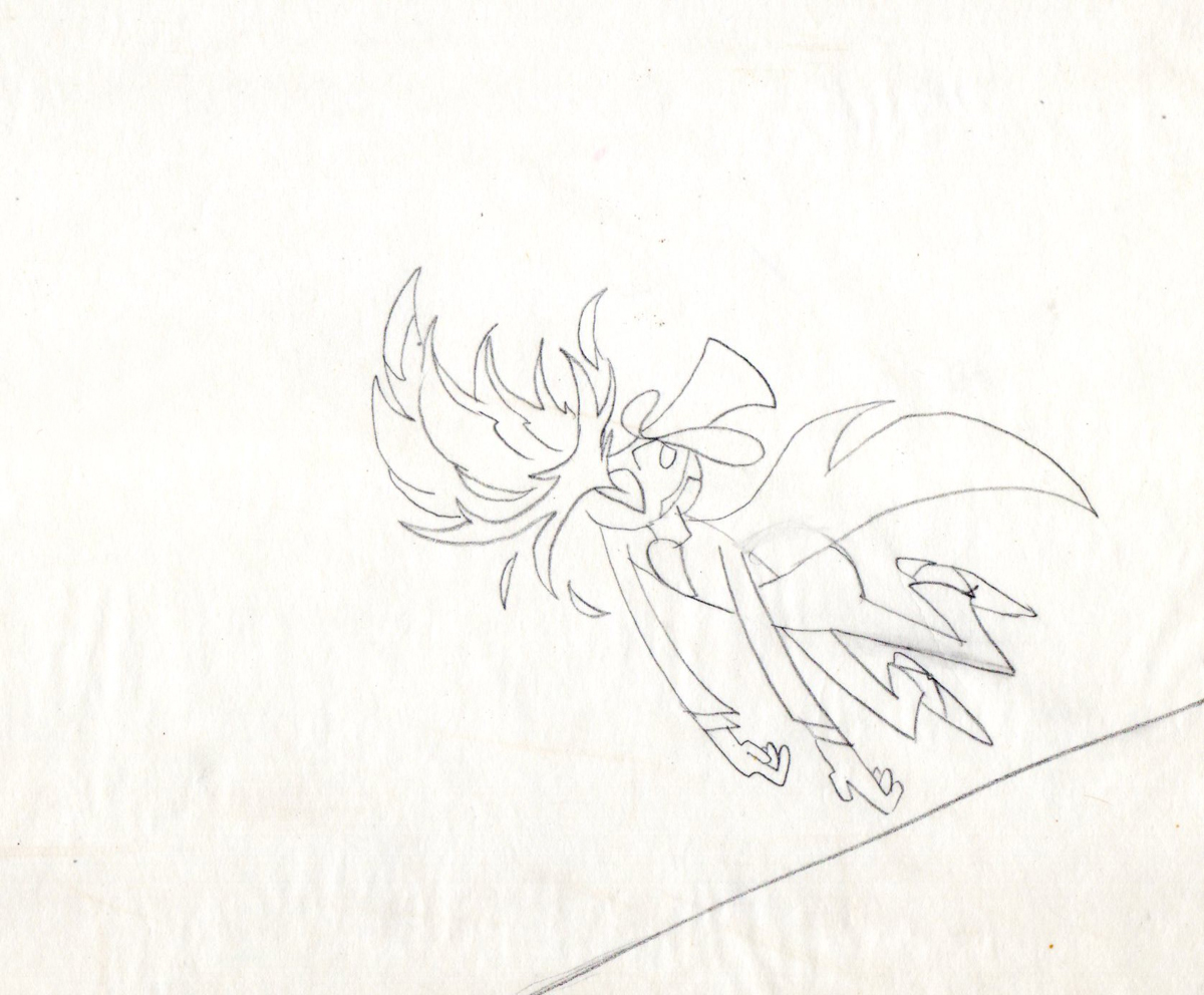
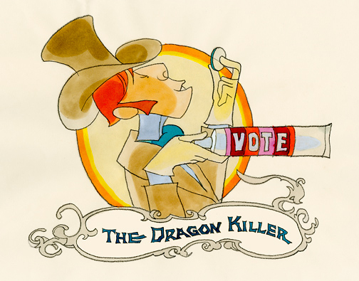
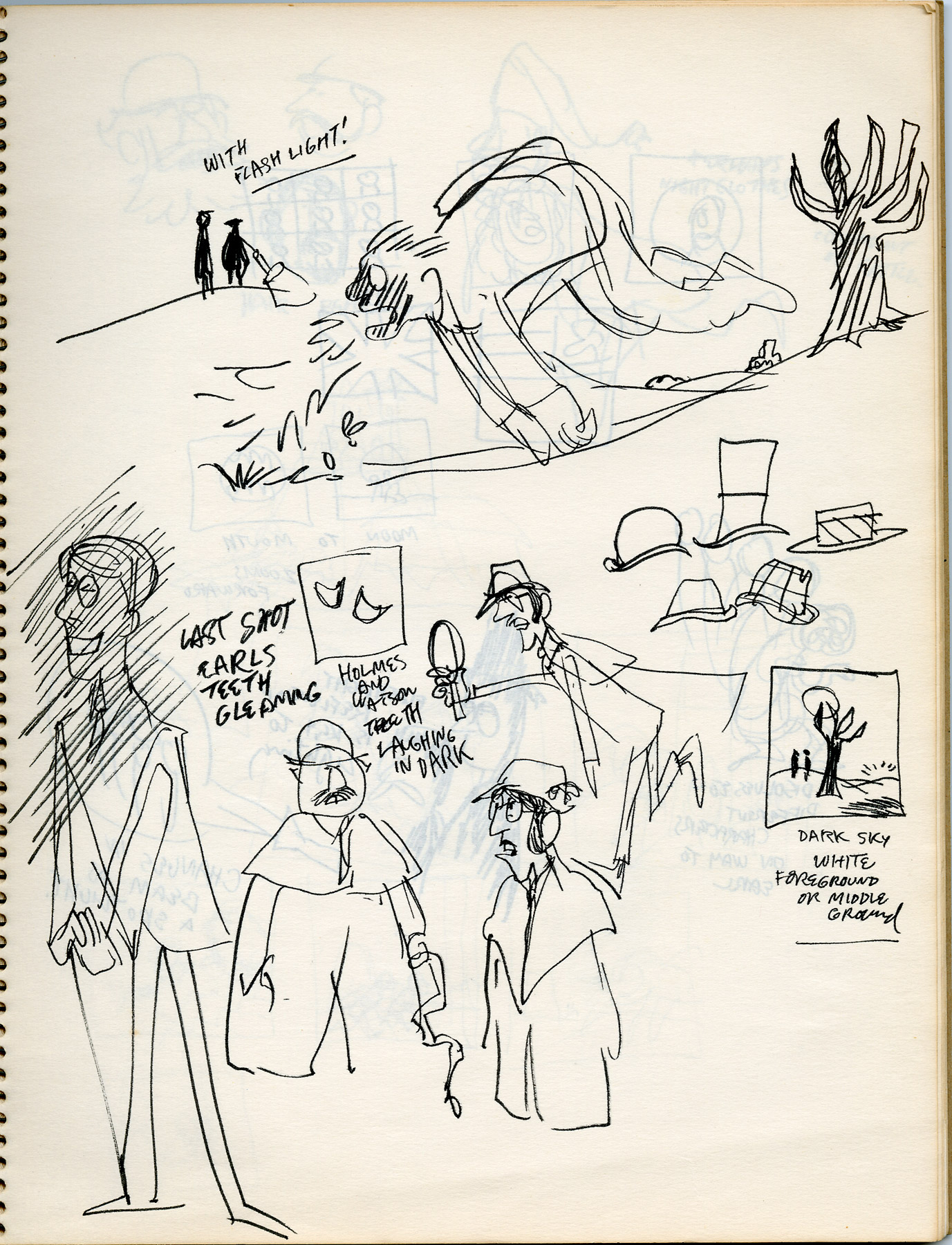
At the time that Rowland designed his Utica Club Beer ‘Mountie’ spot, he also did another U. C. Beer spot where the two adversaries were a Knight and a dragon.
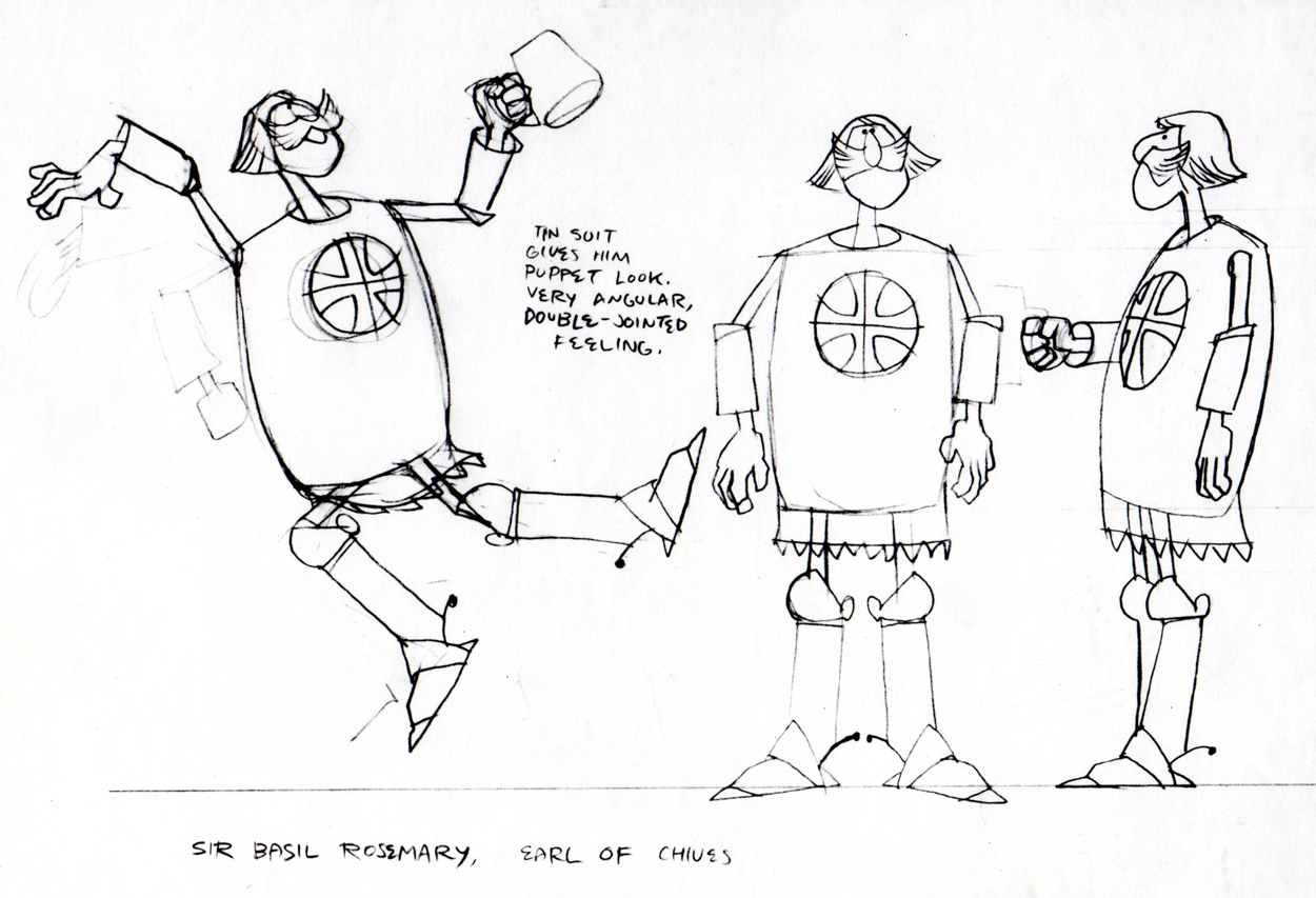
Unfortunately the only remaining piece that
I have from it is this stat of the Knight.
As for the dragon, all I can do is show you this page from
Suzanne Wilson’s ‘Trade Secrets’, where Rowland didn’t
forget his old friend from that commercial and gave him a
new coat of paint. One of his best character designs ever.
The tavern panel is a bg. from the same spot.
The Vote spot starts at 0:37 on this Jack Schnerk sample reel.
Animation Artifacts &Bill Peckmann &commercial animation &Illustration 24 Aug 2012 05:05 am
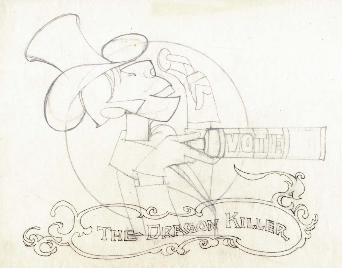
Rowland Wilson’s Vote Toothpaste
-If you’re a brilliant designer, you get there by doing the work that’s necessary. If you’re as great as Rowland B.Wilson was, you take the opportunity of a fine commercial spot, and you research it, plan it, and sketch it out. That’s just what Rowland did with this spot for Phil Kimmelman and Ass. back in the 70s. Vote toothpaste had a gem featuring “Plotzen” and “Coombs”. They just look like Sherlock and Watson.
Thanks to Suzanne Wilson, here’s the prep work Rowland did for this commercial. Many thanks to Bill Peckmann for getting it to the Splog and for additional artwork.
 1
1
 2
2
 3
3
 5
5
 6
6
 7
7
model sheet
 8
8
 9
9
The characters turn 180º in this animation model.
This was animated by Jack Schnerk and cleaned up by Bill Peckmann.
 12
12
 13
13
B&W BG Layout for the color image to follow.
 14
14
 15
15
 16
16
B&W Bg Layout for the following image.
 17
17
Finally, here are some rough sequential drawings that Rowland did
for a sequence where the villain transforms via Vote toothpaste.
The object in his mouth is a toothbrush with toothpaste on it.
 1
1
 3
3
 4
4
 5
5
 6
6
 7
7
 8
8
The Vote spot starts at 0:37 on this Jack Schnerk sample reel.
Books 21 Aug 2012 07:06 am
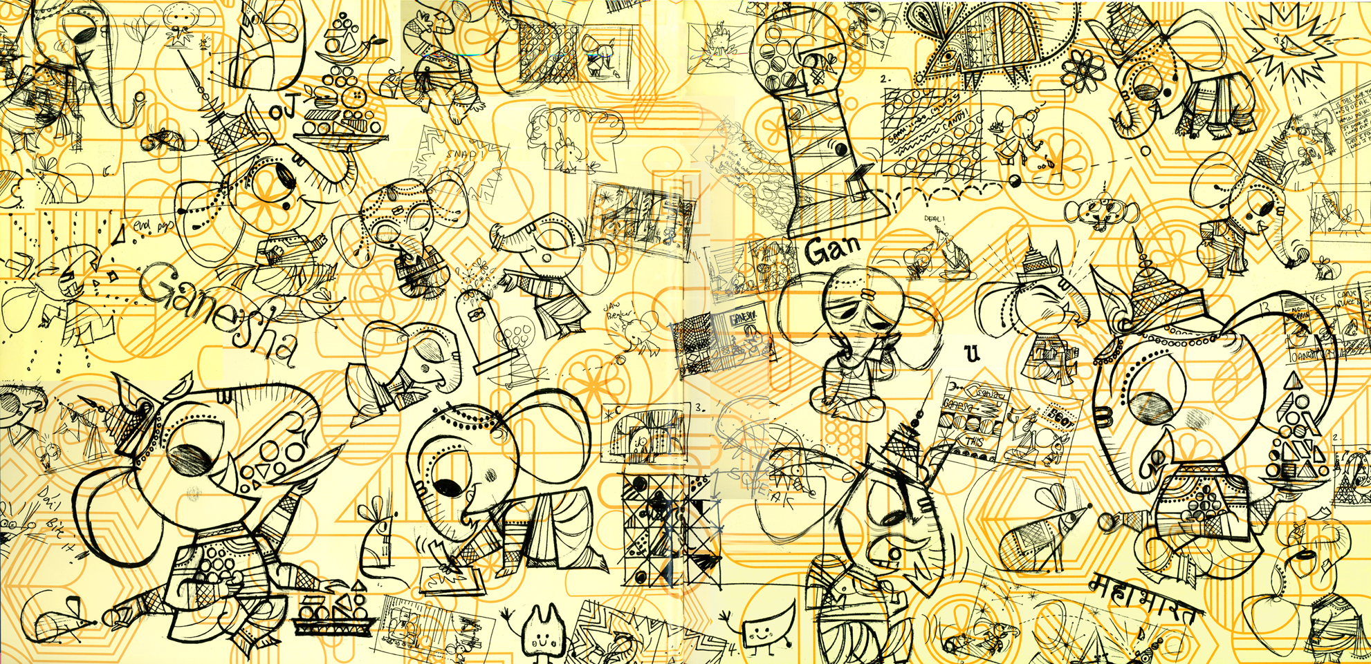
Ganesha’s Sweet Tooth & Mama’s Love
- I received the children’s book, Ganesha’s Sweet Tooth, illustrated by Sanjay Patel and written by Emily Haynes.
It’s the story of the elephant, Ganesha, and how he breaks his tusk on a jawbreaker. With tears in his eyes, he learns to use the tusk as a pen to write, and he ultimately writes The Mahabharata, all one hundred thousand verses. It’s the great epic poem of Hindu literature.
Like every other book sent me by the excellent publisher, Chronicle Books, I am a fan of Sanjay Patel‘s work. I’ve reviewed his work very favorably, for good reason. It’s excellent. Here are a couple of past posts: #1, #2, #3. The Ramayana is still his masterwork, but it’s nice to see material like this on the children’s shelf.
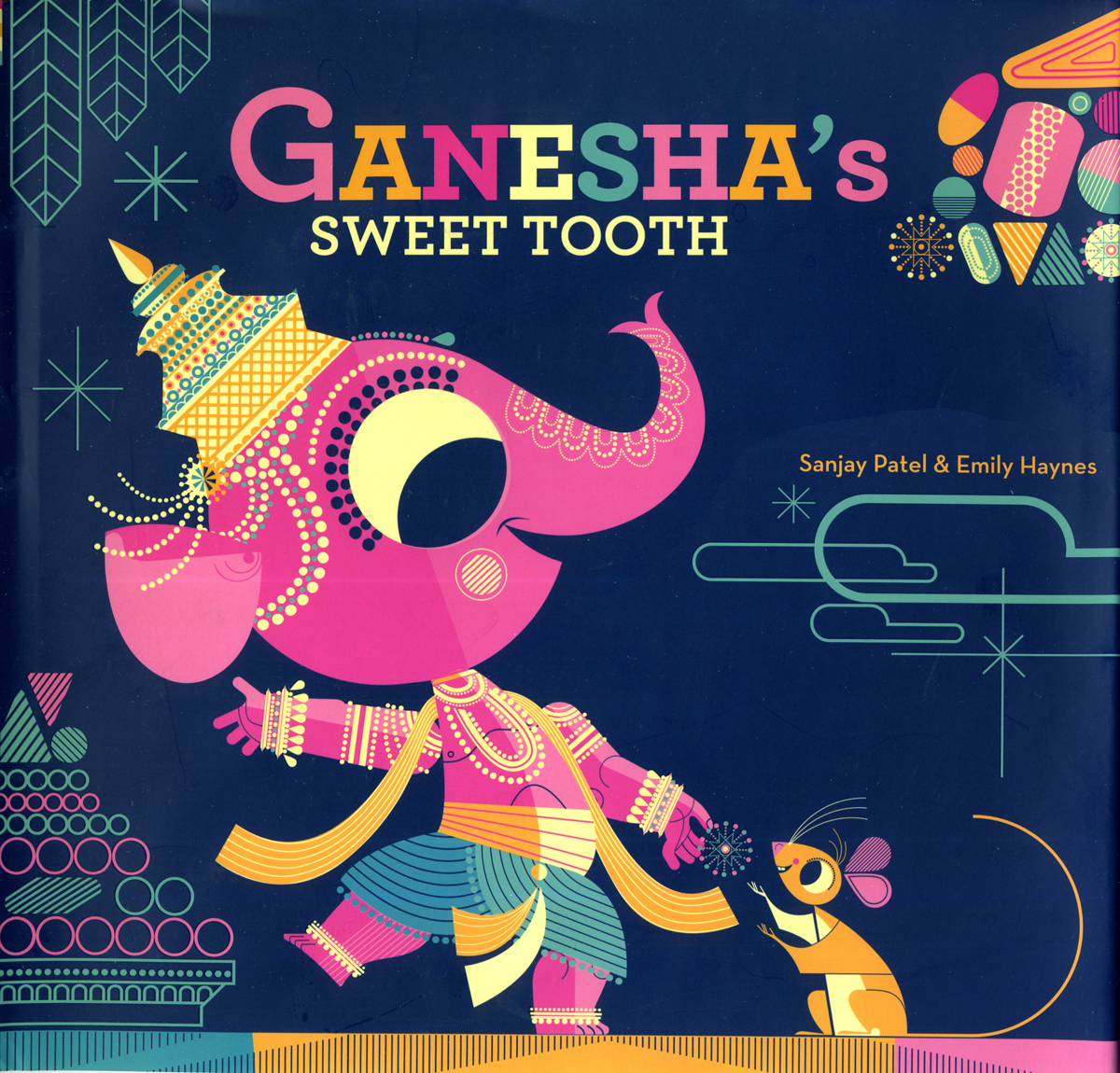
This is the cover of the book.
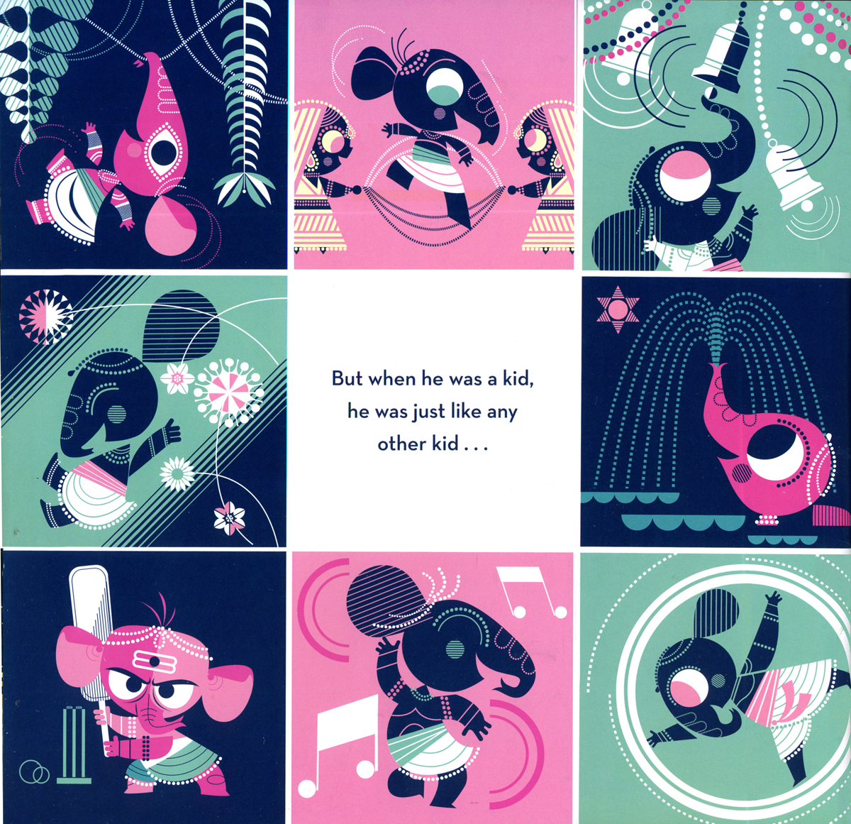
Many of the images are single pages, like the one above.
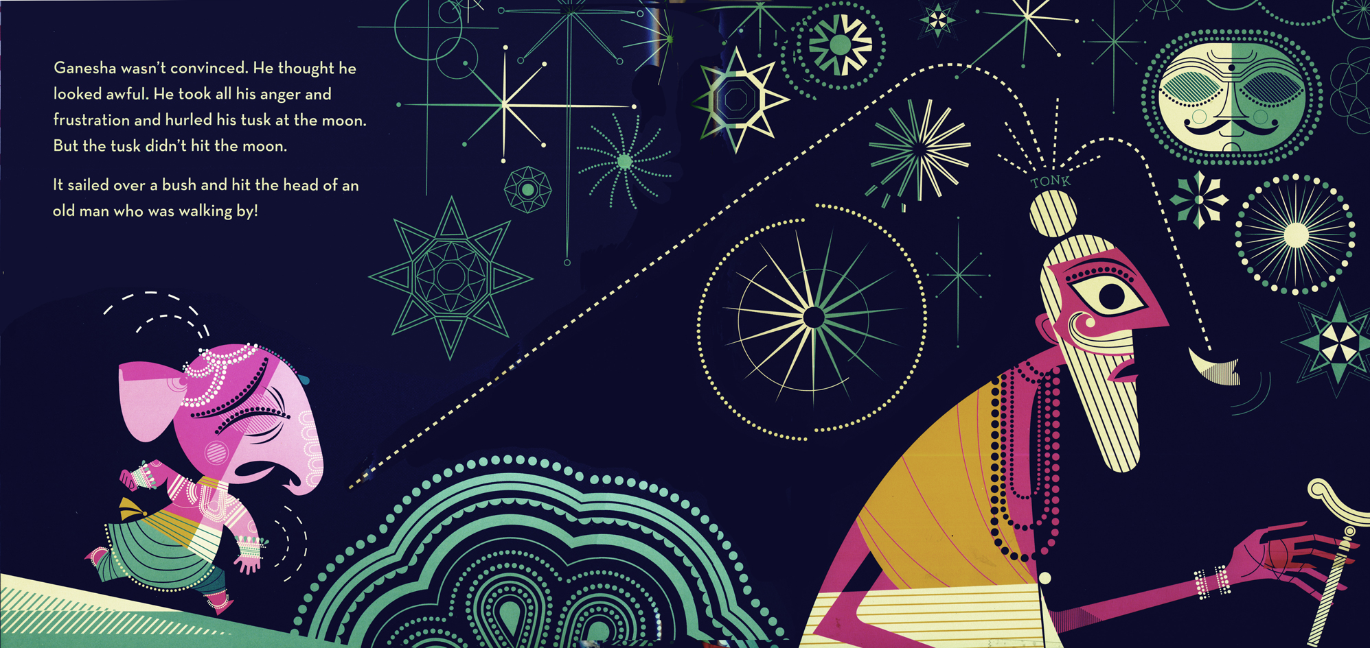
Most are doubled page spreads.
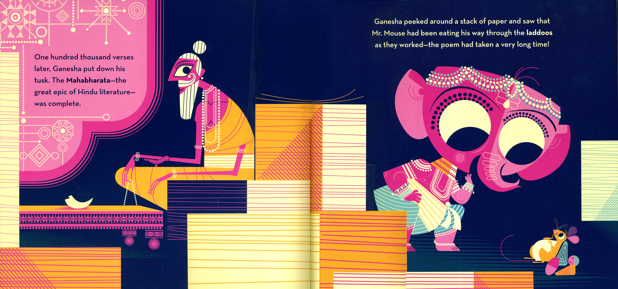
Another double page spread.
The drawing on the front inner cover. There’s
another, different one in the back of the book.
The drawing on the back cover.
Mr. Patel is an artist working for Pixar as an animator and storyboard artist. He’s made quite a name for himself with these beautiful publications. Chronicle books is the perfect home for him. Their books always feature wonderful detail and care.
Note that this book will officially be released on Sept. 19th, when I’ll mention it again.
I’d love to see Mr. Patel’s designs and art animated.
- Here’s a very different kind of book.
I received it in the mail; it came from Laura Bryson. Laura worked for me on a number of my half hour shows. She did Bgs on The Red Shoes, The Marzipan Pig and several others as well. I think The Strongest Love is Laura’s first book. She illustrated Katie McDonnell‘s verse story about a mother’s love. The book seems to be for a very young audience, but the illustrations are timeless. he publisher is Turn the Page.
Laura certainly wasn’t looking for me to review it; she was just excited to share it with a friend. However, I have to share the news (and maybe sell a book or two for her.)
Here are a couple of sample pages (every other page is illustrated against others that include the written, printed verse.)
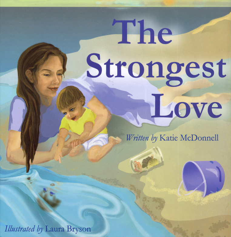
The book’s cover
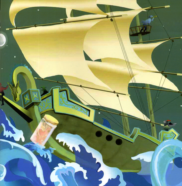 2
2
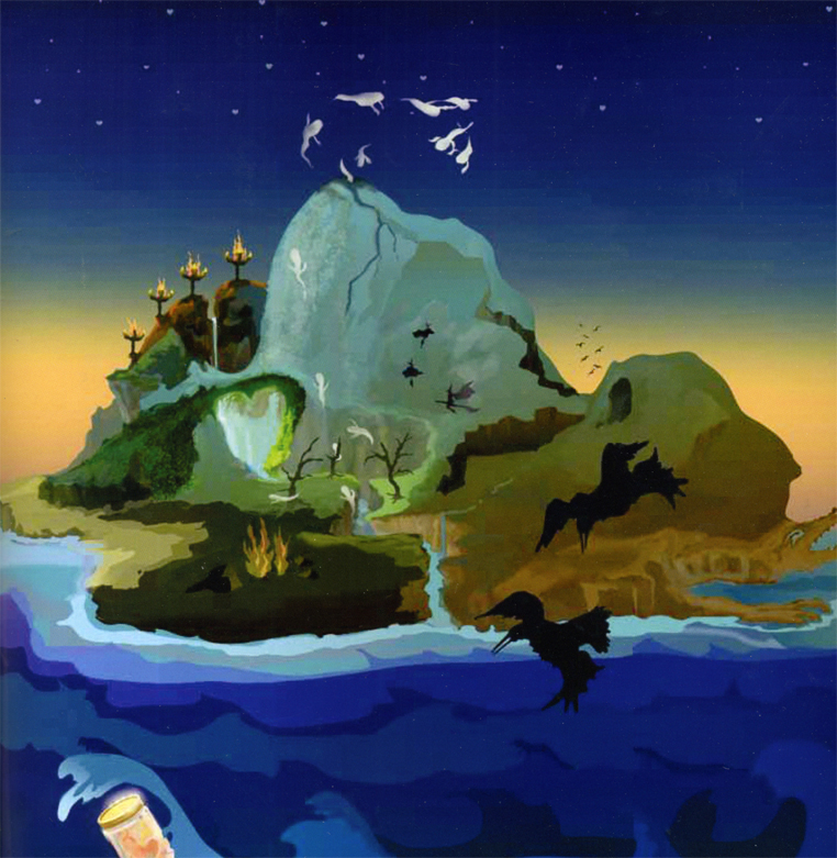 3
3
Bill Peckmann &commercial animation &Layout & Design &Models 16 Aug 2012 04:43 am
Weber & Schnerk Vote Toothpaste
Bill Peckmann shared these great LO sketches for one of Jack Schnerk‘s animation samples:
- Since one of the first spots on Jack Schnerk‘s reel was his ‘Dragon’s Mouth‘ Vote Toothpaste commercial, I thought you’d enjoy seeing New Yorker cartoonist Bob Weber‘s key LayOut drawings for the spot. Unfortunately they are not the full color original illustrations but black and white stats that were made to fit in a comfortable field size. These are for the first half of the spot.
These were the only keys that Jack had to guide him on this spot to work his animation magic. It was always a super treat to clean up Jack’s roughs, especially when he animated ‘named’ print cartoonists. The essence of the pose was always there in those terrific sketchy lines and the body proportions were also always bang on!
 1
1
 2
2
 3
3
 4
4
 5
5
 6
6
 7
7
 8
8
 9
9
 10
10
 11
11
 12
12
Bob Weber had a great sense of what to do in animation, his poses are beautiful. You only wish he would have been given more spots to design.
You can also go here and just watch the first spot to see a larger version.
Animation Artifacts &Disney &John Canemaker &Story & Storyboards 02 Jul 2012 04:43 am
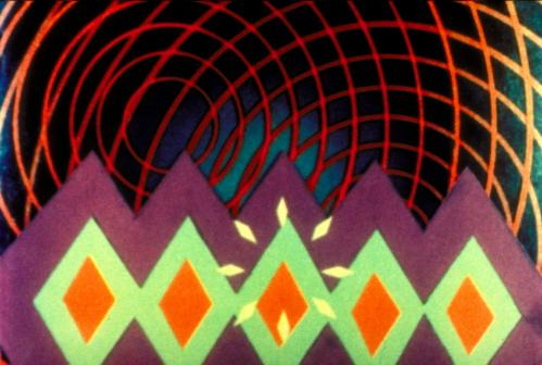
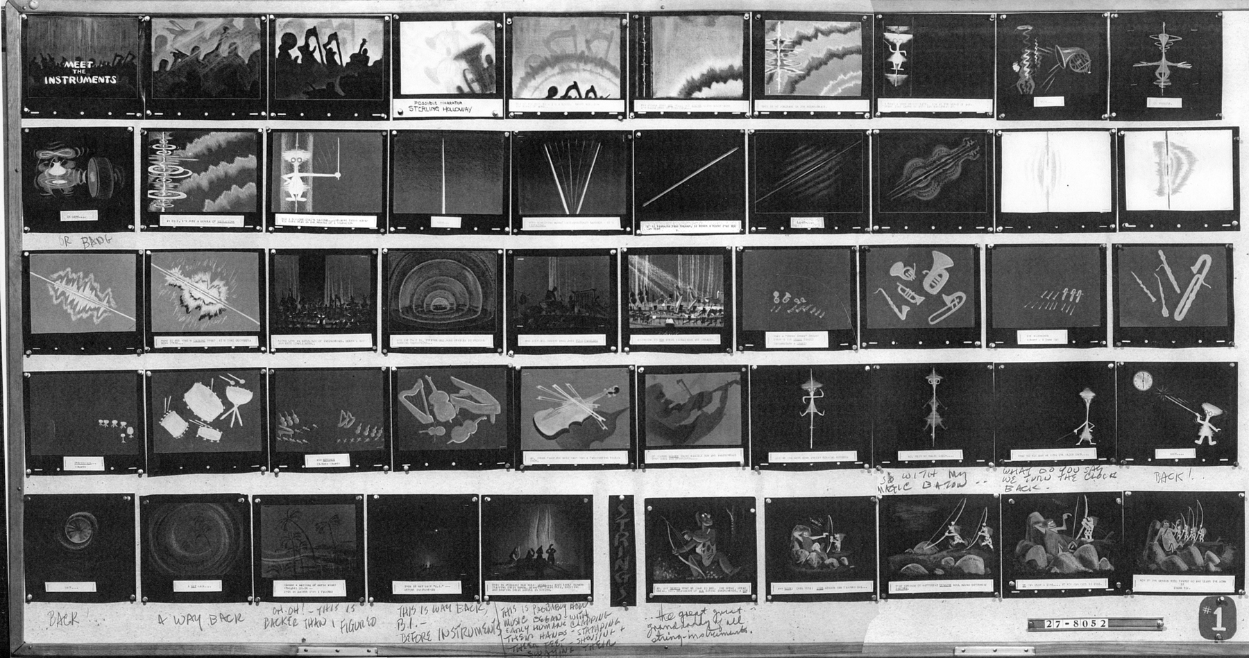
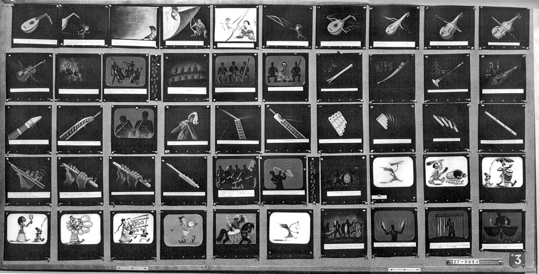
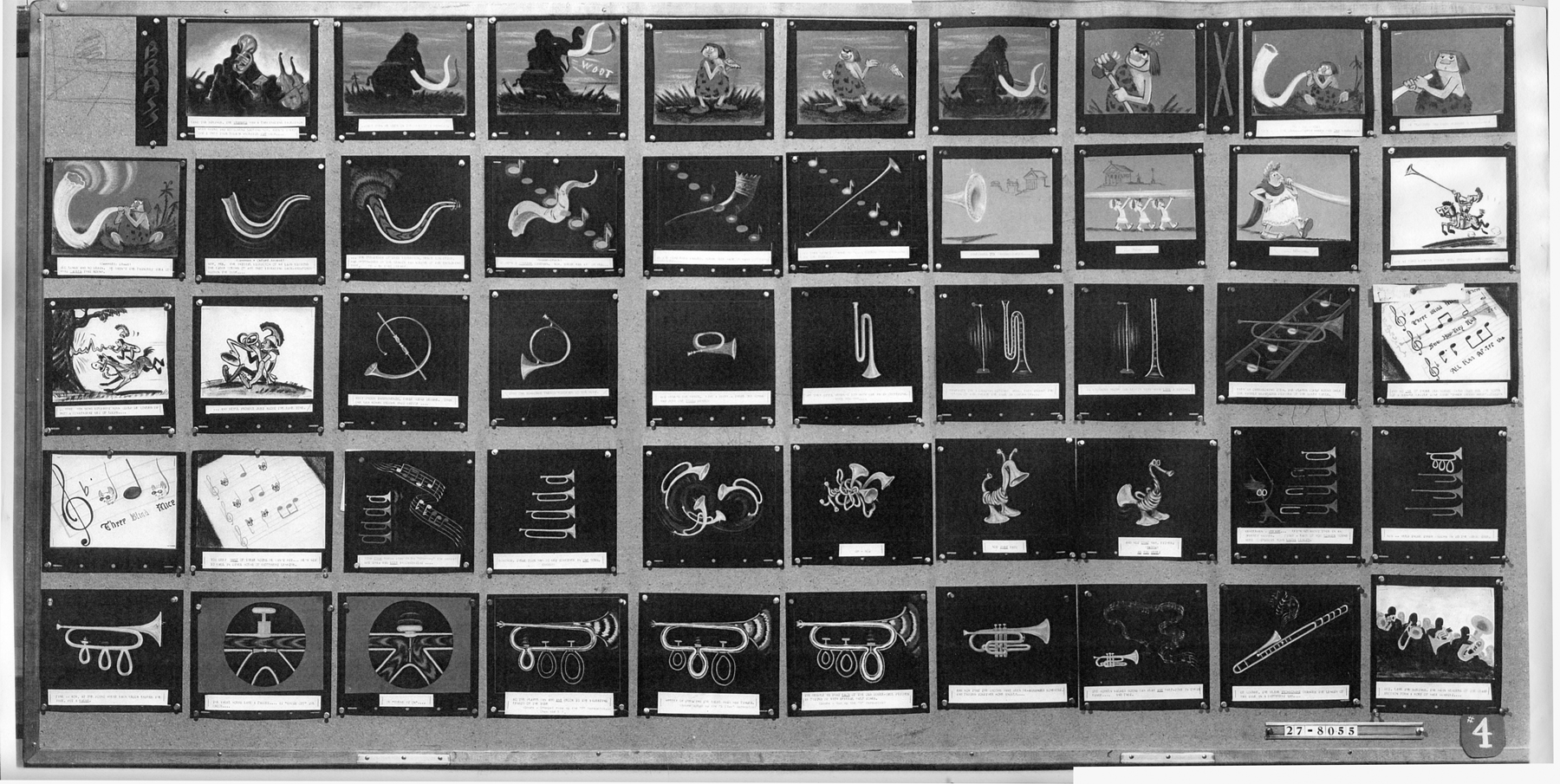
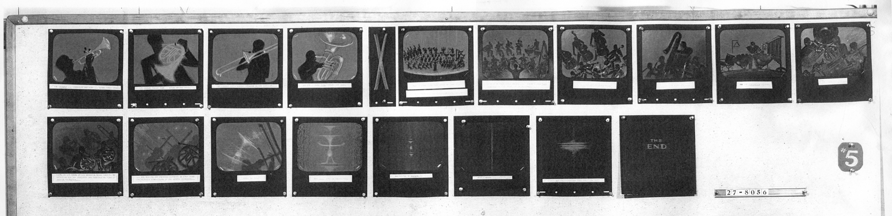
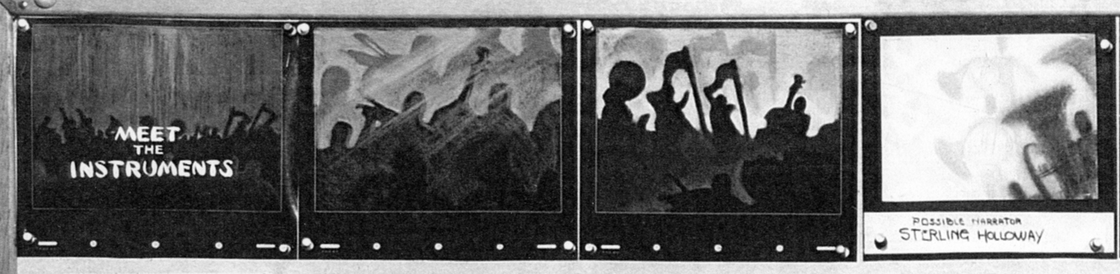
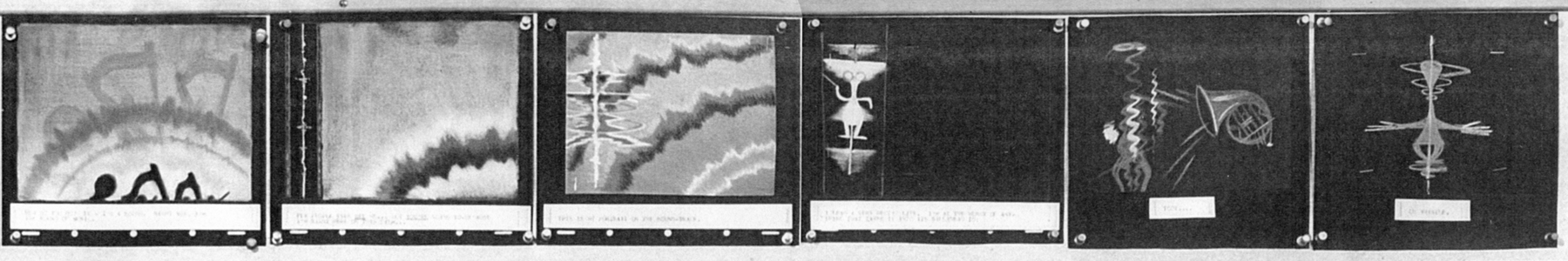
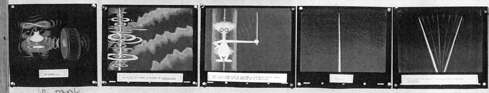
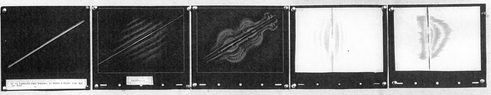
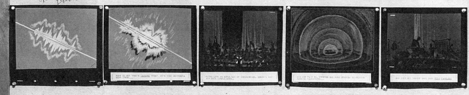
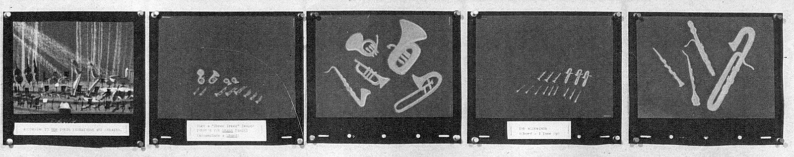
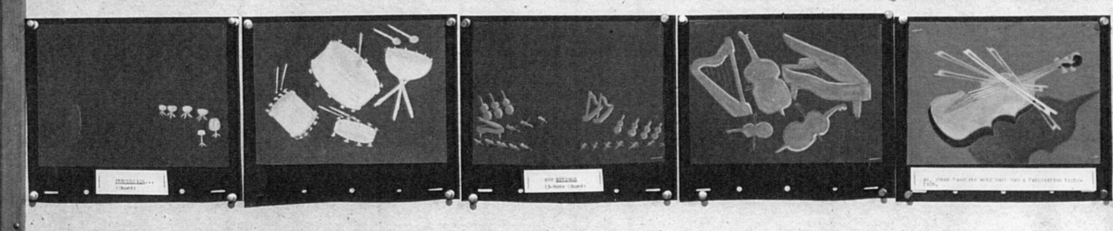
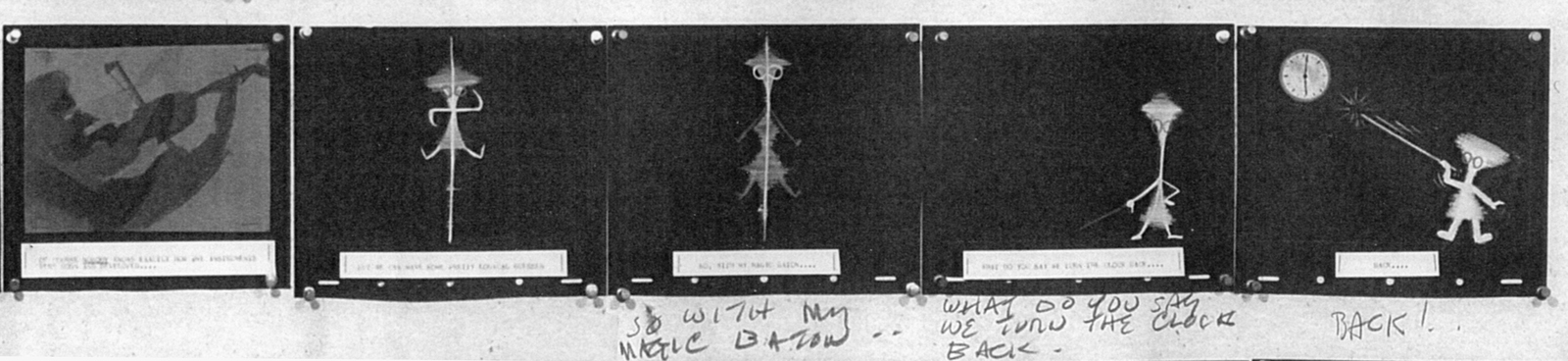
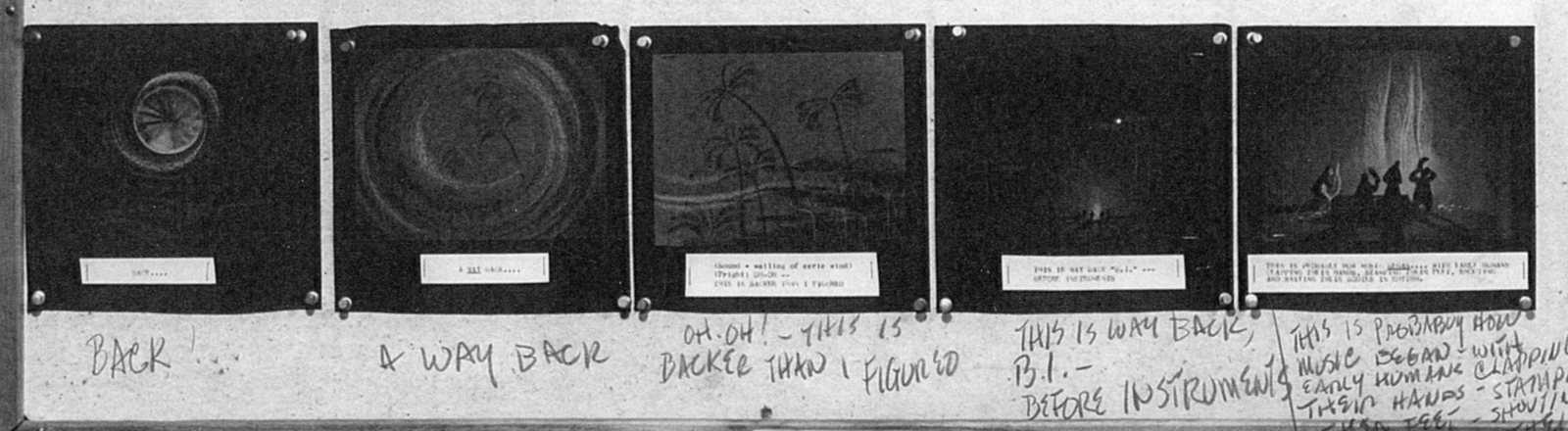
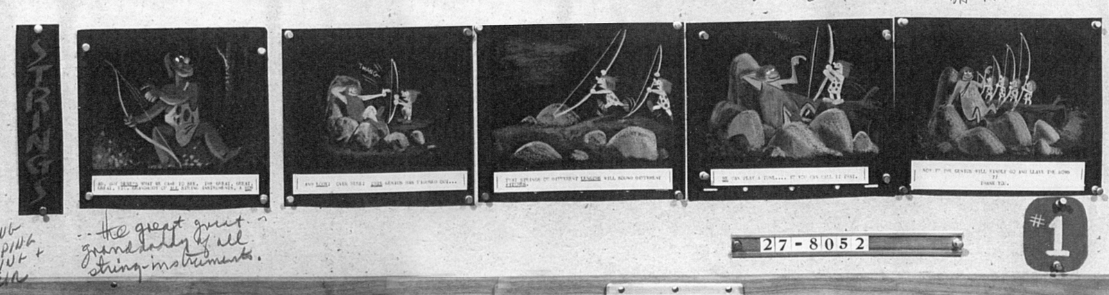
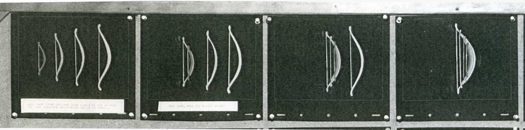
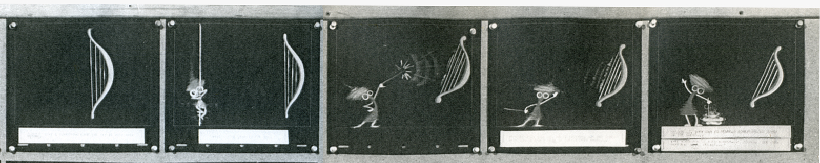
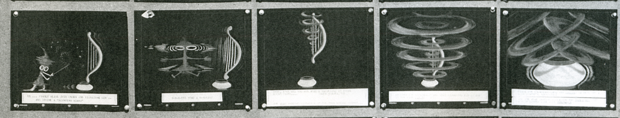
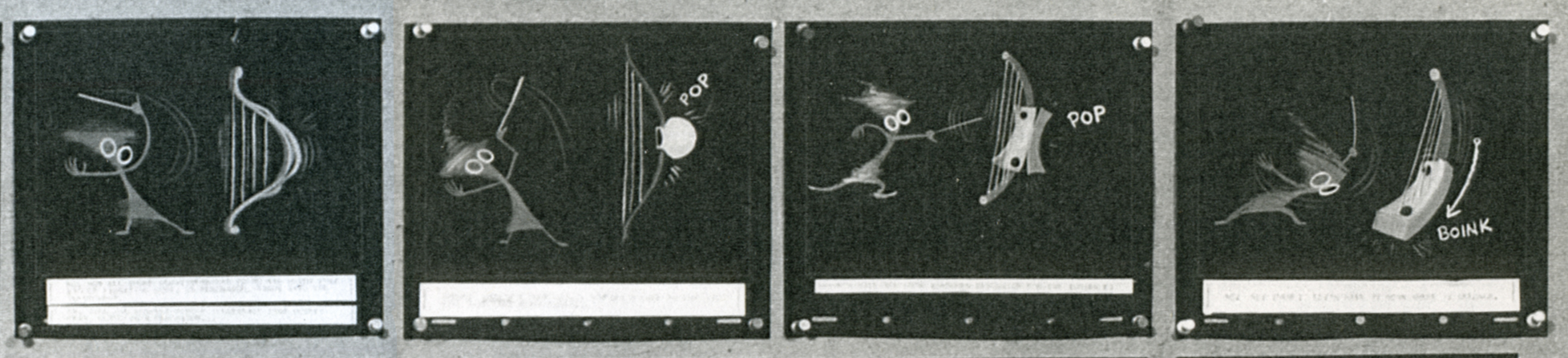
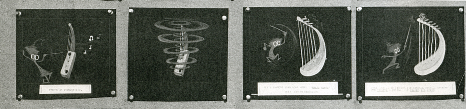
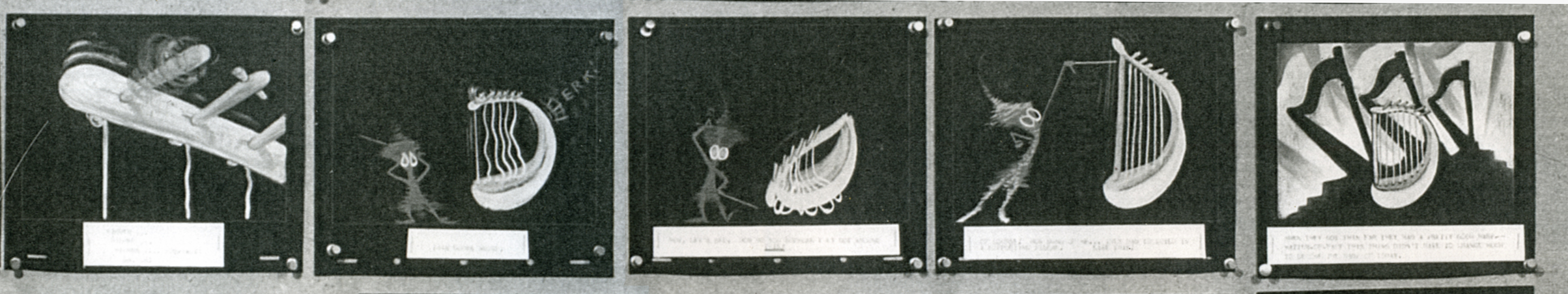
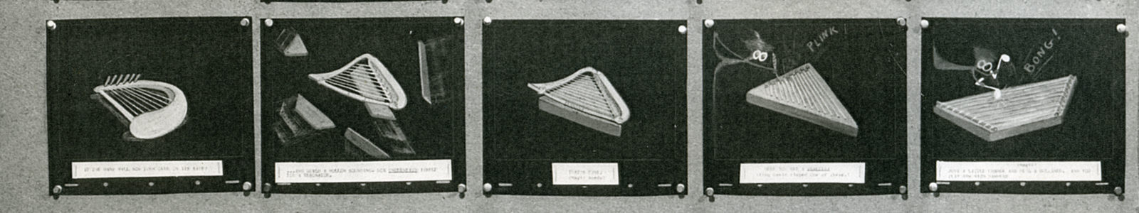
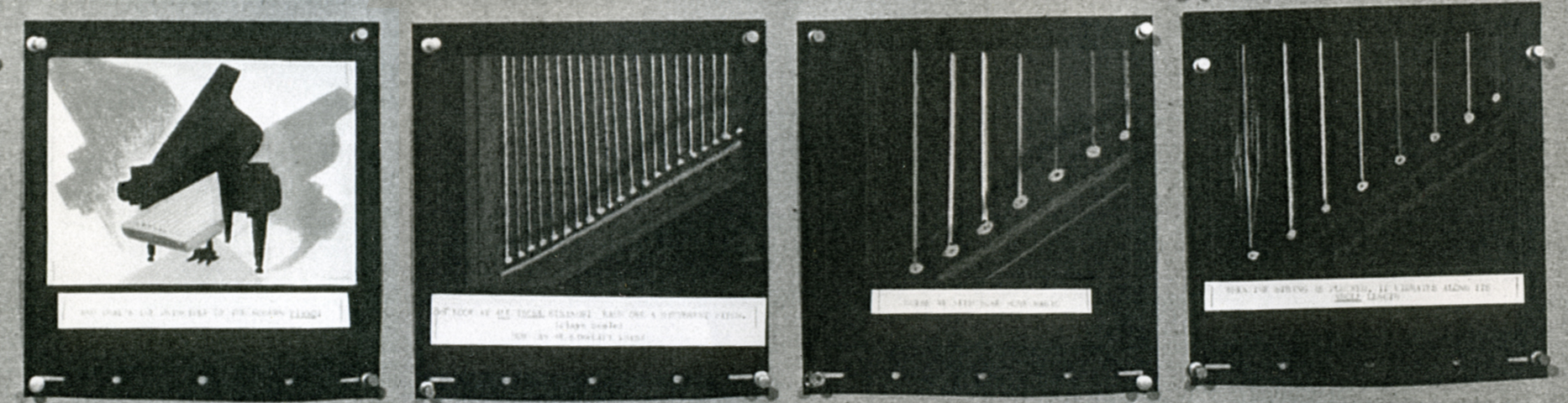
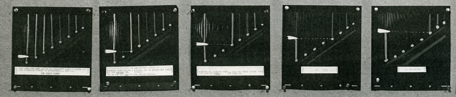
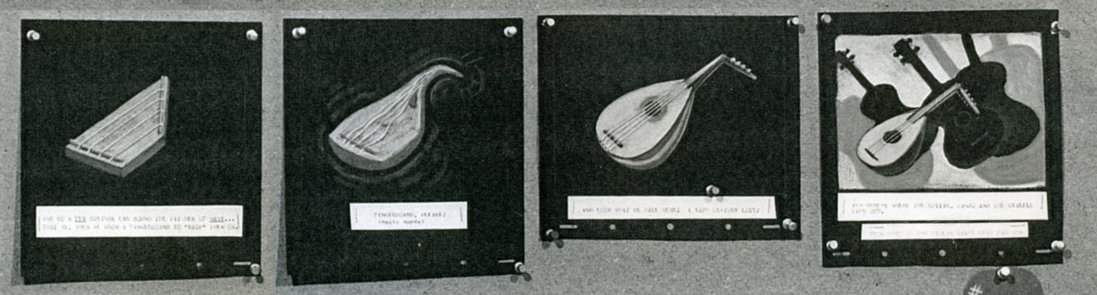
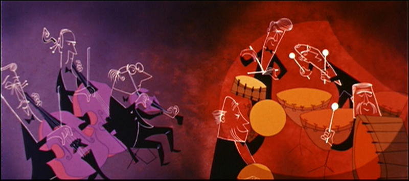
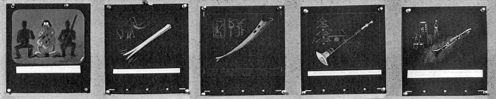
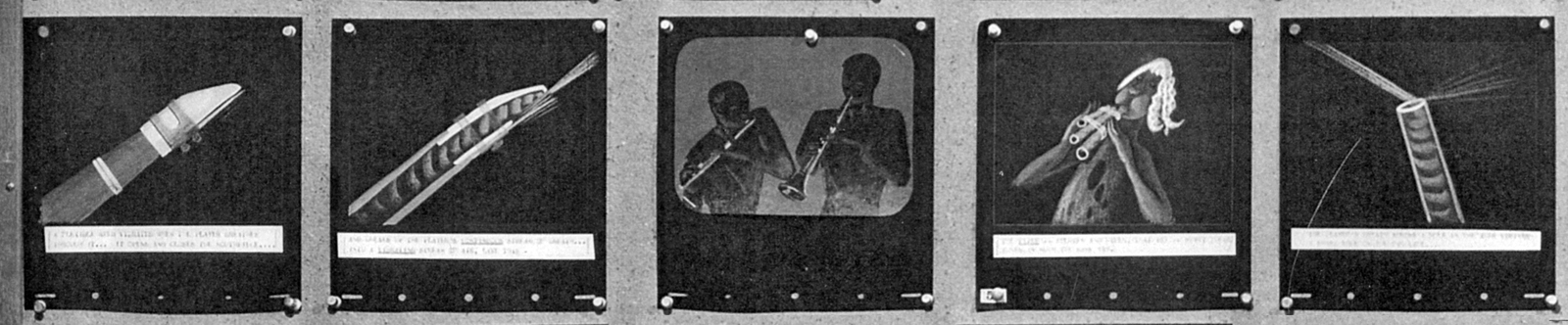
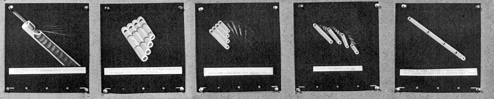
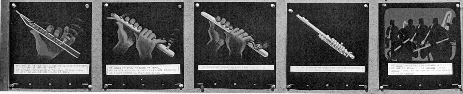
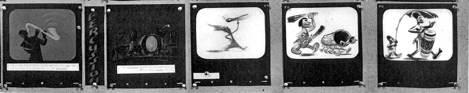
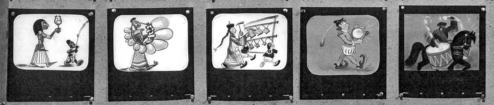
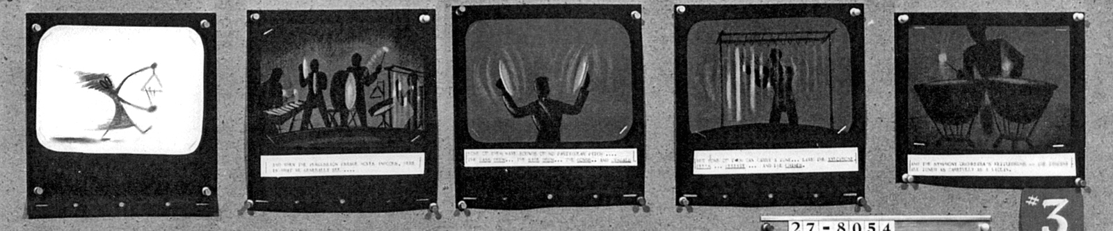
Toot Bd – repost
 - Our Adventures in Music continue with the preliminary storyboard for what would ultimately become Toot Whistle Plunk & Boom. This is another board on loan from the archives of John Canemaker, and you can see the outgrowth from the prior film, Melody: Adventures in Music.
You can see how little of the magic was in this board, yet it obviously inspired others to keep it alive and make it work. Ward Kimball has to get most of the credit, though designs by Tom Oreb, Ken O’Connor, Eyvind Earle and Victor Haboush sure brought it to life.
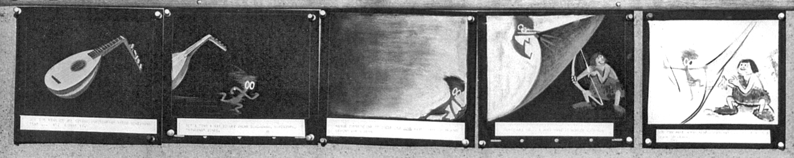
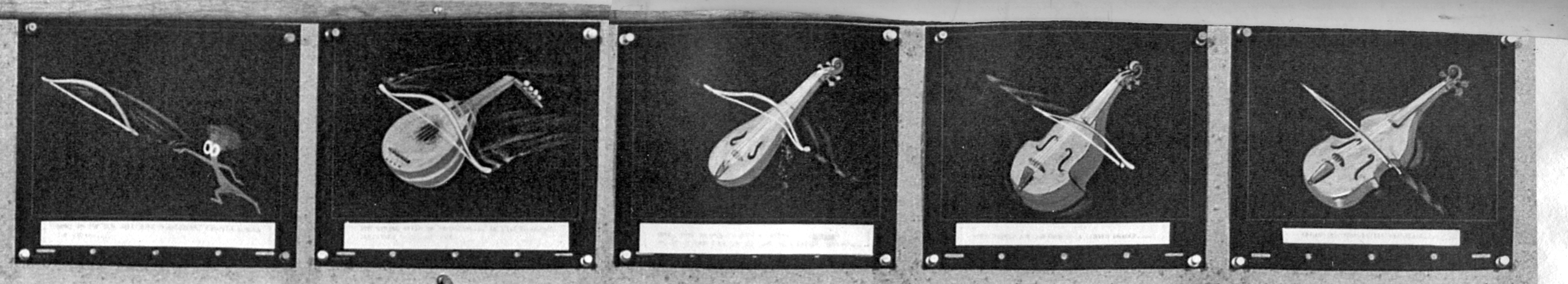
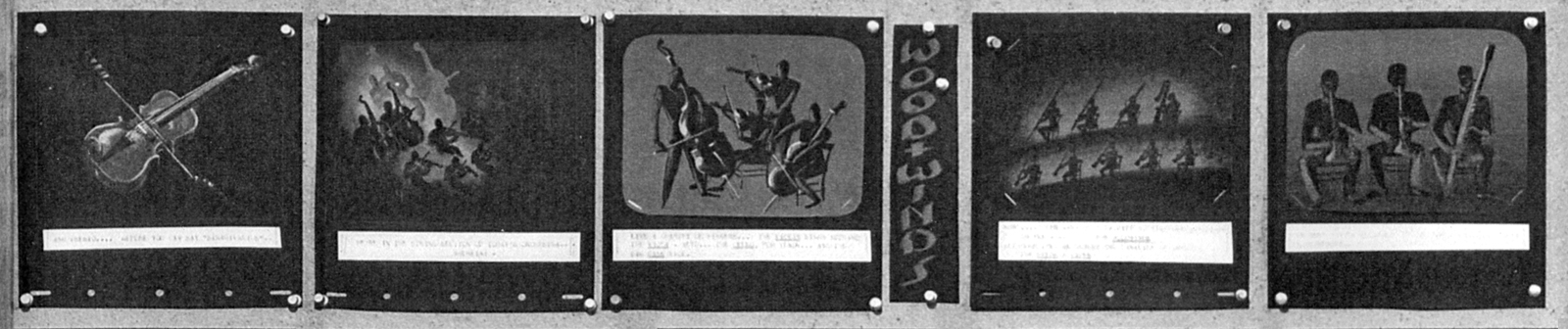
The material I’m posting here is on large photostat copies. The problem is that the images are a bit fuzzy, and the text beneath the boards is illegible. In some cases, the appropriate text has been hand written on the copies themselves.
 1
1
 2
2
(Click any image to enlarge.)
4
5
These are breakdowns of each row of the boards so that the images can be made as large as possible. Each row of images is split in two and labelled accordingly. #31a means Board 3 row 1 part a.
 11a
11a
 11b
11b
 12a
12a
 12b
12b
 13a
13a
 13b
13b
 14a
14a
 14b
14b
 15a
15a
 15b
15b
 21a
21a
 21b
21b
 22a
22a
 22b
22b
 23a
23a
 23b
23b
 24a
24a
 24b
24b
 25a
25a
 25b
25b
 31a
31a
 31b
31b
 32a
32a
 32b
32b
 33a
33a
 33b
33b
 34a
34a
 34b
34b
 35a
35a
Finally, something familiar.
 35b
35b
Ward Jenkins has posted some beautiful frame grabs from the completed film. Go here.
See this short on YouTube here.
John Canemaker deserves all the kudos he gets for lending this material to me as well as plenty more that he’s loaned this blog.
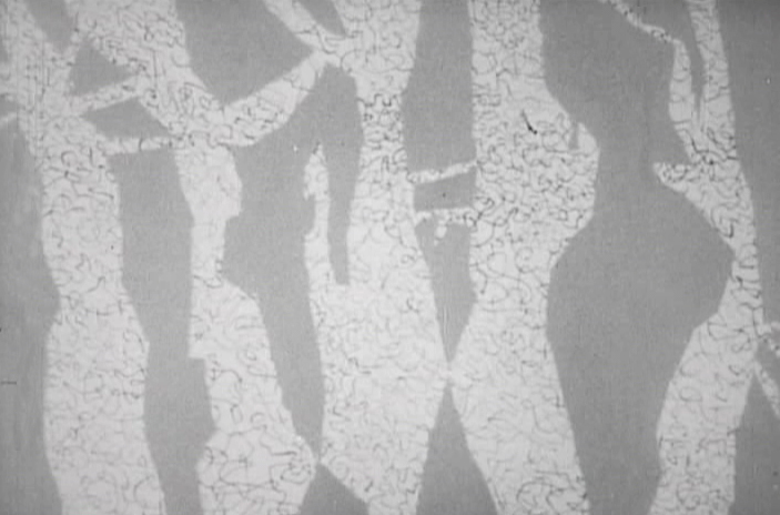
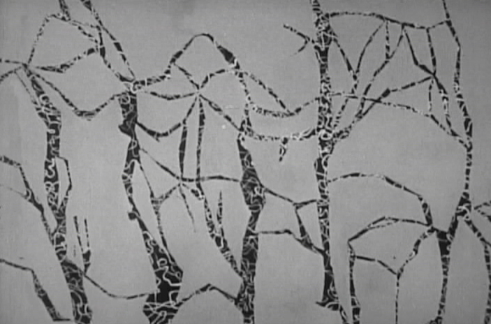
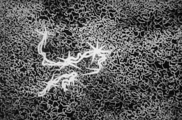
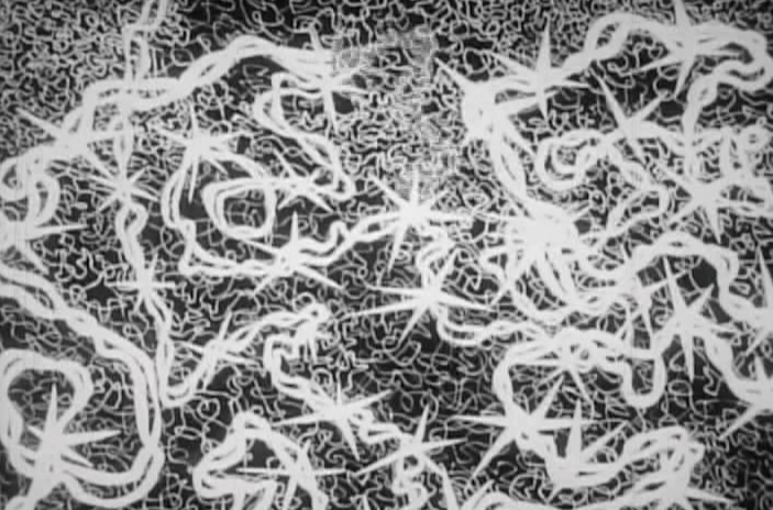
Frame Grabs &Hubley &UPA 11 Jun 2012 07:01 am
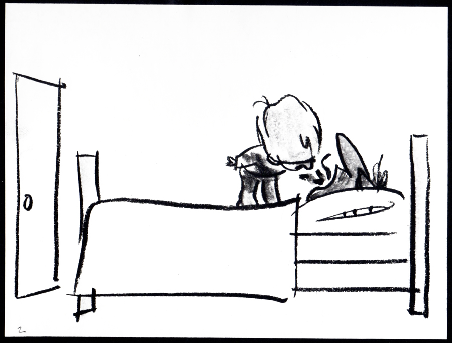
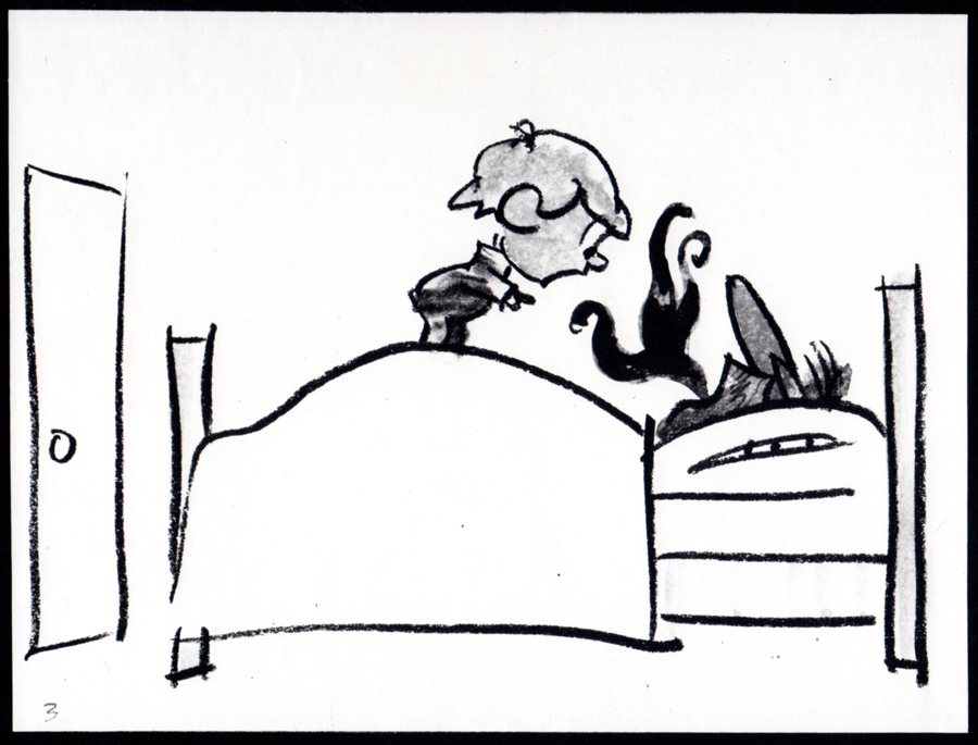
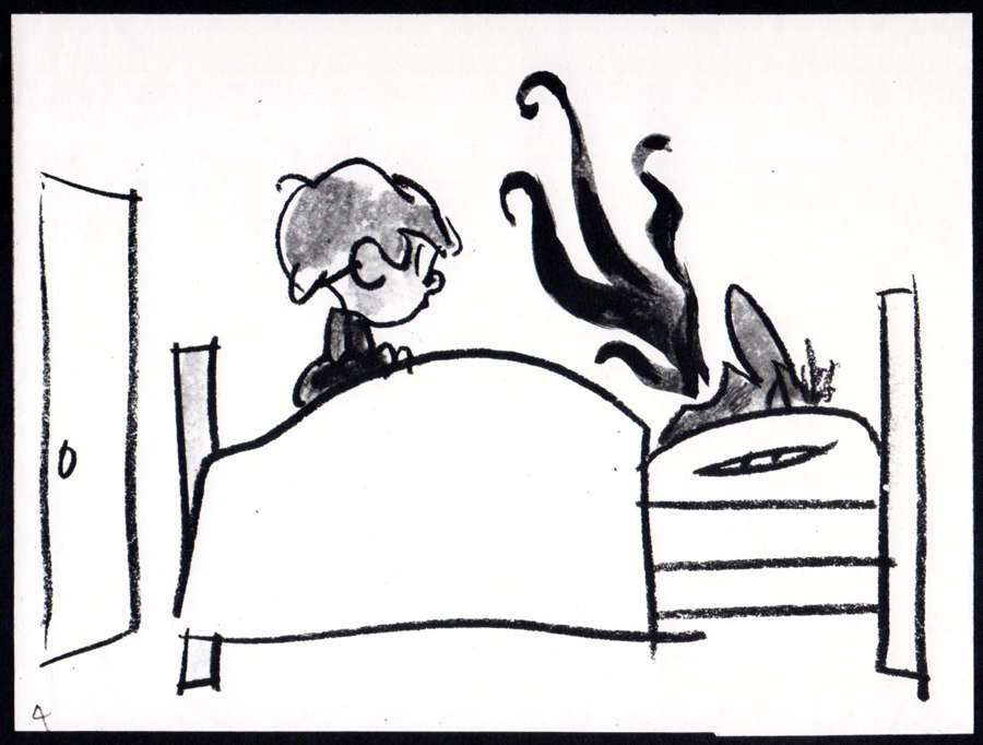
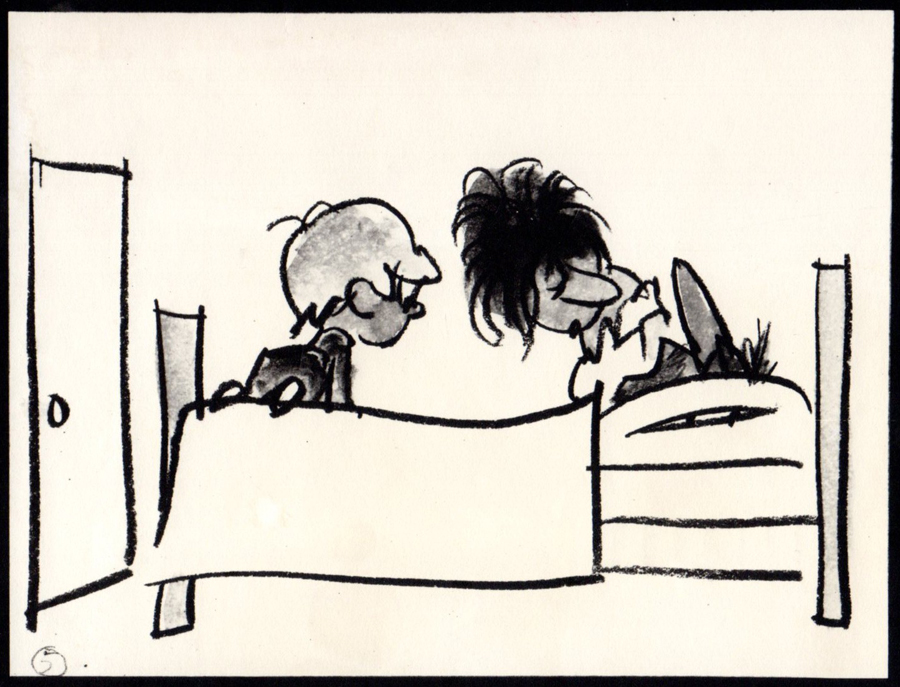
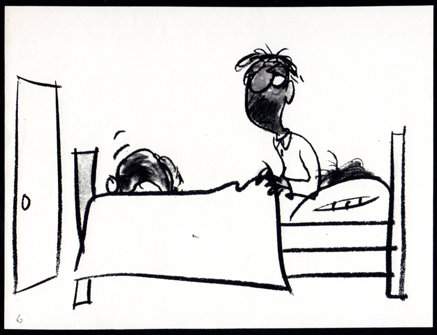
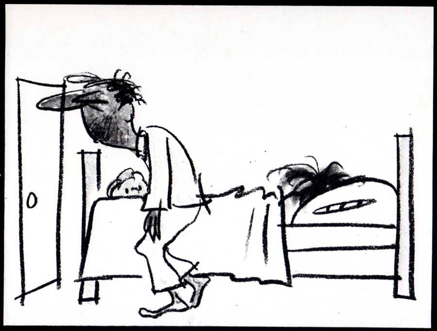
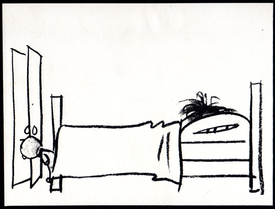
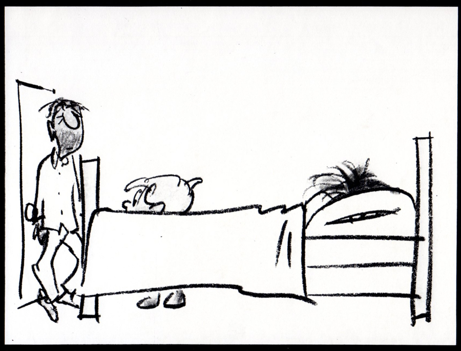
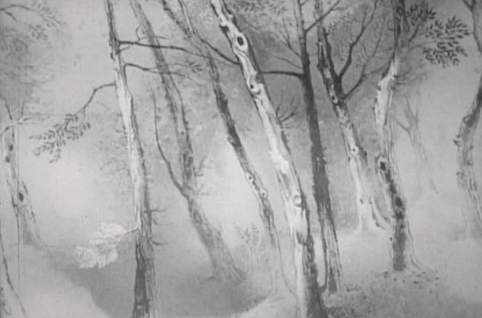
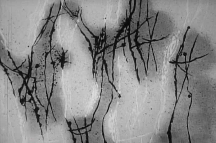
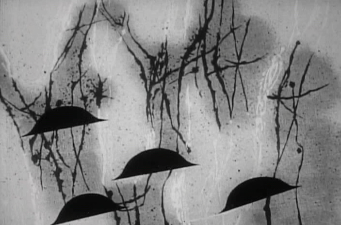
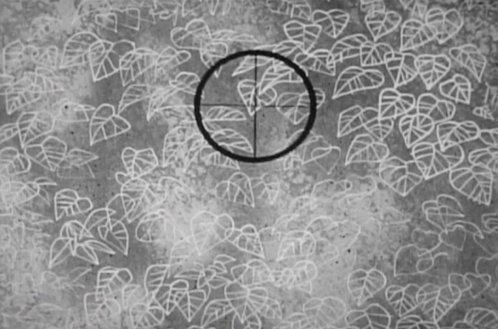
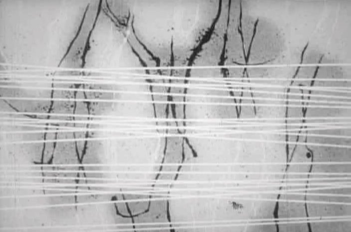
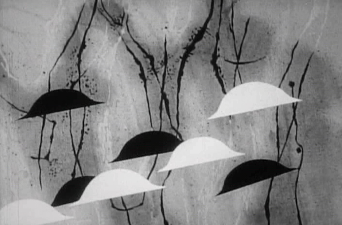
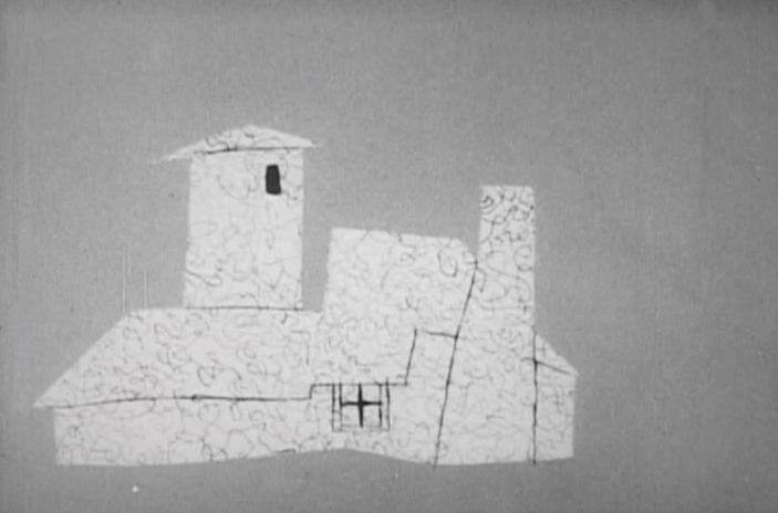
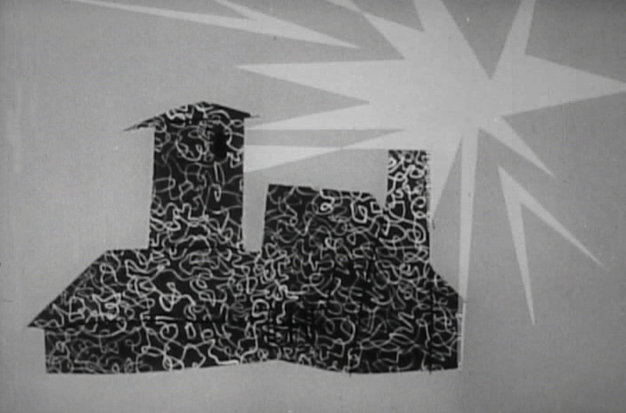
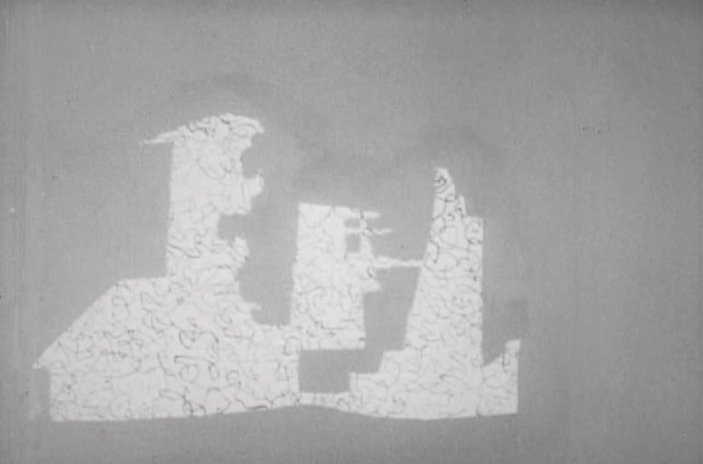
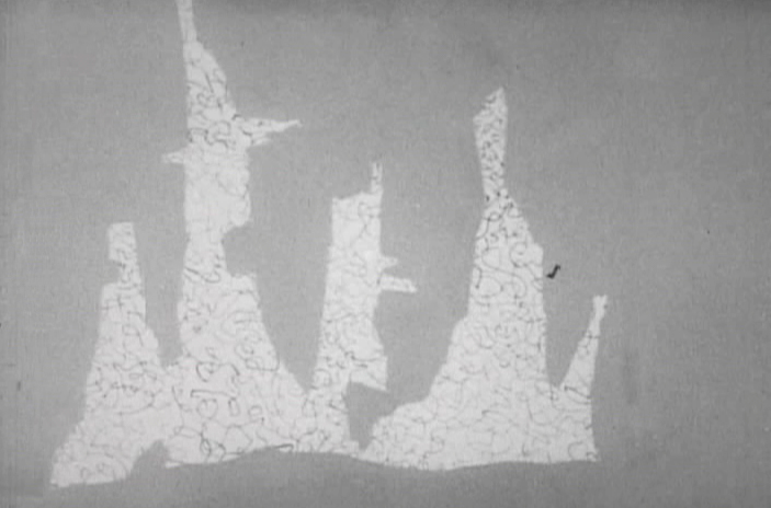
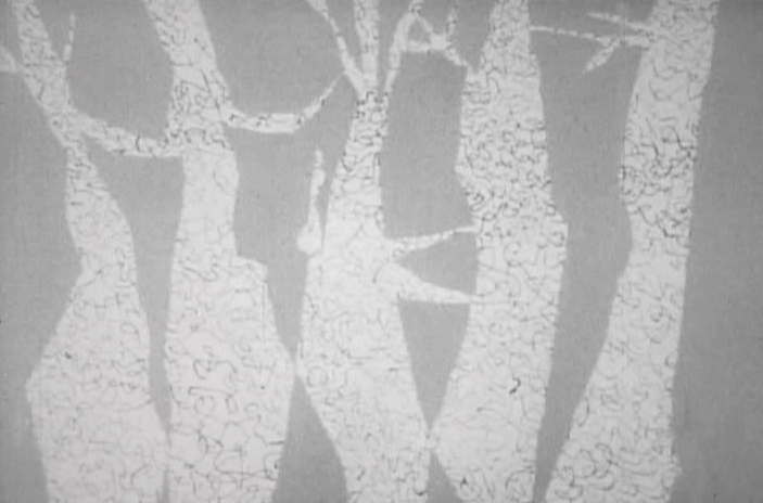
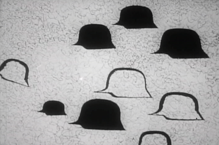
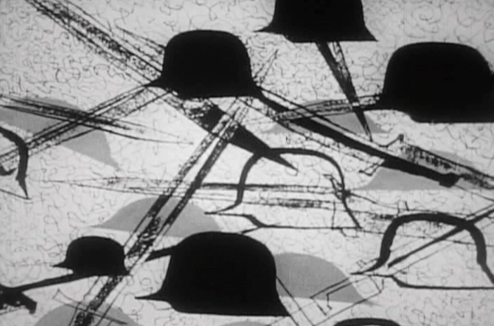
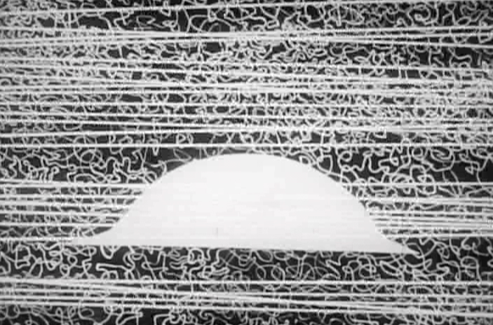
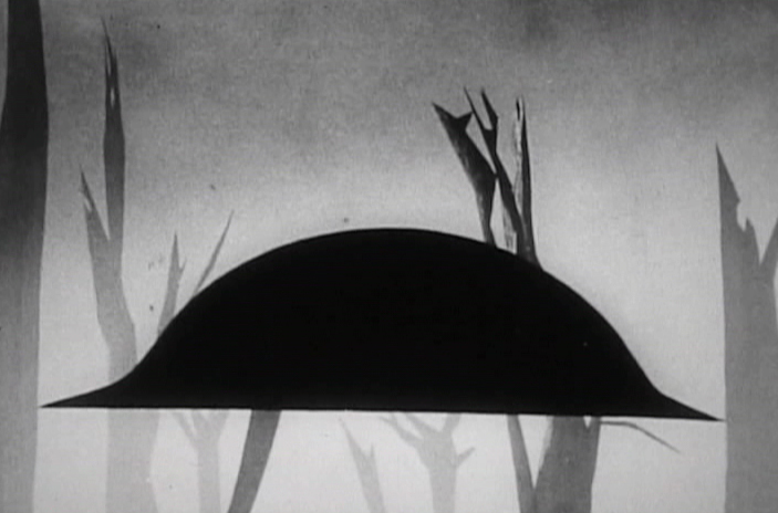
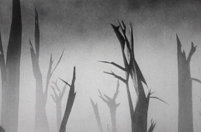
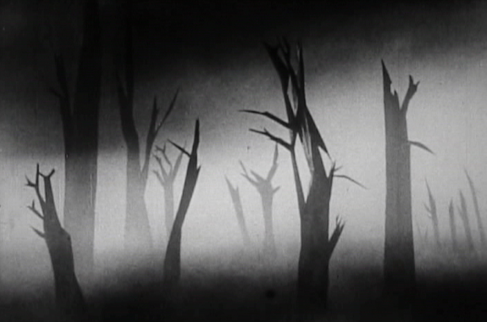
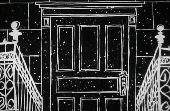
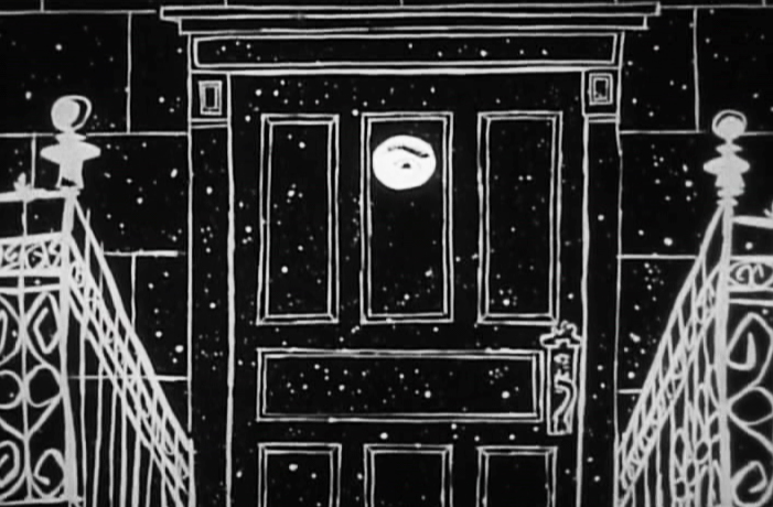
The Four Poster – part 3
- I’ve located a better copy of The Four Poster, so my posts will be more in focus henceforth. I’ve gone back and replaced the images in Part 1 and will do the same for Part 2 in the next week.
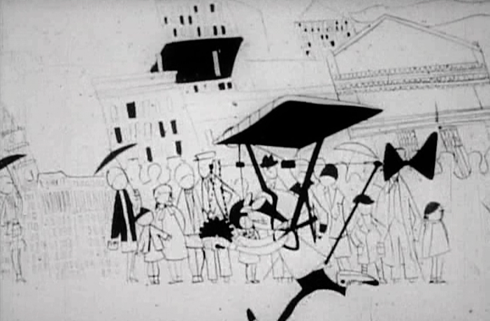
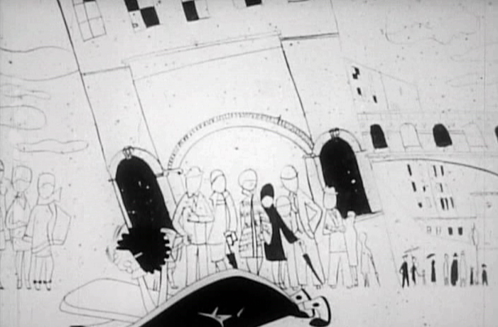
The Four Poster, in case I have to remind you, is a live action feature adaptation of a play by Jan de Hartog. It was produced by Stanley Kramer and directed by Irving Reis. The film takes place entirely within the bedroom of a married couple as they grow old together. To open up the film, they turned to animation working with the Columbia studio, UPA. John Hubley supervised all of the animation following his recently completed film, Rooty Toot Toot.
Part 3 starts as the couple’s child has grown up and gone off to War. World War I. The sequence was supervised by Paul Julian, and like most of his other directorial efforts it’s about beautiful paintings and graphic movement.
 1
1
 2
2
 3
3
 4
4
 5
5
 6
6
 7
7
 8
8
 9
9
 10
10
 11
11
 12
12
 13
13
 14
14
 15
15
 16
16
 17
17
 18
18
 19
19
 20
20
 21
21
 22
22
 23
23
_______________________________
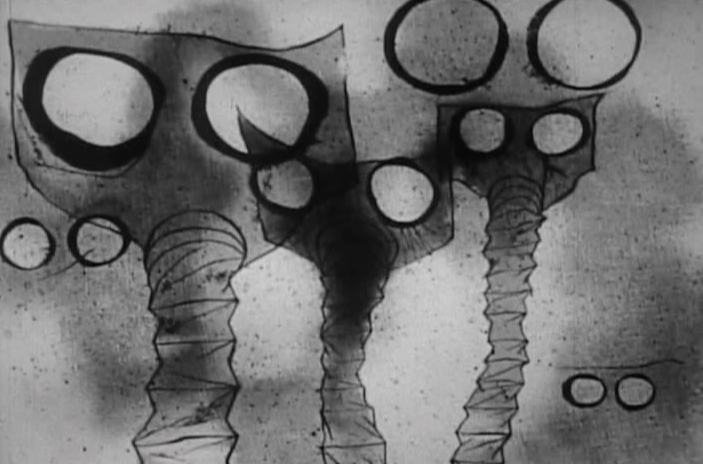
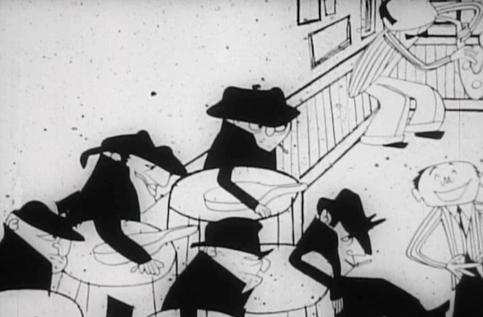
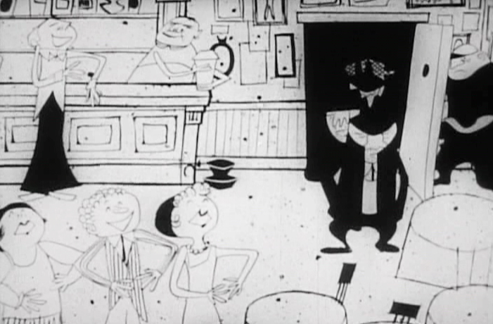
From the death of their son, the film takes us forward into the Roaring Twenties.
 1
1
 2
2
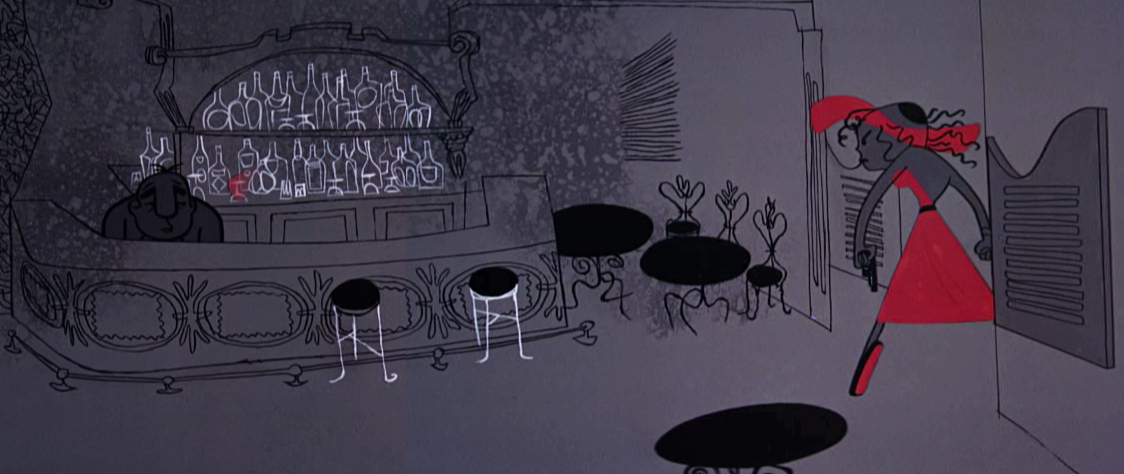
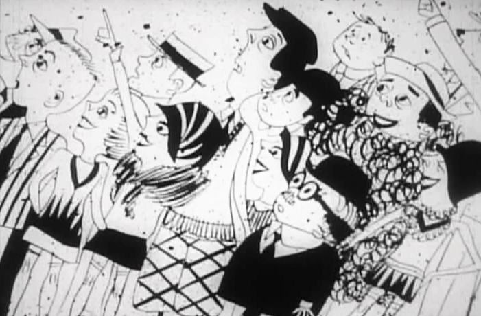
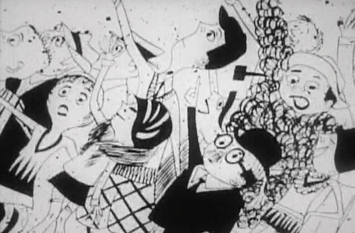
It’s a world of speakeasies.
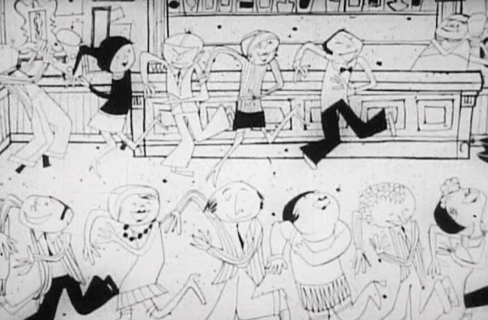 3
3
Flappers dancing and living the high life
 4
4
Mobsters
 5
5
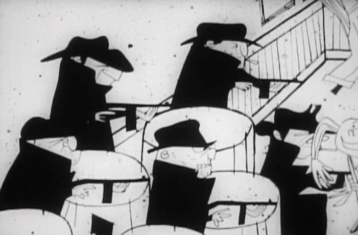 6
6
and their violence
 7
7
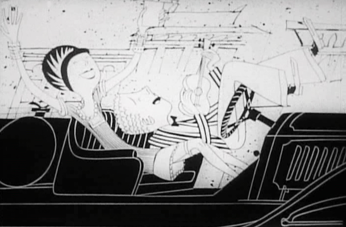
Fast cars
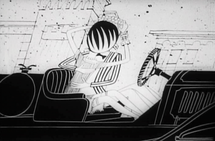 8
8
and flirting
 9
9
High flying inventions
 10
10
 11
11
 12
12
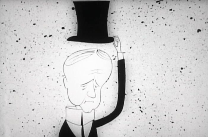
Calvin Coolidge
 13
13
and new ways of travel.
