Animation Artifacts &Books &Disney 18 Jul 2008 08:01 am
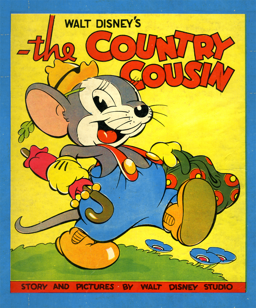
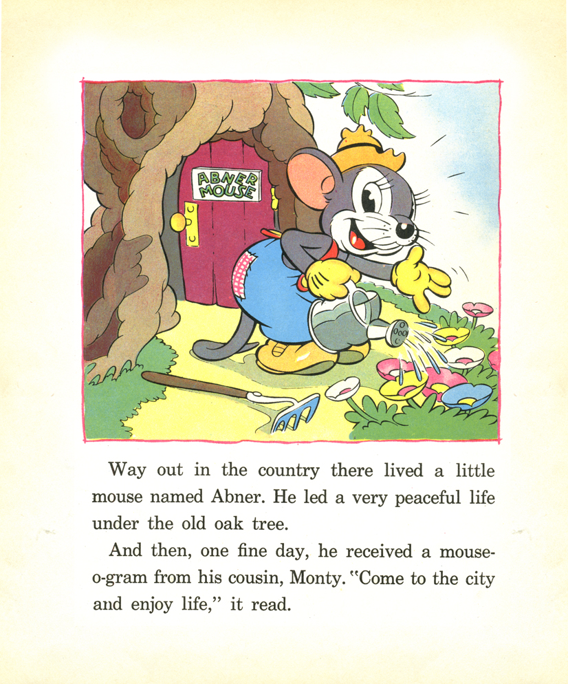
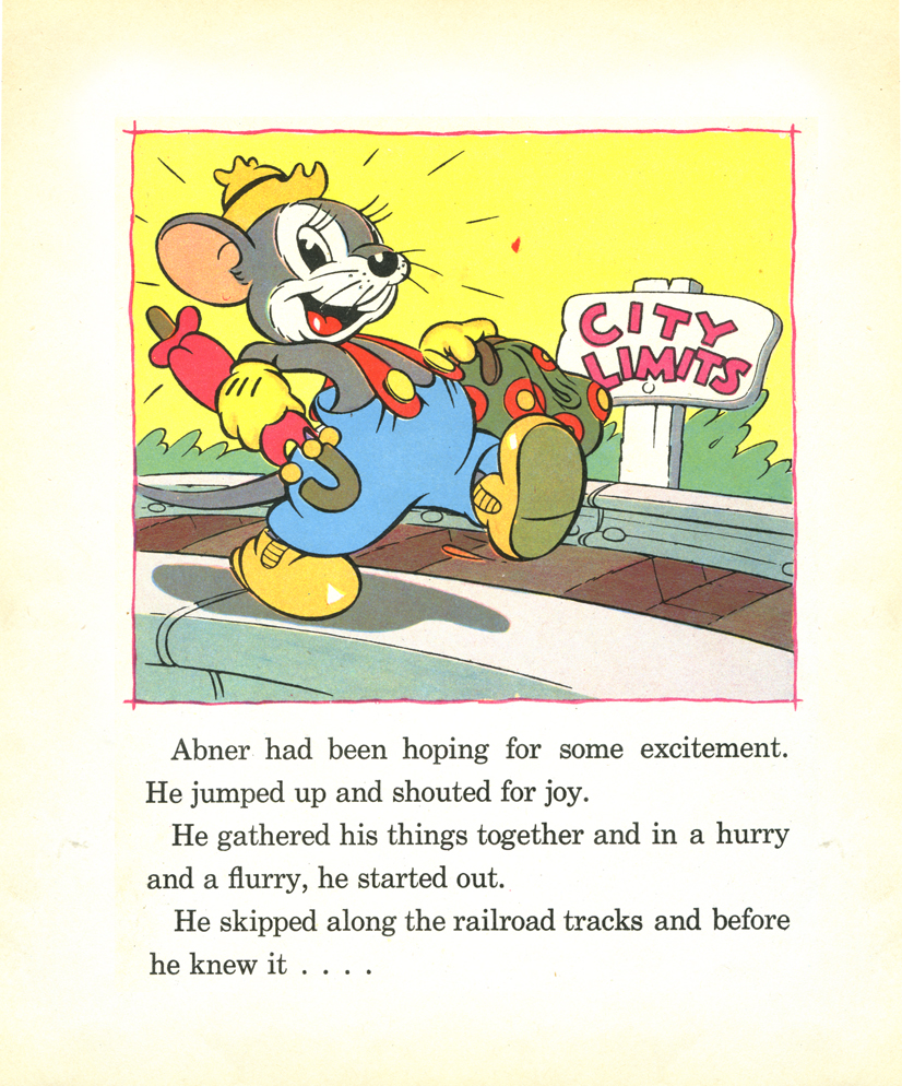
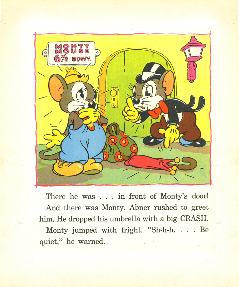
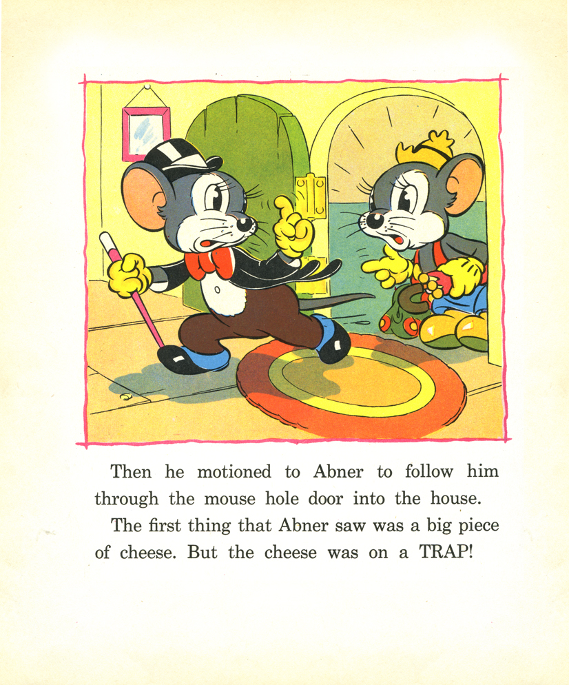
Country Cousin book
 – John Canemaker has loaned me a couple of books to be scanned for posting. These are all storybooks for young children, and they’re all adaptations of Silly Symphonies.
These books are some of the first bits of merchandising to piggy back some of the more popular short films. Aside from the “Mickey” craze, there was a demand for Silly Symphony merchandise. The biggest book featured the original Three Little Pigs, which I posted back in Feb. 2007.
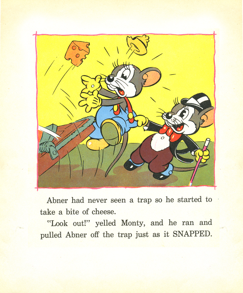
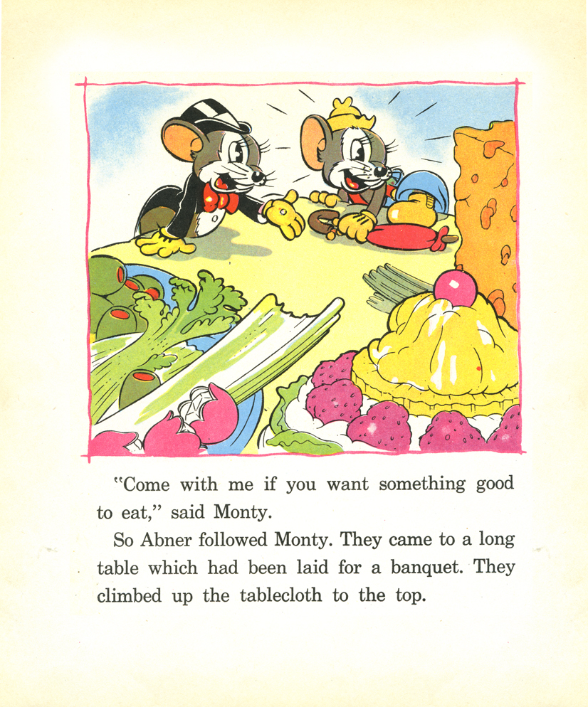
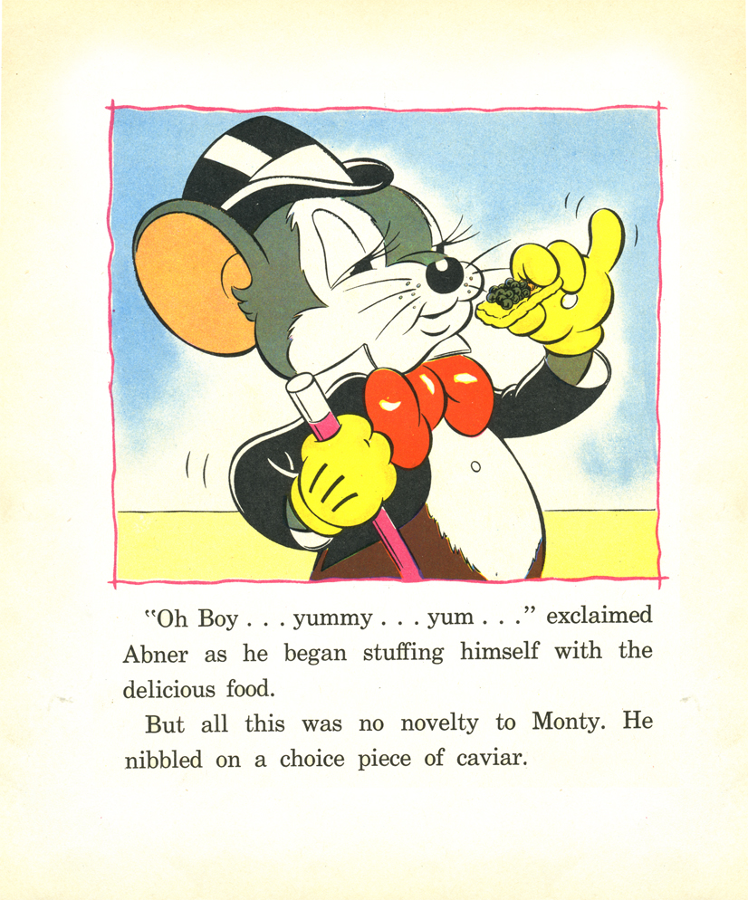
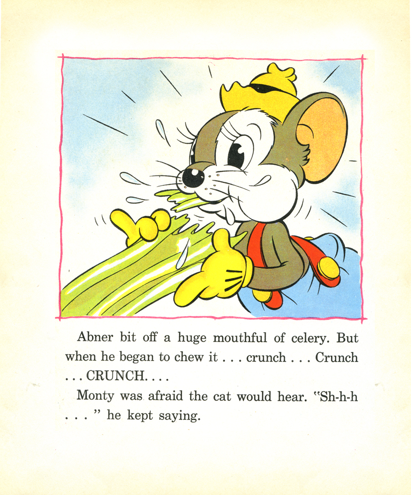
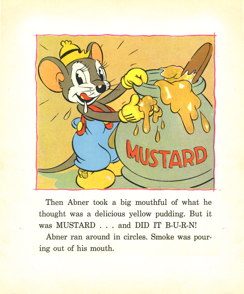
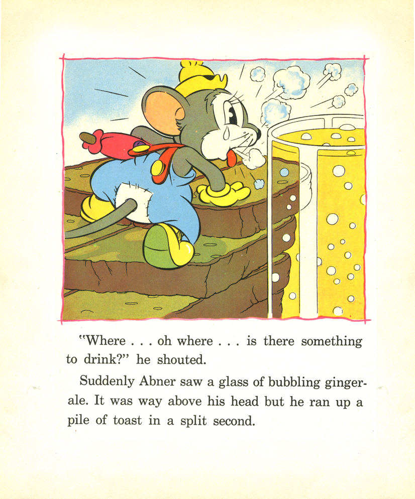
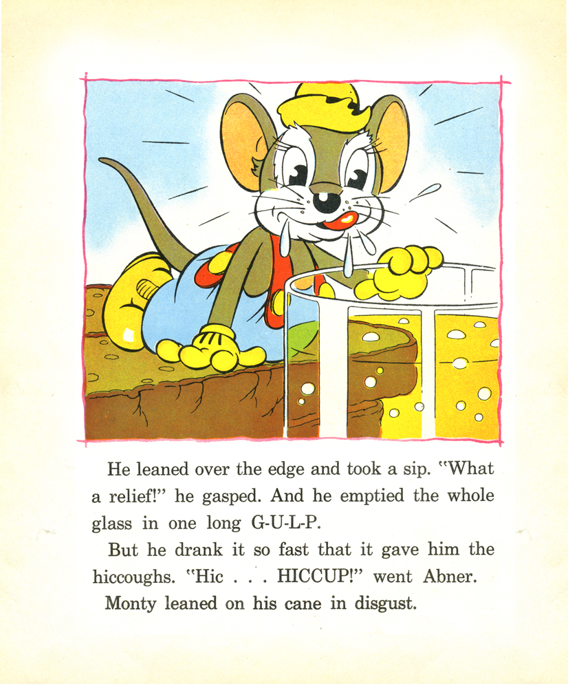
There’s no doubt that The Country Cousin was one of their more popular shorts. It’s been called one of the great advances in character animation – specifically the drinking scene animated by Art Babbitt. This all led up to the film’s Oscar win.
_______(Click any image to enlarge.)
___________________________________________I’m amazed that this book has such
thick paper with very crisp colors. It’s held up well all these years later. The book is slightly larger than posted; I cut some of the extra white space around the images.
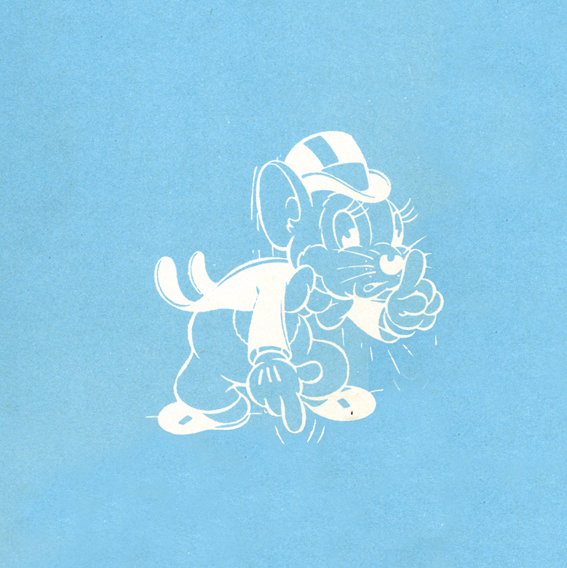
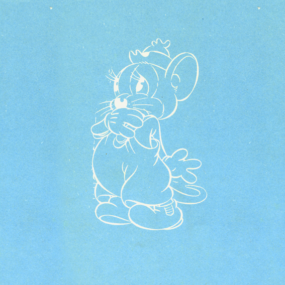
These are the two inner cover pages. (The pages are much larger,
but I just took the drawings.)
_______
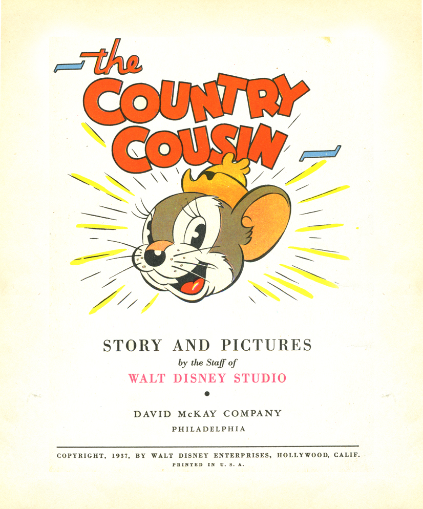
The title page
_______

on 18 Jul 2008 at 8:43 am 1.Jerry Edwards said …
Hi Michael! Thanks for sharing this book’s story and art. The Silly Symphonies and Spccials shorts are up there among my favorite Disney shorts, so I enjoy seeing these books. I don’t collect them, since I have to stop my numerous collections SOMEWHERE, but I still much enjoy seeing these when I can.
on 18 Jul 2008 at 10:08 am 2.biblioadonis aka George said …
Very nice scans!
Got any secrets to share?
Thank Mr. Canemaker for us. I really appreciate him sharing these amazing works.
on 18 Jul 2008 at 11:10 am 3.Pat said …
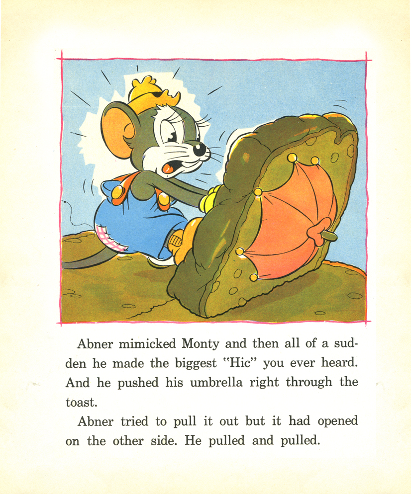
Just an observation: the country cousin’s head is drawn in nearly identical versions of a 3/4 view in almost every single scene.
I count one profile, and one full forward, and a couple of slight variations on the 3/4.
I guess that’s true of most cartoons, but for some reason it really sticks out here. I think its because even in dynamic scenes where they are falling or being chased the head is the same view, just tilted up or down.
on 18 Jul 2008 at 2:58 pm 4.Michael said …
Yes, Pat, I noticed the head shapes as well. I don’t find these the best drawings published by the Disney artists. They certainly don’t compare to some of the beautiful artwork in the film. The drawings by Babbitt, among others, as well as the ink & paint in that film are stunning.
These drawings are watercolors though most of the colors are flat and feel opaque. Not very delicate, indeed.
on 18 Jul 2008 at 3:22 pm 5.Thad said …
Is this Tom Wood’s work? His style was similar, and he usually did all of the publicity art for Disney (before he died in ’40/’41). That color sure held up some seventy years!
on 18 Jul 2008 at 5:48 pm 6.Jenny Lerew said …
This is beautiful. Thanks John and Michael for sharing it.
What simple appeal-and I really love that title page.
As an aside–how the hell did Thad get so well-versed in cartoons at his tender age? Jeez, it makes me feel such a dolt by comparison! At least my 19 year old self or whatever he is now-man! I stand in awe. Seriously.