Commentary &Frame Grabs &Hubley 19 Feb 2009 09:01 am
Windy Day 2
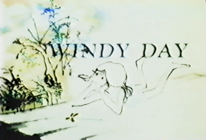 - Here we continue with some frame grabs from the brilliant Hubley short, Windy Day.
I wish there were a good copy of the film available. As a matter of fact, ALL of the Hubley films are in bad versions on the dvds available. They all look soft and dark, they weave and show added scratches. It’s too bad since so many of these films are gems. Wouldn’t it be great to have an extras track or three? Emily and Ray Hubley know everything about these films and could tell us so much. As a matter of fact, Ray helped supervise production of the 35mm print of The Cosmic Eye, and that was a stunningly beautiful print. Yet, the dvd image of it is a paltry and distant relation.
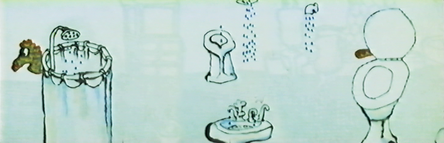
I want to start out here by noting that this film’s technique features bottom lit art (done like a pencil test). The grain of the paper can be seen and was somewhat controlled by the type of paper used for the coloring. It’s architect’s vellum. The paper’s thinner, more transparent and allows some slight watercolor without buckling. Several points in this second half are done with top light and mattes or double expposures. I’ll point those out.
Two other sites that recently featured articulate pieces on this film include Ian Lumsden’s Animation Blog and Richard O’Connor’s Asterisk Pictures blog. Richard gives a lot of deserved attention to Sarah Calogero who did some beautiful rendering on the short. I’d like to give attention to Nina di Gangi who did I&P work for the Hubleys on a number of their key shorts.
Continued from yesterday’s post.
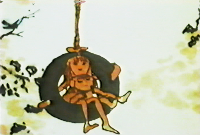
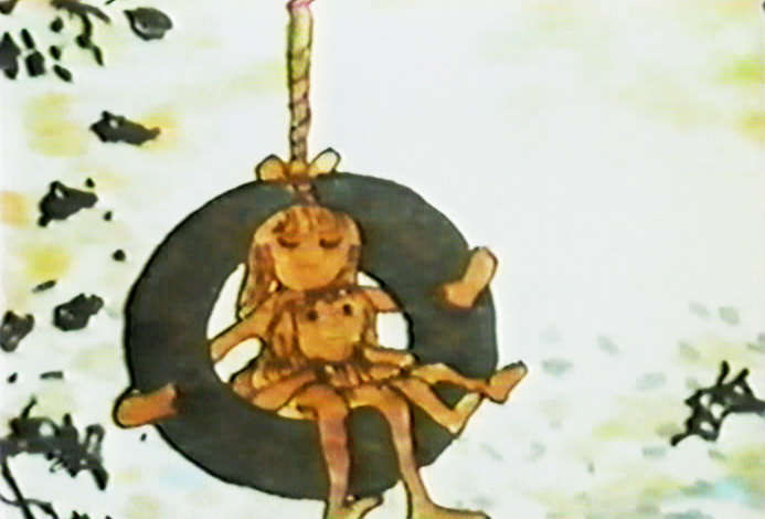
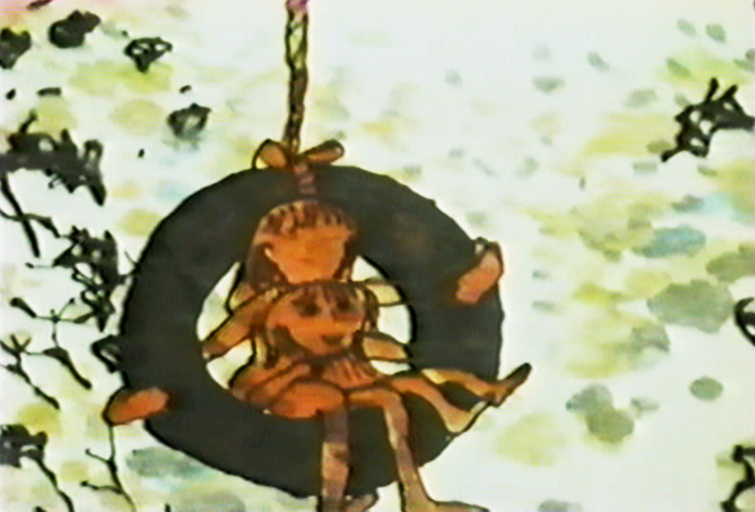
(Click any image to enlarge.)
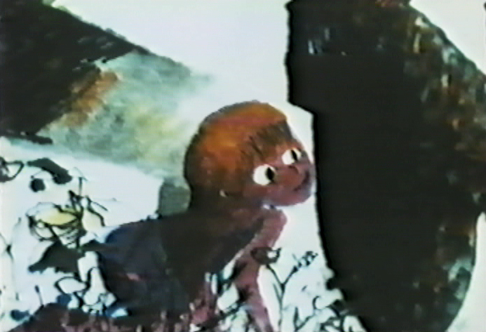
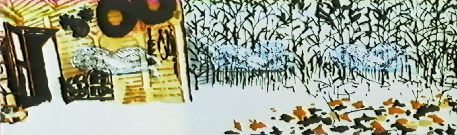
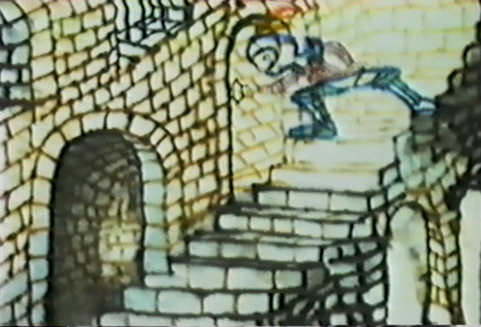
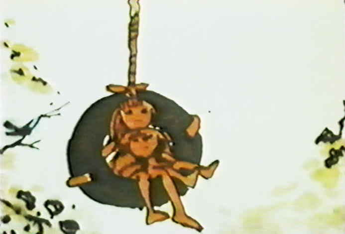
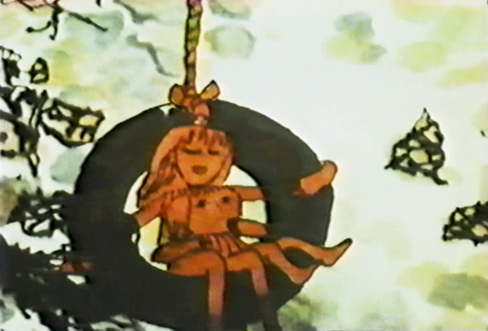
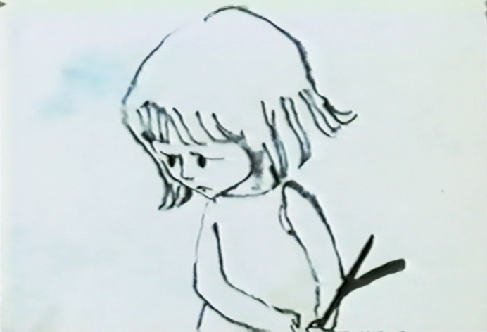
Note that John isn’t afraid to use the bot lit technique despite
the black wheel seen behind and through the character.
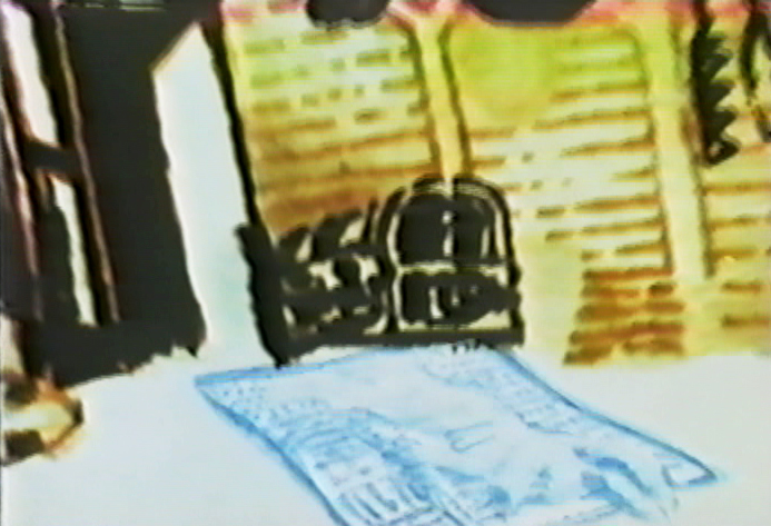
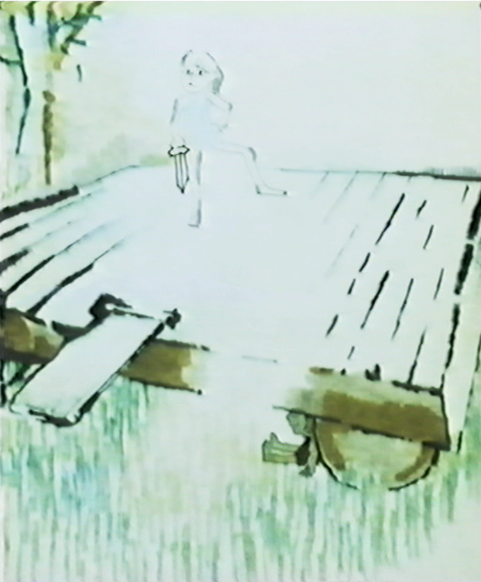
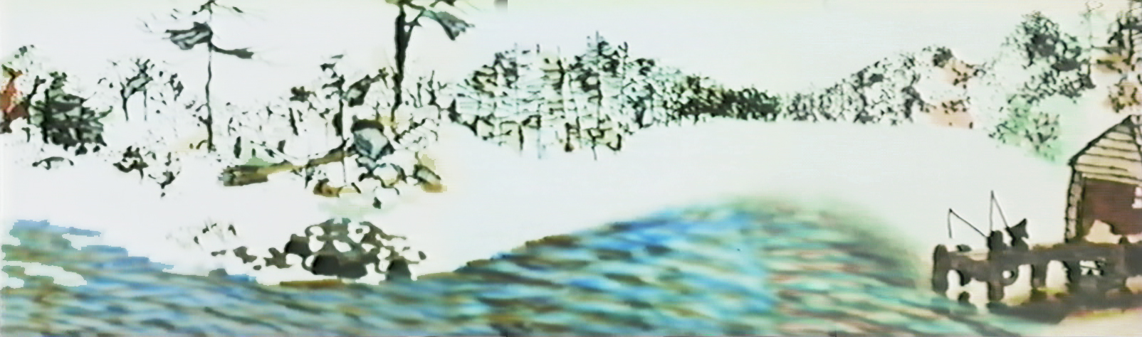
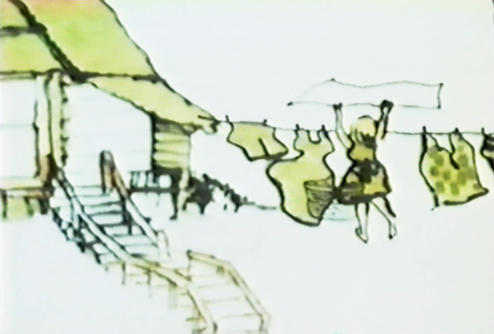
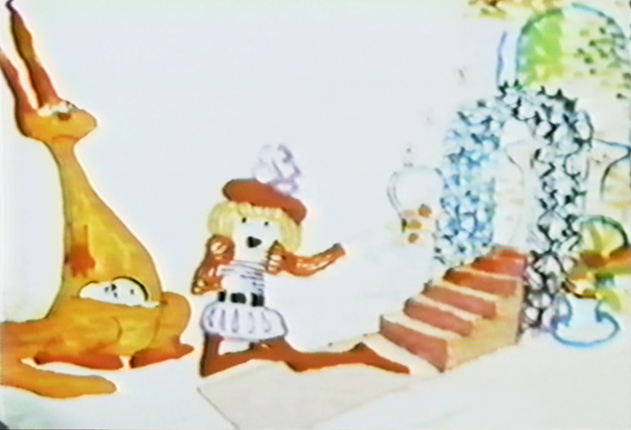
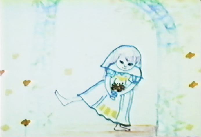
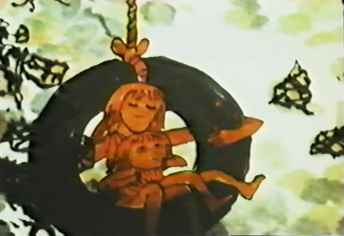
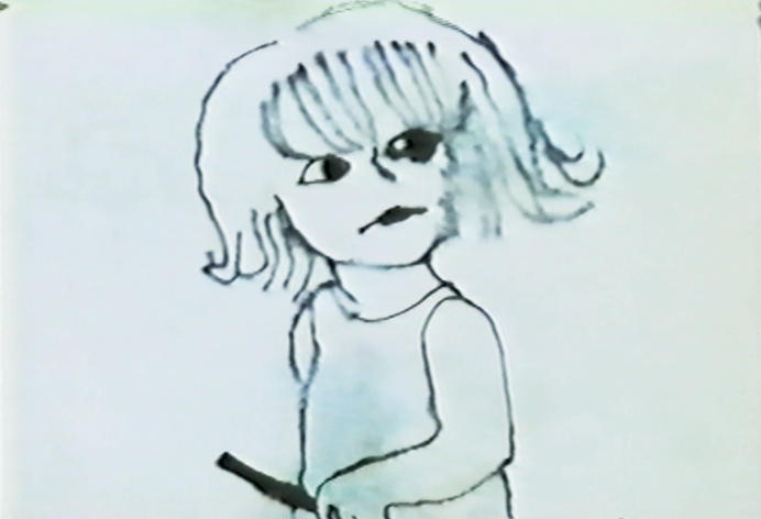
This image starts a scene which isn’t bottom lit.
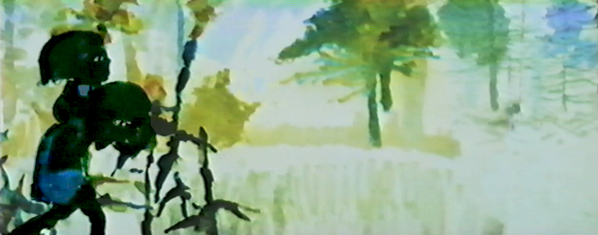
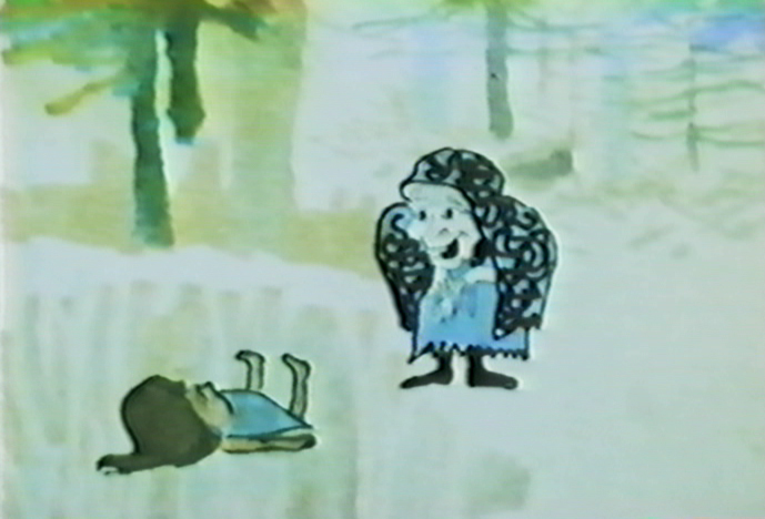
The newspaper/dead rabbit is matted into the picture then . . .
. . . becomes a double exposure as it floats over the pan.
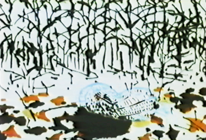
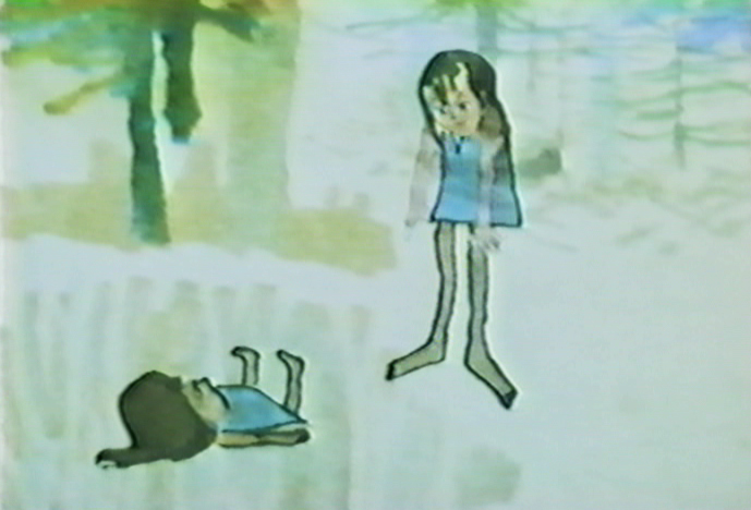
. . . and goes into the grave.
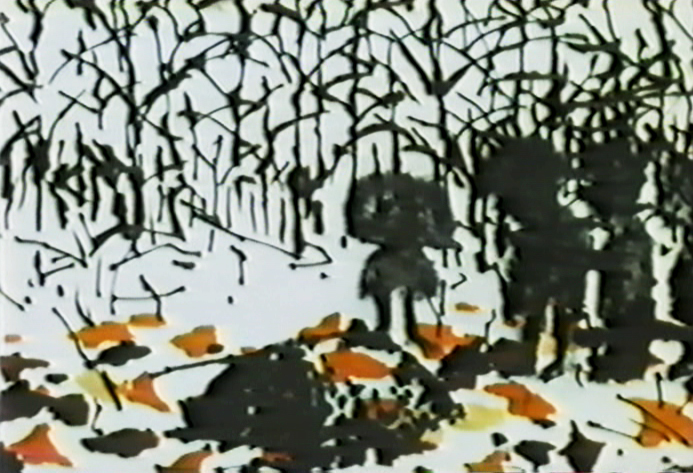
Dissolve on the top lit silhouetted people.
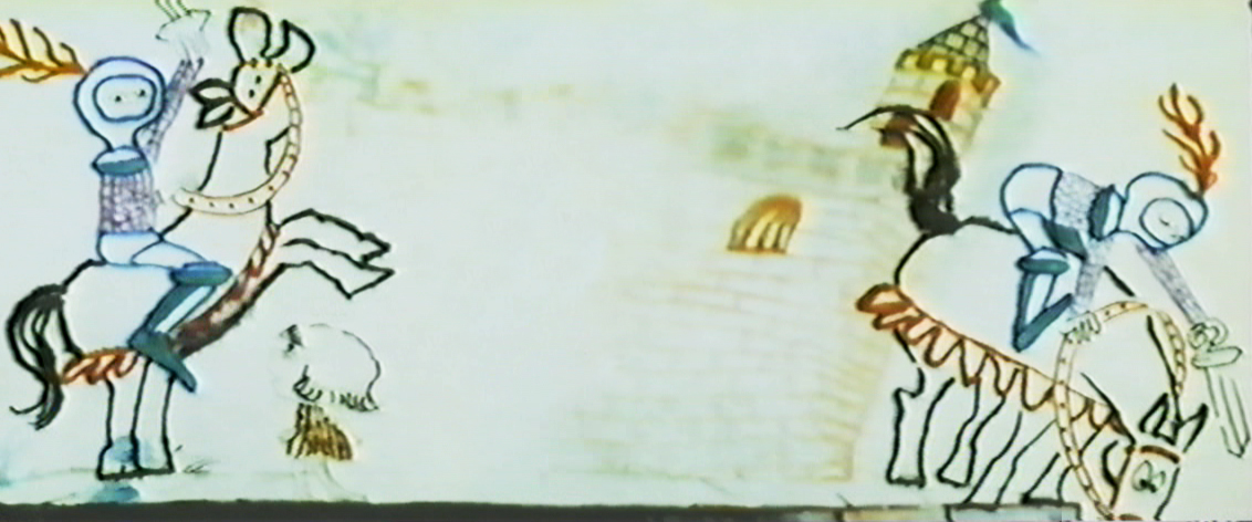
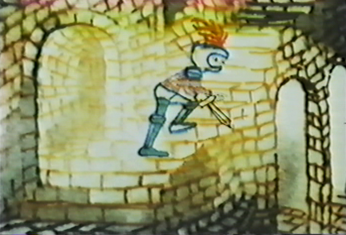
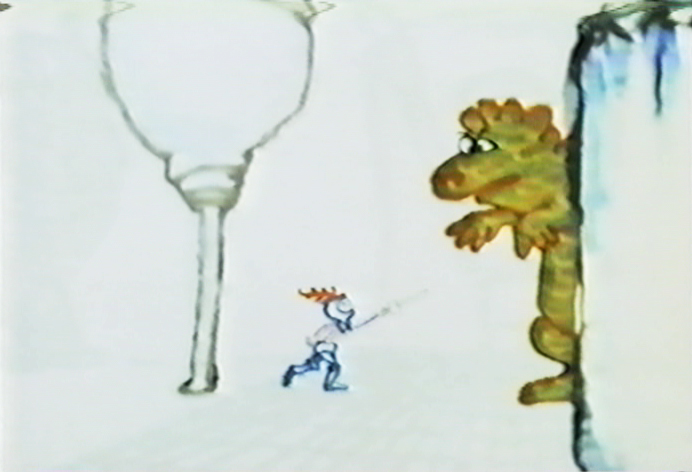
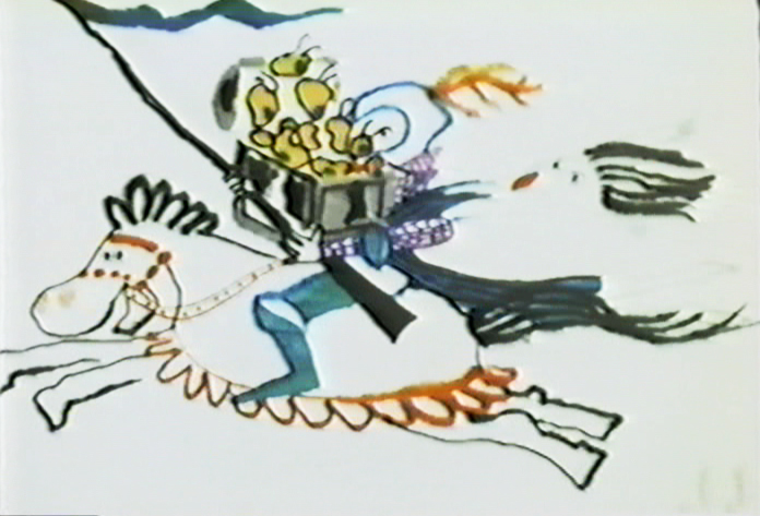
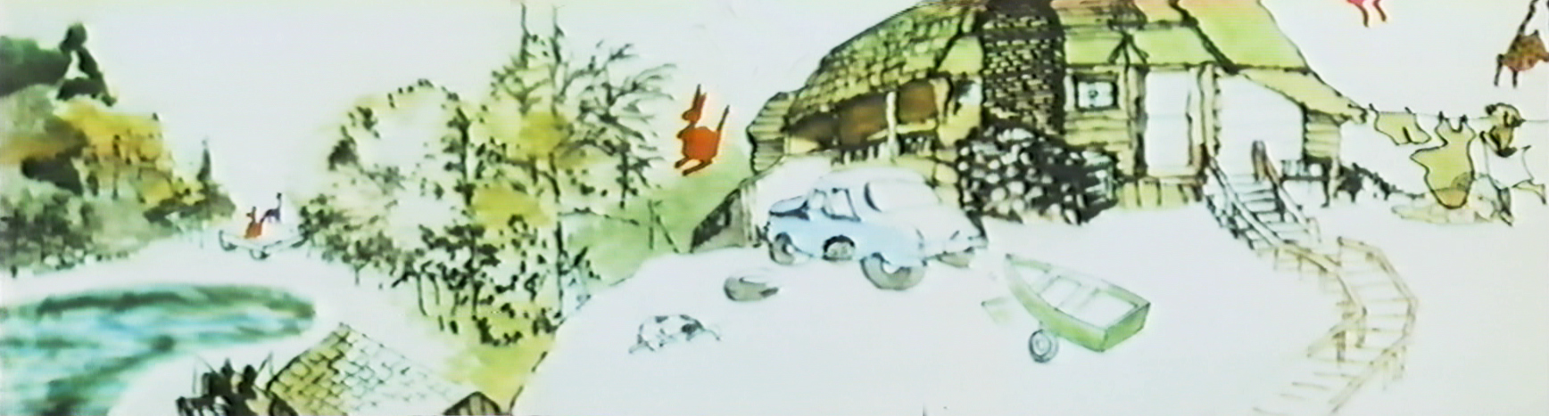
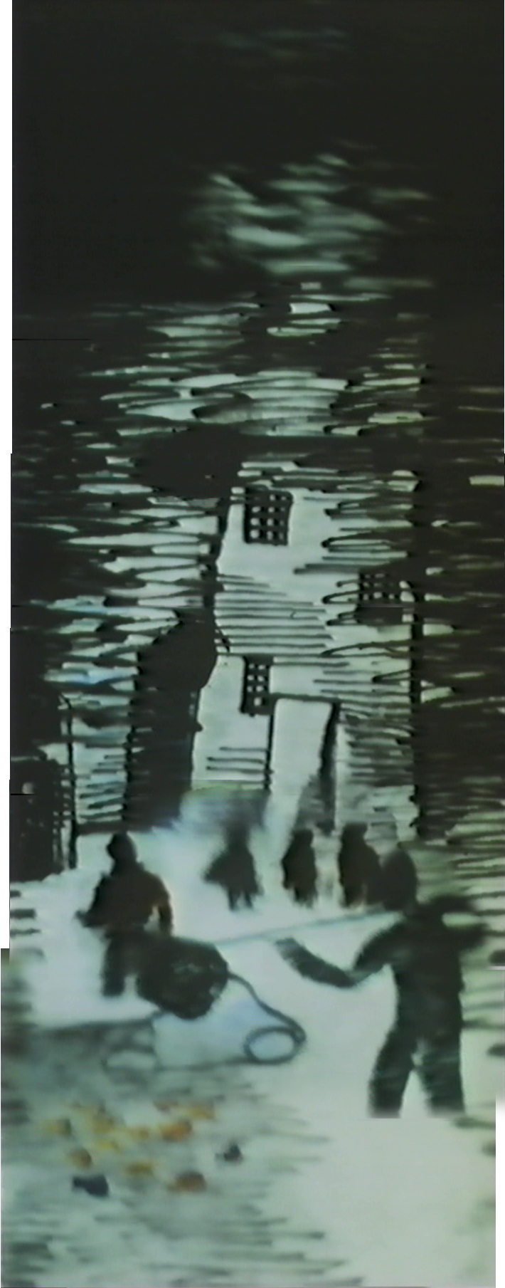
Back to the bottom lit knight riding across the pan.
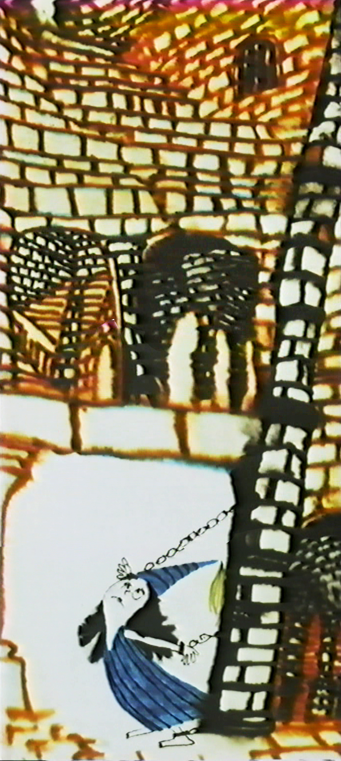
This is a complicated bottom lit scene.
At the top of the pan, the knight is lit in yellow.
He goes through a portal, and the light moves to the
bottom of the pan as the knight enters a level down.
It took some careful thought and a creative cameraman to pull it off.
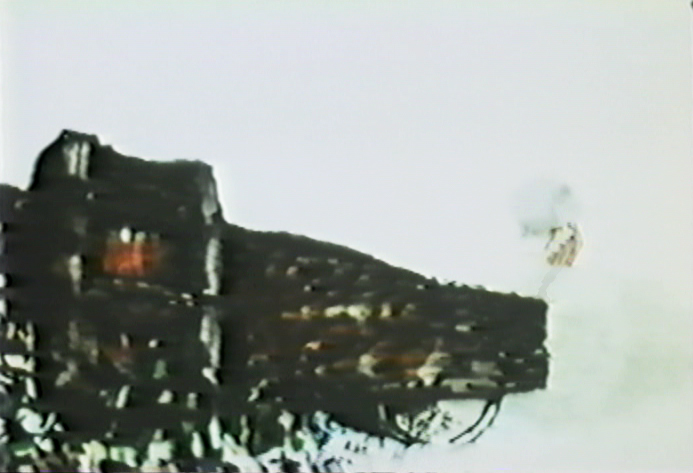
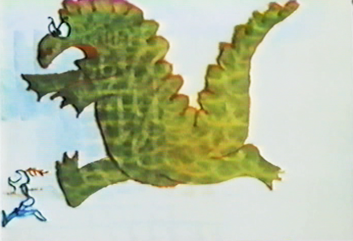
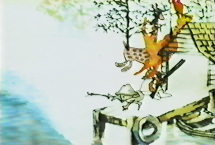
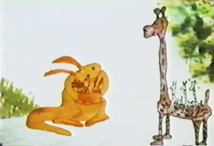
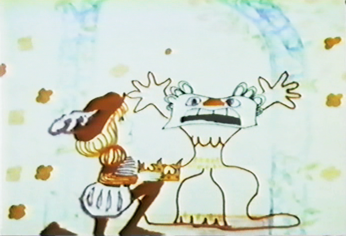
A bottom-lit dragon moves across the pan.
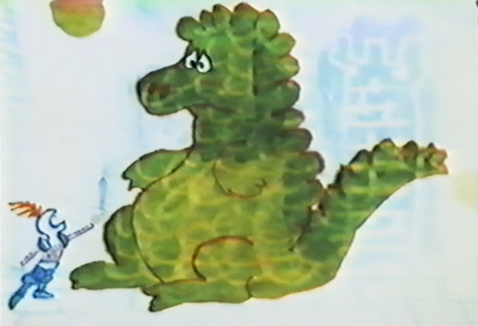
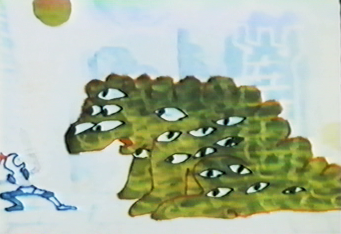
This bot-lit BG looks to have stepped out of Adventures of an *.
The effect on the water is matted into a bot-lit BG.
The effect, itself, is top-lit.
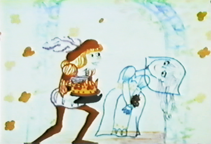
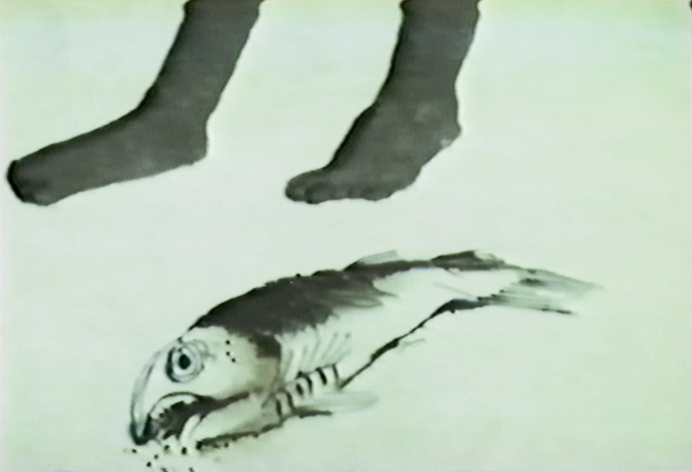
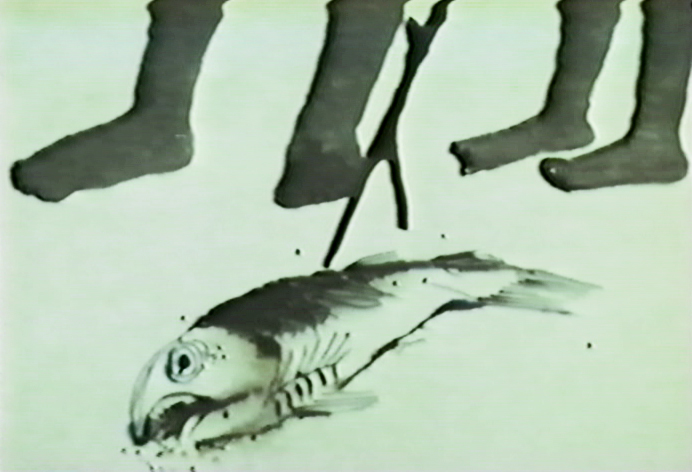
The subject of the film slides quickly between marriage, and birth . . .
.. to death and murder.
Yet, the conversatioin is done gently and quietly
without the obvious self-imortance it could have had.
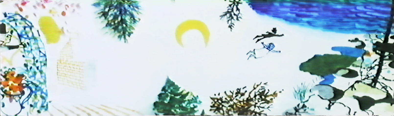
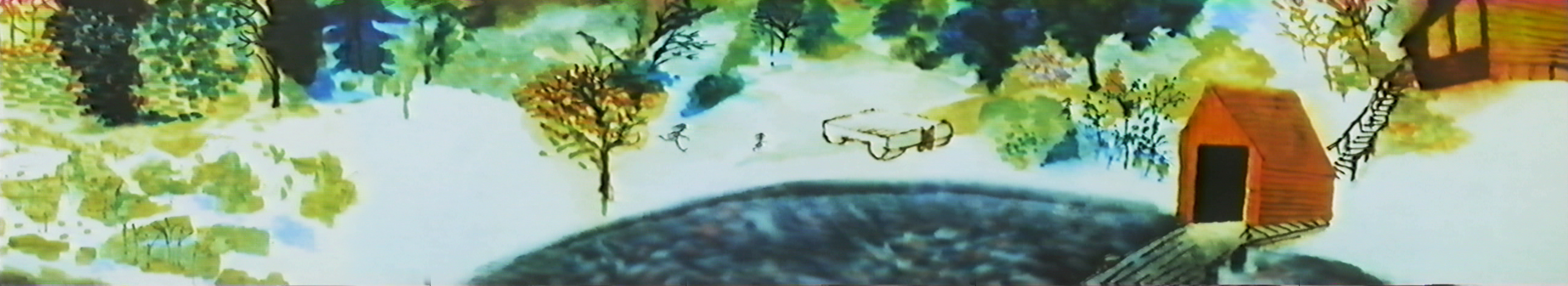
This is one of the more beautiful scenes in the film.
Very complex animation and layout, yet done so simply.
A beautiful N>S then S>N pan while the art animates in and out.
Both sides of the pans N&S&N and both sides of
the zoom in & out ease at perfect speeds.
This is something that could be tested easily on a computer, but in the days before computer you could only film the piece in a Pencil Test.
However, the Hubleys couldn’t afford a PT. They just did it.
A beautiful, bot lit, multiple run pan. This is experimentation at the service of Art.
I can’t think of many such scenes in all the features or shorts I see today.
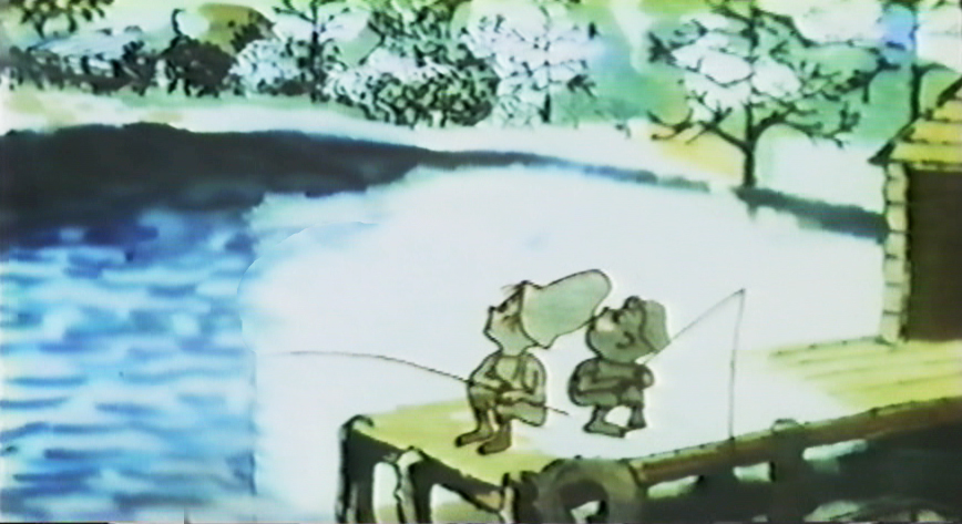
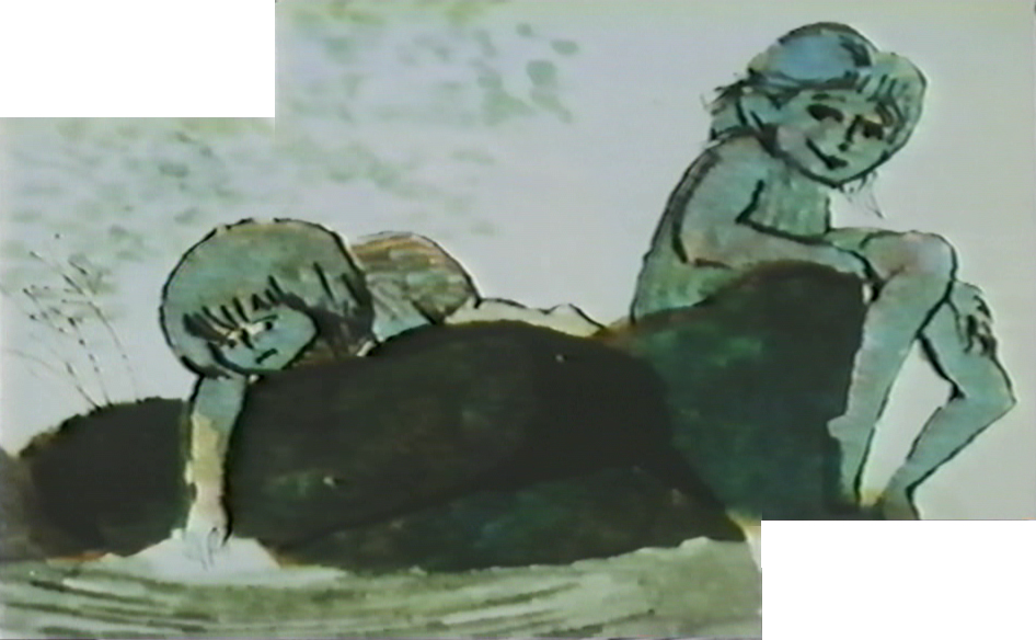
Again, death enters the picture.
The kids are talking about Life & birth.
These two scenes, to me, are the heart of the film.
Beautiful animation, beautiful rendering, beautiful soundtrack.
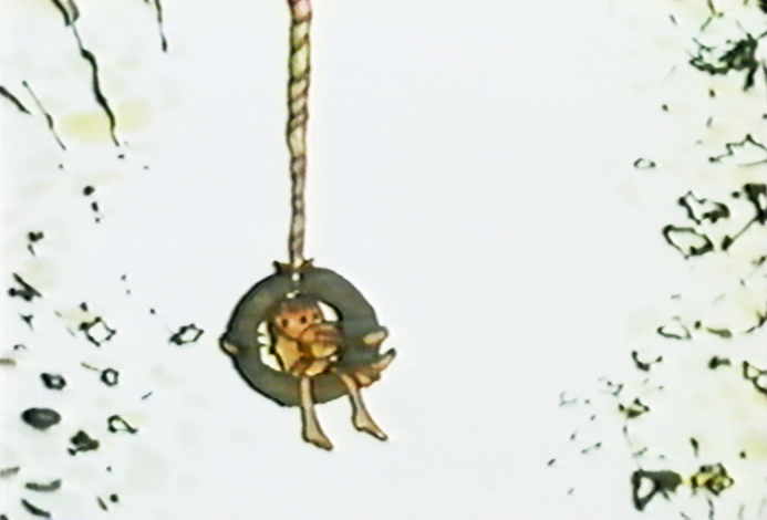
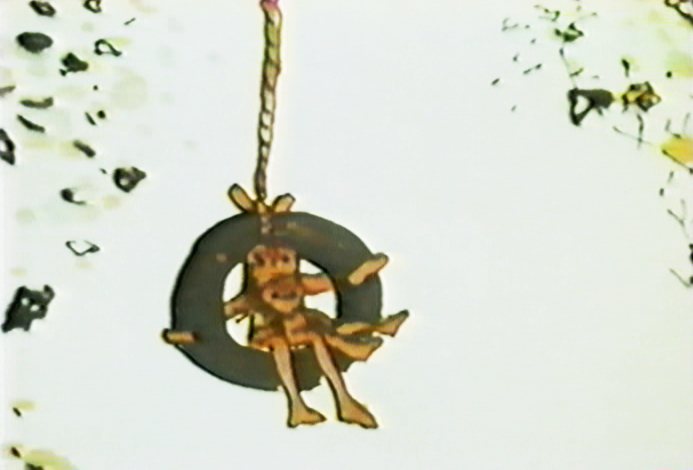
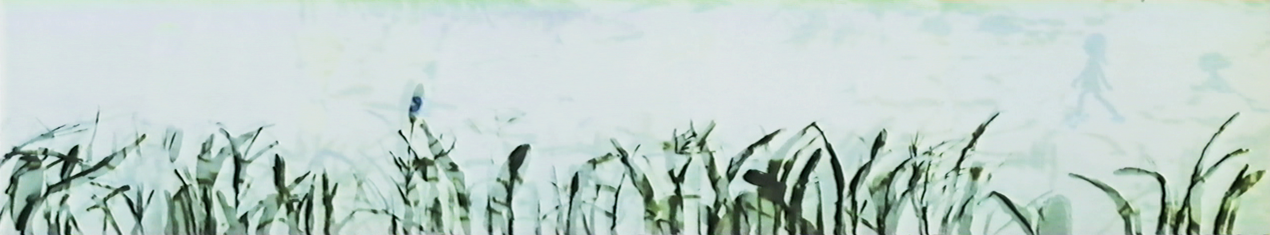
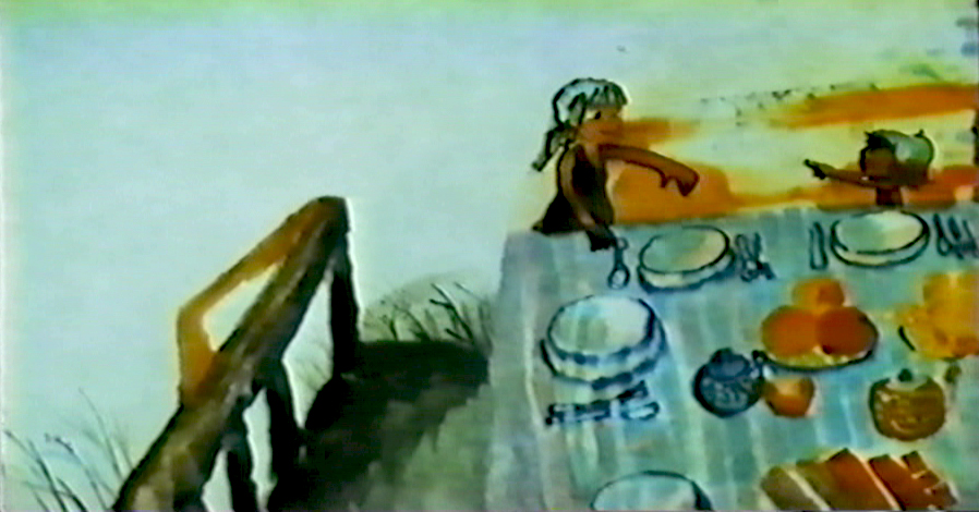
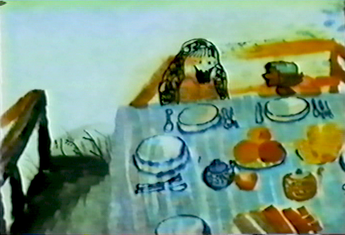
A windy day.
top lit
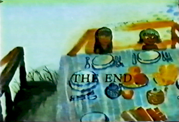
An absolute gem.

on 19 Feb 2009 at 10:07 am 1.Richard O'Connor said …
The Academy of Motion Pictures had an exhibition of Oscar-nominated animation art several years ago. 2002, most likely.
The Hubley Studio was represented by a few “cels” from Windy Day. I don’t recall who lent them, but most of the show was courtesy of San Francisco collector, a few Canemakers, and now that I think about it maybe you loaned some art as well.
Time has not worn well on the physical art. The markers continue to bleed into the vellum and the color fades to dull tints.
This film represents a summit of animation production, the fact the art has degraded only reinforces that. It’s art created for film- to be bottom lit, cut out and hogtied any way necessary to make it beautiful on the screen. That’s where (capital ‘a’) Art is.
on 19 Feb 2009 at 10:58 am 2.Tim Rauch said …
This film and “Moonbird” were very much in my mind while making “Q&A” (our new StoryCorps film). Really fantastic treatment of natural conversation, I hope a small sliver of that “inspiration” shows up in our results.
on 19 Feb 2009 at 12:40 pm 3.Dave Levy said …
This is the definition of “heart.”
on 20 Feb 2009 at 1:07 am 4.Dagan said …
Wow, I really NEED to see this film…
It looks absolutely beautiful!
Thanks for sharing these stunning images.
