Commentary 26 May 2009 07:47 am
Q&A
- I recently spent a few minutes rereading the questions printed at the back of John Halas’ seminal text, The Technique of Film Animation. There’s something formidable to me in a few solid questions posed to a number of smart people. Playing off and comparing them against each other almost gives another answer. I think I first found this book back in 1966, yet in all those years the questions and answers never seem to date. At least not for me.
Anyway, one specific answer struck me this time, and had me thinking about a subject that’s been prominently on my mind lately. Naturally enough, it’s John Hubley’s answer that impresses me. Here’s the question with John’s answer:
 Do you think animation is in a general state of stagnation as regards its style and presentation? How would you like to see it develop artistically?
JOHN HUBLEY: There is a tendency toward cliches of design in a traditional sense, and even the so-called modern style. (The large profile nose, hair line, arms and legs, black dot eyes, etc.) But more disturbing are the cliches of action (stylized flutter-lip action—sandpiper-like leg motion for walks and runs, multiple image jitters for fright, and many others). The trend toward more rapid timing of actions and reactions is reducing the human characteristics portrayed in the animated image. I would like to see the development of animation which is capable of deeper emotional expression; the portrayal of characters that are more profound and human. This will require stories dealing with ideas and relationships beyond the usual cat and mouse chase or “cute” children’s tale.
If anything his answer is more appropriate today. Cliches in design are not the only sins evident, but cliches in animation and movement even more so. There’s the Flash thing – angled characters with thick external lines are the way forward for most animation done today. It’s the most severe design that the mediocre to poor popping animation hides behind. Solid flat colored backgrounds and a total lack of depth in drawing is the signature of most of the Flash pieces I’ve seen. Too few try to overcome the simple problems in Flash – like popping a head from profile to straight on with no inbetween drawings, or popping from any pose to another. They’re not all in homage to Tex Avery. More likely it’s an homage to laziness. After all, it’s just a cartoon.
Occasionally, you’ll come upon a Sita Sings the Blues and realize that Flash isn’t the problem, but it’s the handicap for many another limited animator. How smartly the design is conceived in Nina Paley‘s film, it gives a very fluid action and a busy texture in the very stylized and appropriate backgrounds. But this is defiinitely the exception to the Flash films out there. Nina uses the medium for all it’s got.
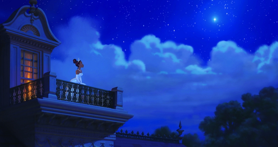 It isn’t just Flash. So many other shorts; so many cg or 2D features are so limited in their choices. The upcoming Disney feature, The Princess and the Frog, cannot fully be critiqued based solely on its trailers, but honestly, it’s doubtful the rest of the film will be designed differently. As it is, the film reminds me a bit of the animated sequences done by James Baxter for Disney’s Enchanted. That was supposed to be a parody of all those Disney fairy tales done recently. I somehow doubt that The Princess and the Frog is parody, but I could be wrong. It just looks retread; well-done retread but just the same.
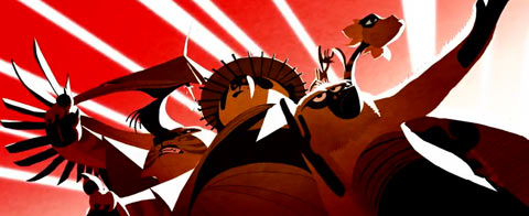 After seeing those credit pieces for Kung Fu Panda (also done by James Baxter Animation & Shine Studio) wouldn’t we expect more of Disney? Maybe not. Actually, the entire Kung Fu Panda was well designed.
Those 2D title sequences were exceptional though, and if I were trying to revitalize the 2D division of Disney, I’d be going for something strong not reworked. However, as I’ve said, I haven’t seen the final version of The Princess and the Frog and will hold any final criticism until I do.
Design shouldn’t exist outside of the film it’s working within. Two fine examples of excellent and daring design that strengthened their films would be Mulan and Lilo and Stitch. The strong, simplicity of Mulan gave that film the backbone it so needed. I wasn’t completely satisfied with the character design; several of the characters (grandmother and dog) seemed to step out of another film. But overall, it was a brilliant effort, and watching it was almost hypnotic. Lilo and Stitch almost seemed retro with the decision to use the water color backgrounds and beautifully rounded characters. There was a softness there that absolutely made that film. Both were examples of daring design that supported the stories and the animation. It didn’t call attention to itself but brought you into the film.
My sole purpose here isn’t to criticize anyone. I’m just calling for some solid and strong design in animation for both settings and characters. Designers and animators have been sleep walking far too long.

on 26 May 2009 at 7:00 pm 1.Graham said …
Lower eye twitch. That’s all I’m going to say….
on 26 May 2009 at 7:24 pm 2.Dan Caylor said …
Keith Lango made a great comment on The Princess and the Frog over at Cartoon Brew not too long ago. His argument was something along the lines of, the Disney company is kind of hand-cuffed in it’s decision to bring back 2D in that the safest and most secure way to insure it’s success is to repeat what worked last time. The artists at Disney, and us artists outside are craving something new and groundbreaking, but that’s too much of a gamble, and could spell the end of 2D feature animation for a much longer period than weve recently experienced. So once it is proven that story is king and medium is insignifigant among animation executives, then they can afford to take some chances stylistically (Lilo, etc).
I think it sucks, and an argument can be made that they use the resources they now have in Lasseter and company to construct a story along the same lines as any of the other Pixar films and use it in 2d, and they can’t go wrong. But who says they haven’t done that. We’ll have to wait until Christmas to see, but so far it looks kind of fluffy to me. Beautiful, but fluffy. Amazingly beautiful, but fluffy.