Commentary 25 Aug 2009 07:30 am
Notes
First the positive:
- There are a couple of good comments about Ponyo on a number of those blogs I often frequent, and I’d like to call attention to a couple of them. Mark Mayerson, as usual, articulates some of the finest insight into the story of the film. David Levy has some fine comments worth checking out on his blog. As expected Daniel Thomas MacInnes’The Ghibli Blog offers many views and comments over many posts about the film.
This is a film that has remained very much alive in my mind since seeing it two weeks ago. Any animator or anyone interested in animation should see it.
Then the dumb:
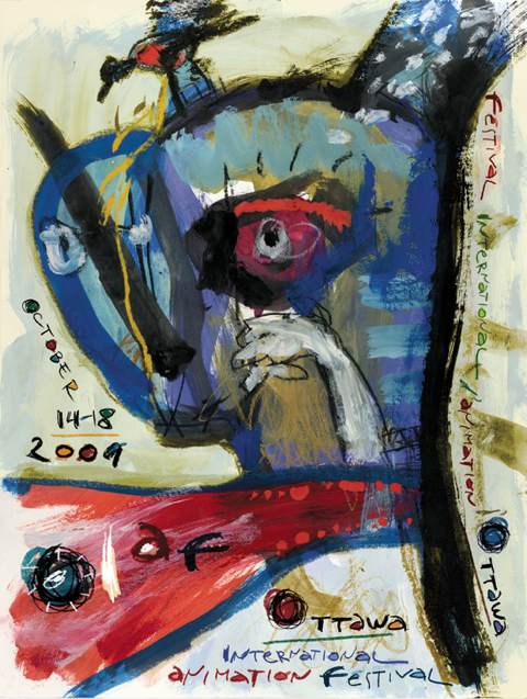 - There seems to be some nasty commentary brewing on some blogs about the current poster for the 09 Ottawa Animation Festival.
I’m made to think back to the world of the forties. Some animation artists wanted to move the world of the cartoon out of the Nineteenth Century and into the Twentieth. When these artists did break from the tradition, creating UPA, ultimately dragging the medium into the art world of the present, there was a backlash by those who didn’t seem to understand what was going on.
Picasso, Matisse and Klee (not to mention Pollock, Kline and Dubuffet) had successfully brought the artworld around, but the cartoon world was stuck on Arthur Rackham and Walter Crane. The new wouldn’t do for these animators, and they rebelled against the different. The public loved the new shorts.
The world’s not too different today. Some people are denying Obama’s naturalized birth, and others are denying modern art. (Even though it isn’t all that modern.)
When I first saw the OIAF 09 poster I liked it but didn’t think much beyond that initial response. Now I see all these absurd comments attacking the artwork on the poster, and I wonder what the fuss is all about. Pete Emslie, on his blog The Cartoon Cave (indeed), in a post childishly labelled “Blecchh!”, veers from his usual presentation of celebrity caricature to rail against this artwork. “. . .it’s not to my more discerning tastes, art wise. Rather than be on a poster for an international event, I’d suggest the proper place for this image would be taped to a fridge door by some loving mom.” The comment looks down its nose with a childish and ludicrous tone; as if Pete Emslie had decided his taste in art was “more discerning” and better educated. And he doesn’t just have to tell you he doesn’t like the poster, he has to try to find the nastiest invective: “My best guess is that it’s supposed to be a cat vomiting. Yes, a vomiting cat, I’m almost sure of it.”
Naturally, others comment trying to outdo the viciousness on this blog attacking the Festival poster. It’s disturbing that this “better-than-thou” attitude exists. I find it odd to have to defend abstraction or modern art at all.
This poster is a fine work, and it deserves a little respect from those who’d like to call themselves artists. Perhaps it’s time to revisit your art history books and art galleries; you might find that this doesn’t work as a gag cartoon because it isn’t one. It isn’t very comfortable, and it’s not supposed to be.
Kudos to Chris Robinson for selecting such a poster to represent this Festival and for selecting more daring films (that would never find the way into super-commercial Fests like Annecy) within the programming, itself.
Richard O’Connor has similar musings on the Asterisk blogsite.

on 25 Aug 2009 at 10:47 am 1.Bridget Thorne said …
Pete Emslie’s kind of rant seems to permeate
American culture these days. That is ugly.
on 25 Aug 2009 at 11:19 am 2.Wouter Morris said …
“My best guess is that it’s supposed to be a cat vomiting. Yes, a vomiting cat, I’m almost sure of it.â€
That’s the kind of thing you say when you’re 15 — you’re on a school trip to a museum, you’re bored, you want to get an easy laugh from your friends. Then you go home again and watch TV.
I think Peter Emslie’s diet of cute Disney forest animals and celebrity caricatures has made it very hard for him to open up his mind to anything else.
That said, everyone is entitled to dislike the poster, of course. Just, sheesh man, be a bit mature about it at least.
on 25 Aug 2009 at 11:24 am 3.Thad said …
I have to ask, why the double standard? I agree with the idea that one can be as critical as one wants to, and being able to use derisive language about what one dislikes. I don’t agree with the idea that everyone else is expected to “play nice” and dare not speak ill of what someone else holds dear.
BTW, couldn’t all of these comments you’re leaving all over the place about the brilliant artists and filmmakers who chose to work in a more traditional, comedic style at Warners and Disney as being “stuck in the 19th century” (I don’t even know what the hell that even means… Are you saying people actually drew in the same style of a 1947 Warners cartoon in 1877?) be considered “holier-than-thou”?
on 25 Aug 2009 at 1:24 pm 4.Thad said …
Oh god, that should read “[...]dare not speak ill of what I hold dear.” Me so smrt.
on 25 Aug 2009 at 1:26 pm 5.Michael said …
There is no double standard, Thad.
You can say anything you want to say about anything you like. However, if one wants to be mature, one might say it in a mature way. “Blech” and “vomit” and “refrigerator magnets” is not, to my mind, mature. It is simply a way of deriding and hurting without critically saying why something is bad.
When the artist, himself, comments on the blog, it’s obvious that the attempt to deride someone to his face is successful in a 15-yr-old way.
Disney did the best of all with what they drew. Everything was built on art from the 19th Century, which was appropriate for what Disney wanted. However, modern art had been doing quite a bit in the world by 1930. There was NO reflection of that in the drawing styles of the Disney and Warner studios. Chuck Jones with John McGrew introduced it into their WB cartoons. UPA went further.
Animators, definitely at Disney’s as well as other studios, mocked the UPA style in 50′s. (Without the UPA movement Jim Tyer’s wild animation of the 50′s-60′s wouldn’t have been quite as acceptable graphically.)
We got used to modern art in many of our cartoons, and now with cgi we’re taking a step backward culturally.
The “holier than thou” reference has nothing to do with how people draw. It’s about people saying: “I know what’s best and I am right therefore you are wrong.”
Having an opinion is one thing.
Convincing yourself that your’s is the only acceptable voice is another.
Deriding those you don’t like with childish jibes and name-calling is something else again.
You can have a strong opinion and you can state it maturely. You can also read opposing voices without mocking them because they don’t agree with you.
on 25 Aug 2009 at 2:55 pm 6.Jonah Sidhom said …
I don’t like the poster because
1) it’s unappealing, to me anyway, and
2) the info isn’t presented as clearly as it could. (I especially don’t like vertical text in any situation.)
I don’t see anything wrong with Pete Emslie saying it looks like a cat vomiting, because it basically does. I first thought he meant it looks like a cat vomited on a blank canvas, but then I realized he meant it literally looked like a car vomiting.
Although to me it looks more like a blue Satan wiping a tear away while a steady stream of blood pours out of his mouth. I’d shed a few tears myself if that happened to me.
What’s it supposed to be anyway?
on 25 Aug 2009 at 2:59 pm 7.Richard O'Connor said …
Murray the Cat, you know friend Murray the Cat, has been sick lately.
I assure you, Theo’s poster looks nothing like a cat vomiting. Such an analogy leads one to question the eye of the beholder.
on 25 Aug 2009 at 3:05 pm 8.Pete Emslie said …
Michael,
“Blecchh” is a word I picked up from a misspent youth reading MAD Magazine. Naturally, as I became a cartoonist myself, the lingo stuck. And being a cartoonist, I tend to react to stuff I don’t like by lampooning it, either visually or verbally.
No backpeddling from me -I find the the Ottawa poster ugly as heck and painted in the crude manner of a young kid. I make no apology for having that honest impression. By the artist’s own admission it is deliberately child-like: “I think that the child-animation-unconscious relation is more than obvious. The childish and unconscious art method is not a new things to defend it. It is been around for 60 Years.”
Adult artists painting or drawing like kids is indeed nothing new. In my opinion, neither is it clever. While we may, as proud parents, uncles or aunts, applaud the earnest efforts of a troupe of 5 year olds in a school pageant, do we also applaud and rave about adult singers who sing off-key? Or adult dancers who can’t keep the rhythm? Why is it that only in the visual arts is there no yardstick by which to determine whether something has merit or not? Perhaps those of you in the fine art world consider every mark placed down upon a surface by someone proclaiming himself to be an artist to be above questioning. Well, I do not subscribe to that fuzzy thinking. I like to point out the naked emperors when I see them, even if it does put a damper on the parade.
As for my “immature” way of criticizing the poster, what exactly can one say in trying to assess an image that is so visually vague? Chris Robinson describes it thus: “The image is raw, explosive and chaotic—like the work we emphasize at the OIAF”, yet doesn’t speculate on what it may be.
Richard O’Connor says “My first reaction to the poster was that it felt like animation. There’s kinetic power in the composition. This comes, in part, from the layering. The image developed over time and we approach it and understand it over time. The cubist-like face implies time, as does the shouted ‘OIAF’.”
So Richard at least acknowledges that he thinks it’s a face, and that the projectile from its gaping mouth must denote shouting. Well, when I look at this same unexplained Rorshach test, my own impression is that it looks like a cat vomiting up blood. (That’s “explosive and chaotic”, isn’t it?) Hence, why I consider the painting to be rather ugly. As to your charge of my critique being “immature”, that may well be. But not much more dismissive or “immature” than your recent comment on the Pastoral sequence of Fantasia: “The Pastoral sequence of Fantasia is probably the lowest point during the feature. An overly cute sequence in cartoon color glory does the least to support the original score……The entire sequence can be wrapped up by that one scene where the cupie-doll cupids close out a scene with their fannies forming hearts.”
Or your recent dismissal of the Donald Duck cartoons that paired him up with Ranger Woodlore and/or Humphrey Bear as “those godawful ranger films”.
Or how about your reader above summing up me with: ” I think Peter Emslie’s diet of cute Disney forest animals and celebrity caricatures has made it very hard for him to open up his mind to anything else.” Mature, no?
The point is, Michael, is that we are all entitled to our opinions and, yes, how we choose to state them. You’re just as “immature” on occasion as the rest of us. The thing is, I don’t care what you say about things I like or the way you say it – that’s your privilege. But as Thad said, there very much is a double standard with guys like you and also Amid Amidi. You seem to hold others to a higher standard of criticism than yourselves, and that’s what I resent, not the actual criticism nor the way it’s delivered.
So stop acting so high and mighty already. Face it, you’re just one more arrogant, opinionated, blowhard blogger like the rest of us!
on 25 Aug 2009 at 3:12 pm 9.Michael said …
Jonathan, I think it’s supposed to be an abstraction. It’s completely open to any interpretation you like. Even vomiting cats, if that’s what you’d like to see.
I have nothing wrong with anyone saying they don’t like anything they don’t like. I do have problems with people who do their best to take down the artist they don’t like with insults and childish metaphors. I prefer a civilized discussion, as you’ve offered in your comment.
Pete, I’ve gone as far as I will with this juvenile tit for tat. Sorry, I find your approach to criticism immature.
on 25 Aug 2009 at 3:33 pm 10.Pete Emslie said …
Hey Mikey,
How about this latest comment on his blog from your mature buddy, Richard O’Connor:
“Did Walt Disney’s personal vision turn them into closet train nuts (one step removed from the coaster enthusiast -one goosestep closer.)”
“Goosestep”?! Oh that’s right – we Disney enthusiasts (or “Toon” folk, Dicky likes to call us) are all Nazis….
on 25 Aug 2009 at 3:38 pm 11.Bill Perkins said …
For what its worth I liked the poster. When I first saw it I was quite intrigued by it, and thought to myself “boy thats different”. Too me It’s a break with the past and kudos to Chris Robinson for going with it. Every once in a while stirring things up is not a bad thing. We’re all mature and I personally think we, as adults, can respect differences in taste and style.
on 25 Aug 2009 at 3:53 pm 12.Michael said …
Bill, check the maturity in Pete’s most recent comment just above yours. I completely agree with what you’ve written. I have no problem understanding the dislike of the poster, despite my disagreement; I’m just unable to accept the belittling nature of some of the comments.
on 25 Aug 2009 at 4:03 pm 13.Pete Emslie said …
For crissake, Michael, it’s like you’ve got blinkers on! All I’m trying to do is point out that we’re ALL guilty of making immature comments in our critiques. Me, Richard and, yeah, you too. Since when did worn out Nazi analogies become “mature”? Again, I don’t care what anybody says or how they choose to say it. Fact is, I find a lot of the examples I’m citing pretty funny, not offensive. Cartoonists tend to have thicker skins and higher tolerance levels for crass remarks than most. But it’s the DOUBLE STANDARD that I object to in the case of you and your fine art cronies. Geez!
on 25 Aug 2009 at 4:07 pm 14.Liesje Kraai said …
I think we’ve all discovered the real reason Robinson chose this as the poster for this year’s festival… to discourage the narrow-mind folks from putting in an appearance.
In other news, I can’t wait to see ‘My Dog Tulip’.
on 25 Aug 2009 at 4:10 pm 15.Michael said …
That is a film I’d like to see, Liesje. It’ll certainly be one of the highlights of that festival.
on 25 Aug 2009 at 5:38 pm 16.daniel thomas macinnes said …
Maybe it’s because I’m an artist who works in abstracts, but I love that painting. I think it’s terrific. I’m scribbling on my “desk calendar” project right now, in fact.
Very interesting that this painting would draw criticisms. Anyone who believes abstract is simple or childish should learn the craft themselves. And isn’t it ironic that this painting draws the very same criticisms leveled against cartoons themselves?
Whatever its direct relevence to animation, that is an excellent painting. Next year, they can let me draw the Ottowa poster and we’re really have a controvercy
on 25 Aug 2009 at 5:50 pm 17.Thad said …
I wasn’t referring to Warners or Disney being modern in any way, but that they evolved in their own way, into what I think is the pinnacle of the art of animation. Oh, of course IN MY OPINION! Yes, with the Internet, you HAVE to clarify that what one writes is one’s own opinion. Christ, I wonder how Mark Twain managed to write sarcasm without smilies.
In animation, I love Looney Tunes, pre-60s Disney, Tex Avery, the Hubley-UPA films, Fleischer/Famous shorts, Bakshi’s early work, and just about everything Bill Plympton has done. In the art world, I love Michelangelo, Monet, Picasso, Rockwell, Dali, and Warhol.
But I hate this painting. I think I’m well rounded enough in my tastes and knowledge to appreciate and understand what I’m seeing.
The problem with this “painting” is that unlike anything I just mentioned, it has absolutely no merit whatsoever. It can most surely be summed up, as Pete said, “Blecchh!”
That’s all I am saying. Peace out.
on 25 Aug 2009 at 5:59 pm 18.Michael said …
Hey, Thad. I have no problem with your liking or not liking the painting. I make films and know that a lot of people don’t like them. Someone like Emily Hubley works in a more daring more abstract style, and she’s going to accept criticism. That’s all fine, of course.
It’s just that I have a problem trying to completely tear down an artist for the work. You can say you don’t like it without saying the artist/cartoonist is stupid and ugly, too.
That’s all I’m saying about it. I have no high horses to ride.
on 25 Aug 2009 at 6:26 pm 19.Pete Emslie said …
I never said that the artist was stupid or ugly. For all I know, Theo may look like Gregory Peck. I’m not even saying that all of his artwork may be stupid or ugly. To be honest, I actually saw several pieces on his website that I thought were pretty good. I am saying, however, that I find this particular image to be ugly, and that’s just my opinion based on what I see. Have you never described any art you disliked as being “ugly”, Michael? Think back long and hard – I’ll bet you have…
on 25 Aug 2009 at 6:27 pm 20.Richard O'Connor said …
This is a real powderkeg, huh?
Last year, I hated the Ottawa poster. I told Chris Robinson, “Boy, I don’t like this art.”
Honestly, I’ve never been able to pinpoint exactly why I don’t like it. I have little problem with the creative approach (we’ll liken it to Gary Panter as a shorthand), but that art -no, not that.
It’s my failure as critical thinker, I believe, this inability to intellectualize this distaste.
The compensation for that failure is to react personally -”It sucks!” “I looks like chickenshit!” etc. This is a natural reaction, but a base one. One that all humans should strive to overcome.
While it’s convenient to say “it’s my opinion and I can say what I want”, it’s also lazy. Worst of all, destructive.
I think the merit of this year’s poster has been sufficiently supported. Yes, the first question is always “Do I like it?”. Those who answer “NO!” may have legitimate reasons and I read some that are compelling.
As for anything I’ve written on my site, I won’t take up Michael’s bandwidth to explain it. Feel free to take issue there.
on 25 Aug 2009 at 6:29 pm 21.Thad said …
Well, in some cases, it is necessary to deride the artist if one holds their work in particular disdain and finds it to be an affront on the arts.
I took a look at Theodore Ushev’s other work, though, and I have to say, some of it is great! These abstract posters, for example, are very nice. When I glance at them, I am intrigued, asking “What is that? What event is this for?” When I glance it the Ottawa “painting” I ask “What’s this garbage? Some amateur event?” Why couldn’t Ottawa get something more along the lines of the former? The real question.
on 25 Aug 2009 at 7:27 pm 22.Elliot Cowan said …
I love this poster.
I am very happy to see the poster for an animated film festival devoid of any kind of mice.
Bravo, I say.
on 25 Aug 2009 at 8:31 pm 23.Bill Perkins said …
Personally I like the poster. I have to admit I did a double take when I first saw it but I think its bold and innovative, As artists and animators we should always be looking at the new and considering the possibilities. Long time Disney layout Artist Ken O’Connor once expressed to me his admiration for the work produced by the National Film Board of Canada and as well the fact that while at Disney’s, films from the NFB were screened regularly during lunch. As he said ” When you worked for Walt you had too do as Walt said” but many Disney artists were in fact quite envious of the artistic freedom granted too, and experimental nature of the work produced by the NFB Artists and Animators. Point I’m trying to make is that the best of the best were looking at and considering works other then there own. Its something we should all be doing all the time.
on 25 Aug 2009 at 8:40 pm 24.Theodore Ushev said …
OK, I will do something that I never did before – to explain and defend my works. But got inspired from the comments. So, here it is – for the lovers of the clear narrative:
ver1. The third law of dialectic is the law of the negation of the negation. The evolution is based on conflicts. Which means:every mouse has to be eaten by the cat. Disney (and etc.) mouses style has to be caught in the jaws of a mighty, trendy, abstract or progressive fine art cat – it can be Murray, Murray the Cat, or other fellow cat. (Thank You Richard and Elliot about this idea). But the new wave won’t come directly from destroying those mouses. It will come after. So, after the cat vomits it. So – go and see OIAF 2009 to see if this is the Year when finally the cat will vomit the so long waited negation.
ver2. Two Years ago, after the animation picnic at Ottawa, a Sheridan student vomited the abundant quantity of beer and wine on my head on the bus back to Ottawa. The same evening played my film. It won an award. Which I saw like The second law of dialectic – one of the passage of quantitative changes (wine and beer) into qualitative changes (the award). Which also can mean that at Sheridan college the teachers not only don’t teach there student the history of art – they don’t teach them how to schmooze properly (and the proper schmooze is – never take more that You can handle and become a maniac), which is much worse that the lack of some art courses… So, this picture is a realist depiction of the event – me, and the student who puke on my head.
And at the end – as everybody who knows me know already – those description of my humble image are completely false and fictional. Nothing that I say or draw can be taken seriously. I didn’t mean any of those. What I meant actually is…
on 25 Aug 2009 at 9:18 pm 25.John Schnall said …
Hey, can some of you folks who hated this poster so much take some time out of your busy schedules to spread some bile on my film The Dead Comic? Just click on my name above to watch and despise it; I haven’t had venom swung my way since Michael so generously posted a link here a while back and frankly I miss it. Spread the hate, peeps.
Thanks for sticking to your guns Michael. Right arm, Bridget. And I’m still waiting to find a five year old who understands juxtaposition, forced perspective, the jarring inclusion of that hand in shadow puppet formation, balancing and tying in colors… I must just have never met five year olds of the caliber some of you seem to deal with…
on 25 Aug 2009 at 11:13 pm 26.eggman said …
Love the poster. It grabbed my attention, and made my eyes wander around the graphic. It’s very animated–and more animated (and entertaining) than a whole lot of so-called “animated” films. I only wihI could make it to the festival to snag one of them!
on 25 Aug 2009 at 11:14 pm 27.eggman said …
…make that “I only wish I could make it to the festival to snag one of them!”
on 25 Aug 2009 at 11:49 pm 28.Mac said …
I like it, reminds me of a Basquiat.
on 26 Aug 2009 at 2:14 am 29.Kellie Strøm said …
I think the 19th C. vs 20th C. view of pre and post UPA animation is much too simplistic. Much non-UPA style animation of the ’30s and ’40s was in a very contemporary style despite not being flat. Flat was not the only game in 20th C. painting, though now the modelled deco type styles popular in the ’30s and ’40s have been eclipsed by the 1950s’ renewed embrace of the 1920s.
on 26 Aug 2009 at 3:17 am 30.Charles Brubaker said …
Quite frankly, anyone who thinks it’s okay to critique something by childish name-calling should never be taken seriously. If they resort to that they really have nothing to offer in the said critique.
You’re doing nothing wrong, Michael. Keep on writin’!
on 26 Aug 2009 at 7:32 am 31.Stephen Macquignon said …
Well this has been a fun read.
If I like the poster or not it does not matter; what’s important is that the artwork worked!!
It has drawn the eye to the beholder, what is art but a conversation or argument between two or more people with separate views.
on 26 Aug 2009 at 8:03 am 32.Mike Fontanelli said …
Please explain the phrase “non-thinking gag cartoonist.” I’m afraid I’m unfamiliar with this term.
It seems to me the one guilty of “looking down his nose” at others, and deciding his taste in art was “more discerning and better educated” has been you all along, Mr. Sporn.
Physician, heal thyself.
on 26 Aug 2009 at 10:04 am 33.daniel thomas macinnes said …
Is there something going around in the water? Are we at high tide? Everybody is really cranky right now.
It’s always amusing to me that controversy is what drives attention to websites. If you can push people’s buttons and tick them off, they’ll come roaring back for more. This reminds me of this essay I once wrote about a gun movie called “The Boondock Saints.” I didn’t like the movie and made my opinions known on my website. Hoo boy..I got heckling emails for the next three years because of that. The attention also gave my art site its highest traffic ever.
So I say kudos to the Splog and the painting. Artists should be provocative. Don’t know why that is, but it’s part of the profession.
on 26 Aug 2009 at 10:06 am 34.Tom Hachtman said …
It took me a while but when I finally did see that it is indeed a cat throwing up and that the ‘O’ in OIAF is a hairball I thought, “What could be more about animation?” I feel bad for the cat – scarlet vomit concerns me. Many thanks to Mike and Petey (and all who commented) for making me look at this funky poster twice.
Now, could someone please tell me the name of the artist who painted (was ‘paint’ involved? – I never know anymore) this puking pussycat poster.
on 26 Aug 2009 at 10:36 am 35.Michael said …
Tom, the artist is Theodore Ushev. He left a comment a couple above yours; he was obviously incensed at the dialogue – and I can’t blame him.
By the way, I like to think an abstraction is just that, and I don’t go searching for representation in the splashes of color and brushstrokes. Miro pushed himself to make sure that the things he painted couldn’t be interpreted as anything but the surreal images he conjured up.
on 26 Aug 2009 at 10:59 am 36.Theodore Ushev said …
Thank You Michael. And sorry for the fire, and the trouble that this caused to You too. Yes, I’m incensed. It is not because of the fact that there are people who dislike my work. I never think that an artwork should please everybody – or if it does, the artist has to put himself in serious doubts about his creation. I was incensed by the tone of the “campaign” – never believed that some fellows artists can talk about other works in this manner (even with xenophobic nuances) . I respect every artist work, without having to like it. This is what we are into this. For the art sake, goddamith…
on 26 Aug 2009 at 11:35 am 37.Michael said …
I think your poster is excellent and does a first rate job of representing the Ottawa Animation Festival. You have nothing to apologize for. In a way, I’m pleased that your poster has garnered so much attention; the Festival is the recipient of the attention, and deservedly so. Chris Robinson owes you a big thank you.
Keep up the fine work.
For the record:
Marco de Blois has started a new blog devoted to the Animation Festival poster. It started so recently and already has a wide representation on display.
on 26 Aug 2009 at 11:58 am 38.Tom Hachtman said …
My apologies – I read the comments too quickly and skipped over Theodore’s ‘explanation’ comment (#24) which is hilarious. I love that his, Theodore Ushev’s, Basquiatesque poster has inspired so many cranky comments. I don’t think he need apologize for ‘the fire’ – this is much more fun than a debate about health care.
BTW I always look for something in abstraction – someone told me ‘every Picasso is a mask’ and I read that Pollock started out trying to draw some horses and then it just became a big drippy mess. Anyone who has ever tried to draw a horse can appreciate this.
on 26 Aug 2009 at 12:06 pm 39.Richard O'Connor said …
Wait a minute, that’s supposed to be a cat?
I take it all back.
on 26 Aug 2009 at 1:22 pm 40.Theodore Ushev said …
Tz, Richard. It is an elephant (smile). Riding a dog…
on 26 Aug 2009 at 2:11 pm 41.Tom Hachtman said …
I thought, being overly susceptible to Pete Emslie’s perception, that it was (scale indicated by the bird on top of the elephant’s head) a very big cat. I was wondering why such a large pussycat would tolerate a bird perched on its head. I can’t find the dog. It musta got squashed. This would explain what I used to think was a spewing of scarlet pussycat puke. Those teeth, too round to be cat teeth, are (now that I am seeing it all clearly) obviously elephant toenails. Who do those hands belong to?
Are those hands?
on 26 Aug 2009 at 8:45 pm 42.Tom said …
I like it. It perfectly manages to encapsulate everything that makes Canadian animation dull and forgettable.
Was that not the intention?
on 26 Aug 2009 at 11:16 pm 43.Tom Hachtman said …
Did you read Maureen Dowd today? (Wednesday)
I just want to make it clear that I am not the Tom who made that nasty comment above (#43) about Canadian animation. I am the Tom who spent countless nights sleeping on the couch of a Canadian friend and would NEVER disparage anything Canadian. That said, I thought this was and INTERNATIONAL film fest. If it is a poster about CANADIAN animation why hasn’t Theodore Ushev painted a beaver?
on 26 Aug 2009 at 11:56 pm 44.daniel thomas macinnes said …
Theodore, you have created a great painting. If this was a poor painting, or even a mediocre one, nobody would be commenting about it. Yet here are some very passionate responses. Surely, you see that. Take comfort in that.
It’s always best to not worry about what others think. I know that’s tough advice when you pour so much of yourself into your work, but a good dose of that Cliff Burton attitude is essential. I just laugh it all off with a wink and a sneer. Then throw on some Ramones or Motorhead or Miles Davis, get some classic Bob Dylan sunglasses, and rock out.
The painting reminds me a lot of Kandinsky and Joan Miro, with some of the graffiti style thrown in. The mixture of text was a great addition; reminds me of the style of art I’m creating now.
on 18 Oct 2010 at 10:14 am 45.showcase: “Yannick Nézet-Séguin: No Intermission” – Théodore Ushev, 2010 | Canadian Animation Resources said …
[...] Casual readers of Cartoon Brew would probably recognize Ushev’s unique poster work from the eccentric internet flap the OIAF 09 poster had created. Aesthetes then duke it out HERE, HERE and the overall best result of the flame job resulted in this wonderful blog of animation posters from around the world HERE. Hats off to Marco DeBlois for spinning a positive out of that one. [...]