Animation &Animation Artifacts &Independent Animation 16 Jan 2012 06:17 am
John Wilson/Fine Art Films – part 2
- After completing the film, Tara the Stone Cutter in 1955, John Wilson and his newly formed company,Fine Arts Films, was able to sell the idea of an animated version of Stravinsky’s Petroushka to NBC. They aired the 16 min. film in 1956 as part of The Sol Hurok Music Hour. Stravinsky, himself, arranged and conducted the shortened version of the score using the LA Philharmonic Orchestra.
The film was designed by John Wilson and Dean Spille; animation was done by Bill Littlejohn, Art Davis, and Phil Monroe. Chris Jenkyns, Dean Spille and Ed DeMattia designed the show from Wilson’s storyboard. This is considered the first animated Special ever to air on TV.
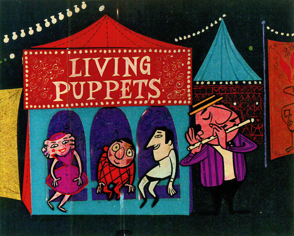
Here are some stills from that film and its artwork.
 1
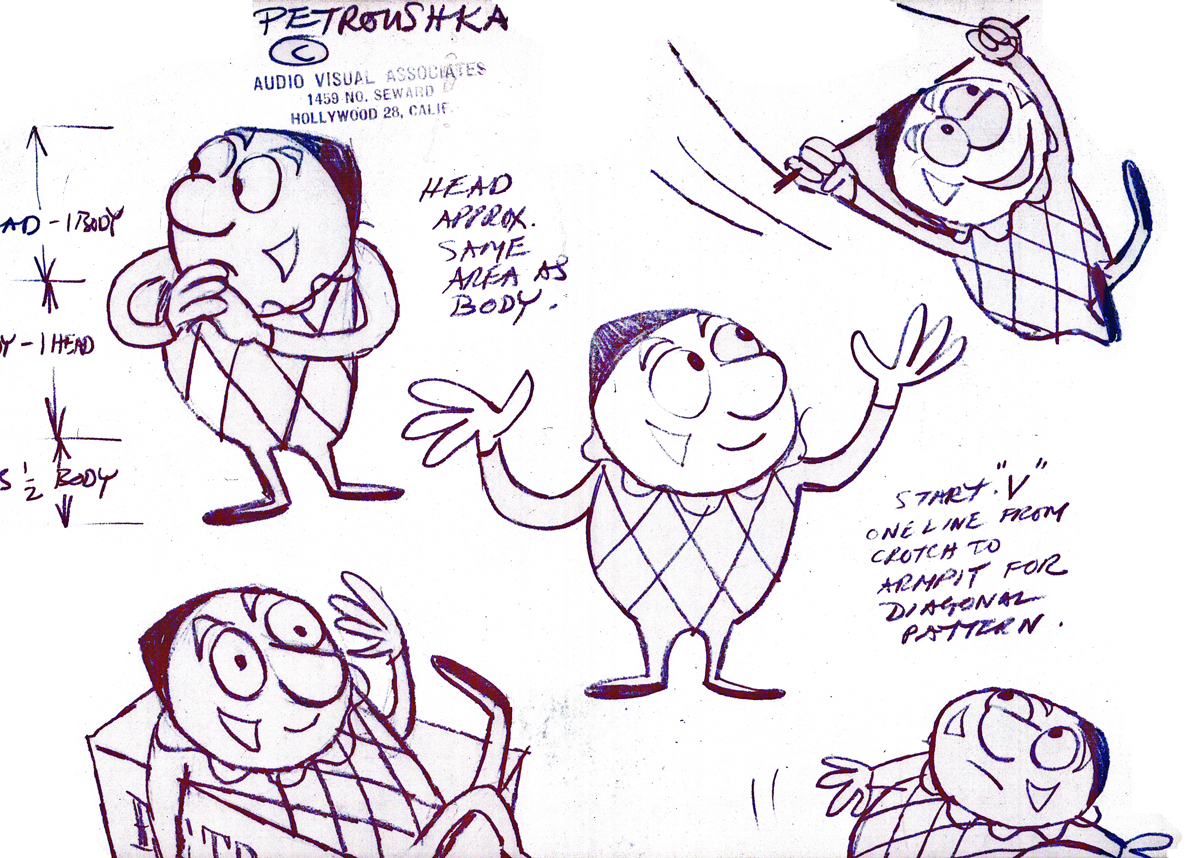
1Petroushka – model 1
 2
2
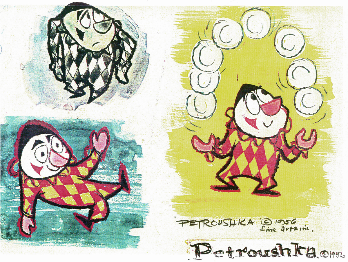
Petroushka – model 2
 3
3
Petroushka – model 3
 4
4
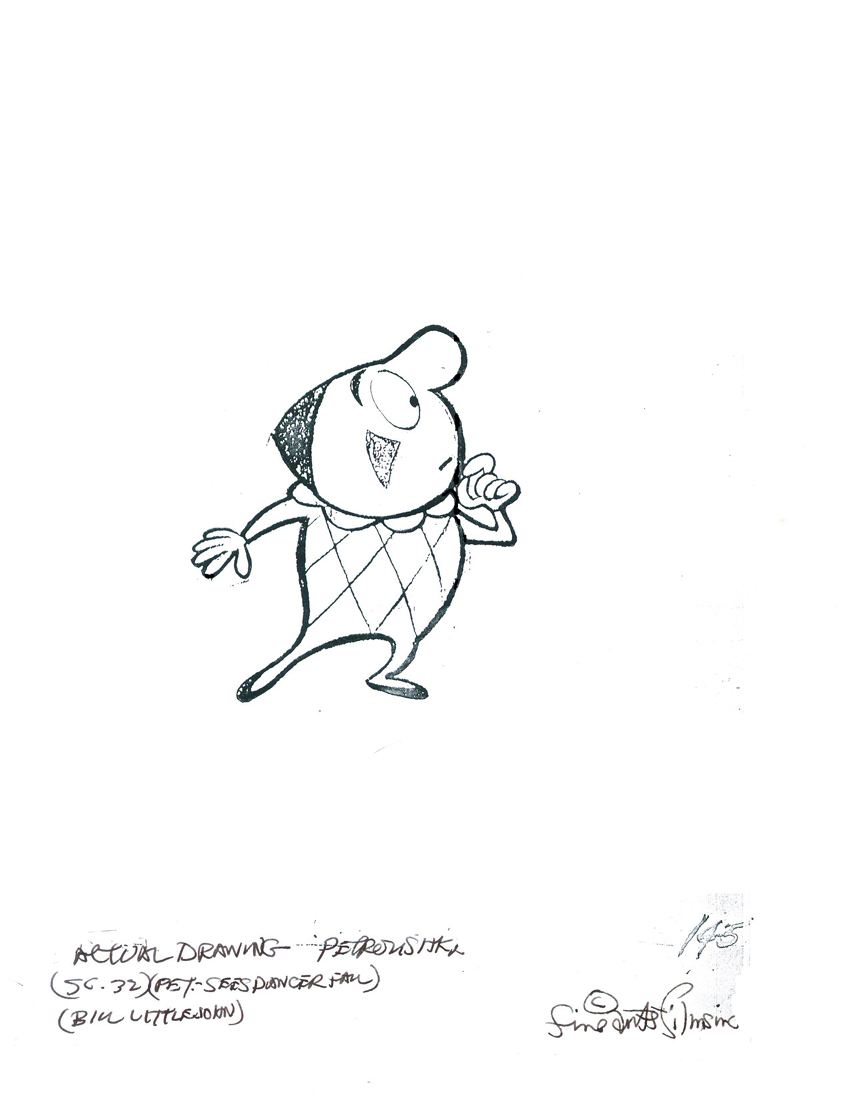
Bill Littlejohn drawing
 5
5
film still #1
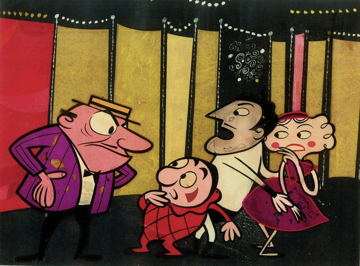 6
6
film still #2
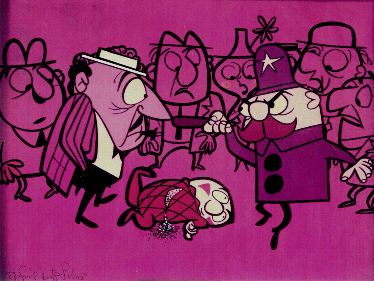 7
7
film still #3
 8
8
film still #4
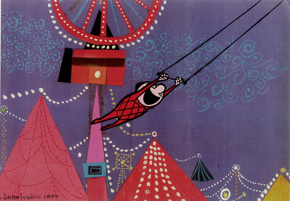
 9
9
film still #5
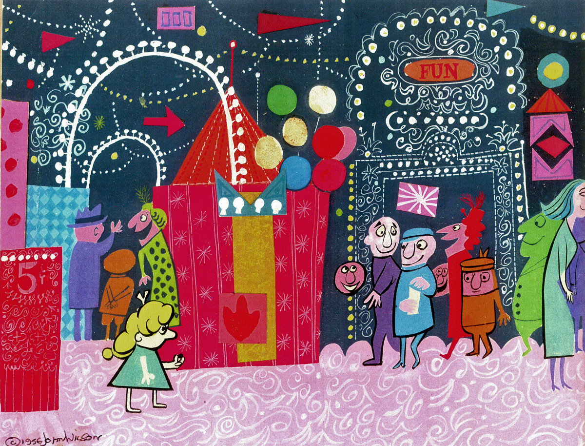
 10
10
film still #6
 11
11
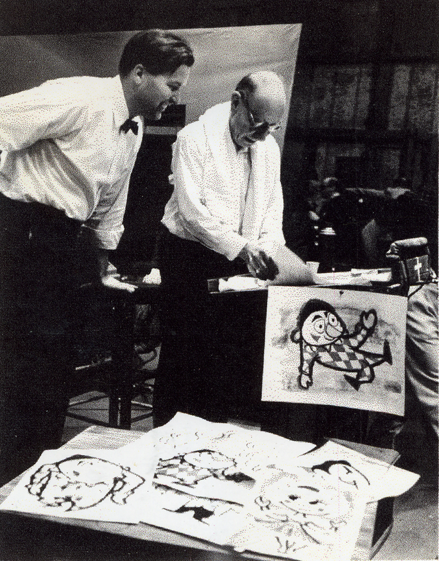
John Wilson and Igor Stravinsky preparing for recording of Petroushka
with the Los Angeles Philharmonic Orchestra (1955).
Here are copies of two reviews:
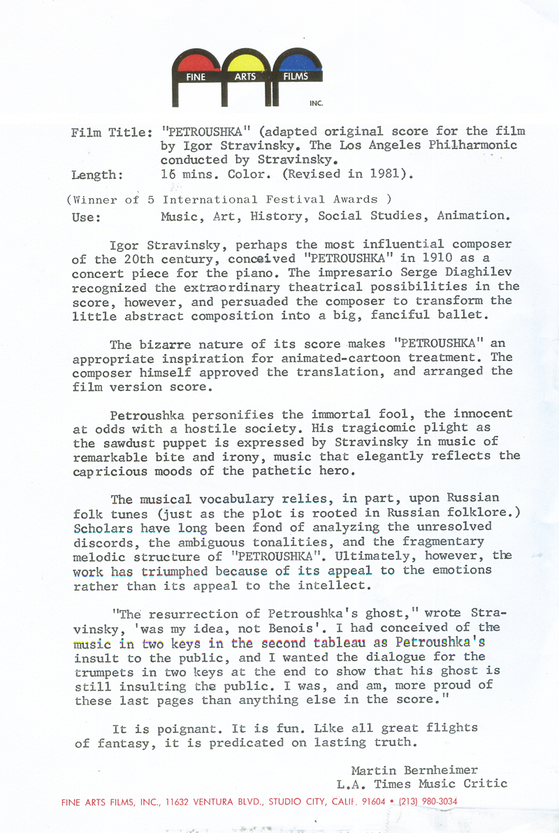
Los Angeles Time review (1956)
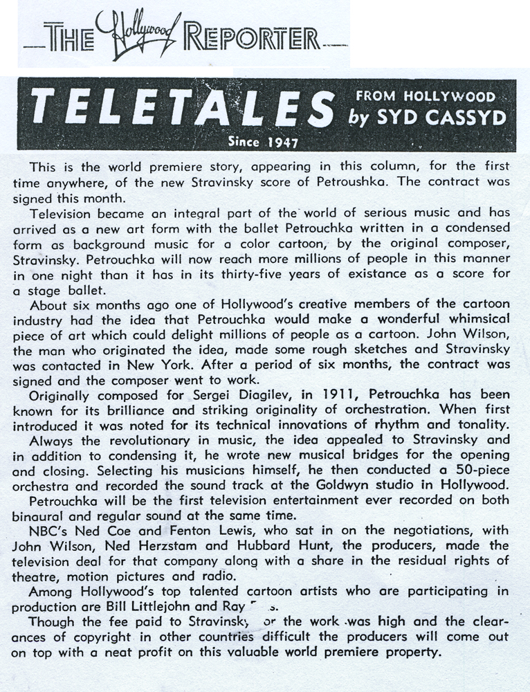
Hollywood Reporter review )1956)
(Click any image to enlarge.)
Petroushka was released on VHS tape combined with a number of the song pieces he did for the Sonny and Cher program. This tape, John Wilson’s Fantastic All Electric Music Movie, can still be found on Amazon but is pricey.
Thanks to Amid Amidi for the material.

on 16 Jan 2012 at 9:52 am 1.James Tim Walker said …
Thanks for the interesting posts on John Wilson. He gave me my first job in animation back in 1969 on “Shinbone Alley”. It’s been 42 years of fun ever since. Thanks John for getting me started and thanks Micheal for your interesting post.
on 16 Jan 2012 at 5:51 pm 2.The Gee said …
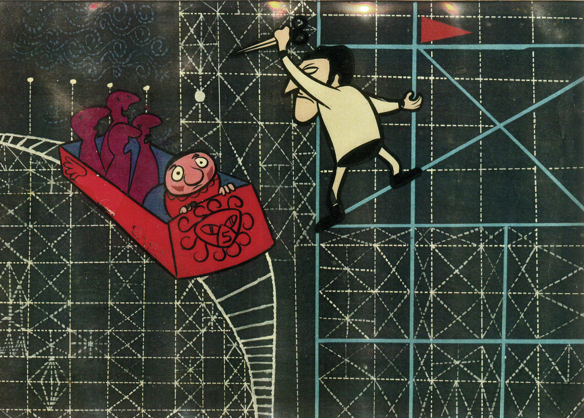
Frame Still #6
I’d love to see how that plunge works out. Hopefully, it didn’t involve cutting to a close up.
——————-
It must’ve been cool that back in the 50s, network TV was so open to showing something like this. But, I guess if network TV was open to having something called a “music hour†then anything was possible. (on the last part, I kid. There were probably many of those types of shows that ran for years at a time, like Lawrence Welk’s show)
And, okay. The makeup on the main character’s face. It is simple marks on his cheeks but in addition to the design following the form, it changed from pointing one way to another. hmmmm….a pointless observation, sure. But, I’m just surprised to see it.
on 17 Jan 2012 at 2:16 pm 3.Peter Hale said …
It can be hard to decide which way a triangle is pointing, but the above stills seem pretty consistent.
The top of the triangle represents the curve under the cheekbone, the far side curves down along the jawbone and the inner side curves round the side of the upper teeth. If you feel out the shape on your own face, then rest your finger on the lower point and go “ooo” “eee” “ooo” “eee” you can feel how much movement there can be.
And also attract a lot of curious bystanders.
But a) Petroushka is a straw puppet, so the markings only the cheek hollow
and b) in this film the 2D design created is of slightly more importance than 3D accuracy
So, while the top line follows the curve of the eye making him seem more ‘alive’ when he comes to life, the contrary curve of the top triangle in still 3 emphasises the brokenness of death.
Likewise the position of the triangle in still 2, while angled too far towards his ear for anatomy’s liking, helps strengthen his expression and aids the distortion of the angle of his head.
In short, I don’t think the stills show any actual errors.
on 17 Jan 2012 at 2:21 pm 4.Peter Hale said …
oh poot – I should’a checked it first!
point a) should have read “so the markings only represent the cheek hollow
(without the rest in italics!)
on 17 Jan 2012 at 9:47 pm 5.The Gee said …
thanks.
I can see how it follows the smile lines on the cheeks.
The short end is used most often for that in those grabs.
In the Littlejohn drawing, one of the long edges is used and the acute angle is pointing down. That one seems to work with the character’s alert-curious-puppy-dog-on- its-haunches pose (or, the “What’s This?†pose, i guess).
In film still #3…they show ” the brokenness of death.â€
I probably couldn’t have explained myself better than that. It works.
on 18 Jan 2012 at 2:35 am 6.The Gee said …
by smile lines, I mean wrinkles or where dimples sometimes are on real people.
on 18 Jan 2012 at 9:59 am 7.slowtiger said …
If TV was still b/w those days and this film was planned as a TV special: why was it produced in colour? Did somebody (rightfully) assume it would have an afterlife after being aired?
on 18 Jan 2012 at 12:08 pm 8.Michael said …
Many of the DISNEYLAND TV shows were also done in color.
on 02 May 2012 at 3:37 am 9.Fabian Wilson said …
Petroushka was a film that John was so very proud of. It is sad that so little of the art work actually remains. It was stored in a warehouse that got flooded, and so much was lost many years ago — before I met John.
on 28 Jan 2013 at 9:58 pm 10.Carol Erickson said …
We have some storyboard watercolors at the Chuck Jones Gallery by Dean Spille. He worked on many Charlie Brown Specials. You can see these at chuckjones.com under new releases. Very charming art pieces.