Animation Artifacts &Fleischer &Layout & Design 20 Jun 2012 05:36 am
Paramount Bgs & Gulliver Teaching Aid
- For the past few weeks, I’ve been posting artwork from Vince Cafarelli‘s collection of animation artifacts. We’re coming down to the remainders in this box, and I’ll post most of it. There are a few color Background originals.
At first viewing, I thought these were possibly from Terrytoons, (here is a past post I did of Terry Backgrounds I own from the late Thirties) but they have a slickness that Terry Backgrounds wouldn’t have had. They also lack any sign of the glorious whimsy the Fleischer Backgrounds had. These, no doubt, come from Late 40s Paramount cartoons when Bob Little was the principal artist. There’s ample use of airbrush over the bright tempera colors. (I don’t remember seeing airbrush in any Terry cartoons of this period.) Physically, they were all done on bristol board and separated from the card back. This is also true of all the Terrytoons Backgrounds I’ve seen.
I’m sorry to say that I can’t ID any of these Backgrounds or tell you what films they’re from. Were I able to do that we might have been able to figure out who did them. If you know anything about them, anything at all, your comments would sure be appreciated, and I’ll keep updating the post to make sure they’re noted.
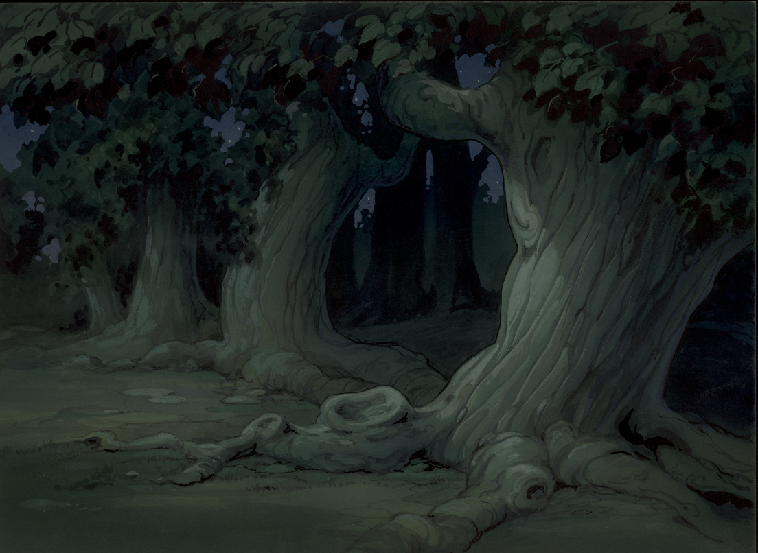 1
1This first one does a nice job of setting the mood for the scene.
 2
2
from Song of the Birds
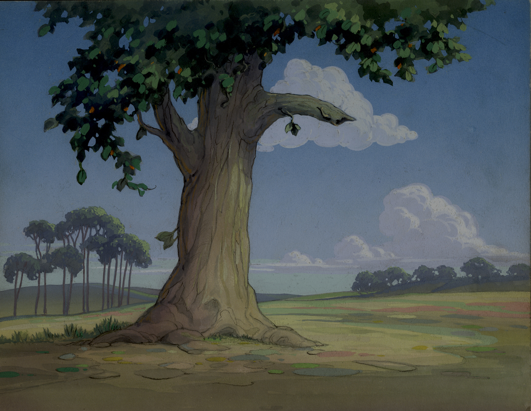
This one doesn’t really do much other than be a background.
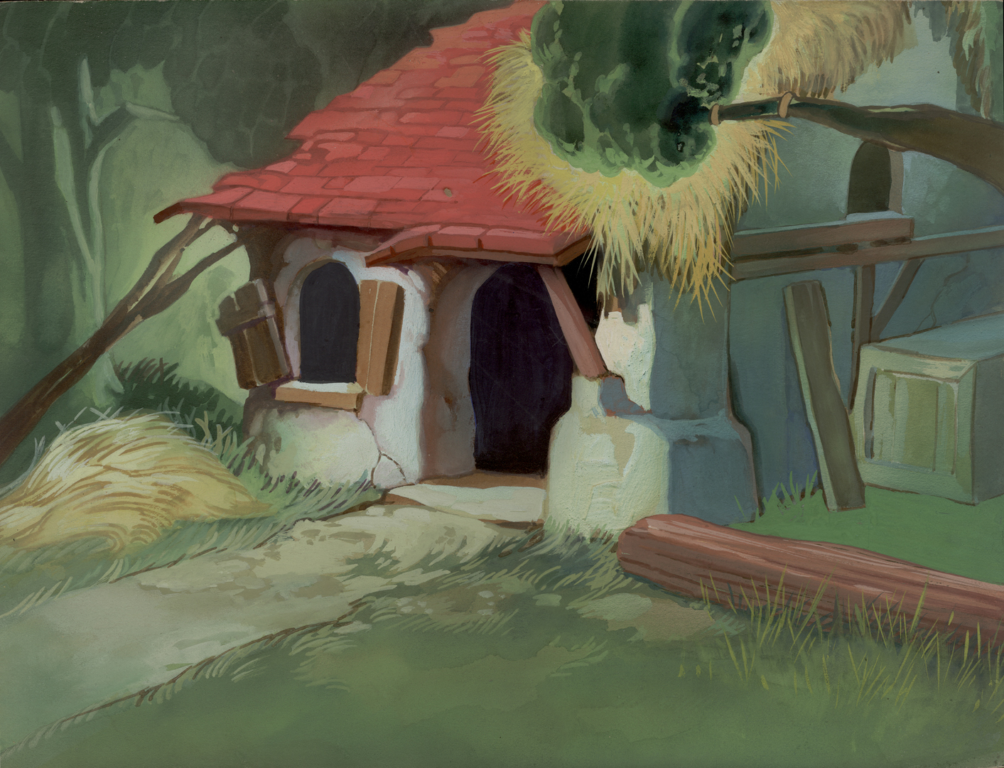
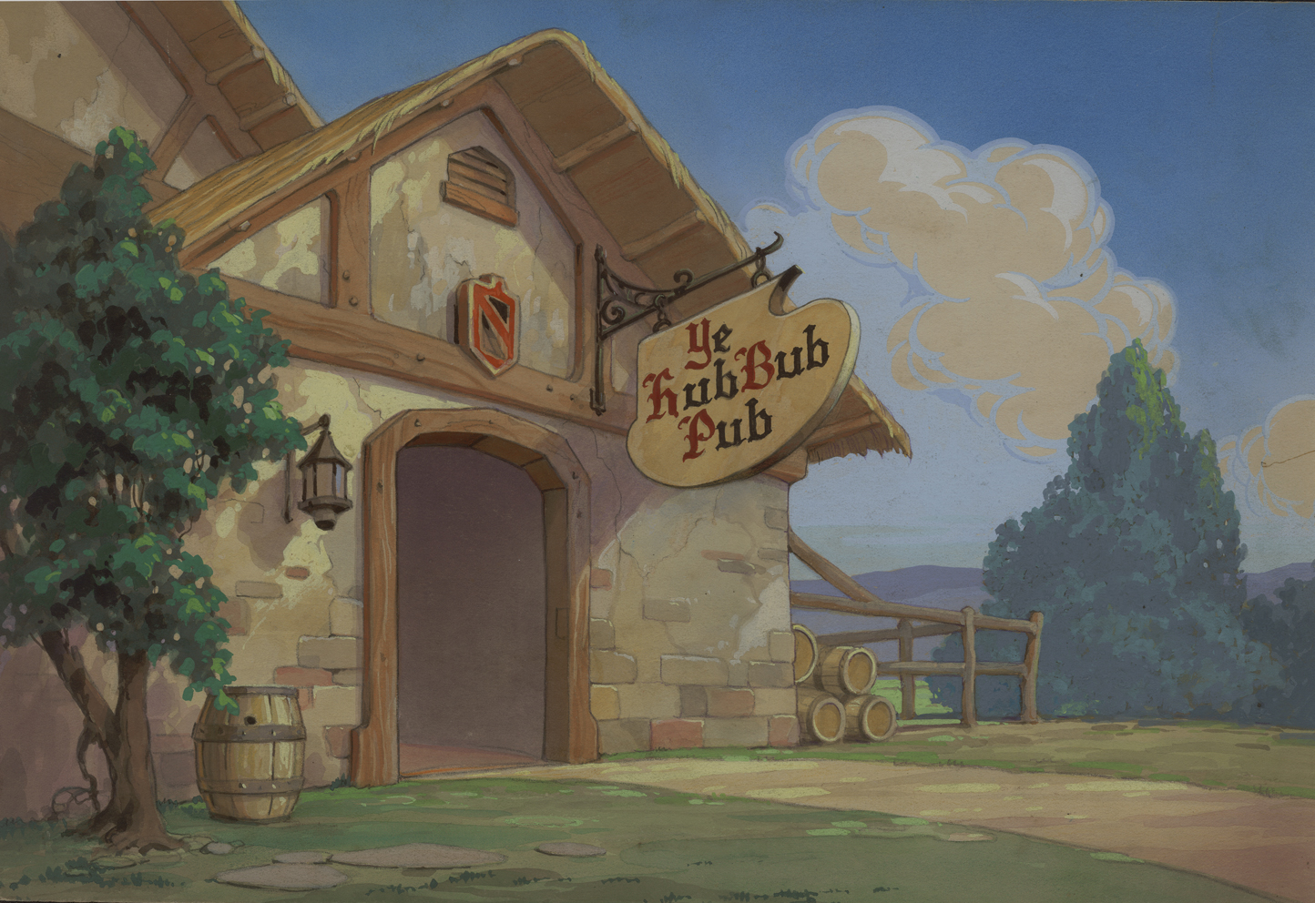 3
3
from Robin Hood-Winked
This tavern really does set up the scene. As a matter of fact,
it’s so specific it should be one of the easiest to identify.
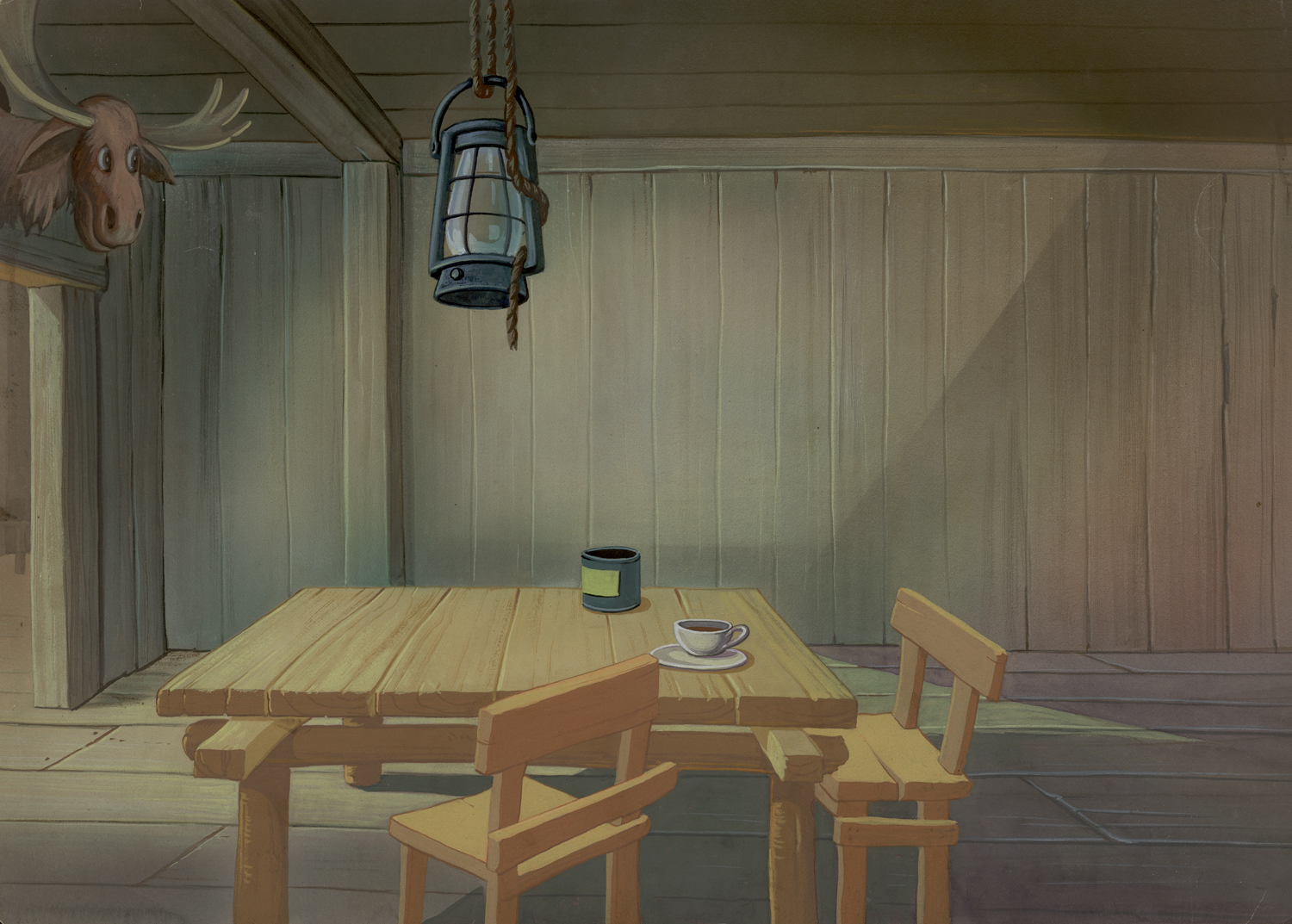
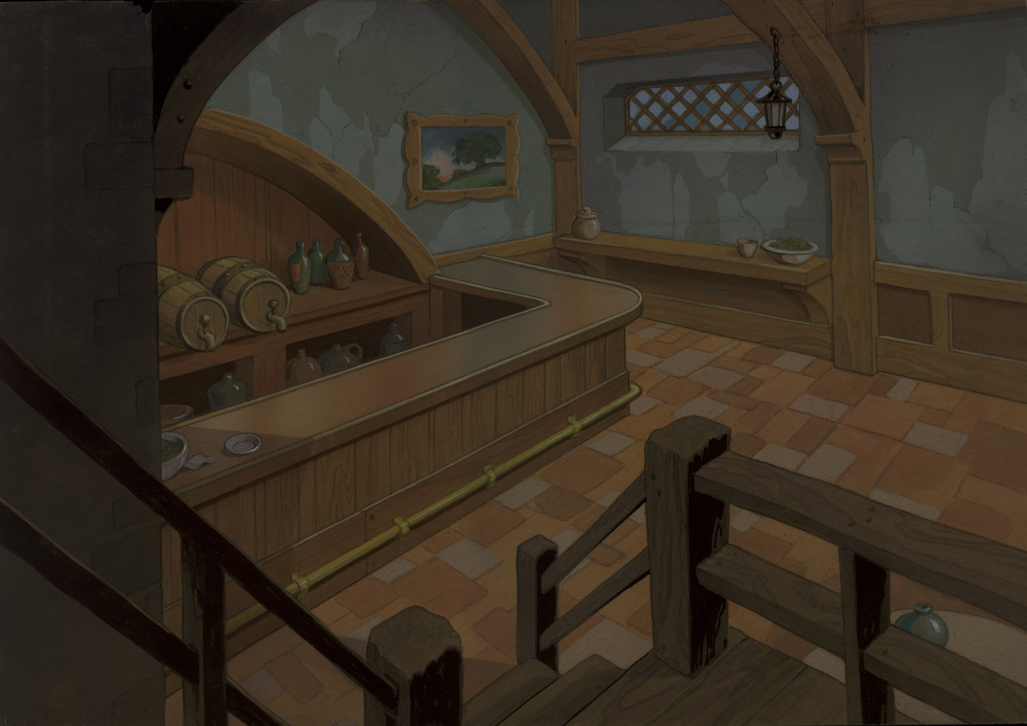 4
4
from Robin Hood-Winked
This interior is also more specific than most of the
Paramount Bgs of the period and feels as though
it may have come from the same film as the tavern, above.
 5
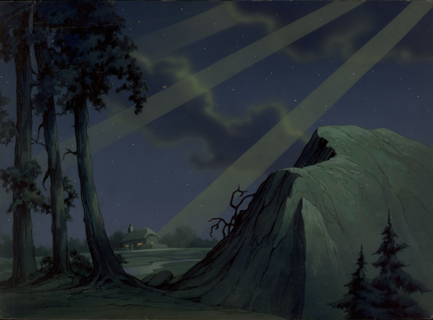
5
from Lumberjack and Jill
This one is so generic it may have come from any of a hundred
films of the period. It’s the Bg that felt like a Terrytoon to me.
 6
6
This Bg feels closer, stylistically, to #4, above,
than to #5. There’s a lot of airbrush in it.
 7
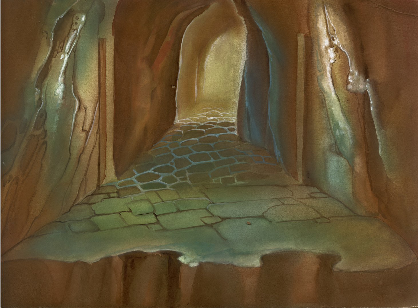
7
This Bg seems to have some chalk used on the white stone
of the building’s exterior. It reminds me of several other
Disney Bgs – not as good as Disney, but similar in feel.
 8
8
from Leprechaun’s Gold
Who knows what this Bg is. I guess god’s
looking down on the inhabitants of the hutch.
- As a bonus to add to these Backgrounds, here’s something completely unrelated.
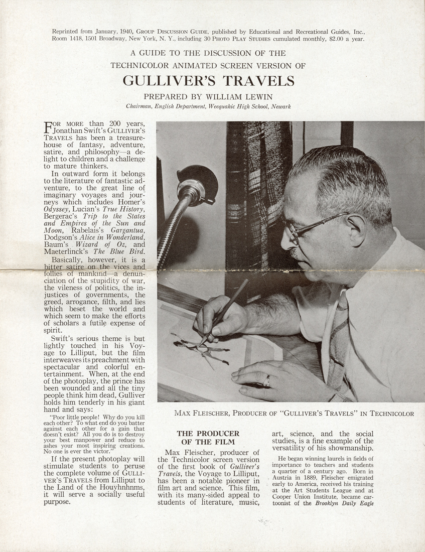
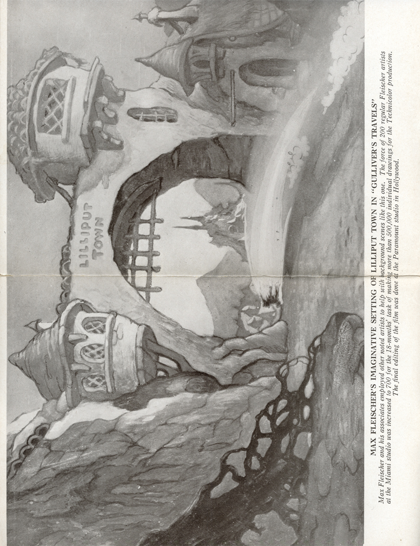
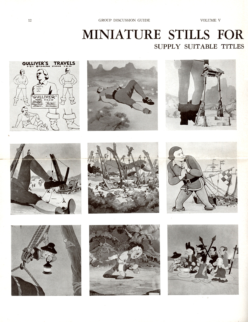
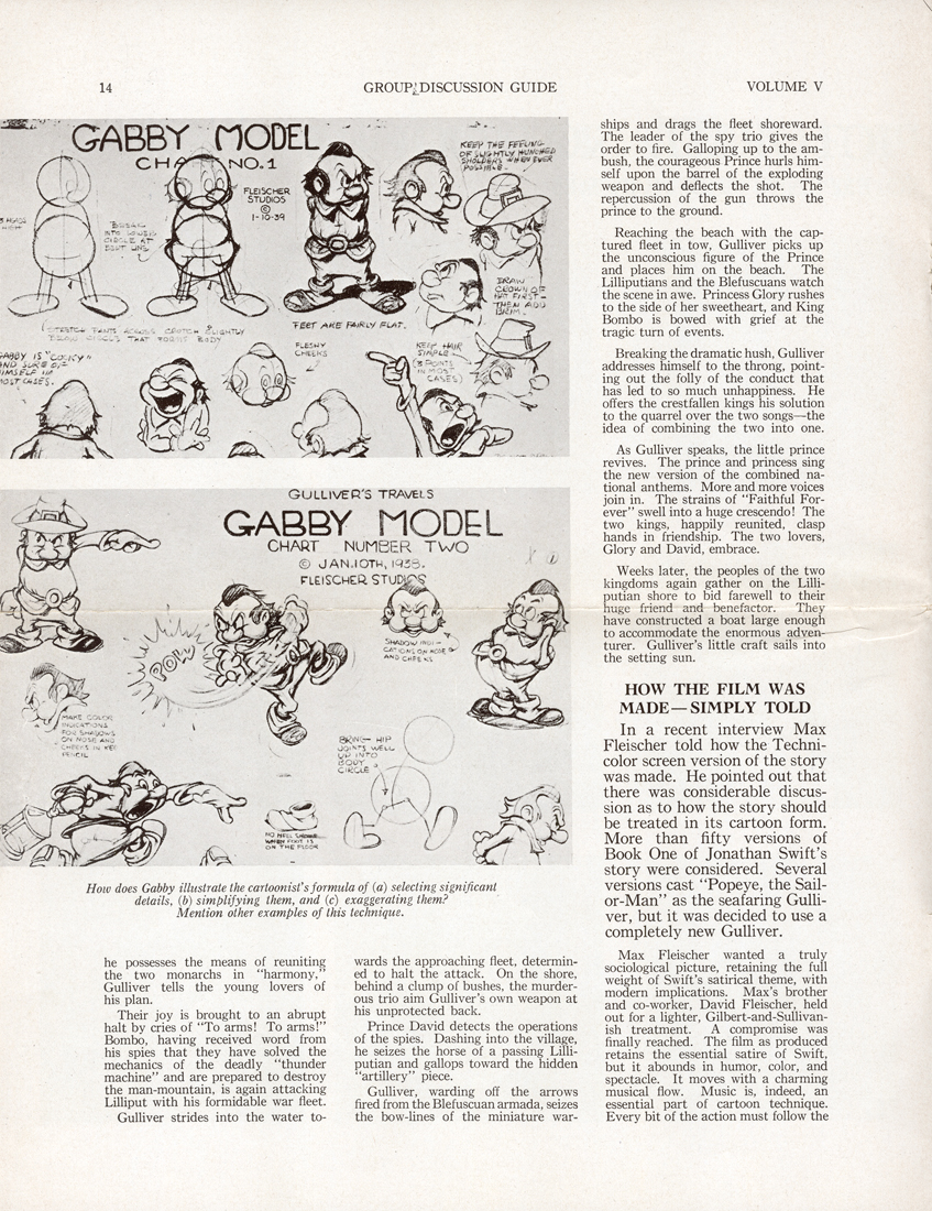
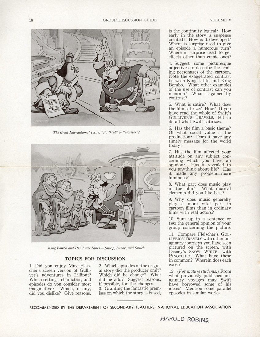
Today, when children’s films are distributed non-theatrically (meaning to schools and libraries) a teaching aid accompanies the film. This is usually a two or three page piece which gives information on how the film can be used to teach whatever subject to the students. This form has developed in quite a sophisticated way so that it is often very helpful to the teacher or librarian.
Within Vince Cafarelli’s collection of art and artifacts, there was a teaching aid – which seems half designed to be a give-away to students. It’s a primitive form of what is standardized today. The printing of the piece is quite rich on semi-gloss paper with nice B&W photo reproductions of stills from the film. I thought this would be of interest to some of you out there.
 1
1(Click any image to enlarge.)
 2
2 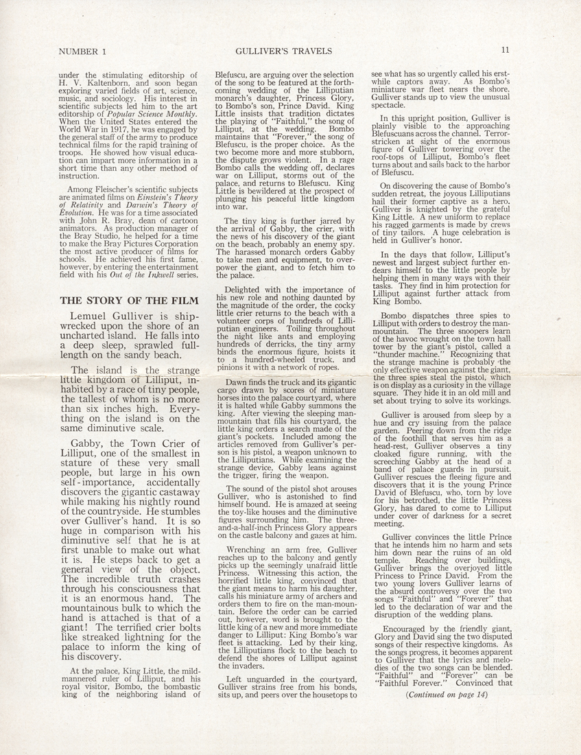 3
3
 4
4 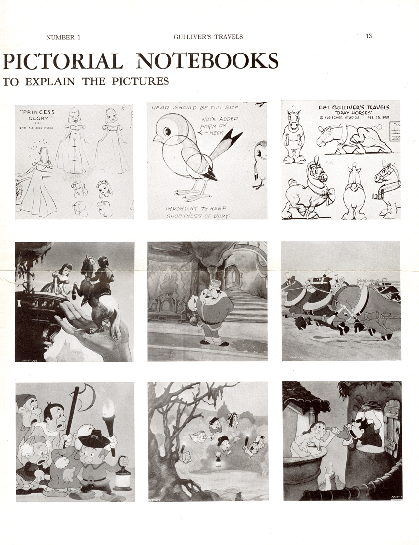 5
5
 6
6 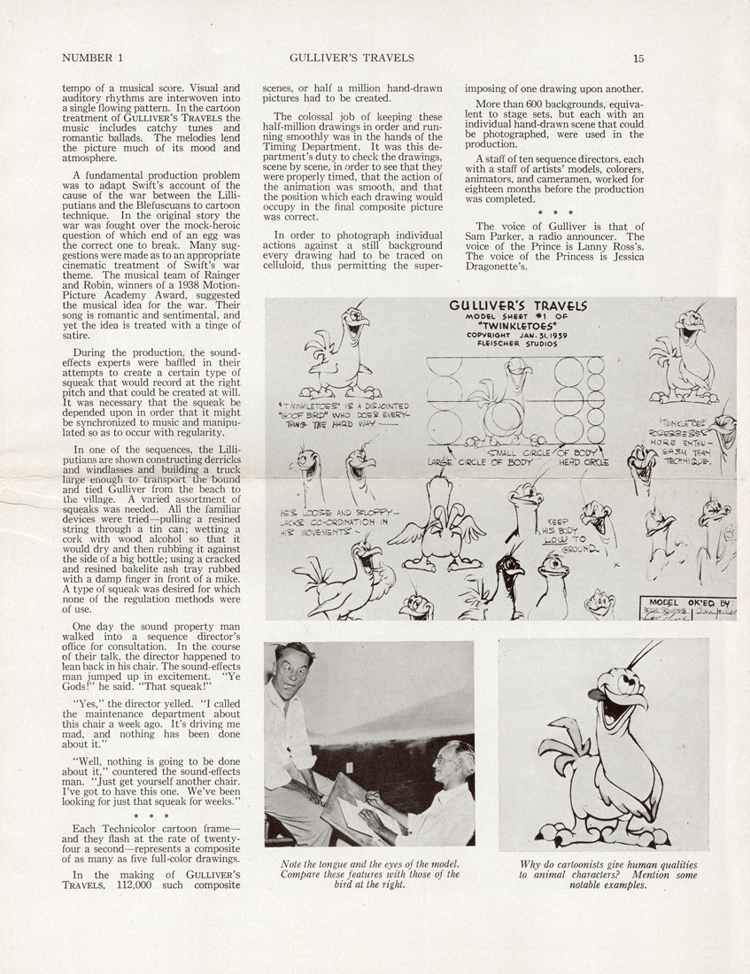 7
7
 8
8

on 20 Jun 2012 at 8:27 am 1.Yowp said …
Hubbub Pub is in “Robin Hood-Winked,” bgs. by Bob Little. The tavern is the next bg. in the cartoon.
on 20 Jun 2012 at 9:41 am 2.J Lee said …
The last background is also Little’s, from 1949′s “Leprechaun’s Gold”, which along with 1947′s “The Wee Men” were Bill Tytla’s most serious attempts to do Disney-style cartoons at Paramount. The first one, done with Al Eugster as head animator, actually succeeds quite well; the latter, featuring a more trite story and apparently Little Audrey’s Irish cousin (foeshadowing “The Patty Duke Show” I guess), was weaker and no further follow-ups were done.
on 20 Jun 2012 at 10:26 am 3.Bob Jaques said …
#5 (the ‘generic’ one) is from Lumberjack and Jill – a Popeye cartoon.
Are there production numbers on the paintings??
on 20 Jun 2012 at 10:42 am 4.Pierre said …
Many of the images are awfully dark. Are the originals like this?
The paintings seem to be so nicely rendered that it would be nice to see all the details and color of the originals (unless of course if this is truly how the originals look).
Just curious!
PIerre
on 20 Jun 2012 at 3:14 pm 5.Michael said …
Bob: There are no indications or numbers on any of the Bgs. Even the back of the Bgs is void of any indicators as to where they’re from. None have pegs.
Perre: I scanned and color adjusted the BGs on line with the originals in front of me. The luminance of one monitor to another may be a difference, but the images on my monitor matched the originals pretty close. They were dark and a bit on the gray side.
on 20 Jun 2012 at 6:14 pm 6.Kevin Martinez said …
The second BG appears to come from Song of the Birds, a Little Audrey from 1949.
I’d sure like to see the actual cartoons looking as nice as these BG’s, Red-faded Eastmancolor prints don’t do much for these cartoons’ aesthetic appeal.
on 20 Jun 2012 at 7:39 pm 7.Thad said …
Mmm, I love Famous color styling! Even that ‘generic’ one from LUMBERJACK AND JILL. How can you not love a BG with a decrepit moose head?
on 20 Jun 2012 at 10:10 pm 8.Charles Brubaker said …
I think some of the BG painters at Famous also worked at Terry at some point. I know John Zago worked at both studios.
on 21 Jun 2012 at 10:02 am 9.Bob Jaques said …
Thanks for taking a look. The BGs were trimmed for some reason. Any originals I have seen include the pegs, production number, scene number, and approval signature. With the aid of production numbers I would have been likely to match the unknown BGs to cartoon titles.
on 21 Jun 2012 at 4:58 pm 10.The Gee said …
“How can you not love a BG with a decrepit moose head?â€
It is a sign of quality story, no?
Seriously, you can’t just slap a moosehead on the wall without a good reason.
The very presence of one says where the story takes place and says something about at least one person in the cartoon/story/whatever.
It is like a suit of armor in a haunted house comedy. Hopefully, it, like a moosehead, is never gratuitous.
on 21 Jun 2012 at 5:41 pm 11.Mark Sonntag said …
They’re quite nice, OK they’re not Disney, but they are well executed and I kind of like the subtle stylization of them. Maybe it wasn’t intentional but they don’t seem to be trying to be realistic.
on 23 Mar 2013 at 8:17 am 12.Ray Pointer said …
“So they’re not Disney.” They don’t need to be. Disney is not the only approach. Is an Andrew Wyeth, Maxfield Parish, or Salvadore Dali any better than a Picasso or Jackson Pollack? Much of this is a perception of the mind. It might be interesting to place actual BGs between the two studios and compare. As skilled as color Disney BGs seemed to be, it might be revealing to see how closely the painting techniques and execution between the two studios match. This comes down to the individual skill of the BG painters as well as the Art Direction combined with time factors. Frankly there are some Fleischer and Famous BGs that look a bit rushed due to deadline issues, while others seem more carefully done. What really mattered was how they photographed. The public seeing them on screen was not really studying them as one would for Fine Art since that was not their purpose. They are still beautiful to look at, and educational in terms of painting techniques. Very inspiring. Thank you for posting these.
on 05 Oct 2017 at 6:21 pm 13.dread said …
“Is an Andrew Wyeth, Maxfield Parish, or Salvadore Dali any better than a Picasso or Jackson Pollack?”
Yes.