Animation Artifacts &repeated posts &SpornFilms &Title sequences 08 Jul 2012 07:05 am
Prince of the City – recap
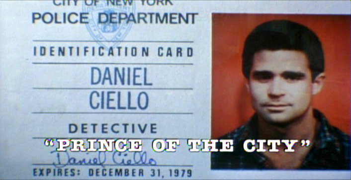
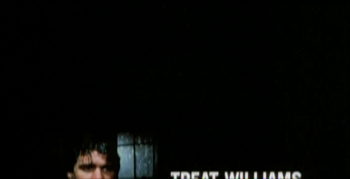
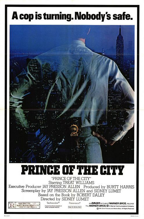 - One of my studio’s very first jobs was to do the titles to a big Sidney Lumet feature film, Prince of the City. (Feb, 1980) The film was a hard-nosed crooked cop drama brilliantly directed by Lumet. The problem it had was that few of the actors in the large cast were known, and the audience was having a recognition problem. Treat Williams was in his break-out role and the only other identifiable actor was Jerry Orbach.
I was hired to ID all of the cops, lawyers, good guys and bad with what-looks-like live action identification cards. I also did title cards throughout the film, breaking it into chapters. Finally there were the end credits (no opening credits.)
I pulled in a friend and film genius, Phillip Schopper. Together we shot the actors with Polaroid film trying to make the photos look a bit cheesy, as the real items would. Phillip took the Polaroids and doctored them to our needs. Treat Williams, for example, had moved onto another film and came back only for these photos. His hair was now jet black for the new movie, so Phillip had to recolor his hair in the doctoring (in those years before computers.) Jerry Orbach had a blemish on his lip that he wanted retouched. There were plenty of little things to deal with on the photos.
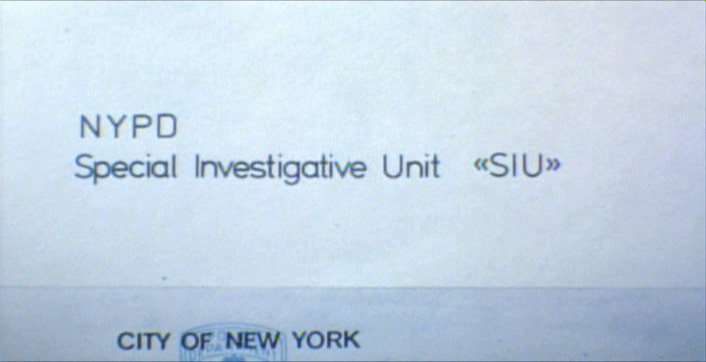
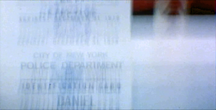
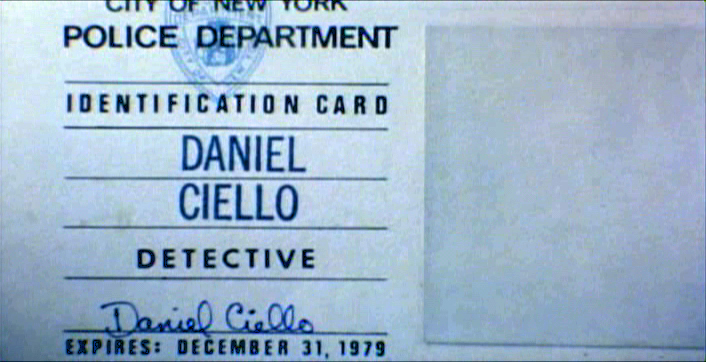
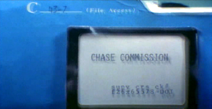
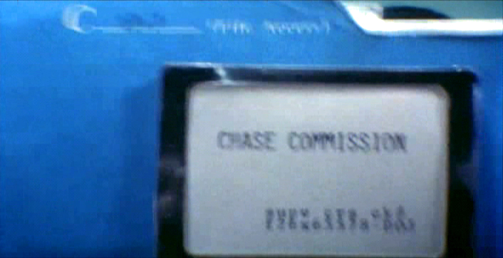
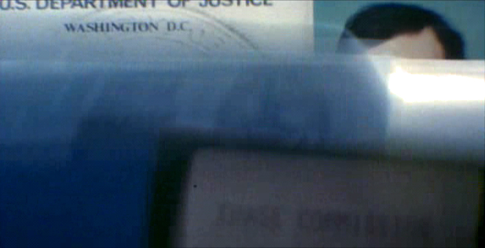
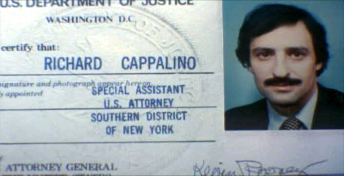
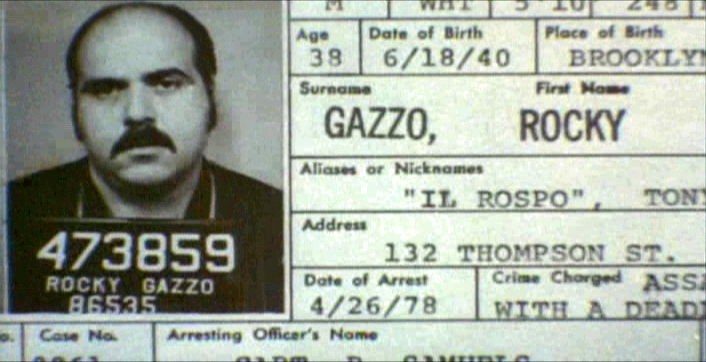
I had to locate the real identification cards (NYC police dept, NYState Supreme Court judges and DA’s, etc.)
Then I had to forge them. I worked with a printing shop in NY that didn’t ask questions. We chose to actually print the cards as if they were done via mass production so that they would look authentic. The cards should have that slightly embossed feel as if the letters were pressed into the card stock. (Printing these days has the type laying on the paper without pressing into it.) I also had to find appropriate paper and laminating machines to get the actual look of these cards. This was all done before the wide use of computer technology.
We had to film the sequences.
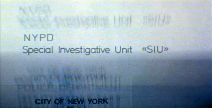
We worked with animation cameraman, Gary Becker for about a week and took over his Oxberry. We built miniature sets to hold the ID cards at odd angles, and we relit the cards with shadows built in. We wanted these cards to have a gritty reality to them that an animation stand didn’t generally offer.
The cards were animated moving as if a machine were printing them or a folder were being opened or papers were being tossed aside. This involved a lot of work getting out-of-focus images in the animation. When a folder opens, it moves in soft focus. The folder will pick up the top sheet and let that drop back again. We had to manipulate this all in stop motion to get it to work properly.
(Click any image to enlarge.)
 2
2 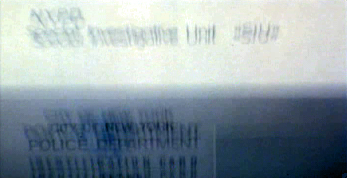 3
3
 4
4  5
5
 6
6 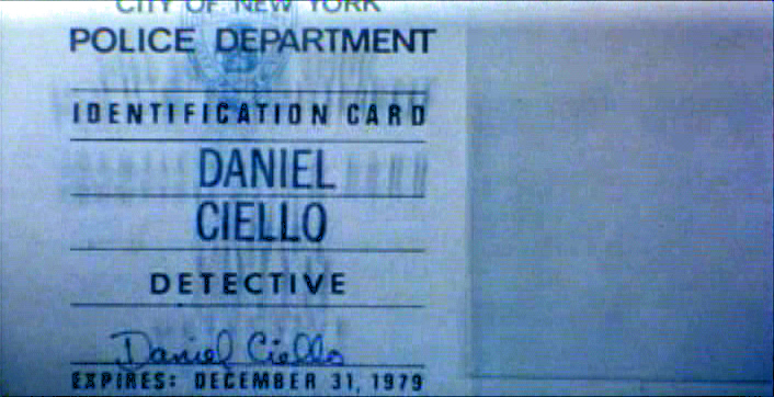 7
7
 8
8 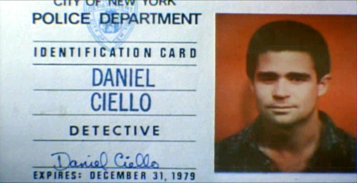 9
9
 10
10
These cop cards (about five of them – one for each
of the five cops) appear twice. Once for the new enthusiastic cops.
Another for the tired and jaded cops.
There were about 8 insert sequences about a minute each.
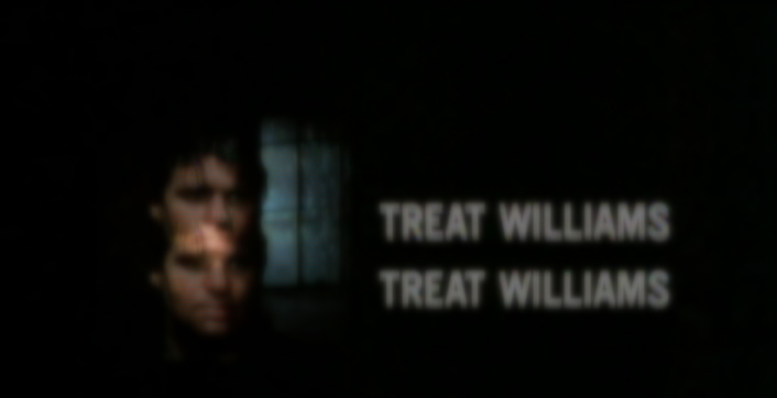
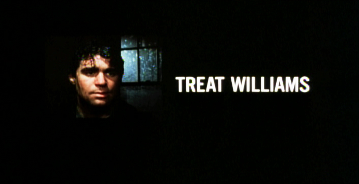
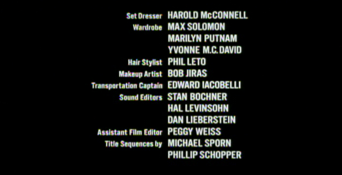
When it came time for the end credits, we chose to include photos of the actors with their names so that people would be able to recognize them from the film, without having to have had to memorize their characters’ names. We pushed these cards up as if a machine were printing the titles, a card at a time. The cards had to move in out-of-focus, as well. It was long and arduous shoot.
 2
2 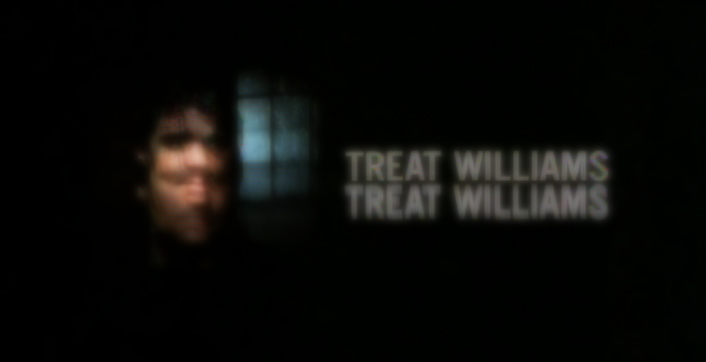 3
3
 4
4
All of the credits came up at varying speeds, timed to the music.
This was helpful in that all titles go through changes after they’re done.
Our system gave us a lot of flexibility to addd or change cards as
necessary without having to reshoot them all.
Sidney Lumet didn’t want me to have a company credit. I couldn’t include the studio name, Michael Sporn Animation, Inc. because he felt that people would try to figure out what was animated. He didn’t want them to know there was any animation in the film. Hmmmm.
I put both my name and Phillip’s as doing the titles and insert shots.
 1
1 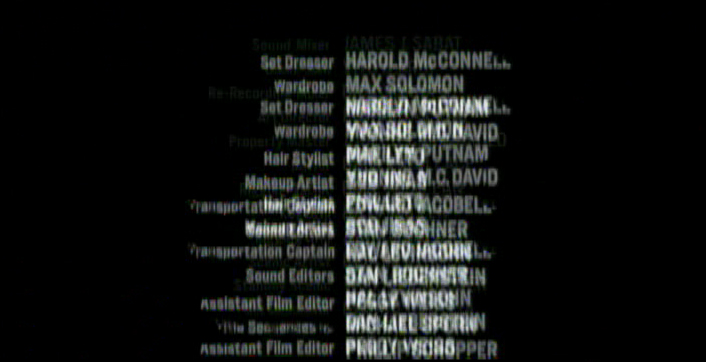 2
2
 3
3
There’s actually a four frame fade out of the old credit list
as the new list zips up and in / out-of and into-focus.
I did quite a few other title sequences for Sidney as a result of this job, and I was pretty proud of the film and the job that I had done.
 1
1
Records in a folder. The embossed stamp was a headache.
We shot the back of a card’s actual stamp in shadow, then we
printed it on a document in reverse on the front of our card.
 2
2 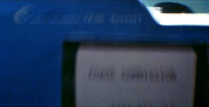 3
3
 4
4 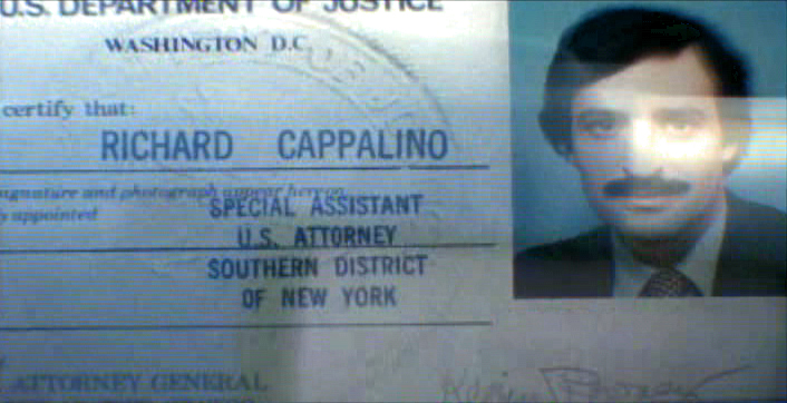 5
5
 6
6
.
 1
1
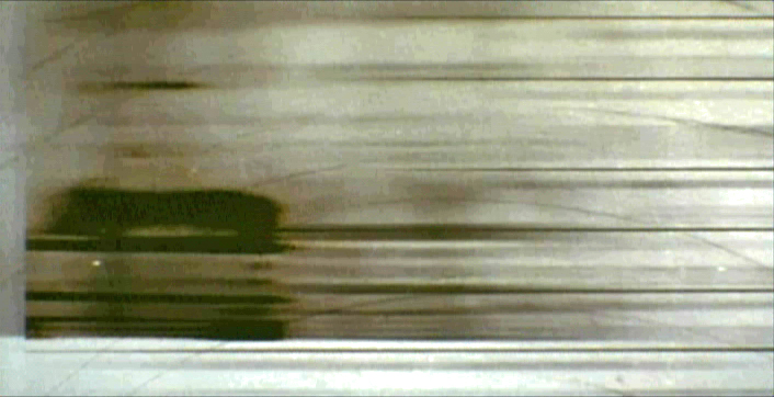
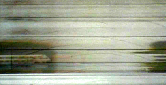
The microfilm look for mug shot records.
The slightly bad guys in B&W.
 2
2 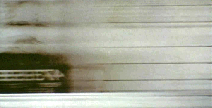 3
3
 4
4

on 08 Jul 2012 at 10:40 am 1.Alfred von Cervera said …
Wow, what a wonderful idea to introduce the characters. Animation helping storytelling. I will try to look for the movie. Thanks for the post
on 08 Jul 2012 at 12:47 pm 2.Scott said …
Great work in a great movie. Just watched this back to back with Serpico recently–both hold up beautifully, and make me miss a more “gritty” less polished (albeit more emotionally involving and ultimately better) films with ambiguous elements.