Monthly ArchiveNovember 2008
Animation Artifacts &Daily post &Story & Storyboards 20 Nov 2008 09:02 am
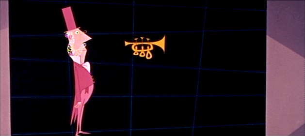
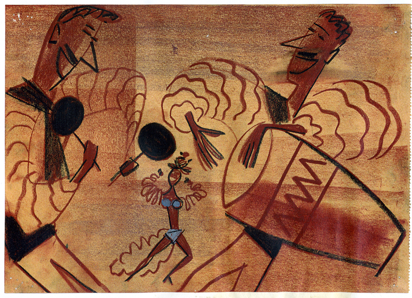
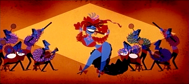
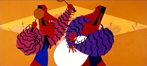
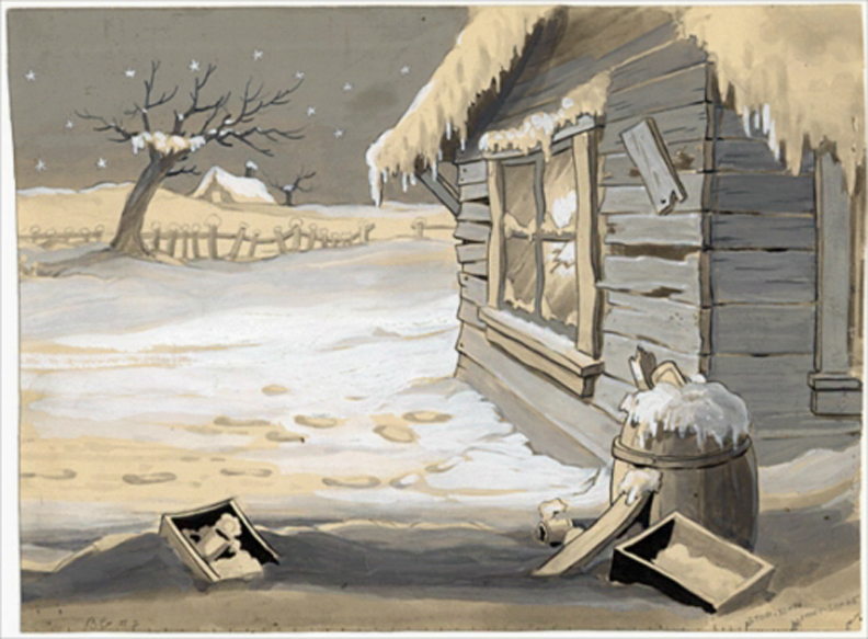
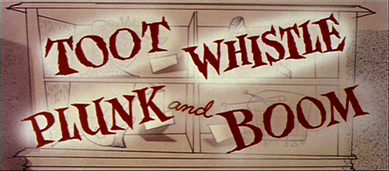
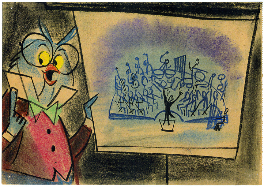
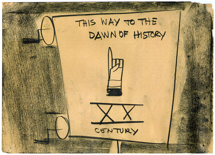
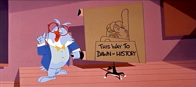
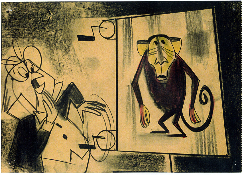
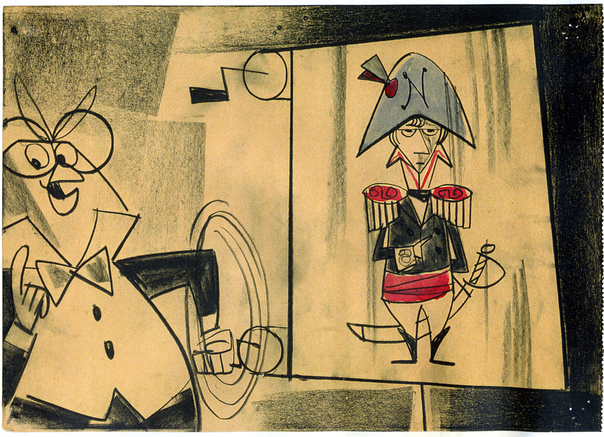
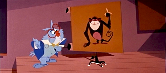
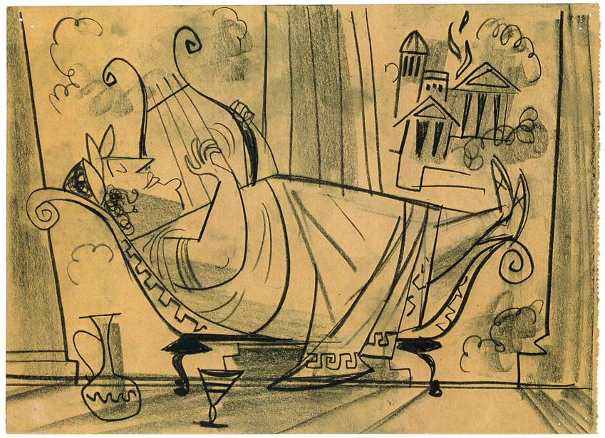
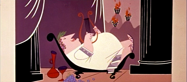
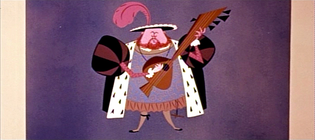
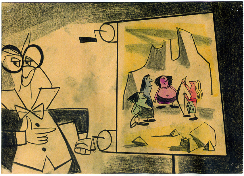
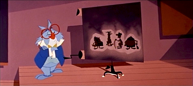
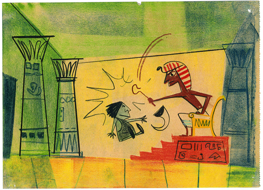
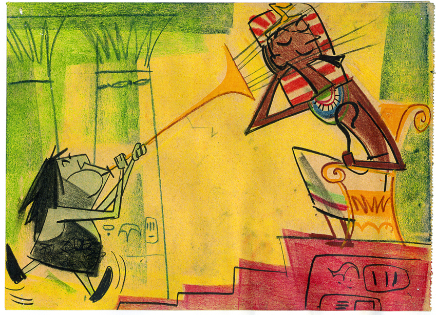
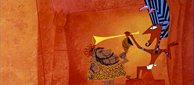
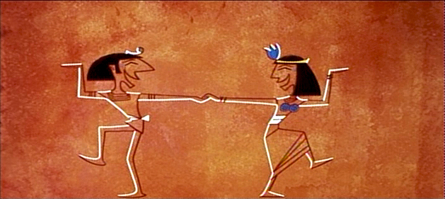
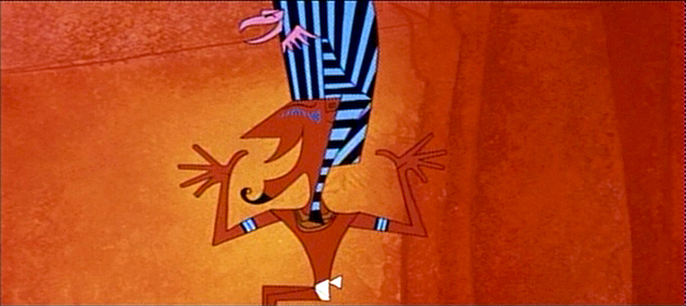
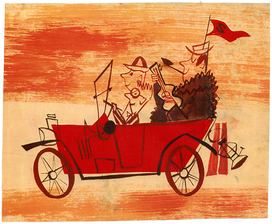
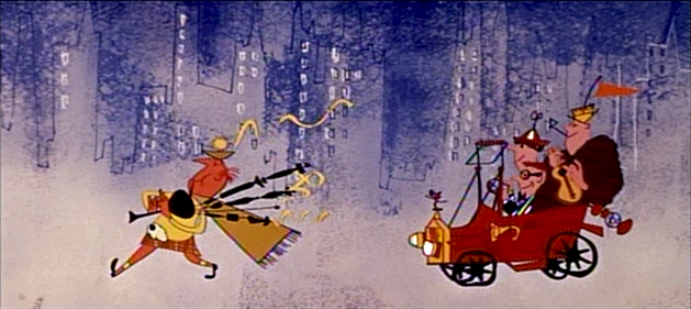
Toot Art – 4
- Here are the last of the color stats of art from Toot Whistle Plunk & Boom. They were loaned me by John Canemaker to whom I’m enormously grateful.
As with past posts, I’ve interspersed some frame grabs from the film to show what the final designs looked like for comparison’s sake.
(Click any image to enlarge.)
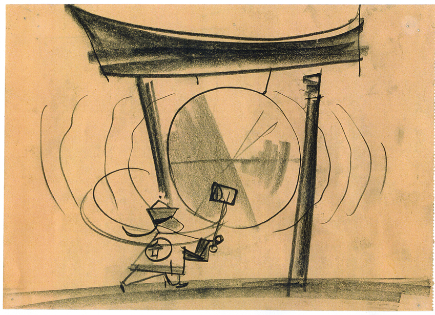
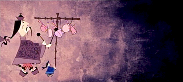
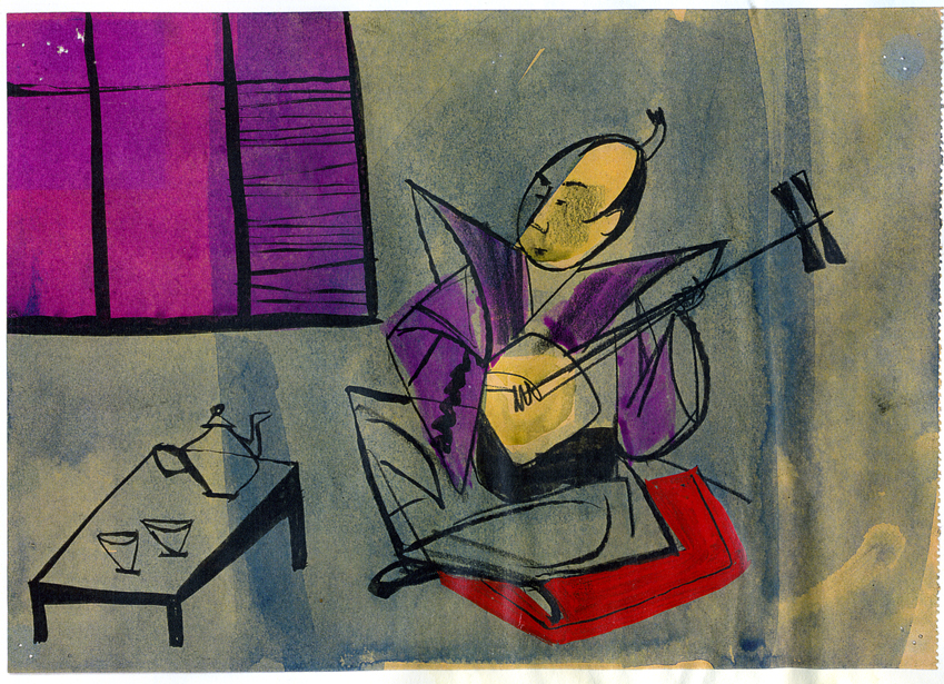
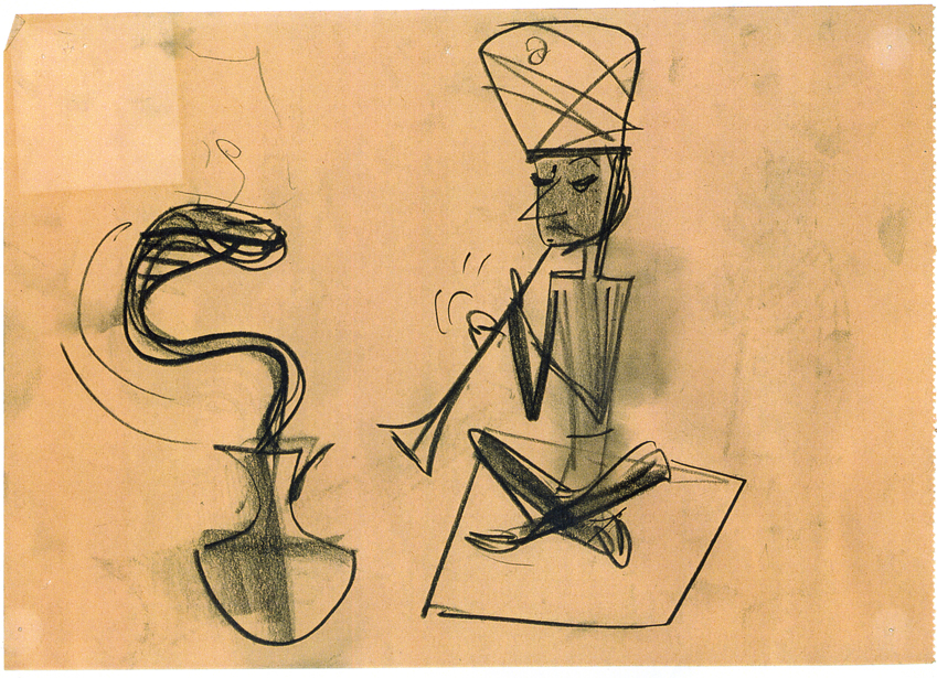
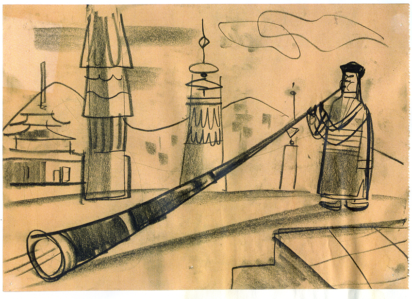
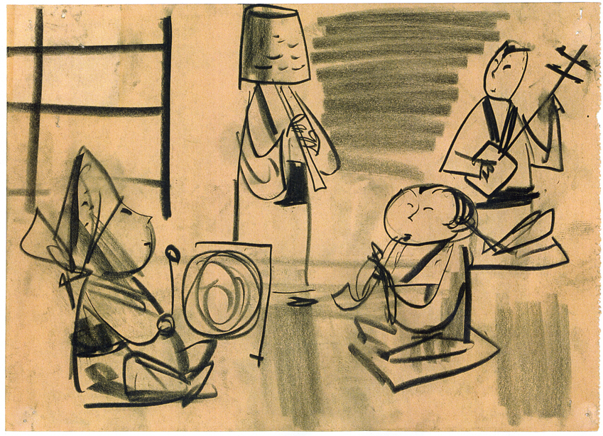
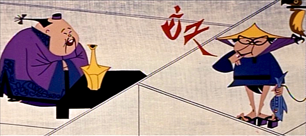
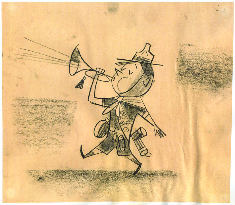
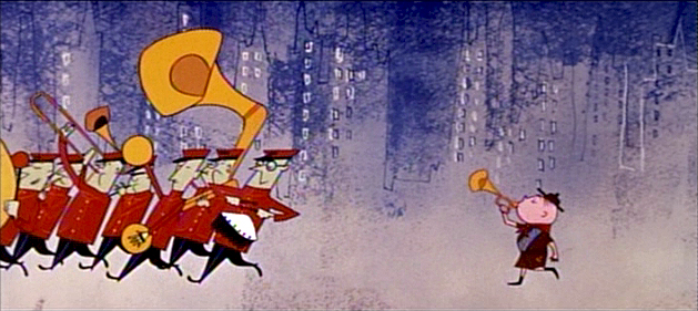
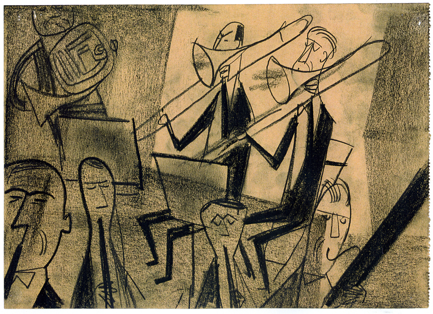
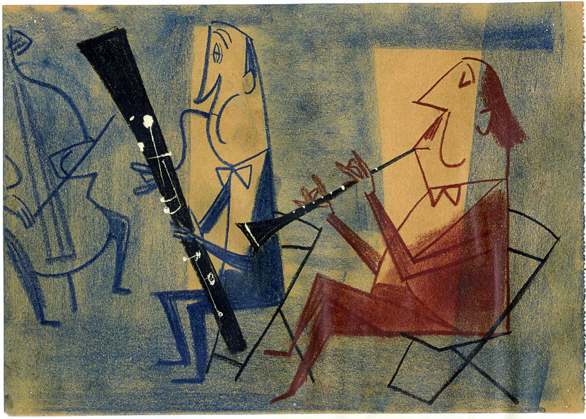
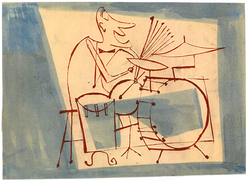
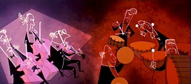
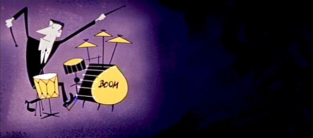
Ward Jenkins has many more frame grabs from the entire film on his site.
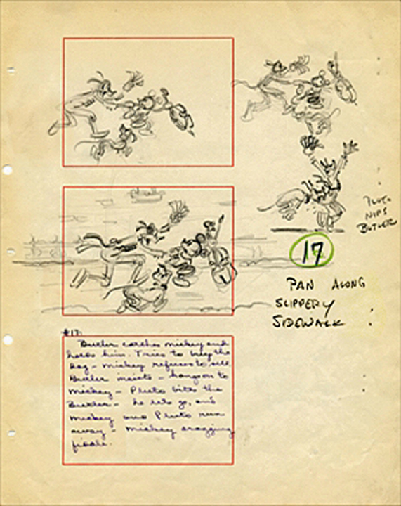
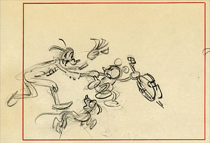
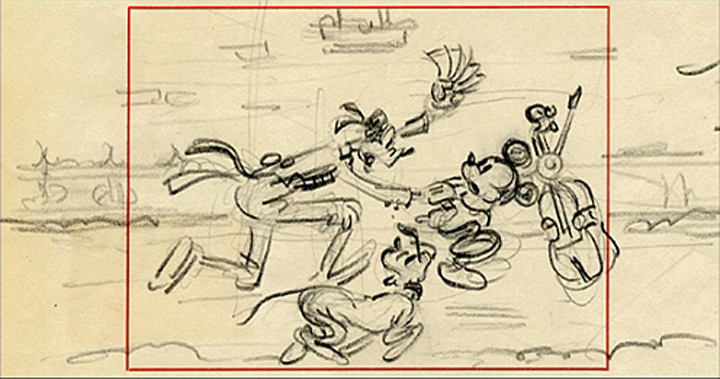
Animation Artifacts &Frame Grabs &Story & Storyboards 19 Nov 2008 09:04 am
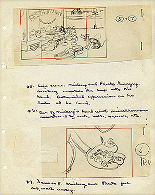
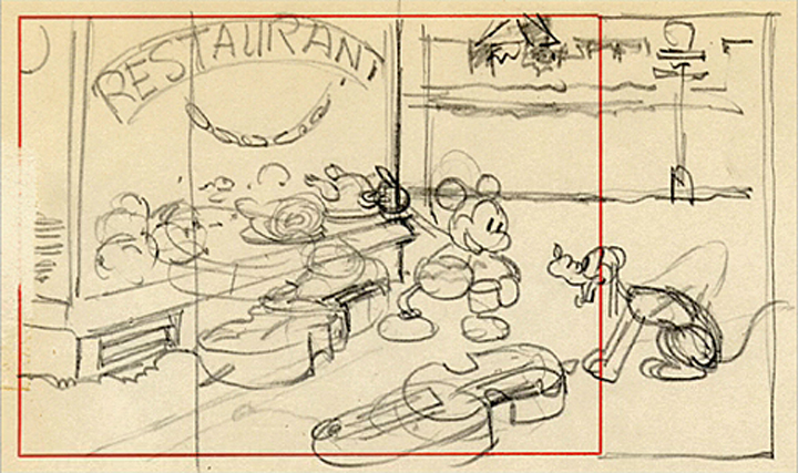
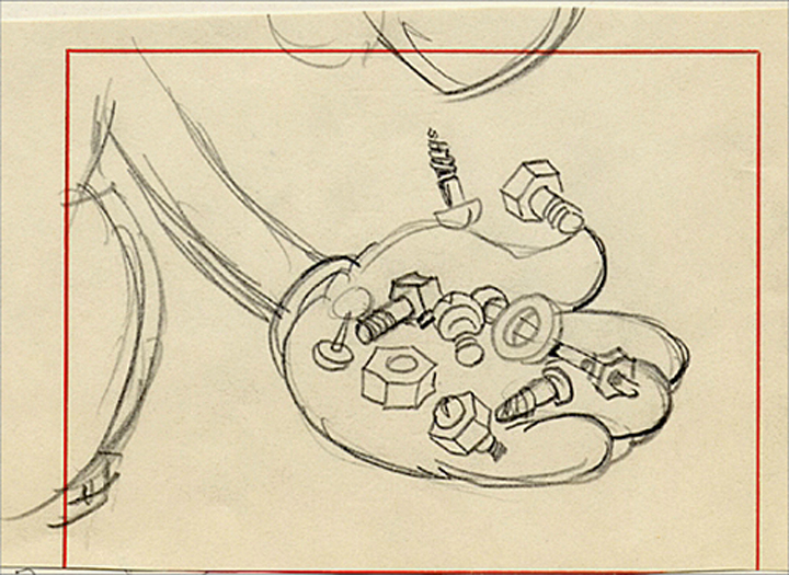
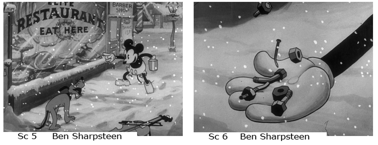
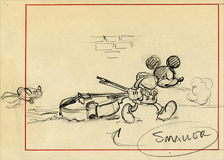
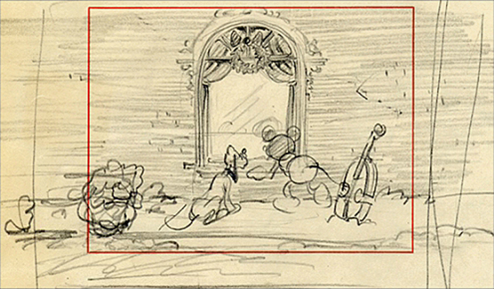
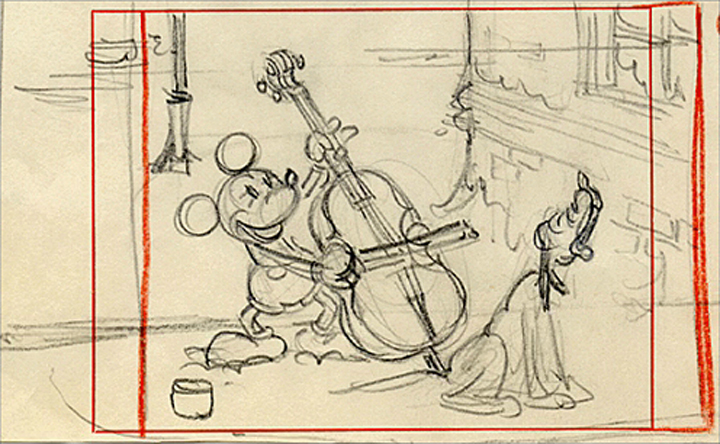
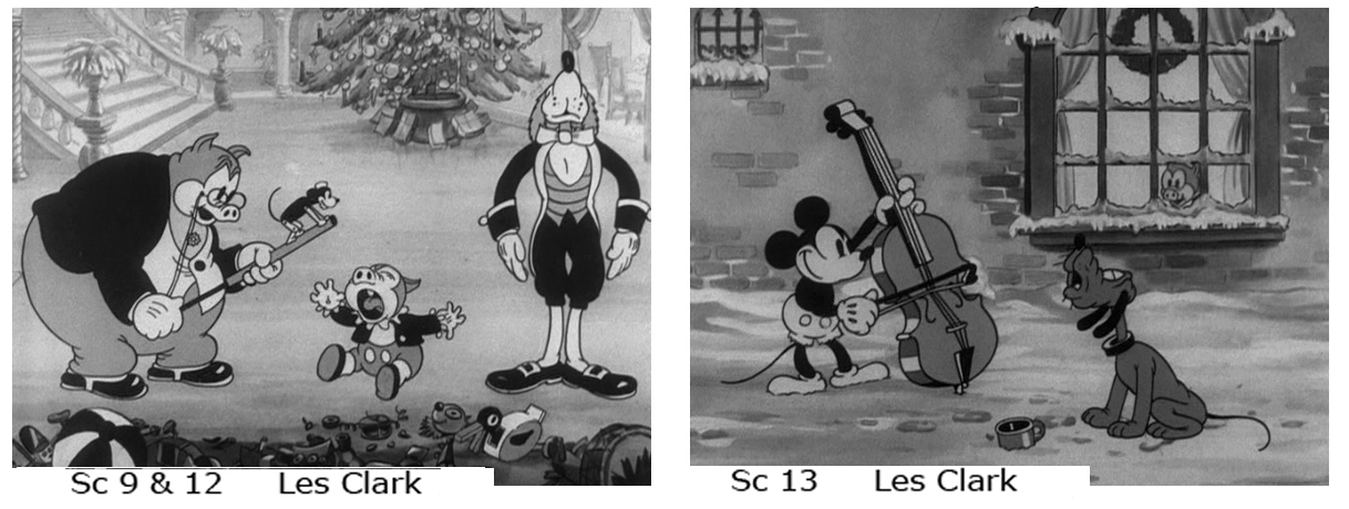
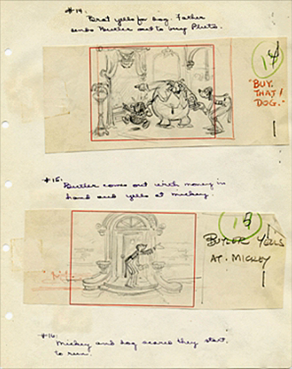
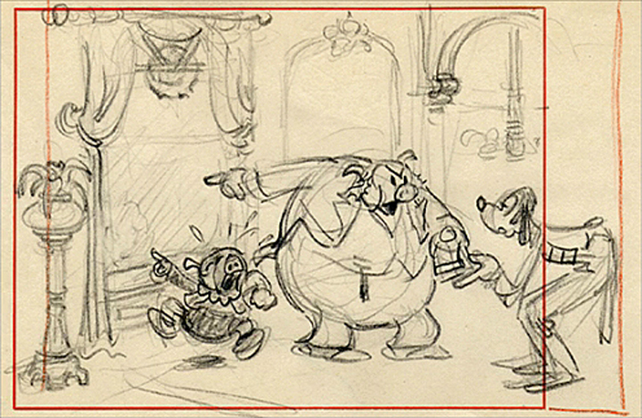
Good Deed Art
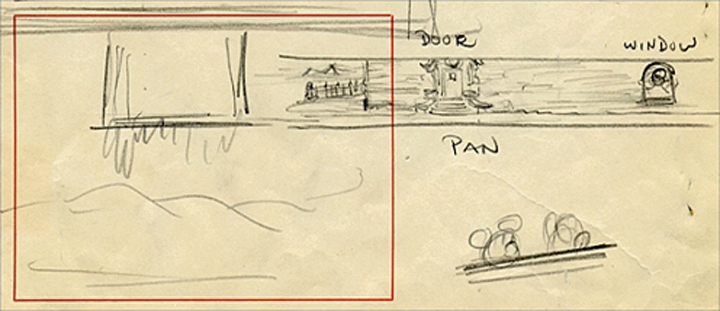
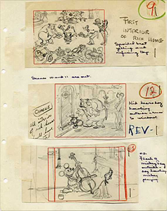
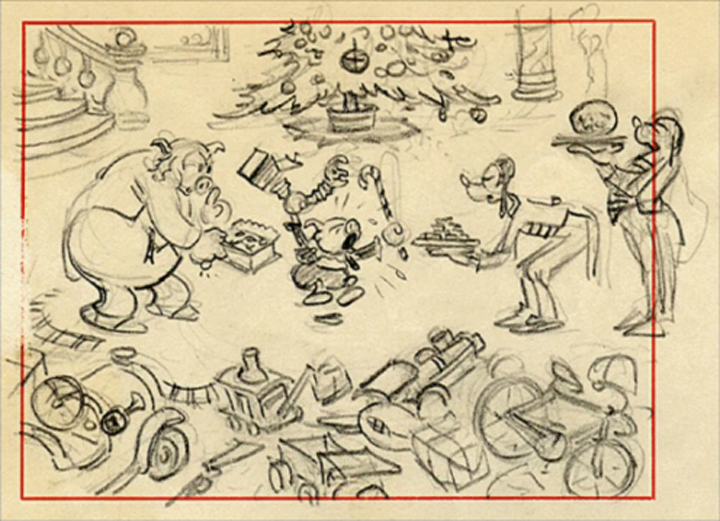
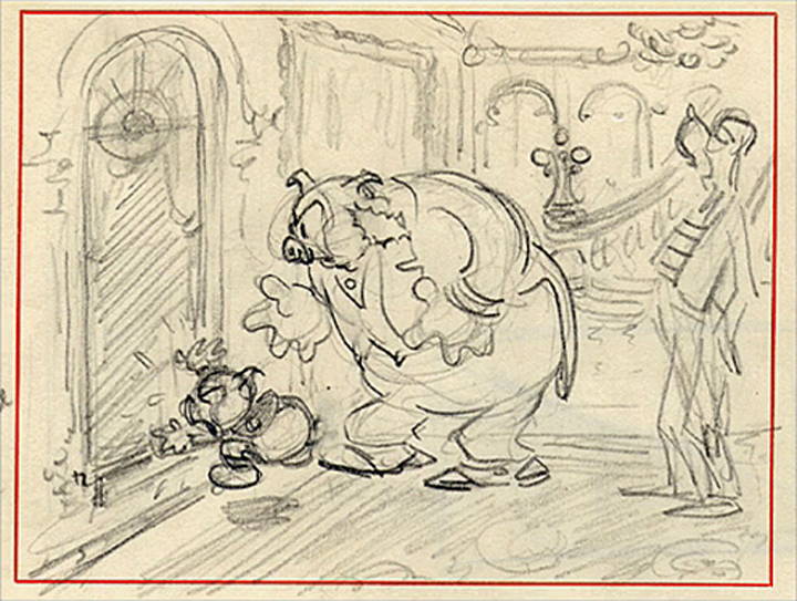
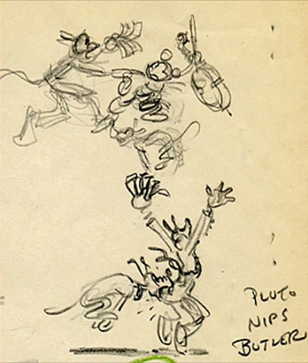
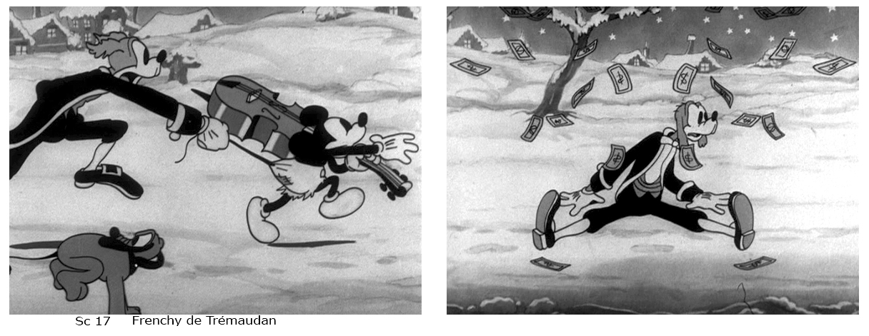
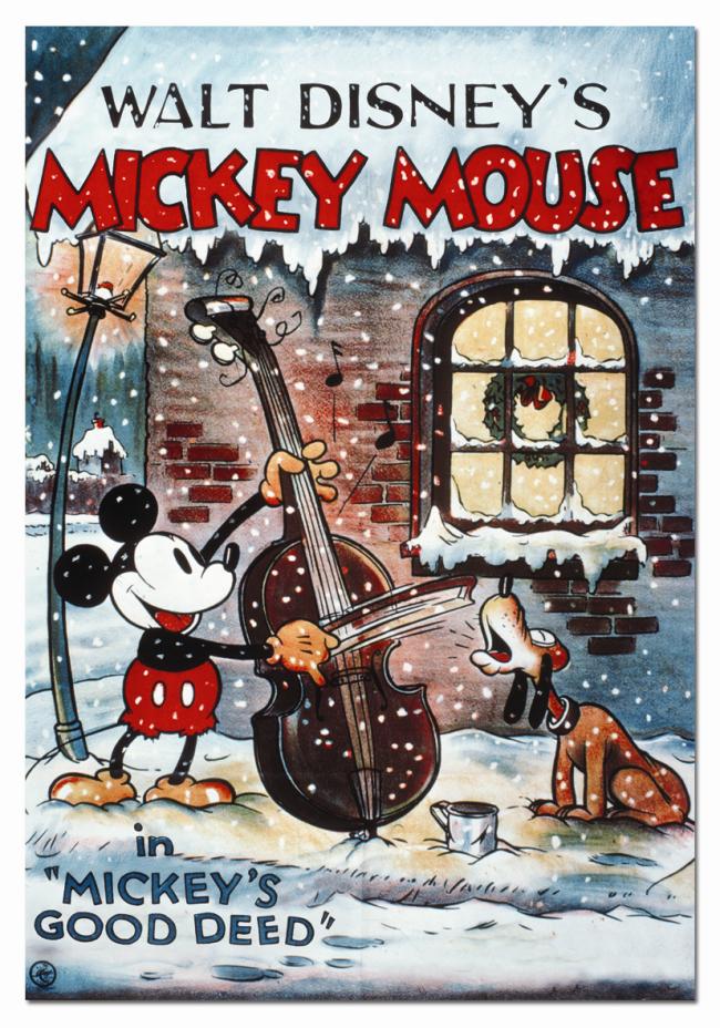 Mickey’s Good Deed is one of my all-time favorite Mickey mouse cartoons. So much so that when Hans Perk posted the drafts on his site, A FILM LA, and knowing that it’d be unlikely that Mark Mayerson would do one of his famous Mosaics for this film, I did it. Yesterday being the “Official” of birthday Mickey, I’ve decided to add a bit about this short.
(Go here to see the animator breakdown for it.)
I recently found the extras on the Disney Treasures: Mickey Mouse in B&W vol 2.
How can I resist sharing what they include as extra on this dvd!
Since the frame grabs reveal material so small, I’ve actually enlarged them all (with some deterioration) so they’d be legible. Sorry.
I’ve also included frame grabs from the final scenes with animators’ IDs for those scenes.
(Click any image to enlarge slightly.)
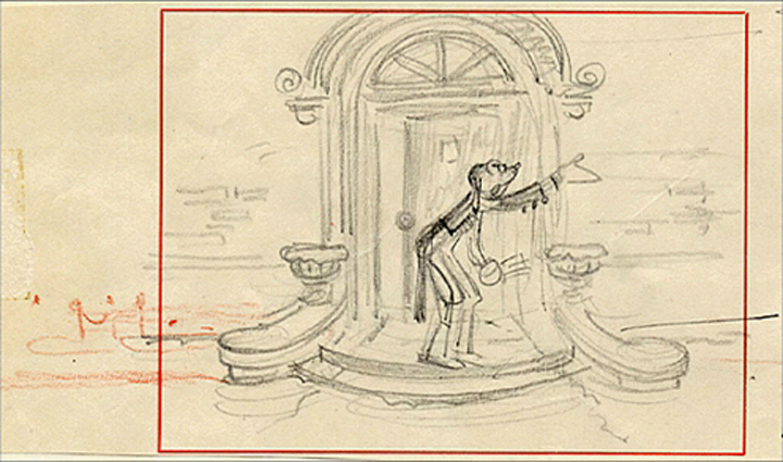
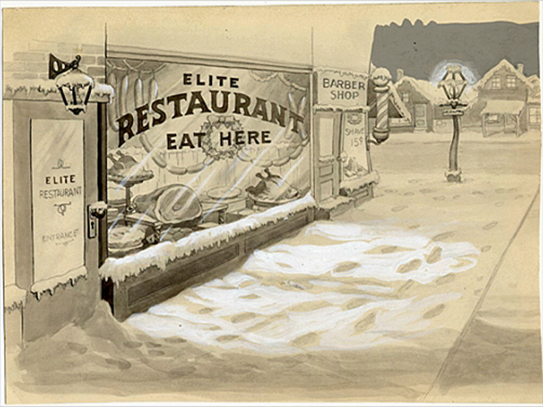
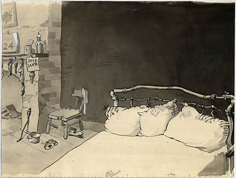
Here are three Bg’s from the film:
You can watch a YouTube copy of the film here.
Daily post &SpornFilms 18 Nov 2008 09:10 am
Boxed Sporn
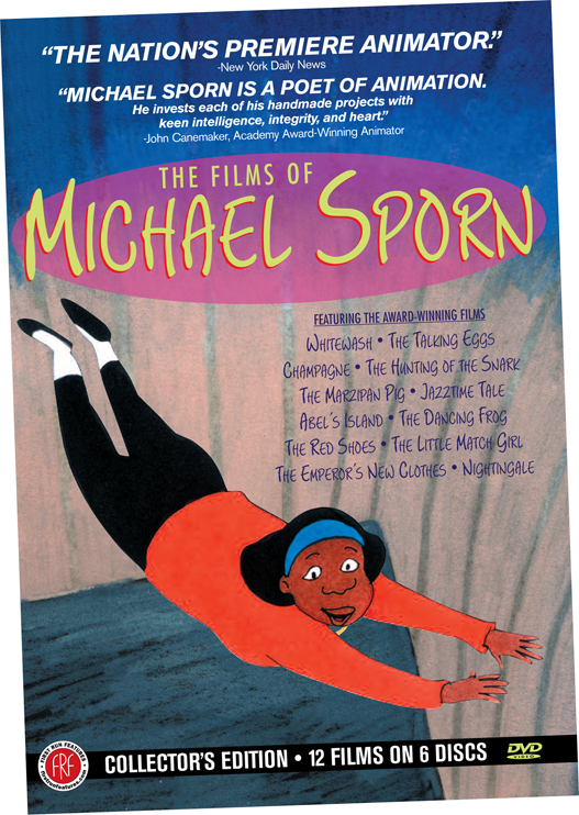 - Today marks the official date of the release of the Boxed Sporn. My distributor, First Run Features, has compiled six dvds (12 films) into a boxed set and released it. (Amusingly, Steisha Pintado left a comment yesterday pointing out that today is also the birthday of Mickey Mouse – or at least the first screening of Steamboat Willie at the Colony Theater, NY.)
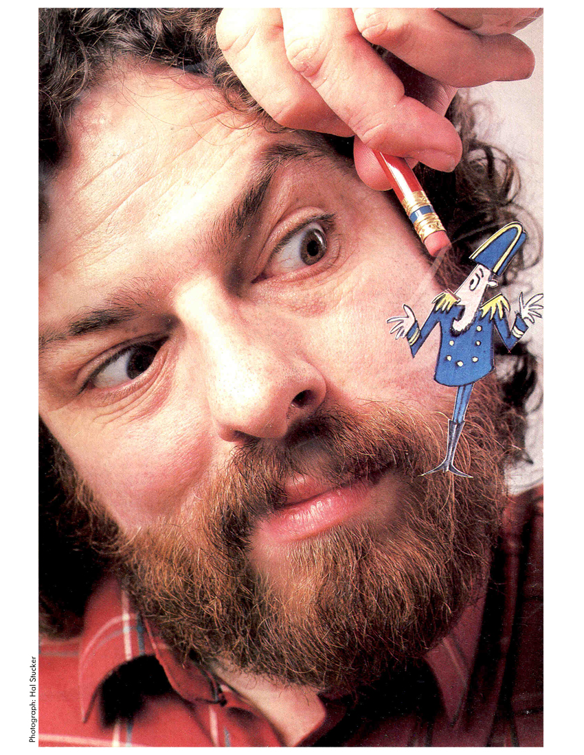
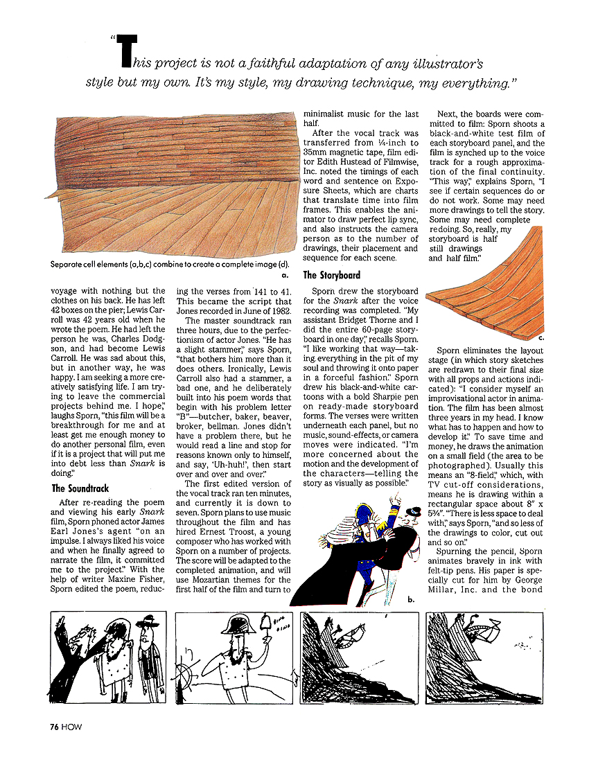
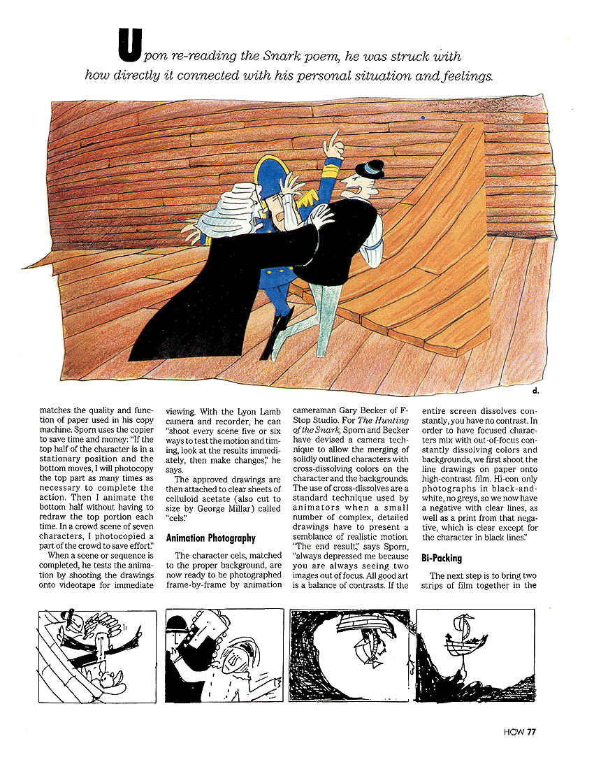
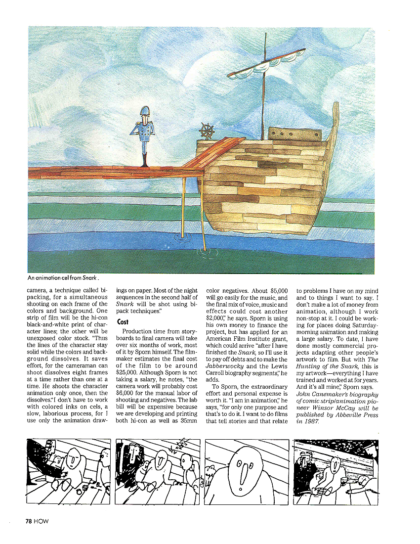
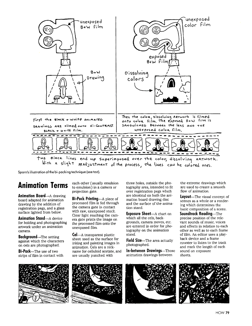
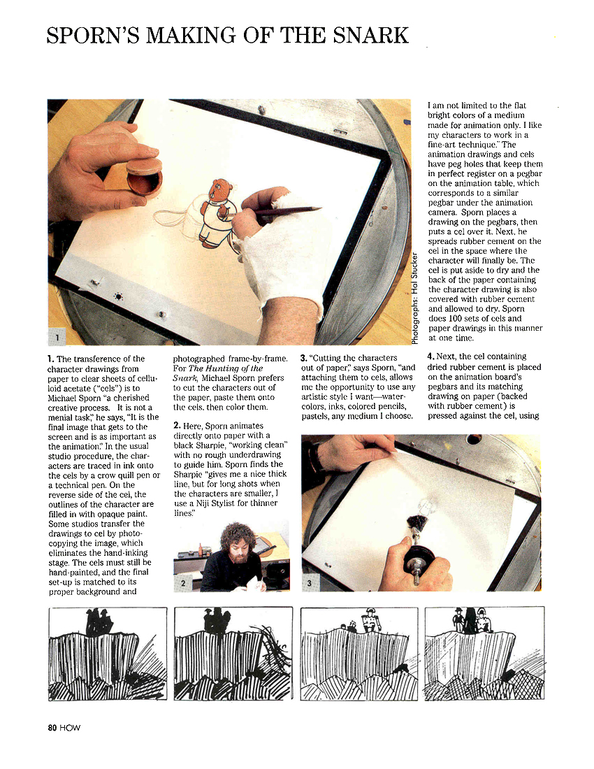
To commemorate this event, I’ve decided to post an old article about the making of The Hunting of the Snark as published in HOW Magazine back in the early 80′s.
The film adaptation of Lewis Carroll’s poem was in the works for seven years – done in between other jobs when there was spare time – and was completed in 1989. This was years after this article came out.
John Canemaker wrote the article, and just as I love that film I love this odd bit of press. I have it permanently on my official studio site but thought I’d enjoy posting it here. My hair is long and I’m thin, what’s not for me to love.
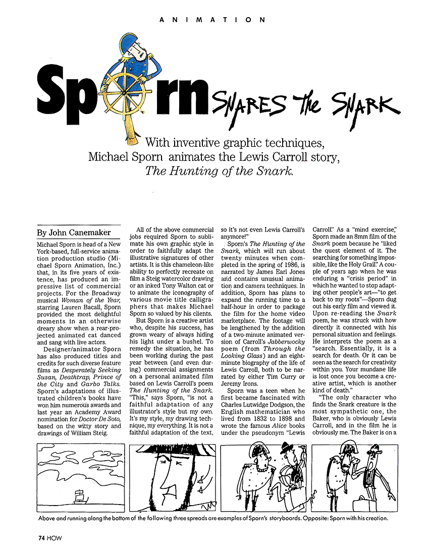 1
1(Merely click any image and it will enlarge so you can read it.)
 2
2
 3
3
 4
4
 5
5
 6
6
 7
7
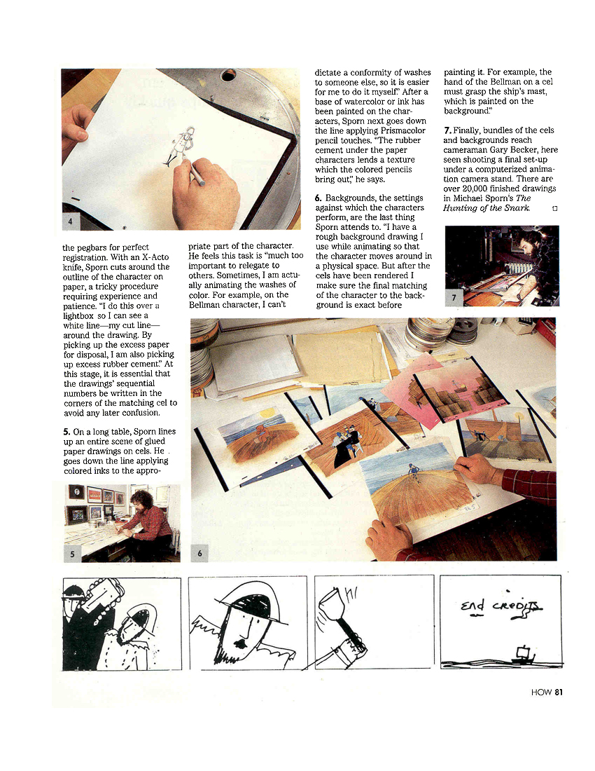 8
8
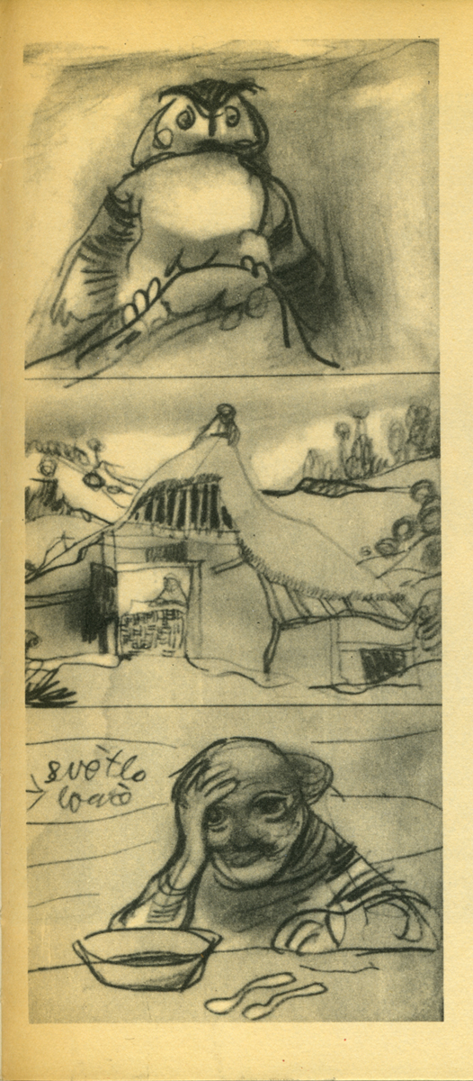
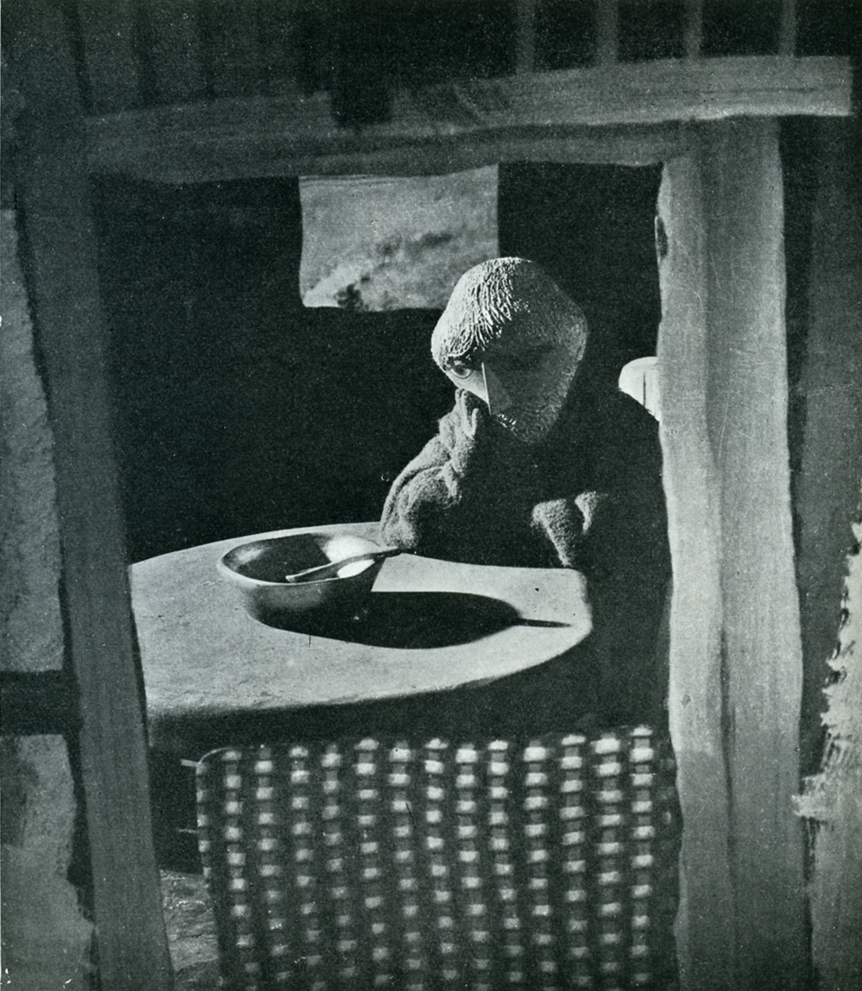
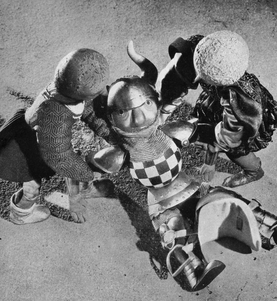
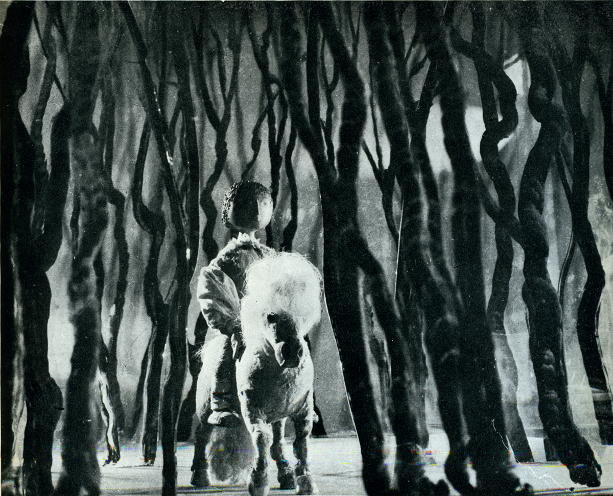
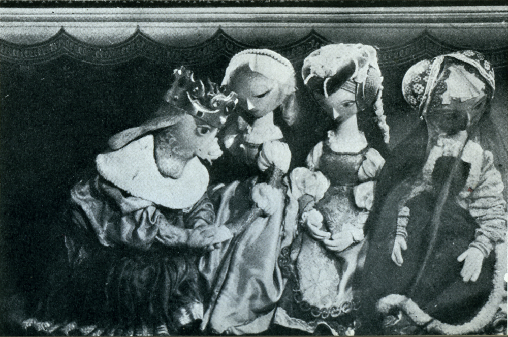
Books &Puppet Animation &Trnka 17 Nov 2008 09:14 am
Trnka’s “Bayaya”
 – Early in the history of this blog, I wrote quite a bit about Jiri Trnka. This man’s artwork has long been a source of great inspiration to me. His illustrations for the fairy tales of Grimm and Andersen are stunning and the two books are of inestimable value to me. His puppet films are so brilliantly strong and lyrically beautiful that I was overwhelmed when I first saw them, even though his reputation preceded them. I’d read enough about him and owned a magnificent biographical account of his work, that I was confident I would be a bit disappointed when I finally saw the films. I wasn’t.
The Hand was magnificent and remains one of my favorite films, to this day.
The Archangel Gabriel and Mother Goose is a beautiful animated puppet film about Venice during the late Middle Ages.
The Midsummer Night’s Dream is a feature-length masterwork that has to be seen for any lover of animation – nevermind puppet animation.
 The film, Bayaya was a mystery to me for many years. It was not an easy film to view. Back in the 70s, there was no video, and seeing Trnka’s films meant trips to the NYPublic Library in NY to visit their collection of 16mm films. There you could watch any of the collection or borrow them to watch at home. These films were often littered with many bad splices where the films had broken. The quality of the colors deteriorated over the years. It made for tough viewing, but it also made it possible to see some of the Trnka canon.
Bayaya was not part of this collection. In fact, I’ve only seen part of the film once. John Gati, a NY puppet animator who was a good friend, located a copy of a 20 min excerpt (in Czechoslovakian) for an ASIFA-East screening and showed it to a small audience in a classroom at NYU. The print was black and white, but since I’d only seen B&W illustrations, this made sense.
This film represented a strong change for Trnka. He had previously done a number of cel animated films. These shorts were remarkable in that they were a strong step away from the Disney mold. This was a bold step to take in the animation community in Europe circa 1947.
The film was purely lyrical, and the story accented the folk tales quality of these legends of Prince Bayaya and The Magic Sword. Consolidating the two, he named the film after the hero and made him the embodiment of courage, morality and honor.
Trnka considered Bayaya a turning point in his career. He realized that the puppet film had taken on new strength and he had to follow through with every film thereafter.
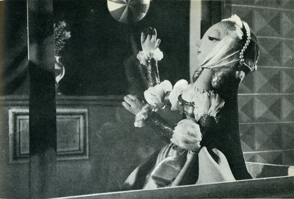
Here are a couple of scenes from the Trnka book I treasure, Jiri Trnka: Artist & Puppet Master.

There are two parts of a documentary on Trnka available via YouTube. They’re worth the watch. Part 1, Part 2.
Photos 16 Nov 2008 09:59 am
Hand Painted – PhotoSunday
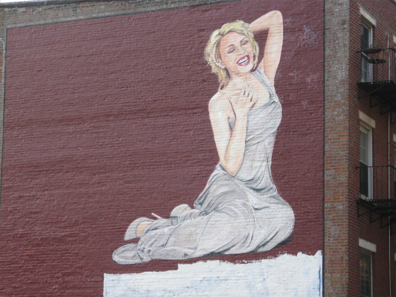
A couple of weeks ago I noticed that the hand-painted billboard had changed to something peculiar. It looked, to me, as though some renegade sign-painter took vengeance on the increased number of billboards in this area.
However, a comment by Lorelei, left on the site, identified the new poster as one by artist, Banksy. Indeed this poster appears on his site.
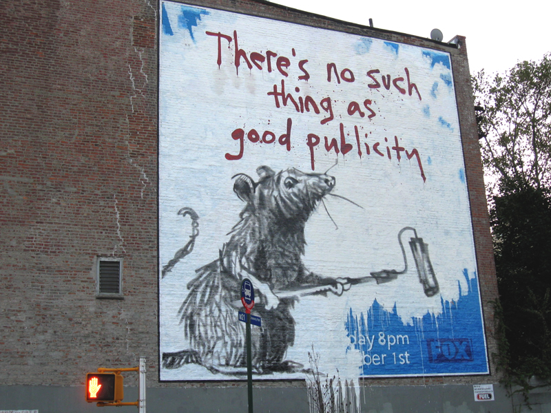
(Click any image to enlarge.)
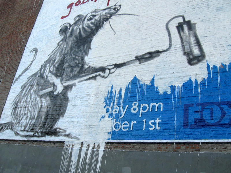
However it’s now being replaced, and I have a few photos to show the process that’s happened over the past weeks. It’s been raining a lot, so there’ve been whole days of delay.
I first noticed the base white primer painted over most of the rat image.
This was toward the end of the first day.

This crane was planted at the street level beneath the sign.
The painter would hoist the rented crane up to paint and draw.
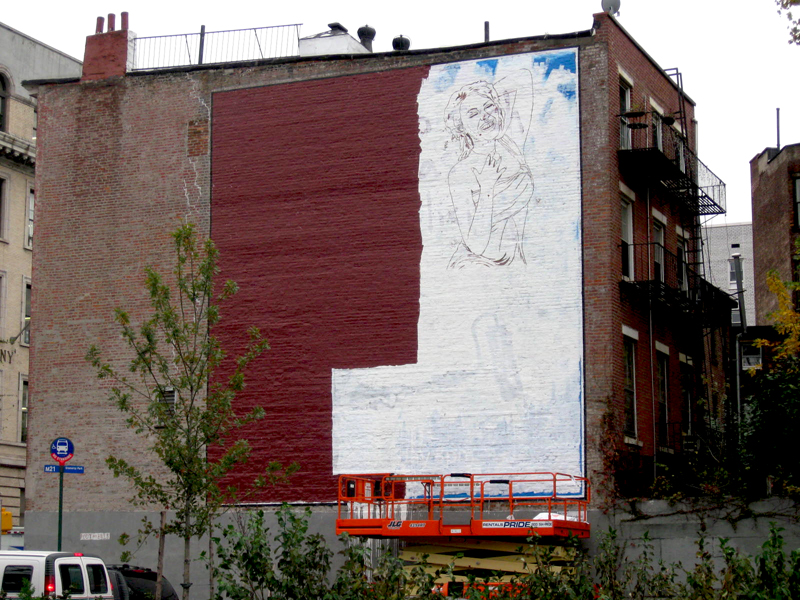
A day later, much of the sign has been covered with a reddish brown base
to try to match the colors of the bricks on the ediface.
At first, I thought the paint had been wiped clear from the surface.
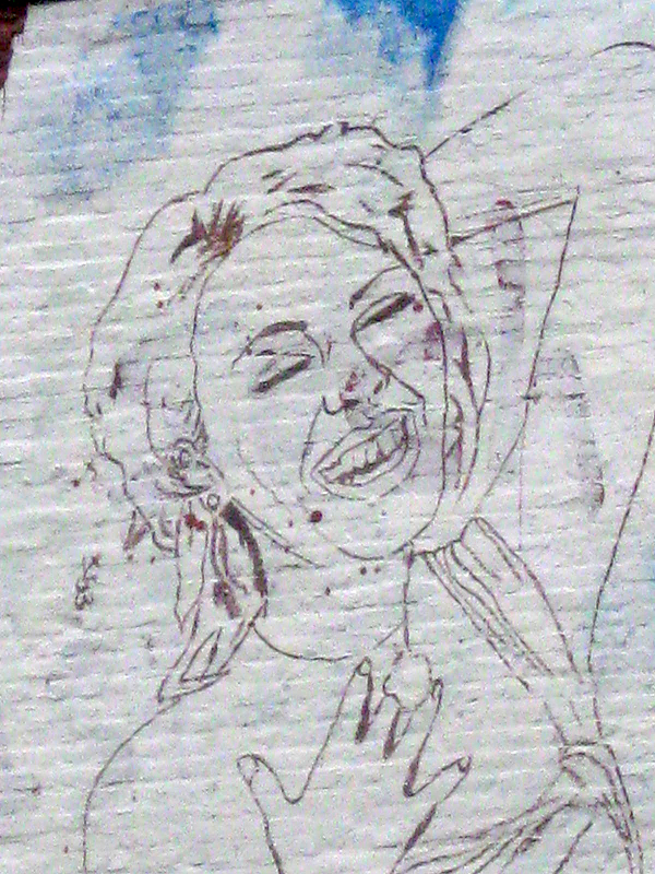
A drawing of a female had been started.
On the next day, flesh tones appeared, and the shape
of the white area had been altered.

Friday it rained – no change in the painting
Saturday it rained – no change
Sunday was windy – no change
Monday was sunny – no change
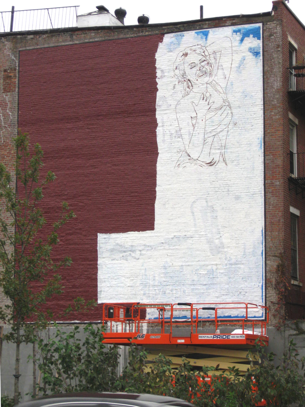
Tuesday things developed, the woman was colored. (image left above)
Wednesday the border was fully painted; snowflakes & type
were added. (image right above)
Note that the white from the original Banksy image is still
spilling off the sign at the bottom.

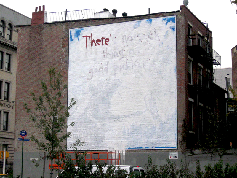
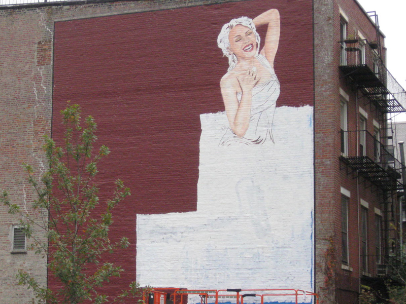
Four days later, and the sign still isn’t complete, but
it’s getting close. There’s been too much rain and wind,
and I’m sure the painter has had some problems continuing.
You can see where it’s going. When it’s done, I’ll post the final.
Maybe they’ll change the background brown, but I don’t think so.
I’ve never been one to like mixing transparencies with opaques,
though I suppose the half hidden snowflakes help it there.
Amusingly enough, about a block away a sign that was designed
to look like it had been graffiti on the building was erected.
This one is a screen that was hung on the building.
Articles on Animation &Puppet Animation 15 Nov 2008 09:44 am
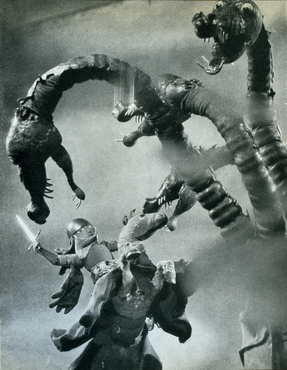
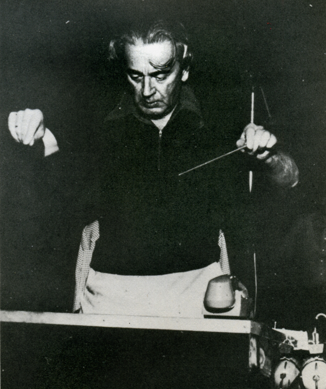
Harryhausen Interview
- It’s been a while since I’ve posted anything about stop-motion animation, and seeing an attractive poster for Coraline made me realize it was time. I’ve recently posted some articles from the Millimeter/1975 animation issue which was edited by John Canemaker. This is another excellent piece from the same magazine, and I think it a good one.
An Interview with the Master of Stop-Motion Animation
by Mark Carducci
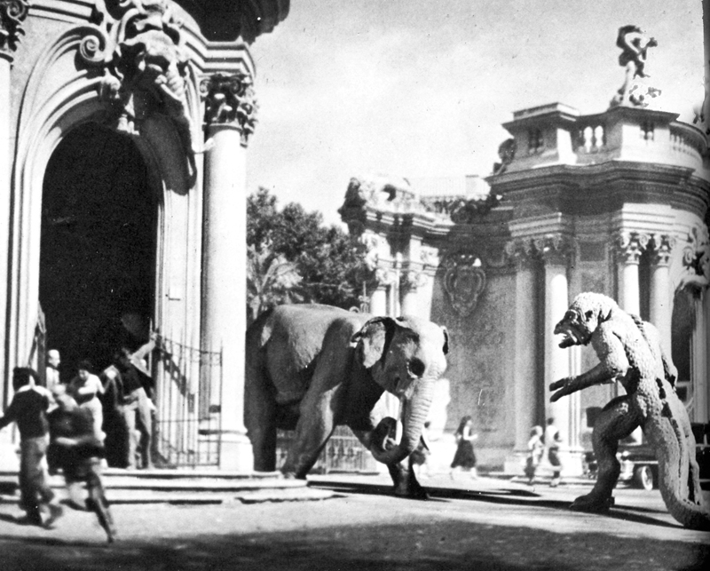
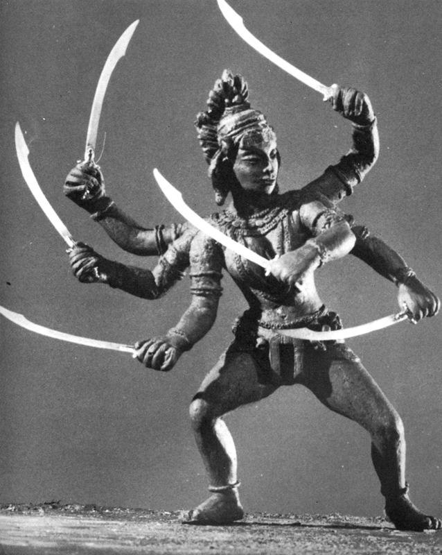
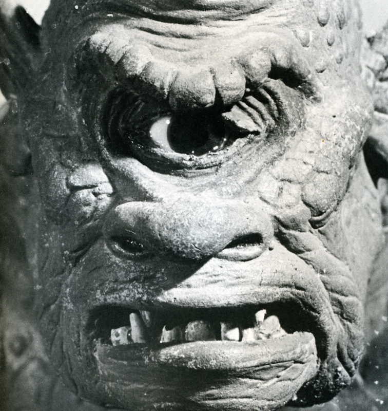
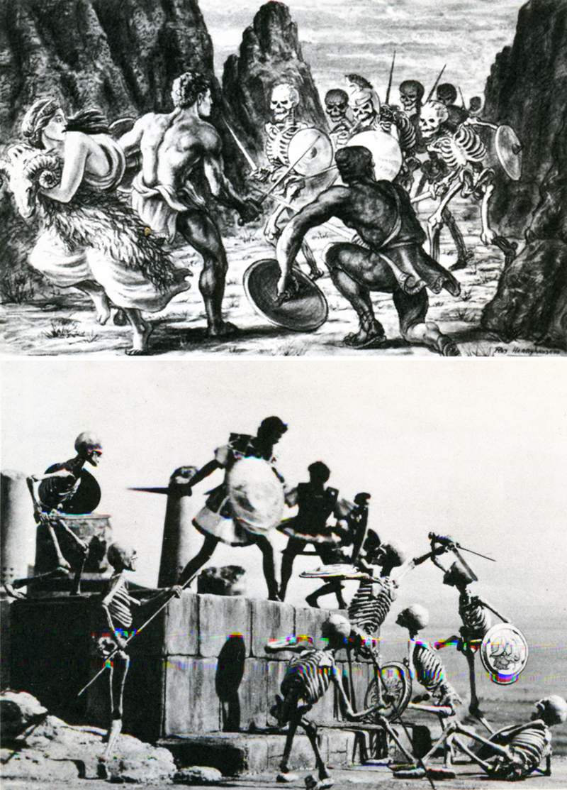
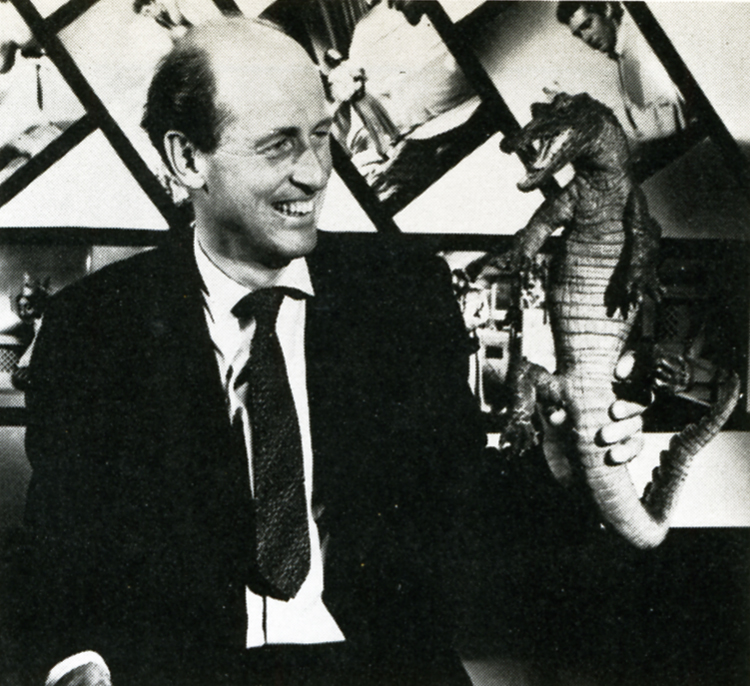 Film history records the earliest three-dimensional animator as George Melies, the showman-turned-filmmaker of A TRIP TO THE MOON fame. Melies, unlike many special-effects men of today, realized the value in using several different effects processes at the same time. Thus he would utilize stop-action, animation, miniature photography and mechanical effects all in the same frame. Melies was a pioneer in the field of effects animation in three dimensions, and he paved the roads other animators would one day travel. One such traveler was Willis H. O’Brien. O’Brien single-handedly elevated the techniques of three-dimensional model animation to a fine art, beginning in the silent era with short subjects and continuing through the 1925 classic THE LOST WORLD to KING KONG a mere eight years later. As Kong was king of Skull Island, so O’Brien was king of model manipulation, and tike Melies before him, O’Brien never missed an opportunity to add drama, atmosphere or pathos by mixing effects together. Witness the clash between Kong and a flying reptile atop Kong’s mountain lair: Kong and the pterodactyl are jointed foot-high foam rubber models; the mountain’s ledge is a plaster recreation; the sky background is a painting on glass; the flying reptiles in the sky are double-printed eel animation. It was this intelligent and intentional combining of effects that allowed O’Brien to achieve the marvelous sense of reality he did in KING KONG, a reality so intense as to make a thirteen-year-old named Raymond Harryhausen choose the field of special effects animation as his life’s work.
From the time he saw KING KONG in 1933, until the mid-40′s, the youthful Harryhausen animated in what might be called a highly animated fashion.
He even managed, on several occasions, to gain an audience with his future mentor. Though Ray’s fledgling efforts were crude, O’Brien saw in them a promise of future greatness, and he was quick to offer constructive advice to his precocious- protege whenever he was asked. In 1946, impressed by Ray’s solo efforts in producing a series of animated fairy tales; O’Brien offered him encouragement of a more concrete nature: a position as an animator on the Merian C. Cooper production MIGHTY JOE YOUNG. Of this opportunity-of-a-lifetime Harryhausen recalls: “It was, of course, the climax of a long-awaited dream come true. I had a magnificent two-year period of working with O’Brien, during the long pre-production and design stage, up to the end of animation photography. He was so involved in production problems that I ended up animating aboul 80% of the picture.”
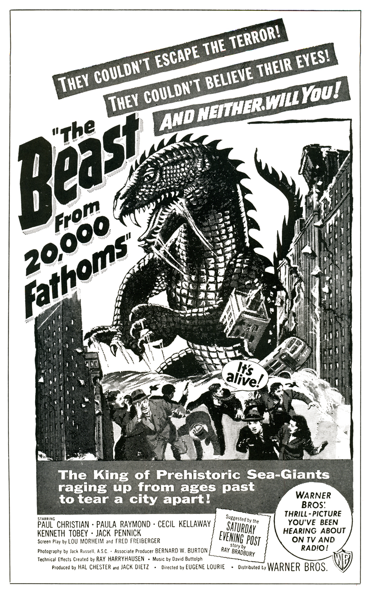 In 1952, as a result of his Oscar-winning work on MIGHTY JOE YOUNG (Best Special Effects of 1949) Ray was approached by Jack Dietz and asked to create the effects for THE BEAST FROM 20,000 FATHOMS. These he executed ably, employing an innovative front-projection system of his own design, as the preferable but more expensive rear-project ion equipment the work called for was outside the boundaries of Dietz’s budget. THE BEAST came in at $200,000, a remarkably low figure considering the expertise and high quality of Ray’s animation and effects. Audiences of 1952 flocked to the picture in droves, making it the unexpected sleeper of the year for Warner Brothers. Completing THE BEAST left Ray on the brink of a long, creatively satisfying and financially rewarding association with a then-youthful producer, Charles Schneer.
Schneer wished to produce a script about a giant octopus that terrorizes San Francisco, and after meeting hirn^ {Schneer, not the octopus) Ray agreed to work on the picture. The result was IT CAME FROM BENEATH THE SEA, the first of a series of ten feature films produced by Schneer with special visual effects by Ray Harryhausen. Along the way, Ray has freelanced twice: once in 1958 to animate the dinosaur sequences in Irwin Allen’s THE ANIMAL WORLD, and again in 1966 to handle effects on Hammer Film’s OWE MILLION YEARS B.C.
 A comparison of the work of Ray Harryhausen and Willis O’Brien yields some interesting observations. One of O’Briens trademarks throughout, his career was his use of glass paintings. The three-dimensional effect of the jungles of Skull Island was achieved through the painting, on glass, of dense trees and vines. By animating his models behind several layers of these realistic depictions of forest, O’Brien was able to achieve an illusion of depth that added tremendously to the dramatic impact of the entire film. O’Brien was a dramatic romantic, and a stickler for any detail •haqlbuld romanticize. Harryhausen, on •hefOtner hand, is a realist, and in his Jiifork there is a sense of reserve; of a wpjehful eye on the cost of each particular effect. No layers of intricate glass paintings for him—too expensive. For Ray’s purposes a simple but effective matte painting will suffice. The net result is always a little less atmospheric than O’Brien’s work and ultimately less powerful. To compensate for this Harryhausen outshines his master in the fluidity of his animation. His smoothness of movement of his foam rubber creatures is the most striking difference between his and O’Brien’s digital prestidigitation. In this area the pupil could have taught his teacher.
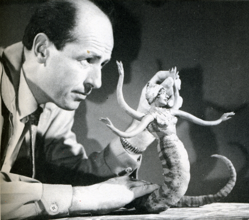 The exact processes by which Harryhausen combines his animated models with live actors are ones he prefers to anyone with a basic of animation can grasp the*1 rudiments of what Schneer and Harryhausen have dubbed “Dynarama.” Let us take an example from Harry-hausen’s latest film, THE GOLDEN VOYAGE OF SINBAD. The script called for a battle between Sinbad and a giant one-eyed centaur. The first step in creating the illusion of a human dueling with a mythical monster was to film the actor, in this case John Philip Law, leaping to and fro fighting with an imaginary creature. The resulting footage is loaded onto a rear-screen projector which has been modified to move a frame at a time instead of at sound speed. In front of this rear screen, Harryhausen constructs a miniature set, which corresponds to the full-size one on the film in the projector. Placing his foot-and-a-half tall centaur into this miniature setting, Harryhausen animates it a frame at a time, being careful to similarly advance the rear-projected image of Sinbad. Re-photographing this entire set-up with a locked down animation camera produces the desired effect. This description can only serve to illustrate the bare bones of the Dynarama process. Many sequences have required much more complex techniques of Ray and his equipment. As a result the time element involved in the production of a Dynarama picture is staggering. Pre-production lasts six months to a year. Principal photography lasts several months and the animation photography consumes an incredible year or more! But the results, which speak for themselves, have always seemed to justify the commitment of two or three years of Ray Harryhausen’s life; at least in the past they have.
 At present Ray is involved in yet a third film about the adventures of the swashbuckling Sinbad, though he characteristically refuses to give details about the project. This is understandable, since at the time we spoke he didn’t even have a story-line. This, too, is characteristic; perhaps unfortunately so. For it is in this area, the script, that Ray’s films have shown their vulnerable underbellies. Starting as they do with Ray’s sketches of the fantastic monsters involved, most Dynarama films are built around a monster or monsters on the loose. Plot, dialogue and characterization have always played second fiddle to special effects in Harryhausen’s films, and this is nowhere as painfully obvious as in THE GOLDEN VOYAGE OF SINBAD. Although his cart-before-the-horse method of scripting has always netted Harryhausen films of a very satisfying financial nature, it has never netted him a film with the impact and scope of KING KONG, and never will. One can only hope that as he has more say in his productions than any effects animator on earth, (he is a co-producer) Harryhausen will one day put as much creative energy into his script, casting and choice of director, as he does into his visuals. Perhaps then the day may yet come when Dynarama films will have some saving graces beyond their impressive opticals. Be that as it may, for anyone at all interested in animation and effects cinematography, the words of the grandmaster of Dynarama paint a fascinating portrait of a seldom glimpsed phase of film production.
M.C.: Have you ever considered remaking the film which first inspired you, KING KONG?
R.H.: Yes, but KONG couldn’t be re-made today without spending vast amounts of money. The time and cost involved in doing all those glass paintings would be astronomical. You know O’Brien really developed the technique of glass painting single-handedly. In a way his use of them was a forerunner of Disney’s multi-plane camera. On KONG Obie had animation tables sandwiched between the glass paintings, and on these tables he’d place his models. He needed a tremendous amount of light for the camera to record through all those panes of glass. Often a light would blow in the middle of a scene, ruining a shot he had worked on for days. To remake KONG would be much too complex a thing to get into today.
M.C.: Some hold the opinion that your films have little merit aside from their impressive effects. I don’t mean to criticize, but I tend to agree with that, excepting MYSTERIOUS ISLAND, a Him I feel could stand alone if the footage of the monsters was cut.
R.H.: Really? I don’t think you would feel that way about MYSTERIOUS ISLAND if you actually did cut that footage. Pick up an 8mm version some time and try it. (Laughs) The original Jules Verne novel was really just a tale of survival on a desert island. The survivors in the story saw rather mundane things, so we modified their adventures a bit by adding Capt. Nemo and his giant creatures.
 M.C.: With newer and better emulsions now available in 16mm, have you considered working in that gauge?
R.H.: No, I have no reason to work in 16mm. With 16 you don’t have the options and accuracy of 35mm and the optical printer. Certain subjects might show up quite well on a blow-up from 16, but my work is much too complicated to further complicate it by working in a smaller gauge than 35mm.
M.C.: What about 70mm?
R.H.: We released FIRST MEN IN THE MOON in 70mm, but that was a blow-up from 35. Shooting on a 70mm negative is too costly a proposition, necessitating the use of too many specialized pieces of equipment.
M.C.: FIRST MEN was shot in Panavision. What effect did shooting wide screen have on your usual methods?
R.H.: I was forced to re-design many things, because certain techniques are impractical in Panavision. I relied more heavily on traveling matte work in FIRST MEN, whereas normally I might have used front or rear projection.
M.C.: you are quite active in other areas of production besides animation photography. Have you ever considered directing an entire film?
R.H.: Oh, yes, I would very much like to direct if I find the right subject. But it’s a big job just to keep track of the special effects. There’s a limit to how much one man can do.
M.C.: Didn’t you once remark that you were unhappy with the animation of the miniature horse in THE VALLEY OF GWANGI? If so, why?
R.H.: No, what I did say was that it was a sequence I ‘dreaded doing because the horse really didn’t have anything dynamic to do. It just had to sit there and look coy. It’s always difficult to decide what to have the creature do in scenes like that. An action sequence involving a giant animal is much more impressive. So I let that scene go until last.
M.C.: Box-office-wise your films have usually done quite well. How can you account for the relative failure of THE VALLEY OF GWANGI?
R.H.: It was released at a time when Warners was being sold and it received very poor distribution. There was no advertising to speak of and nobody knew what the picture was about.
M.C.: Alternately, THE GOLDEN VOYAGE OF SINBAD has really hit big with audiences here.
R.H.: You must remember the time when GWANGI was released. Everyone was on a sex binge then, and we only had sexy dinosaurs. Warners didn’t push the picture at all. Columbia, on the other hand, has put a great deal of effort into their campaign for GOLDEN VOYAGE. That and word-of-mouth really paid off.
M.C.: In the past you have utilized the talents of film composer Bernard Herrmann for your scores. Why was he not used on GOLDEN VOYAGE?
 R.H.: There were many reasons. Sometimes people are tied up, and sometimes the situation just isn’t conducive to getting the people you would prefer. I think the composer we did use, Miklos Rozsa [SPELLBOUND], writes a different kind of music than Herrmann, and that he did a very good job for us.
M.C.: Taking his past efforts into account, why was Gordon (THE OBLONG BOX) Messier chosen to direct GOLDEN VOYAGE?
R.H.: Again, there were many reasons, and I can’t go into them here. I think Hessler has a very good sense of direction. You must remember that the quality of each picture a director works on depends largely on how much money is in the budget. Some people think we have carte blanche to make a picture any way we please. Except for a David Lean or a Stanley Kubrick, this is not the case. We make a commercial product, and though there are many things we might like to do on a picture, it always comes down to whether or not the money is there.
M.C.: All told, how long were you at work on the effects for GOLDEN VOYAGE?
R.H.: About a year. All the work was done here in London at Gold Hock Studios.
M.C.: Did British Museum sculptor Arthur Hayward assist you in constructing the animation models, as he had on ONE MILLION YEARS B.C. and GWANGI?
R.H.: No, I had others assist me. Molding and casting are very time-consuming jobs, so I farm some of it out to certain individual. I can’t do all the models myself, because I don’t have the time.
 M.C.: Do you paint your own matte paintings?
R.H.: No, I don’t. In fact nowadays I try to avoid using them. There are very few people who can do them well enough so that you don’t have to cut away from them right away. Today it’s practically a lost art, unfortunately. Most of the ones in my other films were done by staff matte painters at Shepperton Studios.
M.C.: I found there was quite a bit of grain in GOLDEN VOYAGE. Why was this?
R.H.: We worked with dupes quite a lot. There are shots in the film where you’re looking at a third-generation dupe, so naturally there’s an increase in grain. Another reason you might have spotted some excess grain was because we printed several optical zones and dolly shots on the printer.
M.C.: What can you tell me about your next film project?
R.H.: It’s called SINBAD AT THE WORLD’S END, and that’s about all I can say. We have a formal company which releases information to the public, and at the moment I’m not at liberty to say anything more. Does that pacify you? (Laughs)
M.C.: Not really. Will John Philip Law again play Sinbad?
R.H.: That depends on his availability, and the characterization in the script, which we don’t even have yet. There have been several Sinbads—Douglas Fairbanks, Kerwin Mathews, Guy Williams. We would like to give him a different quality each time. The irony is that when you knock yourself out to make a picture different, the critics chastise you for not putting in the expected cliches. One reviewer said of GOLDEN VOYAGE that he missed the dancing girls. Now that is a typical Arabian Nights cliche that we avoided on purpose.
M.C.: I have one final question concerning THE SEVENTH VOYAGE OF SINBAD. There is a sequence in that film which depicts Sinbad’s crew walking up the beach loaded down with fruit. There is a black man in the crew, and he’s carrying a watermelon.
R.H.: Oh no…(torrents of laughter at this) only a member of today’s generation would notice something like that. I assure you it was all accidental as to who got what prop.
Thus satisfied that THE 7th VOYAGE OF SINBAD contained no racist undertones, I bid Mr. Harryhausen a fond farewell, leaving his Kensington High Street home for the bleak and foggy streets of London. As I ambled towards the nearest Underground I gave additional thought to the question of Mr. Harryhausen’s responsibility for the over-all quality of his films. Approached on an adult level they are rather silly entertainments. But for a child they create a vivid fantasy world where skeletons come to life and fire-breathing dragons battle with cyclops. I was a child once, and the marvels of Harryhausens monsters, both mythic and imaginary, overwhelmed me. There is a definite place in cinema for this type of film. The adult critical eye must squint a bit to watch THE GOLDEN VOYAGE OF SINBAD, but if that’s not enough, one can always leave the theatre to the little people, whose eyes Ray Harryhausen’s films are created for.
Daily post 14 Nov 2008 08:58 am
Things & Things
- Next week there are a couple of animation events to look forward to.
- Sita Sings The Blues will show at MOMA on Thursday and Saturday upcoming. The film is better than any of those eligible for Oscar nomination this year (but for some reason is not on the list.)
The film won the top prize for animated feature at Annecy this year. It was written, directed, and animated by Nina Paley. Using Indonesian shadow puppets, torch songs of 1920s and the finest use of Flash animation on record, the film sparkles. If you haven’t seen it, go.
Nov. 20, Thursday: 6pm
Nov. 22, Saturday: 3pm
- Don Hertzfeldt will be in town next Wednesday, November 19, accompanying several showings of his films at the IFC Center (323 Sixth Avenue). The two scheduled shows have already sold out, but a third, late show, may be added. If so, tickets will go on sale soon. His new film, I Am So Proud of You, will debut with this package of shorts.
- Speaking of films eligible for Oscar consideration, here’s the list of those submitted and eligible:
 Bolt – Disney
Delgo – Fathom Studios
Dr. Seuss’ Horton Hears a Who! – 20th Century Fox/Blue Sky
Dragon Hunters – Futurikon/Peace Arch
Fly Me to the Moon – Summit Ent./nWave
Igor – MGM/ Weinstein Co./Exodus
Kung Fu Panda – DreamWorks Animation
Madagascar: Escape 2 Africa – DreamWorks Animation
$9.99 – Regent Releasing
The Sky Crawlers – Production IG./Nippon/Sony Pictures Classics
Sword of the Stranger (Stranger Mukoh Hadan) – Shochiku/Bones/Bandai
The Tale of Despereaux – Universal
WALL-E – Disney/Pixar
Waltz with Bashir – Sony Pictures Classics
It’s a tough choice, and I suppose I’d probably go with $9.99 just for its being independent and individual. Of the studio films, Horton Hears a Who looks the best to me, despite Jim Carrey. It’s going to be a case of closing my eyes, holding my nose and throwing a dart. I don’t even WANT to watch some of these, nevermind vote for them. But I will, and I’ll pick what I think is the best of the lot. (For what it’s worth.)
 - A site that keeps getting better is Ben Price‘s blog. A lot of news seems to show up there before I see it elsewhere. Much of it comes directly out of Variety, but it’s hard to find it at times.
Yesterday alone he offered a new poster for Coraline – this looks like a feature worth seeing – , a piece about Linda Woolverton and her WGA Award, the studio Image Metrics, Christmas dvds, Ridley Scott, Emru Townsend, a Wizard of Oz cgi feature directed by John Boorman, and more.
It’s a read, an informative one. This is a blog worth watching.
Animation Artifacts &Disney &Frame Grabs &Story & Storyboards 13 Nov 2008 09:12 am
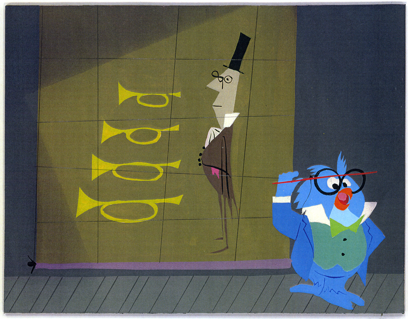
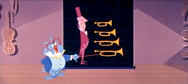
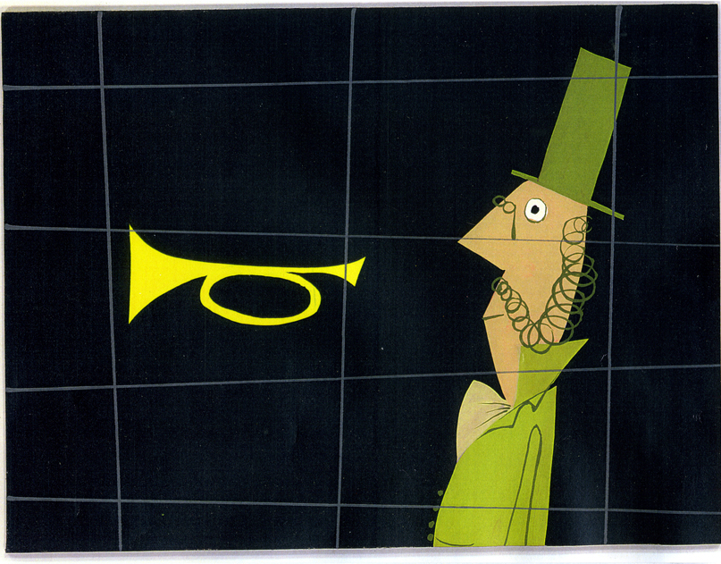
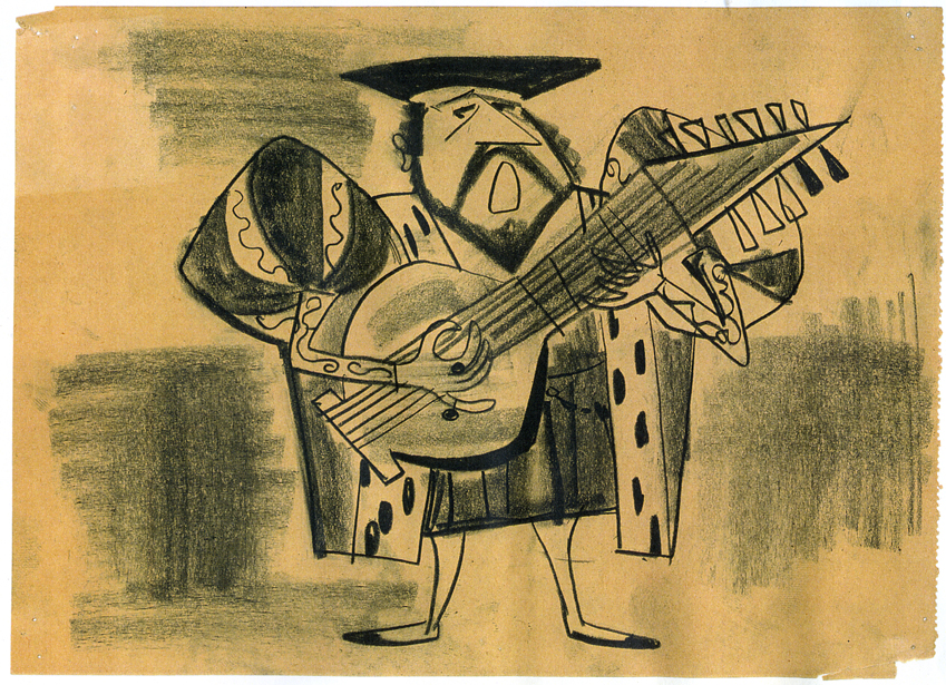
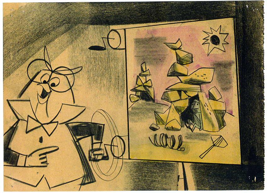
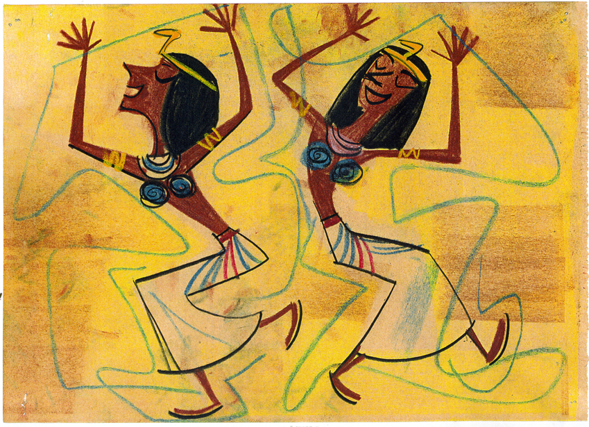
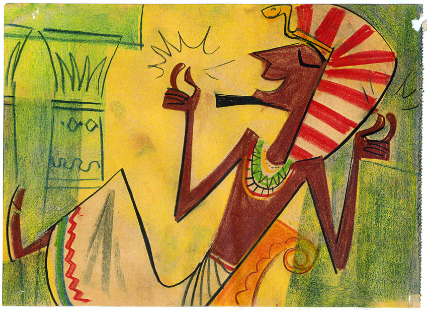
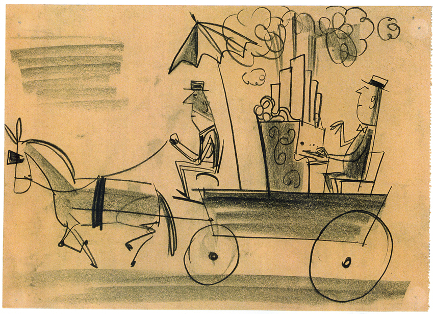
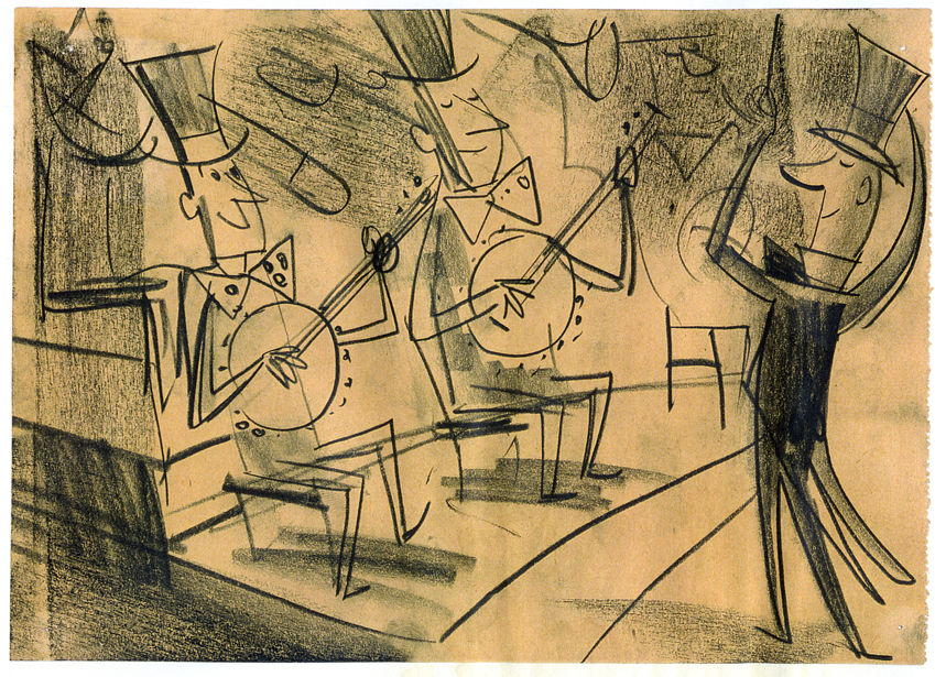
Toot Art – 3
 - Continuing with the enormous group of color stats of art from Toot Whistle Plunk & Boom, I have two more posts to offer. Today’s group gets a little more into true storyboard form. Amid Amidi has identified many of the B&W sketches as the work of Tom Oreb, and they show off his vibrant lines and strong sense of design.
As with other posts, I’ve added frame grabs for comparison.
All of these are from the collection of John Canemaker to whom I’m enormously grateful, just for seeing them nevermind posting them.
Here we go:
(Click any image to enlarge.)
One more post will follow, next week.
Art Art 12 Nov 2008 09:14 am
Tamayo
- The painter, Rufino Tamayo, has been an imprtant source of inspiration for me over the years, and I thought I’d share some of his later paintings.
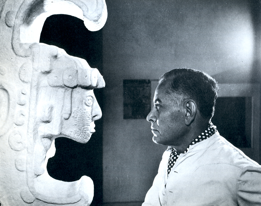 He was a Zapotecan Indian born in Oaxaca, Mexico in 1899. After his mother died, in 1911, he moved to México City where he attended the Escuela Nacional de Artes Plasticas. Tamayo was exposed to pre-Colombian Méxican art while working at the Museo Nacional de Arqueologia.
.
His contemporaries Siqueiros, Rivera and Orozco advocated a political art form whereas Tamayo’s work focussed on plastic forms integrated with a masterful use of colors and textures. Tamayo in Life Magazine, 1953
.
He is one of the best known Latin American
artists with exhibitions in major museums such as the Palacio Nacional de Bellas Artes, México, The Philips Collection in Washington, The Guggenheim Museum in New York and The Museum of Modern Art as well as principal art galleries throughout the world.
He died in 1991.
His work reminds me, in some ways, of Matisse’s Moroccan phase in its color choice and strong forms. His work has been compared to de Kooning and Debuffet. I’d certainly agree with the later. I find his artwork abstract yet bodering on the representational. The opposite of someone like Arp, Miro or Mondrian.
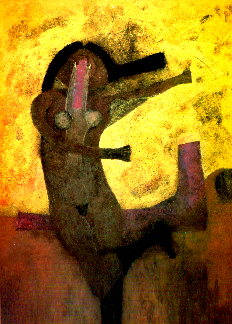
Here, for no good reason, are a few of his paintings.
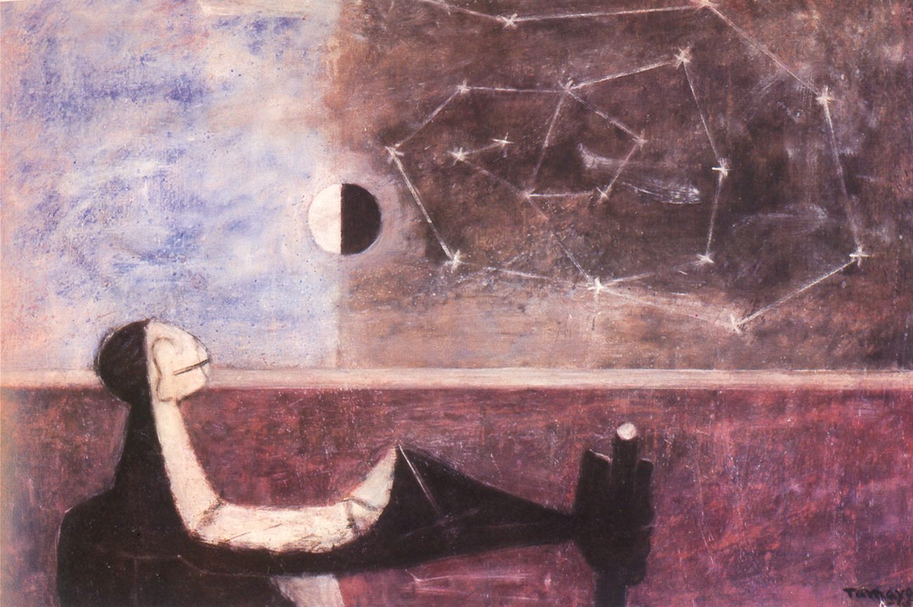
Man Before the Infinite – 1950
.
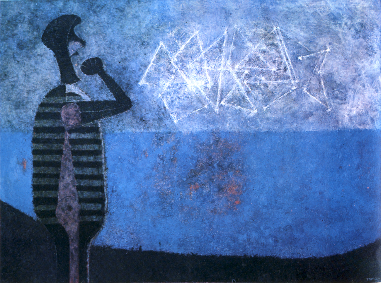
The Great Galaxy – 1978
.
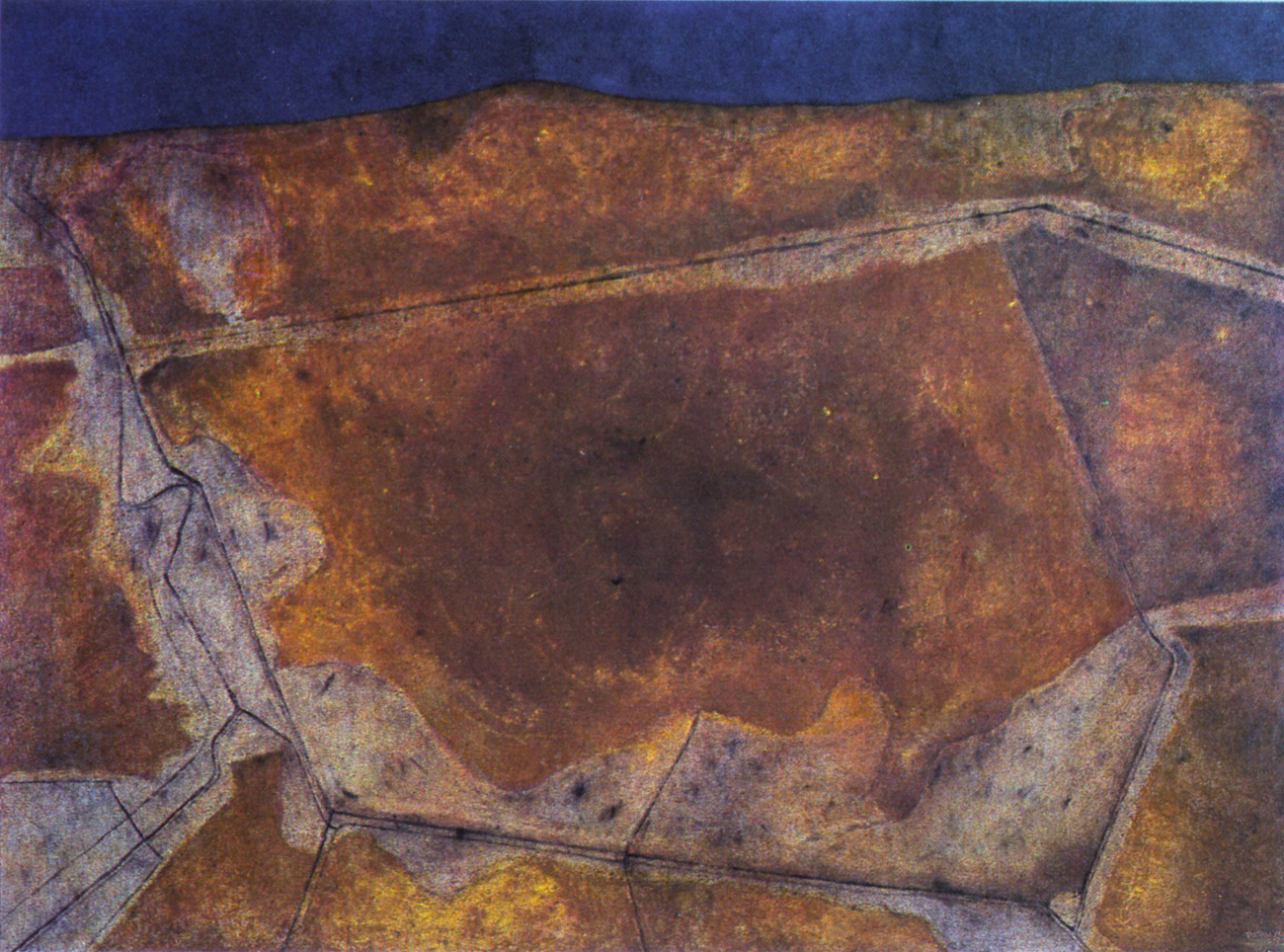
Arid Landscape – 1974
.
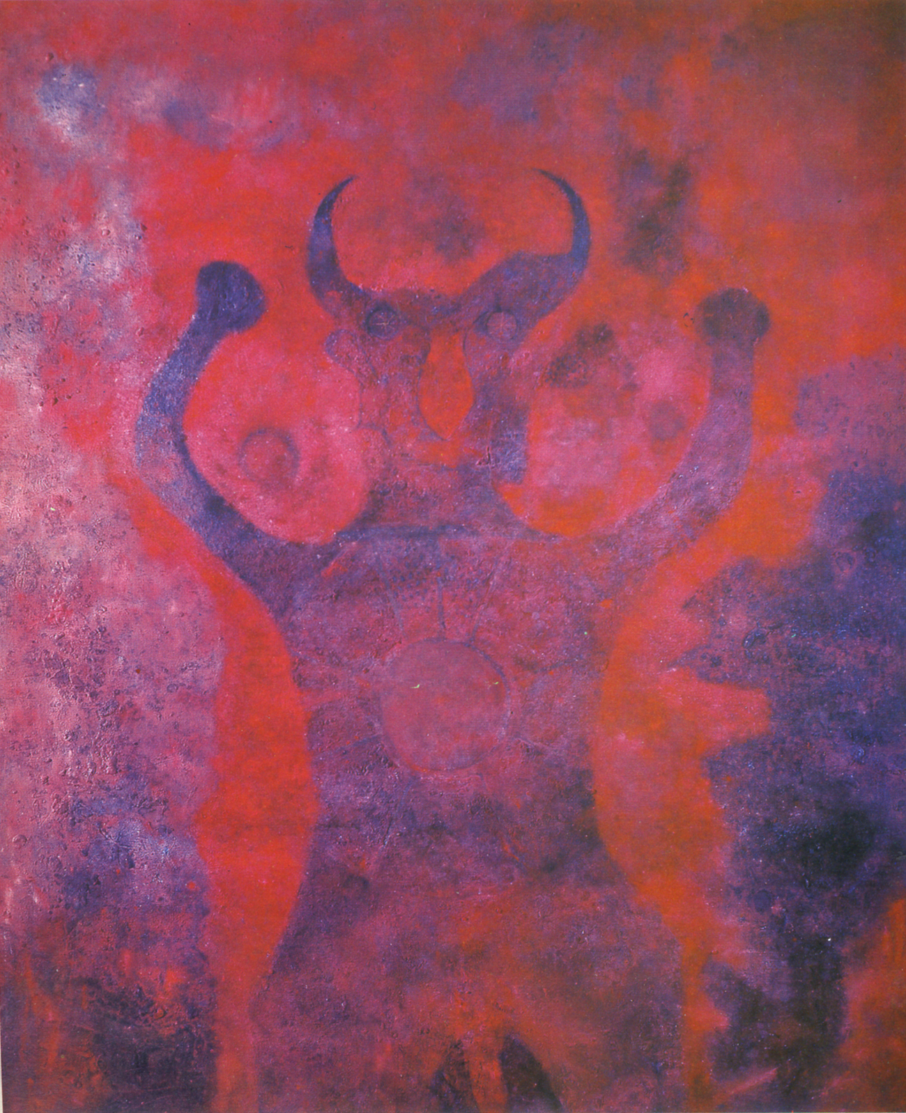
Portrait of the Devil – 1974
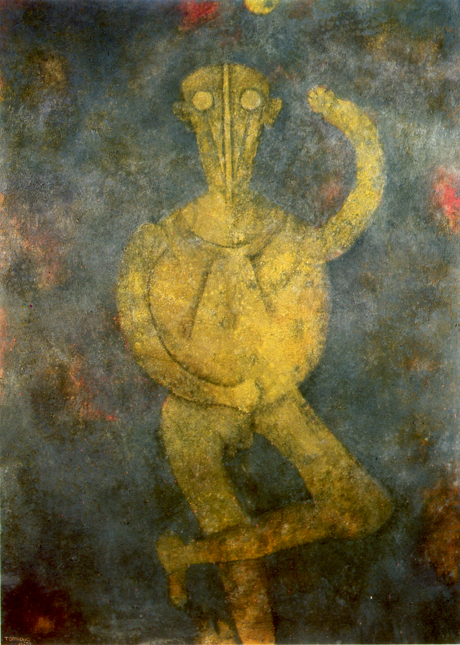
.
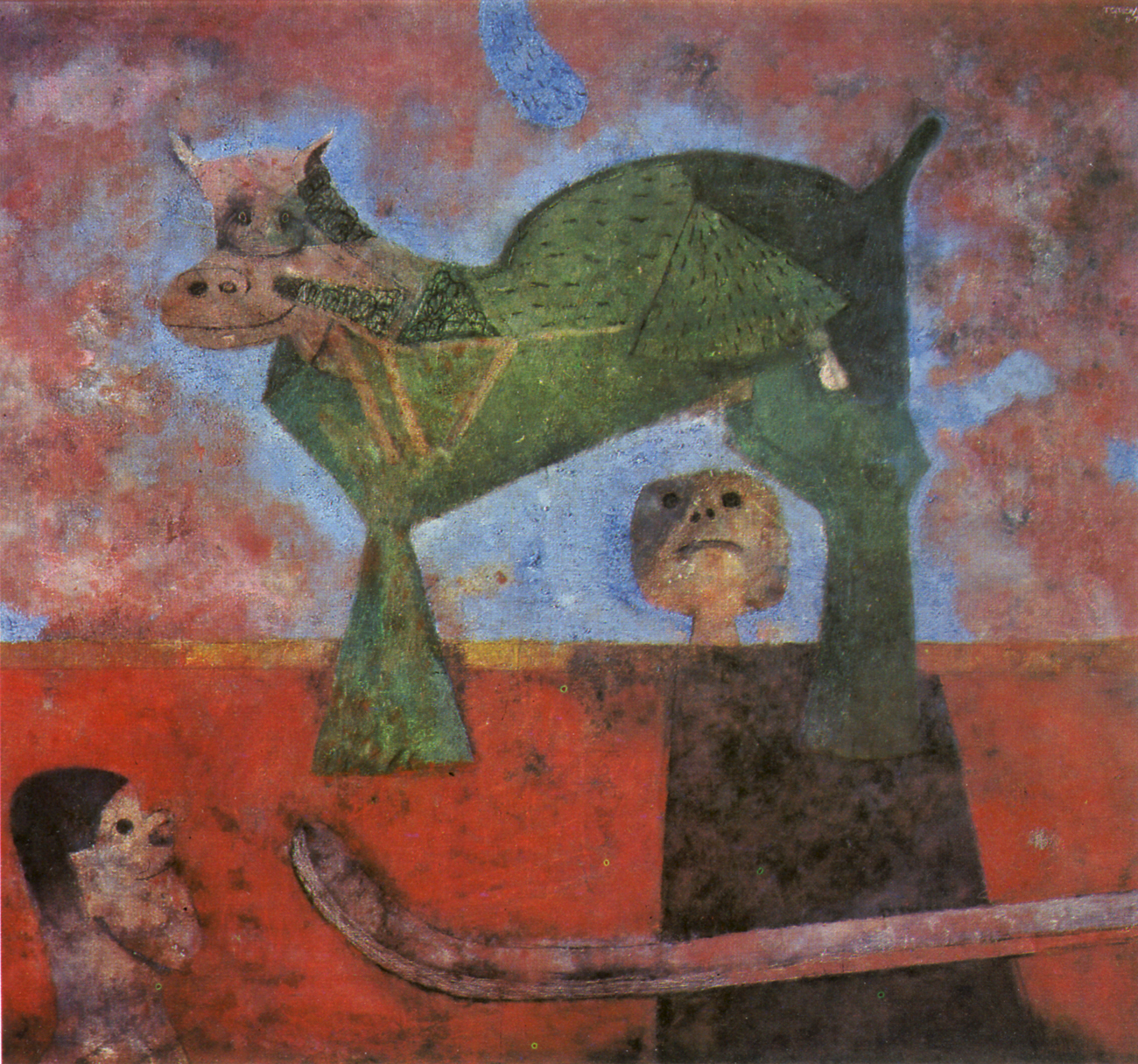
Showdog – 1974
.
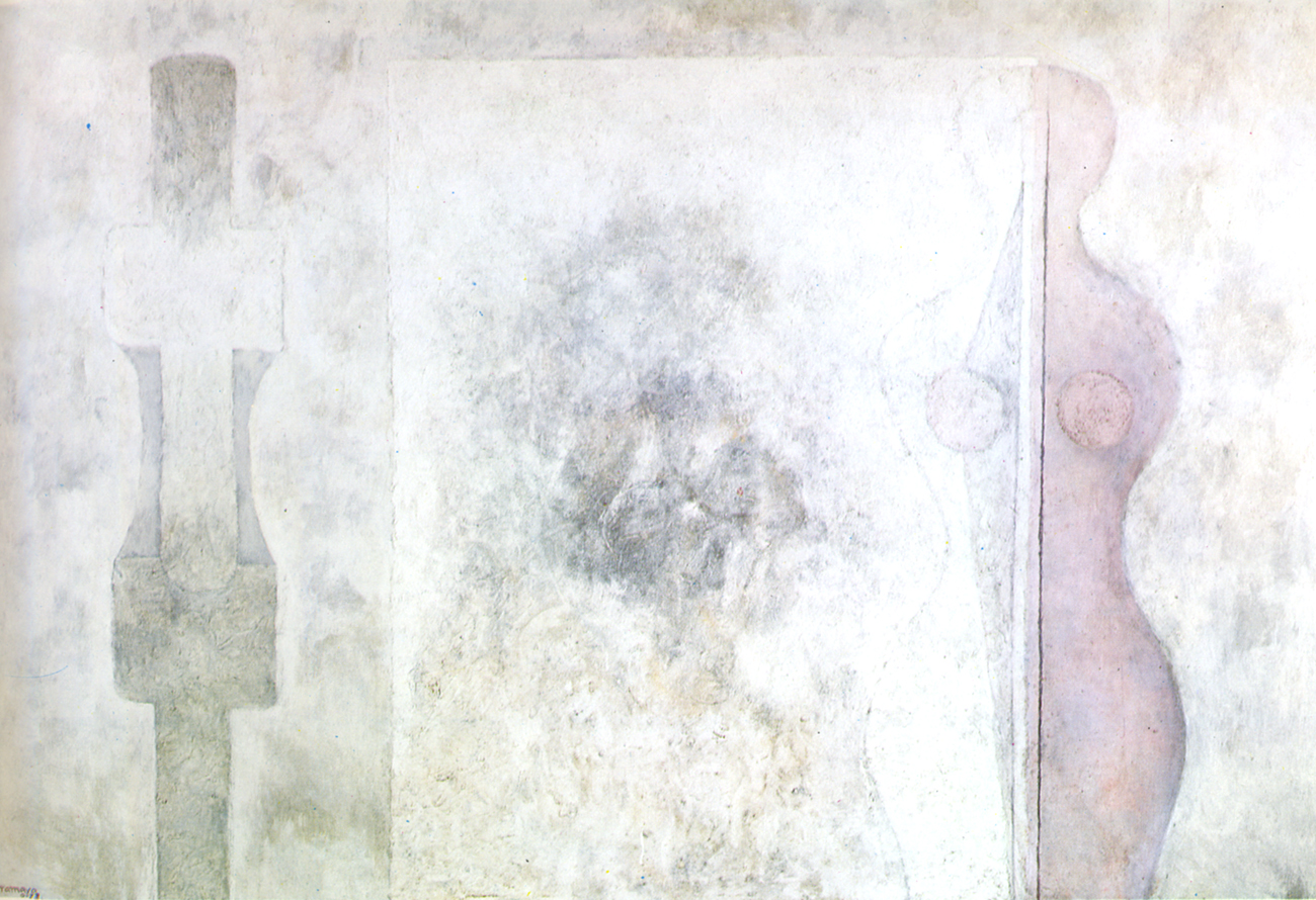
Woman Behind Glass – 1974
.
Empty Fruit Bowl – 1976
.
Dancer – 1977
.
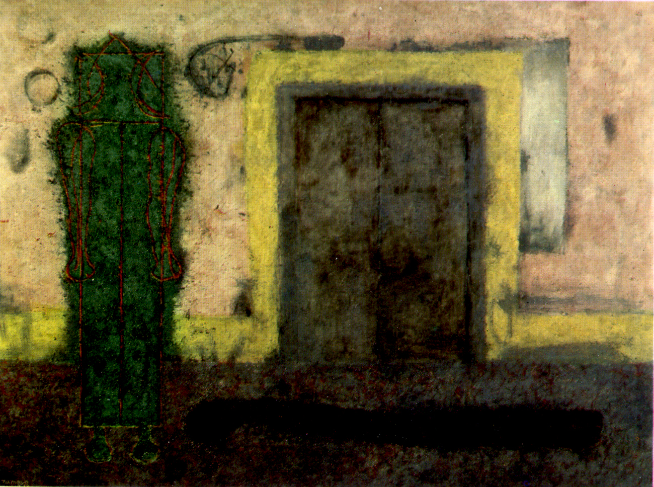
Ghost At The Door – 1978
.
Man (Hombre) – 1980
.
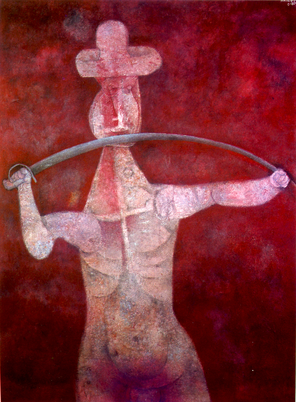
Man with Sabre – 1980
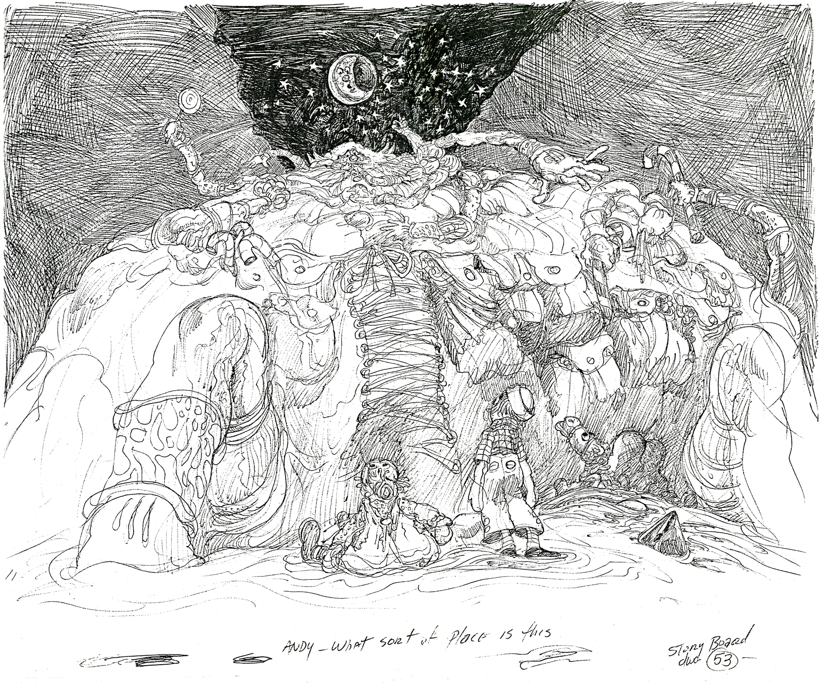
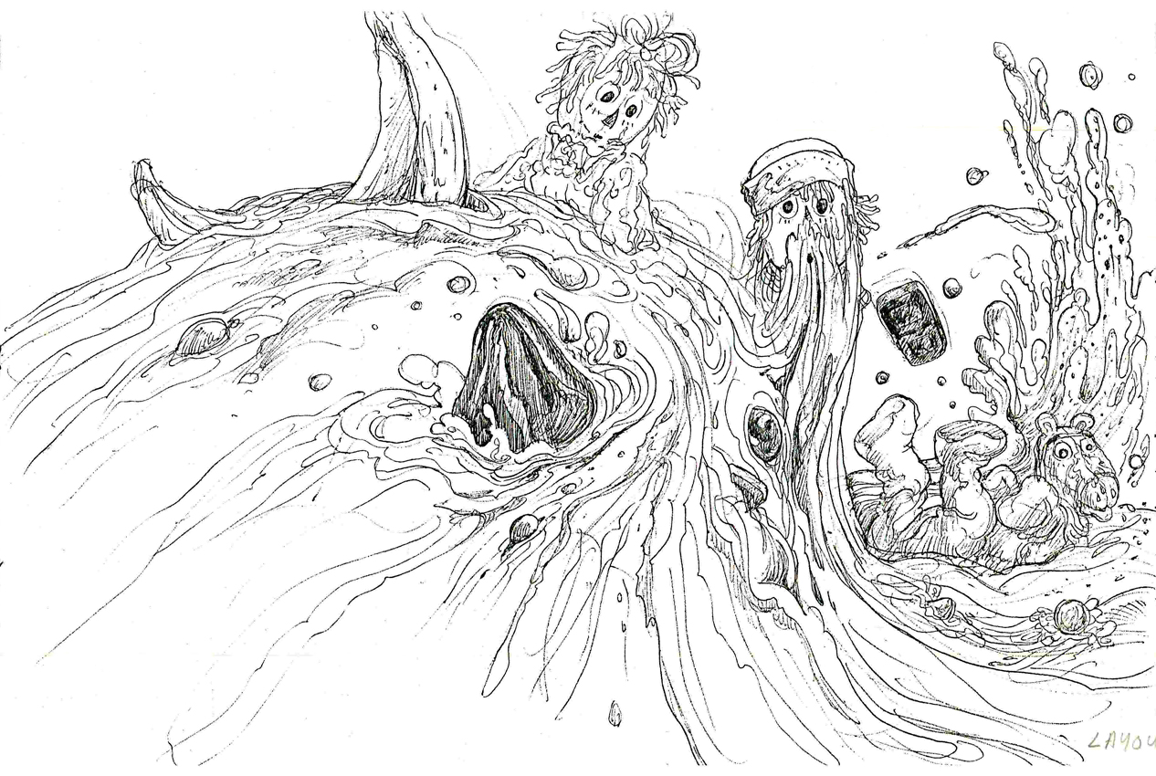
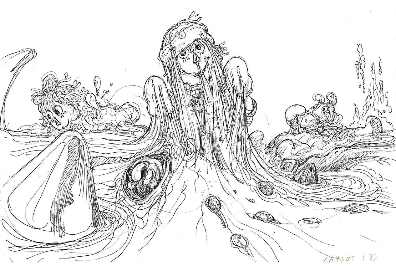
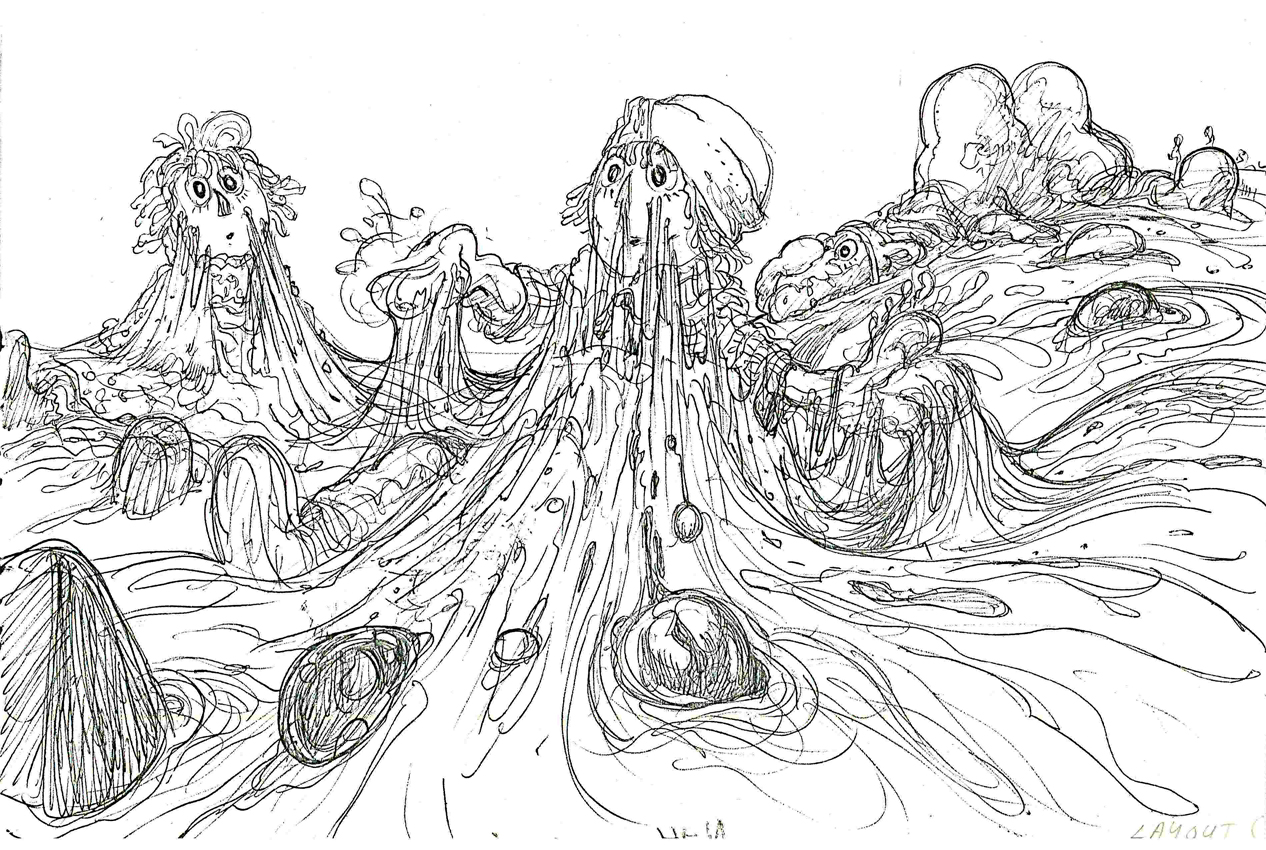
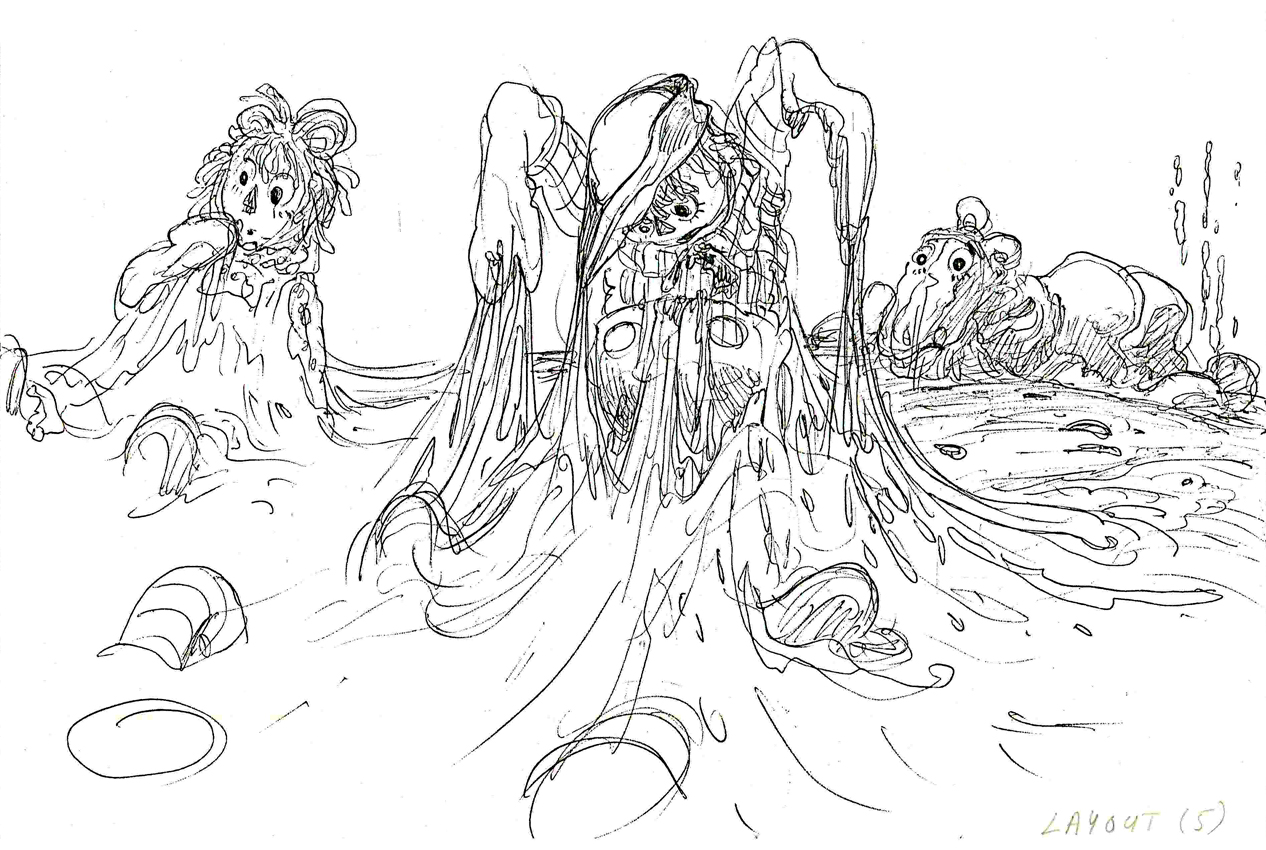
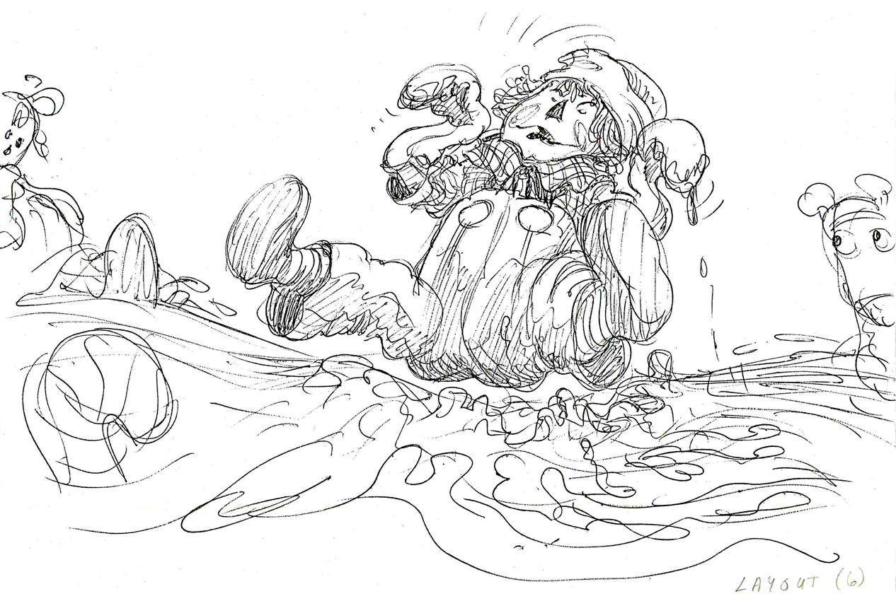
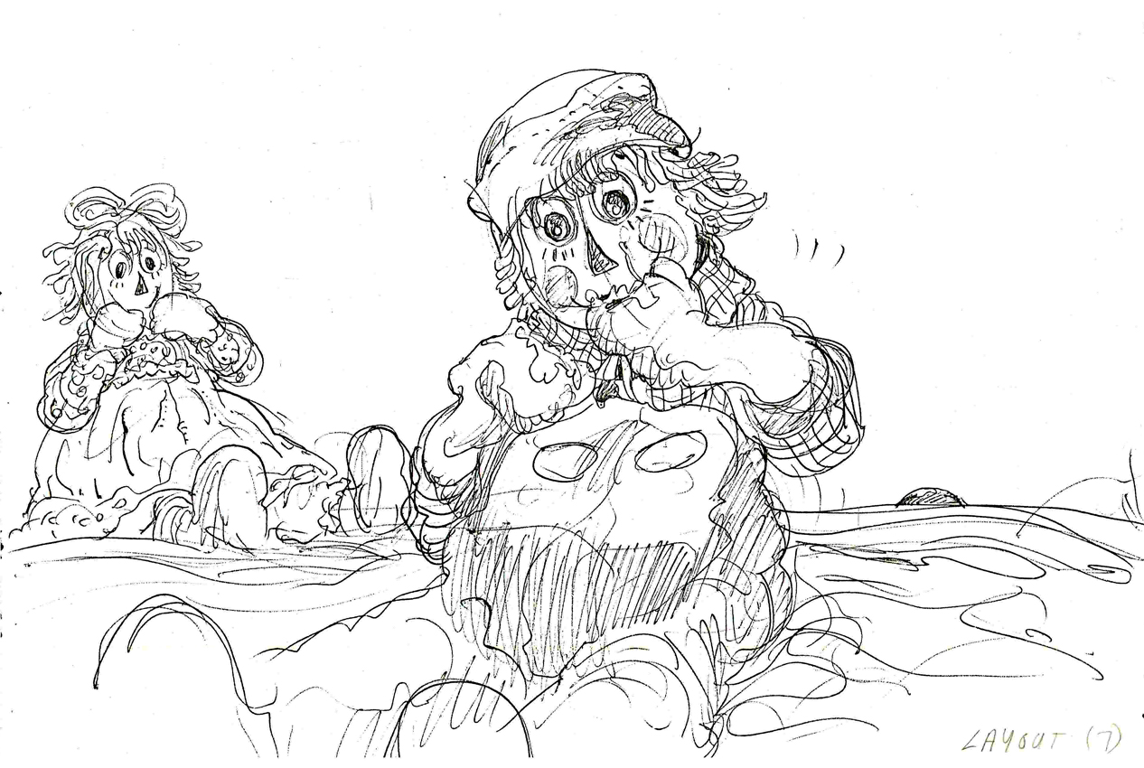
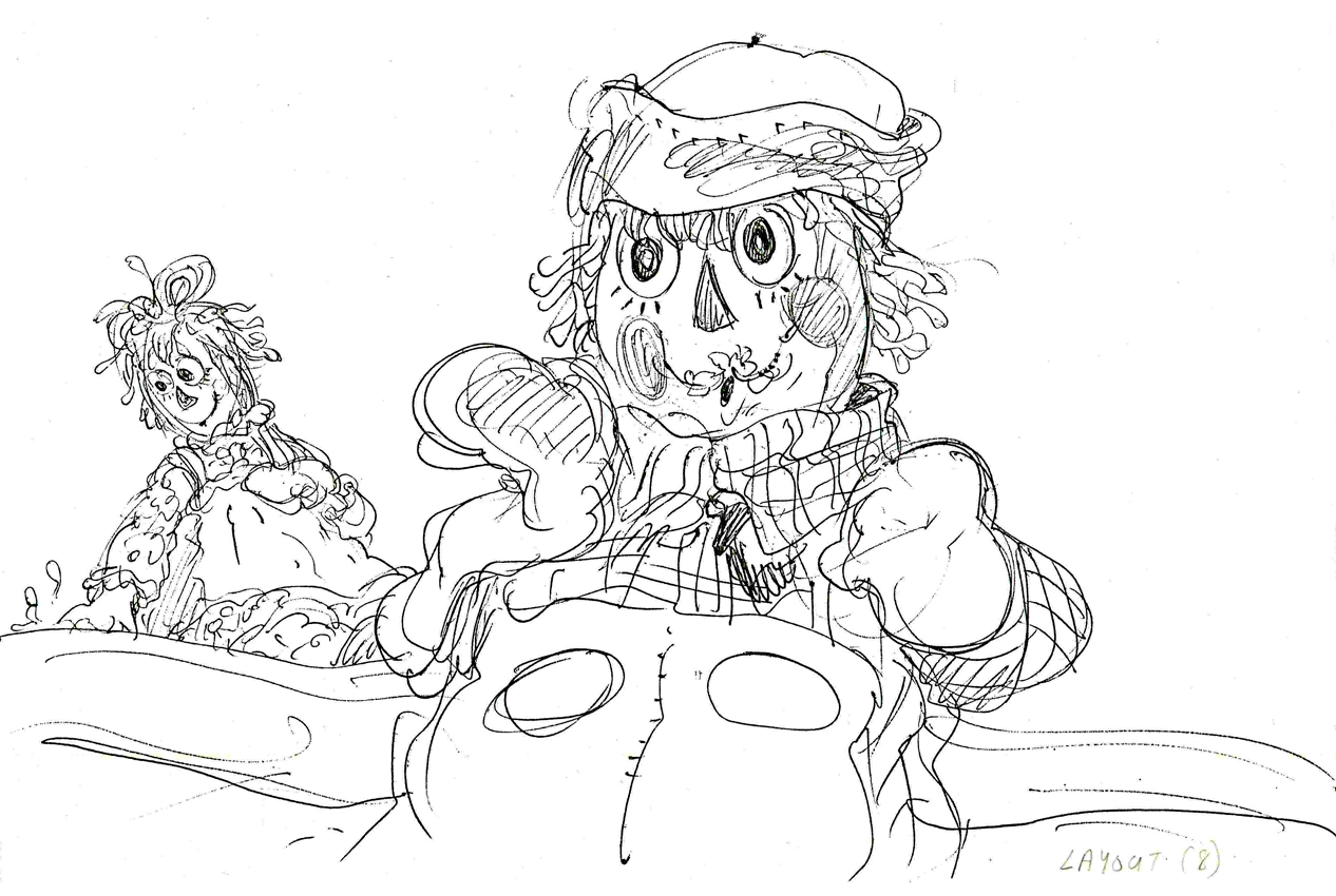
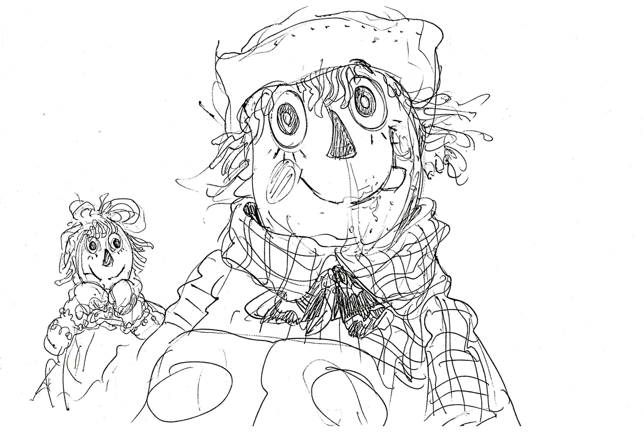
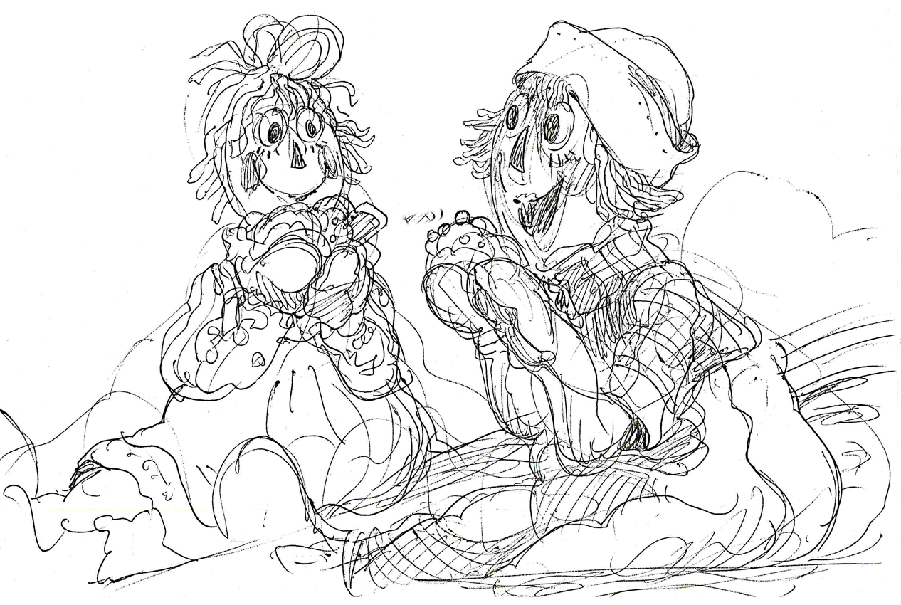
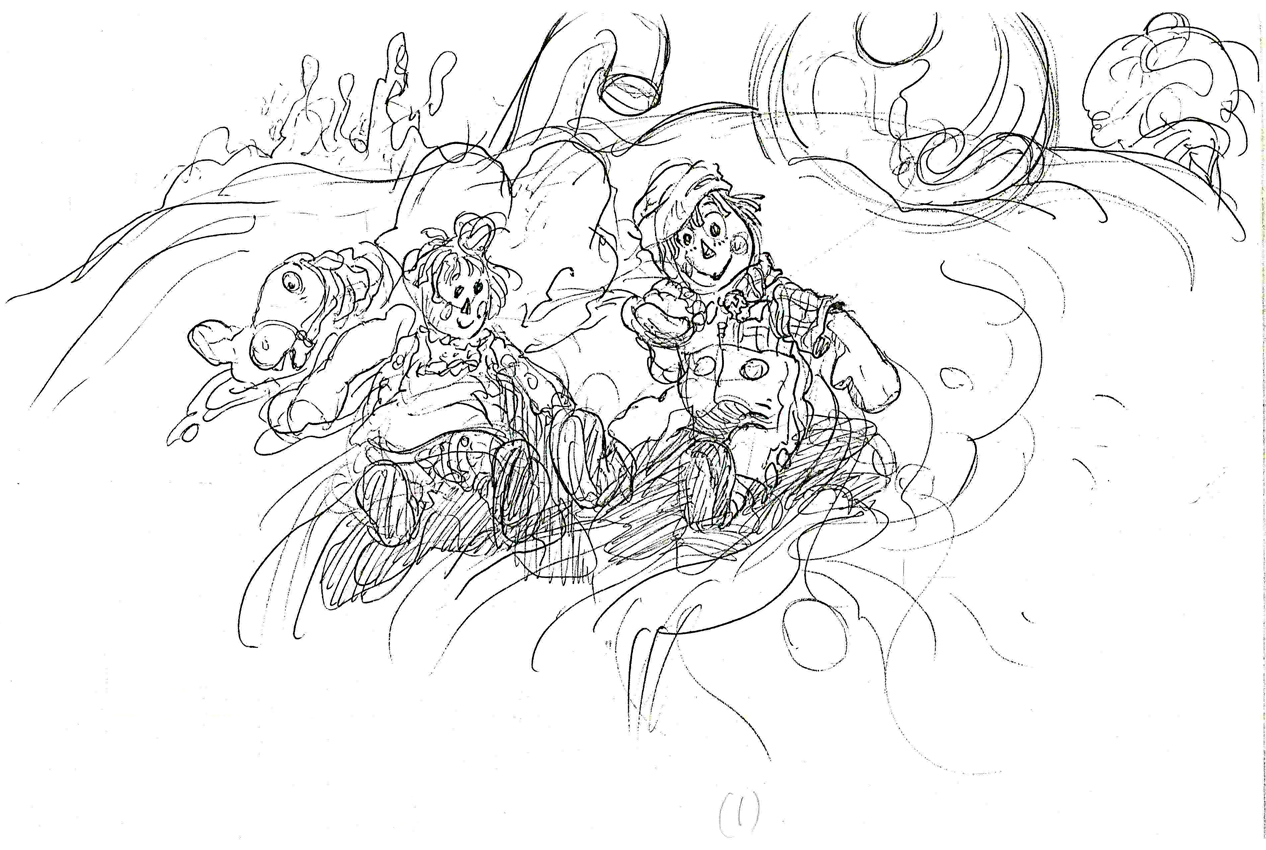
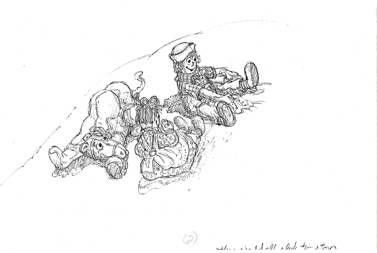
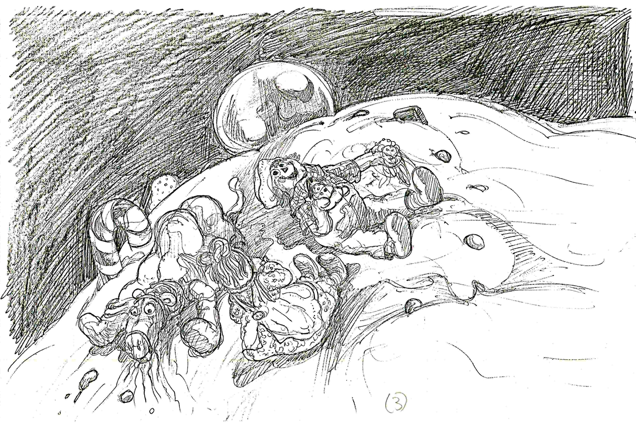
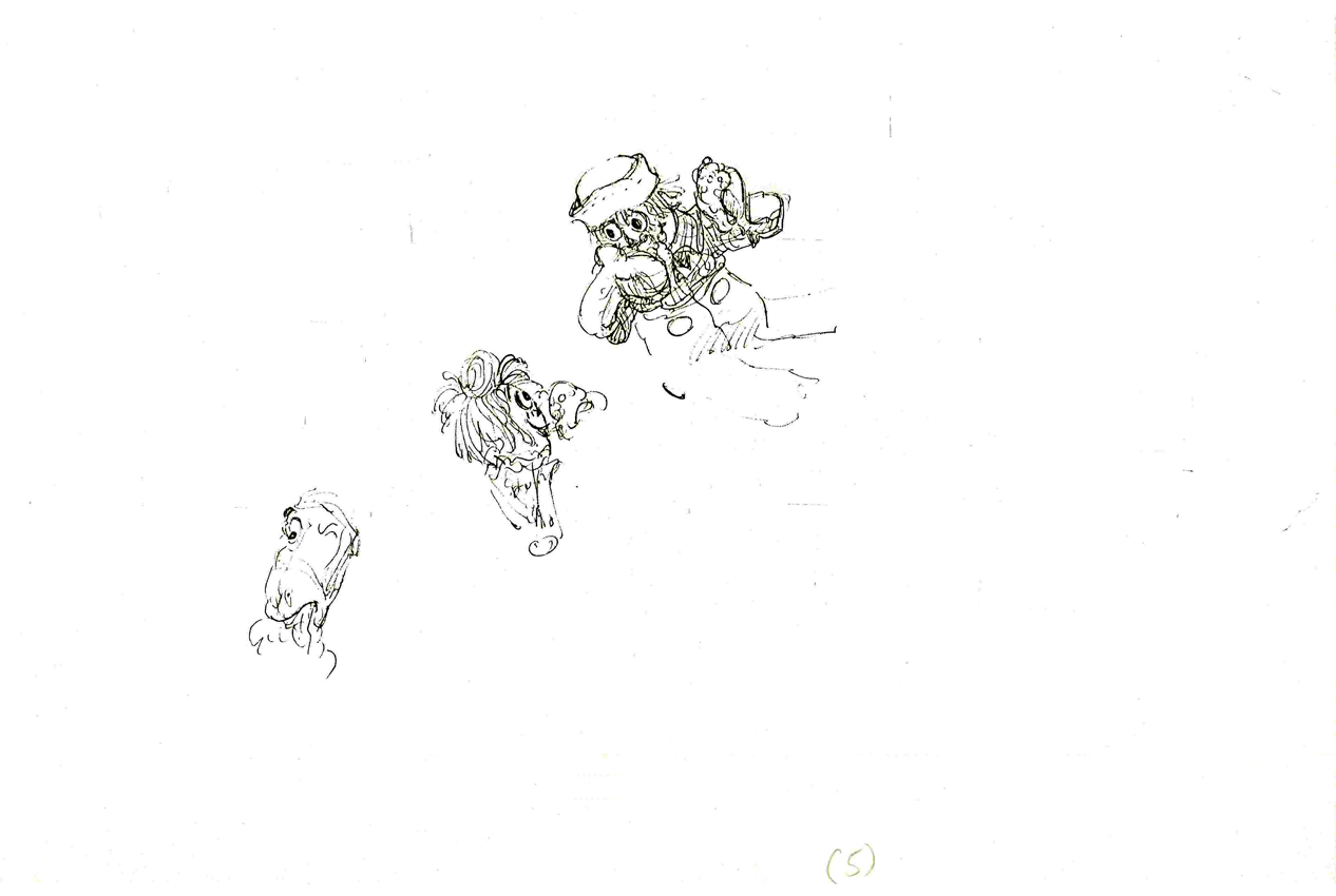
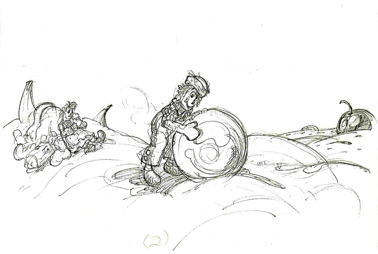
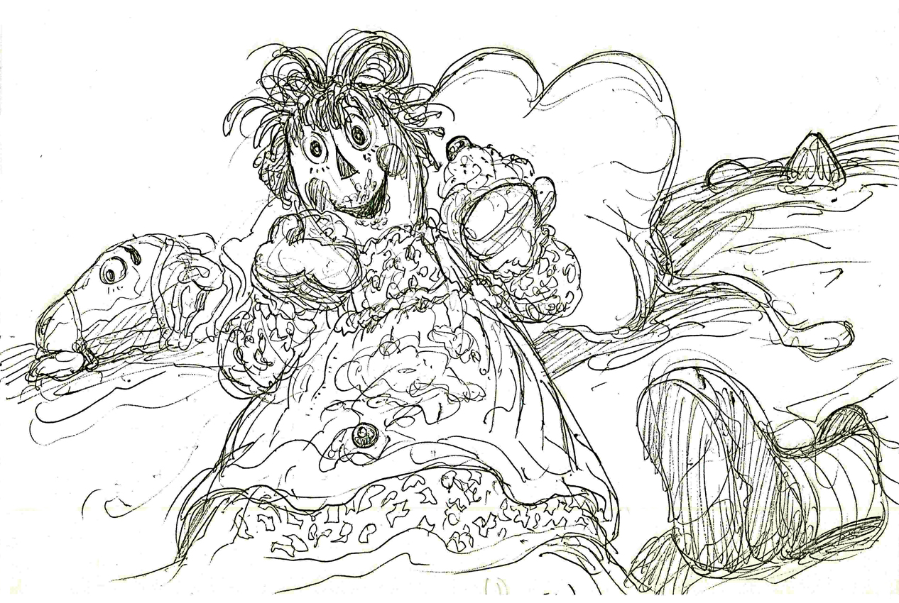
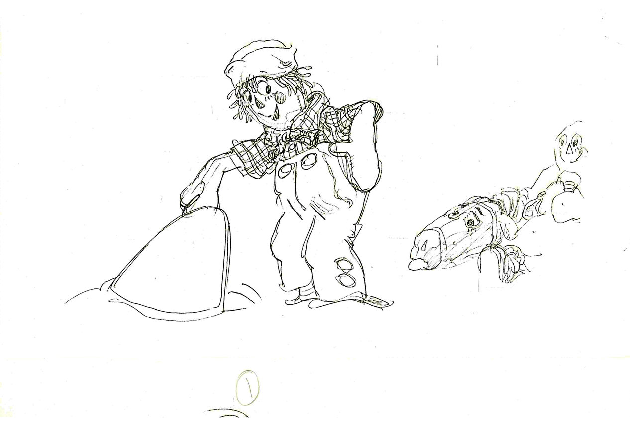
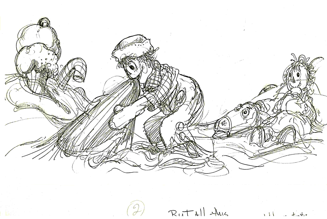
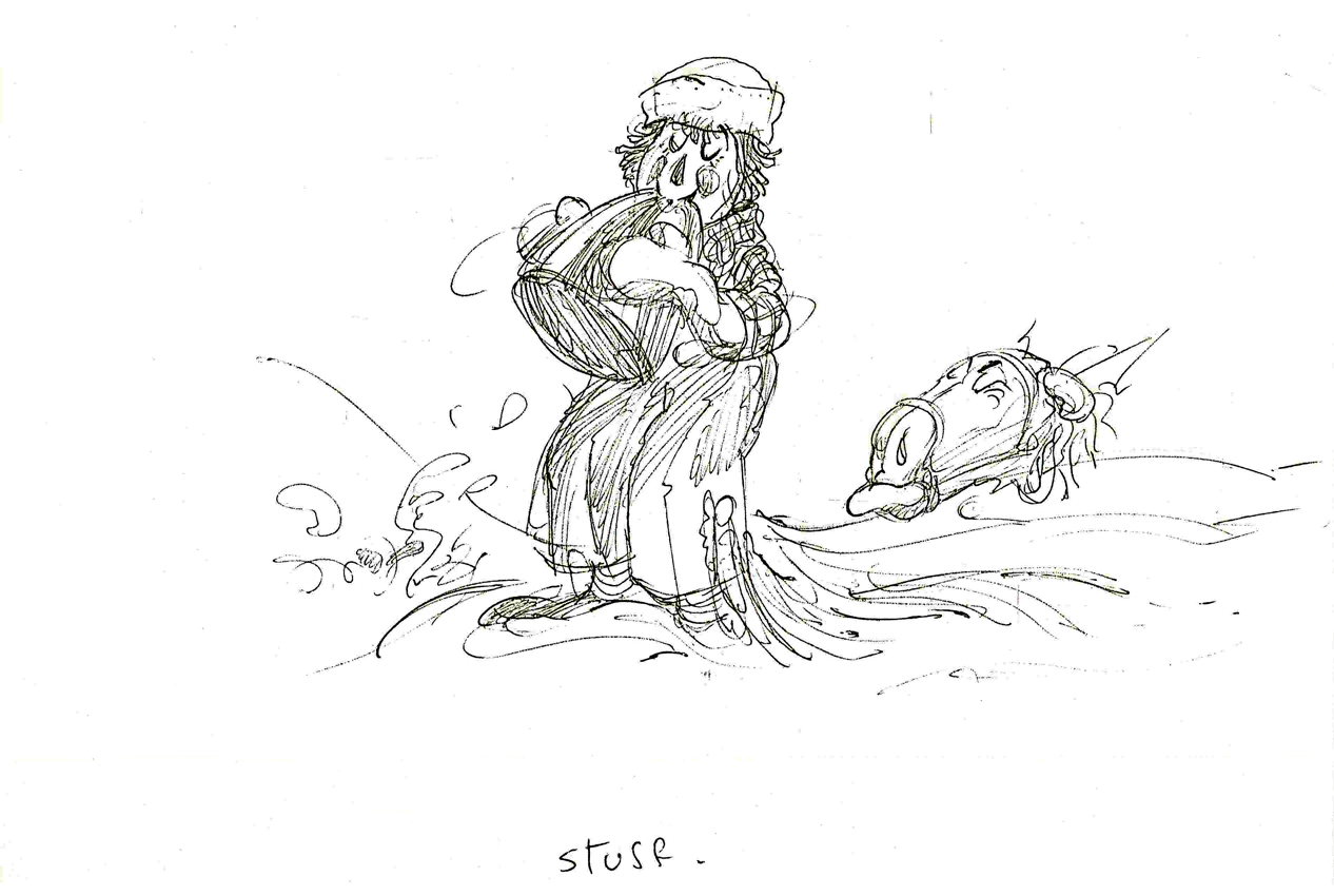
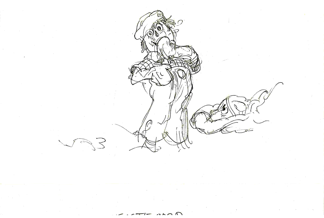
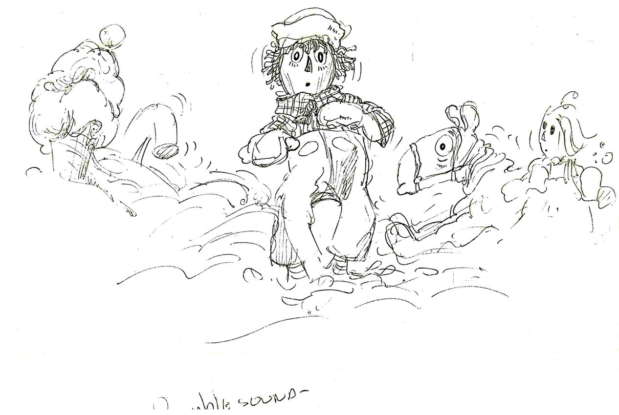
Animation &Layout & Design &Richard Williams &Story & Storyboards 11 Nov 2008 09:16 am
Corny Taffy
Corny Cole’s home was destroyed in a recent California fire. 90% of his artwork, saved from over his many years in animation was destroyed. This is a link to a PayPal site where you can donate some coin to help Corny and his wife who lost everything in the fire.
I have a feeling that many people don’t know of Corny’s incredible talent, so I’ve been trying to feature some of the material I have. It’s all stunning artwork, so it’s also a treat for me.
Here’s a sequence of layouts from Dick Williams’ Raggedy Ann featuring Ann, Andy and the Camel in the taffy pit. All drawings (and there are many hundreds more like this) were done by Corny.
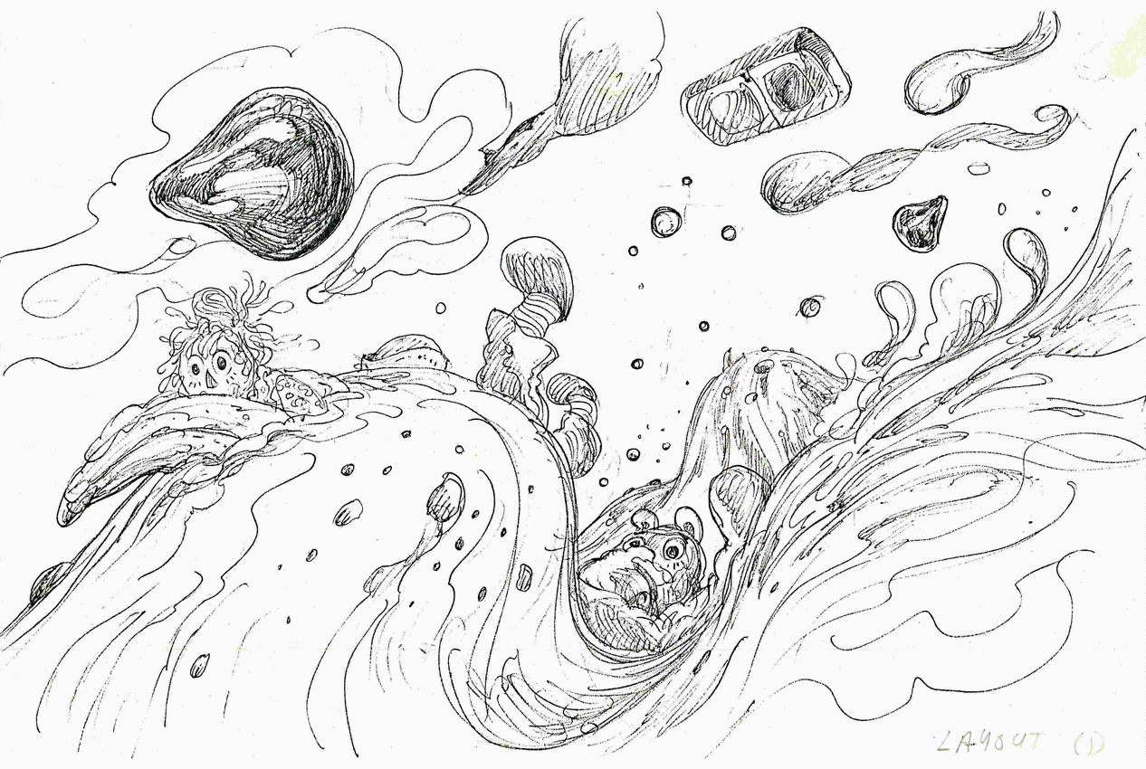 1
1(Click any image to enlarge.)
 2
2
 3
3
 4
4
 5
5
 6
6
 7
7
 8
8
 9
9
 10
10
 11
11
 12
12
 13
13
 14
14
 15
15
 16
16
 17
17
 18
18
 19
19
 20
20
 21
21