Monthly ArchiveSeptember 2013
Daily post &Festivals &Hubley &Layout & Design 09 Sep 2013 12:44 am
Ford, Noble and Art
I am a fan of the work of John Ford. If I’m caught catching a minute of one of his films, you’ll see me stay through to the end. Likewise I have almost as great a respect for the animation design work of Maurice Noble.
 It never fails. I get to the point where I’ve just about run out of hope for animation, and I feel like the greatest pessimist in the world. When I say “animation,” I mean 2D. Every frame is controlled by one person. The rest – cgi – is, to me a graphic effect, electronic puppetry. I’m certainly not talking about the overacted cg action you see in most films done today. Most animation to me, these days, is something that’s done in a computer by teams of people, and isn’t wholly designed as “personal.” There are, of course, the exceptions. When something like THE LIFE OF PI shows up, it feels like magic; the magic you expect of great animation.
There’s just too much of everything in most current animation; even the flash Mickey Mouse spots go too fast with their Zips, Pans, Takes; the simplest move seems to go over the edge. Gestures are bigger than they need be, actions are over the top, dialogue is too loud and frenzied unless it wants to be quiet – then, it really is dead. The animator became that big red button they have at “Staples.” You press it and the client can fix what he has to – his way. The poetry has vanished from the art form when this animation begins. Too bad there’s no personality in those big red buttons.
John Ford made some of the most beautiful movies we have on film. Many of these are Westerns, Westerns which notably featured some of the most extraordinary, natural land masses photographed. The incredible buttes and sights appear in the Arizona Desert, called “The Painted Desert”, and whether they were shot in the glorious golds, violets and other colors or even shot in B&W they add extraordinary sights to these films. If they weren’t already there, constructed and painted by some god, Ford would have had to have a mass of people construct these images.
Working to a better advantage is the art director Maurice Noble who created his original version of the “Painted Desert” mostly out of his own imagination. I suspect he and a couple of other artists were all it took to develop these animated scenics: far fewer people and a lot less time.
As I said, Noble’s desert was original, a recreation of the actual “Painted Dessert” but one that developed out of Noble’s imagination. These are almost as beautiful as the real thing, in that “design-y” way Noble’s art had.
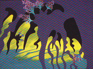
So here we have two film plans. Elaborate impersonal scenery that was designed by Mother Nature, vs the personal designs delicately designed by Maurice Noble. Both are very different but have similar effects on the films they inhabited. A personal world Ford shares with us and another that Noble constructs for the backdrops of the Coyote and Road Runner. Both set designs are larger than life and full of that very-same-life. It’s in gloriously wonderful color (even thoughmany of these sets were shot in B&W) it’s just the beginning of the strength of these films. We’ll look further to see what more has been offerred to us in their films.
Illustration &repeated posts 07 Sep 2013 11:50 pm
Emergency Mouse – repost
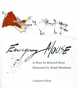
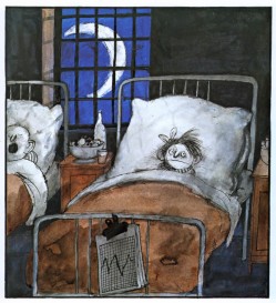
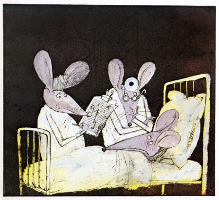
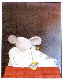
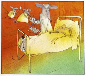
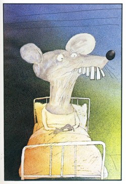
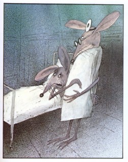
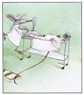
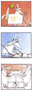
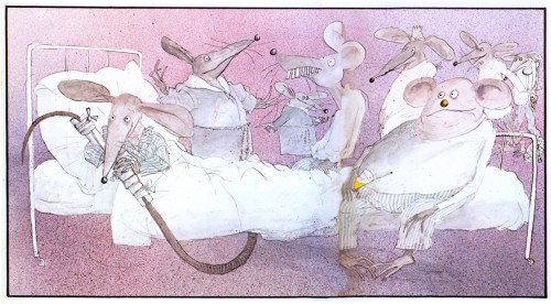
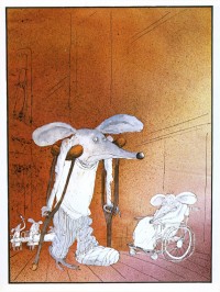
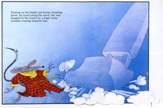
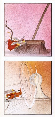
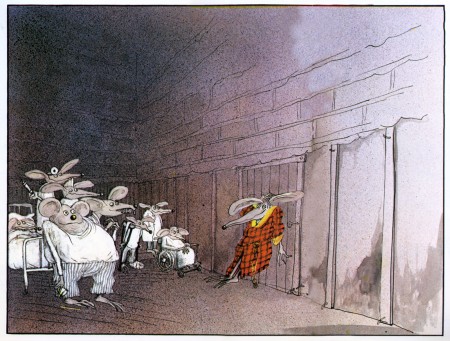
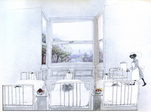
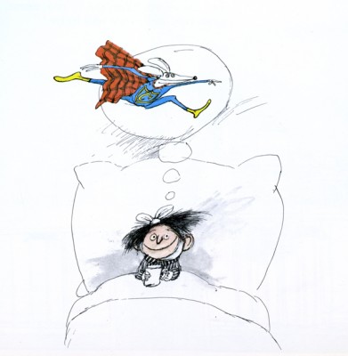
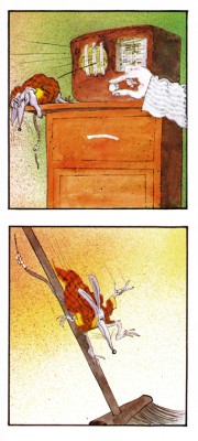
- Have I mentioned more that a dozen times in the last few weeks, that I’m a fan of Ralph Steadman’s artwork. Here we take a short break from Ralph Steadman‘s Alice in Wonderland to post something original from him, Emergency Mouse. The guy’s a real artist. Here’s a few pages from the book:
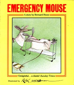 – I’ve been a Ralph Steadman fan/collector for most of my life. I love the guy’s work and would give anything to be able to do anything remotely as well as he does.
His versatility with pen and ink, dyes and watercolors doesn’t quite hide the magnificent draftsmanship behind his illustrations. Many try to copy his style and none have come close – though Gerald Scarfe has made a nice living off of a similar style – though a bit sweeter. Others, more academically inclined, those who swear by the Bauhaus rules, tend to turn their noses up at his work. I like to think of Steadman as the Jim Tyer of illustration.
Regardless, the work is brilliant. His art always has an amazing intelligence carrying it to the highest pinnacle. It breaks the rules and makes new ones. Illustration comes damn close to Art.
Not too many people have focused on his children’s books, and there are many. Not least is the series of “Mouse” books he’s done with Bernard Stone. Here is Emergency Mouse, a good example. I’ve not lifted the script but am merely showcasing the illustrations. Unfortunately, this also takes a bit away from the book design which is unique on its own. The type is well placed to balance off the different sized illustration.
If you want to read the story, you’ll have to get the book from the library – or buy it.
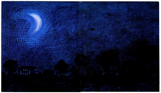
(Click any image to enlarge.) This is the inner cover. ____
 14
14
Articles on Animation &Commentary &Frame Grabs 07 Sep 2013 02:24 am
Saturday Comments Live
Well, today’s Saturday, and I actually have a realio trulio live blog post for the day. We were able to get Verizon in to trip over their own shoelaces and figure out what was causing our phone problems. But they came through with blazing colors, and here we go again. Now I hope we can, at least, make it through the next week without having to shut down again.
More on St. Louis
I received a surprise check this week from the St. Louis Animation Film Festival.
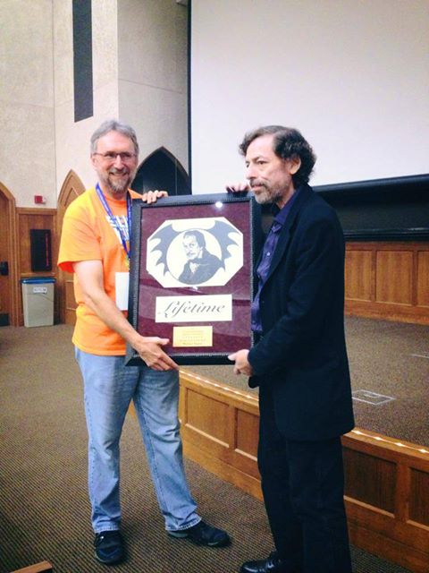 Maybe you’ll remember that we had to leave St. Louis in the middle of the night. Because of some enormous pain I was getting from an operation I’d had in NY, just the week before, doctors had to retrace their steps. The Festival felt that they should cover any overage costs that it took to get me into NY and onto Beth Israel’s operating table. The Festival folk couldn’t have been more generous. I was embarrassed just to have to pull out the way I did. They made it more than alright by covering extra travel costs that caught me unawares
The award was made especially for me. and had just gone out via FedEx. The award celebrates my career with by illustrating my in-production film. Illustrated by a local talent, it depicts Vincent Price in the E.A.Poe position lookin’ over me. My new guardian angel will be looking out for me from my office wall. It’s working guys; it’s working.
The film isn’t even finished yet, and already it has an Award. Thanks to you.
Cliff Froehlich and the rest of his staff are first class people, I can guarantee that! Thank you Cliff and anyone else involved.
The commercial for “Christian Mingle” animation looks like it was pulled from the 60′s animated short, Nathan A]exander Davidson and his wife, done at their company, Zone One Oni Designs.
Christian Mingles lasts less than 20 secs whereas Cosmic Cartoon lasted almost 20. Both use lots of hand-done air brushing done on top of cels and photographed traditionally. At least, I know that’s how Cosmic Cartoon was done; you can’t really tell with the Christian dating service ad. One presumes they’re now using a computer for artwork and effects. Regardless, it’s a top-rate spot.
I’m sure the full film is out there somewhere on YouTube.
If Fred Ladd, John Lisberger or anyone else connected with the film want to give us more info, I’d love to see it in the comment section.
The same is true of Nathan Alexander Davidson. Tell us what you’re up to now. Any more such spots in the works?
I still haven’t gotten over the retirement of Hayao Miyazaki this past week. There are very few animation directors, historically, that I can think of whose influence was as far reaching and key to the art of the medium. There are enough live action film makers whose work was consistent and moving over a consistent number of themes. John Ford, Alfred Hitchcock, Howard Hawks and George Cukor
I’ll talk about this at length in the upcoming posts. The director’s influence has been too great on me to not pay great attention. (It’s at a time like this that I wish the late, great Tissa David were still around so that we could recap our thoughts with each other.)
Animation &Animation Artifacts &Art Art &Miyazaki 04 Sep 2013 07:05 pm
Holes
We’re still in a fight-down with Verizon and our work isn’t getting there. Hopefully it’ll finally be resolved by Friaday, so don’t be wurprised is anoternpost is missing.
It was good to read Mark Mayerson’s article on Monday night. I was sure Hayao Miyazaki was planning to retire, so it felt positive knowing what was to happen. After the last few threats, it was somewhat expected. He did everything he could to line up Goro, his son, to take charge of one wing of the films in production. Now he can entertain the idea of running the studio’s production.
Given that The Wind Rising, Hayao’s most recent film, is doing well on the Festival circuit, the elder Miyazaki can go out with å bÃ¥ng. The film’s also reaped very high grosses within Japan and seems †o be doing well at the Box Office,
The hard part is actually knowing he won’t do more films. When you have someone of his caliber consistently turning out special work, it’s a shame to see that product get lost.
Mark Mayerson had a nice analogy comparing John FOrd to animation. Once such a master stops working the vacuum left behind them is enormous. A space is left open, missing and ¨if left open and not-filled it surely becomes a hole in †he arc of the medium, it’s noticeably missing.
There’s certainly nothing in the world of cgi feature animation that compares. Everything on the market in the last year was so wholly vapid
we can only hope a surprise will take over for the younger artists and give a direction forward. Miyazaki will be missed in the world – he already is. There will be no other like him. At least we know he’s alive and kicking so we can aontinue to honor him and his creatopns.
Articles on Animation &Commentary &repeated posts 02 Sep 2013 01:12 am
Labor Day Reader
 - I’ve been watching some older animated features lately. Plague Dogs, I thought, deserved another chance, so I rented the DVD. I was right. The film is a very odd one.
Surprisingly, despite the depressing subject, I found myself unattached to the story’s emotions. I would guess it has to do with the direction of he work.
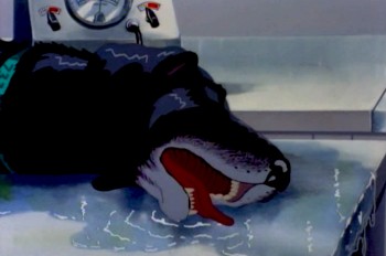
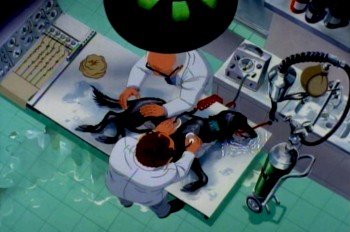
The film starts with one of our two lead characters
in deep trouble in the laboratory.
The story is essentially the story of two dogs who escape a laboratory that experiments on animals, and they make their way across the British countryside while teams of people search for them. One of the dogs has been inflicted with a plague bacteria and could spread the disease outside of the lab.
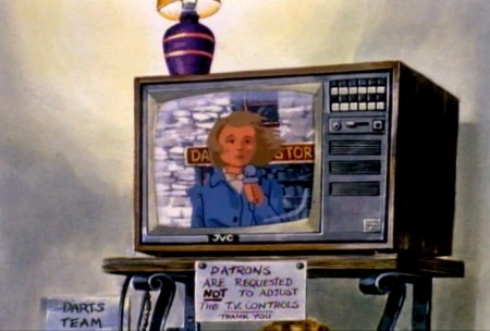
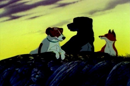
The story is told through a sort-of narration done in a very clever way. Disconnected human voices talking about the situation are used as voice over. We don’t often see who’s talking but we hear their voices. There are times where the voices start and we join the speakers in their conversations. The two dogs communicate with each other and a fox, who helps them in their escape.
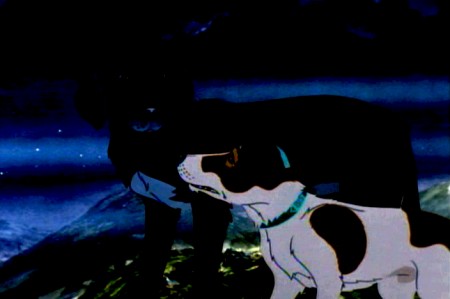
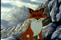
The dogs escape and travel the back roads in the mountains.
The animation throughout is just about serviceable. No scenes really shine even though there are a couple of standout names in the credits – including Brad Bird, Tony Guy and Retta Scott – as animators.
The film was a follow-up project for producer/director, Martin Rosen. He was the original producer of Watership Down, and his ego allowed him to think he could direct that film better than John Hubley, who was fired within the first six months.
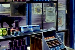
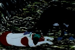
There’s the constant play between the traveling dogs
and the humans who talk about their roaming the countryside.
It’s no surprise that Plague Dogs includes no poetic scenes such as the introduction and the “Bright Eyes” sequences of Watership Down. It’s all down and heavy, done with a lack of grace. Yet, despite this there are several very clever devices for keeping the story moving forward. It would have been nice to see what better animation and a better director might have brought to it.
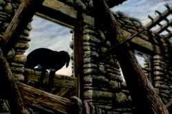
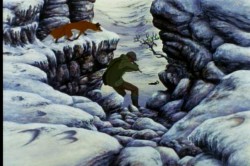
However, the film’s tough subject matter was sure to bring back poor business, and there’s no surprise in its low grosses at the box office. However, as I’ve said, the film deserves another look.
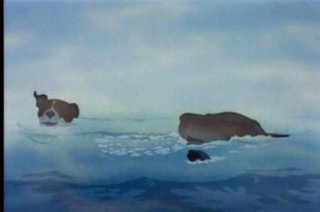
The film gasps for air with the heavy approach, though it deserves
praise for trying to be different and take animation seriously.
I can remember being in England, mixing the voice track of Tim Curry for that film. The recording engineer talked about having to sit through Plague Dogs so many times while mixing it, and explaining how the film had to fail at the box office. He talked in similar terms about When the Wind Blows which, at the least, had Raymond Briggs and David Bowie behind it. Not quite such a miserable failure as Plague Dogs, it still didn’t do well.
I’d always thought that “Doctor Rat” by William Kotzwinkle would have made a better animals-escape-lab story. It’s certainly a better read.
Daily post 01 Sep 2013 08:17 am
Orphan Kittens in the Subway
It was on Friday that two kittens got lost underground on the NYC Subway tracks. It stopped and entire track line for over two hours until the kittens were caught and retreieved. I thought
it apprporiate to repost this post from four years back. It took some four hours to keep the subway closed until they retreieved the kittens.
- I’ve often been curious about the generation that lived through the late 30′s early 40′s. The animated cartoons that were made during this roughly six year period often feature enormously cute characters going through cute storylines. The audiences must have loved it considering the fact that there are so many of these films, including Oscar nominees and winners.
Lend A Paw, The Milky Way, Merbabies, Wynken Blynken and Nod, Two Little Pups, and any of the Sniffles cartoons all featured good animation and high prduction values but terminally cute material.
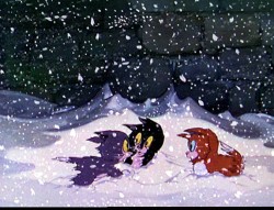
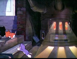
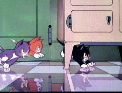
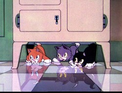
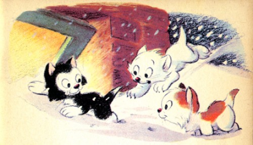
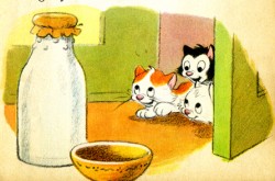
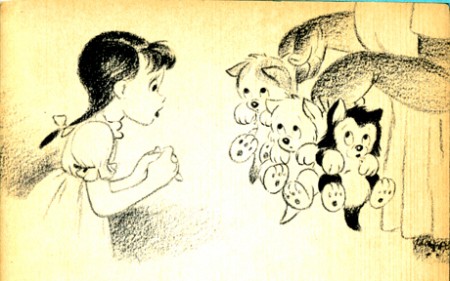
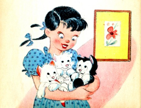
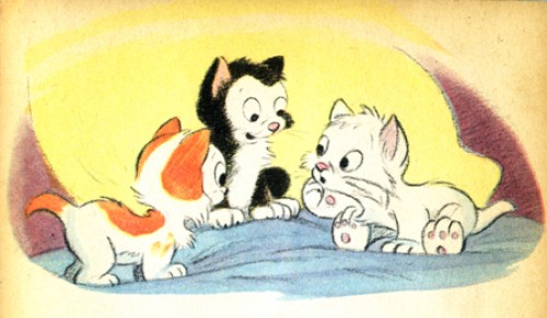
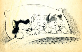
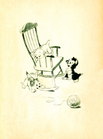
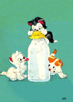
The Three Orphan Kittens of 1935 was an Oscar winner and as cute as all getout. Not only are these mischievous kittens, but they’re also orphans. The film was directed by David Hand and featured a seuquence by Ken Anderson in which floorboards were animated to try to capture the illusion of 3D.
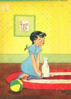
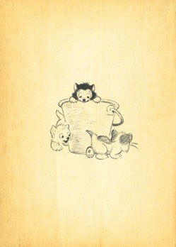
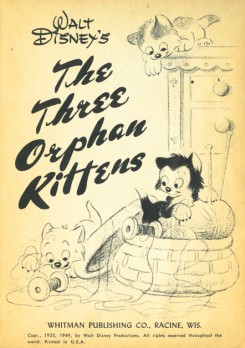
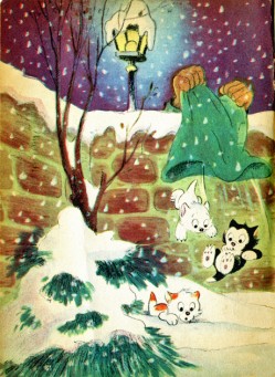
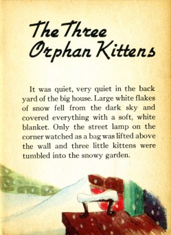
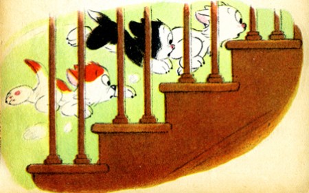
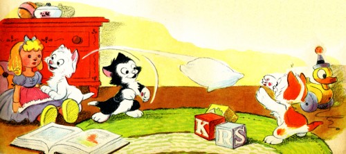
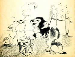
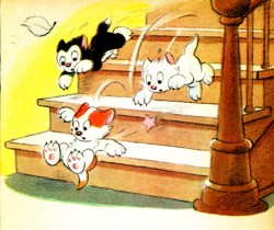
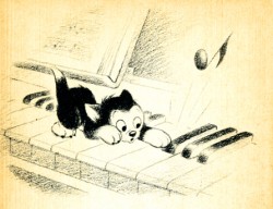
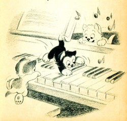
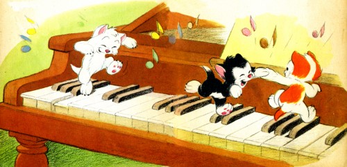
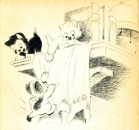
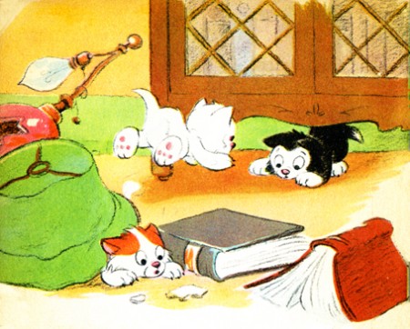
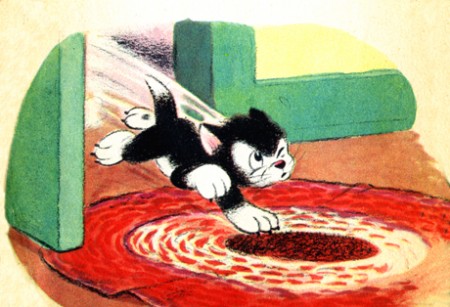
A number of children’s books were produced from this material, and I offer here the illustrations from one smaller-sized book. It was originally published in 1935 and was obviously such a success that it was reprinted in 1949.
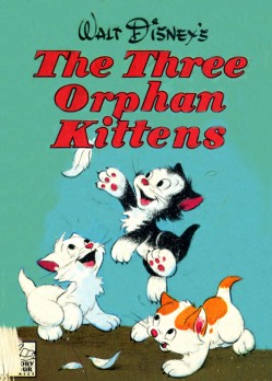
(Click any image to enlarge.)
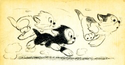
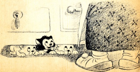
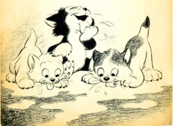
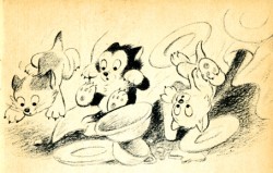
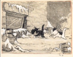
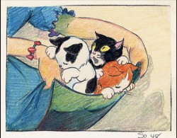
Here are a couple of preproduction drawings done for the film.
It’s interesting to compare this material with the excellent shorts by Simon Tofield featuring Simon’s Cat. Both utilize pet cats as the featured star; both are lightyears apart from each other. They’re both representative of their time. Two different kinds of cuteness. One works today.

