Monthly ArchiveJune 2008
Art Art &Illustration 10 Jun 2008 08:16 am
More McClaren’s Dwngs
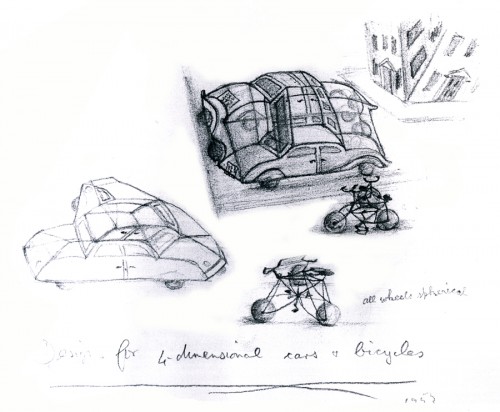
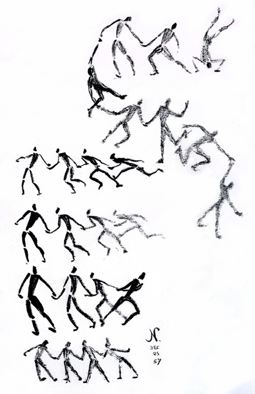
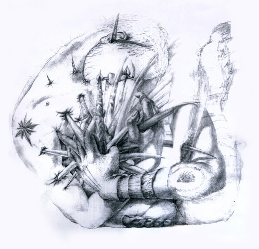
- When I posted several of Norman McClaren‘s drawings, recently, it got a bit of attention. I received a number of comments and emails about the post, and I realized that fewer people have seen these drawings than I thought. Obviously, it means, to me, that I should post more of them.
McClaren was certainly a brilliant artist, and his experimentation and developments brought about a real maturation of the art form. I wonder how he would have dealt with the technology we’re using today. Remember, he realized that the soundtrack could be drawn and did his own exploration of this part of the process.
The book was published in 1975 by Tundra Books.
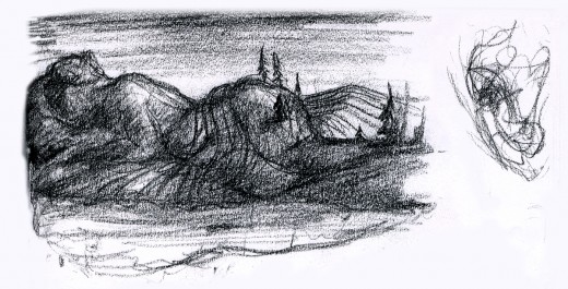
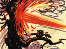
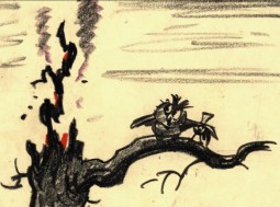
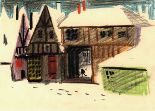
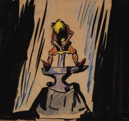
Because the one illustration which graces the book’s cover, was of such interest to those reading my piece, I’ll start with the rest of that page. It’s a series of sketches done for the film, “LÃ -haut sur ces montagnes” and was drawn in 1945.
__________________(Click any image to enlarge.)
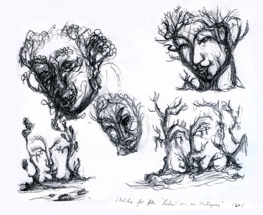
The two illustrations above are connected on the same page. I separated them .
The entire page is labelled: Sketches for the film, “LÃ -haut sur ces montagnes.”
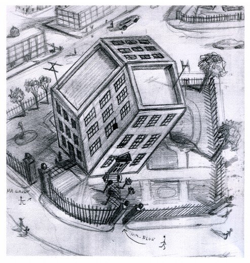
“Tesseractine House”
I’m fascinated that a number of his illustrations look not too unlike Steinberg’s work. It’s obvious he was an influence for a lot of animators in the late ’40′s.
Animation Artifacts &Disney &Story & Storyboards 09 Jun 2008 08:00 am
Alice Board 1
- Here, as promised, is the first stat of the Alice In Wonderland storyboard.
The Mad Tea Party – “A Very Merry Unbirthday”
This comes from the archives of John Canemaker ‘s collection, and I am grateful for the loan.
I don’t know who the artist is, (John and I guessed at Joe Rinaldi) though it’s dated 1949.
As with past boards, I post the original stat here, and then follow up by breaking the very long columns into two or three, thus allowing me to post it larger for easier viewing. This is the original:
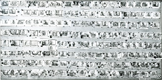
(Click any image to enlarge.)
And here are the breakdowns:
John has given me more boards from Alice. One for her talk with the flowers “All In A Golden Afternoon” and Alice in the Rabbit’s house – growing larger.
I’ll post these on future posts in the next week or so.
Photos 08 Jun 2008 09:33 am
PhotoSunday – Big Apple B.B.Q.
- There’s always a surprise at Madison Square Park when you walk through it in the early morning. On Thursday, I’d seen a bunch of tractors and large vehicles, basically immobile at 7am. Not much else
On Friday, Tents had been built all over the park. Many of them. I took some photos to chronicle whatever was coming.
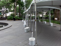
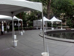
These little tents meant and event of some sort was to take place this coming weekend.
I saw no signs throughout the park to advertise what it was that’d be coming._
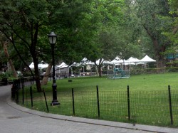
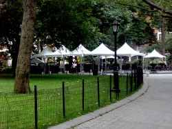
The tents circled all around the large lawn._
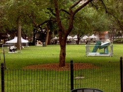
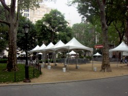
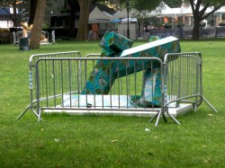
The sculptures – some of them – had fences constructed around them.
I snapped my photos and continued on through and off to work._
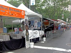
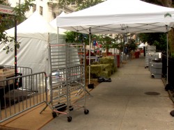
I returned Saturday to see that work had been done on the tents.
Signs had been attached to show that things would be sold.
Other signs asked people to watch what they did with the food._

There weren’t a lot of people in the tents, working on them.
Everything had been prepared by 7am.
I asked a sweeper near the dog-walk what was happening. She told me that “The Big Apple Bar B-Q would take place Saturday and Sunday.
I decided to return to see.
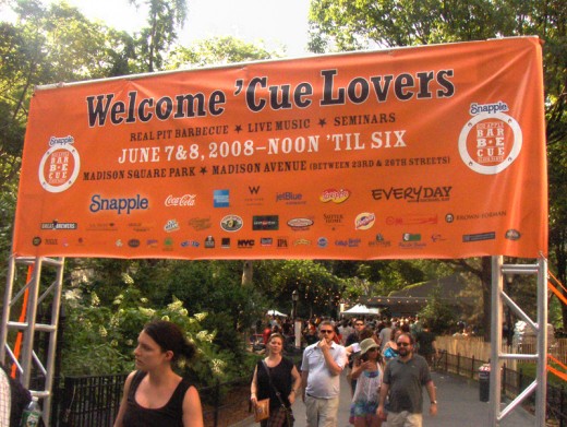
Saturday night presented a completely different picture.
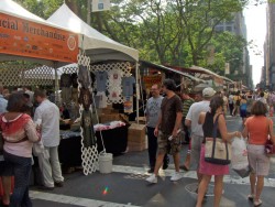
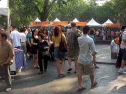
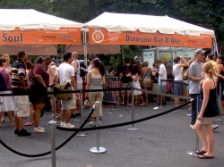
Throngs of people greeted us at 5pm. 26th Street (the back of the park where
we entered) was almost unmoveable. Crowds were lining up to buy BBQ.
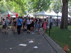

The circular reflecting ponds was less busy but still crowded, and the
oval lawn was filled with people picnicking.

The gated sculptures were just part of the background.
I don’t think too many people were giving these objects much mind.
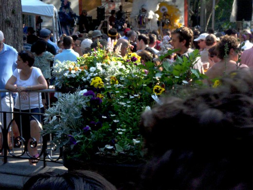
The back 1/4 of the park was jammed to the point of uncomfortable.
This is where they were selling beer, and alcohol couldn’t be removed from this area.
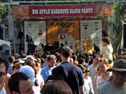
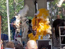
There was also a bandshell erected with loud music. Oddly the music
was louder back on 26th Street than it was here, at 23rd Street.
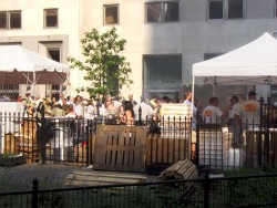
Getting out of this area was all we wanted. It was too crowded.
It was also gated and near impossible to find an exit once we were in.
Finally out of it, we found a lot of people cueing up to buy pulled pork.
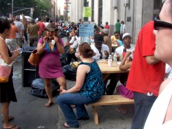
They’d set up some picnic tables where people ate the hard won meal.
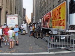
Leaving we saw several blocks of trucks supplying ice and other materials for the event.
We headed for the not-too-far-away Rodeo Bar. They served BBQ food, but we weren’t hungry. A beer sounded good though. Since the temperature was in the 90′s, being outdoors was more of a trial than necessary. The air conditioned bar was a pleasant respite.
Articles on Animation &Disney 07 Jun 2008 08:53 am
Palmistry
- Reading palms can probably tell you a lot about people.
LIFE Magazine, back in Dec 13, 1937, decided to see what they could learn from the palms of a number of celebrated people.
_________________Let’s see what they had to say about Walt Disney‘s palms.

_____________________________________(Click any image to enlarge.)
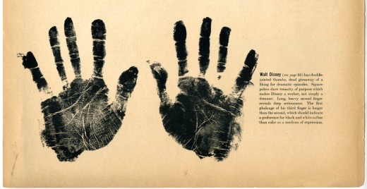
________This is the full layout of the piece. I’ve split it for better sightseeing, below.
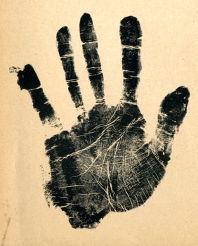 __
__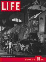
Yet again, this magazine article came courtesy of John Canemaker and his invaluable collection. Many thanks to John.
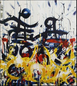 - Speaking of good palms, let me promote the gallery opening and congratulate my good friend, Lew Achenbach.
His show “Spirit Animals, Contained Chaos and Actuality” will run from June 13th through June 27th. There’s an opening reception on Friday June 13th from 5-8pm.
The website is here.
The show is located:
Upstairs in the Historic Temple Theare Building
at 628-632 Centre Street
Ashland, Pennsylvania
The art, like the artist, is certainly going to be modern.
Animation Artifacts &Disney &Models &Peet &Story & Storyboards 06 Jun 2008 08:25 am
Recap Friday – Wizard’s Duel Storyboard
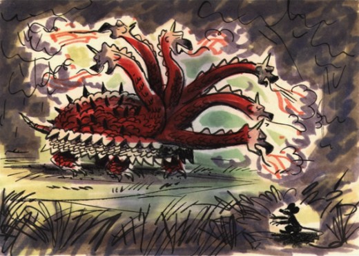
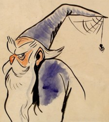
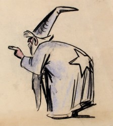
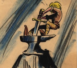
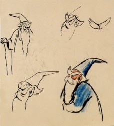
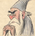 – Here is a preliminary storyboard done by Bill Peet of the Wizard’s Duel from Disney’s Sword In The Stone. It’s another gem on loan from John Canemaker, and is a companion to the piece I posted last Friday by Peet. The oddity of this board is that it’s dated April 1949. (The numbers at the bottom of the board clearly read “449.”) I didn’t have any clue that this film was in development that early. The book was published in 1938, so it’s quite feasible.
If that date is accurate, it’s amazing how close the characters stay to their final models. This could easily be explained with the heightened us of xerography in animation after 1958. Post 101 Dalmatians, this loose style was easy to translate into animation, and Ken Andersen was easily able to adapt to this style by Bill Peet that all of the animators in the studio loved.
 A
A
Click on any image to enlarge
 B
B
Note in row 2 how the spider turns into the tiger’s face; it’s a graphic turn. This never would have made it to the final in a Disney film, and it didn’t.
 C
C D
D
I love how extra drawings which have been pulled make it to the bottom of the second board.
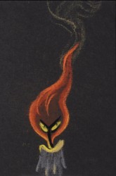 - I always thought Disney’s The Sword In The Stone a somewhat underrated film. The background art is sensational, and several sequences are brilliantly animated.
Bill Peet‘s adaptation from TH White‘s book, The Once and Future King, loses some of its poetry in the adaptation, but the book’s storyline features a lot of rambling making it hard to construct a screen story. I’ve watched this film quite a few times over the years, and somehow it always gives me a bit of a charge that comes with many of the older classics.
The extras on the dvd seems to consist predominantly of storyboard drawings by Bill Peet. So why not show them off? There’s no continuity to attend to, hence the images are gathered in small clusters. The sequence everyone jumps to analyze and discuss is the Wizard Duel between Merlin and Madame Mim (animated by Milt Kahl.) Consequently, a lot of the drawings on the dvd come from this sequence. I, personally, would have loved seeing some of the squirrel section. I found it quite moving and full of real character stuff. It would be nice to see how Peet developed this.
There’s no hint of a continuity on the dvd, but I’ve heard that the storyboard drawings in the vault are just placed in manilla envelopes with no suggestion of an order. It would make sense that they’ve just plopped these images on the dvd as they have with no order, details or related information.
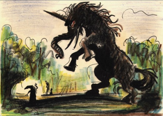
_______Here’s a creature that never made it to the battle of the wizards.
 _
_
_________________________(Click any image to enlarge.)
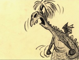
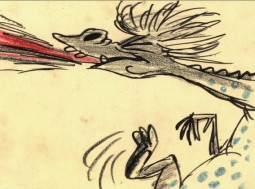
___________Another fantastic creature that didn’t make it into the film.
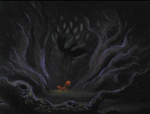
I’m not sure if this drawing is also from the duel. Or was it another sequence where Wart becomes an animal – cut out of the film?
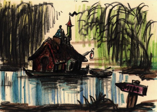
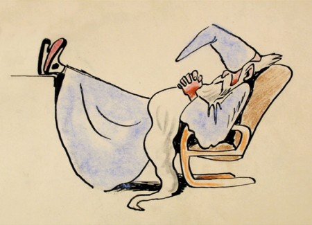
This looks like it may have been planned as a home for Merlin. Did it inspire anything for The Rescuers?
_____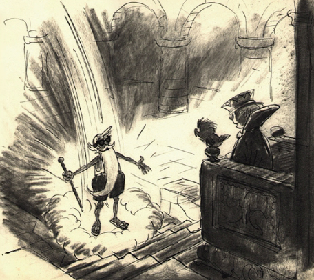
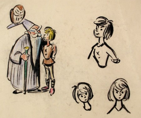
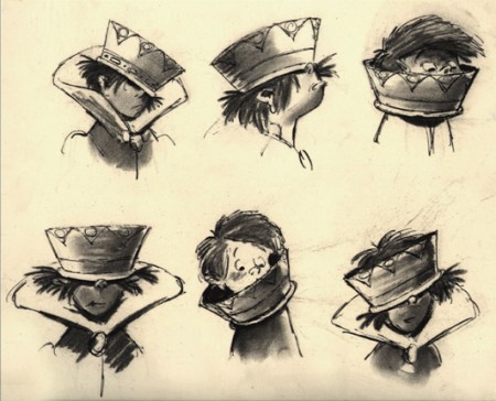
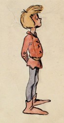
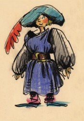
Here are a couple of models Peet obviously did –
_______________________probably more for himself than anything.
______ _
_
Animation Artifacts &Articles on Animation &Disney 05 Jun 2008 08:16 am
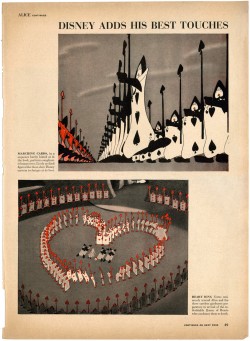
LIFE with Alice
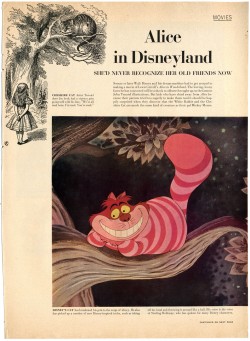
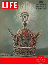 - I’m going to put together a couple of posts on Disney’s Alice In Wonderland, and I think this LIFE Magazine article from June 18, 1951 is an excellent place to start.
It’s interesting that they call the article, “Alice In Disneyland.” This is one of the first references to “Disneyland” that I’ve noticed. There was a TV show done for ABC, “One Hour In Wonderland,” a 1951 Christmas show which promoted the heck out of the movie. Kathryn Beaumont, dressed as Alice, got to parade around with lots of kids. This show probably served as the prototype for the “Disneyland” TV series, but made no reference to the name of the future theme park.
This article comes from John Canemaker‘s the collection, and I have to thank him for his contribution, _____(click any image to enlarge.)
yet again.
I’ve chosen to leave any periferal ads in there, for context and amusement.
 1
1 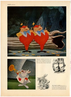 2
2
Commentary &Hubley &Photos 04 Jun 2008 08:14 am
Jazzy Show
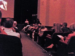 – On Monday night, there was a presentation at the Museum of Modern Art of a number of Hubley short films that highlighted their JAZZ SCORES series. The program was well organized by film curator, Josh Siegel.
Emily Hubley presented the films at the start and had a couple of words about her parents’ work. She was joined in the audience by her sister, Georgia Hubley, and her brother, Ray Hubley. Their families were also present. Only Mark Hubley wasn’t able to make it down for the show. ________________________________Emily talking in front of the auditorium
The films were presented in clusters of composer.
Tender Game, with music by Ella Fitzgerald and the Oscar Peterson trio, led off the program. With a newly constructed print the colors dazzled with depth and beauty. You could see the texture of the paper in the backgrounds and the beautiful brush strokes. The art couldn’t have looked more stunning.
Three Dizzy Gillespie shorts followed:
 The Hat has an improvised voice track with Dudley Moore and Dizzy Gillespie. They also did the score – Dudley on piano, Dizzy on trumpet.
Date with Dizzy is a live action piece that promotes the “Storyboard” ads. A live action director, “Don Babbitt,” tries to get Dizzy and his group to perform a score to their animated ad. The ad was drawn and animated by R.O. Blechman.
____The Hat played on the big screen______Voyage to Next features Maureen Stapleton
_____________________________________and Dizzy Gillespie. Dizzy did the score with Dee Dee Bridgewater singing. (I did a lot of work on this one. I have a lot of Bill Littlejohn’s drawings, and I’ll show them off sometime soon.)
Following this, Benny Carter‘s widow, Hilma Carter, and Ed Berger, Carter’s biographer, introduced shorts that Carter scored.
Adventures of an * was the featured piece with a newly reconstructed print (I wrote about this here) and an out-of-this-world art exhibit of many backgrounds and cel paintings. (Actually cels weren’t used. The characters were colored on paper with crayon and wax and blackened all around their shape. This was then double-exposed into the backgrounds.)
Finally, Of Men and Demons, finished the night. This film was scored by the brilliant Quincy Jones, and the score is a major strong point. There is no dialogue, hence there are no voices heard. Tissa David animated a lot of this film and re-worked a lot of Art Babbitt‘s scenes in this film. Bill Littlejohn did much of the demons.
Tissa sat to my left along with her close friend Ruth Mane, who was a first class inker and checker in NY’s animation story. We worked closely at Raggedy Ann.
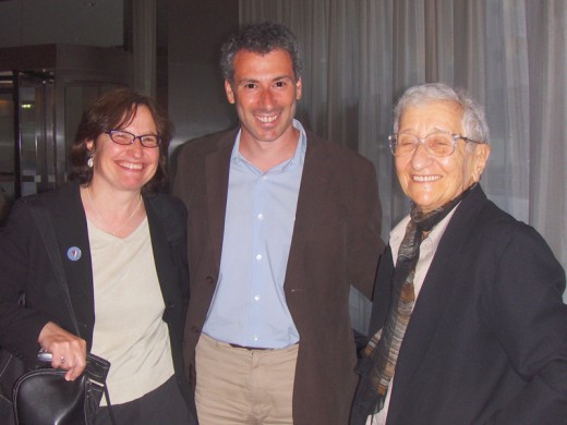
____Emily Hubley, Josh Siegel and Tissa David in the lobby of MOMA.
____I met them there when I arrived.
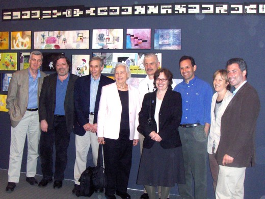
__A crowd after the screening.
__Left to right: John Canemaker, me, Ed Berger, Hilma Carter, Ron Magliozzi (Assistant
__Curator, Research and Collections, MoMA), Emily Hubley, Ray Hubley, Georgia Hubley,
__Josh Siegel (Assistant Curator, Department of Film, MOMA).
The screening was pretty much full, but I wouldn’t say the animation community was well represented. I saw a couple of young animators there including Tim Rauch and Emmett Goodman. Ray Kosarin, just back from viewing some 1700 films at Hiroshima’s prejudging, was also there and seemed charged by the Hubley films.
The museum had a dinner for some of the guests including John and me, Amid Amidi, the Hubleys and their families, as well as Hilma Carter and Ed Berger. Tissa had to leave right after the screening. It was a real treat of an evening.
Animation Artifacts &Disney 03 Jun 2008 07:54 am
Gag Cartoons
- Usually the gag cartoons done in a studio don’t stand the test of time. No one can figure out what half of them mean – never mind what the gag is. However, sometimes they come off still funny.
After posting the Ward Kimball models, yesterday, I thought it might not be a bad time to post these images I have all on one pretty small photostat. I can hardly identify half of the people caricatured, but I’ll let you know what I can figure out.
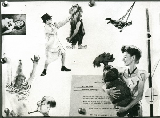
This collage was done by Ward Kimball pasting photos and caricatures into the heads of the characters of the film. Ollie Johnston with a cigar in his mouth and Ward as the “Lost Boy” in “Michael’s” hands.
The image is long (above and below) so I split it in half to make it easier to enlarge; the right half is below.
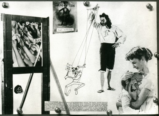
It’s Hans Conreid as “hook” manipulating Frank Thomas as Pinocchio. Milt Kahl is checking out “Wendy’s” breast.
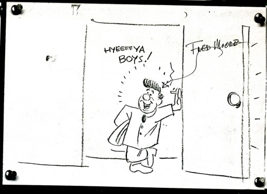
This looks like a Freddie Moore self-portrait.
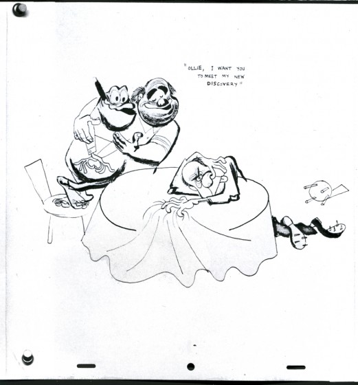
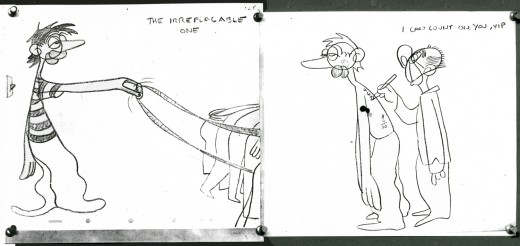
Ollie Johnston and Ward were obviously friends since there are a lot of nasty Ollie cartoons. I’m not sure what the meaning of this one is.
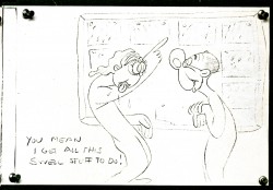
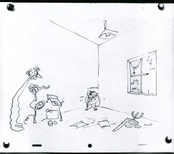
Ollie must have been something of a taskmaster with his Assistants. These cartoons lead you to believe he was tough. At least until he found … “Yip”? or is it VIP – Virgil Partch – who wasn’t his Assistant.
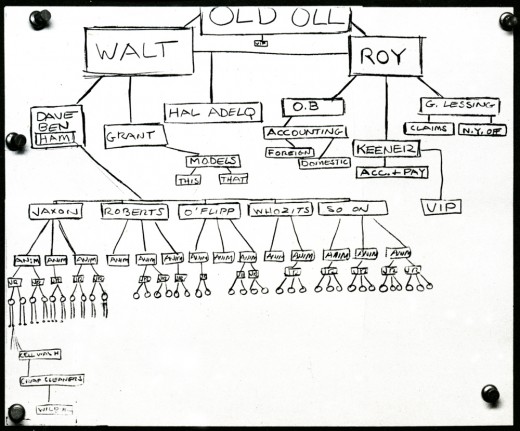
This studio chart places Ollie above even Walt and Roy. An important guy!
Hmmmmm?
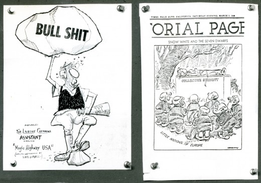
Here are a couple of “Scrapbook” pieces that Ward saved.
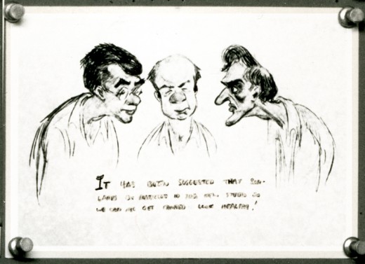
I’m not sure who drew this, but it’s the old “lightbulb under the animation table can give you a tan” joke. This is Frank Thomas, Ollie Johnston and – I think – Milt Kahl tanned.
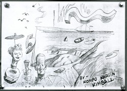
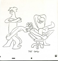
(L) A surreal image out of Ward Kimball’s hands. Who knows what it meant?
(R) Ward stands off to the side (arms crossed) watching others laugh at one of his gag cartoons.
I have a couple hundred of these cartoons from “Raggedy Ann”. Someday when I get them out of storage I’ll try to remember what they mean and post some of them.
Disney &Models 02 Jun 2008 08:27 am
Kimball Models & Dwngs
- About a hundred years ago, it seems, John Canemaker gave me some copies of models and drawings by Ward Kimball. I’m sure at least a couple of these have been published in some of John’s books. His book, Nine Old Men, includes many other beautiful Kimball drawings, and I’d suggest you look there for more Kimball inspiration.
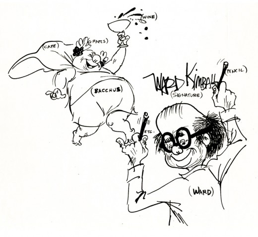
I once posted a couple of these, and I like them a lot. I’m posting them again and adding a bunch more that weren’t included. Ward was a brilliant artist with a very active and excited intelligence. His material from the 50′s is just excellent, and it’s always worth a look.
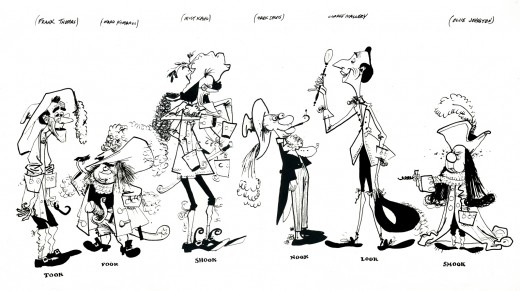
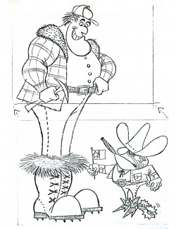
During the making of “Peter Pan” Kimball illustrated how Frank Thomas, Ward, Milt Kahl, Marc Davis, Clarke Mallery (an Asst at the time) and Ollie Johnston would look as “Hook”.
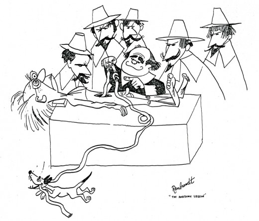
When Ollie Wallace, a composer at the studio, went to hospital to have his appendix removed, Kimball made this card for Ollie. It was based on Rembrandt’s painting, “The Anatomy Lesson”. It got Wallace laughing so hard in the hospital that he burst his own stitches and had to have them re-sewn.
______________(Click any drawing to enlarge.)
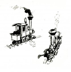
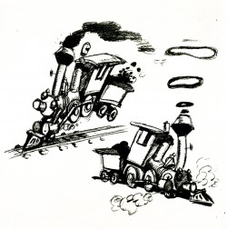
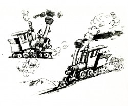
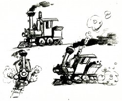
These are the first rough sketches done for Casey Jr. for both Dumbo and The Reluctant Dragon. Eventually, a headlight cap was added and the eye lamps were eliminated.
The eyes were drawn on the boiler’s front.
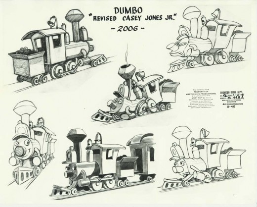
Robert Cowan sent me this model of Casey Jr. which was used in the final film.
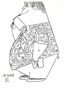
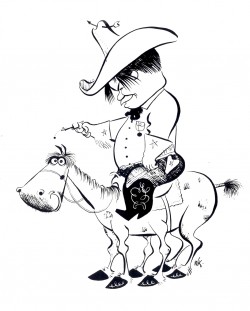
The caricatures above show
(L) Joe Dubin, the composer to “Toot, Whistle, Plunk & Boom”. Joe was a big fan of Mexico and its food. Every lunch would include a huge plate of Mexican “gut-bombs” and two Margaritas. He’d then come back to the studio to sleep through the story meetings.
(R) Gerry Geroniomi, a director on many of the Disney features.
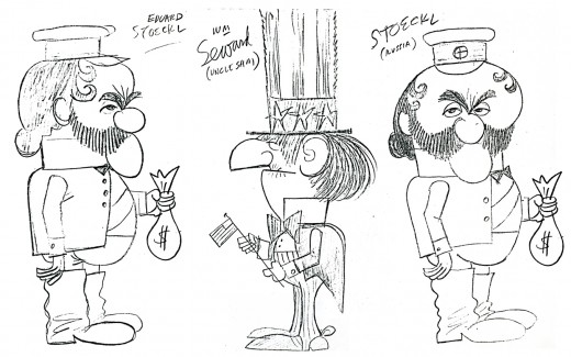
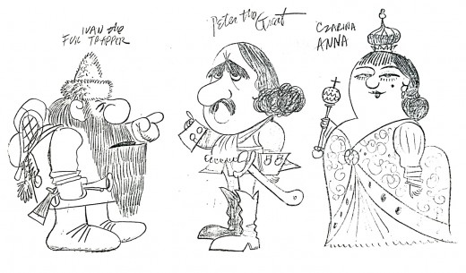
The drawing above, as well as the next five, are rough models Kimball did for the animated section of a Disneyland TV show, “Alaska.” The drawings of the historical personalities were inspired by early photographs.
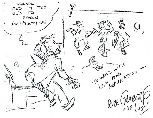
This drawing was a gift to Kimball from Rube Goldberg, who was an ardent Disney animation fan.
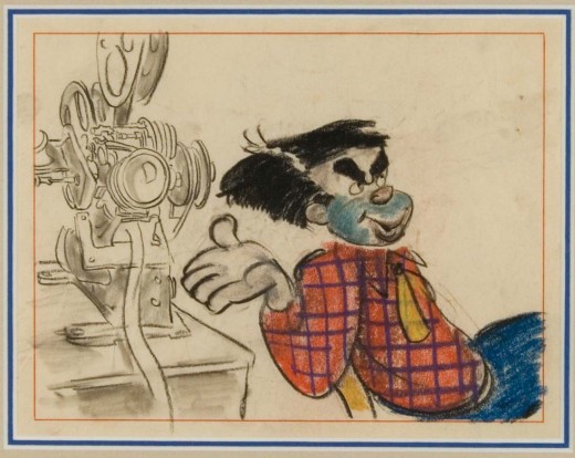
This final drawing looks like a Kimball storyboard drawing that was done for The Reluctant Dragon. It’s, of course, a self-portrait of Kimball. This also comes from Robert Cowan’s collection. It was previously posted on Jenny Lerew’s wonderful blog, Blackwing Diaries along with storyboard from Melody Time.
Animation Artifacts &Photos &SpornFilms &Theater 01 Jun 2008 08:59 am
PhotoSunday Recap – WOTY
- Back in Jan 2007, I posted these photos from the animation production of Woman of the Year. I think these are interesting enough that they’re worth revisiting. So here, again, is that post:
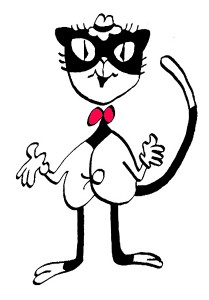 – To recap:
Woman of the Year was a project that came to me in the very start of my studio’s life – 1981.
Tony Walton, the enormously talented and fine designer, had gone to Richard Williams in search of a potential animator for WOTY (as we got to call the name of the show.) Dick recommended me. But before doing WOTY, there were some title segments needed for Prince of the City, a Sidney Lumet film. (I’ll discuss that film work some other day.)
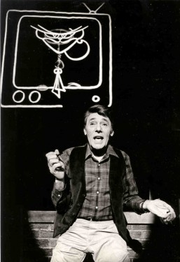
Tony Walton designed the character, Katz, which would be the alter-ego of the show’s cartoonist hero, played by Harry Guardino. Through Katz, we’d learn about the problems of a relationship with a media star, played by Lauren Bacall.
It turned out to be a very intense production. Three minutes of animation turned into twelve as each segment was more successful than the last. ___________(All images enlarge by clicking.)
There was no time for pencil tests. I had to run
to Boston weekly, where the show was in try-outs, to project different segments; 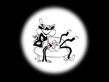 these went into the show that night – usually Wednesdays. I’d rush to the lab to get the dailies, speed to the editor, Sy Fried, to synch them up to a click track that was pre-recorded, then race to the airport to fly to the show for my first screening. Any animation blips would have to be corrected on Thursdays.
There was a small crew working out of a tiny east 32nd Street apartment. This was Dick Williams’ apartment in NY. He was rarely here, and when he did stay in NY, he didn’t stay at the apartment. He asked me to use it as my studio and to make sure the rent was paid on time and the mail was collected. Since we had to work crazy hours, it was a surprise one Saturday morning to find that I’d awakened elderly Jazz great, Max Kaminsky, who Dick had also loaned the apartment. Embarrassed, I ultimately moved to a larger studio – my own – shortly thereafter.
Here are a couple of photos of some of us working:
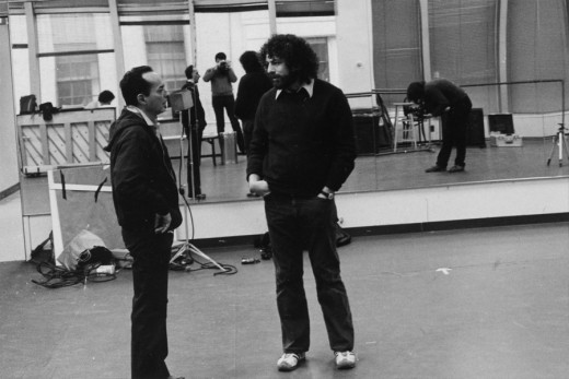
Tony Charmoli was the show’s choreographer. He worked with me in plotting out the big dance number – a duet between Harry Guardino and our cartoon character. I think this is the only time on Broadway that a cartoon character spoke and sang with a live actor on stage. John Canemaker is taking this photograph and Phillip Schopper is setting up the 16mm camera.
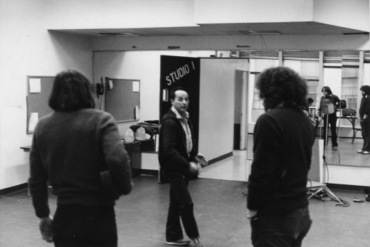
Here Tony Charmoli shows us how to do a dance step. Phillip Schopper, who is filming Tony, figures out how to set up his camera. We used Tony’s dancing as reference, but our animation moves were too broad for anyone to have thought they might have been rotoscoped.
John Canemaker is working with Sy Fried, our editor. John did principal animation with me on the big number. Here they’re working with the click track and the live footage of Tony Charmoli to plot out the moves.
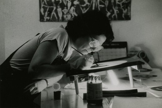
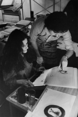
Steve Parton supervised the ink and paint. To get the sharpest lines, we inked on cels and didn’t color the drawings. It was B&W with a bright red bowtie. A spotlight matte over the character, bottom-lit on camera by Gary Becker.
 5
5 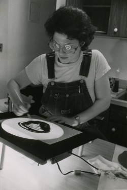 6
6
5. Steve Parton works with painter Barbara Samuels
6. Joey Epstein paints with fire in her eyes.
 8
8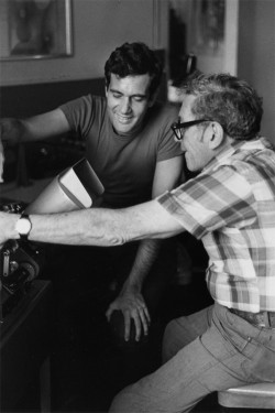 9
9
8. Harry Guardino on stage with the creation of “Tessie Kat” developing on screen behind him. This was Harry’s first big solo.
9. John Canemaker gets to see some of his animation with Sy Fried, editor.
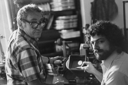
One of my quick stops from the lab on the way to Boston? No, I think this is a posed photo.
The success of the animation (including good reviews) posed a small problem for me. The rest of the show was ripped over the coals. When I started using some quotes about me in industrial ads, the producers came down on me for gloating over the others who’d gotten negative reviews.
All the same, it was a real learning experience in a big Broadway kinda way.

 1a
1a 1b
1b 1c
1c 2a
2a 2b
2b 3a
3a 3b
3b 4a
4a 4b
4b 5a
5a 5b
5b 6a
6a 6b
6b 6c
6c 7a
7a 7b
7b 8b
8b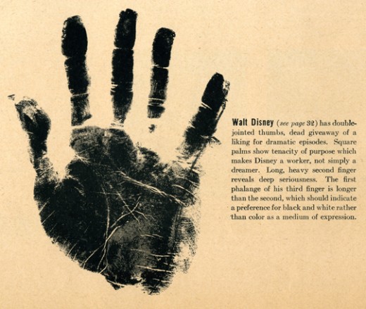
 3
3 4
4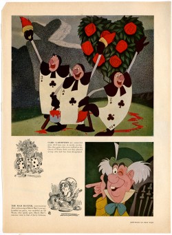 5
5