Monthly ArchiveDecember 2009
Bill Peckmann &Books &Illustration &Rowland B. Wilson 11 Dec 2009 09:06 am
Bedtime for Robert – 2
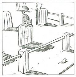
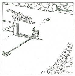
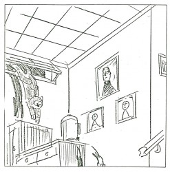
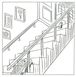
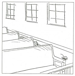
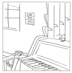
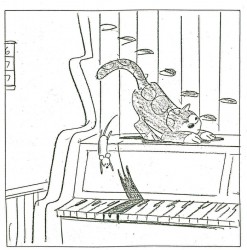
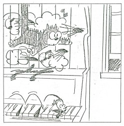
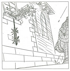
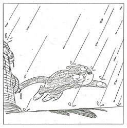
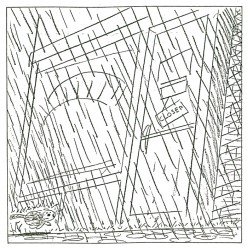
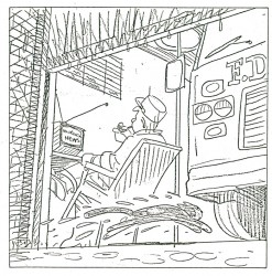
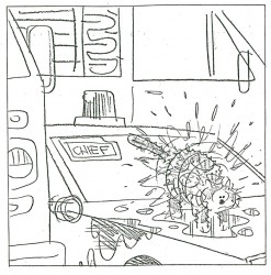
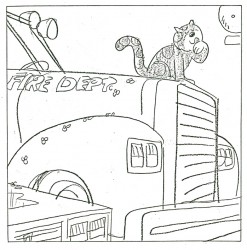
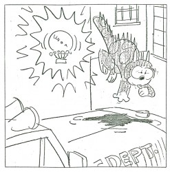
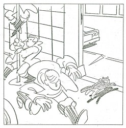
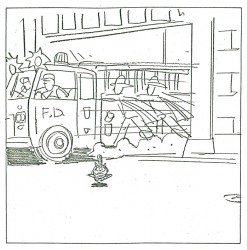
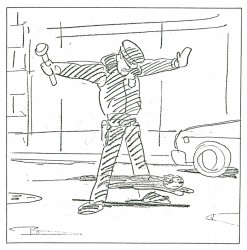
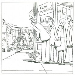
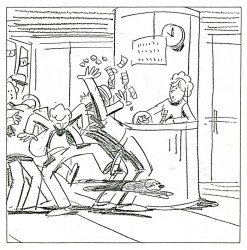
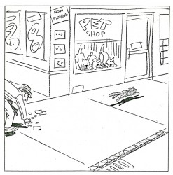
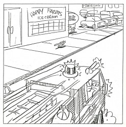
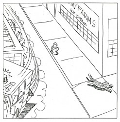
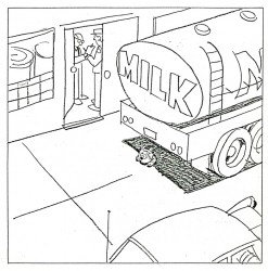
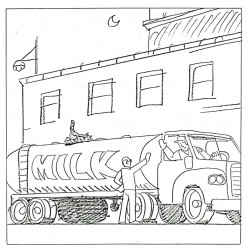
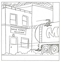
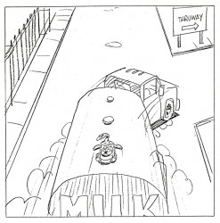
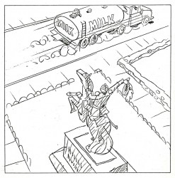
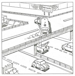
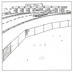
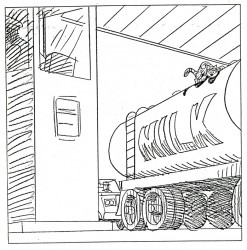
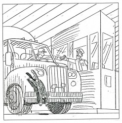
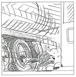
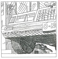
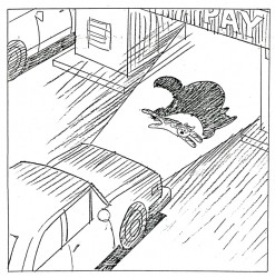
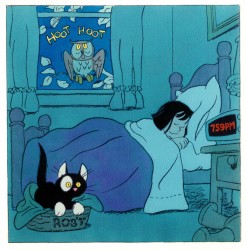
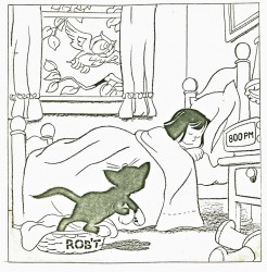
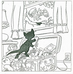
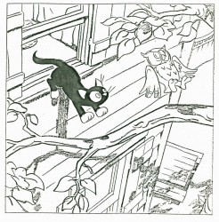
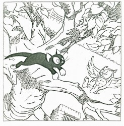
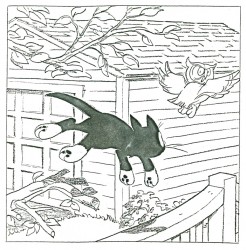
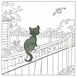
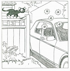
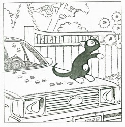
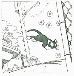
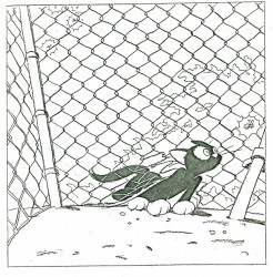
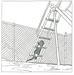
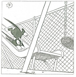
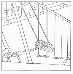
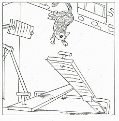
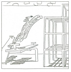
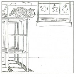
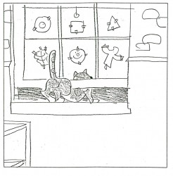
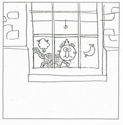
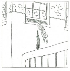
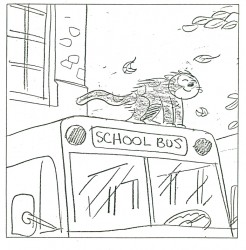
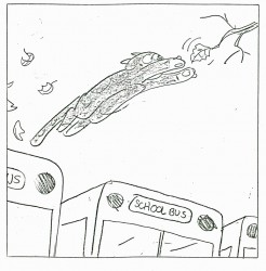
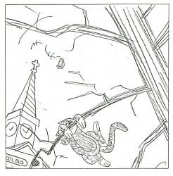
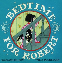 - Today we continue with this magnificent, yet unpublished, book that was written by Bill Peckmann and illustrated by the late, great Rowland B. Wilson. The book almost reads like a dialogue-less storyboard.
Posted the way it is, the piece moves with all the speed of fast paced cartoon of the forties, and is drawn and composed with as much grace.
This is a treat to post, and I thank Bill Peckmann for the chance to do so. You can see Part 1 here.
I begin this entry with the last image from the last post.
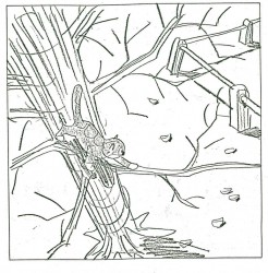 28
28 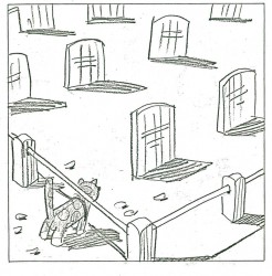 29
29(Click any image to enlarge.)
One more part to come, next week.
Events 10 Dec 2009 08:56 am
Events
John Dilworth
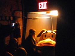 - Tuesday night, ASIFA-East hosted a spectacular evening devoted to John R. Dilworth and his work. It was a lot of fun thanks to the crazy combinations John pulled out of his bag o’ tricks. Lots of surprises and laughs.
I took a bunch of pictures and will post some of them Sunday, if I can find any that are in focus. The live intros and music were a wonderful dressing for the carefully chosen body of films. It was a well orchestrated program. Congrats to John.
Prep & Landing Landed
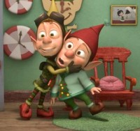 - Disney’s Prep and Landing landed on ABC on Tuesday night. If like me, you were unable to catch it on it’s scheduled broadcast, you can watch it on HULU complete with commercial interruptions (though probably fewer than ABC aired.) My thoughts? It was ok, not worth all the puffery that came in advance of the show. All this cgi stuff to me is getting to look alike. Lots of running in place and shouting with nicely modeled everything to get that little doll look. I also think the current crop of stories going into our features and specials is lacking charm and movie magic. This filled that bill.
A Bob Dylan Christmas vid
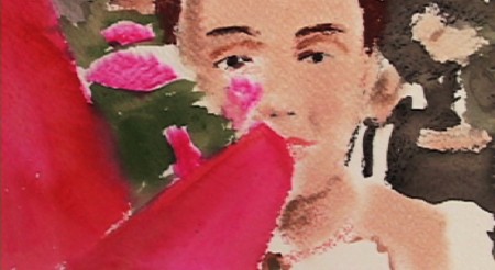
The NYTimes posted the latest Bob Dylan christmas song video – The Little Drummer Boy. Surprise, it’s an animated video done by my friend, Jeff Scher. The visuals are inventive, as expected, but I miss the Shay Lynch score.
Jeff wrote this little note in an email he sent me:
“I made a music video for Bob Dylan’s Christmas Album: “The Little Drummer Boy”.
It went up yesterday on Amazon… All profits from the album go to charity.
It was neat, the only direction I got was “do what you do”.
So this is what I did.”
________________
UPA
Here’s another reminder to those in New York that there will be a glorious celebration of UPA’s short films at the Academy of MP Arts & Sciences next Monday, Dec. 14th.
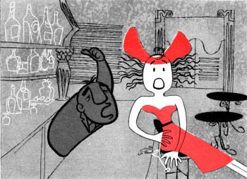
John Canemaker will host the event which will feature eight rarely seen films to be screened in 35mm. Many of them new prints.
The titles will include:
_____GERALD MCBOING BOING
_____MISTER MAGOO’S PUDDLE JUMPER
_____ROOTY TOOT TOOT
_____MADELINE
_____THE TELL-TALE HEART
_____THE UNICORN IN THE GARDEN
_____FUDGET’S BUDGET
_____GEORGIE AND THE DRAGON
There are lots of Oscar winners and nominees among them. This show will be a treat.
At 7PM December 14, 2009 at the Lighthouse, 111 East 59th Street, between Park and Lexington avenues
$5.00 admission ($3.00 for members)
Animation &Animation Artifacts &Articles on Animation &SpornFilms 09 Dec 2009 08:09 am
Interviewing Bridget
- For a short while I produced a quarterly publication, called Sporn-O-Graphics, that promoted the work and the workers at Michael Sporn Animation, Inc. It was mailed free to about 1000 people on a list we’d put together. The idea was to talk about our films and the people who had made them. There were a total of six issues of this paper. I’ve posted a couple of the issues or more interesting bits in them on this blog, (here and here) and today I’d like to post an interview that was in one of the last issues. Bridget Thorne was as important to me as anyone who’s ever worked here. Denise Gonzalez also worked for me – at the time she edited and put together Sporn-O-Graphics.
Behind the Scenes with
Bridget Thorne
Interview by Denise Gonzalez
Bridget Thorne is a background designer who has been an important part of Michael Spom Animation for more than fifteen years. In that time she has enhanced the look of MSA films with beautiful backgrounds that are, in a way, part of the characters rather than just a scenic backdrop.
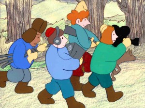 DG: How long have you been working with Michael Sporn?
BT: I first started working for Michael in 1979 on Byron Blackbear And The Scientific Method, a fifteen minute short for the Learning Corporation of America. It is actually one of my favorites. I started out as a scenic painter for plays. I worked with a designer and basically dressed the set. We’d paint the exteriors, lay in wallpaper, marbleizing floors, etc. I started at Williamstown and at Playwright’s Variety in New York, I did a lot of off Broadway and off-off Broadway.
DG: Do you see background painting as a complete picture or as a supplement to animated artwork?
BT: It’s a supplement.
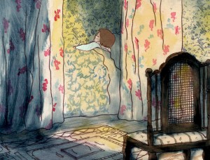 DG: How do you take that into consideration when you start the backgrounds?
BT: Ideally, I take into consideration how the characters are designed. I like the characters to be part of the picture, not stand out like they do in Saturday morning cartoons. It all fits into a stylistic sensibility or pace more than anything else. I’m not a cartoon snob, I’m more of a two dimensional artist than a filmmaker. I design my backgrounds and line style according to the way the characters are designed. What I used to try and do was color the backgrounds, to match the colors of the characters. You work out of your home rather than at the studio. What are the benefits or drawbacks of working this way? I’ve just started doing this and yes, there are benefits. I can get into my own head, and I take off more with ideas because I’m not interrupted as much. But I like being in the studio and staying with the rest of the production as it goes along.
DG: Do you prefer working on original stories or from an existing book?
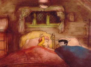 BT: It depends on the story. Let’s say IRA SLEEPS OVER, it was great working out here on that because with an existing story you have a style to imitate, and it is easy for a whole bunch of people to follow that when they’re all working in different places. So as far as production goes, that makes it easier. The great thing about original scripts is that they allow for an incredible amount of individual input. What do you take into consideration when designing the look of a film and what preparation is involved? It depends on the story. I tend to have a knee jerk reaction at first or an impulse. I have a Fine Arts background, and I tend to rely on painters. I find fine artists are more in tune stylistically with Michael’s films than the more hard-edged graphic cartoons. (Though I will look at Disney inspirational drawings.)
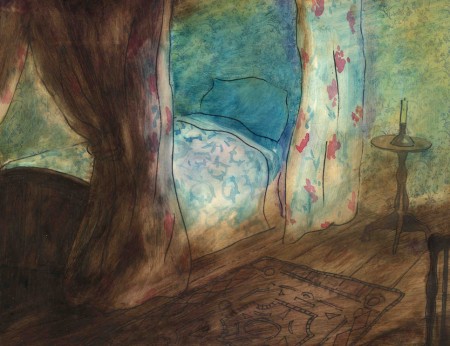
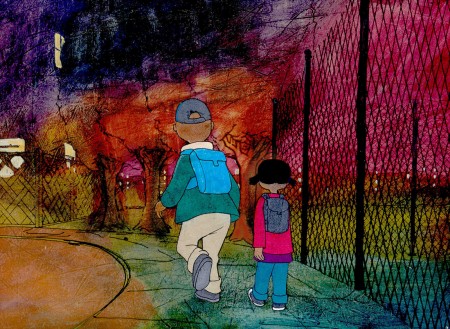
Then I look at the layouts and the character design, so I sort of work on intuition and impulse. Then I look at the existing elements and put those all together and come up with a design. As far as preparation goes, what I consistently do is make 5×4 sketches of design ideas. For ABEL’S ISLAND I did lots and lots of little paintings of winter and fall and spring.
First three illustrations pictured above:
1. BYRON BLACKBEAR AND THE SCIENTIFIC METHOD.
2. A CHILD’S GARDEN OF VERSES.
3. IRA SLEEPS OVER
DG: When designing the film do you take into consideration that this will be seen by a child?
BT: I’m not a cartoony person so I don’t think about that. I tend to think more — sometimes I run into trouble this way — I think of it in a frame and ideally what I really want is a balanced look on the screen. A lot of times that’s hard because what I see in front of me is so different when it is filmed.
DG: What do you consider to be the best example of your work thus far?
BT: I guess ABEL’S ISLAND. I was able to abstract a little. I wasn’t confined to chairs and bureaus. I was able to match the mood of the movie to the backgrounds. If Abel was in trouble, I could put colors that indicated that, or I could abstract it. If something was calm I could paint it calmly. Abstraction, or looseness, is more my personal style. This is true of Michael’s style, as well.
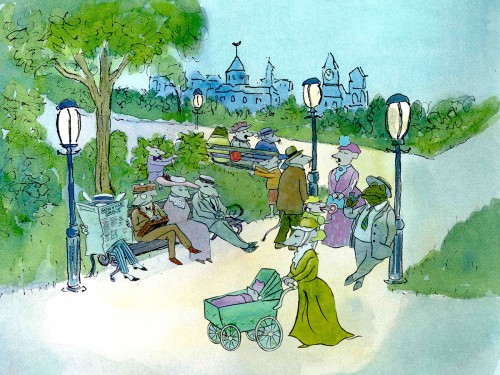
A scene toward the end of ABEL’S ISLAND.
DG: Have you ever worked on a film you couldn’t connect with?
BT: I’d say yes. It’s a hard question to answer off the top of my head. I sort of think of movies like they were kids; they are either noisy or funny or quiet or sad. They all have their own characteristics, and it is really the process of making the movie that attracts me to animation. I tend to have different feelings about each movie. But yes, sometimes a story irritates me or something comes in and it doesn’t suit my style or what I imagined. It can be very difficult. That’s an interesting thing about animation; there is really a sense of compromise; you are compromising all the time.
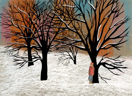
A scene of the narrator at the end of THE TALKING EGGS.
Animation &Animation Artifacts &Commentary &Events 08 Dec 2009 09:02 am
Dilworth/Mr. Fox/Thomas ruffs
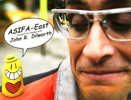
Tonight, ASIFA-East is presenting an evening with John R. Dilworth. This means that John will be there with a number of surprise guests from his past and present, including Howard Beckerman, who taught him; me, who hired him; and Courage the Cowardly Dog, who was drawn by him. Given John’s affinity for the unexpected, it’s doubtful that it’ll be the typical Q&A.
Some of his shorts will be shown as well as several of his films. I could tell you which ones they are, but that would spoil the surprise.
The festivities begin at 7pm at the School of Visual Arts, 209 East 23rd St, 3rd floor amphitheatre. The admission price is free and worth every bit of it.
Of course, if you insist on buying some things, ASIFA calanders will be sold as will John Dilworth goodies.
.
 - Once again, let me promote The Fantastic Mr. Fox, an animated feature that I just love. There was a good interview with director, Wes Anderson, on Charlie Rose 11/30/09. There’s no direct link from here, but you can see this clip by going to Charlie Rose ‘s website, then typing in Wes Anderson on the search box. You can see the whole interview (about 30 mins) there.
.
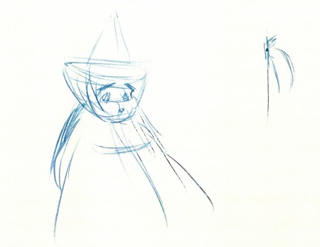
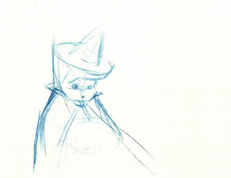
- Now for something different. Just for the opportunity of showing off some beautiful blue-pencilled ruffs by Frank Thomas, loaned to me by John Canemaker, I’m going to post them here. They’re from Sleeping Beauty, of course.
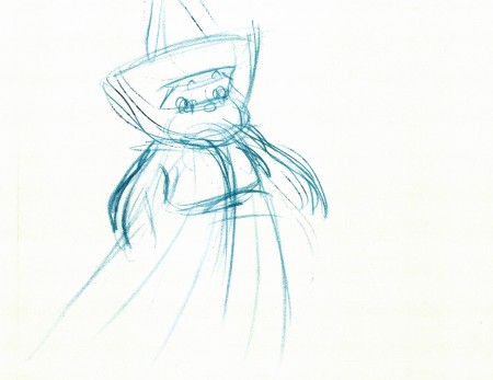 1
1
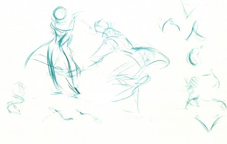 4
4
This last one is from Ichabod and Mr. Toad –
The Legend of Sleepy Hollow. Ichabod and Katrina.
_______________
- The most peculiar news story of the week was the headline at the top of Sunday’s NYTimes. It talked about a Taiwanese company that was creating their own videos of the news using cgi animation. The Times reports that the “. . . Taiwanese newspaper, Apple Daily, has dozens of programmers, designers, animators, even actors on its staff . . . responsible for scripting the videos.” We were shown a poorly created video of Tiger Woods (they admit that it didn’t really look like him, but they were happy over the color of his skin and his hair.) Maybe Robert Zemeckis could help out.
The question is how long it’ll take for ALL newcasts to include animated stories because they’re too lazy to do the actual reporting. Get rid of newspapers and make up your own videos. Apparently, MSNBC’s Keith Olberman made some sly comments about it. When he needs to make up the stories, he uses his “finger puppet theater.” In Taiwan they use cgi.
The world’s gone berserk, but now there’s a whole new line of work for animators of the future.
Here’s the YouTube presentation of that newscast.
Animation &Animation Artifacts &Disney 07 Dec 2009 08:43 am
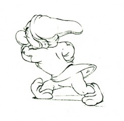
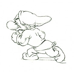
Dwarf walk
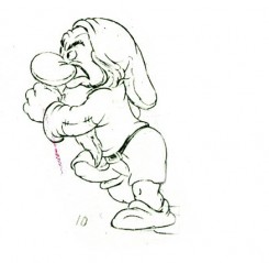
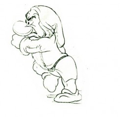
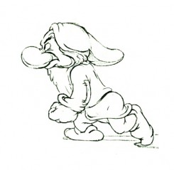
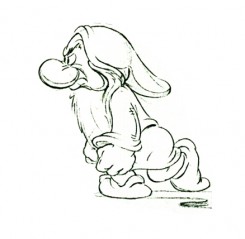
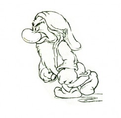
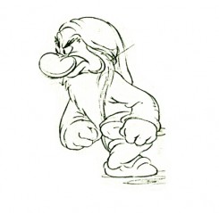
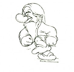
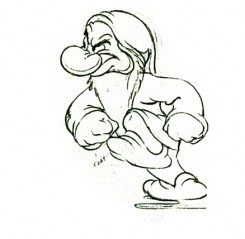
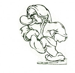
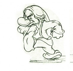
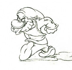
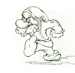
- Here are the drawings of Grumpy walking in a huff. Bill Tytla was the animator. The images come from a photostat which prepared the material for publication. A couple of these drawings appeared in the Thomas-Johnston book, Illusion of Life. The sequence, here, is missing drawing numbers 6,7 and 8.)
 1
1 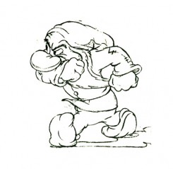 2
2Note how he starts with his shoulders high.
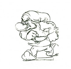 3
3 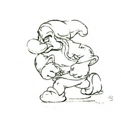 4
4
His bent leg, at this point, takes the weight of his body.
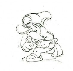 5
5 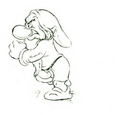 9
9
He moves his body up, high . . .
(Note that we’re missing drawings 6, 7, and 8.)
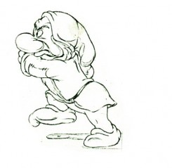 12
12 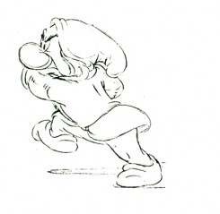 13
13
. . . then twists his entire torso.
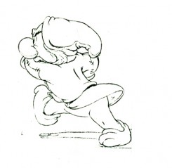 14
14 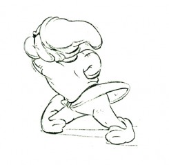 15
15
The straightened leg makes contact.
 16
16 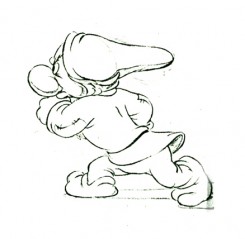 17
17
Again the shoulders go high as the pattern repeats on the other leg.
 18
18 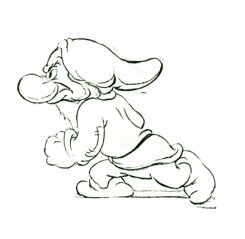 19
19
Note the detailed attention to the flow of the clothing throughout.
 28
28
(Click any of the above images to enlarge.)
The following QT movie is on one’s with
the exception of dwngs #5, 9, & 11 on twos
to make up for the three missing drawings.
Right side to watch single frame.
Commentary 06 Dec 2009 09:39 am
Frogs
 - I’m a bit cranky. Having just come from Disney’s The Princess and the Frog, I’m not sure how to comment on it fairly. There were moments when I just relished the hand-drawn animation done at such a high level. I treasured the levels of technical depth being executed on the screen. I enjoyed whole sequences of animation and overall design choices. However, the story has such deep problems. I don’t intend to drag the film down with negatives.
I hope the film does well. 2D animation needs a boost. Would that someone had pulled the film in a straight-arrow direction and told the story more directly. But that isn’t the case.
I won’t complain about the incessant violence and loud actions in the film, but I will tell you something else that’s irritating the hell out of me. PR people have released information that I’ve seen repeated a few times. Anika Noni Rose repeated it on Jimmy Kimmel Friday night. They’re saying that she’s the first princess ever to sing and act the part, herself. Prior to her it was done by two people.
I suppose Adriana Caselotti as Snow White’s singing and acting voice doesn’t count. Nor does Ilene Woods as Cinderella, or Mary Costa as Sleeping Beauty, or Paige O’Hara as Belle. Can’t they even get their facts right about their own movies! Do they have to take away from the brilliant talent of some of the past films?
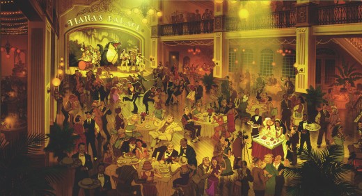
The two illustrations above come from Jeff Kurtti’s book, The Art of The Princess and the Frog. The pencil drawing was by Ruben Aquino, and the color sketch is by James Aaron Finch and Armand Baltazar.
Commentary &Daily post &Puppet Animation 05 Dec 2009 09:46 am
Screenings&Events
Dec 5th – Today is Walt Disney’s birthday. I’ll celebrate by seeing The Princess and the Frog. Nothing like 2D animation to celebrate the man. Maybe later I’ll also watch a couple of great Mickey shorts from the early thirties.
Today’s also the day that we start our fifth year working this blog. It doesn’t feel that long to me, and it still continues to be fun. Hopefully I’ll be able to say the same in another four years.
Mary and Max
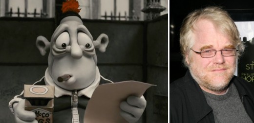
- I finally got to see Adam Eliot’s feature, Mary and Max. For those of you unfamiliar with the movie, it’s an animated feature by the Australian creator of Harvie Krumpet, which won the Oscar for animated short in 2003. I won’t go into the story other than to say it’s a penpal tale between a girl in Australia and a Jewish man with Asperger’s Syndrome in NY.
Since I’ve only seen these two films, I can only judge one against the other – with no other references. These are the aspects both films have in common:
. They have excellent, picaresque stories that move forward through their characters’ lives.
. They are narrated rather than played out and have close to no dialogue spoken by the characters. The work is done in clay with very inventive scenes, but animated in a strongly limited way. (Eliot had once boasted that he’d never done a walk cycle in any of this three previous shorts. Indeed, Mary and Max mostly shows them walking from the waist up. There’s one excellent cycle of a very heavy character walking, so Eliot can do it. Or at least one of his animators can; I don’t know if there are any other animators since there’s no credit for animation on the film.)
. Lastly, the celebrity voices are bordering on brilliant. Geoffrey Rush was at least half the film in Harvie Krumpet. In this feature, Philip Seymour Hoffman gave one of the best animation vocal performances of the past several years.
This last bit counts for a lot. The narration can carry you draggingly through a half-hour short like Harvie Krumpet, but in a a feature like Mary and Max it gets a bit tedious regardless of how interesting the story. After a half hour of only three principal voices (narrator: Barrie Humphries/Dame Edna, Phillip Seymour Hoffman, and Toni Collette) you start looking for more, and the film does wear out its welcome a bit. (Eric Bana also has a small, underwritten part.)
I enjoyed this film somewhat, but it’s in a different league from The Fantastic Mr. Fox or Coraline.
John R. Dilworth
- This coming Tuesday, Dec 8th, ASIFA-East will present an evening with John R. Dilworth. The program should promise to be an unforgettable evening of films, conversation . . . and surprises and comedy.
There will be a screening of a number of John’s films including the NY public premiere of John’s most recent short, “Rinky Dink.”
Tuesday Dec 8, 2009
SVA 209 E 23rd Street, 3rd floor amphitheatre
7 PM
Admission: FREE
By the way, ASIFA-East calenders will be on sale at the event ($10 each), as well as some Dilworth merchandise. Get Christmas shopping in while attending this event.
Mad Monster Party
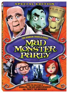
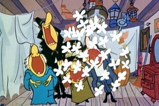
– Can’t get enough Stop-Motion Animation? Fantastic Mr. Fox, Mary and Max, and Coraline have just wet your appetite? Lert’s go back to the creators of the feast – Rankin-Bass. As part of its Tim Burton retrospective, the Museum of Modern Art will be screening today and tomorrow (Dec. 6th and 7th) Mad Monster Party. (I’d personaly prefer to see Daydreamer, The World of Hans Christian Andersen.) Dracula, the Mummy, and Dr. Jekyll and Mr. Hyde plot to gain control of Baron von Frankenstein’s secret weapon during a monster convention. Featuring the voices of Boris Karloff, Phyllis Diller, the movie should be a trip down memory lane.
December 5, 2009, 5:45 p.m.
December 6, 2009, 5:30 p.m.
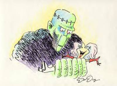
A drawing by Don Duga who storyboarded the film. __________________
,
UPA

-On December 14th, the Academy of Motion Pictures Arts & Sciences will have a program celebrating the short films of UPA. John Canemaker will host the event with a look back at the studio’s output. Eight rarely seen films will be screened in 35mm.
These will include:
_____GERALD MCBOING BOING
_____MISTER MAGOO’S PUDDLE JUMPER
_____ROOTY TOOT TOOT
_____MADELINE
_____THE TELL-TALE HEART
_____THE UNICORN IN THE GARDEN
_____FUDGET’S BUDGET
_____GEORGIE AND THE DRAGON
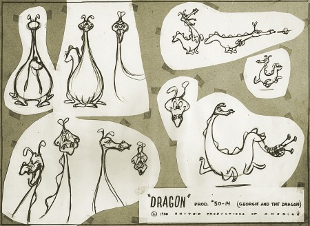
Take it from someone who knows, the collection of shorts couldn’t be better. Lots of Oscar winners and nominees among them. The 35mm prints from the UCLA Archives, will be immaculate. This show will be a treat.
At 7PM December 14, 2009 at the Lighthouse, 111 East 59th Street, between Park and Lexington avenues
$5.00 admission ($3.00 for members)
Books &Norshtein 04 Dec 2009 08:39 am
Norshtein Comics – 3
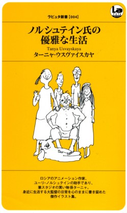 - It’s Friday, so it’s time to read the next chapter in the delightful book by Tanya Usvayskaya. She recorded her stay at Yuri Norshtein’s studio by caricaturing her boss and his life during that period. The simple drawings say a lot.
This book was gifted me by Richard O’connor, whose Asterisk Productions does some charming animation of their own. I am enormously grateful for that surprise package of a book.
Note that the translation, sometimes poorly worded, is copied verbatim. I’m just trying to transcribe the book without any alterations.
The first two parts of the book can be found here:
Norshtein Comics – 1
Norshtein Comics – 2
This chapter concerns itself with biographical notes of the master’s life.
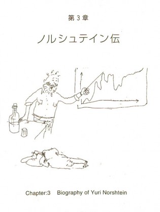 1
1(Click any image to enlarge.)
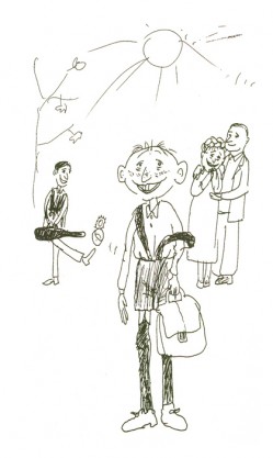 2
2
“Childhood”
Red haired with freckles and in stockings – boy grew up cheerful.
Made mama Bassya and papa Boris happy and almost he never
quarrelled with his brother – violinist Garik.
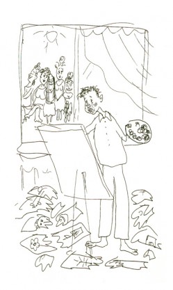 3
3
“Adolescence”
As a lad, he was soon captured by one passion – just painting!
Drew, torn to pieces and thrown out.
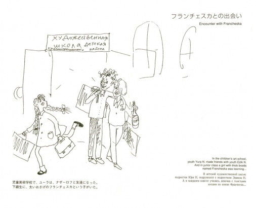 4
4
“Encounter with Francheska”
In the children’s art school.
youth Yuri N. made friends with youth Edik N.
And in junior class a girl with thick braids
named Francheska was learning . . .
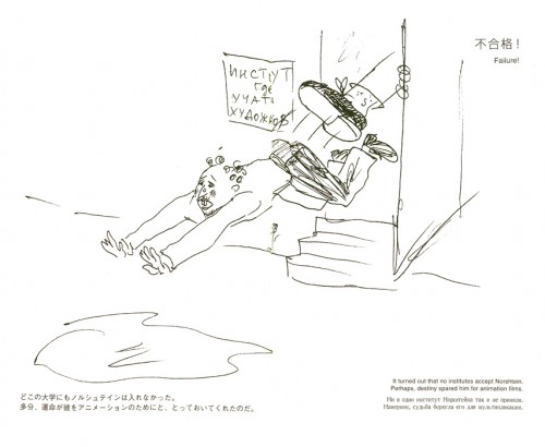 5
5
Failure!
It turned out that no institutes accept Norshtein.
Perhaps, destinyspared him for animation films.
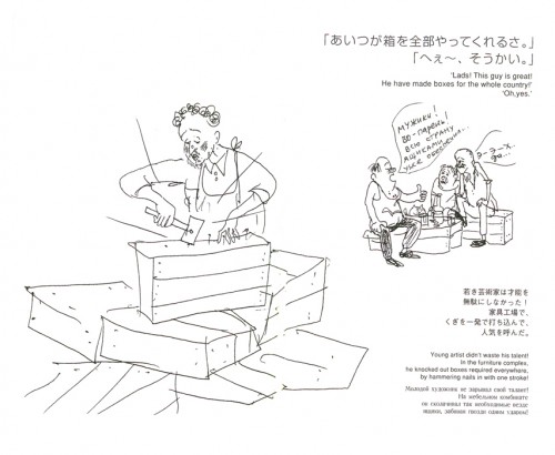 6
6
“Lads! This guy is great!
He made boxes for the whole country!”
“Oh, yes.”
Young artist didn’t waste his talent!
in the furniture complex
he knocked out boxes required everywhere
by hammering nails in with one stroke!
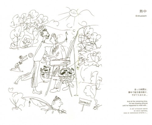 7
7
“Enthusiasm”
And all the remaining time
he was drawing pictures
until he happened to meet with . . .
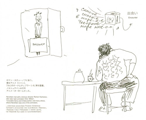 8
8
“Encounter”
Norshtein met with a famous director, Roman Kachanov,
who later took (made) animation film “Mitten”,
“Crocodile Gena and Cheburashka” and many others,
where Norshtein was one of the animators.
 9
9
“On the road to becoming an animator.”
(Without believing his own luck . . .)
With the blessing of Kachanov, Norshtein successfully passed
an examination and entered the artists, animator’s class!
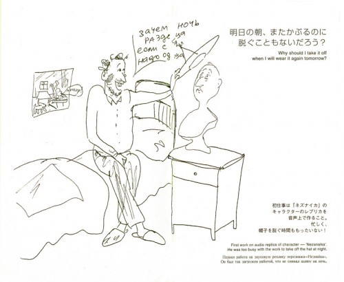 10
10
“Why should I take it off
when I will wear it again tomorrow?”
First work on audio replica of character – “Nezanaika”.
He was too busy with the work to take off the hat at night.
Bill Peckmann &Books &Illustration &Rowland B. Wilson 03 Dec 2009 07:37 am
Bedtime for Robert – 1
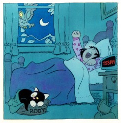
- Bill Peckmann collaborated with Rowland Wilson, back in the early ’80s, on a charming little book for children that never found a publisher and, consequently, never was completed. Bill had a bound copy of the book – in a mockup form – and sent it to me. I, naturally, would like to share it.
So here’s the first part. There are about 90 pages, so it’ll probably take three posts to complete them all.
First, here’s the note on the inner sleeve of the cover:
- ABOUT BEDTIME FOR ROBERT, A WORDLESS BOOK
Bedtime for Robert is intended to bring to small children an early experience of the special personal relationship one has to a book; the availability and flexibility that a book enjoys over a fixed-time medium such as television.
Being wordless, the book needs no translation. The child has access to it at any time without relying on adults. This early exposure to the physical reality of books will, we believe, enhance the experience of reading later on.
The story combines the pull of a narrative with information that appeals to a child’s curiosity: in this case what goes on at night in the adult world. Although the child must go to bed (reluctantly), Robert the cat’s curiosity leads him into this forbidden adult world. Robert is all cat with cat qualities, not a little person in a cat suit as most cartoon cats are. The child can project his own emotions into the character.
The authors are booklovers with extensive experience in both print and film. We have both won Emrnys and other awards for our animation designs for educational TV.
We believe this is the first book to utilize the principles of film continuity in a printed form. This continuity is vital to the understanding of a narrative without the aid of words.
The use of film pacing supports the unfolding of adventure and humor in a wordless story.
The book is planned to be in color. The pages up to 17 are in finished linework and the rest is in rough layout form.
Robert is conceived as a series. The character and structure would remain constant. The variables would be in the cat’s adventures in various places, seasons, times of the day, and occupations.
Please contact either of us at the addresses below. This is a simultaneous submission.
Yours truly,
Rowland Wilson
Willi Peckmann
Here, then, are the first 20 or so pages. You’ll see immediately how original this book is:

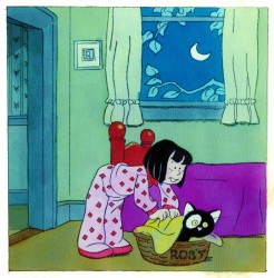 3
3(Click any image to enlarge.)
Rowland was so brilliant with color; it would have been wonderful if he’d been able to complete the book. At least we have this much.
Many thanks to Bill Peckmann, again, for sharing this gem.
Commentary &Events 02 Dec 2009 09:30 am
Magoo’s Christmas Carol Screening
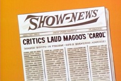 - Last night, the Paley Center (formerly known as the Museum of Broadcasting) hosted a program celebrating the first animated Christmas Special on TV, Mr. Magoo’s Christmas Carol. The program first aired in 1962 and was something of an instant success.
Present for the show were Judy and Roberta Levitow (the daughters of Abe Levitow, who directed the show), Darrell Van Citters (who’d written the recent, attractive book Mr. Magoo’s Christmas Carol: the Making of TV’s First Animated Special), and Marie Matthews (the voice of Young Scrooge) participated in a panel moderated by Jack Doulin (casting director – NY Theater Workshop).
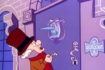 The film looked glorous projected in High Def supplied by the DVD distributor, Classic Media. They also distributed free copies of the DVD to every member of the audience. What more could you ask for!
I was particularly taken with how beautiful some of the Backgrounds looked on the big screen; those in the last segment – ghost of the future, cemetary – were especially stunning. It was amazing to see the extraordinarily limited animation play so well with the brilliant soundtrack and the strong scenics. (It’s hard to believe the complete production for this show totaled just five months.)
The panel wasn’t particularly illuminating; I knew a good deal about the show having read Darrell Van Citters‘ amazingly informative book about the production. It seemed that was all the moderator really knew about the show; he’d read the book. Given the audience and the moderator’s theatrical background, there was a bit of a stronger focus on the Jule Styne and Bob Merrill songs, but, even there, the book offered so much more information. I wish Darrell had been the moderator. He’s so much more informed.
The program ended with Marie Matthews singing her song, “When You’re Alone in the World,” live to piano accompaniment. Nice.
Regardless, seeing the show projected and coming out into the lively Christmas world of Rockefeller Center left me in a good mood for the night. You should take another look at the show, even though on DVD.
There’s a screening upcoming in LA on Saturday, Dec. 19, 2009 at 4:00pm. It’ll take place at the Aero Theatre, 1328 Montana Avenue at 14th Street in Santa Monica. That screening will also be followed by a panel and book signing.
.
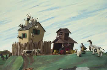
Another stop motion feature opening in NY:
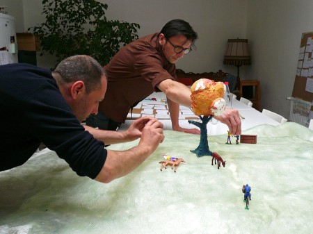
A TOWN CALLED PANIC will have a 2-week run in New York at the Film Forum. The animated stop-motion film will screen December 16-29.
This seems to be an absurdist piece of animation wherein some small toys – a cowboy, an Indian, a horse, a dinosaur are animated shuffling about to a somewhat insane script. You can see a sample of the film here and you can see a short with the same characters here.
The Film Forum is located at West Houston Street (W. of 6th Avenue), with screenings daily at 1:00, 2:40, 4:15, 6:00, 8:00, and 10:00.
_________________
- Finally, since we’re talking about Christmas, let me promote some excellent merchandise provided by John Schnall. He’s created some hilarious e-mail cards that are personalized for you. They’re inexpensive and worth every dime he’s asking. You can see what he’s offering here, and you can see a sample done for me here.
.
