Animation &Animation Artifacts 12 Mar 2009 07:58 am
Taras & Fritz
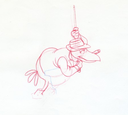
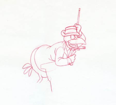
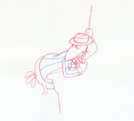
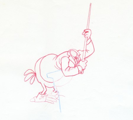
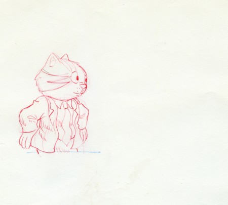
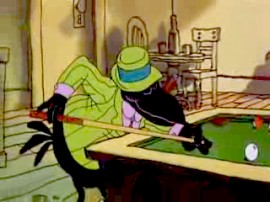 - Reading a short piece about Ralph Bakshi on David Levy’s Animondays blog, brought me back to my collection of drawings. Here are some drawings from Fritz the Cat, the first scene of the pool sequence.
The drawings are by New York staple, Marty Taras. He, Johnny Gentilella and Nick Tafuri all had similar drawing styles. The clean rough. An inker could (and did at Hubley’s) work directly from their drawing without a cleanup by and an Assistant. These drawings were assisted by Jim Logan, who gave the drawings to me back in 1976.
(Johnny was an amazingly sweet guy, who spent a lot of time teaching me much in those early days. Marty was someone whose defenses always seemed to be up. Perhaps this is the reason he was the brunt of som many gags back at Terrytoons. Nick, when I knew him, was grumpy. He seemed not very talkative – just wanted to hand in the job and get outta there. But he did a couple of the best takes I’ve ever seen in the animation he handed in.)
Marty’s style was to work so light that it’s a struggle to see the red lines. For these scans, I had to darken the artwork so that the paper ends up with a bit more yellow than it has in reality.
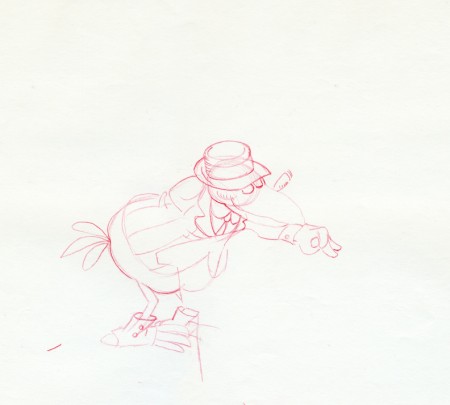
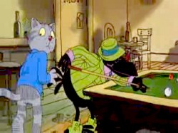
The crow chats with Fritz.
His arm and pool cue are on another level.
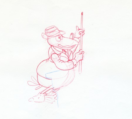
(Click drawings for enlarged versions of the entire animation sheet.)
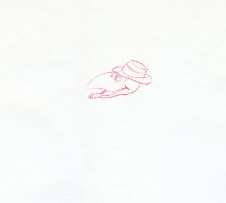
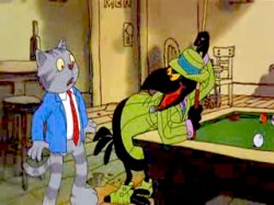
Crow’s head moves to a separate level as he chats with Fritz.

on 12 Mar 2009 at 5:59 pm 1.Eric Noble said …
These are wonderful drawings. You are very lucky to have these. Duke was one of my favorite characters in that movie.
While “Fritz the Cat” is a good film, I prefer Bakshi’ films that he did after like “Heavy Traffic” or “Hey Good Lookin”
on 13 Mar 2009 at 2:53 am 2.Jeffrey Gatrall said …
Thanks for remembering some old masters, particularly Johnny Gent and Nick Tafuri.
Nick Tafuri was the guy who taught me how to lay out scenes for the camera. We were both working at a studio called Cinema Fair on bi-centennial programs for CBS. I had a scene with a pan that was about 36″ long, with characters on each of the four levels, that had to be moving as the camera passed and then stop after it had passed, so that new characters could be switched onto those levels, to be ready to move when the camera passed them. Sound confusing? It was to me, but Nick sat and patiently showed me how to set up the exposure sheets and mark the camera pan. All of this is stuff that I use to this day.
He also taught me that you should check yourself three times to make sure you have caught all of your mistakes. He said, “I had the reputation of being the slowest guy at Paramount. Some of these new guys would rather run around with their heads cut off and get things done fast, without checking, but then afterwards they just have a lot of mistakes that cost them twice as much to fix. I think my way is faster and cheaper “
on 16 Mar 2009 at 12:16 pm 3.Jenny said …
I see such sensitivity and appeal(I know, that word! but it fits)in these drawings that the color utterly lacks…it looks so flat and muddy in color. And Fritz’s blue jacket pops so much it’s distracting. Maybe it’s the stills or the print. But the important thing is how nice the drawings are.