Commentary &Photos 15 Mar 2009 07:58 am
Peevish
- Walking around New York one starts to see a lot of small annoying things that get catelogued somewhere in the recesses of one’s brain. Eventually, I think those annoyances have to be released. Let me tell you, I have a lot of them. What’s a blog for if not for that release, so here I am sharing. Sorry about that.
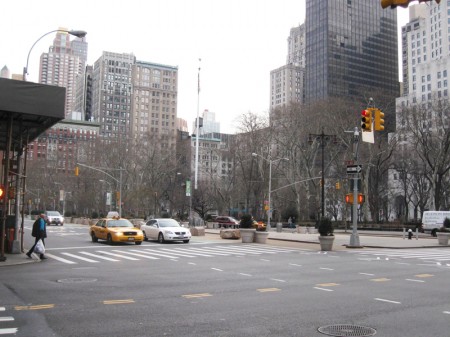
This uninteresting little bit of Broadway meeting Fifth Avenue is getting me
more and more annoyed as time goes on.
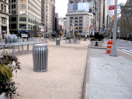
Last year, Mayor Bloomberg’s administration decided that several areas of
street traffic should be closed and turned into a sit-down area with tables.
IN THE MIDDLE OF FOUR LANES OF TRAFFIC!
The two middle lanes were turned into a rest area where people
could sit their weary bones and watch traffic swirl about them.
I shot these pictures early morning. Tables and chairs had to be set up,
and someone does this daily. A guy was in the background sweeping
the area at 6:30am Saturday when I took the pictures.
You can’t see it vivdly in my photos, so I’ve done a quick aerial map.
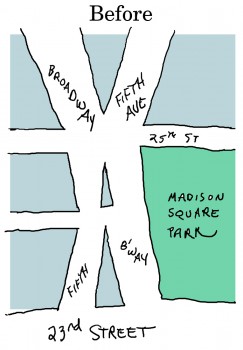
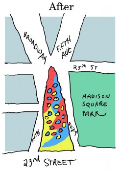
Left: You can see that three lanes of traffic on Broadway crossed and
ran into three lanes of traffic from Fifth Avenue.
Right: After the “Fun and Games Area” has been added to the center of this
traffic center, cars are reduced to four lanes total – including lots of busses.
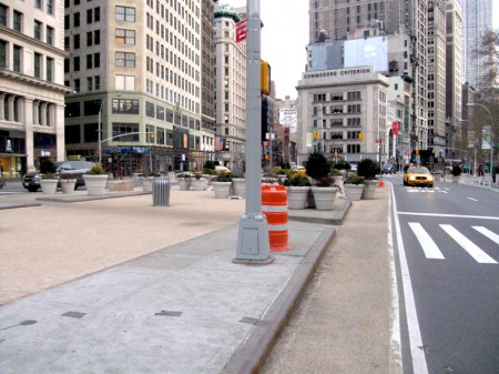
Now you can sit watching the swirling traffick, swallowing plenty of exhaust fumes
while you look across to Madison Square Park a distant 20 feet away.
What sense makes this!?!
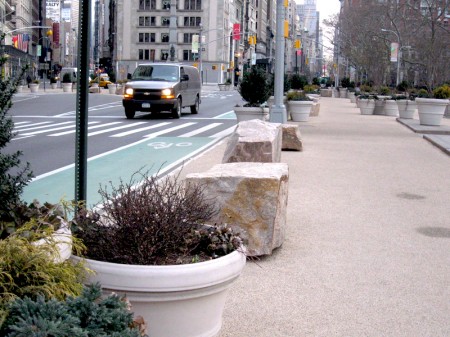
Rocks like these line both sides of the triangle so that any careening car
won’t crash through the seated folk resting.
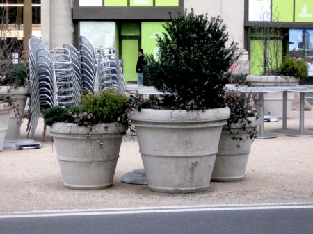
The lovely foliage adds to the experience.
A similar area was done in Times Square!
This summer, the cars will be turned away from these areas, and the streets
will become a pedestrian mall. No cars on 42nd Street and Broadway!
Try walking with the other thousands of people enjoying a delightful
hot summer evening in the middle of the street – Times Square.
Try getting a cab after the theater.
It’s the mall-ization of New York. Every eve’s going to be New Years Eve!
Every day Christmas.
____________________
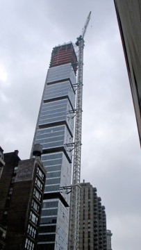
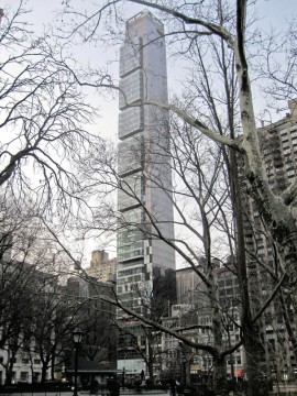
Left: For years, we put up with this mile-high crane on 23rd Street –
always waiting for it to come crashing down on us.
Right: The end result is this hideously unattractive building. I tried to make it look interesting by shooting it from the park, surrounded by trees. It didn’t work.
____________________
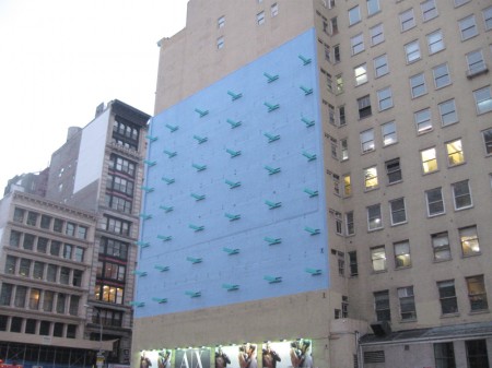
Finally, for today, could someone tell me what the hell this is!
In an area surrounded by enormous posters painted or draped onto
the sides of buildings on Houston Street, this one has this.
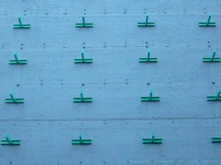
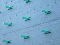
Are these clips or hangars or what?
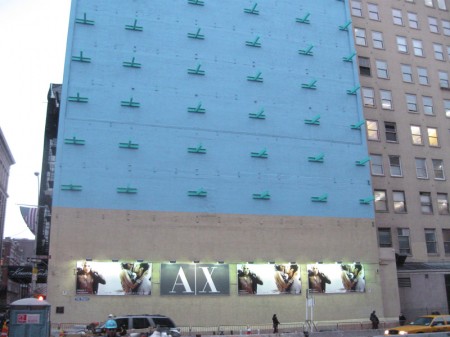
Is it an artwork? An ad? Something different from Banksy?
A year it’s been there, and I don’t know what or why.
________________________________
On the positive side. There’s New York’s newspapers and the on-line versions.
Today’s NYTimes includes an informative article about William Kentridge and includes one of his animated films, Tide Table. It’s a must-view for those interested in animation as an art form.
Better yet, if you live in San Francisco, go to the San Franciso Museum of Art where a retrospective of Mr. Kentridge’s work opens next Saturday.

on 15 Mar 2009 at 10:58 am 1.steve said …
Michael: I can’t explain the blue on the wall, but I think the ‘clips’ have been there a long time, ever since the adjoining building was torn down. I believe they are intended to help hold the remaining building’s structure from moving outward toward the street. The removed building had acted as a buttress and without it something else was needed. Their design is quite another thing; they could have looked very different from what was placed. Art? I don’t know, but with having to put something there, perhaps it was an attempt to make it as abstract and non-representational of anything as it could.
on 15 Mar 2009 at 11:54 am 2.gg said …
http://www.nytimes.com/2007/11/15/garden/15frosty.html?pagewanted=2&fta=y
on 15 Mar 2009 at 12:14 pm 3.Michael said …
Steve Fisher also sent this as an answer to the blue sculpture.
on 15 Mar 2009 at 1:16 pm 4.John said …
Here’s my annoying Madison Square traffic island story — Back in the 1960s, when both Broadway and Fifth were still two-way avenues, they had a bizarre little set-up between 22nd and 23rd streets where one of the bus lines would terminate it’s run coming south at 23rd and Fifth, then turn east on 22nd and start back north while parked on the wrong side of the traffic island in the middle of Broadway, facing in the direction of the southbound traffic and making passengers have to stand on the island in the middle of traffic to wait for the next bus to arrive. It definitely kept you from wandering too far away from the bus stop while standing there.
on 15 Mar 2009 at 2:02 pm 5.JPB said …
the “Fun in Games Area” is awful. As a driver its dangerous, as a visual artist is horrendous to look at. I just love breathing in car fumes when I sip on my latte…
on 15 Mar 2009 at 6:47 pm 6.Richard O'Connor said …
It’s a noble effort to capture the island for pedestrians, but this is bad execution.
The optimal way to do it is impossible. That would be to submerge traffic -like Park Avenue at Grand Central. With the Broadway N/R line there’s no subterrainian real estate to do this.
The re-imagined High Line should be the blueprint for 21st Century urban planning. That incorporates elements of the city, is accessible but removed.
This intersection has been a blight as long as I’ve lived in New York, is it really any worse now than it has been?
on 16 Mar 2009 at 8:41 am 7.Charles K. said …
Michael, I have to liaise with municipal and state government agencies on a regular basis. Common sense is rarely if ever a factor in the decisions they make.
on 16 Mar 2009 at 11:55 am 8.Bridget Thorne said …
Bird perches?
on 16 Mar 2009 at 12:05 pm 9.Michael said …
Actually, it’d be worth hanging out there to snap a picture of any bird that might perch there.
on 16 Mar 2009 at 12:22 pm 10.Bridget Thorne said …
But it could be big and scary!
on 16 Mar 2009 at 12:50 pm 11.Dawn said …
Hi Micheal,
I read an article in Art in America June/July 2007 issue that did a short piece on the blue wall. It’s the ten year return (after construction repairs seized) of Forrest Myers’s 1972 public artwork, The Wall. There was a lawsuit between the artist and the building owners that lastest some ten years because the owners wanted to sell advertising instead of restoring the artwork that was protected was SoHo was land marked in 1973. The artwork’s design originated because “a grid of 42 aluminum projecting girders attached to steel brackets, which were installed to secure the bricks when the building adjacent to 599 was torn down to widen Houston”. Hopes this helps clear it up a bit. I’ll scan the article in for you if you like.:)