Category ArchiveIllustration
Articles on Animation &Books &Commentary &Disney &Illustration &John Canemaker &Layout & Design &Story & Storyboards 01 Jul 2013 07:29 am
Alice Boards
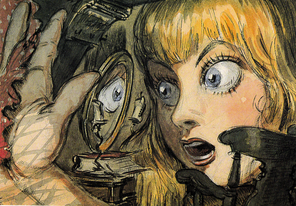
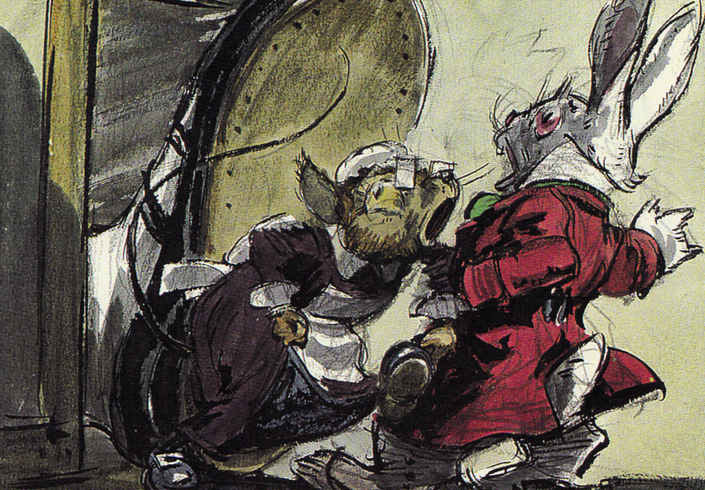
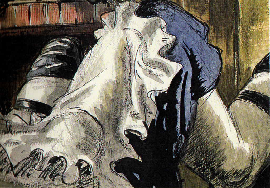
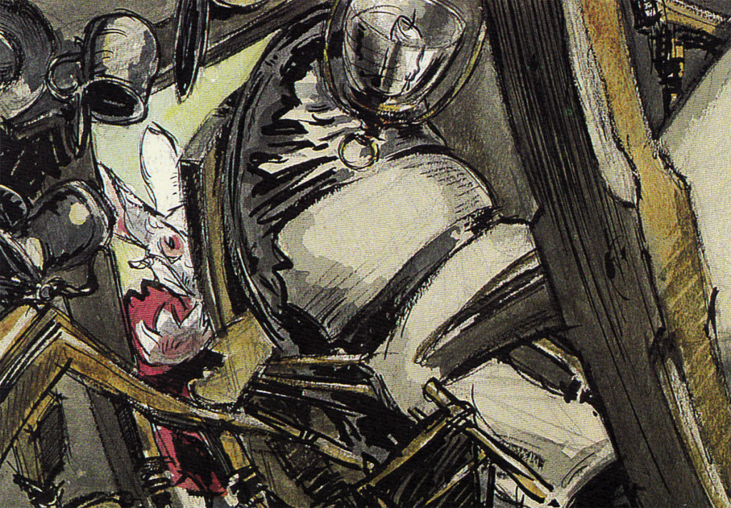
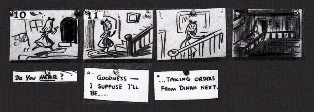
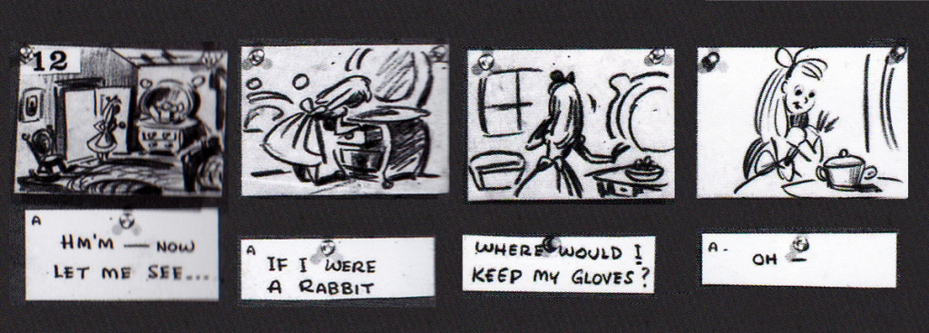
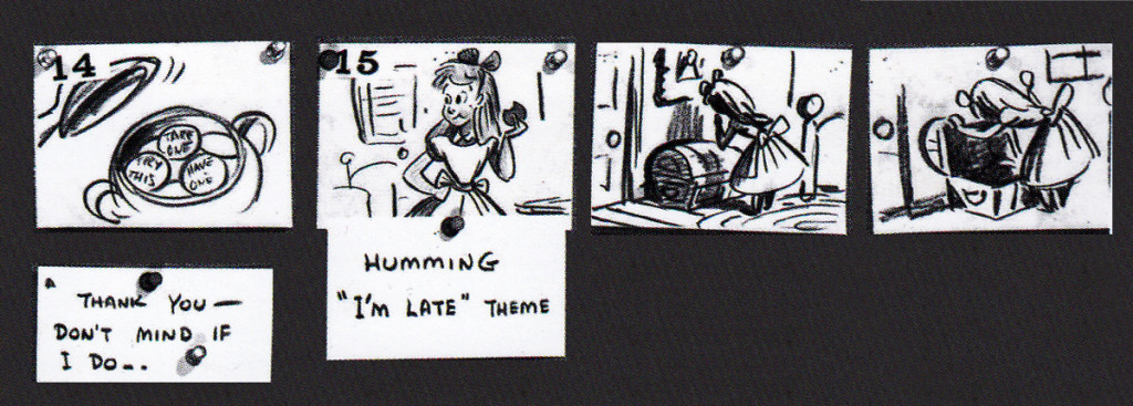
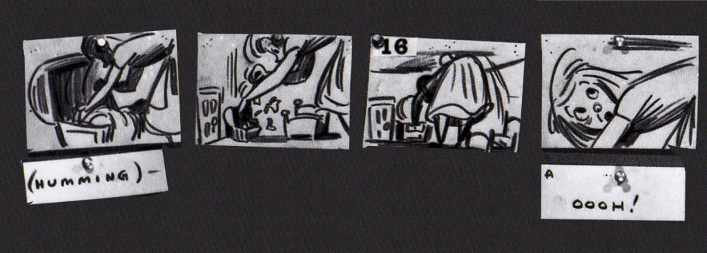
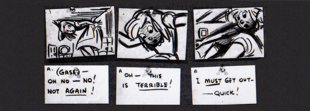
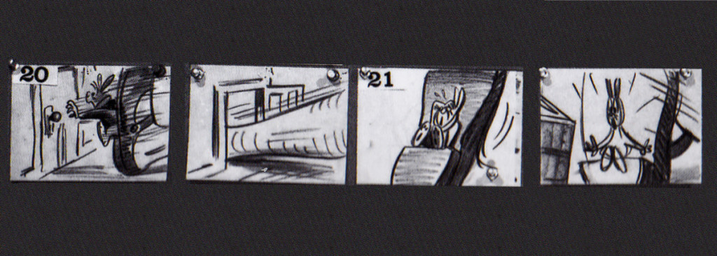
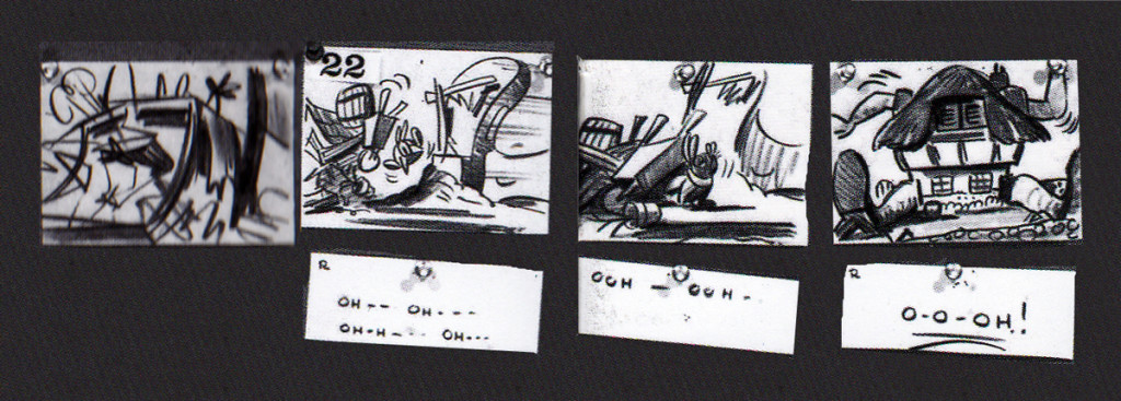
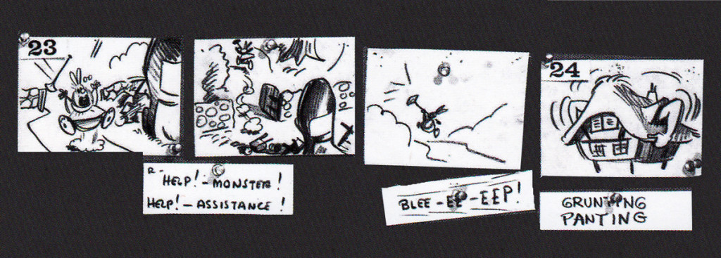
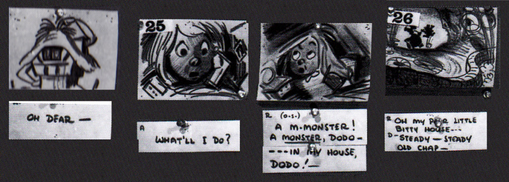
John Canemaker‘s book Paper Dreams: The Art & Artists of Disney Storyboards, is a brilliant work. As an example, take a look at this short piece for Alice In Wonderland.
The animated feature went through a long, slow birth.
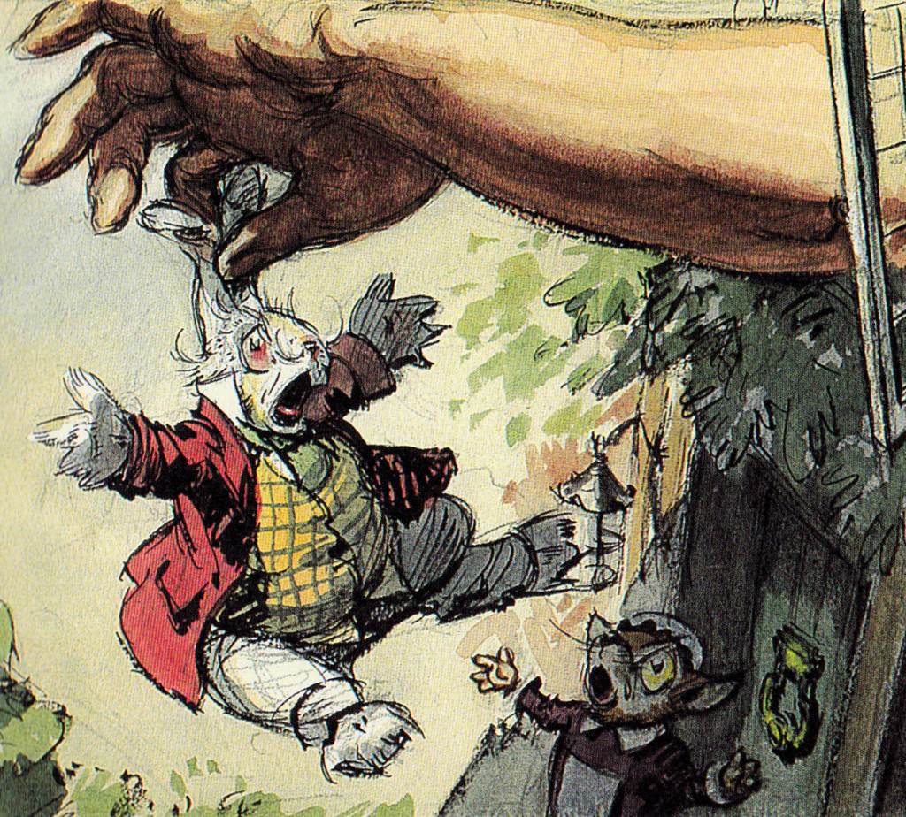
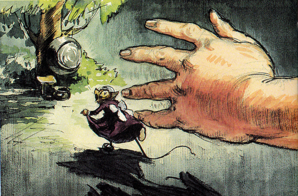
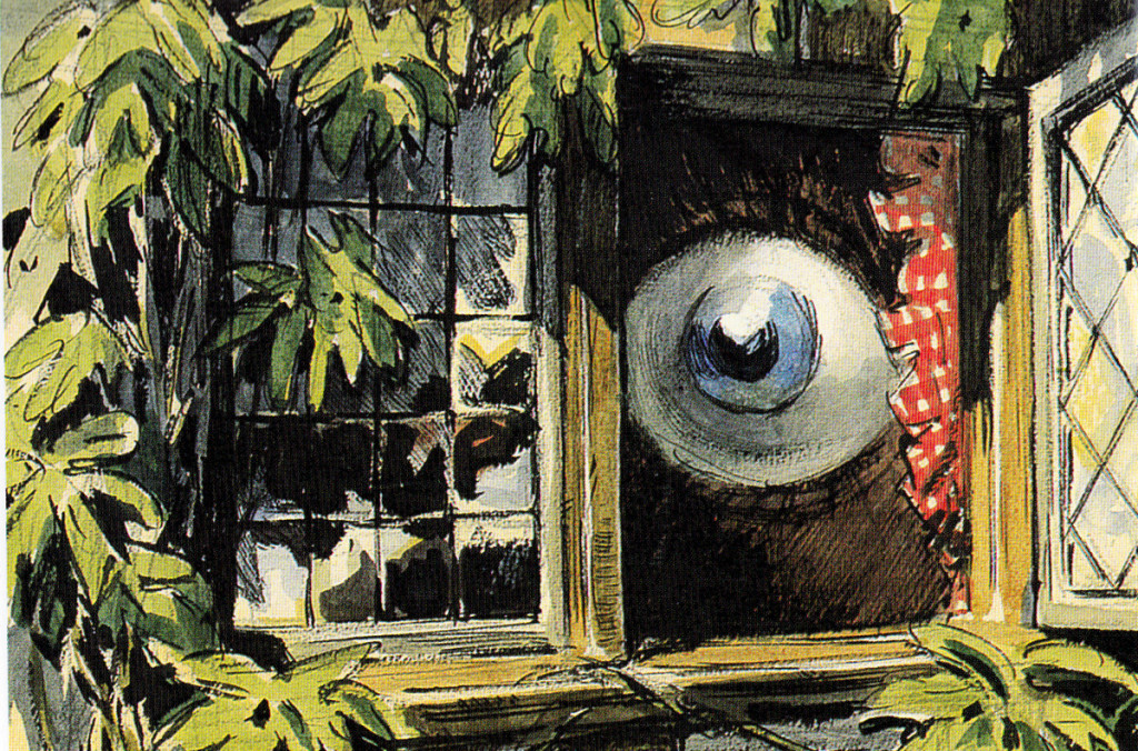
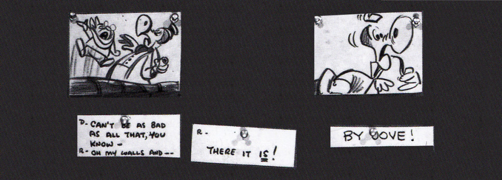
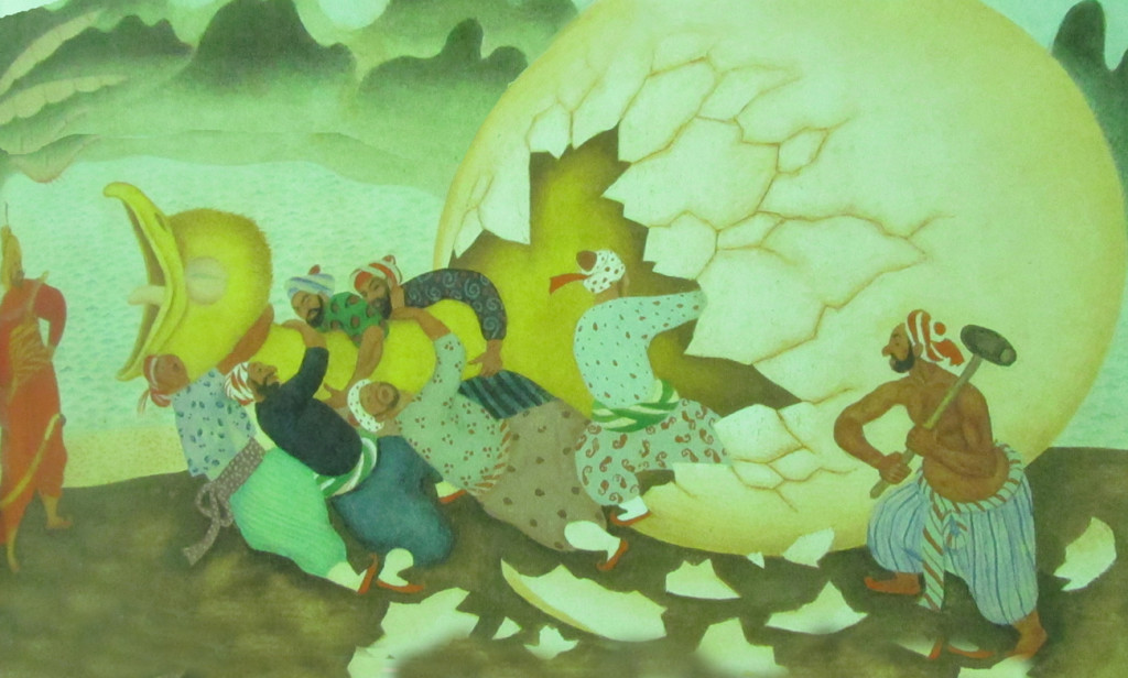
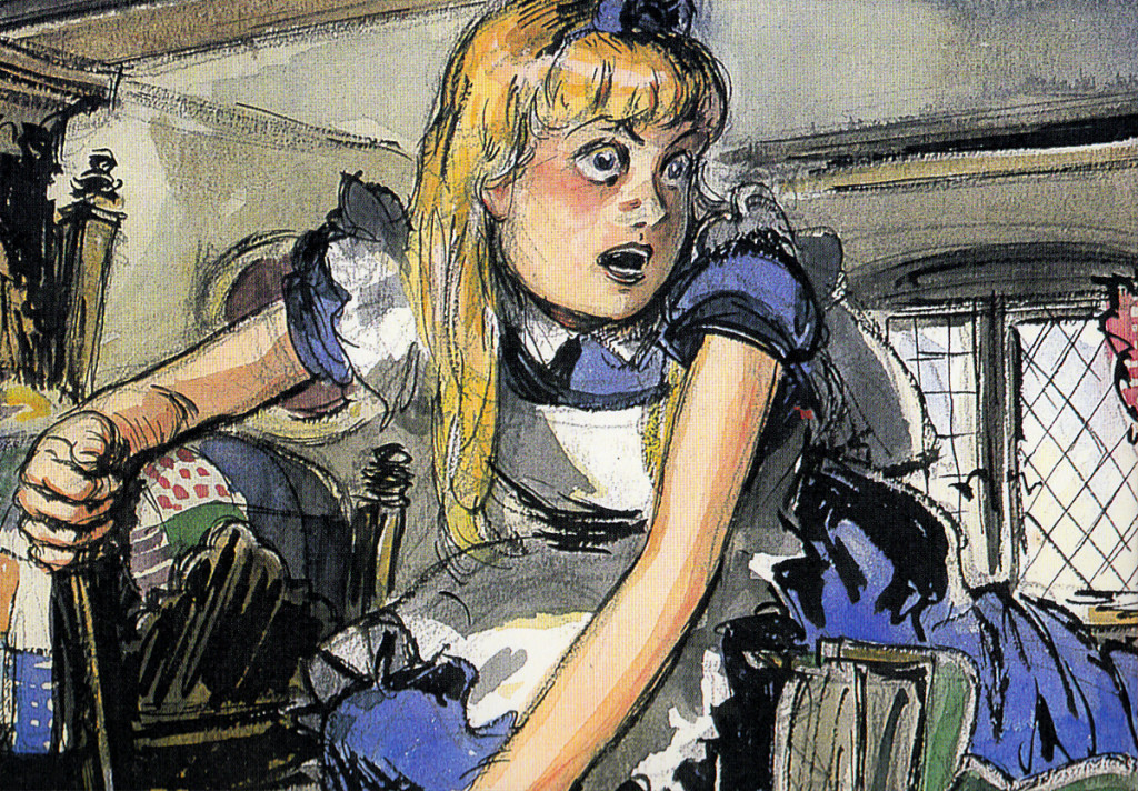
The first board, for this sequence, was by David Hall and was done in 1939, the late Thirties. Hall was originally a production artist for Cecil B. DeMille at Paramount Pictures; he worked as an illustrator who was called in to make many delicate watercolors. There was one sequence from the Carroll original which was kept for the final film. In it, Alice gets trapped within a house when, having bitten into a cracker, she suddenly starts getting larger and larger until she fills the white rabbit’s home with her head and overgrown body parts. Many a creature try to pull her from the house.
Here are some of the Hall watercolor images:
 1
1
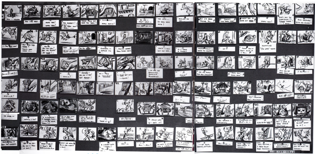
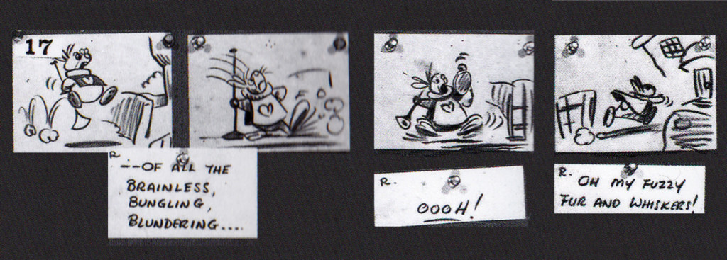
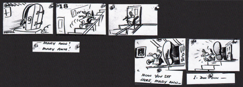
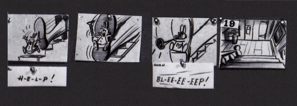
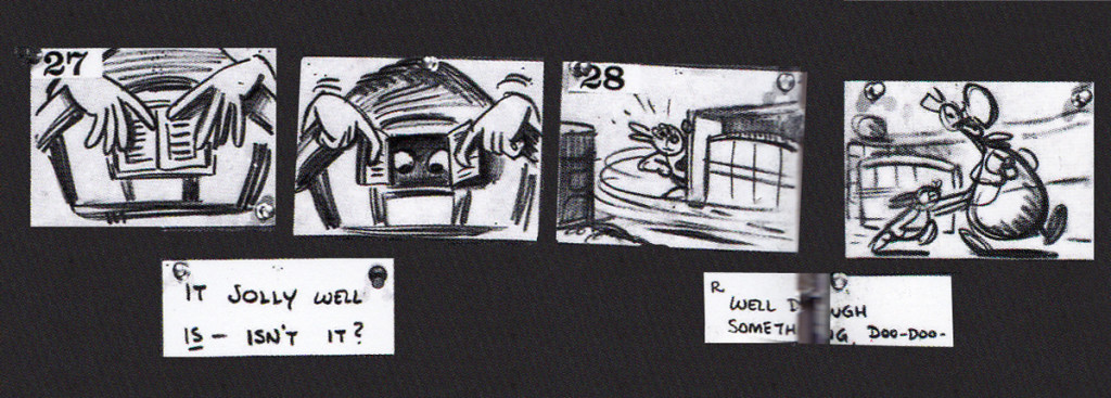
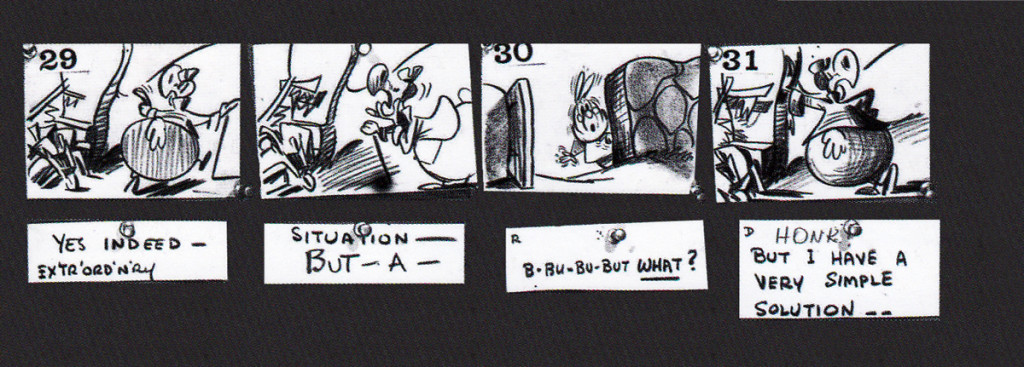
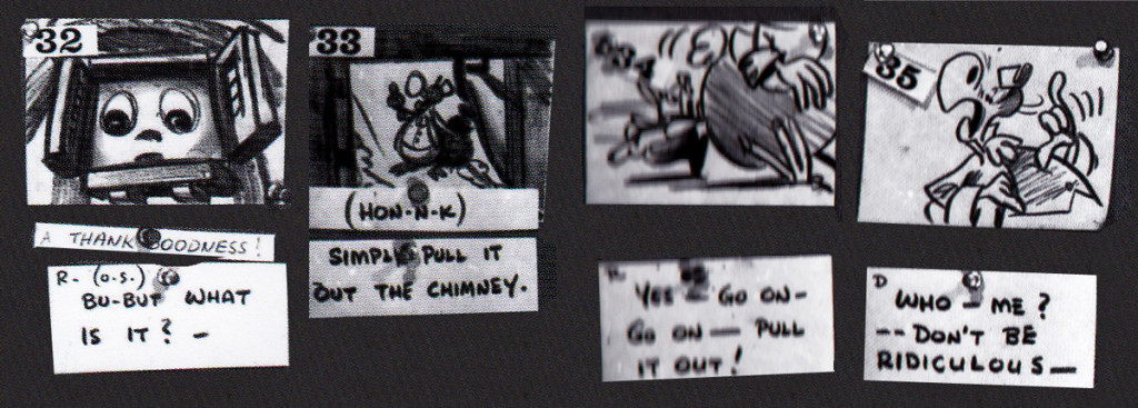
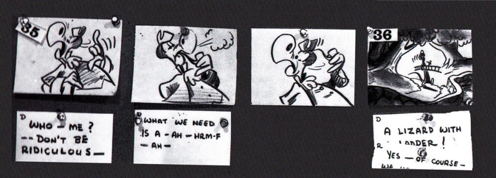
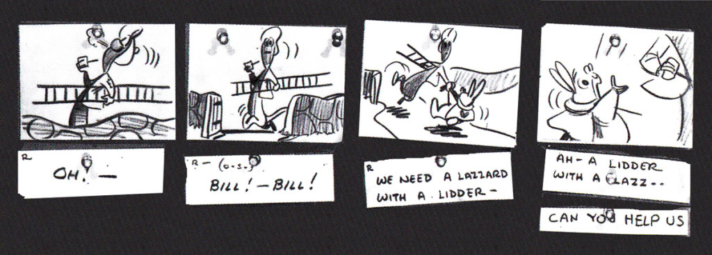
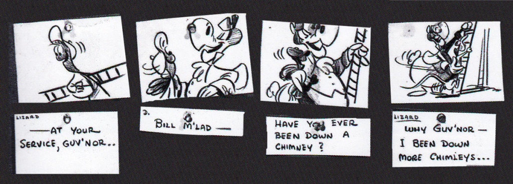
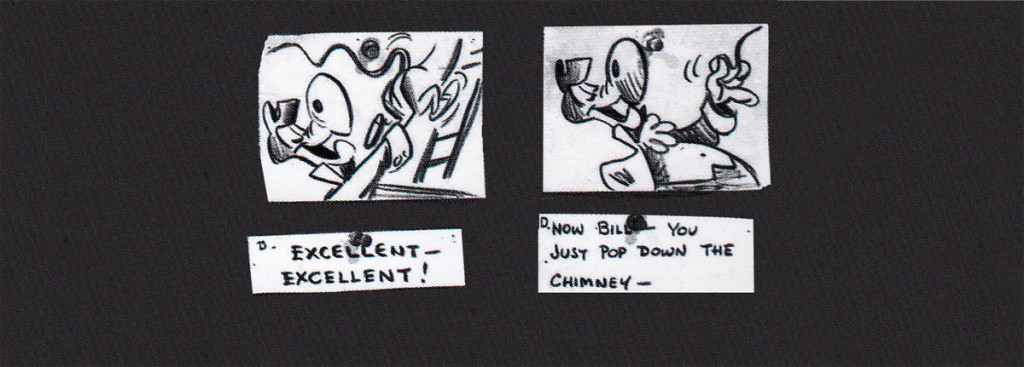
Following his version, there was an attempt at a script by novelist Aldous Huxley. Done in 1945, this was ultimately abandoned when storyboard continuity artist, Joe RInaldi, came in to make some more cohesive and funny drawings in 1950.
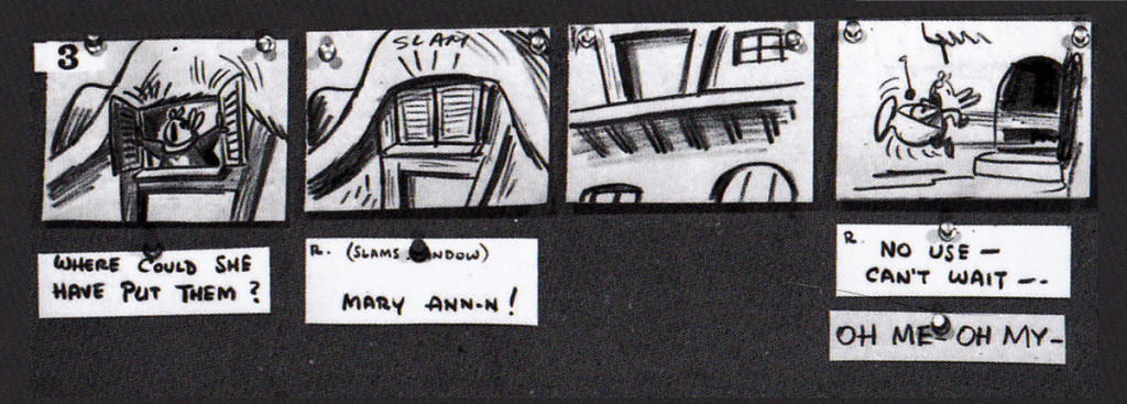
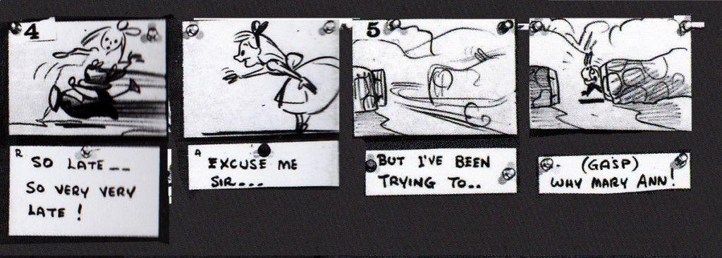
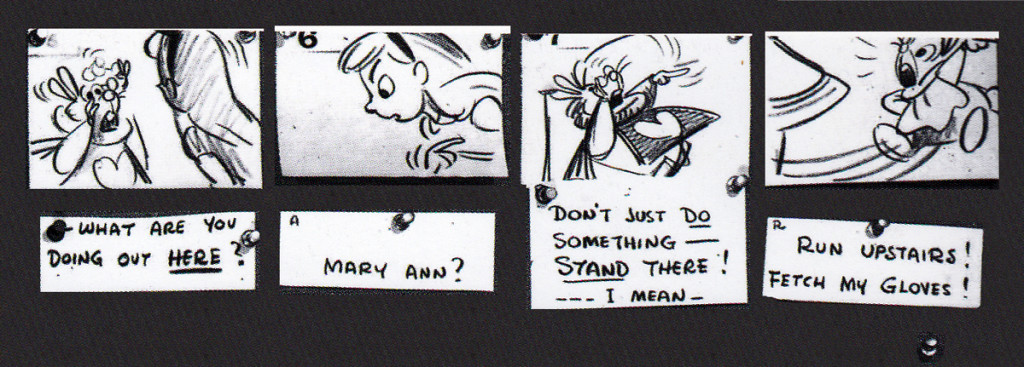
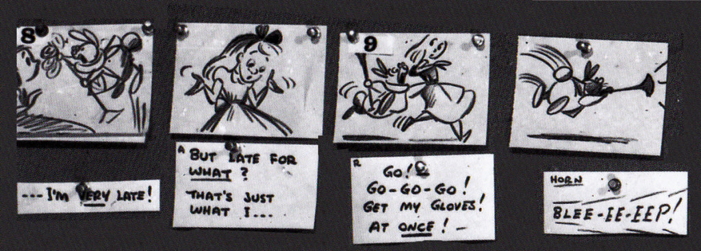
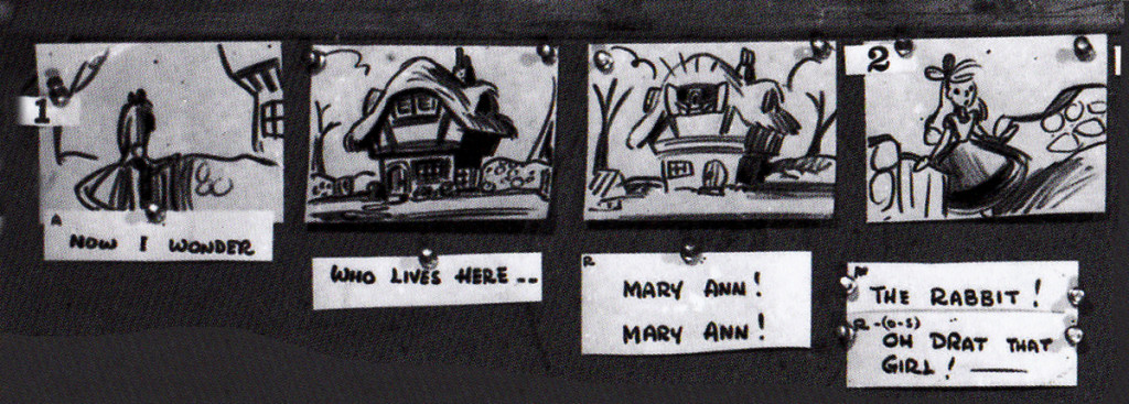
Here’s the full sequence, Rinaldi’s version.
The following is Rinaldi‘s board enlarged for the sake of legibility:
 1
1
I have to give John Canemaker many thanks for allowing me to post these images. His book is a treasure. to those who appreciate the storyboard.
Animation &Animation Artifacts &Articles on Animation &Disney &Illustration &Models &repeated posts 29 Jun 2013 03:51 am
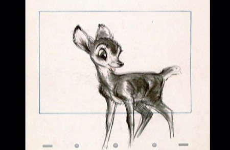
Young Bambi – repost
- It all starts with a drawing.
The brilliant host of cartoonists that came before us were an amazing group. To think of the complicated set of characters that the created. Characters with complex personalities and sophisticated drawing techniques.
Those characters went trough the mill in my own life time. Seeing the horrendous things that have happened not only to Mickey, Donald and Goofy but to Bugs, and Daffy and other Warner’s Bros characters. It’s been shameful.
I was going to post illustrations of some of those bastardizations, but I think it’s enough just to mention some of them.
Think of the Mickey Mouse Clubhouse running now on the Disney Channel. If ever there was proof positive that cgi weren’t cartooning, that would be it. Those are very unsophisticated digital puppetry shows where every move is obvious and preplanned, the voices are hideous, and the stories nowhere sophisticated enough to call trite.
Take a quick jump from those to the flash animated whirls that are being released with a lot of fanfare, and you’ll see what can go wrong with animation of stars. They may as well have dug Marilyn Monroe and Clark Gable out of the ground to allow the computers to move them as well. Like all new animation that’s being called good, these beasts-of-films are moved at the speed of light where no move gets to have any personality. Think of that naked Mickey in the most recent release. A thin slime of a creature, all black, that looks like a clam being animated by a Jim Tyer. There isn’t a pose in the film that could compare with what Terrytoons did – Terrytoons, the bottom of the barrel. They had personality all over these poorly drawn efforts.
There were the old Greg Ford versions of the WB characters for theatrical release, compilations of old with new. They were all mediocre but had the honor of the past directors in mind. The Bakshi Mighty Mouse cartoons were a take on their group of characters, but you had someone with a personality, Bakshi, trying to do wonders with a library of “B” stars. Even with the TV budgets, they were trying hard to do something, and often they were successful.
Today it’s all for poor exploitation, and no one is trying to do wonders with their characters. It’s all too sad.
The WB characters have had even greater attempts at poor art. You don’t have to think back too far to remember the sitcom version of the characters now running on Cartoon Network, also done in Flash. Think back to the poorly designed wretches that WB issued to their local network of stations, the WB. Those poor animated creatures were redesigned versions with scales and all. It’s just about time to scream, “Enough!” Is there not one executive who can offer some honor to these golden characters of our past? How much do we have to watch?
Why did these studios create their archives? Was it just to resell the goodies or was anything preserved so that the future animators could do right by these characters?
- It all starts with a drawing.
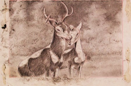
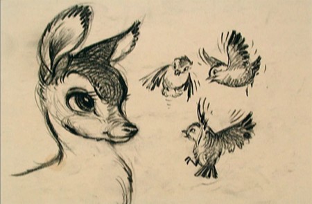
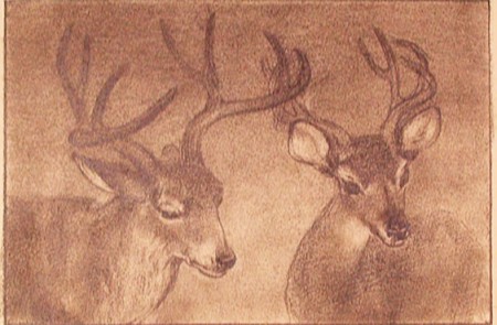
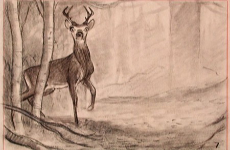
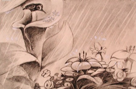
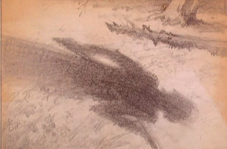
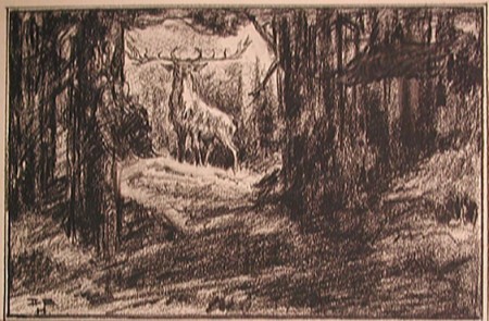
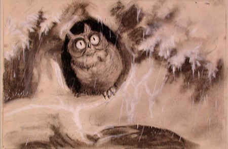
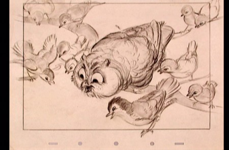
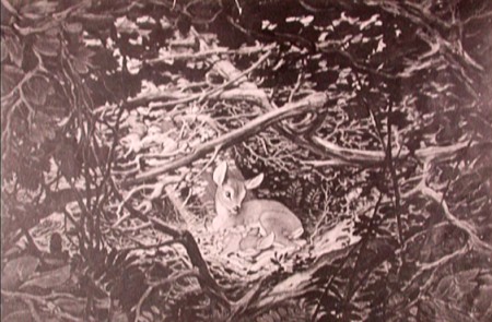
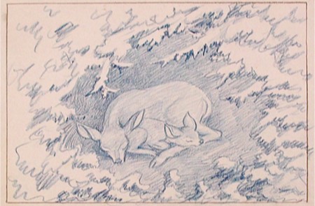
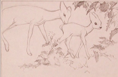
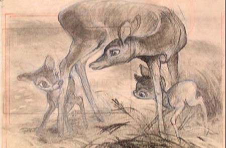
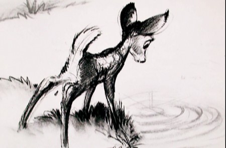
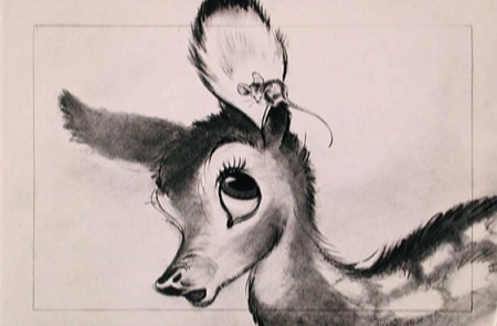
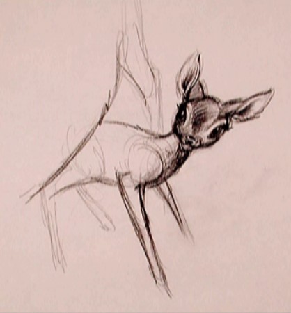
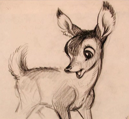
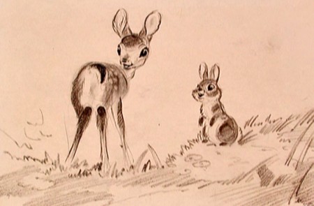
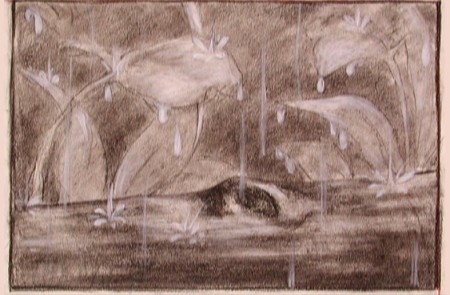
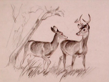
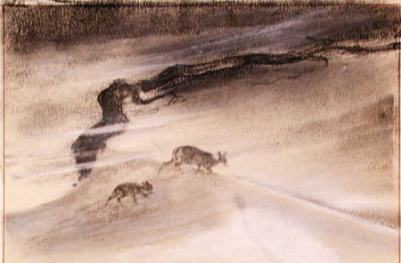
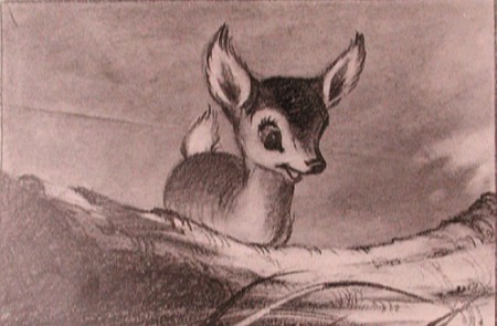
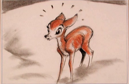
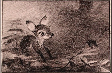
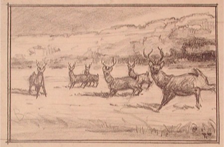
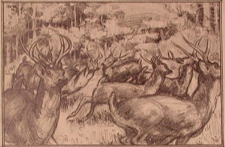
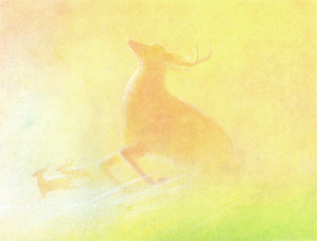
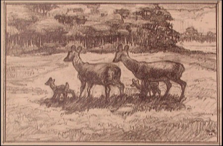
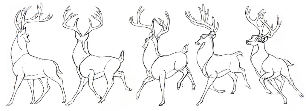
That’s all I can think. With that I’m just going to post a number of gems from Bambi. These had to have had some purpose greater than feeding Bambi !!. Or maybe I’m wrong.
Bambi is, to me, one of the most beautiful of animated features. Collectively, the artists at the Disney studio pulled together to create some wonderful artwork which produced a wonderful film.
The initial work went through many phases, as would be a natural state for animation. However, all of the artists seem to be trying for a higher plane, and oftentime they reached it.
To celebrate the latest release of this film, the Blu-Ray/DVD version, I’ve pulled a lot of the drawings from the film and post them here. It’s amazing how much influence Marc Davis had early on. I can only ID the artists of some of the sketches. If you know, let me know. We have to continue to ID these artists. Without their names we just have these flash animatedMickes that don’t even include one credit. And maybe they shouldn’t be credited; the work is so embarrassing.
 1
1David Hall
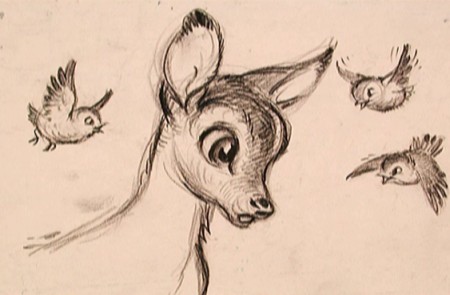 3
3
(above and below) Marc Davis
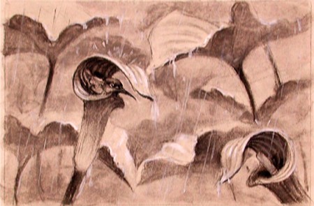 7
7
(above and below) Ken Peterson
Bill Peckmann &Books &Comic Art &Disney &Illustration &repeated posts 26 Jun 2013 06:29 am
Kelly’s 3 Caballeros, again
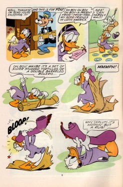
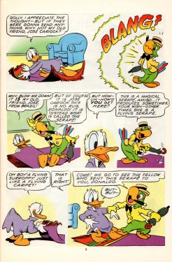
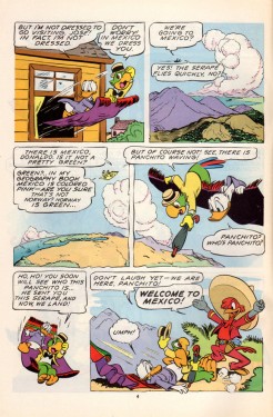
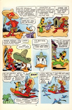
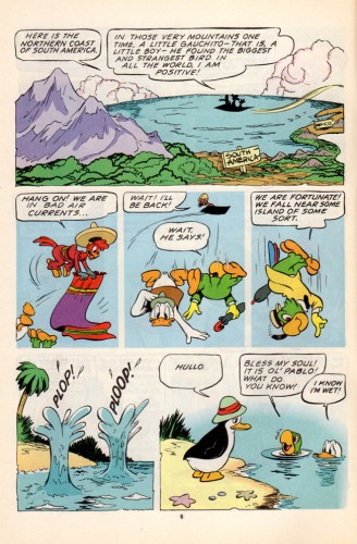
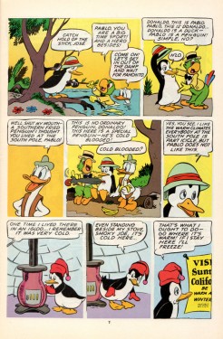
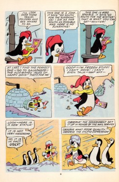
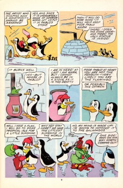
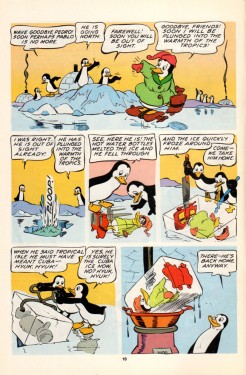
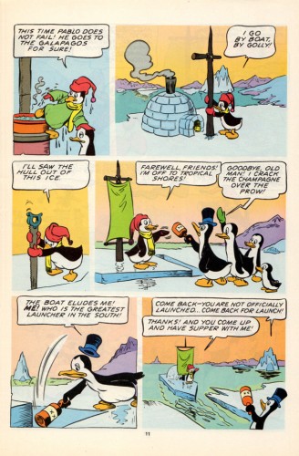
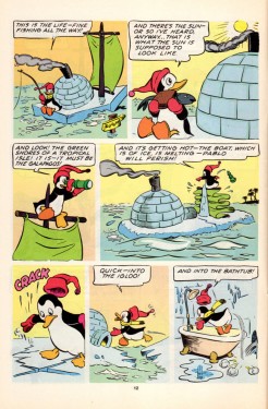
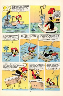
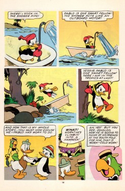
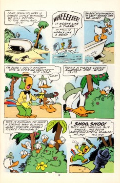
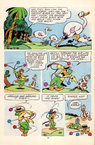
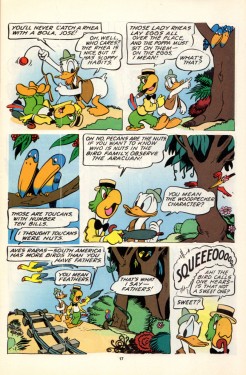
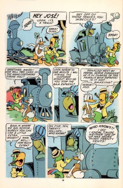
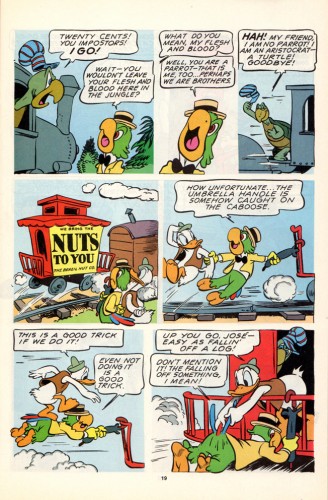
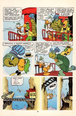
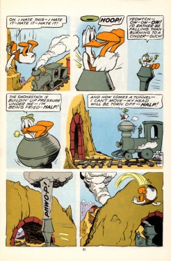
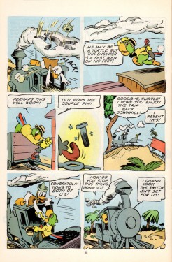
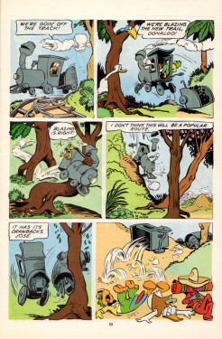
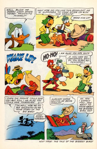
- Suppose we had a comic book version of The 3 Caballeros; wouldn’t that be fun to see? What if the artwork were done completely by Walt Kelly; would that make it a treasure? I think it does. Bill Peckmann made my week when he sent me the scans to the following comic book. As Bill wrote to me: “Beautiful stuff, like Barks’ art, it’s timeless, looks like it was done yesterday.”
However there’s some residue floating about. Sorry about that, but it is Kelly’s residue.
Not only is the artwork out of this world, but the quality of the printing is brilliant. And the quality of the book, itself, is wonderfully well preserved. You only have to look below to read it. Take your time; this is great.
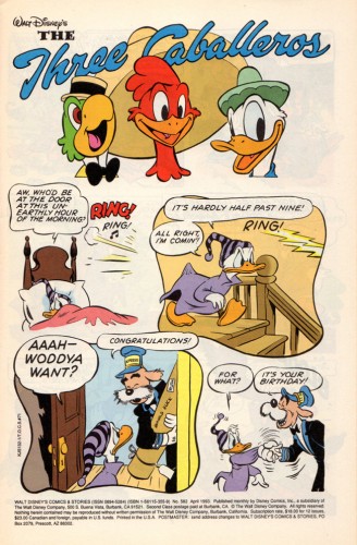 1
1
Many thanks to Bill Peckmann for sharing this gorgeous material with us.
Bill Peckmann &Commentary &Illustration 21 Jun 2013 06:24 am
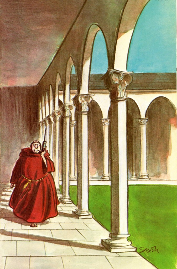
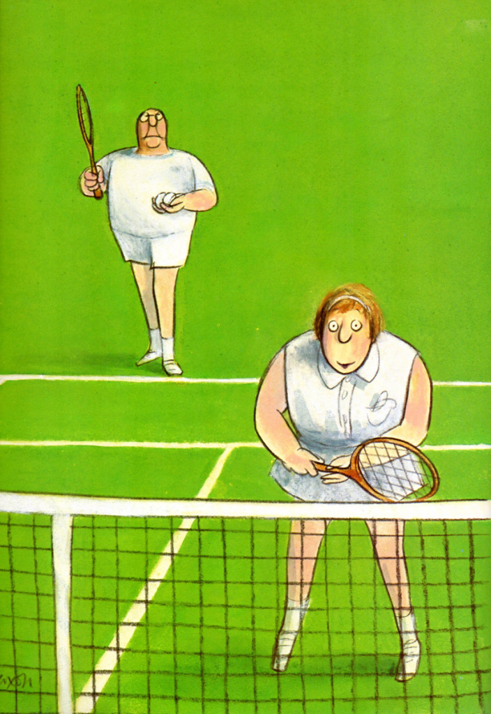
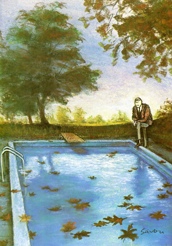
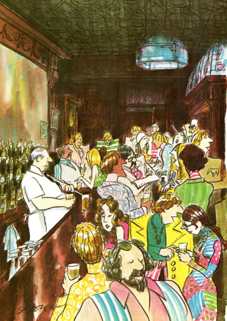
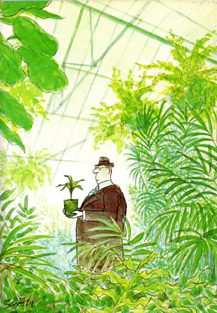
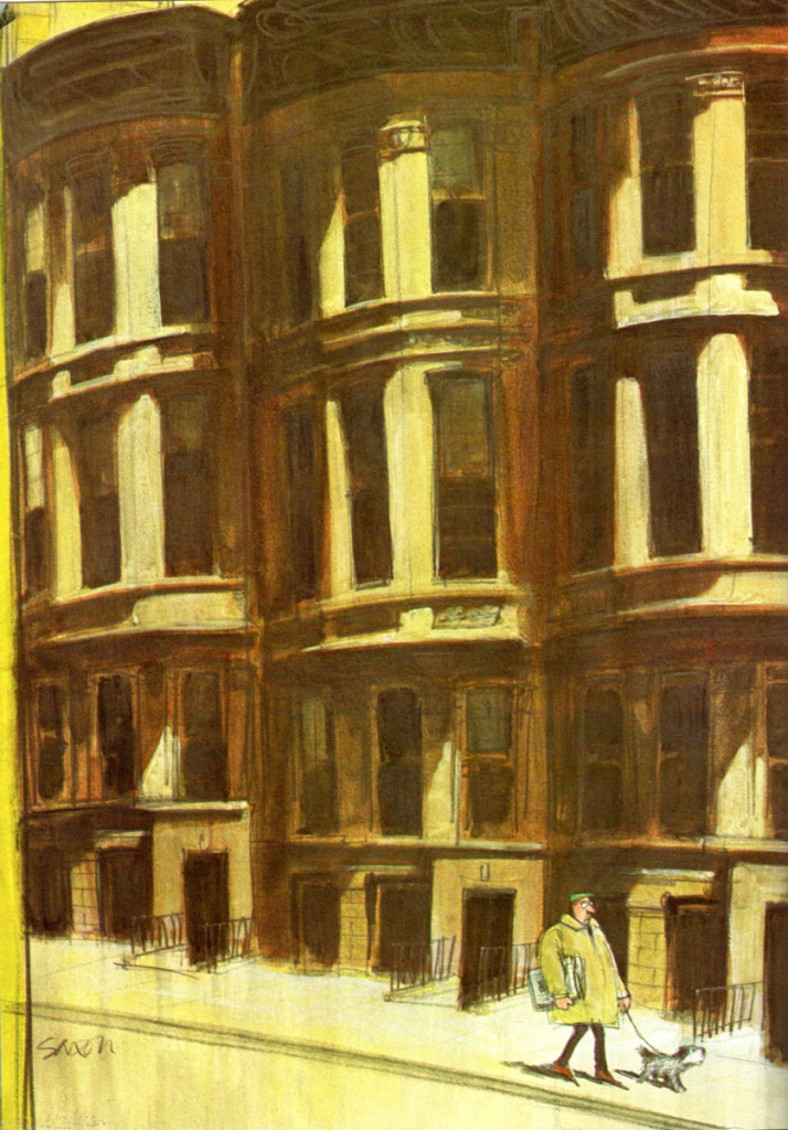
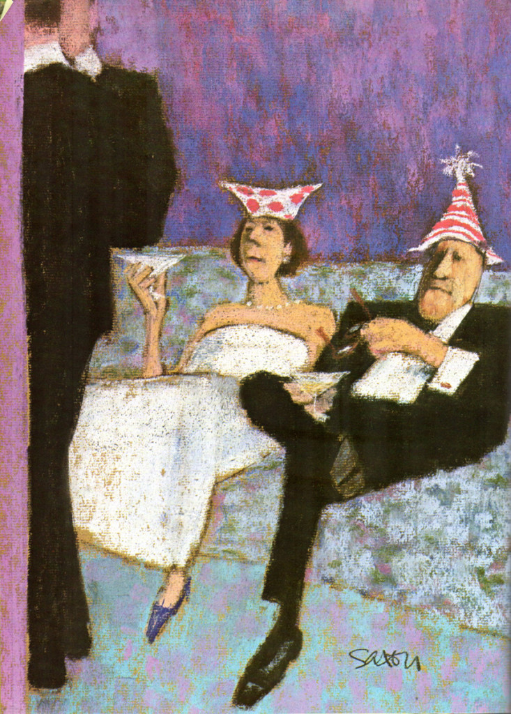
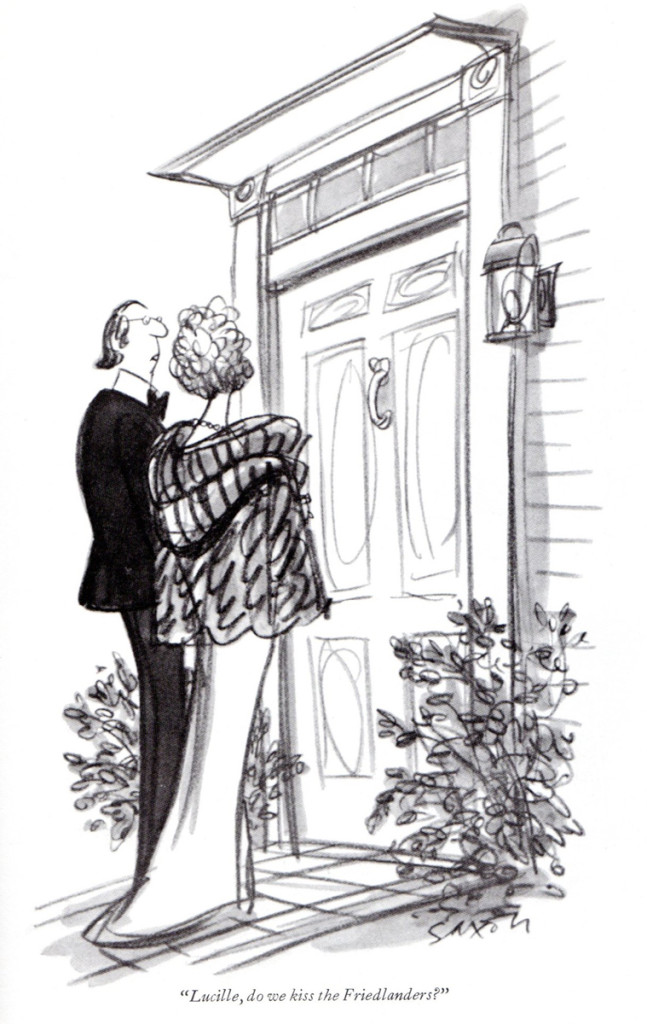
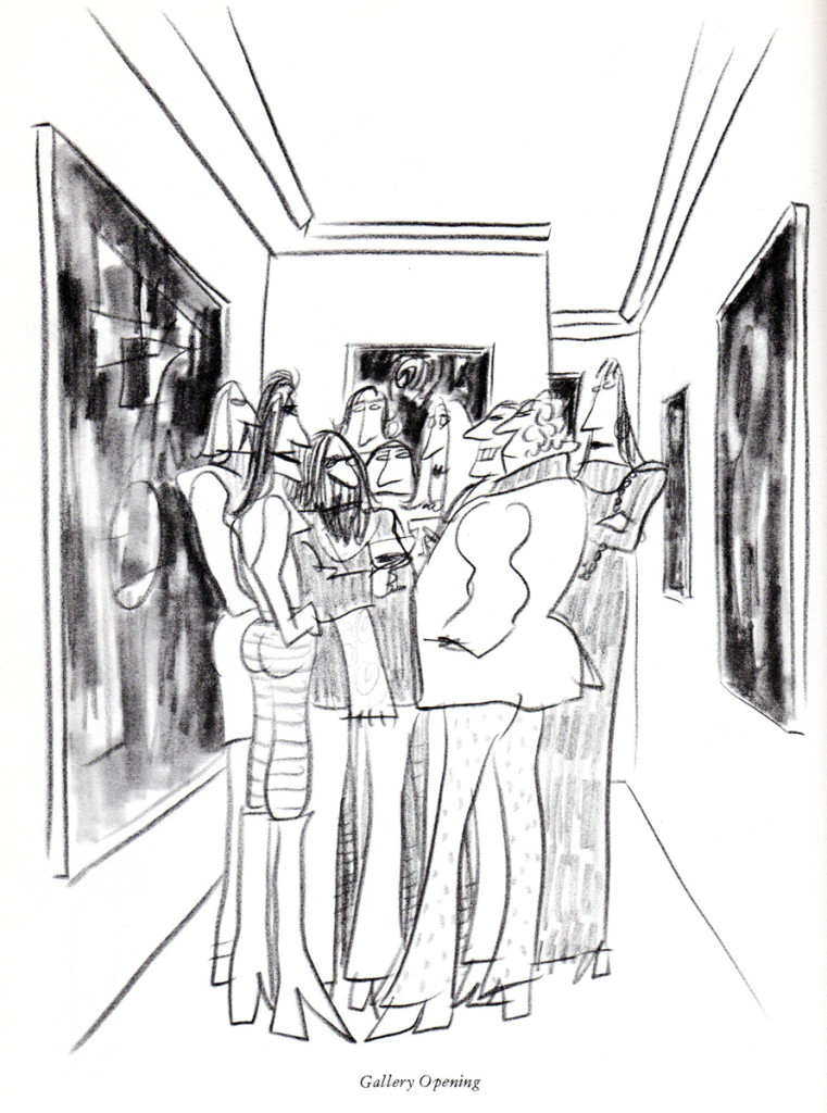
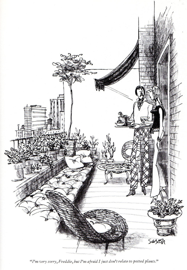
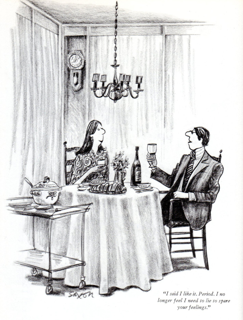
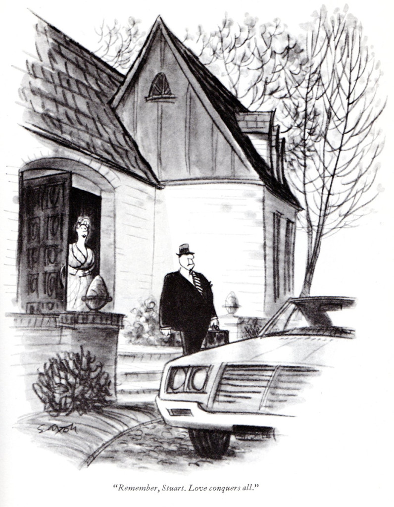
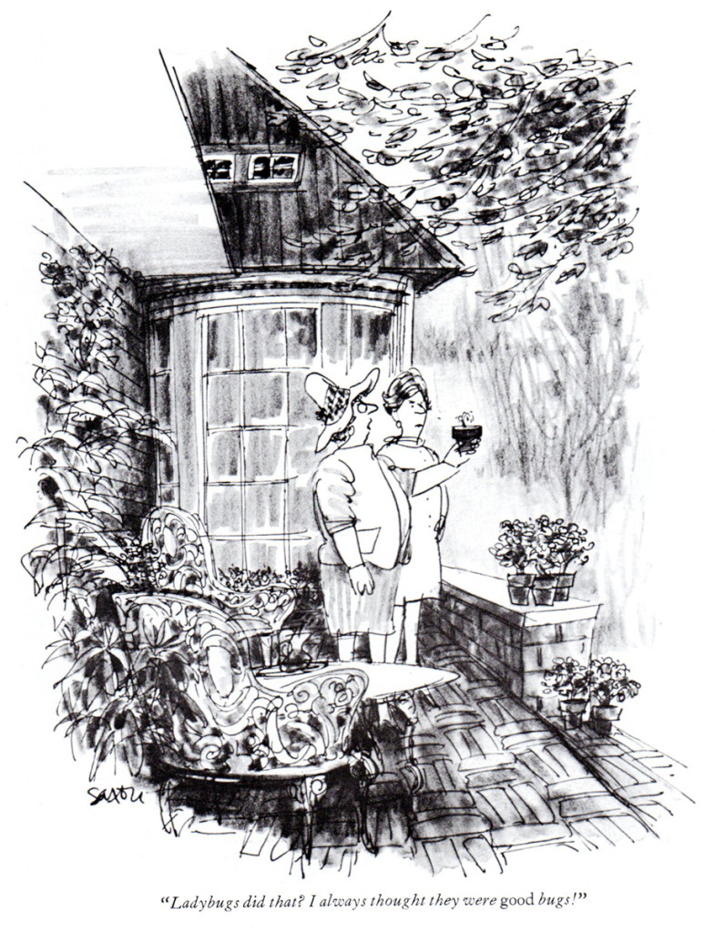
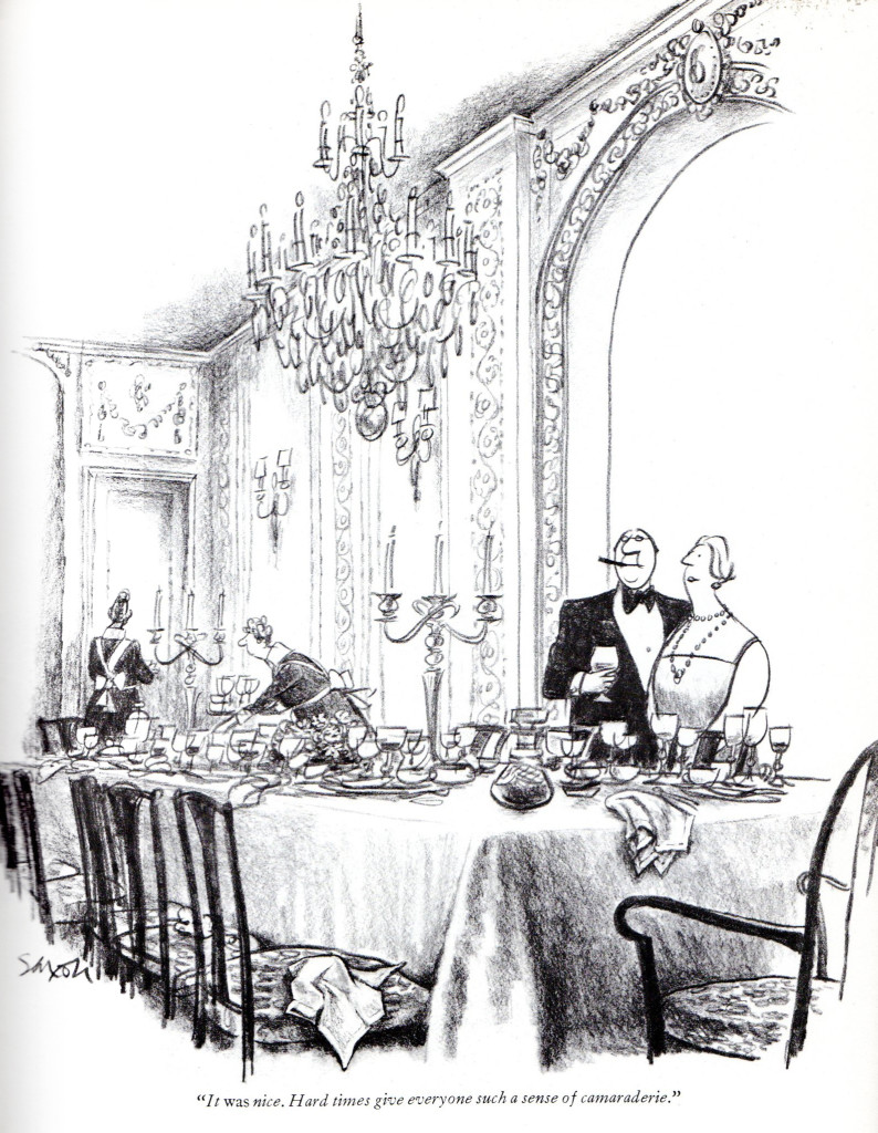
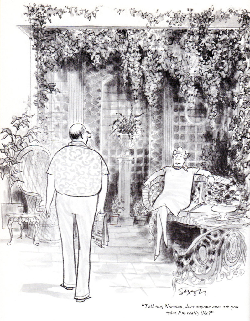
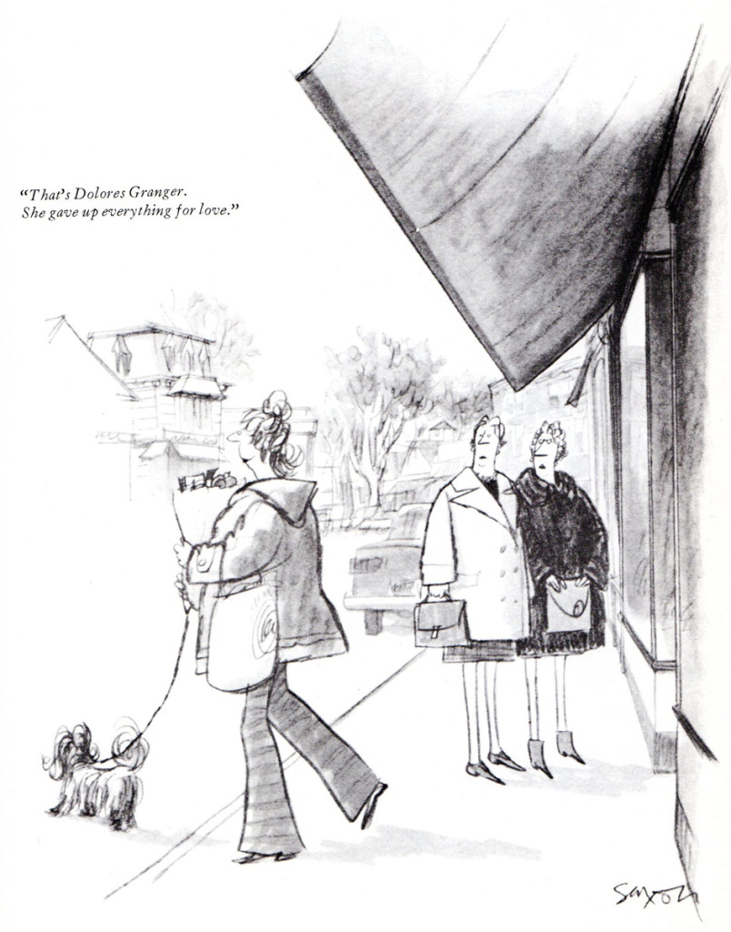
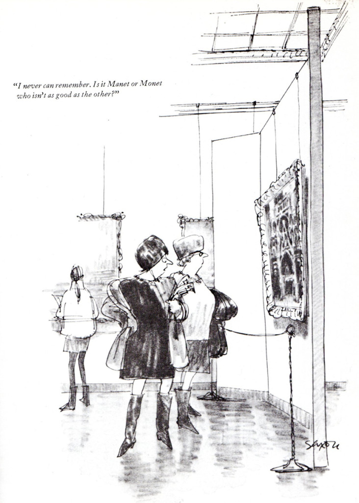
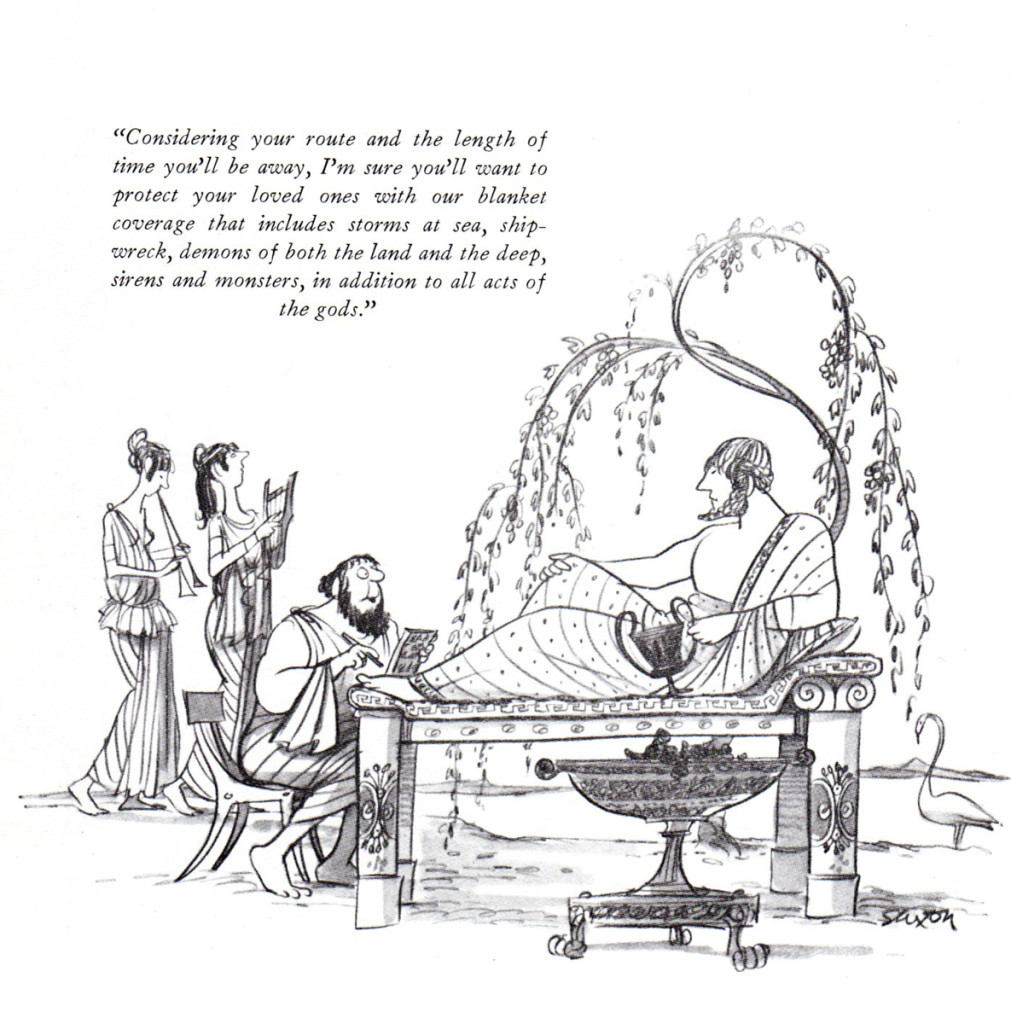
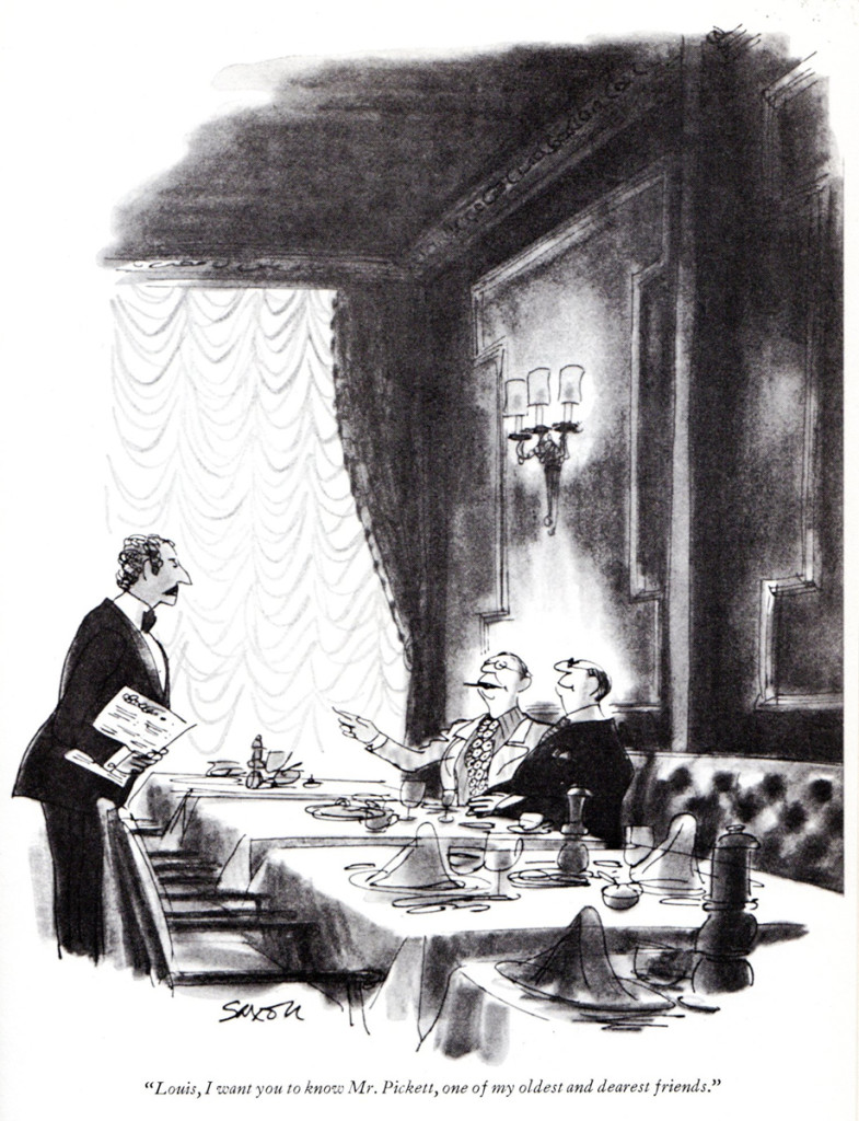
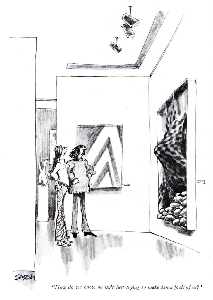
Charles Saxon
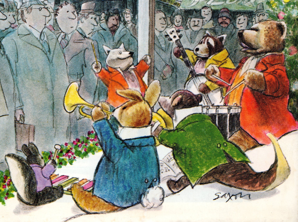
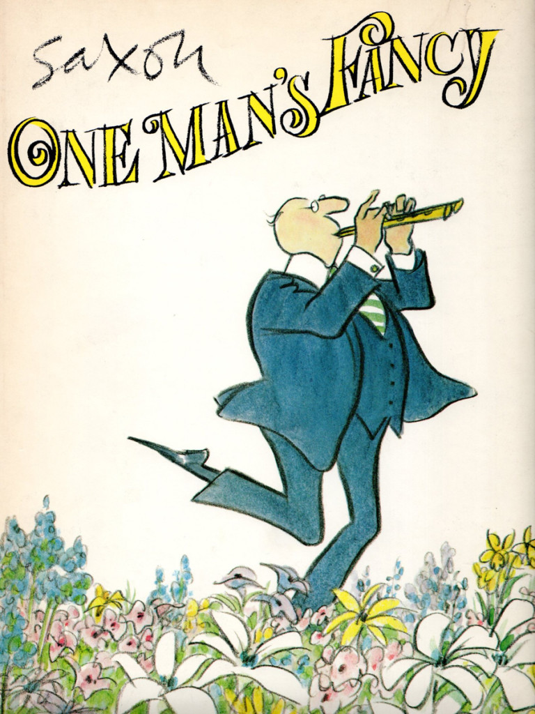
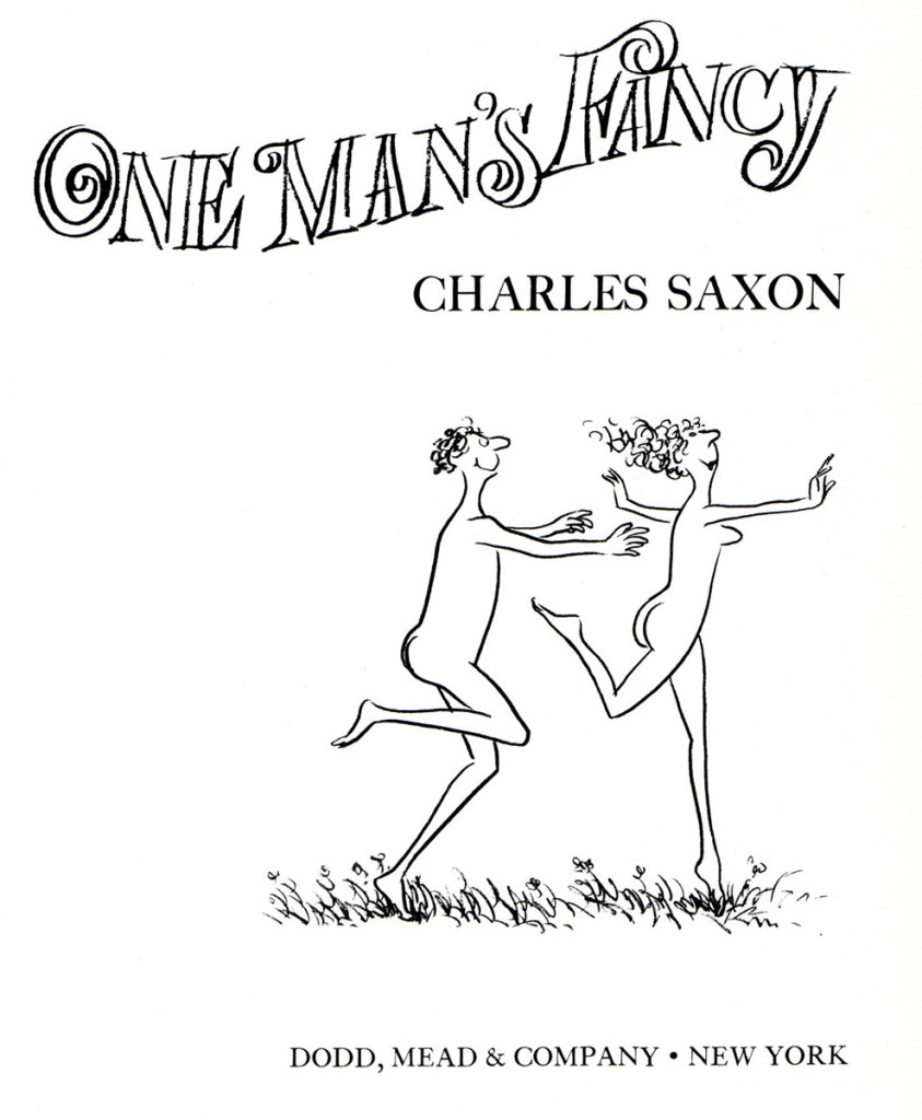
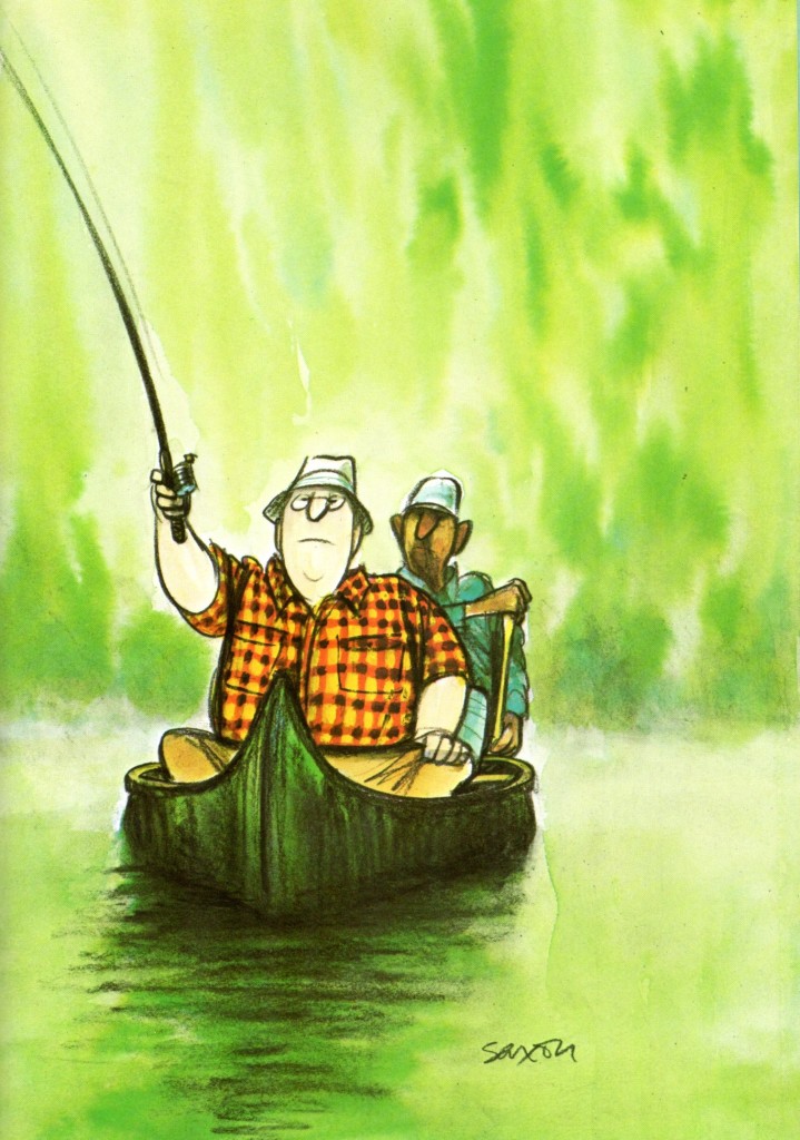
I’ve always loved the extraordinary work of Chuck Saxon and have watched it closely. I do have one cel from a commercial done in his style, thanks to a good friend, Jim Logan who acted as an assistant on the spot. Unfortunately, it’s currently in storage or I’d post it.
Bill Peckmann sent me a number of pieces,and I’m glad to share them. Here’s Bill:
- Exquisite and scrumptious are two words that describe the work of New Yorker artist Charles “Chuck” Saxon to a fair thee well. The cover below which I had clipped, was one of my favorites because of his animals in it. The human condition was always Saxon’s main concern, but one can still wish that he could have included more critters, stuffed or otherwise in his incredible art.
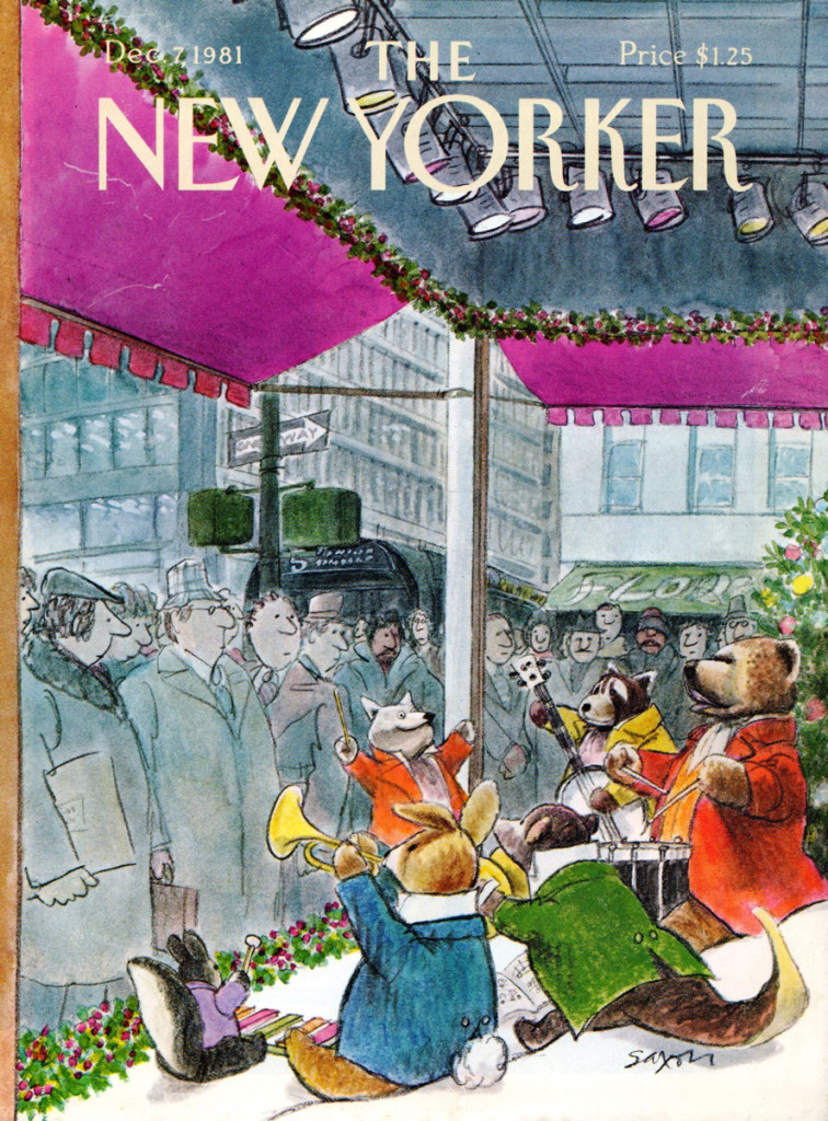 1
1
Bill Peckmann &Books &Commentary &Illustration 20 Jun 2013 05:28 am
Peter de Seve
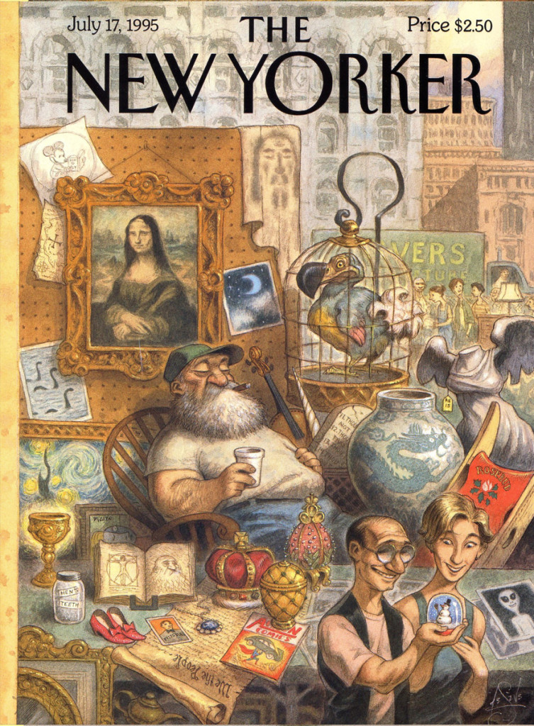
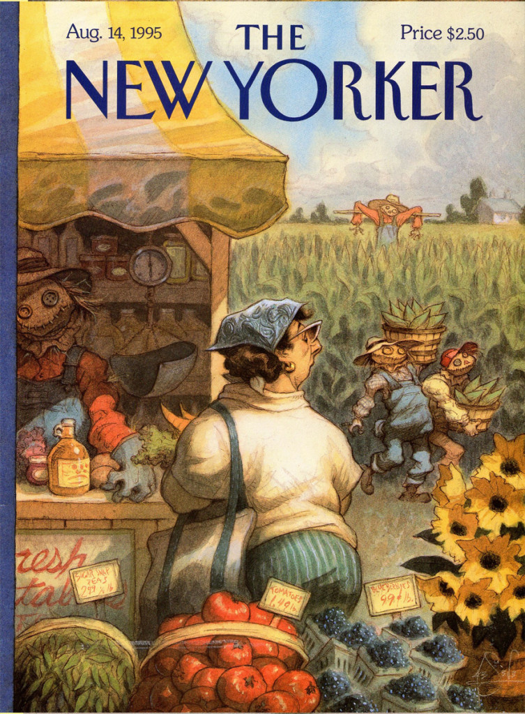
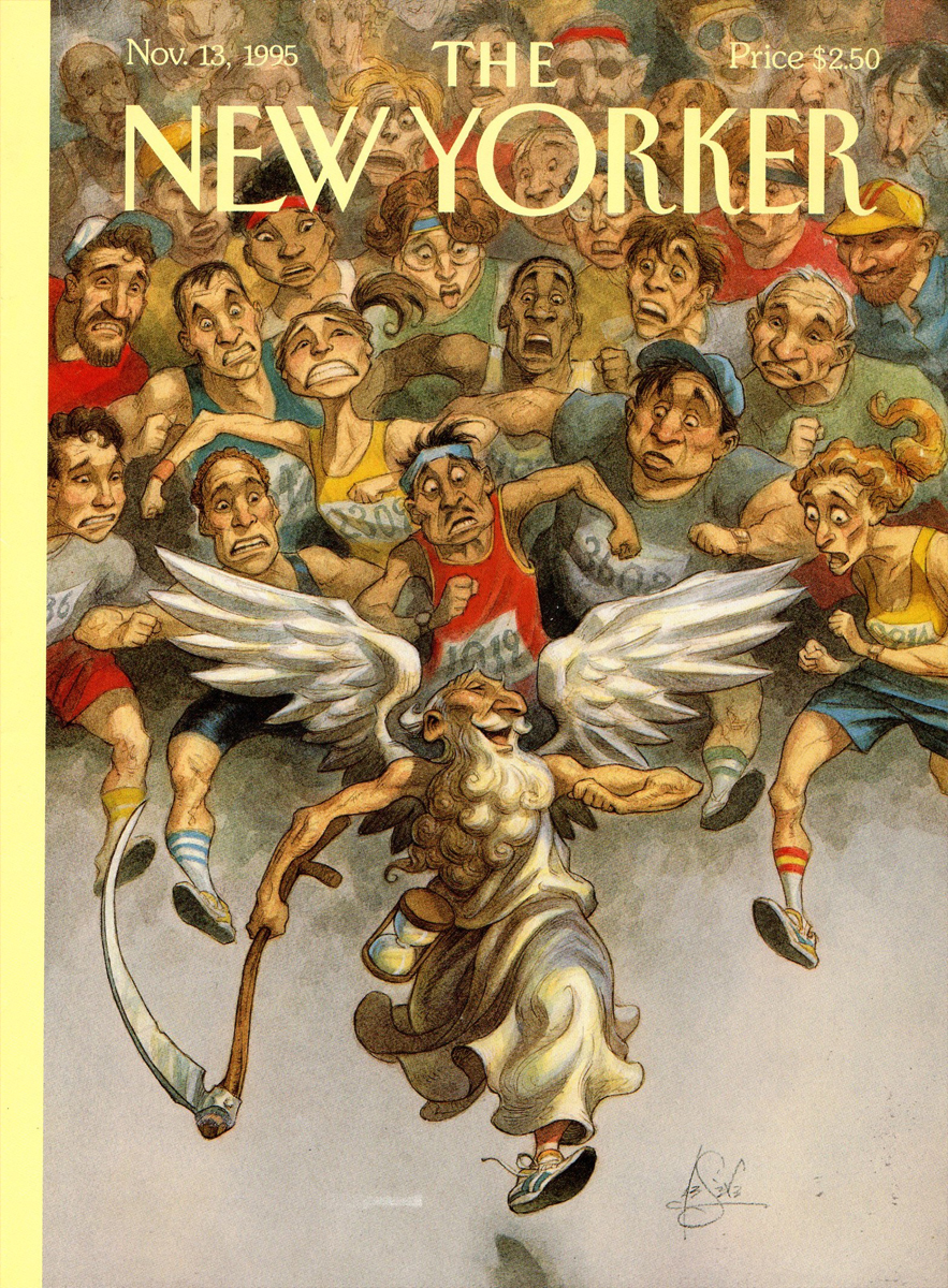
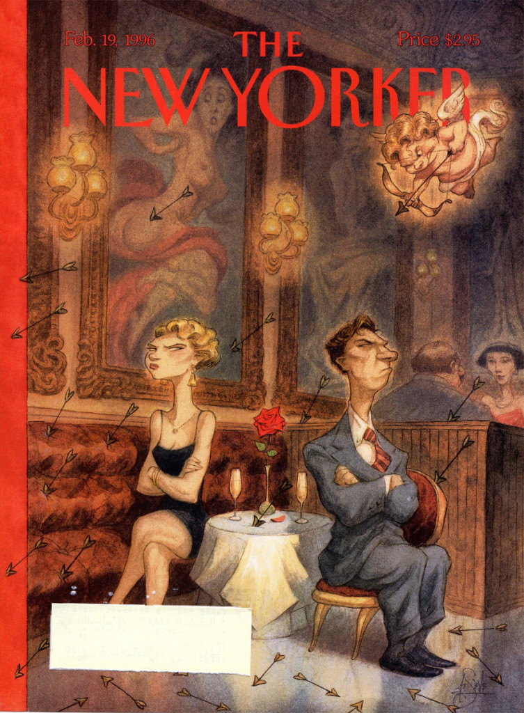
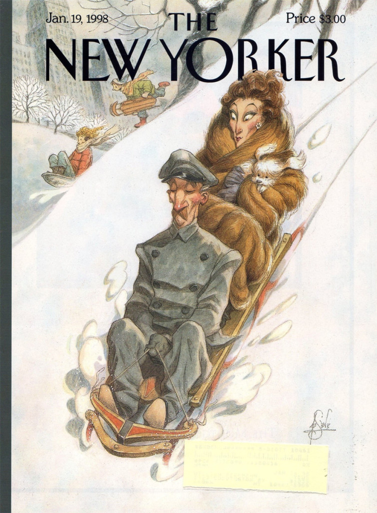
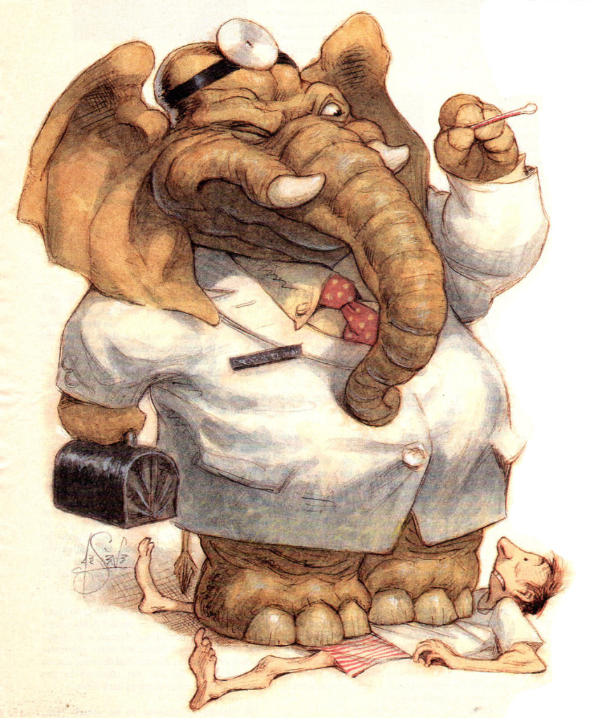
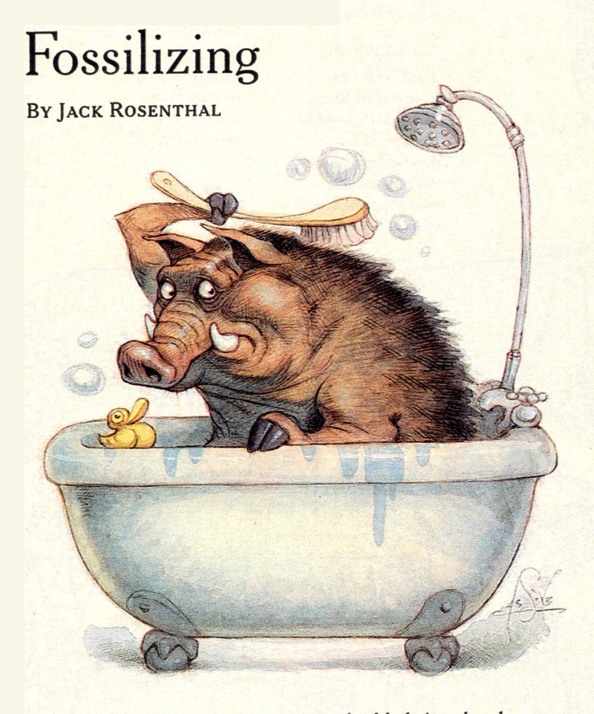
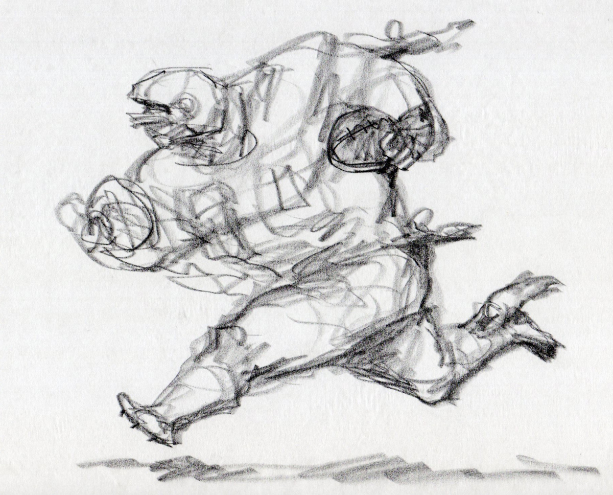
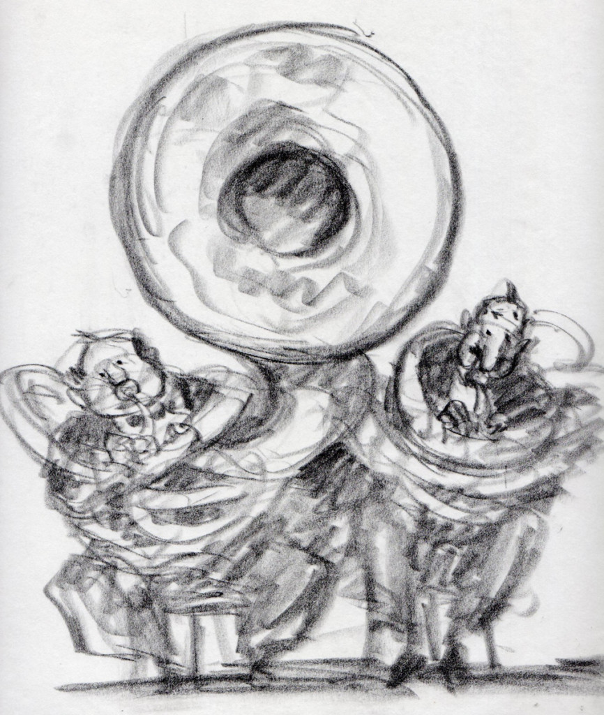
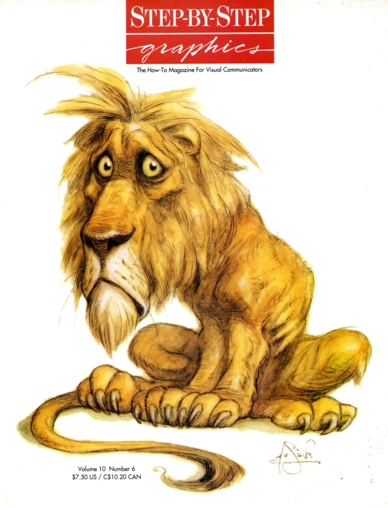
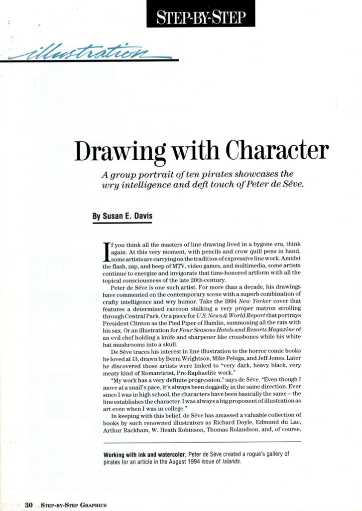
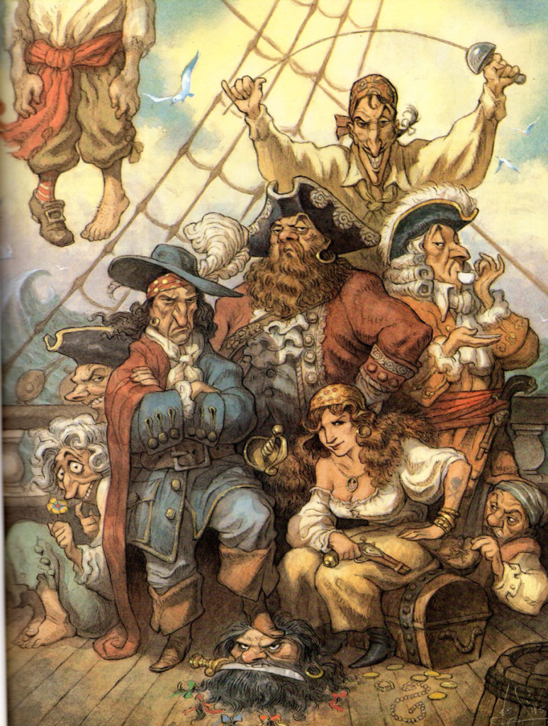
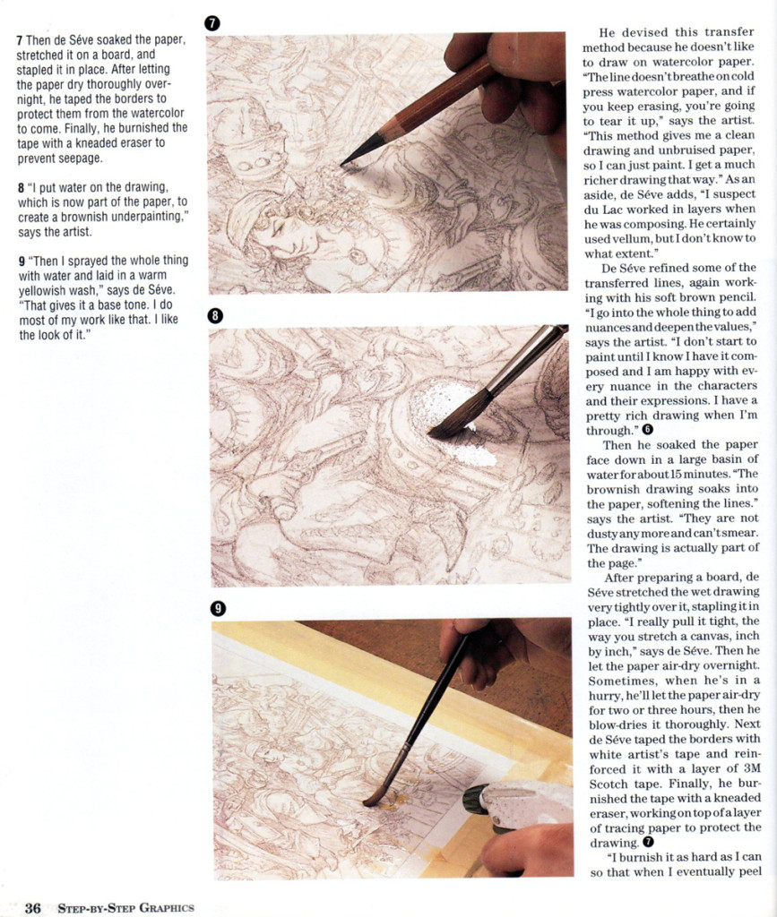
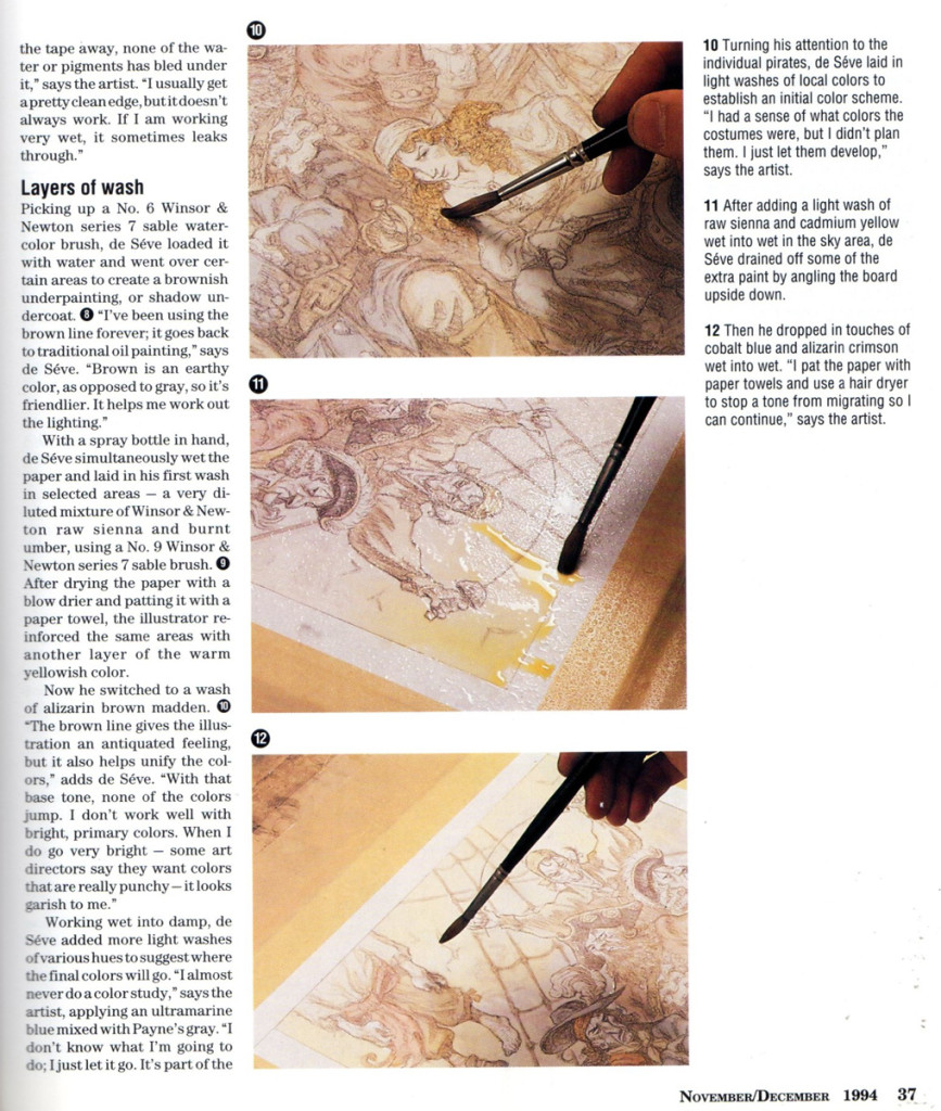
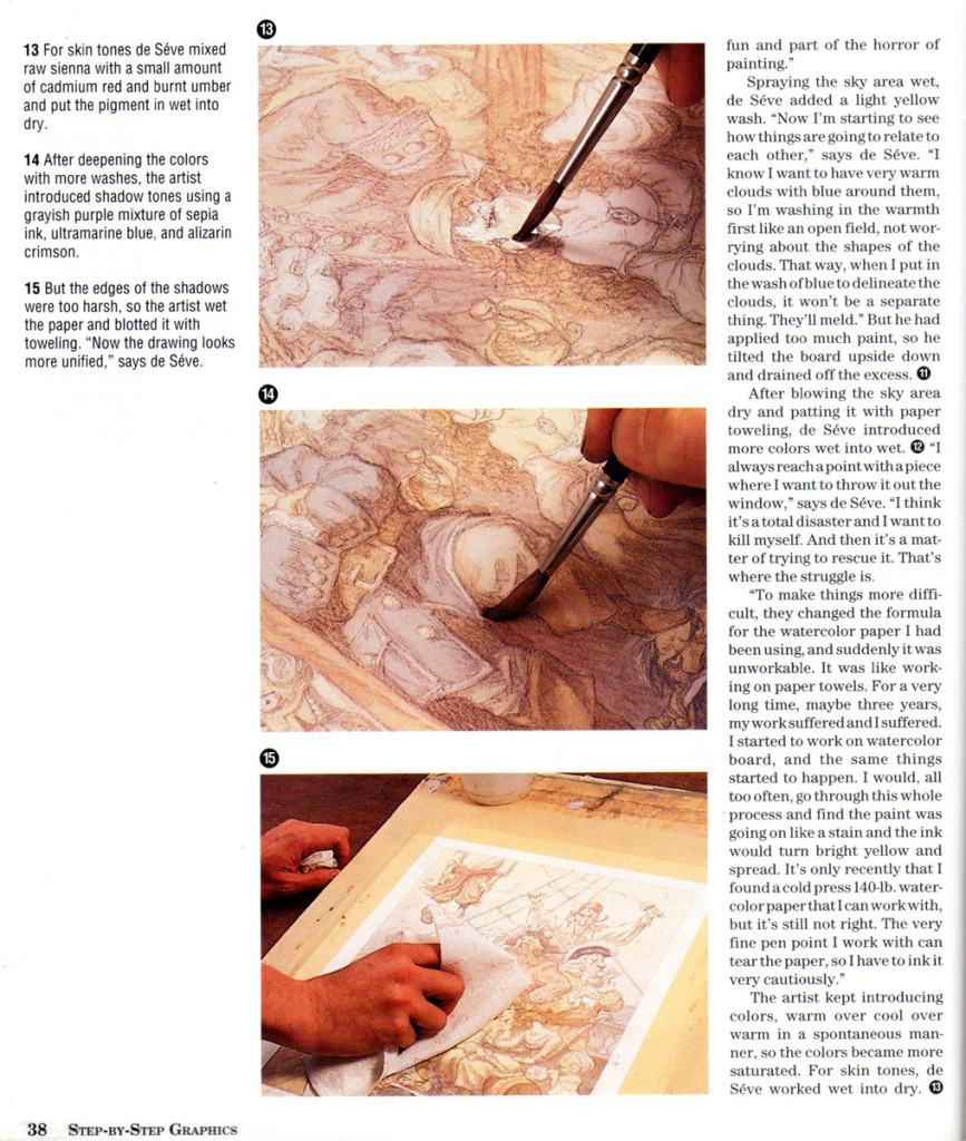
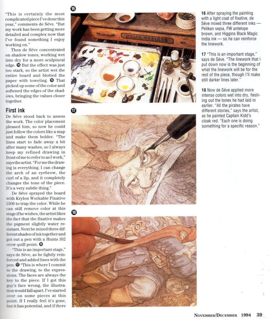
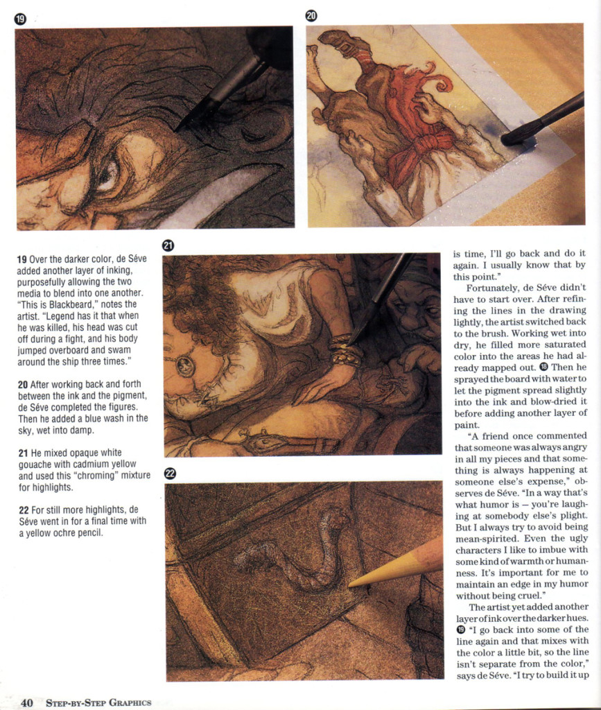
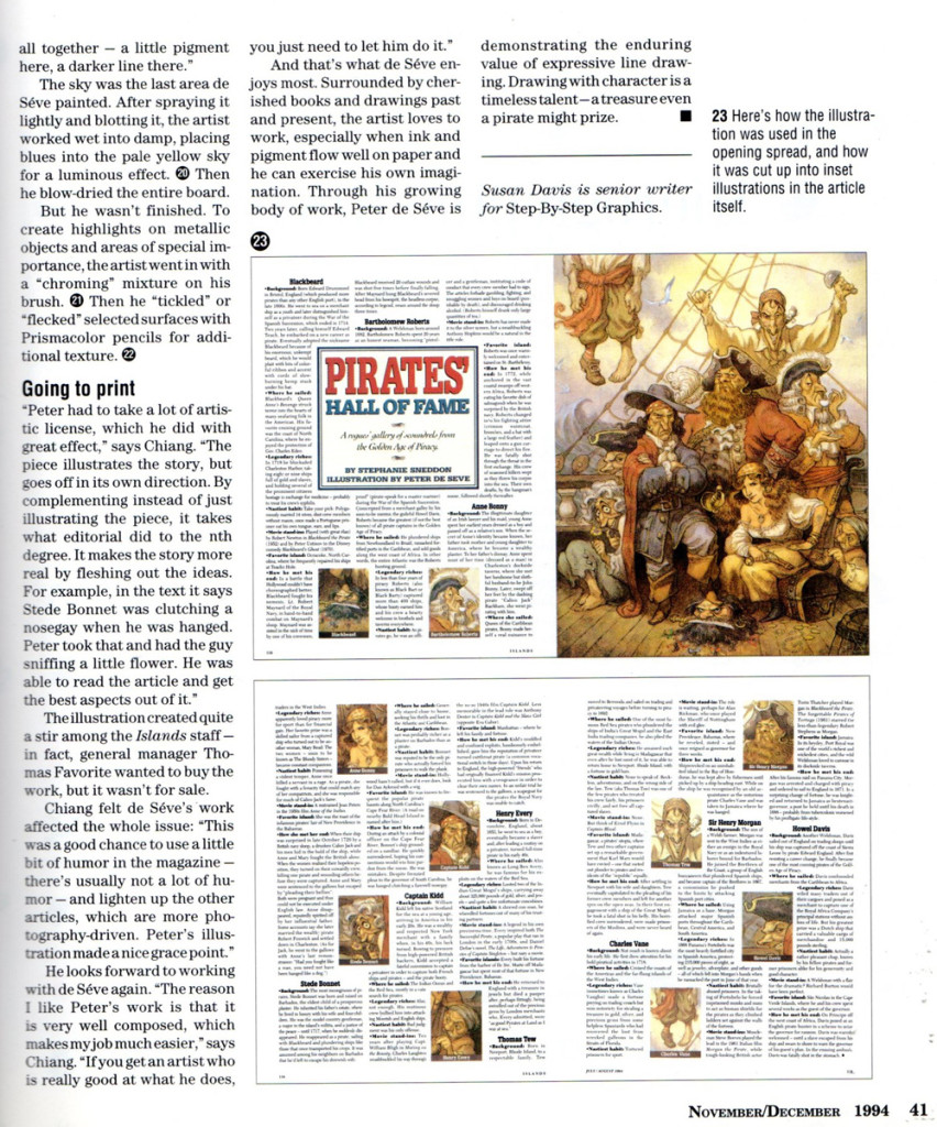
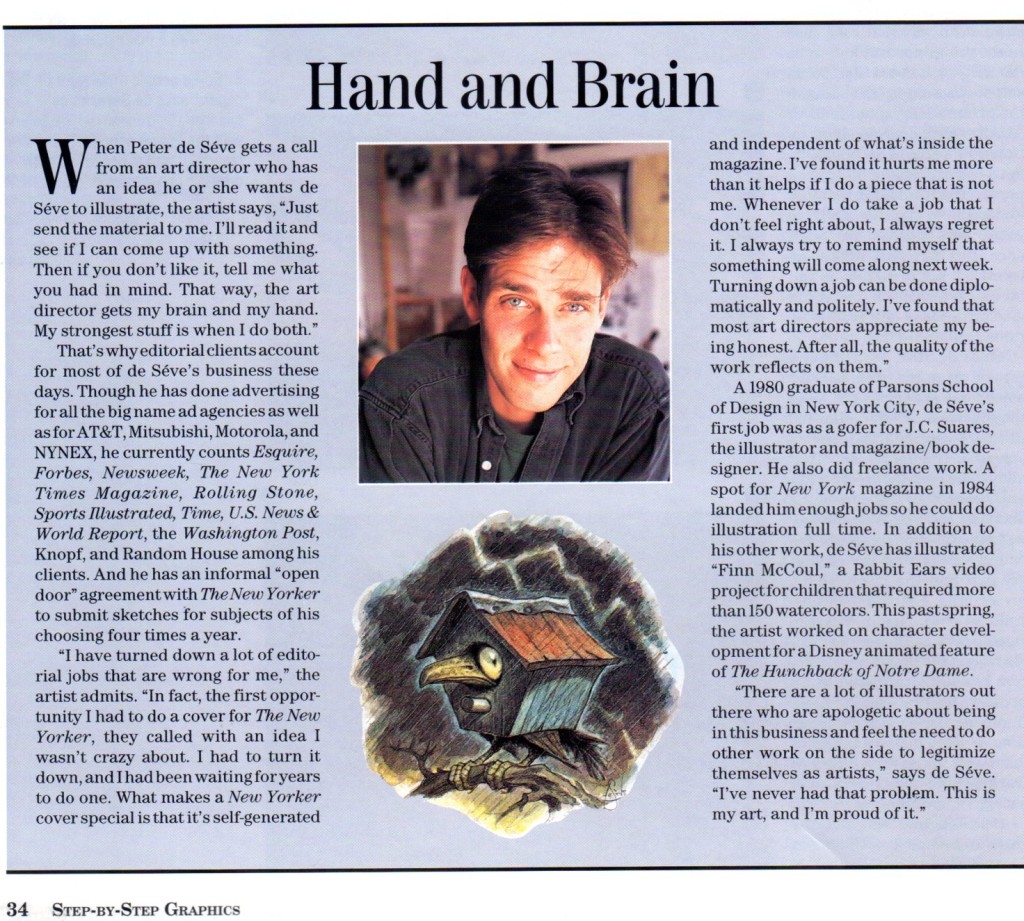
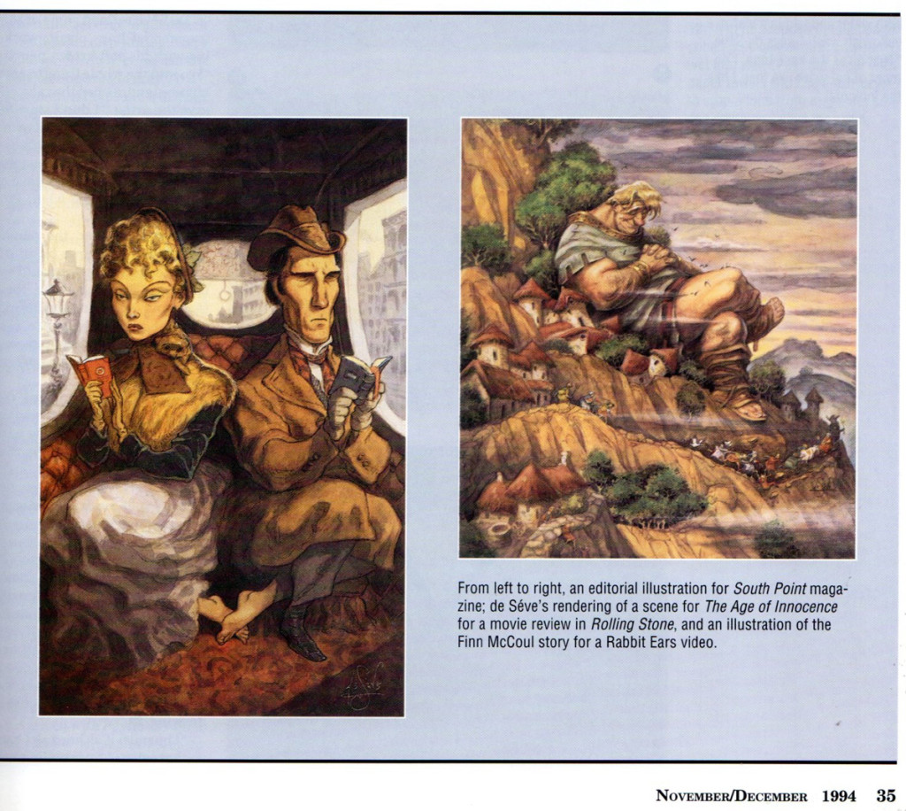
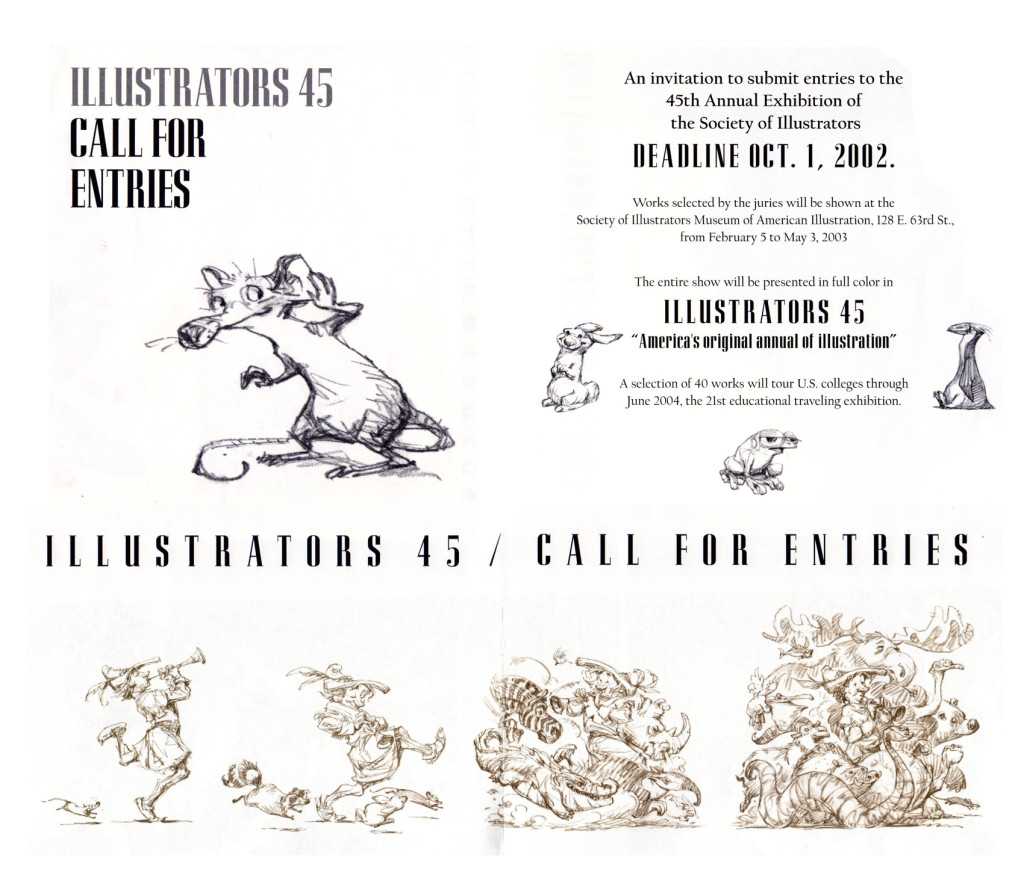
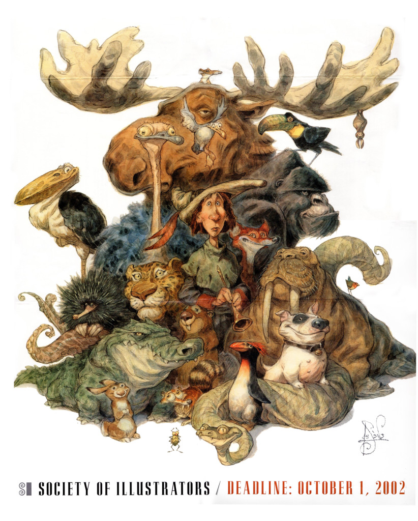
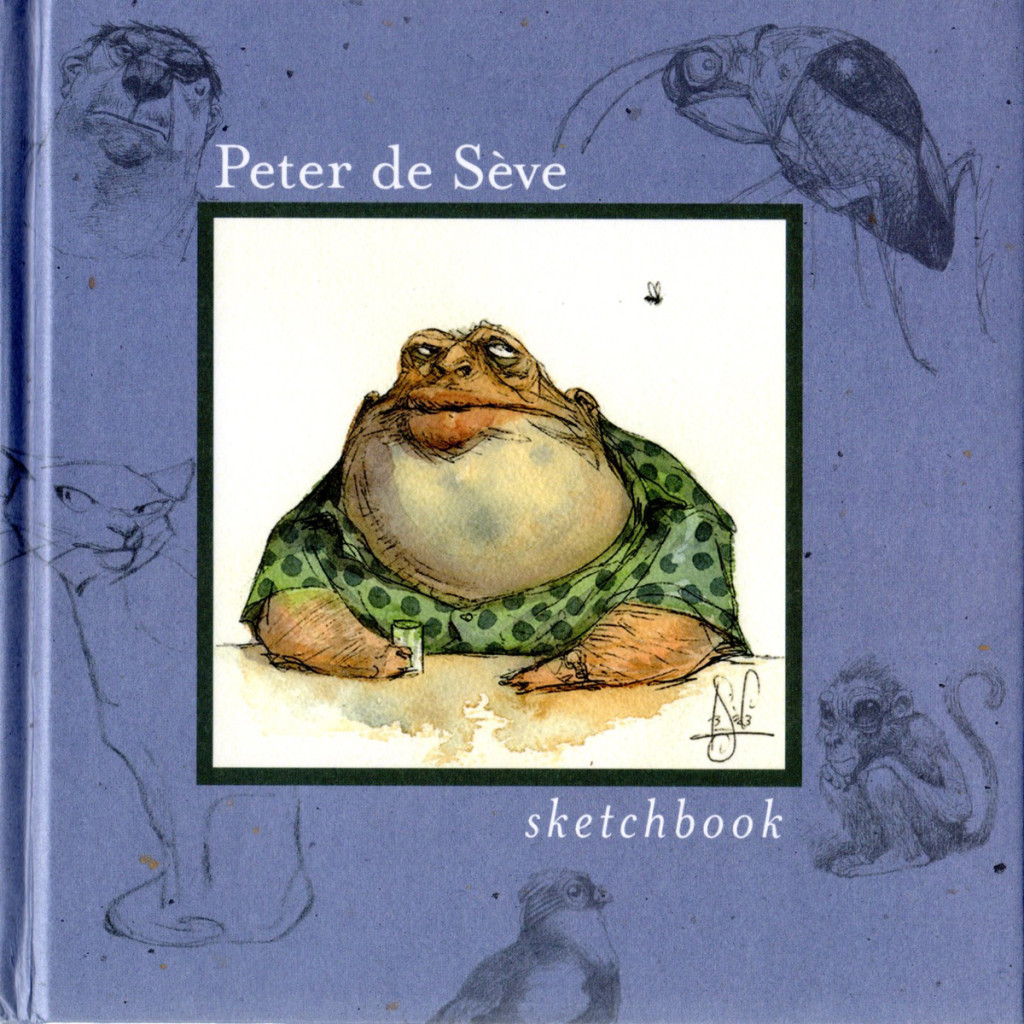
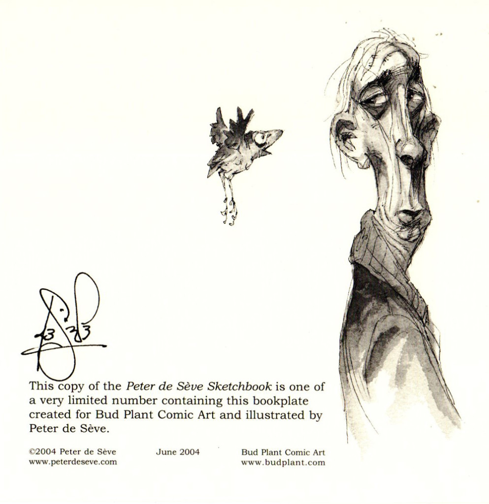
We, in animation, are all familiar with the work of the talented designer, Peter de Seve. Bill Peckmann has sent me a number of clippings of his work: covers from New Yorker magazines, ruff illustrations and articles about him. It makes for a good post on this talented artist.
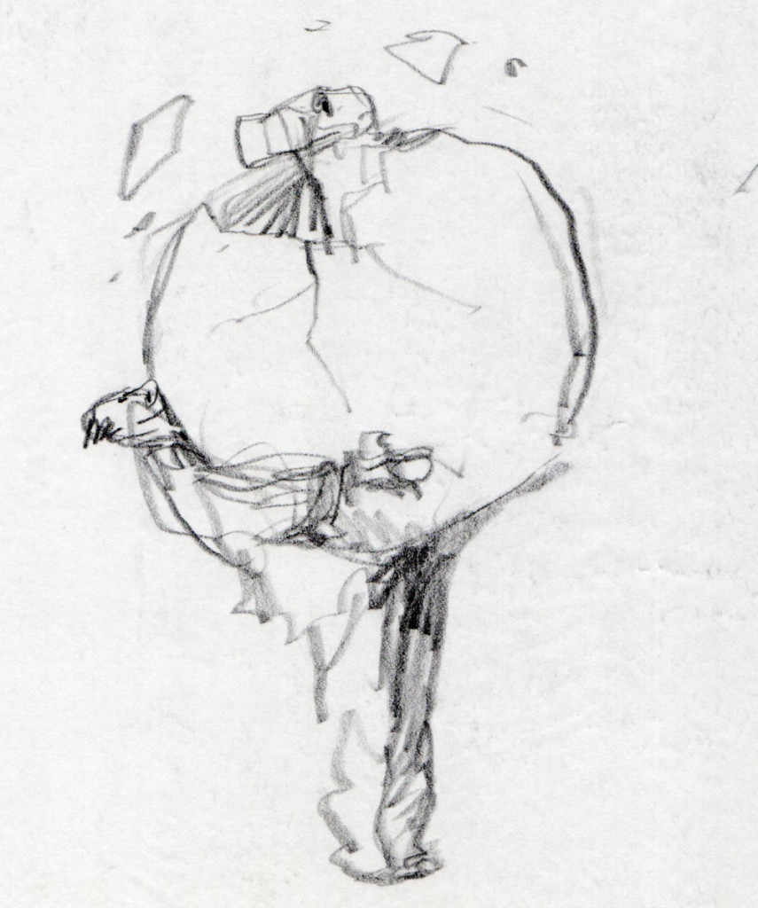
Back in the mid 1990′s, friend Tom Yohe was art directing an ad agency print job and he called in Peter De Seve to do the illustration. Tom knew I was a huge De Seve fan and he was kind enough to give me Peter’s discarded roughs. Here they be…
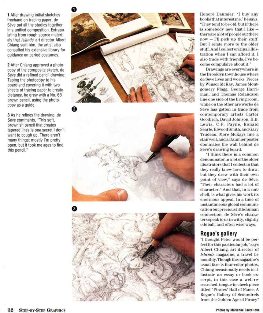
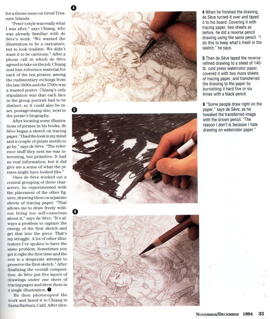
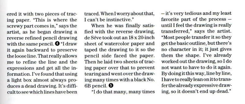
The following is an article from a 1994 issue of STEP-BY-STEP GRAPHICS.
 29
29
Books &Disney &Illustration &John Canemaker &Layout & Design 19 Jun 2013 06:53 am
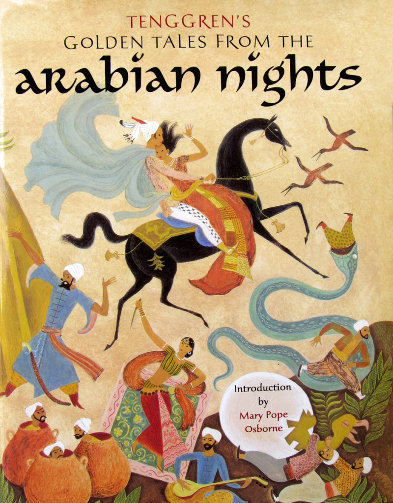
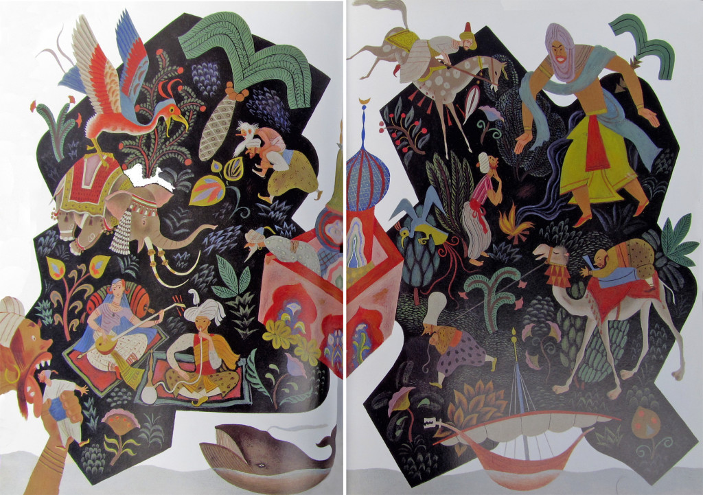
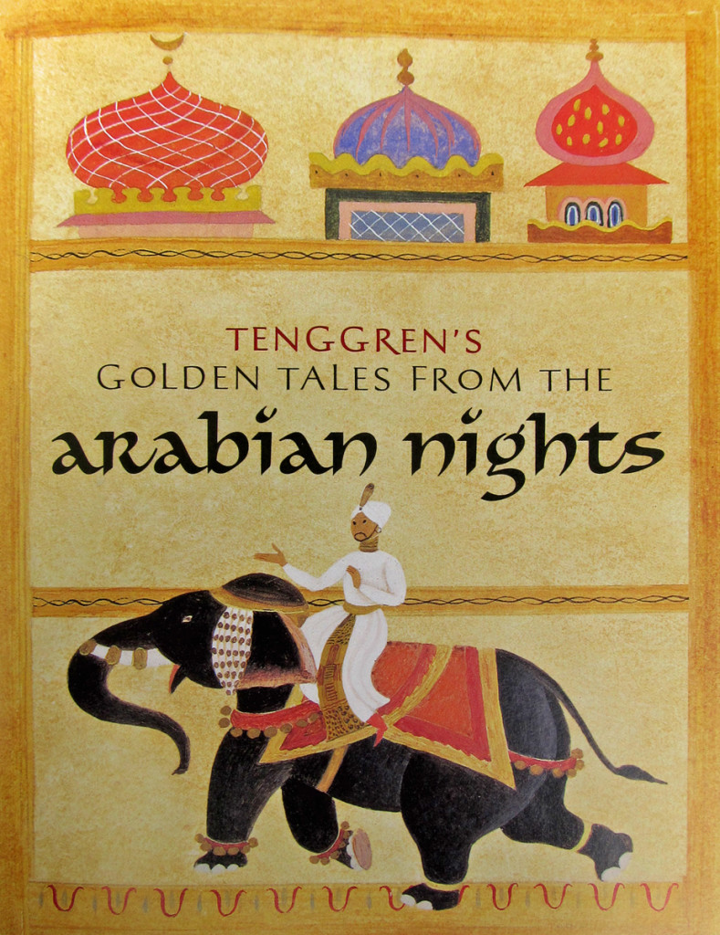
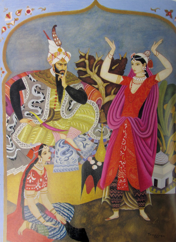
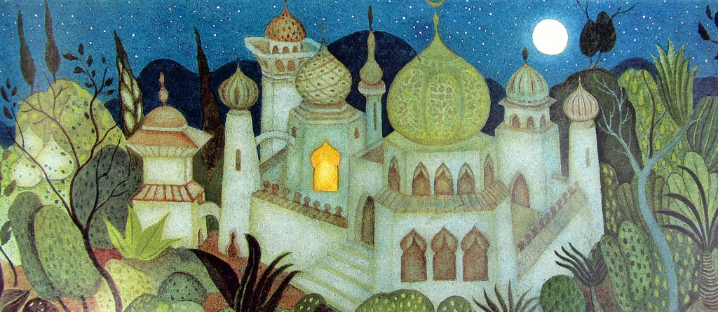
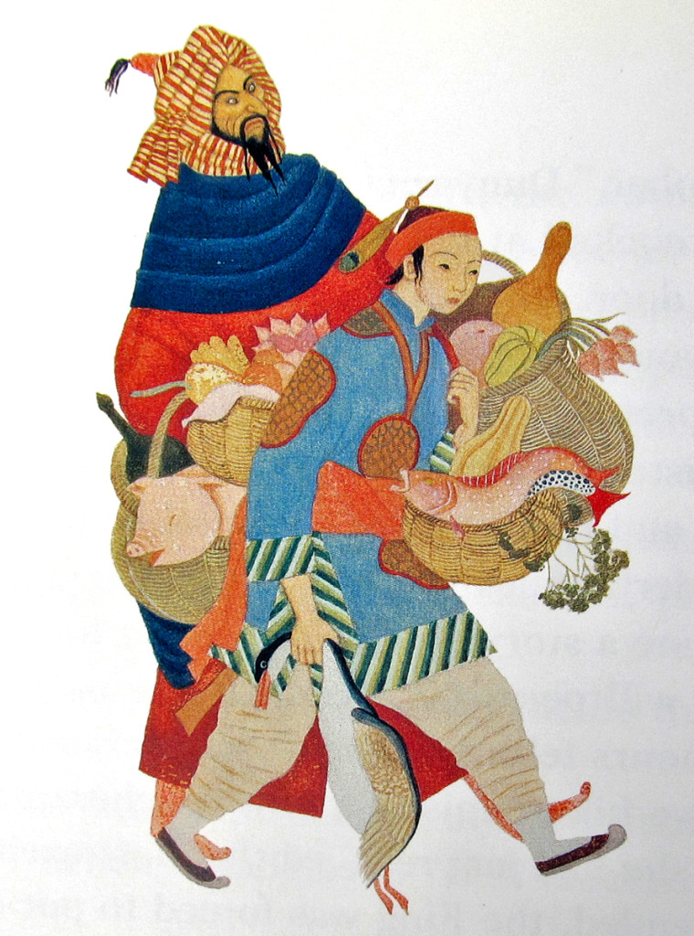
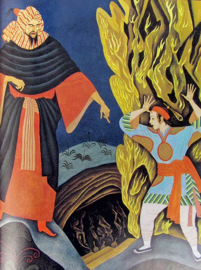
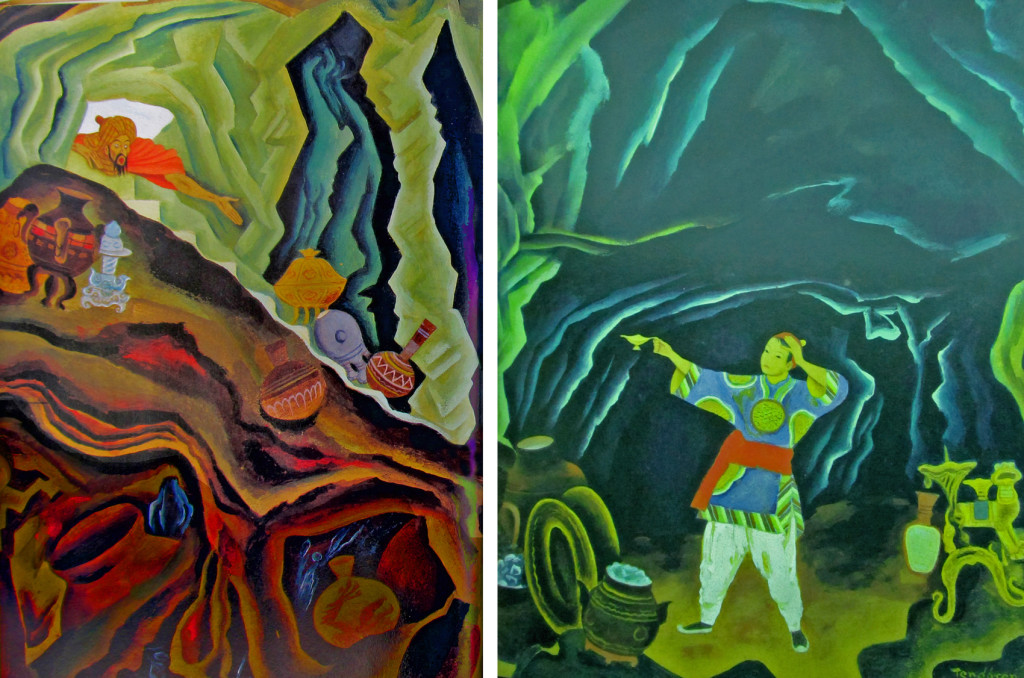
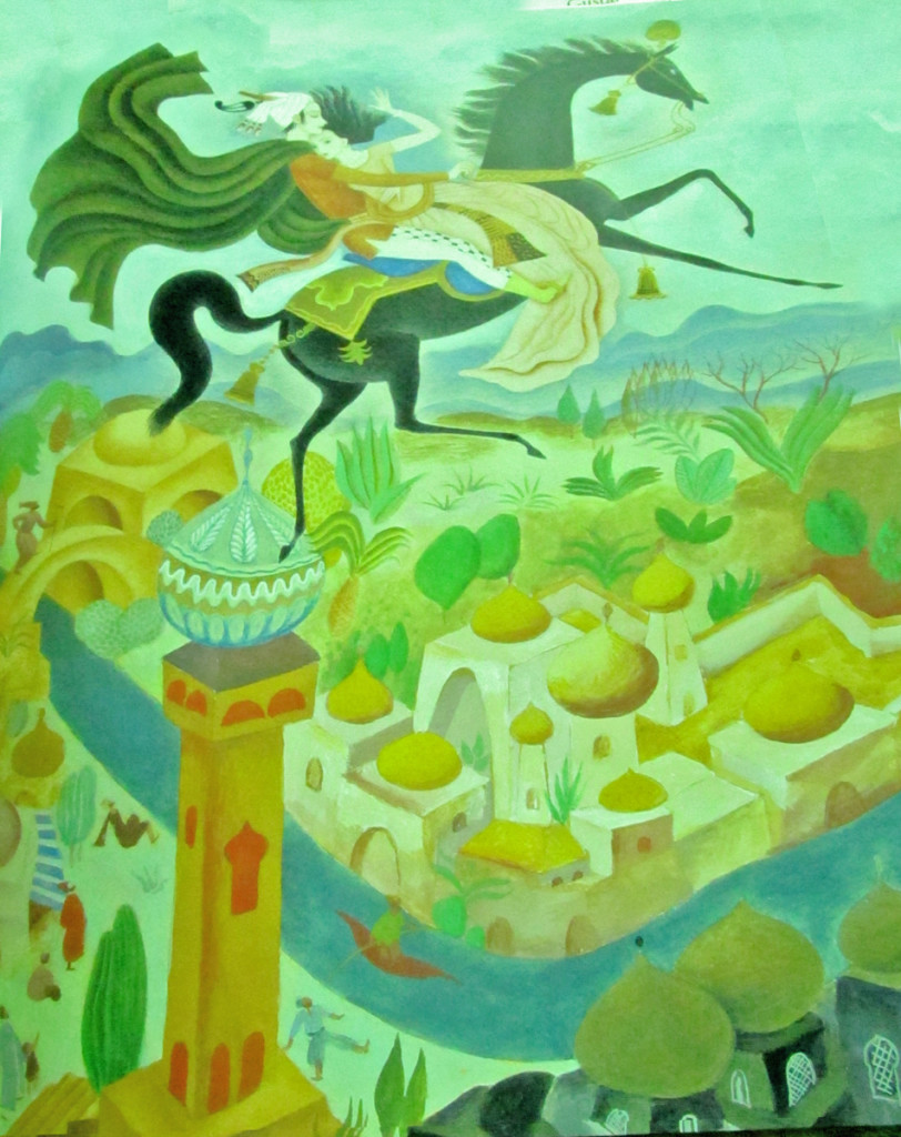
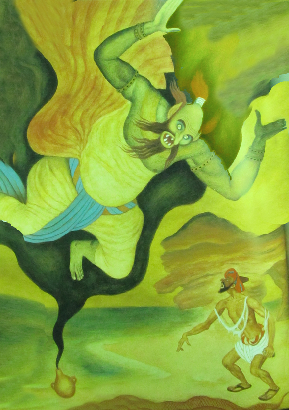
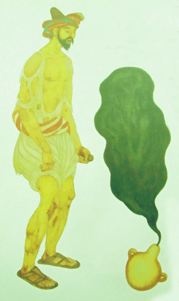
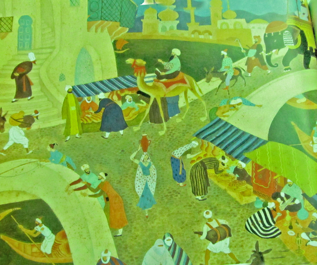
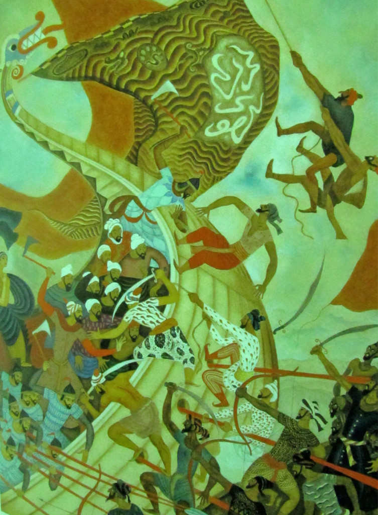
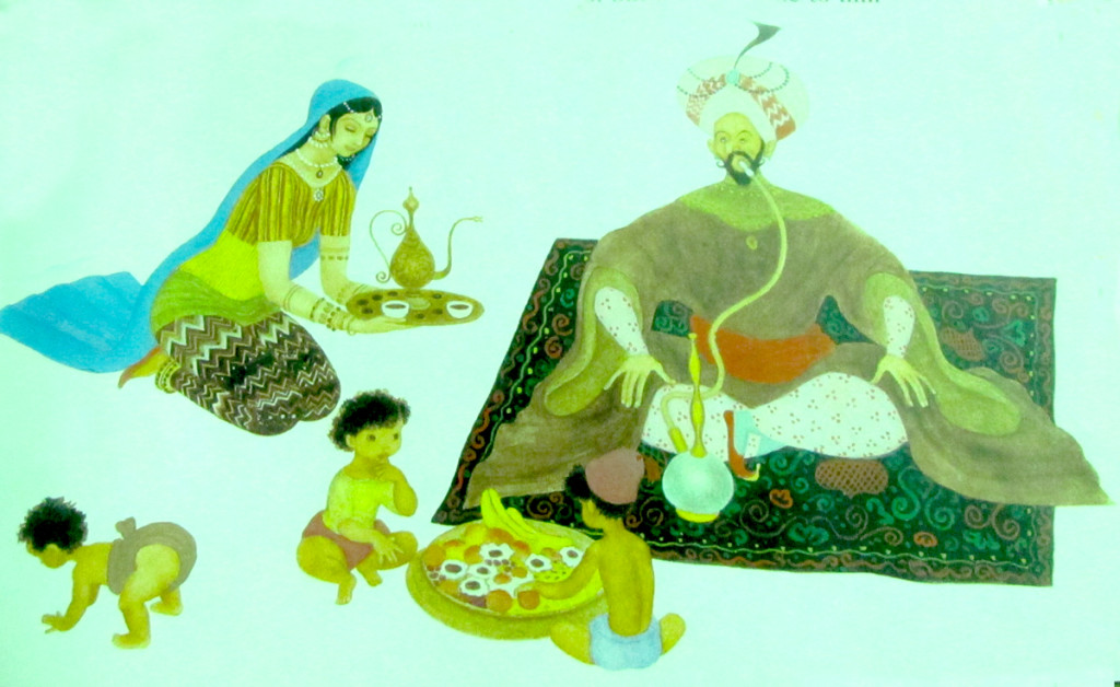
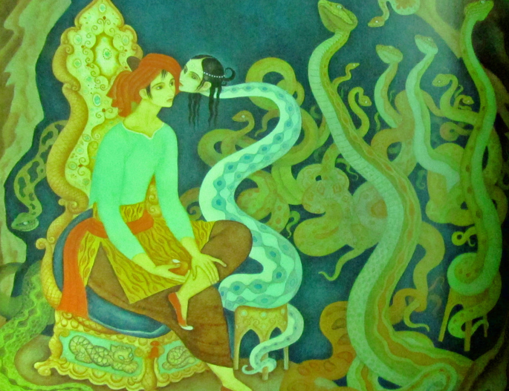
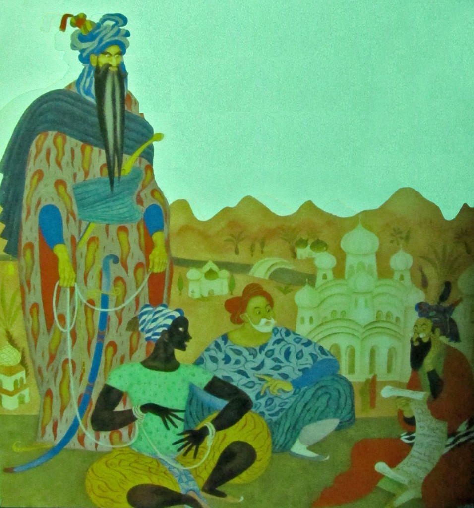
Tenggren’s Arabian Nights
Gustaf Tenggren, of course, was the designer who worked at Disney’s studio during the thirties creating art which became models for Snow White, Bambi, and Pinocchio. John Canemaker wrote extensively about Tenggren in his book, Before the Animation Begins.
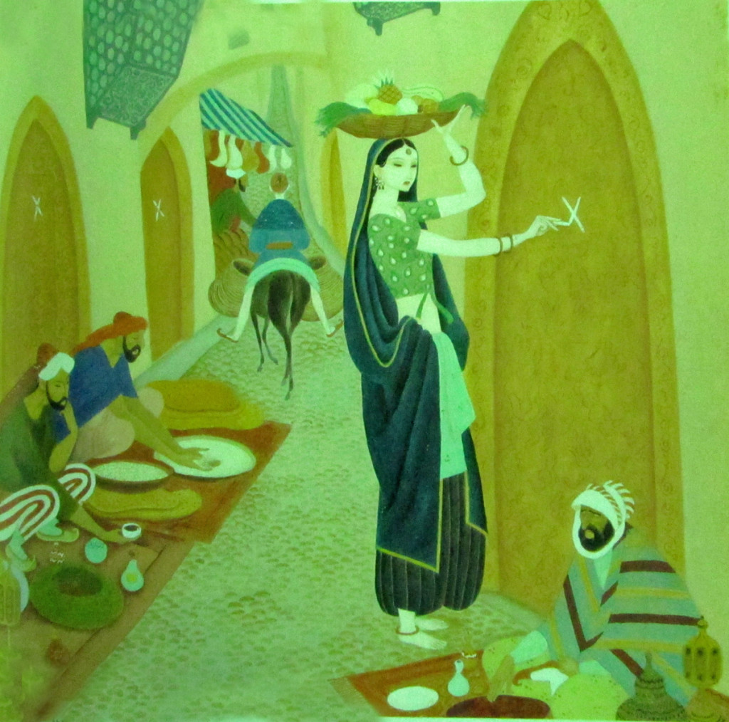
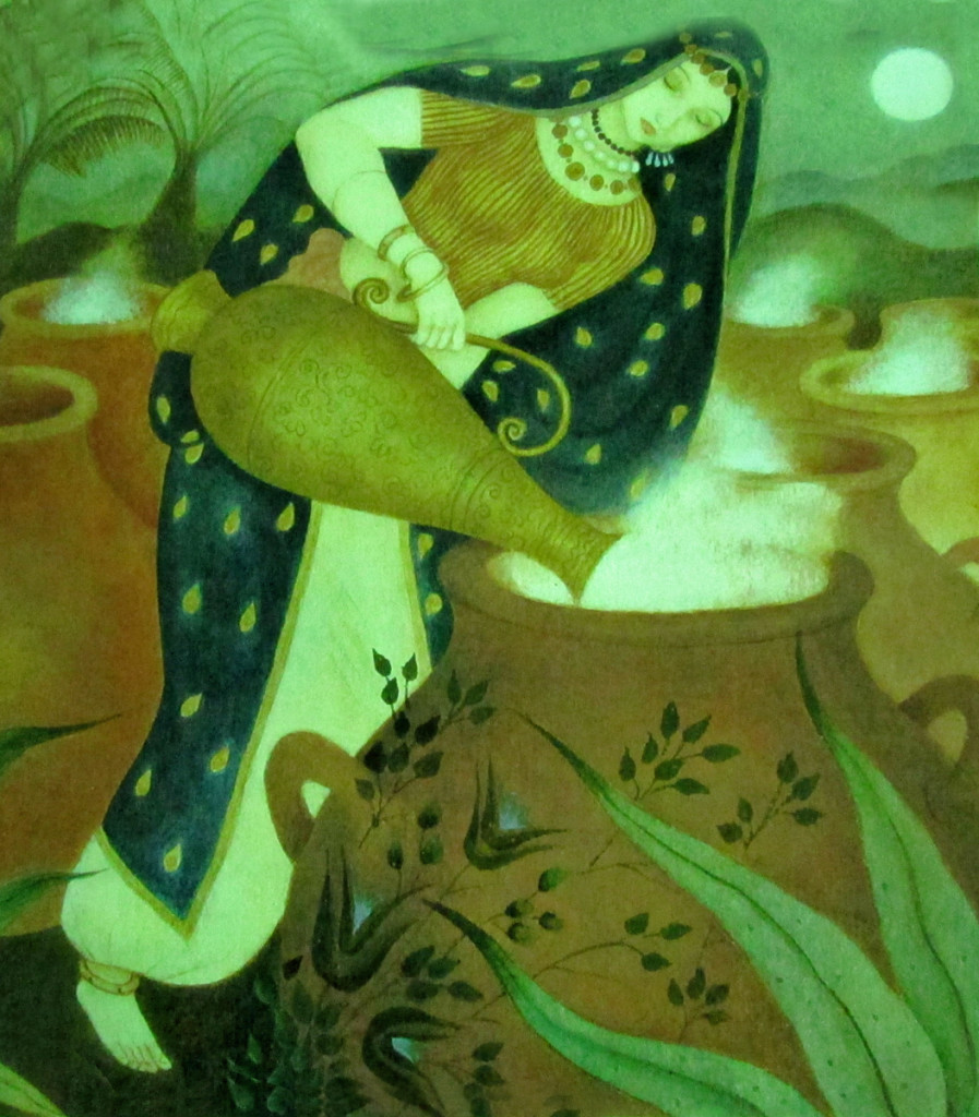
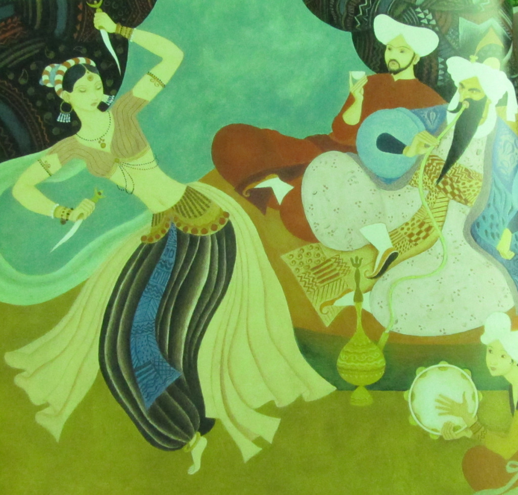
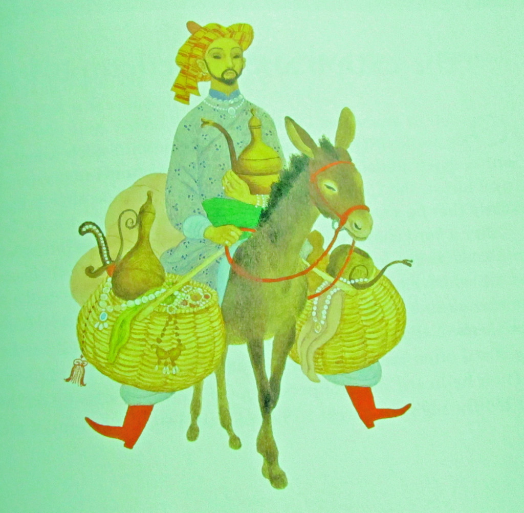
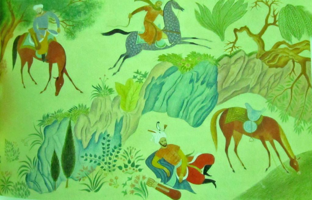
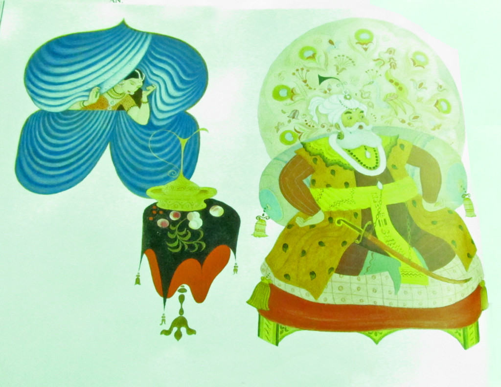
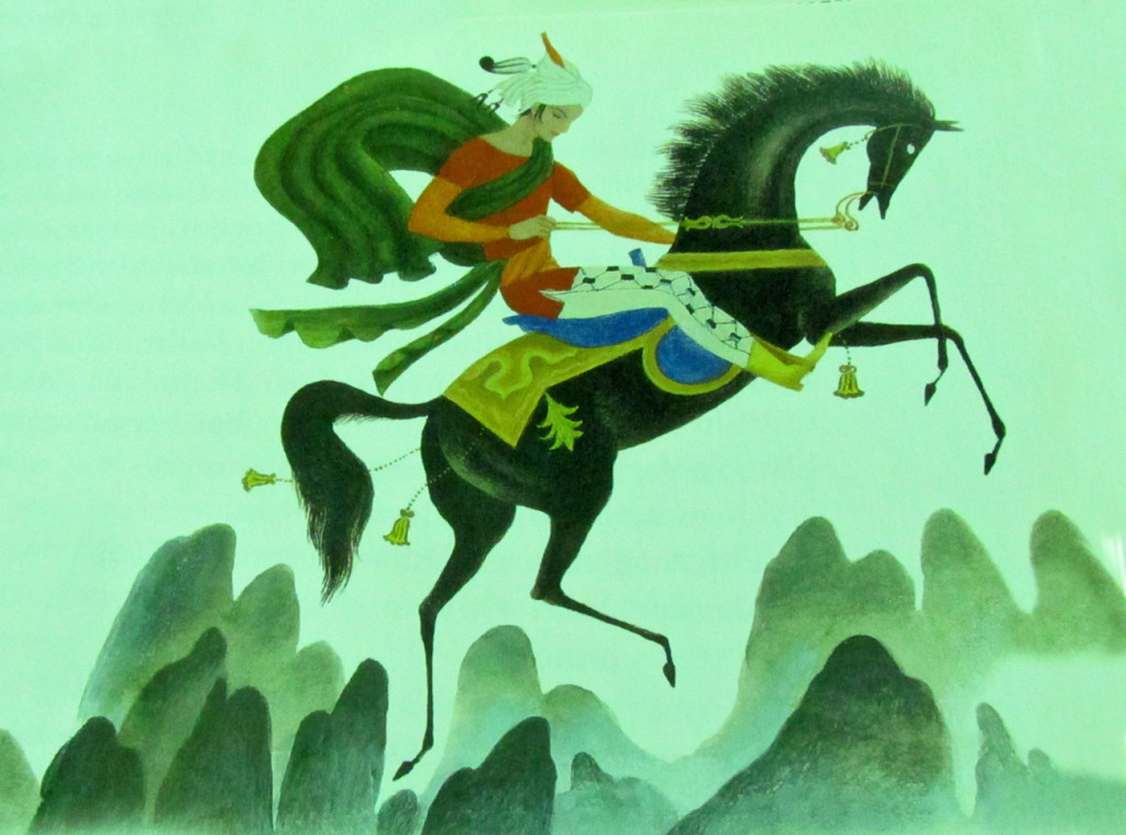
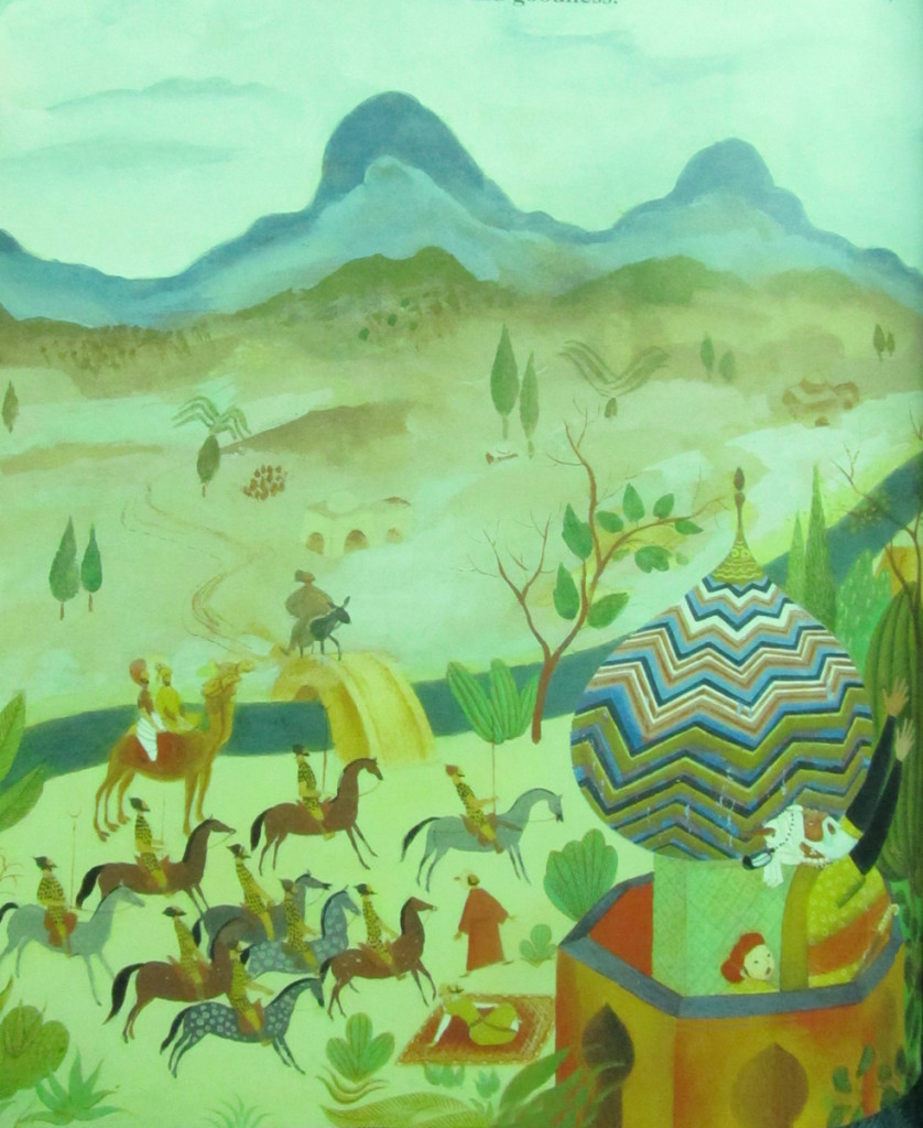
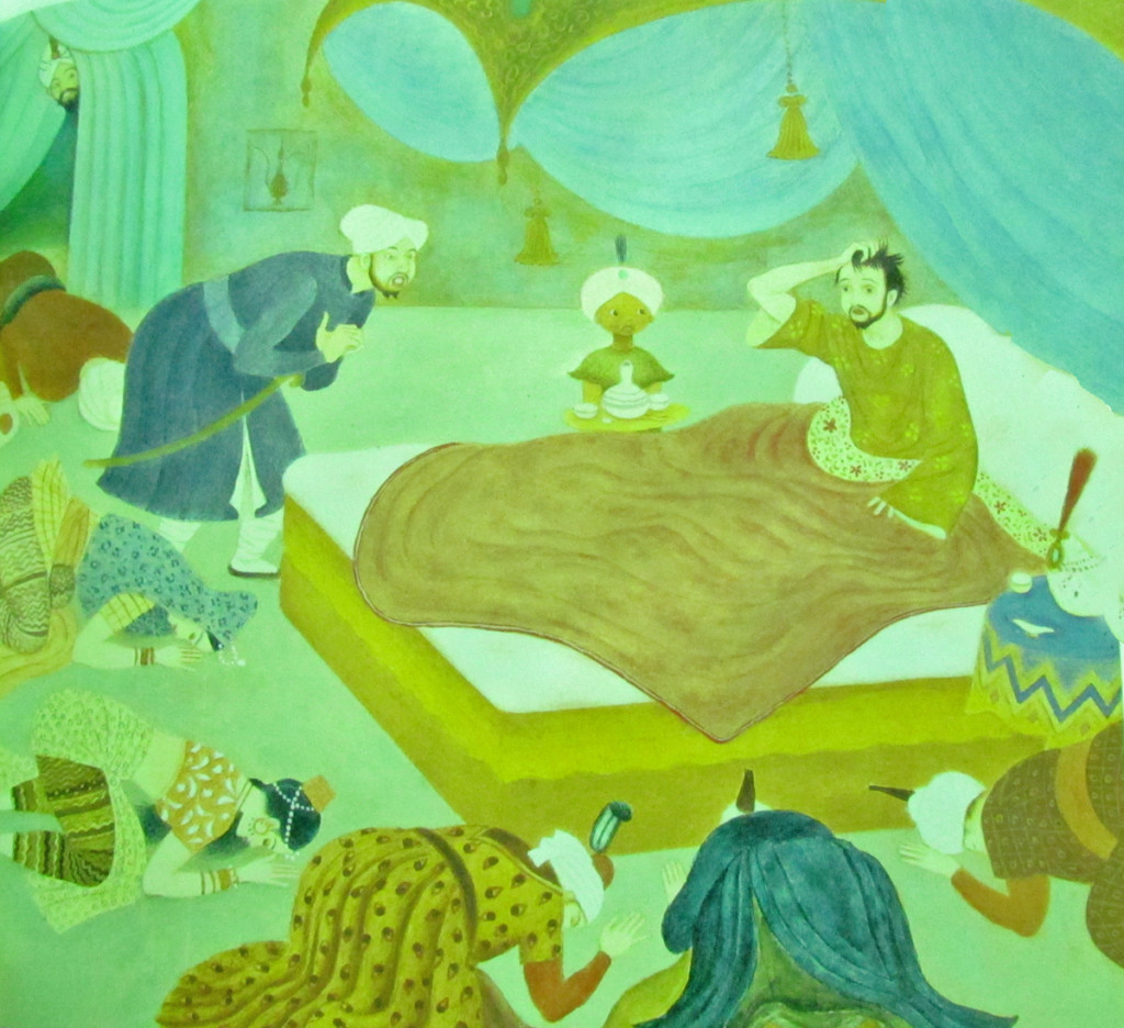
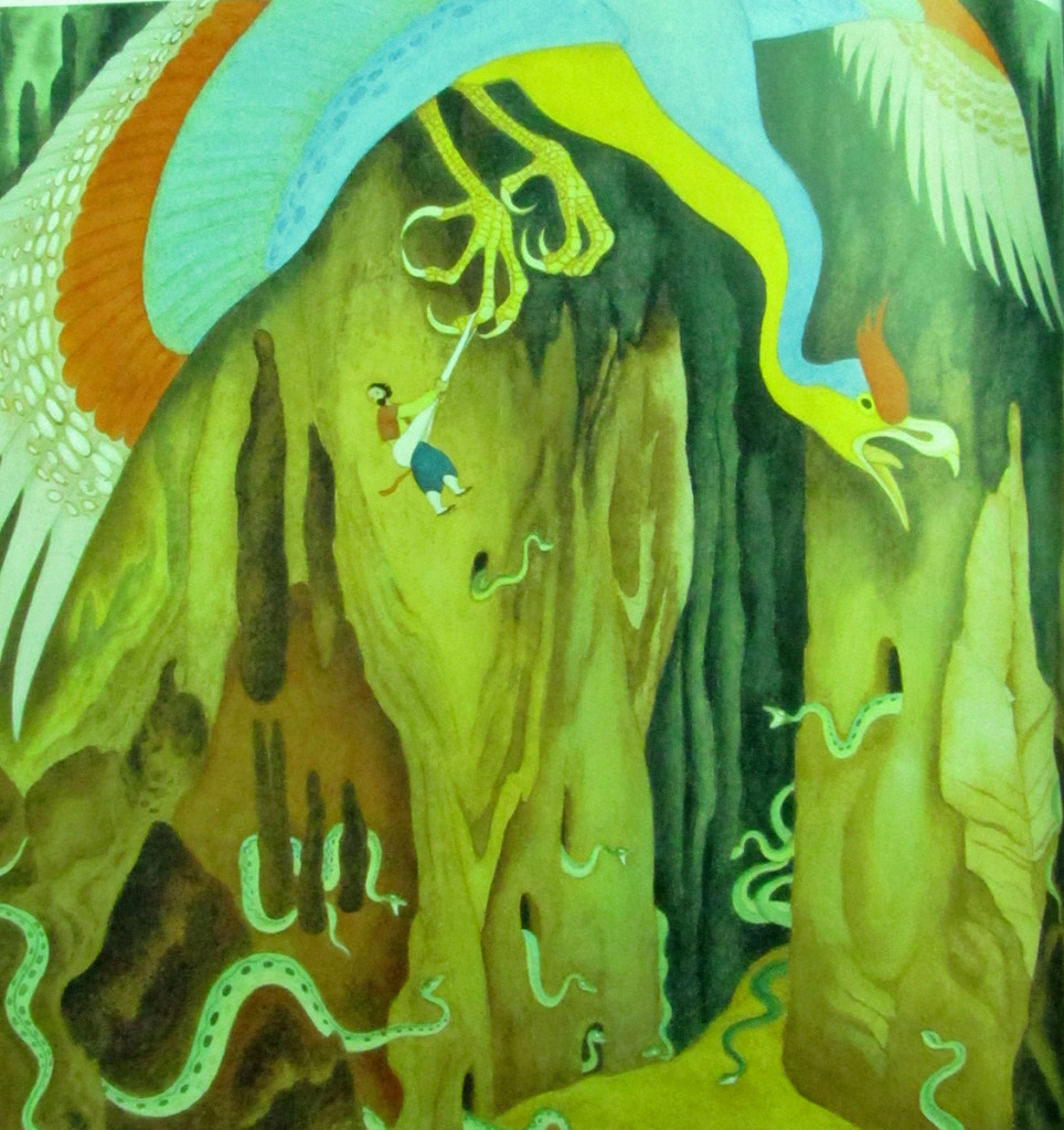
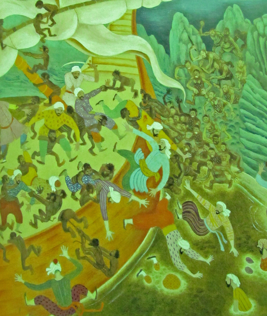
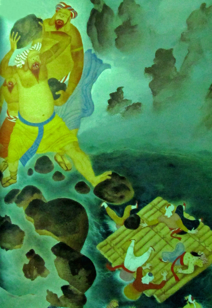
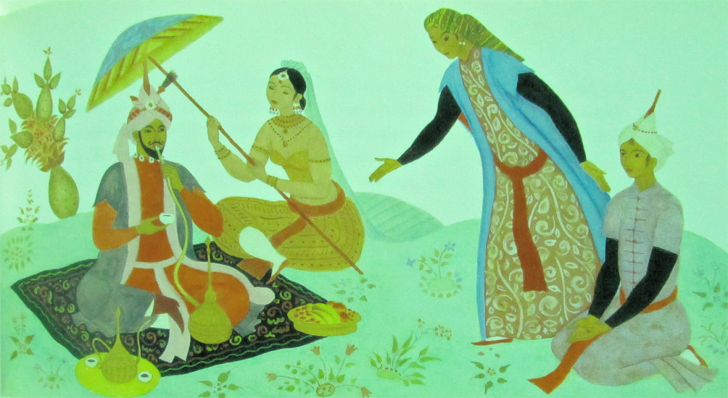
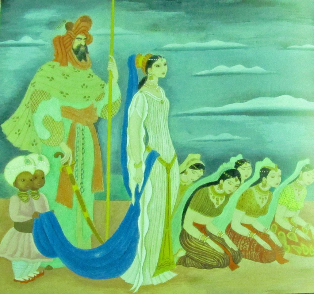
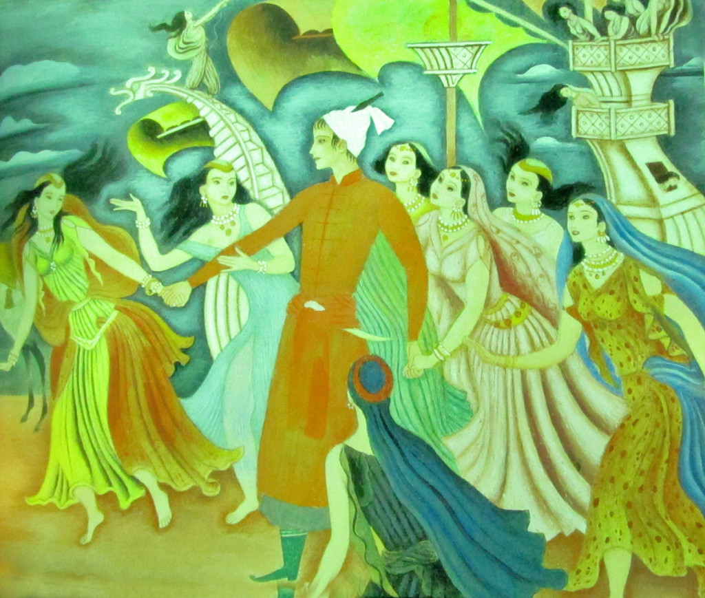
The artist moved into publishing after work at the Disney studio where he created The Poky Little Puppy for Little Golden Books. The Tales of the Arabian Nights was another of the many books Tenggren did for them. While visiting John Canemaker I saw the book and photographed some of the illustrations. Hopefully, the quality will be good enough so that I can share them with you. They’re completely original for Mr. Tenggren; not at all inspired by the many European-styled work he was known for. A true artist.
Books &Errol Le Cain &Events &Festivals &Illustration &repeated posts 17 Jun 2013 04:52 am
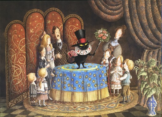
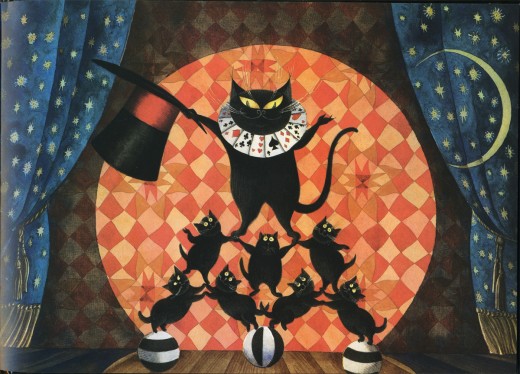
Mr. Mistoffelees – repost
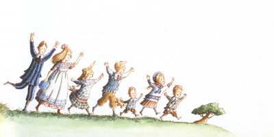
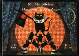 – I’ve posted many of Errol Le Cain‘s illustrations for his children’s books. Ever since coming across that very first paper-bound book, about Briar Rose, (meaning it was the very first I’d seen for sale) I’ve been an avid collector searching out any of the many books he created.
Le Cain was my hero for quite some time. He was a student of Dick Williams’ studio, had learned to animate there and was doing the backgrounds for Dick’s feature The Thief and the Cobbler. Dick pushed him, at one time, to do a film on his own, The Sailor and the Devil, with, of course, Dick’s harsh scrutiny.
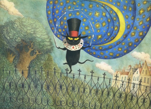
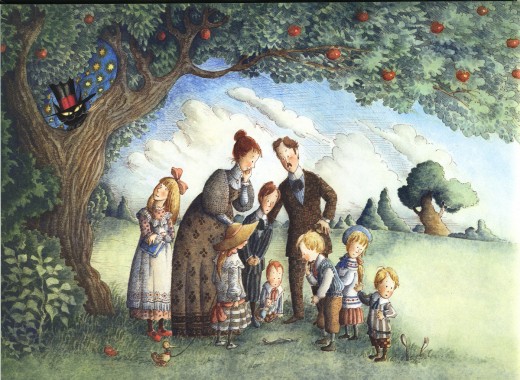
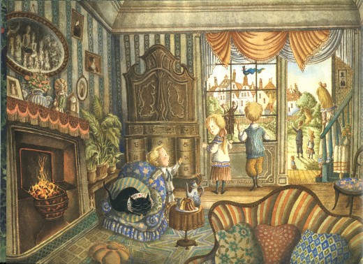
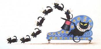
I present here his illustrations for the first half of the book, Mr. Mistoffelees with Mungojerrie and Rumpelteazer. The latter half of the book included the Mungojerrie and Rumpelteazer part which we’ll save for another time.
This story is part of the Old Possum’s Book of Practical Cats by T.S. Eliot.
That was, of course, the source material on which Webber and Nunn based their show CATS. These images are so attractive and stylish, I was quite curious to know whether Andrew Lloyd Webber had seen the books. Especially when he was about to put CATS onto the screen as an animated film.
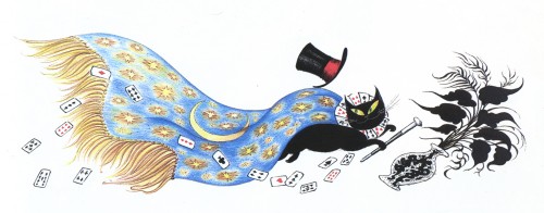
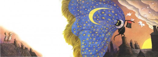
Here are the illustrations by Le Cain:
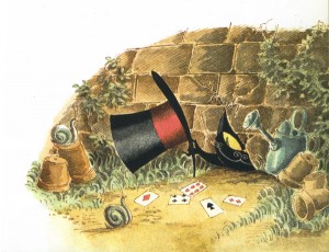
________ (Click any image you’d like to enlarge.)
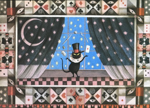
_____________Mr. Mistoffelees
___________You ought to know Mr. Mistoffelees !
___________The Original Conjuring Cat -
___________(There can be no doubt about that).
___________Please listen to me and don’t scoff All his
___________Inventions are off his own bat.
Bill Peckmann &Books &Illustration 14 Jun 2013 04:06 am
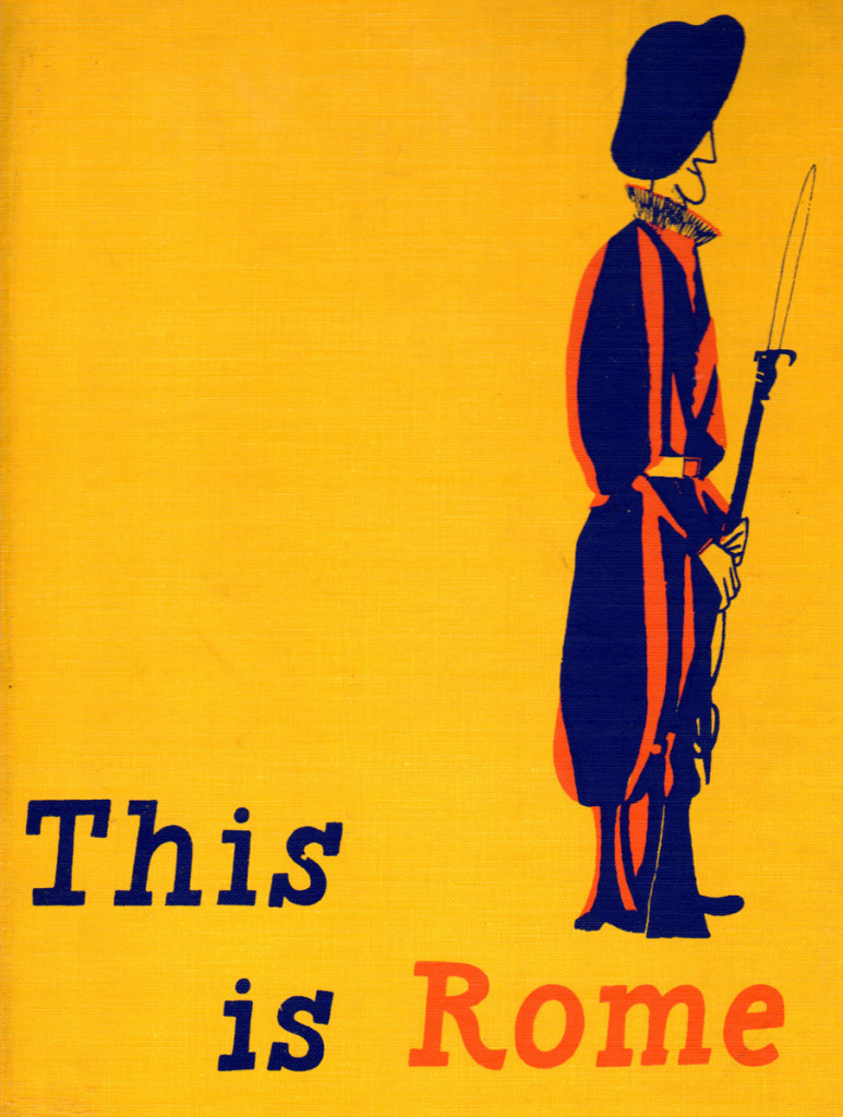
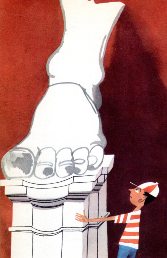
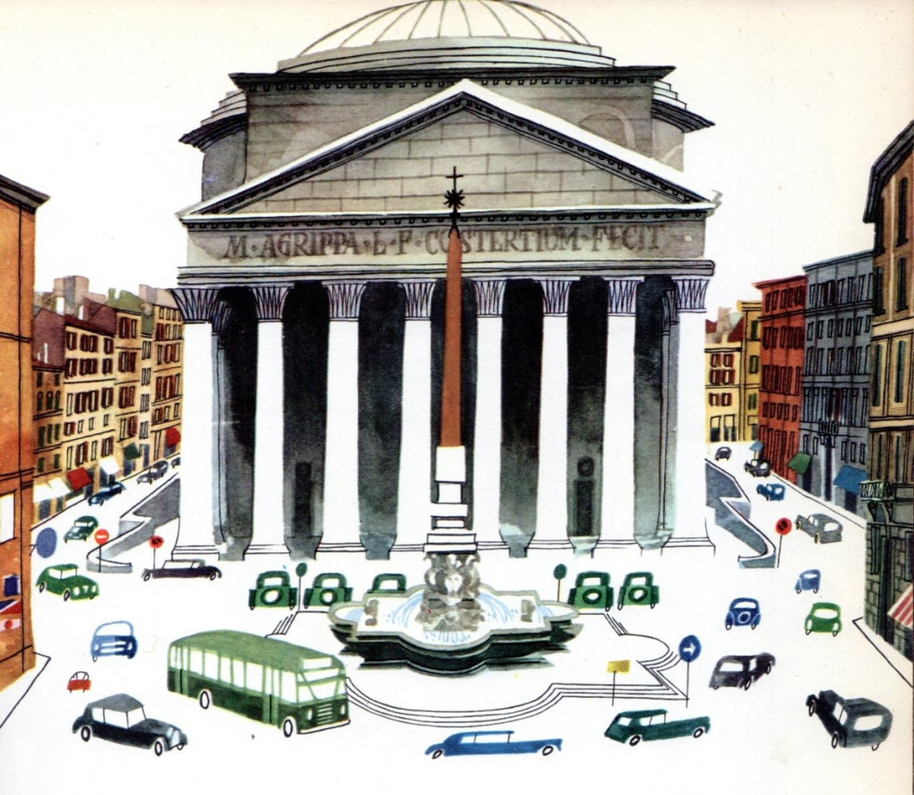
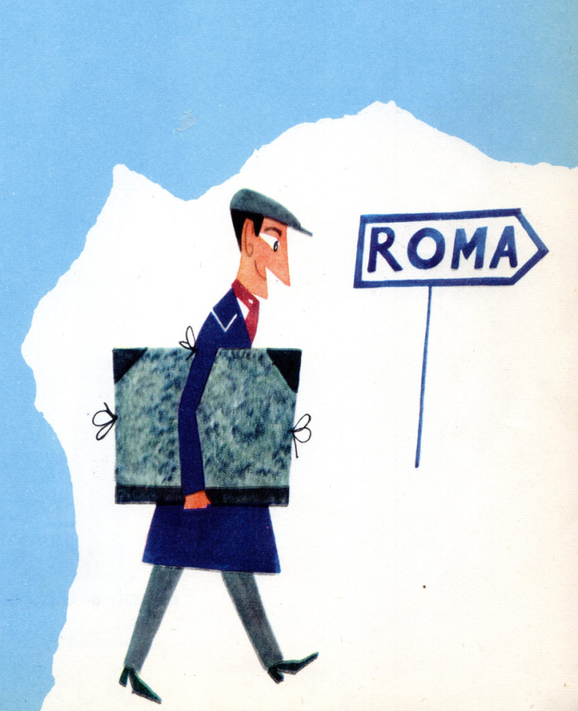
Sasek’s Rome
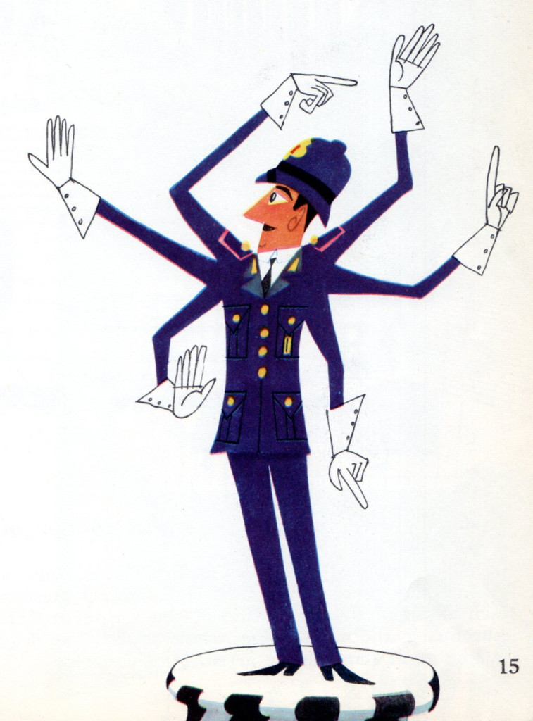
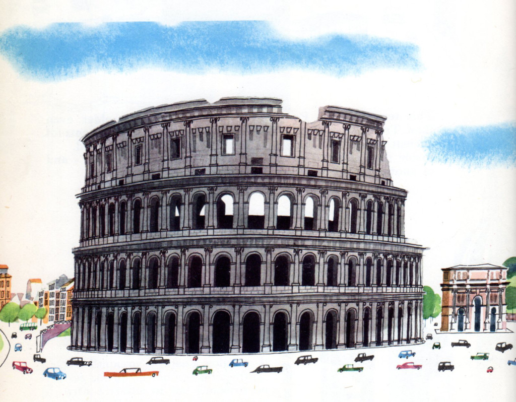
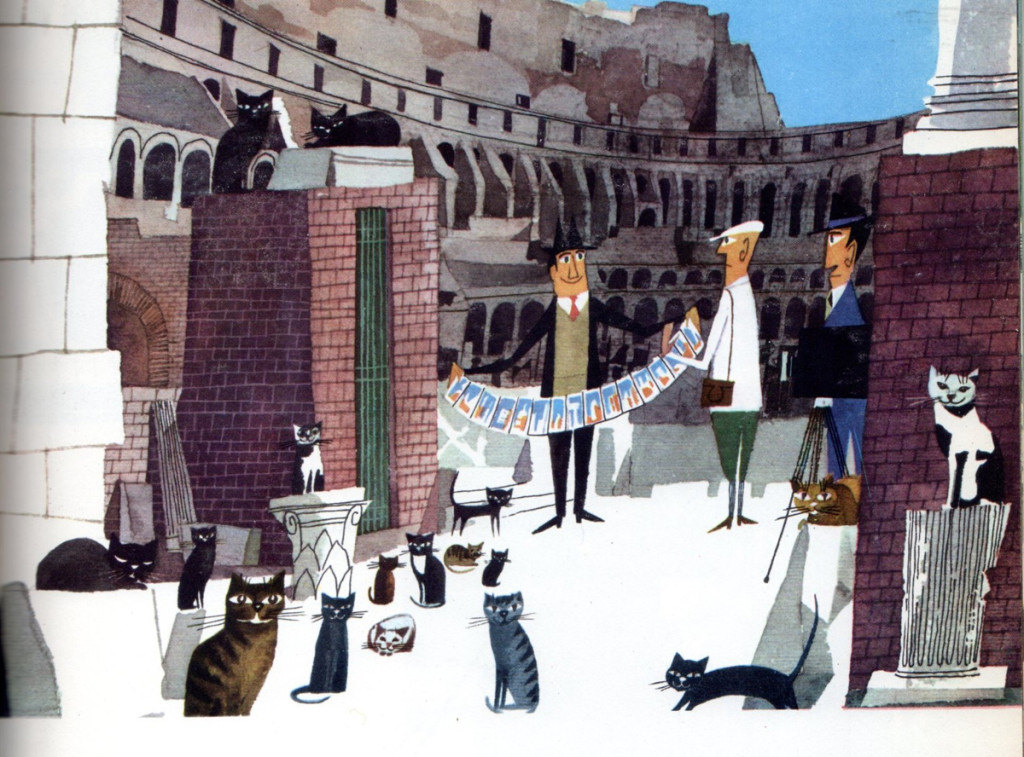
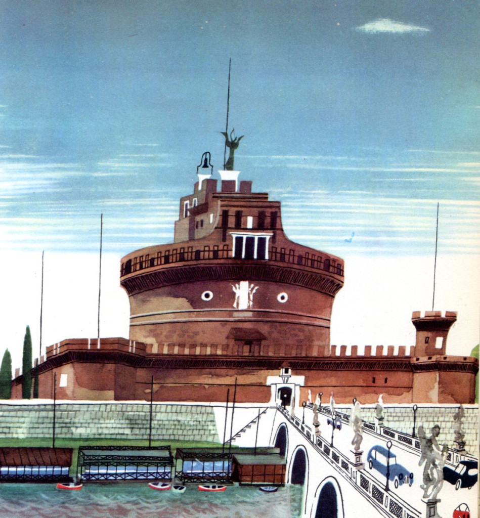
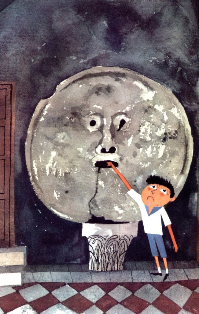
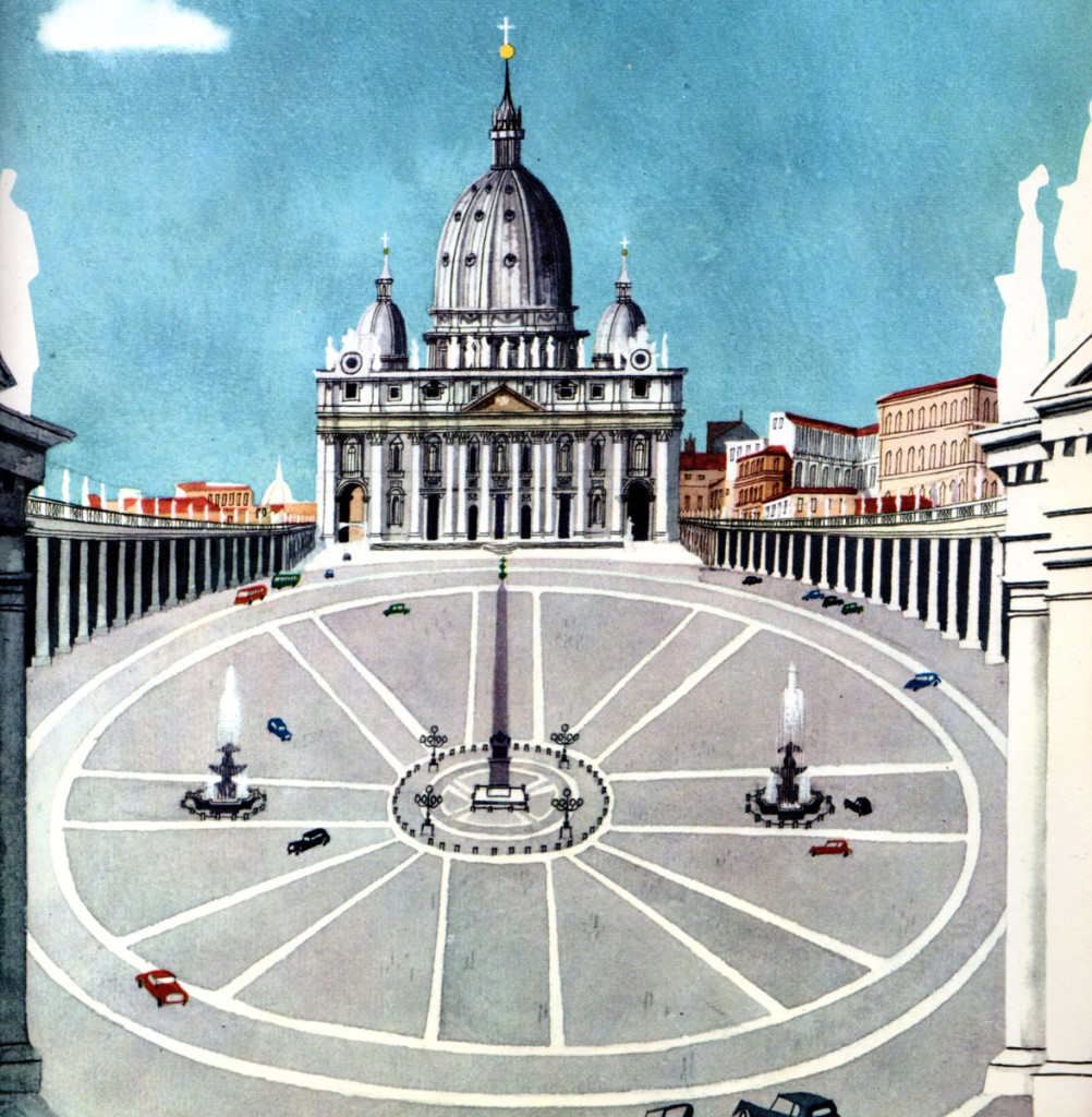
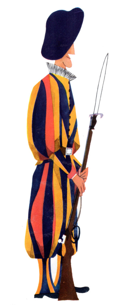
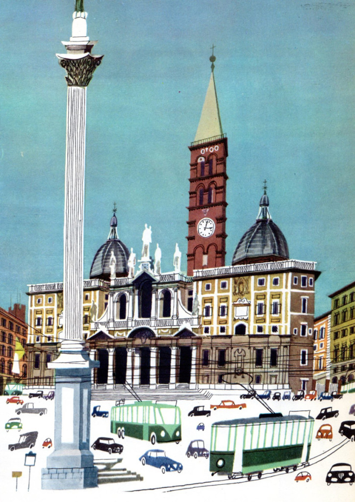
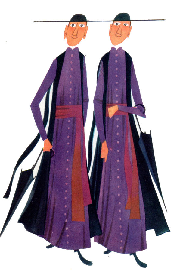
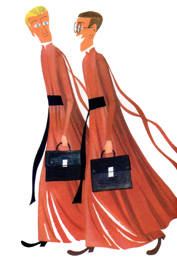
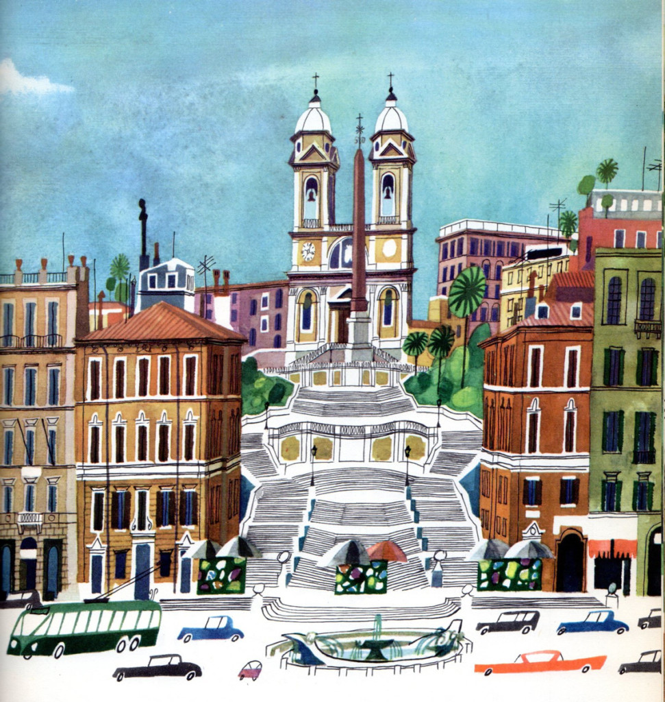
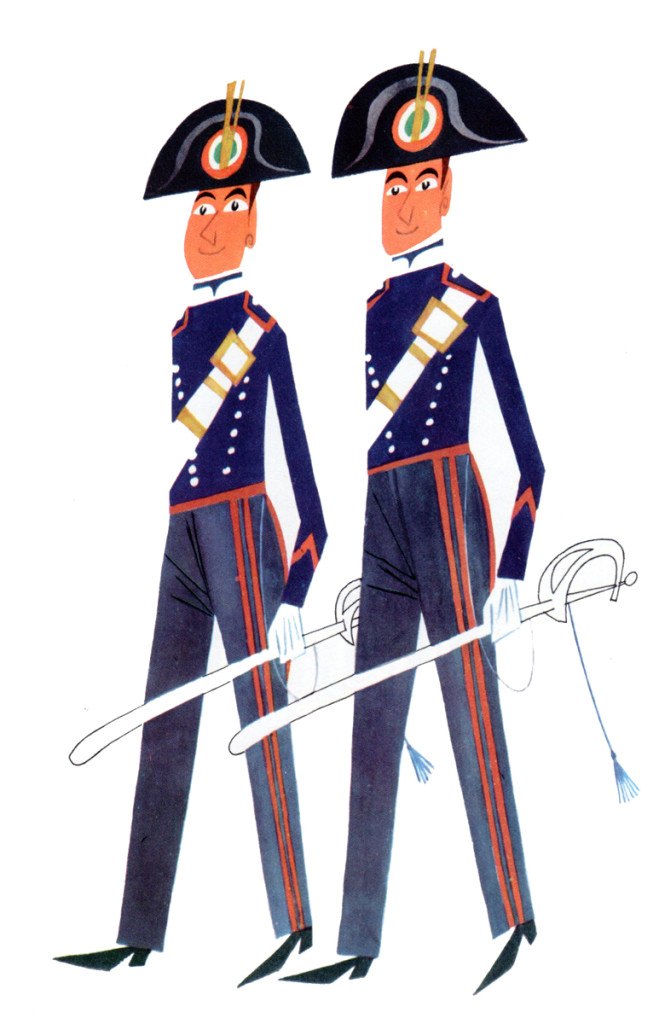
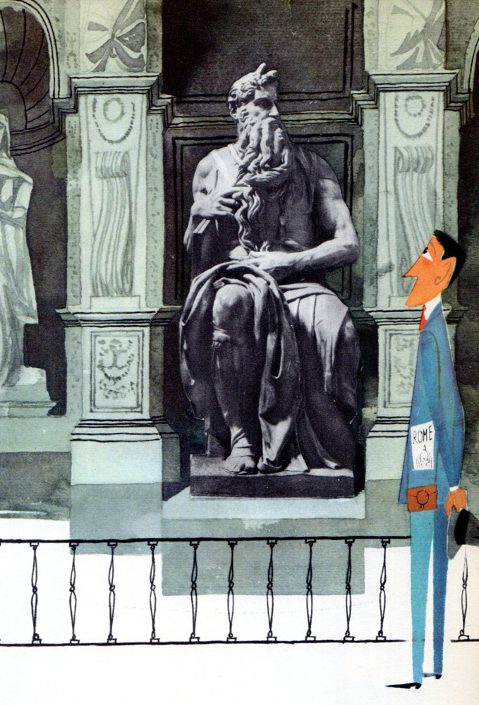
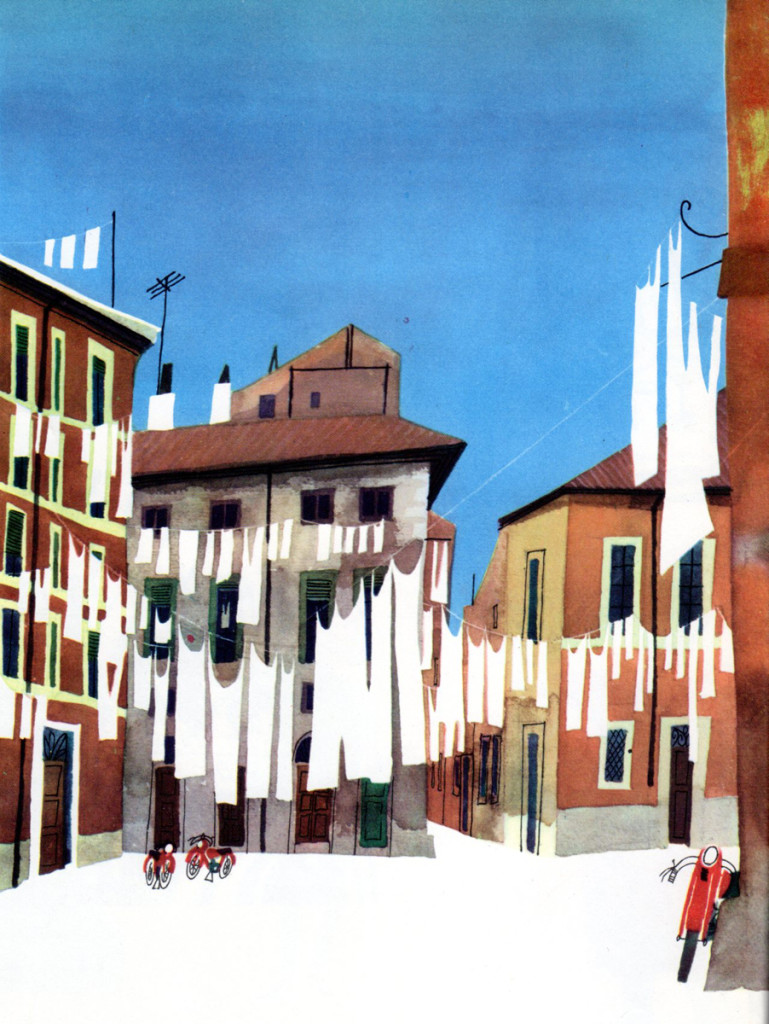
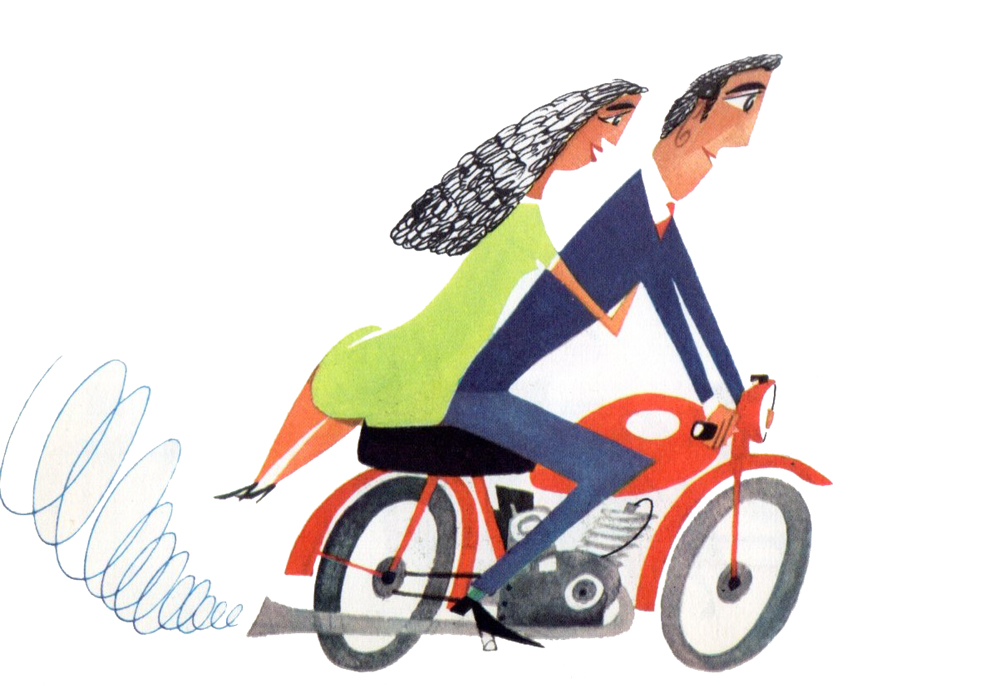
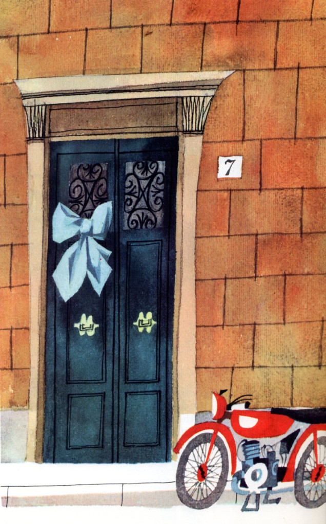
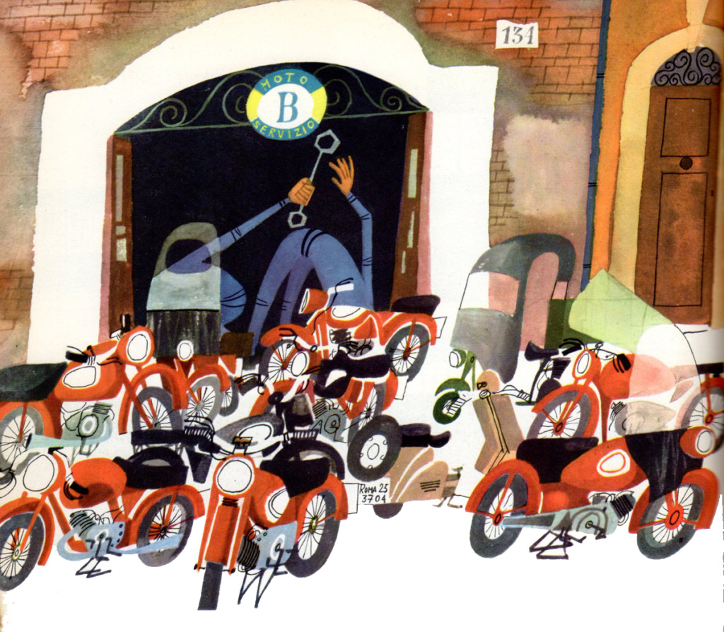
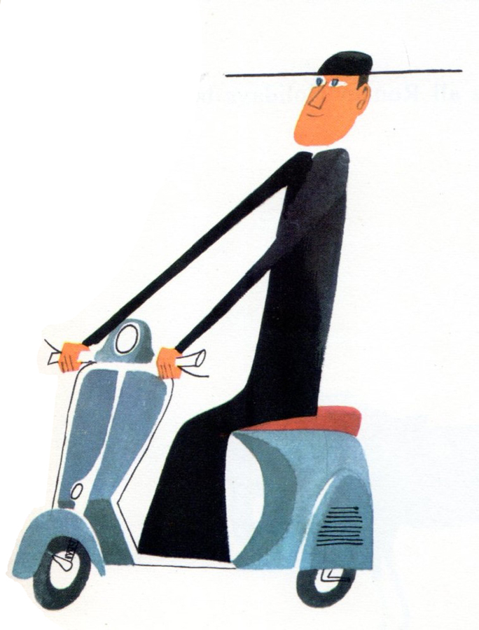
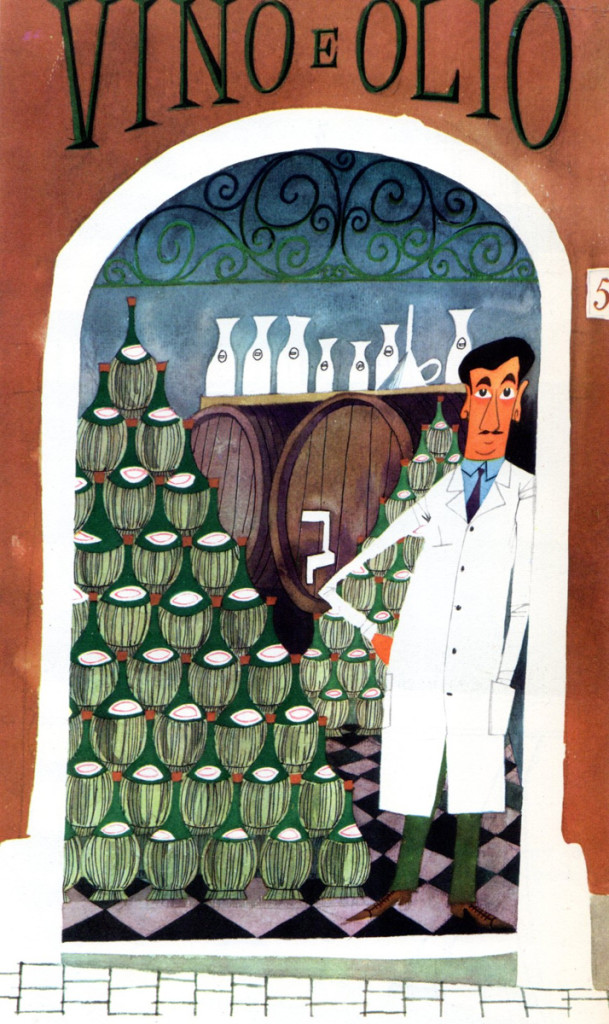
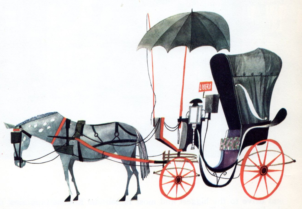
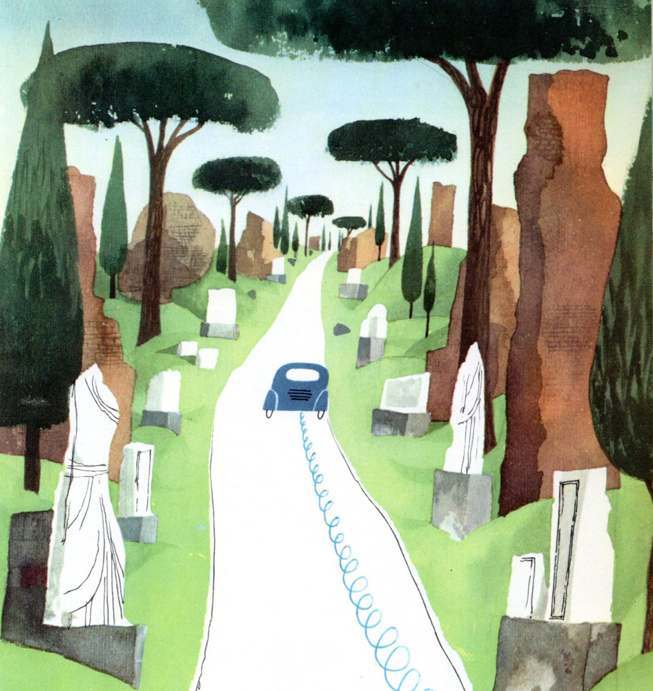
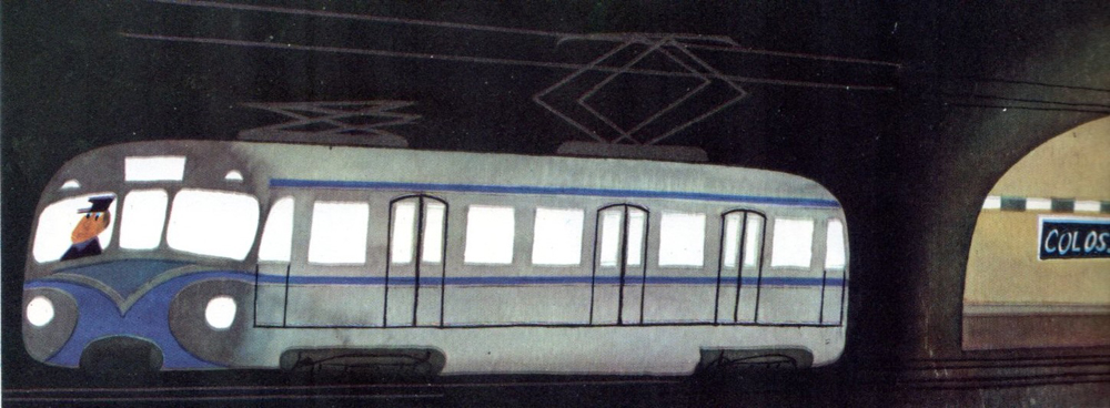
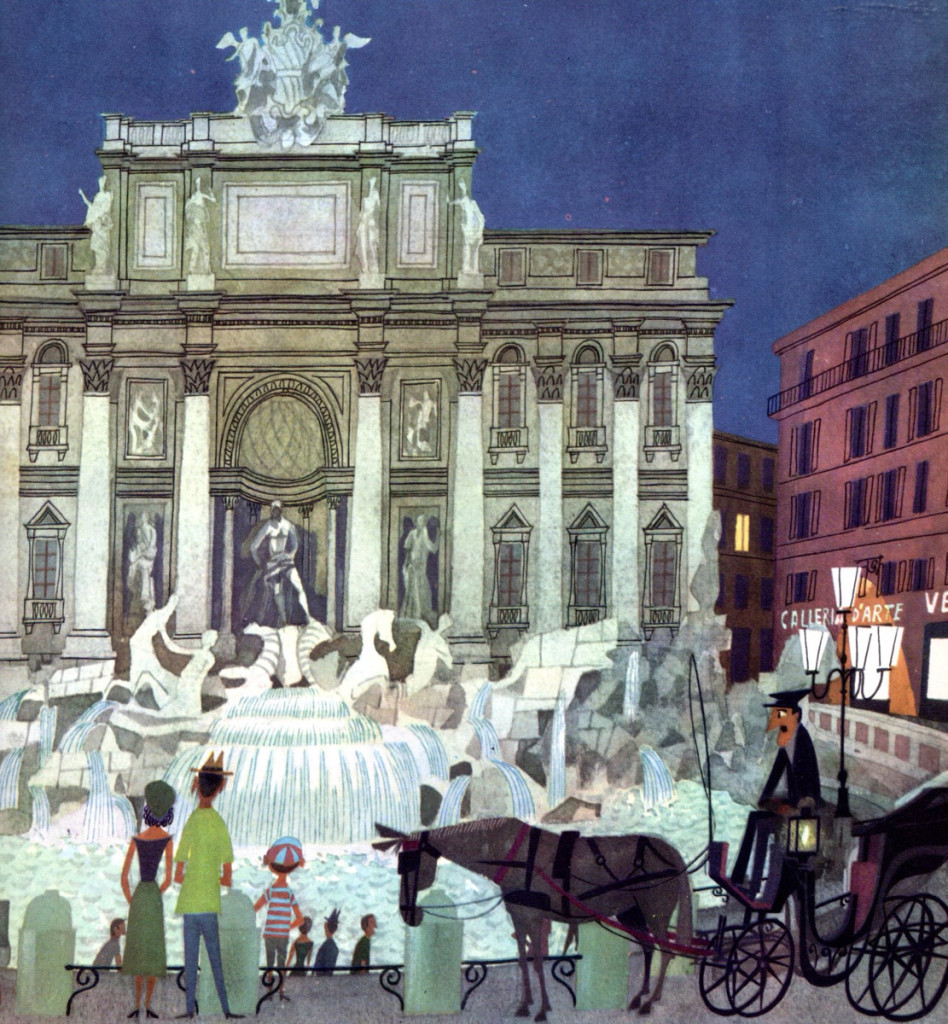
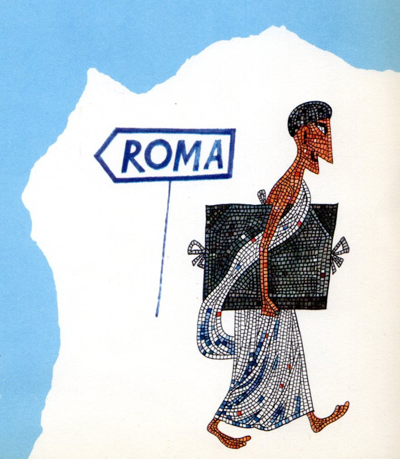
Talk about “Modern Cartoon” Bill Peckman sent me this book about Rome. It’s a beauty and deserves to be shown off. Thanks to Bill for calling attention to Miroslav Sasek‘s work.
 1
1
Check out this Pinterest facebook page.
Books &Illustration &Theater 12 Jun 2013 05:41 am
Into the Woods Book
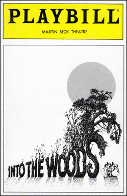 Into the Woods is one of the highlights from the number of musicals Stephen Sondheim has written. The show takes many famous fairy tales and plays them out through the first half of the show.
With the start of the second Act, we learn the fate of all these fairy tale characters. They’re all victims of their own cupidity. Jack, for example, stupidly sells his family cow for five “magic” beans. The beans are discarded by his angry mother, and Jack climbs into the heavens on that beanstalk.
Once there, Jack falls into his greatest vices, stealing a chicken that lays golden eggs and a magic golden harp. When the giant chases him to get his things back, he falls to earth and dies. Sondheim and cowriter, James Lapine, take the story more seriously and has all the evil of the characters pla itself out, with their suffering for their own irresponsibility.
The show was somewhat successful when it was written, and it was immediately designed to become a live action/animation mix m0vie. Rob Minkoff, one of the directors of The Lion King as well as Stuart Little, was set to direct the film. It eventually fell through, and it’s back in production again with a different director, Rob Marshall (Chicago). Needless to say, there’ll be no animation in the movie anymore. A lot of computer effects.
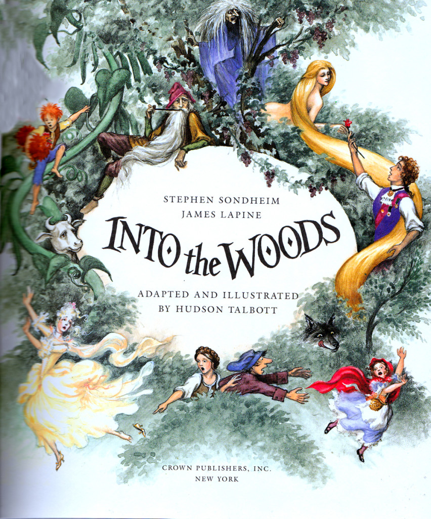
When it was just a NY theatrical musical, the piece was turned into a large children’s book. I thought it might be fun to post some of it here. So, as of today I’ll offer about two or three posts with a focus on the book’s writer/illustrator, Hudson Talbott.
Talbott was the original writer of “We’re Back! A Dinosur’s Story.” That was made into an animated feature for Steven Spielberg back in 1993. He’s also done many designs and illustrations for the Metropolitan Opera Guild and the Metropolitan Museum of Art.
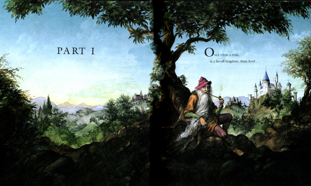
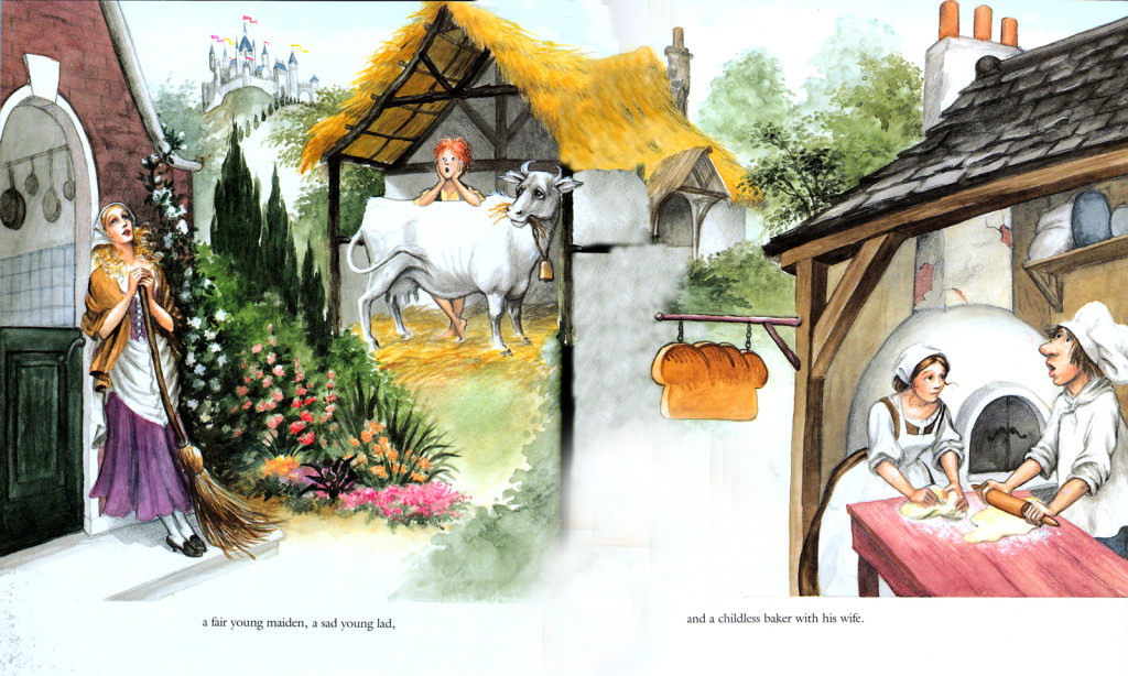
Here are some of the first pages of the book. Note that I’m only posting the illustrations.
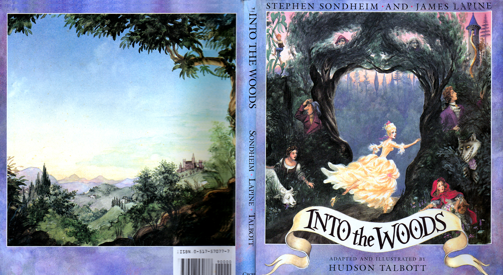
Dust Jacket Art
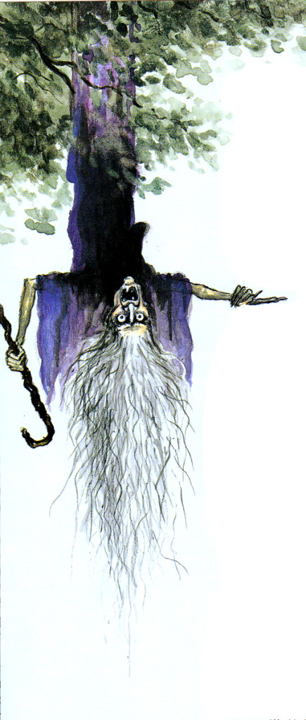
No, this is not upside down, except by design.
Action Analysis &Animation &Articles on Animation &Books &Commentary &Disney &Illustration &Richard Williams &Rowland B. Wilson &SpornFilms &Story & Storyboards &Tissa David 10 Jun 2013 03:31 am
Illusions – 3
I’ve written two posts about Frank Thomas and Ollie Johnston‘s book, The Illusion of Life the last couple of weeks. I came to the book only recently and realizing that I’d never really read the book, I thought it was time. So in doing so, I’ve found that I have a lot to write about. The book has come to be accepted almost as gospel, and I decided to give my thoughts.
There were two major complaints I’ve had with what I’ve read in their book so far, and I spent quite a bit of time reviewing those.
- First out of the box, I was stunned to read that these two of Disney’s “nine old men” said that they’d originally believed that each prime animator should control one, maybe two characters in the film. Then, later in life they decided that an animator should do an entire scene with all of the characters within it. This is not what I’d seen the two (or the nine) do in actual practice. post 1
Secondly, they argue for animating in a rough format, and they give solid reasons for this. As a matter of fact, it was Disney, himself, in the Thirties who demanded the animators work rough and solid assistants who could draw well back them up. Then much later in the book the two author/animators suggest that it’s better for an animator to work as clean as possible with assistants just doing touch-up. This helped out the Xerox process, but didn’t necessarily help for good animation. post 2
The book starts out sounding like it’s going to be a history of Disney animation, but then starts getting into the rules of animation (squash and stretch, overlapping action and anticipation and all those other goodies) exploiting Disney animation art in demonstration. Soon the book moved into storytelling and how to try to keep the material fresh and interesting. It all becomes a bit obvious, but you keep hoping that some great secret will be revealed by the two masterful oldsters.
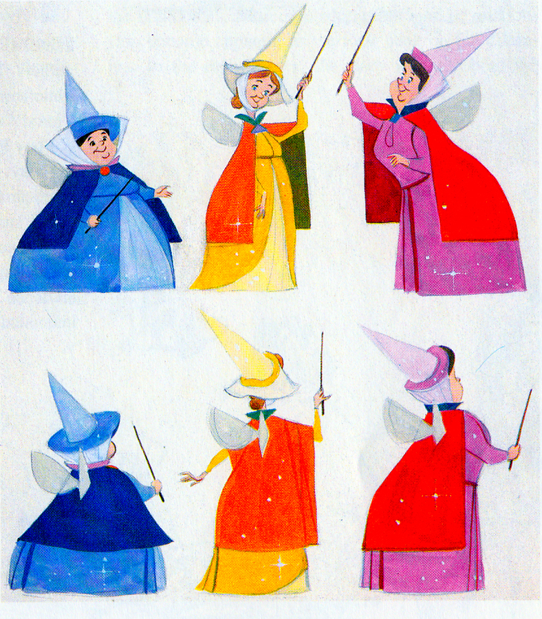 They do go into depth about how to develop characters when making animated films. They offer lots of examples from Orville, the albatross in The Rescuers to the three fairies in Sleeping Beauty, but their greatest attention goes to Baloo the Bear in The Jungle Book. They were having a hard time with this guy; they had been trying to do an Ed Wynn type character, until Walt Disney, himself, suggested Phil Harris. Once they auditioned Harris, they knew they were on the right track, and the character kept grabbing more screen time and grew ever larger. In the end, audiences just loved him.
Personally, I’ve always hated Phil Harris’ performance in this film. What was it doing in Rudyard Kipling’s book? When I was a kid, Harris and Louis Prima were the perfect examples of my father’s entertainers. He loved these guys and spent a lot of time in front of the family TV watching the Dinah Shore Show______Tom Oreb designs for Sleeping Beauty.
and other such entertaining Variety Shows with
lots of little 50′s big-band jazz-type acts. I hated it; this was my parent’s kind of music and humor and had nothing to do with me. I was the kid who paid his quarter to see the Walt Disney movies (that was the children’s price of admission in 1959.)
In their book they say they knew he was perfect because generations of kids later (who have no idea who Phil Harris was) still take joy from Baloo. What they forgot is what I knew all along. This was The Jungle Book. If they had been truly creative, they would have developed a character in line with Kipling’s material that would have been an original, not an impersonation of Doobey Doobey Doo, Phil Harris. The same is true of Louis Prima as a monkey. (There was a time when Disney said that they should never animate monkeys because monkeys are funny on their own, in real life. Animation wouldn’t make them funnier.) Sebastian Cabot, as Bagheera, works as does George Sanders as Shere Khan.
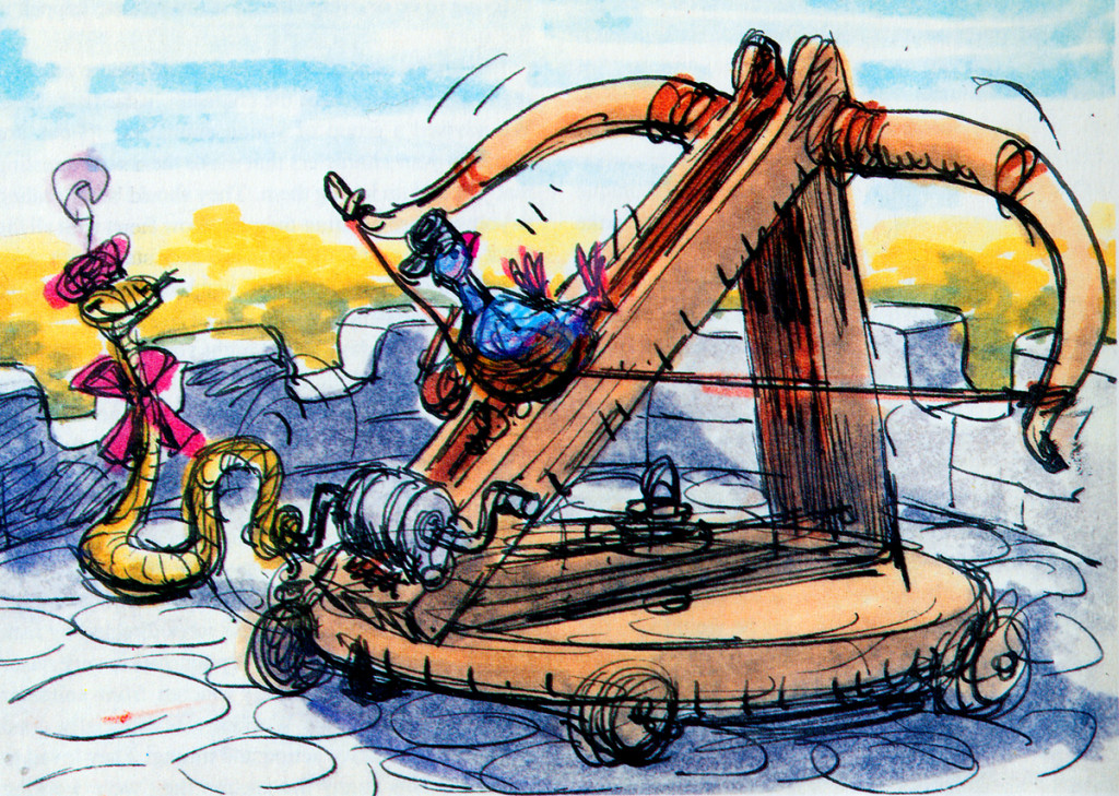
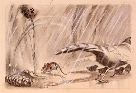
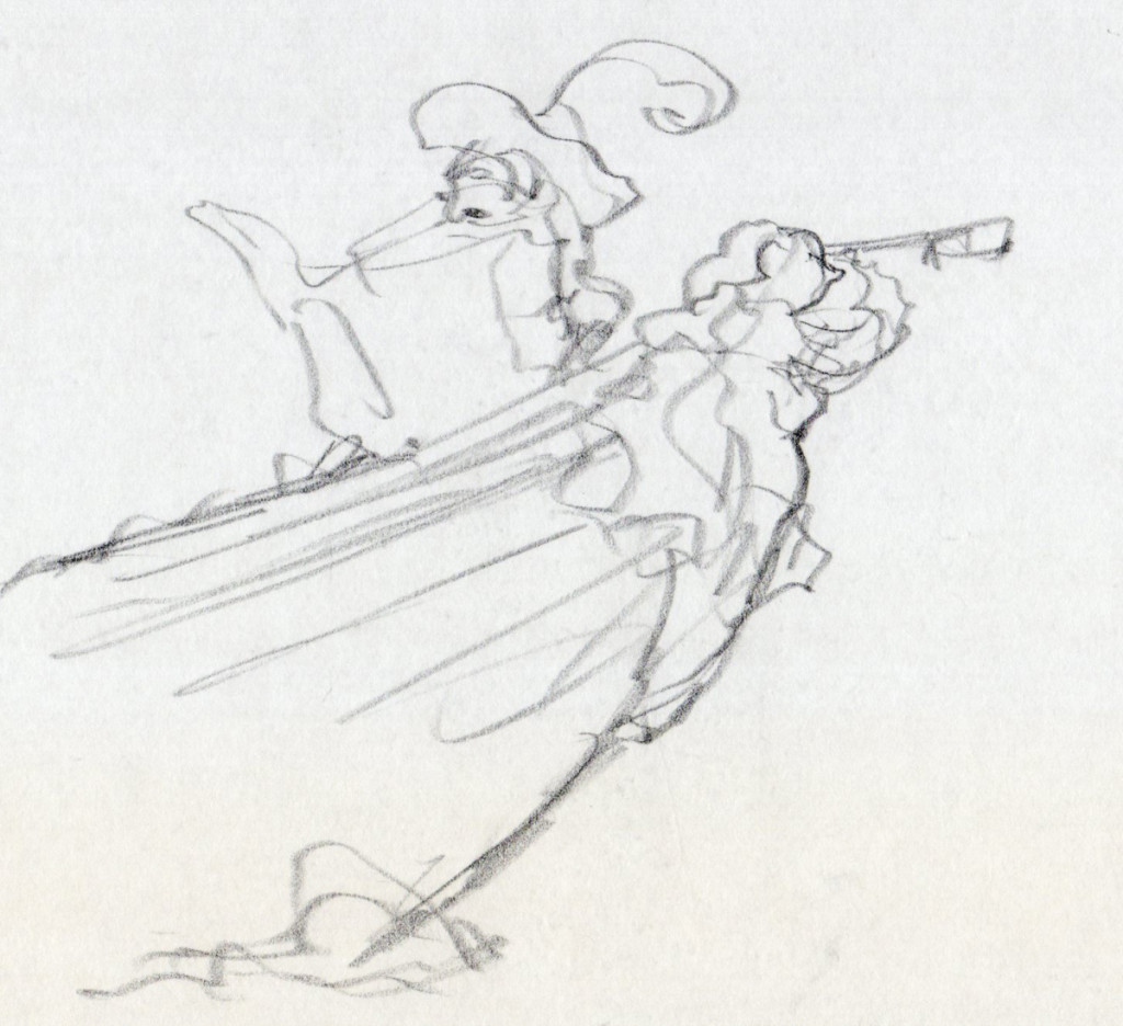
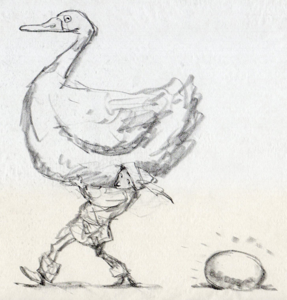
- Right: A discarded sequence from Robin Hood showed a messenger pigeon so fat and heavy he had to be shot into the air. This gave the animators the beginnings of The Albatross Air Lines in The Rescuers.
Phil Harris was so successful, they dragged him into Robin Hood as well. Robin Hood. The very same character from The Jungle Book is now Little John! All those cowboy voices in Robin Hood don’t work either, especially when you mix them up with Brits like Peter Ustinov and Brian Bedford. When these two thespians work against Pat Buttram, Andy Devine and George Lindsey, it’s one thing. Throw in a Phil Harris, and you have something else again. Where are we, the audience, supposed to be? Is it “Merry Ol’ England”? Or is it the lazy take on character development by a few senior animators who have taken license to jump away from the story writers for the sake of easy characters of the generation they’re familiar with. Robin Hood is a mess of a story – even though it’s a solid original they’re working from, and I find it hard to take written advice from these fine old animation pros who take an easy way out for the sake of their animation; shape shifting classic tales to fit their wrinkles.
At least, that’s how I see it – saw it. And perhaps that’s why it’s taken me so long to read this book. I felt (at the age of 14 when these films came out) that the Disney factory had turned into something other than the people who’d made Snow White and Bambi and Lady and the Tramp.
They had, in fact, become the nine old men.
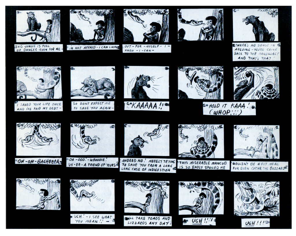
The Jungle Book was the last film Bill Peet worked on. He left
before the film was done. He’d had a long, contentious relationship
with Disney. He never felt he’d gotten the respect he deserved.
They were incredibly talented animators, and they certainly knew how to do their jobs. The animation, itself, was first rate (sometimes even brilliant as Shere Khan demonstrates), but try comparing the stories to earlier features. Even Peter Pan and Cinderella are marvelously developed. Artists like Bill Peet and Vance Gerry knew how to do their jobs, and they did them well. When Peet quit the studio, because he felt disrespected, Disney’s solid story development walked out the door.
The animators were taking the easy route rather than properly developing their stories. The stories had lost all dynamic tension and had become back-room yarns. Good enough, but not good.
Today was Nik Ranieri‘s last day at Disney’s studio. He’s definitive proof, in the eyes of Disney, that 2D animation is dead as an art form. This is the end result of some of the changes Thomas and Johnston suggest in their book. The medium took a hit back then; it just took this long for the suits to catch up. Good luck to Nik and the other Disney artists who no longer work steadily in what is still a vitally strong medium.
