Category ArchiveAnimation Artifacts
Animation &Animation Artifacts &Disney 11 Apr 2012 05:40 am
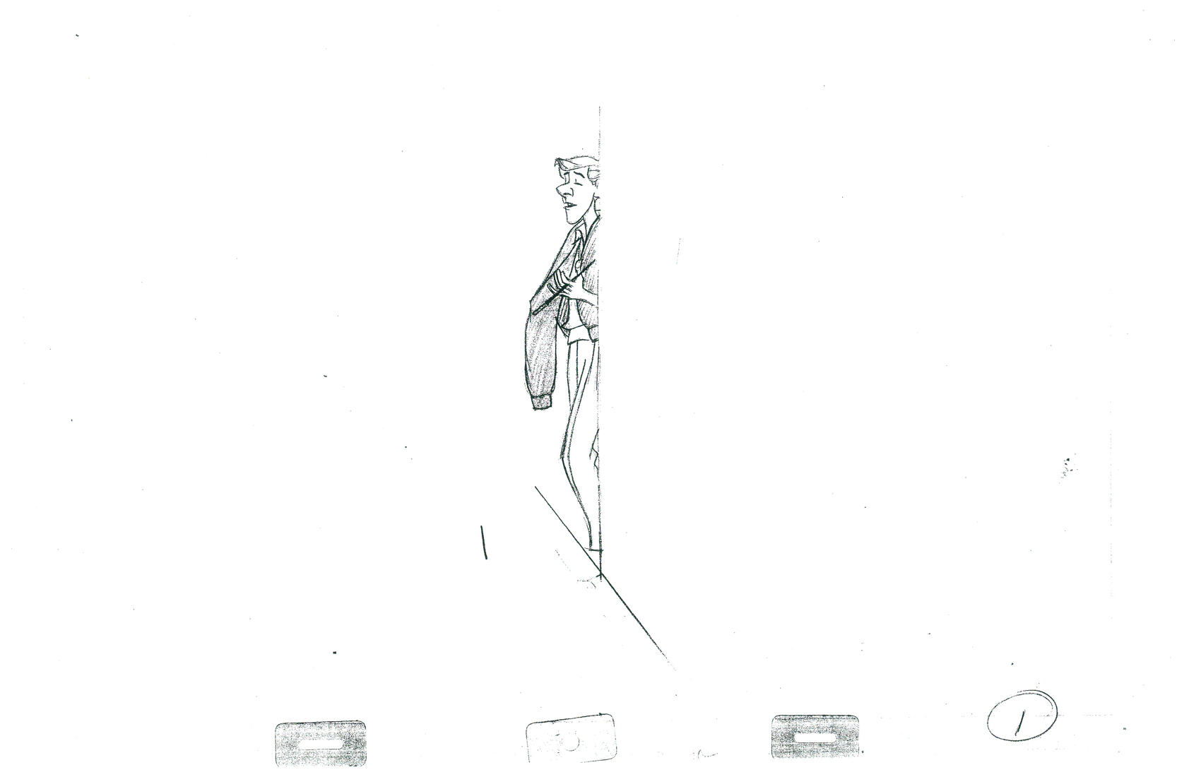
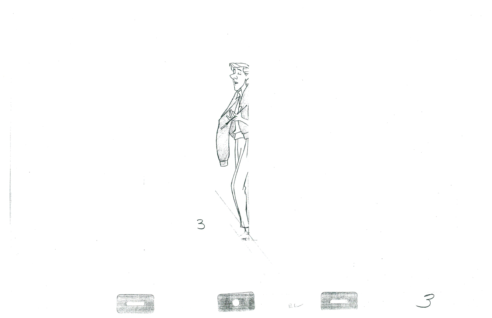
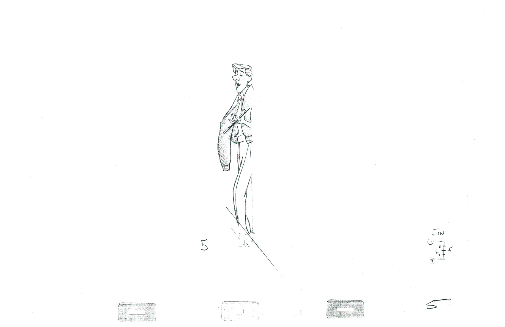
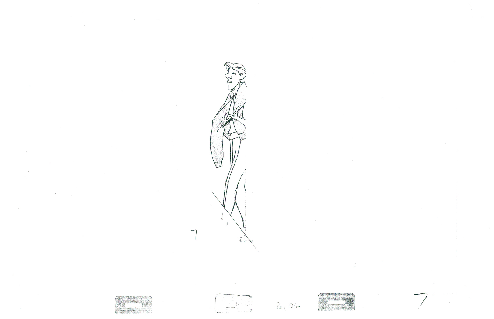
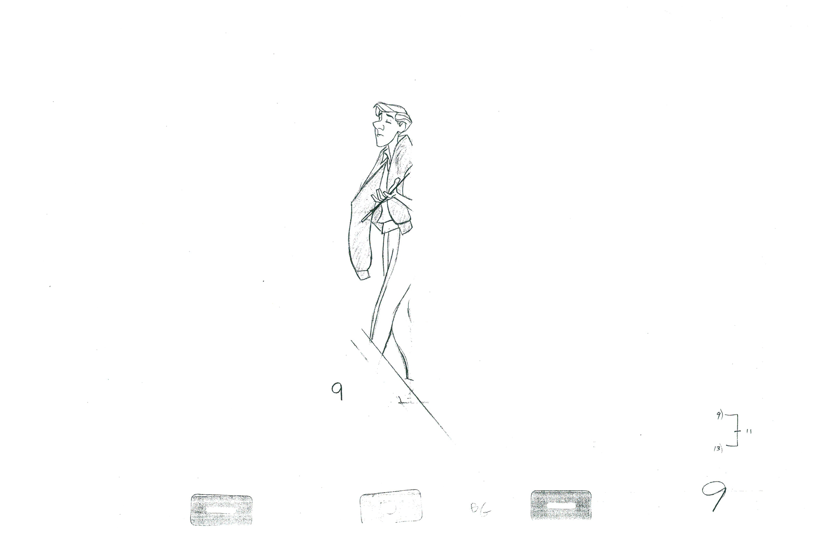
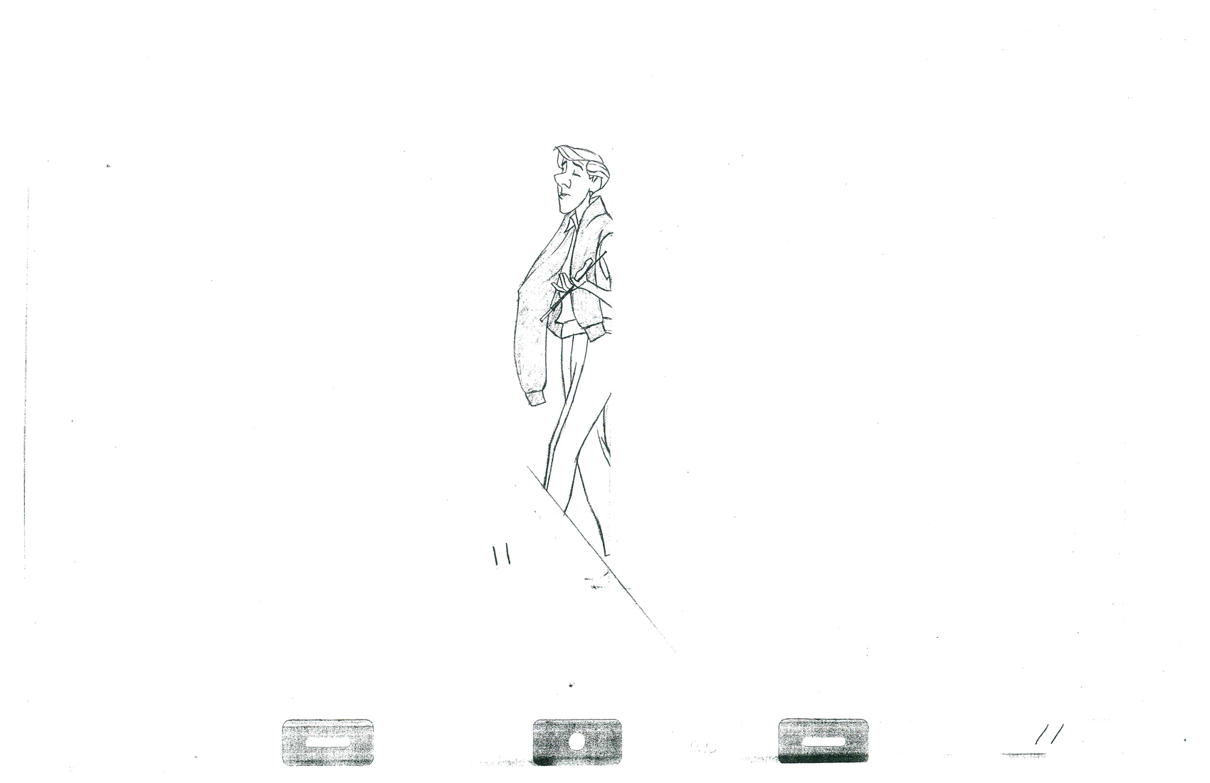
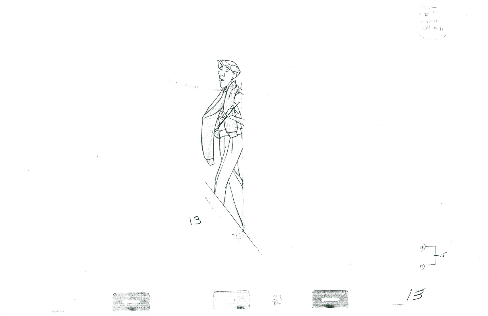
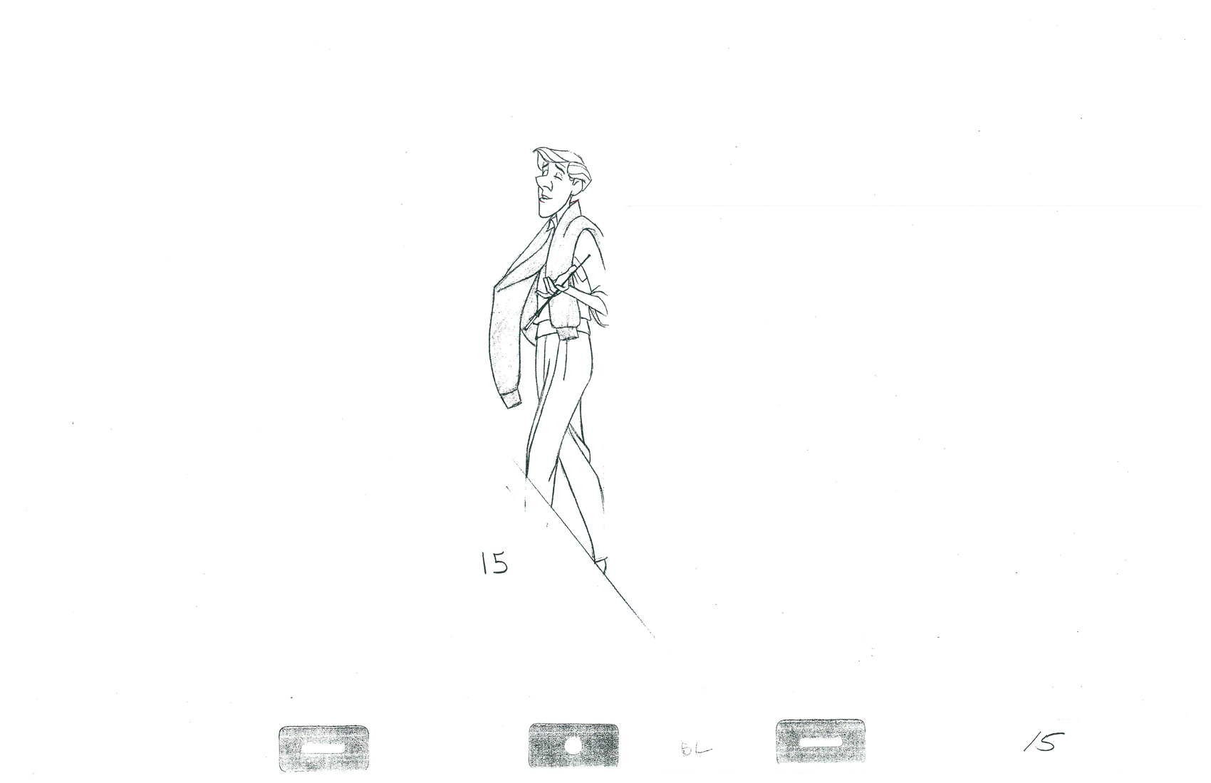
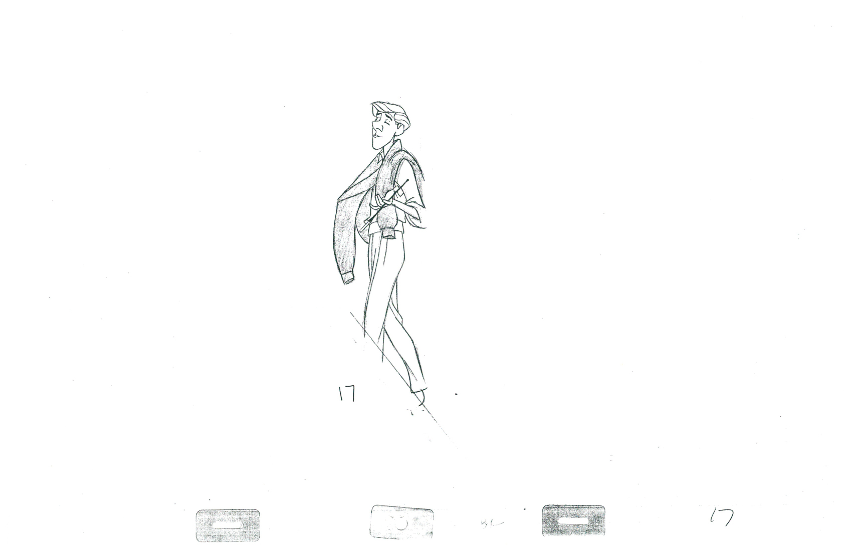
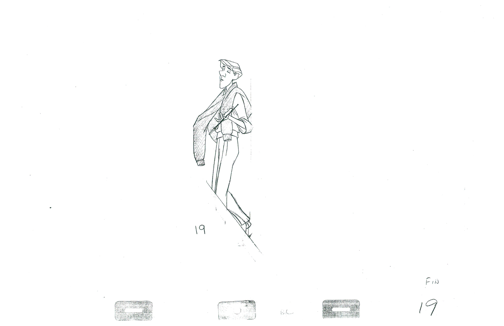
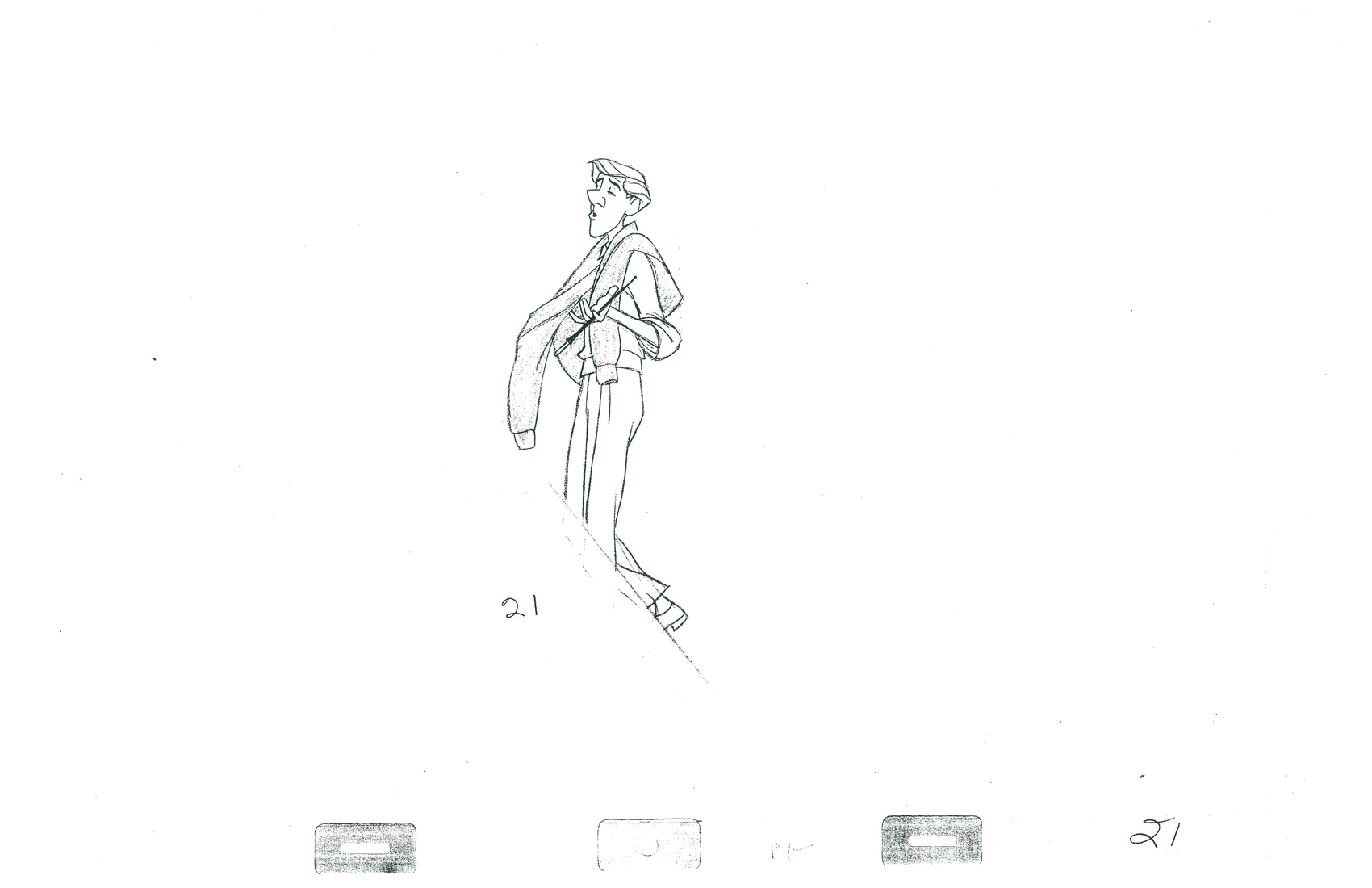
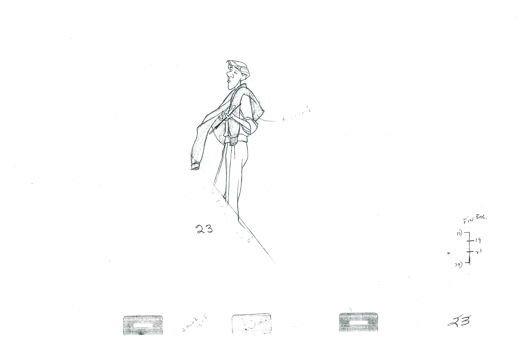
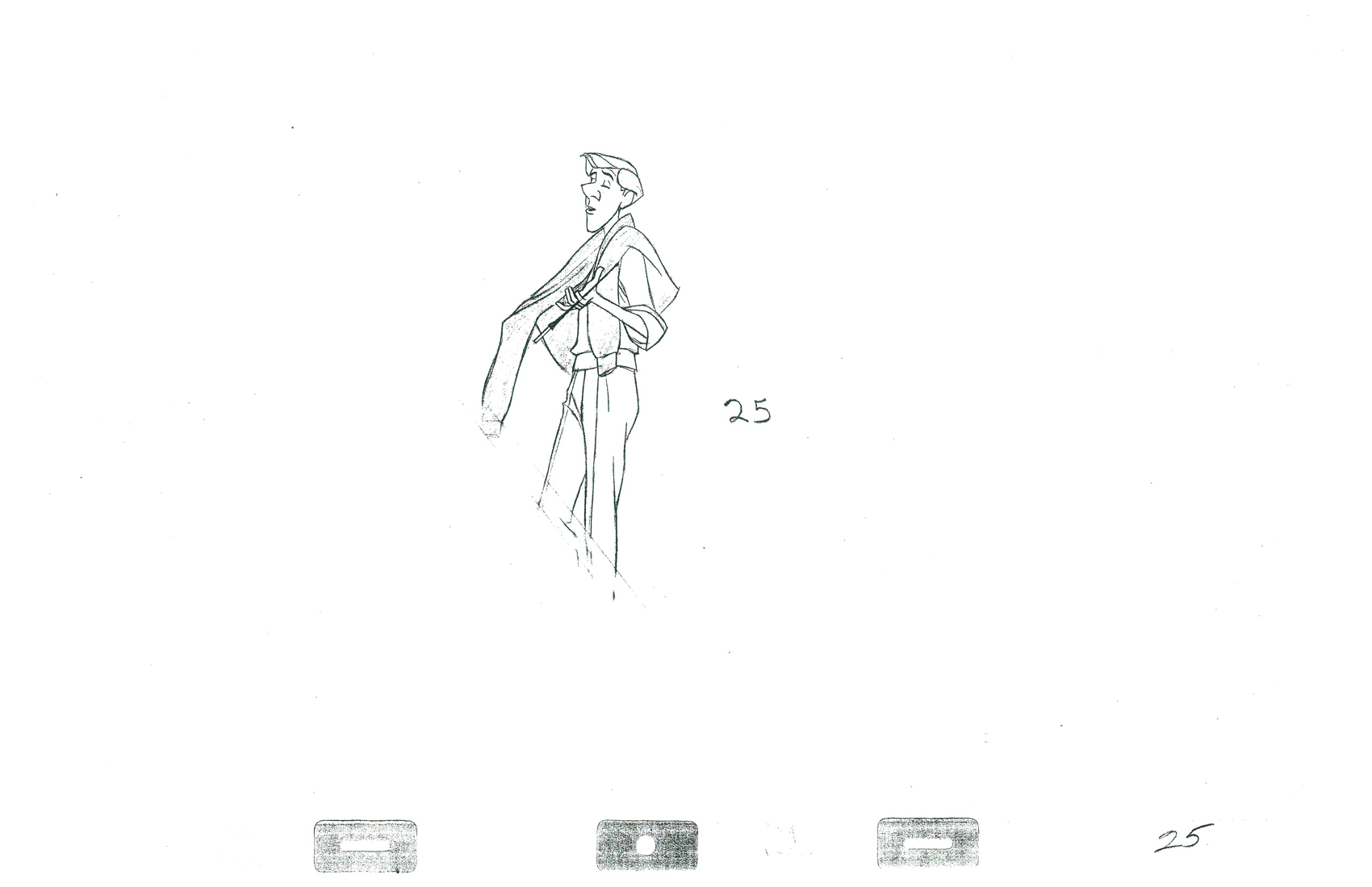
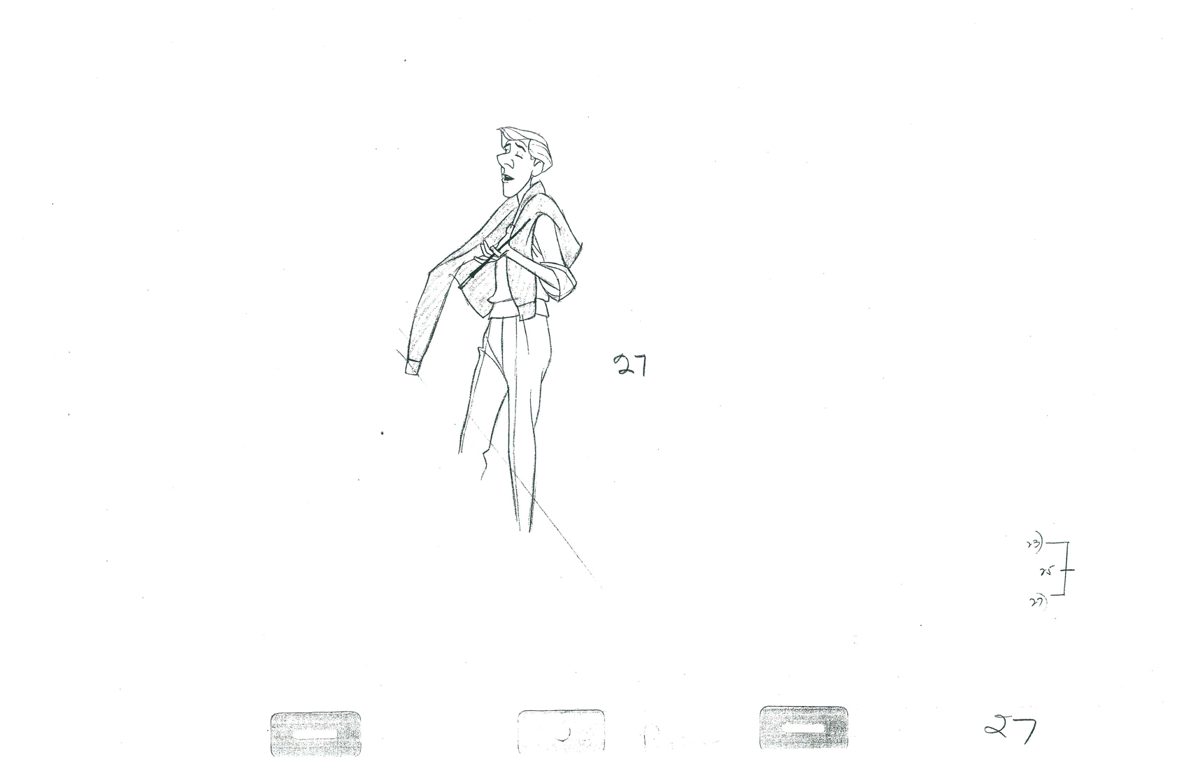
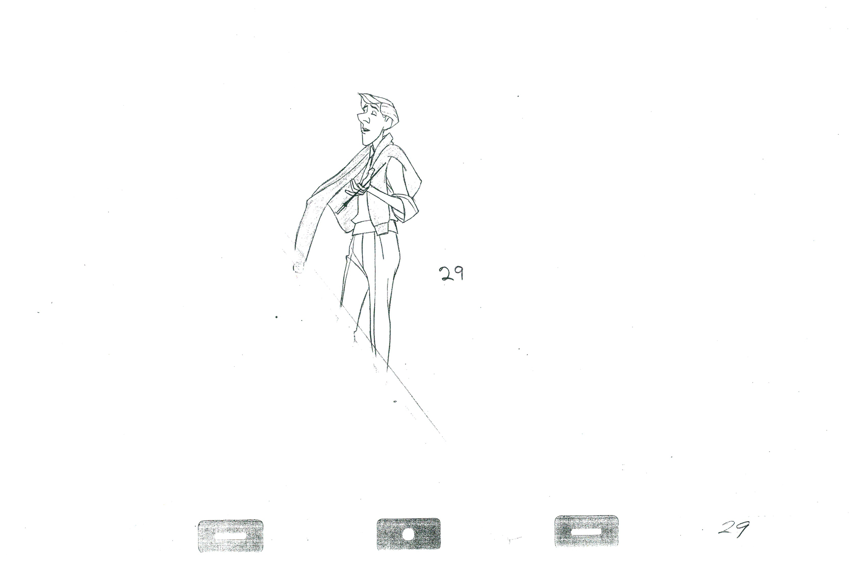
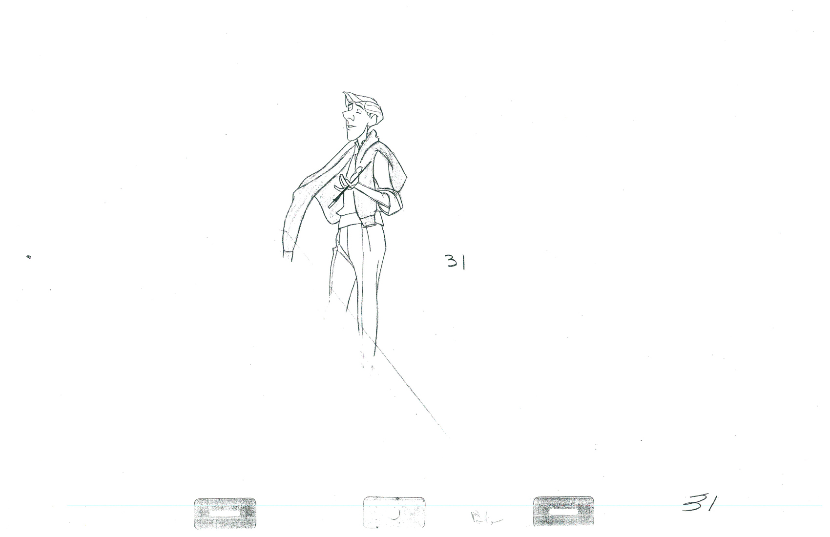
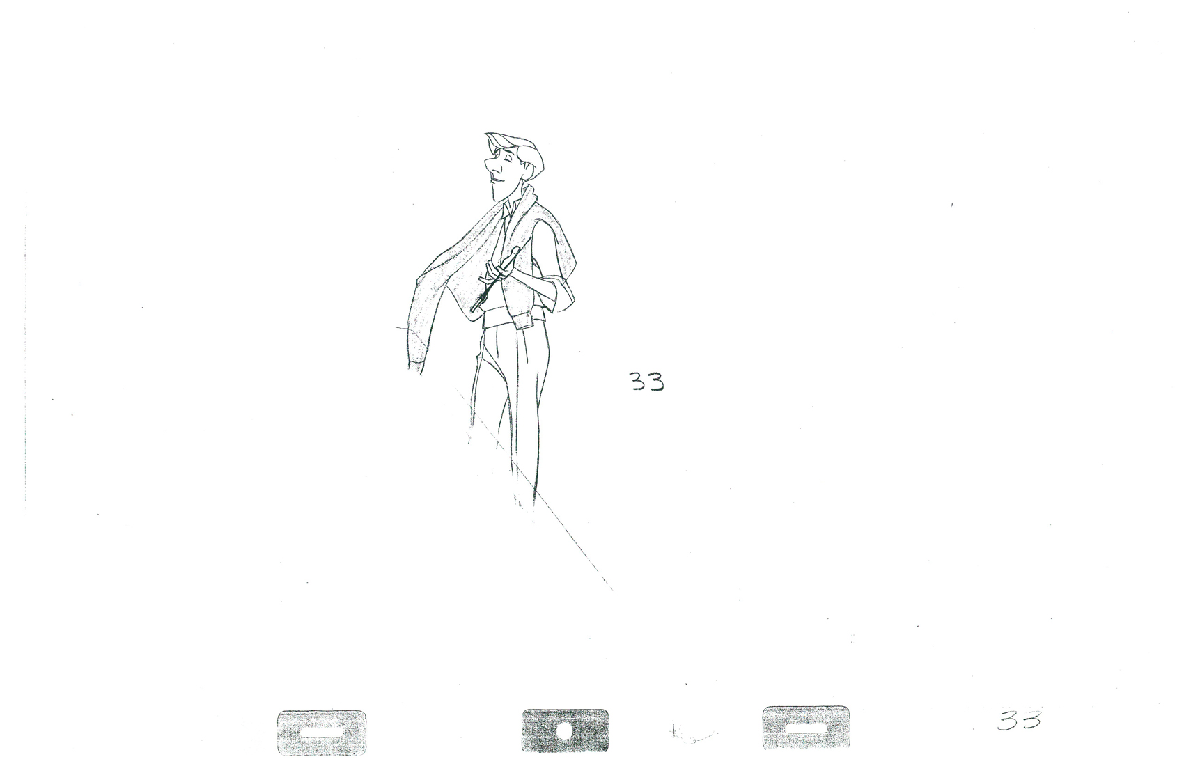
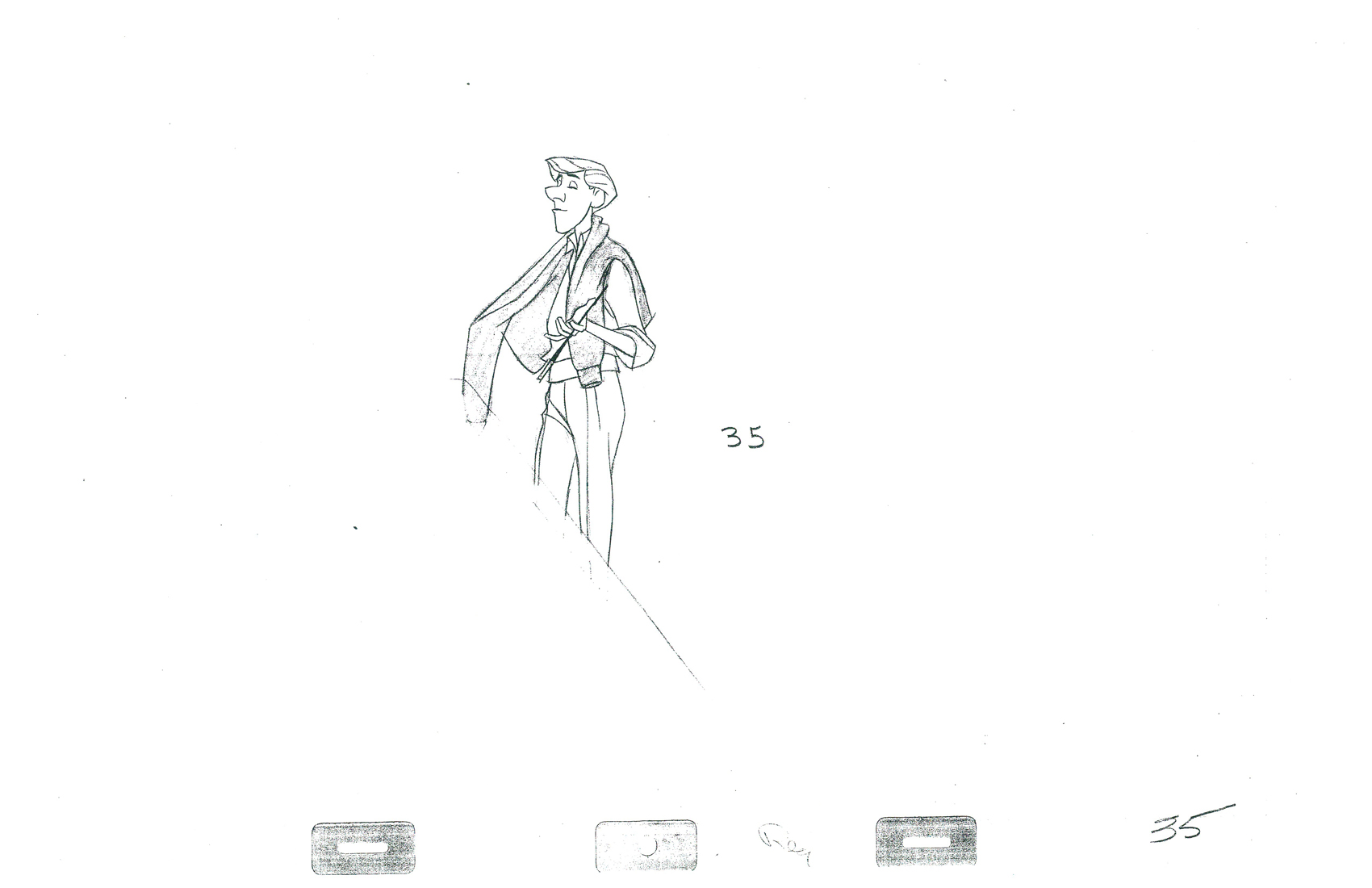
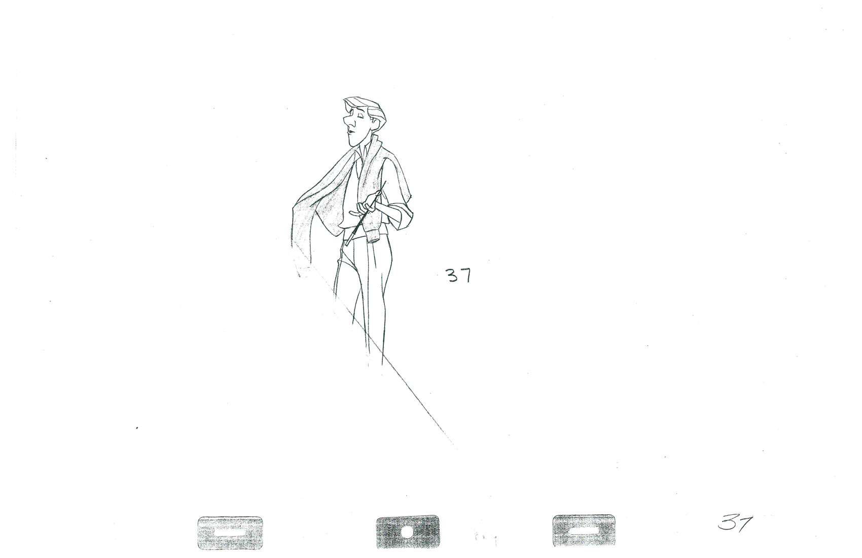
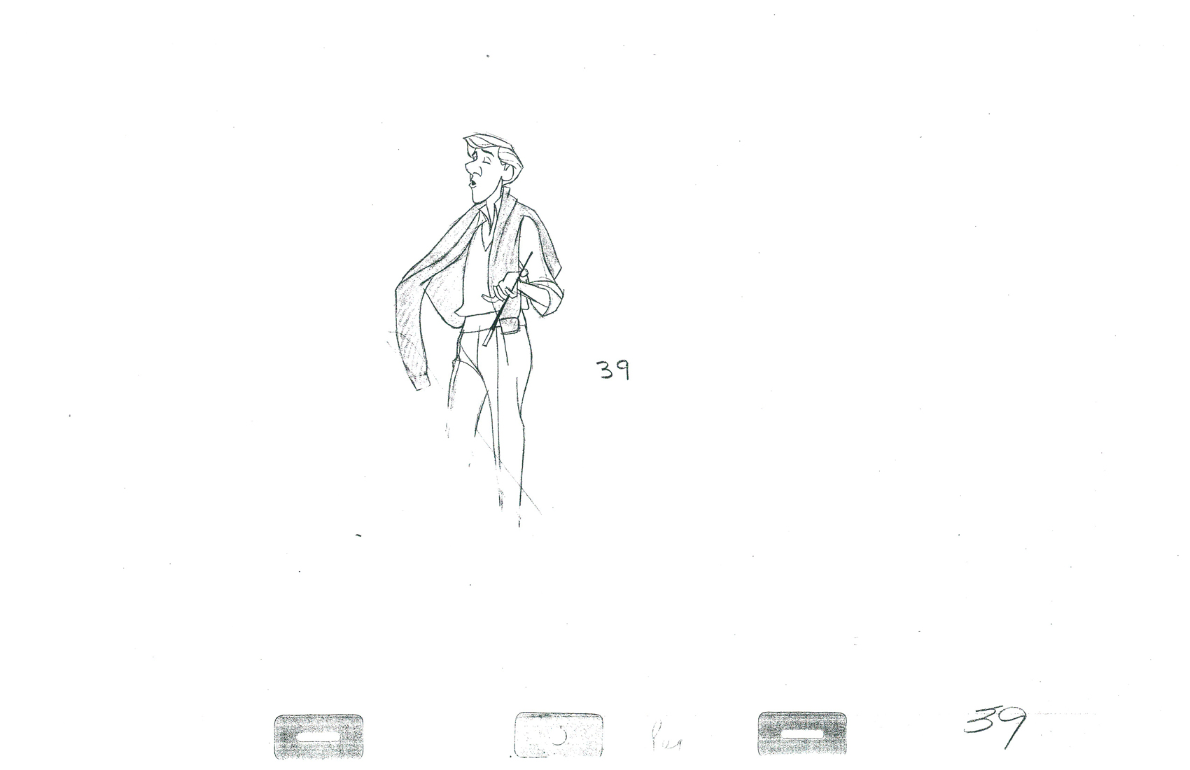
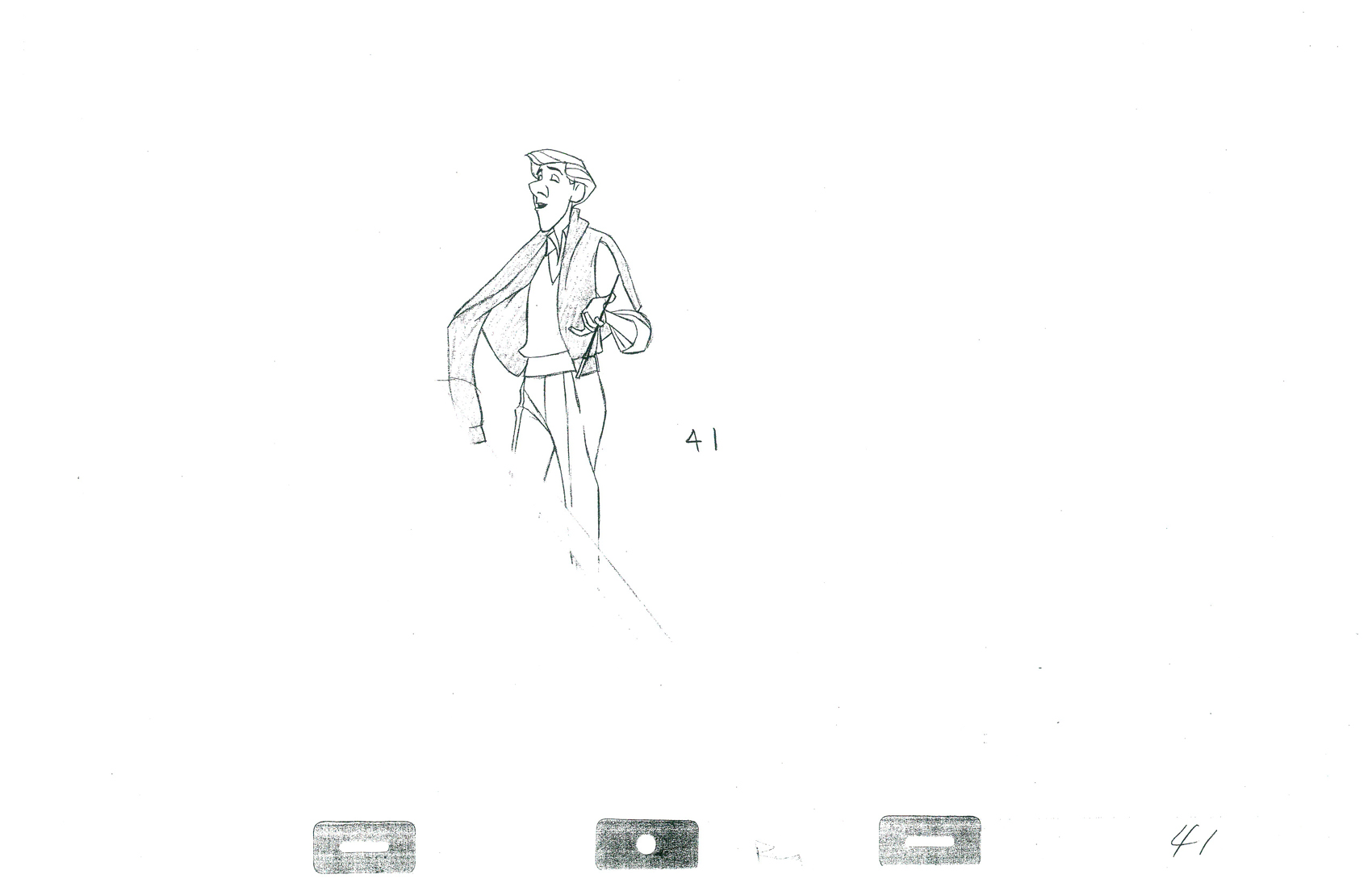
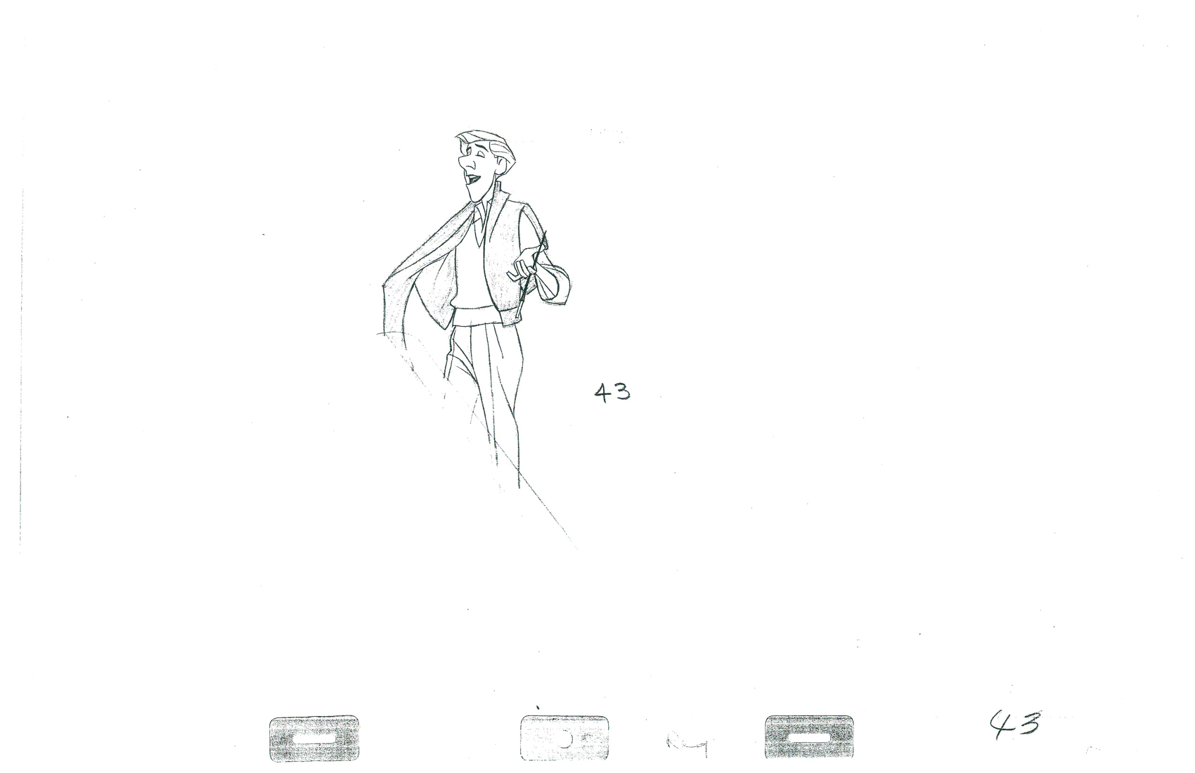
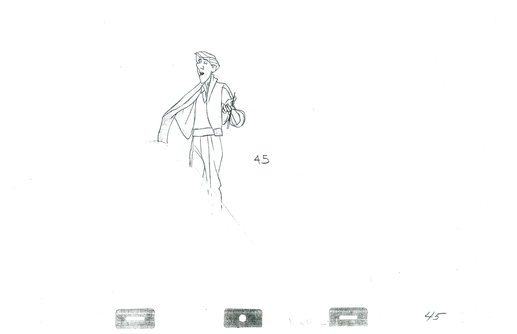
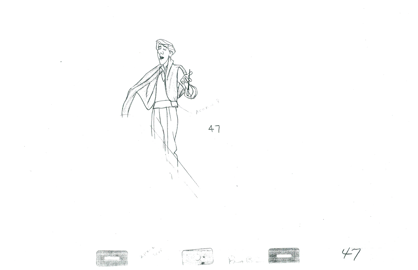
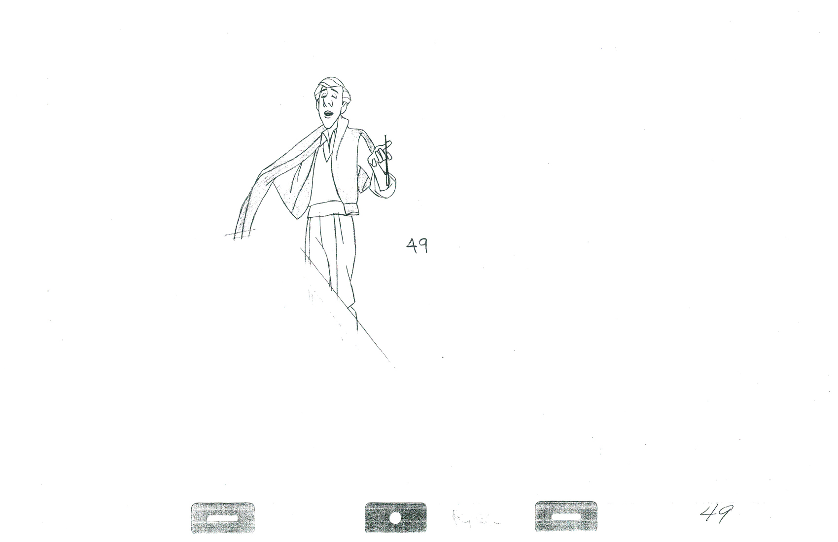
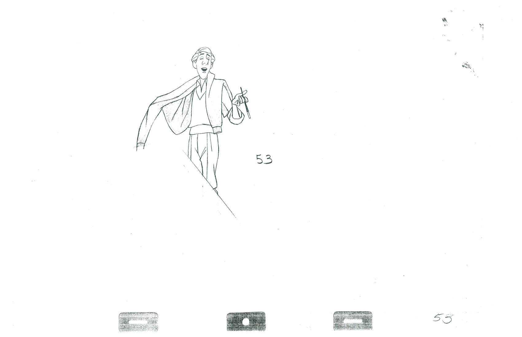
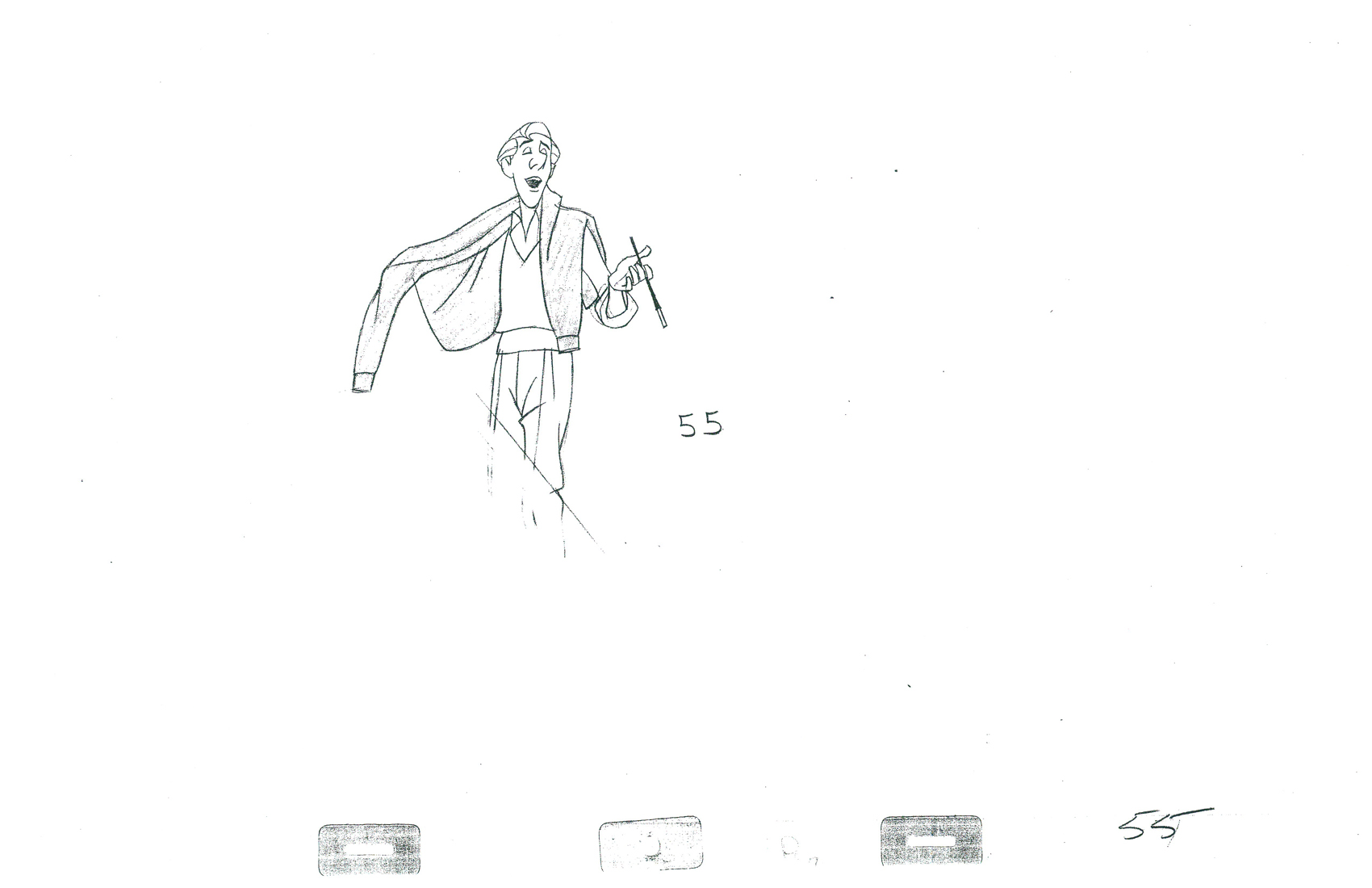
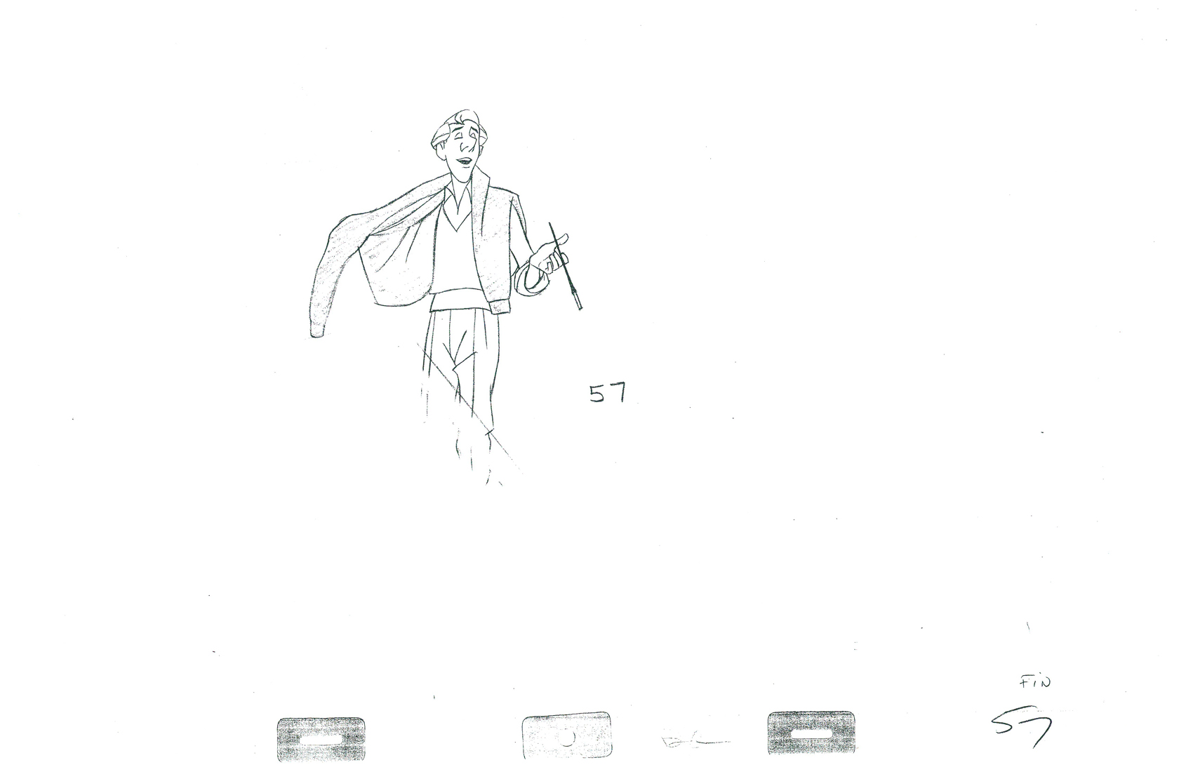
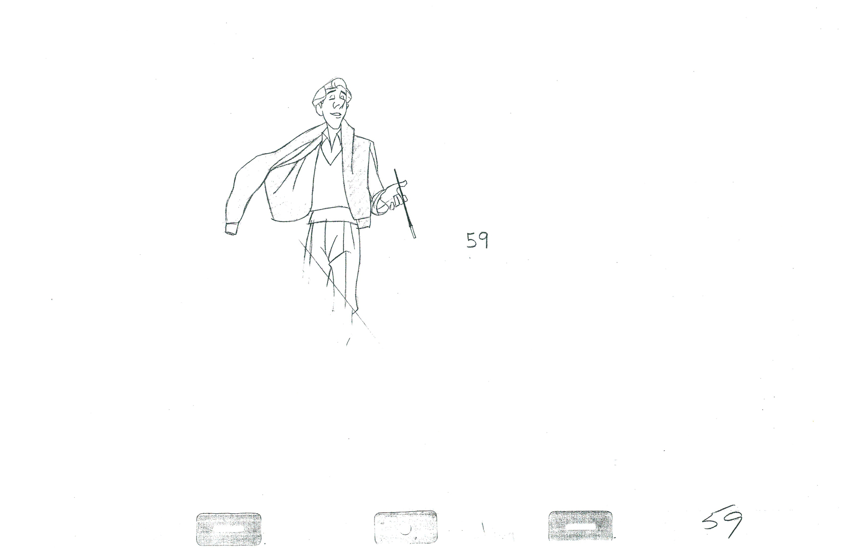
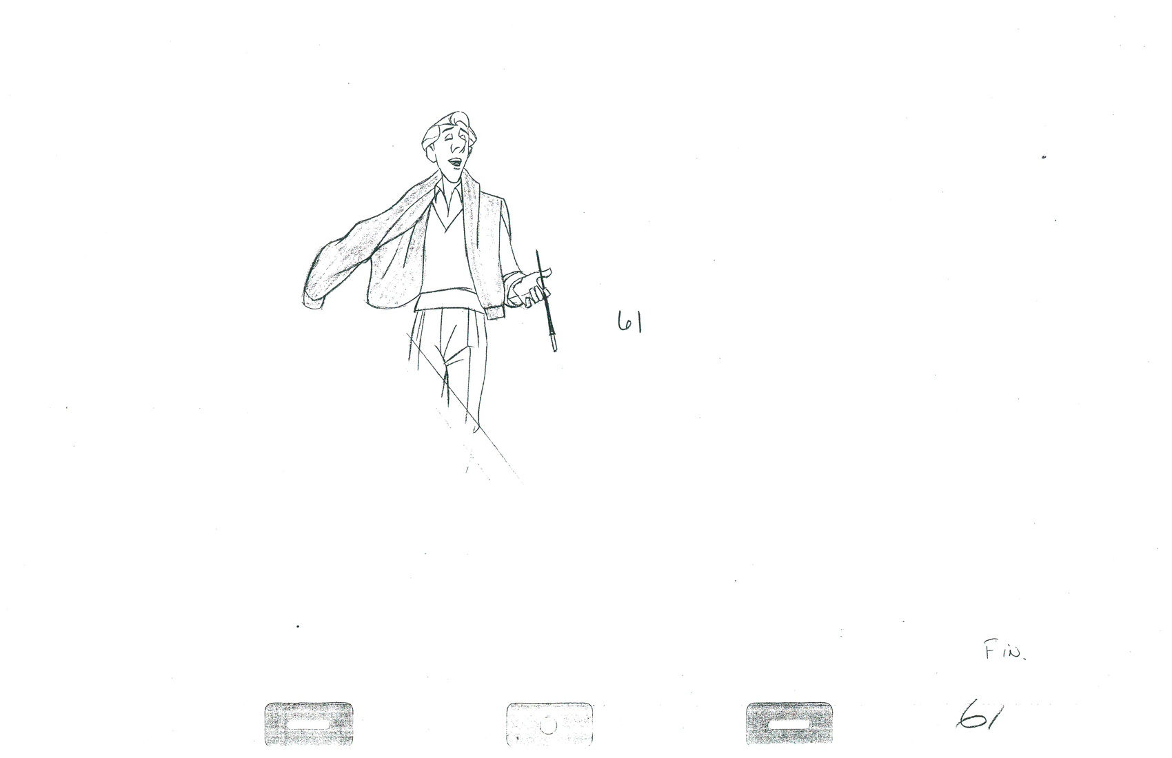
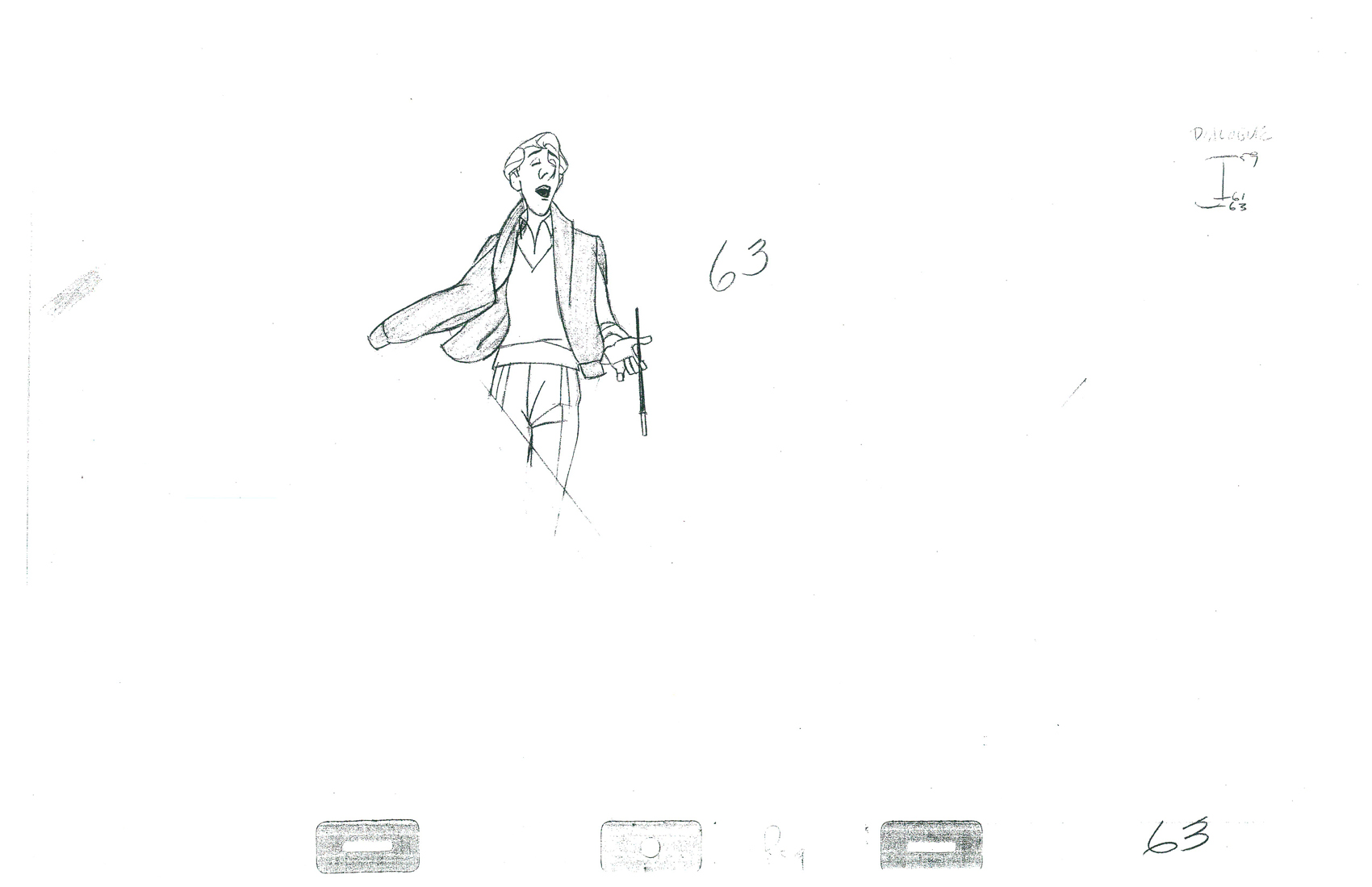
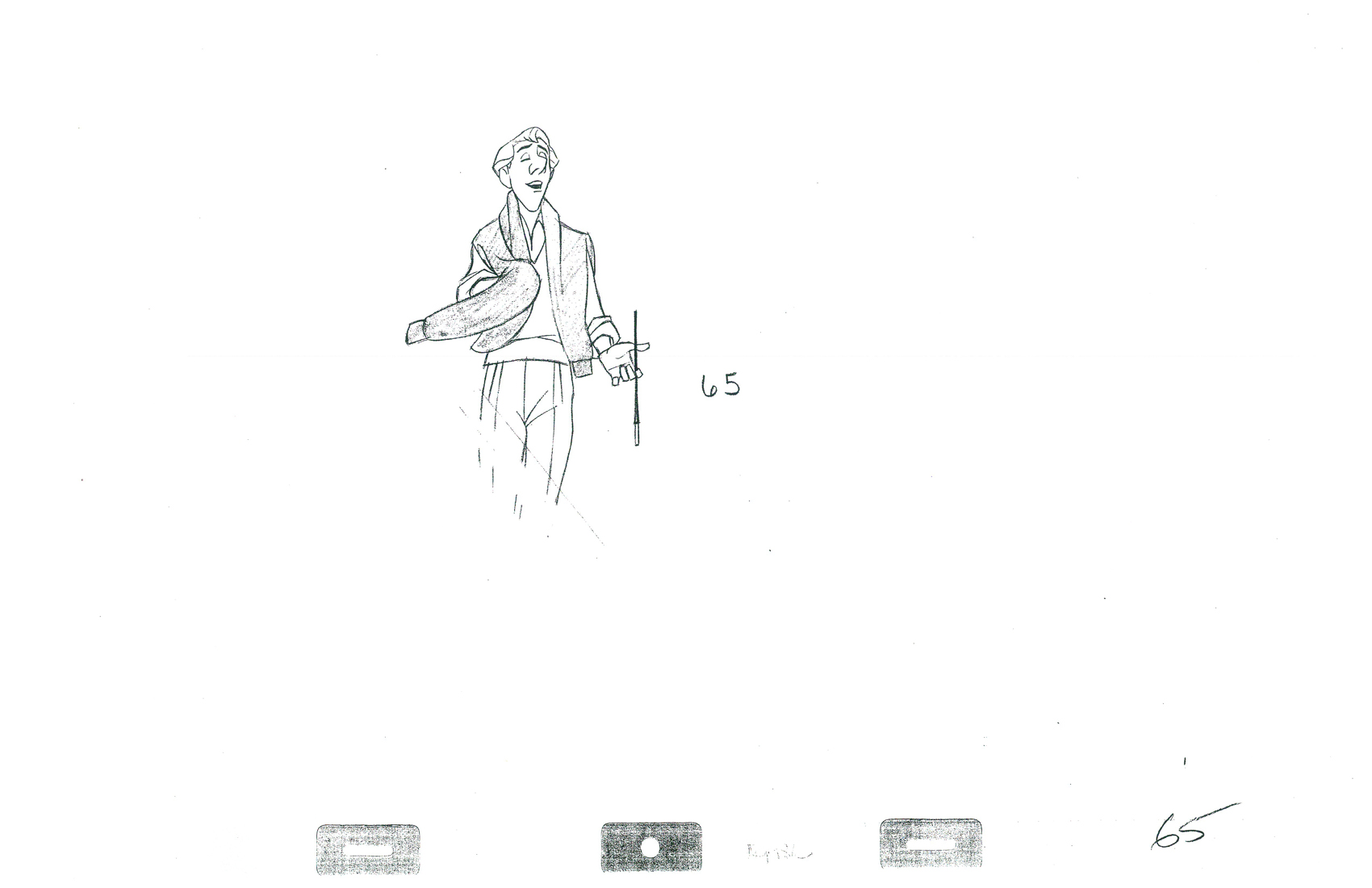
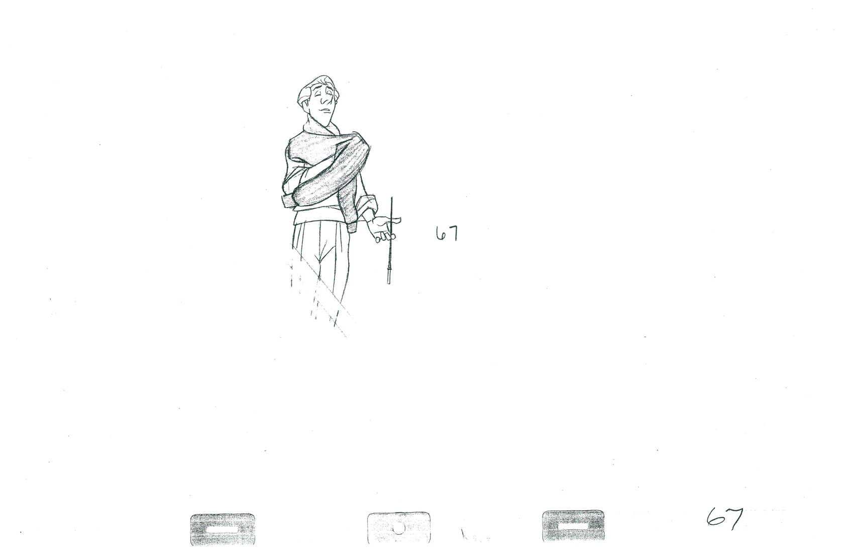
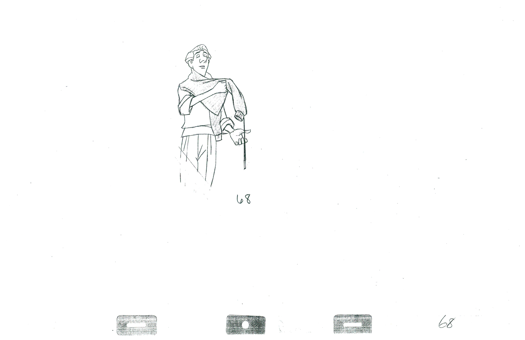
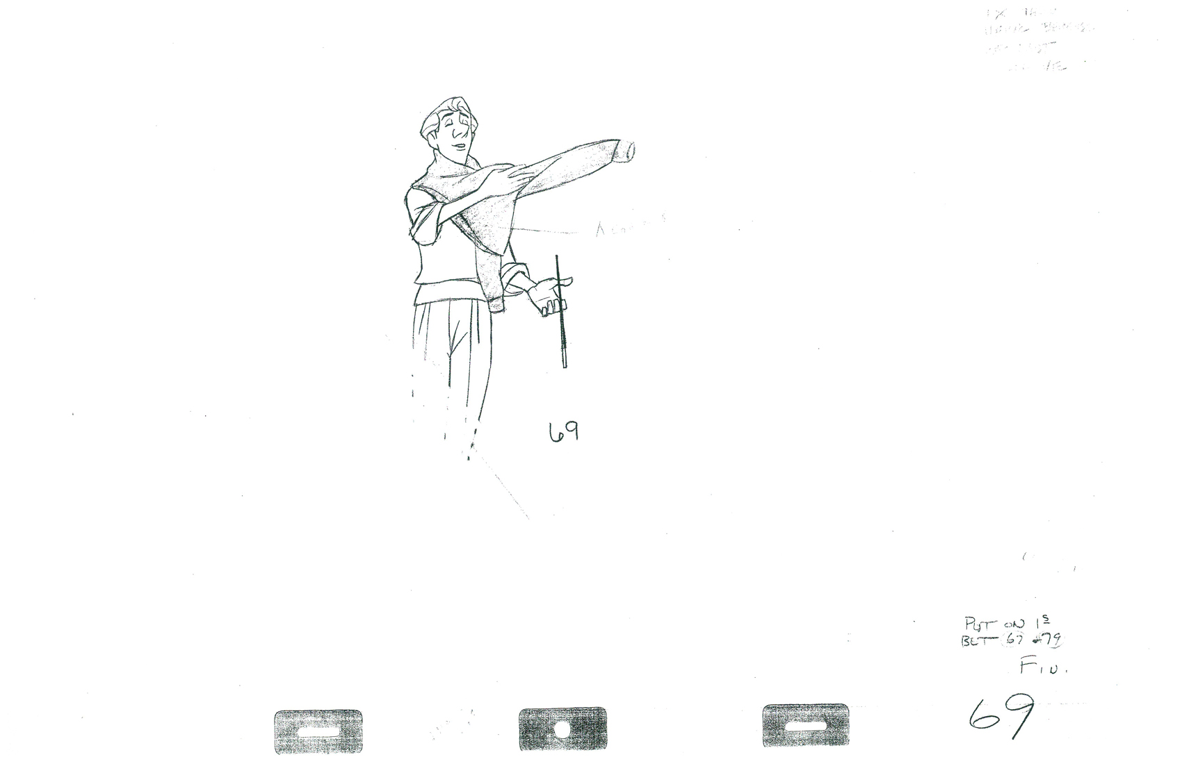
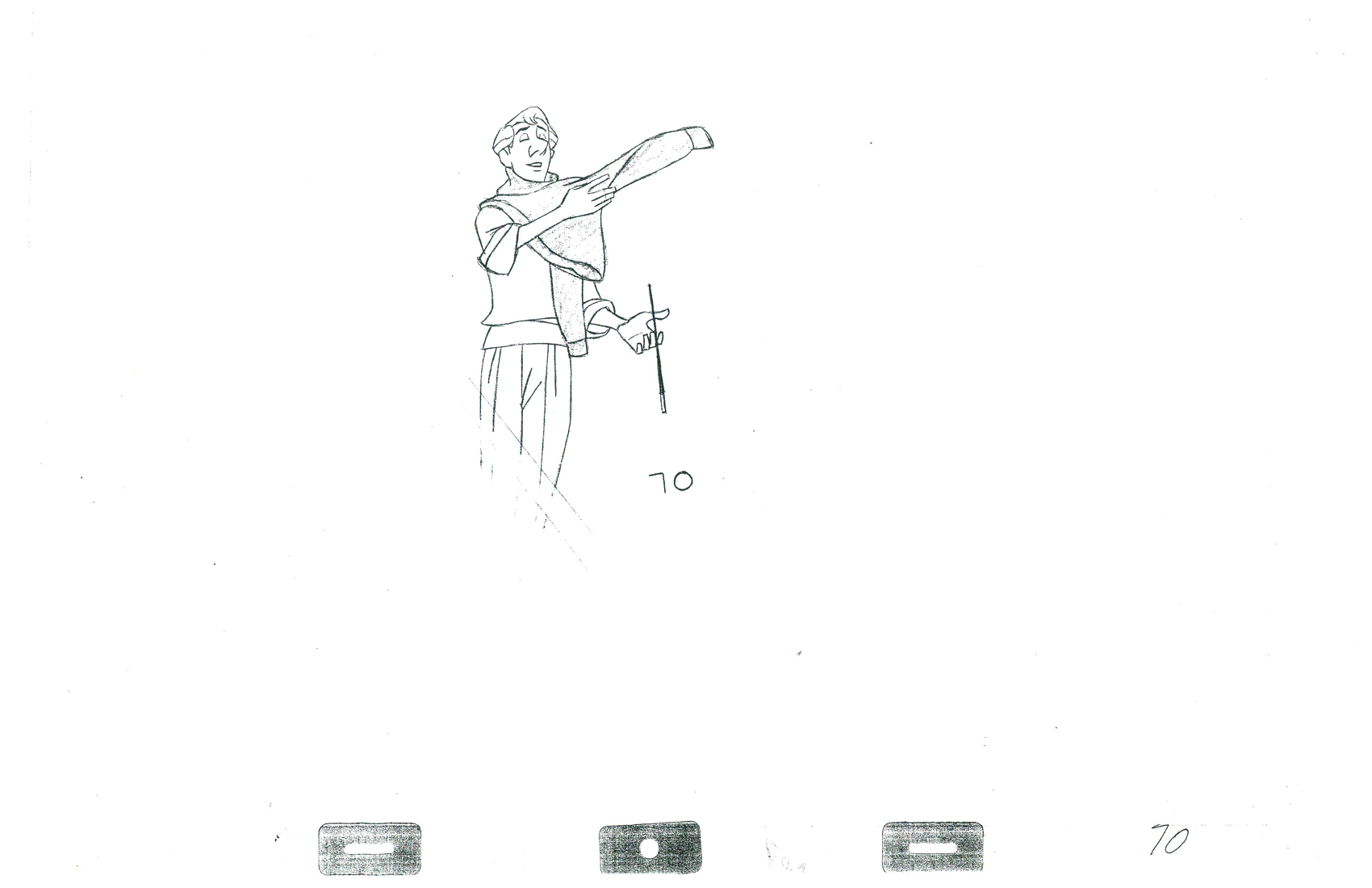
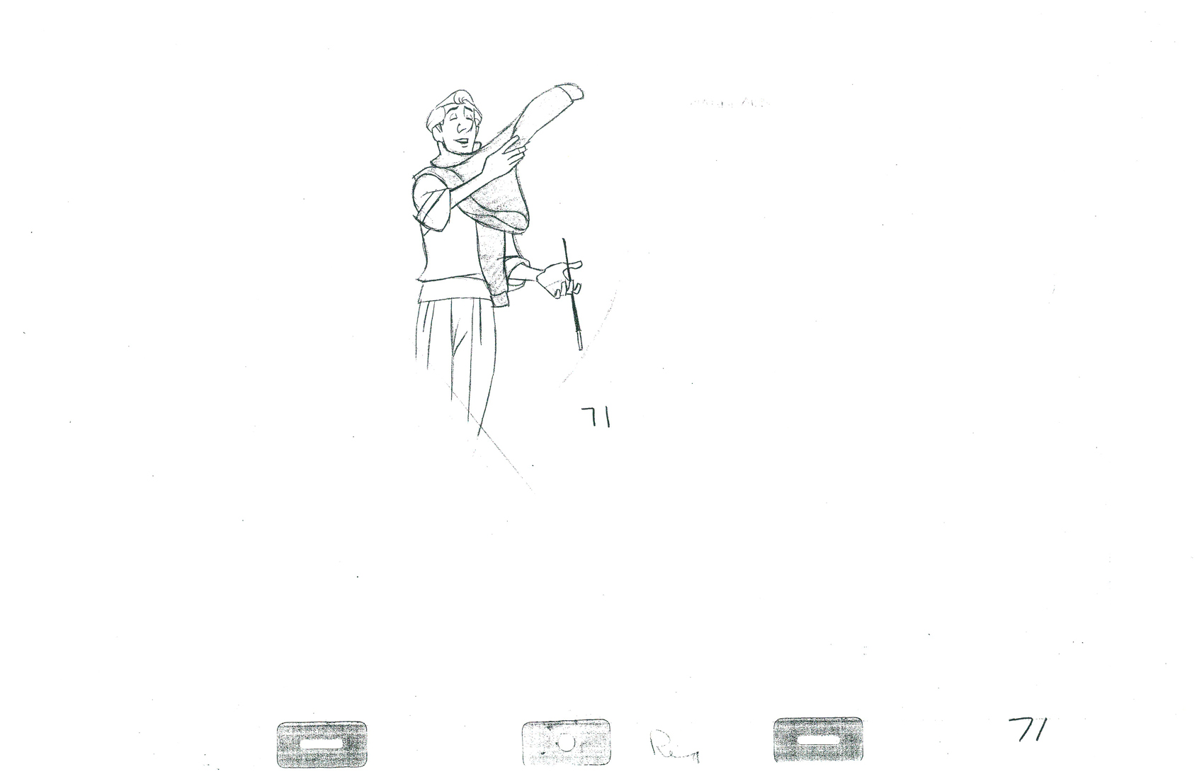
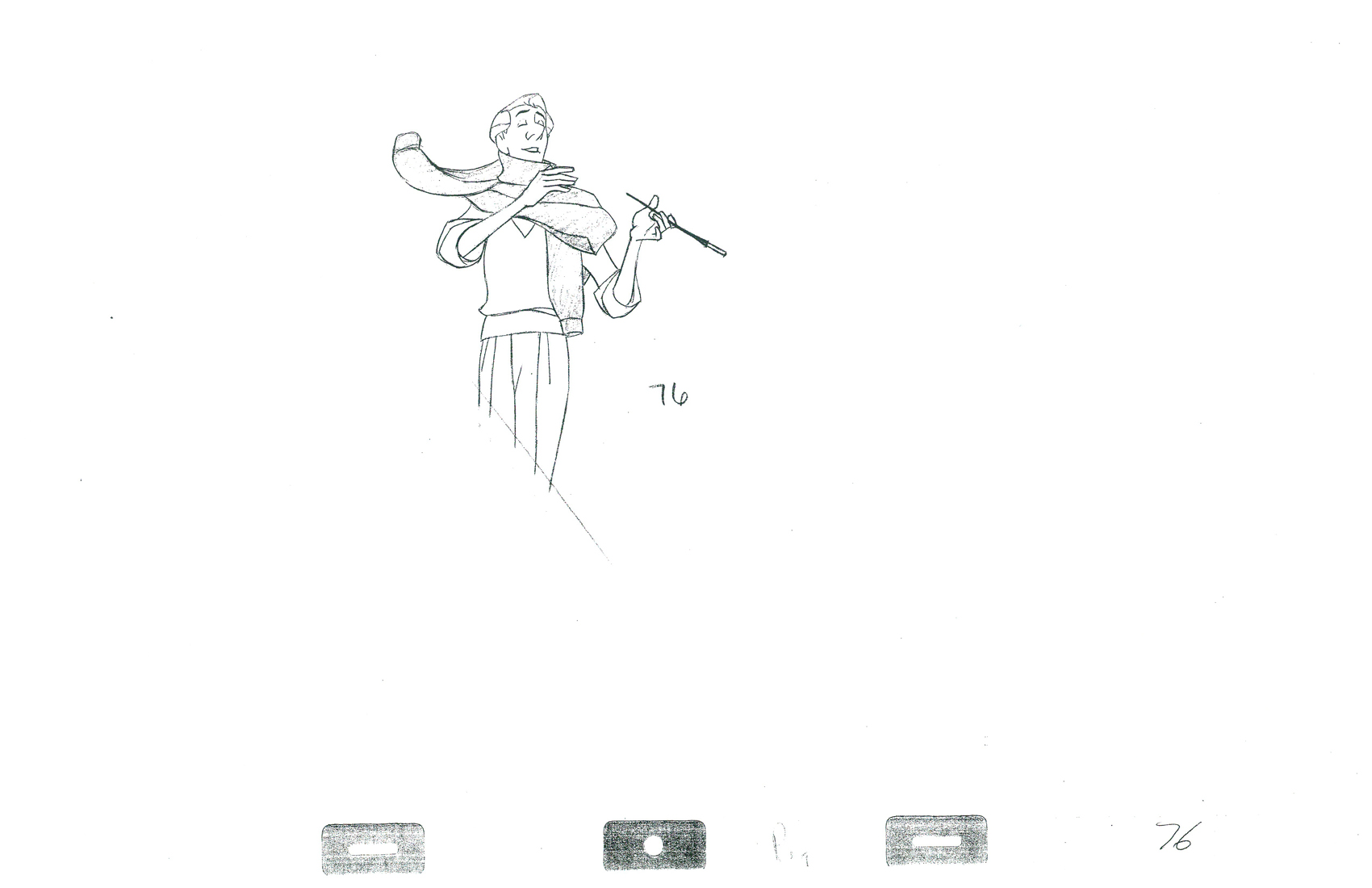
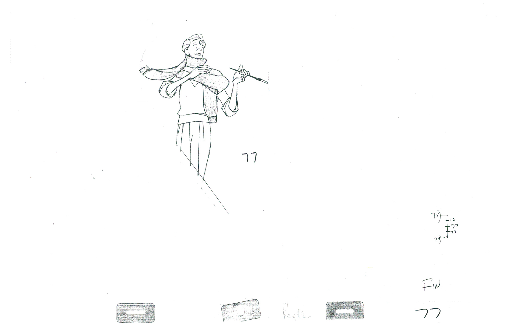
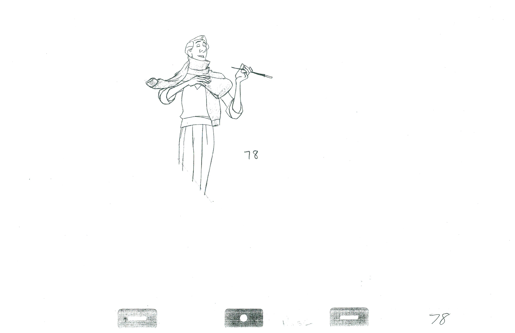
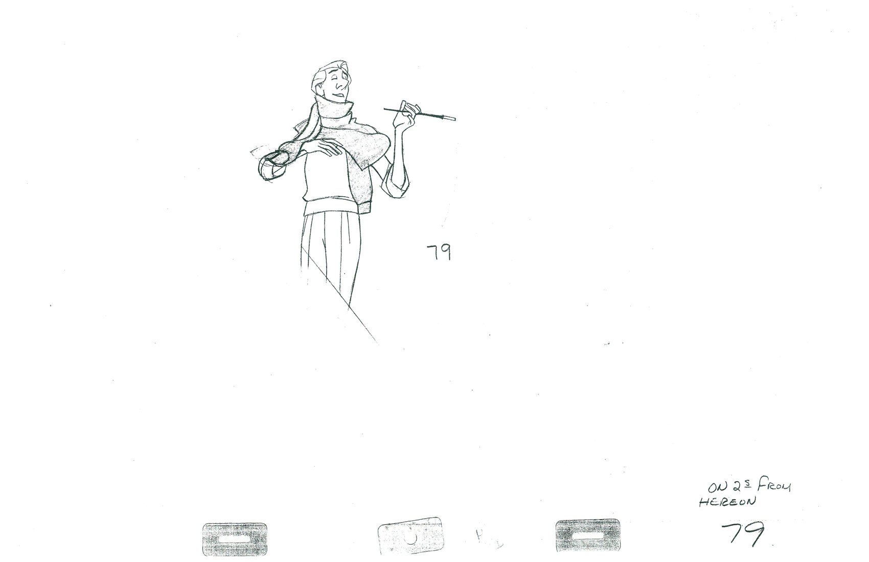
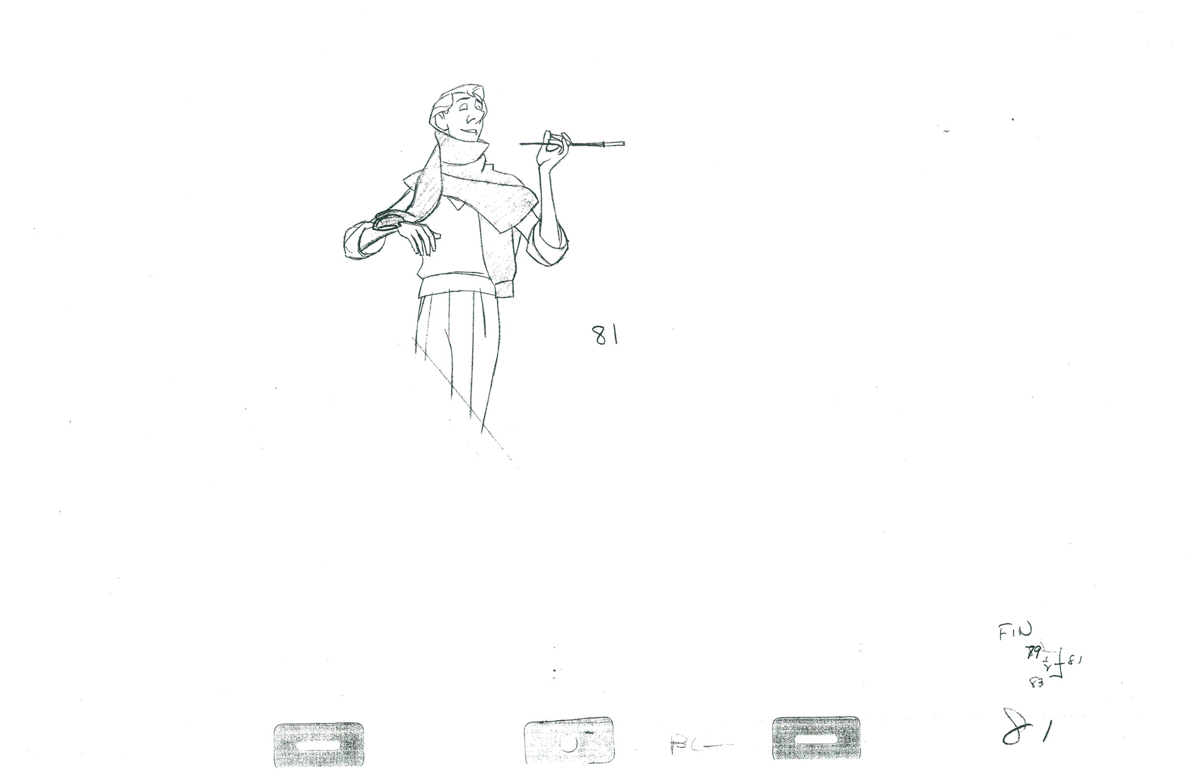
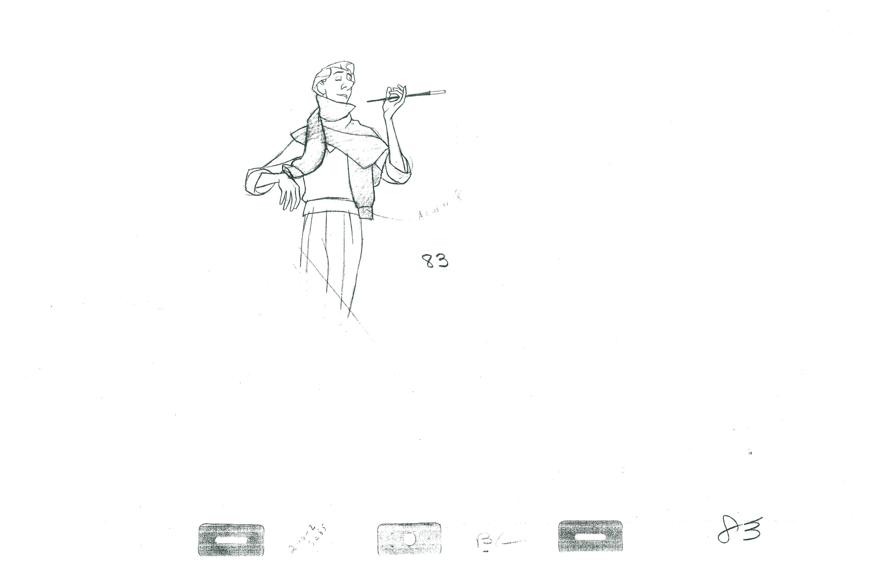
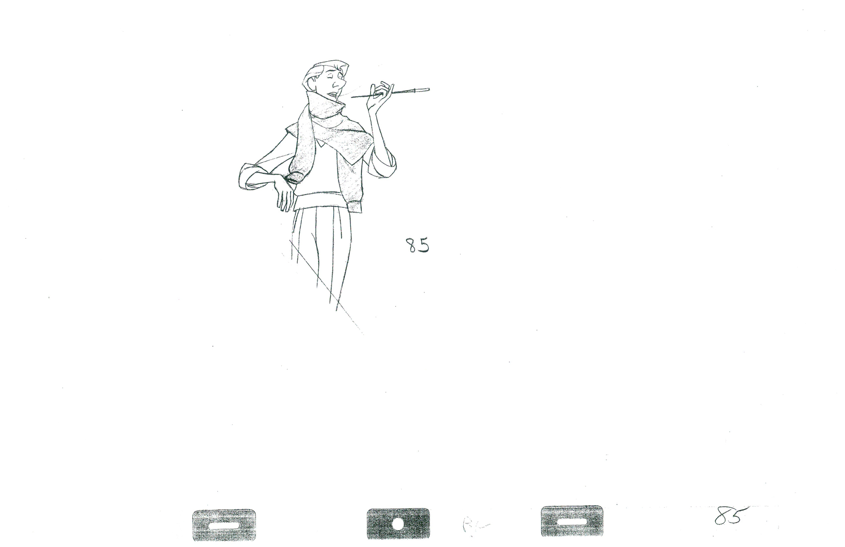
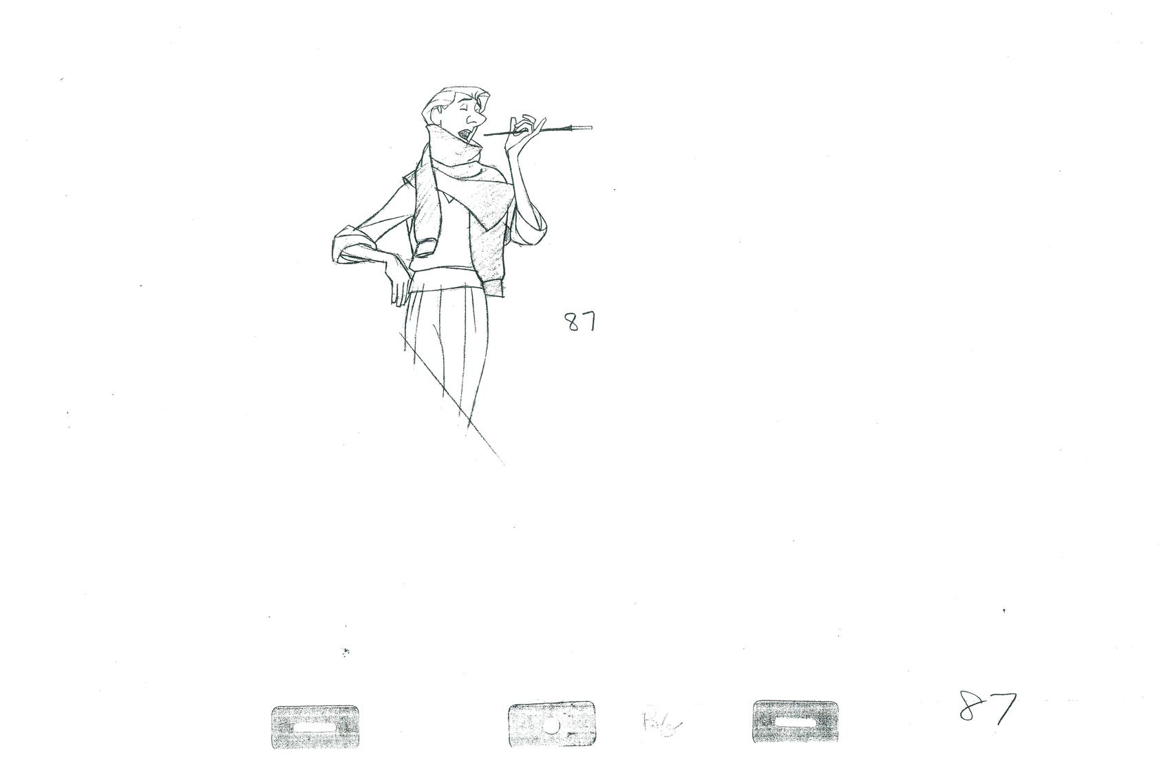
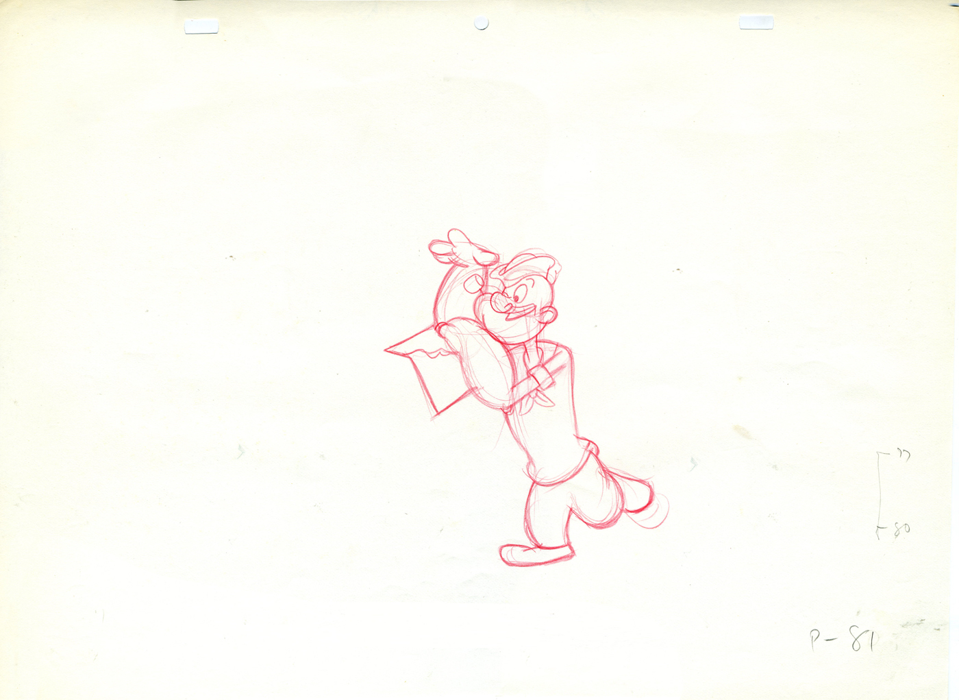
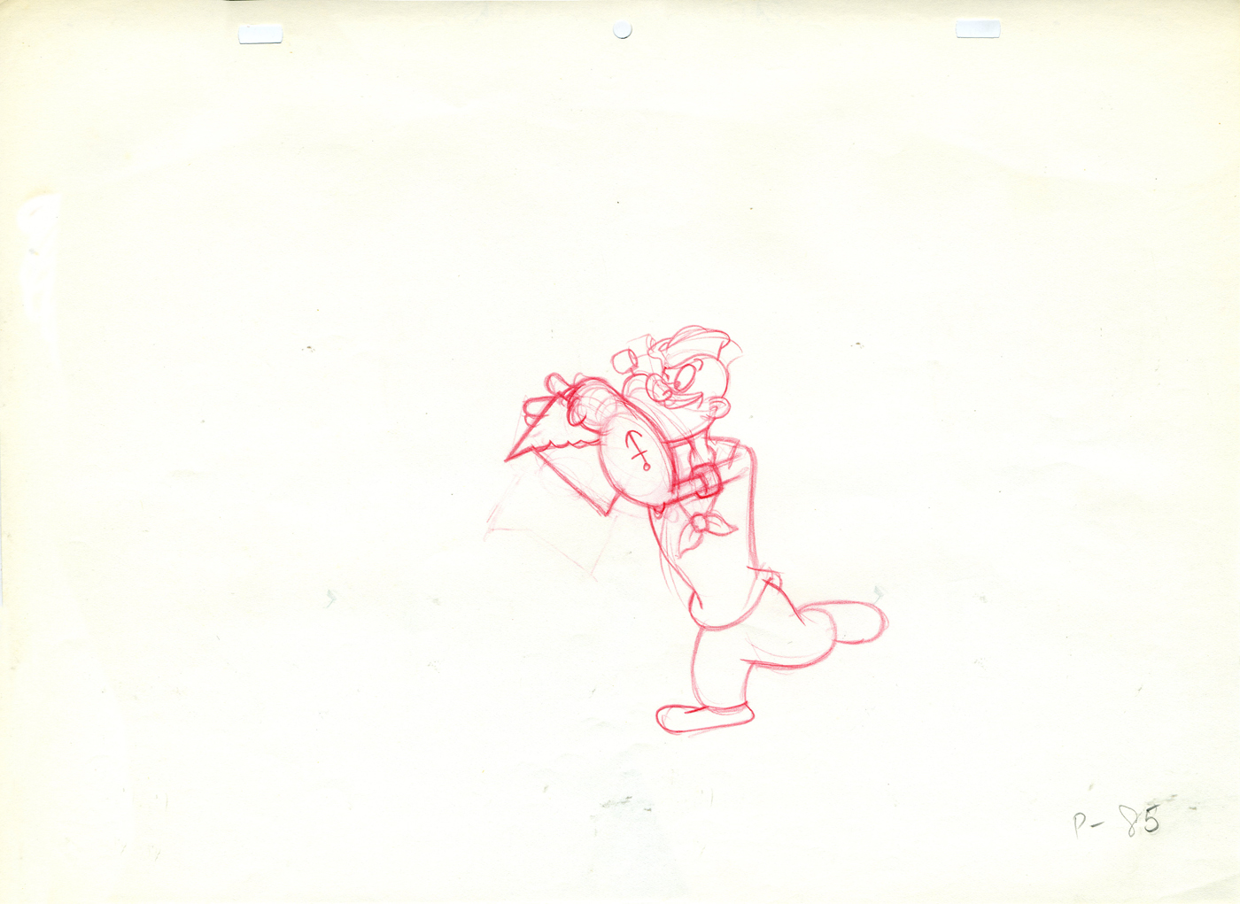
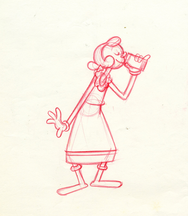
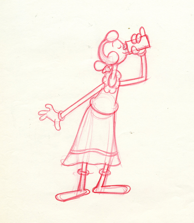
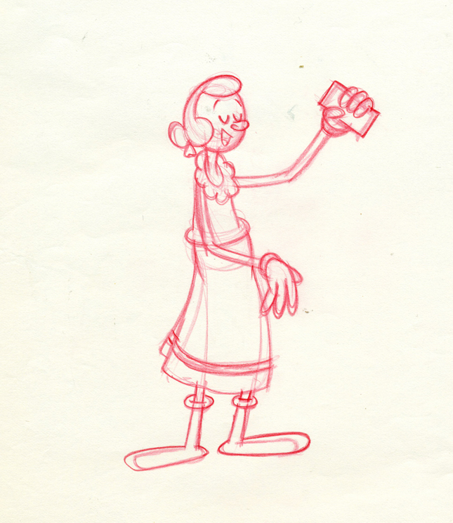
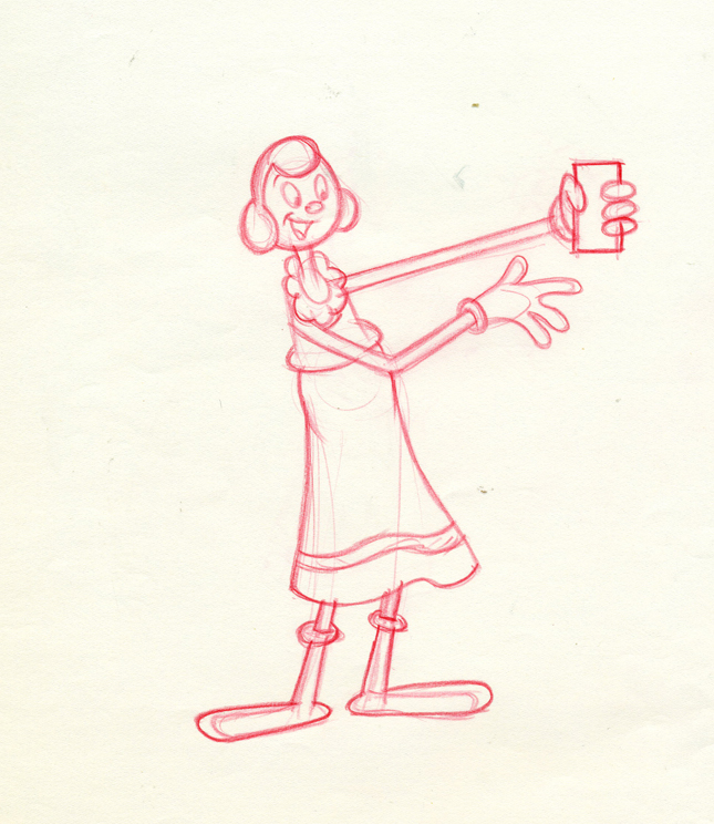
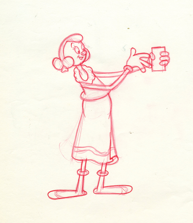
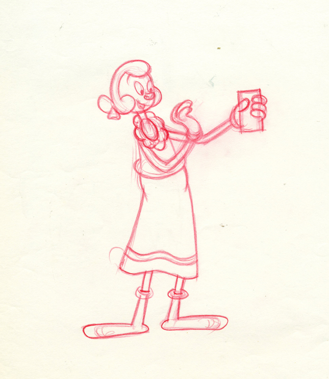
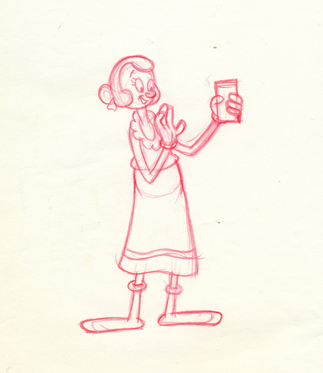
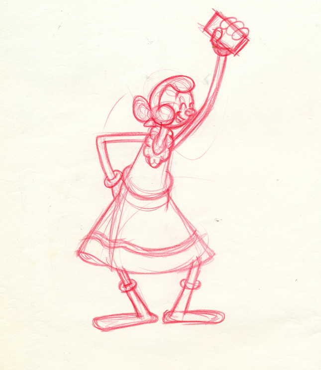
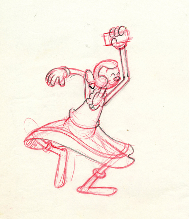
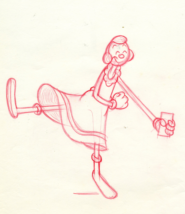
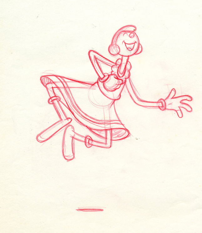
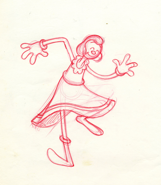
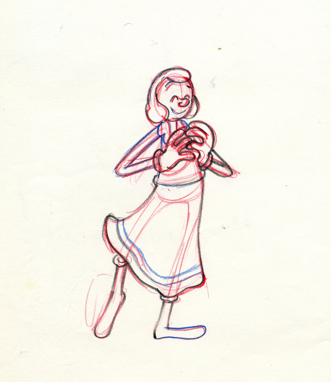
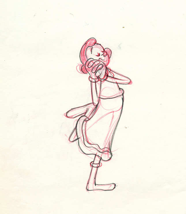
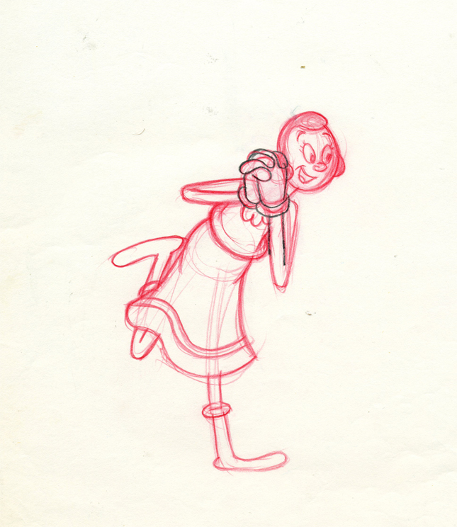
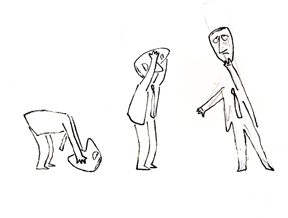
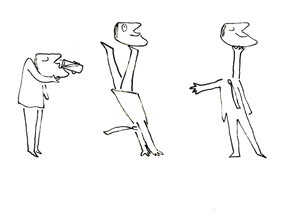
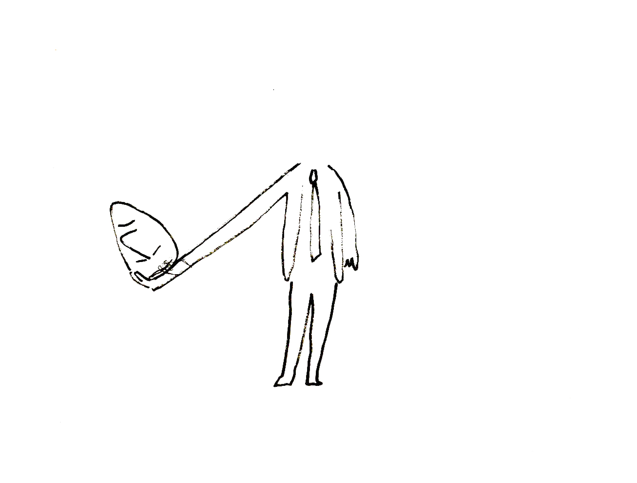
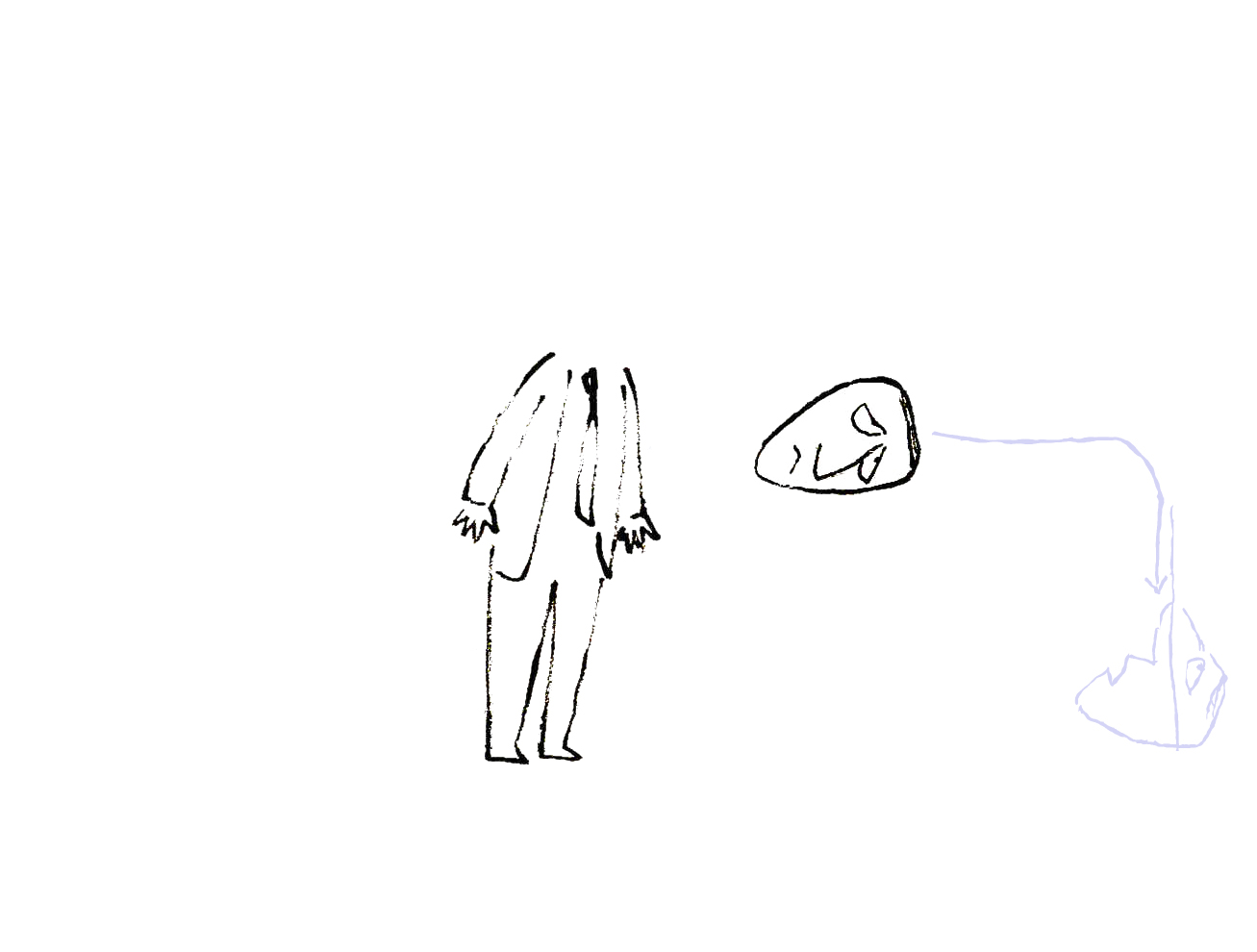
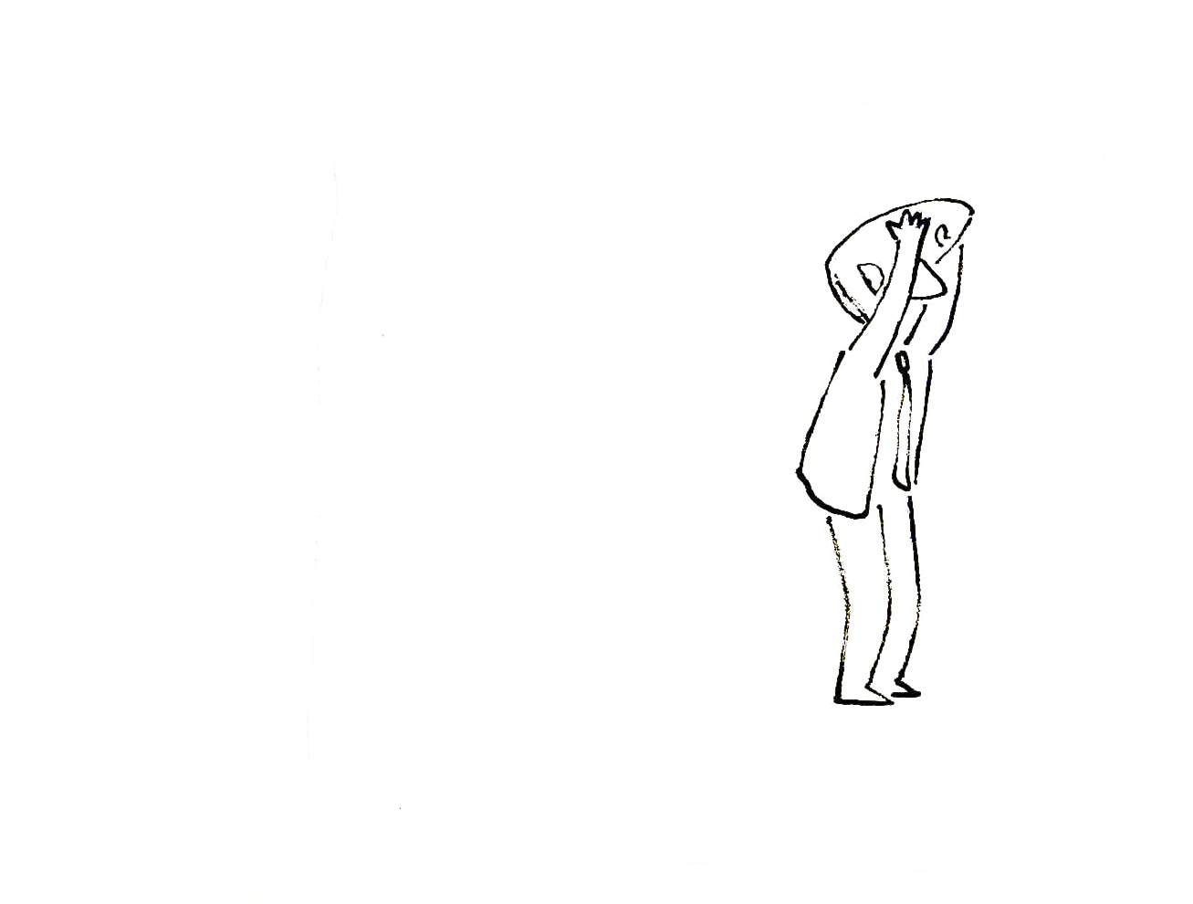
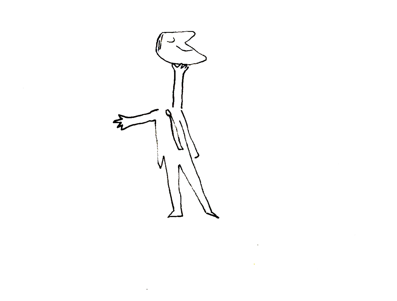
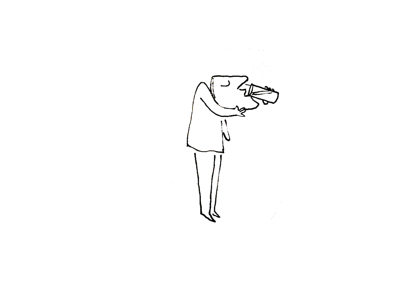
Roger’s Sc.88 – pt.1
- Returning to 101 Dalmatians, I have Milt Kahl‘s artwork for Scene 88 which continues Roger’s rendition of his song, “Cruella de Vil.” In this first half, the point where he throws the arm of the sweater around his neck is the highlight. It plays beautifully against the timing of the slow walk down the stairs. The scene is a beauty. This is the first half which will be concluded next week.
 1
1
 11
11
 21
21
 31
31
 41
41
 51
51
 61
61
 67
67
 68
68
 69
69
 70
70
 71
71
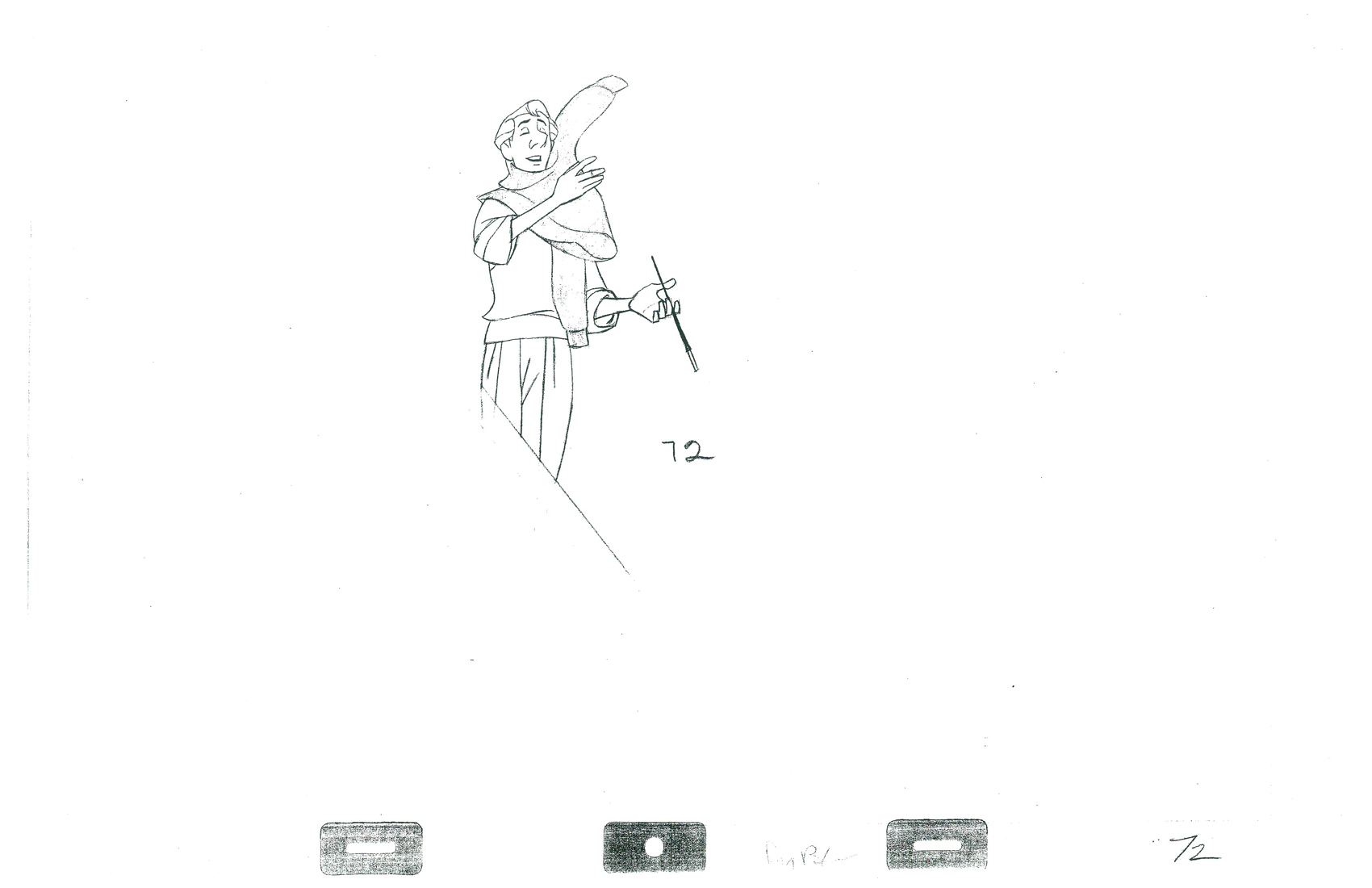 72
72
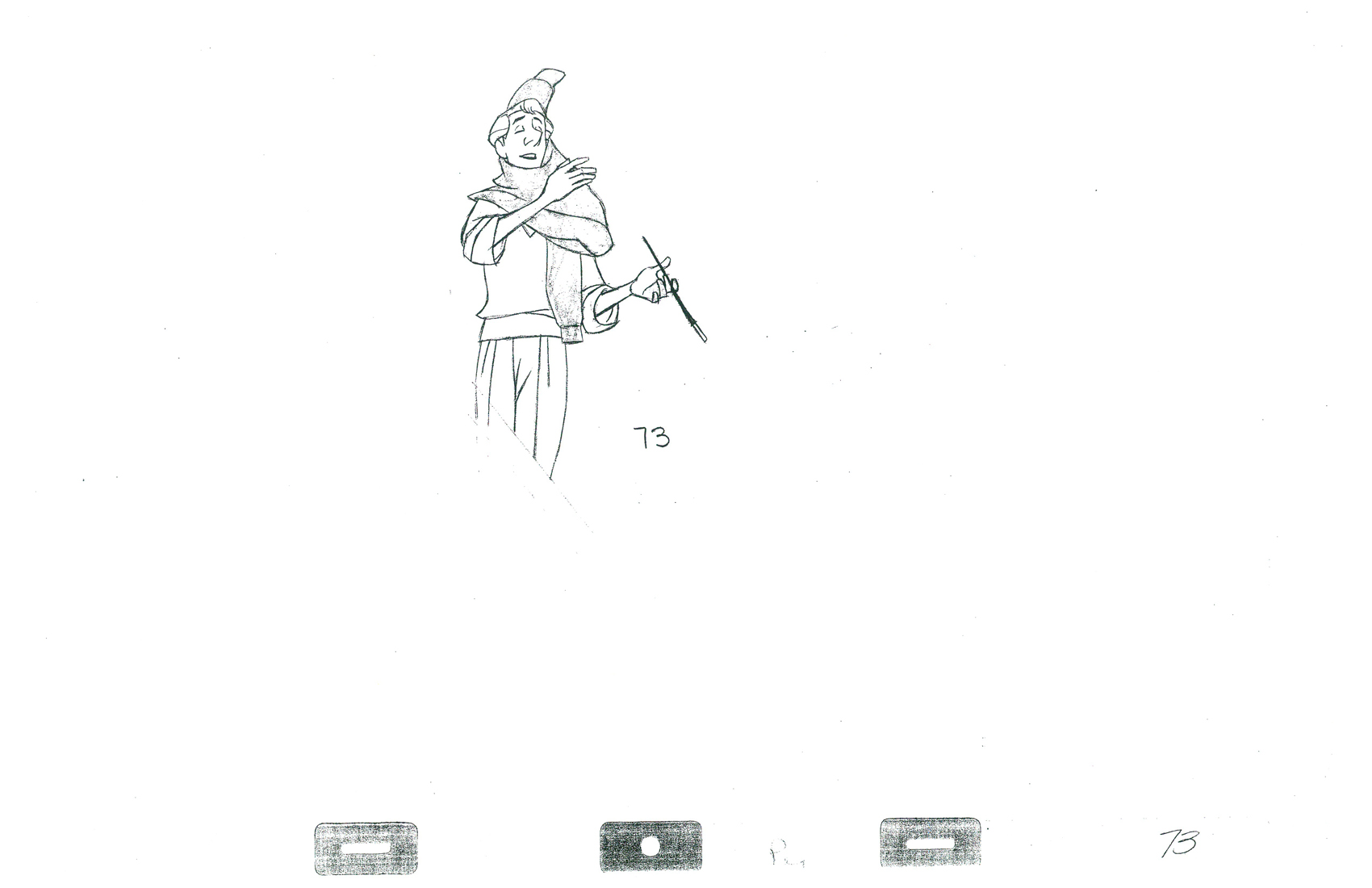 73
73
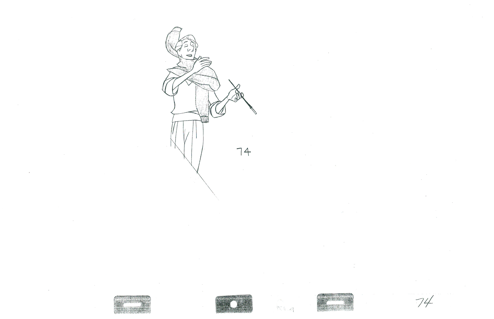 74
74
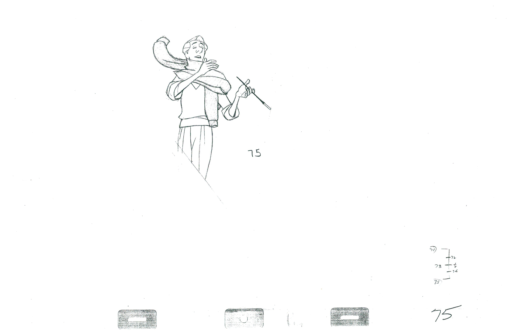 75
75
 76
76
 77
77
 78
78
 79
79
 81
81
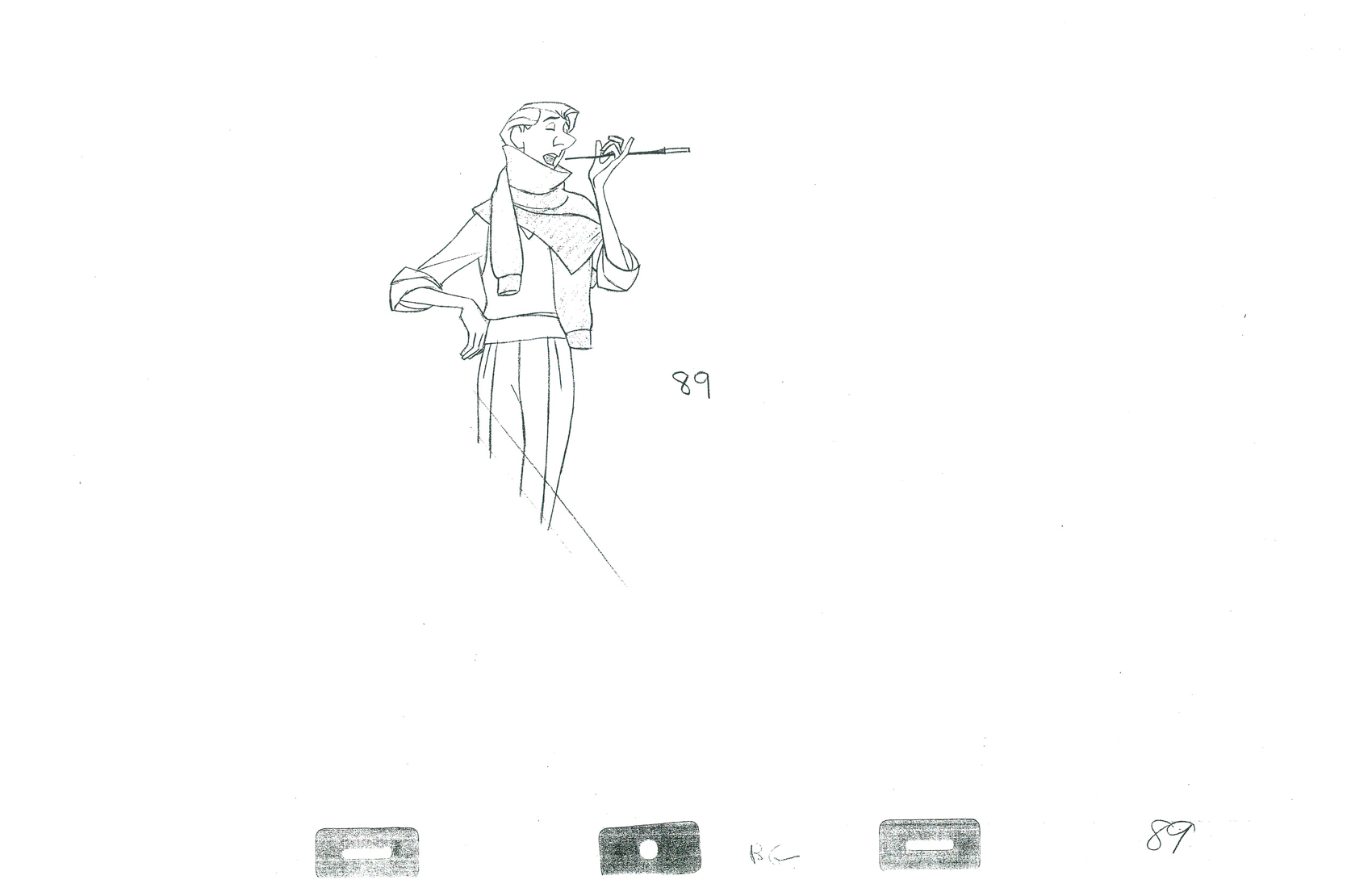
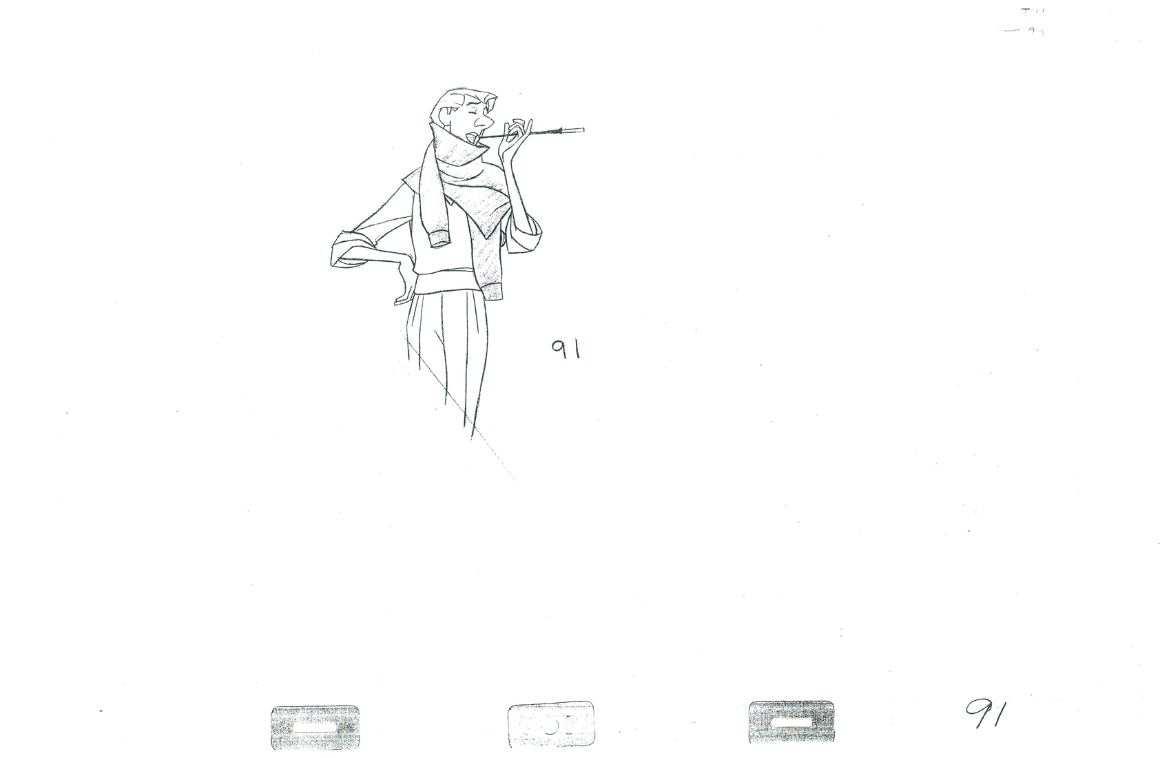 91
91
______________________
The following QT includes all the drawings posted above.
There’s a bit of distortion in the Xerox copies
so the registration goes in and out.
Click on the right side of the lower bar to watch it one frame at a time.
Action Analysis &Animation Artifacts &Disney 05 Apr 2012 06:26 am
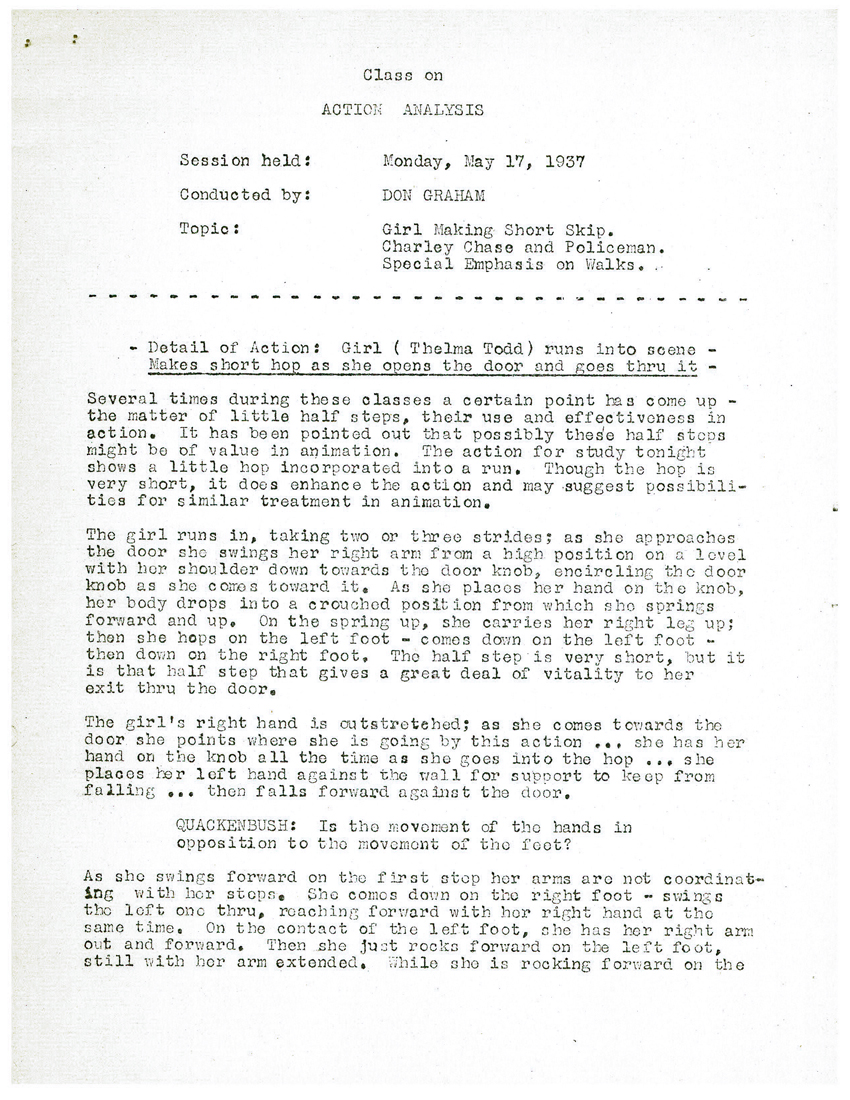
Action Analysis – May 17, 1937
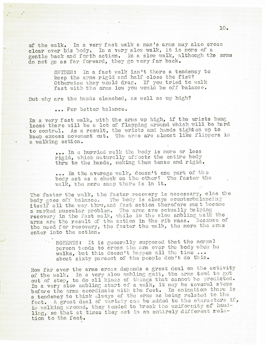
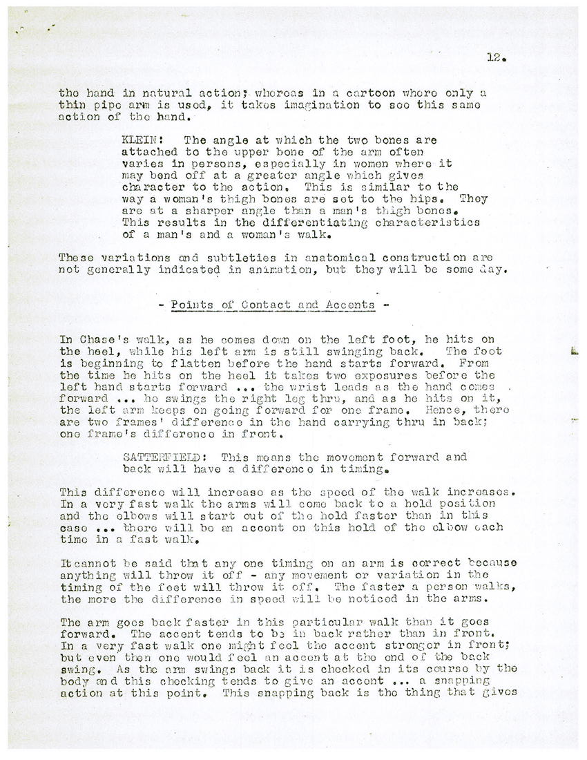
- To continue my posting of the Disney after hours Action Analysis class notes, I have this edition from May 17, 1937. It’s a short scene from a Charley Chase comedy sort. A girl skips into the scene followed by Chase and a Policeman with odd walks. Some of the participants include: Stan Quackenbush, Bill Shull, Izzy Klein, Jacques Roberts, John Vincent Snyder, Joe Magro, (?) Rose, Jimmy Culhane, and Paul Satterfield.
 1
1
 2
2  3
3
 4
4  5
5
 6
6  7
7
 8
8  9
9
 10
10 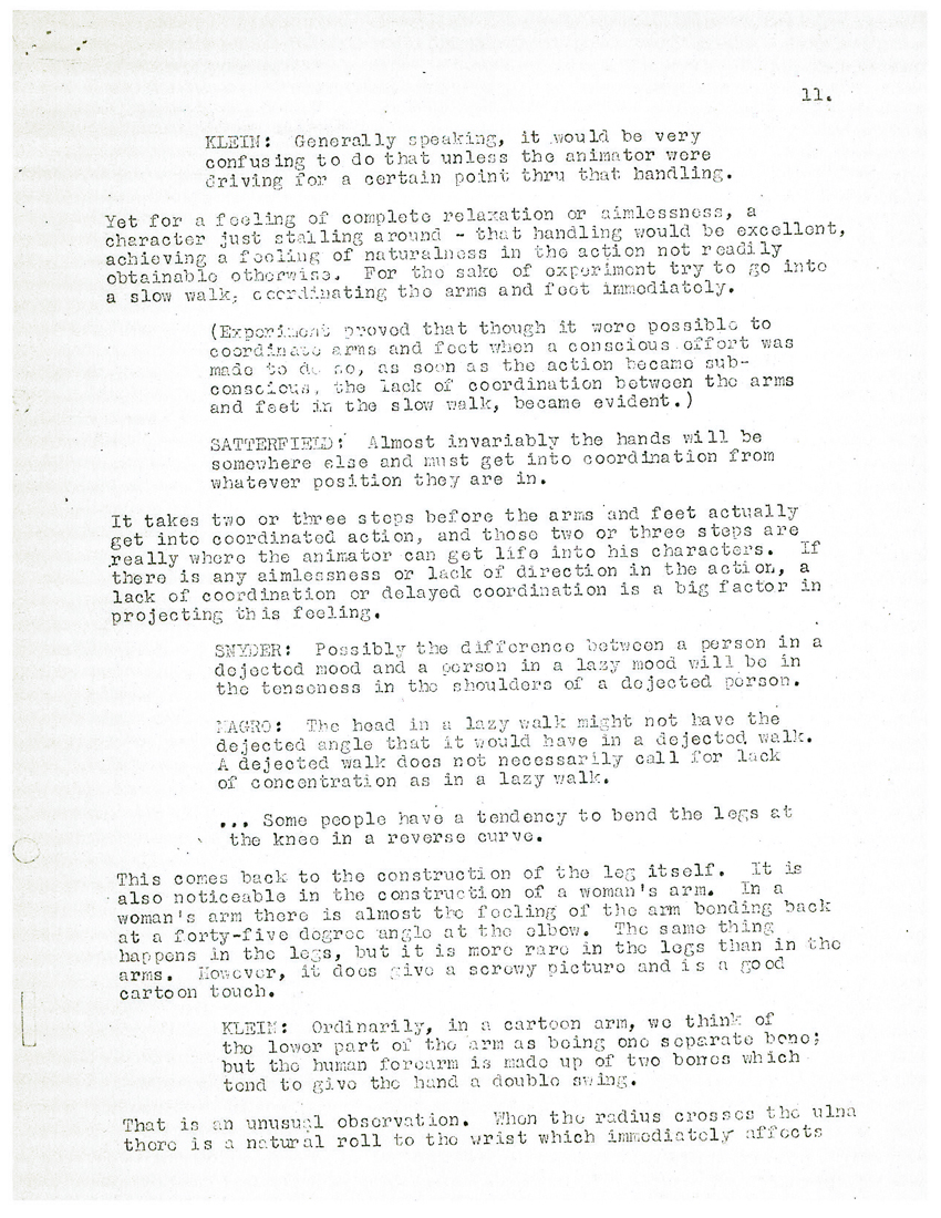 11
11
 12
12 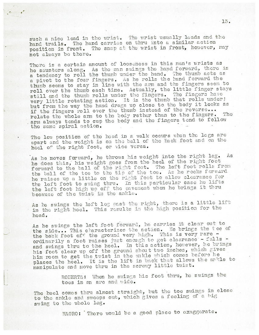 13
13
 14
14  15
15
Animation &Animation Artifacts &commercial animation 04 Apr 2012 07:20 am
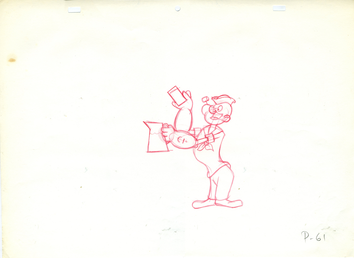
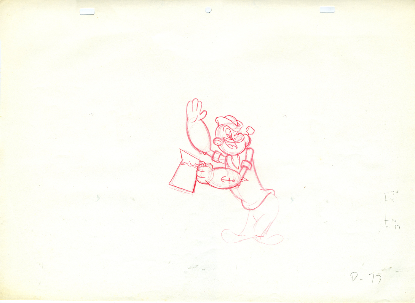
Tangy Popeye – repost
Tangy Popeye
 - Here are some of the drawings I have from what is probably the last piece of animation Jack Zander did professtionally.
It must be remembered it was Zander’s Animation Parlour that did the TV one hour “Special”, Popeye and the Man Who Hated Laughter. I was working as an Assistant Editor at Hal Seeger’s Studio when the job came through to Seeger. He decided to hire Zander’s Studio when he got the show from King Feature’s Syndicate. It was exciting to watch, first-hand, as the show developed.
This is from a Start commercial, a Tang competitor, done at Zander’s Animation Parlour. Instead of doling out the animation, Jack was intrigued with the idea of animating the character. He hadn’t animated Popeye before.
 61
61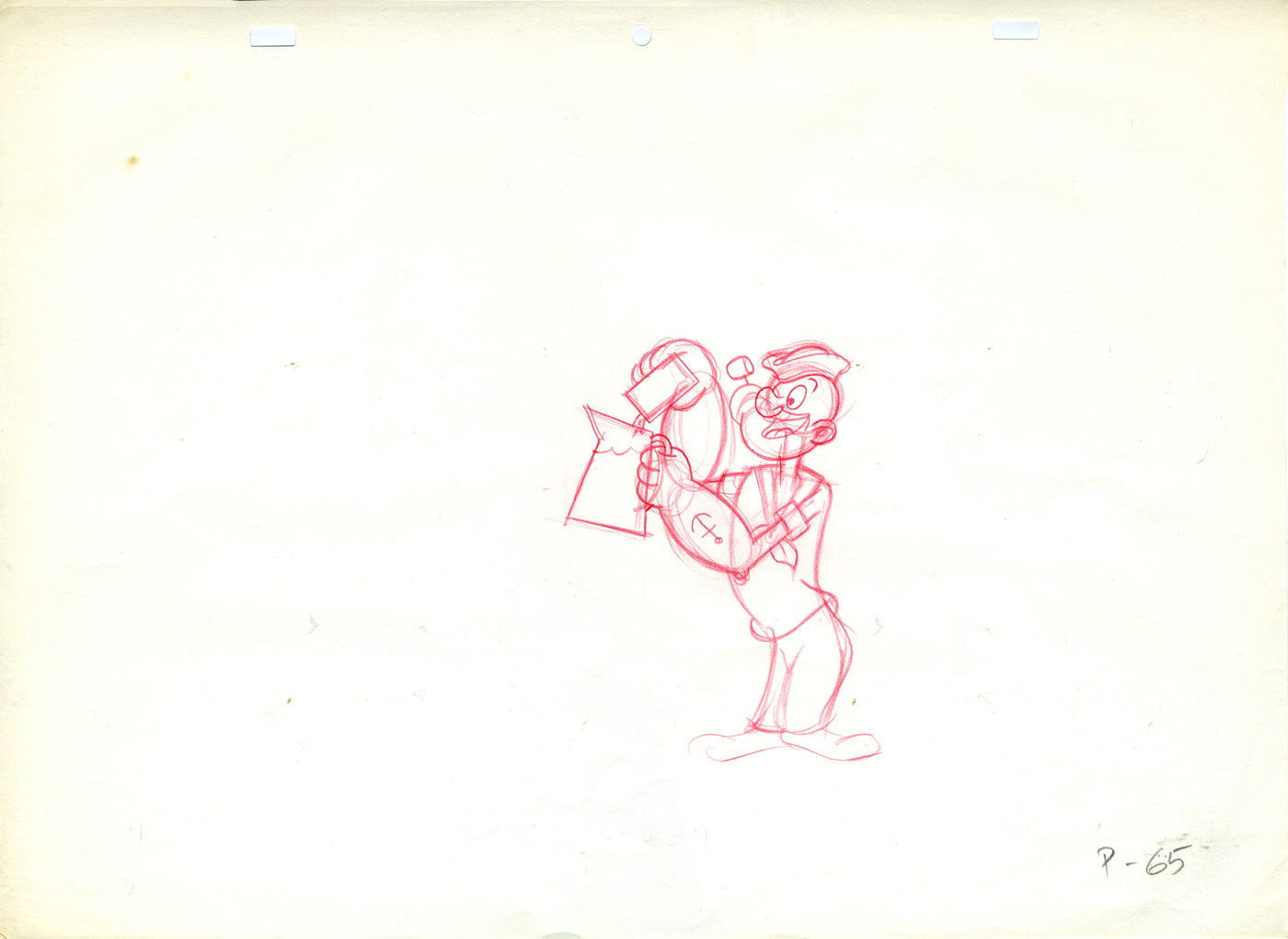 65
65
(Click any image to enlarge.)
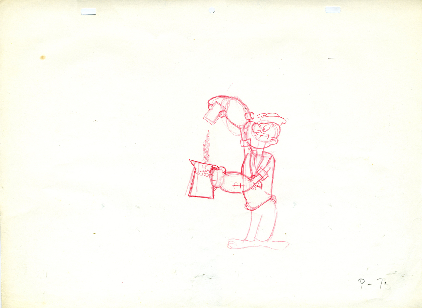 71
71 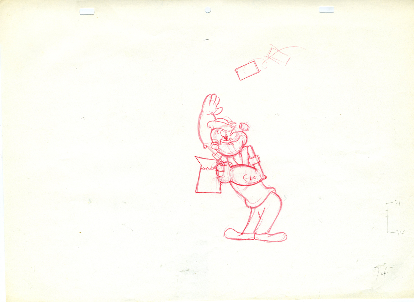 74
74
Do you think the assistant asked for a straight on model of Popeye’s face to do the inbetweens?
 85
85 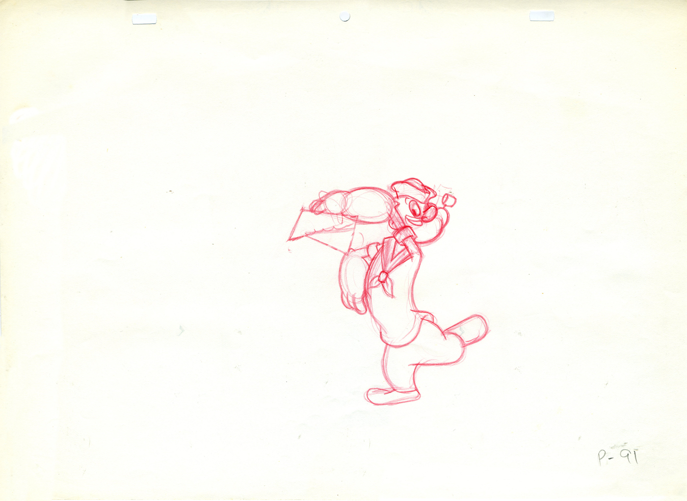 91
91
I think Jack might have been a bit out of practice when he did this spot. It looks a bit stiff.
By the way, this drawing is an example of how Jack drew
Popeye, straight on. I’m not sure anyone else used this pose.
.
Tangy Olive Oyl
– Continuing my posting of the animation keys from the Popeye Tang commercial done at Zander’s Animation Parlour back in the early 70′s. Jack Zander cast himself to animate the spot since he hadn’t worked with these characters before. (His studio did the animation for The Man Who Hated Laughter for King Features Syndicate via Hal Seeger Prods. back in 1972, but Jack didn’t animate on it.)
(Click on any image to enlarge.)
On Saturday past, I put up the Popeye portion of this scene. Here are the Olive Oyl drawings. Jack has a bit more fun with her, and his drawings are much more loose.
 57
57
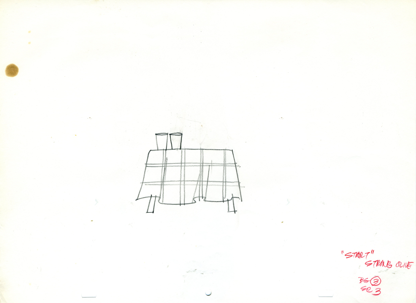
I’d thought this was a Tang commercial, but
Charles Brubaker in the comments, below, directed
me to one of the spots on YouTube. It’s for
“Start”, which I assume was a Tang competitor.
AWN has on its site an excellent Joe Strike interview with Jack Zander about his career.
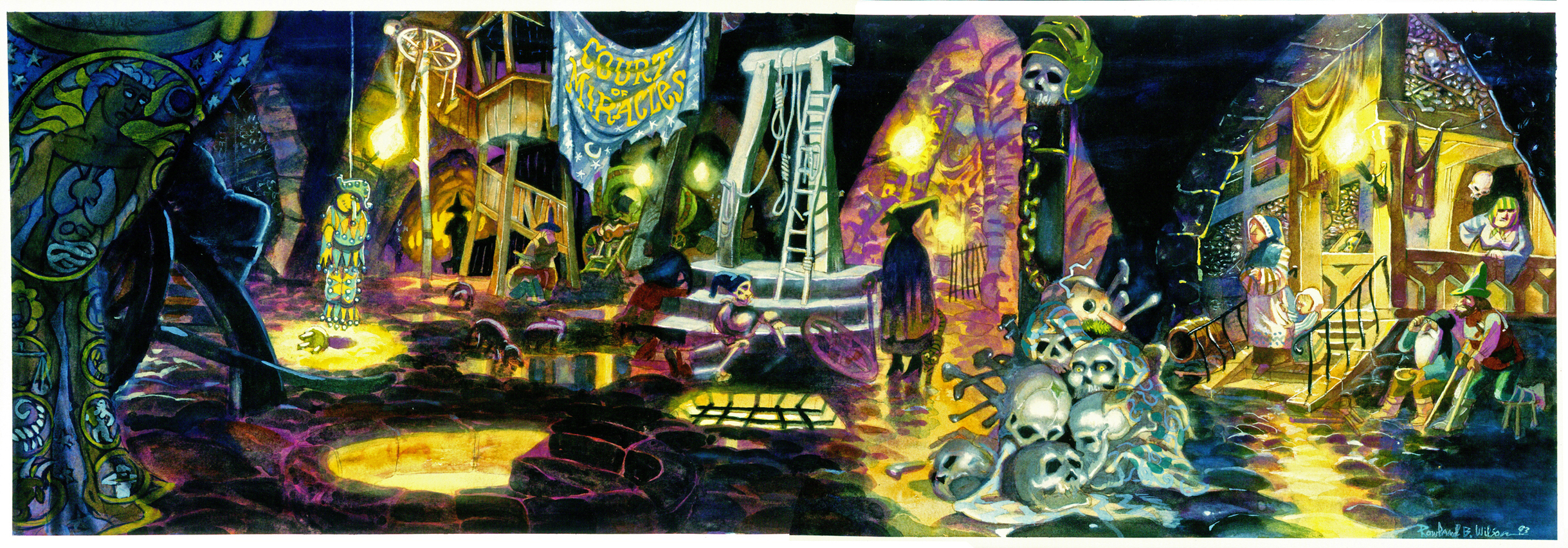
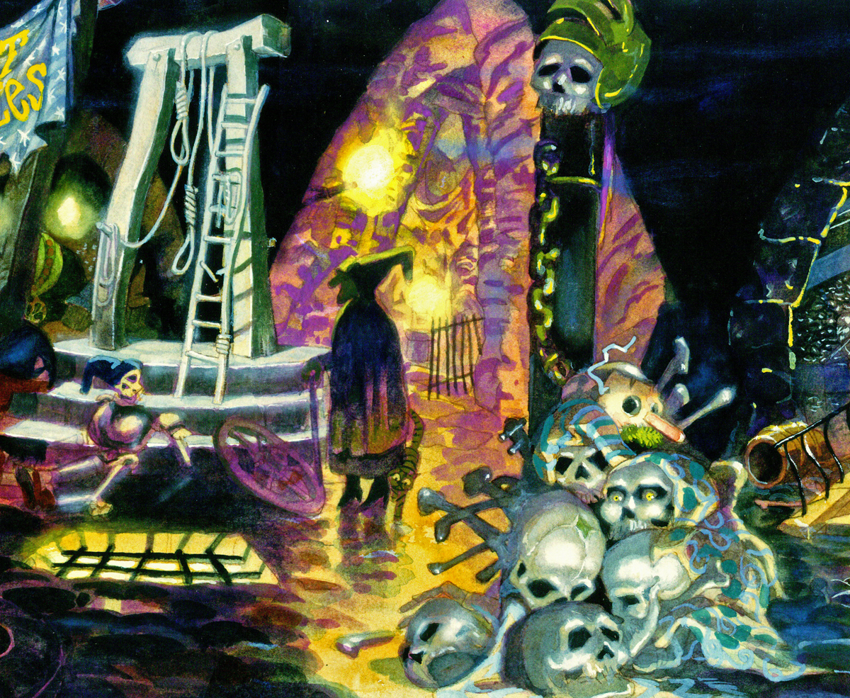
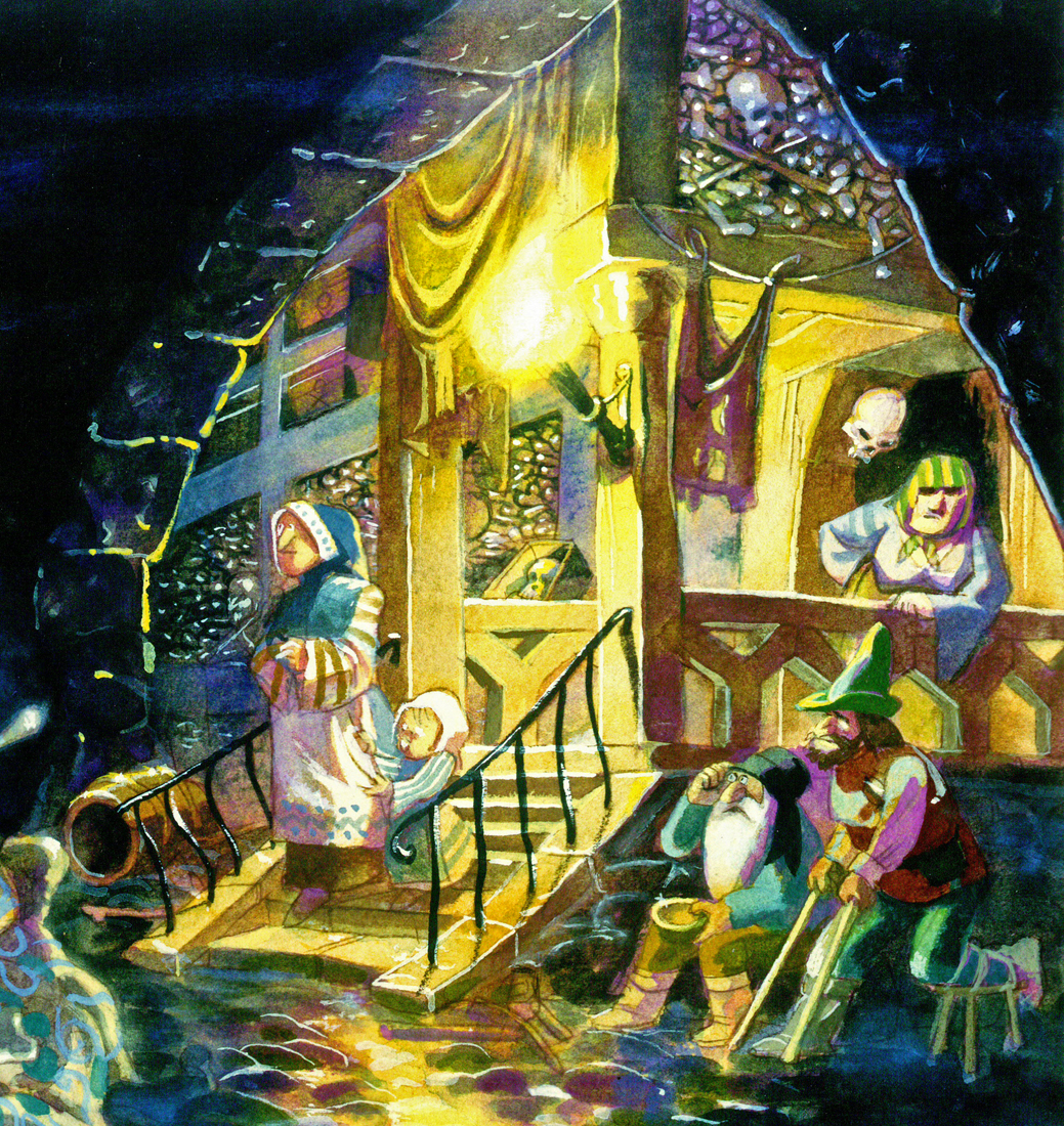
Animation &Animation Artifacts &Bill Peckmann &Independent Animation &Models &repeated posts &Rowland B. Wilson 02 Apr 2012 07:03 am
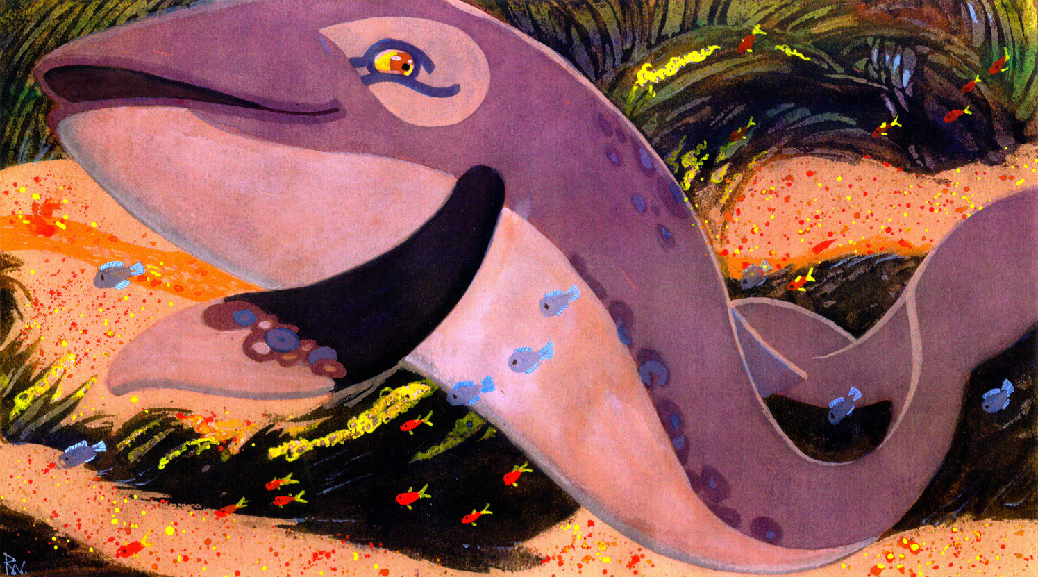
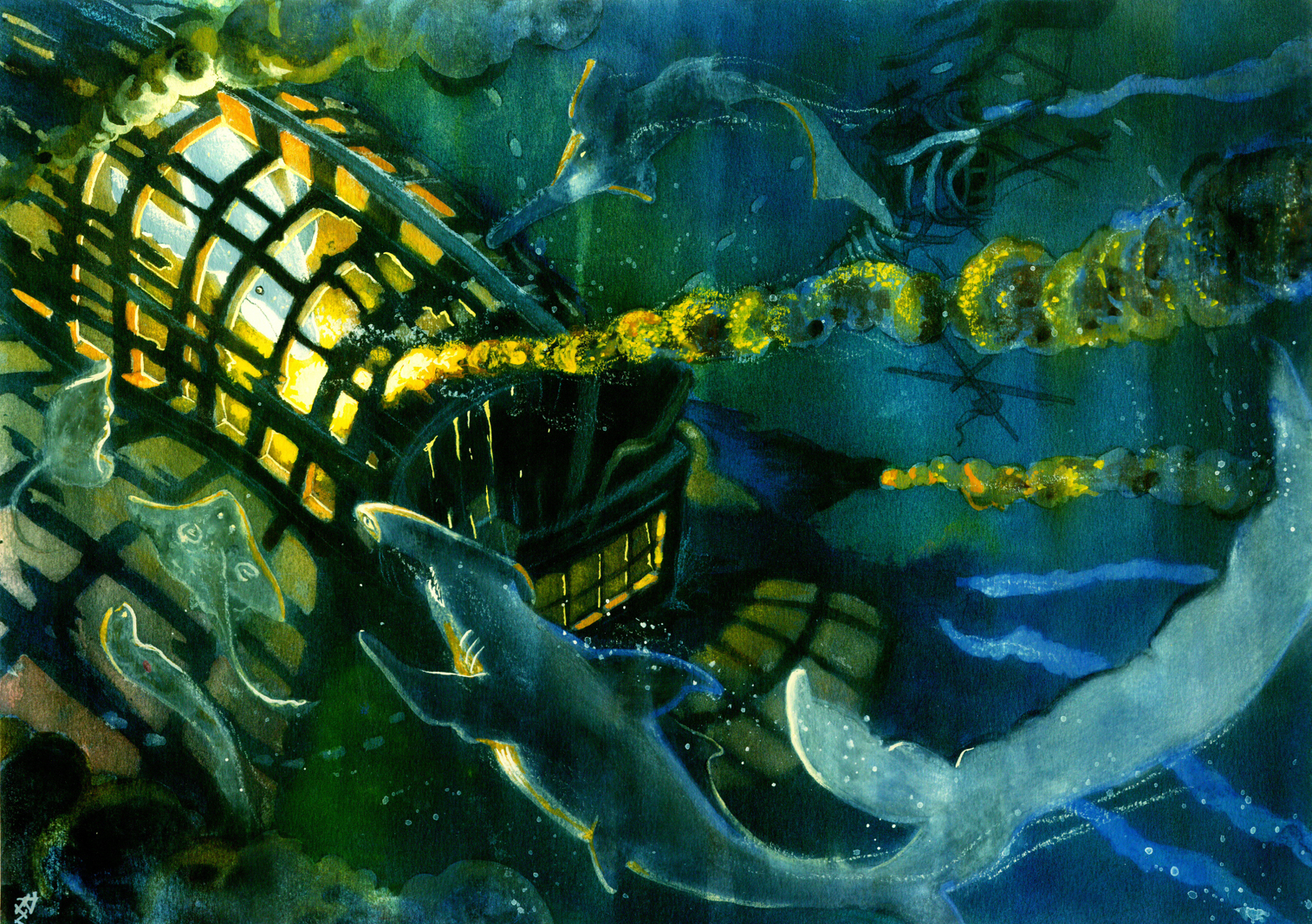
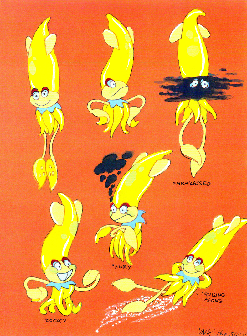
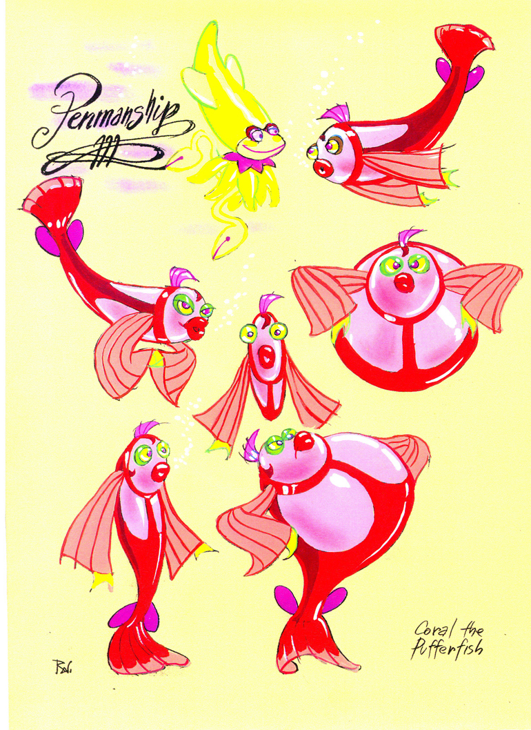
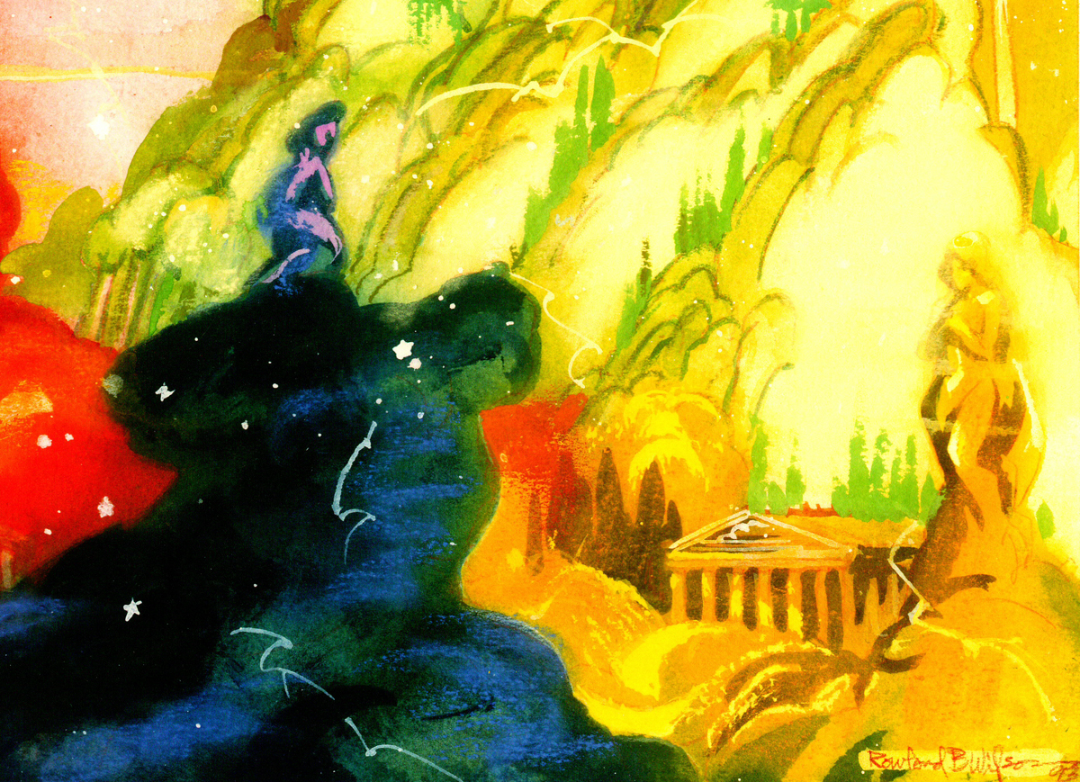
Rowland Wilson’s The Little Mermaid
- The brilliantly talented Rowland B Wilson, certainly paid his dues at a number of animation studios. We’ve seen his work with Richard Williams’ Soho Square studio and with Disney and Don Bluth’s Ireland studio.
Today, I have some sketches and designs he did for Disney while working on The Little Mermaid.
Not all of this material made it to the film, but the incredible wealth it brought the directors had to have affected the overall production. This invaluable material comes courtesy of Bill Peckmann.
The first group to view are Production Designs that he did for various sequences throughout the film.
(Click any image to enlarge.)
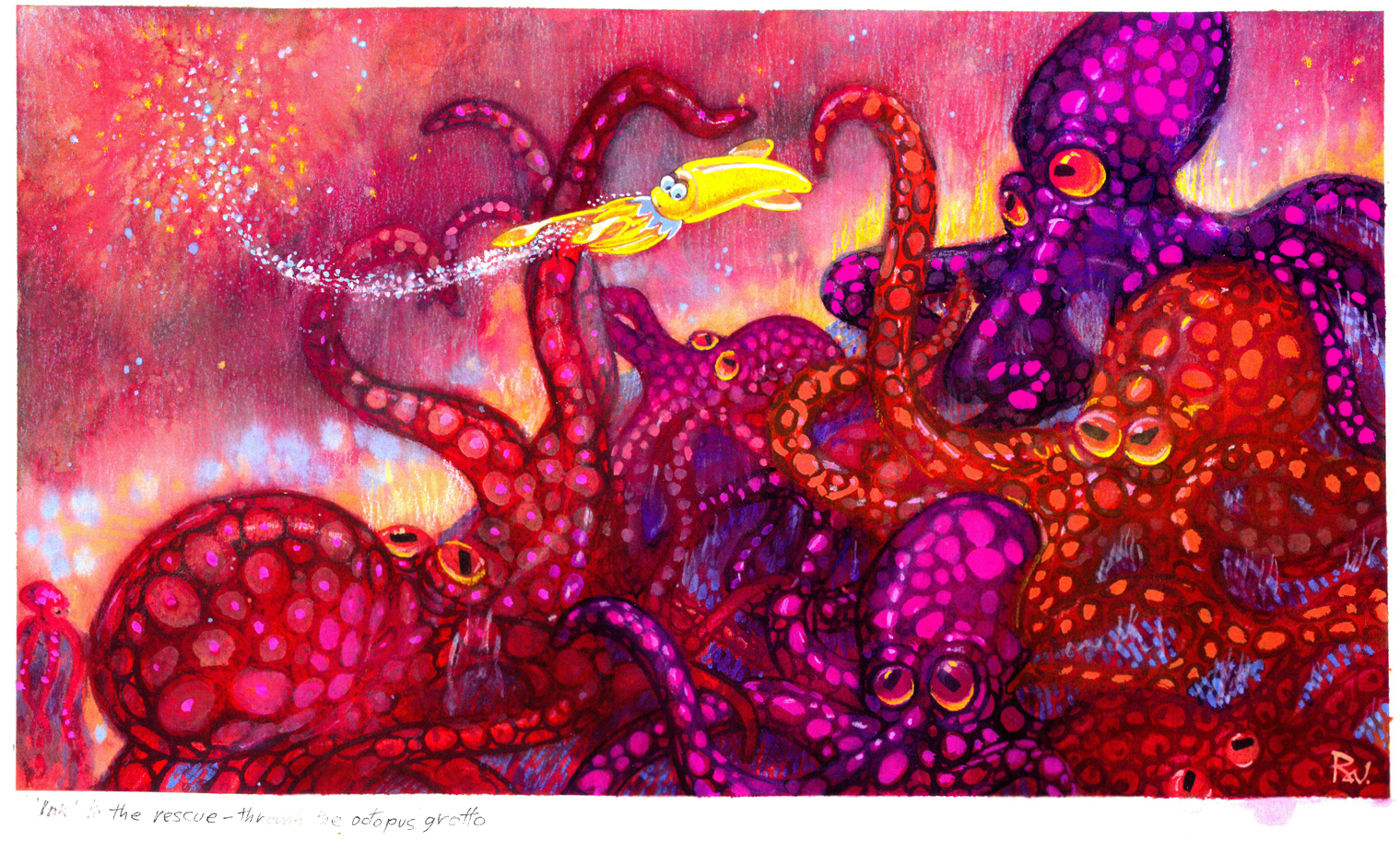
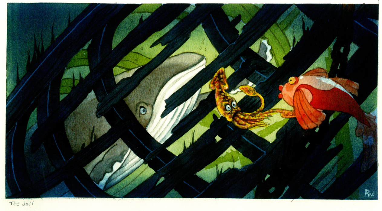
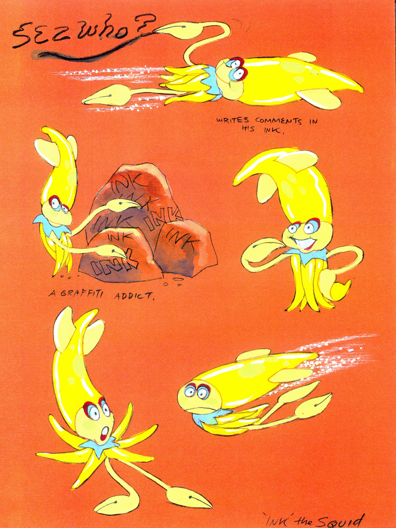
The following are character designs Wilson did for The Little Mermaid for a character that never made it into the movie. Though, I think “Ink the Squid” may have developed into “Sebastian the Crab”.
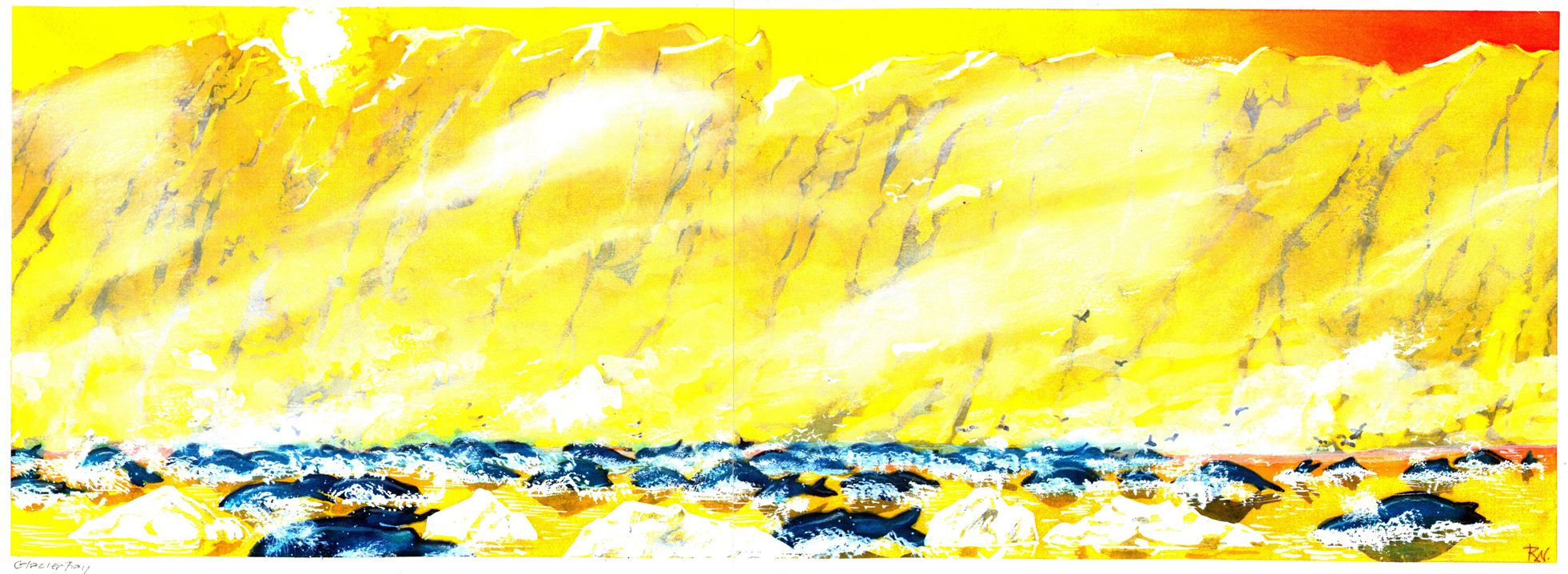
Then there are some of the creatures seen above land at the Glaciar Tray which apparently was designed to be part of the film.
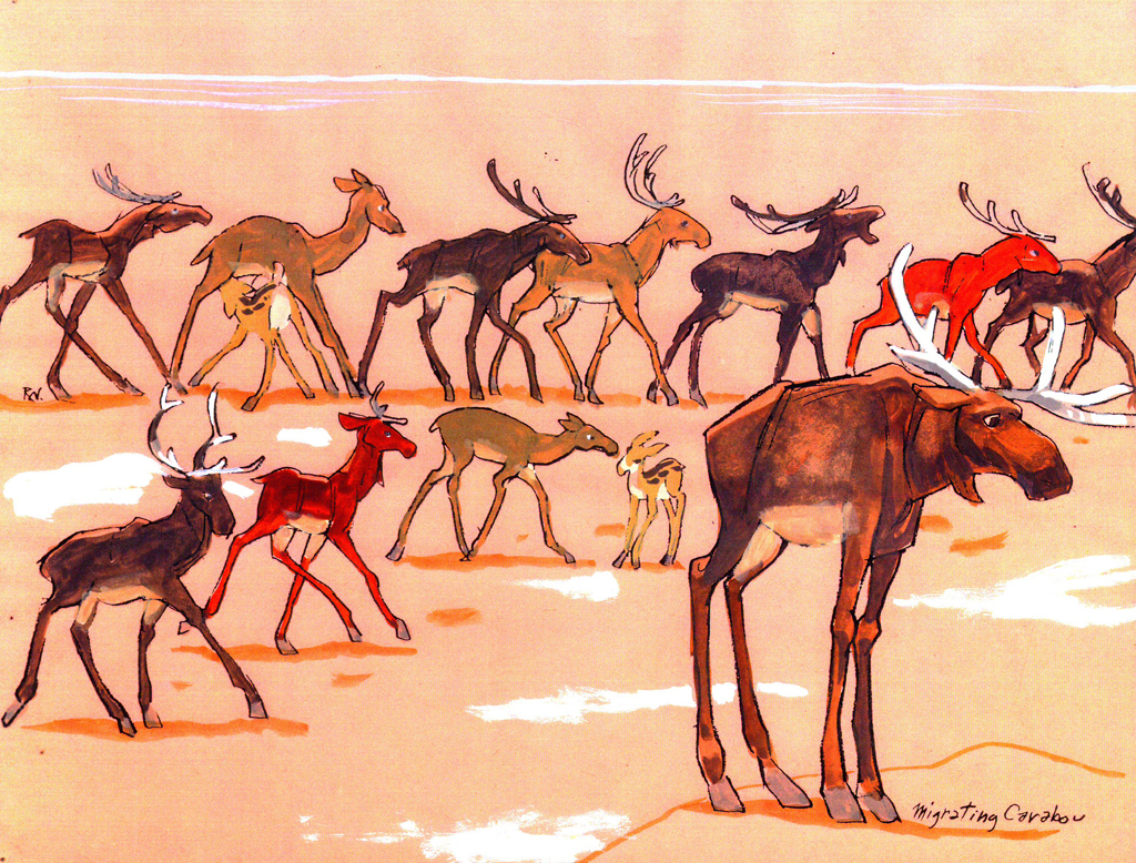
The migrating Caribou
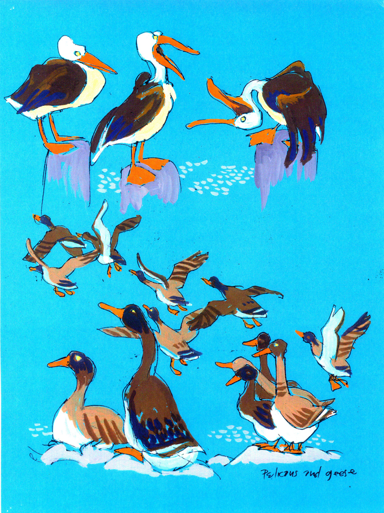
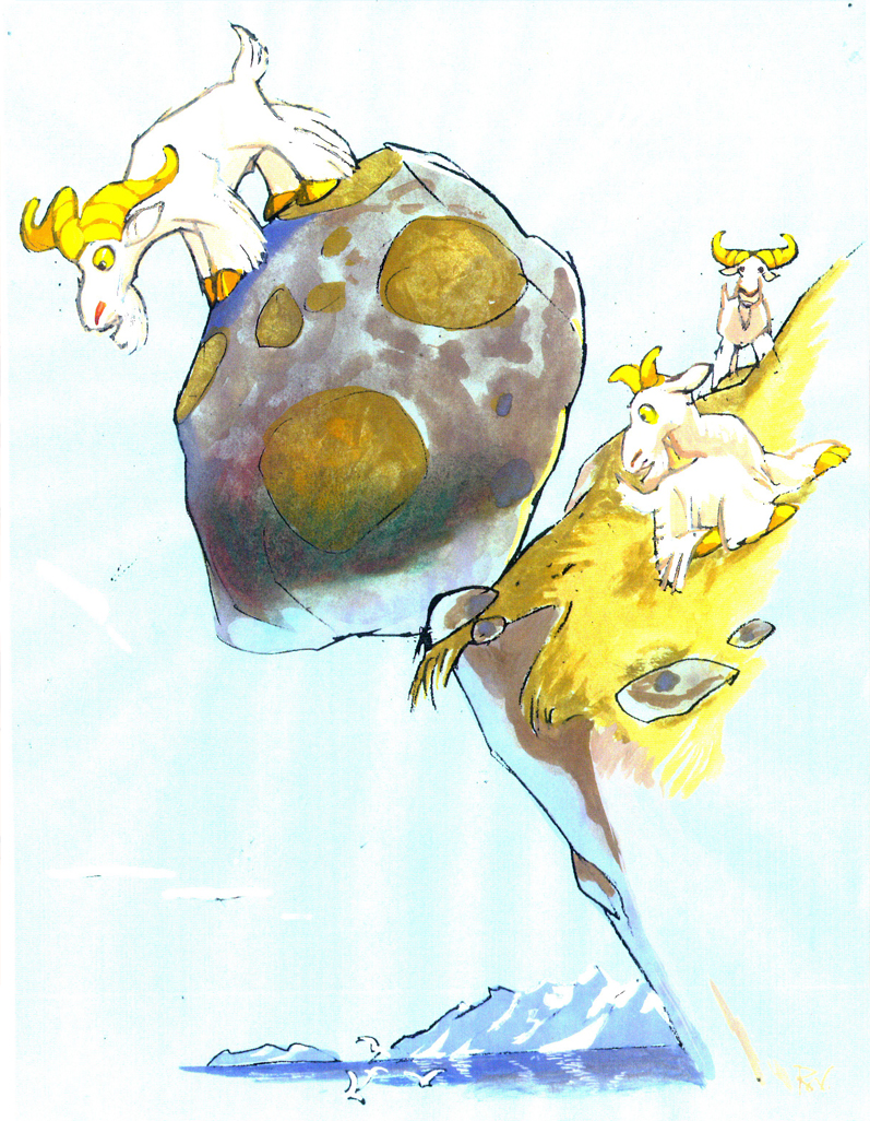
There are pelicans and geese as well as mountain goats.
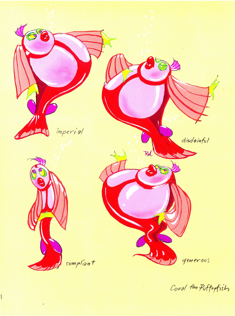
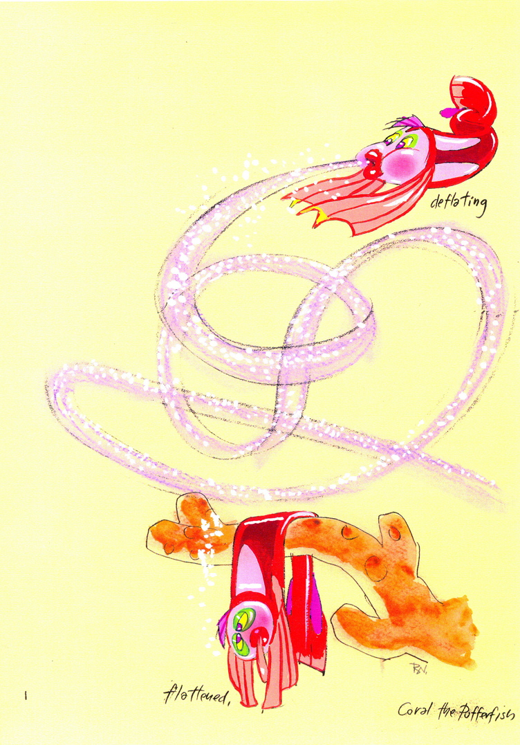
Then there is this short seqeunce of interaction between two fish:
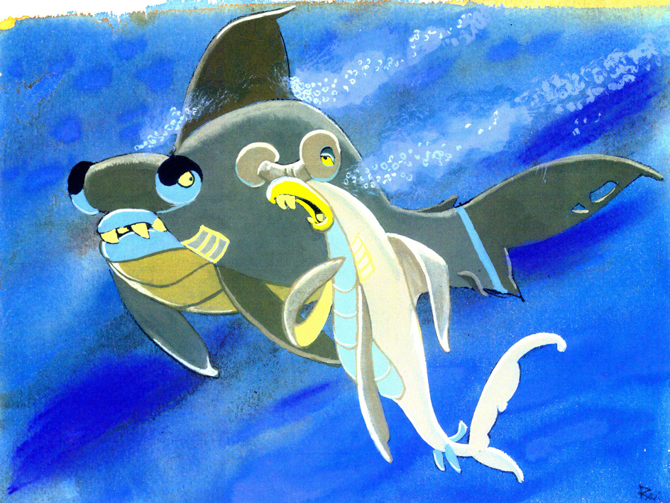
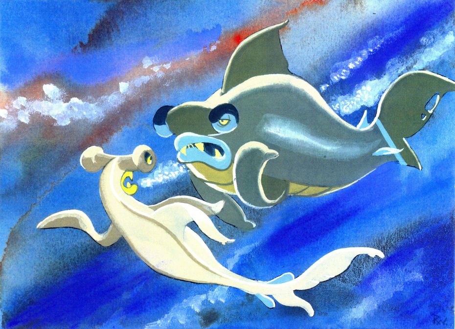
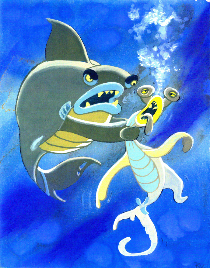
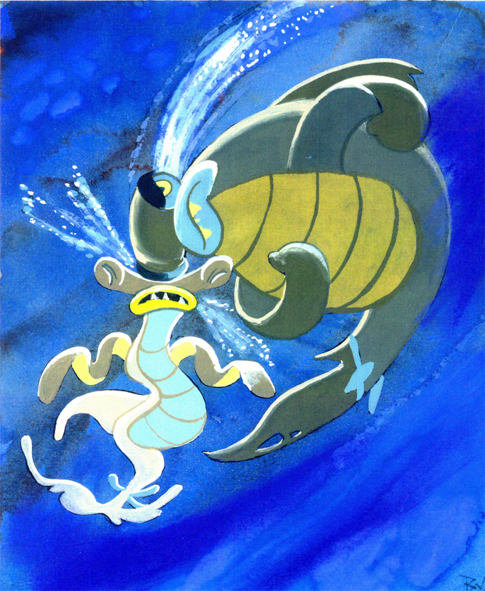
All art displayed © Walt Disney Prods.
 This material is a treasure. I want to thank Bill Peckmann for sharing it with us.
Rowland B. Wilson was an artist of the highest standard, and I can’t get enough of his work. True inspiration.
- Don’t forget that there’s a wonderful new book on the market. I’d like to keep it in your attention, hence I’m trying to give a lot of attention to the great work of Rowland B. Wilson.
Rowland B. Wilson’s Trade Secrets: Notes for Cartooning and Animation seems to offer quite a bit of attention to Mr. Wilson’s animation art as it does his brilliant illustration and cartooning. The book looks unique, and to have someone like Rowland as the guide to this world has to be a gem.
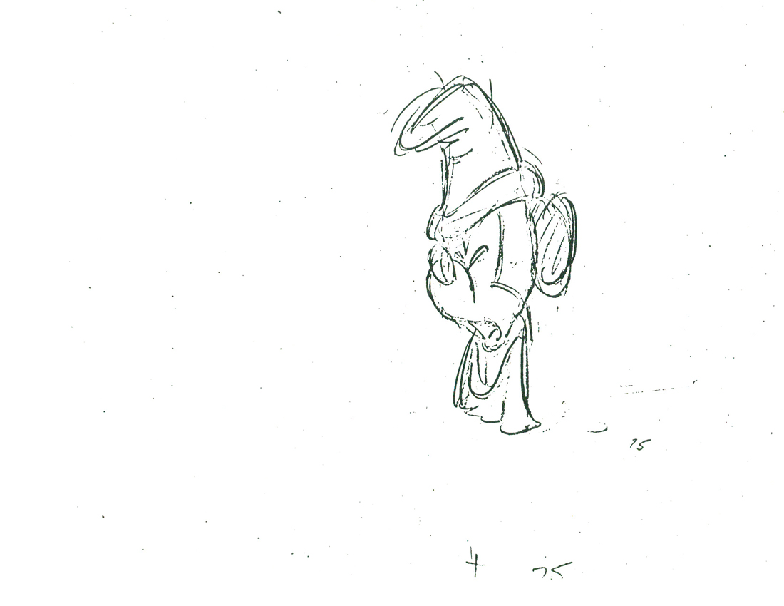
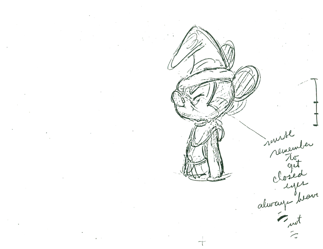
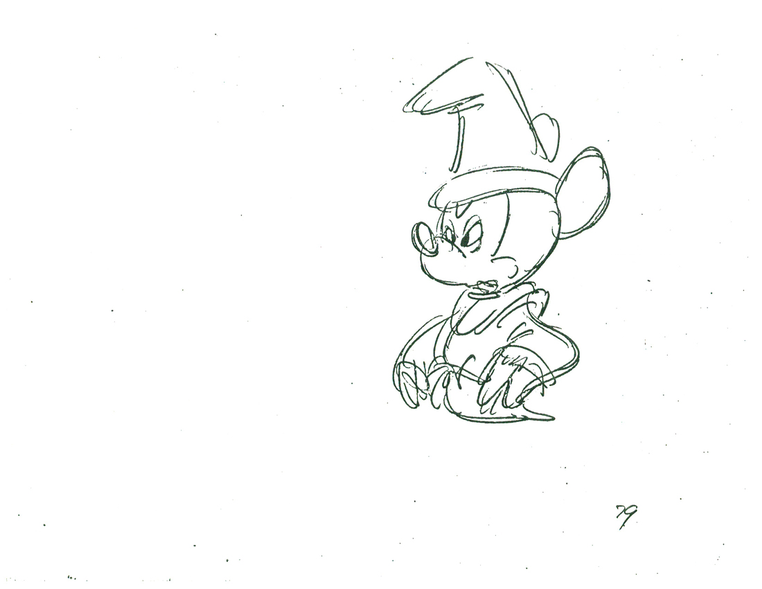
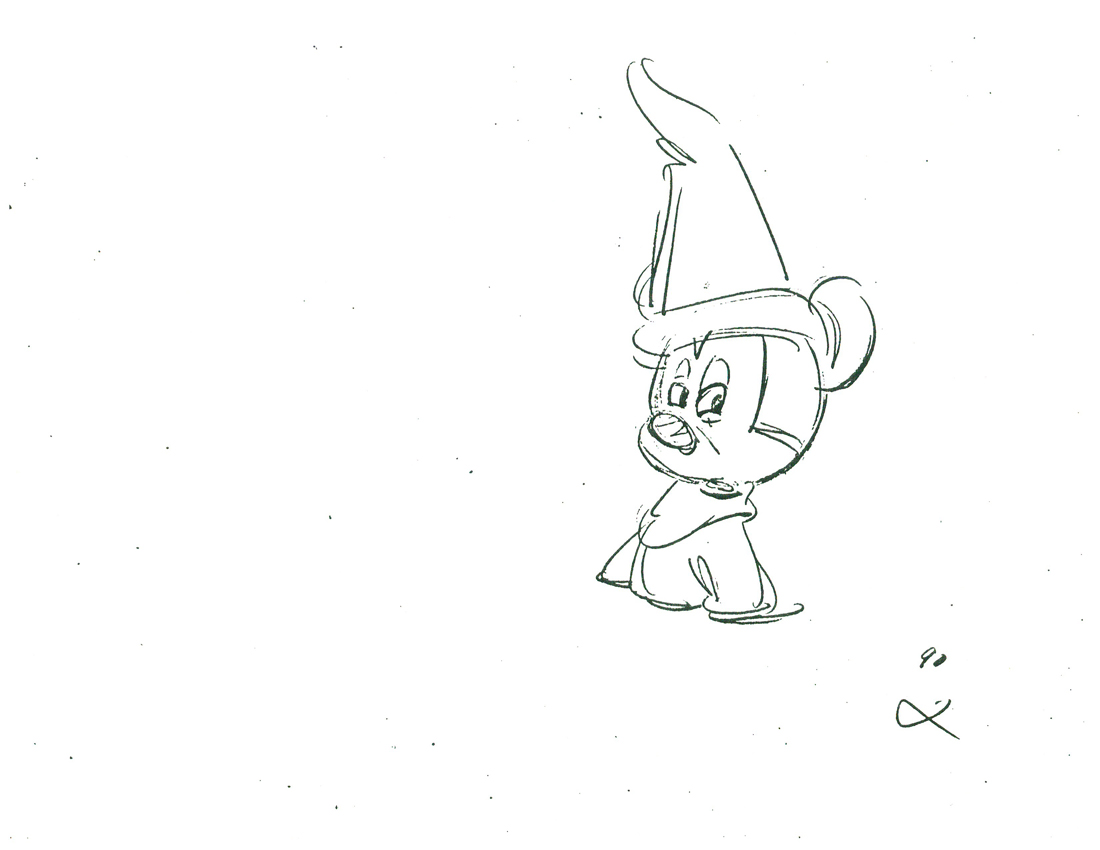
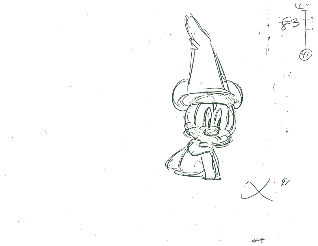
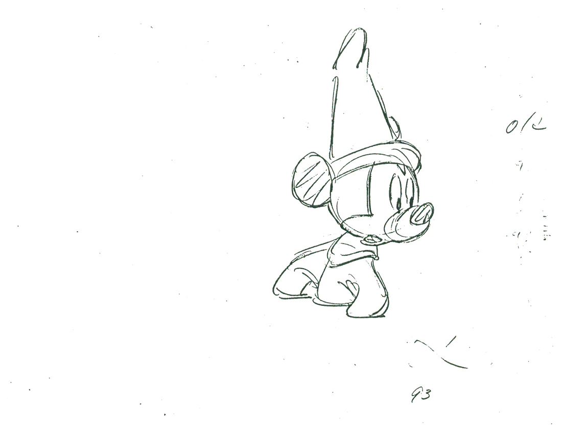
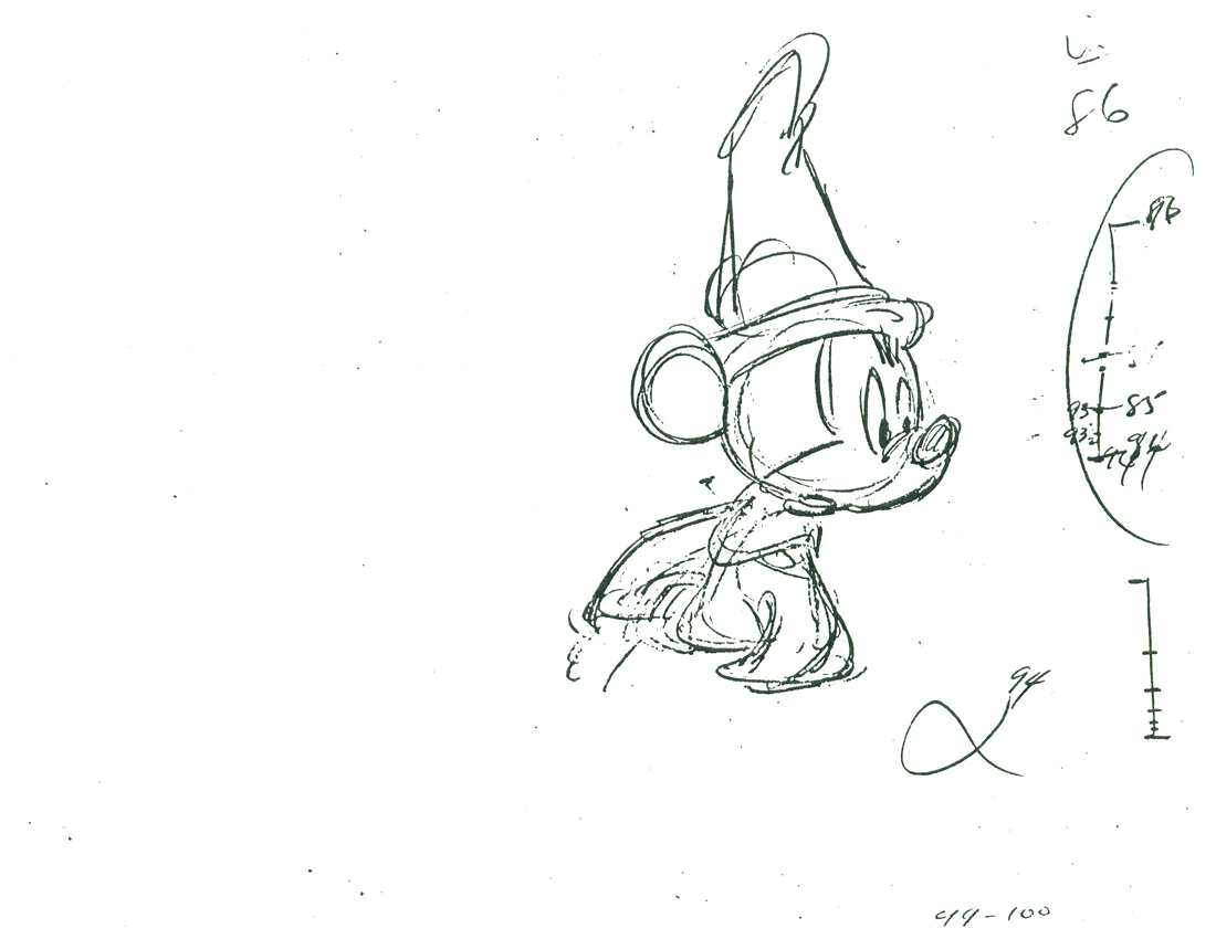
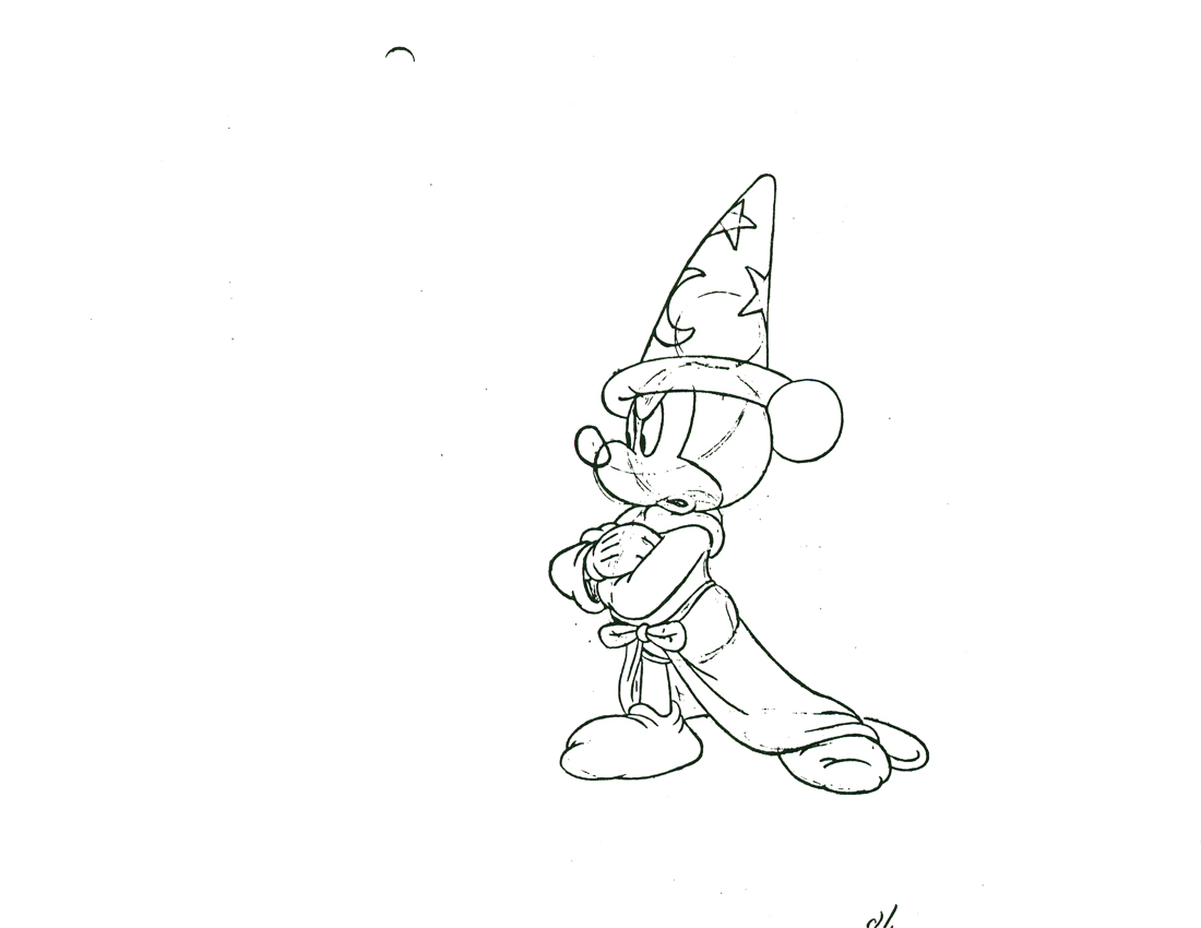
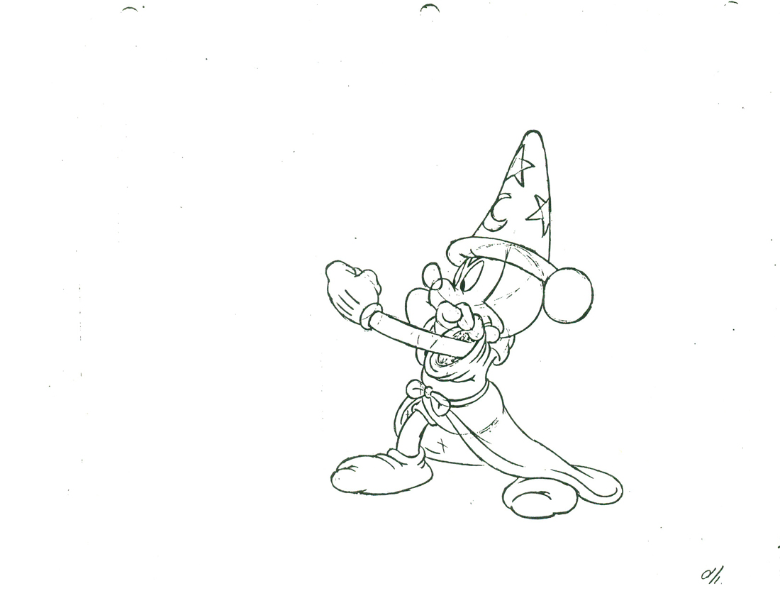
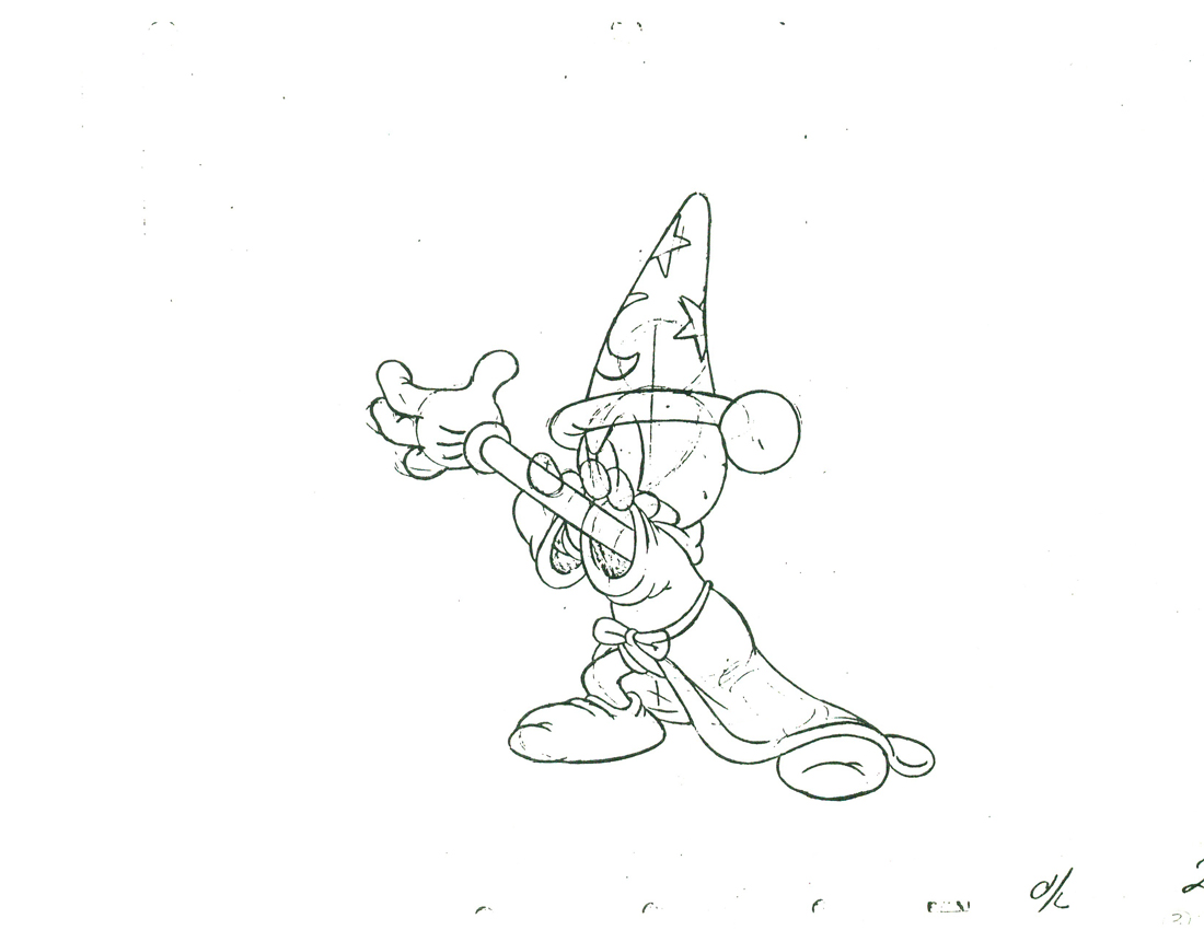
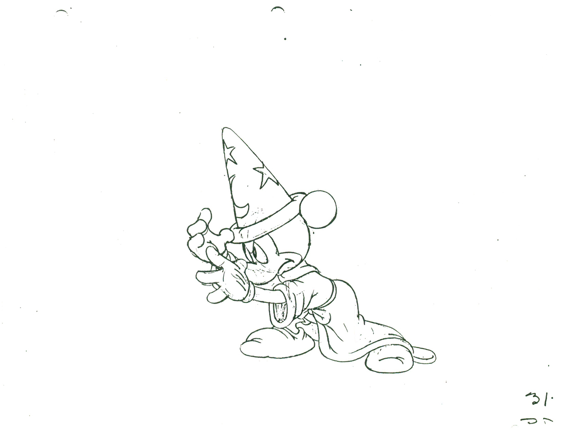
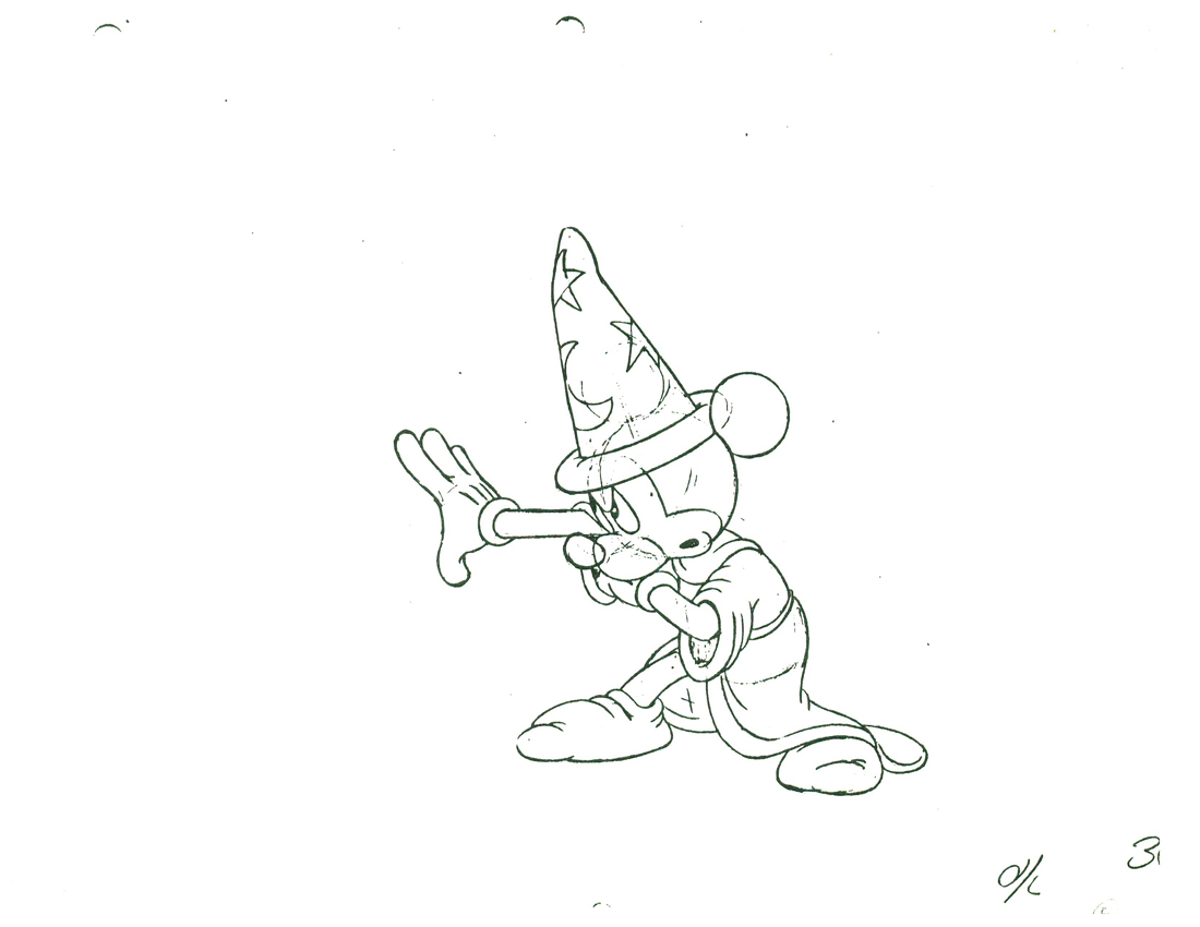
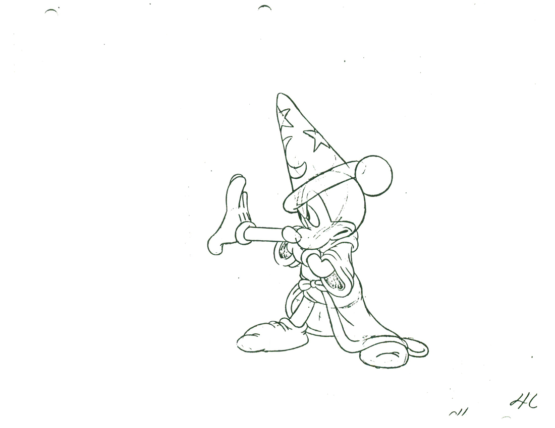
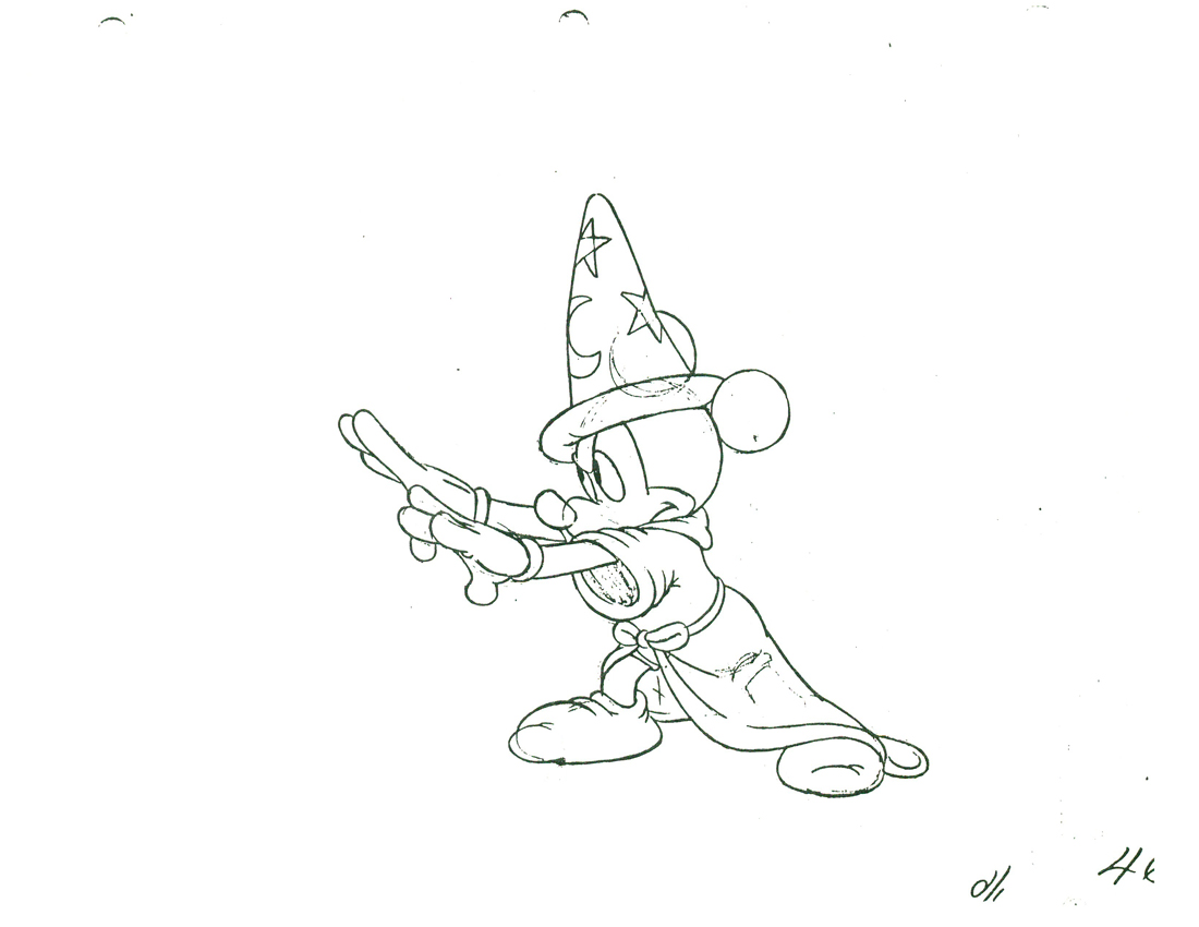
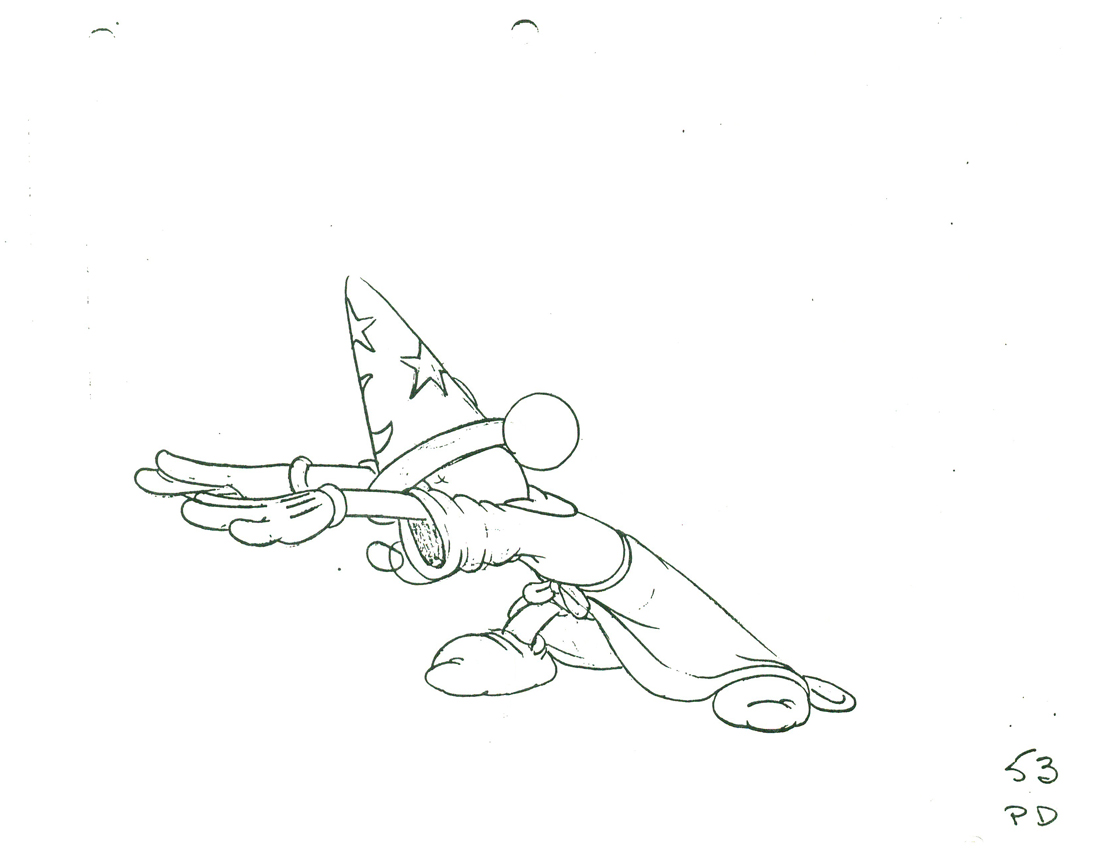
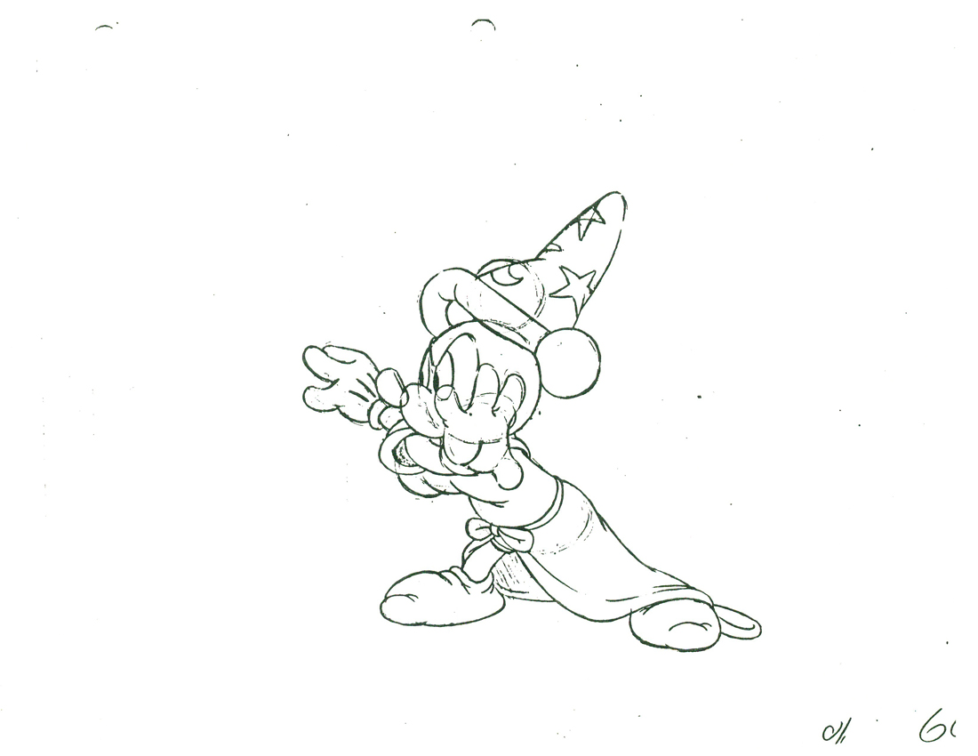
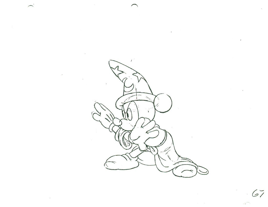
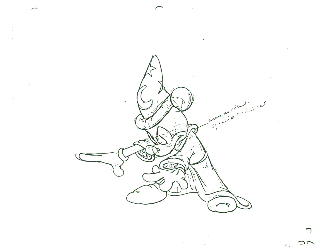
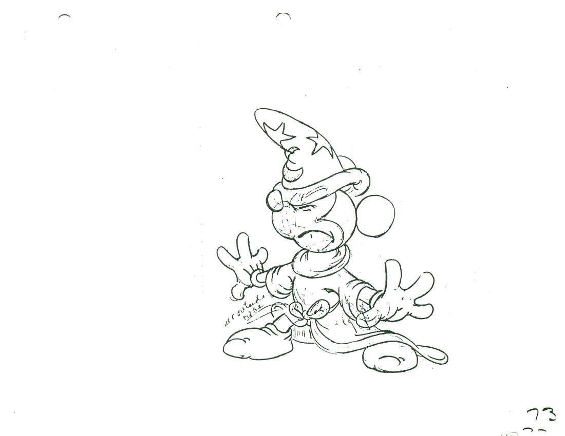
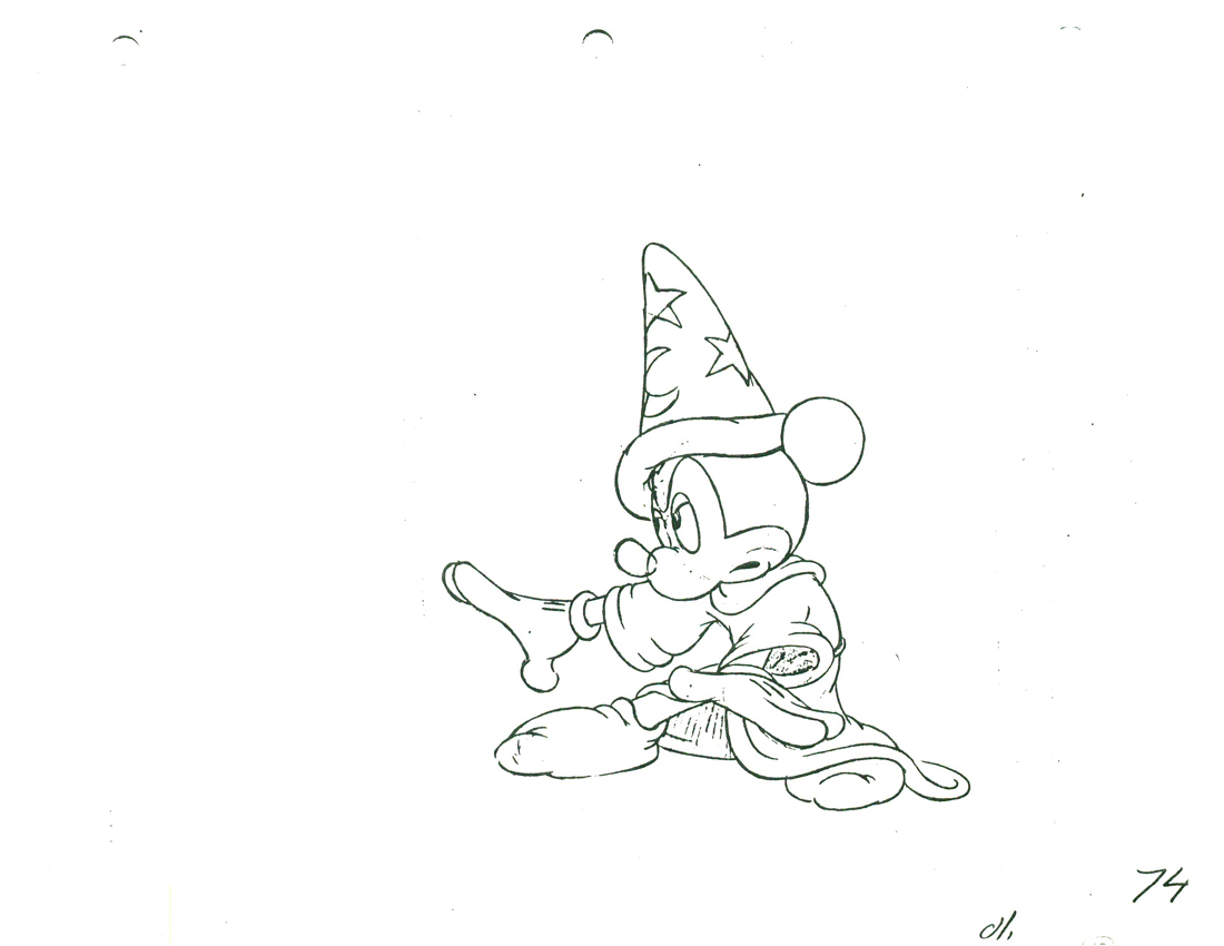
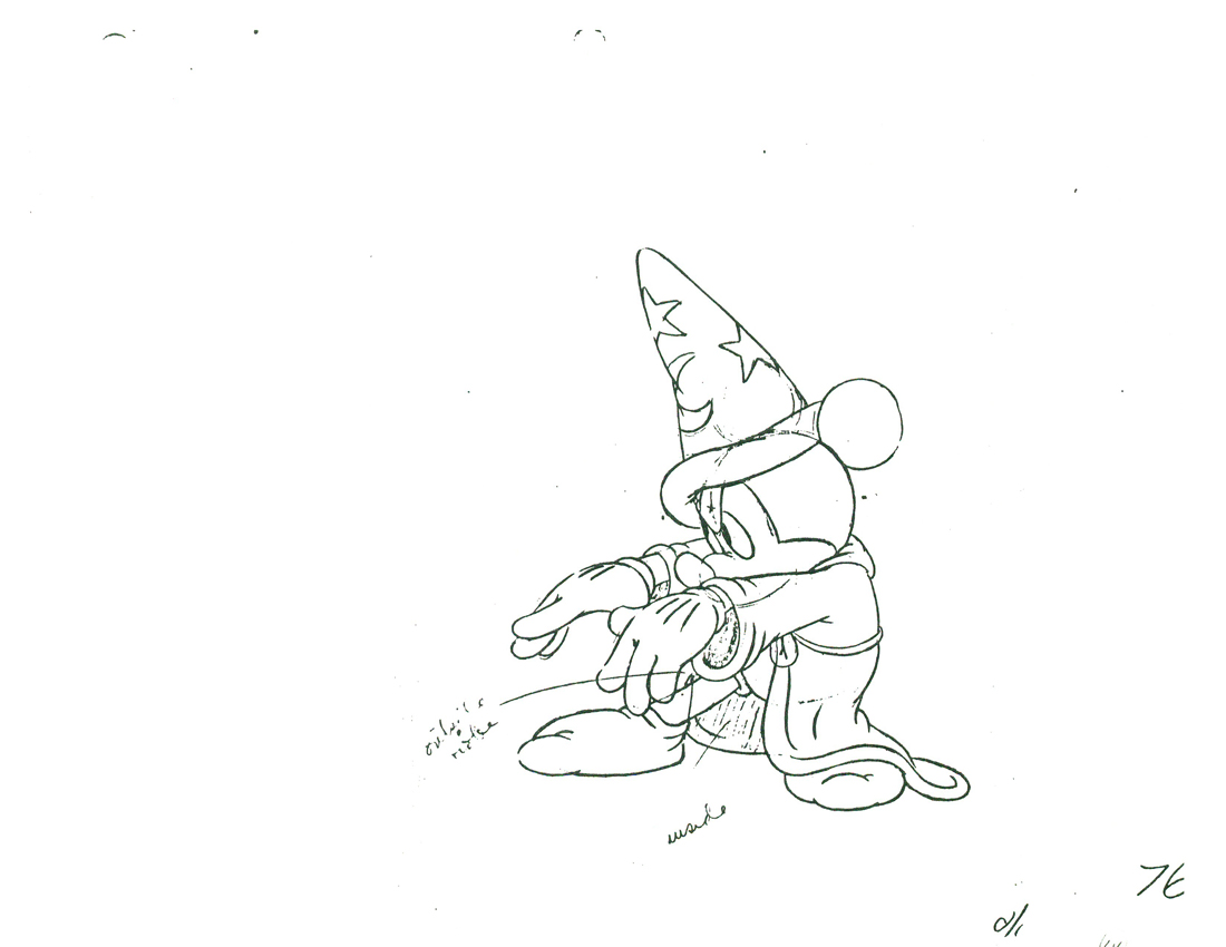
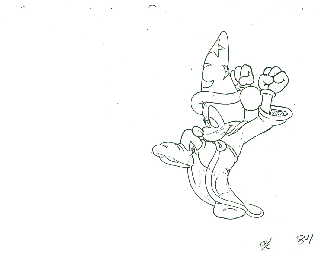
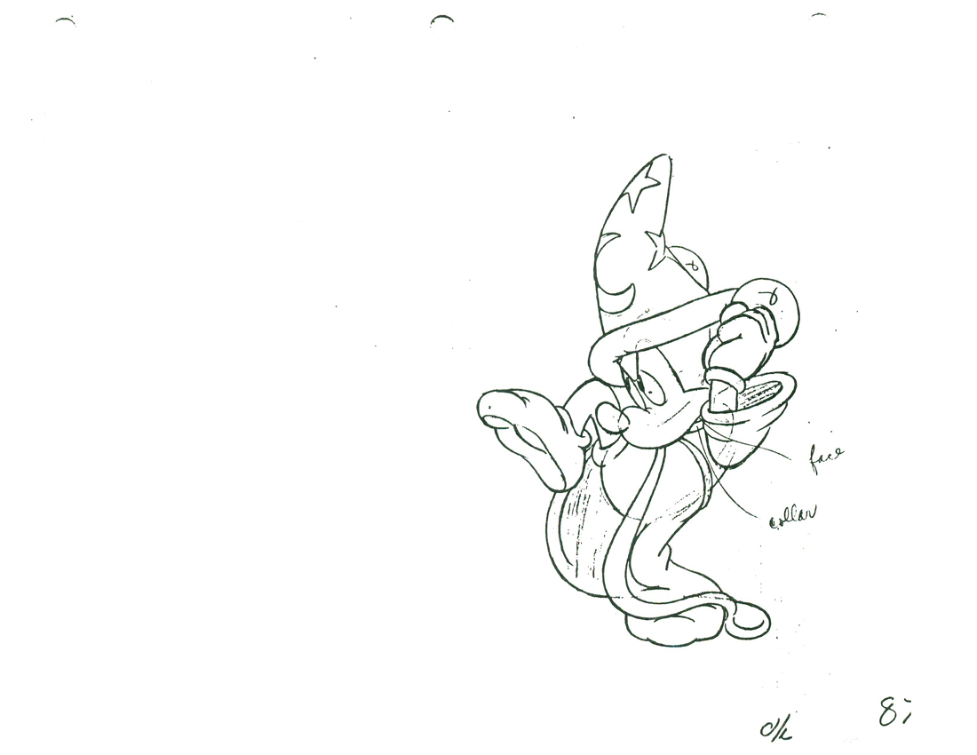
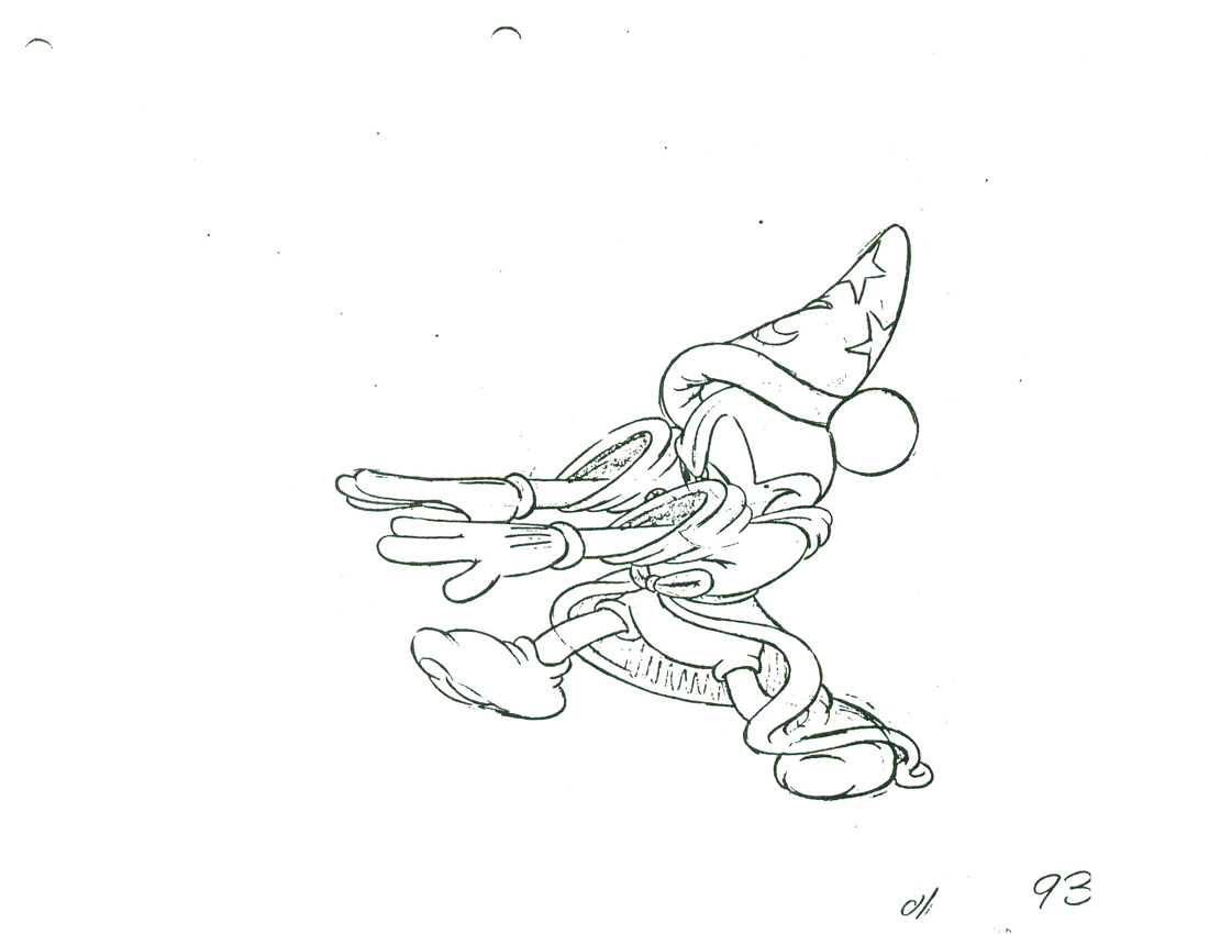
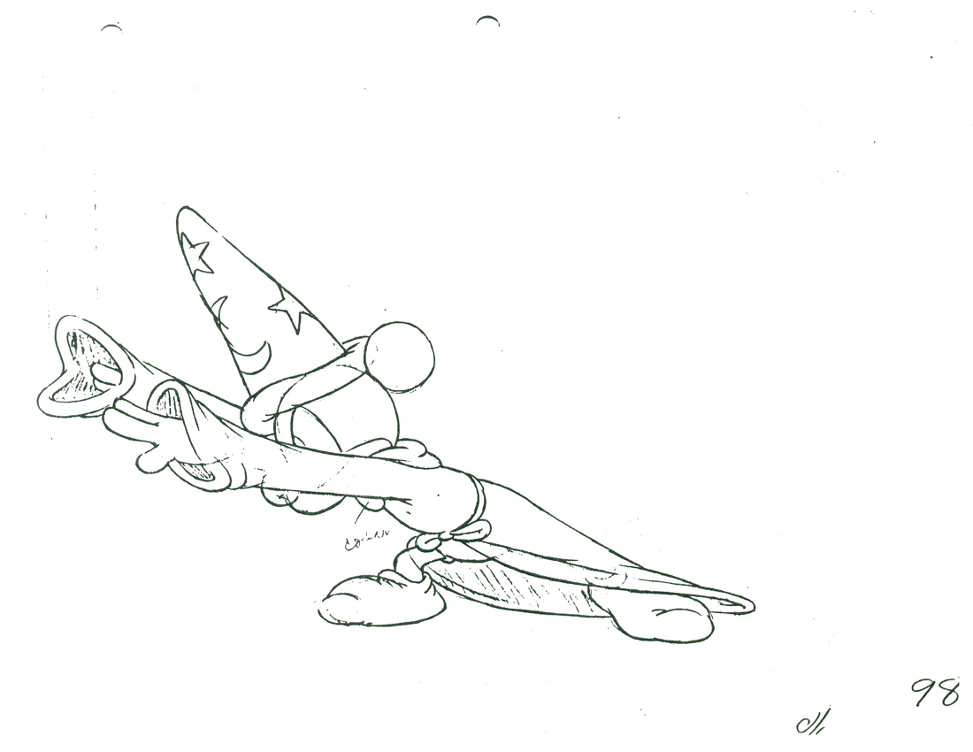
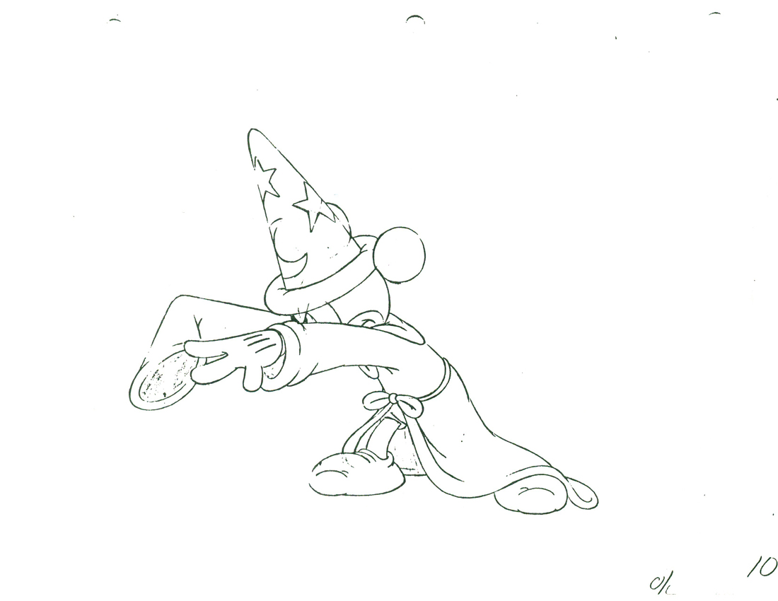
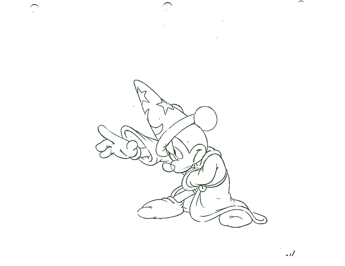
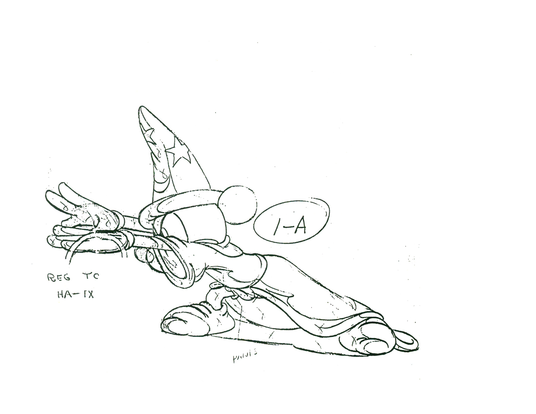
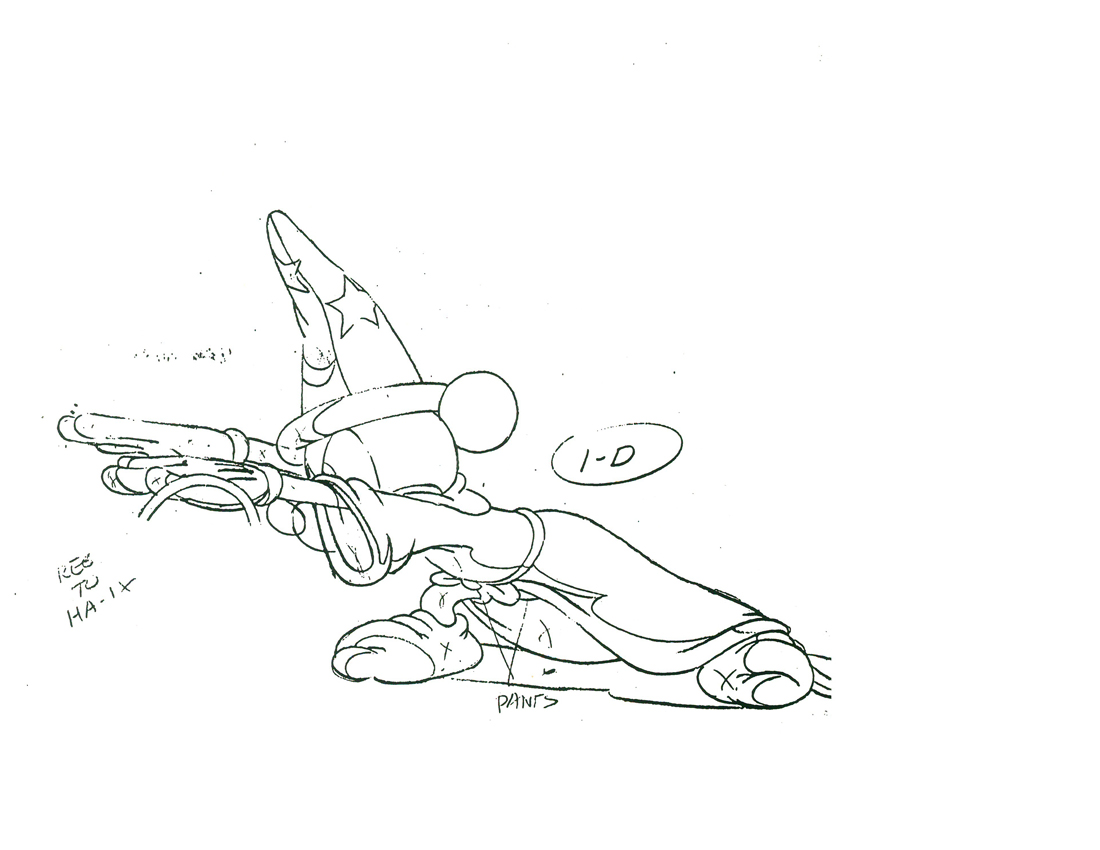
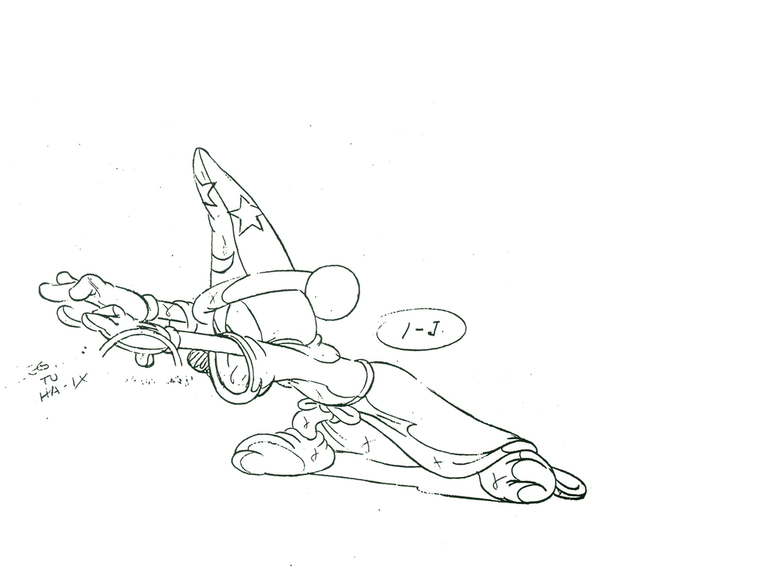
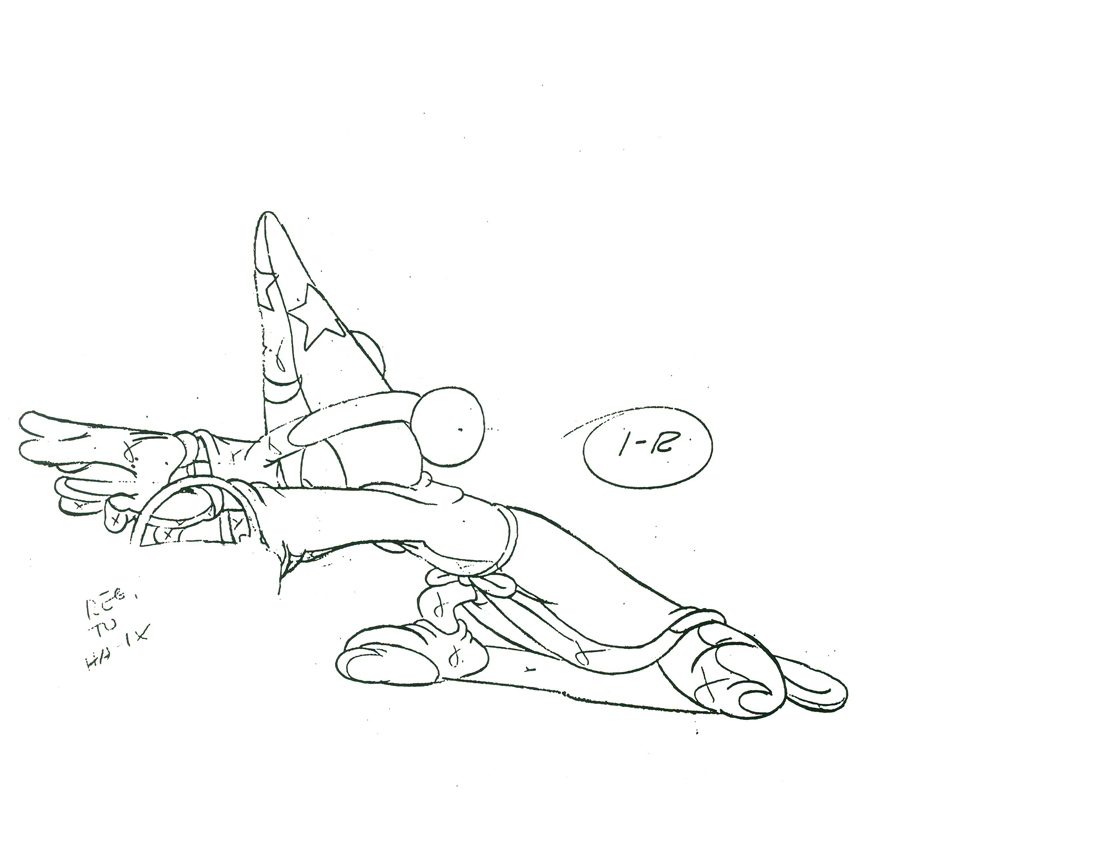
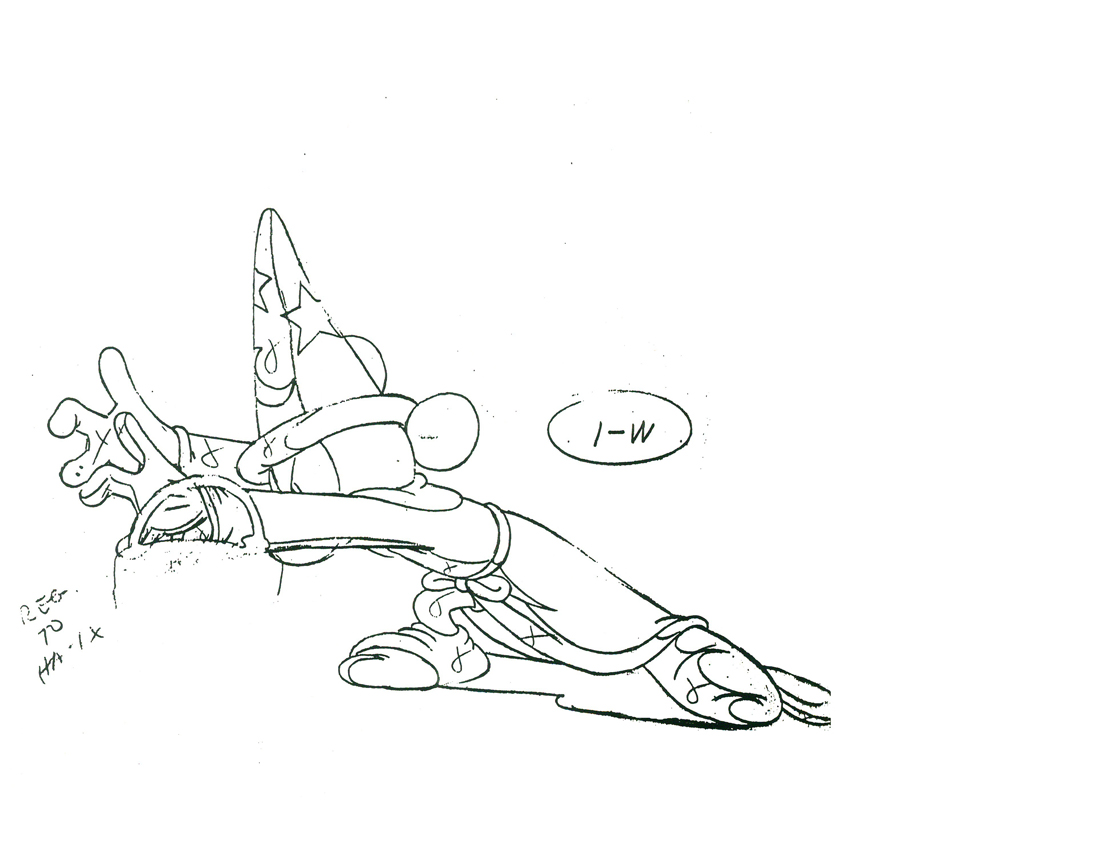
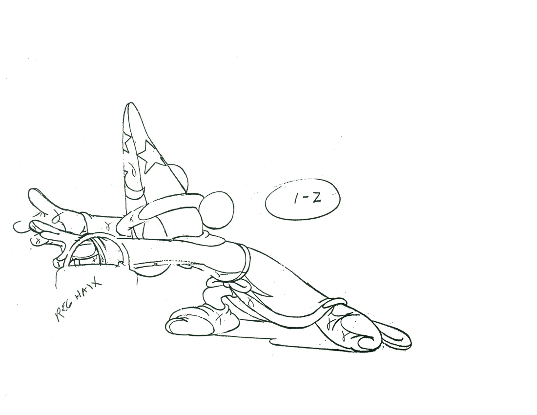
Animation &Animation Artifacts &Disney 29 Mar 2012 06:49 am
Mickey Turns in Water
- Before we get into today’s posts, I have to remind you again
that today’s the last days of our
Anything you can offer to the POE Project would be appreciated.
Thanks for your support.
________________________
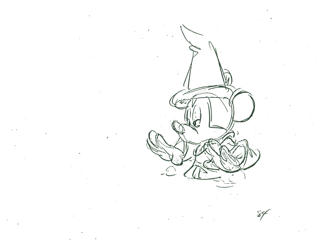
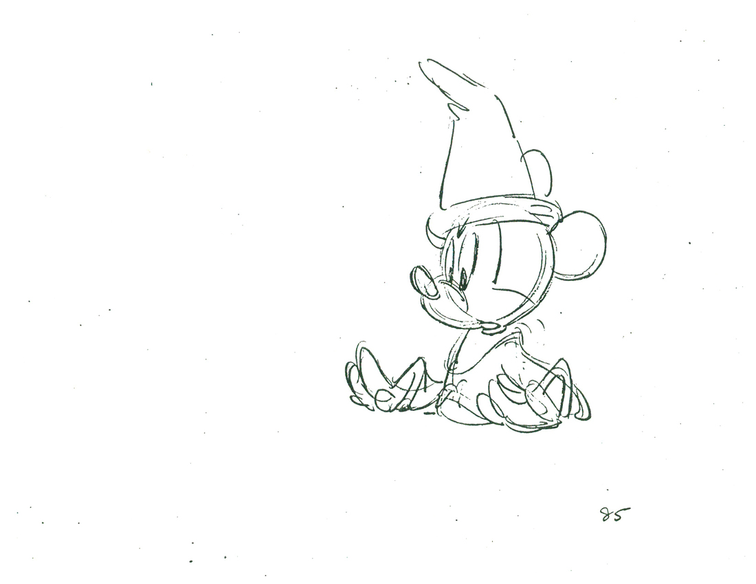
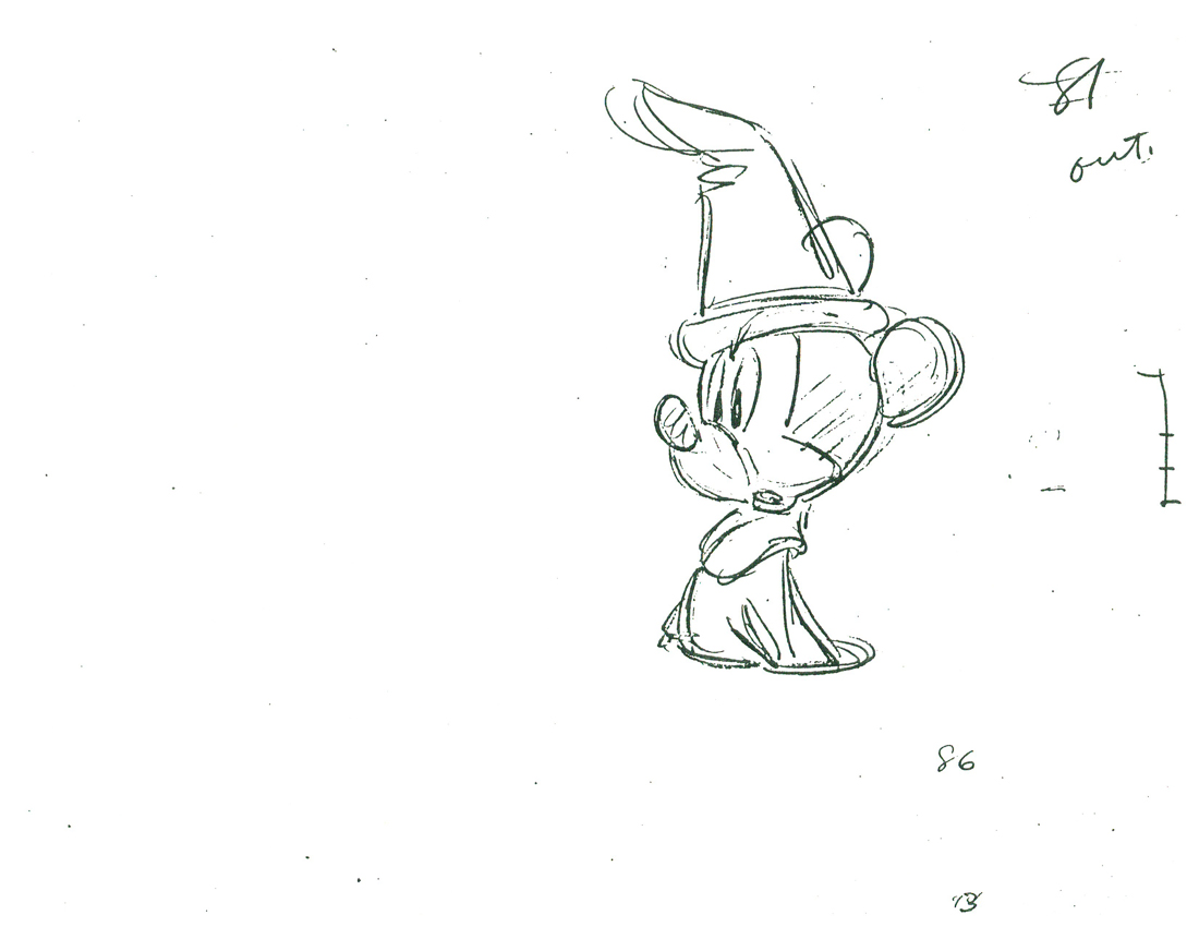
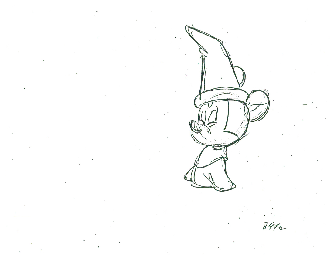
- Here’s another Preston Blair scene of Mickey, half under water, turning with some surprise. Of course, the scene is part of The Sorcerer’s Apprentice from Fantasia.
 75
75
 77
77
 79
79
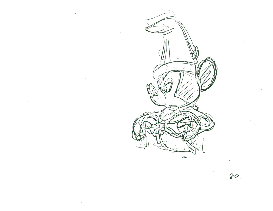 80
80
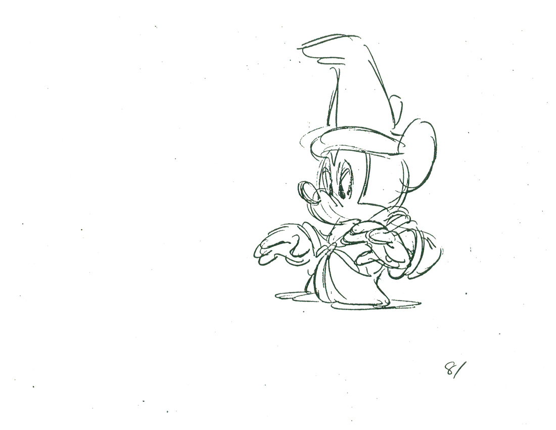 81
81
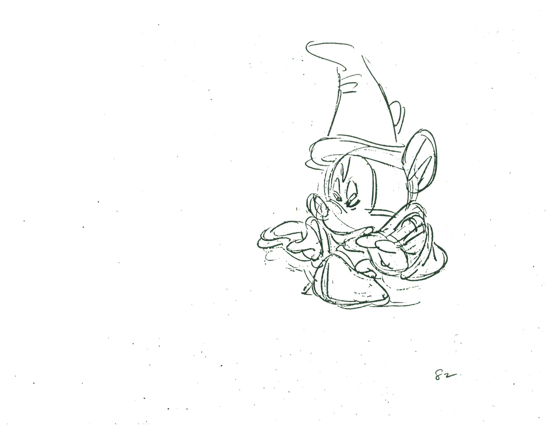 82
82
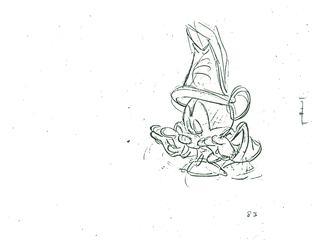 83
83
 84
84
 85
85
 86
86
 89-5
89-5
 90
90
 91
91
 93
93
 94
94
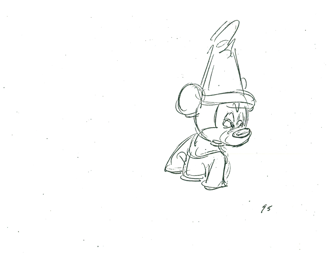 95
95
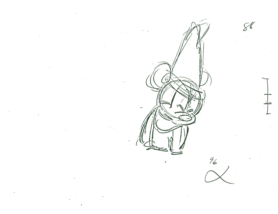 96
96
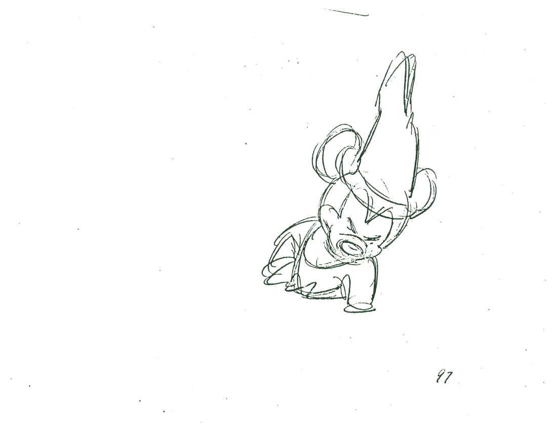 97
97
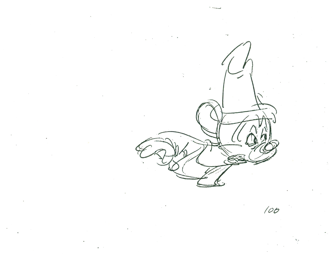 100
100
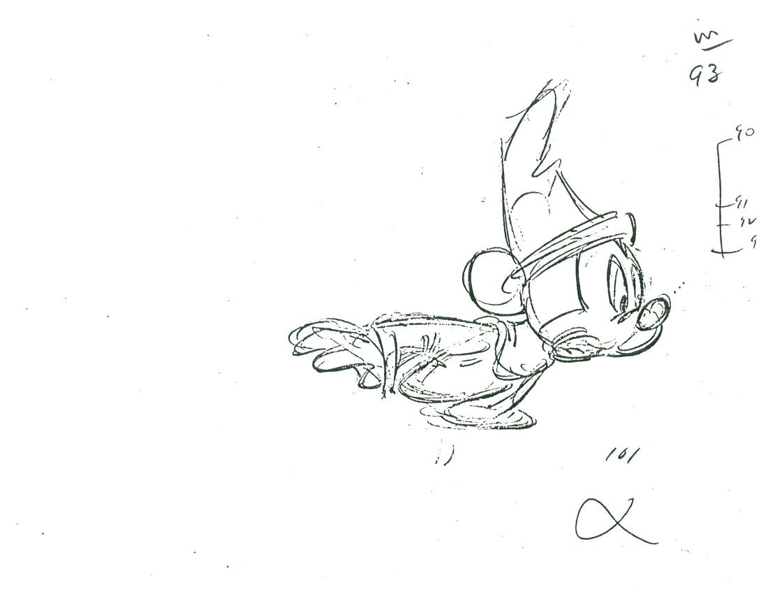 101
101
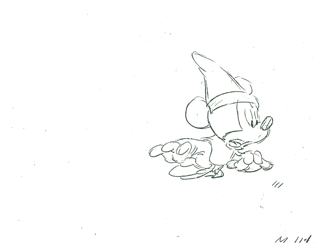 111
111
______________________
The following QT includes all the drawings posted above.
The registration is a bit loose. Sorry but, these are obviously
copies of copies and there’s plenty of shrinkage and distortion.
Animation Artifacts &Bill Peckmann &Illustration &Layout & Design &Models &repeated posts &Rowland B. Wilson 26 Mar 2012 07:23 am
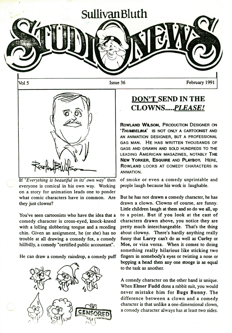
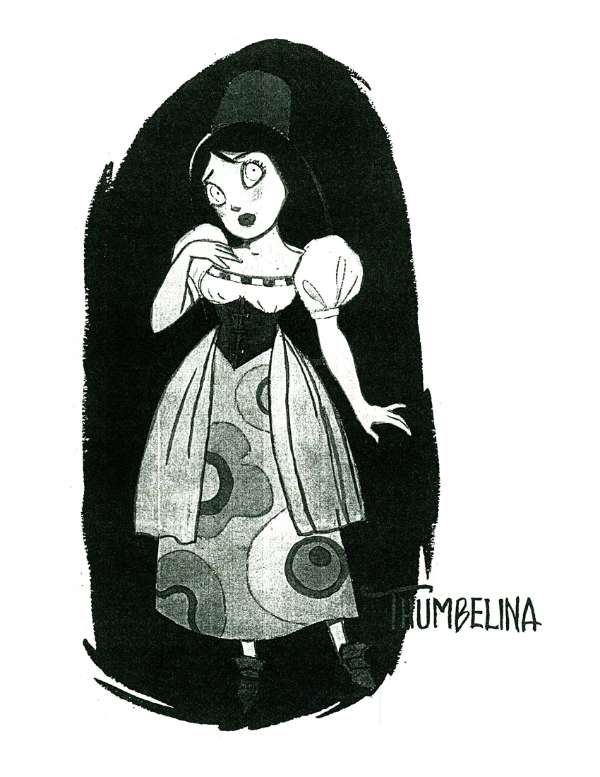
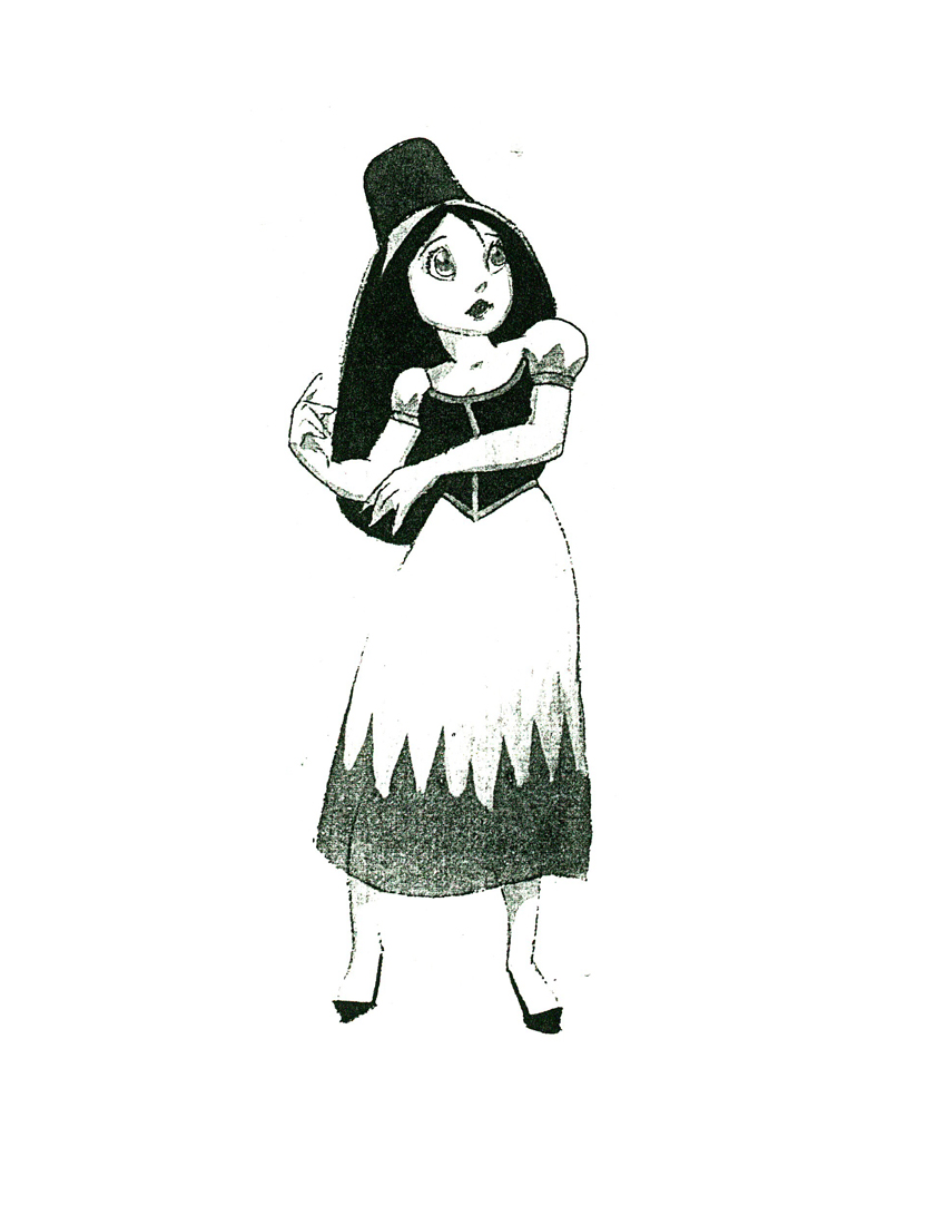
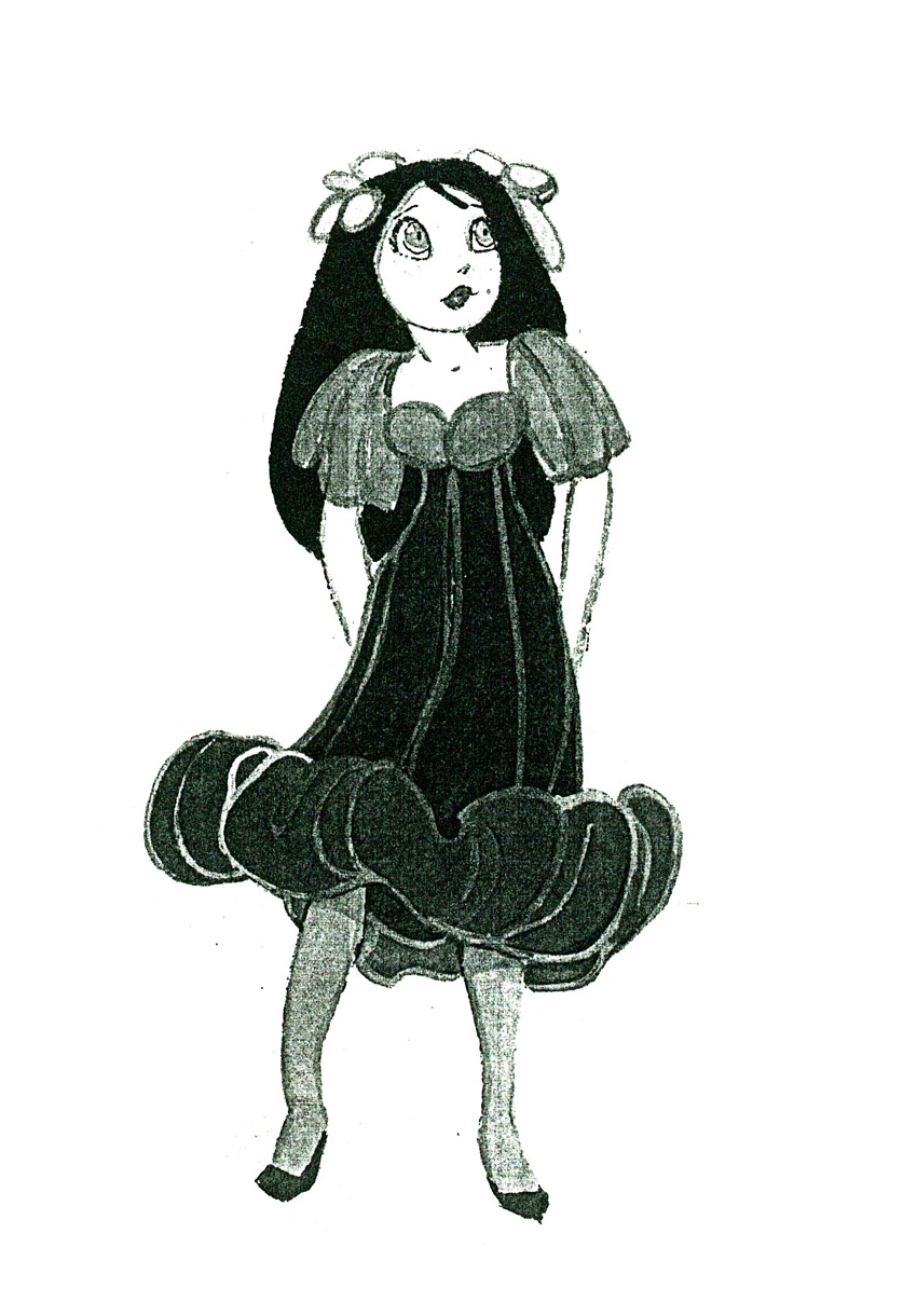
Thumbelina from Rowland B. Wilson
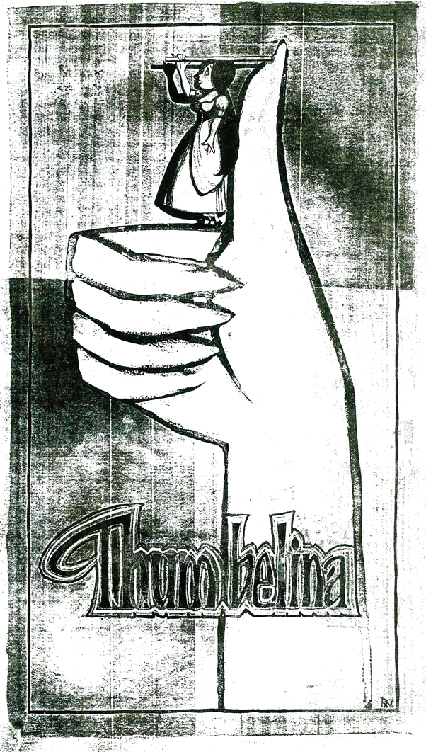 - Thanks to Bill Peckmann‘s extraordinary collection of design material, I have access to quite a few model sheets by Rowland B. Wilson.
His models for Don Bluth‘s feature, Thumbelina, fill a binder. I’m gong to have to break it up into two posts.
Here, I’ll reproduce the article Rowland had written for the in-house organ “Studio News.” This follows with models for some of the lead character models.
These models were done in pencil and ink, sometimes in color. Unfortunately, all of these are 8½ x 11 xerox copies. Blacks wash out and washes blacken. Regardless, they all come across fine enough to get the idea.
Any feature takes a lot of work. You can understand that just in the large number of model sheets that grace the production. When you have a talented artist such as Rowland Wilson doing that modelling for you, your art is off to a good start.
 1
1(Click any image to enlarge.)
 2
2  3
3
 1
1
Here we have the model that Rowland drew for Thumbelina.
This is definitely not the rotoscoped princess that we saw in the film.
 2
2 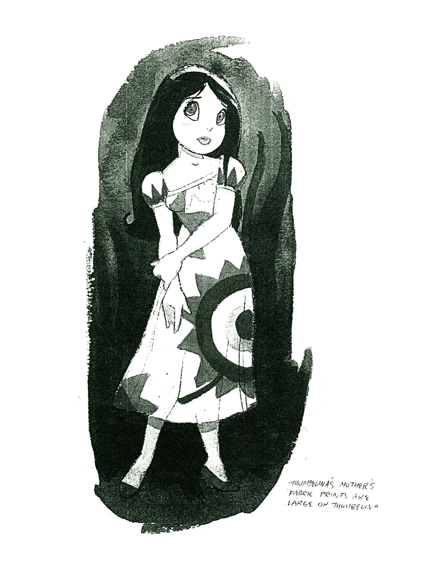 3
3
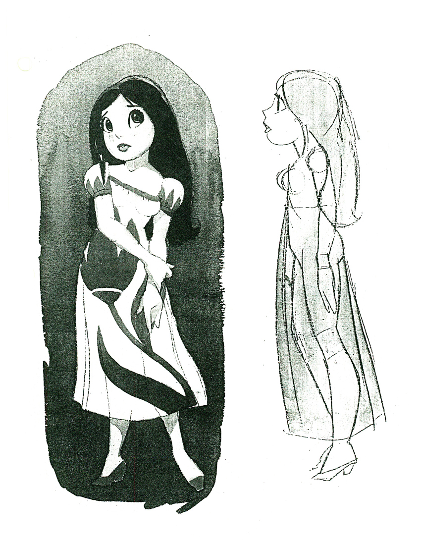
Here we have a lot of different costumes Thumbelina
will wear as she travels on her expeditions.
 4
4 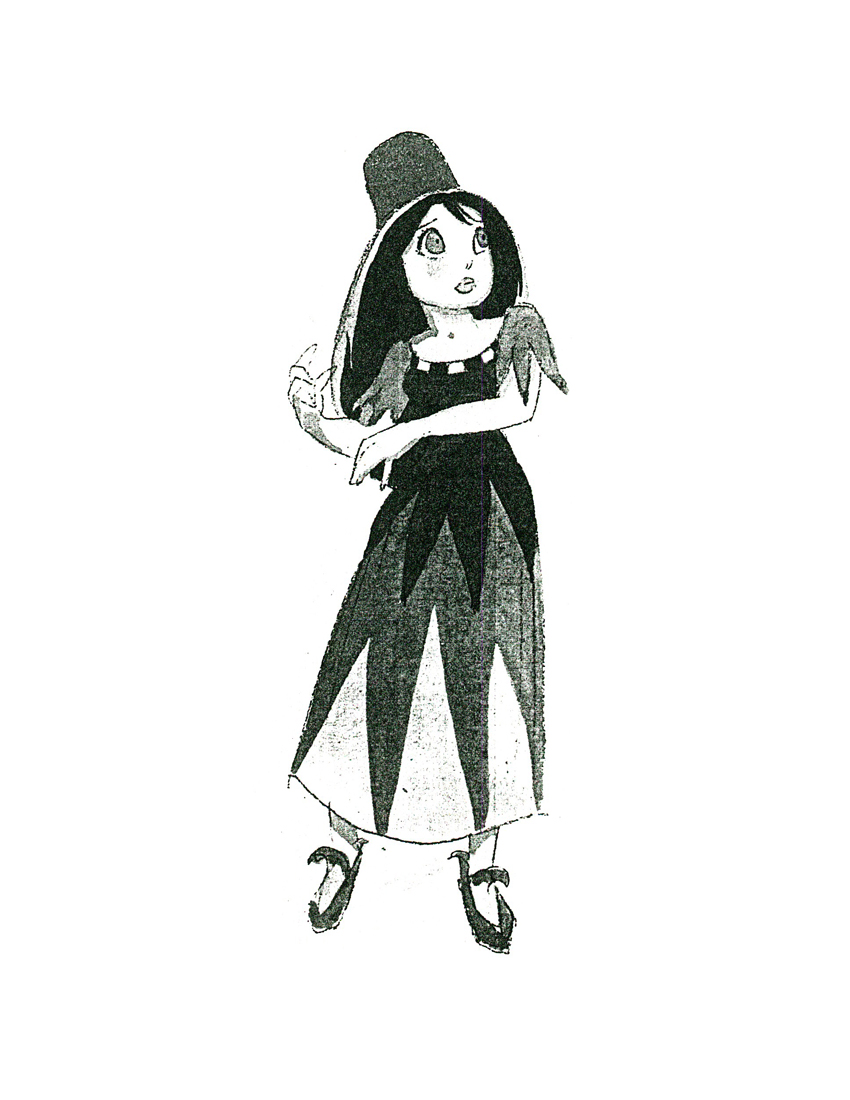 5
5
An original idea – a character who wears
more than one costume in a film!
 6
6  7
7
 8
8  9
9
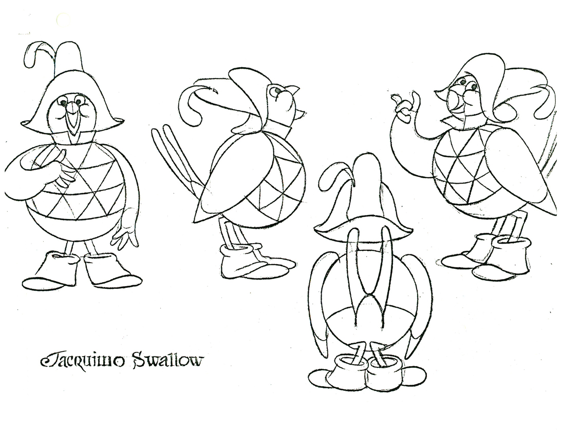
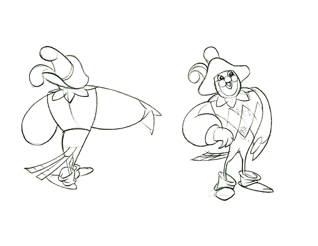
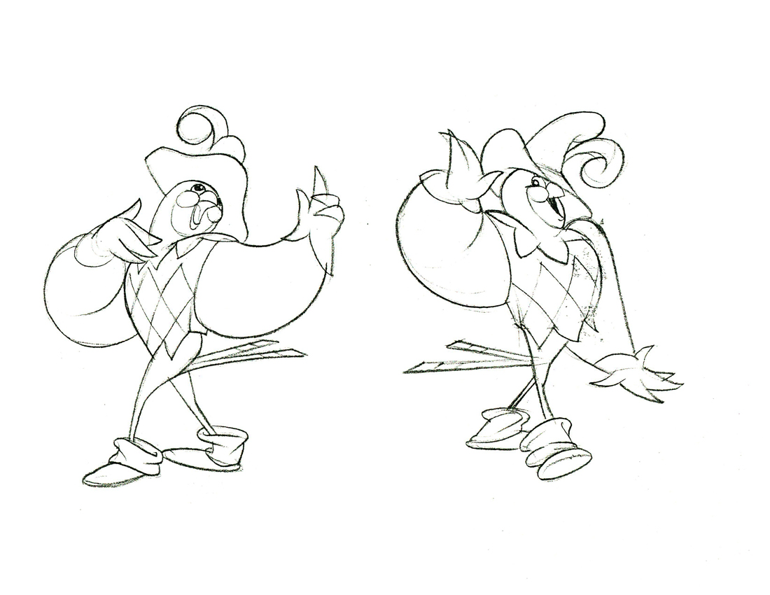
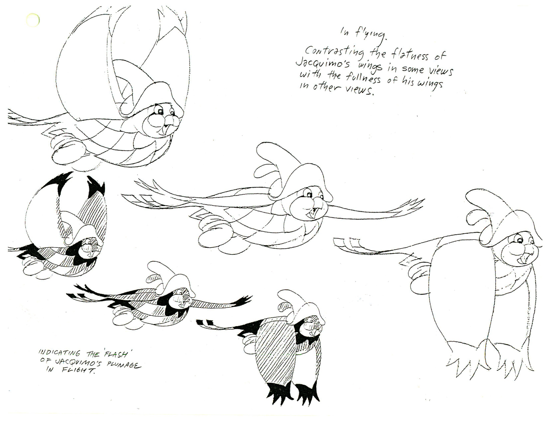
Jacquimo Swallow
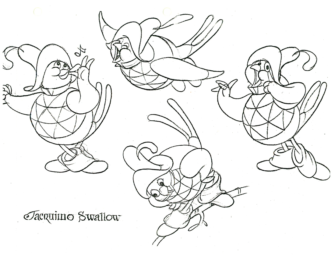
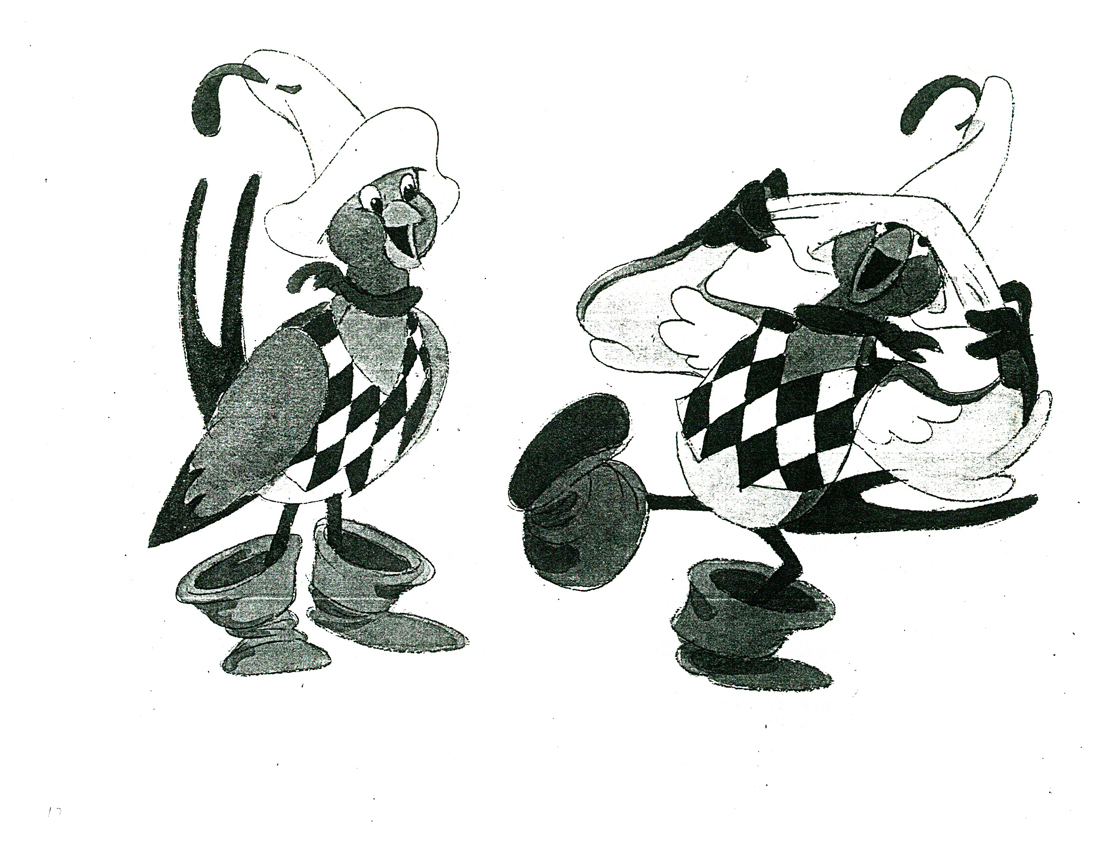
In color but copied in B&W.
Jacquimo 1
Jacquimo 2
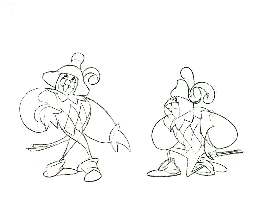
Jacquimo 3
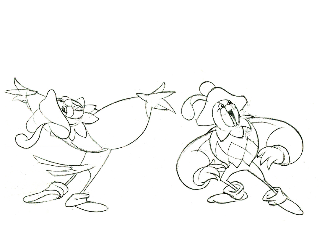
Jacquimo 4
Jacquimo 5

Jacquimo 6
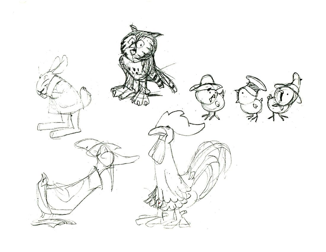
Some other birds in the course of the film.
This film is far from the best of Don Bluth, but it goes to show how much solid work is done for any feature film. There’s also quite a bit to be learned from any feature. Many of these models didn’t end up in the film (take a look at Thumbelina herself in yesterday’s post) but the drive was a forward one.
Off to the modelshow:
 1
1
(Click any image to enlarge.)
 2
2
 3
3
Another color one copied in B&W
 4
4
 5
5  6
6
 7
7
 8
8
 9
9
 10
10
 11
11 12
12
 13
13
 14
14 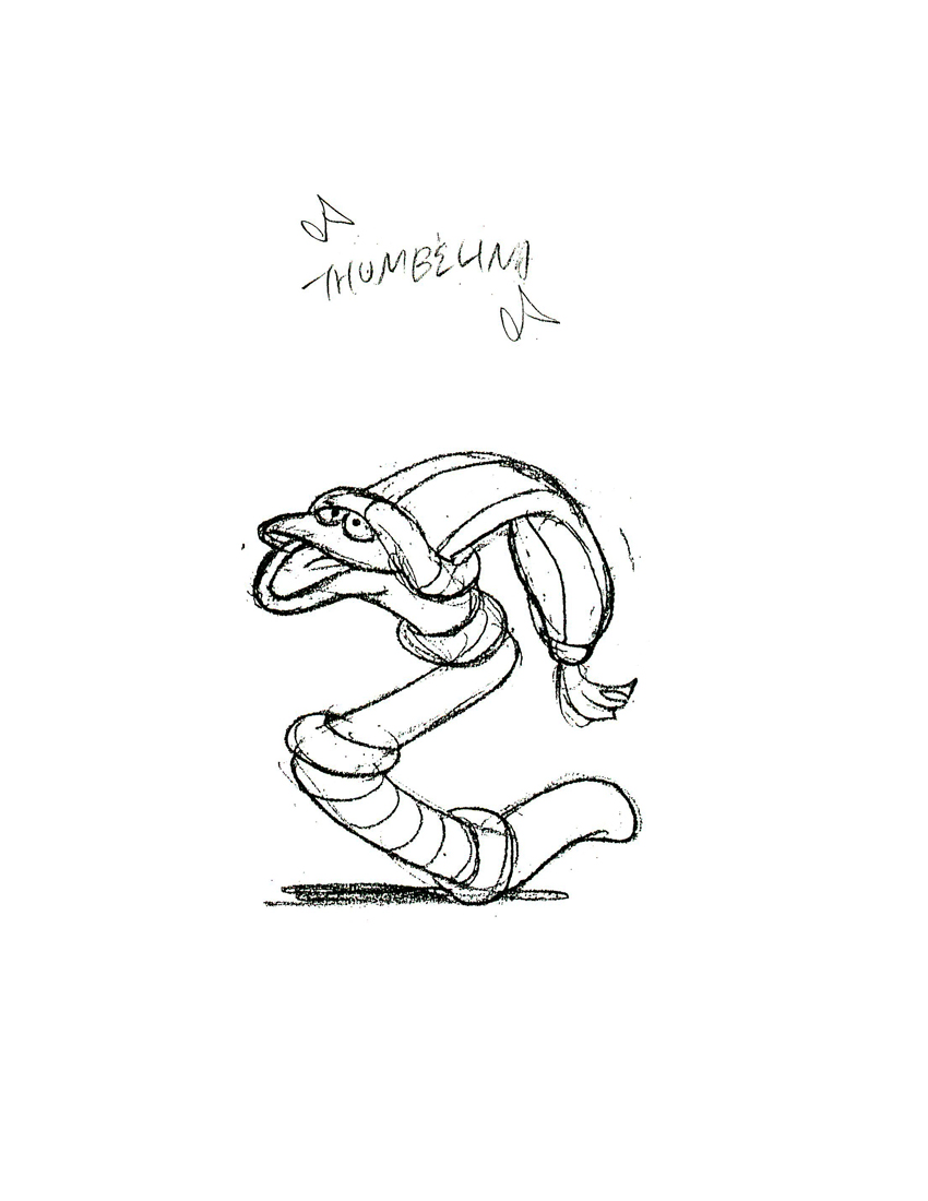 15
15
 16
16
 17
17
 18
18
 19
19  20
20
 21
21
 22
22
 23
23
 24
24
 25
25
 26
26
 27
27 28
28
Some notes
 29
29
 30
30
Finally, here are two color photos Rowland took of his presentation art.
 31
31
Animation Artifacts &Bill Peckmann &Books &Disney &Illustration &Rowland B. Wilson 19 Mar 2012 09:32 am
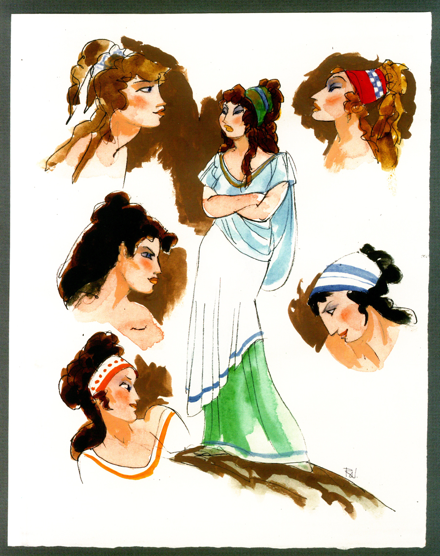
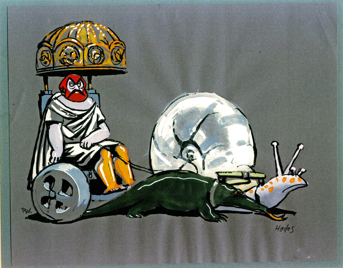
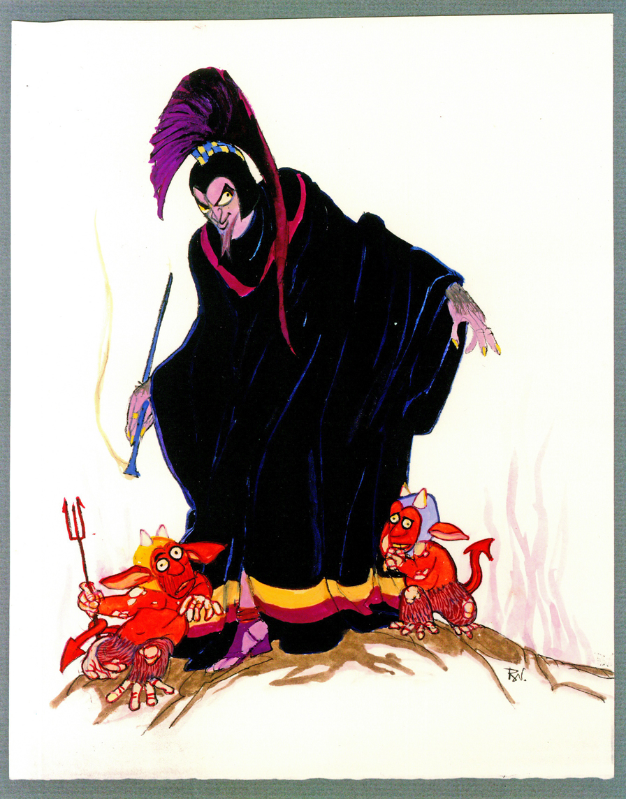
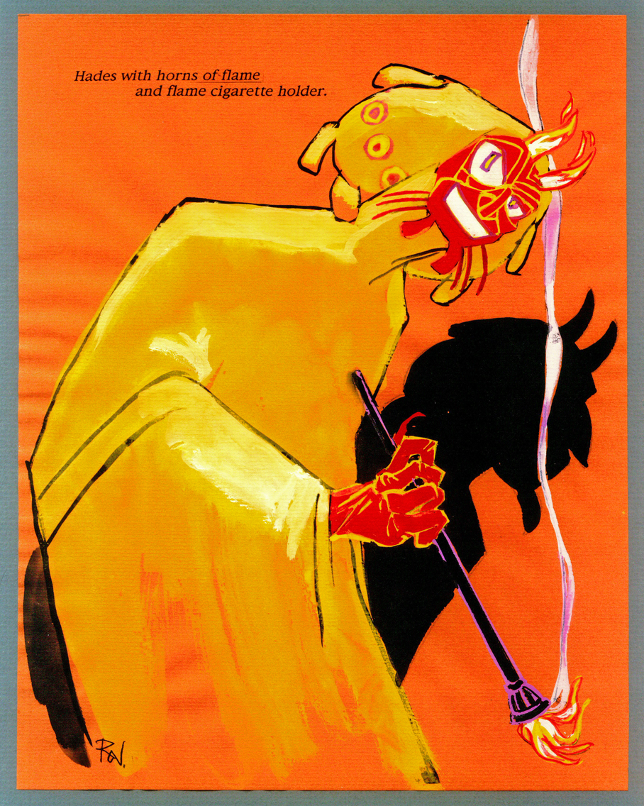
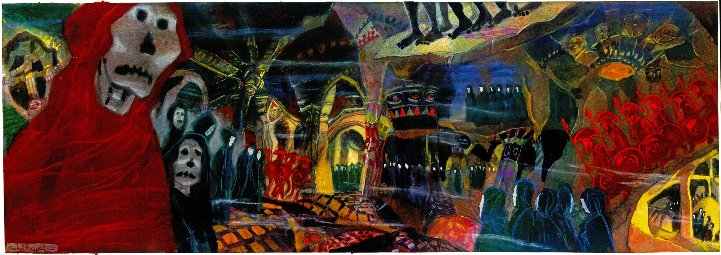
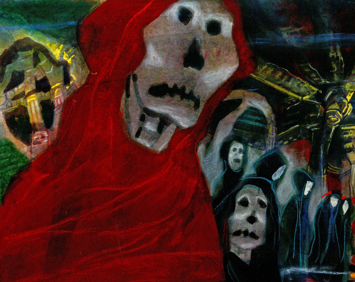
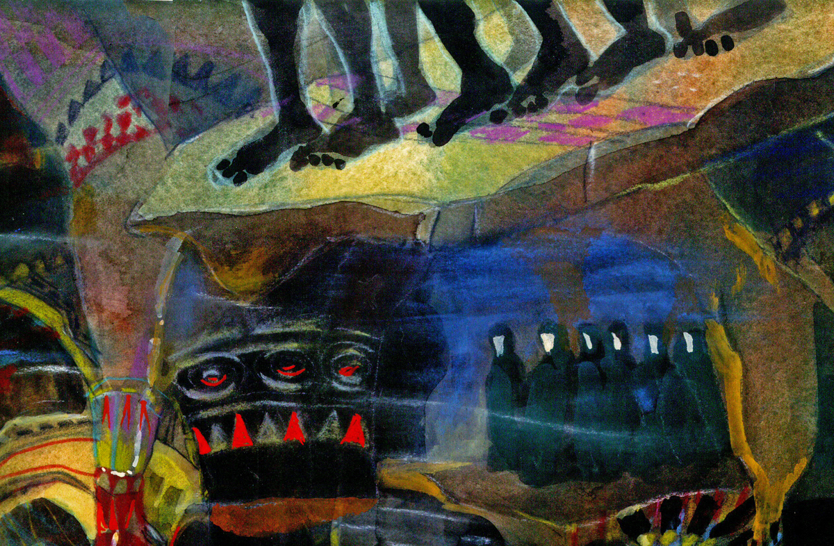
Rowland B. Wilson’s Hercules – Another look
Given the new book coming onto the market, Rowland B. Wilson’s Trade Secrets: Notes for Cartooning and Animation, I thought it appropriate to take a fresh look at some of his brilliant art for the animated film.
Last week I showcased some material previously posted, which had been done as preproduction art for Disney’s Hunchback of Notre Dame. Today, we look back to some of the work for Disney’s Hercules. It’s all pretty stunning material. Unquestionably the work of a master.
This is a book that was put together by Suzanne Lemieux Wilson, and it looks to be as much about animation as about cartooning. I’m not sure exactly what’s in the book, but I’m certainly eager to find out, and will give you a report as soon as I see it.
- Here’s Hercules.
This entry includes character sketches for characters that developed into something completely different, or didn’t end up in the film at all.
Once again, I must express my debt of gratitude to the generosity of Bill Peckmann for lending me the art to post here. And to Suzanne Lemieux Wilson for some additional sketches. Thank you, both.
 1
1Megara
 2
2
Hades – version 1
 3
3
Hades – version 2
 4
4
Hades – version 3
 5
5
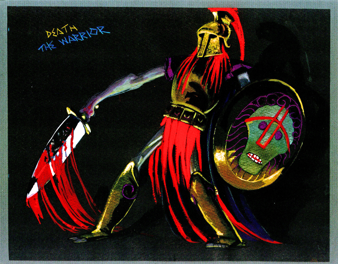
Death
 6
6
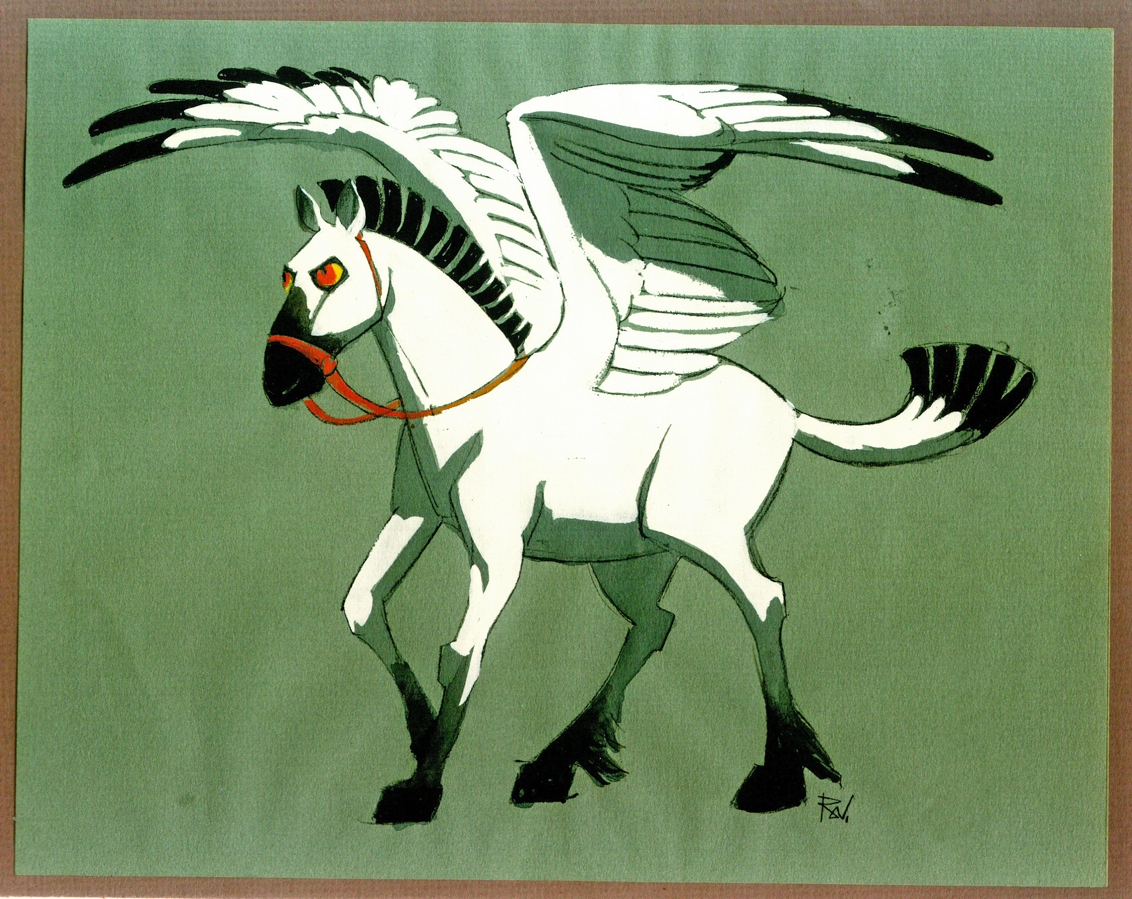
Pegasus
 7a
7a
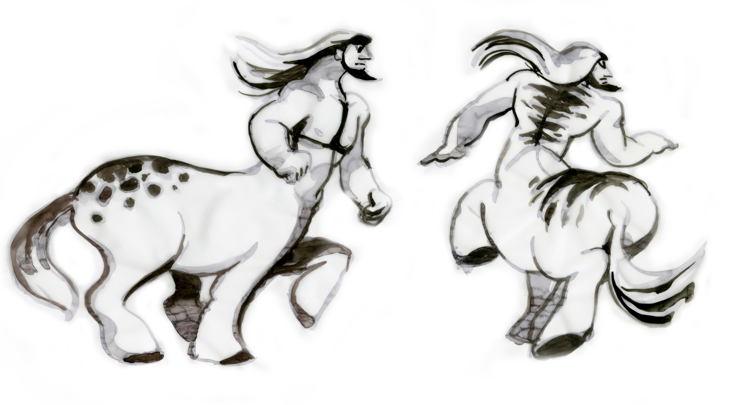
Centaus 1 drawing
 7b
7b
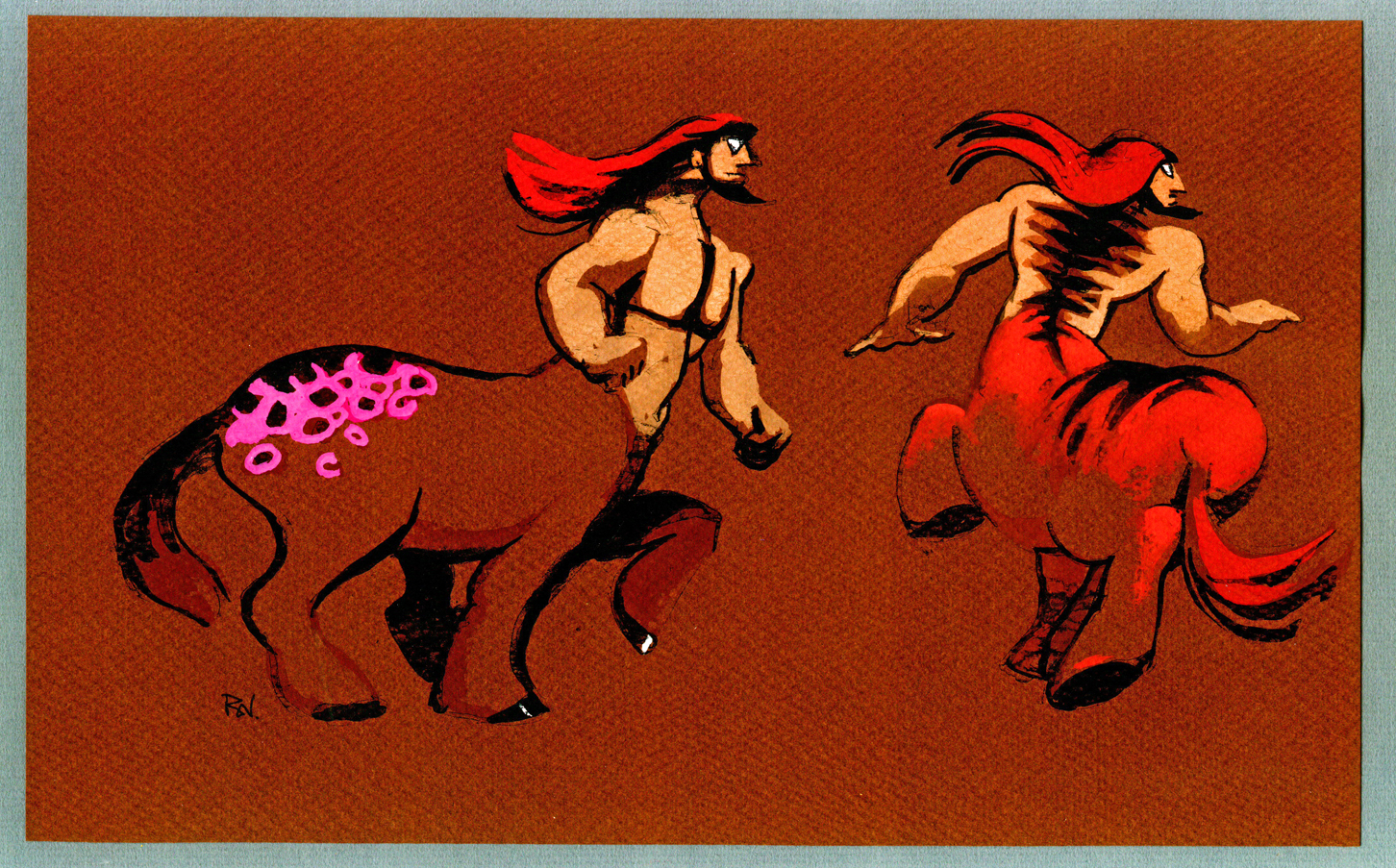
Centaurs 1 color
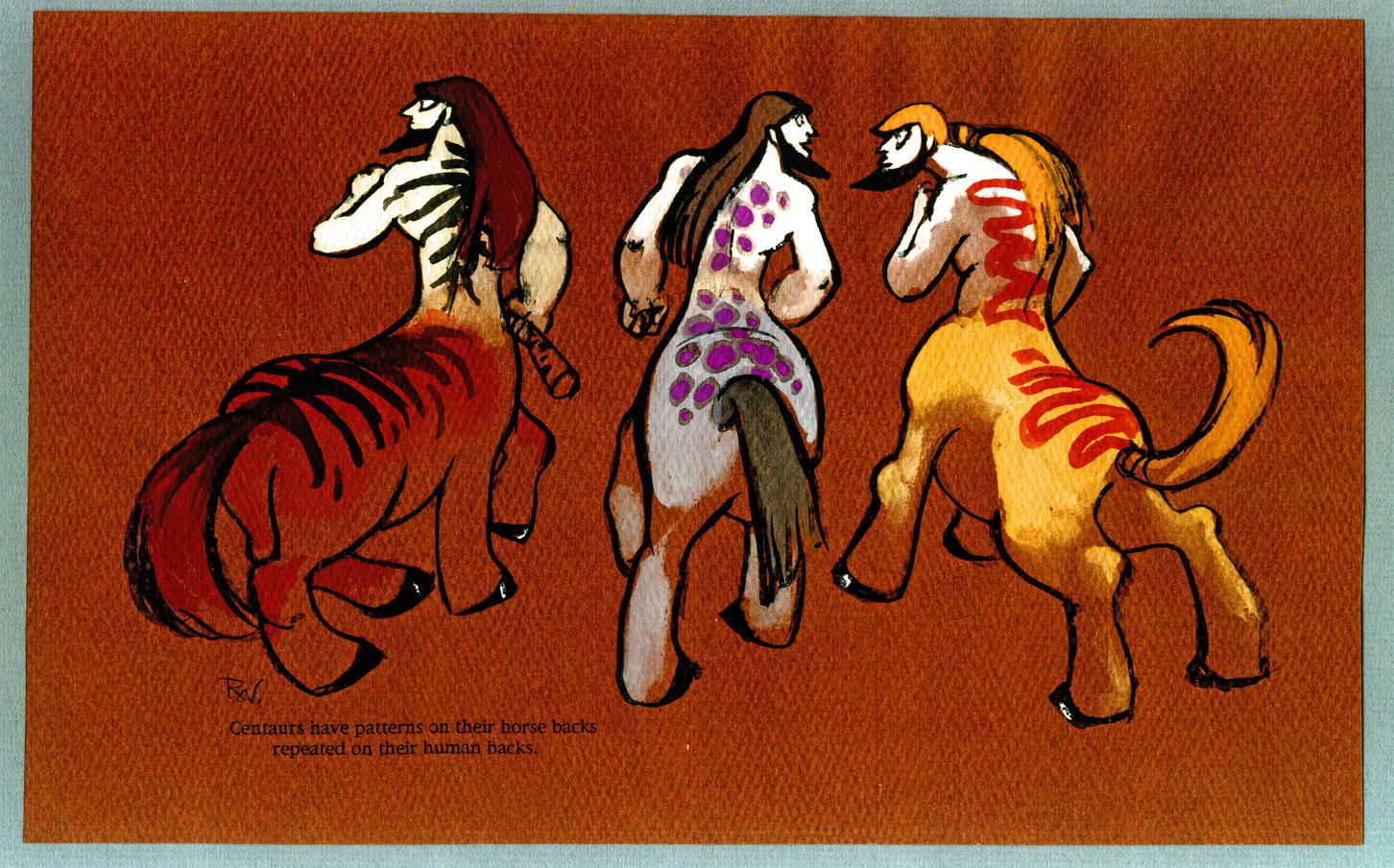 8
8
Centaurs 2
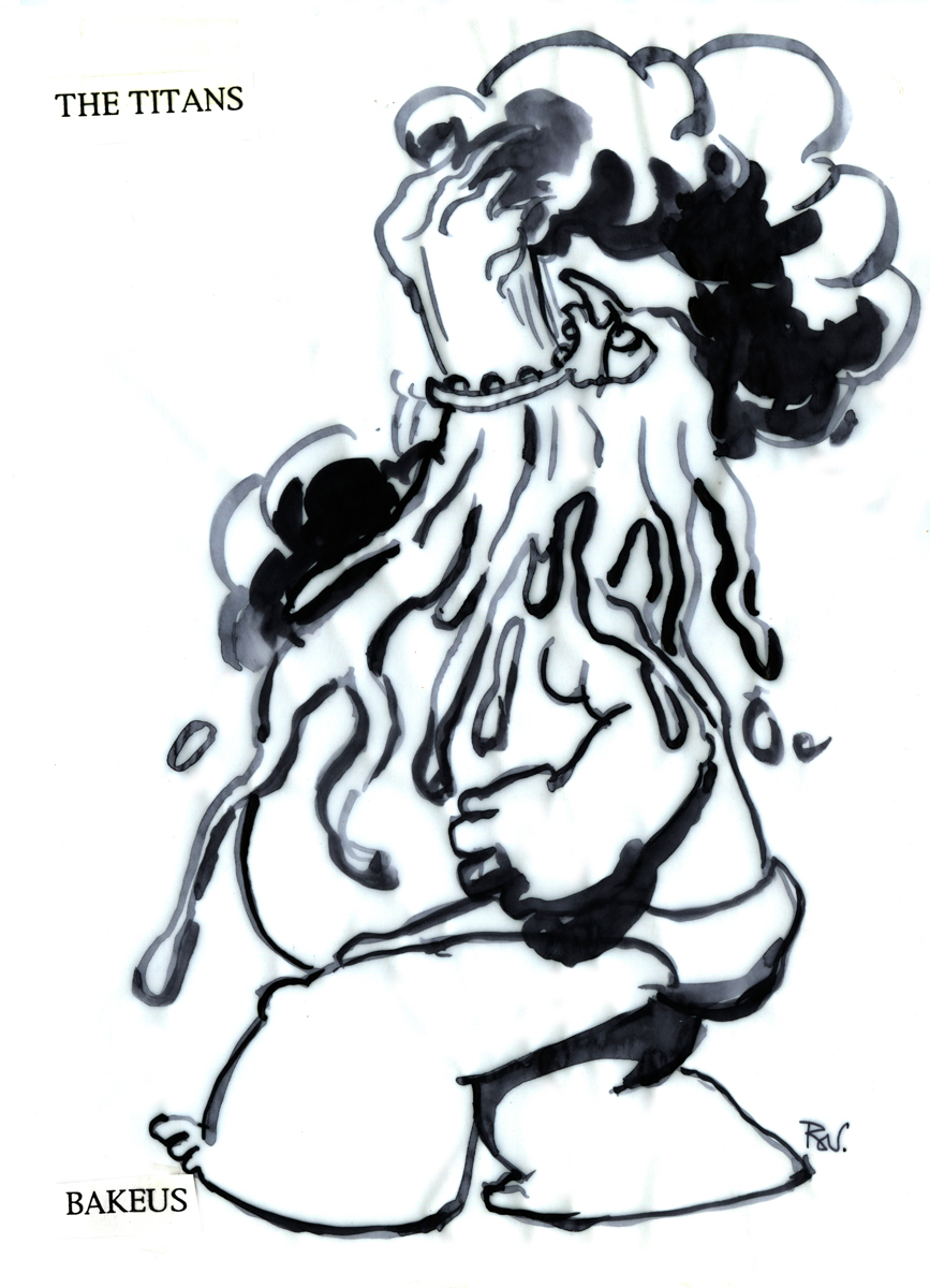 9a
9a
Bakeus – drawing
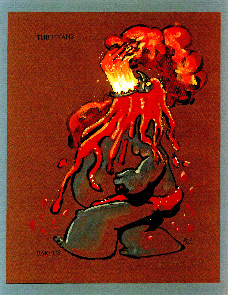 9b
9b
Titans 1 – Bakeus – color
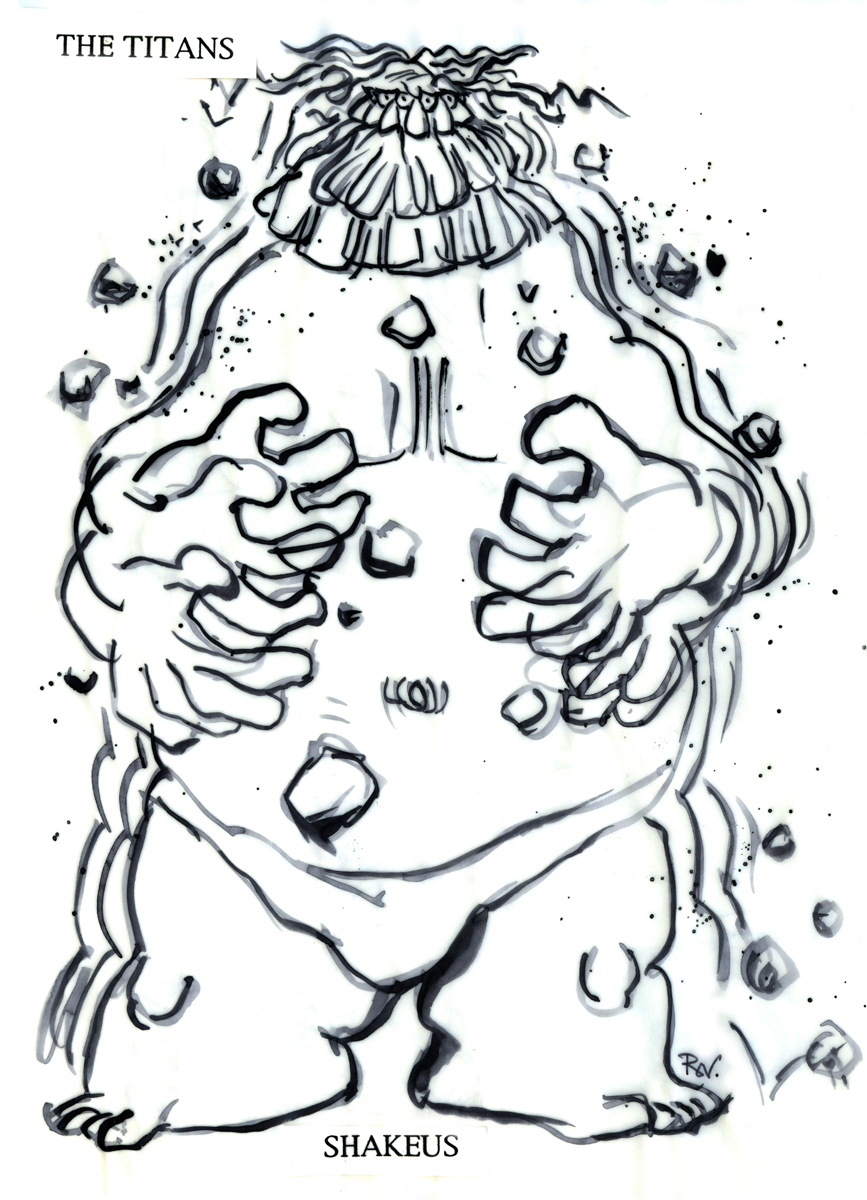 10a
10a
Shakeus – drawing
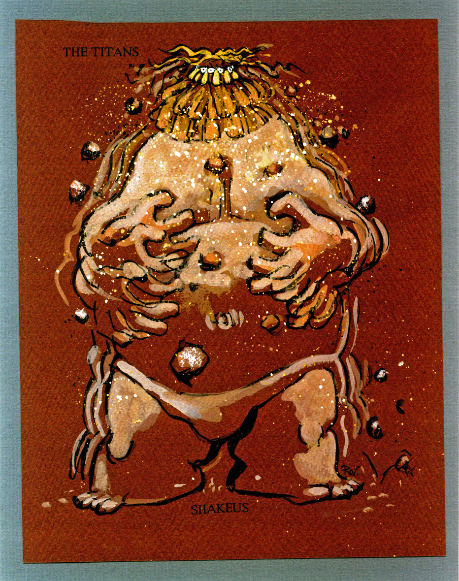 10b
10b
Titans 2 – Shakeus – color
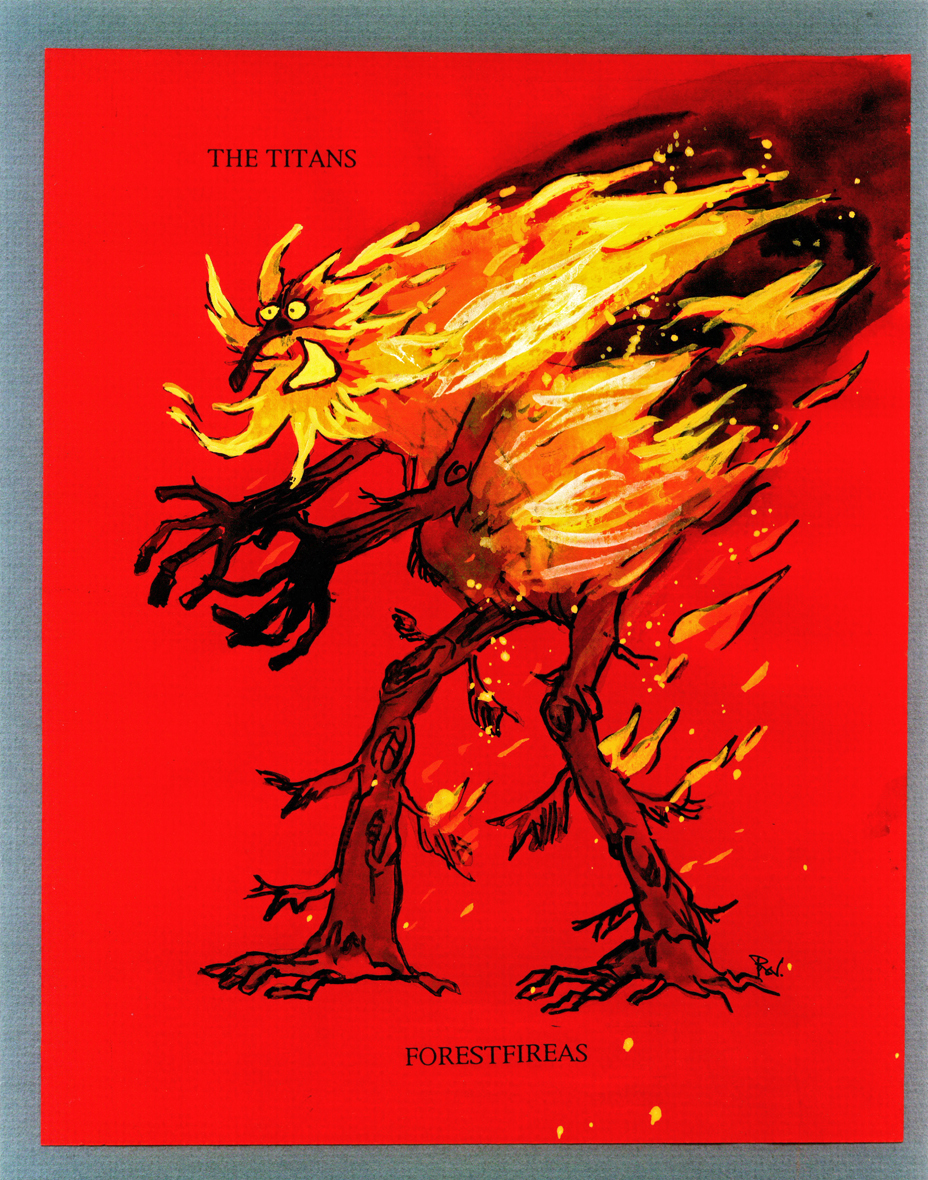 11
11
Titans 3
 12
12
Titans 4
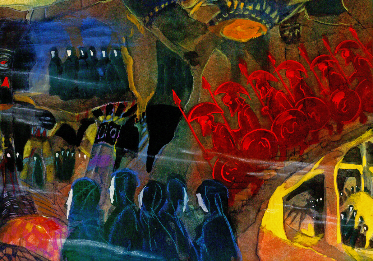
These watercolors are less character designs than they are inspirational pieces. They are inspirational. How stunning this art. I would have loved seeing something like this on the screen rather than Gerald Scarfe‘s. But that’s just me.
As with some of the last posts, I’m showing the larger piece (and they are large) and then going in for some tighter blowups.
 13
13(Click any image to enlarge.)
 13A
13A
 14
14
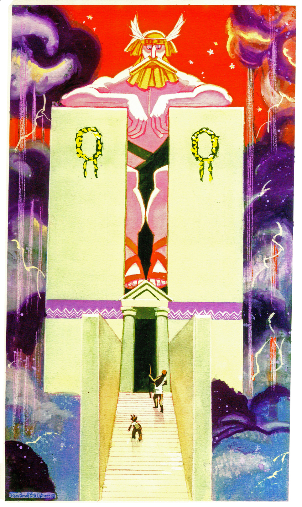
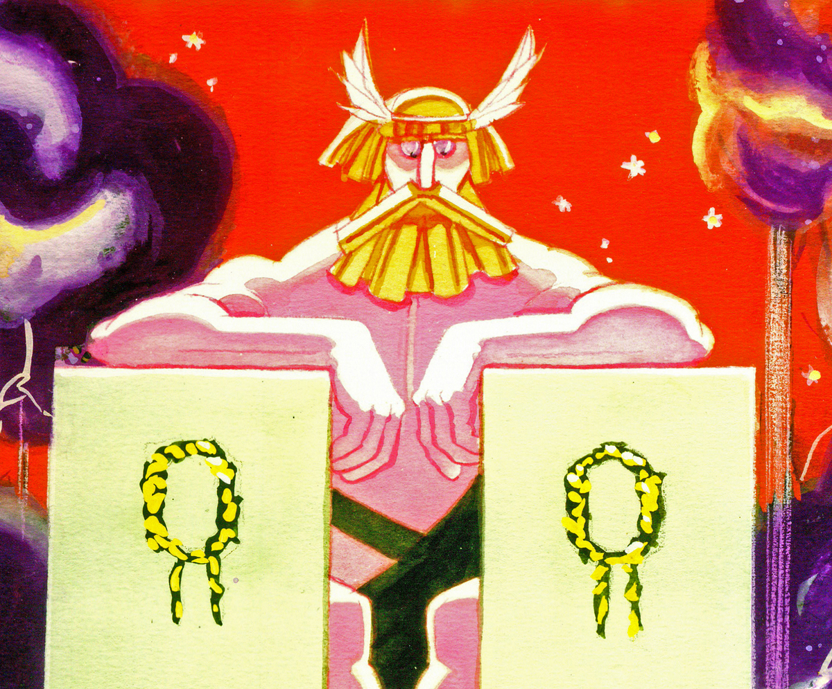
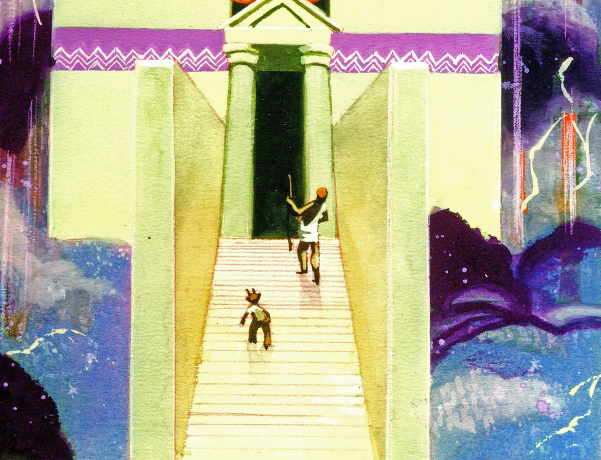
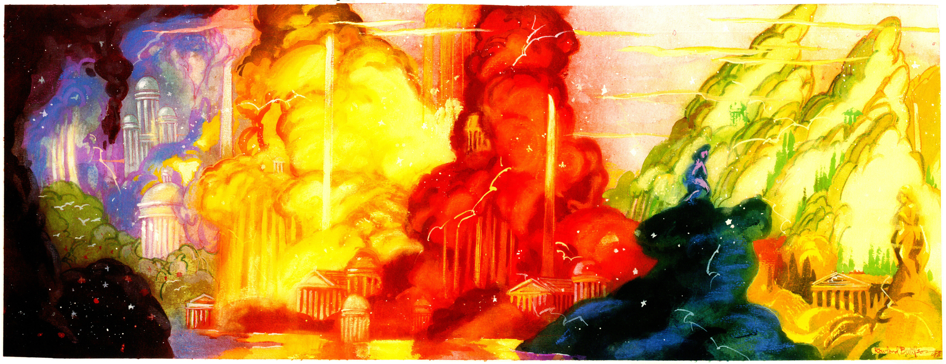
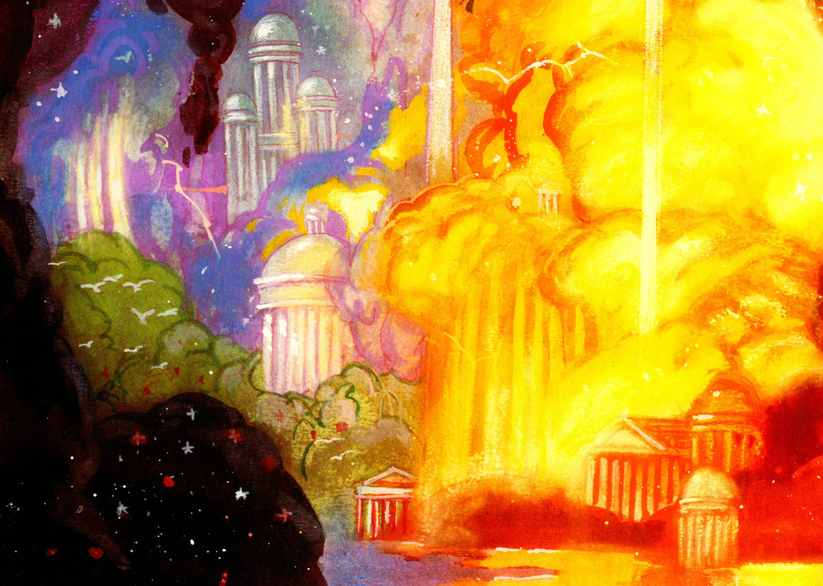
Typed beneath this image:
HERC AND PHIL ADDRESS ZEUS ON MT. OLYMPUS
The realm of the gods is in the sky. The landscape is made of sky imagery –
the classic buildings, the trees, the hills are the colors of rainbows, thunderheads,
lightning, rain, hail and stars. Trees have tops made of clouds and trunks of rain
or lightning. Buildings evolve out of mist as do the gods themselves.
The gods can be large or human scale as needed.
In mythology, Zeus changed himself into a swan, a bull, a cloud,
and even a shower of gold.
Everything is as changeable and colorful as a sunset.
 14A
14A
 14B
14B
 15
15
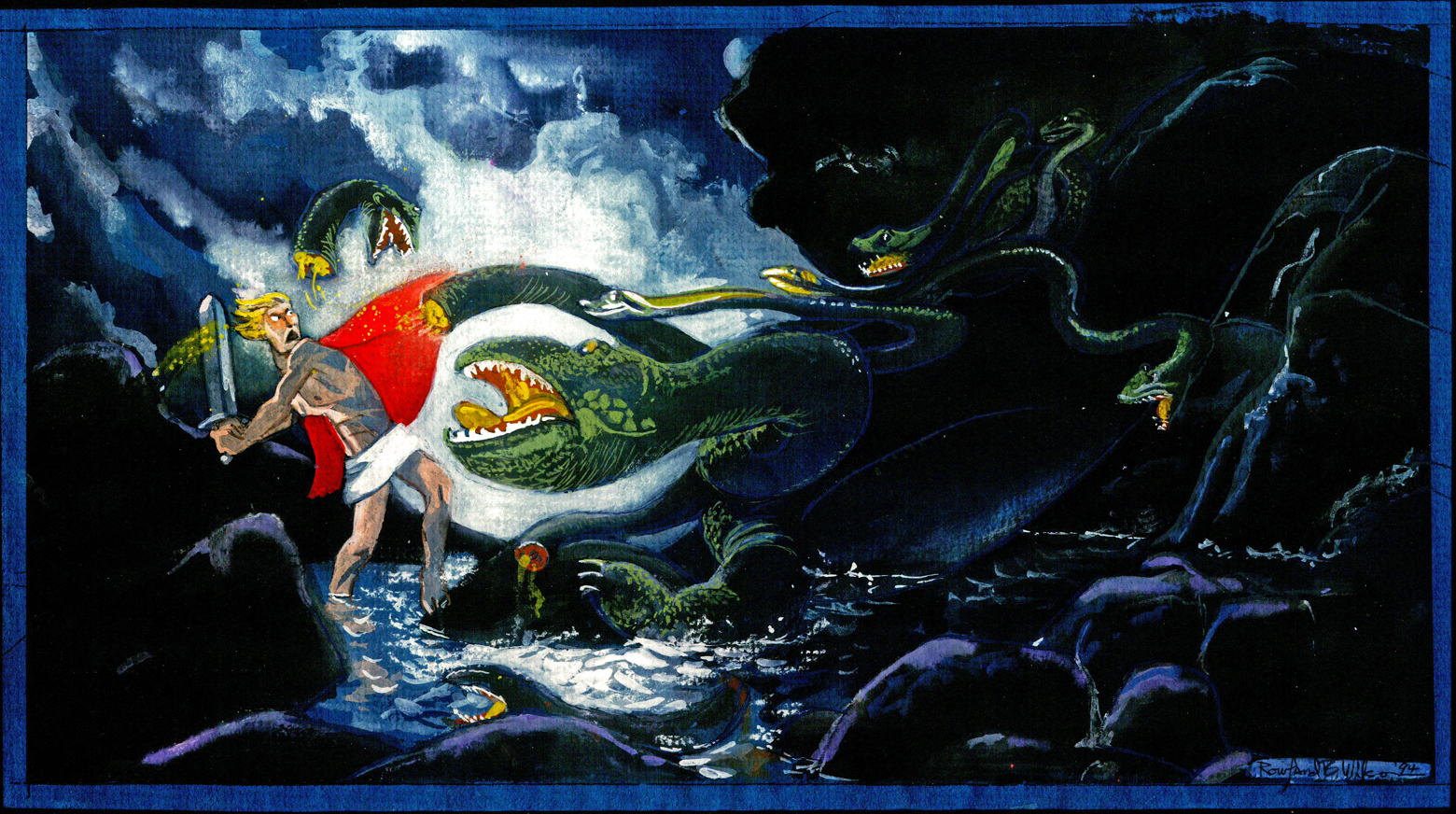
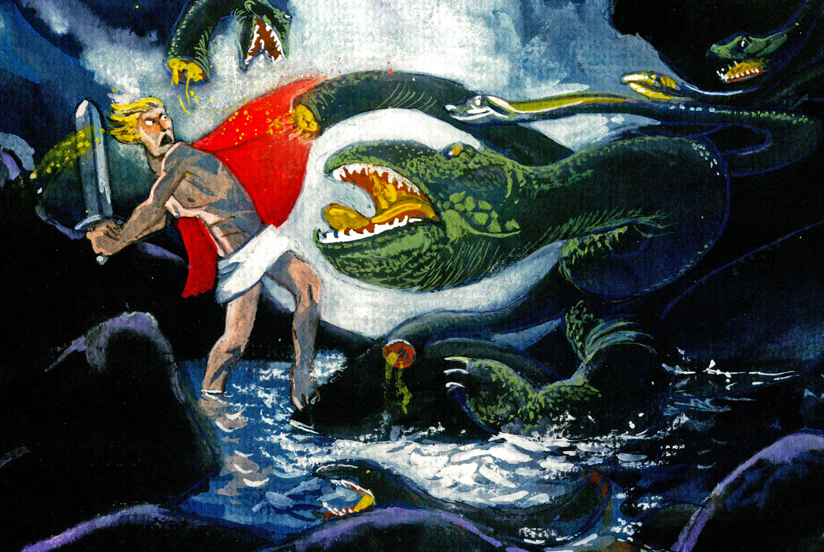
Hercules and the Hydra.
 15A
15A
 16
16
Typed below this image:
THE HOME OF THE GODS.
A skyscape. Trees, mountains and waterfalls appear and dissolve away.
We can see shapes in the clouds – temples and statues.
Lightning flashes and stars gleam in unexpected places.
The whole skyscape is slowly drifting.
 16A
16A
 16B
16B
 17
17
This ain’t heaven.
 17A
17A
 17B
17B
 17C
17C
 18
18
This one looks almost as though it were painted
on black velvet – appropriately enough.
 18A
18A
 18B
18B
 18C
18C
Suzanne Wilson also sent these very rough cartoons RBW did:
 19
19
 20
20
 21
21
Animation &Animation Artifacts &Disney 14 Mar 2012 04:20 am
Mickey Rolls Up Sleeves
- Continuing what I’d started last week, I have a few of these Mickey scenes. This one is an extension of what we saw already. Les Clark has Mickey roll up his sleeves and throw an order to the broom, which glimmers to life.
I’ll follow up, next week with a couple of Preston Blair scenes as well as an article about his work.
Here, with no registration other than my own guess work are some more images of Mickey and the broom.
 1
1
 23
23
 26
26
 31
31
 36
36
 40
40
 46
46
 53
53
 60
60
 67
67
 71
71
 73
73
 74
74
 75
75
 84
84
 87
87
 93
93
 98
98
 104
104
 107
107
 1A
1A
 1D
1D
 1J
1J
 1R
1R
 1W
1W
 1Z
1Z
______________________
The following QT includes all the drawings posted above.
The registration is a bit loose. Sorry but, these are obviously
copies of copies and there’s plenty of shrinkage and distortion.
Animation &Animation Artifacts &Art Art &commercial animation &Independent Animation &SpornFilms 05 Mar 2012 06:22 am
Steig Alka Seltzer Drawings
 I thought today I’d post anew some layout drawings done by William Steig for an Alka Seltzer commercial produced in the early 60′s.
Obviously, for the purpose of viewing, I’ve reconfigured the poses so that several of them are on each set-up. There are actually 15 drawings to the commercial, all on separate sheets of rice paper.
 The commercial was done by Elektra Studios. Steig worked with a bamboo reed cut to form a point. He dipped that in ink and drew. The paper is particularly thick and is designed to absorb the ink. They’re punched with Oxberry peg holes top and bottom. I have one of the bamboo “pens” he used to draw these layouts. The final commercial was basically an ink line drawing against a white field.
 I’ve been a big fan of Steig‘s since my earliest days when I first discovered him in the New Yorker Magazine. By the time I’d made it to college, I’d already seen two art exhibits of his artwork.
 By the time I saw my third exhibit of his work, I was able to barely afford one of the New Yorker drawings. It’s done on rice paper with the same type of “pen”. Years later, when I told Steig that I’d bought it, he said that it was the only drawing to have sold at that exhibit.
It was real luck for me to have been able to adapt a couple of his children’s books to animation. I not only got to meet him and his wife, Jeanne, but worked with his flutist son, Jeremy, on a number of projects.
I’m rather partial to Abel’s Island as a film. There were only about two dozen B&W pen and ink illustrations in the book, so we had to do quite a bit of designing in the style of Steig Bridget Thorne, who art directed the film, did some of her finest work ever on the backgrounds – beautiful pieces that I still treasure. I think this is one of Steig‘s best books, and I think we more than did it justice. Too bad negative feelings developed toward the end of that film as Jeremy sought some kind of financial greed, and I had to move on past him to protect the film, itself. - I still wonder what Shrek might have looked like if they’d followed Steig‘s book illustrations.
The original one minute spot.
These are some of the layout drawings done by William Steig for an Alka Seltzer commercial produced in the early 60′s.
 2
2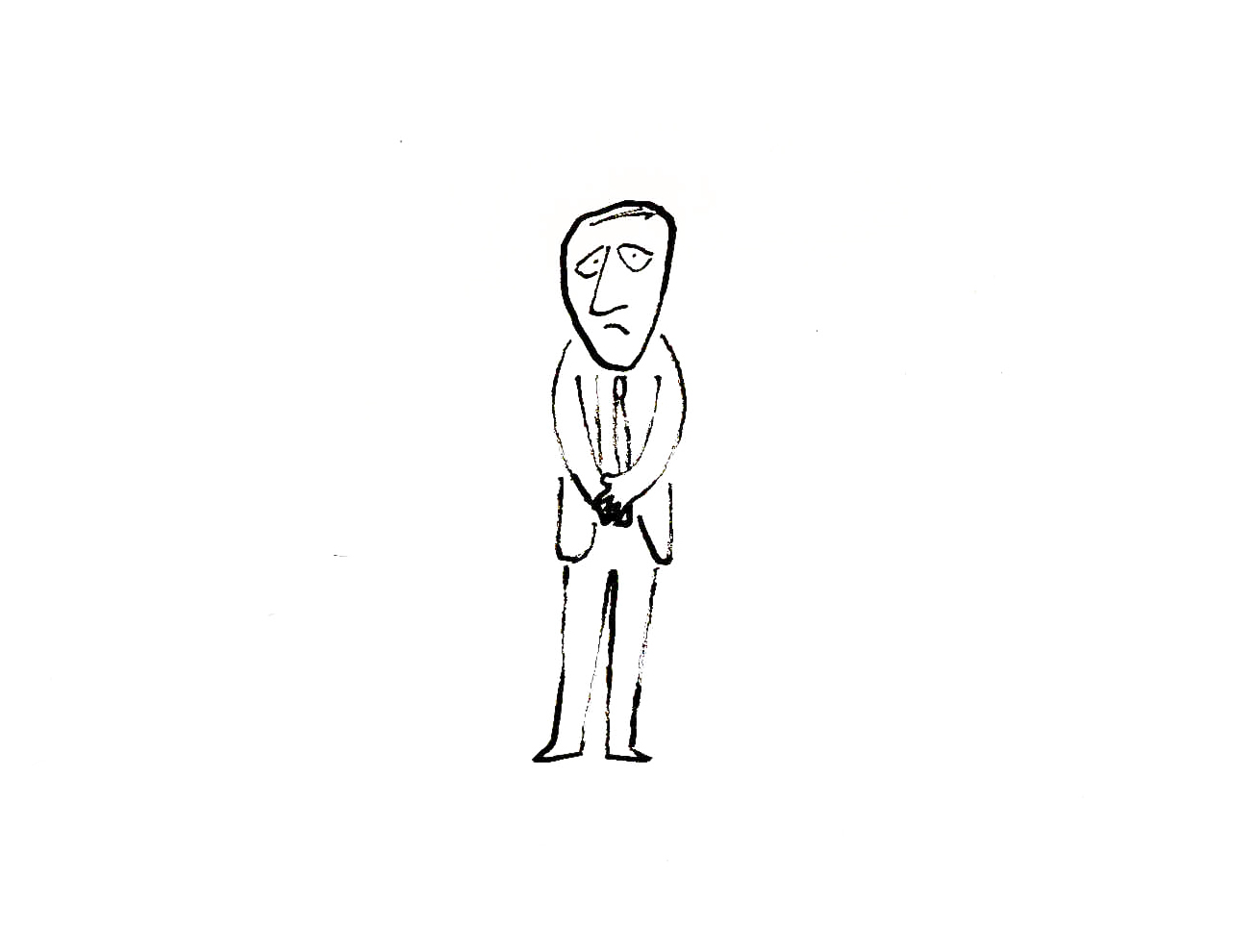 3
3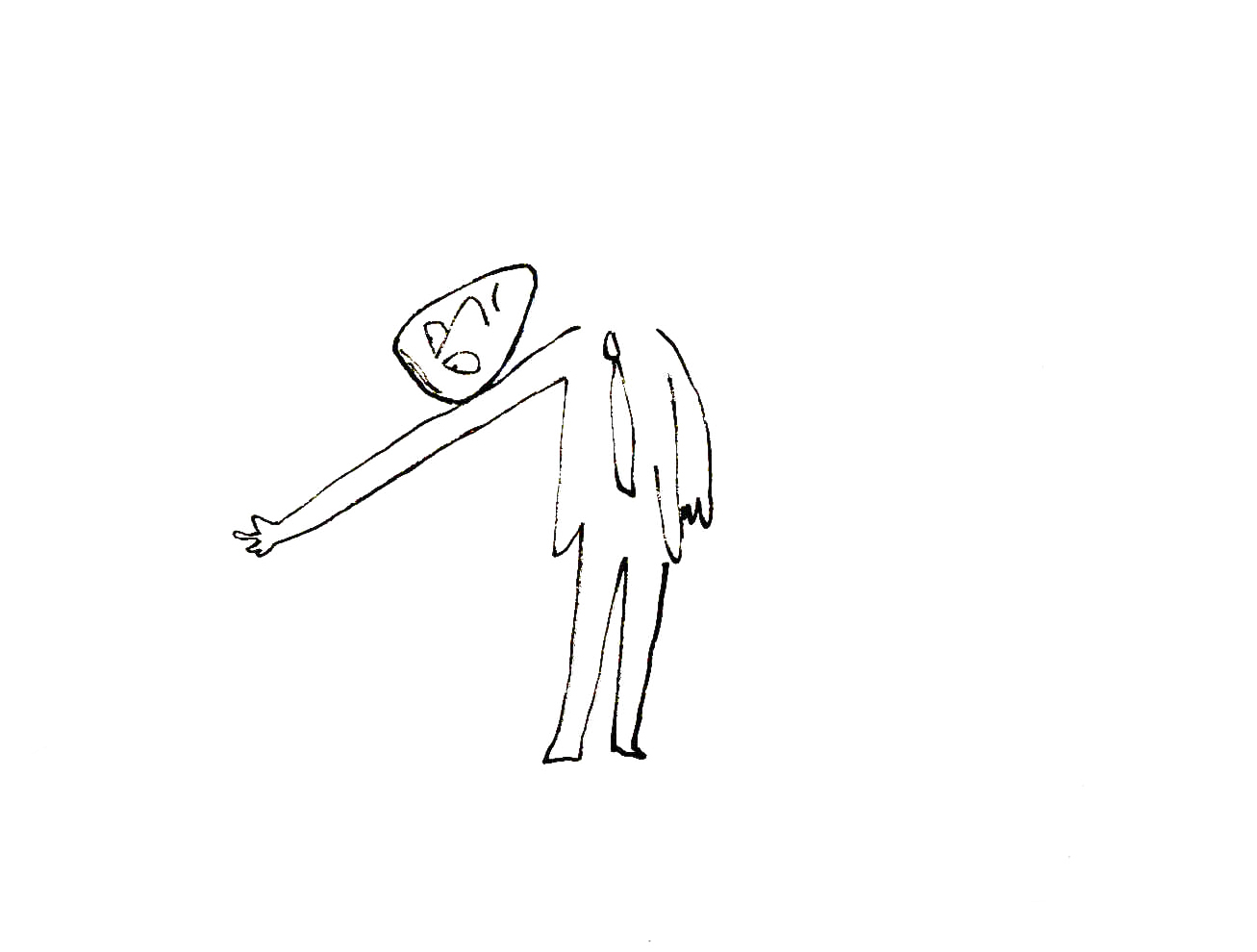
The commercial was done by Elektra Studios. Steig worked with a bamboo reed cut to form a point. He dipped that in ink and drew. The paper is particularly thick and is designed to absorb the ink. They’re punched with Oxberry peg holes top and bottom. I have one of the “pens” he used to draw these layouts. The final comercial was basically an ink line drawing against a white field.
 7
7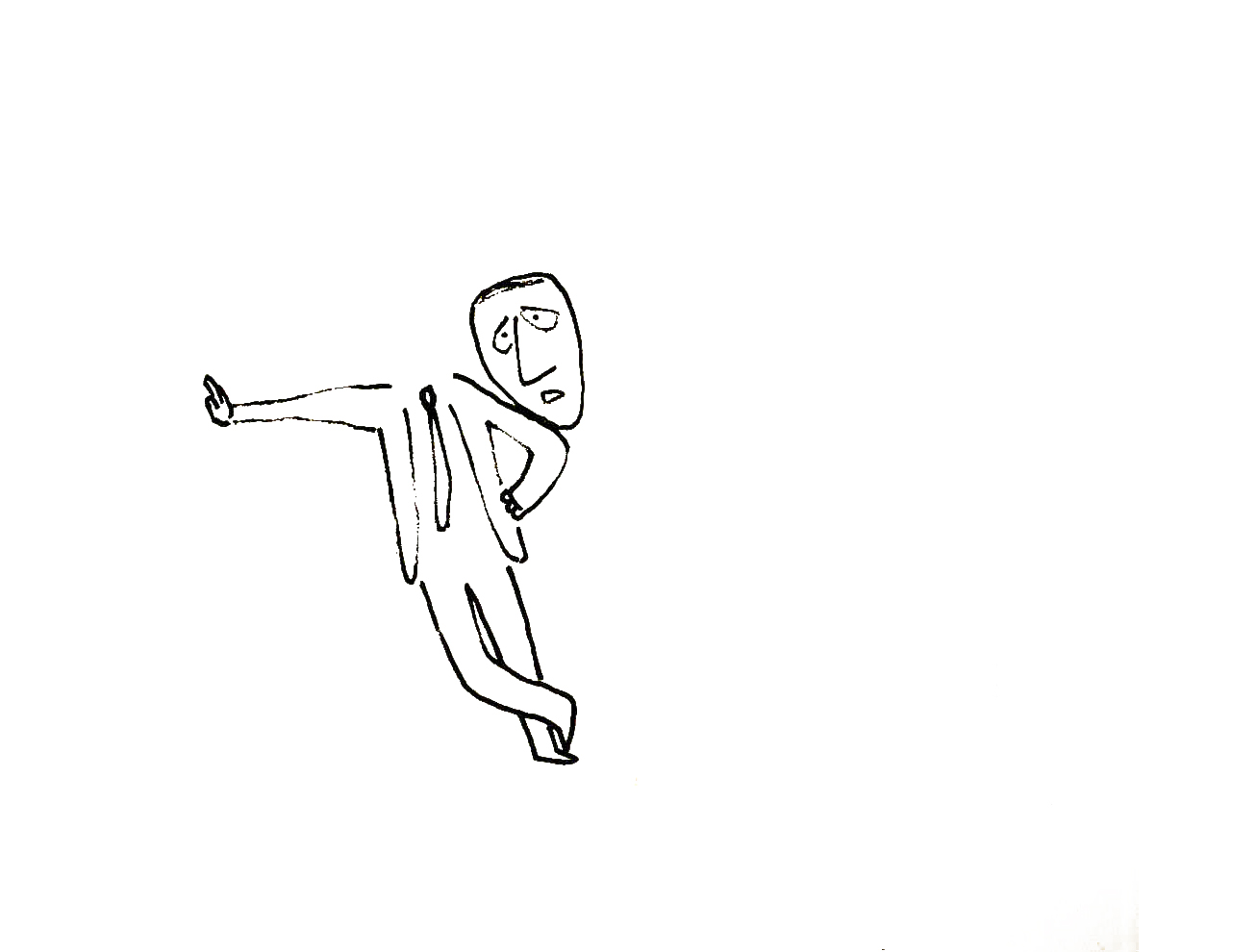 9
9I’ve been a big fan of Steig‘s since my earliest days when I first discovered him in the New Yorker Magazine. By the time I’d made it to college, I’d already seen two art exhibits of his artwork.
 12
12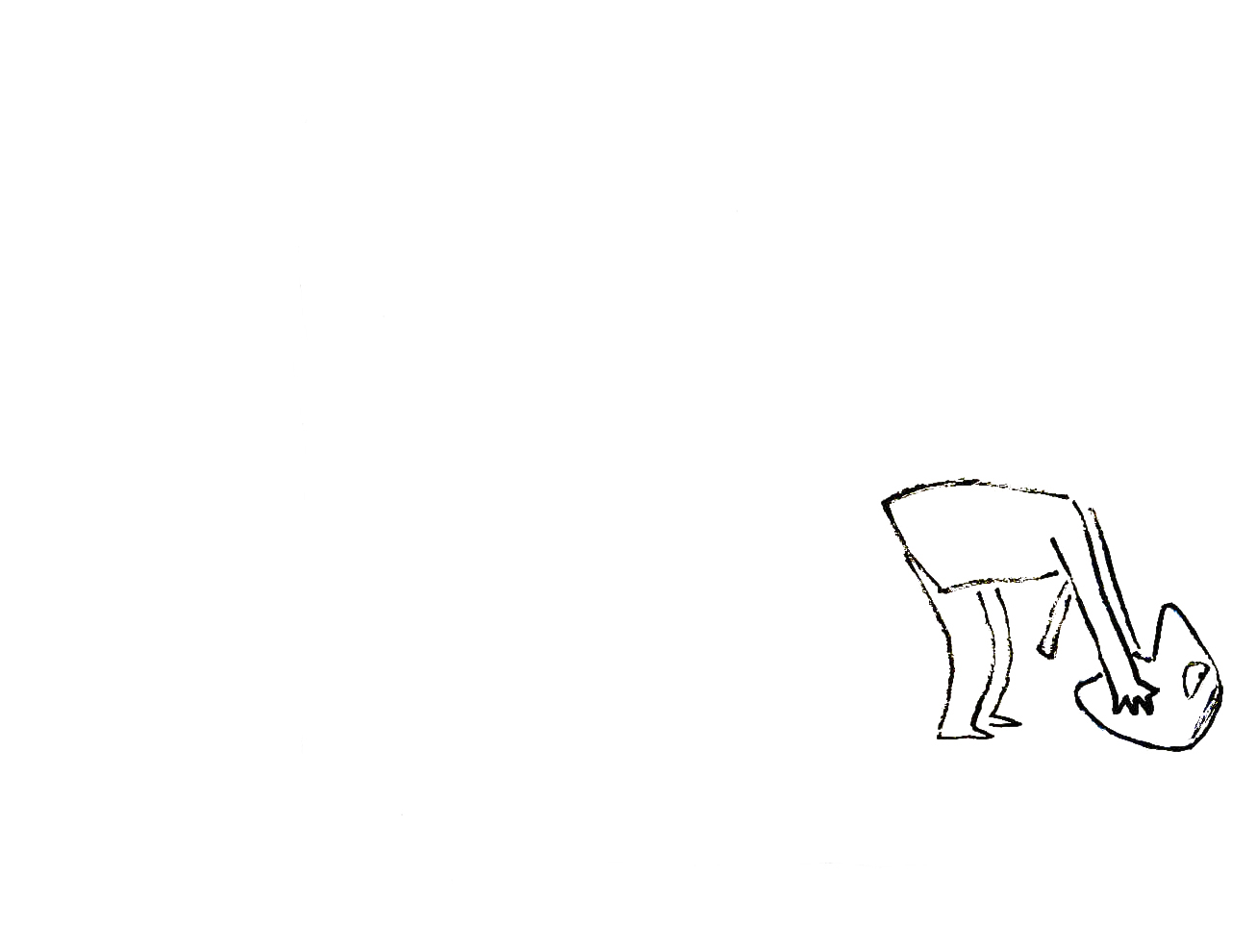 13
13By the time I saw my third exhibit of his work, I was able to barely afford one of the New Yorker drawings. It’s done on rice paper with the same type of “pen”. Years later, when I told Steig that I’d bought it, he said that it was the only drawing to have sold at that exhibit.
 15
15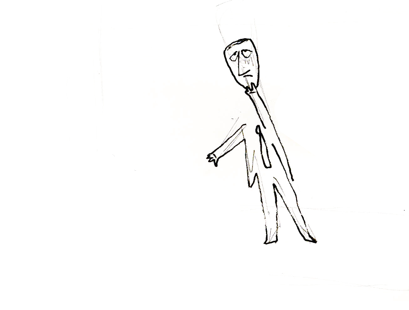 17
17It was real luck for me to have been able to adapt a couple of his children’s books to animation. I not only got to meet him and his wife, Jeanne, but worked with his flutist son, Jeremy, on a number of projects.
Bridget Thorne, who art directed the film, did some of her finest work ever on the backgrounds – beautiful pieces that I still treasure. I think this is one of Steig‘s best books, and I think we did it justice. 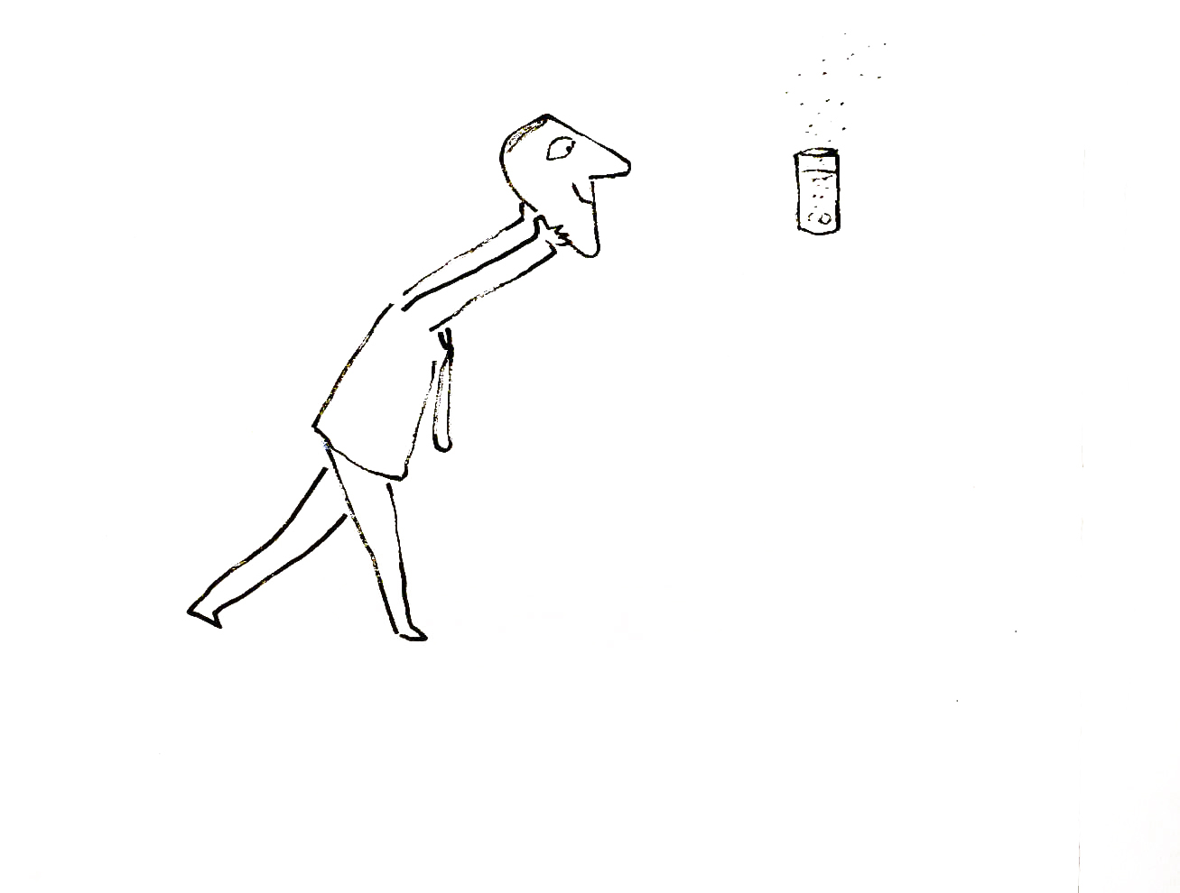
I’m rather partial to Abel’s Island as a film. There were only about two dozen B&W pen and ink illustrations in the book, so we had to do quite a bit of designing in the style of Steig
 24
24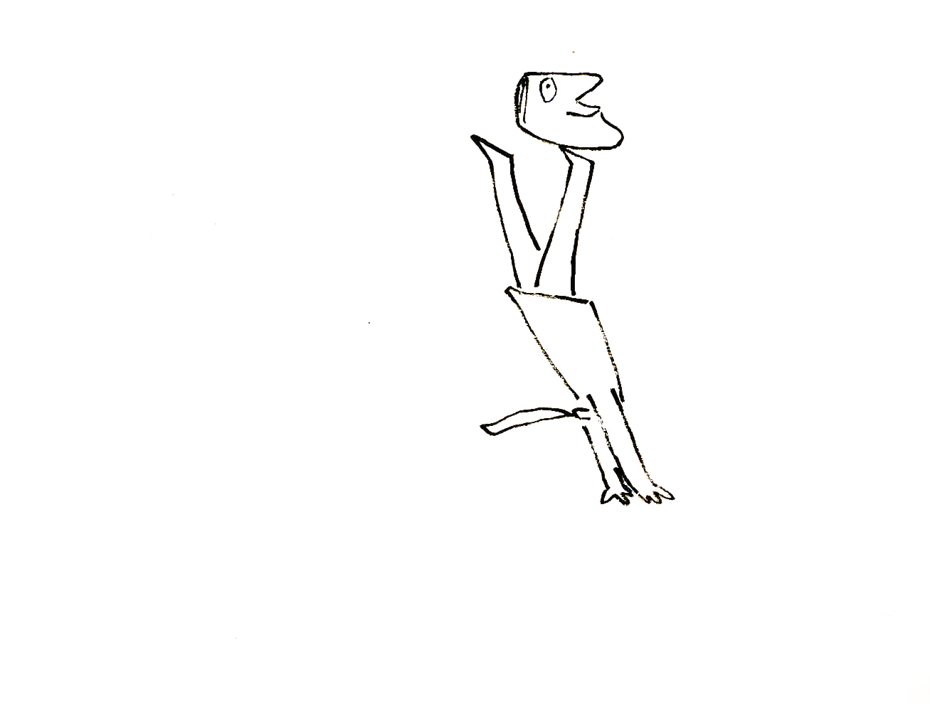 27
27
Animation Artifacts &commercial animation &Richard Williams 04 Mar 2012 08:24 am
Williams/Frazetta/Bakshi – Recap
 – Having given images of both Dick Williams‘ work and Bakshi‘s, I thought it’d be a good time to post the cel below. It reminds us of what an extremely talented animator and draftsman Richard Williams was – and still is.
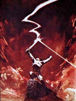
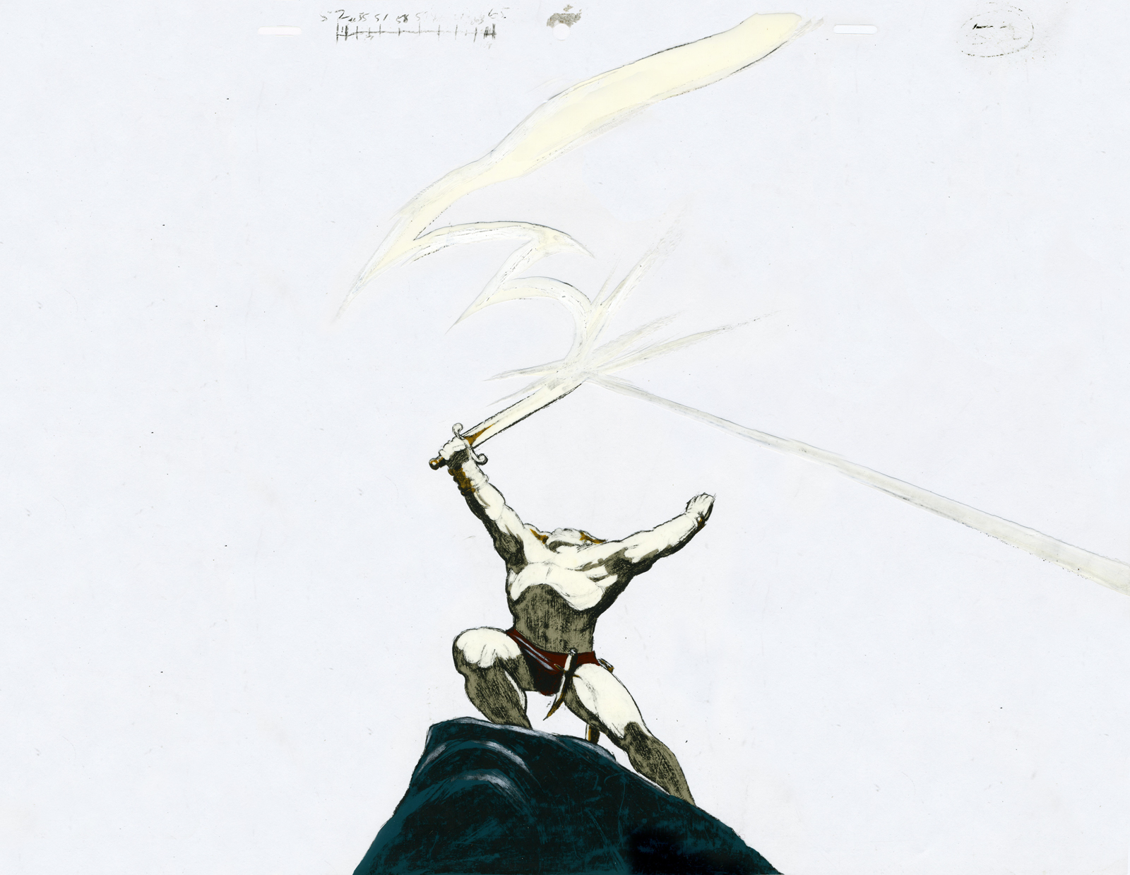
This is a cel from his commercial for Jovan done in Frank Frazetta‘s style.
Of course, Williams captures the illustrator’s work better than Bakshi did in Fire and Ice (although to be fair Bakshi had an enormously lower per second budget.) There’s a gallery of some art from Bakshi‘s film here, and there’s a trailer for it on YouTube.
Dick Williams‘ beautiful commercial ran briefly in 1978.
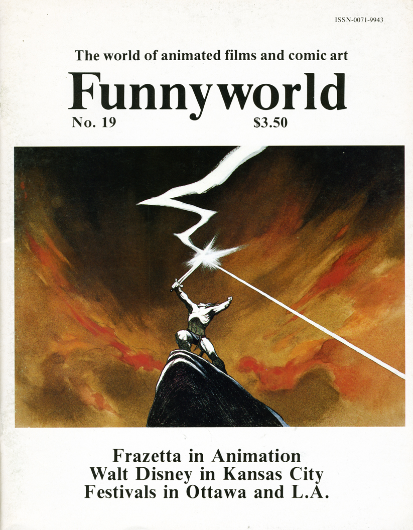
An image scanned from the cover of Funnyworld #19 runs beneath the cel to give an indication of what it looked like in the final. It appears to be a cel from the __________Frazetta’s original.
same scene – a bit closer on the character.
The cel was given to me by Dick. (I also have another which matches the other Funnyworld illustration from this spot.)
(Click on any image to enlarge.)
Dick animated the spot directly on cel with his Mars Omnichrome pencil (no longer available, of course.) There were six weeks for the entire production. Illustrator Rebecca Mills painted the backgrounds in oil. I remember Dick telling me how brilliant her work was while this commercial was in production.
_________________
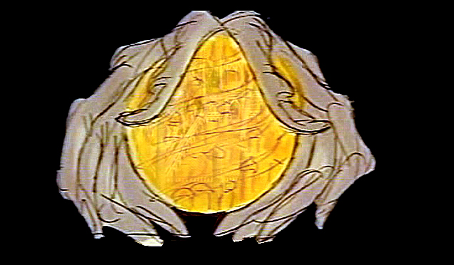
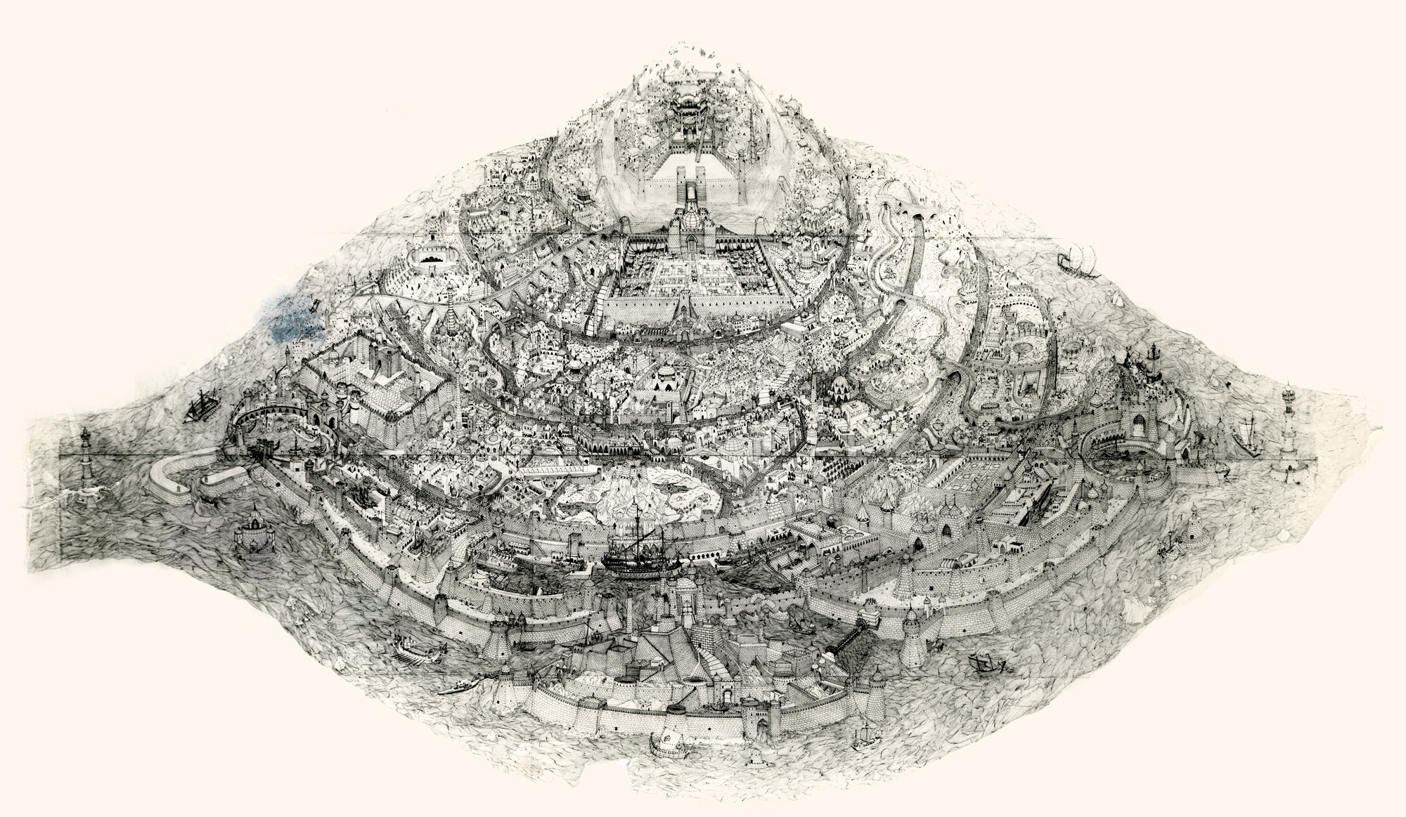
- Lets go even beyond Frazetta and Bakshi with the Richard Williams‘ studio in the heyday when he was about to prove himself with The Cobbler and the Thief. Let me share another image with you.
When Raggedy Ann & Andy was winding down, Richard Williams asked me, over dinner, whether I would be interested in working in London on his feature, The Cobbler and the Thief. He had in mind one sequence which he said would be all mine. This was the film’s opening – a slow truck into the island where all the action of the film would take place.
 (Click on any image to enlarge.)
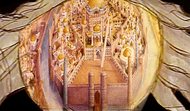
This was a photostat of this island. The original drawing, Dick had said, was enormous. It was composed of many smaller segments that were pinned together on a wall in his studio. If you look closely you can see those dividers in this photostat. To give a better indication of the detail in this drawing, I’m posting, below, a second image of a small portion of it.
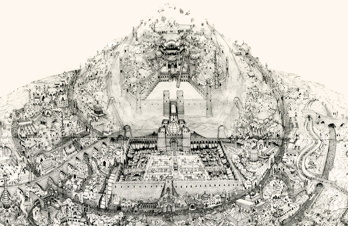
The idea of it exhilarated me. I believe he said that Roy Naisbitt was involved with it, and that was something to get me going. I’d read about many of Dick’s staff and had already placed them on pedestals – including Roy’s work. I would not only get to meet them but work with them as well.
I decided not to take the job. I thought it would be better to remain friends with Dick than to continue working with him. That decision is something I don’t regret. It would have been fun to have been involved with that film, but so much has happened in my life by staying put, that I have no regrets.
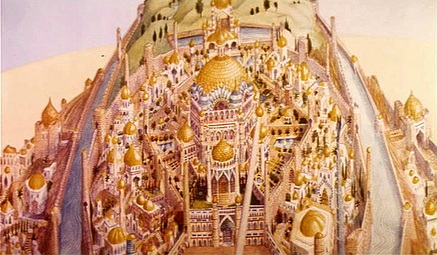
The storyboard for the original cut of Dick’s film included these panels which led into the image of the animated city. A still of the city remained in the Miramax/Fred Calvert version, but that’s all.