Category ArchiveTitle sequences
Commentary &Frame Grabs &Illustration &Models &Title sequences 08 Jul 2013 02:27 am
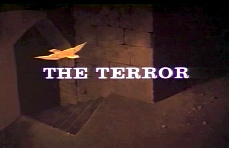
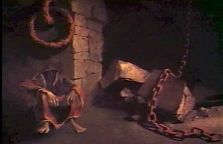
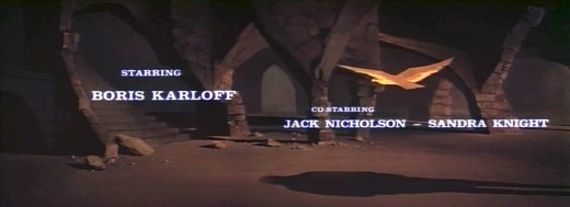
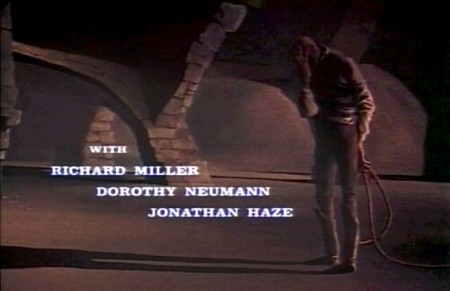
Paul Julian’s The Terror titles
After posting the book, Piccoli, a week or so ago, I’ve grown more interest in Paul Julian‘s work. He’s known predominantly for the Bgs he did at Warner Bros and the art direction he did on The Tell Tale Heart. However, there’s more film work he did independently.
The Hangman was a short film he did with co-director Les Goldman. Maurice Ogden’s poem is read by Herschel Bernardi in a very earnest tone. The artwork by Julian absolutely saves this film which was nominated for the Oscar.
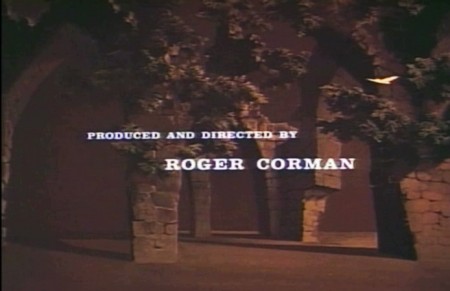
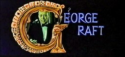
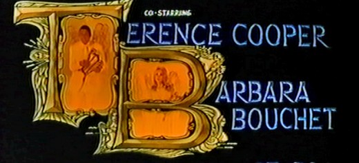
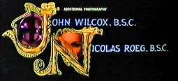
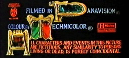
Roger Corman also used Paul Julian for a number of opening title sequences for the low budget films he did in the 60s. I’m going to try pulling some frame grabs from a number of these title sequences so that I can place some focus on Julian’s work in these forgotten films.
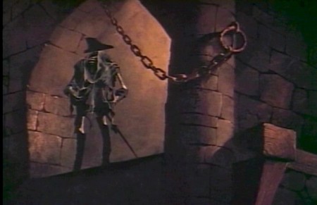
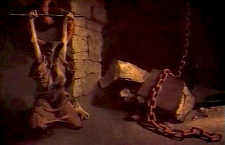
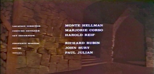
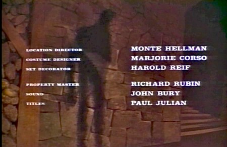
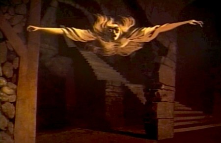
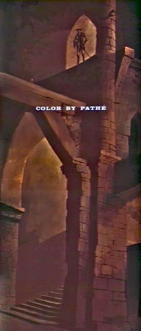
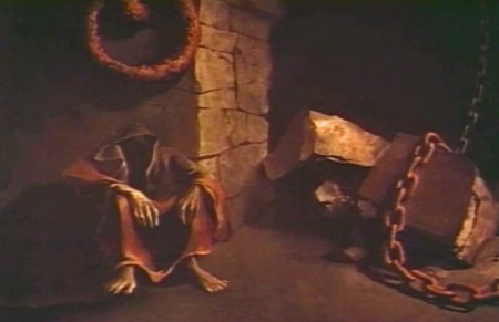
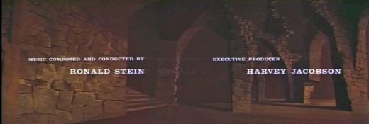
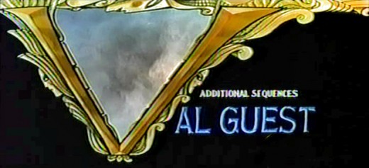
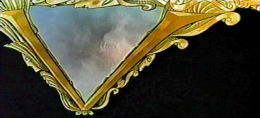
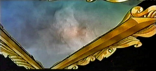
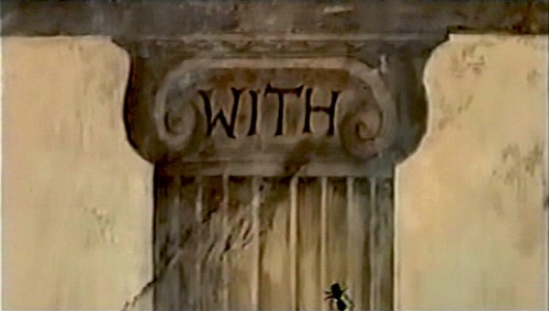
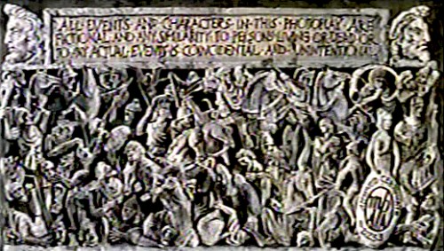
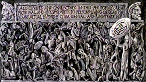
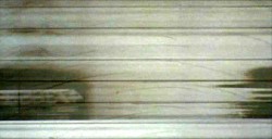
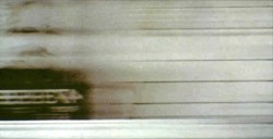
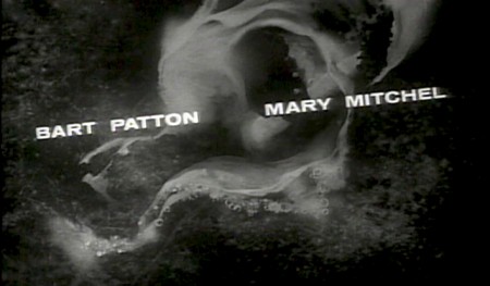
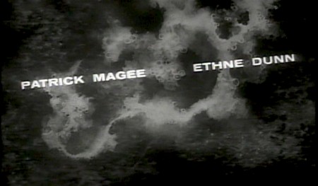
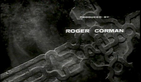
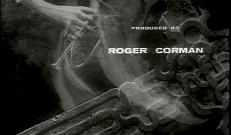
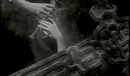
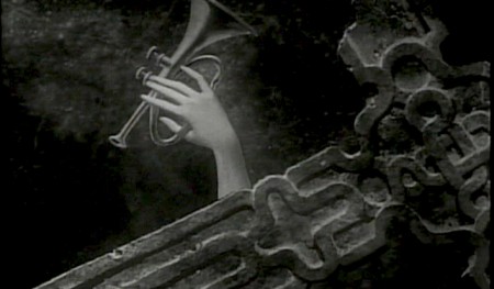
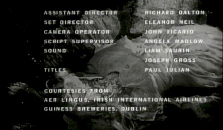
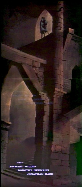
I start here with The Terror a film Starring Boris Karloff and Jack Nicholson. Julian uses a couple of pieces of artwork that he works over the course of the sequence with lots of lateral camera moves. Quite expressive work, though certainly not on a par with Tell Tale Heart.
 1
1(Click any image to enlarge.)
 6
6
Starts at the bottom and pans up.
You can watch a grayed-out version of this video on YouTube. The credits come on about a minute into it.
Swamp Women’s title sequence will follow soon.
Commentary &Frame Grabs &Richard Williams &Title sequences 24 Mar 2013 03:38 am
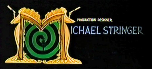
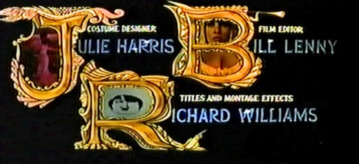
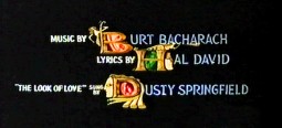
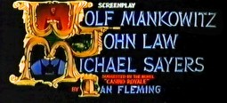
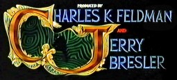
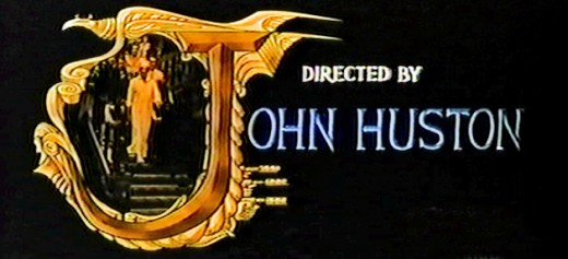
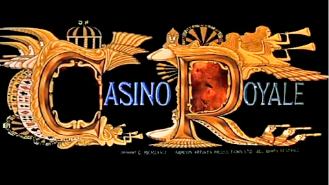
Dick Williams – Casino Royale Titles – recap
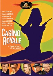 - Casino Royale (the 1967 original) was the fourth credit sequence animated by Richard Williams‘ Soho Square studio. Prior to this he’d directed What’s New Pussycat (1965), A Funny Thing Happened on the Way to the Forum (1966), and The Spy Who Came In From the Cold (1966).
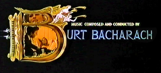
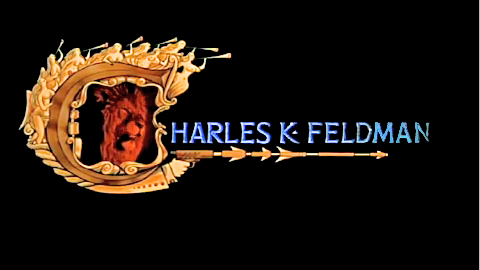
Continuing the presentation I’ve done of other title sequences by Williams, here’s Casino Royale. The other Williams credit sequences of the period are generally rambunctious items with almost too much happening on screen. It often gets hard to read the credits – in a theater, never mind trying to do it on TV. (God bless imdb.)
Theses are all frame grabs off a TV airing. My apologies for the horrendous quality. It aired on one of those cable channels that adds plenty of promos at the bottom of the screen (which I cleaned out of these images) overlapping many of the cards. They might have taken a bit more care to try to eliminate some distortion on the screen. The image skews, and the type gets distorted. I did my best with what I had. If I ever get my hands on a good dvd of the show, I’ll correct these images.
________________________ (Click any image to enlarge.)
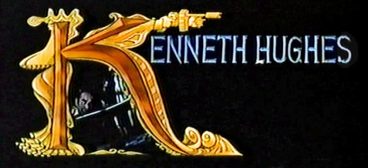
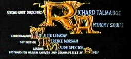
____Joseph McGrath, Robert Parrish, and Richard Talmadge also directed but I
____eliminated their screen cards as repetitious.
Dick Williams’ version of the opening titles
And for the sake of amusement here are
The credits from the 2006 version of the film
Designed by Daniel Kleinman
commercial animation &Frame Grabs &repeated posts &Richard Williams &Title sequences 19 Mar 2013 04:58 am
A Funny Thing Happened – again
 - Today marks the 80th birthday of RIchard Williams. To celebrate, I’ve chosen to post these images from the credit sequence of A Funny Thing Happened On The Way To The Forum. My first introduction to Richard Williams and his work came by way of a BBC documentary from 1965, The Creative Person: Richard Williams. It aired on WNDT’s ch 13 in New York (PBS before PBS existed.) Within the sequence there is once scene of a girl smelling a flower. (The Annette Andre credit.) I remember this as part of that doc, and Richard said that at times you should slow down the animation of a character if you want it to seem more real. There’s a dissolve animation going on here.
This is a great theatrical show and a mediocre movie. Despite the great cast, the brilliant people working behind the scenes (from Tony Walton‘s sets and costumes to Nicholas Roeg‘s extraordinary photography; from the incredible song score by Stephen Sondheim to Ken Thorne‘s excellent incidental music), somehow it all doesn’t really work.
However, animation enthusiasts would be primarily interested in the animated credit sequence by Richard Williams‘ fine animation. This was a sequence that brought Williams out of the cartoon world and into the more serious fold. Suddenly, his studio grew up.
Since we didn’t get to see his brilliant ads in the US, we had to seek out his title work. Credit sequences for future films such as The Charge of the Light Brigade, The Pink Panther sequels and What’s New Pussycat easily demonstrated how he really lifted his studio into the big time.
I’ve made frame grabs of the sequence from my recording, and thought I’d post them for your amusement. Sorry that the copy I have isn’t the most pristine and that the frames available are a bit soft. But I guess the idea comes across.
______________________________________(Images enlarge slightly by clicking them.)

The sequence starts at the end of the film. Buster Keaton runs on a circular treadmill, and dissolves to an animated version of himself.

He grows in the frames as some large-sized flies enter from the left.

Cut out to see a small Buster disappearing. The camera whips across to a picture of fruit. The flies zip over there and eat the picture. (This image of fruit was very dark on screen.)
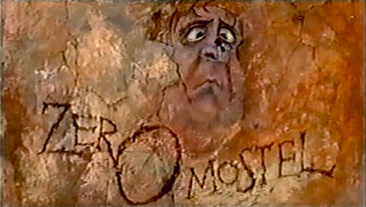
A fly lands on the nose of a CU caricature of Zero Mostel. His eyes cross watching the fly.
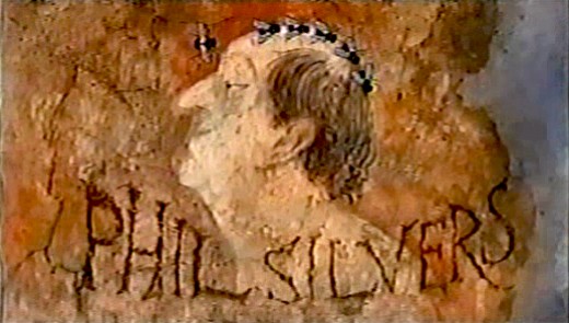
Flies land on Phil Silvers’ bald head and march across.

Buster runs across a painted frieze on the way to a series of inlayed boxes.
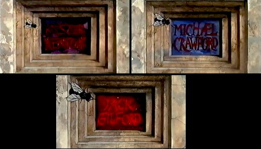
Zip to the second box credits Michael Crawford. Pan to the third box which features Jack Gilford’s name.
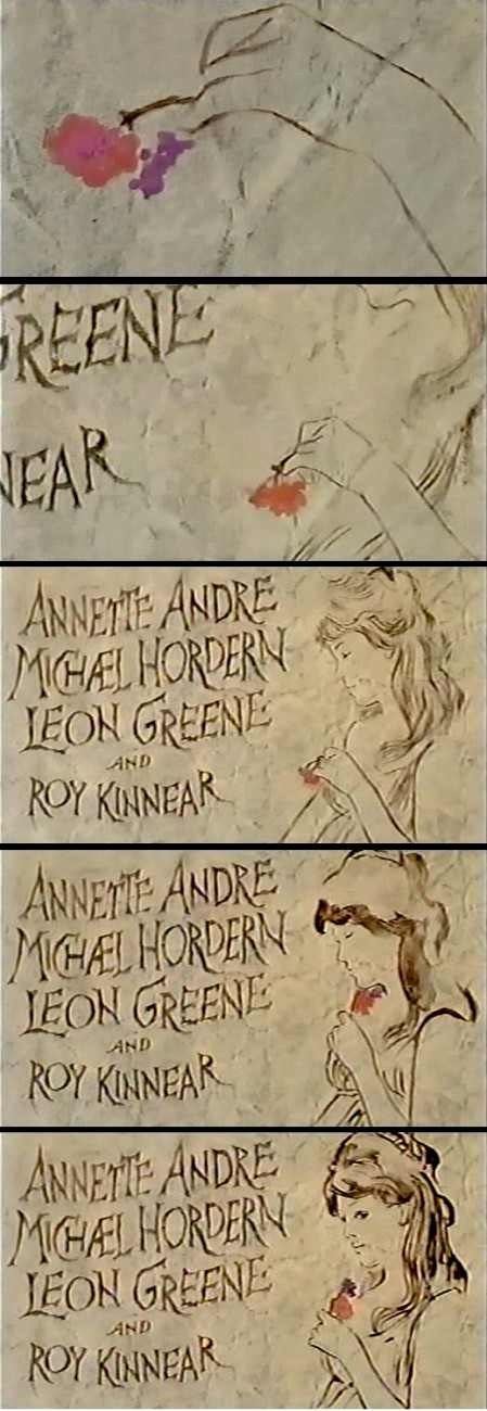
Dick talked with me about this scene in the film. He felt that to create realistic
characters in animation one had to slow everything down. He did it with dissolves.
It’s a technique he came back to often, quite noticeably in The Charge of
the Light Brigade.
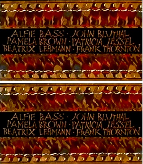
Errol LeCain’s art seems to be featured in this elaborate scene. The entire group – top
and (upside down) bottom – dance.
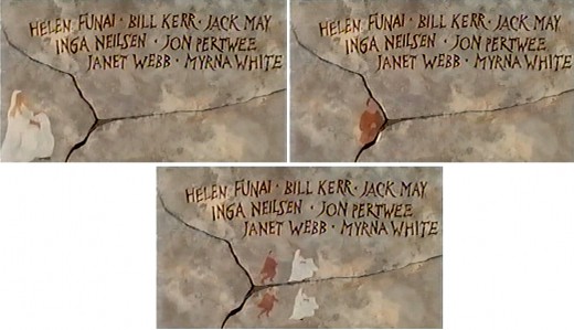
An animated version of Zero Mostel chases a female through and across a painted wall moving into and across the cracks.

The cornucopia of fruit starts in full color but goes to B&W before it’s done, in honor of the great cinematographer.
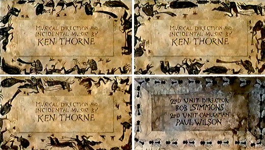
A very large cast of shilhouettes runs around this credit for Ken Thorne. There is no cycle here. This is a Dick Williams piece, so they’re all fresh drawings. They turn into flies for the next credit.

A Roman version of an Escher wall painting animates, confusing the fly trying to walk across.
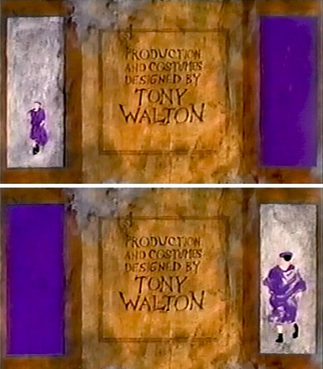
The animated Buster Keaton runs toward us on one side
and away from us on the other side.
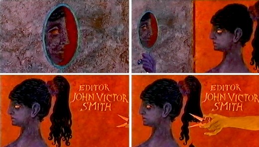
For the editor’s credit, a female looks at herself in a mirror. A hand comes in and clips off her pony-tail.
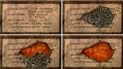
A slew of credits rots in one spot. This falls off revealing the choreographers’ names.
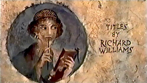
I’m always fascinated by the credit the designer gives himself. No sign of anyone else
who worked on this sequence. Titles have changed since then.
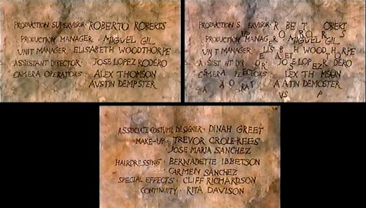
This is the first time I remember seeing letters from the type of one card falling down to match letters from the next card.
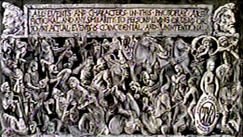
This card, the least significant one, comes back several times.
Of course it’s overanimated though it looks like a cycle.

The camera moves in on a fly crossing a checker board.
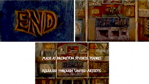
Truck out from “End” past “The End” to reveal several more boxes.
Happy Birthday, Richard. Thanks for all the wonderful gifts you gave animation, not the least being the obvious: a new respect for a medium that was dying when you stepped up to the plate. You restored its dignity at least once.
Frame Grabs &Layout & Design &Title sequences 28 Jan 2013 06:18 am
Paul Julian’s The Terror titles – redux
After posting the book, Piccoli, a week or so ago, I’ve grown more interest in Paul Julian‘s work. He’s known predominantly for the Bgs he did at Warner Bros and the art direction he did on The Tell Tale Heart. However, there’s more film work he did independently.
The Hangman was a short film he did with co-director Les Goldman. Maurice Ogden’s poem is read by Herschel Bernardi in a very earnest tone. The artwork by Julian absolutely saves this film which was nomainted for the Oscar.
Roger Corman also used Paul Julian for a number of opening title sequences for the low budget films he did in the 60s. I’m going to try pulling some frame grabs from a number of these title sequences so that I can place some focus on Julian’s work in these forgotten films.
I start here with The Terror a film Starring Boris Karloff and Jack Nicholson. Julian uses a couple of pieces of artwork that he works over the course of the sequence with lots of lateral camera moves. Quite expressive work, though certainly not on a par with Tell Tale Heart.
 1
1(Click any image to enlarge.)
 6
6
Starts at the bottom and pans up.
You can watch a grayed-out version of this video on YouTube. The credits come on about a minute into it.
Animation Artifacts &repeated posts &SpornFilms &Title sequences 08 Jul 2012 07:05 am
Prince of the City – recap
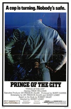 - One of my studio’s very first jobs was to do the titles to a big Sidney Lumet feature film, Prince of the City. (Feb, 1980) The film was a hard-nosed crooked cop drama brilliantly directed by Lumet. The problem it had was that few of the actors in the large cast were known, and the audience was having a recognition problem. Treat Williams was in his break-out role and the only other identifiable actor was Jerry Orbach.
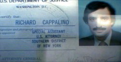
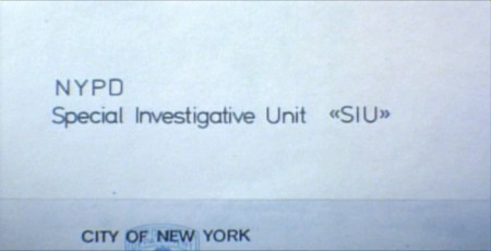
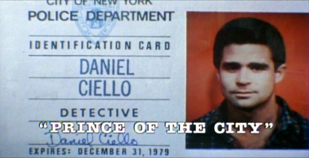
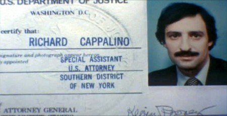
I was hired to ID all of the cops, lawyers, good guys and bad with what-looks-like live action identification cards. I also did title cards throughout the film, breaking it into chapters. Finally there were the end credits (no opening credits.)
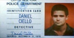
I pulled in a friend and film genius, Phillip Schopper. Together we shot the actors with Polaroid film trying to make the photos look a bit cheesy, as the real items would. Phillip took the Polaroids and doctored them to our needs. Treat Williams, for example, had moved onto another film and came back only for these photos. His hair was now jet black for the new movie, so Phillip had to recolor his hair in the doctoring (in those years before computers.) Jerry Orbach had a blemish on his lip that he wanted retouched. There were plenty of little things to deal with on the photos.
I had to locate the real identification cards (NYC police dept, NYState Supreme Court judges and DA’s, etc.)
Then I had to forge them. I worked with a printing shop in NY that didn’t ask questions. We chose to actually print the cards as if they were done via mass production so that they would look authentic. The cards should have that slightly embossed feel as if the letters were pressed into the card stock. (Printing these days has the type laying on the paper without pressing into it.) I also had to find appropriate paper and laminating machines to get the actual look of these cards. This was all done before the wide use of computer technology.
We had to film the sequences.
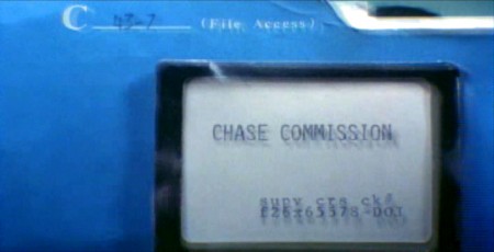
We worked with animation cameraman, Gary Becker for about a week and took over his Oxberry. We built miniature sets to hold the ID cards at odd angles, and we relit the cards with shadows built in. We wanted these cards to have a gritty reality to them that an animation stand didn’t generally offer.
The cards were animated moving as if a machine were printing them or a folder were being opened or papers were being tossed aside. This involved a lot of work getting out-of-focus images in the animation. When a folder opens, it moves in soft focus. The folder will pick up the top sheet and let that drop back again. We had to manipulate this all in stop motion to get it to work properly.
(Click any image to enlarge.)
 10
10
These cop cards (about five of them – one for each
of the five cops) appear twice. Once for the new enthusiastic cops.
Another for the tired and jaded cops.
There were about 8 insert sequences about a minute each.
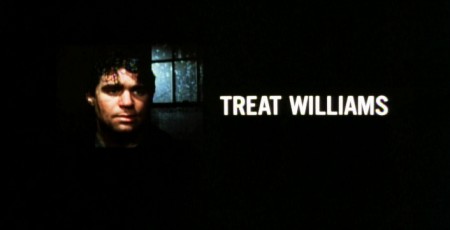
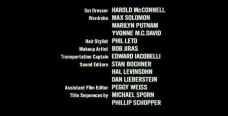
When it came time for the end credits, we chose to include photos of the actors with their names so that people would be able to recognize them from the film, without having to have had to memorize their characters’ names. We pushed these cards up as if a machine were printing the titles, a card at a time. The cards had to move in out-of-focus, as well. It was long and arduous shoot.
 4
4
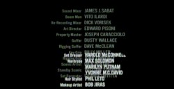
All of the credits came up at varying speeds, timed to the music.
This was helpful in that all titles go through changes after they’re done.
Our system gave us a lot of flexibility to addd or change cards as
necessary without having to reshoot them all.
Sidney Lumet didn’t want me to have a company credit. I couldn’t include the studio name, Michael Sporn Animation, Inc. because he felt that people would try to figure out what was animated. He didn’t want them to know there was any animation in the film. Hmmmm.
I put both my name and Phillip’s as doing the titles and insert shots.
 1
1 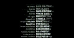 2
2
 3
3
There’s actually a four frame fade out of the old credit list
as the new list zips up and in / out-of and into-focus.
I did quite a few other title sequences for Sidney as a result of this job, and I was pretty proud of the film and the job that I had done.
 1
1
Records in a folder. The embossed stamp was a headache.
We shot the back of a card’s actual stamp in shadow, then we
printed it on a document in reverse on the front of our card.
 6
6
.
 1
1
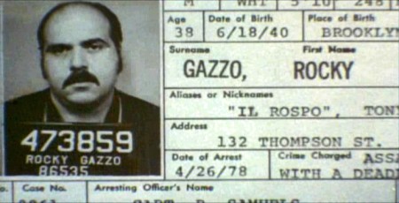
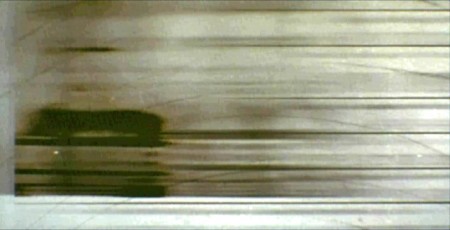
The microfilm look for mug shot records.
The slightly bad guys in B&W.
Animation Artifacts &commercial animation &Story & Storyboards &Title sequences 30 Jan 2012 05:49 am
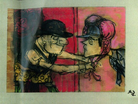
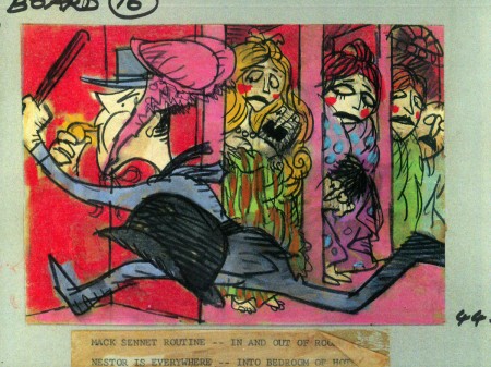
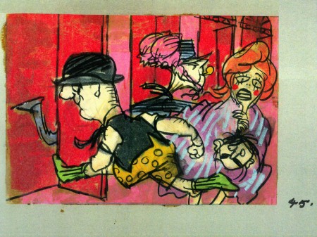
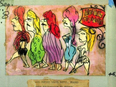
John Wilson/Fine Art Films – part 4
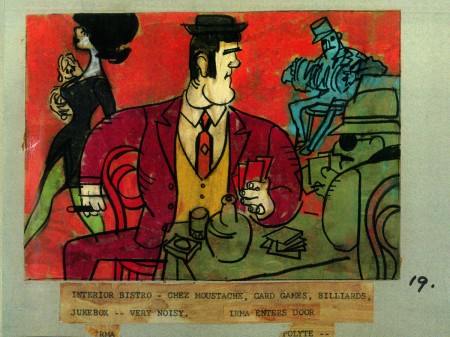
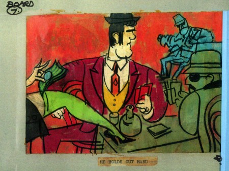
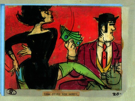
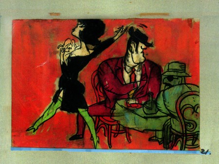
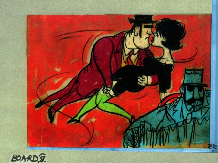
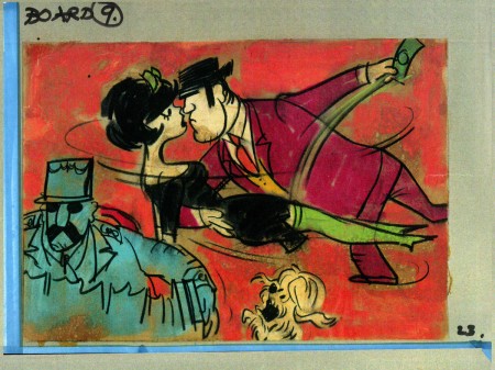
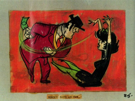
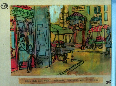
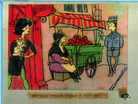
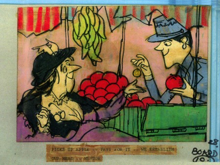
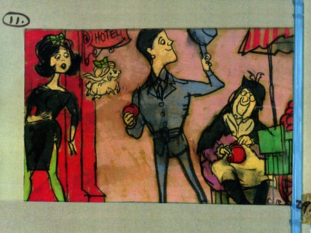
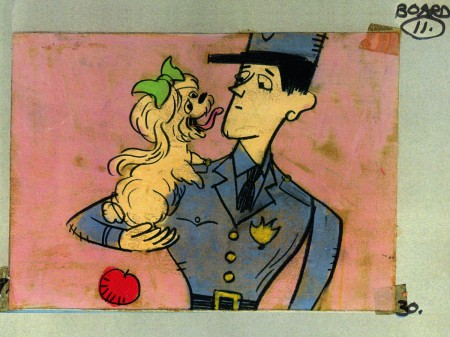
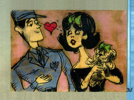
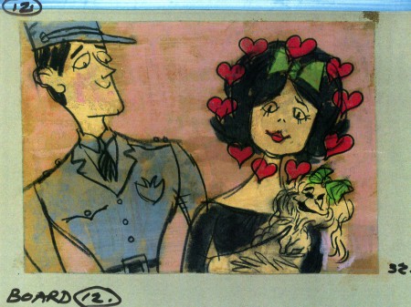
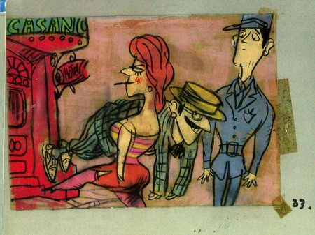
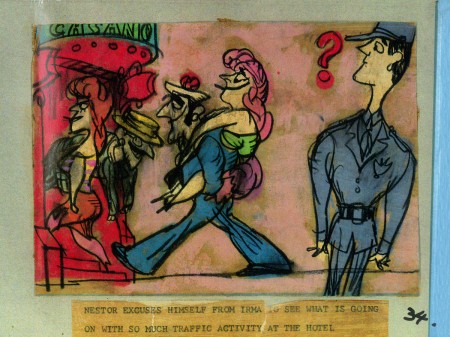
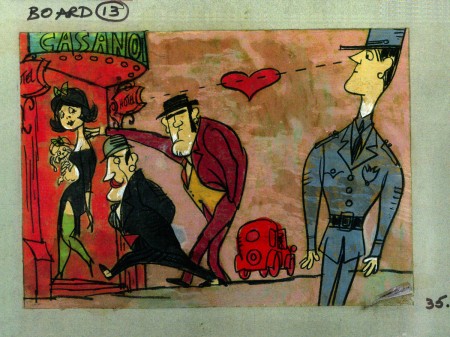
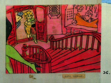
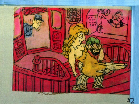
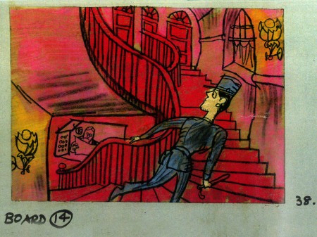
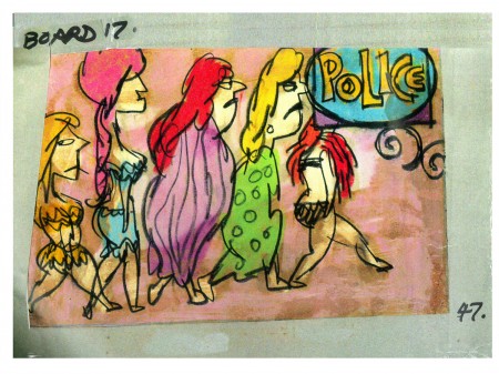
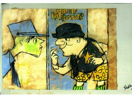
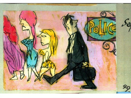
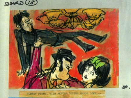
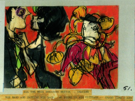
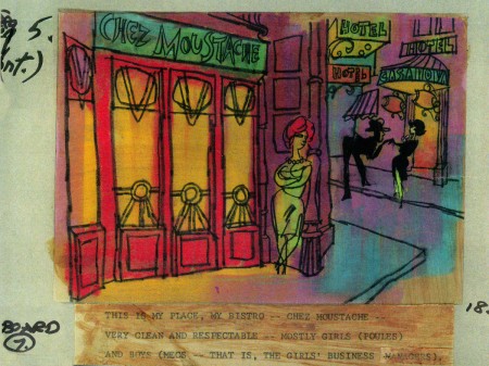
- This is the second half of the storyboard John Wilson created for the Mirisch Corp. A trailer to promote Billy WIlder‘s coming film, Irma La Douce. This was a film about a French prostitute, played by Shirley MacLaine, and a French gendarme, Jack Lemmon. Love blossoms.
As I wrote on part 3, the board comes in 18 pages of three storyboard drawings. Rather than post the sets of three images (and only being able to show them at a smallish size) I’ve taken each individual drawing and have blown them up to see them better on this blog.
Again, these were for a lengthy trailer for the film not the opening credits. The film’s credits do not use animation.
 7a
___________________________
Here’s a YouTube version of the trailer. Not the brightest quality, but you can see it.
Animation &Richard Williams &Title sequences 04 Jan 2011 08:16 am
Jaffe & Turkey & Titles & Tulip
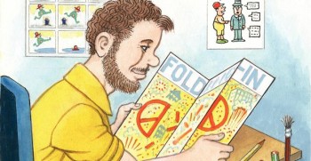 - The Huffington Post currently features an article about and an interview with MAD Magazine cartoonist / writer, Al Jaffee.
Jaffee has long been a mainstay at the magazine, and he is something of an idol to many up and coming cartoonists (as well as to many who up and came.)
It’s an entertaining and short read which you’ll enjoy.
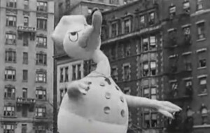 - Circulating recently is a YouTube video of the 1935 Macy’s Thanksgiving Day parade with a prime feature being the balloons.
Particularly entertaining is the wild and wacky Donald Duck (the 1935 Donald) completely out of control. I also enjoyed seeing how they dealt with the elevated train station interfering with the movement of the balloons. This isn’t a problem today.
It’s a short, fun video, if you haven’t seen it.
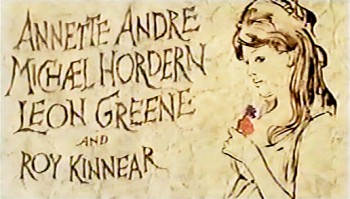 - Mark Mayerson calls appropriate attention to a site which features stills of many film titles through history. Movie Title Stills. It’s an entertaining site, indeed, and the only one to really go back into early film history.
There are a number of sites out there which feature and celebrate movie titles.
Forget the Movie and Watch the Titles is one which breaks them down into categories. There are 147 title sequences listed and 49 of them are animated. Most of them are newer sequences like Kung Fu Panda or The Pink Panther 2 (the Steve Martin one).
Art of the Title also has a large number of title seqeunces including some older titles. Many of the Saul Bass titles can be found here, as well as one of my favorites, To Kill a Mockingbird. This site will first take you to frame grabs of the titles but then you can click to download the film sequence. They also include several interviews with a number of designers.
All of Saul Bass’ work is featured on the site Not Coming to a Theater Near You. Here there are predominantly still images from the credits, but a lot of them. If you’re a Saul Bass freak, this is a place to visit. Many of these same titles can be found elsewhere on the net. At Signals vs Noise, for example, you can watch videos of 11 of them.
Richard Williams’ title sequences can’t be found on any of the above sites, but if you go to YouTube, TheThiefArchives has uploaded a number of them (as well as quite a bit more of Dick’s work.)
The first site of this sort that I found was a French one, Generique-Cinema. I found them when I learned that they had an entire page for me listing most of my film titles:
1981 – Prince of the City (Sidney Lumet)
1982 – Deathtrap (Sidney Lumet)
1984 – Garbo Talks (Sidney Lumet)
1985 – Desperately Seeking Susan (Susan Seidelman)
1987 – Making Mr Right (Susan Seidelman)
1988 – Running on empty (Sidney Lumet)
1989 – Family Business (Sidney Lumet)
Finding this site, way back when, was a treat.
Paul and Sandra Fierlinger‘s film, My Dog Tulip, returns to the Film Forum for nine days only. January 5th through 13th. It’s on a double bill with the documentary, The Kings of Pastry, a DA Pennebaker and Chris Hegedus film. A double bill, two films for the price of one.

SpornFilms &Title sequences 16 Nov 2009 08:39 am
Prince of the City
 - When you have an animation studio, and you have to keep paying the overhead, you end up taking some pretty unusual jobs. I once had a man who thought his poodle would make a great talk-show host. He wanted us to produce a talking poodle trailer which he would release on YouTube. The Royce Report was an entertaining two week job to push through. We shot the dog in live action against a green screen, We animated the dog’s mouth to the voice of the dog’s owner (who’d also written the piece) and pasted him into the photo backgrounds I shot. It paid a couple of bills for the week and is still on YouTube with over (or only) 17,000 hits.
 - One of my studio’s very first jobs was to do the titles to a big Sidney Lumet feature film, Prince of the City. The film was a hard-nosed crooked cop drama brilliantly directed by Lumet. The problem it had was that few of the actors in the large cast were known, and the audience was having a recognition problem. Treat Williams was in his break-out role and the only other identifiable actor was Jerry Orbach.
I was hired to ID all of the cops, lawyers, good guys and bad with what-looks-like live action identification cards. I also did title cards throughout the film, breaking it into chapters. Finally there were the end credits (no opening credits.)
I pulled in a friend and film genius, Phillip Schopper. Together we shot the actors with Polaroid film trying to make the photos look a bit cheesy, as the real items would. Phillip took the Polaroids and doctored them to our needs. Treat Williams, for example, had moved onto another film and came back only for these photos. His hair was now jet black for the new movie, so Phillip had to recolor his hair in the doctoring (in those years before computers.) Jerry Orbach had a blemish on his lip that he wanted retouched. There were plenty of little things to deal with on the photos.
I had to locate the real identification cards (NYC police dept, NYState Supreme Court judges and DA’s, etc.)
Then I had to forge them. I worked with a printing shop in NY that didn’t ask questions. We chose to actually print the cards as if they were done via mass production so that they would look authentic. I also had to find appropriate paper and laminating machines to get the actual look of these cards. This was all done before the wide use of computer technology.
We had to film the sequences.
We worked with animation cameraman, Gary Becker for about a week and took over his Oxberry. We built miniature sets to hold the ID cards at odd angles, and we relit the cards with shadows built in. We wanted these cards to have a gritty reality to them that an animation stand didn’t generally offer.
The cards were animated moving as if a machine were printing them or a folder were being opened or papers were being tossed aside. This involved a lot of work getting out-of-focus images in the animation. When a folder opens, it moves in soft focus. The folder will pick up the top sheet and let that drop back again. We had to manipulate this all in stop motion to get it to work properly.

(Click any image to enlarge.)
 10
10
These cop cards (about five of them – one for each
of the five cops) appear twice. Once for the new enthusiastic cops.
Another for the tired and jaded cops.
There were about 8 insert sequences about a minute each.
When it came time for the end credits, we chose to include photos of the actors with their names so that people would be able to recognize them from the film, without having to have had to memorize their characters’ names. We pushed these cards up as if a machine were printing the titles, a card at a time. The cards had to move in out-of-focus, as well. It was long and arduous shoot.

 4
4
All of the credits came up at varying speeds, timed to the music.
This was helpful in that all titles go through changes after they’re done.
Our system gave us a lot of flexibility to addd or change cards as
necessary without having to reshoot them all.
Sidney Lumet didn’t want me to have a company credit. I couldn’t include the studio name, Michael Sporn Animation, Inc. because he felt that people would try to figure out what was animated. He didn’t want them to know there was any animation in the film. Hmmmm.
I put both my name and Phillip’s as doing the titles and insert shots.
 1
1  2
2
 3
3
There’s actually a four frame fade out of the old credit list
as the new list zips up and in / out-of and into-focus.
I did quite a few other title sequences for Sidney as a result of this job, and I was pretty proud of the film and the job that I had done.
 1
1
Records in a folder. The embossed stamp was a headache.
We shot the back of a card’s actual stamp in shadow, then we
printed it on a document in reverse on the front of our card.
 6
6
.
 1
1
The microfilm look for mug shot records.
The slightly bad guys in B&W.
Title sequences 14 Oct 2009 07:37 am
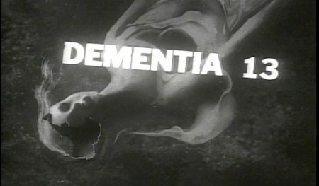
Paul Julian’s Dementia 13
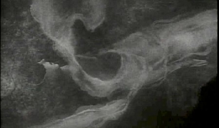
 - Dementia 13 was Francis Ford Coppola‘s first real, credited film direction. Done in 1963, it was contrived in a rush to capitalize on the completion of another Roger Corman film, The Young Racers. They were able to use the sets and props from the low-budget film Corman had just finished in Ireland with Coppola as his sound technician.
When they returned to LA, Coppola and Corman fought, with Corman bringing in another director, Jack Hill, to complete the film as he wanted it adding a few ersatz scenes.
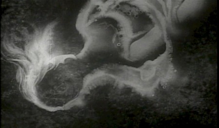
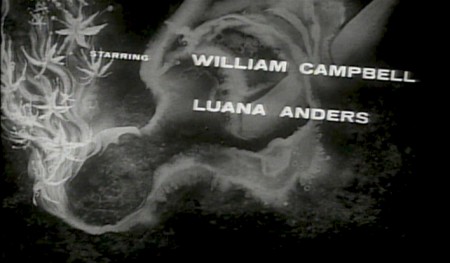
It’s interesting that Paul Julian was able to get in there to do the credits for this film. Presumably Corman brought him in since he did a number of other Corman title sequences. Obviously, the budget was just about nothing (one doubts it even covered the cost of Julian’s paints.) Regardless, the film is notable for Coppola’s name. Julian’s work stood out.
The up front titles are particularly short, as is the credit list at the end.
 1
1(Click any image to enlarge.)
Hans Bacher on his site, One1more2time3′s Weblog has a couple of posts with recreated Warner Bros backgrounds by Paul Julian.
Frame Grabs &Title sequences 29 Sep 2009 08:28 am
Paul Julian’s The Terror titles
After posting the book, Piccoli, a week or so ago, I’ve grown more interest in Paul Julian‘s work. He’s known predominantly for the Bgs he did at Warner Bros and the art direction he did on The Tell Tale Heart. However, there’s more film work he did independently.
The Hangman was a short film he did with co-director Les Goldman. Maurice Ogden’s poem is read by Herschel Bernardi in a very earnest tone. The artwork by Julian absolutely saves this film which was nomainted for the Oscar.
Roger Corman also used Paul Julian for a number of opening title sequences for the low budget films he did in the 60s. I’m going to try pulling some frame grabs from a number of these title sequences so that I can place some focus on Julian’s work in these forgotten films.
I start here with The Terror a film Starring Boris Karloff and Jack Nicholson. Julian uses a couple of pieces of artwork that he works over the course of the sequence with lots of lateral camera moves. Quite expressive work, though certainly not on a par with Tell Tale Heart.
 1
1(Click any image to enlarge.)
 6
6
Starts at the bottom and pans up.
You can watch a grayed-out version of this video on YouTube. The credits come on about a minute into it.
Swamp Women’s title sequence will follow soon.
