Category ArchiveFrame Grabs
Articles on Animation &Commentary &Frame Grabs 07 Sep 2013 02:24 am
Saturday Comments Live
Well, today’s Saturday, and I actually have a realio trulio live blog post for the day. We were able to get Verizon in to trip over their own shoelaces and figure out what was causing our phone problems. But they came through with blazing colors, and here we go again. Now I hope we can, at least, make it through the next week without having to shut down again.
More on St. Louis
I received a surprise check this week from the St. Louis Animation Film Festival.
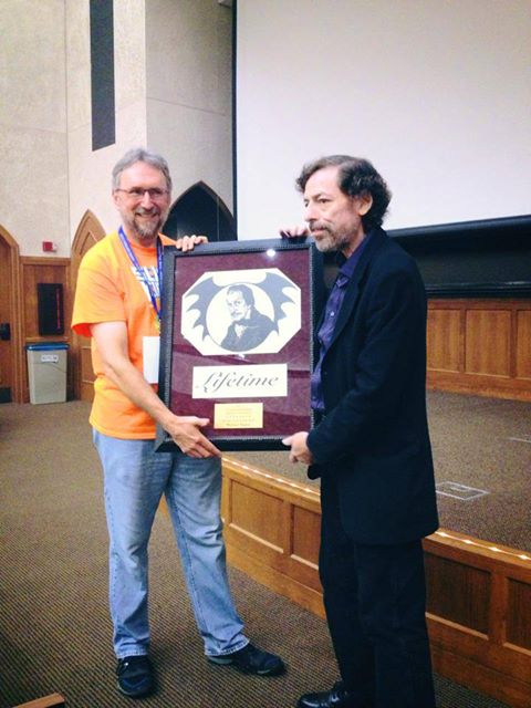 Maybe you’ll remember that we had to leave St. Louis in the middle of the night. Because of some enormous pain I was getting from an operation I’d had in NY, just the week before, doctors had to retrace their steps. The Festival felt that they should cover any overage costs that it took to get me into NY and onto Beth Israel’s operating table. The Festival folk couldn’t have been more generous. I was embarrassed just to have to pull out the way I did. They made it more than alright by covering extra travel costs that caught me unawares
The award was made especially for me. and had just gone out via FedEx. The award celebrates my career with by illustrating my in-production film. Illustrated by a local talent, it depicts Vincent Price in the E.A.Poe position lookin’ over me. My new guardian angel will be looking out for me from my office wall. It’s working guys; it’s working.
The film isn’t even finished yet, and already it has an Award. Thanks to you.
Cliff Froehlich and the rest of his staff are first class people, I can guarantee that! Thank you Cliff and anyone else involved.
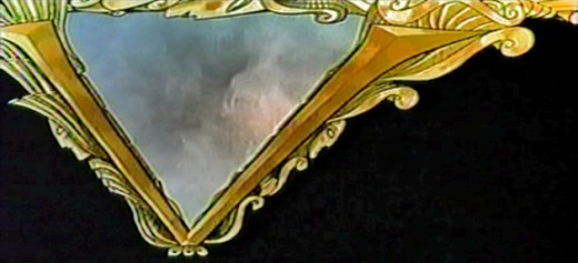
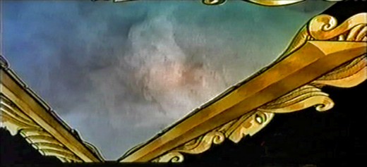
The commercial for “Christian Mingle” animation looks like it was pulled from the 60′s animated short, Nathan A]exander Davidson and his wife, done at their company, Zone One Oni Designs.
Christian Mingles lasts less than 20 secs whereas Cosmic Cartoon lasted almost 20. Both use lots of hand-done air brushing done on top of cels and photographed traditionally. At least, I know that’s how Cosmic Cartoon was done; you can’t really tell with the Christian dating service ad. One presumes they’re now using a computer for artwork and effects. Regardless, it’s a top-rate spot.
I’m sure the full film is out there somewhere on YouTube.
If Fred Ladd, John Lisberger or anyone else connected with the film want to give us more info, I’d love to see it in the comment section.
The same is true of Nathan Alexander Davidson. Tell us what you’re up to now. Any more such spots in the works?
I still haven’t gotten over the retirement of Hayao Miyazaki this past week. There are very few animation directors, historically, that I can think of whose influence was as far reaching and key to the art of the medium. There are enough live action film makers whose work was consistent and moving over a consistent number of themes. John Ford, Alfred Hitchcock, Howard Hawks and George Cukor
I’ll talk about this at length in the upcoming posts. The director’s influence has been too great on me to not pay great attention. (It’s at a time like this that I wish the late, great Tissa David were still around so that we could recap our thoughts with each other.)
Action Analysis &Animation &Frame Grabs 29 Jul 2013 11:16 am
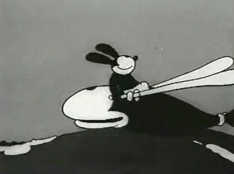
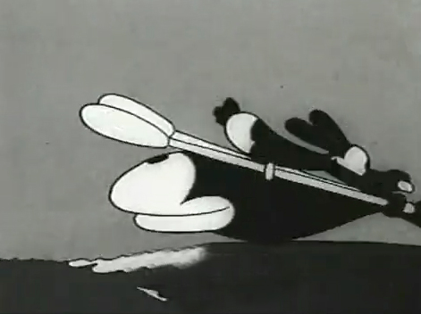
Andy Panda & Oswald Rabbit Flipbooks
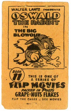
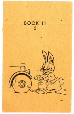
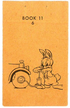
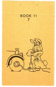
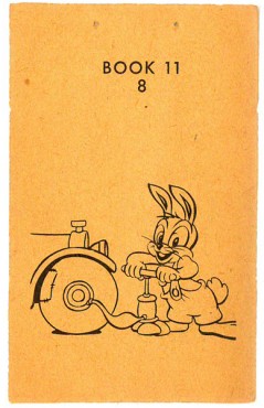
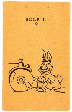
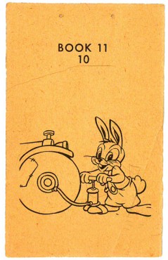
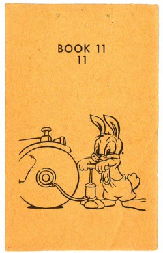
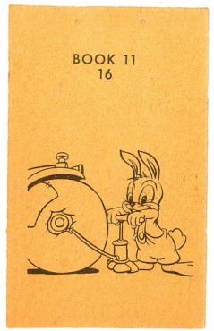
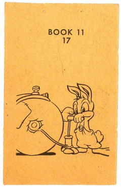
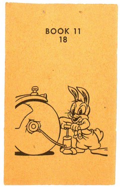
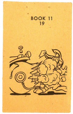
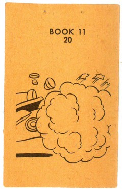
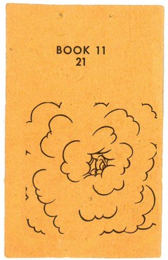
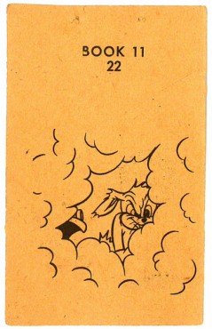
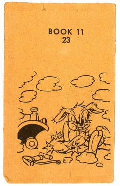
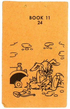
- Imagine you’re a kid in 1949 eating your Grape Nuts Flakes in the morning. You’re about to pour on the milk when you realize you’ve found the Flipbook that was included in the box. Would that start you on your way of wanting to become an animator? Would you just flip it and throw it out?
Back then the Walter Lantz studio had a promotion going where they gave a number of flipbooks free to consumers of the Post cereal.
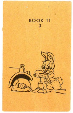
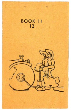
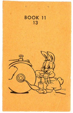
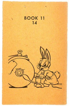
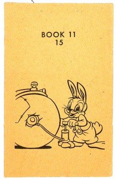
The pages were double-sided. This side features Oswald the Rabbit blowing up his tire. The flip side has Andy Panda. Andy is in full color, whereas Oswald was just line work, so you know which one was still a “star” in 1949.
The registration wasn’t very good on the printed page, and I had to adjust a bit to make it work. The paper it was printed on is newsprint and delicate. The images in the thumbnail are about twice the size of the original.
 1
1 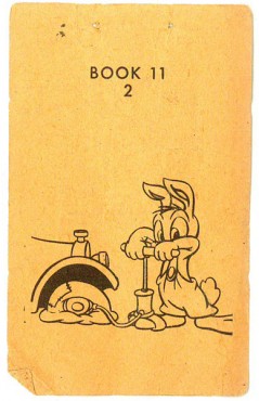
(Click any image to enlarge.)
 3
3 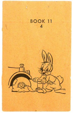 4
4
The following QT movie is exposed on 3′s to make the action work.
Click left side of the black bar to play.Right side to watch single frame.
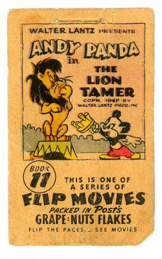
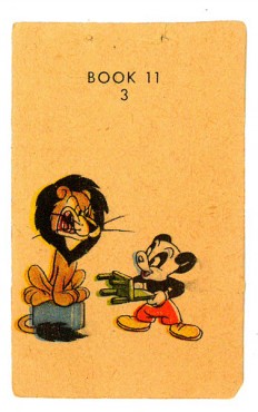
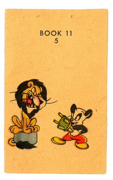
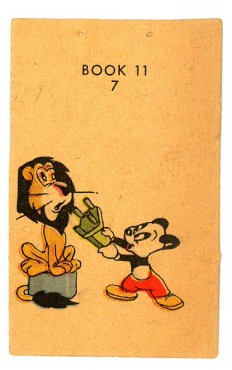
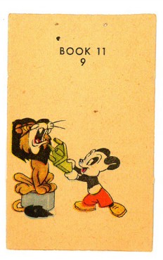
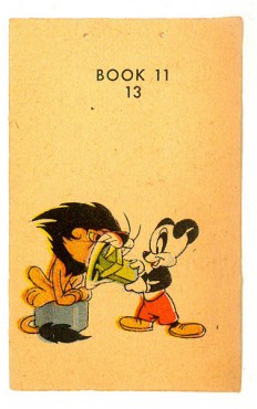
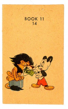
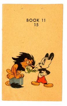
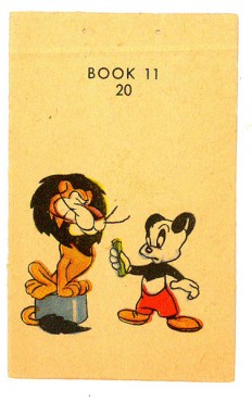
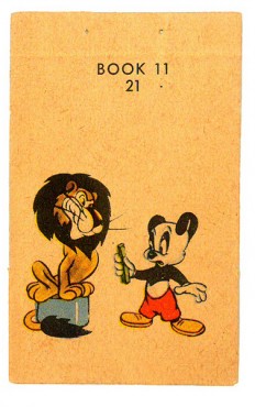
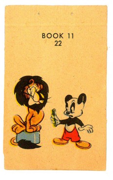
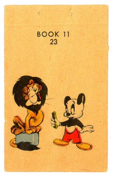
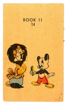
- Then I posted the other side of this flipbook. In 1949, the Walter Lantz studio had a promotion going where they gave a number of flipbooks free to consumers of Grape Nuts Flakes.
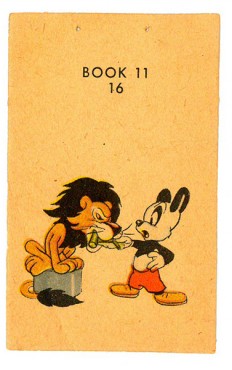
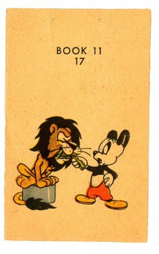
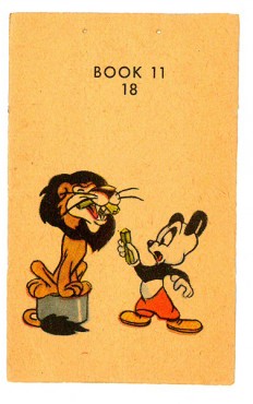
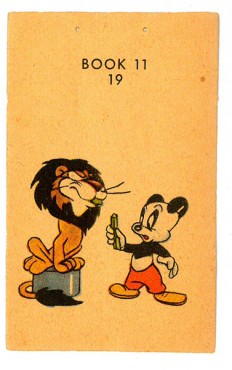
The pages were double-sided. This side features Andy Panda taming a lion. Andy is in full color, whereas the flip side – Oswald – was just line work, so you know which one was still a “star” in 1949. See the Oswald book here.
The registration wasn’t very good on the printed page, and I had to adjust a bit to make it work. The paper it was printed on is newsprint and the color registration is also off. The images in the thumbnail are about twice the size of the original.
 1
1 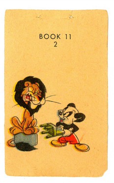 2
2(Click any image to enlarge.)
“>
 3
3 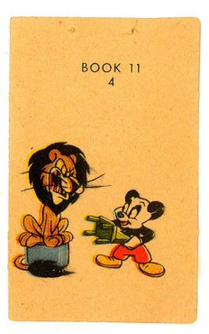 4
4
“>
 5
5 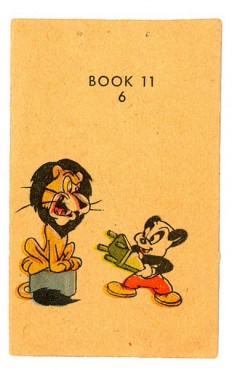 6
6
“>
 7
7 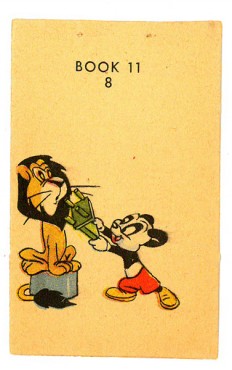 8
8
“>
 9
9  10
10
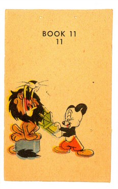 11
11 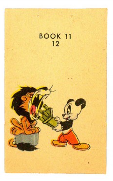 12
12
The drawings of the following QT movie were exposed
on threes to best make the action work.
Right side to watch single frame.
Action Analysis &Animation &Animation Artifacts &Commentary &Disney &Frame Grabs 15 Jul 2013 06:40 am
Mickey’s Service Station Grabs
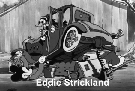
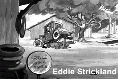
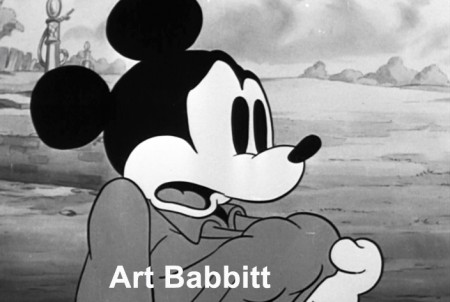
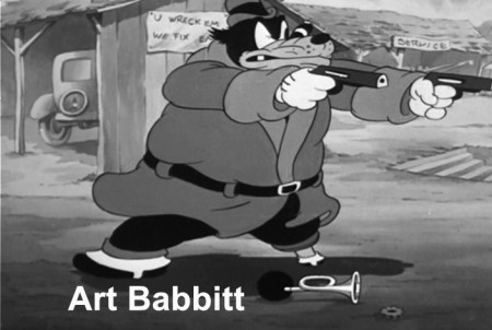
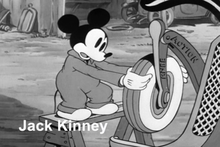
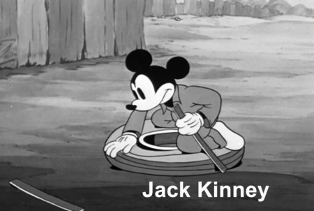
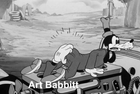
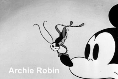
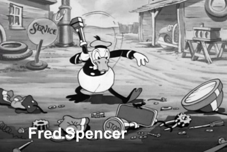
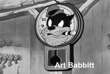
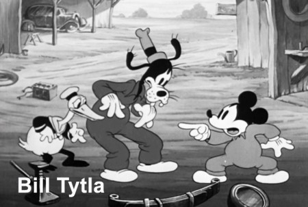
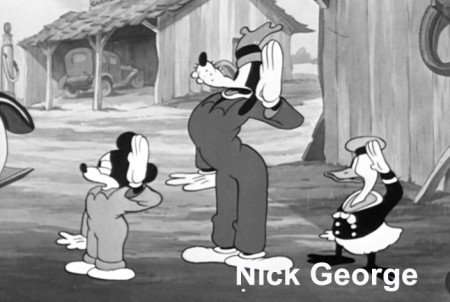
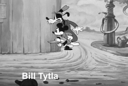
- Having posted sketches from Mickey’s Service Station, the brilliant 1935 short, the last B&W Mickey film, the next thing for me to do, logically, is post frame grabs from the final film – for comparison.
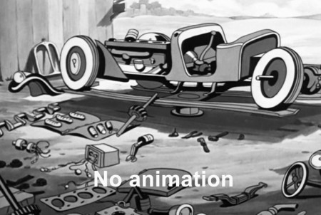
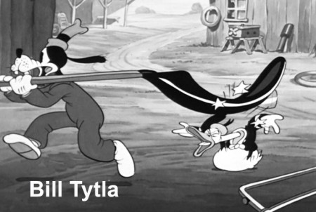
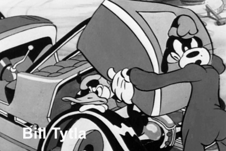
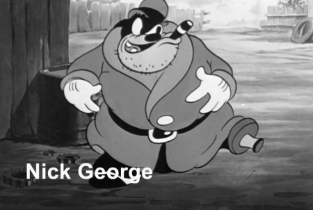
Since Hans Perk has made available the film’s draft on his incredibly resourceful site, AFilmLA, I’ve also added the animators’ names to the frame grabs. What an assortment it is, too. Art Babbitt, Eric Larsen, Bill Tytla, Jack Kinney, Don Towsley, Fred Spencer, Milt Kahl, Ferdinand Hovarth, Archie Robins among others.
Here, then, are the scenes from the film:
 1
1(Click any image to enlarge.)
Commentary &Frame Grabs &Illustration &Models &Title sequences 08 Jul 2013 02:27 am
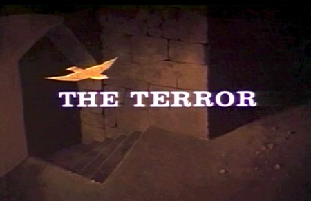
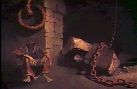
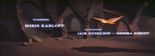
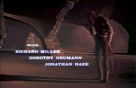
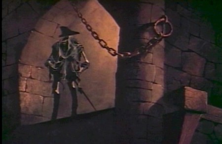
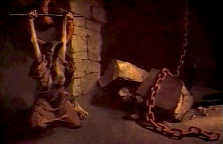
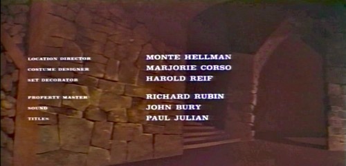
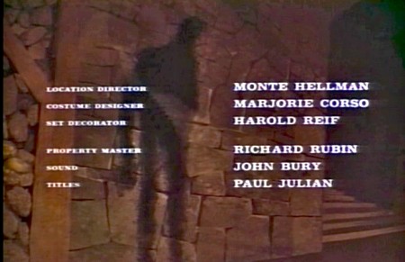
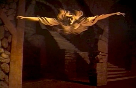
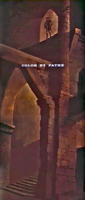
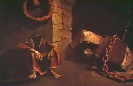
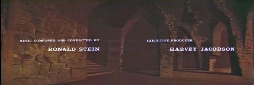
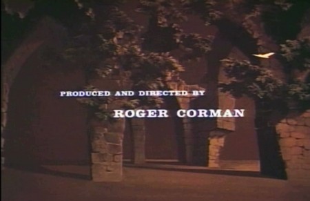
Paul Julian’s The Terror titles
After posting the book, Piccoli, a week or so ago, I’ve grown more interest in Paul Julian‘s work. He’s known predominantly for the Bgs he did at Warner Bros and the art direction he did on The Tell Tale Heart. However, there’s more film work he did independently.
The Hangman was a short film he did with co-director Les Goldman. Maurice Ogden’s poem is read by Herschel Bernardi in a very earnest tone. The artwork by Julian absolutely saves this film which was nominated for the Oscar.
Roger Corman also used Paul Julian for a number of opening title sequences for the low budget films he did in the 60s. I’m going to try pulling some frame grabs from a number of these title sequences so that I can place some focus on Julian’s work in these forgotten films.
I start here with The Terror a film Starring Boris Karloff and Jack Nicholson. Julian uses a couple of pieces of artwork that he works over the course of the sequence with lots of lateral camera moves. Quite expressive work, though certainly not on a par with Tell Tale Heart.
 1
1(Click any image to enlarge.)
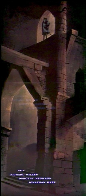 6
6
Starts at the bottom and pans up.
You can watch a grayed-out version of this video on YouTube. The credits come on about a minute into it.
Swamp Women’s title sequence will follow soon.
Animation Artifacts &Disney &Frame Grabs &Layout & Design &repeated posts &Story & Storyboards 03 Jun 2013 04:17 am
Lady Drawings – repost
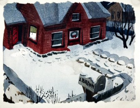
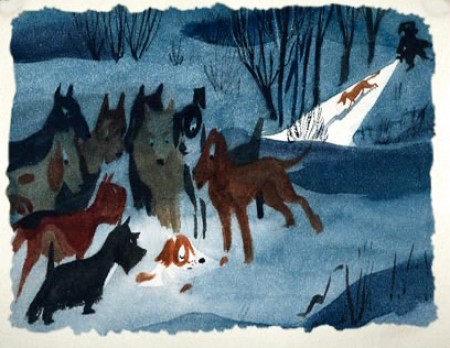
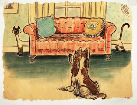
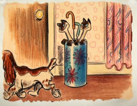
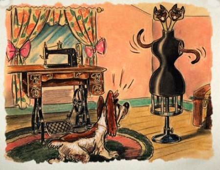
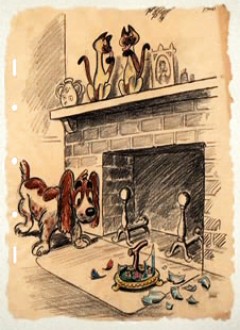
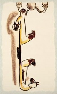
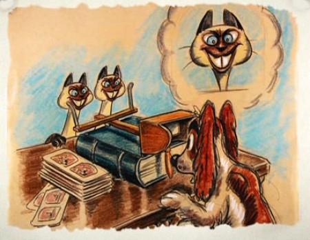
 - The recent posts by Hans Perk on his blog A Film LA of the animation drafts to Lady and the Tramp have led me to add to the mix by posting some of these older posts.
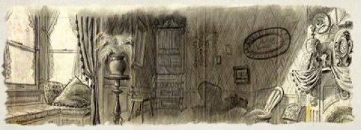
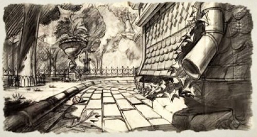
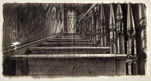
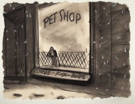
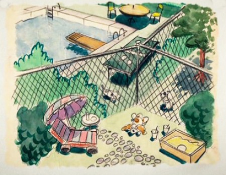
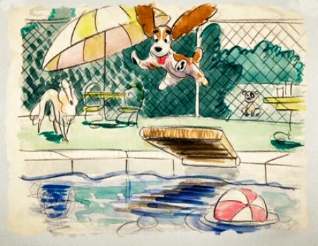
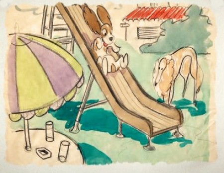
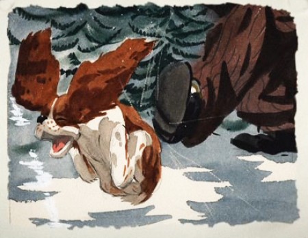
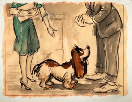
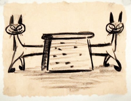
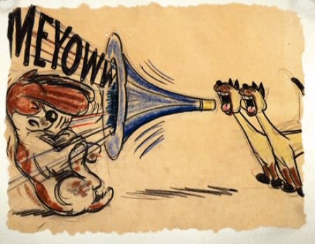
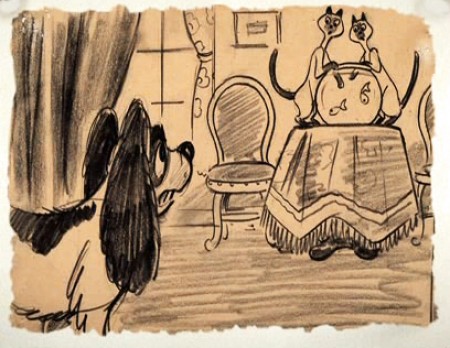
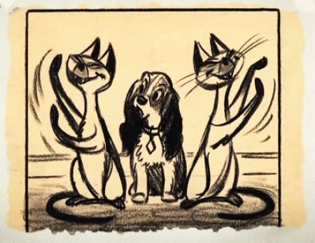
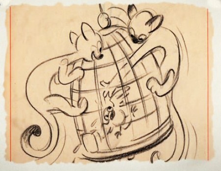
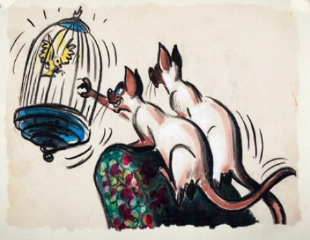
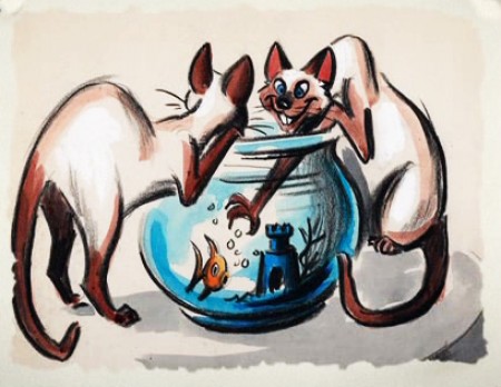
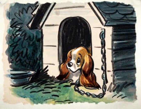
Here are a lot of drawings done predominantly by Joe Grant in the early forties in preparation for the movie.
The illustrations – some are obviously BG layouts, others storyboard drawings – have a light and jaunty feel. They’re very cartoon in nature, and belie the actual feature they produced which, at times, is quite beautiful. Disney truly got the feel of “Main Street, USA” in this film.
I’m interested that most of the images don’t take in Cinemascope (since they were obviously done before the decision to go Scope.Cnemascope didn’t come into being until 1953) Most of them are also fast drawings that don’t feature the Tramp as we know him, and even Lady takes on a different form.
You get the feeling this film was pushed out relatively quickly. The results are excellent, regardless. Sonny Burke and Peggy Lee wrote an excellent pop-song score that doesn’t quite capture the turn-of-the-century, but it does capture the atmosphere of early 50s USA.
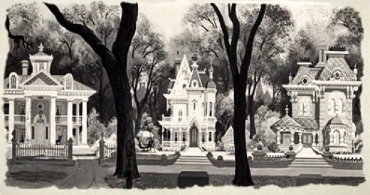
This drawing is in B&W on the DVD, but it appears in
Bob Thomas’ 1958 book, “The Art of Animation.”

Bg for The Princess and the Frog.
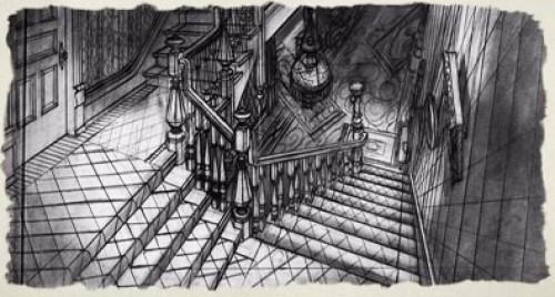
This looks not too different from a shot in Hitchcock’s Psycho.
You can find more Bgs from Lady and the Tramp on Hans Bacher‘s site, one1more2time3.
The following are Joe Grant development drawings.
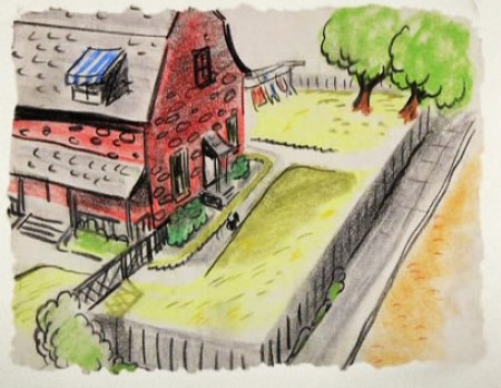
We seem to be in the Little Golden Book territory
with some of these images.
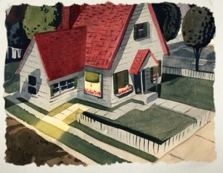
An earlier and different view.
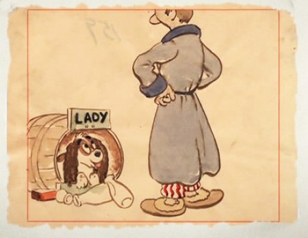
Or did I mean the New Yorker circa 1948?
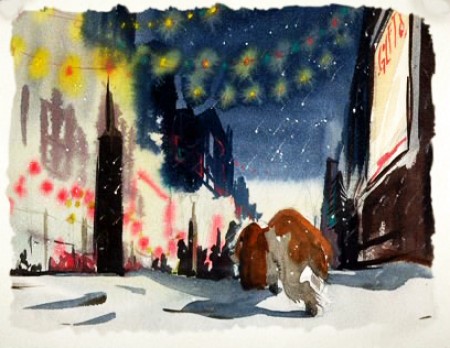
I love weather and would have applauded more of it in the film.
—-
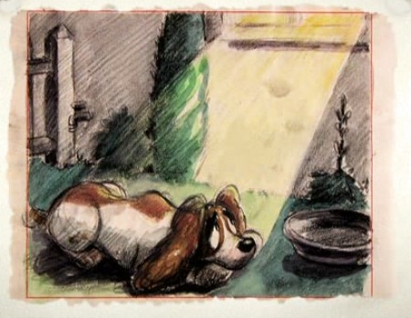
(Click any image to enlarge.)
One more post of these to go. On Friday.
.
Animation &Disney &Frame Grabs &repeated posts 28 May 2013 05:38 am
Whoopee
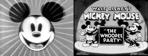
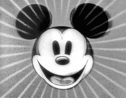 - Before there was video tape (which means before there were dvds), there was only 16mm film that you could project in your own home. I had (and still have) a nice collection of decaying movies and used to show these often. One of the regulars to show and watch and laugh at was the great Mickey short, The Whoopee Party. Everyone loved this short, no matter how many times we watched it. It’s a great film!
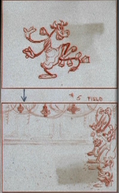
This encouraged me to watch it again on the B&W Mickey dvd I have. So I couldn’t help but jump for joy over the story sketches they include in the extras. Why not post them? So here they are – sketches from the limited storyboard they produced. I’ve also interspersed frame grabs from the film so you can compare images.
________________________(Click any image to enlarge.)

____________(Click any image to enlarge.)
 13
13
Commentary &Disney &Frame Grabs 02 Apr 2013 03:29 am
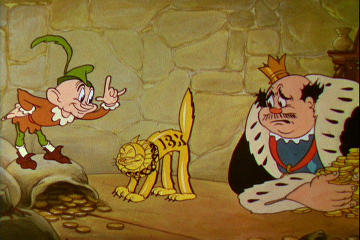
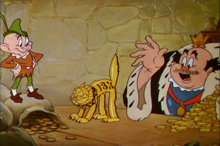
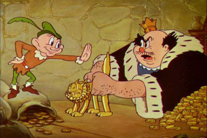
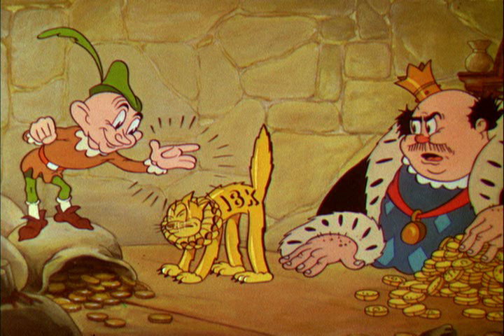
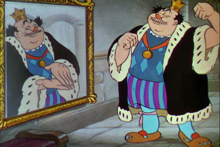
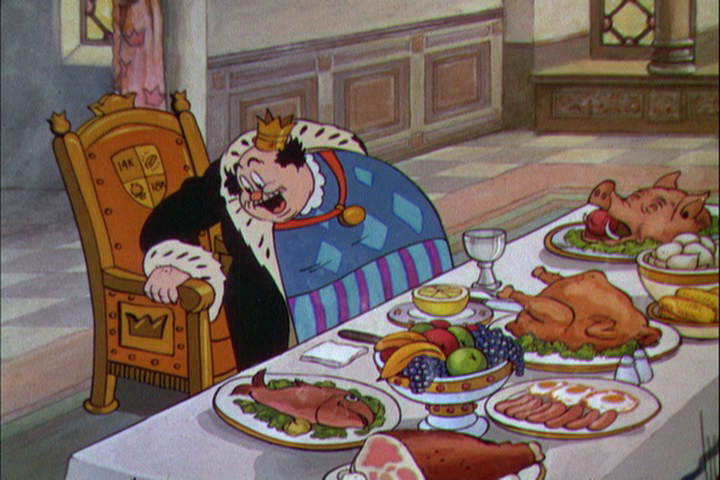
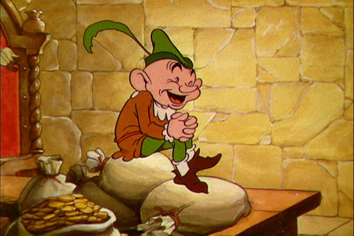
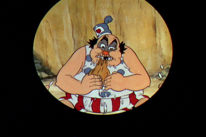
The Golden Touch
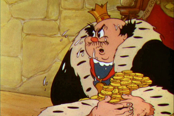
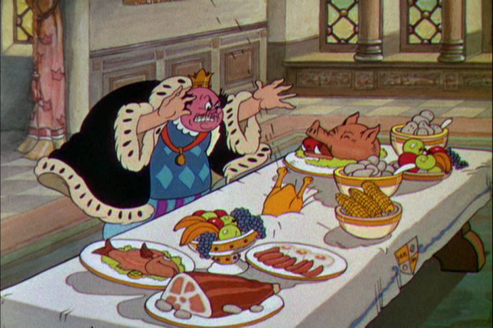
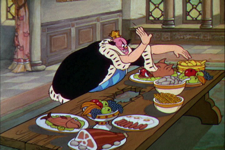
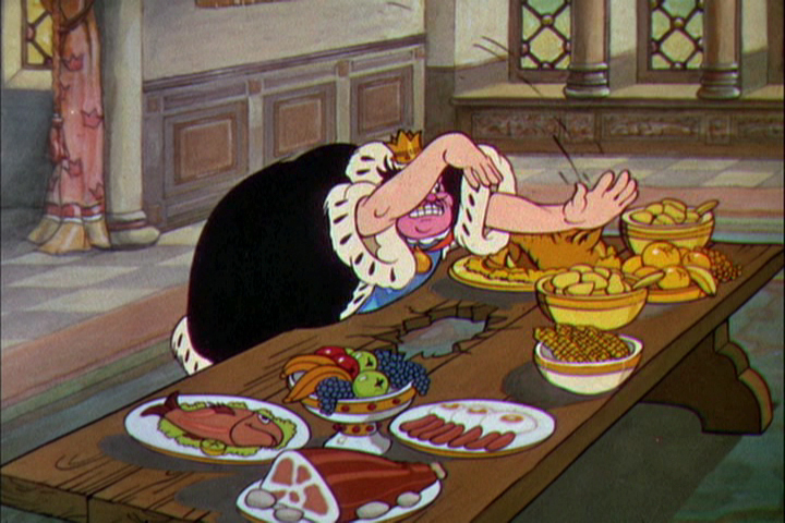
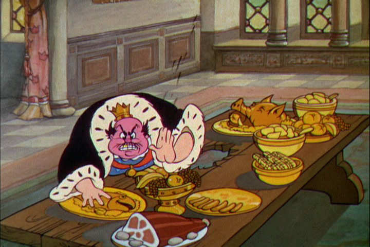
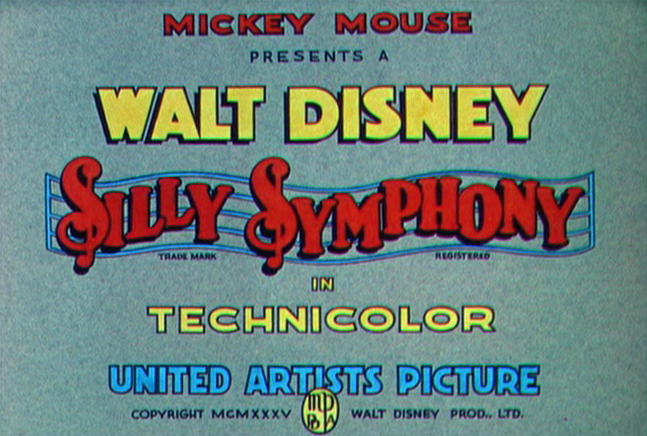 With Snow White in the back of his mind, Walt Disney placed close attention to what was going on at his studio. He had to be completely aware of his artists’ abilities in how they’d be able to handle the task of creating strong emotions in animation, something that wasn’t too risky on a Mickey Mouse cartoon, but might prove difficult when tackling tears for the climactic moments of a feature about a realistic looking princess and her prince.
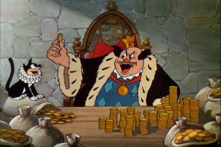
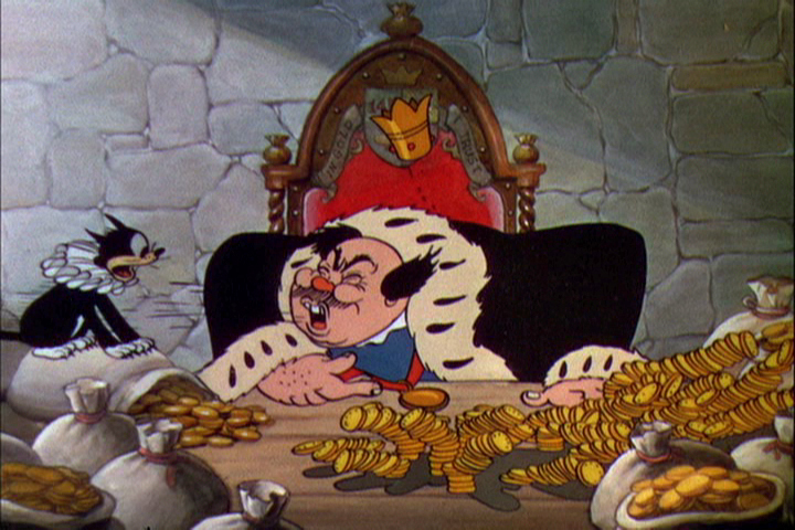
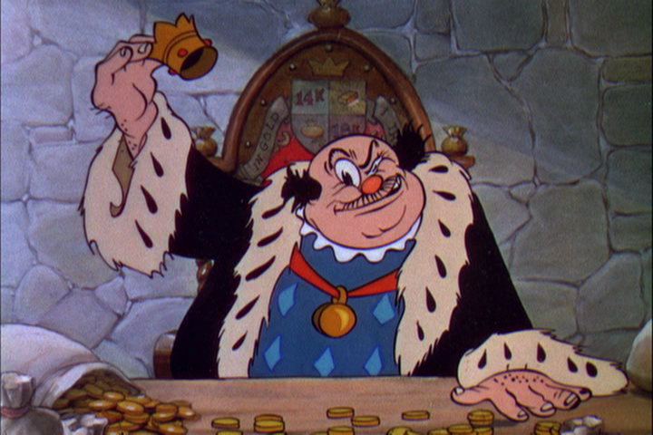
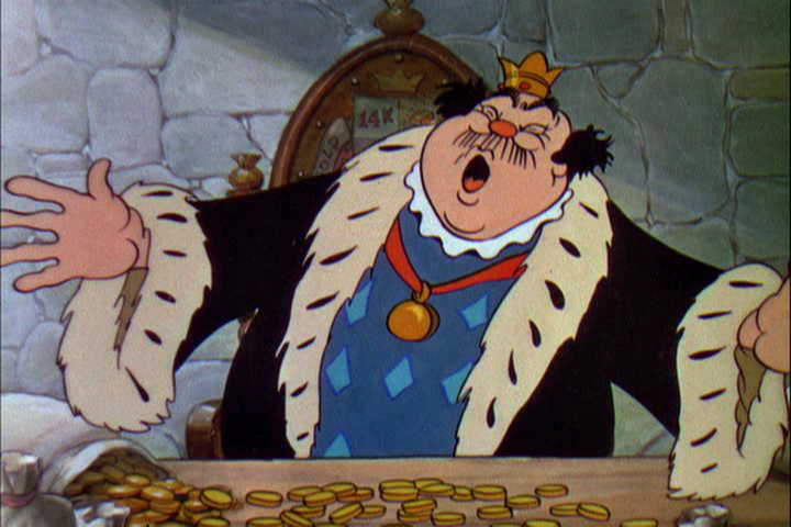
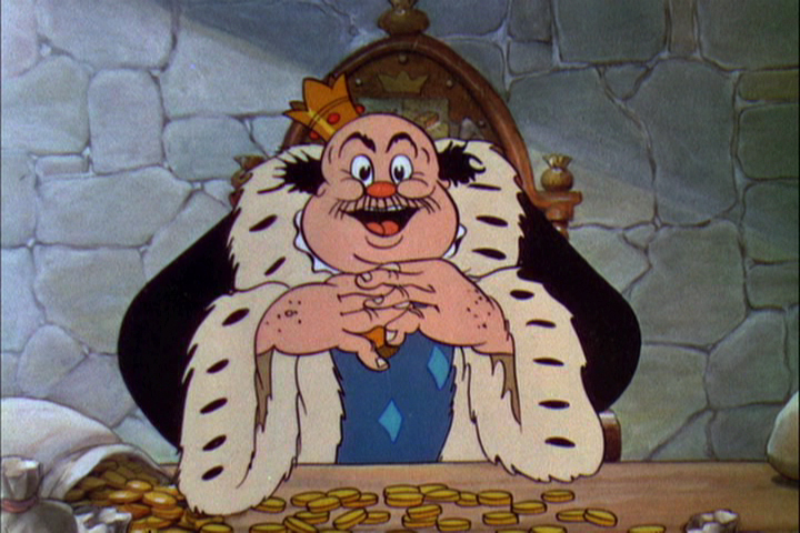
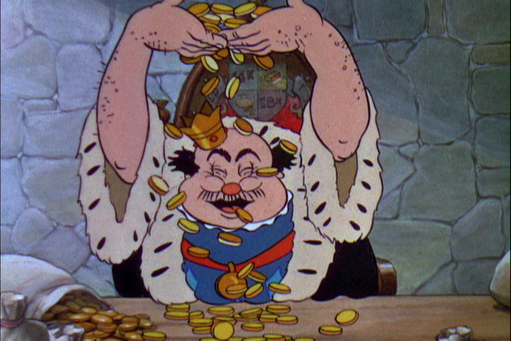
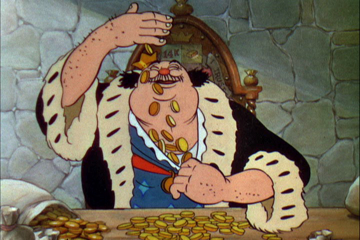
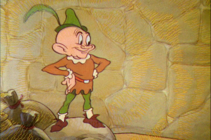
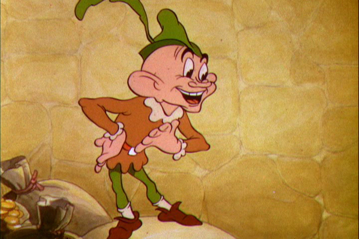
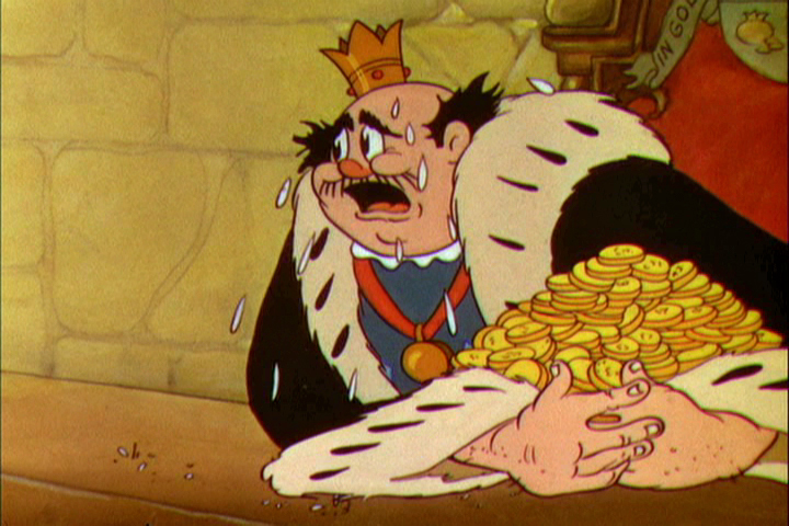
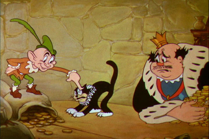
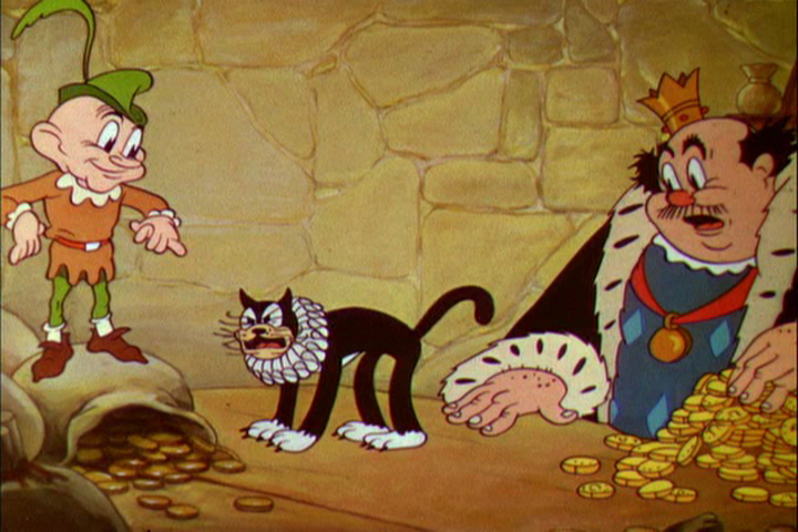
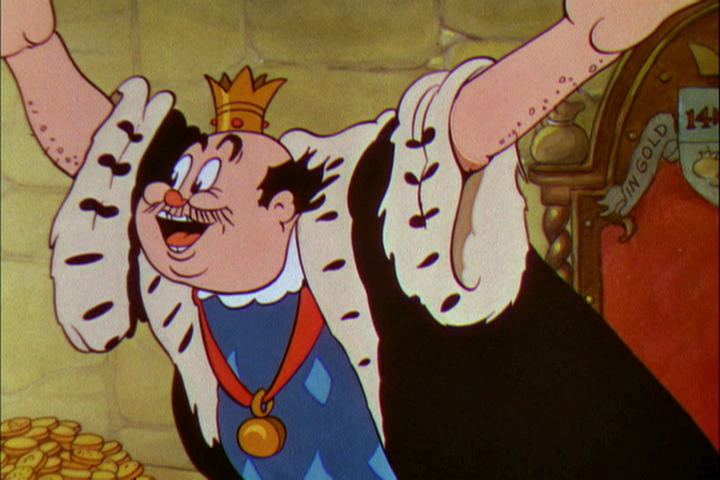
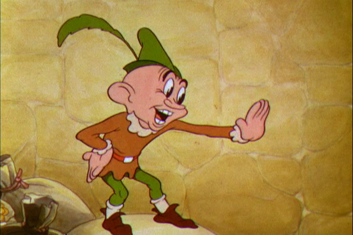
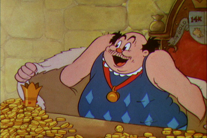
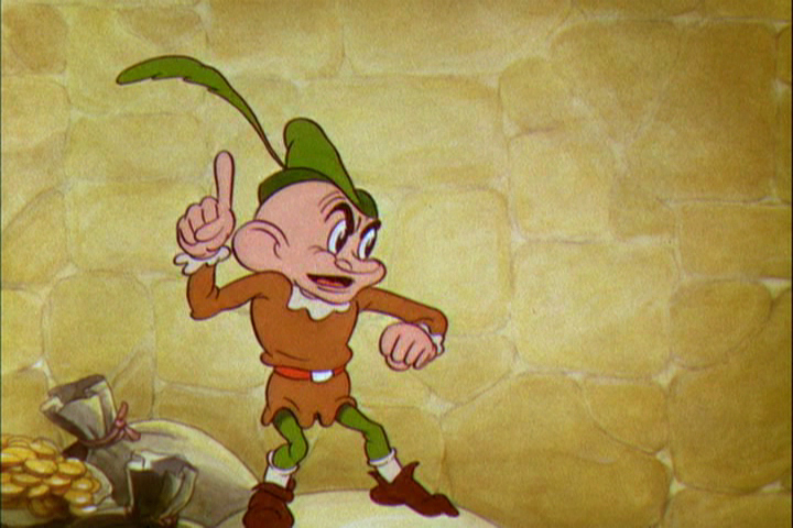
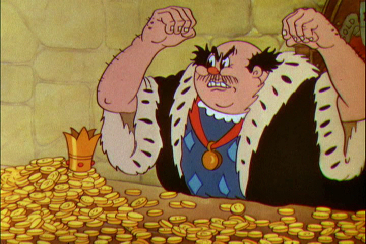
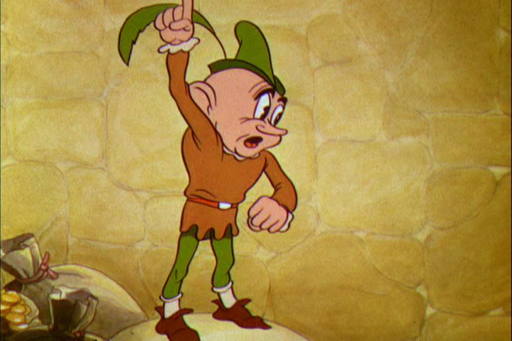
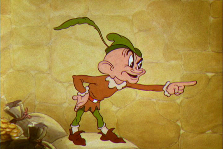
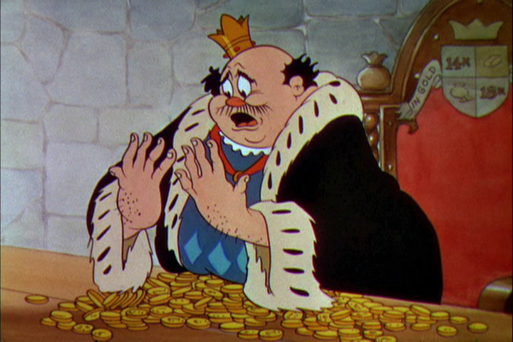
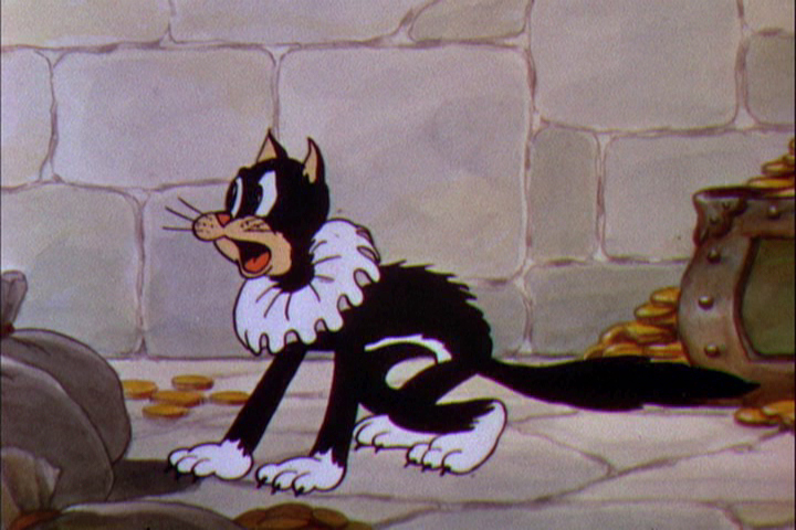
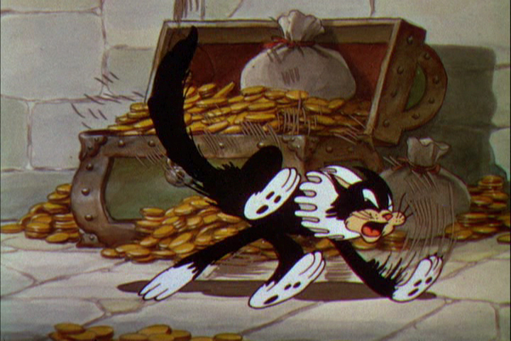
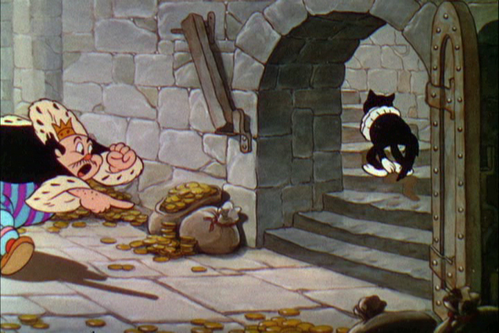
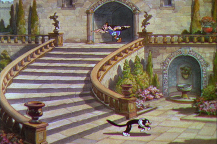
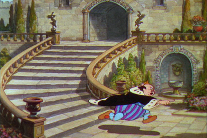
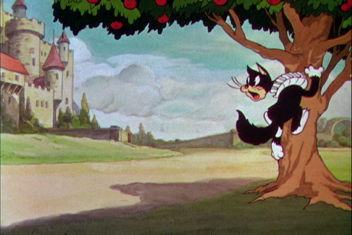
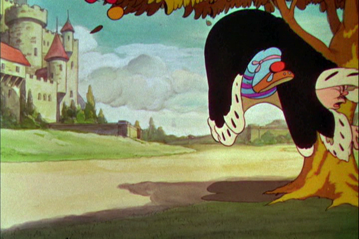
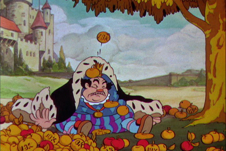
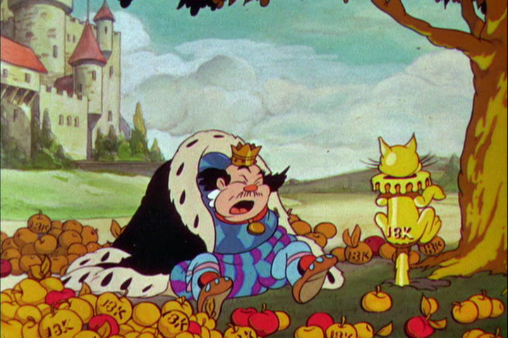
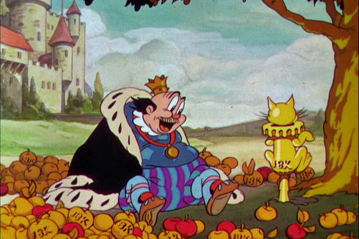
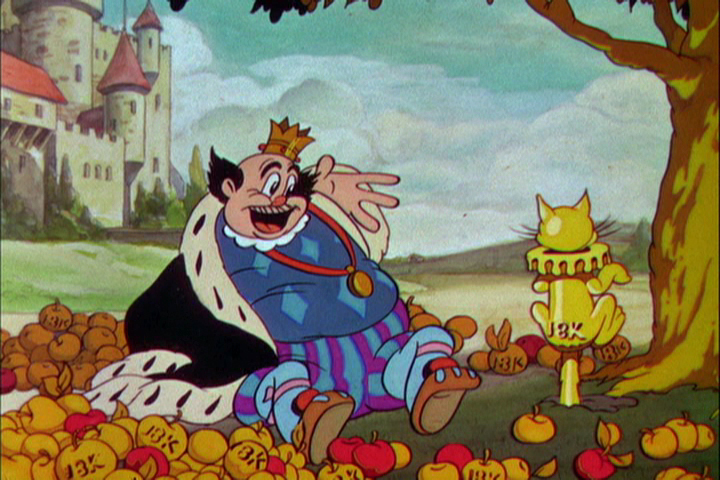
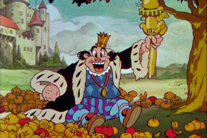
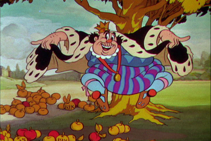
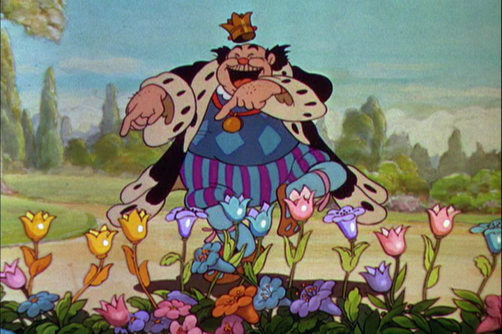
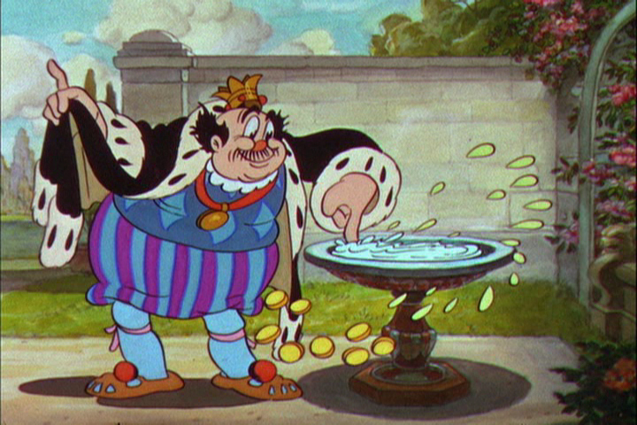
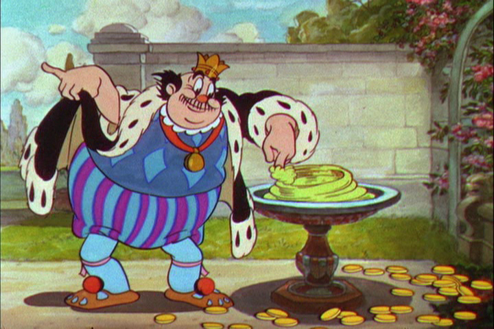
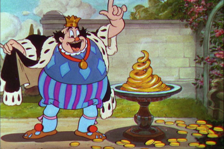
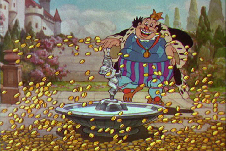
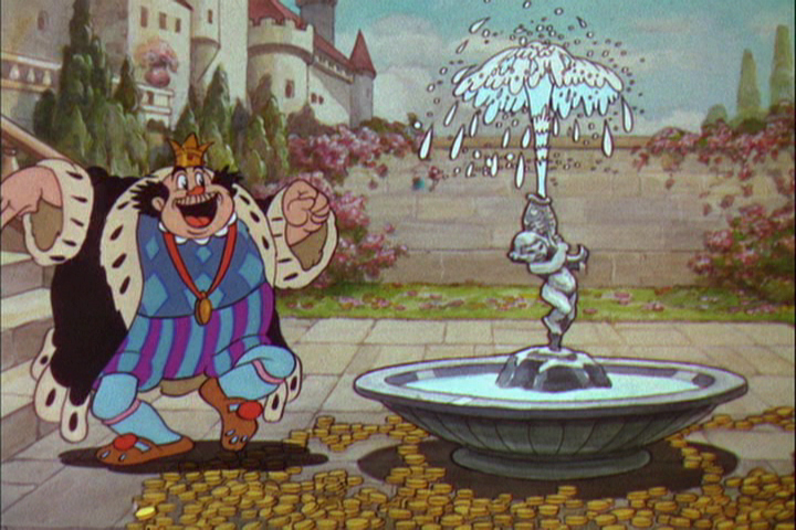
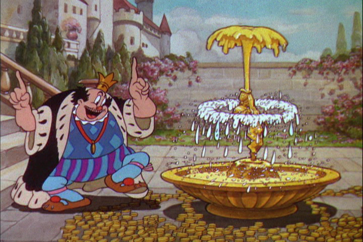
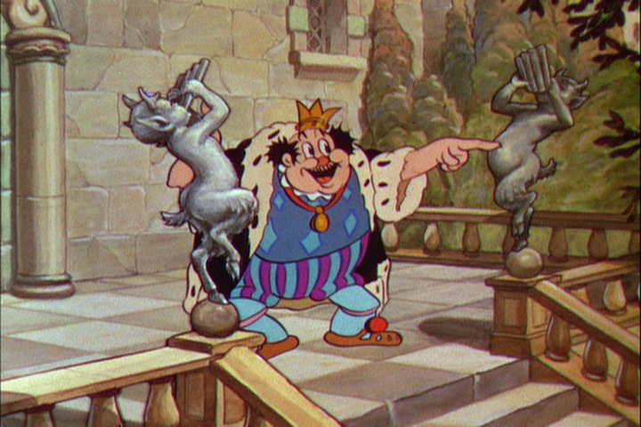
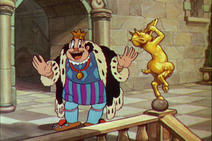
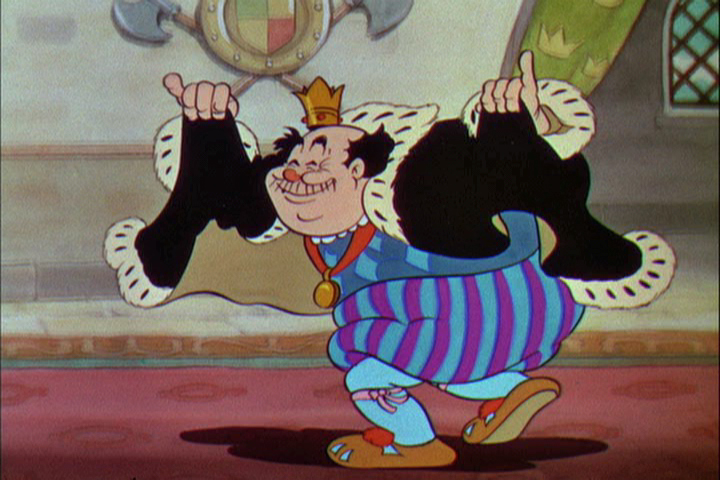
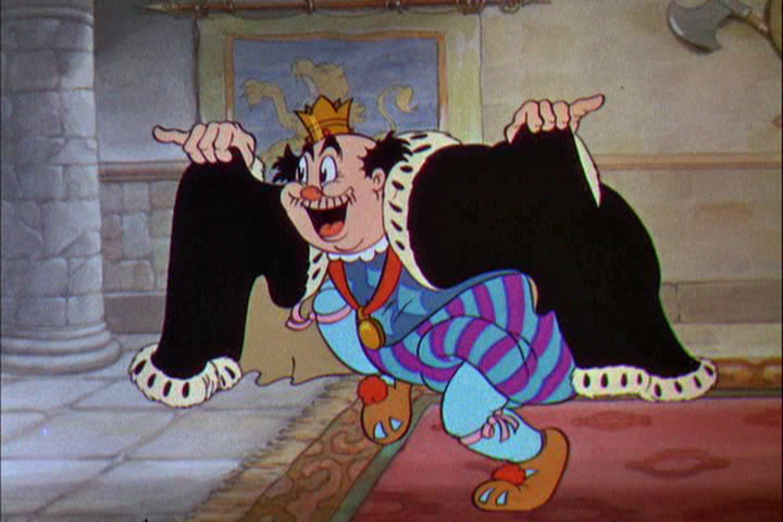
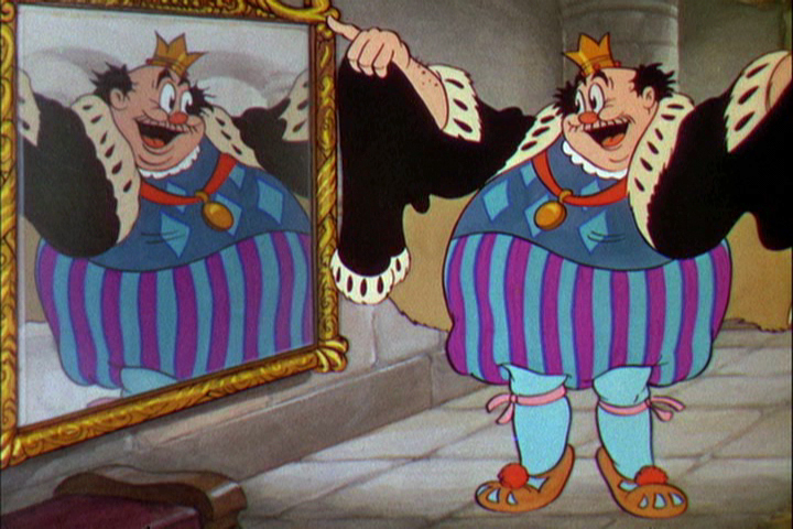
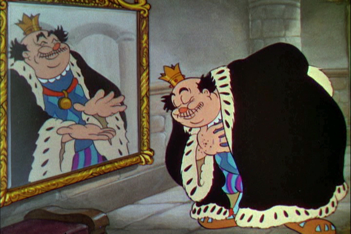
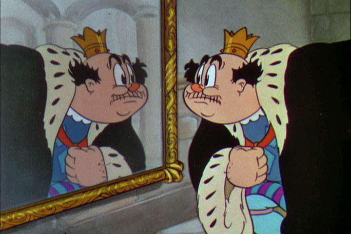
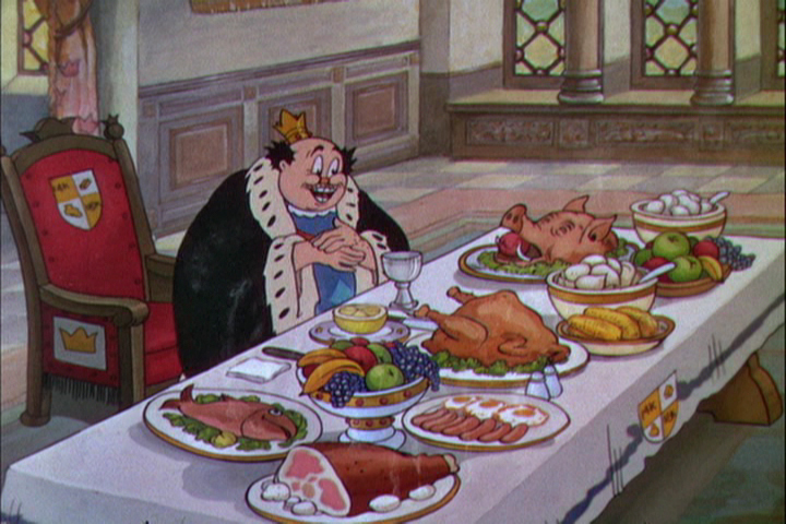
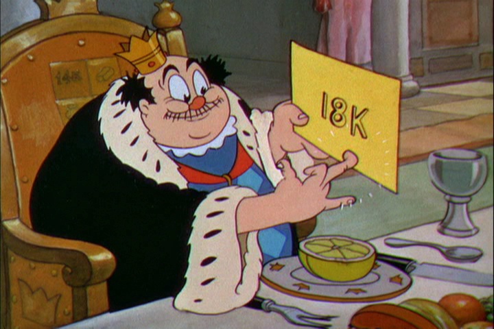
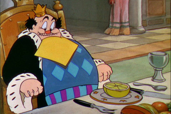
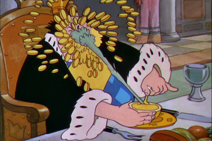
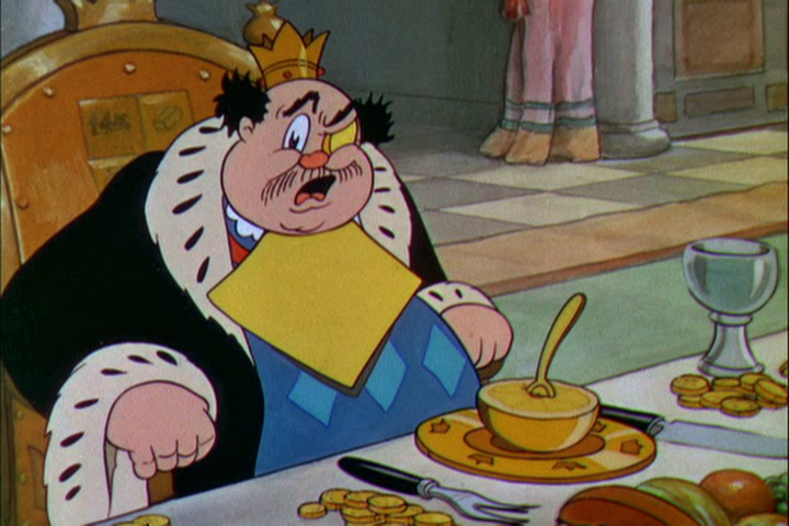
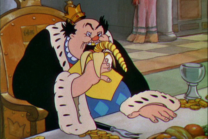
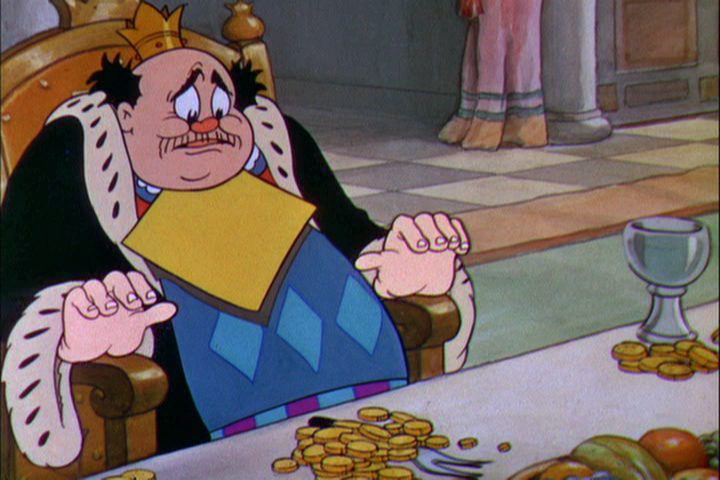
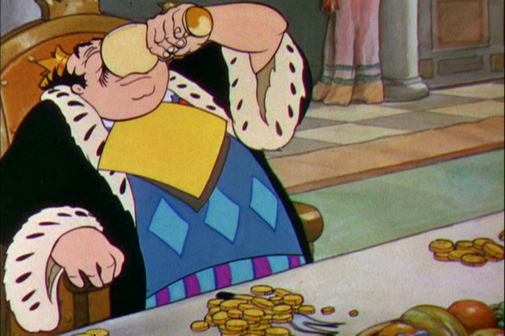
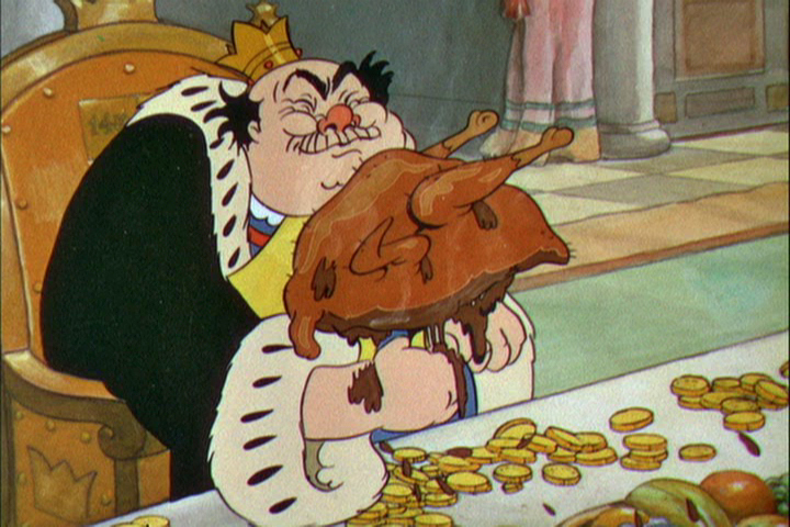
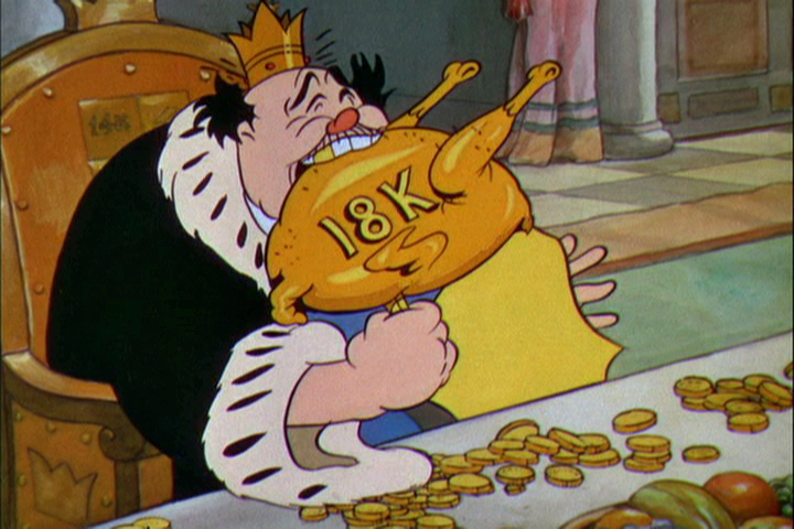
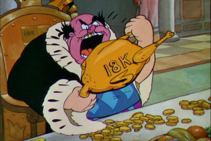
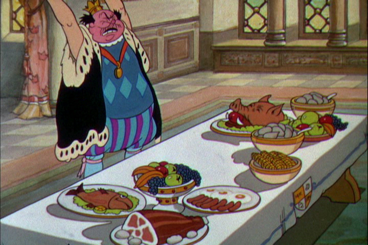
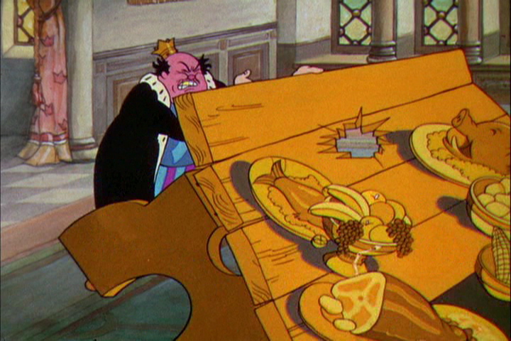
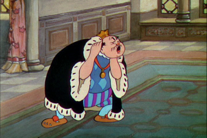
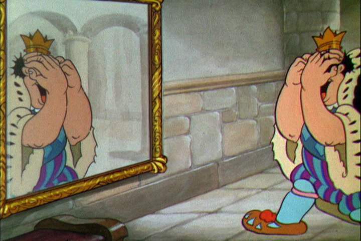
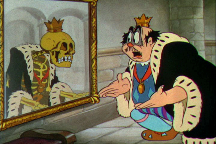
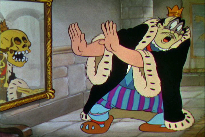
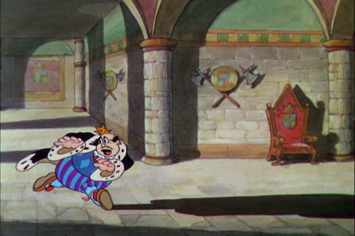
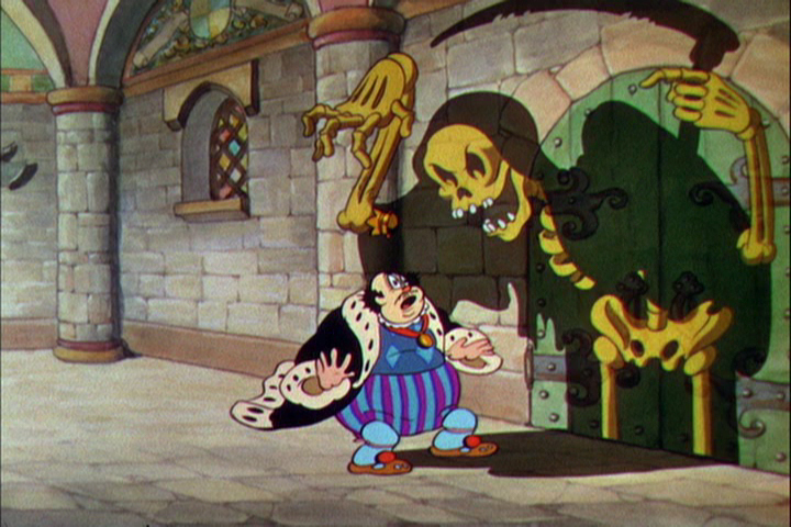
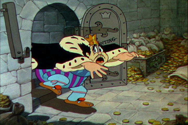
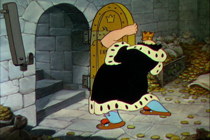
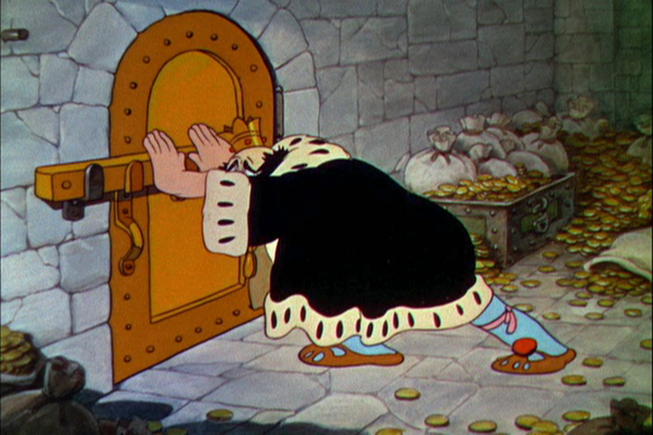
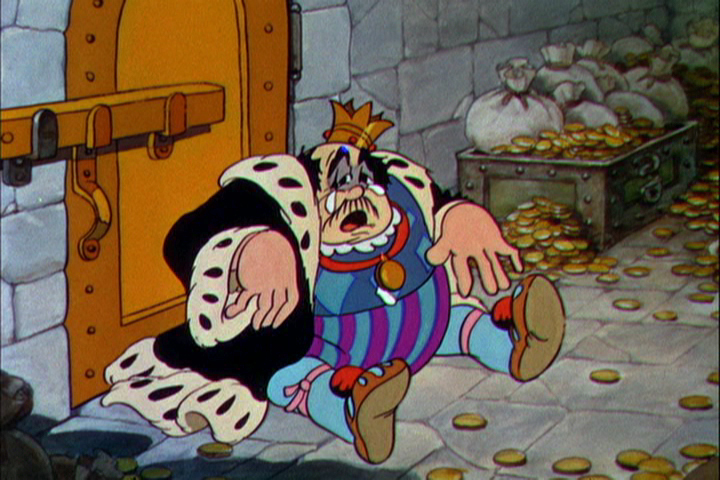
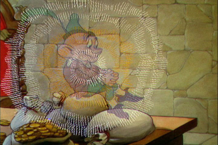
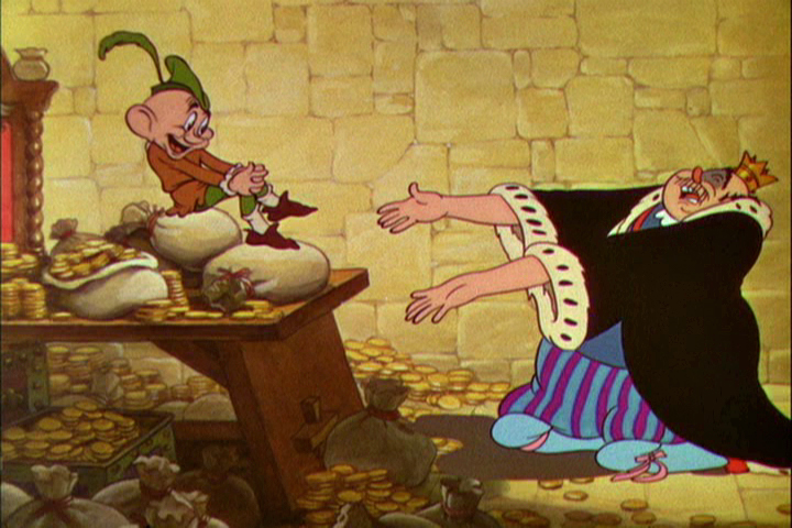
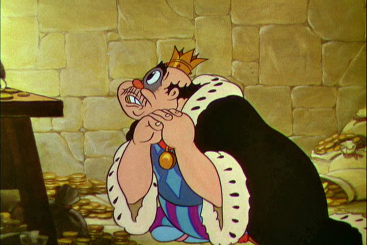
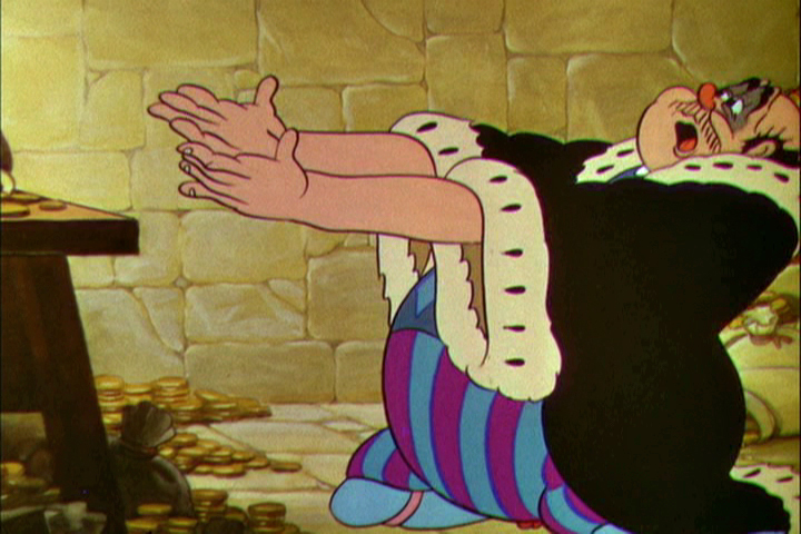
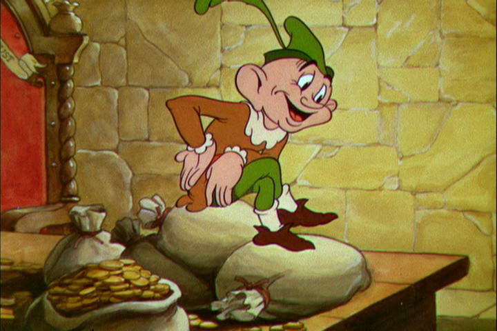
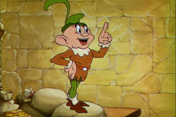
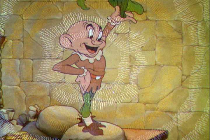
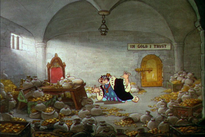
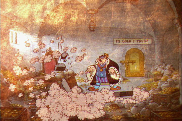
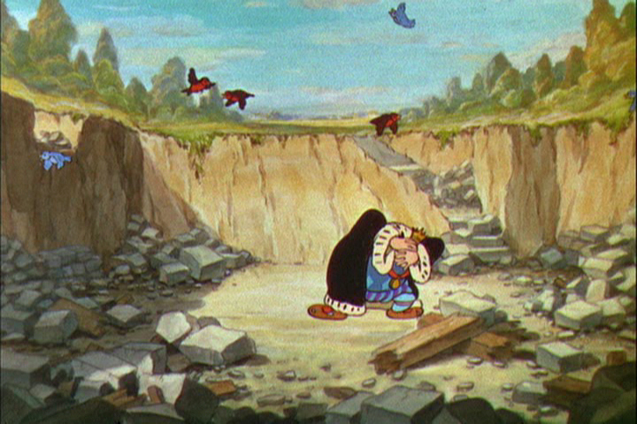
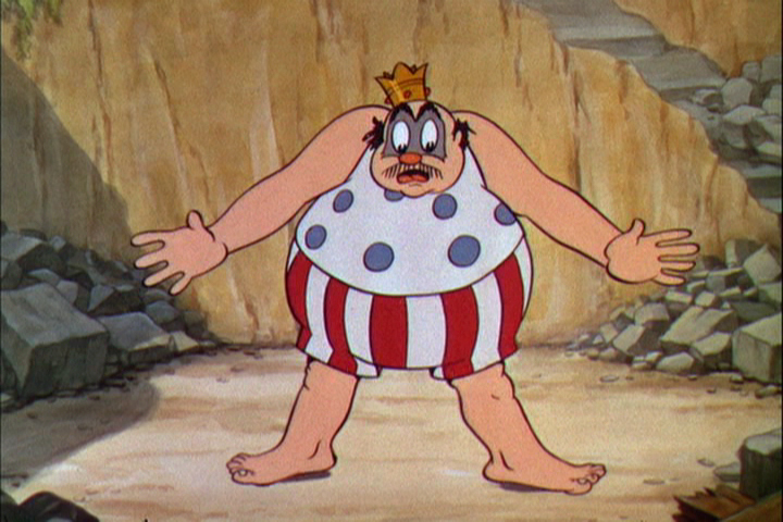
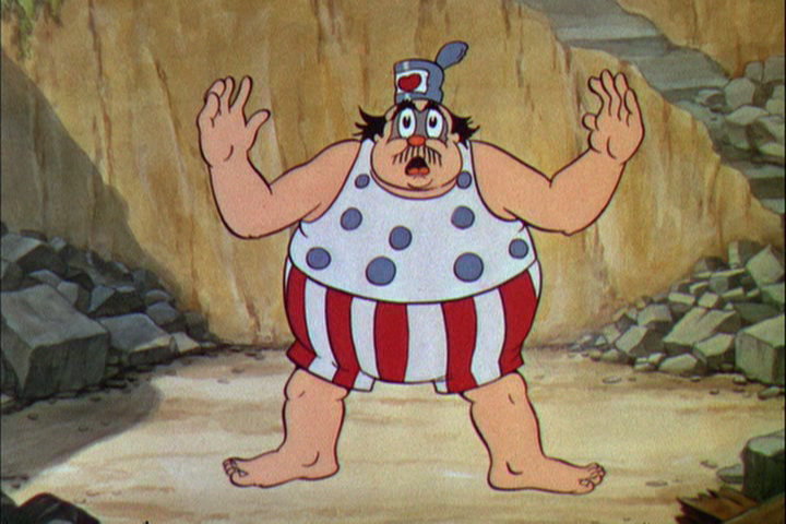
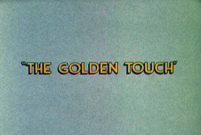 The Golden Touch was a task given to his two best animators, Fred Moore (who animated all of “Goldy”, the elf who bestowed the magic touch on the king,) and Norm Ferguson (who animated all of the king and his black cat.)
Walt Disney gave himself the task of directing the film. This would be the last screen credit he would ever get for direction. After the film was completed, Walt admitted that the film was “a real stinker.”
This film was the first to use extensive use of dialogue throughout. When Billy Bletcher was recorded as the voice of King Midas they filmed him reading the lines with his lips painted white so that the animator, Ferguson, could easily work with the frame by frame study. The film does get a bit talky.
Other critics have given it as negative a review as Disney gave himself. I actually like a lot of it. The animation throughout is interesting. Neither animator has found a positive character, but both bring a peculiar touch to the two protagonists. “Goldy” is one of the creepier characters ever in a Disney film. Fred Moore gave an indication of how odd the seven dwarfs could have been. The king is very similar to “Old King Cole” done only a year earlier in 1933. He looks and acts similar, although the animation is tighter and more experienced.
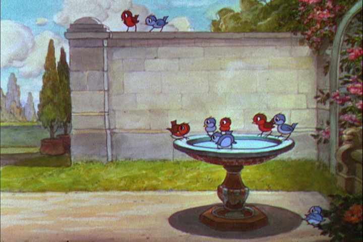
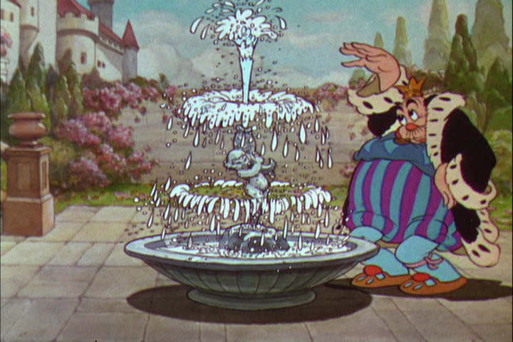
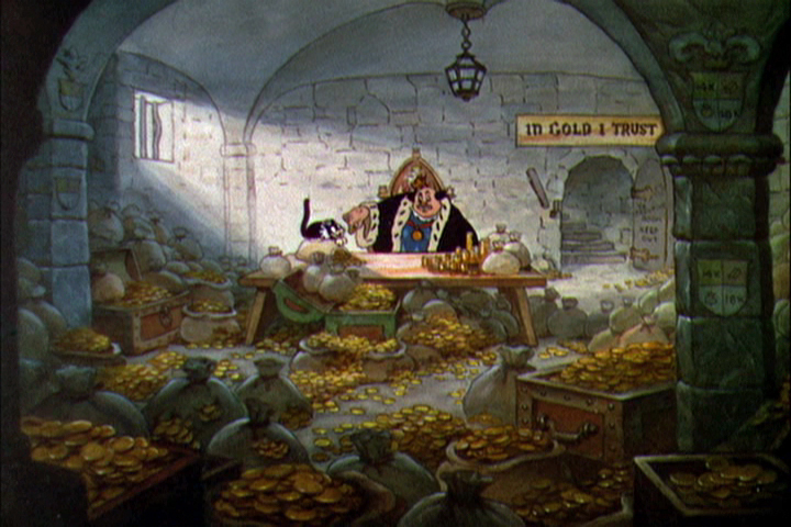
I think the backgrounds in “The Golden Touch” are spectacular and well designed, color-wise. The art direction is first rate, as might be expected. The watercolors of the castle and its surroundings are beautifully painted. Even though cross cutting between the king and “Goldy” the variation in backgrounds isn’t jarring but firmly appropriate. “Goldy” has a bright gold color behind him, the king remains has gold behind hi until he returns to reality, now with Gold’s magic touch. Then he gets the blueish-gray of the castle as his Bg color.”
Artistically the film is very rich, as might be expected of any “Silly Symphony” of this period. Handsomely produced, of course.
 3
3
Finally, here is a video representation of the Silly Symphony in motion.
Action Analysis &Animation &Fleischer &Frame Grabs 26 Mar 2013 05:45 am
Grim – Distortions Smears, Abstractions & Emotions – 3
- In 1930, the animation in the Fleischer studio (as evidenced by Michael Barrier in his great book, Hollywood Cartoons) was pretty much controlled by the timing department. They supported a very even sense of timing and would expose everyone’s animation in the house meter. This virtually destroyed the timing within the studio. Their idea was that every drawing had to overlap the drawing before and after. It was done to such an extreme that it caused the even timing throughout their films.
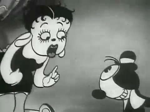
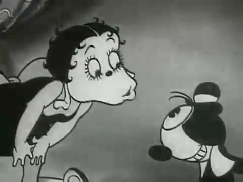
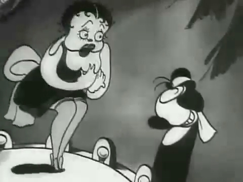
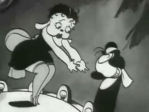
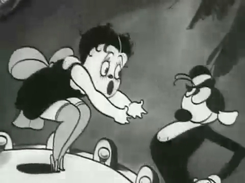
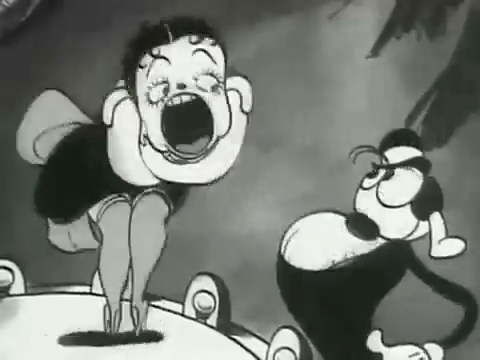
There was at least one animator free of the timing department. Grim Natwick was the key guy in the studio, at the time. His animation was built, back then, on a distortion, a freedom of expression, that very much resembled what Bill Nolan was doing in Hollywood. The difference was that Natwick could draw, so his artwork was planned, designed to look that way. It wasn’t just a matter of straight ahead animation causing distortion. It allowed distortion with scenes going back to square one every so often to hold off the appearance of distortion. The inbetweens distorted and, in a way, smeared always to come back to a nice, tight pose of an extreme.
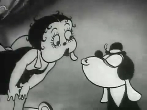
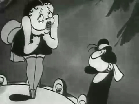
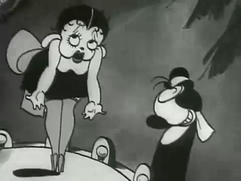
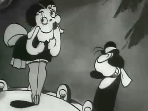
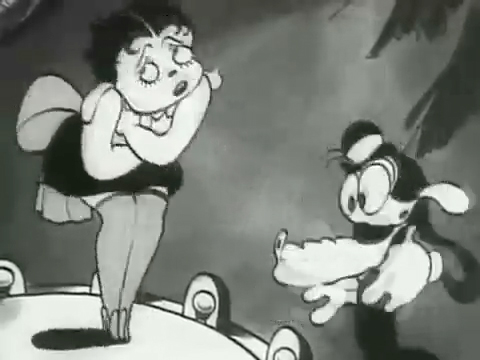
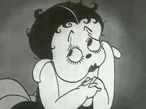
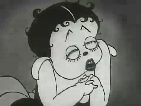
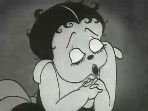
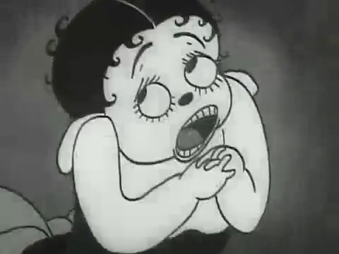
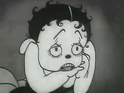
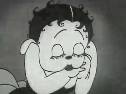
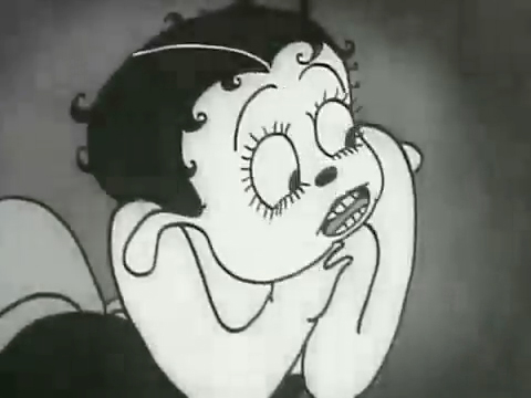
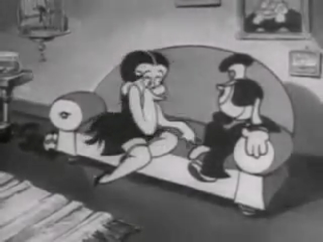
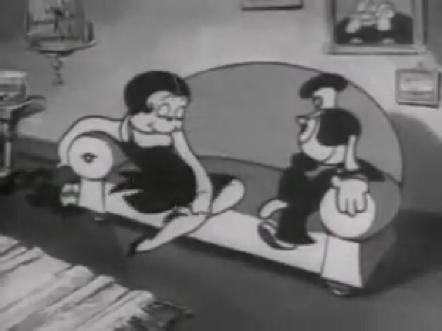
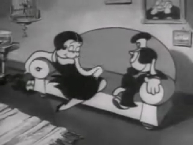
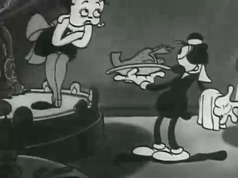
The film “Dizzy Dishes” is the perfect example of this style. This was actually the first Betty Boop cartoon, and Betty, a plump dog sings broadly. She really goes wild as she sings a song on top of a table à la Marlene Dietrich!. Here are some frame grabs from a couple of connected scenes to give you an idea of what was going on.
 1
1
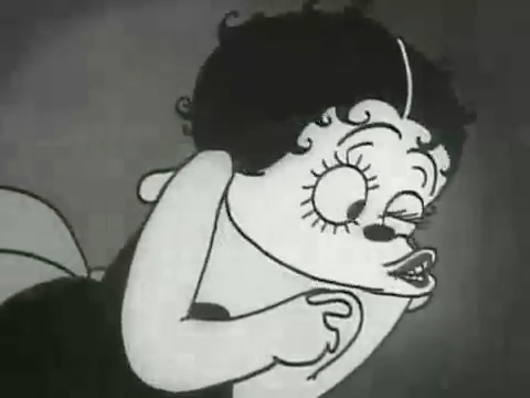
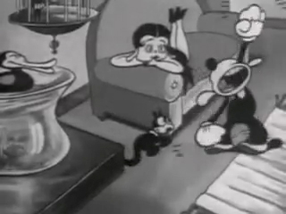
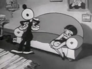
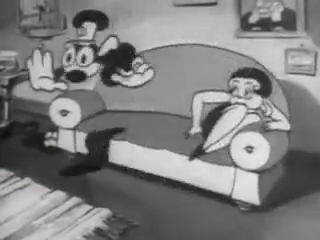
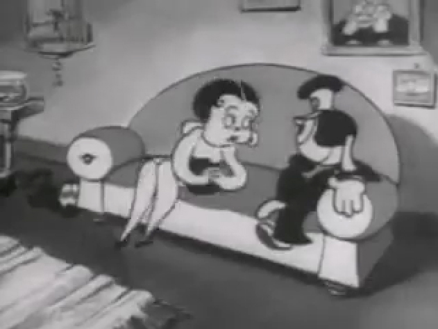
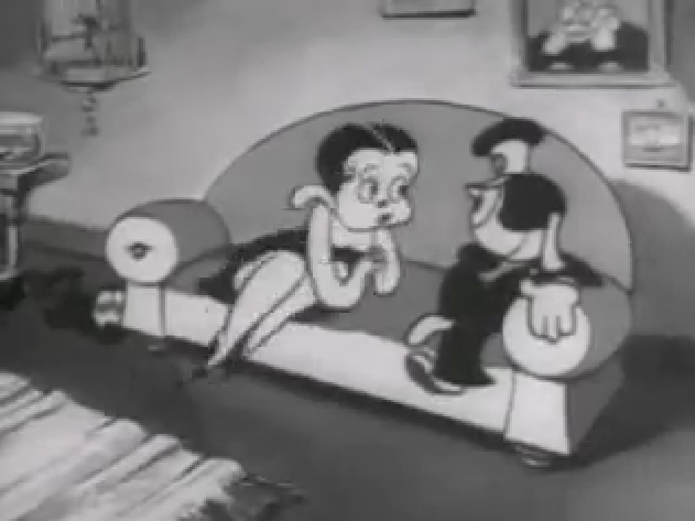
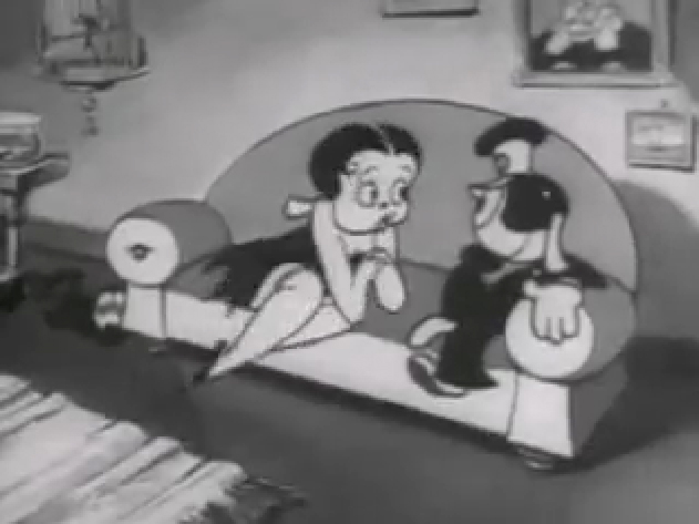
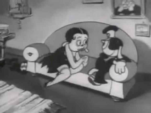
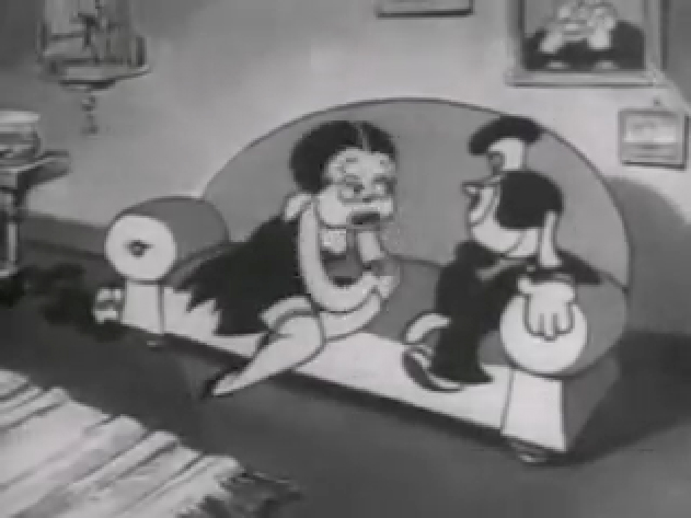
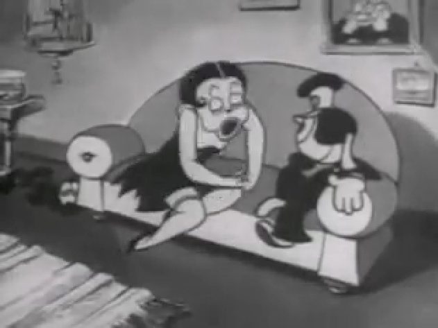
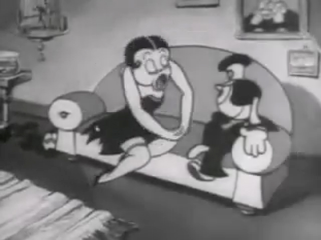
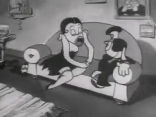
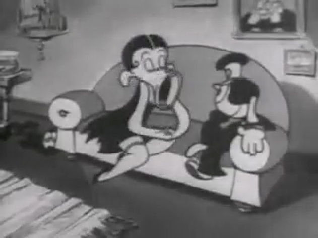
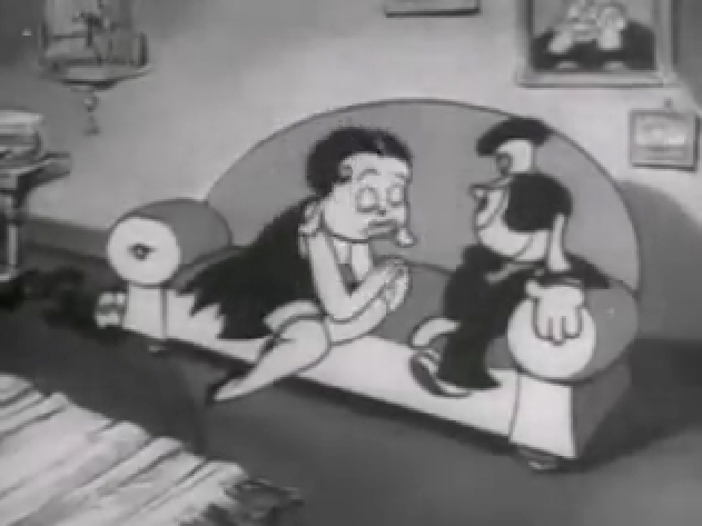
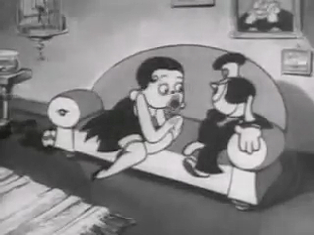
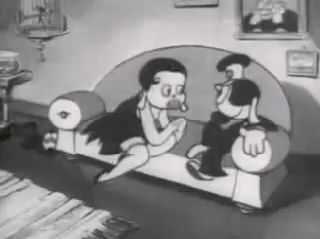
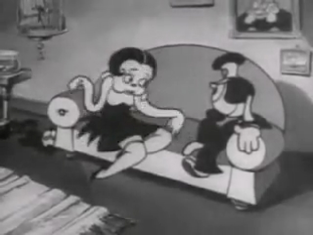
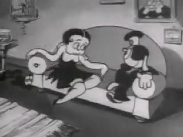
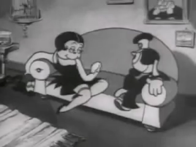
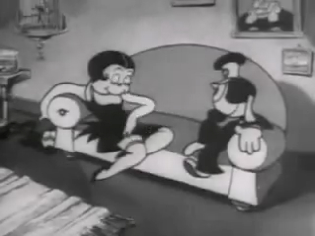
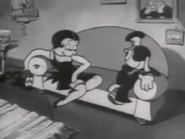
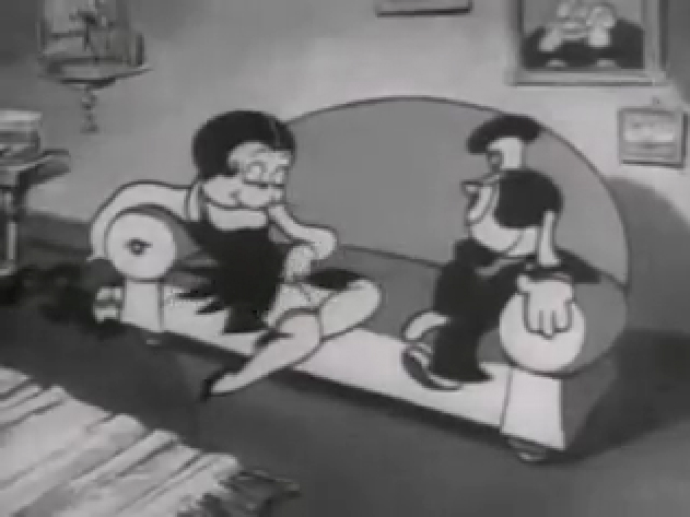
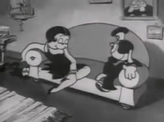
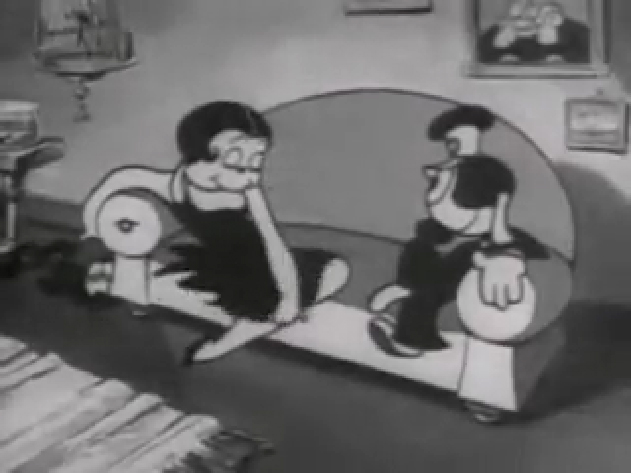
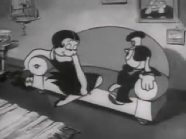
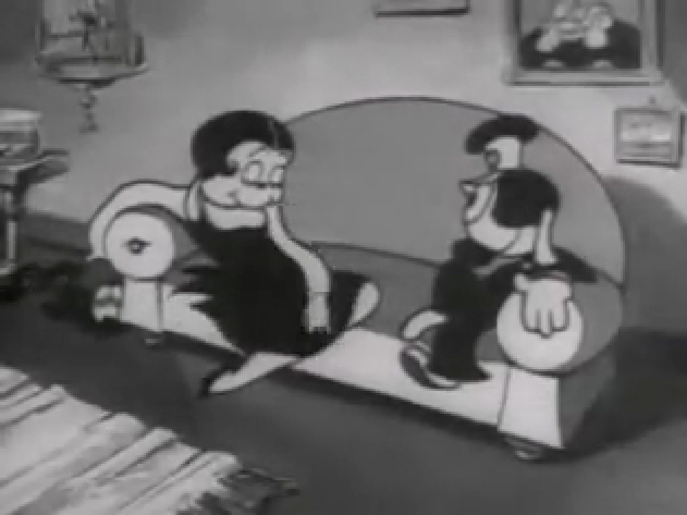
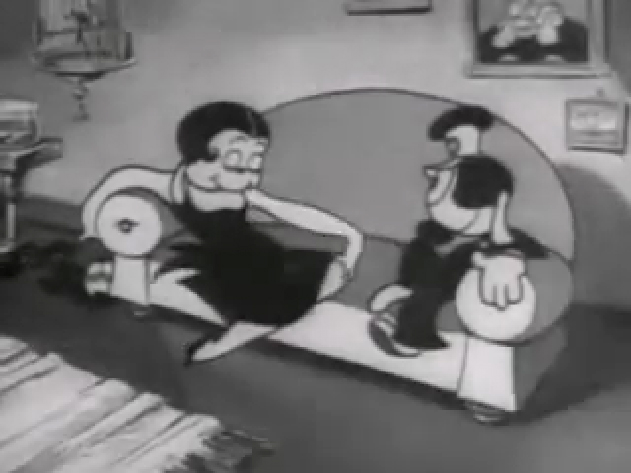
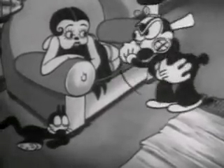
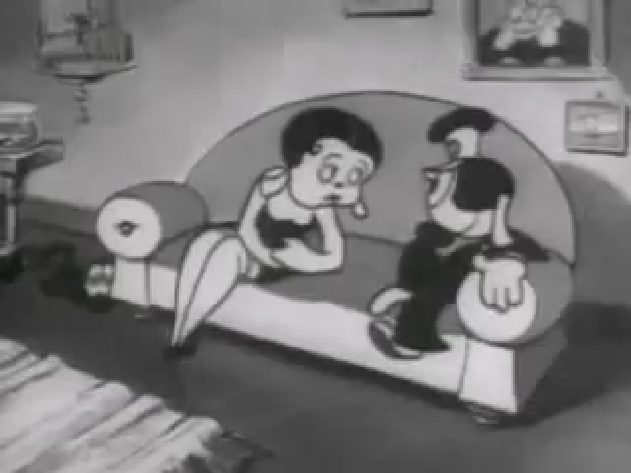
If you jump ahead to Fleischer’s “Barnacle Bill”, also from 1930, you’ll find this wild scene where Betty is seducing Bill, you’ll see all sorts of distortion in the inbetweens which Grim has maneuvered for Betty’s movements on the couch. Note how well posed his extreme positions are drawn despite the distorted inbetweens, when she is moving.
 1
1
Look at the beautiful drawings (above) of this character in some of these extremes from this film. The character of Betty isn’t moving whereas Bimbo – I mean Barnacle Bill is all over the place. Yet your eyes are on Betty in that held position.
Now, let’s look at what the inbetweens are doing as Betty gets from one pose to the next. It’s really funny. Grim has found a way to create a sympathetic, adult and female character, yet he keeps her funny with the surface of the animation.
 1
1
At times in the animation, Betty’s hand may turn into a claw, but that might be that Grim delivered a rough which was poorly cleaned up by an assistant. Or perhaps the inker just inked from a rougher drawing, perhaps a Grim “clean up” if there ever were such a thing. He worked ROUGH. In fact, that distorted claw of a hand doesn’t matter. It’s the extremes that counted for Grim, and he was experimenting with this animation to see if that really were true.
I’ve remembered over many years an interview with Dick Huemer,* who worked alongside Grim on some of these films. Huemer gets credit for inventing the inbetweener to use in the animation process. It allowed him to turn out more animation and not worry about the many drawings that would paste the scenes together. In that interview, Huemer said that it didn’t really matter what the inbetweens looked like. You could draw a “brick” and it would still work. They actually may have believed this, at that time. Grim is using the inbetweens to get somewhere else in putting the scenes together.
(Tomorrow, I’ll post, again, a scene Grim did for Raggedy Ann with Dick Williams’ clean ups alongside so you can see the variance.)
* In Recollections of Richard Huemer interviewed by Joe Adamson, [1968 and 1969] Huemer said:
- And i decided that I would save all that work of inbetweening by just having a bunch of lines or smudges, just scrabble, from, position to position, When something moved fast. To prove it, I had an alarm clock flying through the air, and right in the middle of the action I put a brick. And vhen they ran the finished
film you didn’t see the brickl It proved that you didn’t really see what was in the middle. But I overdid it.
Action Analysis &Animation &Commentary &Frame Grabs &Tytla 25 Mar 2013 06:05 am
Smears, Distortions, Abstractions & Emotions – 2
- I wrote about this stylistic animation device not too long ago. I was leading up to the master, of course, Bill Tytla. He distorted things, alright, and in the way he did it, he changed animation forever, as far as I’m concerned.
But I started that story by writing about traditional animation and where it came from and where it was going; leading to a sort of rebellion as animators started distorting things, generally, in working closely with their unconventional directors. I purposely skipped a step there, and I should go back a tiny bit and talk about a couple of animators from the silent/early sound days. Today I have Bill Nolan in my sights; tomorrow, Grim Natwick. It’s kind of important before going on to Bill Tytla.
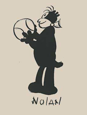 In the animation community in 1927-1930, there were two key animators who were considered the leaders in the business:
Ub Iwerks at Disney (until he left to open his own studio) and
Bill Nolan (at first with Pat Sullivan & Felix the Cat, then with Mintz’ Krazy Kat, and then onto a series of topical gag films called “Newslaffs.”
Both were considered the fastest animators in the country, and it was debatable as to which was quicker, though Iwerks was probably the guy. When Disney learned that Iwerks was leaving, he interviewed Nolan in New York to see if he were interested in replacing Iwerks. Disney offered a high salary of $150 per week for the job. It didn’t work out; Nolan was doing an unusual series, but ultimately went to ________________Nolan’s Krazy Kat looked original.
Oswald the Rabbit after Universal had taken
charge of it. Nolan just about ran the studio under Walter Lantz and allowed them to turn out an enormous amount of footage.
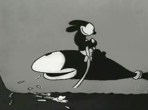
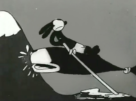
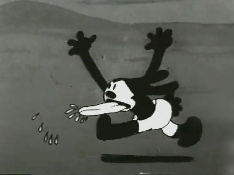
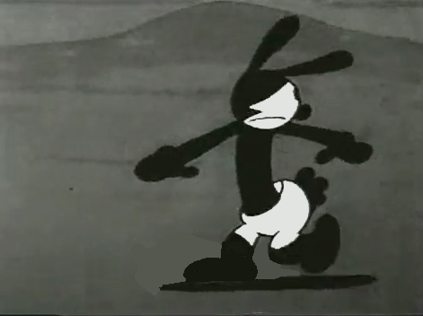
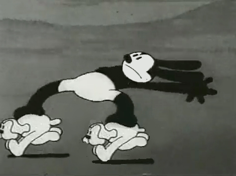
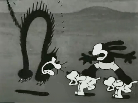
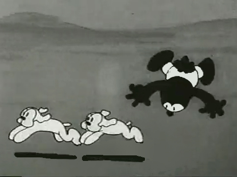
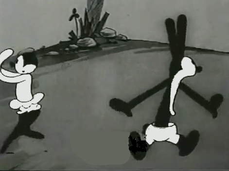
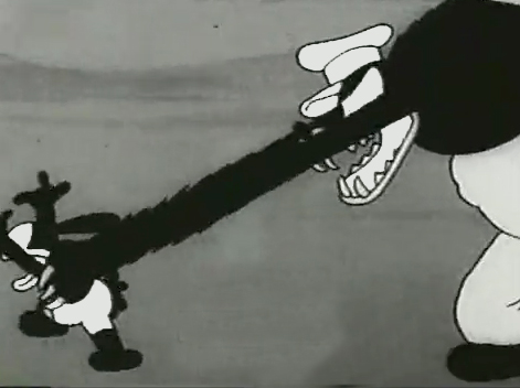
Nolan had developed a style known as the “rubber hose” style in that the limbs of a character were like flexible hoses and joints would be broken wherever the animator wanted. The style also featured very circular drawings. Stylistically, this fought the angularity of some other films that were being made and allowed Nolan to turn out many more drawings than usual. The roundness offered a faster line, and there was also quite a bit of distortion in Nolan’s drawings. Quite often the characters, Oswald, for example, didn’t even look like the character on the model sheet. In fact, you’d have to wonder if there was a model sheet, given the look of the animated character. Both Nolan and Iwerks were straight ahead animators, which meant they could easily go off model. Iwerks was better at holding things than Nolan, who seemed to enjoy being wild. Nolan would go back through his wild drawings and correct a couple of them, but would leave any other changes to lesser artists.
Nolan’s work was somewhat similar to the work of Jim Tyer, but I don’t think Tyer was drawing/animating that way to turn out faster work (though he was a very fast animator.) Nolan had to push the work out, and the rounded, distorted drawings enabled him to animate very quickly. As he went on, the artwork grew more and more wild, and it varied somewhat from the other animators’ work. Tyer tried to get his art to distort, as it does; Nolan just ended up there.
 1
1 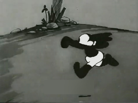 2
2I’d chosen a lot of stills from several of the
Universal/Lantz Oswald cartoons, animated by Nolan.
 3
3 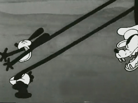 4
4
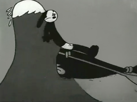
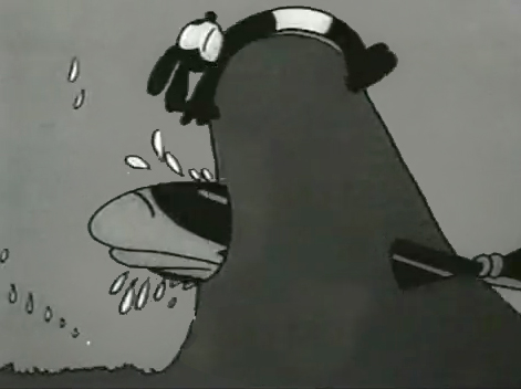
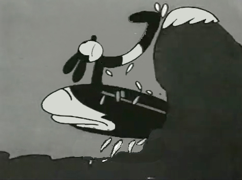
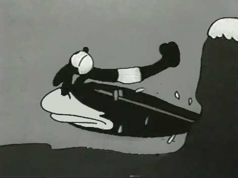
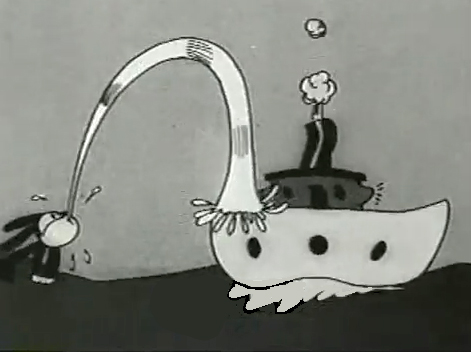
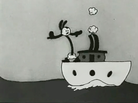
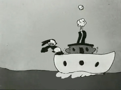
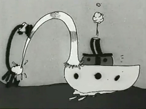
But so many of these from the short, “Permanent Wave,”
are good enough to illustrate my point.
 13
13 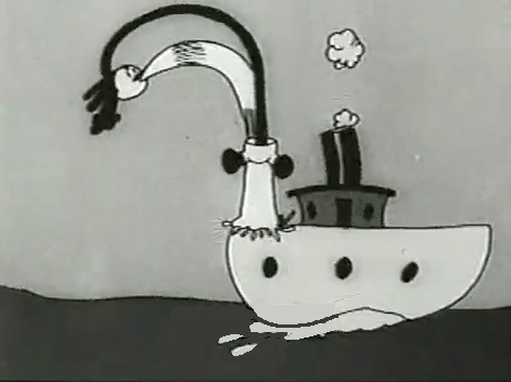 14
14
His body moves out in front of his head
as it climbs up the water he’s spitting onto the boat.
“The Hash Shop” was about as crazy as the animation and the gags went. Here’s one that ends the film.
By 1930, Bill Nolan seems to have settled down a bit. He still abstracts and distorts his animation, but he tries to fit in a bit more with other animators who aren’t drawing their animation quite so abstractly.
After Disney’s “The Three Little Pigs,” other studios tried to catch up with this new type of animation. Nolan and, to a lesser extent, Lantz, didn’t try very hard to change. They liked the way things were going. However, it didn’t take long for Lantz to move for a change in Oswald’s design. They went cuter and whiter on the rabbit.
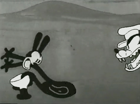
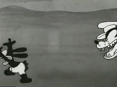
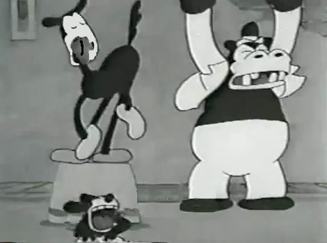
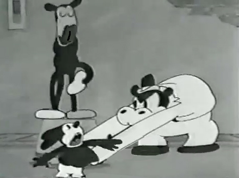
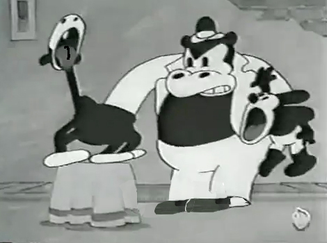
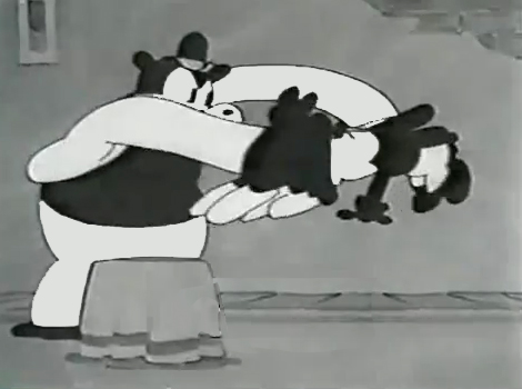
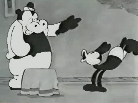
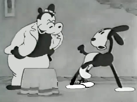
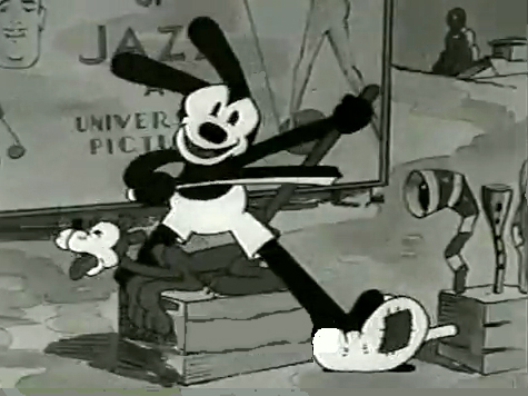
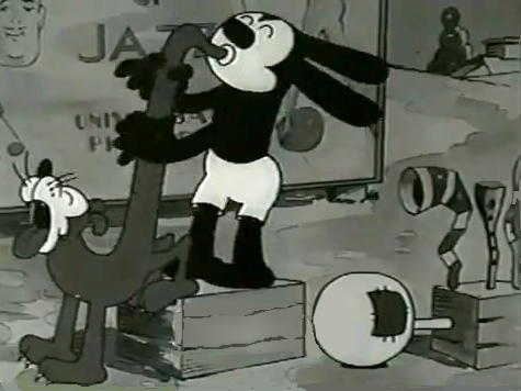
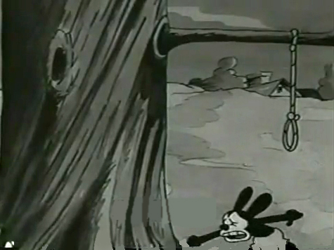
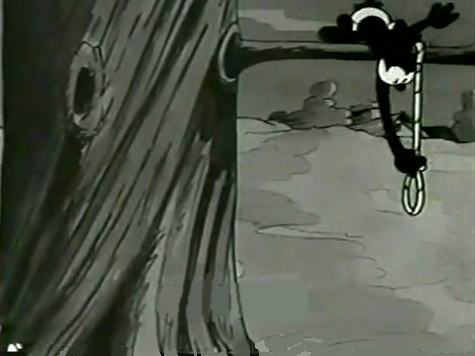
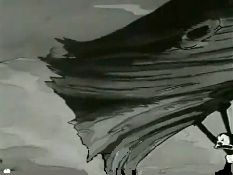
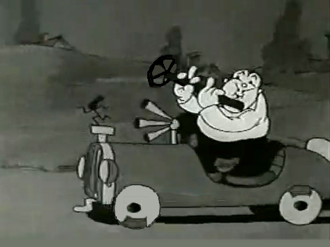
Here are some frame grabs from “My Pal, Paul.” In it Oswald wants to play music with jazz conductor/musician, Paul Whiteman. As it happens, Whiteman’s car breaks down while he’s driving through the woods, and the two get a bit of a duo as Whiteman plays the steering wheel like a clarinet. (Maybe that’s abstract enough.)
Commentary &Frame Grabs &Richard Williams &Title sequences 24 Mar 2013 03:38 am
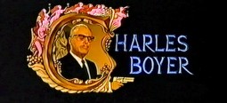
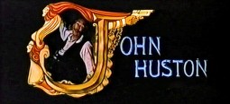
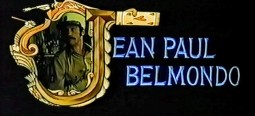
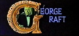
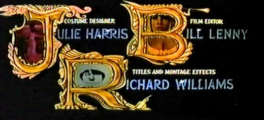
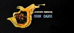
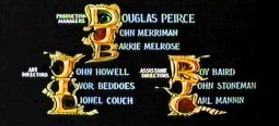
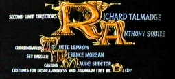
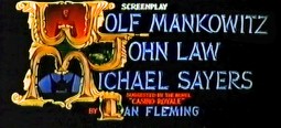
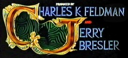
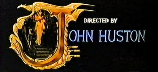
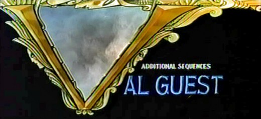
Dick Williams – Casino Royale Titles – recap
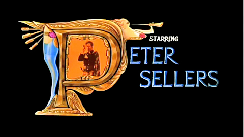
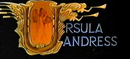
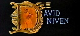
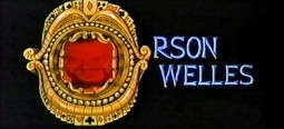
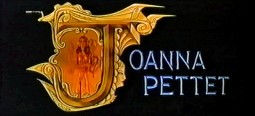
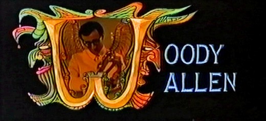
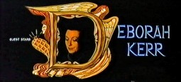
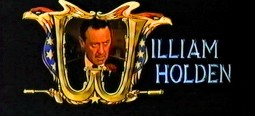
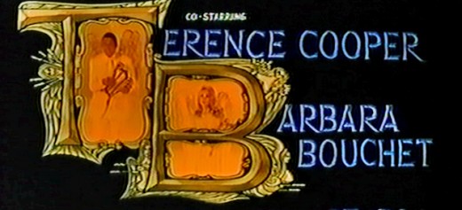
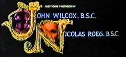
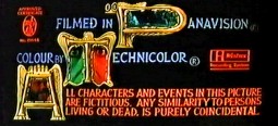
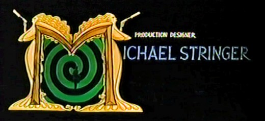
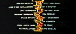
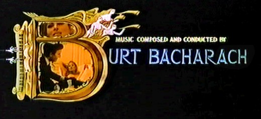
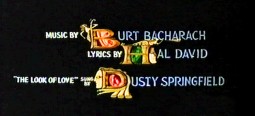
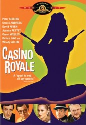 - Casino Royale (the 1967 original) was the fourth credit sequence animated by Richard Williams‘ Soho Square studio. Prior to this he’d directed What’s New Pussycat (1965), A Funny Thing Happened on the Way to the Forum (1966), and The Spy Who Came In From the Cold (1966).
Continuing the presentation I’ve done of other title sequences by Williams, here’s Casino Royale. The other Williams credit sequences of the period are generally rambunctious items with almost too much happening on screen. It often gets hard to read the credits – in a theater, never mind trying to do it on TV. (God bless imdb.)
Theses are all frame grabs off a TV airing. My apologies for the horrendous quality. It aired on one of those cable channels that adds plenty of promos at the bottom of the screen (which I cleaned out of these images) overlapping many of the cards. They might have taken a bit more care to try to eliminate some distortion on the screen. The image skews, and the type gets distorted. I did my best with what I had. If I ever get my hands on a good dvd of the show, I’ll correct these images.
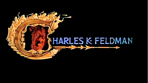
________________________ (Click any image to enlarge.)
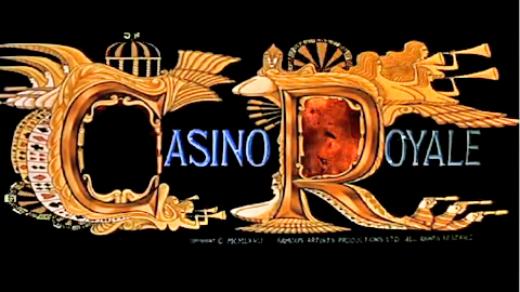
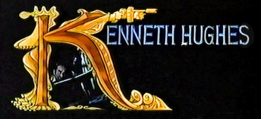
____Joseph McGrath, Robert Parrish, and Richard Talmadge also directed but I
____eliminated their screen cards as repetitious.
Dick Williams’ version of the opening titles
And for the sake of amusement here are
The credits from the 2006 version of the film
Designed by Daniel Kleinman
























 1
1

 2
2
 3
3
 4
4
 5
5

 6
6
 7
7
 8
8 9
9
 10
10
 11
11
 12
12

 14
14
 15
15
 16
16
 17
17

