Category ArchiveSpornFilms
Animation &Animation Artifacts &Commentary &commercial animation &SpornFilms &Tissa David 26 Aug 2013 08:54 am
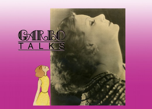
Garbo Talks through Tissa’s Drawings
To celebrate Tissa David‘s last days, Ive chosen this title sequence she did for Garbo Talks. Her anmation is beautiful for it, and I enjoy looking at the film which has yet to be released on DVD.
The initial rough/cut screening for Garbo Talks was a bit peculiar. I sat down and a woman sat next to me; I sort of recognized her. We said hello when she sat down. Somewhere midway during the film I realized who the woman was – Betty Comden, that half of the Comden & Green writing team. I realized she was playing the part of the older Greta Garbo in the film, without receiving credit. It was brilliant casting, but you could say that about all of Sidney Lumet’s movies.
When I left the screening room there was a tense meeting going on with four people. I caught Sidney’s eye and waved goodbye. Going down in the elevator Burtt Harris, the producer, rushed in as the doors were closing. He asked what I thought of the film. Before I answered he said it wasn’t working, and Elliott Kastner and MGM weren’t very happy. A rough conversation in an elevator.
The next day, Sidney asked what I thought of the film, I said that I felt we didn’t know enough of the back story of the Ann Bancroft character in the film. I suggested that I try to offer this in the opening credit sequence. Sidney loved the idea. He just made me promise that it wouldn’t feel like the credits to “I Love Lucy” or “I Dream of Jeannie.”
During the mix, we were talking about the music for Garbo Talks when we slipped off into discussing the music for some of Sidney’s other films. I told him that the music by Richard Rodney Bennet for Murder on the Orient Express was one of the most brilliant film scores ever done. Sidney hesitated in responding finally saying he didn’t get it at first, and it took a while for him to appreciate the music for that film. Sidney wasn’t always perfect in selecting a composer for his films, although I do think that Johnny Mandel was a great choice for him on Deathtrap and The Verdict (or any film, actually).
Bob James had scored Garbo Talks. (He is an eminent jazz pianist, whose most famous piece is probably the theme to the tv show, Taxi.) Bob and I had to work together very closely. He wrote the score to the animatic I’d given him and would build the rest of the film’s score from that. He hit many of the actions in that opening title, and Tissa David‘s animation hit them all. There was a very tight sync between music and title animation.
The preview screening was held on Long Island. I drove there and met the group of Sidney, editors and MGM execs, including Elliott Kastner. He was the leading producer on the film. They weren’t happy at the end of the screening, and I was sure my titles were going to go. It took a week to hear that the titles were staying, but the score by Bob James was dropped. The composer took the hit, unfairly. A new score was being written by Cy Coleman. All that tight sync work!
Coleman wrote a lovely melody for the film, but just swept across the animation not hitting any points in particular. It’s taken me a long time, but I’ve come to like the music he wrote. Tissa wouldn’t watch the piece again with the new music.
In the film, the character played by Ann Bancroft has had a life that, in some small way, was shaped by Greta Garbo’s feature films. This is a small bit of backstory in the live action film, until the end.
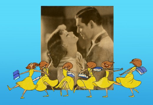
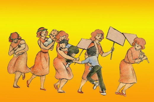
For the credits, I chose to develop this aspect of her story, and Sidney agreed on the approach. We told her life in a caricature of Ann Bancroft‘s character, growing up. The sequence ends with her at her current age, an elderly woman, and the live action begins. Hence, we were giving the life story of the film’s lead character before the film started.
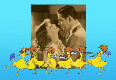
The idea was to use the device that had been developed for TV in the 50′s & 60′s of the caricatured characters whisking through the sitcom titles. (See Bewitched or The Carol Burnett Show.) However, it was our intent to treat it in a serious way.
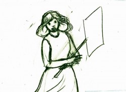
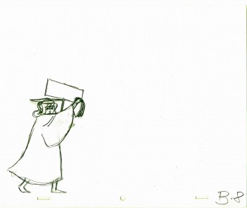
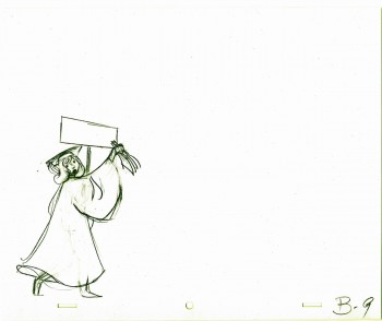
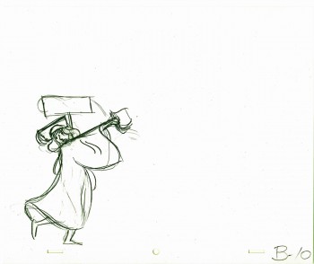
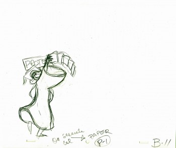
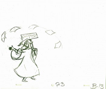
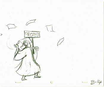
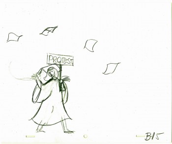
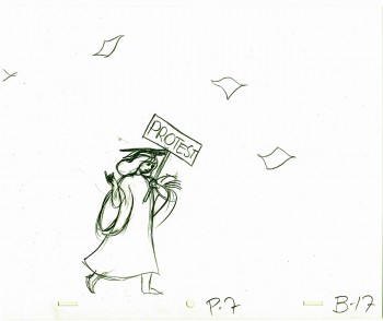
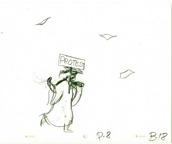
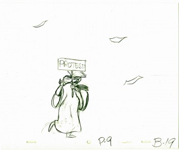
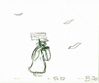
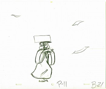
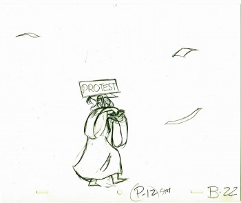
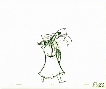
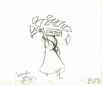
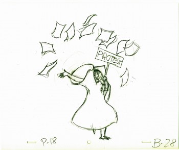
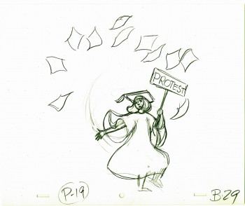
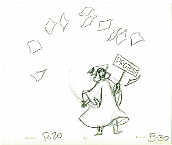
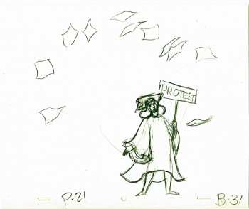
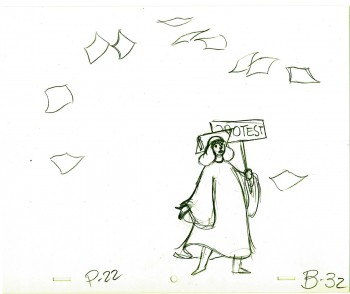
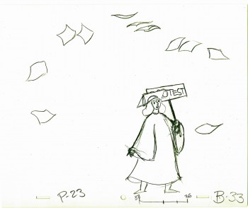
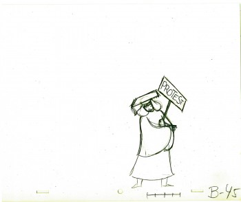
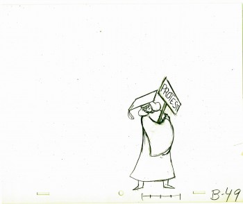
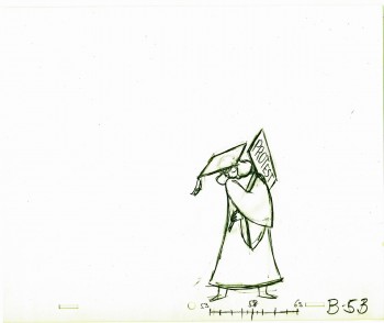
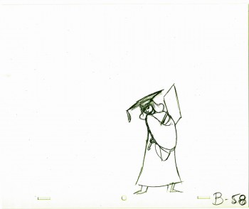
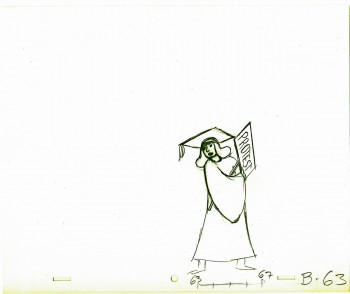
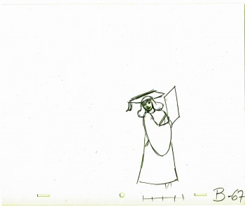
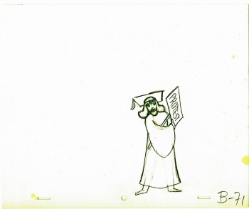
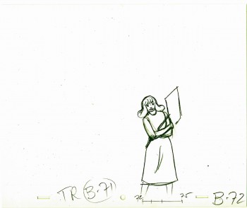
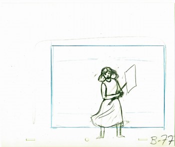
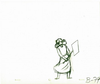
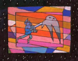
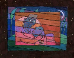
Tissa David did a stunning, tour de force of a brilliant piece of animation. It was a dance that the character went through, and the credits played off the animation, which played off stills of Greta Garbo’s films.
There was a small crew on the piece, which ran about 2 ½ minutes. Tissa animated, I did whatever clean up was left. Robert Marianetti single-handedly colored everything; Janet Benn and Christine O’Neill did additional I&P. Gary Becker filmed it, and Edith Hustead edited.
.
.
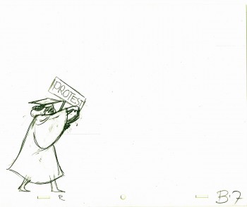
Tissa had about two weeks to animate about 2½ mins. of animation. I begged her to leave inbetweens for me, which she did, though only on close positions. I inked on paper, and Robert Marianetti colored directly from these rough-ish drawings. It was done with prismacolor pencils on paper. The paper drawings were then cut out and pasted to cels.
.
 7
7
(Click any image to enlarge.)
Below is a rough PT of the piece with its staccato rhythm since it’s missing inbetweens.
Garbo Talks ruff PT On twos at 24FPS
Click left side of the black bar to play.
Right side to watch single frame.
The entire title sequence.
Thanks to Roger79 for uploading it.
Thanks to Stephen MacQuignon for finding it.
Animation &Animation Artifacts &Books &Comic Art &Layout & Design &SpornFilms &Story & Storyboards 28 Jun 2013 05:40 am
Jabberwock – repost
- To me, Lewis Carroll‘s nonsense poem, Jabberwocky, is one of the most brilliant pieces ever written. It’s always been important to me, and I’ve collected many versions of it in illustrated versions. Now that I mention it, let me confess that I’m a Lewis Carroll addict, and Jabberwocky is one of my favorites among his many poems.
In film, you have the one live action feature by Terry Gilliam; it’s a good film with a clunky monster in the end. In animation, professionally, I know of only two versions completed. One was by Jan Svankmajer done in 1974. I did a version of it in 1989. Mine, of course, sticks closer to the poem even though it is pretty “arty”.
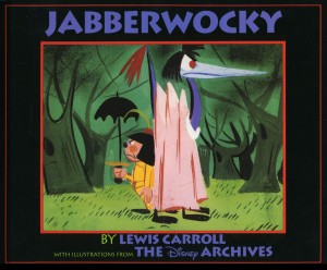 Apparently, there was also a version Disney was preparing as part of Alice In Wonderland. A book was published, credited to the “Disney Archives,” with illustrations from the preparatory drawings of this sequence. It’s obvious that the final versions of these drawings were done by one person, but there’s no record in the book of who did the finals. I’d read somewhere that Marc Davis had a lot to do with it, at one point. Though he obviously was most involved with Alice, herself.
I’m not in love with the images in the book. I like the technique used, but I find the images too cute. Though, it’s amazing how current they look.
(Click on any image to enlarge.)
I’m going to give you a number of the book’s pages today and, in comparison, will follow it up with images from my version tomorrow.
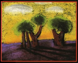
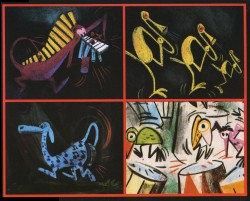
‘Twas brillig and the slithy toves
Did gyre and gimble in the wabe;
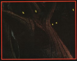
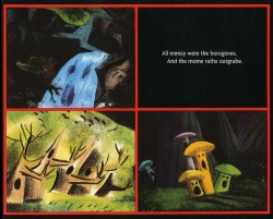
All mimsy were the borogoves,
And the mome raths outgrabe.
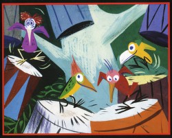
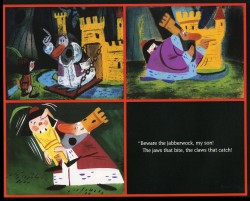
“Beware the Jabberwock, my son!
The jaws that bite, the claws that catch!”
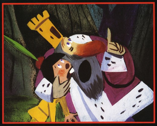
“Beware the Jubjub bird, and shun
The frumious Bandersnatch!”
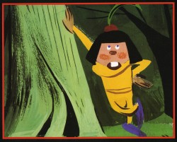
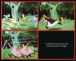
He took his vorpal sword in hand;
Long time the manxome foe he sought -
So rested he by the Tumtum tree
And stood awhile in thought.
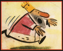
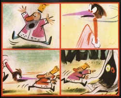
And as in uffish thought he stood,
The Jabberwock, with eyes of flame,
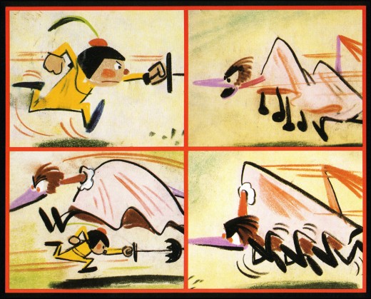
Came whiffling through the tulgey wood,
And burbled as it came!
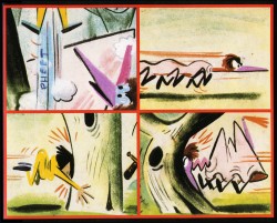
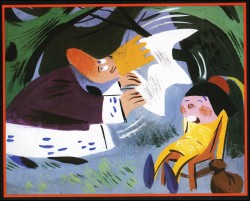
One, two! One, two! And through and through
The vorpal blade went snicker-snack!
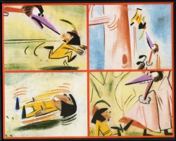
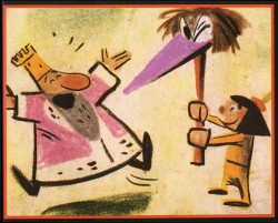
He left it dead, and with its head
He went galumphing back.
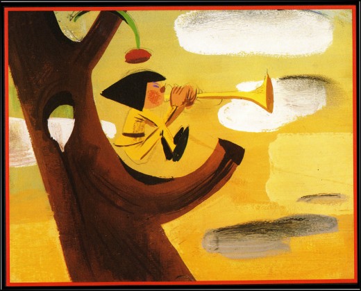
“And hast thou slain the Jabberwock?
Come to my arms, my beamish boy!
O frabjous day! Callooh! Callay!”
He chortled in his joy.
Jim Hill talks a bit about this book on his site in a letter response. here.
For amusement, you might check out this site for translations of this poem into 58 other languages, 23 parodies of the poem, and 10 explanations trying to define what Carroll meant by it.
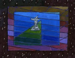
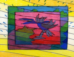
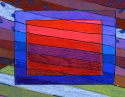
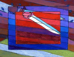
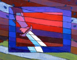
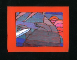
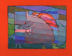
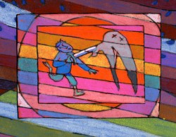
I’d like to post here a few of the images from my short adaptation of the Lewis Carroll poem, Jabberwocky. In doing the film, I tried to mimic a style I’d used in my oil paintings and felt it was a bit successful. I don’t think the filmed version is all it could be – it was rushed to complete a package which included the 19 min. film, The Hunting of the Snark, as well as an animated documentary done about Lewis Carroll’s nonsense poems. Of course, the video package wouldn’t have made sense without including Jabberwocky.
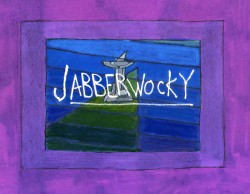
(click any image to enlarge.)
But I’ve scanned these images from the actual artwork and realize how well they’ve held up. I’d like to redo the film digitally someday and see where I can go with it.
Here are some of the images:
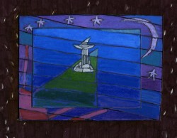
‘Twas brillig and the slithy toves,
Did gyre and gimble in the wabe;
All mimsy were the borogoves,
And the mome raths outgrabe.
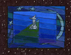
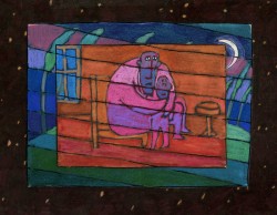
“Beware the Jabberwock, my son!
The jaws that bite, the claws that catch!â€

“Beware the Jubjub bird, and shun
The frumious Bandersnatch!â€
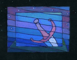
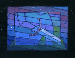
He took his vorpal sword in hand;
Long time the manxome foe he sought -
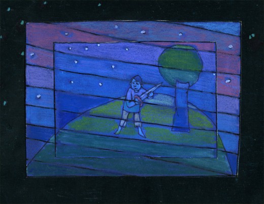
So rested he by the Tumtum tree
And stood awhile in thought.
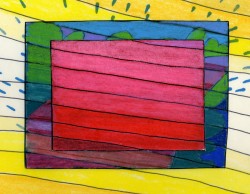
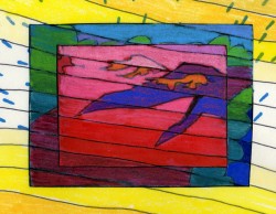
And as in uffish thought he stood,
The Jabberwock, with eyes of flame,
Came whiffling through the tulgey wood,
And burbled as it came!
One, two! One, two! And through and through
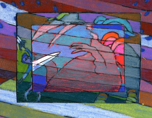
The vorpal blade went snicker-snack!
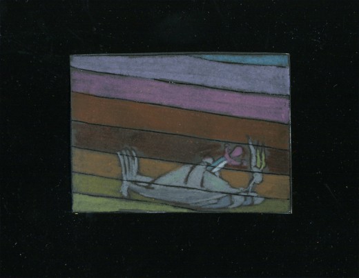
He left it dead, and with its head
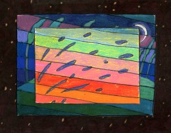
“And hast thou slain the Jabberwock?
Come to my arms, my beamish boy!
O frabjous day! Callooh! Callay!â€
He chortled in his joy.
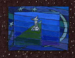
‘Twas brillig and the slithy toves
Did gyre and gimble in the wabe;
Action Analysis &Animation &Articles on Animation &Books &Commentary &Disney &Illustration &Richard Williams &Rowland B. Wilson &SpornFilms &Story & Storyboards &Tissa David 10 Jun 2013 03:31 am
Illusions – 3
I’ve written two posts about Frank Thomas and Ollie Johnston‘s book, The Illusion of Life the last couple of weeks. I came to the book only recently and realizing that I’d never really read the book, I thought it was time. So in doing so, I’ve found that I have a lot to write about. The book has come to be accepted almost as gospel, and I decided to give my thoughts.
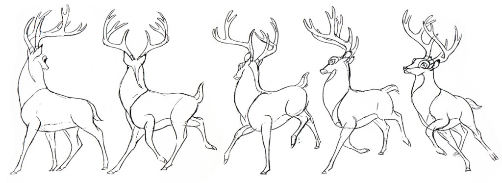
There were two major complaints I’ve had with what I’ve read in their book so far, and I spent quite a bit of time reviewing those.
- First out of the box, I was stunned to read that these two of Disney’s “nine old men” said that they’d originally believed that each prime animator should control one, maybe two characters in the film. Then, later in life they decided that an animator should do an entire scene with all of the characters within it. This is not what I’d seen the two (or the nine) do in actual practice. post 1
Secondly, they argue for animating in a rough format, and they give solid reasons for this. As a matter of fact, it was Disney, himself, in the Thirties who demanded the animators work rough and solid assistants who could draw well back them up. Then much later in the book the two author/animators suggest that it’s better for an animator to work as clean as possible with assistants just doing touch-up. This helped out the Xerox process, but didn’t necessarily help for good animation. post 2
The book starts out sounding like it’s going to be a history of Disney animation, but then starts getting into the rules of animation (squash and stretch, overlapping action and anticipation and all those other goodies) exploiting Disney animation art in demonstration. Soon the book moved into storytelling and how to try to keep the material fresh and interesting. It all becomes a bit obvious, but you keep hoping that some great secret will be revealed by the two masterful oldsters.
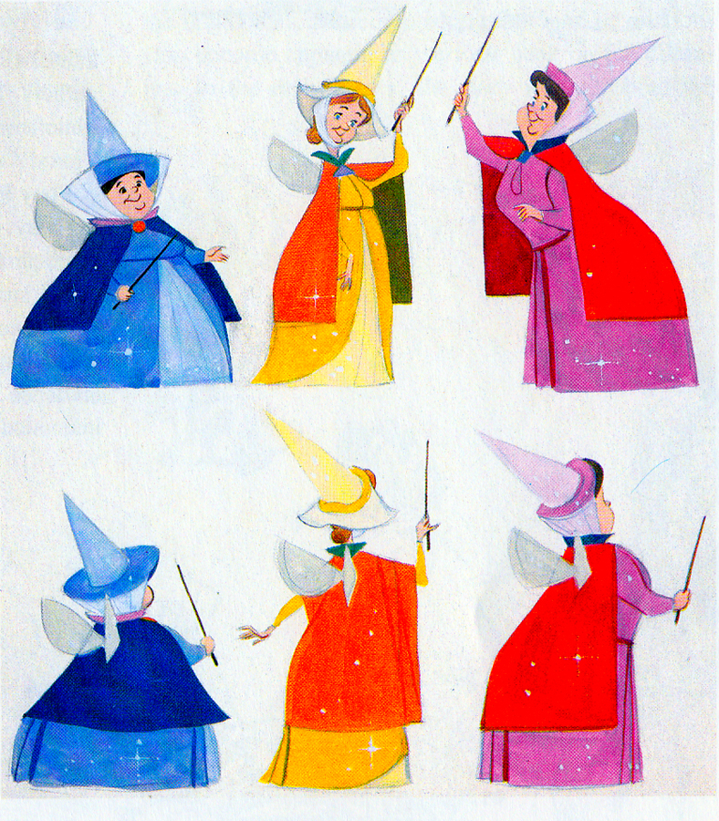 They do go into depth about how to develop characters when making animated films. They offer lots of examples from Orville, the albatross in The Rescuers to the three fairies in Sleeping Beauty, but their greatest attention goes to Baloo the Bear in The Jungle Book. They were having a hard time with this guy; they had been trying to do an Ed Wynn type character, until Walt Disney, himself, suggested Phil Harris. Once they auditioned Harris, they knew they were on the right track, and the character kept grabbing more screen time and grew ever larger. In the end, audiences just loved him.
Personally, I’ve always hated Phil Harris’ performance in this film. What was it doing in Rudyard Kipling’s book? When I was a kid, Harris and Louis Prima were the perfect examples of my father’s entertainers. He loved these guys and spent a lot of time in front of the family TV watching the Dinah Shore Show______Tom Oreb designs for Sleeping Beauty.
and other such entertaining Variety Shows with
lots of little 50′s big-band jazz-type acts. I hated it; this was my parent’s kind of music and humor and had nothing to do with me. I was the kid who paid his quarter to see the Walt Disney movies (that was the children’s price of admission in 1959.)
In their book they say they knew he was perfect because generations of kids later (who have no idea who Phil Harris was) still take joy from Baloo. What they forgot is what I knew all along. This was The Jungle Book. If they had been truly creative, they would have developed a character in line with Kipling’s material that would have been an original, not an impersonation of Doobey Doobey Doo, Phil Harris. The same is true of Louis Prima as a monkey. (There was a time when Disney said that they should never animate monkeys because monkeys are funny on their own, in real life. Animation wouldn’t make them funnier.) Sebastian Cabot, as Bagheera, works as does George Sanders as Shere Khan.
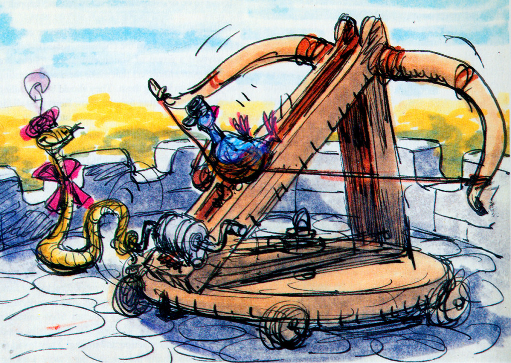
- Right: A discarded sequence from Robin Hood showed a messenger pigeon so fat and heavy he had to be shot into the air. This gave the animators the beginnings of The Albatross Air Lines in The Rescuers.
Phil Harris was so successful, they dragged him into Robin Hood as well. Robin Hood. The very same character from The Jungle Book is now Little John! All those cowboy voices in Robin Hood don’t work either, especially when you mix them up with Brits like Peter Ustinov and Brian Bedford. When these two thespians work against Pat Buttram, Andy Devine and George Lindsey, it’s one thing. Throw in a Phil Harris, and you have something else again. Where are we, the audience, supposed to be? Is it “Merry Ol’ England”? Or is it the lazy take on character development by a few senior animators who have taken license to jump away from the story writers for the sake of easy characters of the generation they’re familiar with. Robin Hood is a mess of a story – even though it’s a solid original they’re working from, and I find it hard to take written advice from these fine old animation pros who take an easy way out for the sake of their animation; shape shifting classic tales to fit their wrinkles.
At least, that’s how I see it – saw it. And perhaps that’s why it’s taken me so long to read this book. I felt (at the age of 14 when these films came out) that the Disney factory had turned into something other than the people who’d made Snow White and Bambi and Lady and the Tramp.
They had, in fact, become the nine old men.
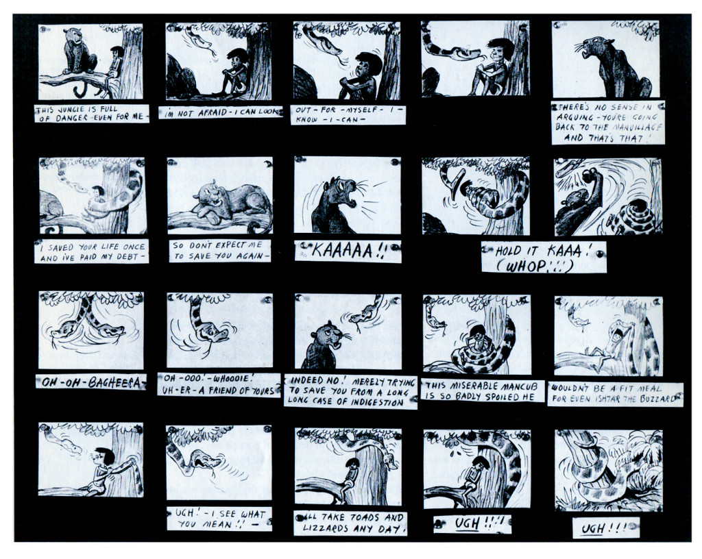
The Jungle Book was the last film Bill Peet worked on. He left
before the film was done. He’d had a long, contentious relationship
with Disney. He never felt he’d gotten the respect he deserved.
They were incredibly talented animators, and they certainly knew how to do their jobs. The animation, itself, was first rate (sometimes even brilliant as Shere Khan demonstrates), but try comparing the stories to earlier features. Even Peter Pan and Cinderella are marvelously developed. Artists like Bill Peet and Vance Gerry knew how to do their jobs, and they did them well. When Peet quit the studio, because he felt disrespected, Disney’s solid story development walked out the door.
The animators were taking the easy route rather than properly developing their stories. The stories had lost all dynamic tension and had become back-room yarns. Good enough, but not good.
Today was Nik Ranieri‘s last day at Disney’s studio. He’s definitive proof, in the eyes of Disney, that 2D animation is dead as an art form. This is the end result of some of the changes Thomas and Johnston suggest in their book. The medium took a hit back then; it just took this long for the suits to catch up. Good luck to Nik and the other Disney artists who no longer work steadily in what is still a vitally strong medium.
Animation &Animation Artifacts &Commentary &SpornFilms &Theater 19 May 2013 06:09 am
WOTY – again
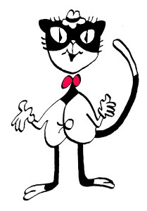 – I’ve posted a couple of pictures from Woman of the Year (called WOTY by those in the know) in the past but thought I go a touch deeper now.
Woman of the Year was a project that came to me in the very beginning of my studio’s life – 1981. Tony Walton, the enormously talented and fine designer, had gone to Richard Williams in search of a potential animator for WOTY (as we got to call the name of the show.) Dick recommended me. But before doing WOTY, there were some title segments needed for Prince of the City, a Sidney Lumet film. (I’ll discuss that film work some other day.)
Tony Walton designed the character, Katz, which would be the alter-ego of the show’s cartoonist hero, played by Harry Guardino. Through Katz, we’d learn about the problems of a relationship with a media star, played by Lauren Bacall. (All images enlarge by clicking.)
.
It turned out to be a very intense production. Three minutes of animation turned into twelve as each segment was more successful than the last. There was no time for pencil tests. I had to run to Boston, where the show was in try-outs, to project different segments weekly; 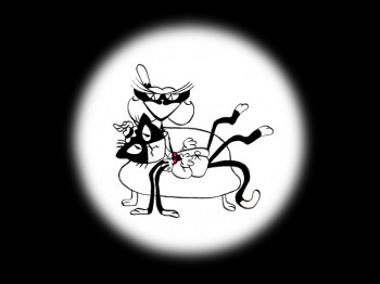 these went into the show that night – usually Wednesdays. I’d rush to the lab to get the dailies, speed to the editor, Sy Fried, to synch them up to a click track that was pre-recorded, then race to the airport to fly to the show for my first screening. Any animation blips would have to be corrected on Thursdays.
There was a small crew working out of a tiny east 32nd Street apartment. This was Dick Williams‘ apartment in NY after he;d finished Raggedy Ann. He was rarely there, and when he did stay in NY, he didn’t stay at the apartment. He asked me to use it as my studio and to make sure the rent was paid on time and the mail was collected. Since we had to work crazy hours, it was a surprise one Saturday morning to find that I’d awakened elderly Jazz great, Max Kaminsky, who Dick had also loaned the apartment for a night. Embarrassed, at the awkward confrontation, I ultimately moved to a larger studio – my own – shortly thereafter. Dick was convinced I was upset at him and the two of us didn’t talk for years afterward.
Here are a couple of photos of some of us working on WOTY:
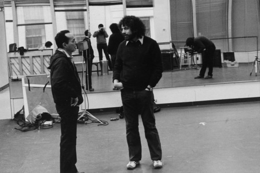
Tony Charmoli was the show’s choreographer. He worked with me in plotting out the big dance number – a duet between Harry Guardino and our cartoon character. I think this is the only time on Broadway that a cartoon character spoke and sang and danced with a live actor on stage. John Canemaker is taking this photograph and Phillip Schopper is setting up the 16mm camera.
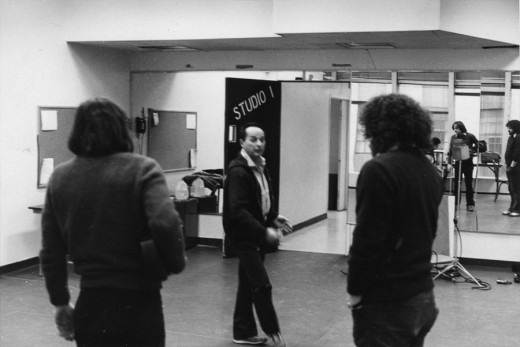
Here Tony Charmoli shows us how to do a dance step. Phillip Schopper, who is filming Tony, figures out how to set up his camera. We used Tony’s dancing as reference, sooting Tony’s dancing in 16mm, but our animation moves were too broad for anyone to have thought they might have been rotoscoped.
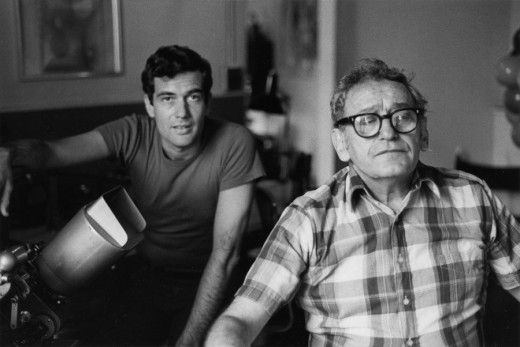
John Canemaker worked with Sy Fried, our editor. John did principal animation with me on this one big opening number. Here they’re working with the click track and the live footage of Tony Charmoli to plot out the moves.
At one point I asked John to have the character, Katz, flick his tale at Harry Guardino, tripping the live actor mid-dance. It got a laugh at every performance.
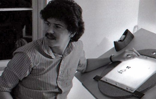
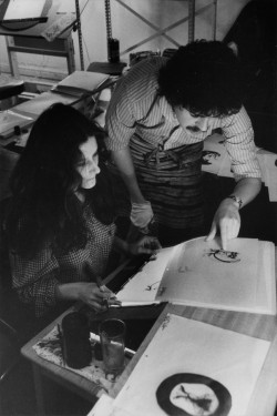
Steve Parton supervised the ink and paint. To get the sharpest lines, we inked on cels and didn’t color the drawings. It was B&W with a bright red bow-tie. A spotlight matte over the character, was bottom-lit on camera by Gary Becker. It was shot almost like a pencil test with high contraxt to get those very sharp lines.
 5
5 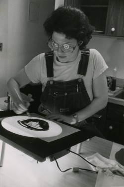 6
6
5. Steve Parton works with painter Barbara Samuels
6. Joey Epstein paints with fire in her eyes.
 8
8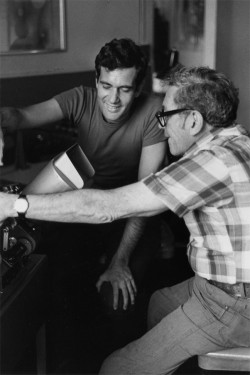 9
9
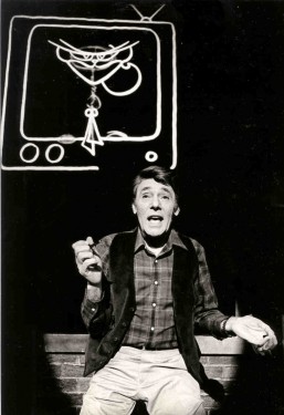
8. Harry Guardino on stage with the creation of “Tessie Kat” developing on screen behind him. This was Harry’s first big solo.
The filmed segment was shot backwards so the matte would develop as the song sang on.
The entire seqeunce took about 2½ minutes.
9. John Canemaker gets to see some of his animation with Sy Fried, editor.
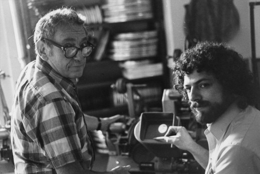
One of my quick stops from the lab on the way to Boston? No, I think this is a posed photo.
All together we had more than 12 minutes of animateion song duets between Harry Guardino and Katz. It was originally supposed to be three pieces totaling about five minutes. The animation was so successful in the tryouts in Boston that they kep adding more material. Finally the last song added – about 1½ minutes never made it to New York. Harry never properly learned it in Boston and he was too nervous for the Broadway opening to learn it for the big Opening. So the number was cut.
Lately there’s been more animation on Broadway and off-Broadway. Things are done with digital screens, and the technical aspect has gotten easier. One version of Sunday In the Park with George had painted backgrounds developing via animation as the characters sang their songs. Too bad the show didn’t offer the heart that was in the original Sondheim gem, when here wa no animation involved. Hopefully, eventually there will be something more. We did a show that was very successful (the show wasn’t successful; the animation was.) I’d love to try again. The only other try I had was to do musical scenics for the Overture to Meet Me In St. Louis on Broadway. The producers were irritants and didn’t help move things forward. I did get to meet the songwriter, Hugh Martin, before he passed away. That was my treat in that project.
Bill Peckmann &Books &SpornFilms 21 Apr 2013 04:50 am
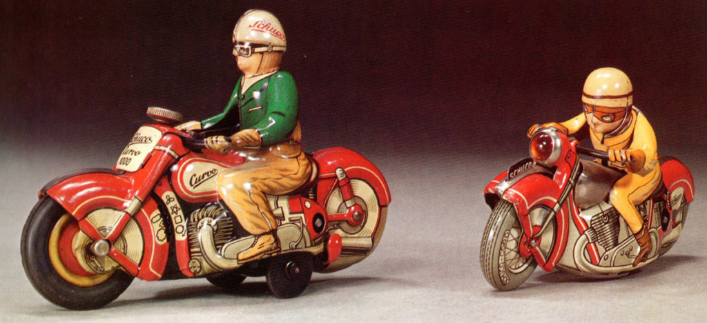
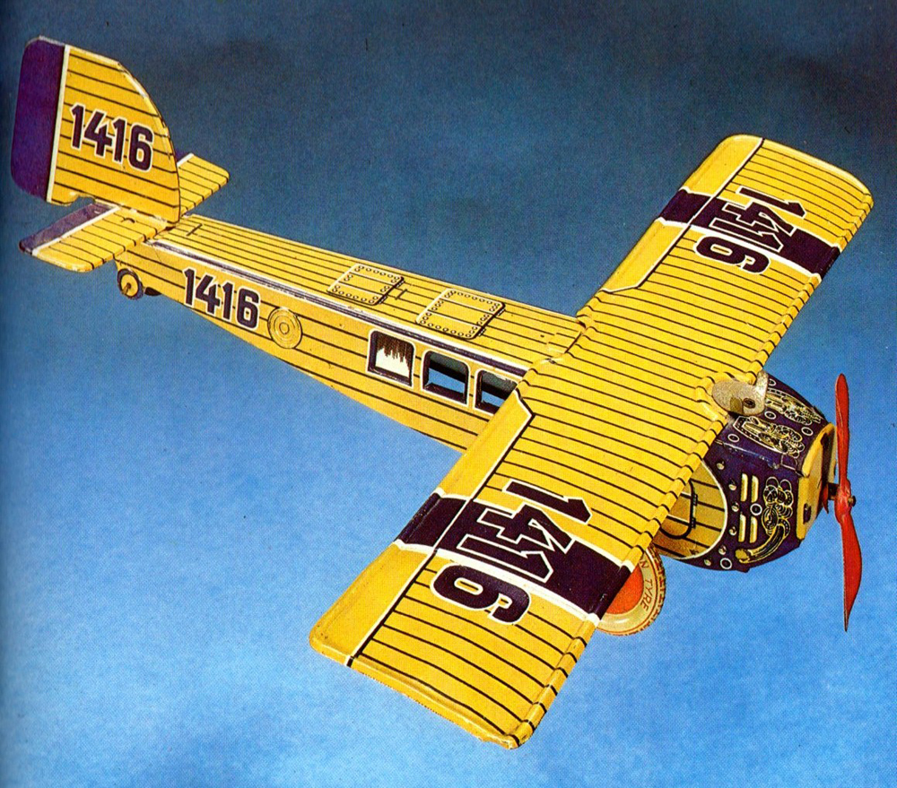
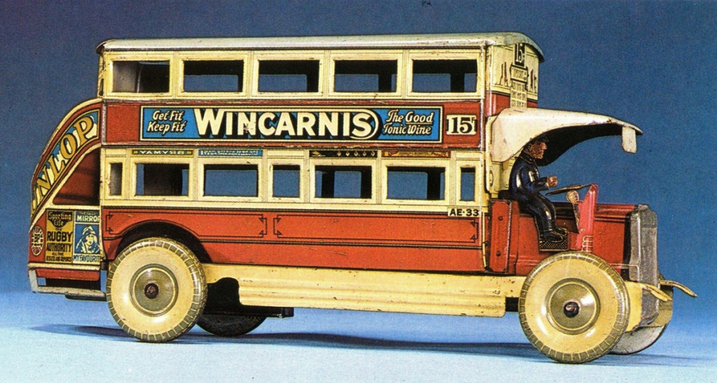
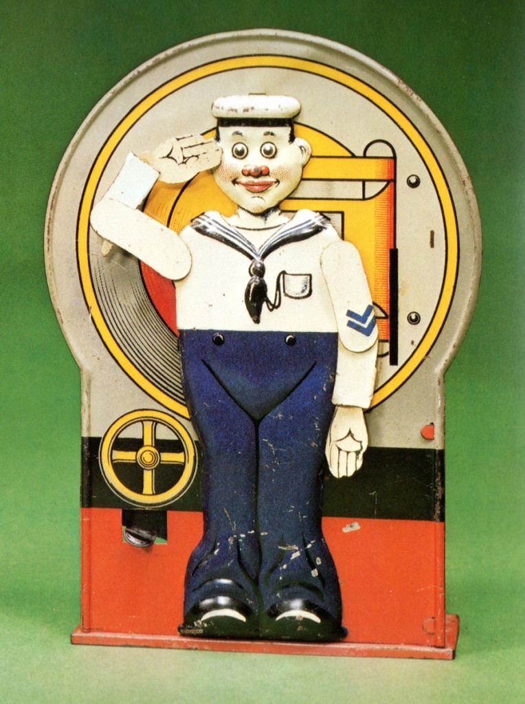
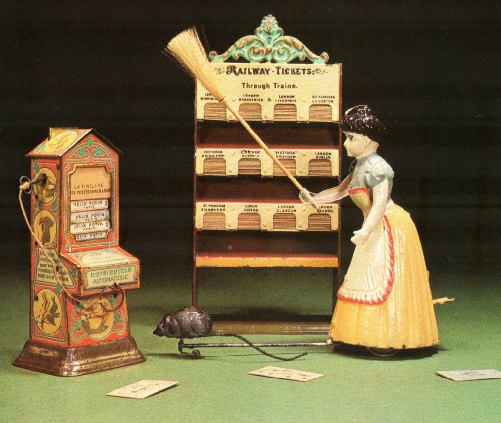
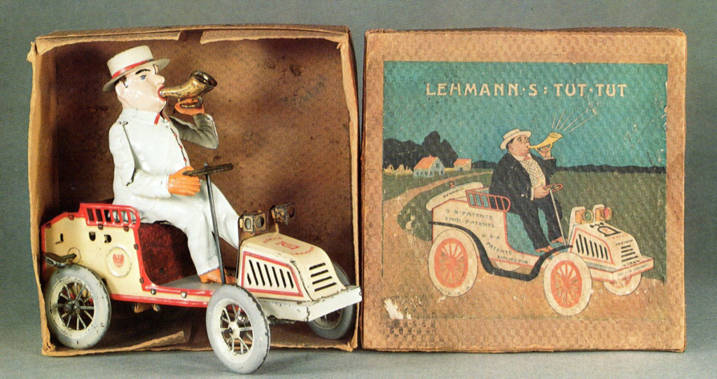
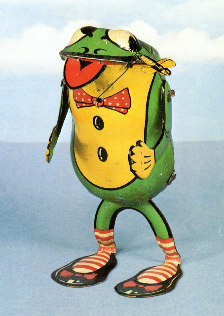
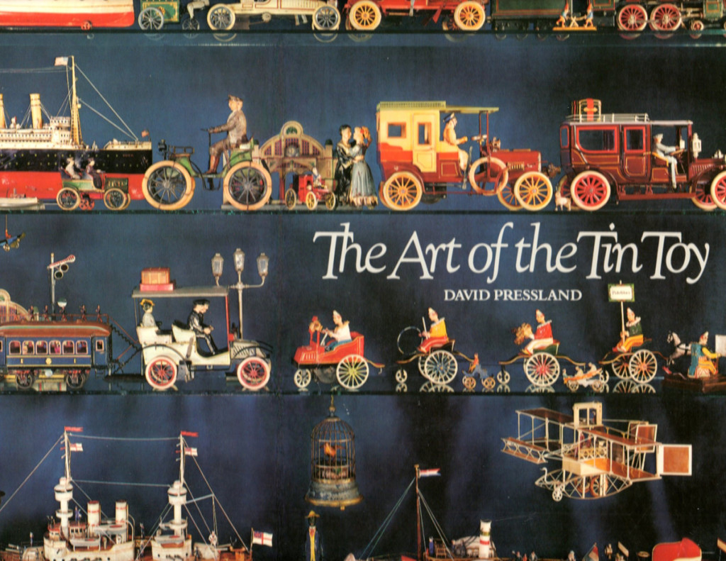
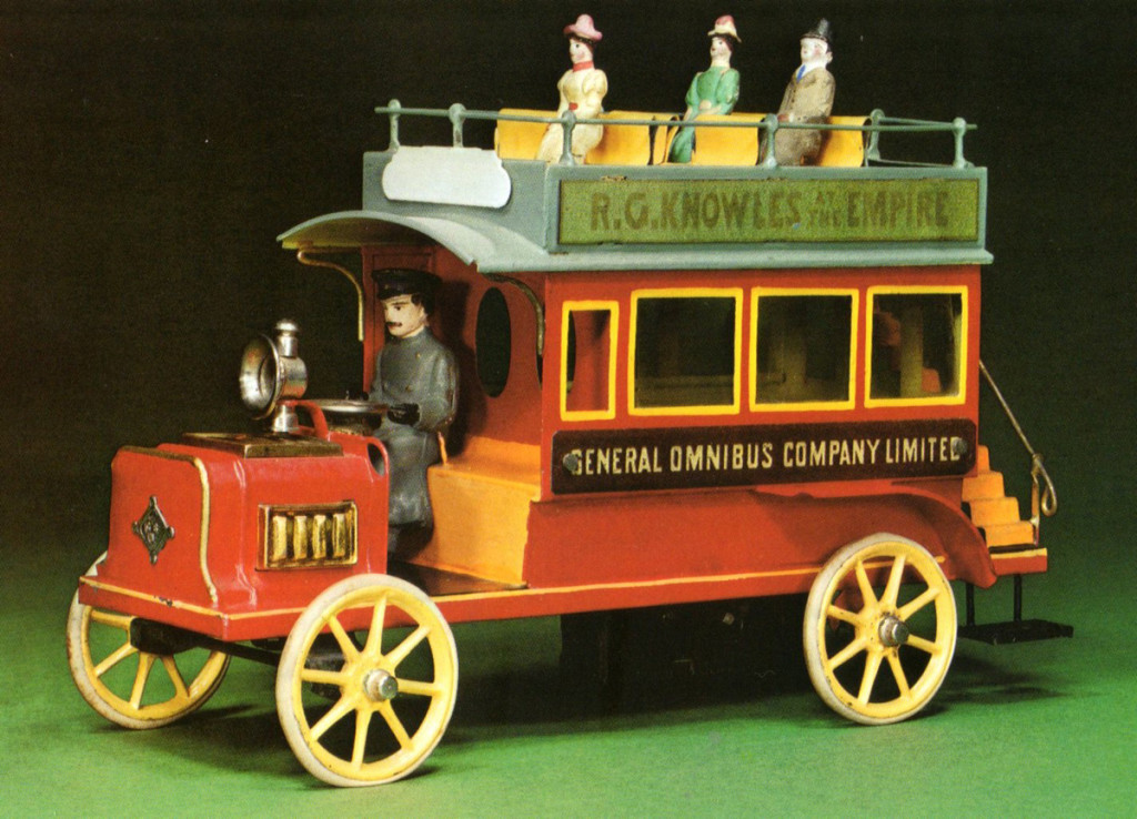
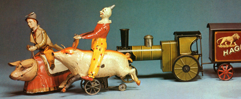
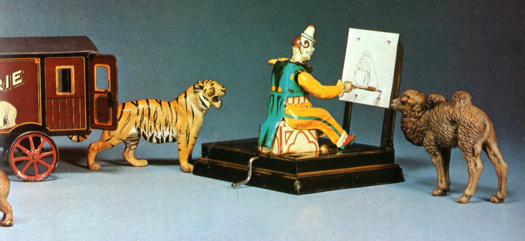
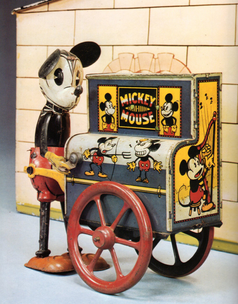
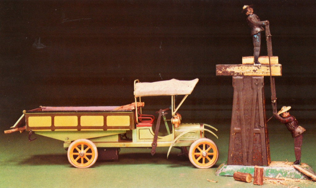
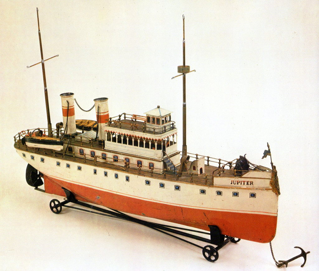
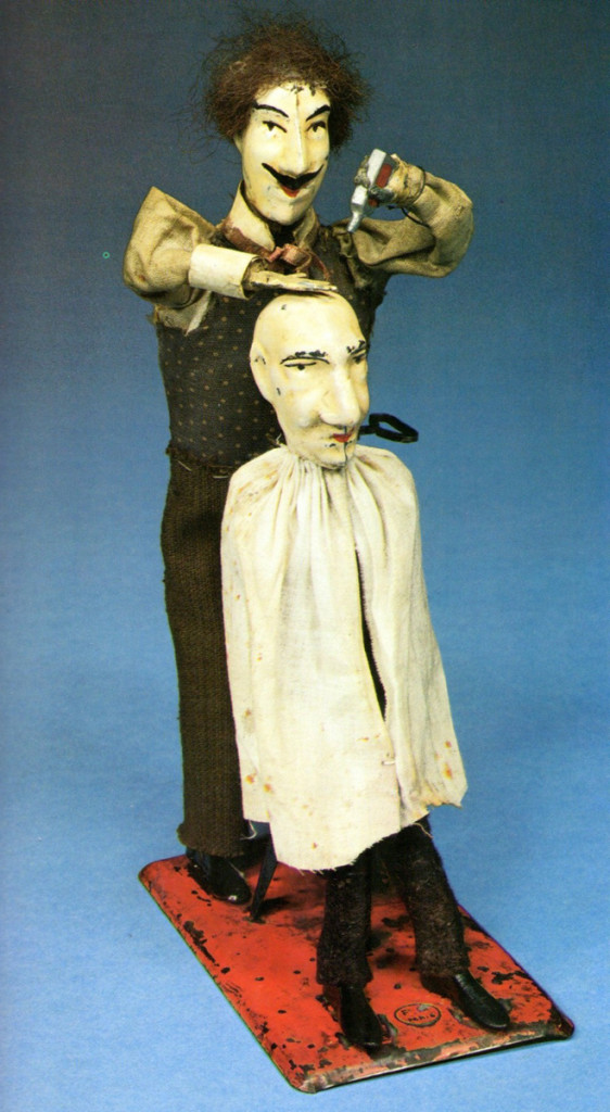
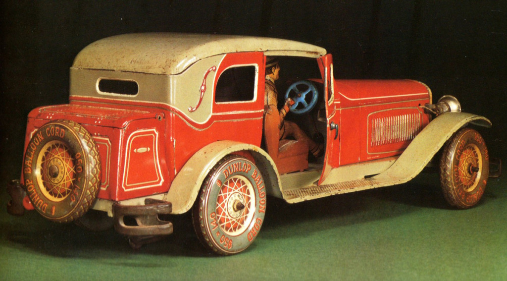
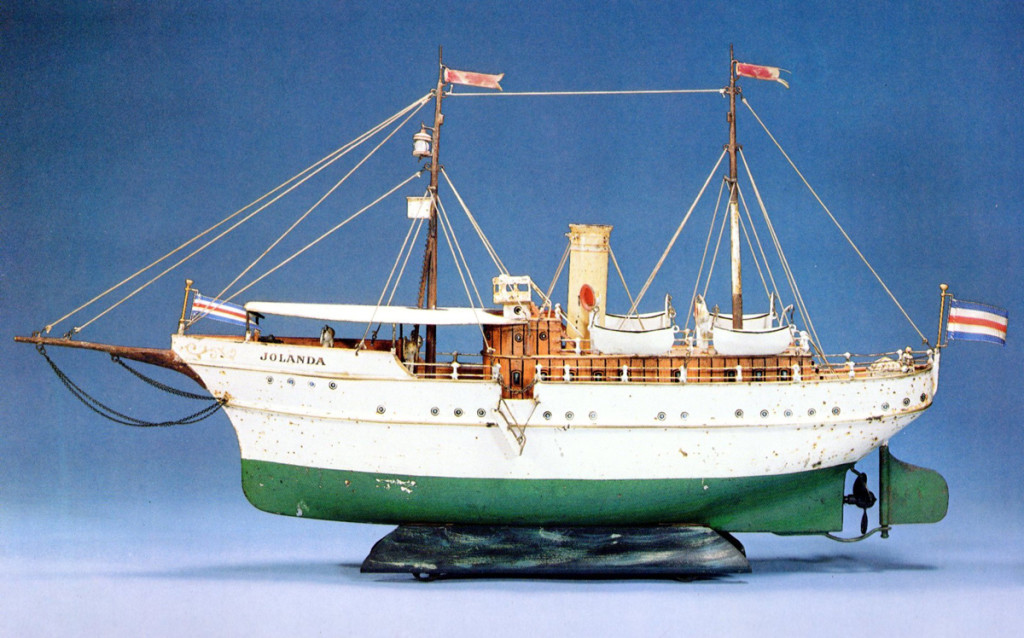
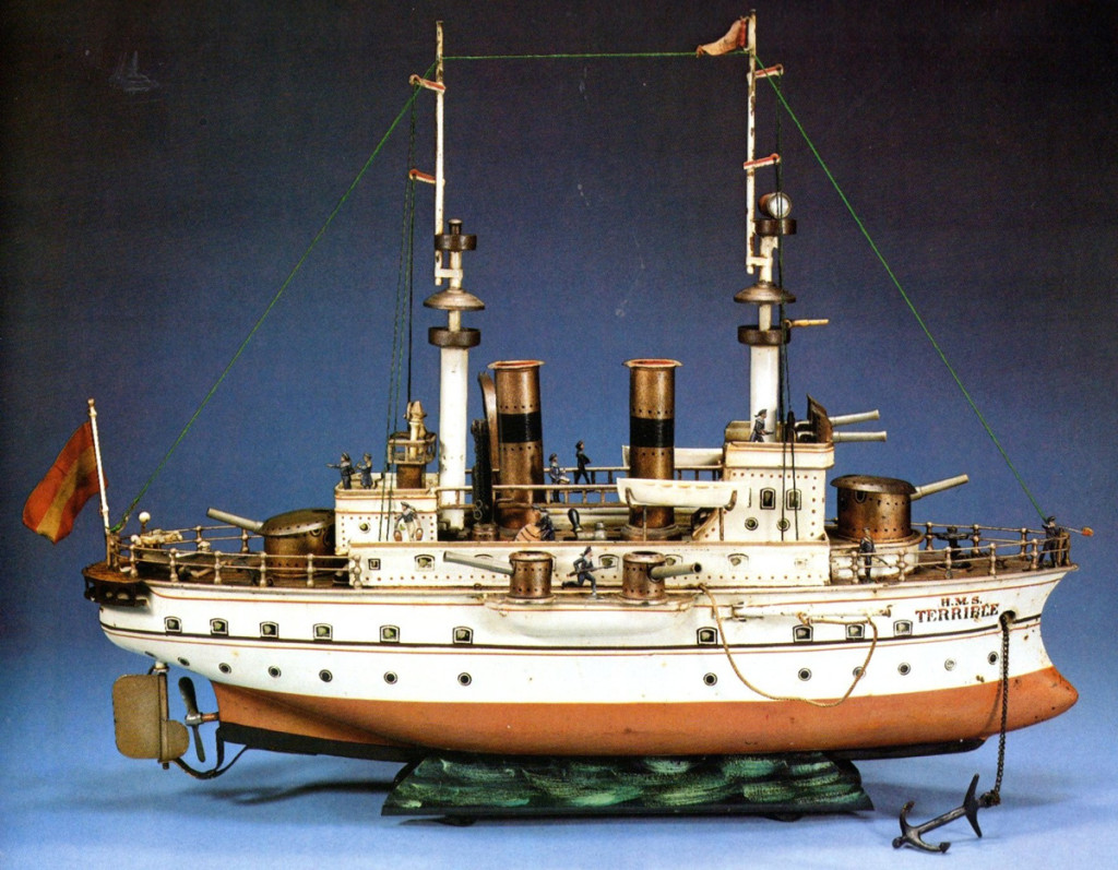
Tin Toys
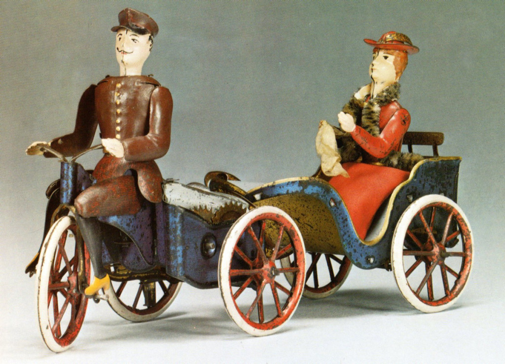
- Bill Peckmann surprised me this week. He sent a number of stills from the book, The Art of the Tin Toy, featuring tin toys. These are all wonderful, and I knew it would make a great post to show on Sunday. Hence it’s here. I have to admit I didn’t know. Afyer her mother died, I offered her outfit to cousins. that I’m personally more attached to those toys of characters like the barber and his customer, or the tin frog, or even (and maybe especially) the Mickey Mouse.
I hope you’ll have some you like.
 1
1The book’s cover
Many thanks to Bill Peckmann for shaking it up a bit.
______________________
Here is a film we did for a home video of children’s poems. It’s a poem by the late Russell Hoban. The animation is by Mark Mayerson, and the design is by Jason McDonald. The music is by Caleb Sampson. I think all of these artists did brilliant work, but then Hoban’s thoughts and words always pull out the best.
Russell Hoban’s The Tin Frog
Commentary &Layout & Design &SpornFilms 10 Mar 2013 03:18 am
Bridget’s Art
It’s time to put up some more Sporn Studio art. I had a couple of posts that celebrated BG art of Bridget Thorne. I’m putting a couple of these together and posting anew. Personally, I love this stuff and can’t get enough of it. I want to see Bridget doing BGs again; it’s been a while.
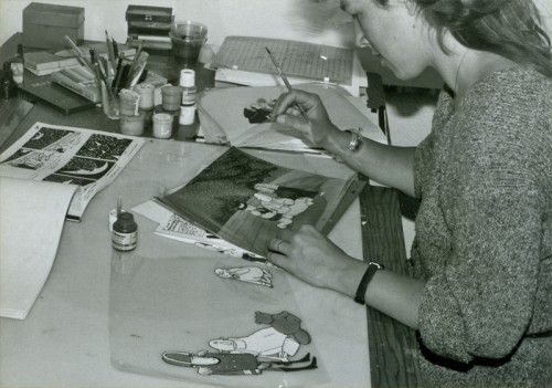
Bridget Thorne did the storyboard for
The Hunting of the Snark with me back in 1980.
We didn’t finish the film until 1989. She also painted the
backgrounds for the last third of the movie.
Bridget Thorne is someone who has been an invaluable part of the history of my films.
She has been an extraordinary Art Director and Background painter on quite a few of my favorite films produced within the studio, and I’ve put together a random sampling of some of those films.
(Click image to enlarge) Lyle, Lyle Crocodile (1987)
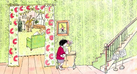
This painting is a key transition point in Lyle, Lyle Crocodile. The film had a looseness  that Bernard Waber‘s original book art had engendered. I felt very much at home in Waber’s style, and I think Bridget did as well.
She worked out a color scheme for the film, and we both agreed to follow it closely through the film. Liz Seidman lead the character coloring. Bridget, of course, had a strong hand in all those character models, as well.
The scene pictured above follows the introduction of Autumn on “East 88th Street”, and the background brings us full force into it as we get “the girl’s first song” – Mrs. Primm’s report on what it’s like to have a crocodile living in your house.
 – Ira Sleeps Over was the second children’s book by Bernard Waber that we adapted. This is a very sweet story which involves a sibling rivalry; it focusses on a teddy bear and a sleep-over party. I pulled composer, William Finn, into the film and he wrote some great tunes for it. Prior to doing the script, I gave him the book and asked him to figure out where he would like the songs. In a week he had already written all the songs for the film, and they were brilliant. It turned out he used all the words of the book in his songs, and now I had to find a way of telling the same story using past, present and future tenses, as he did in the songs. It was a good challenge that worked out well and created a fabulous construction for the story.
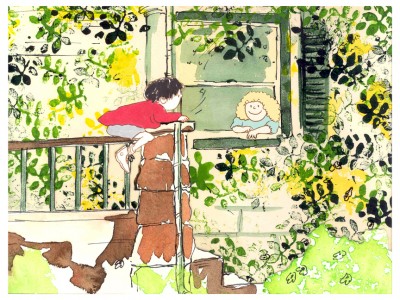 The style in this book was, if anything, looser than in Lyle. Waber did a lot of his illustration featuring duplicating printing techniques. Lino cut enabled him to repeat decorations throughout the settings. Bridget played with the lino cuts and was able to succesffully duplicate the technique in the backgrounds. In this one bg, at the beginning of the film, the foliage is a good example of this technique, printed over watercolors. The characters are markered paper drawings cut out and pasted to the cel overlays.
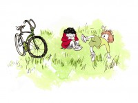
The book, like Lyle, featured a lot of white space, so we followed suit. When a book’s been in circulation for over 25 years, you have to realize there’s been a reason for it; find the reason and the heart, and take advantage of it. This use of white space made the actual backgrounds oftentimes little more than abstract shapes of color with a solid object on the screen. Here, for example, we see Ira and his friend, Reggie, playing against a blast of green and a bicycle.
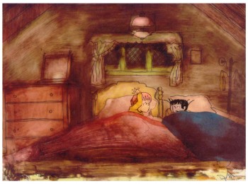 – At the end of the film, Ira and Reggie talk in the dark at the sleep-over. To get the look of the dark Bridget had to come up with something clever. The book resorted to B&W washes of gray and wasn’t very helpful. She came up with some dyes that were used for photo retouching. By quickly painting these lightly onto cel levels with a wide brush, she was able to get translucent cels with the brush strokes imbedded in the color overlays. By placing these overlays over the characters and backgrounds, we got the desired effect that let it feel connected to the very loose style of the film.
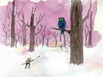 -Abel’s Island is one of the few films we did that I treasure for its artwork. Bridget’s work on the backgrounds was, to me, extraordinary. The looseness I love was developed into enormously lush backgrounds using shades of green that I didn’t know could be captured in the delicate watercolors.
This film was a complicated problem that seemed to resolve itself easily and flow onto the screen without much struggle. The book had won a Newberry Award as best children’s writing of its year. It was not a picture book but a novel. The more than 120 pages featured fewer than 20 B&W spot drawings by author/illustrator, William Steig. We were on our own with the color.
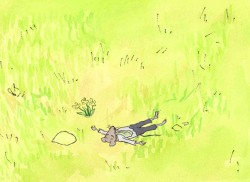 However, we had adapted Doctor DeSoto and The Amazing Bone as shorter films and could use what we’d learned from Steig on Abel. Bridget topped herself.
Several of the animators gave us more than I could have expected. Doug Compton‘s animation of Abel sculpting his statuary and living in his log was heart rending; Lisa Craft‘s animation of the big pocket watch, the big book and the leaf flying sequences was nothing short of inspired; and John Dilworth‘s animation of the owl fight was harrowing. This was all set up and completed by Tissa David‘s brilliant animation of Abel in the real world with wife, Amanda. She established our character.
 – At the end of the film, Abel, who has been separated from his new bride, trapped on an island for over a year, finally gets to come home. He sees Amanda in a park at twilight but decides to hold back. He races on ahead of her to greet her, privately, at home. The park sequence has a busyness as an acute counter to the lonliness we’ve watched for the previous 90% of the half-hour program. Setting it at early evening gave an opportunity for rich, royal colors. Bridget took full advantage of the opening, and underscored it all with a regal green not seen earlier. It was stunning and is one of my favorite backgrounds in the film.
Here are two more films Bridget Thorne designed for me.
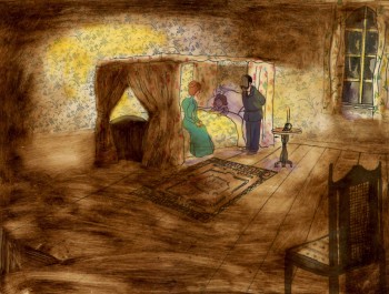 A Child’s Garden of Verses presented new and different problems to explore.
It was a project generated by HBO. Charles Strouse and Thomas Meehan were going to write the book and song score. We met several times trying to discover a way into the book of poems. I’d suggested we use the verses in Robert Louis Stevenson‘s book to illustrate the author’s early childhood.
(Click on any image to enlarge.)
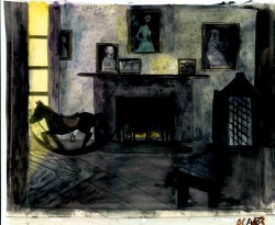 Stevenson was a sickly boy who was always confined to his dark room. He was not expected to live long. The only visitor for days on end was his overprotective mother.
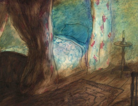
For much of the film, we had only the dark, child’s bedroom to explore. Artistically, I asked Bridget to delve deeper into the photgraphic dyes that she had discovered and used so well in Ira Sleeps Over. These dyes would allow us to keep the style, once again, loose while exploring dark areas and brush strokes to simulate the darkness “Robbie” lived in.
For the wallpaper throughout the house, Bridget used real wallpaper which was photostated; scaled down and reshaped to fit the backgrounds. Then watercolor washes colored these backgrounds and overlays were mixed and matched to get the desired results.
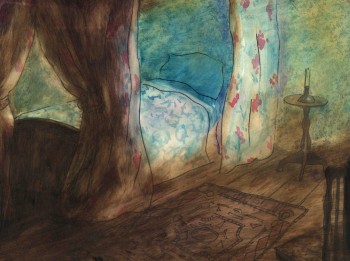 I was never quite pleased with this film. The elements that worked well worked really well. Bridget’s work was a highlight. The acting was extraordinarily good. Heidi Stallings performed with an enormous amount of emotion yet barely raised her voice above a whisper. Jonathan Pryce was brilliant as Robert Louis Stevenson, the narrator and even sang a song when asked at the last minute. Gregory Grant as the young “Robbie” was vulnerable, sweet and all we could have hoped for.
However, there was too much of a rush given the delicacy of the piece, and the exterior backrounds done by me for the end of the film are poor. The animation is also hit and miss. Oddly enough, my favorite sequence used little actual animation but intense camera work. Ray Kosarin was the animator in charge of it, and it’s an impressive sequence.
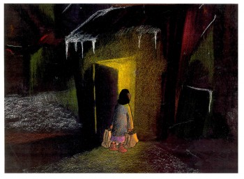
- The Talking Eggs was done for a PBS series called Long Ago & Far Away. It was an adaptation of a Creole Folk Tale which Maxine Fisher updated for me. (Lots of discussion between WGBH, Maxine & me about what distinguishes a Folk Tale from a Fairy Tale. It seriously impacted the story we were telling and I wanted what I wanted and got.)
Bridget chose to use pastels and we searched for a paper that would bring out the most grain. I loved the end result. The characters, to match the look of the Bgs, were xeroxed onto brown kraft paper and colored up from there with prismacolor pencils. This was cut out and pasted to cel.
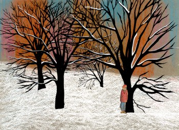 Danny Glover was the narrator, and we chose to make him an on-screen character appearing intermitently in the film. His narration was recorded on a rush as he stopped off in LA from SF on his way to direct a film in Africa.
There’s a focus in these backgrounds that matches the content and mood of the piece, and it worked wonderfully for my purposes. I always like it when the medium is front and center; I want audiences to know that they’re watching animated drawings, and texture usually helps to do this. Of course, I also want the films to have a strong enough story that the audience gets past the point of knowing, to enter the film. It works some of the time, and I’m in heaven when it does.
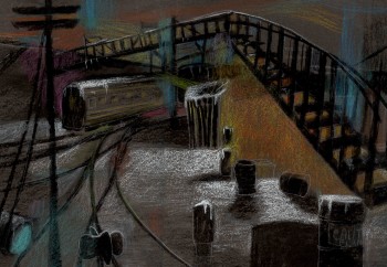 Bridget altered the color of the paper on which she was coloring with the chalks, and the different colored papers represented varied moods from sequence to sequence.
Naturally, there were some problems with the chalks under camera. All the fixative in the world didn’t stop the chalks from bleeding onto the cels or platen on the camera. (Lots more cleaning involved than usual.) We heard constantly from our cameraman, Gary Becker. The extra effort was worth it; the look was unique and successful.
The following is a short interview that we did in a publication I generated back in the ’80s.
Behind the Scenes with
Bridget Thorne
Interview by Denise Gonzalez
Bridget Thorne is a background designer who has been an important part of Michael Spom Animation for more than fifteen years. In that time she has enhanced the look of MSA films with beautiful backgrounds that are, in a way, part of the characters rather than just a scenic backdrop.
 DG: How long have you been working with Michael Sporn?
BT: I first started working for Michael in 1979 on Byron Blackbear And The Scientific Method, a fifteen minute short for the Learning Corporation of America. It is actually one of my favorites. I started out as a scenic painter for plays. I worked with a designer and basically dressed the set. We’d paint the exteriors, lay in wallpaper, marbleizing floors, etc. I started at Williamstown and at Playwright’s Variety in New York, I did a lot of off Broadway and off-off Broadway.
DG: Do you see background painting as a complete picture or as a supplement to animated artwork?
BT: It’s a supplement.
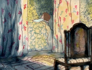 DG: How do you take that into consideration when you start the backgrounds?
BT: Ideally, I take into consideration how the characters are designed. I like the characters to be part of the picture, not stand out like they do in Saturday morning cartoons. It all fits into a stylistic sensibility or pace more than anything else. I’m not a cartoon snob, I’m more of a two dimensional artist than a filmmaker. I design my backgrounds and line style according to the way the characters are designed. What I used to try and do was color the backgrounds, to match the colors of the characters. You work out of your home rather than at the studio. What are the benefits or drawbacks of working this way? I’ve just started doing this and yes, there are benefits. I can get into my own head, and I take off more with ideas because I’m not interrupted as much. But I like being in the studio and staying with the rest of the production as it goes along.
DG: Do you prefer working on original stories or from an existing book?
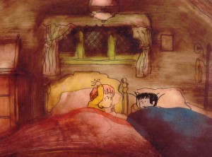 BT: It depends on the story. Let’s say IRA SLEEPS OVER, it was great working out here on that because with an existing story you have a style to imitate, and it is easy for a whole bunch of people to follow that when they’re all working in different places. So as far as production goes, that makes it easier. The great thing about original scripts is that they allow for an incredible amount of individual input. What do you take into consideration when designing the look of a film and what preparation is involved? It depends on the story. I tend to have a knee jerk reaction at first or an impulse. I have a Fine Arts background, and I tend to rely on painters. I find fine artists are more in tune stylistically with Michael’s films than the more hard-edged graphic cartoons. (Though I will look at Disney inspirational drawings.)
Then I look at the layouts and the character design, so I sort of work on intuition and impulse. Then I look at the existing elements and put those all together and come up with a design. As far as preparation goes, what I consistently do is make 5×4 sketches of design ideas. For ABEL’S ISLAND I did lots and lots of little paintings of winter and fall and spring.
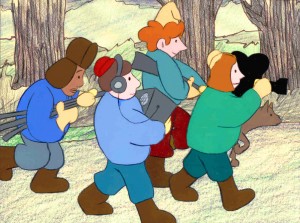
First three illustrations pictured above:
1. BYRON BLACKBEAR AND THE SCIENTIFIC METHOD.
2. A CHILD’S GARDEN OF VERSES.
3. IRA SLEEPS OVER
DG: When designing the film do you take into consideration that this will be seen by a child?
BT: I’m not a cartoony person so I don’t think about that. I tend to think more — sometimes I run into trouble this way — I think of it in a frame and ideally what I really want is a balanced look on the screen. A lot of times that’s hard because what I see in front of me is so different when it is filmed.
DG: What do you consider to be the best example of your work thus far?
BT: I guess ABEL’S ISLAND. I was able to abstract a little. I wasn’t confined to chairs and bureaus. I was able to match the mood of the movie to the backgrounds. If Abel was in trouble, I could put colors that indicated that, or I could abstract it. If something was calm I could paint it calmly. Abstraction, or looseness, is more my personal style. This is true of Michael’s style, as well.
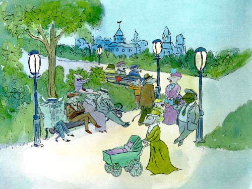
A scene toward the end of ABEL’S ISLAND.
DG: Have you ever worked on a film you couldn’t connect with?
BT: I’d say yes. It’s a hard question to answer off the top of my head. I sort of think of movies like they were kids; they are either noisy or funny or quiet or sad. They all have their own characteristics, and it is really the process of making the movie that attracts me to animation. I tend to have different feelings about each movie. But yes, sometimes a story irritates me or something comes in and it doesn’t suit my style or what I imagined. It can be very difficult. That’s an interesting thing about animation; there is really a sense of compromise; you are compromising all the time.
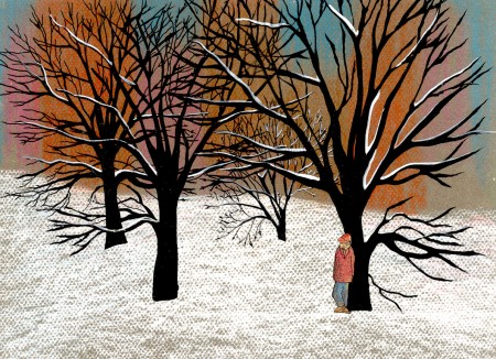
A scene of the narrator at the end of THE TALKING EGGS.
Commentary &SpornFilms 24 Feb 2013 04:39 am
Jabberwocky
- To me, Lewis Carroll‘s nonsense poem, Jabberwocky, is one of the most brilliant pieces ever written. It’s always been important to me, and I’ve collected many versions of it in illustrated versions.
I’d like to post here a few of the images from my short adaptation of the Lewis Carroll poem, Jabberwocky. In doing the film, I tried to mimic a style I’d used in my oil paintings and felt it was a bit successful. I don’t think the filmed version is all it could be – it was rushed to complete a package which included the 19 min. film, The Hunting of the Snark, as well as an animated documentary done about Lewis Carroll’s nonsense poems. Of course, the video package wouldn’t have made sense without including Jabberwocky.

(click any image to enlarge.)
But I’ve scanned these images from the actual artwork and realize how well they’ve held up. I’d like to redo the film digitally someday and see where I can go with it.
Here are some of the images:


‘Twas brillig and the slithy toves,
Did gyre and gimble in the wabe;
All mimsy were the borogoves,
And the mome raths outgrabe.


“Beware the Jabberwock, my son!
The jaws that bite, the claws that catch!â€

“Beware the Jubjub bird, and shun
The frumious Bandersnatch!â€


He took his vorpal sword in hand;
Long time the manxome foe he sought -

So rested he by the Tumtum tree
And stood awhile in thought.


And as in uffish thought he stood,
The Jabberwock, with eyes of flame,


Came whiffling through the tulgey wood,
And burbled as it came!


One, two! One, two! And through and through

The vorpal blade went snicker-snack!

He left it dead, and with its head

“And hast thou slain the Jabberwock?
Come to my arms, my beamish boy!
O frabjous day! Callooh! Callay!â€
He chortled in his joy.


‘Twas brillig and the slithy toves
Did gyre and gimble in the wabe;
All mimsy were the borogoves,
And the mome raths outgrabe.
______________________
In other film versions, you have the one live action feature by Terry Gilliam; it’s a good film with a clunky monster in the end. In animation, professionally, I know of only two versions completed. One was by Jan Svankmajer done in 1974. I did a version of it in 1989. Mine, of course, sticks closer to the poem even though it is pretty “arty”.
 Apparently, there was also a version Disney was preparing as part of Alice In Wonderland. A book was published, credited to the “Disney Archives,” with illustrations from the preparatory drawings of this sequence. It’s obvious that the final versions of these drawings were done by one person, but there’s no record in the book of who did the finals.
I’m not in love with the images in the book, and I know I would have hated the animated version (especially if it looked like this.) They’re trying too hard to make sense of the poem. I find the images too cute, though, it’s amazing how current they look.


‘Twas brillig and the slithy toves
Did gyre and gimble in the wabe;


All mimsy were the borogoves,
And the mome raths outgrabe.


“Beware the Jabberwock, my son!
The jaws that bite, the claws that catch!”

“Beware the Jubjub bird, and shun
The frumious Bandersnatch!”


He took his vorpal sword in hand;
Long time the manxome foe he sought -
So rested he by the Tumtum tree
And stood awhile in thought.


And as in uffish thought he stood,
The Jabberwock, with eyes of flame,

Came whiffling through the tulgey wood,
And burbled as it came!


One, two! One, two! And through and through
The vorpal blade went snicker-snack!


He left it dead, and with its head
He went galumphing back.

“And hast thou slain the Jabberwock?
Come to my arms, my beamish boy!
O frabjous day! Callooh! Callay!”
He chortled in his joy.
(Boy, do I like my version better! – MS)
Jim Hill writes a bit about this book on his site in a letter response. here. (Scroll down to middle of page.)
For amusement, you might check out this site for translations of this poem into 58 other languages, 23 parodies of the poem, and 10 explanations trying to define what Carroll meant by it.
Commentary &Poe &SpornFilms 31 Dec 2012 06:22 am
New Year’s Eve
 - We’ve come to the end of another year. I face the new year without my trusted computer. You work for a number of years on one particular machine, and you get to know what to expect. Photoshop has its own kinks on each different machine as does AfterEffects or the Wacom tablet. With each machine the same pen and the same tablet gives me wholly different lines no matter how I try to focus the brushes that the computer offers. Finally, finally I get the lines and the shapes that I want on a specific screen with just the right pressure I want to exert, and wallah!

No computer. Yesterday morning, Sunday, the computer just wouldn’t turn on. I found a really trusty place to bring my sick machine to be examined, but, it being New Year’s weekend, this is the one Sunday they’re not opening. So I wait till today, Monday, New Year’s eve (when they’ll close early) and will carry my computer there at 9am to get a check out. No doubt they’ll tell me something before they close at 1pm.
 Of course, I suspect the worst, the motherboard (what a name) is probably damaged, though I hope not. I hope I just haven’t been properly putting the cord in place, and it’s not getting the electricity it needs. But, as I said, I expect the worst. I expect to have to buy a new machine and hire the computer repair place to dig out all my files and reconstruct them for me on the new computer. Then I’ll have all those programs like Photoshop and AfterEffects and the Wacom tablet that I’ll have to buy new software (since I don’t have the outdated disks I once used to install them onto the dead machine. If I do have them, they’re n storage somewhere in New Jersey or the Bronx or whereve that particular lot of things is stored.) Money just seems to grow on trees when you don’t have any. I’ll figure it out.
 I’m more worried about my files. I’ve been working months on the opening of POE and have about 40 secs of finished animation sitting dormant on a possibly dead disk. I have animatics I’ve been doing for presentation – not one piece of art outside that machine – for HBO that I’d hoped to finish this weekend. Forget that. Just hope you don’t have to do them yet again. Files and files and files. Many of them are saved on an external drive, but not the last two months worth of work. I’ve been remiss in saving back up. You can be sure I’ll visit “justcloud” or “backupGenie” or some-such in the future and will become a regular habitué.
 Life’s so full of precarious options, and you can’t let them get you down when they don’t seem positive. Everything happens for a reason, and I’m sure there’s a reason for this, too. Maybe I should be shifting completely over to Mac. I’ve been a PC supporter all along, but have a powerful Mac sitting at my brother’s loft for protection. All my other studio computers are in storage in some other state. No, the key studio computer – the one we used for all our editing – is safely ensconced in my brother’s loft. When you can’t trust a storage unit, trust the most reliable person you know. And I have been working Mac at Buzzco all these months (working mornings on Mac and afternoons on PC on the very same scenes can drive you schizo quickly. Something as simple as using “Ctrl” is one place on PC and another on Mac. How many times, after the fact, have I had to do an operation a second time because my fingers went to the wrong place. All niggling complaints, I know. Especially when I have a real complaint/worry. Hopefully, I’ll have all those files back. I’m sure I will.
 My brother also has all of Tissa David’s artwork for POE. I’ll need to get that soon, too. I want to inbetween what she’s done to see how it moves as anmation rather than animatic. After all she posed at the animatic on sixes or twelves as her whim carried her. We both agreed that it would ultimately have to be redrawn and reanimated for the final, but now I’d like to keep it as is (except for the opening sequences so that we can get her younger version of “Eddie” to look more like the older version. Bo, I have that logo on there. I just remembered that. It took months for me to satisfy myself with logo-looking portrait of Edgar Allan Poe to use for the Tee-Shirts and postcards, etcetera to send out for the Indiegogo souvenirs. I’m pretty sure that’s also on the computer I use at Buzzco. It’ll wait till Wednesday to find out. When I go back to Buzzco.
 Thinking back to the time we worked on that animatic of POE. Tissa never touched a computer. Her drawings were done on punched letter sized paper – 8 ½ x 11. She animated (“animaticed”?) using a penstick on the paper. No rough drawings, and they were all rough drawings. They were finals, most of them will be finals. Life was so much easier back then, yet from the entry position so much harder. It was more fun though, lots of communit. Today we’re all bent into the glow of the television screen and we probably listen to earphone music or noise, and we don’t intercommunicate with those around us. Not like the olden days, when we’d have conversations while doing the work. Of course there was the shut up time, but there was also the community time. How many times did Heidi comment, when walking into my studio, “It’s so quiet here.” You guys have to get music. We did play music once upon a time, but then it all went into the earphones. Everybody into their own TV world. Alone with the animated character. Sorry, it’s a stupid complaint from someone getting to be an old timer. An old timer worried about his machine doing that line that took a long time to perfect. Wondering if he’ll ever get it back again.
Update
J.J. just called from the New York Computer Help group. It wasn’
t the “notherboard” but a power line that was the cause of the problem. He has the part in stock, and I should have my computer back – fully functional – by 3pm. Only $160.
Let me tell you, I recommend them highly. If you’re in New York and need any computer help, go there. They’re friendly, fast and great. They could have taken me for a ride if they really wanted. I expected to have to pay through the nose to get that repaired. They’re life savers. It’s going to be a nice New Year.

New York Computer Help
53 EAST 34th STREET, 3rd FL.
NEW YORK, NY 10016
(Park and Madison Avenues)
(212) 599 0339
Animation &John Canemaker &SpornFilms 09 Dec 2012 06:04 am
WOTY recap
- Back in Jan 2007, I posted these photos from the animation production of Woman of the Year. I recently was talking about choreography, and I thought that there was one whole style of choreography wrapped up in the work of Tony Charmoli. It made me want to look back on the work I did with him, and I think these pictures are interesting enough that they’re worth revisiting. So here, again, is that post:
 – To recap:
Woman of the Year was a project that came to me in the very start of my studio’s life – 1981.
Tony Walton, the enormously talented and fine designer, had gone to Richard Williams in search of a potential animator for WOTY (as we got to call the name of the show.) Dick recommended me. But before doing WOTY, there were some title segments needed for Prince of the City, a Sidney Lumet film. (I discussed that film in this post.)
Tony Walton designed the character, Katz, which would be the alter-ego of the show’s cartoonist hero, played by Harry Guardino. Through Katz, we’d learn about the problems of a relationship with a media star, played by Lauren Bacall.
It turned out to be a very intense production. Three minutes of animation turned into twelve as each segment was more successful than the last.
______________________________________________(All images enlarge by clicking.)
There was no time for pencil tests. I had to run
to Boston weekly, where the show was in try-outs, to project different segments;  these went into the show that night – usually Wednesdays. I’d rush to the lab to get the dailies, speed to the editor, Sy Fried, to synch them up to a click track that was pre-recorded, then race to the airport to fly to the show for my first screening. Any animation blips would have to be corrected on Thursdays.
There was a small crew working out of a tiny east 32nd Street apartment. This was Dick Williams’ apartment in NY. He was rarely here, and when he did stay in NY, he didn’t stay at the apartment. He asked me to use it as my studio and to make sure the rent was paid on time and the mail was collected. Since we had to work crazy hours, it was a surprise one Saturday morning to find that I’d awakened elderly Jazz great, Max Kaminsky, who Dick had also loaned the apartment. Embarrassed, I ultimately moved to a larger studio – my own – shortly thereafter.
Here are a couple of photos of some of us working:

Tony Charmoli was the show’s choreographer. He worked with me in plotting out the big dance number – a duet between Harry Guardino and our cartoon character. I think this is the only time on Broadway that a cartoon character spoke and sang with a live actor on stage. John Canemaker is taking this photograph and Phillip Schopper is setting up the 16mm camera.

Here Tony Charmoli shows us how to do a dance step. Phillip Schopper, who is filming Tony, figures out how to set up his camera. We used Tony’s dancing as reference, but our animation moves were too broad for anyone to have thought they might have been rotoscoped.

John Canemaker is working with Sy Fried, our editor. John did principal animation with me on the big number in the big ke segment. Here they’re working with the click track and the live footage of Tony Charmoli to plot out the moves.

Steve Parton supervised the ink and paint. To get the sharpest lines, we inked on cels and didn’t color the drawings. It was B&W with a bright red bowtie. A spotlight matte over the character, bottom-lit on camera by Gary Becker.
 5
5  6
6
5. Steve Parton works with painter Barbara Samuels
6. Joey Epstein paints with fire in her eyes.
 8
8 9
9
8. Harry Guardino on stage with the creation of “Tessie Kat” developing on screen behind him. This was Harry’s first big solo.
9. John Canemaker gets to see some of his animation with Sy Fried, editor.

One of my quick stops from the lab on the way to Boston? No, I think this is a posed photo.
The success of the animation (including good reviews) posed a small problem for me. The rest of the show was ripped over the coals. When I started using some quotes about me in industrial ads, the producers came down on me for gloating over the others who’d gotten negative reviews.
All the same, it was a real learning experience in a big Broadway kinda way.
Animation &Animation Artifacts &SpornFilms &Tissa David 17 Sep 2012 06:20 am
Garbo Talks thru Tissa’s Animation
The initial rough/cut screening for Garbo Talks was a bit peculiar. I sat down and a woman sat next to me; I sort of recognized her. We said hello when she sat down. Somewhere midway during the film I realized who the woman was – Betty Comden, that half of the Comden & Green writing team. I realized she was playing the part of the older Greta Garbo in the film, without receiving credit. It was brilliant casting, but you could say that about all of Sidney Lumet’s movies.
When I left the screening room there was a tense meeting going on with four people. I caught Sidney’s eye and waved goodbye. Going down in the elevator Burtt Harris, the producer, rushed in as the doors were closing. He asked what I thought of the film. Before I answered he said it wasn’t working, and Elliott Kastner and MGM weren’t very happy. A rough conversation in an elevator.

The next day, Sidney asked what I thought of the film, I said that I felt we didn’t know enough of the back story of the Ann Bancroft character in the film. I suggested that I try to offer this in the opening credit sequence. Sidney loved the idea. He just made me promise that it wouldn’t feel like the credits to “I Love Lucy” or “I Dream of Jeannie.”
During the mix, we were talking about the music for Garbo Talks when we slipped off into discussing the music for some of Sidney’s other films. I told him that the music by Richard Rodney Bennet for Murder on the Orient Express was one of the most brilliant film scores ever done. Sidney hesitated in responding finally saying he didn’t get it at first, and it took a while for him to appreciate the music for that film. Sidney wasn’t always perfect in selecting a composer for his films, although I do think that Johnny Mandel was a great choice for him on Deathtrap and The Verdict (or any film, actually).
Bob James had scored Garbo Talks. (He is an eminent jazz pianist, whose most famous piece is probably the theme to the tv show, Taxi.) Bob and I had to work together very closely. He wrote the score to the animatic I’d given him and would build the rest of the film’s score from that. He hit many of the actions in that opening title, and Tissa David‘s animation hit them all. There was a very tight sync between music and title animation.
The preview screening was held on Long Island. I drove there and met the group of Sidney, editors and MGM execs, including Elliott Kastner. He was the leading producer on the film. They weren’t happy at the end of the screening, and I was sure my titles were going to go. It took a week to hear that the titles were staying, but the score by Bob James was dropped. The composer took the hit, unfairly. A new score was being written by Cy Coleman. All that tight sync work!
Coleman wrote a lovely melody for the film, but just swept across the animation not hitting any points in particular. It’s taken me a long time, but I’ve come to like the music he wrote. Tissa wouldn’t watch the piece again with the new music.
In the film, the character played by Ann Bancroft has had a life that, in some small way, was shaped by Greta Garbo’s feature films. This is a small bit of backstory in the live action film, until the end.
For the credits, I chose to develop this aspect of her story, and Sidney agreed on the approach. We told her life in a caricature of Ann Bancroft‘s character, growing up. The sequence ends with her at her current age, an elderly woman, and the live action begins. Hence, we were giving the life story of the film’s lead character before the film started.
The idea was to use the device that had been developed for TV in the 50′s & 60′s of the caricatured characters whisking through the sitcom titles. (See Bewitched or The Carol Burnett Show.) However, it was our intent to treat it in a serious way.
Tissa David did a stunning, tour de force of a brilliant piece of animation. It was a dance that the character went through, and the credits played off the animation, which played off stills of Greta Garbo’s films.
There was a small crew on the piece, which ran about 2 ½ minutes. Tissa animated, I did whatever clean up was left. Robert Marianetti single-handedly colored everything; Janet Benn and Christine O’Neill did additional I&P. Gary Becker filmed it, and Edith Hustead edited.
.
.
Tissa had about two weeks to animate about 2½ mins. of animation. I begged her to leave inbetweens for me, which she did, though only on close positions. I inked on paper, and Robert Marianetti colored directly from these rough-ish drawings. It was done with prismacolor pencils on paper. The paper drawings were then cut out and pasted to cels.
.
 7
7
(Click any image to enlarge.)
Below is a rough PT of the piece with its staccato rhythm since it’s missing inbetweens.
Garbo Talks ruff PT On twos at 24FPS
Click left side of the black bar to play.
Right side to watch single frame.
The entire title sequence.
Thanks to Roger79 for uploading it.
Thanks to Stephen MacQuignon for finding it.





 17
17