Monthly ArchiveNovember 2011
Action Analysis &Animation &Animation Artifacts &Disney 30 Nov 2011 06:36 am
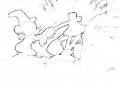
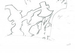
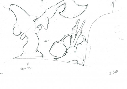
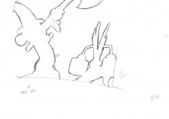
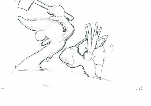
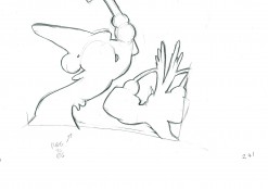
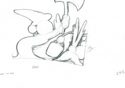
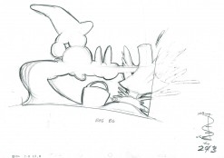
Mickey and the Shadows – 1
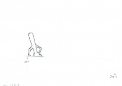
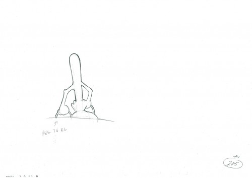
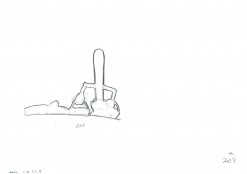
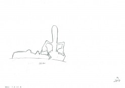
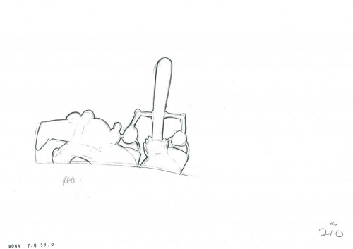
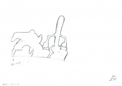
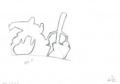
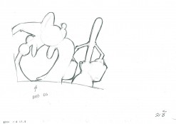
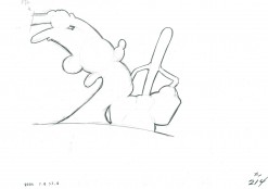
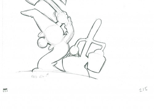
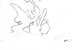
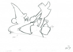
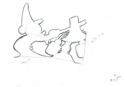
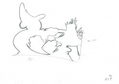
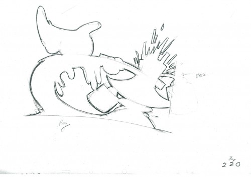
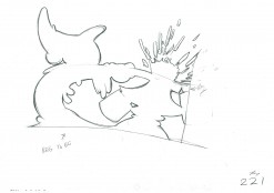
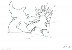
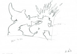
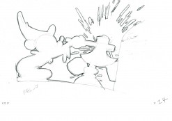
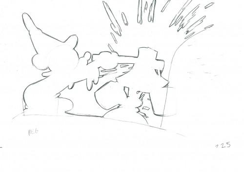
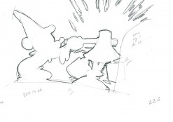
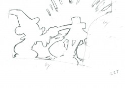
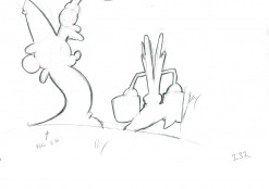
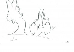
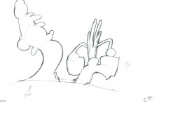
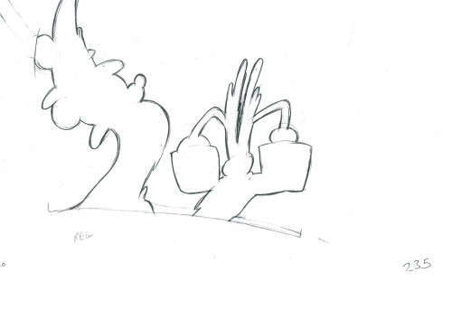
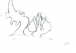
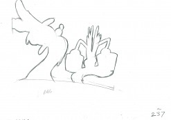
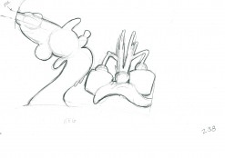
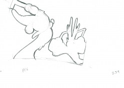
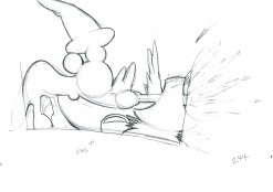
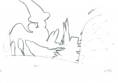
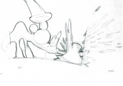
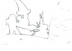
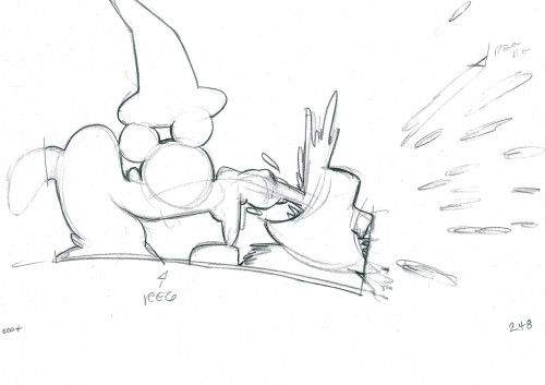
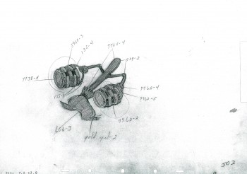
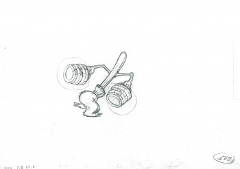
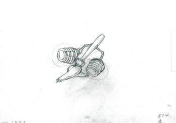
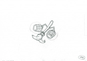
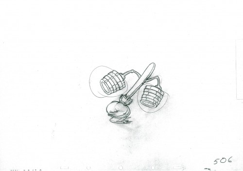
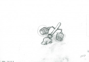
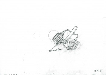
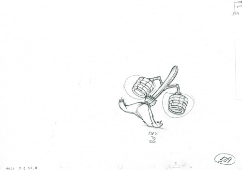
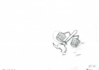
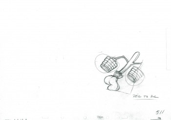
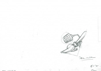
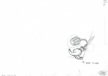
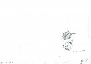
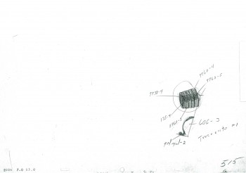
- Having seen the entirety of Mickey chasing the broom into the adjoining room, we now take up the shadows that show us what Mickey does in there. Again there are many drawings (it’s all on ones) so this is the first part. (See past posts here.)
It’s animated by Riley Thompson with Harvey Toombs assisting. The sequence director was James Algar.
 1
1  2
2
____________________________
The following QT incorporates all the drawings from this post
All previous posts will be combined in the final piece.
All drawings were exposed per the Exposure Sheets.
Books &Commentary 29 Nov 2011 06:35 am
Overdue Review – The Motion Picture Cameraman
- A couple of weeks ago, I reviewed the E.G. Lutz book, Animated Cartoons. I was also intrigued by another of his many books, The Motion Picture Cameraman, and quickly ordered a copy from Amazon. This 1927 book is obviously dated, but like his earlier book, Animated Cartoons, it’s so filled with information that most of it has held up over the years. Of course, today everything is digital, so there’s no need for a lot of information about film and film stocks, but there’s still of lot to be learned for the aspiring motion picture photographer.
This is all illustrated by detailed drawings by Lutz, himself.
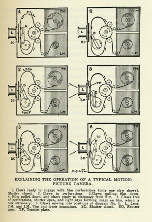
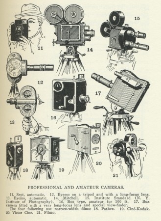
The book starts out talking about the camera. Lutz, at first, sticks to the simplest, the box camera, and moves on from there ultimately comparing and contrasting a number of different makes, at the time.
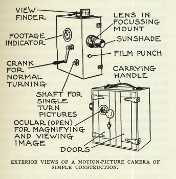
The simple box camera
The book offers lots of charts and details that are pertinent to the subject. Everything from filming outdoors “When subjects have a preponderance of red and yellow hues they require a large stop and a long exposure to procure any kind of result. In subjects where blue and violet prevail a smaller stop will do.” Naturally, there’s a chart analyzing daylight hours at different months of the year.
He has an entire chapter on shooting within a studio of the period: “A Motion-Picture studio is a huge structure with glass roof and sides in which artificial lights supplement daylight, or are used exclusively for the illumination.” Certainly, this is not what studios were even five years on. They would soon be doing color, and they would need to very carefully control the conditions for photography.
How quickly it all changed and how casually we shoot now with our digital cameras.
He has a chapter on effects photography covering everything from glass matte shots to split screen photography. Many of these effects are illustrated.
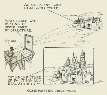
The glass matte shot explained in a very clear way
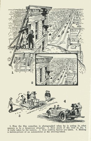
How people hang precariously
from clocks in silent films (see Hugo).
He has an entire chapter on how titling is done, and there’s another chapter on “‘One Turn, One Picture’ Work”, or as we call it “animation.” The “one turn, one picture” means that you crank the camera only once around to film one image. It took 16 cranks to shoot one foot of film, or one second in the silent pictures. Film ultimately went to 24 frames per second to accommodate sound photography.
In that animation chapter, he analyzes the different types of animation from cut-out to stop-motion to time-lapse photography. It’s very succinct and well informed, as we might expect from the author of the first how-to book on the subject.
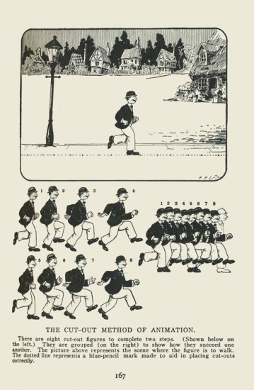
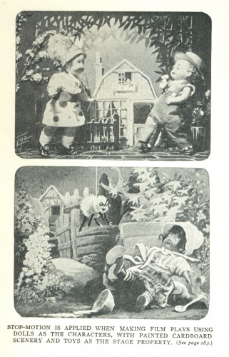
Puppets, prior to the ball and joint method
were just strung together with strong wire.
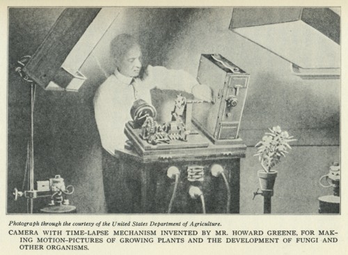
This man is shooting a time-lapse film although
it looks as though he were creating Frankenstein’s monster.
Ultimately, we even get instructions on how to develop the film. Fortunately, labs were created for that purpose and handle such an important part of the process today.
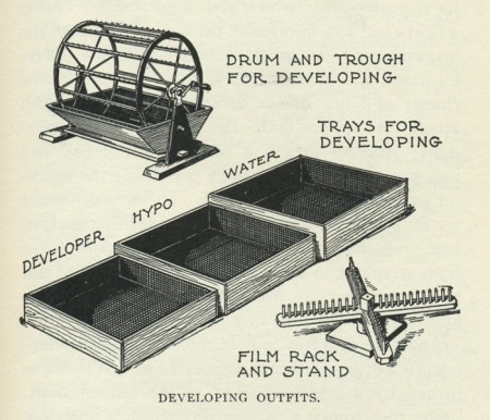
Equipment needed to develop your own film.
I guess the book seemed valuable for me because I have an interest in the process, both that of the past as well as that of today. I’m not sure everybody has that interest, but this book will serve you well and entertain if you do.
Animation Artifacts &Disney &John Canemaker &Peet &repeated posts &Story & Storyboards 28 Nov 2011 07:45 am
Ben and Me Board – repost
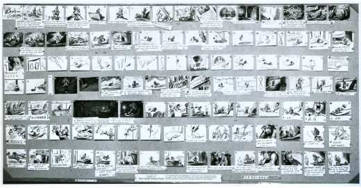
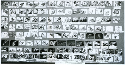
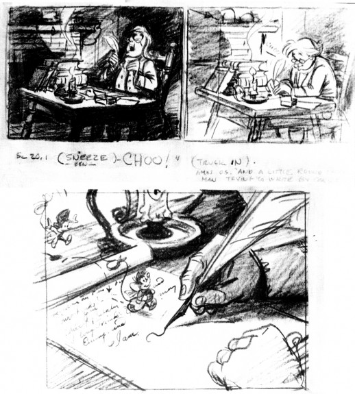
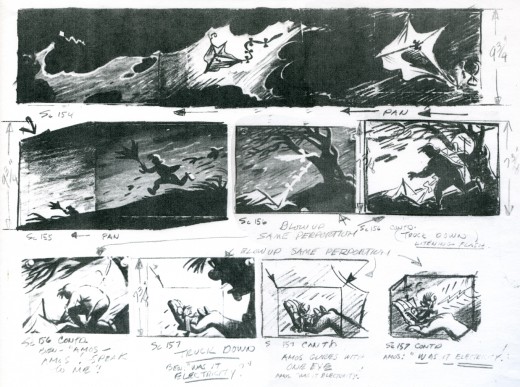
 - Bill Peet was one of the prime artists who shaped many of the Disney features. He has been an enormous influence on me and thanks to John Canemaker, who has loaned me the following storyboard, I’m pleased to post some of Mr. Peet’s excellent artwork.
Ben and Me was a 20 min short produced in 1953. It’s an oddity in the Disney canon. The story of a mouse who influences Benjamin Franklin through many of his most famous moments was originally a book by Robert Lawson and was adapted by Bill Peet for the studio.
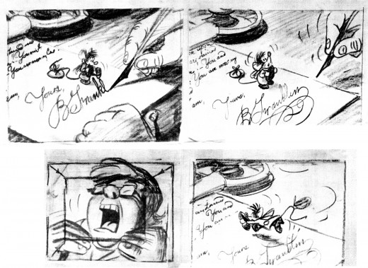
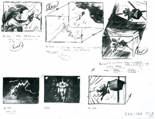
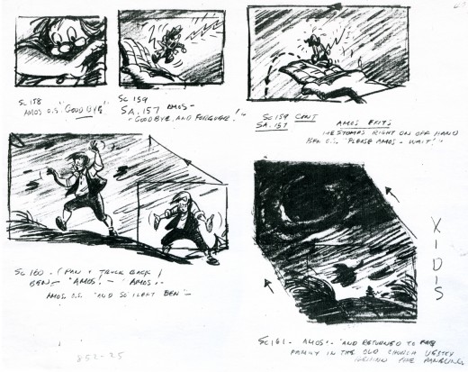
The photostats of the storyboard, like others I’ve posted, is extremely long. Hence, I’m posting them as large as I possibly can so that you’ll be able to read them once you’ve enlarged the images.
These three panels are followed by a couple more revisions. The revisions I only have as xeroxes – lesser quality.

This image is a recreation of the extraordinary pan as seen in the first row of the storyboard posted above. It’ll enlarge to a size where you can properly see it. A couple of the objects were on secondary overlays creating a minimal multiplane effect.
Bill Peet offered great drawings in his storyboards, and I’m sure he brought a lot of inspiration to the animators.

This is an excedingly long pan (30 inches), and is almost invisible in this minimal thumbnail. Rather than break it up into shorter bits, I’m posting it as is and hope it won’t be too much of a problem for you to follow in its enlarged state. You have to click on it to see it.
The image below is a recreation of this pan from the final film done using multiple frame grabs.
There’s an excellent article about the making of Ben and Me by Wade Sampson at Jim Hill Media. It gives quite a bit of information about this odd short and is well worth reading as a companion to these boards.
Commentary &Photos 27 Nov 2011 04:41 am
Mean Benches – repost
- Has anyone else noted that the world has gotten meaner? Just watch one of the Republican debates for proof positive of that. Or take a look at what’s happening to the protesters of the Occupy Wall Street movement. Pepper spray anyone?
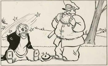 Remember the comic strip Pete the Tramp by C.D. Russell? no, it’s probably before your time. Pete was a tramp who stole pies from windows and got in trouble with the law. He was the typical hobo in comic strip form, and the strip started during the depression and lasted through 1963. I read it in color in Saturday’s NY Journal American.
Pete usually slept on park benches under newspapers and got his feet slapped by the cop. I noticed park benches this week and wanted to call attention to the way our society has handled tramps, hoboes, homeless people. In New York, they’ve made them uncomfortable.
This is the park bench I noticed.
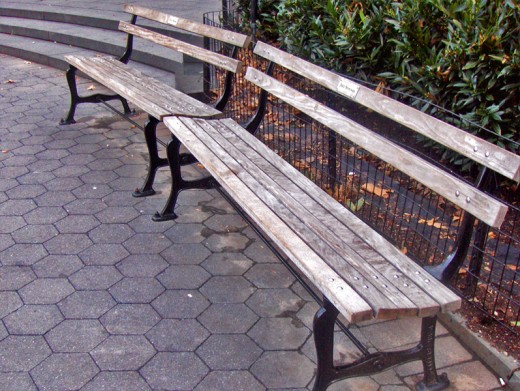
It’s a bench in Madison Square Park, and I noticed it because it’s become a relic of the past. A person could actually sleep on it.
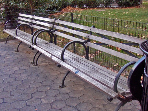
This is the newer model. The only way you could sleep on it is if you only had a torso. They’ve put dividers there, so it makes it handy to sit and not touch the person next to you, but you couldn’t really lie down on it.
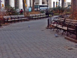
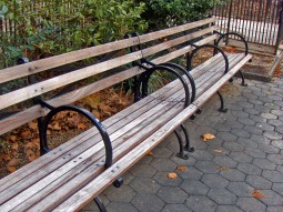
See. There are lots of these now. Madison Square Park is made of mostly these benches, but there are still a couple of the old kind.
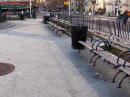
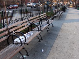
The new little park down on Bleecker and 6th Avenue only has this type of bench.
No vagrants wanted here.
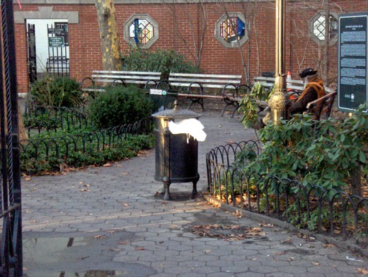
Even the old, tiny private park on Bleecker has these newer benches. (I did see someone sleeping on them, but I couldn’t get close enough to photograph the way he mangled his body to get some sleep.)
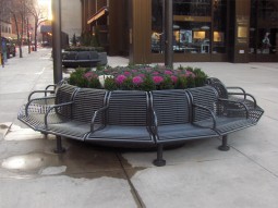
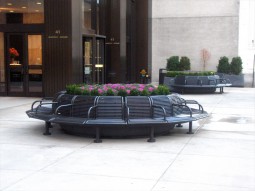
A building up on 28th and Madison made sure no one could sleep on their public seating area.
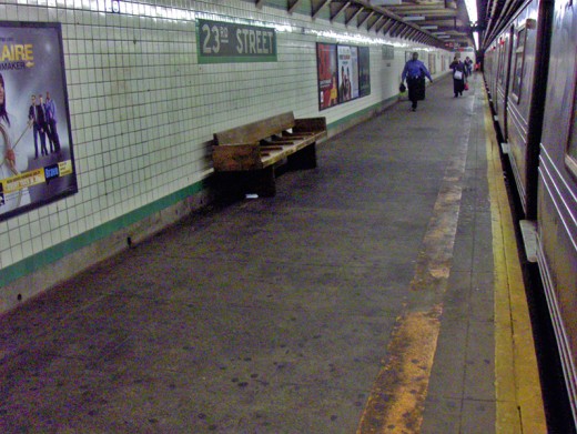
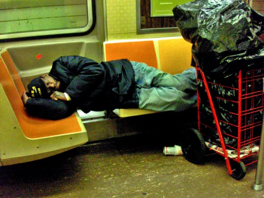
Subway benches have also become completely inhospitable.
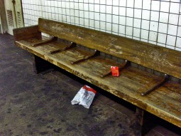

This type bench has very tight dividers. Wearing winter garb, one hardly fits into the space. However, these benches aren’t quite so bad in that the dividers aren’t mercilessly high.
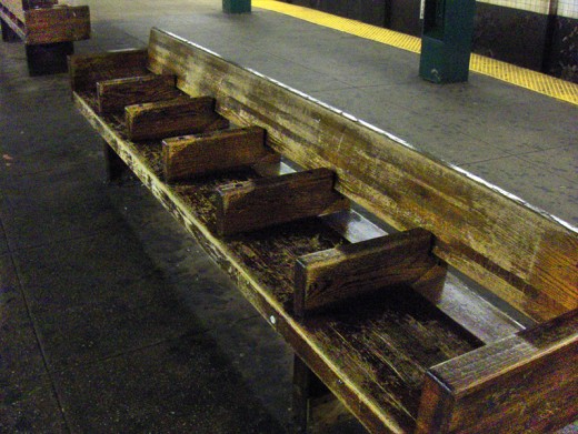
Look at these uncomfortable things at West 4th Street. (Plenty of homeless used to be downtown.)
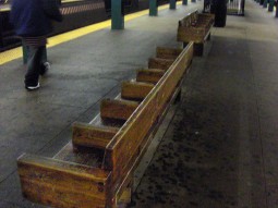
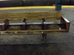
You could hurt your back trying to sleep here. Though, I have seen some people stretched out over these partitions. That’s how desperate it gets in the winter cold.
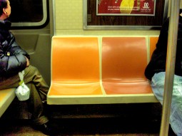
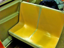
It’s not too much better on the subway. The seats are lumpy – shaped for the bum (I don’t mean vagrant-like bum) in bright colors. It’s a tight squeeze.
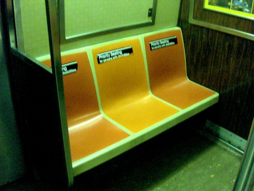
The few longer seats are “Priority seating.” This means bums have to get up for older people. I’m not sure what it means if the bum is an older person.
__________(Click any image to enlarge.)
.
This is a repost from January 2008. The world has gotten even meaner since then.
Art Art &Commentary &Illustration 26 Nov 2011 07:42 am
Patel’s Pictures at an Exhibition and Gene Deitch’s Chopsticks
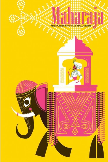
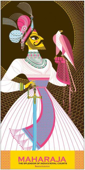
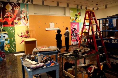
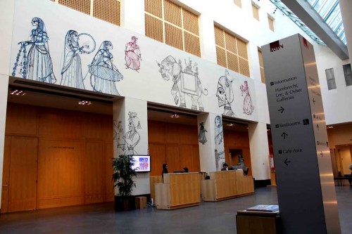
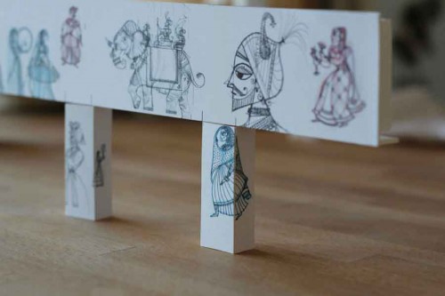
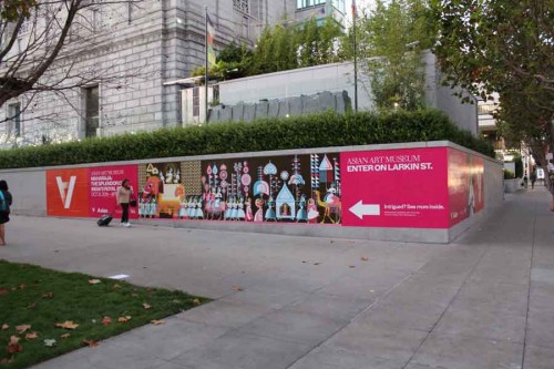
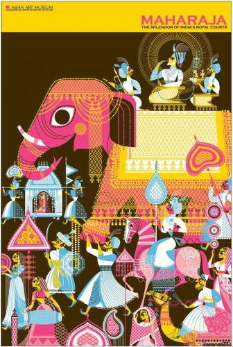
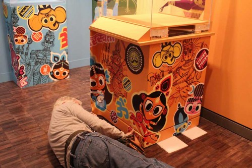
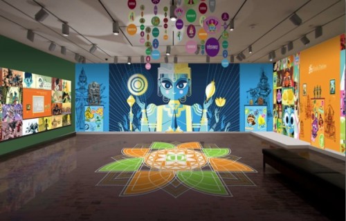
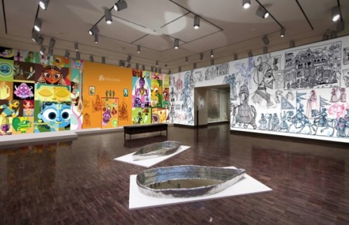
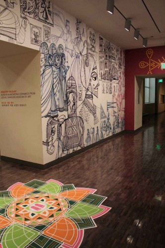
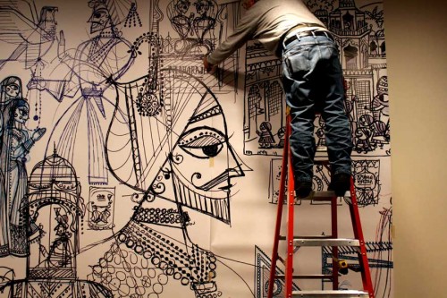
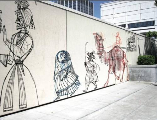
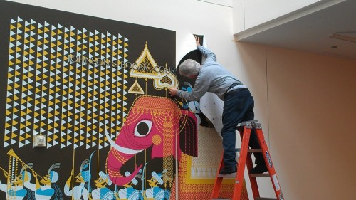
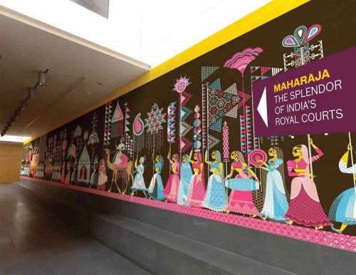
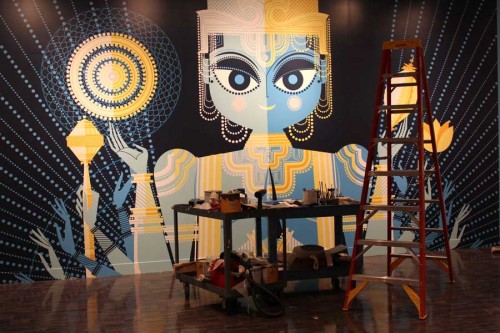
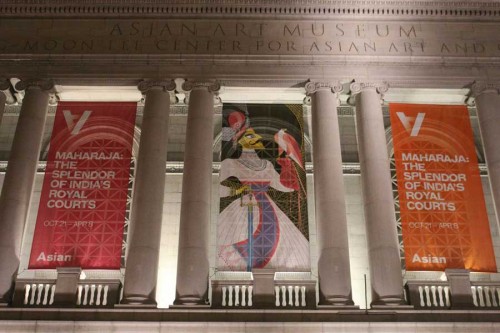
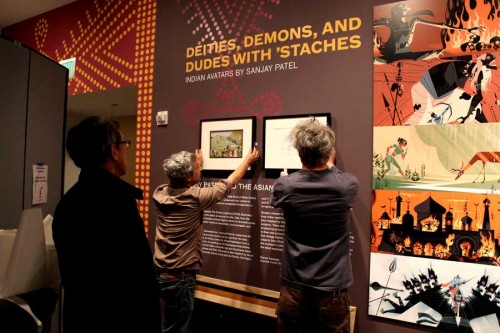
- After I’d posted a review of Sanjay Patel‘s most recent publication, The Big Poster Book of Hindu Deities, he sent me some information about an exhibit opening in San Francisco at the Museum of Asian Art. Included in the email were a number of photos of the exhibition setting up. I’ve chosen some to post which follow below:
 1
1The banners outside the Museum
 2
2
Setting up the exhibit’s entrance sign
More pictures can be found on Sanjay’s site.
I’ve also found this short video piece about his work and thought I’d share it with you. It’s quite informative.
Mr. Patel also had an exhibition of some of his work which is reviewed here in the Asian Art Museum in San Francisco and here in the New York Times.
I received this note from Gene Deitch in the past week:
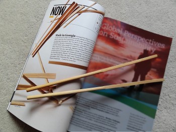 . . . it seems nearly impossible to buy anything that’s not made in China or some other competitive distant land that’s taken over our jobs. I thought we had no other choice but to give gift certificates to local services, to benefit our own workers.
- But lo! The brand new December, 2011 issue of National Geographic magazine, published in Washington DC, and totally reliable for the truth, has come out with the news that chopsticks, necessary for all Asiatic food, are actually Made in USA, in Georgia, and exported to China and other far east, forkless regions!
Consider a gift parcel of this traditional American product!
- (A subscription of National Geographic itself would also be great, but not without warning of the a trap I myself have fallen into. It’s impossible to give the National Geo for a single year! Once begun you are hooked for a lifetime of renewals! The magazine is so precious, so informative, and so beautifully printed, that it’s not too discardable. We ourselves have had to move four times to progressively larger quarters, just to accom-
modate the ever growing shelf space needed since I started my subscription in 1946!)
Bill Peckmann &Comic Art &Illustration 25 Nov 2011 08:51 am
Early Jack Davis
- Bill Peckmann sent the following collection of art by the incomparable Jack Davis. Many of these pieces are from the very early career of Mr. Davis. At this point, I’ll let Bill take on the writing in his own words:
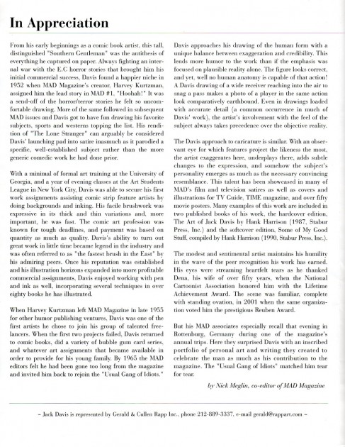
- I came across the program guide for Jack’s exhibition of work at the Society of Illustrators in 2002. It’ll be 2 pages: The cover, a B&W illustration from Field and Stream magazine titled “The Hunters” and the second page which is a heartfelt intro by fellow MAD staffer Nick Meglin.
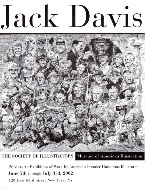
Program cover
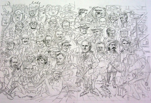
Here is a pencil drawing of the Society of Illustrators cover illustration,
“The Hunters,” printed on the cover of the program, above.
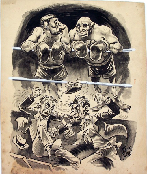
The rest of the Davis dinner will be images from the discs that Jack sent me. They are untitled and undated, ranging from the beginning of when he first put pen and brush to paper, up to recent endeavors. So, we’ll just have to sit back and enjoy what’s going to served up in front of us without rhyme or reason. I don’t think anyone will have a problem with that. 99% of the art was new to me, as I hope it will be for the rest of his fans.
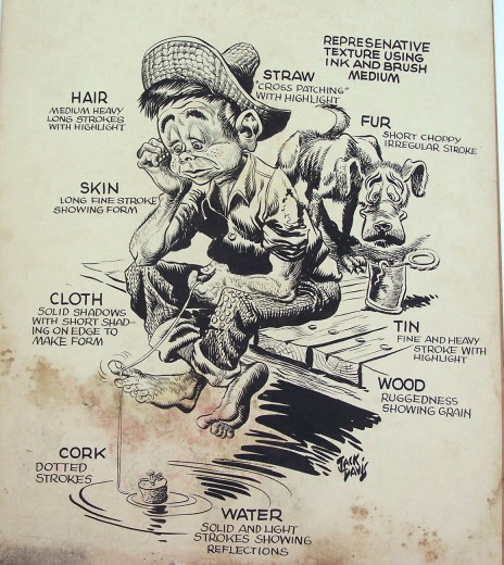
A very, very early piece, either an art school exercise
or a portfolio sample.
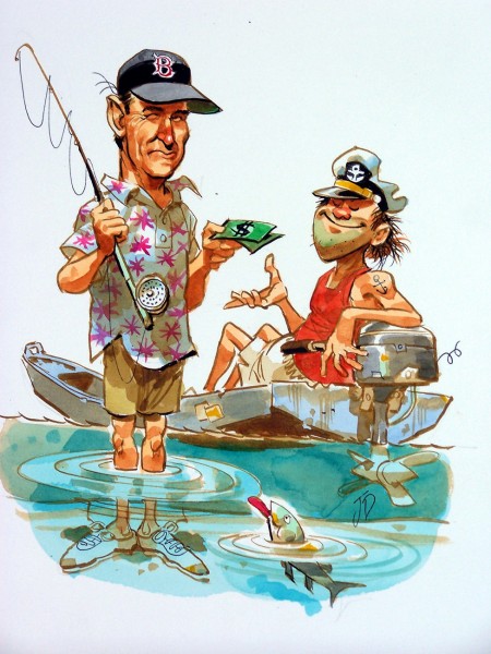
Another fishing theme but quite a few years later.
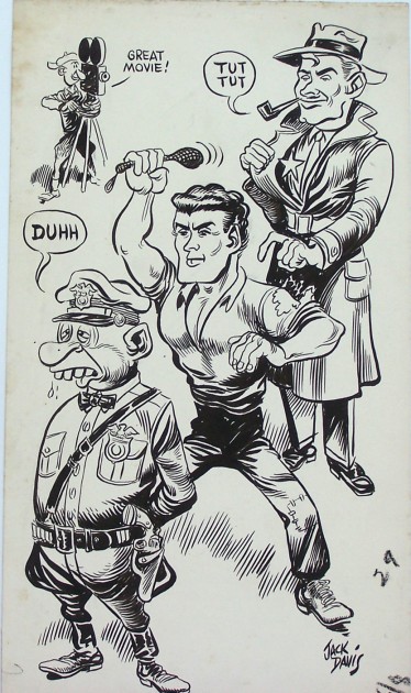
Another early fascinating piece.
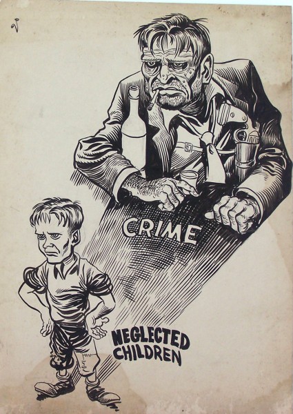
Here’s another drawing done by very young, budding cartoonist
Jack Davis. I recently found out that Jack was and has always been
a big fan of illustrator, Albert Dorne. Interesting, because I believe
you can see Dorne’s influence in these early pieces by Jack.
Bill Peckmann &Comic Art 24 Nov 2011 07:45 am
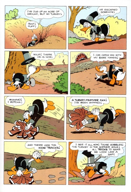
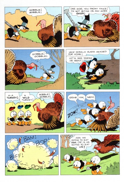
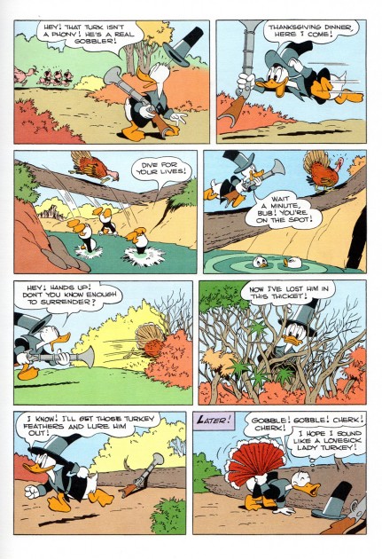
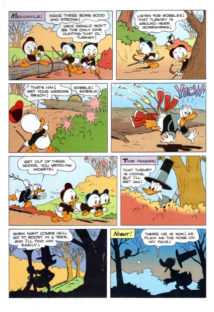
Thanksgiving Duck à la Barks
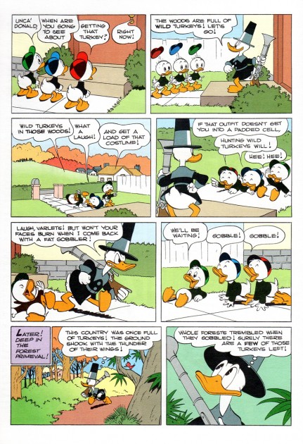
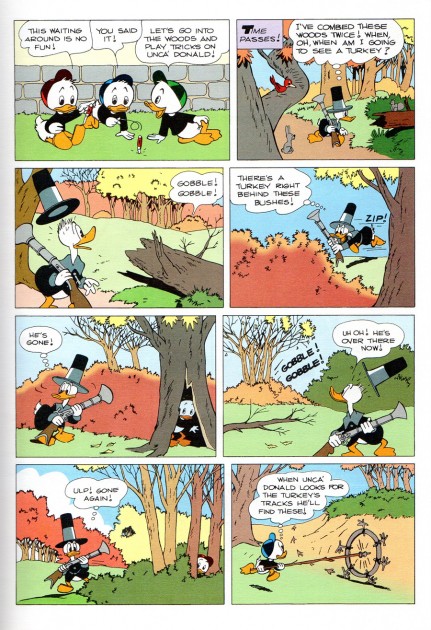
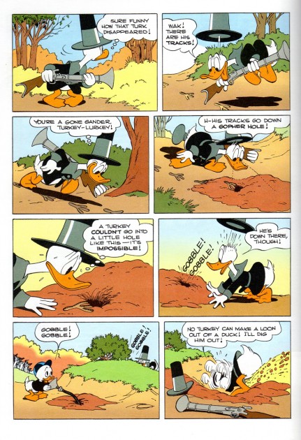
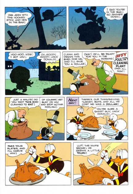
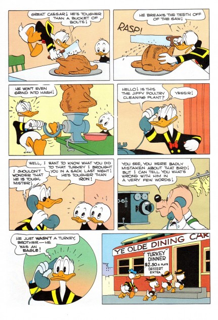
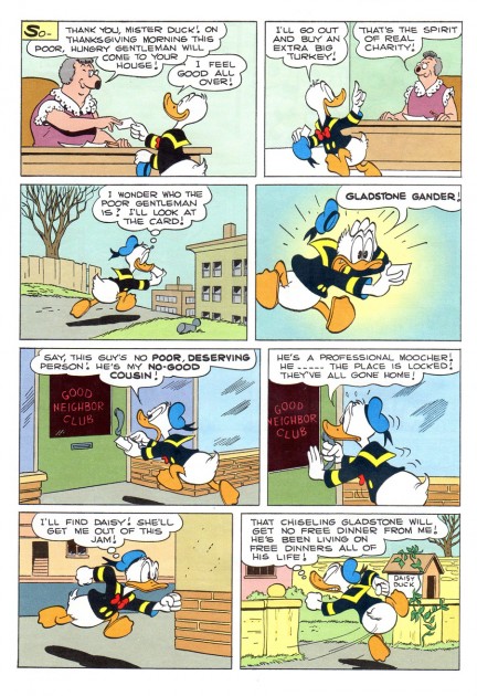
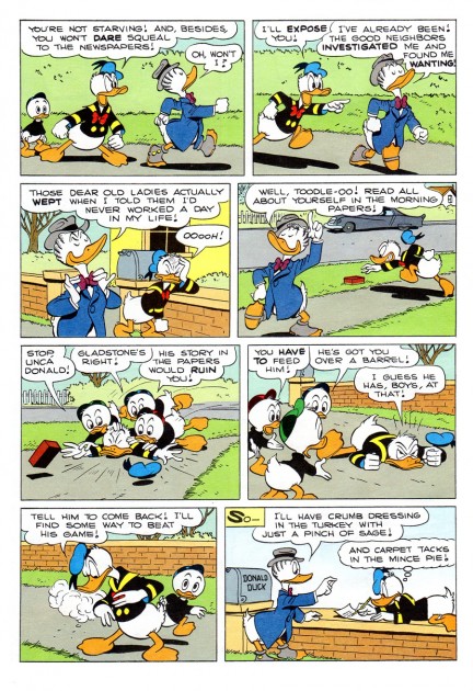
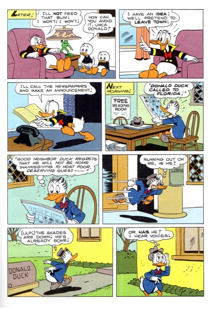
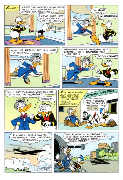
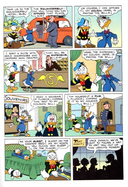
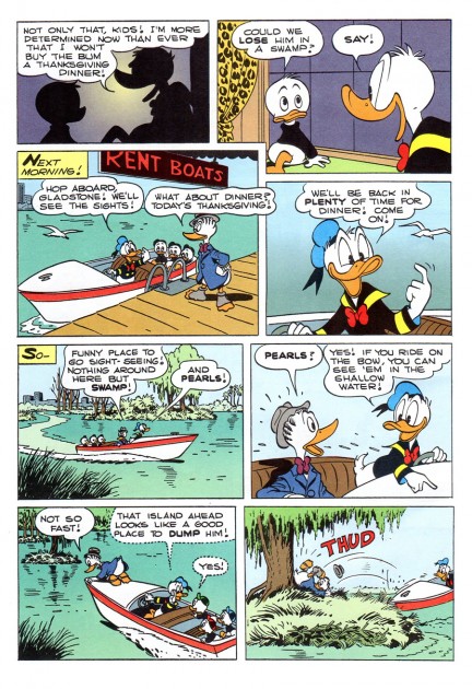
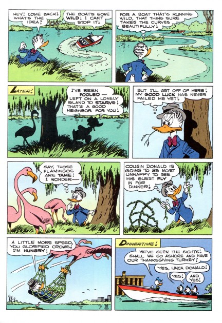
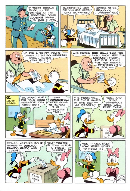
- A note from Bill Peckmann on Tuesday, and we have a pleasant way to say “Happy Thanksgiving” today. Here are a couple of Donald Duck stories from Carl Barks. A nice way to get into the day’s adventures, by seeing what another fowl is up to.
Here’s Bill:
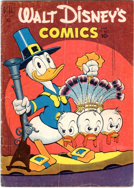
The cover is the Dec. 1951 issue of
Dell’s “Walt Disney’s Comics and Stories”.
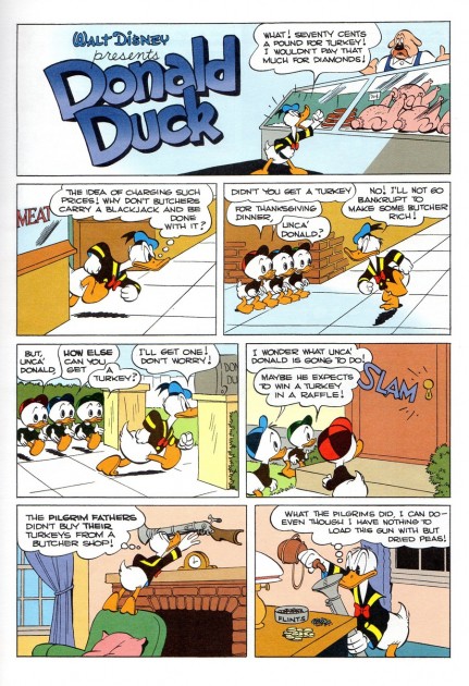 1
1
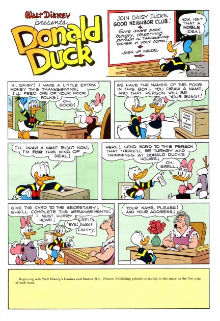
The 10 page story “The Terrible Turkey” is a Gladstone Pub. reprint.
It was originally printed in Dec. 1947.
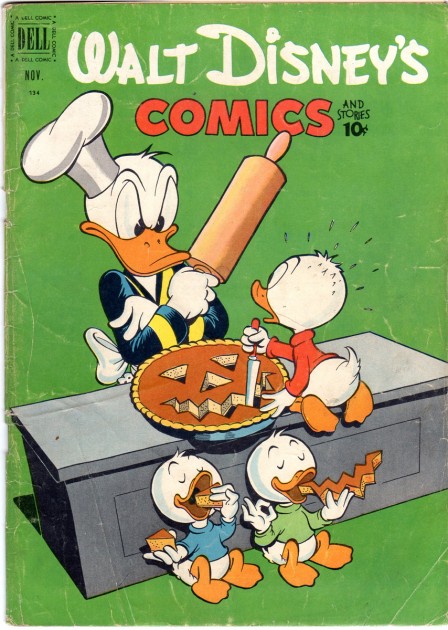
This Nov. 1952 cover is more Halloween than Thanksgiving
but there is that pumpkin pie!
 21
21
This Gladstone reprint “The Charitable Chore” is originally Dec. 1952.
Many thanks to Bill Peckmann.
Happy Thanksgiving
Animation &Animation Artifacts &Disney 23 Nov 2011 05:02 am
Mickey and the Brooms – 4
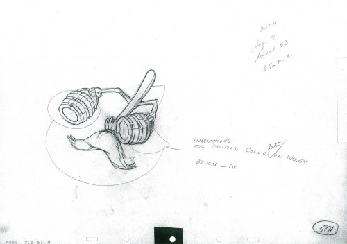
- I should have started with this opening run of the broom which Mickey follows. So, this weeks entry has only a few drawings, but it’s an introduction to the broom that’ll be splinters in a few seconds.
The scene was animated by
Riley Thomson with an assist from Harvey Toombs.
The sequence was directed by Jim Algar.
This is production #2004- Seq. 7 – Scene 53. It runs 28 ft. 3 frs.
 501
501
____________________________
The following QT incorporates all the drawings from this post
as well as the previous posts, Part 1 & Part 2, Part 3.
All drawings were exposed per the Exposure Sheets.
Books 22 Nov 2011 04:28 am
Hindu Deities
- In 2010, Pixar animator, Sanjay Patel had his book, Ramayana, Divine Loophole, published by Chronicle Books. This is a work of art, if ever there was one. There are more than 100 color illustrations mixed with B&W sketches and rough drawings in the book. The artwork is beautiful throughout the book illustrates the tale of the Rama’s adventures in loving detail.
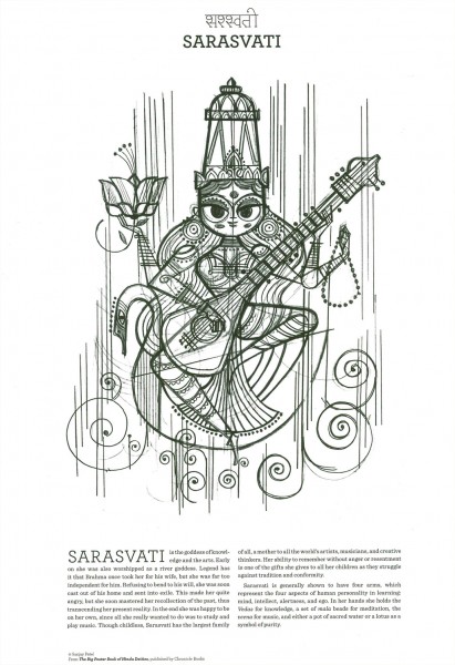
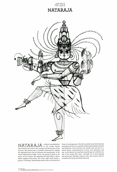
Now Mr. Patel has a new book, of sorts. The Big Poster Book of Hindu Deities features 12 color, poster-sized illustrations which can be taken out of the book and framed or left in bound form. They make up the body of this book/package.
Sanjay Patel is an animator and story artist working for PIXAR. He’s been involved in films from A Bug’s Life to Cars 2, including The Incredibles, Ratatouille, and Toy Story 2 and 3.
Patel’s illustration style is quite original and forceful. A strong sense of design, the colors and nuances of the book are very delicate, and Chronicle Books has done a wonderful job of capturing these in the printing and layout.
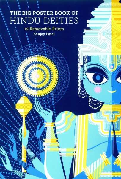
The outer cover is a sleeve which wraps around the bound envelope of a book.
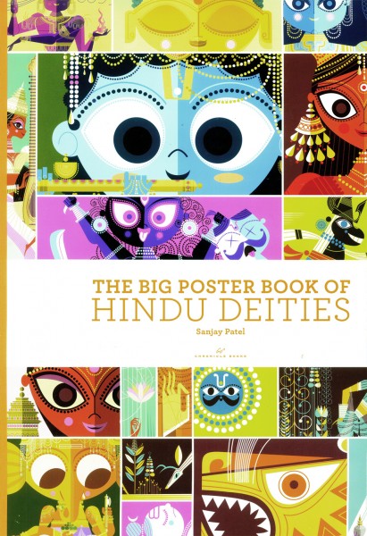
The cover of the actual book, within the enveloping binding
gives a hint of the posters held within the volume.
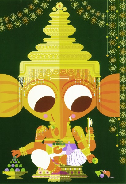
Each illustration can be removed from the book and framed as a poster.
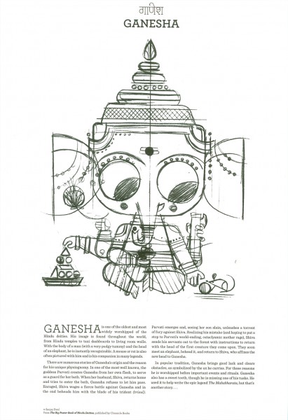
The back side of each page includes another sketched drawing
with a piece about the God/Goddess illustrated.
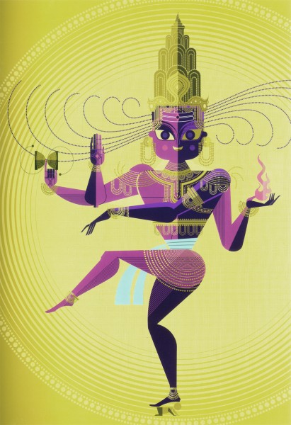
The printing of the illustrations is exceptional.
In scanning them, I had a difficult time trying to match the printing.
I did not succeed. The subtleties were too great for my scanner.
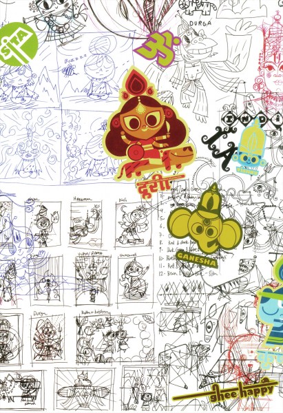
The inner cover of the bound book offers a look
at some preliminary sketches done for the tome.
The $25 book sells for $15.96 on Amazon and is quite large.
repeated posts &Trnka 21 Nov 2011 07:42 am
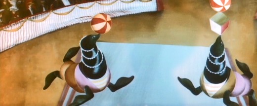
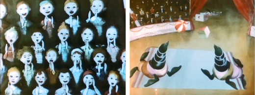
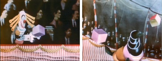
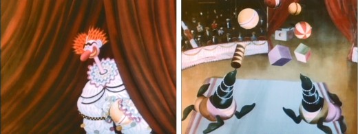
Trnka’s Merry Circus – repost
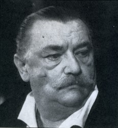 – I’ve been a fan of Jirà Trnka‘s work since I first saw it back in the 60′s. I’ve bought every publication I’ve ever found which discusses or displays his films or illustration. These days I can also own a number of his films.
His puppet films were always the gold standard of that medium. However, since I’ve studied his illustrations for many years, I’m always interested in the 2D work he’s done.
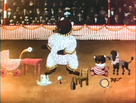
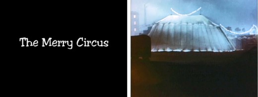
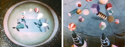
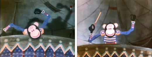
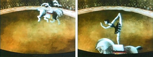
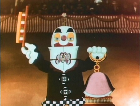
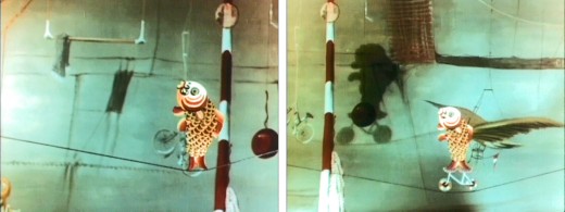
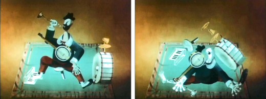
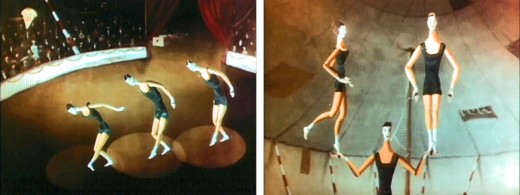
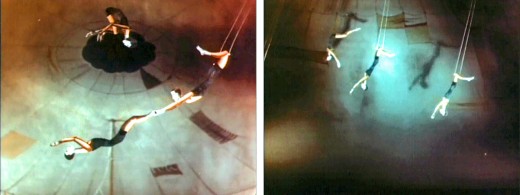
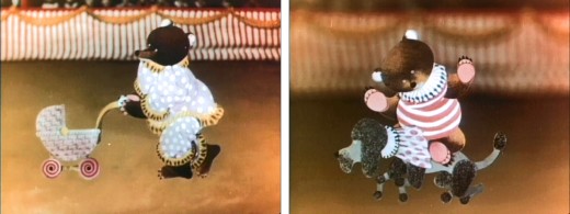
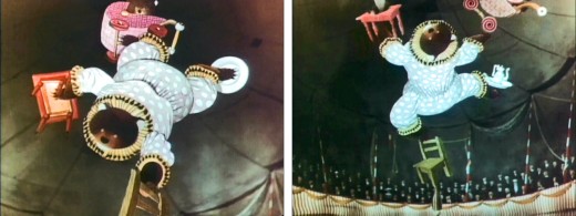
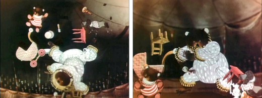
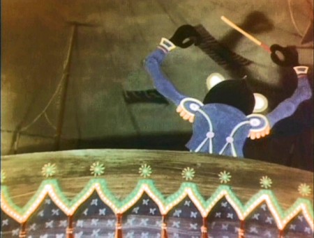
The dvd titled The Puppet Films of Jirà Trnka includes one of these 2D films. It’s cut-out animation, so it really borders the world between 2D and 3D. Trnka exploits the shadows on his constructed cardboard backgrounds to great effect. The style purposefully hides the three dimensions of the constructions, but it uses it when it needs to. The film is a delicate piece which just shows a number of acts in a local circus setting.
It’s a sweet film with a quiet pace. I’m not sure it could be done in today’s world of snap and speed. No one seems to want to take time to enjoy quiet works of art.
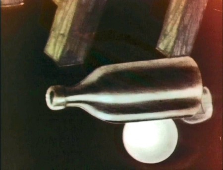
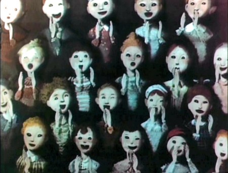
I’m posting a number of frame grabs from this short so as to highlight the piece.
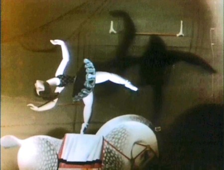
Note the real shadows on the background.
These were obviously animated on glass levels in a multiplane setup.
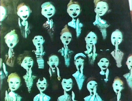
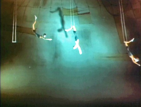
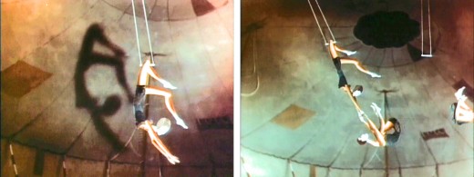
Again, note the excellent use of shadows. It’s very
effective in these long shots of the trapeze artists.
