Category ArchiveHubley
Daily post &Festivals &Hubley &Layout & Design 09 Sep 2013 12:44 am
Ford, Noble and Art
I am a fan of the work of John Ford. If I’m caught catching a minute of one of his films, you’ll see me stay through to the end. Likewise I have almost as great a respect for the animation design work of Maurice Noble.
 It never fails. I get to the point where I’ve just about run out of hope for animation, and I feel like the greatest pessimist in the world. When I say “animation,” I mean 2D. Every frame is controlled by one person. The rest – cgi – is, to me a graphic effect, electronic puppetry. I’m certainly not talking about the overacted cg action you see in most films done today. Most animation to me, these days, is something that’s done in a computer by teams of people, and isn’t wholly designed as “personal.” There are, of course, the exceptions. When something like THE LIFE OF PI shows up, it feels like magic; the magic you expect of great animation.
There’s just too much of everything in most current animation; even the flash Mickey Mouse spots go too fast with their Zips, Pans, Takes; the simplest move seems to go over the edge. Gestures are bigger than they need be, actions are over the top, dialogue is too loud and frenzied unless it wants to be quiet – then, it really is dead. The animator became that big red button they have at “Staples.” You press it and the client can fix what he has to – his way. The poetry has vanished from the art form when this animation begins. Too bad there’s no personality in those big red buttons.
John Ford made some of the most beautiful movies we have on film. Many of these are Westerns, Westerns which notably featured some of the most extraordinary, natural land masses photographed. The incredible buttes and sights appear in the Arizona Desert, called “The Painted Desert”, and whether they were shot in the glorious golds, violets and other colors or even shot in B&W they add extraordinary sights to these films. If they weren’t already there, constructed and painted by some god, Ford would have had to have a mass of people construct these images.
Working to a better advantage is the art director Maurice Noble who created his original version of the “Painted Desert” mostly out of his own imagination. I suspect he and a couple of other artists were all it took to develop these animated scenics: far fewer people and a lot less time.
As I said, Noble’s desert was original, a recreation of the actual “Painted Dessert” but one that developed out of Noble’s imagination. These are almost as beautiful as the real thing, in that “design-y” way Noble’s art had.
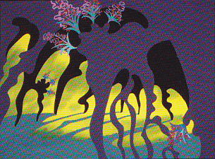
So here we have two film plans. Elaborate impersonal scenery that was designed by Mother Nature, vs the personal designs delicately designed by Maurice Noble. Both are very different but have similar effects on the films they inhabited. A personal world Ford shares with us and another that Noble constructs for the backdrops of the Coyote and Road Runner. Both set designs are larger than life and full of that very-same-life. It’s in gloriously wonderful color (even thoughmany of these sets were shot in B&W) it’s just the beginning of the strength of these films. We’ll look further to see what more has been offerred to us in their films.
Action Analysis &Animation &Animation Artifacts &Commentary &Hubley &repeated posts &walk cycle 02 Aug 2013 04:29 am
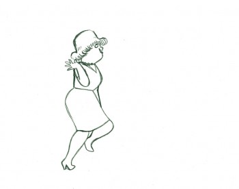
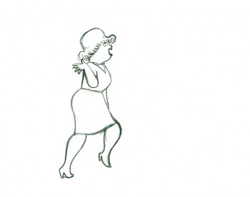
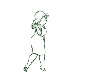
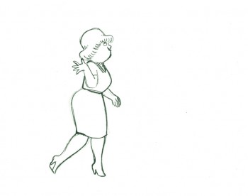
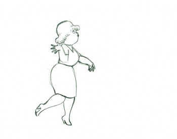
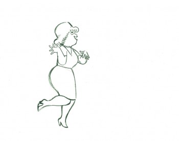
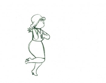
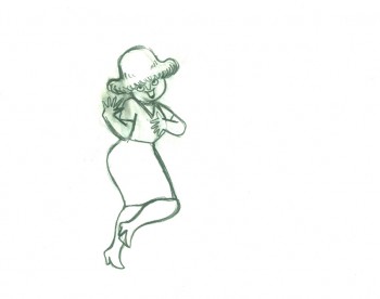
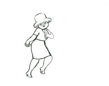
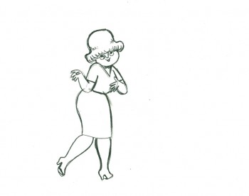
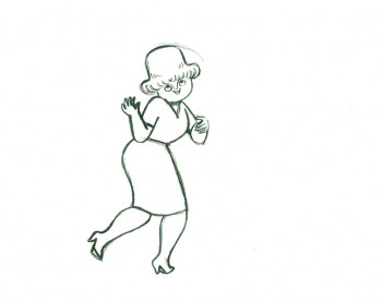
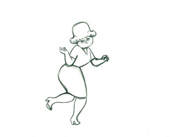
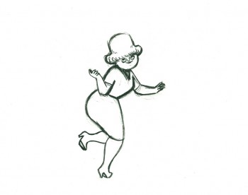
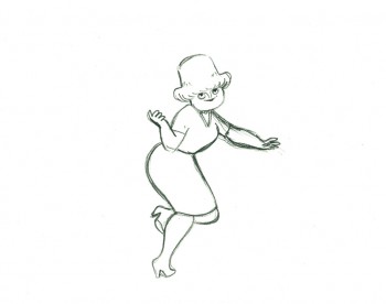
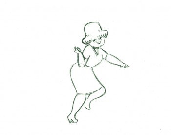
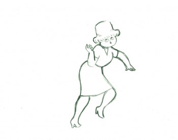
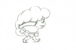
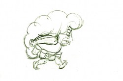
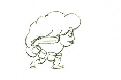
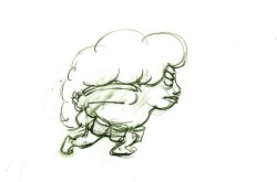
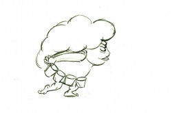
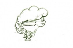
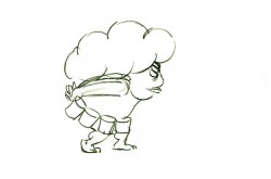
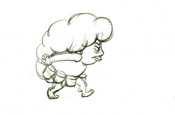
Marky’s Walk, cycled
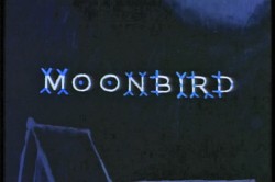 - If I had to choose who was my favorite animator, I’d have a tough time. Equal credit would probably have to go to three different people: Bobe Cannon, Tissa David and Bill Tytla. Jim Tyer and Ed Smith would fall just a smidgen below these three, for me. But there are none like them all, as far as I’m concerned.
I’ve posted a lot of drawings from Tissa and Bill Tytla, but have very few drawings by Bobe Cannon (nor have I seen many published anywhere.)
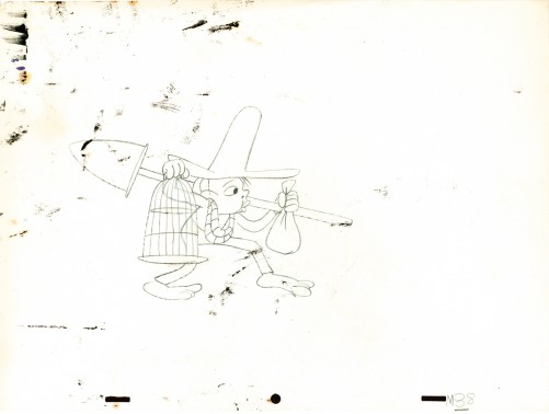
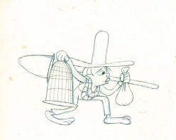
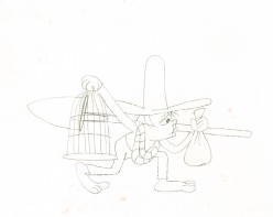
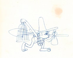
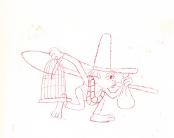
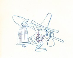
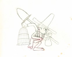
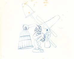
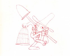
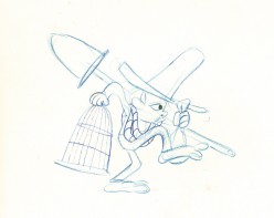
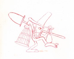
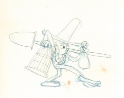
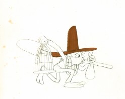
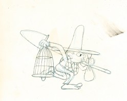
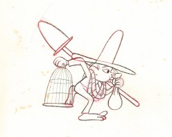
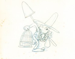
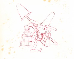
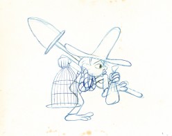
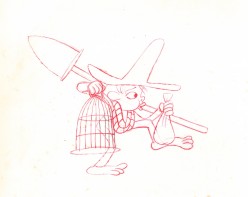
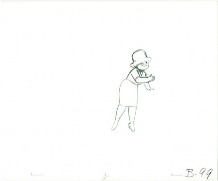
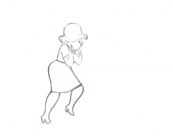
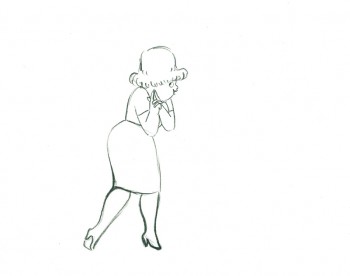
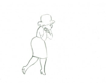
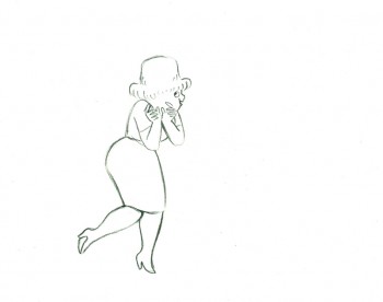
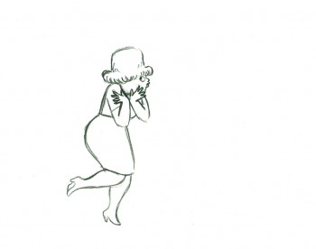
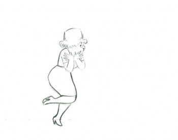
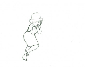
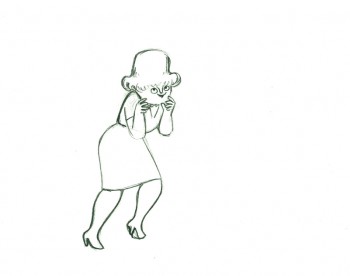
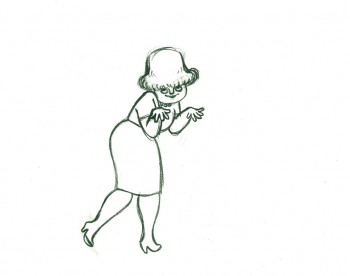
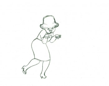
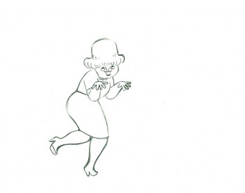
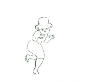
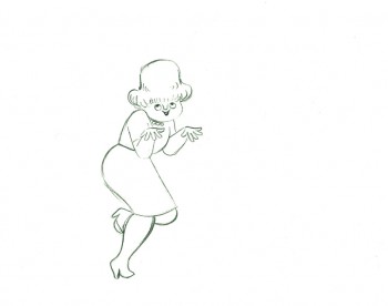
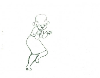
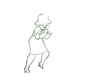
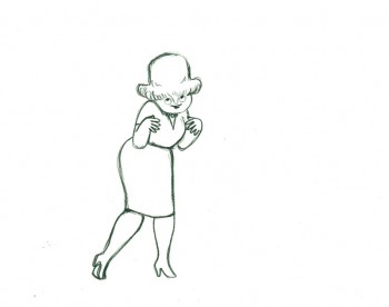
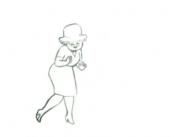
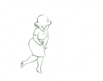
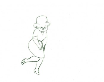
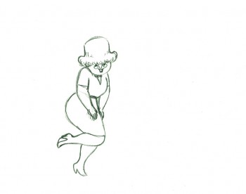
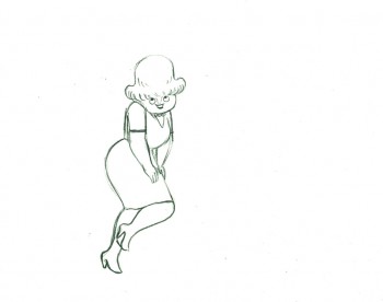
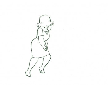
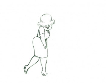
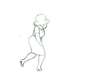
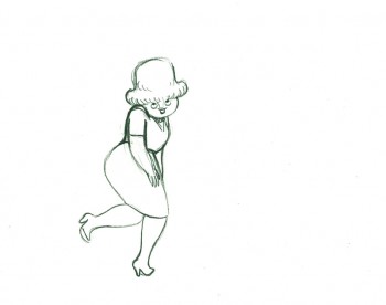
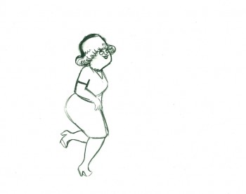
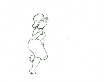
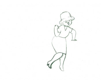
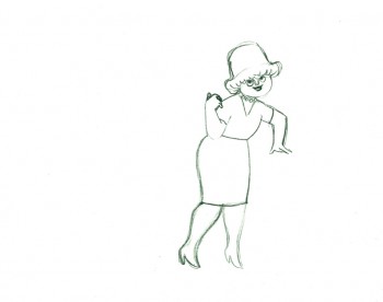
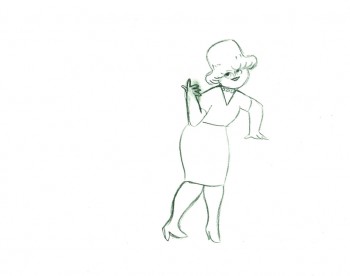
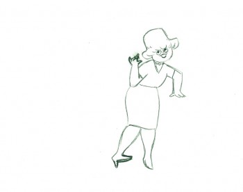
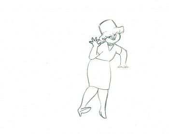
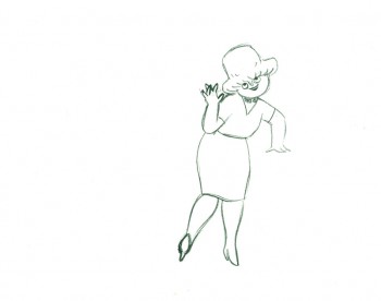
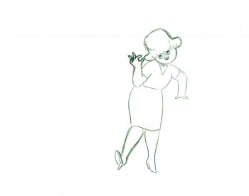
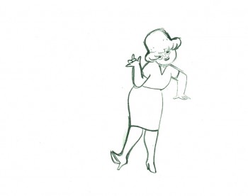
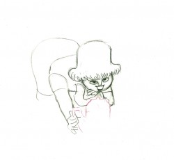
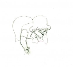
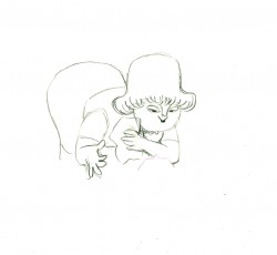
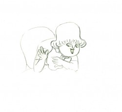
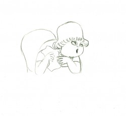
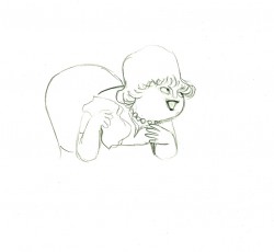
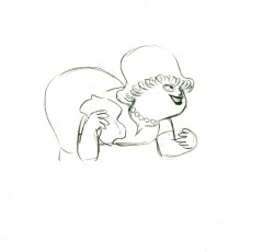
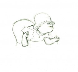
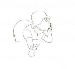
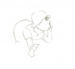
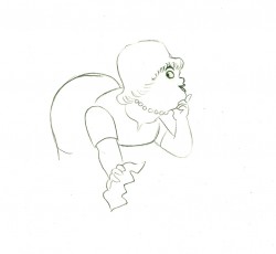
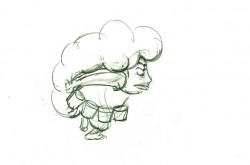
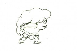
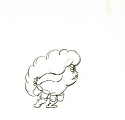
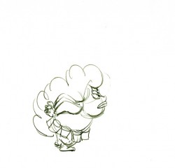
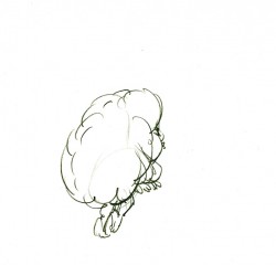
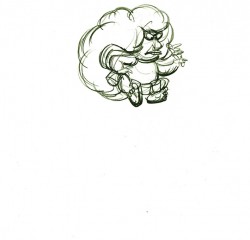
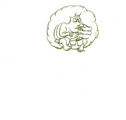
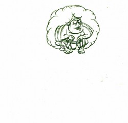
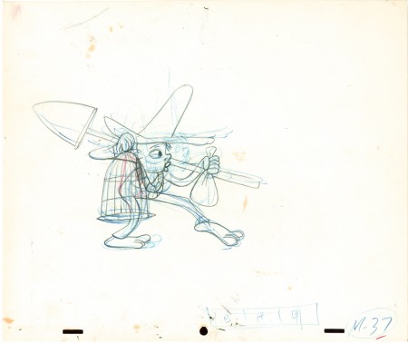
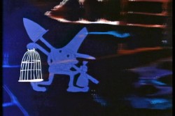 Here is a walk cycle from the beginning of Hubley’s monumental short, Moonbird. The odd numbers are extremes by Cannon, and the inbetweens (even numbers) were done by Ed Smith. Three different sized papers were used for this, and you can view them full sized if you click the thumbnails.
You’ll notice there’s paint all over the drawings. The ink & paint involved tracing the drawing, then using oil paints to cover all of the clear area in black. Some of that paint seeped onto the originals. In one drawing even to coloring the hat accidentally.
 37
37(Click any image to enlarge.) “Marky” walk cycle from Moonbird
On twos at 24FPS
Click left side of the black bar to play.
Right side to watch single frame.
There’s a lot more to this scene including several variants on the walk.
At some future time, I’ll add the other drawings to show off the entire scene.
Commentary &Hubley &Illustration &Models &Story & Storyboards 26 Jul 2013 05:06 am
Telltale Hearts Anew
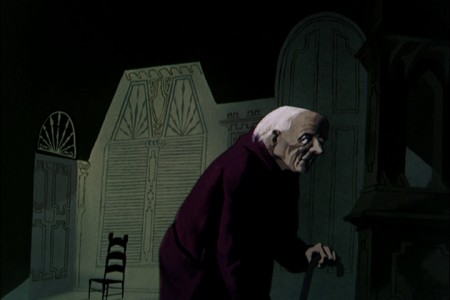
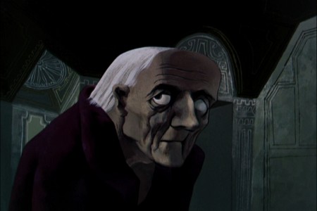
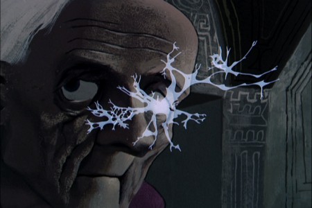
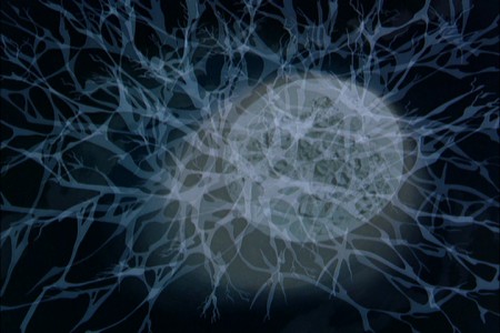
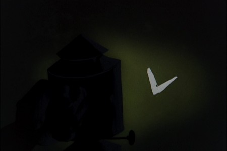
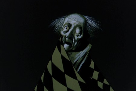
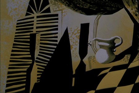
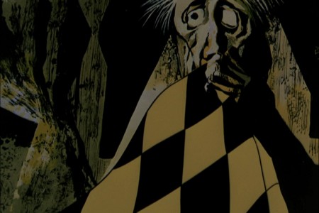
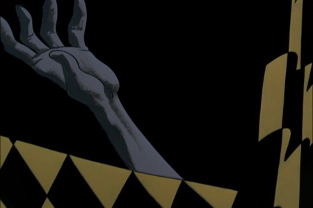
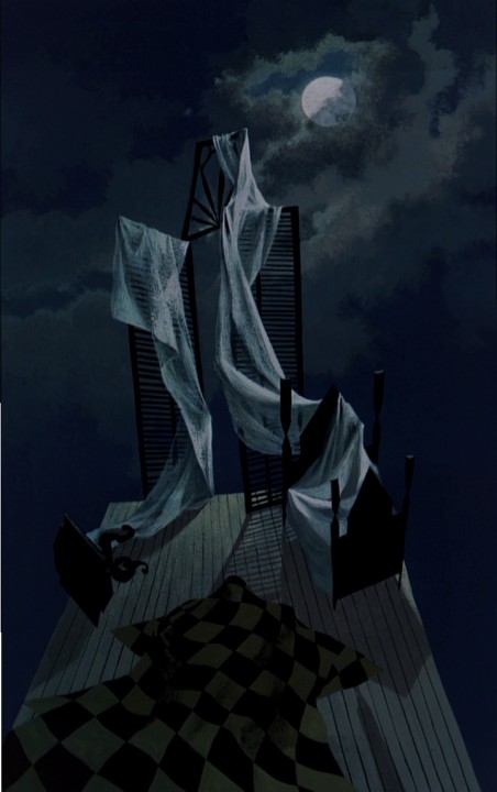
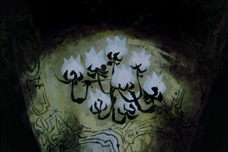
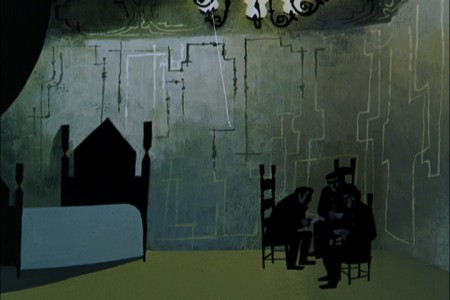
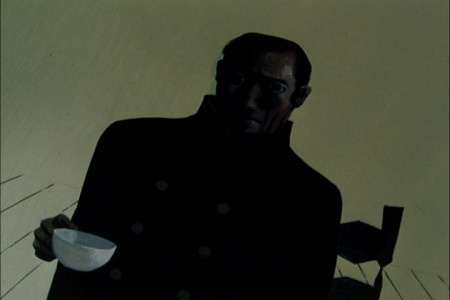
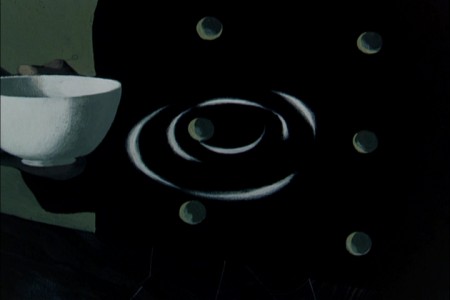
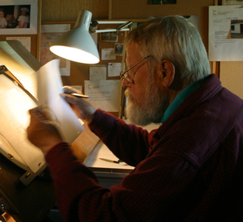 - In at least a half dozen posts I’ve written about Paul Julian‘s magnificent work. Of all of it, The Telltale Heart is probably the richest and most sophisticated of all of this artwork. Such a magnificent artist he was, bordering the realist with the surrealist. I love the man’s work and will continue to feature many of the pleasures he’s given me.
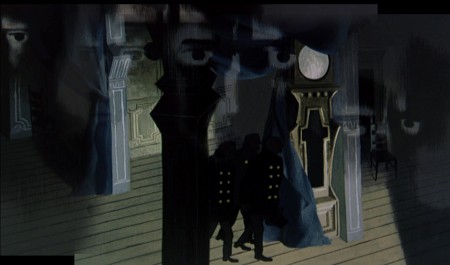
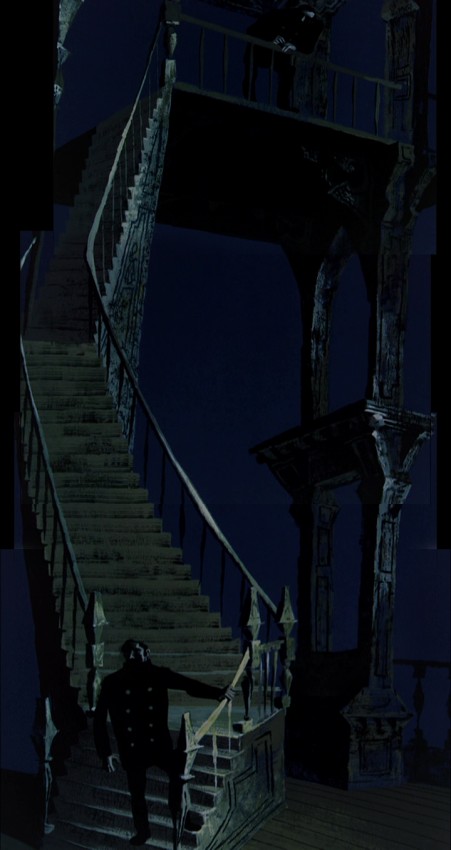
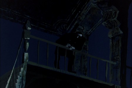
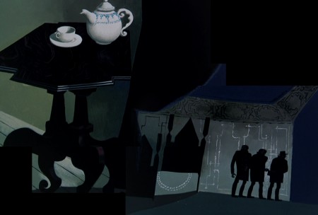
When the Jolly Frolics UPA DVDs were released, there were several films by Mr. Julian that I took great pleasure in analyzing, taking apart and studying anew. How appropriate that John Hubley, my all time favorite, brought the sophisticated Paul Julian into the studio to get him to paint with such elan.
This week, a surrealist one for me if ever there were one, between Verizon’s ample attacks on my phone and blog and the amazingly disturbing hernia operations thrown at me – just for the heck of it – by a brilliant surgeon from India who has worked well in New York City.
It was added b a delightful letter from Borge Ring, by way of his wife, Joanika. The letter prompts a good reason for my posting again the magnificent Julian artwork. I hope you enjoy it, but it’s posted more for my own amusement than yours. Don’t get me wrong, I really hope you enjoy it as much as I do.
Here, then, is the great anecdote b way of Borg:
- hi MICHAEL
Paul Julian’s “Telltale Heart” was shown at Annecy in the sixties. Some0ne asked
producer Les Goldman:
“How long did it take to make the film”?
“It took a year. A year for Paul to paint the film and a year for me to beg the
money together”
cheers
Borge
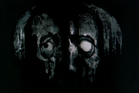
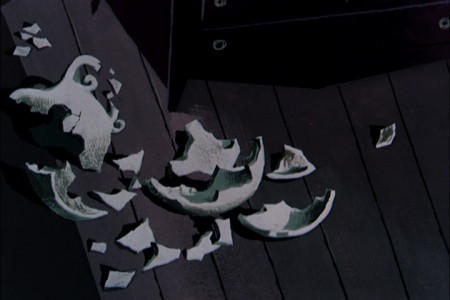
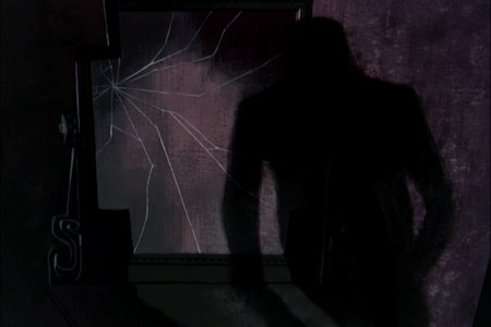
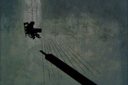
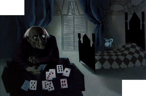
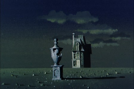
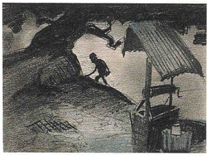
- Of all the pleasures I’ve gotten from the recently released UPA dvd Jolly Frolics the Backgrounds of Paul Julian are a particular enjoyment. His most famous and greatest achievement is, of course, the work he did on The Tell Tale Heart. This is his film. Ted Parmelee directed it, but I’m certain that he pretty much set the camera moves and timing, leaving all the design work for Julian.
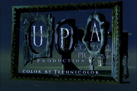
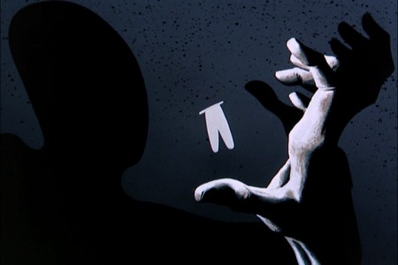
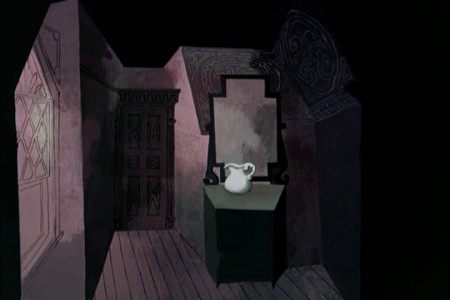
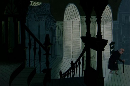
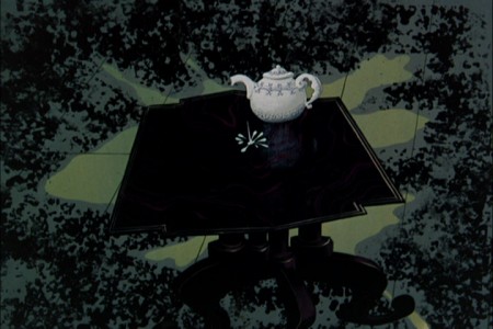
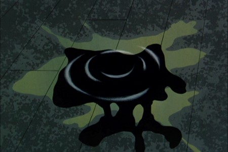
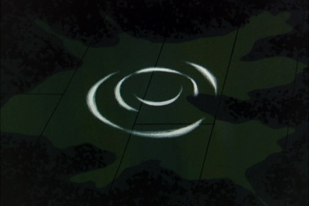
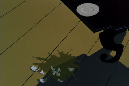
The Tell Tale Heart is a tour de force of production design. It is probably one of the first non-war/propaganda animated films, since Baby Weems, to so feature this element of production over everything else – except story. Paul Julian‘s brilliant artwork oozes from the pores of every frame of this film. Together with James Mason‘s narration and Boris Kremenliev‘s strong musical score, the film evocatively tells the strong Edgar Allan Poe story. This tale has not been told on film any better since it was made in 1953. Ted Parmalee directed the film with authority.
 1
1
Animation Artifacts &Articles on Animation &Hubley &Independent Animation &John Canemaker 16 Jun 2013 04:53 am
Finian’s Rainbow
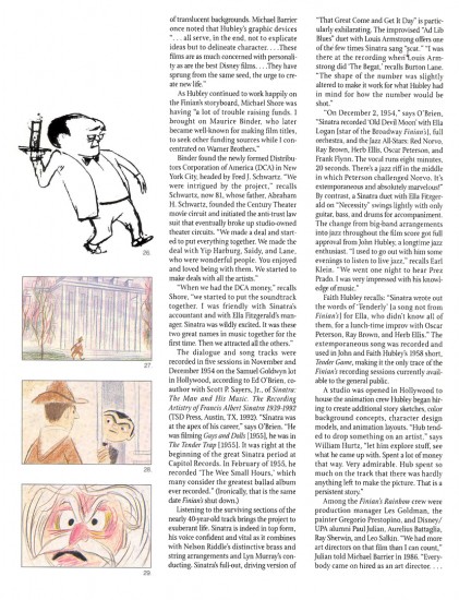
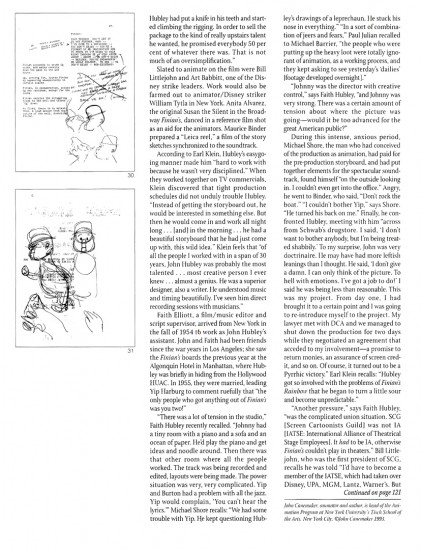
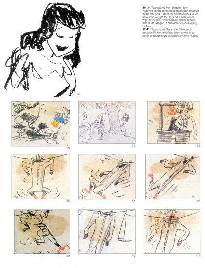
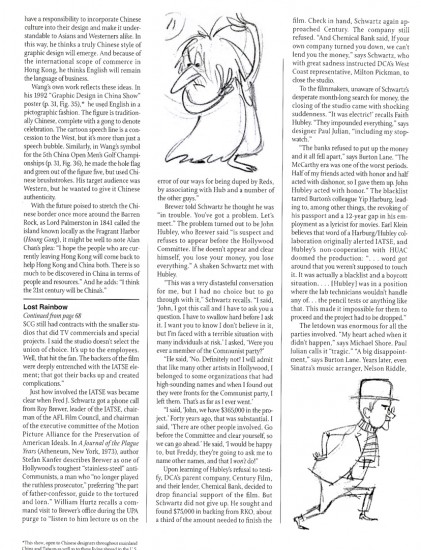
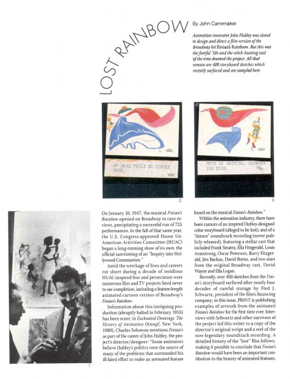
This article by John Canemaker is, to me, one of the most important pieces I’ve ever posted. I want to continue to give it some fresh air time, and I think today’s the day to post it anew. It’s one of the great articles ever printed in Print Magazine and a brilliant piece of historic recreation by John Canemaker. I’ve read it a couple dozen times, and am about to read it again, now. (Yesterday, I heard Duke Ellington perform “Tenderly” on the radio and that was enough to prompt me to repost it. I’d intimately known the Oscar Peterson/Ella Fitzgerald version of the song. Here was Ellington’s version which literally took the song apart and reconstructed it. Art was performed in front of me thanks to local radio.)
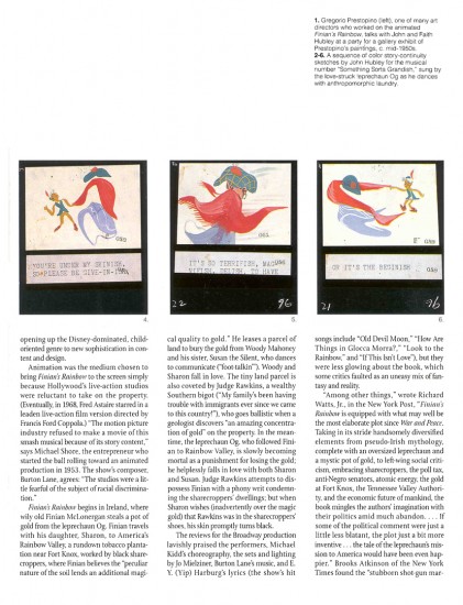
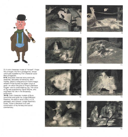
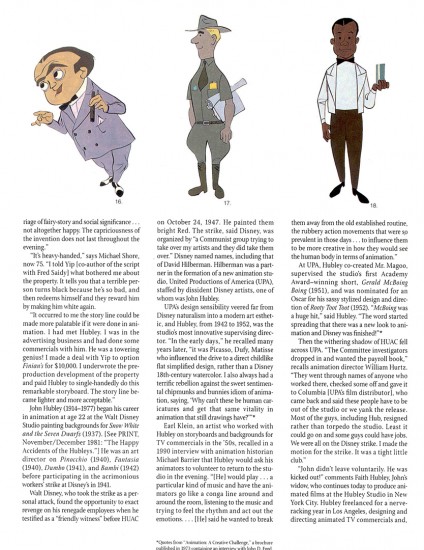
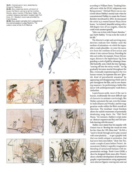
 - A treasure of a piece, John Canemaker wrote an article for the March/April 1993 edition of Print magazine an article about Finian’s Rainbow. This was an animated feature well under way in 1953 to be directed by John Hubley. It was to be an adaptation of the successful Broadway musical by Burton Lane and E.Y. Harburg. The film about racism twisted into a fantasy story about love and leprechauns would have been the first official adult film done by a team of brilliant animation artists. The soundtrack would have featured songs sung by Frank Sinatra, Ella Fitzgerald, Louis Armstrong, Oscar Peterson and Jim Backus.
I remember hearing stories about animation in production at the Bill Tytla studio, with Tytla animating on it. In Hollywood, Art Babbitt and Bill Littlejohn were animating, with Paul Julian, Aurelius Battaglia and Gregorio Prestipino art directing. Maurice Binder had assembled a LEICA reel.
Senator Joseph R McCarthy and the HUAC investigation brought the entire project down to ground and set back the history of animation some 30 years.
John Canemaker has generously allowed me to post this article again; I wanted to celebrate the artist and director,John Hubley.
 1
1
The story told to me by several people came most faithfully from Jim Logan, a long-time Asst. Animator working for Bill Tytla and sitting at a desk nearest Tytla’s office. Within his office there was a wall of mirrors. Tytla was in the middle of a hand out of a scene from Finian’s Rainbow. He was acting as an animation director for Hubley. He wanted the animator to practice the dance steps with him in front of the mirror. The animator was embarrassed to be asked to roll up his pants legs so he could better see how the move should animate.
Tytla was in his element. This was the first time since he’d left Disney’s that he was really being asked to do animation, get animation out of his staff for this eccentric and thoroughly adult animated feature. It was about Racism in 1956, and it was a serious attempt to do something serious and political and funny – all at the same time. Within days the animated scene had been collected by the producers who lost all their financing because of a ridiculous anti-communist comment thrown Tytla’s way. Tytla wasn’t the only one who lost; Hubley did as well. As a matter of fact, the entire industry lost. A second rate journalist made easy accusations, and the only thing to be done was to shut the production down.
Years later a young Francis Ford Coppola directed a young Petulia Clark with another Brit, song and dance man, Tommy Steele, playing the mischievous leprechaun. Needless to say, that film is a minor effort from Coppola’s resume.
Articles on Animation &Hubley &Independent Animation 07 Mar 2013 05:24 am
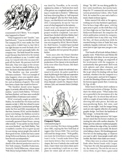
Animation Learns a New Language
This is an article that was published in the July, 1946 issue of The Hollywood Quarterly. I thought some might be interested
by John Hubley & Zachary Schwartz
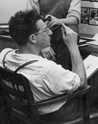
John Hubley is a director of cartoons at United Productions. He has worked as art director and director of Disney Studios, at Columbia, and in the First Motion Picture Unit of the Army Air Forces.
.
.
.
Zachary Schwartz was one of three organizers of United Productions, where he is now a director. He has worked on Disney productions and on wartime training films. He is now preparing a training film for State Department personnel.
.
.
Select any two animals, grind together, and stir into a plot. Add pratfalls, head and body blows, and slide whistle effects to taste. Garnish with Brooklyn accents. Slice into 600-foot lengths and release.
This was the standard recipe for the animated cartoon. That is, it was standard until Hollywood’s fantasy makers were presented the task of teaching people how to fight.
Six months before America entered World War II, the animated motion picture industry of Hollywood was engaged in the production of the following films:
- 1 Feature-length cartoon about a deer
16 Short subjects about a duck
12 Short subjects about rabbits
7 Short subjects of a cat chasing a mouse
5 Short subjects with pigs
3 Short subjects with a demented woodpecker
10 Short subjects with assorted animals
1 Short technical subject on the process of flush riveting.
Since that time, the lone educational short, dubbed by the industry a “nuts and bolts” film, has been augmented by hundreds of thousands of feet of animated educational film. Because of wartime necessity, pigs and bunnies have collided with nuts and bolts.
Sudden change from peace to war presented to government agencies, the military services, and industrial organizations a fundamental problem. This was the necessity of teaching millions of people an understanding of objective information with which they were essentially unfamiliar. The thinking and mechanical skills of millions had either to be changed or developed. And fast. Thinking, that is, and understanding regarding international policies, the nature of the enemy, coöperative safety measures, the fight against disease, price control, taxes, motor skills involving the thousands of tactical details of warfare for fighting men, and the hundreds of new methods for unskilled workers.
Thus it also became necessary for the craftsman-animators of the motion picture industry to analyze and reëvaluate their medium; for visual education, or more specifically the motion picture, bore the burden of this tremendous orientation program. Previously, animation usage in the educational film had been singularly undeveloped. While the theatrical cartoon developed an ability to emphasize and exaggerate for comedy purposes, and perfected the techniques of dramatization, “nuts and bolts” animation remained static. It consisted of rigid charts, diagrams, mechanical operations, maps, and labels. Unlike its Hollywood counterpart, it contained no humor, no personalized or intensified image, no emotional impact, no imaginative association of ideas to enable one to retain its content.
It presented cold facts, and left its audiences in the same state. But because of the urgency of the war situation; because of the varied specialized groups to be taught; because of the attitudes to be formed or converted, new and more effective means were necessary. The collision of these two animation methods occurred because of the need to present objective information in human terms.
Film units in the Armed Forces, and many professional studios producing educational films of infinitely varied subjects, soon discovered that, within the medium of film, animation provided the only means of portraying many complex aspects of a complex society. Through animated drawings artists were able to visualize areas of life and thought which photography was incapable of showing.
Psychological tests and reaction studies conducted by the military indicate an exceptional popularity and response to animated technical and orientation films. The Signal Corps found that the reaction to the animated “Snafu series” was greater than the reaction to any of the live-action films. The Air Forces Psychological Test Film Unit undertook a study of how much was learned through use of an animated training film as compared with how much through oral and written instruction on the same subject matter. The superiority of the film, both for learning and retention, was particularly clear when full use was made of the unique possibilities inherent in the medium.[1]
What are these unique factors? To understand them we must examine the basic difference between animation and photographed action. Now a single drawing, especially the cartoon, has always been capable of expressing a great many ideas. A drawing of a man, for instance, can glorify him or ridicule him. Further, it can emphasize aspects of his physical form and subdue or eliminate others. It can combine ideas, such as a human face on a locomotive, an animal in a tuxedo, a skeleton with a cloak and scythe, etc. It can represent a specific object (a portrait, a landscape, a still life). Or it can represent a symbol of all men, all trees; the drawing of Uncle Sam representing America; the eye representing sight; the skull representing death: the single image can represent the general idea. The part can be interpreted as a symbol for the whole.
Thus a drawing’s range of expression, its area of vision, is wider than that of the photograph, since the camera records but a particular aspect of reality in a single perspective from a fixed position. In short, while the film records what we see, the drawing can record also what we know. The photograph records a specific object; the drawing represents an object, specific or general.
Animated drawings are a series of single images drawn in the progressive stages of a motion, which, when photographed on film and projected, create a visual symbol of that motion. In this lies the significant element that creates the possibility of a new visual language.
Our general idea, our broadest observations of reality, can be visualized in terms of the personal emotional appeal of the specific idea. What does this mean in terms of the communication of ideas? It means that the mental process which the individual scientist has undergone to achieve a greater understanding of nature can now be visualized for millions of people.
For example, a scientist deduces that by grafting two plants a seed is produced that will bring forth a new type of plant. He then proves his deduction by experimentation and comparison. We can see the result. We can see the original plants; we can see the seed. But we only understand the process by means of a language whereby the scientist explains the development to us. He may use words, and is thereby limited to audio images. Or he may photograph the specific parts of his experiment in motion pictures and, by assembling the parts in conjunction with words, produce a segmentary progression of the process. Or, by using stop action or other camera devices, he may photograph the growing plant itself.
But were he to translate the process into animation, he could represent, by means of the dynamic graphic symbol, the entire process, each stage or degree of development; the entire growth, from the grafting, through the semination of the seed, to the resultant plant. This quality of compression, of continuous change in terms of visual images, supplies the scientist with a simple language and a means of representing his own process of observation to millions.
Since the artist controls the image of a drawing, he also has the ability to change its shape or form. He is able to change a tree to a stone, an egg to a chicken, in one continuous movement. And he can compress a process that would by nature take centuries, or days, into minutes, or seconds. Or he may extend a rapid movement, such as the release of atomic energy, from split seconds to minutes, that it may be more carefully observed. These aspects of natural movement, and simultaneous confiicts of opposite movements, such as physical action and reaction, positive and negative electricity, processes we know, we can now see.
We must be clear that the effectiveness of live-action photography is by no means reduced by animation. It is only necessary to understand photography’s functions and capabilities in relation to animation. This may be stated as an ability to represent a specific aspect of reality in very real terms. We can photograph reality. Or we can create a synthesis of reality, and record it.
For instance, we may see the subtle shades of expression on the face of a resistance leader before a fascist firing squad. This may be actual (documentary) or enacted. We see his bodily aspect, his clothes, his hands, the barren wall behind him, the distance between the man and the guns, the sky, the trembling, the blood. Dramatically, we are made to feel the relationship between the victim and the firing squad, the emotional conflict, the tension, the fear, the hatred. We can understand these emotions because we have experienced similar emotions. The specific situation is the focal point that gives us the clue to the general situation. We see this victim of fascism shot, and we gain a better understanding of the general nature of fascism.
With animation, this process is reversed. Instead of an implied understanding resulting from the vicarious experience of a specific situation, animation represents the general idea directly. The audience experiences an understanding of the whole situation.
Dynamic symbols, images representing whole ideas, the flags, the skulls, the cartoon characters, can explain the nature of fascism in terms of its economic roots, the forces behind it, the necessity for its policies of aggression, its historical roots, its political structure. The dynamics of changing symbols—ballots turning into guns, books to poison, plowshares to swords, children changing to soldiers, soldiers to graves—can carry a visual potency as clear as the growth of a seed into a plant. Our understanding of the process as a whole is experienced directly and immediately.
The significance of the animated film as a means of communication is best realized in terms of its flexibility and scope of expression. It places no limitations upon ideas; the graphic representation grows out of the idea. The broadest abstract theory may be treated in a factual manner and made interesting, clear, and memorable through the use of movement and sound. All degrees of the general and particular are within its normal scope because anything that the brain can conceive can be expressed through the symbol. For instance, the subject might demand an extremely impressive statement of reality. It might then be advisable to use a combination of photography and animation, the photography to state the facts of outward appearance and the animation to illustrate the inner construction, or comments upon the subject, or to suggest emotional reactions of the subject. This kind of treatment creates a super-reality in which we are conscious of many aspects simultaneously.
In animation, the artist and writer have at their command all the traditional means of graphic expression and the new means which grew out of moving symbols and sound. One of these is the concept of explanation through change from an object as it is to the thing it signifies. For instance, in explaining the function of the liver the picture changes from a liver to a recognizable sugar bowl filled with cubes of sugar. The cubes hop out into the blood stream and bob away into the circulatory system. Or, we might wish to give graphic expression to an emotional reaction. One person is being protected by another, and for a moment the protector animates up into a proud knight and charger. We hear the clank of metal and stamp of horse’s hoofs for just an instant, and then the whole image animates down again into its original form. Another example of this is the picturization of certain words in dialogue to stress a particular idea. A person is being taught a difficult mechanical technique involving rapid manipulation of buttons and levers, etc. He protests, “What do you think I am—an octopus?” At the moment the word is spoken the character changes to an octopus and then back again so quickly that the observer has just gotten a fleeting impression of the picture of the word. These examples indicate the kind of picture solution that can be evolved from an idea no matter how abstract.
We have found that the medium of animation has become a new language. It is no longer the vaudeville world of pigs and bunnies. Nor is it the mechanical diagram, the photographed charts of the old “training film.” It has encompassed the whole field of visual images, including the photograph. We have found that line, shape, color, and symbols in movement can represent the essence of an idea, can express it humorously, with force, with clarity. The method is only dependent upon the idea to be expressed. And a suitable form can be found for any idea.
Action Analysis &Animation &Animation Artifacts &Hubley &Independent Animation &Tissa David 24 Sep 2012 05:41 am
Viva à la Tissa
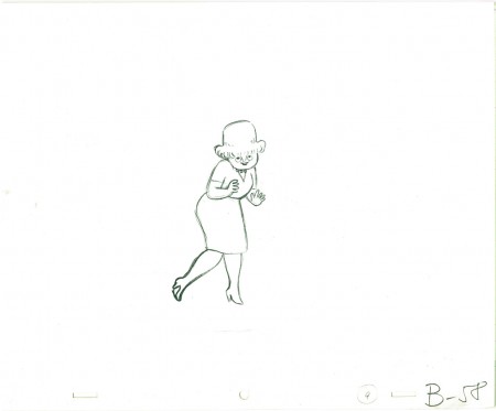
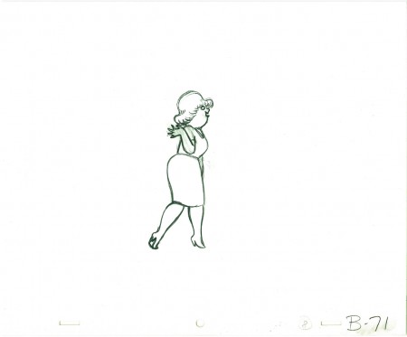
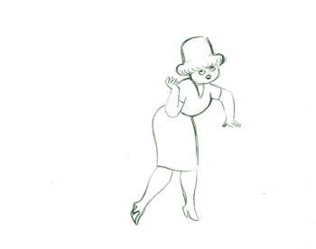
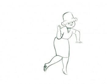
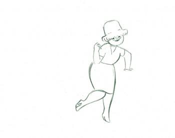
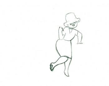
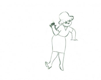
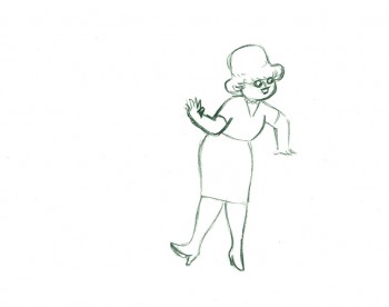
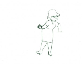
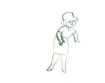
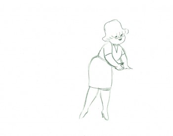
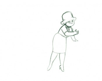
- Tissa David animated a VIVA paper towel spot for John Hubley. Here’s a scene wherein the lead, a woman, walks through (Bg pans behind her at .25 per drawing) toward the kitchen, where she stops.
Instead of giving you the entire page of animation paper, I’ve trimmed it down to just include the character and her walk. Here are four examples of what the entire drawing looks like, untrimmed.
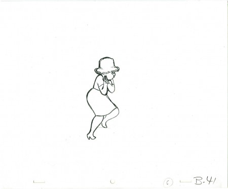 B41
B41
And here are all the drawings for the scene cropped:
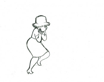 41
41
________________________
.
The following is a QT of the entire scene with all the drawings included.
Since I didn’t have exposure sheets, I put everything on two’s straight ahead.
- Here’s what looks like a simple move done by Tissa David when she animated this Viva, paper towel commercial.
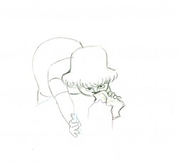
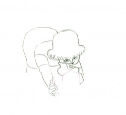
The character’s move in this scene is a complicated one done simply. She has been bent over, cleaning with her paper towel, and she moves up. You can follow the overlapping action as her eyes pull her up, head turn, and body follows.
The stripes will come and go. Tissa depends on someone else to concentrate on this material when she’s working on a commercial.
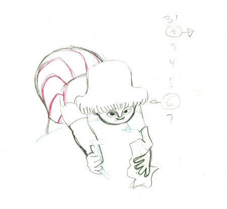 e37
e37(Click any image to enlarge.)
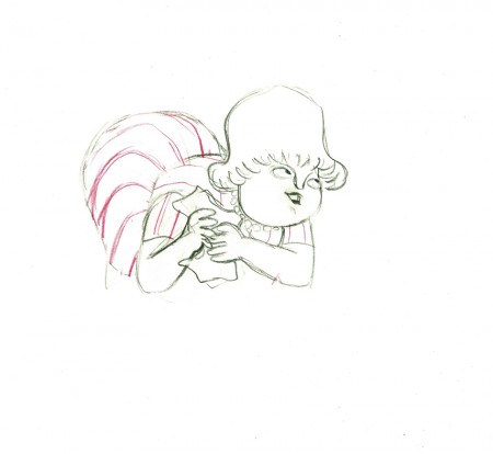 e44
e44
Her eyes point in the direction she wants to go,
and the rest of the scene moves her up and into profile.
This key move is hidden under the exchange of the
paper towel from one hand to the other.
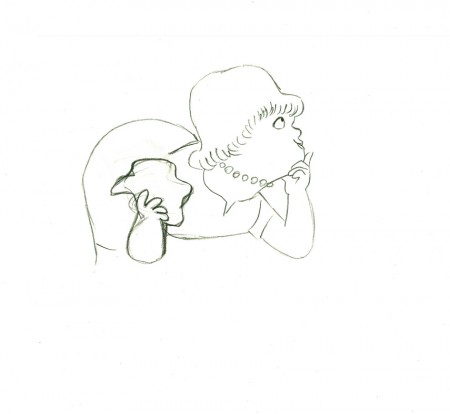 e51
e51
She stops to think (accenting her monologue.)
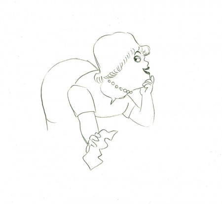 e58
e58
And she slyly looks back to camera to respond with her thought.
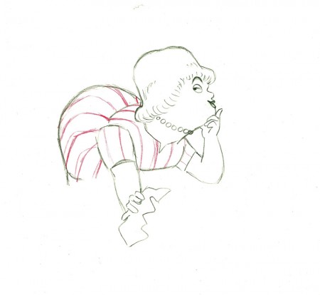 e59
e59
She continues, all through this move, talking.
She’s pitching the product.
Here’s a QT of the piece:
Cleaning for VivaClick left side of the black bar to play.
Right side to watch single frame.
Animation &Animation Artifacts &Hubley 04 Sep 2012 06:12 am
Phil Duncan’s Walk Cycle – recap
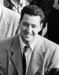
 - Phil Duncan was a mainstay of the Hubley animators in all the time I was there. That was my good fortune. What a learning experience for a young animation student.
You could tell who Hubley’s favorite animators by the frequency in which he doled out sequences to them. Whereas Tissa David or Bill Littlejohn or Barrie Nelson would have been asked to animate entire shorts by themselves, someone like Phil Duncan would get whole sequences to animate. At the same time, John so depended on Phil and trusted what he did.
There were never pencil tests at the Hubley studio. Only one instance of it do I remember, and that was on the Art Babbitt mime scenes from Carousel. As I said once before, I remember John running out to get me asking if I’d like to see animation as good as I’d ever see. We then watched the PT over and over together. Ultimately John took Art’s animation on twos and had me put it on four frame dissolves to get more screen time out of it. A budget was a budget and you had to make the most out of the excellence you had in your hand.
But as I mentioned yesterday, Phil would animate on odd numbers expecting the even numbers to be inbetweened. Most times, John asked me to reexpose the scene on fours and not do the inbetweens. Of course, Phil was aware this would happen and had planned on it.
.
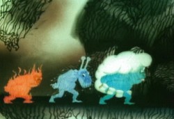
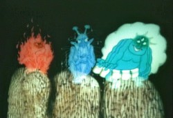
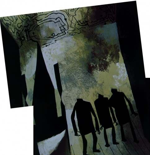
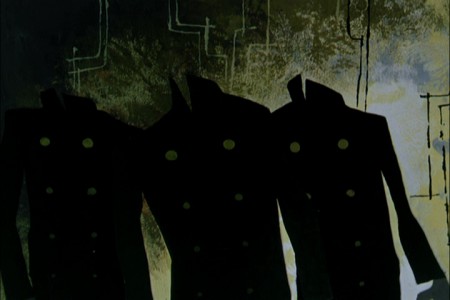
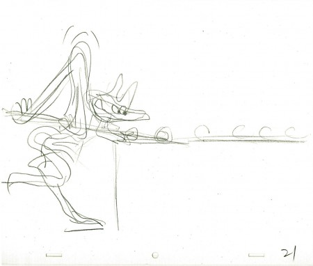
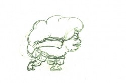
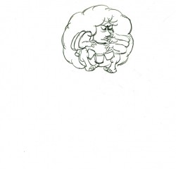
Here is a walk cycle (and more) by Phil Duncan from Of Men and Demons, which was nominated for the Oscar in 1969. The full scene includes the three demons walking and then flying up to their cave.
 1
1 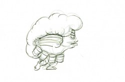 2
2
(Click any image to enlarge to full animation paper view.)
The rest of the scene breaks out of the walk cycle. I
enlarged the frames to accomodate the remainder of the action.
 23
23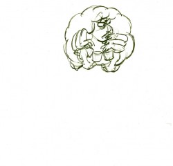 24
24
On threes at 24FPS
Click left side of the black bar to play.
Right side to watch single frame.
Animation &Animation Artifacts &commercial animation &Hubley &Models &repeated posts 03 Sep 2012 05:11 am
Vlasic Business at the Hubleys
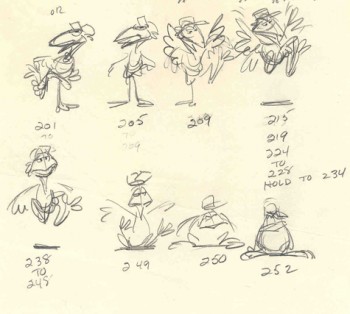 – Years ago I worked at the Hubley studio on a pair of commercials for Vlasic pickles. One of the two spots made it to the air.
This is from the spot that never made it.
Vlasic had a commercial they wanted, and because of the agency’s long time relationship with the Hubleys, they came to him to try to develop the character. (The agency was W.B. Doner, the agency that had done so well with Hubley’s Maypo commercials.)
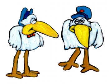
The agency came with two already-recorded voices: one was a Groucho Marx impersonator (Pat Harrington was the Groucho impersonator ultimately used for the stork’s voice.*) The other voice was character actor, Edgar Buchanan, a man with a gruff voice who appeared in a million westerns. John Hubley wanted Edgar Buchanan – it was a much richer voice, lots of cowboy appeal.
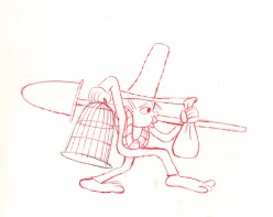
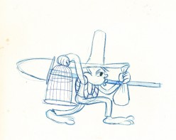
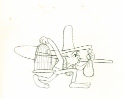
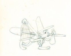
John designed the character to look like one of those stationmasters in cowboy films. The guy who gives out tickets and does morse code when he has to. The stork had a vest and a blue, boxy, stationmaster-type cap cocked off to the side. It was a great character.
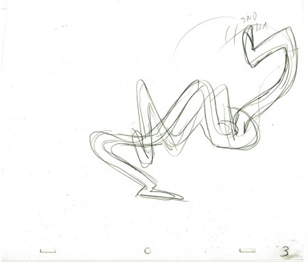
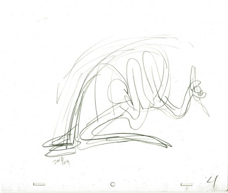
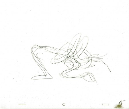
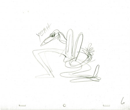
Phil Duncan was the animator. A brilliant character guy who had done everything from Thumper to George of the Jungle. I loved cleaning up and inbetweening his work. It was all fun and vibrating with life.
The rough thumbnail drawing (above) fell out of one of Phil’s packages. It was a thumbnail plan of the action. Phil would do these things which usually stretched around the edges of his final drawings. In a nutshell, you could see the scene and how he worked it out. Lovely stuff.
I felt this drawing was as beautiful as the original animation drawings.
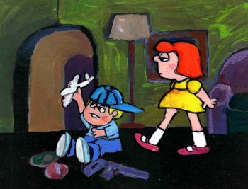 The agency approved the stork, Edgar Buchanan and the plan of action.
We’d already finished the first commercial which was on the air. (Represented by the two set-ups posted here.) The style was done with acrylic paints – out of a tube – on top of the cel. Ink with Sharpie on cel; paint dark colors – ON TOP of cel
- up to and over ink line; after drying we painted it again with lighter tones, and we pained it again after it dried using even lighter tones with a translucent color. Imagine kids & a gun in a spot today!)
Phil Duncan did a great job of animating it. I inbetweened, and the Agency loved it and approved it to color.
All this time, John and Faith were busy preparing the start of Everybody Rides the Carousel. It was to be three half-hour shows (Eventually CBS changed their mind and asked the shows, still in production, to be reconfigured to make a 90 min film) and was in preproduction. I did the spots on my own with John checking in. Faith wanted nothing to do with a commercial and was somewhat furious that a commercial was ongoing. She daily spoke out against this spot with many shouting matches. I never quite understood the problem. The spots didn’t hold up any other studio work; I was making it as easy as possible for John to not have to do much work on the spots, and they were getting necessary money to help finance some of the preliminary work for the Carousel. (Of course, the Hubley name was involved, but even Michelangelo did commercial work – like the Sistine Chapel to pay for the art. Not that Vlasic was the Sisine Chapel, of course.)
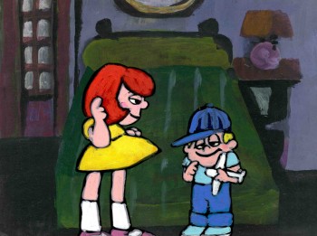 Within weeks the spot was in color and two junior exec. agency guys, John and I stood around the Hubley moviola. (It was a great machine with four sound heads and a picture head that was the size of a sheet of animation paper. Pegs were actually attached to enable rotoscoping!)
The two agency guys were buttoned up with good suits and briefcases. They stood behind John and me, and I operated the moviola.
We screened the spot the first time. I turned around and these two guys had come undone. Their ties were loose and astray; they were visibly sweating. I swear this all happened within the course of 30 secs.
 John smiled and optimistically asked how they liked it. They looked at each other, and couldn’t answer. I don’t think they were able to form a decision or say what they actually thought. Eventually, they left with the spot in their briefcase and would get back. It wasn’t good.
They did get back. I was asked to pack up all the elements and ship them back to W.B. Doner. The spot was thrown out of the studio by John who refused to change it. (Hubley’s stork.)
He liked what was done, and apparently had
a rider in his contract which covered him – somehow.
The spot showed up at Jack Zander‘s studio, Zander’s Animation Parlour. They used the Groucho impersonation and slicked it up a lot. Vlasic is still using that stork, and that was John’s last commercial endeavor. The character is still showing up in a cg version, just as bad as the 2D version.
* Thanks to Mark Mayerson for this information.
Hubley &Layout & Design &Models &Tissa David 30 Aug 2012 05:15 am
Layouts Cool Pool Fool – recap
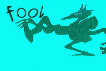
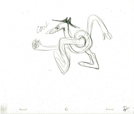
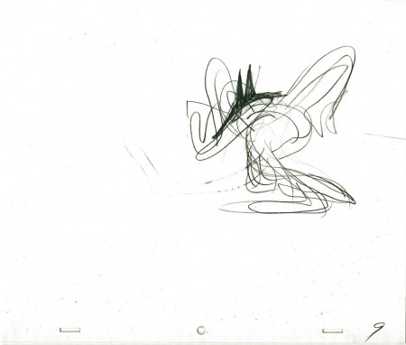
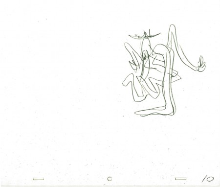
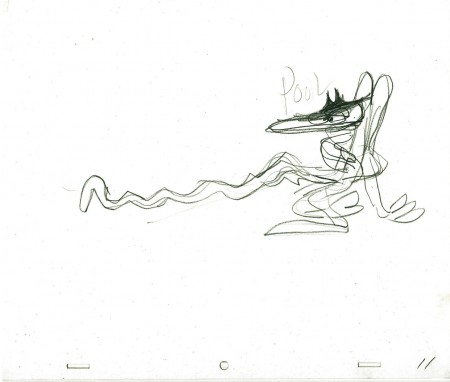
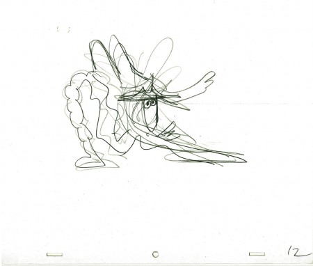
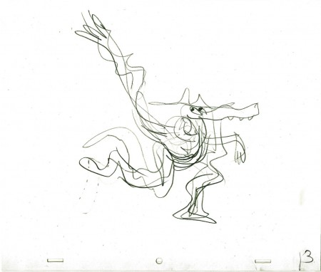
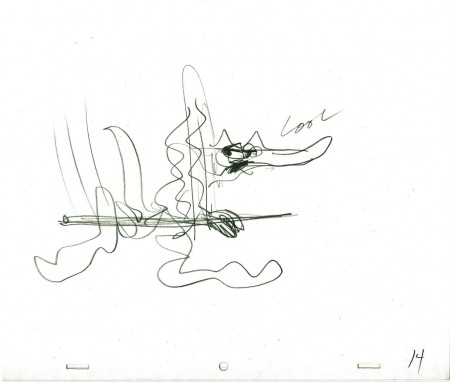
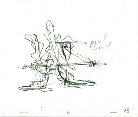
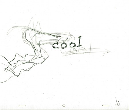
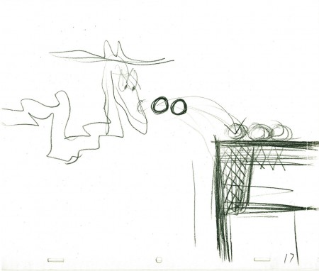
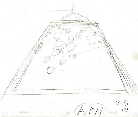
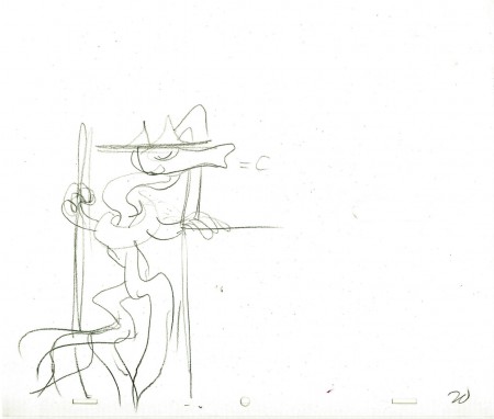
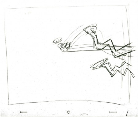
- Here are the Layout drawings by John Hubley for the Electric Company piece, Cool Pool Fool. Tissa David animated from these layouts and the verbal instructions from John.
A couple of drawings are missing #7 and #18
 1
1
Here are some frame grabs from the spot. They’ve been severely touched up in photoshop since the video has lost all color and is almost unwatchable except as a silhouette film. I’ve reconstructed the colors as near as I can remember them. At any rate, the purpose of these grabs is for you to see what Tissa has done with John’s layouts.
 1
1
Thanks to RIchard O’Connor, here is the
poor YouTube version.
The indomitable Billy Taylor wrote and performed the music.
What a great piano! I had the treat of spending a couple of
hours talking with him about his music for the Hubley films.
We talked for about a half hour about this music.
Animation &Animation Artifacts &Disney &Hubley &John Canemaker &repeated posts 20 Aug 2012 05:53 am
Fantasia FX – Schultheis – recap
John Canemaker recently completed his latest book about Herman Schultheis and the effects department at Disney’s during the early 40s. It, hopefully, will be published in late 2014. This encouraged me to pull up this piece I posted in Sept/2009. It’s amazing how much information I was able to cull from the photos I found on the DVD.
I’m pleased with this post and am glad to repeat it for those who might not have seen it. John’s book, by the way, is one I’m looking forward to reading. He’s written a bit about it on his website.
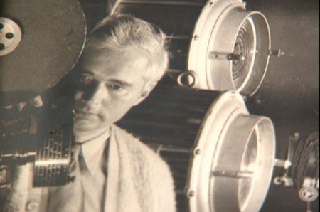
- Herman Schultheis was an effects animator who worked on Fantasia. He kept a tight record of the effects they were creating from 1938-1941 and a photo display of how they were done. Schultheis disappeared in 1954 while trekking through Central America, and the notebook was forgotten until his wife’s death in the early 1990s, after which it was discovered by Howard Lowery behind the couple’s bedroom wall.
(Click any image to enlarge.)
Herman Schultheis created the book of charts and photos
which gives us a link to the many creative effects in the film.
The book is on display at the The Walt Disney Family Museum. It’s also been digitized so that visitors are able to go through the book, enlarge photos and view it page by page. An interactive display.
Prior to the discovery of the book we were able to figure out a few of the effects. One Disneyland show, in fact, recreated the bubbling lava scene from the Rite of Spring sequence.
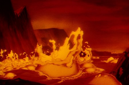
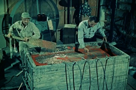
Josh Meador recreated the slow motion shoot of the
boiling concoction used to develop the bubbling lava.
However, the book revealed so much more than we’d understood
about how the superb effects had been crafted.
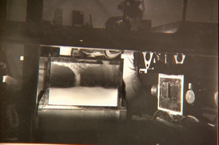
Using a vat of water, they were able to
drop ink into the liquid and film it in slow motion.
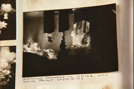
A photo of the ink spilling into the water behind built-in mattes.
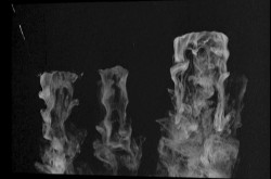
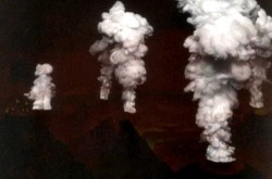
Taking the shot of the ink, they then turned it upside-down.
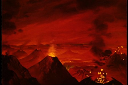
They then superimpose the “smoke” (or ink) over the volcanoes.
This same effect was used in Close Encounters of the Third Kind
to create clouds when the alien ships were moving in on the
farmhouse where the boy and mother lived.
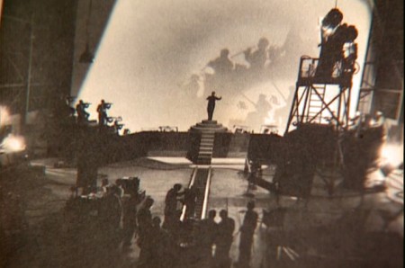
The orchestra was shot on a set with strong, planned shadows.
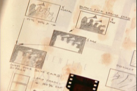
All these shots were orchestrated and planned for color effects.
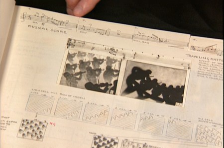
They were also catalogued by Schultheis who kept close
track of the music, as well, in his book. You can see a
page by page breakdown of the score at the top of the page.
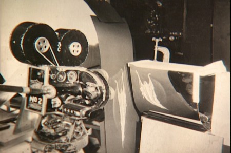
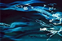
You can see the highly polished sheet of metal (middle left) which reflected
and distorted the animation drawings. This is what the camera photographed
in some of the scenes during the Night on Bald Mountain sequence.
It was also used for the fire in Bambi.
 1
1 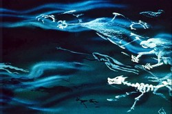 2
2
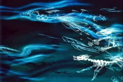
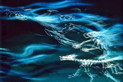
This scene’s ghosts were shot using that distorted metal reflection.
 2a
2a 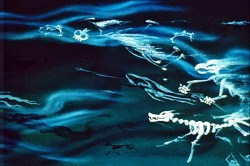 3
3
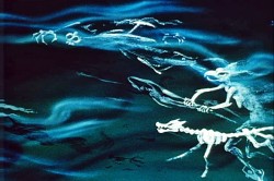
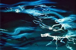
The ghosts also used a form of cross dissolve.
John Hubley explained to me how that was done, and
we used the technique in Everybody Rides the Carousel.
 4
4 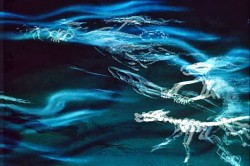 4a
4a
They shot the entire scene at 50% exposure. Then they went back
to the beginning and reshot the entire scene again at 50% exposure.
 5
5 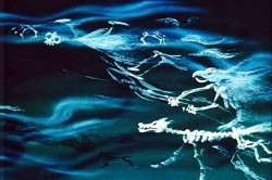 6
6
However on the second shoot, they started by shooting a black frame.
This made #1 fall where #2 should have been, #2 for #3 etc.
This creates a ghostly dissolve effect.
 6a
6a 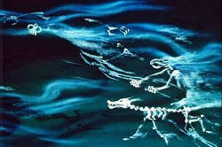 7
7
All of the drawings labelled with an “a” are the double exposures:
2a, 4a, 6a
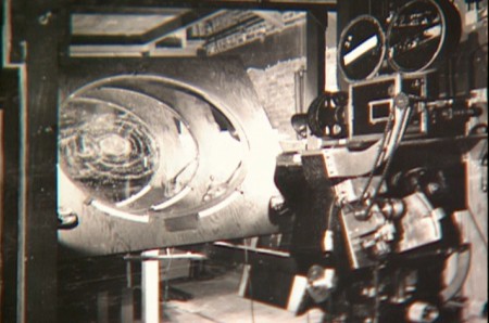
A make-shift circular multiplane camera was built.
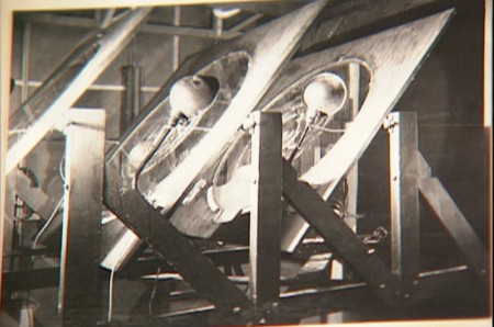
Created out of wooden sheets with holes cut out,
placed so they could shift angles, they were designed to
allow revolving artwork in the circular cut outs.
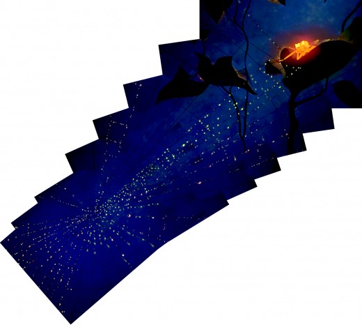
This allowed shooting scenes such as this shot of
a spider web as the camera moved around it
while dew glistened off of it.
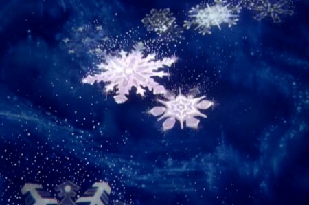
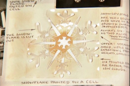
The spinning snowflakes are well explained in Schultheis’ book.
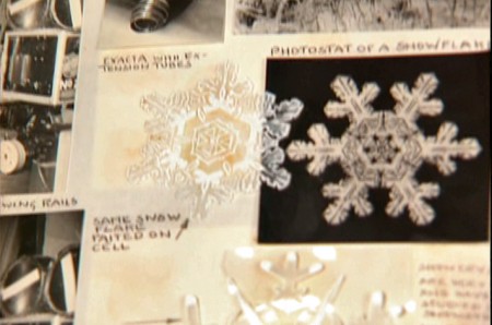
The snowflakes had a detailed construction.
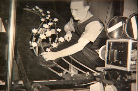
The path of action was intricately defined.
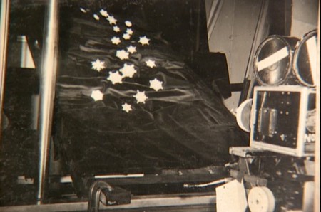
The snowflakes were shot against a sheet of
black velvet hiding the wire guides.
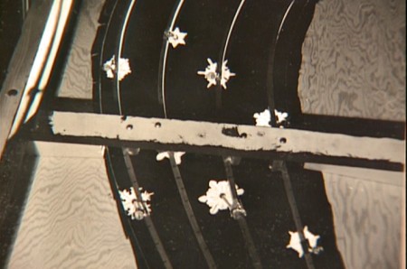
They were shot in tight closeup. From below you can
see the turning gears they were constructed on.
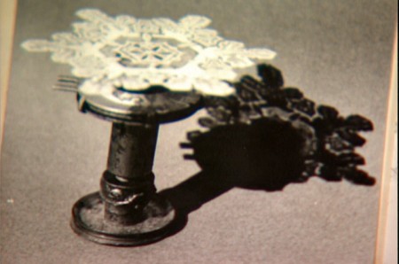
Each snowflake was built on a turning gear
so that they could revolve in their path of action.
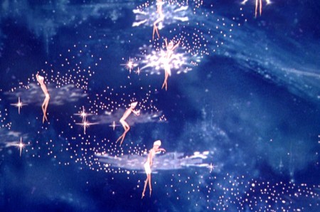
Burn these snowflakes over the multiplane background
and add matching 2D animated fairies within each snowflake,
and you have the finished scene.

