Monthly ArchiveMarch 2013
Photos 31 Mar 2013 07:02 am
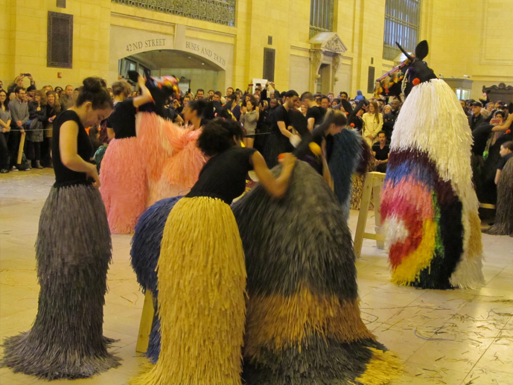
Easter with Horses in Grand Central
___________________
 I was on my way, this past Friday about 1:15pm to Richard O’Connor‘s studio, Ace & Son, to photograph the Fred Mogubgub paintings (see yesterday’s post). All at once, I came upon a small stretch of 29th Street where a couple of hundred males (I saw only one female – covered and in pants) gathered with shoes off sitting on towels and kerchiefs that they had brought. They all faced the same direction, North – uptown. Out of one store, a store which seemed to arrange air flights and trips, a loud voice spoke somewhat harshly. I wasn’t paying attention to the
 commentary from the loud speakers, but neither were most of the males in attendance.
I asked a street vendor – there were a number of them who wouldn’t give up their space on the sidewalk for a sudden call to prayer – what was the occasion. Obviously, they were outside their improvised mosque and performing their religious duty.
The vendor said that this happened every Friday. There’s something to learn about this city every time you turn a corner.


On the way back, 30 minutes later, no one was on the sidewalk.
A large group stood within the airline sales shop, praying.
They were tightly packed.
____________________________
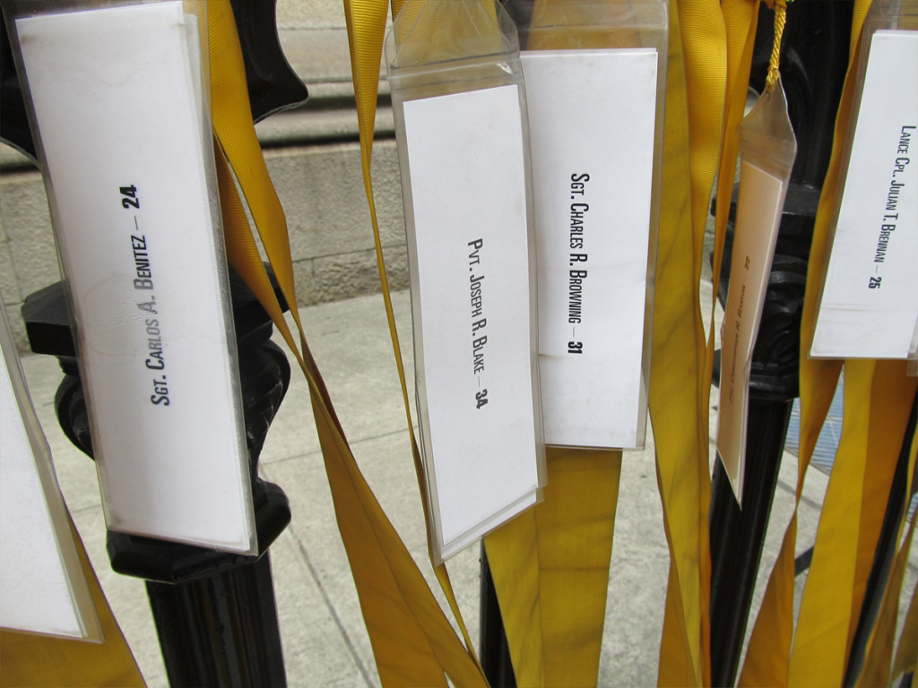
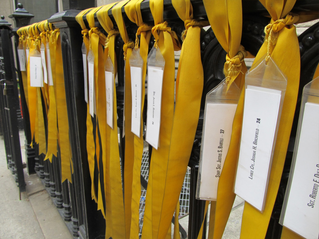
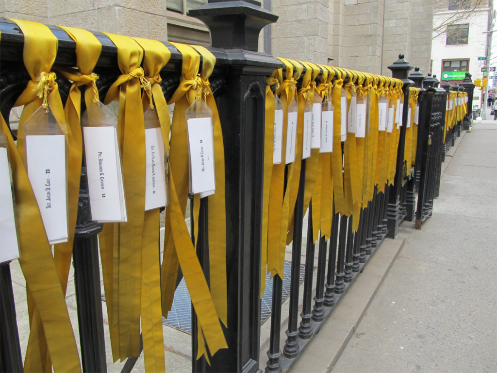
Naturally, I passed Marble Collegiate Church which continues to display yellow ribbons for the soldiers who died in Iraq and Afghanistan. Appropriate for Good Friday.
____________________________
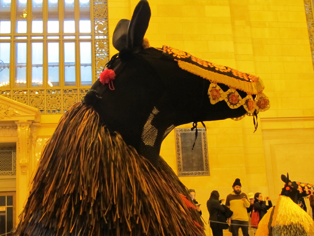
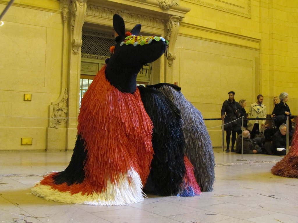
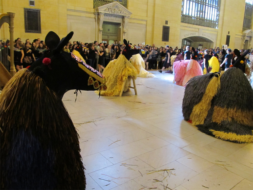
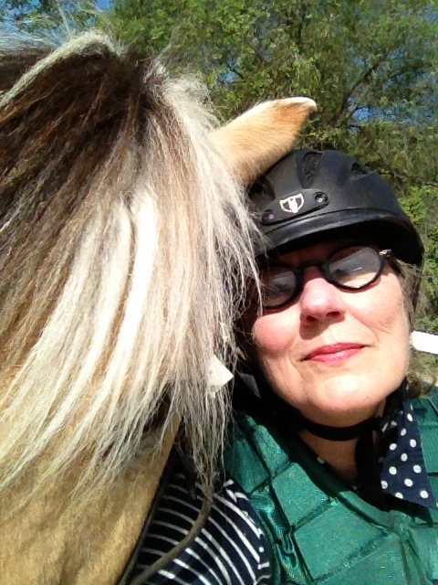
Heidi and I went to Grand Central Station on Saturday to watch a program of dance (lasting about 20 minutes.) She was actually more excited about going than I, but it was great fun and I’m glad she pulled me into it. We’d actually gone on Friday but found that you had to get there much earlier.
We arrived an hour early for it on Saturday, and even though Grand Central was not crowded, there were a lot of people attending for the dance program.
It was devised, choreographed and composed by Nick Cave. This wasn’t the great rock musician, Nick Cave, but another person from LA who produces excellent shows like this one. Glasto make the acquaintance.
It was also a good photo event.
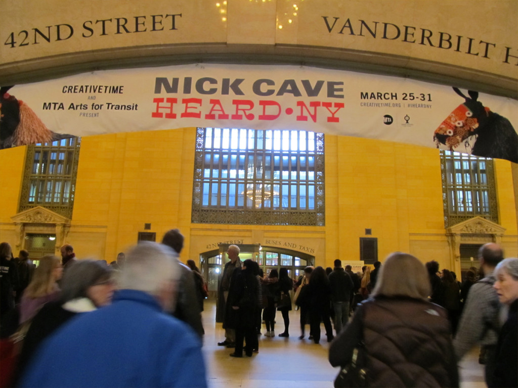 1
1This is the official entrance. We came in the back door.
We were about an hour early though
the doors closed on newcomers soon after.
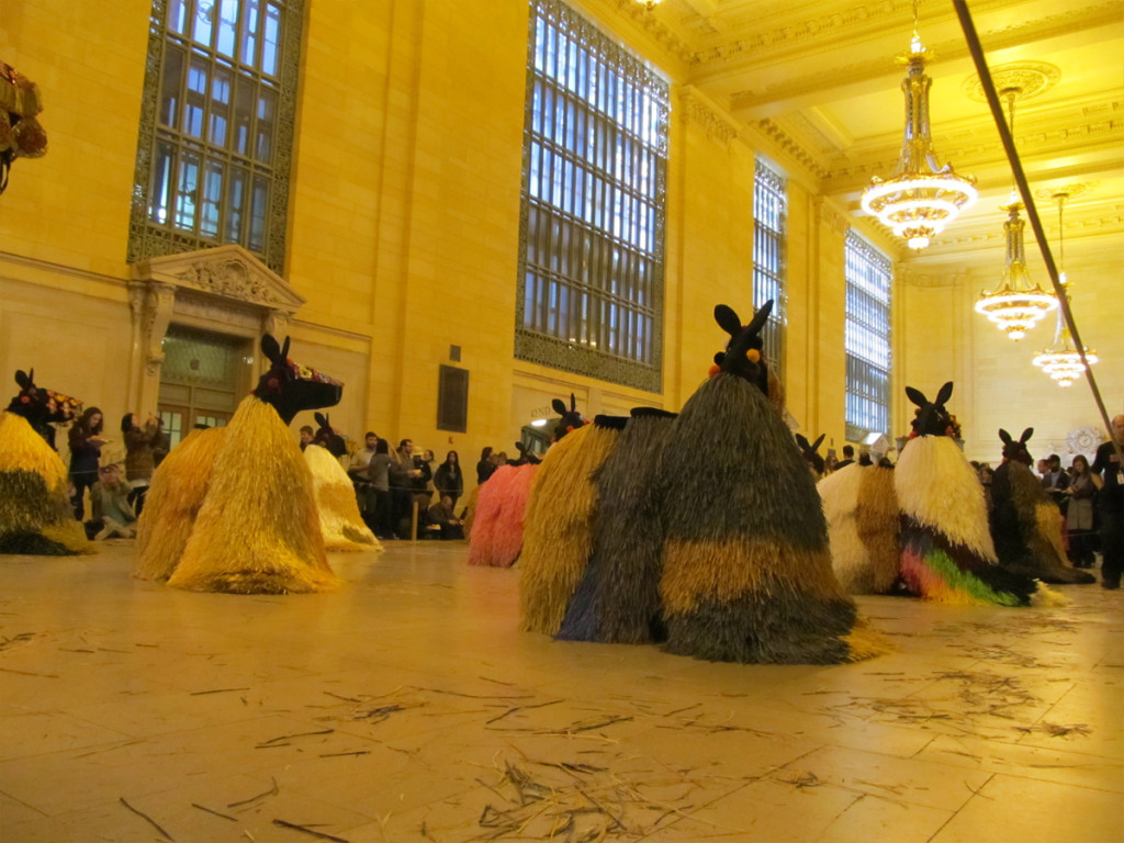 2
2
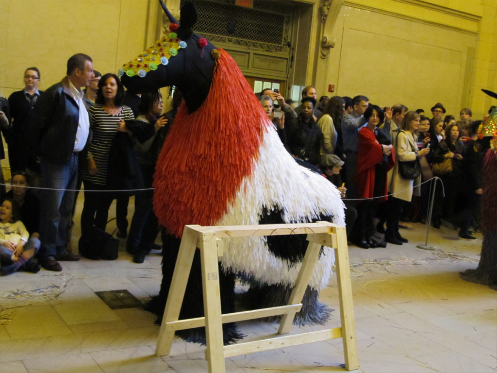
The horses are set up already as we enter.
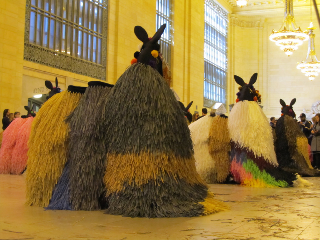 3
3
They’re just costumes set up about a “sawhorse”
without life until the dancers enter.
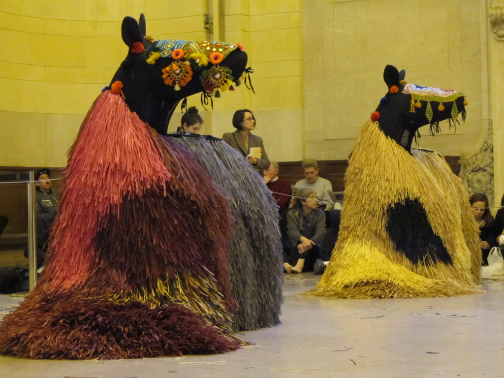 4
4
We have a great spot to watch.
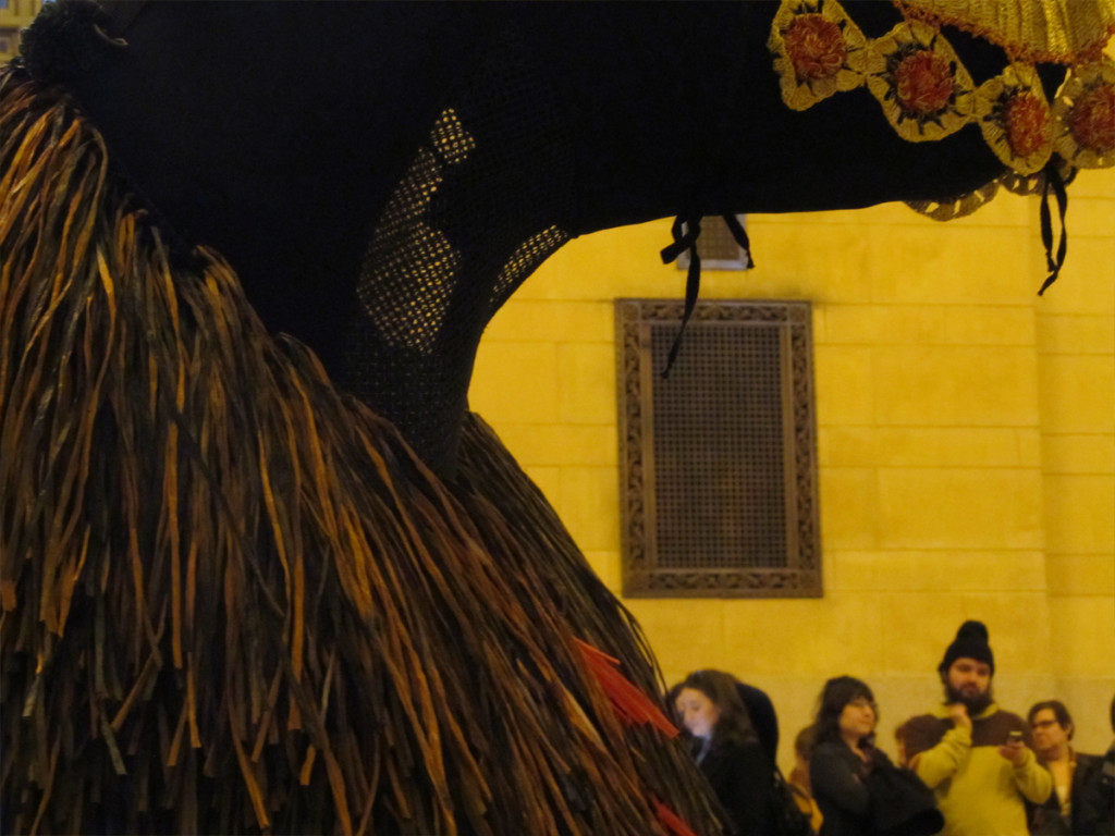 7
7
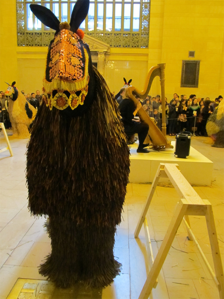
You can see the netting in the neck out of which
the dancers look out. I’ll guess they don’t see a lot.
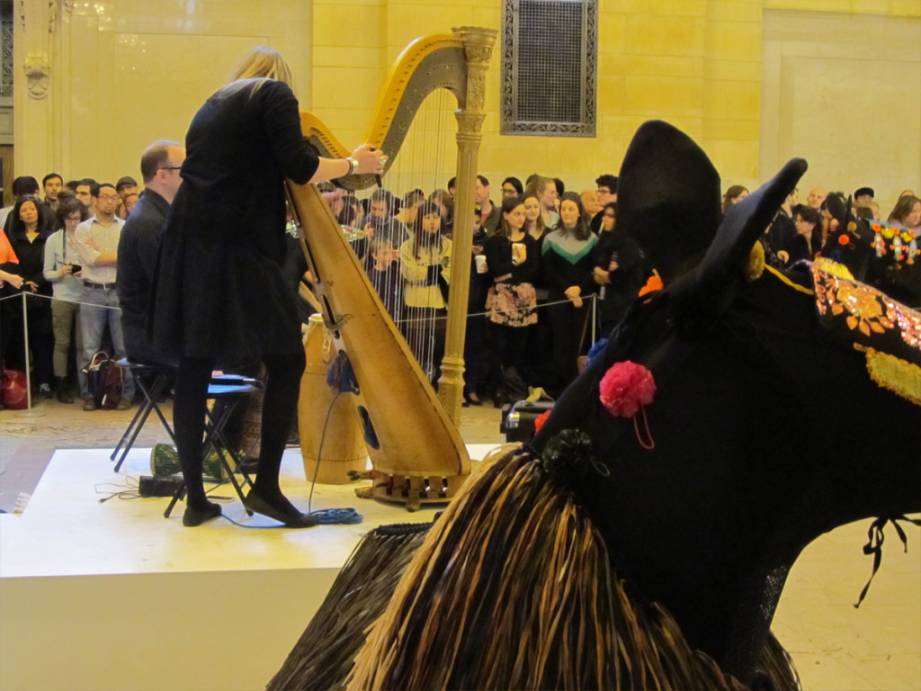 8
8
A harp and a drum. They come out to tune up with each other.
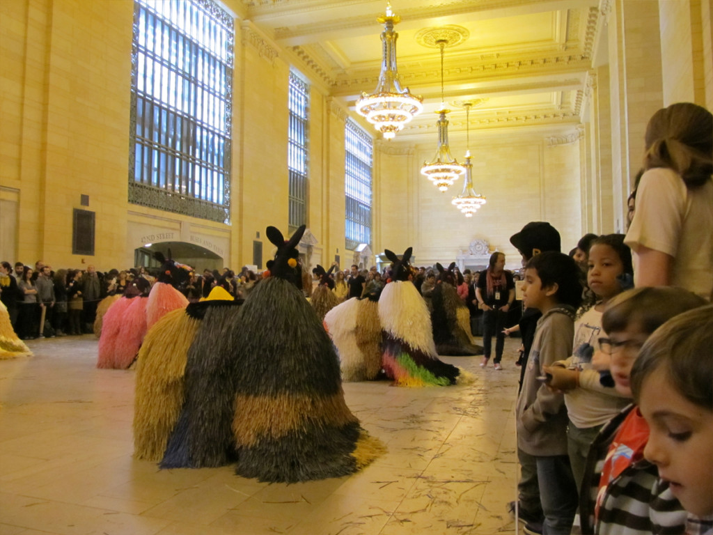 9
9
There are two groups: the heads and . . .
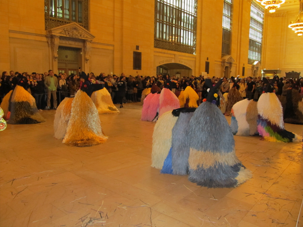 10
10
. . . the tails. They’ll also break apart
mid-dance when the movement goes very fast.
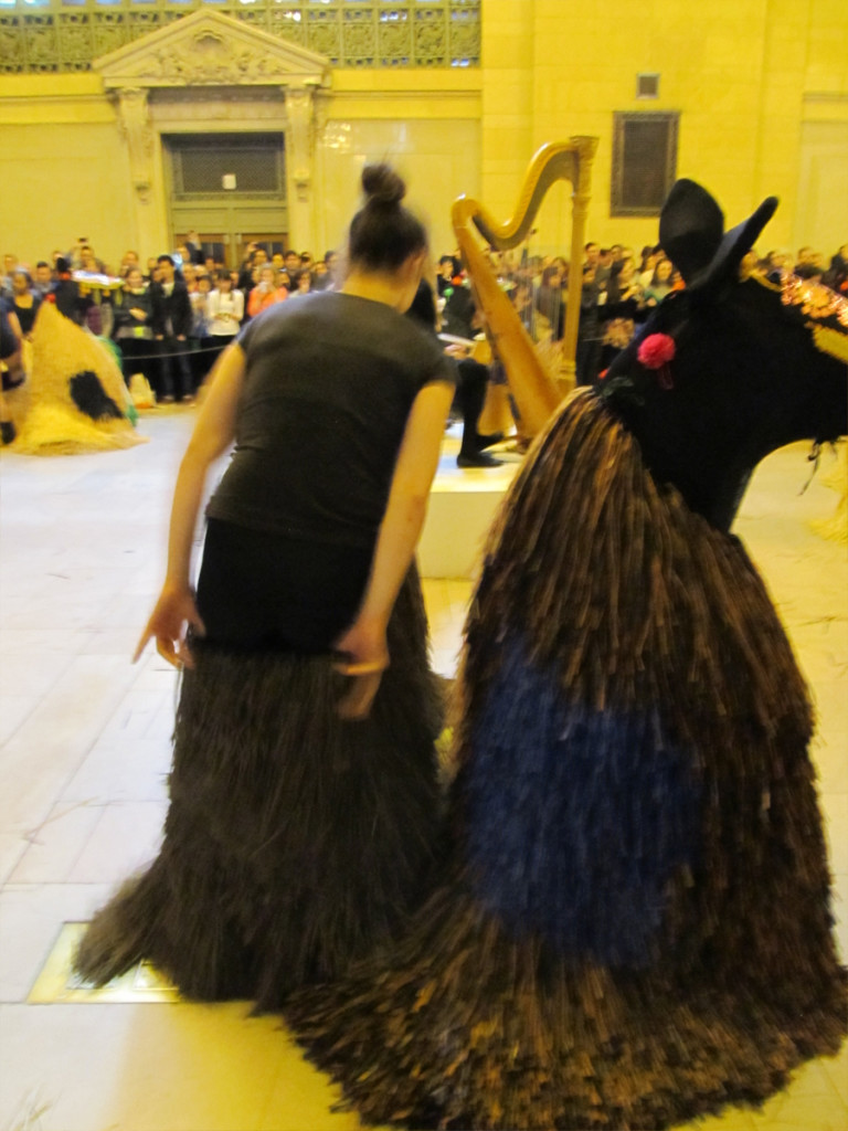 11
11
Dancers put on the costumes.
 12
12
They work in small groups to help each other move quickly.
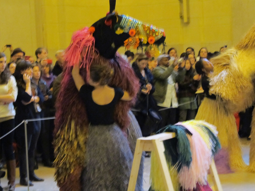 14
14
They help each other prepare to become horses.
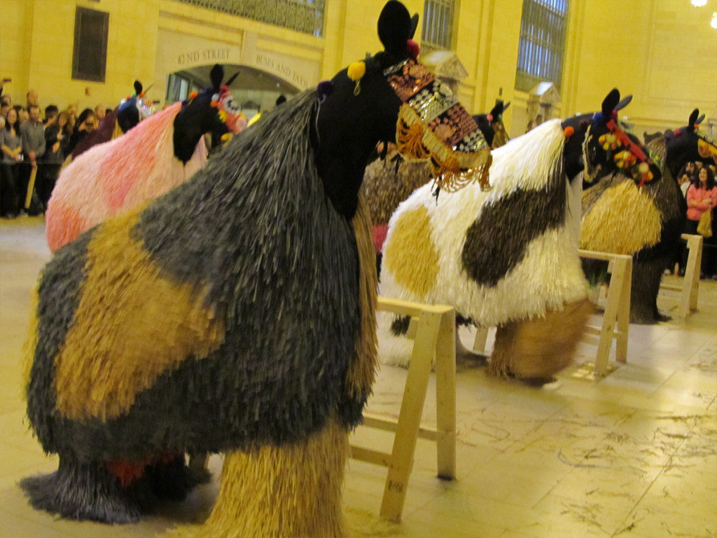 15
15
The dancers have their costumes on.
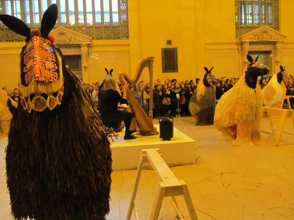 16
16
The music’s about to start.
 17
17
The dance is about to begin once the “sawhorses” are removed.
 18
18
Silence as a group of the crew comes in to remove the “sawhorses”.
 19
19
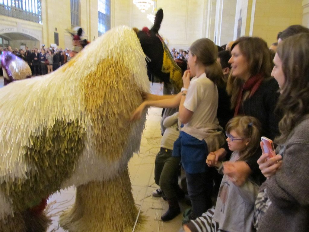
Some of the horses go back to the kids.
 20
20
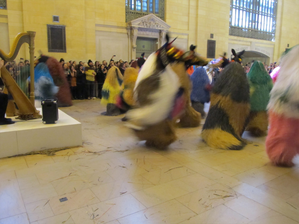
The last number begins wild drums.
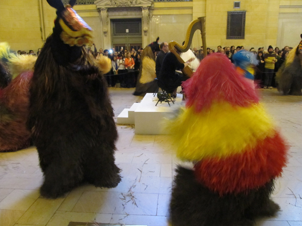 21
21
The horses really rock their fur.
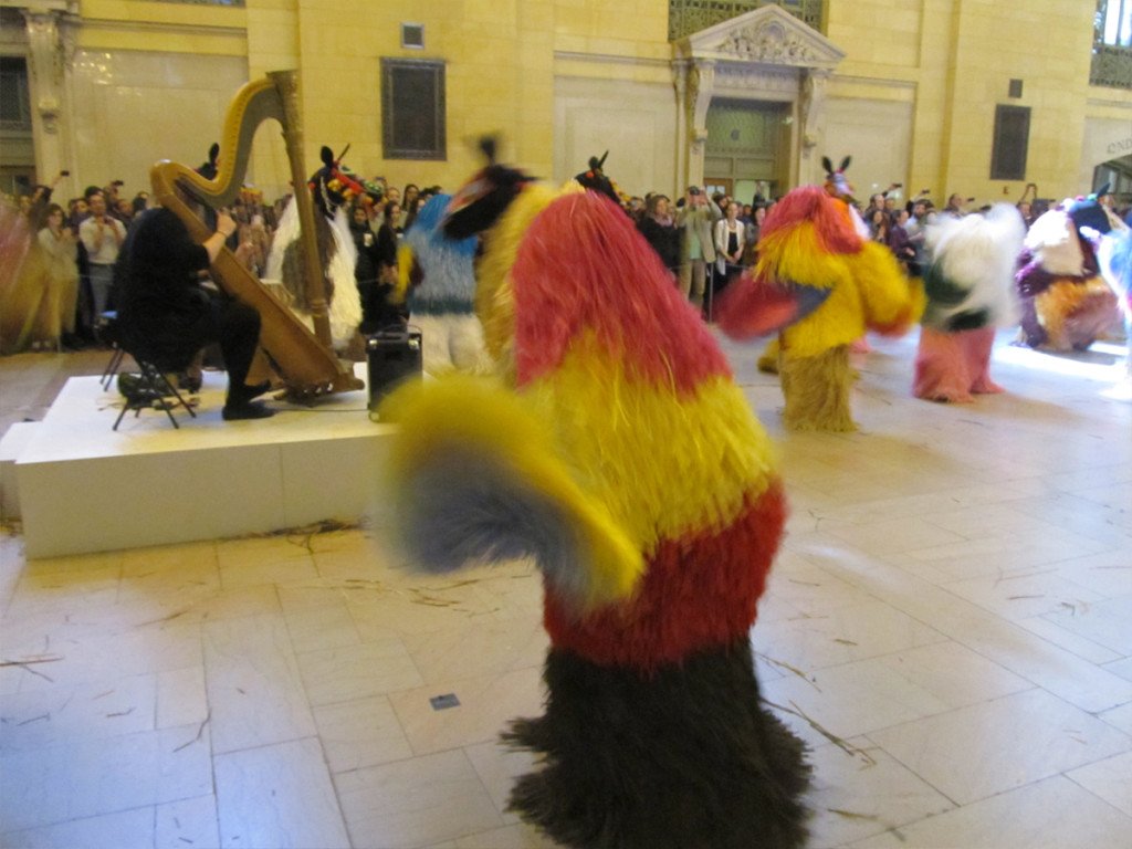 22
22
They rock out this last number.
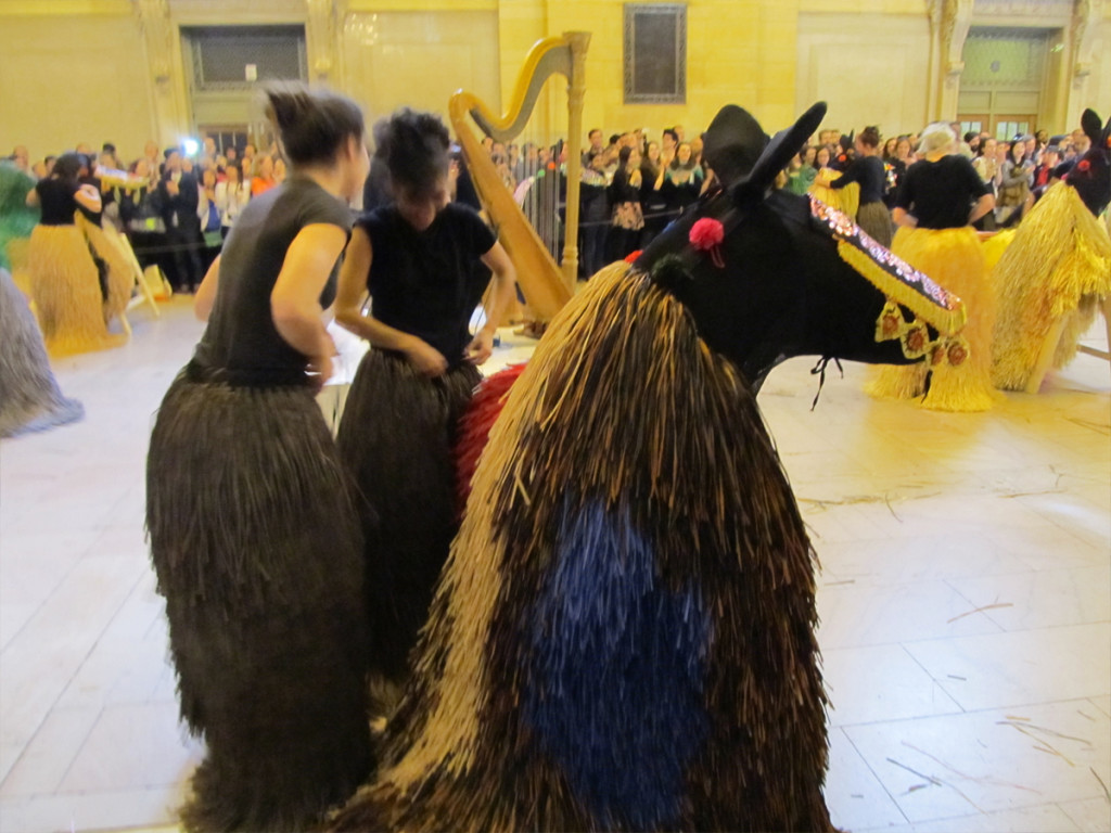 23
23
The dancers break apart and begin to undress
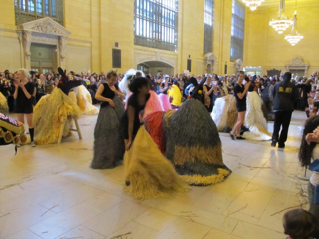 24
24
Another round of applause including
the dancers who applaud as well.
It was fun
 25
25
The horses dress the “sawhorses” again and people startt exit.
Commentary 30 Mar 2013 04:35 am
Brewing Sqwiglies
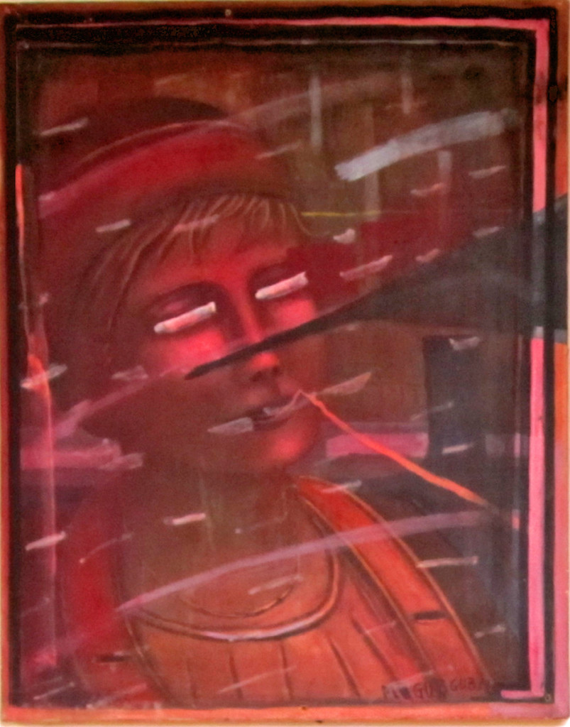
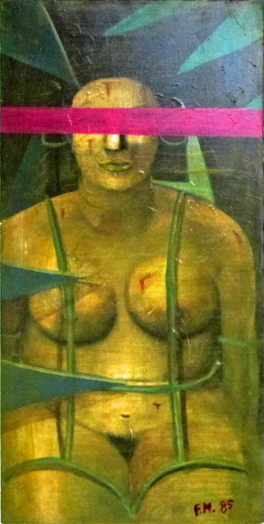
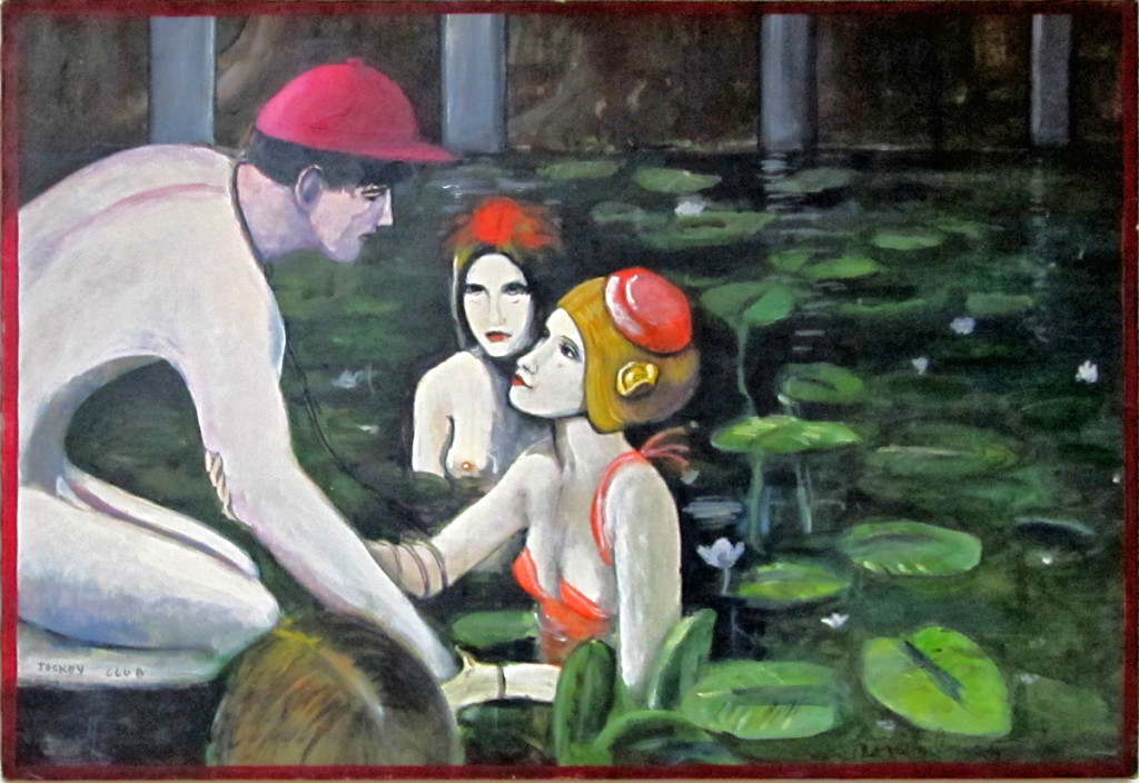
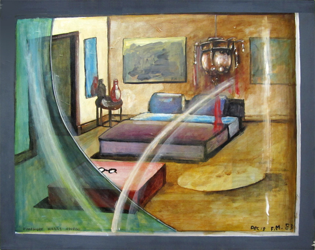
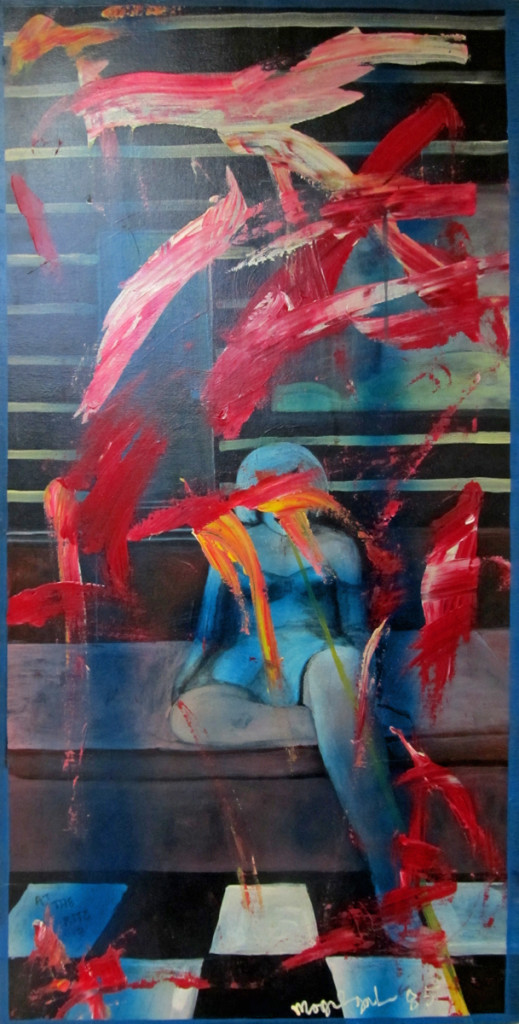
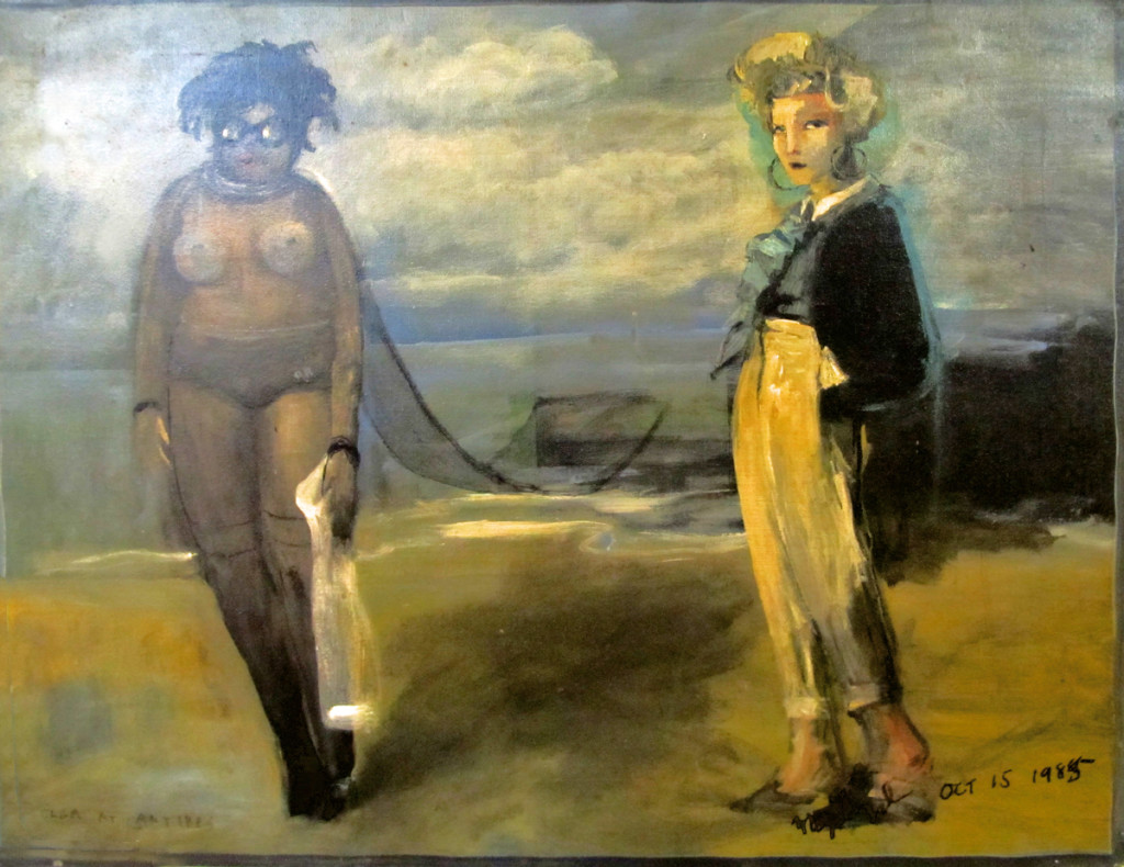
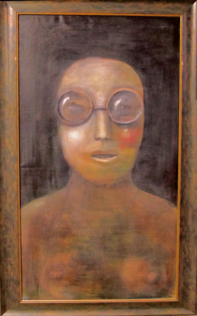
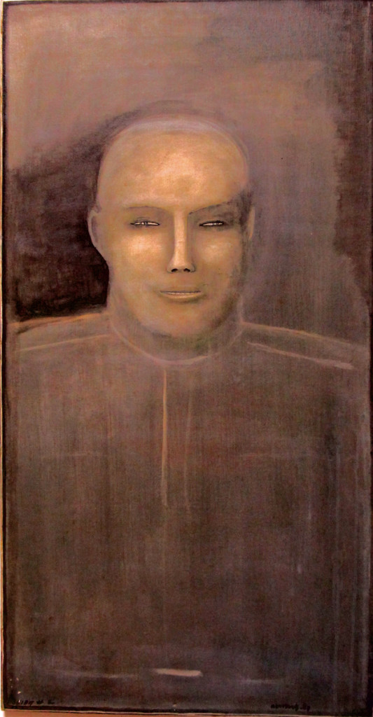
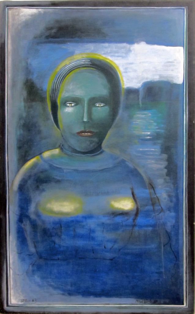
- Richard O’Connor turned his animation studio, Ace and Son into an art gallery this past Thursday night to celebrate the art of Fred Mogubgub. Fred was something of a wildly eccentric genius who rode the animation studios from the forties through the eighties. He was know publicly in animation for Enter Hamlet a short that used the voice of Maurice Evans performing the “To Be or Not To Be” soliloquy from Hamlet, while funny drawings pass in front of the camera.
Fred was an artist, and Richard owns many of his works of art. A large number of oil paintings, watercolors and animation pieces. I’d seen Enter Hamlet in 1965 as a young animation enthusiast, and I knew Fred’s work from The Big Blue Marble which was wildly popular in NY.
The event was a wonderful party where I met up with George Griffin, Liesje Kraai, Lee Corey, Larry Ruppel, and Elliot Cowan among others. Richard went to the trouble of searching out for wine from Lebanon which he felt was appropriate in Fred’s Lebanese honor. As my astute wife, Heidi Stallings, pointed out, it was very much like the old days when people actually socialized with each other. I miss the mingling, too, and it was nice to get out to something other than for a holiday event. And how much better than to toast an extraordinary artist like Fred Mogubgub.
Unfortunately, I didn’t properly mark down the titles of the paintings. I’ll try to fill those in later in the day. Here are the pictures:
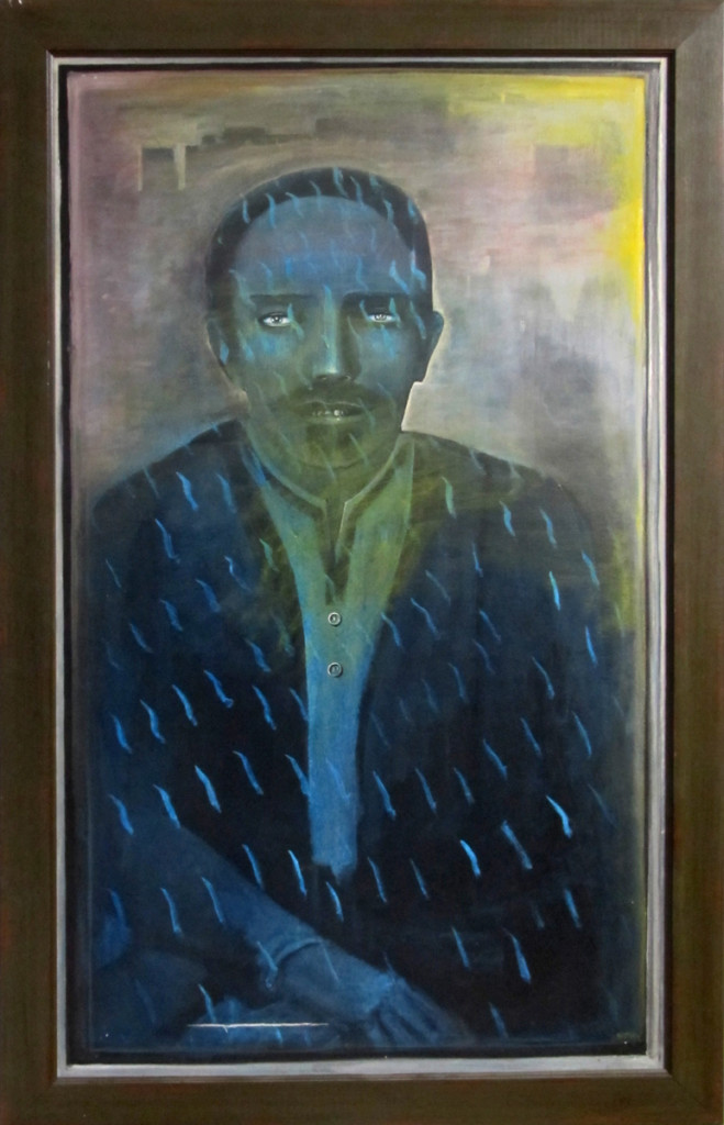 1
1Spirit #4
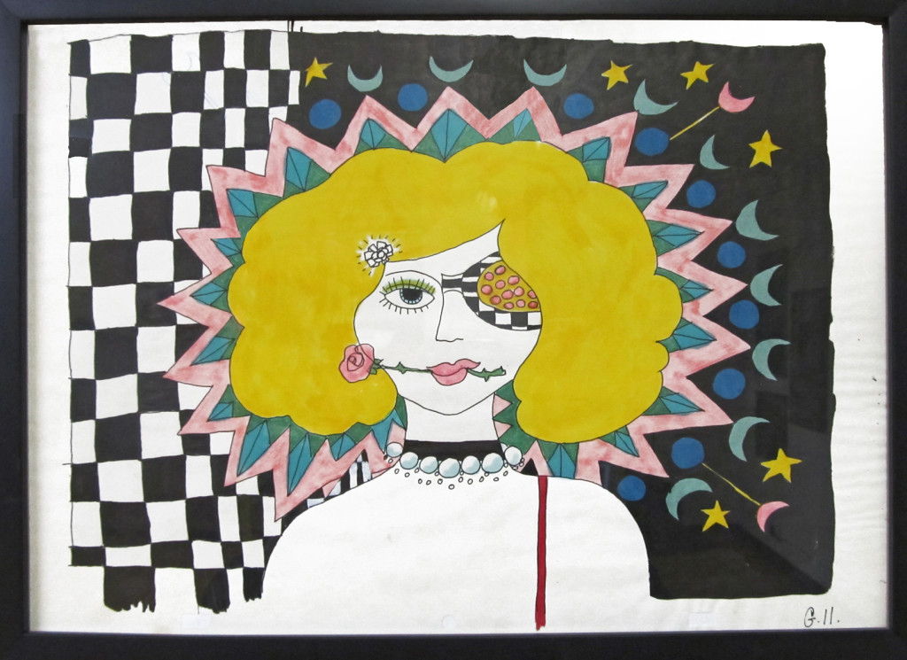 2
2
A cel setup from a BeechNut Gum ad.
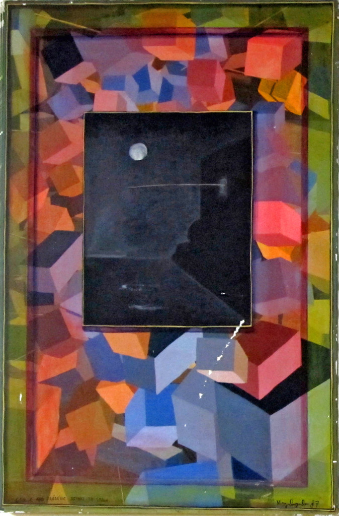 6
6
George and Frédéric Depart to Spain
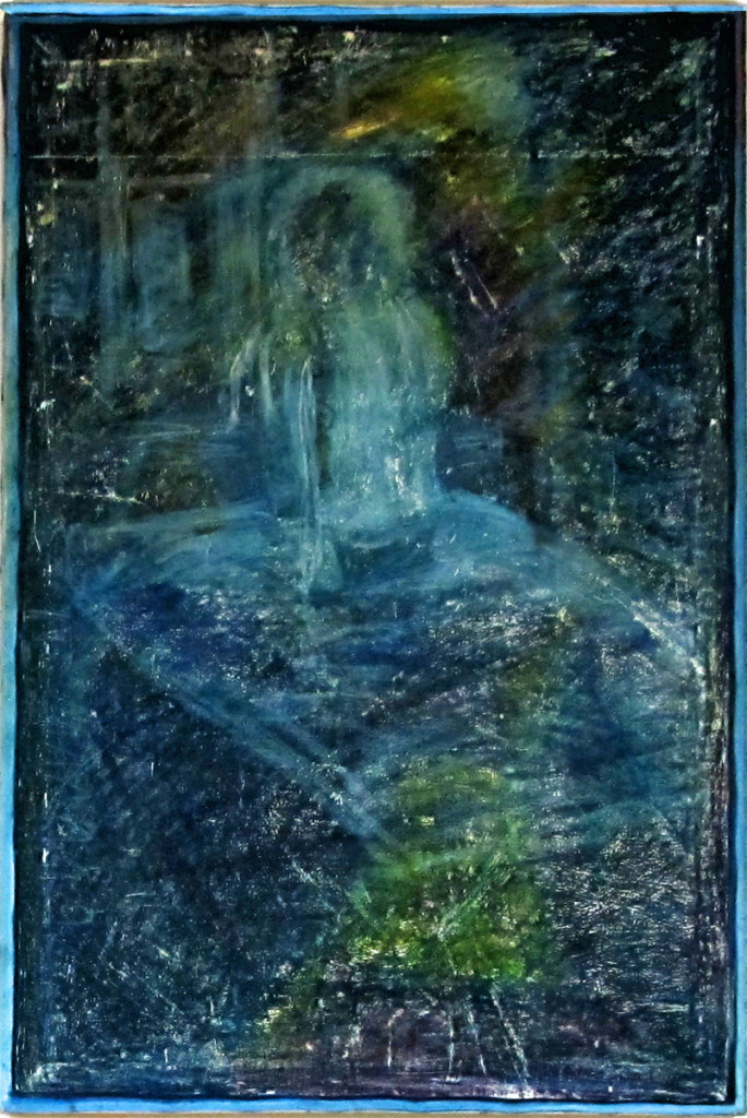 7
7
Untitled [possibly unfinished as it's unsigned and undated]
2 Miyazakis on Poppy Hill
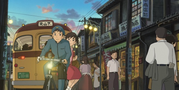
- This week I saw The Croods (and reviewed it here) and From Up on Poppy Hill. I really wanted Poppy Hill to be a small masterpiece, but it wasn’t. It was just a trek. I wanted Goro Miyazaki to have a glimmer of the old man in him; it’ll be hard to let go of Hayao Miyazaki when he retires or decides to end his enormous career. This film was supposedly written by Hayao in collaboration with the son, Goro. I didn’t feel the spirituality of Goro in this movie; That’s what I love about Hayao’s films; there’s a spirituality. All those films (at least since Totoro) are about so much more than what’s on the surface. What’s on the surface is usually good, too. And lately the animation has been getting better. If there’s any spirituality in Goro, it didn’t make it to the big screen, and the animation was first class TV work. No magic there, either.
It’s the second film directed by Goro Miyazaki. Tales from Earthsea should have jump-started a new career. The film was just dull. I assume the artists at Studio Ghibli want things to go on, as well. Poppy Hill had some of the elements of a Ghibli production; it just lacked the magic. First rate styling, fine character design (they all do look a bit like, at times), and a human story.
Although the story had too little in it. It was quite subtle and for a sophomore director to pull it off was too much to ask. The animation rarely had a spark. The characters always did what they were asked to do, but they didn’t really have much of a lifetime within them. The director needed a LOT of experience within him to pull it off, needed a lot of animation experience to be able to pull stronger performances out of his animators and needed a stronger connection to the story to make us care about those characters. Zer0 for three.
Don’t get me wrong; I’d take this over The Croods any day, but I’d prefer to have something good rather than either of these movies.
Crood Surfacing
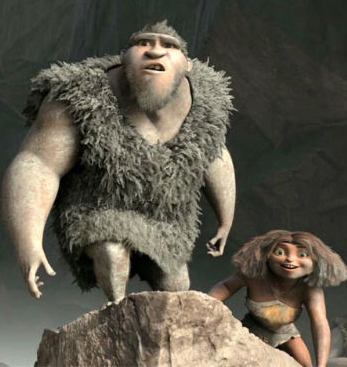
 I saw this interview with “surfacer” Animator T.J. Nabors on line and I thought I’d share it with you. She sought work as a textile designer and taught herself computer art and animation from an Amiga on up. Several design jobs later, from millinery to Laika commercial division, and, before you know it, she is a supervising surface animator for Dreamworks. Her specialty on this film was the creature pictured above.
I was attracted to the article about a “surfacer” because that was one aspect of the film that really caught my attention. It does from time to time in these cg films. There was one elf (I don’t know Hobbit or something) in the Hobbit that had lots of hair. But the surface of his skin was, to me, stunning. I looked forward to shots of this guy so that I could look into his cheeks. It was  extraordinary work, in my opinion, and I’m pretty sure it had to have been done with computer enhancing. You can’t get that with latex. In The Croods I was wholly taken by the surface of the girl’s skin. She was most definitely a thick skinned character, slightly darker than other characters. It remained consistent for the entire 90 minute journey of the film. I hated the expressions on her face, most of the time as the penchant for “cute” is too strong for most Dreamworks animators, however the skin of that girl was something to behold. She truly felt like a “cave woman”, and I found that impressive. The same was true of the father, Nicholas Cage’s character. The voice reading kept turning me off, but the character built into the animation wa most impressive. With him, though, it wasn’t the “skin” that I paid attention to, it was the subtle motions that kept him 20% Neanderthal to his 80% human. He was most definitely something else.
This is aside attraction I find with these cgi features. The “animation” means something else again in these films. It’s part of the reason I have to think of that medium more as digital puppetry than as animation, in the same sense that a 2D person (me, for example) would think of it. I don’t think I’m putting anything down; I’m just trying to get past the roots to look more closely at the follicle, itself.
Anyway, never mind my hang up. Enjoy the interview. I’d like to see a lot more like these rather than the generic animation artist interview. As much of a puff piece as this is, I’ve been able to learn something from it.
Actually, Life of Pi gave me new found respect for the work done by these folk. In my mind, the work in that movie is the reason why cgi was invented. There’s the art. It may hae taken a lot of features like Toy Story and Monsters Inc. to get there, but Pi is where the form was finally and properly used.
In Show
Here are a list of the U.S. films that have made it into Annecy or Anifilm competition screenings. Only two US features seem to have made it – Consuming Spirits and It’s Such a Beautiful Day. Congrats to Chris Sulliven AND Don Hertzfeldt.
in competition at ANIFILM
Consuming Spirits | Chris Sullivan | USA
It’s such a beautiful day | Don HERTZFELDT | USA
Feral | Daniel SOUSA | USA
Sidewalk | Celia BULLWINKEL | USA
And/Or | Emily HUBLEY | USA
in competition at ANNECY
Independent films:
Drunker than a Skunk | Bill PLYMPTON | USA
Feral | Daniel Sousa | USA
Fight | Steven SUBOTNICK | USA
Marcel, King of Tervuren | Tom SCHROEDER | USA
Education:
What Makes a Hero? | Kirill YERETSKY | USA
Congratulations to all those who made it. It’s a tough game these days.
(I didn’t include TV series or TV Specials, because that’s just
big business, and I’m not too interested in congratulating some company.)
A History of Computer Animation
(Is there a history already?)
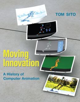
Here‘s an interview with my friend Tom Sito on his new book, a history of computer animation. Moving Innovation: A History of Computer Animation.
It should be interesting since Tom has been a fantastic 2D animator. I’m curious as to what he has to say about the machines.
Bill Peckmann &Books &Illustration 29 Mar 2013 03:08 am
Kurtzman Jungle Book – part 1
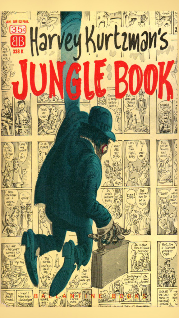
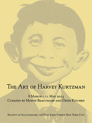 - Currently, the Society of Illustrators is featuring an exhibit celebrating the art of Harvey Kurtzman. This exhibit continues through May 11th.*
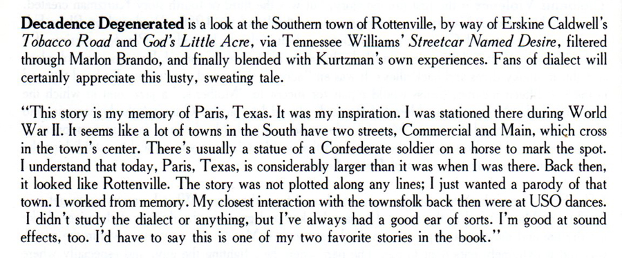
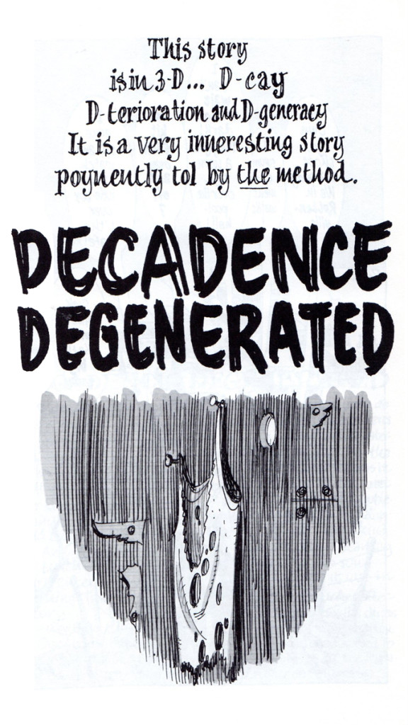
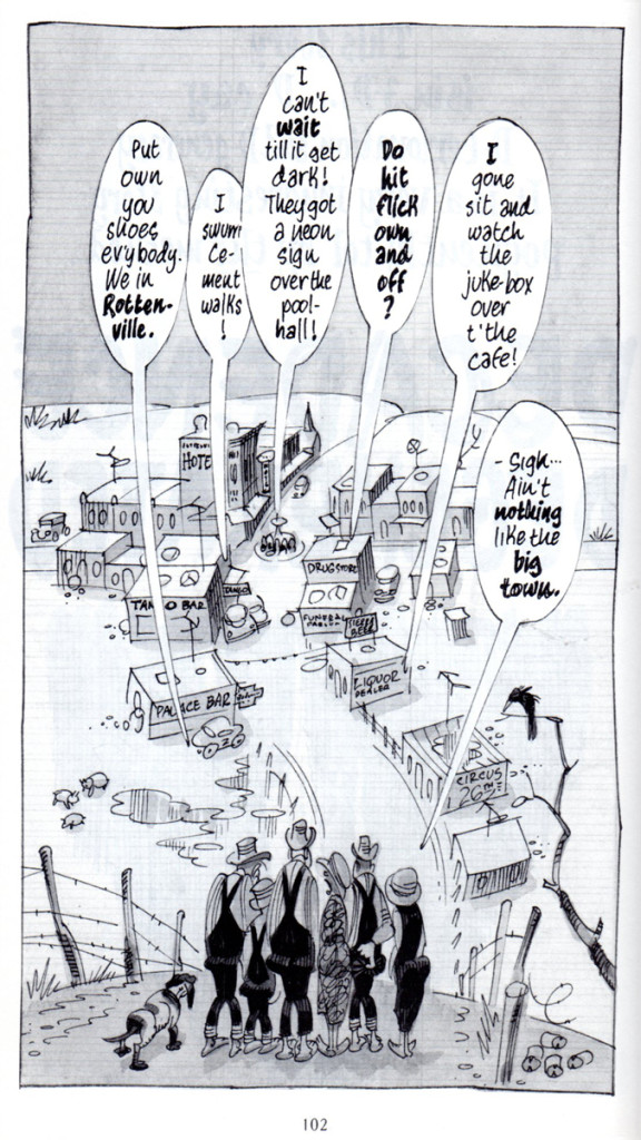
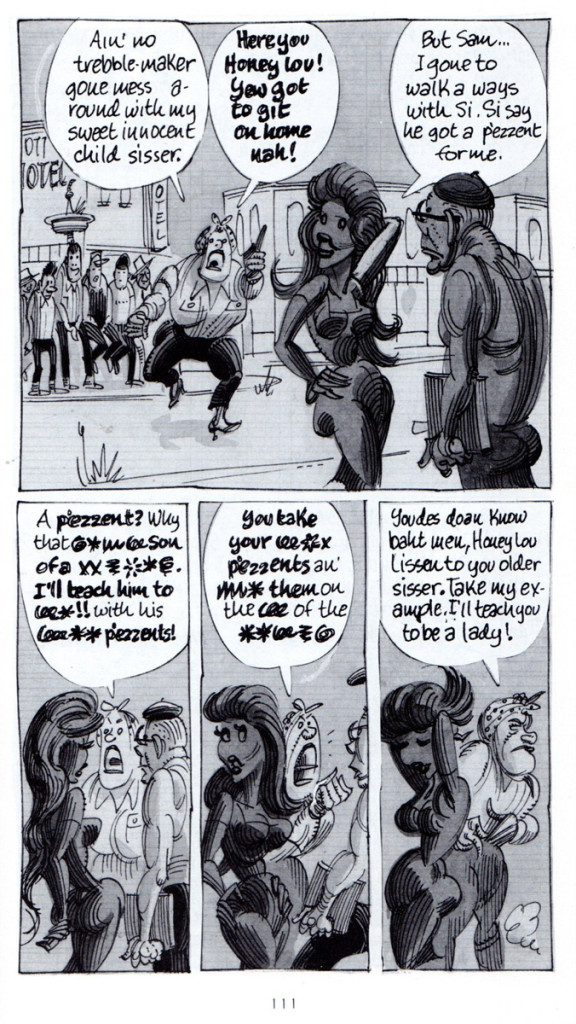
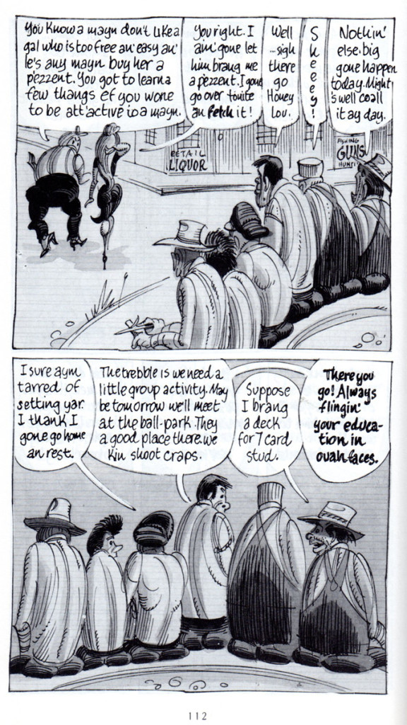
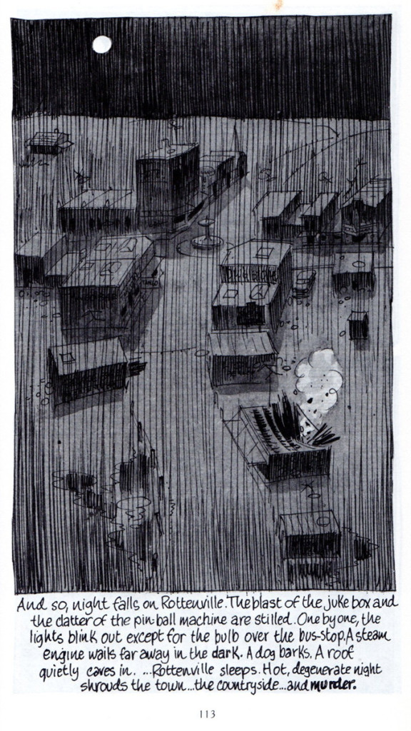
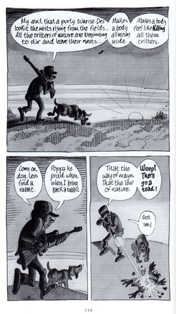
When I brought this info to the attention of Bill Peckmann, Bill naturally began by sending me some pages of “Jungle Book”. It’s 4 pages long, so we’ve decided to break it into two. The second part will come next Friday. Here’s part 1, immediately following Bill’s comments:
- Harvey Kurtzman‘s “Jungle Book” was a very rare treat for us knuckle headed Kurtzman fans when it came out in 1959. It was 140 long pages of Harvey’s writing and art. The art was the rare part, since HK had just come off editing and writing Mad, Trump and Humbug magazines where the final art was always left to his “usual gang of Idiots”.
Here in this wonderful paperback was the master at the height of his cartooning talent! The treat was extended when Kitchen Sink Press published their reprint version in 1988, and what an exquisite job they did!
The cover of the book is the original paperback, the inside pages are from the beautifully done reprint book.
* Thanks to Steve MacQuignon for word on the show at the Society of Illustrators.
Commentary 28 Mar 2013 05:40 am
Crood
 There can be no denying Chris Sanders‘ extraordinary talent. His character design is unmistakably his own. Slightly wall-eyed creatures who all have an extra dose of . . . I’m not sure what to call it. One wants to say “cuteness”, but that is decidedly the wrong word. It’s in those eyes. There’s an innocence there, and that overrides just about everything else in his creatures.
To house those wide set eyes, you need an extra thick head. Just right for cave dwellers.
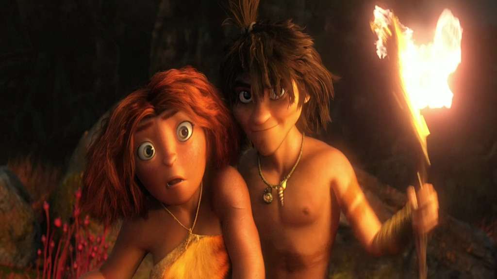
For the first half hour or so of The Croods I spent a lot of time wondering about these characters that were being pushed at me. The direction was harsh, loud, fast and annoying. The tone was equal to that. The Croods is the new Dreamworks feature co-directed by Sanders and Kirk De Micco, the latter fresh off directing Space Chimps, a successful independently produced cgi animated feature released by 20th Century Fox last year. This film, The Croods, is something of a mess. (By the way, what are they trying to say with that title? Obviously, “Crood” is the Neanderthal spelling of “crude”, but even still it doesn’t really make much sense. You can tell yourself it does, but no. Sorry. Unfortunately, that’s a good example of what the film’s jokes are like, and they repeat them often.)
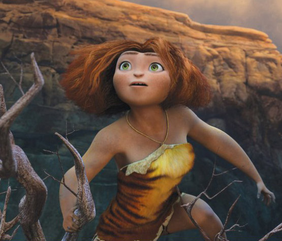 The story is a cliché; it seems to be the endlessly repeated story of this generation. They keep making the same film. Feisty daughter doesn’t want to be part of the cookie-cutter mold so fights with the father until dad learns the lesson and gives the girl some space. In Brave, at least, it was her mother the girl was fighting. Here, we stick to the formula – tried and true and predictable.
It took about five minutes for me to remember that Nicholas Cage was the big voice. I didn’t remember that he was in it and his “Valley girl” accent was very irritating. In this film everyone except Catherine Keener, as the mom, sounds like they’re ripped from the Valley. The film, about the division and replacement of the earth’s land masses feels as though it’s not about the entire planet but more about Southern California. I felt left out of the movie.
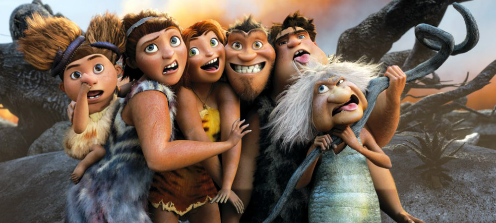
The world of these cave people is populated with few other people although there are a bunch of imaginary animals. The animals are supposed to be real, but they were created by the writer/designers. Obviously all were afraid of being called inaccurate if they included dinosaurs; dinosaurs didn’t coexist with humans. (Sorry, “Creationists” this was the reality of what did happen.) Instead, we get a bunch of creatures that look like oversized stuffed animals, and they threaten the existence of the Croods and other humans.
Actually, I’m not sure if I should call the Croods “human”. I assume they’re supposed to be Neanderthal since they’re not as highly developed as Guy, the young man voiced by Ryan Reynolds, who arrives midway through the film. He is obviously from a different, higher-functioning species than the Croods. Regardless of all this, all of the characters speak with California accents and usage. Undoubtedly it was written for the 21st century and the teens of that period. Again, I felt left out not being a teenage girl from Santa Monica.
Let’s step away from the story (hard to do when you’re watching the film.) Actually, you’re being assaulted by the film as it comes at you and comes at you, loud and violent. This is much different than most of the cgi films these days. Even Brave didn’t have the patience to properly develop all that it had on its mind without just flinging it at you. But Dreamworks keeps going there. No quiet moments for the weary. This film is miles better than Rise of the Guardians, but it has its own share of problems.
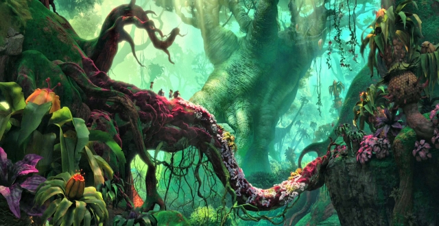
The one thing it does have is Chris Sanders with that beautiful drawing style, and his art is oftentimes glorious to watch. Of course, I know he’s not doing all the drawing and painting, but he is directing it. I’m not sure of Kirk De Micco;s contribution; I don’t know his work. I have to assume it has to do with the commercial asp;ects of this film – all the hyper movement, gag setups, short scenes. I do wish the two of them could tone down the energy in the film. Animate the story and let it come to the audience. It doesn’t have to attack the audience to get where it wants to go. If Nick Cage’s character smashed his head into one more rock or chased another stuffed animal I would have walked out. The sad part is there was a genuine character in that father. At the film’s start he was most definitely only 3/4 human with Neanderthal man trying to get out. You get much the same from Emma Stone’s girl. She started out as an original – no doubt related to Meridia from Brave. Her wiry hair even has some movement of its own to prove it. I found Emma Stone’s reading not as strong as I expected, but the animators pulled a real person out of it. Despite all the milked activity that is thrown at you at a zealous pace.
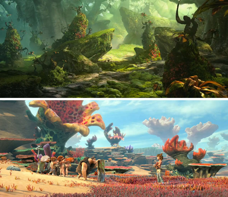
No, the film just wasn’t good enough. Good effects, good 3D (though my eyes kept watering) and some good artwork. All the dialogue was pathetic and the story was trite. My first thought is that we deserve more.
The film opened with $52.9 million coming from the U.S. and another $62.4 million coming from International sales. That means that the film earned more than $115 million in the first weekend. Neanderthals do well at the box office. Take a look at all those Ice Age films from Blue Sky & 20th Fox. The Croods is the first of the films 2th Fox is distributing of the Dreamworks product. They just moved to this distributor from Paramount. Rupert Murdoch ca dance in the streets and make a few more Neanderthal movies. There probably won’t be any Oscars, but they’ll garner the real gold with this material.
Maybe we’re getting exactly what we deserve.
Action Analysis &Animation &Animation Artifacts &repeated posts &Richard Williams &Tissa David 27 Mar 2013 04:26 am
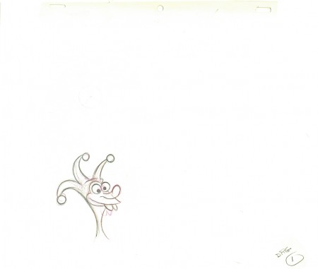
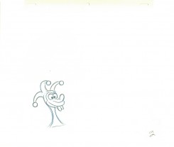
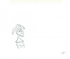
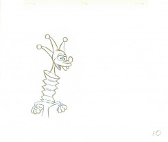
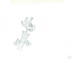
Grim’s Jester – recap
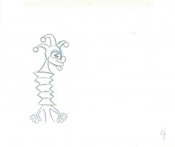
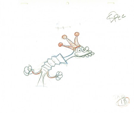
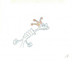
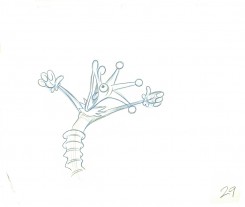
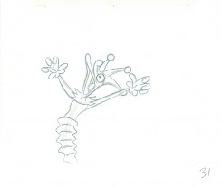
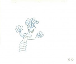
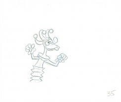
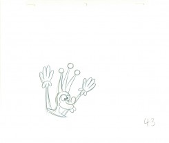
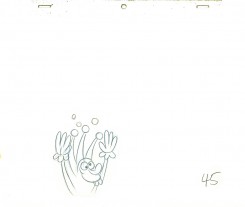
- Yesterday I focused on a couple of scenes Grim Natwick animated in his early days at the Fleischer studio. He was obviously experimenting with distortions, breaking of the joints, the visibility of inbetween drawings and how much he could get away with in “Rough drawings.”
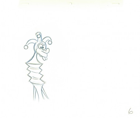
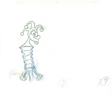
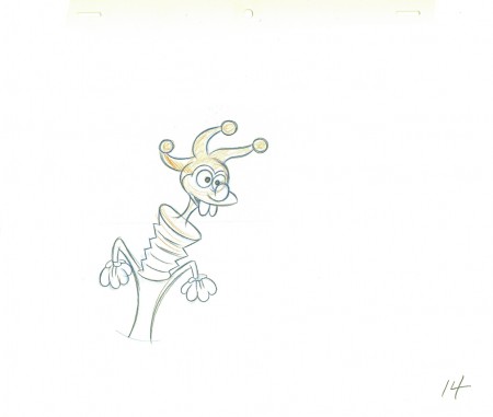
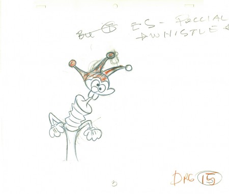
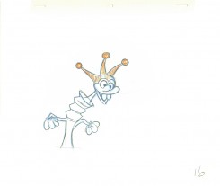
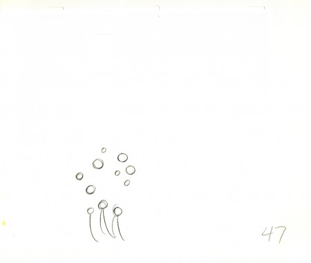
This, of course, isn’t the animator that Grim became, but gives us some light to understand what did make up that animator. The scene here today is something I’d posted on my blog once before, in 2010. It features a lot of Grim’s ruffs as well as the clean ups by Richard Williams, himself.`
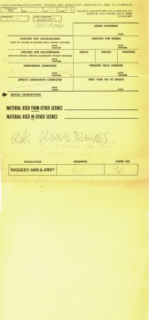
You can see Grim’s drawings erased and cleaned up. (The semi-erased semblance of Grim’s very large numbers remain on many of the drawings, as do Grim’s notes. The inbetweens were all done by Dick. (It’s Dick’s writing in the lower right corner, and I remember him doing this overnight.)
The scene is all on twos. There are two holds which Dick changed to a trace back cycle of drawings for a moving hold. It actually looks better on ones, but there was a lip-synch that Grim had to follow. It is interesting that both Tissa David, one of the five key animators on this film, and Grim Natwick, who Tissa had assisted for at least 20 years, both shared the one assistant on key scenes in this film – Richard Williams. Eric Goldberg assisted on many of Tissa’s other scenes.
 1
1.
 2
2 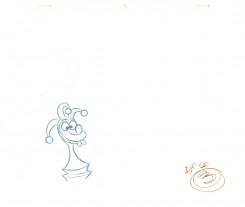 3
3.
 4
4 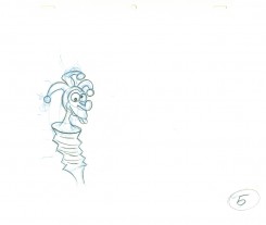 5
5.
 6
6An inbetween by Dick Williams.
.
 7
7A cleaned-up extreme by Grim Natwick.
.
 8
8 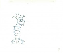 9
9.
 10
10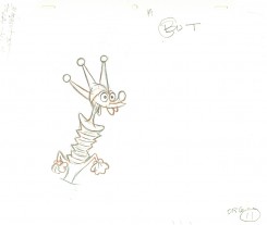 11
11.
 12
12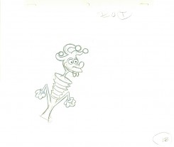 13
13.
 14
14Dick Williams clean-up.
.
 15
15Grim Natwick (sorta) cleaned-up rough.
.
 16
16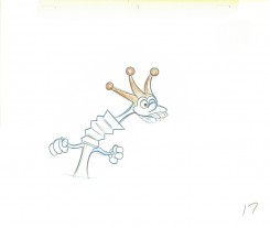 17
17.
 18
18Grim Natwick rough.
.
 19
19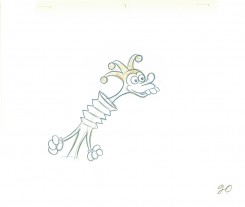 20
20.
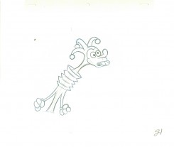 21
21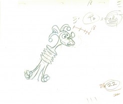 22
22.
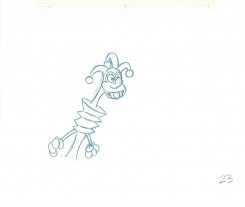 23
23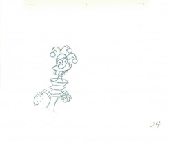 24
24.
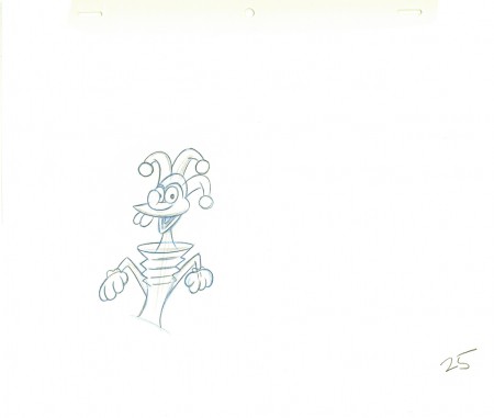 25
25Williams inbetween.
.
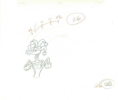 26
26Natwick ruff, cleaned up.
.
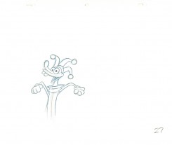 27
27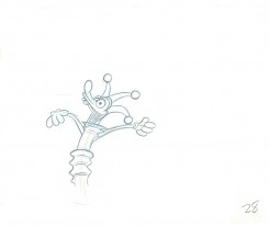 28
28.
 29
29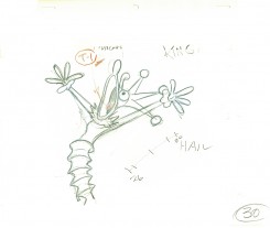 30
30.
 31
31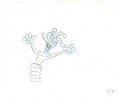 32
32.
 33
33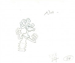 34
34.
 35
35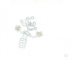 36
36.
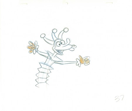 37
37Dick’s clean-up inbetween.
.
 39
39Definitely a Grim Natwick drawing – cleaned up by Dick (his handwriting).
.
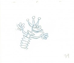 39
39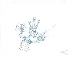 40
40.
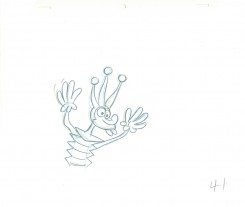 41
41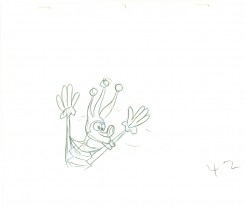 42
42.
 43
43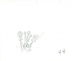 44
44.
 45
45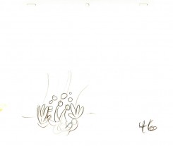 46
46.
 47
47Drawings 44-47 are all Grim’s roughs with minor CU.
.
_____________________________
Here’s a QT movie of the complete action from the scene.
The scene is exposed on twos per exposure sheets.
_____________________________
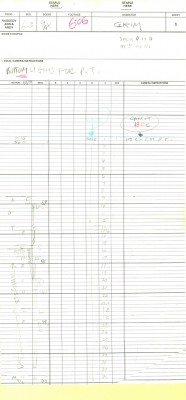
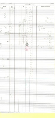
Here are the folder in which the two exposure sheets
are stapled (so they don’t get separated.)
Action Analysis &Animation &Fleischer &Frame Grabs 26 Mar 2013 05:45 am
Grim – Distortions Smears, Abstractions & Emotions – 3
- In 1930, the animation in the Fleischer studio (as evidenced by Michael Barrier in his great book, Hollywood Cartoons) was pretty much controlled by the timing department. They supported a very even sense of timing and would expose everyone’s animation in the house meter. This virtually destroyed the timing within the studio. Their idea was that every drawing had to overlap the drawing before and after. It was done to such an extreme that it caused the even timing throughout their films.
There was at least one animator free of the timing department. Grim Natwick was the key guy in the studio, at the time. His animation was built, back then, on a distortion, a freedom of expression, that very much resembled what Bill Nolan was doing in Hollywood. The difference was that Natwick could draw, so his artwork was planned, designed to look that way. It wasn’t just a matter of straight ahead animation causing distortion. It allowed distortion with scenes going back to square one every so often to hold off the appearance of distortion. The inbetweens distorted and, in a way, smeared always to come back to a nice, tight pose of an extreme.
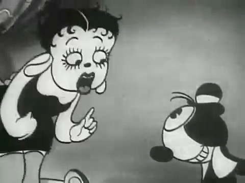
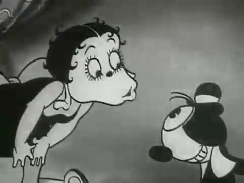
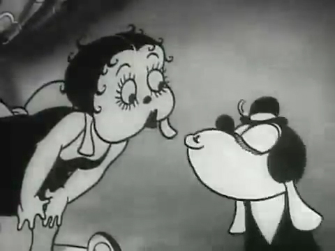
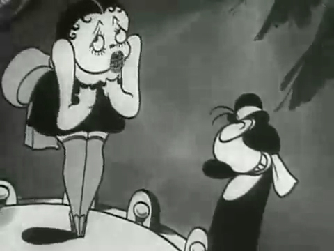
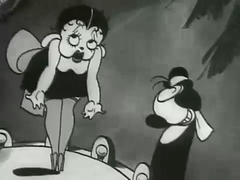
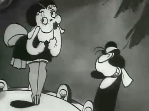
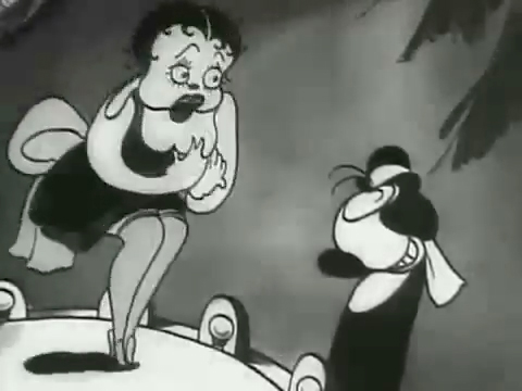
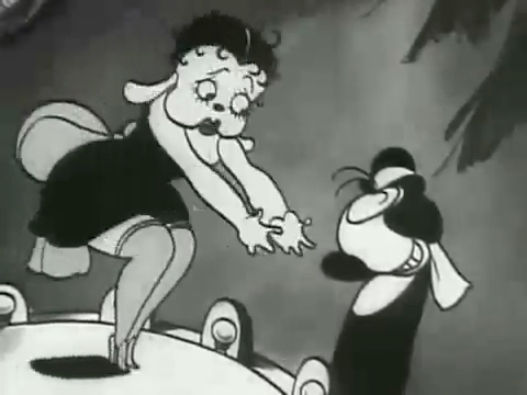
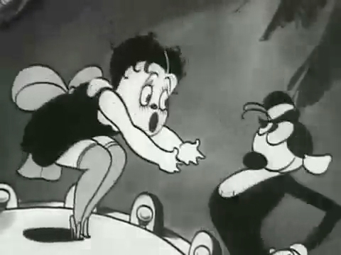
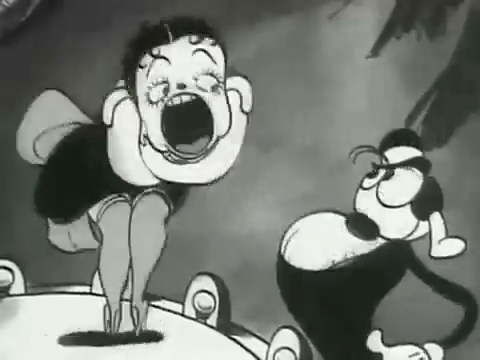
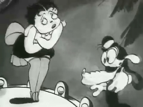
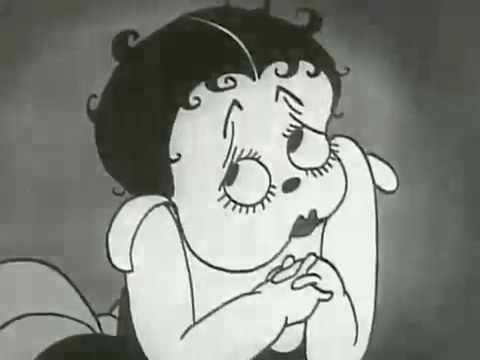
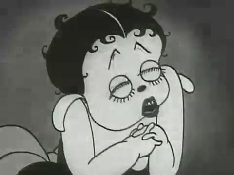
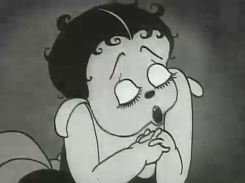
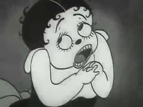
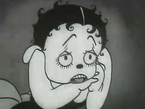
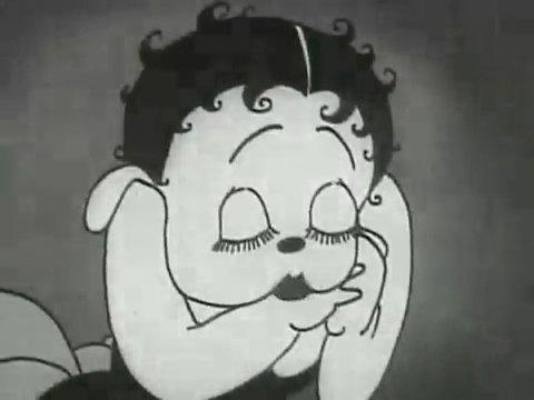
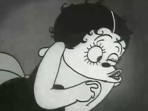
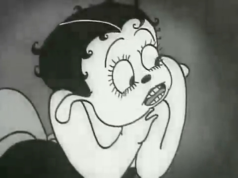
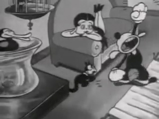
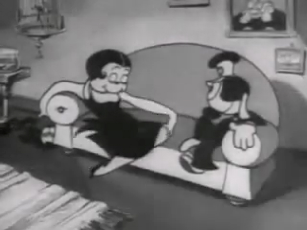
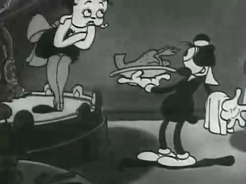
The film “Dizzy Dishes” is the perfect example of this style. This was actually the first Betty Boop cartoon, and Betty, a plump dog sings broadly. She really goes wild as she sings a song on top of a table à la Marlene Dietrich!. Here are some frame grabs from a couple of connected scenes to give you an idea of what was going on.
 1
1
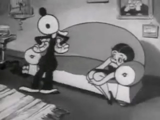
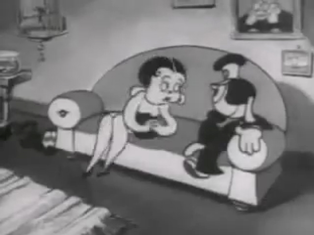
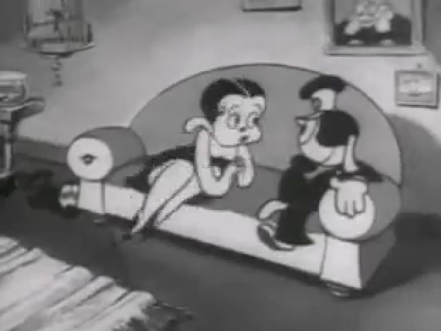
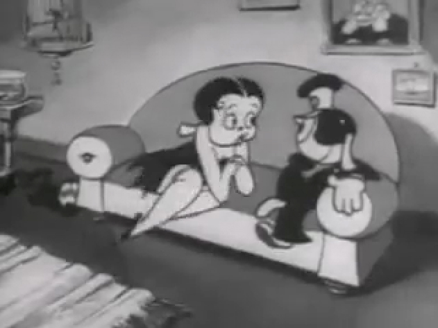
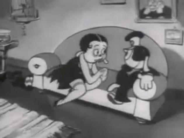
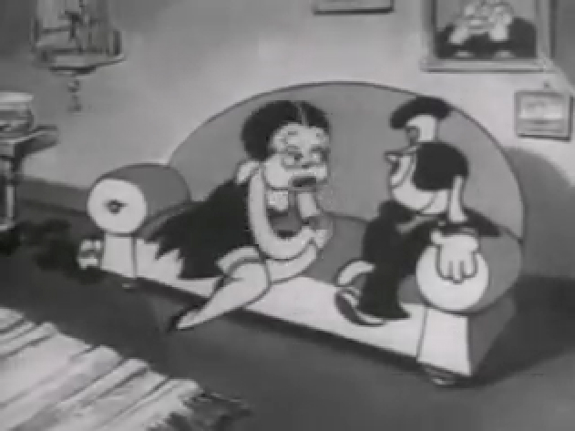
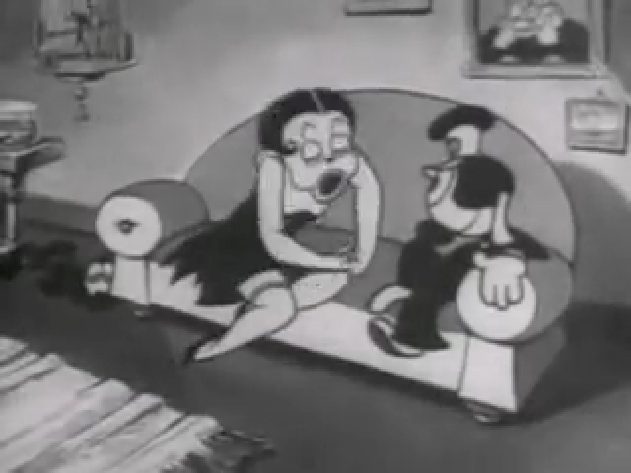
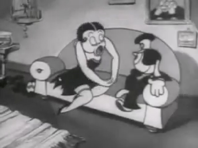
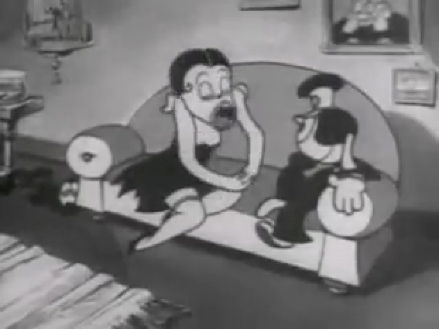
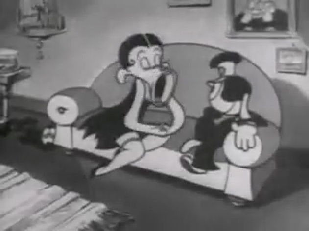
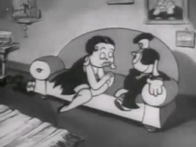
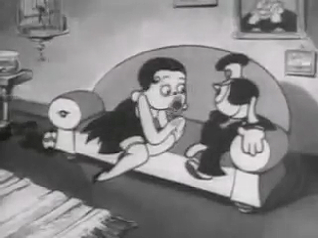
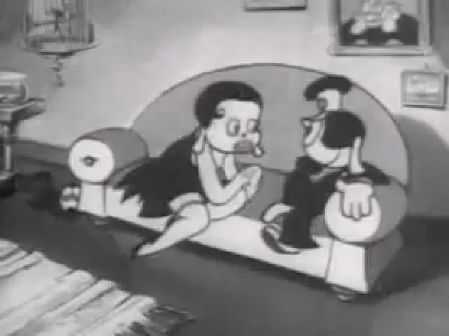
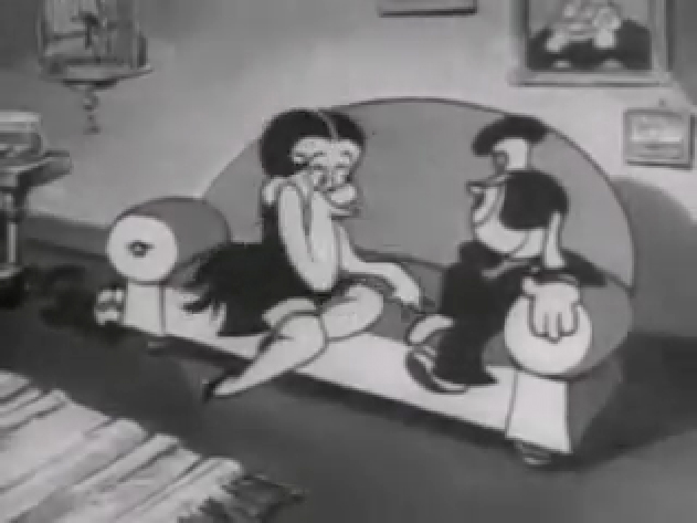
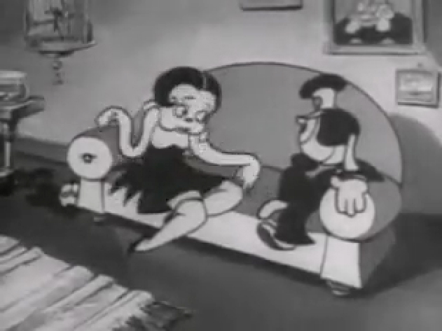
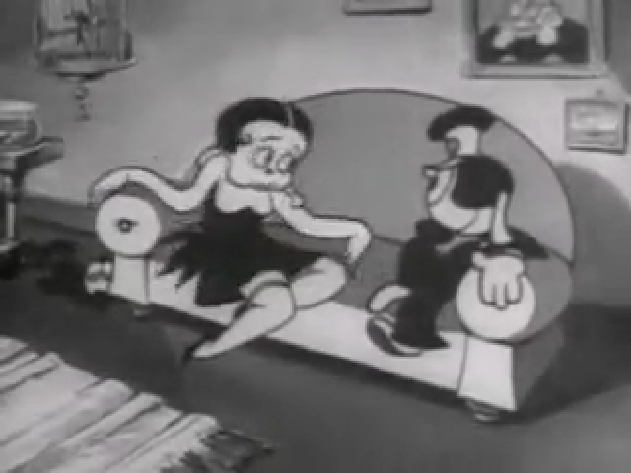
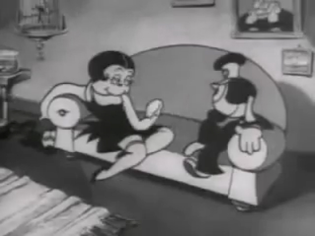
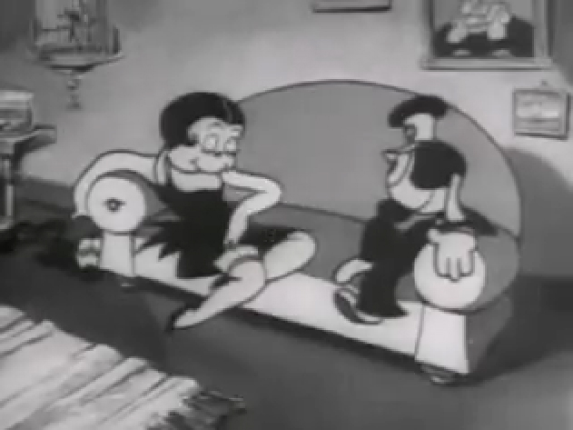
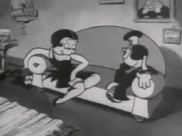
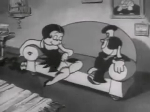
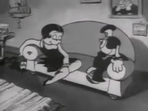
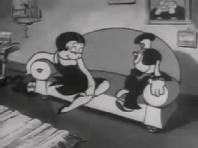
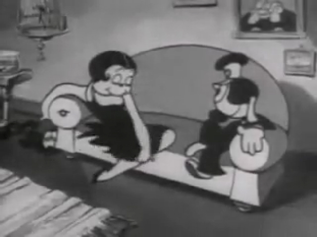
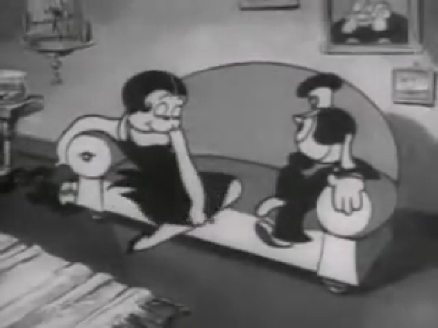
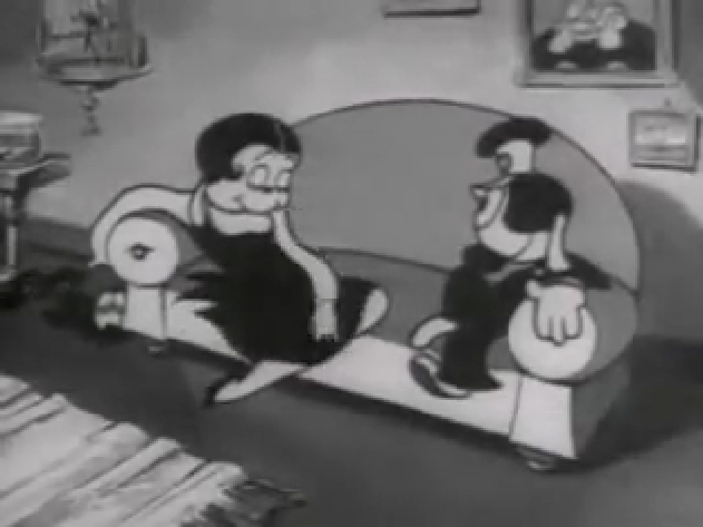
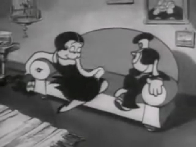
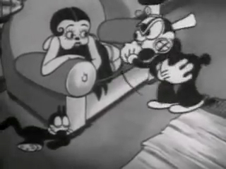
If you jump ahead to Fleischer’s “Barnacle Bill”, also from 1930, you’ll find this wild scene where Betty is seducing Bill, you’ll see all sorts of distortion in the inbetweens which Grim has maneuvered for Betty’s movements on the couch. Note how well posed his extreme positions are drawn despite the distorted inbetweens, when she is moving.
 1
1
Look at the beautiful drawings (above) of this character in some of these extremes from this film. The character of Betty isn’t moving whereas Bimbo – I mean Barnacle Bill is all over the place. Yet your eyes are on Betty in that held position.
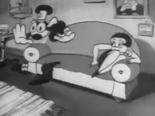
Now, let’s look at what the inbetweens are doing as Betty gets from one pose to the next. It’s really funny. Grim has found a way to create a sympathetic, adult and female character, yet he keeps her funny with the surface of the animation.
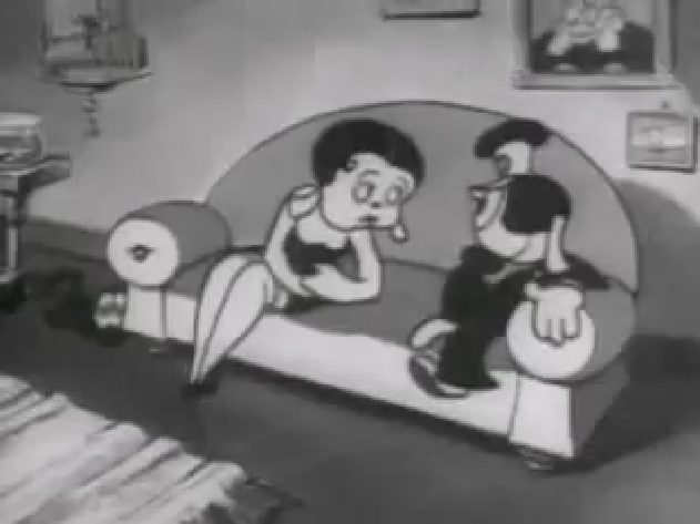 1
1
At times in the animation, Betty’s hand may turn into a claw, but that might be that Grim delivered a rough which was poorly cleaned up by an assistant. Or perhaps the inker just inked from a rougher drawing, perhaps a Grim “clean up” if there ever were such a thing. He worked ROUGH. In fact, that distorted claw of a hand doesn’t matter. It’s the extremes that counted for Grim, and he was experimenting with this animation to see if that really were true.
I’ve remembered over many years an interview with Dick Huemer,* who worked alongside Grim on some of these films. Huemer gets credit for inventing the inbetweener to use in the animation process. It allowed him to turn out more animation and not worry about the many drawings that would paste the scenes together. In that interview, Huemer said that it didn’t really matter what the inbetweens looked like. You could draw a “brick” and it would still work. They actually may have believed this, at that time. Grim is using the inbetweens to get somewhere else in putting the scenes together.
(Tomorrow, I’ll post, again, a scene Grim did for Raggedy Ann with Dick Williams’ clean ups alongside so you can see the variance.)
* In Recollections of Richard Huemer interviewed by Joe Adamson, [1968 and 1969] Huemer said:
- And i decided that I would save all that work of inbetweening by just having a bunch of lines or smudges, just scrabble, from, position to position, When something moved fast. To prove it, I had an alarm clock flying through the air, and right in the middle of the action I put a brick. And vhen they ran the finished
film you didn’t see the brickl It proved that you didn’t really see what was in the middle. But I overdid it.
Action Analysis &Animation &Commentary &Frame Grabs &Tytla 25 Mar 2013 06:05 am
Smears, Distortions, Abstractions & Emotions – 2
- I wrote about this stylistic animation device not too long ago. I was leading up to the master, of course, Bill Tytla. He distorted things, alright, and in the way he did it, he changed animation forever, as far as I’m concerned.
But I started that story by writing about traditional animation and where it came from and where it was going; leading to a sort of rebellion as animators started distorting things, generally, in working closely with their unconventional directors. I purposely skipped a step there, and I should go back a tiny bit and talk about a couple of animators from the silent/early sound days. Today I have Bill Nolan in my sights; tomorrow, Grim Natwick. It’s kind of important before going on to Bill Tytla.
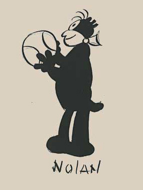 In the animation community in 1927-1930, there were two key animators who were considered the leaders in the business:
Ub Iwerks at Disney (until he left to open his own studio) and
Bill Nolan (at first with Pat Sullivan & Felix the Cat, then with Mintz’ Krazy Kat, and then onto a series of topical gag films called “Newslaffs.”
Both were considered the fastest animators in the country, and it was debatable as to which was quicker, though Iwerks was probably the guy. When Disney learned that Iwerks was leaving, he interviewed Nolan in New York to see if he were interested in replacing Iwerks. Disney offered a high salary of $150 per week for the job. It didn’t work out; Nolan was doing an unusual series, but ultimately went to ________________Nolan’s Krazy Kat looked original.
Oswald the Rabbit after Universal had taken
charge of it. Nolan just about ran the studio under Walter Lantz and allowed them to turn out an enormous amount of footage.
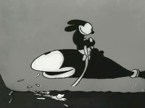
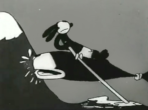
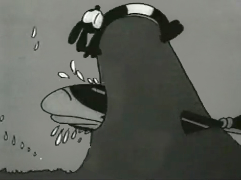
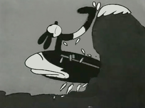
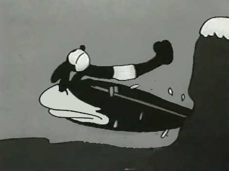
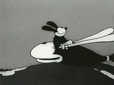
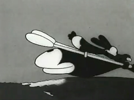
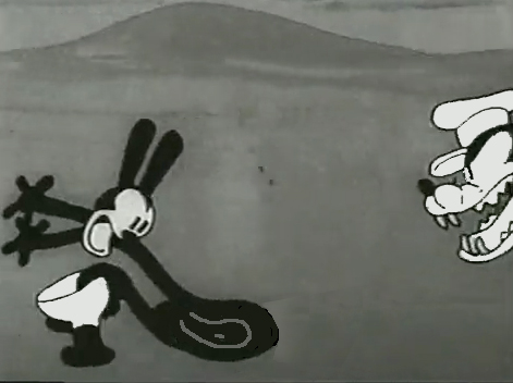
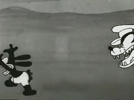
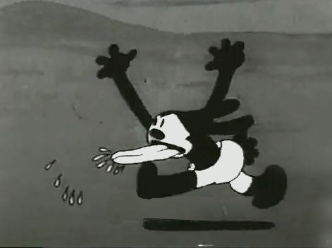
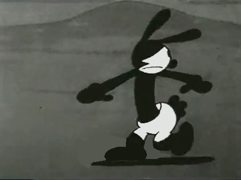
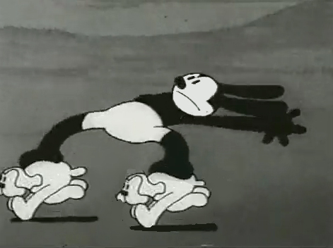
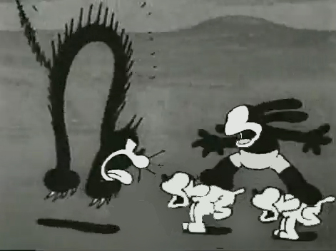
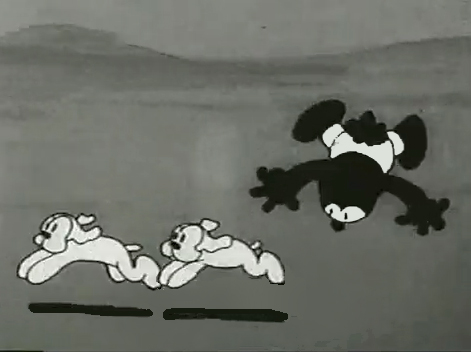
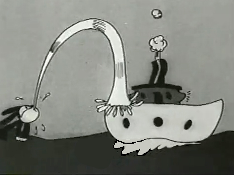
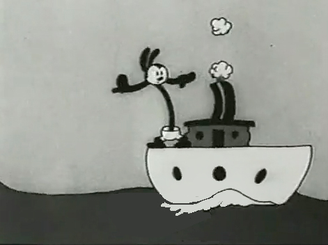
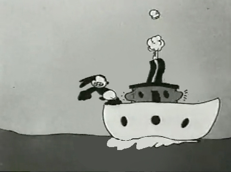
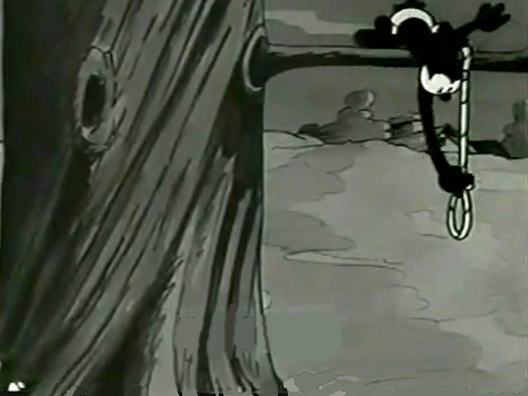
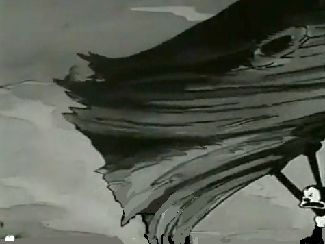
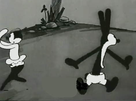
Nolan had developed a style known as the “rubber hose” style in that the limbs of a character were like flexible hoses and joints would be broken wherever the animator wanted. The style also featured very circular drawings. Stylistically, this fought the angularity of some other films that were being made and allowed Nolan to turn out many more drawings than usual. The roundness offered a faster line, and there was also quite a bit of distortion in Nolan’s drawings. Quite often the characters, Oswald, for example, didn’t even look like the character on the model sheet. In fact, you’d have to wonder if there was a model sheet, given the look of the animated character. Both Nolan and Iwerks were straight ahead animators, which meant they could easily go off model. Iwerks was better at holding things than Nolan, who seemed to enjoy being wild. Nolan would go back through his wild drawings and correct a couple of them, but would leave any other changes to lesser artists.
Nolan’s work was somewhat similar to the work of Jim Tyer, but I don’t think Tyer was drawing/animating that way to turn out faster work (though he was a very fast animator.) Nolan had to push the work out, and the rounded, distorted drawings enabled him to animate very quickly. As he went on, the artwork grew more and more wild, and it varied somewhat from the other animators’ work. Tyer tried to get his art to distort, as it does; Nolan just ended up there.
 1
1 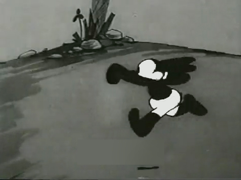 2
2I’d chosen a lot of stills from several of the
Universal/Lantz Oswald cartoons, animated by Nolan.
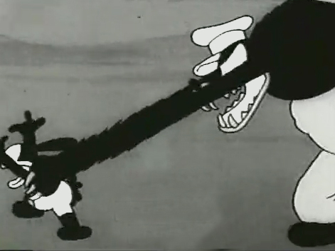 3
3 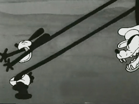 4
4
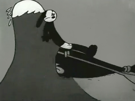
But so many of these from the short, “Permanent Wave,”
are good enough to illustrate my point.
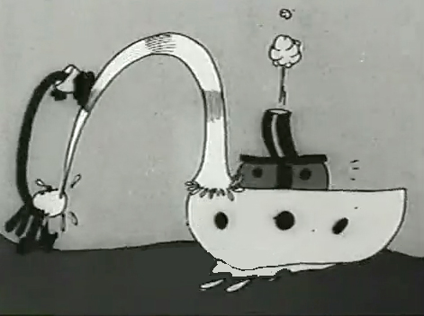 13
13 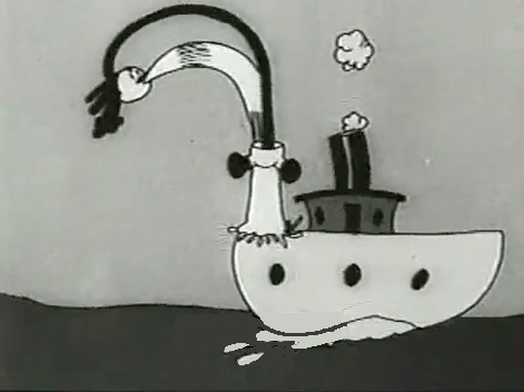 14
14
His body moves out in front of his head
as it climbs up the water he’s spitting onto the boat.
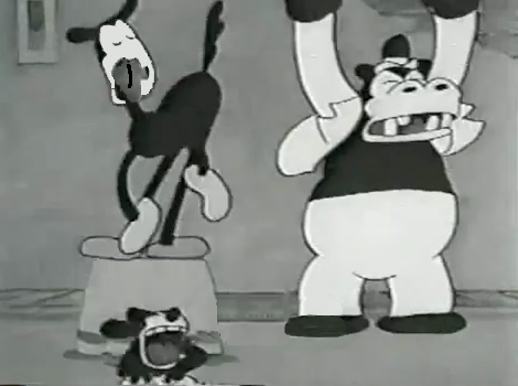
“The Hash Shop” was about as crazy as the animation and the gags went. Here’s one that ends the film.
By 1930, Bill Nolan seems to have settled down a bit. He still abstracts and distorts his animation, but he tries to fit in a bit more with other animators who aren’t drawing their animation quite so abstractly.
After Disney’s “The Three Little Pigs,” other studios tried to catch up with this new type of animation. Nolan and, to a lesser extent, Lantz, didn’t try very hard to change. They liked the way things were going. However, it didn’t take long for Lantz to move for a change in Oswald’s design. They went cuter and whiter on the rabbit.
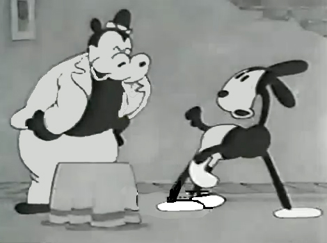
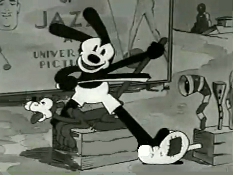
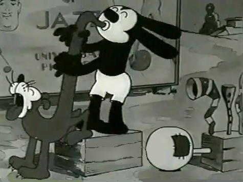
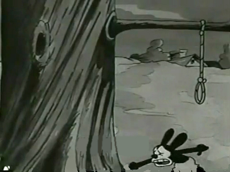
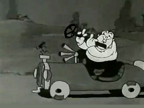
Here are some frame grabs from “My Pal, Paul.” In it Oswald wants to play music with jazz conductor/musician, Paul Whiteman. As it happens, Whiteman’s car breaks down while he’s driving through the woods, and the two get a bit of a duo as Whiteman plays the steering wheel like a clarinet. (Maybe that’s abstract enough.)
Commentary &Frame Grabs &Richard Williams &Title sequences 24 Mar 2013 03:38 am
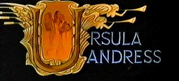
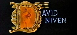
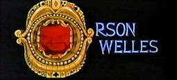
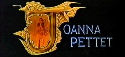
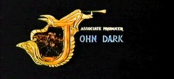
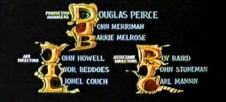
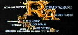
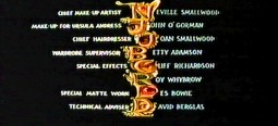
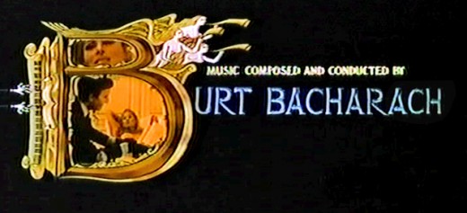
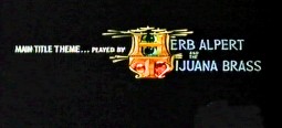
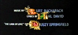
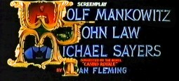
Dick Williams – Casino Royale Titles – recap
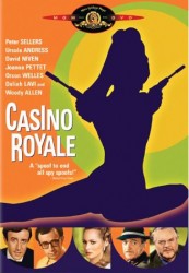 - Casino Royale (the 1967 original) was the fourth credit sequence animated by Richard Williams‘ Soho Square studio. Prior to this he’d directed What’s New Pussycat (1965), A Funny Thing Happened on the Way to the Forum (1966), and The Spy Who Came In From the Cold (1966).
Continuing the presentation I’ve done of other title sequences by Williams, here’s Casino Royale. The other Williams credit sequences of the period are generally rambunctious items with almost too much happening on screen. It often gets hard to read the credits – in a theater, never mind trying to do it on TV. (God bless imdb.)
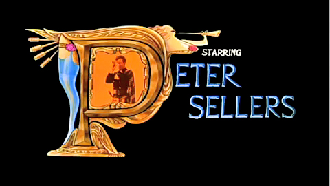
Theses are all frame grabs off a TV airing. My apologies for the horrendous quality. It aired on one of those cable channels that adds plenty of promos at the bottom of the screen (which I cleaned out of these images) overlapping many of the cards. They might have taken a bit more care to try to eliminate some distortion on the screen. The image skews, and the type gets distorted. I did my best with what I had. If I ever get my hands on a good dvd of the show, I’ll correct these images.
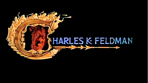
________________________ (Click any image to enlarge.)
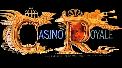
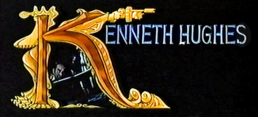
____Joseph McGrath, Robert Parrish, and Richard Talmadge also directed but I
____eliminated their screen cards as repetitious.
Dick Williams’ version of the opening titles
And for the sake of amusement here are
The credits from the 2006 version of the film
Designed by Daniel Kleinman
Art Art &Commentary 23 Mar 2013 04:23 am
Gawking
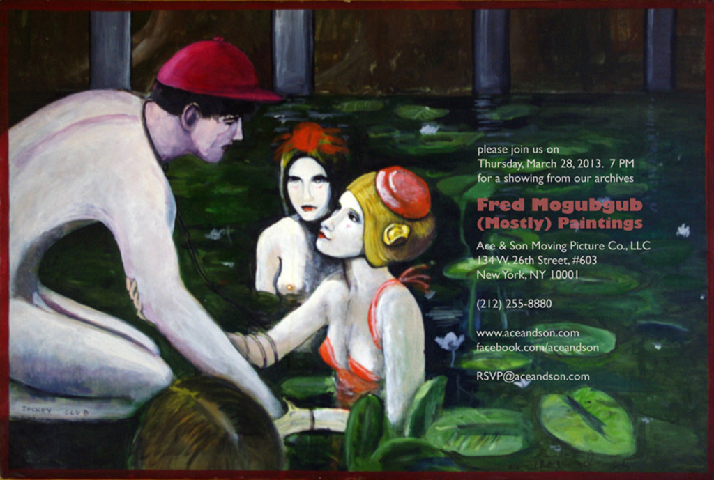
I can’t think of many artists who have supporters as solid as is Richard O’Connor toward the brilliant artist, Fred Mogubgub. Certainly Fred deserved and deserves the attention and support and pleased I am to see it given.
Richard will exhibit some of Fred’s bits of genius in the studio of Ace and Son. This coming Thursday, March 28th at Ace & Son. 7pm. RSVP@aceandson.com
How to Animate the Fleischer Way
Ignacio Carlos Ochoa recently placed this video on his blog. He said he wasn’t familiar with it. I saw the video about a year ago and thought it really nicely done. I’m not sure why I didn’t share it back then, but Ignacio’s comments make me feel like I should post it now, as he has already done. (By the way, his is a good blog and always worth a visit. Keep it in your eyesight; I put it on my sidebar.)
Crood Reviews
I guess Dreamworks’ The Crood opened on Friday, yesterday. The reviews felt so after-the-fact that I almost didn’t notice it in the NYTimes. The reviewer Neil Genzlinger wrote that “The Croods” is “. . . colorful and has an appealing central character and — who knows? — might even give the little ones something more challenging to think about than its tired main plot.”
Not the sort of review one might hope for. It contines that “. . . the movie is at its most interesting and amusing when riffing on how cavemen might have reacted to new experiences and ideas, like fire and shoes.”
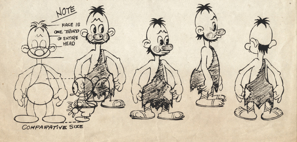 Flintstones . . . meet the Flintstones . . .
How many remember the Fleischer series called Stone Age? 12 shorts that couldn’t keep the Fleischer brothers together.
Great ideas just keep living on. I was a bit surprised a while back when Iwent to a party for How to Train Your Dragon; Chris Sanders said he’d be going on to The Croods, which was having a bit of trouble getting started. I thought his talent will probably not be best exploited there. But I don’t know. I can’t review the movie until I see it; that will be on Tuesday – that I see it. I’ll try to say something shortly thereafter. The film has to be better than Rise of the Guardians – talk about wasted material. I truly hope The Croods will be the bright spot of my coming Tuesday.
The NYTimes has a slide show about the design of the film. A violently colored watercolor toward the end of the slide show piqued my interest.
The review in the NY Daily News: “There’s a peculiar violence in the comedy in this CG-animated family film, similar to watching a loud, slapstick football game played by extraordinarily ugly plastic figures.”
“The film is best when speculating on the origins of human nature. Why, for instance, do we keep pets or love watching the horizon? When it gets past the Stone Age humor, this weird film manages to find some gentle revelations.”
The NY Post writes: Nothing Prehysterical Here – 1 star – “I’d like to take back all those times I said Nicolas Cage was one of the most annoying actors on film. It turns out he’s equally terrible when he’s only on the soundtrack.
And yet Cage is the least of the problems with “The Croods” . . .
63% from Rotten Tomatoes. That’s not too good. But then Oz the Great and Powerful got a 61% and has been the blockbuster these last two weeks.
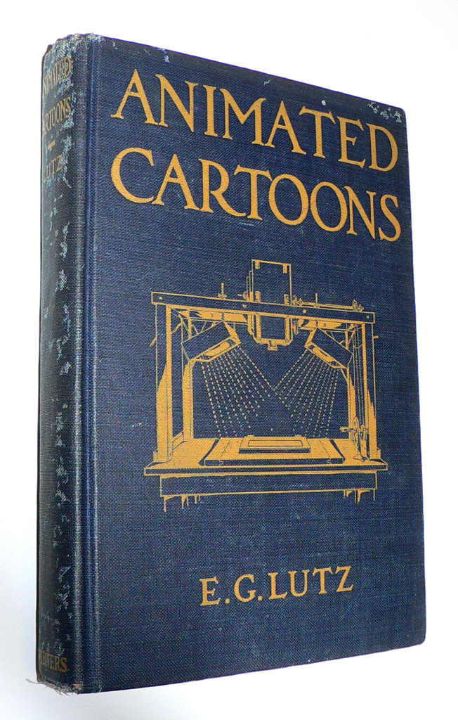 J.J. Sedelmaier has posted everything you want to know about the E.G. Lutz book, Animated Cartoons: How They Are Made (including a scan of the entire book).
The article, actually, is called How Walt Disney Used His Library Card, which is a more appropriate article, because it shows us other books that Disney probably checked out of his local library when growing up in Kansas City.
With some material borrowed from Mike Barrier‘s book, The Animated Man, we get a good picture of the young Mr. Disney staking out the world of the animated cartoon in the early thirties.
A New Face for an Old Effect
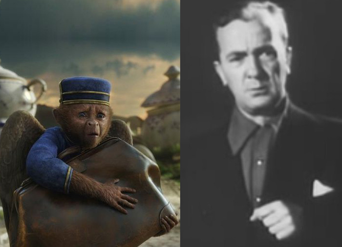
Finley, the flying monkey – Billy Bletcher with natural colored lips
Recently while reading Post Magazine in an article about the Effx for the new Wizard of Oz movie, Oz the Great and Powerful, I stumbled upon something interesting. Actually, it was only interesting because that same day I’d read a small piece in Mike Barrier‘s Hollywood Cartoons, and I found an interesting juxtaposition of the one story to the other.
According to Barrier’s book, back in 1934 Disney had chosen a Silly Symphony to direct, The Golden Touch. It would be the last animated film he’d take credit for directing. Disney had the two best animators of the day, Norm Ferguson and Freddie Moore scheduled to do all the animation in the film. A lot of time was given to every stage of this movie. When it came time to record Billy Bletcher as King Midas, they painted his lips white and filmed him so that Ferguson could use his lips in animating the character. The animation took a particularly long time and didn’t go well. Disney, himself, called the film “a tremendous flop.”
They didn’t paint his lips white, but they did photograph Walt Disney acting as the voice of Mickey Mouse when he did the track for “The Pointer.” The stills were used by Frank Thomas for the one big dialogue scene in the short, and Frank spoke several times, when I knew him, of this tactic.
Jump almost 80 years to shooting the monkey sidekick of the Wizard, James Franco, as he travels down the yellow brick road, seeking to become the Wizard of Oz. The two of them have a long conversation. The film’s visual effects supervisor Scott Stokdyk talks about the flying monkey partner of James Franco‘s wizard.
“Finley is the monkey who becomes Oz’s companion on the journey. He’s played by Zach Braff. The modern way for doing a CG character is to have them on-set, interacting actor to actor, and then paint out the stand-in actor and replace him with CG. We tried to do that whenever we could. But our CG Finley was three-feet-tall and had wings, could fly around, and was very active. So we couldn’t put Zach’s face where the monkey’s was.”
“We came up with this thing called ‘puppet cam.’ We had a puppet with a rod, and a monitor and camera on the end of it. We had Zach in the same booth that Joey was in, and he was interacting. We set up a virtual video conference, but it was executed through a monitor on a stick on-set. James had an ear rig, and he could talk to Zach, but was looking at a video monitor on a stick, put in the place of where the monkey’s head would be. And in the monitor he’d see Zach’s head in the booth. It gave us a proxy for having Zack on-set with his head in the right place.â€
All the time that has passed and not much has changed. They don’t paint Zach Braff’s lips white, but they do paste his video image onto a cardboard puppet on set. It all amounts to the same thing; it just costs a lot more money.
As a matter of fact I also think about the cardboard cutouts that James Baskett dealt with when shooting the live action sequences for Song of the South. It sounds very similar to what they did on the new movie.
ASIFA East Festival Judging Screenings
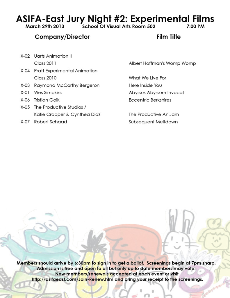
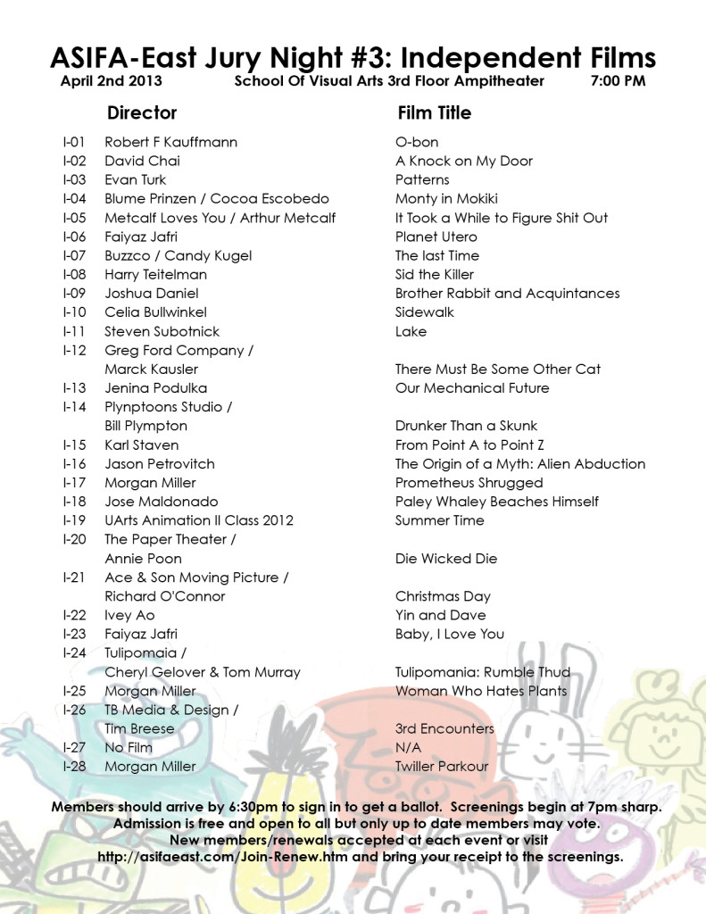
This week several nights will be devoted to judging the entries for the ASIFA East Festival. Remember that all members of ASIFA East are eligible to vote for the awards from the films to be screened. Get out the vote.
There will be four screenings:
1. Wed., March 27th – 7pm – Student films
2. Thurs., Mar 28th – 7pm – Commissioned Films
3. Fri., March 29th – 7pm – Experimental Films
4. Tues., April 2nd – 7pm – Independent Films
These are the films competing:
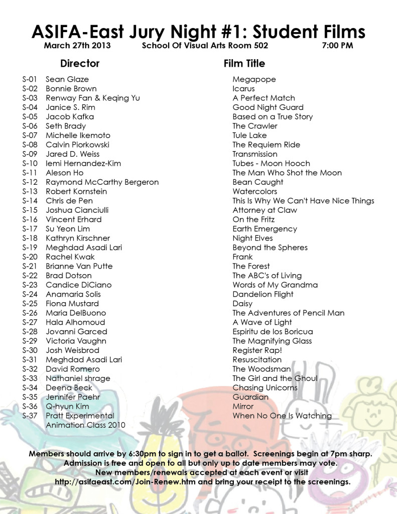 1
1 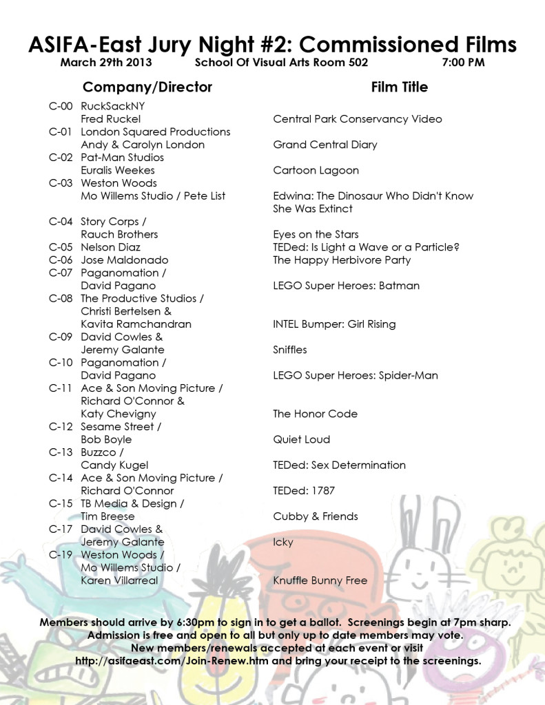 2
2
(click on any page to enlarge for legibility.)
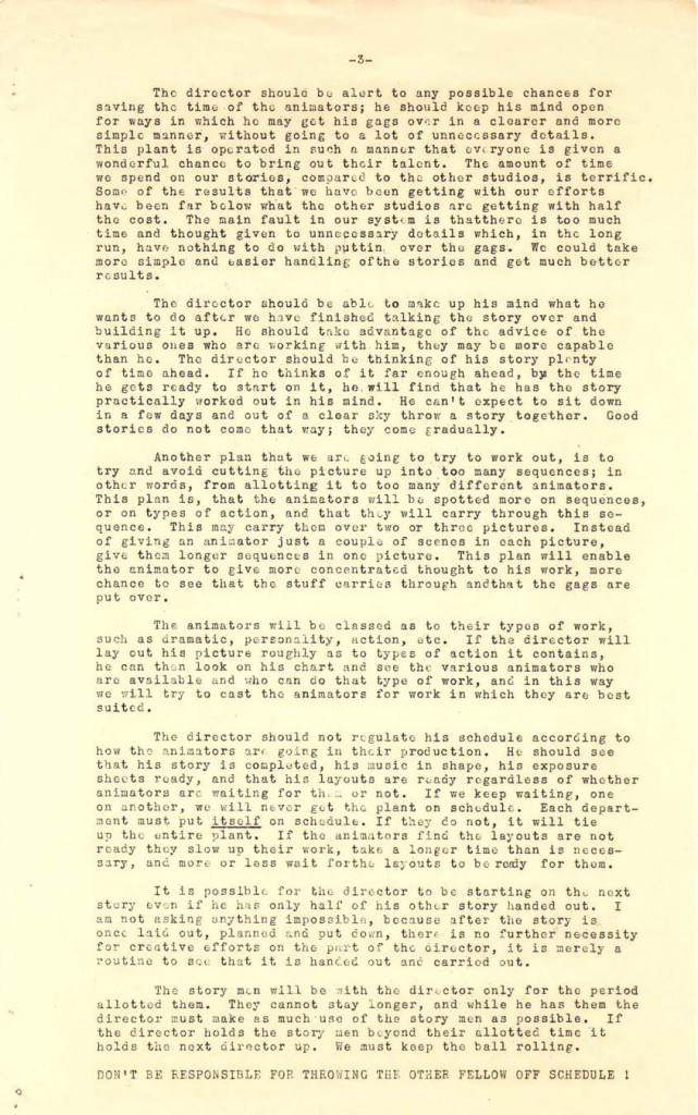
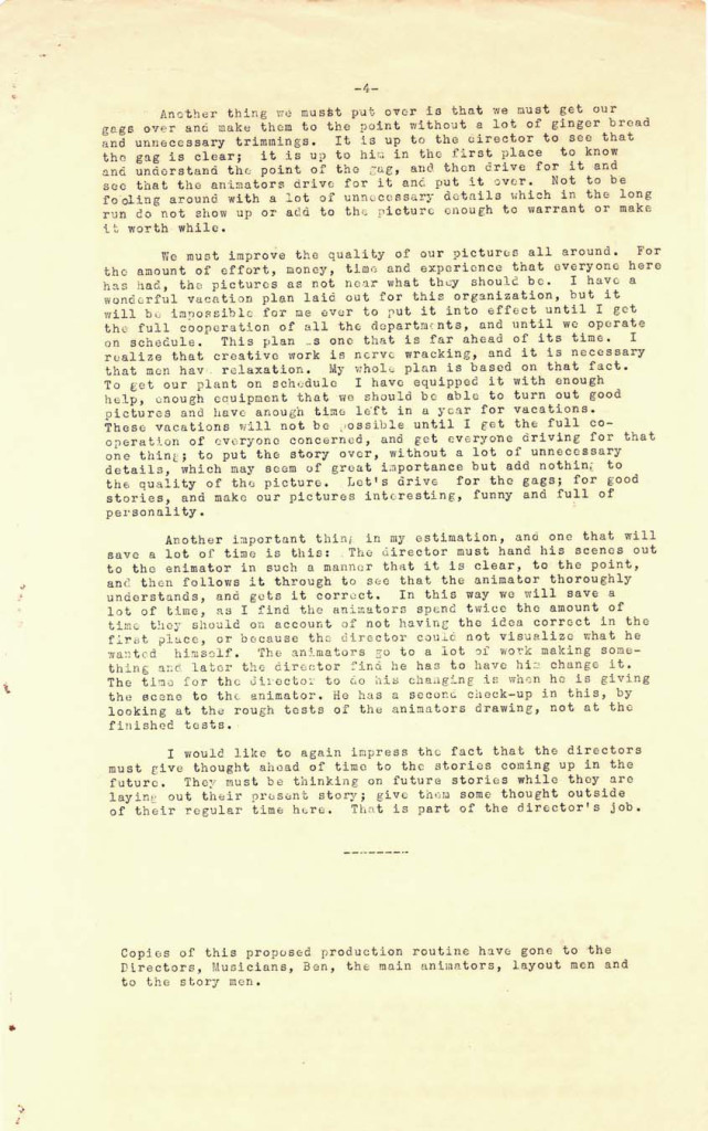
As an extra added attraction today, here’s a paper that was distributed at the Disney studio in early 1934, which outlines how their productions will move forward through the studio. They’re merely trying to set up some kind of organization, and they start by telling everyone how it will operate.
This document came from someone who would like to remain anonymous, but we thank him, just the same.
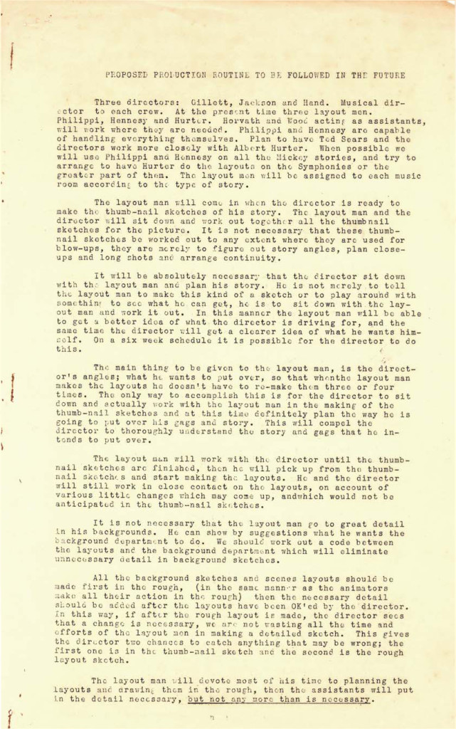 1
1 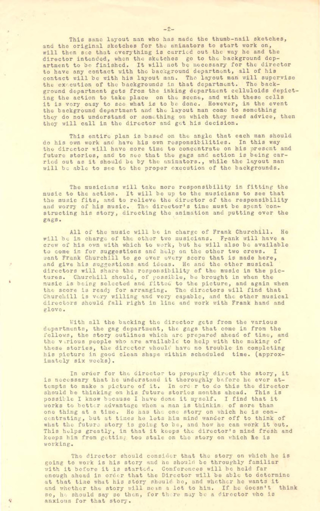 2
2
Art Art &Bill Peckmann &Illustration 22 Mar 2013 03:52 am
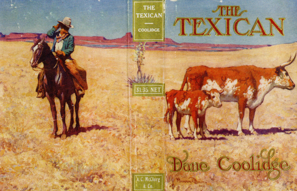
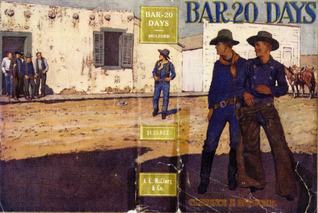
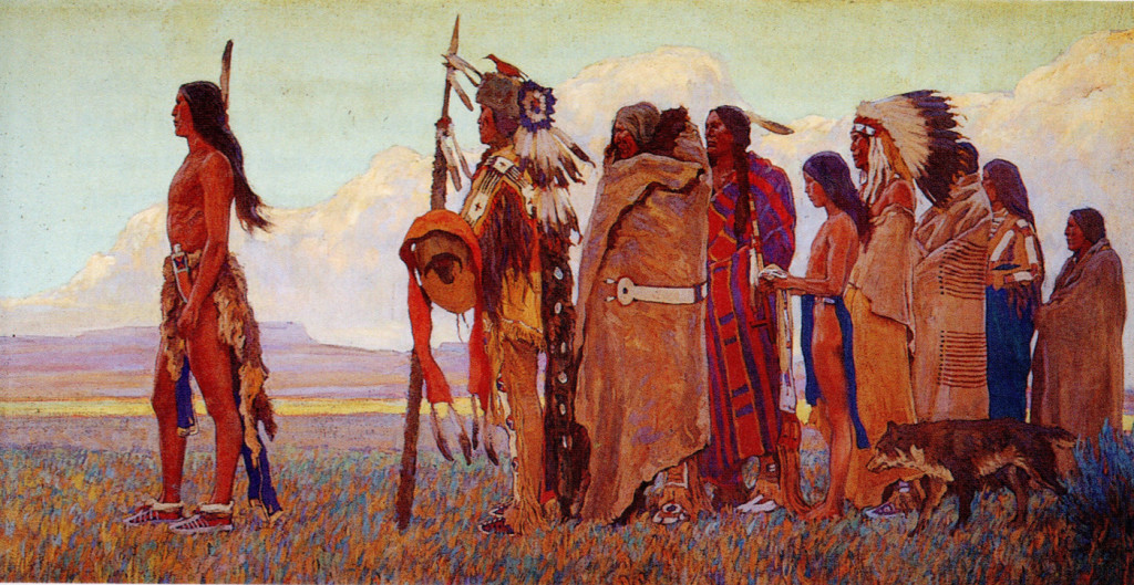
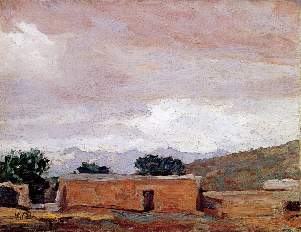
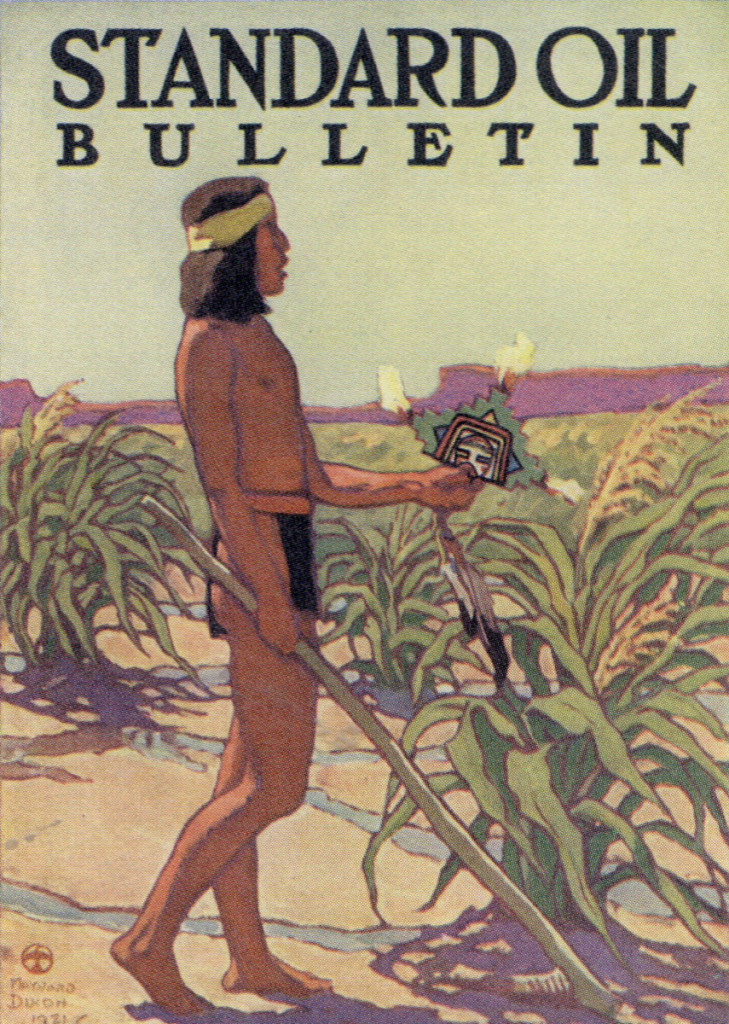
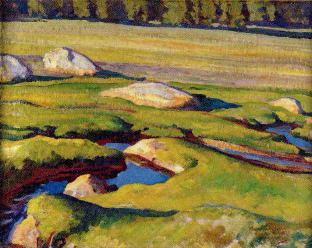
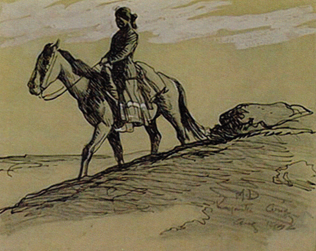
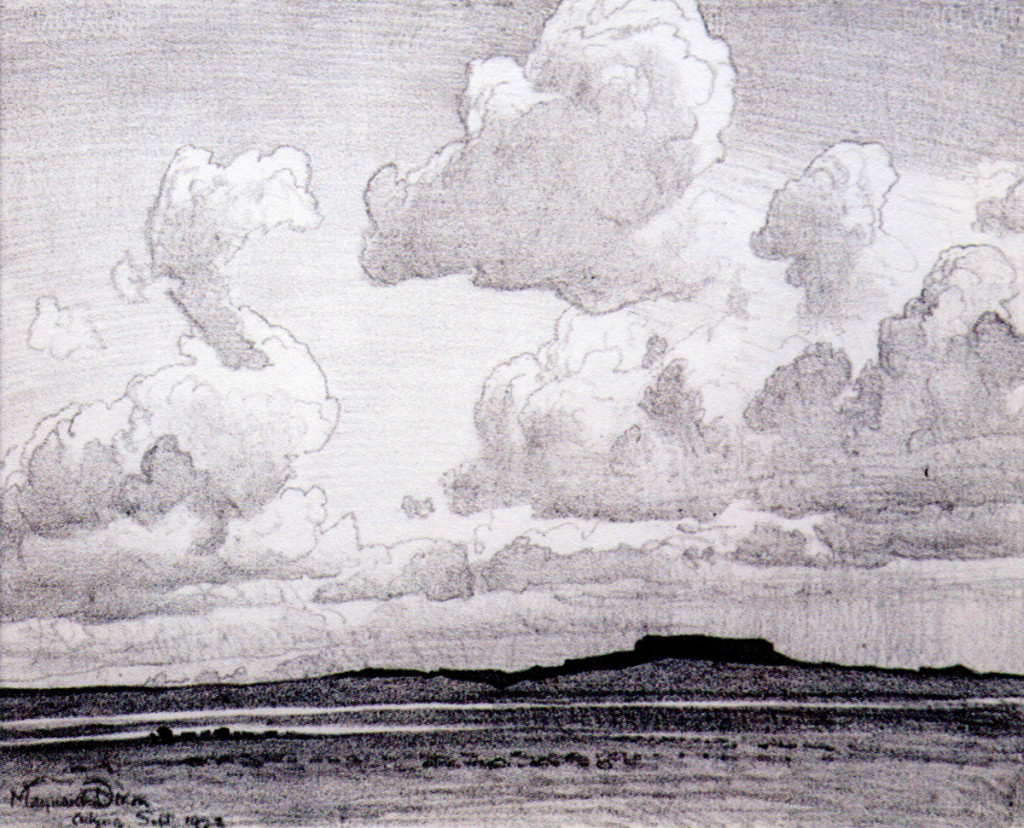
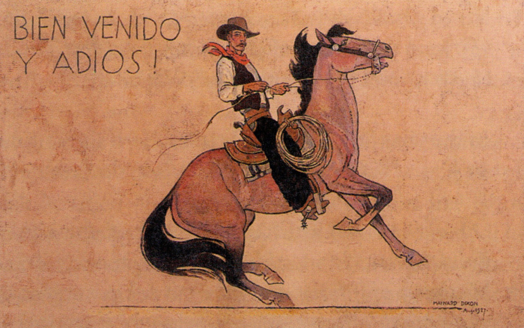
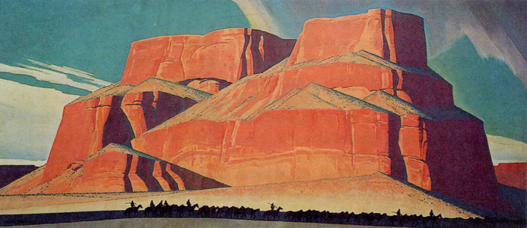
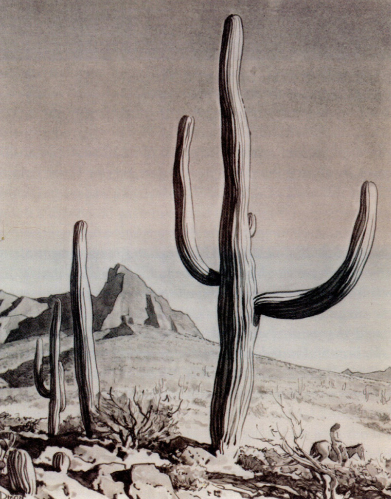
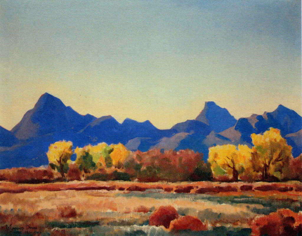
Maynard Dixon
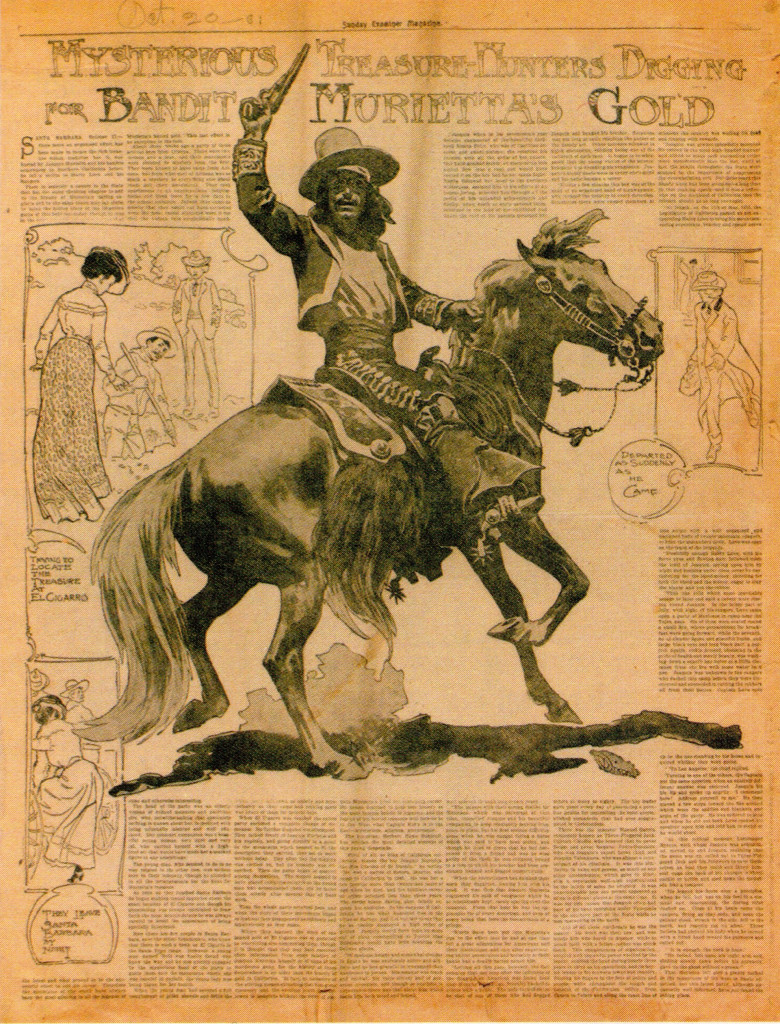
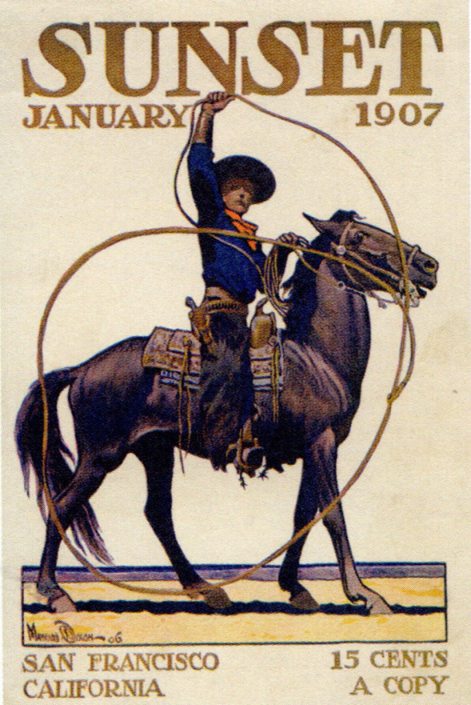
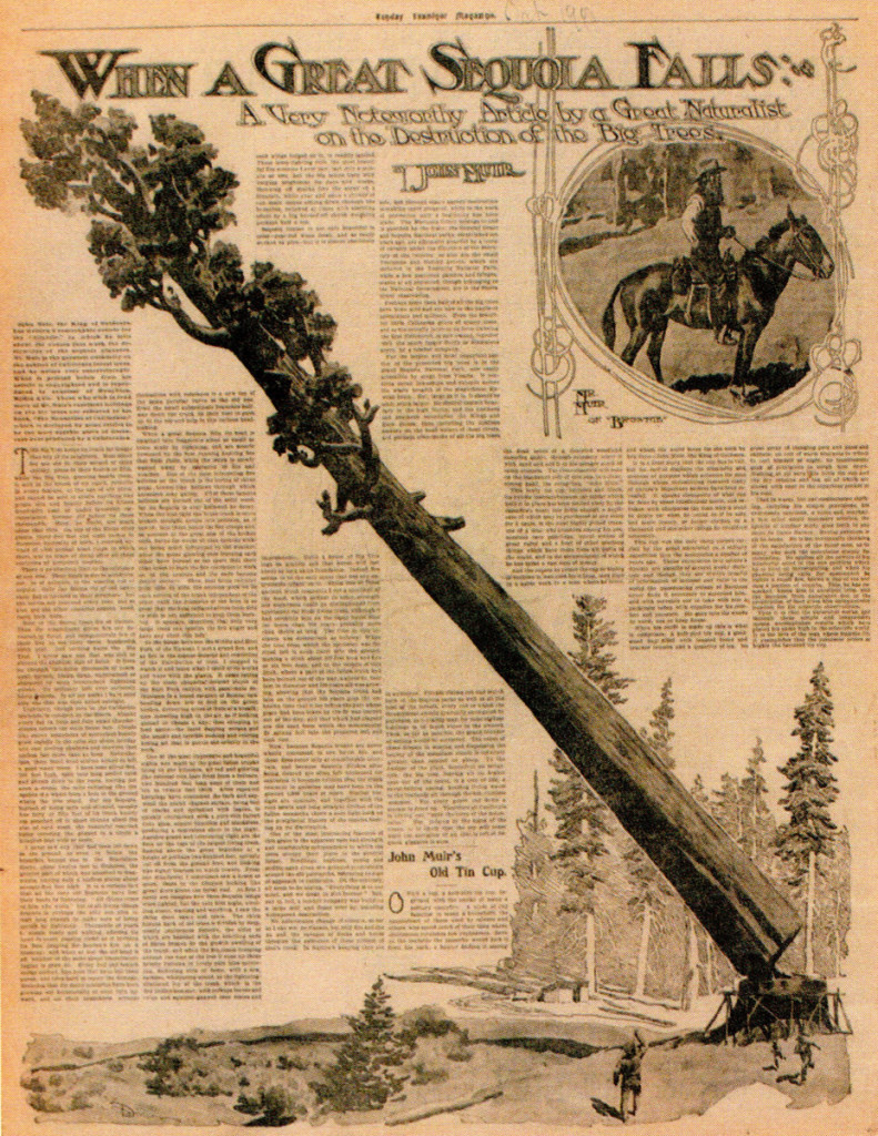
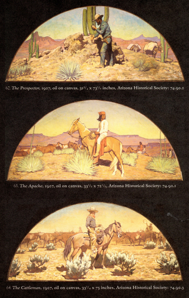
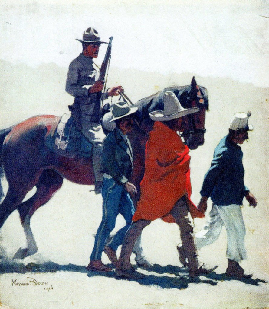
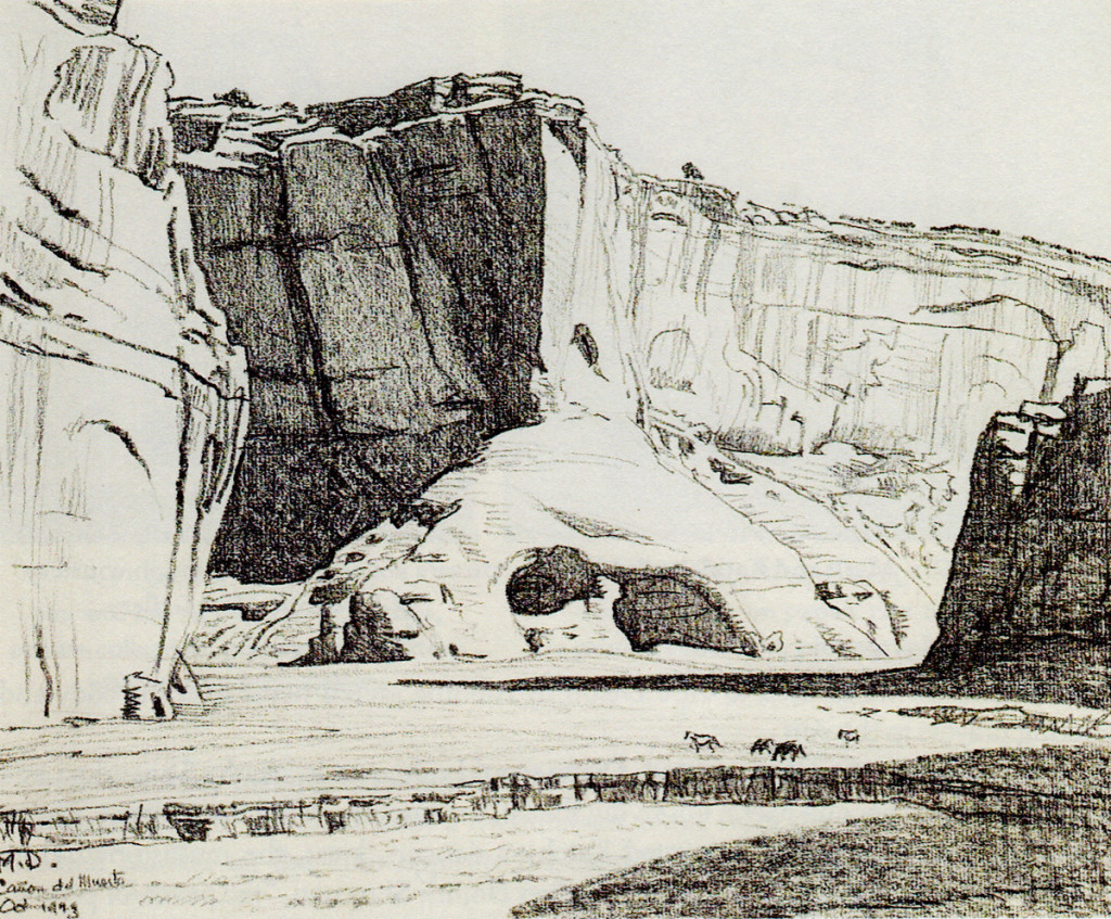
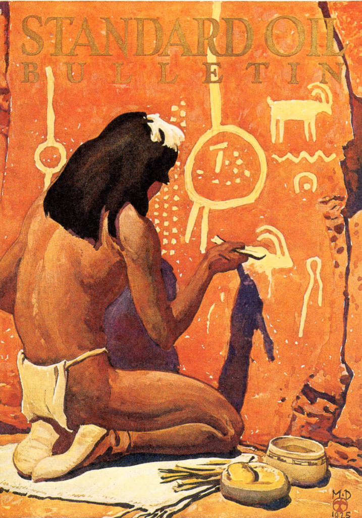
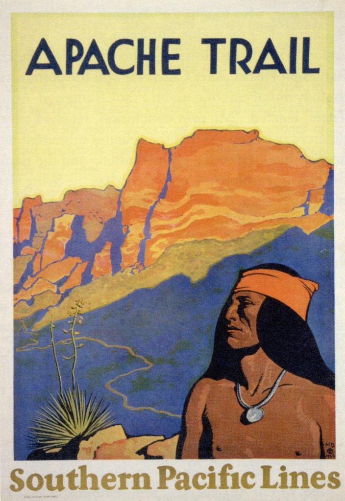
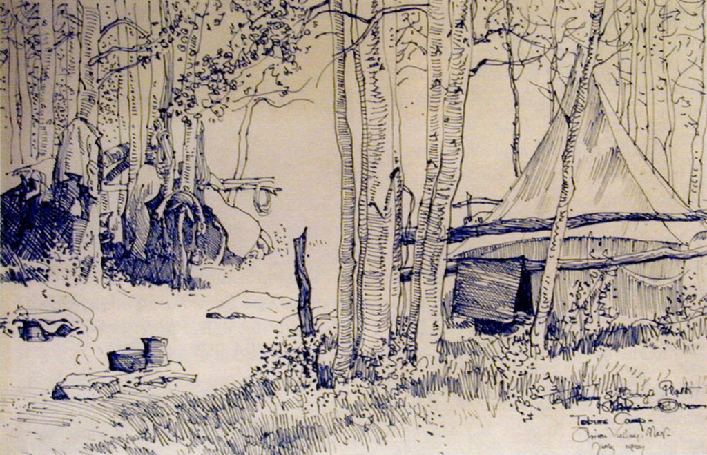
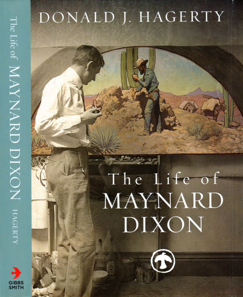
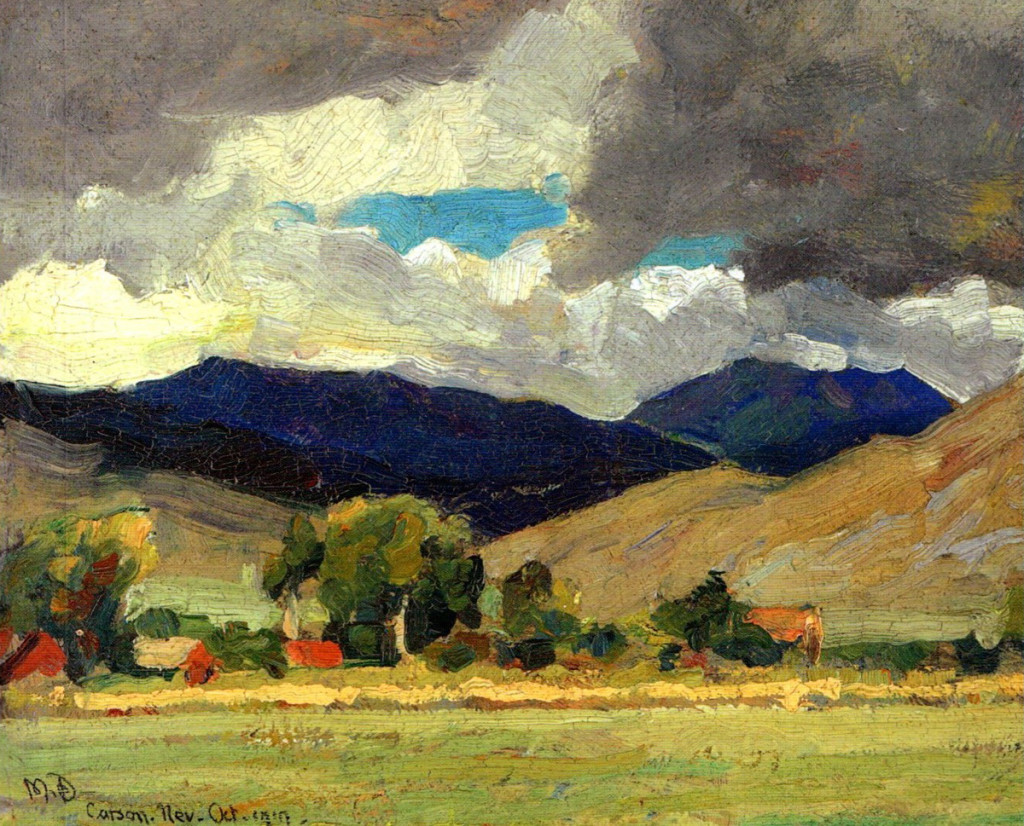
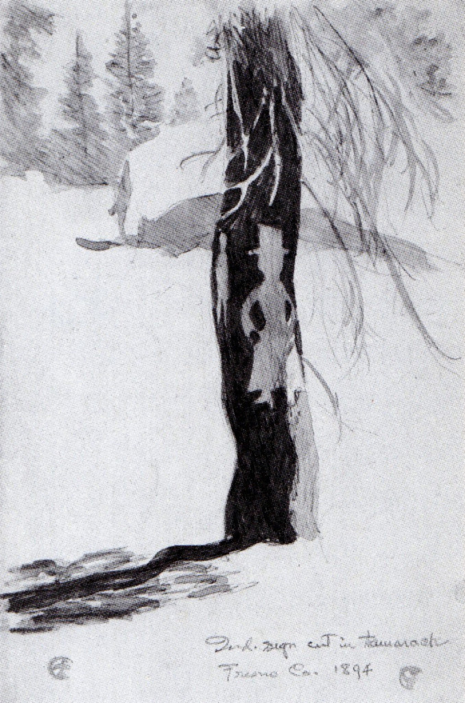
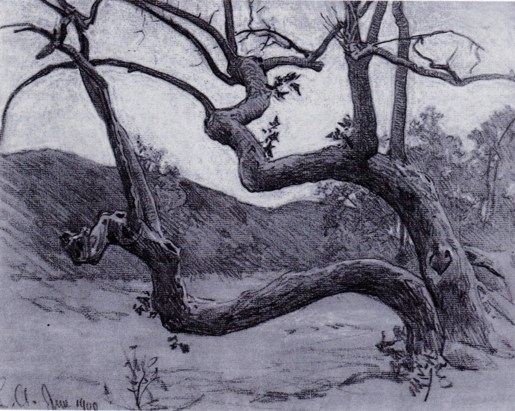
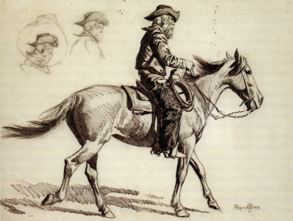
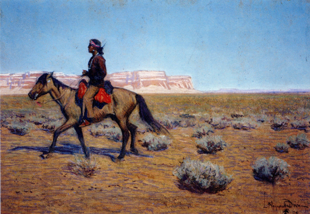
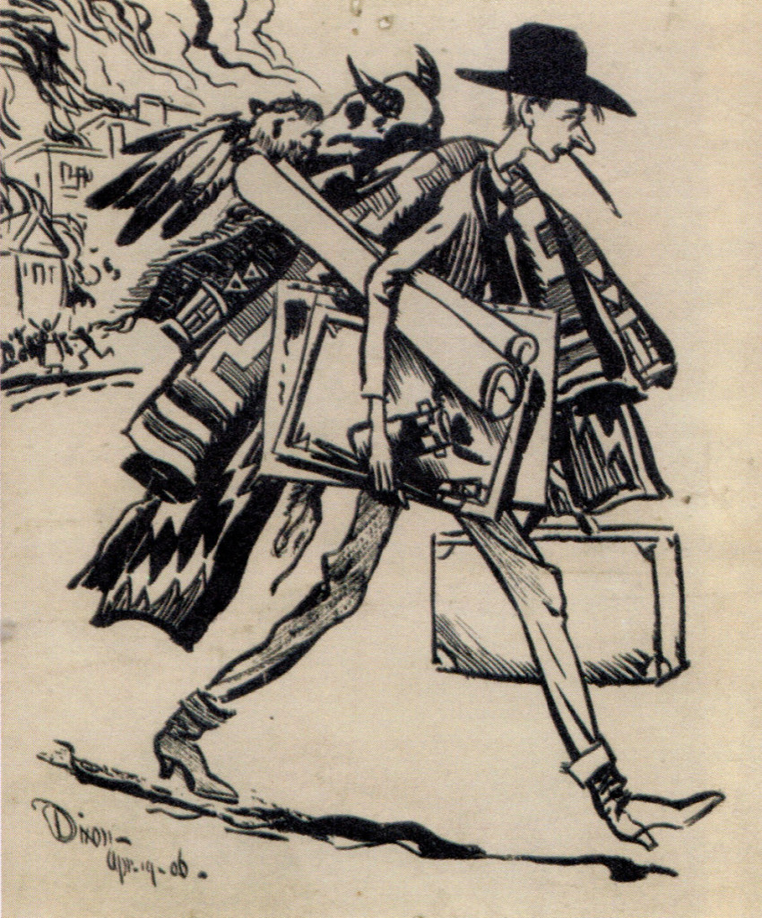
Maynard Dixon was a wonderful artist of the old West. His beautiful landscapes, his extraordinary posing of the figures in those landscapes, his ability to connect us to the scenes he so beautifully creates are strong reasons for caring deeply about his art. Bill Peckmann has this book, and he shared it with me/us. Is there anything more I need say? I hope you enjoy this artwork as well as do I
Here are Bill’s comments:
- This book of Maynard Dixon’s wonderful western art is not exactly a coffee table book, at 9 x 6, it’s more like a night stand book, but don’t let its’ bantam size fool you, it packs a very potent punch! This well written, perfectly researched and very enjoyable to read biography by Donald J. Hagerty, has it all. Profusely illustrated, with lots of pictures that I’ve never seen before. (The best part about that, is the fact that the illo’s are in sync with the text, you read about something and there’s a picture right there to illustrate the point. That doesn’t happen that often in books.) The price is a steal on Amazon, so whether you are a fan and have all of Dixon’s exceptional, well worth, over sized art books, or, you are new to the art of Maynard Dixon but want to find out what the noise is about, this IMHO is THE book to get!
Here are some of the illustrations that appear in the book. If you remember that Dixon was born in 1875 and then look at the dates of the illustrations, you’ll see what this mostly self-taught artist was capable of doing at a very young age.
 1
1
Here is the deftly done cover design, a composite of
a sepia photo of MD and one of his works in color.
 2
2
Carson, Nevada (Oct 1917)
A Dixon oil sketch that appears on the book’s back cover.
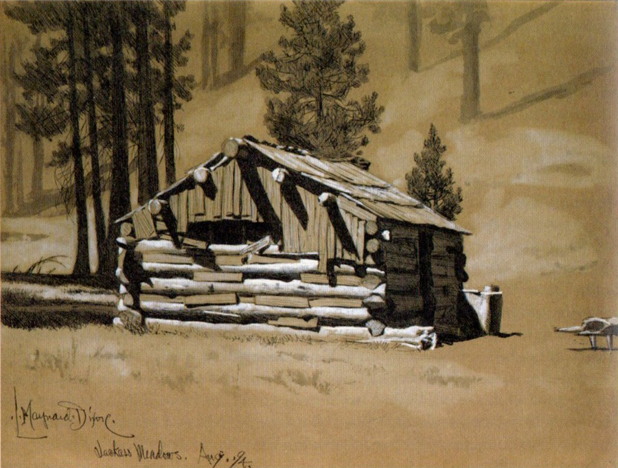
Jackass Meadows (1894)
Pencil and pastel on paper
 4a
4a
Indian Sign (1893)
Pen & ink on paper
One of my favorite Dixon sketches. It’s a haunting
piece of art, a sketch of another work of art.
 4b
4b
Sycamore, El Alisal (1900)
Pencil and charcoal on paper
 6
6
Oregon Cowboy (1901)
pencil and pen & ink on paper
 7
7
Indian on Horseback (1903)
Pastel on paper
This sketch done in 1903 looks like it came out of a 1950′s magazine.
 8
8
Fire and Earthquake (1906)
ink on paper


