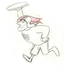
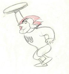
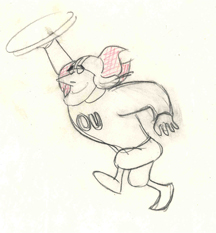
Monthly ArchiveMarch 2006
Daily post 31 Mar 2006 07:49 am
Bicoastal AMPAS Screenings
Jerry Beck on Cartoon Brew appropriately applauds the Motion Picture Academy for resuming their series of films that won the Best Picture awards and usually includes winners & nominees for short subjects. The has also been true of the NY chapter of the Academy. 
– NY screenings are open to the public and have had some success with packed houses. Thanks to the incredibly diligent work of Patrick Harrison, the prints have been superb, and there is almost always a guest to talk about the film. There has been no break in this series, and each month there’s been a classic screening to look forward to.
On April 10th HUD will be screened; Patricia Neal will be interviewed by TCM’s Robert Osborne. The Ernest Pintoff short, The Critic, will be screened. Unfortunately, Mel Brooks, who doesn’t quite narrate, but comments – won’t be there.
(Ernest Pintoff)
-
Tickets for the screening are $5 for the general public and $3 for Academy members and students with a valid I.D. and may be reserved over the phone by calling 1-888-778-7575. For more info go to: Oscars.org.
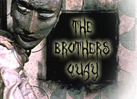
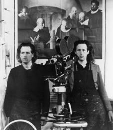 - People in LA also have a treat coming April 21st. The Brothers Quay will talk about their films in a personal appearance. This is something of a rare event, and it’ll be interesting to hear what they have to say.
Again, tickets are $5 for the general public and $3 for Academy members and students and will be available after April 1. For more information go to the Academy site.
.
- Amid Amidi has been busy today writing two excellent pieces on films & artists that inspire me. On Cartoon Modern, there’s a sampling of artwork and a thesis about Eyvind Earle’s work on Sleeping Beauty. On Cartoon Brew, there’s a link to view Yuri Norstein‘s masterful short, The Heron and the Crane. Enlighening and inspirational; worth the visits.
- Reviews (mixed but generally positive) are out for Ice Age 2. To read a few:
The NY Times
The LA Times
Roger Ebert
The NY Daily News
Animation Artifacts 30 Mar 2006 08:10 am
Gepetto goes to sleep
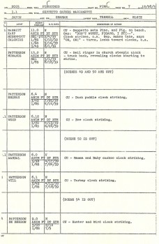
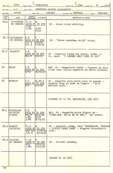
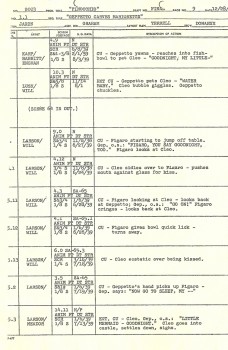
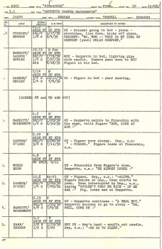
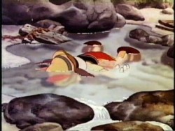 - Here are four more pages of the production scene drafts for Pinocchio. It takes us to the point where Gepetto turns out the light, and the small family goes to sleep.
- I always was curious as to why all of these books about the production of animated films rarely talk about the actual production. I’m not even talking about books written today; they’re all about the stars at the microphones and not about the films – in other words all they want to do is sell dvds.
These production drafts, to my knowledge, have never made it into any such book. Halas came closest with his Techniques of Film Animation book when he talked about the director’s workbook, and we’ve seen plenty of versions of exposure sheets.
As a kid, I would have gone crazy over the image of such a chart. It was out of my experience, and I knew nothing about it. The first time I encountered such a thing was in working on Everybody Rides A Carousel. The production chart – not too different from the Disney ones – were posted on oaktag in the studio, and I, managing the production, would literally check off scenes as they moved from phase to phase. It was nothing I’d ever heard about in a book – I mean, it’s obvous, I guess, to have them. But I just hadn’t thought about it.
To this day, I still don’t know what a production chart/draft would look like in a couputer animation house; I’m sure they’re there, but no one mentions them. I guess I should look into it.
SpornFilms 29 Mar 2006 07:47 am
More Bridget BGs
I’d like to call attention to two more films Bridget Thorne designed for me.
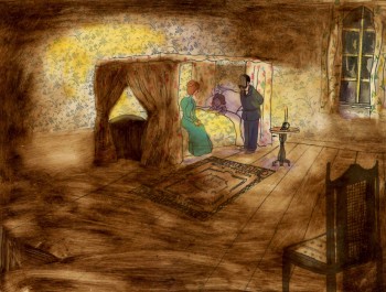 A Child’s Garden of Verses presented new and different problems to explore.
It was a project generated by HBO. Charles Strouse and Thomas Meehan were going to write the book and song score. We met several times trying to discover a way into the book of poems. I’d suggested we use the verses in Robert Louis Stevenson‘s book to illustrate the author’s early childhood.
(Click on any image to enlarge.)
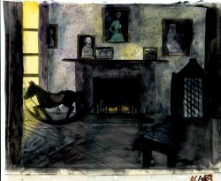 Stevenson was a sickly boy who was always confined to his dark room. He was not expected to live long. The only visitor for days on end was his overprotective mother.
For much of the film, we had only the dark, child’s bedroom to explore. Artistically, I asked Bridget to delve deeper into the photgraphic dyes that she had discovered and used so well in Ira Sleeps Over. These dyes would allow us to keep the style, once again, loose while exploring dark areas and brush strokes to simulate the darkness “Robbie” lived in.
For the wallpaper throughout the house, Bridget used real wallpaper which was photostated; scaled down and reshaped to fit the backgrounds. Then watercolor washes colored these backgrounds and overlays were mixed and matched to get the desired results.
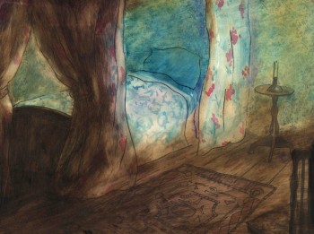 I was never quite pleased with this film. The elements that worked well worked really well. Bridget’s work was a highlight. The acting was extraordinarily good. Heidi Stallings performed with an enormous amount of emotion yet barely raised her voice above a whisper. Jonathan Pryce was brilliant as Robert Louis Stevenson, the narrator and even sang a song when asked at the last minute. Gregory Grant as the young “Robbie” was vulnerable, sweet and all we could have hoped for.
However, there was too much of a rush given the delicacy of the piece, and the exterior backrounds done by me for the end of the film are poor. The animation is also hit and miss. Oddly enough, my favorite sequence used little actual animation but intense camera work. Ray Kosarin was the animator in charge of it, and it’s an impressive sequence.
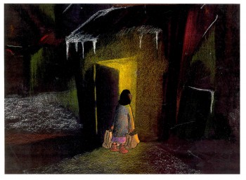
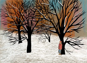
- The Talking Eggs was done for a PBS series called Long Ago & Far Away. It was an adaptation of a Creole Folk Tale which Maxine Fisher updated for me. (Lots of discussion between WGBH, Maxine & me about what distinguishes a Folk Tale from a Fairy Tale. It seriously impacted the story we were telling and I wanted what I wanted and got.)
Bridget chose to use pastels and we searched for a paper that would bring out the most grain. I loved the end result. The characters, to match the look of the Bgs, were xeroxed onto brown kraft paper and colored up from there with prismacolor pencils. This was cut out and pasted to cel.
 Danny Glover was the narrator, and we chose to make him an on-screen character appearing intermitently in the film. His narration was recorded on a rush as he stopped off in LA from SF on his way to direct a film in Africa.
There’s a focus in these backgrounds that matches the content and mood of the piece, and it worked wonderfully for my purposes. I always like it when the medium is front and center; I want audiences to know that they’re watching animated drawings, and texture usually helps to do this. Of course, I also want the films to have a strong enough story that the audience gets past the point of knowing, to enter the film. It works some of the time, and I’m in heaven when it does.
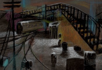 Bridget altered the color of the paper on which she was coloring with the chalks, and the different colored papers represented varied moods from sequence to sequence.
Naturally, there were some problems with the chalks under camera. All the fixative in the world didn’t stop the chalks from bleeding onto the cels or platen on the camera. (Lots more cleaning involved than usual.) We heard constantly from our cameraman, Gary Becker. The extra effort was worth it; the look was unique and successful.
Festivals 28 Mar 2006 07:19 am
Tribeca Redux
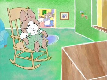 – For the second year in a row, I have a film in the Tribeca Film Festival.
The film, – rushing to completion – READING TO YOUR BUNNY – will be screened as part of Tribeca’s Family Film series.
Saturday April 29th, 10:45am & Sunday May 7th, 11:15am at The AMC 34th Street Theater and Sunday April 30th at 10:00am at AMC 68th Street.
The gatherings, attention, parties and goodies they hand out is certainly the best part of this festival. Film makers are really made to feel special.
- There’s also a program of Independent Animation at the festival with a lot of NYC animation involved. I’m somewhat surprised that two of NY’s most important independent film makers weren’t included as part of it. George Griffin and Lisa Crafts both have exciting new films, and I’m sorry their films aren’t in it.
- ASIFA Hollywood has posted some excellent photos and a few comments on the UPA screening held in Hollywood Sunday night. It’s nice to see photos of Willis Pyle again; I haven’t seen him since Raggedy Ann & Andy (30 years ago). Also nice to see Howard Beckerman there; I hope he’ll write a piece for ASIFA NY’s newsletter. I hope someone will do a more in-depth cover of the event. Jerry Beck also talks about it briefly on Cartoon Brew.
- Amid Amidi continues to post stunning UPA art on his site, Cartoon Modern. More of Rooty Toot Toot. (There’ll never be too much for me.)
- The Cannes Film Festival, which hasn’t completely selected its roster of films to unveil next month, will probably include a couple of animated films. French animator, Michel Ocelot’s medieval Arabian tale “Azur and Asmar” is a likely contender as is Belgian director Picha’s satirical teen/adult cartoon “Snow White”. Picha’s film “The Missing Link” screened in competition at Cannes in 1980.
- Meanwhile Pixar’s “Cars” will not be previewed in Cannes because Disney’s European junket for the film will take place at the Spanish Grand Prix in Barcelona – the weekend before the Cannes festival begins.
SpornFilms 27 Mar 2006 08:12 am
Bridget’s Art
Lost in my Web Host’s upgrade was my tribute to Bridget Thorne, and I want it there for her. So, with this post I’d like to give some attention to one of the artists who have worked with me over the years.
Bridget Thorne is someone who has been an invaluable part of the history of my films. I hope to feature some of her work in the next week.
She has been an extraordinary Art Director and Background painter on quite a few of my favorite films produced within the studio.
(Click image to enlarge) Lyle, Lyle Crocodile (1987)
This painting is a key transition point in Lyle, Lyle Crocodile. The film had a looseness that Bernard Waber‘s original book art had engendered. I felt very much at home in Waber’s style, and I think Bridget did as well.
She worked out a color scheme for the film, and we both agreed to follow it closely through the film. Liz Seidman lead the character coloring. Bridget, of course, had a strong hand in all those character models, as well.
The scene pictured above follows the introduction of Autumn on “East 88th Street”, and the background brings us full force into it as we get “the girl’s first song” – Mrs. Primm’s report on what it’s like to have a crocodile living in your house.
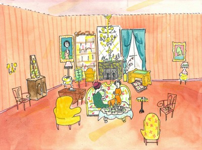
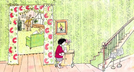 – Ira Sleeps Over was the second children’s book by Bernard Waber that we adapted. This is a very sweet story which involves a sibling rivalry; it focusses on a teddy bear and a sleep-over party. I pulled composer, William Finn, into the film and he wrote some great tunes for it. Prior to doing the script, I gave him the book and asked him to figure out where he would like the songs. In a week he had already written all the songs for the film, and they were brilliant. It turned out he used all the words of the book in his songs, and now I had to find a way of telling the same story using past, present and future tenses, as he did in the songs. It was a good challenge that worked out well and created a fabulous construction for the story.
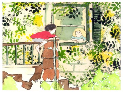 The style in this book was, if anything, looser than in Lyle. Waber did a lot of his illustration featuring duplicating printing techniques. Lino cut enabled him to repeat decorations throughout the settings. Bridget played with the lino cuts and was able to succesffully duplicate the technique in the backgrounds. In this one bg, at the beginning of the film, the foliage is a good example of this technique, printed over watercolors. The characters are markered paper drawings cut out and pasted to the cel overlays.
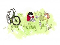
The book, like Lyle, featured a lot of white space, so we followed suit. When a book’s been in circulation for over 25 years, you have to realize there’s been a reason for it; find the reason and the heart, and take advantage of it. This use of white space made the actual backgrounds oftentimes little more than abstract shapes of color with a solid object on the screen. Here, for example, we see Ira and his friend, Reggie, playing against a blast of green and a bicycle.
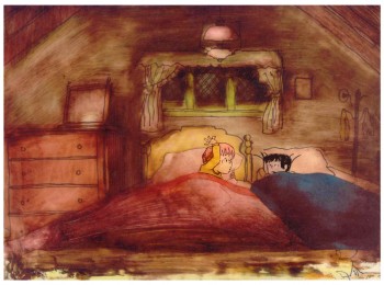 – At the end of the film, Ira and Reggie talk in the dark at the sleep-over. To get the look of the dark Bridget had to come up with something clever. The book resorted to B&W washes of gray and wasn’t very helpful. She came up with some dyes that were used for photo retouching. By quickly painting these lightly onto cel levels with a wide brush, she was able to get translucent cels with the brush strokes imbedded in the color overlays. By placing these overlays over the characters and backgrounds, we got the desired effect that let it feel connected to the very loose style of the film.
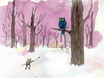 -Abel’s Island is one of the few films we did that I treasure for its artwork. Bridget’s work on the backgrounds was, to me, extraordinary. The looseness I love was developed into enormously lush backgrounds using shades of green that I didn’t know could be captured in the delicate watercolors.
This film was a complicated problem that seemed to resolve itself easily and flow onto the screen without much struggle. The book had won a Newberry Award as best children’s writing of its year. It was not a picture book but a novel. The more than 120 pages featured fewer than 20 B&W spot drawings by author/illustrator, William Steig. We were on our own with the color.
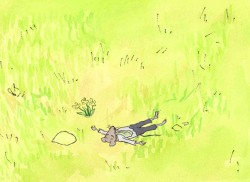 However, we had adapted Doctor DeSoto and The Amazing Bone as shorter films and could use what we’d learned from Steig on Abel. Bridget topped herself.
Several of the animators gave us more than I could have expected. Doug Compton‘s animation of Abel sculpting his statuary and living in his log was heart rending; Lisa Craft‘s animation of the big pocket watch, the big book and the leaf flying sequences was nothing short of inspired; and John Dilworth‘s animation of the owl fight was harrowing. This was all set up and completed by Tissa David‘s brilliant animation of Abel in the real world with wife, Amanda. She established our character.
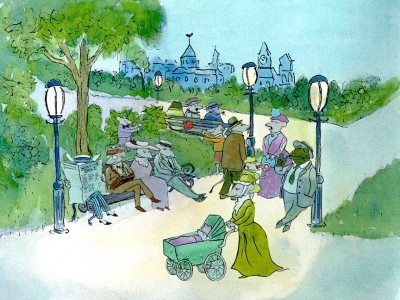 – At the end of the film, Abel, who has been separated from his new bride, trapped on an island for over a year, finally gets to come home. He sees Amanda in a park at twilight but decides to hold back. He races on ahead of her to greet her, privately, at home. The park sequence has a busyness as an acute counter to the lonliness we’ve watched for the previous 90% of the half-hour program. Setting it at early evening gave an opportunity for rich, royal colors. Bridget took full advantage of the opening, and underscored it all with a regal green not seen earlier. It was stunning and is one of my favorite backgrounds in the film.
Animation Artifacts &UPA 26 Mar 2006 08:41 am
UPA of the Past
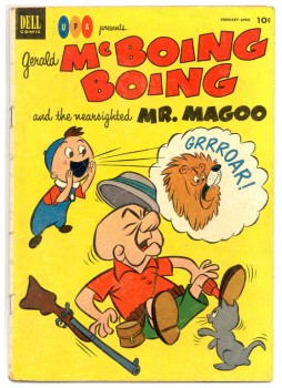 – There’s been a lot made about UPA these past few weeks because of the upcoming show in Hollywood at The Egyptian Theater (today). Rightly so, they did some great work in their early years.
But we have to remember that once they reached their pinnacle during the early fifties, they sort of STOPPED and kept running in place. After teaching the world that 20th century graphics worked in animation – unlike the model set by Disney et. al. – they stopped in their Steinberg phase. Magoo kept puddle jumping, and after the first McBoing Boing, they broke little ground with the character.
It took till the late fifties for me to catch up to them, so I’m glad they ran in place for awhile. I loved Magoo’s Christmas Carol, regardless how limited its animation was. I even watched the Dick Tracy show as a kid and was happy that it looked different than Little Audrey and Popeye. But if we look seriously at the history of animation, we have to say that ART stopped happening at UPA after Unicorn In The Garden, The Telltale Heart and Madeline.
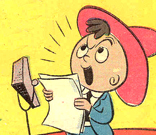 – Dave Hilberman and Zach Schwartz had left the studio because of a control issue in the studio. John Hubley eventually was forced out for fhis political beliefs and another attempt to control the studio.
Hilberman and Schwartz started Tempo, a commercial production studio in NYC, in 1947 and continued working until McCarthyism hit and closed their studio. Hubley eventually started Storyboard, also to produce commercials. However, Hubley started work on Finian’s Rainbow, an animated feature that, from the look of the remaining art and soundtrack tapes, was certainly a push forward for the ART of animation. That, too, was ultimately killed by Joseph McCarthy’s attempt to destroy civil liberties.
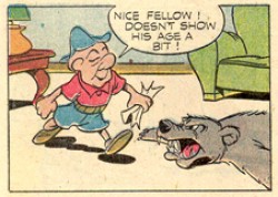 Hubley moved to NY and began working in the style of the new art, abstract expressionism. UPA continued turning out cartoons in the style that they been stuck in for the rest of their history. They no longer were moving the ART forward, but were exploiting their reputation for the commercial interests.
In their initial days, UPA was the studio that changed the world of animation. The films they did in those days are the ones celebrated at events like today’s. It’s wonderful that those films are still alive and being seen. It’s too bad the studio didn’t go further; maybe they’d still be around.
- Today’s NYDaily News has an article about animation features by lead resident critic, Jack Mathews. Talk about art!
Animation Artifacts &Comic Art &Hubley 25 Mar 2006 07:41 am
Letterman I, II, & III
Trying to recover some of the highlights from the past two weeks, I’m reposting these items from the Letterman series done for The Electric Company, starting back in 1972.
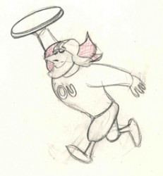
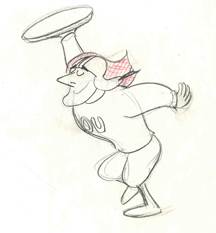
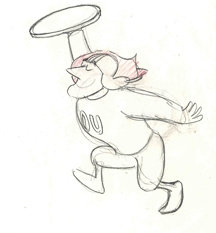
- These drawings are animation drawings of a run cycle done by Tissa David for the first season of the show.
There were three seasons of Letterman episodes we did at the Hubley Studio. All 60 episodes were 2 1/2 mins. apiece including the reused wrap-around: “It’s a bird! It’s a plan! It’s Letterman!” They were all directed by John Hubley. The first 40 episodes were all done in-house. The last 20 episodes were split with 10 done in the NY studio and 10 farmed out to Fred Wolf‘s studio in LA. The boards and layouts in NY for those sent out. Fred and Chuck Swenson animated all 10. (These are also the only episodes to use cel vinyl.) The audio was done in NY, and editing was done in the studio by Faith Hubley.
In the first season of the show the primary voices were: Gene Wilder as Letterman, Zero Mostel as Spellbinder, Joan Rivers as the Narrator, and Jack Gilford doing incidental voices. Billy Taylor did the music.
II
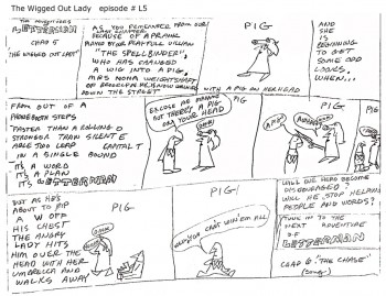 Christopher Cerf wrote all 60 episodes of Letterman, probably in collaboration with John Hubley. The storyboard posted here for episode #5 was by Chris Cerf; that’s pretty much how he did the scripts.
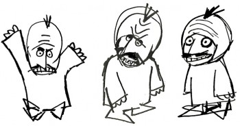
It’s undeniable that the wacky “naive” drawings undoubtedly inspired the models for the characters in the films.
(Click on any image to enlarge to a readable size.)
No doubt also affecting the models was an acccident that John Hubley had had at the start of production on this first series. At a dinner party, John tried to stop a falling 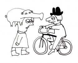 fondue pot filled with melted cheese. Horrible burns over both hands somewhat hampered his artwork. I would make several visits a day to his nearby apartment to have art approved. To have John draw, we’d prop a felt-tip pen into the mass of gauze and cotton and bandages wrapped around both hands. He’d move his wrapped fist around a sheet of paper and end up with a model like the one posted here. This went on for about three weeks (roughly half of the production time.) When he returned, backgrounds were done at a super speed.
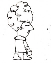
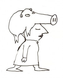 Everything was modeled on Krazy Kat. Lots of white space with sparkling color sprinkled about. The lines were dressed up with a ragged cross-hatching. The characters were colored with magic marker. (John’s favorite color was Eberhard Faber’s “Shock Pink”. Letterman’s skin color took this tone. It showed up in almost everything John did with markers.) The backgrounds were inked with a pentel felt-tip. John would throw a light wash of water over some of these lines to get them to bleed.
We’d race daily to get at least half a dozen scenes ink, painted and colored on paper. Then it’d be packaged and sent out via Fed Ex. (Celine Miles in LA cut & pasted the colored drawwings to cels; the art was shot at Animcam by Jack Buehre.) The FedEx guy arrived daily at 5:30pm, so that was my deadline. I found myself coming in at 7am to add more time to the day. I’d watch the clock which ticked furiously; I averaged 30secs to ink a drawing – any more, and I wouldn’t make Faith’s deadline.
III
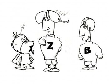 – These scrappy examples are not the best to give an indication of Letterman. But they were the ones I saved, so they’ll have to do. John Hubley drew these very early in the production, and they undoubtedly owe something to Chris Cerf‘s hilarious storyboards.
The animators involved in season one included: Tissa David, Johnny Gentilella, Vinnie Bell, Lu Guarnier and Jack Schnerk.
Helen Komar, a veteran Asst. Animator in NY, was the coordinator of the production and Gen Hirsch also colored. Gen and I got really close over the couple of years we worked together. She was the wife of Joseph Hirsch, the brilliant artist and mother of Paul Hirsch (editor of Star Wars and other incredible films) .
It was my first real job in an animation studio. Probably for this reason, I remember a lot of what happened – it was indelibly etched in my memory. I was the inker, colorist (we used markers, remember), animator of miscellaneous scenes (I think I animated some 40 scenes that first season), hole puncher, and Assistant Animator.
 It was in the capacity as Assistant Animator that I found trouble. I hadn’t done it before, except for myself, so was horribly untrained. Because the schedule was so ridiculously tight, I had to assist in ink (Sharpie pens – the fat ones that dribbled ink and bled through multiple sheets of paper) and correctly put some of the animation – I won’t say on model, but closer to model.
Johnny Gentilella, an absolutely wonderful guy, was the farthest astream. He was THE Popeye animator at Paramount. His characters looked like Paramount characters, and I had to get them closer to John’s style. This meant assisting (in ink), inbetweening and basically redrawing everything he’d done – in a rush – without proper training. The guilt of what I was doing to Johnny’s drawings weighed heavily on me, and I eventually apologized to him for what I’d done. He laughed and told me that he had no problem with it. This was standard for NY production in those days and he was used to it. (As a matter of fact, he hired me for another job he directed months later. So I guess he wasn’t too upset. I was.)
The race against the clock was always on; my career had started, and it couldn’t have been more fun. And I was working for John Hubley.
UPA 23 Mar 2006 09:59 pm
UPA pin
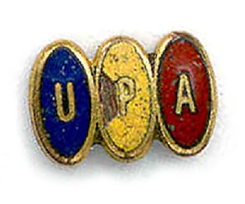 – One of the favorite artifacts I own is this employee pin given out to those at UPA back in the fifties. It was given to me by Lu Guarnier, and I have it framed alongside a studio ballpoint pen which also has the UPA logo on it. A bit of the yellow is chipping away, but I’m trying to preserve it.
These bits and pieces of another time and place are the real treasures in my collection. If you enlarge the image, you’ll get an indication of just how tiny this pin is.
(Click on the image to enlarge it.)
- Go from here to Cartoon Modern to check out the wonderful character design of John Hubley‘s for Rooty Toot Toot. This show coming up on Sunday in Hollywood has prompted some fantastic UPA artwork.
- Jenny Lerew has a wonderful series on Fred Moore on her blog. The photos are wonderful, and her research is enlightening. I was never the biggest fan of Moore’s work, but I’m getting a new appreciation thanks to Jenny’s comments. Perhaps it’s worth a good reinvestigation. I always found Lampwick in Pinocchio his best work; I’ll have to take another look.
 I like seeing some of these old studio photos. The pictures Amid Amidi has posted on his Cartoon Modern site – particularly the earlier of the two – are just out of this world. None of them tops the photo of Walt Disney Jenny posted back on Jan 15.
– Thanks to Tom Sito‘s blog, I know today is Ub Iwerks’ birthday. An aries. Nice piece of information.
Animation Artifacts &Daily post 23 Mar 2006 08:07 am
It’s Official
- Well, it’s official. The last two weeks of this blog are gone for good, but my “Web Host” tells me they’re more efficient since upgrading their cables. For some reason, a number of links to my site on others seem to have broken. Thank you for your patience with this nonsense.
- There were three particular items that I want to repost since I thought them valuable. I know that’s unusal for a blog, but what the hell – this is a Splog.
I had posted some Letterman art, 3 pages of Pinocchio production drafts, and art from a couple of my films by Bridget Thorne. I’ll start today by putting up the Pinocchio drafts (which are at the end of this page.) I’ll use Saturday to post the Letterman material, and I’ll post Bridget’s art and backgrounds next week.
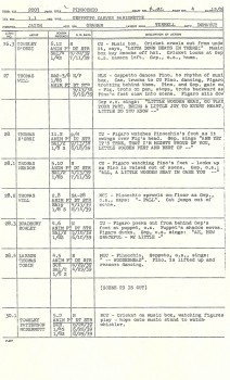
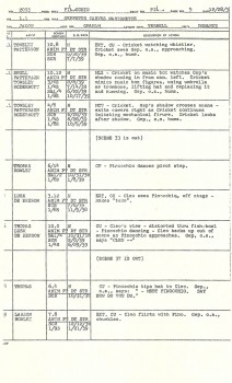
(Click on any item to enlarge.)
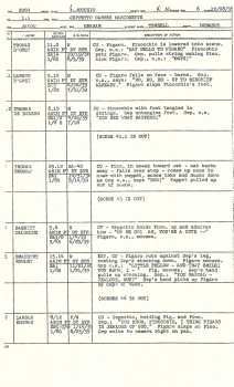 - These three pages of the Production Drafts for Pinocchio finish off the “Little Woodenhead” sequence and have Gepetto introducing the puppet to Figaro and Cleo.
I have the sheets for this film through the Blue Fairy sequence and will post more of them next week.
- I’m still waiting for Disney to release a “Platinum” edition of Pinocchio. It’s arguably Disney’s best crafted film – certainly, it’s the highlight of the “Golden” era. It deserves extras up the kazoo. Unfortunately, these days the extras they offer from Disney don’t include the valuable commentary tracks of past DVDs. They offer games and puzzles for children. It’s sad for the collector to have to know what can be offered and accept what will be offered.
As I pointed out recently (lost to the archives) the Disney Rarities DVD is not the gem it should have been. Bad transfers, inadequate extras and no commentaries – other than the one for A Symposium On Popular Song by Richard Sherman which was added in a clumsy fashion making it pointless.
- Mark Kennedy has been posting some invaluable notes on color and composition by the late, Rowland Wilson. All you artists out there should take a look at these documents. I first met Rowland back at Phil Kimmelman‘s studio on “Conjunction Junction” for Schoolhouse Rock. Dick Williams then introduced him to me years later at Raggedy Ann & Andy. The guy was a consummate artist and a powerhouse of knowledge about his craft. You’ll have no doubt about it once you look at these notes.
Mark has a interesting, very informative site. I look forward to visiting it every day.
Animation Artifacts &UPA 22 Mar 2006 10:34 am
Root Toot 2
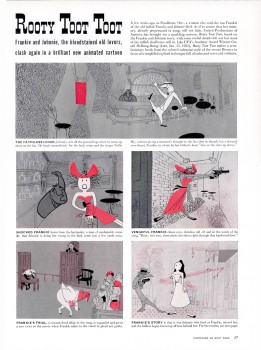
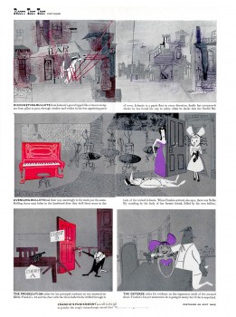
(Click any image to enlarge to a readable size.)
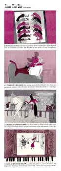 - This is my second attempt at posting this LIFE Magazine story on Rooty Toot Toot from a March, 1952 issue. They obviously enjoyed the UPA films back then, and luckily for us they posted it on something concrete – like paper.
Next Sunday, March 26th there will be a UPA program to be held at the Egyptian Theater in Hollywood. The films scheduled include:
Bobe Cannon’s “Gerald McBoing-Boing”, John Hubley’s “Rooty Toot Toot”, Ted Parmelee’s “The Tell-Tale Heart” and Pete Burness’s “When Magoo Flew”, as well as shorts produced for “The Gerald McBoing-Boing Show”, “Deerfoot Dan” and “Blues Pattern”.
There will also be a preview of a forthcoming documentary THE BOING THAT SHOOK THE WORLD.
In between the films there will be two panels hosted by Jerry Beck. His guests will be: UPA animators and designers including Bill Melendez, Alan Zaslove, Willis Pyle, Fred Crippen, and Sam Clayberger. There will also be contemporary artists: Mark Kausler (BEAUTY AND THE BEAST, THE LION KING), Lou Romano (production designer of Pixar’s THE INCREDIBLES) and author/historian Amid Amidi.
It sounds like an amazing show that I only wish I could attend. I’ll have to satisfy myself with those amazing studio photos posted by Amid on the Cartoon Modern site.
Sunday, March 26 – 6:00 PM
The Egyptian Theater
6712 Hollywood Boulevard
Hollywood, CA 90028
