Monthly ArchiveJune 2013
Daily post 30 Jun 2013 12:58 pm
Problema
I’m sorry for the absence of the Splog today. We’ve had some great difficulties with Verizon this week. Service has been interrupted. I’ll try to keep something posted until I can get things back in proper order.
Animation &Animation Artifacts &Articles on Animation &Disney &Illustration &Models &repeated posts 29 Jun 2013 03:51 am
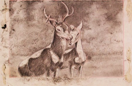
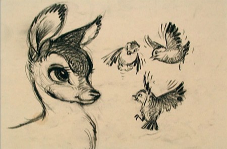
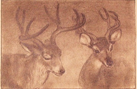
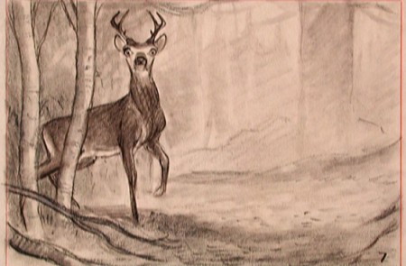
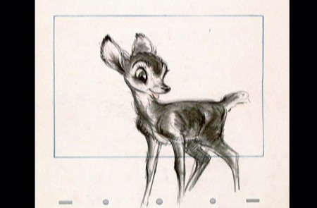
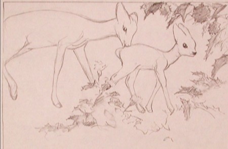
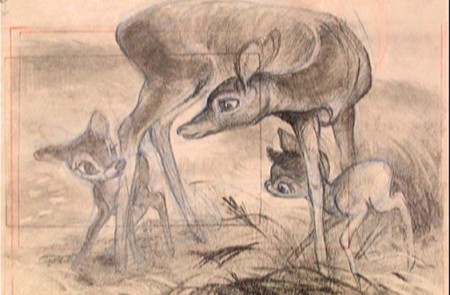
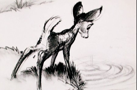
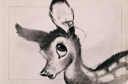
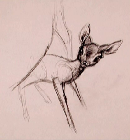
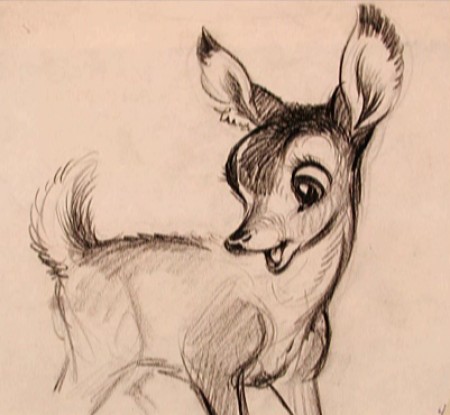
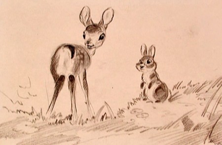
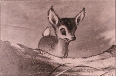
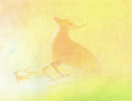
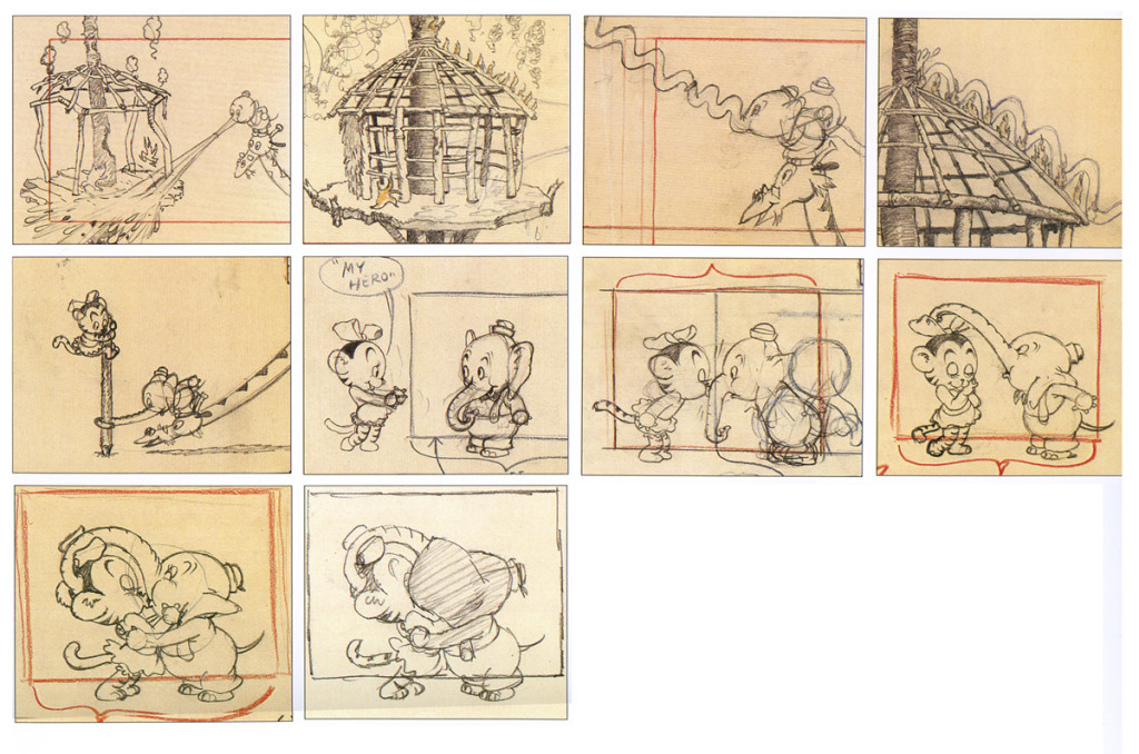
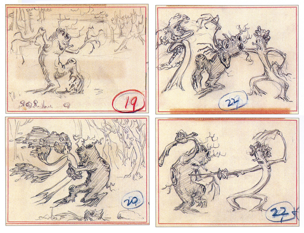
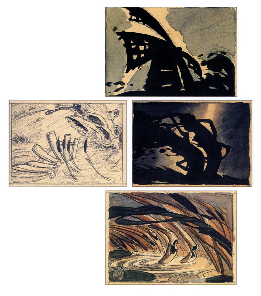
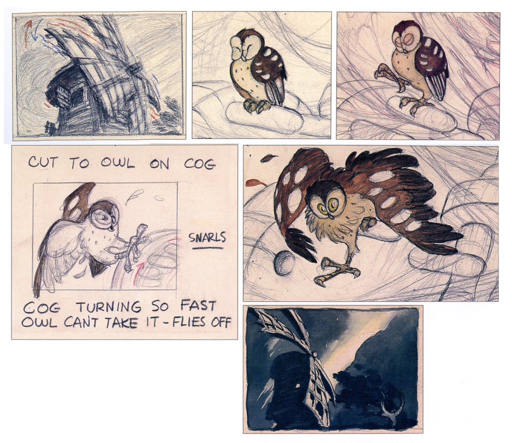
Young Bambi – repost
- It all starts with a drawing.
The brilliant host of cartoonists that came before us were an amazing group. To think of the complicated set of characters that the created. Characters with complex personalities and sophisticated drawing techniques.
Those characters went trough the mill in my own life time. Seeing the horrendous things that have happened not only to Mickey, Donald and Goofy but to Bugs, and Daffy and other Warner’s Bros characters. It’s been shameful.
I was going to post illustrations of some of those bastardizations, but I think it’s enough just to mention some of them.
Think of the Mickey Mouse Clubhouse running now on the Disney Channel. If ever there was proof positive that cgi weren’t cartooning, that would be it. Those are very unsophisticated digital puppetry shows where every move is obvious and preplanned, the voices are hideous, and the stories nowhere sophisticated enough to call trite.
Take a quick jump from those to the flash animated whirls that are being released with a lot of fanfare, and you’ll see what can go wrong with animation of stars. They may as well have dug Marilyn Monroe and Clark Gable out of the ground to allow the computers to move them as well. Like all new animation that’s being called good, these beasts-of-films are moved at the speed of light where no move gets to have any personality. Think of that naked Mickey in the most recent release. A thin slime of a creature, all black, that looks like a clam being animated by a Jim Tyer. There isn’t a pose in the film that could compare with what Terrytoons did – Terrytoons, the bottom of the barrel. They had personality all over these poorly drawn efforts.
There were the old Greg Ford versions of the WB characters for theatrical release, compilations of old with new. They were all mediocre but had the honor of the past directors in mind. The Bakshi Mighty Mouse cartoons were a take on their group of characters, but you had someone with a personality, Bakshi, trying to do wonders with a library of “B” stars. Even with the TV budgets, they were trying hard to do something, and often they were successful.
Today it’s all for poor exploitation, and no one is trying to do wonders with their characters. It’s all too sad.
The WB characters have had even greater attempts at poor art. You don’t have to think back too far to remember the sitcom version of the characters now running on Cartoon Network, also done in Flash. Think back to the poorly designed wretches that WB issued to their local network of stations, the WB. Those poor animated creatures were redesigned versions with scales and all. It’s just about time to scream, “Enough!” Is there not one executive who can offer some honor to these golden characters of our past? How much do we have to watch?
Why did these studios create their archives? Was it just to resell the goodies or was anything preserved so that the future animators could do right by these characters?
- It all starts with a drawing.
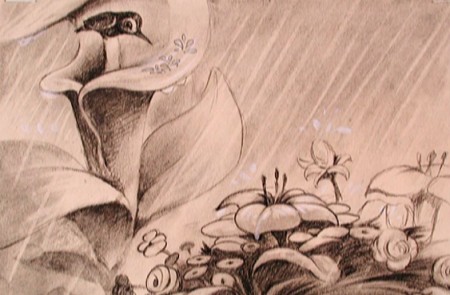
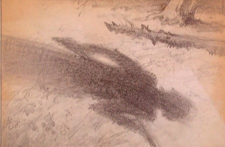
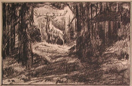
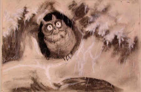
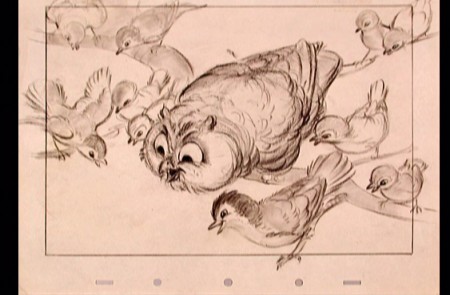
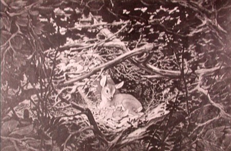
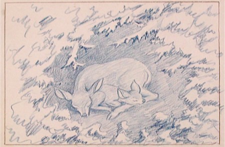
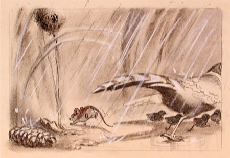
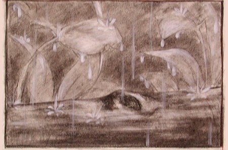
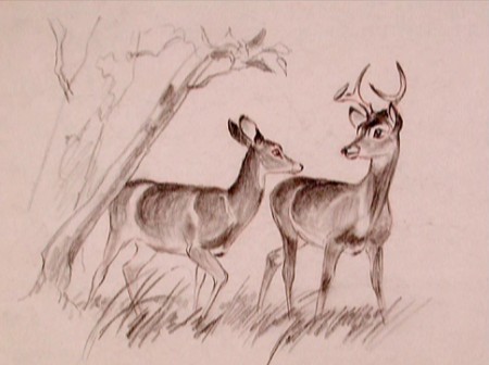
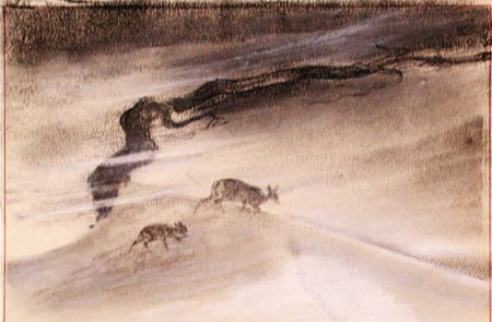
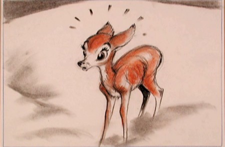
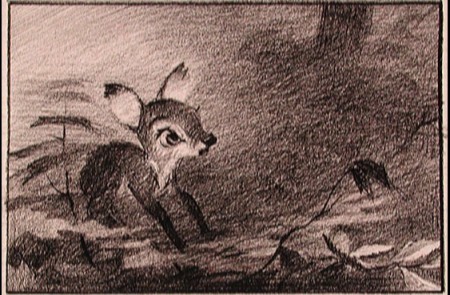
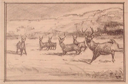
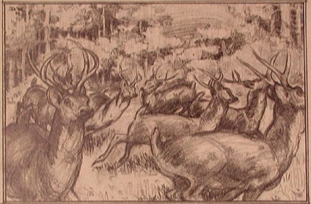
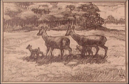
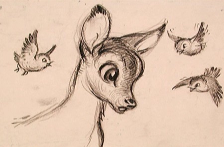
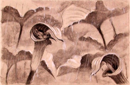
That’s all I can think. With that I’m just going to post a number of gems from Bambi. These had to have had some purpose greater than feeding Bambi !!. Or maybe I’m wrong.
Bambi is, to me, one of the most beautiful of animated features. Collectively, the artists at the Disney studio pulled together to create some wonderful artwork which produced a wonderful film.
The initial work went through many phases, as would be a natural state for animation. However, all of the artists seem to be trying for a higher plane, and oftentime they reached it.
To celebrate the latest release of this film, the Blu-Ray/DVD version, I’ve pulled a lot of the drawings from the film and post them here. It’s amazing how much influence Marc Davis had early on. I can only ID the artists of some of the sketches. If you know, let me know. We have to continue to ID these artists. Without their names we just have these flash animatedMickes that don’t even include one credit. And maybe they shouldn’t be credited; the work is so embarrassing.
 1
1David Hall
 3
3
(above and below) Marc Davis
 7
7
(above and below) Ken Peterson
Animation &Animation Artifacts &Books &Comic Art &Layout & Design &SpornFilms &Story & Storyboards 28 Jun 2013 05:40 am
Jabberwock – repost
- To me, Lewis Carroll‘s nonsense poem, Jabberwocky, is one of the most brilliant pieces ever written. It’s always been important to me, and I’ve collected many versions of it in illustrated versions. Now that I mention it, let me confess that I’m a Lewis Carroll addict, and Jabberwocky is one of my favorites among his many poems.
In film, you have the one live action feature by Terry Gilliam; it’s a good film with a clunky monster in the end. In animation, professionally, I know of only two versions completed. One was by Jan Svankmajer done in 1974. I did a version of it in 1989. Mine, of course, sticks closer to the poem even though it is pretty “arty”.
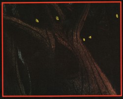
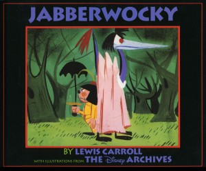 Apparently, there was also a version Disney was preparing as part of Alice In Wonderland. A book was published, credited to the “Disney Archives,” with illustrations from the preparatory drawings of this sequence. It’s obvious that the final versions of these drawings were done by one person, but there’s no record in the book of who did the finals. I’d read somewhere that Marc Davis had a lot to do with it, at one point. Though he obviously was most involved with Alice, herself.
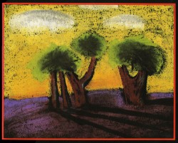
I’m not in love with the images in the book. I like the technique used, but I find the images too cute. Though, it’s amazing how current they look.
(Click on any image to enlarge.)
I’m going to give you a number of the book’s pages today and, in comparison, will follow it up with images from my version tomorrow.
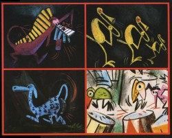
‘Twas brillig and the slithy toves
Did gyre and gimble in the wabe;
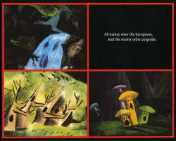
All mimsy were the borogoves,
And the mome raths outgrabe.
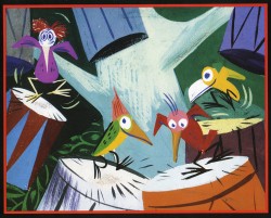
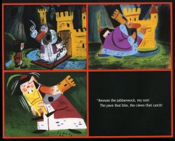
“Beware the Jabberwock, my son!
The jaws that bite, the claws that catch!”
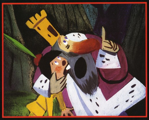
“Beware the Jubjub bird, and shun
The frumious Bandersnatch!”
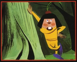
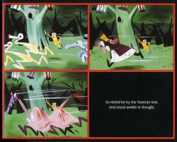
He took his vorpal sword in hand;
Long time the manxome foe he sought -
So rested he by the Tumtum tree
And stood awhile in thought.
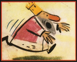
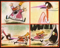
And as in uffish thought he stood,
The Jabberwock, with eyes of flame,
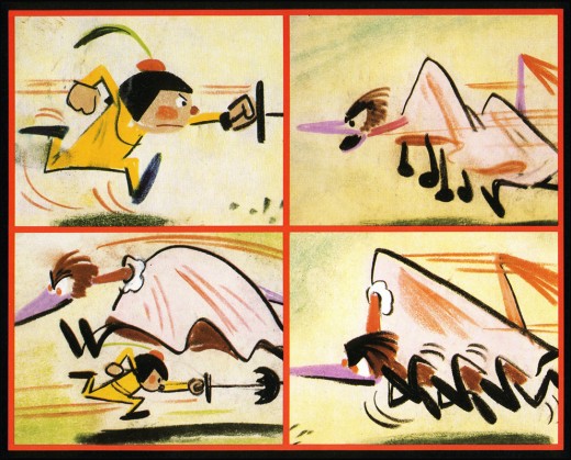
Came whiffling through the tulgey wood,
And burbled as it came!
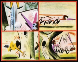
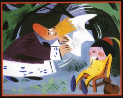
One, two! One, two! And through and through
The vorpal blade went snicker-snack!
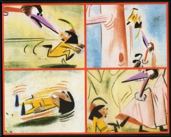
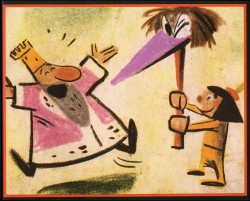
He left it dead, and with its head
He went galumphing back.
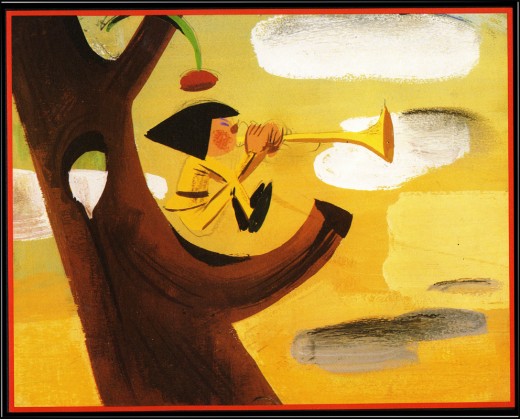
“And hast thou slain the Jabberwock?
Come to my arms, my beamish boy!
O frabjous day! Callooh! Callay!”
He chortled in his joy.
Jim Hill talks a bit about this book on his site in a letter response. here.
For amusement, you might check out this site for translations of this poem into 58 other languages, 23 parodies of the poem, and 10 explanations trying to define what Carroll meant by it.
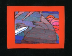
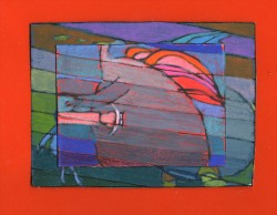
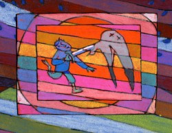
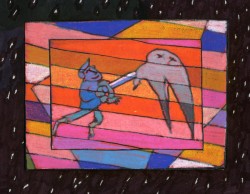
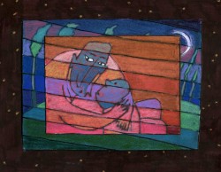
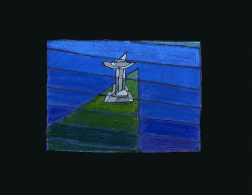
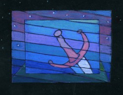
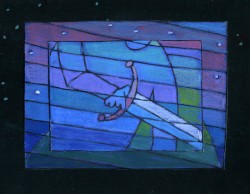
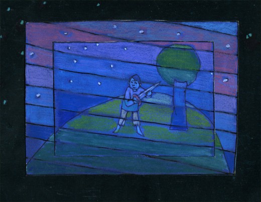
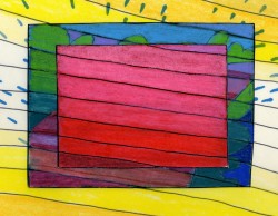
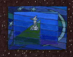
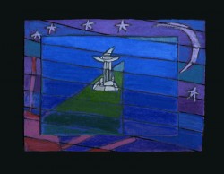
I’d like to post here a few of the images from my short adaptation of the Lewis Carroll poem, Jabberwocky. In doing the film, I tried to mimic a style I’d used in my oil paintings and felt it was a bit successful. I don’t think the filmed version is all it could be – it was rushed to complete a package which included the 19 min. film, The Hunting of the Snark, as well as an animated documentary done about Lewis Carroll’s nonsense poems. Of course, the video package wouldn’t have made sense without including Jabberwocky.

(click any image to enlarge.)
But I’ve scanned these images from the actual artwork and realize how well they’ve held up. I’d like to redo the film digitally someday and see where I can go with it.
Here are some of the images:
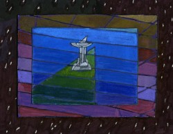
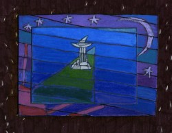
‘Twas brillig and the slithy toves,
Did gyre and gimble in the wabe;
All mimsy were the borogoves,
And the mome raths outgrabe.
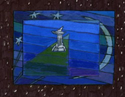
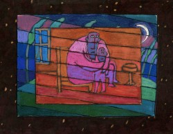
“Beware the Jabberwock, my son!
The jaws that bite, the claws that catch!â€

“Beware the Jubjub bird, and shun
The frumious Bandersnatch!â€
He took his vorpal sword in hand;
Long time the manxome foe he sought -
So rested he by the Tumtum tree
And stood awhile in thought.
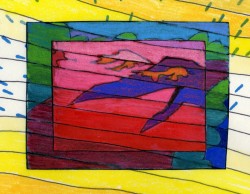
And as in uffish thought he stood,
The Jabberwock, with eyes of flame,
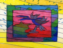
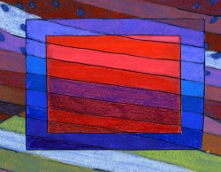
Came whiffling through the tulgey wood,
And burbled as it came!
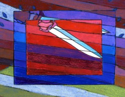
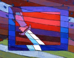
One, two! One, two! And through and through
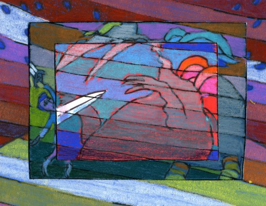
The vorpal blade went snicker-snack!
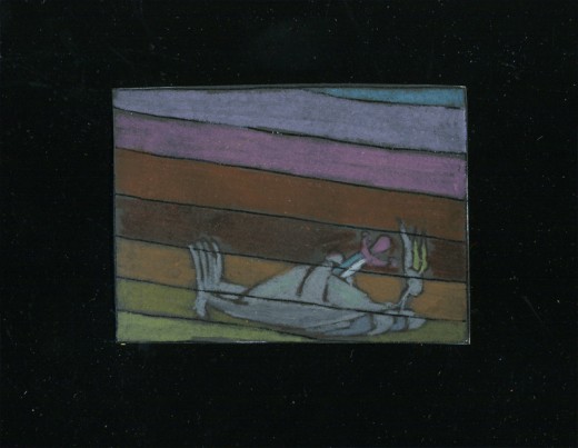
He left it dead, and with its head
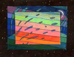
“And hast thou slain the Jabberwock?
Come to my arms, my beamish boy!
O frabjous day! Callooh! Callay!â€
He chortled in his joy.
‘Twas brillig and the slithy toves
Did gyre and gimble in the wabe;
Daily post 27 Jun 2013 08:30 am
Paul Julian’s TOOOOT!
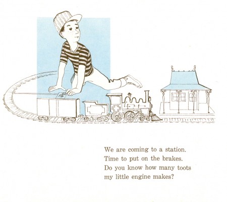
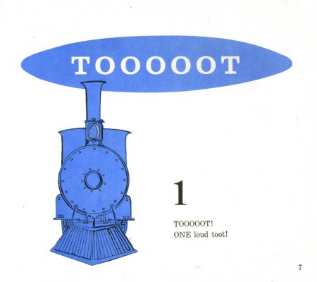
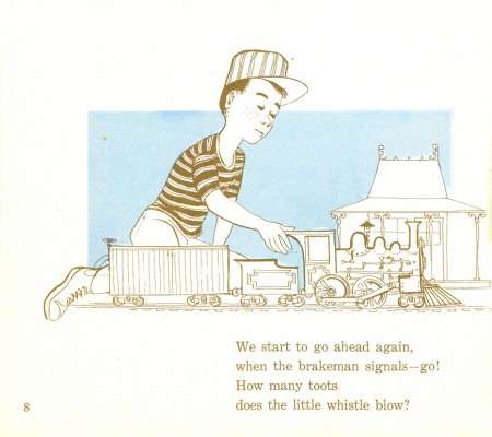
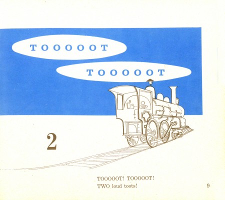
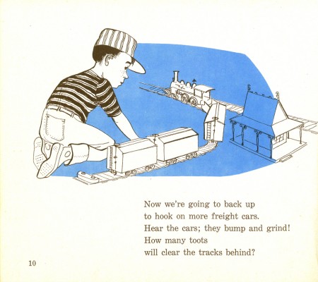
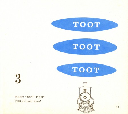
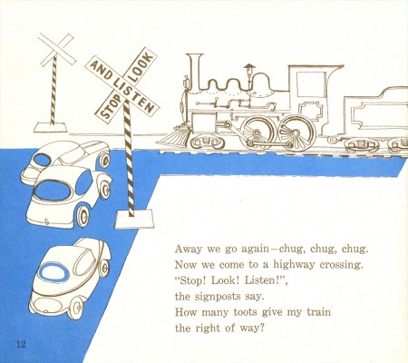
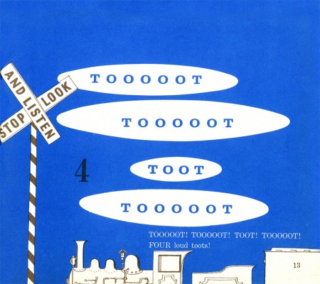
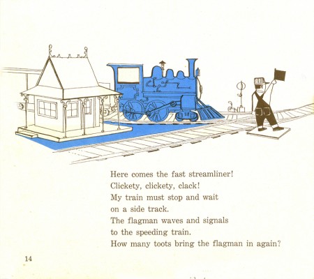
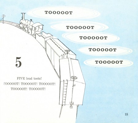
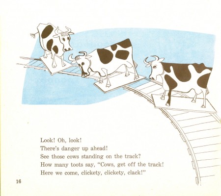
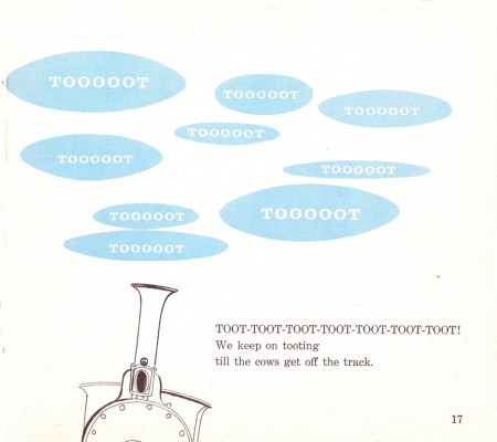
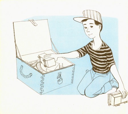
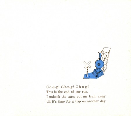
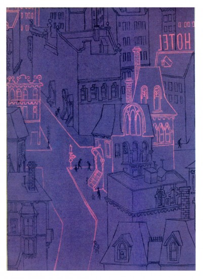
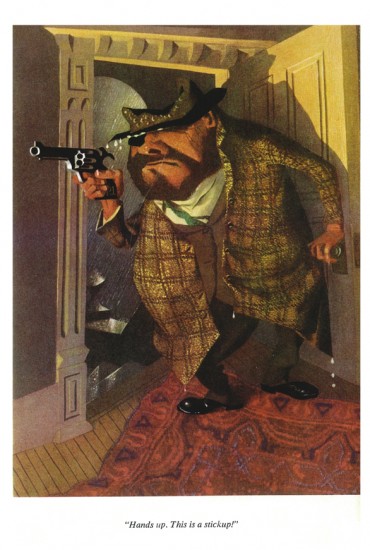
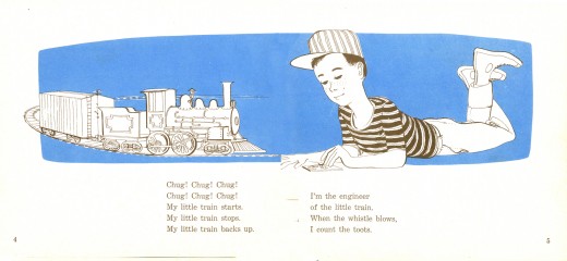
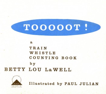 - Here are the illustrations for Tooooot! which is a book illustrated by Paul Julian in 1958 to a text by Betty lou LaWell.
It’s a two color book (black and blue) as were many books of the period. I’m always amazed at how much illustrators of the time got out of the limited color printing. So many big books (by the likes of Dr. Seuss, Bernard Waber, Maurice Sendak among others) were published at the time with more imagination than many of the current books with full color.
The artwork, unlike his other book Piccoli, is composed of graceful and delicate line drawings with the simple, flat color. The work looks very much a part of the brilliant illustrations and art coming out of the 50s, influenced by Ben Shahn and Gregorio Prestopino.
 2
2
and
Piccoli
m
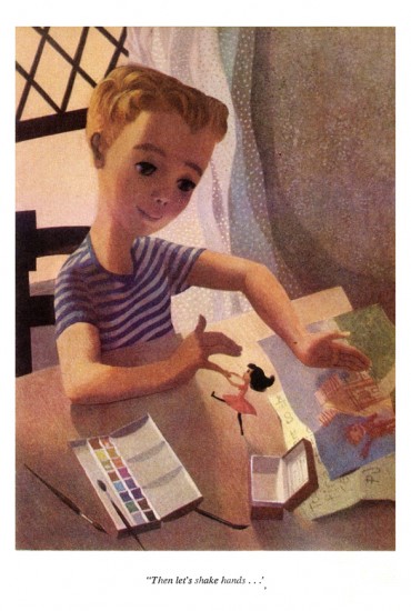
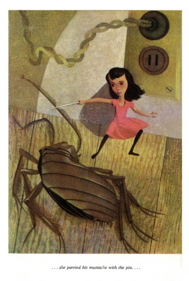
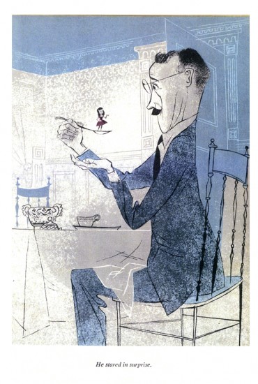
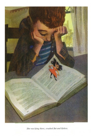
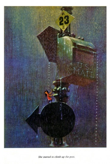
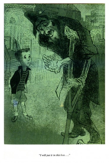
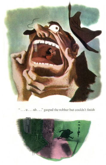
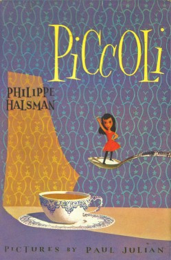 - The brilliant artist/designer/background artist, Paul Julian, illustrated a stunner of a children’s book in 1953. Piccoli is the story of Piccoli Sogni (little dreams) a tiny girl who lives in a matchbox. A stranger gives her as a gift to a sad young boy. She helps to inspire him creatively.
The story is by Phillippe Halsman which he had written for his daughters. He was a celebrated photographer who worked with Salvador Dali on the book Dali’s Moustache. In 1958 he was chosen as one of the 10 greatest photographers in an Internation poll. His 1959 book, Philippe Halsman’s Jump Book, collected more than 200 recognized photographs.
Paul Julian, of course, is well known by animation enthusiasts as one of the principal background artists for many of the most famous Warner Bros cartoons. He also gained some fame for his art direction of the UPA masterpiece, The Tell-Tale Heart.
His work has always seemed just slightly this side of the surreal, to me. His color choices were masterful and the many backgrounds he did reflect his own style. See this excellent post by Hans Bacher on his important blog, Animation Treasures.
John Canemaker loaned me a number of color copies of the book, and I tried to get an accurate read on the colors from the copies, but I suspect they’re still a bit off. Here are Julian’s illustrations for Piccoli:
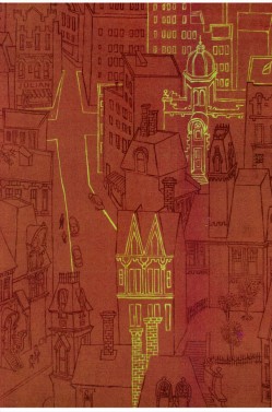
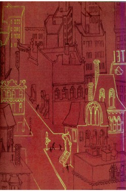
The inner cover of the book.
 2
2
At times the art looks influenced by Gregorio Prestopino.
 8
8
This is actually a composite of two different illustrations
on two separate pages in the book.
Bill Peckmann &Books &Comic Art &Disney &Illustration &repeated posts 26 Jun 2013 06:29 am
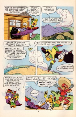
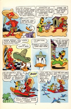
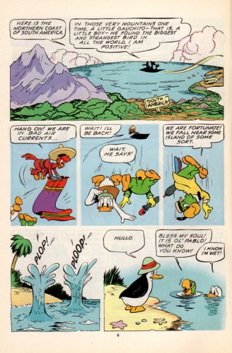
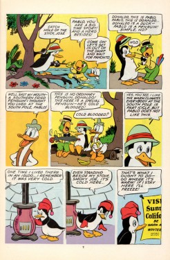
Kelly’s 3 Caballeros, again
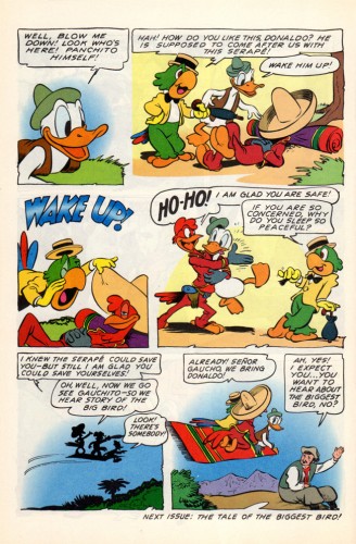
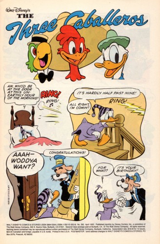
- Suppose we had a comic book version of The 3 Caballeros; wouldn’t that be fun to see? What if the artwork were done completely by Walt Kelly; would that make it a treasure? I think it does. Bill Peckmann made my week when he sent me the scans to the following comic book. As Bill wrote to me: “Beautiful stuff, like Barks’ art, it’s timeless, looks like it was done yesterday.”
However there’s some residue floating about. Sorry about that, but it is Kelly’s residue.
Not only is the artwork out of this world, but the quality of the printing is brilliant. And the quality of the book, itself, is wonderfully well preserved. You only have to look below to read it. Take your time; this is great.
 1
1
Many thanks to Bill Peckmann for sharing this gorgeous material with us.
Daily post 24 Jun 2013 06:58 am
Old Boards at Disney’s
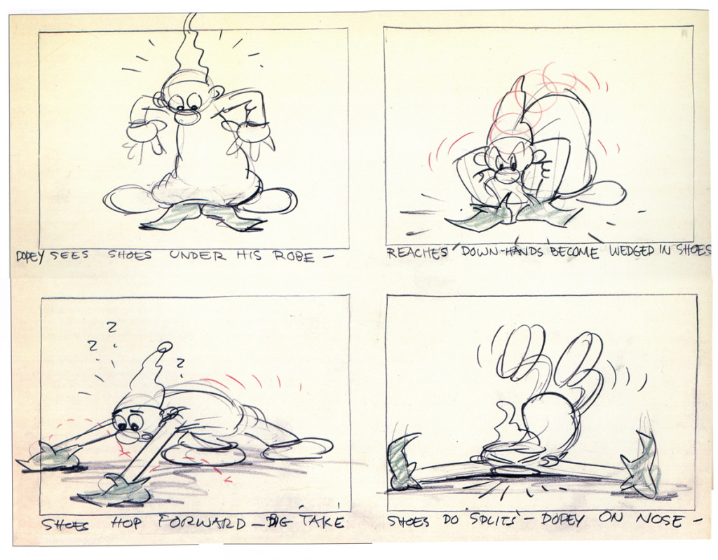
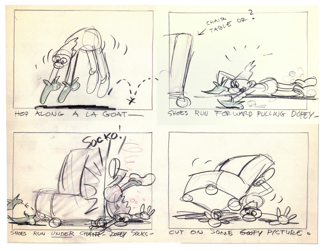
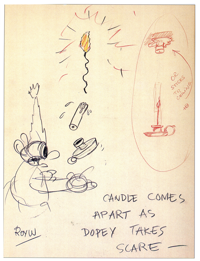
I’ve recently been reading John Canemaker‘s excellent book, Paper Dreams: The Art & Artists of Disney Storyboards. This book not only examines the history of the Disney storyboard but the artists who drew them, as well. We get tp examine the lives of people like Tee Hee and Ted Sears, Webb Smith and Pinto Colvig, Roy Williams, Bianca Majolie, Carl Barks, and, of course, the great Bill Peet.
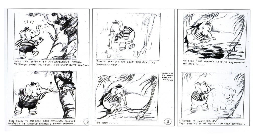
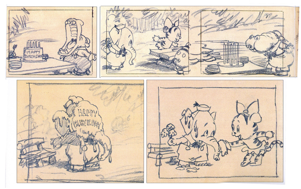
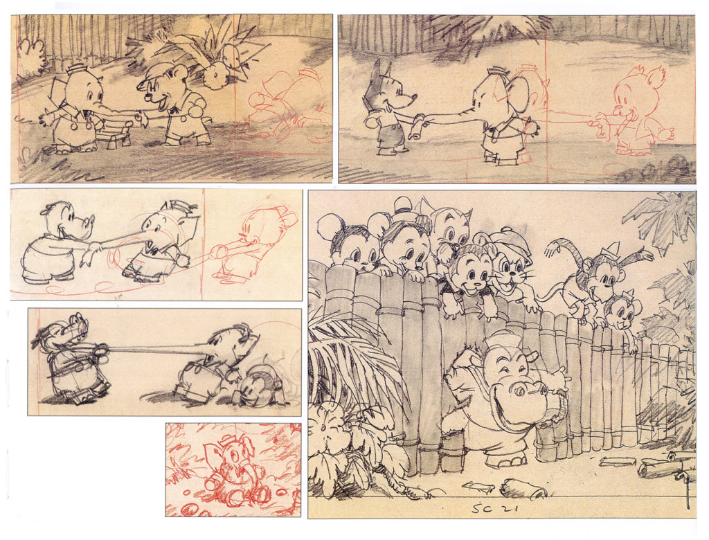
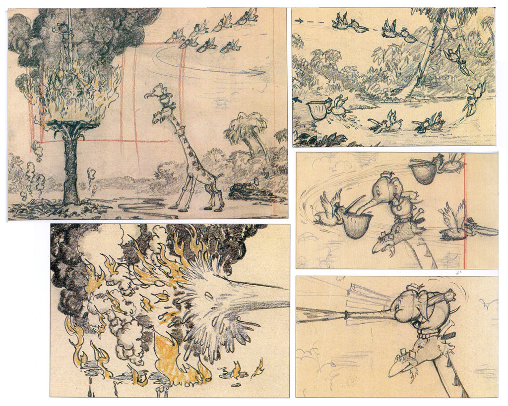
Along the way we see shorts like Elmer Elephant, Playful Pluto (fly paper sequence), Brave Little Tailor, Mother Goose Goes Hollywood, The China Shop, and Donald’s Lucky Day develop. Fetures like Snow White, Fantasia, 101 Dalmatians, Pinocchio and Lady & The Tramp all took shape.
I’ve pulled some of the great art from these films for you to take a look at.
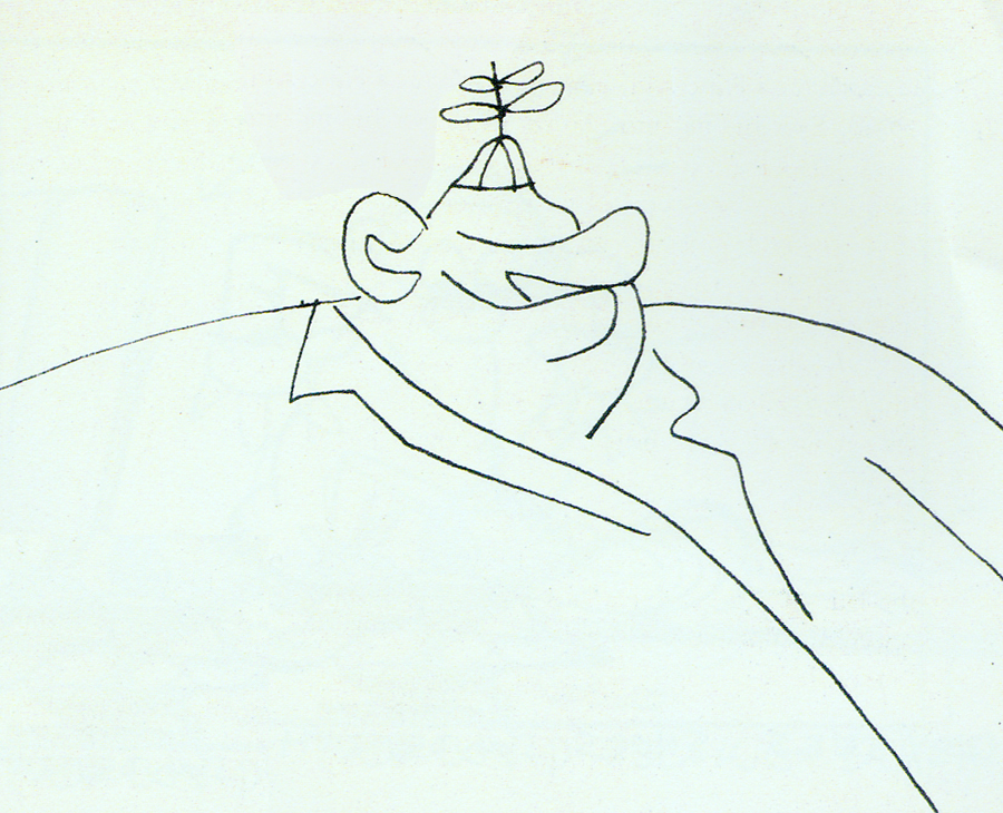
Don Williams (the “old Mousketeer” self-portrait)
Snow White gags.
Elmer the Elephant
The board for this Silly Symphony is attractive.
The Western Publishing book edition is a gem, as well.
Beautiful W/C illustrations.
Flowers and Trees
Done in 1932, it was the first animated short done in Technicolor.
Still, the board is a beauty.
The Old Mill
An Oscar Winner done just prior to Snow White. It acted, in a way,
as a test for ther feature and its effects. The film’s a beauty, yet
the board looks not too distant from Flowers and Trees.
Animation &Animation Artifacts &Articles on Animation &Commentary &commercial animation &Independent Animation &Layout & Design 22 Jun 2013 05:13 am
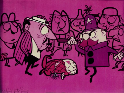
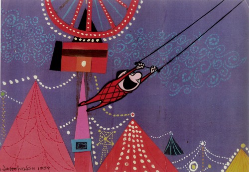
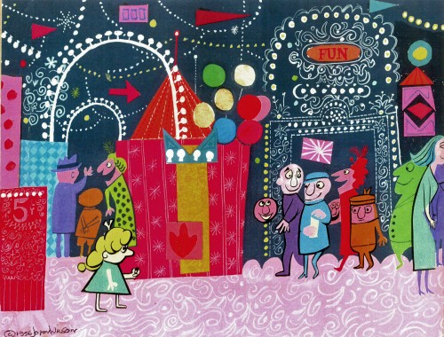
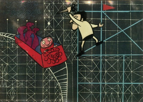
John Wilson 1920 – 2013
A number of years ago I’d made a short trip to LA. During that visit, a man came up to introduce himself. It was John Wilson. He told me that he had just nominated me for an ASIFA Hollywood Award because he’d loved my work. I’d learned so much from watching Mr. Wilson’s films that it was wonderful to see that the mutual admiration society ran both ways.
John Wilson died yesterday. His son, Andrew, wrote to tell me of it. My feelings go out to the family and am enormously sorry that animation loses another one of its masters.
He was a director, designer and animator about whom I’d done a series of posts on his career. Out of respect for Mr. Wilson, I’d like to post all of those articles together (and hold them there for the entire weekend.)
Hope you’ll enjoy.
1.
Let me start by sharing some bio information about John Wilson and his company Fine Arts Films.
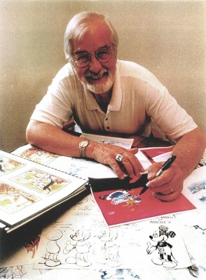 - John Wilson was born in Wimbledon in 1920. He attended the Royal College of Art and was working by age 18 as a commercial artist with Willings Press Service. In WWII he served with the London Rifle Brigade in African where he was seriously wounded. Recuperating in hospital, he drew many cartoons of which several were printed. Eventually he would recover and get work at Pinewood Studios in the art department where he worked on GREAT EXPECTATIONS and THE THIEF OF BAGHDAD, among other films.
- By the time he was 25, he was working in animation at Gaumont-British Animation, a newly formed division of J. Arthur Rank’s studio, working under the direction of David Hand on the “Animaland” series starring “Ginger Nut.”
- In 1950 he moved to the United States working in layout and animation at UPA. He found himself working with Bobe Cannon, Pete Burness, Jules Engel, and Paul Julian. Eventually he left for the Disney studio working in Les Clark’s ‘Tinkerbell’ unit on PETER PAN and with Ward Kimball on TOOT WHISTLE PLUNK & BOOM.
- He tried to sell Disney on the film Tara, the Stonecutter, but they weren’t interested. He completed it himself in 1955 using a Japanese style to tell the story. Wilson was impressed with the UPA style of modern art in animation, and that’s the route he took for his personal film. Thus his studio was born, called Fine Arts Films, in 1955. Tara had some success playing theatrically with the successful Japanese feature film, GATE OF HELL by Kinugasa (which had won the Oscar for Best Foreign Film.)
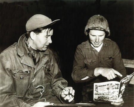
Wilson in Korea with the Bob Hope Tour to entertain the troops.
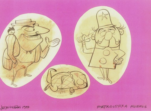
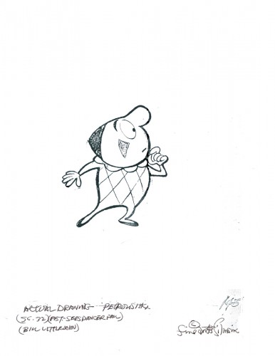
- This film led to his producing a verion of Stravinsky’s Petroushka for NBC which aired in 1956 as part of The Sol Hurok Music Hour. Notably, Stravinsky, himself, arranged and conducted the shortened version of the score suing the LA Philharmonic Orchestra. The film was designed by John Wilson and Dean Spille with anmation by Bill Littlejohn, Art Davis, and Phil Monroe. Chris Jenkyns, Dean Spille and Ed DeMattia designed the 16 minute show from Wilson’s storyboard.
- Fine Arts Films had produced ‘Journey to the Stars’, a project for the 1961 World’s Fair, an animated voyage through space for NASA, which was seen in 70 mm Cinerama by ten million visitors to Seattle.
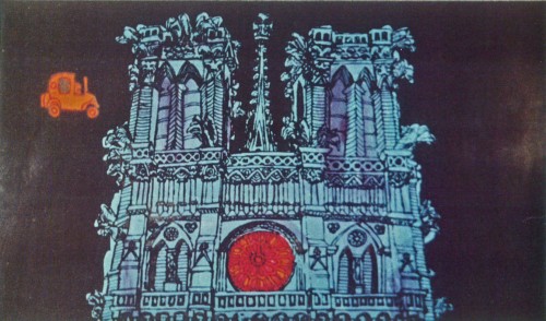
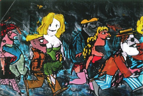
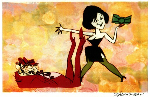
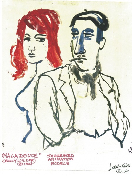
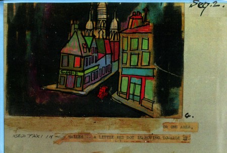
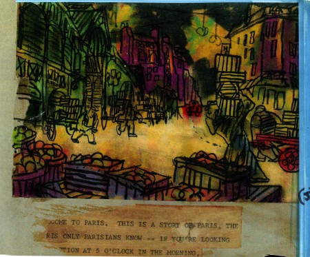
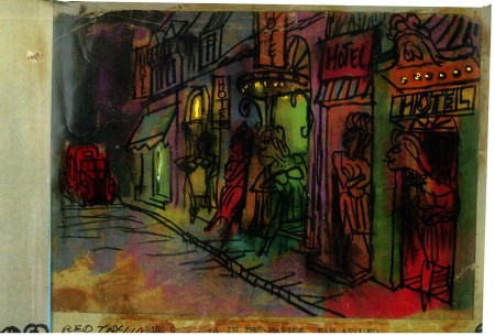
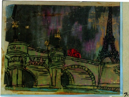
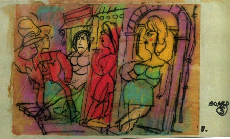
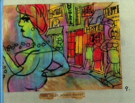
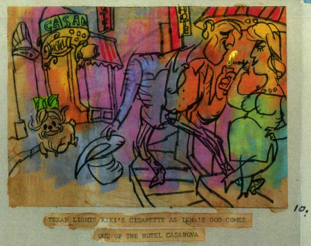
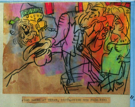
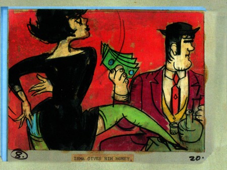
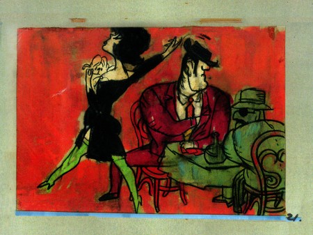
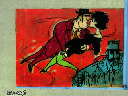
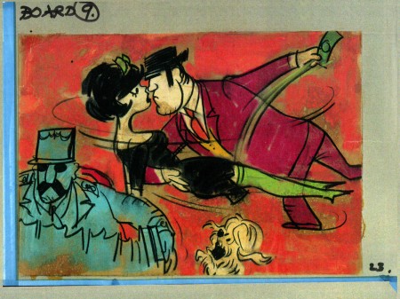
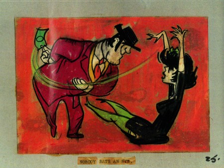
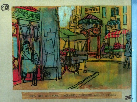
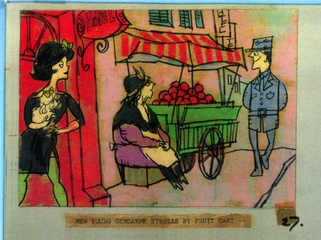
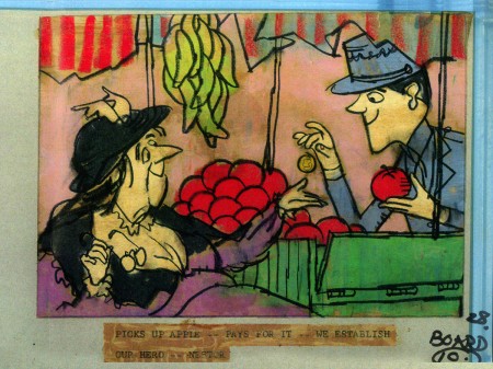
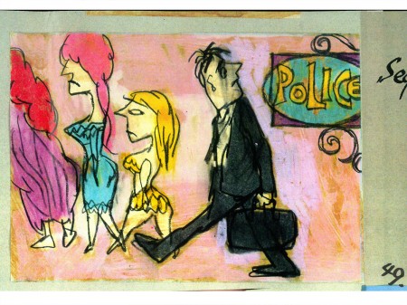
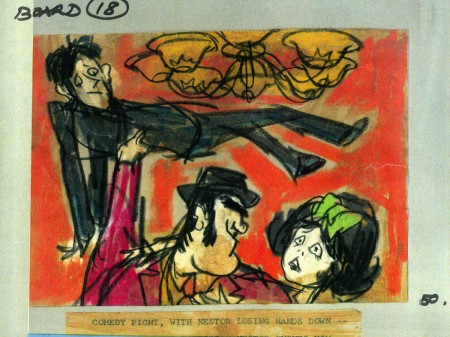
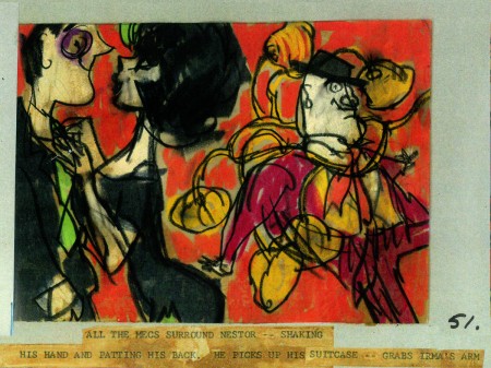
- Billy Wilder employed Wilson to do the titles for Irma La Douce after which they did a six-minute trailer for this Jack Lemmon, Shirley McLaine feature. It was all about Parisian prostitutes romping about in Montmartre, and animation could apparently make it acceptable. Artists Ron Maidenberg, Sam Weiss, Sam Cornell and Bob Curtis caught the vivid nightlife of Paris in a sexually charged animated short. It was a huge success in promoting the feature.
- In 1970 Wilson flew to Chicago to see Carol Channing and Eddie Bracken appearing in “archy and mehitabel in Shinbone Alleyâ€. On the basis of this theatrical musical, Wilson bought the screen rights to the book “archy and mehitabel” by George Herriman and began work on an animated feature which was released by Allied Artists in 1971.
- Fine Arts Films was also responsible for many animated commercials as well as weekly music video segments for the weekly CBS-TV series “The Sonny and Cher Show.†The songs included Joni Mitchell’s “Big Yellow Taxi†and Jim Croce’s “Leroy Brown.â€
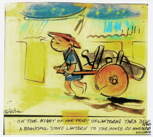
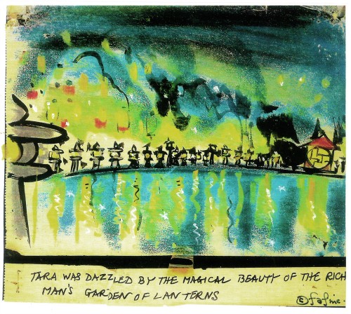
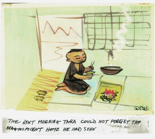
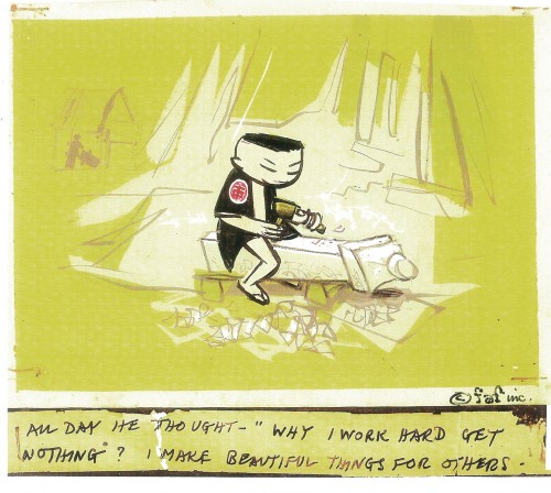
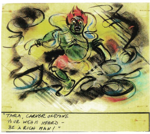
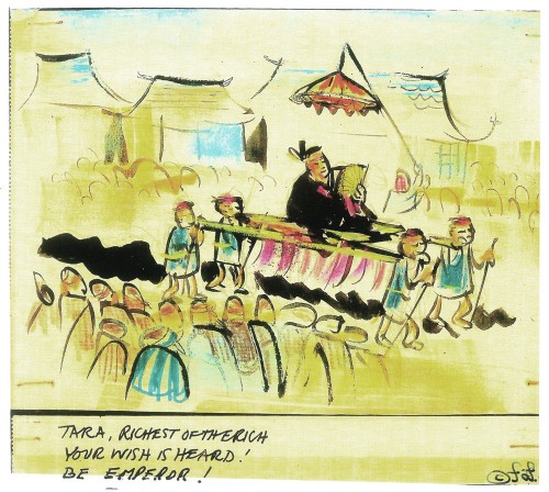
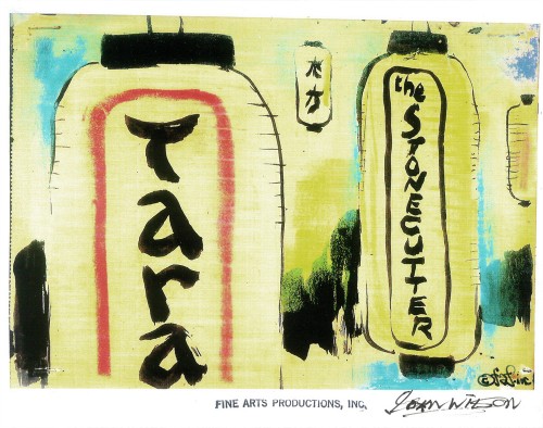
Here are some storyboard sketches by John Wilson for his initial short film, Tara, the Stonecutter. This film started it all for Wilson.
 1
1
I haven’t seen the finished film, but I understand that Japanese decorative papers were used in the backgrounds and costumes of the characters.
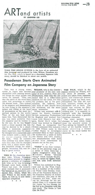
Here are two press clippings for this film from California papers.
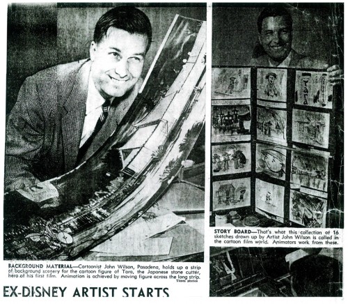
(Click any image to enlarge.)
2.
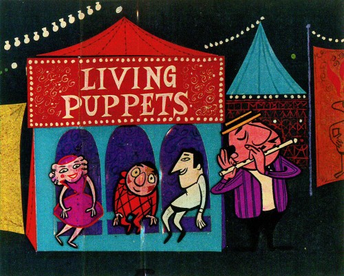
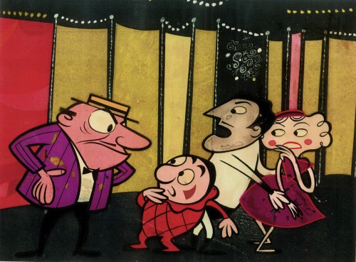
- After completing the film, Tara the Stone Cutter in 1955, John Wilson and his newly formed company,Fine Arts Films, was able to sell the idea of an animated version of Stravinsky’s Petroushka to NBC. They aired the 16 min. film in 1956 as part of The Sol Hurok Music Hour. Stravinsky, himself, arranged and conducted the shortened version of the score using the LA Philharmonic Orchestra.
The film was designed by John Wilson and Dean Spille; animation was done by Bill Littlejohn, Art Davis, and Phil Monroe. Chris Jenkyns, Dean Spille and Ed DeMattia designed the show from Wilson’s storyboard. This is considered the first animated Special ever to air on TV.
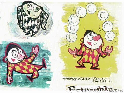
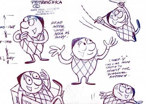
Here are some stills from that film and its artwork.
 1
1Petroushka – model 1
 11
11
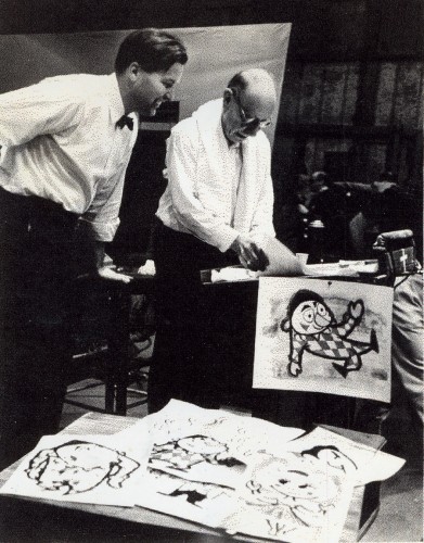
John Wilson and Igor Stravinsky preparing for recording of Petroushka
with the Los Angeles Philharmonic Orchestra (1955).
Here are copies of two reviews:
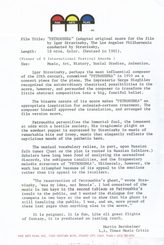
Los Angeles Time review (1956)
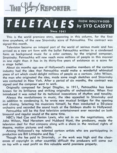
Hollywood Reporter review )1956)
(Click any image to enlarge.)
Petroushka was released on VHS tape combined with a number of the song pieces he did for the Sonny and Cher program. This tape, John Wilson’s Fantastic All Electric Music Movie, can still be found on Amazon but is pricey.
Thanks to Amid Amidi for the loan of this material.
3.
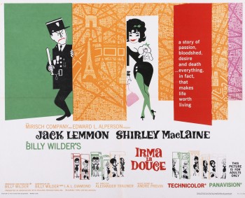 Irma La Douce was a racy film written and directed by Billy Wilder that starred Shirley MacLaine as a Parisian prostitute and Jack Lemmon as a French policeman who falls in love with Irma (Shirley MacLaine.) The film, for its time was daring, and came up with (heaven forbid) a “C” for Condemned rating from the Catholic church. This made it off limits for anyone under the age of 18. I was determined to go see the film, so I ignored the ban and went by myself. Naturally enough, no one tried to stop me. I wasn’t jaded by the movie anymore than I had been disturbed by the violence in all the Warner Bros. cartoons I’d seen. Looking back on Irma La Douce, it really is an innocent film, hardly risqué in any way shape or form.
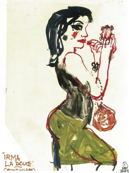
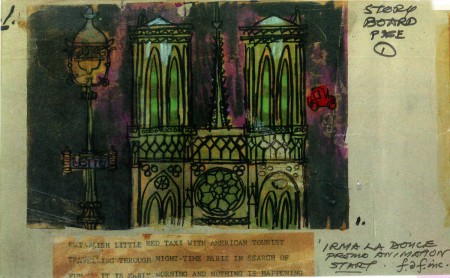
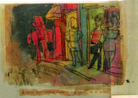
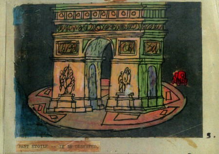
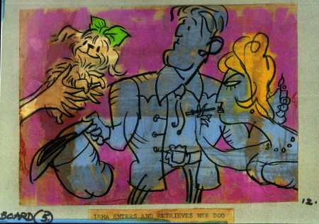
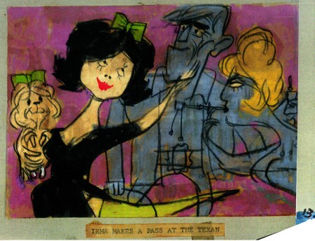
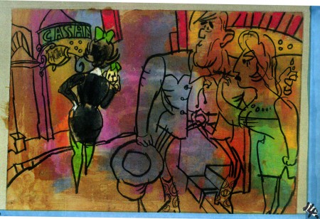
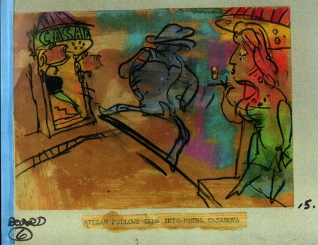
The film started with some nicely drawn animated credits which were done by John Wilson’s studio. Until recently I hadn’t known that Wilson also produced an animated short promoting the feature for the Mirisch Company. I have some preproduction art from that short as well as the color storyboard. The board is large enough that I’ve decided to break it into two parts. We’ll see part one today and the second part next week.
Each section of three images is long enough that unless I post one drawing at a time, it’ll be too tiny to see unless enlarged. I’d like to post each storyboard sketch a nice viewing size and still give you the option of enlarging it.
Let’s start with some production and post production stills so you can see what it looked like.
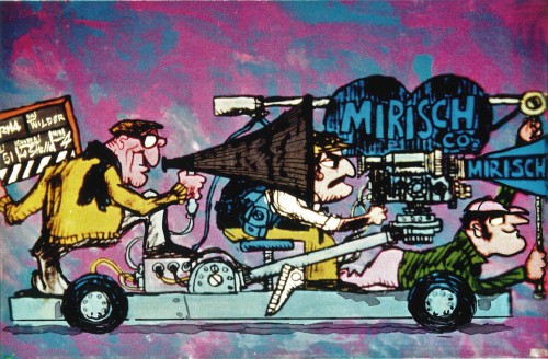 1
1
A couple of pre-production drawings:
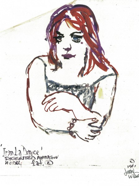 1
1
Then, there’s the storyboard. I’ll give an example of the three panel pull out and follow that with each individual image.

You can see why I’ve decided to enlarge the images.
4.
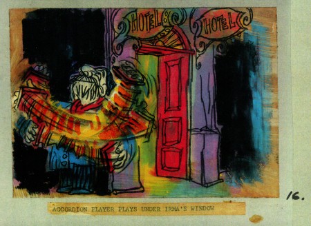
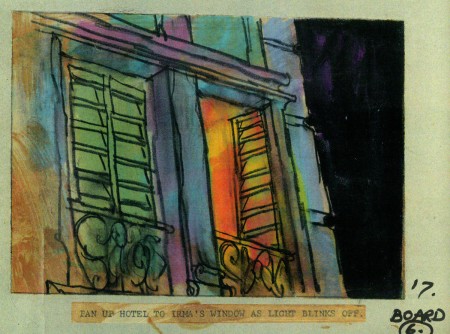
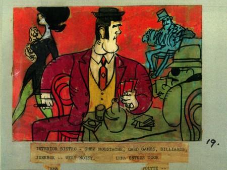
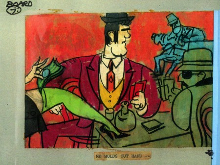
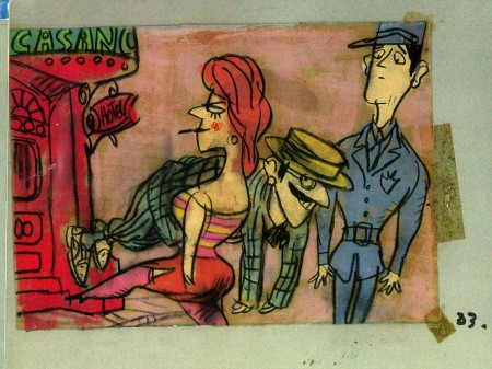
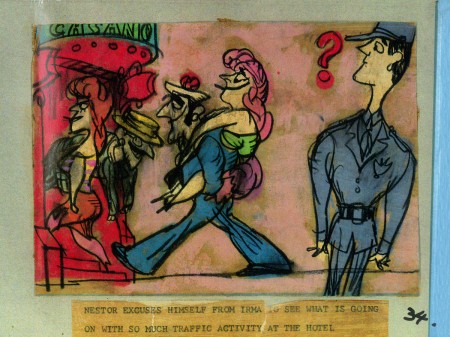
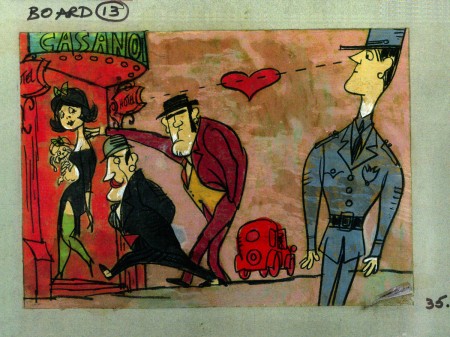
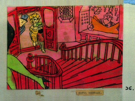
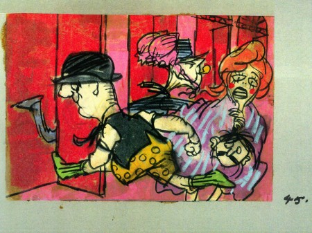
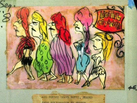
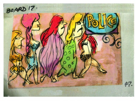
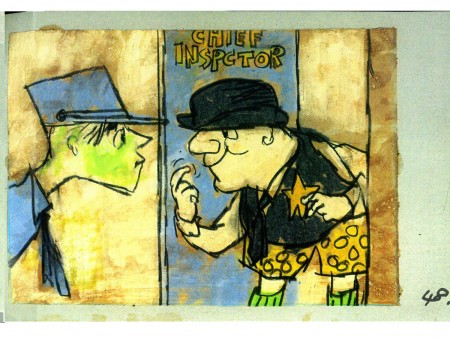
John Wilson created this storyboard for the Mirisch Corp. It was an animated trailer to promote Billy Wilder‘s coming film, Irma La Douce. The board comes in 18 pages of three storyboard drawings. Rather than post the sets of three images (and only being able to show them at a smallish size) I’ve taken each individual drawing and have blown them up to see them better on this blog.
Again, these were for a lengthy trailer for the film not the opening credits. The film’s credits do not use animation.
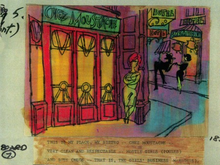 7a
___________________________
Here’s a YouTube version of the trailer. Not the brightest quality, but you can see it.
5.
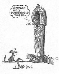
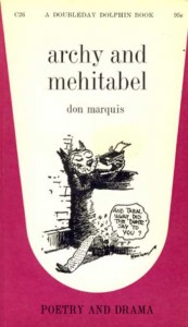 - Don Marquis‘ book, Archy and Mehitabel, garnered fame quickly and not least because of the extraordinary illustrations of George Herriman, the creator of Krazy Kat.
The first book was published in 1927 and others followed in 1933 and 1935. It wasn’t until the third book that Herriman took over the characters created by Marquis in his book of short stories, developed mostly, in poetry. An on-again off-again love affair, the story had two principal characters: a cat, Mehitabel, and Archy, cockroach. (You can read these poems on line here.)
In 1953, writer Joe Darion along with composer George Kleinsinger (the creator of Tubby the Tuba) wrote a musical theater piece. Tenor Jonathan Anderson played Archy and soprano Mignon Dunn was Mehitabel. At about the same time a recording of the showtunes was recorded with Carol Channing as Mehitabel and Eddie Bracken as Archy. The record was a success.
With the help of the young writer, Mel Brooks, they were able to get their show to Broadway in 1957, but it was now named Shinbone Alley. After 49 performances, the show closed, but the original cast album was recorded that same year. The songs stayed in the permanent repetoire of Carol Channing and Eartha Kitt.
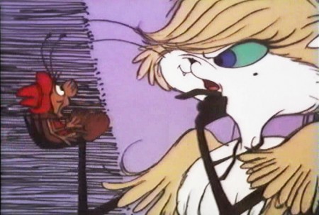
 In 1971, John Wilson directed an animated feature starring the voices of Channing and Brackett and using the songs from the musical. The love affair between Archy and Mehitabel was penned by Archy, the cockroach; his poems tell their story.
The film suffers from its music. The songs are simple and sound as if they’re written for children, but the lyrics pull from the poems which are definitely designed for adults. It gets a bit confusing, as a result, and is a bit picaresque; the poems are short and illustrating them in animation would take more adaptation than seen here.
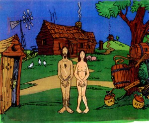 John Wilson had developed his studio, Fine Arts Films, on the back of the weekly, animated, music videos he did for The Sonny and Cher Show, an enormous hit in the early 70s.
These music videos were loose designs animated quickly and lively around the songs Sonny & Cher would schedule each week. There would always be one or two of these pieces, and they were highlights in the weekly one-hour musical/variety program.
 The graphics of Shinbone Alley aren’t too far from these Sonny & Cher videos. Loose design and animation with a design style not too far from the Fred Wolf’s made-for-ABC feature, The Point. This was the first feature made for television and featured the songs and story of Harry Nilsson, although Shinbone Alley featured a wilder color pallette.
Jules Engel, Corny Cole and Sam Cornell all worked in design on the film. The long list of  animators included Barrie Nelson, John Sparey, Spencer Peel, Eddie Rehberg and Jim Hiltz. Mark Kausler was an assistant on the show.
The film wasn’t an enormous success, but that was probably explained much by the limited distribution and the poor marketing of the film. I saw the film when it came out; I was living in Washington DC at the time (in the Navy). I was very disappointed. The animation is very limited and the style was a real let-down having known the George Herriman illustrations from the Don Marquis book. We’d already seen those limited animation Krazy Kat cartoons from King Features, so I knew the style could be done adequately – even on a budget. The style in this film just seemed a little too Hollywood cute, at the time, and it felt dated when it came out. I don’t feel too differently about it watching the VHS copy I own.
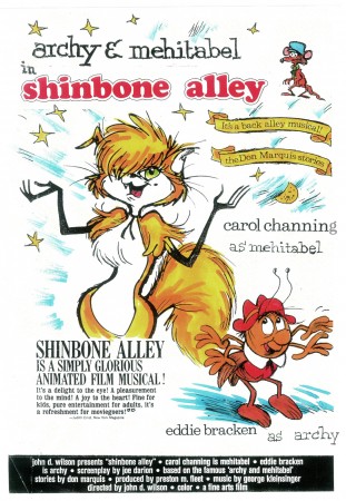
the film’s poster
Here are some frame grabs from the first 1/4 of the film:
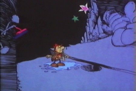
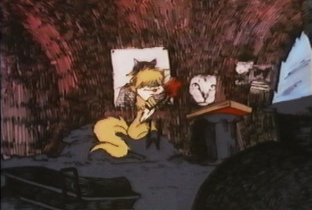
We’re introduced to Archy right off the bat as he
flies out of the river onto the dock. He realizes that he,
the poet, tried to kill himself and was sent back as a cockroach.
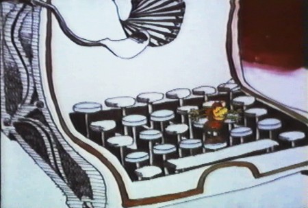
He soon finds a typewriter and goes straight back to work.
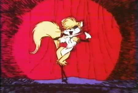
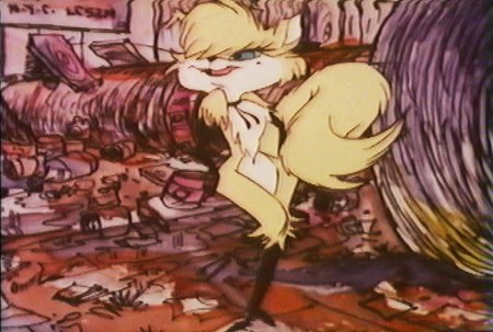
Mehitabel is a performer – with Carol Channing’s voice.
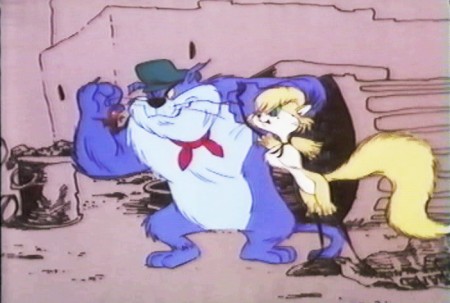
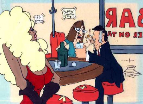
She has another boyfriend, voiced by Alan Reed,
who is also the voice of Fred Flintstone.
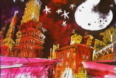
A song video takes us outside.
6.
- This final post featuring the work of John Wilson and his company, Fine Art Films, covers many varied film projects. Unfortunately, I found relatively few images available for posting especially considering the amount of film done.
The Sonny and Cher Show was a long running Variety program on television in the 70s. Most weeks featured an animated music video as done by John Wilson. Some examples of this include:
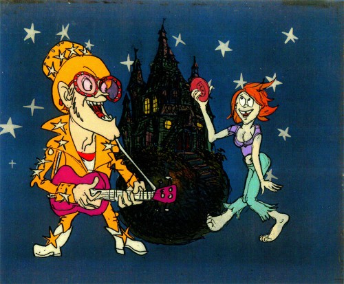
Helen Reddy’s song “Angie Baby”
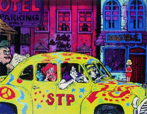
Joni Mitchell’s “Big Yellow Taxi”
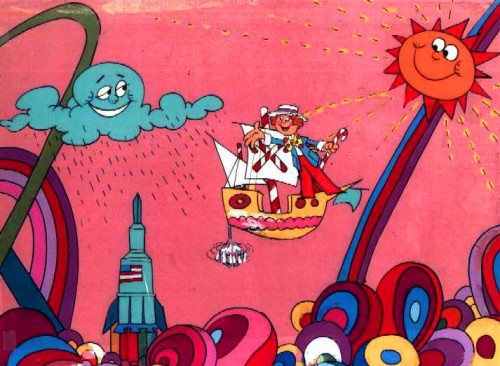
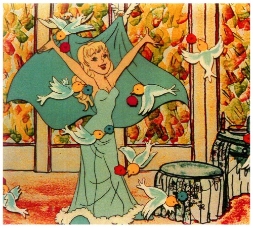
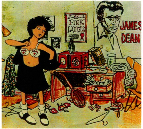
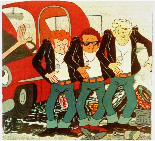
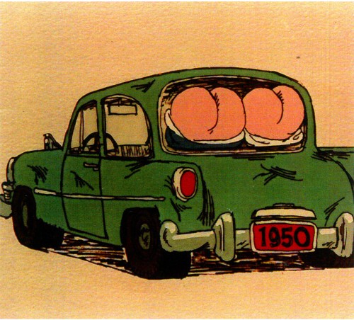
Fine Arts Films also did some movie titles and trailers. We saw, recently, the long theatrical trailer done for Irma La Douce. Here are a few stills done for the main title sequence for the 1978 musical, Grease.
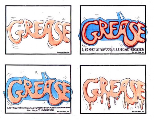
storyboard sketch for Grease.
Produced and Directed by John Wilson
Story and Layout by Chris Jenkyns
Music by Barry Gibb
John Wilson also directed a number of short films which appeared on television on the NBC program, “Exploring” between 1964-1966.
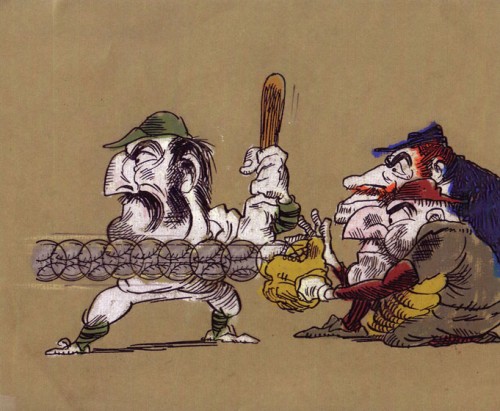
“Casey At the Bat”
Narrated by Paul Frees
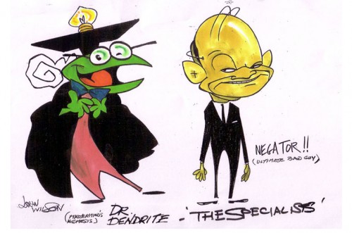
Finally, for MTV’s “Liquid Television” in 1992 John Wilson directed some of the 10 episodes of a series called “The Specialists.”
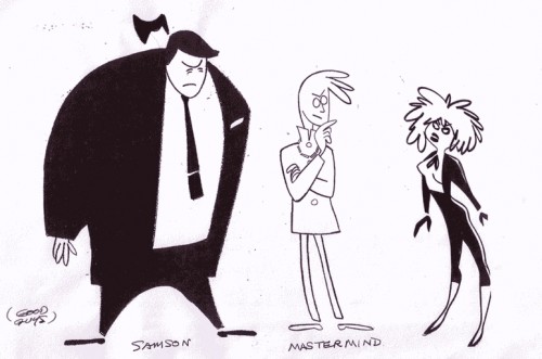 1
1
Go here to see other episodes.
Commentary 22 Jun 2013 03:11 am
A Week that Was
Academy Screenings have come at us this Summer in a hot and heavy fashion. I can’t say that all the films are worth watching, but then you’ll get a week like this where there were several positive adventures as opposed to last week when you had duds on top of duds.
On Tuesday, Brad Pitt came to us in 3D with World War Z. Quite some time ago, I had read that it was a film about Zombies and had forgotten. If I’d remembered I wouldn’t have gone to see the movie, and I might have been sorry. The story is a bit simplistic, but the metaphor is a good one. People, for some medical reason gone awry, turn into killers destroying each other, by bite, without reason. From the first 10 minutes in the film, right to the end I was sitting on the edge of my seat. The tension was formidable.
It was basically about Brad Pitt trying to save his family and in doing so resolve the problem for the world. It all seemed possible (given all the horrendous medical mishaps we’ve seen – from AIDS to Avian Flu to whatever else we could imagine.) Pitt’s one of the only actors I can think of who can relay confidence as a father to his two daughters (and a boy they pick up along the way) as well as a leading consultant working for the UN. The story resolves things in the way Mr. Pitt would like to see. A positive and hopeful ending.
Having seen Superman (Man of Steel)a week ago, it was good to see something with more heft on its mind than aliens.
Monsters University was a piece of garbage that could have stayed on the shelf. More like one of those Disney reworks (Remember: Bambi 2, Peter Pan 2, Aladdin 2, Pocahontas 2, Lady & The Tramp 2 et. al.) This thing, Monsters University, was a total piece of waste. At least the other 2D animated films had originals worth trying to live up to. It’s a tough chore to compete with the original Bambi that the off shore studio tried hard. The original Monsters Inc. was easy to compete with. Nothing to do with the art of animation and all to do with padding Disney’s pockets. (Coming up next week is Despicable Me 2. Who cares? I couldn’t make it through the original.) Pixar, doing Monsters Inc and now Monster U, should be ashamed of this work.
The Attack was an Arabic film that capitalized on the endless war between their two cultures. The 100% rating for The Attack might have been more deserving of half that.
So far, too many battles this summer. All tedium.
Same Old Sad Song
Back in 1955 I was nine years old. There were five kids in my family (including me and an older sister who never would’ve hung out with the rest of us.) Up the block was a larger family of cousins – all girls (at the time). Lady and the Tramp was opening, I wanted to see it on opening day – a Wednesday, and there was no stopping me. In the end, it meant I was supervising 7 kids if I wanted to see this film on it’s first Manhattan screening.
My mother had give me enough for the 8 admissions: 15 cents each for admission ($1.20) plus cash for popcorn & sodas. I had it all worked out and was set to buy something for every one. But the theater got smart! They raised admission for anyone under 12.($.25 cents!) Now, instead of being $1.20 for all of us to get in, it’d cost TWO DOLLARS for admission. We had enough to get in, but forget the candy. There wasn’t enough.
I explained it to my siblings and my cousins. My big fat, old-enough-to-know-better cousin started crying while we waited on line. We needed another quarter, and we could all share popcorn. How was I gonna get that! We were on line and she wouldn’t shut up.
I just wanted to see the movie. I didn’t care about candy or popcorn. Yet the fake-ish crying got louder. They were starting to sell tickets.
The theater manager came over to me to ask what was wrong. When I said we didn’t have enough, he thought I meant admission. He had to stop the crying. It was bad promotion for opening day at his theater. He gave me a dollar!
We suddenly had enough candy and popcorn for all of us, and we had no trouble getting into the theater in plenty of time with lotsa extras. The only problem was that my cousin was hooked onto her crying and she wouldn’t let up on it.
In the end, we saw the movie, ate the candy and had a good time. Of course, before we left, that same cousin had lost her glasses and she started crying again until we found them.
That big wide C i n e m a s c o p e screen. It was great, and I refused to ever go to a theater with my cousin again. I figured out a way to go again the next day with just my younger sister. We sat through Lady & the Tramp twice.
Nowadays, you’d have to put half those kids up for adoption to get enough for entrance and popcorn and 3D glasses. And the movie wouldn’t be as good. (See Monsters U about that one. They didn’t even offer 3D version to the Academy members; that’s how much it mattered.)
New Old Favorites from John Canemaker
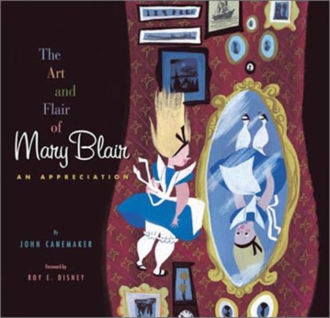
Recent news I got from John Canemaker was that they are going to republish all of his Disney art books with a fresh approach. I believe they’ll be doing one book a year with The Art and Flair of Mary Blair to be the first to be published anew. It will have better color matching supervised by the Disney archives to equal the originals by Mary Blair.
The second book from the Canemaker canon to go this route will be Walt Disney’s Nine Old Men and the Art of Animation. In the end all of his great books should look fresh and bright, possibly even better published than the originals.
For once a publisher does a positive service to the history of the medium.
Speaking of which, I’m reading John’s Paper Dreams for the first time. It’s a pretty fabulous book, and I’ll have a lot to say when I finish it this coming week.
More on Mogubgub
Ed Grant on his site, MediaFunhouse, has devoted some space to the late Fred Mogugub. The material in the article seems to have been culled from work written by Mogubgub;s friend, Richard O’Connor as well as from my site.
The rehash is worth the reread; I can assure you. Artists need to be recognized.
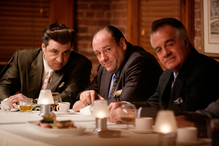
James Gandolfini
At only 51, James Gandolfini (center above) seems to have left us. Thank god for The Sopranos. That show gave us a clue as to was a fine actor he was. I’m unable to turn on an episode, and episode and to quit so quickly thereafter. I feel compelled to watch the entire show regardless of the fact that I’d seen it many times already. Like a great movie, not a TV show.
As it happens, in the past year I seem to have run into Gondolfini more than my fair share of times. Twice I saw him with other “Soprano” members at David Chase events and three times I saw him at HBO events which celebrated documentaries about to be aired. I am amazed at how fit he looked all those times that I’d seen him. He was an actor who carried some weight (I don’t mean physically but dramatically), someone I would have cast in a moment’s notice no matter what I was filming. He was a talent to be reckoned with, someone who’d have brought real character to your film.
Bill Peckmann &Commentary &Illustration 21 Jun 2013 06:24 am
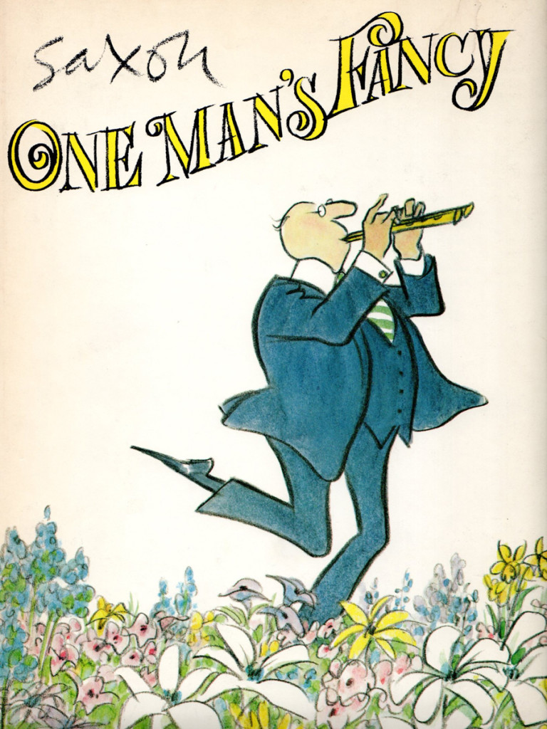
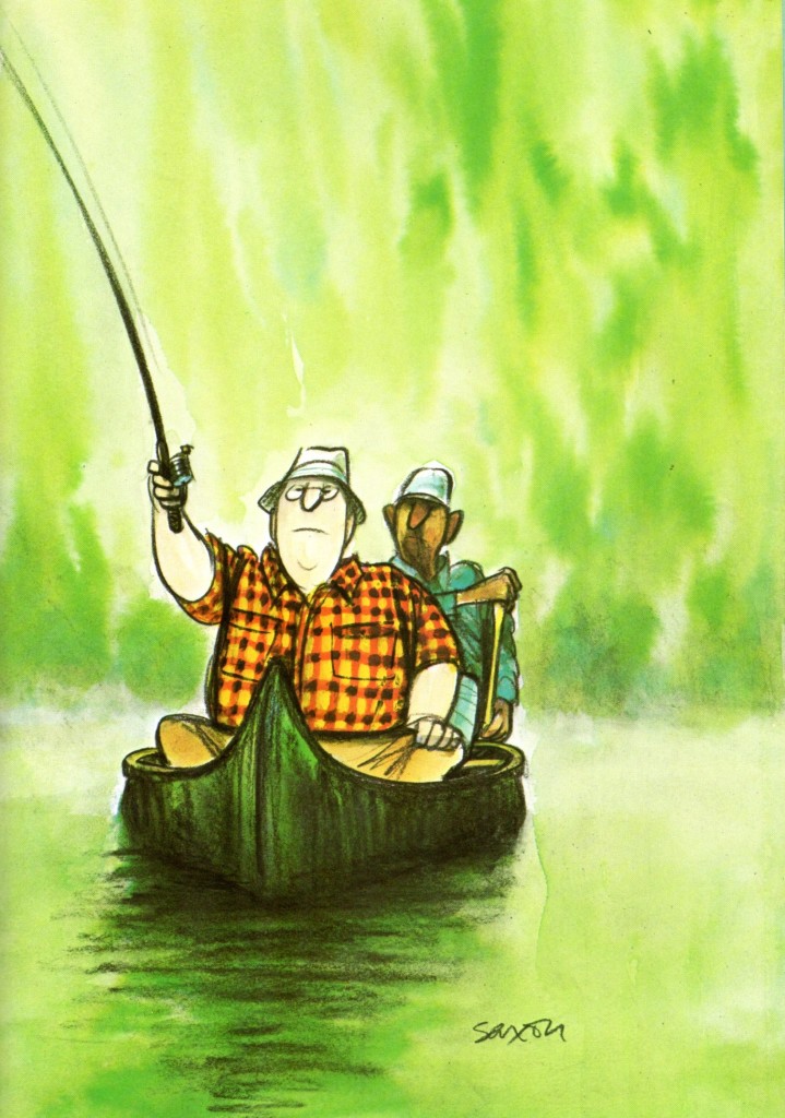
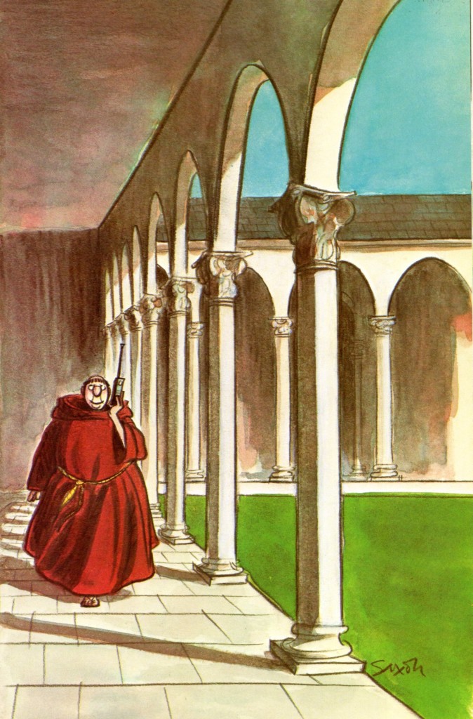
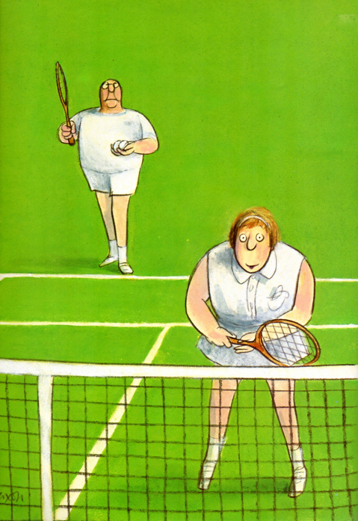
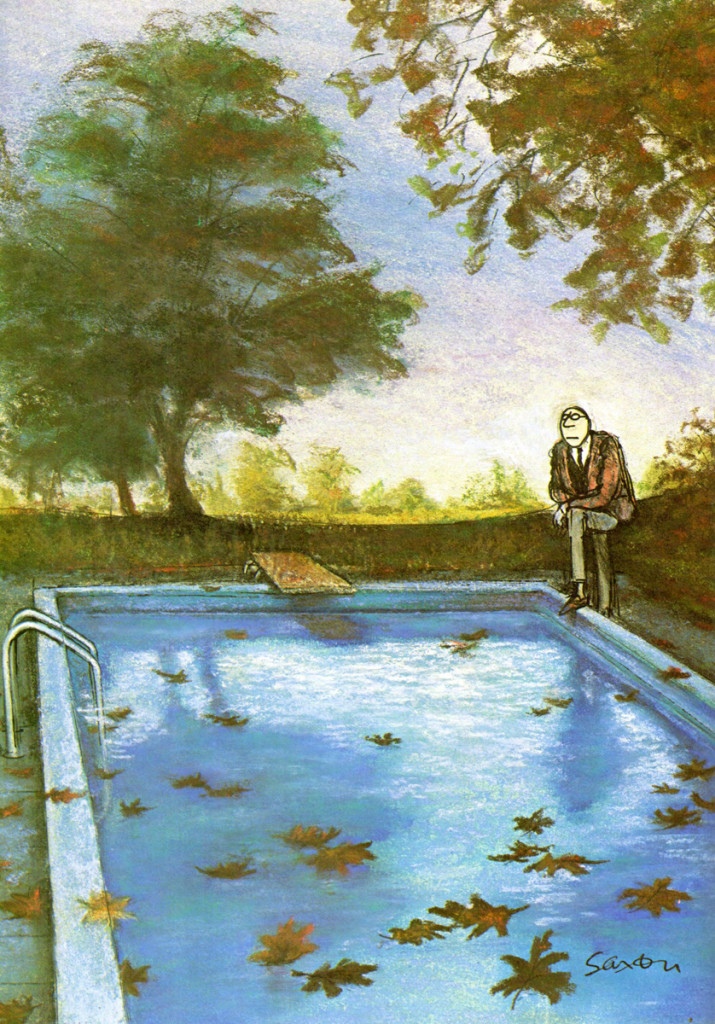
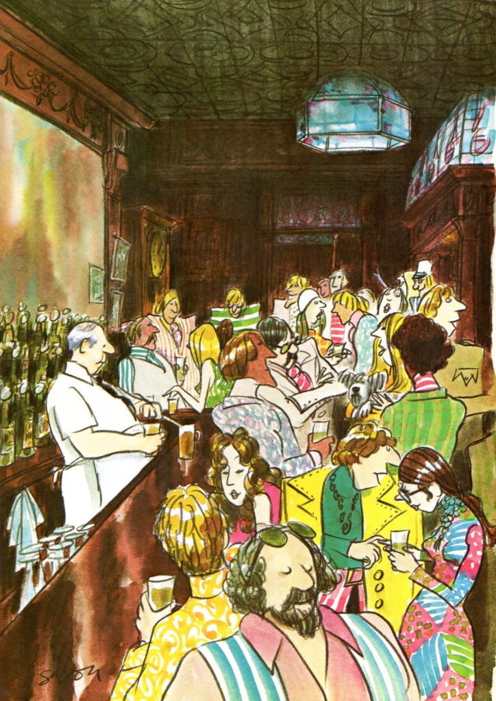
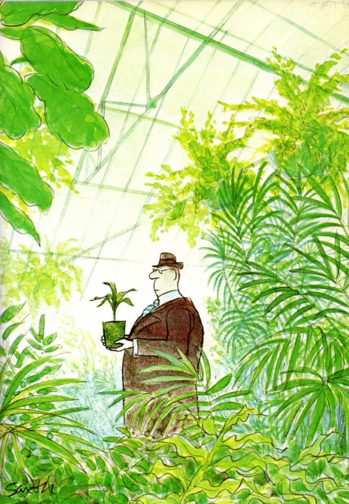
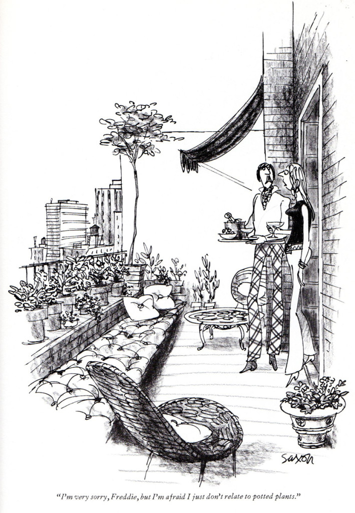
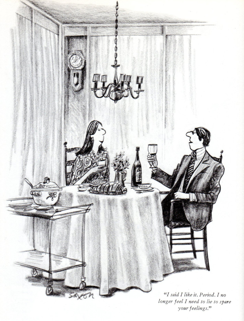
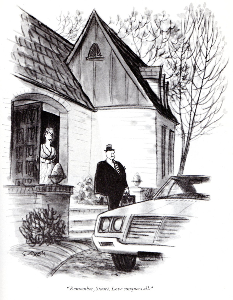
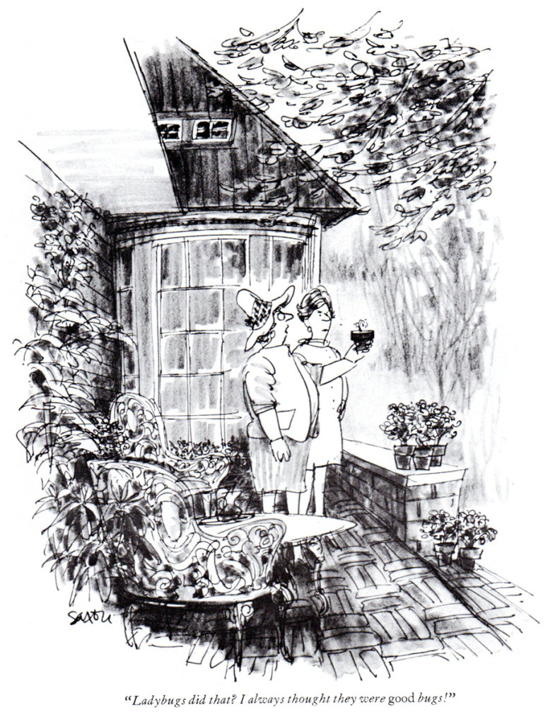
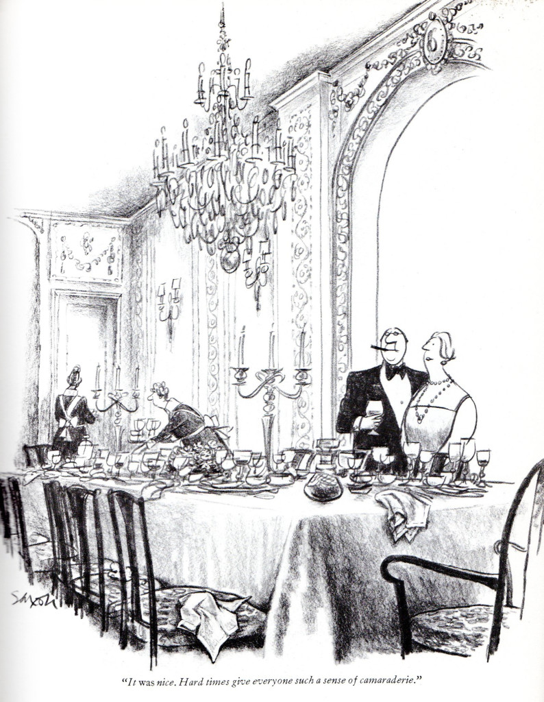
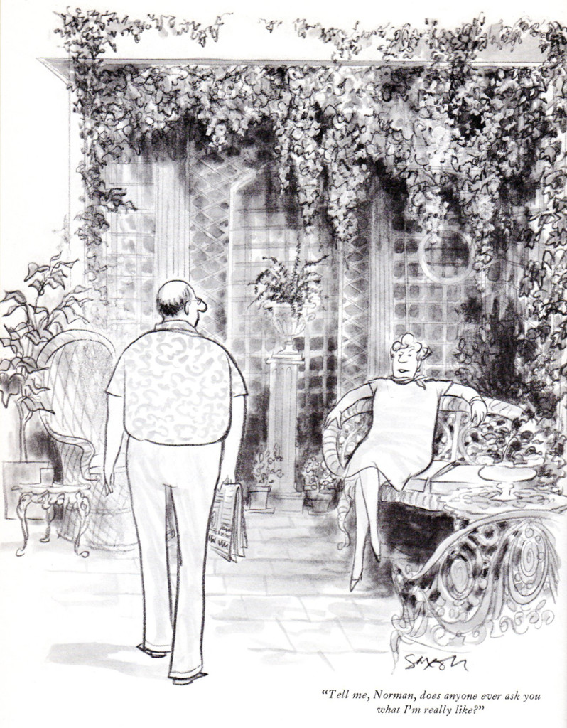
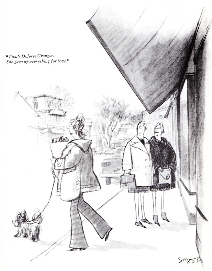
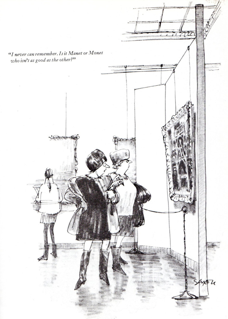
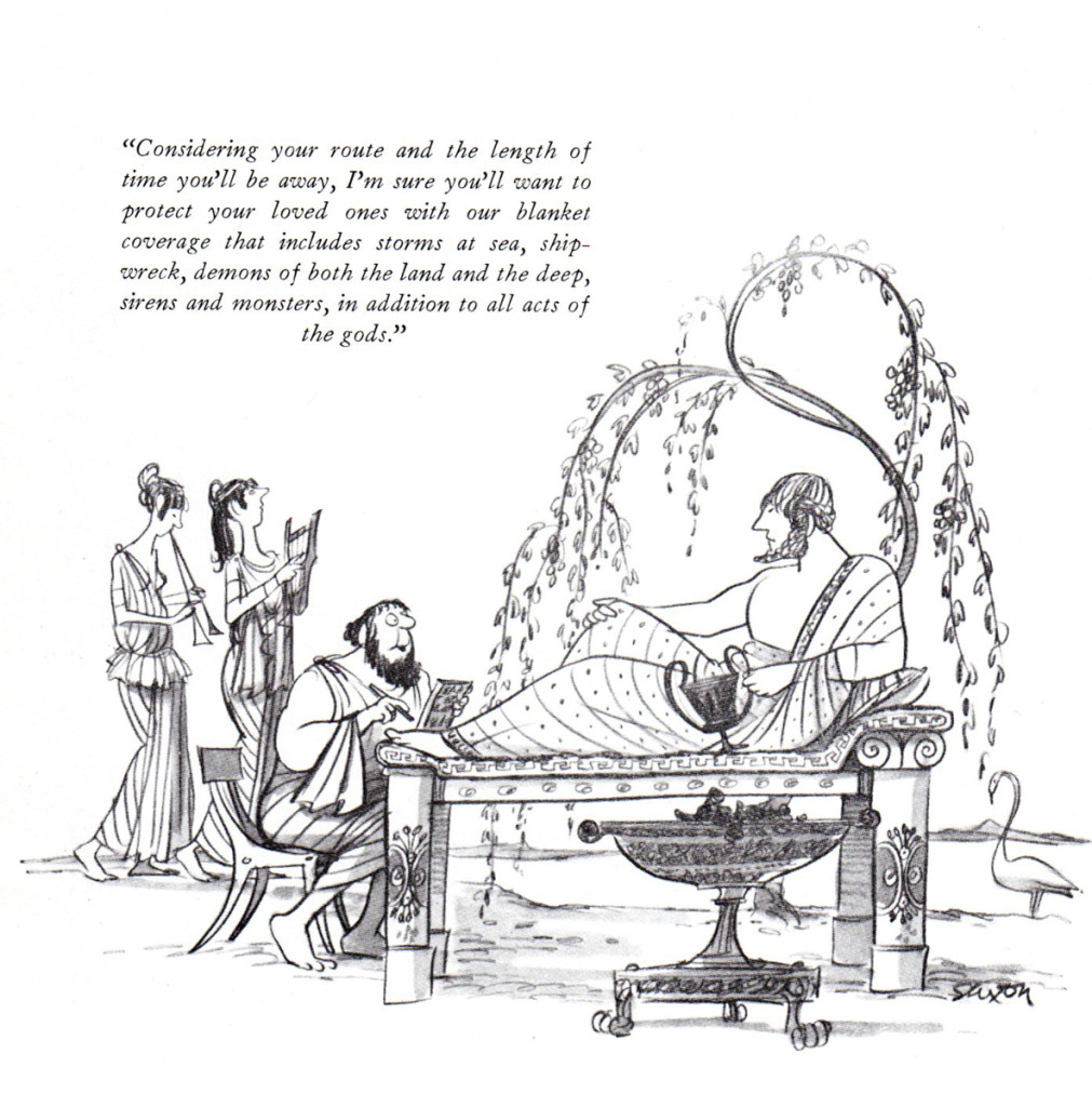
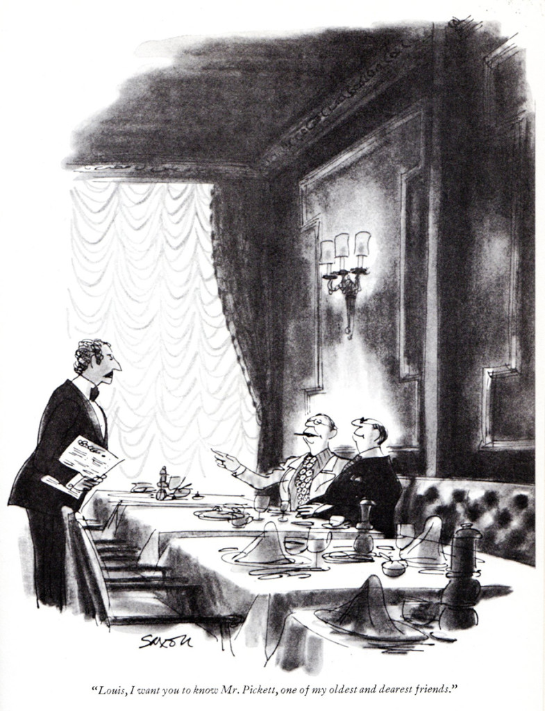
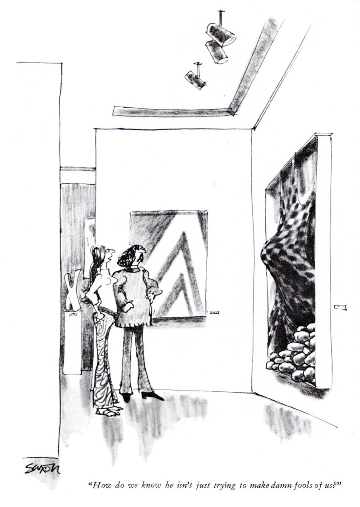
Charles Saxon
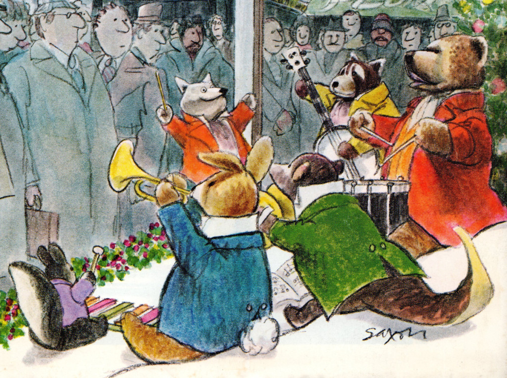
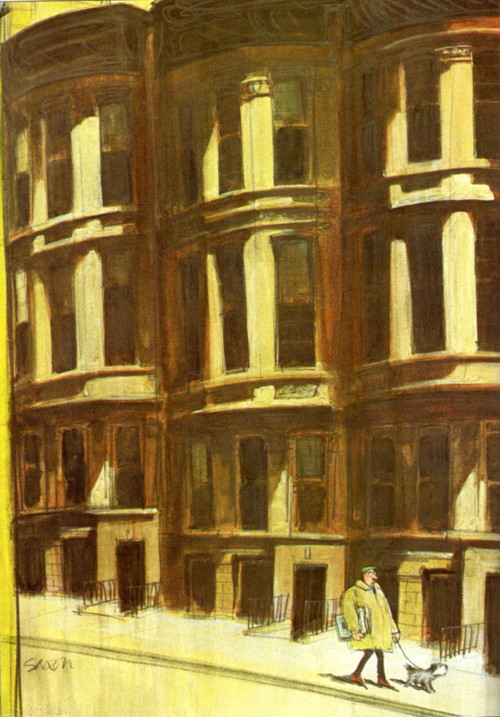
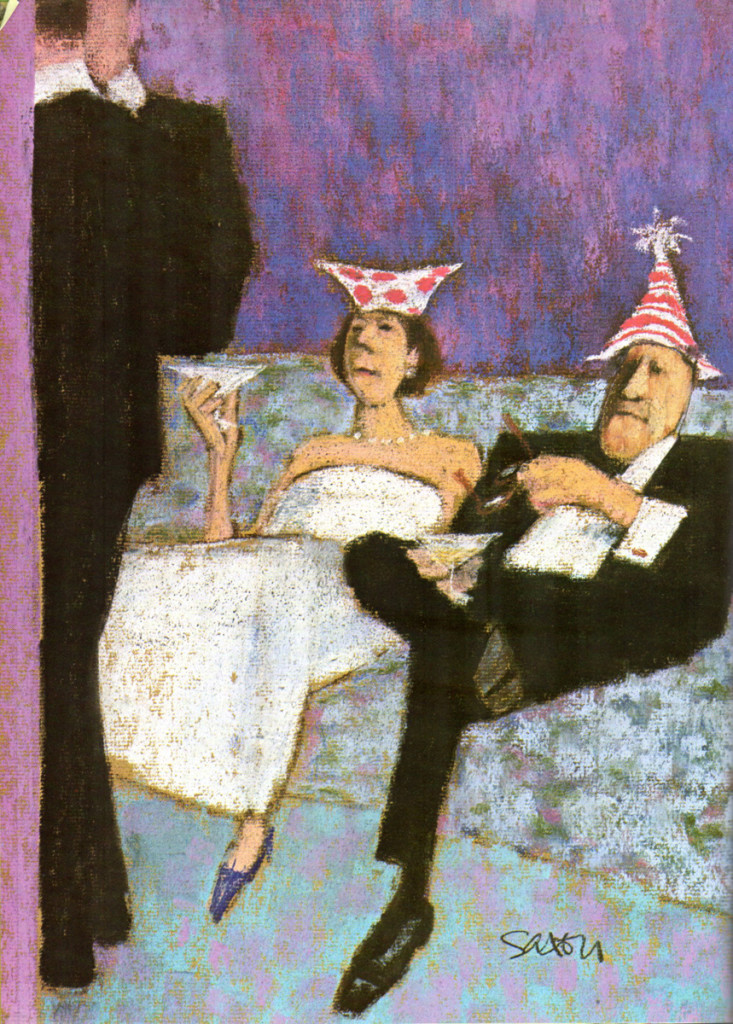
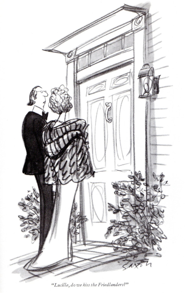
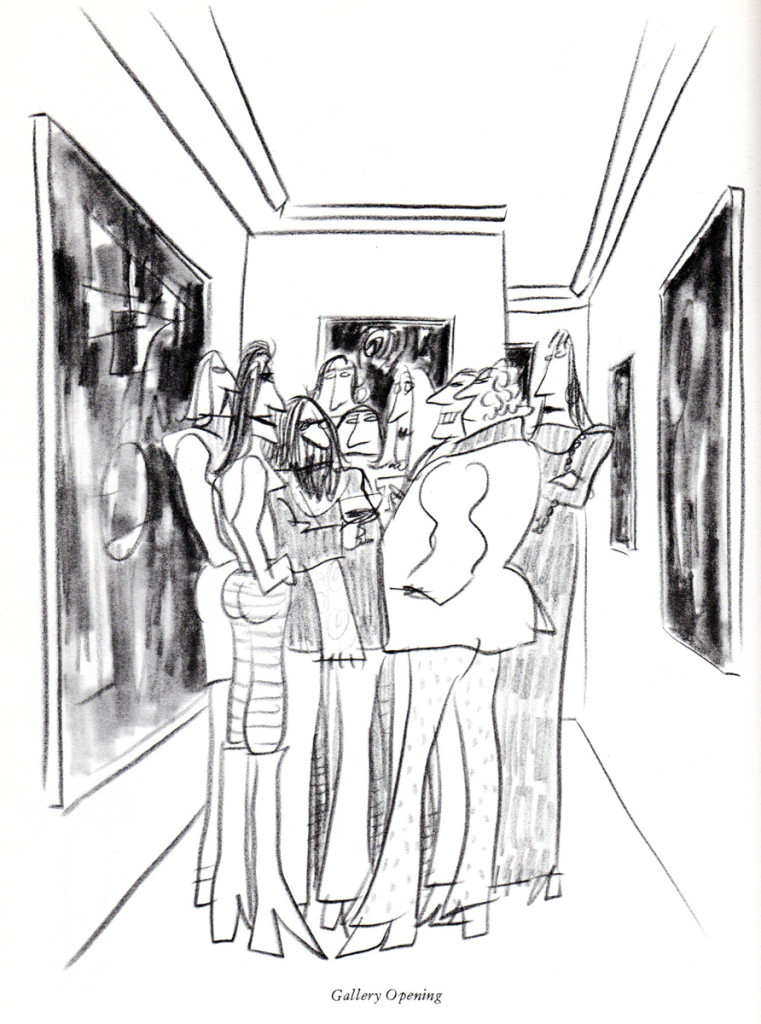
I’ve always loved the extraordinary work of Chuck Saxon and have watched it closely. I do have one cel from a commercial done in his style, thanks to a good friend, Jim Logan who acted as an assistant on the spot. Unfortunately, it’s currently in storage or I’d post it.
Bill Peckmann sent me a number of pieces,and I’m glad to share them. Here’s Bill:
- Exquisite and scrumptious are two words that describe the work of New Yorker artist Charles “Chuck” Saxon to a fair thee well. The cover below which I had clipped, was one of my favorites because of his animals in it. The human condition was always Saxon’s main concern, but one can still wish that he could have included more critters, stuffed or otherwise in his incredible art.
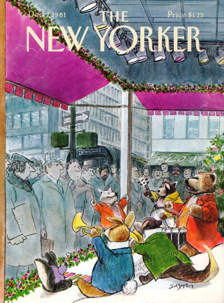 1
1
Bill Peckmann &Books &Commentary &Illustration 20 Jun 2013 05:28 am
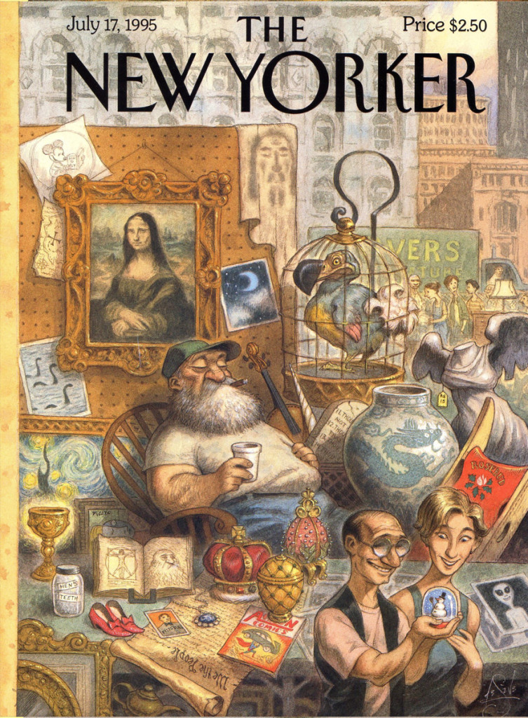
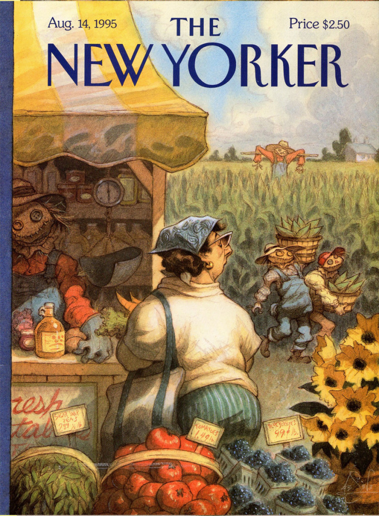
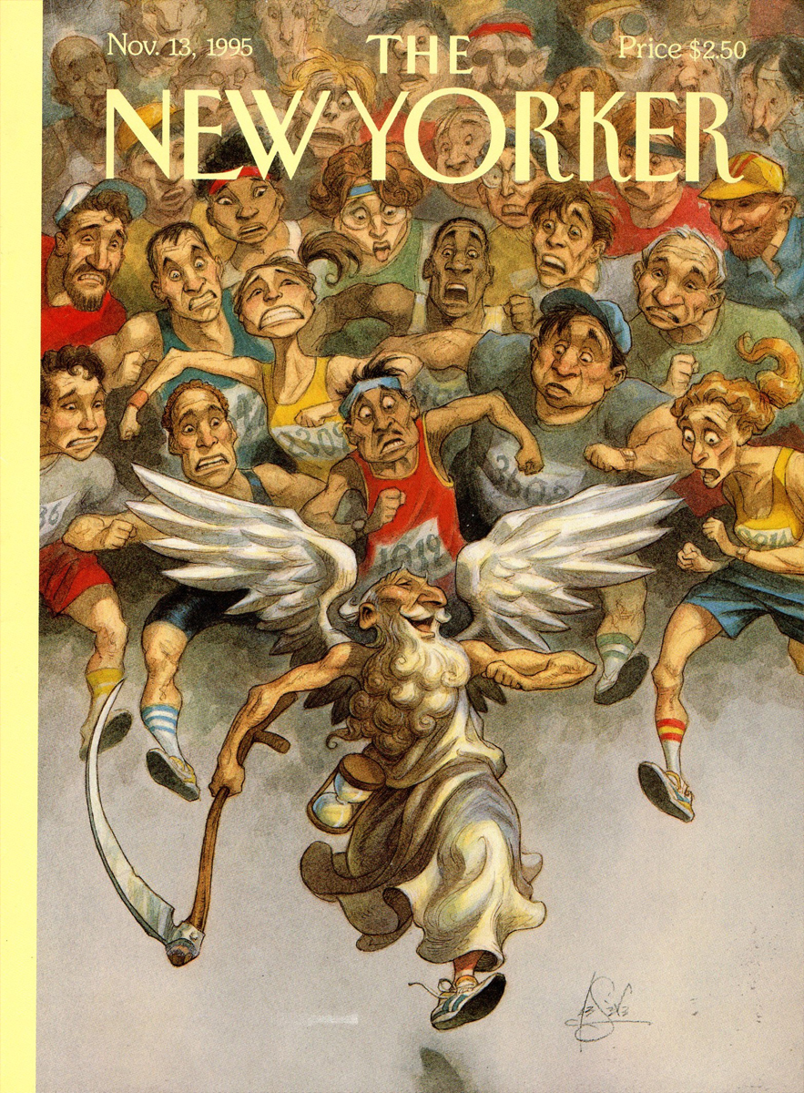
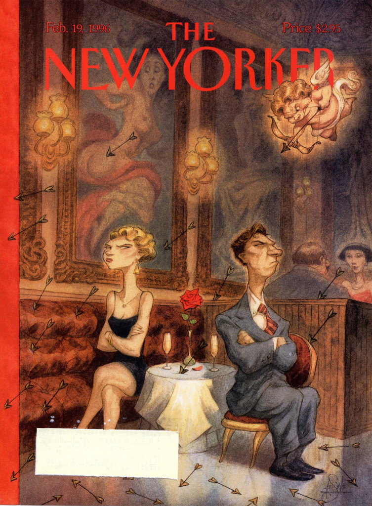
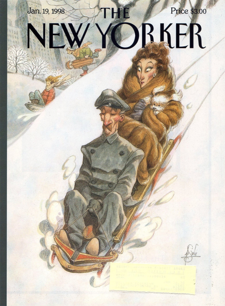
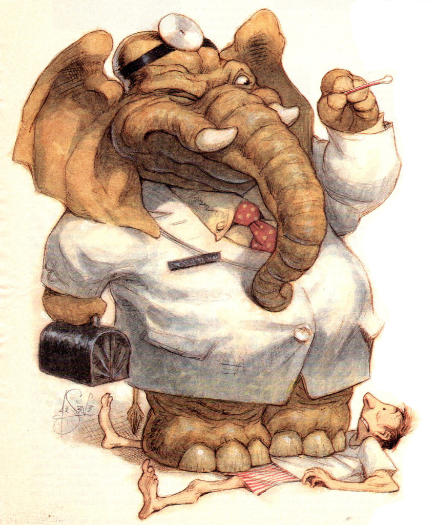
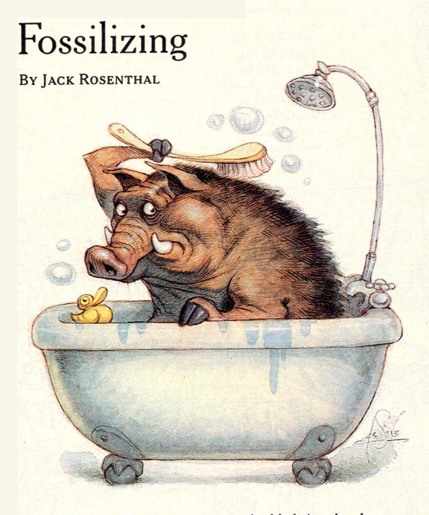
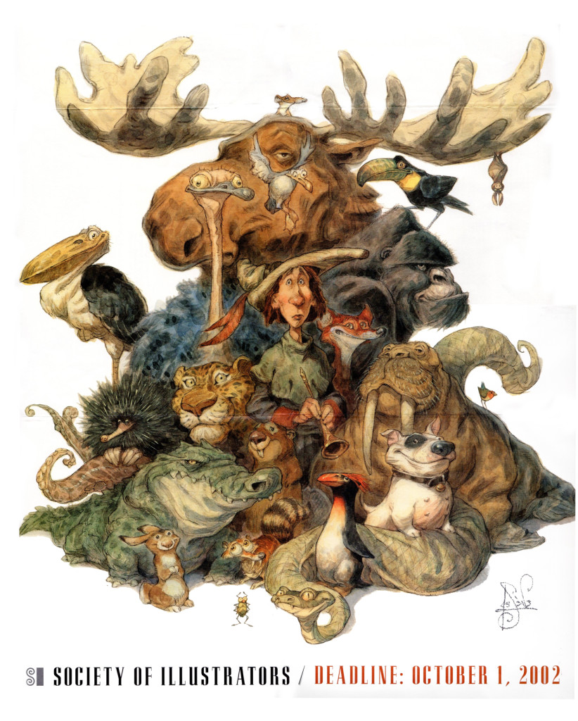
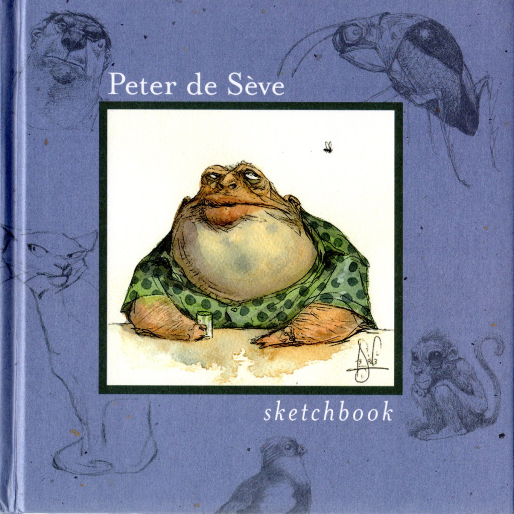
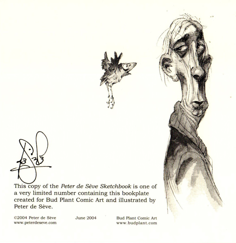
Peter de Seve
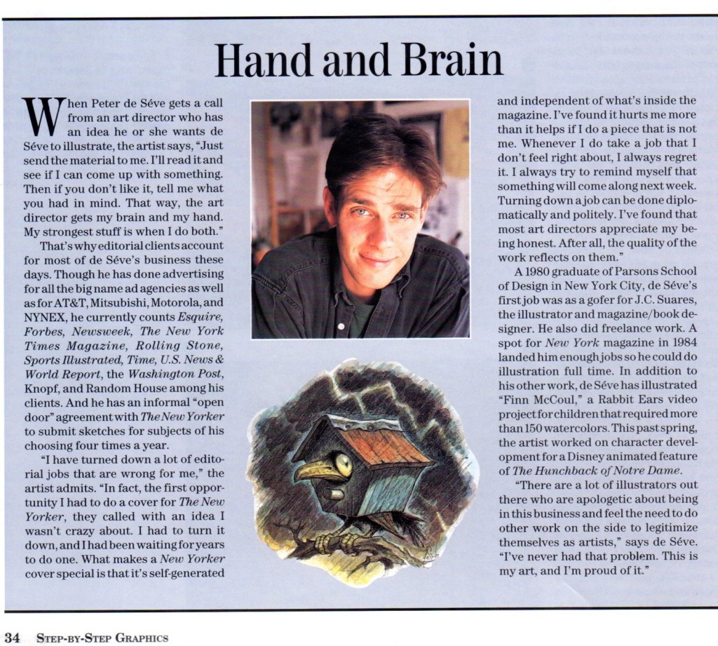
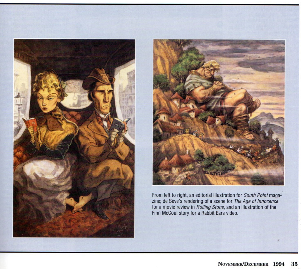
We, in animation, are all familiar with the work of the talented designer, Peter de Seve. Bill Peckmann has sent me a number of clippings of his work: covers from New Yorker magazines, ruff illustrations and articles about him. It makes for a good post on this talented artist.
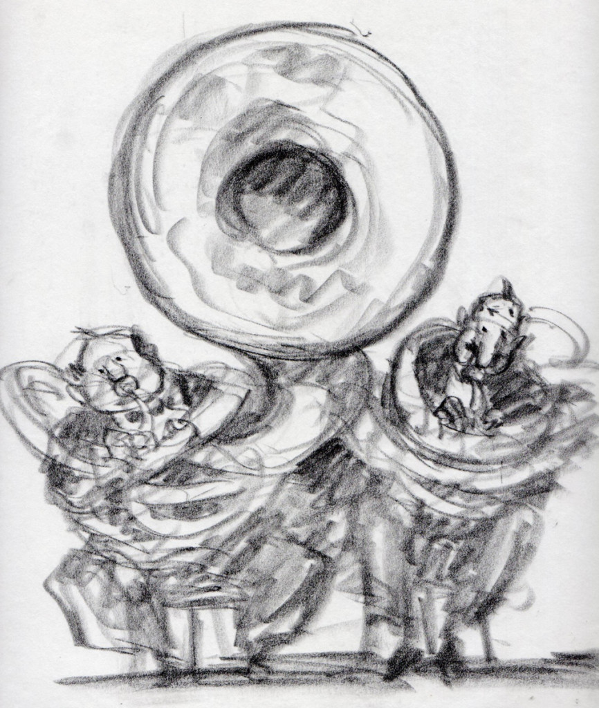
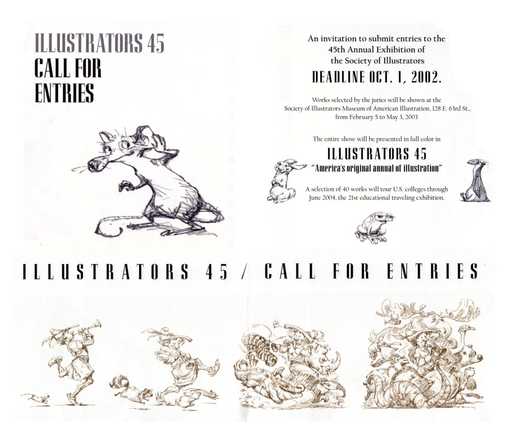
Back in the mid 1990′s, friend Tom Yohe was art directing an ad agency print job and he called in Peter De Seve to do the illustration. Tom knew I was a huge De Seve fan and he was kind enough to give me Peter’s discarded roughs. Here they be…
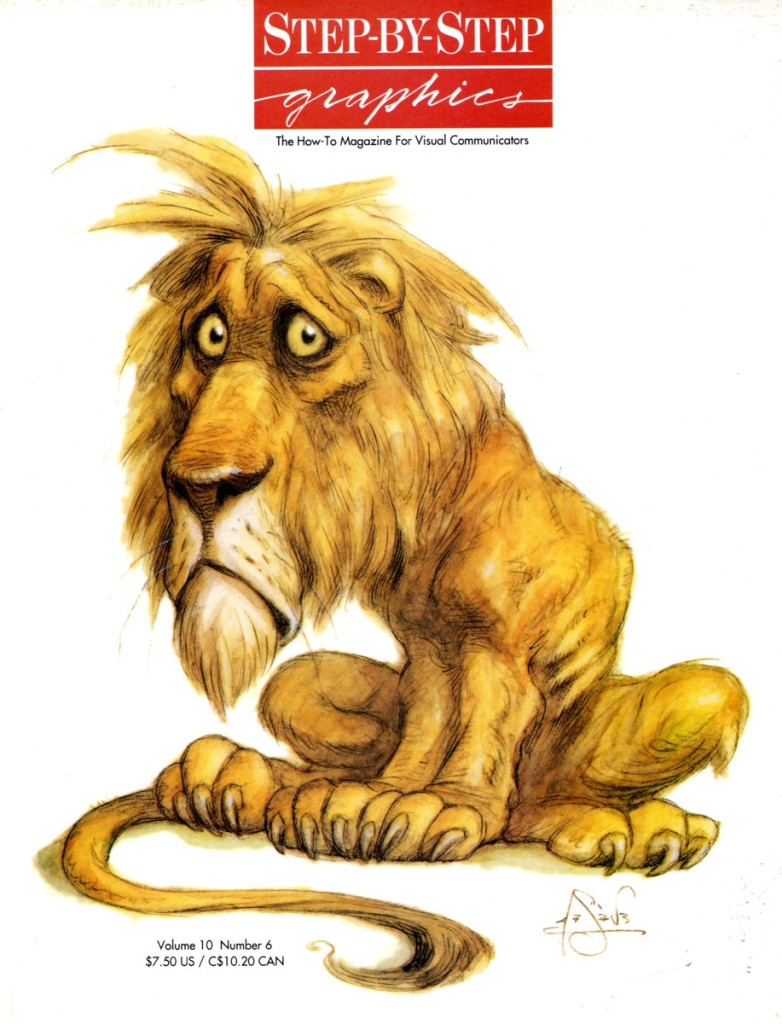
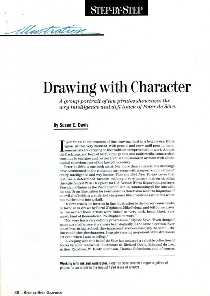
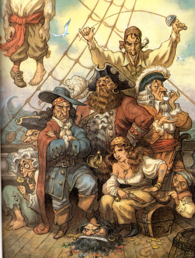
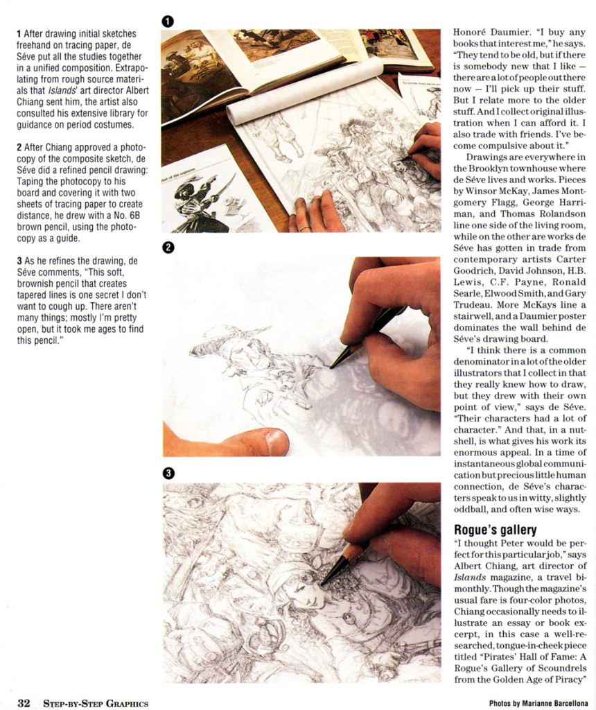
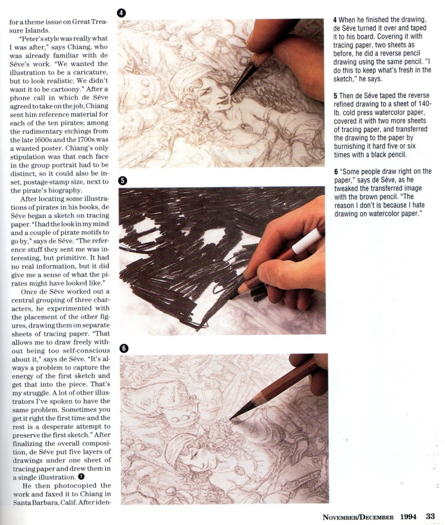
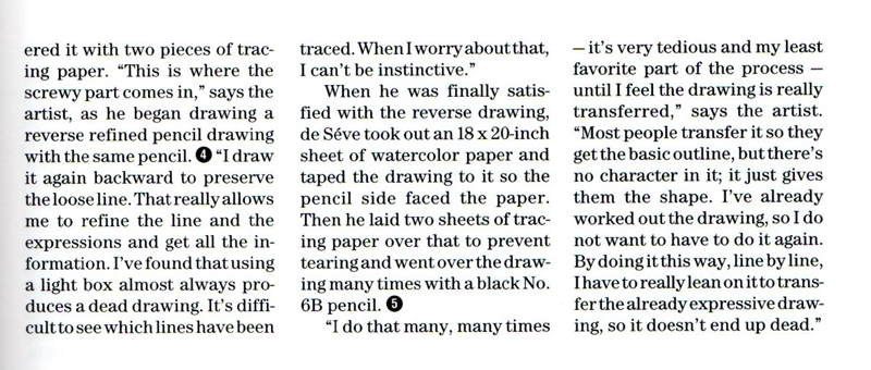
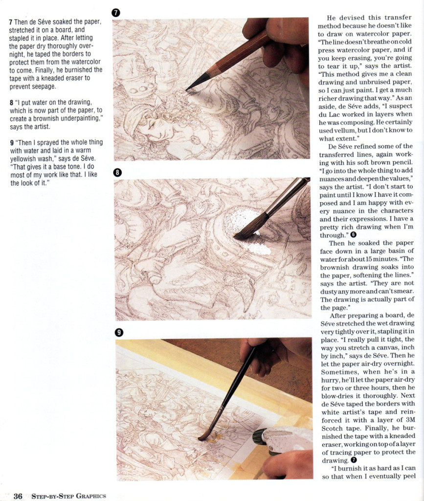
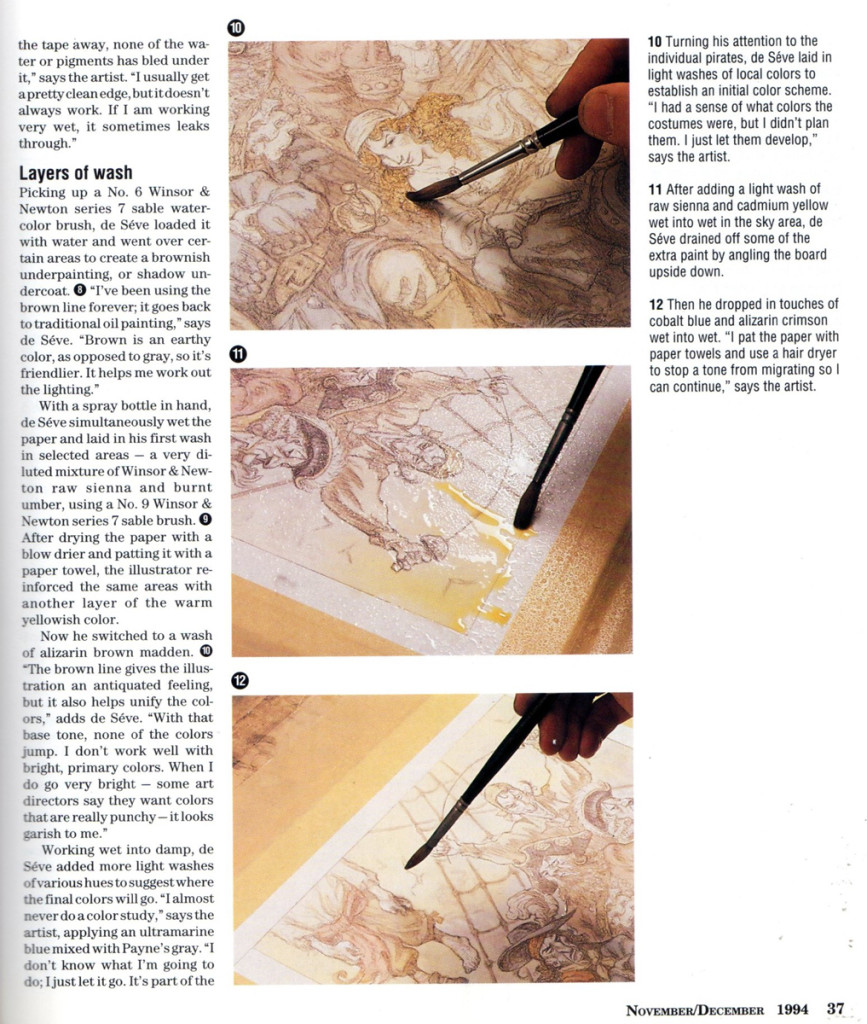
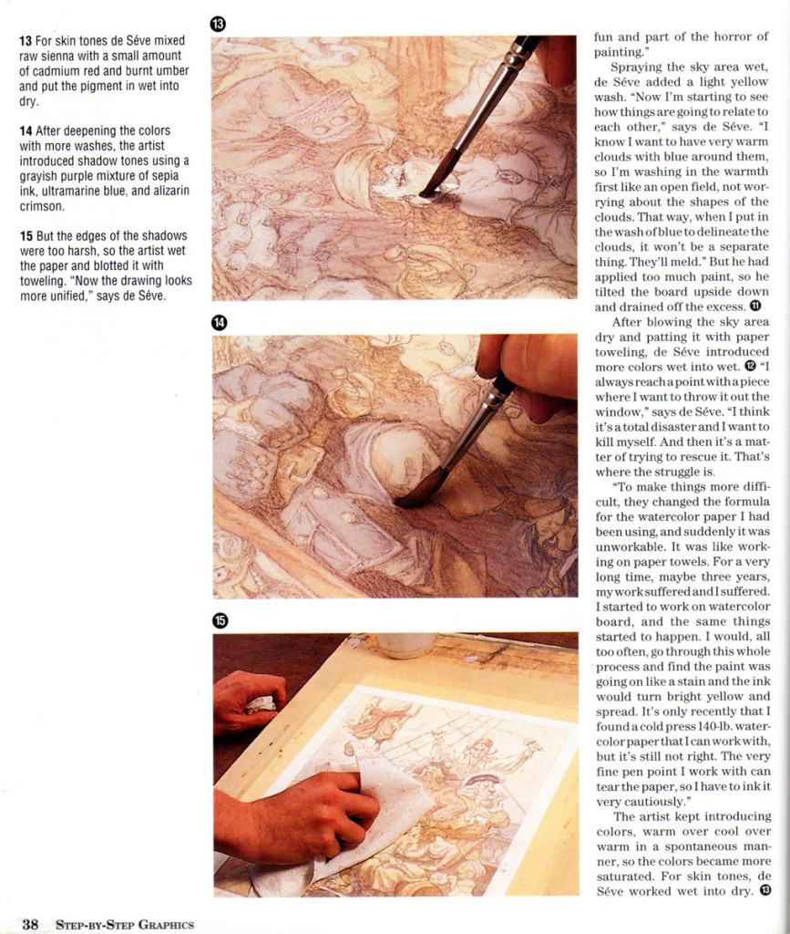
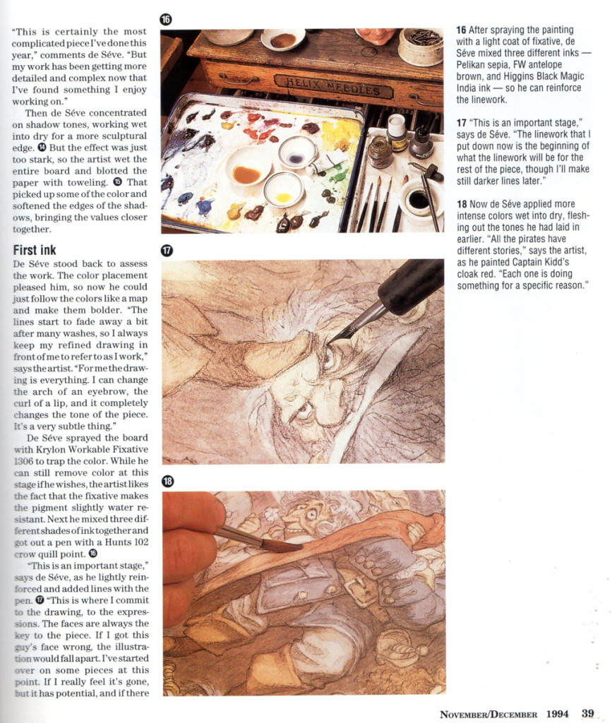
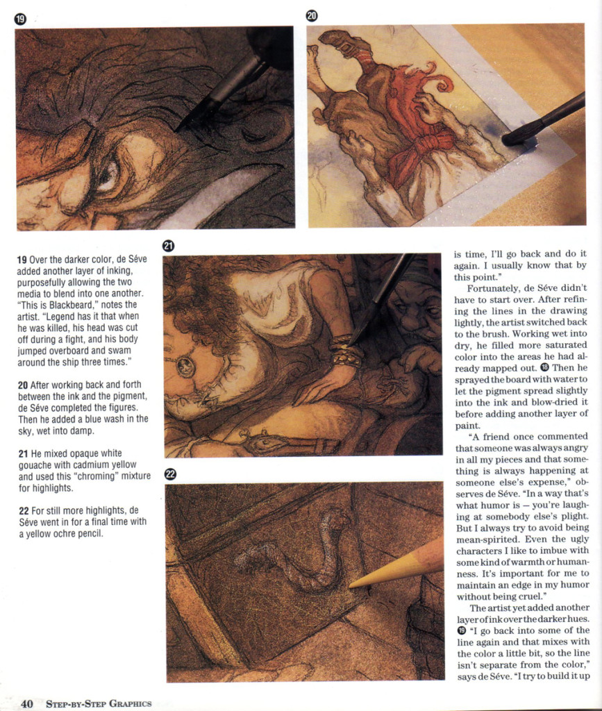
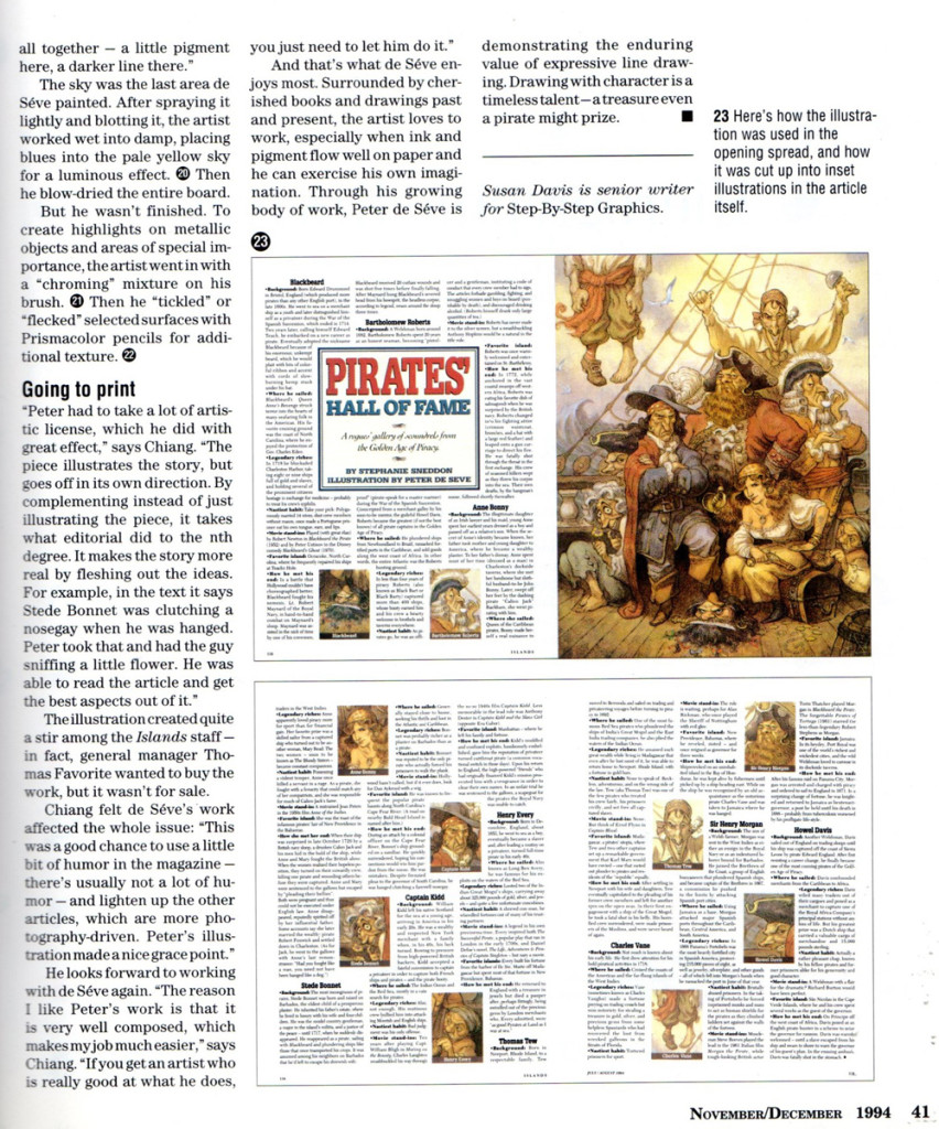
The following is an article from a 1994 issue of STEP-BY-STEP GRAPHICS.
 29
29
