Monthly ArchiveMarch 2008
Animation Artifacts &Layout & Design &repeated posts &Story & Storyboards 21 Mar 2008 08:03 am
Recap Friday – Jax Beer commercial
- In November 2006 I posted the storyboard, workbook and final layouts for a Jax Beer spot which was directed by Mordicai Gerstein. I thought it interesting enough to recap the two posts, so here they are.
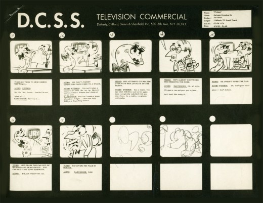
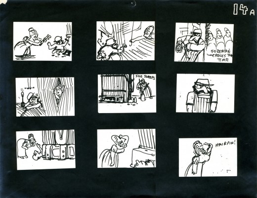
- This is the material for a Jax Beer commercial. It was done by a NY studio named Pelican in 1962. There were about 75 people on staff at Pelican back then.
This spot was directed by Mordi (Mordicai) Gerstein. He left animation in th 70′s to write & illustrate children’s books. (He won the Caldecott Medal for his book, The Man Who Walked Between The Towers. This was the book I adapted to animation in 2005.)
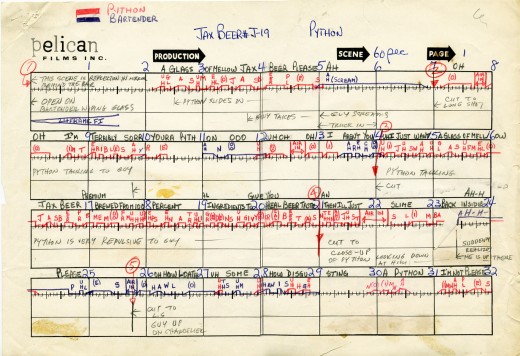
What follows is the storyboard and the director’s workbook. (It appears to be an agency board, though it’s drawn in a style that looks to be Mordi Gerstein’s. Perhaps boards from the agency were drawn by the studios back in 1964; I’m not sure. The layouts were drawn by the same artist.)
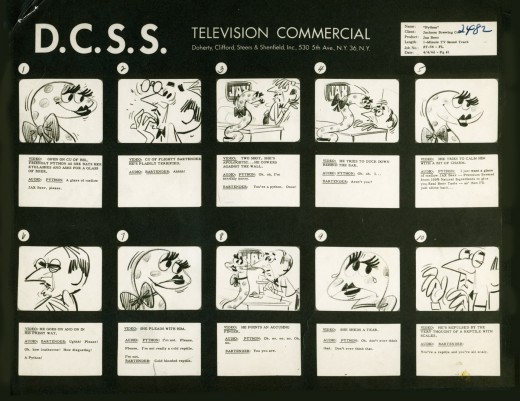
_____(Click any image to enlarge.)
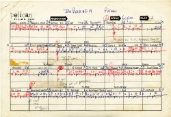
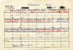
The workbook has several flaps on it that indicate changes in timings. There are also glue stains where I assume other flaps fell off. (See page one, last row, first column.) Each column represents 16 frames/one foot of film. Odd numbers are marked off.
Each row contains 8 feet of film/128 frames. Each page represents 32 feet/512 frames. It would have been smarter to keep to even numbers.
More modern exposure sheets generally have 80 frames/five feet per page. This also divides into two feet of 16mm film. (Handy.) The numbers add and divide smartly and easily. But then most people don’t use exposure sheets anymore.
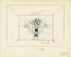
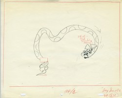
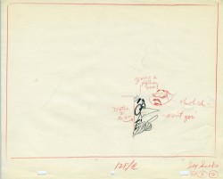
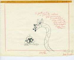
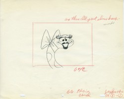
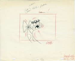
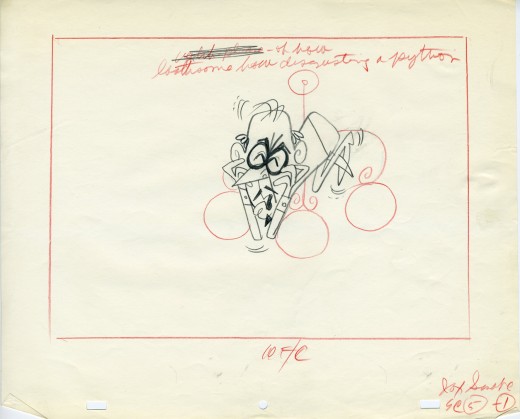
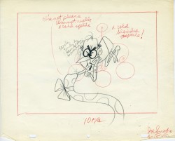
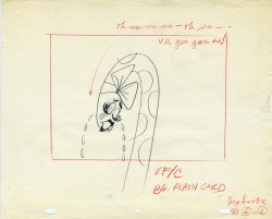
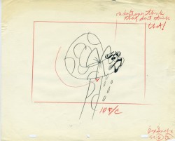
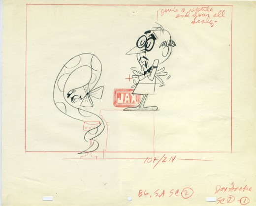
 - Continuing with the above post, a Jax Beer commercial, I present some of the film’s layouts. This represents about 2/3 of them.
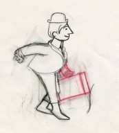
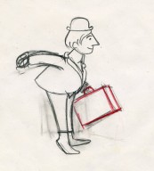
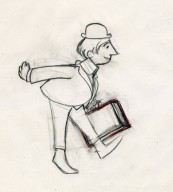
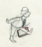
The art was done by Mordi (Mordicai) Gerstein, who also directed the spot. Grim Natwick animated the spot and Tissa David assisted him. Of course, this was in the days before auido tapes could be handed out, so the animator would get a phonograph of the soundtrack. They could mark it with a white pencil to indicate key spots.
I thought that this in conjunction with yesterday’s prep material gave a good indication of the preproduction that went into making a commercial back in 1962.
That said, here are the layouts:
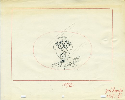
(Click on any image to enlarge.)
Animation &Animation Artifacts 20 Mar 2008 08:07 am
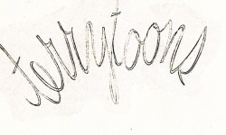
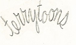
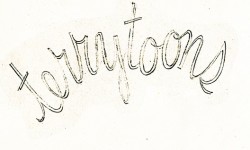
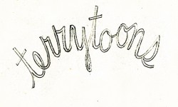
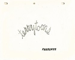
Terry’s Logo
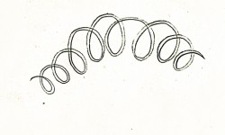
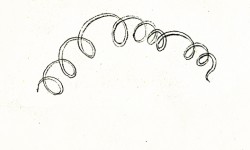
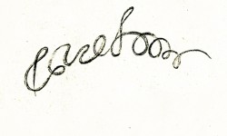
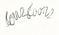
I was looking at an older piece of animation I had posted about two years ago. I’ve always loved these drawings and felt that they truly represented an era at Terrytoons and, more specifically, New York animation. I thought I’d like to post them again (adding a QT movie
of the motion.)
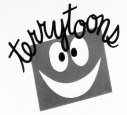 – Since first seeing them in the 50′s, I’ve been a fan of the films from the Gene Deitch period at Terrytoons. You know, Clint Clobber, Sidney the Elephant, Gaston Le Crayon and Tom Terrific. Call this a guilty pleasure.
The animated logo included a linear face which had some scribbled hair that animated to read “Terrytoons” when a door closed on it. It was a short bit that seemed different and more lively than other logos of the day, though I think things started to change with Gene Deitch’s approach.
The UPA films had a tighter animation style. There was some looseness in the opening credits of the Gerald McBoing Boing Show, but generally there was a less freestyle animation in the limited UPA approach. The Dick Tracy show was airtight.
Perhaps the full credit should go to Deitch or perhapts it was Jim Tyer’s influence at Terrytoons that really changed things. I don’t know who actually animated this logo, but there’s plenty of life in it.
 1
1 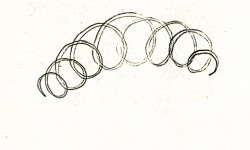 2
2
(Click any image to enlarge to its full size.)
Terrytoons Logo, animated.
Books &Commentary &Illustration 19 Mar 2008 07:58 am
Only God Can Make a Tree
- If you’ve only heard clips of the Obama speech given yesterday, spend the time and watch the whole thing. It’s time to plant apples here. Part 1, Part 2, Part 3, Part 4.
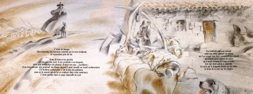
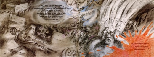
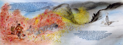
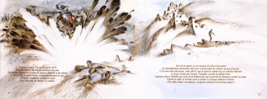
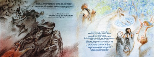
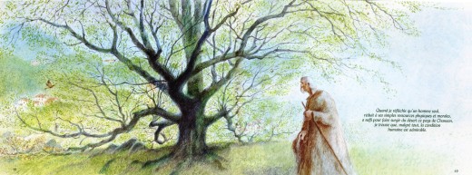
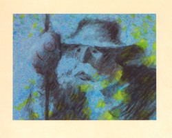 - Mark Mayerson features an article on his blog about Frédéric Back and the news about an exhibit of his artwork. I’m not in Canada, so it’s hard to see the exhibit and the screeenings. However, I thought it might be a good idea to look again at Back’s stunning film, The Man Who Planted Trees. Naturally, I want to share what I’m viewing with you, so I thought to put up some frame grabs. This film, though, is so stunning, I don’t think fuzzy frame grabs will do.
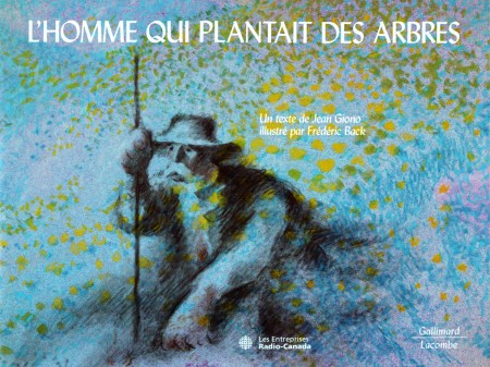
I have a book of the film which was illustrated by Frédéric Back from art for the film. It’s in French, and I haven’t attempted to translate it. I’m posting these images purely for the artwork. Aside from the cover, all six images I’m posting are double-page spreads. The book has about 50 pages, so I may post more some other day, but for now enjoy these.
(Click any image to enlarge.)
Animation &Commentary &Frame Grabs &Hubley 18 Mar 2008 08:16 am
The Hat
- Forgive me, I’ve been in a Hubley frame of mind these past few days, so I’m into reminiscing.
 New York’s local PBS station, WNDT – that’s what it was called in the old days – used to have a talk show hosted by film critic, Stanley Kaufman.
(It turns out that this show was produced by the late Edith Zornow, who I once considered my guardian angel at CTW.)
This talk show was quite interesting to me, a young art student. I remember one show featured Elmer Bernstein talking about music for film. He gave as his example the score for The Magnificent Seven. He demonstrated that the primary purpose of the score, he felt, was to keep the action moving, make the audience feel that things were driving forward relentlessly. I still think of that show whenver I see a rerun of the film on tv.
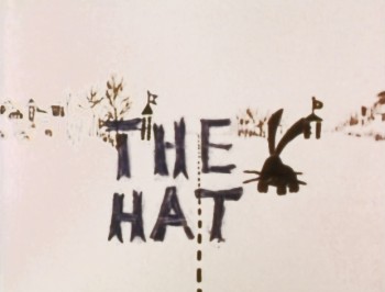
The surprise and exciting program for me came when John and Faith Hubley turned up on the show to demonstrate how animation was done. They were using as an example a film they had currently in production, The Hat. This film was about the siliness of border lines. One of two guards, protecting their individual borders, loses his hat on the other side of the line. Of course, all he needs do is to step over and pick up the hat, but he can’t. The other guard won’t allow him to cross the border illegally – even to pick up his hat.
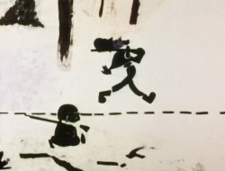
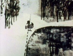
The voices were improvised by Dudley Moore and Dizzy Gillespie (much as the earlier Hubley film, The Hole, had been done.) The two actor/musicians also improvised a brilliant jazz score.
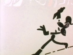
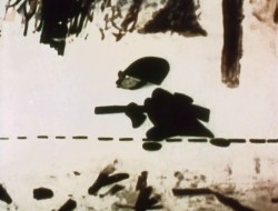
John’s design was quite original. The characters were a mass of shapes that were held to-gether by negative space on the white on white backgrounds.
 The animation of the two soldiers was beautifully done by Shamus Culhane, Bill Littlejohn, Gary Mooney and “the Tower 12 Group“.
Shamus animated on a number of Hubley films during this period, most notably Eggs and a couple of commercials.
Bill Littlejohn animated on many of the Hubley films from Of Stars and Men up to Faith’s last film.
Gary Mooney animated on The Hole and Of Stars and Men. He was an Asst. Animator at Disney, animated for Hubley then moved on to some of the Jay Ward shows before moving to Canada where he continues to animate.
Tower 12 was the company formed by Les Goldman and Chuck Jones at MGM. Apparently they were between jobs when Hubley was finishing this film, and Chuck offered help.
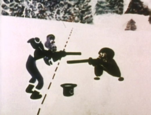
Of course, the colors of the film as represented by the dvd are pathetically poor. It’s hard
to even imagine what the actual film looks like, and it’d be great to see a new transfer of
all the Hubley films.
Animation &Animation Artifacts &Hubley &Story & Storyboards &Tissa David 17 Mar 2008 07:46 am
Upkeep Board
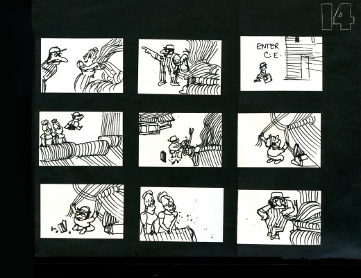
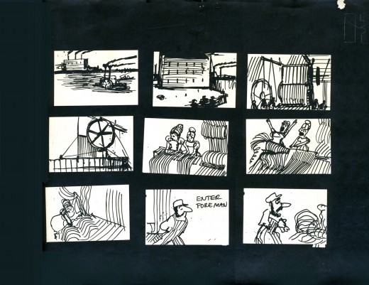
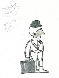 - I spoke a little too quickly last week when I promised to post the storyboard for UPKEEP, Hubley’s short film for IBM. I seem only to have three pages of the board, and I’m posting them here.
The story tells the history of the maintenance guy, for this client, IBM. When the first stone-wheeled cart breaks down (square wheels don’t work), the mainenance man comes in and cuts off the edges to give the world the first round wheel. When the loom goes crazy, the maintenance guy enters to fix the macinery, making it easier and smoother to weave. (Love blossoms in this sequence.)
The entire film is told without dialogue. Its soundtrack is a score by jazz great Benny Carter, and it was prerecorded. The film was animated to
___Xerox Model of lead character_______ it and the animation was edited by Faith Hubley.
___drawn by John Hubley______________The animation was done by Phil Duncan, Tissa
___________________________________David, Jack Schnerk and Lu Guarnier.
Again, I have only these three pages. They’re photostats made from the storyboard drawings pasted to black flint paper and reduced to 9×12 size. Originally, John did the drawings on pads of paper (4×5) cut to size. The drawings he chose to include were tacked to the wall in his room. This is where he’d present the board to his client.
_________________(Click any image to enlarge.)
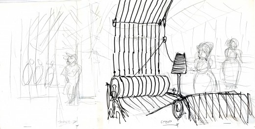
Here are a couple of the Layouts for this sequence.
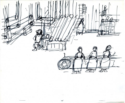
_________A drawing by John Hubley of the assembly line BG.
_________Tissa turned this shot into a pan so that we’d end on the lead girl.
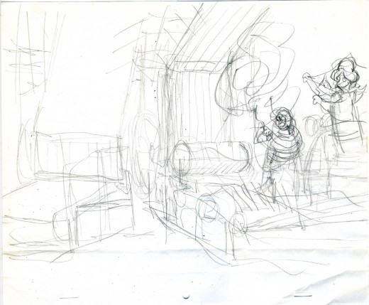
_________The loom goes haywire as Tissa blocks out the scene.
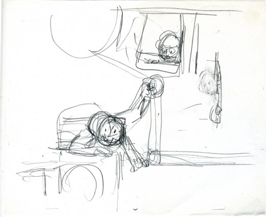
_________Tissa shows the girl watching the guy at work.
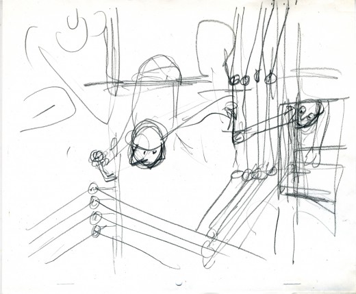
_________John’s drawing of the serviceman repairing the loom with Tissa’s touchups.
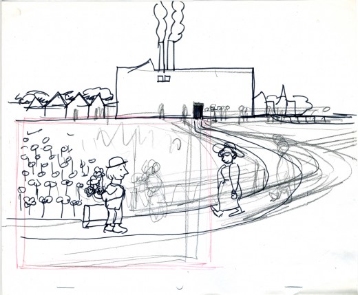
__John draws the serviceman waiting for the girl at the end of the day – with flowers.
Daily post &Photos 16 Mar 2008 08:34 am
Photo Sunday Murals
- I recently received this email from my friend, Tom Hachtman (the cartoonist who draws Gertrude’s Follies, a strip I’ve featured):
 Joey has taken over Three Designing Women. She employs two women and me.
“Three Designing Women. Who’s this guy?”
“Oh, that’s my husband Tom.”
I do get tired of hearing this.
This mural painting is a phenomena.
Joey just lined up some work in Florida. If I can find Joey’s folders, I will try to e-mail some recent work to you.
love,t
Joey, of course, is Tom’s wife. I’ve featured their mural work before, but thought it time for an update. Here are the photos sent me. The comments are Tom’s descriptions.
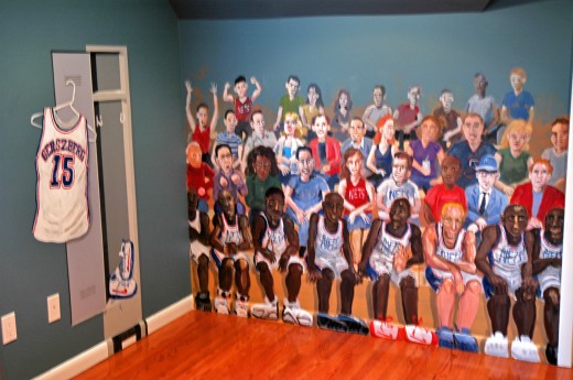
________(Click any image to enlarge.)
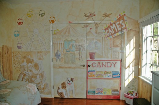
________These are bedrooms in Highland Park, NJ.

________They wanted the bed to look like a fort in the forest.
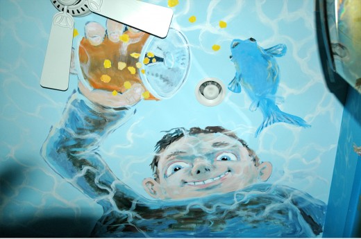
________Joey wanted the aquarium room to feel like you were inside a fish tank –
________I painted this boy on the ceiling feeding his fish.

________Sometimes I think the details are so beautiful – Chris painted these birds.
Take a look at the Three Designing Women site.
Daily post 15 Mar 2008 08:21 am
New Directors & Gerry Potterton
- Emily Hubley‘s first feature film has made it into the New Directors:New Films series at MOMA in conjunction with the Lincoln Center Film Society.
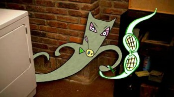 The Toe Tactic is 2/3 live action and 1/3 animation. Emily directed both parts of the film and wrote it as well.
The film’s stars include: John Sayles, Marian Seldes, Eli Wallach, Andrea Martin, and Mary Kay Place.
The short synopsis found on line is: In this hybrid of live-action and animation, a young woman grieves for her father while unaware of the magical world around her.
A review appeared in the Austin Chronicle when the film played as part of the South by Southwest Festival.
The film will play:
______Sat Mar 29: 6:00pm (Walter Reade Theater)
______Mon Mar 31: 9:00pm (MoMA)
 - I was pleased to have received word that the great Gerald Potterton will be awarded the Pulcinella Lifetime Achievement Award from the 12th Annual Cartoons on the Bay International Festival of Television Animation in Salerno, Italy.
The award is presented each year to “a prestigious personality of the world of cinema and television animation,” will be given to Gerry during the awards ceremony on April 12th. Previous recipients of the Lifetime Achievement Award include Italian animator Bruno Bozzetto, Roy E. Disney, and Bill Hanna & Joe Barbera.
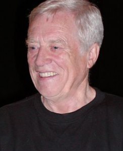 I met Gerry on Raggedy Ann when I first started in a very big office with almost no one as yet hired. I spent a great Saturday with Gerry and Dick Williams coloring storyboard drawings mostly drawn by the brilliant Corny Cole. The drawings were being fed to, cameraman, Al Kouzel to shoot an animatic on 35mm film. It was a funny day, and I was in heaven working with Dick and Gerry for a solid Saturday.
Both Gerry and Dick were part of the Grasshopper Group in England back in the 50′s (along with the likes of Bob Godfrey, George Dunning and Stan Hayward. They’d known each other for quite some time and were close. I was the odd man out, but couldn’t have enjoyed the company more – with questions aplenty that I snuck in during the day.
During Raggedy Ann, I’d let Gerry know that I wanted desperately to see a film he’d done in 1969, Pinter People. This was a documentary about Harold Pinter and his characters, 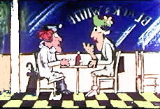 showing the varied places that his characters inhabited: the parks, the pubs, the places. The films includes Pinter talking about these characters and includes five animated segments (about 45 mins of animation) from Pinter’s short plays. It is truly one of the first adult animated films built around words. Gerry brought me a 16mm copy to view, and I returned it immediately.
I couldn’t be more pleased to see him receive this award, and I don’t think there is anyone more deserving. Congratulations, Gerry.
Here’s the part of the press release that was sent which includes Gerry’s bio, for those who are unfamiliar with Mr. Potterton’s distinguished career.
- Few Canadian film careers have been as colorful as that of British-born writer, director, producer and animator Gerald Potterton. In a career spanning over fifty years, he has worked on dozens of live action and animated films, including the classic British animated feature Animal Farm and the Beatles’ Yellow Submarine. He left the National Film Board to start up Potterton Productions, the largest film production house in Canada at the time, but he is best known as the director of the cult classic, Columbia Pictures release Heavy Metal, which was released in 1980. He directed the great American silent film comedian Buster Keaton in a National Film Board live-action short, The Railrodder, for which he was awarded a Buster for “film excellence in the Buster Keaton tradition” in 2002 at the annual Buster Keaton Celebration in Iola, Kansas.
In 1998, Potterton was selected as one of the “Ten Men Who Rocked the Animation World” at the first World Animation Celebration in Pasadena, California. His prolific career has been honored with retrospectives at North American film festivals from Ottawa to Seattle.
Animation &Hubley &repeated posts &walk cycle 14 Mar 2008 08:33 am
Recap Friday – Upkeep Cycles
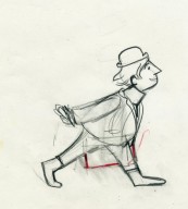
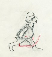
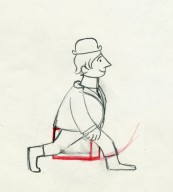
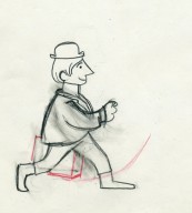
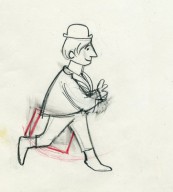
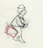
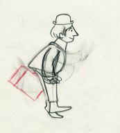
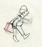
- Back in October 2006, I posted this piece about John & Faith Hubley‘s short film Upkeep which includes an excellent walk cycle by Tissa David. I’ll try to post the storyboard for this film next week, if I can locate it.
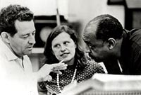 – Back in 1973, the Hubleys produced Upkeep, a short film for IBM. It chronicled the history of the service repairman in a light hearted way. Actually an industrial, it was treated like a personal film. (There’s a thin line between some of their industrials and their personal films.) Of Men and Demons was done for IBM though they considered it a personal film; it instructed in the positive aspects of the binary code and was nominated for an Oscar.
___ (John & Faith Hubley with
___composer, Benny Carter)
Tissa David did the lion’s share of the animation for Upkeep. Phil Duncan, Lu Guarnier and Jack Schnerk were the other key animators on it. Helen Komar and I assisted all of them, and I inked the whole film. Gen Hirsch and I colored it. John did all the Bg’s.
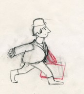
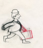
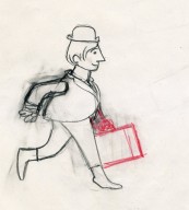
The initial animation on the service man was done by Phil Duncan. Tissa had to pick up the character, and she found the walk Phil had done so funny that she kept it throughout the film adding shades and tones to it as she thought appropriate.
The art was inked with a sharpie, bled with thinner, then colored with magic markers. Each drawing was then cut out and pasted to cels. Hubley’s Bg’s followed the same style: sharpie on board, washed & bled with thinner, added watercolor washes.
Posted below are the drawings for that 18 drawing walk cycle.
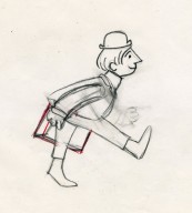
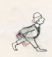
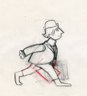
___(Click any image to enlarge them.)
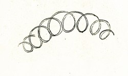
Walk cycle on twos.
Commentary 13 Mar 2008 08:15 am
Chicago 10-8=2
 - On Tuesday night I saw the feature length documentary Chicago 10 and have been trying to think what to say about the experience and the film. I have to give great credit to the director, Brett Morgen, for having chosen to tell the meat of the story in animation. However, I also have to give him credit for the absolute confusion and lack of information relayed in that same story.
Todd McCarthy in his review in Variety justifies this lack of information:
____“Chicago 10″ is far less interested in ____offering a fresh, probing look at what
____took place on the streets during the 1968 Democratic National Convention and the
____circus trial that followed than it is in celebrating the stars of the anti-war movement.”
This was a warning almost every critic gave in their mixed to negative reviews, so I went
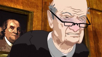 into the film somewhat prepared. However, I found myself even wondering what the trial – told almost completely in animation – was about. This isn’t good for a documentary. One would think relaying information was first and foremost for a doc. Brett Morgen tries boldly to tell a film dramatically without using a narrator or explanatory cards (except at the beginning and end of the film.) Unfortunately, this decision left us in the dark. There’s just a lot of theatrics and in-fighting during the trial, and a lot of cops beating on hippies outside.
The film seems to intercut between the mostly live action doc footage of crowds and Chicago Police and soldiers and beatings to the trial of the Chicago 7. (In this film, others are included adding to the director’s total title count.)
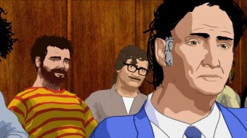 The trial is wholly recreated in MoCap animation. It looks a bit like Waking Life, but whereas the Linklater/Sabiston film has fun with the style and a looseness, this is all hard rock shapes. Areas of the face have that paint-by-numbers type of shading, but the shapes remain hard edged and move like the hair – as a solid shape in 3D. When Abbie Hoffman, with his mounds of curly hair, turns his hair stays solid and is interesting but inaccurate movement-wise. I suspect it stayed locked to the MoCap images without much alteration. It ain’t pretty.
The exterior shots include what, to me, was the best and most daring of the animation. At one point, there’s a bandshell in which a couple of speakers speak to a crowd in the park. The crowd is live action (sometimes color; sometimes B&W), but the speakers are animated. The sequence completely works, and you never question the mix of media but completely take it in. This was a surprise in the film which feels just flat in its loudness (the sound blares throughout) and its constant intent to entertain – without letting us really learn anything.
I’m not sure if any of the Asterisk Pictures work remains in the film, but I didn’t recognize any of the art I saw prior to the film viewing. Curious Pictures gets the big credit at the end of the film.
The Curious Pictures site has a full page about the film with links to a lot of the reviews.
Rotten Tomatoes gives it a 72% on their “Tomatometer.”
Chuck Jones &Daily post 12 Mar 2008 08:31 am
Abe Levitow.com
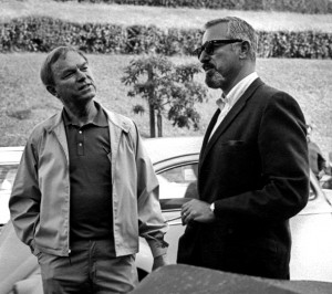 - There’s a brand new site debuting today, and I’m pleased to say that my studio had a small part in seeing it off and running. Abe Levitow was an animator and director whose work I’ve long admired. I met his daughter, Judy Levitow, during the production of Raggedy Ann and Andy, and I really enjoyed her friendship. So many years later, she contacted me to ask about our sites and their design and told me that her family was hoping to put up a site to honor her father. The end result was that Matthew Clinton, a key animator in my studio, worked with Roberta Levitow in putting together the new site www.abelevitow.com, ______________ Chuck Jones and Abe Levitow
for the family, Judy, Roberta and Jon Levitow.
Darrell Van Citters was principal in organizing the archival material. As of today the site’s operational and in full swing.
 The site includes lots of photos, artwork and information about Abe Levitow’s life and career.
For those of you who are not familiar with his work, Abe Levitow started at Leon Schlesinger’s studio where he worked for years, breaking only for work in the Signal Corps during World War II. He animated key sequences of What’s Opera Doc, Robin Hood Daffy and Broom-stick Bunny. He joined UPA where he was an animation director on 1001 Arabian Nights with Magoo, and he directed Magoo’s Christmas Carol and the feature Gay Purr-ee.
He worked with Chuck Jones at MGM where he directed a number of the Tom & Jerry shorts as well as co directing The Phantom Tollbooth with Jones.
Abe Levitow’s animation for Richard Williams was key to Dick’s films. On The Christmas 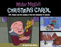 Carol his animation of the ghost of Christmas Present revealing the two waifs “want” and “ignorance” under his robe is the finest scene in that fine film. (I suddenly realize that he is probably the only artist to have worked on both the Magoo Christmas Carol and Williams’ Christmas Carol.)
He died in 1975 at age 53.
This new site also announces the soon-to-be-published book by Darrell Van Citters about the making of Mr. Magoo’s Christmas Carol.
