Monthly ArchiveFebruary 2009
Hubley 18 Feb 2009 08:50 am
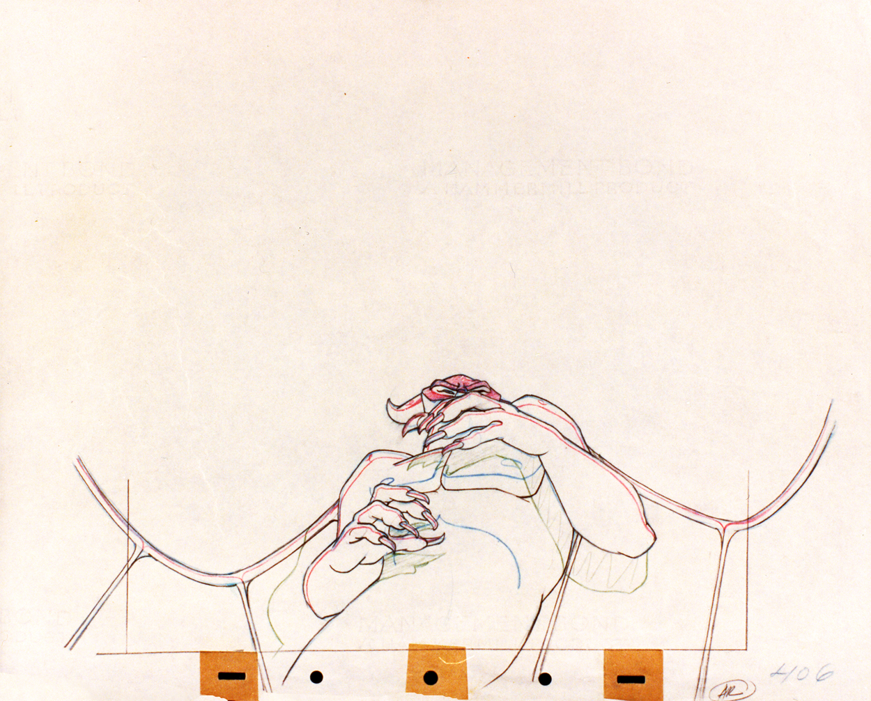
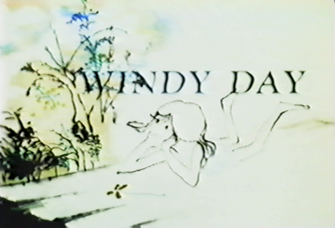
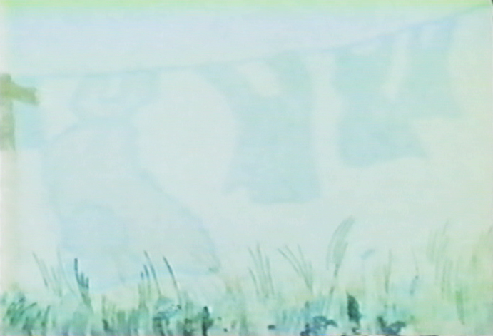
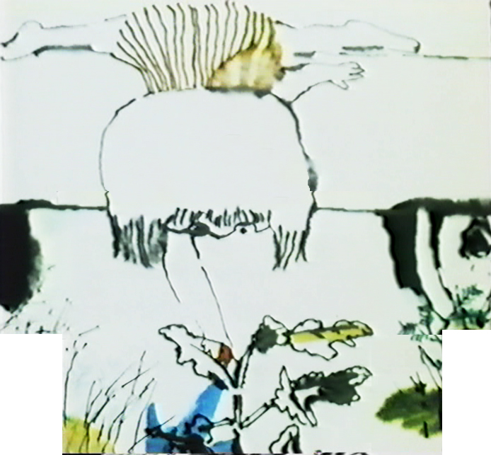
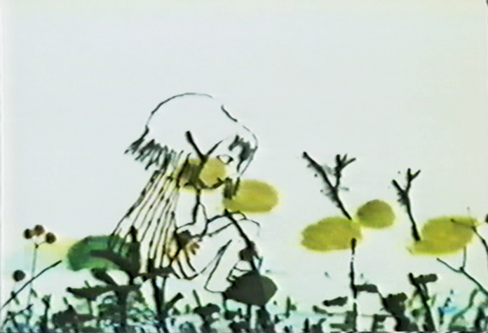
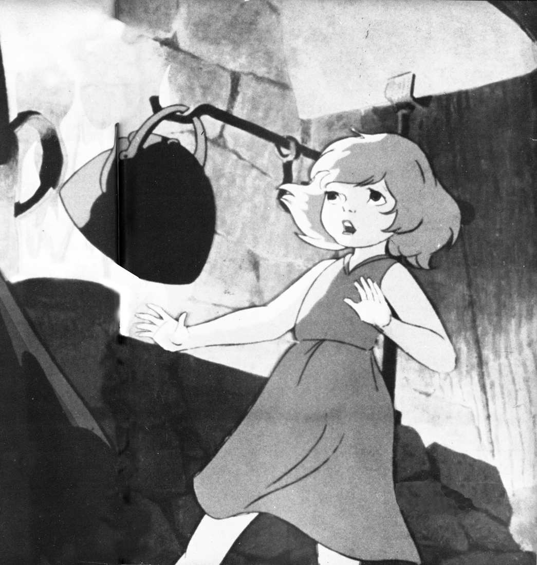
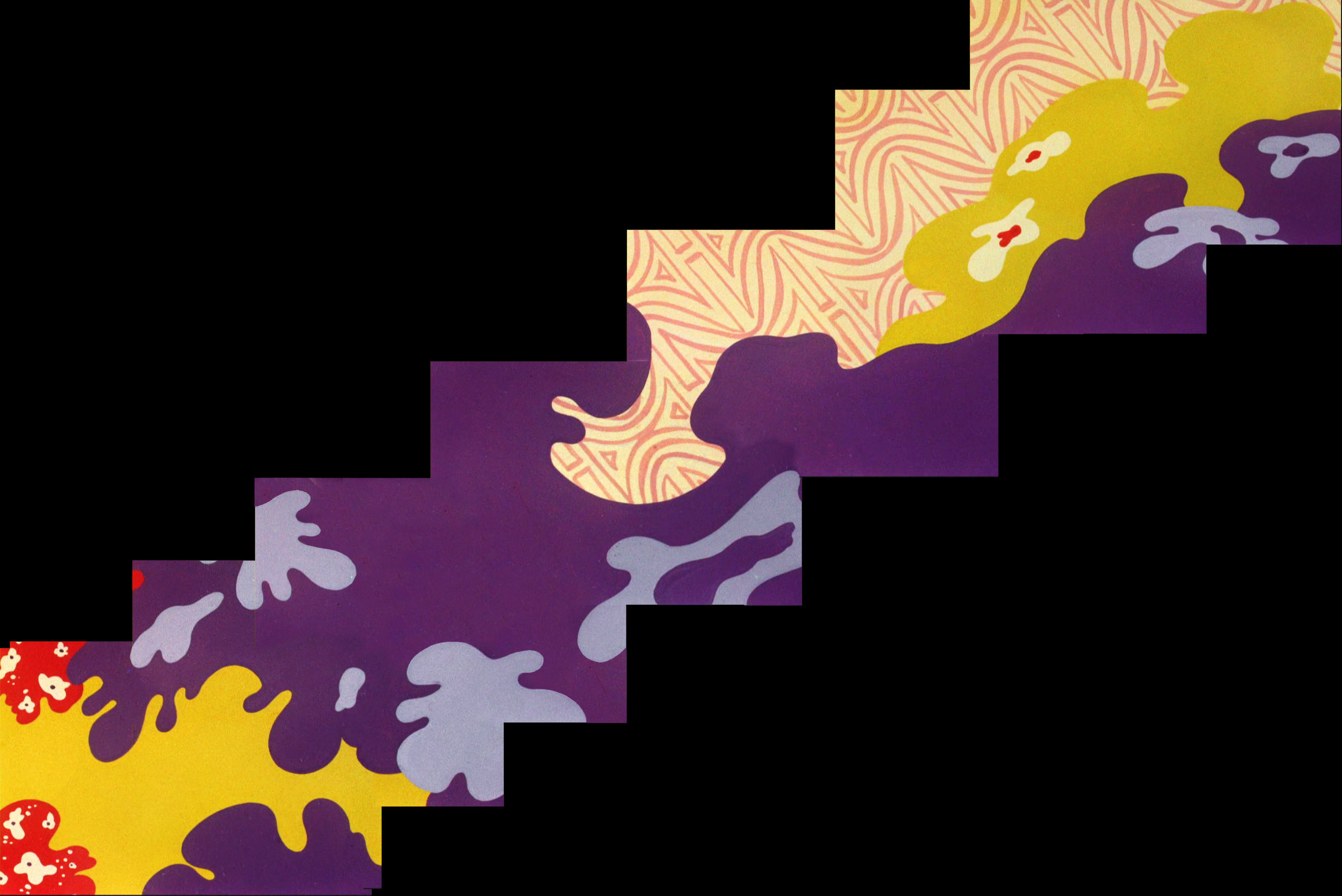
Windy Day 1
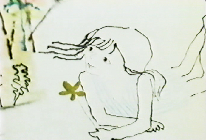 - In some ways, Windy Day is my favorite Hubley short. Several shots couldn’t be more perfect to me. The problem is all the white that yellows or grays in later prints and transfers. It’s hard to view the film as it was intended.
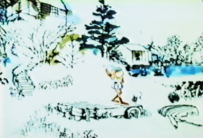
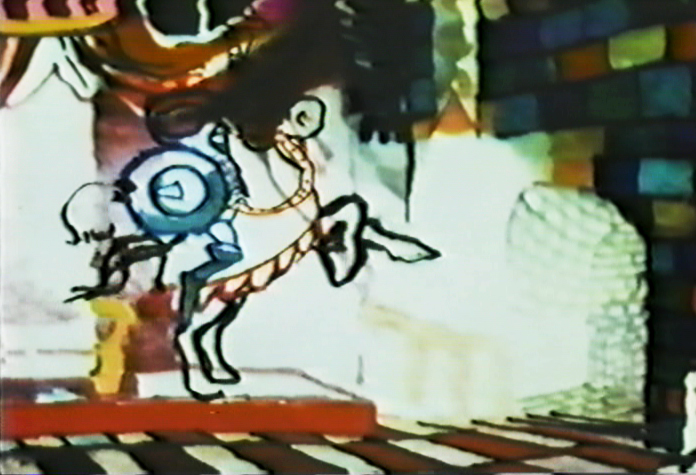
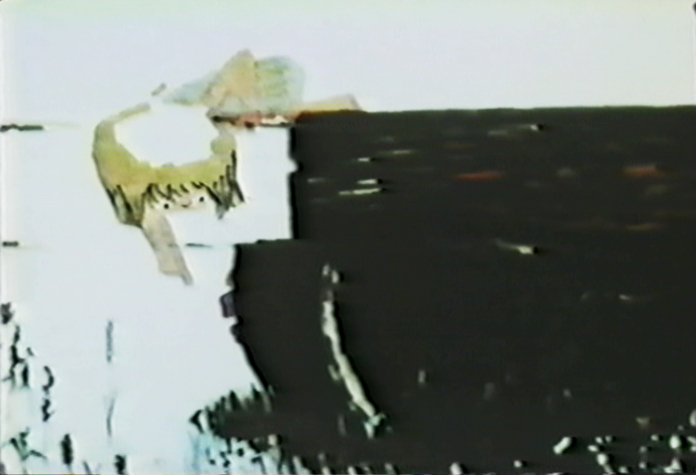
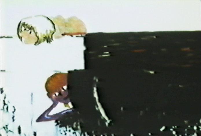
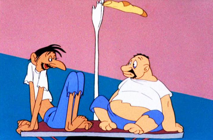
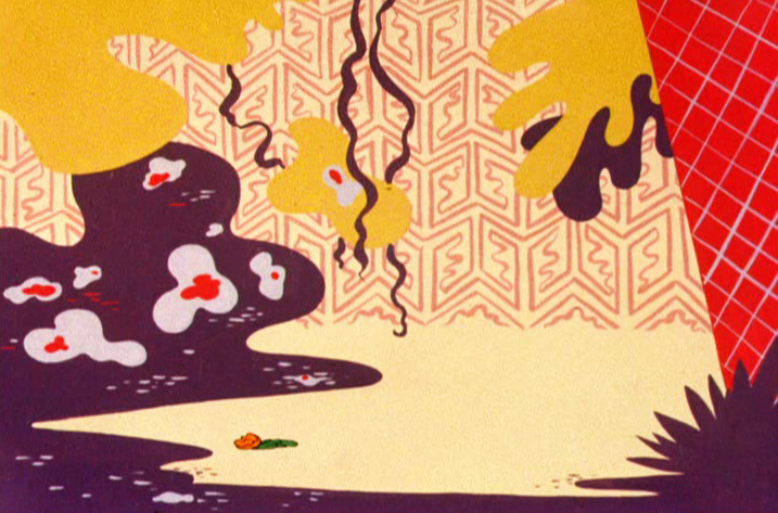
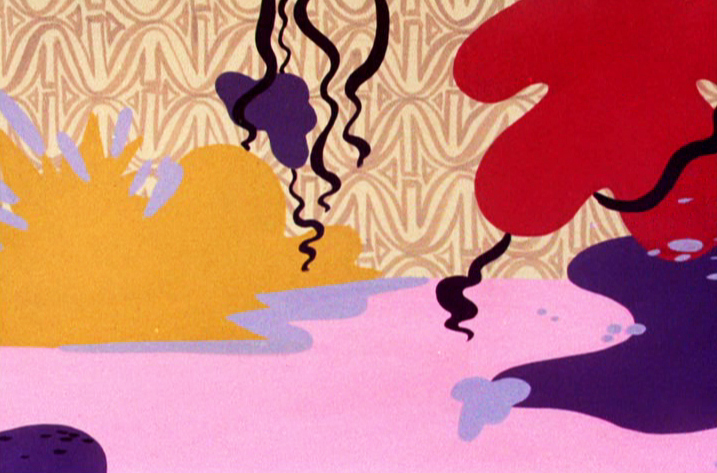
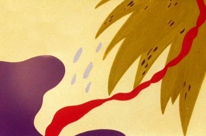
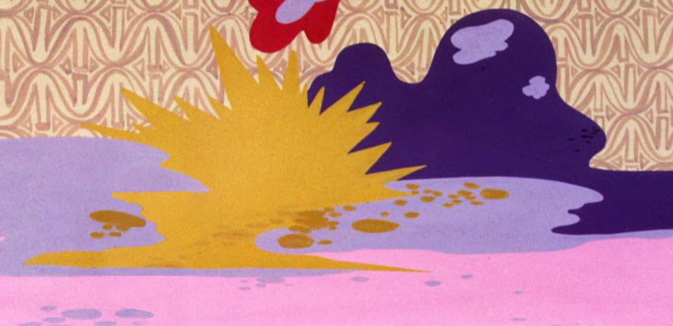
Barrie Nelson’s animation is superb and blends excellently with the wispy style used. They washed the ink lines and lit the art from below so that the style is quite delicate. This
 probably limited them to three levels including the background. John Hubley built his backgrounds around the animation of the characters, so that they’d be in the clear. However, there are many points where the animation crosses over and is blotted out by the background, but that is accepted as part of the design. There are also a couple of points where double exposures were used for effect or distortion.
Richard O’Connor writes nicely about Sara Calogero‘s watercolor rendering. I suspect that Faith Hubley probably did all the actual inking herself. She’d done that often and sometimes didn’t have the most sensitive hand just the fastest.
(Click any image to enlarge.)
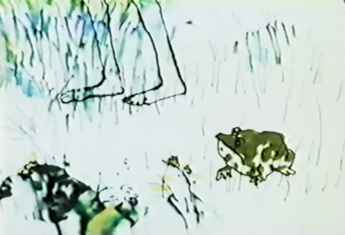
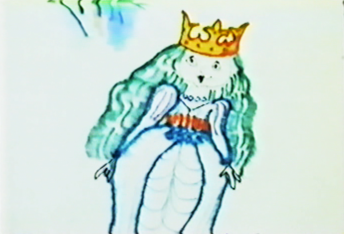
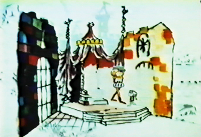
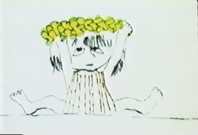
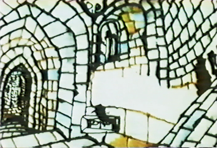
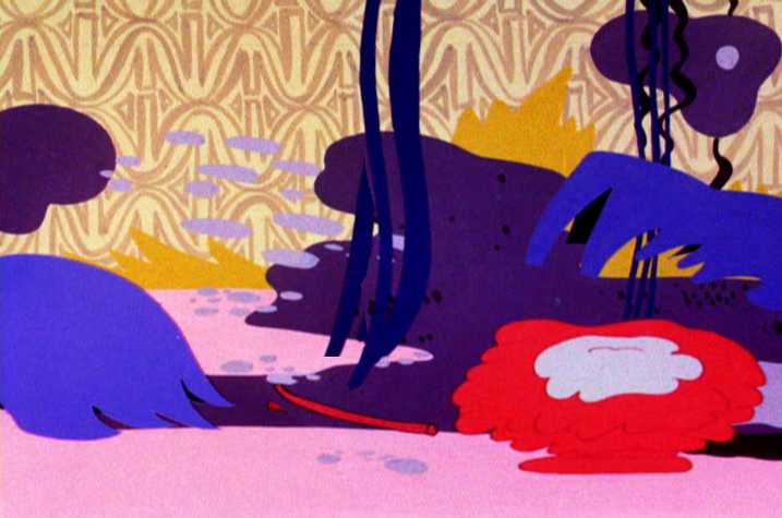
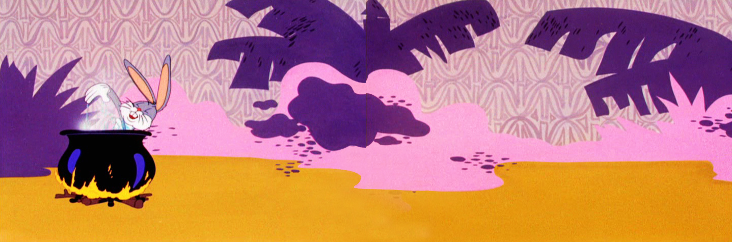
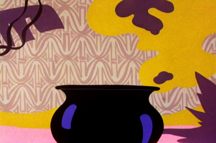
The style is bottom lit, so there has to be a hole open
in the Bg drawings so that the character won’t be obscured.
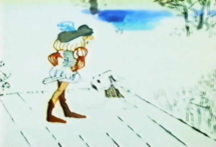
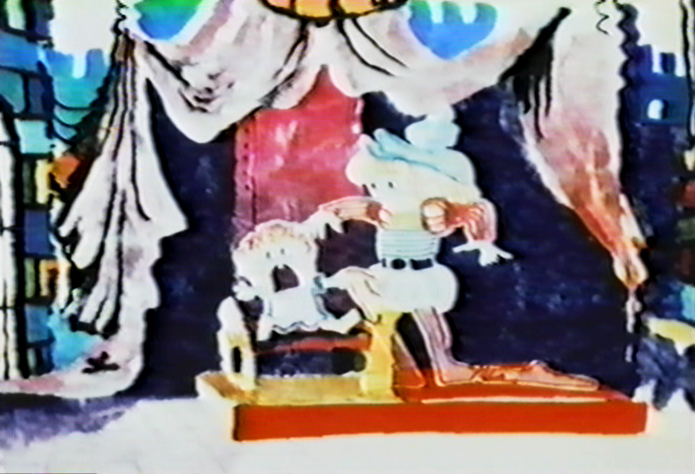
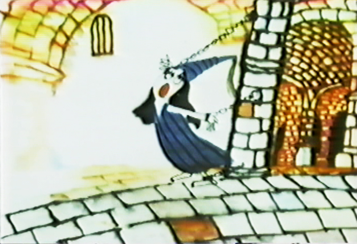
In this scene, the characters are double exposed into the BG
so that the black areas can be behind them.
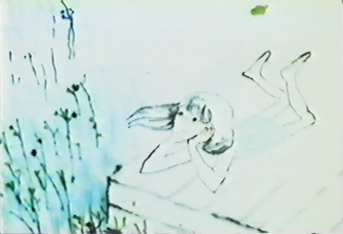
This is one of the most beautiful shots in the film.
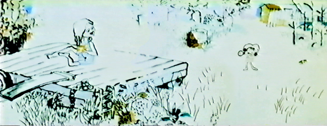
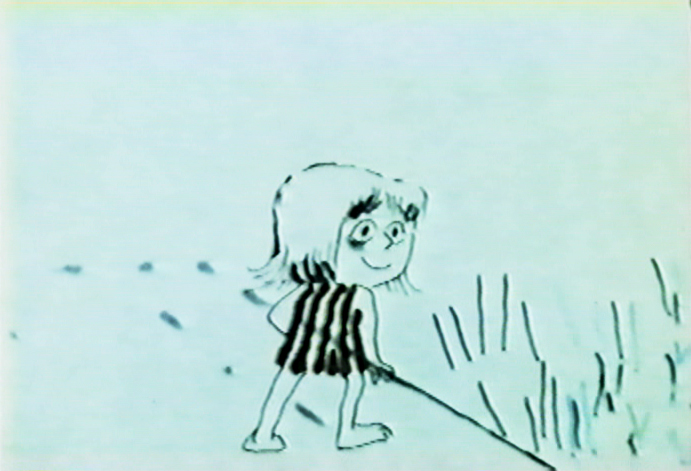
A character thinking.
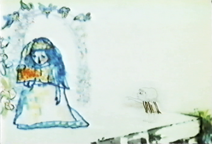
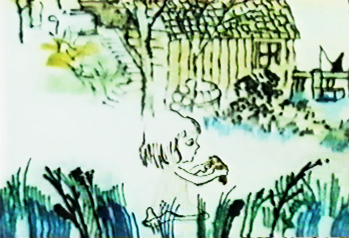
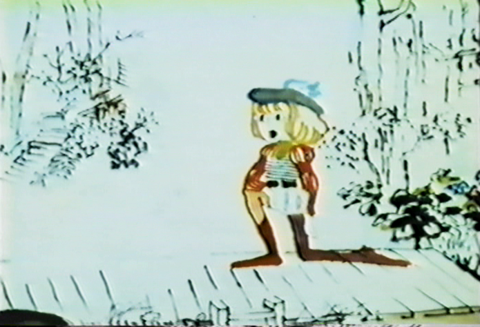
The character’s marker coloring is well served with the bottom lit art.
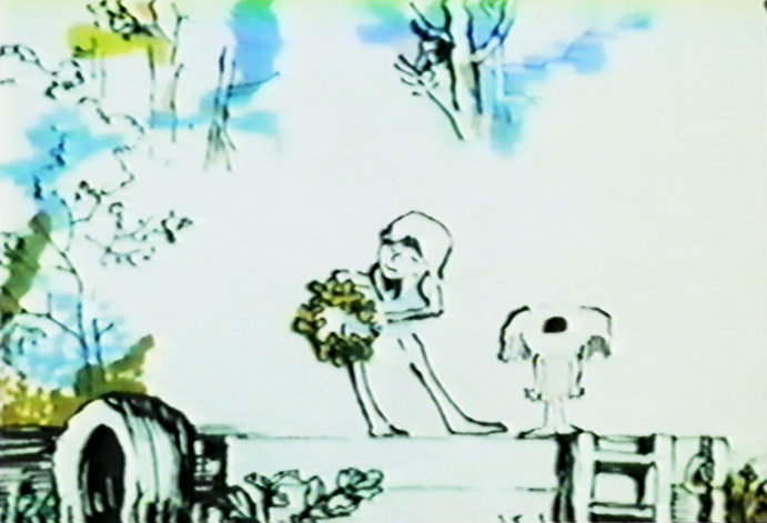
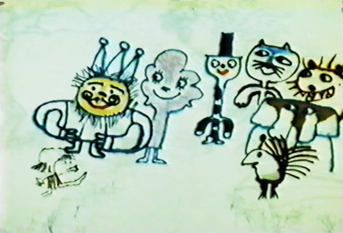
The style is used to its full potential here.
.
This will be completed tomorrow.
Books &Commentary 17 Feb 2009 08:48 am
Amid’s Books
 – Let’s talk a bit about a new book by Amid Amidi, The Art of Pixar Short Films. There are two reasons one might want to buy this book: you’re a fan of the Pixar films, including the shorts, or you’re a fan of Amid Amidi’s animation books.
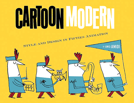
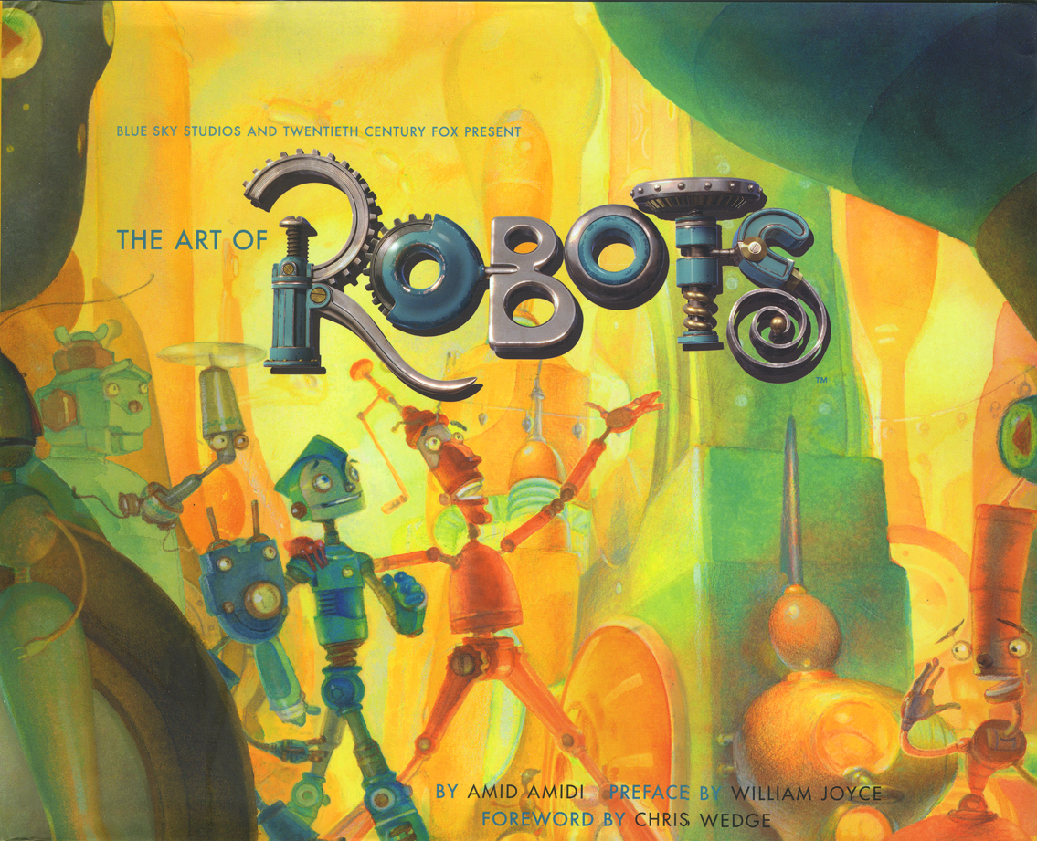
I’d like to cover my interest first; I like Amid’s work very much. This is his third book published by Chronicle books. The first The Art of Robots was a beautiful puff piece for that Blue Sky film, a bit over-filled with fine drawings and paintings and final art
 from the industrious film. The second, Cartoon Modern, is a stunningly attractive, informative and extremely important animation book. It covered a lot of the holes left by other books – the real art that was pioneered by those who made films in the late 40s, 50s and early 60s. A thoroughly researched tome filled with beautiful reproductions, drawings and modern art as made for animation by many many studos and individuals. The book was an arduous task to pull off, and Amid made it look so simple.
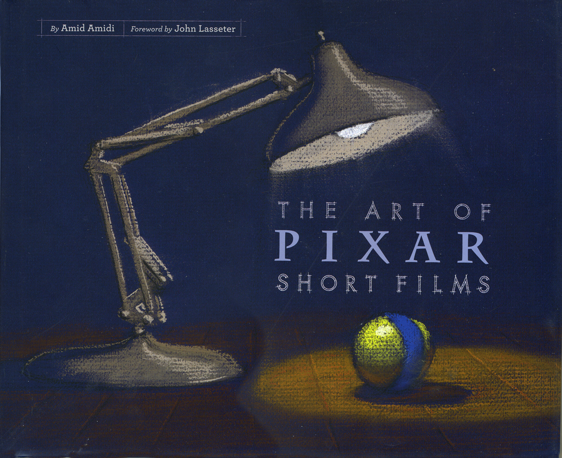 This third book, The Art of Pixar Short Films, resembles both of these past books, in some way. Amid has learned enough from the second book that his writing, his selection of artwork, his choices of design and presentation are important and make the book a beauty.
All type is gray, not black. The type for IDs of photos and artwork is handled as it would be on an architectural sketch or blueprint. Names are delineated, literally. The images are thoughtfully placed for the best composition with plenty of
 white space around them.
The artwork representing the films is well chosen; the development art is better represented than stills from the films, themselves. This is a plus; we can see the actual shorts on the dvds. For the most part, much of this art is excellent and oftentimes better than the films’ final art.
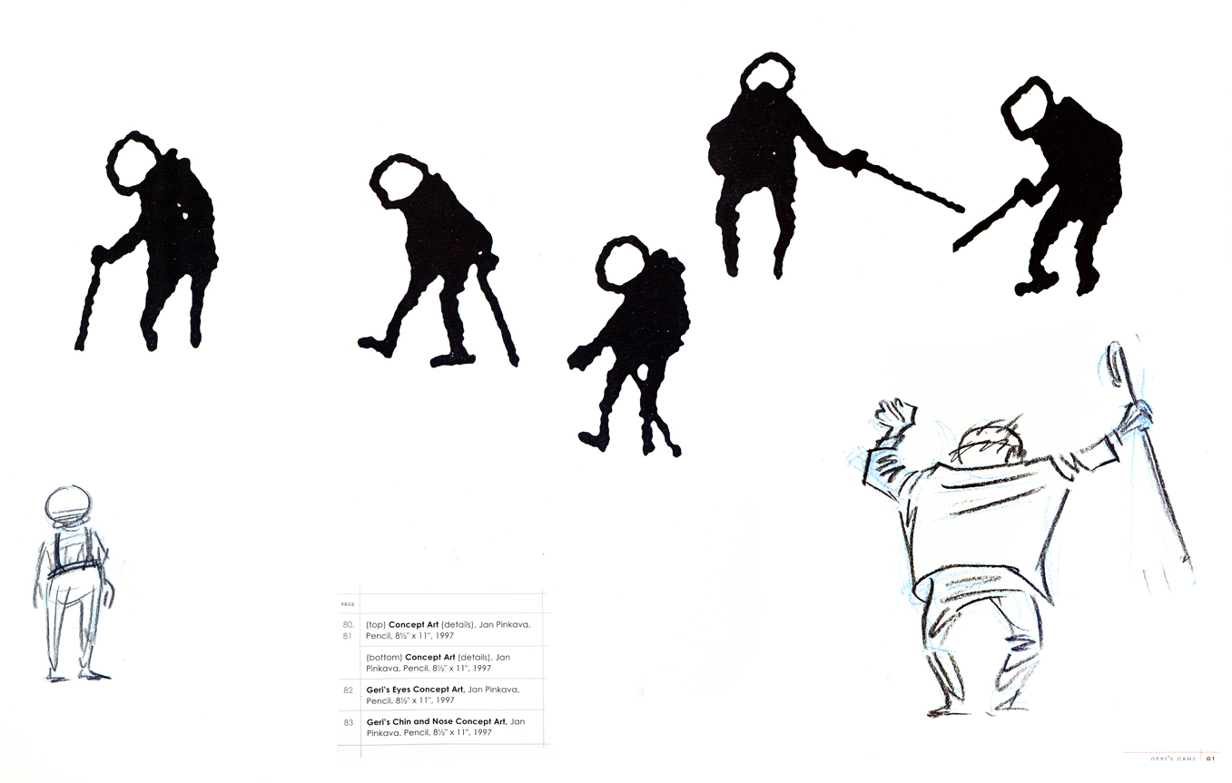
The gesture drawings done for Geri’s Game present an excitement
that seems distant from the final film, pictured below left.
 This brings me to my problem with the book, I’m not a big fan of the films. Pixar is a big studio, doing the top of the line work in cg animation. Toy Story, The Incredibles, Ratatouille can’t be beat. The shorts, especially the later ones are just not very good – in my opinion.
When a studio with the enormous abilities of Pixar chooses to do shorts, there has to be a reason. We’ve heard that the reason was to help develop talent so that future directors could stretch and grow. This is a good reason, but the shorts have to either showcase a high quality or a sense of experimentation that isn’t evident. When Disney did shorts back in the 30s so that his animators could learn and grow, the films were made to sell, but they had a level of expertise that we came to expect from Disney. Some of those Silly Symphony shorts have not been topped.
Looking at those beautiful drawings, above, for Geri’s Game, we see the potential for something alive and vibrant. The film is, for me, difficult to watch. It is the antithesis of those drawings. Perhaps they were working out some cg problem, but that’s really irrelevant to audiences.
Pixar’s current film short, Presto, isn’t represented in the book. (The 2D short, Your Friend the Rat is also not included in the book.) It aspires to outdo Tex Avery at his own game. But it doesn’t; t doesn’t come close. There’s no character animation that I can see – both characters move identically. There’s no character development that I see – both are cartoon characters with no personalities; only their motivations are different.. The timing is dreadful; the film moves too fast in its animation and in its cutting. Maybe you’d call that experimentation, but I call it bad film making. Of course, this is just my opininon. Many people love the short, and it may win the Oscar next Sunday.
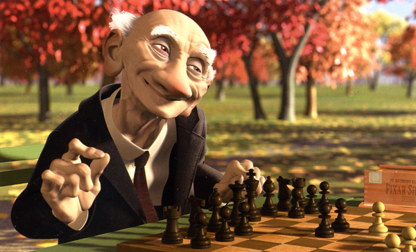
A beautiful drawing from one of the finer shorts by Pixar.
Yes, other shorts are better. One Man Band has delightful animation of the two musicians, but it also has the cloying, clichéd animation of the child which seems to come right out of the most obvious of Bluth. However, the score for this short is incredibly good.
Luxo Jr. is the finest of their shorts. It’s a beauty. Well designed with strong character animation. The fact that cg animation hadn’t been well developed at the time was irrelevant. The short did what it should have; it told a simple story, introduced a strong character and entertained audiences. It hasn’t lost that appeal, but I think Pixar may have.
I don’t have enormous hope for the cg films of Dreamworks unless some strong director can compete with Jeffrey Katzenberg’s insensitivities. I do still have hope for Pixar, and I’d like to see them do something with these short films. The Disney short, Glago’s Guest, though not perfect gave me great hope for the other Disney lot.
So, I’ve come a long way to say I prize this book for the graphics, many of the images chosen, the author, Amid Amidi’s sense of design and strong knowledge of the medium as well as an ability to articulate that information well. My only problem is the subject of the book. I’ll keep looking for everything Amid’s done, and I’ll continue to collect his books. They all have a lot to offer and fill an important part of my collection. They all are beautifully designed and every small detail is carefully watched. I’m ready to buy his next book.
Animation &Animation Artifacts &Disney 16 Feb 2009 09:05 am
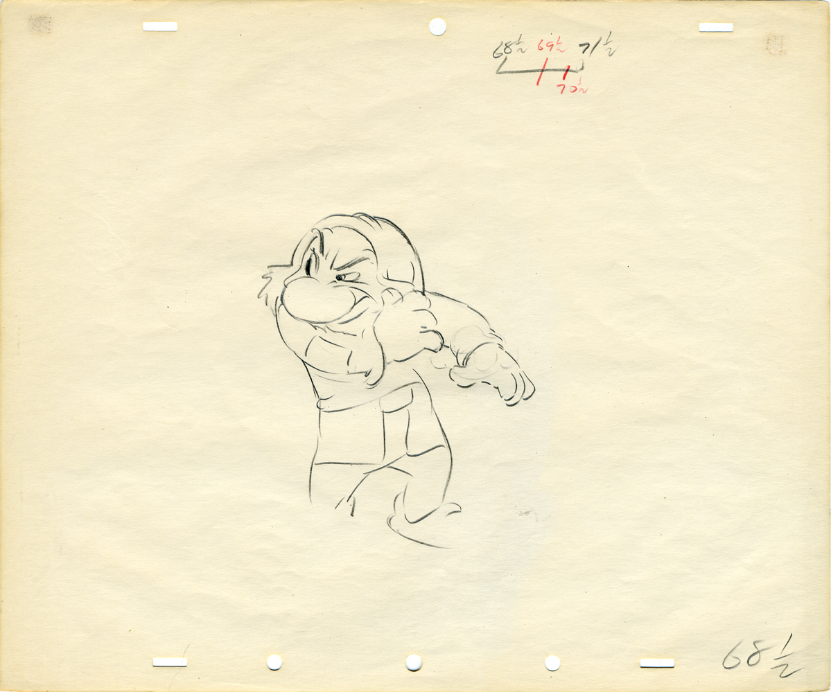
Tytla’s Snow White
- Here are a couple of drawings by Bill Tytla done for Snow White. They’re, all three, beautiful drawings, and I enjoy looking at them. They’re worth posting.
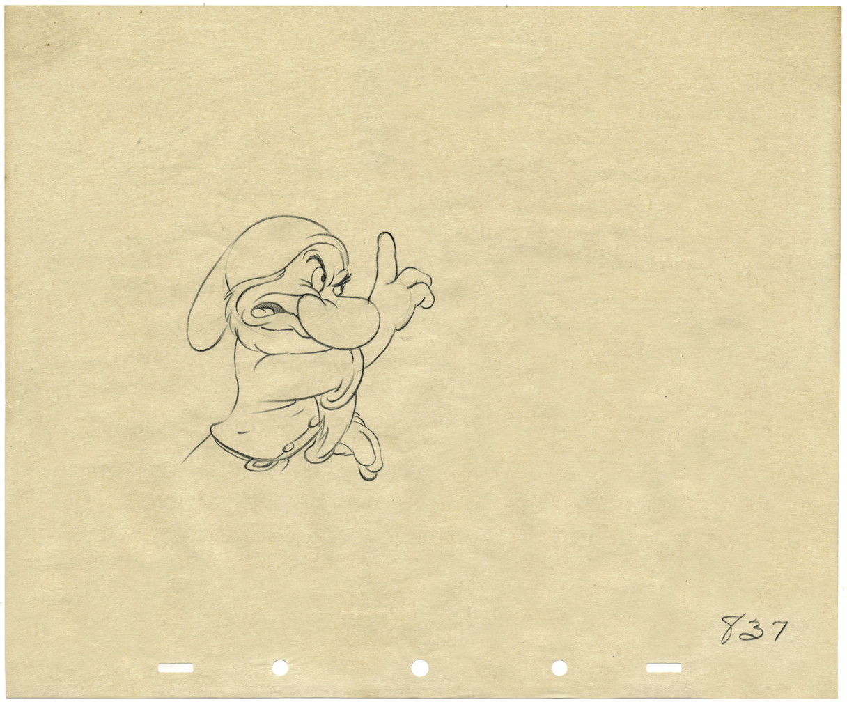
A wonderful drawing of Grumpy warning Snow White to look out for strangers.
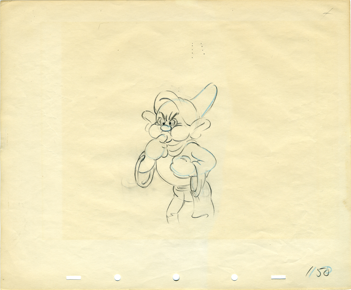
Dopey blows water out his ears.
Here’s a link to another post I did on this.
Photos &SpornFilms 15 Feb 2009 09:03 am
Snark Photos
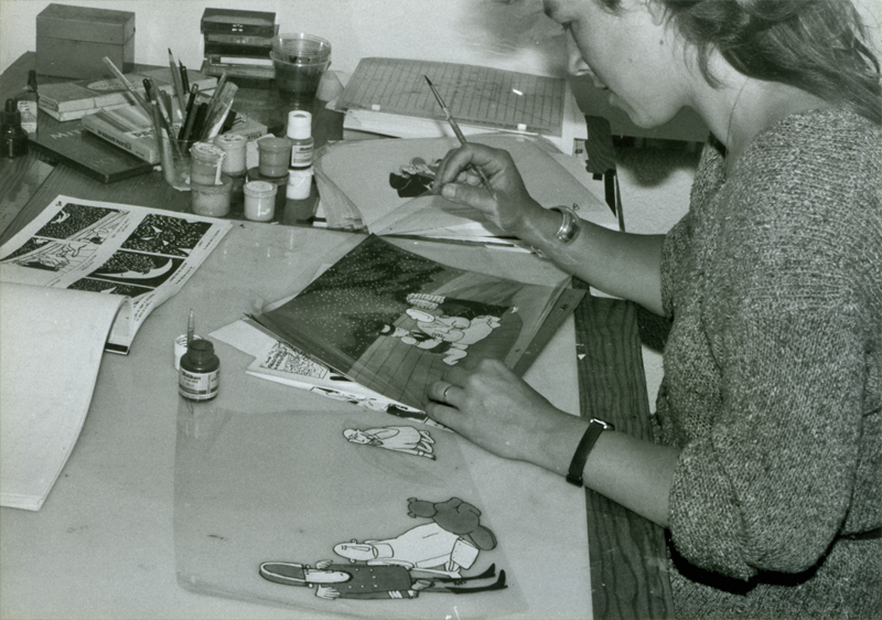
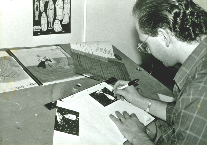
- I fell upon some photos I haven’t shared and thought I would. They were taken back in 1989 when we were in the last push to finish The Hunting of the Snark. All of the pictures seem to be posed since much of the art those coloring was done years before.
For much of the time this film was animated by me and then colored by me, in between projects. Then in 1989, with a small grant from AFI, I received enough to finish the film, and we rushed to the end. About a half dozen of us picked up the remaining coloring before we had to get into the next half hour show.
Bridget Thorne did the storyboard with me back in 1980. We didn’t finish the film
until 1989. She also painted the backgrounds for the last third of the movie.
Lisa Crafts inking a cel from the film. The cel comes from the,
first scenes of the film, so I actually did this one, myself.
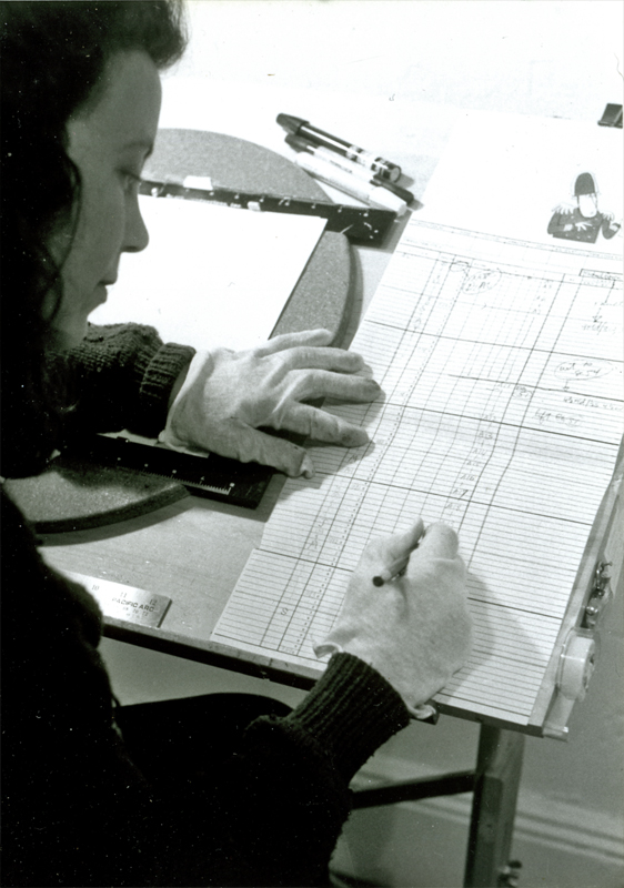
(left) Lisa consults with the exposure sheets for a scene.
(right) This is one of the many backgrounds that Bridget painted.
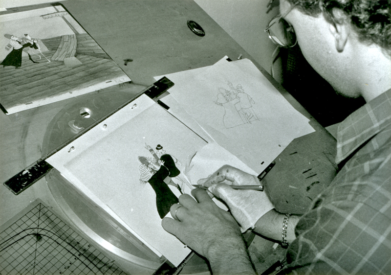
Steve Dovas is coloring a scene that I actually did in the early days of
the film. The scene was done on a 3 field (very small artwork) looking
for the images to distort a bit when they were blown up. It’s one of my
favorite parts of the film.
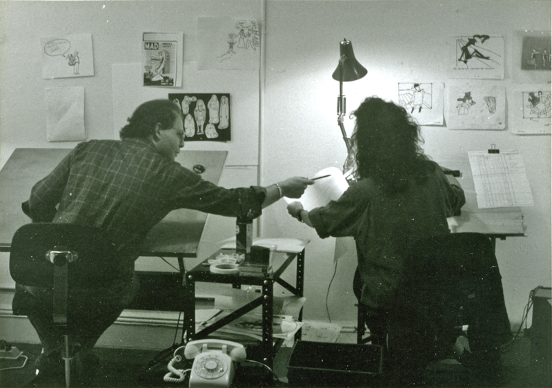
Steve and Lisa sat alongside each other in that studio on
38th St & Fifth Ave. It was a great space.
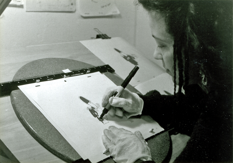
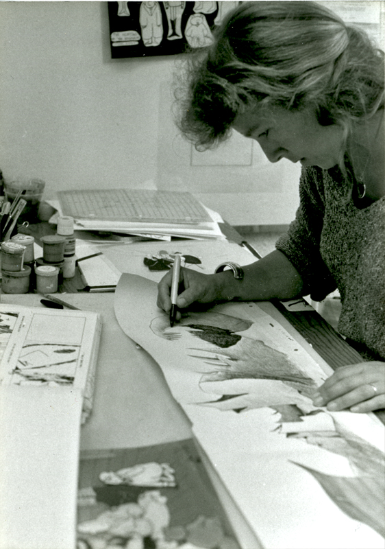
A closer photo of Lisa at work on the Bellman.
Steve posing with some early artwork from the film.
I don’t know if these pictures were ever used for anything, but
I love all three of these guys and enjoy sharing these early pictures.
Thanks to Kit Hawkins who took all of these photos while working there.
She helped produce Santa Bear for me and ran my studio for a while.
Art Art &Hubley 14 Feb 2009 09:14 am
Ounce
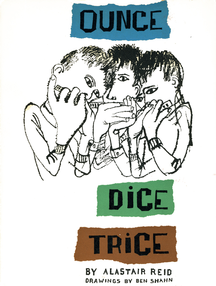 - I love Ben Shahn’s work and have since I first saw it in NY at a show at the Jewish Museum when I was in college. Shahn was enormously successful during the 50s, 60s & 70s; he was politically unpopular in the 80s and 90s. Now his work is considered passé by a lot of art critics since so much of it is politically motivated.
Shahn had an enormous influence on the NY crowd of the 50s, particularly those connected with the Art Student’s League. This included John and Faith Hubley, who studied painting there under Joseph Hirsch, and became closely associated with Gregorio Prestopino (who looks to have been an acolyte of Ben Shahn’s.) One can see the heavy influence of Shahn on a lot of John’s backgrounds in Adventures of an * or Moonbird.
In fact, all graphics of the 50′s and early 60s
 flew off the back of Ben Shahn’s work, and it wasn’t until Peter Max and The Yellow Submarine that art, illustration and, by association, animation seriously moved away from his beautiful line work.
Recently, John Canemaker showed me a book he had in his collection which Shahn had illustrated. I have a number of them, and they all look similar. Lots of white space, careful and poised compositions, textural lines with blacks and dark greys. They’re beautiful.
I thank John for lending me the book to post. It’s large, and I won’t post all of the pages, but I will have to break it into a couple of posts if I want to display it nicely. So this is the first. Usually, I don’t post the text of the book pages, but here the type and text is as much a part of the composition as the linework.
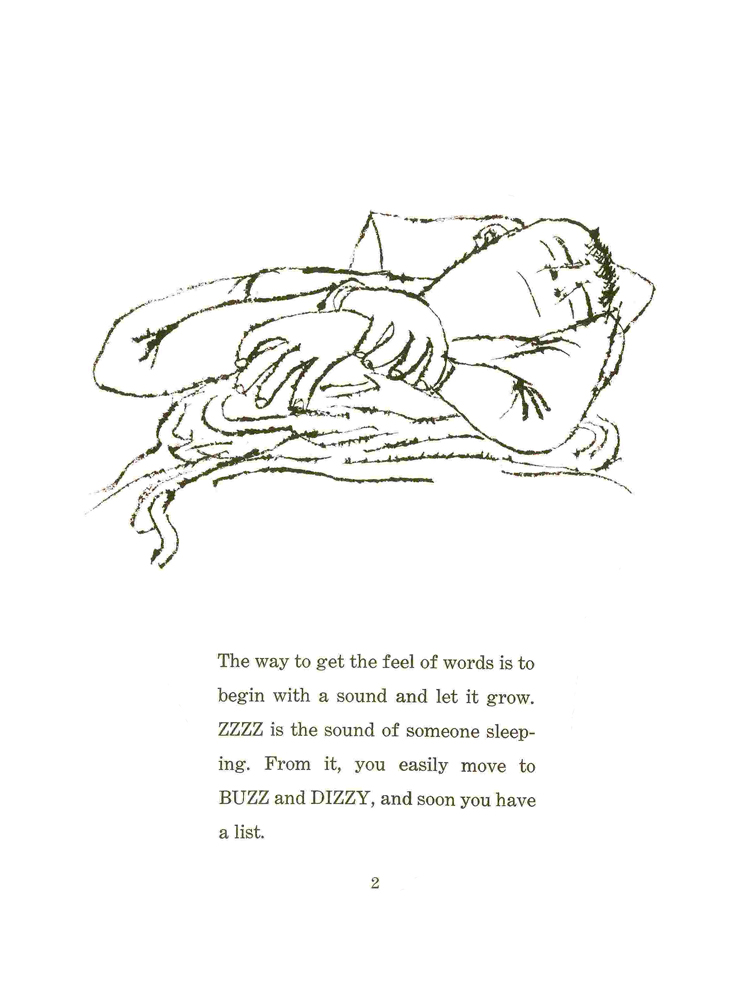
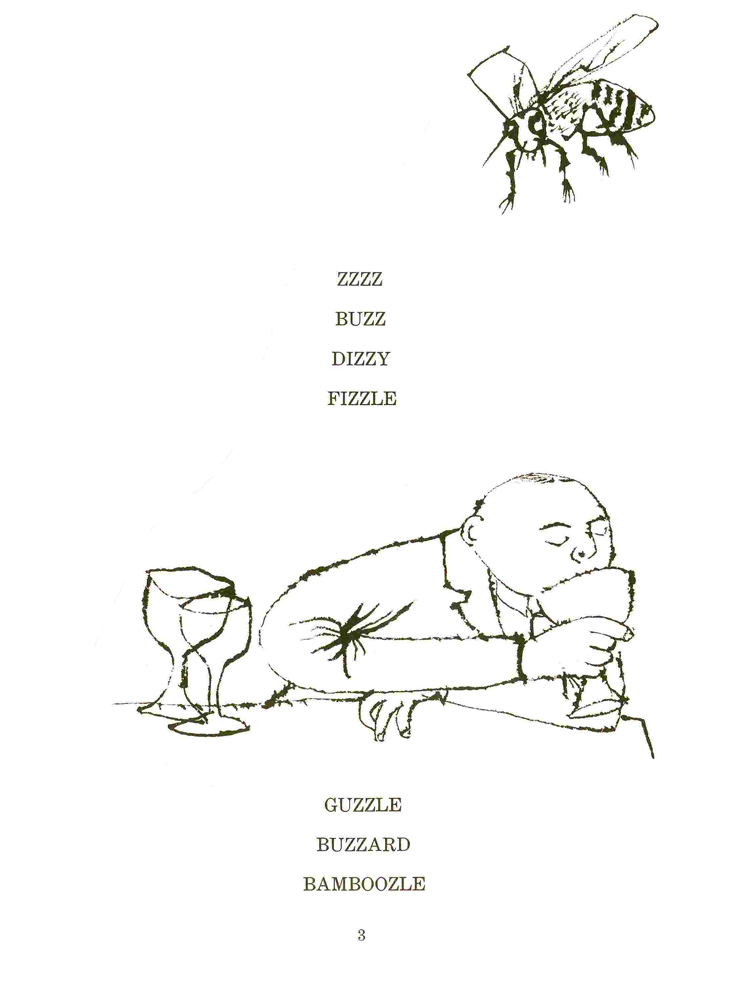
(Click any image to enlarge.)
Here’s the house that ends Hubley’s Moonbird.
It’s part of the long pan that appears below.
Articles on Animation 13 Feb 2009 08:50 am
Heidi’s Song
- Animated features, like some of the shorts, come and go. While working on it, there’s often an expectation that THIS will be the film to catch gold and change history. It doesn’t happen often.
Looking back on a puff piece from some past feature is oftentimes ludicrous; sometimes it’s just sad. Here’s a 1981 story from Millimeter Magazine about Hanna Barbera’s upcoming feature, Heidi’s Song. It sounds like it may be the future, but really it’s even hard to remember the film. It certainly didn’t change the world.
Will HEIDI’S SONG be its SNOW WHITE?
by John Canemaker
Hanna-Barbera Productions Inc. is such a giant corporate entertainment entity that it prompts the old joke: What does a two-ton canary sing? Any damn thing it wants! This Hollywood “canary” tias expanded since 1957 to become the wold’s largest producer of animated TV series andspecials; more recently Hanna-Barbera has become involved in themed amusement parks and live action movies for television.
Now H-B is eager to enter and conquer the sacred Disney domain of fully animated, “quality” feature-length animated films for theatrical release. William Hanna and Joseph R. Barbera hope to do so with an expensive flourish this summer when they will premiere HEIDI’S SONG, a $9 million cartoon feature that has been in production for five years. The film’s staff of 200-plus includes 12 background painters, 60 assistant animators, eight layout people, and 18 top character animators. All cut their teeth years ago at the Disney studio, or at MGM, working with Hanna and Barbera during their halcyon days in the 1940s and ’50s producing Tom and jerry shorts and animated segments for live action features such as Jerry the Mouse dancing with Gene Kelly in ANCHORS AWEIGH.
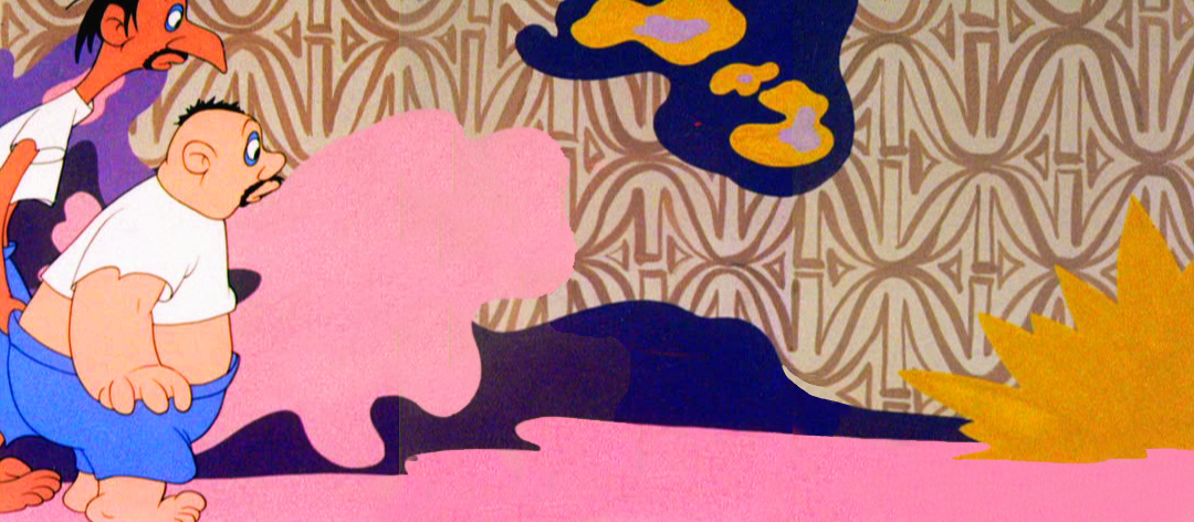
A moment of menace for Heidi whose voice is dubbed in by
Broadway actress Margery Gray in the Hanna-Barbera feature.
Joseph Barbera claims HEIDI’S SONG will be “a step forward in animation that’s very exciting.” But perhaps it will actually be a welcome artistic step back—a comeback of sorts—for Hanna and Barbera, who were once considered by their peers and the public to be superior cartoon craftsmen, winners of seven Academy Awards for two decades of beautifully timed and fully animated Tom and Jerry cartoons. In the 23 years since forming their own company—a factory geared to the production of “limited” animation series, a reduced form of animation that, as an H-B publicity release points out, “ignored the time-consuming and expensive detail that would not be visible on the dimly lit video screen”—Hanna and Barbera have produced over 20 TV specials and some 60 series (“Huckleberry Hound,” “Yogi Bear,” “The Flintstones,” “The Jetsons,” “Scooby & Scrappy Doo,” and so on).
In other terms, H-B produces more film footage in a week today than it did in a year at MGM. The principals’ choice to, as they say, “exploit a niche Disney had missed in family entertainment, with low cost cartoons for television,” has made the two men cartoon tycoons, rich beyond their dreams. They claim “there is not one hour out of every 24 that a Hanna-Barbera cartoon is not entertaining some segment of the world’s population.”
When, in 1967, Taft Broadcasting Company of Cincinnati acquired H-B, the company expanded its operations into five themed amusement parks, including Kings Island (Cincinnati) and Marineland (Los Angeles), where life-sized replicas of H-B characters—Yogi, Huckleberry et al — roam about greeting visitors. More than 1500 licensed manufacturers world-wide turn out 4500 different products bearing likenesses to H-B characters, for example, Flintstone window shades, Scooby-Doo pajamas.
In 1978, H-B won an Emmy, this time for a live action TV movie, “The Gathering,” starring Ed Asner and Maureen Stapleton; more live action films are planned for theatrical release and TV. With all this success, why would Hanna-Barbera bother pouring money into turf that is traditionally Disney’s and has proved to be a producer’s graveyard, from GULLIVER’S TRAVELS (1939) to RAGGEDY ANN & ANDY (1977)?
Company is built on cartoons
One should not forget that cartoons are the heart of the H-B corporate structure (as they are at the Disney studio). And it must be noted that as popular as the TV series are with small children, there is, to Hanna and Barbera’s distress, a persistently vocal, mostly adult contingent that just plain doesn’t like their cartoons! Veteran animator/director Chuck Jones, for instance, dismisses the whole breed of limited animation TV fare as “illustrated radio!” Writer Leonard Maltin once denounced H-B cartoons as “consciously bad: assembly-line shorts grudgingly executed by cartoon veterans who hate what they’re doing.”
 Years of this kind of criticism (and worse from TV critics, parents groups and, most painfully, professional peers) has hit Hanna and Barbera right in their pride of craftsmanship. Witness Bill Hanna’s responses during an interview with Eugene Slafer: “Are you accomplishing what you believe is good TV animation?” asked Slafer. “No, I do not,” came
__Director Robert Taylor states that HEIDI’S SONG has _______Hanna’s candid reply.
__“a style unto itself, more like a live action picture in_______ To a further probe, “Have
__the staging, as opposed to what you’d see in animation.”____you ever been ashamed of your work, especially since parents have ranted about the general lack of quality on Saturday morning cartoon shows?” Hanna admitted, “Actually I feel like I should crawl under a seat sometimes.”
Joe Barbera recently spoke with Millimeter about his partner’s abilities to recognize the difference between good and bad quality animation and their alleged lack of craftsmanship. “We had to get that stuff out for Saturday morning,” he explains. “That’s a budget problem. Believe me, I don’t stand still for people saying, ‘Oh, they’re doing junk! They don’t know how to do…. ‘We’re not doing that. We only do it because you don’t get the money to do it differently. When we get the money —and you’re talking about millions—we doajob!”
So perhaps the initial thrust for the HEIDI feature came from Hanna’s and Barbera’s desire to prove they haven’t forgotten how to produce animation in the “classical” style, or how to create memorable characters that affect more than an audience’s funny-bone. Of course, Hanna and Barbera are too business-wise to produce a full-animation feature merely to assuage pain dealt their pride; there also had to be a bedrock of financial motivation behind the move and, sure enough, there was. “The thrust,” states Barbera, “was to do one every year and to build a superb perennial library, which Disney had for years.”
The Disney animated features, from SNOW WHITE (1937) to THE RESCUERS (1977), are re-released like clock-work every seven years, just in time to greet a new generation or to remind an older group of their existence. “They are,” says Barbera admiringly, “forever pictures;” that is, films that keep the Disney empire well-oiled with money derived from box office returns (pure profit, since there are no production costs on re-releases), and from lucrative merchandising spin-offs, like comic strips and dolls for themed amusement park rides. This money-making machine depends upon the public’s continuing affection for the cartoon characters and their “classic” stories found in the Disney features. Hanna and Barbera have not yet fully entered this profit arena, but they have been working on it.
Previous animated features
HEIDI’S SONG is not H-B’s first attempt to produce an animated feature. There was, for example, HEY THERE, IT’S YOGI BEAR in 1964 and A MAN CALLED FL1NTSTONE in 1966, both low-cost, limited animation, based on the one-dimensional characters from TV. Neither film was a “forever” picture.
There was,”in 1973, an H-B version of E.B. White’s book Charlotte’s Web, but this, too, suffered from the taint of limited animation and questionable production values. Reviewer Vincent Canby of The New York Times said of the film, “Parents will survive it, and so will the children.” Barbera acknowledges there was “a problem” with CHARLOTTE’S WEB, but to him it was a misjudgment of the financial potential of the material. “Charlotte’s Web,” says Barbera, “is an American classic. It is not an all-world classic. Germany ended up calling it Zuckerman’s Pig, after the name of the man who owned the pig in the story, because who ever heard of a Charlotte’s Web? The film version is recouping some of its money on Home Box-Office TV, on video cassettes and in non-theatrical markets, a fate H-B hopes to avoid for HEIDI’S SONG.
While Disney can produce almost any project known or unknown because of the sales value inherent in the name, “Disney,” Hanna-Barbera is not yet in that sublime position. To the general public, “Disney” means full-animation, perfect technological craftsmanship, beloved characters in stories containing mythic or nostalgic associations. To the same public, “Hanna-Barbera” means limited animation of flat characters on redundant television series. H-B seeks to improve its image with HEIDI’S SONG.
Animator Charlie Downs (left) flips drawings for director Bob Taylor.
HEIDI’S SONG is the story of an orphan girl, based on Johanna Spyri’s 100-year-old, internationally known book. The cartoon feature contains a”Broadway” score of 16 songs by veterans Sammy Cahn (lyrics) and Burton Lane (music). The characters’ voices include Lome Greene as Heidi’s reclusive grandfather, Broadway actress Margery Gray as Heidi, and Sammy Davis, Jr. as King Rat, leader of a band of rodents. Other characters include a “mean and scary ancient housekeeper,” Fraulein Rottenmeier; Sebastian, “the butler who helps Rottenmeier be miserable to Heidi”; Clara, a lonely girl “confined to a wheelchair”; Peter, “a young goatherd, agile as the animals he tends.”
Off-setting the human characters is a gaggle of animals; Spritz, Heidi’s “feisty” pet goat; Hooter, a baby owl who “warns Grandfather of Heidi’s imprisonment in the cellar”; Gruffle, Grandfather’s “gruff old hound”; Schnoodle, a “nasty little dachshund who is rotten like his mistress, Fraulein Rottenmeier.” There is also a “crusty” German Schnauzer, a white mare, a white kitten and the aforementioned royal rat, “the power-loving and peppy leader of the rats in Sebastian’s basement, who spurs his clownish rodents into a strong force to attack Heidi.”
“We do have our animals,” points out Barbera. “My gosh, if we don’t have animals, we’re in big trouble,” he notes with an eye toward audience appeal and merchandising. “But we do have humans and some marvelous dancing,” he continues. “We are not rotoscoping,” he says, referring to the technique of animators tracing frame-by-frame projections of live-action. “I don’t care for rotoscoping at all.”
Choosing talent
Hanna and Barbera have instead hired a team of 20 top character animators—”Let’s use the word humbly and respectfully: the old-timers, “adds Barbera—people like Hal Ambro and Charlie Downs, both of whom specialize in human figure animation and have worked on films such as Disney’s PETER PAN and Richard Williams’ RAGGEDY ANN & ANDY. There are also master animators of animal caricatures and comic timing, such as Irv Spence and Ed Barge, veterans of the fine Tom and ]erry shorts. Th’e great Disney/MGM animator, Preston Blair, was also involved with HEIDI for a time.
 One might assume that the difficult task of manipulating the drawn human form in full animation is what kept the film in production for five long years. Barbera, however, offers this explanation: “When we are in the slow season, which happens in television all the time, everybody has to be laid off. We were going to keep people busy on the feature. We found that doesn’t work. The kind of people you use on a feature are the old super-pros of our industry, and there are few of them left.
“Secondly, we wanted to use HEIDI’S SONG as a training ground for new animators. The first three or four years the picture would go into production and stop, then go back into production and then stop. That was not good for the picture. We were losing momentum, the enthusiasm of the artists and the excitement we wanted to build up. So finally, about a year and a half ago, we marshalled the last remnants of
__Bob Taylor, director, and animators____ what we think are the best people in the
__Charlie Downs and Hal Ambro. ________business. When we brought these people in we had to change directors. We had a fine guy, but he had forgotten how to go back and really work these old-timers — really get the good animation! We then hired a brilliant young director, Bob Taylor, who is dynamite!”
Prior to rejoining H-B a couple of years ago (he had first worked there in 1966 for one year), Robert Taylor worked for Ralph Bakshi, Steve Krantz, DePatie-Freleng and Murakami-Wolf. “I always seem to come in on things that are hopeless,” he commented recently, “and we try to turn them into hopeful. I think we’ve done it with this picture. For me and the whole crew, and for Joe and Hanna-Barbera and Taft, this is our entrance into real good quality stuff!”
It has not been a piece of cake for Taylor. When he took on the HEIDI assignment, the script was written and the tracks were already recorded. “It was a hang-up for me,” he admits. “That’s the albatross around my neck. The story is episodic. If I had written it, I would have made it a little stronger in terms of her emotions and some of the dialogue. But,” he adds brightly,
I “my whole trip is to keep the audience entertained—get people to go to animated films and make them feel when they come out that they’ve seen something they can’t see anyplace else. It isn’t so much the tools;
i it’s what the hell I’m trying to do with it.”
Trying to elicit a description of the film’s style from both producer and director is difficult. According to Barbera, “The results have been what I call a Hanna-Barbera feature. It is not going to look like a Disney picture, or a FRITZ THE CAT or a RAGGEDY ANN & ANDY. We have our own style.” When pressed, Barbera cites “some very imaginative pieces of business.” Pressed further: “We’re not holding back. When they lock Heidi in the cellar, that’s a scary place—to be locked in a basement in a house in Frankfurt in the 1880s, that’s enough to put you away. We’re not holding back, yet we’re keeping it in good taste throughout.”
New wave animation
Taylor was a bit more specific: “I hate to opportunity for the guys to get back into what it’s really all about. We take as many new animators as we can bear—the ones that have the enthusiasm and are really interested in what we’re calling a ‘renaissance.’ But even more important, we are just interested in making great animated films and updating them into the 1980s.”
The HEIDI unit has already begun production of its next two animated features, ROCK ODYSSEY (which Barbera describes as “a marvelous treatment of music from the 1950s, ’60s and 70s. A rock-FANTASIA, if you want to call it that”), and NESSIE COME HOME, a tale about the Loch Ness monster. Again, the thinking behind the choice of both projects is carefully calculated toward maximizing box office. “If you are going to do a feature,”reasons Barbera, “you must have something people will identify with. You can’t do ‘Willie the Glowworm!’ That’s why HEIDI is so great. It’s always a problem finding material. Watership Down is a marvelous book, but we would have hesitated to do it because it’s just not that well known. It’s a gamble. You have to put four to five million dollars into something like that.”
Marketing concepts for animated features
At a time when Disney films are attempting to woo an older (“PG”) audience, one wonders why Hanna-Barbera appears to be aiming toward a traditional, family-oriented “G”-rated audience with its animated features. Barbera explains: “First of all, anything that Disney has done is going to play forever, so he will have that constant market in every media. Secondly, the theater audience isn’t going to be the only audience. There are going to be cassettes, a perennial that will run forever. And thirdly, we are going to have our own style. We’re not going to have a picture that will be only for kids. We will get the adults with this one.”
“ROCK ODYSSEY,” continues Barbera, “will appeal to those between the ages of 18 and 35, but we will not lose the kids because of the animation. And we will have the adults that remember those ’50s and ’60s songs. NESSIE will have a great, I hate to use the word, ‘environmental’ appeal, but we will be protecting a character that’s getting it. If there are monsters in that lake, they get bothered—by submarines, depth bombs, cameras—more than any character in the world. We have a very unusual twist that will make it appealing.”
Joseph Barbara, executive producer, displays color models that some
150 animators used for reference while working on HEIDI’S SONG.
Asked whether the future might see Hanna-Barbera producing adult-oriented features a la Bakshi, Barbera answers, “Oh yes, very much! We had a recent all-day meeting where the thrust was the fact that we can’t depend on the children audiences to pay for these things. We must attract the adults, too. Statistics show there are less children around now. So whatever we do, we must attract the adults.” Barbera must have been thinking of a recent Bakshi product, i.e., LORD OF THE RINGS, for when asked if he would produce an unquestionably adult cartoon such as HEAVY TRAFFIC or FRITZ THE CAT, he replied, “No! I don’t think we would do that! We certainly wouldn’t shy away from a gutsy project, but it must bring in the kids, too. So there would be no bad taste.” For the time being, it is significant that Hanna-Barbera is training an enthusiastic crew in the techniques of full, character animation, one form of the art that for the last two decades has seemed to teeter constantly on the brink of extinction. It is enough for now that H-B is producing with integrity and care a film like HEIDI’S SONG, which will attract and appeal to large audiences.
The success of Hanna-Barbera will keep an avenue open for future animated features, and hold the public’s awareness of and interest in the medium of animation itself. With an increase in the number of future animated features will come diversity in form and content. Animation
as a vital and viable entertainment medium will then come closer to realizing its potential, as it did in 1968 when George Dunning directed YELLOW SUBMARINE, and in the early 1970s, when Ralph Bakshi excited audiences, and, indeed, as in 1937 when a struggling young producer named Walt Disney redefined the genre.
Commentary 12 Feb 2009 08:55 am
Premio Dardos
- My Sunday comments section was met with this from Brian Sibley: “Thought you’d like to know I’ve awarded you a Premio Dardos Award. Congratulations! And don’t forget to pass it on…”
So I went on to Brian’s brilliant blog to find what this was all about.
“The Dardos Award is given for recognition of cultural, ethical, literary, and personal values transmitted in the form of creative and original writing. These stamps were created with the intention of promoting fraternization between bloggers, a way of showing affection and gratitude for work that adds value to the Web.”
As it turns out, Brian received commendation for the prize and was requested to select five other nominees. Whatta ya know, he chose my site. Well, shucks, I’m honored.
I have, as part of my duties, the obligation to select five more nominees. This I’ve done, and I would have probably chosen Brian Sibley’s site above all others had he not drawn attention to me. So, excepting his blog, I sought out the blogs I most enjoy, though I sought to choose sights that were not exclusively about animation, I can’t say I succeeded. I decided the most important part of it was that it was a site that I enjoyed. That being said, here are my five choices:

Blather From Brooklyn is a photo blog by Annulla. Despite the title, it’s not really about Brooklyn but about New York. There are an endless number of quirky images of events covered, objects found, and passions felt. It’s a wonderful site that I check in on daily hoping to find something new.

Tom Sito‘s unique blog is a source of constant entertainment and education. Daily, he posts events in history that have happened on that particular day. An animation producer/director who once headed the LA union, Tom’s focus might be slightly skewed toward animation but not by much. There’s a daily quiz which is amusing and sometimes challenging, and a list of others sharing their birthday on the particular date. This blog changes almost 365 days a year and is always jam-packed with good reading. I like checking in on my own birthday to see if I’m listed – I have been once or twice!

Lines and Colors is a website about drawing, painting, cartooning, and many of the other visual arts. Hosted by Charley Parker, a cartoonist/artist/animator, the site hails out of the Philadelphia area and treats the visual arts with such joy that it often becomes infectiously inspiring. Regular posts discuss everything from the treat photographing art in museums and Eustace Tilly to Dutch cityscape paintings.

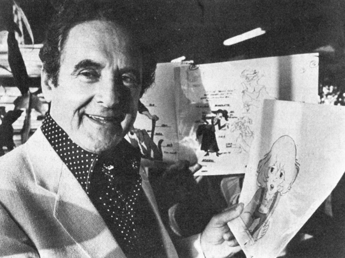
asterisk animation is a blog for a NY animation company called, oddly enough, Asterisk Animation. Hosted by one of the principals, Richard O’Connor, the site takes on his personality – literate, intelligent, thoughtful and artistically interesting. Richard writes with entertaining strokes, as one would expect from a studio site, about their animation and past projects. However, these tales are usually informing and entertaining enough that it makes it a delight to visit the regularly developing blog. I do have to admit, though, it’s tough at times to face the bold yellow of this site in the mornings.

Finally, since I pretty much live for animation, I have to add my favorite animation site, and this is it. Mike Barrier has been dedicated to ACCURATE animation reporting of history, and his site offers that history as well as reviews that are exact and usually dependable. There’s so much information on this site and so much worth looking for that I have to place it in the uppermost category of my favorites. Actually, it’s probably the stop I come to most often on the internet, so how could I resist lauding it.
Even today’s post about the faces of Marceline, MO. (Disney’s home town) is so unusal, enlightening and eccentric, that it’s a joy to check out this site.
Articles on Animation &Chuck Jones &Frame Grabs 11 Feb 2009 09:00 am
Wackiki Art
- John McGrew is a principal designer in the history of animation who quite radically changed things for us all. He led the way out of the 19th Century and, with Chuck Jones’ blessing, pulled the art of animation into the 20th. Others followed or were running alongside him, but he left the first mark.
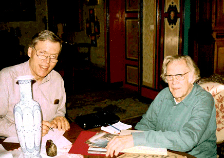 Mike Barrier interviewed McGrew in his studio in France in 1995, (photo right by Phyllis Barrier from Mike’s site) published the interview in Funnyworld Magazine and has it now posted permanently on his website. If you have any interest in design in animation, you should have already read it. I just reread it for about the 15th time, and am amazed at how much history is packed in there. Go here.
McGrew, with his work on The Dover Boys and dozens of other brilliant cartoons, took animation into abstraction and back. His work, I think, is comparable to Scott Bradley’s music at the MGM cartoons. Bradley was the very first film music (live action or animated) to incorporate Schoenberg’s 12 tone serial music. McGrew didn’t imitate Picasso or Steinberg, he created modern art in animation.
McGrew did his layouts in color showing the background artists what he wanted. He worked with strong designers, in their own right, painting backgrounds:Paul Julian, at first, and  Gene Fleury after 1941. When he left the unit, during the War, Bernyce Fleury took his place working with her husband, Gene, on Jones’ films.
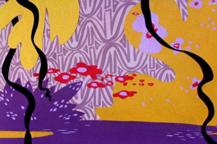
Wackiki Wabbit is one of the most interesting of Chuck Jones cartoons.
Precisely because of the layouts and backgrounds. They’re done in an abstraction that almost dominates the film, but actually serves to represent a world of foliage. The style uses cutouts and a wide range of techniques. Mcgrew probably did not work on this film; it came exactly at time of 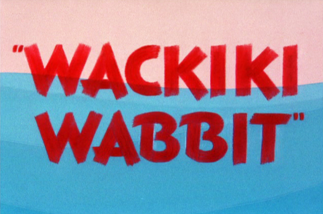 change when Bernyce Fleury entered the picture. McGrew, in the Barrier interview, says that he had never worked with her on a film. Her style seems evident throughout. Cut-outs mixed with the wallpaper-like patterns.
The film gives no credit to Layouts or Backgrounds.
I’ve made some frame grabs of the backgrounds (eliminating most of the characters – unless they were stationary) and
___ (Click any image to enlarge.)__________am posting them below.
The film opens with tones of blue against a pink sky.
The two solidly drawn cartoon characters float in a sea of color.
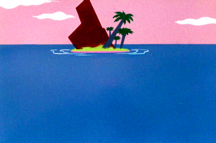
This is about as green as the Island will ever get.
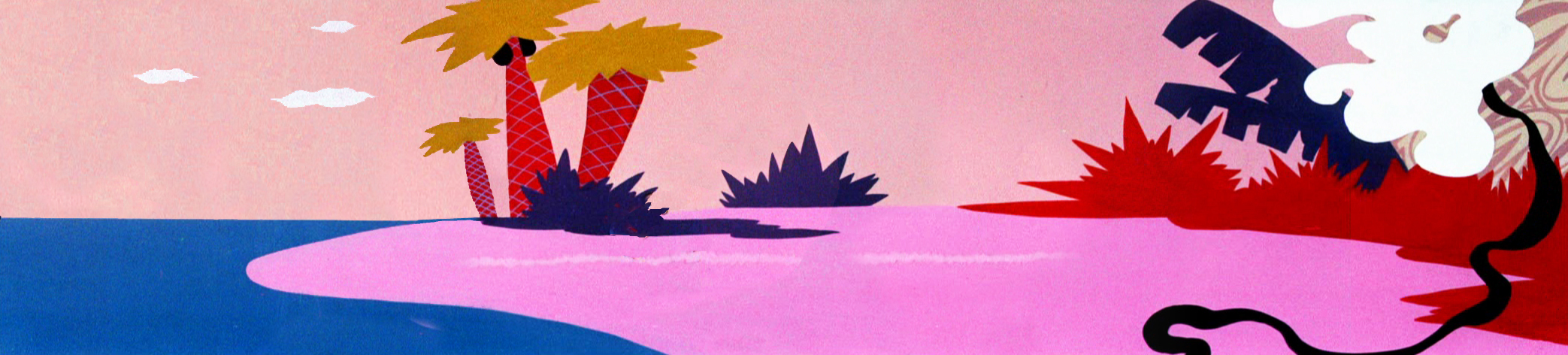
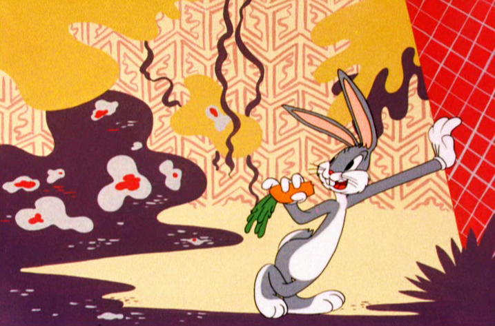
On the island, Bugs Bunny lives in a world of abstract foliage.
The colors are skewed – not verdant but warm.
Large masses of solid colors sit against brush drawn lines.
A limited number of colors allows the scenes to cut
without following through with any other consistency.
However, if you remove the characters, you’re missing the center.
As it should be.
There are numerous large and fast pans,
this one a diagonal from right to left.
Some areas like the blue, above left, or the red, above right, animate.
The solid colors help them all to combine seamlessly.
Bugs dances on the right, a pan
to the left reveals the two humans.
Cut from the pot to a quick pan high up in the trees.
This serves as a sunset with our two humans
chasing each other into the distance and the film’s end.
Commentary &Richard Williams 10 Feb 2009 08:52 am
Borge’s Note
I mentioned in my post this past Friday, that I had a copy of Dick Williams’
notes from Art Babbitt’s lectures at the Williams, London studio. Borge Ring wrote the following letter about those notes:
- You own a copy of Dick Williams’ notes from Art Babbit’s lectures at the studio in Soho Square.
Art drew on an overhead projector during the lessons. Dick sat there copying them into his scetchbook all the while.
Years later I asked Carol Hall – Russell’s wife – if they had copies of Art’s own overhead drawings. They did and Carol graciously sent me the lot.
It was WILDLY interesting to compare the two.
Dick’s version is – let us say – “Bobo Cannon as seen by Ronald Searle.”
Art’s personal taste in design were very influenced by UPA. Clear, compact designs almost emblematic. But when he draws a row of “little men” they are jolly in an exuberant Syverson way.
I noticed this preference of his when he corrected my animation. He would change a shoe into a UPA shoe ignoring the client’s modelsheet.
Performing the corrections he desired did not come easy to him. He put a clean sheet on top of your drawing and redrew with a blue pencil.
He did not like the result,and went over his blue drawing with a red pencil.
That wasn’t it either; so he took a black pencil and bored into the blue and red. Watched awhile …. then tore the thing off the board and started the blue pencil on a fresh sheet.
He ended up with a nice clear drawing in black pencil. I kept one, trimmed it to the size of the character and it resides in the drawer where I keep erasers and things,and greets me every time I open the drawer.
Dick’s thrifty business partner had asked me: “Now Borge, what do you think you should be paid for this job? You know, we’ve got Art Babbitt coming.”
I said: “Art Babbitt has been teaching me for 24 years, Carl. Only he doesn’t know it.”
Another gambit was: “You must have an excellent showreel. that can attract clients to us. May we borrow it?”
Now, this is like having your passport confiscated in Teheran, so I said:
“Dont worry, CarI In 3 months time you will have a new, vastly improved showreel of mine, all of it Richard Williams commercials.”
Carl Gover was a thrifty often frustrated man in a difficult Roy Disney position. I got to like him very much, and still do.
I once asked Dick what sort of artist Art Babbitt was “privately.” He said: “I don’t know. He does not consider himself an artist, and he is very shy about such matters. His wife showed me a collection of caricatures from the 20s.”
“What do they look like?”
“Beautiful”.
Art scoured the art galleries in London looking for things that might improve his animation.
Four young animators complained that the client’s (trademark) character was very corny. Babbitt smiled to the paper on his desk and said mildly: “That depends on how charmingly they can animate him. Because if they can, he will not look corny.”
Frank Thomas visited and Dick showed him a funny commercial for dogfood he had drawn in a James Thurber like style. Frank said; “I like that surface-trick-stuff you do, Dick. But I prefer real characters.”
Dick answered:: “You dont think that Captain Cook is a more real character than this dog, just because you use liveaction for reference.”
writes
Borge
 ps: The Dutch art authorities are justly proud of their heritage of Rembrandt and Vermeer etc etc etc and you might expect them to be condescending towards an artbook showing 25 years of The NewYorker frontpages.
Not so.
A review by a top guru in a quality newspaper said. “These are so-called commercial drawings which means that they will never find their way into a museum. But I would gladly exchange all the museums for these drawings. Because they are the best collection of drawings of this century.”
I played hobby jazz with some other oldies. The vibraphone player was a bigshot at the Rijksmuseum in Amsterdam. He got me invited to exhibition openings. “Are you coming sunday for Da Vinci? We have a new sherry.”
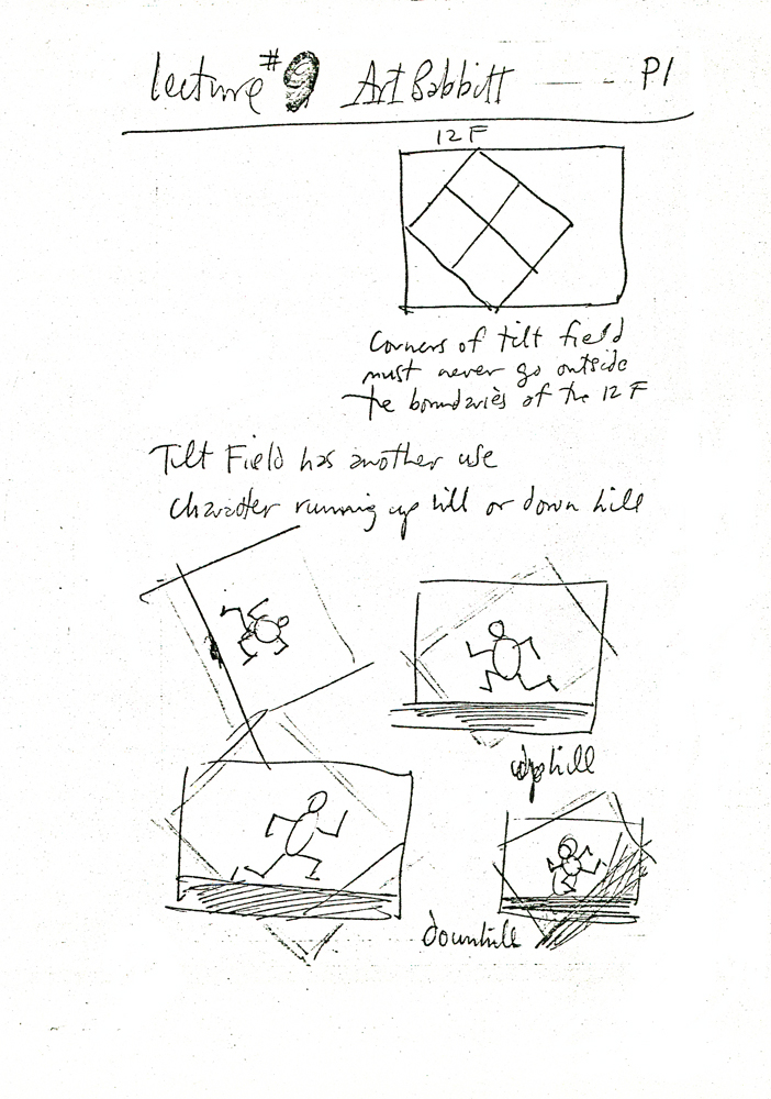
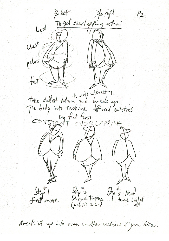
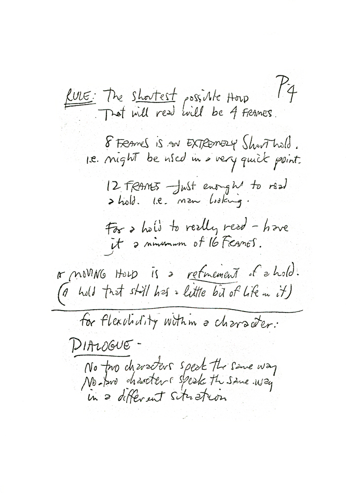
Dick’s notes Chapter 9.
 2
2 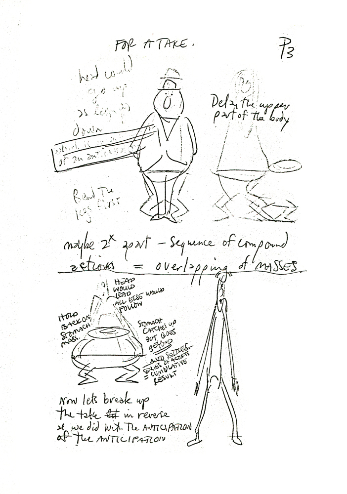 3
3(Click any image to enlarge.)
 4
4 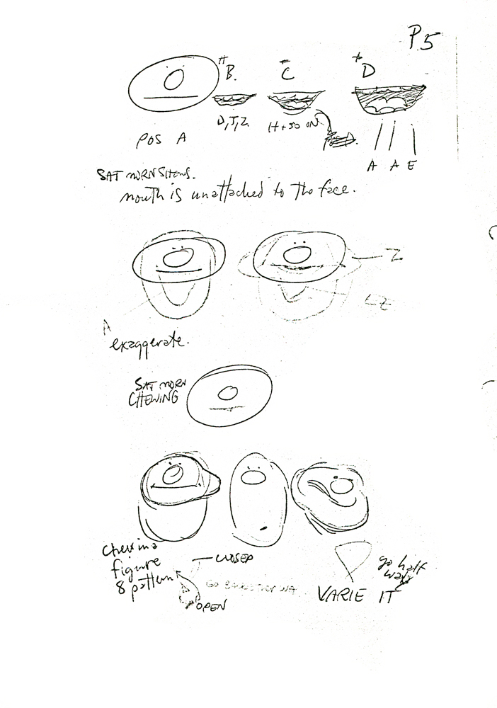 5
5
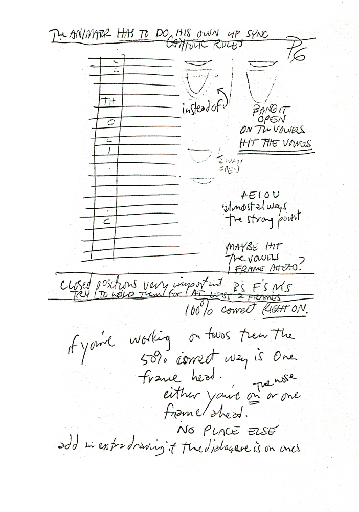 6
6 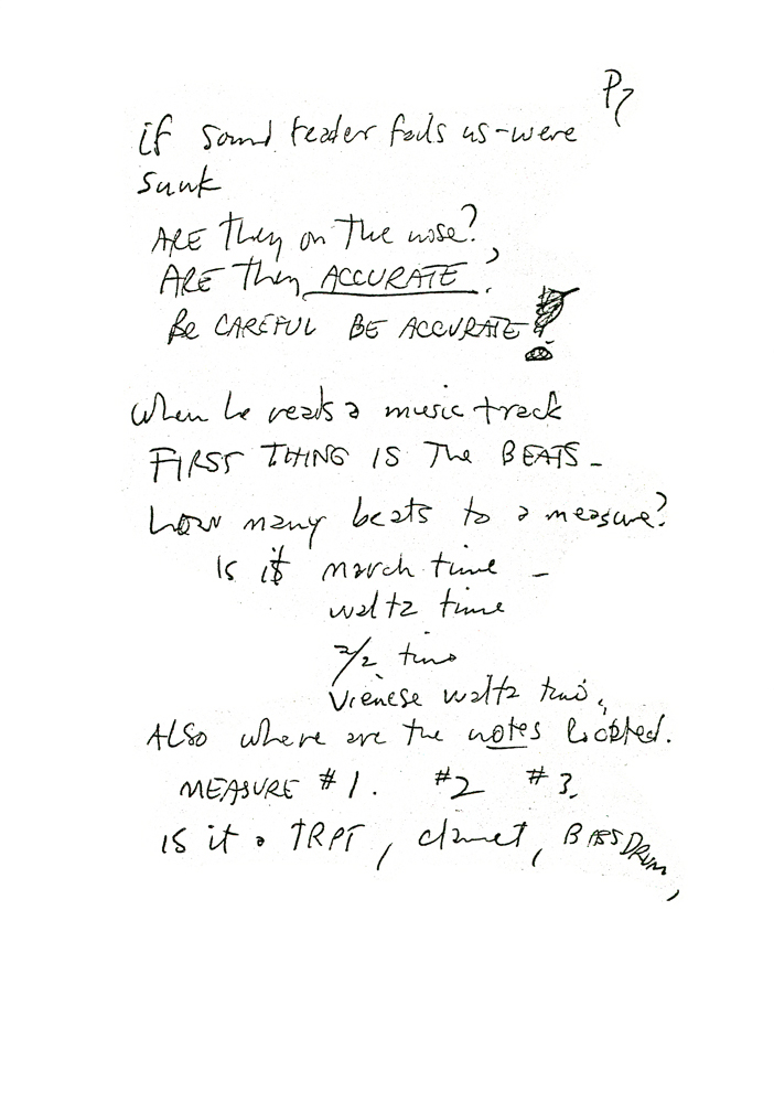 7
7
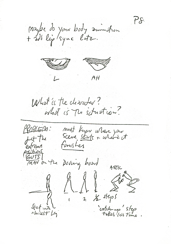 8
8 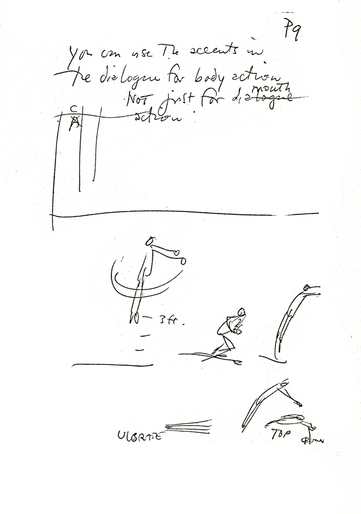 9
9
Animation &Disney 09 Feb 2009 09:20 am
Devils
- The BAFTAs were doled out last night. Slumdog Mullinaire won everything it was eligible for. Fortunately it wasn’t in the Short animation category. That was won by WALLACE AND GROMIT: A MATTER OF LOAF AND DEATH – Steve Pegram, Nick Park, Bob Baker.
Wall-E beat out Persepolis and Waltz with Bashir (great nominees) for Best Feature.
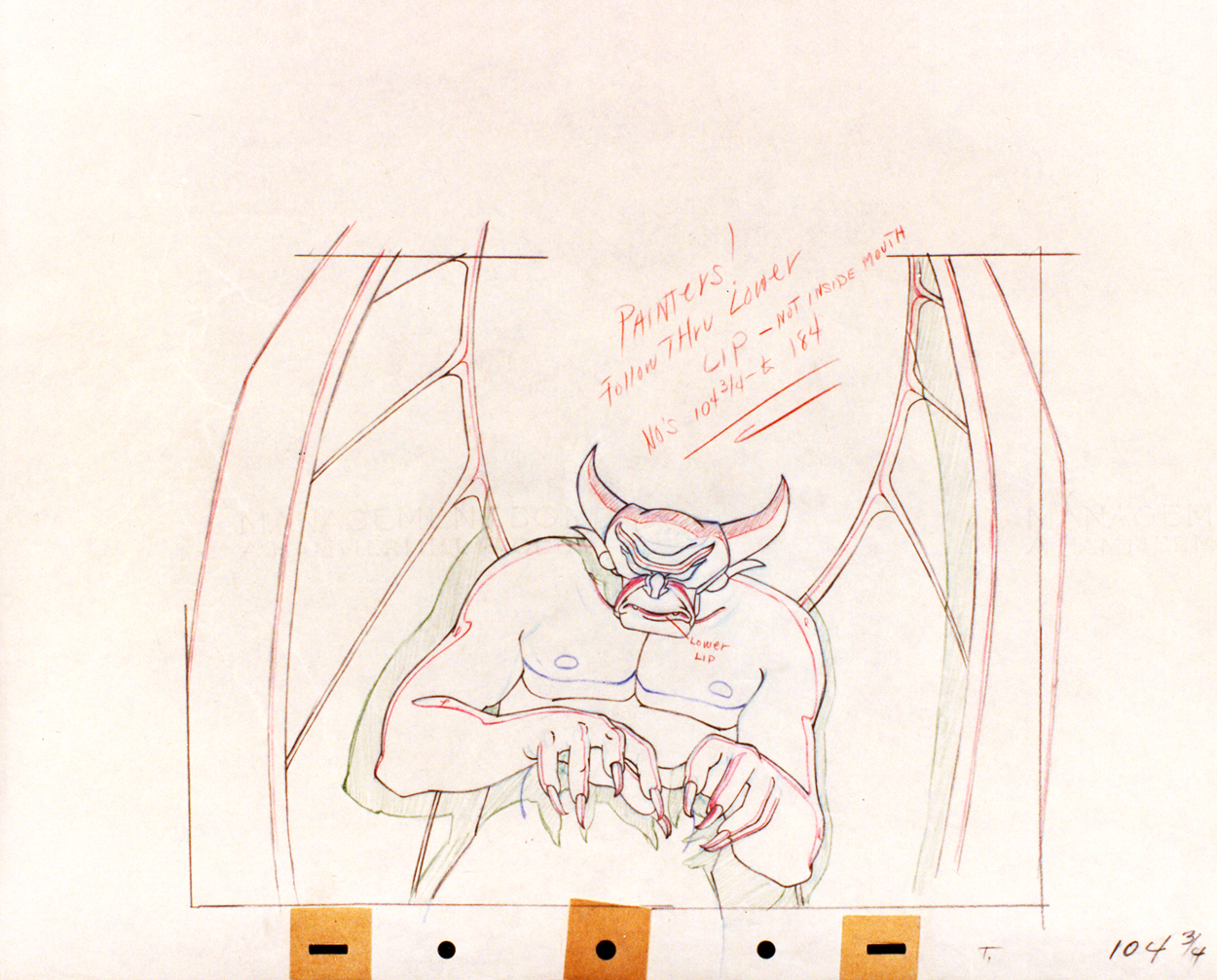
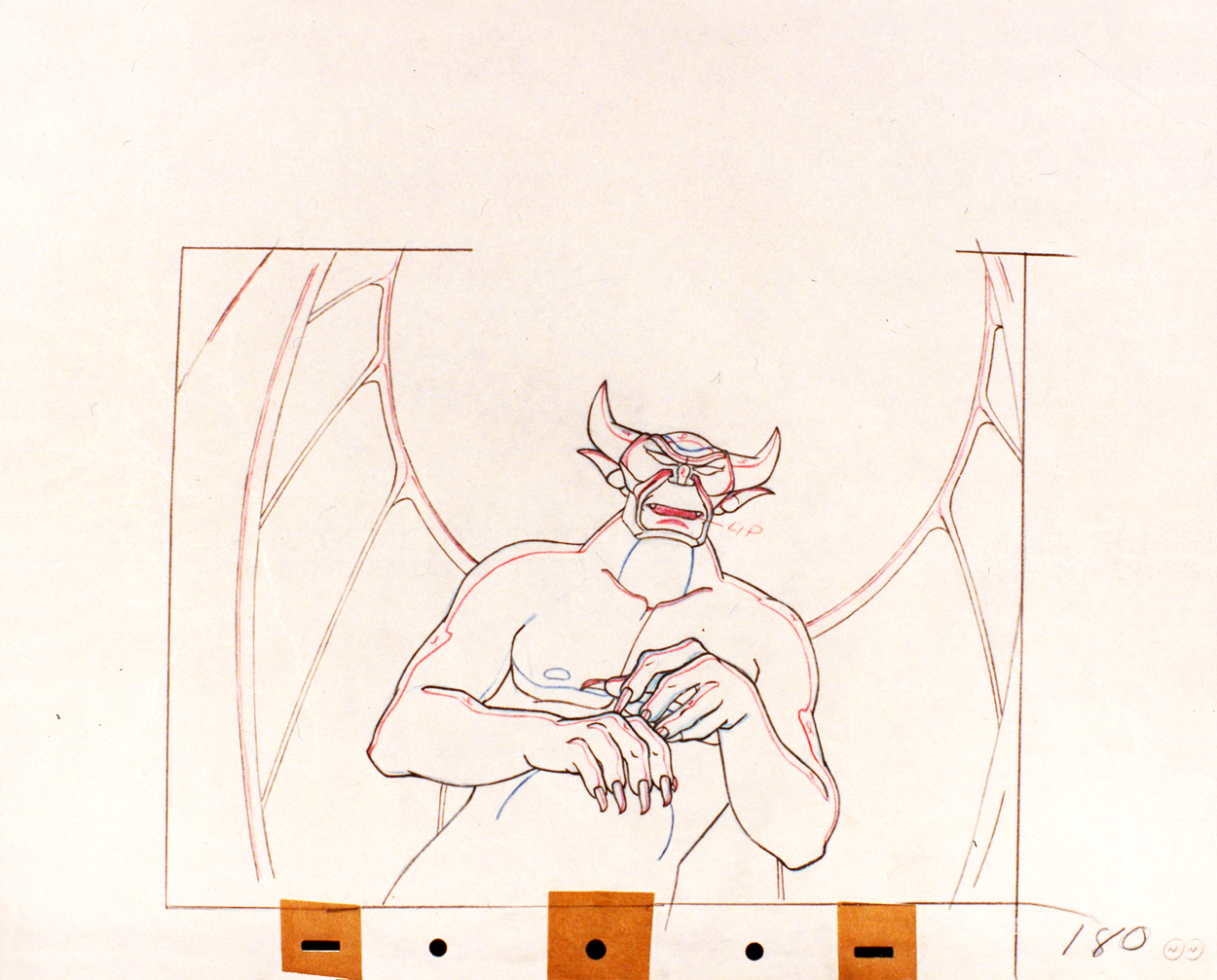
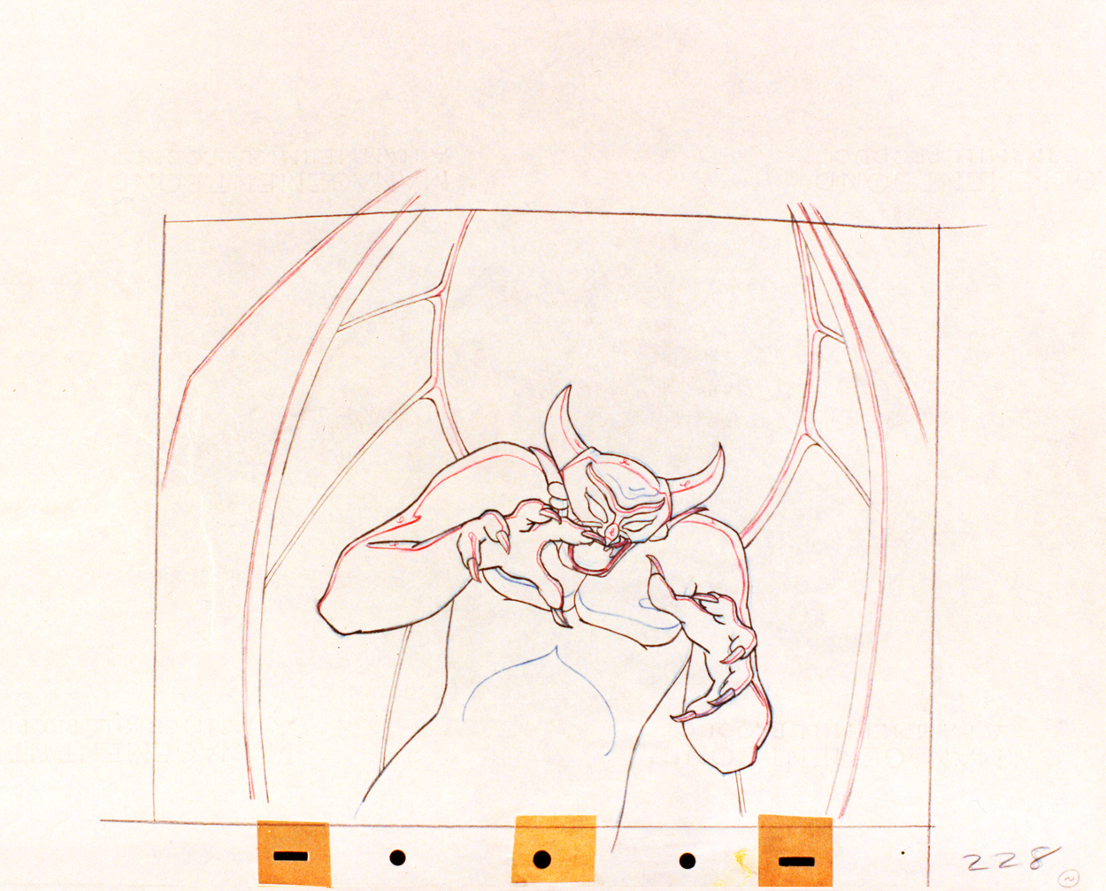
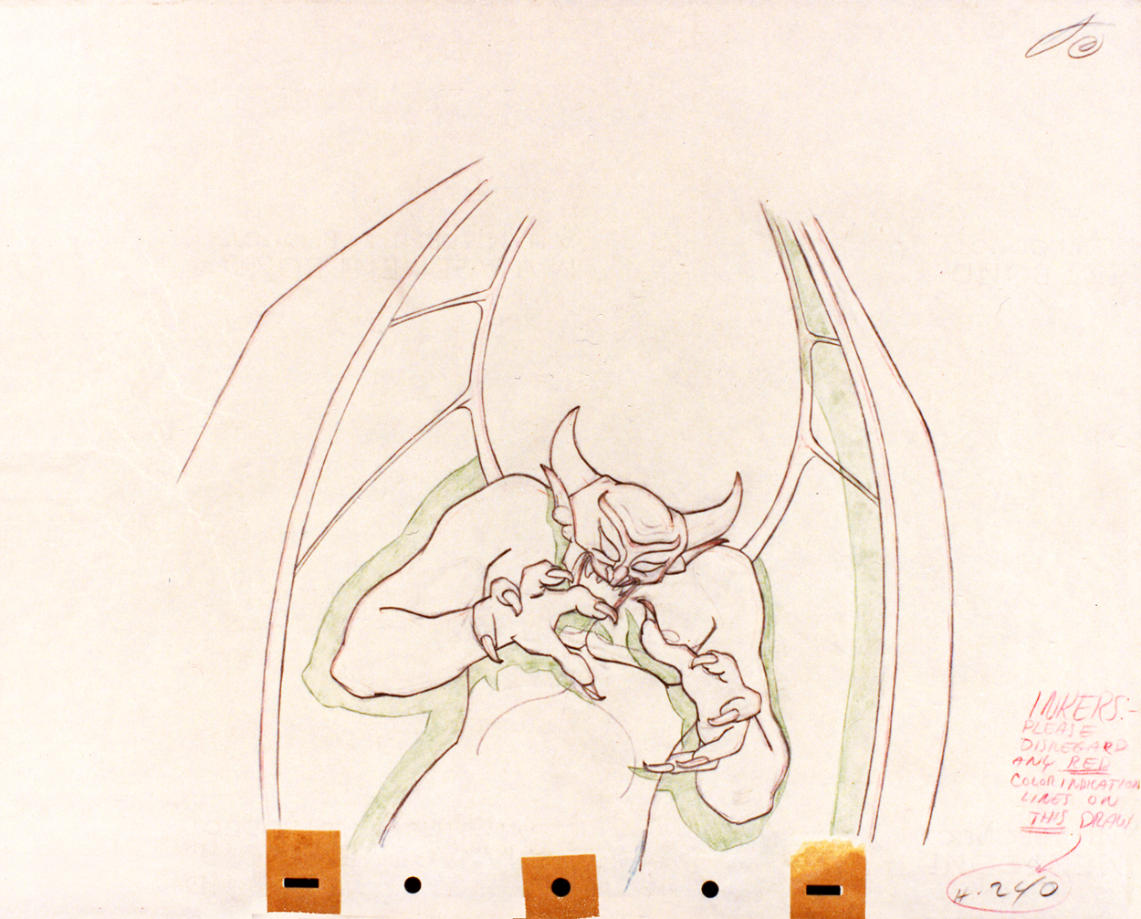
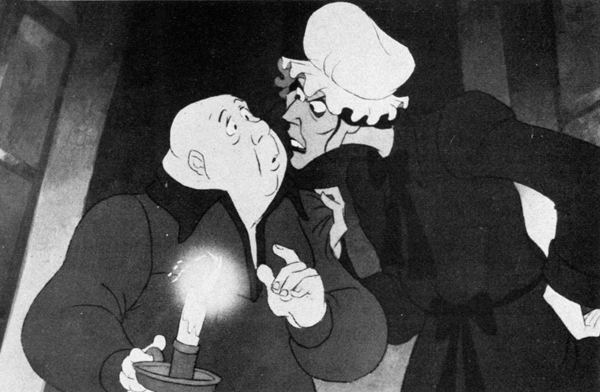
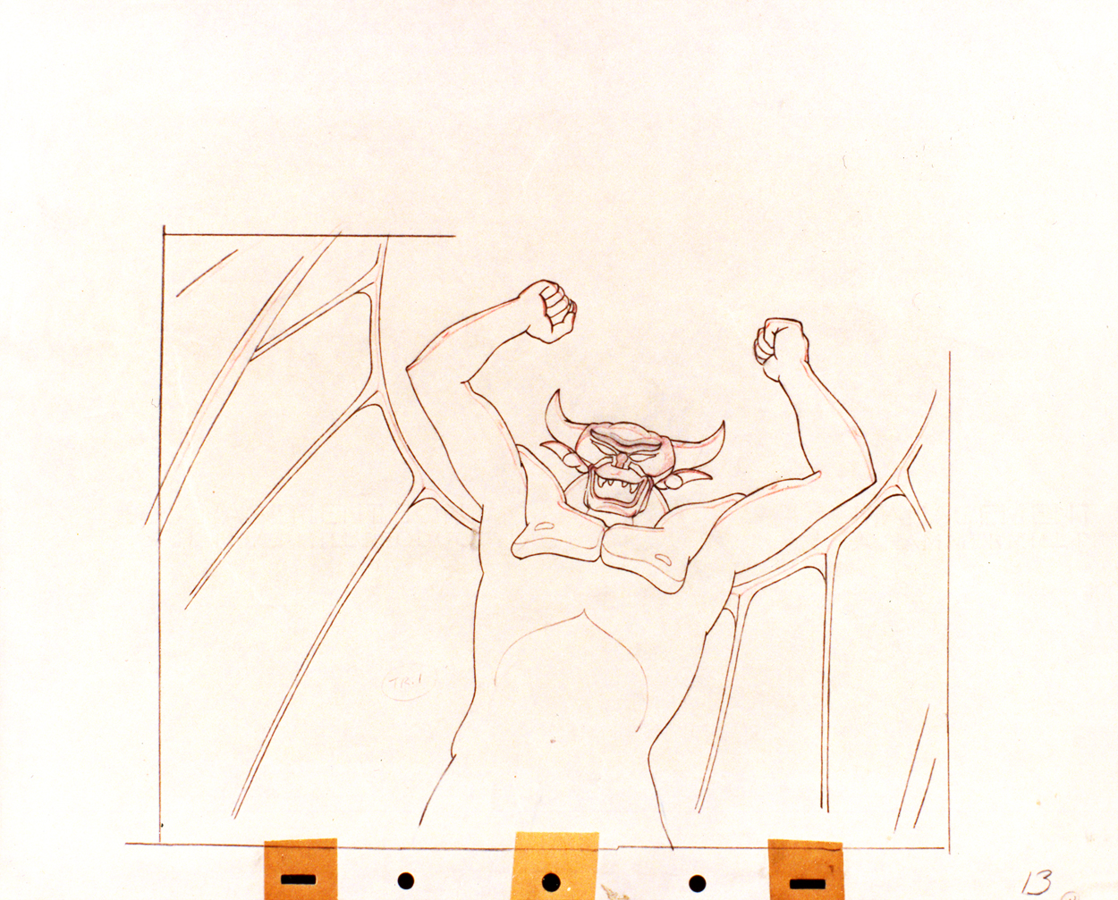
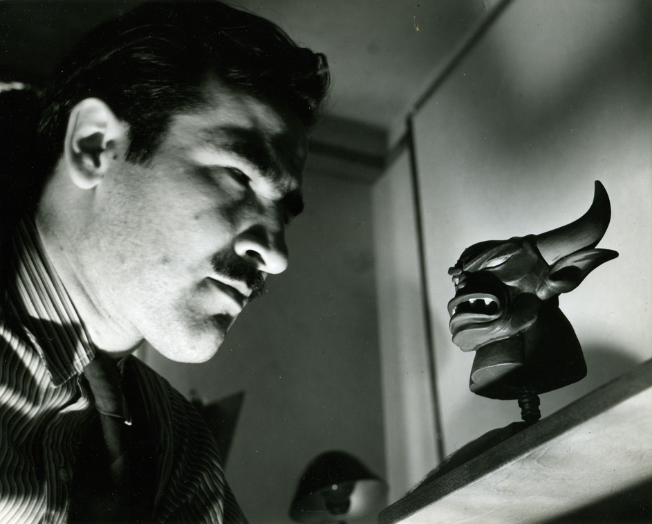 - Going under the assumption that there never are enough of Tytla’s Devils on the internet, I’ve got a few drawings to show here.
These were photographs of drawings taken (rather dark exposure that I lightened a bit) of what appears to be some cleanups. Most of them are from one scene; one drawing is from another. They’re all treasures.
How do you go from delicate Dumbo’s bath to this? That’s acting!
(Click any image to enlarge.)