Books &Disney 07 Aug 2008 08:07 am
The Robber Kitten
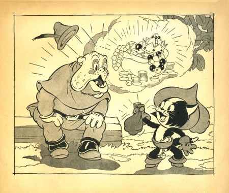
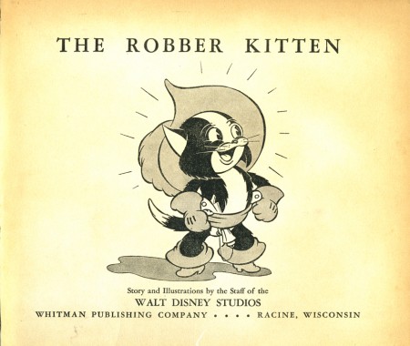
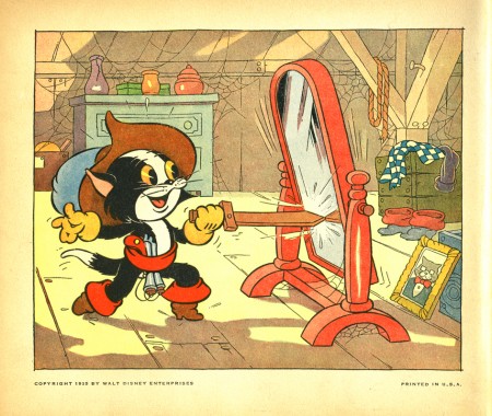
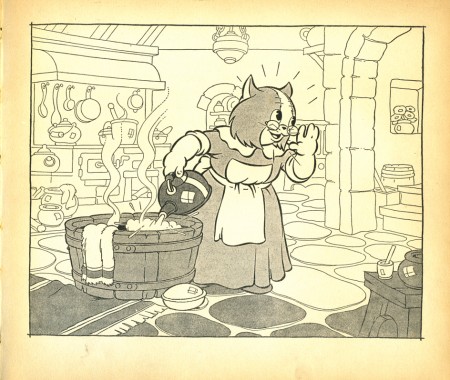
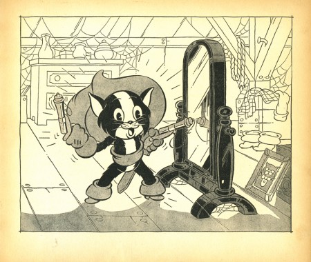
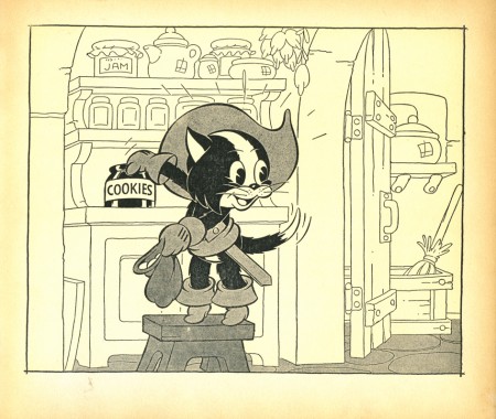
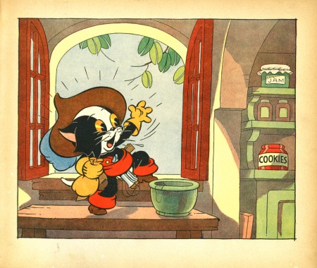
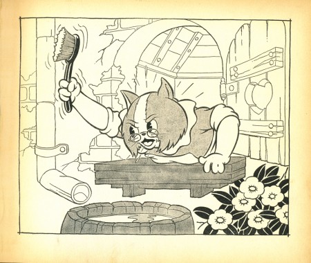
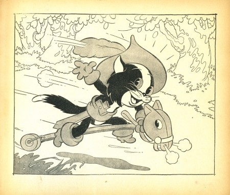
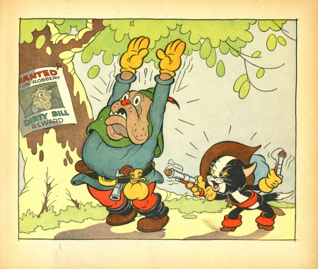
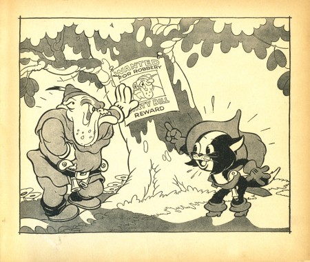
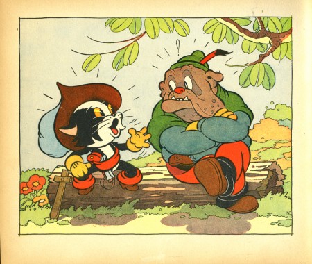
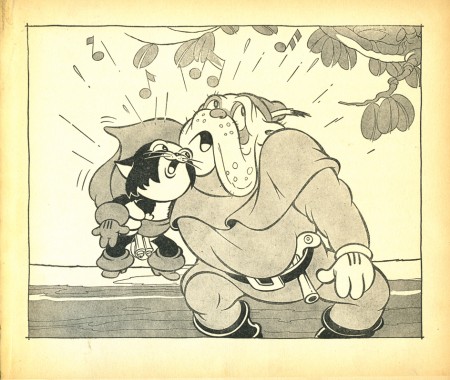
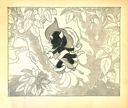
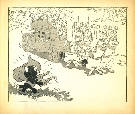
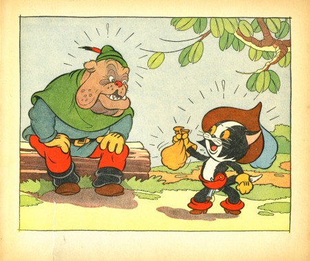
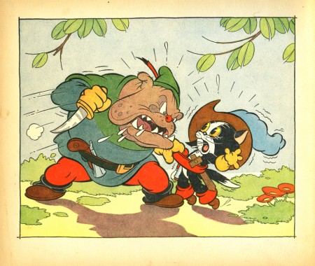
- In John Canemaker‘s collection is a children’s book I lust after. It’s a 1935 publication of the Silly Symphony. The illustrations are out of this world. John’s loaned it to me to post the images. Every other page is filled with the type of the story, and the remaining pages are illustrations – most in B&W with tone. The book was published by Whitman Publishing.
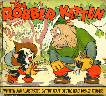
(Click any image to enlarge.)
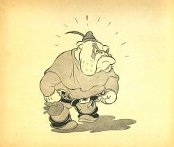
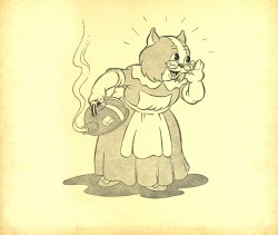
These two full pages drawings grace the covers’ interiors – front and back.

on 07 Aug 2008 at 11:14 am 1.stephen said …
wow! look at all those lines coming out of their heads! I wonder at what point they felt their drawings were expressive enough without all of those sparks?
That being said, I sort of miss seeing the exclamation points nowadays. Beautiful illustrations.
on 07 Aug 2008 at 11:53 am 2.Eddie Fitzgerald said …
Beautiful!!! It’s a great water color look, but I’m guessing that the originals were colored in black and white transparancies, with each level representing one of the printer’s inks.
on 07 Aug 2008 at 12:49 pm 3.Stephen Worth said …
That looks like it may be the work of Howard Wookey. He did a lot of the poster designs for early Disney films.
See an example of a Wookey drawing
See ya
Steve
on 07 Aug 2008 at 1:02 pm 4.Robert Schaad said …
Beautiful stuff! Great fonts for the cover art too. Amazing what can be done w/ black and white and gradation/tone.
on 07 Aug 2008 at 9:36 pm 5.Bob Flynn said …
WOW! Thanks for sharing! The linework is to die for and I love the gray ink washes. At the same time, what a weird idea! Makes me want my cat to aspire to do more.
I’m not sure I’ve seen the Silly Symphony…I’ll have to look for it now.
Loads of inspiration…thanks again!
on 08 Aug 2008 at 12:01 am 6.Larry Levine said …
WOW, these (very) awesome drawings–expressive, beautifully colored & a LOT of fun!!!
on 08 Aug 2008 at 9:58 am 7.David said …
Most of the 1930s Whitman books were done along similiar lines – beautiful art reproduced in vibrant color. The paper the books were printed on wasn’t the highest grade, (very acidic), and today copies of these books are usually quite brittle…but that doesn’t take away from their beauty. Just gorgeous…thanks!