Animation &Animation Artifacts &Articles on Animation &Richard Williams 31 Jan 2011 08:24 am
Raggedy Drafts – 4 / seq. 5 & 6
- Continuing the drafts to Raggedy Ann & Andy, I’m posting two sequences today:
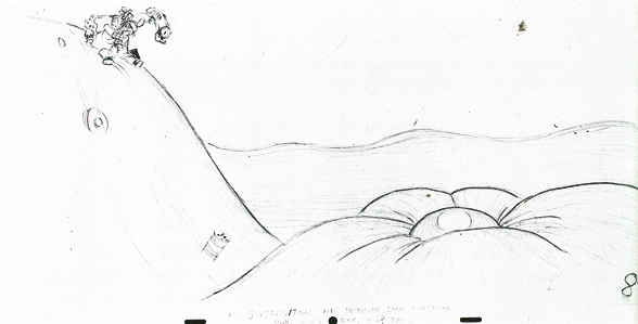
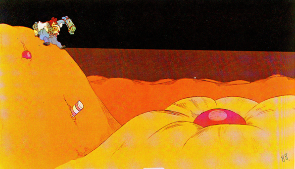
5 contains Emery Hawkin’s taffy pit and
6 contains the meeting with the Looney Knight. (This is where the picture really goes off its wheels and takes a deep spin downhill.)
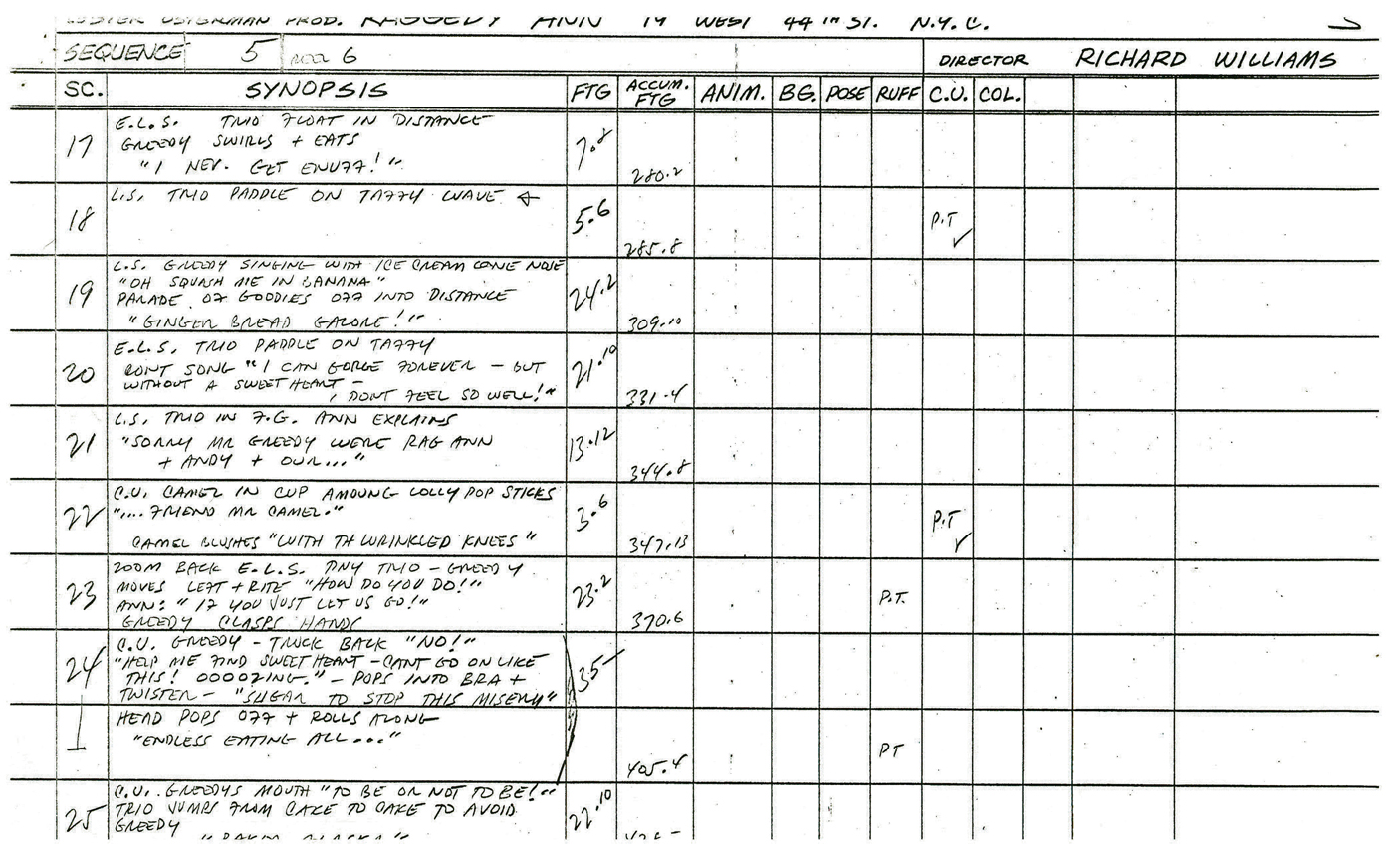
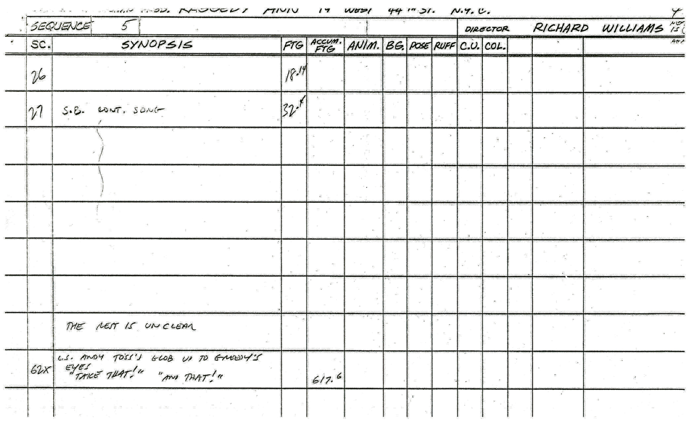
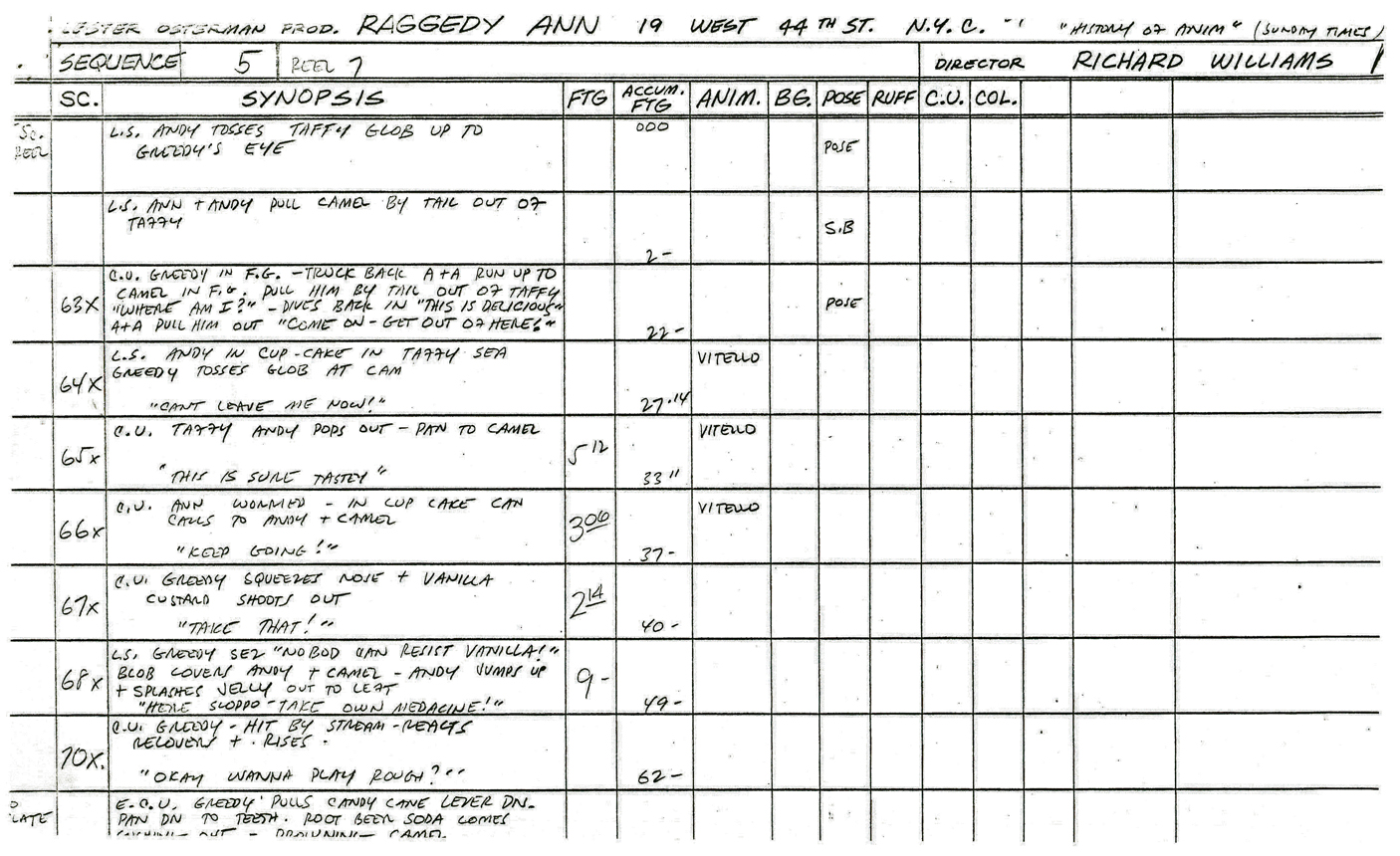
Seq. 5 employs these animators: Emery Hawkins. (A number of scenes were left blank for animator. At the end of the production they pushed this through pulling the sequence from Emery. Assistants became animators, and the animation looked shoddy.) Art Vitello, John Bruno, and Grim Natwick.
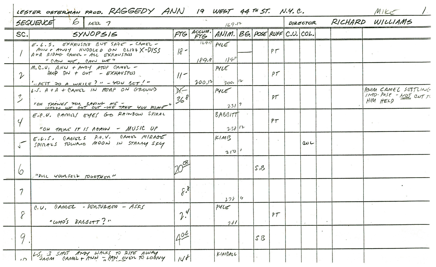
Seq. 6 is animated by: Willis Pyle, Art Babbitt, and John Kimball (Ward’s son). Again, several other animators came on at the end: Jim Logan stepped up from assisting to animating the Looney Knight, since Dick felt he was handling it so well.
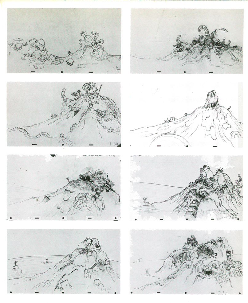
Sequence 5
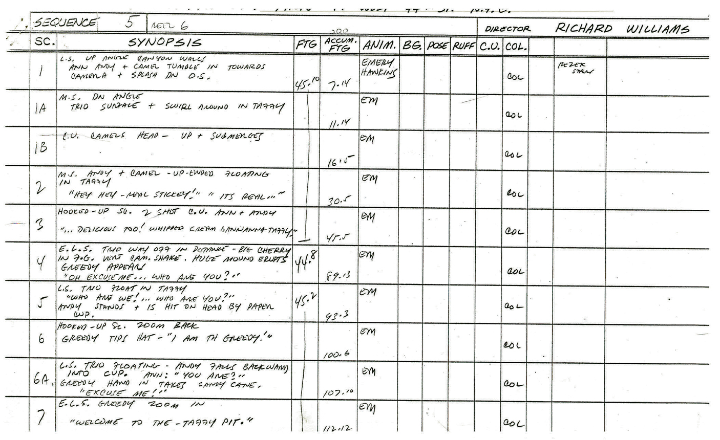 1
1
 2
2
 3
3
 4
4
 5
5
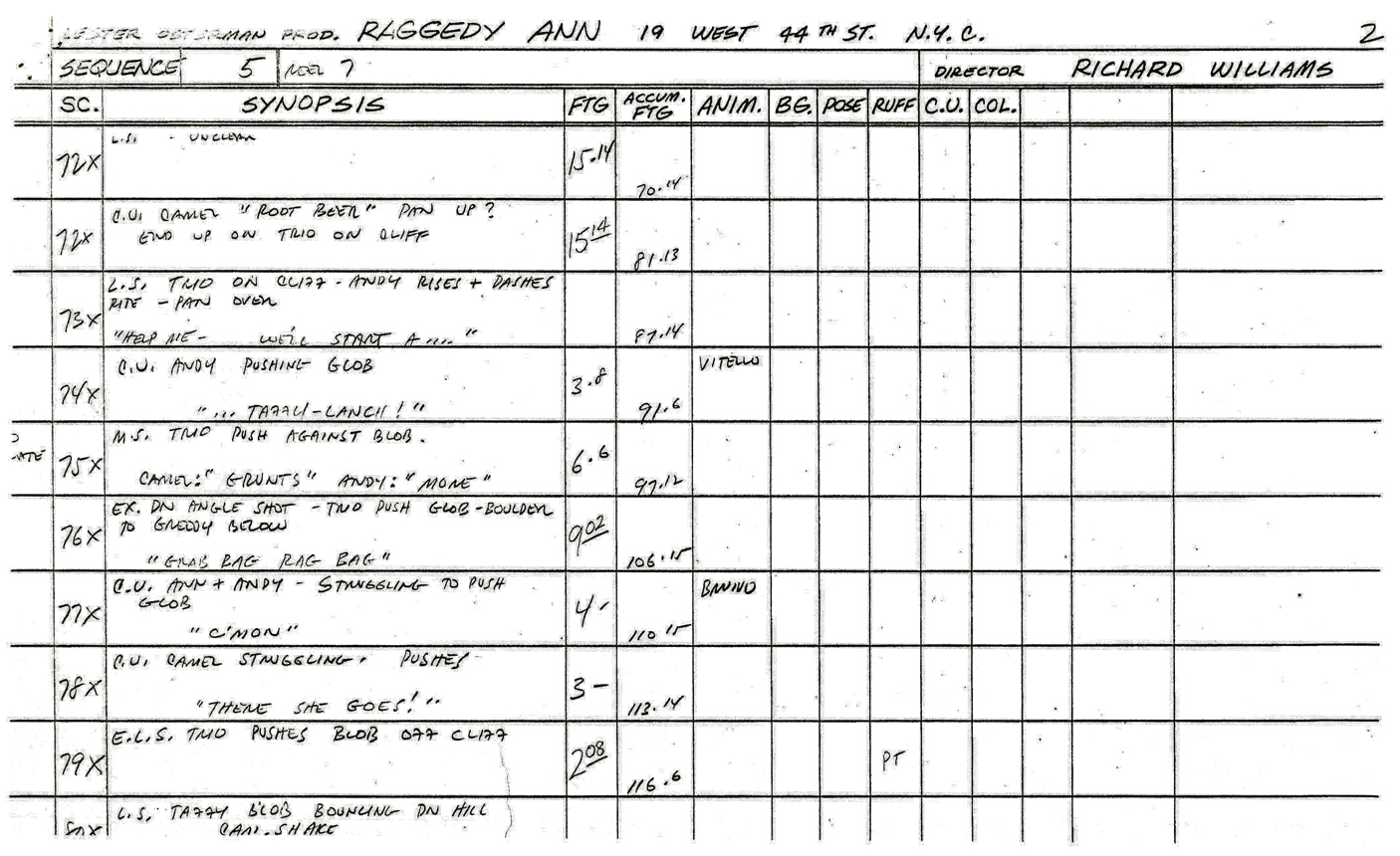 6
6
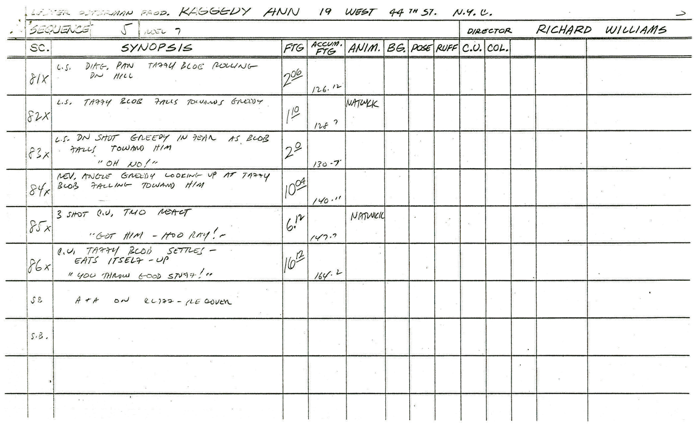 7
7
Here are some images from John Canemaker‘s excellent book, The Animated Raggedy Ann & Andy.
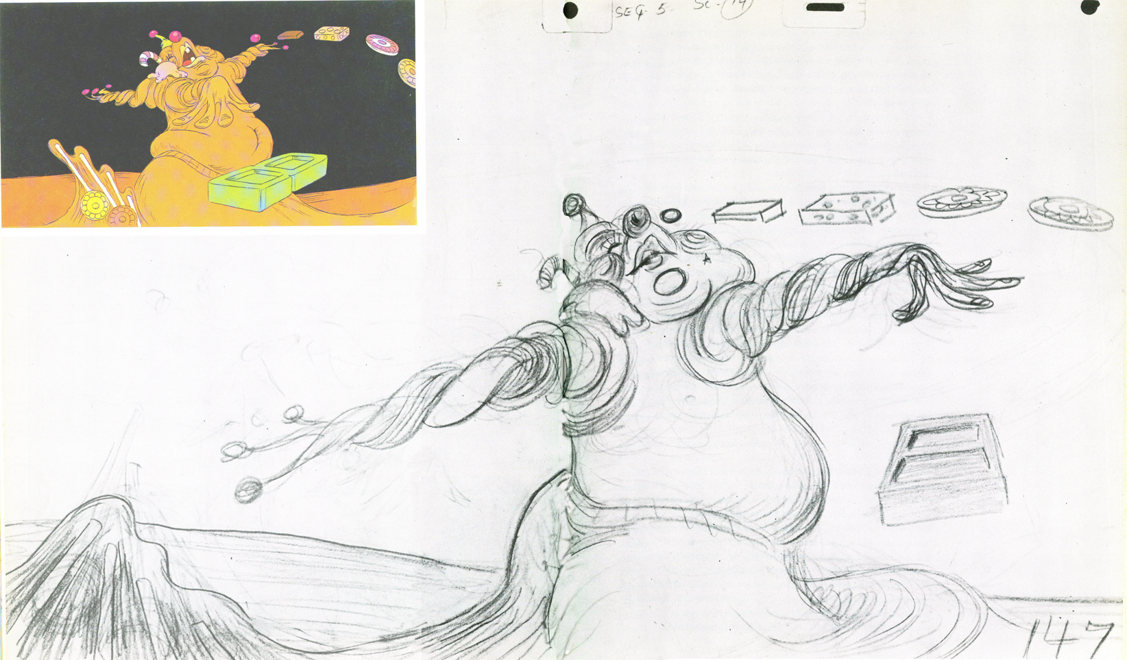
Sequence 6
 1
1
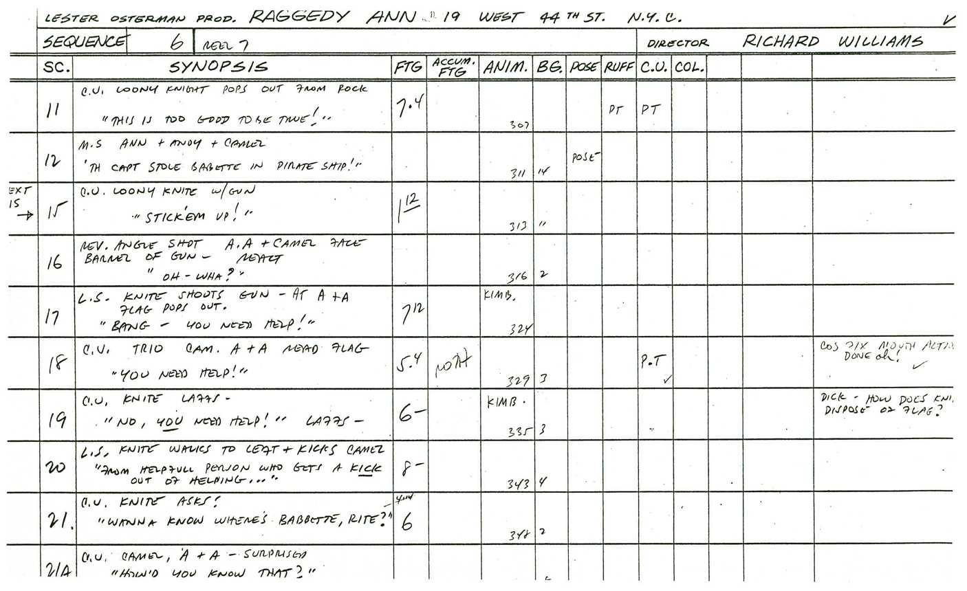 2
2
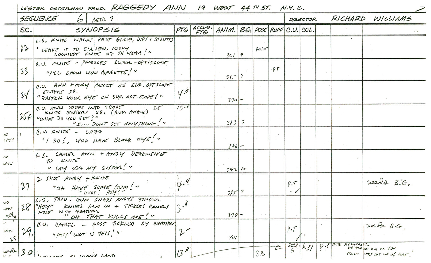 3
3
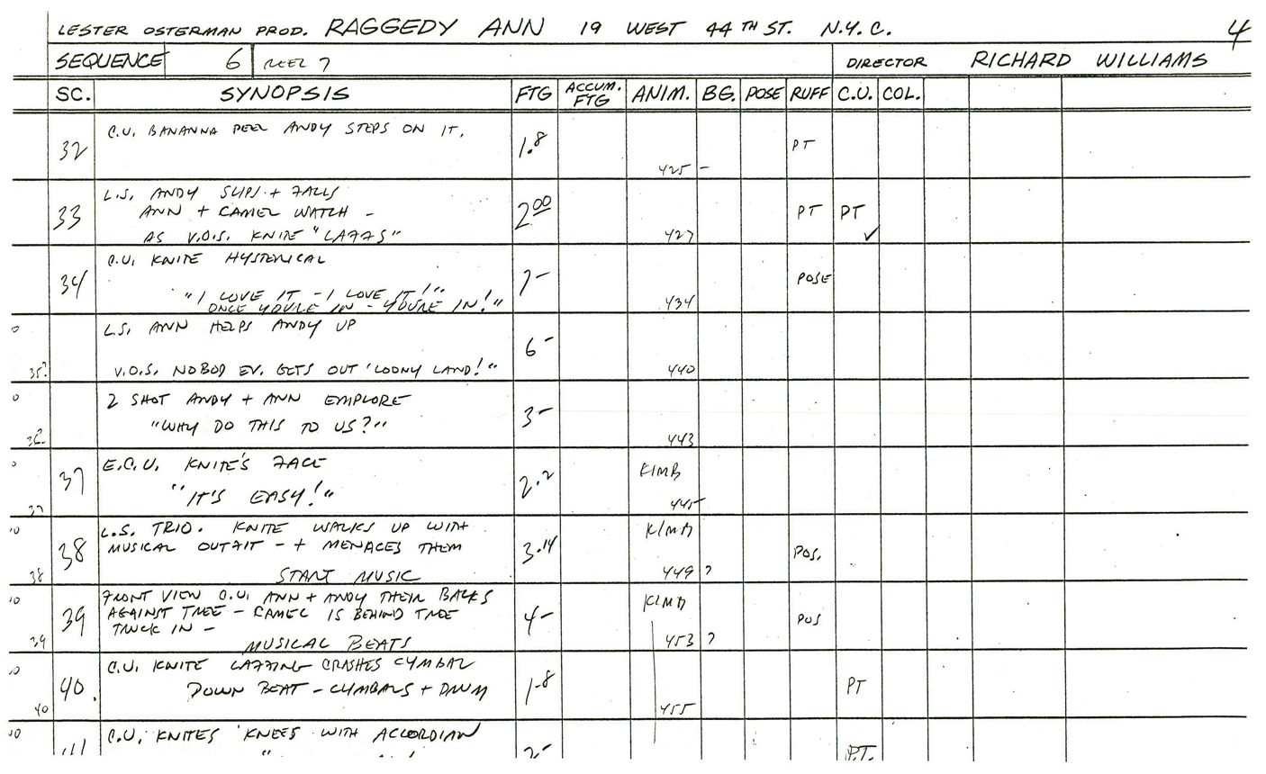 4
4
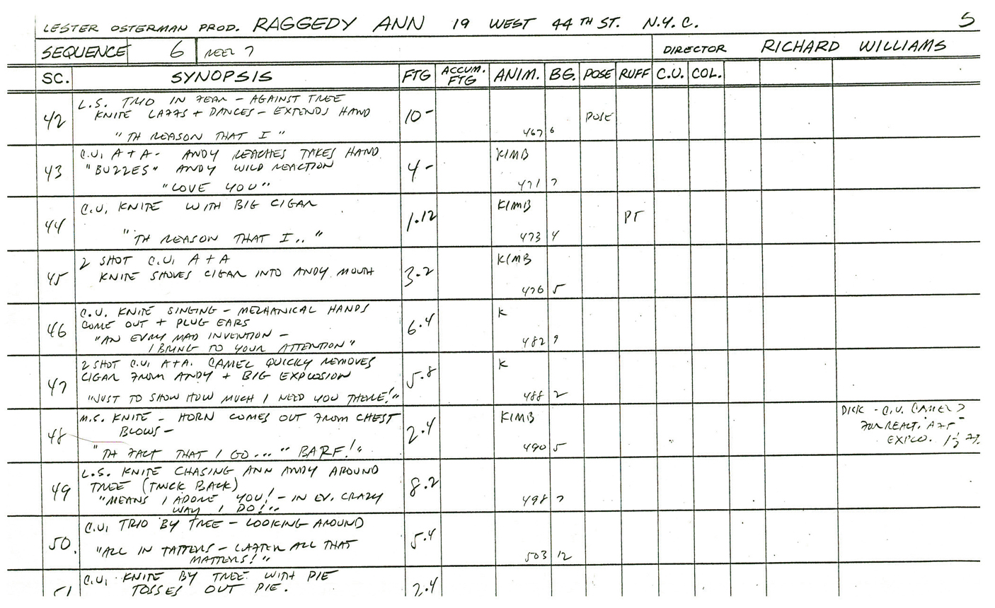 5
5
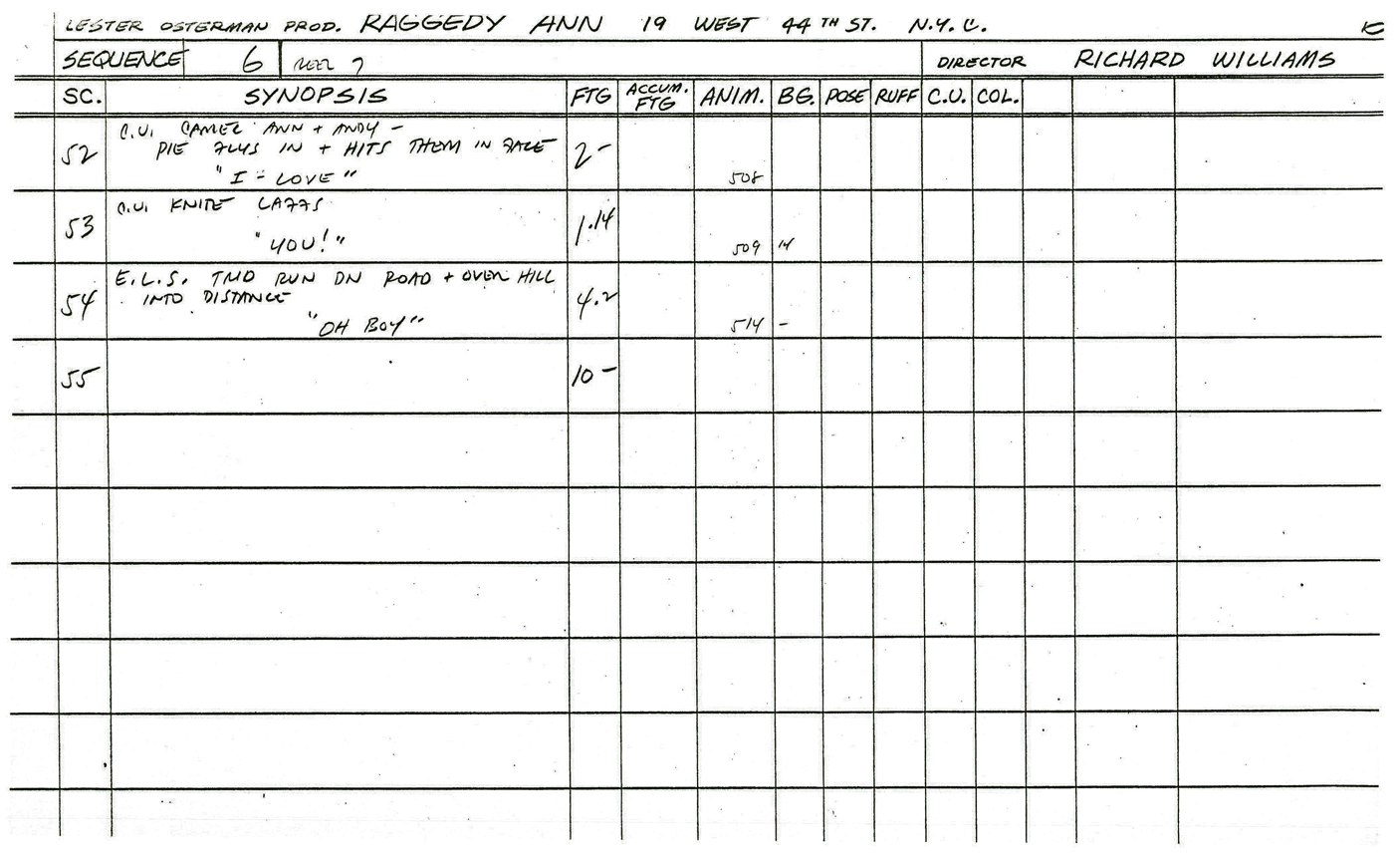 6
6

on 31 Jan 2011 at 10:35 am 1.Eric Noble said …
Emery Hawkins did a fantastic job. This was certainly one of the most entertaining parts of the film. It’s too bad he didn’t get to finish the job.
on 31 Jan 2011 at 4:50 pm 2.John Celestri said …
Michael,
I remember working very carefully to make sure Pyle’s camel looked as close as possible to Babbitt’s (especially since their scenes hooked up).
on 31 Jan 2011 at 7:17 pm 3.NYFA Photography School said …
amazing! I love it!
on 01 Feb 2011 at 11:18 am 4.The Gee said …
I’ll be honest. This movie always disturbed me. As a kid it did. And, in recent years I’m just left to wonder was it entirely because of William’s that it was all so detailed?
I’d like to think that one of the things Rube Goldberg did was take the simple, make it complex and then started drawing. That is opposite of what cartoonists usually do.
Obviously, for animation, forms and clarity matter so much. It still seems odd that so much line work stayed in the designs. Maybe the ends justified the means but…
on 01 Feb 2011 at 1:33 pm 5.Tom Minton said …
It’s easy to tell the precise frame where Emery left off and the others took over with the Greedy. That gray Xerox line that Williams apparently wanted because Disney was then doing it with “The Rescuers” makes the animated images somewhat difficult to read.
on 01 Feb 2011 at 4:58 pm 6.Michael said …
Tom: Williams felt that the gray line took on the colors of the masses around it. Unfortunately, it was neither here nor there.
When Williams was canned, they stopped working on large fields and reduced all the layouts on copiers. Then they animated roughly and quickly without the same care that w4ent into it originally and xeroxed on a flat copier allowing shrinkage to happen and bad registration as well.
Gee: the over drawn and over detailed artwork was all from Williams who encouraged Corny Cole to go crazy. Too many colors on all the characters; too many spots and dots and plaids. The film was designed for ten times the budget it had.
on 01 Feb 2011 at 9:47 pm 7.The Gee said …
Thanks for that info.
Those dang toy properties!
That one drawing of Cole’s you shared that is 18×24 is still mind boggling and I could possibly see it for a set piece (justifying it’s detail; not justifying the ball point pen.). But, dang. Everything I see from this or The Thief seems like the makings of a set piece. Too much.