Disney &Frame Grabs 07 Mar 2011 08:13 am
Bambi – Into the Woods
- The new Blue-Ray/DVD has just been released for Bambi. It was less than a year ago that I bought the “Platinum Edition” of this DVD, so, not owning a Hi Def TV, I’ll hold onto what I’ve got, for now.
However, it did make me look at the film again. First off, let me say this is one of my favorite films. I don’t like the cartoony “Twitterpated” sequence, but I do like everything else. Secondly, let me say that they’ve done all they could to destroy the film in cleaning it up with their digital mastering. All the film grain seems to have disappeared and the images feel flattened out. They often come off as garishly colored rather than the sensitive painting that was done.
Thirdly, let me say that, regardless, this is a great movie.
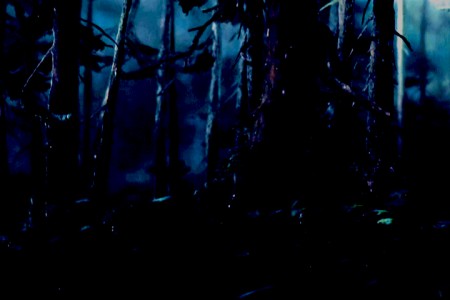
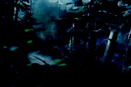
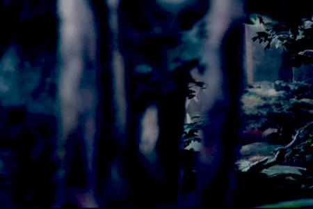
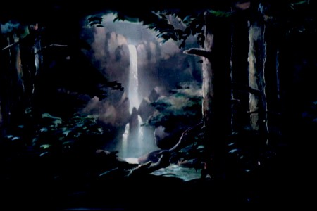
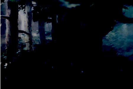
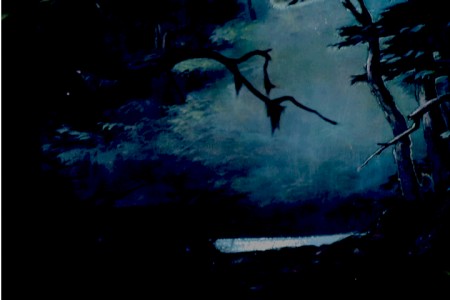
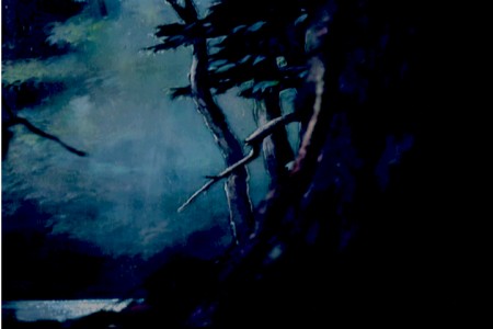
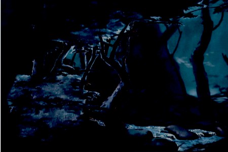
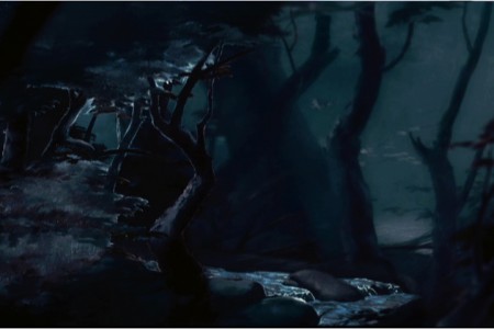
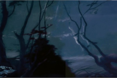
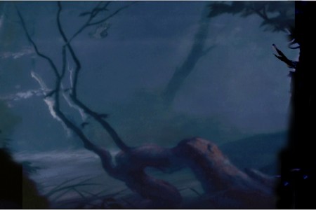
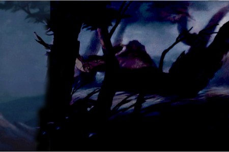
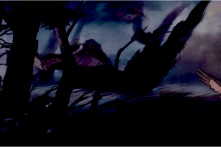
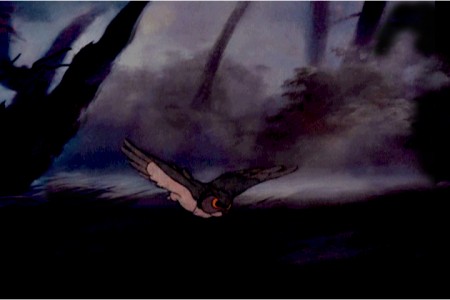
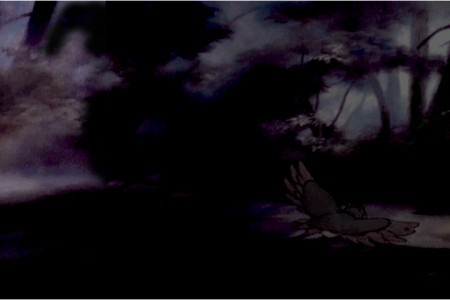
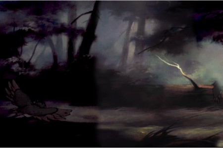
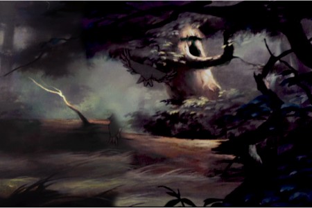
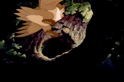
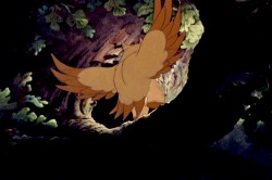
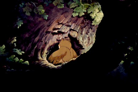
I’ve decided to make some frame-grab sequences to display. How can you not start with the very beginning of the film. That endlessly long pan with the many-levelled multiplane camera hard at work. There are also rear-screen projections (such as the waterfall) that have been built into the pan.
I’ve done my best to connect the frame grabs to simulate the length of the pan. Then I had to break it into four parts from start to stop so as to post it. Each one of these four read well when enlarged. For the thumbnails, I broke each of the four into parts (with a slight overlap) so you could look a little closer.
I hope to pull a couple of other sequences at a later time. This film deserves all the honor it can get. It can’t be beat.
 1
1The pan opening to the waterfall.






on 07 Mar 2011 at 3:03 pm 1.Don Cox said …
The criticisms you make do not apply to the Blu-Ray version on my large TV.
The colors are rich but clean, whereas on the grabs that you posted they appear muddy with a magenta cast. On the Blu-Ray, the texture of the paint is much clearer, as is the texture of the watercolor paper behind the titles. I think one of the big advantages of Blu-Ray is that the background paintings really look like paintings. Obviously the resolution is still much lower than it would be in an art book.
The film grain is there if you look for it, but very fine.
Bear in mind that flat TVs have a setting for color saturation, which can easily be set too high.
I don’t have a Blu_Ray drive in a computer as yet, so cannot do grabs.
We are agreed that it is a great film. Now, all the classic first five feature films are available on Blu-Ray. We are very fortunate that Technicolor originals survive so well.
on 07 Mar 2011 at 6:48 pm 2.ed said …
All I ever hear from people about the Disney DVD re-releases is that they have cleaned the films up too much and that they have tweaked elements as they now see fit. Oscar Grillo regularly posts about how poor these newer ‘supposedly better’ versions are. Sadly I have no frame of reference but it does annoy me that people, ie not just Disney, seem intent on digitalising everything and not paying attention to how the original film was meant to be perceived. Grrrrrrr!
on 08 Mar 2011 at 8:33 am 3.Don Cox said …
The best comparison would be with the actual artwork of the backgrounds and cels, which Disney have access to.
on 08 Mar 2011 at 5:19 pm 4.ed said …
Actually with Bambi is that true – can they reference the artwork? I think I am right in saying that an awful lot of the Bambi background artwork was done on glass and then once used a lot of them were wiped so they could be repainted? I seem to remember reading this on Hans Bacher’s Blog – but apologies if I’m wrong? Obviously some of them are still in the morgue so they could have referenced those…
on 08 Mar 2011 at 8:12 pm 5.Michael said …
Ed, you’re right. Many of the glass plates were cleaned or lost although there are still some in the morgue. Hans Bacher did say that.
Oswald Iten sent me a frame grab from an earlier edition of the DVD to compare with mine. His is full of beautiful colors while mine was higher contrast and with a more limited palette. My conclusion is that there are two problems: my frame grabs are of a lower quality and the information I’m grabbing isn’t as good as his older PAL DVD. My apologies.
on 09 Mar 2011 at 12:41 pm 6.dh said …
“The best comparison would be with the actual artwork of the backgrounds and cels, which Disney have access to.”
No it wouldn’t. The original artwork was made in a way that would look good on 3-strip technicolor film. The paint colors looked different in person than they did on film, and the artists took that in to account when they painted it.
on 09 Mar 2011 at 11:20 pm 7.GhaleonQ said …
I know it would be difficult, but I would sincerely appreciate an in-depth color study. The Pinocchio rerelease struck me as wrong even after 4 or 5 viewings, but I’ve never known what a real, projected film would look like. The same goes for the other cleaned up releases.
That bit of animation scholarship would really help.