Comic Art &Disney 01 Sep 2011 06:51 am
Luck of the North – Part 1
- Having pulled into the great Carl Barks story, “Sheriff of Bullet Valley,” we can’t repeat the adventure, but we can find another just about as good. “Luck of the North” is a gem. Bill Peckmann has begun sending a copy of the comic book in a reprint mode, and here are his comments:
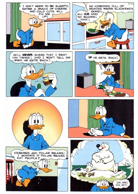
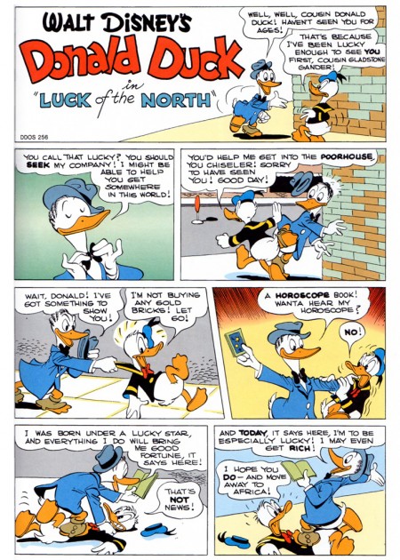
- It’s a reprint of Dell’s 1949 Donald Duck Four Color #256 titled “Luck of the North”. The cover is from the original comic, but the re colored, reprinted story is from Gladstone Publishing, LTD.’s Giant Comic Albums.
He also sends along the original comic printing of the first title page of the story. You can see how much was missing from Barks’ brilliant art in the pulp mode printing.
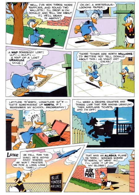
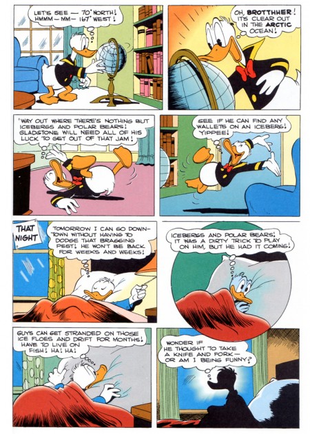
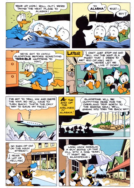
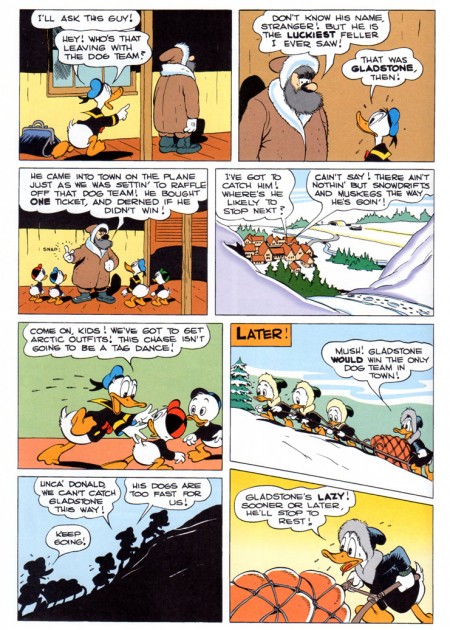
Anyway, here’s part 1 taken from a reprint version:
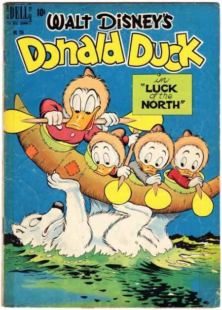
The original comic cover.
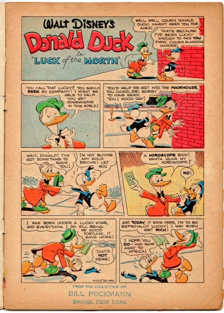
This is what the original comic looked like.
 8
8
Bill’s note on the page above reads:
_______________One of the all time impressive comic book pages!
____________ And I have to agree with him.
To be continued.
____________
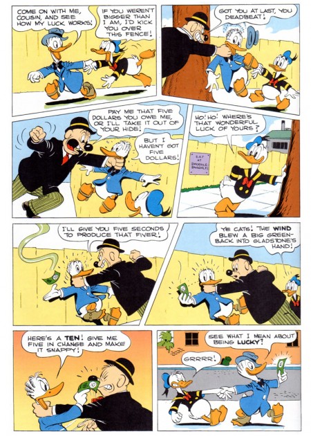
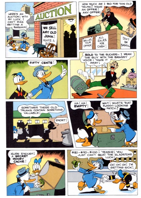
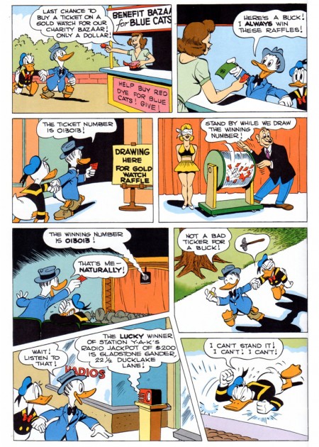
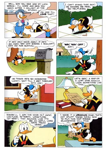

on 01 Sep 2011 at 11:34 am 1.The Gee said …
The color differences between the two versions reminded me of this:
http://boingboing.net/2011/05/24/color-palette-of-glo.html
That is supposedly the typical gamut for older four color comics.
At the least, it is a curiosity thing…at best, a good reference/tool.
on 01 Sep 2011 at 1:50 pm 2.Stephen Worth said …
I may be a luddite, but I kinda prefer the pulp, even with all its limitations and misprints. With a really first class scan and a bit of photoshop magic, those old yellowed pages can be made to look very good, without losing the idiomatic look. I’m always more happy with Craig Yoe’s books than I am the over processed, computer colored and crunchy Spirit reprints for instance. Gladstone did good with the approach they took, but I’d still pay more to have the original look, warts and all.
on 01 Sep 2011 at 2:25 pm 3.The Gee said …
“I may be a luddite, but I kinda prefer the pulp, even with all its limitations and misprints.”
There’s nothing wrong with being that way.
Honestly, there probably should be more comics which are just printed as black and white books. I’ve bought and read enough reprints of comic strips in my life that I’ve never found myself complaining about the lack of color.
As long as the lines are crisp and sharp and the blacks are solid enough, the main part of the art is right there.
Another benefit to doing this for reprints is if the paper costs were kept down, enough, they’d be more affordable and might spur people who wouldn’t buy them to try them. Right now there’s too much catering to people who find reprints as being Precious.
Enh. It’s too early for ranting. I guess I’ve been paying attention to publishing trends lately. That’s coloring my contribution to this (pun intended)
on 01 Sep 2011 at 2:34 pm 4.Bill said …
IMHO, it seems like there should be a third coloring solution between the two extremes, (the pulp press and the computer) with their respective challenges and failings. Just by having the color done by a competent artistic colorist. The pulp colorists weren’t always the best and computer coloring has a tendency to get away from every one.
on 02 Sep 2011 at 2:24 pm 5.Stephen Worth said …
I think just outlawing the gradient tool would go a long way to make modern reprints look better. In this story, my eye keeps getting dragged to the Photoshop gadients all over it.
on 02 Sep 2011 at 10:57 pm 6.The Gee said …
I second that on the gradients. I get the point for using them but even used sparsely they seem overused.
Looking over the art again: the composition is good enough that gradients aren’t needed to lead the eyes and sometimes it looks too garish like the one panel at night where Donald is in silhouette.
Making Gladstone’s clothes blue looks a bit too much. Maybe it is negligible in printed form with facing pages but in this format it is too much because of Donald wearing blue, too.
Minor points on my part though. So, you know, whatever.