Bill Peckmann &Disney &Rowland B. Wilson 12 Mar 2012 05:38 am
Rowland B. Wilson’s Hunchback – another look
- When you post every day, there are gems that just don’t get long enough exposure. Bill Peckmann, at one time, had sent some preliminary artwork that Rowland B. WIlson did for a number of Disney and Bluth features. The wealth of material was enormous and it went too quickly into the past.
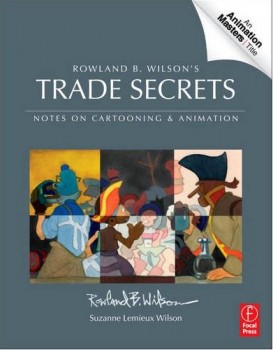 Given the new book coming onto the market, Rowland B. Wilson’s Trade Secrets: Notes for Cartooning and Animation, I thought it appropriate to take a fresh look at some of his brilliant art for the animated film.
This is a book that was put together by Suzanne Lemieux Wilson, and it looks to be as much about animation as about cartooning. Certainly, I think it appropriate to bring back some of this great pictorial material. NOW.
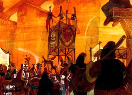
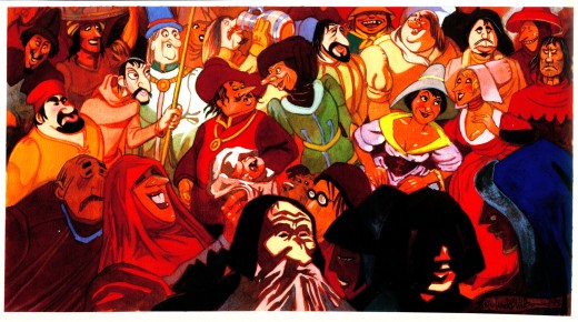
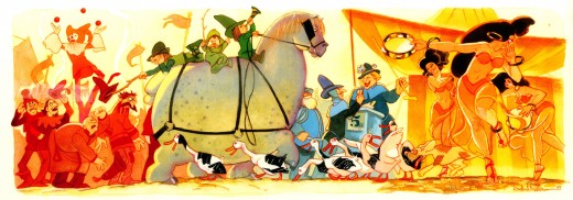
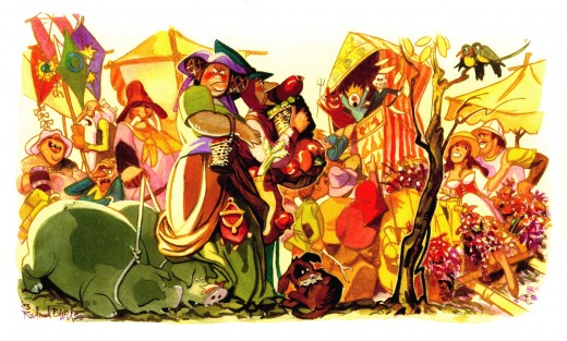
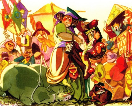
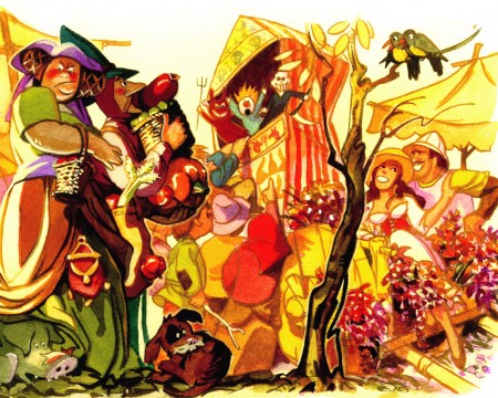
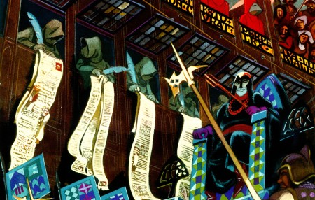
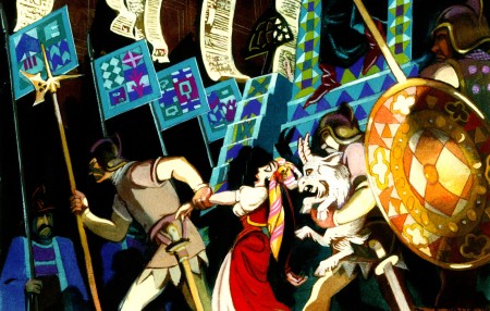
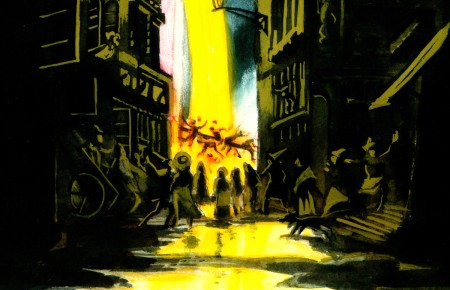
Here is the incredible cache of photostats that Bill Peckmann had sent me showing some watercolor paintings Rowland B. Wilson did while working for Disney. There are two groups of paintings: one for The Hunchback of Notre Dame, one for Hercules. These are the Hunchback images; Hercules will come next week.
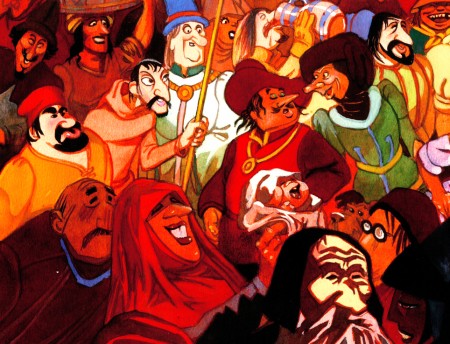
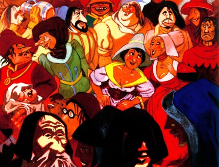
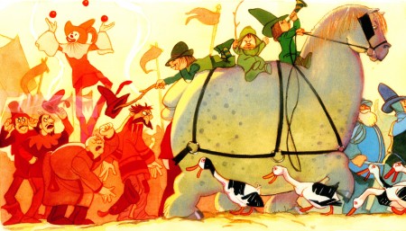
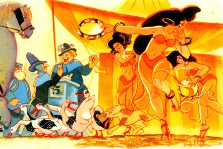
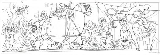
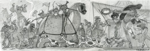
These were all inspirational sketches, and they’re all extremely long. Consequently, I’m posting them in batches. The first comes from Hunchback, and I’ll post the full sized image, then break each down into a couple of parts so that you can appreciate the incredible detail Rowland did in these things.
I hope you enjoy them.
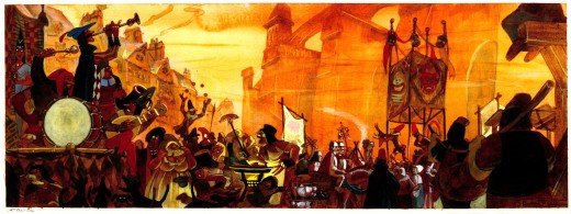 1
1(Click any image to enlarge.)
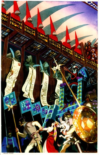
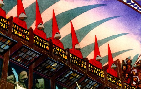
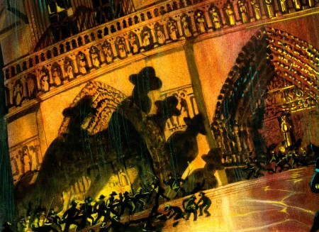
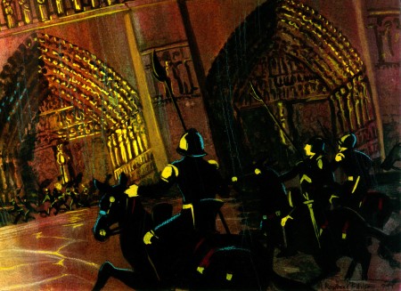
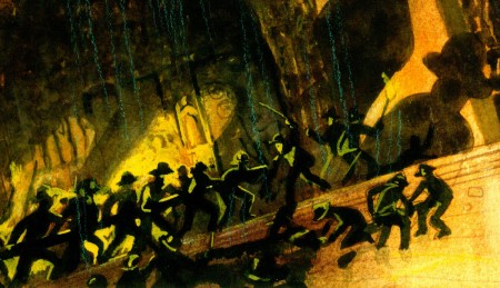
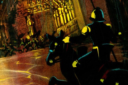
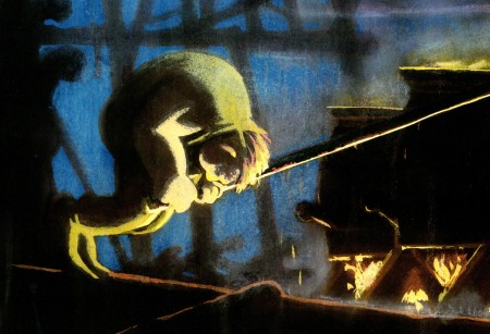
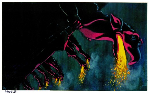
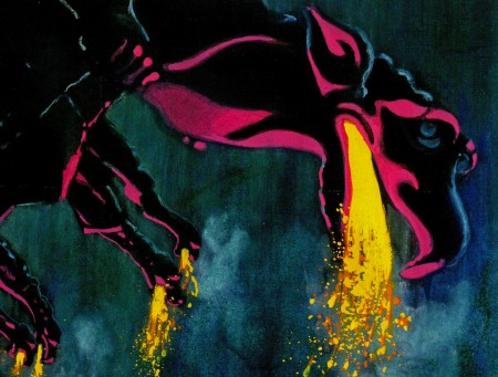
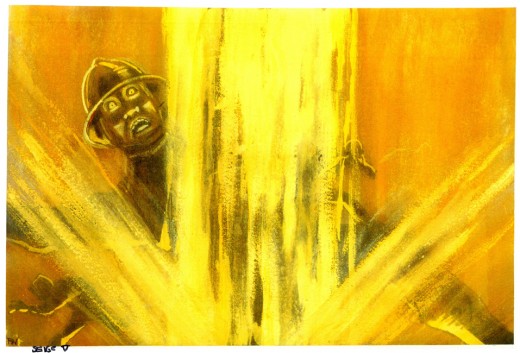
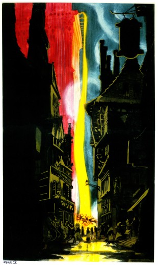
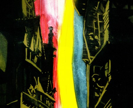
The following group of images is labelled, “The Siege” and concerns itself with the climax of the film where the people storm Notre Dame Cathedral and Quasimodo pours oil on them. These pictures are so beautiful (and large) that I can’t help but split them up so you can see some of the closeup detail.
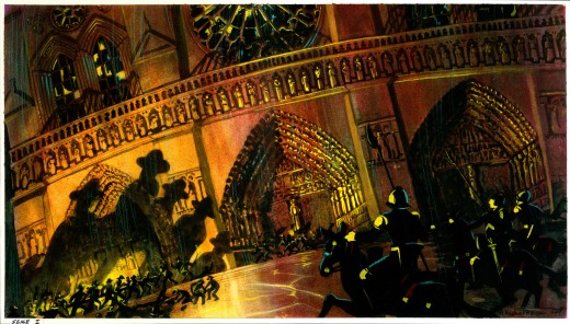 11
11(Click any image to enlarge.
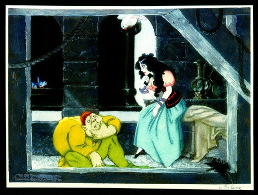 12
12
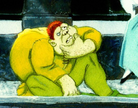
Now this is a Hunchback I could love.
 12a
12a
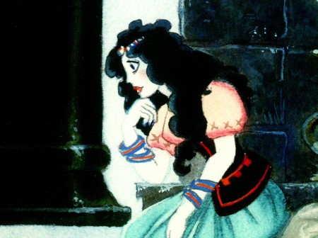
These two character designs look like they were influenced
by Richard Williams’ “Cobbler & the Thief.” Since Rowland worked
with Dick in London, it’s possible.
 12b
12b
Errol Le Cain by way of Rowland B. Wilson. Beautiful.
 13
13
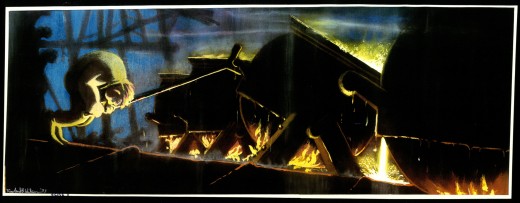
At first I wasn’t sure which end was up on this image.
It might be correctly viewed counter-clockwise.
However, the label in the lower left should be the lower left.
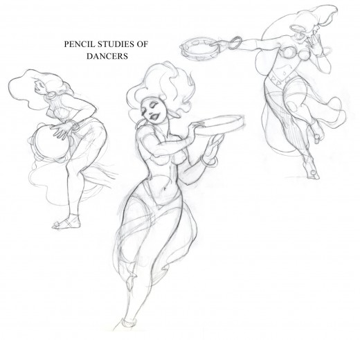
Here are a couple of additions, a few sketches contributed by Suzanne Wilson.
Many thanks to Bill Peckmann for the generous loan of this material.

on 12 Mar 2012 at 2:12 pm 1.Brett McCoy said …
Wow, the final film would have been a lot better if they had stuck closer to his loose painterly style. It would have added so much more mood and character to the film. I love the designs of Quasimodo and Esmeralda in the picture where they are looking at each other (the one that strongly resembles “Thief & the Cobbler” design.)
on 12 Mar 2012 at 3:29 pm 2.Joakim Gunnarsson said …
These RBW posts are like x-mas gifts!
Love them!
on 12 Mar 2012 at 7:46 pm 3.Eric Noble said …
These story sketches are absolutely gorgeous. I agree with Brett that the film should have stuck with this style. It would have added a lot of mood and expressive power to it. The sketches of Quasimodo spilling the boiling oil particularly stand out to me. They make make a bold statement of the power and searing heat of the boiling inferno being unleashed.
on 12 Mar 2012 at 7:52 pm 4.Eric Noble said …
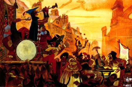
I also adore the sketches of the citizens and performers at the Festival of Fools. Sketch #2 and 3 stand out. There are a variety of body types and personalities on display. Disney could use more of that, instead of the cookie cutter designs they seem to use for every character.
on 12 Mar 2012 at 9:25 pm 5.Liim Lsan said …
Absolute gorgeousness.
It’s a shame, somewhat, that it had to be CalArts-ified as far as it has. It’s still atmospheric, but in the sense of ‘a million people did a million artworks’ more than ‘a guy had ideas and worked with them, and was nurtured by other guys who contributed their own material…’
It both perplexes and envies me how Disney can throw about fifty people, at any one time, simply banging out little inspirational drawings – it would enrich the film save the fact that %99.99 of the material is never used, as inspiration or at least to densen out the crowd scenes. (I can say Topsy Turvy would have been MUCH more fun with his style of lighting.)
on 13 Mar 2012 at 5:21 pm 6.The Gee said …
A couple of things.
I haven’t watched Disney’s Hunchback…quite honestly, I forgot it was even made.
So, I can’t compare it to my dim memory of whatever I’ve seen from the movie.
Wilson’s art in these is awesome though. Some of the figures in the crowd scenes seem like he was playing around a bit, having fun. Like with the couple on the right in image 4B. My first thought–ha ha, and this is just a bad hunch– is that it might be based on a real couple. Even it if isn’t, it is playful. Given all he put into it, I can dig that.
There was something on Cartoon Brew about some dude who filtered a Simpsons episode, one featuring artists and about the art scene in general. I wrote something about using the color yellow and how it needs to make sense somehow. I wrote something like that. In these paintings,the color yellow and variations do what yellow does most often, depicts Light and to a degree, heat… But, of course, Wilson knew how to be judicious with his use of hot, bright colors. Everything that’s been show of his demonstrates this.
Finally, and if I didn’t get a moment’s peace today to type anything much, I would have typed this alone:
That is a great horse!
on 13 Mar 2012 at 10:30 pm 7.Scott said …
Liim Lsan–a film is not about all the artwork leading up to the final production. Not every artist on a large production can draw like Wilson, which would prevent slavishly recreating his specific style on a large scale cost and time prohibitive.
His artwork is a means to and end, as almost all pre-production art is.
And it is absolutely NOT true that 99.99%, or even 100% of the artwork isn’t used on any level. That is silly. It’s used a lot. But again, read my first paragraph. As far as Disney throwing 50 pre-production artists on a project–that also isn’t the case. Most projects are lucky to get 2 or 3, with a few early story artists and animators throwing in to help the production designer discover the style of the film as it grows.
Wilson’s work is truly great, and the film is truly mediocre. But forcing a style on a film before the story is ironed out is a truly DUMB idea. And consistently proven to be the wrong way to go.