Animation Artifacts &Disney &Frame Grabs &Models &repeated posts &Story & Storyboards 12 Apr 2012 06:22 am
Some Lady Drawings – recap
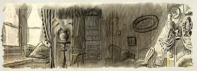
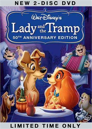 - The DVD of Lady and the Tramp includes some preliminary artwork for the film. I collected a bunch of it and am breaking it into a couple of posts. It’s easier to read off a blog than a tv screen, especially when the DVD tries hard to reduce them to the smallest size they can muster within an overworked border that is virtually pointless.
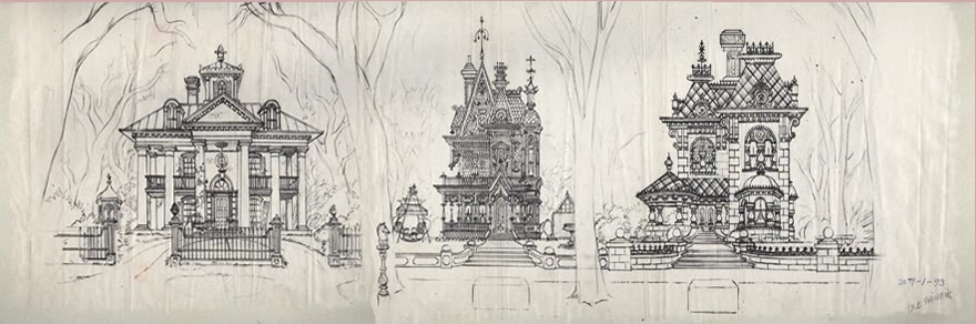
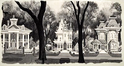
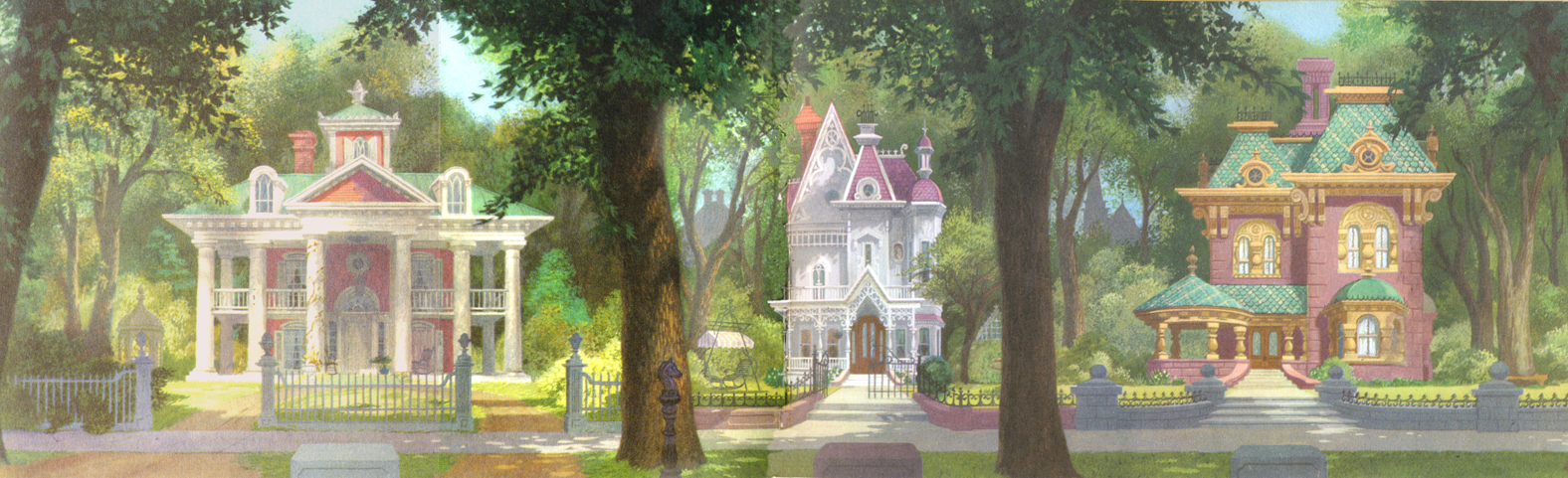
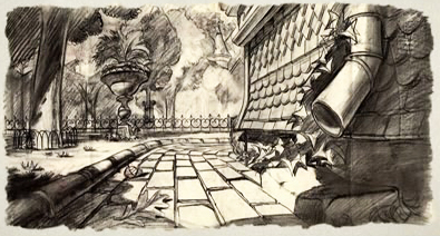
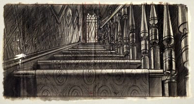
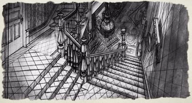
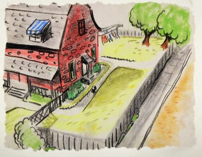
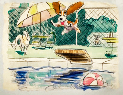
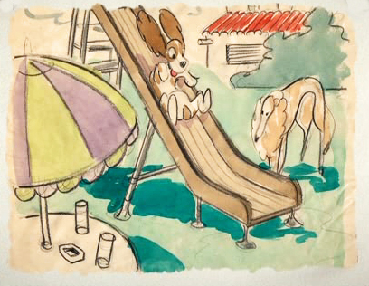
The illustrations – some are obviously BG layouts, others storyboard drawings – have a light and jaunty feel. They’re very cartoon in nature, and belie the actual feature they produced which, at times, is quite beautiful. Disney truly got the feel of “Main Street, USA” in this film.
I’m interested that most of the images don’t take in Cinemascope (since they were probably done before the decision to go Scope.) Most of them are also fast drawings that don’t feature the Tramp as we know him, and even Lady takes on a different form.
You get the feeling this film was pushed out relatively quickly. The results are excellent, regardless. Sonny Burke and Peggy Lee wrote an excellent pop-song score that doesn’t quite capture the turn-of-the-century, but it does capture the atmosphere of early 50s USA.
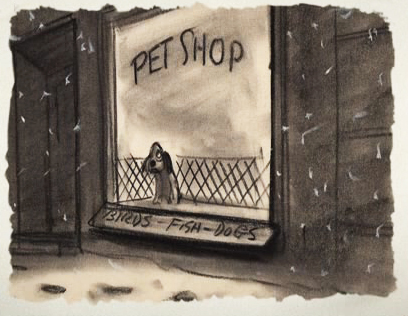
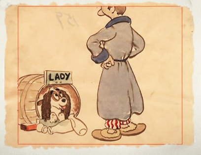
This drawing is in B&W on the DVD, but it appears in
Bob Thomas’ 1958 book, “The Art of Animation.”
(Click any image to enlarge.)

Bg for The Princess and the Frog.
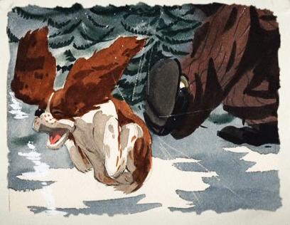
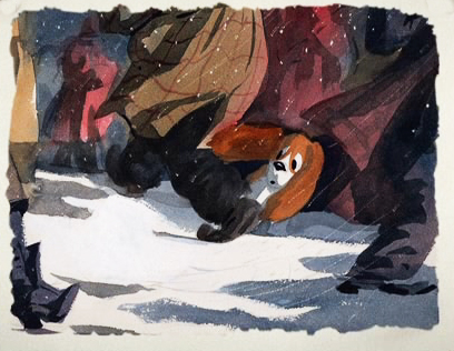
This looks not too different from a shot in Hitchcock’s Psycho.
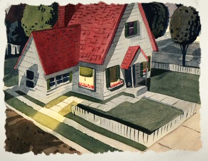
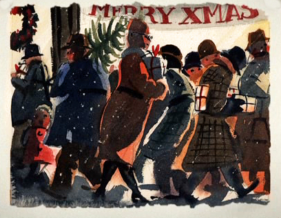
We seem to be in the Little Golden Book territory
with some of these images.
An earlier and different view.

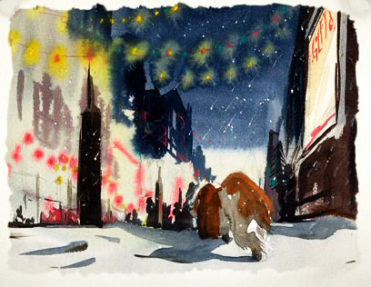
Or did I mean the New Yorker circa 1948?
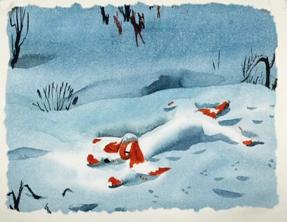
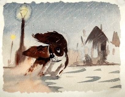
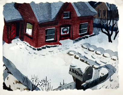
I love weather and would have applauded more of it in the film.
To be continued.

on 12 Apr 2012 at 7:49 am 1.Stephen Macquignon said …
Do you think Mary Blair did some of the artwork you posted?
on 12 Apr 2012 at 9:02 am 2.Michael said …
Yes she did the last seven watercolors.
on 12 Apr 2012 at 1:49 pm 3.Scott said …
Color storyboard sketch of 3 Houses.
http://www.AnimationArtGallery.com/WDA/WDACS97.html
on 13 Apr 2012 at 5:09 pm 4.Eddie Fitzgerald said …
The block containing three houses brings back wonderful memories of an upscale neighborhood near the one where I was raised. My folks didn’t have that kind of money, but I was never resentful. It was kind of nice to have Victorian houses and peaceful, tree-lined streets nearby, and the people who lived there were mostly friendly and civic-minded.
Oddly, the furnishings in the interiors were never all that impressive. I guess presenting a beautiful face to the world was the most important thing. I see it as a gift that they gave to less well off people in surrounding areas.
on 14 Apr 2012 at 6:38 am 5.Stephen Worth said …
I like the way the Mary Blair version looks better than the film itself. And the early storyboards I’ve seen look even more appealing than her drawings. Disney films got more impressive as they got more realistic, but they didn’t really get more appealing.