Animation Artifacts &Bill Peckmann &commercial animation &Illustration 24 Aug 2012 05:05 am
Rowland Wilson’s Vote Toothpaste
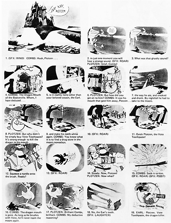
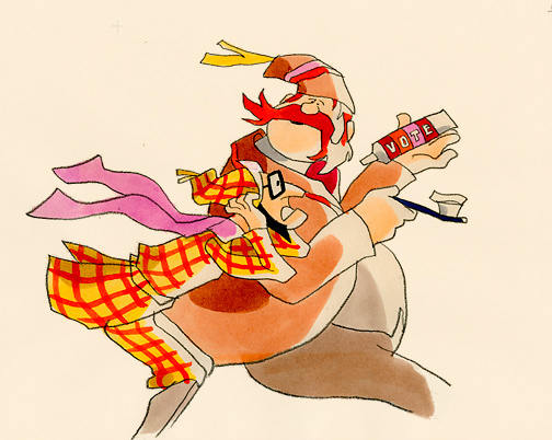
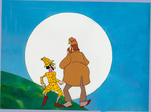
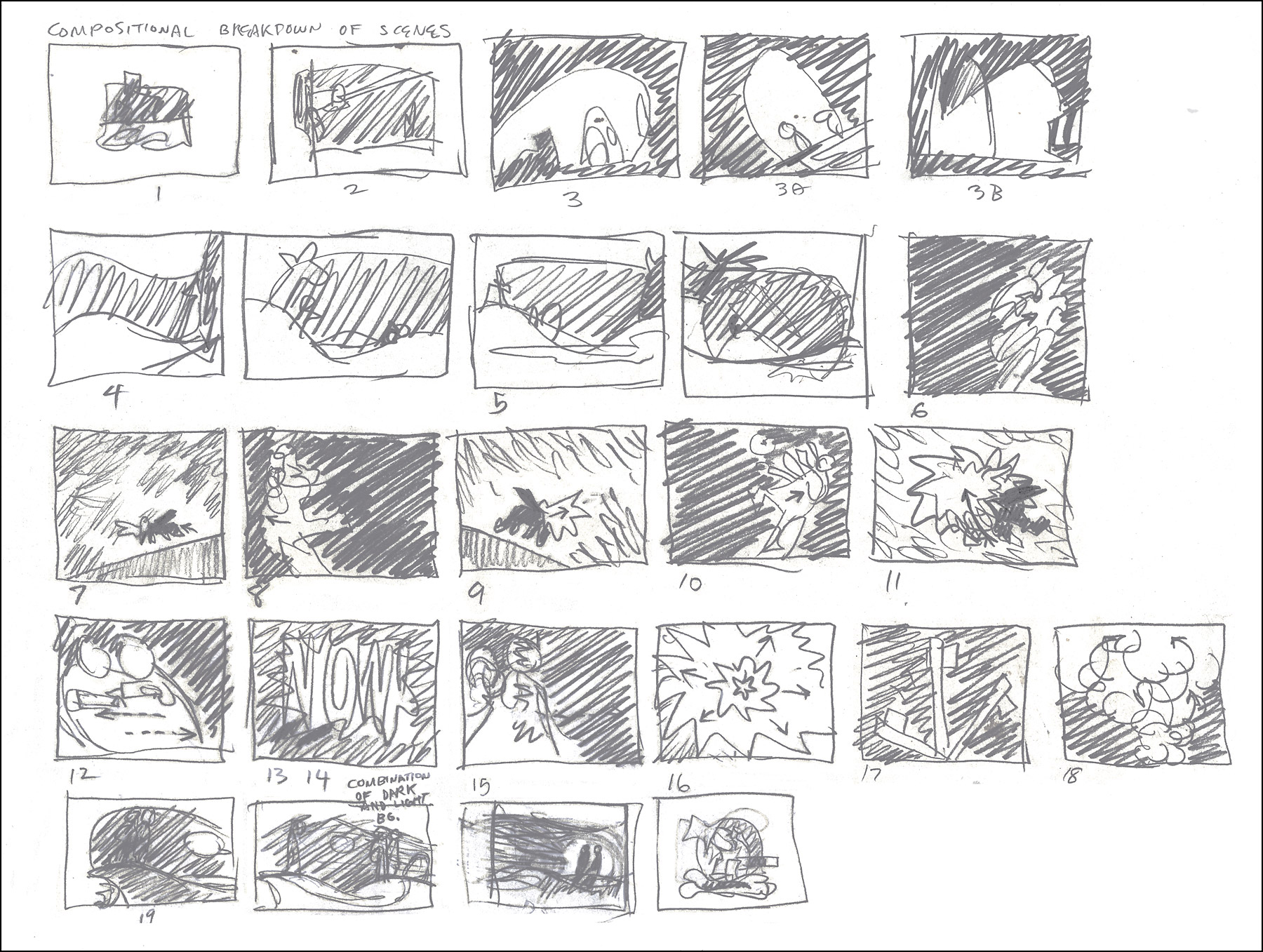
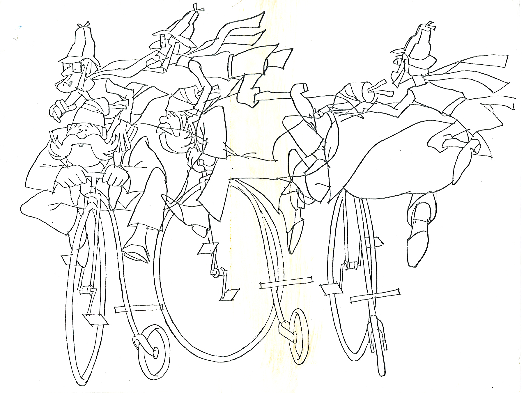
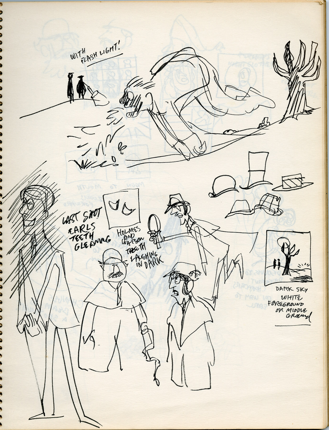
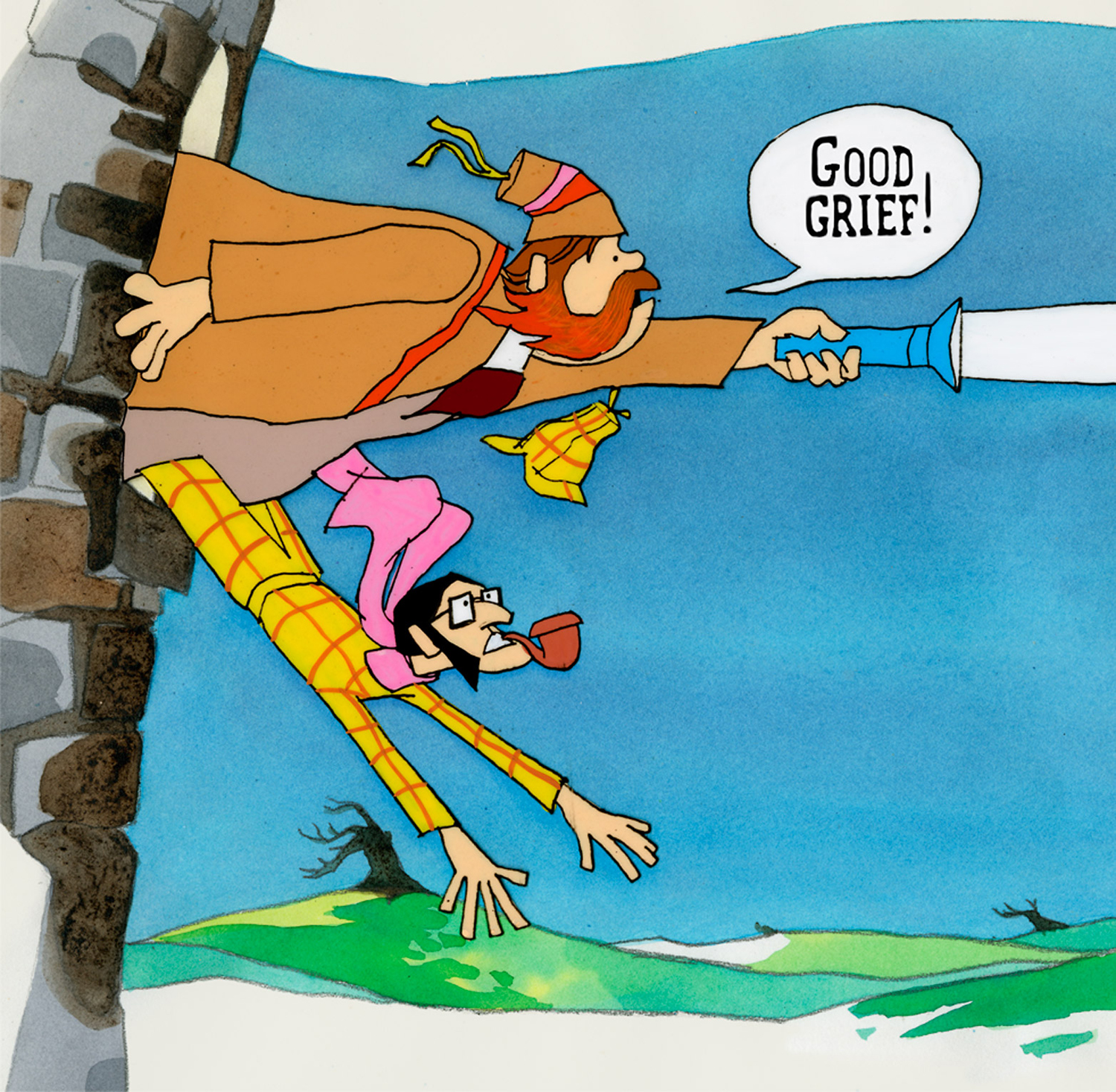
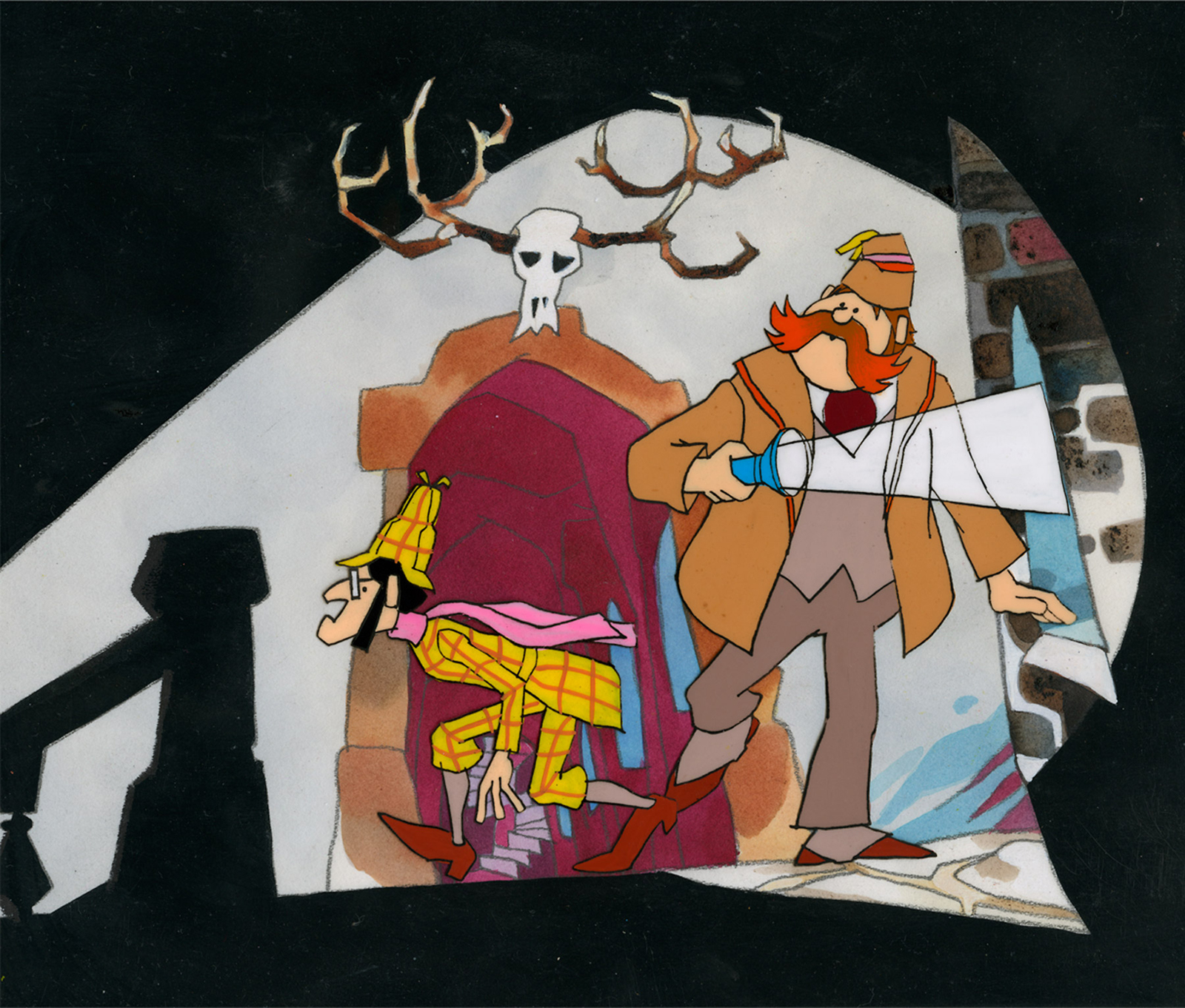
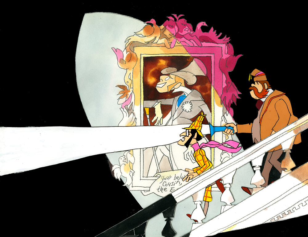
-If you’re a brilliant designer, you get there by doing the work that’s necessary. If you’re as great as Rowland B.Wilson was, you take the opportunity of a fine commercial spot, and you research it, plan it, and sketch it out. That’s just what Rowland did with this spot for Phil Kimmelman and Ass. back in the 70s. Vote toothpaste had a gem featuring “Plotzen” and “Coombs”. They just look like Sherlock and Watson.
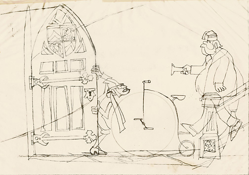
Thanks to Suzanne Wilson, here’s the prep work Rowland did for this commercial. Many thanks to Bill Peckmann for getting it to the Splog and for additional artwork.
 1
1
 2
2
 3
3
 5
5
 6
6
 7
7
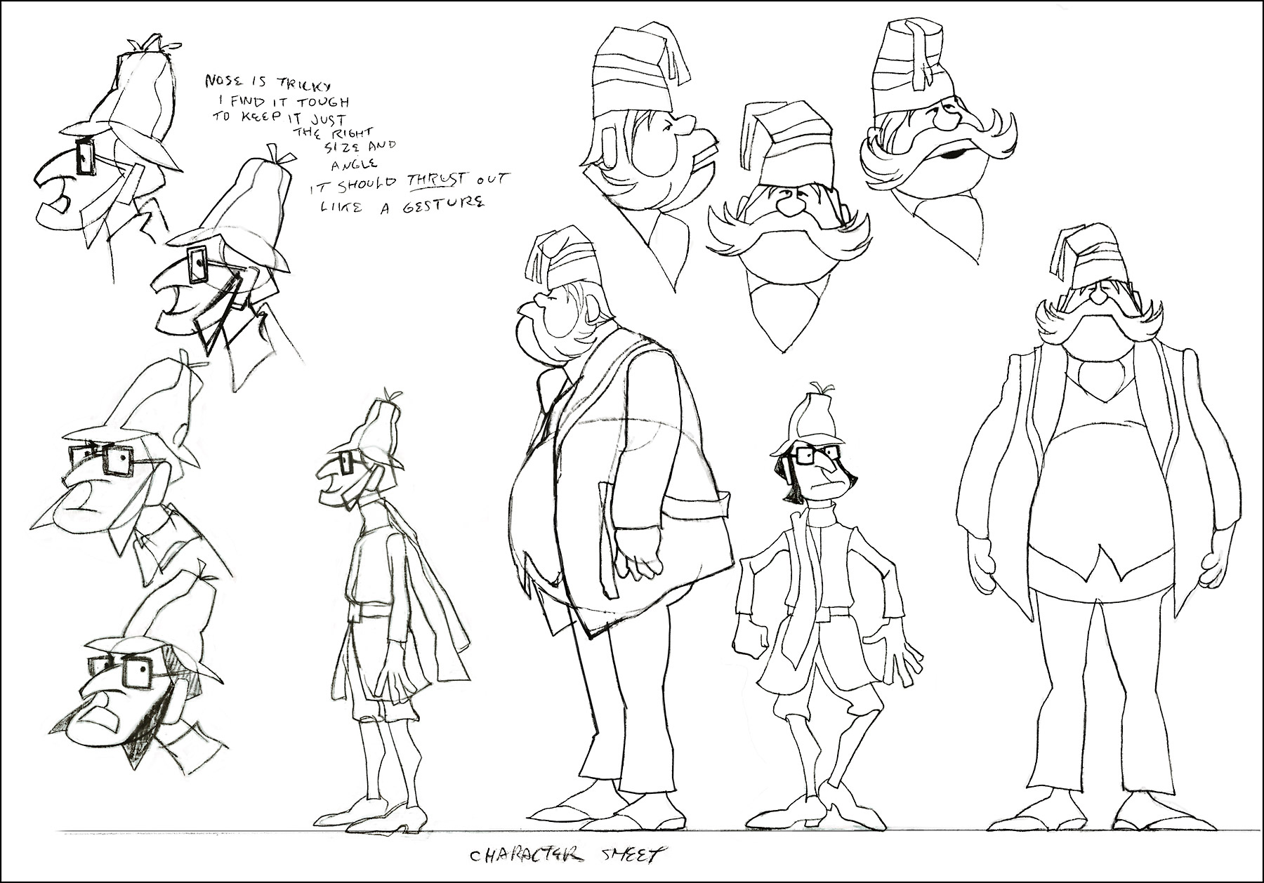
model sheet
 8
8
 9
9
The characters turn 180º in this animation model.
This was animated by Jack Schnerk and cleaned up by Bill Peckmann.
 12
12
 13
13
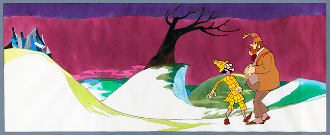
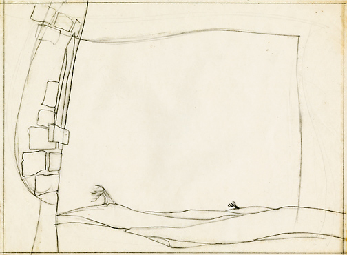
B&W BG Layout for the color image to follow.
 14
14
 15
15
 16
16
B&W Bg Layout for the following image.
 17
17
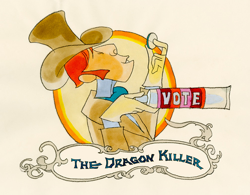
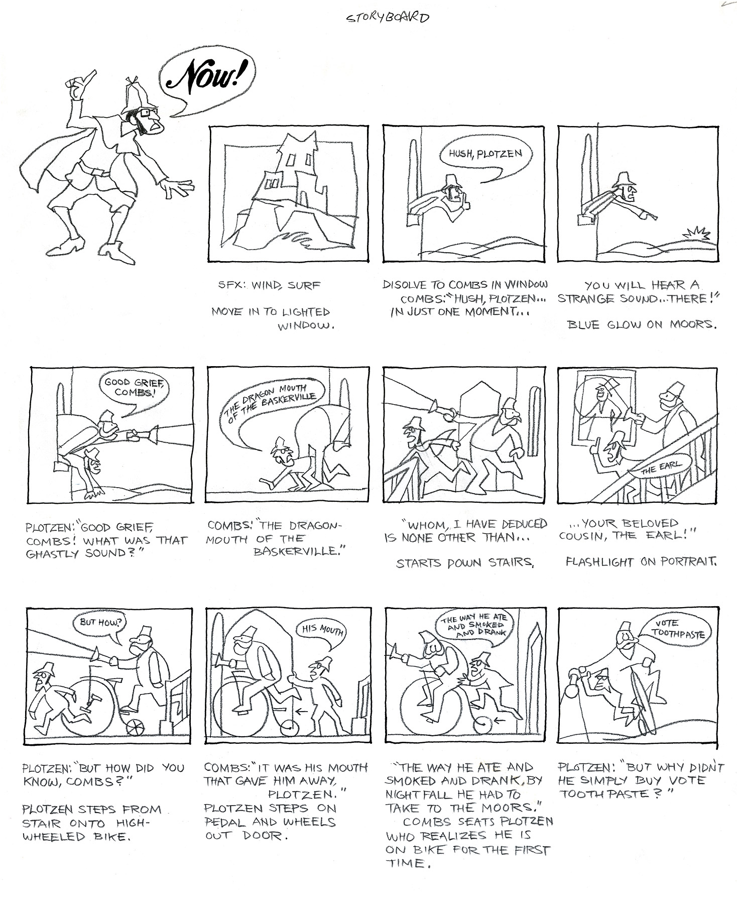
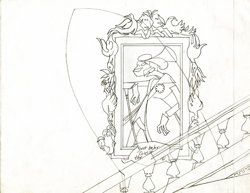
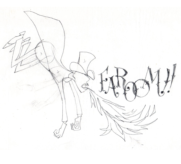
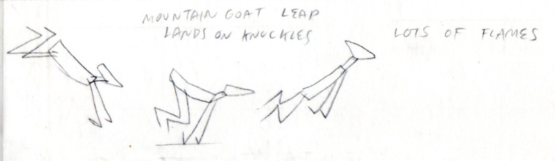
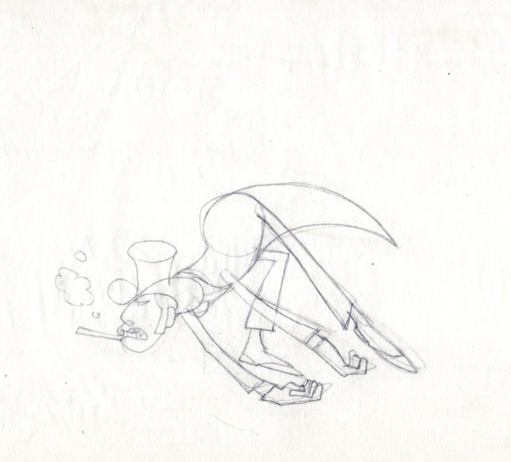
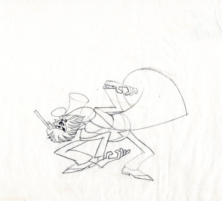
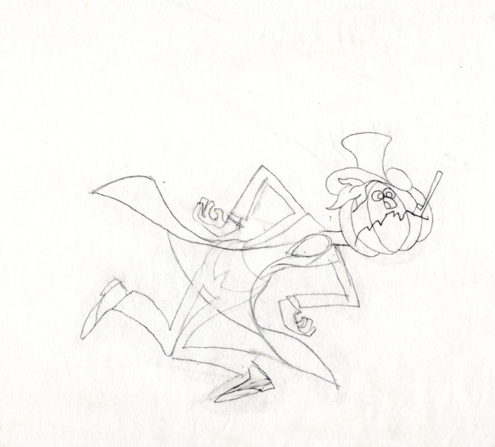
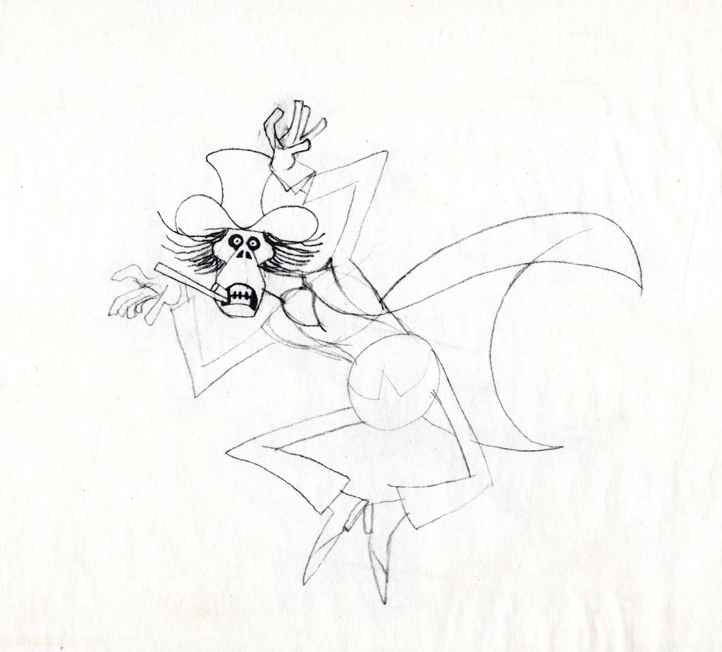
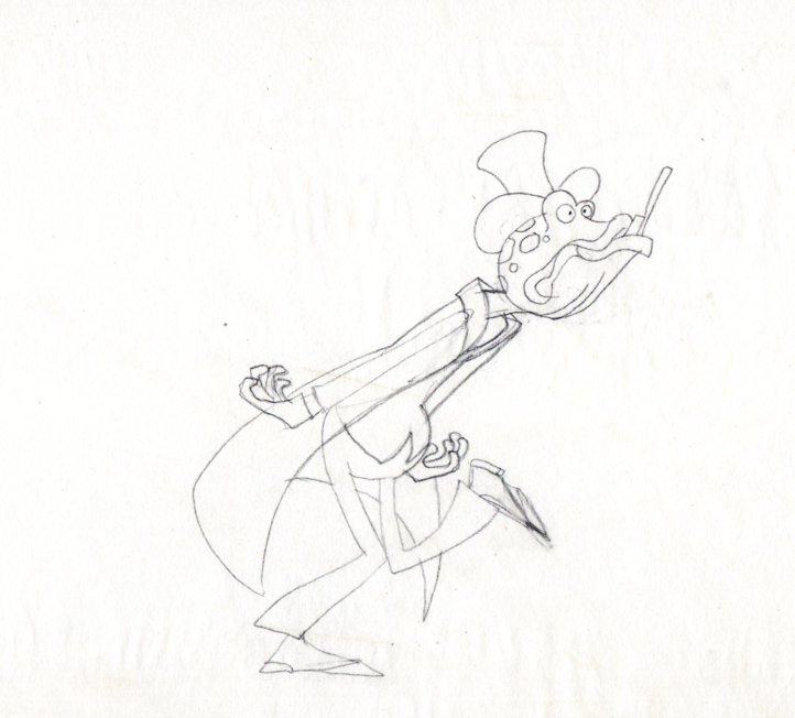
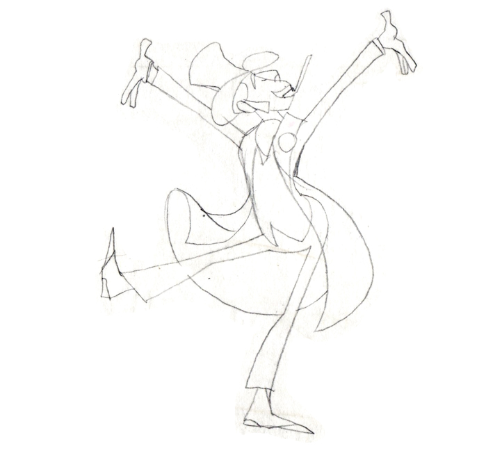
Finally, here are some rough sequential drawings that Rowland did
for a sequence where the villain transforms via Vote toothpaste.
The object in his mouth is a toothbrush with toothpaste on it.
 1
1
 3
3
 4
4
 5
5
 6
6
 7
7
 8
8
The Vote spot starts at 0:37 on this Jack Schnerk sample reel.

on 24 Aug 2012 at 11:05 am 1.Suzanne Wilson said …
Vote Toothpaste “The Dragon Mouth of the Baskerville†was named one of the Year’s Best Television Commercials by Art Direction/The Magazine of Visual Communication, (not sure what year!)
It was one of Rowland’s favorites and Combs and Plotzen remained a prized portfolio piece for the rest of his career. He was so intrigued with the project that he filled many pages of a sketchbook while working out ideas on the train between Westport and New York.
I think Rowland would have wished to give a tip of the hat to Phil Kimmelman and his stellar staff, including Bill Peckmann who made a huge contribution to Vote Toothpaste and all the great commercials that passed through Phil Kimmelman and Associates studio.
Rowland acknowledged Jack Schnerk’s work and every aspect that went into the production, right down to the cel painters. At Phil’s studio the whole team was so engaged in what they were doing that when I later entered the industry it was a big shock to discover that animation is actually work. Perhaps it was this camaraderie and enthusiasm that make the commercials still such a joy to watch today.
on 24 Aug 2012 at 11:20 am 2.Suzanne Wilson said …
In case anyone is picking up on the title “The Dragon Mouth of the Baskerville” (visible in the speech balloon), compared to the Sherlock Holmes story where “Baskervilles†is spelled with an “s”. Baskerville is a typeface. Maybe that was a little “in” joke among the industry! Coincidentally Playboy uses the Baskerville font for cartoon captions.
on 21 Aug 2013 at 6:32 am 3.Sondra said …
This is fascinating! Do you know who the ad agency was that hired Kimmelspn and Assoc to create the commercials?