Category ArchiveDaily post
Daily post &SpornFilms &T.Hachtman 20 Jun 2009 08:04 am
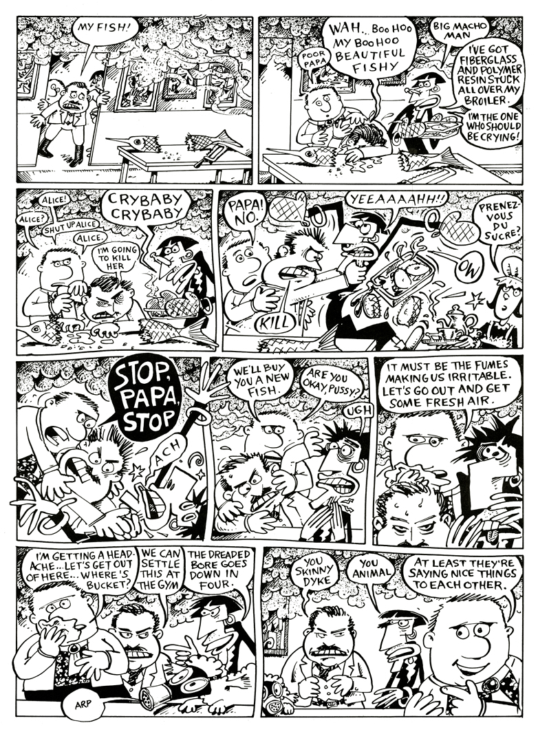
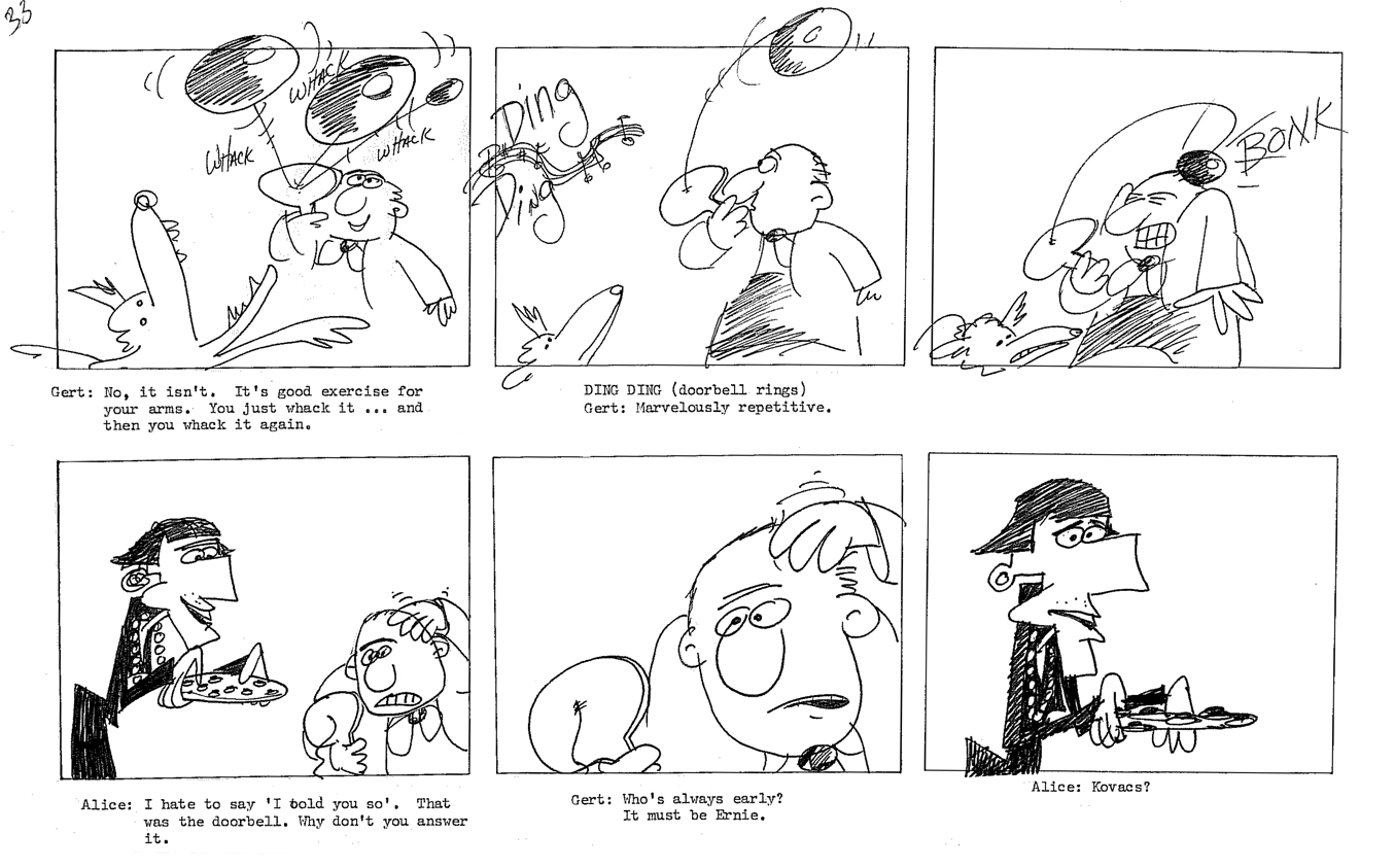
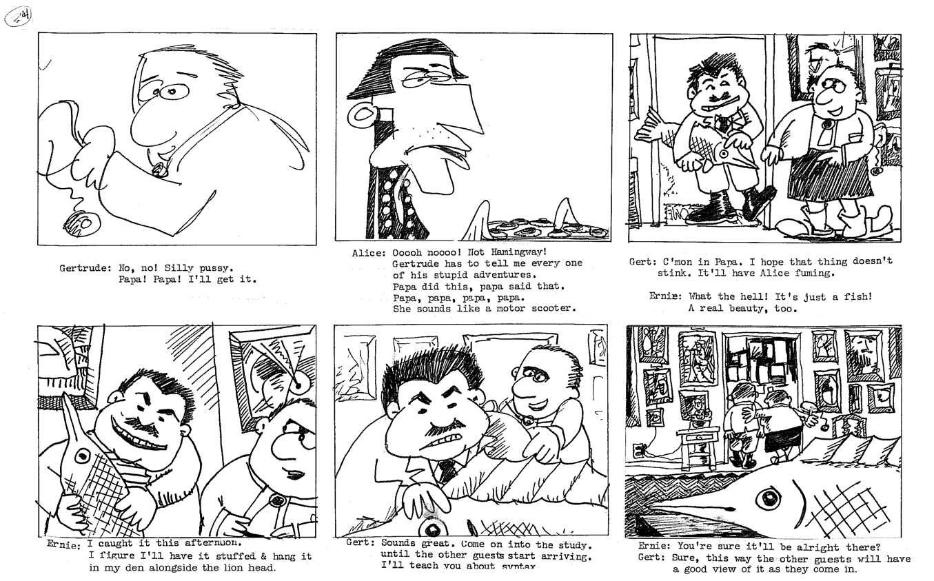
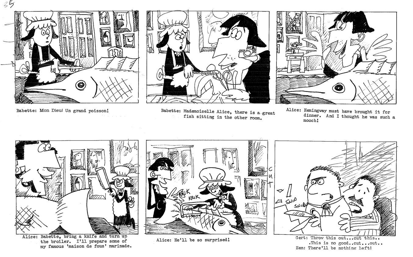
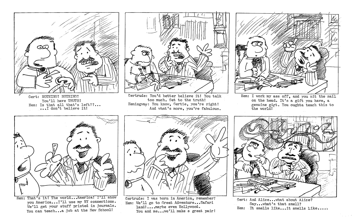
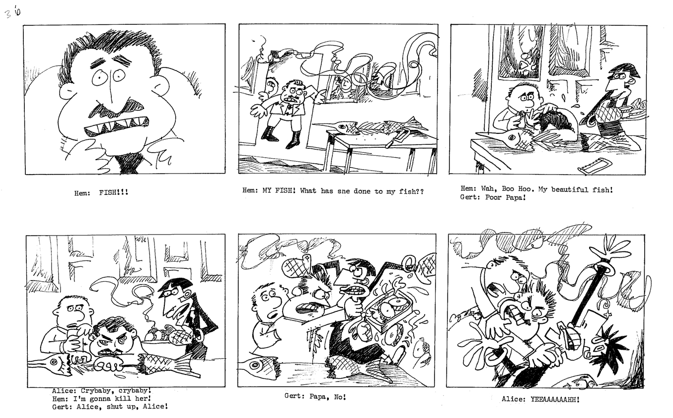
Gertrude – Recap
- Back in the late ’70s, there was a local newspaper that competed with the Village Voice for the alternative audience. The Soho News was smaller and thinner, but had its own treasures. Some good writing and listings, and many excellent alternative comic strips. (Bill Plympton had a weekly strip in this paper before he started animating.)
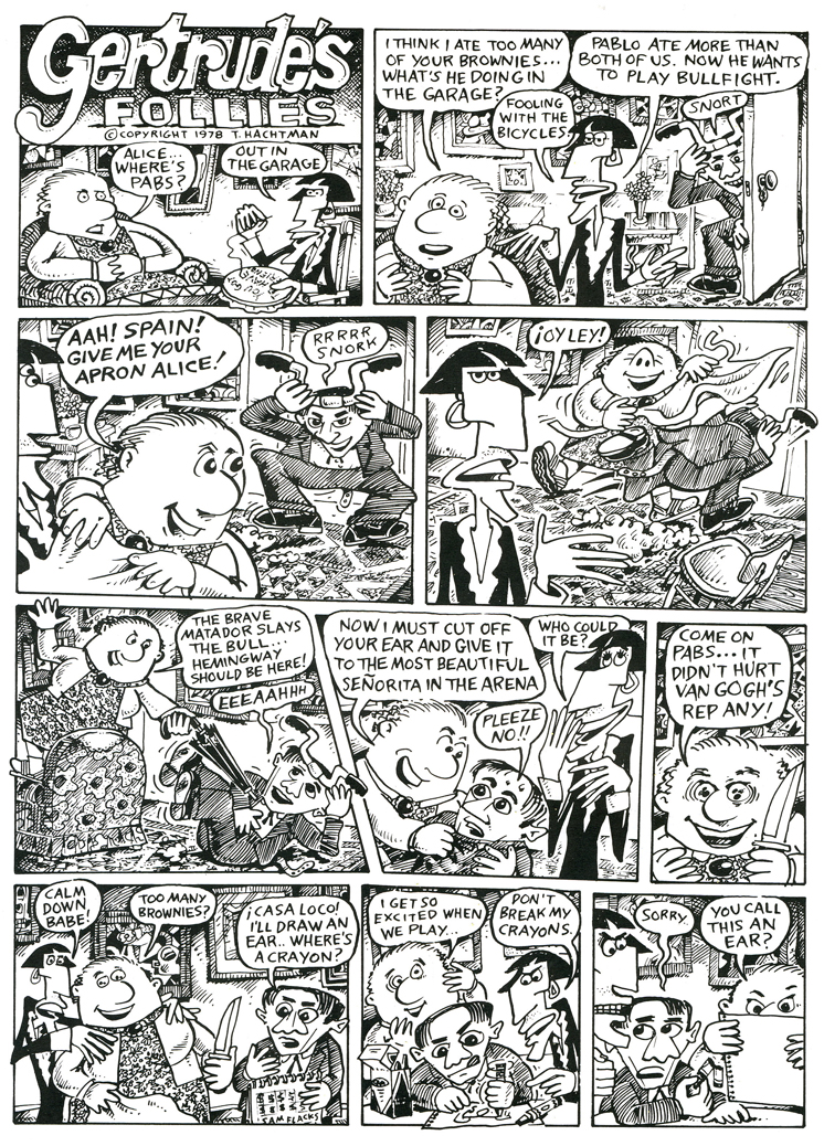
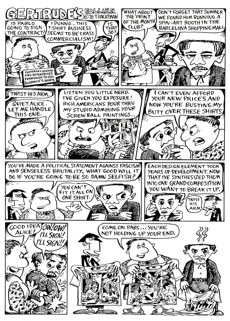
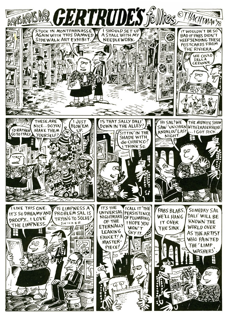
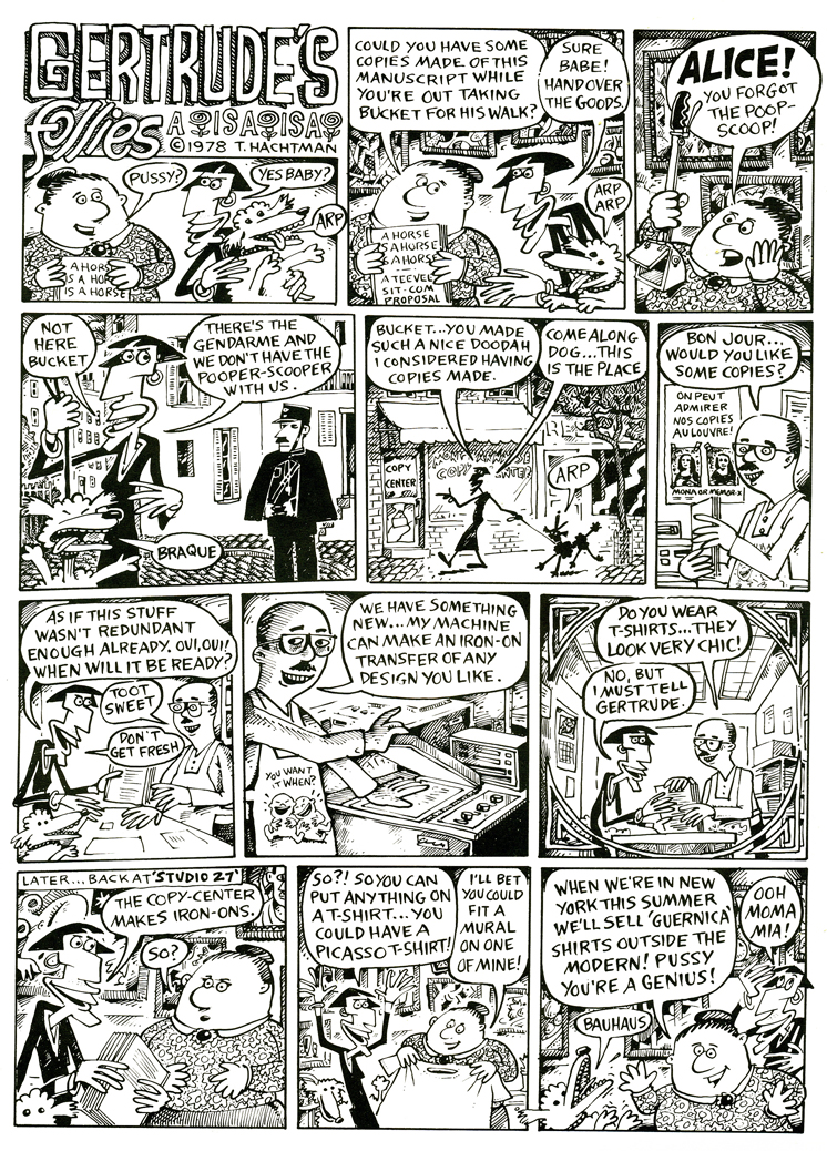
I fell in love with one comic strip called Gertrude’s Follies to the point where I waited 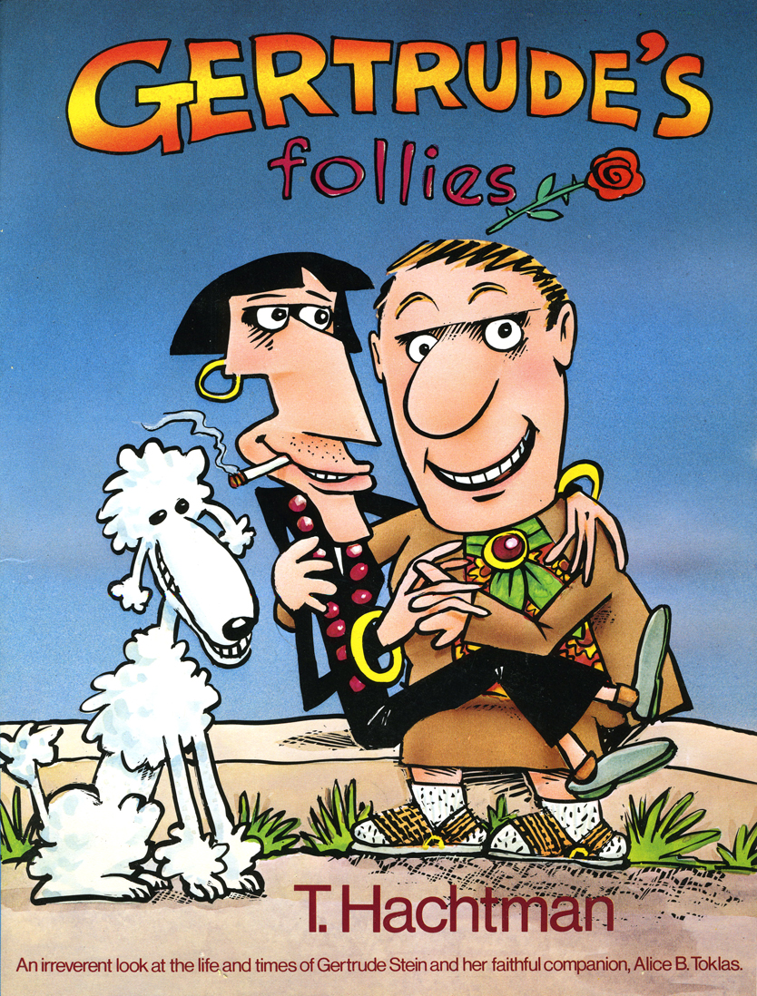 each week for the new issue and the new strip to hit to market. It was about Gertrude Stein and Alice B. Toklas and all the crazies that came into their lives – particularly Picasso, Hemingway and other iconic art types. It didn’t matter that Matisse and Capote didn’t meet; they were both available for the strip – as was everyone else.
Finally, after enjoying it for so long, I decided to locate the cartoonist behind it, and see whether he was interested in developing a storyboard and script for a feature. Maybe we could get some low-budget financing.
Tom Hachtman was the cartoonist, and he was a brilliant artist. His wife, Joey Epstein, was another fine artist. The two entered my life at this point, and some interesting things developed.
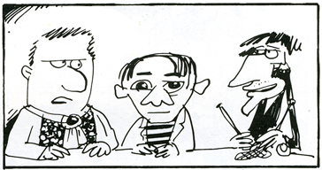
Gertrude’s Follies was an ongoing project. Tom worked with Maxine Fisher, who has been my writing partner through all the years of my studio. The two of them developed a couple of themes from the mass of strips that had been done and started to weave a storyboard. Tom left 4 or 5 panels of each 6 panel page empty, and I constructed and reconstructed story around them. Sometimes I would draw more material, sometimes I would take some away. It was real fun.
The Soho News folded, and no one really picked up the strip. It ran for a short time in The Advocate. Tom was able to publish a collected book (see the cover above.) You can still locate a rare copy on line.
Some newer, color copies of the strip can be found on line here.
Tom also does some political cartoons for the site here.
 The movie never went into production. I couldn’t raise the funds – my inexperience. We did make one short segment – a two minute piece that was the most hilarious strip. Sheldon Cohen, an animator I met at the Ottawa 76 festival, came to NY when I offered him a job on Raggedy Ann. Sheldon, ultimately, did a number of films for the National Film Board which you can watch on-line if you click on his name.
Sheldon animated this particularly funny strip. It took a while for him to animate it, and by the time he was finished, the feature had died and I had lost some interest. Years later I inked and painted it and had it shot. The short piece was never finished, though I still think about doing that.
Aside from Gertrude, both Tom & Joey worked on a number of my films and still infrequently do. The two have painted many murals on the Jersey Coast, where they currently live. Tom has been a political cartoonist for the NY Daily News, has done lots of airbrush work for Bob Blechman when the Ink Tank was in operation. He also has done quite a few cartoons for The New Yorker magazine.
Here are a few of the strips to give you the flavor. Perhaps next week I’ll give a sample of our storyboard, comparing it with some of the actual strips. Enjoy.
 1
1 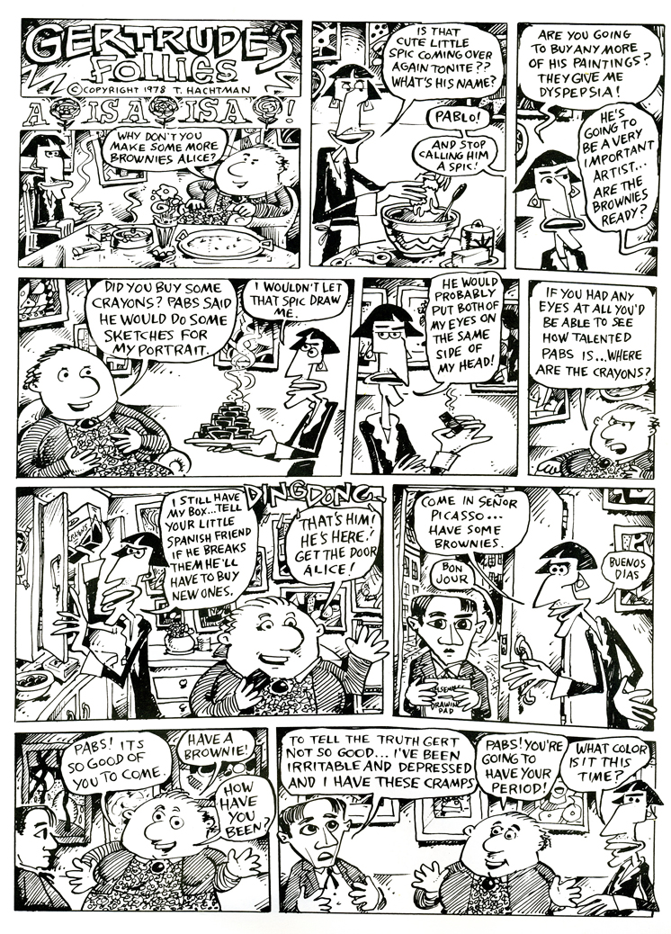 2
2
(Click on any image to enlarge so that you can read the strips.)
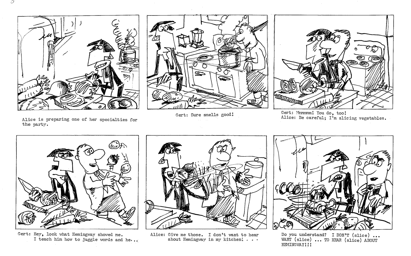
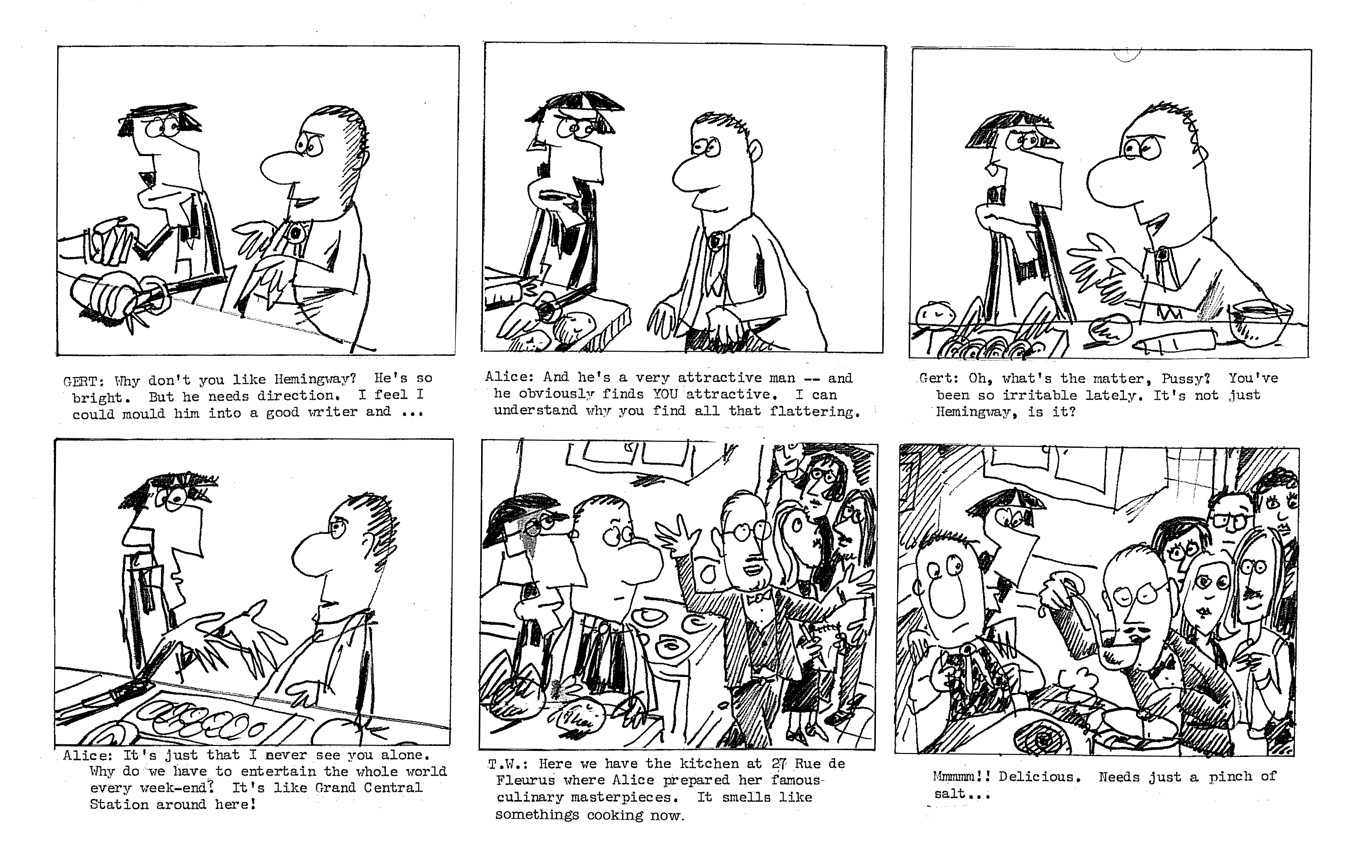
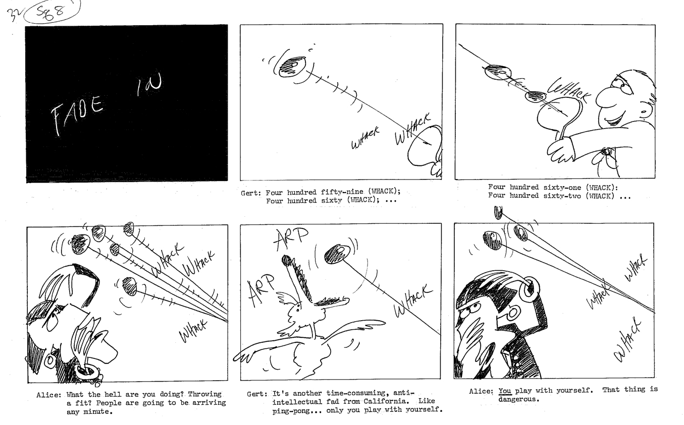
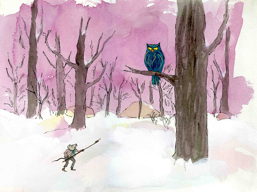
We worked up a storyboard and script for a feature. It was a bit of a rush since I found the distributor of a low budget comedy film who asked for something similar in animation. I thought we could get him interested. I wanted to strike while the iron was hot. The guy didn’t get it, thought it wasn’t funny, didn’t even understand it. His company folded six months later. A one hit wonder.
We tried to stay close to many of the strips and found a direction.
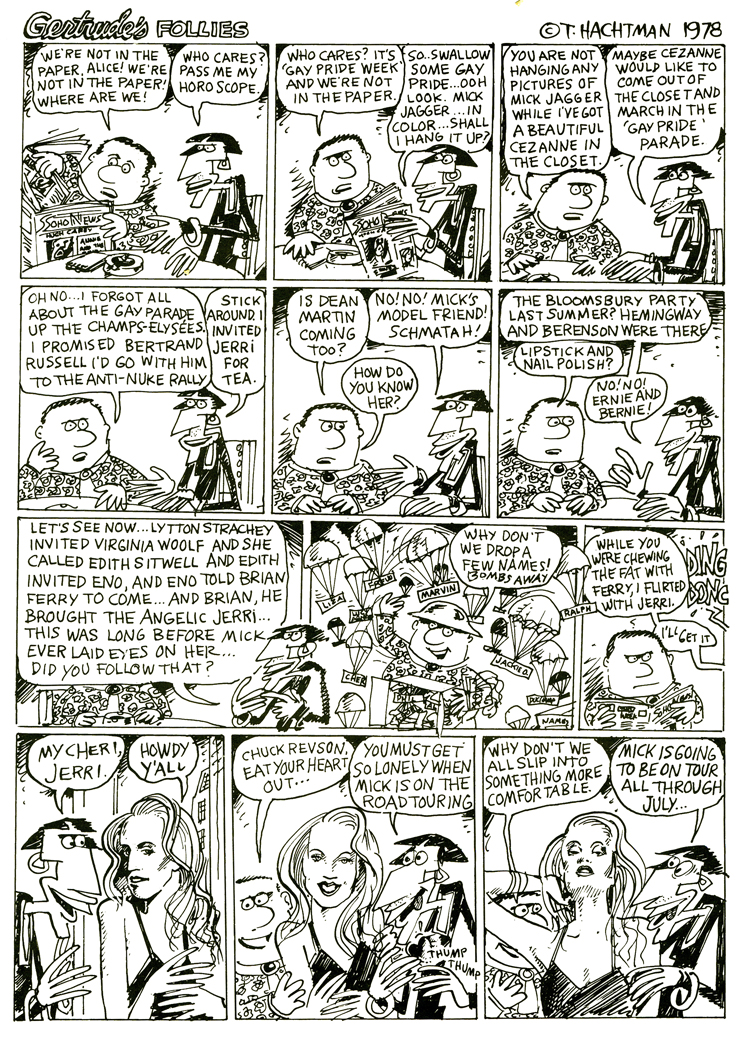
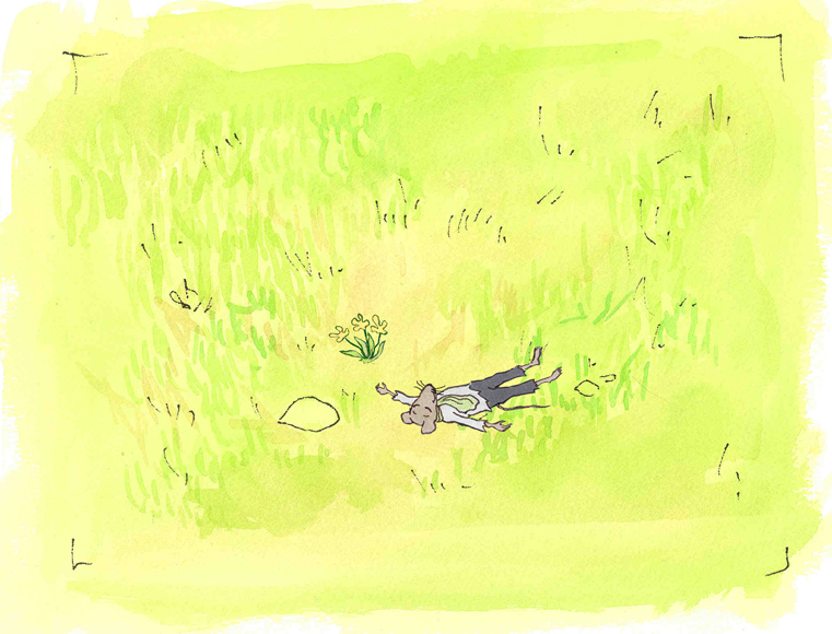
Here are two weeklies from the strip.

(Click on any image to enlarge.)
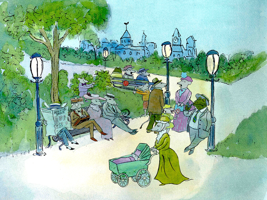
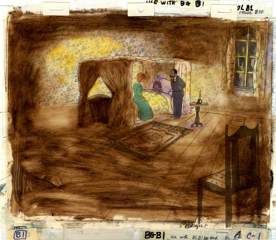
The equivalent part of the storyboard follows. To give a short syopsis of the story thus far:
Trying to be somewhat current, we built the story around an upcoming, all-encompassing exhibit Picasso was going to have at the Museum of Modern Art. At the same time, Gertrude had just sent off a big book to her agent in NY. A party was in order, and we join them in this section of the storyboard as they prepare for the party. There’s a guided tour going on at the house as they prepare, and Hemingway arrives early.
(This is about 20 mins into the film.)
Daily post 18 Jun 2009 07:38 am
$9.99 Opening/Snow White/Norstein
 - Tatia Rosenthal‘s animated feature has its New York premiere tomorrow evening at the Landmark Sunshine Cinemas at 143 East Houston Street (view map).
From the director, who certainly wants to celebrate:
“If you go to see it this Friday at 8:15 (tickets should be on sale soon on Fandango or on the theater’s website) we can all go after for drinks. I’ll be there to lead the way. I’m thinking La Linea or One and One – both on first Av. and First street. See you Friday!”
The film, in case you don’t know as yet, is a stop-motion animated feature based on the book by Etgar Keret, a series of short stories. Ms. Rosenthal raised the money from Israel and directed the animation in Australia. It includes an all-star cast including Geoffrey Rush (who recently won the Tony Award for Exit the King) and Anthony LaPaglia.
There was a good article in the NYTimes last Friday.
An informative interview with Tatia Rosenthal appears in Film Monthly, and there is an interview with writer, Etgar Keret, in the NYPress.
Hopefully there will be plenty more press with this opening.
The film’s official website can be found here.
Needless to say, this film is not getting quite the same marketing push that UP is getting, and the filmmaker needs as many to show up this weekend as possible to keep the film alive and thriving. Get off your bum, as they say, and go see it. It’s going to be raining all weekend anyway; perfect time for a movie.
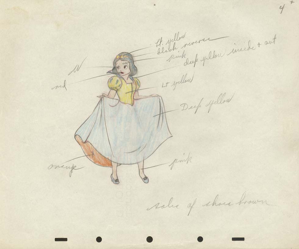
- I’d like to suggest a brilliant website with some awe inspiring artwork that you won’t see elsewhere. Most of it, currently, is from Disney’s Snow White, and you get to realize what a remarkable film that was. The Cowan Collection is just a treat for people like me. Such a wealth of material. I also suggest you leave a comment. It’s disheartening to put a lot of work into a site to have no feedback.
- There’s an interview with Yurij Norstein at the Animatsiya in English site. This is what the Art of it is all about. Thank you Niffiwan.
Commentary &Daily post 06 Jun 2009 08:20 am
Spare Change
 - Having just posted lots of frame grabs from Bruno Bozzetto’s marvelous film, Allegro Non Troppo, I should have linked to his website. You can find there a page devoted specifically to this feature, as well as to his other two animated features: West and Soda and The VIP: My Brother Superman.
You can also find there many hilarious Flash films that Bruno has done. This is some of the best use of Flash that I’ve seen – all for a great laugh. If you’re looking for on-line entertainment – this is it.
- Jeremiah Dickey (who has assisted Emily Hubley on many of her hits) sent this note:
 Salutations friends & colleagues in the NYC area,
Two really superb documentaries for which Emily Hubley & I created animation last year are making their official NY premieres at the Brooklyn Academy of Music this month – come check them out if you can.
William Kunstler: Disturbing The Universe is a film about the life of the radical lawyer, made by his amazing daughters Sarah and Emily Kunstler. Part of BAMcinemaFEST, it will be screening on Saturday June 20th at 12:30pm, followed by a Q&A with the filmmakers (moderated by DemocracyNOW!’s Amy Goodman).
It will also be screened outdoors the following Thursday June 25th at 9pm in the parking lot across the street from BAM – links to tickets below.
_____6/20 _____6/25
What’s On Your Plate?, directed by Catherine Gund, daughter Sadie Hope-Gund & her friend Safiyah Riddle, follows the 11-year olds as they learn about the politics of food and its various impacts on urban sustainability, among other things. I should add that this film is also alot of fun. It will be screening for FREE in Fort Greene Park Saturday June 27th at 9pm, and screening again Tues July 2nd at 6pm as part of BAM’s Afro-Punk Film Fest.
Hope this finds everyone well -
cheers
Jeremiah
- Nina Paley sends the following message:
 Dear friend of “Sita Sings the Blues,”
The Sita Sings the Blues Merchandise Empire is finally live and open
for business: http://www.sitasingstheblues.com/store
(redirects to http://questioncopyright.com/sita.html )
At last we have DVDs and T-shirts for sale. Thanks for your support –
I won’t spam you again!
Love,
–Nina
From Patrick Smith:
 “ANIMATION FROM HELL!”
I’m curating a program for MOCCA Arts Festival this year called “Animation From HELL.” It’s a program of dark and twisted animation that will scare the fluffy bunnies out of any animation fan. This collection of disturbing shorts, past and present, has been hand picked by Satan himself.
Sunday, June 7, 2009
5:00pm – 6:00pm
at the Armory
68 Lexington Avenue, between 25th and 26th Streets
New York, NY
Commentary &Daily post 02 Jun 2009 08:25 am
MOMA and other shorts
Howard Weinberg, President of the New York Film/Video Council, will introduce a series of short films at MOMA on June 3 at 7pm. The films will screen again on June 4 at 4pm.
The Museum offers this bit of information:
- “Cosponsored with the New York Film/Video Council, MoMA’s annual showcase of recent narrative, documentary, animated, and experimental short films provides a glimpse into cinema’s future. Most short films are produced by young filmmakers at the start of their careers; at their best, these works are characterized by youthful vigor and a daring willingness to break with cinematic convention. The results can be funny, romantic, instructive, otherworldly, and insightful, and they frequently serve as bellwethers of future developments in the art of filmmaking.”
The program includes:
 The Glass Trap (2008) Poland – Pawel Ferdek 15min.
The Portrait (2008) USA – Irra Verbitsky 4min.
Steel Homes (2008) Scotland – Eva Weber 10min.
Ten (2008) France – Bif 7 min.
Second Hand Pepe (2007) USA/Haiti/Can – Hanna Rose
______Shell, Vanessa Bertozzi 24min.
Left Behind (2008) Germany – Andreas Graefenstein, Fabian Daub 13min.
Eclipse (2007) Ind/Aus/New Z’land – Mark Lapwood 9 m
Lies (2008) Sweden – Jonas Odell 13 min.
Photograph of Jesus (2008) Grt Brit – Laurie Hill 7 min.
I’ve highlighted the one film because it’s the work of NY animator/artist, Irra Verbitsky (pictured right). Hopefully, a large audience will attend to cheer her film on.
I might take exception with MOMA’s statement that “Most short films are produced by young filmmakers at the start of their careers.” This somehow debases the work of most animation Independents. We can’t afford, for the most part, to do features. Shorts are expensive as well, but making them is obviously more manageable. Perhaps the same isn’t true of live action filmmakers. Perhaps once they’ve put their foot into the short film exercise, they can jump into producing feature films. Or maybe they give up.
Regardless, there are plenty of us out there making short films, animated, doc or live. We don’t need to feel diminished by an organization like MOMA that, I know, is supportive. Just bad copywriting.
- I must say that I enjoyed Mike Barrier‘s review of Up (in fact, I waited for it.) My only spark of contention is that I’m not a fan of Monsters, Inc. and he is. Regardless, he has a lot to say – even if you were a fan of the film – and is worth the read.
Over the years, as a film maker who has gotten a lot of very positive reviews, I’ve noticed that general film reviewers look at animated films in a different way than they do 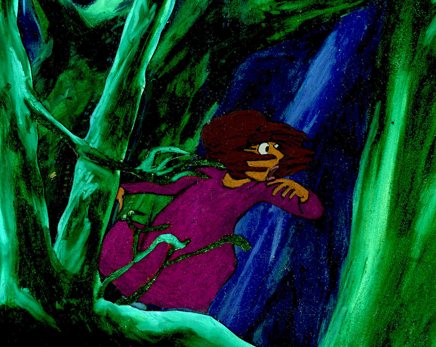 live action films. Animation gets a pass on lots of faults and is not treated as harshly. A film like Up gets praised to the hilt and generally good critics ignore significant problems that stare them in the face.
After I’d finished The Red Shoes, I thought that the story was just not well told. The film seem too compressed, and I felt I needed another 15 minutes to get it out logically and properly. No, the reviewers were all aglow, yet I know that if I had done the exact same film in live action, I would have been castigated for my sins. Or, at least, that’s how I felt.
Now, I think the same can be said for the last two Pixar efforts. They’ve been blessed by critics who miss the trees and the forest for a pretty drawing of the same.
Coraline, the theatrical production, has just opened in NYC ath the Lucille Lortel (a beautiful little gem of a theater in the West Village.)
The review in the NYTimes can be found here.
Daily post 29 May 2009 07:48 am
Hubley answer
For some inspiration let me give another Hubley answer in the Halas book, The Technique of Film Animation:
- Do you think cartoon is capable of handling realistic subjects, especially involving the human figure?
 JOHN HUBLEY : Yes, provided animators master fundamentals of drawing form and volume, and then combine this with fresh, personal expressions of human action. The mechanics of moving the human figure cannot be isolated from the motivational drives and dramatic meaning of any action, without rendering it empty and useless. It is primarily the emotional content of an action that is of interest to an audience, and the goal of animators must be to express this in graphic motion; not merely to move arms, legs, and bodies around in space. At this point it will become possible to deal with “realistic subjects” and make them exciting and believable.
For some reason, the response makes me think immediately of Glen Keane’s Tarzan. Glen was on to something for whole stretches of that film, but the skateboarding through the trees destroyed any illusion of reality for me.
In fact, for me, the best and best observed human animation has always been the work in 101 Dalmatians. All of it.
The reviews are out, and the clearest and most articulate of the ones I’ve seen is by Manohla Dargis in the NYTimes. She’s fast becoming my favorite current reviewer. I urge you to read the whole thing, though I can’t resist quoting one or two phrases:
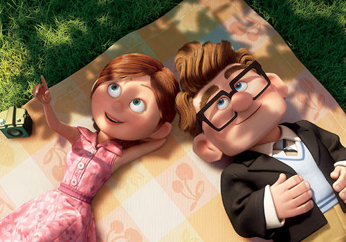 In its opening stretch the new Pixar movie “Up†flies high, borne aloft by a sense of creative flight and a flawlessly realized love story.
Though the initial images of flight are wonderfully rendered — the house shudders and creaks and splinters and groans as it’s ripped from its foundation by the balloons — the movie remains bound by convention, despite even its modest 3-D depth. This has become the Pixar way. Passages of glorious imagination are invariably matched by stock characters and banal story choices, as each new movie becomes another manifestation of the movie-industry divide between art and the bottom line.
… an adult relationship that the director Pete Docter brilliantly compresses into some four wordless minutes during which the couple dream together, face crushing disappointment and grow happily old side by side. Like the opener of “Wall-E†and the critic’s Proustian reminiscence of childhood in “Ratatouille,†this is filmmaking at its purest.
But much like Russell, the little boy with father problems, and much like Dug, the dog with master issues, the story starts to feel ingratiating enough to warrant a kick. O.K., O.K., not a kick, just some gently expressed regret.
I’m looking forward to seeing it tomorrow.
Daily post 27 May 2009 07:35 am
Peters/Scher/Ford/Barrier & NewYorker
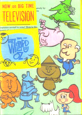 – I’m sad to report that ASIFA East board member, Tony Peters, has died.
I’d known Tony only in conjunction with ASIFA for the many years I sat on that board. He was a member before I, and that dates at least back to 1973. He was a voicferous member who helped forge that little organization back in its earliest days.
His work goes back as far as 1961 when he was one of the producers on the Tales of the Wizard of Oz for Rankin Bass. He also did continuity for Rudolph the Red-Nosed Reindeer and wrote and did production design for the Rankin Bass feature, Willie McBean & His Magic Machine.
His presence at ASIFA East meetings will be missed.
 - Jeff Scher shares an older film of his with the NY Times.
NYC was shot in 1975. After the lab went out of business and the negative was lost, Jeff hand colored his print and used that as his negative. The images and colors were more vivid than expected and
his work was completed. Shay Lynch added an appropriate syntho-pop score which adds light to the film.
The words of Hans Richter “who spoke of rhythm as being the essence of cinema and ‘the conscious articulation of time’†and Goethe “who called architecture frozen music” drove the film.
It’s a stirring and expressionist view of the city with a hand-touched vivacity. Check it out (and support animation on the NY Times – so they know people are watching.) NYC
- An extensive article written by historian Greg Ford about animation director Tex Avery appears on the Bright Lights Film Journal‘s website. The article was originally written for the 1978 Zagreb Animation Festival’s retrospective of Avery’s work. It was reprinted in the Bright Lights magazine/journal but until now hasn’t appeared on-line.
Like all of Greg Ford’s work, it’s thorough and extensive and includes unnecessary apologies by the author. If you have any interest in Mr. Avery’s work, read Tex Avery/Arch-Radicalizer of the Hollywood Cartoon.
By the way, Greg Ford’s commentaries on those WB DVD collections is among the finest. His offerings, as well as those by Mike Barrier and Mark Langer are principal.
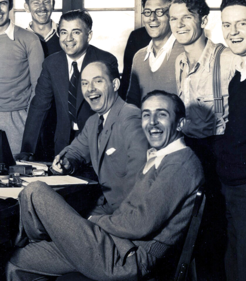 - And speaking of Mike Barrier, he recently posted on his site, MichaelBarrier.com, a picture of Disney wearing cap and gown as he received his honorary degree from Harvard back in 1938. This page and picture gave Mike an excuse to note that he had a relatively recent feature on his site called: Day in a Life. These photo essays are invaluable, and if you haven’t checked them out, I urge you to do so. They’re light enough to make you smile, but they offer real historical information.
Disney 1927
Walt Kelly, 1955
Disney, 1930
Kansas City, 1922
Disney, June 20, 1938
Disney, 1931
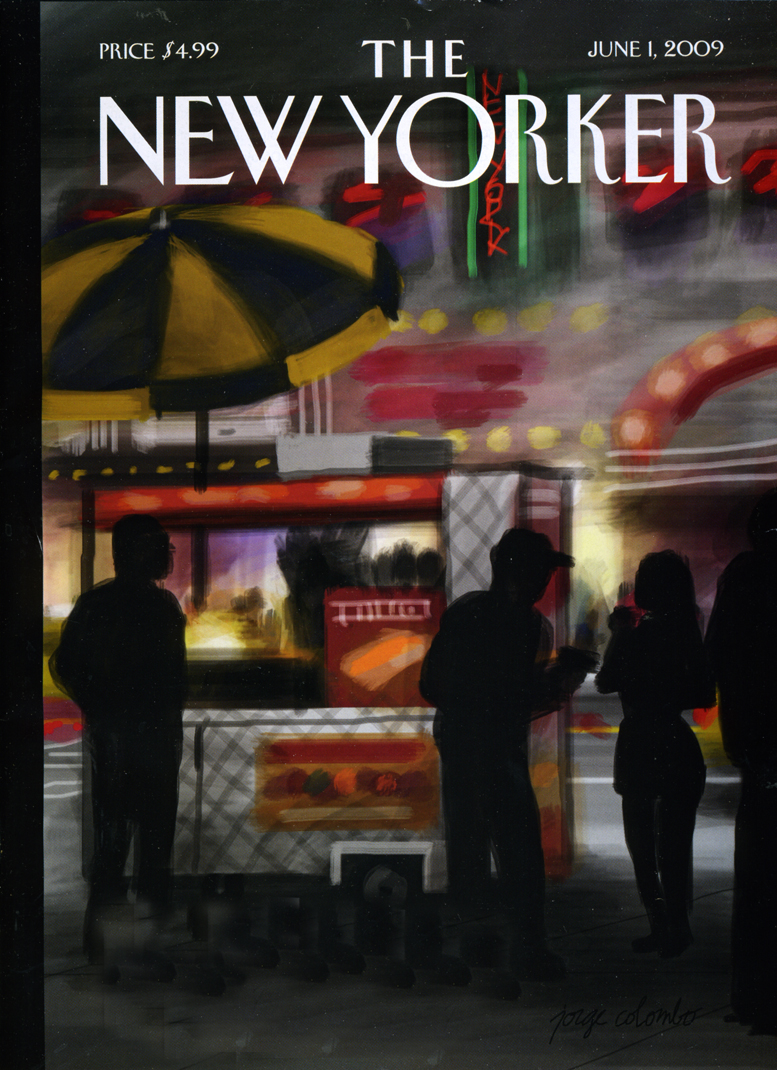
- Finally, in case you haven’t heard or seen it, the current New Yorker cover is one that was drawn and painted by Jorge Columbo while standing and waiting an hour on line at Madame Tussaud’s Wax Museum on 42nd Street. It was drawn on his tiny iphone. You can watch a short video of the cover painting and read more about it here.
Daily post 23 May 2009 08:04 am
Disney 23, 24, & ’77
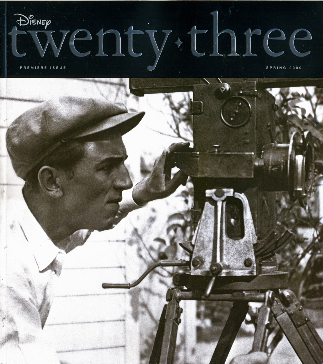 - The new Disney magazine twenty-three hit the streets this week. I mean that literally. While walking past some street vendor selling used books out of old cartons, I noticed a copy of this magazine sitting there bright, shiny, new and cellophane wrapped. We haggled the price until he sold it to me for $5. Cheap at half the price, but I wanted to find out what it contained.
Actully, the issue has been available for a little while now. The magazine is probably expensive (I can’t find a price anywhere including the website for it.) I guess you’re supposed to buy a membership in D23, a fan club. Regardless, I was still curious.
This issue contains, of course, an obligatory story on Up as well as another story about touring Pixar, plenty of articles about forthcoming films and Disneyland sites. There’s also one about Annie Leibovitz shooting stars to look like animated princesses and princes. It reminds me of an expensive version of an old fanzine they used to have called the Mickey Mouse Club Magazine. This is obviously more glamorous, exciting and expensive, but it’s still all just advertising for Disney product.
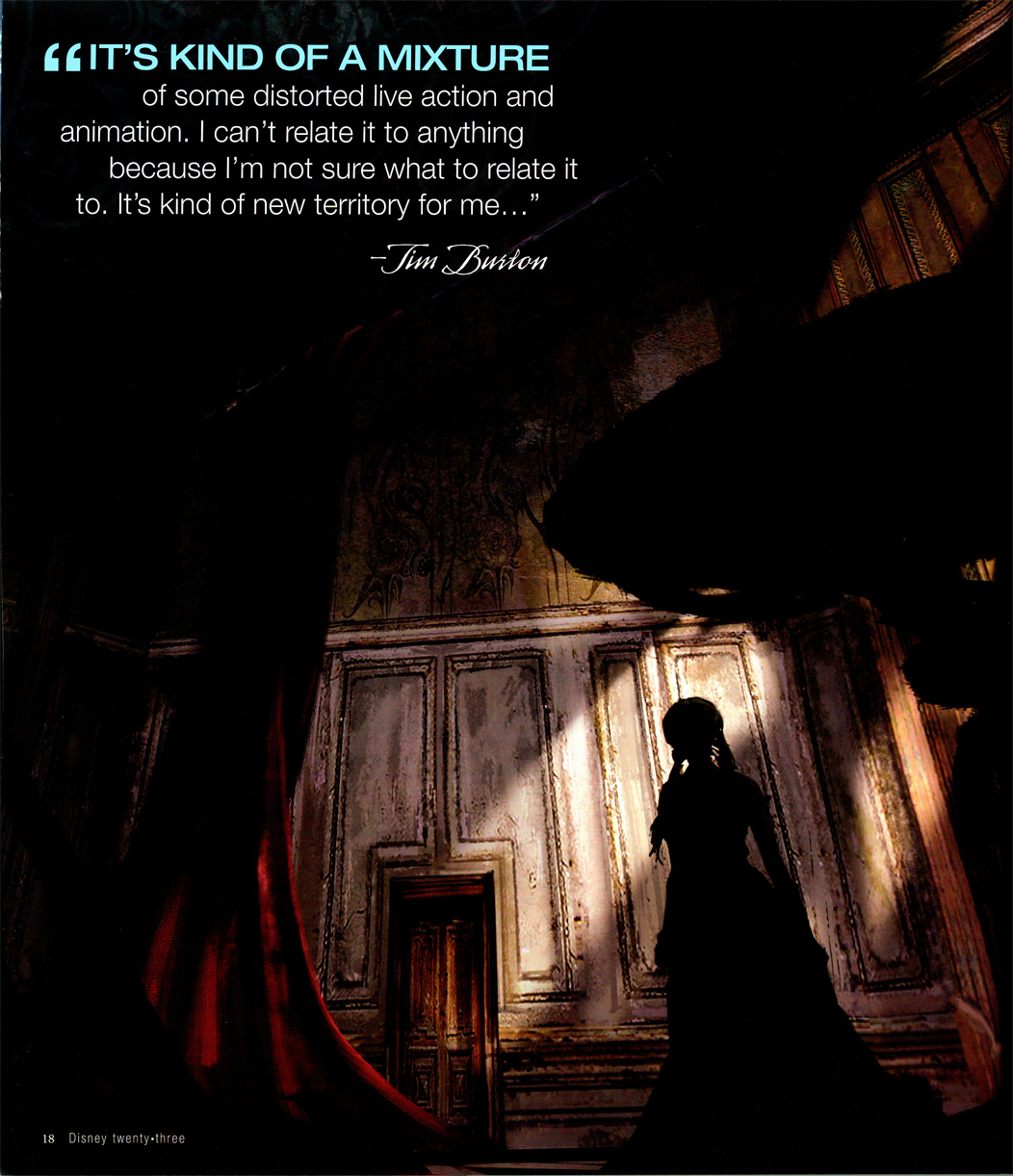
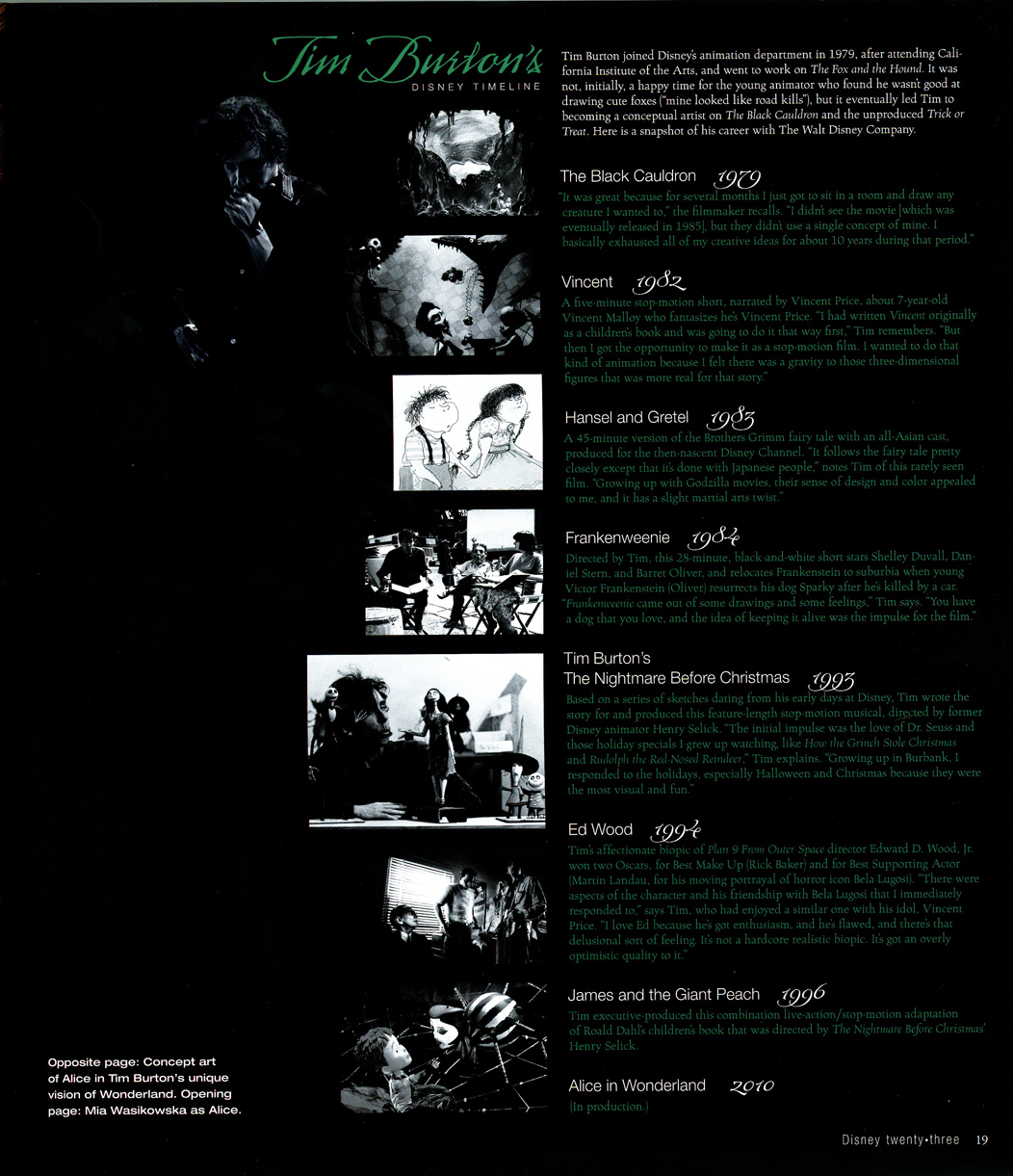
They’ve taken their cue from Vanity Fair (without all those board advertising plates – coming soon?) and use a lot of slick photos, and lots of type: white against black. The one article that caught my interest (no, not the piece about the “Modern day Gepetto”) was one on Tim Burton’s forthcoming Alice in Wonderland. It didn’t really say much about that film (slick photos, though), however there was a list of Burton’s films. Included on it was a 45 min. “Hansel and Gretel” he did for the Disney Channel in 1983. Why isn’t this out and available? I want to see it! Regardless, I look forward to his Alice.
(Having written this, I must confess that I was just interviewed by John Canemaker for an article he’s writing for the magazine about Snow White.)
(Click any image to enlarge.)
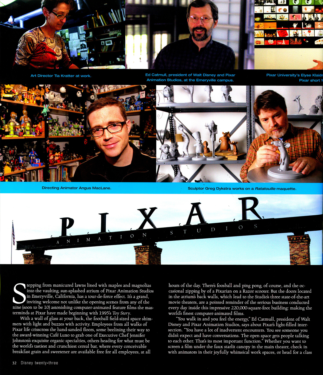
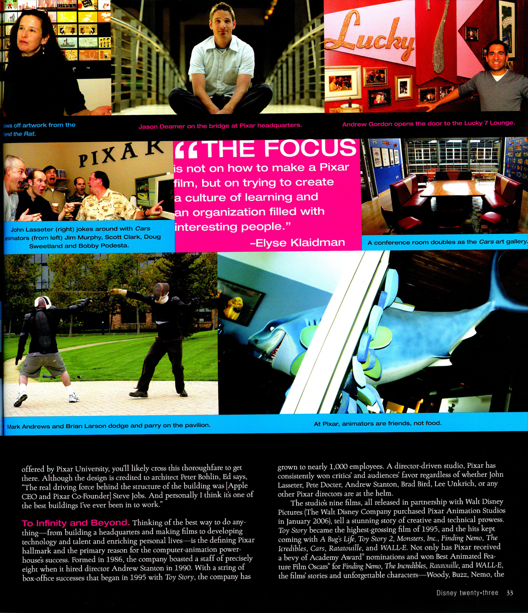
Part of the “Finding Pixar” story.
________________________
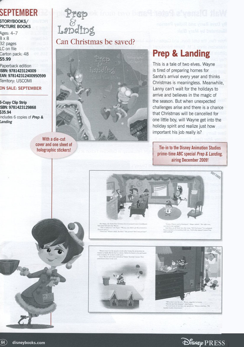
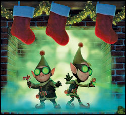 - Variety reports about a Christmas Special, “Prep and Landing“, in production at the Disney TV unit. It didn’t take long for the story to go from Variety to the NYTimes to USA Today.
Dave Foley is the starring vocal talent involved. Apparently, according to the article, John Lasseter asked for suggestions for possible shorts. Chris Williams, director of Bolt, came up with this idea but was too busy to take it into production.
BlueSkyDisney has a post about this and other shorts in production.
In April, the ever vigilant Cartoon Brew posted
this image from Disney’s book catalogue highlighting forthcoming books.
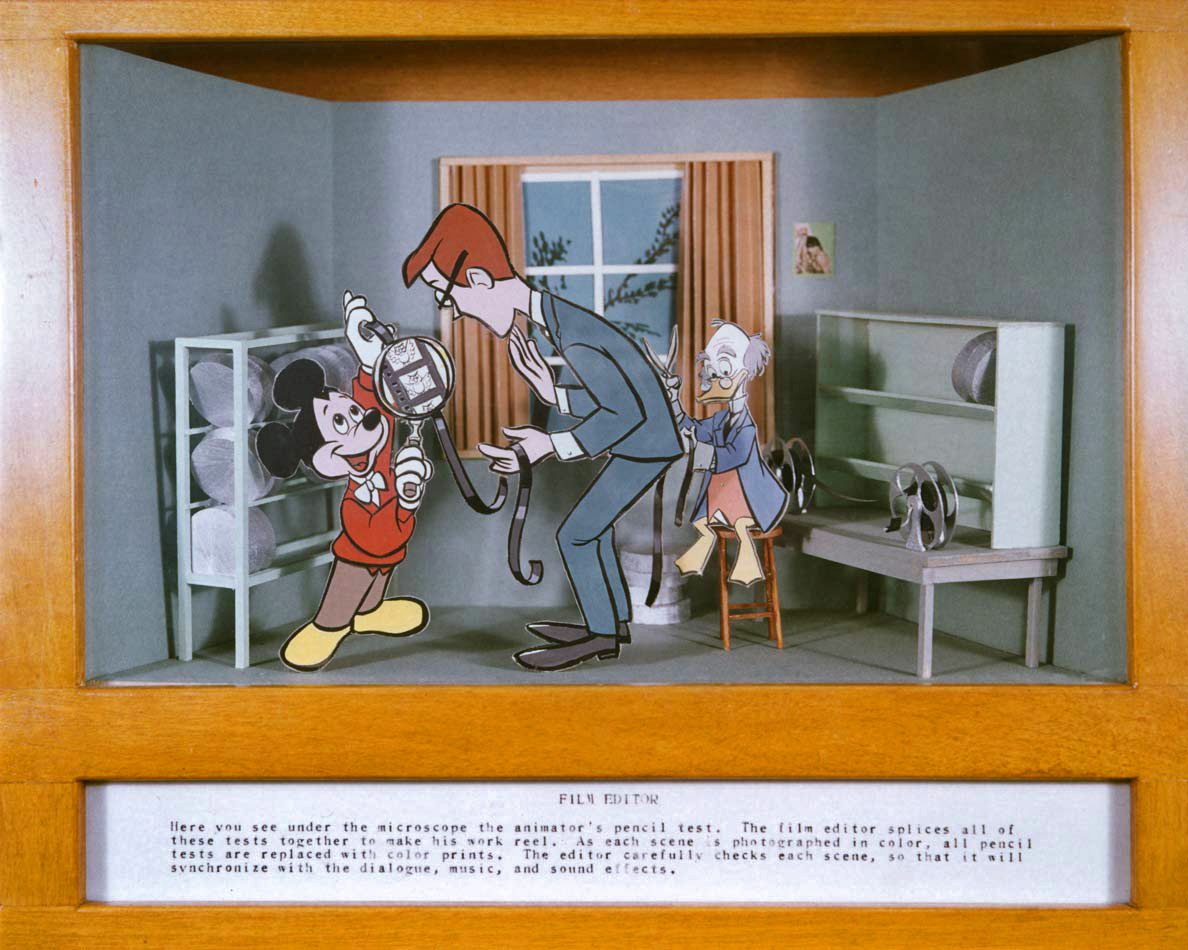 - Hans Perk, on his inimitable site, has a post that’s been holding over for a couple of days. For some reason this piece has stayed with me since he first posted it.
It features those boxes they had on the wall of the first floor of the Disney Animation building way back when. I saw them in 1977 when I was granted a tour of the studio. The animation department was deep in the throes of completing Pete’s Dragon and I wasn’t permitted a tour of the second floor. They didn’t want to disturb any of the hard-working animators. So I had to contend with viewing these boxes and seeing a couple of the live-action sets for Pete’s Dragon.
I had a light (meaning laughing a lot) viewing of the boxes and didn’t really take them seriously. However, they obviously stuck hard in my memory. Every one of these boxes posted by Hans remained clear and real in my memory, despite only viewing them once. I was impressed that the artist had done so successful a job. In fact, I was surprised when Hans noted that it was Bill Justice who designed them. That guy was a talent. I’ll have to write about him someday soon.
Thanks to Hans for posting them and touching some recessed memory.
Commentary &Daily post 15 May 2009 08:04 am
Totally TV – I mean, 3D
- A couple of news events have passed by the Arts pages of the New York Times.
Up had its premiere screening last night as it opened the Cannes Film Festival. It’s the first animated film to have had that honor – of opening the Festival. A lot of critics seem to be guessing that it’s because so many of the films in the competition screenings (Up is not in competition) are severe downers, and they needed something positive to open the Festival.
Lasseter is quoted as saying that he is “looking forward to seeing that great image of all these people tonight in their tuxedos, bow ties and gowns, wearing 3-D glasses in that big theater,” he said. “That’s going to be a good picture.” This according to the NYDaily News
The Sydney Morning Herald featured this review:
THE most opulent film festival in the world showed it was up to the technological minute on Wednesday when it opened with Up, the new 3D animation from Pixar Studios. As an audience studded with stars walked the red carpet, they were invited to accessorise their tuxedos and ball gowns with a pair of polarised plastic glasses.
It was the first time the festival had opened with an animated film, which caused ripples of horror among the faithful when the program was announced. Judging by the sounds of sniffing that preceded fierce applause, however, Up won them over.
“Walt Disney always said for every laugh there should be a tear,” said the creative head of Pixar, John Lasseter, at a press conference during the day. Walt’s formula is still working.
In case you want a few clues about what Toy Story 3 will be about, read this article in the NYTimes.
>
The animated series Sit Down, Shut Up is down and out. According to the NYTimes and Variety, Fox has decided to cancel this animated sitcom which recently made its debut. They’ve chosen even to passing on airing the last episode produced. Apparently, sandwiched between The Simpsons and Family Guy, it was losing audience for both of those shows.
I recently saw Jason Bateman and David Cross together on the subway and wondered if they were recording anything for this show in NY. Of course, that’s ridiculous; it would’ve been done months ago..
>
Finally, the Times had an article about the new show Dreamworks is preparing for Nickelodeon. Kung Fu Panda will now join the Madagascar Penguins on the Nick schedule.
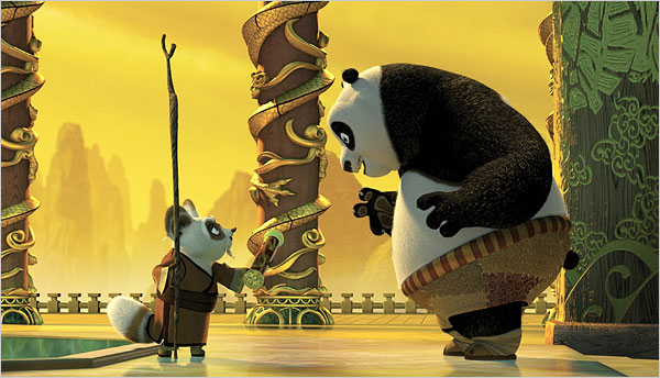
This is probably good news for those working at Dreamworks. Many considered the film the best of the cg films out of that studio, and now it can go on forever. Hopefully, Jack Black will remain involved with it. It might have been nice if they had gone with the 2D style of the credit sequences. At least, do something to keep the movie special.
Daily post 14 May 2009 07:41 am
Garbo Talks – recap
- For some reason, recently, I was thinking a lot about a title sequence I did for Sidney Lumet’s Garbo Talks. I thought of doing a piece about the job but remembered doing one for this blog and found it in Oct 2006. Here’s a recap of it. I’ll probably post some of the animation some day.
- One of the pieces done in my studio which still leaves me proud is a title sequence done for the Sidney Lumet feature, Garbo Talks. In the film, the character played by Ann Bancroft has had a life that, in some small way, was shaped by Greta Garbo’s feature films. This is a small bit of backstory in the live action film, until the end.

(Click any image to enlarge.)
For the credits, I chose to develop this aspect of her story, and Sidney agreed on the approach. We told her life in a caricature of Ann Bancroft‘s character, growing up. The sequence ends with her at her current age, an elderly woman, and the live action begins. Hence, we were giving the life story of the film’s lead character before the film started.
The idea was to use the device that had been developed for TV in the 50′s & 60′s of the caricatured characters whisking through the sitcom titles. (See Bewitched or The Carol Burnett Show.) However, it was our intent to treat it in a serious way.
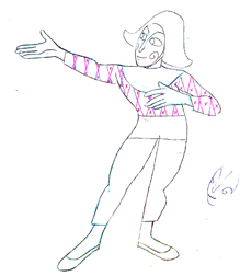
Tissa David did a stunning, tour de force of a brilliant piece of animation. It was a dance that the character went through, and the credits played off the animation, which played off stills of Greta Garbo’s films.
There was a small crew on the piece, which ran about 2 ½ minutes. Tissa animated, I did whatever clean up was left. Robert Marianetti single-handedly colored everything; Janet Benn and Christine O’Neill did additional I&P. Gary Becker filmed it, and Edith Hustead edited.
We worked with the film’s composer, Bob James (a great jazz musician and the man who wrote the Taxi theme song), who developed a piece of music that Tissa animated to. He developed a beautiful waltz, and Tissa animated to every beat, every note.
After a preview screening, that didn’t go well, I expected my credits to be dumped. No, only Bob James was dumped and replaced by tunesmith, Cy Coleman. His music for the opening ignored most of the beats, and he wrote a lush waltz to replace it. It never quite matched in the eyes of Tissa and me.
Daily post 09 May 2009 08:56 am
Bridget Thorne – recap
- The key to my studio in the first dozen or so years was the brilliant artist, Bridget Thorne. She was every bit my partner in creating some of the greatest of my films, and I can’t attribute more to her work. With this post, back in March 2006, I gave some small attention to some of the excellent art she’d done for my films. Time to show it off again.
Bridget Thorne has been an extraordinary Art Director and Background painter on quite a few of my favorite films produced within the studio. Here is some of that art.
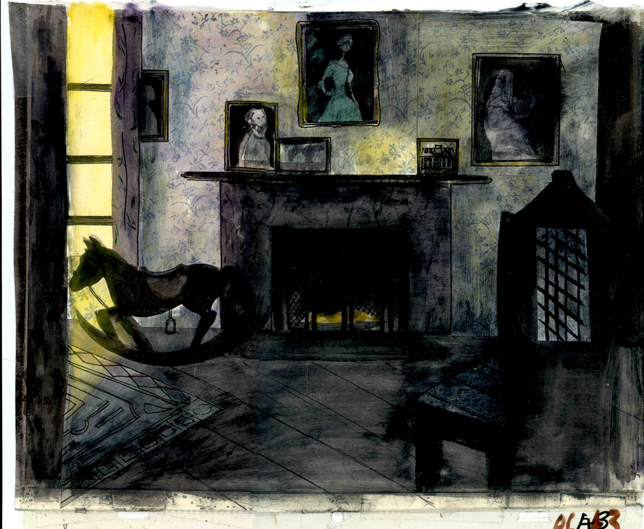
 This painting is a key transition point in Lyle, Lyle Crocodile. The film had a looseness that Bernard Waber‘s original book art had featured. I felt very much at home in Waber’s style, and I think Bridget did as well.
She worked out a color scheme for the film, and we both agreed to
______ (Click image to enlarge) Lyle, Lyle Crocodile (1987) _____.__follow it closely
___________________________________________________________throughout the half hour film for HBO. Liz Seidman lead the character coloring. Bridget, of course, had a strong hand in all those character models, as well.
The scene pictured above follows the introduction of Autumn on “East 88th Street”, and the background brings us full force into it as we get “the girl’s first song” – Mrs. Primm’s report on what it’s like to have a crocodile living in your house.
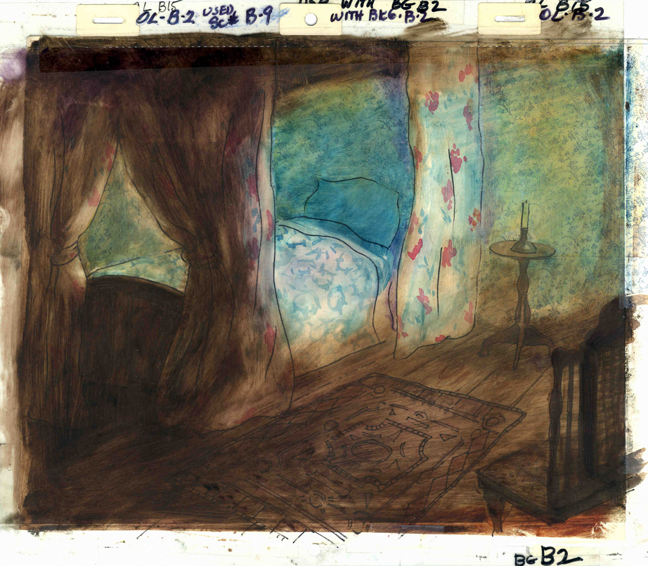
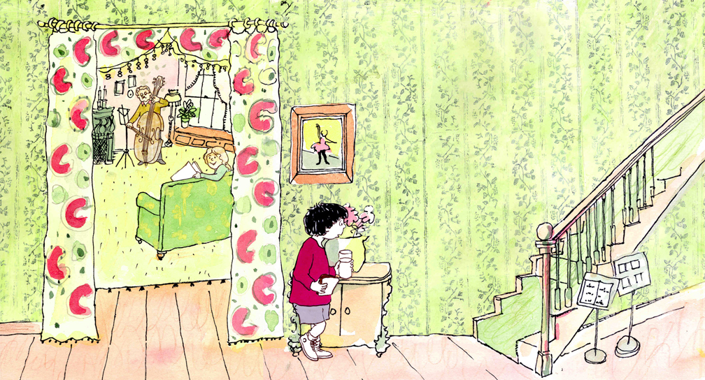 – Ira Sleeps Over was the second children’s book by Bernard Waber that we adapted. This is a very sweet story which involves a sibling rivalry; it focusses on a teddy bear and a sleep-over party. I pulled composer, William Finn, into the film and he wrote some great tunes for it. Prior to doing the script, I gave him the book and asked him to figure out where he would like the songs. In a week he had already written all the songs for the film, and they were brilliant. It turned out he used all the words of the book in his songs, and now I had to find a way of telling the same story using past, present and future tenses, as he did in the songs. It was a good challenge that worked out well and created a fabulous construction for the story.
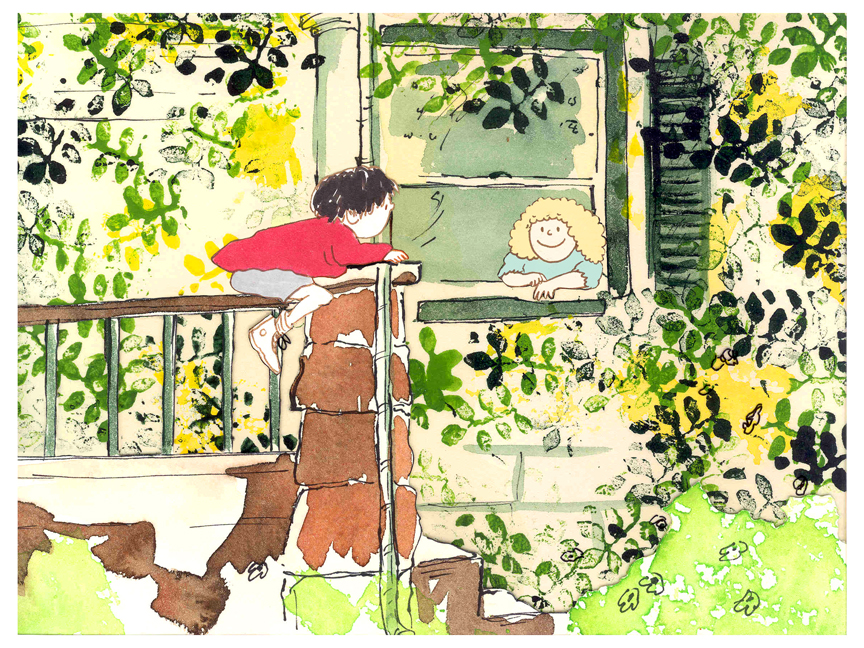 The style in this book was, if anything, looser than in Lyle. Waber did a lot of his illustration featuring duplicating printing techniques. Lino cut enabled him to repeat decorations throughout the settings. Bridget played with the lino cuts and was able to succesffully duplicate the technique in the backgrounds. In this one bg, at the beginning of the film, the foliage is a good example of this technique, printed over watercolors. The characters are markered paper drawings cut out and pasted to the cel overlays.
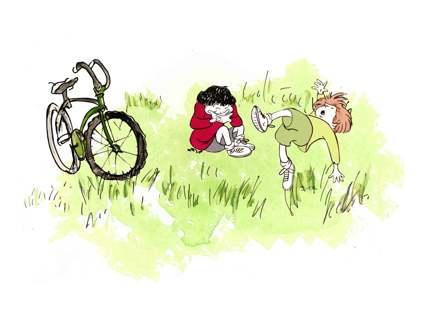
The book, like Lyle, featured a lot of white space, so we followed suit. When a book’s been in circulation for over 25 years, you have to realize there’s been a reason for it; find the reason and the heart, and take advantage of it. This use of white space made the actual backgrounds oftentimes little more than abstract shapes of color with a solid object on the screen. Here, for example, we see Ira and his friend, Reggie, playing against a blast of green and a bicycle.
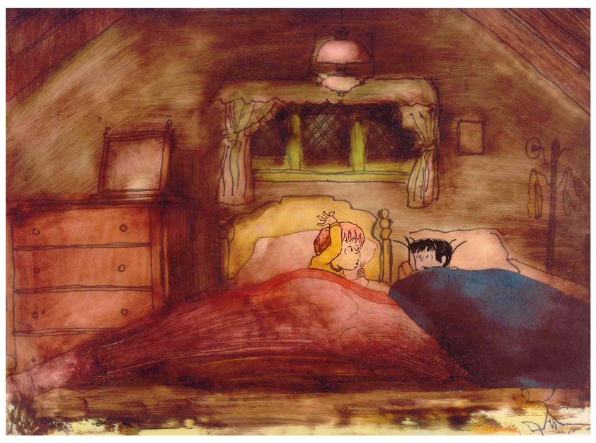 – At the end of the film, Ira and Reggie talk in the dark at the sleep-over. To get the look of the dark Bridget had to come up with something clever. The book resorted to B&W washes of gray and wasn’t very helpful. She came up with some dyes that were used for photo retouching. By quickly painting these lightly onto cel levels with a wide brush, she was able to get translucent cels with the brush strokes imbedded in the color overlays. By placing these overlays over the characters and backgrounds, we got the desired effect that let it feel connected to the very loose style of the film.
 -Abel’s Island is one of the few films we did that I treasure for its artwork. Bridget’s work on the backgrounds was, to me, extraordinary. The looseness I love was developed into enormously lush backgrounds using shades of green that I didn’t know could be captured in the delicate watercolors.
This film was a complicated problem that seemed to resolve itself easily and flow onto the screen without much struggle. The book had won a Newberry Award as best children’s writing of its year. It was not a picture book but a novel. The more than 120 pages
(Click image to enlarge) Lyle, Lyle Crocodile (1987) featured fewer than 20 B&W spot drawings by author/illustrator, William Steig. We were on our own with the color.
 However, we had adapted Doctor DeSoto and The Amazing Bone as shorter films and could use what we’d learned from Steig on Abel. Bridget topped herself.
Several of the animators gave us more than I could have expected. Doug Compton‘s animation of Abel sculpting his statuary and living in his log was heart rending; Lisa Craft‘s animation of the big pocket watch, the big book and the leaf flying sequences was nothing short of inspired; and John Dilworth‘s animation of the owl fight was harrowing. This was all set up and completed by Tissa David‘s brilliant animation of Abel in the real world with wife, Amanda. She established our character.
 – At the end of the film, Abel, who has been separated from his new bride, trapped on an island for over a year, finally gets to come home. He sees Amanda in a park at twilight but decides to hold back. He races on ahead of her to greet her, privately, at home. The park sequence has a busyness as an acute counter to the lonliness we’ve watched for the previous 90% of the half-hour program. Setting it at early evening gave an opportunity for rich, royal colors. Bridget took full advantage of the opening, and underscored it all with a regal green not seen earlier. It was stunning and is one of my favorite backgrounds in the film.
 A Child’s Garden of Verses presented new and different problems to explore.
It was a project generated by HBO. Charles Strouse and Thomas Meehan were going to write the book and song score. We met several times trying to discover a way into the book of poems. I’d suggested we use the verses in Robert Louis Stevenson‘s book to illustrate the author’s early childhood.
Stevenson was a sickly boy who was always confined to his dark room. He was not
 expected to live long. The only visitor for days on end was his overprotective mother.
For much of the film, we had only the dark, child’s bedroom to explore. Artistically, I asked Bridget to delve deeper into the photgraphic dyes that she had discovered and used so well in Ira Sleeps Over. These dyes would allow us to keep the style, once again, loose while exploring dark areas and brush strokes to simulate the darkness “Robbie” lived in.
For the wallpaper throughout the house, Bridget used real wallpaper which was photostated; scaled down and reshaped to fit the backgrounds. Then watercolor washes colored these backgrounds and overlays were mixed and matched to get the desired results.
 I was never quite pleased with this film. The elements that worked well worked really well. Bridget’s work was a highlight. The acting was extraordinarily good. Heidi Stallings performed with an enormous amount of emotion yet barely raised her voice above a whisper. Jonathan Pryce was brilliant as Robert Louis Stevenson, the narrator and even sang a song when asked at the last minute. Gregory Grant as the young “Robbie” was vulnerable, sweet and all we could have hoped for.
However, there was too much of a rush given the delicacy of the piece, and the exterior backrounds done by me for the end of the film are poor. The animation is also hit and miss. Oddly enough, my favorite sequence used little actual animation but intense camera work. Ray Kosarin was the animator in charge of it, and it’s an impressive sequence.
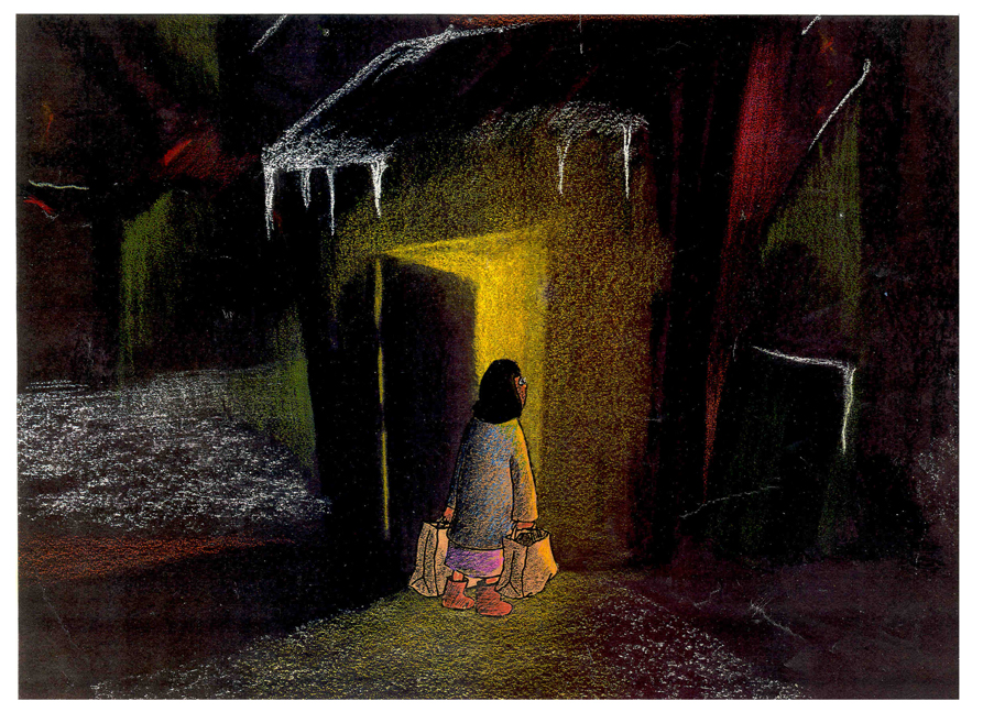
- The Talking Eggs was done for a PBS series called Long Ago & Far Away. It was an adaptation of a Creole Folk Tale which Maxine Fisher updated for me. (Lots of discussion between WGBH, Maxine & me about what distinguishes a Folk Tale from a Fairy Tale. It seriously impacted the story we were telling and I wanted what I wanted and got.)
Bridget chose to use pastels and we searched for a paper that would bring out the most grain. I loved the end result. The characters, to match the look of the Bgs, were xeroxed onto brown kraft paper and colored up from there with prismacolor pencils. This was cut out and pasted to cel.
 Danny Glover was the narrator, and we chose to make him an on-screen character appearing intermitently in the film. His narration was recorded on a rush as he stopped off in LA from SF on his way to direct a film in Africa.
There’s a focus in these backgrounds that matches the content and mood of the piece, and it worked wonderfully for my purposes. I always like it when the medium is front and center; I want audiences to know that they’re watching animated drawings, and texture usually helps to do this. Of course, I also want the films to have a strong enough story that the audience gets past the point of knowing, to enter the film. It works some of the time, and I’m in heaven when it does.
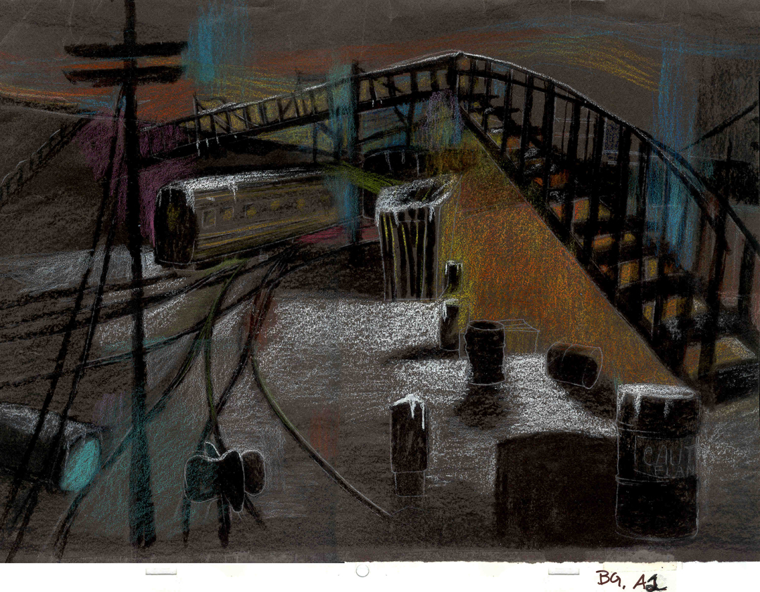 Bridget altered the color of the paper on which she was coloring with the chalks, and the different colored papers represented varied moods from sequence to sequence.
Naturally, there were some problems with the chalks under camera. All the fixative in the world didn’t stop the chalks from bleeding onto the cels or platen on the camera. (Lots more cleaning involved than usual.) We heard constantly from our cameraman, Gary Becker. The extra effort was worth it; the look was unique and successful.
