Category ArchiveArticles on Animation
Articles on Animation 11 Feb 2010 09:43 am
George Dunning Remembered
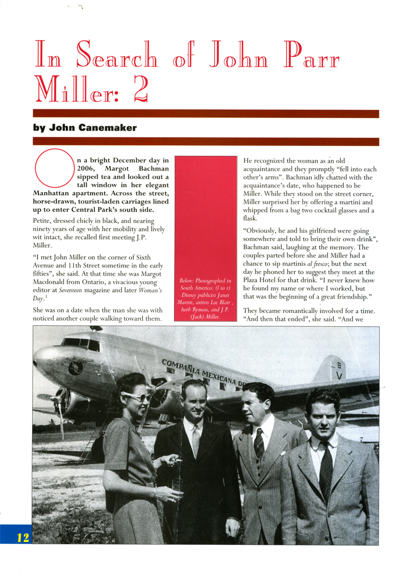
- George Dunning died February 15, 1979 – thirty years ago, next Monday. The January 1980 issue of ANIMAFILM featured a couple of pieces about him. I recently posted (here) the interview conducted by John Canemaker. Just preceding that piece, there was a short remembrance of Dunning, who had just passed. Comments by Bob Godfrey, John Coates and Norman McLaren were offered.
To complete the post, I wanted to give those pieces here. (Obviously the title should read: “They Remember George Dunning.” So much for translations from English into Russian and back again.
BOB GODFREY
 George Dunning’s T.V. Cartoons was one of the dozens of small animation companies to spring up in and around Soho in the early 50′s to satisfy the demands of Advertising Agencies eager to experiment with the new medium, Television Advertising.
Two factors contributed to JVC’s success, in a notoriously difficult medium, George’s continual striving for excellence and his long and happy association with his business partner John Coates.
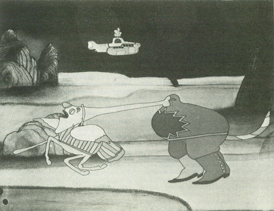
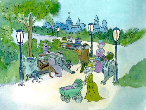
Most animation houses were making their own entertainment shorts about that time, and George’s house was no exception. First came “The apple” an excellent short, and then George changed the whole shape and feel of animation with “The flying man”, painting straight onto glass. He was to change the look of animation again in the late 60′s when he directed the “Yellow submarine”, adapting Heinz Edelmann’s brilliant graphics to animation. Fortunately George lived to see “The Sub” become a landmark in animation history. George’s patience and kindness with young students was legendary and they always recognised in him a fellow “Freak”.
At the time of his death, George was animating Shakespeare’s “The tempest”. I can not think of a more unlikely subject for animation than that, but that, of course, was why George was making it.
JOHN COATES
I first met George in a Mayfair pub 22 years ago, and as a result T.V. Cartoons was formed in June of 1957.
Like all animation studios, we had many ups-and-downs, during which time pur partnership thrived. A large part of this was due to George’s steadfastness. He had an amazing way of keeping his cool under all circumstances, whether he was forcing through his creative ideas or arguing with the “money-men”.
To people in the business, he was quiet innovator of marvellous new techniques and experiences, and many are the studios around the world today whose creative owners learnt their art at TVC, under George’s patient direction.
Animation has lost one of its great talents, and many of us a very good friend.
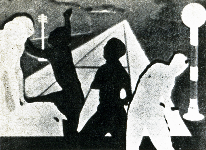
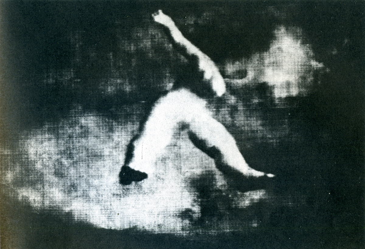
A still from Dunning’s short, “The Flying Man.”
NORMAN McLAREN
I had the good fortune to work with George Dunning when he first arrived at the National Film Board. He had just come from Art College, and already his style as a graphic artist was quite distinctively his own.
From his very first film he showed a ready and natural bent for animation, and, what was even more important, he had the ability to make the sensitive and mystic marriage between his talents as a graphic artist and as an animator. His peculiarly personal vision and whimsy soon shone out in such early films as “Cadet Rouselle” and “Upright and Wrong”. I found George a graceful, articulate and gentle person: a philosopher much given to strangely fanciful invention and drollery, and all in great taste.
His later personal films such as “The Flying Man” and “Damon the Mower” emphasize these asnects of the man even more. He was a true noet.
Articles on Animation &Hubley 23 Jan 2010 09:05 am
Up from Bugs
- It was definitely a more innocent time back then.
I found this article in the Aug. 5, 1961 issue of the New Yorker,
the Talk of the Town section:
The film officer of the United Nations Children’s Fund is a buoyant lady named Susan Burnett. Miss Burnett has given a little party at the U.N. to honor Mark and Hampy Hubley, the two very young narrators – Mark is eight and Hampy (short for Hampton) is four – of “Children of the Sun” an animated cartoon produced for UNICEF by the narrstors’ parents, John and Faith Hubley. We were among those present at the party, along with the Hubleys; absent, for reasons ranging from professional engagements elsewhere to afternoon naps, were several other contributors to the film’s sound track, including the narrators’ sister Emily, who is two; their sister Georgia, not yet one; the Budapest String Quartet; the violist Walter Trampler; and Pablo Casals.
The party began with a showing of the cartoon in the small basement screening room of the Secretariat Building. A charming sketch of important events in the life of a young child – spearing peas on a plate, climbing trees, daydreaming at the shore – it end with a quiet, harrowing comment to the effect that this happy child is fr from being typical of most of the children on earth, three-quarters of whom ar suffering from some degree of hunger. Except for a few concluding words recited in English by Mark Hubley (“For the first time in history, nations are united to rid the world of hunger . . . . The United Nations, through UNICEF, is dedicated to the children of the sun. The future of the earth depends on them.”), the sound track requires no dubbing for use in other countries, since the language it peas is either musical – excerpts from Bach’s Cello Suite No. 5, Haydn’s “Sunrise” Quartet, and Mozart’s Quintet in E Flat – or extraverbal, being the crowings and gurglings of various Hubleys, ingeniously synchronized with the action of the cartoon. Hampy identified the family sounds for us. “That’s Georgia,” he said during a bottle-feeding scene, and, during the pea-spearing one, “That’s Emily. She made those noises when we gav her a puzzle to play with.” The sounds of horseplay accompanying the seaside episode were made by Hampy, himself. “Me imitating a orchestra,” he said with pride. “I can do all the instruments, one at a time.”
When the movie was over, the party adjourned to the Delegates’ South Lounge, where refreshments appropriate to the assorted ages of the guests were served. Miss Burnett proposed a toast to the Hubleys, adding, for our benefit, that UNICEF is happier about “Children of the Sun” than about any other film it has put our. Miss Brunett discovered the Hubleys through their cartoon short “Moonbird,” which won an Academy Award two years ago. When she approached them, the were busy preparing their first feature-length cartoon – an adaptation of Harlow Shapley’s book “Of Stars and Men.” “What Miss Burnett told us about children starving all around the world was so shocking that we had to accept her assignment, which was to state the simple fact that children are hungry and to state it in such a way that it would be instantly comprehensible in any language or culture of locality or political circumstances,” Mr. Hubley said. “To keep matters both interesting and universal in a film is quite a job. Bug cartoons, which are what I started my career in, are easy, because a bug is so specific. Only a Paul Klee could make a bug that was interesting, generalized, and yet true to nature.”
Mr. Hubley a native of Wisconsin, was once an art director for Walt Disney, drawing not only bugs but such advanced cartoon images as the “Rite of Spring” sequence in “Fantasia.” After the war, in which he helped to make training films for the Army Air Forces, he had a hand in the famous UPA cartoon films, starring the Messrs. Magoo and McBoing-Boing. Five years ago, the Hubleys left Hollywood for New York and formed their own company here under the name of Storyboard, Inc. “We buy the groceries by making a few TV-commercial cartoons every year,” Hubley said. “The rest of the the time, we like to work on our own things, taking the attitude a painter would – making films that are a part of us and express something of us. A film is apt to cost us around twenty-five thousand dollars and, with luck, will pay for itself in ten years’ time.”
Sorry, I don’t have a copy of this film, and there are no stills of it on line so this goes without illustration.
Articles on Animation &Independent Animation 21 Jan 2010 08:29 am
Len Lye
- Len Lye, one of the original experimental animators, has rarely gotten the acclaim from the animation community that he has certainly deserved. Rarely is his name mentioned in animation books or articles. As a matter of fact, in more than 50 years of reading about animation, I can only remember two significant magazine articles about the man and his work that appeared in animation magazines. (If you really go looking you’ll find a lot written in art publications – not animation mags.)
Here, I’m posting one fof those two that I think is a significant and clear article, and I hope it will give the man another five minutes of your attention. The article was written by Joseph Kennedy for the February 1977 issue of Millimeter Magazine.
by Joseph Kennedy
 Len Lye‘s Greenwich Village loft is an airy workshop, filled with the tools of the artist’s trade: machine saws, diagrams, models of projected works, and several silvery kinetic pieces glistening in the summer afternoon’s light. Len Lye himself is the Renaissance Man of the avant-garde, his prolific skills having manifested with equal success in diverse media: sketches and paintings, eel animation, paint of film, live-action films, essays and kinetic sculpture. Always the innovator, he has never bound himself to one mode of expression, choosing instead that which best suits his creative need.
For more than 50 of his 75 years he has pursued his quest of motion composition. As a teenager in Wellington, New Zealand, he had his first glimpse of the potential of this art form while delivering newspapers at sunrise. His attention was caught by the movement of clouds and he began to ponder creating artificial clouds to achieve that same quality of motion. “I thought then and there, ‘Why clouds? Why not try to compose motion yourself? — compose motion!”
After this “revelation”, he found the idea was not so easy to implement. “I tried to control motion, and I nearly broke my back. Christ, how do you? So I worked out shafts and handles that could be turned and stuck through shafts so the turning shaft could turn the particular stuff you’d stuck to it; and it was a crazy kind of attempt to control motion and compose it. I was having a ball nevertheless.”
Hoping to learn more about film, Lye moved to Australia in 1922, because New Zealand had no cinematic equipment. He worked at a Sydney studio that made animated advertising shorts. “I learned animation in Sydney, not too much because I was doing storyboards. But I took the job just to be around where people were handling film, just to see.”
 Here he chanced upon the concept of “cameraless animation”: “I didn’t invent scratching on film. I saw some guys that had made some marks on it and I rather liked the way they went (through the projector) wiggling like that, you see. I scratched a few feet of film myself, so I kept that in the back of my mind. And then I saw something like it again from a German film crowd. I think it was also some kind of scratching that they did on film. I kept that in mind too.”
These experiments inspired him to adapt his own kinetic works to cinematic technique: “I suddenly realized that films had cuts and sequences. Editors can chop it where they want to. So, instead of having handles and shafts to control motion, I could just swing (objects) on a string or hold them in a black velvet glove against black velvet or whatever; you could really control and make things happen in terms of sequential motion.”
The Russian Revolution had at first created an amazingly fertile environment for the arts, and for the first time film was being considered from an artistic rather than a commercial viewpoint. Later came barbaric suppression. Lye originally planned to travel to Russia, where he hoped to get a job with the Meyerhold Theatre. He worked his passage from Sydney to London on the White Star liner EURIPEDES as a stoker, arriving in 1926. Some fortunate events enabled him to remain in London to work on his first film, TUSALA VA. “I got all sorts of fabulous help that nobody would get now. For example, as a kind of caretaker, I got a rent free barge to work on, plus the use of part of a studio to which the barge was moored on the Thames. I got a promise from the first film society in the world (London Film Society) that they would pay for the photography. And so I settled down for two years worth of animation drawings.”
One of Lye’s early stylistic influences was primitive African and South Seas tribal art. “When I first came to London I didn’t quite know what sort of imagery would carry my figures of motion. I had lived in Australia and often wondered what on earth an Aussie ‘aboe witchitty grub’ dance looked like. To get the spirit of the imagery I also imagined I was myself an Australian aboriginal who was making this animated ritual dance film.” The articulated grublike forms in TUSALA VA are reminiscent of designs on aboriginal shields, but they are dynamic moving forms. The animation was painstakingly tedious. “These goddam grubs were animated sideways, like cogs in a bicycle chain. Each cog had to be animated separately. And there were about 20 of these bloody cog-links, they all had to be animated. Why the hell I picked on that I don’t know. Well, I just plodded on, about 16 hours a day; it turned out to be both the slowest motion and the slowest animation on God’s earth!”
TUSALA VA was received rather coolly after its 1928 premiere. “Except for the art critic Rogar Fry, there was just a big silence, a complete and utter silence.” Lye found himself without the means or the support to produce another film by eel animation, and he began to consider animating without a camera, recalling his Australian experiences. “I had already used up all my goodwill stuff with the Film Society. I didn’t have much spare cash and I used to go out to some friends in Baling Studios, London, and hang around — anything to get a job in films. I used to get the old n.g. sound takes, that is, clear film with just a skinny track on one side. I would then scratch and paint and mess around with these bits of film. I would join them together and take them up the GPO Film Unit where I had some friends and run it. All this was done under the counter, you know, on lunch hours.
“I hit some marvelous effects (with) wet paint on a strip of clear film; for instance, you take an ordinary fine tooth comb and just wriggle it as you go down the length of film in the wet paint and it makes a lot of striated wavy lines. So you run it. With all these fancy abstract designs going on, the film had a very peculiar abstract quality. I was very taken by it, but didn’t have much chance of developing it.”
With the help of a composer named Jack Ellit whom Lye had met in Australia (“he was the only fellow there of the whole lot of people I knew who had any understanding of contemporary art”), he ran his film to a catchy recording of a Cuban beguine. He presented it to John Grierson and Alberto Cavalcanti at the British Government’s Post Office Film Unit. He suggested they add some slogans to the end of it. Then, with the help of Ellit, he synchronized his painted film and turned it into a public service film; and so COLOUR BOX was released in 1935, informing delightful audiences about new low parcel post rates. “A Utopian bit of public service,” thinks Lye.
 The success of COLOUR BOX resulted in subsequent films for the GPO: RAINBOW DANCE (1936), TRADE TATTOO (1937), and MUSICAL POSTER ttl (1939); as well as several advertising films: KALEIDOSCOPE (1935), for Churchman’s Cigarettes and COLOUR FLIGHT (1939) for Imperial Airways. All these films have in common the abstract “cameraless” technique used in COLOUR BOA’as well as an infectious synchronized score taken from classic jazz and Latin recordings.
TRADE TATTOO is Lye’s most ambitious film (“That one’s got to be the most complex film ANYBODY’S ever done”). Lasting but six minutes on screen, it employs some of the most sophisticated editing, montage and processing effects yet seen. Using black-and-white footage from GPO documentaries, Lye combines stencilled patterns, titles and animated effects to form a brilliant montage. Each of the four layers of images that make up the final print had to be exposed three times via the old 3-color Technicolor process, requiring a total of 12 separate processes to arrive at the final color print (“the lab went crazy”). In addition, the footage was tightly edited, employing jump cuts and color reversal to synchronize with the highly percussive Rhumba and Conga beat of the score; once again, Lye was assisted by Jack Ellilt as music director. As one can imagine, the total effect is startling. Even today, some 40 years after its conception, its avant-garde approach still seems fresh and contemporary, capable of rousing an audience to cheers.
 Len Lye turned his hand to live action films, directing several shorts for the GPO. In 1944, he was invited to America to direct films for the “March of Time”. Although his 1958 short abstract film FREE RADICALS won the Silver Medal at the Brussels World’s Fair, Lye began devoting more of his time to kinetic sculpture. “My type of film, which is a short film, might take me eight months; and it’s very definitely fine art, not folk art in any shape or form. I take eight months to make five minute’s worth of film. Nobody is going to pay me for any of those eight months. And in any case, it’s a pain in the neck to have a five-minute film. How’s it going to be laced up and tied in with the rest of the program? People go to a movie house to see a program of at least ninety minutes, and they couldn’t care less whether they miss a five-minute fine art job. So my films were a complete anomaly.”
Nevertheless, Len Lye is still deeply involved in the creation of a new iconography, encompassing all the arts — a new understanding of the relationship mankind, myth, and creativity have in the scheme of life. “I think Art is the only way you can isolate the creative essence of humanity. This essence, like happiness, is individuality. Civilizations and religions may fall down the drain, but their arts remain. It takes the avant-garde to best symbolize the vitality of creativity. There are a lot of great parallels between great, or everlastingly evocative, happiness and great art. This relationship is mainly about value — human value, and it can teach us how to get the most out of ourselves, and life, that we can.”
Photos:
1. Len Lye and a slide from Tusalava (1928) (Photo by John Canemaker)
2. Trade Tatoo by Len Lye (Courtesy of Cecile Starr)
3. Rainbow Dance by Len Lye (Courtesy of Cecile Starr)
4. Joseph Kennedy (L) interviews Len Lye (photo by John Canemaker)
Joseph Kennedy is a New York City schoolteacher and a freelance writer. He has taught film history at Regis High School and he reviews films for Film news.
The magazine gave the above short bio about Mr. Kennedy in the Contributors column. Joe is a friend, and I am aware of how limited this makes his work seem (given that it was written in 1977.) He subsequently became a public relations executive and now has his own corporate communications practice; he worked with John Canemaker and Peggy Stern on The Moon and the Son and Chuck Jones: Memories of Childhood.
There is more information about Len Lye at several websites.
The Govett-Brewster gallery gives some good information about the man and his work.
Senses of Cinema offers an extensive bibliography of books and articles about the man.
Several of his film are available on YouTube (of course) in slightly degenerated versions:
Color Box
Swinging the Lambeth Walk
Particles in Space
Kaleidescope
Articles on Animation &Independent Animation 13 Jan 2010 09:02 am
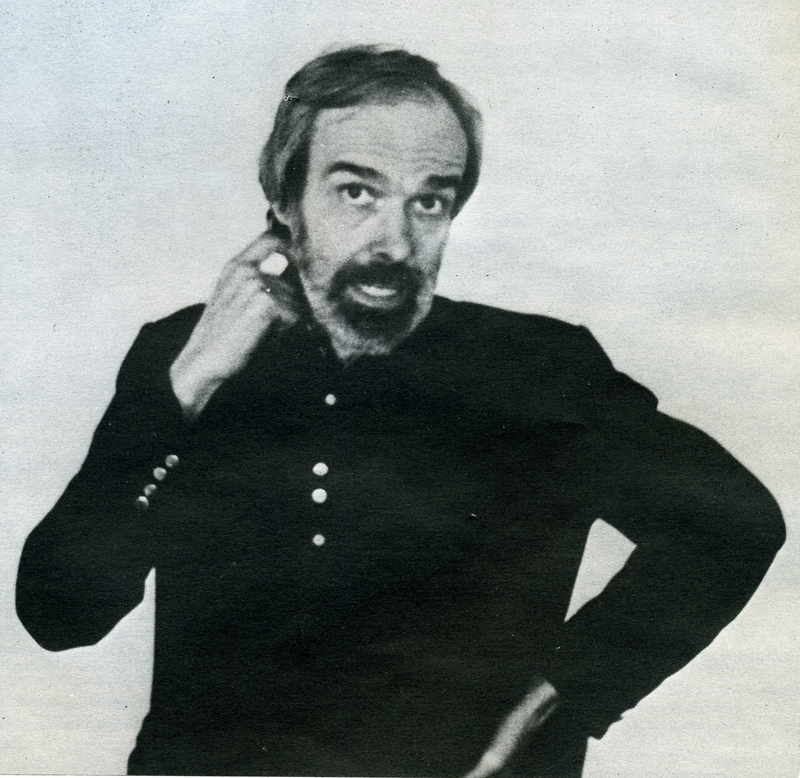
Canemaker meets Dunning – 1980
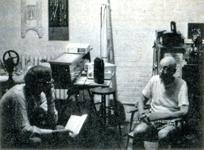
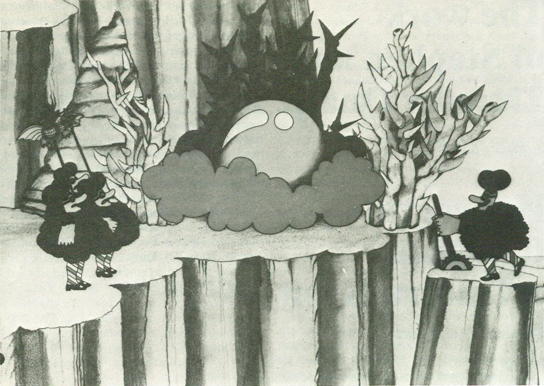
The Jan-Mar 1980 issue of Animafilm included this interview with George Dunning by John Canemaker. John was very taken by the Dunning film in progress, The Tempest, and he starts off his interview with questions about that film.
One has to live
George Dunning talks with John Canemaker
JOHN CANEMAKER: I saw a pencil test of “The Tempest” five years ago on CBS-TV. Are you still working on this film?
GEORGE DUNNING: I am indeed. More so, stronger on it than I was then. I’ve got a few hits and pieces in a rather unfinished state and some more going on now. It’s an attempt to he as personal as I can be. My approach is to do a few minutes to present to hackers. To justify doing Shakespeare as an animated film. Obviously live-action with stars and so on is a great advantage in box-office terms. People ask me why do it in animation. It’s all very well with the fantasy side of it, that seems appropriate. But beyond that, it’s something that I think should be demonstrated. And that’s what I’m doing, and then that helps open a technical line on it as well so that others can carry on.
J.C.: Will you be removing the words as you did with the poem you based “Damon the Mower” on?
G.D.: This is a difficult thing to make a statement about cause I’m in the middle of it. I might change my mind and do it all differently. But at this stage I find that I’m always taking out. I’ve taken a sequence of dialogue and cut it enormously -taken out half of it. Then I look at it and I take out more. I keep taking chunks away. I think this is legitimate but I am worried because it is tampering. But at the same time I think the verbal side of it, from a stage point of view, has a kind of function that on film is not necessary, if I could put it that way. I mean it sounds like I’m saying I know how to rewrite Shakespeare and I’m a bit timid about that. I just feel that in the end it is a film that one is making. I’m not rewriting Shakespeare, I’m making a film. In that sense it’s to use the dialogue but to pull a lot of it.
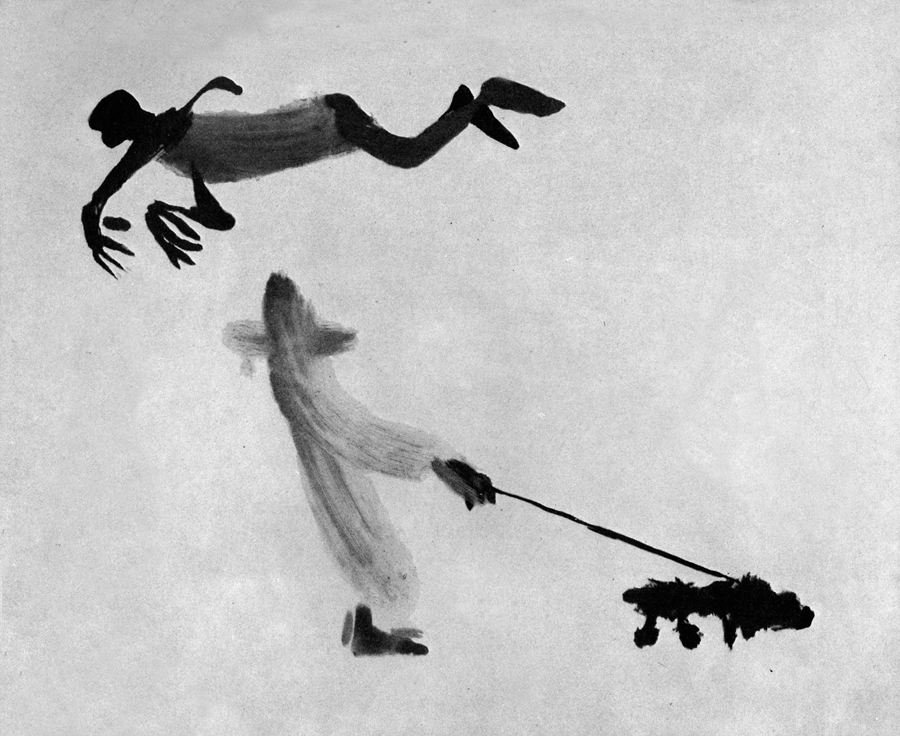
J.C.: The clip I saw showed a tree-like creature walking.
G.D.: That’s Caliban. He’s a tree through the whole thing. I just got carried away with that one phrase where he says, “This island is mine”. It just suddenly hit me, I saw this image of this tree, which is full of creatures as well. It’s sort of an ecology thing all together. And in the end of the play they leave and you have this island with Caliban left. And it’s sort of a hack-to-nature situation.
J.C.: Will you he mixing graphic techniques in the film?
G.D.: At this point it isn’t that far-out as far as technical things are concerned. I’ve been using ccl levels and Xerox drawings. It’s an attempt to keep things handle-able and in a condition where others can help. Cause if you get to do it in a technique which only one person can do it’s very limiting obviously.
(Click any image to enlarge.)
J.C.: Do you work out of a studio in London?
G.D.: Yes, our studio is TVC London. It’s based on the name TV Cartoons. Auspicious name! And we’re having our twenty- first birthday this year. In June we had it. It’s really a studio Dick Williams has had a lot to do with in the sense that he did a great deal to help in the early days to get it started. When I got to London he was working on “The Little Island”, and I helped him a little bit on that. Then he did a lot of commercials, a lot of stuff sort through our studio. I was sent over to London by Bosustow and UFA to set up a UFA satellite. They wanted to get some more footage for the “Gerald McBoing Show” on CBS. In those days Bosustow was on a big expansion drive and he sent Leo Salkin and me over to set that up. We set it up and seven months later UFA was practically bankrupt. This was ’56 or ’57.1 was in this position of going around to agencies cause we were doing commercials at that time and doing very well. Everyone was very glad that UFA was in London and so on. And Dick was doing commercials with us. So then I went around to all the agencies to say good-bye and they said, “Oh, stay. Can’t you keep this thing going? It’s marvelous”. So it was a matter of trying to make a set-up which I did with some businessmen. I had long talks with Dick, saying “What’ll I do…” And he said “I’ll help you and stick with it. This is great and you should stay on.” The prospect otherwise was
 to go back to New York in tatters. It all seemed downhill. I remember Dick came to me exactly a year later and he said, “The year is up.” And I said, “What do you mean, the year is up?” He said, “I said I’ll help you, and give you a push. Now I really want to do stuff through my own company’s name and things like that.” We went on collaborating on some things but he was much more active with the Richard Williams Studio and developed it and so on. I have always had the greatest respect for all his abilities.
J.C.: So you set up your own company and were doing commercials?
G.D.: Lots of stuff like that and industrial films.
J.C.: Did you do features before the “Yellow Submarine”?
G.D.: No, we did a Saturday morning (TV) series
J.C.: Did you do features before the “Yellow Submarine”?
G.D.: No, we did a Saturday morning (TV) series for the Beatles music. King Features organized that with the Beatles and got permission to do cartoon versions of the four of them. It was terrifying. It was a very poor kind of design, but there it was. The show was very ordinary, very cheap cut-rate kind of thing. It was that kind of show with two numbers set into fifteen minutes framing it then another fifteen minutes to make the half hour. We made up a new half hour show one way or another each week, got to the lab then got that onto the plane, had the day off, then started in again, grinding on with this. It was King Features (newspaper syndicate) that had the idea to do a feature-length film and they kept hammering away to Brian Epstein (Beatles’ manager). He didn’t want to buy that for the longest time. Then finally agreed.
J.C.: Which would be around 1967?
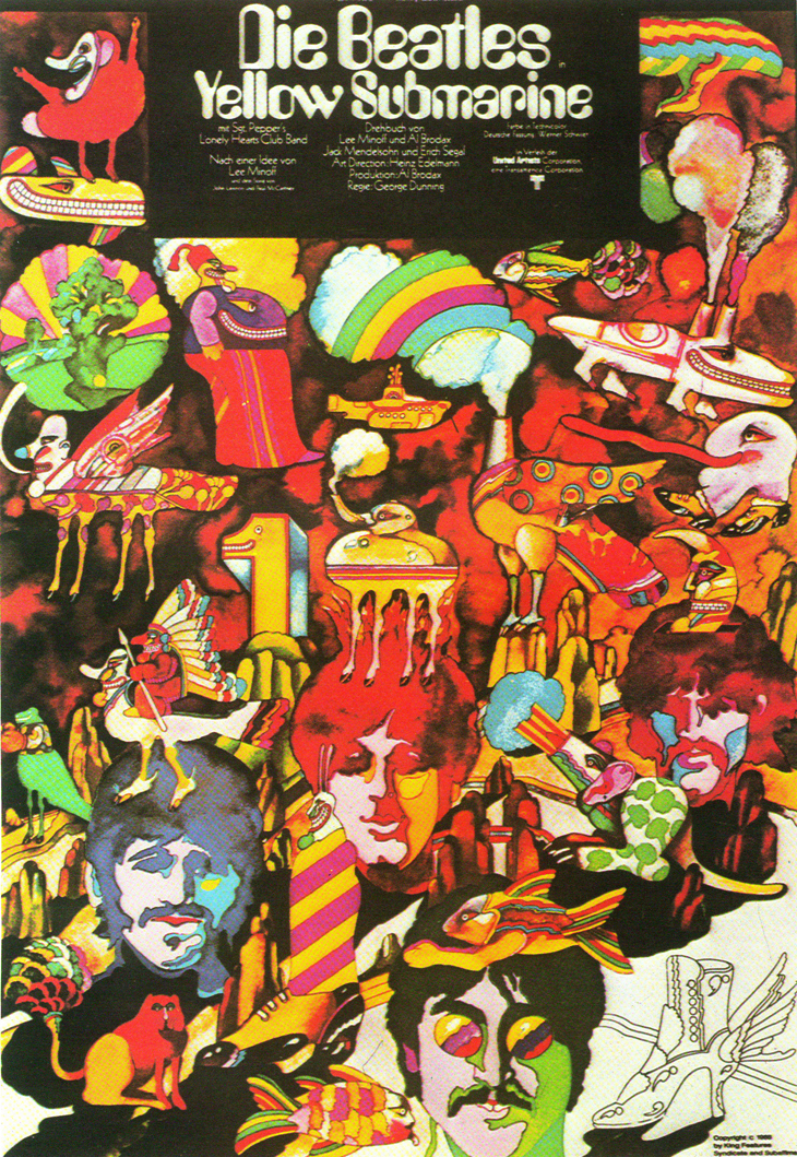
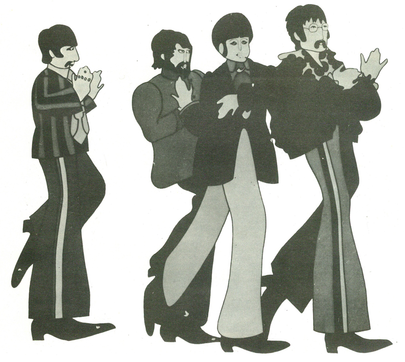
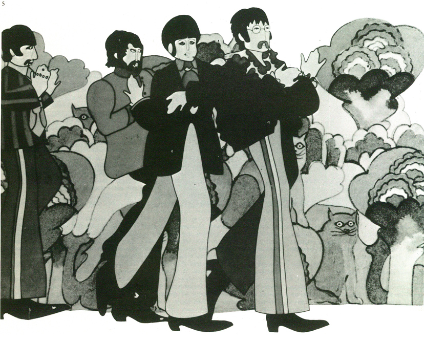
 G.D.: Yes. So that’s why our studio did the thing. As I said, the design of the characters in the TV show was hopeless, although King Features had no objection. They were completely without any point of view on the thing. It was sort of business. We were desperate and I was jumping around like mad because I knew that had to be really well solved or we were dead. I tried with different kinds of designs. We got a bit of track of the four boys talking after they’d left the pot open once on a recording. So we took this talk and animated to it and kept testing and trying different things. We saw and had admired Heinz Edelmann’s graphic designs in “Twin” magazine. And thought why don’t we even try him. So we got in touch with him, he flew over and we showed him what we were doing and he disappeared for two weeks. I remember this brown envelope arrived with four drawings in it, one of each Beatle. It was really marvelous cause it had that solved, attended-to quality. You could see it wasn’t Mickey Mouse, it wasn’t this, it wasn’t that – it was just there! The film is very much a phenomenon.
J.C.: It’s a time capsule of the sixties.
G.D.: It is that. That’s the contribution of many people. The film would have had a life because of the Beatles music.
That’s a separate consideration. And the fact that Heinz solved that side of it was so great and that was marvelous.
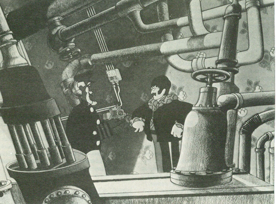 We had a budget of a million dollars, and eleven months to do it. The Beatles took $ 200,000, off the budget. There were three animation directions on it: Jack Stokes, who learned his trade with a group of people – a whole generation of animators in London – from a Disney man who came over, David Hand (Director of “Snow White”). Eddie Radich was another animation director on “Submarine”; Bob Balser, who has been for a long time in Barcelona. He’s the third director.
There was a period of about five months where we had 200 people working together in out studio in Soho Square. My memory of that time is that it was amazingly unfrantic, in the sense of devoted and productive. Everybody was very grim, hardworking. The whole atmosphere was “We’ll show them” meaning the rest of the world “that we can do this in London.” This odd thing of making a feature.
J.C.: This was the first British feature since “Animal Farm”?
G.D.: Absolutely yes. The film made money left and right. But it didn’t for TVC and very nearly bust us. That’s a very long and very bitter story. We had a really nasty time of it. We went over the budget, not a large amount over. The producer people through King Features organized to take over the company. And we learned an awful lot. Very bitter situation. After it was all over it got smoothed down. We repaired our relationship with King Features. But the whole thing was very sour.
 J.C.: You have retained your credentials as a film artist by making personal films. Is your work at TVC to help you to continue as an independent artist?
G.D.: I would guess that is the answer, yes. One has to live. I had a long stint at the Canadian Film Board. I learned a lot and enjoyed that kind of existence – government backing, budgets for films and all kinds of special facilities that you could get that way, that you don’t get out in the cold world of commerce.
J.C.: Who were some of the artistic influences in your career?
G.D.: McLaren. Alexeleff. Bartosch. Then there’s that whole world of Disney stuff that we’d all he poorer without, and I think in hits and pieces and in various ways it’s been an enormous influence.
J.C.: What is your age?
G.D.: 57
J.C.: Thank you very much for your time.
G.D.: Pleasure.
GEORGE DUNNING (1920-1979): FILMOGRAPHY
1943: J’AI TANT DANSE (I have danced so much), AUPRES DE MA BLONDE (By my blonde, Chants populates), 1944: GRIM PASTURES, 1945: THREE BLIND MICE, 1946: CADET ROUSSELIE, (UPRIGHT AND WRONG), 1947: THE ADVENTURES OF BARON MUNCHHAUSEN, FAMILY TREE (with Evelyn Lambard), 1959: THE WARDROBE, 1962: THE FLYING MAN, THE APPLE, 1968: CHARLEY, THE LADDER, THE YELLOW SUBMARINE, 1970: MOON ROCK, 1973: THE MAGGOT.
Publicity and sponsored films including: 1946: DISCOVERY – PENICILLIN, 1958: THE STORY OF THE MOTOR-CAR ENGINE, 1962: THE EVER-CHANGING MOTOR-CAR, 1962-65: THE ADVENTURES OF THUD AND BLUNDER (safety film for the Coal Board), 1966: BEATLES (TVseries with Jack Stokes), CANADA IS MY PIANO (with Bill Sewell).
Articles on Animation &Books &Illustration 05 Jan 2010 09:03 am
Canemaker’s J.P. Miller – 2
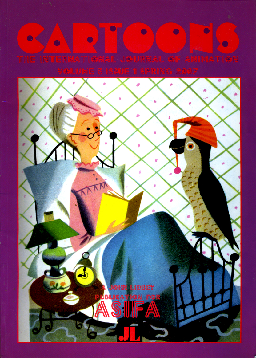 - Last week I posted the first part of a two-part article written by John Canemaker for the magazine, Cartoons, the International Journal of Animation published by ASIFA Int’l. The two part article appeared in the Winter 2006 and Spring 2007 issues. (See Part 1 here.)
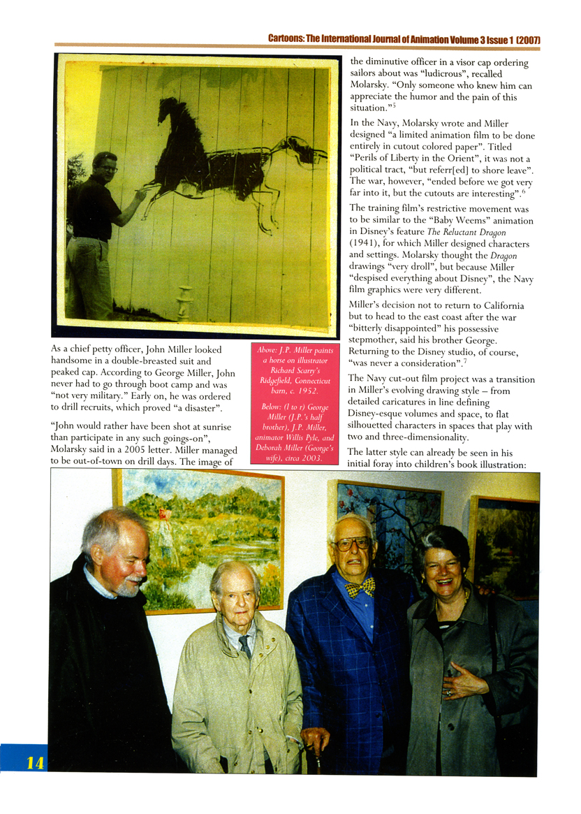
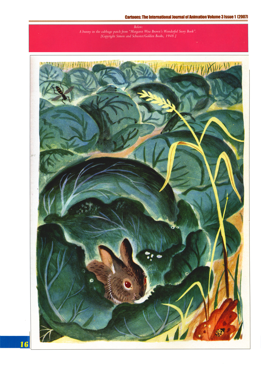
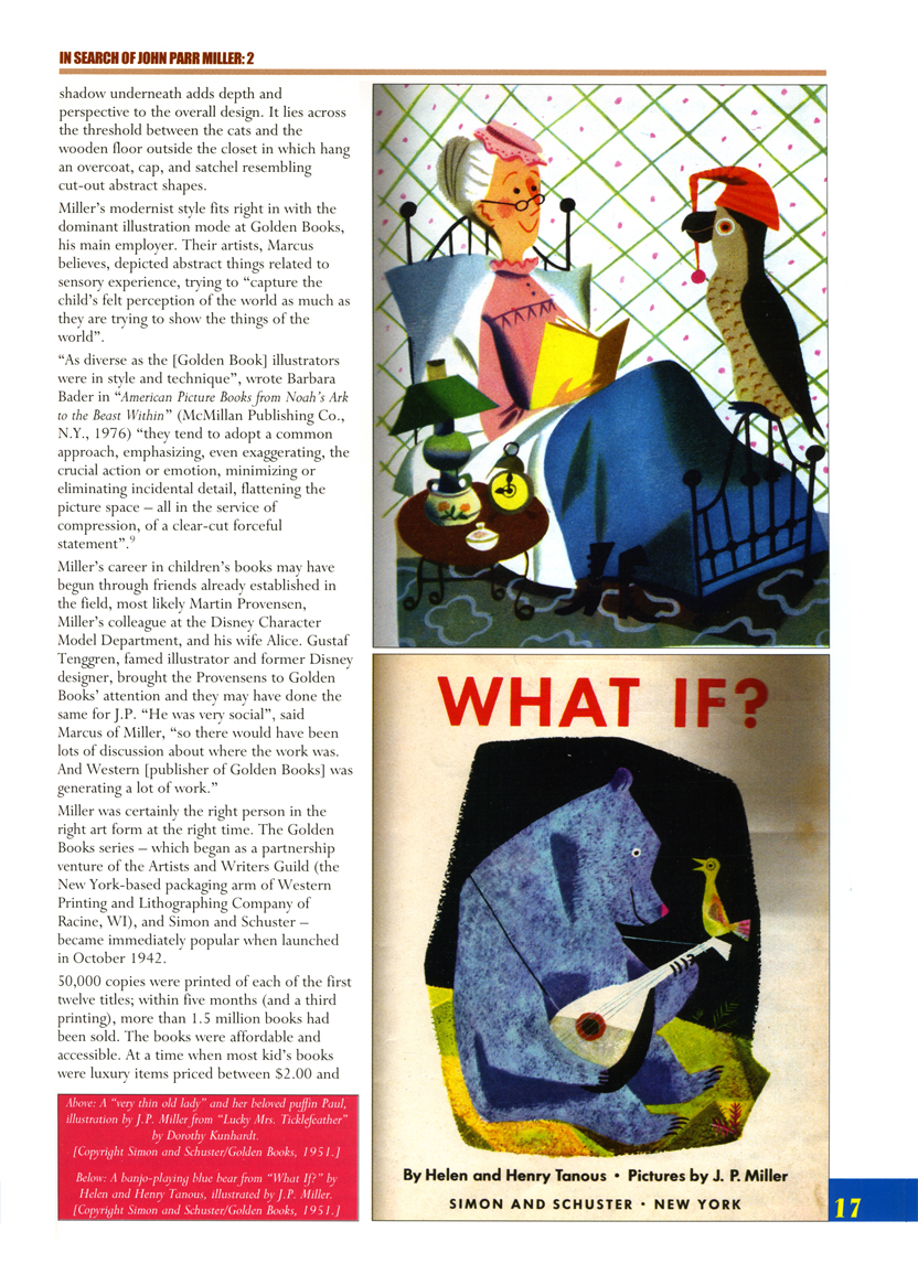
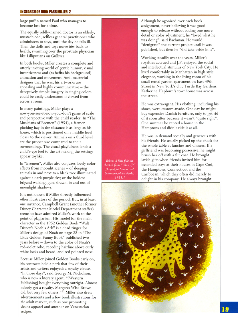
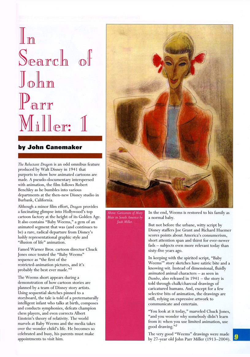
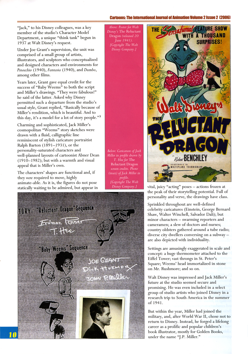
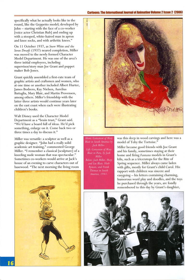
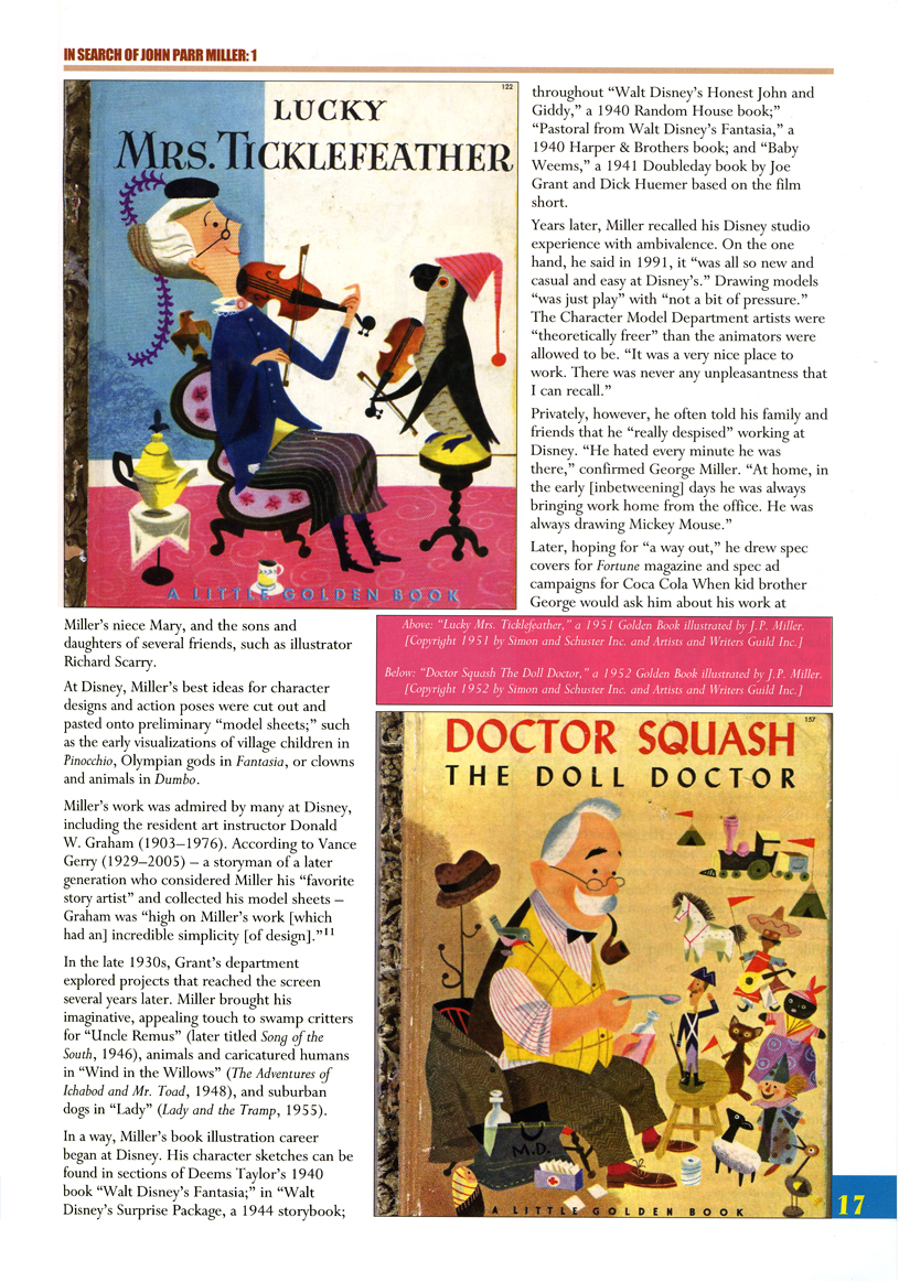
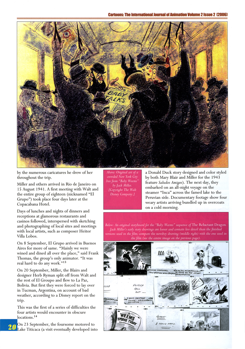
John Parr Miller worked at the Disney studio from 1934 to 1942 as part of the Character Model Department run by Joe Grant. After Miller’s service in WWII, he designed and illustrated many children’s books and he continued in that field for the remainder of his life.
This is an extraordinarily well-researched article by John Canemaker, and I’m pleased to post it here for all those who don’t have access to the magazine, Cartoons. Thanks go to John for his permission to post both parts of the article.
With more of a focus on his children’s books, this is part 2:
 1
1 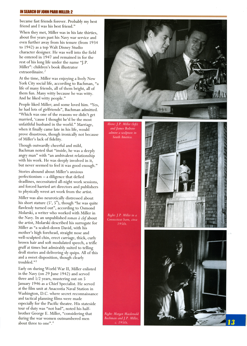 2
2(Click any image to enlarge.)
 3
3 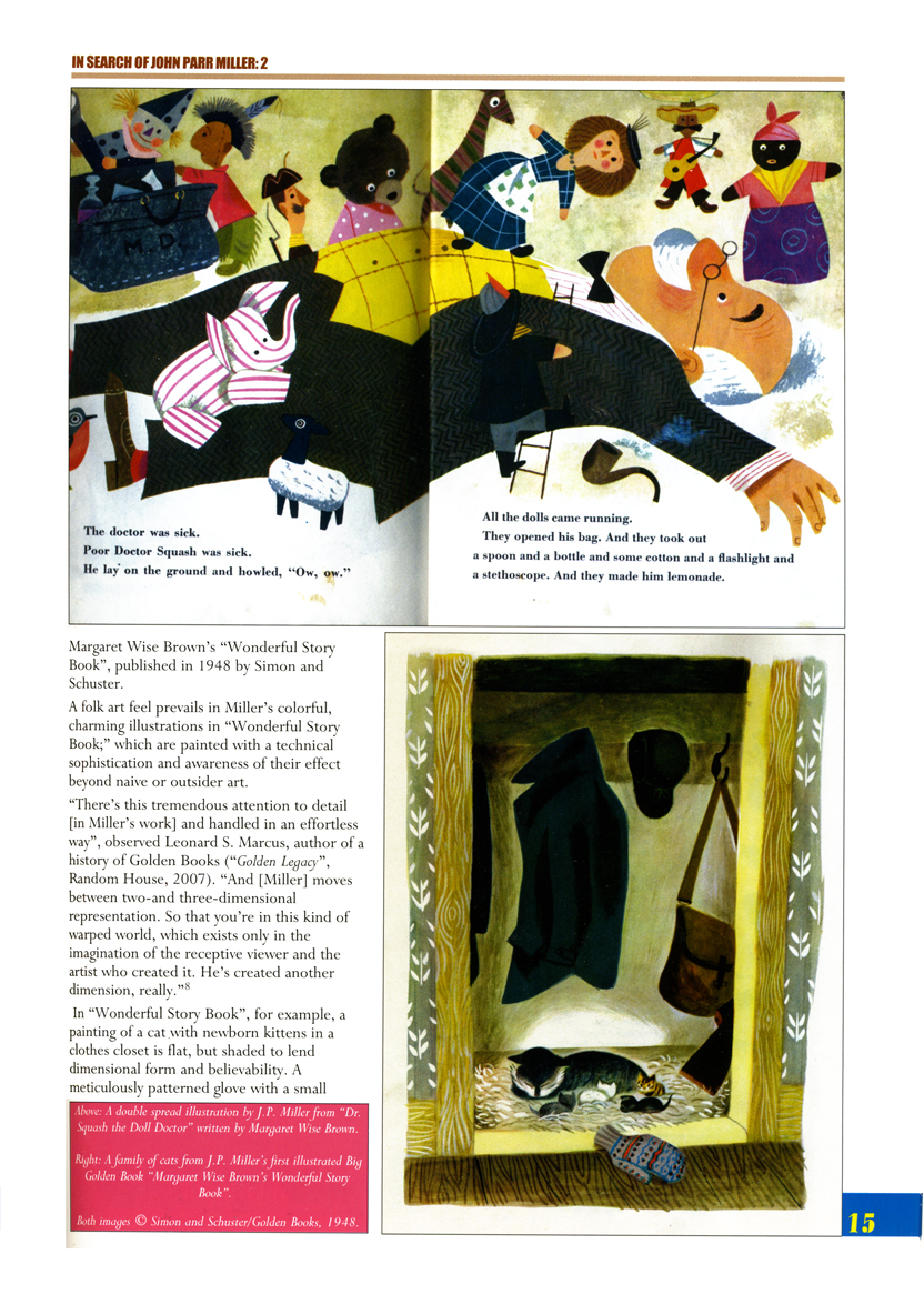 4
4
 5
5
 6
6 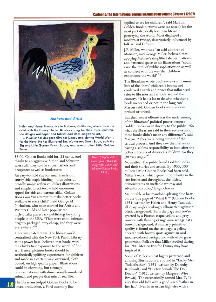 7
7
 8
8 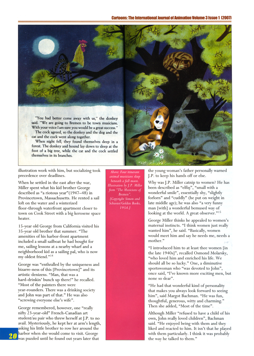 9
9
 10
10 11
11
 12
12
 13
13 14
14
Articles on Animation &Disney &Illustration 29 Dec 2009 08:38 am
Canemaker’s J.P. Miller – 1
 - John Canemaker contributed a two part article on J.P. Miller to Cartoons, the International Journal of Animation published by ASIFA Int’l. The two part article appeared in the Winter 2006 and Spring 2007 issues.
John Parr Miller was a designer who worked at the Disney studio from 1934 to 1942 as part of Joe Grant’s elite Character Model Department. After his service in WWII, he became a children’s book designer and author remaining in that field for the remainder of his life.
J.P. Miller’s career at Disney’s is not something we often hear about, and I think the information in John’s extended article is so valuable that it has to get out there even further and be shared more openly. Consequently, with John’s permission, I’m posting both parts.
This is part 1:
 1
1(Click any image to enlarge.)
 2
2  3
3
 4
4  5
5
 6
6 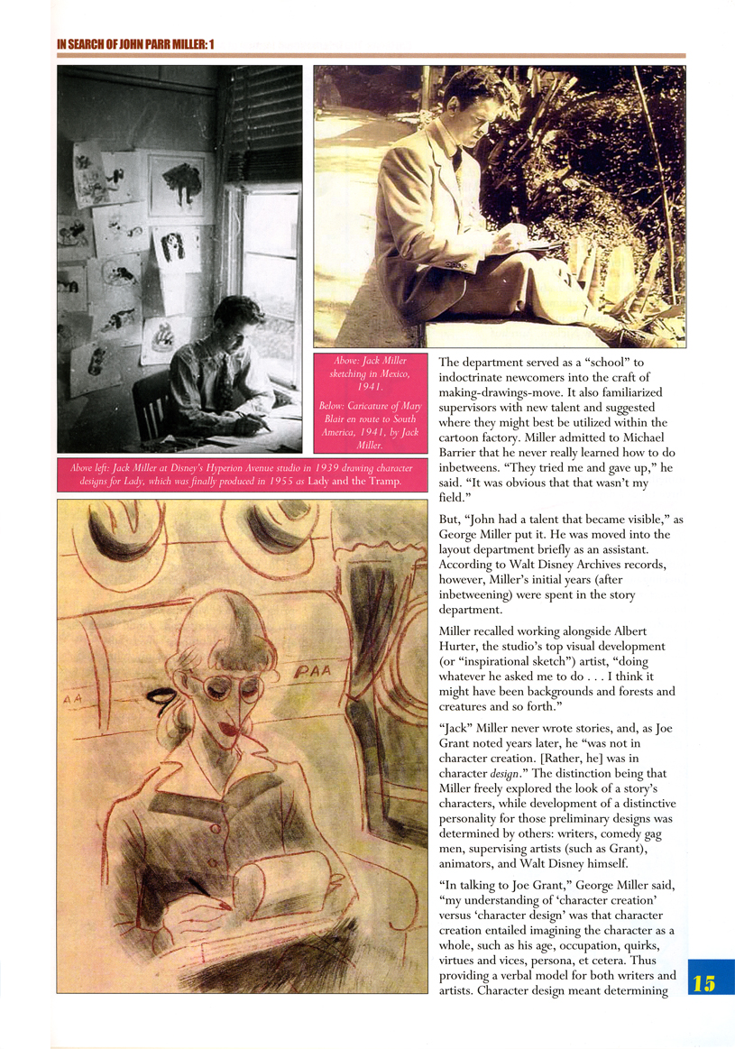 7
7
 8
8
 9
9
 10
10 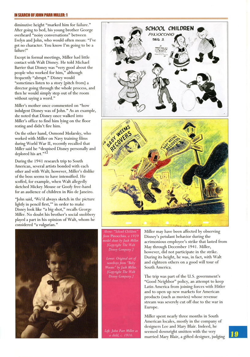 11
11
 12
12  13
13
Articles on Animation &Books &Illustration &Norshtein 18 Dec 2009 09:28 am
Norshtein Comics – 5
 - We’re starting to wind down on this delightful book. It’s Tanya Usvayskaya‘s drawn diary while she worked for Yuri Norshtein‘s studio. This book caricartures the small family within the studio and Norshtein’s world during that period.
Richard O’connor, whose Asterisk Productions does wonderful animation of their own, gave the book to me as a gift, and I’m pleased to share it with you.
Note that the translation by the Japanese publisher isn’t always the best, but it does capture the gist of the original Russian. I’m transcribing the book without alterations.
The first four parts of the book can be found here:
Norshtein Comics – 1
Norshtein Comics – 2
Norshtein Comics – 3
Norshtein Comics – 4
Here we continue with a chapter on “Pirat,” the studio’s dog:
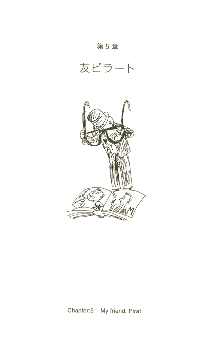 49
49Chapter 5: My Friend, Pirat!
 50
50
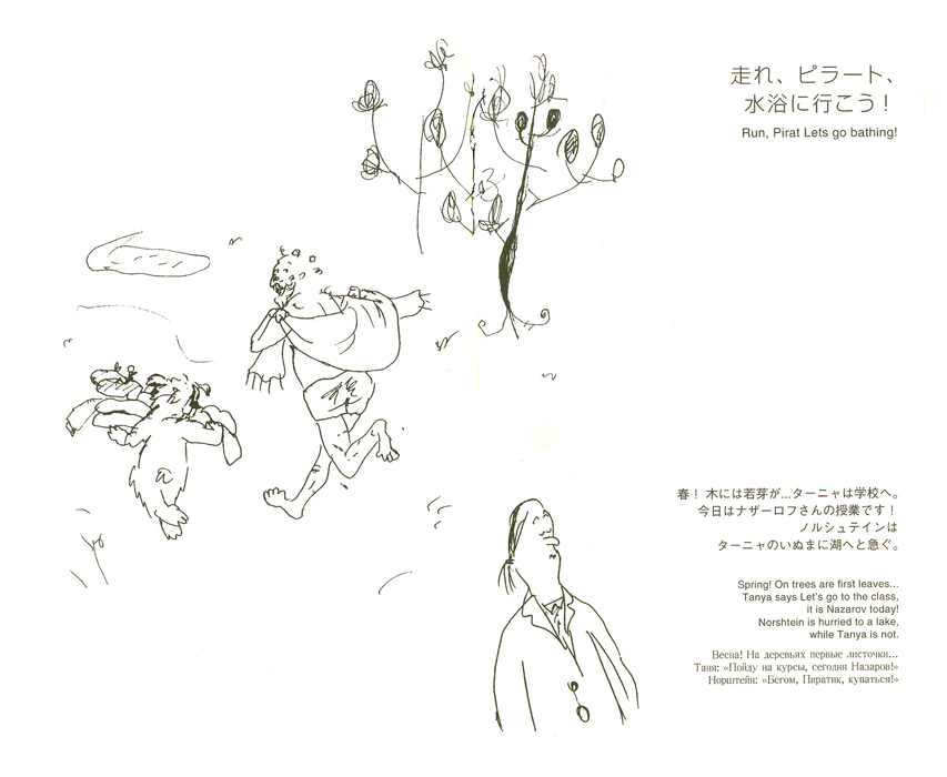
“Run! Pirat let’s go bathing!”
Spring! On trees are first leaves.
Tanya says “Let’s go to the class. It is Nazarov today!
Norshtein is hurried to a lake,
while Tanya is not.
 51
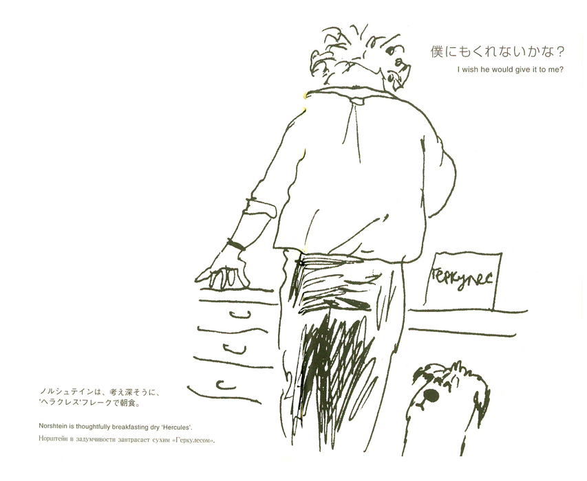
51
“I wish he would give it to me.”
Norshtein is thoughtfully breakfasting dry “Hercules.”
 52
52
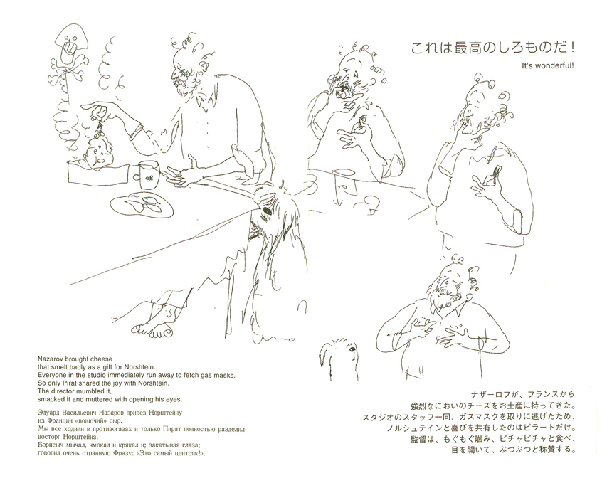
“It’s wonderful!”
Nazarov brought cheese that smelled badly as a gift for Norshtein.
Everyone in the studio ran away to fetch gas masks.
So only Pirat shared the joy with Norshtein.
The director mumbled it
smacked it and muttered with opening his eyes.
 53
53
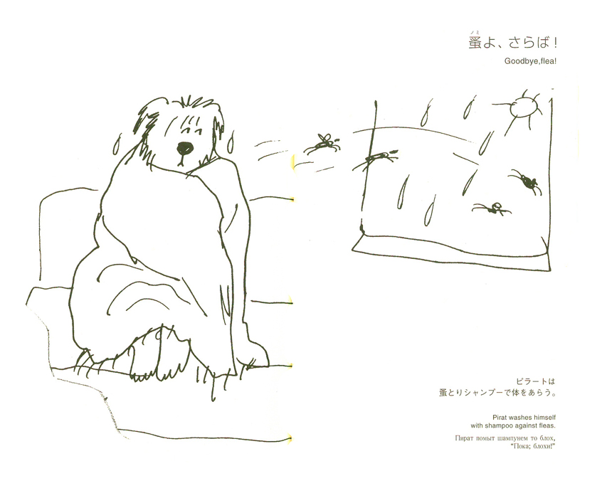
“Goodbye, flea!”
Pirat washes himself
with shampoo against fleas.
 54
54
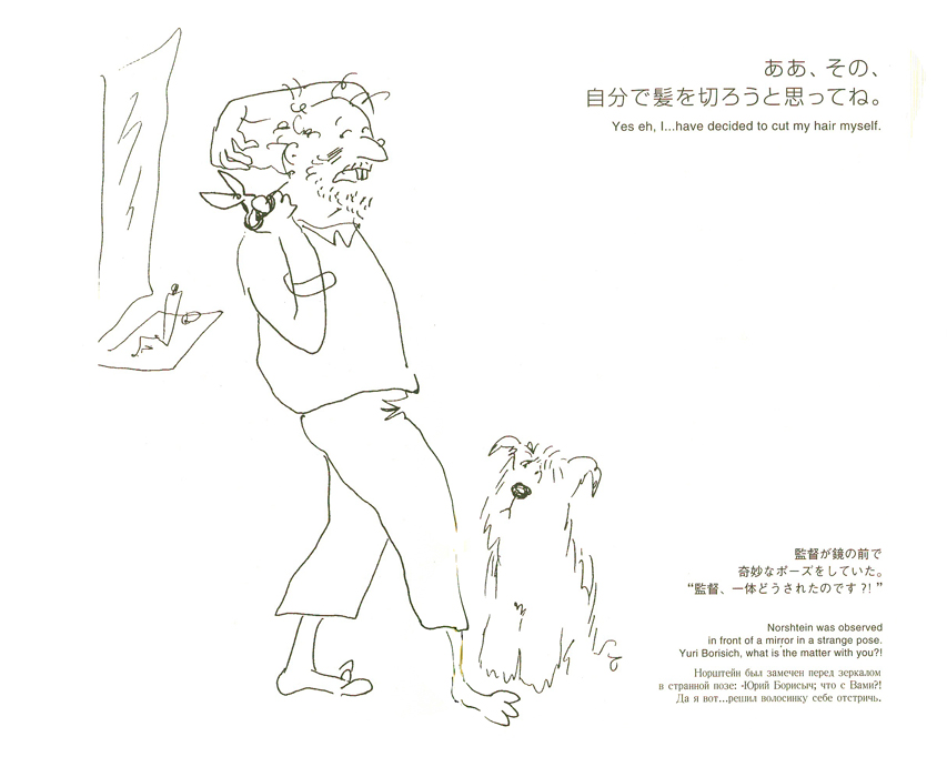
“Yes, eh, I . . . have decided to cut my hair myself.”
Norshtein was observed in front of a mirror in a strange pose.
“Yuri Borisch, what is the matter with you?”
 55
55
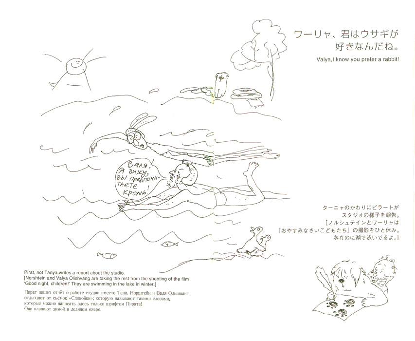
“Valya, I know you prefer a rabbit.”
Pirat, not Tanya, writes a report about the studio.
[Norshtein and Valya Olishvang are taking the rest from shooting the film.
Good night, children. They are swimming on the lake in the winter.]
 56
56
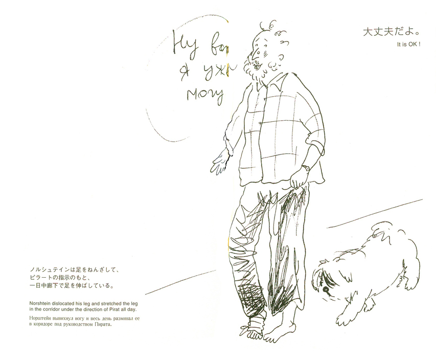
“It is OK !”
Norshtein dislocated his leg and stretched the leg
in the corridor under the direction of Pirat all day.
 57
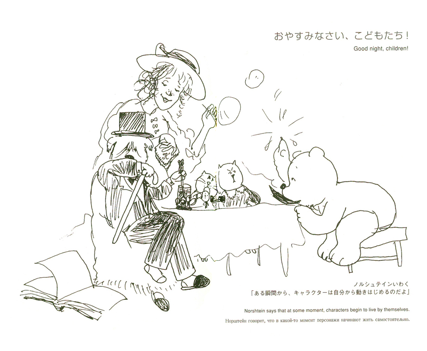
57
“Good night, children !”
Norshtein says that at some moment,
characters start to live by themselves.
Articles on Animation &Events &UPA 14 Dec 2009 08:35 am
Howdy Doody’s Hat Trick
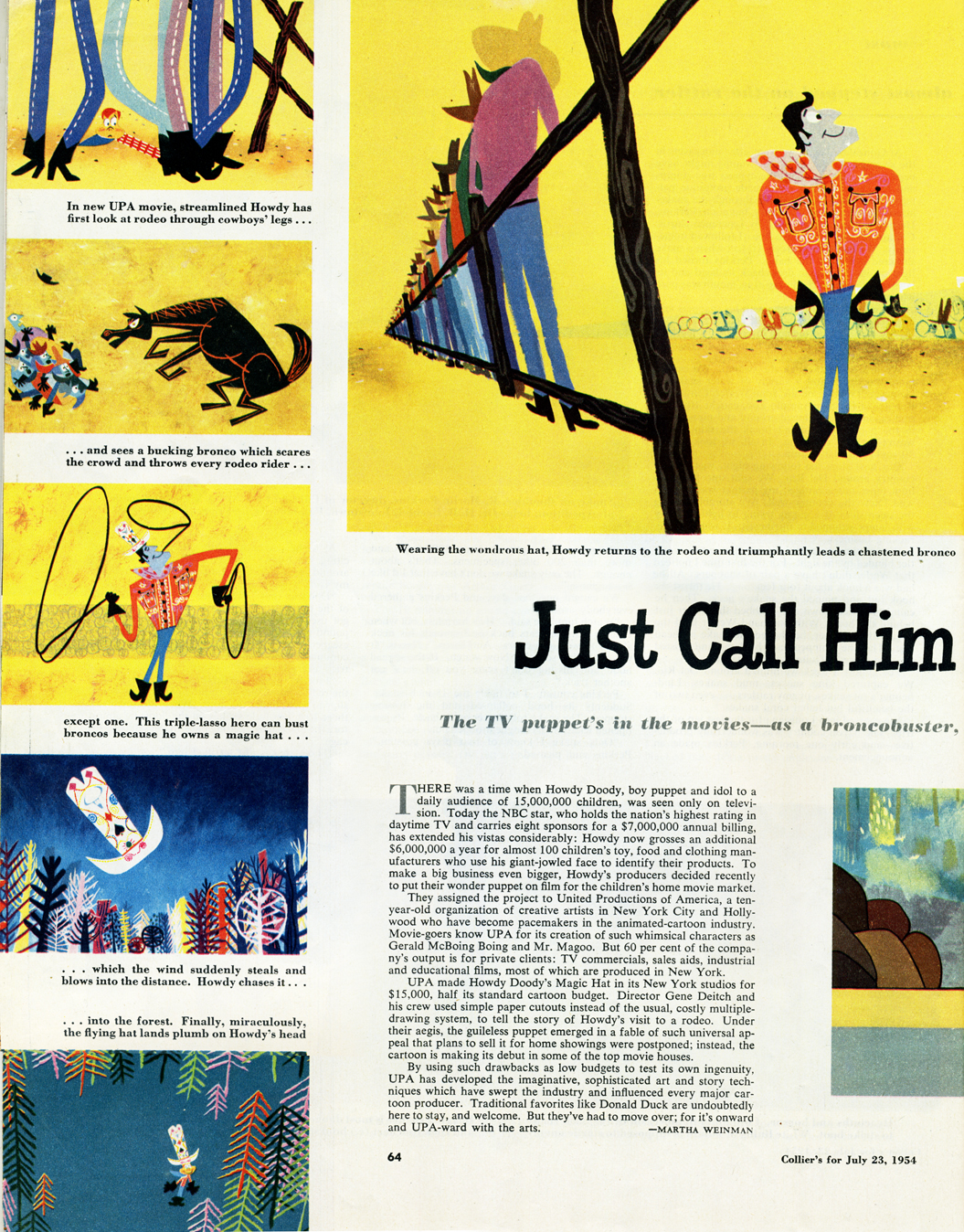
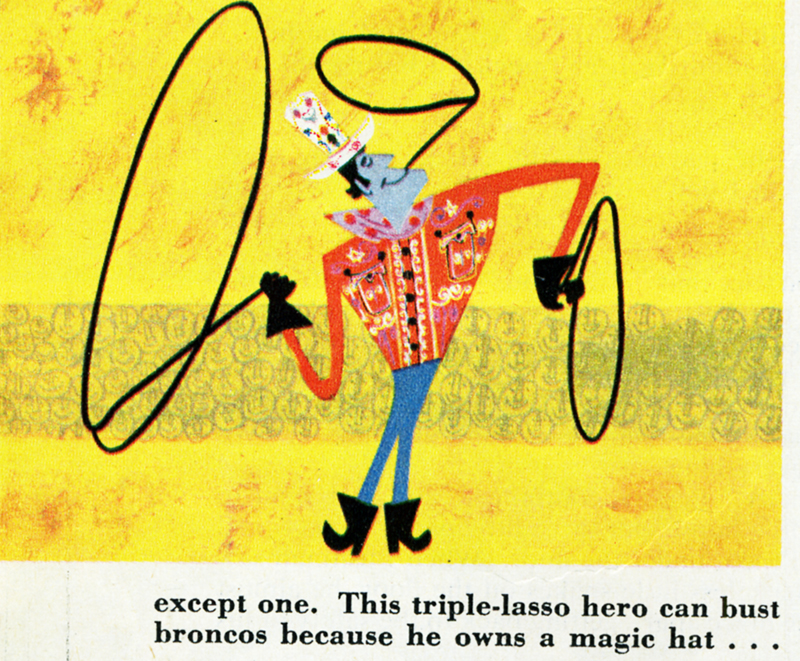
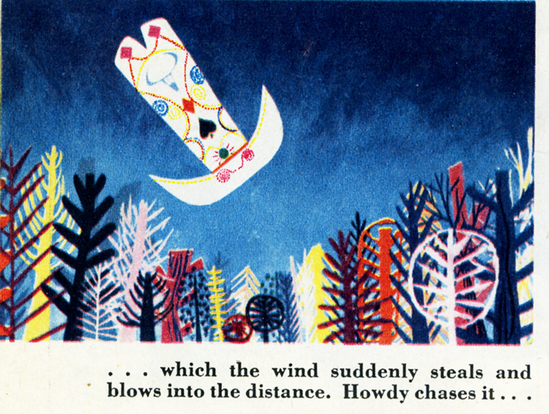
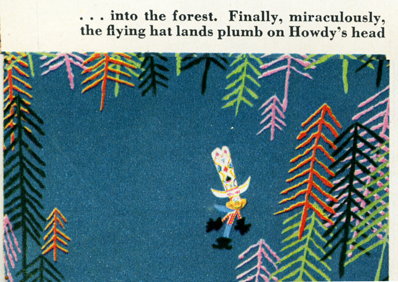
 - Not too long ago, Cartoon Brew had an article about Gene Deitch and the short he directed, Howdy Doody and His Magic Hat. Apparently, the film was held back by Bob Smith and was never officially released.
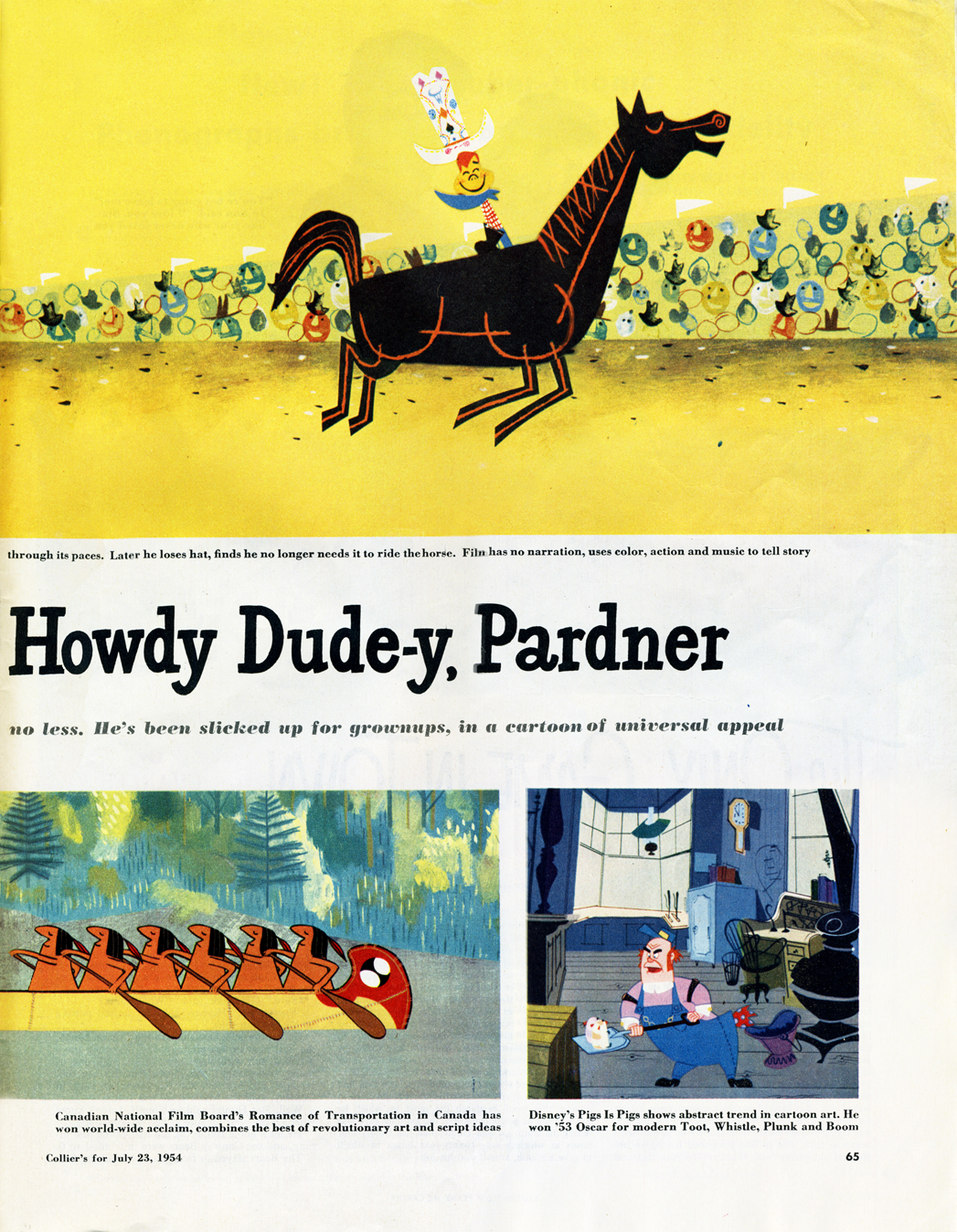
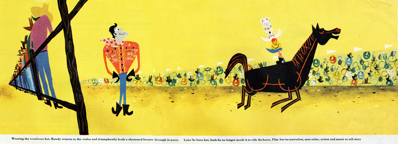
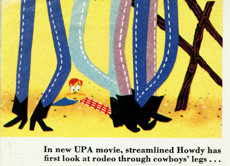
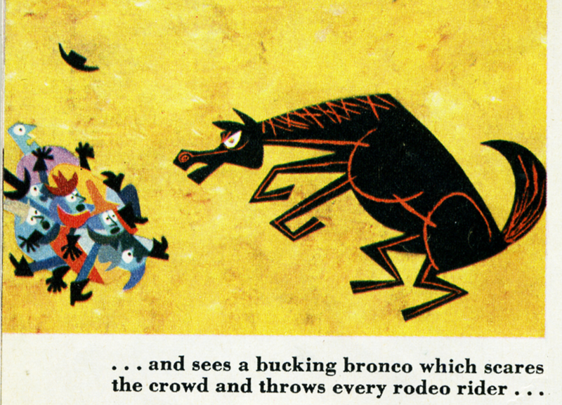
An issue of Collier’s Magazine was mentioned which had printed an article about this UPA short. I recently picked up a copy of the magazine and am posting the two-page article. Interesting that the author of the article says that the short animates cut-outs rather than the “usual, costly multiple-drawing system.” It doesn’t look like cut-outs, but you can’t properly tell from the stills. They also state that the film had a budget of $15,000.
Hopefully, the short will someday show up on our radar, and Gene Deitch will have the pleasure of seeing his first bit of direction again. Until then, we can be grateful that Collier’s did a colorful article on the cartoon.
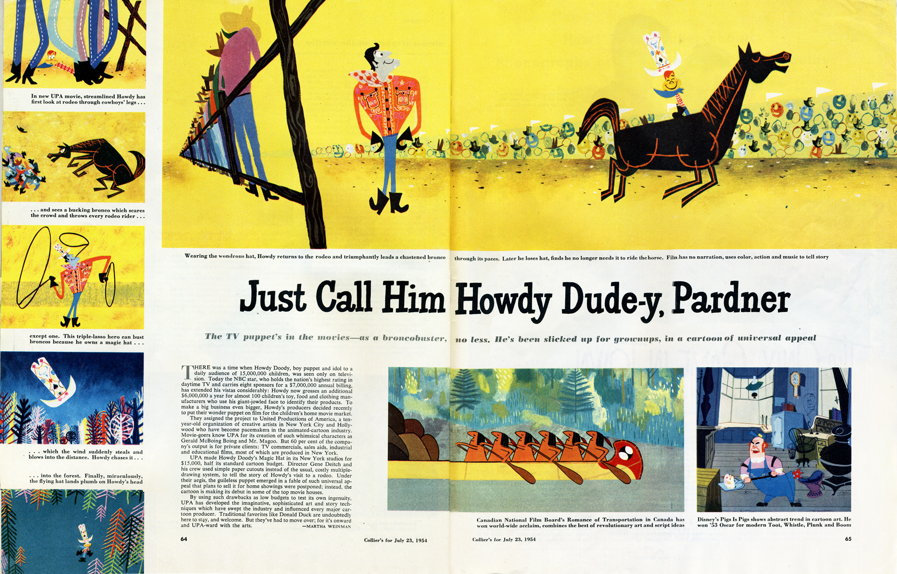
Here’s the full two page spread.”
 a
a
Here are the two separate pages larger.
Here are all of the pictures separated and enlarged.
__________________
-Don’t forget that tonight there’ll be a show of some of the all-time finest UPA cartoons. This will take place at the Lighthouse, 111 East 59th Street, between Park and Lexington avenues. $5.00 admission ($3.00 for members).
The films include:
GERALD MCBOING BOING, MISTER MAGOO’S PUDDLE JUMPER
ROOTY TOOT TOOT, MADELINE, THE TELL-TALE HEART
THE UNICORN IN THE GARDEN, FUDGET’S BUDGET and
GEORGIE AND THE DRAGON
(Personally, I think ROOTY TOOT TOOT is one of the greatest short films ever created and deserves all the attention it can get.)
Pristine 35mm prints will be screened. Not an everyday occurrence.
Animation &Animation Artifacts &Articles on Animation &SpornFilms 09 Dec 2009 08:09 am
Interviewing Bridget
- For a short while I produced a quarterly publication, called Sporn-O-Graphics, that promoted the work and the workers at Michael Sporn Animation, Inc. It was mailed free to about 1000 people on a list we’d put together. The idea was to talk about our films and the people who had made them. There were a total of six issues of this paper. I’ve posted a couple of the issues or more interesting bits in them on this blog, (here and here) and today I’d like to post an interview that was in one of the last issues. Bridget Thorne was as important to me as anyone who’s ever worked here. Denise Gonzalez also worked for me – at the time she edited and put together Sporn-O-Graphics.
Behind the Scenes with
Bridget Thorne
Interview by Denise Gonzalez
Bridget Thorne is a background designer who has been an important part of Michael Spom Animation for more than fifteen years. In that time she has enhanced the look of MSA films with beautiful backgrounds that are, in a way, part of the characters rather than just a scenic backdrop.
 DG: How long have you been working with Michael Sporn?
BT: I first started working for Michael in 1979 on Byron Blackbear And The Scientific Method, a fifteen minute short for the Learning Corporation of America. It is actually one of my favorites. I started out as a scenic painter for plays. I worked with a designer and basically dressed the set. We’d paint the exteriors, lay in wallpaper, marbleizing floors, etc. I started at Williamstown and at Playwright’s Variety in New York, I did a lot of off Broadway and off-off Broadway.
DG: Do you see background painting as a complete picture or as a supplement to animated artwork?
BT: It’s a supplement.
 DG: How do you take that into consideration when you start the backgrounds?
BT: Ideally, I take into consideration how the characters are designed. I like the characters to be part of the picture, not stand out like they do in Saturday morning cartoons. It all fits into a stylistic sensibility or pace more than anything else. I’m not a cartoon snob, I’m more of a two dimensional artist than a filmmaker. I design my backgrounds and line style according to the way the characters are designed. What I used to try and do was color the backgrounds, to match the colors of the characters. You work out of your home rather than at the studio. What are the benefits or drawbacks of working this way? I’ve just started doing this and yes, there are benefits. I can get into my own head, and I take off more with ideas because I’m not interrupted as much. But I like being in the studio and staying with the rest of the production as it goes along.
DG: Do you prefer working on original stories or from an existing book?
 BT: It depends on the story. Let’s say IRA SLEEPS OVER, it was great working out here on that because with an existing story you have a style to imitate, and it is easy for a whole bunch of people to follow that when they’re all working in different places. So as far as production goes, that makes it easier. The great thing about original scripts is that they allow for an incredible amount of individual input. What do you take into consideration when designing the look of a film and what preparation is involved? It depends on the story. I tend to have a knee jerk reaction at first or an impulse. I have a Fine Arts background, and I tend to rely on painters. I find fine artists are more in tune stylistically with Michael’s films than the more hard-edged graphic cartoons. (Though I will look at Disney inspirational drawings.)
Then I look at the layouts and the character design, so I sort of work on intuition and impulse. Then I look at the existing elements and put those all together and come up with a design. As far as preparation goes, what I consistently do is make 5×4 sketches of design ideas. For ABEL’S ISLAND I did lots and lots of little paintings of winter and fall and spring.
First three illustrations pictured above:
1. BYRON BLACKBEAR AND THE SCIENTIFIC METHOD.
2. A CHILD’S GARDEN OF VERSES.
3. IRA SLEEPS OVER
DG: When designing the film do you take into consideration that this will be seen by a child?
BT: I’m not a cartoony person so I don’t think about that. I tend to think more — sometimes I run into trouble this way — I think of it in a frame and ideally what I really want is a balanced look on the screen. A lot of times that’s hard because what I see in front of me is so different when it is filmed.
DG: What do you consider to be the best example of your work thus far?
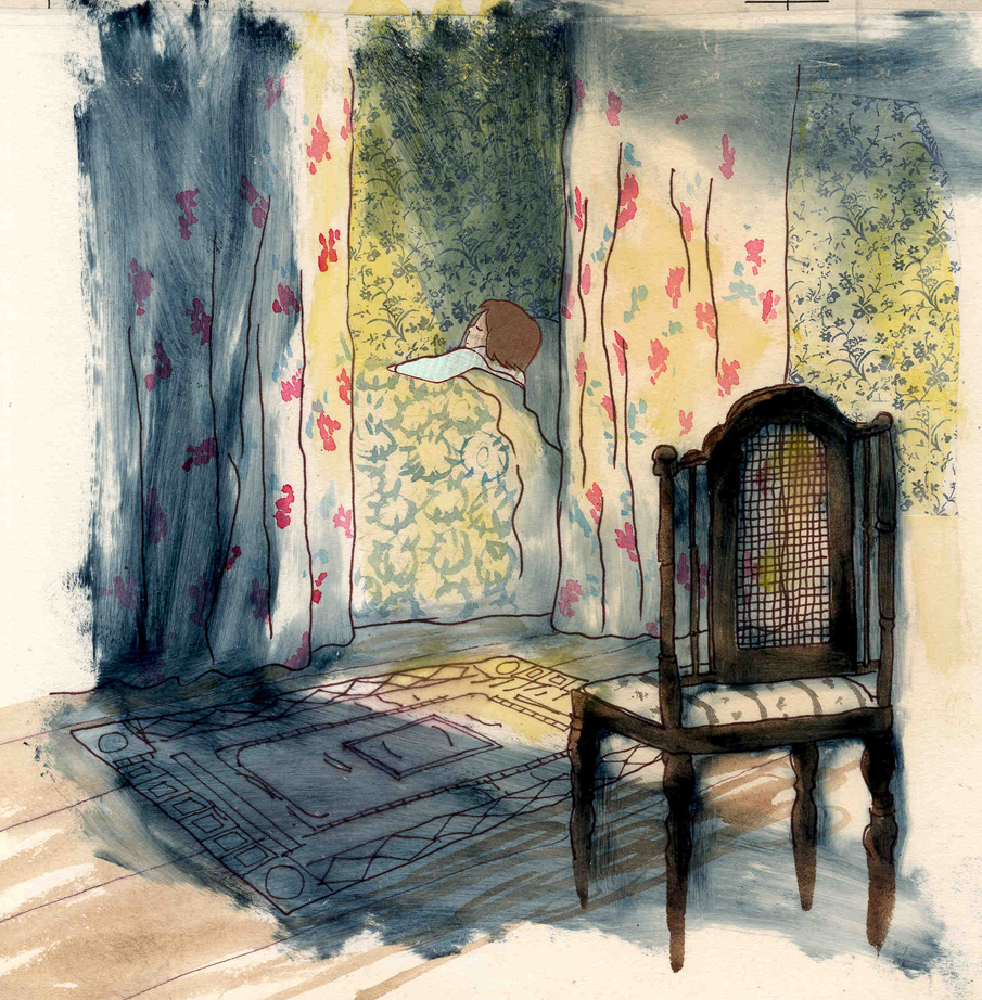
BT: I guess ABEL’S ISLAND. I was able to abstract a little. I wasn’t confined to chairs and bureaus. I was able to match the mood of the movie to the backgrounds. If Abel was in trouble, I could put colors that indicated that, or I could abstract it. If something was calm I could paint it calmly. Abstraction, or looseness, is more my personal style. This is true of Michael’s style, as well.
A scene toward the end of ABEL’S ISLAND.
DG: Have you ever worked on a film you couldn’t connect with?
BT: I’d say yes. It’s a hard question to answer off the top of my head. I sort of think of movies like they were kids; they are either noisy or funny or quiet or sad. They all have their own characteristics, and it is really the process of making the movie that attracts me to animation. I tend to have different feelings about each movie. But yes, sometimes a story irritates me or something comes in and it doesn’t suit my style or what I imagined. It can be very difficult. That’s an interesting thing about animation; there is really a sense of compromise; you are compromising all the time.
A scene of the narrator at the end of THE TALKING EGGS.
A background from A CHILD’S GARDEN OF VERSES.
home from school in WHITEWASH.
Articles on Animation 24 Nov 2009 08:46 am
Alexeieff & Parker
 Svetlana Rockwell, the daughter of Alexandre Alexeieff has recently sent out a letter to several people worldwide. I was fortunate to have received a copy of this via Karl Cohen, the ASIFA-SF president.
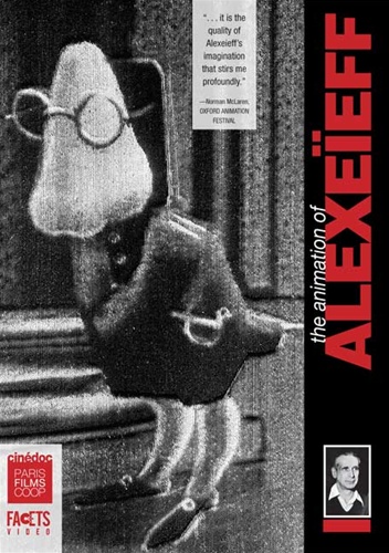
- I am very pleased to be able to let you know that my father Alexandre Alexeieff’s DVD has been produced in this country by FACETS in Chicago.
The DVD was originally put together by my agent Dominique Willoughby ,CINEDOC in Paris. It took him two years to do it.
The result is excellent. It was a work of love!
Years ago, when I read and re-read the Halas/Mavell book Technique of Film Animation, I was particularly curious to see films by Alexeieff & Parker. They were hardly available – even in New York. The best I could do was to see the titles to the Orson Welles’ film The Trial. I had to wait years to see others. These days, of course, like everything else they can be seen relatively easily thanks to such DVDs.
The disc includes their most important films including the renowned adaptation of Moussorgsky’s tone poem, Night on Bald Mountain. Over 30 films are featured, including short animations, stop-motion animated advertisements made for French cinemas, and photographs of Alexeieff’s still artwork.
It also includes The Pinscreen, a documentary by Norman McLaren; Mindscape, a film by Jacques Droulin; Alexeieff and Parker Making Three Moods, a documentary; and a gallery of photos and prints.
You can order the DVD directly from Facets in Chicago.
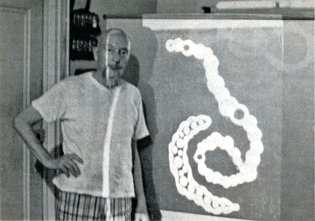
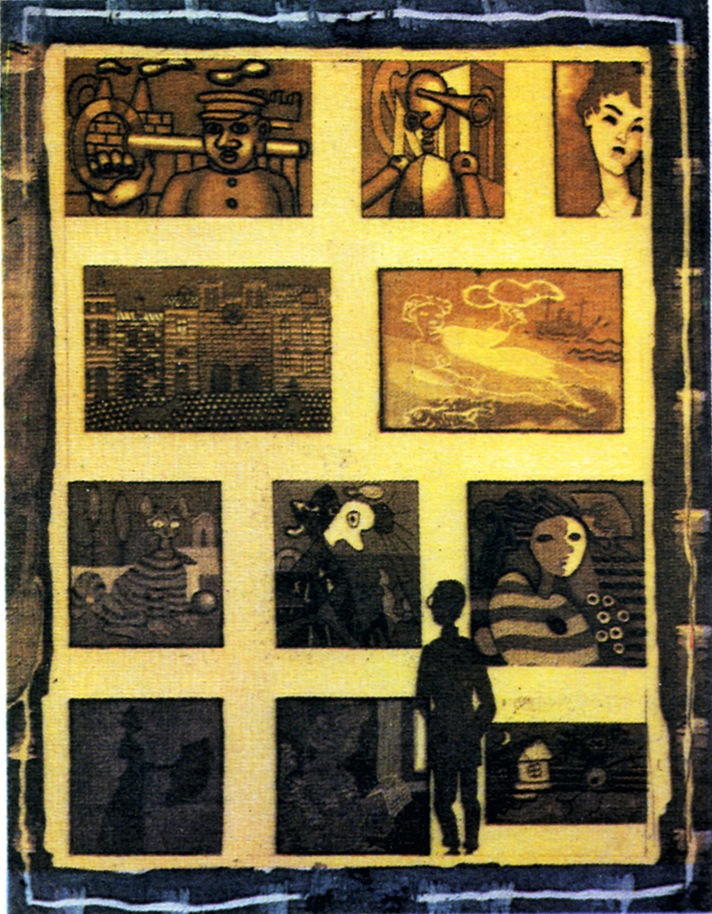
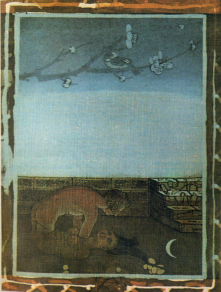
To give more information about the noted duo, whose work is probably not as well known today as it was even 10 years ago, I post this article by Alexeieff written for Animafilm #3, Jan. 1980:
as a profession
by Alexandre Alexeieff
 Does a country exist which would not seem to believe that it must possess a Museum, a School of Fine Arts teaching painting, sculpture, engraving and architecture, a Music Conservatory and an Opera House?
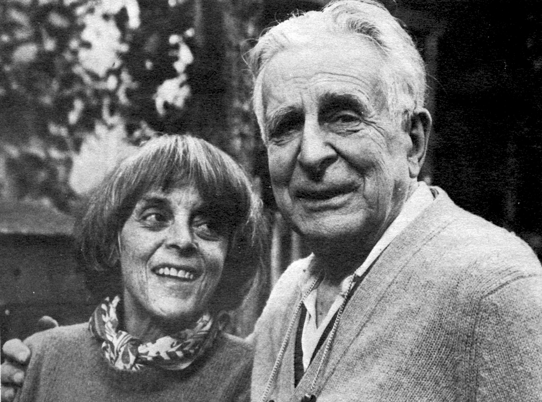
As if there were at any time and in every country great painters, sculptors and musicians… and yet History testifies that the reality is quite different: there are many countries which have never had any great painters, or else have had some, but for a limited time. ________________Claire Parker & Alexandre Alexeieff
For instance a country may have had a great poet hut never a great composer, and so on. A closer study of the history of culture shows that a period during which a given country enjoyed the flowering of one or several particular arts is hut of limited duration. Such a period is invariably followed by a gradual decline consisting of dreary routine due to an excessive respect for stereotyped rules imposed by the elders.
I am particularly impressed by the singular case of Russian classical literature, limited to the first decades of the 1 8th century. It so happened that before 1806 literate Russians spoke and wrote in French. The patriotic feeling engendered by the Napoleonic aggressions resulted in the new fashion of speaking and writing in the native tongue which, until then, had been used mainly by illiterate peasants. A handful of writers (among whom only Pushkin’s name is familiar to the West) ‘ lacking any national tradition, had to create the very language itself, in which they were’to write. Rut never since has Russian literature attained such grandeur. One is tempted to remember the famous line of the French playwright Racine: “.. .qui d’un coup d’essai font un coup de maltre…” What seemed to Racine an exception – an apprentice succeeding as if he were a master – is it an exception or, perhaps, a general rule?
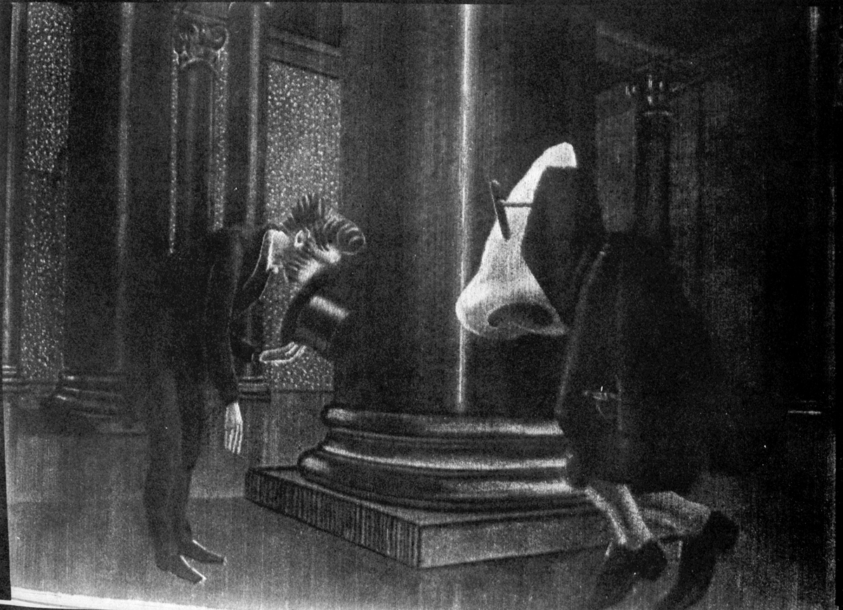
THE NOSE – (1963)
If I remember rightly, it happened around 1922, after the summer vacation was over, that the Cafe du Dome on Montparnasse, which by that time had supplanted the “Rotonde” as the meeting place of painters, opened its redecorated rooms. Its walls were ornate with new polychrome bas-reliefs of a most abominable design prevailing at that time on French banknotes. This discovery gave me immediately the strange certitude that French easel painting was dead for good. And indeed it so happened that after that year paintings of a frankly decorative character supplanted easel painting in everything but name.
I listened nevertheless to the teachings of the new masters with reverence. According to them the utmost care had to be bestowed upon COMPOSITION. Yet one had to care also about TEXTURE. Subsequently it was the preoccupation with texture, which I practised in my engravings, that resulted in the invention of the pinscreen (which is to my mind the purest example of what an engraved plate tends to be).
The year after that sad opening of the Cafe du Dome, when the pinscreen built by Claire and me empowered us to animate my engravings, I conceived that the forthcoming film of “animated engravings” was to show for the first time an image which would remain constantly composed in spite of its movement.
The very first screening of our first rush demonstrated that COMPOSITION was an affair of monumental painting and had nothing to do with movies.
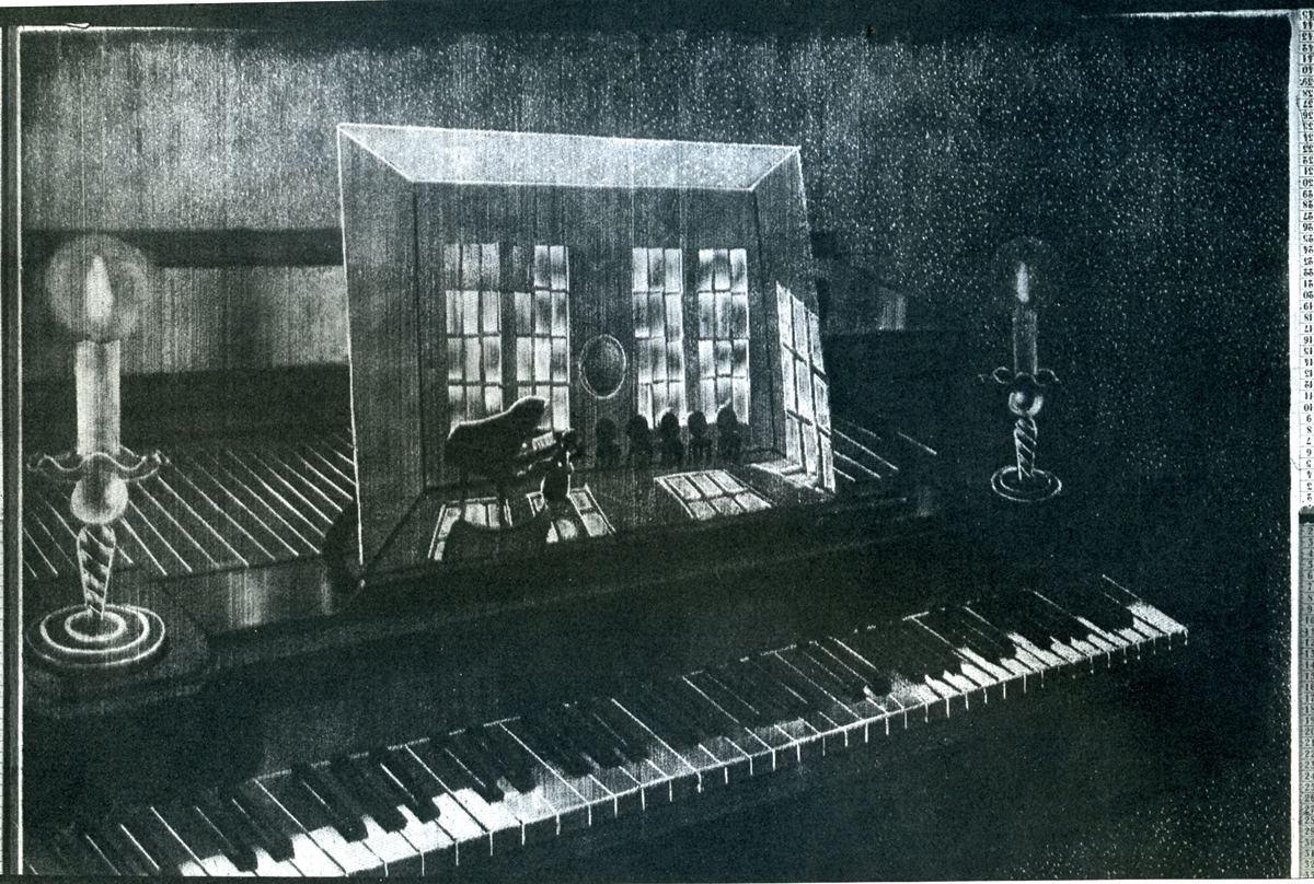
PICTURES AT AN EXHIBITION – (1972)
Forty-five years have elapsed. It no longer looks scandalous to read that easel painting exists no more. In private houses the SINGLE MOVING IMAGE tends to replace static paintings. The rich no longer buy bronze or marble, or paintings in their frozen frames: they buy instead trips to the inhabited inslands of the South Seas. As if humanity were discovering movement and time. As if the ephemeral, the transitory were taking the place of the eternal, the solid, the permanent. One no longer cares about the Seven , Wonders, one bids farewell to Antiquity.
Leaving the three-dimensional, humanity is entering into the fourth dimension.
One may suppose that animation’s destiny is to take the place of painting. Whether decorative or easel painting, does not matter – painting being lost in a maze of sterile scholastic speculations.
Is animation going to live side by side with that sort of animated photography which people call the cinema? Probably – yes, and yet the cinema will have to make some room for animation.
NIGHT ON BALD MOUNTAIN- (1933)
It was in the early 1930s that I saw Renoir’s film showing a white horse galloping on a background of dishevelled clouds. Apparently it was a double print: there were two shots, one of a horse and one of clouds. One of the prints was printed over the other… but I wondered what Renoir’s role was in all that. Dtdn’t he have to accept both horse and clouds such as they were? Certainly it was Re’noir who decided to print the two shots one over the other… was this all he did? Was his part of creation no more than combining recorded real events?
After 45 years, as I understand it motion picture animation is an acceleration of images and events entirely created by the imagination of the artist. These he has to slow down during the step-by-step process of creating the film.
When it crossed my mind to count the days, weeks and months which Claire and me had to spend under the lens of our camera in order to cumulate that time into no more than eight and a half minutes of film, I realised that this was a ratio of about 30,000 to one; reciprocally it might be said that we slowed down an 8 minute long action to some 540 days. There were days when I lived only a fraction of a second during the whole 6 hours of work. This required a discipline yet unknown to me in spite of the pretty hard training I was familiar with as an engraver. The thing looks to me like a sort of slow motion, but now not applied to film hut to human life itself: my life. This had to he so drastically slowed down in order to endow with life an image conceived and made hy me – an image or images of things which (unlike Renoir’s horse) never existed anywhere except in my mind.
 ACCELERATION? I had to examine that. From the start it occurred to me that ACCELERATION is the reverse of SLOW MOTION.
Who can remain indifferent hefore the grace of human and animal movements slowed down?
And yet, why does an acceleration (even a slight one, which is undergone by old films shot at 16 frames per second when screened at 24 f.p.sec.) -why does even so minimal an acceleration invariably look funny.
And more: are there other mechanical accelerations known among the arts? Yes, there are gramophone records of funeral marches which, if recorded at 33 revolutions per minute, sound like gay polkas when speeded up to 78 r.p.min. And in the reverse: a polka, recorded at 78 r.p.min, sounds grave and majestic if played at 33 r.p.min.
It is also illuminating to ponder over the instructions for the speed and character of the interpretation of musical scores: “moderato pesante” or “allargando” or “perdendosi” or “tranquillo”, if not “scherzando” or “andante grave”, even “con dolore” or “allegretto vivo” as well as “feroce” or “maestoso”.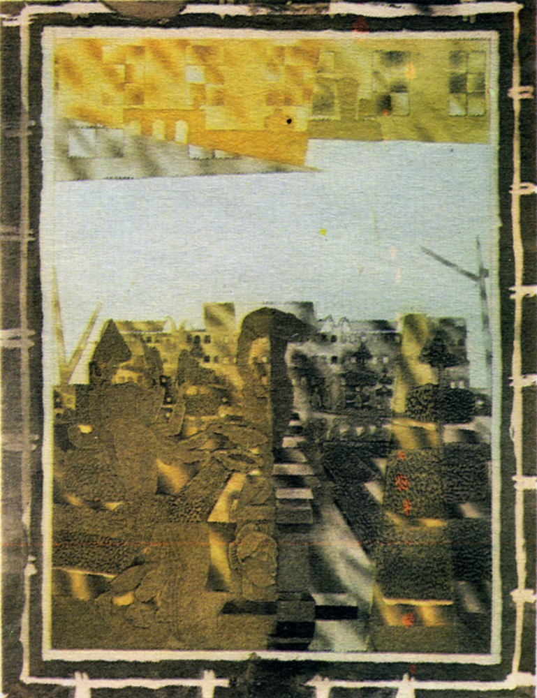
But how about “30,000 times faster”? This is much more than simply faster than “twice as fast”… Here the acceleration is so tremendously out of proportion -could quantity perhaps change the very quality? We cannot answer such a question, but we may note the general trend of animation to rush out of the control of the animator, who is invariably suprised on seeing his shot screened for the first time.
But let us admit also that it is monstrous to spend 18 months for 8 minutes of movement… And then there is that absence of slow motion, which animation ignores… that lack of gravity… that perpetual agitation… that compulsory burlesque… Is it possible that animation cannot do SOMETHING ELSE, as music can?
If I took the liberty to thus speak my mind, it is because I’ve been thinking along these lines for a very long time, I wonder whether some other people do not think like this as well. It is for them that I’m writing.
Doubtless I am not alone in wishing for an evolution. Others than me – Szczechura for instance – are revolutionizing animation admirably.
I also admit that serious subjects have never been well paid for, although burlesque brings in cash. But is big money so important? Impressionist painters did not make money during their lifetime.
 The history of the fine arts is like the card game named “patience”. A solitary game where the cards open their faces one after the other. The future will show what animation can do.
By the way – is there an animator who wouldn’t wish to speed up his production process? This implies the reduction of the ratio between production time and screening time (speeding up production spells out slowing down the acceleration). Therefore Claire and I are presently trying to reduce the speed of out animation to the tempo of slow motion, and I believe we can do it… at least sometimes. Last spring we succeeded in going 50-timcs slower. If we were shooting NIGHT ON BARE MOUNTAIN these days, we might reduce the ratio of 30,000 times to 600 which is almost tolerable.
English version corrected by Claire Parker
©1979, by Alexandre Alexeieff and “Animafilm”
 Claire Parker collaborated with Alexandre Alexe’ieff in the production of all his films made on pin screen. She took part in the animation of all his films, excluding three commercial films which he made in Berlin, and LA PLUME DE F1N1ST – CLAIR FAUCON, made in Rome. The film biography covers their joint work.
1931 – work on the first pin screen: 500,000 little rods sharpened at one end, with a diameter 0.9mm. Surface: I x 1.20m.
1933 – first film, UNE NUIT SUR LE MONT CHAUVE (The Night on Mount Bald). Extremely warm reception of audiences, but poor distribution; six weeks at Pantheon (Paris) and two weefcs at the Academy (London).
1934-LA BELLE AU BO1S DORMANT (The Sleeping Beauty), the first color puppet film starring puppets used for advertising “Nicolas” wines. Cooperation with Jean Aurenche and Francis Poulence. Alexe’ieff gives up puppets and script writing for professionals.
1935-1940 – commercial films (color) with object animation. Cooperation with top European composers. New effects included in ads films of up to three minutes. Friendship with Bartosch.
1937 – an attempt at making a smaller pin screen: 50×65 cm with a simplified structure – a failure.
1940 – A.A. and C.P. find refuge in the U.S.A. Friendships with Canadians, especially with N. McLaren.
1943 – second pin screen. Dimensions 1×1.70 m, 1,400,000 sharp-pointed rods. Diameter 0.45 mm. EN PASSANT (Incidentally) – a film commissioned by the National Film Board of Canada. Lack of interest in this film in the U.S.A. Walt Disney imitates “The Night on Mount Bald” and A.A.’s GRAND FEUX POUR ARTHUR MARTIN (Great Fire for Arthur Martin), but the Americans are somehow distrustful towards Continental artists.
1947-back to Europe; problems: shortages of paper and electricity.
1951-TOTALISATION(Totalization), fortheBel-gian producer Paul Delpire, originates. The film FUMEES (Smokes).
1956 – Films: SEVE DE LA TERRE (Earth Juices), MASQUERS (The Disguised), PURE BEAUTE (Pure Beauty). Admission to the Cineastes Associes.
1963-LE NEZ (The Nose).
1964 – last, 31st commercial advertising film, DE L’EAU (The Wafers,). The producer congratulates A.A. and C.P. on the film but fails to screen it.
1968 – new pin screen with a- more complicated construction. Dimensions: 45×55 cm., 250,000 sharp-ended rodlets. Diameter: 0.45 mm.
1972 – the film TABLEAUX D’UNE EXPOSITION (Pictures at an Exhibition), made on two pin screens. National Film Board of Canada purchases the new screen made by A.A. and C.P.
1975 – an exhibition at the Annecy Castle.
1977 – another pin screen completed. Dimensions: 50×60 cm.; 275,000 rodlets pointed at both ends. Diameter: 0.49 mm. A new film in store, TROIS THEMES (The Three Themes).
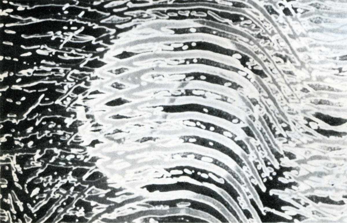
Color Images #5-#8: Graphics by Alexandre Alexeieff
