Category Archiverepeated posts
Action Analysis &Animation &Animation Artifacts &repeated posts &Richard Williams &Tissa David 27 Mar 2013 04:26 am
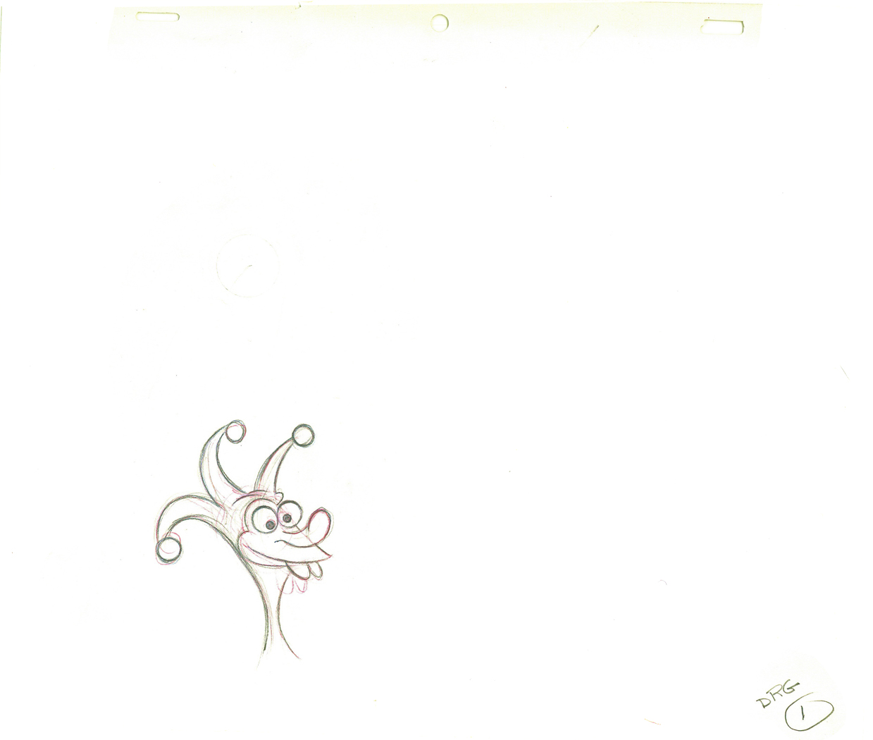
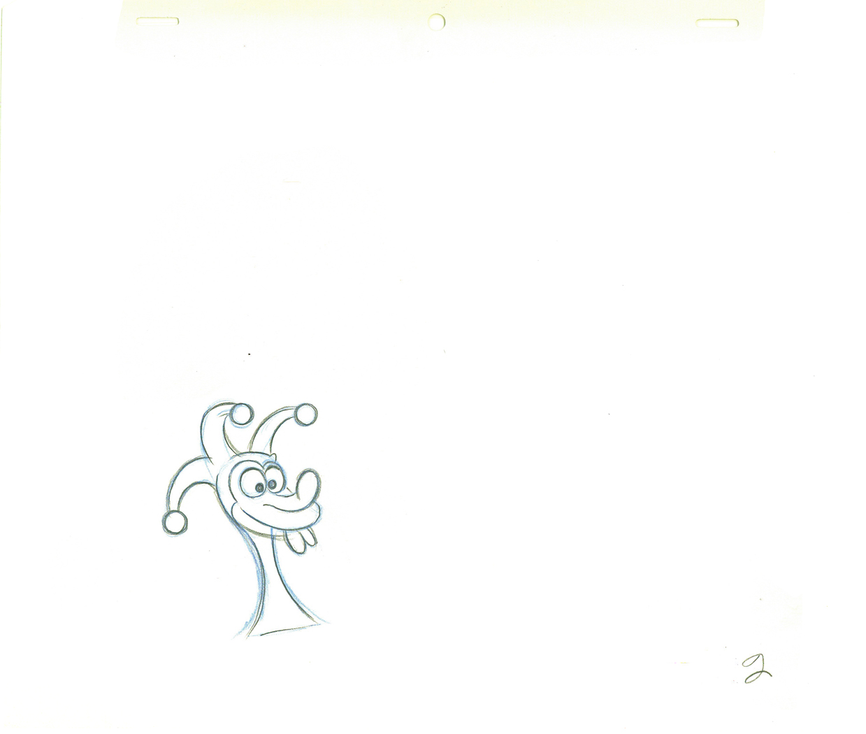
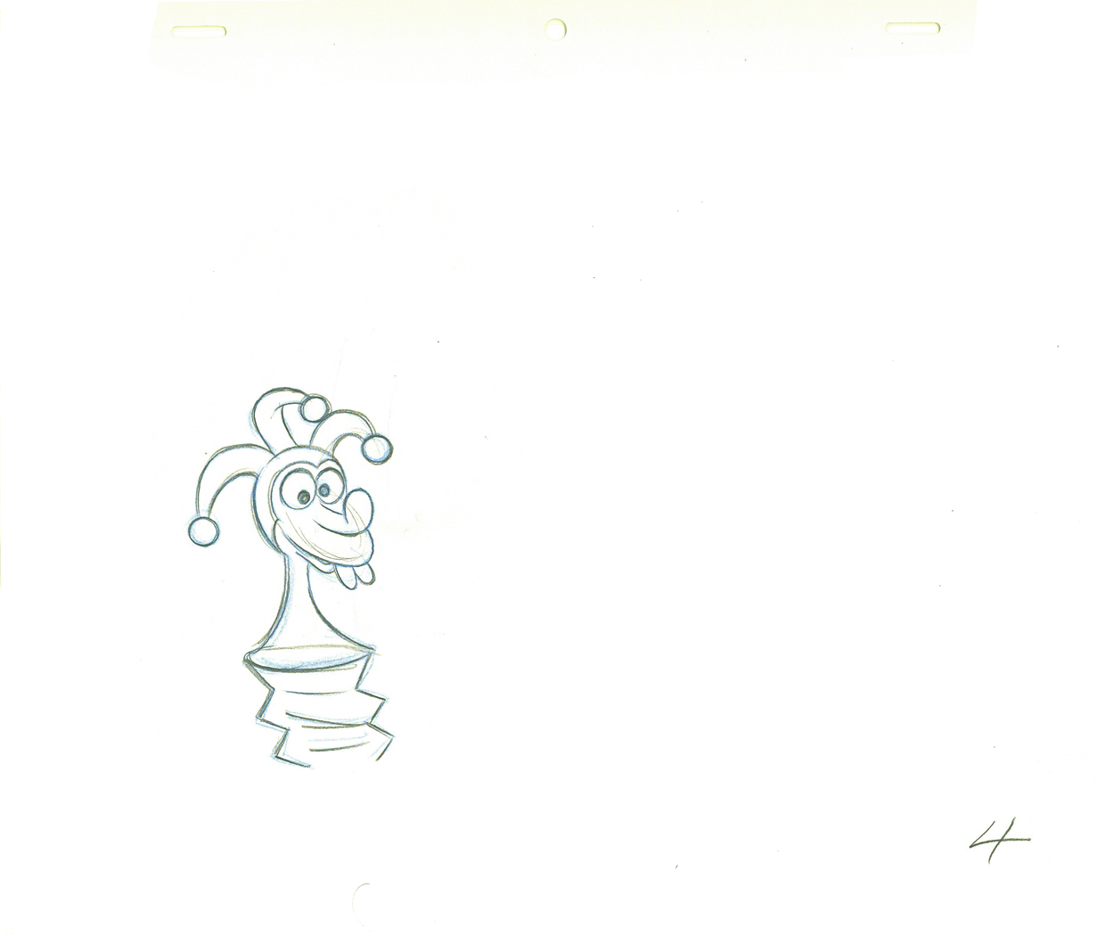
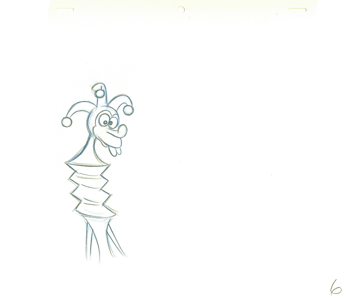
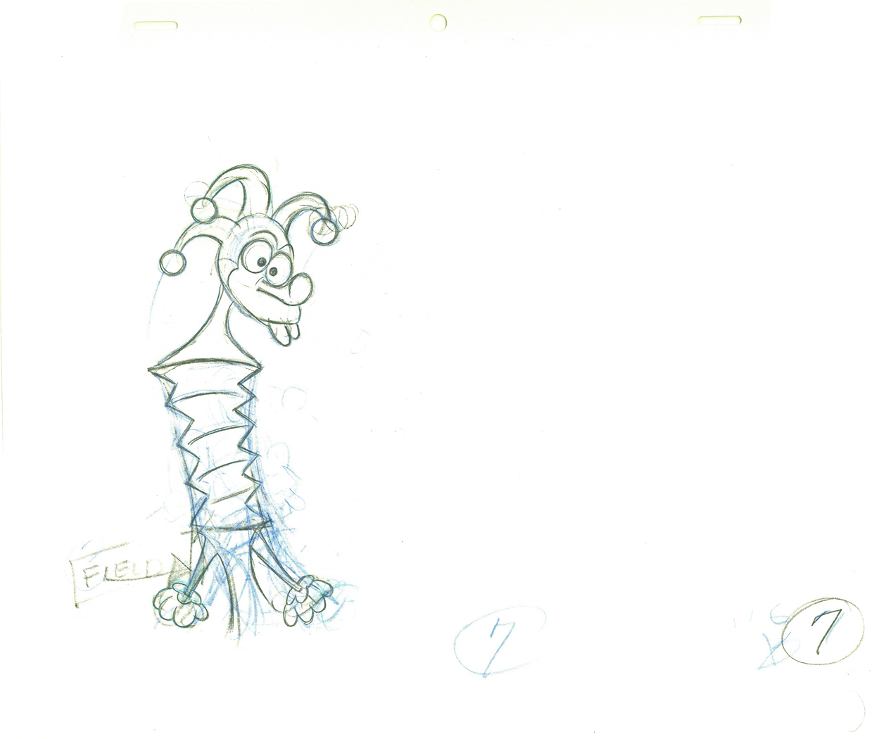
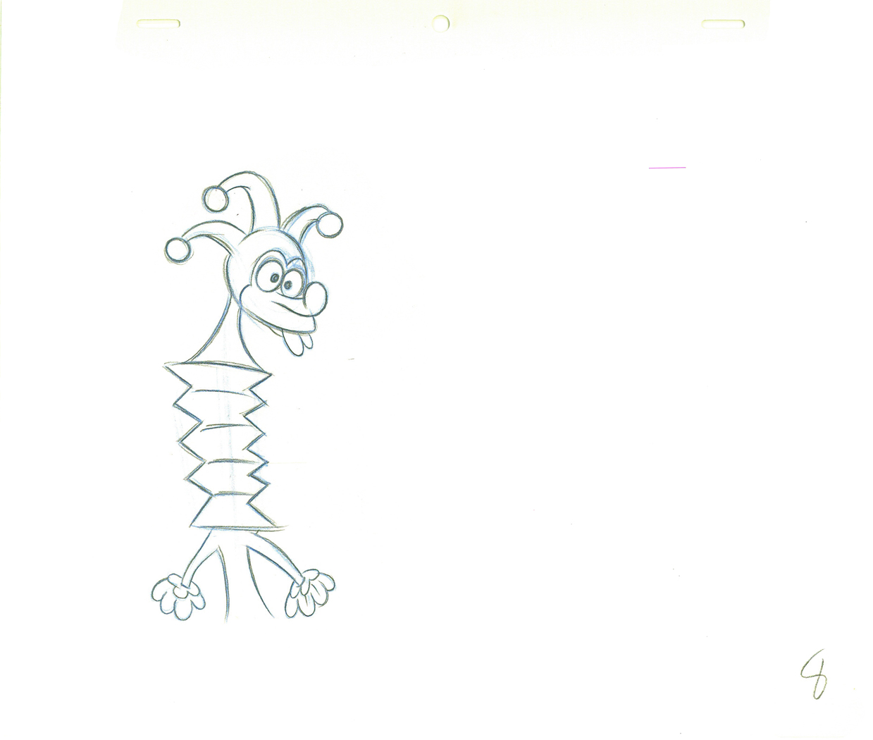
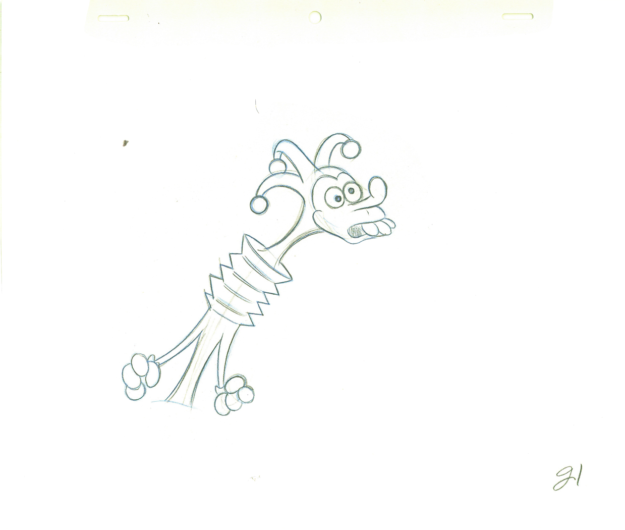
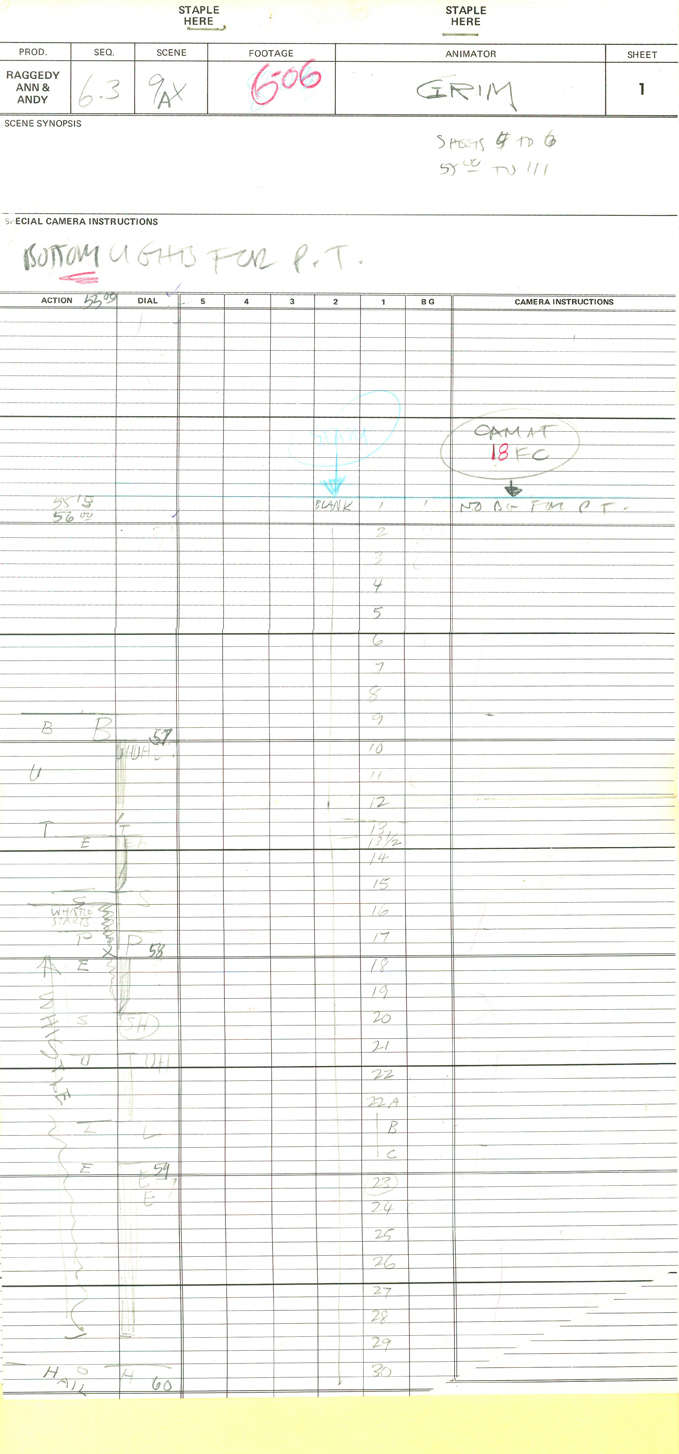
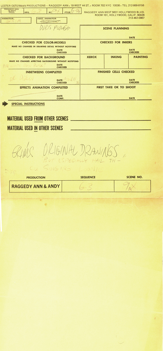
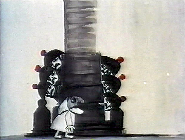
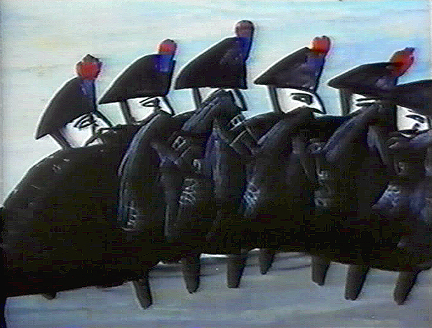
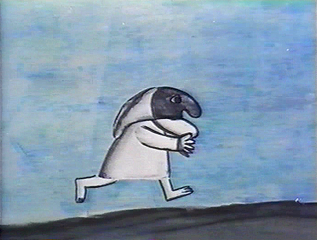
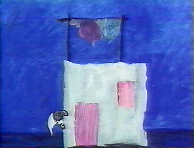
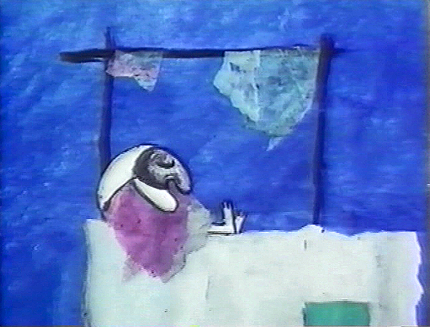
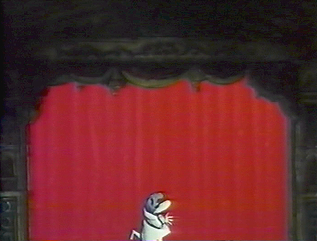
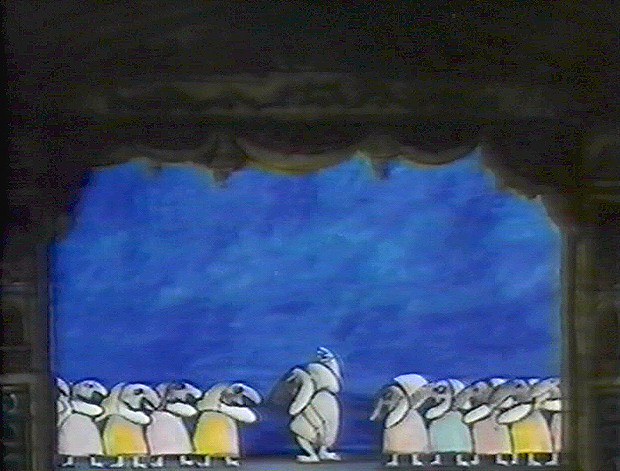
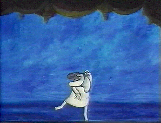
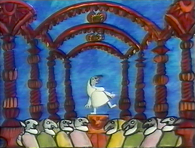
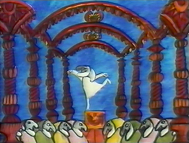
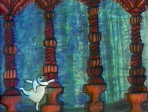
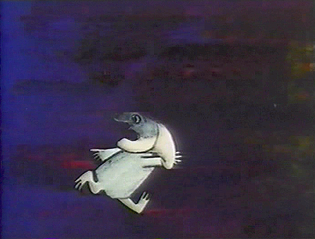
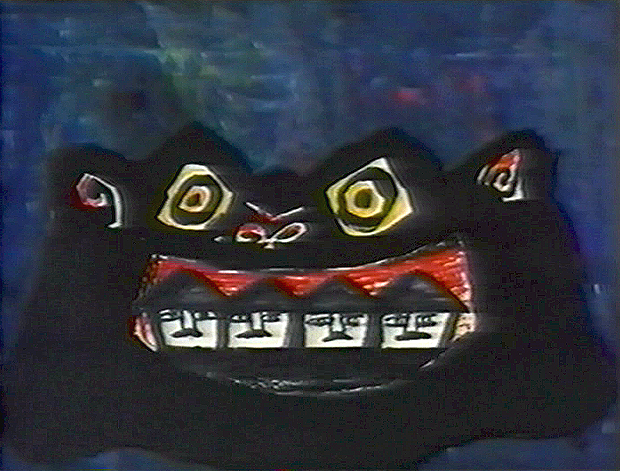
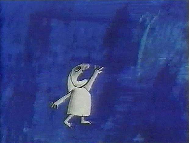
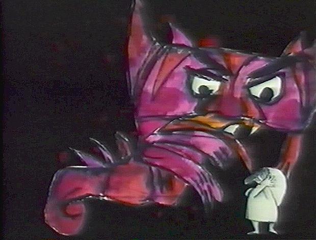
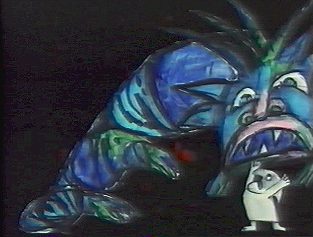
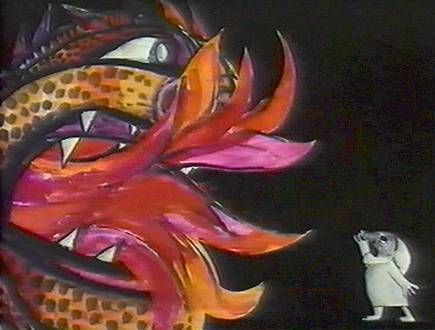
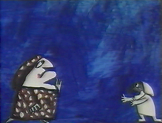
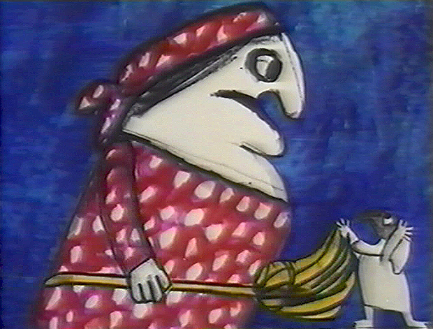
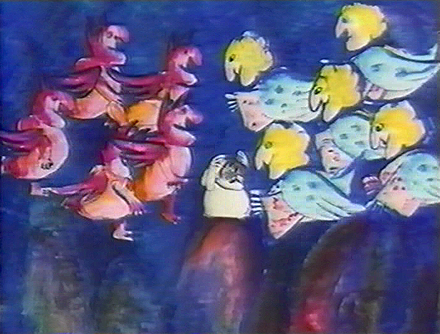
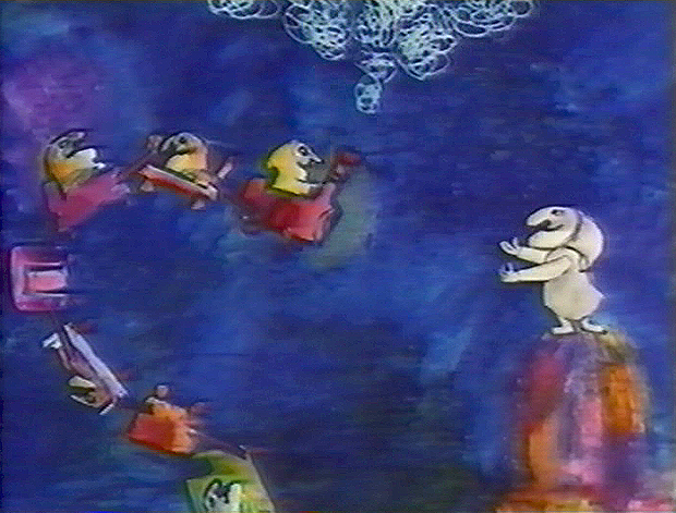
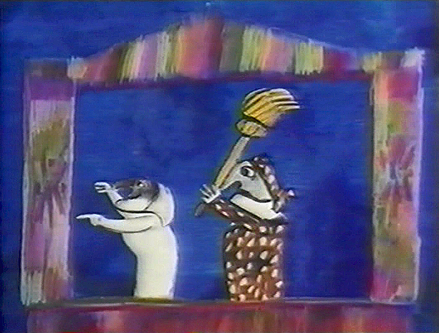
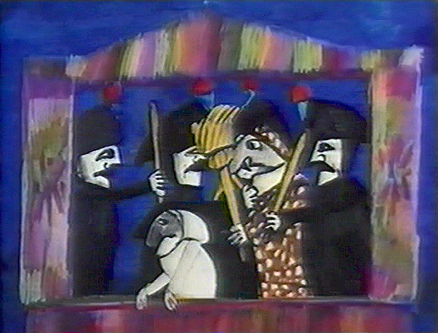
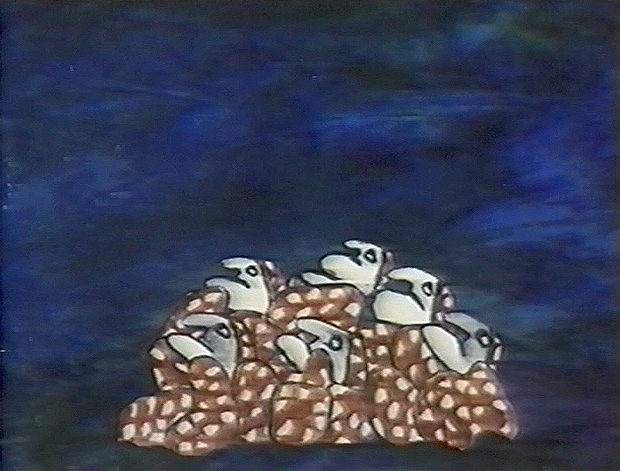
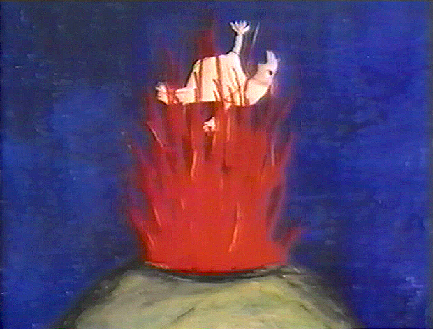
Grim’s Jester – recap
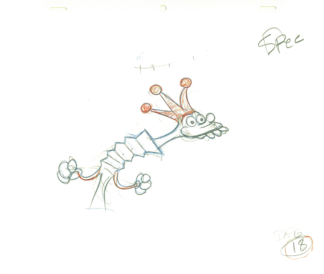
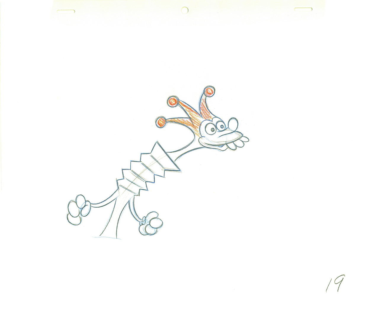
- Yesterday I focused on a couple of scenes Grim Natwick animated in his early days at the Fleischer studio. He was obviously experimenting with distortions, breaking of the joints, the visibility of inbetween drawings and how much he could get away with in “Rough drawings.”
This, of course, isn’t the animator that Grim became, but gives us some light to understand what did make up that animator. The scene here today is something I’d posted on my blog once before, in 2010. It features a lot of Grim’s ruffs as well as the clean ups by Richard Williams, himself.`
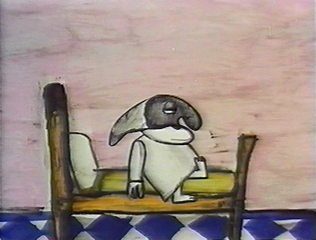
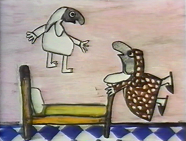
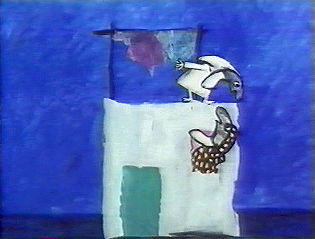
You can see Grim’s drawings erased and cleaned up. (The semi-erased semblance of Grim’s very large numbers remain on many of the drawings, as do Grim’s notes. The inbetweens were all done by Dick. (It’s Dick’s writing in the lower right corner, and I remember him doing this overnight.)
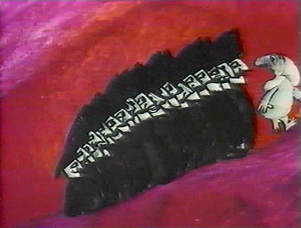
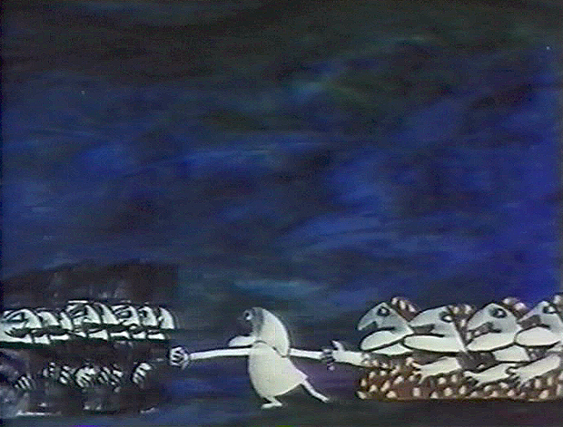
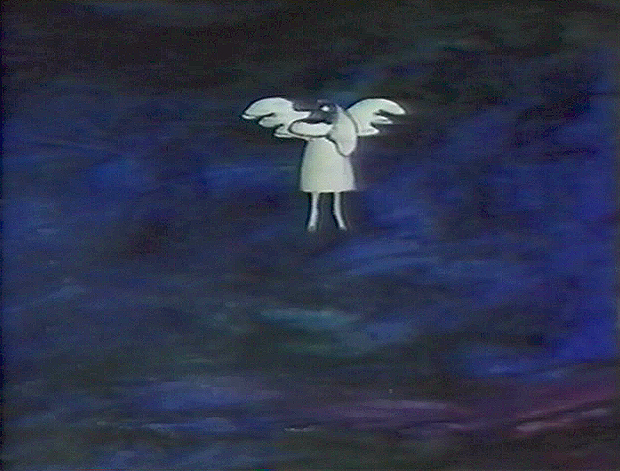
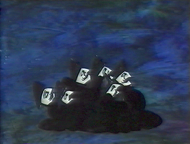
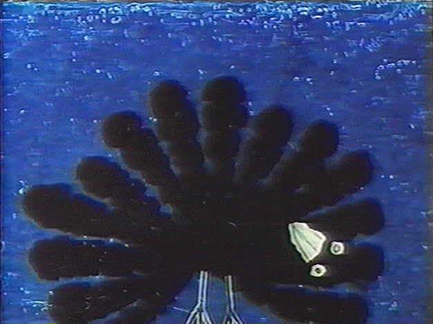
The scene is all on twos. There are two holds which Dick changed to a trace back cycle of drawings for a moving hold. It actually looks better on ones, but there was a lip-synch that Grim had to follow. It is interesting that both Tissa David, one of the five key animators on this film, and Grim Natwick, who Tissa had assisted for at least 20 years, both shared the one assistant on key scenes in this film – Richard Williams. Eric Goldberg assisted on many of Tissa’s other scenes.
 1
1.
 2
2 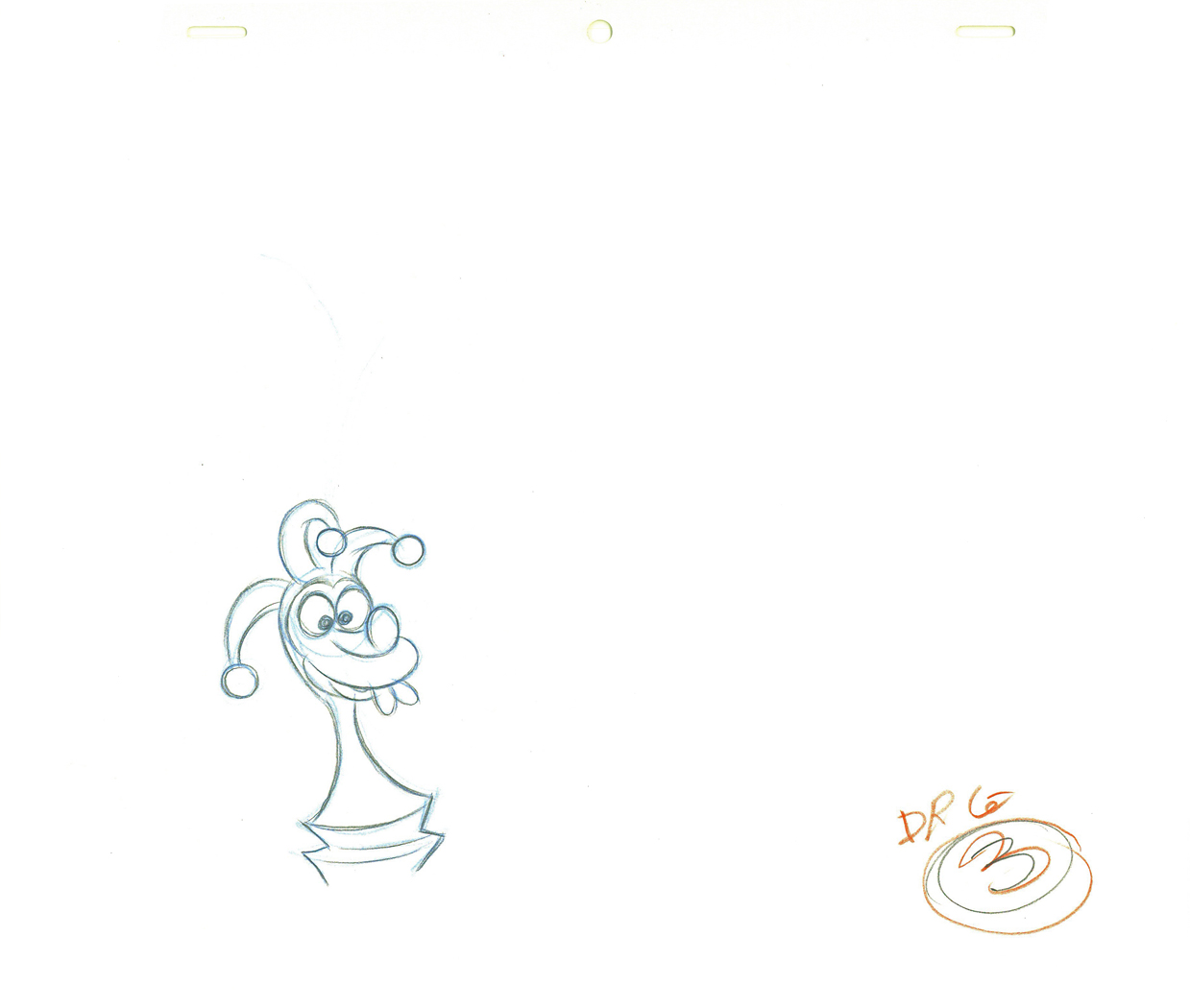 3
3.
 4
4 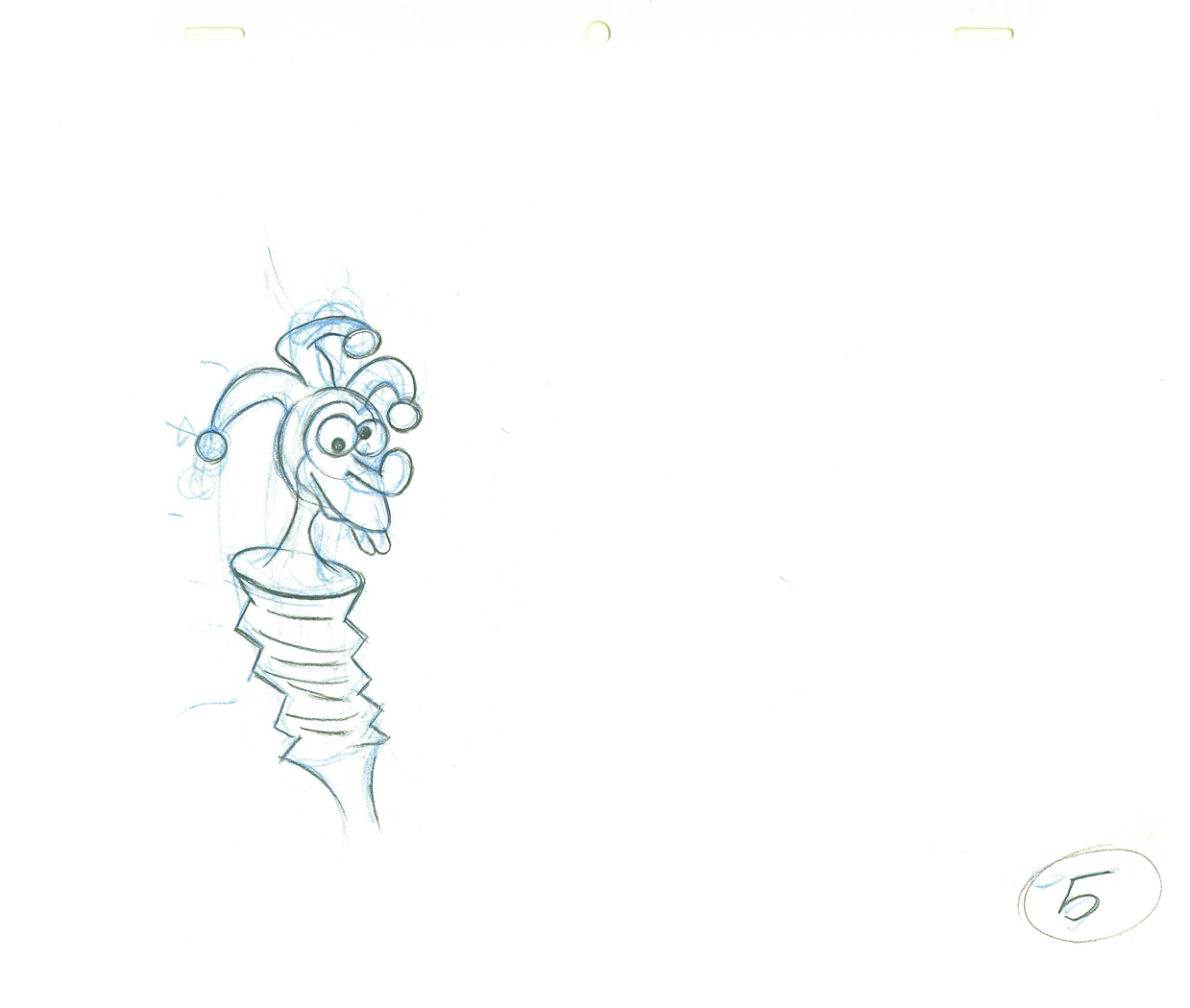 5
5.
 6
6An inbetween by Dick Williams.
.
 7
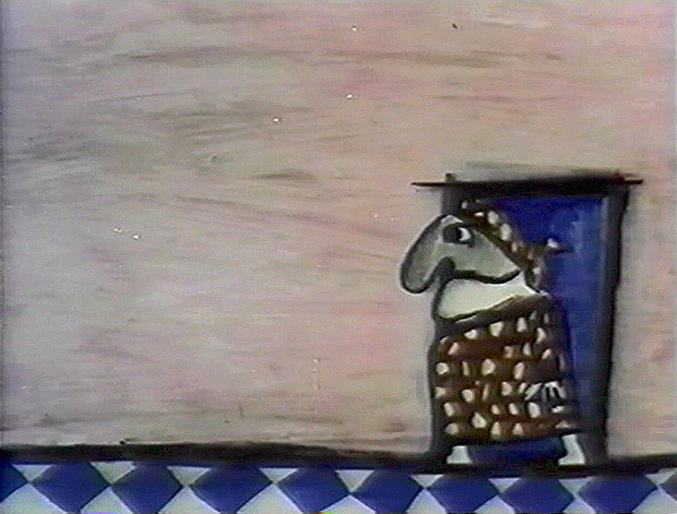
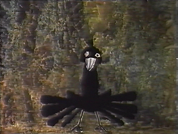
7A cleaned-up extreme by Grim Natwick.
.
 8
8 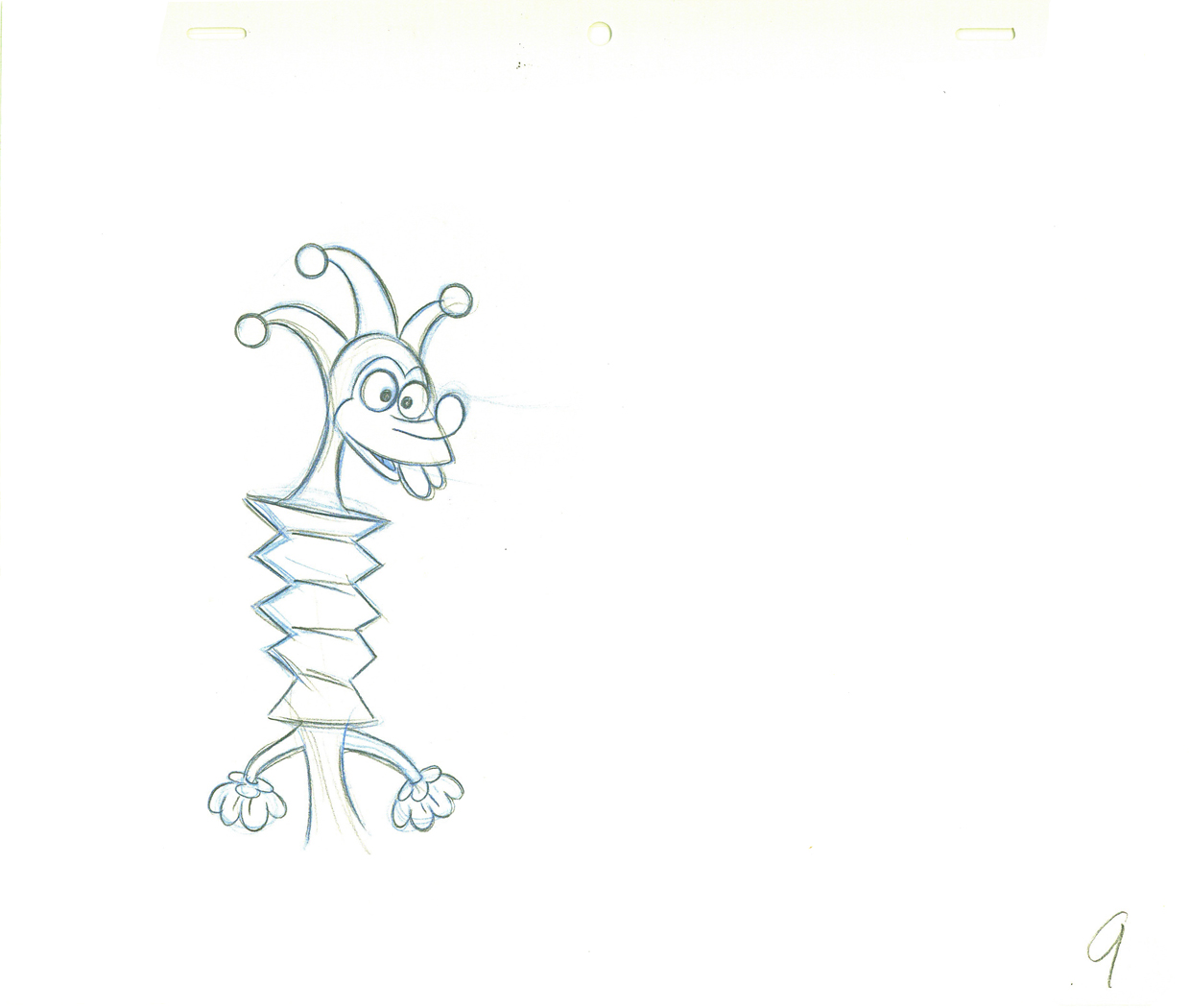 9
9.
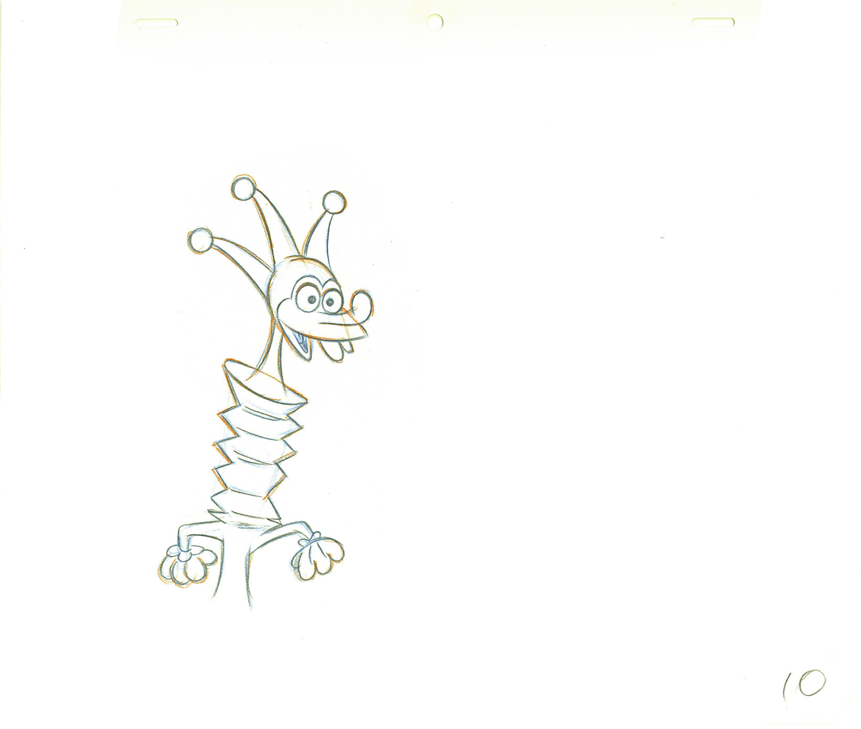 10
10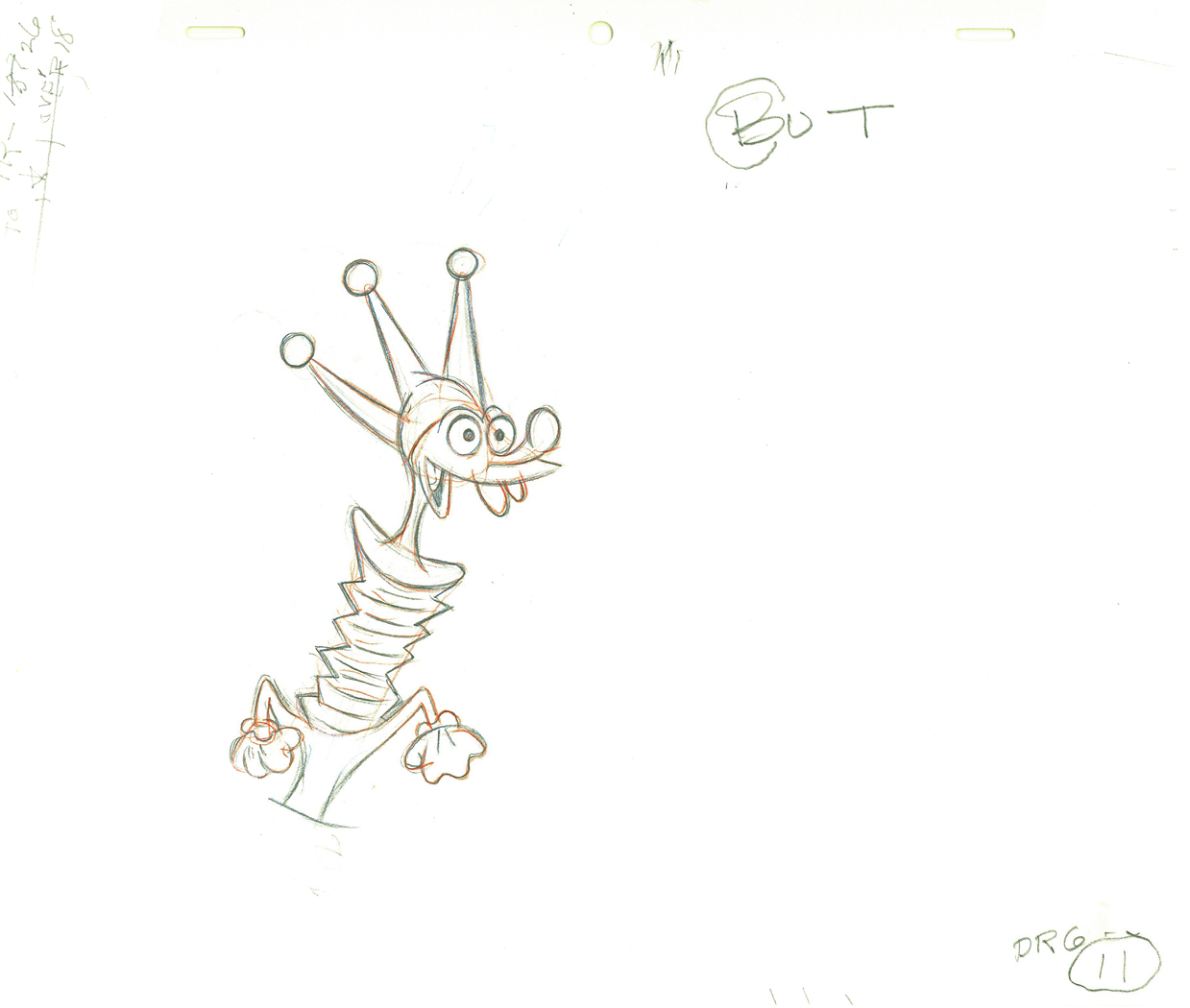 11
11.
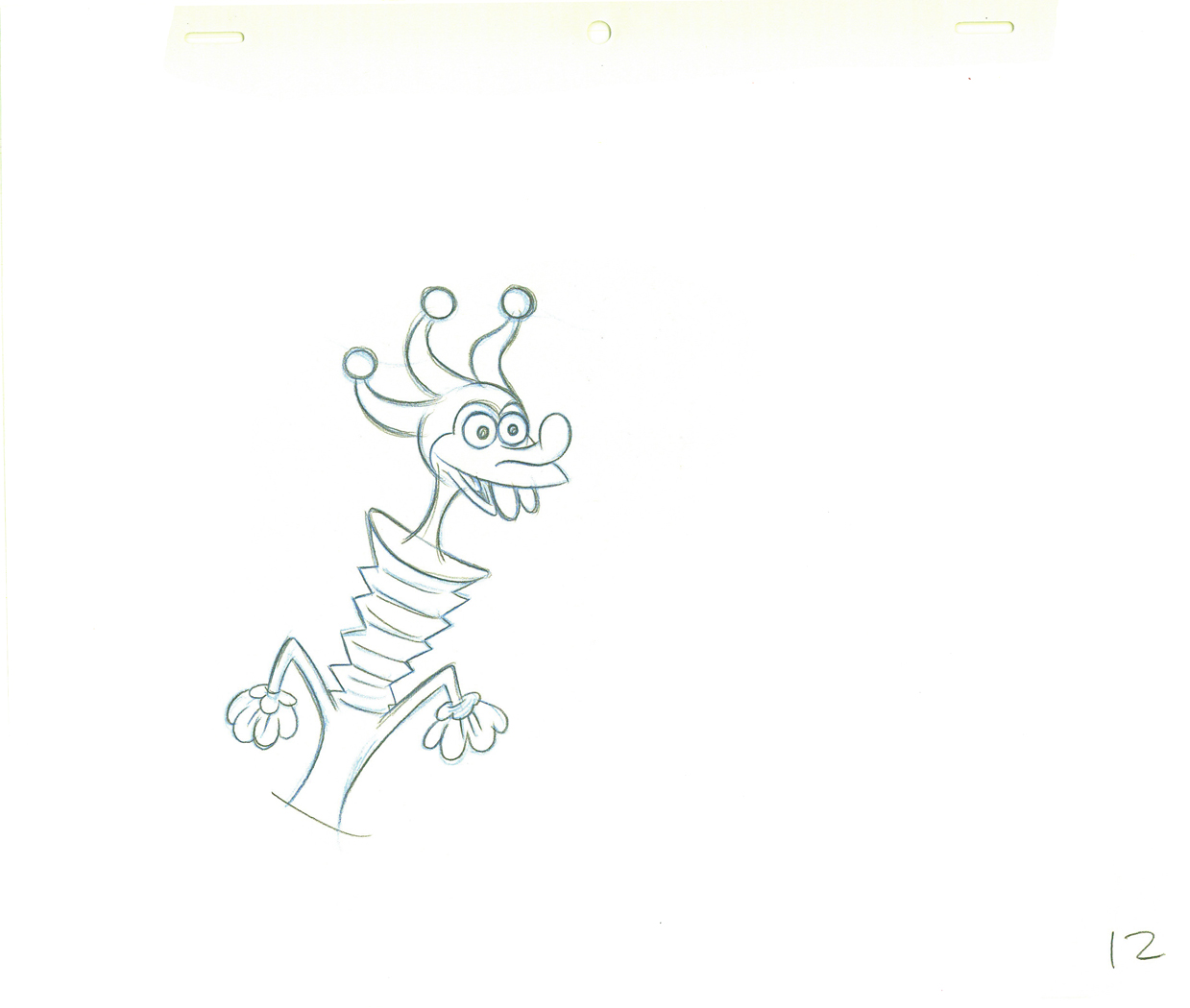 12
12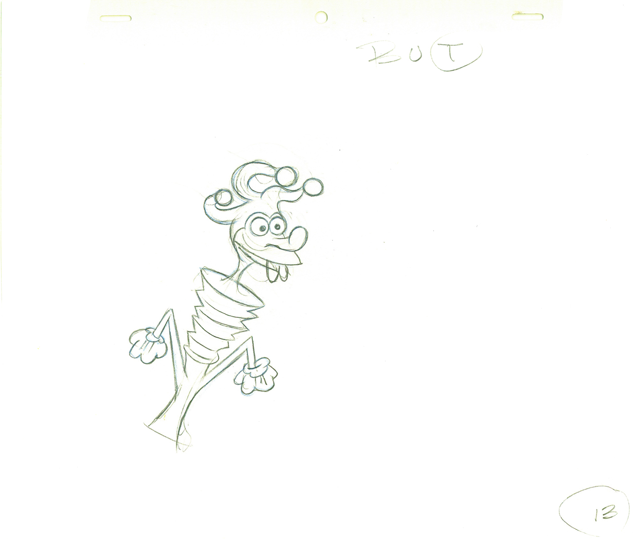 13
13.
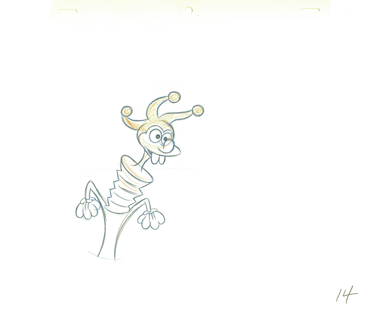 14
14Dick Williams clean-up.
.
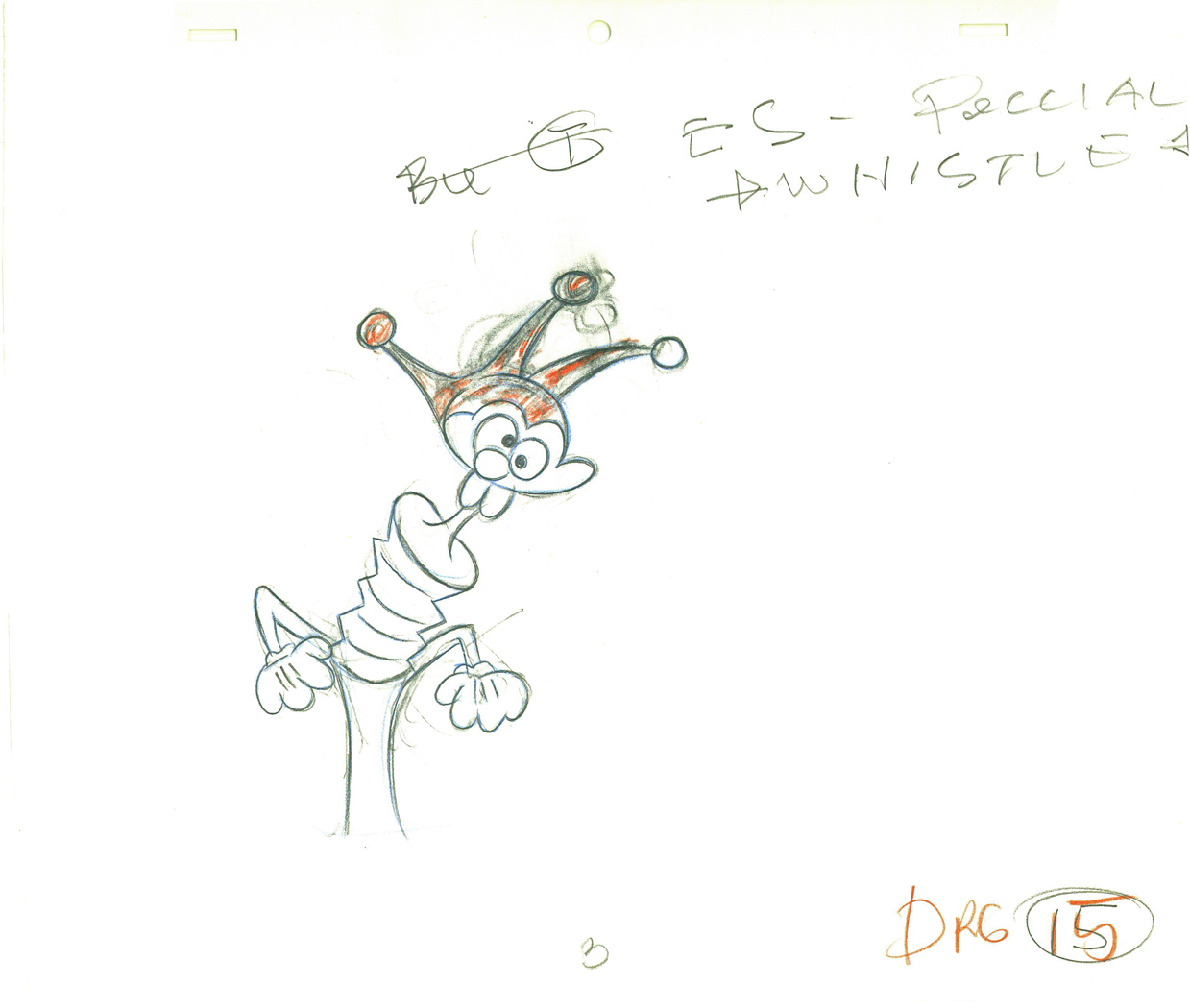 15
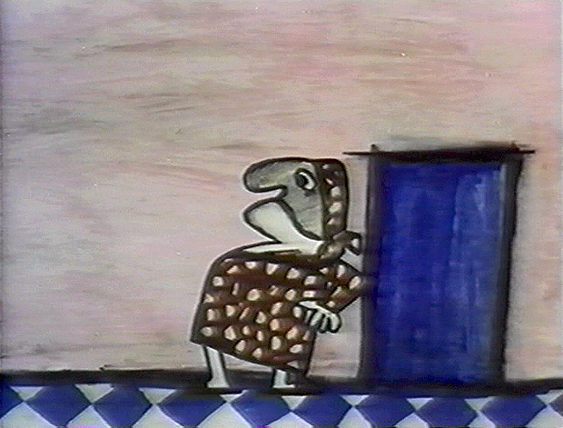
15Grim Natwick (sorta) cleaned-up rough.
.
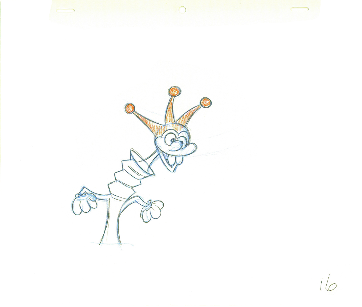 16
16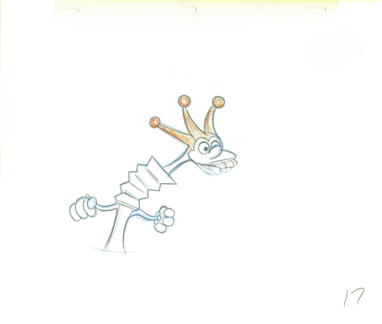 17
17.
 18
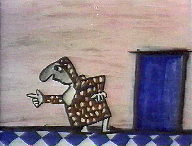
18Grim Natwick rough.
.
 19
19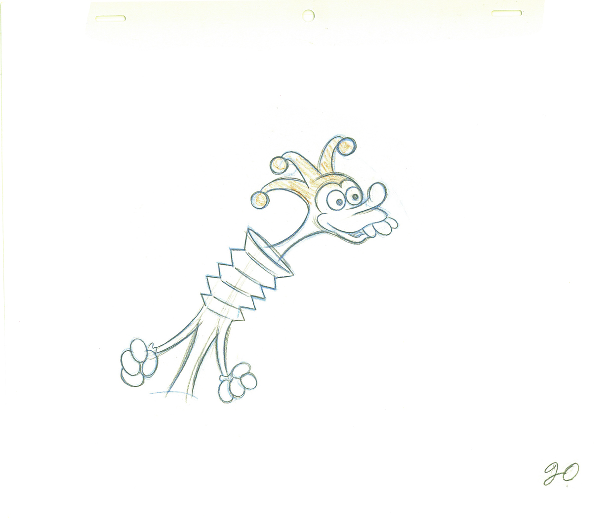 20
20.
 21
21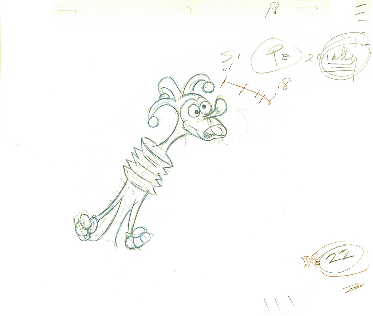 22
22.
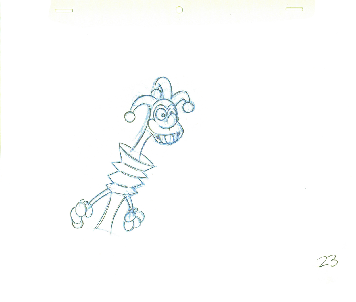 23
23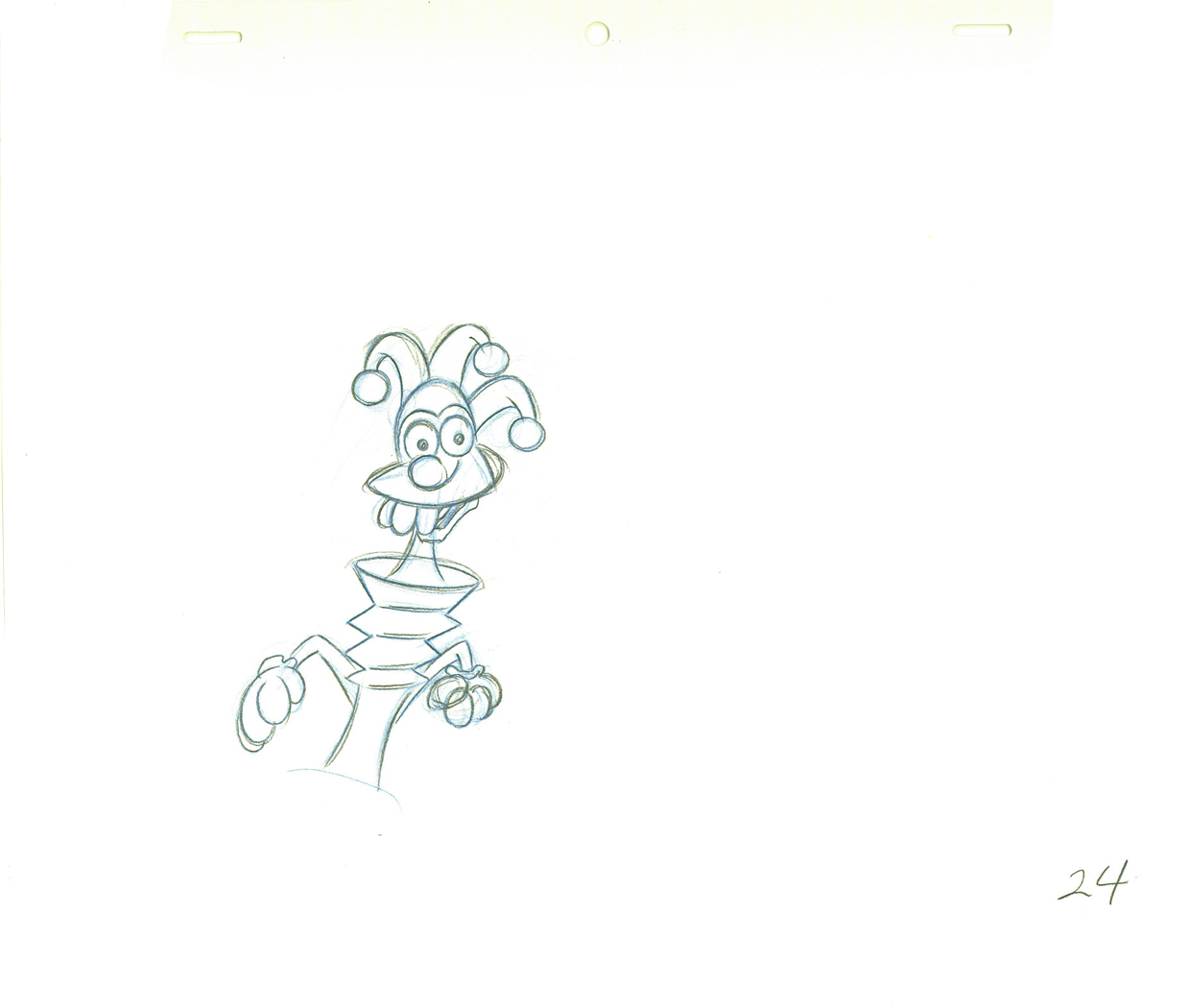 24
24.
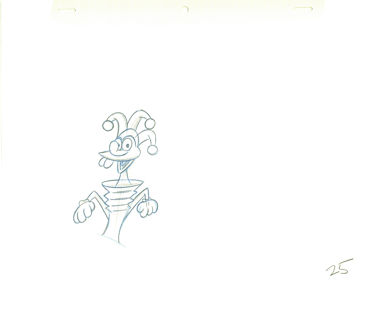 25
25Williams inbetween.
.
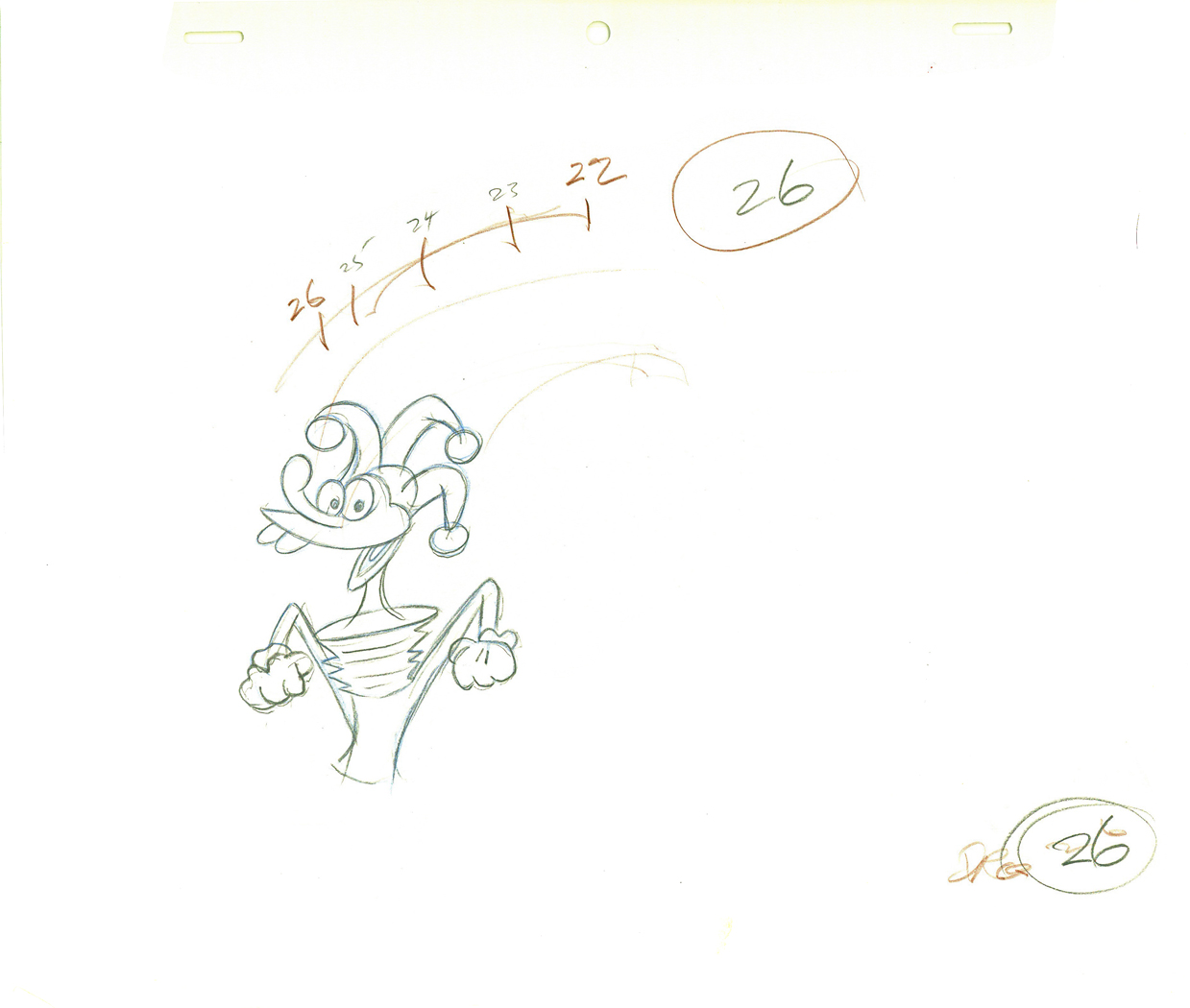 26
26Natwick ruff, cleaned up.
.
 27
27 28
28.
 29
29 30
30.
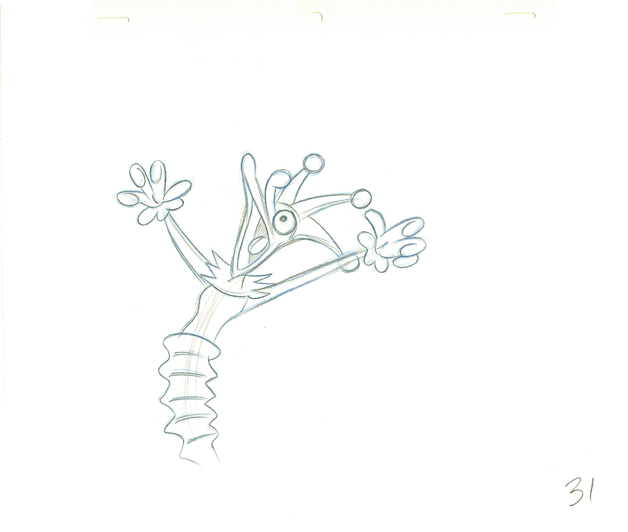 31
31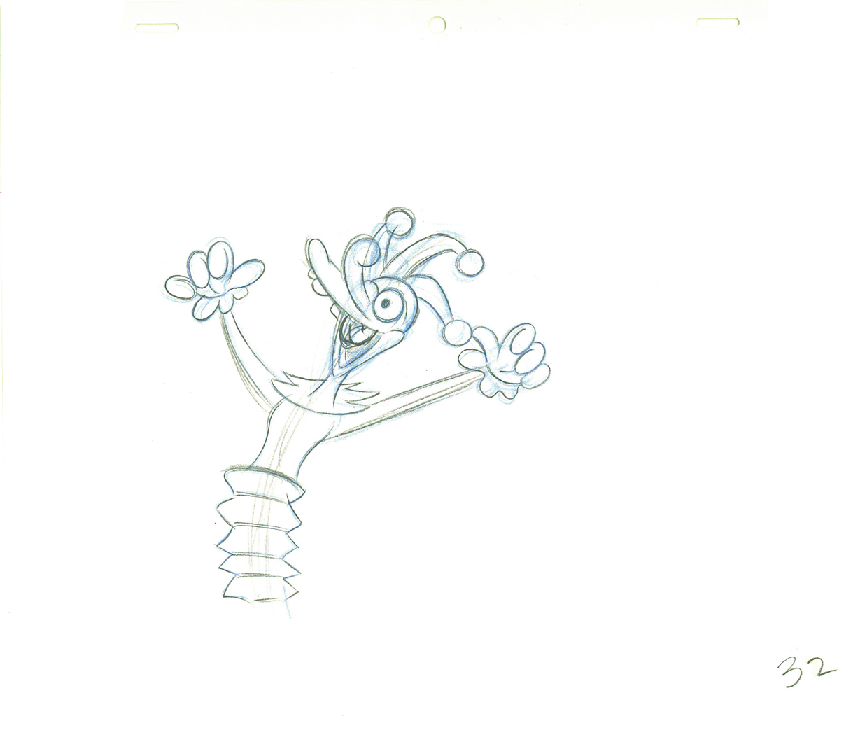 32
32.
 33
33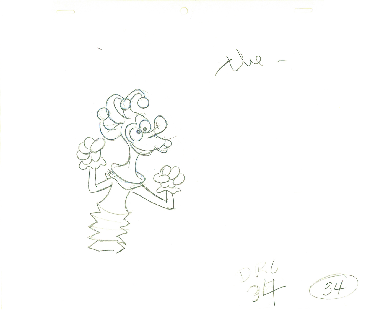 34
34.
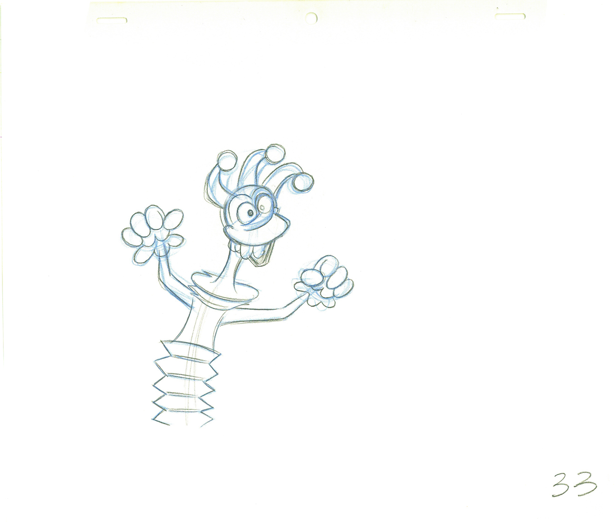
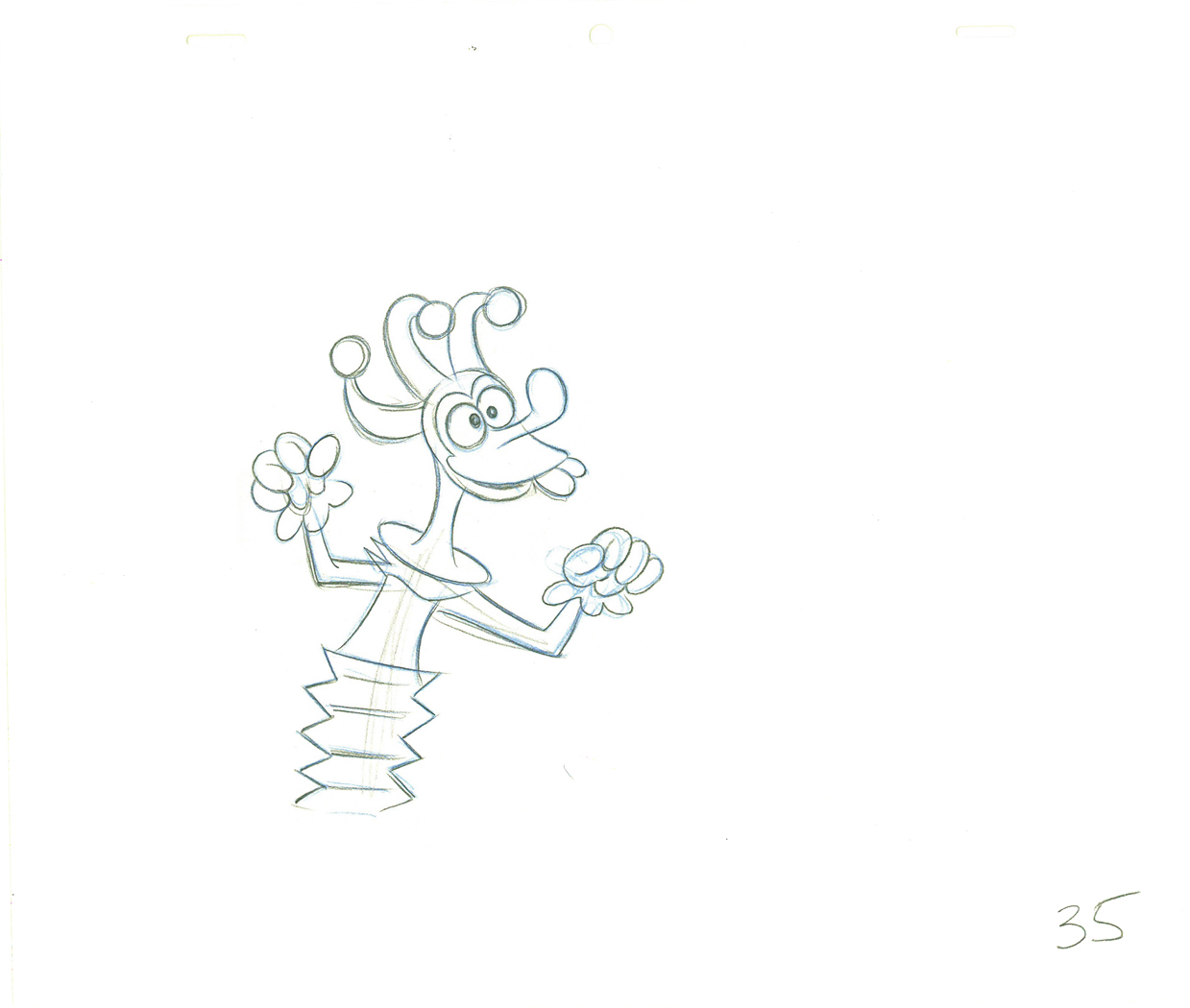 35
35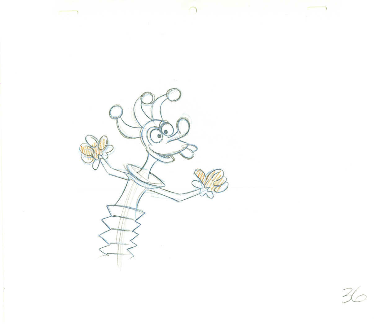 36
36.
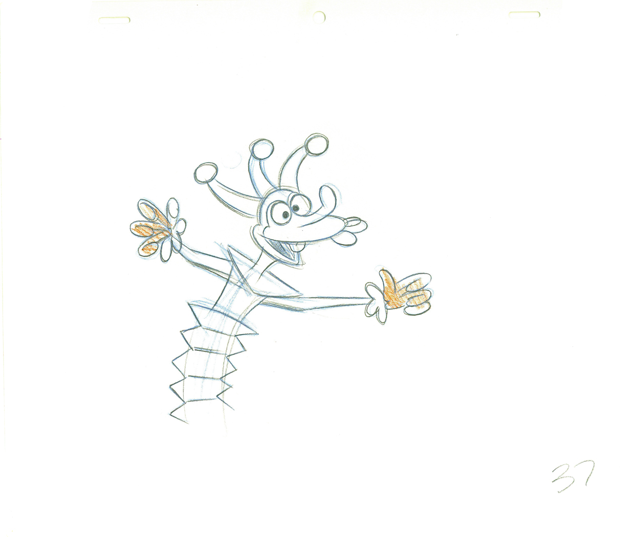 37
37Dick’s clean-up inbetween.
.
39Definitely a Grim Natwick drawing – cleaned up by Dick (his handwriting).
.
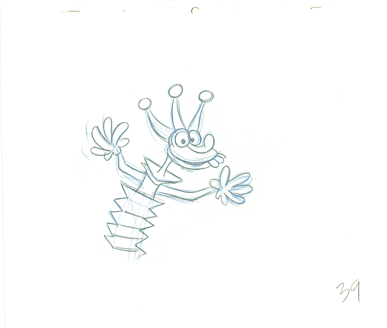 39
39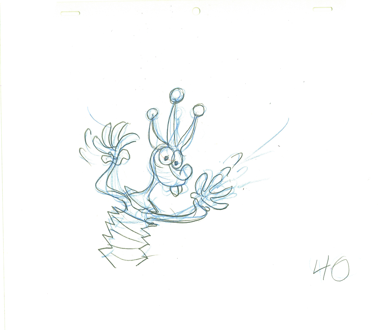 40
40.
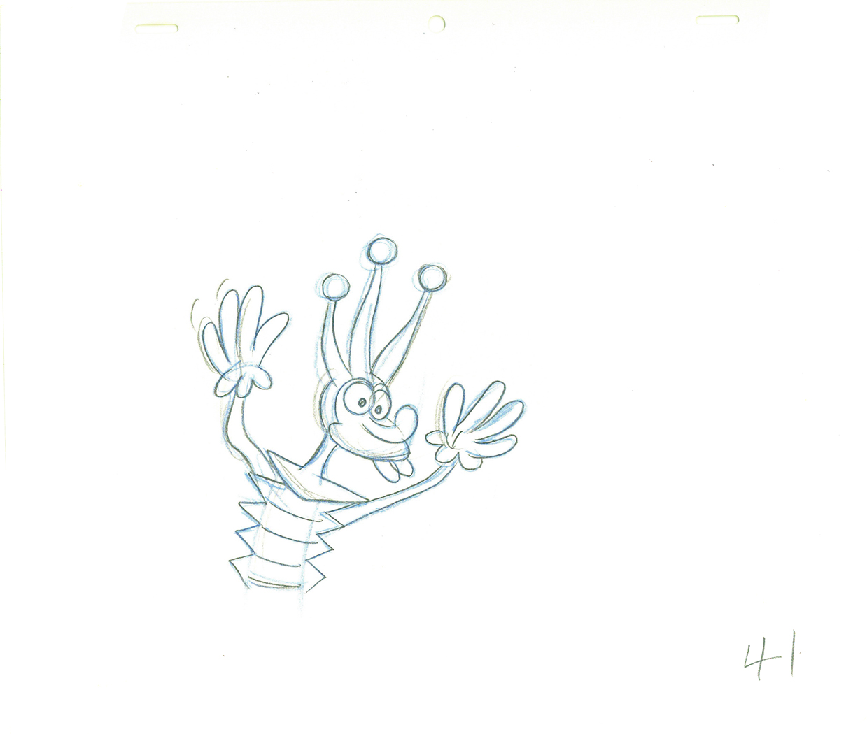 41
41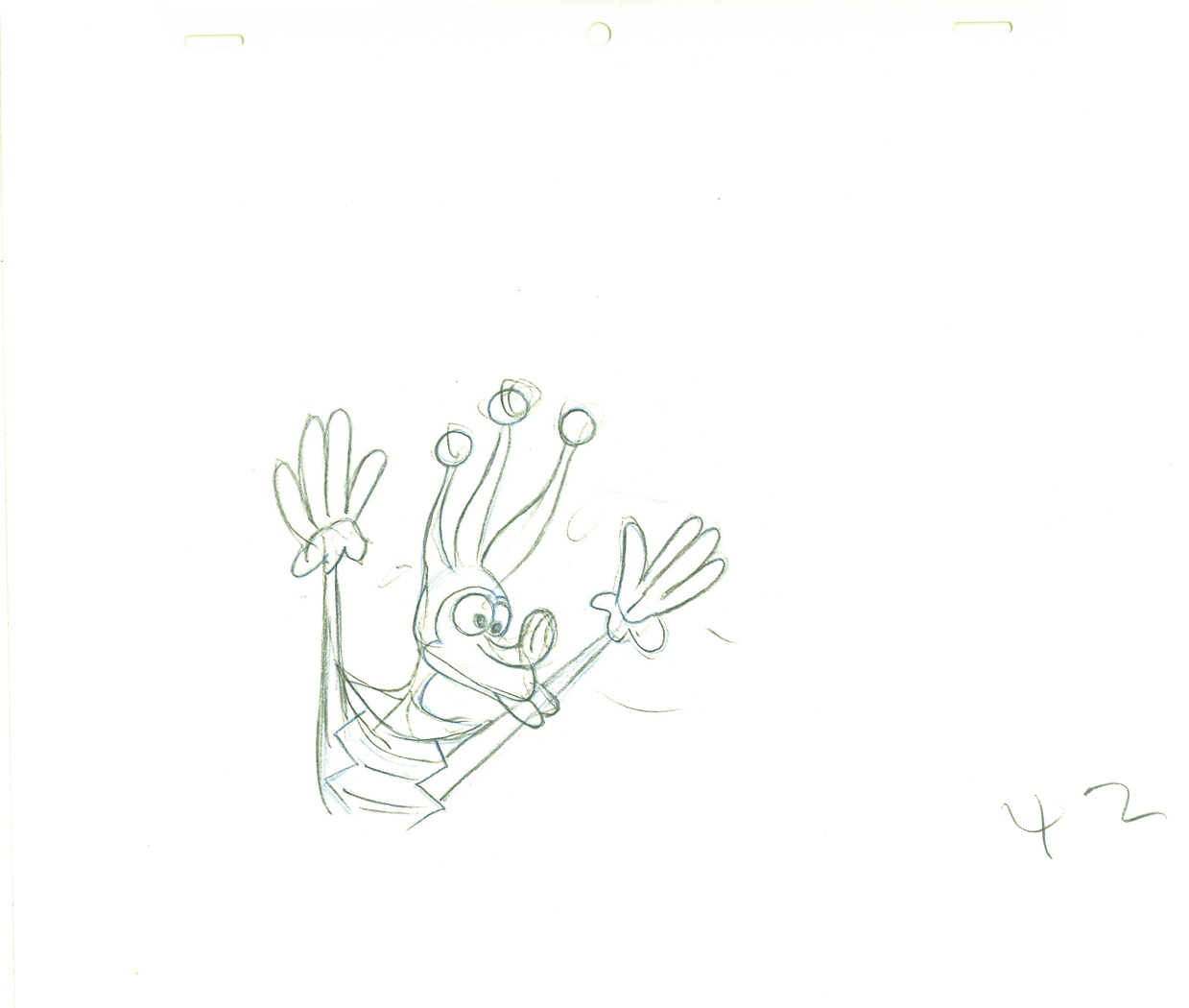 42
42.
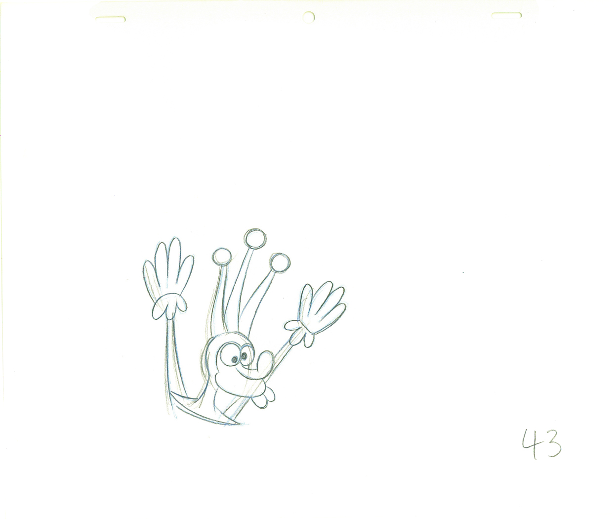 43
43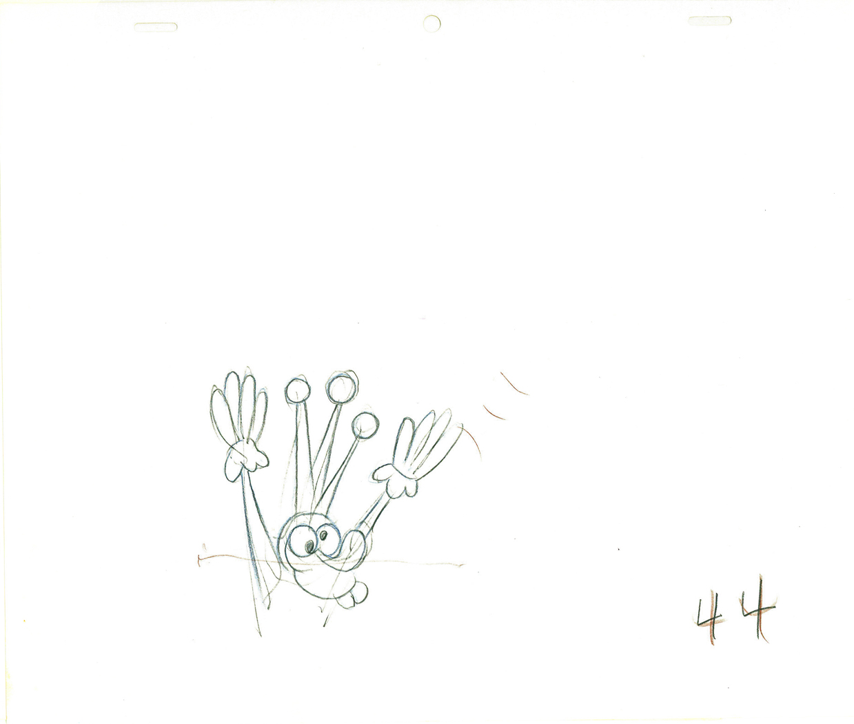 44
44.
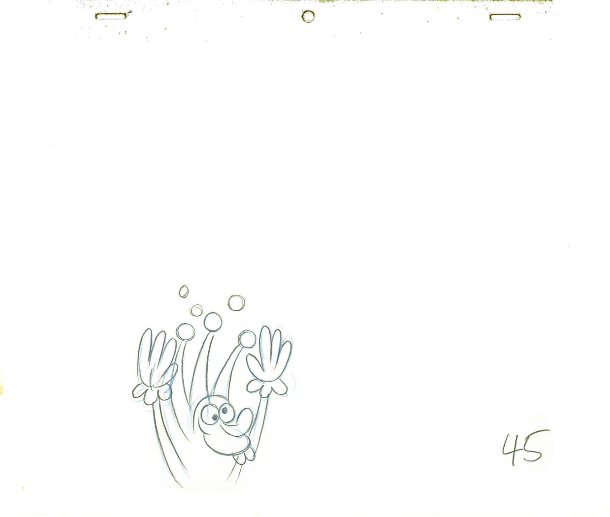 45
45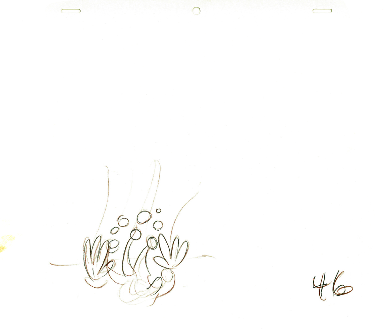 46
46.
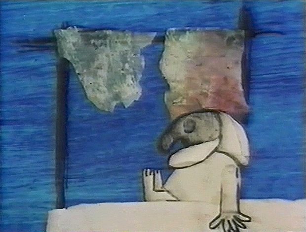
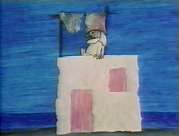
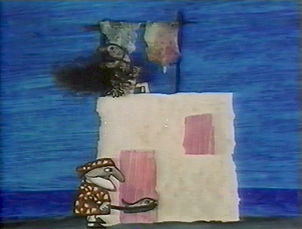
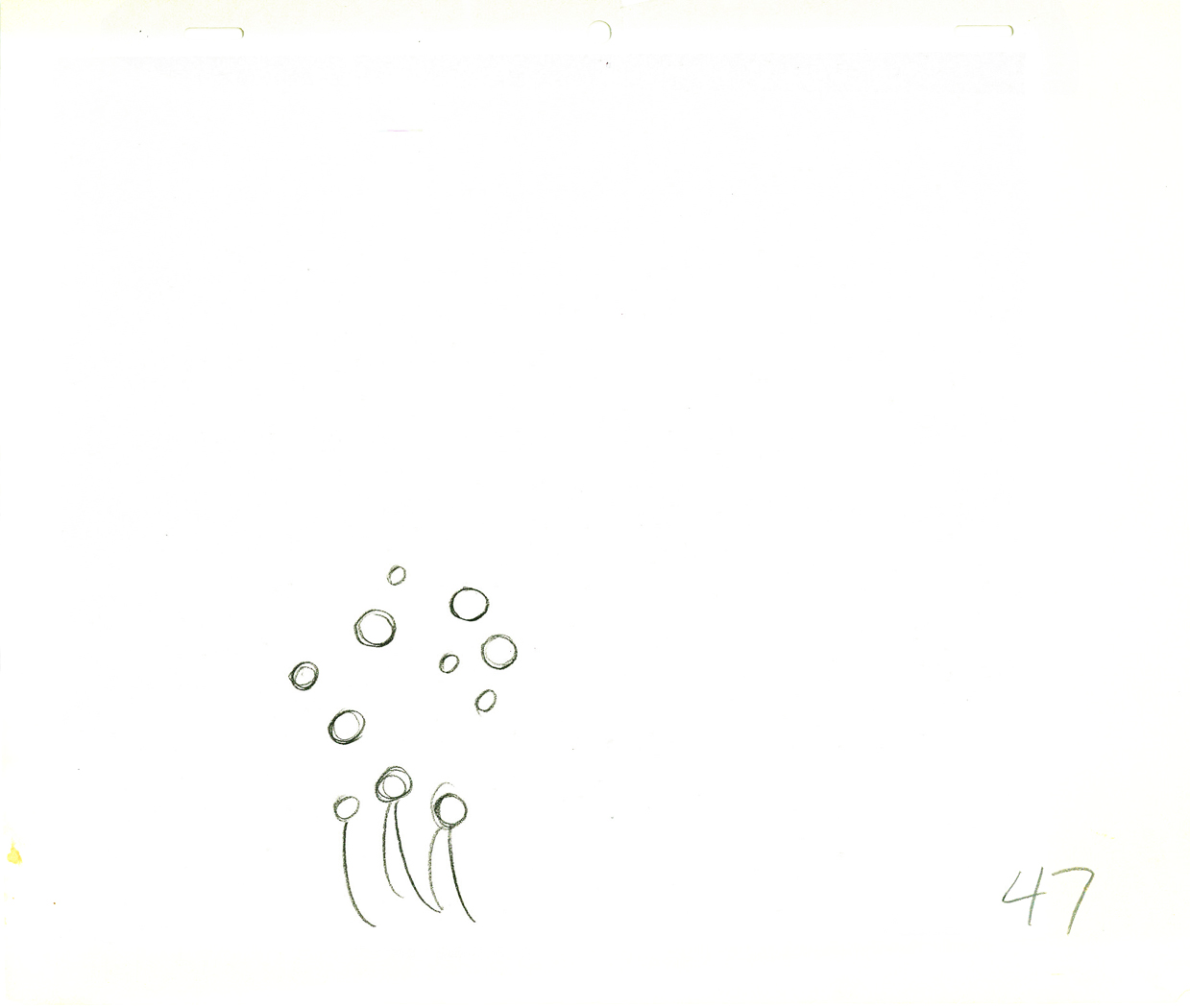 47
47Drawings 44-47 are all Grim’s roughs with minor CU.
.
_____________________________
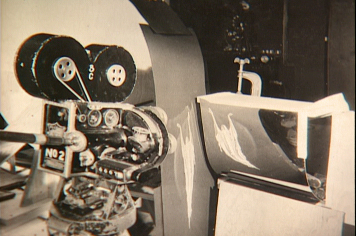
Here’s a QT movie of the complete action from the scene.
The scene is exposed on twos per exposure sheets.
_____________________________
Here are the folder in which the two exposure sheets
are stapled (so they don’t get separated.)
 1
1 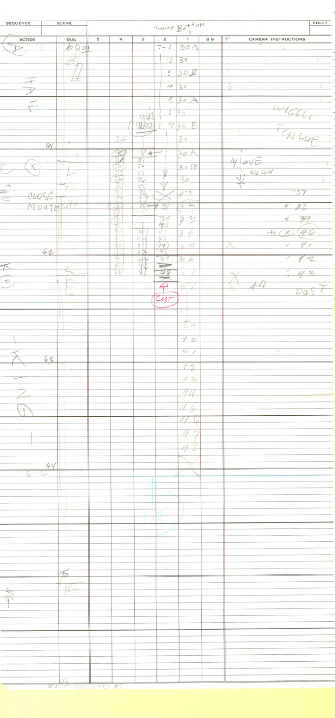 2
2
 Folder
commercial animation &Frame Grabs &repeated posts &Richard Williams &Title sequences 19 Mar 2013 04:58 am
A Funny Thing Happened – again
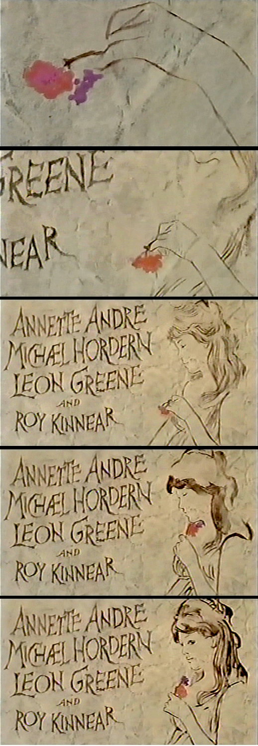
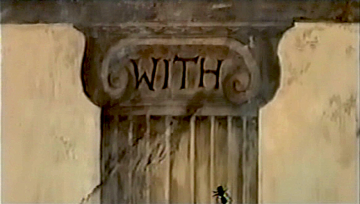
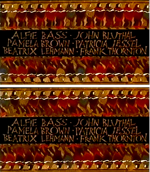
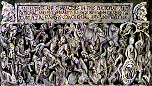
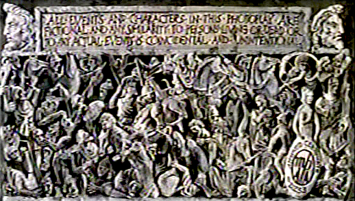
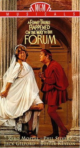 - Today marks the 80th birthday of RIchard Williams. To celebrate, I’ve chosen to post these images from the credit sequence of A Funny Thing Happened On The Way To The Forum. My first introduction to Richard Williams and his work came by way of a BBC documentary from 1965, The Creative Person: Richard Williams. It aired on WNDT’s ch 13 in New York (PBS before PBS existed.) Within the sequence there is once scene of a girl smelling a flower. (The Annette Andre credit.) I remember this as part of that doc, and Richard said that at times you should slow down the animation of a character if you want it to seem more real. There’s a dissolve animation going on here.
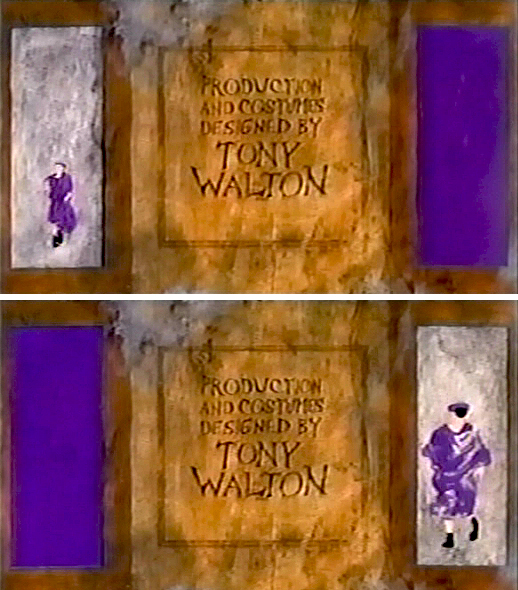
This is a great theatrical show and a mediocre movie. Despite the great cast, the brilliant people working behind the scenes (from Tony Walton‘s sets and costumes to Nicholas Roeg‘s extraordinary photography; from the incredible song score by Stephen Sondheim to Ken Thorne‘s excellent incidental music), somehow it all doesn’t really work.
However, animation enthusiasts would be primarily interested in the animated credit sequence by Richard Williams‘ fine animation. This was a sequence that brought Williams out of the cartoon world and into the more serious fold. Suddenly, his studio grew up.
Since we didn’t get to see his brilliant ads in the US, we had to seek out his title work. Credit sequences for future films such as The Charge of the Light Brigade, The Pink Panther sequels and What’s New Pussycat easily demonstrated how he really lifted his studio into the big time.
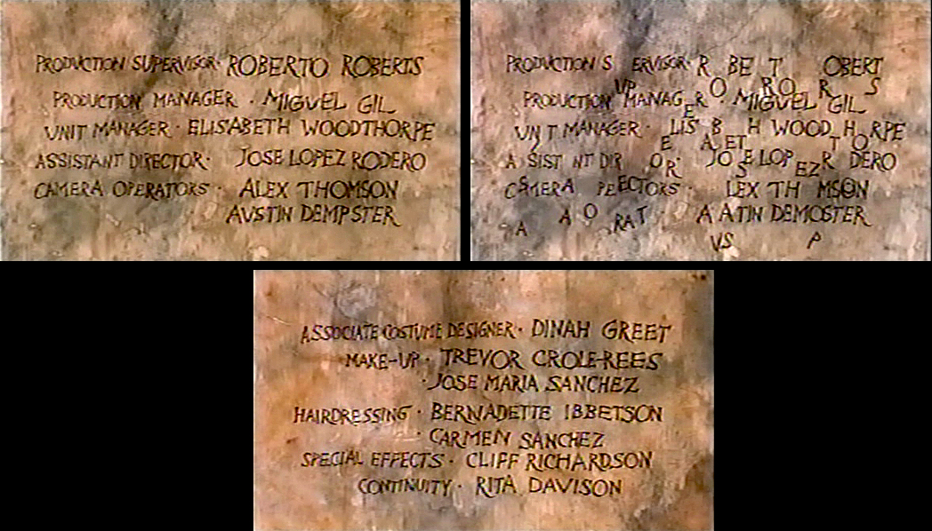
I’ve made frame grabs of the sequence from my recording, and thought I’d post them for your amusement. Sorry that the copy I have isn’t the most pristine and that the frames available are a bit soft. But I guess the idea comes across.
______________________________________(Images enlarge slightly by clicking them.)
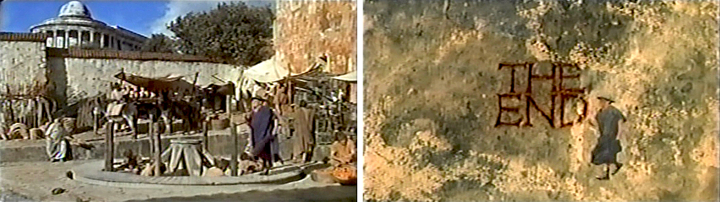
The sequence starts at the end of the film. Buster Keaton runs on a circular treadmill, and dissolves to an animated version of himself.
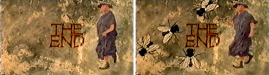
He grows in the frames as some large-sized flies enter from the left.
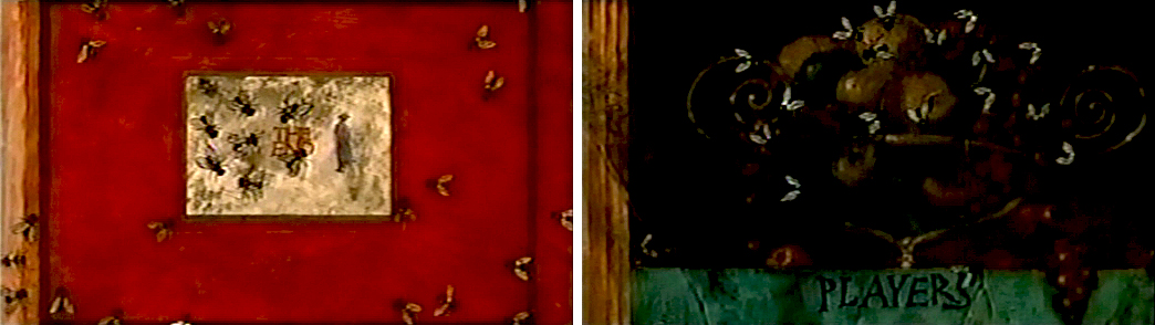
Cut out to see a small Buster disappearing. The camera whips across to a picture of fruit. The flies zip over there and eat the picture. (This image of fruit was very dark on screen.)
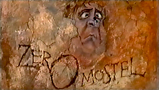
A fly lands on the nose of a CU caricature of Zero Mostel. His eyes cross watching the fly.
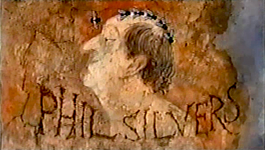
Flies land on Phil Silvers’ bald head and march across.
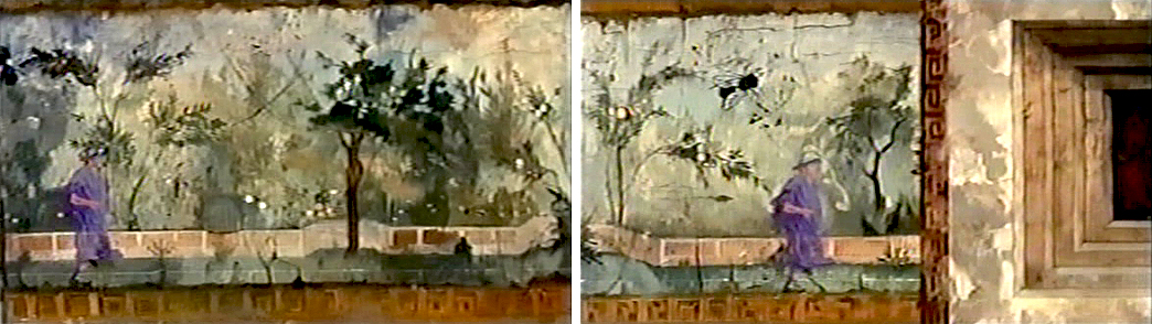
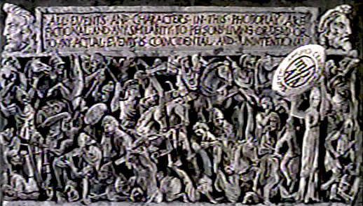
Buster runs across a painted frieze on the way to a series of inlayed boxes.
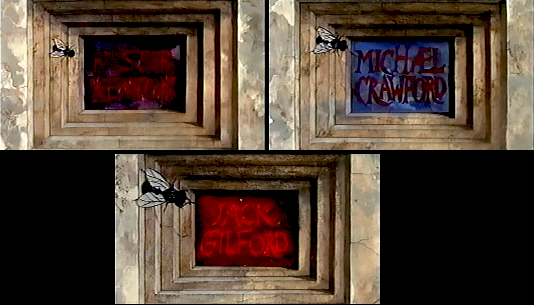
Zip to the second box credits Michael Crawford. Pan to the third box which features Jack Gilford’s name.
Dick talked with me about this scene in the film. He felt that to create realistic
characters in animation one had to slow everything down. He did it with dissolves.
It’s a technique he came back to often, quite noticeably in The Charge of
the Light Brigade.
A fly crawls up a column.
Errol LeCain’s art seems to be featured in this elaborate scene. The entire group – top
and (upside down) bottom – dance.
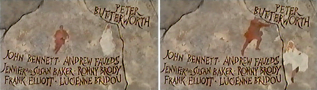
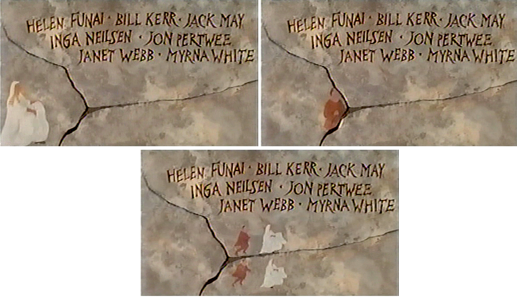
An animated version of Zero Mostel chases a female through and across a painted wall moving into and across the cracks.
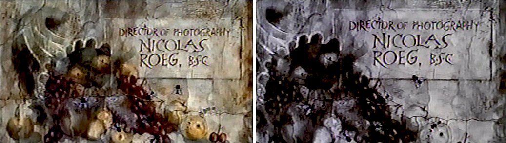
The cornucopia of fruit starts in full color but goes to B&W before it’s done, in honor of the great cinematographer.
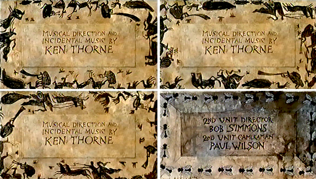
A very large cast of shilhouettes runs around this credit for Ken Thorne. There is no cycle here. This is a Dick Williams piece, so they’re all fresh drawings. They turn into flies for the next credit.
A Roman version of an Escher wall painting animates, confusing the fly trying to walk across.
The animated Buster Keaton runs toward us on one side
and away from us on the other side.
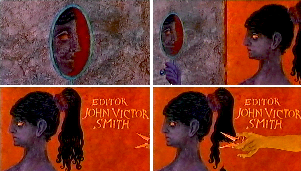
For the editor’s credit, a female looks at herself in a mirror. A hand comes in and clips off her pony-tail.
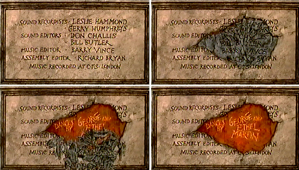
A slew of credits rots in one spot. This falls off revealing the choreographers’ names.
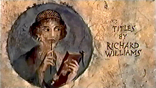
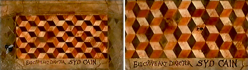
I’m always fascinated by the credit the designer gives himself. No sign of anyone else
who worked on this sequence. Titles have changed since then.
This is the first time I remember seeing letters from the type of one card falling down to match letters from the next card.
This card, the least significant one, comes back several times.
Of course it’s overanimated though it looks like a cycle.
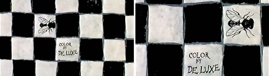
The camera moves in on a fly crossing a checker board.
That legal card, again.
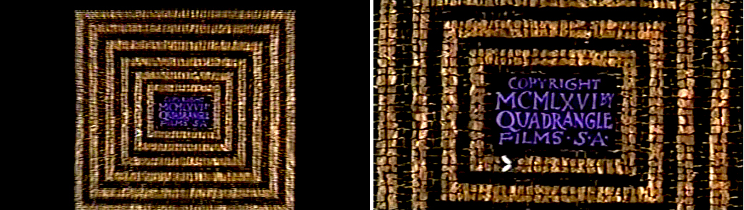
Truck in on the copyright card.
The legalese changes as the MPAA card is lifted.
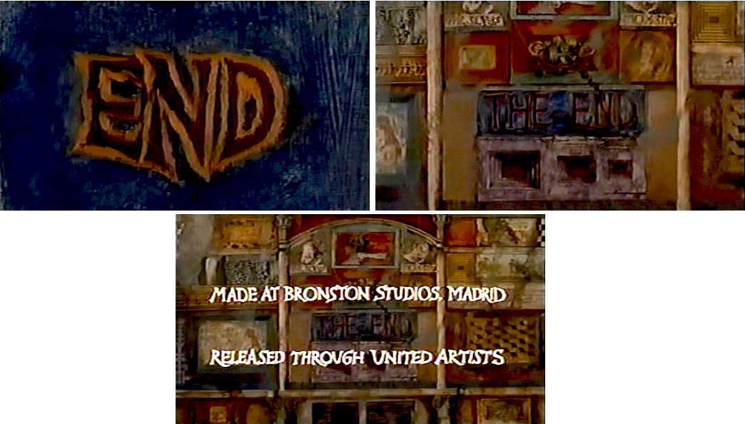
Truck out from “End” past “The End” to reveal several more boxes.
Finally, the MGM lion roars.
Happy Birthday, Richard. Thanks for all the wonderful gifts you gave animation, not the least being the obvious: a new respect for a medium that was dying when you stepped up to the plate. You restored its dignity at least once.
Commentary &Layout & Design &repeated posts 14 Mar 2013 04:38 am
Tubby – looking back
Sometimes the bad films we work on leave the greater mark, and it’s good to look back, infrequently, to assess the damages.
- I was reading the 1957 Disney Studio Directory posted on Joe Campana‘s site, Animation – Who & Where. when I came upon the name of Howard Diettrich. This threw me back to 1973 and Tubby The Tuba.
 I’d just been layed off at the Hubley Studio, after completing the first 20 (of 60) episodes of Letterman. Officially, I had been categorized as an “inbetweener” in the u-nion. I’d done everything from animate to ink at Hubley’s, but that was my category. I received a call from Johnny Gentilella. We’d met through Hubley, and he was now working for NY Institute of Technology. They were in the early stages of production on their feature, Tubby The Tuba, and I was offered the job of Assistant Animator, a categorical promotion.
NYIT was the school I’d graduated from and received my BFA; it was located in Old Westbury, Long Island – about an hour’s drive from Manhattan. It’d be interesting, returning to my old school just to see how it had changed. By taking the Long Island Rail Road, I was able to cut down that ride by a few minutes and leave the driving to someone else. I was picked up at the station and driven to the animation building, a small cottage on the campus. Everyone was out to lunch except for Johnny Gent(ilella), and he drove me (about a couple hundred yards) to meet Sam Singer, the producer recently hired to do the film.
 Singer had done all those Courageous Cat cartoons that had infested children’s programming back in the late 60s/early 70s. Oddly, I enjoyed them; I always was a glutton for bad animation. Love those cel flares, shadows, scratches and cel edges.
I was directed to his office. In there was another producer, Barry Yellin, who had broken his ankle and was on crutches. I got to meet the two of them and listen to them kibbitz around me, virtually ignoring me for a few minutes. Singer was chewing on a cigar, and I couldn’t take my eyes off the spittle that seemed to be moving down the cigar in his mouth. When I finally left to return to the animation building, I saw that Singer was also on crutches. He had a clubbed foot.
I sort of remembered that meeting as an omen of things to come. The entire place, while I was there, felt like it was on crutches.
I liked Johnny Gent a lot; we got along well at Hubley’s; on Letterman I got to mangle quite a few scenes by him as I learned how to inbetween properly.
There were only about 8 others at NYIT at the time. Other people I met included Walt Kubiak, another assistant who I enjoyed talking to; animator, Chuck Harriton, who I’d met at Hubley’s (and never really was crazy about); Lou Marcus who was filming the work on an Oxberry. Lou had gone back in animation for many years and had plenty of stories to tell. (See Andrew Marcus’ comment below.)
The person I most associated with was the editor of the film, Phillip Schopper. He was a young guy who took the LIRR everyday from Brooklyn to Old Westbury. We’d meet daily on the train and laugh over the events of the days out there. I’ve stayed friends with Phillip, who has become a first-rate filmmaker; we rarely talk about those days at NYIT.
It was not a fun place to work. At the time, everyone chatted over their cubicle walls. I was in the front of the studio with full view of the front door. I was constantly getting notes from Chuck Harriton who persistently altered the models of the characters in ways that no one else was drawing. I was forced to work his scenes off-model. Johnny Gent always had a beautiful drawing style and made it easy for assistants to follow and inbetween. He and I spent most of our lunch hours alone together in the studio. We were able to have quite a few conversations; I loved that part.
Everyone seemed to back talk everyone else as they walked out the front door. I couldn’t help wondering what they said about me when I left. Too much swiping makes for an unpleasant working condition.
At one point, Sam Singer brought in a number of his people from California. I’d already been there about four weeks so was glad to see some new blood. Many of the few people were ex-Disney people, so there was a lot for me to learn. Nino Carbe, was a good example of this. He had done some incredible work at Disney’s on Fantasia and other films. He was an artistic force and a nice guy to meet.
Howard Diettrich was a virtuoso assistant who had worked on Sleeping Beauty. Unfortunately, he was an alcoholic who had a big problem. Sam Singer took him under his wing and had decided to cure him. Hypnotherapy came in, and Howard went through the mill for Singer. It made a soap opera of a story for all of us working there, and it was hard for me to watch.
I decided to leave. They wouldn’t allow me to quit without going to Alexander Schure. He was the President of the school – yes, NYIT was still predominantly a school – and he was financing the whole thing. His idea, ultimately, was to introduce computer animation to the world, and he invested heavily there. Some of the brilliant people who grew out of this department moved on to develop Lucas and Pixar.
So I went to Alexander Schure, and he argued with me for about 30 minutes. I told him that the travel time was too much. He didn’t accept that. He liked the fact that I was an art school grad from his school and was working there. He offered to have his son pick me up and drive me.
I knew that there was no solid directorial voice coming from the top, and the film could never be good. My artless tactic was to say as much. He told me that he was going to take over from Sam Singer, and he would be the voice of clarity. Now I knew I really had to get out. He finally surrendered, and I left. Happily.
I was back with Hubley within two weeks. Even better.
I didn’t get to see the film until I borrowed a vhs copy from Dante Barbetta, who eventually joined their staff to animate when it got significantly larger.
That was not a good film, as a matter of fact it was incredibly bad. I’m not sorry I left, though I would have enjoyed more time with Johnny Gent; it was the last time I worked with him. I also still wonder what happened to Howard Diettrich.
Note: Last year, John Celestri wrote about the later period in the making of this film on Mark Mayerson‘s site. Part I and Part 2.
Books &Commentary &Photos &repeated posts 17 Feb 2013 06:51 am
Silents Please – recap
 - I’m sure I’ve mentioned before that I love silent films. I particularly am a fan of D.W.Griffith‘s work. I think I’ve read just about every book about the man’s career and biography.
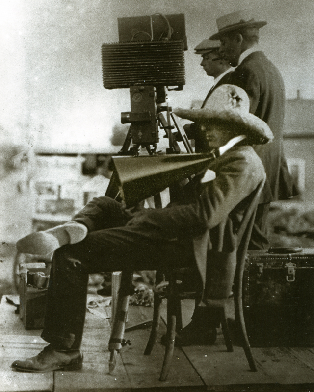
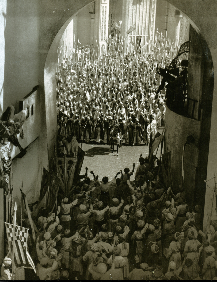
If you’re looking for a great one, read Adventures with D.W. Griffith by Karl Brown, who was an apprentice on Birth of a Nation and Intolerance. I think often enough about Brown’s story about his daily walks with D.W. It seems that they both lived near 14th Street, and their studio was on 125th St. when they worked in NY. They’d walk together to the studio in the morning and walk home at night. The young Karl Brown would use the opportunity to learn as much as he could from the master. He tells how Griffith, at one time, pulled out a big six shooter which surprised Brown. That’s when he realized that most people carried guns. It was protection from criminals. ______Griffith filming Birth of a Nation.
I’m sure it was also protection from the patent
holders group who would beat up anyone making a film without paying for the use of a camera, whose operation was patented and owned by Thomas Edison.
Billy Bitzer, Griffith’s brilliant cameraman, reconstructed their camera so that it was different from the patent rights’ group’s cameras – therefore not in violation of the patent. This didn’t stop the constant attacks on Griffith’s sets.
I have a book by Kevin Brownlow that I love. Photographs from the sets of silent films. Hollywood, the Pioneers is a companion book to a series he produced. The photos are outstanding. Here are a few:
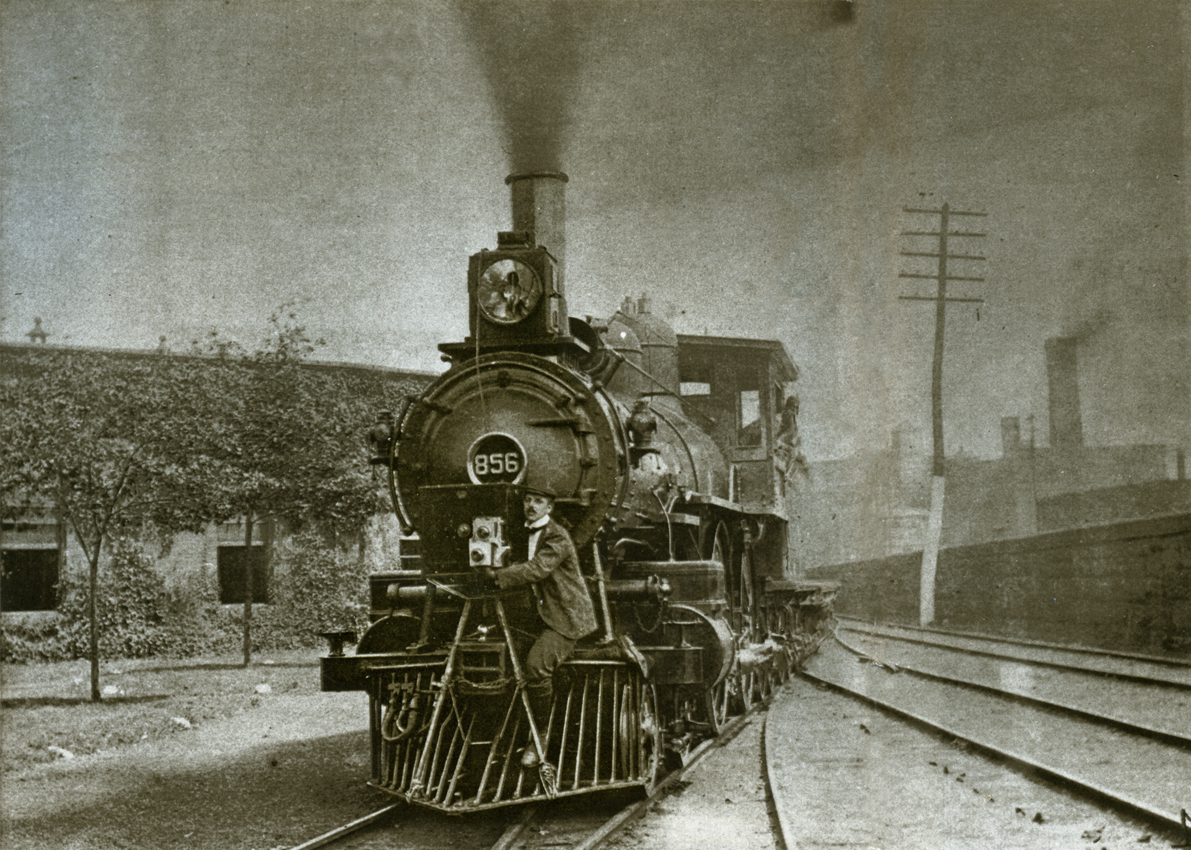
Billy Bitzer on the front of a train filming the movement
for a pre-Griffith film, a Hales Tour film.
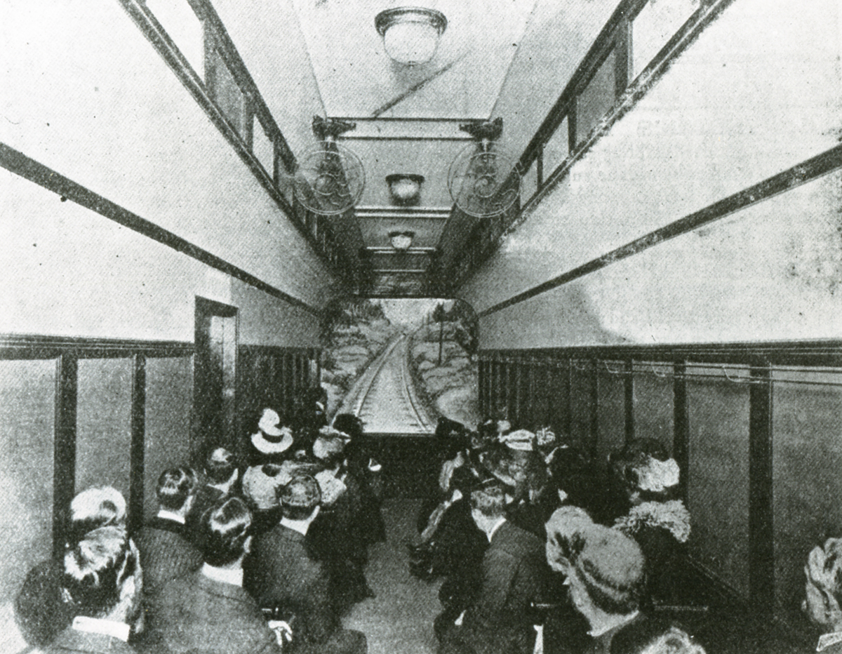
This is how the Hales tour films were screened. It’s a duplicate of a railroad car, and you ride facing the screen where you got to watch the movement, as if you were on a train. Future director, Byron Haskin, talked about spending whole days in a theater
watching these tours since they were so spellbinding.
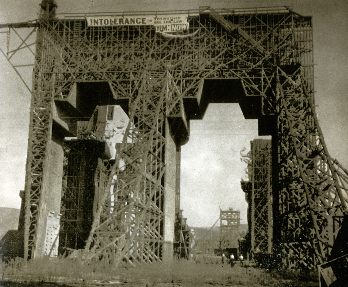
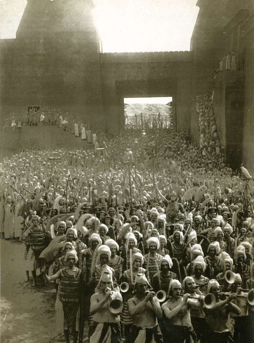
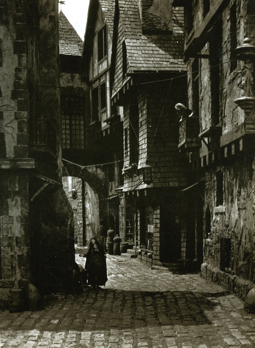
Here’s a shot of the skeleton to the set of Babylonia in the film, Intolerance.
This film was shot in California. Film makers ran to the west coast
as much to escape the patent holders as to find all sun all the time.
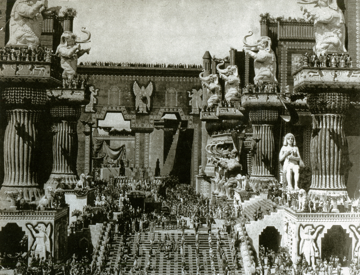
This is what the final set looked like for the film. (Those are
real people and elephants inhabiting the set, not computerized creations.)
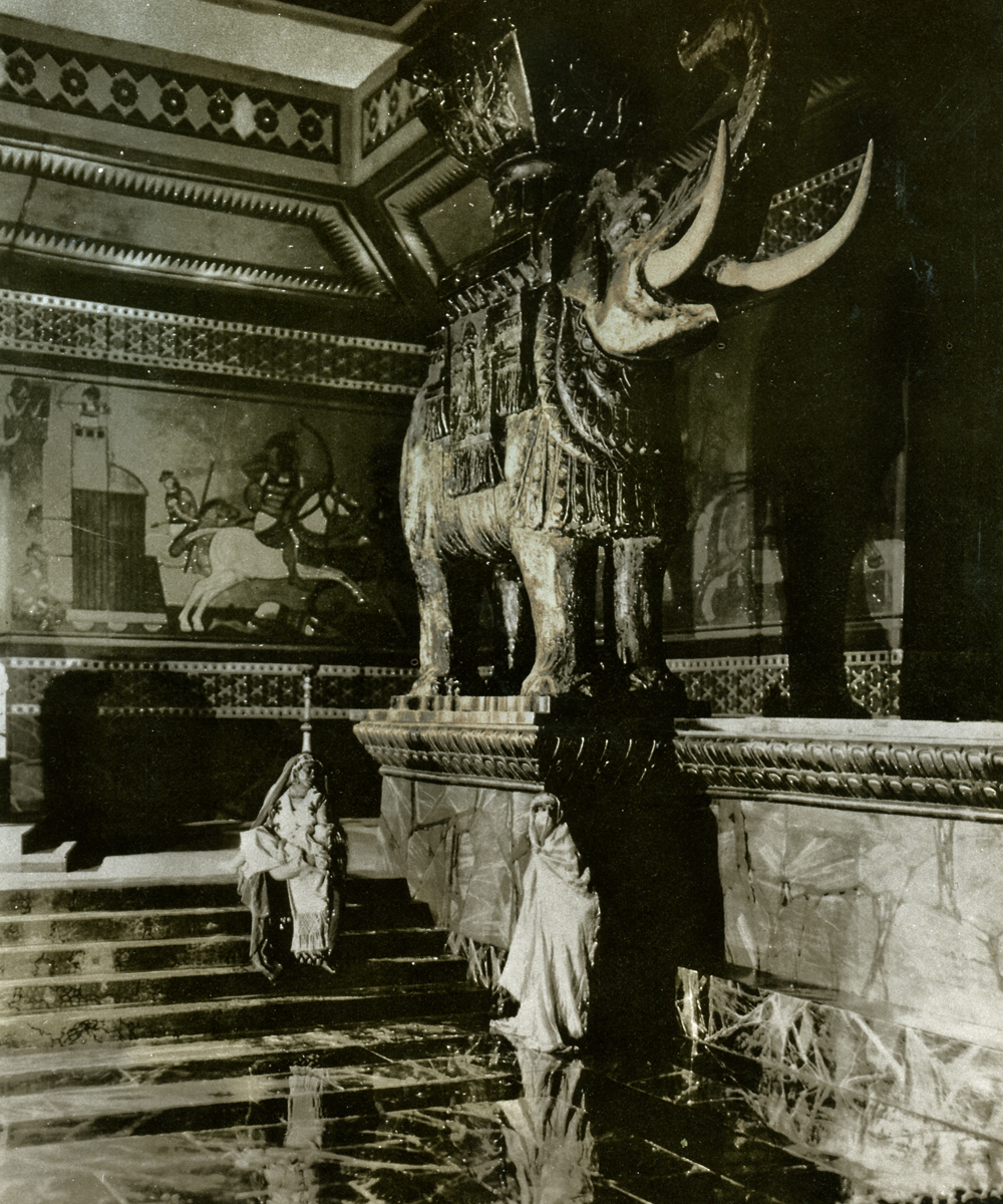 This is closer shot of one of the elephants that lined the walls. The care that was put into these films was amazing. Griffith loved recreating famous paintings and etchings that illustrated the stories he was filming. Quite often, the intertitle would tell you that you were watching such a recreation and show you the painting.
After the film was completed, the set remained standing for many years. If Roger Corman had been around at the time, there would have been another dozen films featuring it.
There’s also a wonderful Italian film by the Taviani brothers called, Good Morning, Babylon. It’s about two architect brothers who emigrate to the US and get work helping to build the set. It’s worth hunting down for a look.
The Griffith film led to bigger and bigger sets.
This is Ernst Lubitsch’s German film, Loves of a Pharoah.
Douglas Fairbanks got even larger with his set for The Thief of Baghdad.
 Years later, after a number of films had failed for him, Griffith tried to make one more special film. He bought some land in Mamaroneck, NY and built his own studio. There he had constructed Paris. This would be the set for Orphans of the Storm.
It was a film that featured the sisters, Dorothy and Lillian Gish. The girls are separated in the period melodrama. here, Dorothy, playing the blind sister, is searching the streets for her sister.
She isn’t very successful and sinks lower and lower into the depths of revolutionary France. Needless to say, there’s eventually a reu-nion.
Lillian took a very big part in the making of these films. During Intolerance she actually was an uncredited editor. Since she had a small role in the film, she would spend the days assembling footage to view with D.W. in the evenings and would rework the film to Griffith’s instructions on the next day.
There was no script when they started this film. Griffith wrote it all and kept it in his head as he shot the film. This was quite a feat since it’s four separate stories that are interwoven. (The first time this was done on film.)
Anita Loos was employed, early in her career, after the fact to help write the intertitles and offer suggested changes to the footage.
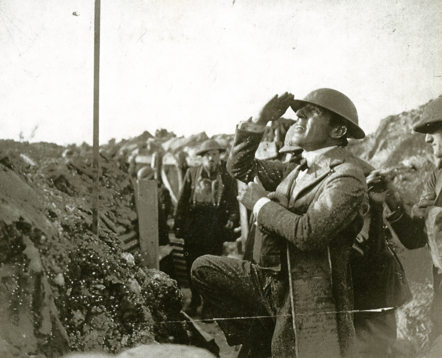
In 1917, during WW I, Griffith actually went to the French front to film his movie,
Hearts of the World. The film was financed with British money as
early propaganda. The footage shot in France wasn’t all he’d hoped for,
so some of it was recreated back in the US when he returned.
Photos &repeated posts &Steve Fisher 10 Feb 2013 06:34 am
Ice Storm – repost
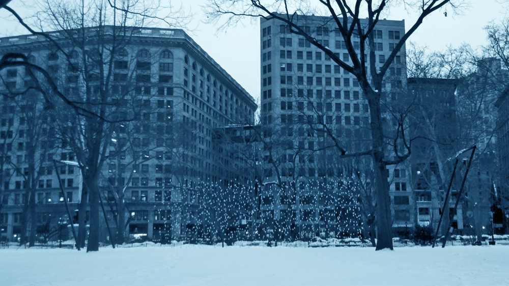
New York has had another snow storm. Oh not as bad as Boston has received, but bad enough. To tell the truth, I didn’t want to include pictures of snow in this week’s post, but what the hell. How do you avoid it? However, I do think one snow storm isn’t too different from others, and since I have one from the past from which I really like Steve Fisher’s photographs, I decided to repost those images. So here they are – the ice storm February 2011.
Here they are, NY in a different light.
 1
1These first two pics were the ones I shot at 6am
but wasn’t crazy about.
 2
2
 3
3
The rest of these are by Steve Fisher.
They’re all color shots.
 4
4
 5
5
 6
6
 7
7
 8
8
 9
9
 10
10
 11
11
 12
12
___________________________
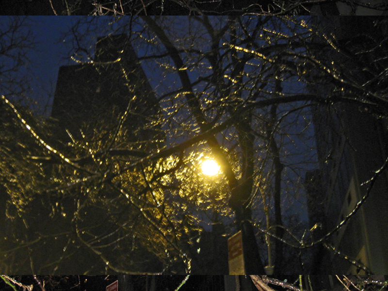
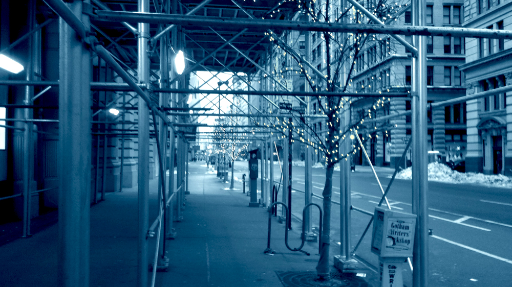
- It’s a couple of days later. The weather has gotten a bit warmer by Saturday, and another smaller snow dusting is expected. I decided to walk to the studio at 6:30am and figure out how to use my camera-phone thing. I’ve had it for two months and haven’t really figured out the machine. So here are some pictures. Note that a light hail was falling throughout the two mile trek.
 1
1First off I walk through Madison Square Park.
I haven’t been here since Christmas, the first big snowfall.
I mistakenly had left the B&W feature setting on the camera.
 2
2
This tree looks to be dead. They’ve cut off a lot of it.
(See the logs on the ground.) Masses of squirrels are
climbing into the hole at the top of it.
 3
3
This is that light “Art-piece” I featured last year.
The lights (you have to look for them) aren’t on,
and the piece is silent.
 4
4
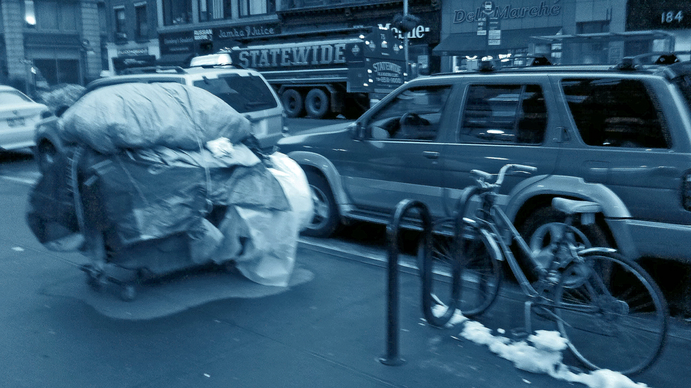
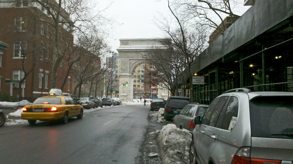
Then I walk down Fifth Ave. to Washington Square Park in the Village.
Some homeless person left their bin parked near a bike stand just
outside of the 23rd St. subway entrance. I guess they’re keeping warm.
 5
5
I almost forgot why I’d shot this photo.
If you look closely you’ll see that the entire building is
“For Rent”. I guess they gave up on the idea of selling it.
 6
6
Are these Christmas tree lights, still hung?
They look nice (in person) under this construction tunnel.
 7
7
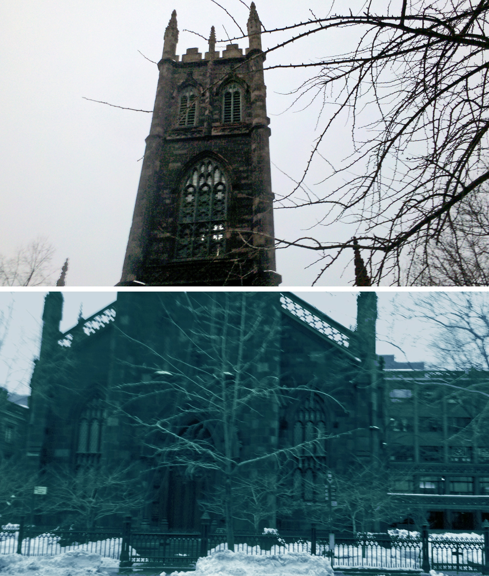
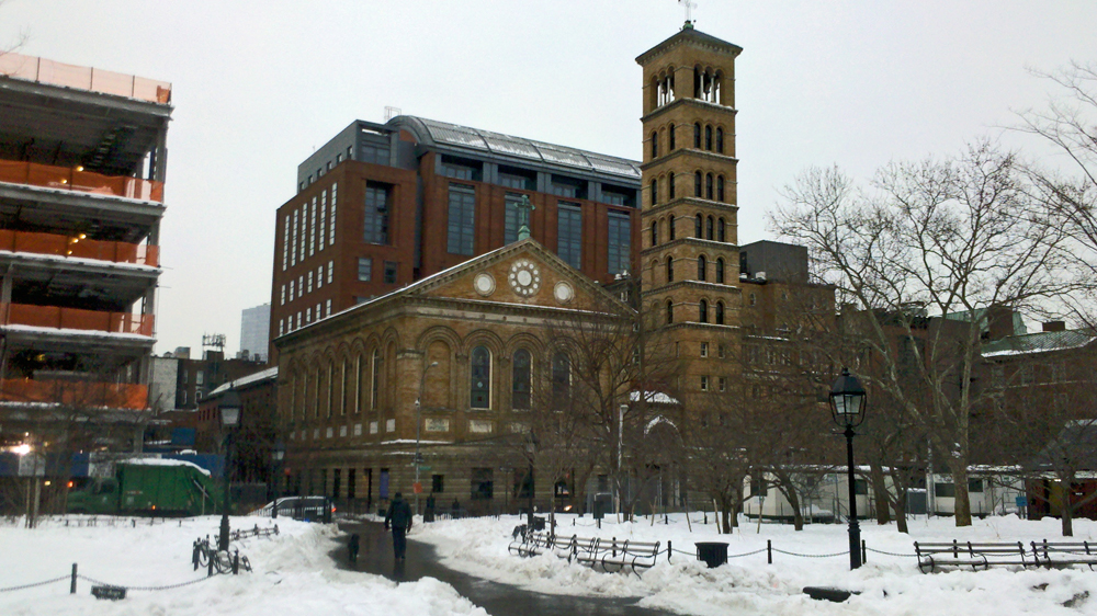
The First Presbeterian Church on 13th Street and Fifth Ave.
I’ve realized I’d been shooting in B&W.
This is the first pic in color.
 8
8
Here’s the Arch at Washington Square Park , shot from 8th Street and Fifth Ave.
 9
9
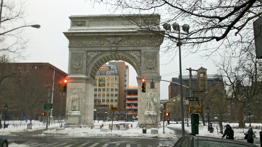
Here’s a closer shot.
 10
10
This is Judson Memorial Church near NYU shot from within the park.
 11
11
A sort-of famous restaurant a couple of blocks from the studio.
All they serve is PB&J hundreds of ways. I haven’t been in there.
I keep PB and Jelly in the studio and my home; I love it.
 12
12
I turn West on Bleecker to Downing which leads me to Bedford.
“Hey ma, I can see our house from here!”
Finally, I reach the studio. The hail’s getting heavier.
Books &Commentary &Puppet Animation &repeated posts 27 Dec 2012 07:28 am
Jason Recapped
- I’ve thought about stop motion animation recently. Films like ParaNorman are beautifully made oversized spectacles that feel, to me, as if they were trying to mimic cg animation. The quality of the 3D animation has just about moved to the “slick” mode; the work has gotten so well done. This is the ultimate effect of mixing the computer with actual puppets, dolls that the computer creates that are then filmed. Isn’t that what happens with the hundreds of thousands of facial positions that are being created? I have a preference for Tim Burton’s puppet motion in films like Frankenweenie. You can feel the fingerprints on those dolls, unlike the excellent work done on ParaNorman.
I know, I’m complaining about the work being too well done. Too good to satisfy me. I just wonder what Ray Harryhausen would have done in this market. How would his films – rarely on ones, often clunky in its movement – have been accepted by modern audiences? Would audiences balk at that? Or would his extraordinary imagination take the bill and give us plenty to take in?
Last night I went to the movies and saw a lot of 3D action adventure trailers of films coming soon: Jack the Giant Slayer, Oz: The Great and Powerful, even the 3D version of Jurassic Park. There were more of them whose titles I’ve forgotten. They all seem the same – Loud and crushing with all those violent 3D moves. The same whooshing sound effect with every cut. It’s hard to get excited about any of them.
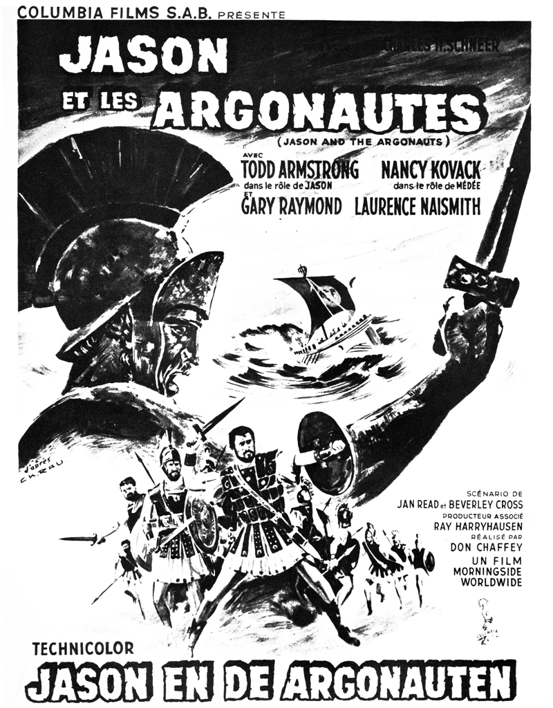
I once posted an article featuring Jason and the Argonauts. There was a chapter from Mr. Harryhausen’s 1972 book, Film Fantasy Scrapbook, about that film. I’d like to show it again. The book is written in the first person singular and collects B&W images like a scrapbook.
Here it is:
Of the 13 fantasy features I have been connected with I think Jason and the Argonauts pleases me the most. It had certain faults, but they are not worth detailing.
Its subject matter formed a natural storyline for the Dynamation medium and like The Seventh Voyage of Sinbad strayed far from the conventional path of the “dinosaur exploitation film” with which this medium seemed to be identified.
Taking about two years to make, it unfortunately came out on the American market near the end of a cycle of Italian-made dubbed epics based loosely on the Greek-Roman legends, which seldom visualized mythology from the purely fantasy point of view. But the exhibitors and the public seem to form a premature judgment based on the title and on the vogue. Again, like Sinbad, the subject brewed in the back of my rnind for years before it reached the light of day through producer Charles Schneer. It turned out to be one of our most expensive productions to date and probably the most lavish. In Great Britain it was among the top ten big money makers of the year.
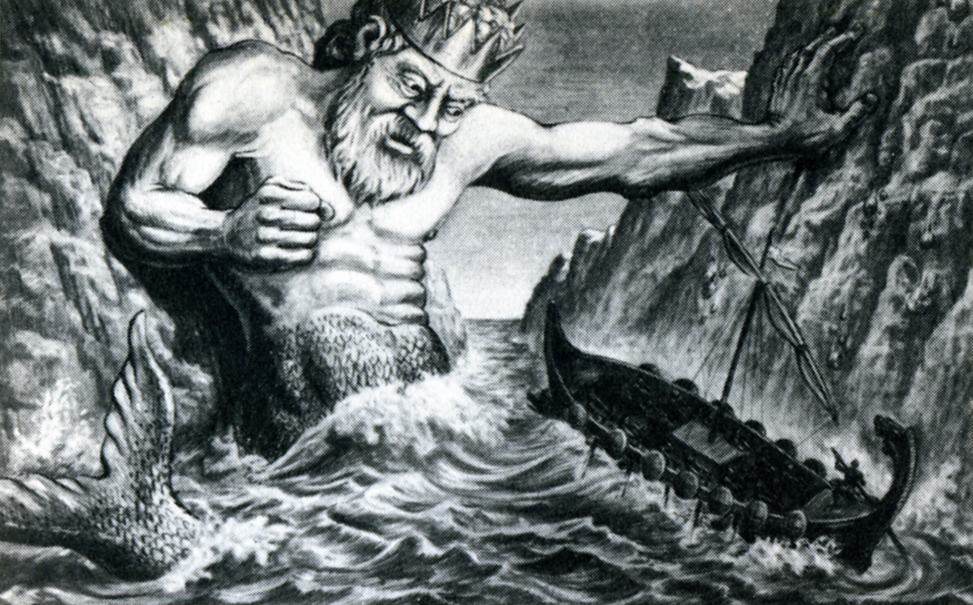
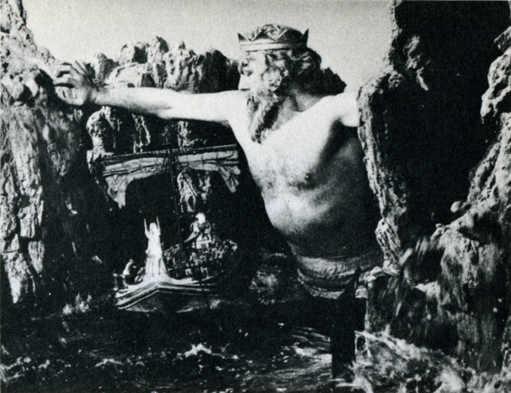
A preproduction drawing (above) compares favorably with a film still (below.)
The drawing is quite a bit more dynamic. (After all, it is Dynamation!)
(Click any image to enlarge a bit.)
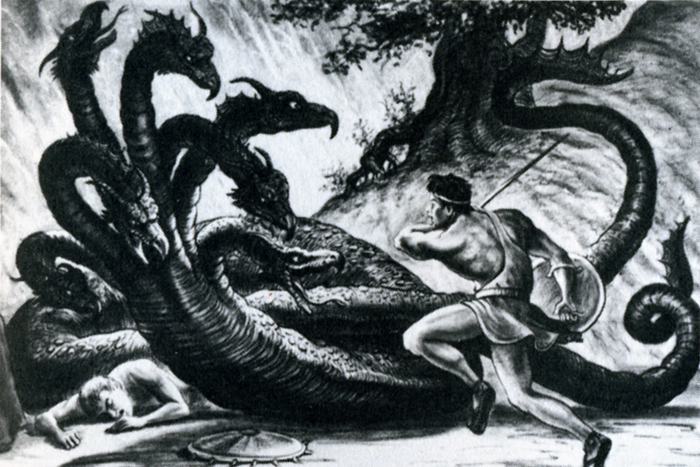
Likewise, a drawing of the hydra (above) film still (below.)
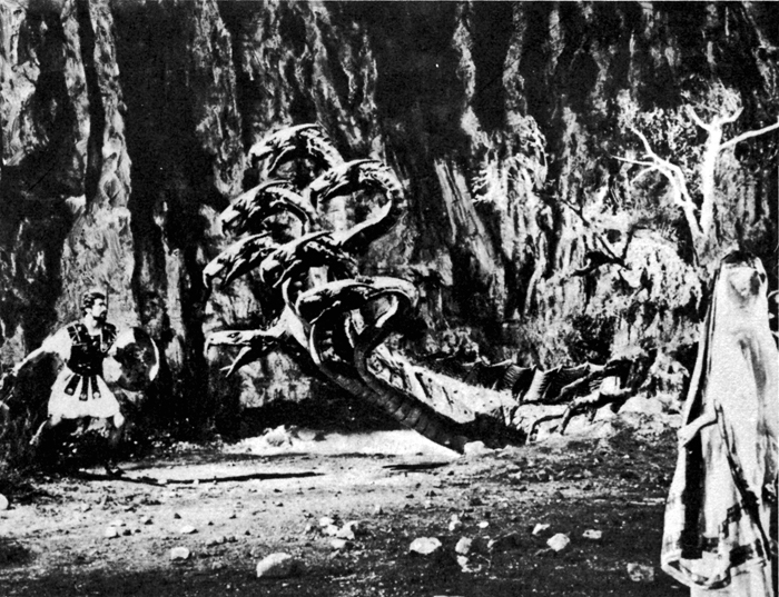
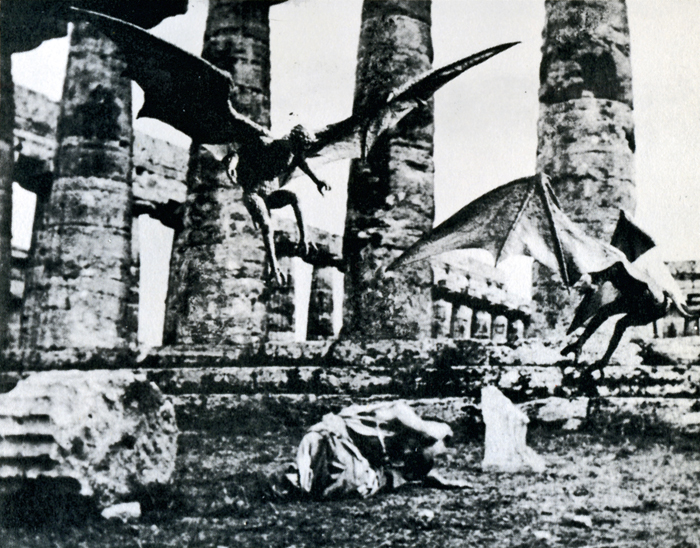
Harpies (Above & Below)
Some of the difference in basic composition between the pre-production sketches I made for Jason and the counterparts frames of the production is the direct result of compromising with available locations.
For example, the ancient temples in Paestum, southern Italy, finally served as the background for the “Harpy” sequence. Originally we were going to build the set when the production was scheduled for Yugoslavia. Wherever possible we try to use an actual location to add to the visual realism. To my mind, most overly designed sets one sees in some fantasy subjects can detract from, rather than add to the final presentation.
Again, it depends on the period in which it is made as well as on the basic subject matter. Korda’s The Thief of Bagdad was the most tastefully produced and designed production of any film of this nature but unfortunately the budget that was required would be prohibitive with today’s costs.
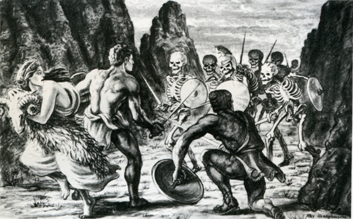
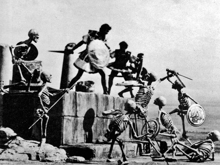
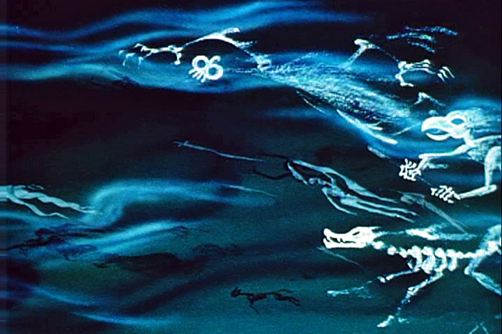
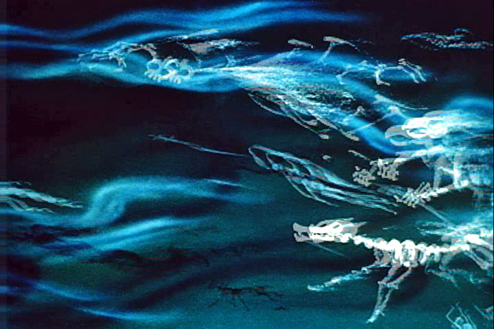
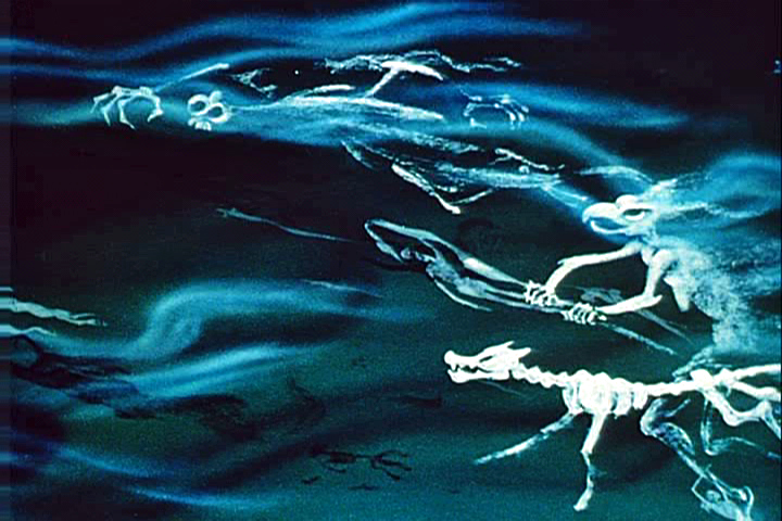
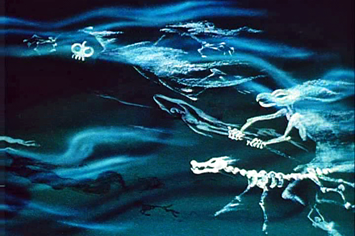
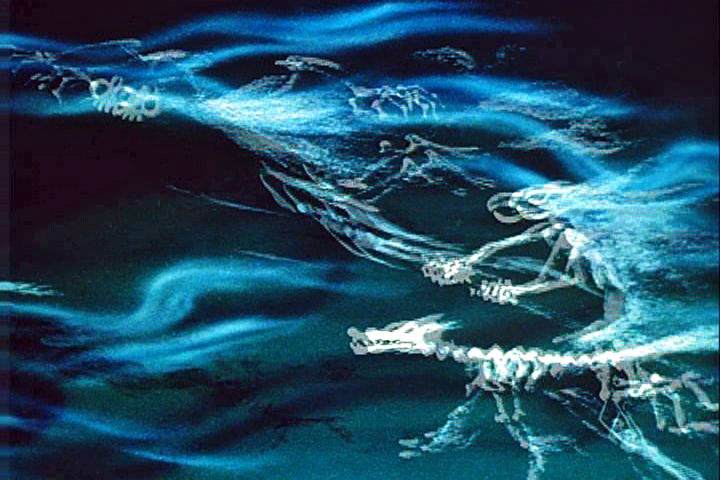
The Skeleton Sequence was the most talked-ahout part of Jason. Technically, it was unprecedented in the sphere of fantasy filming. When one pauses to think that there were seven skeletons fighting three men, with each skeleton having five appendages to move each frame of film, and keeping them all in synchronization with the three actors’ movements, one can readily see why it took four and a half months to record the sequence for the screen.
My one regret is that this section of the picture did not take place at night.
Its effect would have been doubled.
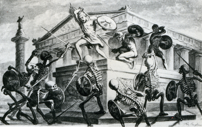
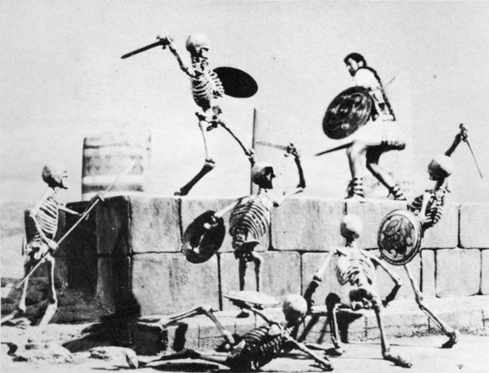
Certain other time-consuming technical “hocus-pocus” adjustments had to be done during shooting to create the illusion of the animated figures in actual contact with the live actors. Bernard Herrmann’s original and suitably fantastic music score wrapped the scenes in an aura of almost nightmarish imagination.
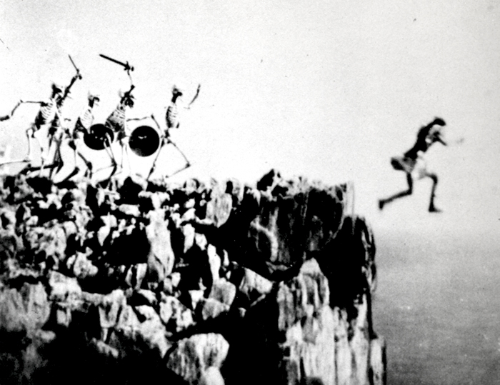
In the story, Jason’s only way of escaping the wild battling sword wielding “children of Hydra’s teeth” is to leap from a cliff into the sea. (Above left) A stuntman, portraying Jason for this shot, leaps from a 90-foot-high platform into the sea closely followed by seven plaster skeletons. It was a dangerous dive and required careful planning and great skill. It becomes an interesting speculation when dealing with skeletons in a film script. How many ways are there of killing off death?
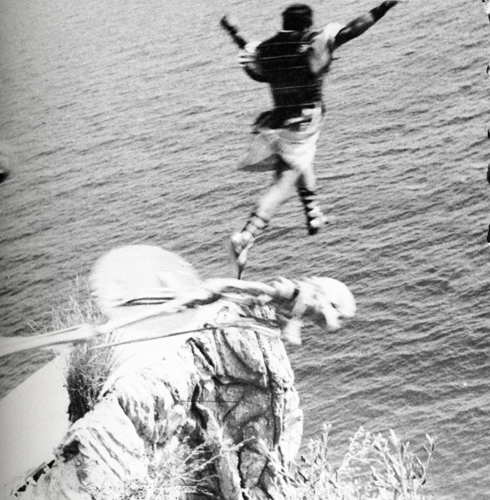
(Above right) Another angle with the real Jason jumping off a wooden platform into a mattress a few feet below. The skeletons and the rocky cliff were put in afterwards while the mattress was blotted out by an overlay of sea.
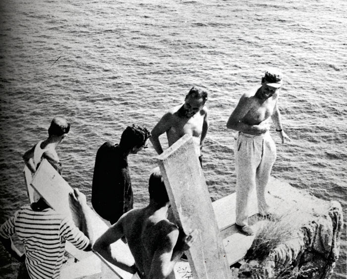
Director Don Chaffey and Ray Harryhausen discuss the leap with Italian stunt director Fernando Poggi.
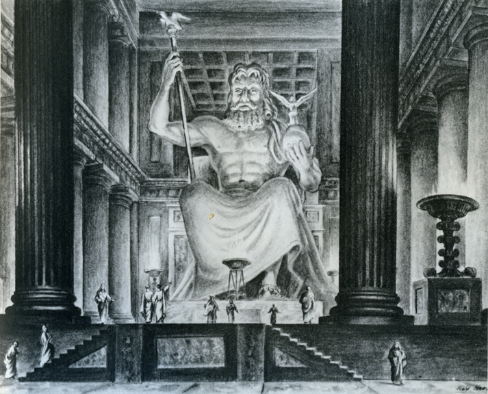
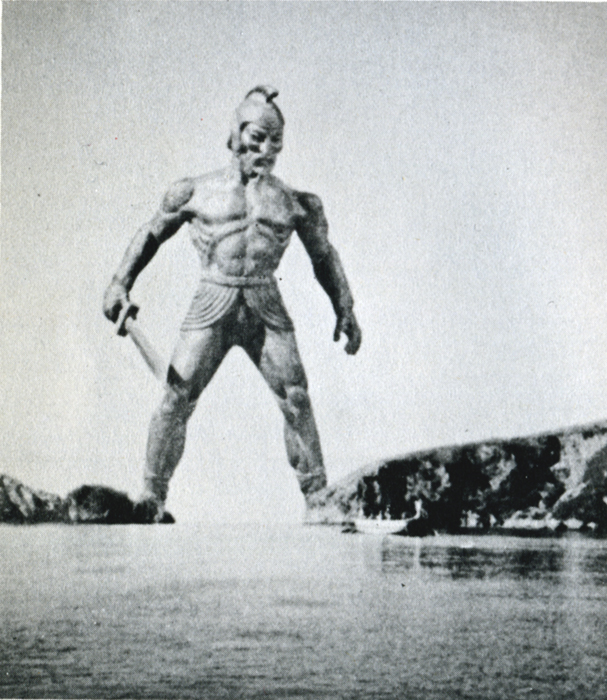
When transferring published material to the screen it is almost always necessary to take certain liberties in the work in order to present it in the most effective visual terms. Talos, the man of bronze, did exist in Jason legend, although not in the gigantic proportions that we portrayed him in the film. My pattern of thing in designing him on a very large scale stemmed from research on the Colossus of Rhodes.
The actior: his blocking the only entrance to the harbor stimulated many exciting possibilities. Then too, the idea of a gigantic metal statue coming to life has haunted me for years, but without story or situation to bring it to life. It was somewhat ironic when most of my career was spent in trying to perfect smooth and life-like action and in the Talos sequence, the longest animated sequence in the picture, it was necessary to make his movements deliberately stiff and mechanical.
Most of Jason and the Argonauts was shot in and around the little seaside village of Palinuro, just south Naples. The unusual rock formations, the wonderful white sandy beaches, and the natural harbor were within a few miles of each other, making the complete operation convenient and economical. Paestum, w its fine Greek temples, was just a short distance north. All interiors and special sets were photographed in a sm studio in Rome.
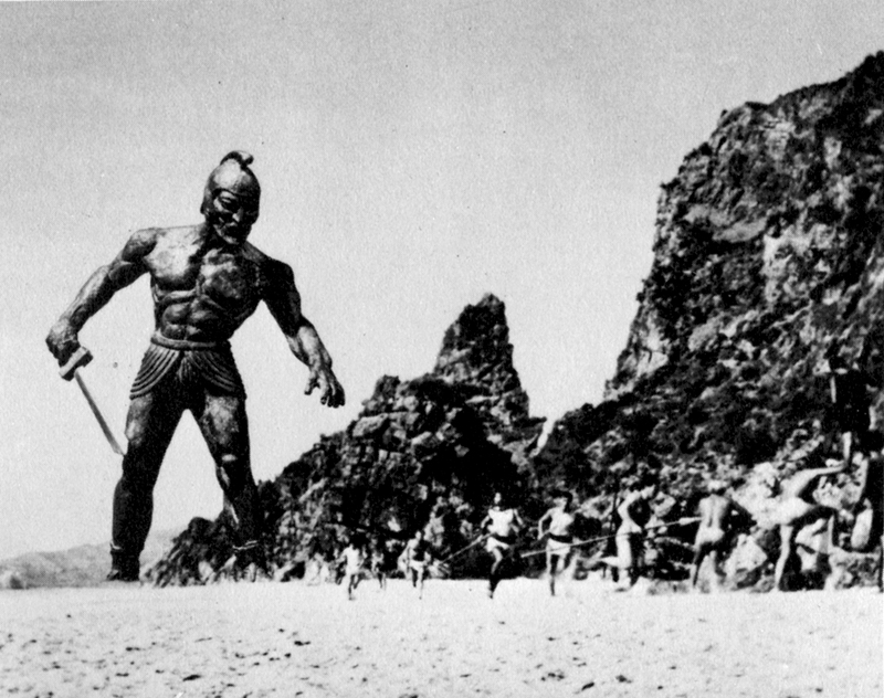
 (Above left) Talos, the statue of bronze, pursues Jason’s men.
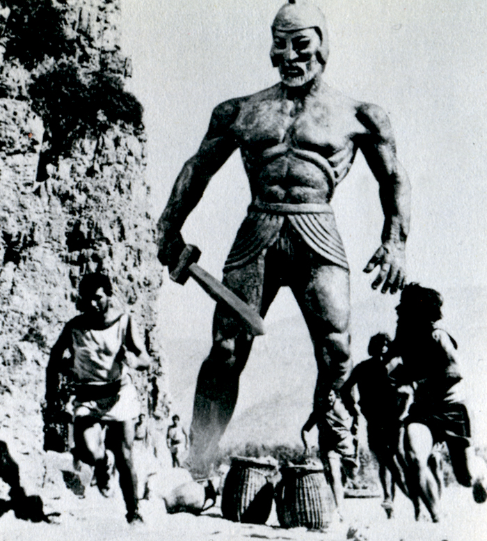
(Above right) Talos blocks the Argo
from the only exit of the bay.
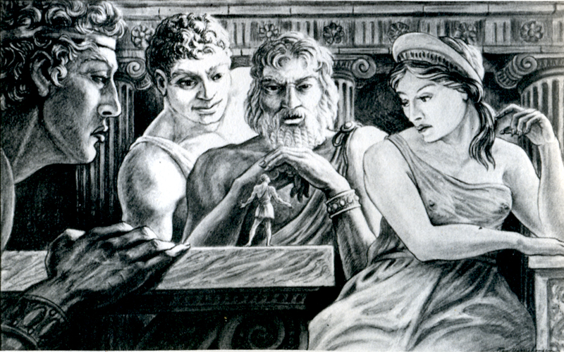
Pre-production drawing of Jason speaking to the Gods of Greece.

For the second unit operation a special platform had to be fitted to the Argo in order to achieve certain camera angles. Although it looks precarious it was far more convenient than using another boat for the shots.
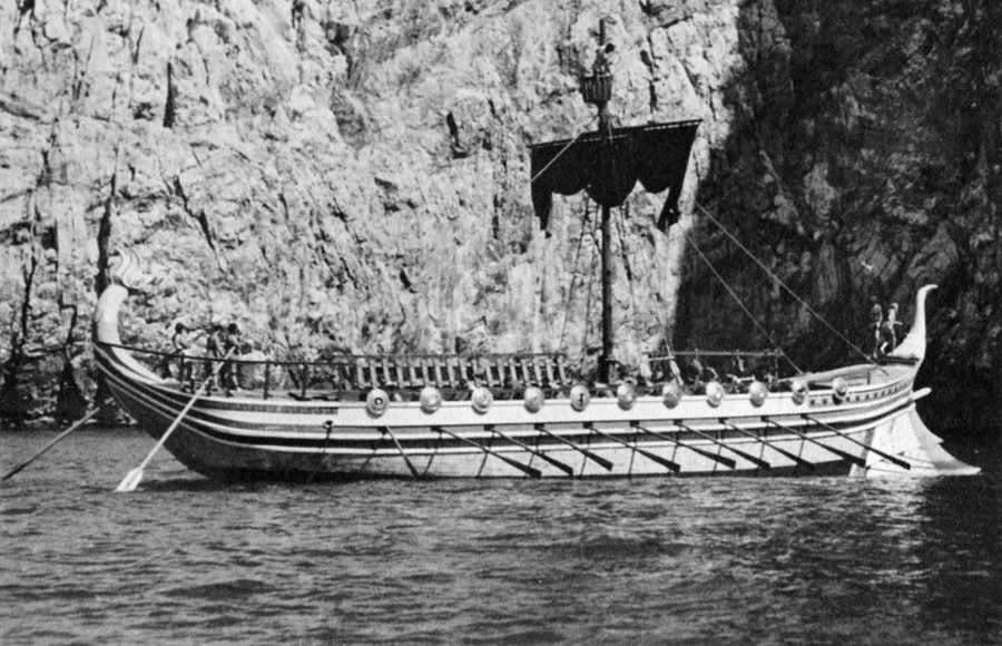
The Argo had to be, above all, practical in the sense that it must be seaworthy as well as impressive. It was specially constructed for the film over the existing framework of a fishing barge. There were twin engines for speed in maneuvering, which also made the ship easily manipulated into proper sunlight for each new set-up.
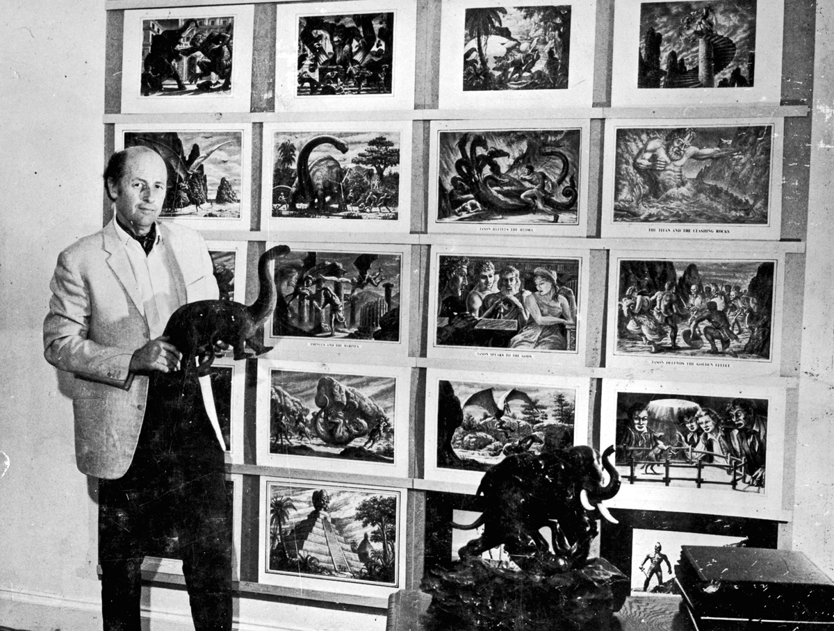
Harryhausen off the book’s back cover
to give an idea of scale of drawing sizes.
Animation &Articles on Animation &Luzzati & Gianini &repeated posts 02 Oct 2012 04:59 am
Luzzati & Gianini
- I spent some time rereading some material about Emanuele Luzzati and Giulio Gianini. I went back into my archives and found a lot of frame grabs and a bit of info about them at the time of their individual deaths. Ive put three of those posts together and am posting that today as sort of a retrospective piece.
Luzzati
Jan. 26th, 2007
 Emanuele Luzzati has died. He was the brilliant Italian designer, who worked with Giulio Gianini in creating some wonderful animated cut-out films.
Their films adapted operatic overtures in reworking the operas themselves. The two were nominated for the Oscar for “The Thieving Magpie,” done in 1965 an interpretation of Rossini’s opera and again in 1973 for “Pulcinella.”
Luzzati died Jan. 26th, 2007 on the way home from work. He collapsed just outside his home. He hadn’t been ill prior to this. He spoke on the phone with Giulio Gianini, who has been very ill for some time, that very morning.
 Luzzati designed sets and costumes for stage productions and operas, including the 1963 production he designed for Mozart’s “The Magic Flute.” Fifteen years later he turned the opera into an animated feature that remains one of his most famous works.
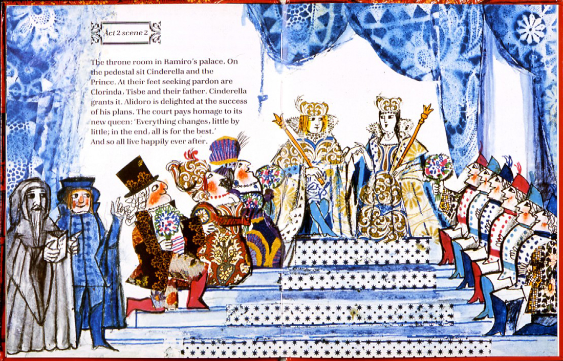
He’s illustrated and written quite a few books. See this list on Amazon.
(Above: an image from his children’s book, Cinderella.)
The only Obituary I’ve seen for him was this one for the AP. It does give rather complete details of his life and work. AP Obituary.
 – I received a call from The Guardian in London. The newspaper was doing an obituary for Emanele Luzzati, and they couldn’t find any illustrations to color their report. They’d found some on my blog and wanted to know if they could use them.
(Go here to see all Luzzati/Gianini posts.)
Of course, I directed them to Luzzati‘s distributor who could give the clearances they needed.
But I found it all depressing.
This was one of the world’s greatest designers of Operas and Animation. His brilliant animated version of The Magic Flute is a feature that should be in theaters now. Unfortunately, it never made it to theaters (at least, not in the US), and his designs for the opera are equally as stunning.
Years of amazing art he’s produced, and there’s so little – even on-line – that could be readily found for his obituary. I find it confusing. This was the original reason I had for putting so much attention on his work, and the call from the paper pushes me back to do another post. Unfortunately, all I have are frame grabs.
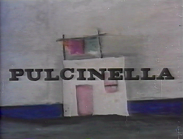
Here is Pulcinella. It is a short that was nominated for the Oscar in 1973. Another cut-out animated film, Frank Film by Frank and Caroline Mouris won the award. The Legend of John Henry by Sam Weiss, produced by Nick Busustow was also nominated.
Like other Luzzati/Gianini films, the score is taken from an opera overture, Rossini’s The Turk in Italy.
The animated film is an abbreviated, caricatured version of the opera. 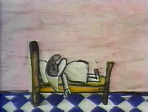
Pulcinella (Punch, as in Punch & Judy) is the principal character who dreams himself into a wild nightmare of a dream that leads us through an abstract world. It’s nice to see how the animators/designers play off the puppet character as well as the opera.
I’m just going to post the images without detailing the story. I like it better that way.
There are some 90 images, so it takes some attention to graphics.
(Click any image on the page to enlarge.)
Gianini
May 18th, 2009
 – I’ve been something of a fan of the films of Luzzati and Gianini. I’d met Emanuelle Luzzati at a function thrown at the Italian Embassy in New York, years ago. I bought a book by him, and the artist drew a beautiful pen and ink drawing in the frontispiece of the book.
In 1988, I met Giulio Gianini in Italy during a stay of a couple of pleasant days with an assistant of his at the festival in Treviso, Italy.
Mr. Gianini died this past Saturday, and I wanted to offer a bit of a memorial. Emanuelle Luzzati died January, 2007 and to memorialize that I posted some illustrations and information about the duo with a lot of frame grabs from a number of the Luzzati/Gianini films. It took a few posts, and I left off without wanting to overplay all of the art at my availability.
Luzzati & friend
The Thieving Magpie was the first of their films to receive an Oscar nomination, and it was the first of the frame-grab posts I showcased. I’d like to post it again in honor of Mr. Gianini. He was sick for several years and in particularly bad condition. His death wasn’t a surprise, but it is still an enormous loss.
 1
1  2
2(Click any image to enlarge.)
La Gazza Ladra (The Thieving Magpie) is a Rossini opera about a young maidservant who, accused of stealing a silver spoon, is sentenced to death for her crime.
At the eleventh hour, the real culprit is found to be a magpie.
A cartoon, if ever there was one. With great music!
The film tells a tale wherein a king and his hunters, on a bird hunt, are beaten
by a magpie who steals their gems and ultimately destroys their village.
 4
4  5
5
Luzzati who spent many years designing operas and ballets,
brought his knowledge to animation as the pair adapted several operas often utilizing the overtures of the operas they were adapting.
 6
6  7 The film was nominated in 1964 along with
Clay, and the Origin of the Species by Eliot Noyes
and the winner, Chuck Jones’ Dot and the Line.
The Sound of Music won the Best Picture Oscar, that year.
 8
8  9 The use of cut-out animation wasn’t mainstream at the time.
This is years before Terry Gilliam made it somewhat fashionable. All of the
Luzzati-Gianini films were totally inventive and creative within the form they established.
Gianini’s animation was as dreamlike as Luzzati’s exciting designs. The films
look to be designed somewhere between Chagall, Kirchner and
stained-glass windows; the sensibilities are all Luzzati and Gianini.
 Today we have Flash animation which does just about the same thing as cut-out animation, but the form used today is flat and vulgar and cartoony. It might be useful for practitioners of Flash to take a good look at what these two brilliant designer/animators did with a similar form under more complex and arduous methods. Ulltimately, it’s all related.
You can get a bit more information about Gianini and Luzzati from the website of the Luzzati Museum in Genova.
Animation &Animation Artifacts &commercial animation &Hubley &Models &repeated posts 03 Sep 2012 05:11 am
Vlasic Business at the Hubleys
 – Years ago I worked at the Hubley studio on a pair of commercials for Vlasic pickles. One of the two spots made it to the air.
This is from the spot that never made it.
Vlasic had a commercial they wanted, and because of the agency’s long time relationship with the Hubleys, they came to him to try to develop the character. (The agency was W.B. Doner, the agency that had done so well with Hubley’s Maypo commercials.)
The agency came with two already-recorded voices: one was a Groucho Marx impersonator (Pat Harrington was the Groucho impersonator ultimately used for the stork’s voice.*) The other voice was character actor, Edgar Buchanan, a man with a gruff voice who appeared in a million westerns. John Hubley wanted Edgar Buchanan – it was a much richer voice, lots of cowboy appeal.
John designed the character to look like one of those stationmasters in cowboy films. The guy who gives out tickets and does morse code when he has to. The stork had a vest and a blue, boxy, stationmaster-type cap cocked off to the side. It was a great character.
Phil Duncan was the animator. A brilliant character guy who had done everything from Thumper to George of the Jungle. I loved cleaning up and inbetweening his work. It was all fun and vibrating with life.
The rough thumbnail drawing (above) fell out of one of Phil’s packages. It was a thumbnail plan of the action. Phil would do these things which usually stretched around the edges of his final drawings. In a nutshell, you could see the scene and how he worked it out. Lovely stuff.
I felt this drawing was as beautiful as the original animation drawings.
 The agency approved the stork, Edgar Buchanan and the plan of action.
We’d already finished the first commercial which was on the air. (Represented by the two set-ups posted here.) The style was done with acrylic paints – out of a tube – on top of the cel. Ink with Sharpie on cel; paint dark colors – ON TOP of cel
- up to and over ink line; after drying we painted it again with lighter tones, and we pained it again after it dried using even lighter tones with a translucent color. Imagine kids & a gun in a spot today!)
Phil Duncan did a great job of animating it. I inbetweened, and the Agency loved it and approved it to color.
All this time, John and Faith were busy preparing the start of Everybody Rides the Carousel. It was to be three half-hour shows (Eventually CBS changed their mind and asked the shows, still in production, to be reconfigured to make a 90 min film) and was in preproduction. I did the spots on my own with John checking in. Faith wanted nothing to do with a commercial and was somewhat furious that a commercial was ongoing. She daily spoke out against this spot with many shouting matches. I never quite understood the problem. The spots didn’t hold up any other studio work; I was making it as easy as possible for John to not have to do much work on the spots, and they were getting necessary money to help finance some of the preliminary work for the Carousel. (Of course, the Hubley name was involved, but even Michelangelo did commercial work – like the Sistine Chapel to pay for the art. Not that Vlasic was the Sisine Chapel, of course.)
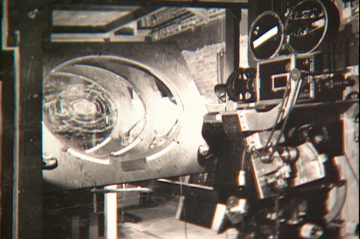
 Within weeks the spot was in color and two junior exec. agency guys, John and I stood around the Hubley moviola. (It was a great machine with four sound heads and a picture head that was the size of a sheet of animation paper. Pegs were actually attached to enable rotoscoping!)
The two agency guys were buttoned up with good suits and briefcases. They stood behind John and me, and I operated the moviola.
We screened the spot the first time. I turned around and these two guys had come undone. Their ties were loose and astray; they were visibly sweating. I swear this all happened within the course of 30 secs.
 John smiled and optimistically asked how they liked it. They looked at each other, and couldn’t answer. I don’t think they were able to form a decision or say what they actually thought. Eventually, they left with the spot in their briefcase and would get back. It wasn’t good.
They did get back. I was asked to pack up all the elements and ship them back to W.B. Doner. The spot was thrown out of the studio by John who refused to change it. (Hubley’s stork.)
He liked what was done, and apparently had
a rider in his contract which covered him – somehow.
The spot showed up at Jack Zander‘s studio, Zander’s Animation Parlour. They used the Groucho impersonation and slicked it up a lot. Vlasic is still using that stork, and that was John’s last commercial endeavor. The character is still showing up in a cg version, just as bad as the 2D version.
* Thanks to Mark Mayerson for this information.
Animation &Animation Artifacts &Disney &Hubley &John Canemaker &repeated posts 20 Aug 2012 05:53 am
Fantasia FX – Schultheis – recap
John Canemaker recently completed his latest book about Herman Schultheis and the effects department at Disney’s during the early 40s. It, hopefully, will be published in late 2014. This encouraged me to pull up this piece I posted in Sept/2009. It’s amazing how much information I was able to cull from the photos I found on the DVD.
I’m pleased with this post and am glad to repeat it for those who might not have seen it. John’s book, by the way, is one I’m looking forward to reading. He’s written a bit about it on his website.
- Herman Schultheis was an effects animator who worked on Fantasia. He kept a tight record of the effects they were creating from 1938-1941 and a photo display of how they were done. Schultheis disappeared in 1954 while trekking through Central America, and the notebook was forgotten until his wife’s death in the early 1990s, after which it was discovered by Howard Lowery behind the couple’s bedroom wall.
(Click any image to enlarge.)
Herman Schultheis created the book of charts and photos
which gives us a link to the many creative effects in the film.
The book is on display at the The Walt Disney Family Museum. It’s also been digitized so that visitors are able to go through the book, enlarge photos and view it page by page. An interactive display.
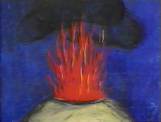
Prior to the discovery of the book we were able to figure out a few of the effects. One Disneyland show, in fact, recreated the bubbling lava scene from the Rite of Spring sequence.
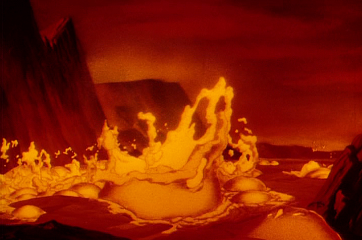
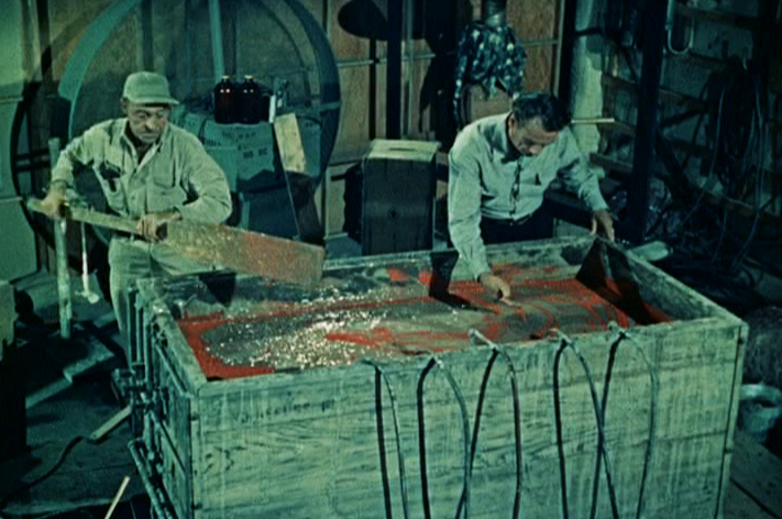
Josh Meador recreated the slow motion shoot of the
boiling concoction used to develop the bubbling lava.
However, the book revealed so much more than we’d understood
about how the superb effects had been crafted.
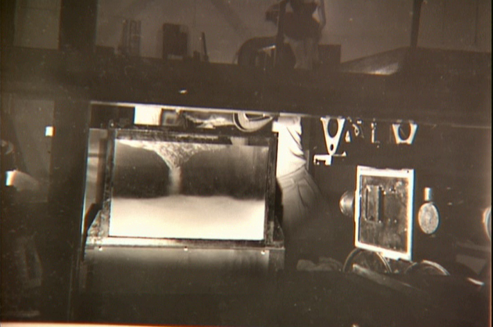
Using a vat of water, they were able to
drop ink into the liquid and film it in slow motion.
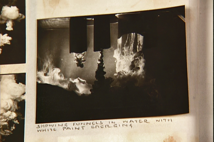
A photo of the ink spilling into the water behind built-in mattes.
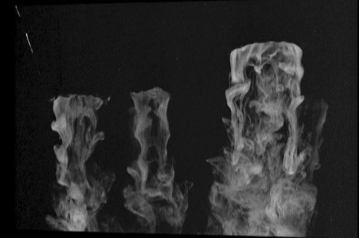
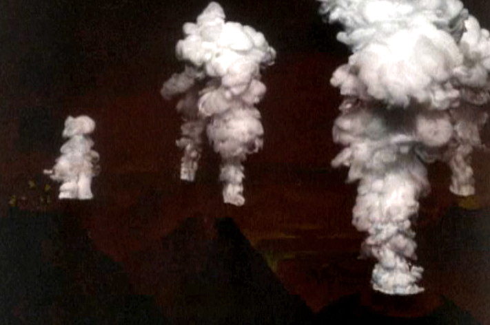
Taking the shot of the ink, they then turned it upside-down.
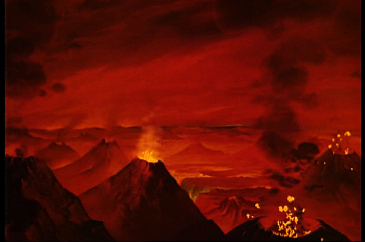
They then superimpose the “smoke” (or ink) over the volcanoes.
This same effect was used in Close Encounters of the Third Kind
to create clouds when the alien ships were moving in on the
farmhouse where the boy and mother lived.
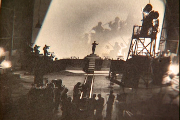
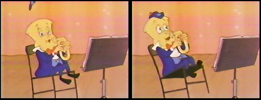
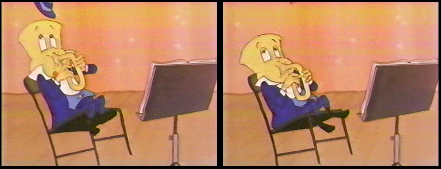
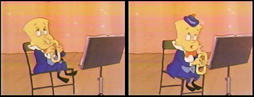
The orchestra was shot on a set with strong, planned shadows.
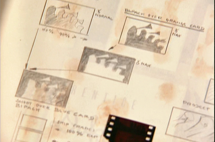
All these shots were orchestrated and planned for color effects.
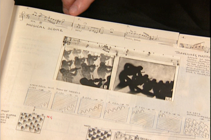
They were also catalogued by Schultheis who kept close
track of the music, as well, in his book. You can see a
page by page breakdown of the score at the top of the page.
You can see the highly polished sheet of metal (middle left) which reflected
and distorted the animation drawings. This is what the camera photographed
in some of the scenes during the Night on Bald Mountain sequence.
It was also used for the fire in Bambi.
 1
1 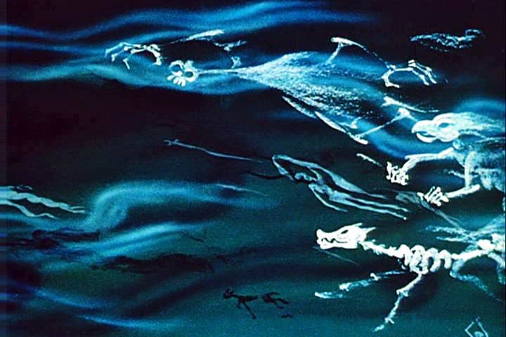 2
2
This scene’s ghosts were shot using that distorted metal reflection.
 2a
2a 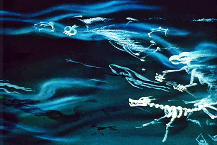 3
3
The ghosts also used a form of cross dissolve.
John Hubley explained to me how that was done, and
we used the technique in Everybody Rides the Carousel.
 4
4 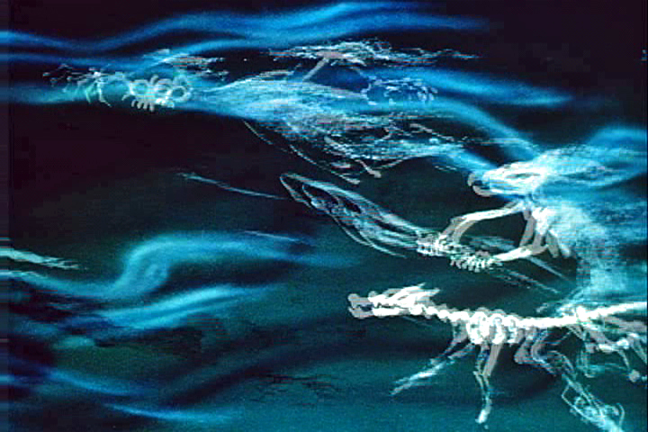 4a
4a
They shot the entire scene at 50% exposure. Then they went back
to the beginning and reshot the entire scene again at 50% exposure.
 5
5 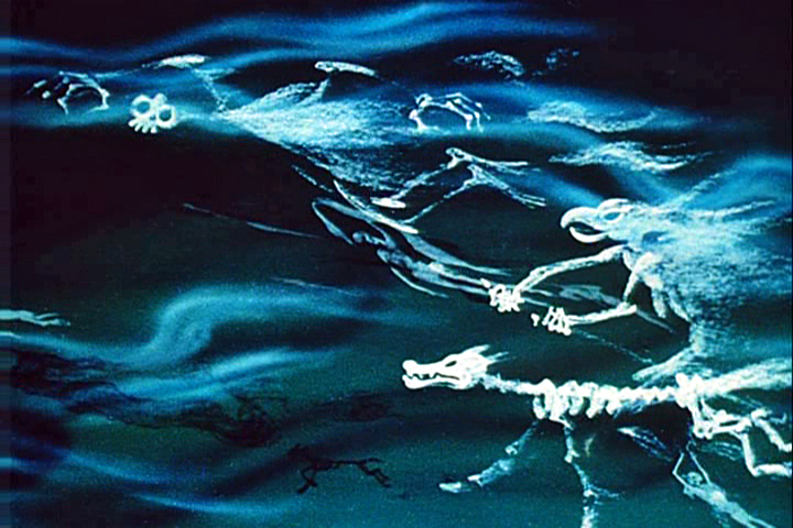 6
6
However on the second shoot, they started by shooting a black frame.
This made #1 fall where #2 should have been, #2 for #3 etc.
This creates a ghostly dissolve effect.
 6a
6a 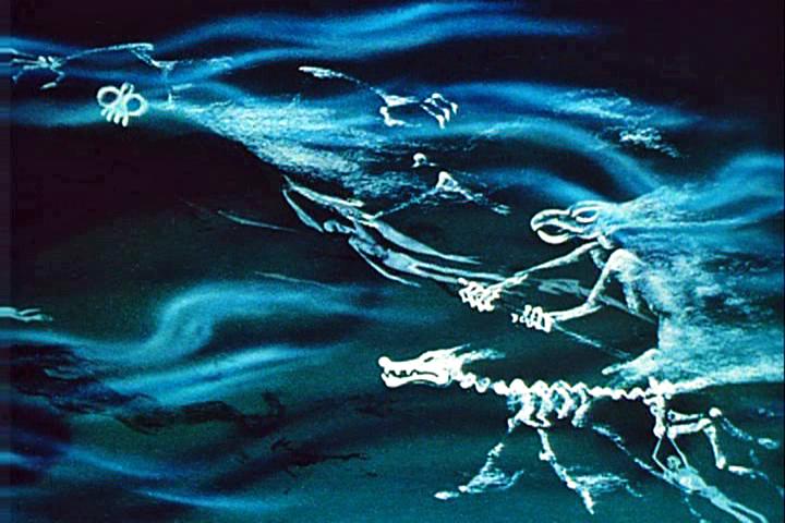 7
7
All of the drawings labelled with an “a” are the double exposures:
2a, 4a, 6a
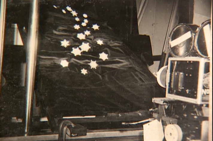
A make-shift circular multiplane camera was built.
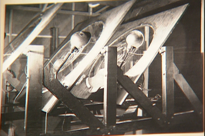
Created out of wooden sheets with holes cut out,
placed so they could shift angles, they were designed to
allow revolving artwork in the circular cut outs.

This allowed shooting scenes such as this shot of
a spider web as the camera moved around it
while dew glistened off of it.

The spinning snowflakes are well explained in Schultheis’ book.
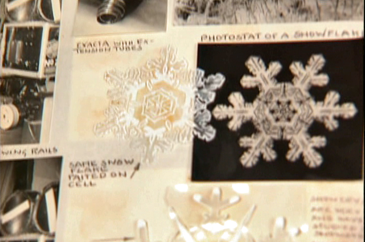
The snowflakes had a detailed construction.
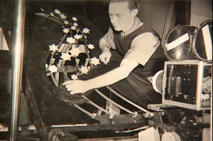
The path of action was intricately defined.
The snowflakes were shot against a sheet of
black velvet hiding the wire guides.
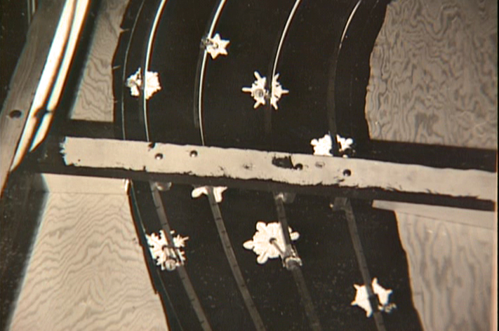
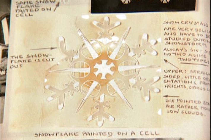
They were shot in tight closeup. From below you can
see the turning gears they were constructed on.
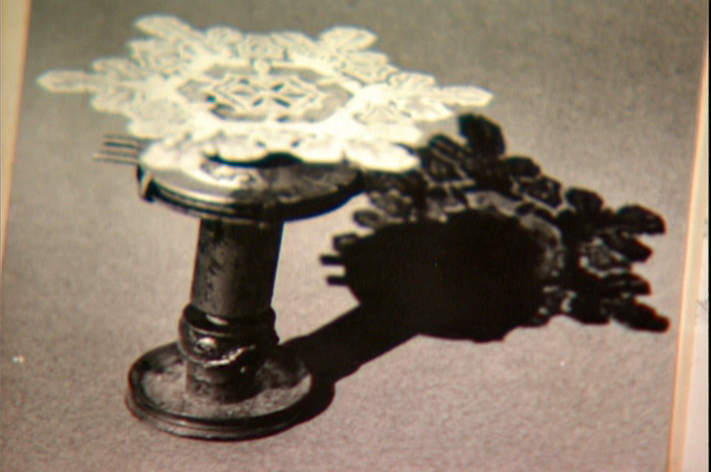
Each snowflake was built on a turning gear
so that they could revolve in their path of action.
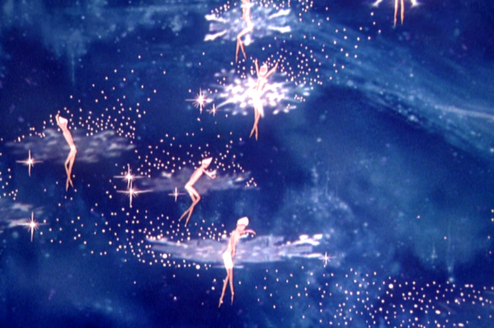
Burn these snowflakes over the multiplane background
and add matching 2D animated fairies within each snowflake,
and you have the finished scene.
John Canemaker &Photos &repeated posts 19 Aug 2012 07:00 am
John & Joe’s Garden
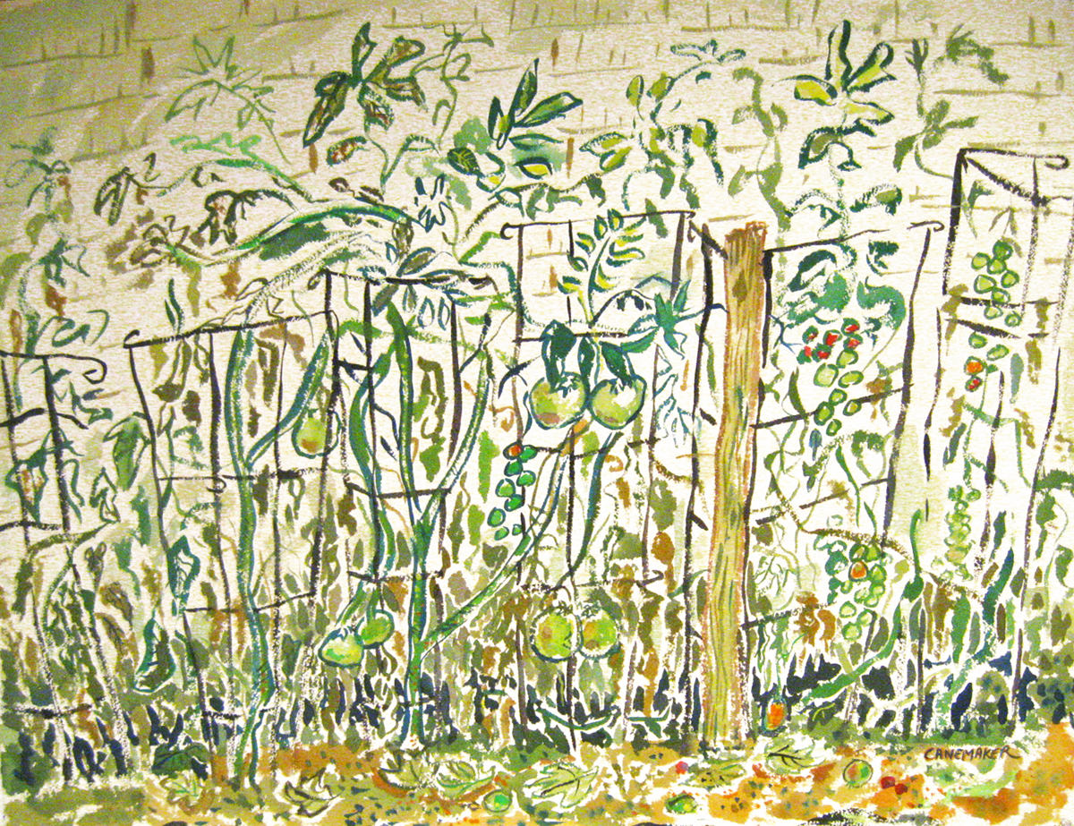
- Last year at about this time, Heidi and I went to visit John Canemaker and Joe Kennedy at their wonderful Bridgehampton house. That weekend I was so overwhelmed by the flush and beautiful gerden as well as the wonderful floral paintings John had done. I reported it on this blog, and was quite pleased with that post.
This weekend we’re repeating the excursion and have come to a different trip. For one, as Joe told me, the flowers bloomed much sooner this year, including those that usually bloom late, probably because of the peculiar weather we’ve been having. Consequently, the garden looked very different this year. It is now very green without much color.
This year we had more than overcast clouds affecting the weather. Rain stayed with us on much of Saturday. I didn’t mind very much, but there was little opportunity to walk through the garden with the ground so wet.
I’ve taken a few pictures this weekend and will add those later this afternoon once I get home, but for now I’m repeating last year’s post (with some minor changes).
- This past weekend, Heidi and I spent a lovely quiet time in Bridgehampton at the invitation of John Canemaker and his companion, Joe Kennedy. It made for a very restful and enjoyable time despite the grouchy weather.

The garden gives you the illusion that it’s larger than it is.
Even walking in it you feel that you could easily get lost in it.
The first dominant site you take with you as you visit the house is the amazing yard and the enormously colorful and tender care Joe and John have taken to cultivate their garden of a back yard. It’s stunningly beautiful. It feels almost as though these plants grew naturally next to each other and happen to take the shape it’s taken. The amount of weeding and nurturing and debugging is left completely behind as you bask in the warm glow of this garden with its variety of flower and shrub. It’s beautiful and peaceful and inviting. I couldn’t help myself over the course of the weekend; I took many walks in the area and sat and enjoyed it. I loved it.
The second thing that captivated me during the visit was a painting John had done. It sat on the wall of the guest room we stayed in. In the first few hours in the house I kept coming back to the painting. I liked it enough that I took out my camera and photographed it. As I did, I realized that there were other smaller paintings in the room, and I found them almost as lovely. There’s no doubt John has been taken with the amazing garden out back, and this has helped to color these fine watercolors.
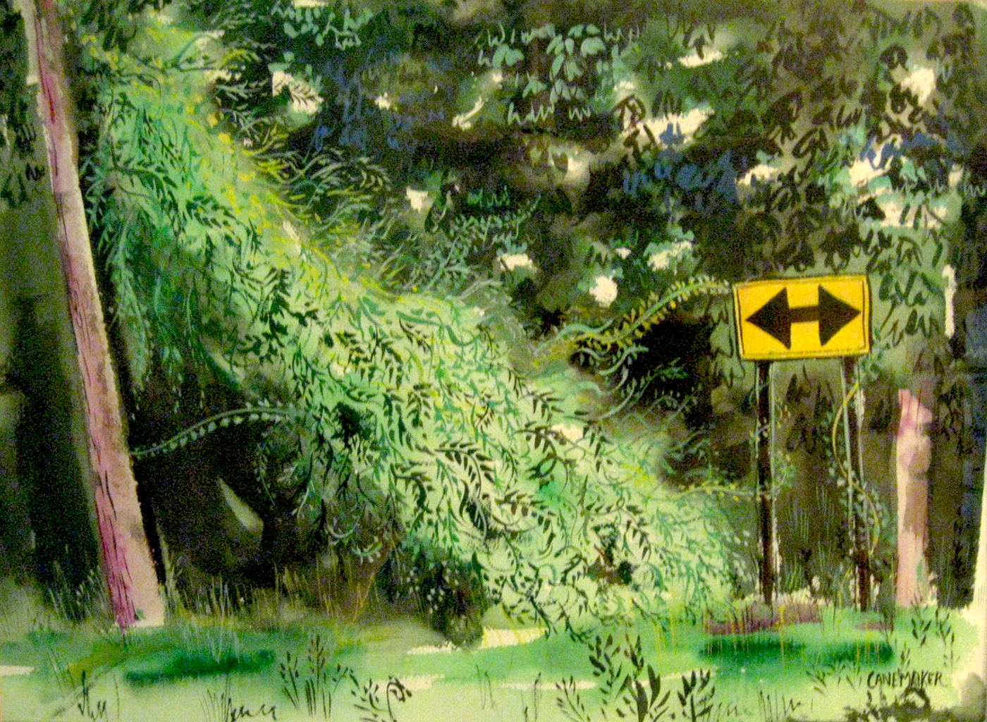
This painting obviously is not from the garden (given the road sign).
However, one can’t help but feel that the life in that garden spills over
into this painting – as it does in all the others.
At some point in the weekend, I asked John if he minded my photographing some of the paintings in the house and posting them on the blog. John, as always, was quite open to anything I wanted to do, so I went about quickly taking some photos. I also intended to mix in pictures from the garden. After all, I see these paintings and the flora as intermingling and working together in a lovely way.
There were some problems. The paintings lost some of their verve when photographed. The delicate colors were lost, and the shape of the pictures altered. (The lens of the camera seems to have slightly distorted the frames of the images.) I saw the pictures in some way influenced by Mary Blair’s work, but John took her colors and softened them. (The brashness of Blair’s work has always bothered me.) In the end, I found myself adjusting the pictures slightly to try to give them a bit of the feel of the originals, but I’m not sure I’ve succeeded. However, better you should get to see these images than none. My apologies to John.
So, I hope you enjoy the quick tour.


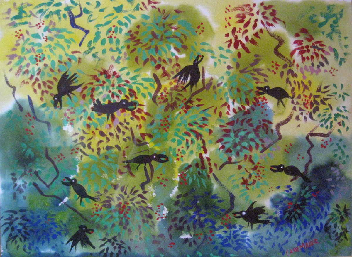
One of the larger paintings John had in his office, downstairs.


A beautiful flower that opened the day we arrived.
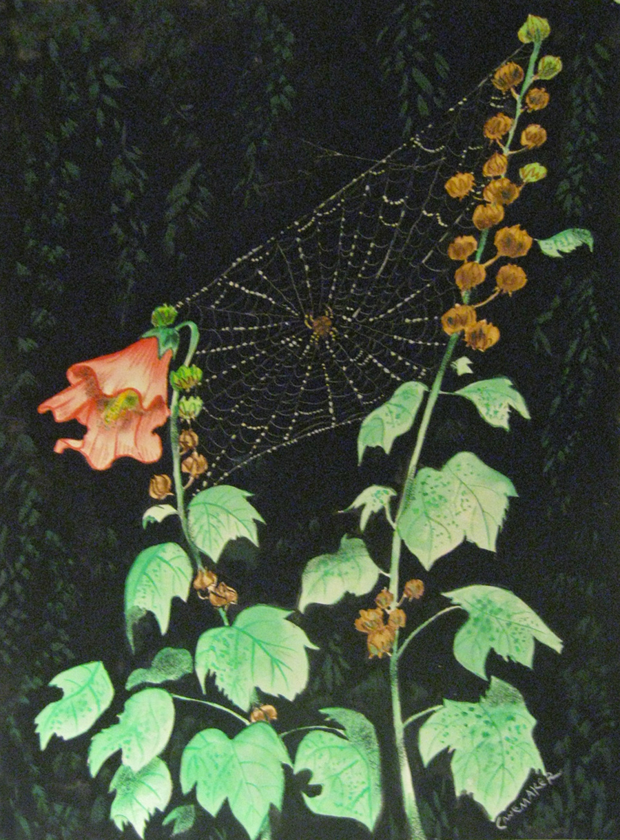

Spider web in the grass


Heidi sitting on the porch just to the front of the garden.

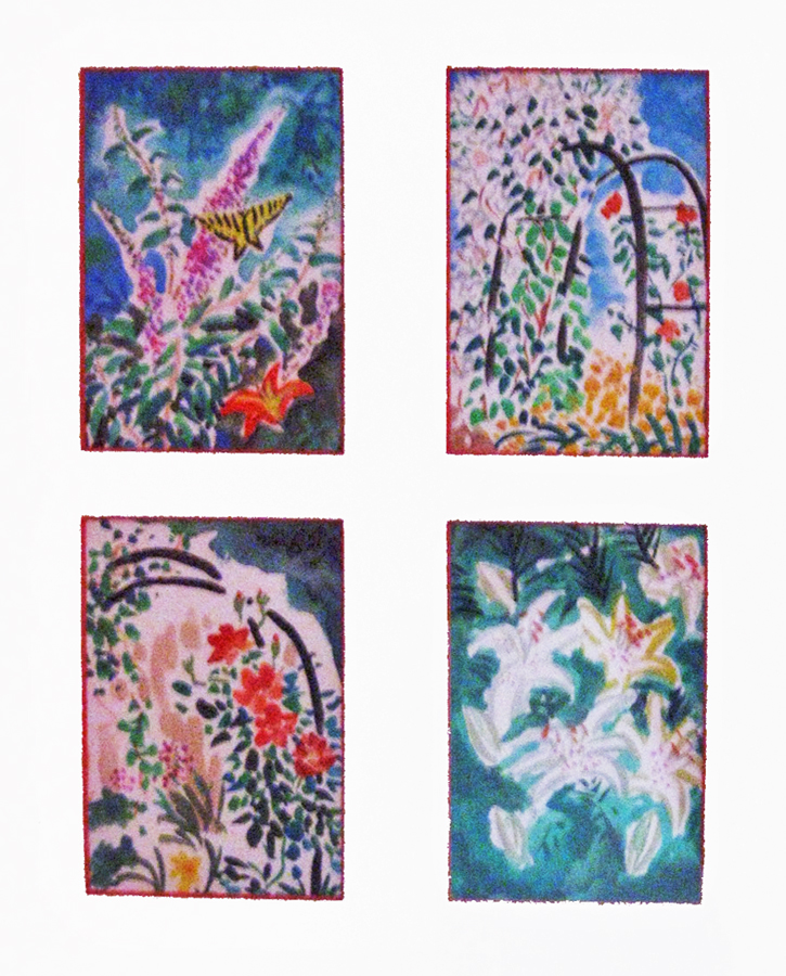
John has done many small quickly sketched watercolors.
Here, you can really feel the distortion of the camera’s lens.
Again, my apologies to John.
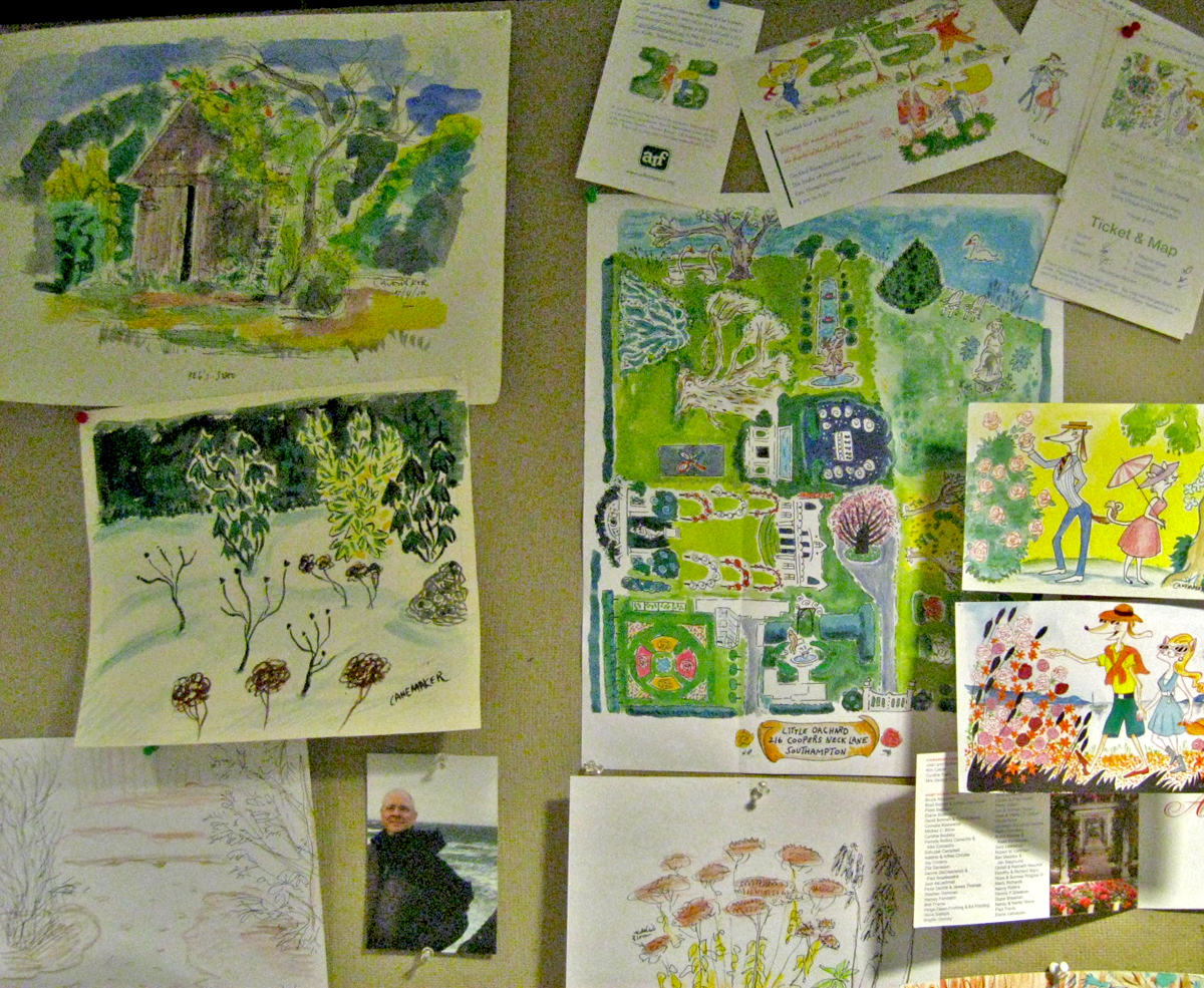
The wall in John’s office.
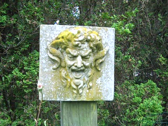
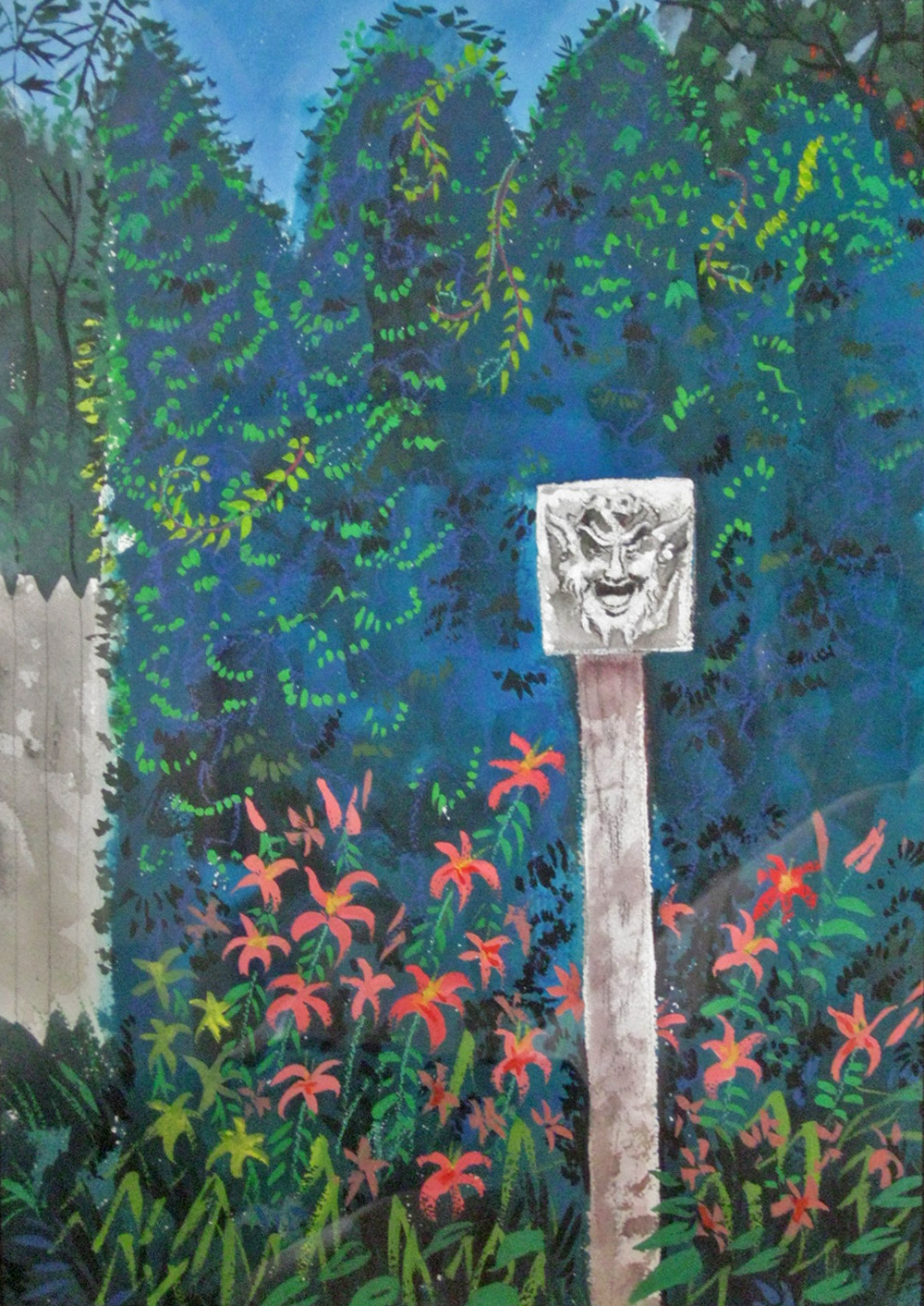
A post in the garden.
I had a hard time photographing this one.
The reflections in the picture frame’s glass was difficult to avoid.

Another painting that just totally caught my attention.

Finally, a lovely little statue sitting just off the porch.
It’s a stone rabbit that once belonged to Bill Tytla.
Adrienne Tytla, Bill’s widow gave it to John as a gift.
Many thanks to John Canemaker and Joe Kennedy for a lovely weekend and all the wonderful inspiration, not only in the paintings but in the garden, as well. It was more than a small retreat.
Well, it’s later that afternoon, and we’re home. But I’m beat.
There are too many pictures I’ve taken and the post would be endless if I added them here, so I’ve decided to post a couple of pics of John’s paintings, and I’ll save the remainder for next Sunday. I’m sure you won’t mind. Though they are good pictures. See John, Joe and Heidi sharing a kitchen as they make linguine with clam sauce; see the four of us romping on the beach; see more pictures of the garden sculpture Bill Tytla’s widow gave John and Joe for their garden. And see some great pictures of the garden in the rain. I’m sure you’ll want to return next Sunday for that. (or not!)
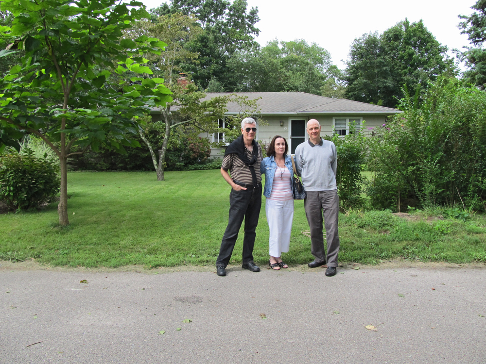
Here’s John, Heidi and Joe outside their house.
It looks as though they’re greeting us, but in reality
Heidi and I are about to leave on Sunday afternoon.


These two small paintings by John were
hanging in the guest bedroom we occupied.
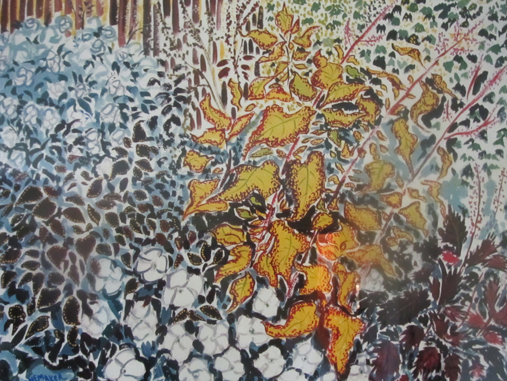
This gem of a painting hung over the mantelpiece
in the living room. It belonged there.
