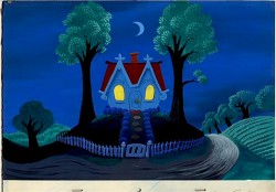
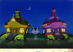
Monthly ArchiveJanuary 2008
Animation Artifacts &Books &Disney &Illustration &Mary Blair &Peet &Story & Storyboards 21 Jan 2008 09:35 am
Peet and Blair’s Little House
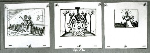
- Earlier this week, I posted John Canemaker ‘s loan of a couple of storyboards by Bill Peet from Bill Cottrell’s script for The Little House. This was adapted from the children’s book by Virgina Lee Burton.
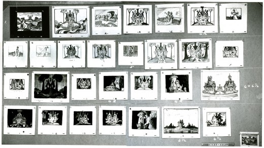
Today I’ve got a fifth board. I’m not sure it’s storyboard; the images look a bit more like background layouts. Perhaps it’s something in between the two. I’m not even sure the drawings are by Bill Peet.
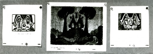
This is the actual board. However, I’m posting it as I did the others in pieces so that it can best be enlarged for good viewing.
_
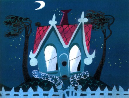
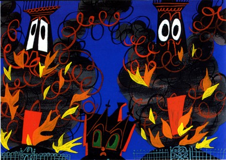
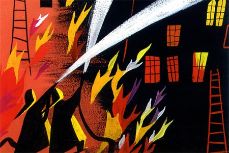
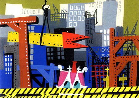
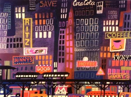
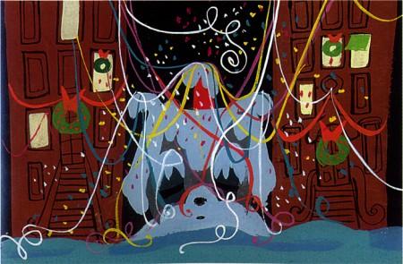
- Mary Blair was the dominating design force on this film, and her work stands out vigorously.
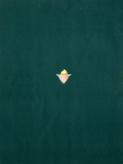
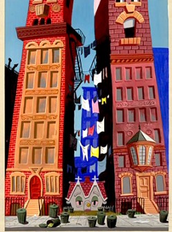
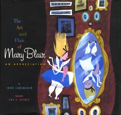
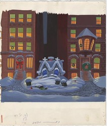
John’s exceptional book, The Art and Flair of Mary Blair includes a number of key pieces of art for this short. I think it might be remiss for me not to post them alongside these storyboards to see how Peet and Blair worked together. With thanks and apologies to John and his excellent book, here are the color scans.
_
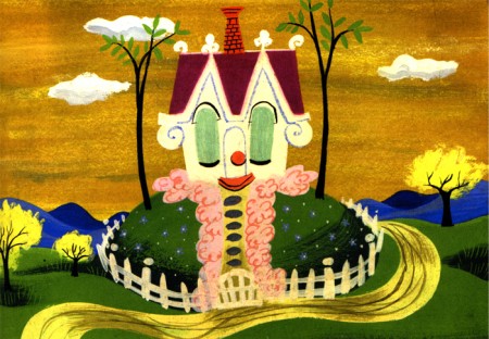
(Click any image to enlarge.)
Animation Artifacts &Daily post 20 Jan 2008 09:19 am
Meador’s Forbidden Planet
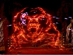
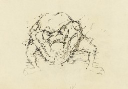
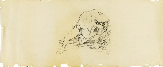
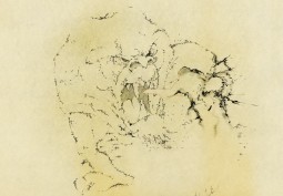
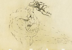
Thanks to Jonathan Annand for pointing me to the upcoming Heritage auction which features a number of oversized animation drawings to the film, Forbidden Planet. This is the 1956 Sci Fi film that featured some magnificent animated effects by Joshua Meador.
Meador was loaned to MGM by Walt Disney to supervise the animated effects. The Id Monster he created is made of shimmering blades of fire. When the film was first distributed to television, they thought the creature was too frightening for children and cut out a lot of the animated scenes. Of course, they eventually replaced them.
The movie is an original take on Shakespeare’s The Tempest although it significantly alters the plot points. The music for the film, created by the married team of Louis and Bebe Barron, is a groundbreaking electronic score – more effect sounds than music. It’s somewhat similar in ways to what Bernard Herrmann did for Hitchcock’s The Birds.
This film runs every so often on Turner Classic Movies, and if you’re not familiar with it, you should be. The next showing will be Feb 2nd at 9:15am.
Josh Meador was an effects animator at Disney’s. He joined the studio in the 1930′s and quickly rose through the ranks moving to the effects animation department and ultimately supervising the effects on Pinocchio and Fantasia. He shared an Oscar for his effects work on the big Disney feature 20,000 Leagues Under the Sea.
He lived in La Crescenta, California for years and was an inveterate painter, an artist represented by numerous galleries.
The Disneyland show, “Tricks of the Trade,” gave me Josh Meador’s name back in the 50′s, and I searched it out ever after. I wrote a piece about sending a letter to him in another post.
While in the Navy, I was stationed in Monterey, California. There was a gallery in Carmel that had a one man show of his artwork. I made numerous trips to the gallery, hoping that he might be there one of those trips. No such luck. And I was too shy to try to seek him out on my own.
He died in 1965 of a congenital heart defect.
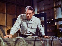 _
_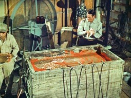
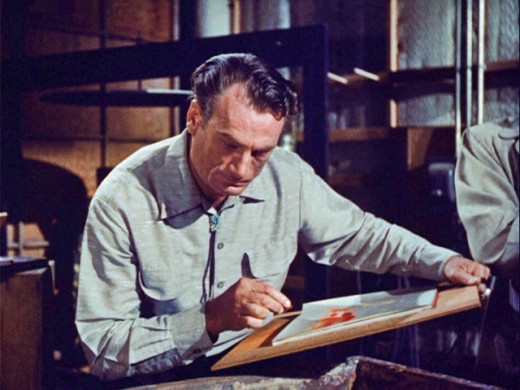
These images were taken from the Disenyland TV show “Tricks of the Trade”. Meador reenacts the study of boiling bubbles for Fantasia’s Rite of Spring segment.
As a teenager, for an early 8mm film of my own, I shot in super-slow motion boiling gravy my mother was cooking. The lens fogged through much of it creating an eerie mist. It ended up being very interesting footage I used for one of my early films.
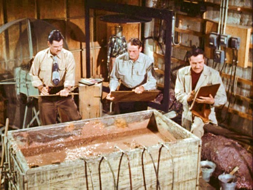
Here’s Meador flanked by Jack Boyd, on the left, and Dan McManus, on the right.
They were other leading effects animators at the studio.

_
- Getting a bit more current, Brad Bird appeared yesterday as a guest on NPR’s news game quiz show, Wait, Wait. Don’t Tell Me !.
You can hear his segment here on the NPR site.
Commentary 19 Jan 2008 09:10 am
Cloudy
 - My favorite documentary of 2006-2007 was a film called White Light/Black Rain. It offered an in-depth look at the bombing of Hiroshima and Nagasaki in 1945 literally ending the war in Japan. I’ve seen this film at least a half dozen times, and I’m moved each and every time. It’s like watching a flame – completely captivating.
There are extensive interviews with many survivors of the bombing. All of course were children when it happened, and all of their lives have been dominantly affected, if not completely ruined, by the bombing. Familes lost, mashed and mauled bodies, peeling bodies and blood, fire, heat and a desperate need for water remain vivid in their memories.
There’s a beauty in these people in the film and a poetry in their language, and I wondered if it were all Japanese that had this about them; I assume it was generational. All of these people spoke with a quiet dignity and unusally articulate turns of phrase to describe everything they saw or felt.
We met the crew of the Enola Gay, the plane that carried the bomb and dropped it on Hiroshima. They discuss their mission and the feelings they had them on completing it.
The film, interestingly, started with a camera crew asking school children in Hiroshima if they knew what had happened on August 6, 1945. It was a sorta Leno’s “Jay Walking” for Japanese children. Expectedly, none of the kids knew what that date represented even though there was a dance-performance piece, remembering the bombing, which was happening right alongside them.
I saw this show again this past Thursday. It often runs on HBO. This viewing the opening stayed with me, I wondered about young kids who seem to know so little, and I worry a bit about it.
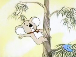 This was brought to mind, again, when I’d read Amid Amidi’s piece on Cartoon Brew about Tex Avery and his last animated product for Hanna-Barbera, Kwicky Koala. Amid ends his piece with these lines:
- So has animation learned from its past? Is our industry diverse enough today to support and utilize the wide range of talents working within it? Twenty years from now, will we be looking at the credits of Bee Movie, Open Season, and Chicken Little with a similarly sad lament? And more importantly, does anybody even know who Tex Avery is in 2008?
We certainly know the answer or the question wouldn’t have been asked.
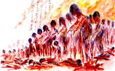 When school children in a mall in Hiroshima, watching a dance piece about the bombing, are unable to remember that the tragedy had happened in their home town, the conscious memory of the newer generations are unable and probably uninterested in remembering an animation past.
We live in the present.
_
Books &Illustration 18 Jan 2008 09:28 am
Steig Children’s Books
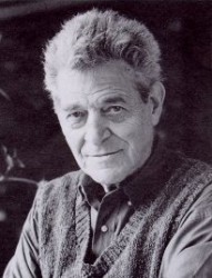 - Continuing my obsession with William Steig I’m posting some artwork from some of Seig’s children’s books. I’ve done four of the books as films: Abel’s Island, Doctor DeSoto, The Amazing Bone and Sylvester and the Magic Pebble. I’ve always felt a kinship in the artwork of Steig and find it easy to draw in that style. It just feels natural to me, probably because I’ve been doing it since I was about 12.
You can view a lot of the original art at The Jewish Museum in NYC until March 16, 2008. The exhibit is delightful, and you’ll see how intense the original colors are in his artwork. William Steig’s brother, Arthur Steig, developed dozens of art supplies over the years, including Luma Colors, a line of brilliant watercolors, and calligraphic inks that would not clog technical pens. William used these Luma dyes profusely in his work. The first use was in what was originally called The Bad Island (1969) and was later republished with a new text as The Rotten Island.
These Luma colors are delicate, and I feel they often don’t publish well in the printing process. The colors of the originals are absolutely radiant, whereas even in the new art book, The Art of William Steig, many of the colors are a bit on the reddish side, and have lost something in the transition.
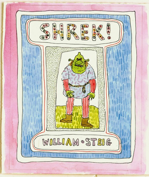
Cover illustration for Shrek! (1990)
pen and ink and watercolor on paper
© 1990 William Steig
Can someone tell me how they got from these illustrations to the ugly art on display in the Shrek films? Even the drawings on display at the museum from Dreamworks are much more palatable than those films. It’s sad.
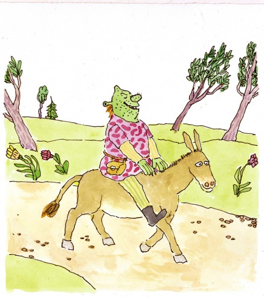
“‘You jabbering jackass!’ Shrek screamedâ€
pen and ink and watercolor on paper
© 1990 William Steig
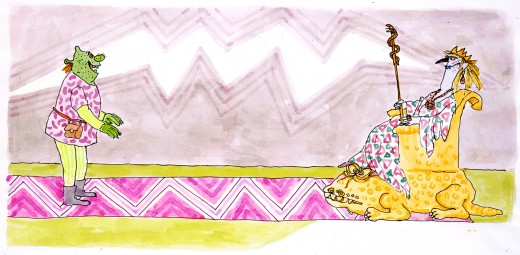
“There before him was the most stunningly ugly princess on the surface of the planetâ€
pen and ink and watercolor on paper
© 1990 William Steig
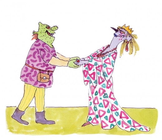
“Oh, ghastly you, with lips of blueâ€
pen and ink and watercolor on paper
© 1990 William Steig
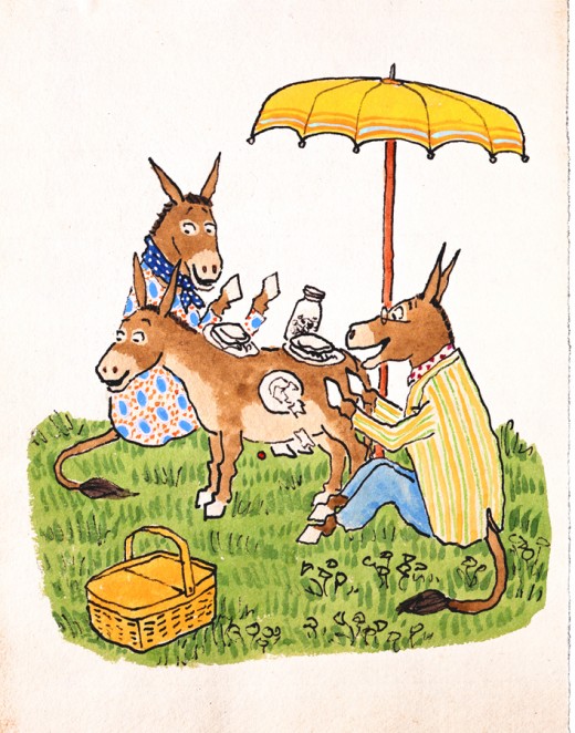
“‘Oh, how I wish he were here with us on this lovely May day,’ said Mrs. Duncanâ€
preliminary illustration for Sylvester and the Magic Pebble (1969)
pen and ink and watercolor on paper
© 1969 William Steig, renewed 1997
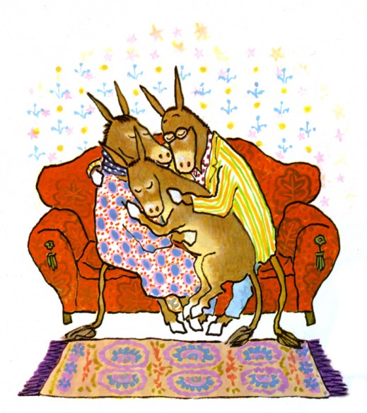
Final illustration for Sylvester and the Magic Pebble (1969)
pen and ink and watercolor on paper
© 1969 William Steig, renewed 1997
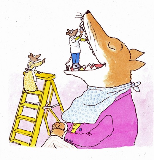
“Doctor De Soto stepped into the fox’s mouthâ€
illustration for Doctor De Soto (1982)
pen and ink and watercolor on paper
© 1982 William Steig
Tomorrow’s Saturday. The museum is free. There’s no excuse. Go, take a look if you’re in the NY area.
Frame Grabs 17 Jan 2008 09:16 am
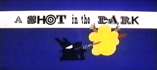
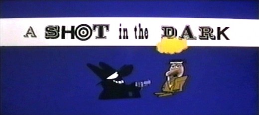
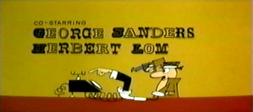
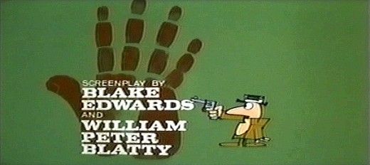
A Shot In The Dark
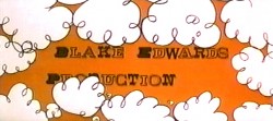
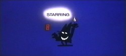
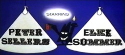
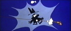
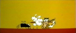
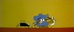
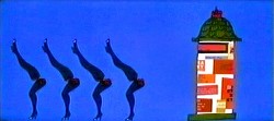
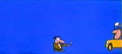
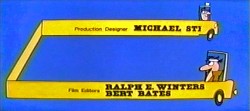
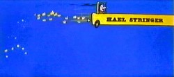
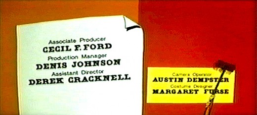
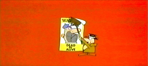
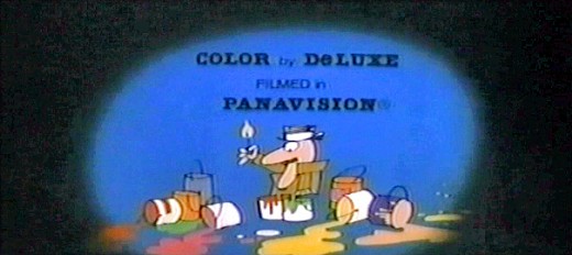
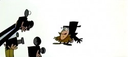
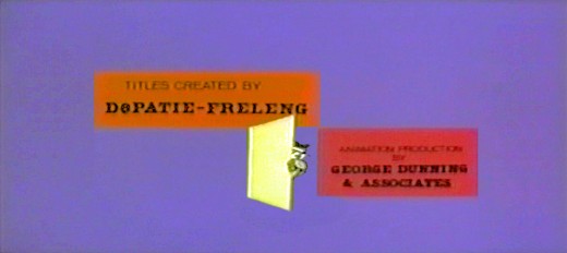
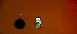
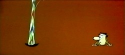
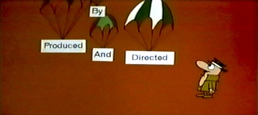
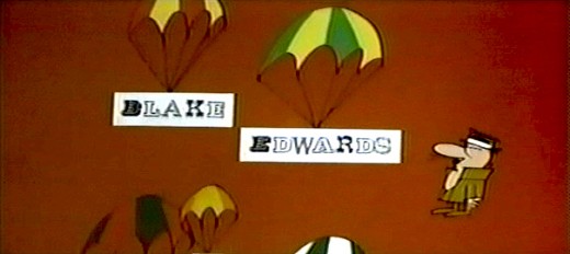
- Warner Bros. had just closed their cartoon studio. Friz Freleng was out of work, and, with partner David DePatie, got the job of doing the title sequence for Blake Edwards’ film, The Pink Panther.
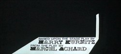
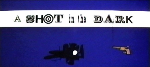 Blake Edwards enjoyed the Pink Panther production, and was asked to adapt the play A Shot In The Dark by Marcel Achard. The English translation of a French play had successfully had a year-long run on Broadway. Edwards brought “Inspector Clouseau” into the adaptation and brought Peter Sellers in to play him.
He went back to DePatie and Freleng to do the titles, and the film opened right on the heels of the original Pink Panther. A new animation studio was born in a full fledged way. Edwards asked the animators to create theatrical shorts based on the character, and they won an Oscar for that first short – Pink Phink. (On YouTube here.)
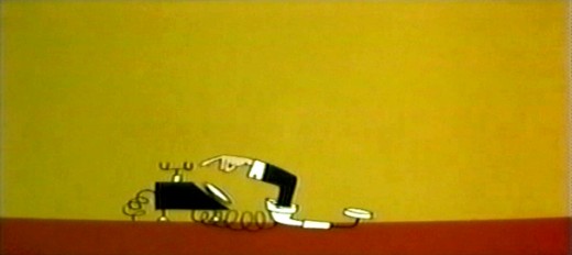
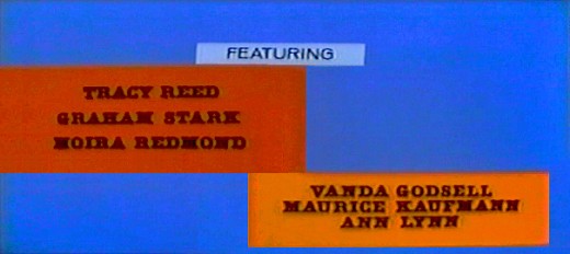
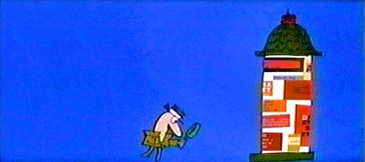
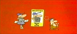
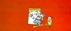
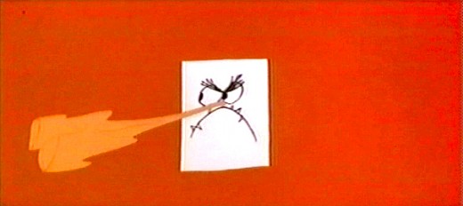
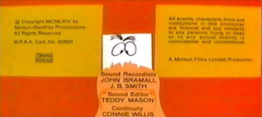
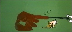
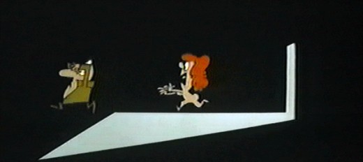
Here are frame grabs for the titles to A Shot In The Dark. The colors aren’t the best; sorry.
Commentary 16 Jan 2008 08:56 am
Rambling about Cheats
- Jerry Beck has a new toybox of a book called The Hanna Barbera Treasury. I haven’t read the book, but I have picked it up and looked at it. It’s a pop-up, pull-out, unfold and play-with-something-on-every-page kinda book. It’s unfortunate, because I think Jerry probably has a lot to say about this company and their history, but the book is designed to be a fun cartoon book. It’s designed to sell to consumers and not to tell anything truly informative about H&B.
However, because of the review Mike Barrier posted last week and a couple of follow up letters the subject of Hanna Barbera’s value has been raised. Since the review was posted and the letters and comments on other blogs appeared, I’ve thought a lot about the subject.
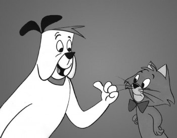 Let me tell you my history here. I remember when Ruff and Reddy first appeared. I was a kid watching the Howdy Doody Show. They’d gathered their “peanut gallery†at the end of their program to announce that a great new cartoon was going to premiere next Saturday at 10:30 AM, following their program, and they showed a short clip.
The next weekend, I was ready for Ruff and Reddy. Howdy and Buffalo Bob reminded us to watch it. The excitement built to a high.
I watched. I don’t remember much about it; the show didn’t make an impression. I remember a lot of the Howdy Doody shows; not much about Ruff and Reddy. I remember liking the opening credits with the two characters in frames. I remember it was, of course, in B&W as all TV was back then. That’s about it. A lot of long shots cut to close ups. I remember that. I was 10. Disney’s Sleeping Beauty was still two years away.
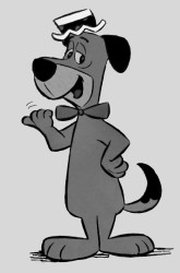 A couple of years later Huckleberry Hound premiered in syndicated form on local channel 11. It was ok; I liked the design style. However, I recognized that there wasn’t a lot happening and that the backgrounds didn’t have a lot on them. I did like the sponge painting technique; I’d never seen anything like it.
There were a lot of news stories about adults watching Huckleberry Hound (with its other featured cartoons – Yogi Bear and Snagglepuss.) I was maybe 12, but I got the reference to Yogi Berra, and I got the parody of Bert Lahr’s voice. He was the Cowardly Lion; how could I miss it? This show was also in B&W, though color TV was just starting to enter our world.
Yeah, I watched the show daily. I watched more after Yogi Bear got his own show, and I enjoyed the Quick Draw McGraw segments. But there were all those wild west backgrounds with only tiny buttes on the straight lined horizons. Maybe a cactus appeared on the bicycle pans, and I got to recognize what a bicycle pan was (without knowing the term). Essentially I was picking up some animation cheats without doing more than watching.
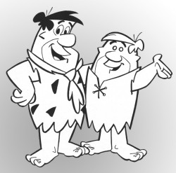 The Flintstones got a lot of attention when they first appeared on ABC. After all, this was the first animated sitcom. It looked a lot like The Honeymooners, but I liked that. It also reminded me of the Fleischer shorts I’d seen about the cavemen living in a somewhat modern world. There was also that Tex Avery cartoon that was similar; I’d seen it on TV by then. I enjoyed those early Flintstones. It was entertaining when they had their baby, Pebbles. Somehow, though, the show lost it for me about that time. I didn’t watch after Bam Bam entered. By then the great inking was not looking so great. I don’t think I saw The Flintstones in color until the 1970′s.
I watched The Jetsons for a small time; I liked TopCat for the first season (all those voices culled from the Phil Silvers “Bilko†show.)
I opted out once Jonny (ugh) Quest entered, and I never went back to H&B.
Looking back on it all, I see how limited the animation was, but I knew that back then and imitated it in my own 12 year old’s animation. I tried doing the limited animation as H&B developed it, but I’d also tried it as Ward Kimball did it in Toot Whistle Plunk & Boom and those other Disney Tomorrowland shows he did. Mr. Magoo’s Christmas Carol was also a much bigger influence than H&B.
The backgrounds were interesting, but I was much more interested in the design style I’d seen in 101 Dalmatians or Sleeping Beauty. I’d bought some B&W lobby cards from Sword In The Stone, and I tried my hand at imitating the backgrounds – in colors I’d choose. These were much more enjoyable than anything I’d seen in H&B cartoons.
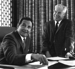 So, where am I going with all this? Looking back now on all that limited animation history, I have to say that I learned the tricks – probably many of them before I learned the right way to do it. I also got to realize that H&B truly flattened out the animation in ways that UPA and Kimball’s limited animation didn’t do.
For a short time H&B and Ruby Spears farmed animation to New York animators. I picked up a lot of work and was able to animate and assist about 200 feet a week. They liked my stuff, and I made a lot of money in a short amount of time. Weeks later my shows would be on TV, and I couldn’t identify ANY of the scenes I did. It was all so forgettable. It was about making quick money, and I hated it. I quit and started my own company.
I had to unlearn the H&B method to get it out of my system, and I think that the world of animation also had to unlearn it. Unfortunately, I don’t think it ever came undone. All those bad habits that were designed by brilliant guys working for Hanna Barbera are too strong.
_Then, John Kricfalusi with Ren & Stimpy introduced newer ways of cheating – ways that worked for that show. Everyone who graduated from Cal Arts started imitating that.
_Now with the influence of Flash, tv animation is doomed to move east or west, bob up and down, and rarely toward or away from the screen. There is no such thing as perspective. Big actions happen off screen or pop from one pose to another (some justify this as an imitation of Tex Avery’s work – it’s not.) If a car crashes, do it off screen. Just shake the background with the audio crash. There are a hundred much more subtle cheats I could point out. You see them everywhere: in anything on tv, in Persepolis, in The Triplettes of Belleville, in newer Disney features. Everywhere.
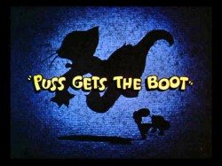 Today, there’s a lot of sloppy cheating and very little animation to see. It all did really start with Hanna Barbera when they modernized animation to become a big assembly line. Michael Barrier is right in his review. I’m not a fan of Hanna and Barbera’s work – not even on the Tom and Jerry cartoons. (As a matter of fact, I suspect they helped Rudy Ising get the boot from MGM after taking his characters from that first T&J cartoon, Puss Gets The Boot.) But I’m not talking about their MGM work, here. I’m just interested in the factory they built on Cahuenga Blvd and the bad habits they offered the future.
In a way it’s brought us back to the days of silent animation. Col. Heeza Liar probably used more drawings than your average Huck Hound cartoon. I’m not sure the stories were any better either.
Is it time to invent Mickey Mouse again?
Animation Artifacts &Disney &Mary Blair &Story & Storyboards 15 Jan 2008 09:11 am
Peet’s Little House 2
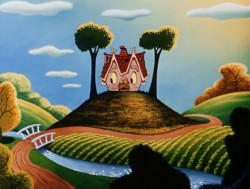
 - Here’s the second of five storyboard pages loaned me by John Canemaker. The boards were drawn by the brilliant Bill Peet.
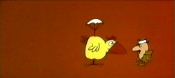
The Little House was a short, and is part of the Disney Rarities dvd still available. The image to the right comes from that dvd’s extras.
Mary Blair was the key designer of the film. Her color work is exceptional, and I’ll try to give some examples of her art in future posts.
All of these boards are small photos that I’m blowing up large, so you’ll be able to see them. It involves heavy scanning of oversize work, then cutting them up and reconstructing them so that they’re in order. Sorry that I have to take a few posts to make them all available. They’re worth the trouble.______________ (Click images to enlarge them.)
Here’s the second page of this board.
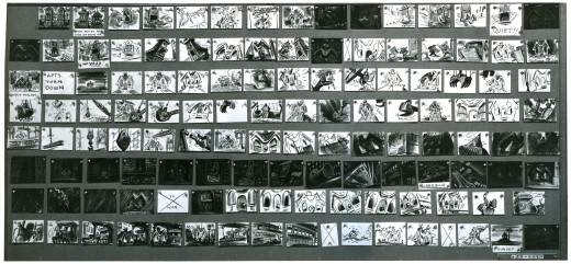
This is the full second board as it looks before I cut it apart. You can see that the image is small and I had to cut it up so you can enlarge it enough to make it visible.
The blue nunbers below the panels represent the row of images displayed.
Animation Artifacts &Disney &Peet &Story & Storyboards 14 Jan 2008 09:17 am
Peet’s Little House 1
 - John Canemaker loaned me these boards by Bill Peet for the short, The Little House.
These storyboards are five dense pages.
The photo images on them are small, so I had to break them apart and reassemble them so that you’d be able to enlarge them enough to study.
They’re an excellent example of an extraordinary story artist developing a pre-existing story, the children’s book by Virginia Lee Burton (who also wrote Mike Mulligan and His Steamshovel.)
This is the first of these five pages. It’ll take a few posts to get them all in.
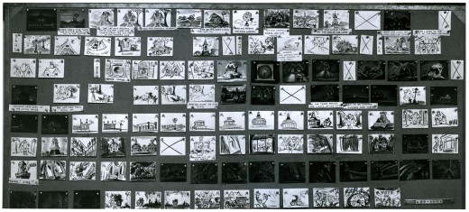
This is the full first board as it looks before I cut it apart. The image is small and I cut it up and reassembled it. The blue nunbers below the panels represent the row of images displayed.

Page 1 – 1a____ You’ll have to click images to enlarge them enough to view them properly.
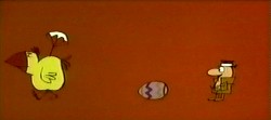
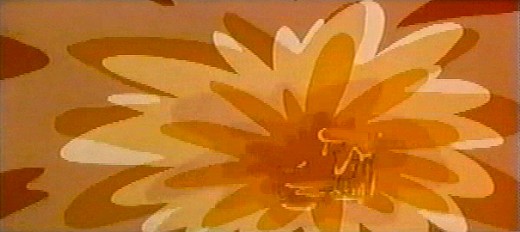
The following are three images from the dvd extas to give an indication of color.
Commentary &Photos 13 Jan 2008 09:51 am
Mean Benches
- Has anyone else noted that the world has gotten meaner?
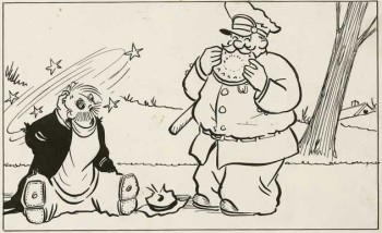 Remember the comic strip Pete the Tramp by C.D. Russell? no, it’s probably before your time. Pete was a tramp who stole pies from windows and got in trouble with the law. He was the typical hobo in comic strip form, and the strip started during the depression and lasted through 1963. I read it in color in Saturday’s NY Journal American.
Pete usually slept on park benches under newspapers and got his feet slapped by the cop. I noticed park benches this week and wanted to call attention to the way our society has handled tramps, hoboes, homeless people. In New York, they’ve made them uncomfortable.
This is the park bench I noticed.

It’s a bench in Madison Square Park, and I noticed it because it’s become a relic of the past. A person could actually sleep on it.

This is the newer model. The only way you could sleep on it is if you only had a torso. They’ve put dividers there, so it makes it handy to sit and not touch the person next to you, but you couldn’t really lie down on it.
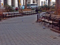

See. There are lots of these now. Madison Square Park is made of mostly these benches, but there are still a couple of the old kind.


The new little park down on Bleecker and 6th Avenue only has this type of bench.
No vagrants wanted here.
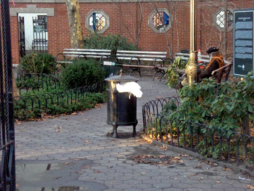
Even the old, tiny private park on Bleecker has these newer benches. (I did see someone sleeping on them, but I couldn’t get close enough to photograph the way he mangled his body to get some sleep.)


A building up on 28th and Madison made sure no one could sleep on their public seating area.

Subway benches have also become completely inhospitable.
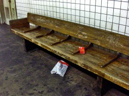

This type bench has very tight dividers. Wearing winter garb, one hardly fits into the space. However, these benches aren’t quite so bad in that the dividers aren’t mercilessly high.
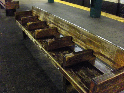
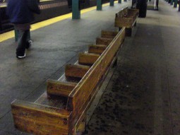
Look at these uncomfortable things at West 4th Street. (Plenty of homeless used to be downtown.)
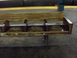
You could hurt your back trying to sleep here. Though, I have seen some people stretched out over these partitions. That’s how desperate it gets in the winter cold.
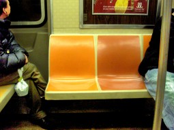
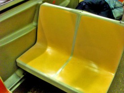
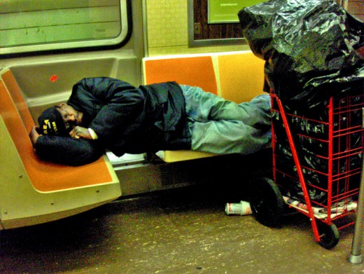
It’s not too much better on the subway. The seats are lumpy – shaped for the bum (I don’t mean vagrant-like bum) in bright colors. It’s a tight squeeze.

The few longer seats are “Priority seating.” This means bums have to get up for older people. I’m not sure what it means if the bum is an older person.
__________(Click any image to enlarge.)
Articles on Animation &Books &Disney 12 Jan 2008 10:14 am
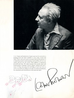
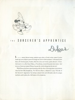
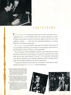
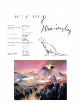
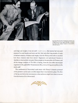
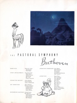
Fantasia Program 2
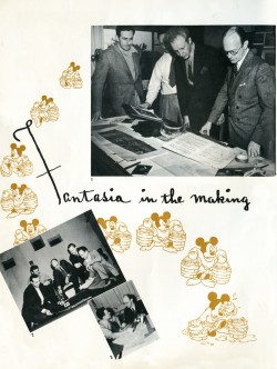
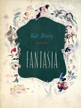 - Last week, I posted the souvenir booklet sold with the initial roadshow presentation of Fantasia. Here I’lll complete the post of the magazine.
The booklet certainly feels quality. The paper is good and the illustrations are high caliber. However, many of the images were reused in several other books on the market at the time, notably the Deems Taylor book, Fantasia. That book, in itself, feels more like a souvenir of the film rather than anything more.
The booklet is quite handy for all the credits given. It makes the film feel important. One wonders if others of the early films had similar books. I haven’t seen any but assume they must have existed. If anyone knows for sure, leave a comment.
So, here it is. I’ve split it into two posts with #2 to follow.
 12
12
____(Click any image to enlarge to a readable size.)
 14
14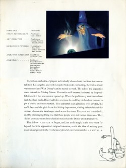 15
15
____
 16
16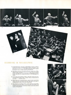 17
17
____
 18
18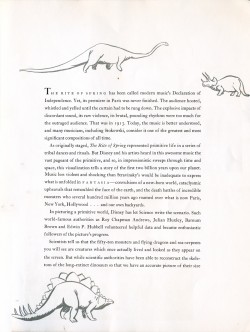 19
19
____
 20
20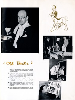 21
21
____
 22_
22_