Monthly ArchiveMarch 2009
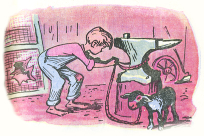
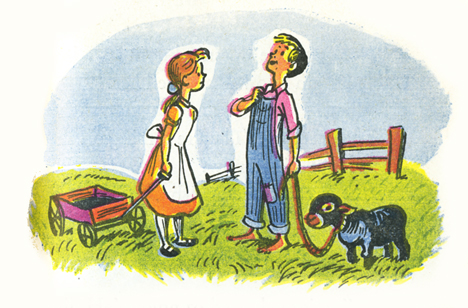
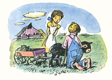
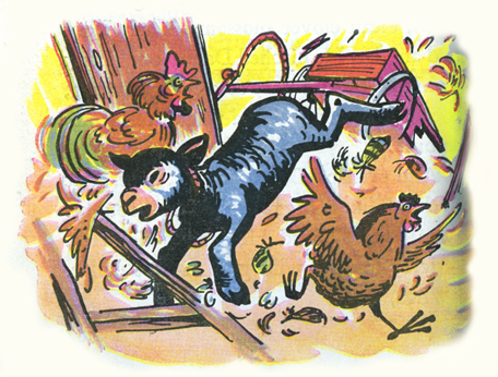
Books &Disney &Illustration &Peet 11 Mar 2009 08:00 am
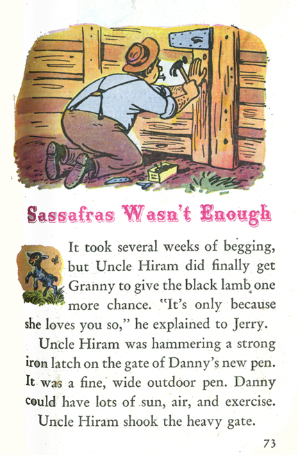
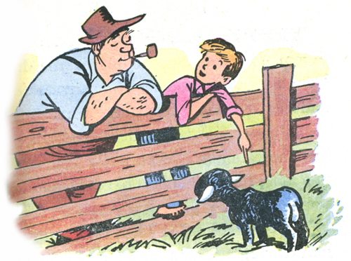
So Dear #4
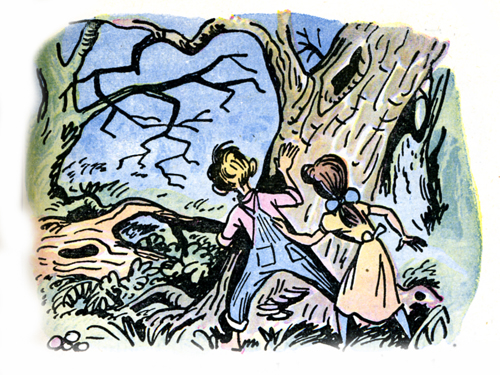
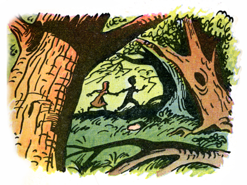
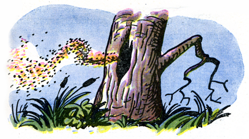
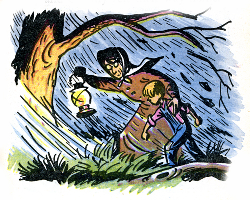
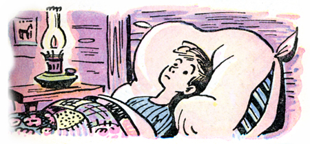
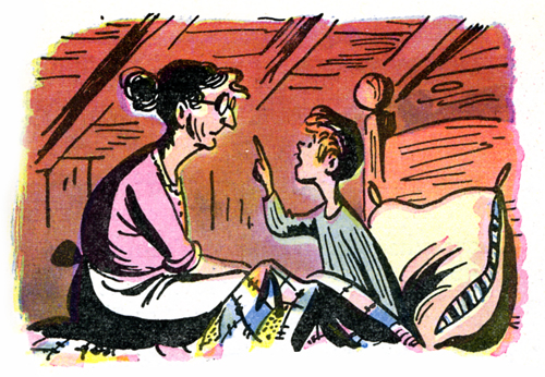
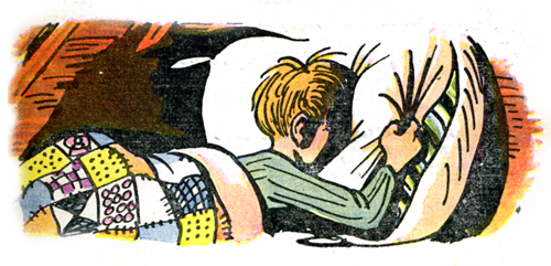
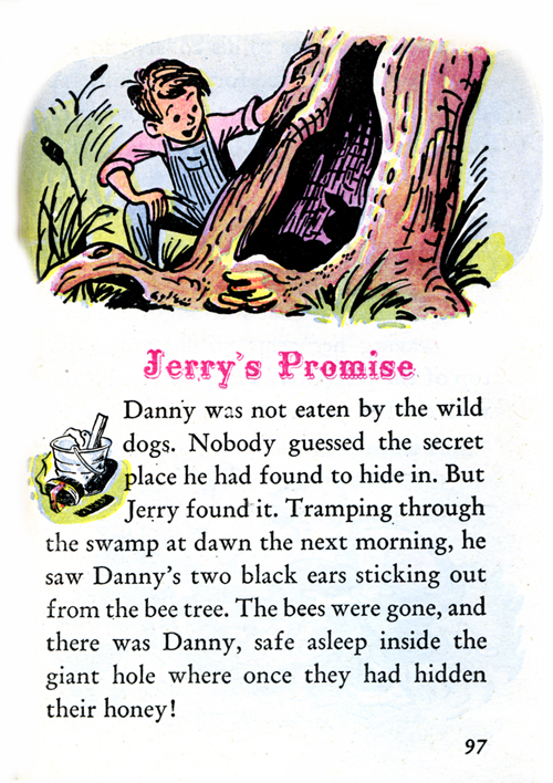
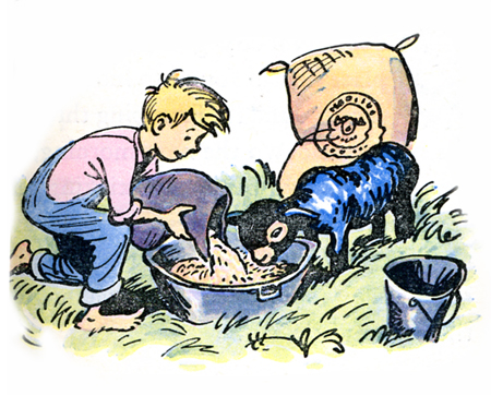
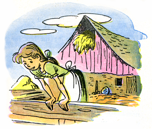
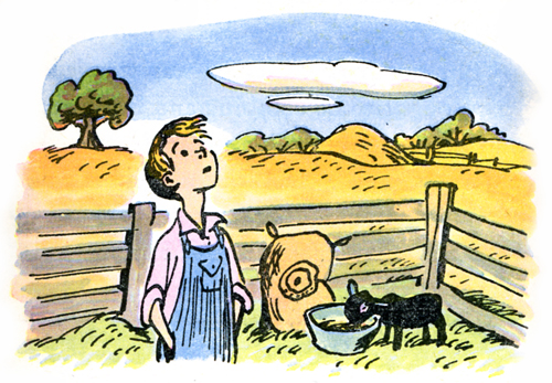
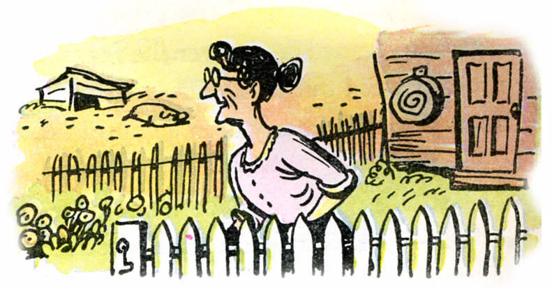
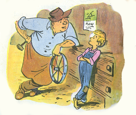
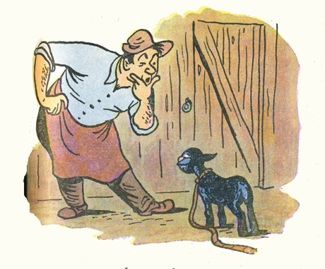
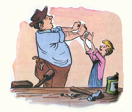
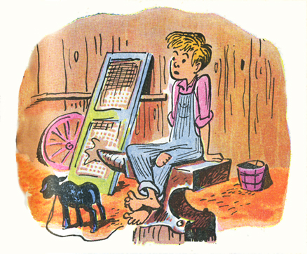
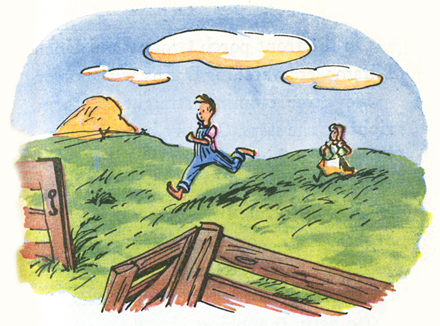
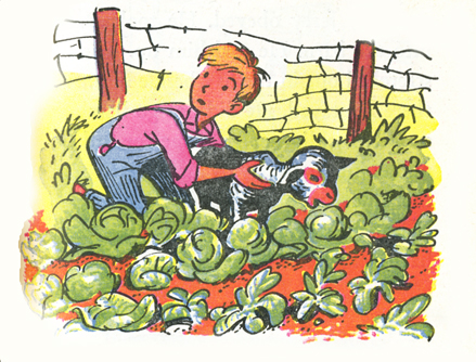
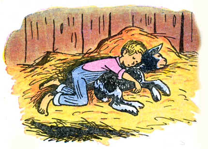
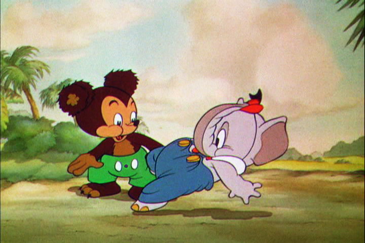
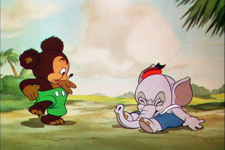
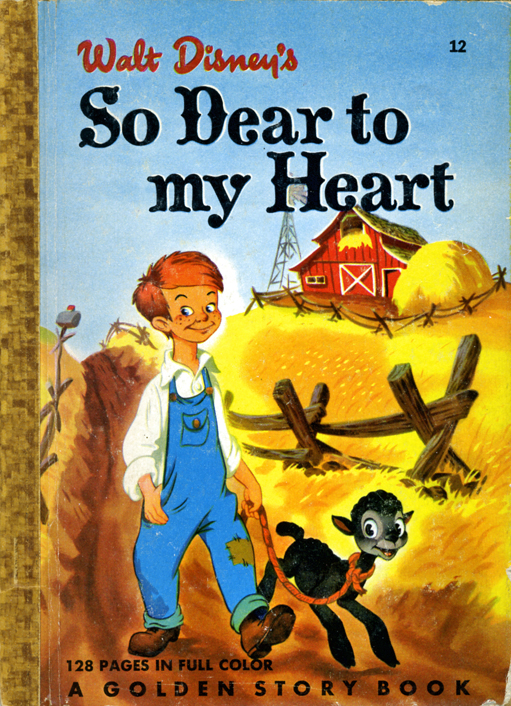 - This is my fourth installment of Bill Peet‘s illustrations for the Little Golden Book adaptation of the Disney feature film, So Dear To My Heart. The book was written by Helen Palmer and is much longer than other Little Golden Books. It’s novella length and includes many short stories built on the film’s original story.
I believe it’s the first book Bill Peet illustrated, and it led the way to a very successful career after he left Disney’s in the 60s. In his autobiography, Peet doesn’t mention this book. He talks about writing Lambert, the Sheepish Lion as his first potential children’s book. Obviously, he sold that to Disney instead of selling it as a book.
All illustrations are drawn with ink and painted with watercolor. THe printing is done on cheap paper, and the inks have obviously saturated the paper.
(click any image to enlarge.)
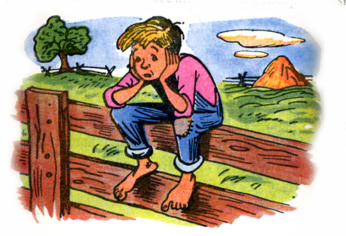
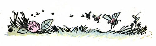
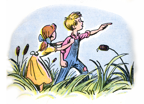
There’s something iconic about this image which
strikes a chord with me.
There are two more chapters to go, so one more post. It’s certainly turned into much more work than I’d expected. It should be complete later this week.
Commentary 10 Mar 2009 08:09 am
Michel Ocelot, 2 Features & Kirk Douglas
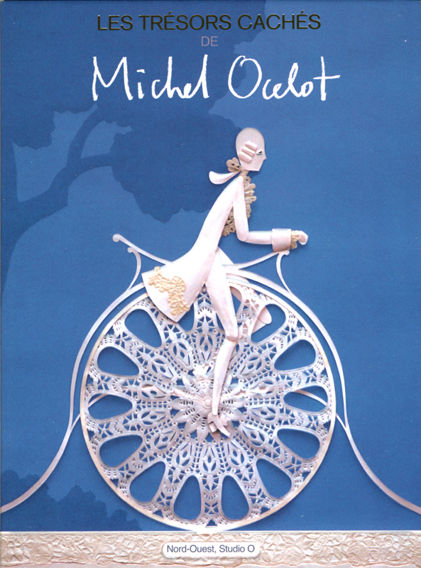 – This past weekend, Michel Ocelot was in town for the NYInternational Children’s Film Foundation screening of his feature, Azur and Asmar. Candy Kugel had a wonderful Saturday night dinner for Michel, and it was nice to see him. He gave a gift of a DVD just released in Europe. It’s a collection of his short films. He finally was able to gather the rights to make them available. The DVD was region 2 PAL, but played nicely on my computer.
They’re exquisite hand-made gems, as was expected from this brilliant filmmaker.
Michel Ocelot: Les Trésors Cachés (Hidden Treasures) comes in an absolutely stunning package and features commentaries (albeit all in French) as well as 11 short films.
I’m not sure if there will be an English release of the DVD, but it’s worth having right now. It’ll give you a chance to practice your French while watching some beautiful animated films.
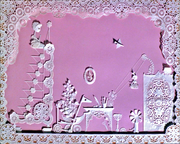
Here are a couple of frame grabs:
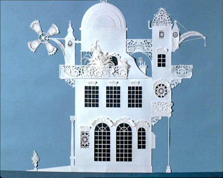
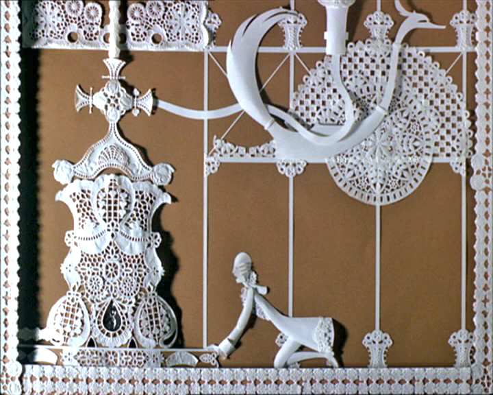
(Click any image to enlarge.)
Above left and above that: The 3 Inventors
Above right: The Insensitive Princess
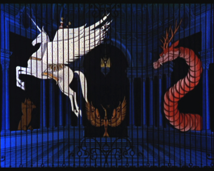
Earth Intruders: A music video for Bjork
- It’s 1940 again.
Yesterday’s NYTimes had a good review comparing two newly refurbished features: Pinocchio and Gulliver’s Travels. The Fleischers always seemed on the short end of the stick, and tying Gulliver’s rerelease to the same date as Pinocchio, probably isn’t helpful for sales . . . or reviews.
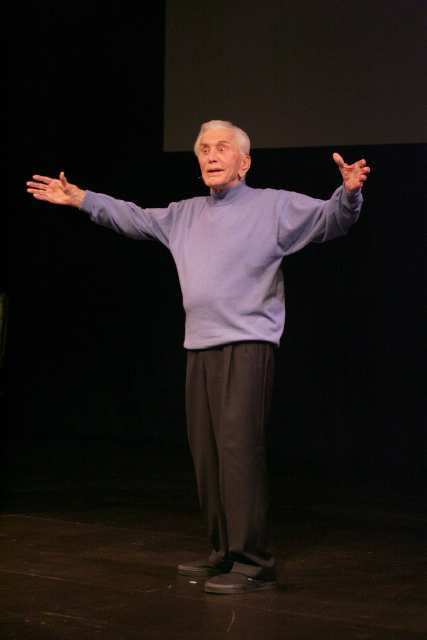 - I noticed in yesterday’s LA Times that there was a review of a one-man show starring Kirk Douglas. “Before I Forget” is a review by Mr. Douglas of his own career in 80 minutes.
Back in the 70s, I was a headstrong young man. I’d just gotten out of the service, immediately found my way into a film company which led to working for my hero, John Hubley. I was happy and full of pep.
One weekend while visiting an exhibit of Chaim Soutine at a larger gallery on 57th Street I was aware that Kirk Douglas was in the room with another gentleman. It filled up the gallery experience, and when I was ready to leave I did. Just before the doors close on the elevator, Kirk Douglas rushed on with his friend. For some reason, he and I locked eyes. A very small staring contest. He broke it. Of course, I could have been a mad man ready to assassinate Spartacus.
I left the experience exhilarated. Without saying a word, I’d communicated with a very real star. One of the fun bits of living in NYC.
Years later I was asked to direct a small filming of Michael Douglas giving a message for the Heartland Film Festival in Indiana. I went to his home, got to actually communicate with him, and wisely kept my story of his father to myself.
If I were living in LA, I’d be down to the Kirk Douglas Theater in Culver City in a NY minute. Only $25, how could you pass it up? One of the last of the REAL stars.
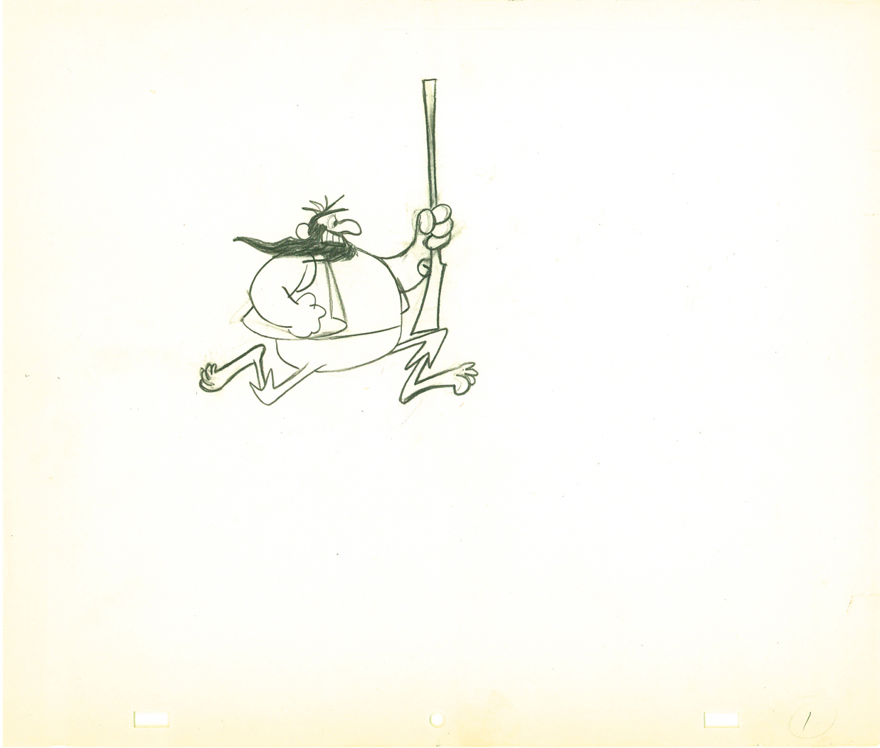
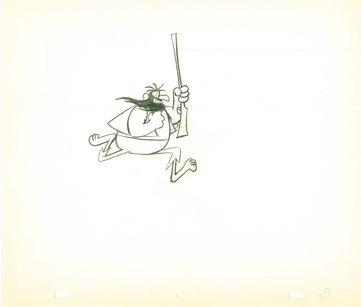
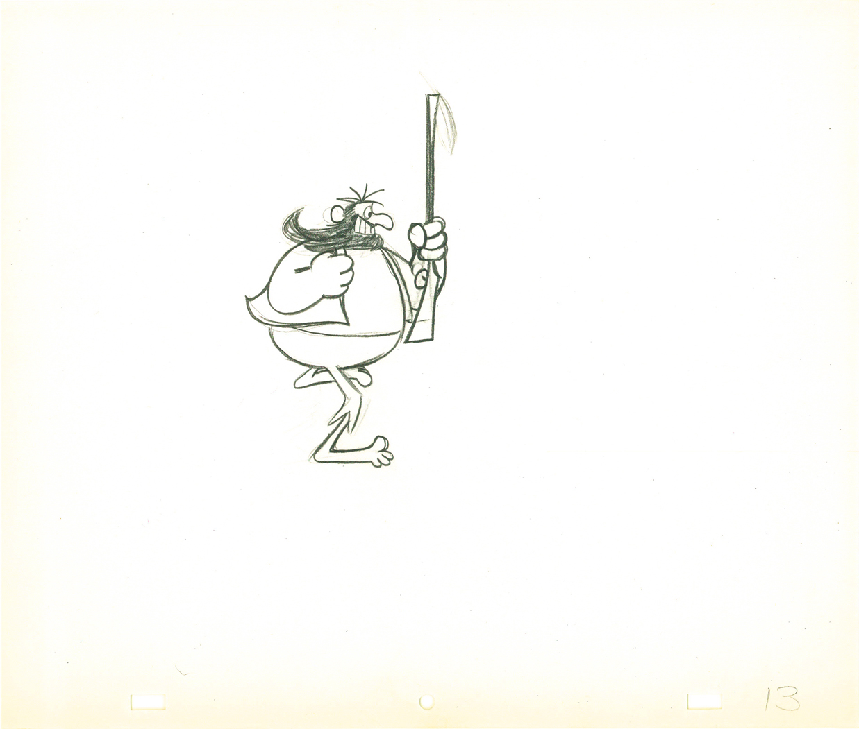
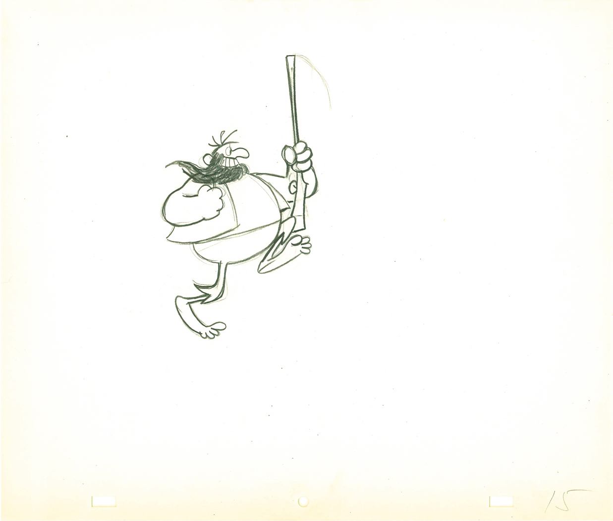
Animation &Animation Artifacts &Tissa David 09 Mar 2009 08:01 am
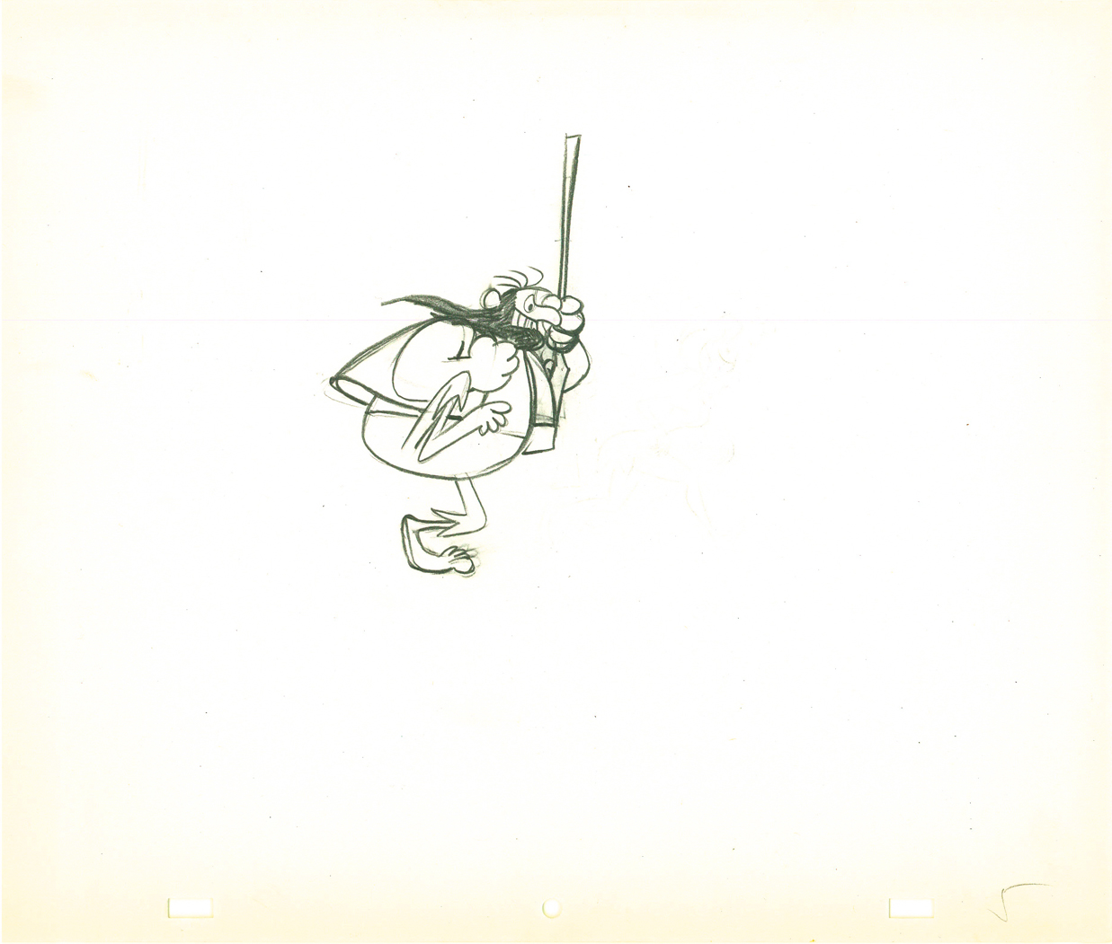
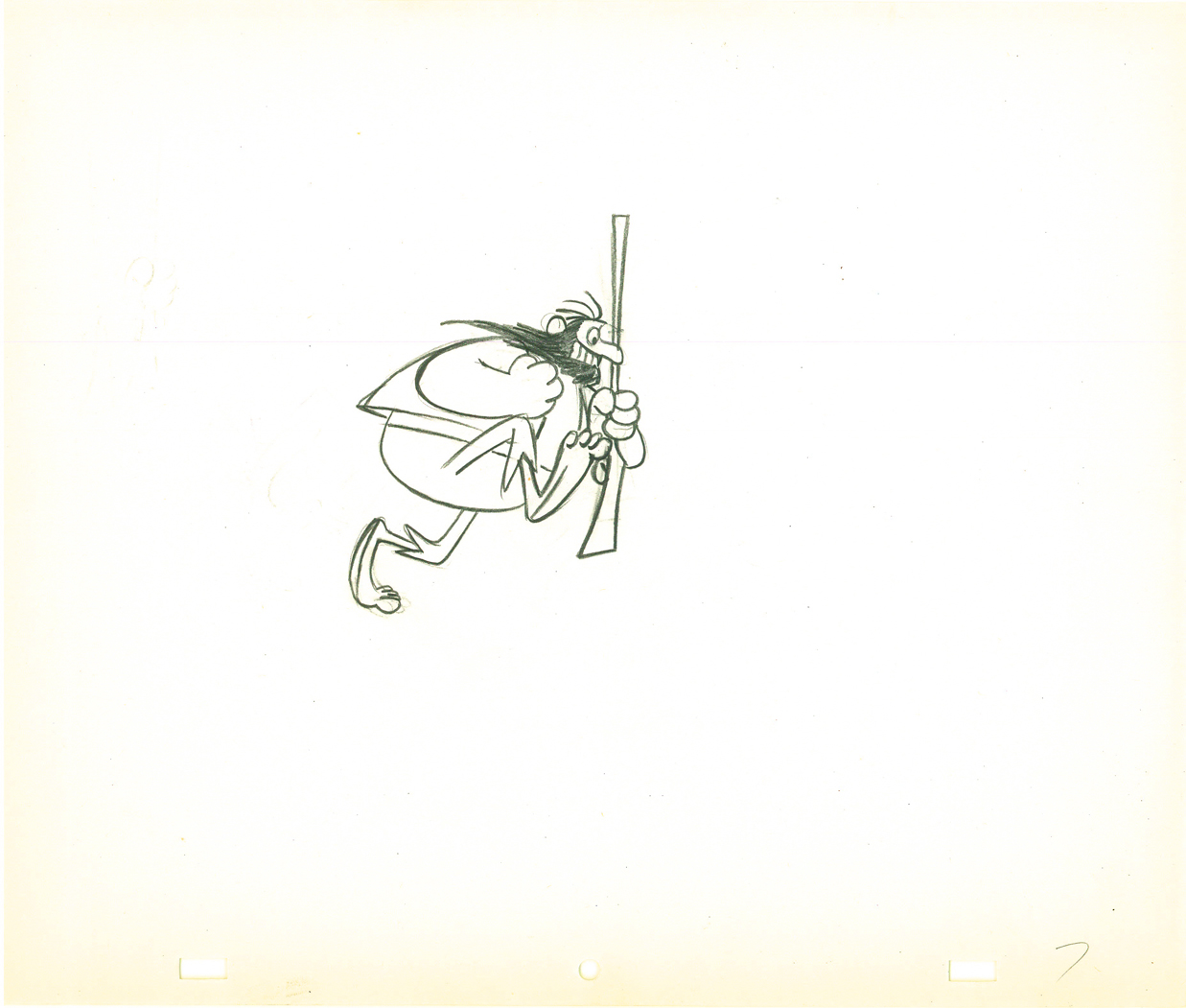
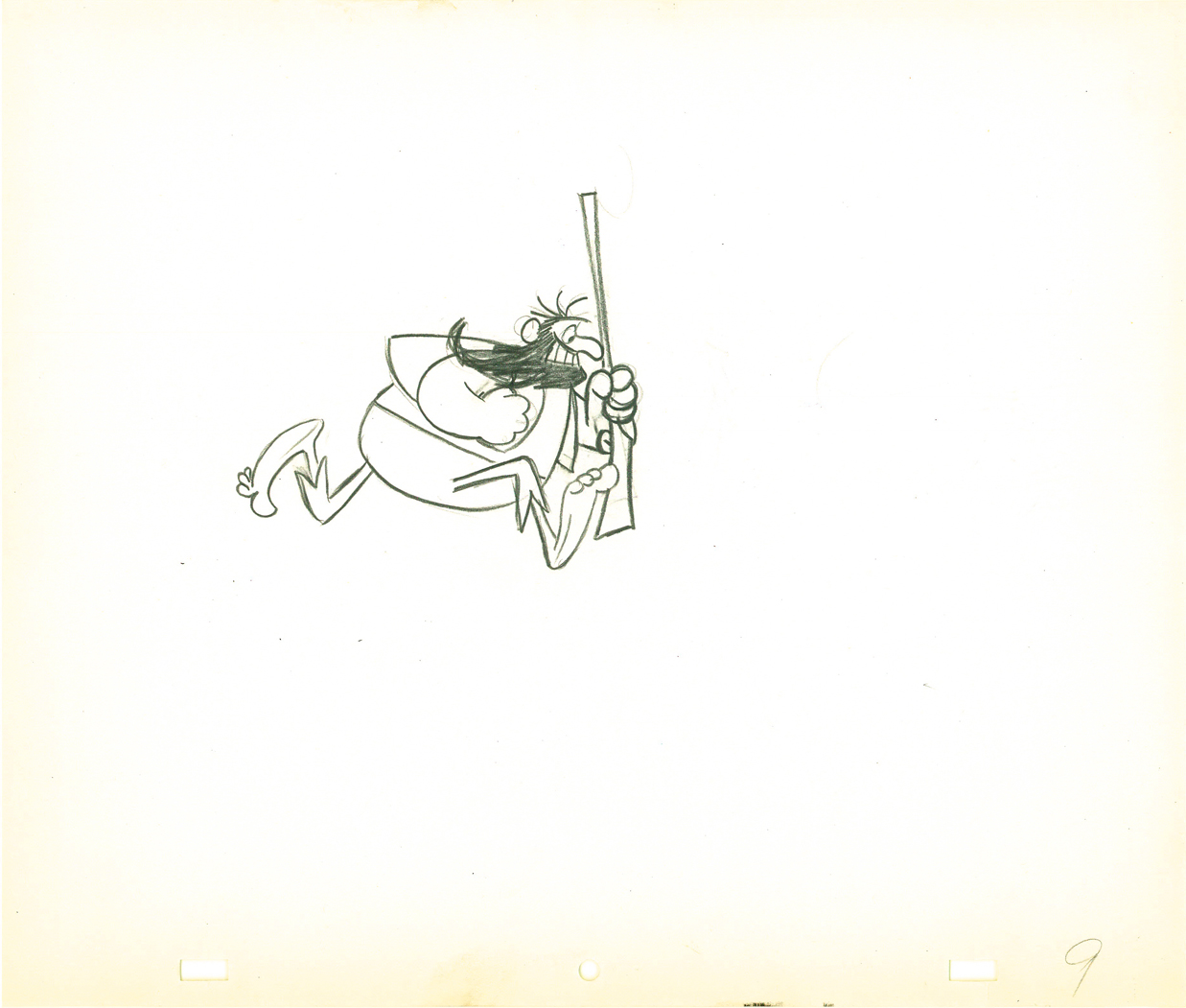
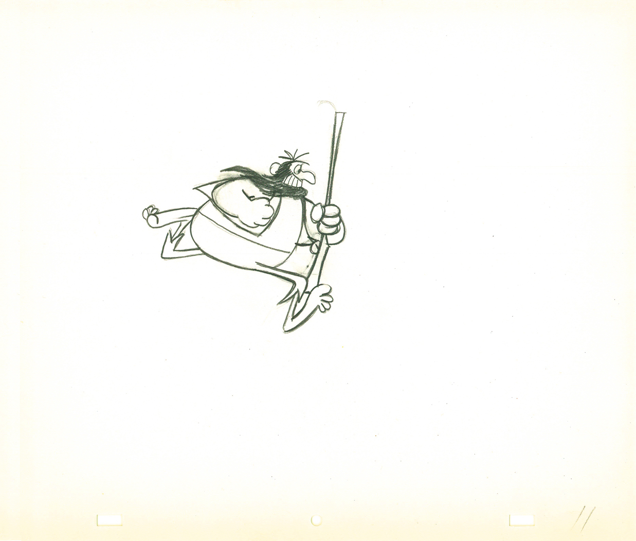
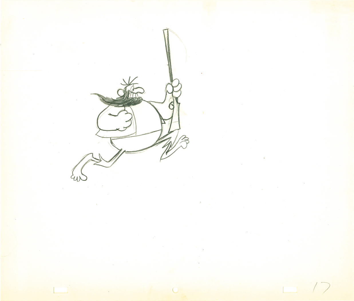
Natwick’s Mountain Dew
Grim Natwick animated a spot for Mountain Dew when he worked for Robert Lawrence Productions. This is a run cycle from the film that was assisted by Tissa David. All of the drawings, here, are Tissa’s clean-ups.
 1
1 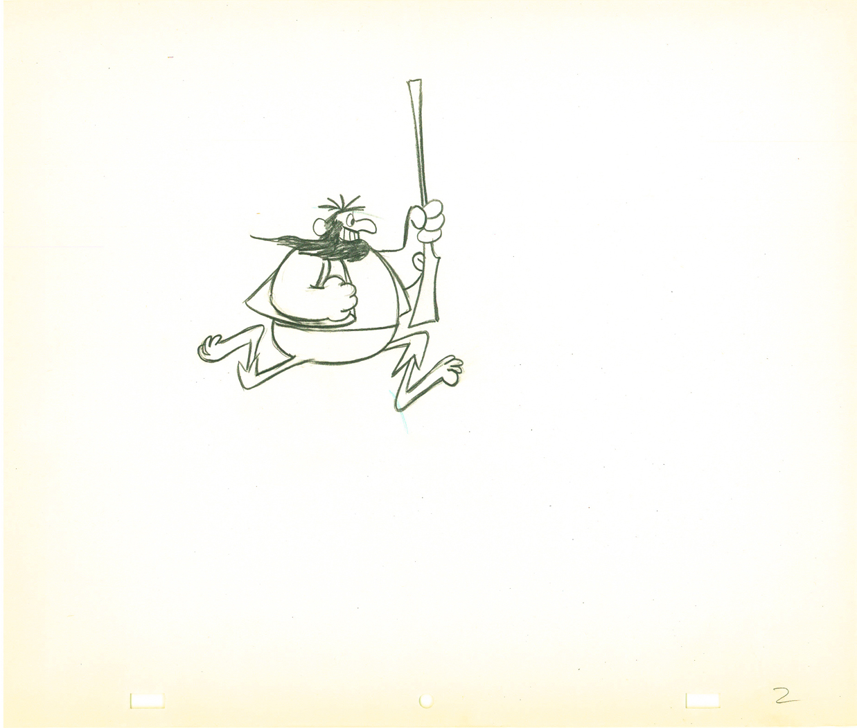 2
2
(Click any image to enlarge to full size.)
 3
3 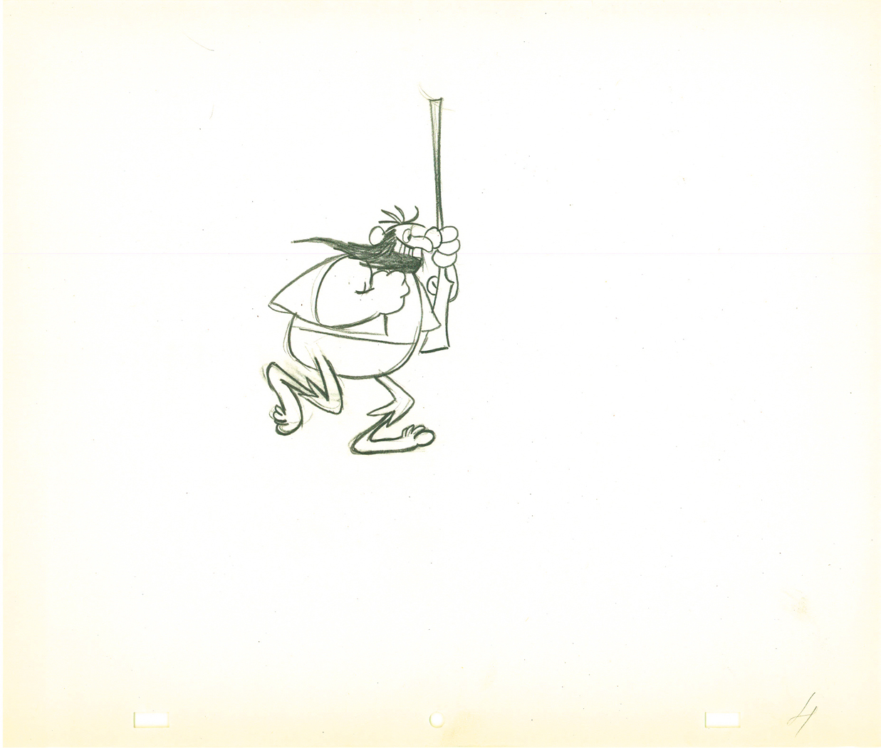 4
4
 5
5 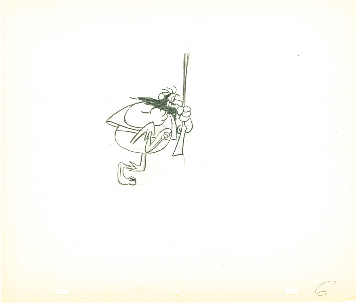 6
6
 7
7 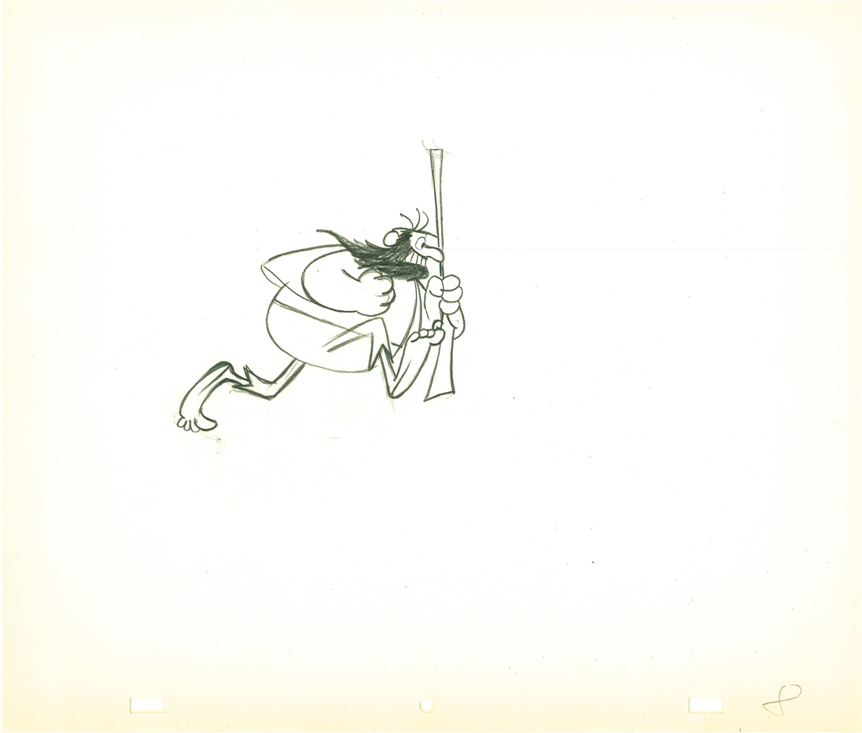 8
8
 9
9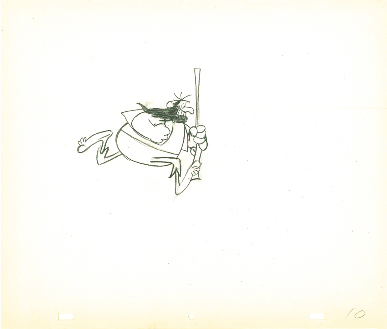 10
10
 11
11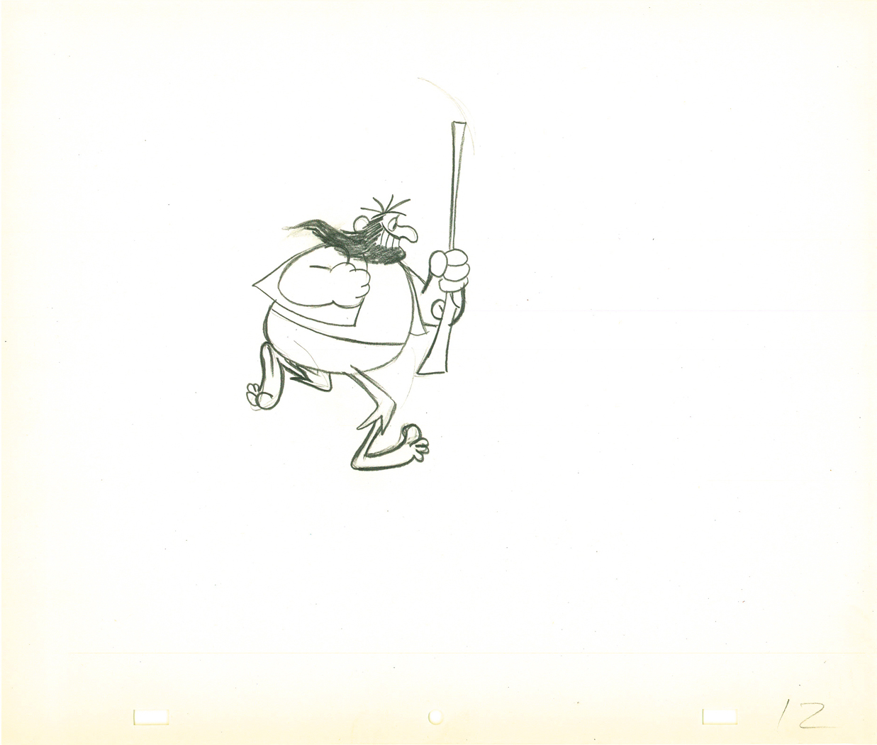 12
12
 13
13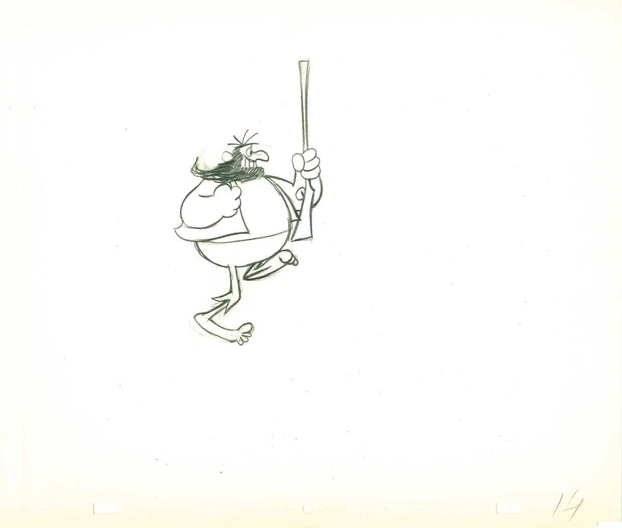 14
14
 15
15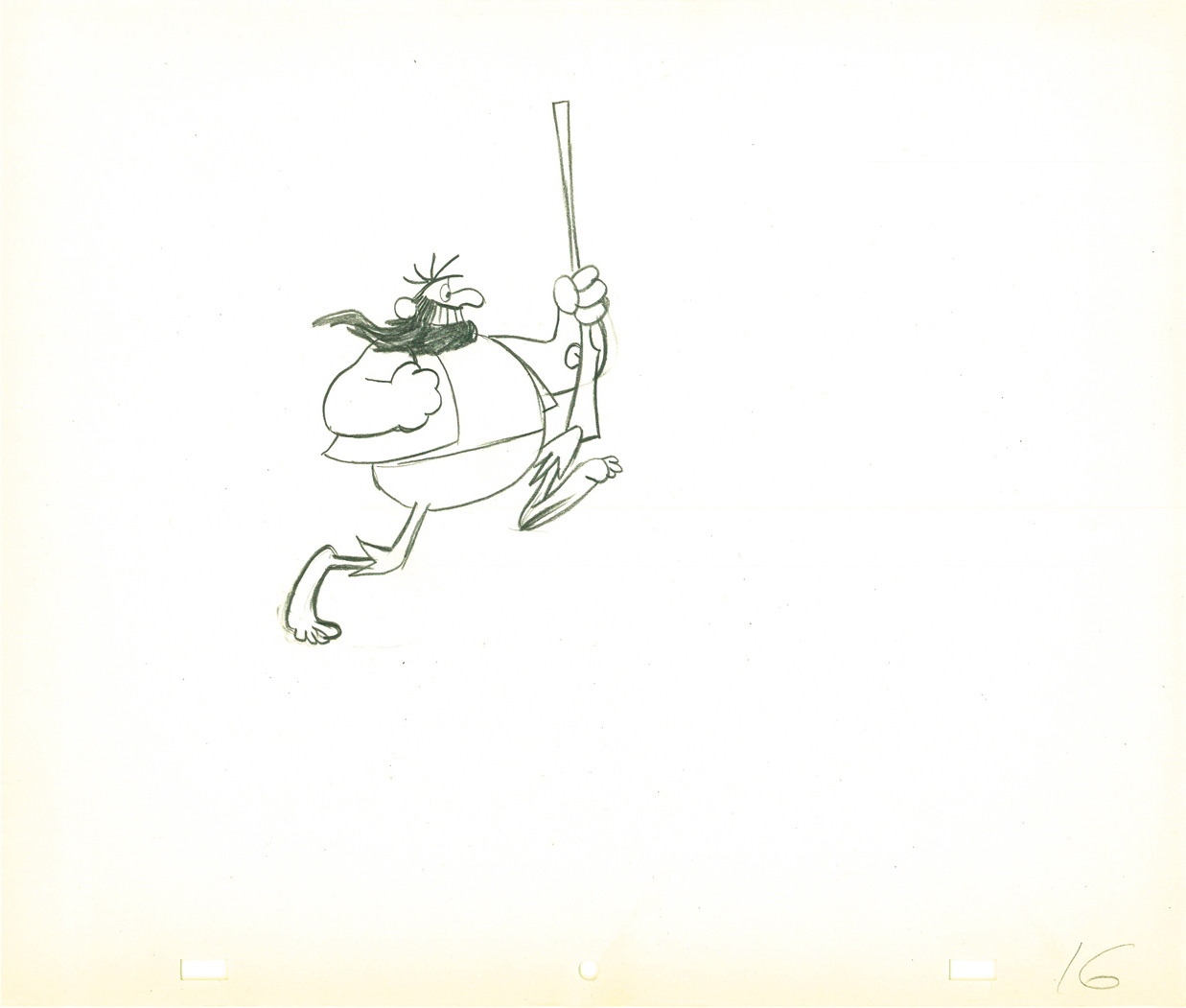 16
16
 17
17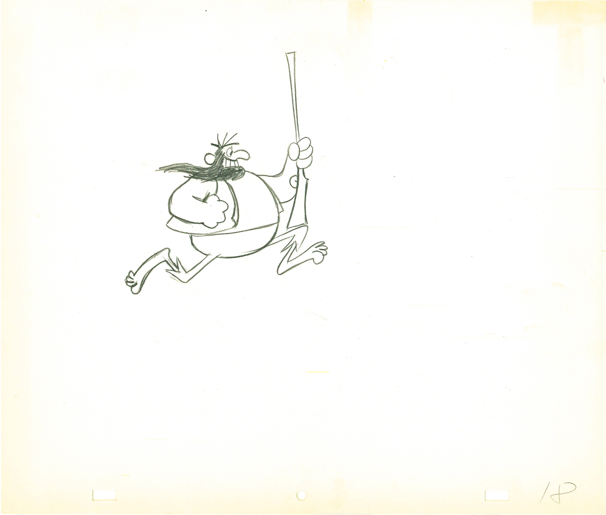 18
18
On ones at 24FPS
Click left side of black bar to play.
Right side to watch single frame.
Photos 08 Mar 2009 08:29 am
Snow Day
- It’s a beautiful day in the neighborhood. The weather forecast calls for 60° temperatures today. It’s hard to believe that last Monday we’d been hit with over 8 inches of snow. Most of it, by now, griming its slushy path into the sewers.
My friend Steven Fisher sent me some pictures he took in the snow, and they were better than those I shot. So let me post his.

(Click any image to enlarge.)

Somehow, to me, this picture looks as though it could have been shot
in the 40s. Or a Currier and Ives lithograph. In reality, it’s the by product
of a school holiday in NY. The first in 5 years. I can’t help but ask:
Why aren’t these kids home watching tv or playing video games?


There are times when some simple change reminds us that
there is a grace in Nature always in front of our eyes.
The berries at the bottom of the picture are so truly hopeful.

Christmas yet to come.
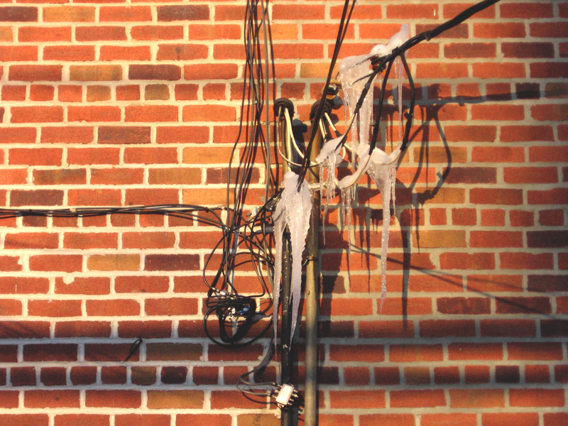
Even something as mundane as cable wire feels the effects of the day.
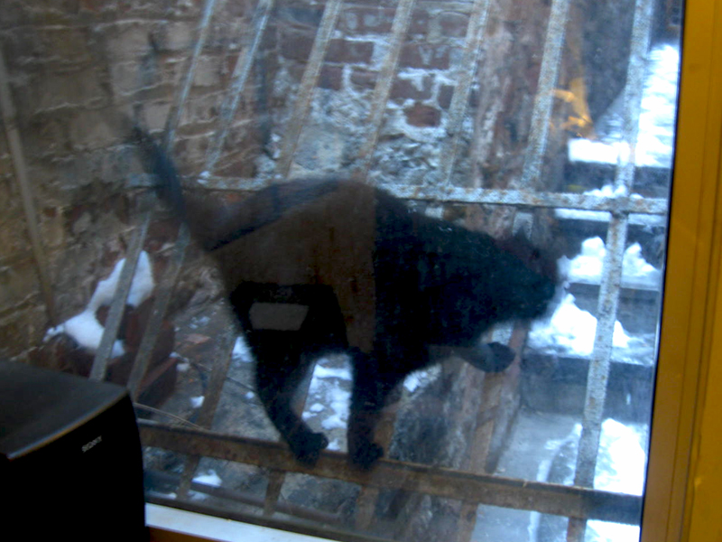
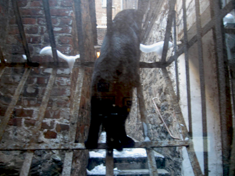
Studio cat, Robbie, enjoys the snow by finding a way to watch it
without standing in it. He’s on a gate guard outside my window.
By the way, the pics are now out of focus because I’m shooting them.

Within a day, the mounds of white snow show the effects of the
pollution around us.

Duane Ullrich, a friend who worked on Raggedy Ann, used to say that
New York was the only place that had black snow. It’s probably not the
ONLY place, but it sure is one of them.

By now, most of this is washed away.
The city needs some rain to wash away the residue.
For now, everything is moist.
Animation Artifacts &Daily post &Independent Animation 07 Mar 2009 08:55 am
Flow charts and Robert Breer
- After my several posts on Exposure sheets, I am planning to write a short piece on the scene folders used at the various studios. These, in a way, are works of art in their own right.
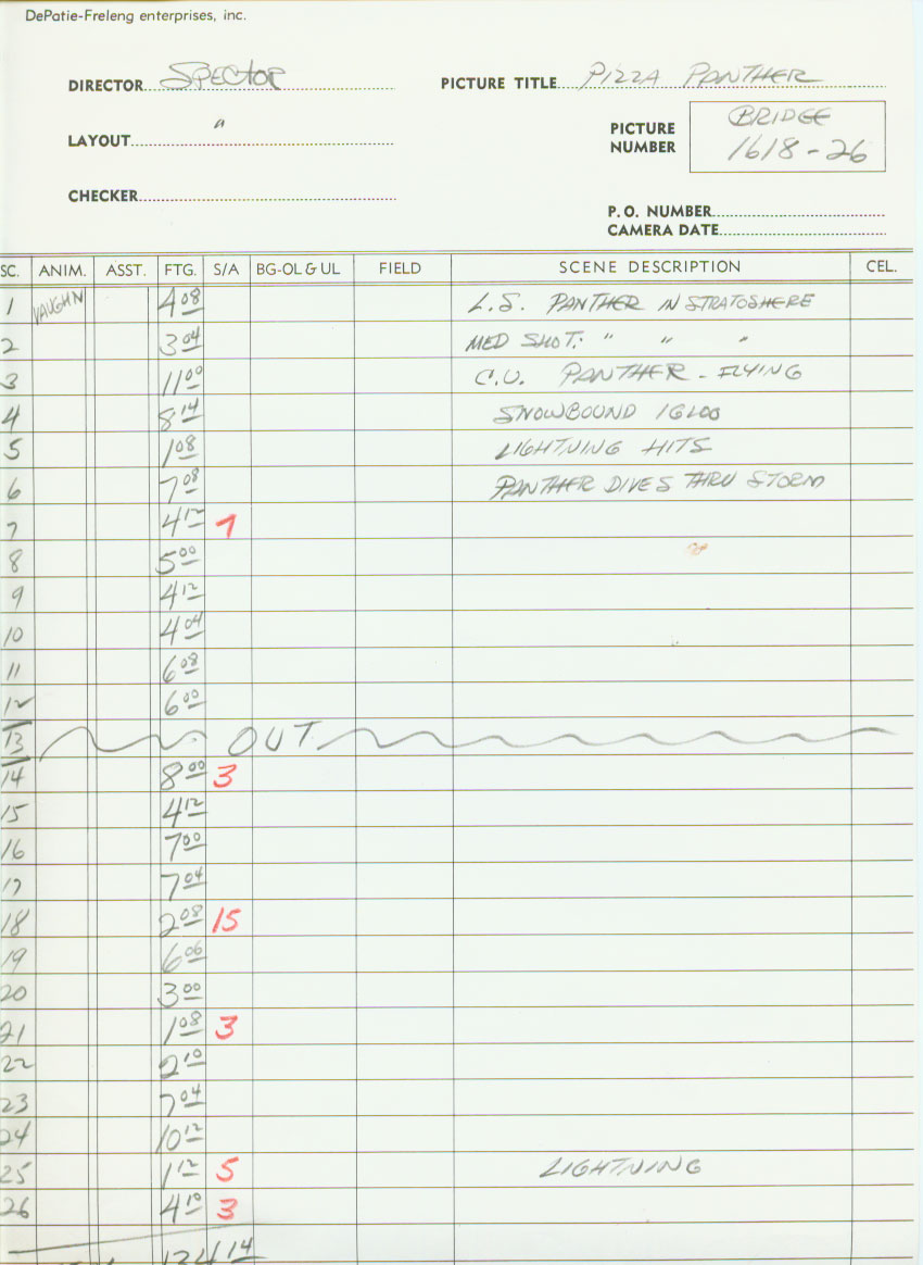
However, Paul Spector sent me something that I talked about quite a while back. When a short or a longform film is done, the amount of paperwork that’s prepared to keep things organized becomes immense. There’s an awful lot of bookkeeping.
All the scenes get numbered, all the sequences get numbered, all the drawings get numbered to correspond to the scene and sequence numbers.
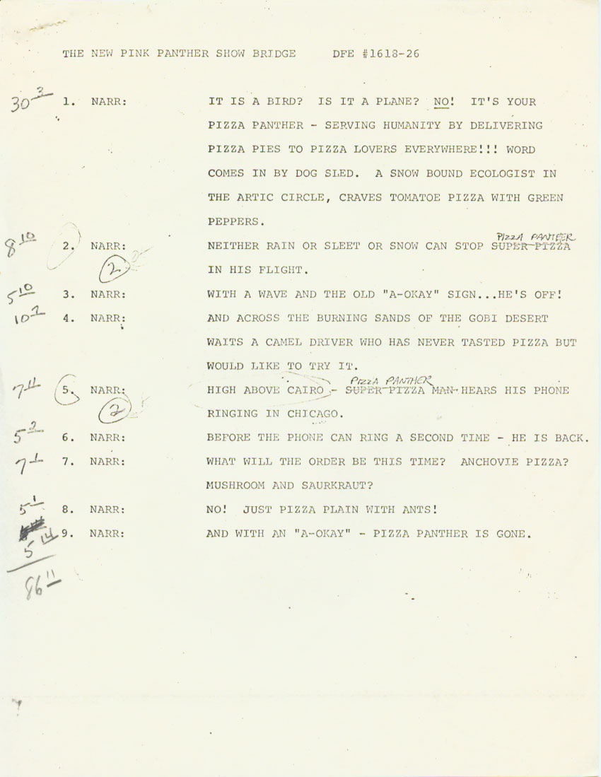
With all those sequences and scenes, you start needing a chart to be able to tell one from the other. Disney’s “Drafts” are a precursor to these. This is what Paul’s sent from his father, Irv Spector‘s collection. It’s a flow chart for some scenes from a Pink Panther short done for DePatie-Freleng. The corresponding page of the script is posted below it.
It looks like they ran out of scene descriptions in the heat of the production and just concentrated on the numbering. John Hubley, I remember, as being the absolute best for scene descriptions. One or two words would completely capture the scene. In the Carousel feature, there were hundreds of scenes, yet you could always tell one from the other. The chart wasn’t done on 8½x11 or 14, but was done by hand on oaktag and pasted in the main I&P room. Using that one or two word caption, you could synthesize the scene you were searching for, and it made a lot more sense than searching for scene C129a or whatever.
(Click any image to enlarge.)
Thanks to Paul Spector for this great example of a flow chart.
__________________________
Tonight!
Don’t forget that Sita Sings the Blues is on ch 13 tonight
in the New York area at 10:45pm.

__________________________
- And now for something completely different.
The Animated World of Robert Breer
Sunday, March 15, 2009, 10:30 a.m.
At The Noguchi Museum
 This free event for children between the ages of 2 and 12 and their families, features an hour-long program of short films by artist and filmmaker Robert Breer followed by art-making activities. Breer, who has been at the forefront of American avant-garde cinema since the 1960s, is a painter and sculptor who turned to animation to create a unique and amazing body of work. Introduced by David Schwartz, Moving Image Chief Curator, Breer’s playful and lively films will engage the entire family and provide a new point of entry from which to view and explore Isamu Noguchi’s work. Following the screening, Noguchi Museum educators will be present to facilitate activities and art-making projects. Families are encouraged to bring a snack and kick back while they enjoy the films. See below for a full list of titles.
Free admission, but reservations are required. To register, send an email to: smurphy@noguchi.org with your family’s name, the number of attendees and preferred form of contact (phone or email) or call 718.204.7088, extension 203.
The Noguchi Museum is located at Vernon Boulevard between 10th St and 33rd Rd in Long Island City. Sunday shuttle-bus service is available between Manhattan and the Museum.
The following films will be screened:
- Homage To Jean Tinguely’s Homage To New York (1960, 9 mins.) This record of the birth and death of Tinguely’s famous auto-destructive sculpture at MoMA is itself a sculptural work, through its camera and editing techniques.
Fuji (1973, 8 mins.) Rotoscoped images of Mount Fuji, as seen from a train, are blended into the magical dreamscape of this lyrical voyage.
Swiss Army Knife With Rats and Pigeons (1981, 6 mins.) Images from everyday life are intercut with abstract and imaginary shapes in this virtuoso collage of drawings and live action photography.
Bang! (1986, 10 mins.) TV images of a boy paddling a boat, an arena crowd cheering, flowers, phones, and a wide array of personal doodle, photos, and assorted images whiz by in this mayhem-filled gem.
ATOZ (2000, 5 mins.) In this film dedicated to his daughter, Breer uses humor—along with a frog, planes, and other shapes—to look at the impact of the ordered alphabet on a child’s awakening mind.
Trial Balloons (1982, 5 mins.) One of Breer’s most lyrical films, Trial Balloons combines home movies with animation and hand-cut traveling mattes.
What Goes Up (2000, 4 mins.) The richness and the impermanence of life are captured in this rapid-fire animation of images capturing the joys of family and work life, and of food, drink, nature, and love.
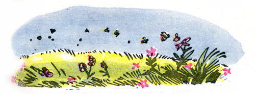
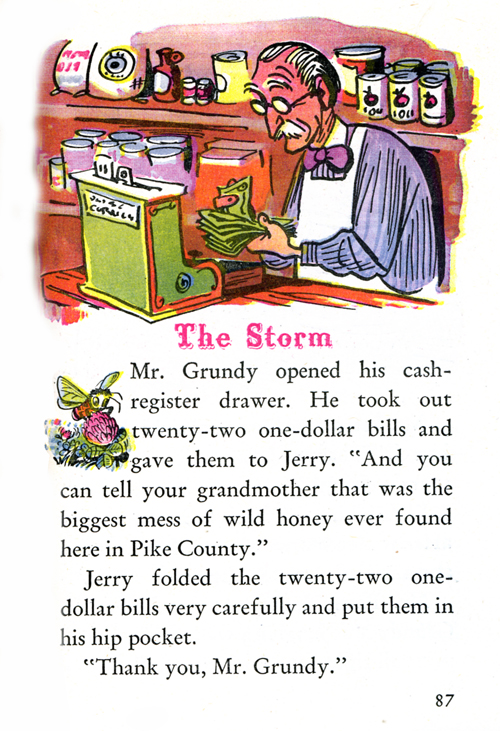
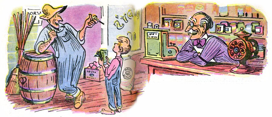
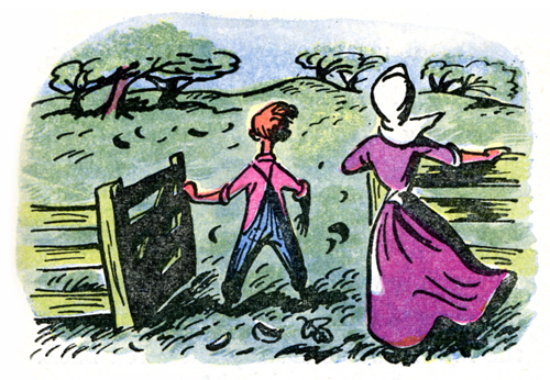
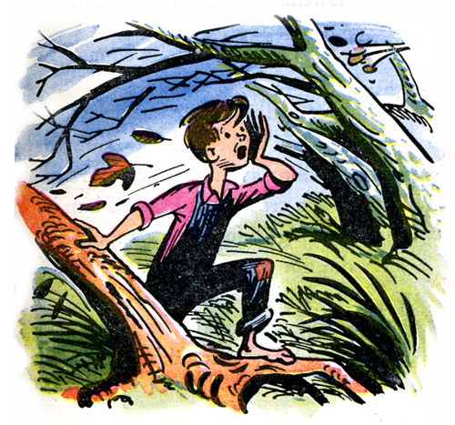
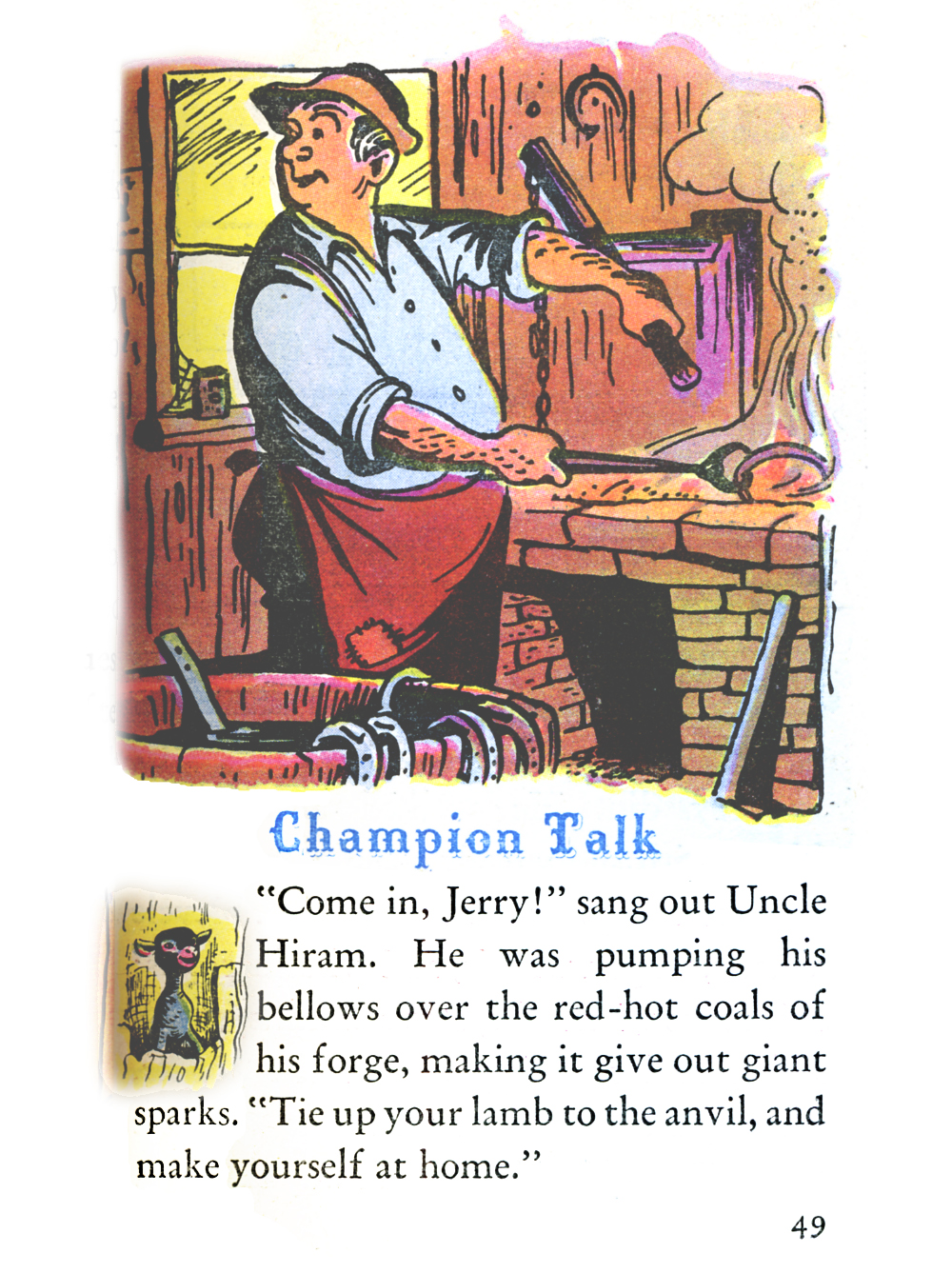
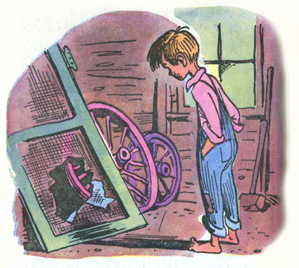
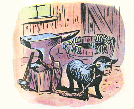
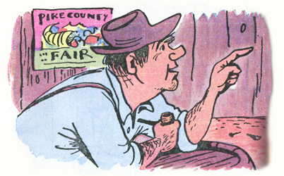
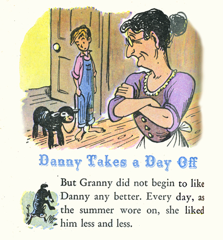
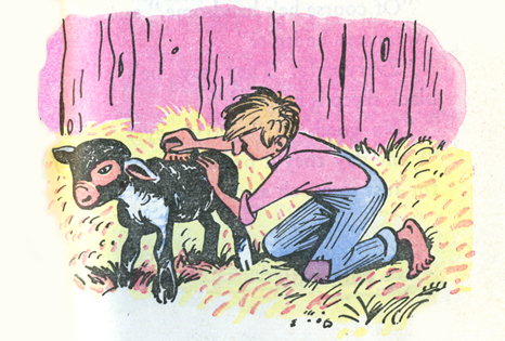
Books &Illustration &Peet 06 Mar 2009 09:01 am
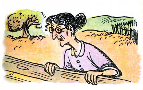
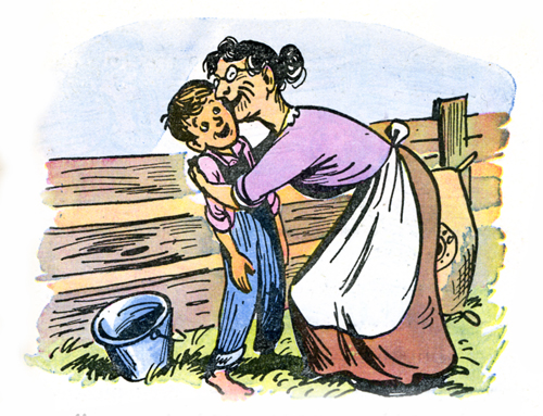
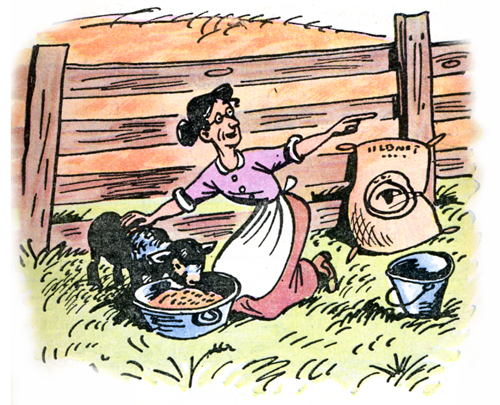
So Dear #3
- Here is the third installment of Bill Peet‘s illustrations for this wonderful Little Golden Book (it’s not so little) adaptation of the Disney feature film, So Dear To My Heart.
The book, written by Helen Palmer, is quite a bit larger than any other Little Golden Book I’ve seen. It really was a large job for Bill Peet to undertake.
All illustrations are ink with light watercolor. They certainly foreshadow the look of Peet’s children’s books to come some 15 years later.
Looking at the book through the illustrations, alone, one gets the feel of a very innocent, bucolic setting. The problems of the child are front and center, but these aren’t very real problems. This makes for a light series of stories. (To be honest, I haven’t read the text, but there is an overwhelming feeling that comes over you when you spend a bit of time with the images.) The film wasn’t an extraordinary success. I don’t imagine it’d fare better today. In fact, I’d suspect it couldn’t get released by today’s Disney. Maybe if you switched the lamb to a talking chihuahua.
(Click any image to enlarge.)
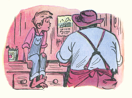
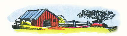
Thanks to John Canemaker for the loan of the book.
Animation Artifacts &Commentary &Disney 05 Mar 2009 09:07 am
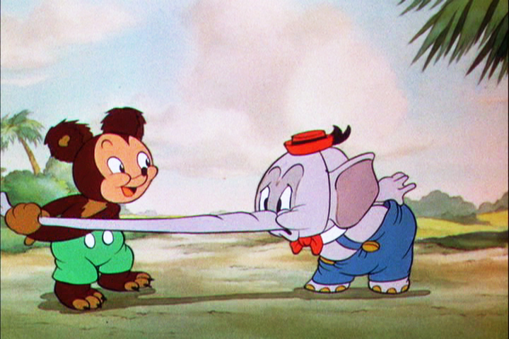
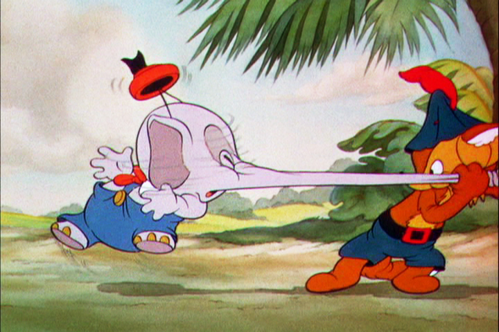
Elmer Elephant
- The post on exposure sheets drew a lot of attention, which is something that pleased me. Perhaps there’s enough interest in the heart of the medium to keep it alive.

Robert Cowan sent me an exposure sheet that was tucked into an envelope in the Ingeborg Willy Scrapbook, which he owns. (Ingeborg Willy was an inker working at Disney’s during the 30′s and made a photographic scrapbook of her stay.)
The sheet is from the Silly Symphony, Elmer Elephant (1935).
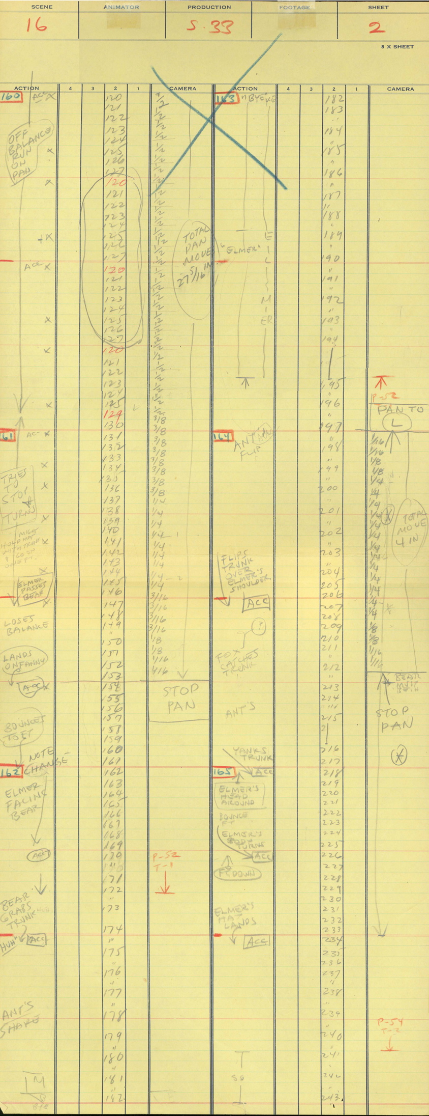
(Click any image to enlarge.)
The film’s about a bunch of baby animals.
Elmer is the shy kid who gets laughed at by the other kids.
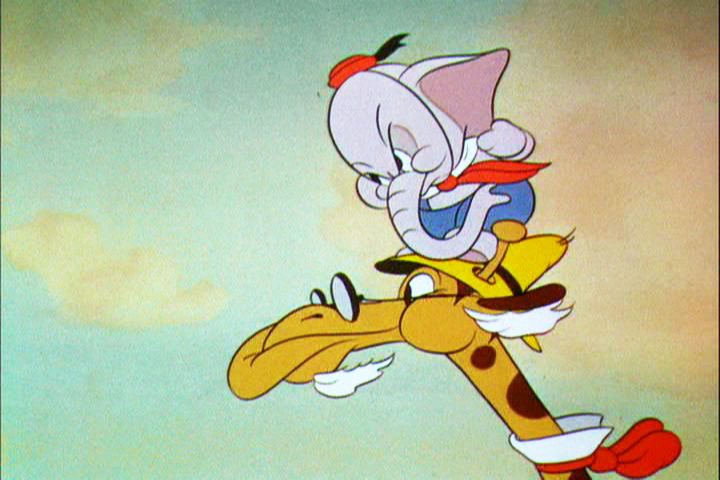
Eventually with the help of an old giraffe he saves the day by putting out a fire …
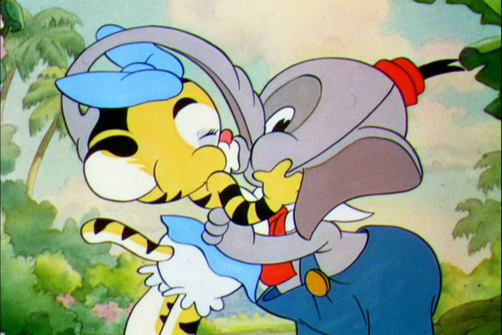
… and winning the girl.
This exposure sheet is about a sequence wherein Elmer is pushed across a row of animals and is poked and prodded in absolute humiliation.
Let’s review what’s on the sheet for the completely unitiated viewer:
There are several columns: Action, 4,3,2,1 and camera.
These are basic to all X-sheets. Sometimes you get 5 numerals, oftentimes you get a column for Bg. Uusaly there’s also a Track column.
Below these descriptives you have lines. Each light blue line represents one frame of film. If the drawing’s on twos or threes or more it’s indicated as in #149. Other numbers are on ones – one frame per drawing.
In the “Action” column, the director writes notes telling where he wants some action to happen. For example: the director has noted that he wants Elmer to try to stop his turn from frames 32 through 49. The animator will follow this as best as possible.
The numbered columns represent cel levels. #1 is the bottom cel and #4 is the top cel. Most sheets also have a column for the Background so you know what number Bg is called for.
The “Camera” column indicates any special camera movements or effects. There we see a pan. The Bg is moving from screen right to left. The actual amount of the physical movement is indicated on every frame. 1/2 is a half inch, 1/4 is a quarter inch etc. Pans usually slow down as they come to a stop and gear up when they start out. This is why it goes from 1/2 to 3/8 to 1/4 to 3/16 to 1/8 to 1/16 before you reach STOP PAN.
You’ll see the sound track indicated at red marked 163 top line middle of the sheet. A character is saying, “Bye Elmer.” The actual number of frames it takes is broken down for you. The animator would animate the mouth accordingly.
Here are frame grabs for the part exposed.
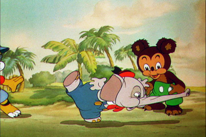 1
1 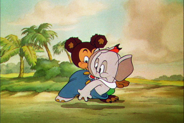 2
2
 3
3 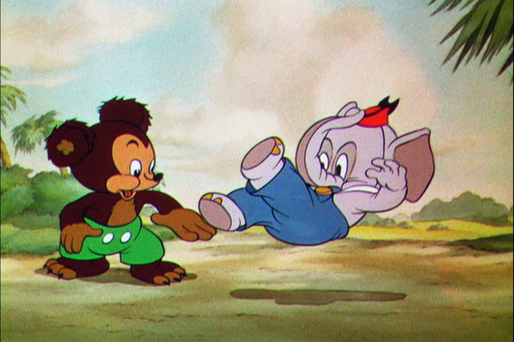 4
4
 5
5 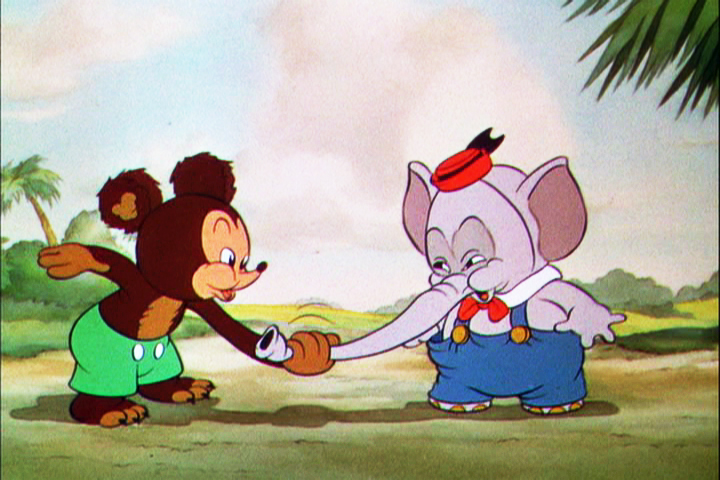 6
6
 7
7 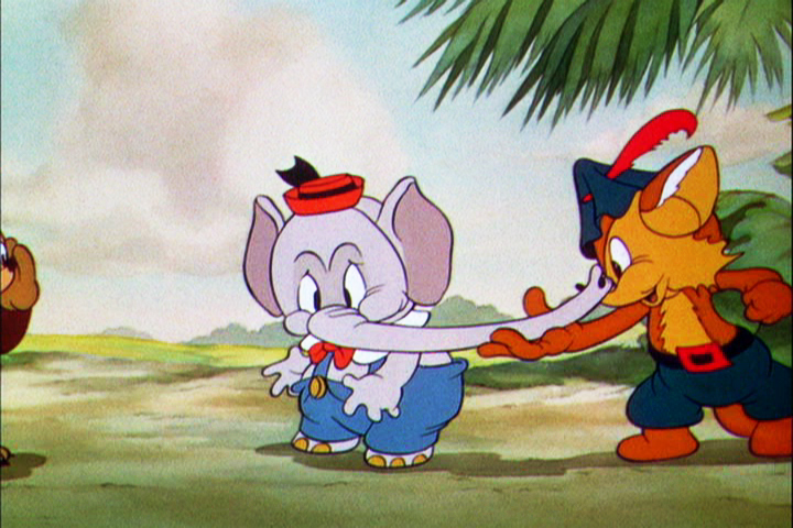 8
8
 9
9 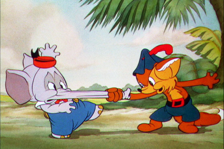 10
10
Let’s analyze the exposure sheet a bit. (For those not familiar with X-sheets, I have more of a breakdown below.)
First off, for me it’s an oddity. There seem to be two sheets combined onto the one. It’s split down the middle into two full sheets – all using only one cel level.
Secondly, there are some highlighted numbers – 160 through 165.
These fall at every 32nd frame. I’m not sure why. It’s not a foot (16 frames) or a second (24 frames). Is it a beat? I notice that the action calls for “ACC” at each of these markings. I assume it stands for “Accent” which would make that part of a musical tempo. Every 16th frame is also marked in red. This would be the only indication that this is what it is.
The pan moves are indicate in FRACTIONS ! I’m not sure why since it created a difficult transposition to decimals for the camera operator. I mean 3/8 of an inch equals what? Quickly now. Time is money. How about 1/16th? I have only met fractions which divided into 20ths. When did the change come in? John Oxberry, anyone?
Of course, some master checker would probably do the math before the scene got to camera.
Some of the drawings are exposed on twos, even for a short bit during the pan. This would be anathema in modern day animation, yet it hasn’t gotten better.
The track reading isn’t the most detailed I’ve seen, yet it does the job, doesn’t it?
The film is directed by Wilfred Jackson. I assume the “Action” column was filled out by him. I think the animation was by Paul Hopkins.
There’s a lot of information that can be pulled out from this one exposure sheet of a film done 73 years ago. Is that enough reason to advocate for continued use of the Exposure Seet?
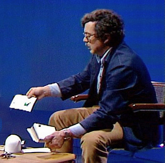
Articles on Animation &Books 04 Mar 2009 08:36 am
Tekenfilm
 - Marten Toonder lived through much of the history of Dutch animation. (Like many other throughout Europe he gained the moniker of the “Walt Disney of Holland.”)
He was born in 1912 and died July, 2005. In 1940, with puppet animator, Joop Geesink, he formed the Geesink-Toonder Studio. The break-up of the two led to his forming the Toonder Studio in 1942.
He left this studio, as tituilar head, to get back to illustration in 1965, and ultimately retired in 1977.
Toonder is probably best remembered for his several successful comic strips. You can visit a sample of these here or here.
He made animated shorts of his comic strip, Tom Puss, which you can see on YouTube.
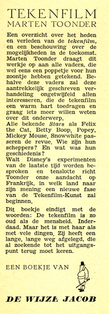
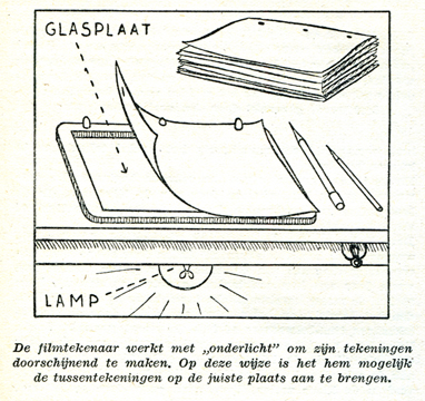
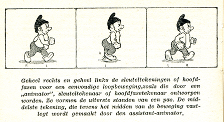
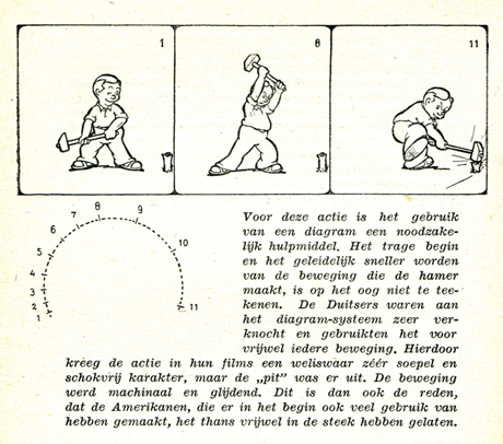
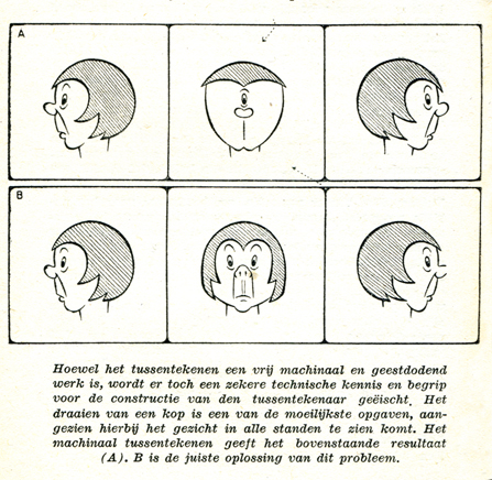
I make Toonder the subject of this post because I have an early book about animation which he wrote. Called Tekenfilm, it seems to have been written in 1946; at least that’s the only date I can find in the smallish publication.
It’s in Dutch, so I’m not able to read the book. However, I thought I’d post a couple of pages of the book . I haven’t been able to find any reference to the publication to date. ___________________The book’s flyleaf – in Dutch
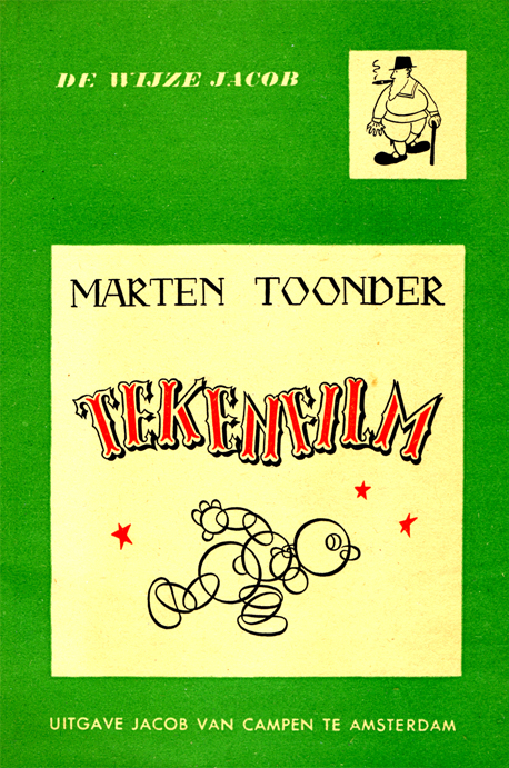
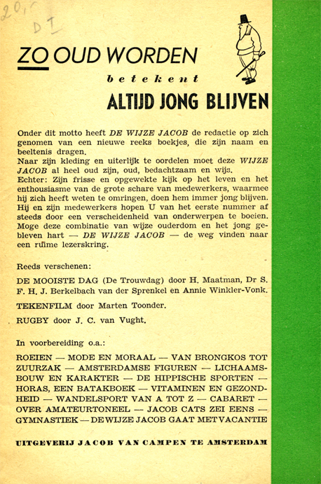
The book’s Front cover & Back cover
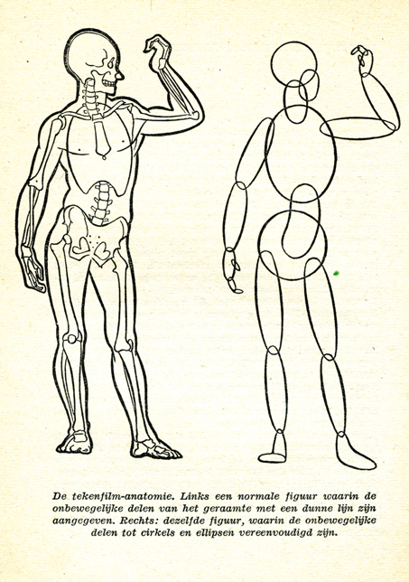
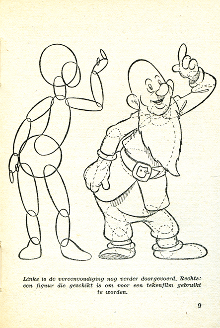
(Click any image to enlarge.)
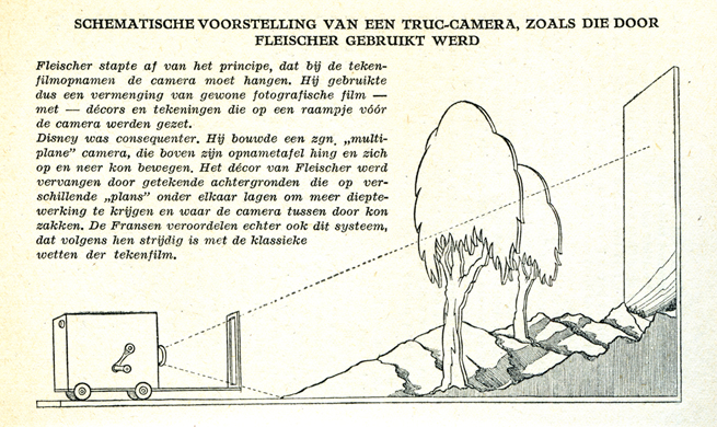
Here the Fleischer studio gets credit for the Multiplane Camera.
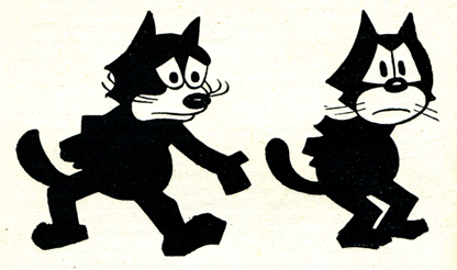
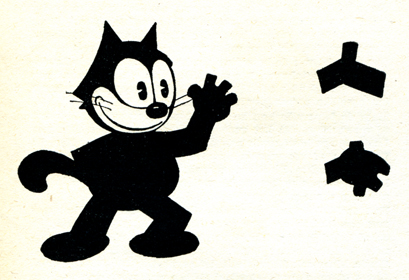
Felix develops.
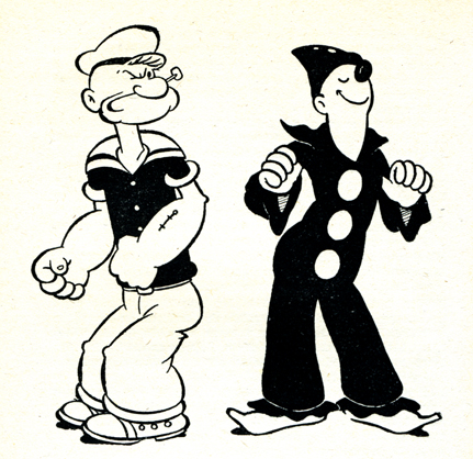
I like the way Popeye is drawn. Koko looks more on model.

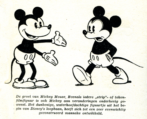
A wierd looking Oswald leads to Mickeys.
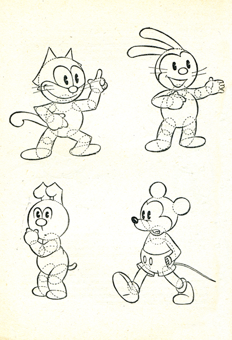
How to try to draw some characters.
Where’s Bugs?
Some basics
Pay attention to those arcs.
Here’s a lesson you still don’t see in many animation books.
How not to draw the mechanical inbetween.
His solution isn’t the best.
Ending with two European cartoons of merit from 1944:
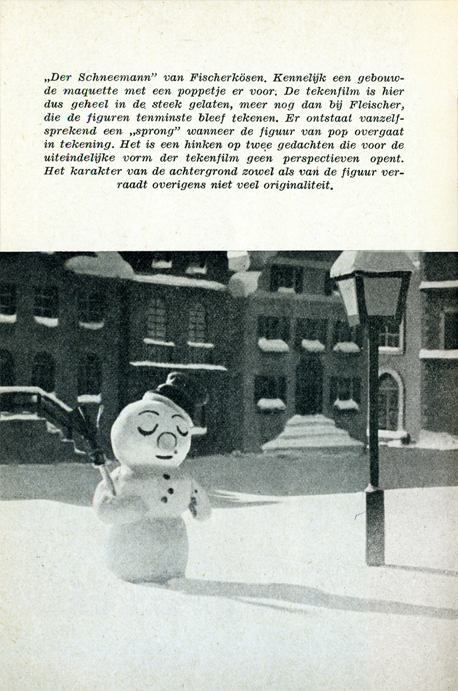
The Snowman in July by Hans Fischer-Kösen
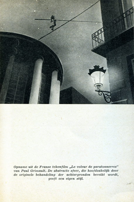
and Voleur de Paratonnerres by Paul Grimault
Animation Artifacts &Commentary 03 Mar 2009 09:39 am
Dope Sheets
Kayvon Darabi-Fard wrote the following letter to me:
 THE DOPE SHEET!!!
I’m a student, of animation in the UK seeking the answer to the neglect of the dope sheet. No matter how hard I try I can’t seem to find a good reason as to why my classmates and production teams refuse to use the things.
It’s not mandatory for us to use the dope sheet, but its seriously being ignored to the extent, some directors think its just time wasting or some kind of magical adventure only the technically minded pursue.
At the college I’m studying at, we’re all broken off into production teams of around 5 people a team to produce a 2 minute short. I went round and had a look at what everyone was doing. Out of 11 teams, only one director was using the dope sheet system defined in Richard Williams Survival Kit, while the other directors and animators were either creating their own systems and methods, or just ‘doing it’.
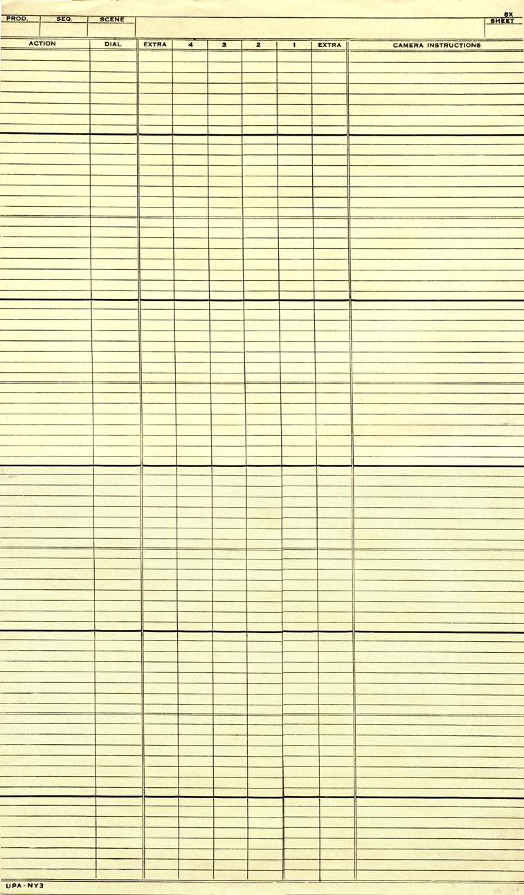
I was looking at the Steamboat Willie dope sheets you posted a few years ago. _____________X-sheet from UPA NY circa 1956
Even with music there’s always a use there. All
I need to do is convince the other 150 animators and directors that it’s not a lost cause.
 After I found the one director who had an actual system (according to RW’s), I found that he was using the dope sheet you use for your studio, tailored with the 400 frames on the one page.
Seriously, Do we change the dope sheet to ‘appeal’ to the new age of animators, or just crack the whip?
How would you go about teaching the dope sheet in education, and in the Sporn studio? What’s the system, and what are your views on the argument in keeping it alive?
I know there’s a war even with it becoming digital in things like Toon Boom and other CG applications, but what’s your opinions when it comes to training and producing the work within 2D traditional animation?
My answer is that, YES, I do believe in “Dope Sheets” (or as they’re known in the US, “Exposure Sheets” or “X Sheets.”)
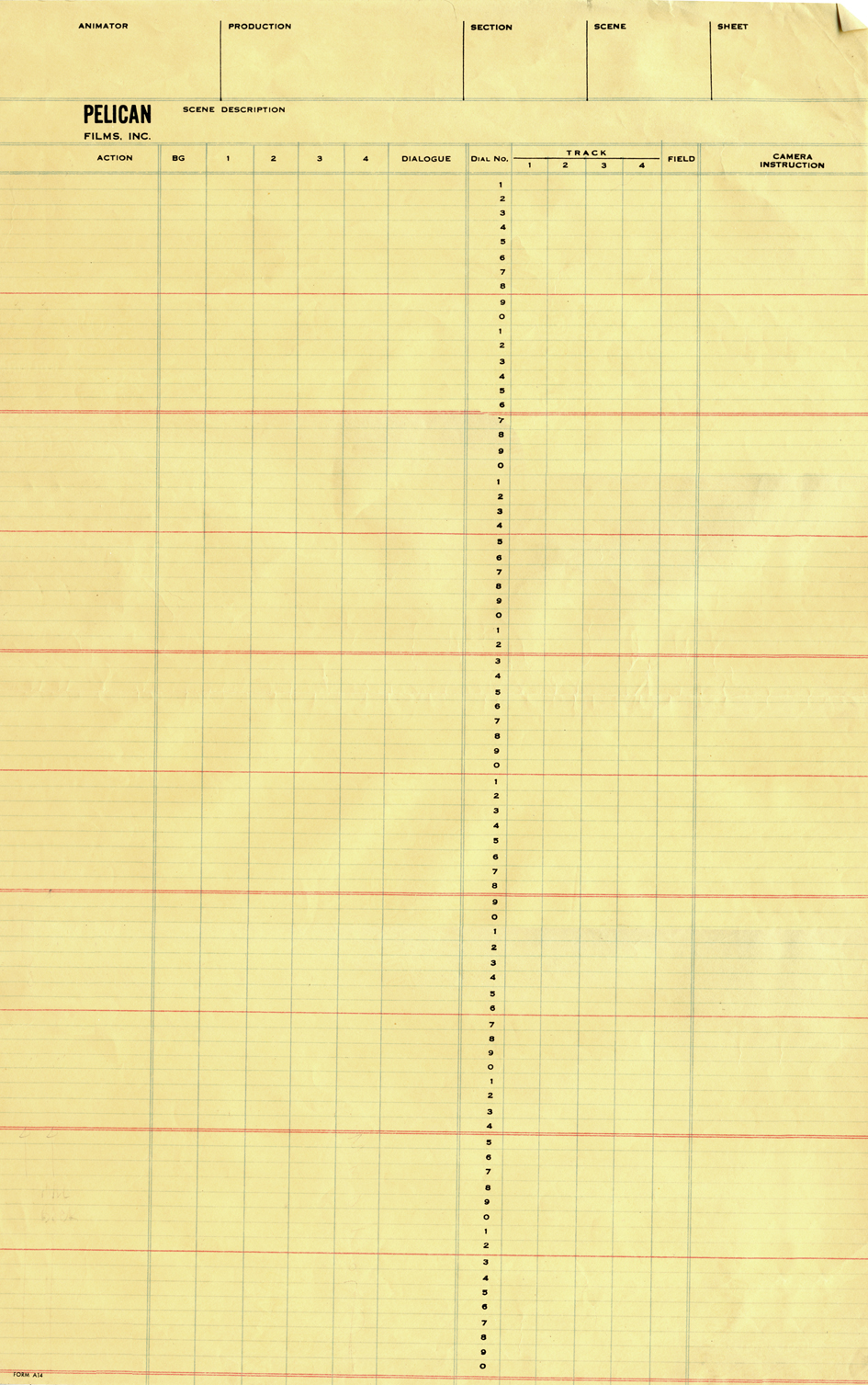
Pelican NY circa 1960
Because I was trained in using the X-sheet and
took a great interest in the differences these forms took from studio to studio, I amassed a collection of about 50 different sheets from varying studios. When I started my own studio, I took every element I thought key or helpful and put them all together on my studio’s sheets.
They were all designed, (I’m talking visually) more for the camera operator than for anyone else, but the usefulness of these sheets is enormous. A large amount of information can be placed on these sheets, and the more sophisticated animator created artpieces out of these sheets.
The 400 fr sheet, you mentioned was a composite I put together from my standard X-sheet. An exposure sheet should have 80 frames per page. The 400 page sheet acted similarly to bar sheets for me, as a director, more than anything else. It gave me an overview of a larger bit of the track so I could plan the cutting of the picture.
You see, when you get used to reading X-sheets, you see them as time. You don’t see the lines, you see seconds and footage, instantaneously. As an animator, you get an overview immediately of the scene; as a director you read the track, how the animator has constructed the scene, and what camera moves are indicated and why.
Of course, the real purpose of these sheets is for communication. If you’re doing a film by yourself and don’t think you need the sheets, then fine. But if you’re working with other people, how else would you communicate what the track is doing or how the scene is constructed?
Certainly, as students, you should be obligated to learn how to use sheets so that you’ll have the knowledge and the experience in your grasp. The more knowledge you’re armed with, the better you’ll make it in the real world.
With the advent of the computer, and as you mention programs such as Toon Boom (which employs its own version of an X-sheet,) studios presumably have reduced their dependence on such charts. Since I know how valuable these sheets are in relaying information, I’ve kept them up in my studio. The sound track is read on the prepared sheets. I don’t demand that anyone fills them out – certainly not when many animators today are developing their animation in the computer – but the sheet gives an excellent way to plan the scene, and the animators can take that information and use it as they like.
In studios of the past, a folder was designed. X-Sheets, when folded in half would sit neatly into the folder (and often be stapled into it) so they would always stay with the scene and not get lost.
I don’t quite know how other studios transfer such info from person to person and keep any oversight on the film as a whole, and your question raises a curiosity that sits in the back of my mind. How does a PIXAR or DREAMWORKS deal with such track readings and director’s notations? Is it all digital or do they actually have a form of X-sheet? If anyone out there knows definitively, I’d be curious.
The UPA NY sheet pictured above, is well designed except for the fact that it
does not include dial numbers. I guess someone can write out all the
numbers, but it doesn’t quite make sense to me.
The Pelican sheet includes the dial numbers, but it’d be nice if they were
also alongside the soundtrack area.
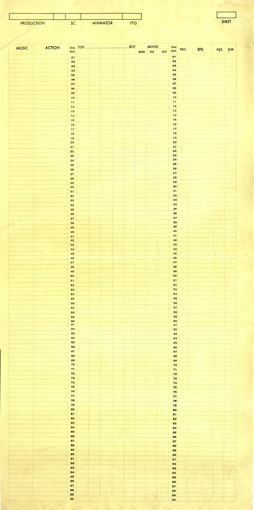
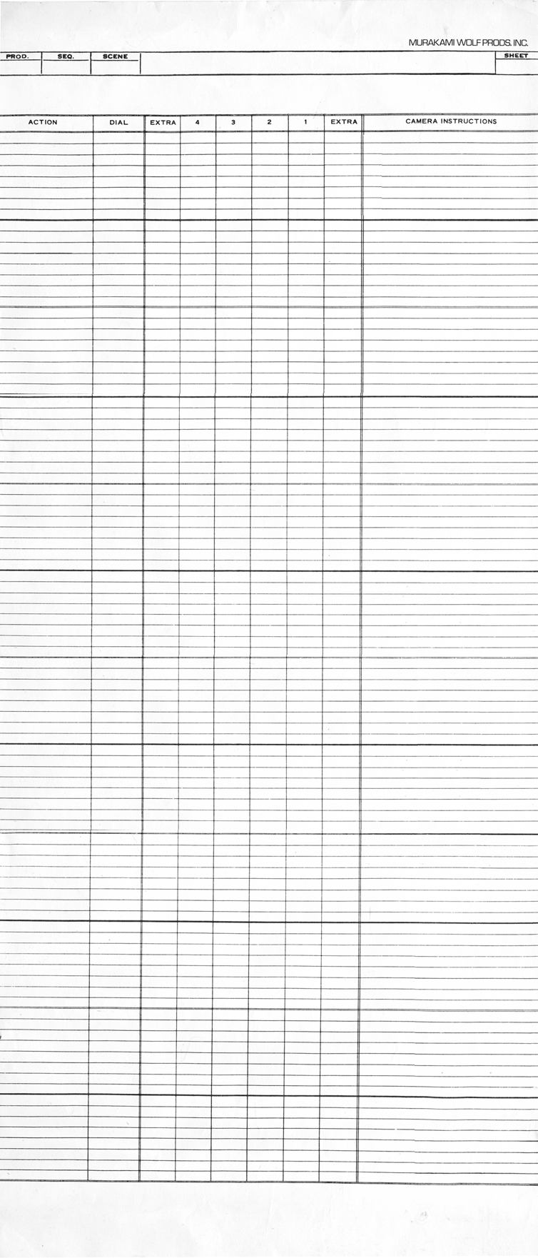
Shamus Culhane Prods circa 1972 | Murakami-Wolf Prods circa 1974
The Culhane sheets are designed for 100 frames per page. I’ve never understood
this calculation. If you do an 80 fr. page, you get five 35mm feet or two 16mm feet.
100 frames gets you nothing but an even number.
There are also no lines on the page making it harder to read.
The Murakami-Wolf sheets include 96 fr. per page or six 35mm feet.
These sheets are also unruly in their length.
 .
. 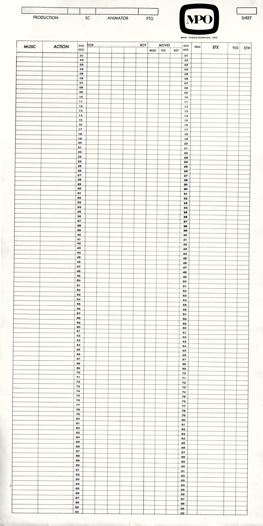
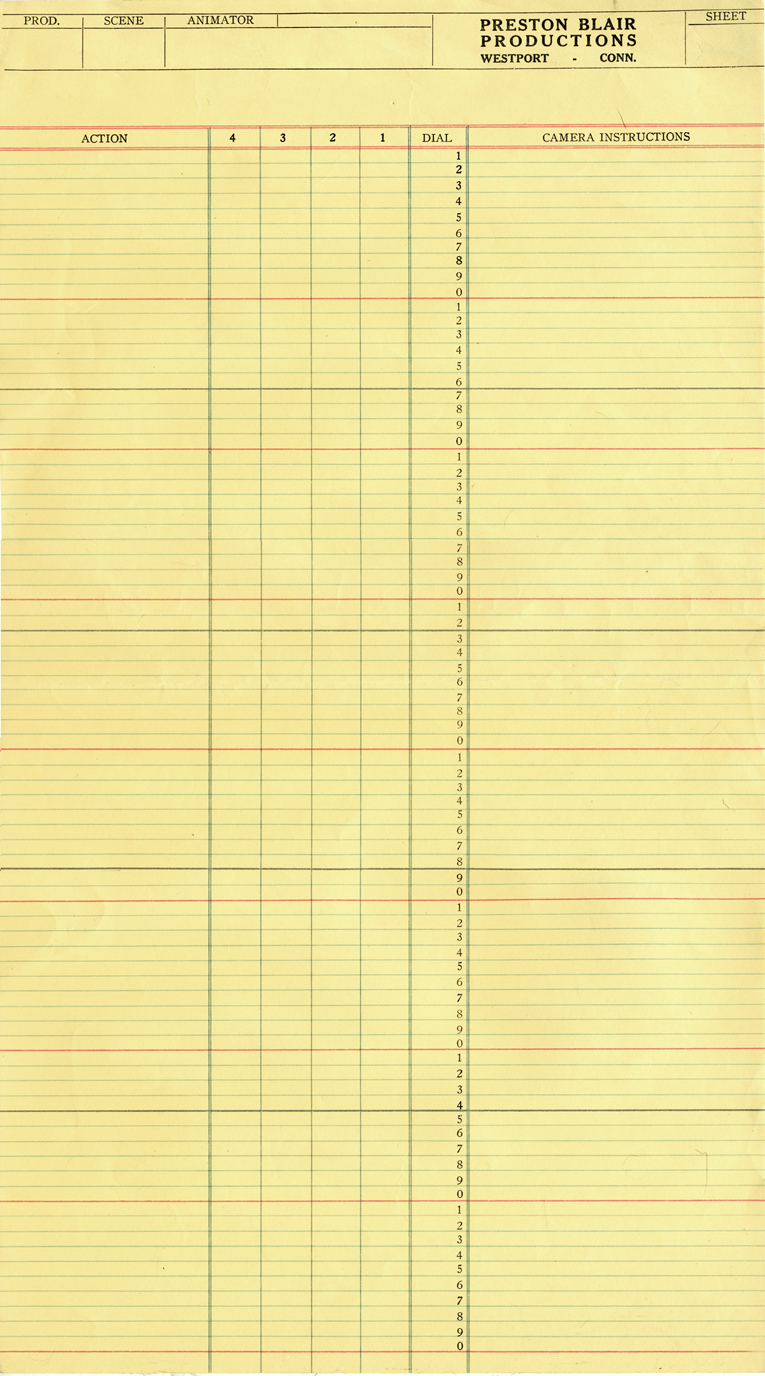
Preston Blair Prods circa 1967 | MPO Prods circa 1970
The Preston Blair sheets are close to perfect except for a red line that was added
at every tenth frame. What use is there for it?
The MPO sheets have no lines and are confusing.
They’re similar to Culhane sheets but a bit more legible.
I have more of these sheets, but I think this may interest only me.
I once spoke to my staff for about 2 hours about exposure sheets. Interestingly enough,
I didn’t have to wake anyone at the end of the chat.
I’ll have a bit more to write about this soon, when I pull it together.
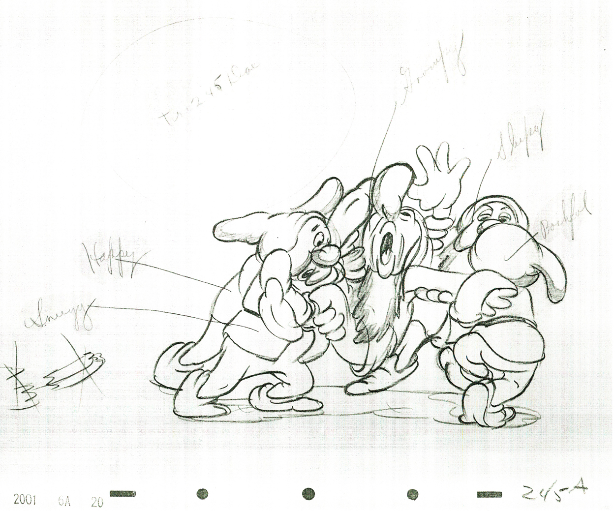
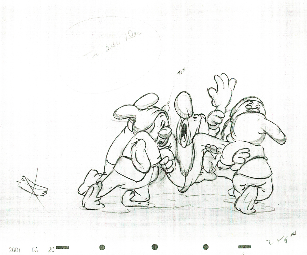
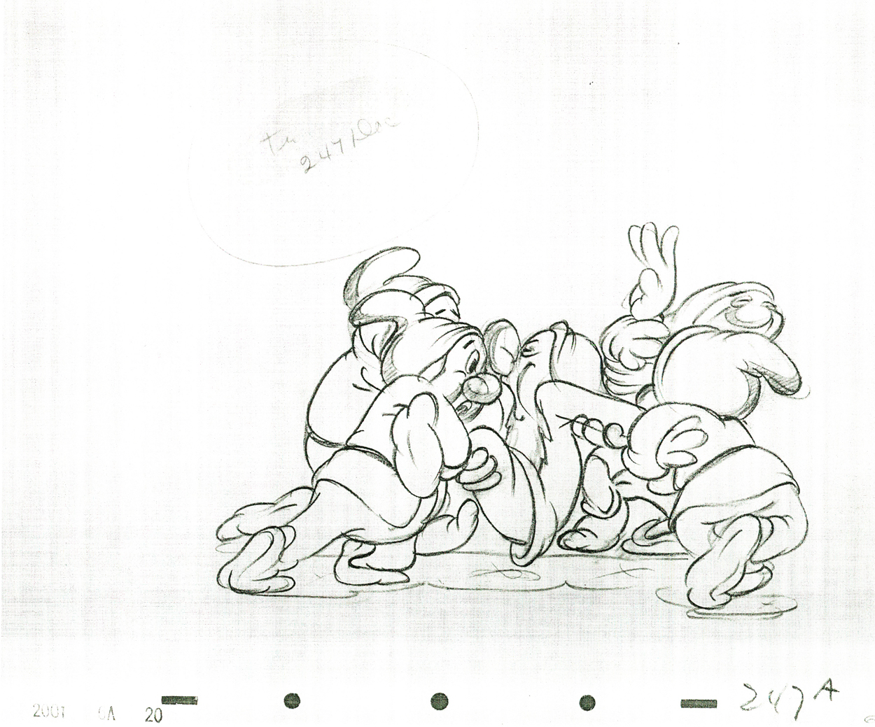
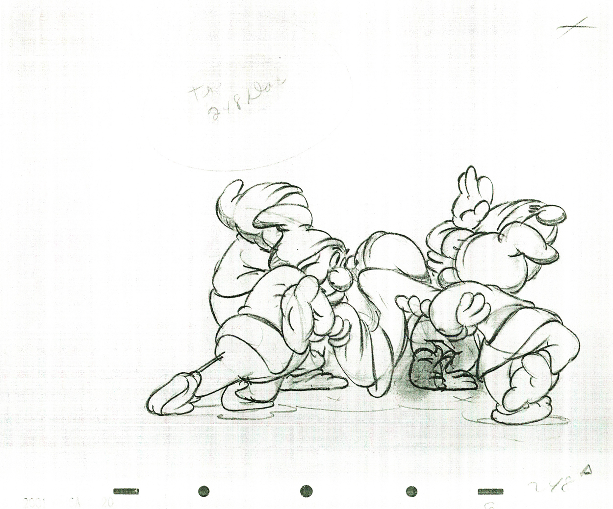
Animation &Animation Artifacts &Disney 02 Mar 2009 09:05 am
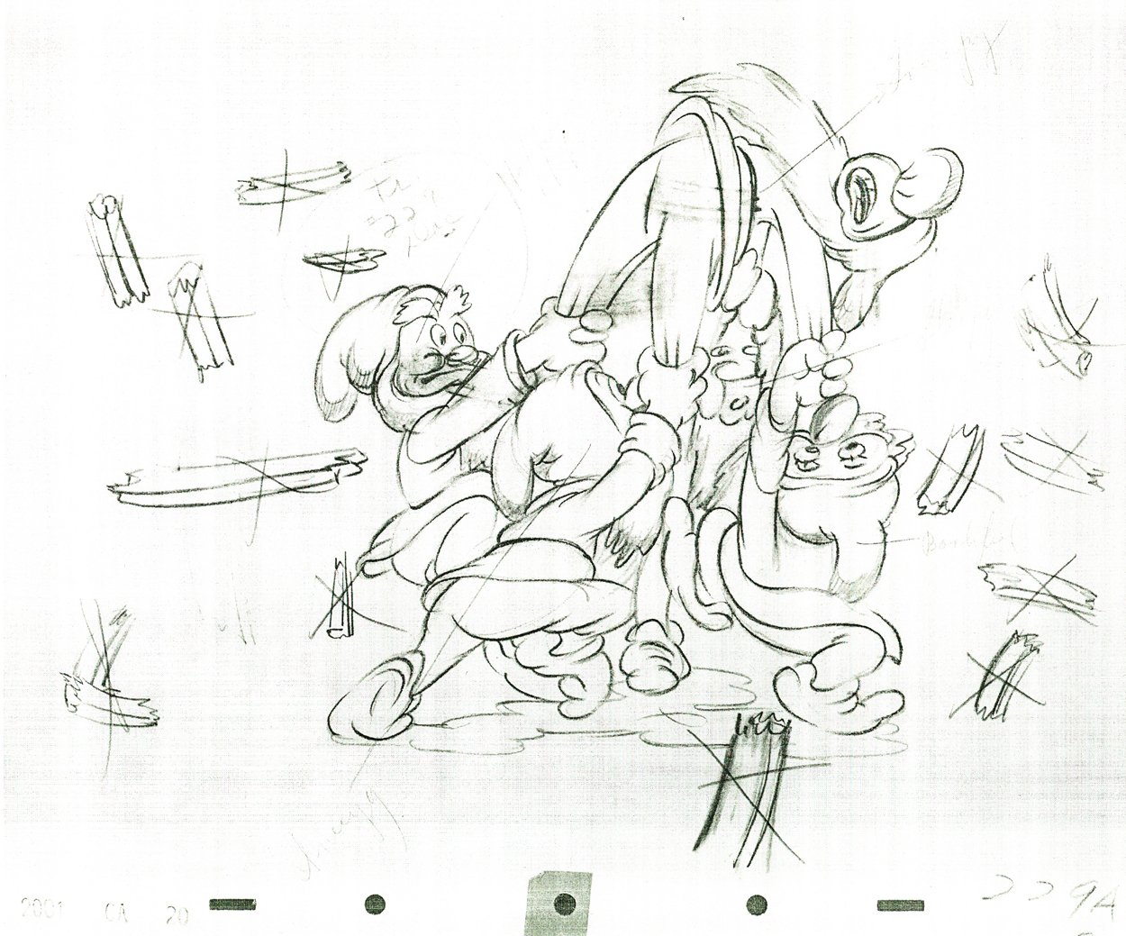
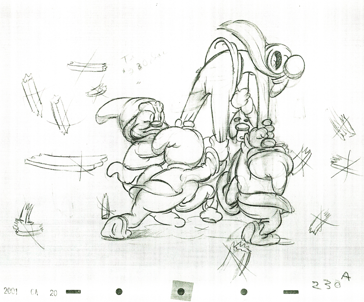
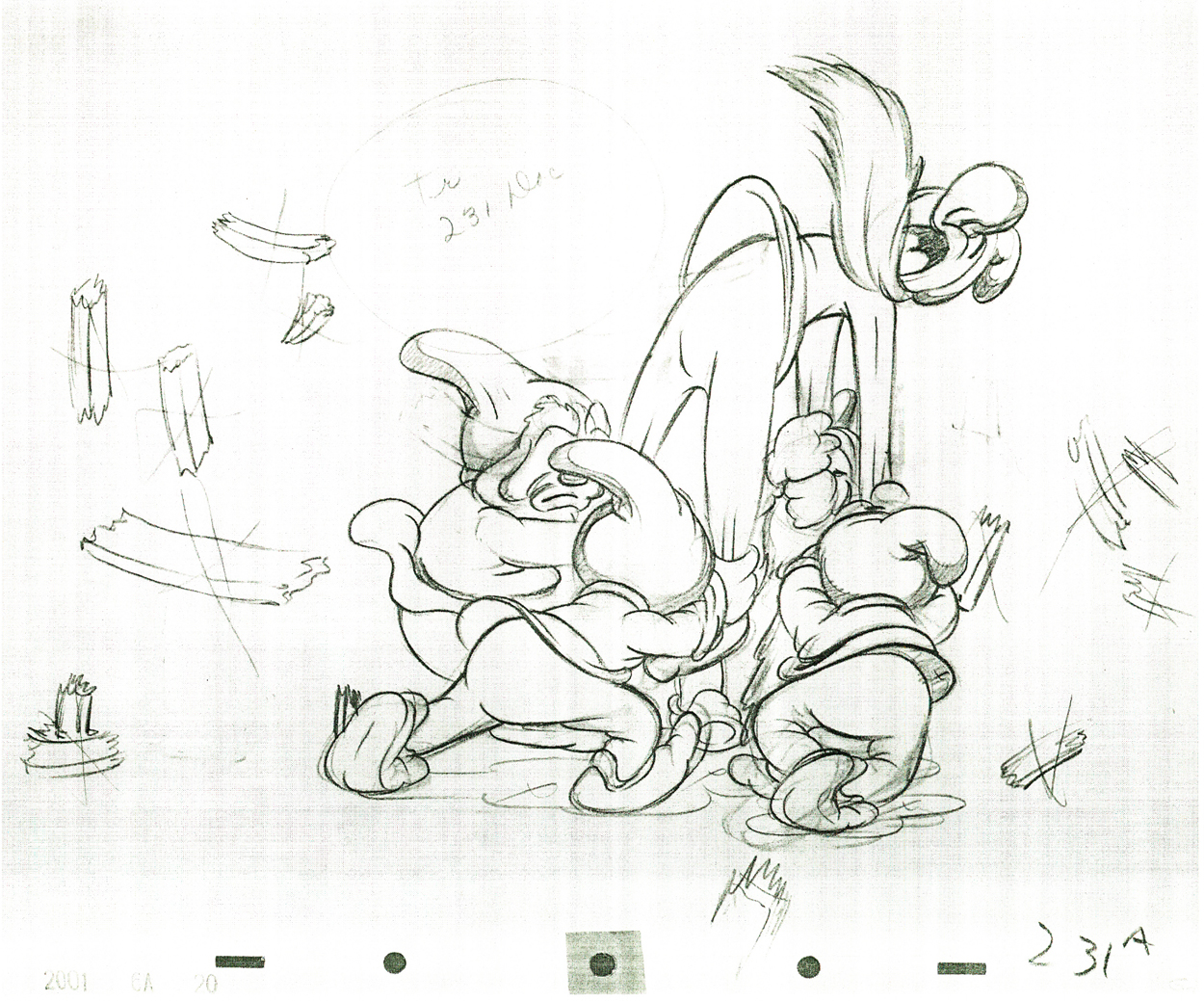
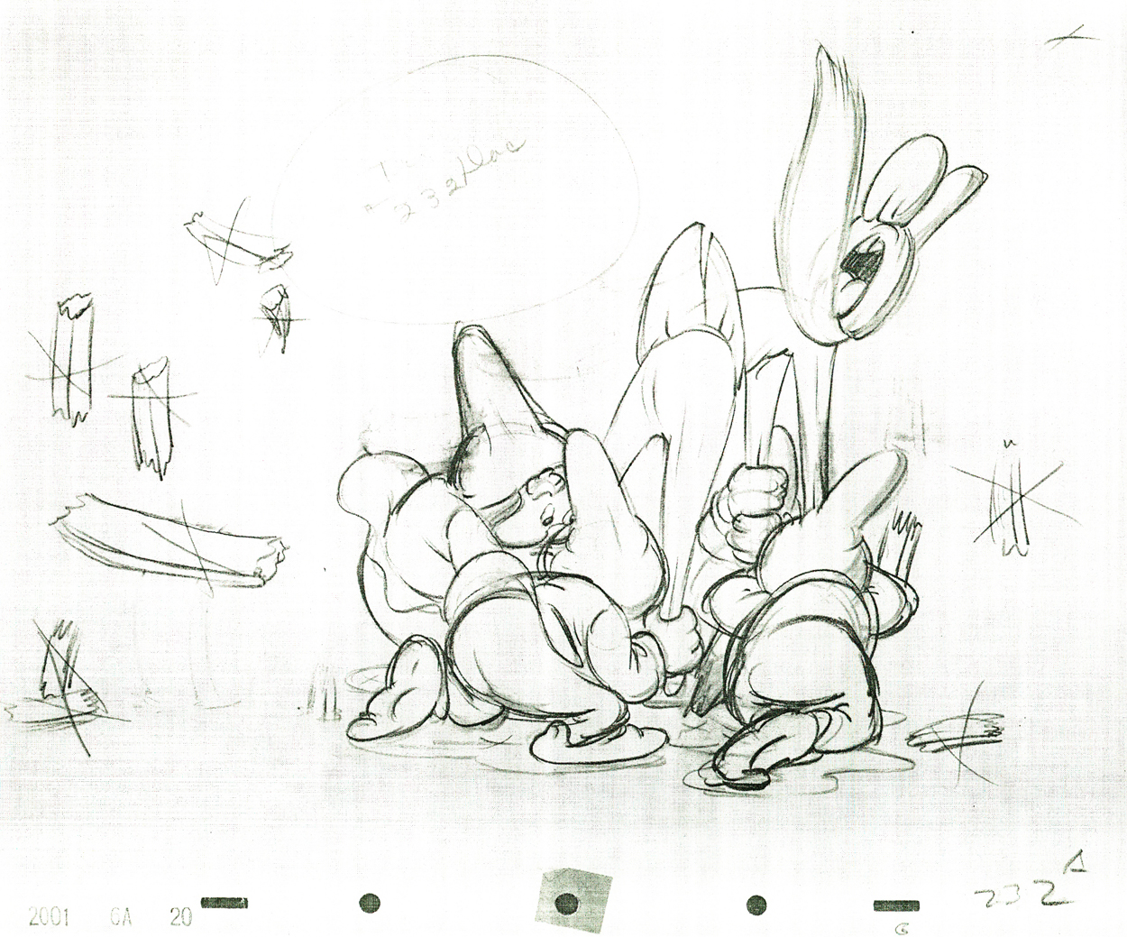
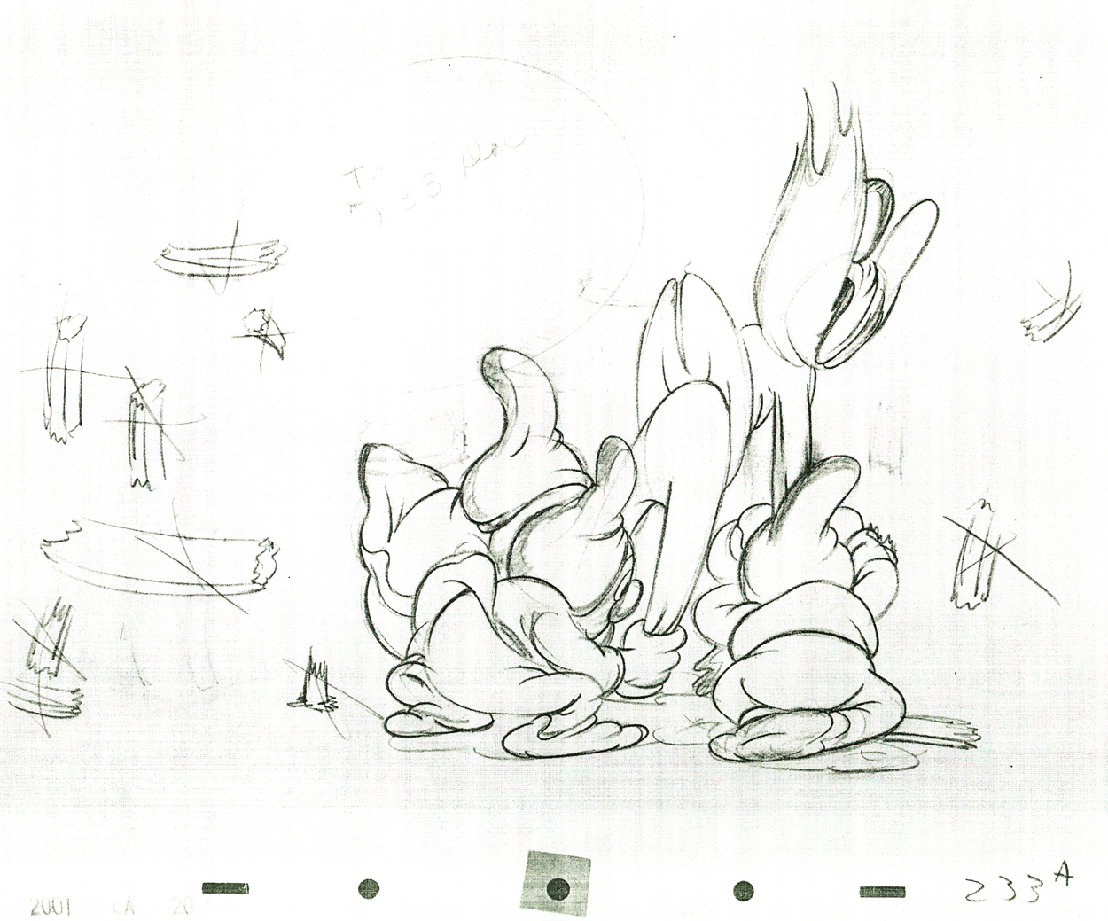
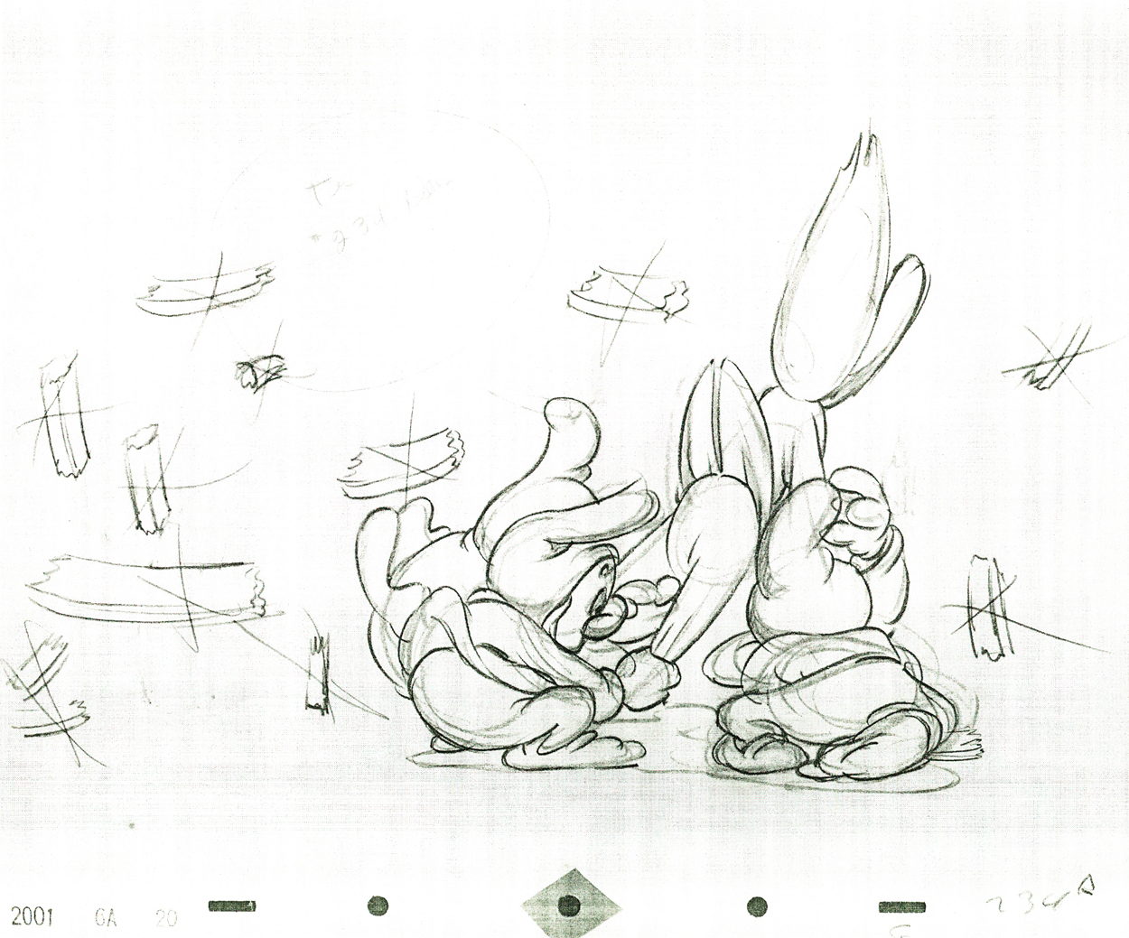
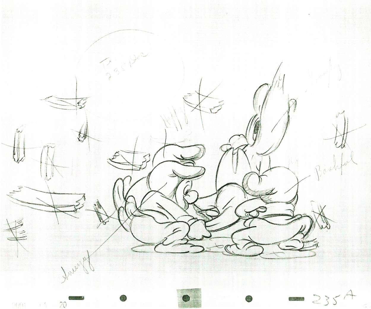
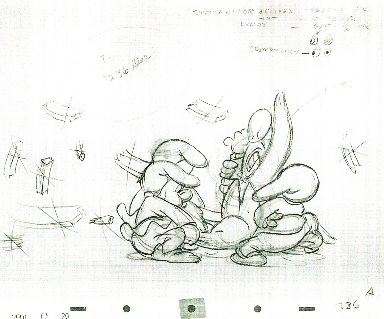
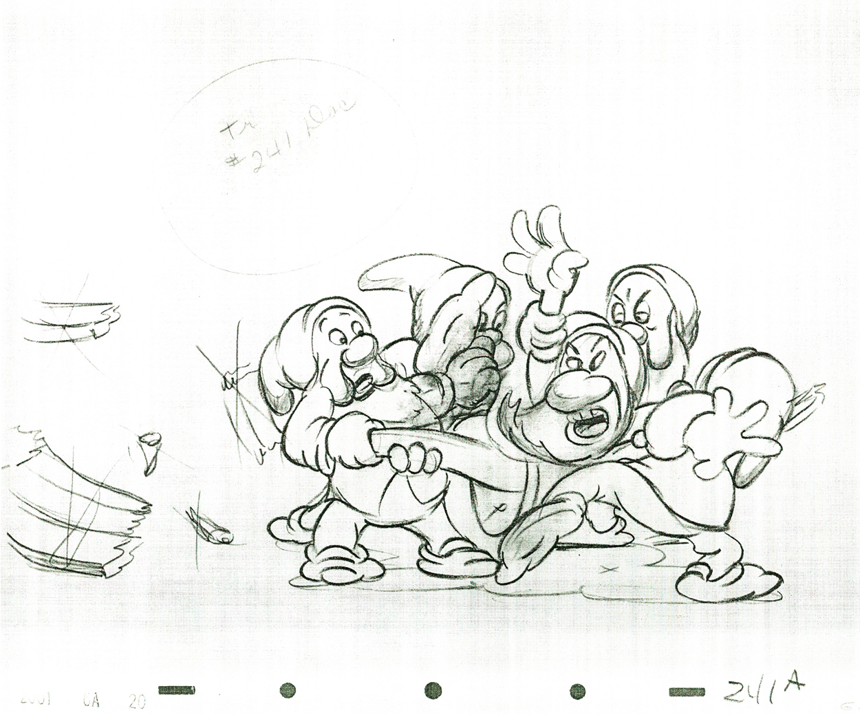
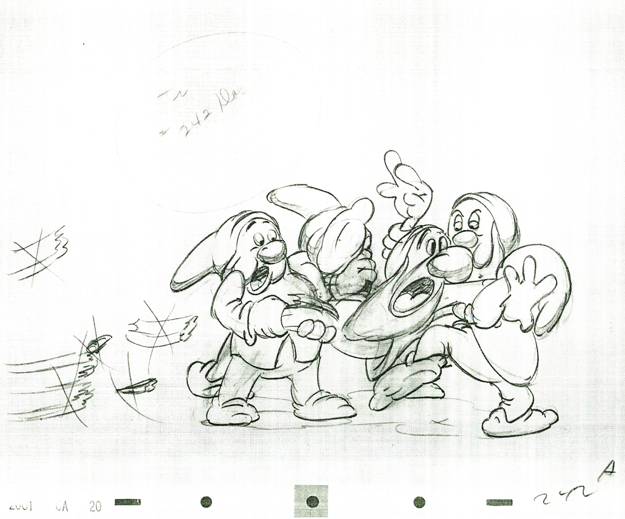
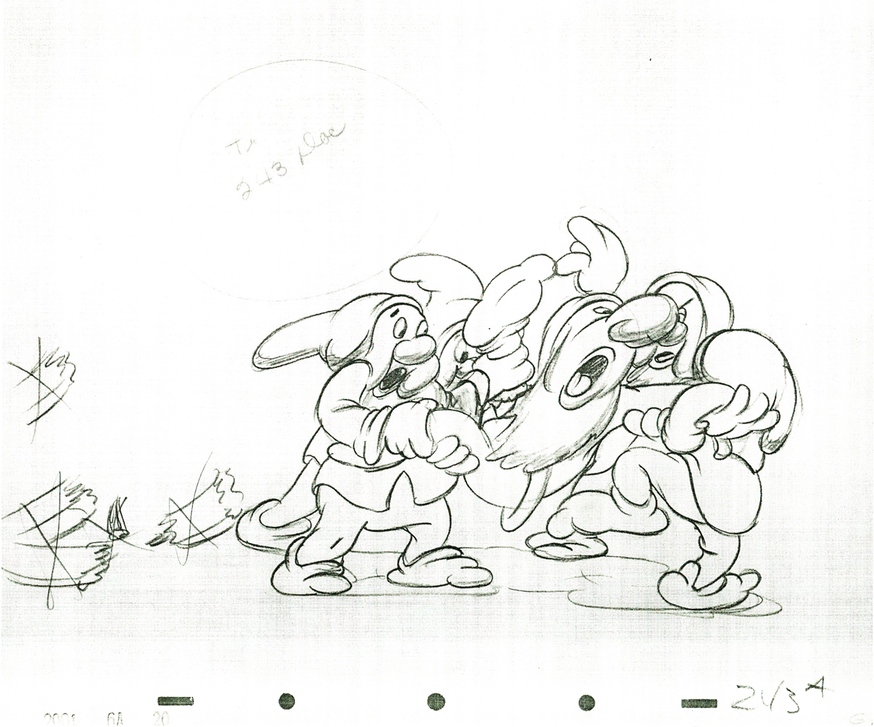
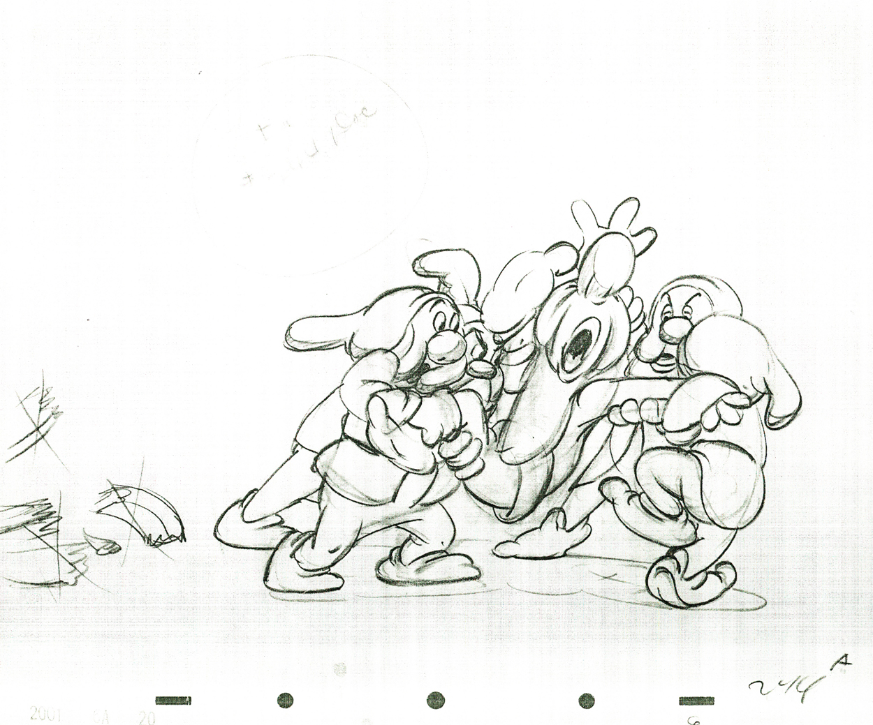
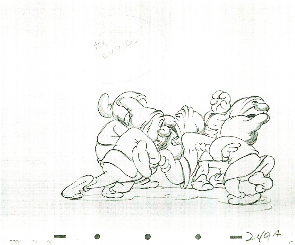
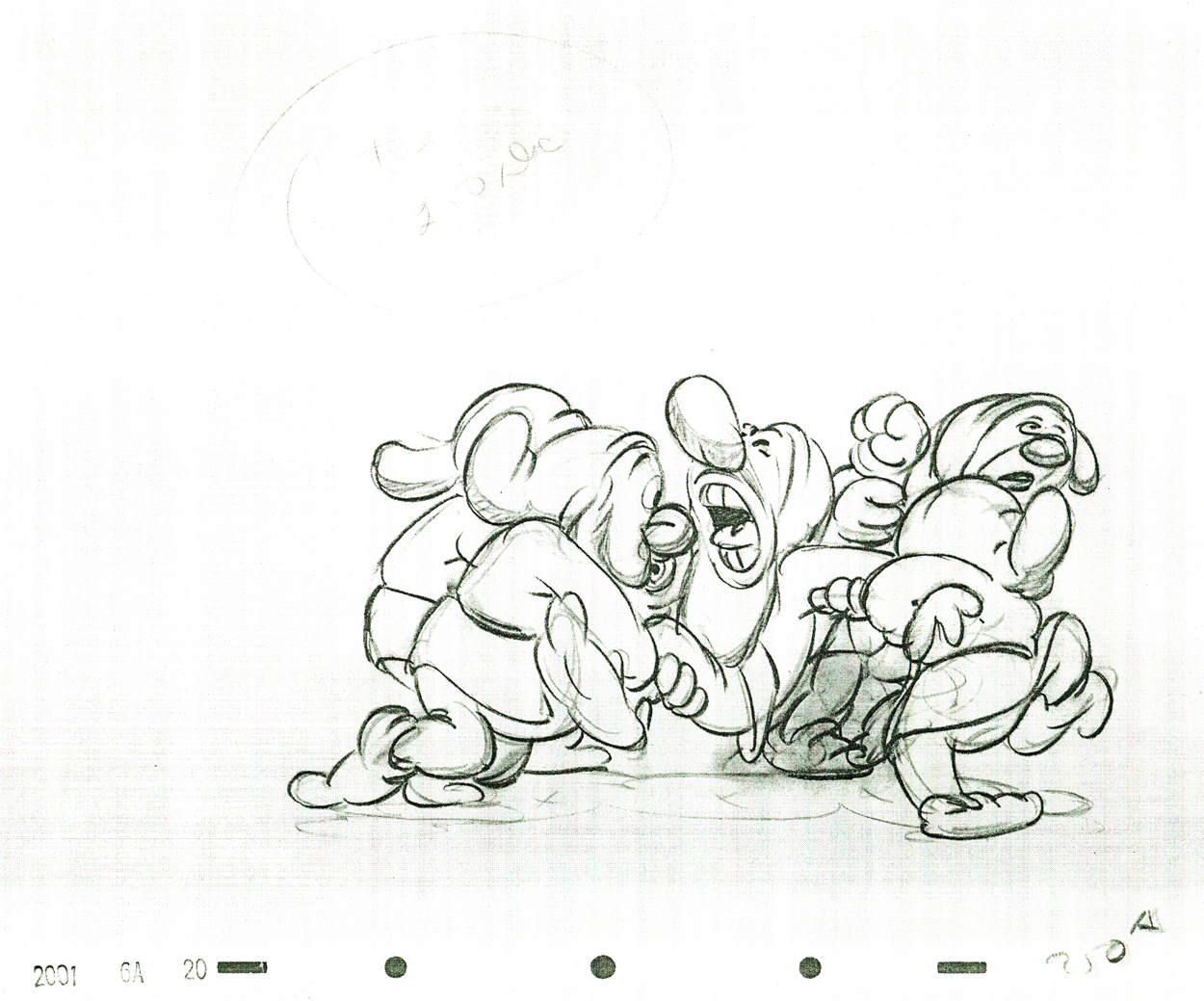
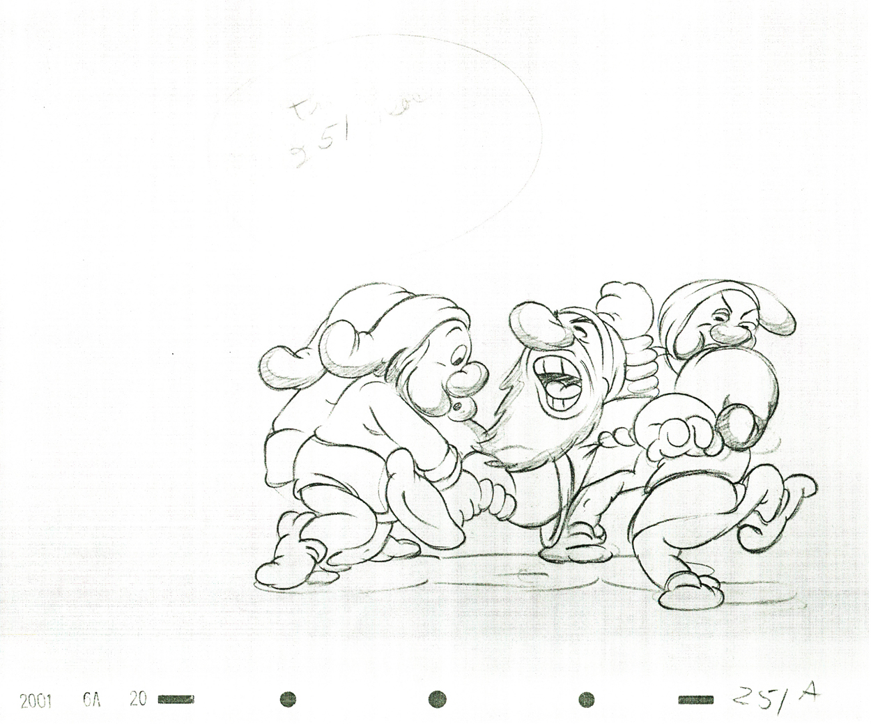
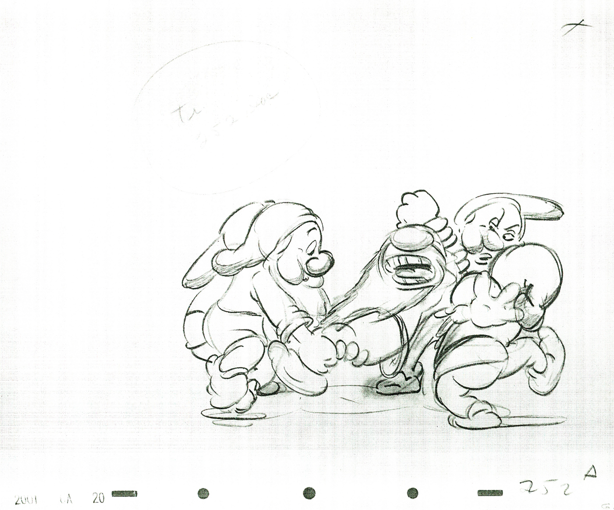
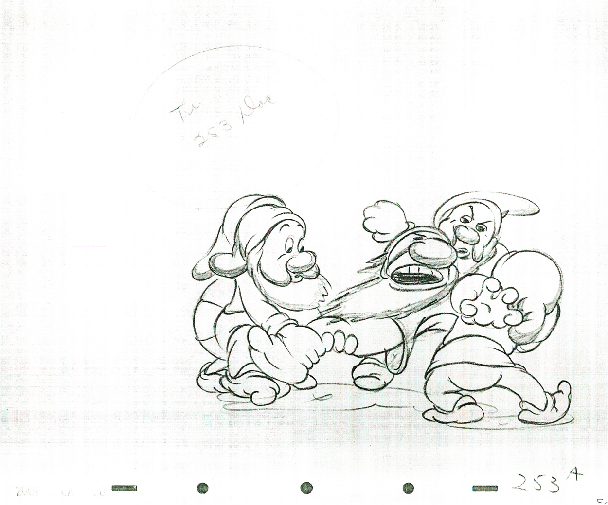
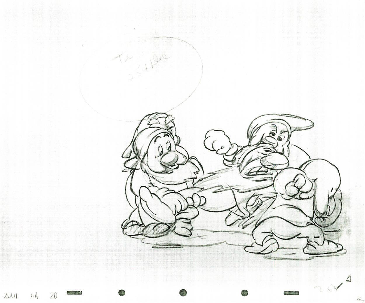
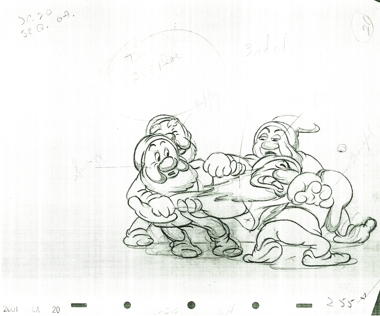
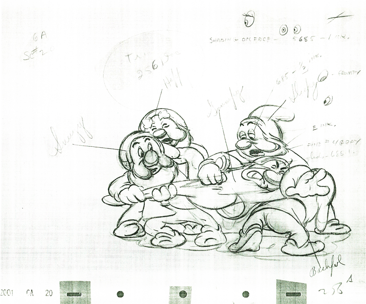
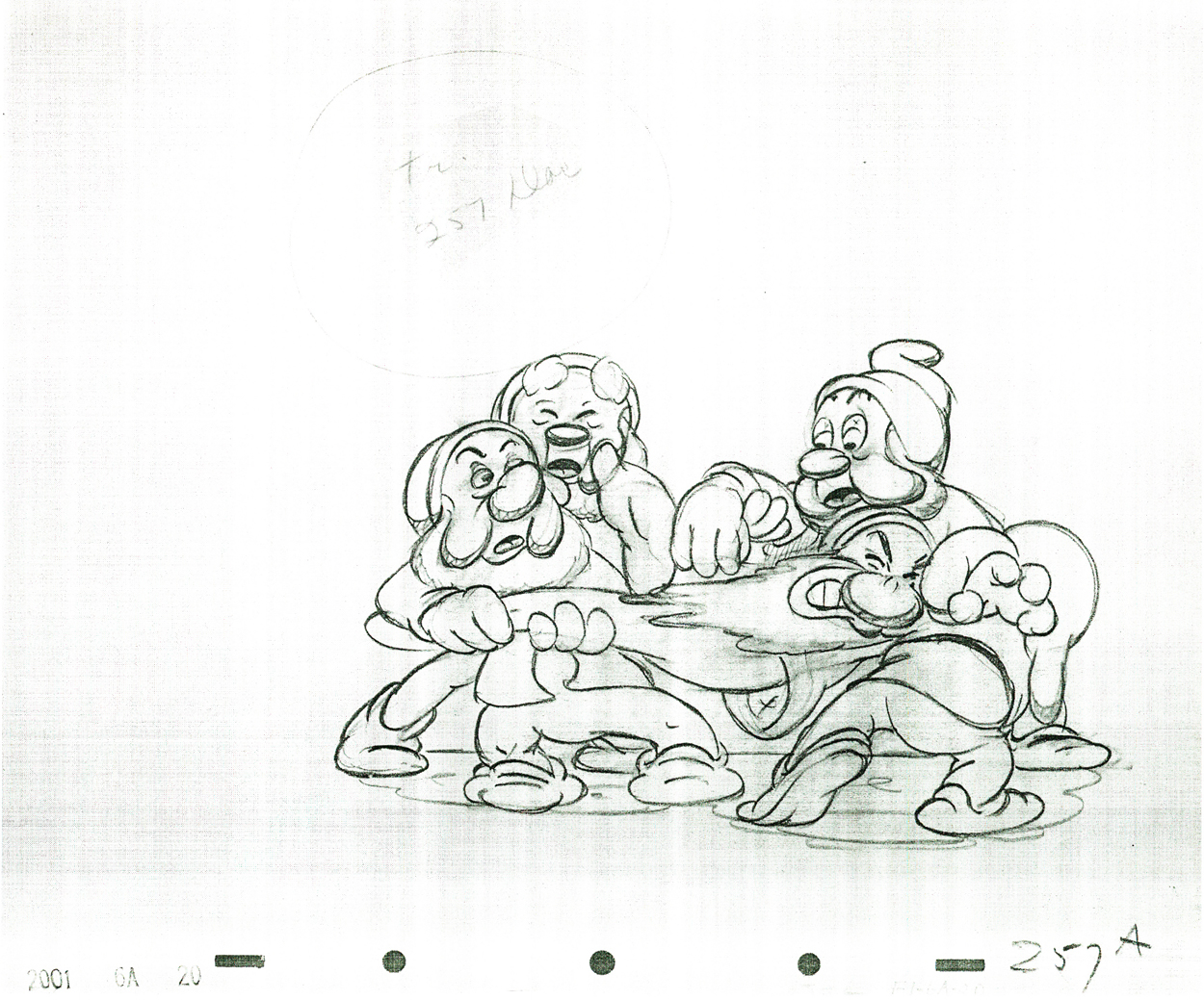
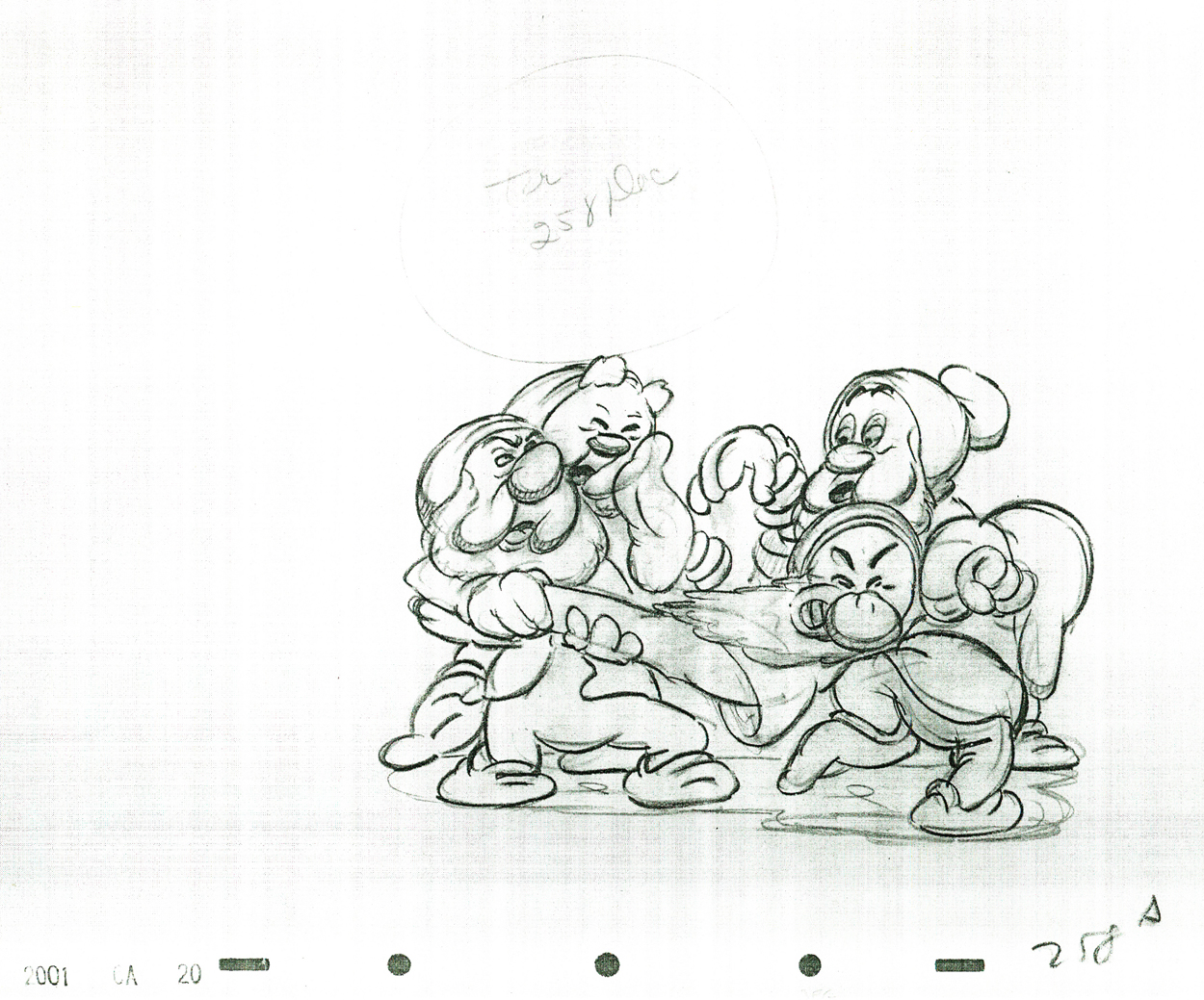
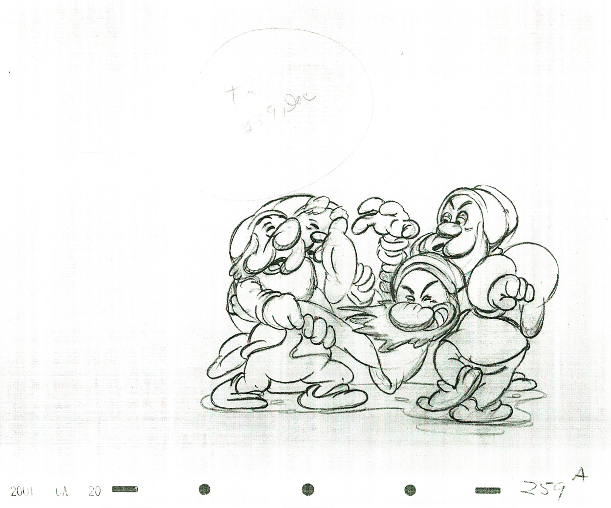
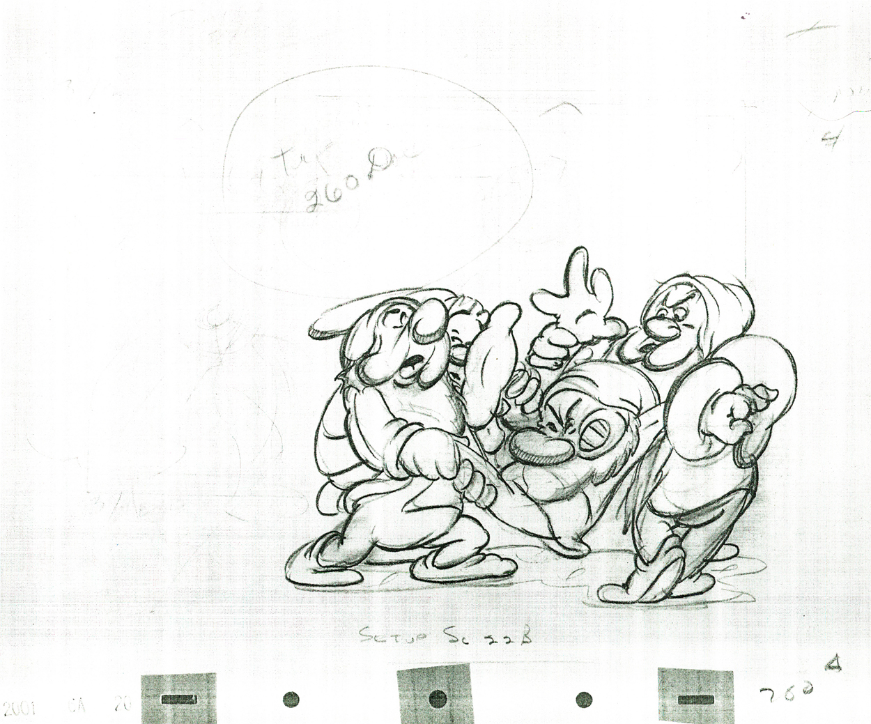
Tytla’s Dwarf Fight
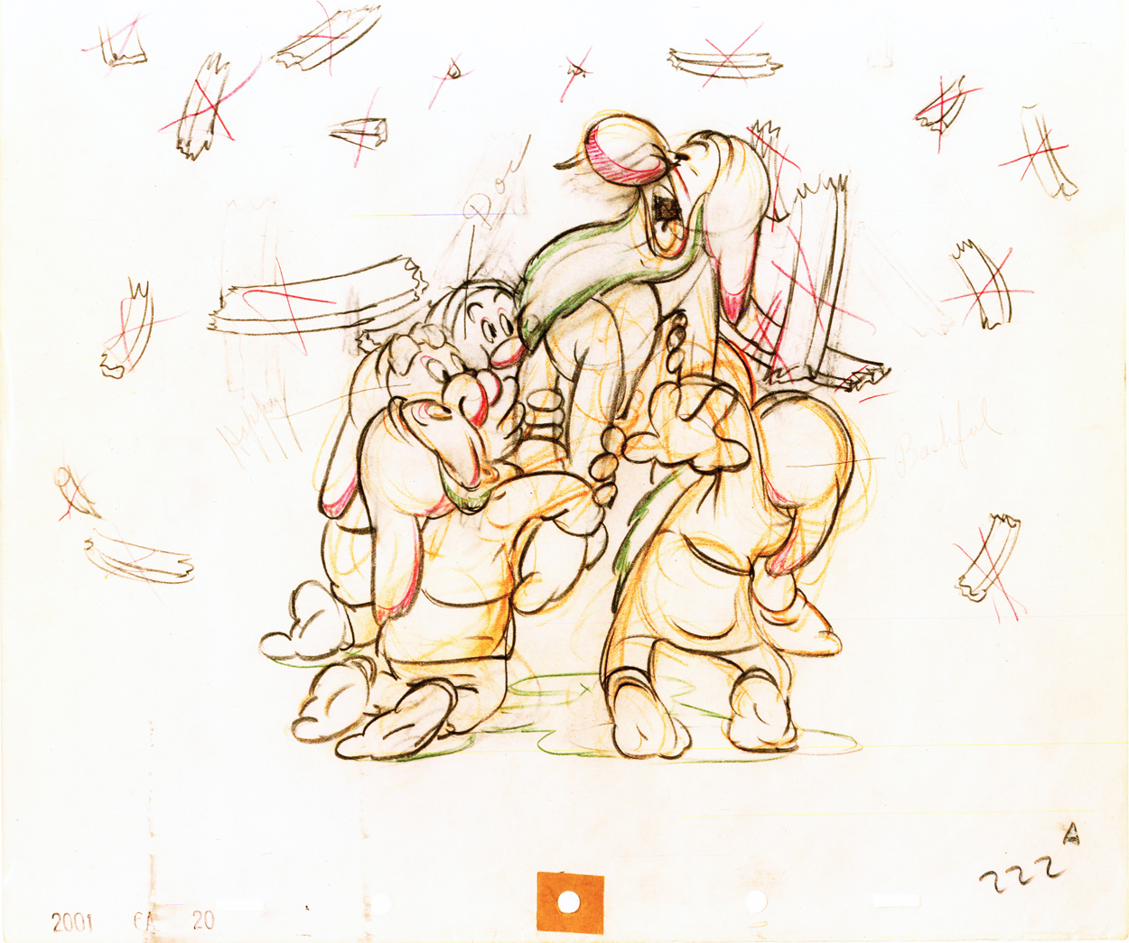
Here is a scene from Snow White, animated by Bill Tytla, in which four of the dwarfs fight Grumpy. The drawing above is the first of these drawings and it shows what it looked like in color – lots of red pencil notes, yellow pencil for rough structural lines. The rest of the drawings I have are B&W copies.
By the way, if you like this material check out Hans Perk ‘s site today. It deals with forces vs. forms in animation. This is what Tytla was all about in animating.
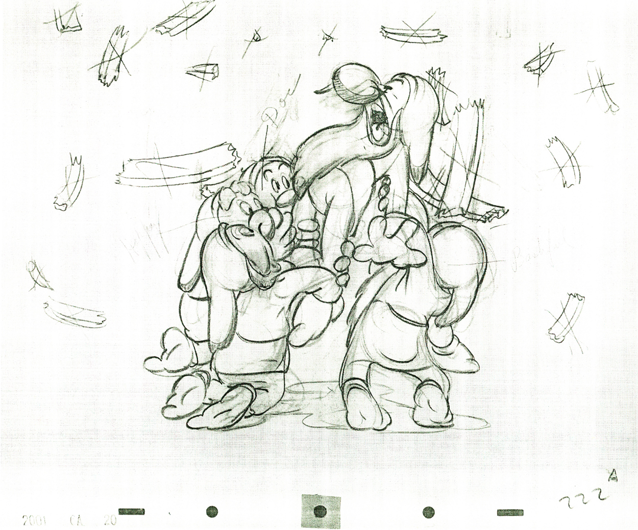 222
222(Click any image to enlarge.)
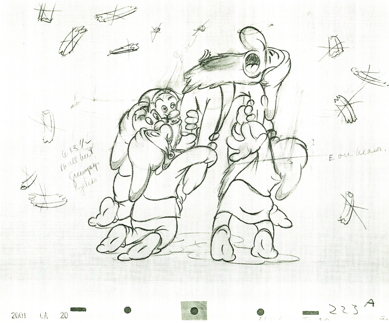 223
223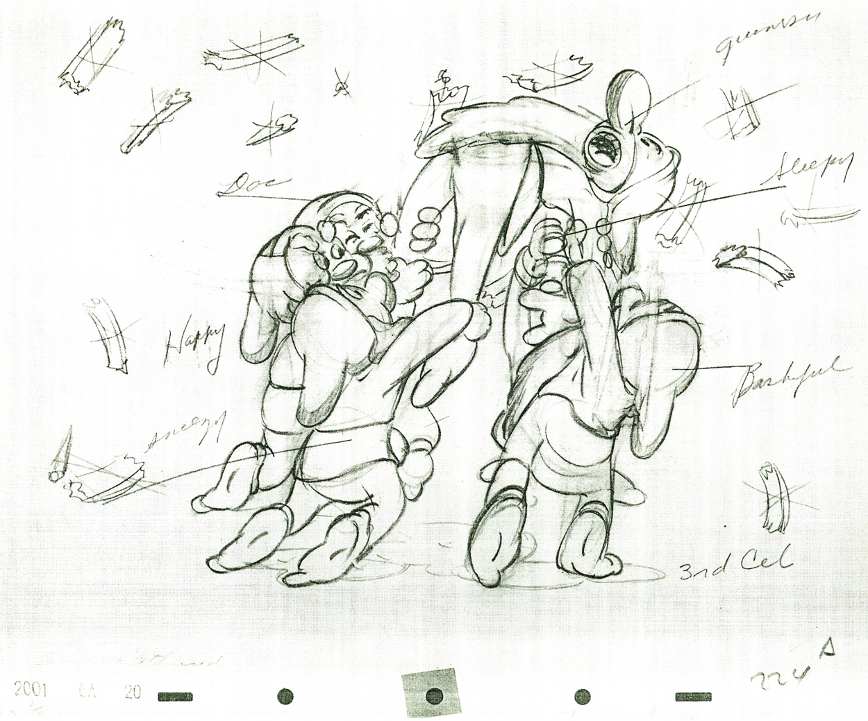 224
224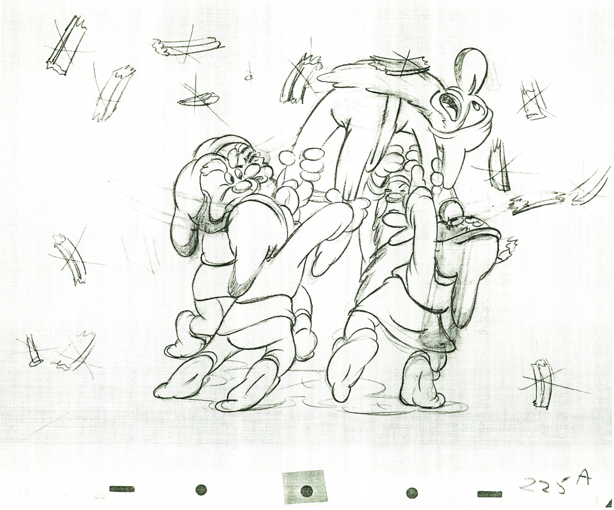 225
225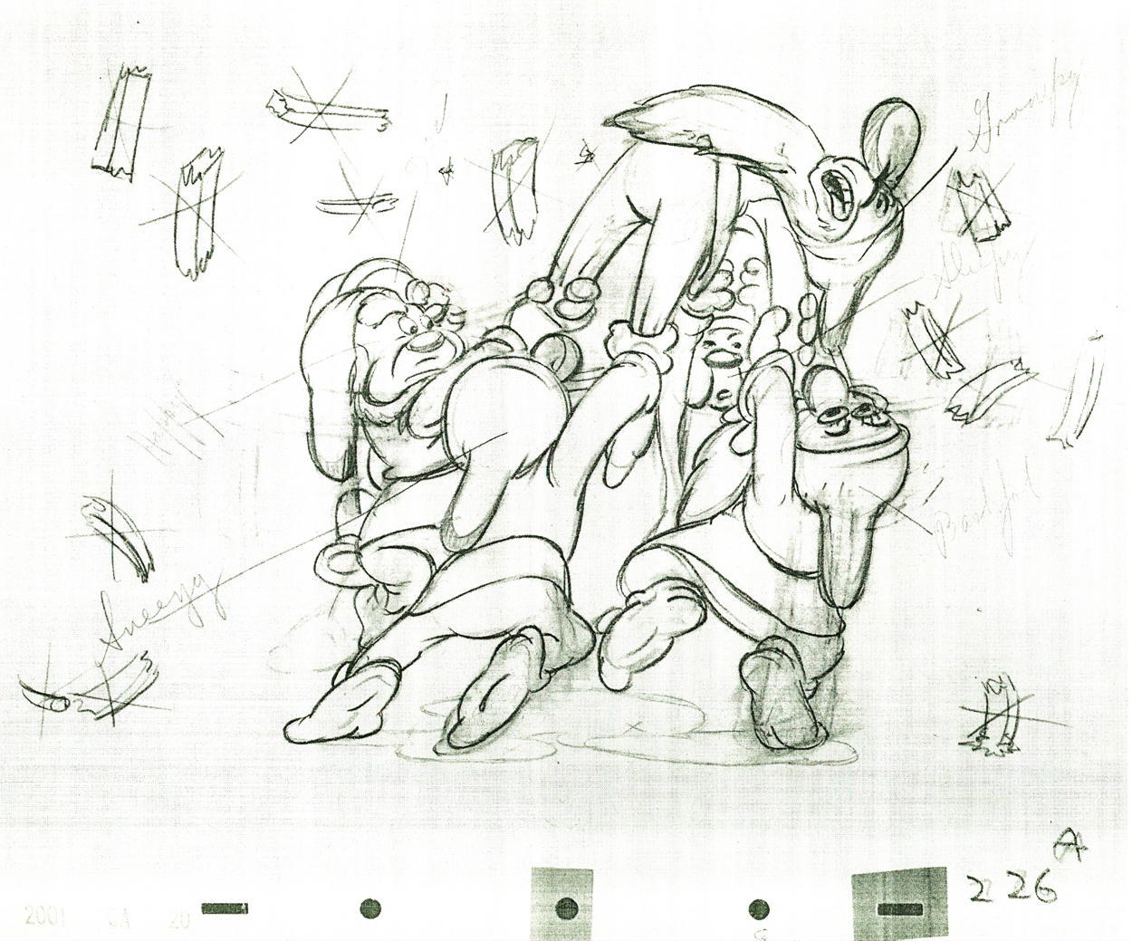 226
226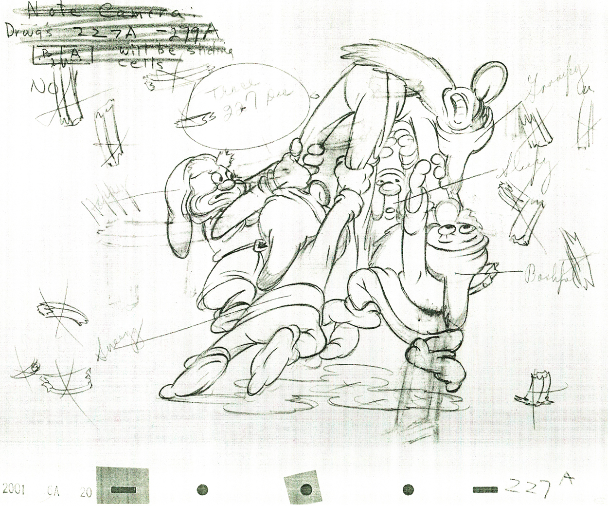 227
227Check out Happy’s face on this inbetween.
Then check out Tytla’s drawing (the next one) of Happy.
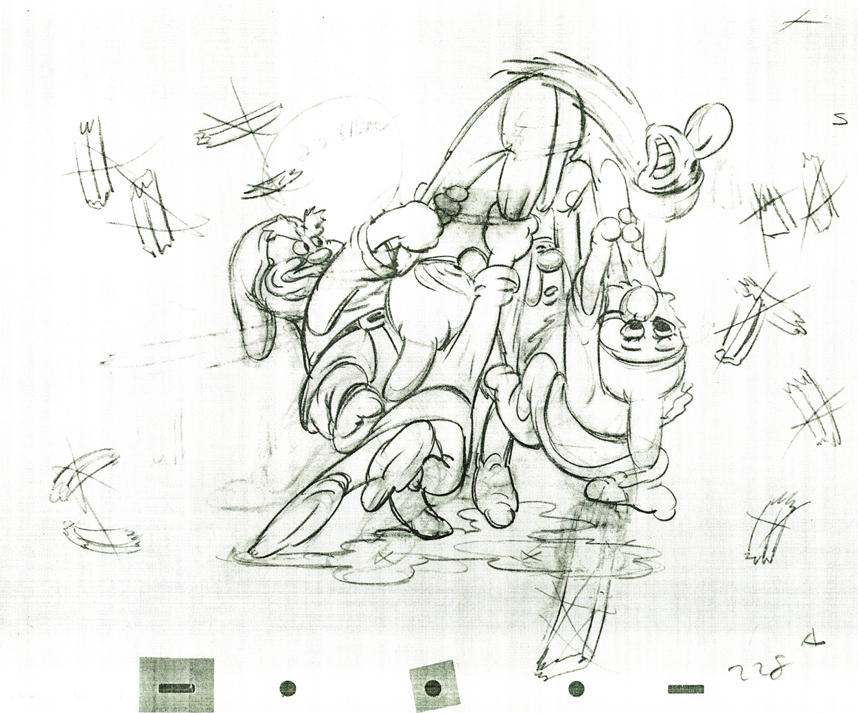 228
228
Tytla marked his own drawings with an “X” in the upper right corner.
The other drawings are the work of inbetweeners. The writing looks
to be all the work of Tytla.
 229
229
 230
230
 231
231
 232
232
 233
233
 234
234
 235
235
 236
236
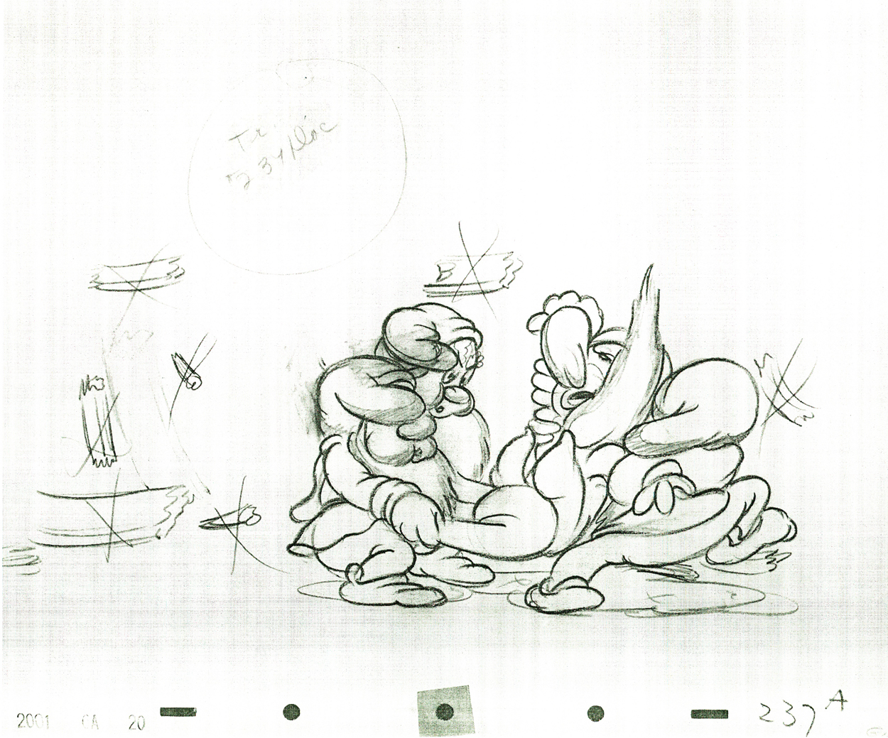 237
237
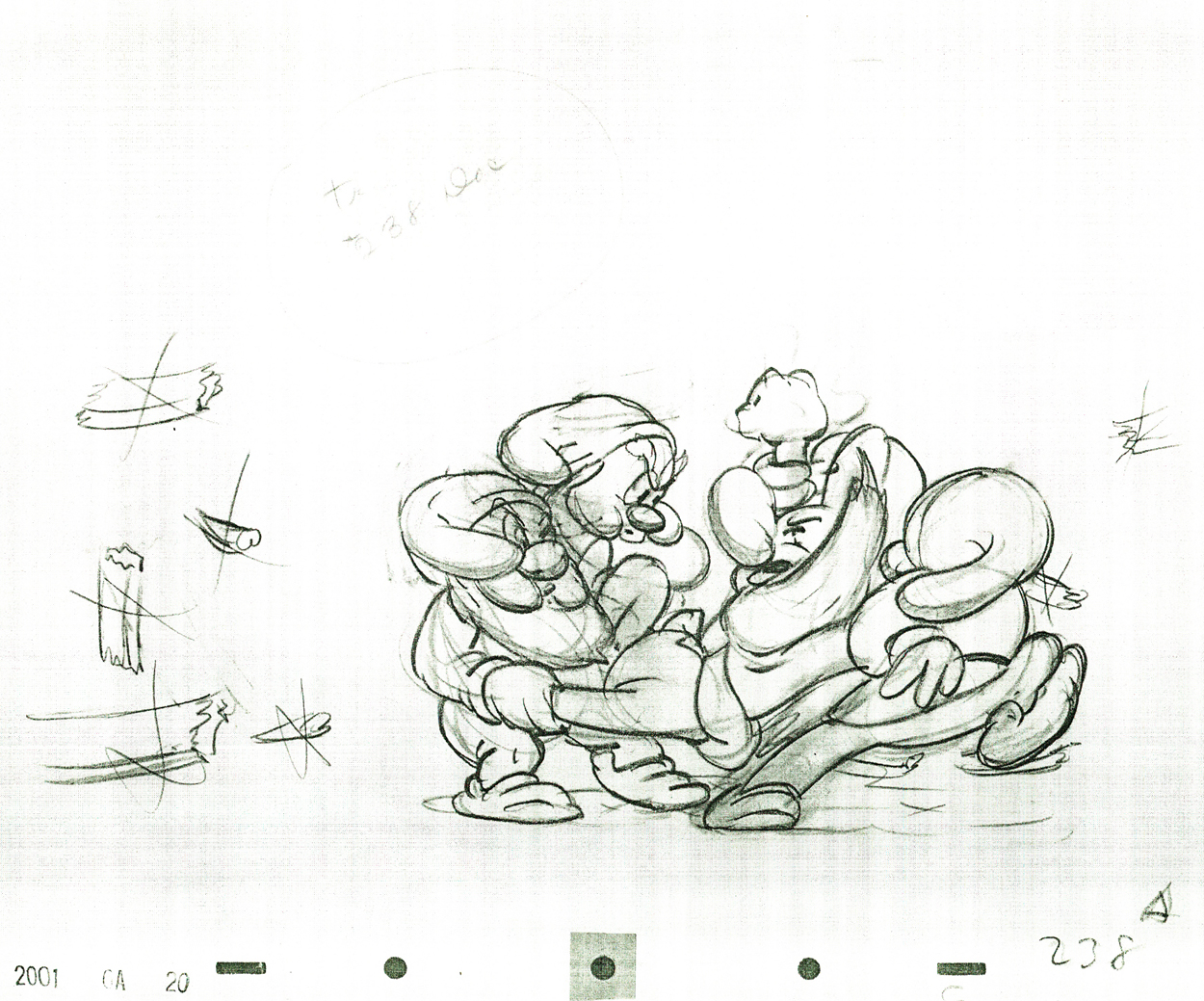 238
238
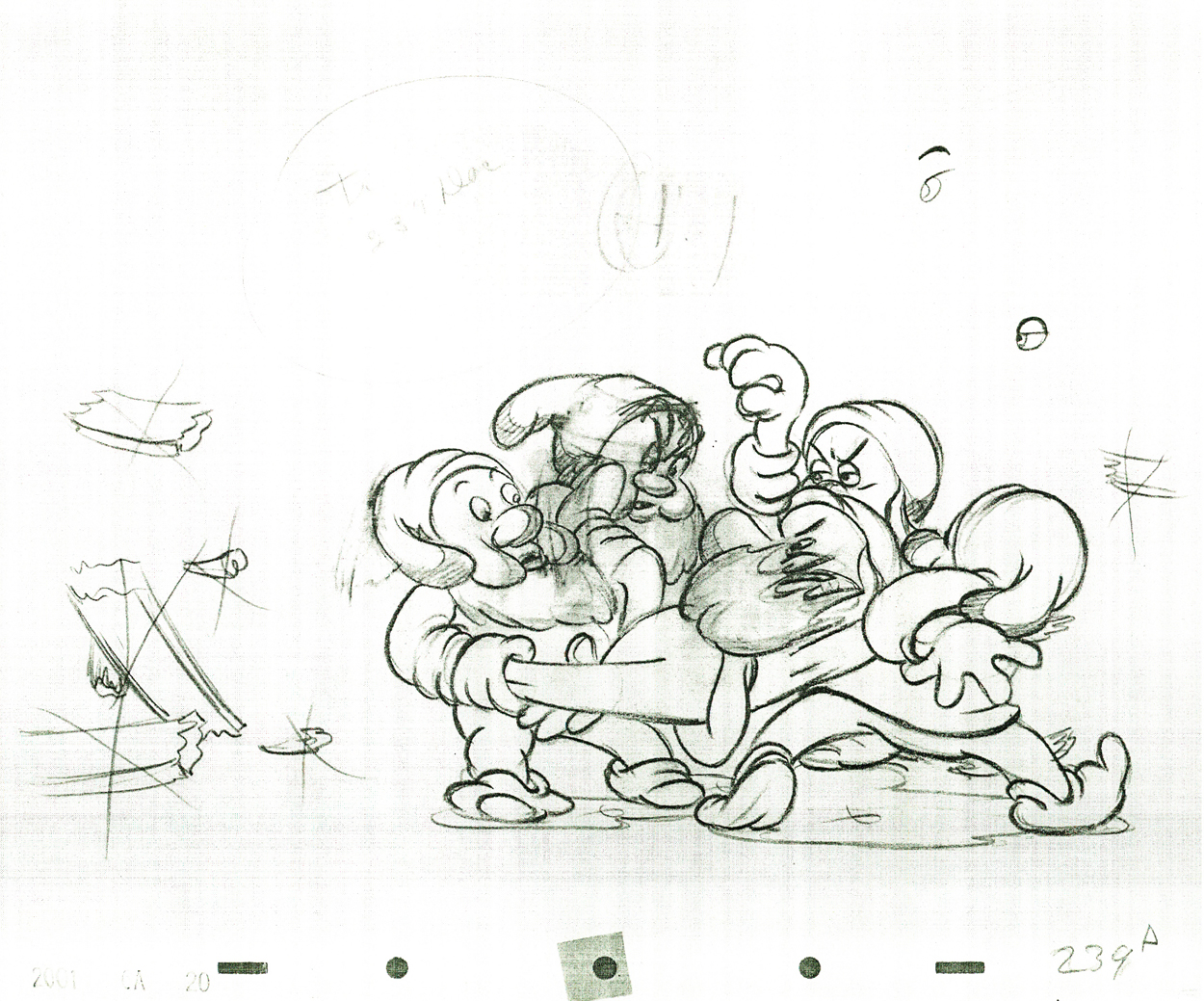 239
239
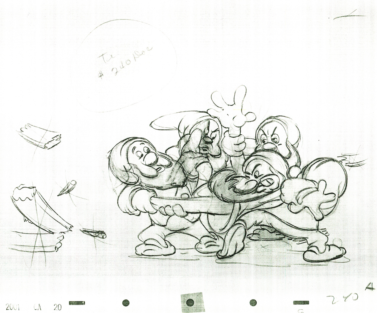 240
240
 241
241
 242
242
Some of these drawings are just hilarious in their own right.
 243
243
 244
244
 245
245
 246
246
 247
247
 248
248
 249
249
 250
250
 251
251
 252
252
 253
253
 254
254
 255
255
 256
256
 257
257
 258
258
 259
259
 260
260
Click the black bar on the left to play.
Click on the right to single frame it.
