commercial animation &Disney &Illustration &Independent Animation 25 Sep 2012 05:29 am
Eyvind Earle – recap
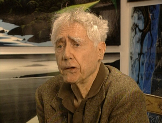 – Let’s talk a little about Eyvind Earle. This is the artist who rose to fame when he was selected by Walt Disney to set the style for the long-in-production feature, Sleeping Beauty. The animators disliked his art direction and openly protested it. Walt remained true in his stance and supported Earle to the end; though it could be said that Walt was more involved in Disneyland’s construction and gave too little attention to the in-fighting at the animation studio.
I remember Frank Thomas, specifically, stating that he had done everything possible to supercede Earle’s style after he, Thomas, had animated the Merryweather scene as she creates Aurora’s dress and cake in honor of her birthday. He felt that the black bodice that Earle had designed took all the lightness out of his character’s delicate dance.
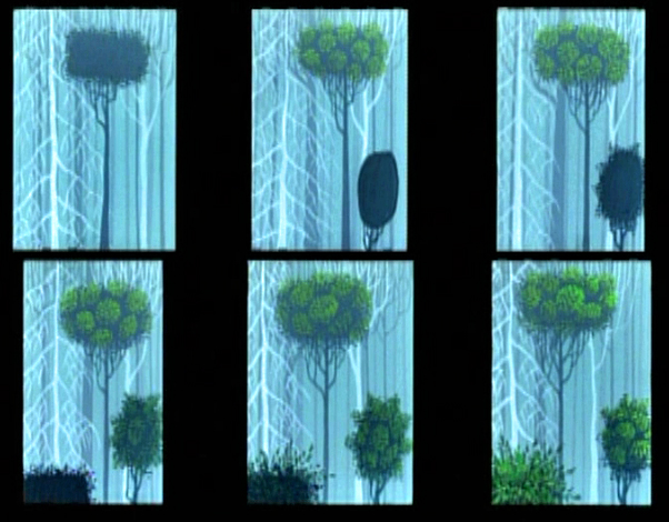
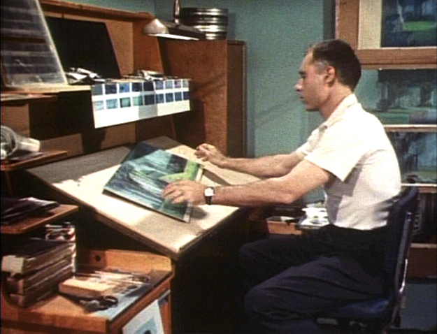
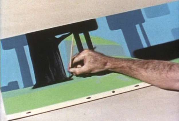
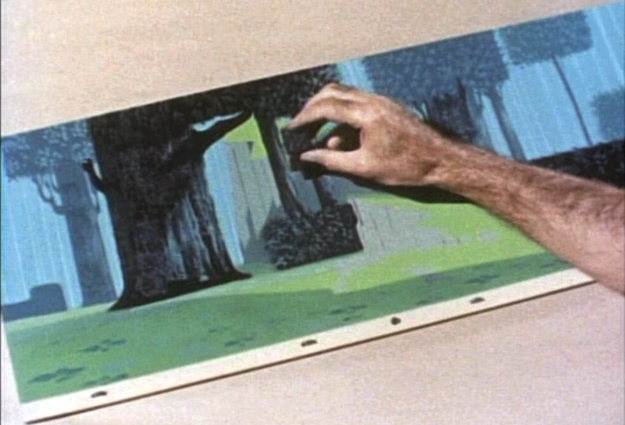
(Click on any image to enlarge.)_________________________________
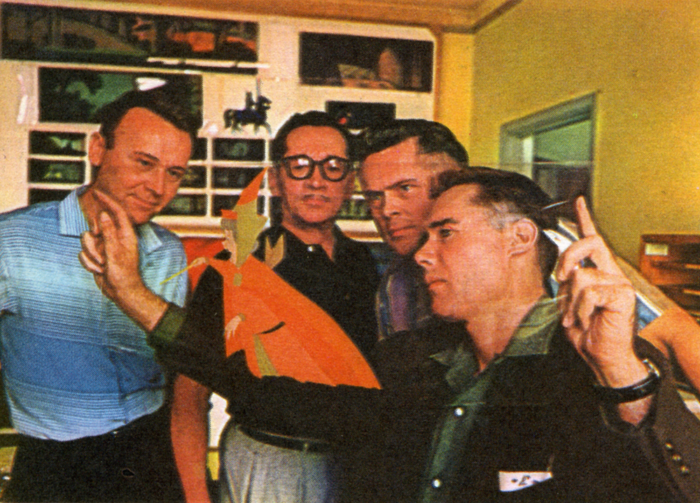
L to R: Al Dempster, Dick Anthony, Ralph Hulett and Eyvind Earle
Thomas publicly attacked Earle at the Lincoln Center celebration of Disney animation back in 1973. I’d already read something similar, and heard it privately. None of the others on stage at Lincoln Center – Woolie Reitherman, Ken Anderson or Ollie Johnston – countered in support of Earle.
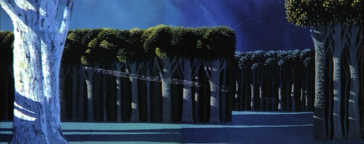
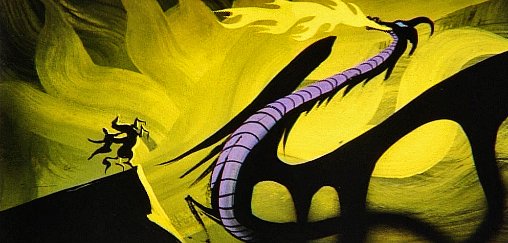
 Sleeping Beauty was such a drastic change in look from the other Disney features, that I think it took deep hold in the minds of a lot of Baby Boomers growing up around this feature. Earle became a strong target of interest, and I think his reputation has grown annually.
I have to admit it was odd seeing the backgrounds of Pocohontas trying to emulate Earle’s Sleeping Beauty style, but in some ways it seemed fitting. The studio had been ripping off the films of the past for so long that it was only appropriate that they’d focus on someone who was such a dynamic force.
For a short period after he was released by Disney, in the post-Sleeping Beauty layoffs, he worked with John Sutherland Productions where he designed the short, Rhapsody of Steel. Then he formed his own studio, Eyvind Earle Productions, Inc. He did an animated trailer for the film, West Side Story, under the supervision of Saul Bass. He did an animated title for the Kraft Suspense Theater, and he did a Christmas Special for Tennessee Ernie Ford.
Ultimately, Earle made a success of his own art after leaving animation. He’s been represented by a number of very large galleries and has sold a lot of popular art in a style all his own. Here are a couple of examples found on line:
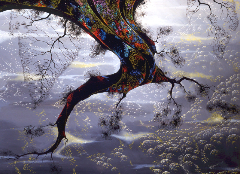

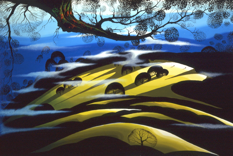
I’m not always a big fan of the color schemes in his graphics, though he always makes them work, but I have to give credit to Earle for his originality and the dynamic approach in his art.
His autobiography, Horizon Bound on a Bicycle, is a must for all real fans.
This is his animation resume:
- 1951 Started with the Walt Disney Studios as background painter on: FOR WHOM THE
__ BULLS TOIL, MELODY, and the Academy Award winner for “Best Short of the Year”
__TOOT, WHISTLE, PLUNK and BOOM which also received a Cannes Film Festival Award.
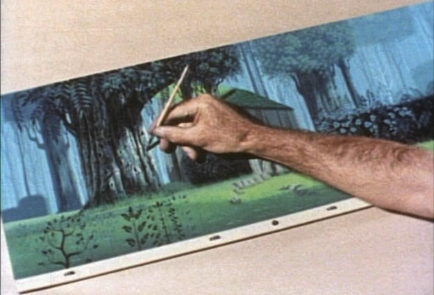
__Production Designer, Color Stylist and Background Painter for the DIsney animated __classic SLEEPING BEAUTY, as well as, PIGS IS PIGS, GRAND CANYONSCOPE,
__PAUL BUNYAN, LADY AND THE TRAMP, LONDON BRIDGE, and WORKING FOR PEANUTS.
__He designed 5 murals for Disneyland.
1958 Joined John Sutherland Motion Picture Company in Los Angeles.
1960-1966 Created 24 sheet poster for Hamm’s Beer.
__Started motion picture animation company, Eyvind Earle Productions, Inc.
__Created animated commercials for Chevrolet Motors, Chrysler Corporation, Marlboro
__igarettes, Motorola Television and the Kellogg Cereal Company.
__Created animated trailer for WEST SIDE STORY for United Artists.
1961 Created animated television special THE STORY OF CHRISTMAS starring
__Tennessee Ernie Ford and the Roger Wagner Choral.
1962 Created animated television special THE EASTER SPECIAL.
__Created title for the KRAFT SUSPENSE THEATER.
__Created the logo trademark trailer for Universal Pictures.
__Produced and created the theatrical short DEATH AND SUNRISE
You’ll find a lot of merchandise including all the books listed here, on the Eyvind Earle website.

on 25 Sep 2012 at 9:15 am 1.Luke said …
“The animators disliked his art direction and openly protested it”
No. They disliked HIM and his autocratic approach, which affected the film in both positive and negative ways. In an animated feature, strict/unbening adherence to “theory” over emotional communication is not a “win.” Earle’s rejection of the collaborative nature of film making obviously hampered the film. Anyone who claims “but it’s so beautiful” is missing the point. Rarely, if ever, does anyone say “I LOVE that film–it makes me FEEL something….” No one can blame the “art direction” for a weak story and direction, but Earle’s arrogance and ego was clearly a case of taking advantage of a slack situation–one that did nothing to endear him to the rest of the studio or further his stature in the industry.
Left to his own devices, Earl demonstrated a lack of ability to connect emotionally with audiences in the medium of film, clearly demonstrating that without strong guidance and direction, his future in film was very limited.
on 25 Sep 2012 at 9:24 am 2.Thad said …
If the animators had been willing to let Tom Oreb’s character designs do the crucial lifting, maybe Eyvind Earle’s cold faux Renaissance settings would have worked. Unfortunately, there is so much wrong with SLEEPING BEAUTY outside of the battle between clichéd character animation and pretentious design that you’d still have to overhaul the entire picture. I have problems with most of the Disney features, but nothing about this film works on any level.
on 26 Sep 2012 at 1:01 am 3.Scott said …
Character designs, and design in general, can’t do crucial lifting when telling a story. If by “crucial,” you mean heavy lifting (and I’m not sure that’s what you meant!). The “art” of a film is not the most important thing in a feature.. The characters and storytelling are. If the designs aren’t single mindedly in service of the audiences ability to connect with the emotions of the characters, it’s failed–no matter how pretty on the surface it is.
Evyind Earl some nice work here and there, but most of his work is sterile and more about him than the story.
on 26 Sep 2012 at 5:13 am 4.Michael said …
I don’t completely agree with you, Scott. In fact, I feel that Earle’s designs for this film are a play on 14th century French medieval art, and as such find his strong designs appropriate to this film.
I don’t find his designs any more “about him than the story” than I would feel about John McGrew’s work for Jones or Maurice Noble’s work for Jones or Tyer’s animation for anyone. We differ in opinion about strong design’s effect on animation. Your comments, if followed, would have kept us saddled to the 19th century style of illustration and would negate all 20th century art. In my eyes, you’re wrong.
I suspect the same answer applies to Luke,as well. Earle cannot be blamed for the film’s script. He was assigned to design the film in a specific style, and he did. It’s amazing how often his style is stolen for today’s style-less films regardless of whether you liked it or not.
on 26 Sep 2012 at 11:54 am 5.Ana said …
Sleeping Beauty was so visually stimulating for me. I experienced it as a child (as most of us did), and because of the stark difference from the animated Disney films before it, I paid more attention to the artistic aspects than I did in all films preceding it. I’m glad I had that experience.
Also, “Pigs is Pigs” was legit.
on 26 Sep 2012 at 11:05 pm 6.Scott said …
I hear what you’re saying Michael–but therein lies part of the problem. Just because he’s riffing on medieval, Japanese, and modern graphic interests doesn’t mean it’s appropriate for the film. At least not in the ridged, unbending fashion Earle insisted upon. Having the visual idea for the film he had is fine, but not adapting it to the needs of the AUDIENCE was where he repeatedly faltered, and where the animators (in this case) were mostly correct. His unwillingness to accept that the audience’s emotional attachment to the characters (hampered by his unwillingness to listen to the very experienced animators) was more important than his “style” made it more about himself than the film. Even his friends said he had a MASSIVE ego, and it’s on full display here.
No, he’s not responsible for the weak story. But that’s when the great film art directors REALLY go to work. Earle just did what he wanted to do.
on 29 Sep 2012 at 3:06 am 7.DB said …
Even though I’m coming in late on this, I can’t resist chiming in because Sleeping Beauty is typically lauded in the general community – so its heartening to see some here are not so crazy about it.
For various reasons, this is one of the Disney ‘classics’ I missed seeing in its entirety for years. I had seen scenes and stills and thought it looked beautiful – but finally I rented a DVD and man I was SHOCKED by how kitschy the look of the film was for me. The design was a weird combination of what is usually kind of streamlined 50′s ‘hip’ (a la UPA) but buried under mountains of unbearably fussy detail. A lot of unusually bad (for Disney) color design as well.
I will say the design and animation of Aurora and the Prince are top o’ the line, but the script is lousy and the whole thing is IMO kind of a train wreck.
Disney came out with some of its worst films in the 50′s, Cinderella, Peter Pan and Sleeping Beauty. Thank god for Lady and the Tramp, which I think was Walt Disney’s masterpiece.