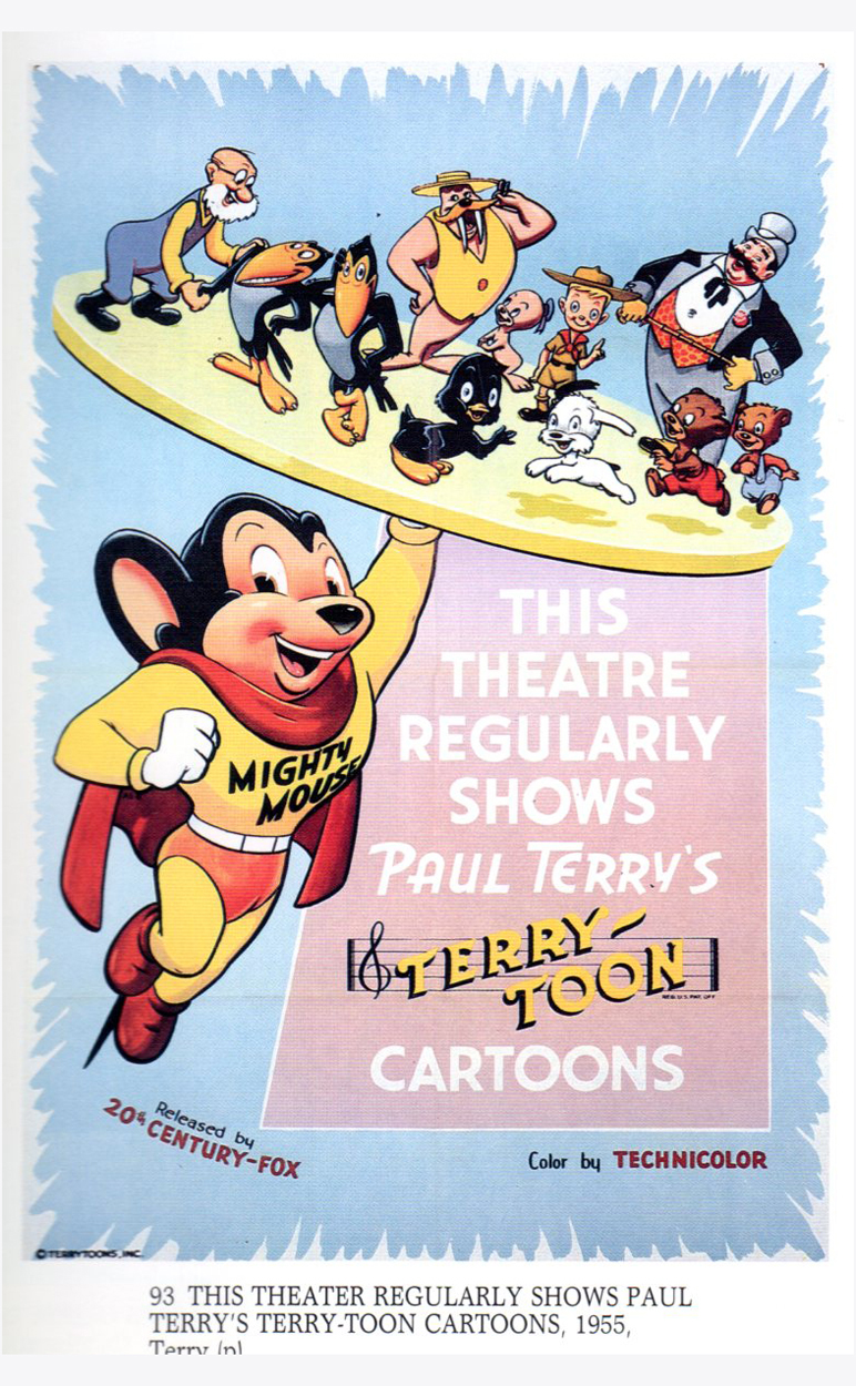
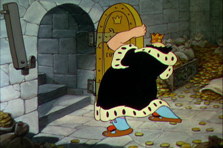
Commentary 06 Apr 2013 04:25 am
Brewsing
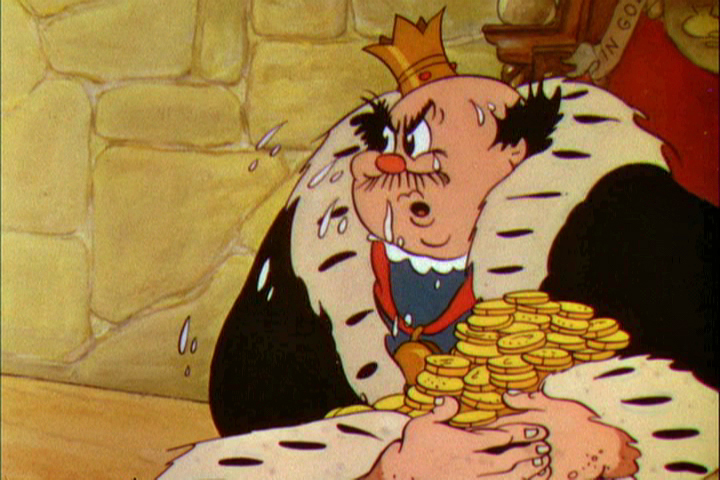
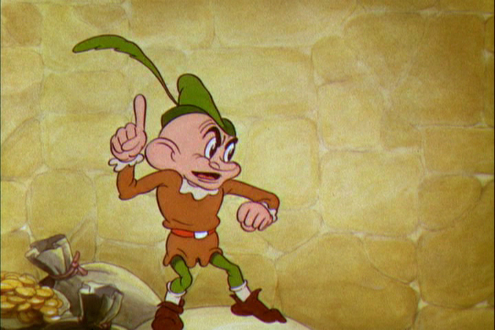
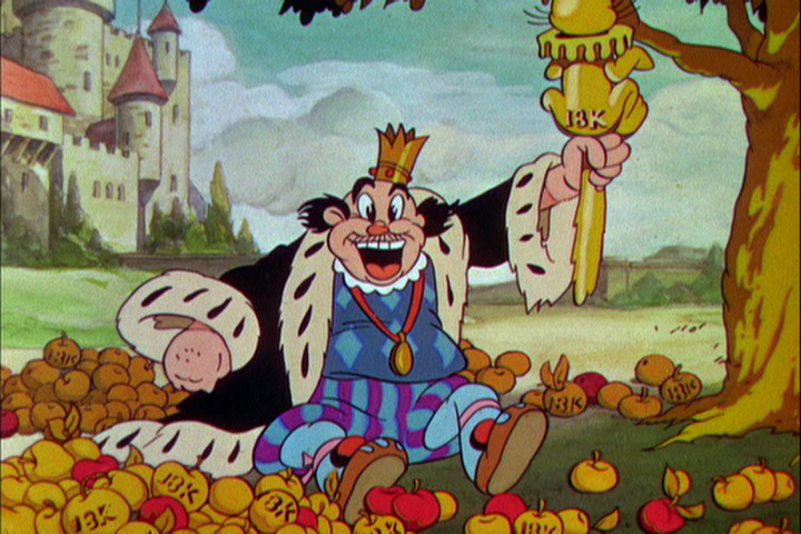
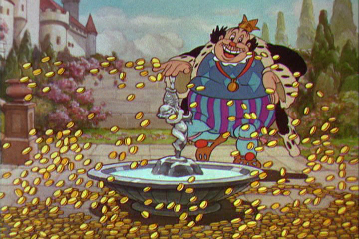
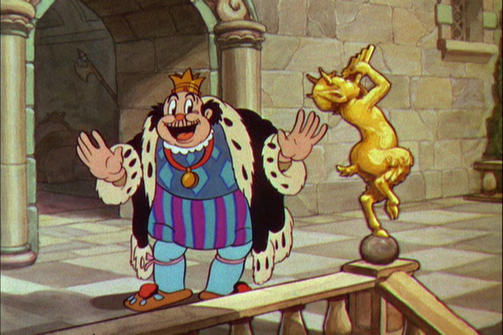
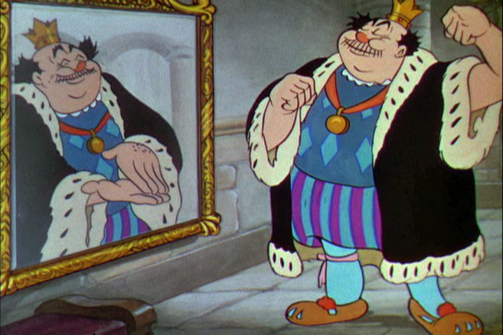
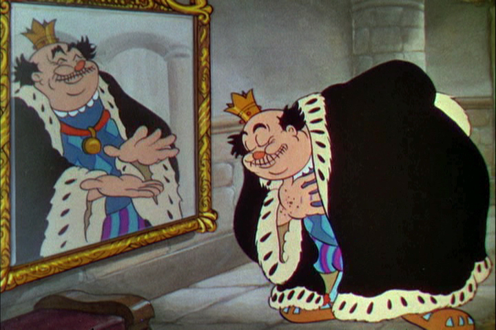
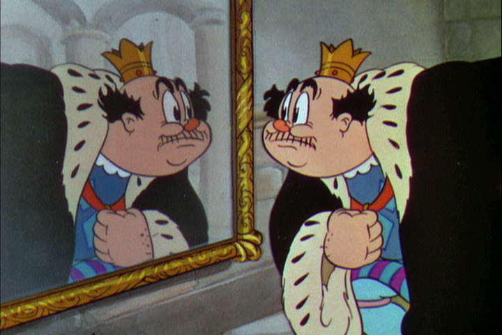
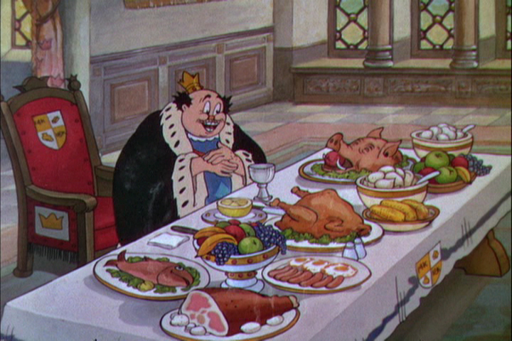
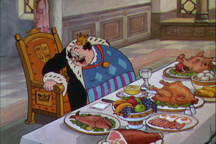
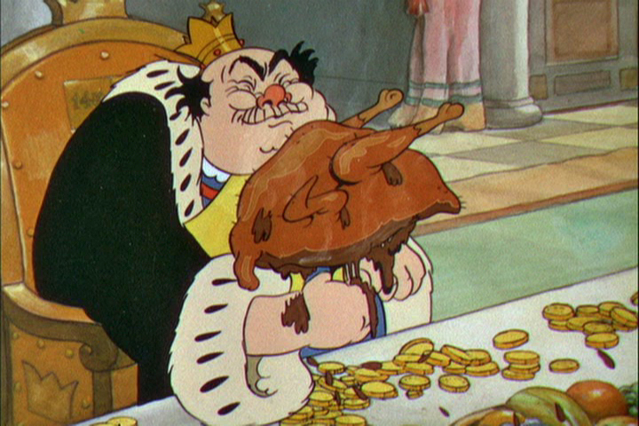
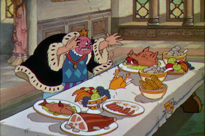
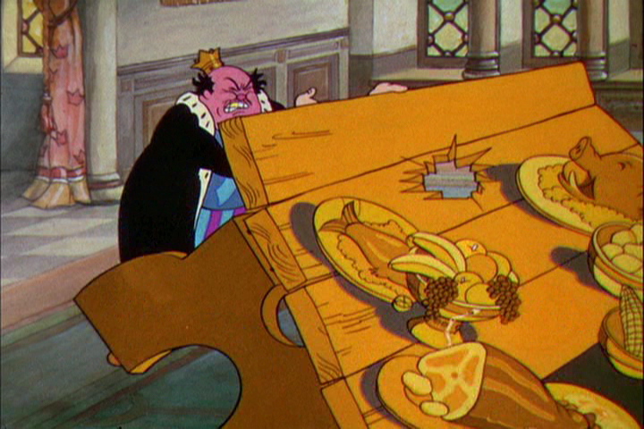
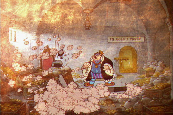
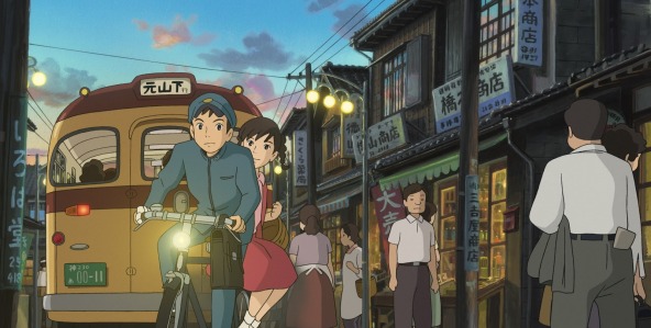
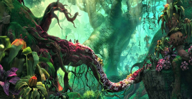
 My thoughts keep going back to From Up on Poppy Hill. I really would have liked giving the film a more positive review, and I feel as though I should go back and see the film again. Maybe I didn’t give it enough of a chance; however, I can’t think of any dynamic scene in the movie that is enticing me back.
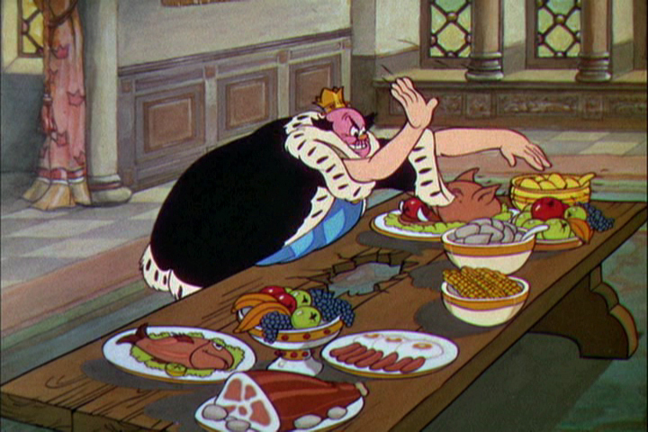
The entire film is professionally and finely planned and layed-out as would be expected from a Ghibli work. The drawing is excellent, and the backgrounds are quite fine and strongly detailed. But there just isn’t anything that soars.
I think of Ponyo riding those waves of the Tsunami. My heart – my entire body lifted in exuberance with that scene. No matter how many times I’ve seen the film it always does it.
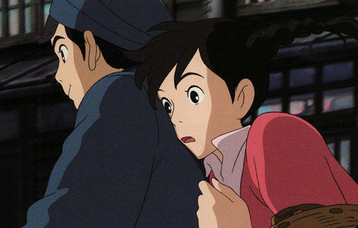
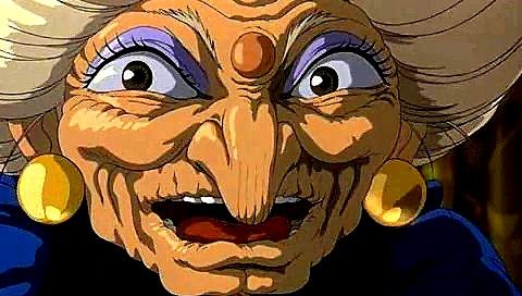 I think of Spirited Away (so many moments) where Chihiro rides on that ghost train with “No Name” to the dark foreign and silent land of Yubaba, Zeniba’s twin sister. I think of Princess Mononoke when the god of the forest, dressed like a deer stands watching him from across the lake. It’s so glorious a moment. Or one of my all time favorite moments in the movies – standing at the bus stop with Totoro in the rain waiting for the bus to arrive. It doesn’t get better than that in film.
There are so many other Ghibli moments for me, I could keep going. Yet not even a hint of any of these in Poppy Hill. Maybe that’s why I felt I was so negative. I wanted something I shouldn’t have expected from a sophomore director without the proper experience to play out that very complex relationship between him and the girl. It becomes cliché when it should have torn at our hearts.
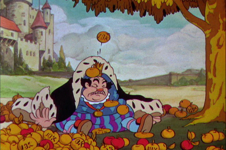
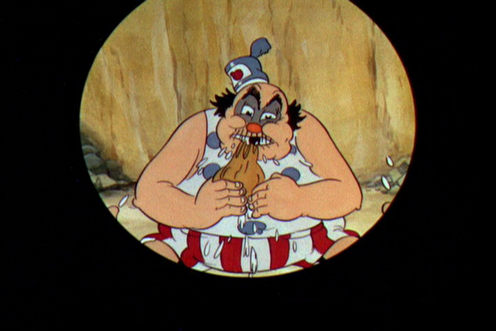
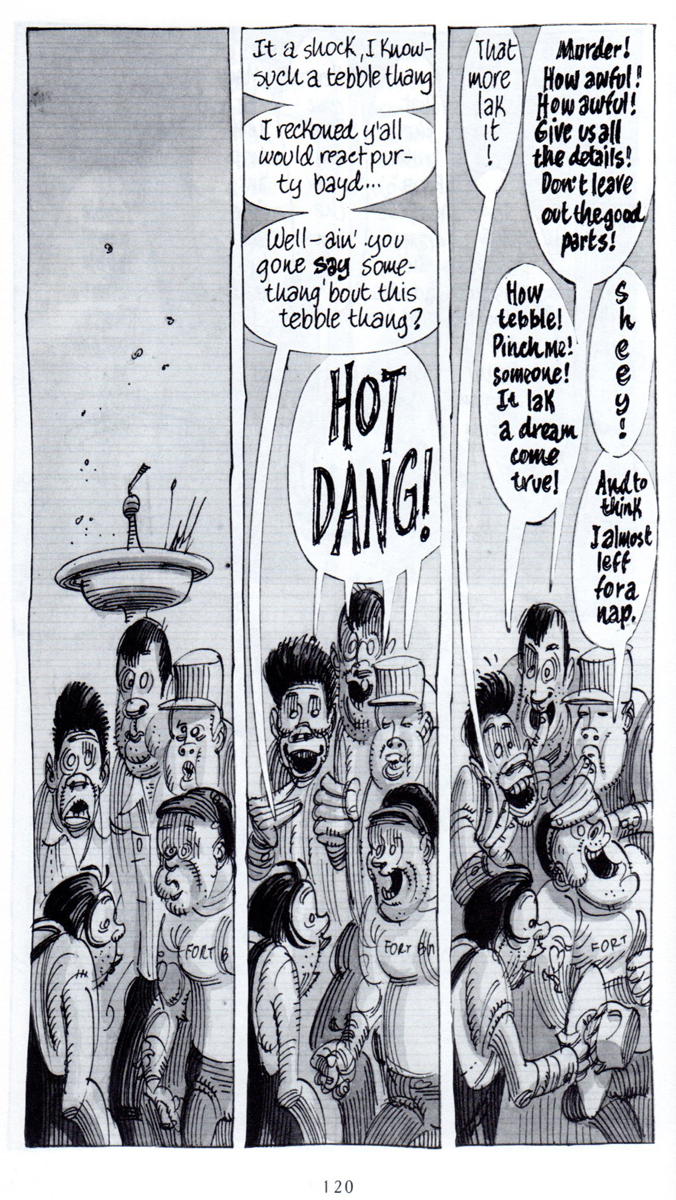
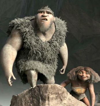
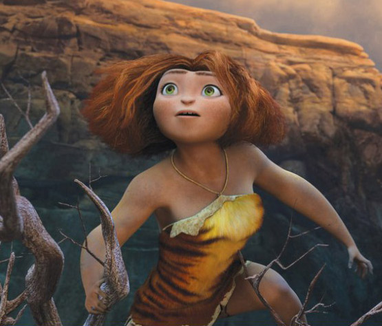
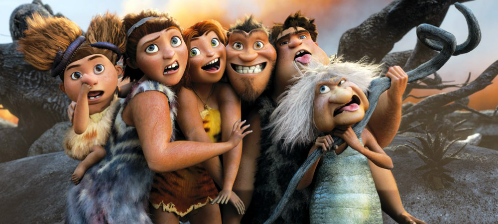
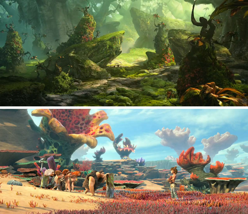
Who knows. Maybe I’ll go back and see the version of the film in Japanese rather than the English dubbed. Interesting that I have no intentions or plans to see The Croods again. Maybe when the Japanese dubbed version comes out so that I won’t have to hear those Nick Cage Valley Girl accents again.
ITVS Cut Out IDs
The Soup Factory in the UK, the studio owned and supervised by Andy Soup, is rightly taking pride in some IDs they did for ITVS. These pieces are animated cut-outs, models that were designed for 3D table top animation. They are beautiful pieces, and I thought it a good idea to link to them so that you can take them in as well. After all, we in the US don’t get to see the advertisements done for ITVS.
For the 6 IDs, Espen Haslene directed the films. He is the leader of a studio known as Tundra, a partnership of Scandinavian/French/Italian/English filmmakers, animators, graphic and web designers. Tundra worked together with Martin M. Andersen, head of Andersen M. Studio, acting as the stop-motion Animation Director. There’s obviously some computer animation mixed with the stop motion work, and you’ll find a complete list of credits when you go to the Soup Factory‘s page for the films to view the IDs.
Take a look here.
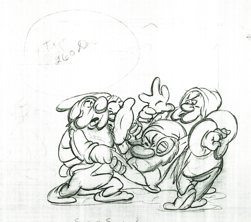
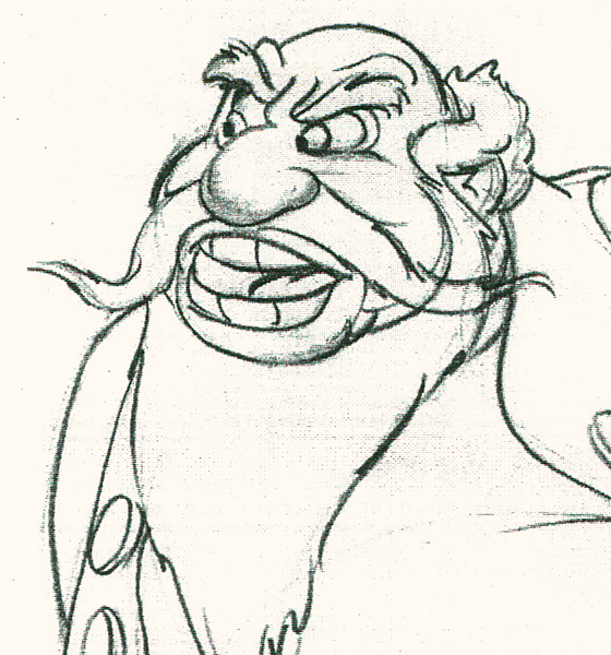
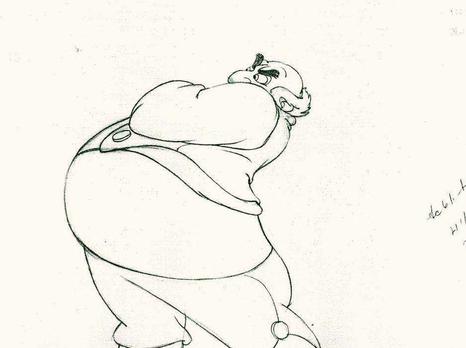
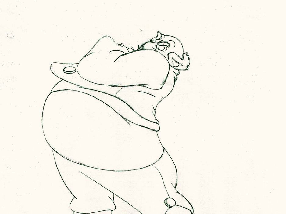
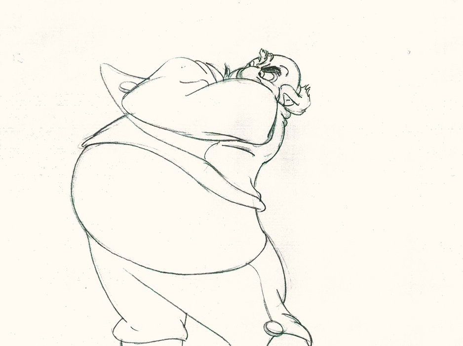
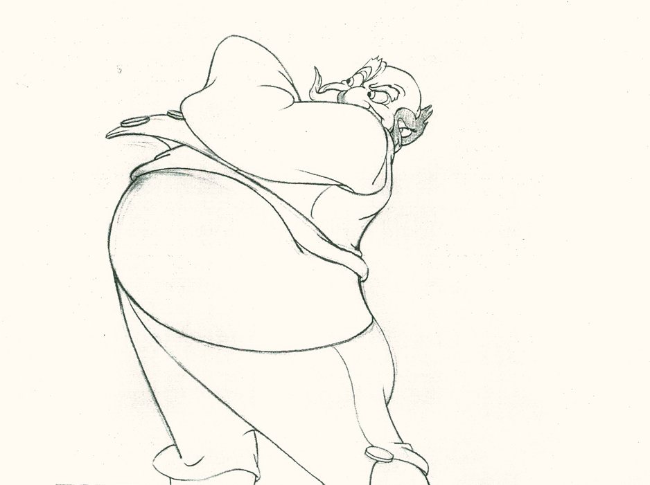
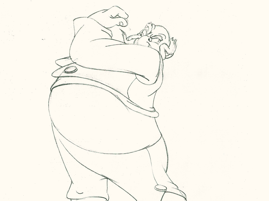
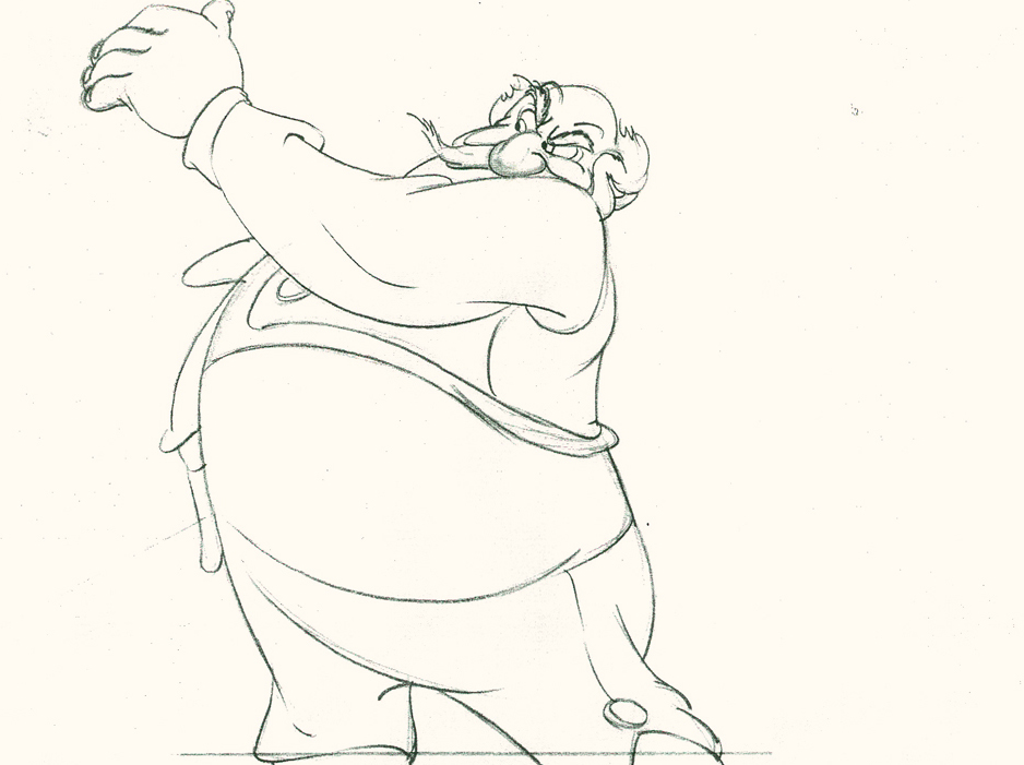
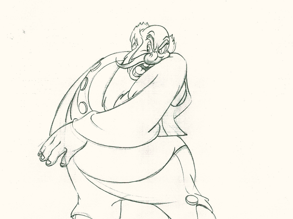
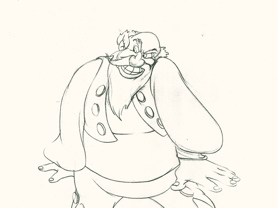
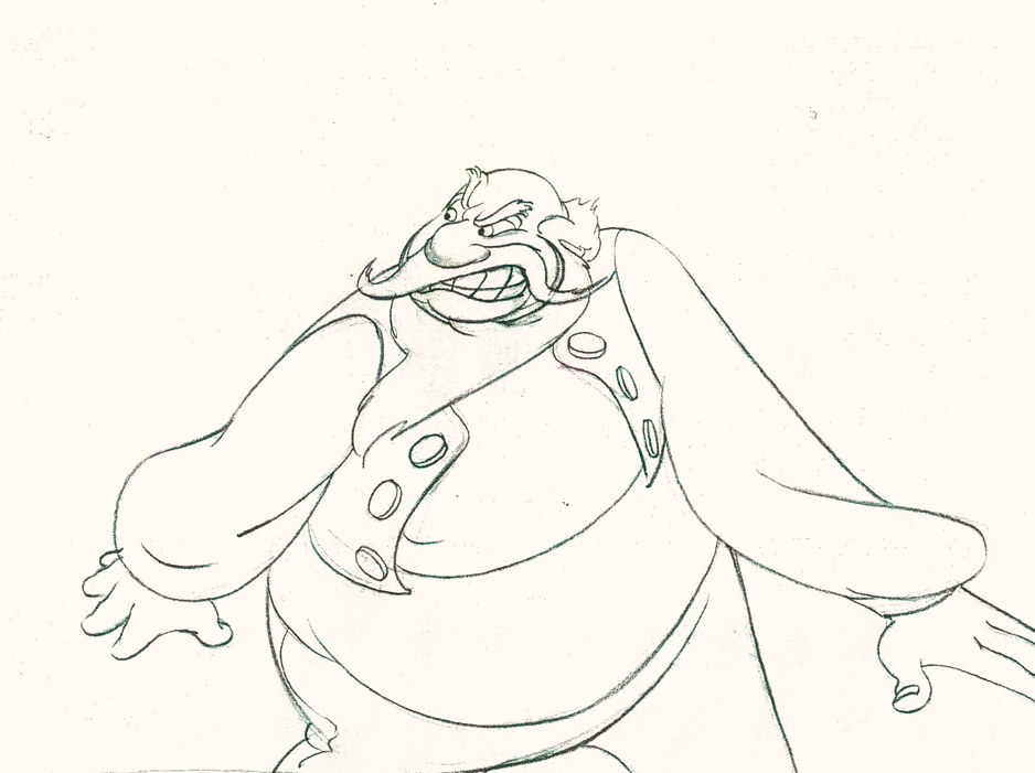
Illusions of Life
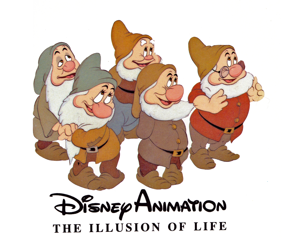
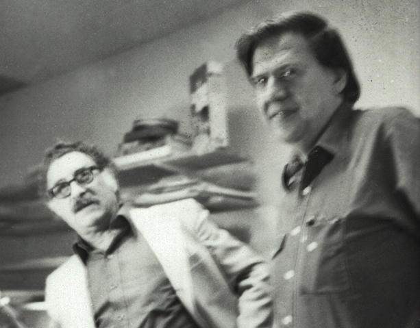
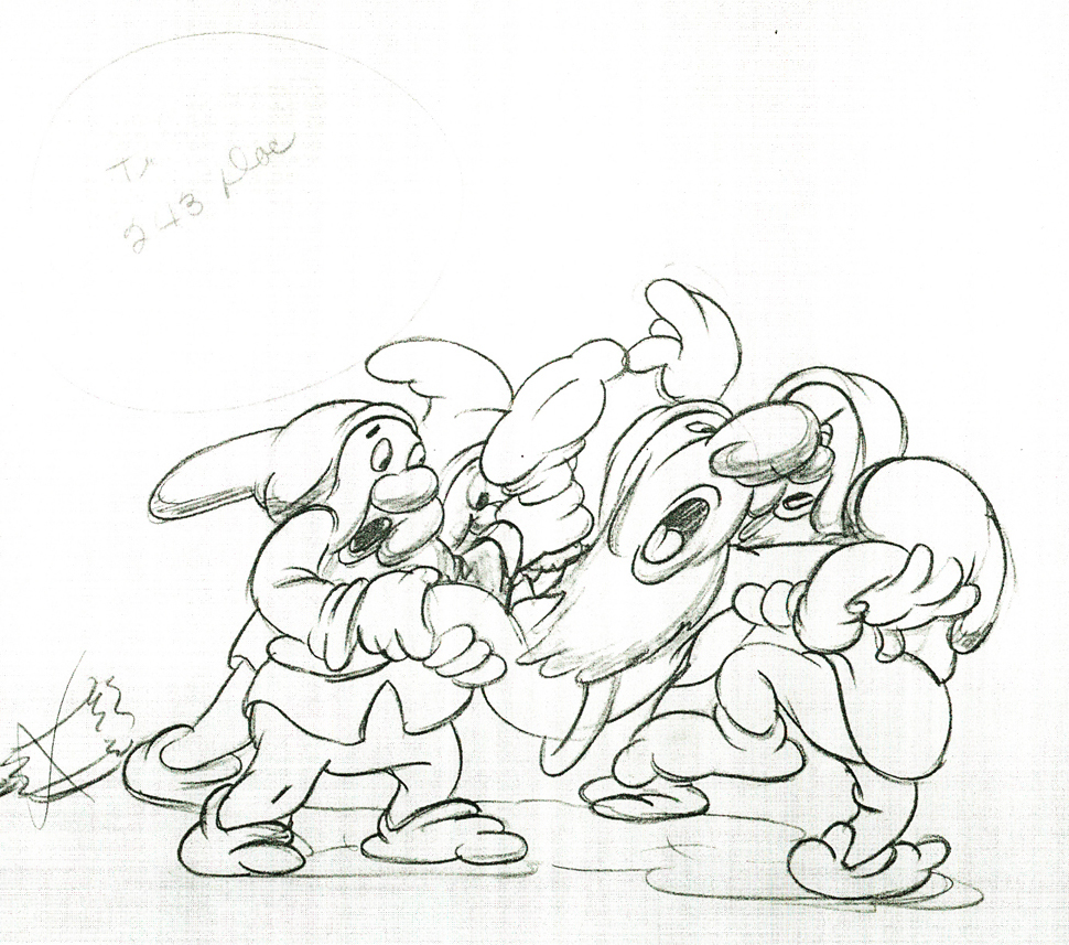
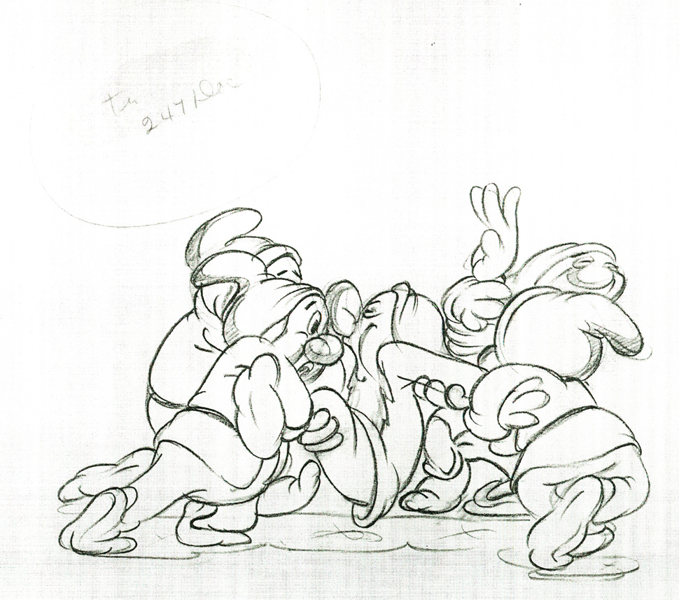
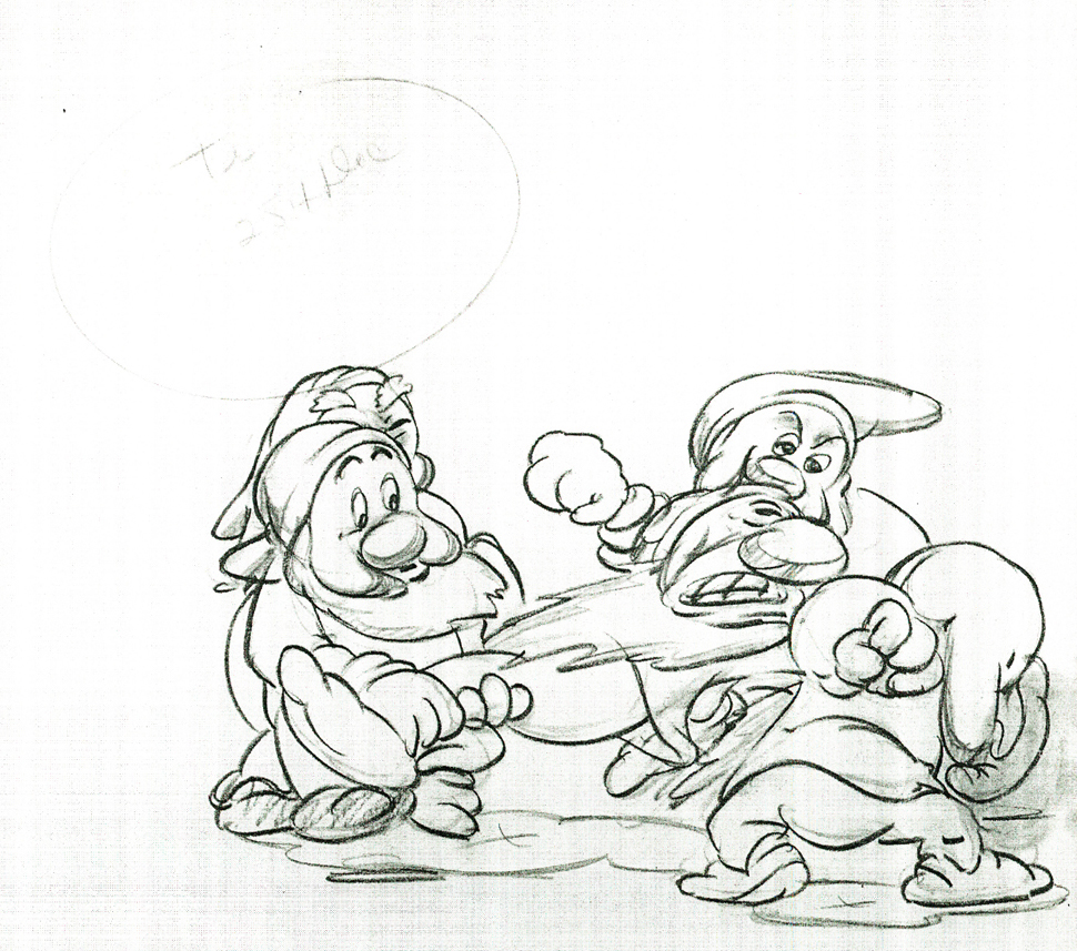
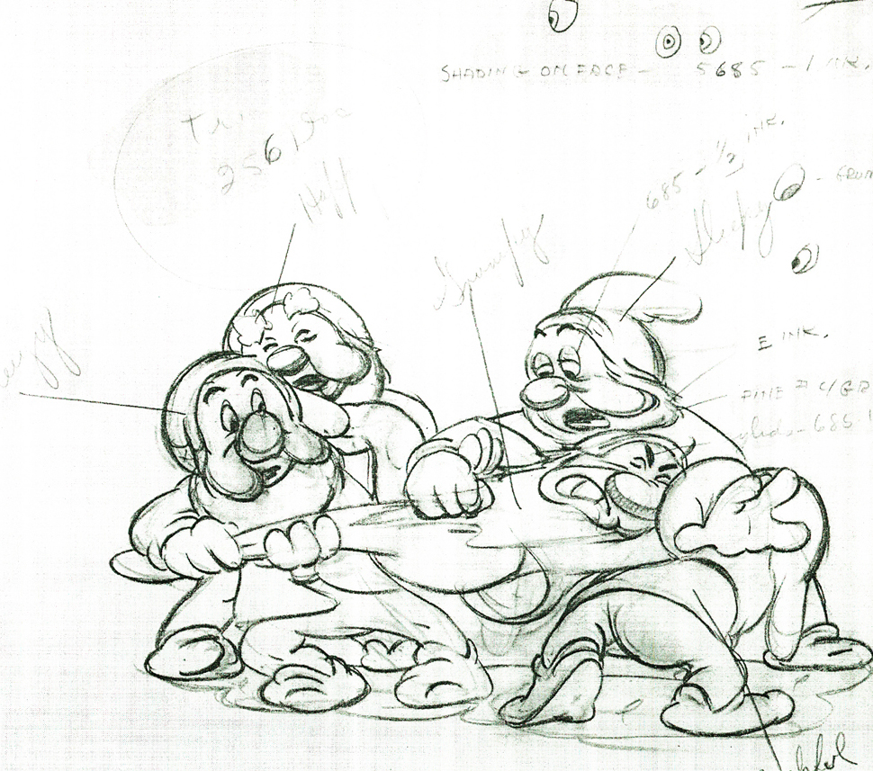
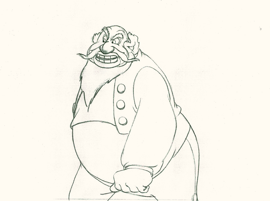
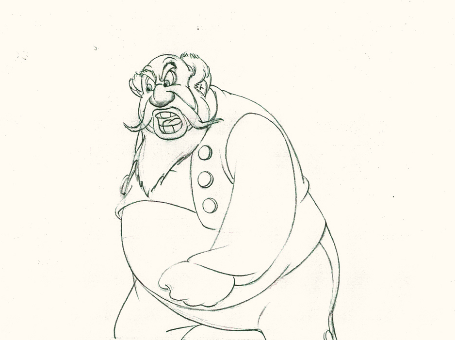
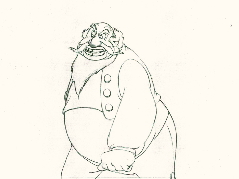
I’ve been going through Frank Thomas and Ollie Johnston‘s first book, Disney Animation: The Illusion of Life. I have to admit that I haven’t been much of a supporter of the book. I remember first getting it and not reading it. I just went through the pictures. Then I read all the captions under the photo/artwork/images. That’s about as far as I got with the book. I don’t really know why; I just wasn’t inclined to really dig my teeth into it, and I never read it. Bt then I’ve often had that problem with large picture books, especially if they’re supposed to be teaching something. The book seems confused. It doesn’t know if it wants to be a glossy art book that teaches you something.
I guess I’ll make up for some lost time and will read it now. But I think in doing it, I’ll take my time with it and will write about it in some detail, trying to get my thoughts out on paper (or on blog). I know that it’s the first of the animation books I can remember where they had some pure gold for illustrations, and they printed it too small to be able to properly get it. The good part about the images on the web is that you can blow them up pretty easily. And I’m going to.
Perhaps I’m inspired by Mike Barrier‘s negative comments about it. His writing, for me, is pretty funny, too. Take a look at this review of Dick Williams‘ book where he necessarily goes to the Thomas-Johnston book.
Time to read it for myself and see what they’re actually saying. I have read others of their books and haven’t been inspired.
Book Reports
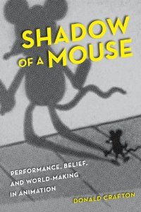 I’ve been reading lately a different sort of book. it’s certainly not a quick read getting through Donald Crafton‘s most recent book, Shadow of a Mouse. I’ve been a fan of Donald Crafton’s work since his first book, Before Mickey: The Animated Film, 1898-1928. It was a study of a little-known part of animation history, and he explored and revealed the difficult period. Certainly, this was a fine feat of research combined with his excellent writing.
Shadow of a Mouse is something else again; it’s a book that employs the author’s extensive knowledge of film history to help consider a number of complex theoretical problems relating to animation, which he poses. The book carefully rethinks animation and all of its properties. Blending 2D, stop-motion, cgi, and more experimental forms, the book challenges the way we think of animated film. It’s a tough and complex read though I’m certainly enjoying it.
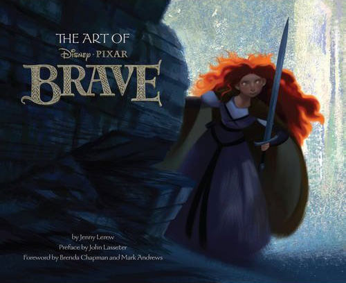 I’ve also been reading Jenny Lerew‘s The Art of Brave. I received apologies from Chronicle books when they’d first published the companion to Pixar’s Brave. They’d gone through their print run quickly and weren’t able to send me a copy. I made myself something of a pest after that and pursued them for a reviewer’s copy. Ultimately, I got my hands on one and am quite enjoying it. The book is something more of a picture-book (and what great pictures), though I am enjoying Jenny’s writing. I hope, also to finish this pretty soon and will write about it – especially now that the film won the Oscar and is available in DVD.
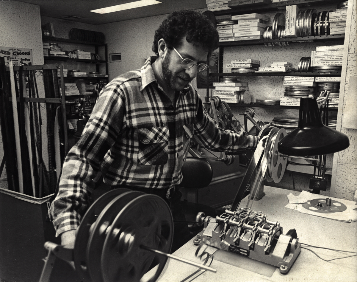
Shadows
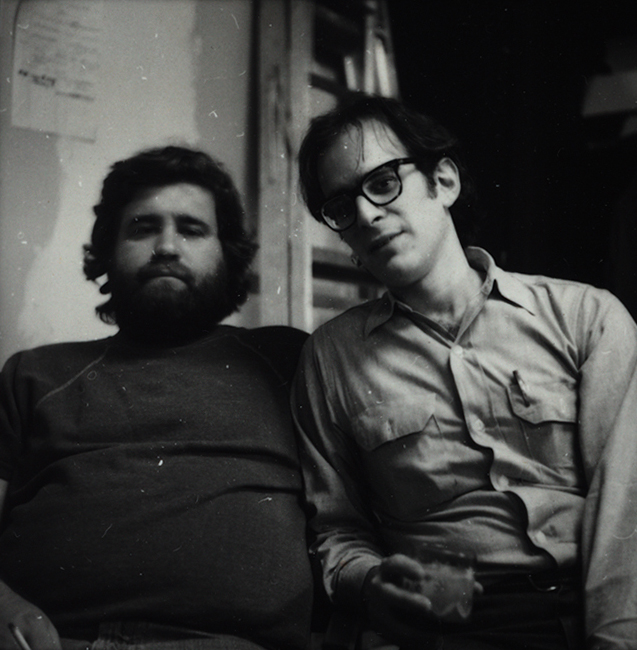
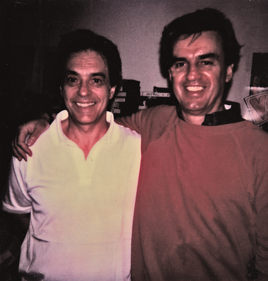
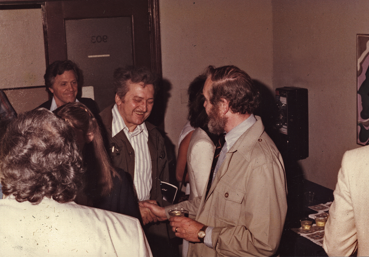
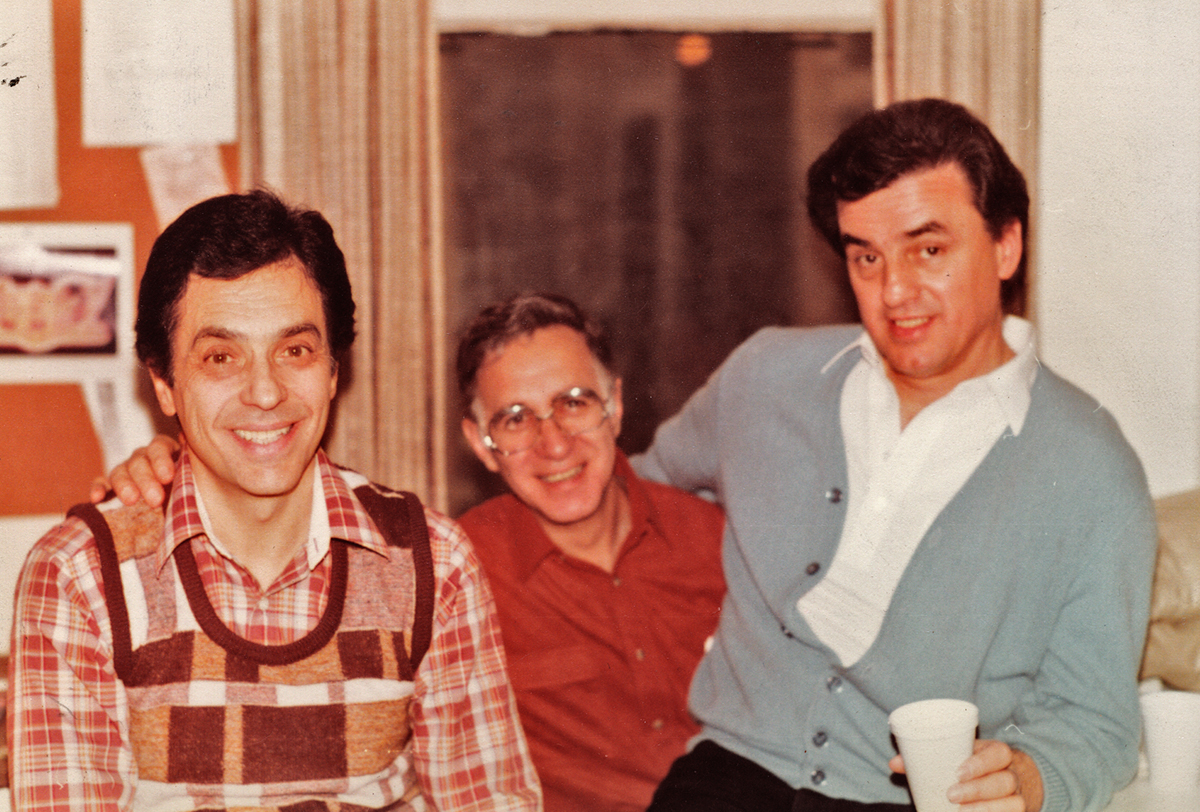
Sometimes you have to take the bull by the horns and do something that nobody wants. During the making of Raggedy Ann & Andy I was supervising the Assistant Animators and Inbetweeners for the course of the production. I was made to jump from being an Inbetweener, myself, to suddenly being someone supervising lots of people (it went up to 150 people at one point toward the end of production) and overseeing their work.
In the middle of all this, there was Art Babbitt‘s sequence. I was the one receiving the work in New York when the shipments arrived. But then, that was just the beautifully animated camel and the two rag dolls that looked like the work of no one else. They were wildly off model – Ann & Andy, our two leads. I was told to leave them as is, by Dick. But I did some slight adjusting trying to get them a little looser to match all the other animation in the film. I wasn’t very successful at that. I couldn’t kill the work of Art or his assistant, David Block. Art’s work looked like it was chiseled into the paper, the line was so tight. His arm – and especially David Block’s – had to hurt after drawing that rigidly.
Then we added stars. It was a simple film effect, but there were a lot of problems getting there. Al Schirano, the supervising cameraman, and Al Rezek, who assisted him on this effect, knew what they were doing, but their work was anything but calibrated and planned. I saw a hole and pushed myself into it to make sure that the star fields in the scene worked with the backgrounds and didn’t interfere with the characters’ movement. They were working well after a hard start and Al Schirano was appreciative of my getting Dick off his back.
Finally, there were those damned shadows. They had to be added and animated to make the scenes work. I got that job, and it had to be done within a week. At first I mirrored Art’s animation but it looked horrible. Try after try after try, it all looked like mud. So without telling anyone, I started snapping the shadows. The legs moved very slow and tight, like all the rest of Art’s animation, but the shadows snapped into position. Every time the legs went up or down, it happened in one or two frames. It worked like a gem and no one commented. I expected to hear from Dick, but nothing. At one point he might’ve said, “good job,” or some such thing, but there were no attacks from either him or Art about that violent movement in Art’s sequence. You never know. Sometimes troubles aren’t as bad as you think.
Every scene of this sequence wass shot numerous times. The shadows were painted black, and the entire scene would be shot at 65% exposure. Then it’d be rolled back to “0″ and shot at 35% exposure without the shadows. That meant that the shadows would be transparent – 65%. Then the film would again be rolled back to “0″ and the star field and the animation of the bottom-lit lights would be shot using a star filter. That was done in three passes so that the stars would have different levels of brightness. (I learned all these tricks back at the Hubley studio and was able to suggest things to the Al Schirano who rode with me (and took credit when it worked.)