Category ArchiveAnimation
Animation &Animation Artifacts &Commentary &SpornFilms &Theater 19 May 2013 06:09 am
WOTY – again
 – I’ve posted a couple of pictures from Woman of the Year (called WOTY by those in the know) in the past but thought I go a touch deeper now.
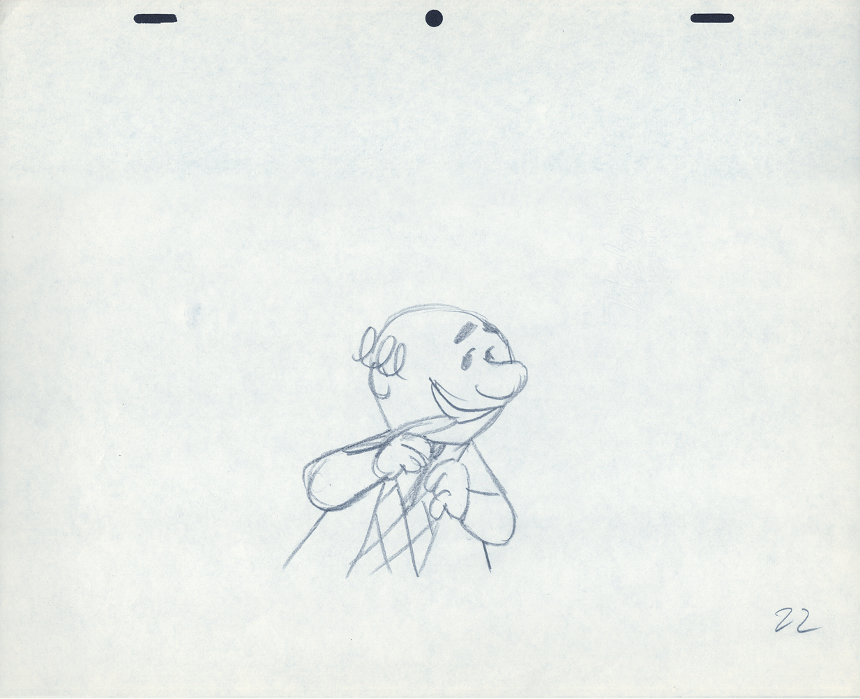
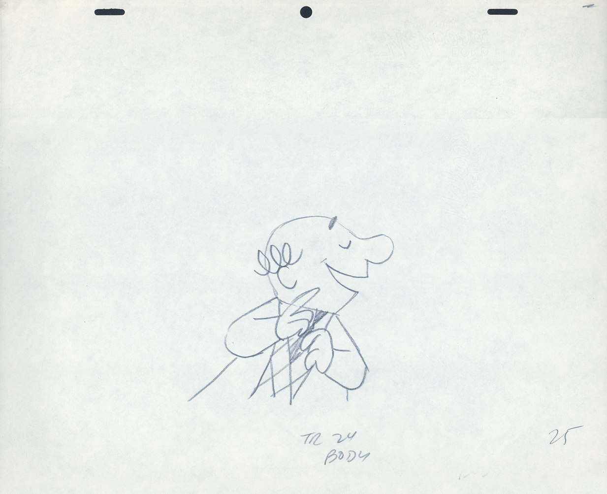
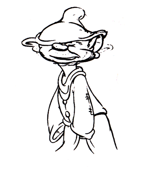
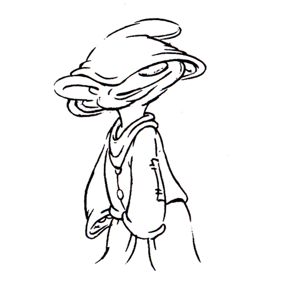
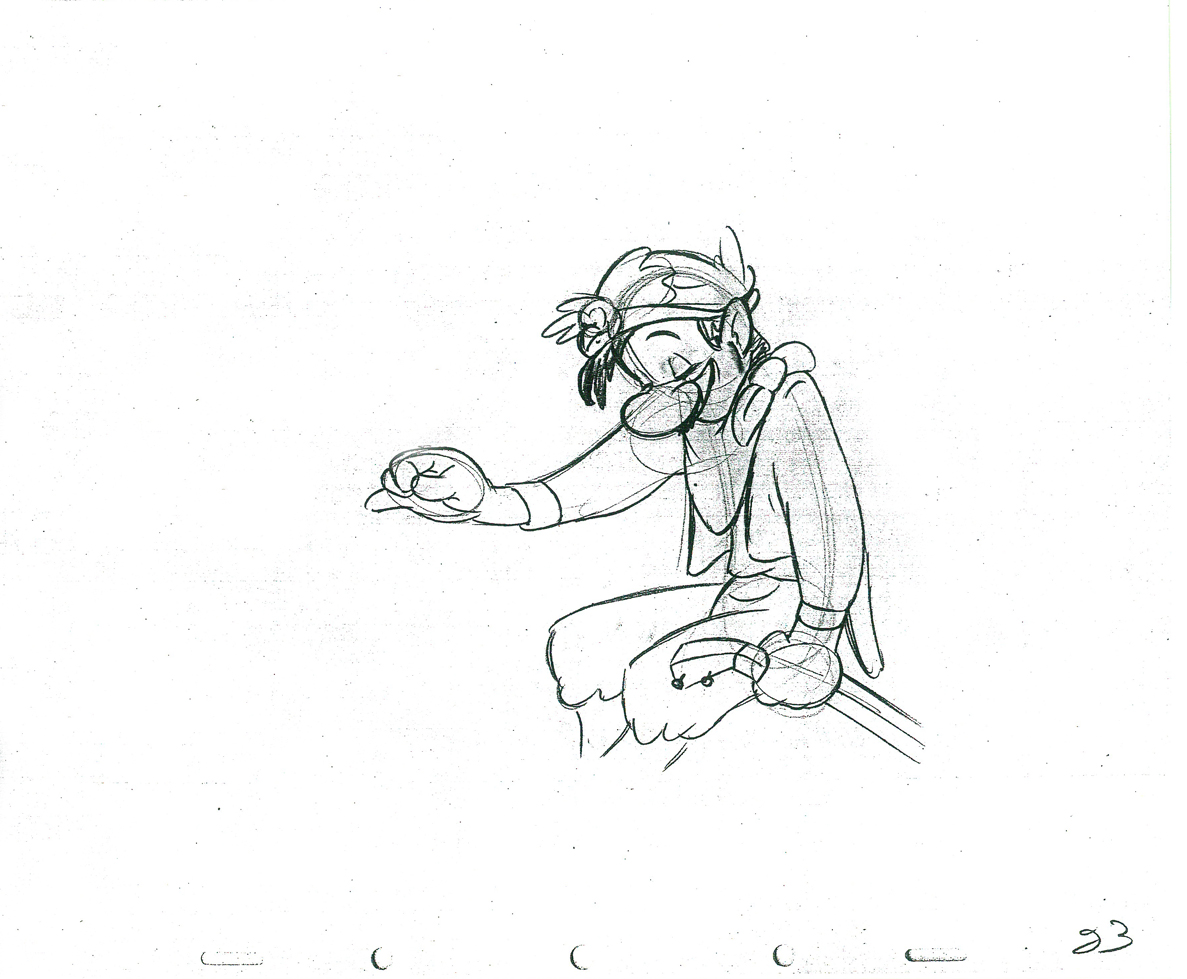
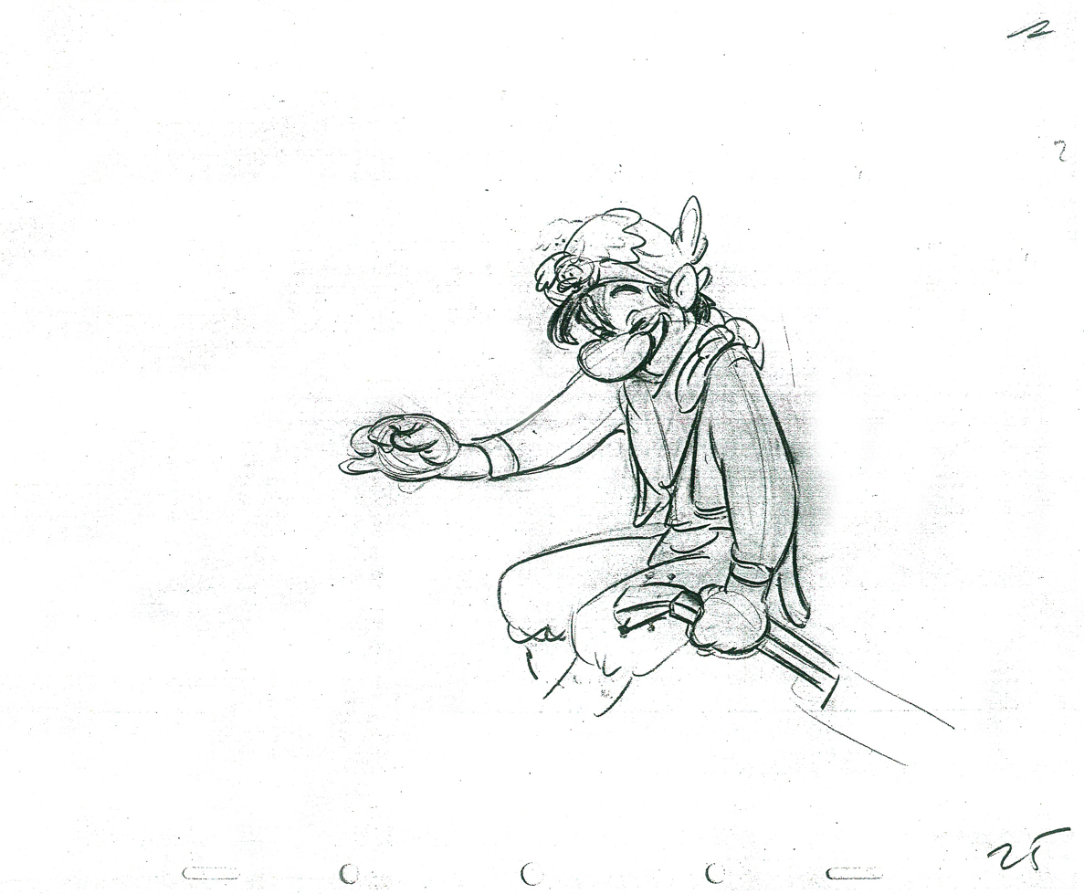
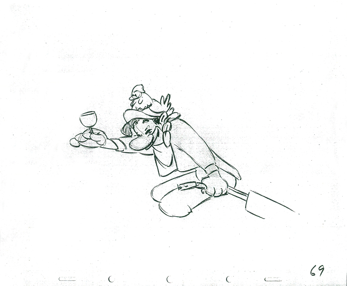
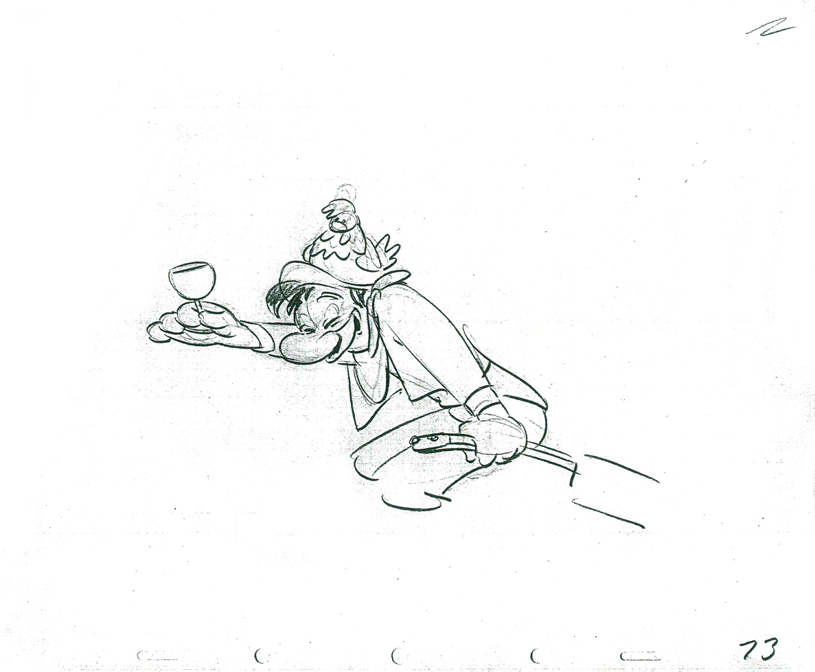
Woman of the Year was a project that came to me in the very beginning of my studio’s life – 1981. Tony Walton, the enormously talented and fine designer, had gone to Richard Williams in search of a potential animator for WOTY (as we got to call the name of the show.) Dick recommended me. But before doing WOTY, there were some title segments needed for Prince of the City, a Sidney Lumet film. (I’ll discuss that film work some other day.)
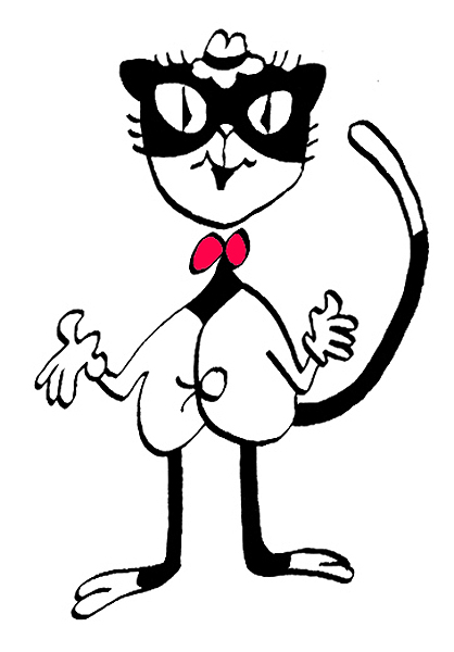
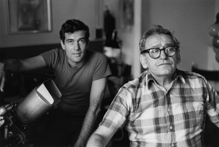
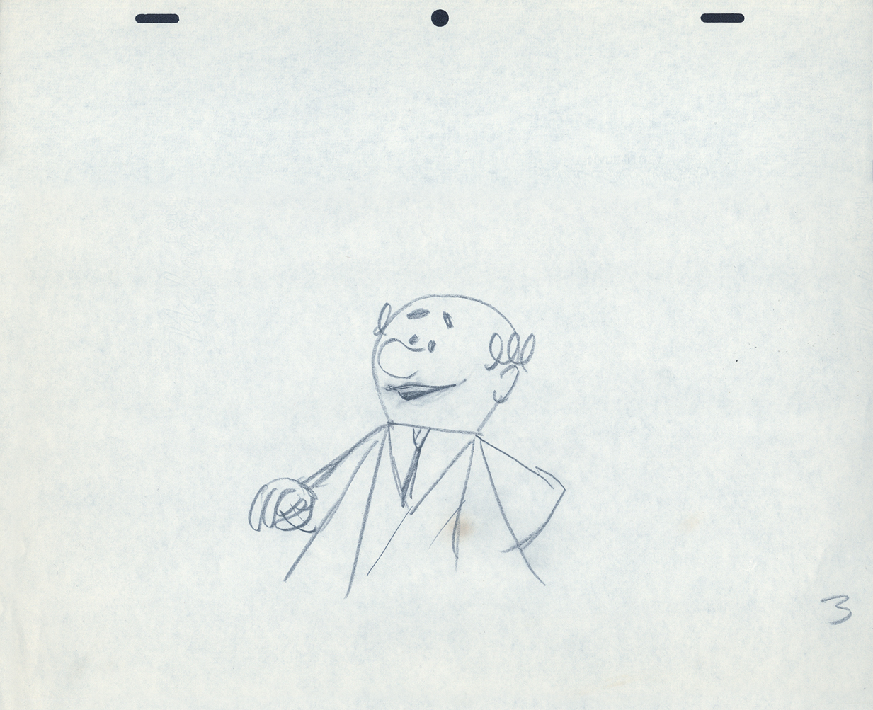
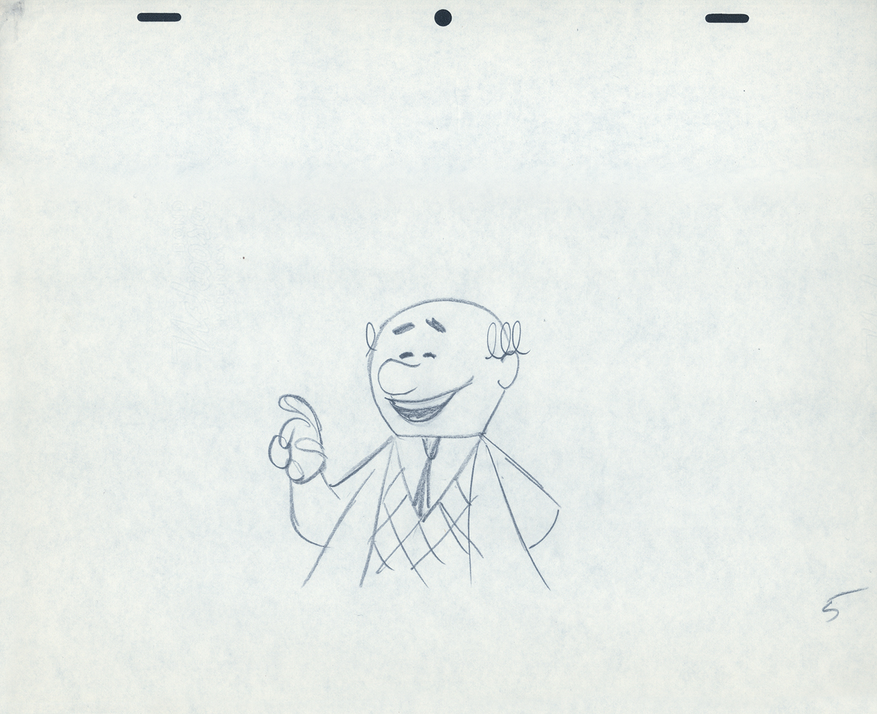
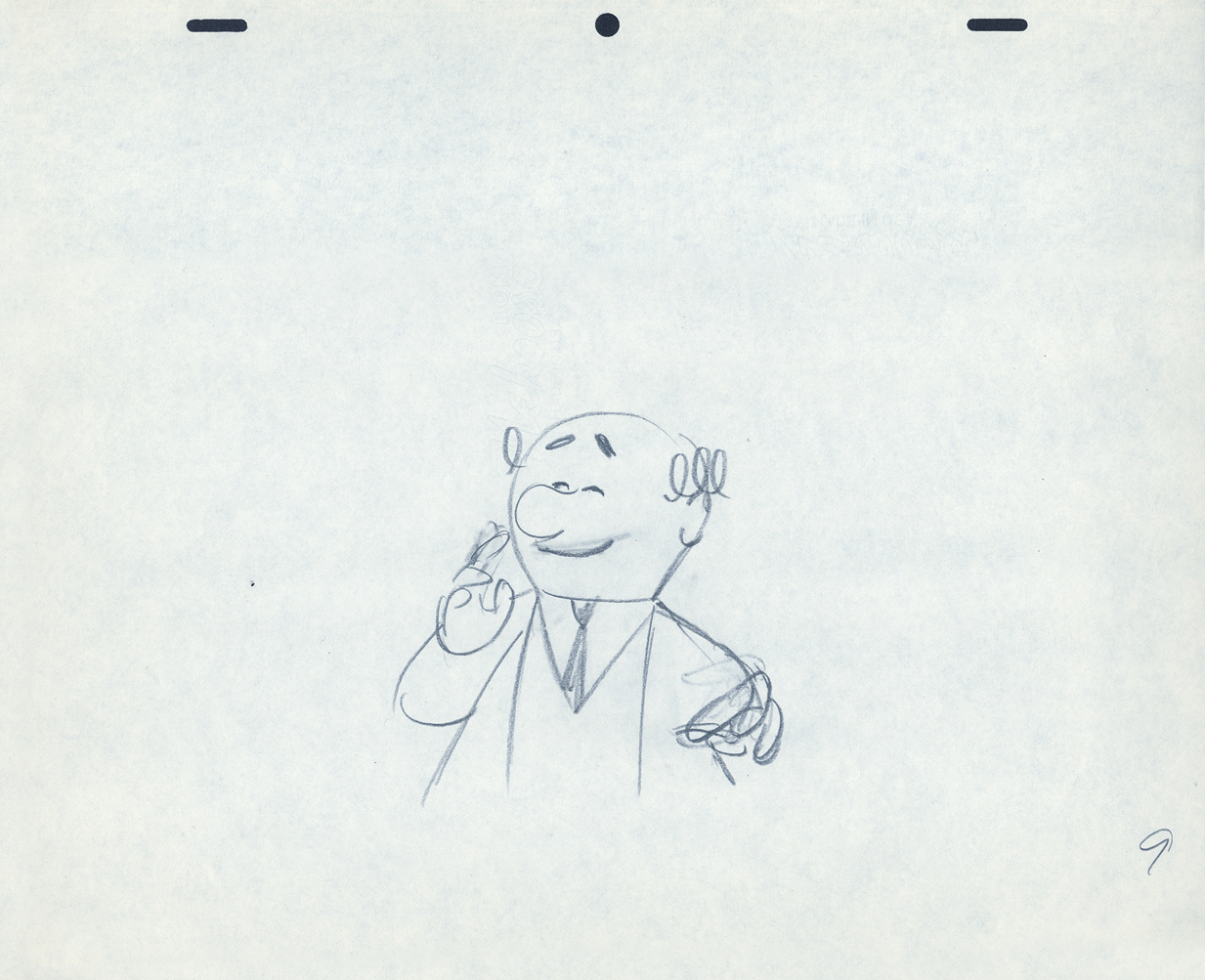
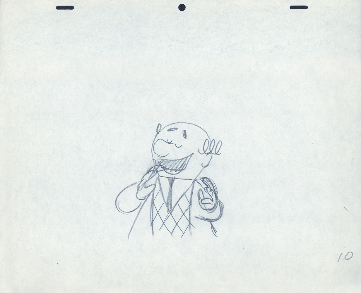
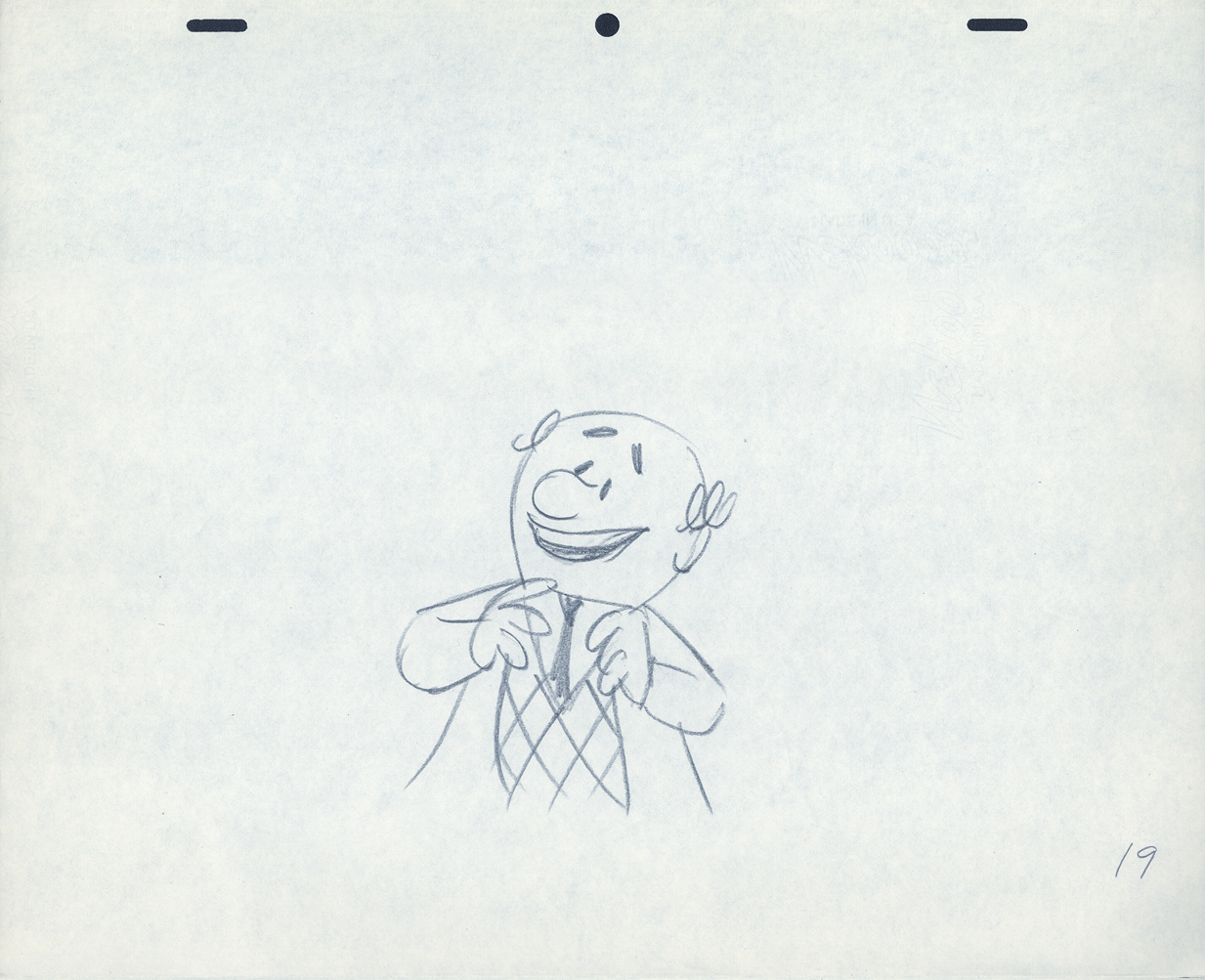
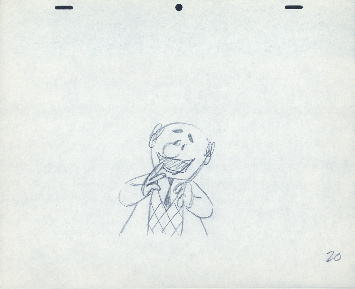
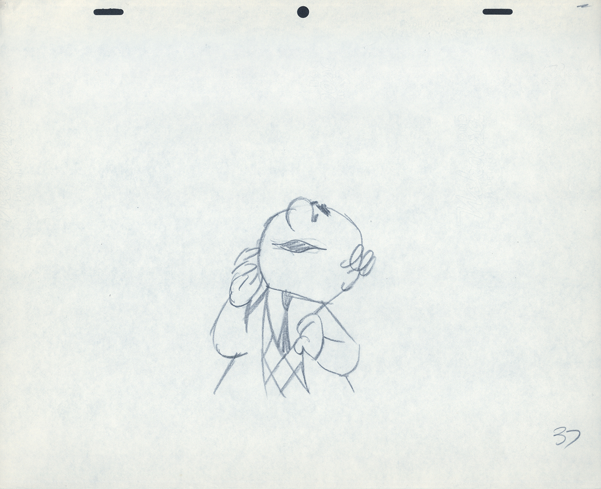
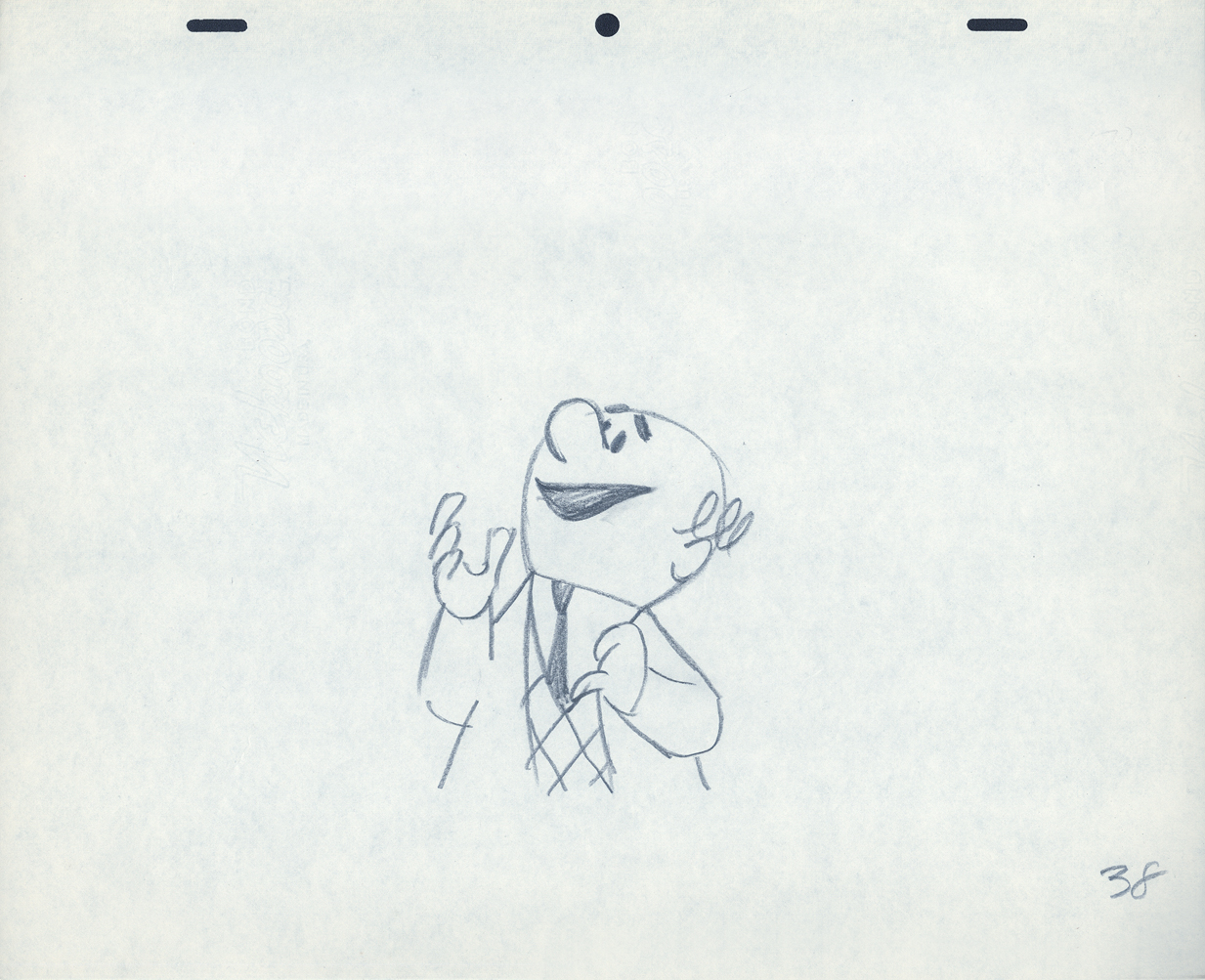
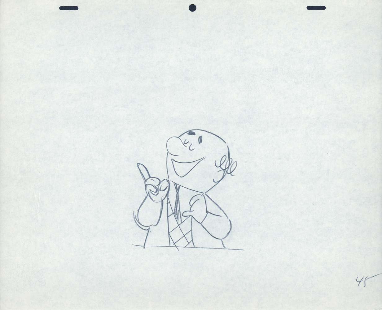
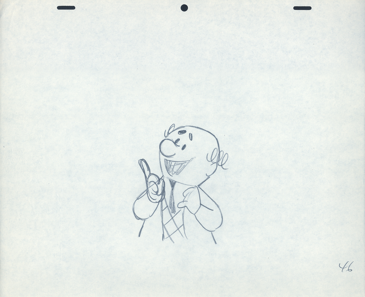
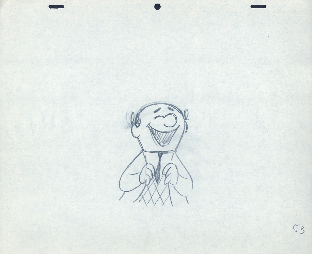
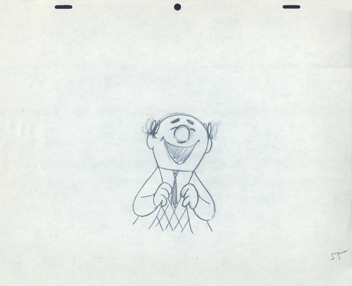
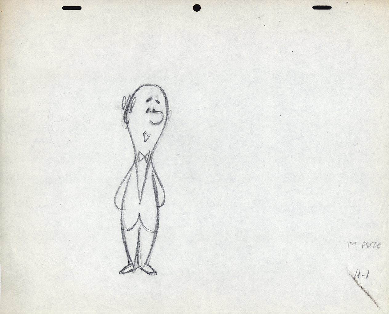
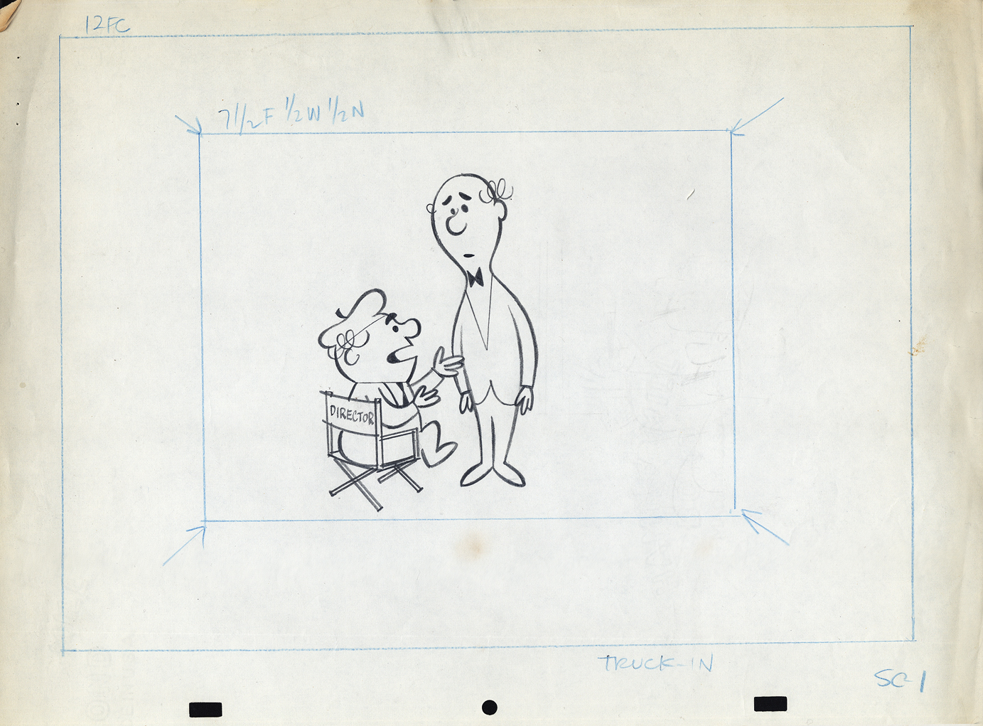
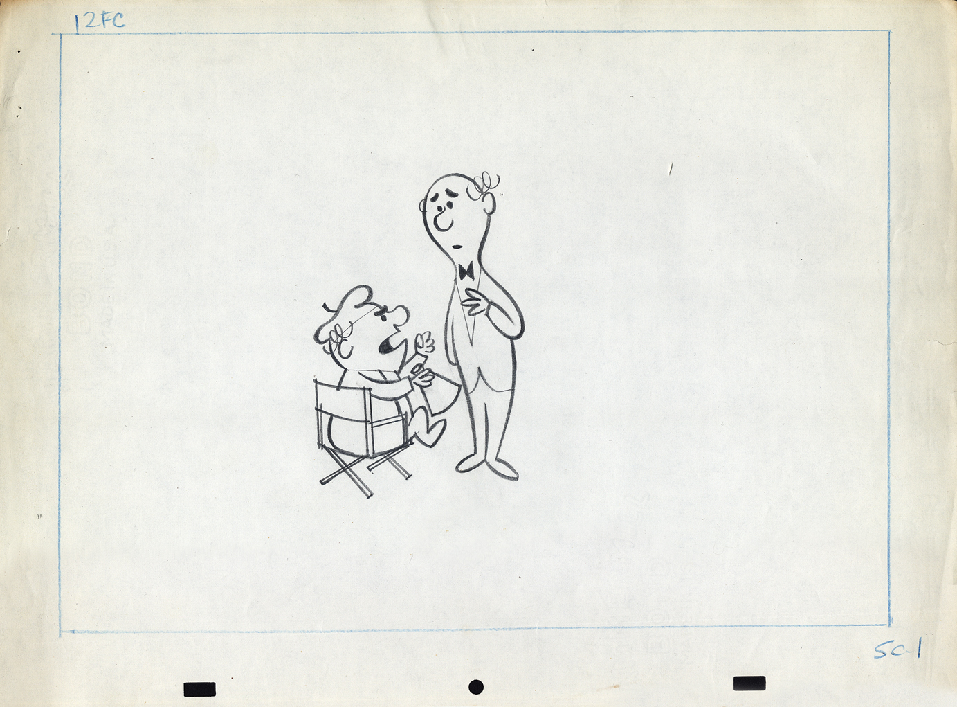
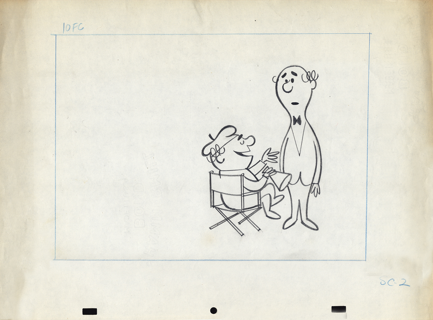
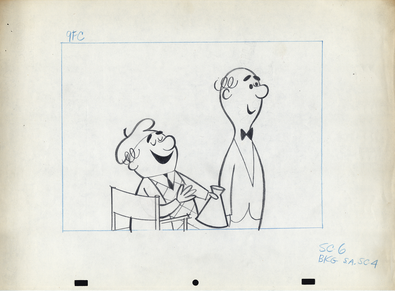
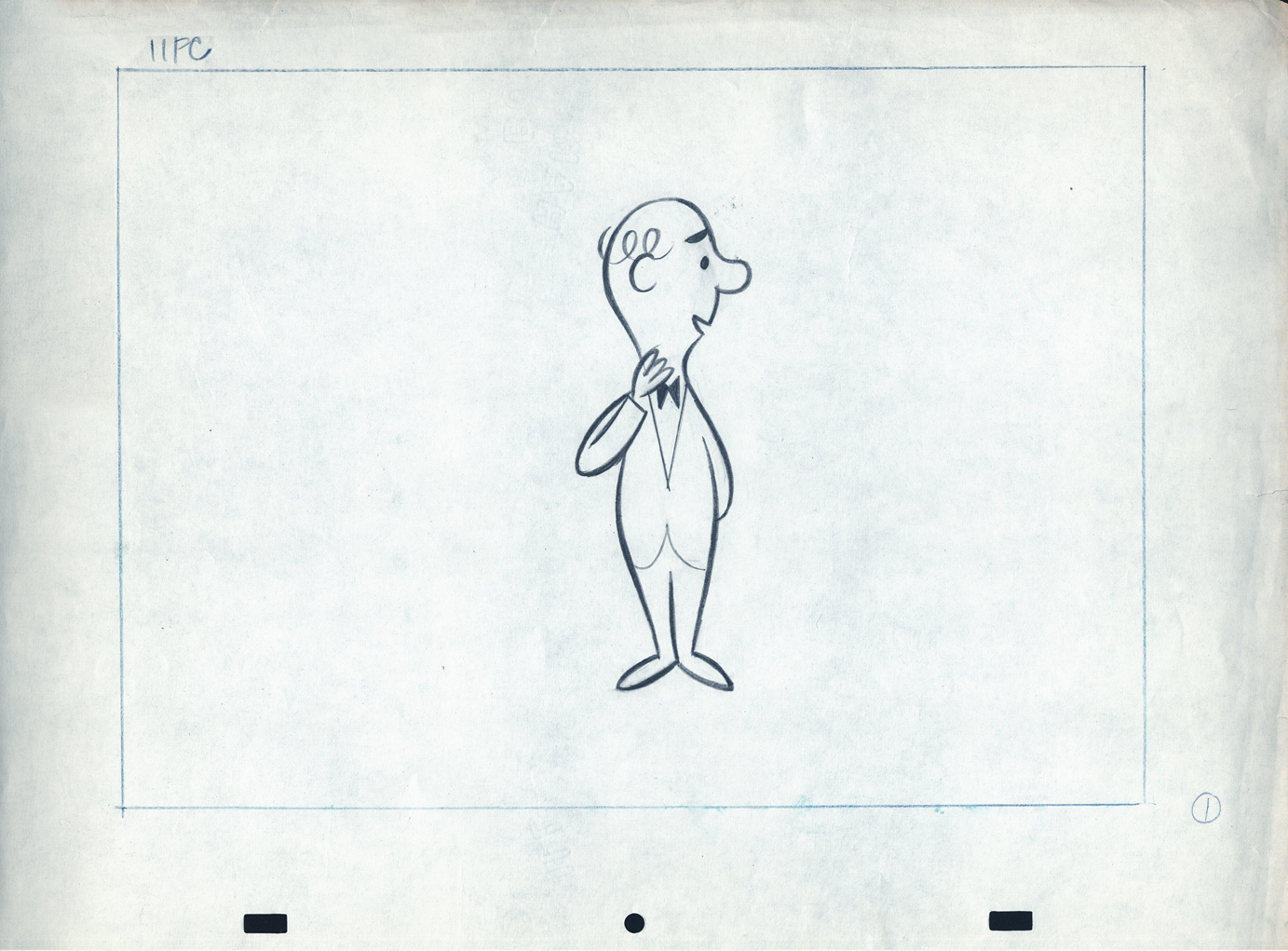
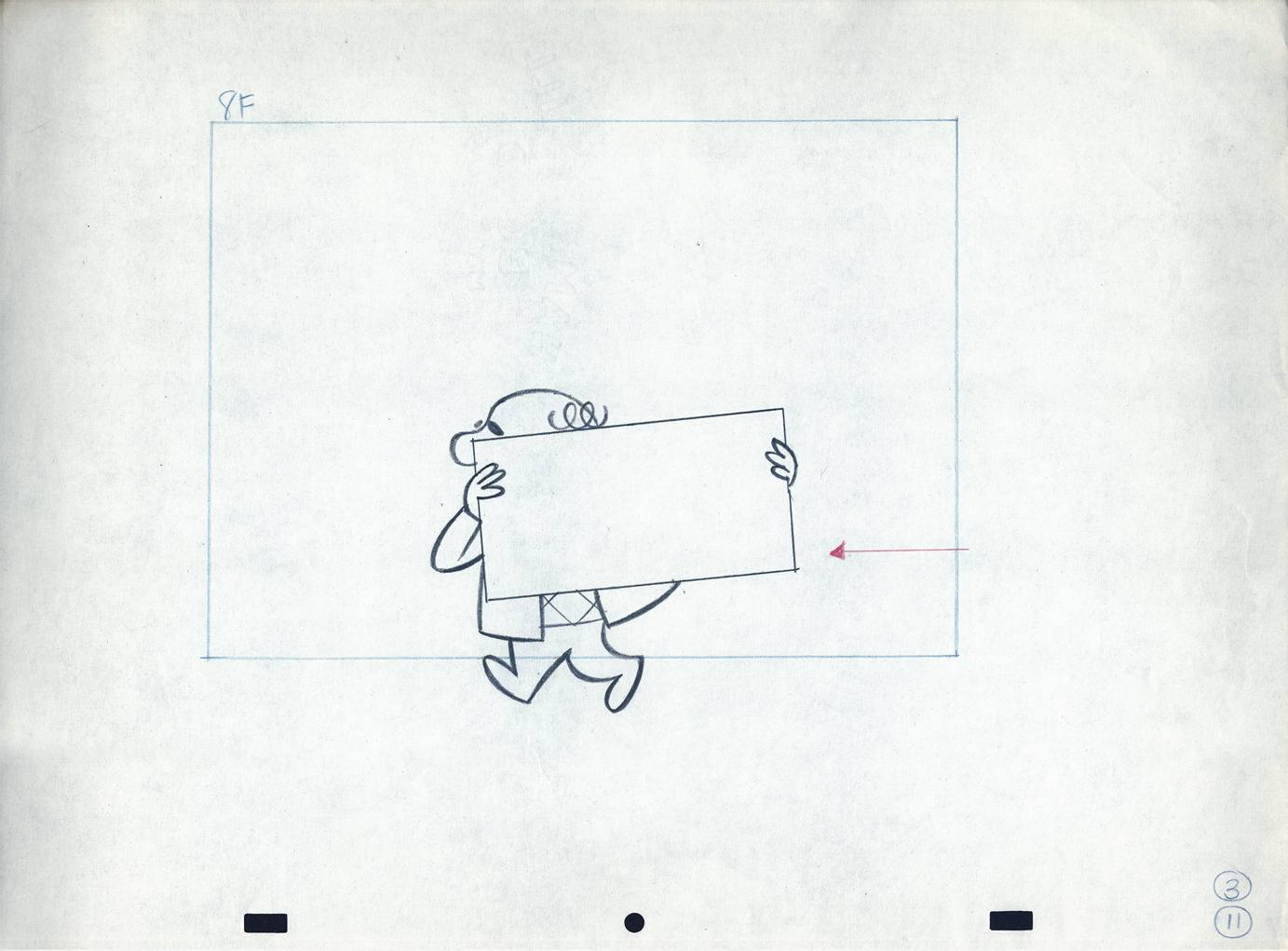
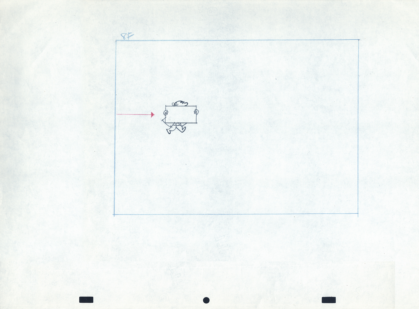
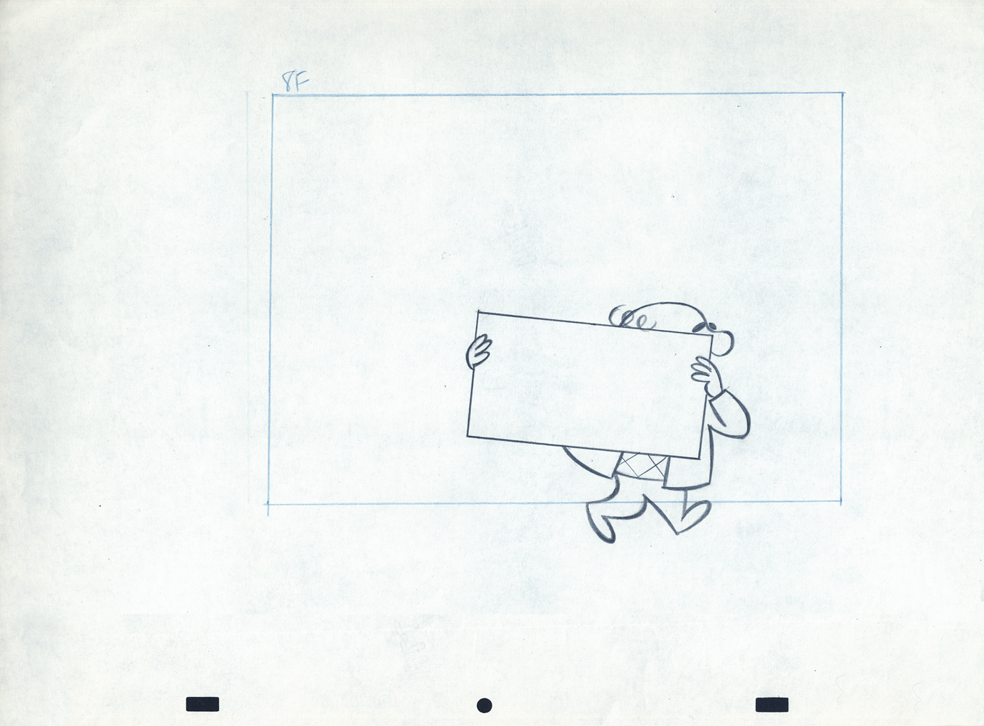
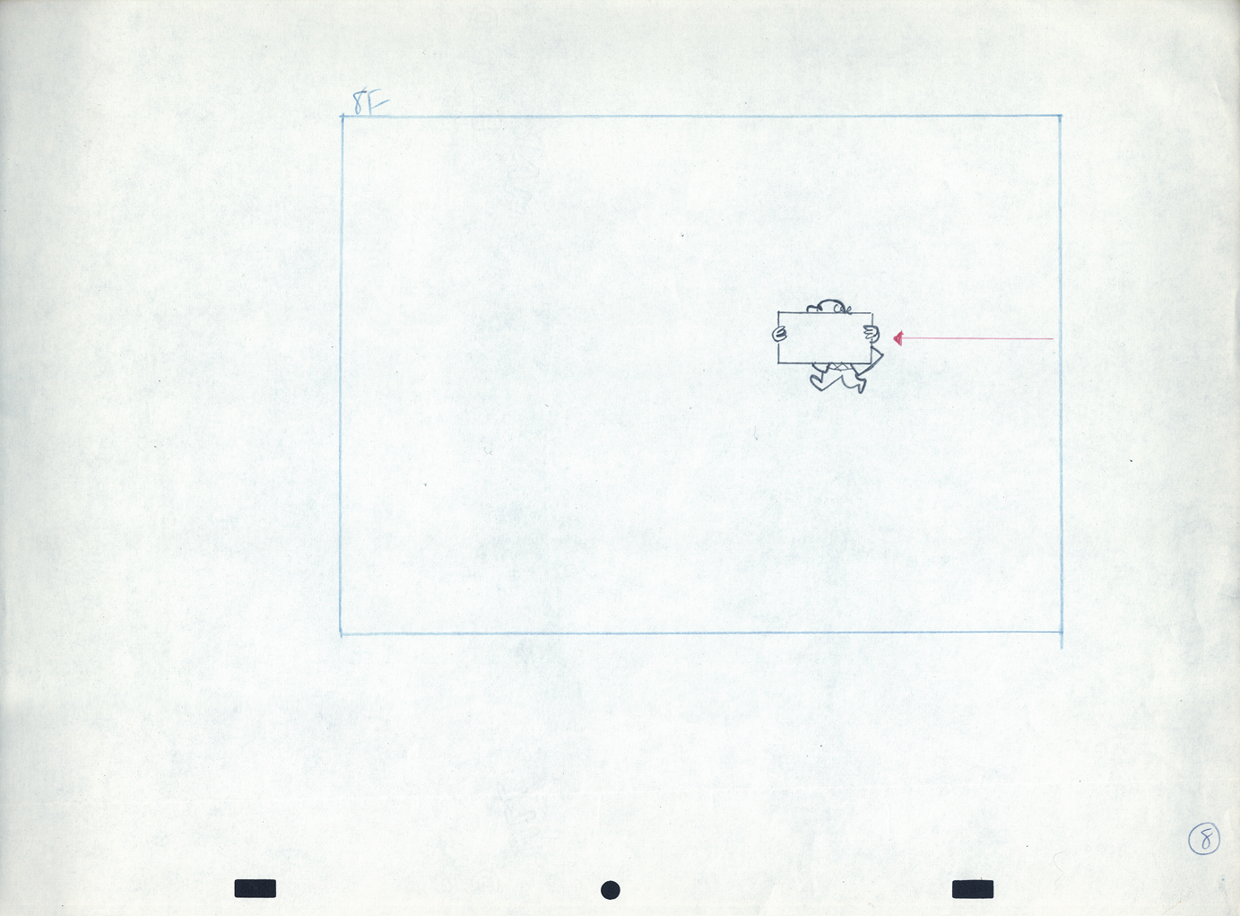
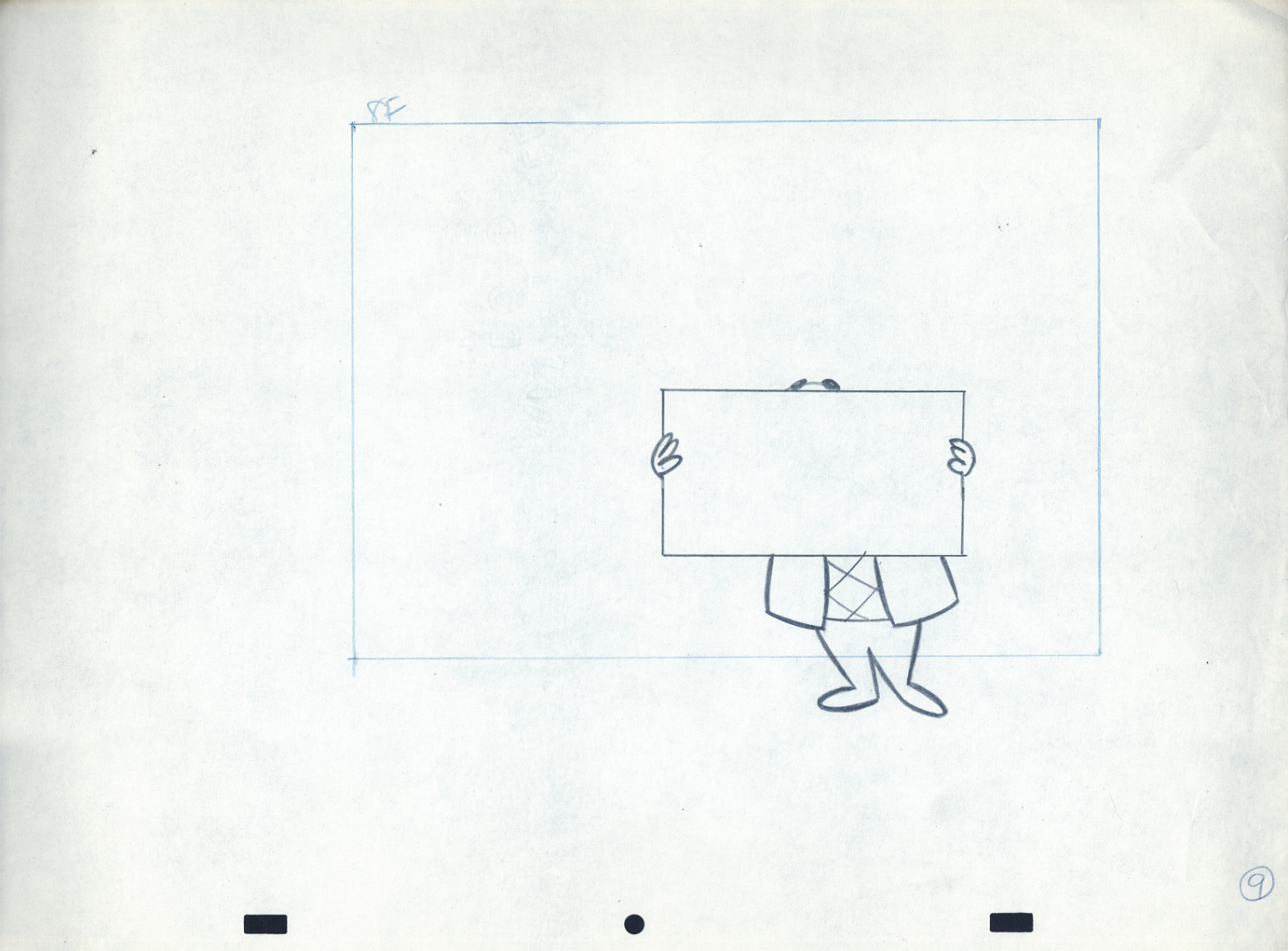
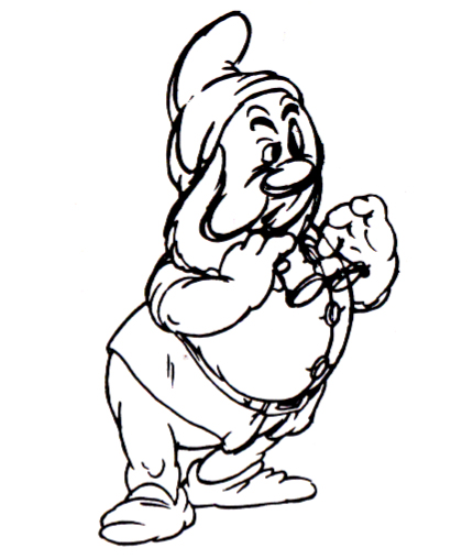
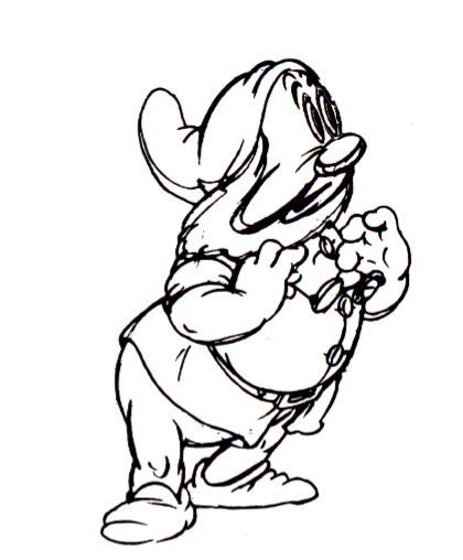
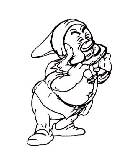
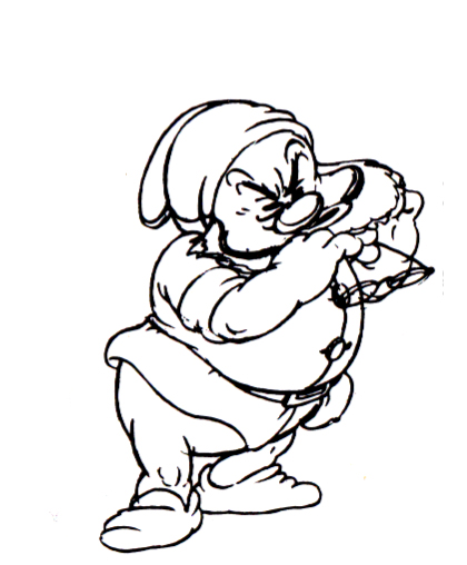
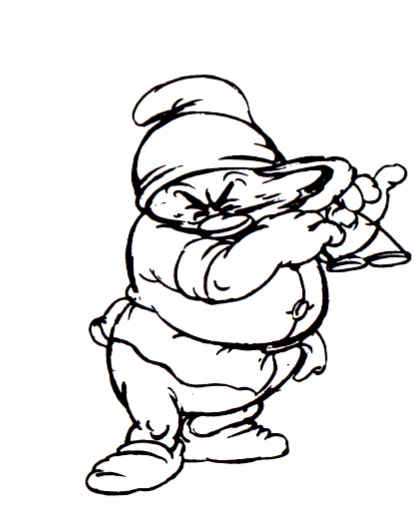
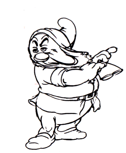
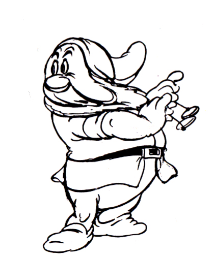
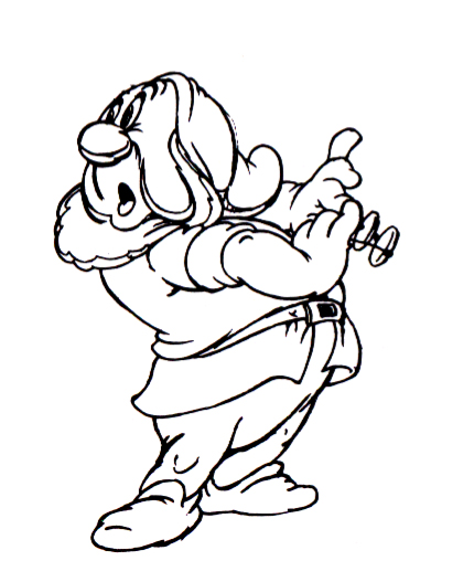
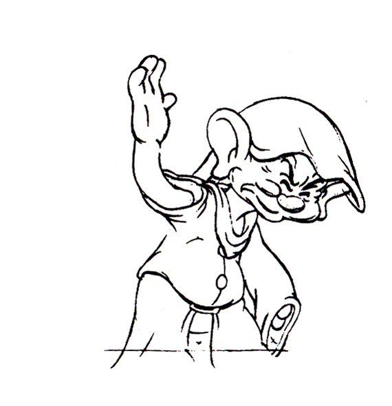
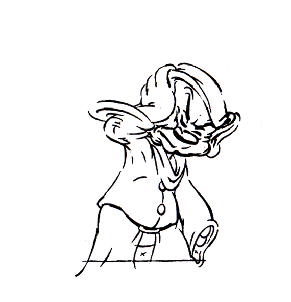
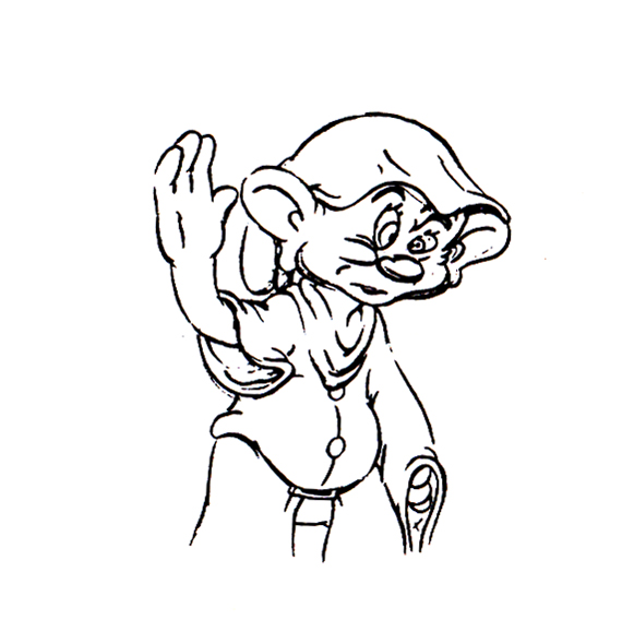
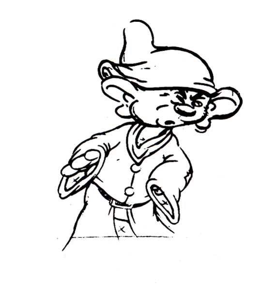
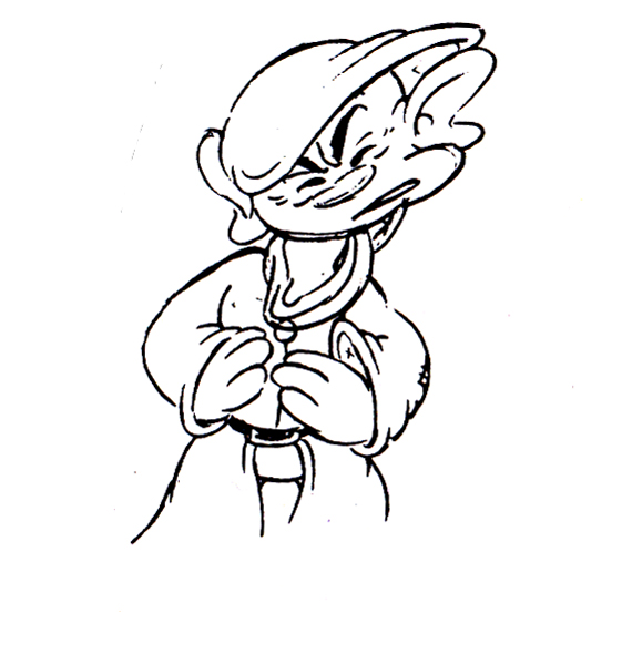
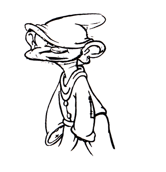
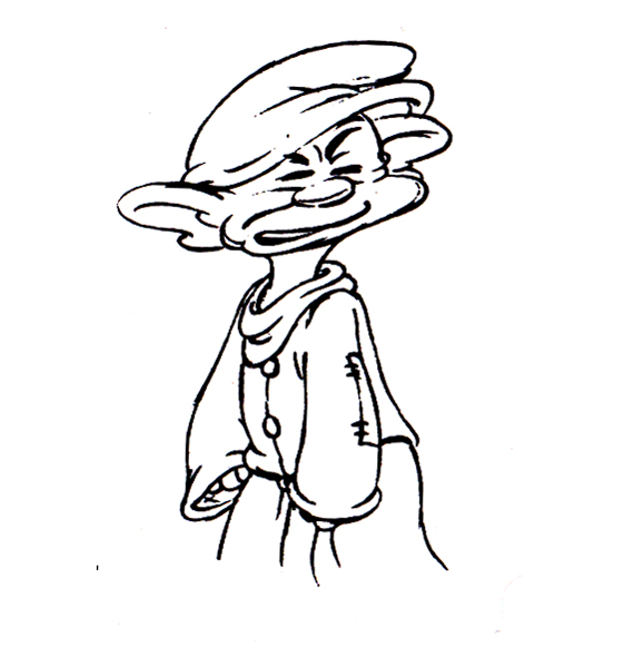
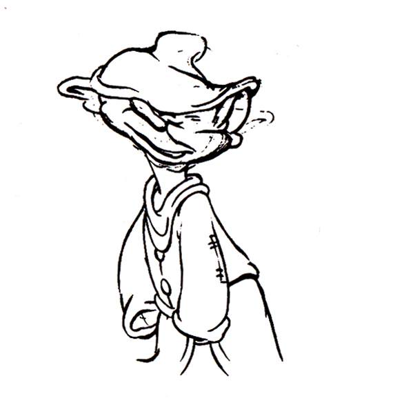
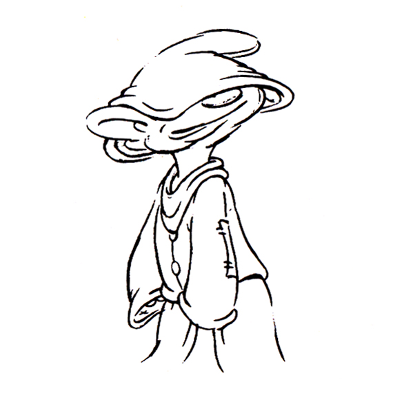
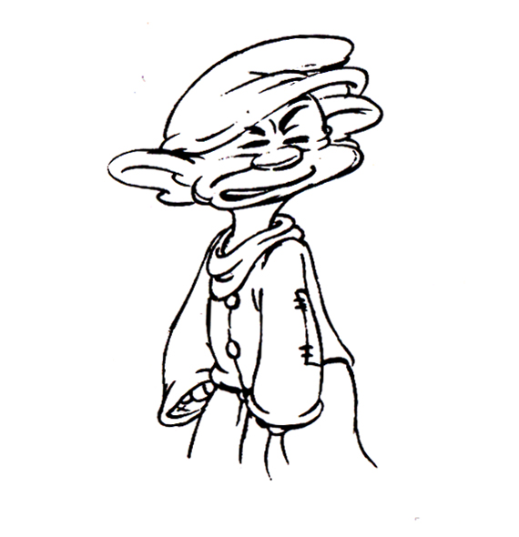
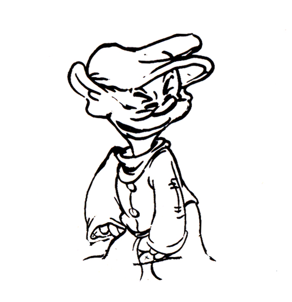
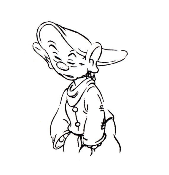
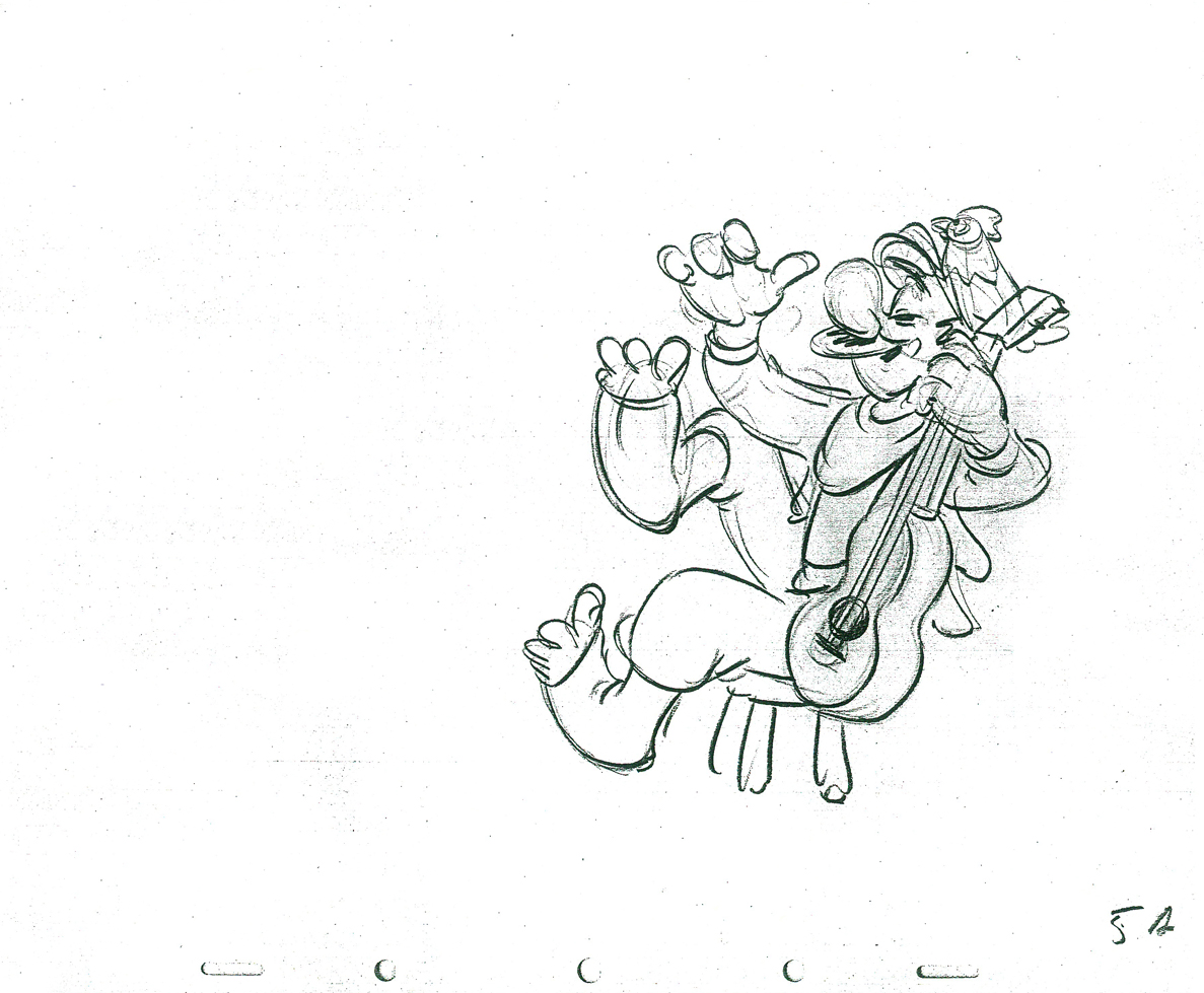
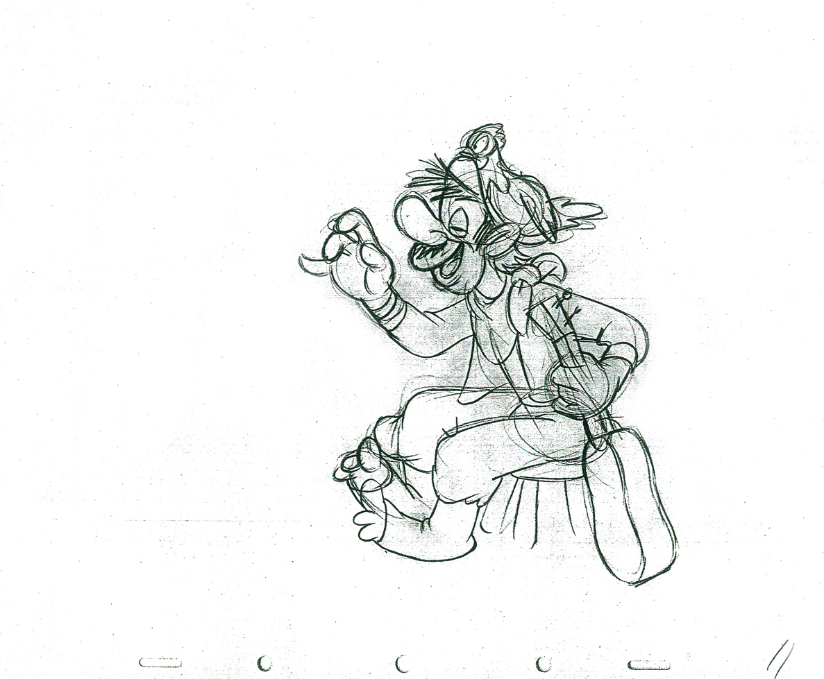
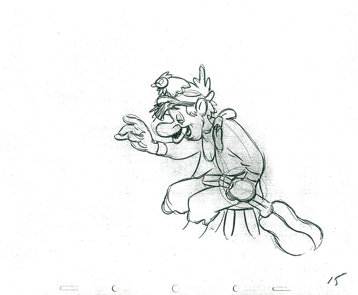
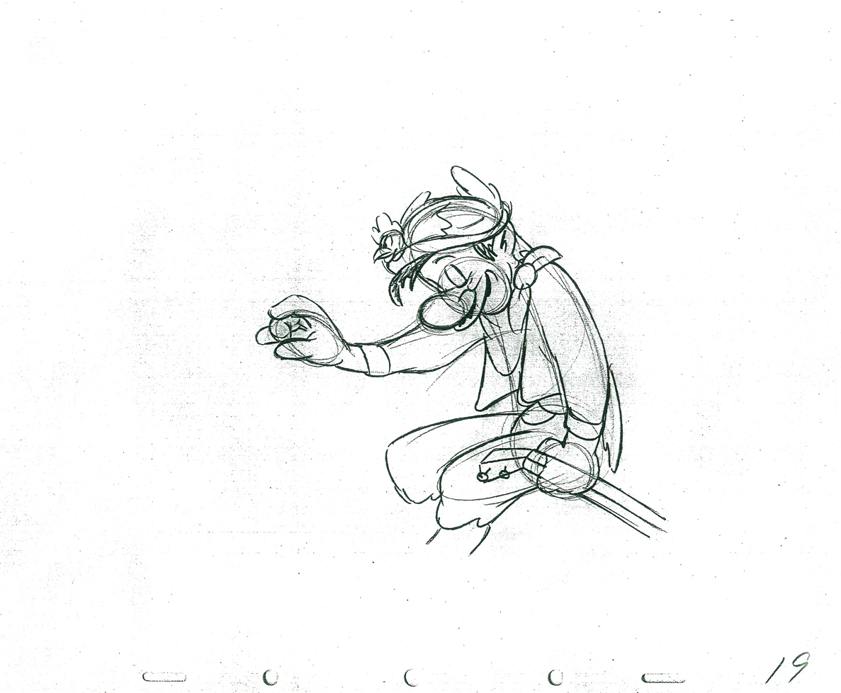
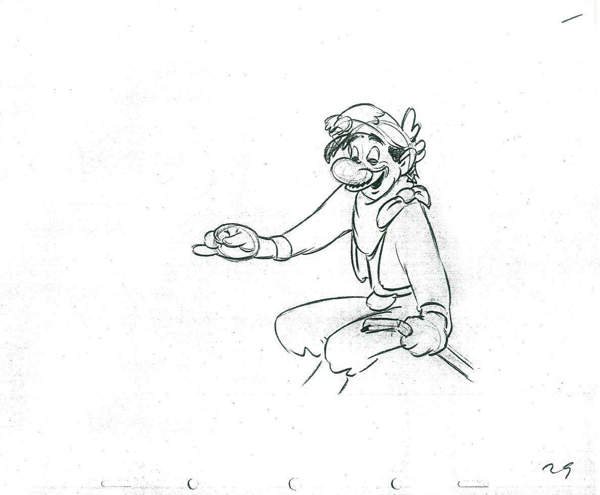
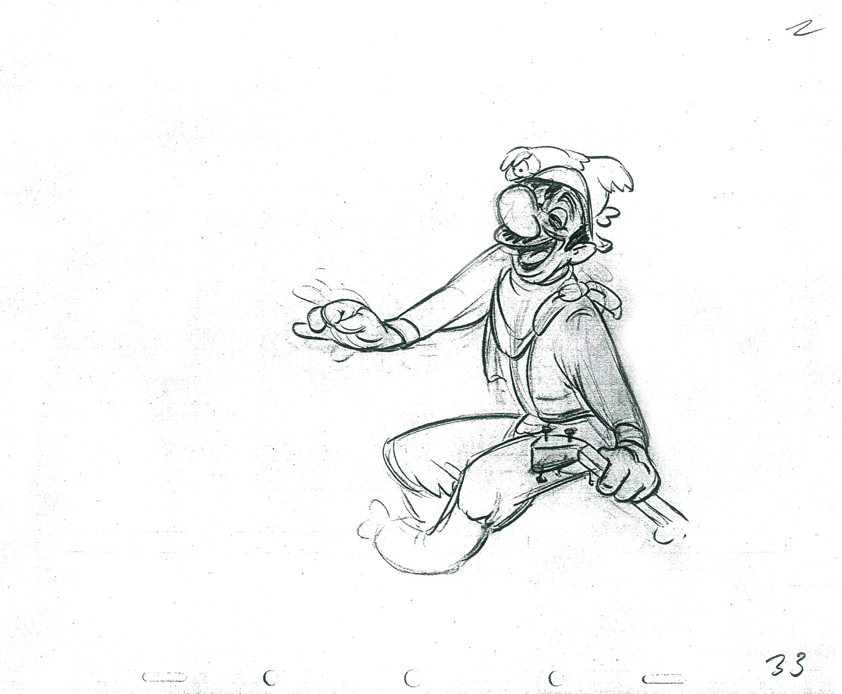
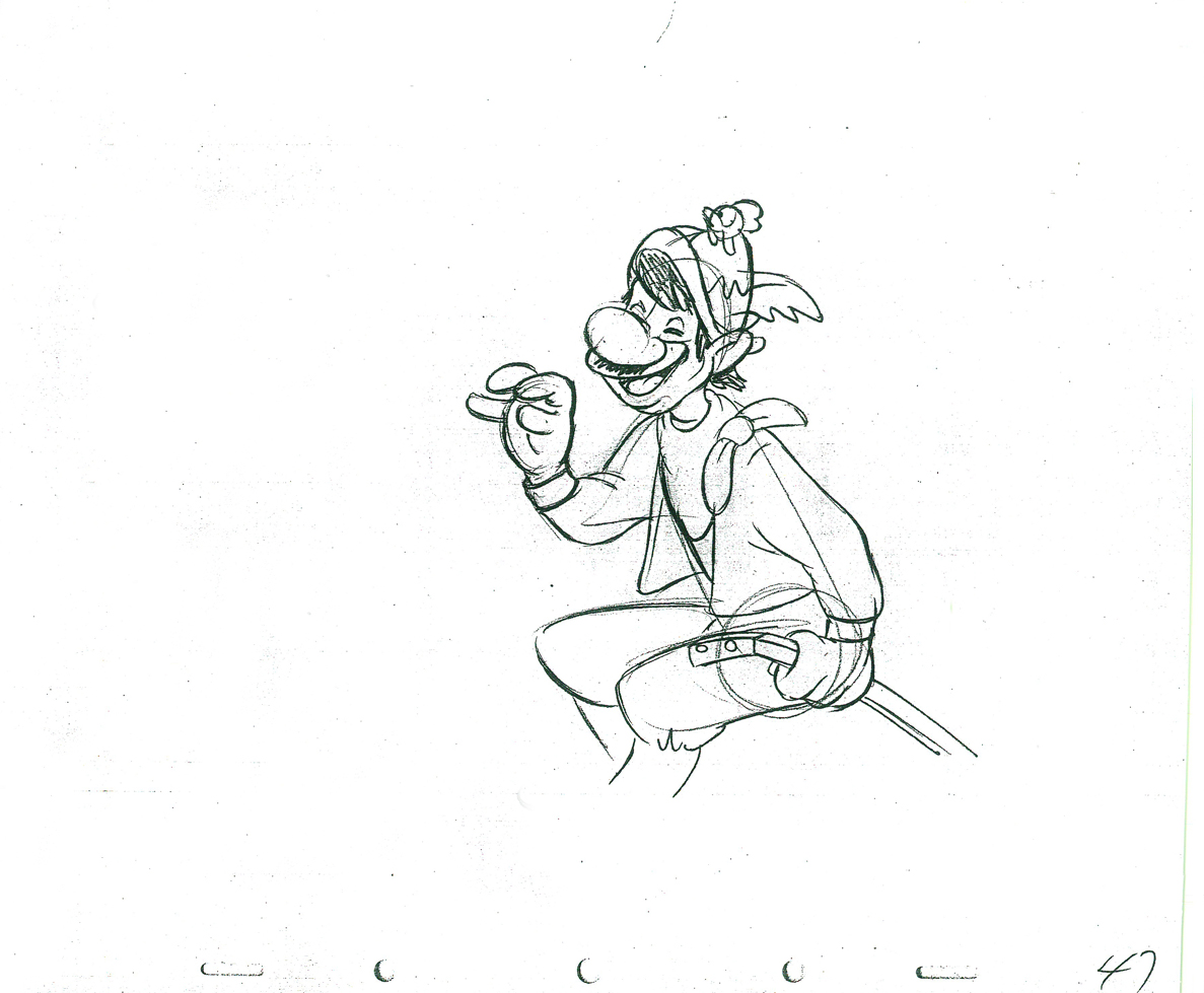
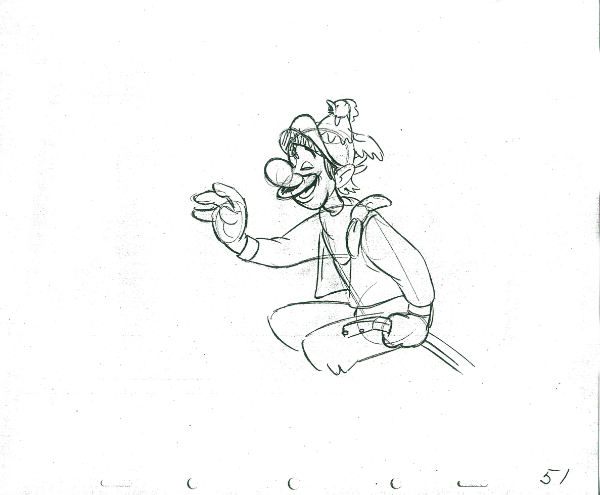
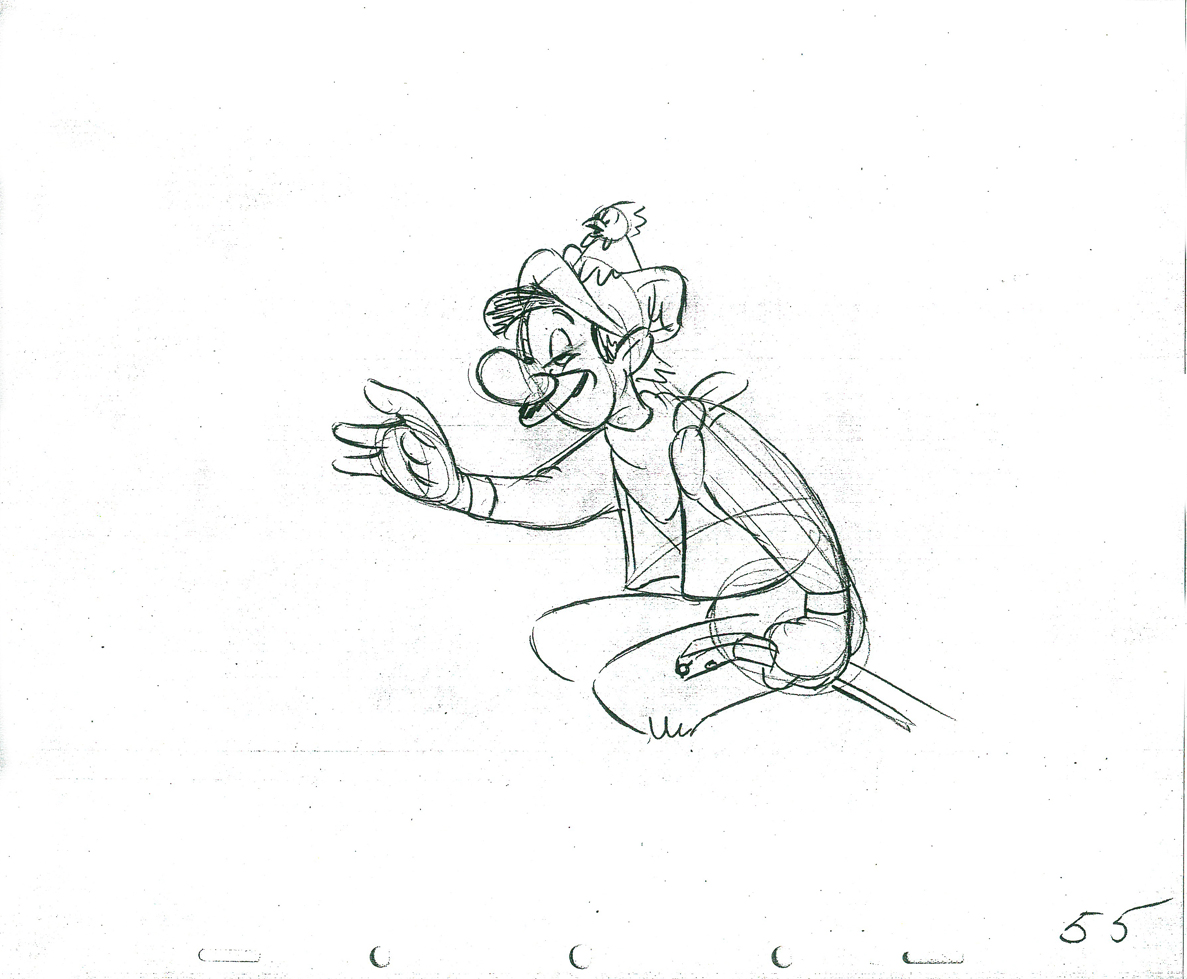
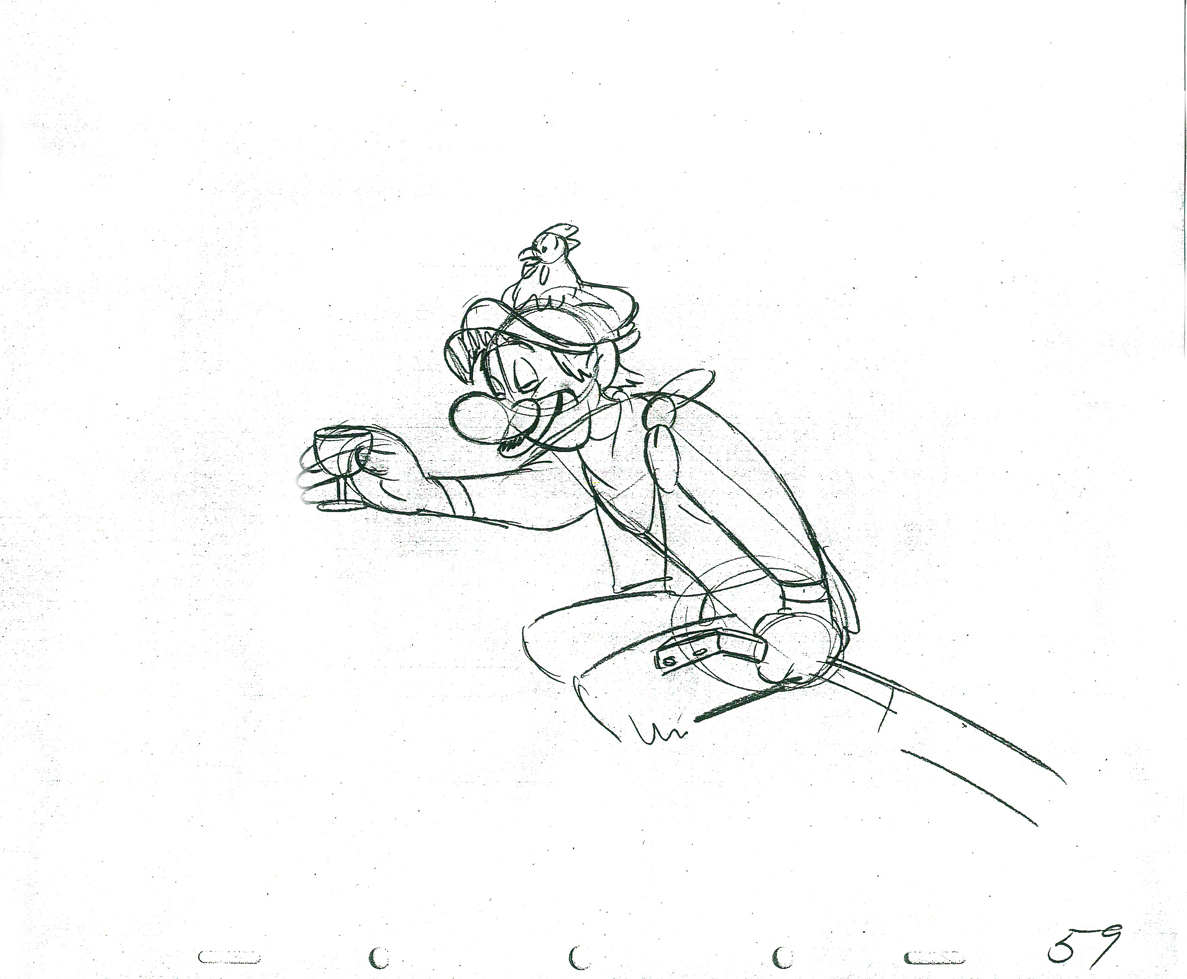
Tony Walton designed the character, Katz, which would be the alter-ego of the show’s cartoonist hero, played by Harry Guardino. Through Katz, we’d learn about the problems of a relationship with a media star, played by Lauren Bacall. (All images enlarge by clicking.)
.
It turned out to be a very intense production. Three minutes of animation turned into twelve as each segment was more successful than the last. There was no time for pencil tests. I had to run to Boston, where the show was in try-outs, to project different segments weekly; 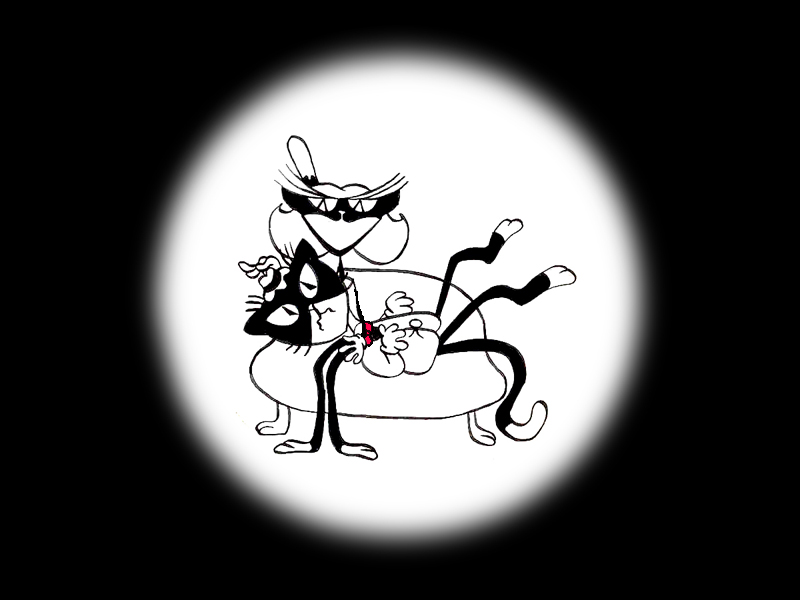 these went into the show that night – usually Wednesdays. I’d rush to the lab to get the dailies, speed to the editor, Sy Fried, to synch them up to a click track that was pre-recorded, then race to the airport to fly to the show for my first screening. Any animation blips would have to be corrected on Thursdays.
There was a small crew working out of a tiny east 32nd Street apartment. This was Dick Williams‘ apartment in NY after he;d finished Raggedy Ann. He was rarely there, and when he did stay in NY, he didn’t stay at the apartment. He asked me to use it as my studio and to make sure the rent was paid on time and the mail was collected. Since we had to work crazy hours, it was a surprise one Saturday morning to find that I’d awakened elderly Jazz great, Max Kaminsky, who Dick had also loaned the apartment for a night. Embarrassed, at the awkward confrontation, I ultimately moved to a larger studio – my own – shortly thereafter. Dick was convinced I was upset at him and the two of us didn’t talk for years afterward.
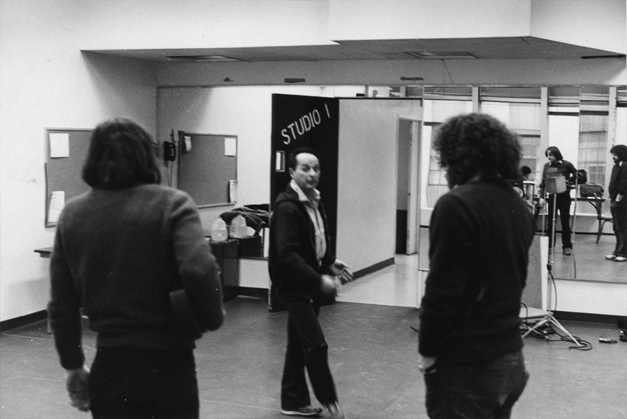
Here are a couple of photos of some of us working on WOTY:
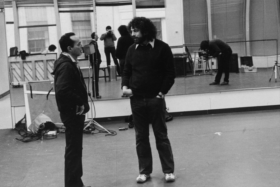
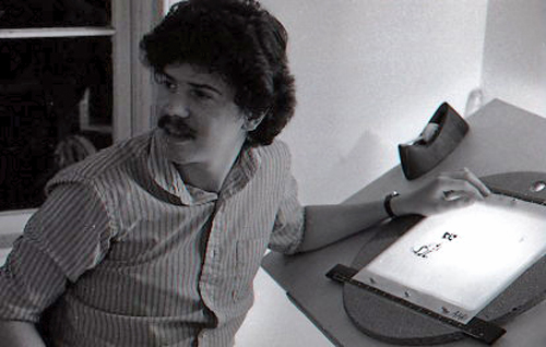
Tony Charmoli was the show’s choreographer. He worked with me in plotting out the big dance number – a duet between Harry Guardino and our cartoon character. I think this is the only time on Broadway that a cartoon character spoke and sang and danced with a live actor on stage. John Canemaker is taking this photograph and Phillip Schopper is setting up the 16mm camera.
Here Tony Charmoli shows us how to do a dance step. Phillip Schopper, who is filming Tony, figures out how to set up his camera. We used Tony’s dancing as reference, sooting Tony’s dancing in 16mm, but our animation moves were too broad for anyone to have thought they might have been rotoscoped.
John Canemaker worked with Sy Fried, our editor. John did principal animation with me on this one big opening number. Here they’re working with the click track and the live footage of Tony Charmoli to plot out the moves.
At one point I asked John to have the character, Katz, flick his tale at Harry Guardino, tripping the live actor mid-dance. It got a laugh at every performance.
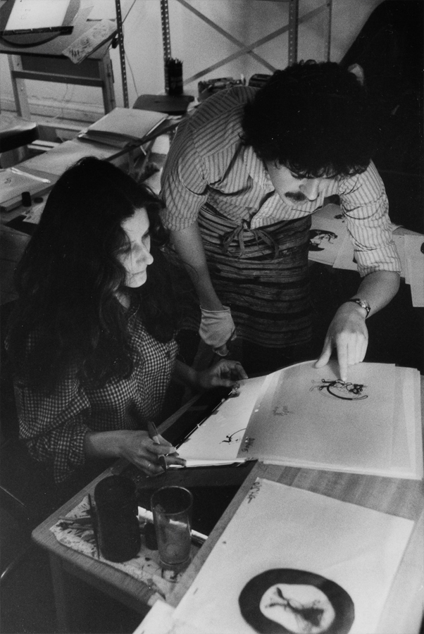
Steve Parton supervised the ink and paint. To get the sharpest lines, we inked on cels and didn’t color the drawings. It was B&W with a bright red bow-tie. A spotlight matte over the character, was bottom-lit on camera by Gary Becker. It was shot almost like a pencil test with high contraxt to get those very sharp lines.
 5
5 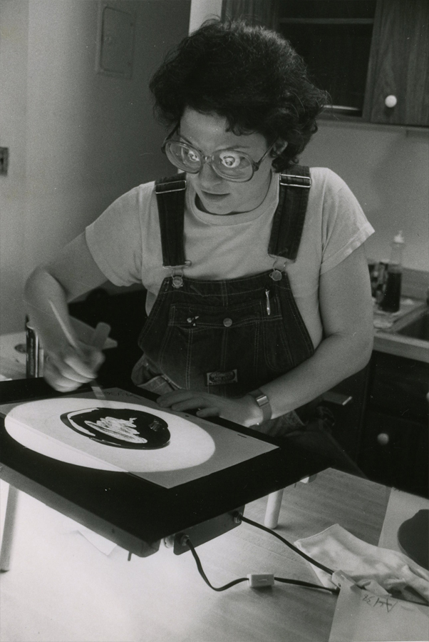 6
6
5. Steve Parton works with painter Barbara Samuels
6. Joey Epstein paints with fire in her eyes.
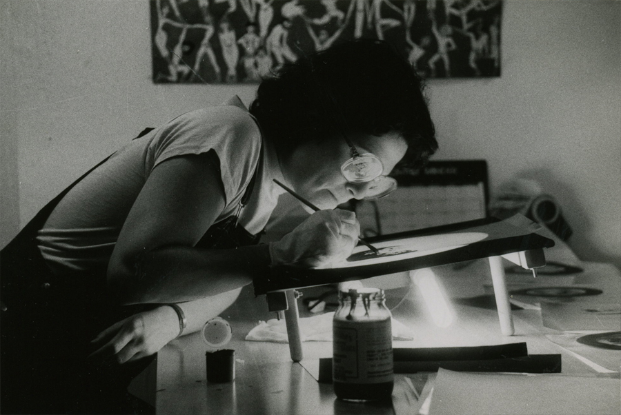
Joey Epstein paints “Katz.”
 8
8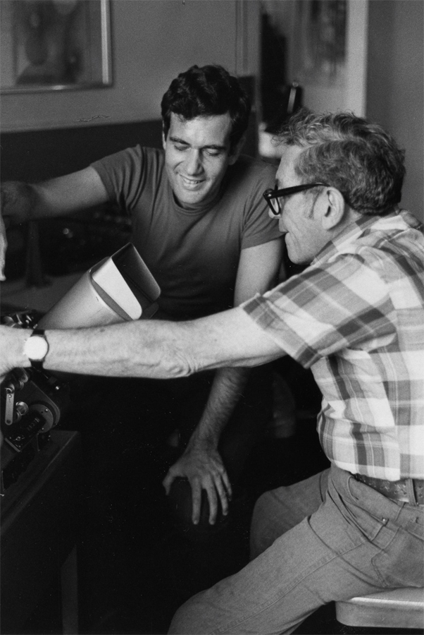 9
9
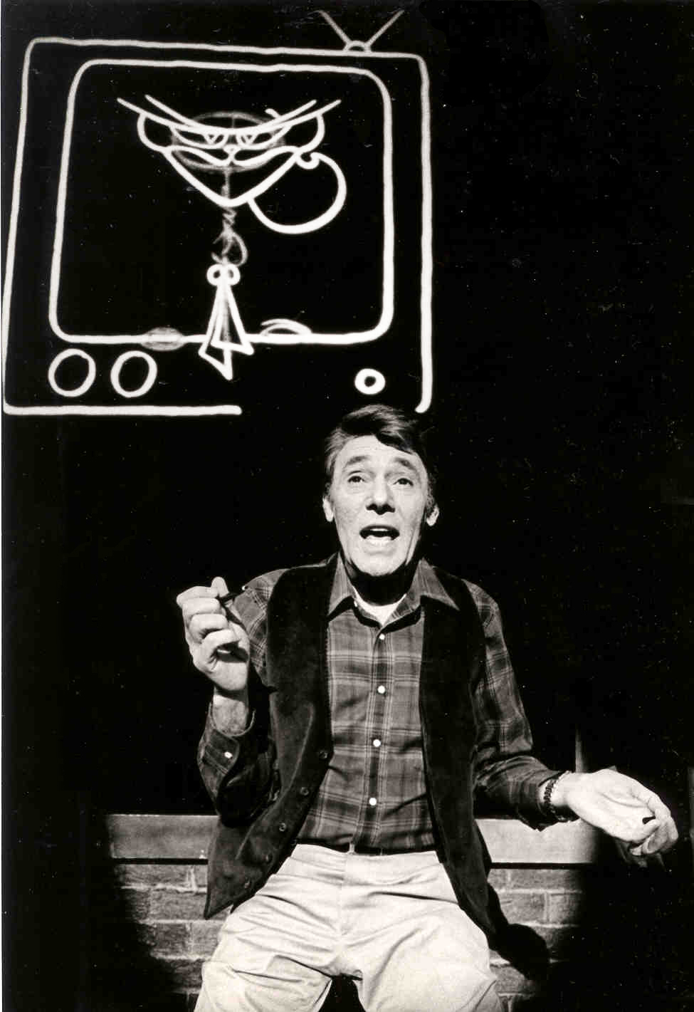
8. Harry Guardino on stage with the creation of “Tessie Kat” developing on screen behind him. This was Harry’s first big solo.
The filmed segment was shot backwards so the matte would develop as the song sang on.
The entire seqeunce took about 2½ minutes.
9. John Canemaker gets to see some of his animation with Sy Fried, editor.
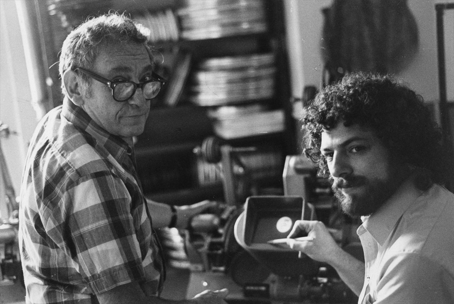
One of my quick stops from the lab on the way to Boston? No, I think this is a posed photo.
All together we had more than 12 minutes of animateion song duets between Harry Guardino and Katz. It was originally supposed to be three pieces totaling about five minutes. The animation was so successful in the tryouts in Boston that they kep adding more material. Finally the last song added – about 1½ minutes never made it to New York. Harry never properly learned it in Boston and he was too nervous for the Broadway opening to learn it for the big Opening. So the number was cut.
Lately there’s been more animation on Broadway and off-Broadway. Things are done with digital screens, and the technical aspect has gotten easier. One version of Sunday In the Park with George had painted backgrounds developing via animation as the characters sang their songs. Too bad the show didn’t offer the heart that was in the original Sondheim gem, when here wa no animation involved. Hopefully, eventually there will be something more. We did a show that was very successful (the show wasn’t successful; the animation was.) I’d love to try again. The only other try I had was to do musical scenics for the Overture to Meet Me In St. Louis on Broadway. The producers were irritants and didn’t help move things forward. I did get to meet the songwriter, Hugh Martin, before he passed away. That was my treat in that project.
Animation &Animation Artifacts &Commentary 01 May 2013 06:52 am
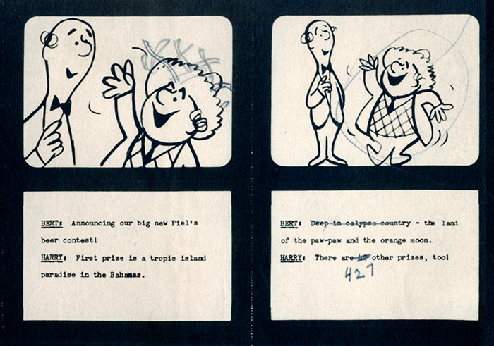
Piels Bros Commercial Animation Dwngs
Here’s the last of the three posts I’ve been able to cull from the drawings left behind in Vince Cafarelli‘s things. The 60 second spot was animated by Lu Guarnier and clean-up and assisting was by Vinnie.
Within this post there are drawings from two separate scenes. If you look at the storyboard (I’d posted the entire board in another post, but I’ve pulled the particular frames from the board to show again here), you can see what it is the characters are saying. I don’t have all the drawings for these two scenes; just those I’ve posted.
I’m also going to use these drawings of Lu’s to write about his style of animation. I was taught from the start that this was completely done in an incorrect way. I don’t mean to say something negative about a good animator, but it is a lesson that should be learned for those who are going through the journeyman system of animation.
 Right from the get-go I had some difficulty assisting Lu’s scenes. He started in the old days (early-mid Thirties) at Warner Bros, in Clampett’s unit, and moved from there to the Signal Corps (Army); then to New York working at a few studios before landing at UPA’s commercial studio. After that, he free lanced most of his career, as had so many of the other New York animators. They’d work for six months to a year at one studio then would move on to another.
I suspect the problems in Lu’s animation all generated from the training he’d gotten at WB. Lu worked in a very rough style. No problem there. An animator should work rough. These drawings posted aren’t particularly rough, but in his later years (when I knew him) there was hardly a line you could aim for in doing the clean-up. His style was done in small sketchy dashes that molded the character. Rarely was it on model, and always it was done with a dark, soft leaded pencil. There were others who worked rougher, Jack Schnerk was one, but Lu’s drawing was usually harder to clean up.
There was a rule that came out of the Disney studio, and, as both an animator and an assistant, I’ve followed it closely. When doing the breakdown charts (those ladders to the right of the drawing) all inbetween positions had to be exactly half way between drawing “A” and drawing “B”. If the animation called for it to be 1/4 of the way, you’d indicate that half-way mark then indicate your 1/4. If a drawing had to be closer or farther away – say 1/3 or 1/5th of the way – the animator should do it himself. This, as I learned it, was the law of the land. However, Lu would rarely adhere to it, and an assistant’s work became more complicated. The work was too easily hurt by a not-great inbetweener. I’ll point out an example of Lu’s breaking this rule as we come to it).
 bd.1
bd.1
 H1
H1
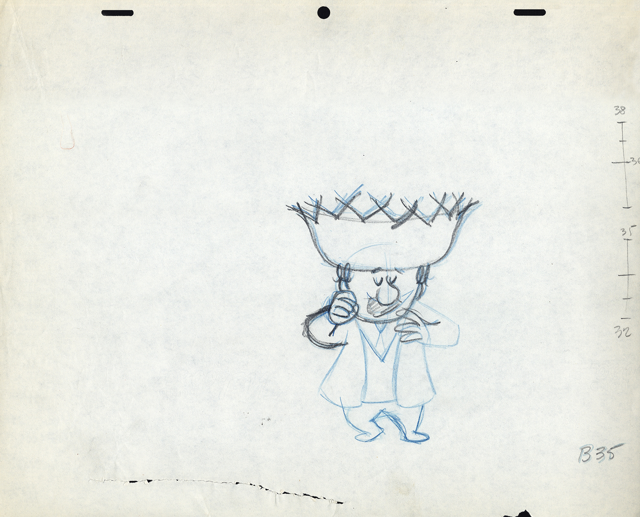
 B7
B7
 B35
B35
These ladders are done correctly, per the Disney system.
#34 is half way between #32 & #35;
#33 is half way between #32 & #34.
#36 is half way between #35 & #38;
#37 (the 1/4 mark) is half way between #36 & #38.
However, Grim Natwick told me
- demanded of me –
that all ladders should appear on the lower numbered drawing.
The ladder here should be on drawing #32 for all art
going into the upcoming extreme, #38.
Lu never followed this rule, which means the
assistant generally had to search for the chart.
The Second scene
 bd.2
bd.2
 B108
B108
This ladder is typical of Lu’s animation.
It would seem that #106 is 1/3 of the way between #108
and #105 is half way between #106 and #109.
and it also looks like #107 is 2/3 of the way between #108 and #109.
Because the numbers come on the last of the extremes, here,
more confusion is allowed to settle in.
 B114
B114
 H1
H1
 H4
H4
 H9
H9
Again, the ladder appears on the later extreme. The assistant
shouldn’t have to go looking for it. The ladder should be on
the first drawing involved in the breakdown.
Again, the breakdown drawings are on 1/3′s, and
the inbetweens are 1/2′s of that. It makes it harder on the
people following up on the clean-up & inbetweens.
 H14
H14
 H19
H19
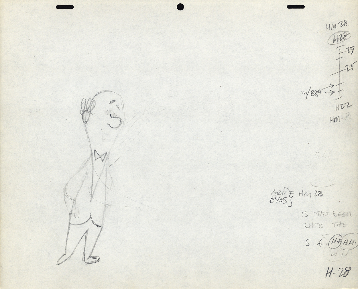 H28
H28
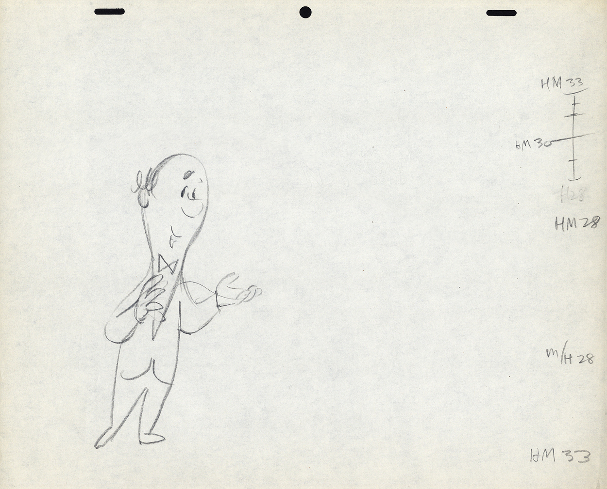 H33
H33
 H34
H34
I don’t know if this style of Lu’s was a product of where he learned to animate or not. Jack Schnerk, a comparable animator – whose work I loved (even though he had a rougher, harder to clean up drawing style) – always broke his timing in halves and halves again. There were times when his animation went to one’s and he did most of all the drawings. I assumed he had an unusual timing, and he didn’t want to burden the Assistant with his schema. He also always carried the breakdown charts on the earlier numbered drawing – per Grim Natwick’s comment. In some way I felt that Lu was rushed to get on with the scene, and whatever method he used would be to get him there more quickly. (It was the assisting that was slowed down.) This may have been a product of his attempts to devise some type of improvisation in the animation. Lu’s work, on screen, was usually excellent, so he didn’t much hurt anything in his method.
It might also have been his method of trying to put SNAP into the animation. This was a WB trait from the mid-late Thirties. It was certainly in Lu’s animation. No doubt a hold-over from Clampett’s early days of directing.
The final thing to note is that Lu usually worked on Top Pegs. Animating on Top Pegs makes it impossible to “roll” the drawings and check on the movement of more than 3 drawings. You can only “flip” the three, checking the one inbetween, but it didn’t give you a good indication of the flow of the animation. This is obviously necessary in animating on paper. It also made it difficult for the cameraman as well as those following behind the animator. If there were a held overlay, this would have to be on bottom pegs since the animation is on top pegs. That requires extra movement of the expensive cameraman to change all the animation cels after lifting the bottom pegged overlay. It also risks the possible jiggling of the overlay as it’s continually moved for the animating cels.
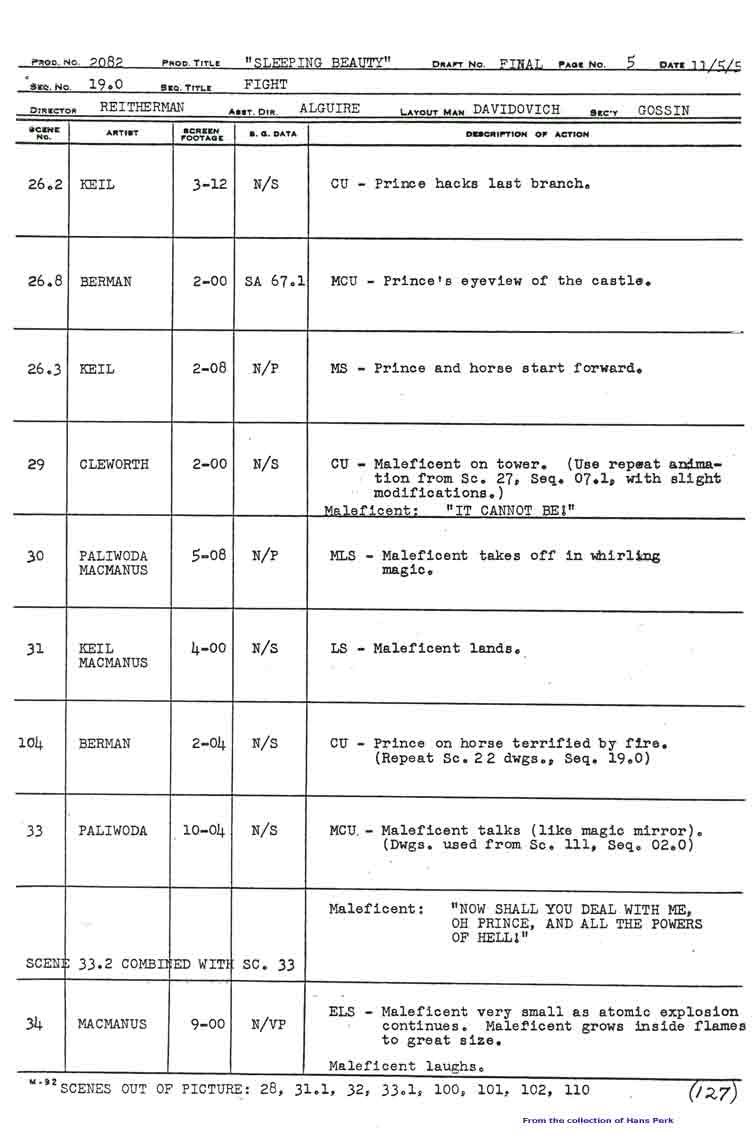
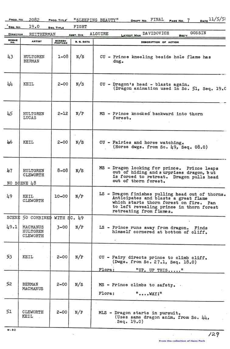
Animation &repeated posts &Story & Storyboards 30 Apr 2013 06:38 am
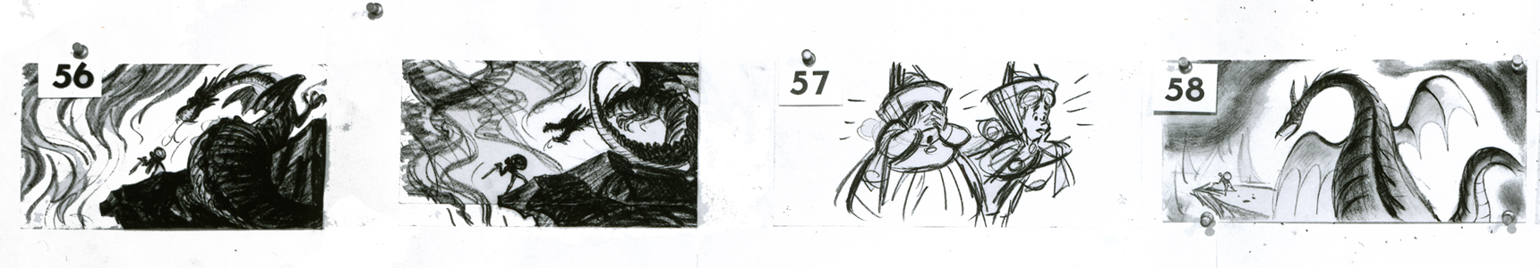
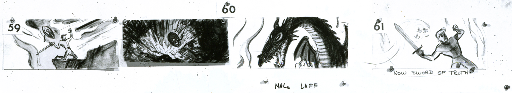
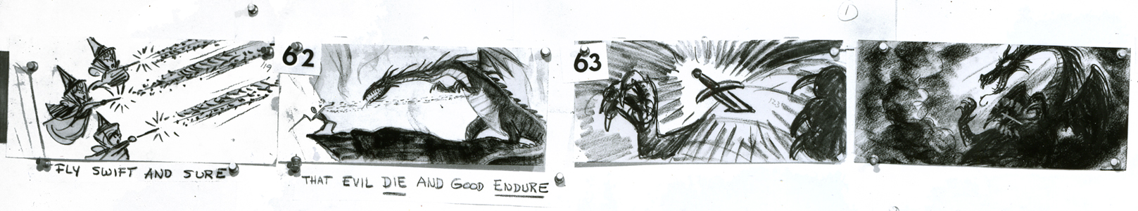
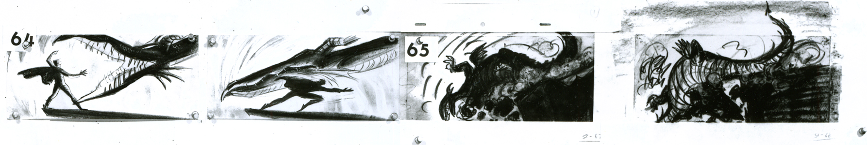
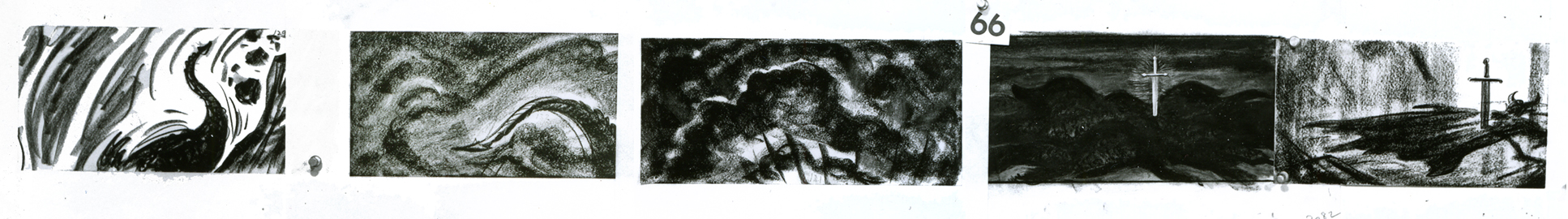
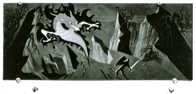
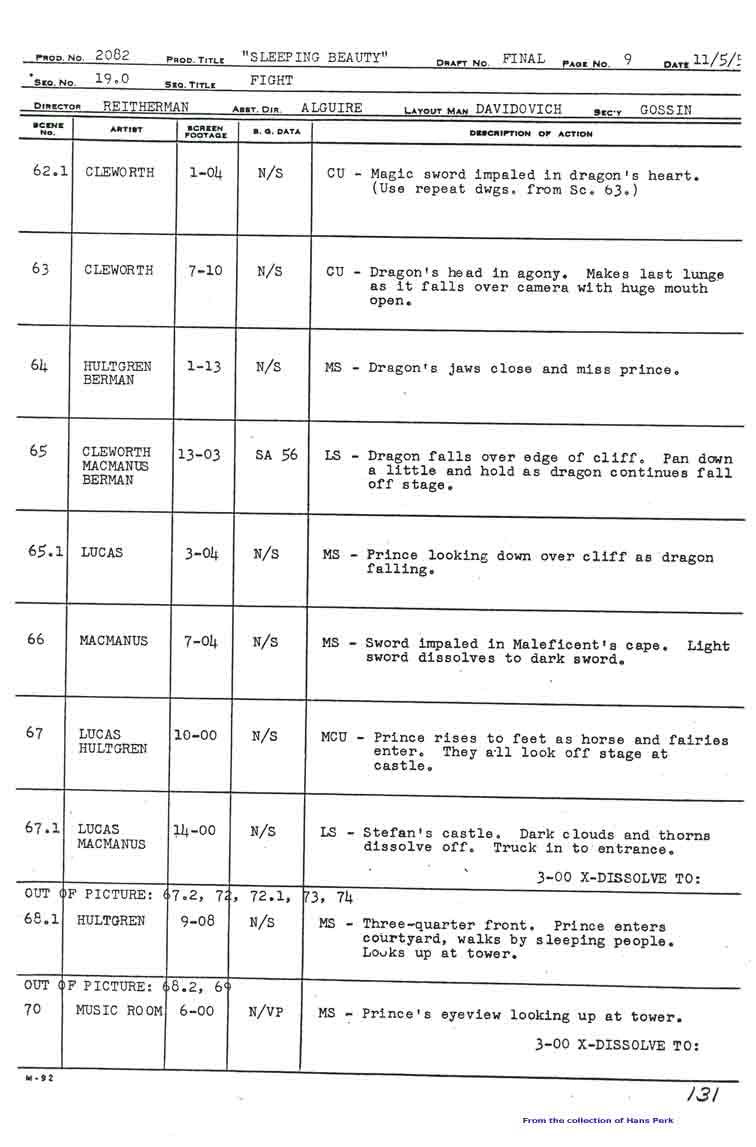
Dragon Fight – Seq 19 the end.
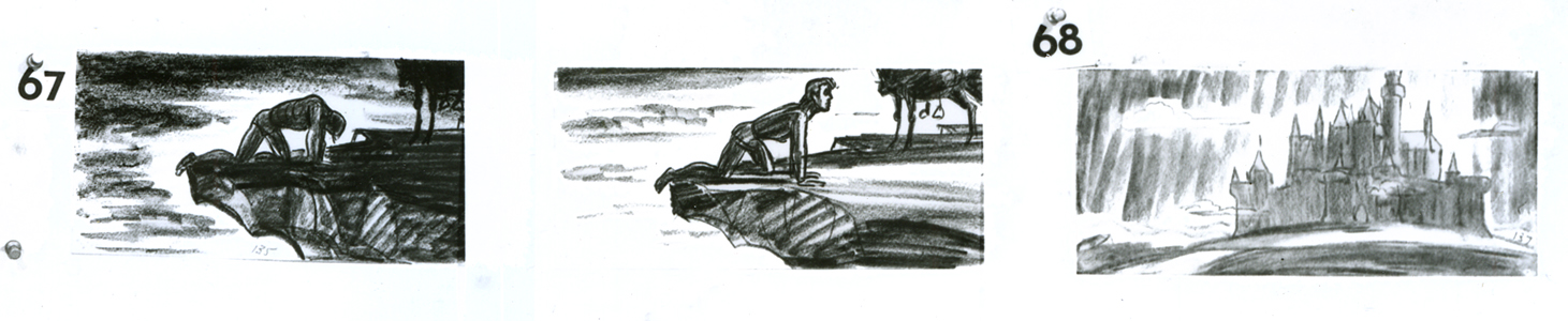
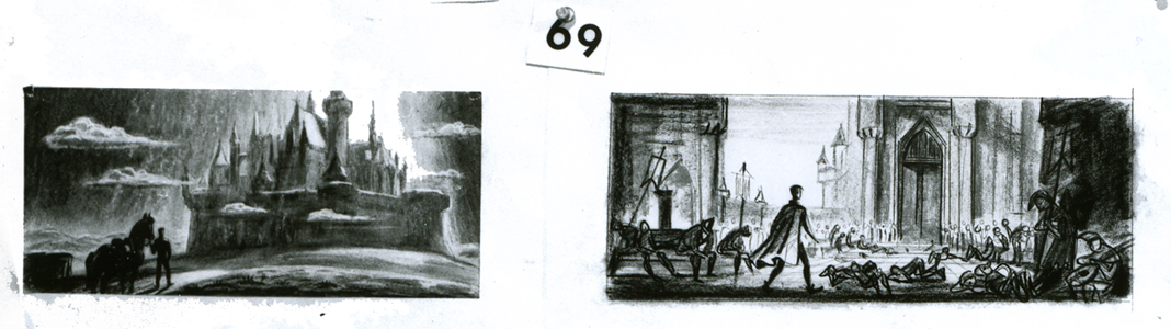
My apologies, I should have included this page among those from the Sleeping Beauty battle which I’d posted yesterday. This concludes the dragon fight.
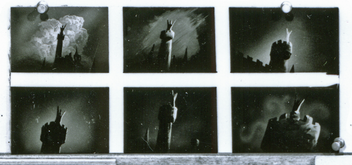
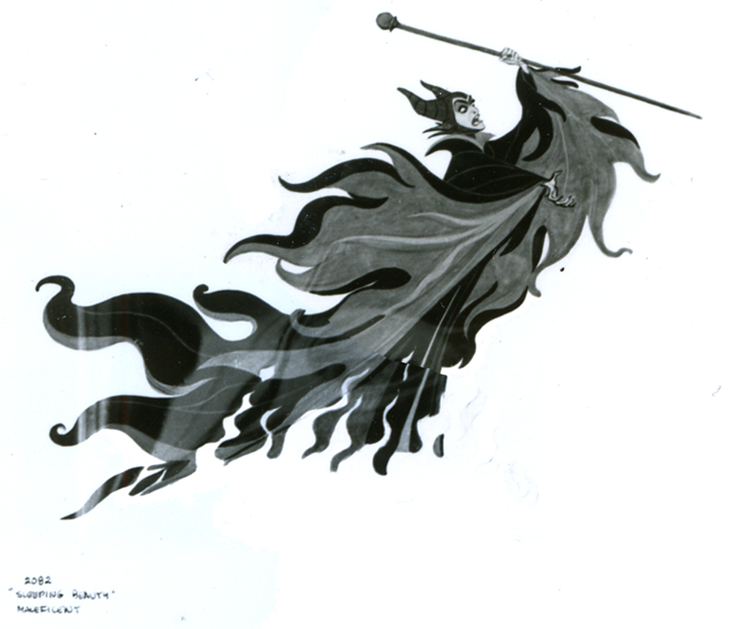
- This is the final photo/page of the Ken Anderson board for Sleeping Beauty. John Canemaker loaned me the series (which I’d posted in June of 2006) that includes Sequences 18 & 19 of the film. They’re the climax of the film – Prince Phillip’s battle with the thorns and the dragon, ultimately killing off Maleficent.
This is the whole photo as is:
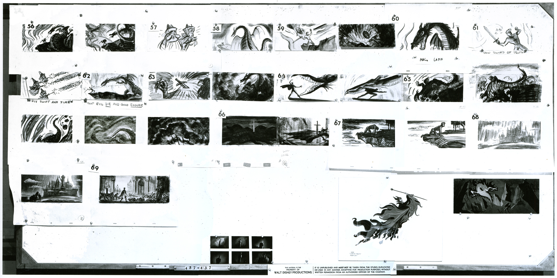
(Click any image to enlarge.
Here, I’ve broken the photo into rows cutting the rows in half. This way I can post them as large as possible for viewing.
 1a
1a
 1b
1b
 2a
2a
 2b
2b
 3a
3a
 3b
3b
 4
4
These last are tiny thumbnails at the base of the photo.
These two basic setups are also pinned to the board.
Here are the pages of the animator’s draft to inform you as to who animated the scenes of sequence 19:
 1
1 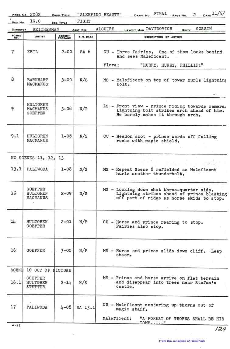 2
2
 3
3 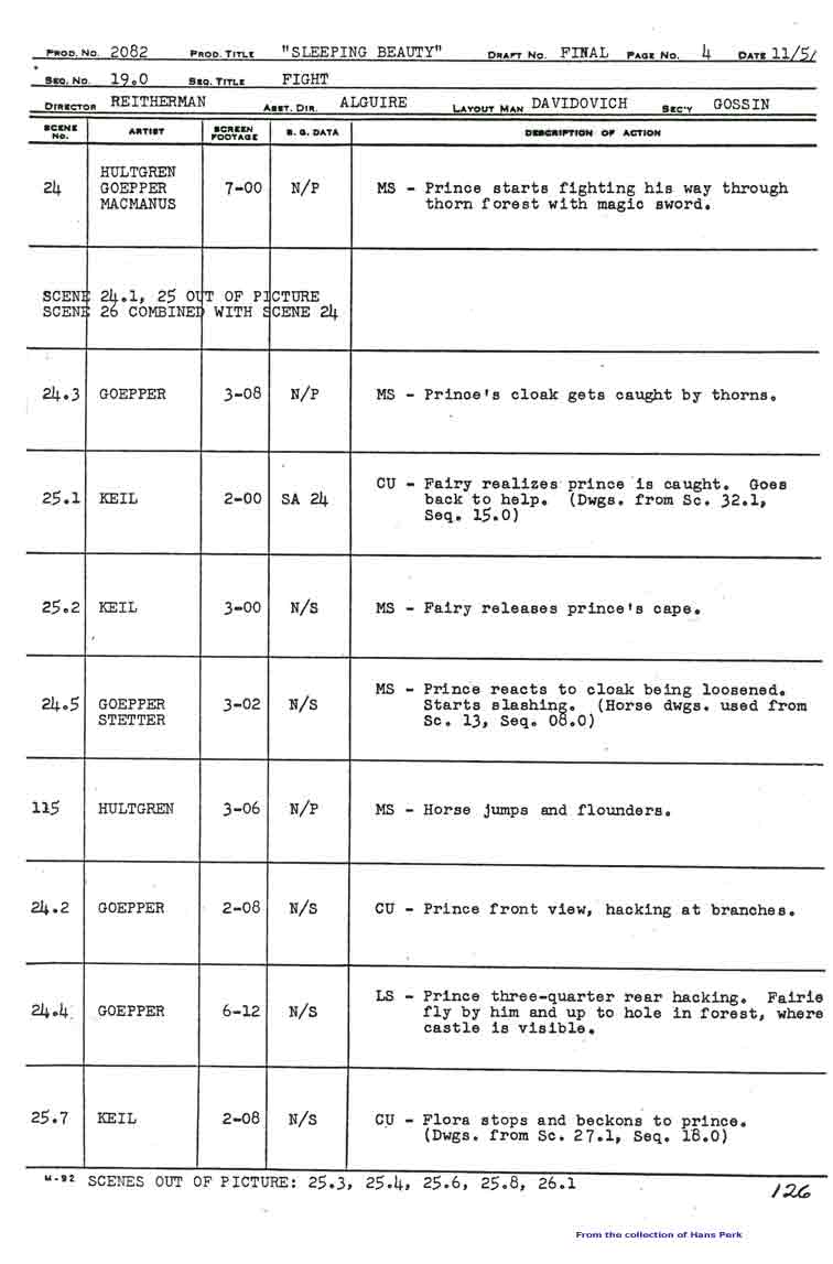 4
4
 5
5 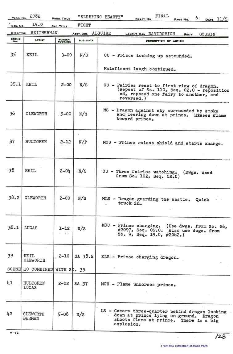 6
6
 7
7 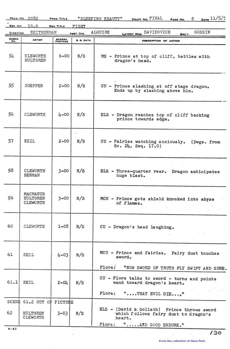 8
8
 9
9 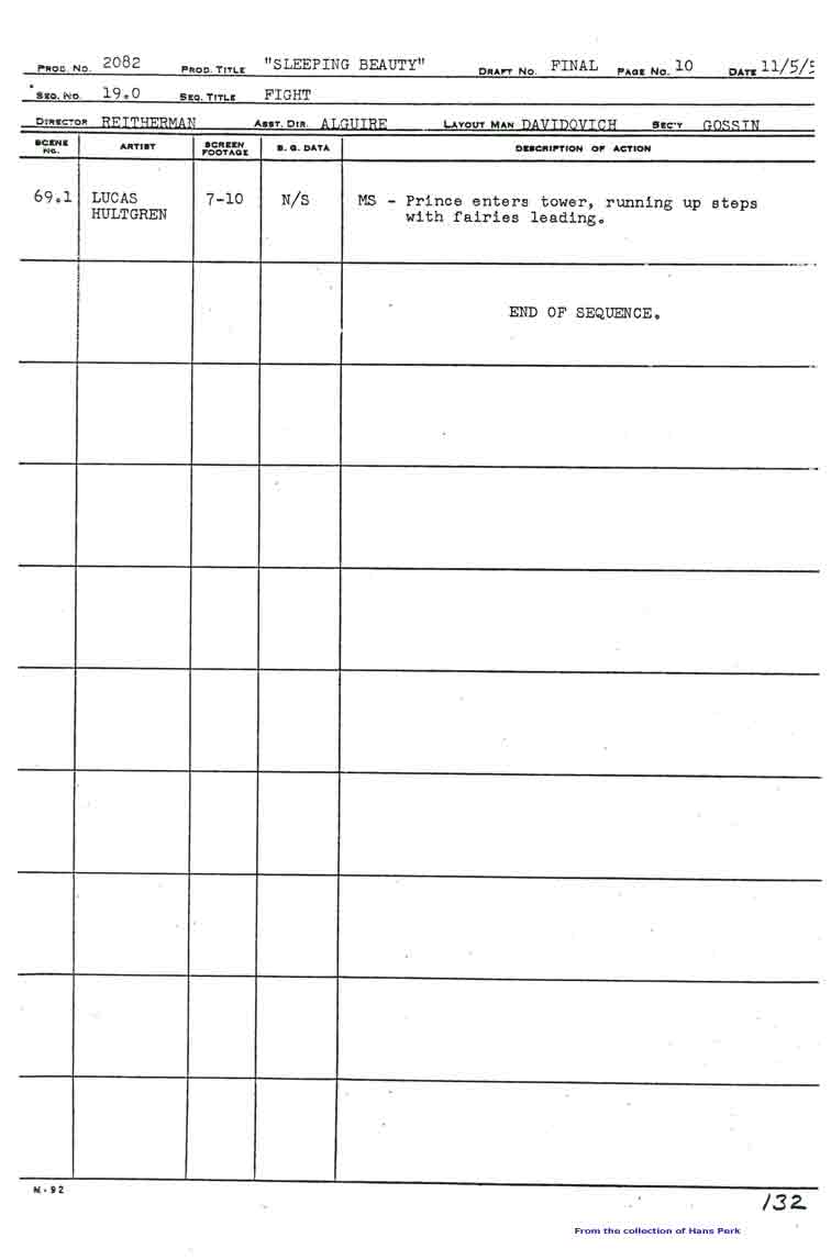 10
10
Click any image to enlarge.
Many thanks also to Hans Perk who, on his blog A Film LA, has posted the animator drafts of this film (like so many others he’s shared with his readers). None of this work could have been done without that reference.
Action Analysis &Animation &Animation Artifacts &commercial animation 24 Apr 2013 05:07 am
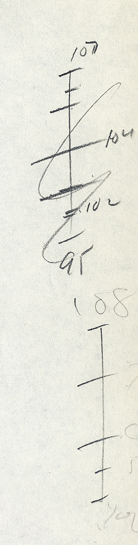
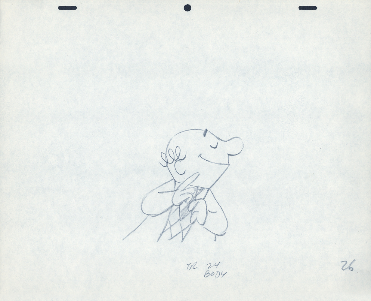
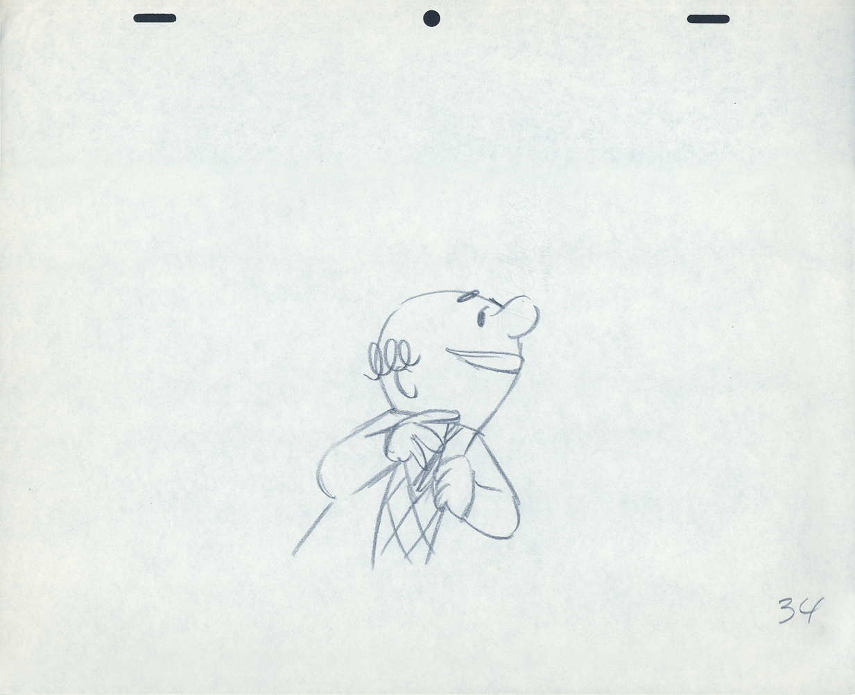
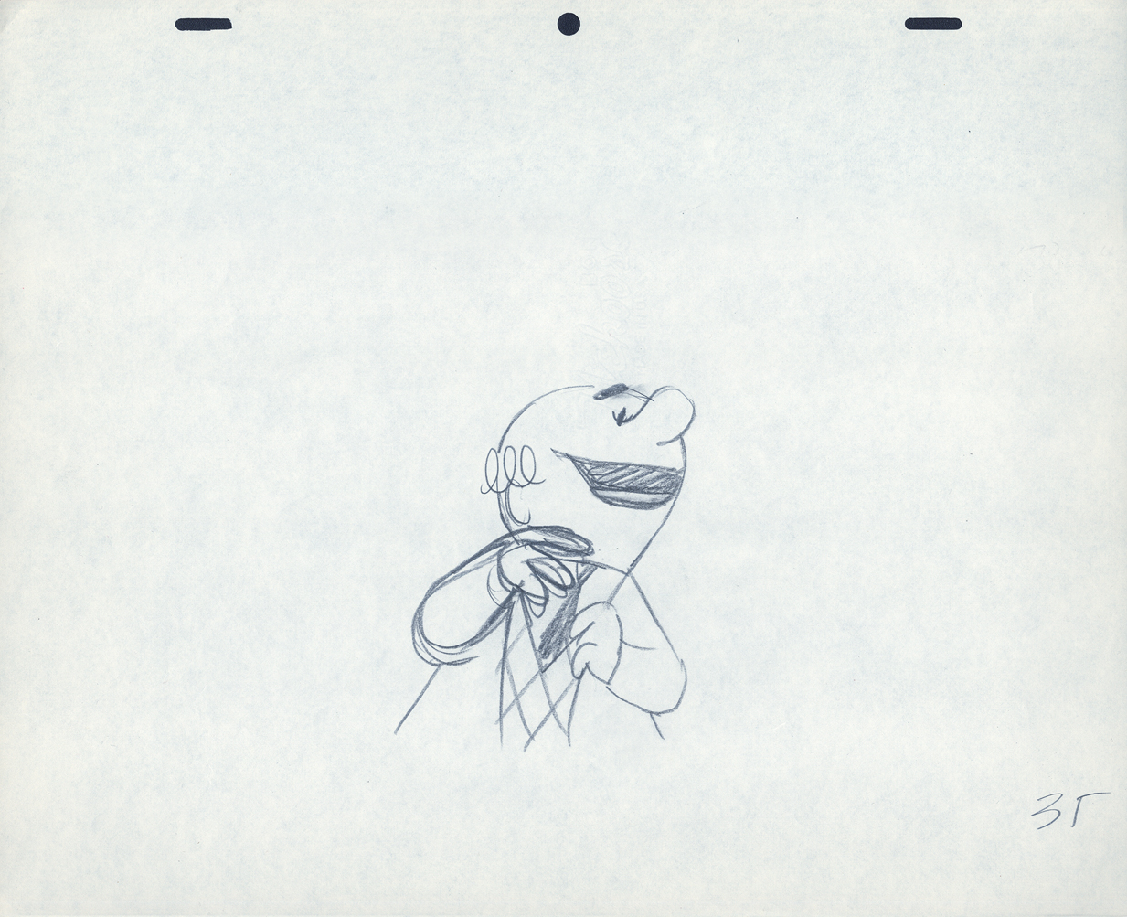
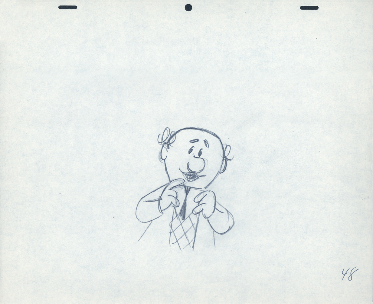
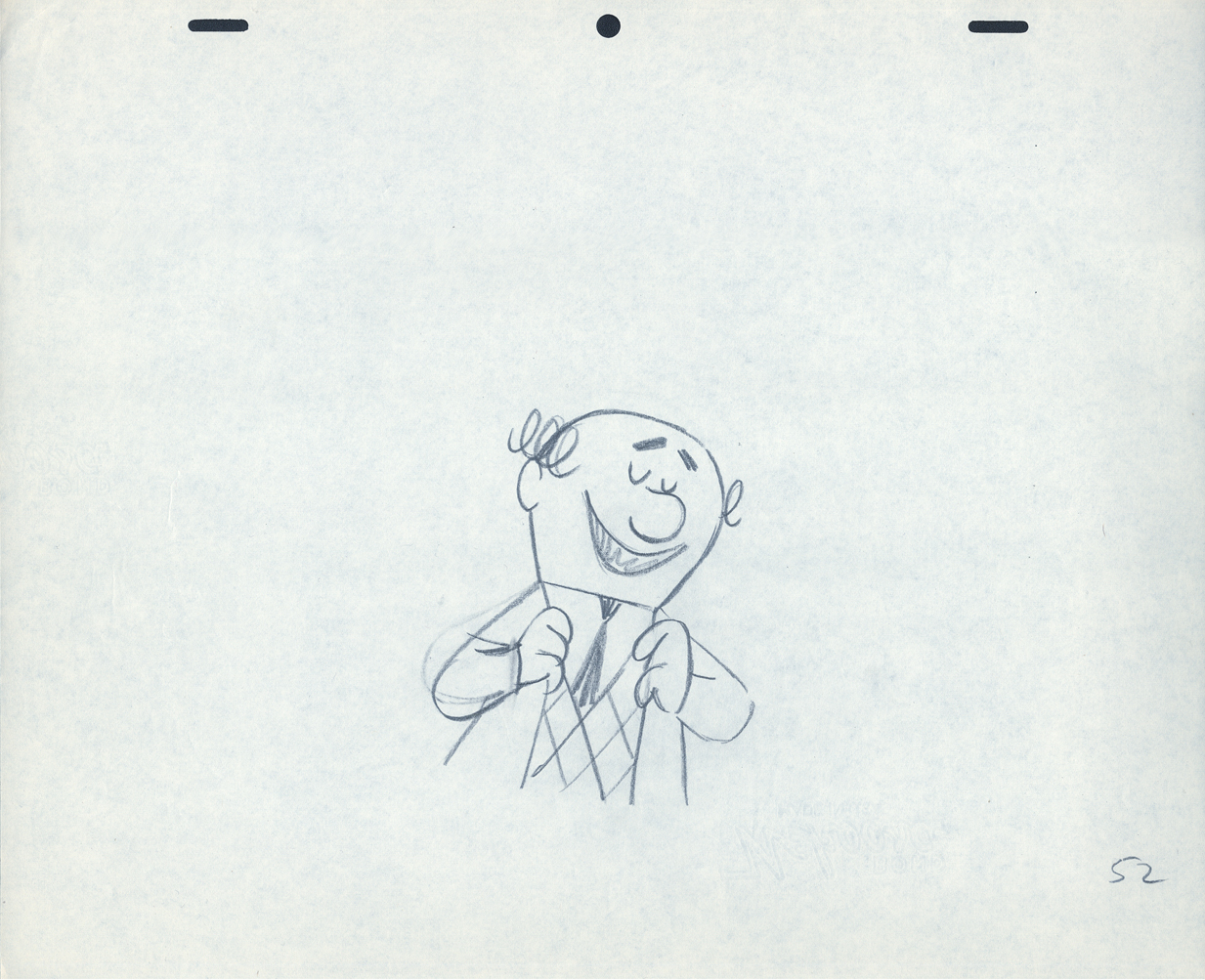
Piels Bert CU
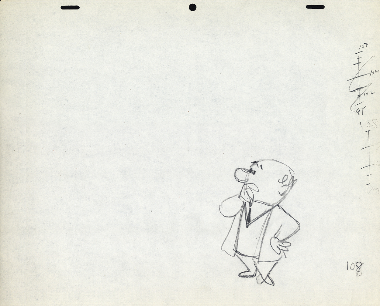
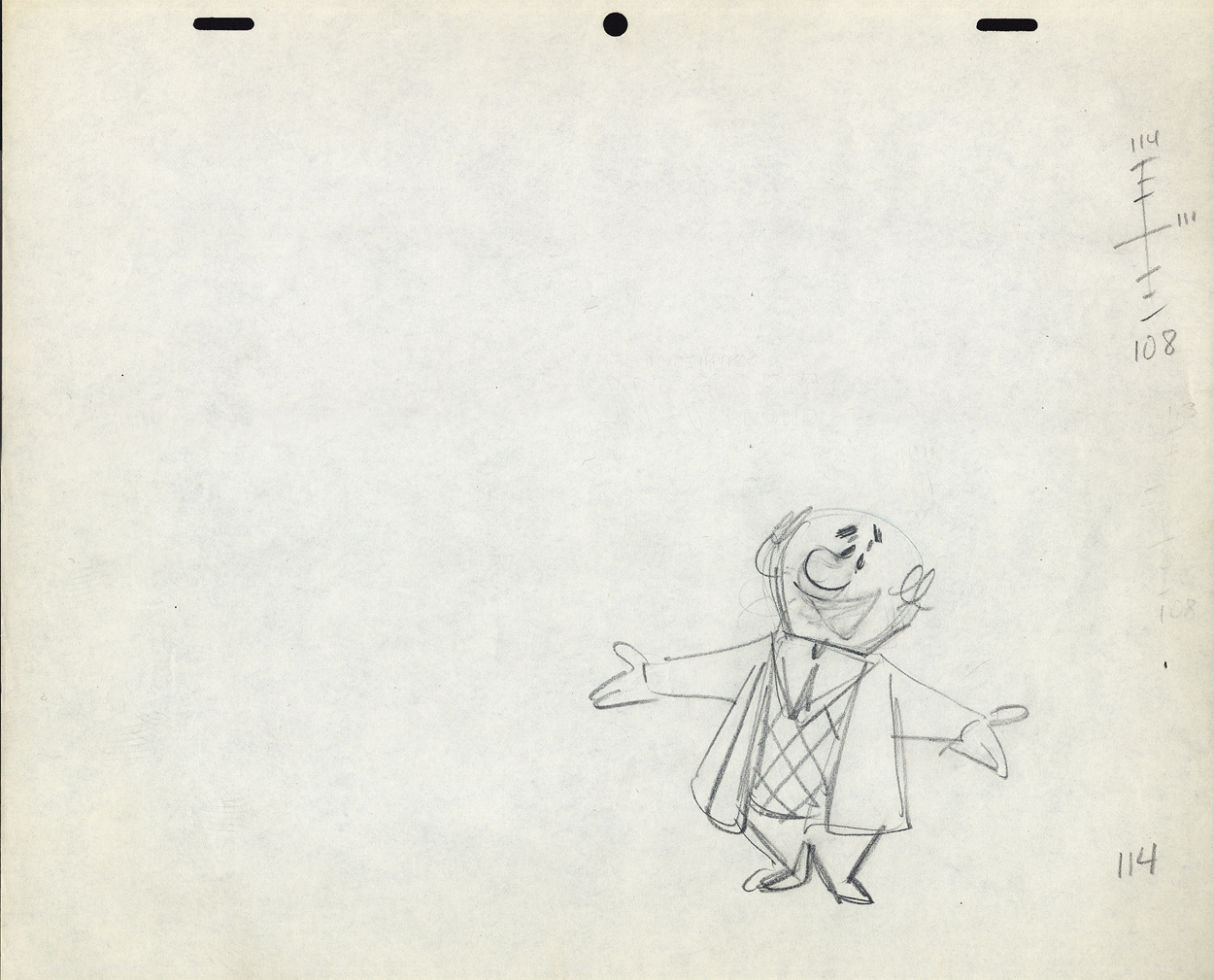
- Here’s one of the scenes saved by Vince Cafarelli from a commercial he did while at Goulding-Elliott-Graham. The commercial was animated by Lu Guarnier, and Vinny was the assistant on it. Hence, he saved the rough drawings (instead of Bert Piels. (Sorry I don’t know what he’s saying, though I’m looking for the storyboard.)
So, here are Lu’s rough drawings in this CU
 2
2
 3
3 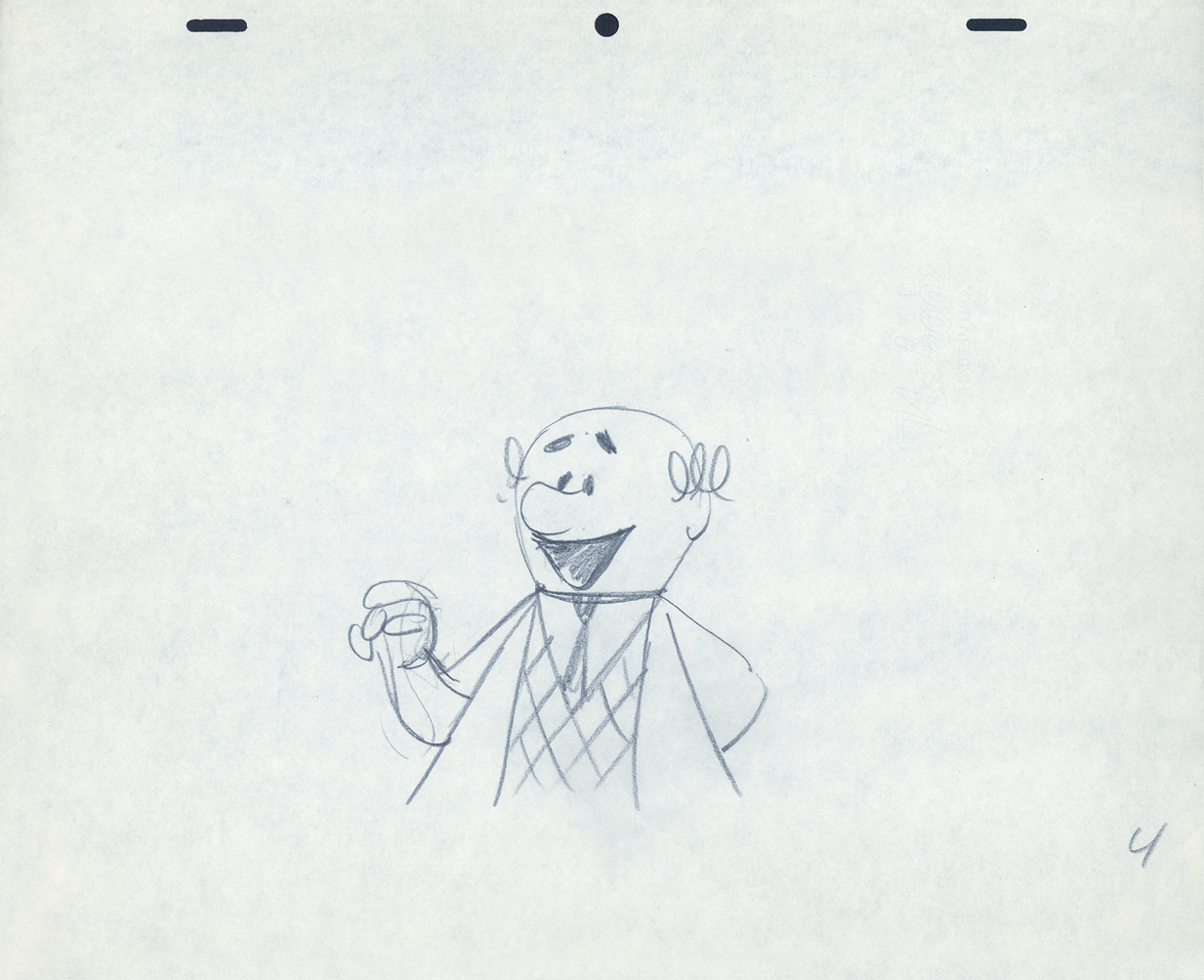 4
4
 5
5
 9
9
 10
10 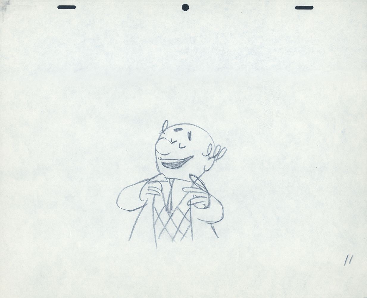 11
11
 19
19
 20
20 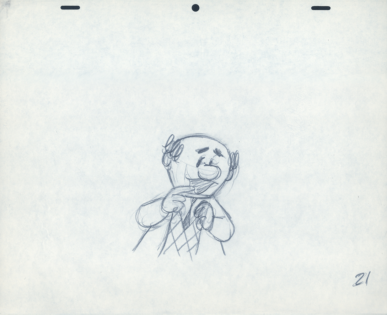 21
21
 22
22 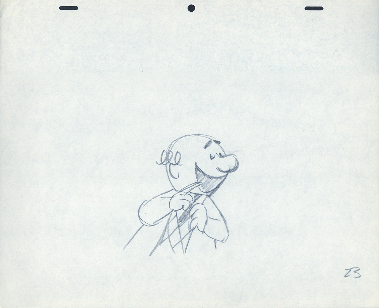 23
23
 25
25
 26
26
 34
34
 35
35 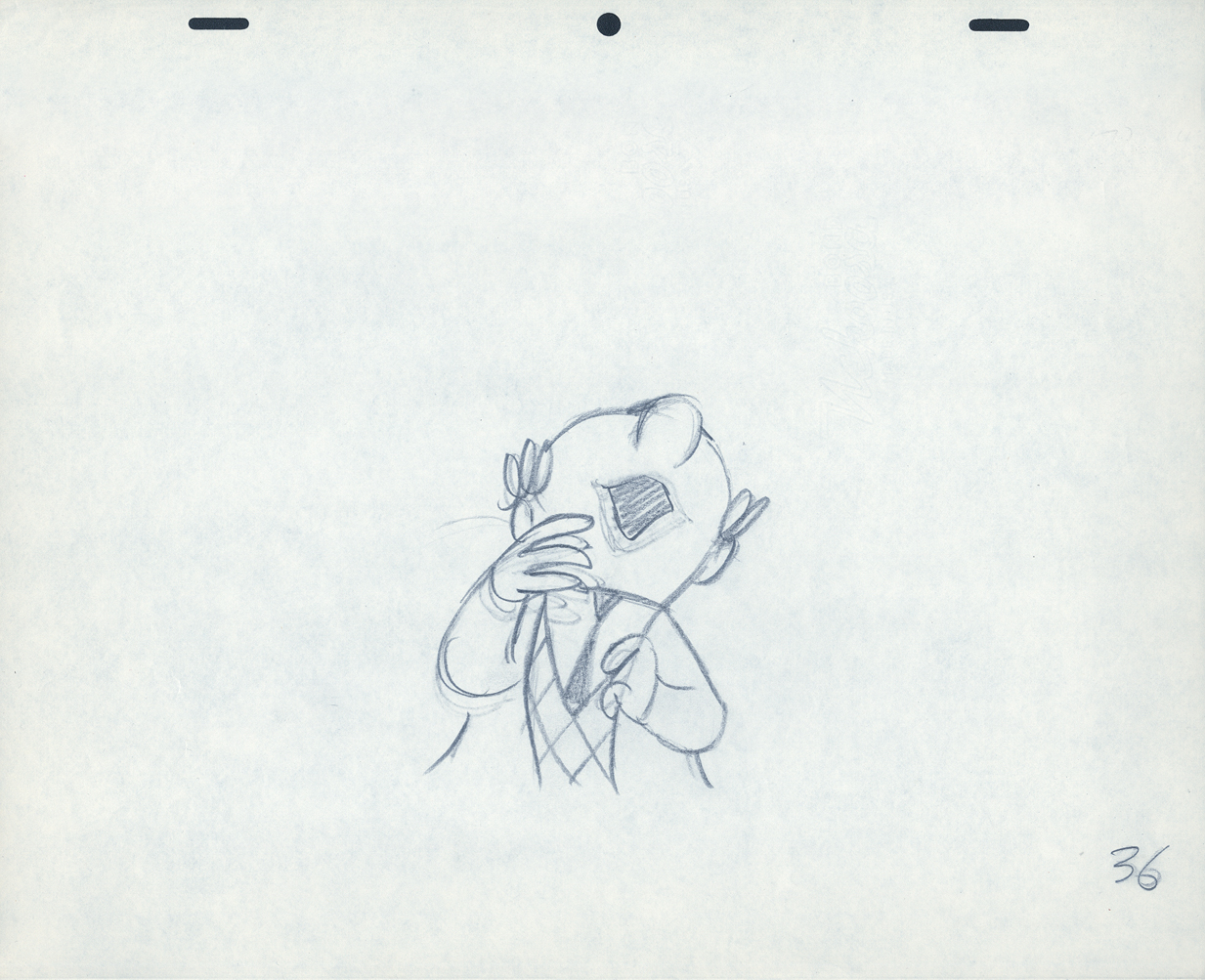 36
36
 37
37
 38
38
 45
45
 46
46 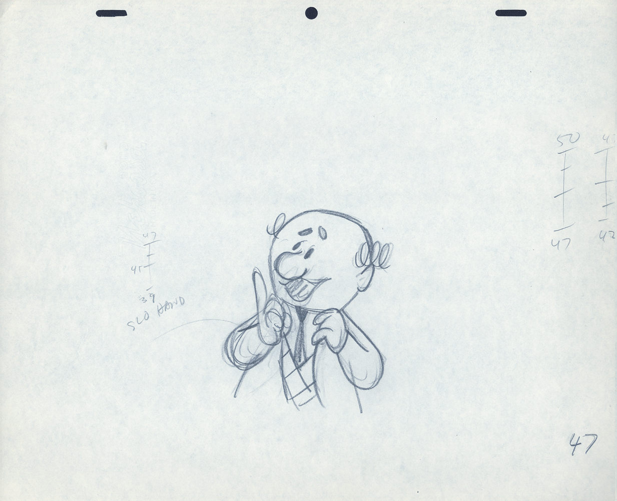 47
47
 48
48 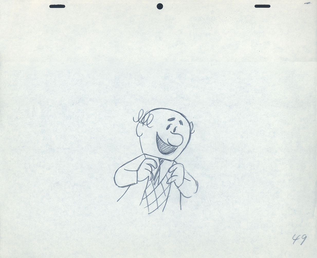 49
49
 52
52
 53
53 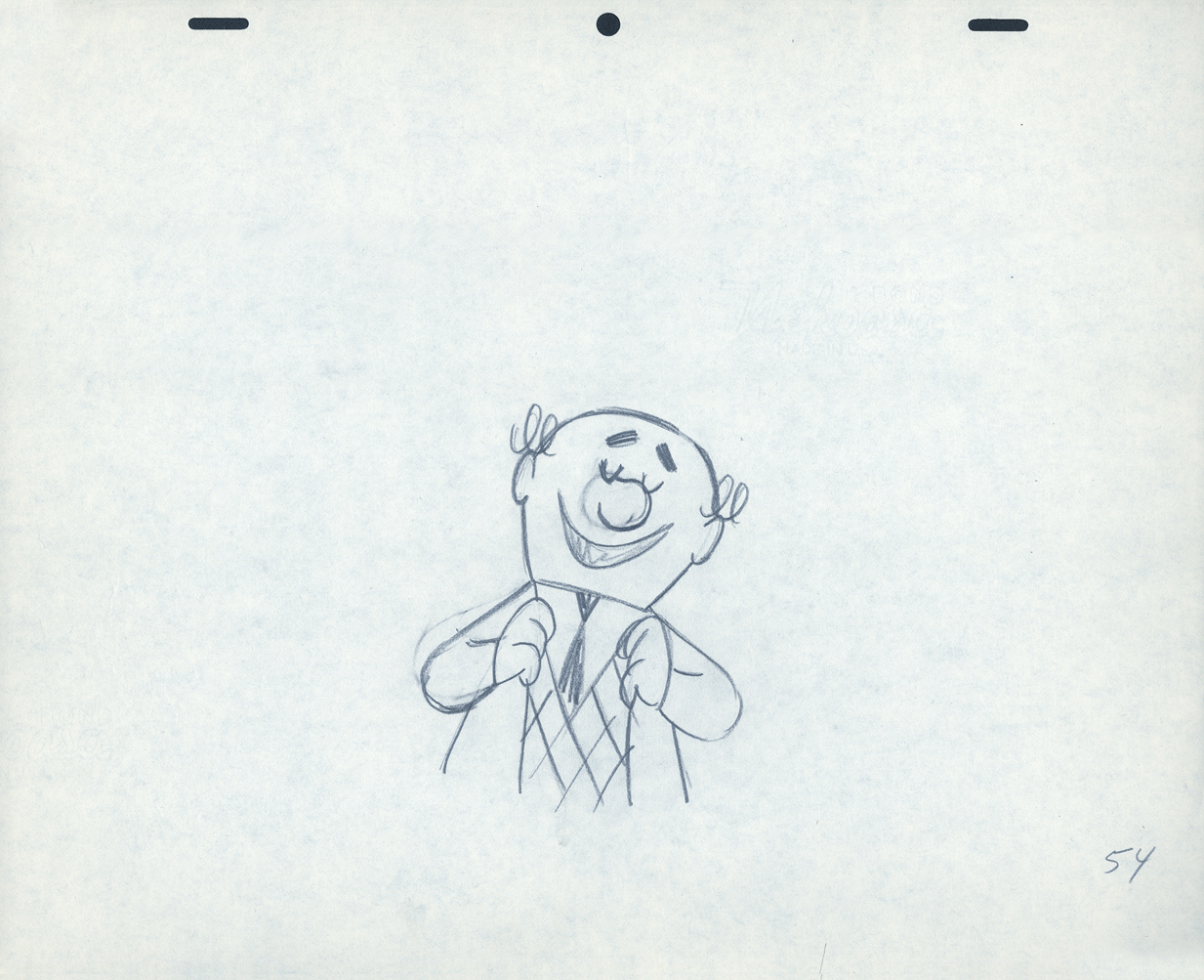 54
54
 55
55 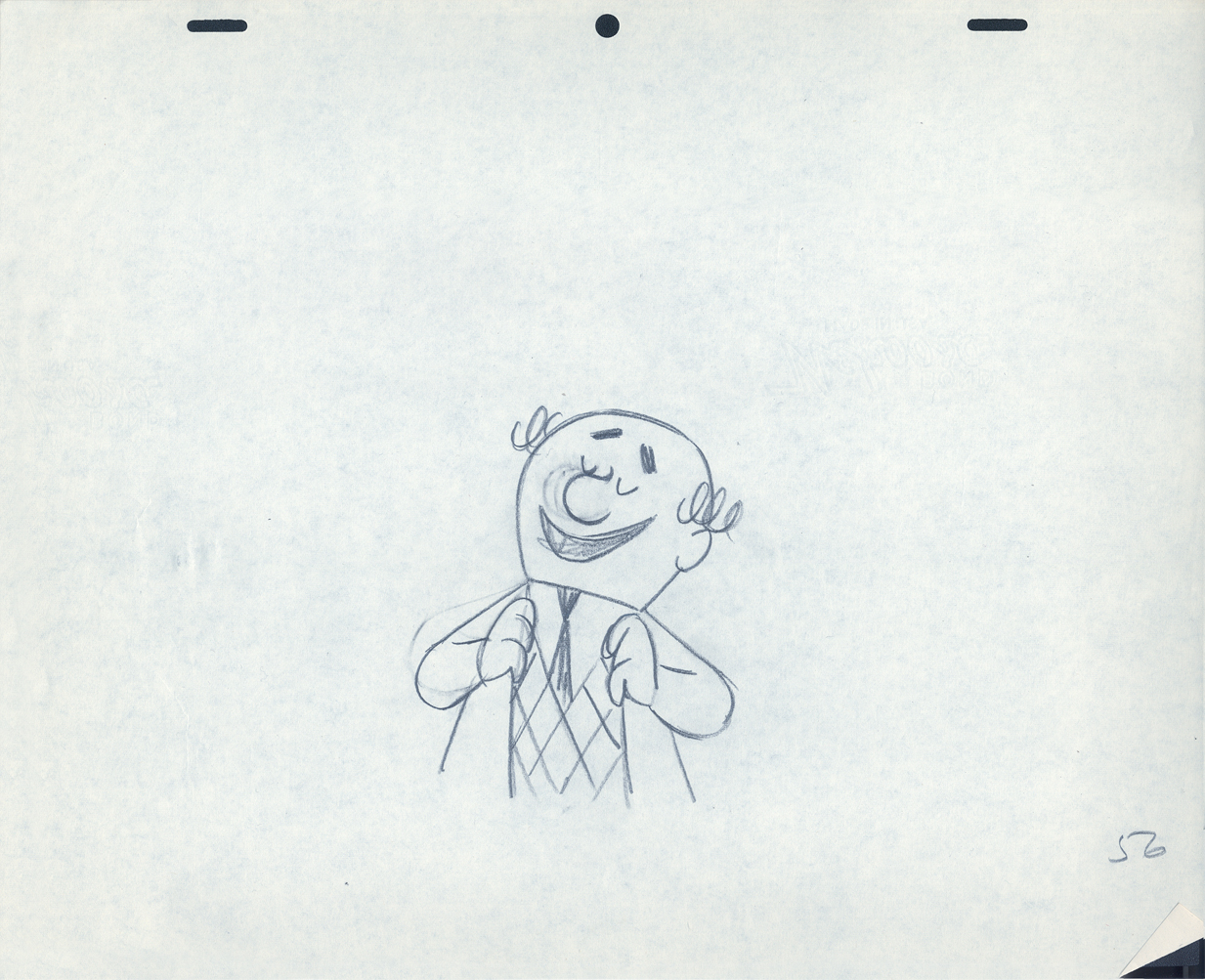 56
56
 57
57
The following QT movie was made by exposing all drawings on twos
except for the extreme positions that were missing inbetweens.
For those, I dissolved from one extreme to the next.
It drove me crazy that Lu Guarnier always animated on top pegs.
Next week with the last of these three posts on this Piels Bros commercial, I’ll talk about Lu’s animation and some of my pet peeves.
Action Analysis &Animation &Animation Artifacts &commercial animation &Layout & Design 17 Apr 2013 05:51 am
Piels Bros. Odds & Ends
Among Vince Cafarelli‘s remaining artifacts there are lots of bits and pieces from several Piels Bros. commercial spots. I decided to put some of it together – even though they’re not really connected – into this one post.
There are animation drawings I’ll try to post in other pieces.
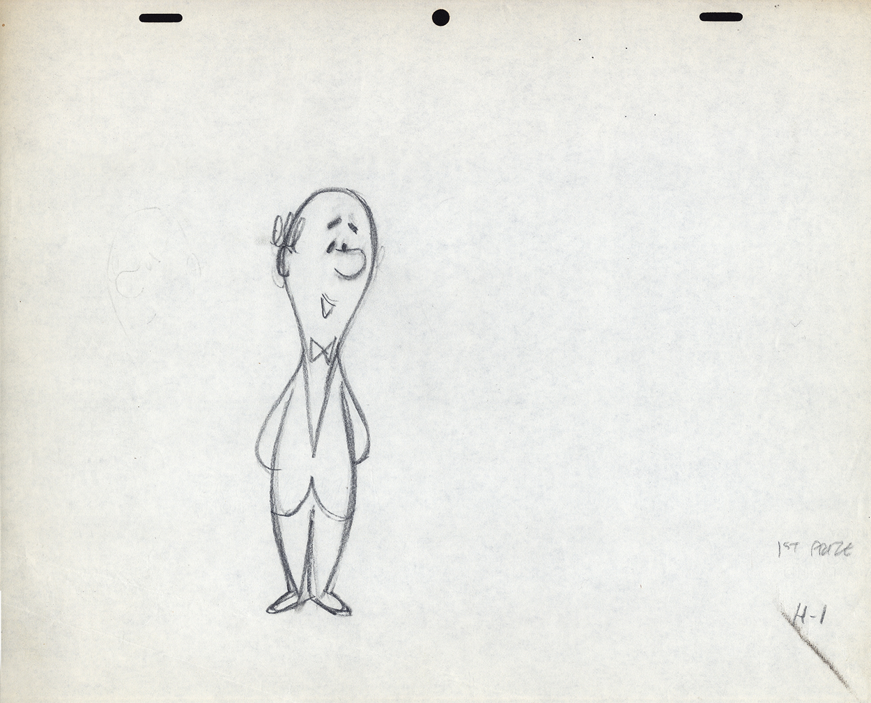
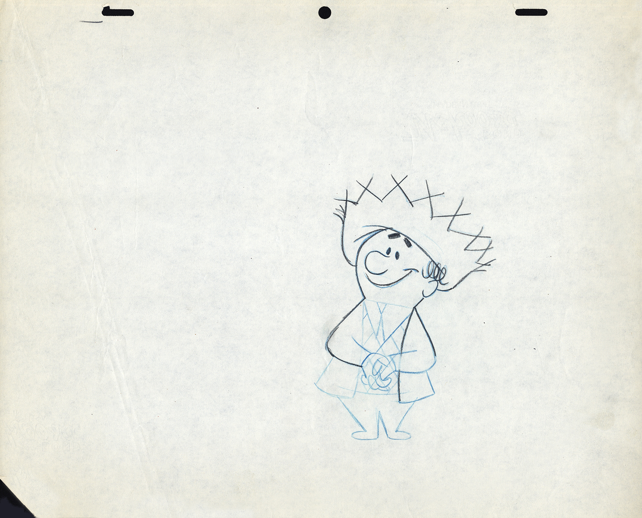
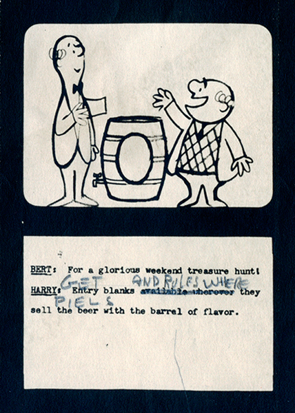
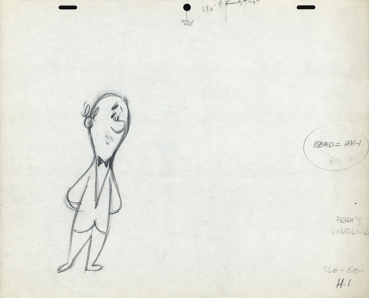
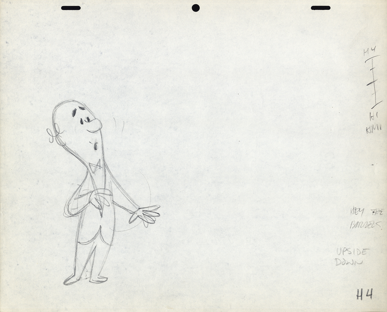
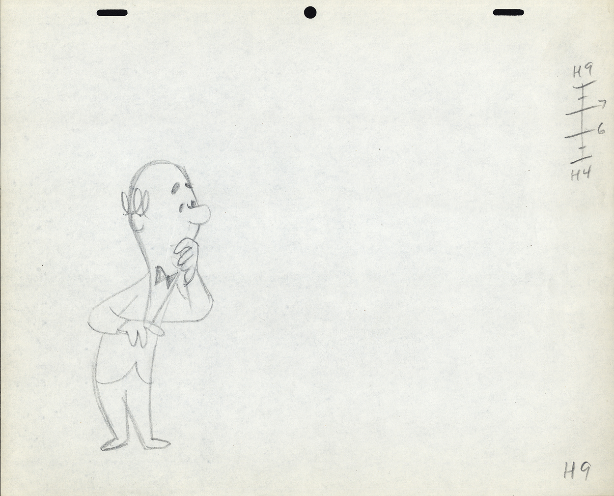
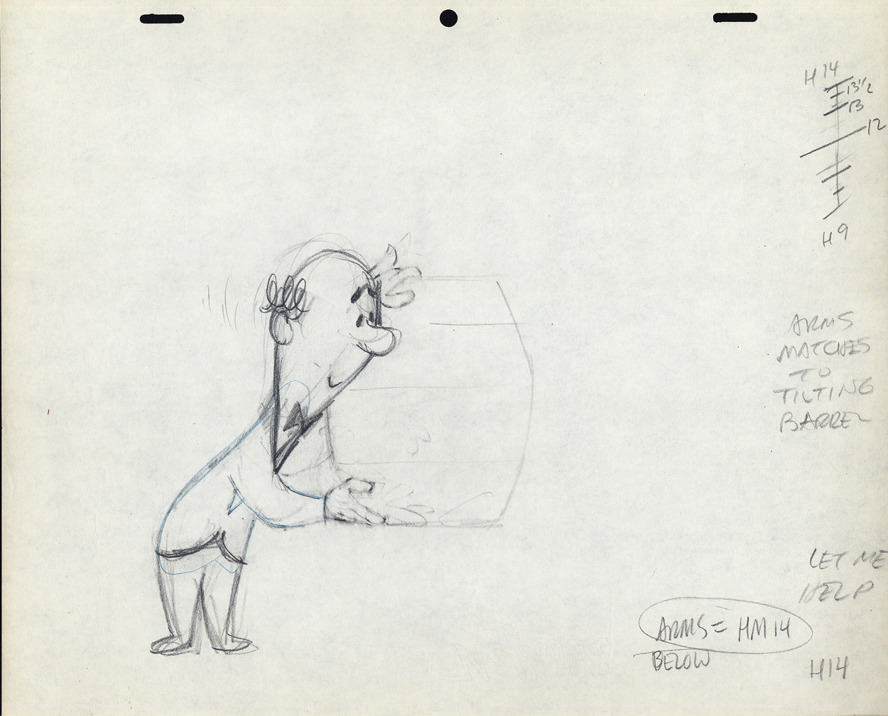
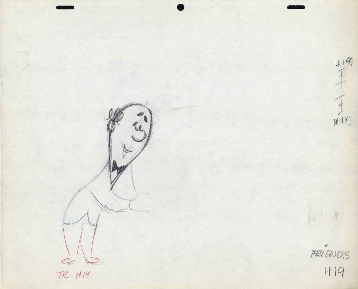
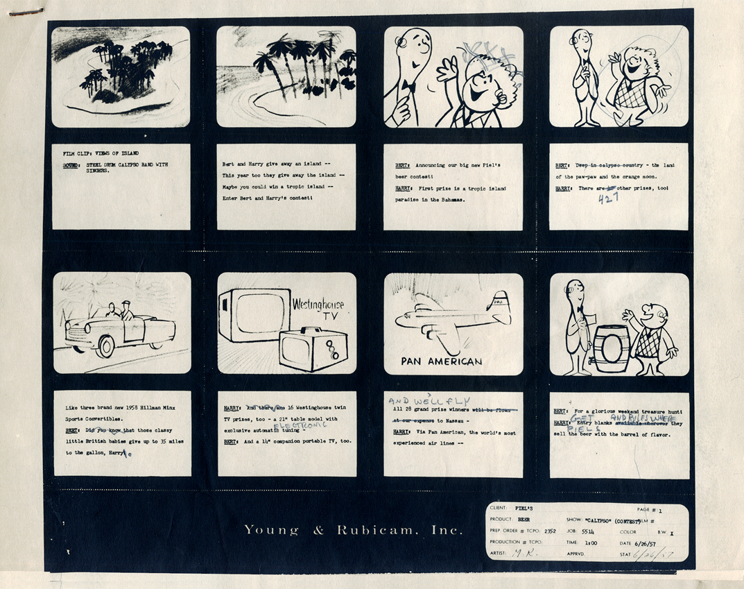
Here, we have a storyboard for a spot; I believe this is an abbreviated spot promoting some contest Piels beer was running. I think this is from a shortened version of a one minute spot since there are animation drawings which are obviously from the same setup, but they’re not part of this storyboard. (There’s an unveiling of the barrel, which is upside down.)
Since the boards are dated 1957, and given the use of signal corps pegs, I believe these were done for UPA.
Regardless, the drawings are excellent. I presume they’re hand outs to Lu Guarnier, animating, and Vince Cafarelli, assisting.
 1
1
 2
2
The following are three drawings from the opening scene of this storyboard. Others from this scene weren’t saved.
 1
1Here’s Bert.
 2
2
 3
3
And here’s a single drawing of Harry from the scene.
Let’s follow that with layout drawings from two different spots. The first doesn’t really offer much, but the quality of the clean-ups and the drawing is first rate. I’m pleased to post it:
 1a
1a
 1b
1b
 2
2
 6
6
Here are layout drawings for the second of the two spots I have in hand. I presume this is also a spot promoting that contest.
 1
1
 3
3
 4
4
 7
7
 8
8
 9
9
In the next week or two, I’ll post some of the animation drawings left behind so you can get an idea of the movement and Lu Guarnier‘s animation. I’ll probably have some to say about Lu’s style of movement. It drove me crazy when I had to assist him. The movement always looked great on screen, but it took a lot for an assistant to get it there.
Action Analysis &Animation &Animation Artifacts &John Canemaker &Tytla 16 Apr 2013 05:12 am
Tytla’s Hungry Wolf – recap
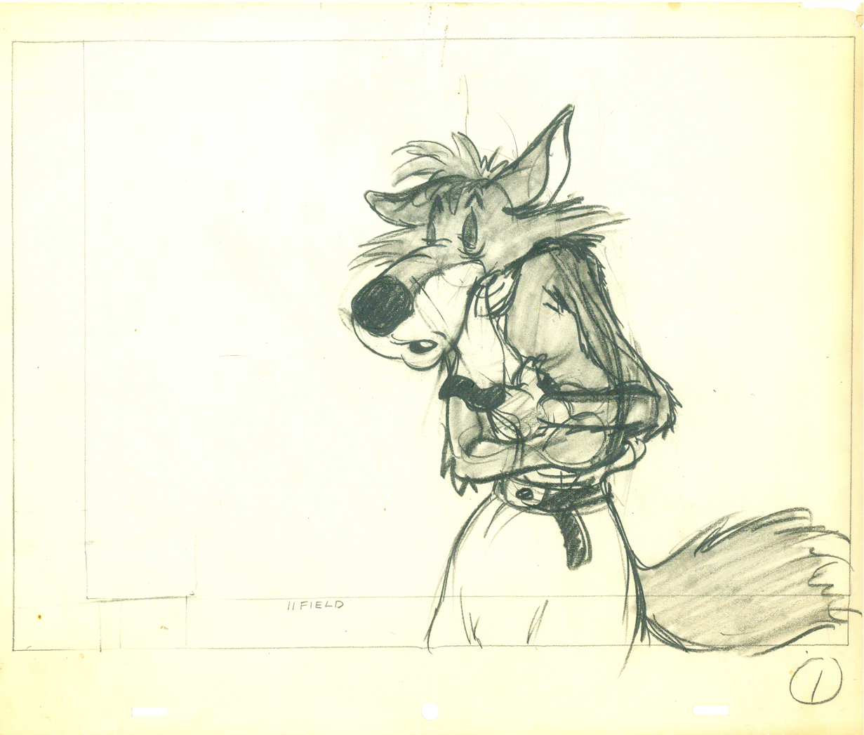
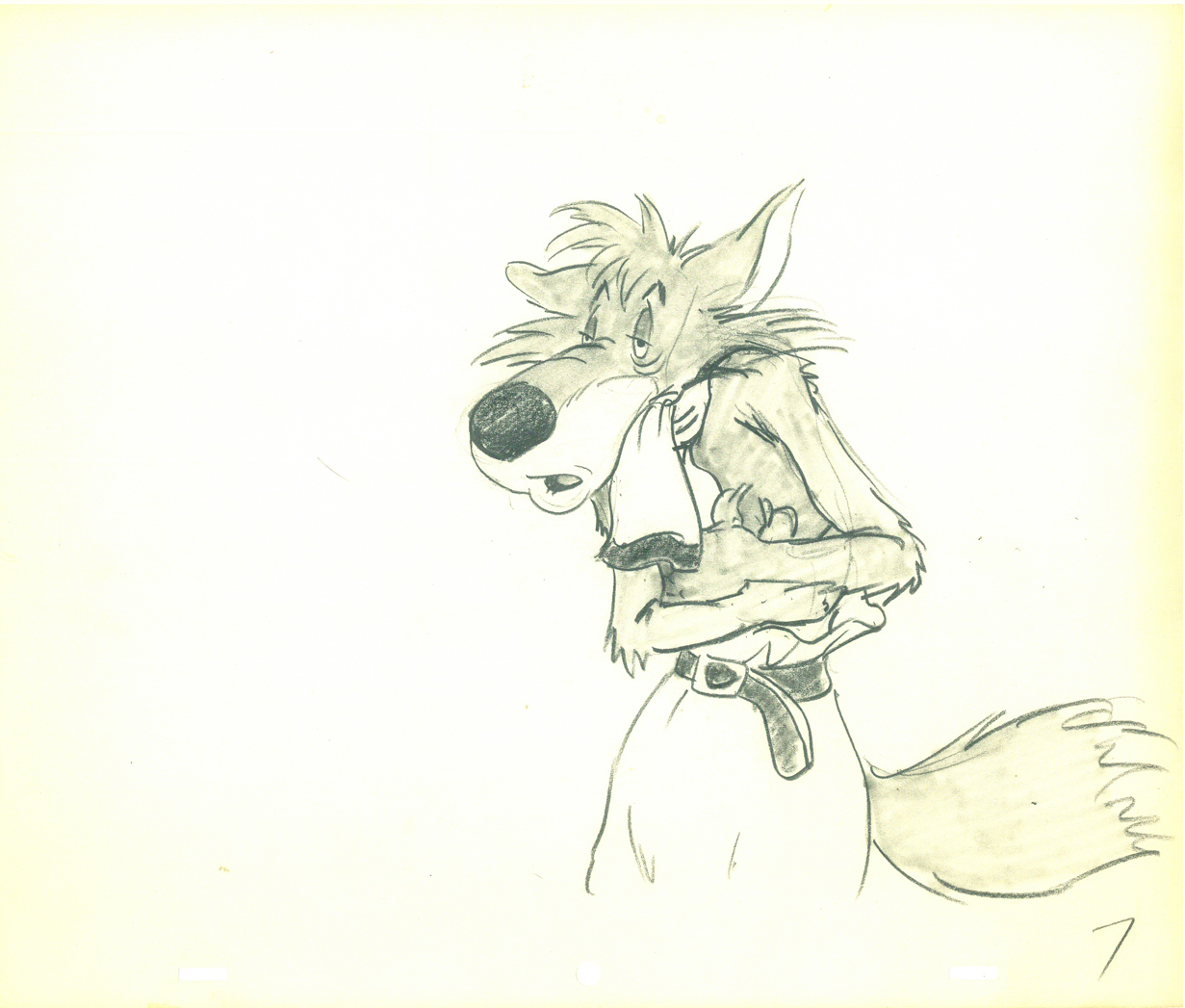
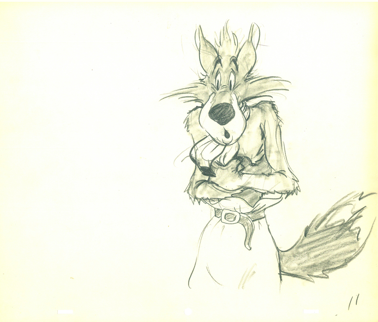
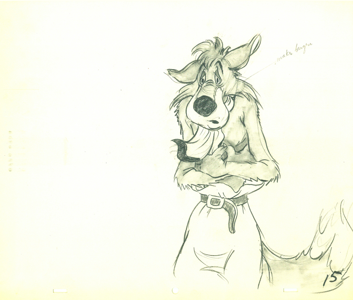
- With all the recent thought and posts on Bill Tytla, I couldn’t resist revisiting this artwork from the Harman-Ising short, The Hungry Wolf. So here it is.
 We’ve seen that Tytla veered his animation style completely toward the “Method” and there is no doubt that he carried that with him even after he left the Disney studio. Unfortunately, he went to the lowest of the low and couldn’t survive any longer as an animator. He turned to direction and had to adapt his use of Stanislavsky to his directing technique.
Unfortunately, the “actors” he was given weren’t up to the task. Those “actors” were the least of the animation industry, those who had learned a lot of bad techniques, ways of cheating and a lack of a deep interest in bringing the souls of his characters to life.
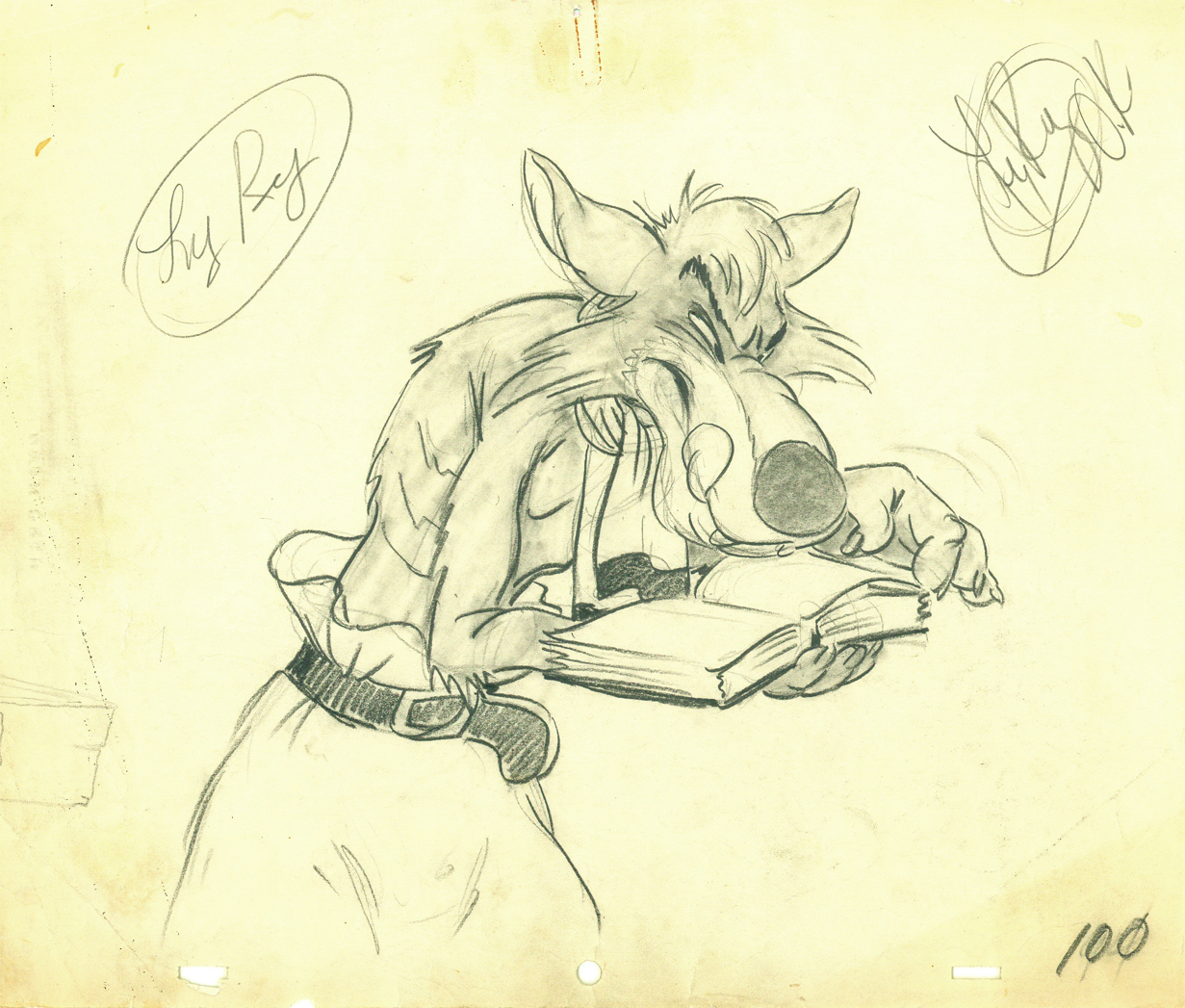
I was surprised to learn that Tytla had worked at a studio that was a bit better than Terrytoons or Paramount right after he’d left the haven of Disney. John Canemaker loaned me a cache of drawings for a Hugh Harman film, The Hungry Wolf, made in 1940 at MGM. It’s not a very good film; the drawings are signed by Tytla, but they have no ladder indication for an Assistant to do the inbetweens. Most oddly, the wolves are shaded in by Tytla. Also take note of the table being animated into place. Are these animation drawings? Is it LayOut posing to give to someone else to animate? And greatest of all, what is Tytla doing at MGM?
Since this would have been completed in early 1942, I can only assume that it was during the strike at Disney that Tytla did some work for Harman in mid 1941. Most probably he was acting as an Animation Director and NOT animating the scene. He worked under Harman, who got credit for directing.
There’s no attempt at distorting or stressing the drawings in any way. I assume the character wasn’t designed by Tytla. It’s similar to a character design that was used in other Harman films.
Here are all the drawings given me by John.
 1
1
 7
7
 11
11
 15
15
 19
19
 23
23
 38
38
 52
52
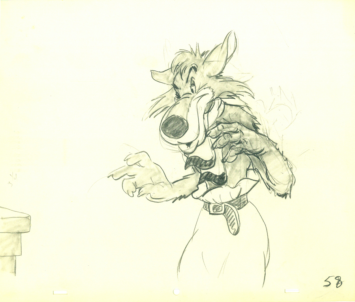 58
58
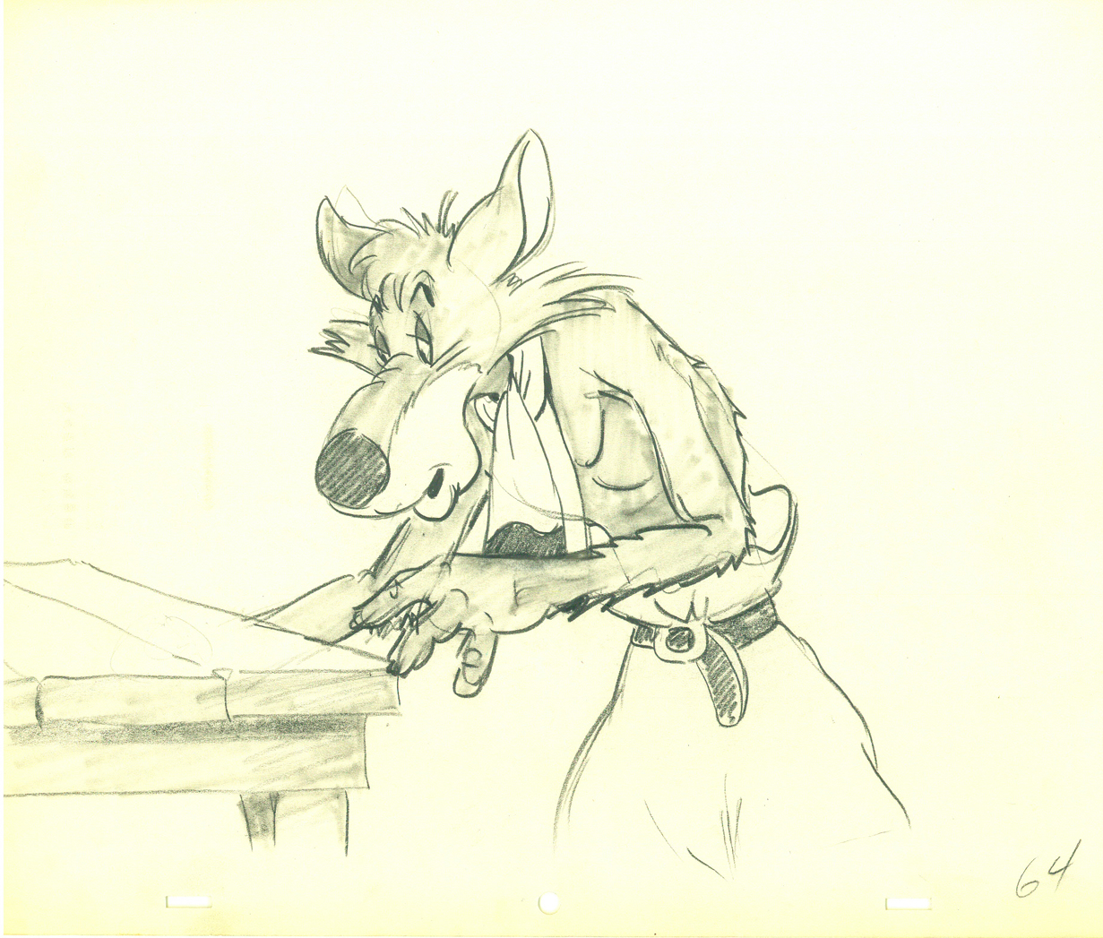 64
64
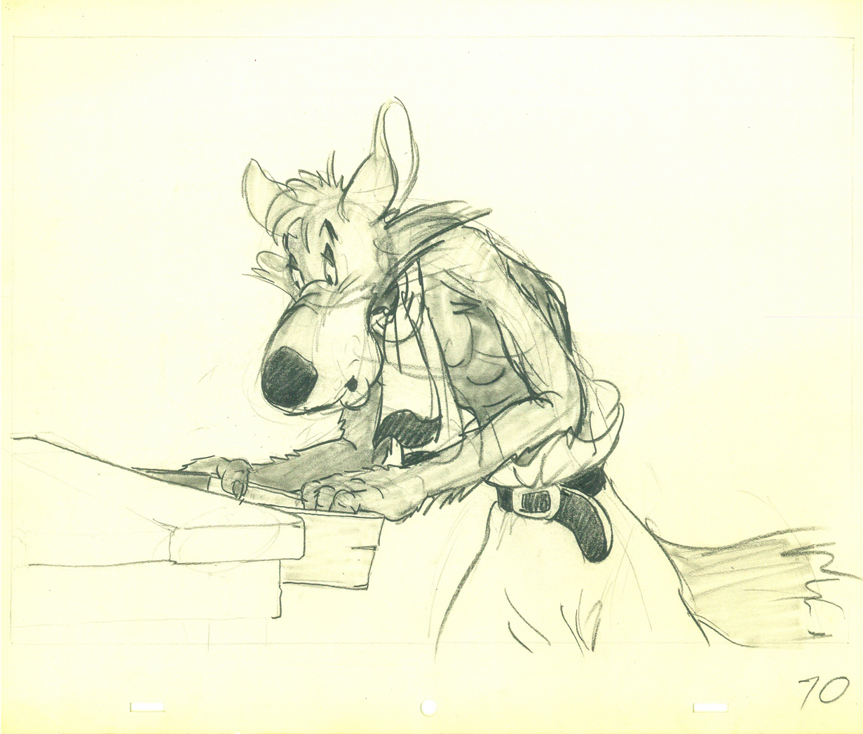 70
70
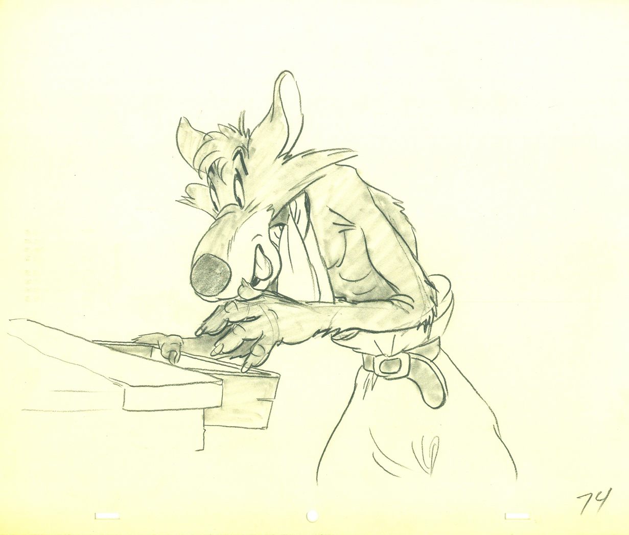 74
74
 82
82
 88
88
 94
94
 100
100
.
The following is a QT of the entire scene with all the drawings included.
Since I didn’t have exposure sheets, I calculated everything on ones
(which seems to reflect the timing in the final film) and left however many drawings to the assistant and inbetweener.
Many thanks to John Canemaker for the loan of the drawings. It was great just touching them.
Action Analysis &Animation &Animation Artifacts &Commentary &Tytla 15 Apr 2013 05:25 am
Tytla Distorts – 5
- I thought it’d be a little fun to give a little showing of some of the distortion and stress Bill Tytla did on some of his drawings. He didn’t feel the need in all of his characters to actually distort and stretch the character completely out of shape as he did in a character like Stromboli.
There were times when he could use the limbs of the character and the flexibility of the movement to provide the looseness that he was searching for. Cartoon characters like the seven dwarfs or Stromboli allowed a wildness that another, such as the devil in Night on Bald Mountain offered.
Let’s just jump into it and take a look at some drawings.
Obviously, this first one is Doc from Snow White
as he drains some water from his face:
 1
1
 2
2
 3
3
Immediately we can see a flexibility in the jowls of Doc’s face,
and Tytla has plenty of fun with it.
 4
4
 5
5
 6
6
 7
7
 8
8
 9
9
Tytla can take it very far out.
 10
10
 11
11
 12
12
Now here’s a similar thing with Dopey shaking the water out of his head.
 1
1 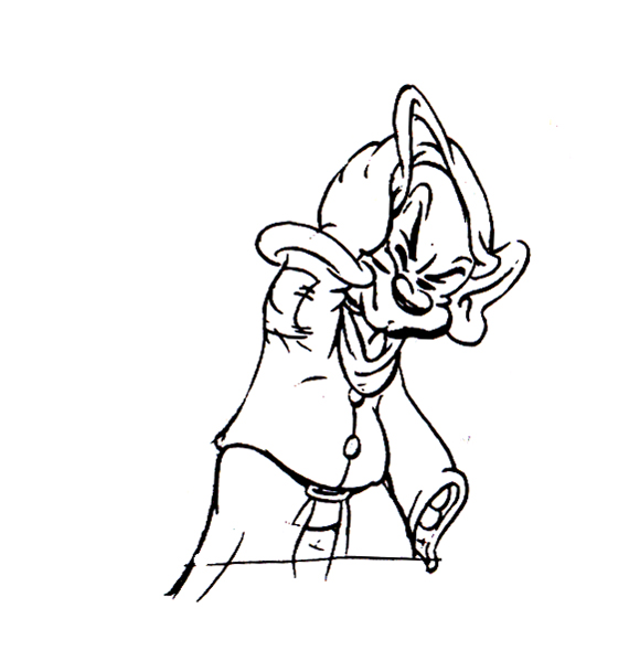 2
2
 3
3 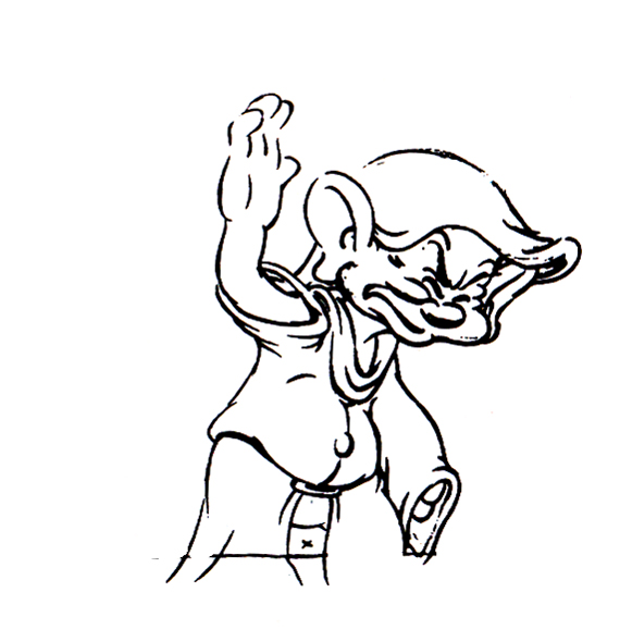 4
4
 5
5 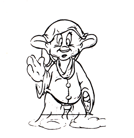 6
6
 7
7 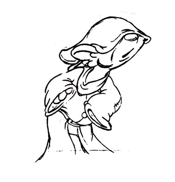 8
8
 9
9 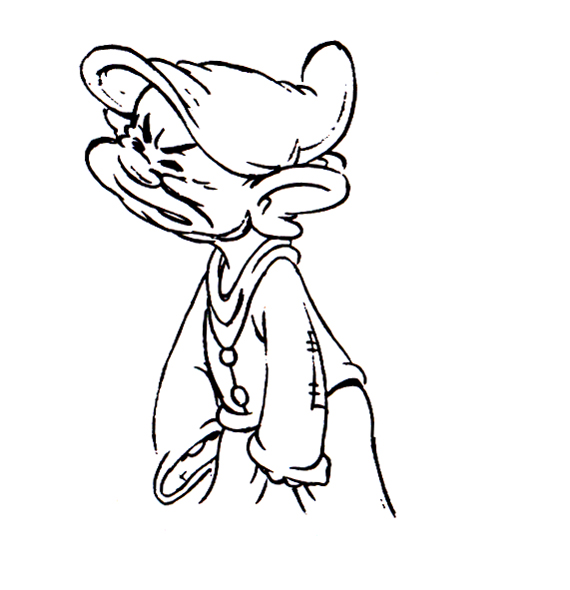 10
10
 11
11 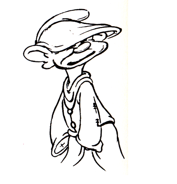 12
12
 13
13 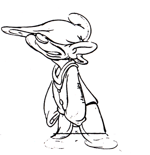 14
14
 15
15 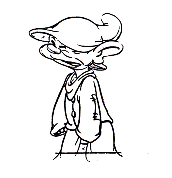 16
16
 17
17 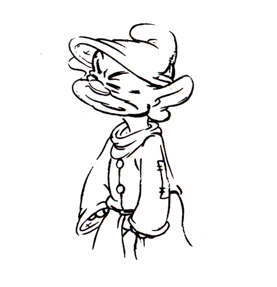 18
18
 19
19 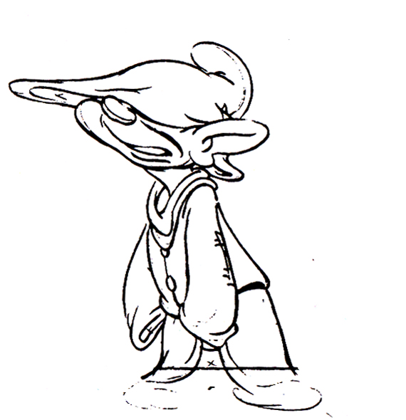 20
20
 21
21 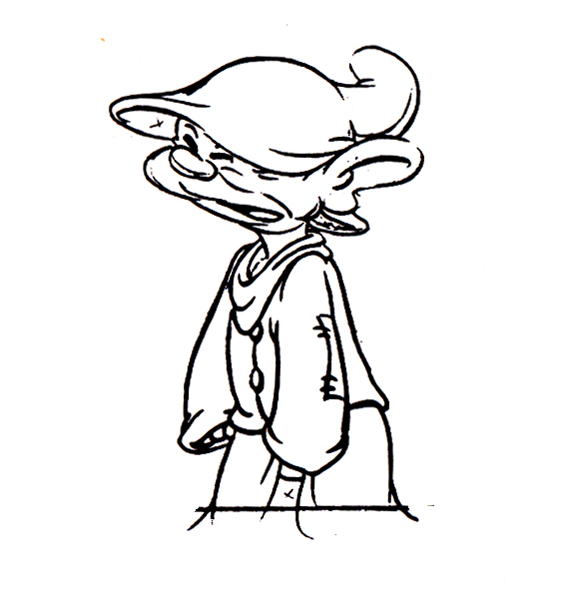 22
22
 23
23 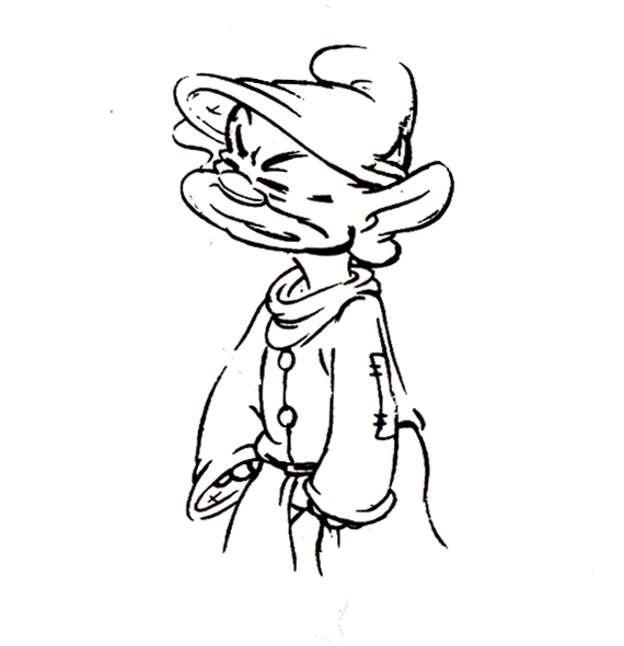 24
24
 25
25 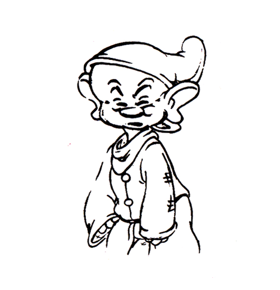 26
26
 27
27 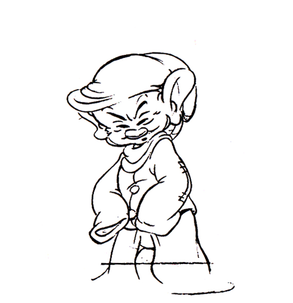 28
28
 29
29  30
30
I also thought I’d pick out a nice frame grab or five of Tytla’s animation for a Mighty Mouse cartoon when he later went to Terrytoons.
 1
1
 2
2
 3
3
 4
4
 5
5
 6
6
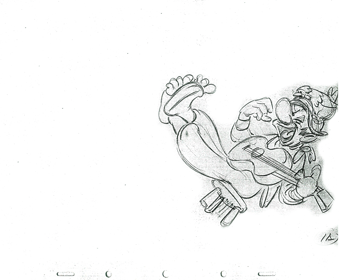
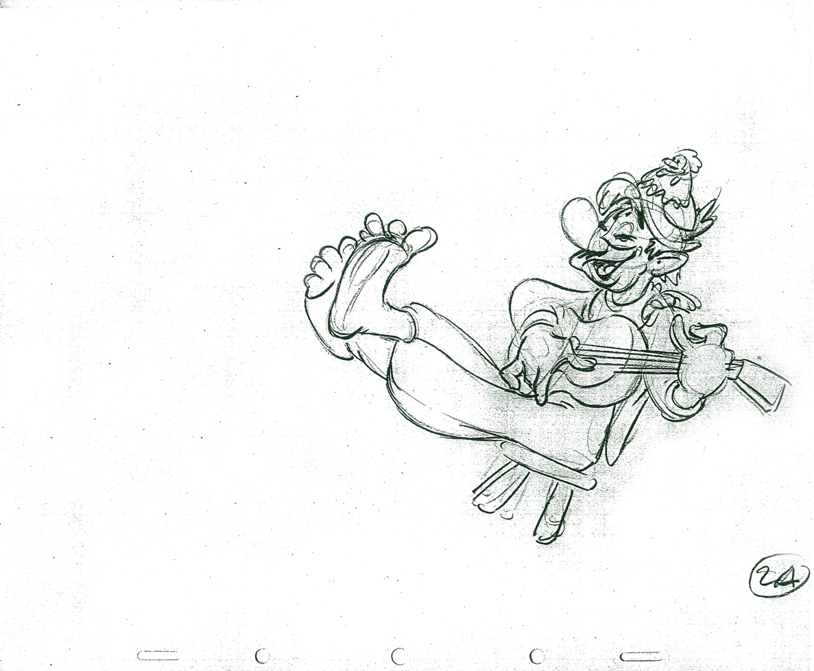
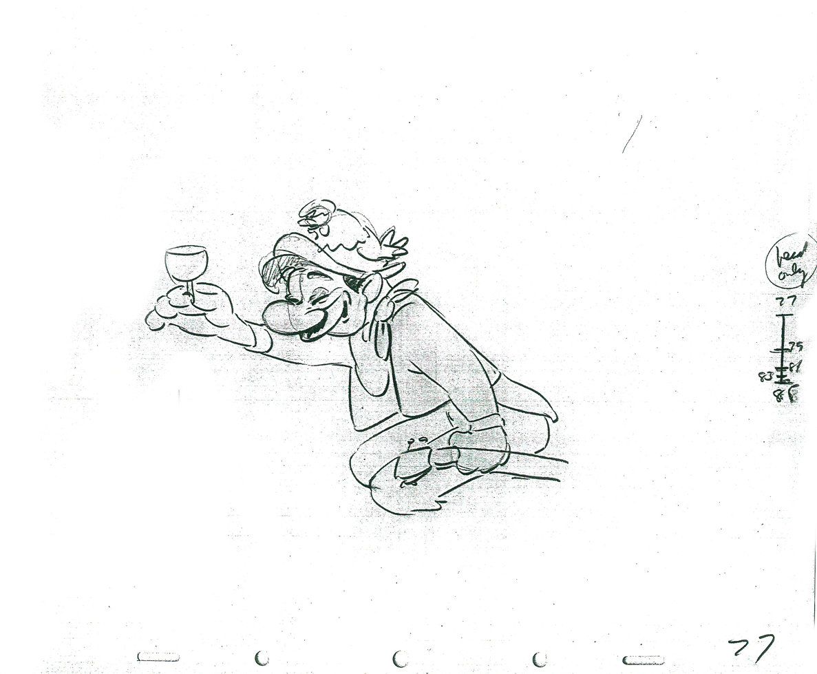
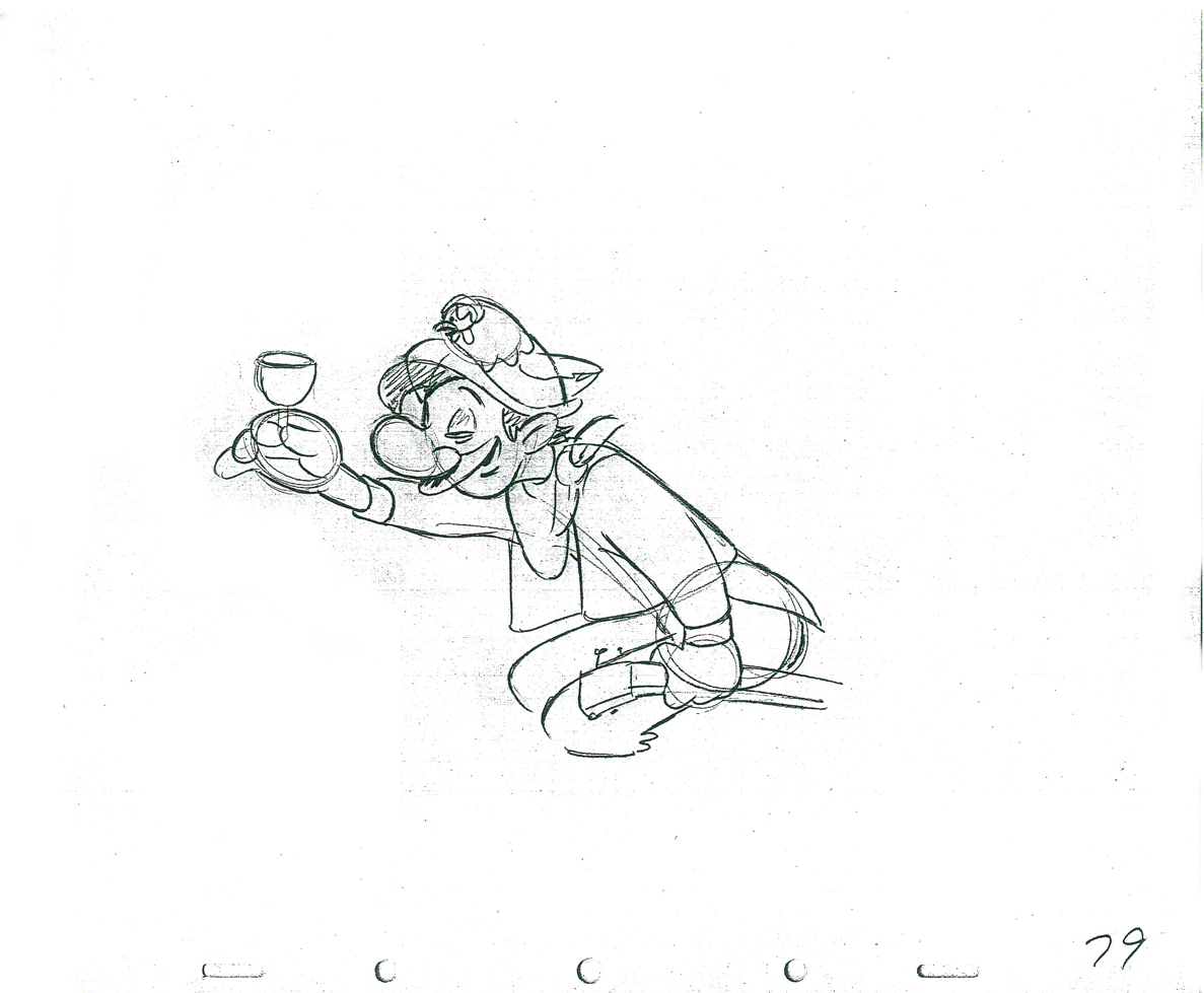
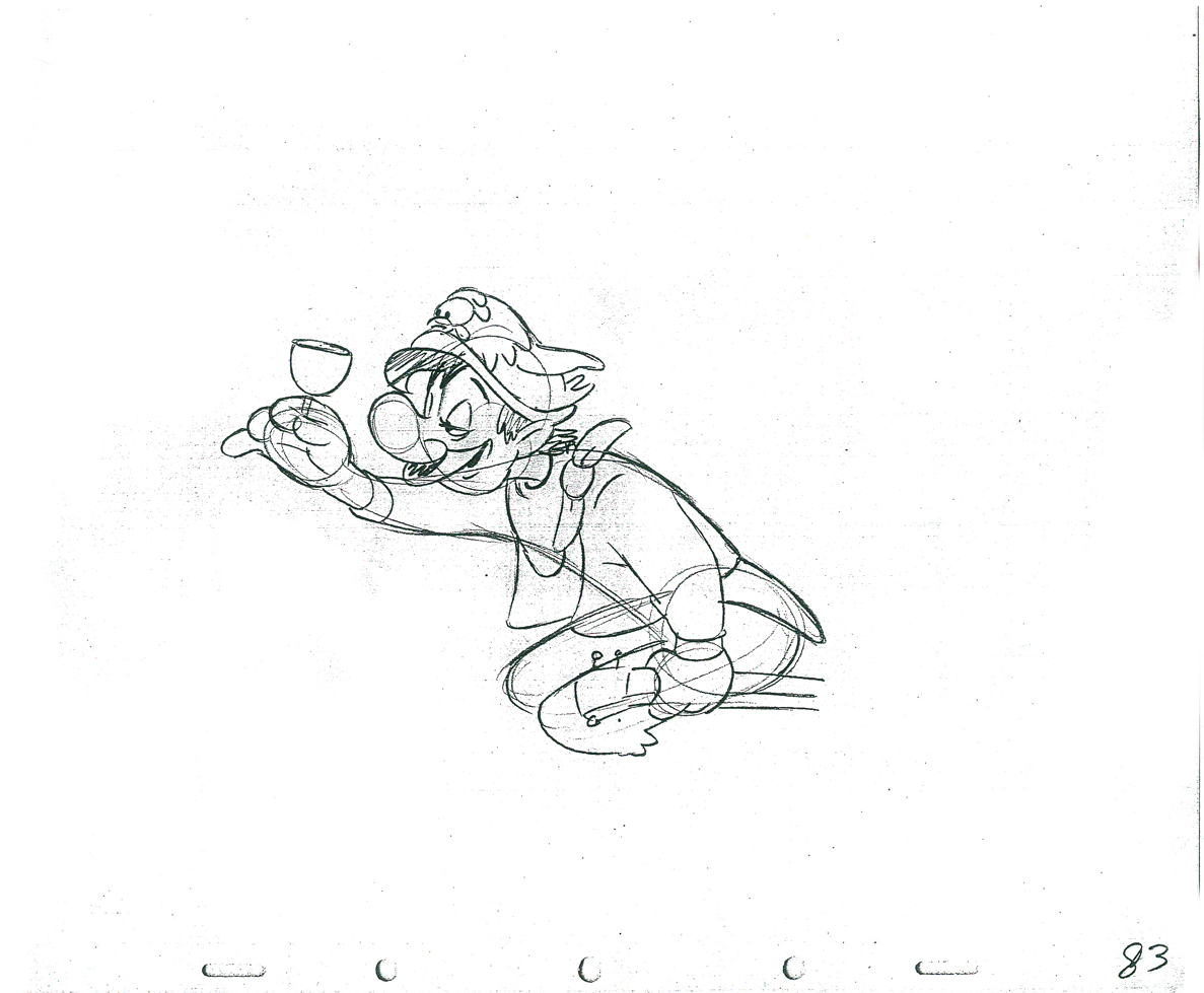
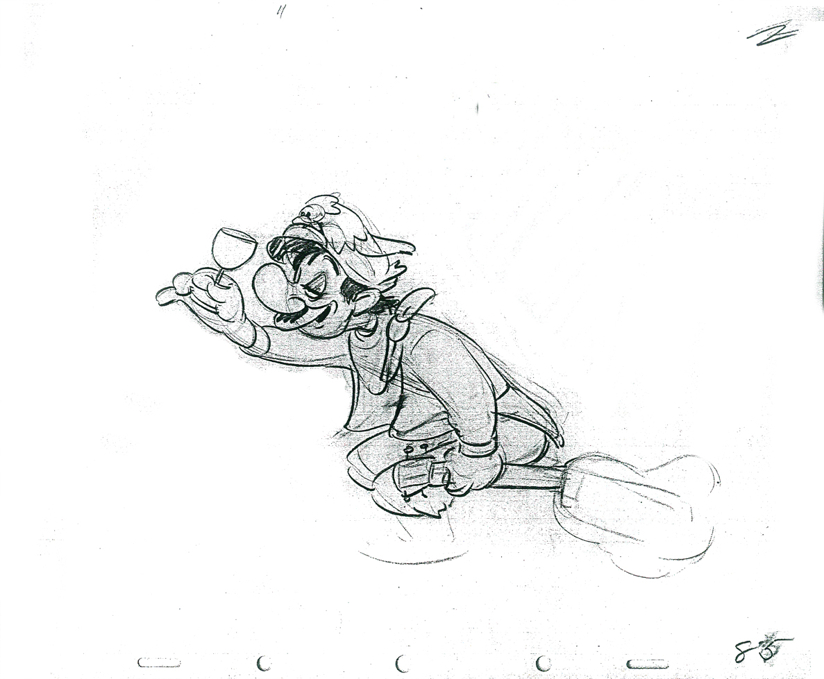
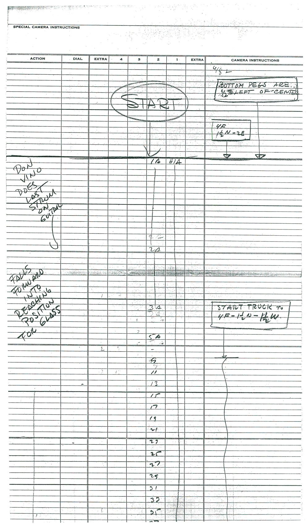
If we’re going to look at Tytla’s play on a drunk character, let’s look at this beauty of a scene. It’s from a film that was never completed, The Laughing Gauchito. This was one of the short pieces being developed during the period when the South American themed films, Saludos Amigos and Three Caballeros, were in production.
For this scene Tytla uses the rubbery feel for the face, but keeps the looseness in the character for the arms and legs. There’s quite a bit of depth he writes into the scene. The character is drinking (and a little tipsy) loses his balance and tries to regain it without spilling his drink. There’s a lot there, and it’s beautifully developed, yet still not a finished scene.
The Background
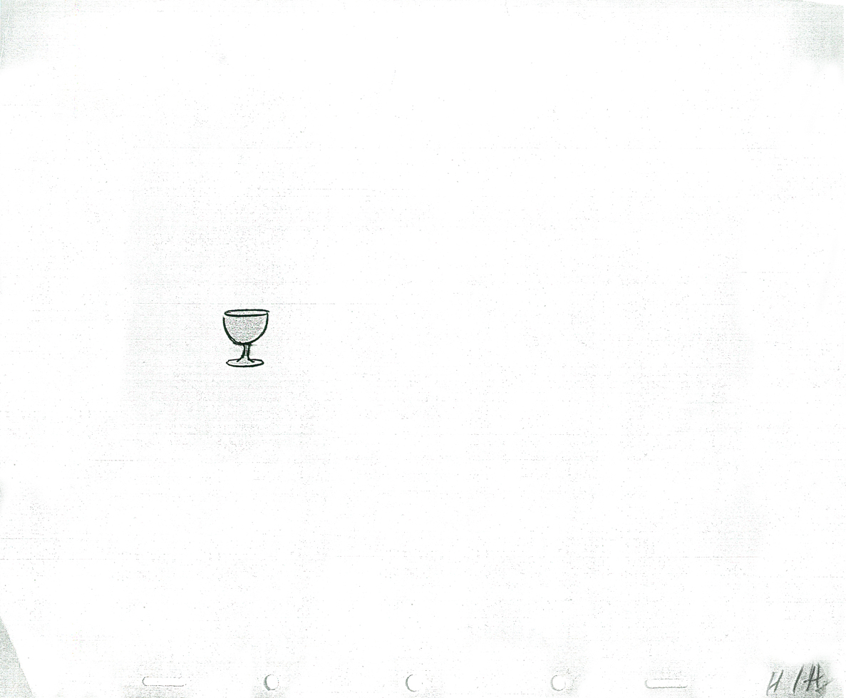
The wine glass overlay
 1A
1A
 2A
2A 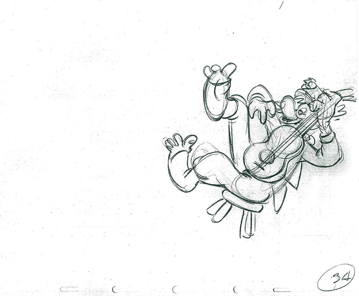 3A
3A
 5A
5A 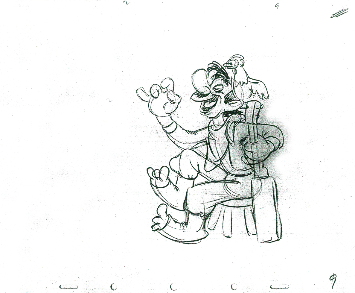 9
9
 11
11 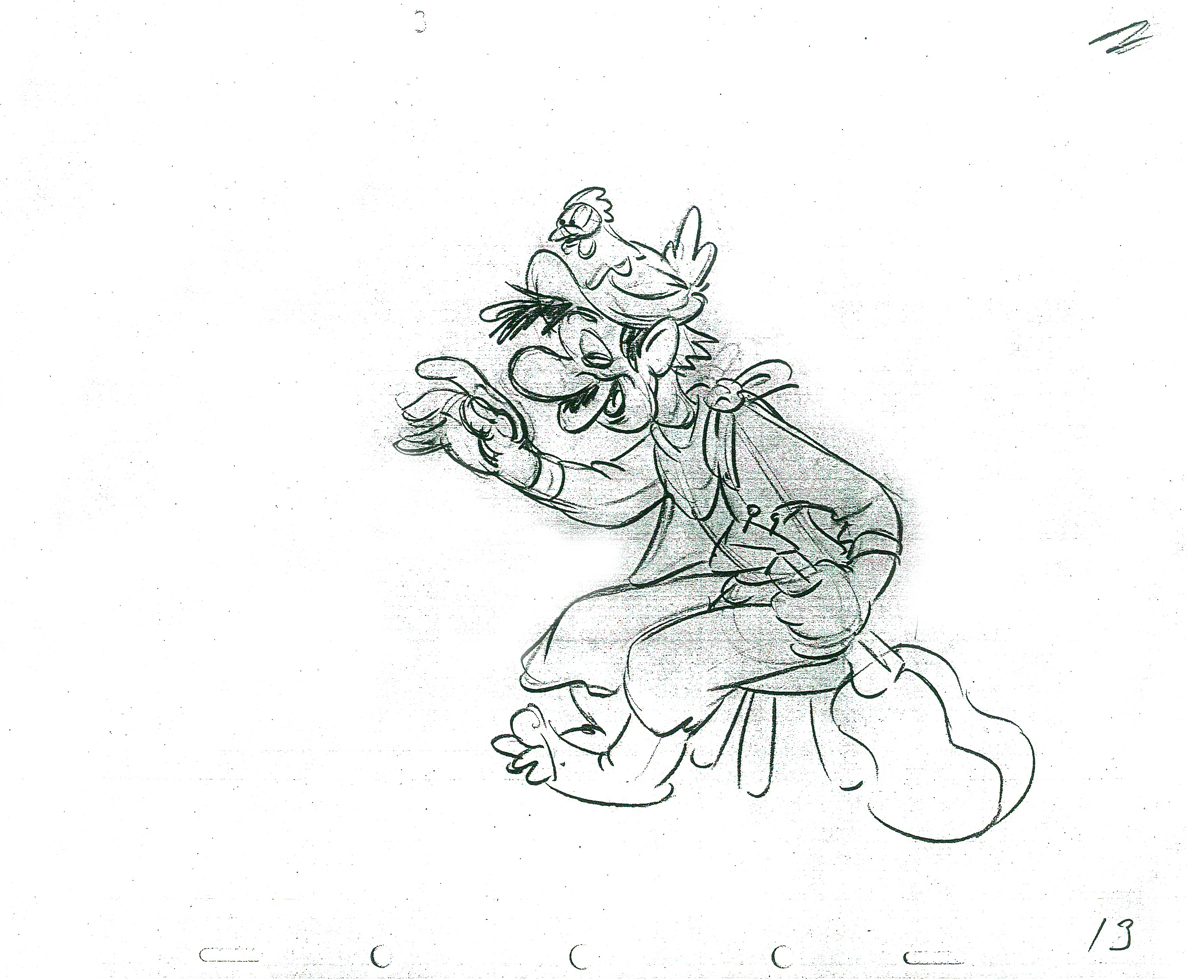 13
13
 15
15 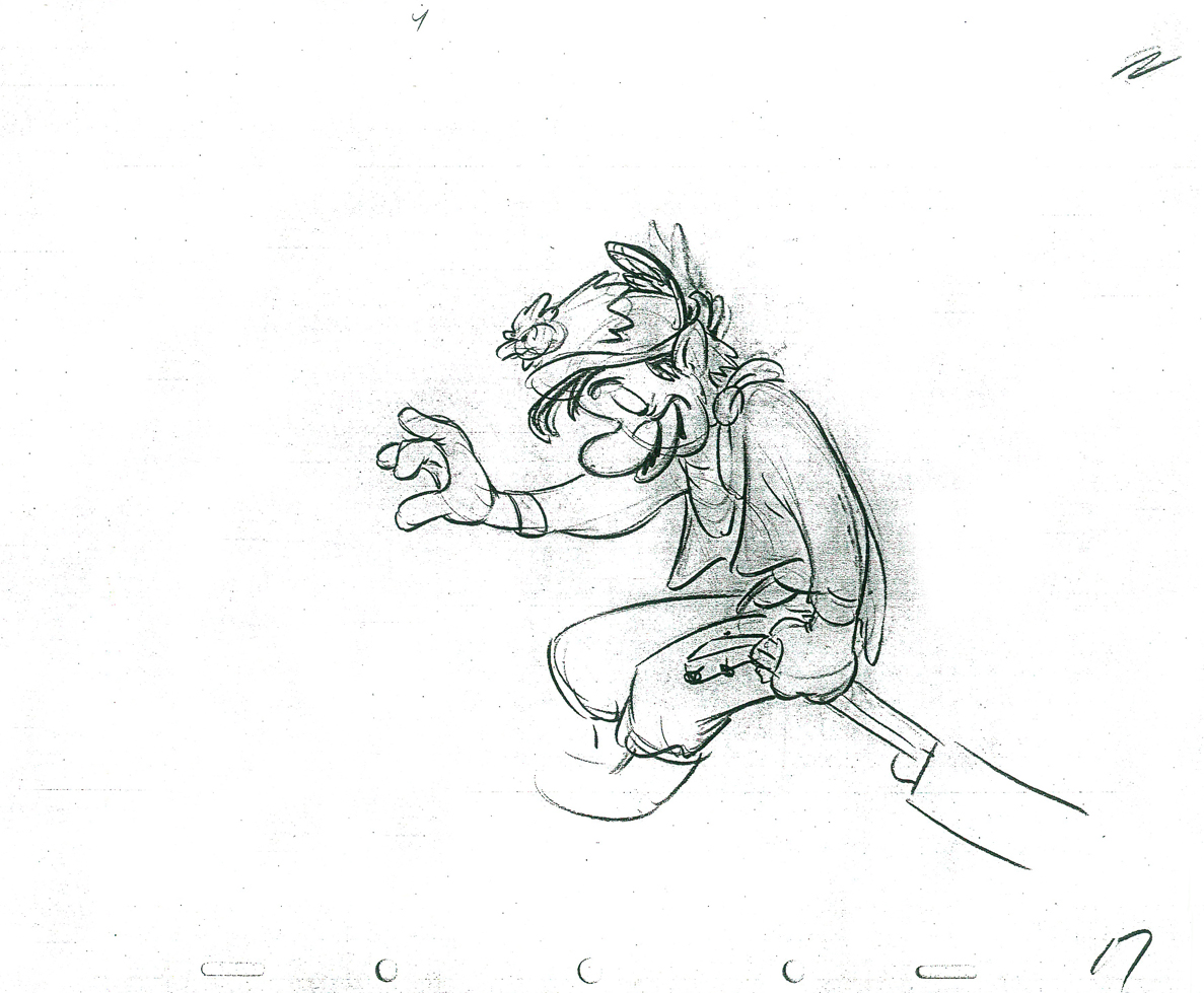 17
17
 19
19 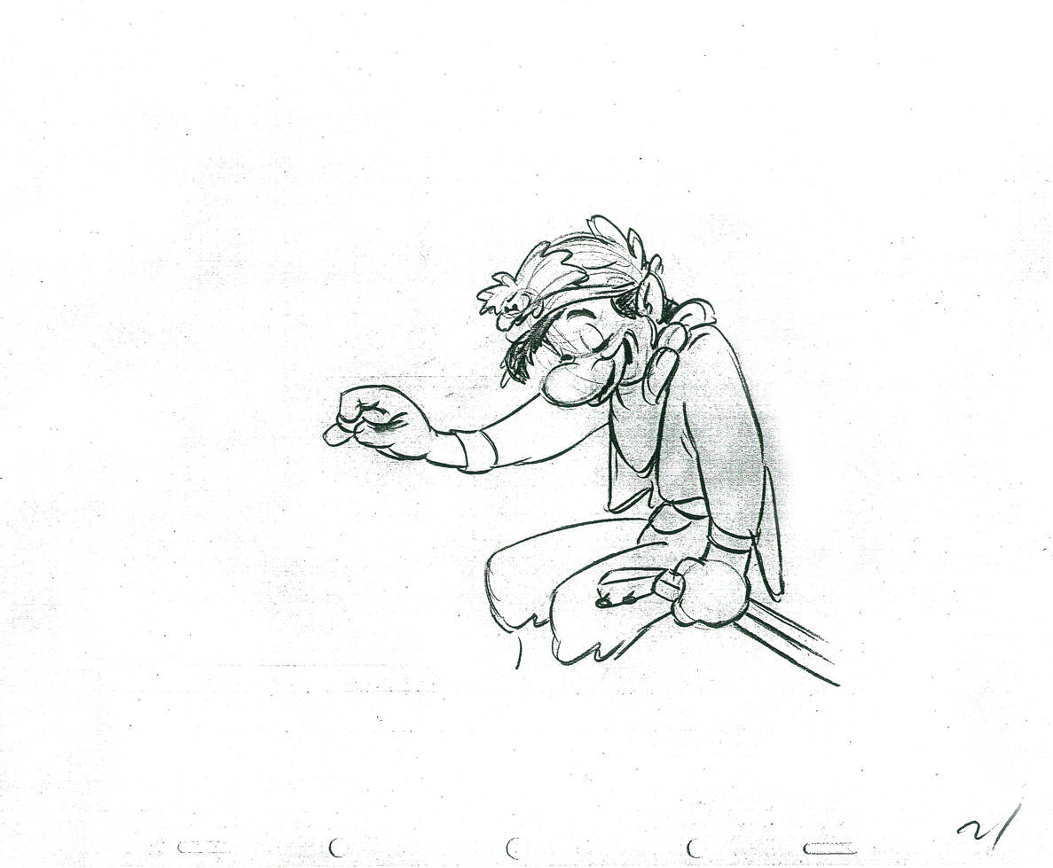 21
21
 23
23
 25
25 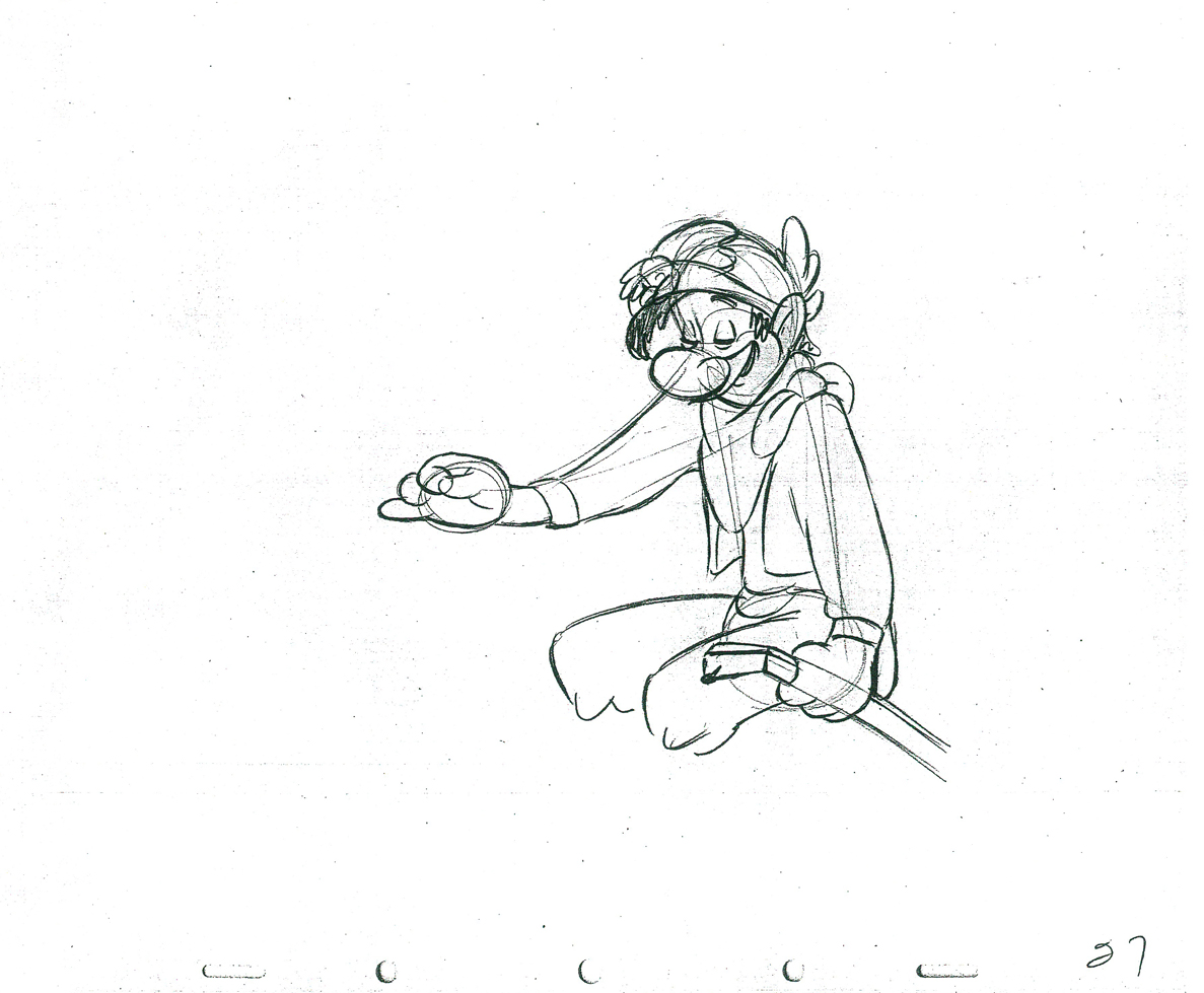 27
27
 29
29 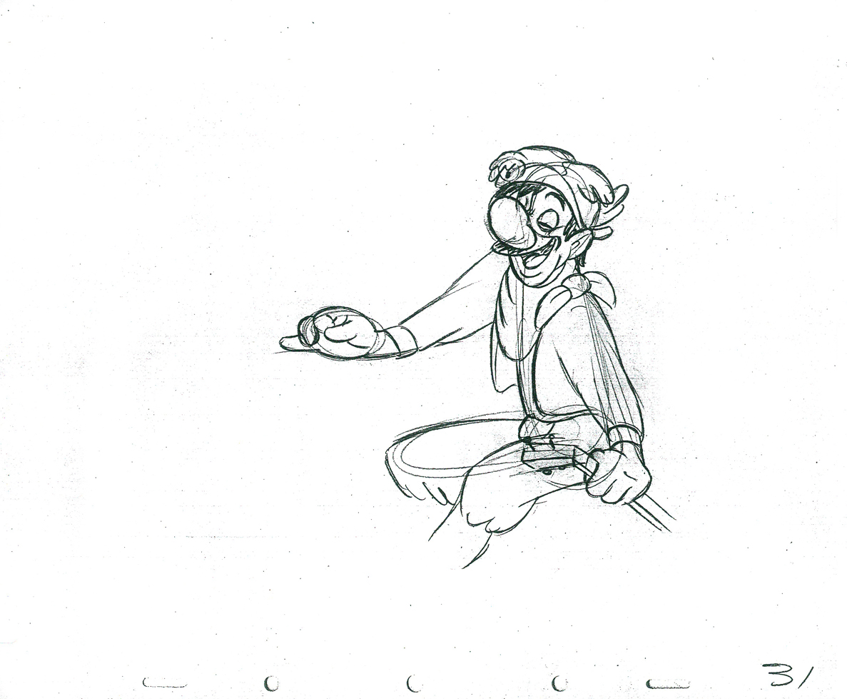 31
31
 33
33 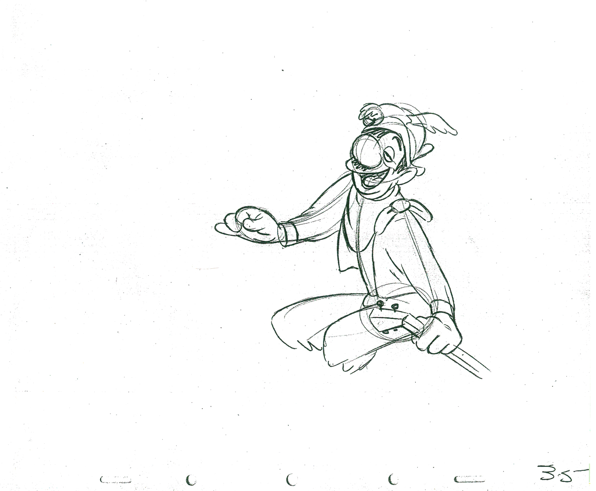 35
35
 37
37  39
39
 41
41
 43
43 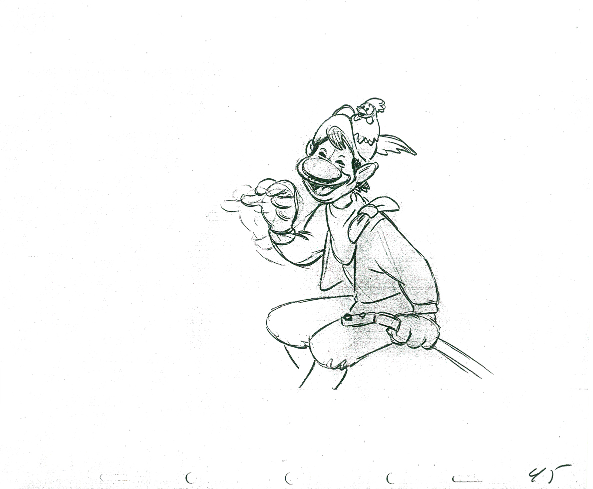 45
45
 47
47 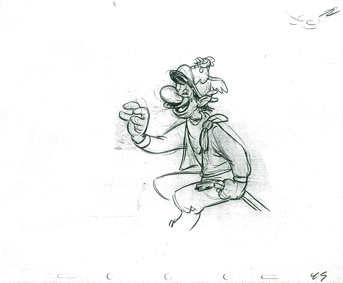 49
49
 51
51 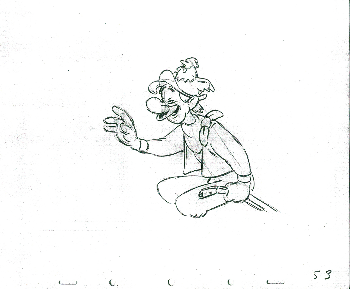 53
53
 55
55 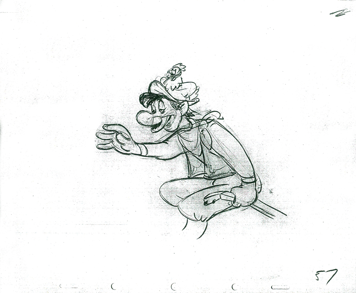 57
57
 59
59  61
61
 63
63  65
65
 67
67
 69
69 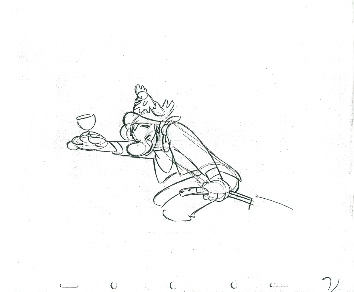 71
71
 73
73 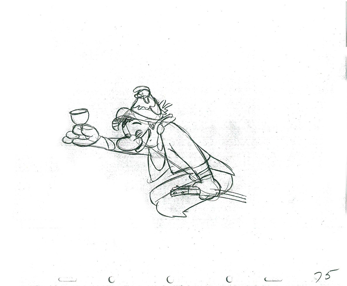 75
75
 77
77
 79
79 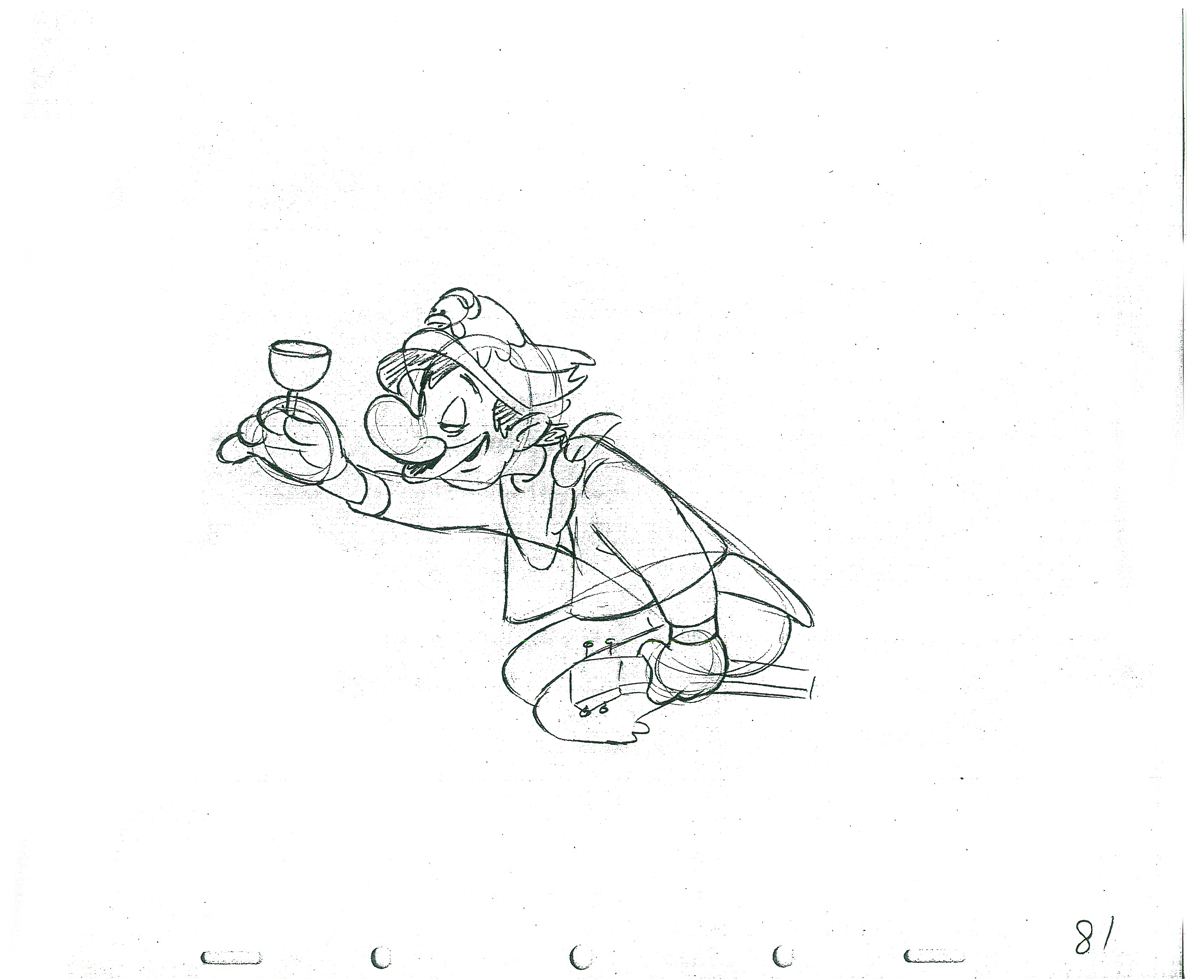 81
81
 83
83
 85
85
 1
1 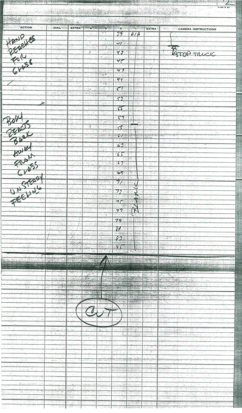 2
2
These are the X Sheets for the scene.
Here’s a QT of the scene with all the drawings included.
I strongly suggest you take a look into J.B. Kaufman‘s excellent book, South of the Border; it gives a full accounting of this film and Disney’s tour of the South American countries in preparation for the film.
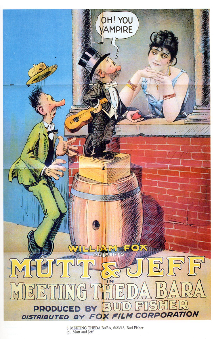
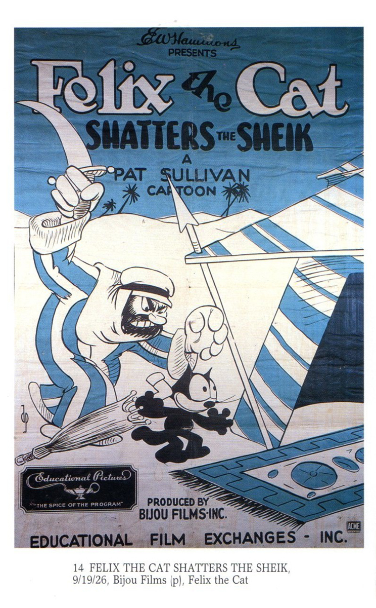
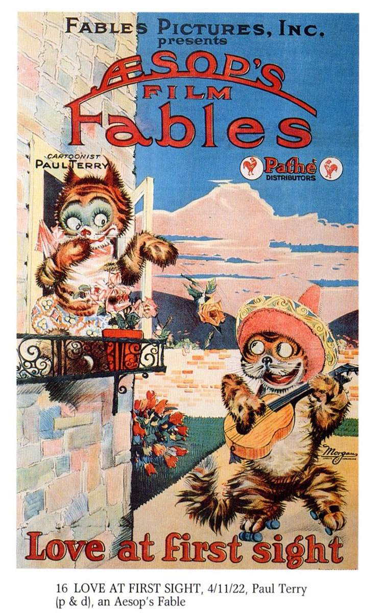
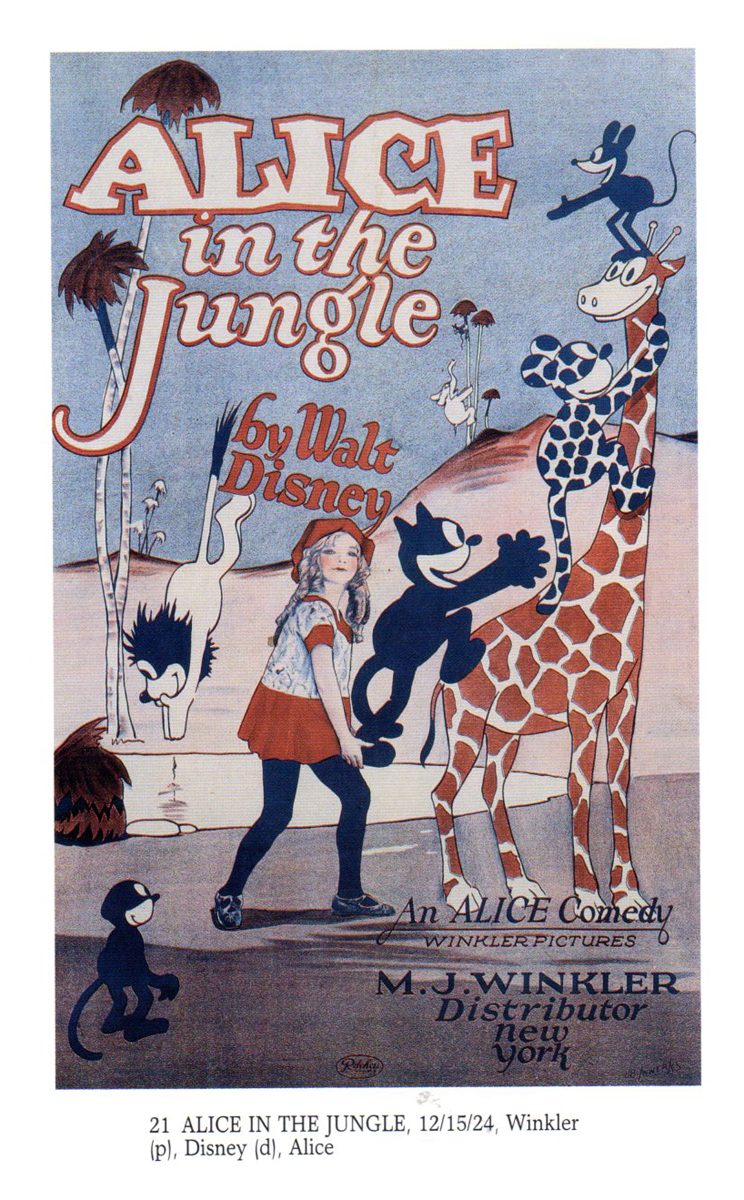
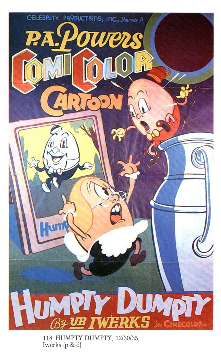
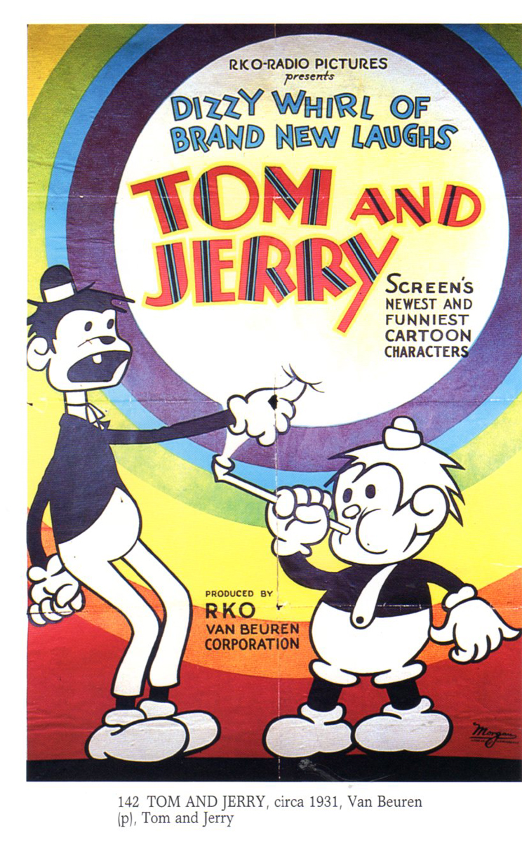
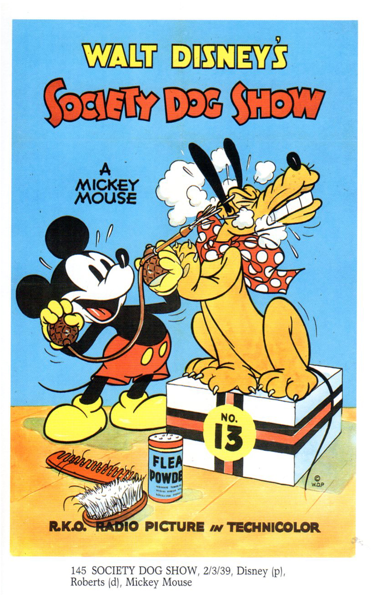
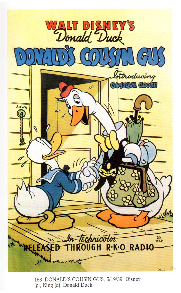
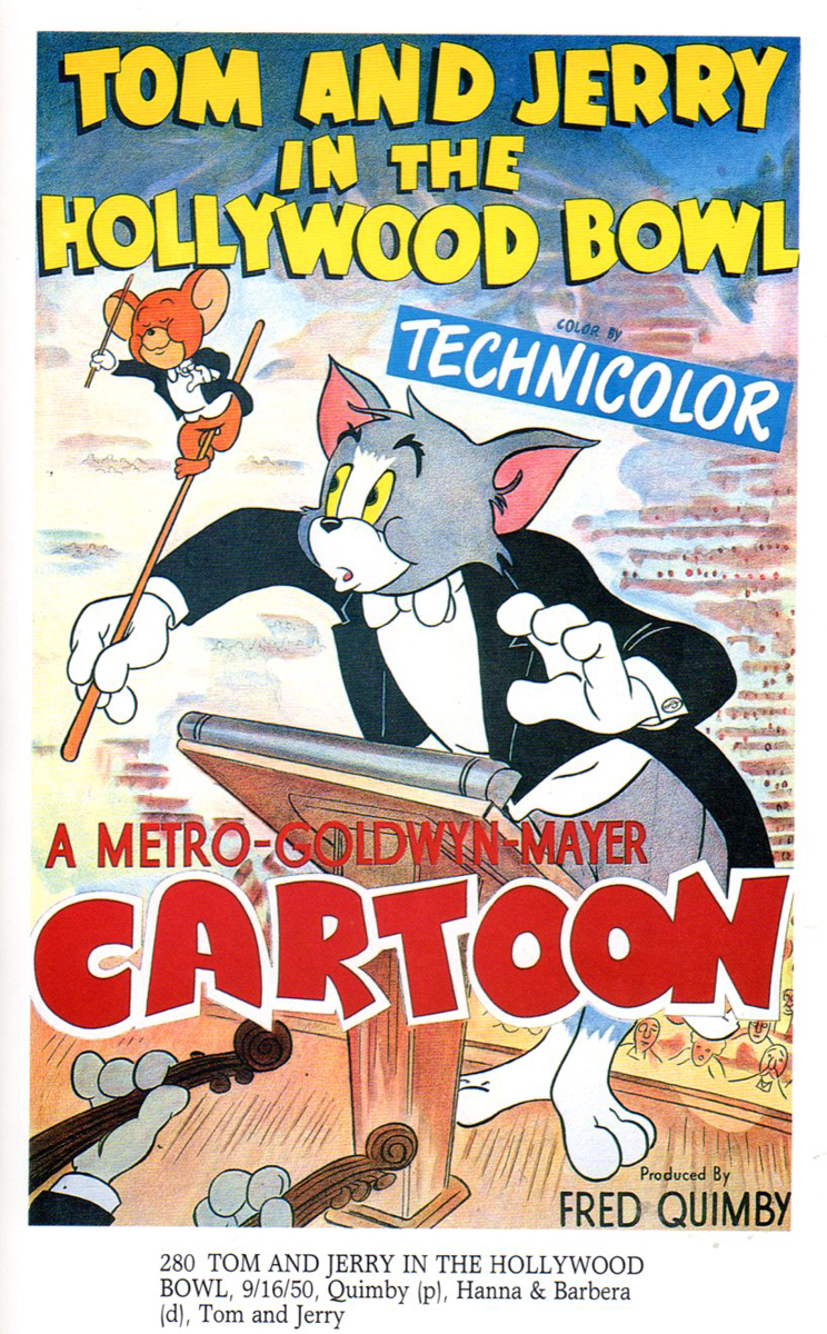
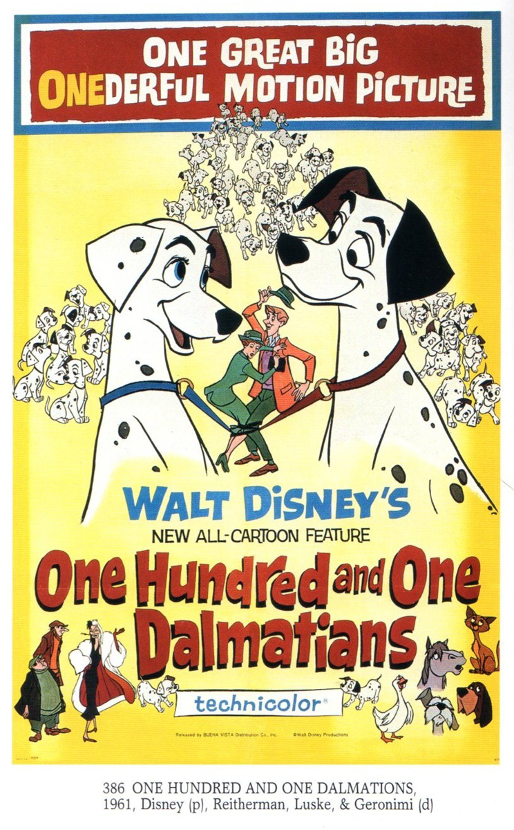
Animation &Bill Peckmann &Books &Illustration 12 Apr 2013 05:40 am
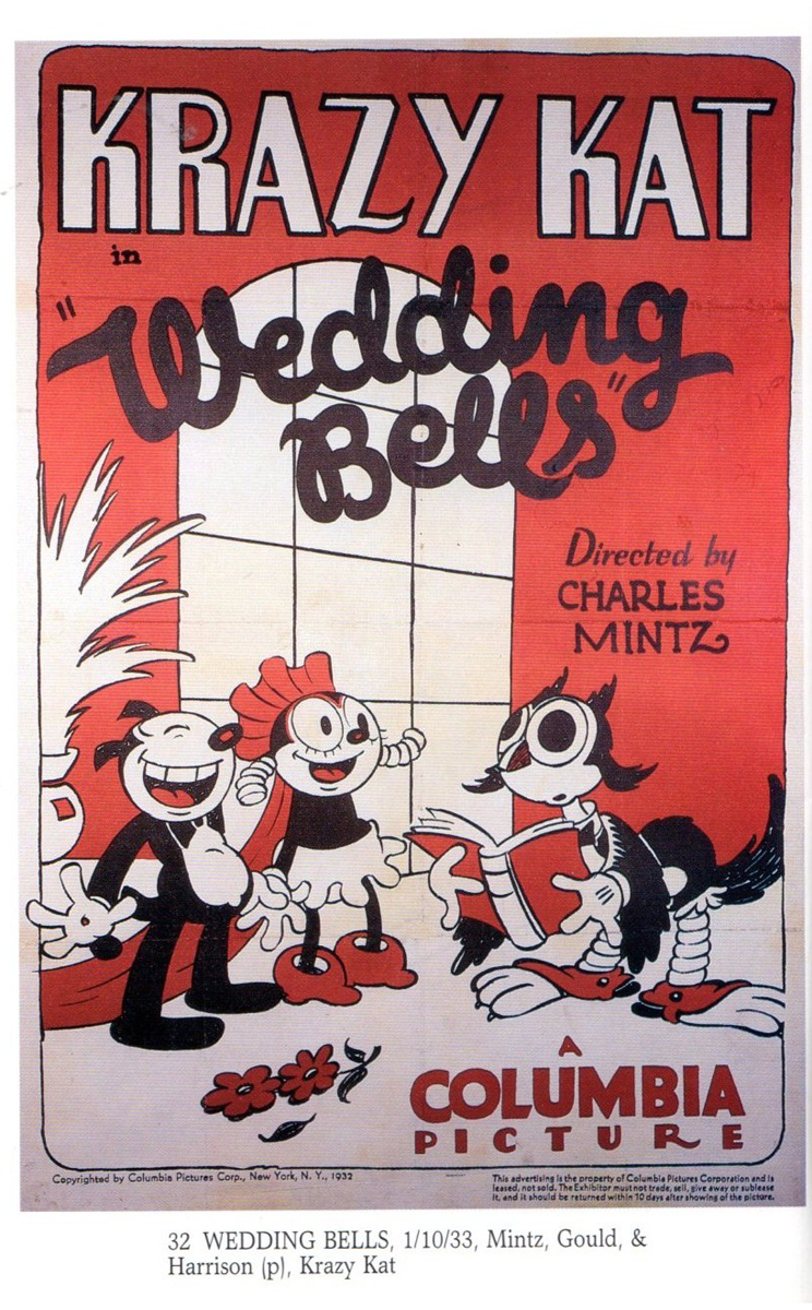
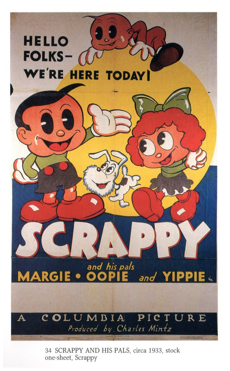
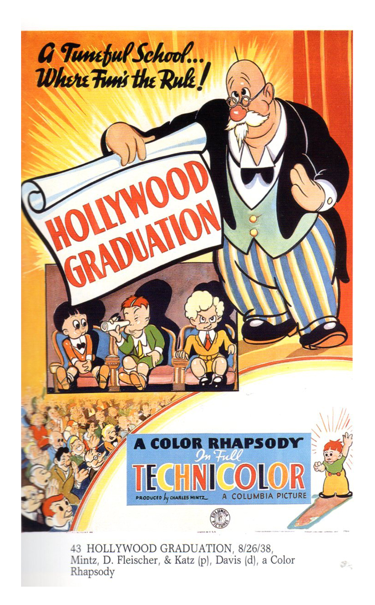
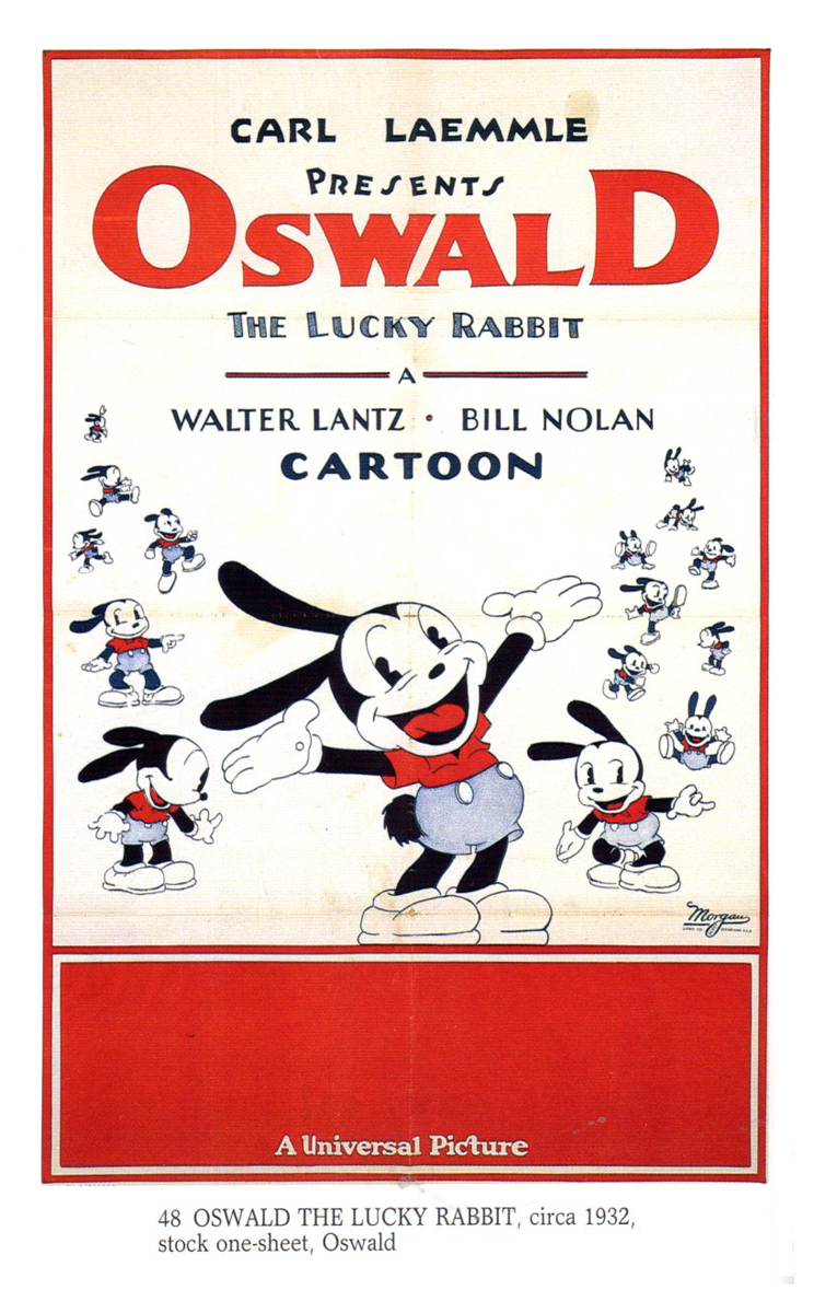
Cartoon Posters – 2
“Cartoon Movie Posters” is a book that was published by Bruce Hershenson in the 1990′s, volume 1.
Bill Peckmann sent me some of the better posters in the book, and I posted them last week.
I have to admit that I’m intrigued by the notion of scanning quickly through the history of animation via the poster art. I guess today one would more easily collect a reel of commercial spots. I’m not sure they’d be any more exciting, and the experience would probably wear thin quickly.
Although, it’s not that rare to see a poster for an animated short. As a matter of fact, posters can all too easily be produced by the film makers, themselves. At Oscar voting time we saw posters for all the potential nominees: Paperman, Combustible, Adam & Dog, The Eagleman Stag, Oh Willy!
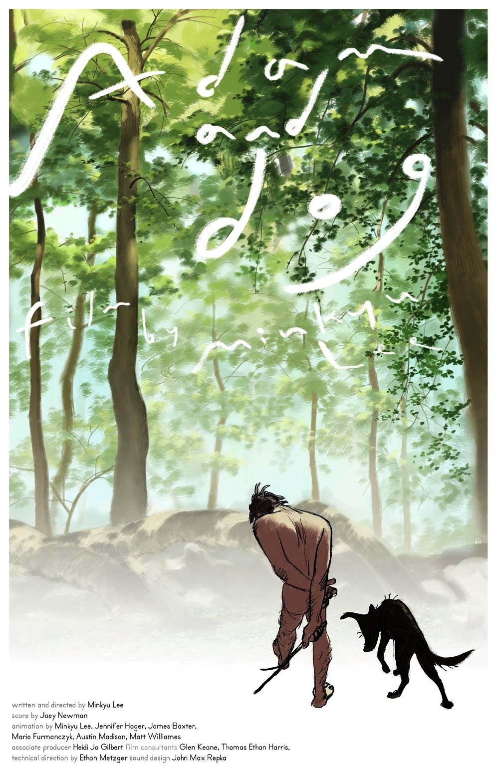
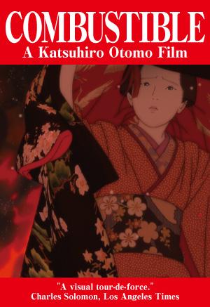
“Adam and Dog” | “Combustible”
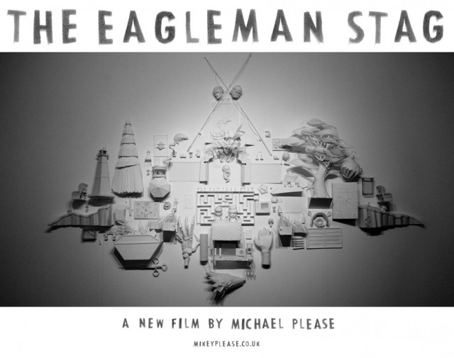
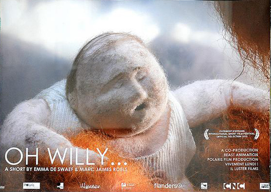
“The Eagleman Stag” | “Oh Willy!”
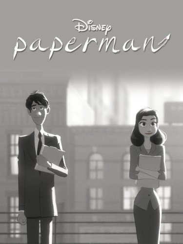
The winner: “Paperman”
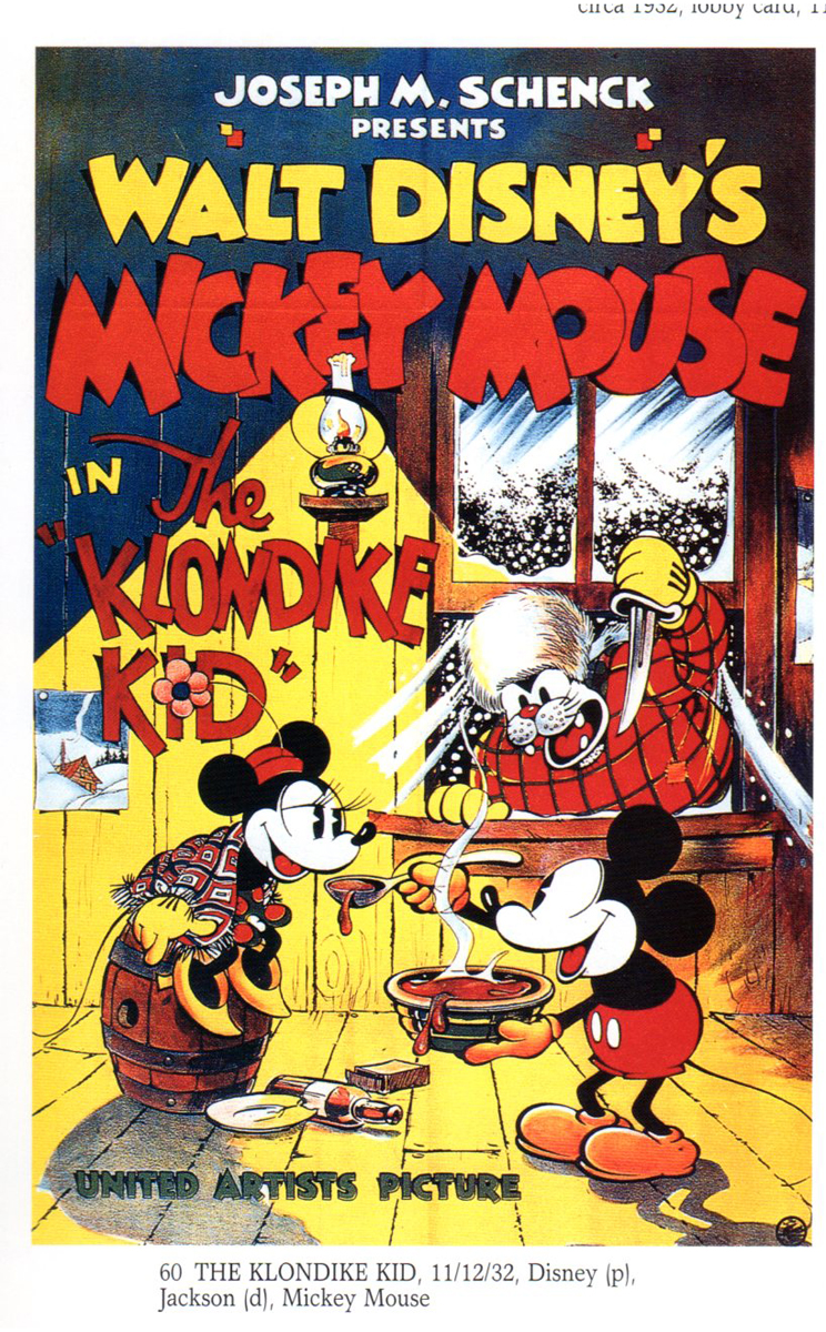
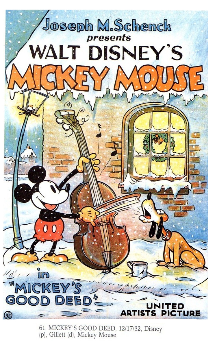
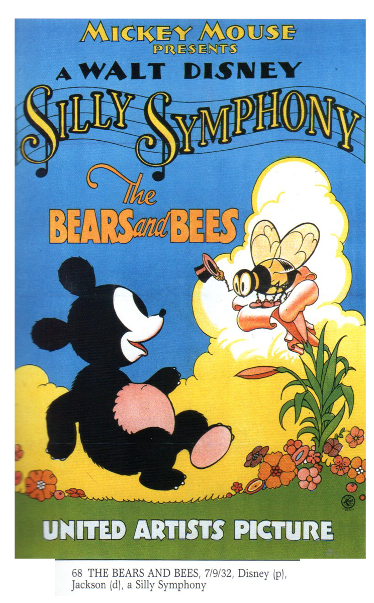
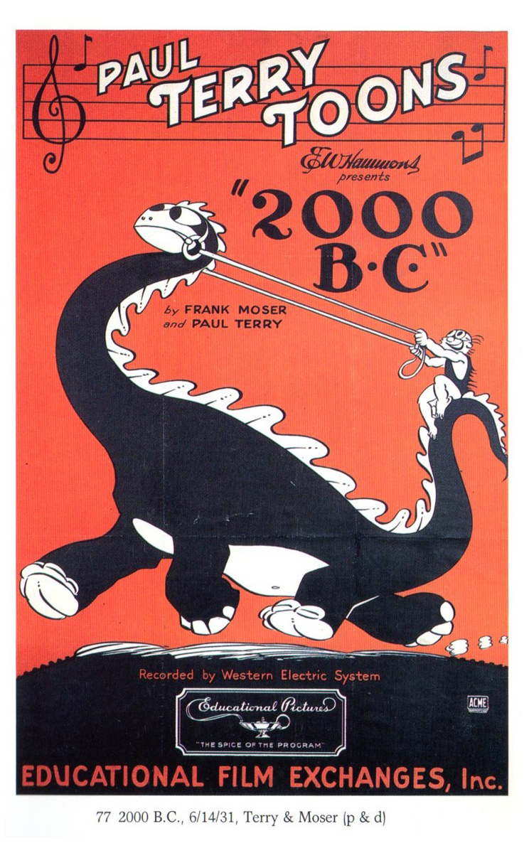
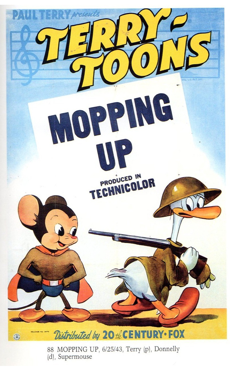
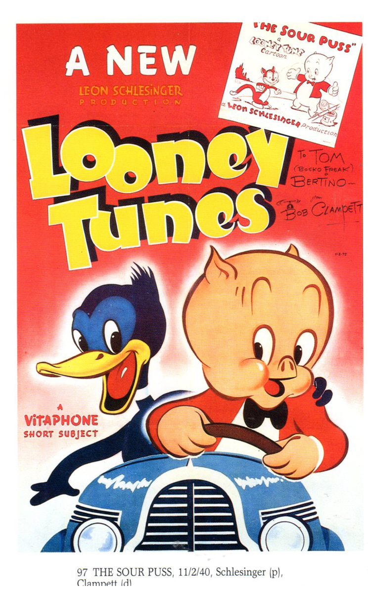
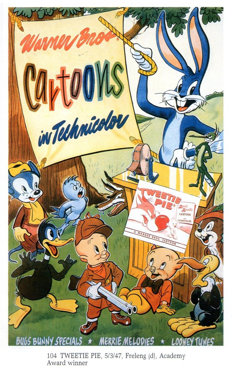
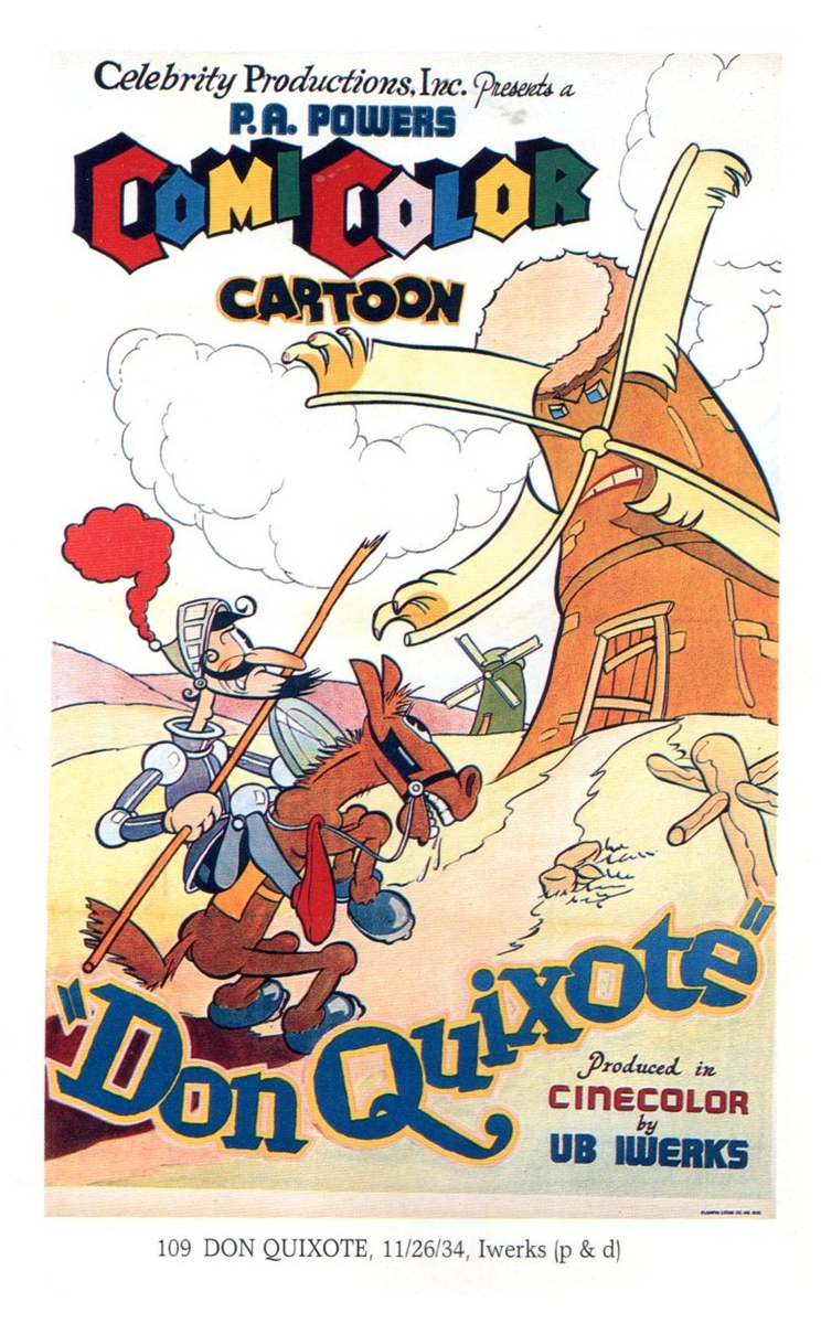
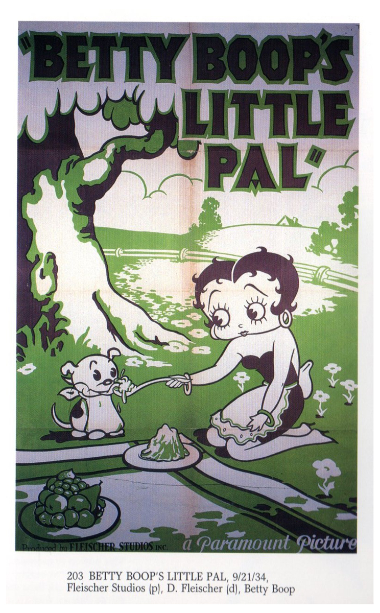
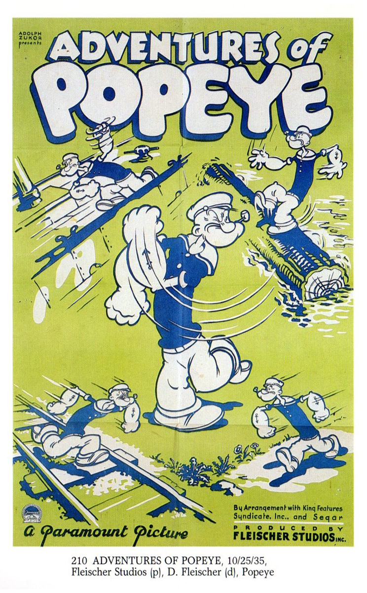
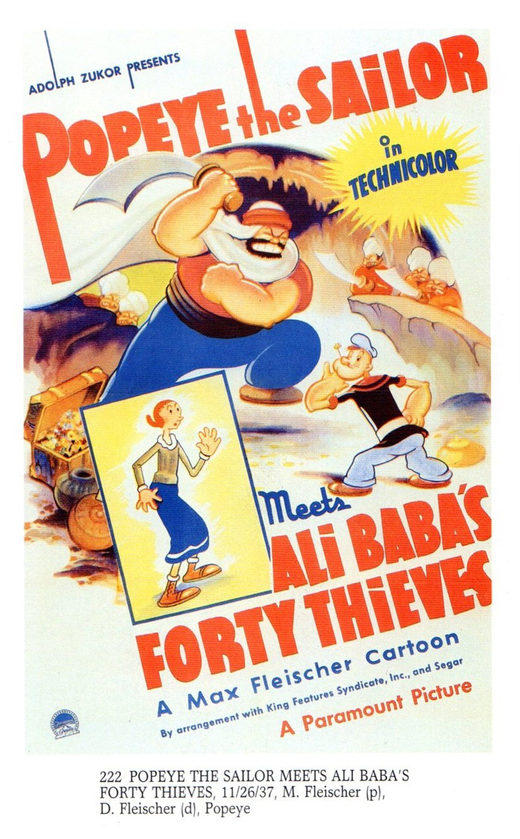
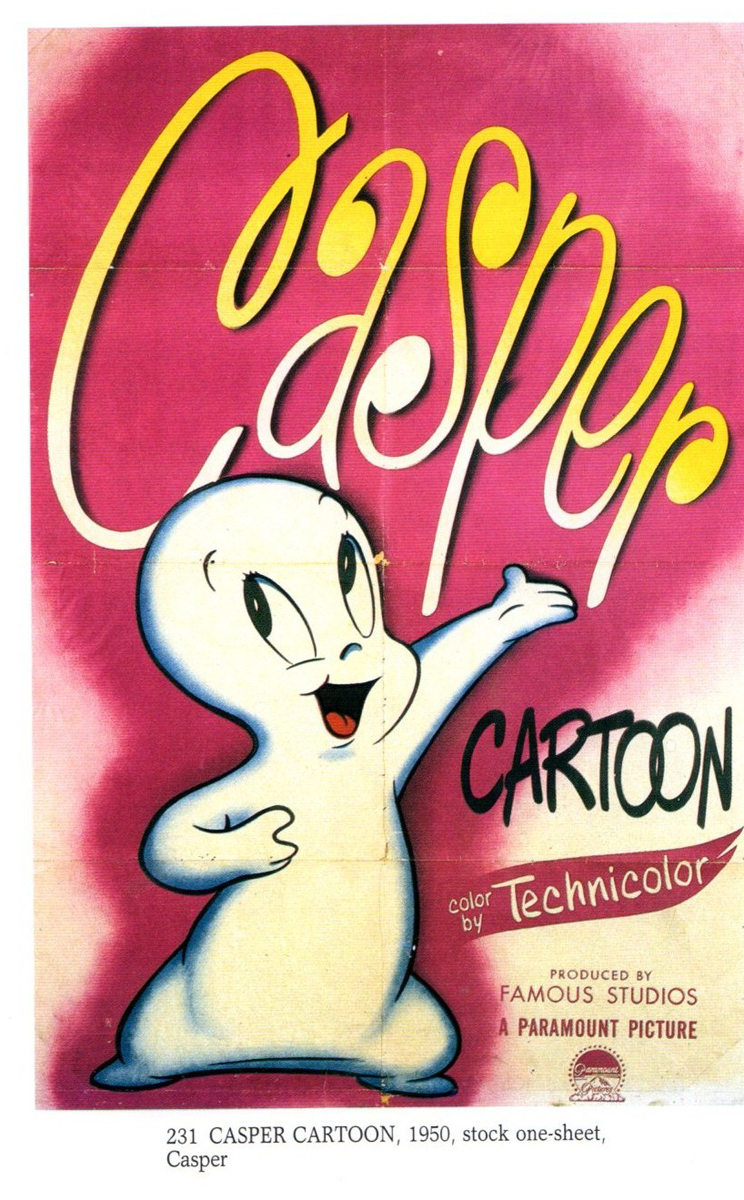
Here’s post #2 featuring some great cartoon posters. Many thanks to Bill Peckmann for planning and scanning and sending.
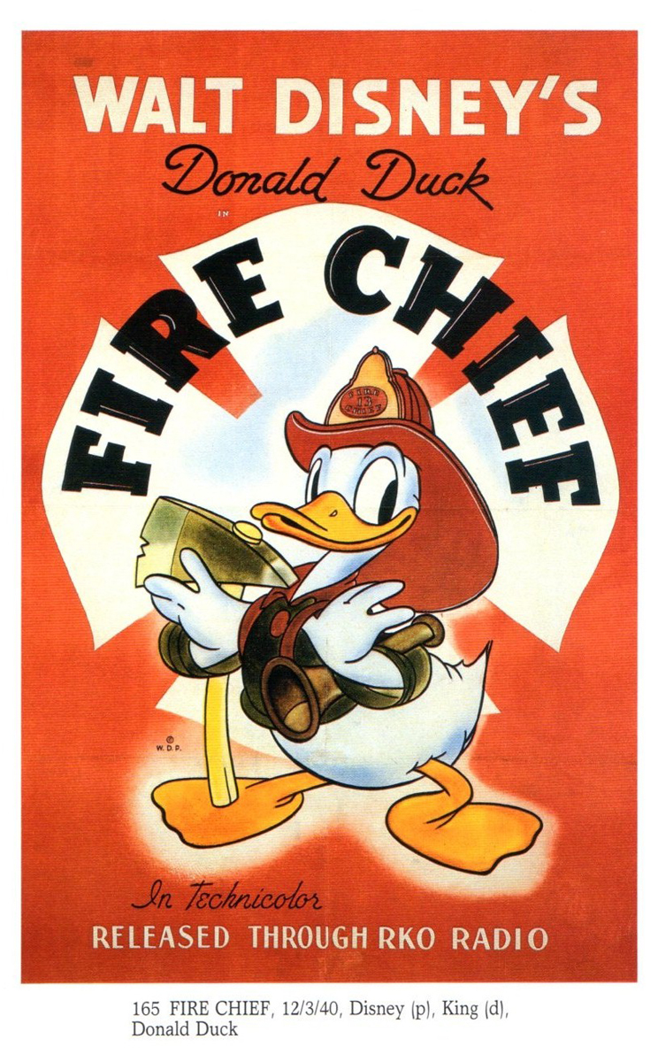
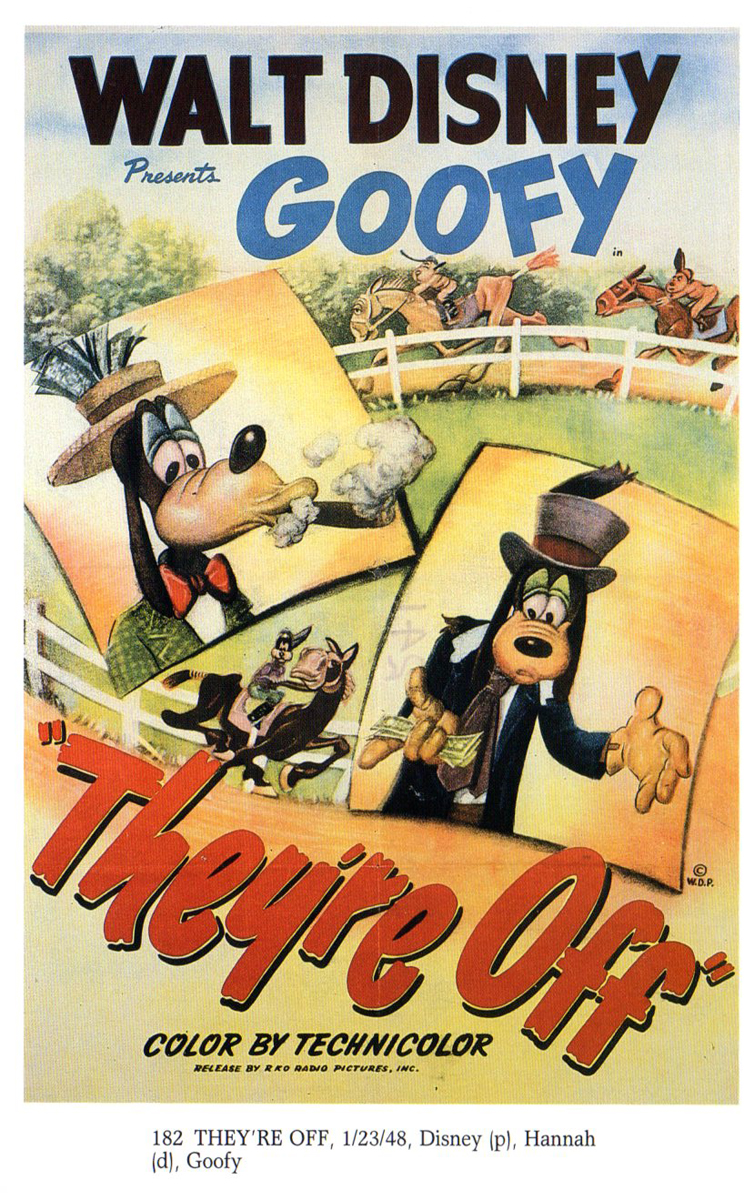
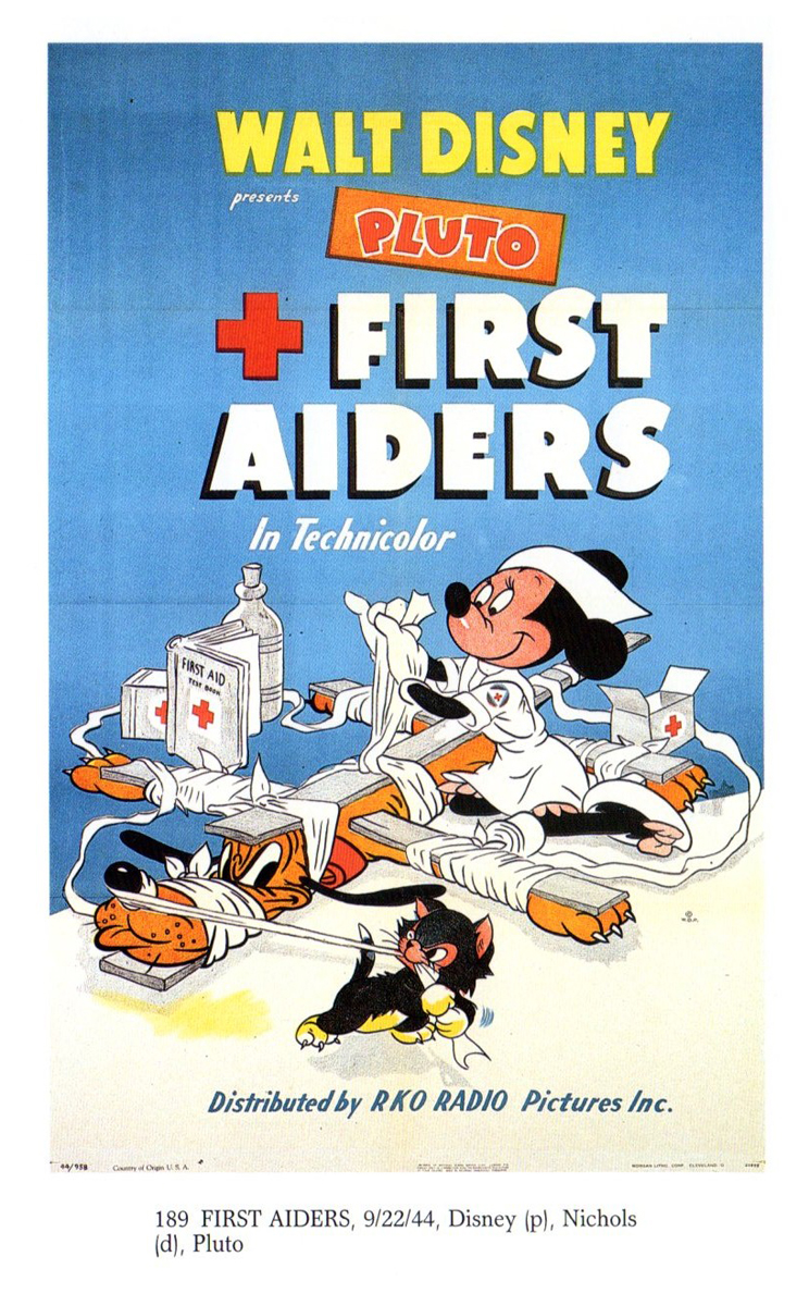
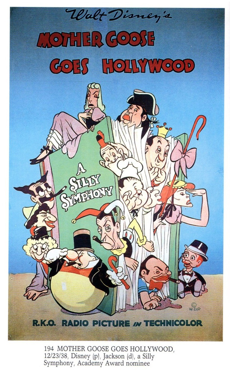
 1
1
 2
2
 3
3
 4
4
 5
5
 6
6
 7
7
 8
8
 9
9
 10
10
 11
11
 12
12
 13
13
 14
14
 15
15
 16
16
 17
17
 18
18
 19
19
 20
20
 21
21
 22
22
 23
23
 24
24
 25
25
 26
26
 27
27
 28
28
 29
29
 30
30
Animation &Books &Comic Art &Disney &Guest writer &Illustration 11 Apr 2013 05:09 am
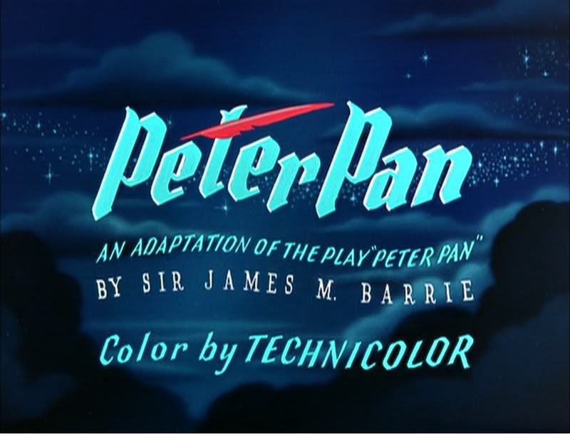
Peter Hale’s Peter Pan
About six weeks ago, I was contacted by Peter Hale in the UK about a “strip book” of Peter Pan that was published in England to tie into the original release of the movie. Peter sent me some beautiful scans of the artwork in the book, and I posted it (here.)
Mr. Hale promised a second book that was also published at the time.
It turns out he has done some extensive research into the subject of the books in conjunction with the Disney film. This week, I received a complete breakdown of all the “Pan” books that were published in the UK, and the scans for another book. I’ve decided that I really have to post what Peter has written; it’s that extensive. I’ll follow up with another post of the books scanned.
Many thanks to Peter Hale for sharing this fine work with the “Splog” and its readers.
The rest of this post is over to Peter Hale who writes:
 My (superficial) research into the Disney-illustrated books of Peter Pan published
in the UK in 1953 has wandered off on several tangents.
Firstly a rough chronology of the development of the original book, and the Disney
film:
1902 – Barrie’s fantasy novel (for adults) The Little White Bird includes a sequence that
features Peter Pan, a 7-day-old baby who flies away from home so that he will never
grow up, and, after learning that he is not a bird, and therefore can’t fly, is
adopted by the faries in Kensington Gardens.
1904 – Barrie expands the idea of Peter Pan into a play, to great success.
1905 – The chapters from The Little White Bird that feature Peter Pan are republished for
children as Peter Pan in Kensington Gardens by his publishers, Hodder & Stoughton,
to cash in on the play’s popularity.
1911 – Because of the demand for Peter Pan products, Barrie publishes a novel based on the
play. He adds a coda wherein Peter promises to return each spring to take Wendy back
to Neverland to do the Spring Cleaning. But he starts to miss years, until he has
forgotten her altogether. Wendy grows up and has a daughter of her own. One day
Peter returns for her and is distressed to find that she is too old to fly away. But
he soon meets her daughter Jane and so takes her to Neverland, and when she grows
old, her daughter Margaret will take over – because he does need a mother.
1915 – Hodder & Stoughton publish an abridged version of Peter Pan for younger children,
written by May Byron with Barrie’s approval. They title it Peter Pan & Wendy.
1921 – A version of May Byron’s adaptation “retold for Little People” is published, with
illustrations by Mabel Lucie Attwell at Barrie’s request. Her drawings of babylike
characters presumably matched Barrie’s vision.
1929 – Barrie donates all the rights to ‘Peter Pan’ to the Great Ormond Street Hospital for
Children.
1935 – Walt Disney plans to follow Snow White with Peter Pan, but has difficulty securing
screen rights from Great Ormond St Hospital.
1939 – Having finally secured rights to make an animated film version, the Disney studios
schedule Peter Pan to follow Bambi and Pinocchio.
1941 – The entry of the US into WWII forces Disney to postpone productions.
1947 – The Disney Studios put Peter Pan back into production.
1953 – February 5th: Walt Disney’s Peter Pan premieres at the Roxy Theater, New York.
1953 – April 16th: Walt Disney’s Peter Pan has its UK premiere at the Leicester Square
Theatre, London.
1953 – May: Walt Disney’s Peter Pan is shown at the 6th Cannes Festival.
1953 – July 27th: Walt Disney’s Peter Pan goes on general release in the UK.]
Through the 40s her characters became ever more chubby, stunted and stylised, but in 1915 she was still starting out as an illustrator.
Here is her version of Peter freeing Wendy from the mast.
The illustrations she did then became almost as much part of the May Byron version of “Peter Pan and Wendy” as Tenniel’s were part of “Alice”, and it was still being published in 1980. A reprint of the 1921 edition was published in 2011.
Which brings us to the versions of Peter Pan published in the UK in 1953.
Jacqueline Rose, in her book “The Case of Peter Pan”, lists the following six books published in the UK that year:
- Barrie, J. M. Peter Pan in Kensington Gardens, illustrated by Arthur Rackham, ‘Peter Pan Books’ (from 9 years) (London: Hodder and Stoughton, I953)
- Bedford, Annie N. Disney’s Peter Pan and Wendy, ‘Peter Pan Books’ (London: Hodder and Stoughton, I953)
- Byron, May. Peter Pan in Kensington Gardens, illustrated by Arthur Rackham, ‘Peter Pan Books’ (for 6 to 8 year olds) (London: Hodder and Stoughton, I953)
- Byron, May. The Walt Disney Illustrated Peter Pan and Wendy, ‘Peter Pan Books’ (for 8 to 9 year olds) (Leicester: Brockhampton Press, I953)
- Pearl, Irene. Walt Disney’s Peter Pan, retold from the original story by J. M. Barrie, ‘Peter Pan Books’ (for 3 to 6 year olds) (Leicester: Brockhampton Press, I953)
- Winn, Alison. Walt Disney’s Peter Pan, retold from the original story by J. M. Barrie ‘Peter Pan Books’ (for 6 to 8 year olds) (Leicester: Brockhampton Press, I953)
as opposed to just one in 1952:
- Byron, May. Peter Pan, retold for the nursery, illustrated by Mabel Lucie Attwell, ‘Peter Pan Books’ for 3 to 6 year olds) (Leicester: Brockhampton Press, I952)
Two of these are versions of the Peter Pan in Kensington Gardens ‘origin’ story, which Disney had decided not to include in the film.
The remaining 4 are all “Illustrated by Walt Disney”. The Irene Pearl version is the strip book already posted, and scans of the May Byron book and the Alison Winn “Little Book” will follow. These all follow the Barrie novel rather than the Disney film, although with different simplifications and omissions.
The Annie N. Bedford book is one I have not been able to trace – she is the American author who wrote the Golden Books version of the Disney film, so this could be a UK publication of that book. It is given as published by Hodder & Stoughton, Barrie’s original publisher. The back cover of the Brockhampton ‘Little Book’ lists a different Hodder & Stoughton book.
“J. M. Barrie’s original Peter Pan and Wendy for older Boys and Girls, with illustrations by Walt Disney”. I have not been able to trace a copy of either book. These two books represent the two ends of the spectrum:
Barrie’s original text and the story of the film.
Finally there is the complication of Dean & Son’s Walt Disney’s Peter Pan, from the motion picture, a book of the film. This has no publication date. The illustrations are given as copyright Walt Disney 1953, but this is not a guide to the publication date, as Disney did not own the publishing rights and so the illustrations were always copyrighted to 1953, the year of the film’s release. It is probable that the Dean book was published later than 1953.
It is published ‘by arrangement with Hodder & Stoughton’, which either means it may be a reprint of the Bedford book, or just an acknowledgement that Hodder held the publication rights to Peter Pan.
In contrast I can only find one UK ‘Disney’s Alice in Wonderland‘ book that might have been published in 1951, and certainly no Carroll text with Disney illustrations.
So why so many Peter Pans? The UK’s wartime paper rationing ended in 1950 so that would not be an issue.
Was it because Disney did not have the publishing rights, so this collaboration was necessary to promote the film?
Was it just, as I’d thought previously, that the British might object to tampering with the story? Or was Disney just trying to overcome the sort of criticism that his Alice had suffered in the UK (that it was too Americanised and not sufficiently true to the book) by linking his film to the original text?
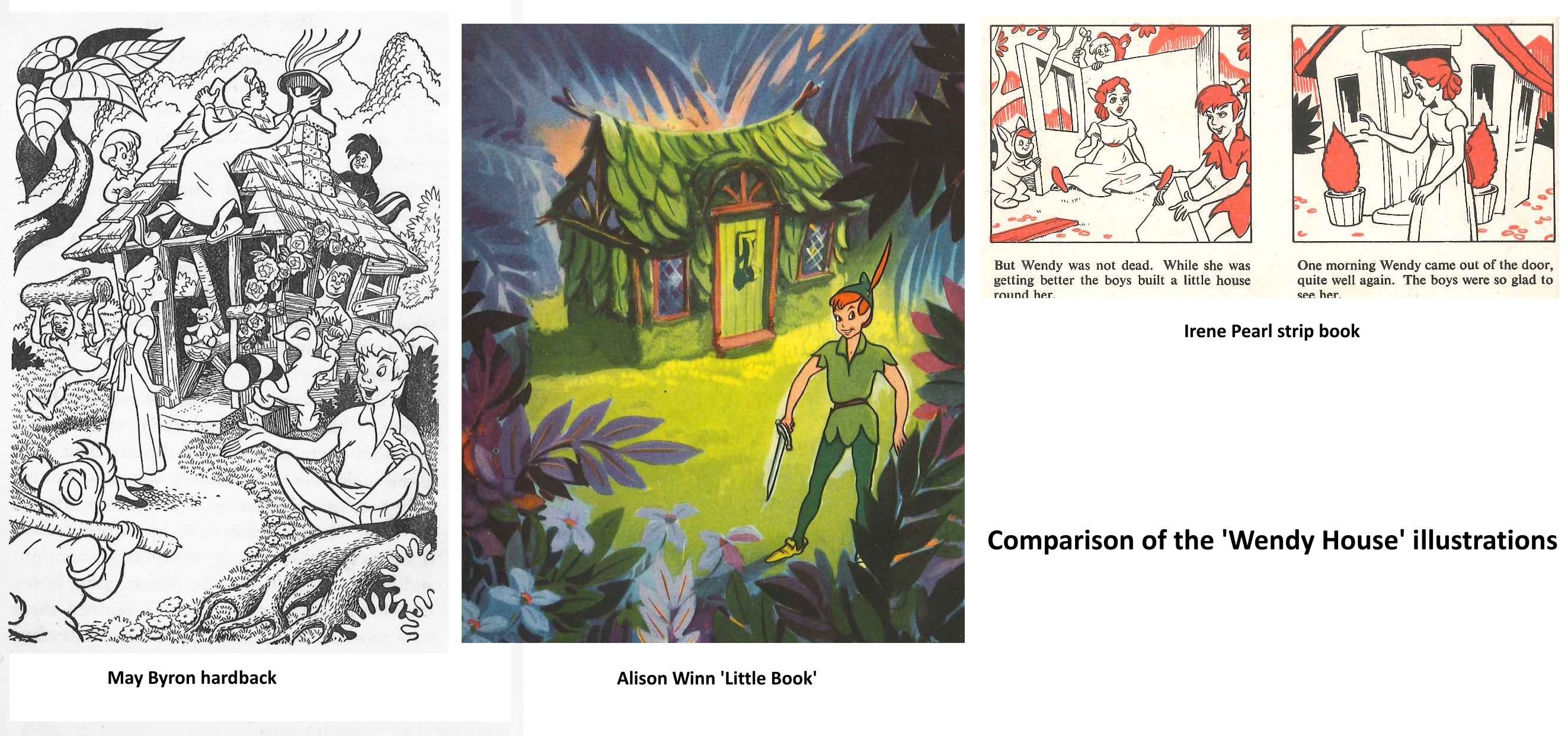
Comparing the 3 Brockhampton books the illustrations are all different, and by different hands it would appear, but all show fidelity to the Disney style. I am assuming that these illustrations were done by British illustrators specially for the books, as where the illustrations differ from the film the artists seem to have consulted the particular text they are working with for details.
Hence the May Byron text describes the adding of a shoe as a knocker, and John’s hat as a chimney, and the illustration shows the hat, although it also shows Wendy watching the building from outside, which is quite wrong!
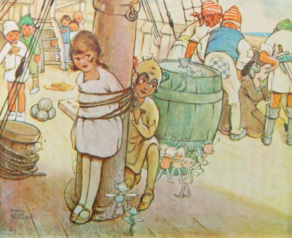
The marooning of Tiger Lily is done in the book by two pirates, with Hook turning up
later.
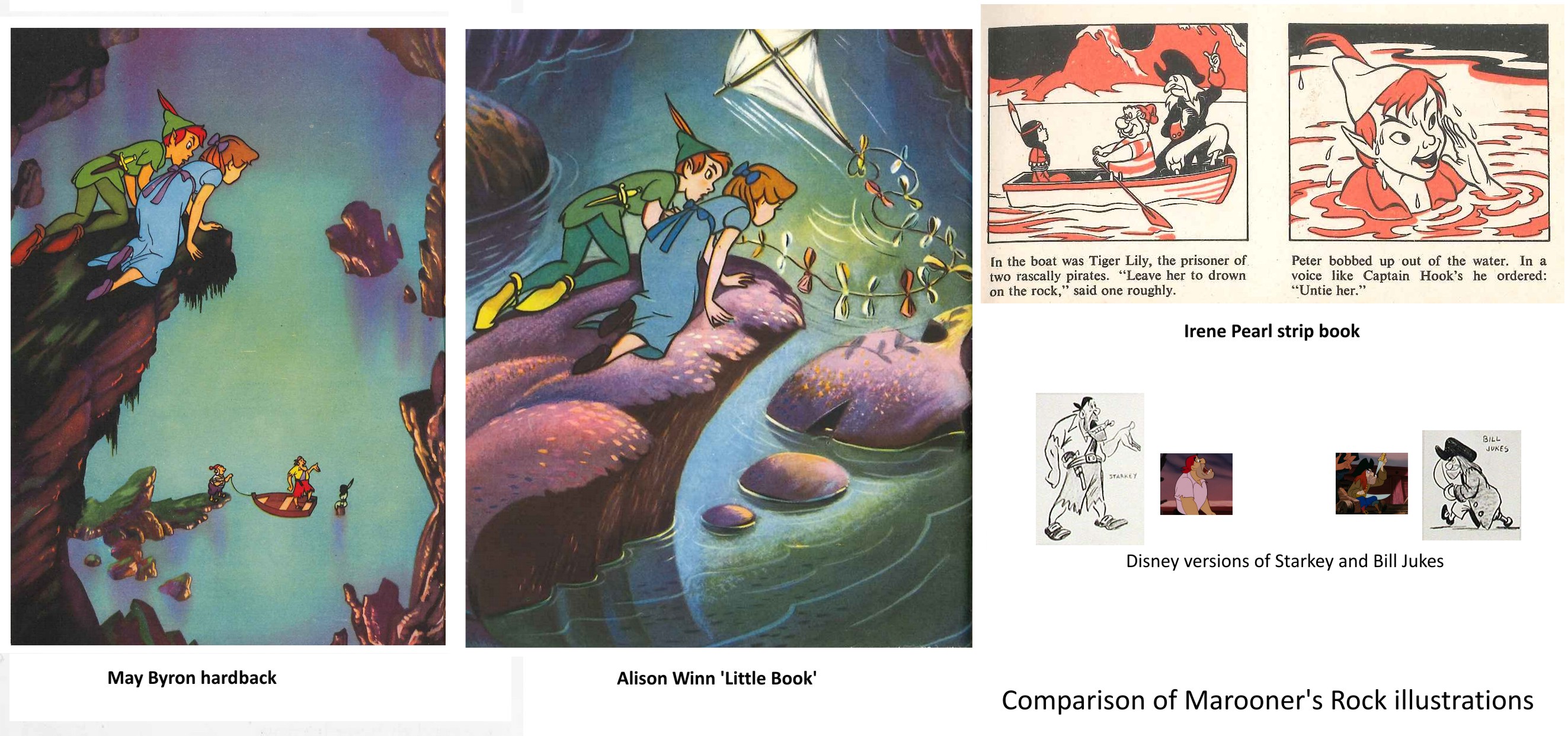
In the May Byron book they are named as Smee and Starkey, and the
illustration has Hook replaced by a likeness of the Disney Starkey (but with a
yellow shirt instead of pink). The strip book doesn’t name the pirates and Hook is
here replaced by Bill Jukes. The Alison Winn version omits the marooning of Tiger Lily entirely and just has Hook turn up to attack Peter.
All three books have Wendy exhausted and Peter injured after the encounter – both
stranded on the rock unable to fly back. John’s kite collects Wendy, while Peter is
rescued by the Never bird, whose floating nest serves as a boat. The Winn ‘Little
Book’ uses a version of the shot of Peter and Wendy watching Hook and Smee from on
high, but without the pirates, truncated to appear a low rock, and with a kite added
in.
This brought me to wonder how much Disney reference they were given, and what it
consisted of. Many of the scenes are close to shots from the film. But a look at the
Dean book, which seems to be taken directly from colour stills, shows that these are
not actually shots from the movie.
Anyone who has ever tried to put together presentation scenes from the cels of an
animated film knows that there are always problems – the best pose is poorly traced,
or one character is in an ungainly inbetween position – whatever, that perfect key
image from the storyboard just isn’t there in the actual film, where, deliberately,
nothing hits a strong extreme at the same time.
Hence it appears that the lobby card stills or coloured transparencies that Disney
circulated in their press packs etc. had been specially recreated – a lead animator
had redrawn the characters from various key frames as they ought to have looked, and
these drawings had been traced and painted on cel with extra care, and combined with
a new version of the background to be photographed by a stills camera. (I presume
the composites then went up on someone’s wall!) The same thing, of course, as the
re-posing of key scenes that is typically done by a stills photographer on the set
of a live action film after it has been shot.
The illustrators appear to have had coloured stills and model sheets to work from.
Does anyone know how much reference was supplied? Walt Disney Studios had an office
in London specifically to deal with promotion, distribution, licensing artwork etc.
Did they do artwork for any of the books – or just supply references?
Lastly, the curator of the Great Ormond St. Children’s Hospital Archives has kindly
sent me these scans relating to the London Premiere of Peter Pan on 16th April 1953
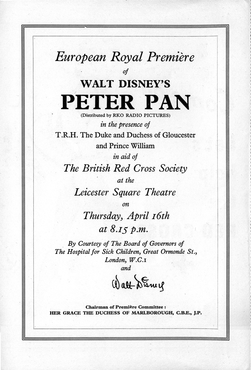
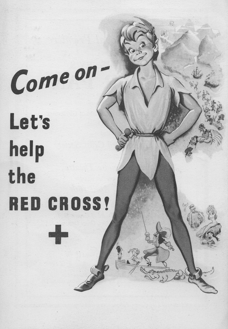
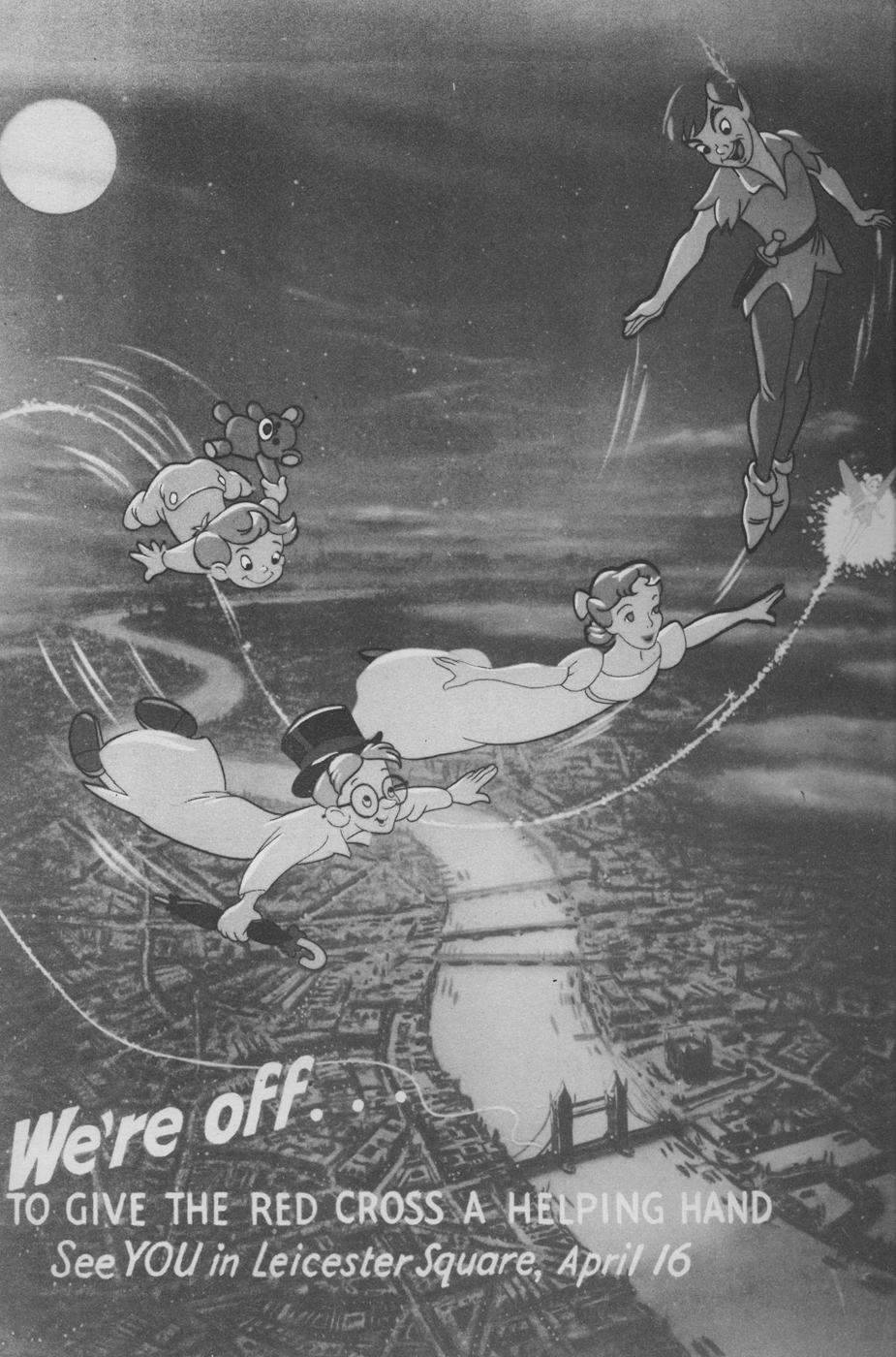
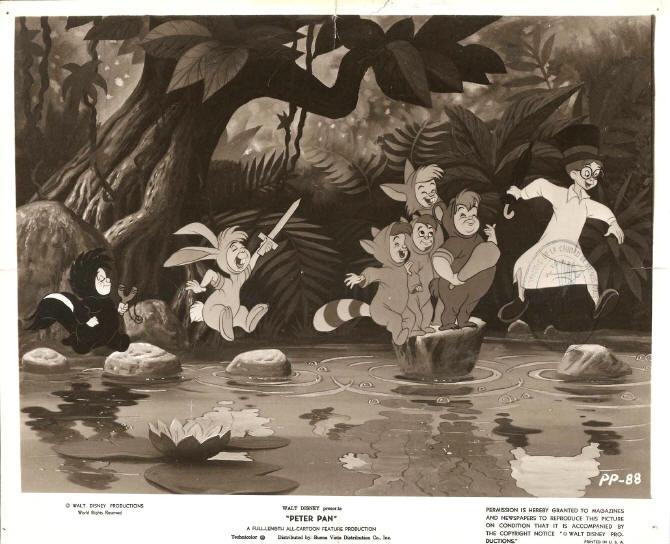
It’s worth taking note that Hans Perk has recently posted the animators’ drafts from the Disney film, Peter Pan. Go here to read and/or collect them.
Action Analysis &Animation &Animation Artifacts 09 Apr 2013 07:23 am
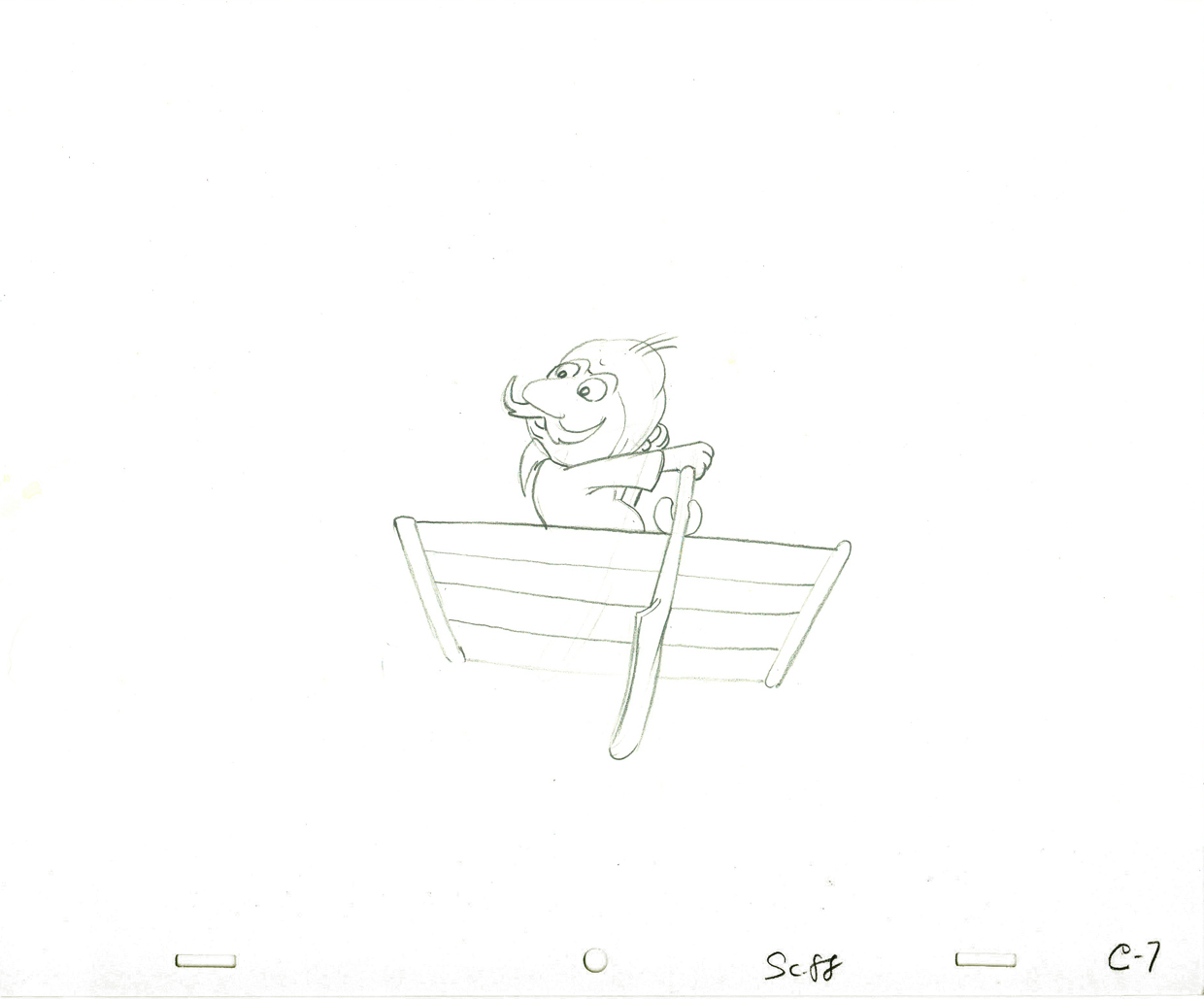
Johnny Gent’s Spellbinder – recap
 Johnny (Gentilella) Gent had the hardest time on the Letterman series done for the original Electric Company. He could never get the characters and kept trying to add 3D form to the 2D characters that John Hubley had created.
It was my first job, and I was in awe of every animator that walked through ________A very early John Hubley model of Spellbinder.
the door. We had 2½ months to do
all the artwork on the 20 spots that were 2½ mins each. A total of 50 mins in 10 weeks. (That’s about right these days for a 30 second spot!)
I did all the assisting, inking and inbetweening and had to do it quickly. (I estimated about 18 secs. per drawing. The game I played with myself to keep up was to keep one eye on the drawing and another on the clock.)
As I said, it was my first animation job. What did I know! I had to take Johnny’s drawings and reshape them into Hubley’s characters, and I had to do it in ink. No pencil tests. Just do it. Whatever came out, was the final artwork (and I use that word loosely.) I felt, even while I was doing it, that I was killing Johnny’s work, so it went as it did.
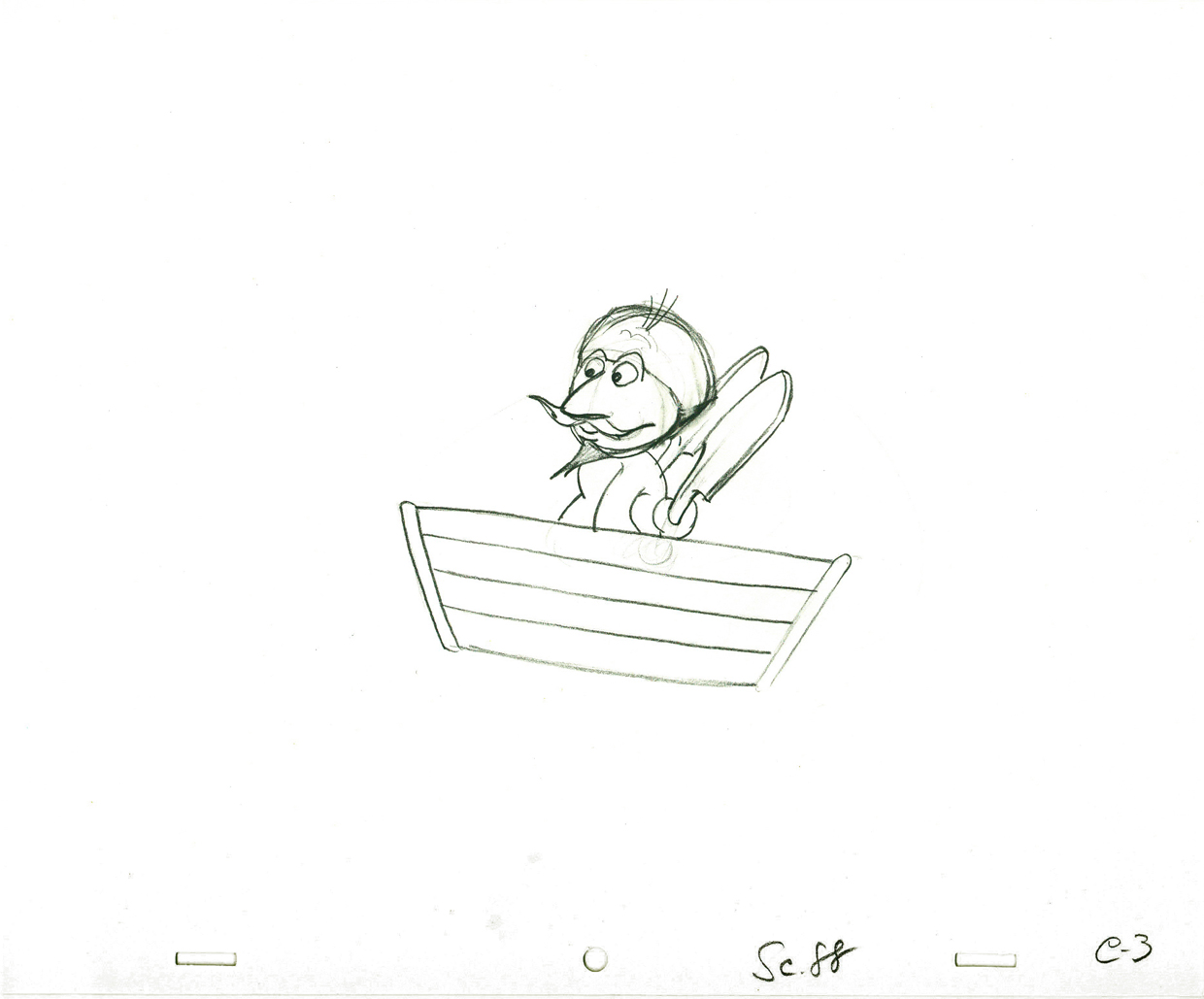
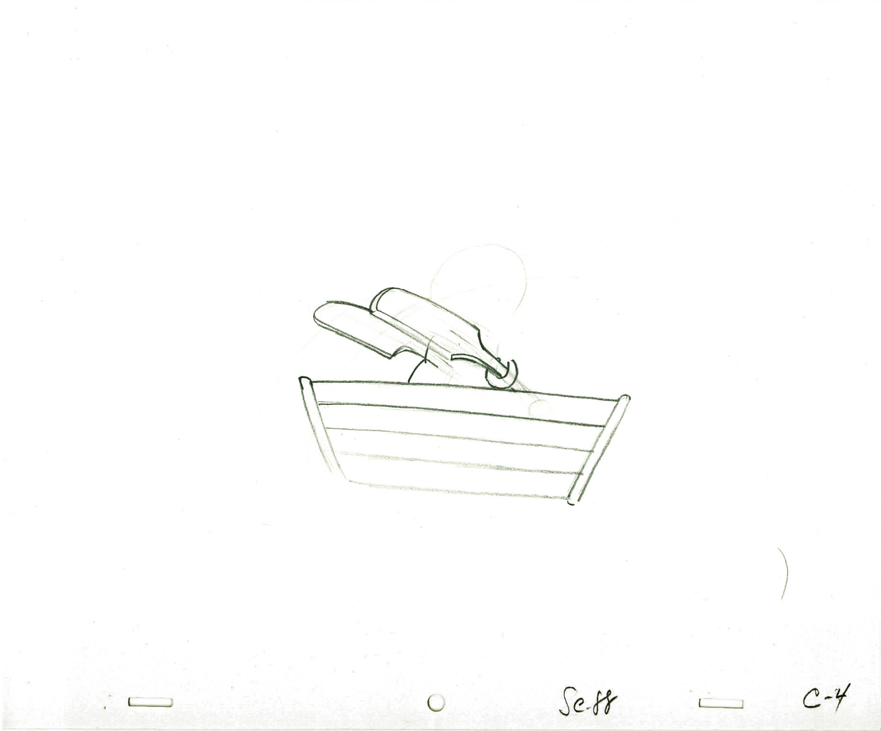
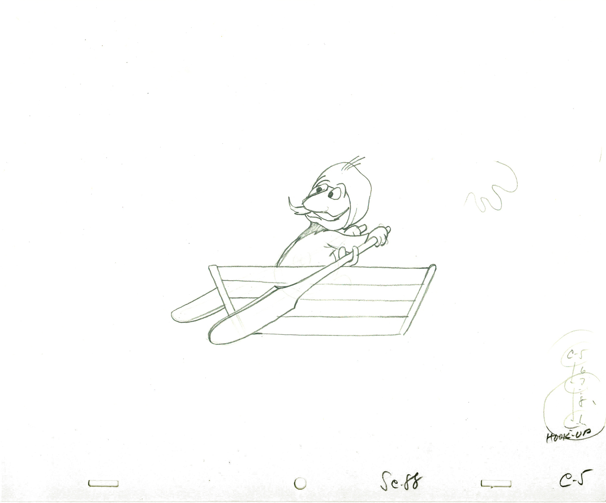
Here’s a cycle of Johnny Gent’s Spellbinder rowing a boat.
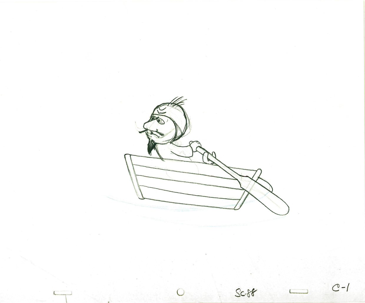 1
1(If you click on any drawing it’ll show you the full animation page.
 3
3
 4
4
 5
5
 7
7
Johnny Gent’s Spellbinder rows a boat
on two’s per drawing indicated
Click left side of the black bar to play.
Right side to watch single frame.
Six months later, I was on a lay-off from the Hubley Studio in need of a job. At NY Institute of Technology, a school in Long Island, they were starting work on a feature animated film that the school’s dean, Alexander Schure, was financing. He had decided to create the world’s largest computer animation department, and they were just barely starting to get a reputation for the incredible people they were employing (Ed Catmull, Alvy Ray Smith and other pioneers among them), but first they were going to do this hand-drawn feature.
 Out of the blue, I got a call from Johnny Gentilella. He was now the head of animation at Tubby the Tuba and was offering me a job as an Asst. Animator. NYIT was my alma mater, so I was curious to see what the place now looked like. Assistant was a promotion with a pay raise. I took the job right quick.
The staff included about ten people in those early days, and we worked in what seemed like a log cabin. I was given a seat directly across from the front door and handed a scene of Tubby the Tuba to clean-up and inbetween. I did it. Then another, then another, then another.
A few weeks later, at lunchtime, Johnny and I were alone in the space eating our sandwiches. I took the opportunity of apologizing to him for what I did at Hubley’s studio. I was taking Johnny’s sculpted drawings and flattening them. To make up time I skipped a step by not working in pencil. I’d clean up with a Sharpie on heavy paper. In the process flattening and taking all of the life out of the drawing. I apologized to John for what I felt was destroig his work. I was also only days into my first job and didn’t really know what I was doing. But I did it anyway.
He said that he hadn’t even noticed. Because of the schedule and the budget on the Letterman series, he knew I was doing what was best for the work. There was nothing I needed to apologize for. He appreciated how I felt but told me not to worry about it.
At the same time, I pointed out that I had just done a scene of Tubby the Tuba giving a speech at a lectern. It was identical, drawing for drawing, of a scene Johnny had done at Hubley’s. There it was Spellbinder, here it was Tubby. How and why did John do that?
He explained that on films like Letterman they were done so fast that there was no time for Pencil Tests. Animators couldn’t do as they did in the old days, animate a scene then see a PT of the scene and correct it if it needed the work. They had to knock out the scenes. If anything went wrong it was the animator’s fault and he’d be out of a job and a future contact for further work. So animators did what they knew would work. Better to be stale and save face, keeping your job, than to be daring and without a job.
 The following Saturday, I told Tissa David this story. She was giving me lessons in animation and inbetweening on Saturday mornings at her apartment. I let Tissa know about Johnny’s cheating to make it work. Tissa’s response – “How lucky Johnny is! I wish I had such luck!” She said she was unlucky to have a memory that couldn’t remember how to do such a scene and to catalogue the work, math and all, in her memory. Obviously John could do that. Tissa, instead, had to approach every scene as wholly new. She had to ____________________Tissa’s Letterman”
animate from scratch whereas John could
pull the scene from his memory.
I got Tissa’s point.
.
.
Note: the drawing of Tubby, above, was done by the
animator, Ed DeMattia, many months later in the production.
