Monthly ArchiveMarch 2007
SpornFilms 11 Mar 2007 08:39 am
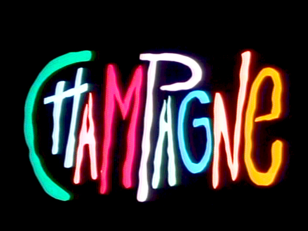
Jason McDonald’s Champagne Bg’s
– As you saw in yesterday’s post, Champagne, the film, had an odd birth:
 It went from the recorded documentary interview with Champagne, the girl, to improvised animation off the voice track.
Jason McDonald came in to storyboard the last half of the film and bring some structure into the life of Champagne, the character.
Jason also did all the backgrounds and color models as well as coloring a good part of the film, himself.
(Click on any image to enlarge for viewing.)
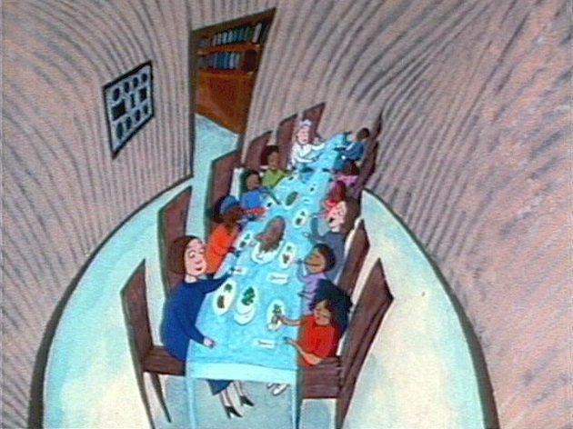
Here are some of his backgrounds:
 \
\
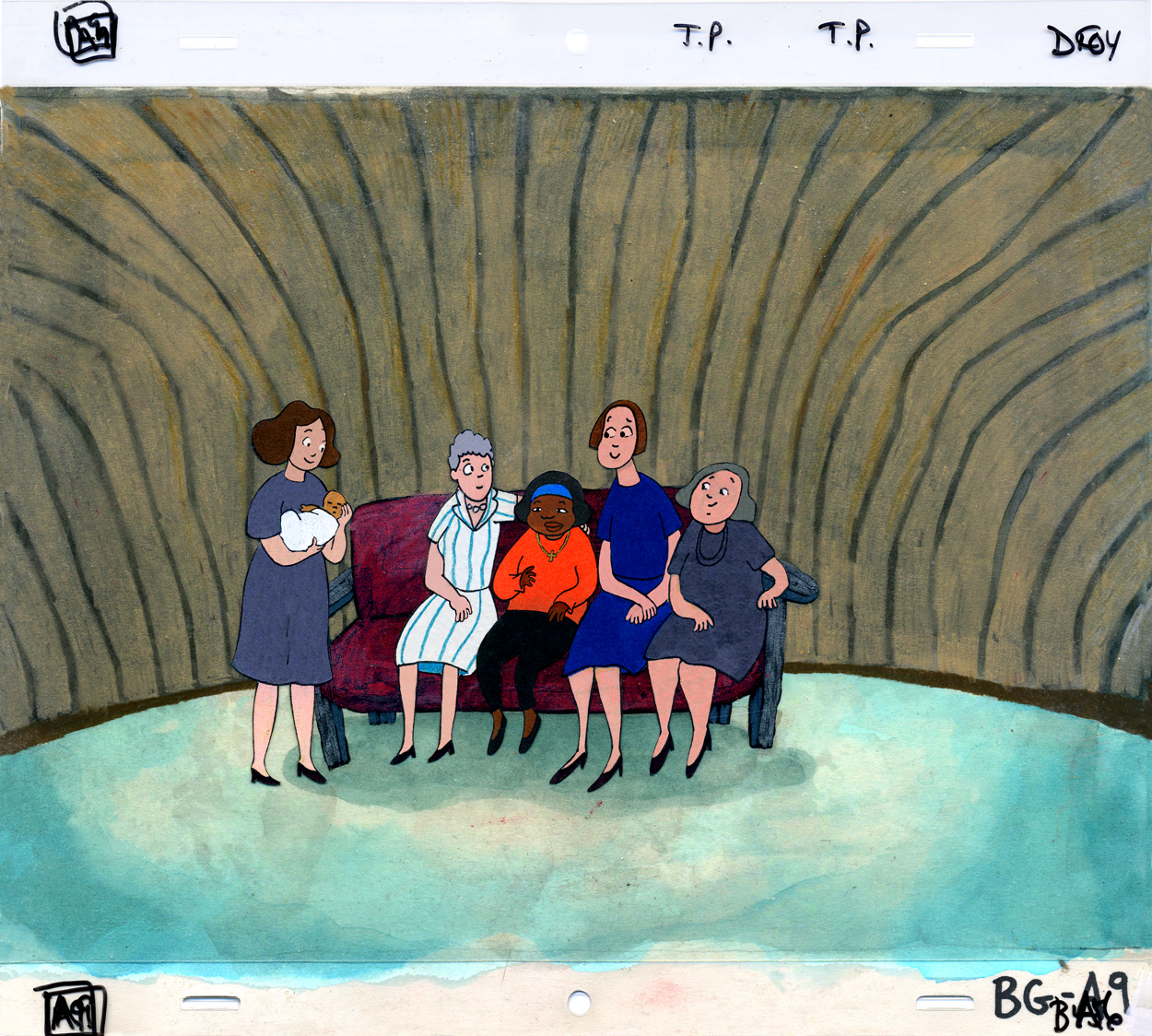
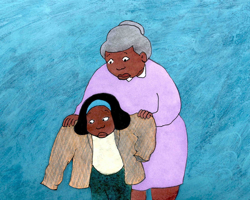
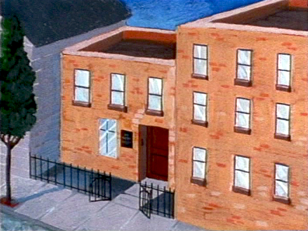
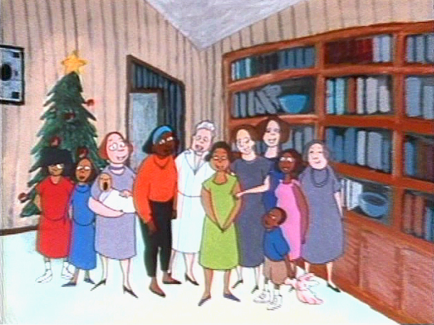
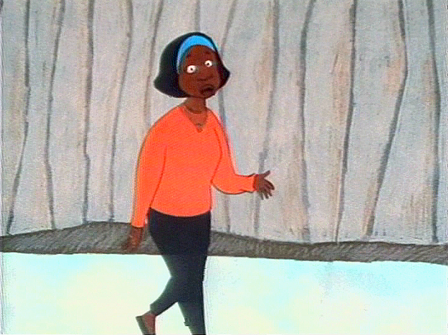
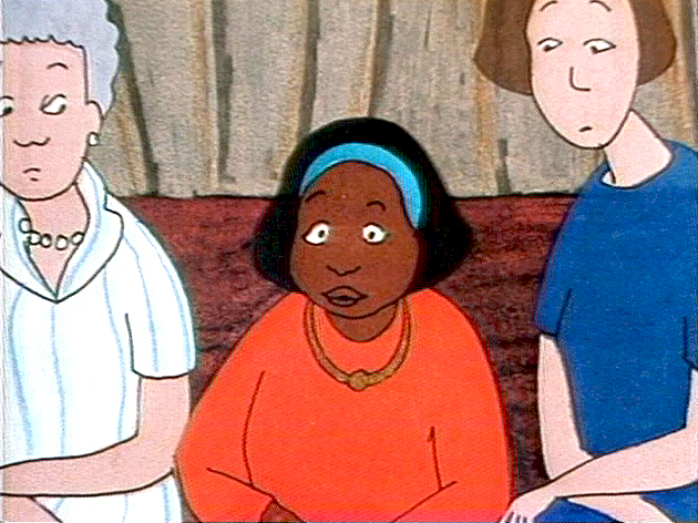
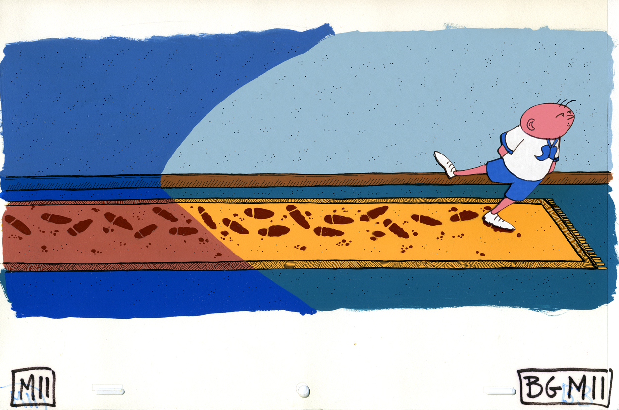
The nuns are gathered around Champagne while she narrates her story. Jason highlighted the fake wall panelling that seems to have been everywhere in the convent. It was a good way of always letting us know where we were and at the same time giving a texture to the backgrounds.
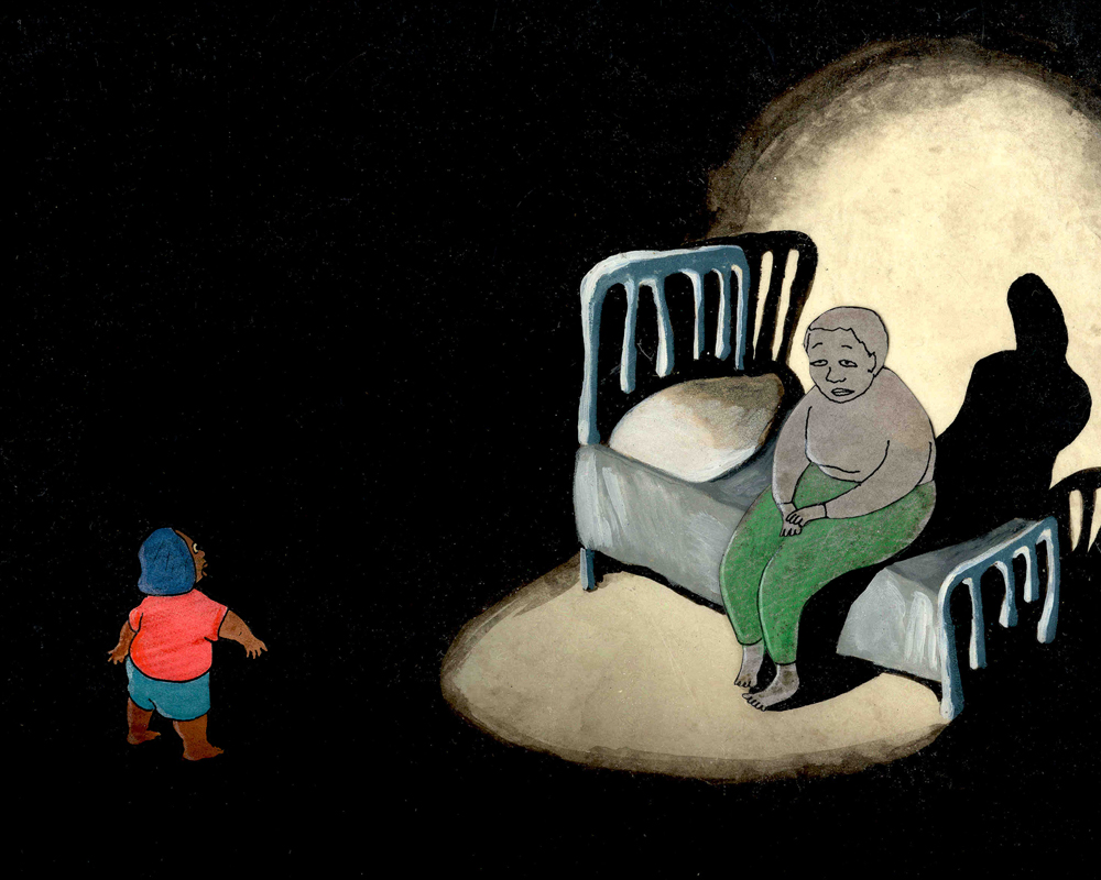
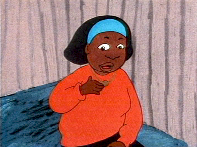
The story takes Champagne back to the point where she’s a very young child whose mother was a drug addict who didn’t take proper care of her daughter. Jason brought a lot of black into this section of the film, and it seemed appropriate.
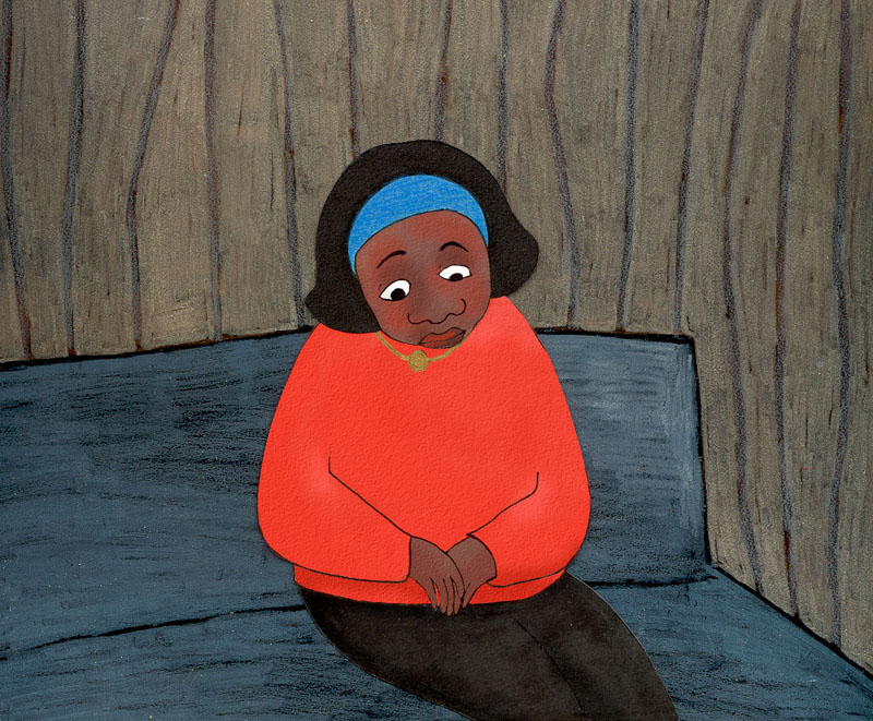
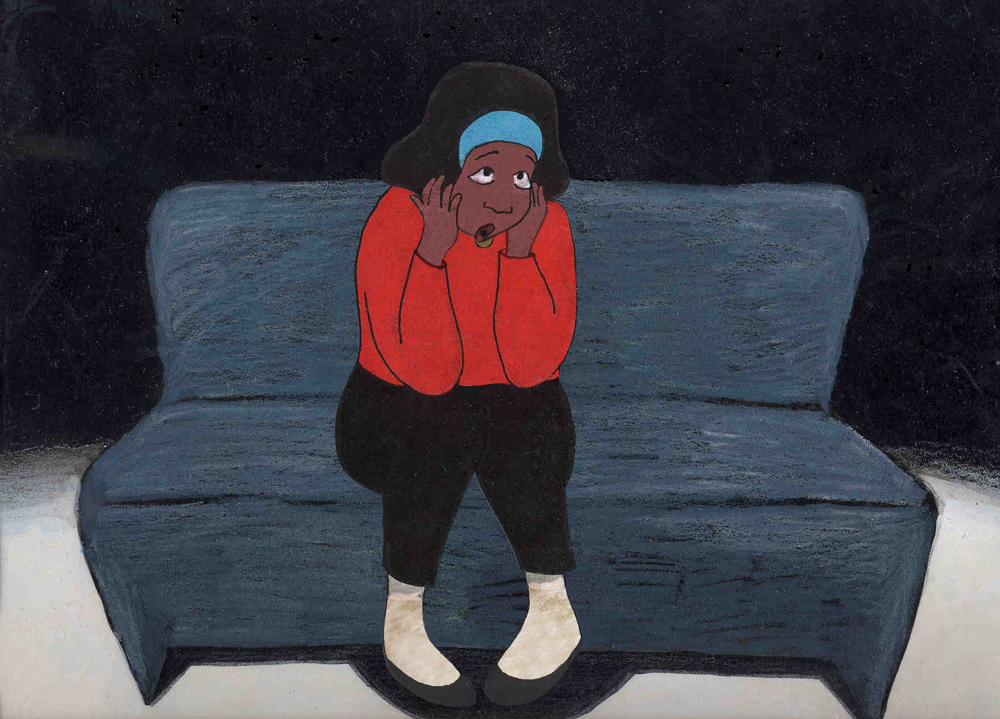
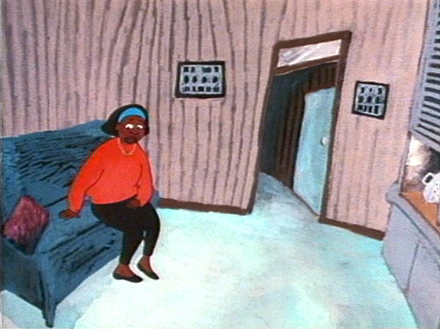
A good portion of the story takes place on the couch, as Champagne narrates. The story leads from the murder by her mother into her grandmother’s care. When the grandmother got ill, the convent took over.
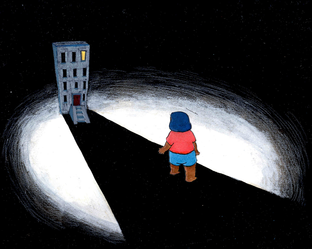
The older Champagne talks about growing up in the shadow of the prison. Many treks to and from a number of different prisons to visit her mother.
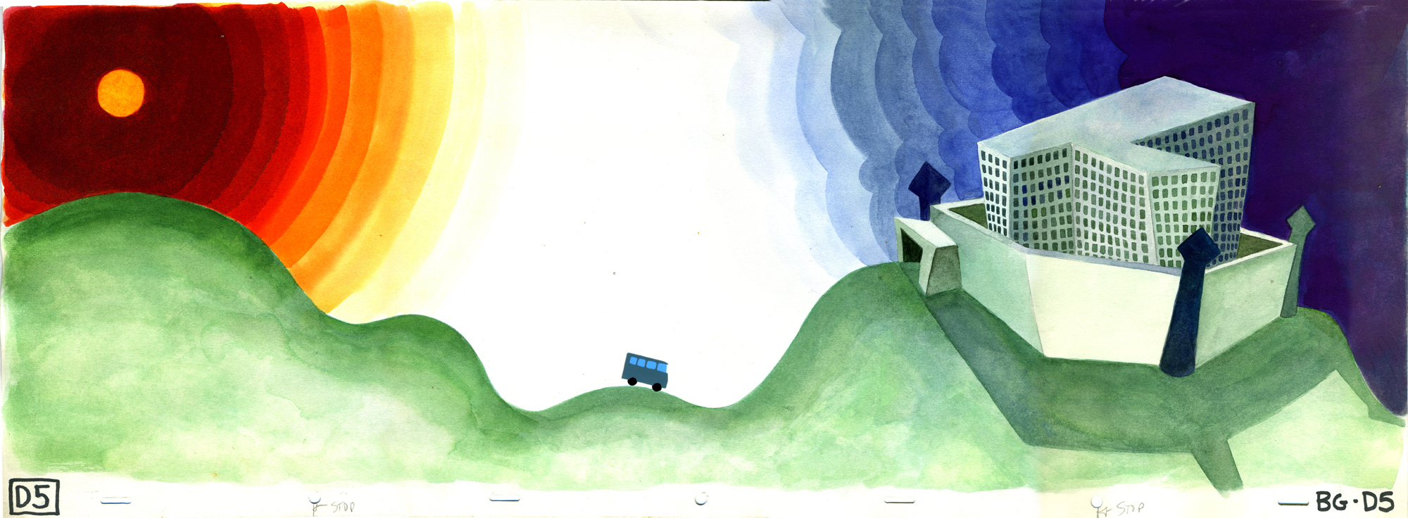
A long bus ride takes Champagne to the prison. We move out of the deep reds and into the shadowy blues of the prison. The camera was close and trucked out and then back in again. It followed the path of the bus which was a cut-out cel that was animated under the camera. The BG, itself, was about 40 inches long, and it moved quickly through the short scene.
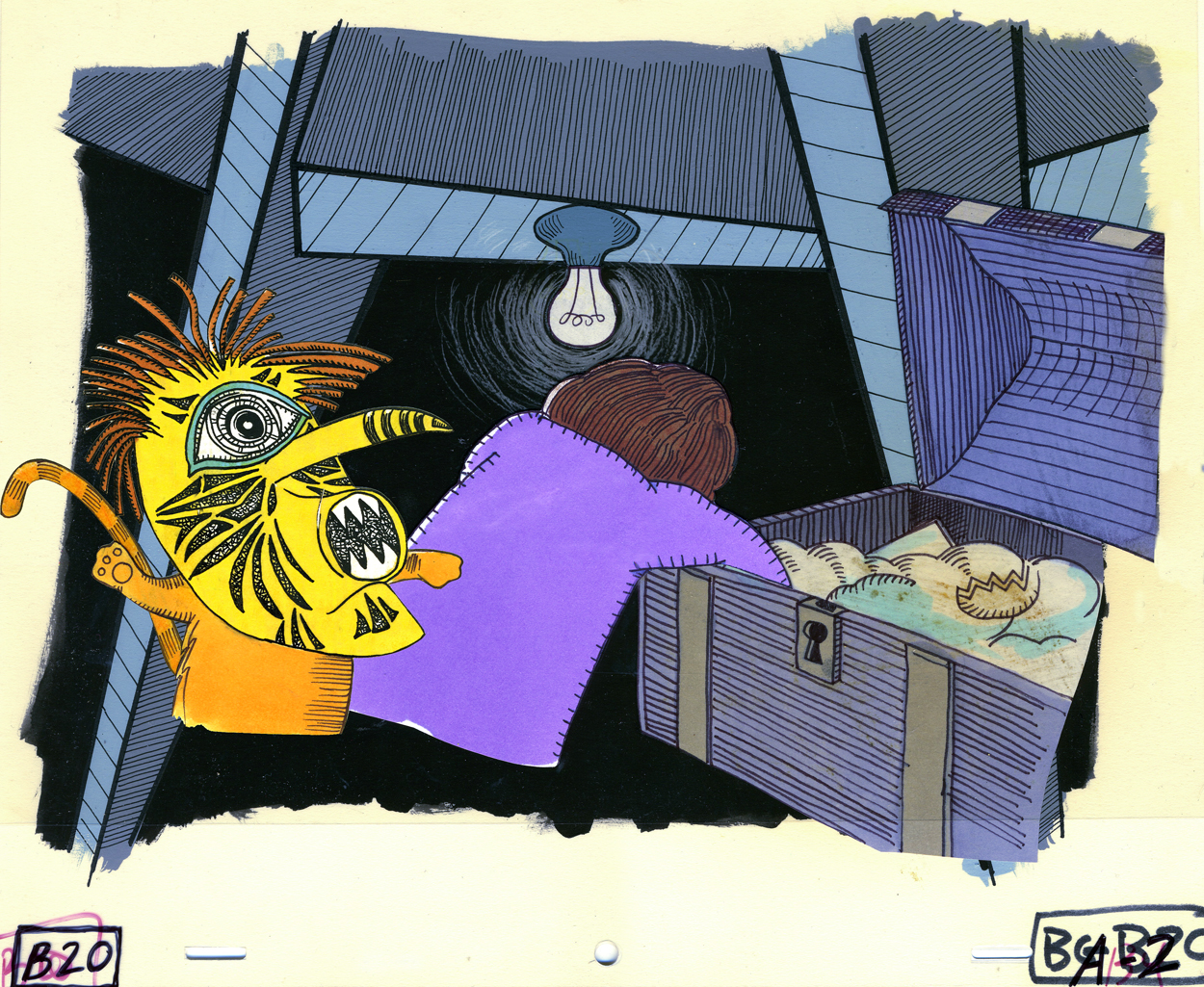
For one brief section, we leave Champagne to go into the mother’s life in prison. It’s really as viewed through the eyes of the young girl imagining her mother’s world – as informed only by what her mother has told her.
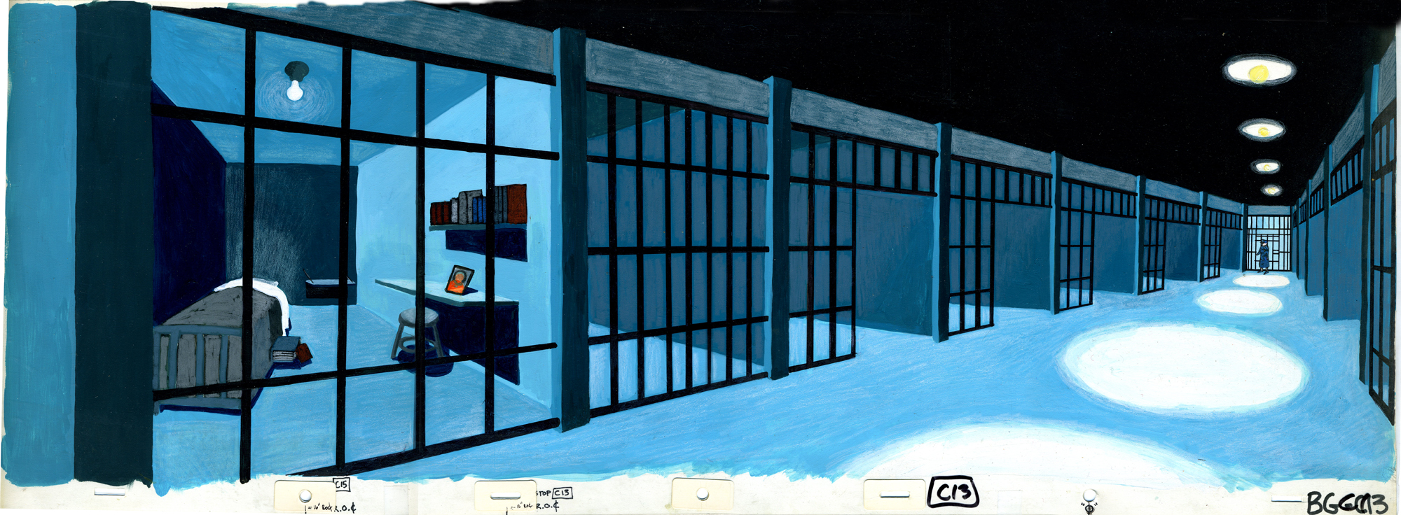
Inside the prison we take a long pan down the corridor to the cel of Champagne’s mother. There are several levels of bars moving at different speeds over this background. Blues and blacks are the predominant colors in our prison.
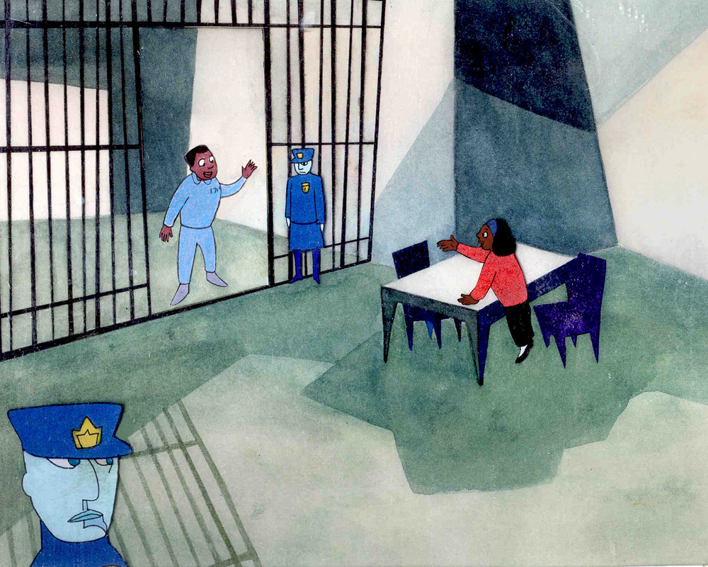
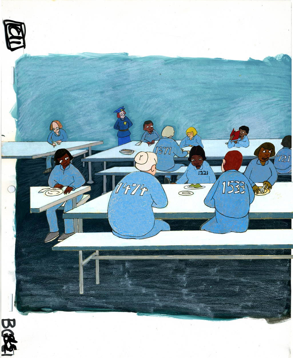
In the film, Champagne tells us what it’s like to make these visits. The entire routine is illustrated in animation from walking through metal detectors to the endless waiting in loud crowded – or empty rooms full of echoing noise. Green enters the prison surrounding Champagne. A warmth has entered the picture, though cubistic shapes separate everything into cubicles.
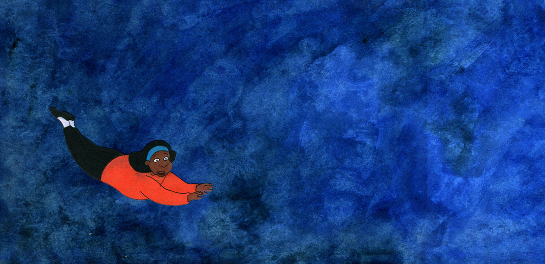
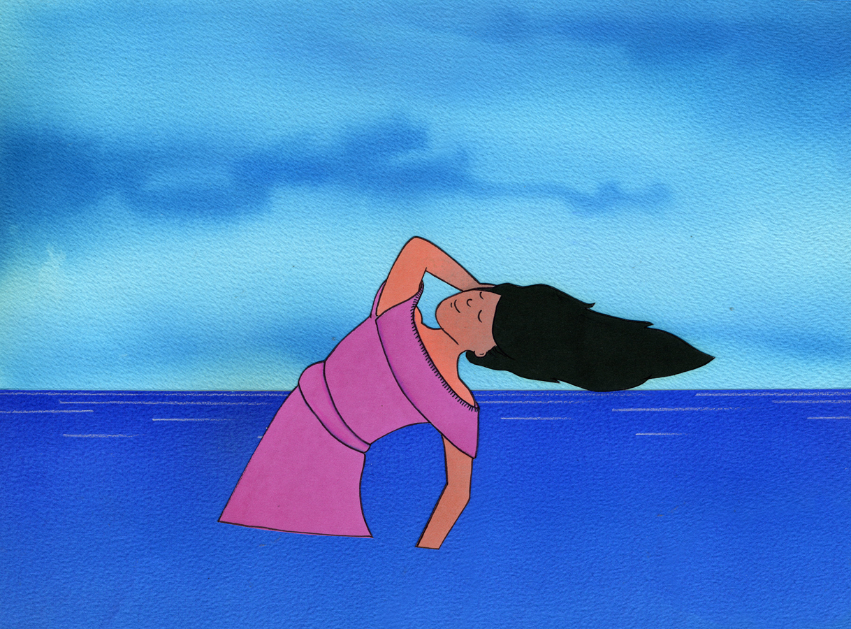
A lot of the last scenes of the film are depicted through fantasy. Champagne flies a lot moving through lots of black spiky clouds. Jason did interpret the dialogue in an uplifiting fantastic way, which worked well in depicting Champagne’s optimism. The backgrounds don’t generally get much brighter except in bits. This pan is about three times this length but a number of the overlaying clouds dominate the images.
SpornFilms 10 Mar 2007 10:26 am
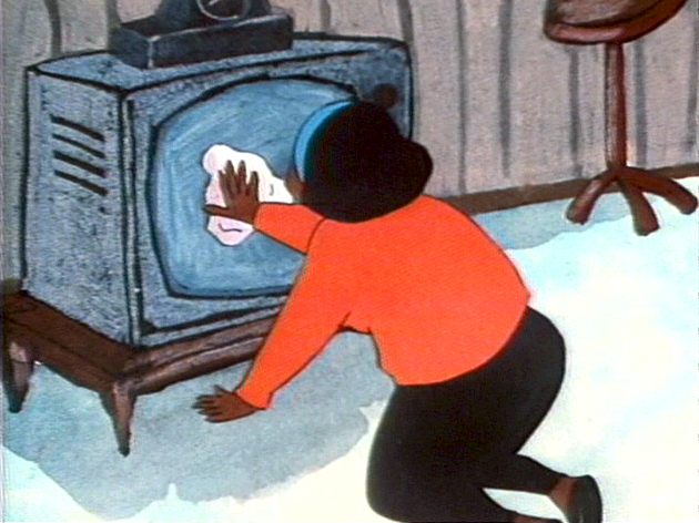
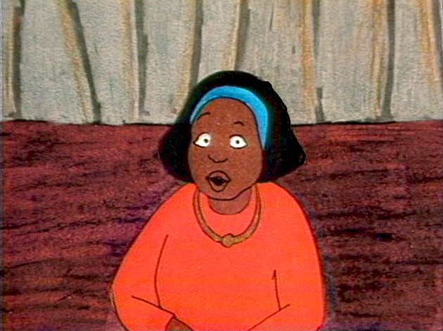
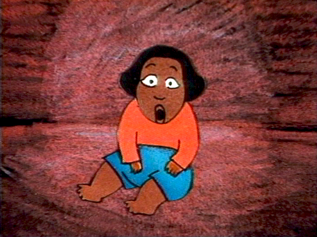
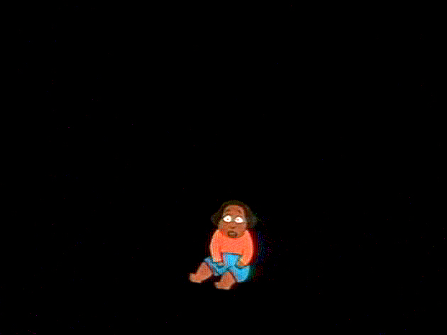
Champagne, the girl
- Let me tell you about Champagne.
These images are frame grabs from the improvised first half of Champagne.
(Click any image to enlarge.)
- Champagne was a short film I completed in 1996. It started with Maxine Fisher, a writer who has done most of the script writing for and with me. She had volunteered to help some children, who were housed at a convent, with their reading skills. Essentially, she read to them each Saturday. These kids were being raised in the convent because their parents were imprisoned for a while. Nuns were raising them.
Champagne was one girl, 14 years old, who developed a relationship with Maxine. When she found out that Max was involved with an animation studio, Champagne asked to get a look. On her Saturday tour through my studio, she asked if I could make her a cartoon character. So I pulled out a DAT recorder and a microphone, and I interviewed her for about two hours. The end result was edited down by my editor at the time, Ed Askinazi, to 13 minutes. (Of course, I was very involved in that edit. Lots of transcripts and reworking were involved.) Eventually, we had a vocal track.
Without doing a storyboard, but having developed a character model, I started animating. I wanted to use only Champagne’s voice to get me to intuitively draw what came to mind.
Some work came into the studio, and I had to put Champagne, the film, aside. After a few months, I was about ready to go back to it. I had reached the key point where Champagne, the four year old child, had witnessed her mother killing a man and had been forced to leave her grandmother to enter the convent. The film was almost half done. We were now going to hear her talk about the future.
I asked Jason McDonald, to start a storyboard for the rest of the film. I wanted the remainder to be more structured. Jason did it, and I animated what he did – sticking faithfully to what he gave me. Then he started in on the backgrounds while I finished animating it. Eventually, he also colored a lot of it and led others in completing the art (including Champagne, herself, who was an intern in the studio – in the afternoons after her high school classes.)
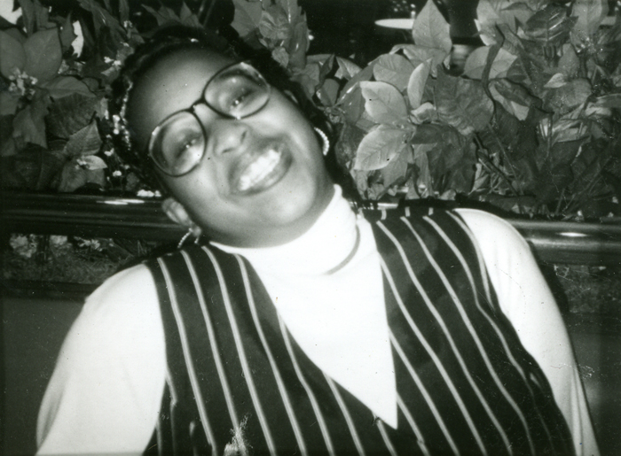
The real Champagne when Maxine first met her in the convent.
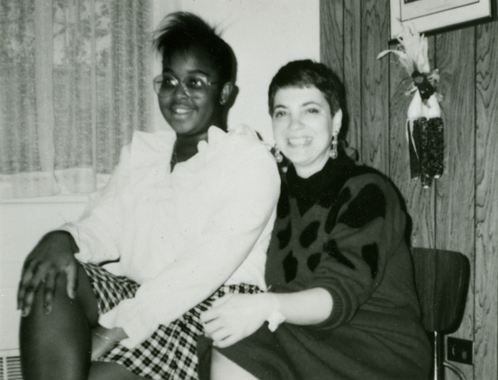
Maxine and Champagne not too long after the initial tracks were recorded.
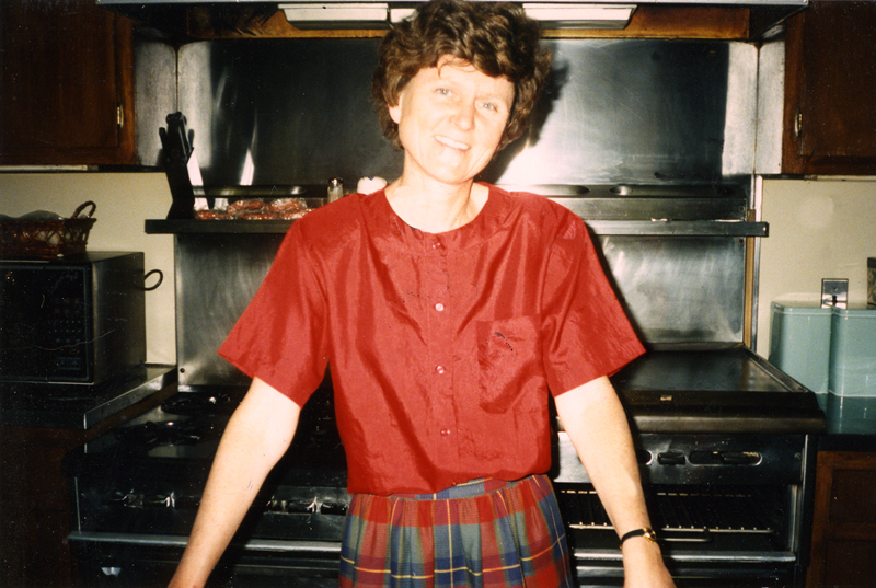
Sister Tesa, the nun who ran the convent, which was named “Our Mother’s House.”
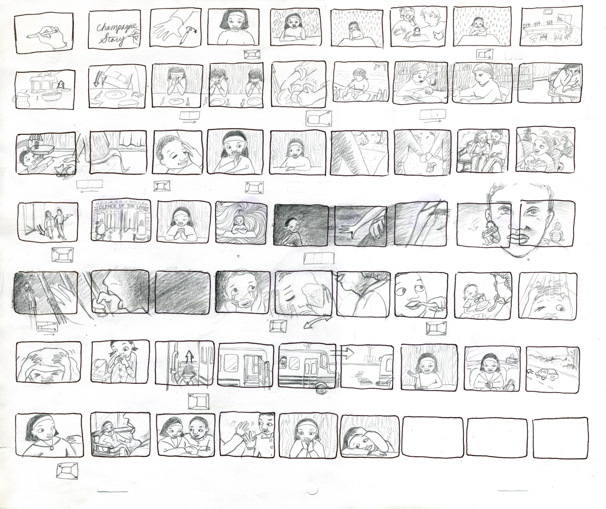
Thumbnails which were done in preparation for the storyboard for the remainder of the film.
Tomorrow we’ll focus on Jason McDonald‘s backgrounds and art from the film.
Commentary &Daily post 09 Mar 2007 09:19 am
Peter Pan?
- Before I get into anything else, something has been buzzzing on the top of my head these past few weeks. Disney has released another dvd version of Peter Pan. This one comes with even more extras and special games for kids to play and dvd coloring books etc.
First there was the Limited Issue Peter Pan; then there was the Special Edition Peter Pan, and now there’s the two-disc Platinum Edition version. And they’re all still available.
What’s up? Where’s Pinocchio? Where’s 101 Dalmatians? Forget about Song of the South. (If any movie wanted a rerelease with extras, that’s it!)
Peter Pan is good, but it’s no Pinocchio.
Did I say Pinocchio?
- Mark Mayerson, on his site, has an excellent column about the opening of Pinocchio. This is his commentary after producing the excellent Mosaic of the first few sequences in the film. The internet seems to have been designed specifically for posts such as Mark writes. There’s little likelihood a book would have been published detailing a film as elaborately as has been done here. It’s done specifically for animation enthusiasts, and there wouldn’t be a market. Mark’s comments are the gold here; this is real analysis on the go. It’s hard to believe the amount of work Mark has undertaken in choosing to break down this entire feature. I’m immensely grateful. On top of that his analysis points to what we should have noticed for ourselves – from that Mosaic and from Hans Perk ‘s publishing the drafts to this film.
- Cartoon Brew, as I’m sure you’ve all noticed, has undergone some severe changes. This is obviously all to the better. They’ve had quite a few more posts (which will probably reduce in number as time moves on), but there have also been more links to art from the libraries of Jerry Beck & Amid Amidi. There’s gold in them thar hills.

![]()
Cartoon Brew Films is now up and running, and there’s no doubt that this will develop into an important site. Already they have some substantial films to view; the potential is enormous. It’s fun watching an enormous megalith of a site develop before our eyes.
- Speaking of Peter Pan, there’s a good article detailing the history of the next bad movie off-shoot, the Tinkerbell epic. You can get all the history of this extravaganza detailed on Chuck Oberleitner‘s site, O-Meon. Information you don’t really need about a movie you don’t need to see (unless you have a 14 year old girl in the house.)
- There are some nice MGM drawings posted at the ASIFA Hollywood Animation Archive. I’m a sucker for Srewy Squirrel. I like seeing any art from those films.
- My last Peter Pan reference will be to the amazing story meeting notes you can read on Devyn Marseilles‘ site: The Sacred Tree of the Aracuan Bird. Pt 1 & Pt 2. She has also given an amazing storyboard to Didier Ghez available on his site: Disney History.
By the way, the drawing at the top comes from
Saul Steinberg’s book All In Line (1945).
I just put it there because I like it.
Animation Artifacts &Richard Williams 08 Mar 2007 08:18 am
Williams/Frazetta/Bakshi
 – Having given images of both Dick Williams’ work and Bakshi’s, I thought it’d be a good time to post the cel below. It reminds us of what an extremely talented animator and draftsman Richard Williams was – and still is.
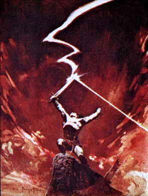
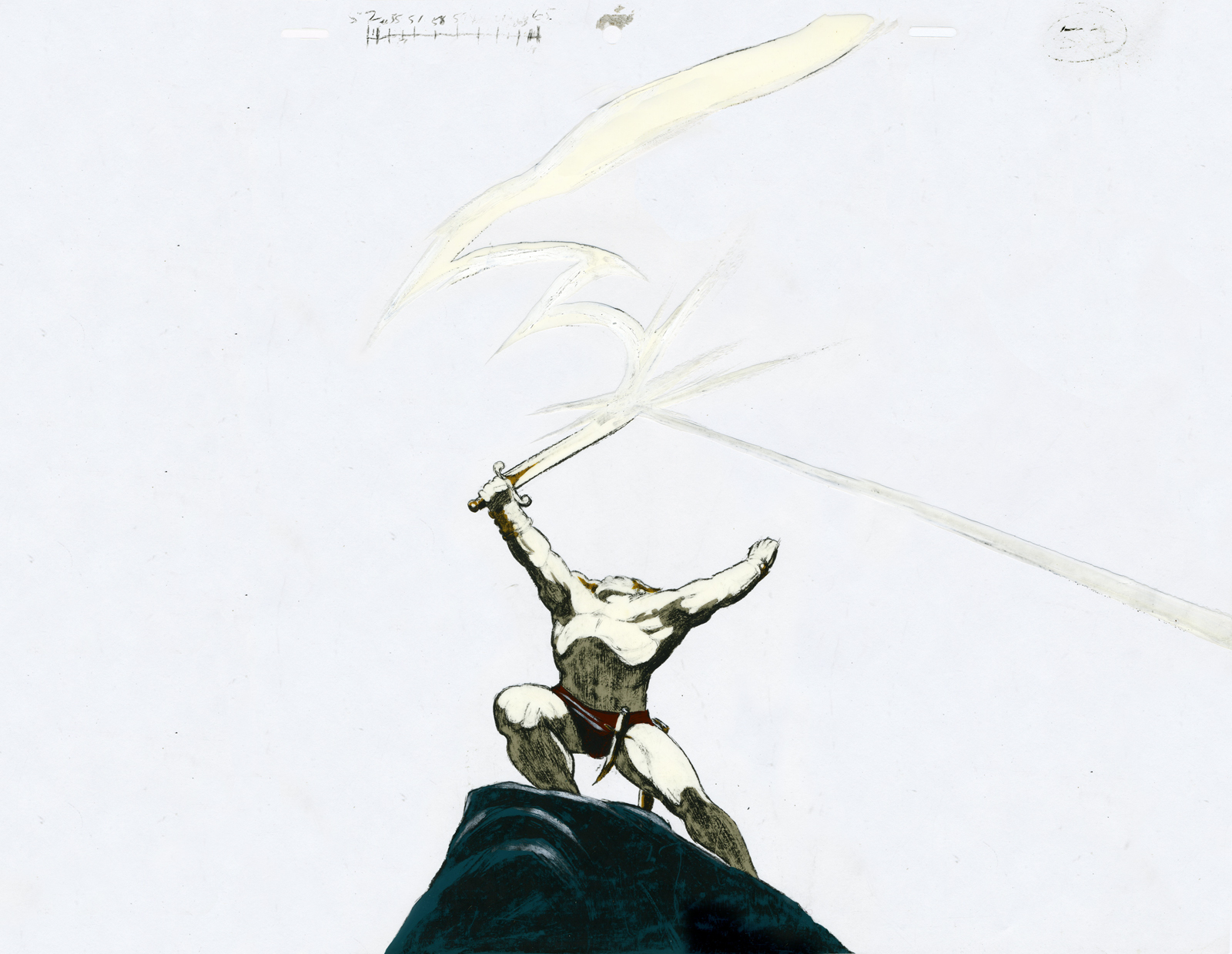
This is a cel from his commercial for Jovan done in Frank Frazetta‘s style.
(Frazetta’s original is pictured to the right.)
Of course, Williams captures the illustrator’s work better than Bakshi did in Fire and Ice (although to be fair Bakshi had an enormously lower per second budget.) There’s a gallery of some art from Bakshi‘s film here, and there’s a trailer for it on YouTube.
Dick Williams’ beautiful commercial ran briefly in 1978.
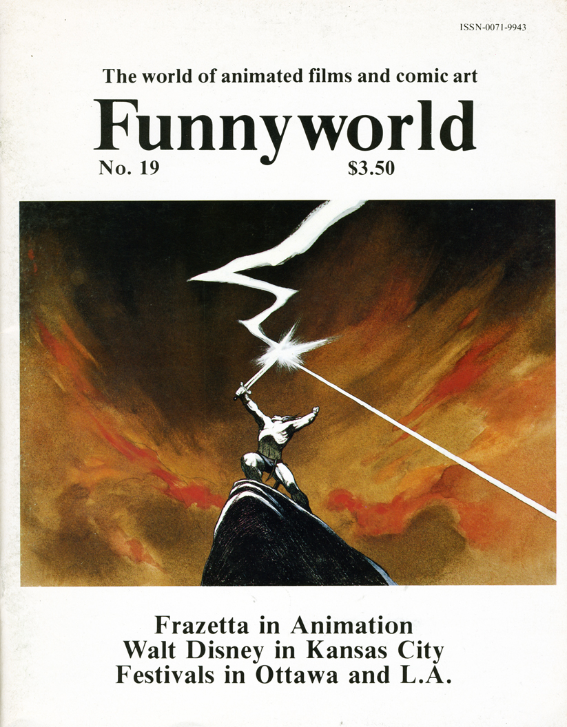
An image scanned from the cover of Funnyworld #19 runs beneath the cel to give an indication of what it looked like in the final. It appears to be a cel from the same scene – a bit closer on the character. The cel was given to me by Dick. (I also have another which matches the other Funnyworld illustration from this spot.)
(Click on any image to enlarge.)
Dick animated the spot directly on cel with his Mars Omnichrome pencil (no longer available, of course.) There were six weeks for the entire production. Illustrator Rebecca Mills painted the backgrounds in oil. I remember Dick telling me how brilliant her work was while this commercial was in production.
Errol Le Cain 07 Mar 2007 08:32 am
Le Cain’s Aladdin
– After thinking about Dick Williams‘ Thief and the Cobbler feature, I can’t help but be brought back to Errol Le Cain. Of course, there isn’t much of his art from the feature available for viewing. The best we can do is to look at his illustration work again. Here, I’m posting several of the images from his adaptation of Aladdin and the Wonderful Lamp.
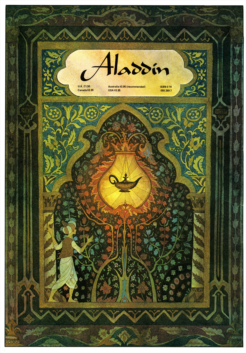
(Click any image to enlarge.)
The daring and invention in images like these makes me wonder why animated films are so obvious in their choices. Is it just that we expect the general public not to appreciate good ideas and imagery, or do we actually think the clichés we’re producing are good? Le Cain‘s backgrounds for Dick Williams were just as original, and in a way Le Cain became to Dick what John McGrew was to Chuck Jones.
The Disney Aladdin was about Robin Williams more than it was about telling the story from the Arabian Nights. The final film was a successful amalgam of reworked Warner Bros. and Disneyesque schmaltz. The design was attractive cartoon; they weren’t trying to do more than that, and it worked. The film was successful.
I just would like to see someone reach a bit higher. These illustrations get me excited about the possibilities of animation, yet animation does that so rarely.
Animation Artifacts &Richard Williams 06 Mar 2007 07:49 am
Dick’s World
- Let me share an image with you.
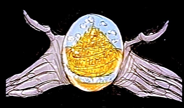
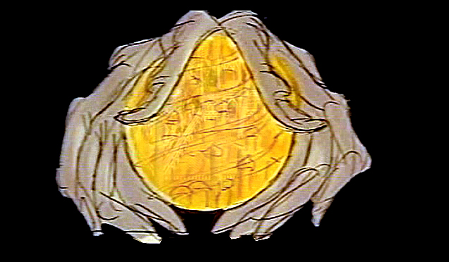
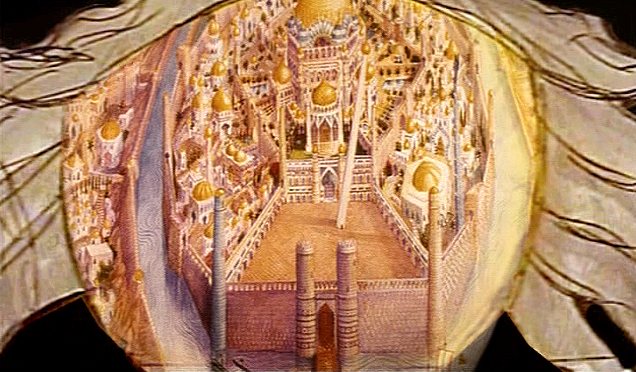
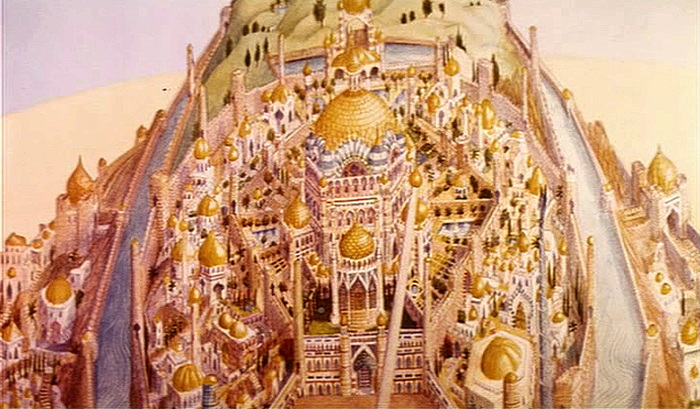
When Raggedy Ann & Andy was winding down, Richard Williams asked me, over dinner, whether I would be interested in working in London on his feature, The Cobbler and the Thief. He had in mind one sequence which he said would be all mine. This was the film’s opening – a slow truck into the island where all the action of the film would take place.
 (Click on any image to enlarge.)
This was a photostat of this island. The original drawing, Dick had said, was enormous. It was composed of many smaller segments that were pinned together on a wall in his studio. If you look closely you can see those dividers in this photostat. To give a better indication of the detail in this drawing, I’m posting, below, a second image of a small portion of it.
The idea of it exhilarated me. I believe he said that Roy Naisbitt was involved with it, and that was something to get me going. I’d read about many of Dick’s staff and had already placed them on pedestals – including Roy’s work. I would not only get to meet them but work with them as well.
I decided not to take the job. I thought it would be better to remain friends with Dick than to continue working with him. That decision is something I don’t regret. It would have been fun to have been involved with that film, but so much has happened in my life by staying put, that I have no regrets.
The storyboard for the original cut of Dick’s film included these panels which led into the image of the animated city. A still of the city remained in the Miramax/Fred Calvert version, but that’s all.
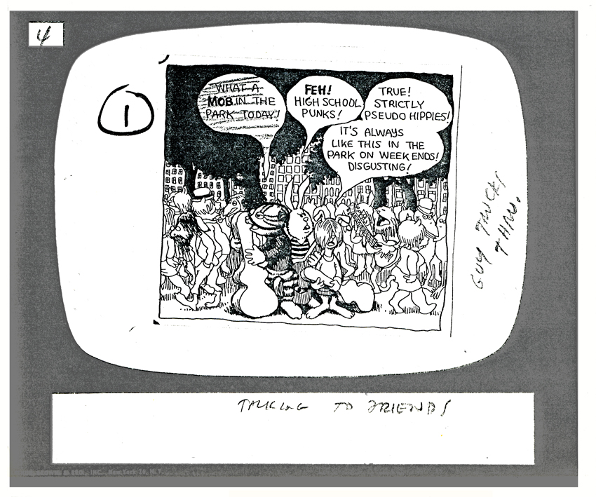
Animation Artifacts 05 Mar 2007 08:10 am
Fritz, the cat
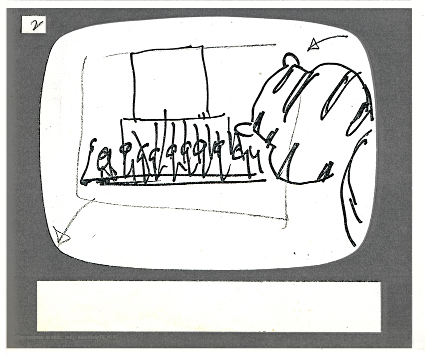
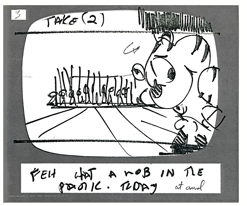
- Here are a few of the storyboard panels to Ralph Bakshi’s feature, Fritz the Cat. I find it interesting that they used those storyboard pads you can buy from art stores. It reminds me of my earliest days, long before I’d entered animation.
 Somehow, I always assumed these pads were most appropriate for ads and advertising agencies and never thought that real studios used them. I couldn’t imagine paying the price for these pads of storyboard panels that were serrated to break apart individually. Why not just use pads of paper? I wonder if anyone who was at the Krantz/ Bakshi studio could explain it to me.
(Click any image to enlarge.)
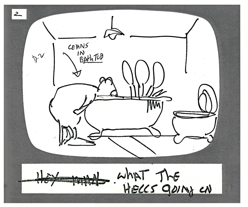
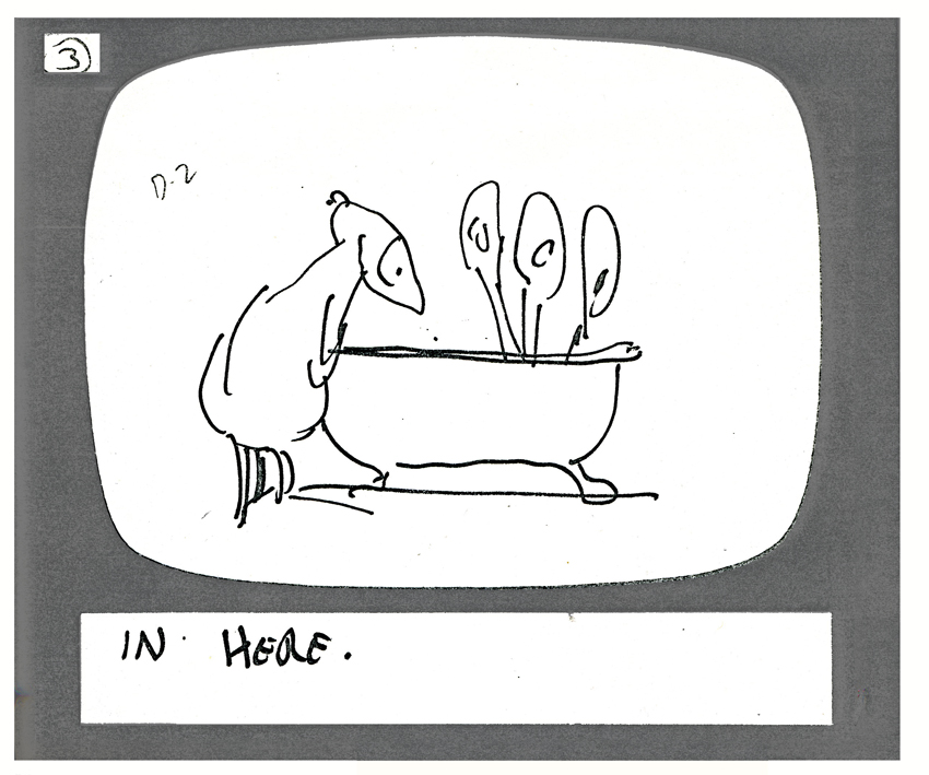
I think the storyboard drawings here might be Cosmo Anzilotti‘s work; I’m not sure. The first four panels come from the opening of the film. The latter group come from the randy bathtub scene a couple of sequences later.
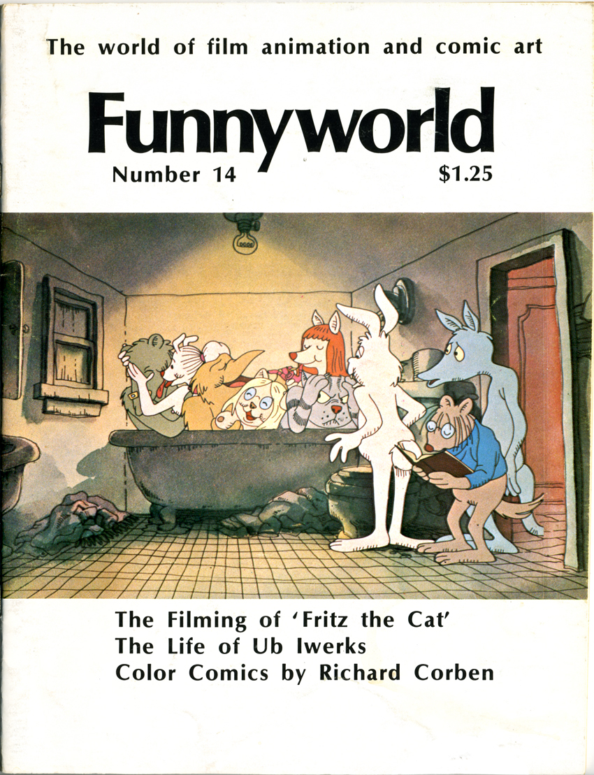
The color illustration above is from Mike Barrier‘s Funnyworld magazine, issue #14.
I encourage you to take the time to go to Mike’s site and read the Funnyworld Revisited section which includes the articles about Fritz in this issue. This was when Funnyworld was at its height, and the articles give a thorough account of the film and a real analysis. Why aren’t we getting the likes of this for any current feature? There are plenty of “The Art of . . .” books but too few critical evaluations. I can understand this for many of the studio features where writers are just bought into a project, but one wonders about the more independent films like The Triplettes of Belleville or Spirited Away. Only the blogs seem to have their spotty critical analyses.
The storyboard panels follow.
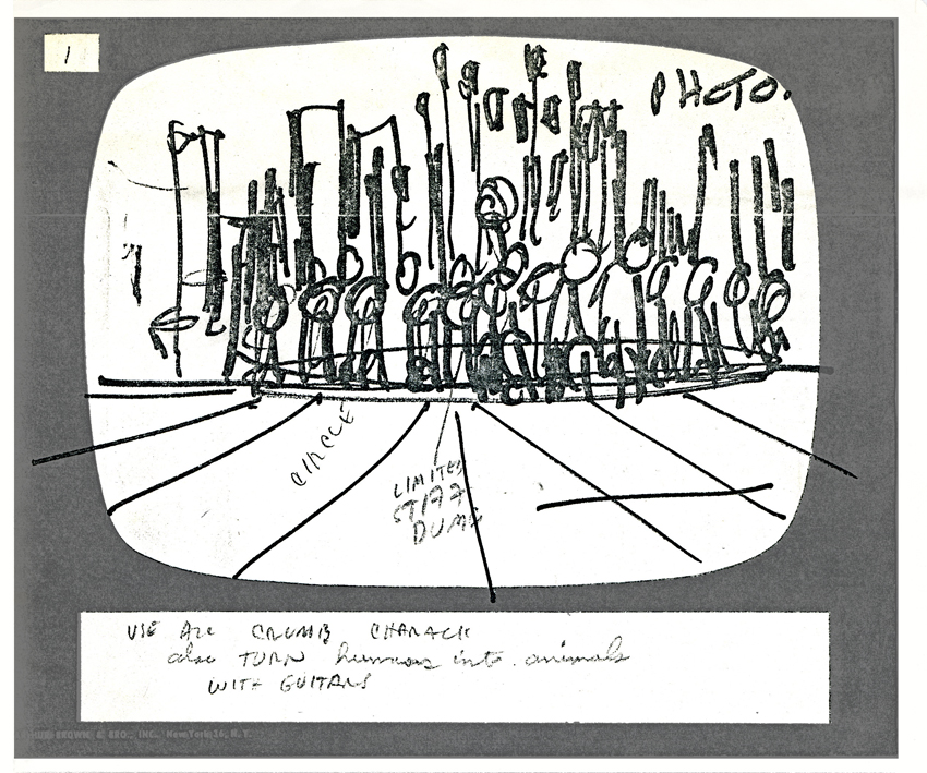
The background is identified as a “Photo.” Many of the backgrounds for the film were photos by Johnny Vita that he traced over in ink on a cel and painted with Luma dyes to match the lines.
For this scene using one of Robert Crumb’s strip panels was enough.
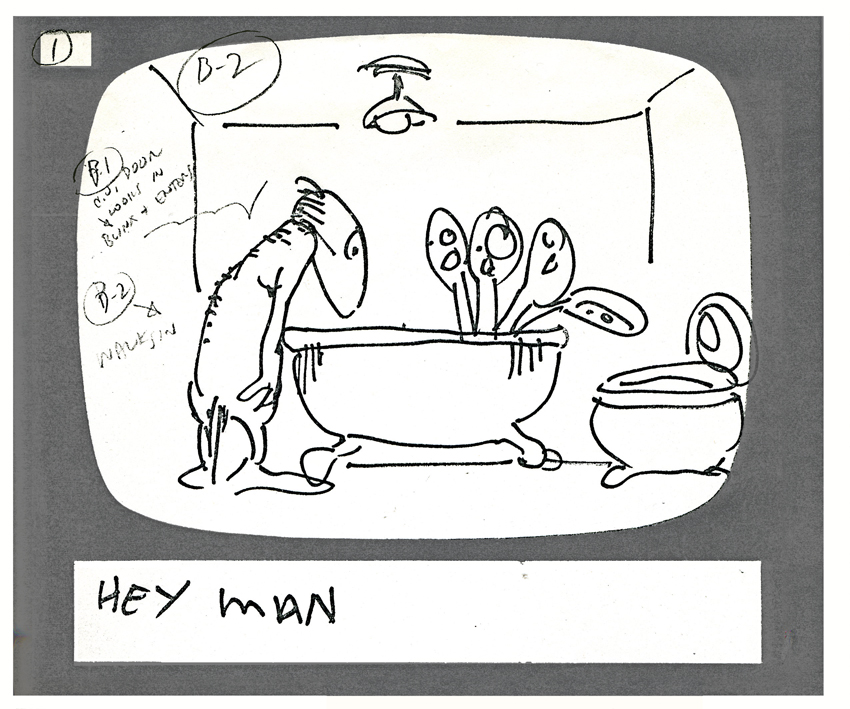
It’s interesting to see how the backgrounds are delineated on this storyboard drawing. From here on they ID the background on every storyboard drawing.
Note how the door has moved to the other side of the bathroom in the final (see color still above).
SpornFilms 04 Mar 2007 07:51 am
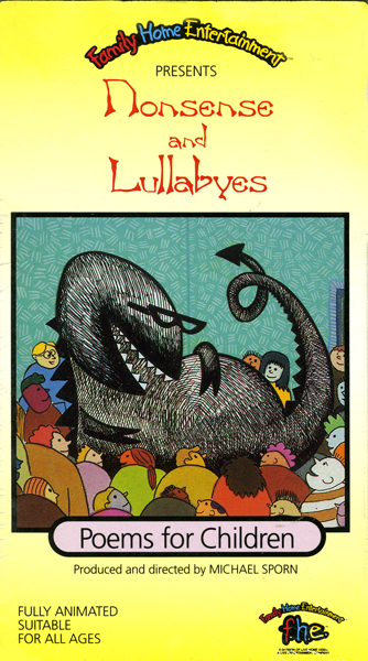
Jason McDonald – Nonsense
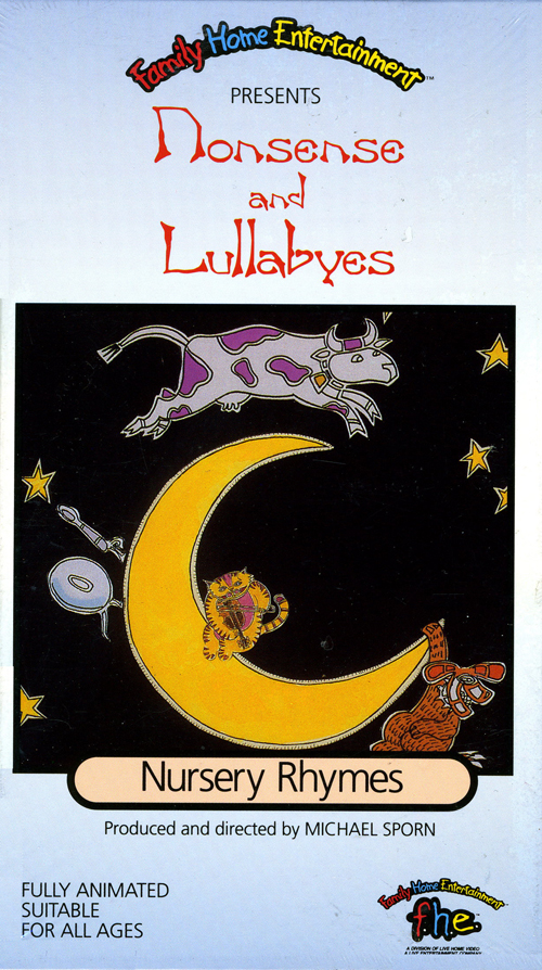 – Having presented Jason McDonald‘s first storyboard for me, the pair of films titled Nonsense and Lullabyes, I’m pleased to showcase some artwork from those two films. As I mentioned on Friday, the two films were adaptations of children’s poems. One, was subtitled “Nursery Rhymes” had anonymous authors (Mother Goose et. al.), the second “Poems” had famous authors’ poems we’d adapted.
They were all designed by Jason as an outgrowth of the storyboards he drew. Once the boards were done and the tracks recorded, we set about layout and animation. Jason did all the backgrounds for the film using different media. Many were done with cel-vinyl, others used Dr. Martin dyes or watercolors. All used ink lines done with brush or rapidograph. Like the storyboards, these were Jason’s first backgrounds for me. They were all done on a tight budget which meant a tight schedule.
(Click any image to enlarge)
Here, then are some pieces from some of the poems:
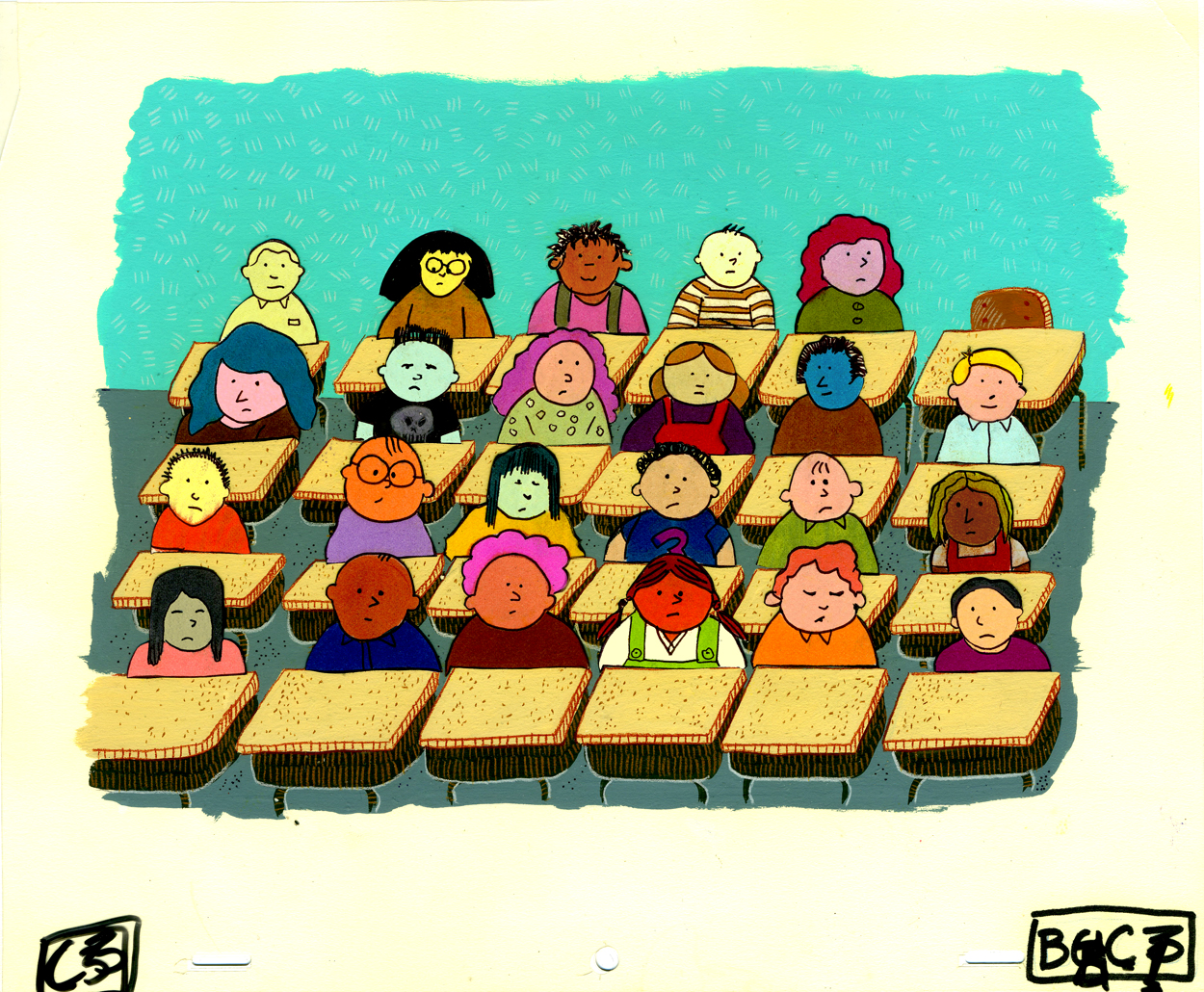
The Creature in the Classroom
It appeared iinside our classroom at a quater after ten,
it gobbled up the blackboard, three erasers and a pen.
It gobbled teacher’s apple and it bopped her with the core.
“How dare you!†she responded. “You must leave us . . . there’s the door.â€
So begins Jack Prelutsky‘s poem. It was one of the signature pieces of the Poetry video. Linda Hunt‘s reading was half the fun, Jason’s designs the rest.
Mr. Nobody
I know a funny little man, As quiet as a mouse,
Who does the mischief that is done In everybody’s house!
There’s no one ever sees his face, And yet we all agree
That every plate we break was cracked By Mr. Nobody.
A Jack Prelutsky gem. He had to have written a good number of the poems we used; they all had charm and weight and humor. I love the sailor suit Jason gave the pointy-nosed boy.
The Bogeyman
In the desolate depths of a perilous place
the bogeyman lurks, with a snarl on his face.
Never dare, never dare to approach his dark lair
for he’s waiting . . . just waiting . . . to get you.
Another Prelutsky poem, this one read with spine-tingling venom by Phillip Schopper. It was the first piece Rodolfo Damaggio animated for me. He captured the light mood underlying Jason’s board.
The Chivalrous Shark
He bowed in a manner most polished
Thus soothing her impulses wild.
“Don’t be frightened,” he said,
“I’ve been properly bred,
And will eat neither woman nor child.”
This was an old sea shanty that we used. It went on a bit for my taste, but Sue Perotto‘s animation and Jason McDonald‘s bright Dr.Martin backgrounds gave it life.
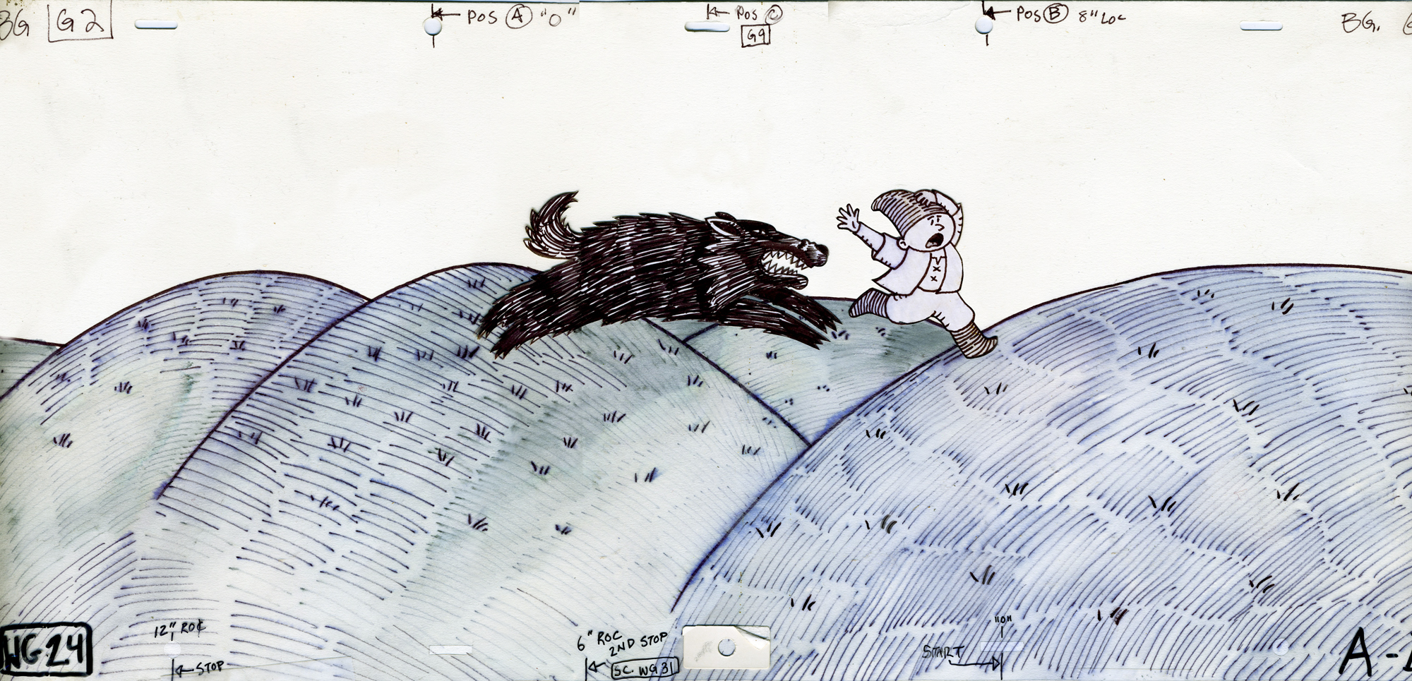
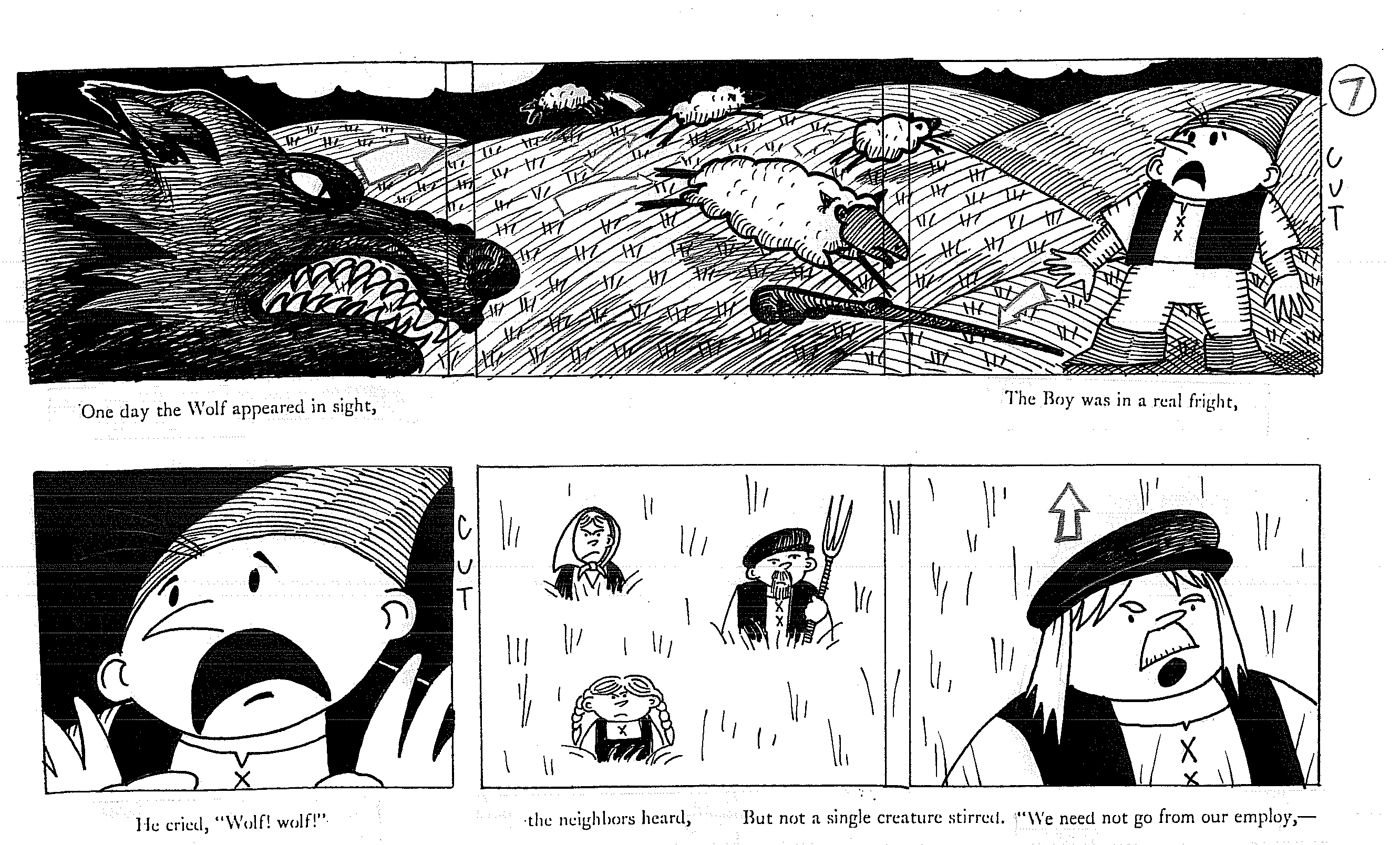
The Boy Who Cried Wolf is a victorian verse telling of this Aesop fable. The piece was on the long side, and we tried to keep it as exciting as possible. It used a style with Sharpie markers which were bled with turpentine then added some marker highlights after it dried. It was a very loose style.
The Tin Frog
I have hopped, when properly wound up, the whole length
Of the hallway; once hopped halfway down the stairs, and fell.
Since then the two halves of my tin have been awry; my strength
Is not quite what it used to be; I do not hop so well.
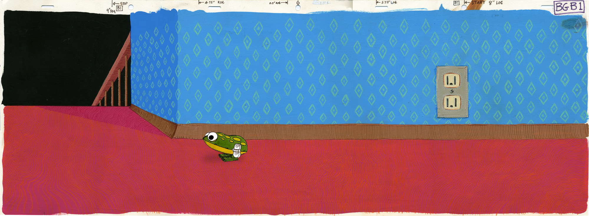
This is far and away my favorite piece. Russell Hoban‘s poem is everything I wanted for this series. Jason pulled dignity out of the verse for the simple style, and Mark Mayerson did a quietly brilliant job of animating it. The character is always a tin frog, but it has so much feeling behind its mechanical motions it just tears me up every time I see it.
to the left: Wrimples
When the clock strikes five but it’s only four, there’s a wrimple in your clock.
When your key won’t work in your own front door, there’s a wrimple in the lock.
Jack Prelutsky continues his funny verse. A great kid pleaser. An easy author to adapt; it’s all in the words. Jason pulled more out in his board and the nice colors. He told a story that wasn’t really there.
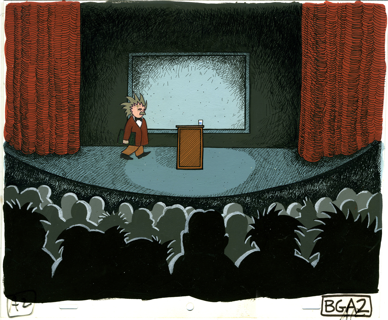
Pictured to the right: Solomon Grundy.
Solomon Grundy, Born on Monday,
Christened on Tuesday, Married on Wednesday,
Took ill on Thursday, Worse on Friday,
Died on Saturday, Buried on Sunday,
And that was the end of Solomon Grundy.
This is an old tale that Jason developed into a lecture. Just for good measure we repeated it at twice the speed.
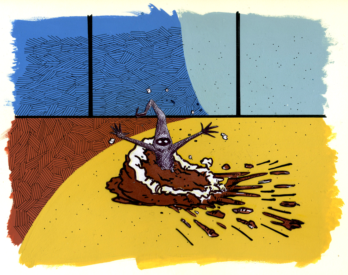
Turtle Soup
Beautiful Soup, so rich and green, Waiting in a hot tureen!
Who for such dainties would not stoop?
Soup of the evening, beautiful Soup!
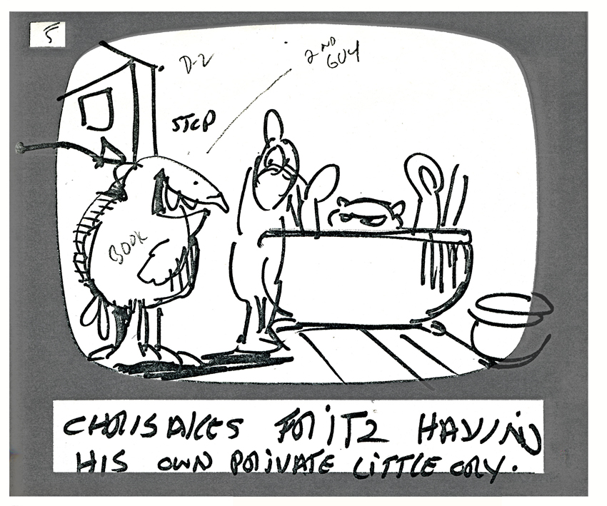
Of course, we had to include Lewis Carroll. Caleb Sampson wrote a song of this poem sung in Alice In Wonderland. Jason gave the poem to the turtle singing inside the pot on the stove as the chef prepares him for dinner.
Daily post 03 Mar 2007 09:00 am
Scumbling Some More
 – I had initially planned to post some of the Bg art from Jason McDonald‘s work from our Nonsense & Lullabyes film. (I’d posted the storyboard yesterday.) However, I won’t get to that until tomorrow, Sunday; it’s taking longer than I expected to scan.
- The NYTimes, this Sunday, features an article on John Lasseter and his role in running the animation division of Disney. Read the article here.
- After my post of the Max Hare run from Disney’s 1935 Tortoise and the Hare, Keith Lango put together a couple of QT movies illustrating this run at a couple of different speeds. He did a great job of timing it.
- After Keith’s post, Jeff Watson sent us a QT movie of the actual frames from the Disney color short. Click here to view this movie.
Michael Barrier continues to build on his comments about script writer/storyboard artists. With some insight, he uses an interview with Bill Scott conducted by Jim Korkis to get Scott’s thoughts. I enjoy reading anything Scott has to say about animation and appreciate Mike’s posting it.
Most of you already know that Bill Scott was the creative genius behind many of the scripts for The Bullwinkle Show. His career as an animation writer stretches back to Warner Bros and UPA in the 40′s. It’s all detailed well in Keith Scott‘s book The Moose That Roared (an excellent book if you’re at all interested in the animation and the animators behind Bullwinkle.)
Bill impacted my life in a big way. In 1984, I was nominated for an Oscar for my film, Dr. DeSoto. That was the year they started the nominee’s luncheon. All the nominees gathered 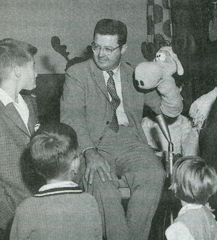 together for a meal and to meet some of the others. I was seated with a number of the documentary filmmakers. The Academy had wisely placed a member from the different divisions to sit at the various tables to try to make us comfortable. Bill Scott sat alongside me. When he introduced himself I was astonished to meet him. I grew up as a Bullwinkle fanatic and knew he was the guy behind those shows.
He told me that he had requested to sit near me since he was a big fan of one of my films. It was a short I did for Reading Rainbow about going to the library. Without words I tried to illustrate the experience of a young child entering a library for the first time.
(Bill Scott from the book, The Moose That Roared.)
.
I don’t know how or when Bill had seen that short, but he knew it and he knew me.
I couldn’t believe that I was in any way on HIS radar. That meant at least as much to me emotionally as the Oscar nomination.
SpornFilms 02 Mar 2007 09:23 am
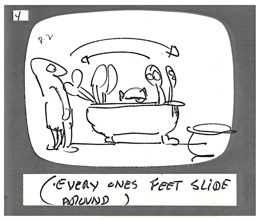
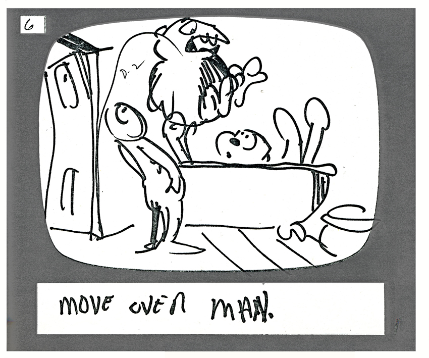
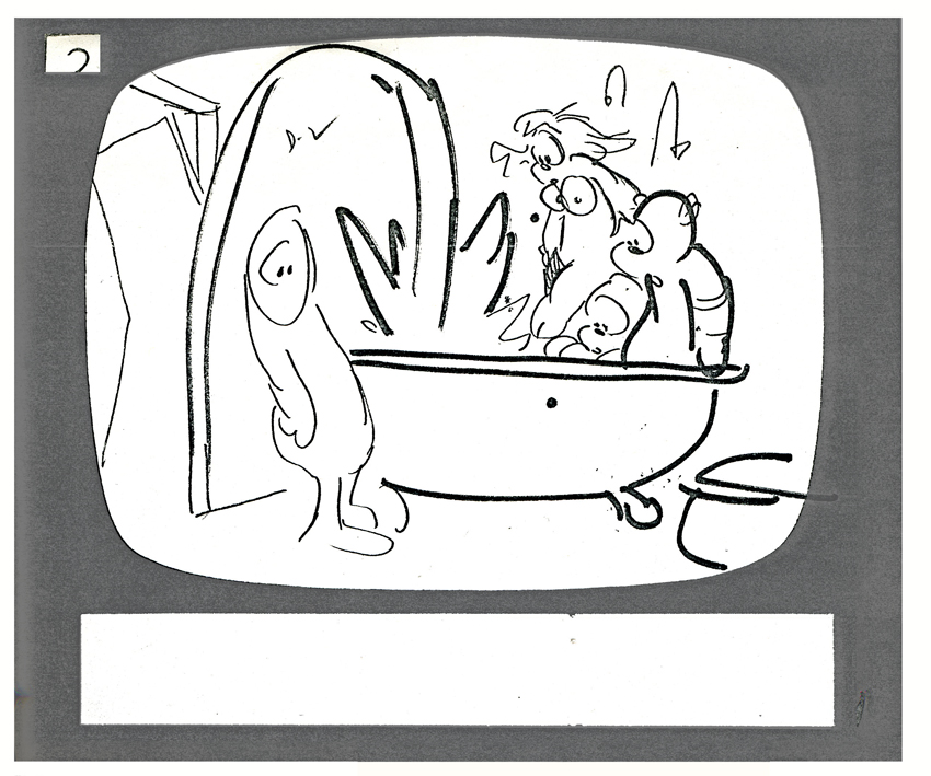
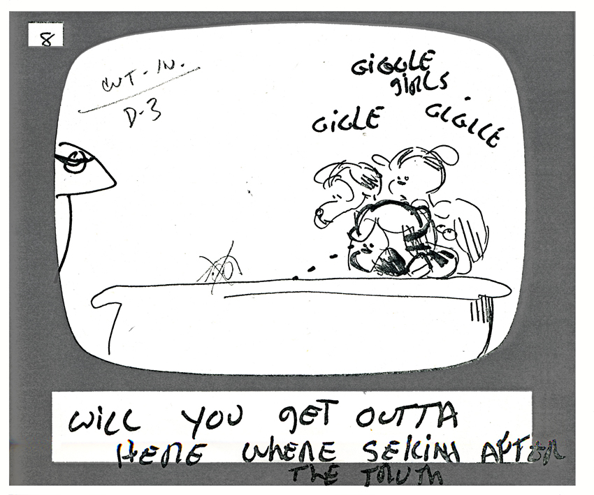
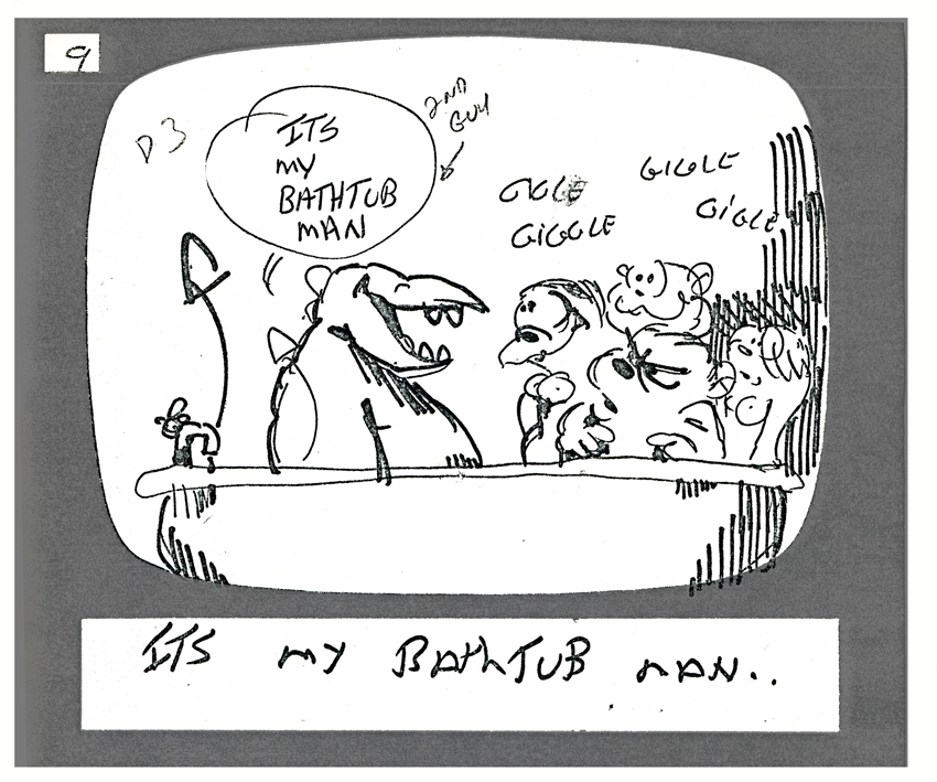
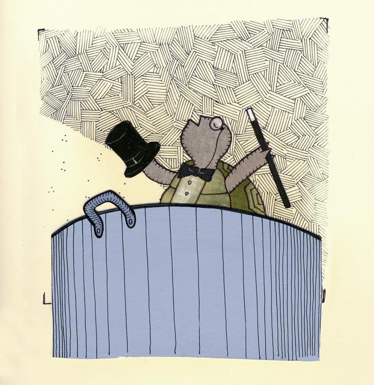
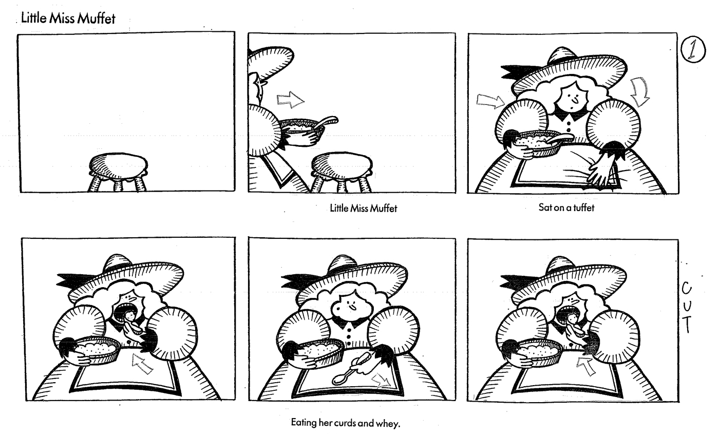
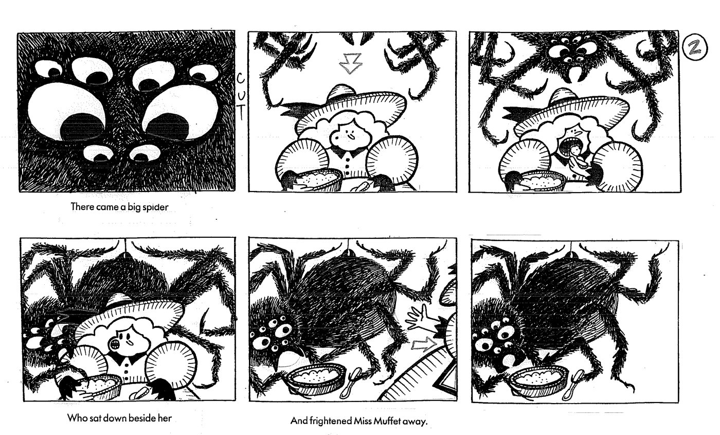
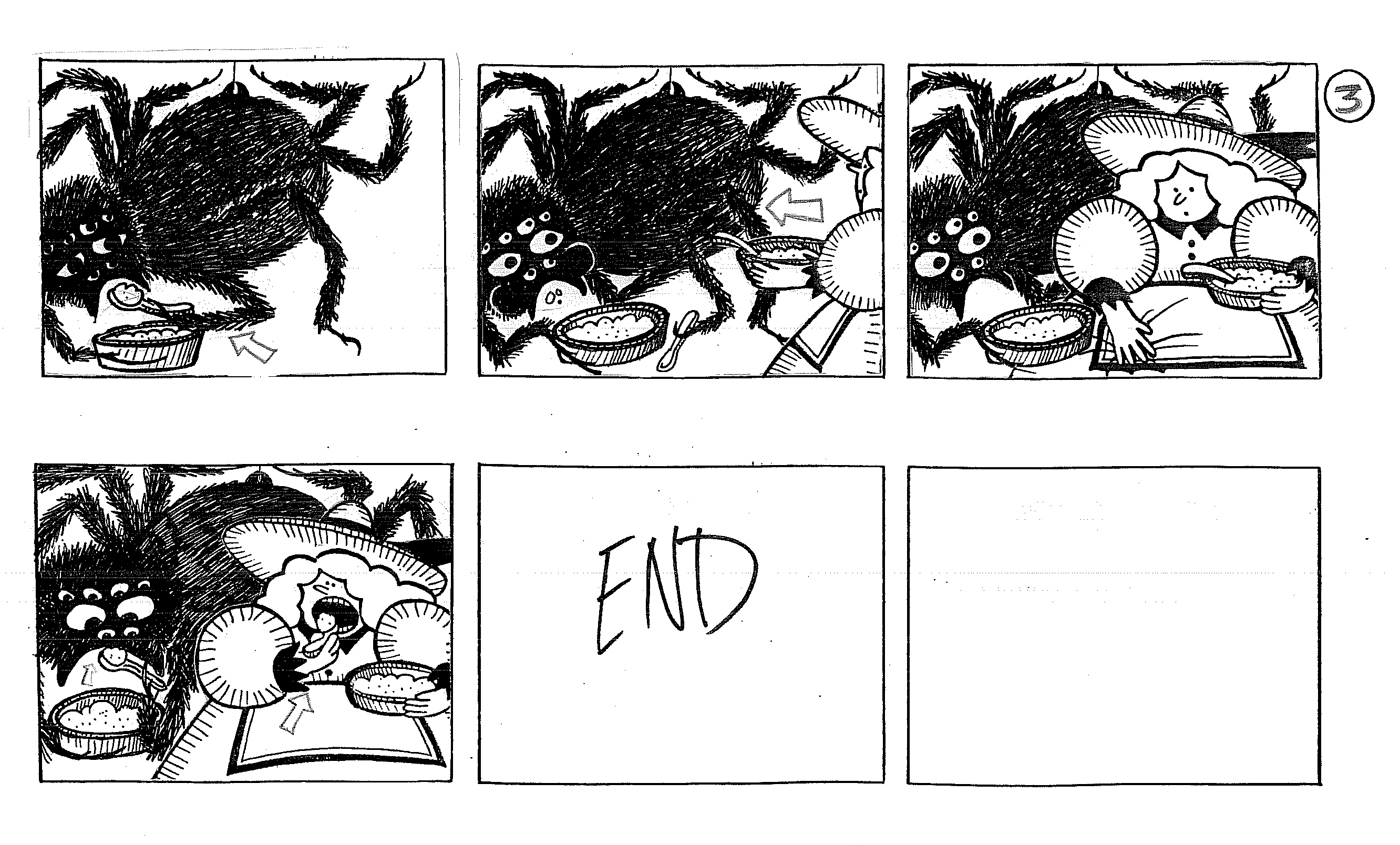
Nonsense and Lullabyes (sic)
 – Jason McDonald is an artist who started with me as a runner. Over the course of a couple of years, he worked his way up through inking, painting and coloring. He was very energetic and not at all pushy. I kept watch on his personal artwork that he’d show. His drawing style was so eccentric and charming that by the time a pair of low-budget films animating poetry – nursery ryhmes & children’s poems – I gave him the task of designing and boarding the films.
This Sunday I want to show off some of the images from this film, hence it made sense to give samples of his storyboard today.
This is his first real boarding job – two half hour films. I encouraged him to have fun and asked him to put in all camera move & cutting suggestions. I took some and discarded others.
I was able to get a handful of celebrities to read the poems: Linda Hunt, Eli Wallach, Courtney Vance, Karen Allen and mixed in a couple of studio regulars Heidi Stallings, Phillip Schopper to read others. One child I got was Grace Johnston. She was Barbara Hershey’s daughter in the film Beaches. What an actress she was; I had great fun working with her and cast her to do a couple more films for me.
These two poetry films went through our studio within three months. Jason took two weeks for the boards. We had an absolute smash doing them. It was fun from start to finish.
No money, but fun.
(Click any image to enlarge.)
One of the films was made up of Nursery Rhymes: Mother Goose and the like. It was great seeing the take Jason would have on some of these poems. His style was very animatable. At the beginning, though, he didn’t always know how to communicate some of the elaborate camera moves in his head.
The other video was made up of poems by some famous authors. Robert Louis Stevenson, Jack Prelutsky et. al. Since we had to pay for the rights to these poems, I coaxed my writer, Maxine Fisher, to write a couple of poems. This one was inspired by a dream her brother had had, and it made for a funny piece.
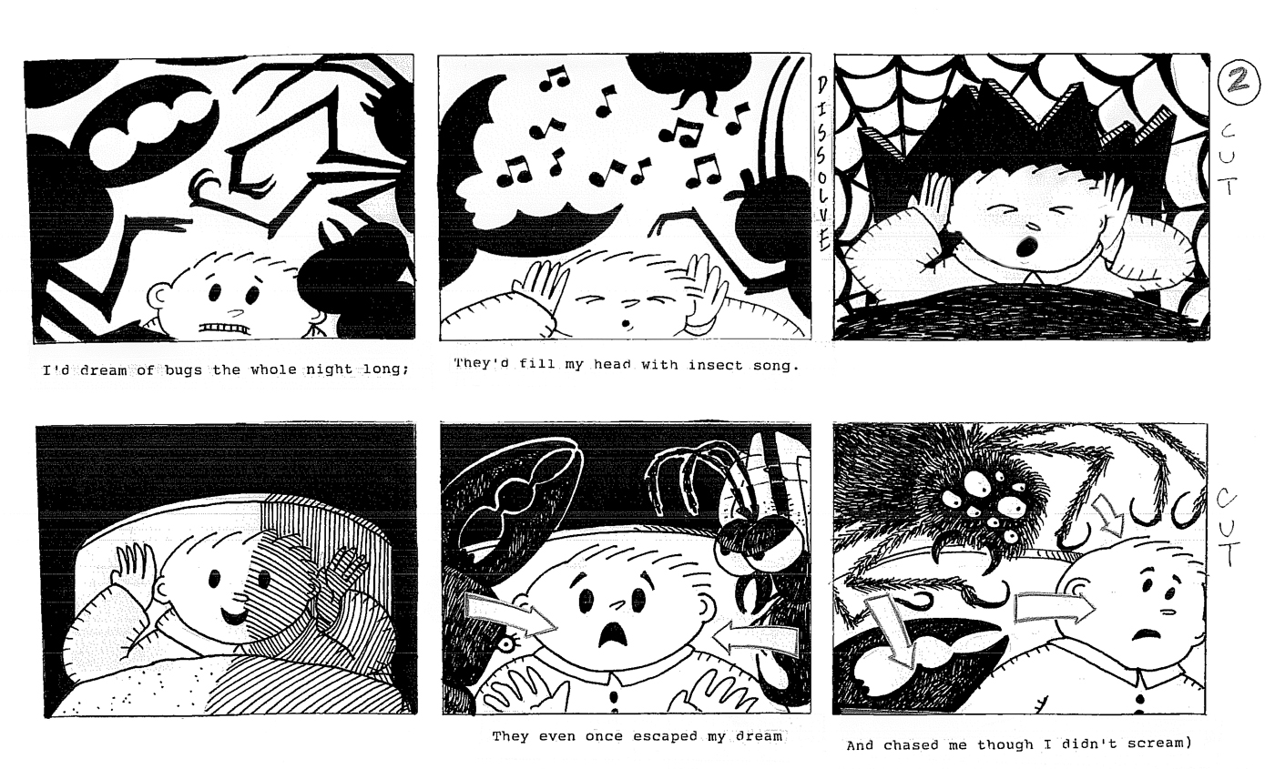
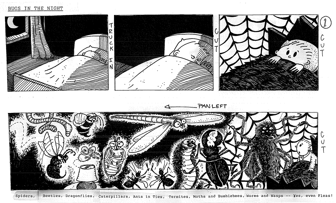
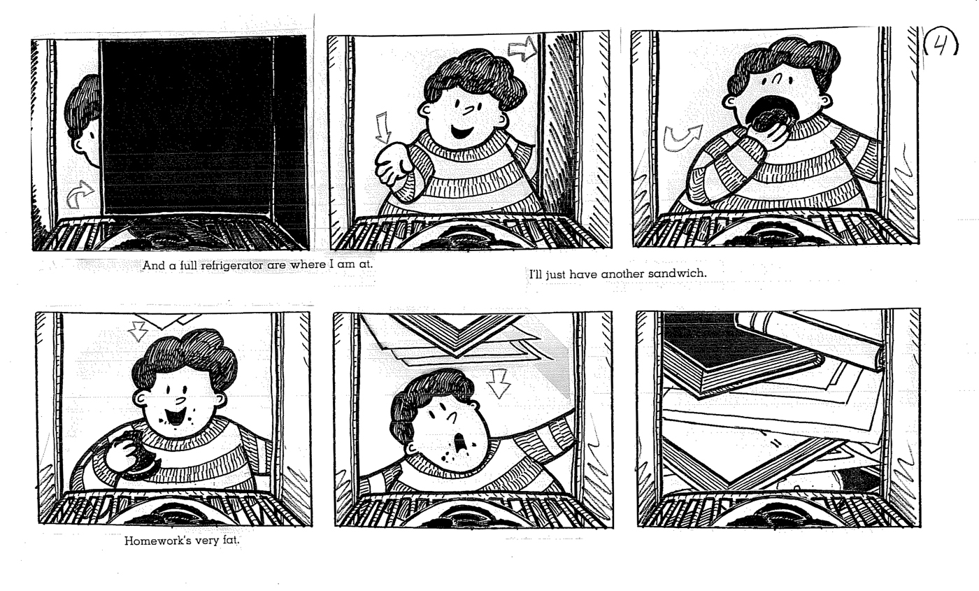
Jason is an action-adventure fan, so he was able to put some that into this piece with giant bugs chasing the boy everywhere.
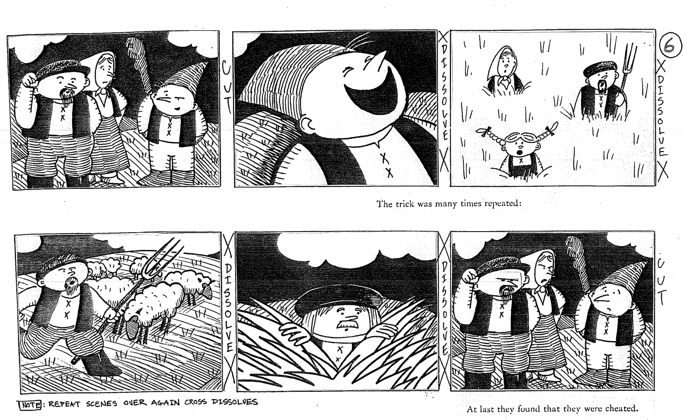
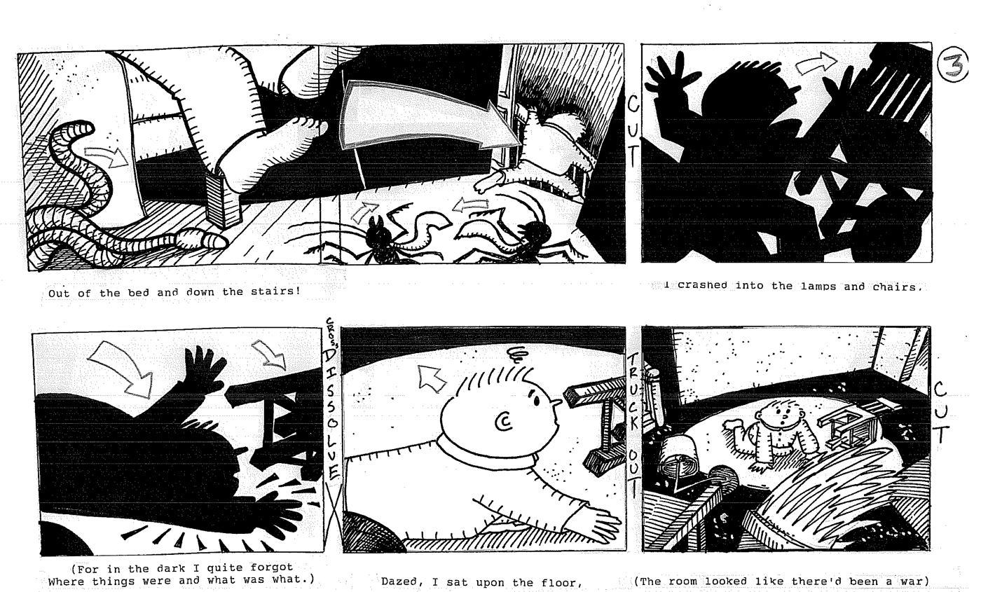
One of the longest poems ran about 4 mins. It was a version of The Boy Who Cried Wolf. It felt like I was forever animating villagers running back and forth. Because of the style we decided on, I animated the piece with a black Sharpie pen. Lots of ink bleeding through the animation paper; I had to have a two levels of paper over the last drawing.
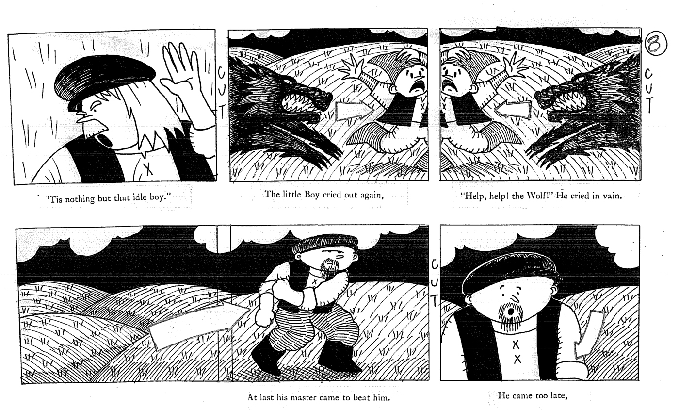
Ultimately the piece turned out well. It looked different than many of the other pieces in the show.
Russell Hoban is one of my favorite authors. Animation fans may know him from The Mouse and His Child, a brilliant book he wrote. (The best part of that film is his invention, and they only use 2/3 of the book!) He’d also authored The Marzipan Pig which I produced.
We bought the rights to several poems by Hoban. Each and every one excellent stories done economically with humor.
The soundtrack by Caleb Sampson required a full hour’s worth of music and several songs. With so many short pieces there was a lot of writing for him; each piece came with its own meter that Caleb had to lock into and he couldn’t fight the words of the poems. It was a tough job that never seemed to have been a challenge to him. At least, he never complained to me.
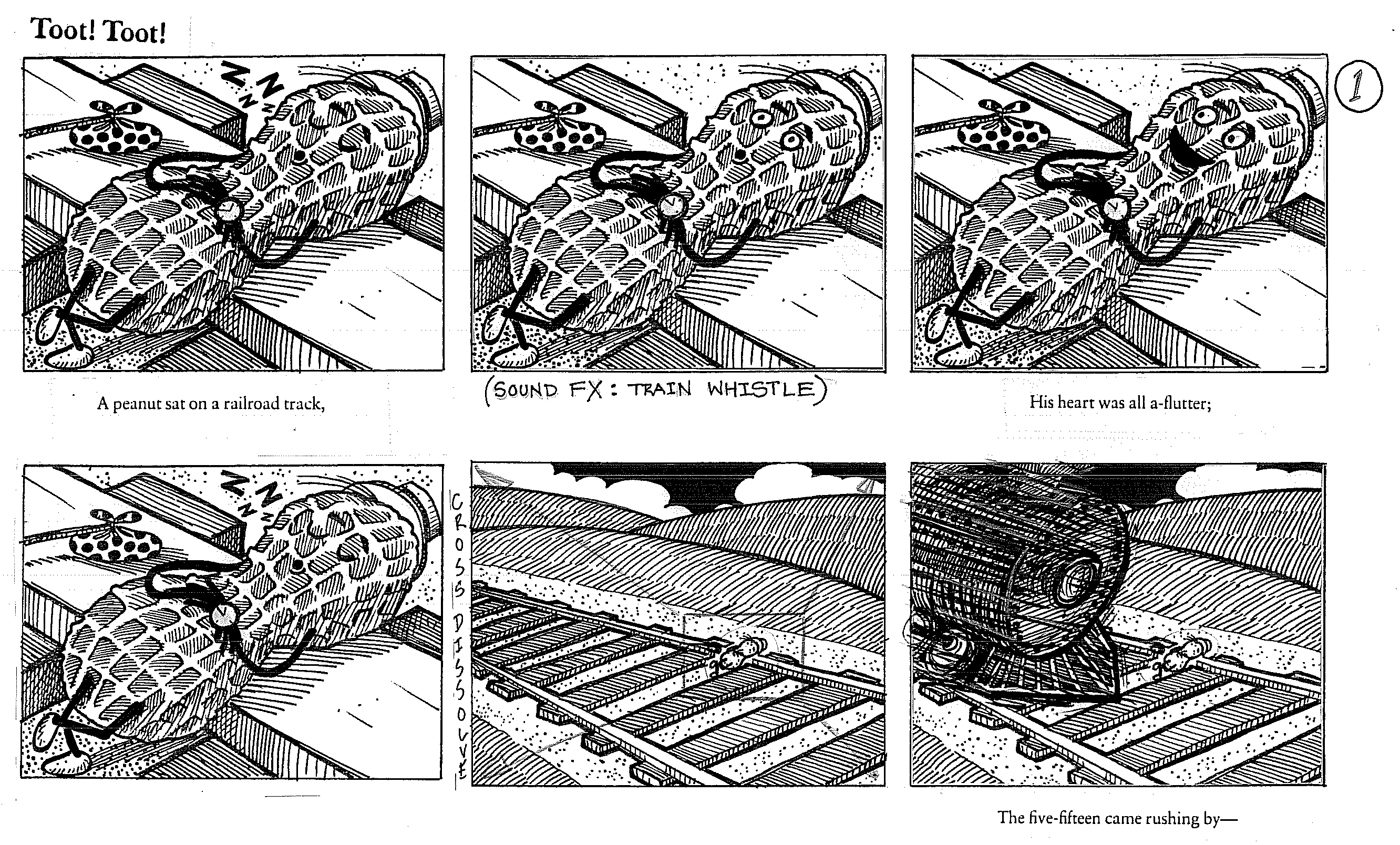
One of my favorite pieces was this less-than-a-minute poem, “Toot! Toot!”
Yvette Kaplan’s son, Randy, read it for me. I think he was eight or ten at the time. His reading never fails to make me smile.
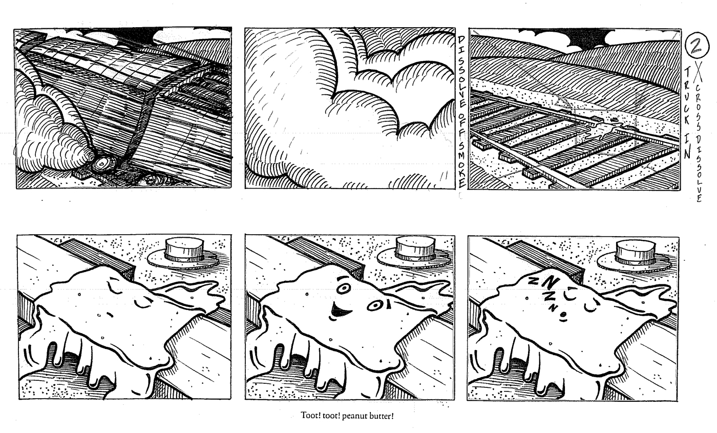
This was a last minute addition, and it went smoothly, just like every other part of these films. I wish I had more of these projects to work on; all my days would be happy.
