Monthly ArchiveAugust 2007
Photos 12 Aug 2007 08:26 am
Manhole Sunday Photos
- This is the first time in the past 150 years that the bells won’t ring in London. Today Big Ben has stopped ticking. The bells won’t chime for the next six weeks as workers repair the cogs. To this end, I started to think of the past and one person who taught me quite a bit.
 When I was in the sixth grade, I had an extra-ordinary teacher who left me with a lot of memories. One of them was his reading of Edgar Allan Poe’s short story The Casque of Amontillado, which chilled us all to the bone as we sat in those little student desks absorbed and thrilled and forevermore fans of Poe.
Another memory was his asking us all if we knew why manhole covers were round. After a number of stupid guesses, we were told the reason – any other shape would allow the covers to fall into the hole. If they were squared or triangular, they could be maneuvered onto their side until they fell in. Round objects wouldn’t fall.
He also told us that manhole covers in NYC were like snowflakes – no two were alike. This I found hard to believe until I started looking. He was right; they were all different in design. Markedly different in design. I looked for years and thumbed my way through many books admiring the designs I found.
Times have changed. Now they come in only a couple of designs.
 _
_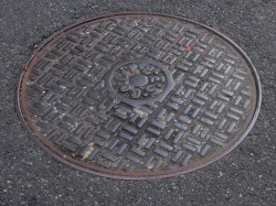
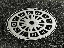
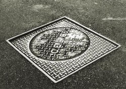
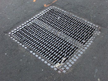
Con Edison is now the primary user for manhole covers, and they seem, these days, to have boiled down to four basic designs. See the two above and the two below.
 _
_
(Click any image to enlarge.)
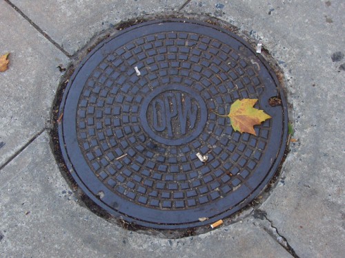
The Department of Public Works features this handy little design. I like its simplicity very much. the color also makes it unique.
 _
_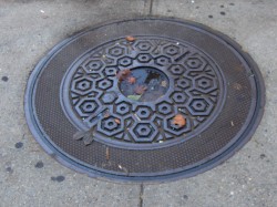
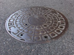
Above left you can see an older model that is wearing down. Parts of the design are blending into other parts almost making a new shape. Above right you see an interesting model. There’s a cover within a cover. The smaller model seems to fit within the larger model, and both can be pulled out. Very interesting. There were three or four of these in the same area around 23rd Street.
 _
_
These manhole covers have been fitted into what were obviously larger spaces.
The concrete circle, above left, fills in for an earlier, larger model manhole cover.
Above right, you see a round cover in what was once a square hole.

The busy minimalism of this design works very well with the cracked asphalt around it.
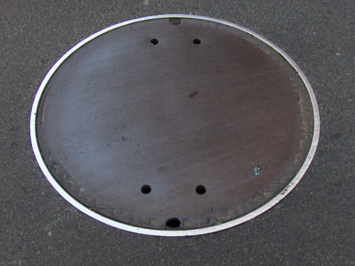
Here we have an interesting model. No design. I guess some would say that that’s
a design in its own right.
If you look on line, you’ll find a lot of information and photos of manhole covers. It’s amazing how big an industry is manhole cover watching. There are many books on the subject, many websites and lots of photographers who specialize in it. I have to direct you to one Roland Muhler. His work is stunning. I’ve posted three of his NYC photos just below. He has many international manhole covers on his site.
Another site which gives a lot of attention to manhole covers is Manhole Covers etc. The site is subtitled: “I’ve been looking down so long, I don’t know which way looks up.” Here you’ll find some history, links and photos from across the US as well as around the world.
Through this site I found a Russian site called Sewers of the World, Unite. There’s plenty of information and links here as well as some excellent photos. The images below are Russian designs from this site.
On the site, the history of sanitary sewers, I found this document (pictured to the right) 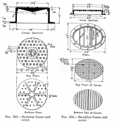 which gives a good view of a plan for some manhole covers. One cover is designed for Syracuse and another for Brooklyn.
I also learned in my small amount of research that most of the covers done for NY’s manholes are made in India. I imagine the shipping charges would be enormous.
I presume that the manhole covers are now made of steel whereas they originally must have been molded of iron (and which would have broken when dropped.) I also learned that the sewers once had a hard glass built into the sidewalk openings so that light could enter. Pre electricity must have made working below ground difficult.
I should say more difficult. It’s not a job I’d like.
Animation &Independent Animation &Story & Storyboards 11 Aug 2007 07:43 am
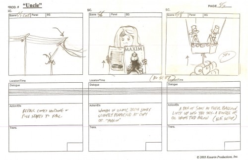
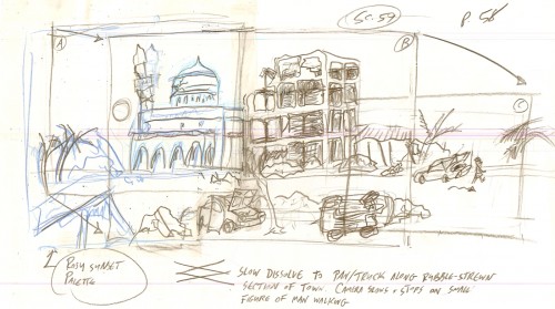
Uncle
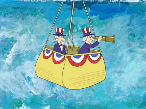
 – After seeing Ray Kosarin‘s film Uncle, a couple of years ago, I could only say that I was ecstatic that finally someone had made a REAL political cartoon that stated a REAL opinion. (It also helped that I agreed with the opinion.)
It wasn’t like the JibJab let’s-laugh-at-everyone’s-expense-without-stomping-on-any-feet kinda film. Ray had something to say; he said it with humor, but he pointedly told what he saw. A political cartoon in the best sense. Jay Leno isn’t going to show his film.
Ray Kosarin has worked within the New York Industry for years. He started out in my studio and animated brilliantly on many of my half hour films. He directed on MTV’s Daria, Beavis & Butthead and spent a bit of time at the Mutant Ninja Turtles. It’s exceptional that he did this political film in his nights and weekends, and you can see the high cost of production on the screen as this short plays. It’s not a second-rate Flash piece but a REAL animated film, and it employed many key animation people in town.
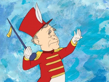 Now that Uncle has been picked up by local PBS outlet Thirteen’s ReelNY series which highlights independent filmmaking, it means that you can watch a clip on line as well as view an interview with Ray. Here’s a working animator who put a lot of his own money on the table to make a serious and dark political commentary. He hired a lot of friends to help, and made a first rate film. You should check it out, if only to support this type of filmmaking. The political statement is also high reason to see the film. If you have access to ReelNY on the East coast, keep your eye out for it. (I’ll definitely give a heads up when it’s about to air. It’s a work well done.
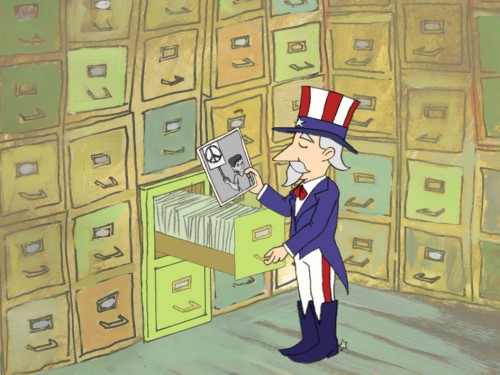
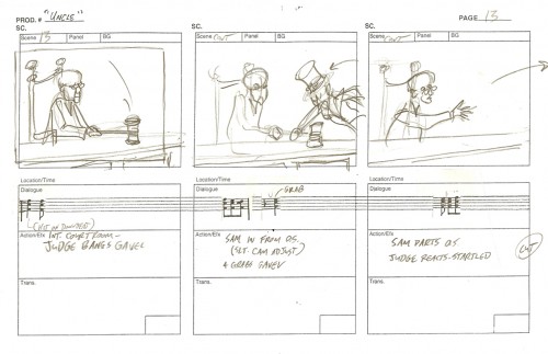
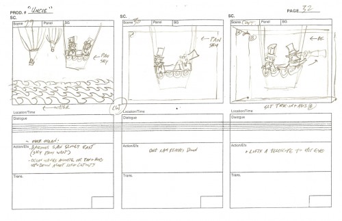
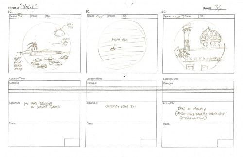
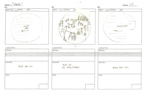
I’ve asked Ray to share some of the art from the film, and he sent me these stills and storyboard drawings. He deserves as much attention as he can get.
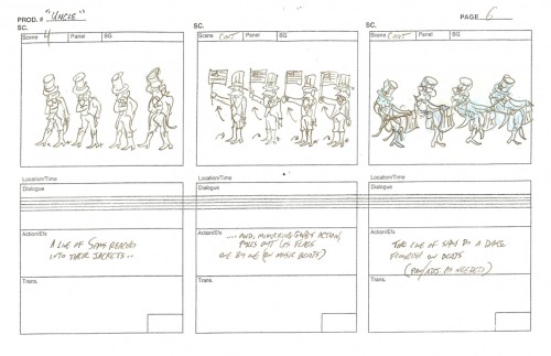
(Click any image on screen to enlarge.)
_Still(s) from UNCLE, animated film by Ray Kosarin, © 2004 Kosarin Productions, Inc.
Animation &Animation Artifacts &Hubley &Story & Storyboards &Tissa David 10 Aug 2007 07:21 am
Cockaboody Layouts
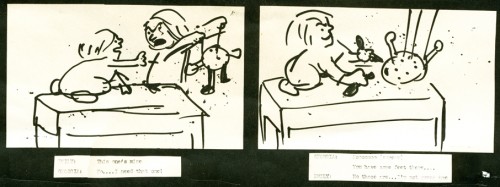
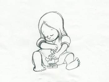 – To hook up with the Cockaboody storyboard I’ve posted in three parts (Part 1, Part 2, Part 3)
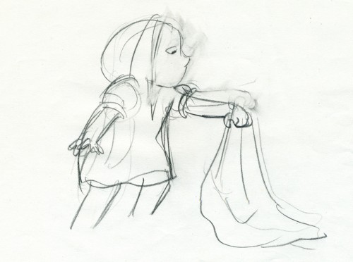
I thought I’d post some of the key drawings done by Tissa David.
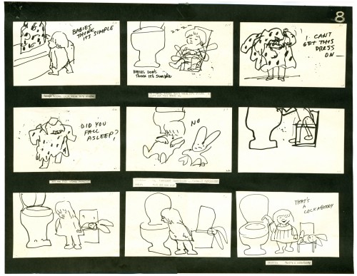
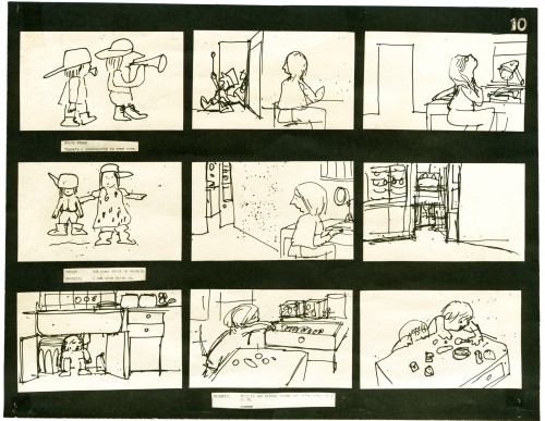
To make them a bit more meaningful, to see what a really sensitive animator adds to a film, with the help from her director, I’m also posting the storyboard drawings that relate to these animation keys.
(Click any image to enlarge in a different view.)
If you watch the film with the storyboard in front of you, you’ll find a lot of discrepancies. The film grew as the animation began.
While working for Phil Kimmelman & Ass. for a short period (which just so happens to have been the exact time the Hubleys were making Cockaboody – I came back to their studio and joined their film in the very last stages) I learned an interesting saying that was the credo at Kimmelman’s. At every stage the film should get bigger. By this, they meant that the animator should take the storyboard and build on it. The Assistants should add whatever they could to the animator’s work, etc. I liked the sound of that and remind myself of it often and try to plan my films so that will be likely to happen.
I certainly think that Cockaboody does this.
If you want to see the film, it’s currently on YouTube.
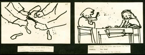
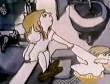
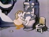
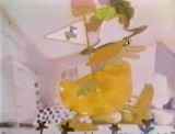
Tissa takes this play with the blocks and places it on the floor. This keeps all of the action down at the girls’ level and allows the blocks to be used throughout the film. They show up
a bit later as part of the background art.
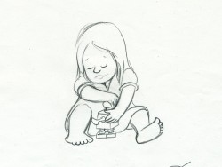
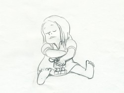
The blocking also puts more attention onto the character of the girls instead of having to have them climb up the chairs to get in place at the table.
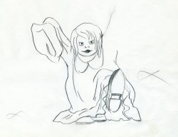
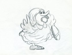
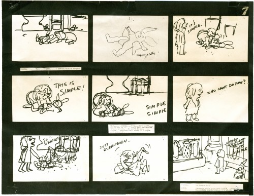
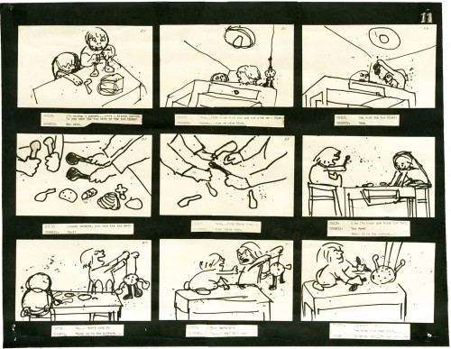
The storyboard drawing above left (with the “goosey”) is the only representation of the girl wearing her father’s shoes. Tissa took this small bit and ran with it.
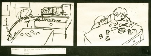
Obviously the action in the boards has nothing to do with the action in the film.
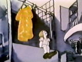
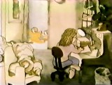
Tissa moved the girl to the closet quietly getting us into the next sequence with this girl
still in grownup shoes.
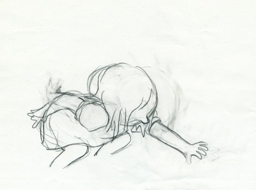
Both of these drawings (above and below) use the father’s shoes on another level.
It forces the girl to bend far to pick up the “blankey.”
Again we’re off the table on the floor, and this sequence now builds out of what came
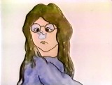
in the past. There’s a lot of definition in the two kids at this point.
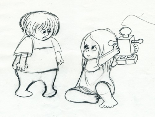
Even the toy has more definition in Tissa’s hands. I’m sure there was some discussion
of this with John. The film takes a solid shape, built on the storyboard drawings and developed with another voice.
Animation Artifacts &Hubley &Story & Storyboards 09 Aug 2007 07:43 am
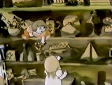
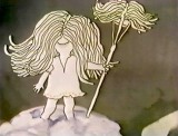
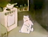
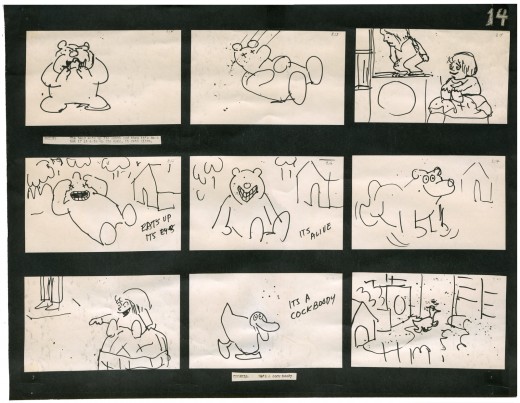
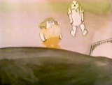
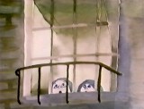
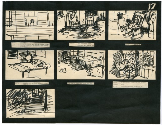
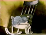
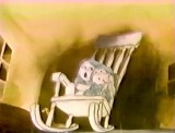
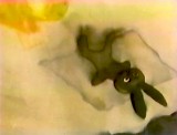
Cockaboody Board Part 3
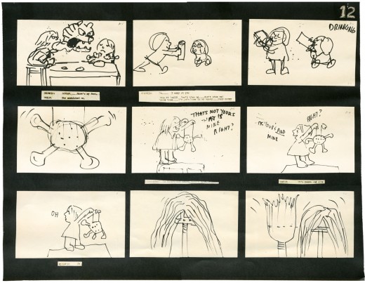
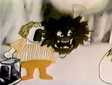
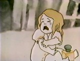
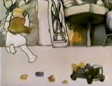
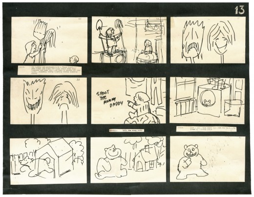
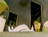
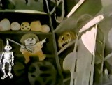
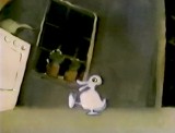
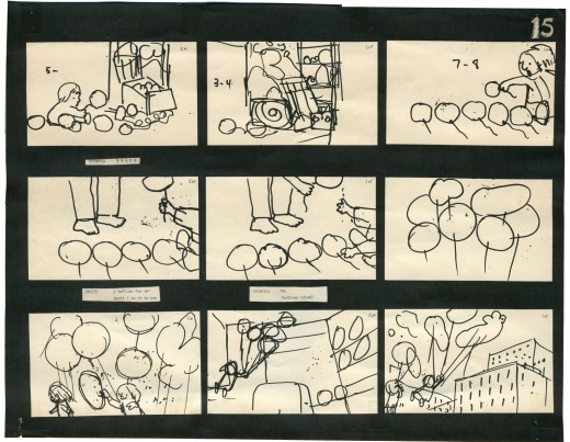
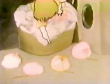
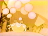
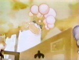
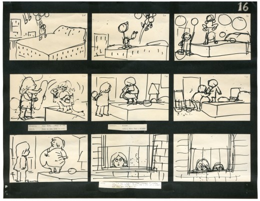
 – Here we have the conclusion of the storyboard John Hubley drafted for the short film, Cockaboody.
These are the direct links to
Part 1 and Part 2.
The film was an outgrowth of an early recording John and Faith made of their two daughters, Emily and Georgia. While teaching at Yale the Hubleys worked with the students in their class to help develop this storyboard. One of the students, Kate Wodell, came to work in the studio and was a mainstay there for many years and continued for a while helping Faith on many of her shorts after John died.
__
__ _
_ _
_
__
__
__ _
_ _
_
_
__
__ _
_ _
_
__
__
__ _
_ _
_
__
__
__ _
_ _
_
__
__
__ _
_ _
_
Daily post 08 Aug 2007 06:10 am
33 years later
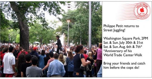
- Tom Sito‘s blog reminded me that yesterday was the anniversary of Philippe Petit‘s walk between the towers of the World Trade Center in 1974. Karl Cohen followed up with an email reminder.
Two years ago I’d received this invitation from Philippe Petit in celebration of the anniversary.
I had just finished my film, The Man Who Walked Between the Towers. The film for Weston Woods went on to win a lot of awards, but it also helped me keep my sanity during a very busy period where little of the work we were doing was anything to write home about.
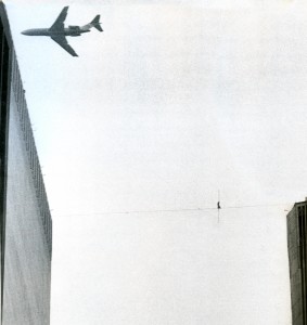 I was able to sneak away from those other jobs to work on this film which, however it turned out, felt more artful than the other. It gave me the small opportunity of commenting, in my own way, on the horrendous events of 9/11.
On August 6th, the weather was just about identical to the morning of 9/11. A crisp, clear day with a stunningly blue sky. We went to the park to see Philippe Petit and were surprised to find him not there when we arrived a tad late. We sat waiting for something to happen, and no sooner had we arrived than the man, himself, rode about the park on a unicycle blowing a whistle. A crowd soon formed.
He drew a chalk circle and, without using words, made us all stand at the brink of that circle. Within, he started juggling, performing, getting people to laugh. Finally, he tied a thick rope to two trees – about five feet off the ground – and started walking the rope. He knew how to 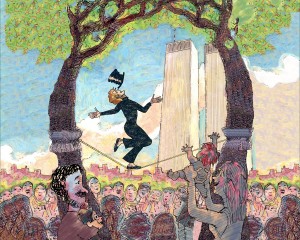 entertain the crowd and keep us all smiling. It was a lot of fun.
When it was over, Philippe passed his top hat around and collected a bit of money. Then he removed himself to the side and prepared for a second performance. It was then that we said hello, exchanged some kind words and moved on.
It made for a pleasant Saturday afternoon in New York.
At the moment, my film can be viewed on YouTube, but don’t be surprised if it’s pulled off again. We’ve already been through this several times.
- Speaking of anniversaries – unpleasant ones, today is the anniversary of the bombing of  Nagasaki. With that bombing, the atrocity of Atomic War was draped across us all by Harry Truman. To celebrate this event, I suggest you try to catch the documentary airing on HBO, White Light Black Rain. It’s extraordinarily good and deserves your time. It’s well done and imparts a lot of information intelligently.
If you prefer there’s also a brilliant dramatic feature entitled Black Rain by the brilliant Japanese director, Shohei Imamura. You can rent the dvd with no problem, and it’s worth seeing if only for the art of the filmmaking.
Master director Shohei Imamura
Daily post 07 Aug 2007 07:40 am
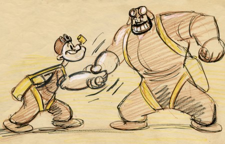
More Popeye
– After posting a piece last week about the Popeye statue in Chester, Ill., I received a letter from Mike Brooks. I found it interesting enough that I’m going to post it here with some images from goodies for sale at his store.
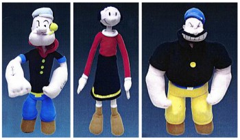 This is Mike Brooks in Chester, IL. I am the founder of the Official Popeye Fanclub (1989) – and editor of the club’s quarterly news-mag that we havebeen publishing for more than 18 years. I also write a local weekly newspaper column called, ‘Popeye 101′ – and have for more than a dozen years. ’101′ is published on the same newspaper
  page as our good friend, Hy Eisman’s ‘Popeye’ comic strip.
In 1994, my wife and I gave-up good jobs – moved to Chester, IL – bought Bill Schuchert’s ‘Opera House’ and sat-up the only Popeye shop and museum in the world (Spinach Can Collectibles). We have had visitors from all 50 states and more than 60 countries since we opened – and more than 5000 items to display. Besides E.C Segar being from Chester, Schuchert was the model for ‘Wimpy’ and acted as Segar’s boss at the Opera House. Dora Paskel – who ran a local general store – was the model for ‘Olive’. Frank Fiegel – a local custodian – was the model for ‘Popeye’.
The “Popeye’ statue turned 30 years old a few weeks ago. Sculptor – Robert Walker – now 85 – made a return and was the main speaker at a special event held in Segar Memorial Park. I was also honored to be asked to speak at this event.
 ‘Wimpy’ got his own granite statue last year next to our building. There will be an ‘Olive/Swee’pea/Jeep’ statue unveiled in just a few weeks at ‘Popeye Picnic’ (28th year). This is scheduled to happen – 8 September. Actor Paul Dooley who played ‘Wimpy’ in the 1980 Robert Altman film is also supposed to be here. He missed the dedication last year, but has promised a return. By the way – this is only the beginning for statues. ‘Bluto’ will be unveiled next year. An entire ‘character trail’ is being planned – as long as we have money volunteers.
Popeye may not be as visible as he once was – but I assure you____ Actor – Paul Dooley
he’s alive and well here in Chester.
Please visit our web-pages – shop and club – and the official picnic page. We are what some have called – “one of the world’s best kept secrets” – but the shop and the picnic each draw a big crowd year after year.
You can visit the Mike Brooks’ Popeye shop and buy some of these great items displayed above (for reasonable prices, I might add) by clicking here.
There’s also the site called Popeye’s Poop Deck that you might want to visit for more information about Popeye and his history.
(Click any of the images above to enlarge.)
________________________________________________
- Don Brockway has an interesting new blog well worth checking into.
. The report he did on Raggedy Ann & Andy is first rate and worth reading.
. However I loved the information he’s posted on Disney scores performed by British orchestras. There’re a lot of good arrangements of classsic Disney songs. The Silly Symphony pieces are excellent. A second one on early animation scores is equally good and includes a Popeye medley.
Articles on Animation &Hubley 06 Aug 2007 08:12 am
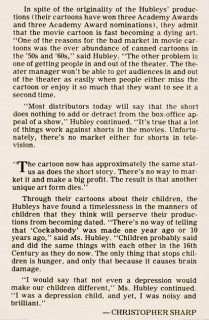
Cockaboody NYTimes
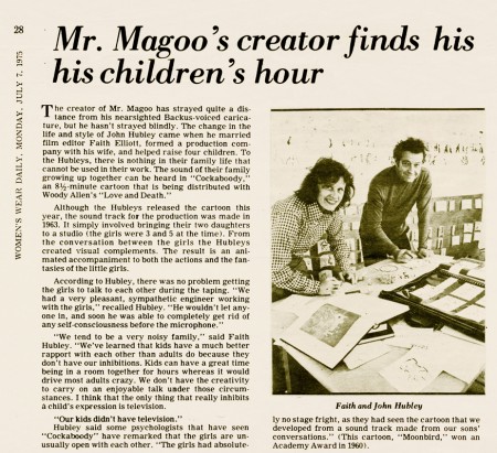
- Since I’ve been posting the storyboards for John & Faith Hubley‘s short, Cockaboody. I thought it might be a good time to post this short article featured in the NYTimes at the time the film was made.
By the way, if you haven’t seen it, you can watch Cockaboody on YouTube.
__________________________________ (Click images to enlarge.)
_____________________________
 _____________________________
Photos 05 Aug 2007 07:57 am
Banner Photo Sunday
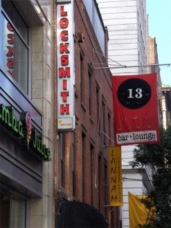
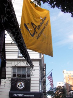
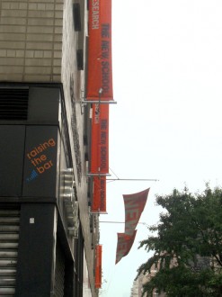
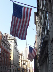 – Back around July 4th, I posted a lot of American flags that could be seen all around town. At that time, I pointed out that there was a bit of a change floating all about us. Back in the 70′s-80′s, a lot of the bronze signs that posted the names of stores and building inhabitants were being stolen right off the buildings and sold for the value of the bronze.
Instead of replacing these heavy metal signs, the storekeepers found cloth banners which could easily and more cheaply advertise their names while at the same time offer brighter colors and bigger lettering. In short, they made for perfect floating ads.
We’ve grown accustomed to these many flags floating all over our landscape, and in NYC they’ve become almost invisible to us. Blocks of color and writing floating everywhere over our heads but just within our lines of sight.
So, just to make my point, here we have some obvious banners that I tread past daily. I hope some of the pictures are, at least, interesting.
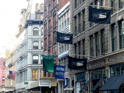
You can see that these banners have just about taken over advertising and display for many store outlets. They’re flying everywhere about Manhattan.”
 _
_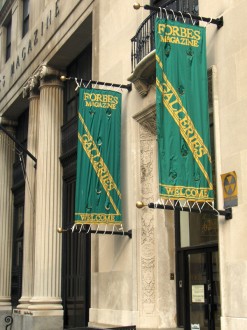
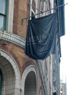
Everything from Bombay Stores to Forbes Magazine use these banners. Forbes, I might add, also has bronze lettering on their door.
 _
_
There are times when electric lights sit right alongside these banners, lighting them up at night.
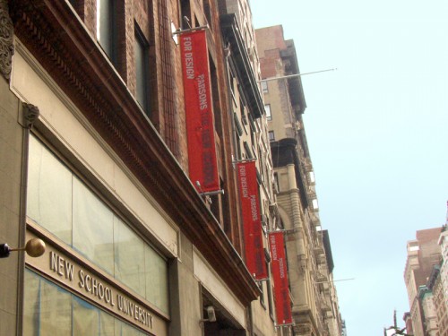
Parsons (above) and the New School (below left) use similar multiple banners across the street from each other.
 _
_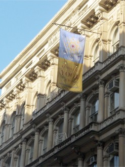
The Yoga banner (on the right) is just about worn out and can barely be read from the other side of the street.
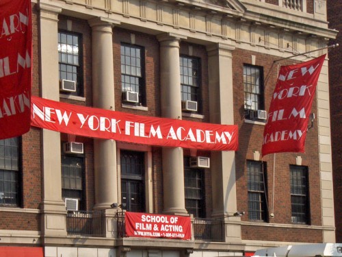
The NY Film Academy just about overdoes it with their multiple banners. This fine old building almost loses all of its dignity in being overdraped like this.

The banners of the Metropolitan Museum of Art have almost become famous; they’ve appeared in so many movies.
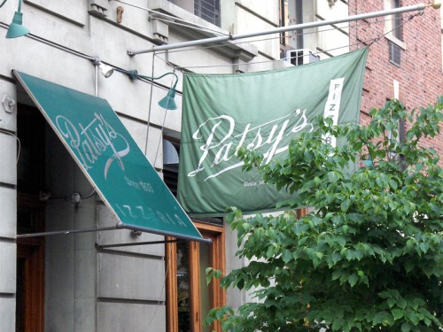
However, I like the way Patsy’s uses the awning and the banner (almost hidden behind the bush) to call some quiet attention to itself.
Daily post 04 Aug 2007 08:06 am
Martin & Chast & The Thief
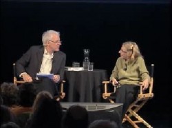 – One of my favorite videos on the internet right now is this Steve Martin interview with Roz Chast on the New Yorker site. They posted the piece last year, just after the event had occurred, and I saw it then but caught it again recently thanks to the notice at Drawn.
The two of them have a new book about to come out this coming October, The Alphabet from A to Y With Bonus Letter Z! Since they were already doing the book when this interview took place, it was obvious for the New Yorker to team them up at their event.
Here’s the publisher’s description of the book:
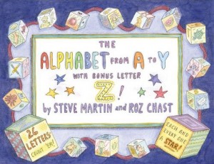 The ABCs have never had it so good. Created by two of today’s wittiest, most imaginative minds, The Alphabet from A to Y with Bonus Letter Z! is a sheer delight from A to Z.
In twenty-six alliterative couplets, Steve Martin conjures up much more than mere apples and zebras. Instead we meet Horace the hare, whose hairdo hides hunchbacks, and Ollie the owl, who owed Owen an oboe. Roz Chast contributes the perfect visual settings for Martin’s zany two-liners. Her instantly recognizable drawings are packed with humorous touches both broad and subtle.
At the moment, Steve Martin is in Paris shooting the next Pink Panther film. (I know this because Alfred Molina will be joining him in the film soon, and he’ll stop off in NYC to record lines for my film, POE, on his way to Paris.) Martin also has an autobiography coming out, Born Standing Up, due out in November.
Garrett Gilchrist continues to work on his recobbled version of Dick Williams’ prime opus, The Thief and the Cobbler. You can read about Garrett’s dedication to this film and to other works by Dick Williams at the forum on his site.
Unfortunately, YouTube has removed the video from their site that Garrett had posted last year. He’d put up The Thief in several parts. This gave you a good view of the entire workcut of the film, prior to the completion Bond company’s halt of the film. They’d pulled it out of the drawing hands of Dick Williams. This labor of love was completed in a truncated way, turned into a musical, and dumped on the market to fail.
Perhaps, the unremittant work of Garrett can bring us a version of the film.
Animation Artifacts &Hubley &Story & Storyboards 03 Aug 2007 07:32 am
Cockaboody Board 2
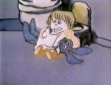
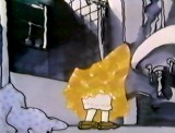
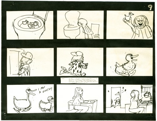
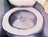
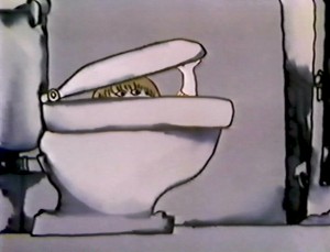 - When we last left the storyboard for Cockaboody, the girls were in the bathroom about to diaper their bunny doll. The story is about toilet training for children.
Here’s the direct link to Part 1.
Cockaboody, of course, is the film by John and Faith Hubley. The storyboard, with all of the drawings done by John, was developed in conjunction with the Hubley’s class at Yale. The students actively discussed the board and offered their participation in the growth of the film’s origin. A documentary was also produced showing the production of the animated short.
The film grew out of some early tapes recorded by the Hubley daughters, Georgia and Emily, who were recorded at play in a studio. The conversations by the children were all improvised. This is not unlike the prior Hubley films, Moonbird and Windy Day.
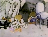
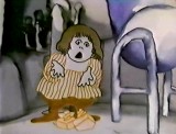
As with the previous post, I’m including some frame grabs of the actual film underneath the appropriate storyboard sections. Tissa David animated the film completely, herself. No assistants worked with her. Faith inked the entire film.
You’ll notice that the action in the film varies from the setups in the storyboard. This undobted had to do with Tissa’s involvement. She would often rework things with John and alter the filmmaking. John, and most of the directors Tissa works with, was open to this. She has a masterful sense of camera placement and uses it throughout this film.
_
________________________________________________________ To be continued.
