Yearly Archive2009
Commentary 24 Feb 2009 08:56 am
Cartoons
- I’m writing this Monday morning having just returned from an interview at Fox Business TV where Amid Amidi and I answered questions about the difference between Disney and Dreamworks. It was a surreal and pointless way to start a week, but it was somehow appropriate after the Oscar telecast last night. I don’t know if I or anyone will ever see it, but I assume the video will show up on YouTube someday. A cartoon in its own right. (You can view the mercifully short video on Cartoon Brew, of course.)
- The Oscars, on Sunday night, were, for me, something of a bust. I was pleased with the animation winners and the documentary winners, but all the Slumdog Millionaire stuff was just a bit too much. I’m not sure Beyoncé or John Legend is going to be singing the winning song, Jai Ho, anytime soon. Not unlike the year that Shaft won for best song. And that tedious musical number that Hugh Jackman led. They weren’t able to settle on any one song, so they did a medley of 200 songs in four minutes. It was ridiculously ludicrous. Actually, Ludicris would have done a better job of it. If they want to go for populist entertainment, they should go for it and stop pretending they’re artists. (Tom Sito offers a nice You Are There feeling on his blog about the Oscars.)
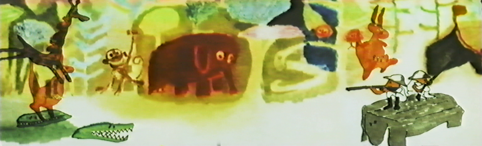
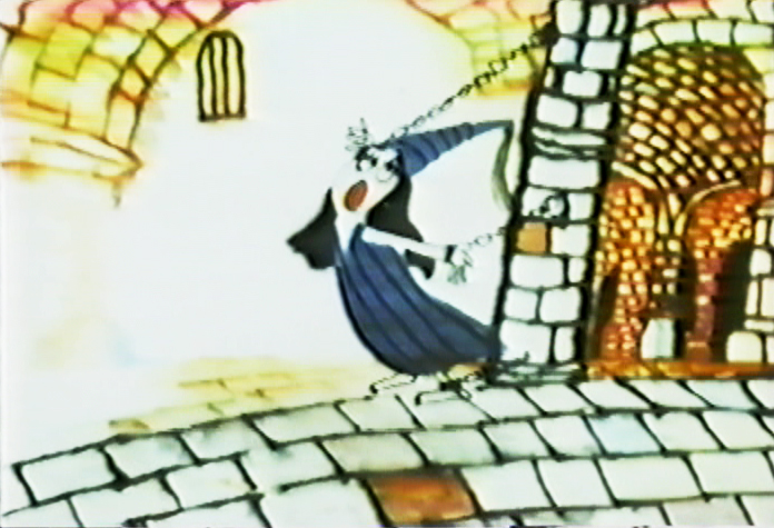
- Cartoons, these days, are ripping through the headlines. Protests and editorials shouted commentaries about these cartoons.
 First we have a Danish cartoonist threatened with Jihads from all of the Muslim world for depicting Muhammed in a cartoon. Mind you, he didn’t make fun of the Prophet, he just drew his image. The Arabic world went berserk. They don’t go crazy for all the killings and ravaging going on in their own lands; it’s the image in a cartoon that upsets them.
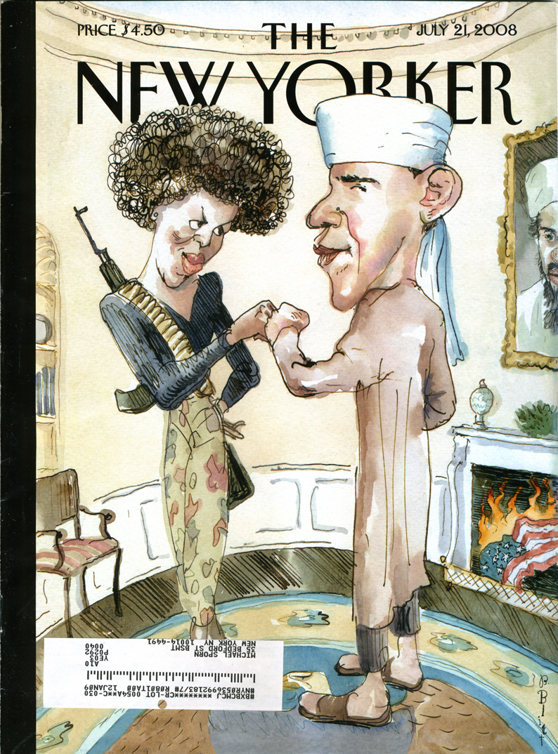
Then The New Yorker, of all places, depicts candidate, Barack Obama and his wife, as terrorists. Cartoonist Barry Blitt didn’t defend himself, it seemed, but the editors of the magazine defended the cartoon as a way to depict all of the fears of people who saw in the next President.
This past week, The New York Post presented an editorial cartoon by Sean Delonas depicting the rabid chimp that maimed a woman in Connecticut dead in the street while cops talk about the author of the stimulus bill. The immediate thought, of course, is that the chimp represents Obama in the cartoonist’s eye. How else could “stimulus bill” connect to a chimpanzee?
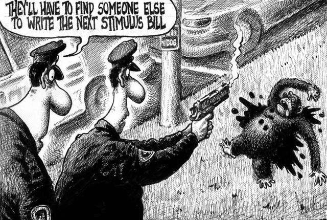
Prostest marches have moved through the streets, Al Sharpton has been in front of many a camera, and there’s been a lot of shouting on cable tv. Editors and writers at The New York Post have announced their displeasure with this cartoon. The NY Post apologized and finally Rupert Murdoch, who owns the Post, has apologized saying in part, “I am ultimately responsible.” (Expect to see a change of editors at the paper – all done quietly.)
I enjoy seeing cartoons take some of the headlines. I wish they were a bit more enlightened, though these seem enormously stupid comments by the cartoonists. Perhaps that’s what makes a cartoon so outrageous and gets readers stirred up. Daumier, of course, led the way with his cartoon “Gargantua” in which the King of France devours the taxes of the people and has grown to obese proportions. This 1831 cartoon followed the riots of 1830, and Daumier was imprisoned for six months for his cartoon.
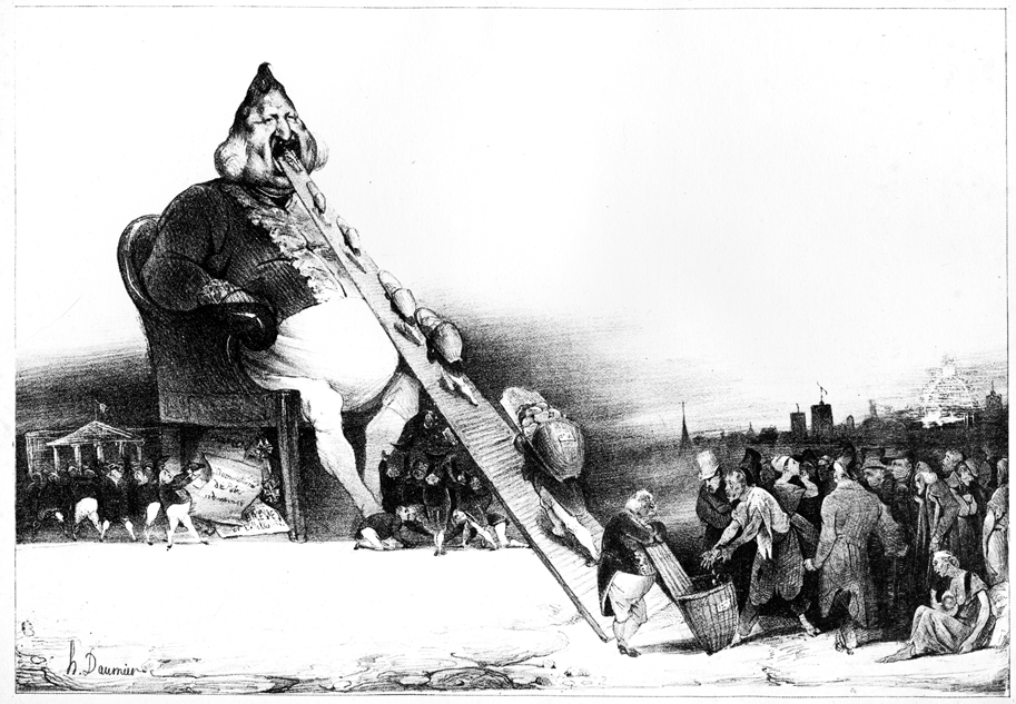
There’s no comparison to what Daumier was doing and the racism (or is it just muddled stupidity) of Delonas, but it’s good to see that cartooning is still alive and that our government isn’t insane enough to imprison cartoonists for attacking the President.
Just a stray thought . . . can you remember the last ANIMATED cartoon that caused a stir?
- JibJab‘s cartoons poke ribs but offer nothing more than mocking entertainment, otherwise they certainly wouldn’t make it to Jay Leno’s show. They actually seem to go out of their way to elbow everyone so as to hurt no one.
- Wall-E‘s political statement is confused enough that it really doesn’t make any points.
- Hugh Harman’s Peace On Earth may have been the last stirring short. It challenged the idea of World War II as America was stepping boldly into it. But that cartoon was nominated for the Oscar; it obviously didn’t create much of a stir.
Actually, there were a few features that did create a small stir.
Bakshi’s Coonskin was attacked for its blatant racism and CORE protested loudly outside the small eastside theater showing the film. Actually, the only thing racist about Coonskin was the title. Those who protested and got the film removed from distribution (only to be reworked and rereleased years later as Bustin’ Out and/or Street Fight) hadn’t seen the film. But with a title like that it had to be racist.
Much the same was true of Disney’s Song of the South. The protests weren’t strong enough to stop the film’s exhibition or to stop it from winning an Oscar for best song and a special oscar for James Baskett, who played Unle Remus.
The other film to get some attention was Bambi. Picketers were out in droves to protest the film for its anti-hunter attitude and editors commented on hunters’ rights. The stir seemed to have been partially used by the studio for publicity and didn’t have much of an effect on its audience.
- Chris Doyle has started a new forum for classically drawn 2D animation. Chris writes,
“It’s a tribute to the Nine Old Men and all those who made those great films during the ‘Golden Age’.”
You know what I think about 2D animation, hence I think it’s a good venture worth joining. Take a look. Here.
- “Thomas Phillip” asked me to point you to this recent short by Reza Dolatabadi, Khoda. A mix of painting, animation and art. It’s worth a look.
 – Jeff Scher has another of his fine, monthly animated pieces in the NYTimes. In Your Dreams is about watching the person you love, while they’re asleep. It’s a poetic and romantic short piece.
- I also found this excellent short, Gary, on line, via Alan Cook‘s site, Cooked Art. I usually figure I’m late to the game in viewing these things. If you haven’t seen it, do. Computer, 2D and character animation. Surprising and excellent.
- The MUST READ today is Mike Barrier’s excellent commentary on acting for animators and Bill Tytla. If you haven’t read it, you should.
Animation &Animation Artifacts &Art Art &Disney 23 Feb 2009 08:00 am
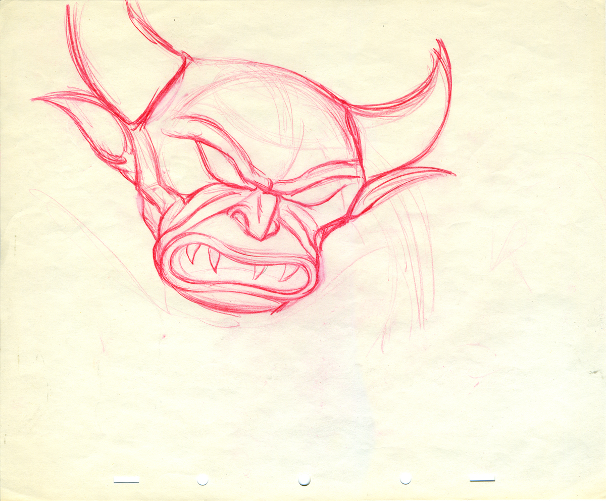
Tytla’s Devil in the Rough
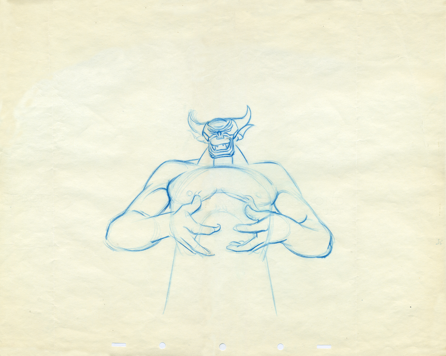
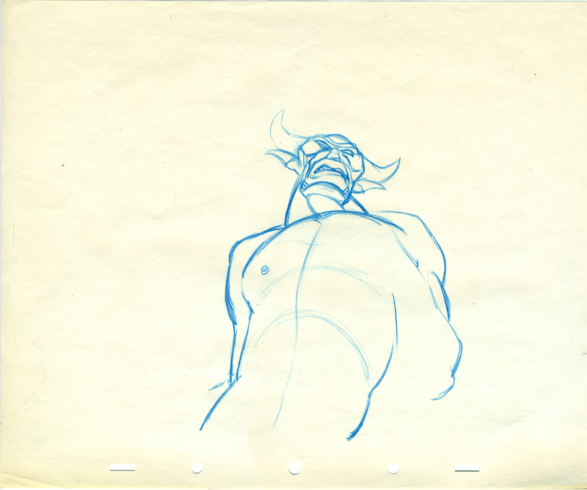
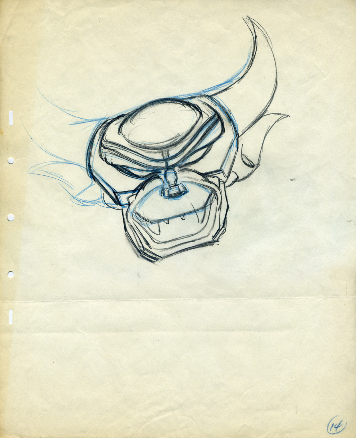
-i Here’s what for me was a real treat to scan and post. I had some limited access to actual drawings by Bill Tytla of the Devil from Fantasia’s Night on Bald Mountain sequence.
The drawings are mostly roughs by Tytla, and they give a good sample of what his actual work looked like.
I don’t need to write about it; let me just give you these mages.
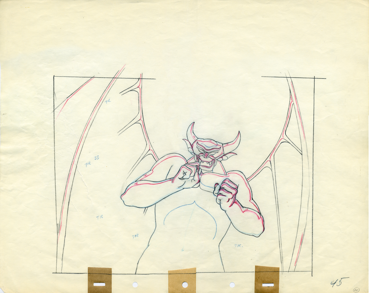
A good example of a Tytla drawing.
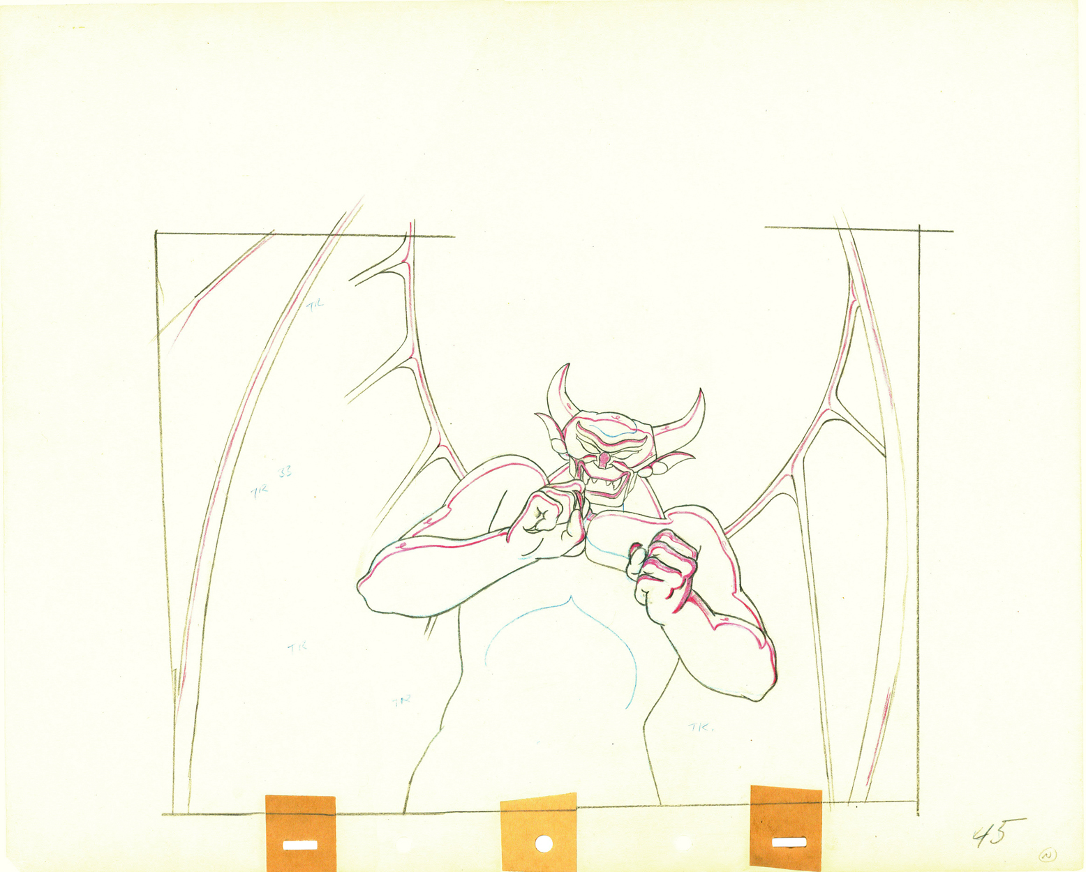
Here’s the clean up of the same drawing.
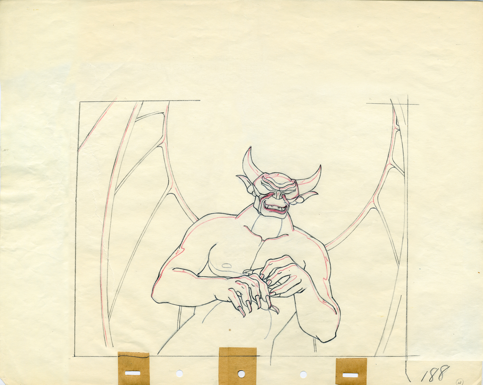
Later in the same scene.
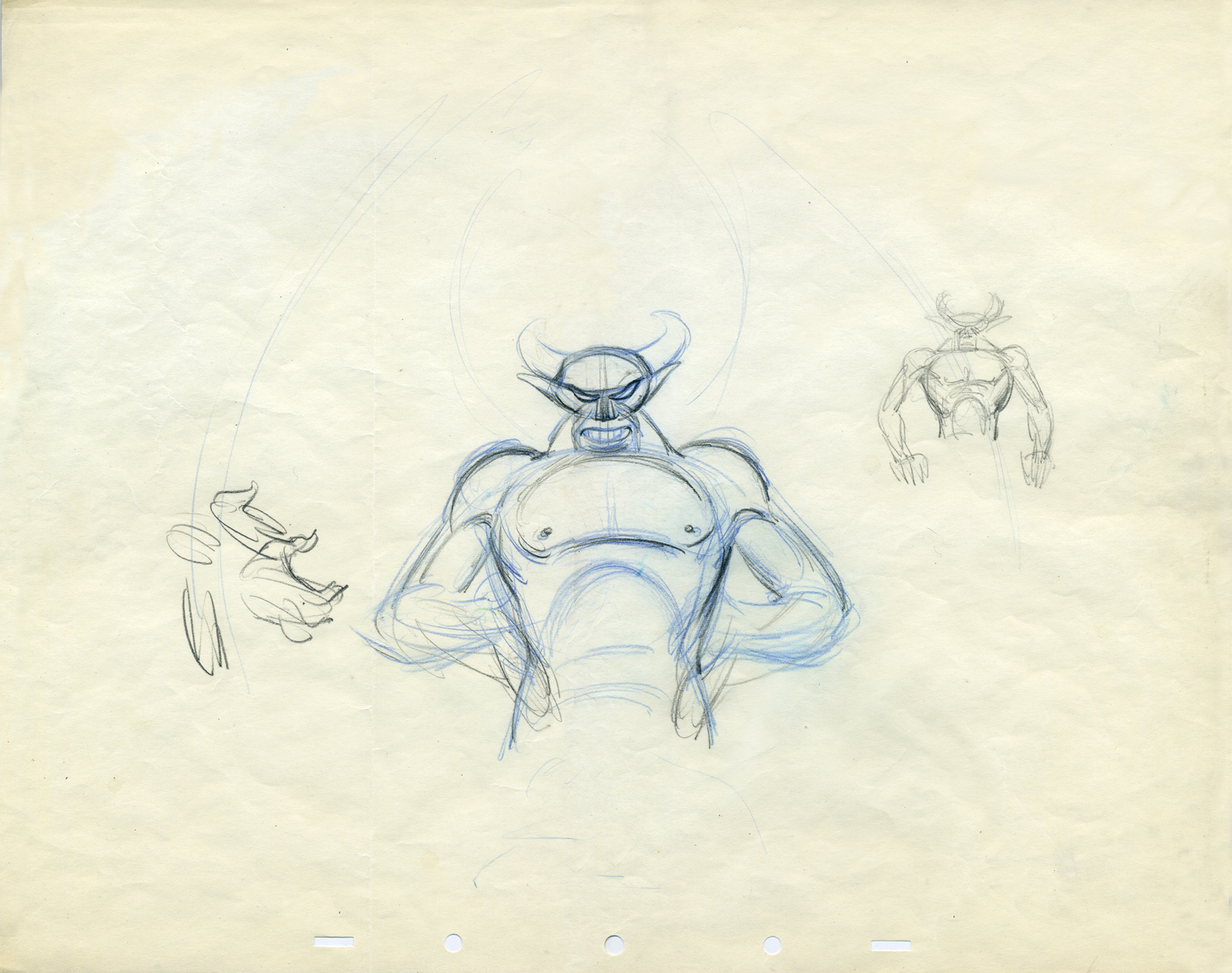
Some Tytla sketches.
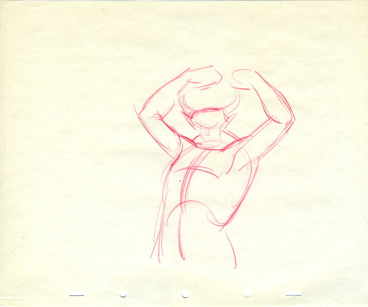
Animation roughs don’t get any more beautiful than this.
A side-peg pan.

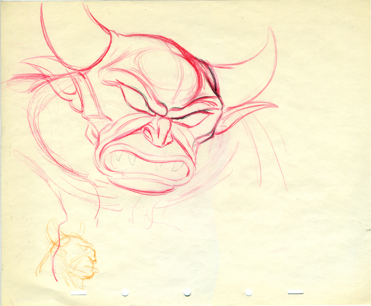
Rough heads.
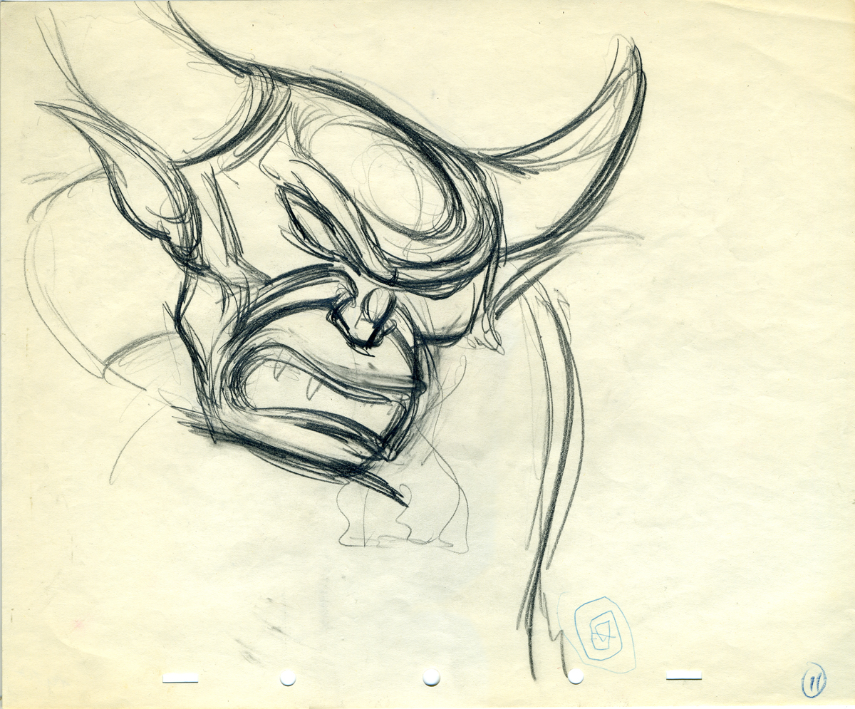
Art. What else need be said?
The individual drawings are stunning, and they’re
in service to a brilliantly acted sequence.
It will never get better.
Photos 22 Feb 2009 08:58 am
PhotoSunday – Construction Update
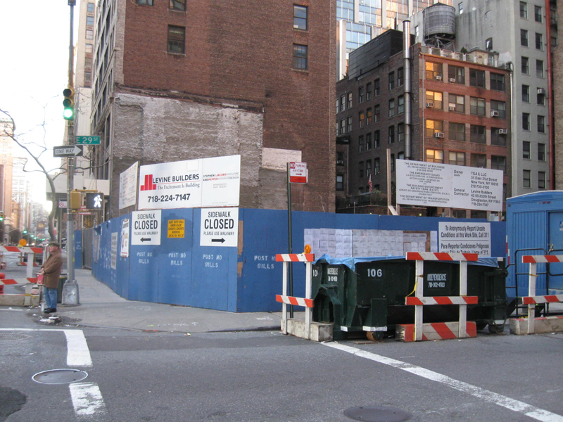
(Click any image to enlarge.)
Two months ago I posted some photographs (including the one above) and wrote about three construction sites in my eyeline. The photo above represented the largest of the three just a block away from my home.
Well, they’ve been busy these past eight weeks, and I thought I’d post an update.

Here’s a shot from about a block away Park Ave. on a Saturday morning.
During the week the building is a flurry of activity: lots of hardhats
redirecting people and cars around the triple-parked trucks delivering materials.

This picture shows the 29th Street crossing.

Another angle – on 29th Street looking toward Park.
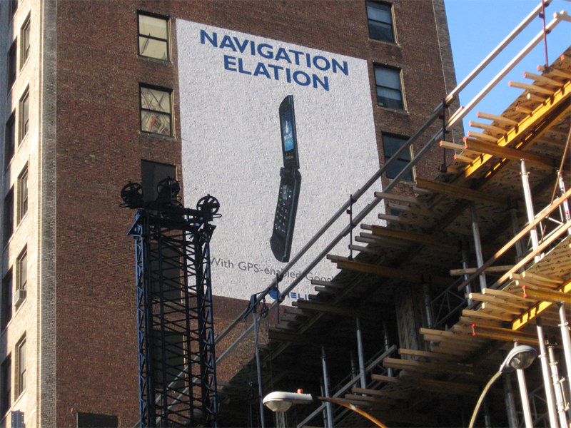
In another month, you won’t be able to see this sign painted on the
building next door. Did the advertiser get his money’s worth?

This enormous crane gives an idea of how tall the building will
ultimately be. Another blockage to the view the Empire State Building.

They’ve constructed a walkway around the building.
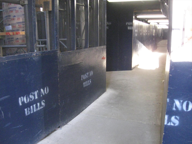
This tunnel moves you across 29th St. (under the base of the crane.)
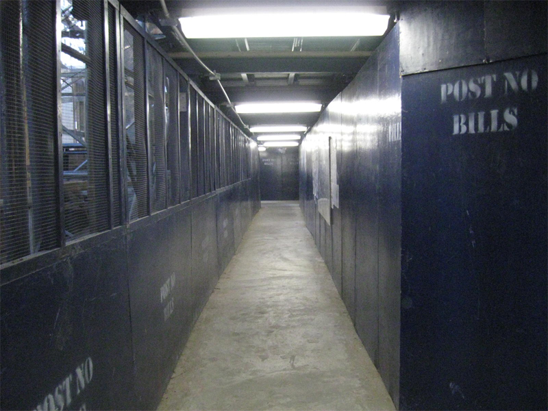
This tunnel takes you down Park Ave. under lots of
crashing, stomping and other scary noises.

Here’s a view from the South side looking North.
Not much to see.
One wonders if there will be any customers left who’ll be able to rent one of the offices in this building. The Economy being what it is.
We’ll check in on the progress another couple of months from now. They’re obviously rushing the consturction.
Animation &Tissa David 21 Feb 2009 09:37 am
Grim Commercial Recap
Back in May 2006 I posted these drawings from a cycle from a Cheerios commercial animated in the late 50′s by Grim Natwick for Robert Lawrence Productions. (Robert Lawrence was half of Gantray-Lawrence, then Pintoff-Lawrence before opening his own studio, Robert Lawrence Prods.)
This highlights the importance of a good assistant for 2D animation. Tissa David was Grim’s assistant on this spot, and her cleanups are sensational. You can see all the detail that Grim actually includes in his drawing when you look at how the clean-up person properly does the job.
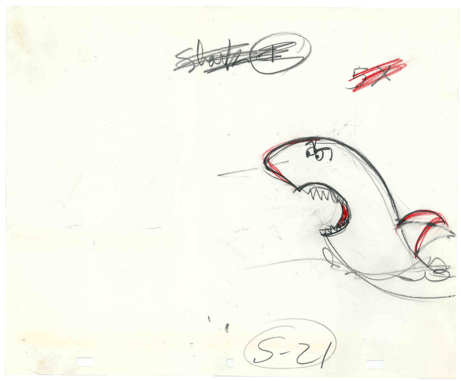
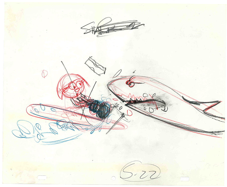
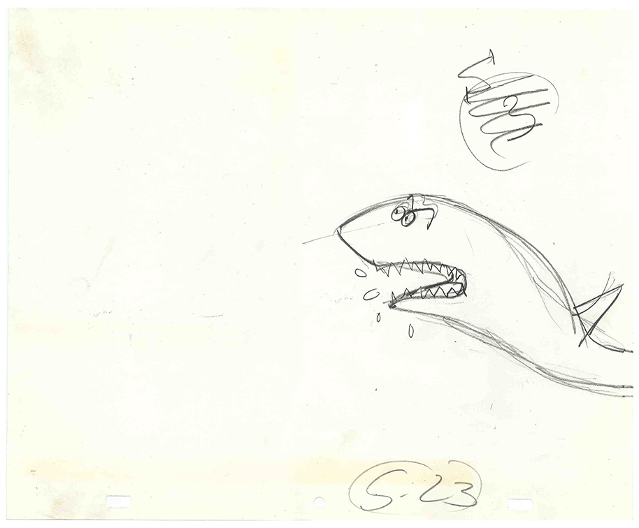
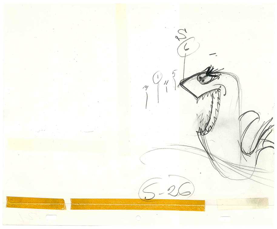
There’s a large shark on another level chasing the girl (see below.)
 .
. 
(Click on any image to enlarge.)
 .
. 
This is the cycle of sharks snapping/chasing the girl.
I don’t think any of the drawings are wholly Grim’s. The numbers on the drawings are done in Tissa David‘s handwriting, so Grim may have worked out the breakdown chart with her and asked her to animate the shark to his timing. Bits of each shark are definitely his: the darker lines – the nose on 21, the shark’s mouth and guitar on 22, and the face on 26.
At one time, Tissa was teaching me how to inbetween properly. I first had to clean up all of these drawings and then inbetwen half drawings. Let me tell you, she taught with a harsh whip; I think I drew all of these images at least a dozen times. (Those are the ones I had nerve enough to show Tissa.) I’m not sure I ever got it right enough before going on to some other scene.
Commentary &Daily post 20 Feb 2009 08:52 am
Odds & Ends
- There were a couple of excellent pieces on the blogs this week.
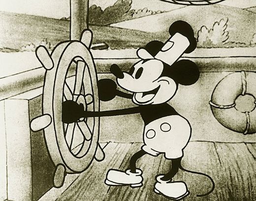 . Hans Perk posted an exposure sheet from Steamboat Willie. It looks to be an amalgam of work by both Ub Iwerks and Walt Disney. It’s quite amazing to view, and I couldn’t be more in awe of the medium. You can see that it all was in place back in 1928; all that was necessary was for the artists to figure out how to use it. Of course, these days all that information has been thrown out the window for a vector version. Presumably, that’ll eventually be better.
Hans’ site, A Film LA, is a treasure for those, like me, who have a modest interest in history. (Here‘s an old post I did on Steamboat Willie & Iwerks.)
. Then there’s a wonderful photo on Didier Ghez‘s great blog, Disney History. The photo celebrates Les Clark’s 50th anniversary of working for the Disney studio. There are plenty of photos of those nine old men, as well as people like Ben Sharpsteen or Wilfred Jackson, but here’s a picture that includes Claude Coats, Bill Justice, John Sibley and Xavier Atencio, among others. It’s a good photo with these key animators in their prime.
By the way, scroll down a little on Didier’s site and you’ll see a curious and wonderful photo of Art Babbitt animating.
- The Oscars are this Sunday and I couldn’t be less interested. Not many of the films were extraordinary this year, and even the animation choices aren’t the best.
The animated feature category is missing a couple of fine films such as Waltz With Bashir, which challenges the medium (ever-so-slightly). Get a three-headed coin and flip.
Wall-E started well and went tedious once we were up in space. Lots of chasing about. I never quite bought the live action humans had turned into cartoon puppet-characters. The film, for the most part, to me, was too much like a Sc-Fi film; its animation tried to equal Jar Jar Blinks as opposed to Pinocchio.
Kung-Fu Panda had some very nice art direction, but much of the animation was too frenetic, lots of pop. Most of the characters moved similarly. If animated cartoons are going to feature a lot of punching and hitting, there’s a good chance they’ll lose me. The audience is the 16 year old boy class.
Bolt started with heightened stupid energy mocking action adventure movies. It settled down, but I never got emotionally invested. There was some nice movement and some nice art direction.
Nothing in any of the three stood out to me as exceptional. Perhaps it’s my bias against the viewmaster style of a lot of these cg film. The first 20 minutes of Wall-E was done well so I’d probably vote for that film.
 I’ve already talked about the animated shorts. My favorite was The House of Small Cubes by Kunio KatÅ (though I wonder why the Japanese short is known in the US as La Maison En Petits Cubes.) I found it the most complex of those nominated and actually felt some emotion the first couple of times I saw it. That’s getting to be a rarity at animation screenings.
I like the film’s art styling which nicely mirrors the subject, and I appreciate the labor that went into the 2D animation and rendering. It’s a well done film and certainly one of my favorite shorts of the year.
My favorite short of the year was Skhizein by Jeremy Clapin. The film took a complex story into a new approach to cg animation combining 2D and 3D elements into a new style. I was a bit impatient watching it a 6th time, recently, but I still recognize its bold achievement. I wish the Academy had recognized it too, but I guess it wasn’t “cartoon” enough.
- Tonight in LA, Emily Hubley will have two programs.
The first, at 7:30, starts out with her parents’ films Tender Game and Windy Day, then one by her mother and several shorts by Emily. A chat with Jerry Beck will be followed by
a 9pm screening of Emily’s feature, The Toe Tactic.
For a full schedule go here.
There’s also going to be a screening of Hubley shorts on Sunday Feb. 22 at 3PM. It’s part of the Redcat Children’s Film Festival screening at Cal Arts. Included are:
Adventures Of An * (USA, 1957)
Urbanissimo (USA, 1968)
The Hole (USA, 1963)
Date With Dizzy (USA, 1958)
The Hat (USA, 1964)
Tijuana Brass Double Feature (USA, 1966)
Dig – Short Version (USA, 1972)
Tender Game (USA, 1958)
This program will be repeated March 5th at 3PM.
Commentary &Frame Grabs &Hubley 19 Feb 2009 09:01 am
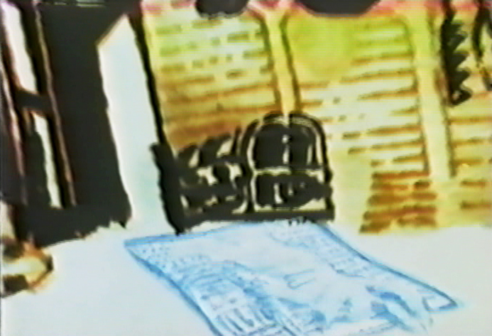
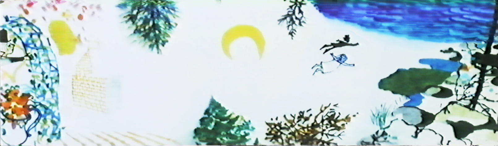
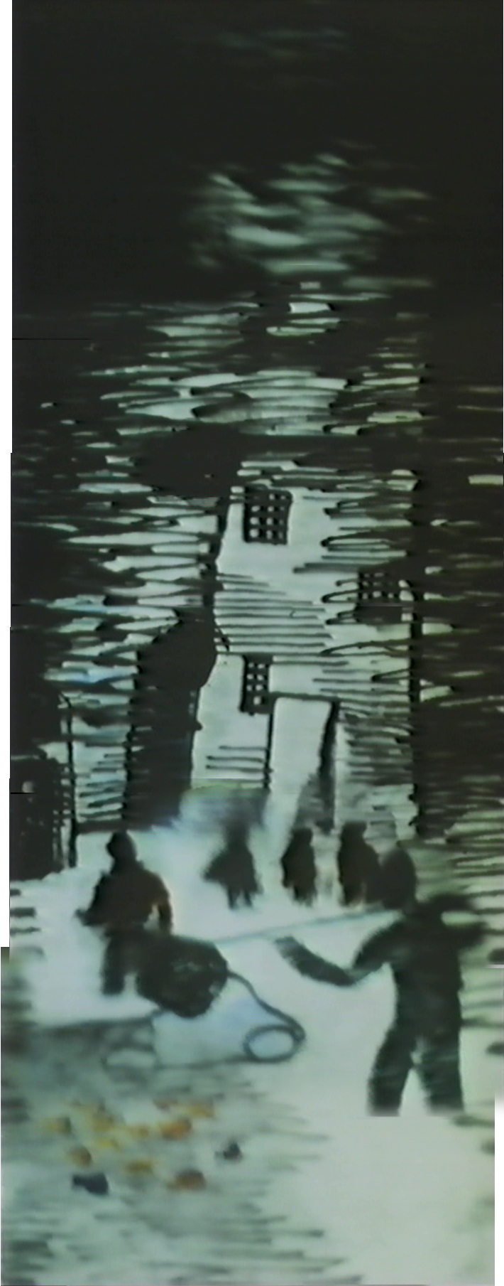
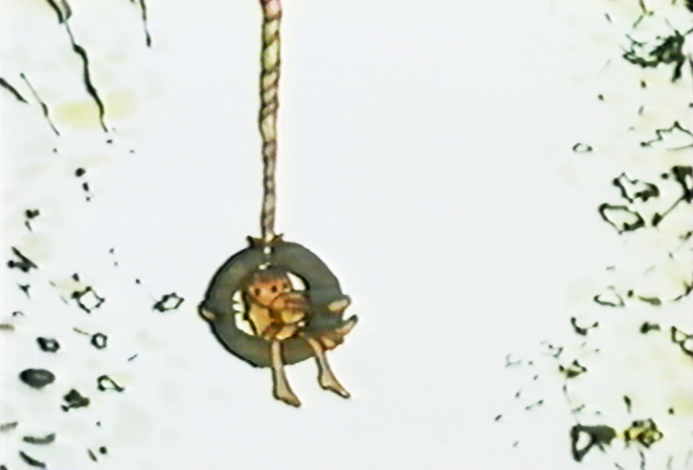
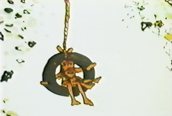
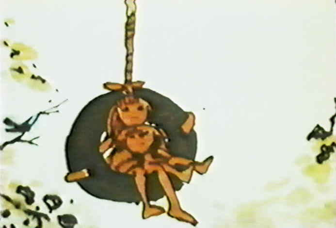
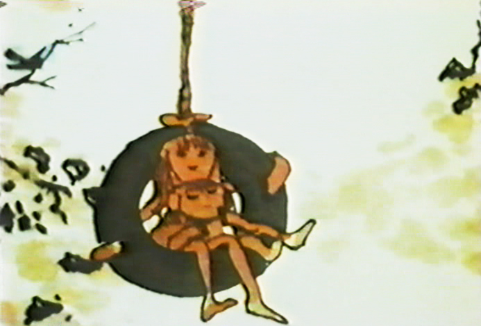
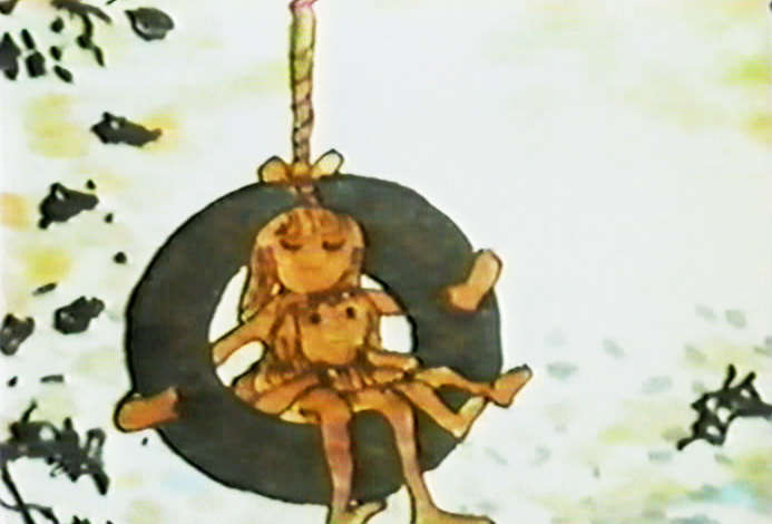
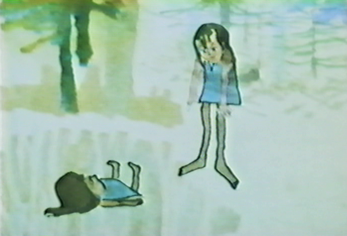
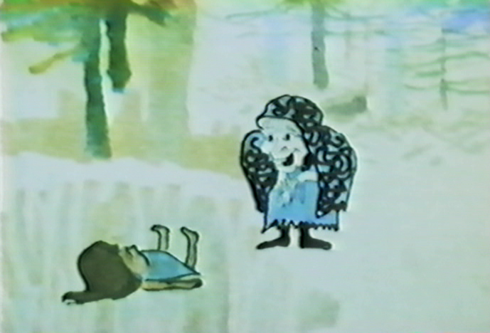
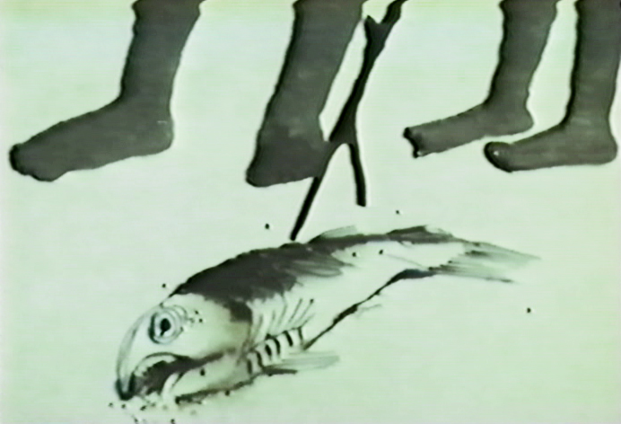
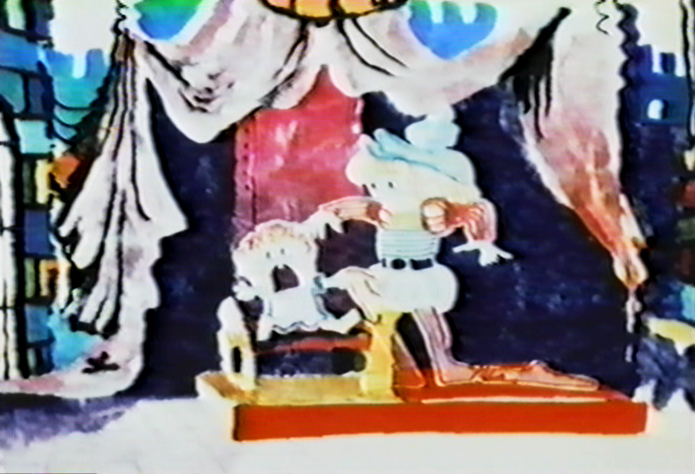
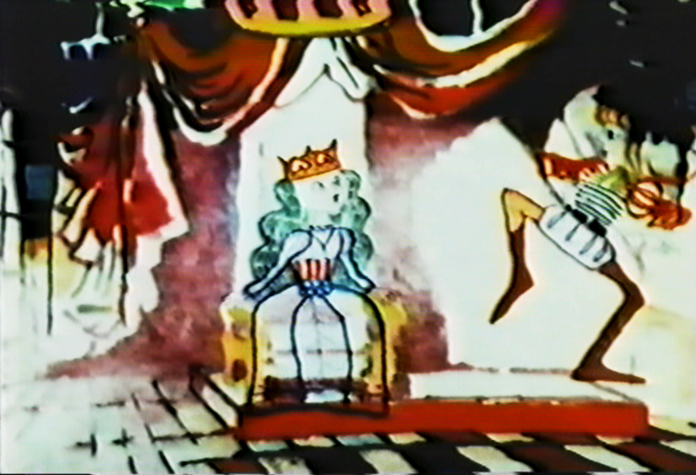
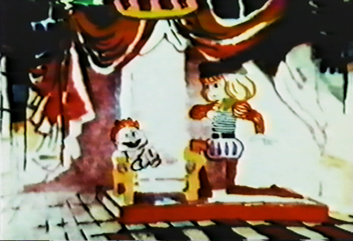
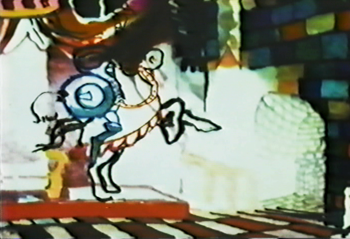
Windy Day 2
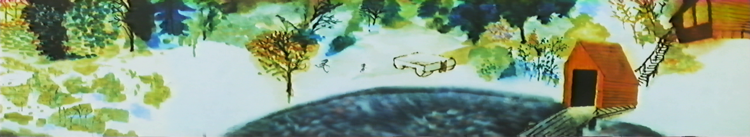
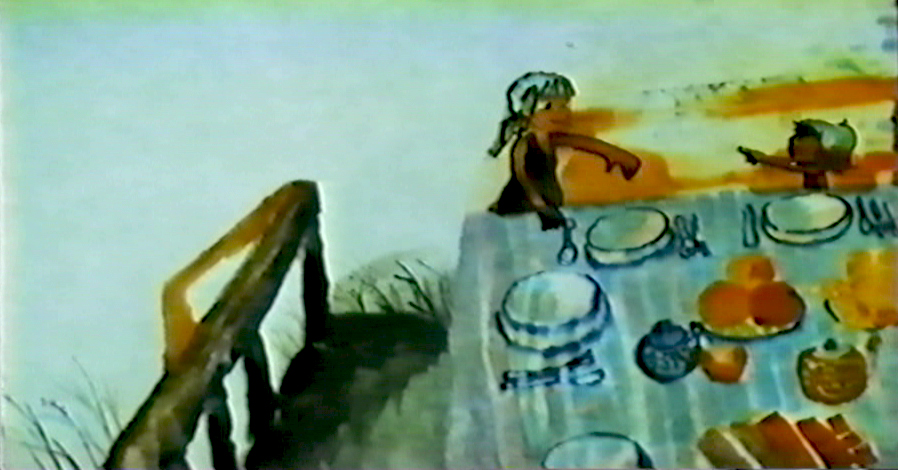
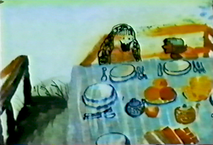
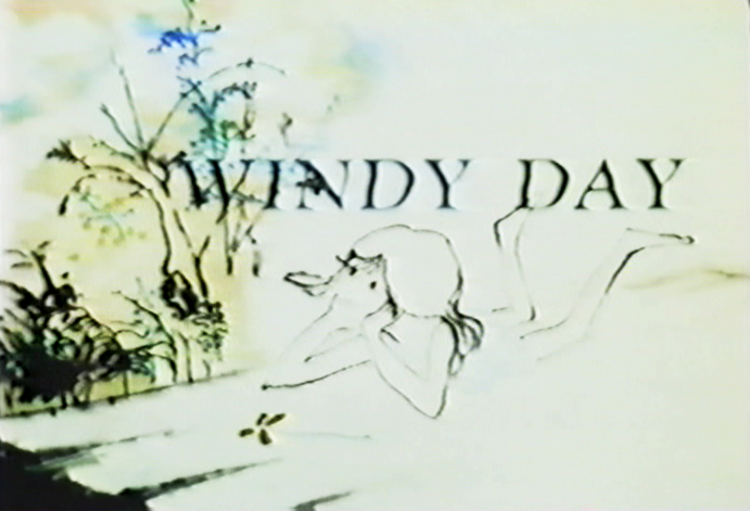 - Here we continue with some frame grabs from the brilliant Hubley short, Windy Day.
I wish there were a good copy of the film available. As a matter of fact, ALL of the Hubley films are in bad versions on the dvds available. They all look soft and dark, they weave and show added scratches. It’s too bad since so many of these films are gems. Wouldn’t it be great to have an extras track or three? Emily and Ray Hubley know everything about these films and could tell us so much. As a matter of fact, Ray helped supervise production of the 35mm print of The Cosmic Eye, and that was a stunningly beautiful print. Yet, the dvd image of it is a paltry and distant relation.
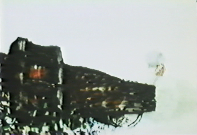
I want to start out here by noting that this film’s technique features bottom lit art (done like a pencil test). The grain of the paper can be seen and was somewhat controlled by the type of paper used for the coloring. It’s architect’s vellum. The paper’s thinner, more transparent and allows some slight watercolor without buckling. Several points in this second half are done with top light and mattes or double expposures. I’ll point those out.
Two other sites that recently featured articulate pieces on this film include Ian Lumsden’s Animation Blog and Richard O’Connor’s Asterisk Pictures blog. Richard gives a lot of deserved attention to Sarah Calogero who did some beautiful rendering on the short. I’d like to give attention to Nina di Gangi who did I&P work for the Hubleys on a number of their key shorts.
Continued from yesterday’s post.
(Click any image to enlarge.)
Note that John isn’t afraid to use the bot lit technique despite
the black wheel seen behind and through the character.
This image starts a scene which isn’t bottom lit.
The newspaper/dead rabbit is matted into the picture then . . .
. . . becomes a double exposure as it floats over the pan.
. . . and goes into the grave.
Dissolve on the top lit silhouetted people.
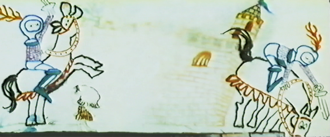
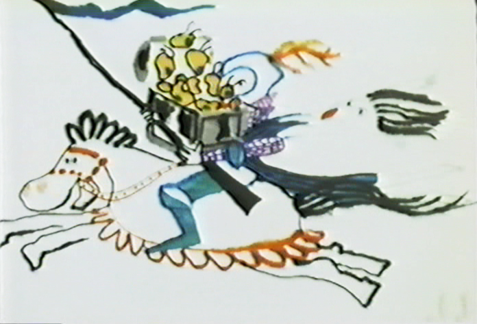
Back to the bottom lit knight riding across the pan.
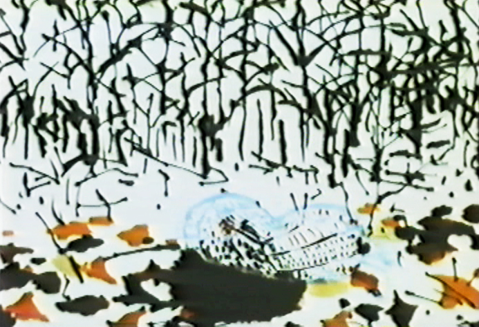
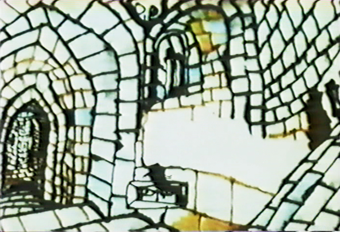
This is a complicated bottom lit scene.
At the top of the pan, the knight is lit in yellow.
He goes through a portal, and the light moves to the
bottom of the pan as the knight enters a level down.
It took some careful thought and a creative cameraman to pull it off.
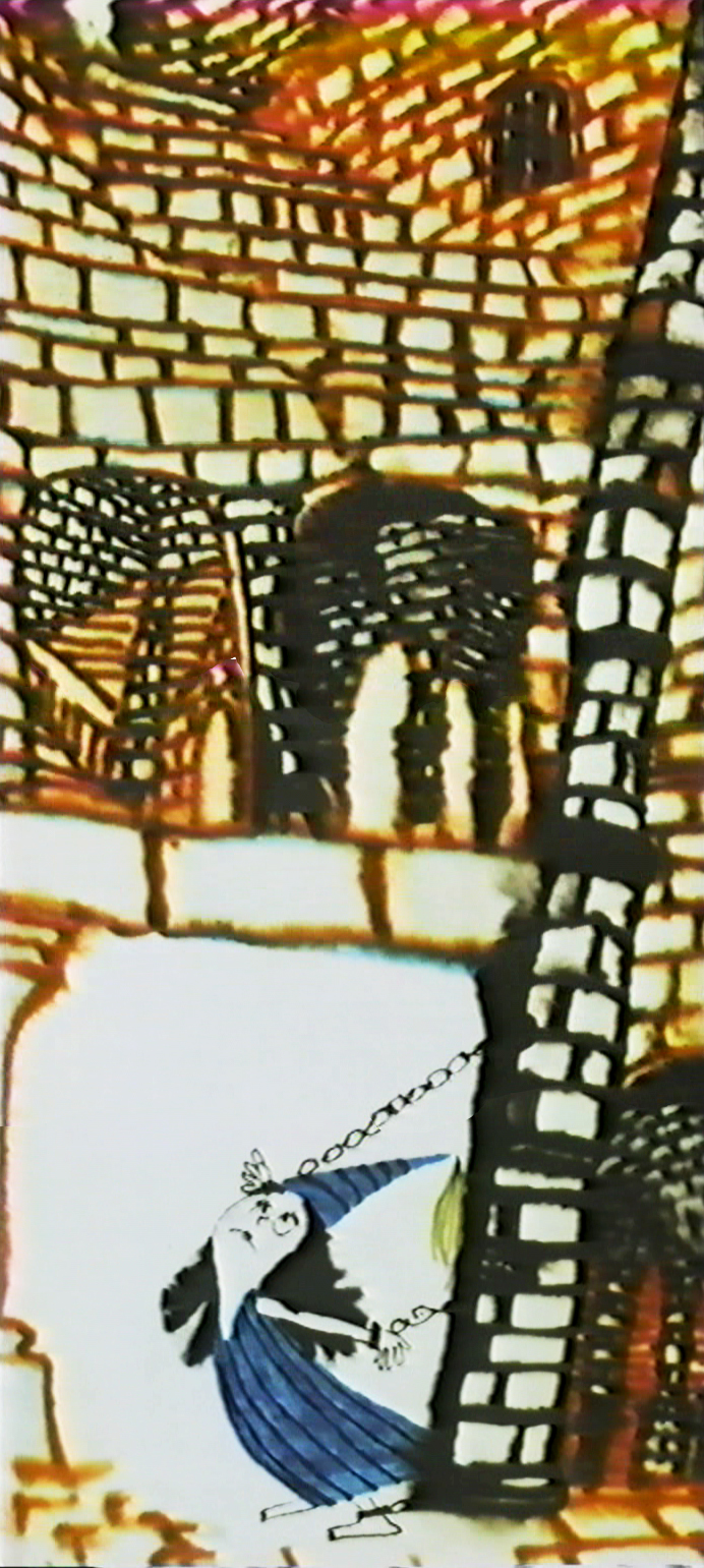
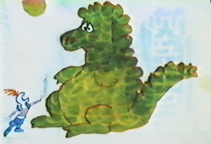
A bottom-lit dragon moves across the pan.
This bot-lit BG looks to have stepped out of Adventures of an *.
The effect on the water is matted into a bot-lit BG.
The effect, itself, is top-lit.
The subject of the film slides quickly between marriage, and birth . . .
.. to death and murder.
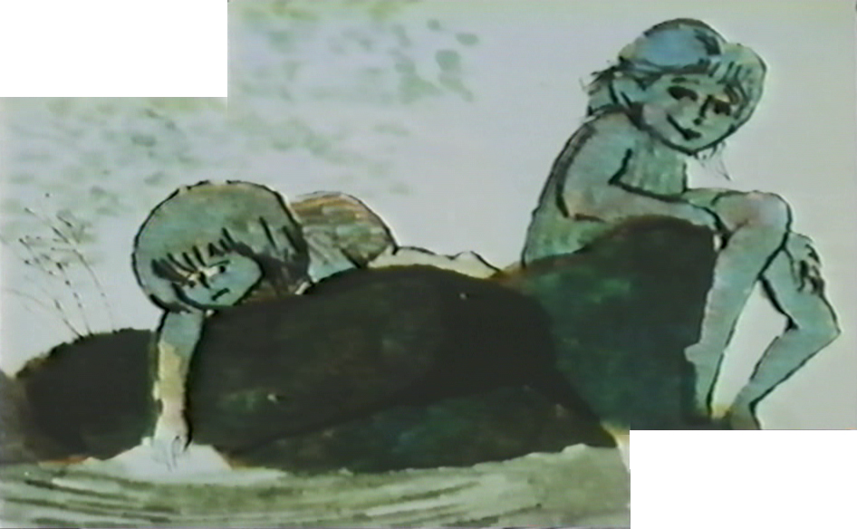
Yet, the conversatioin is done gently and quietly
without the obvious self-imortance it could have had.
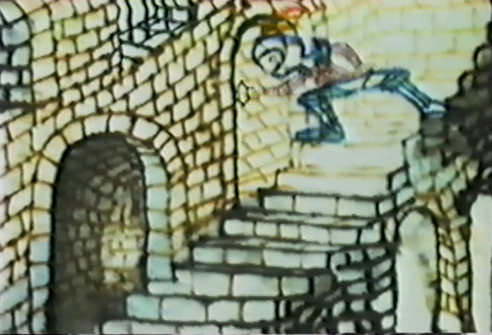
This is one of the more beautiful scenes in the film.
Very complex animation and layout, yet done so simply.
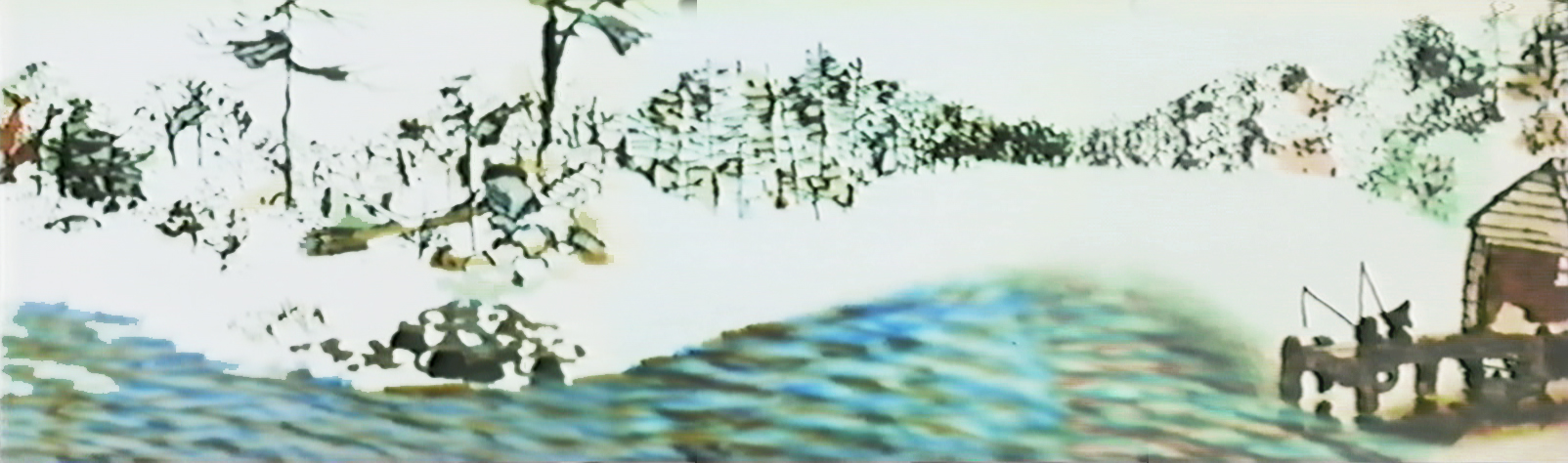
A beautiful N>S then S>N pan while the art animates in and out.
Both sides of the pans N&S&N and both sides of
the zoom in & out ease at perfect speeds.
This is something that could be tested easily on a computer, but in the days before computer you could only film the piece in a Pencil Test.
However, the Hubleys couldn’t afford a PT. They just did it.
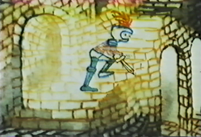
A beautiful, bot lit, multiple run pan. This is experimentation at the service of Art.
I can’t think of many such scenes in all the features or shorts I see today.
Again, death enters the picture.
The kids are talking about Life & birth.
These two scenes, to me, are the heart of the film.
Beautiful animation, beautiful rendering, beautiful soundtrack.
A windy day.
top lit
An absolute gem.
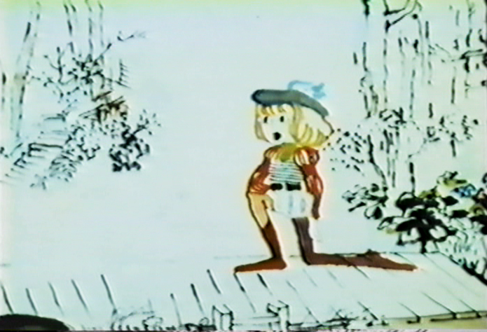
Hubley 18 Feb 2009 08:50 am
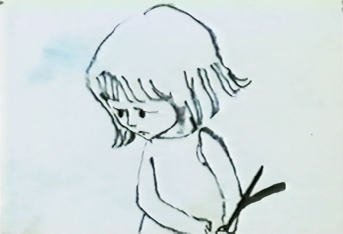
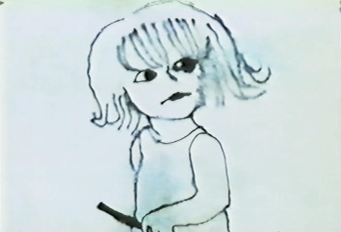
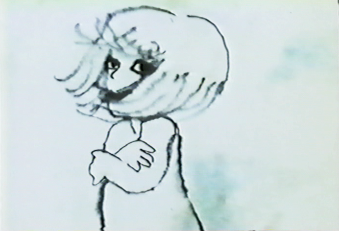
Windy Day 1
 - In some ways, Windy Day is my favorite Hubley short. Several shots couldn’t be more perfect to me. The problem is all the white that yellows or grays in later prints and transfers. It’s hard to view the film as it was intended.
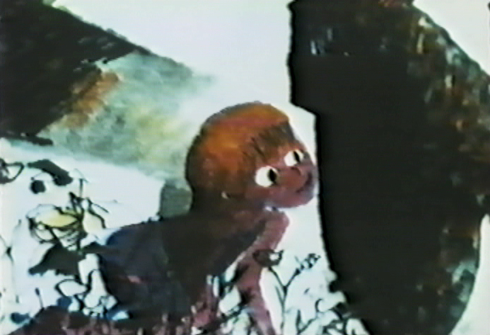
Barrie Nelson’s animation is superb and blends excellently with the wispy style used. They washed the ink lines and lit the art from below so that the style is quite delicate. This
probably limited them to three levels including the background. John Hubley built his backgrounds around the animation of the characters, so that they’d be in the clear. However, there are many points where the animation crosses over and is blotted out by the background, but that is accepted as part of the design. There are also a couple of points where double exposures were used for effect or distortion.
Richard O’Connor writes nicely about Sara Calogero‘s watercolor rendering. I suspect that Faith Hubley probably did all the actual inking herself. She’d done that often and sometimes didn’t have the most sensitive hand just the fastest.
(Click any image to enlarge.)
The style is bottom lit, so there has to be a hole open
in the Bg drawings so that the character won’t be obscured.
In this scene, the characters are double exposed into the BG
so that the black areas can be behind them.
This is one of the most beautiful shots in the film.
A character thinking.
The character’s marker coloring is well served with the bottom lit art.
The style is used to its full potential here.
.
This will be completed tomorrow.
Books &Commentary 17 Feb 2009 08:48 am
Amid’s Books
 – Let’s talk a bit about a new book by Amid Amidi, The Art of Pixar Short Films. There are two reasons one might want to buy this book: you’re a fan of the Pixar films, including the shorts, or you’re a fan of Amid Amidi’s animation books.
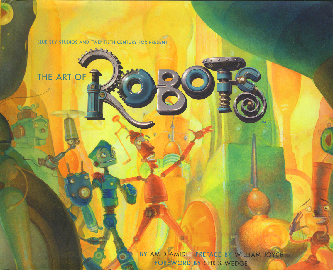
I’d like to cover my interest first; I like Amid’s work very much. This is his third book published by Chronicle books. The first The Art of Robots was a beautiful puff piece for that Blue Sky film, a bit over-filled with fine drawings and paintings and final art
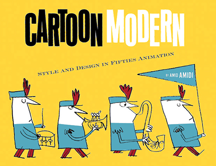
 from the industrious film. The second, Cartoon Modern, is a stunningly attractive, informative and extremely important animation book. It covered a lot of the holes left by other books – the real art that was pioneered by those who made films in the late 40s, 50s and early 60s. A thoroughly researched tome filled with beautiful reproductions, drawings and modern art as made for animation by many many studos and individuals. The book was an arduous task to pull off, and Amid made it look so simple.
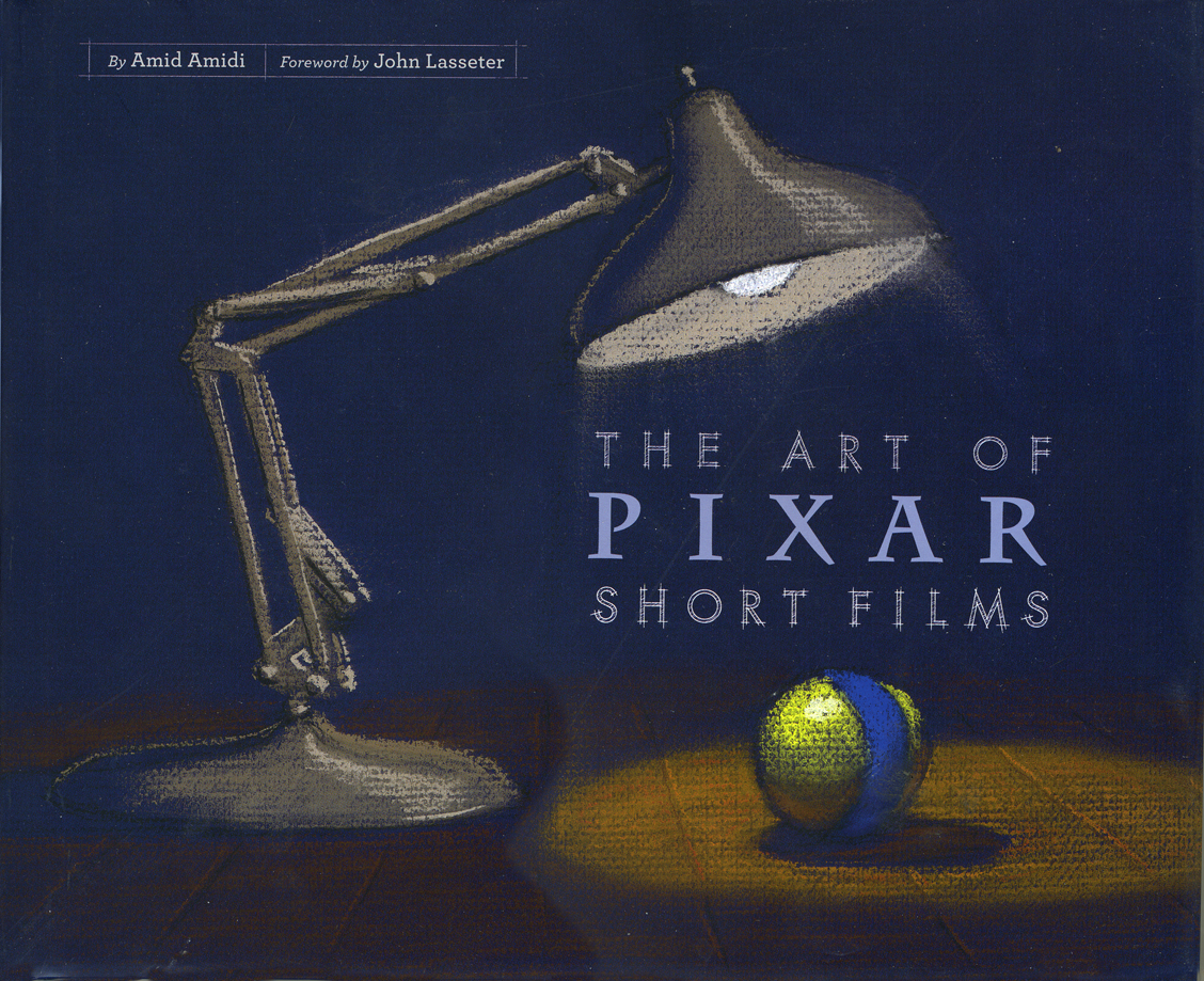 This third book, The Art of Pixar Short Films, resembles both of these past books, in some way. Amid has learned enough from the second book that his writing, his selection of artwork, his choices of design and presentation are important and make the book a beauty.
All type is gray, not black. The type for IDs of photos and artwork is handled as it would be on an architectural sketch or blueprint. Names are delineated, literally. The images are thoughtfully placed for the best composition with plenty of
 white space around them.
The artwork representing the films is well chosen; the development art is better represented than stills from the films, themselves. This is a plus; we can see the actual shorts on the dvds. For the most part, much of this art is excellent and oftentimes better than the films’ final art.
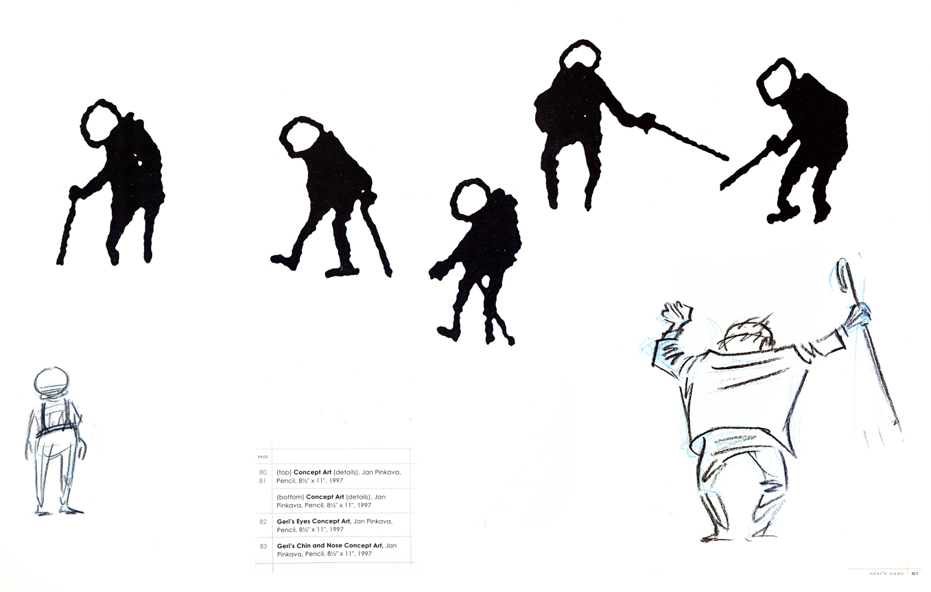
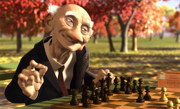
The gesture drawings done for Geri’s Game present an excitement
that seems distant from the final film, pictured below left.
 This brings me to my problem with the book, I’m not a big fan of the films. Pixar is a big studio, doing the top of the line work in cg animation. Toy Story, The Incredibles, Ratatouille can’t be beat. The shorts, especially the later ones are just not very good – in my opinion.
When a studio with the enormous abilities of Pixar chooses to do shorts, there has to be a reason. We’ve heard that the reason was to help develop talent so that future directors could stretch and grow. This is a good reason, but the shorts have to either showcase a high quality or a sense of experimentation that isn’t evident. When Disney did shorts back in the 30s so that his animators could learn and grow, the films were made to sell, but they had a level of expertise that we came to expect from Disney. Some of those Silly Symphony shorts have not been topped.
Looking at those beautiful drawings, above, for Geri’s Game, we see the potential for something alive and vibrant. The film is, for me, difficult to watch. It is the antithesis of those drawings. Perhaps they were working out some cg problem, but that’s really irrelevant to audiences.
Pixar’s current film short, Presto, isn’t represented in the book. (The 2D short, Your Friend the Rat is also not included in the book.) It aspires to outdo Tex Avery at his own game. But it doesn’t; t doesn’t come close. There’s no character animation that I can see – both characters move identically. There’s no character development that I see – both are cartoon characters with no personalities; only their motivations are different.. The timing is dreadful; the film moves too fast in its animation and in its cutting. Maybe you’d call that experimentation, but I call it bad film making. Of course, this is just my opininon. Many people love the short, and it may win the Oscar next Sunday.
A beautiful drawing from one of the finer shorts by Pixar.
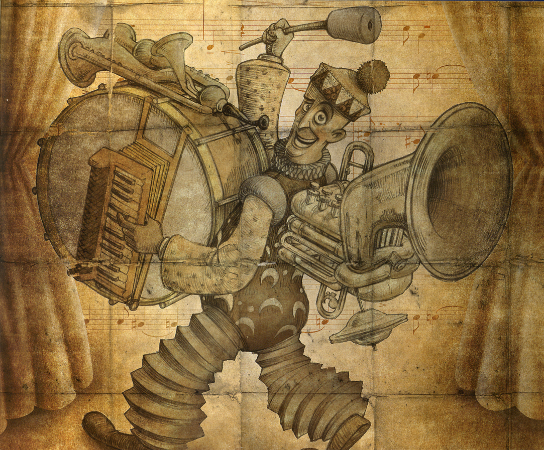
Yes, other shorts are better. One Man Band has delightful animation of the two musicians, but it also has the cloying, clichéd animation of the child which seems to come right out of the most obvious of Bluth. However, the score for this short is incredibly good.
Luxo Jr. is the finest of their shorts. It’s a beauty. Well designed with strong character animation. The fact that cg animation hadn’t been well developed at the time was irrelevant. The short did what it should have; it told a simple story, introduced a strong character and entertained audiences. It hasn’t lost that appeal, but I think Pixar may have.
I don’t have enormous hope for the cg films of Dreamworks unless some strong director can compete with Jeffrey Katzenberg’s insensitivities. I do still have hope for Pixar, and I’d like to see them do something with these short films. The Disney short, Glago’s Guest, though not perfect gave me great hope for the other Disney lot.
So, I’ve come a long way to say I prize this book for the graphics, many of the images chosen, the author, Amid Amidi’s sense of design and strong knowledge of the medium as well as an ability to articulate that information well. My only problem is the subject of the book. I’ll keep looking for everything Amid’s done, and I’ll continue to collect his books. They all have a lot to offer and fill an important part of my collection. They all are beautifully designed and every small detail is carefully watched. I’m ready to buy his next book.
Animation &Animation Artifacts &Disney 16 Feb 2009 09:05 am
Tytla’s Snow White
- Here are a couple of drawings by Bill Tytla done for Snow White. They’re, all three, beautiful drawings, and I enjoy looking at them. They’re worth posting.
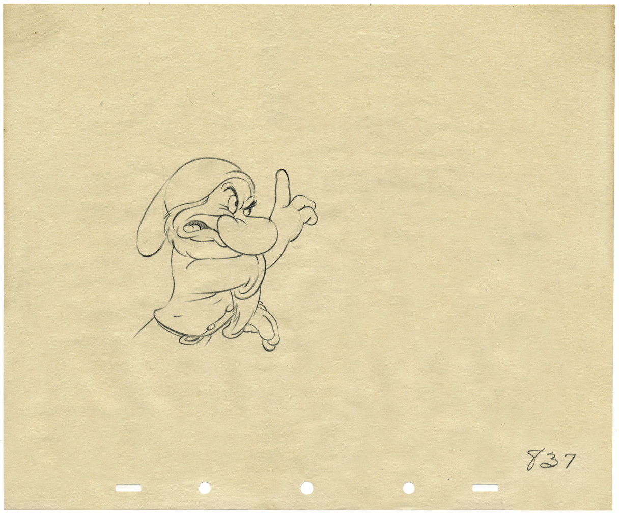
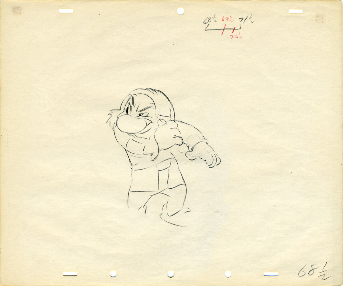
A wonderful drawing of Grumpy warning Snow White to look out for strangers.
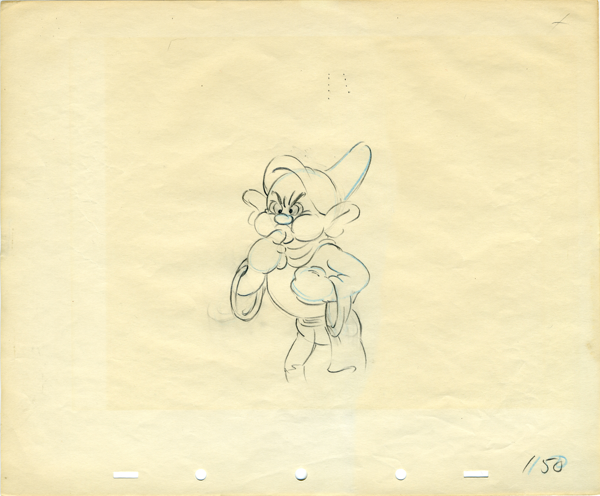
Dopey blows water out his ears.
Here’s a link to another post I did on this.
Photos &SpornFilms 15 Feb 2009 09:03 am
Snark Photos
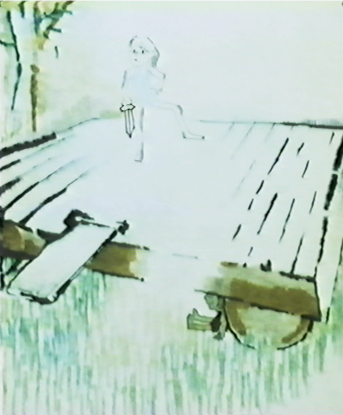
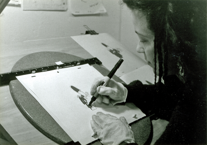
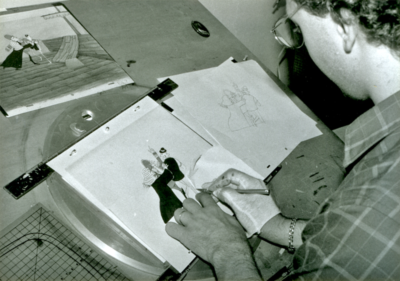
- I fell upon some photos I haven’t shared and thought I would. They were taken back in 1989 when we were in the last push to finish The Hunting of the Snark. All of the pictures seem to be posed since much of the art those coloring was done years before.
For much of the time this film was animated by me and then colored by me, in between projects. Then in 1989, with a small grant from AFI, I received enough to finish the film, and we rushed to the end. About a half dozen of us picked up the remaining coloring before we had to get into the next half hour show.
Bridget Thorne did the storyboard with me back in 1980. We didn’t finish the film
until 1989. She also painted the backgrounds for the last third of the movie.
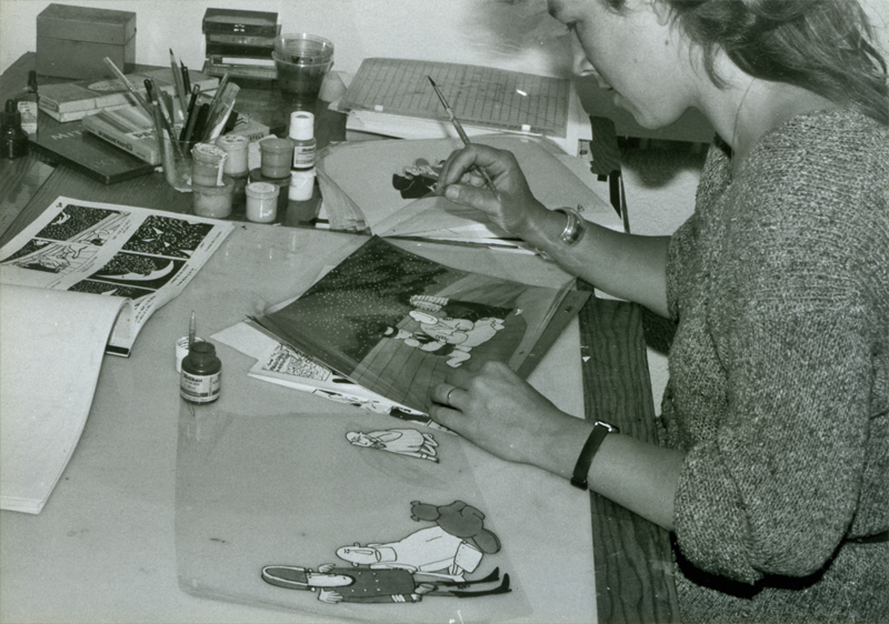
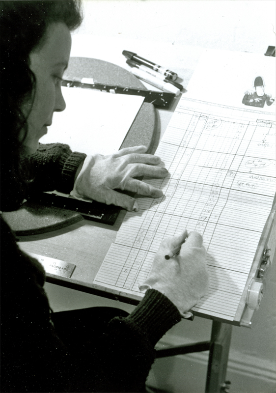
Lisa Crafts inking a cel from the film. The cel comes from the,
first scenes of the film, so I actually did this one, myself.
(left) Lisa consults with the exposure sheets for a scene.
(right) This is one of the many backgrounds that Bridget painted.
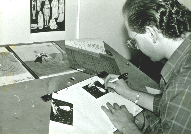
Steve Dovas is coloring a scene that I actually did in the early days of
the film. The scene was done on a 3 field (very small artwork) looking
for the images to distort a bit when they were blown up. It’s one of my
favorite parts of the film.
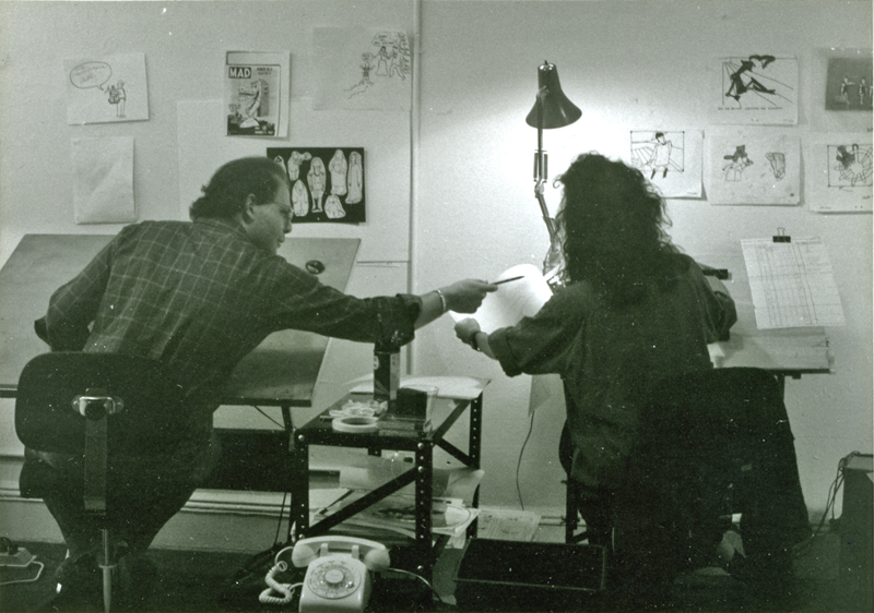
Steve and Lisa sat alongside each other in that studio on
38th St & Fifth Ave. It was a great space.
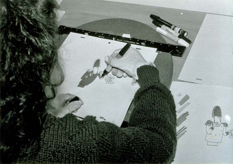
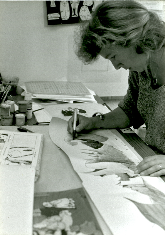
A closer photo of Lisa at work on the Bellman.
Steve posing with some early artwork from the film.
I don’t know if these pictures were ever used for anything, but
I love all three of these guys and enjoy sharing these early pictures.
Thanks to Kit Hawkins who took all of these photos while working there.
She helped produce Santa Bear for me and ran my studio for a while.
