Monthly ArchiveJuly 2012
Animation Artifacts &Books &Comic Art &commercial animation &Models 11 Jul 2012 05:37 am
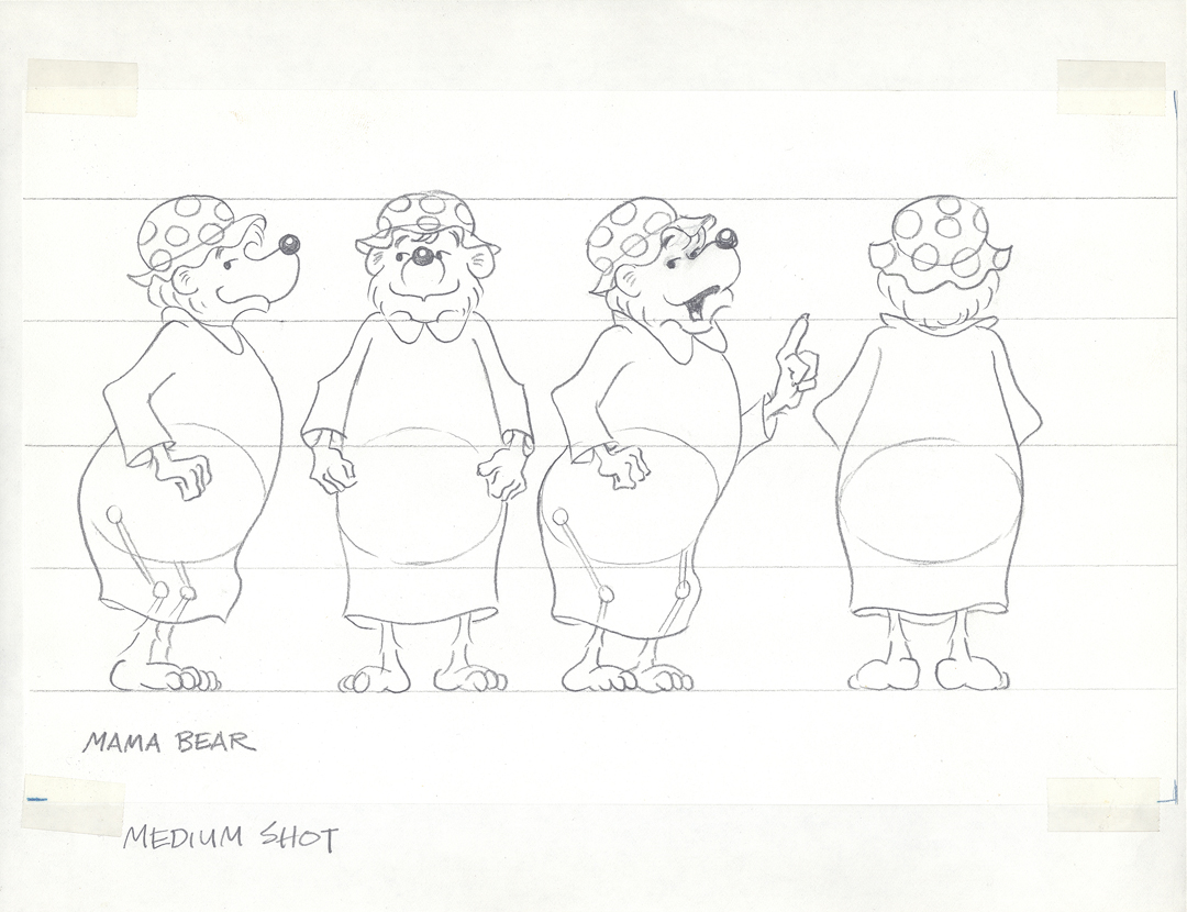
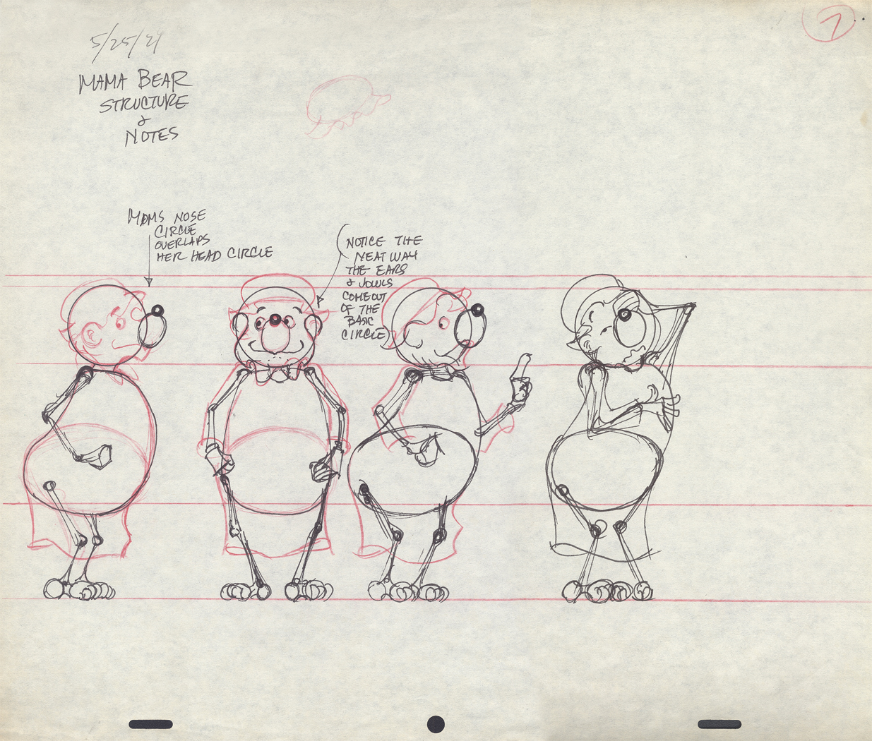
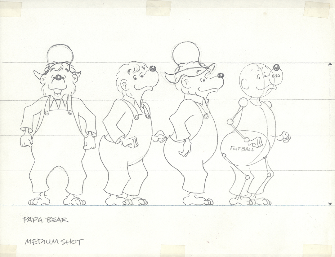
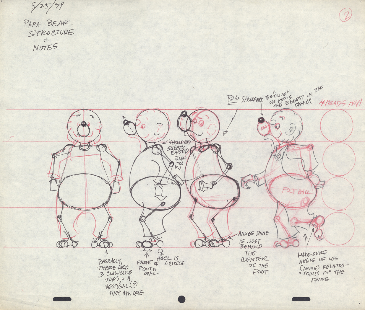
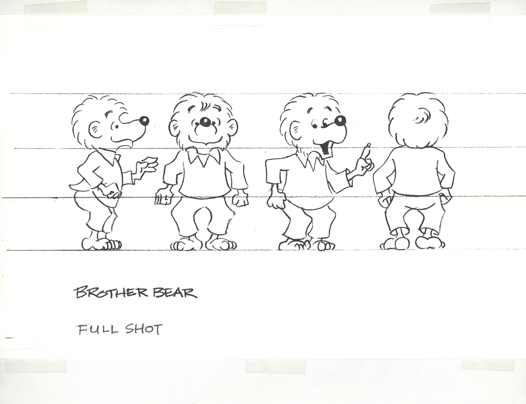
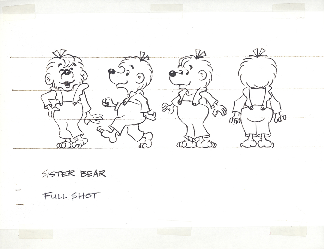
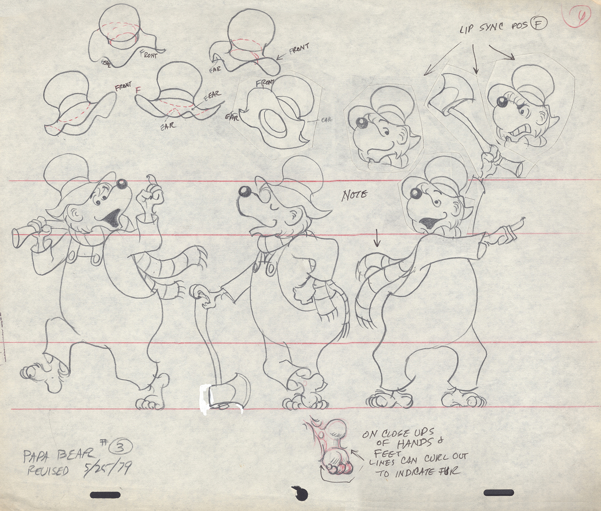
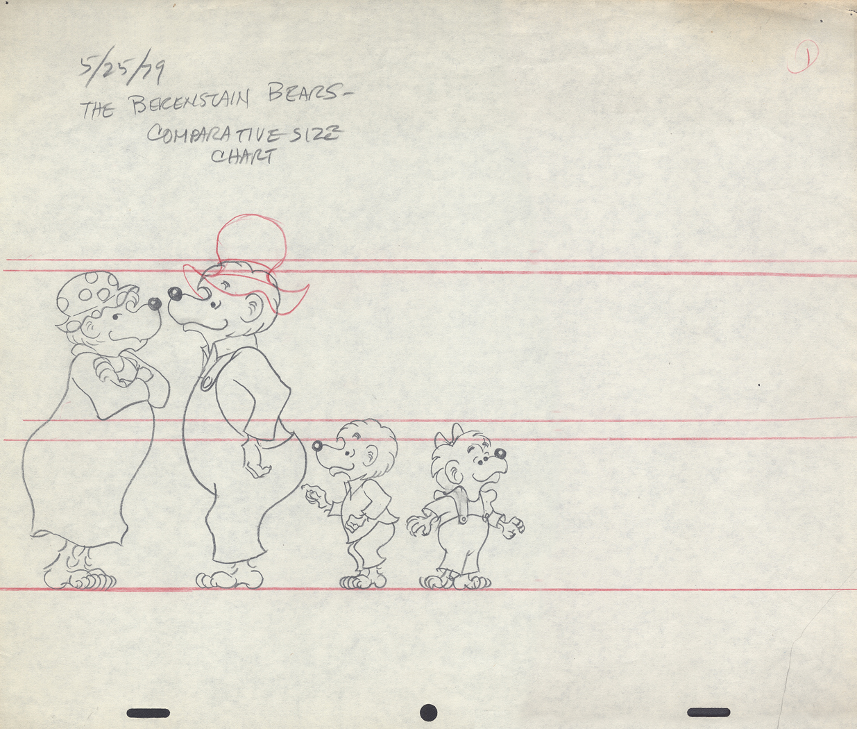
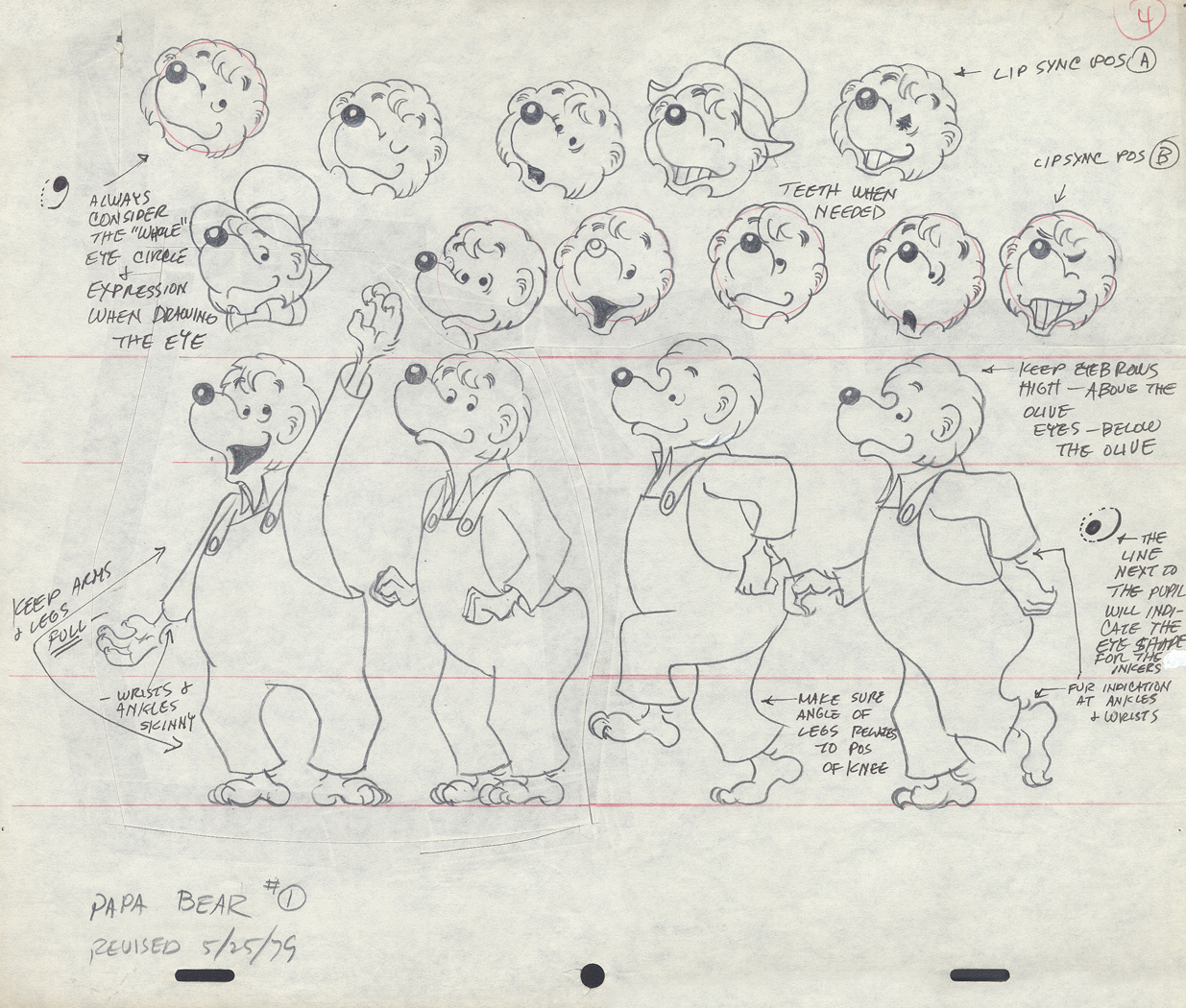
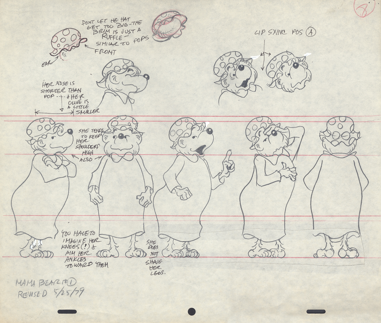
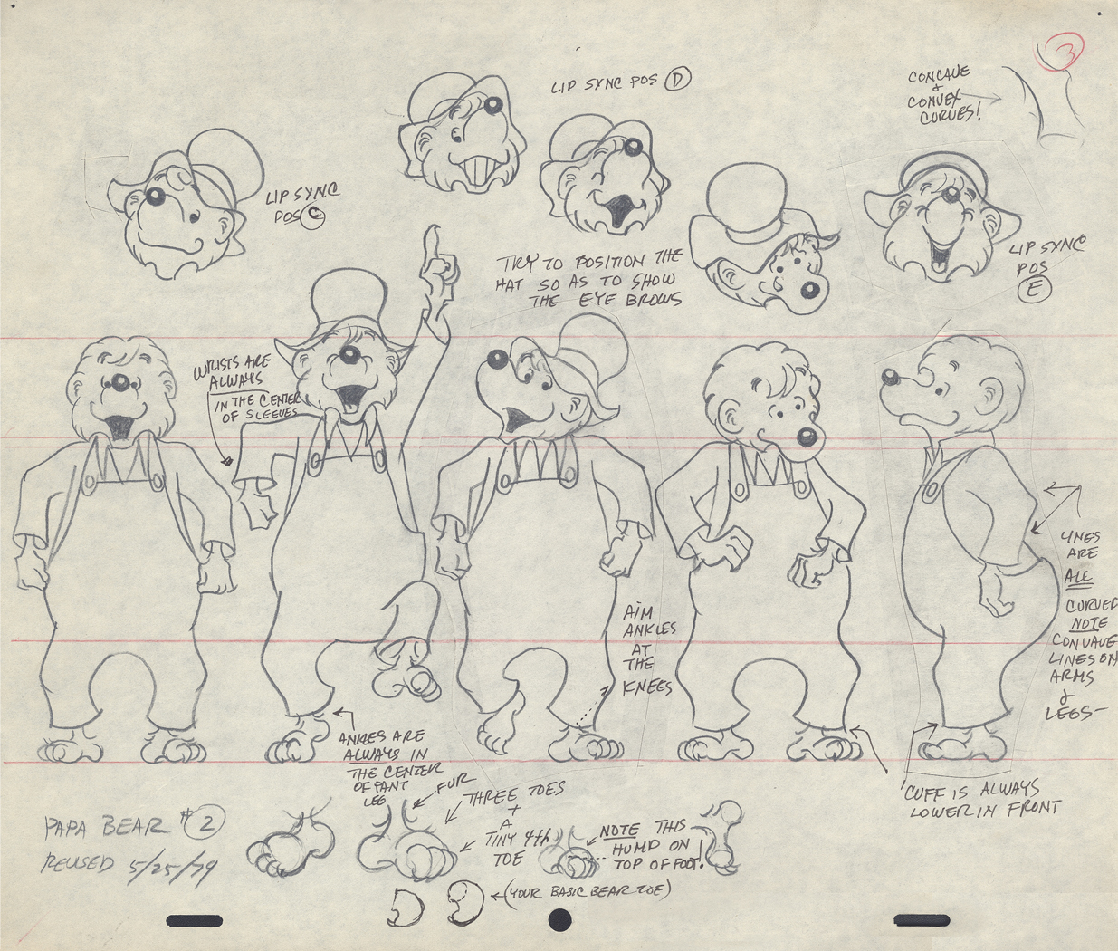
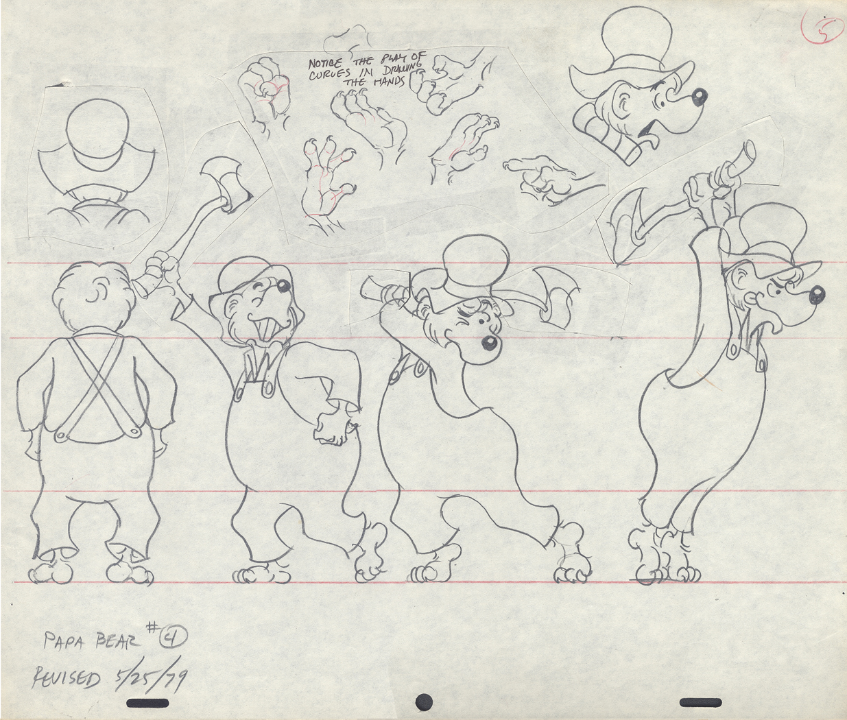
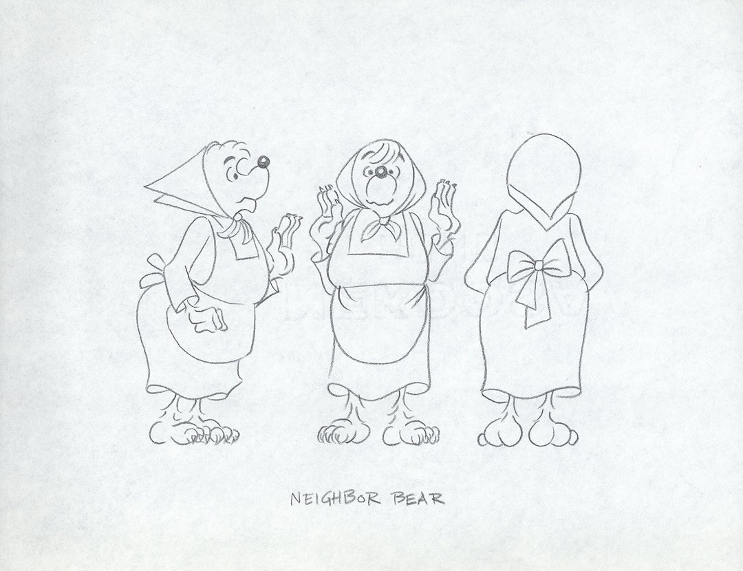
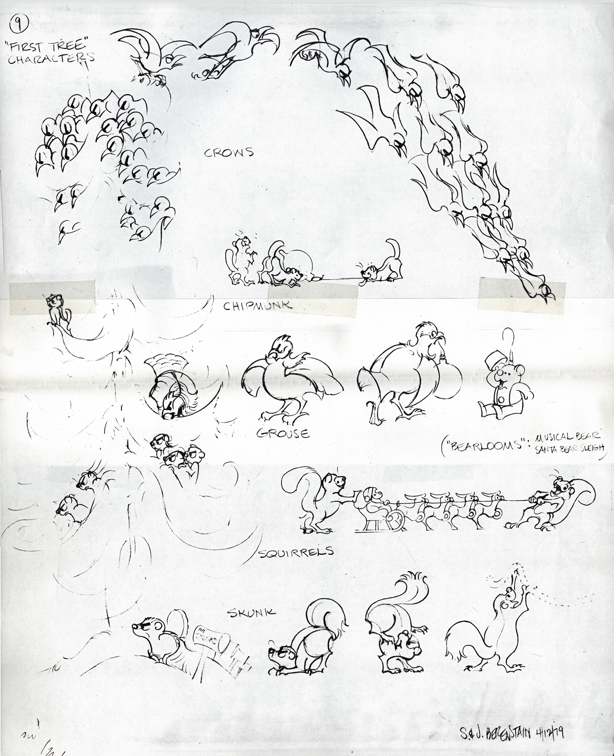
Berenstain Bear Models
- From Vince Caferelli‘s collection, this week we jump to his years at Perpetual Motion Pictures. The first Berenstain Bears Special, Berenstain Bear’s Christmas Tree, was done for NBC in 1979 and was followed by another four. This was a very successful half hour made from the comic strip which was created by Stan and Jan Berenstain. They wrote the original TV special which was directed by Mordecai Gerstein, Animated by Vinnie Bell, Vincent Cafarelli, Jack Dazzo, Lu Guarnier, Jan Svochak and Fred Mogubgub.
The Asst. Director was Candy Kugel, and the Bgs were done by Linda Daurio and Cotty Kilbanks.
Here are the model sheets which were drawn by director, Mordi Gerstein, and animator, Jan Svochak, from original drawings by Stan Berenstain. These, for the most part, are original pencil drawings of those models.
 1
1
 2
2
 3
3
 4
4
 5
5
 6
6
 7
7
 8
8
 9
9
 10
10
 11
11
 12
12
 13
13
 14
14
 15
15
This ic a copy of a model digned by the Berenstains.
____________________________________
This is the half-hour Special as it appears on YouTube.
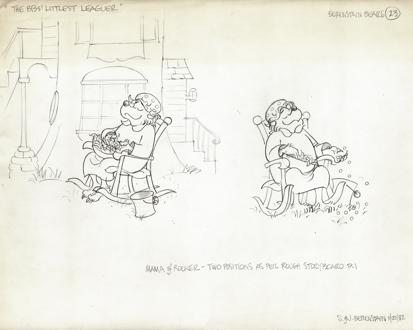
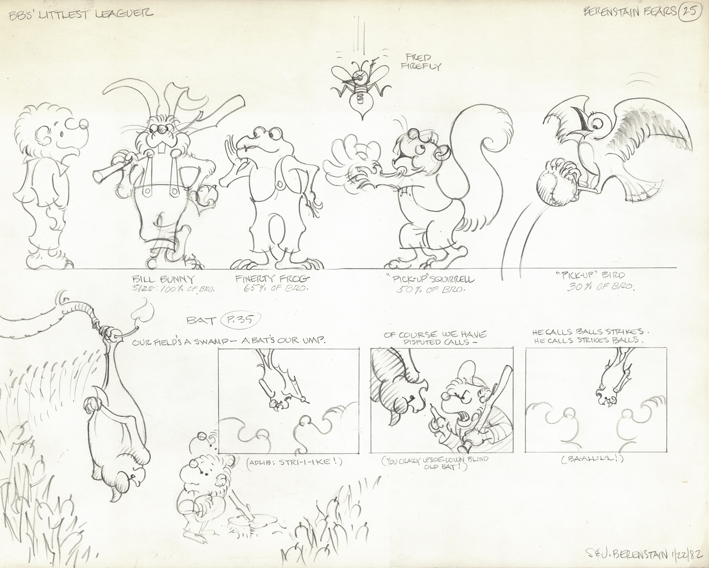
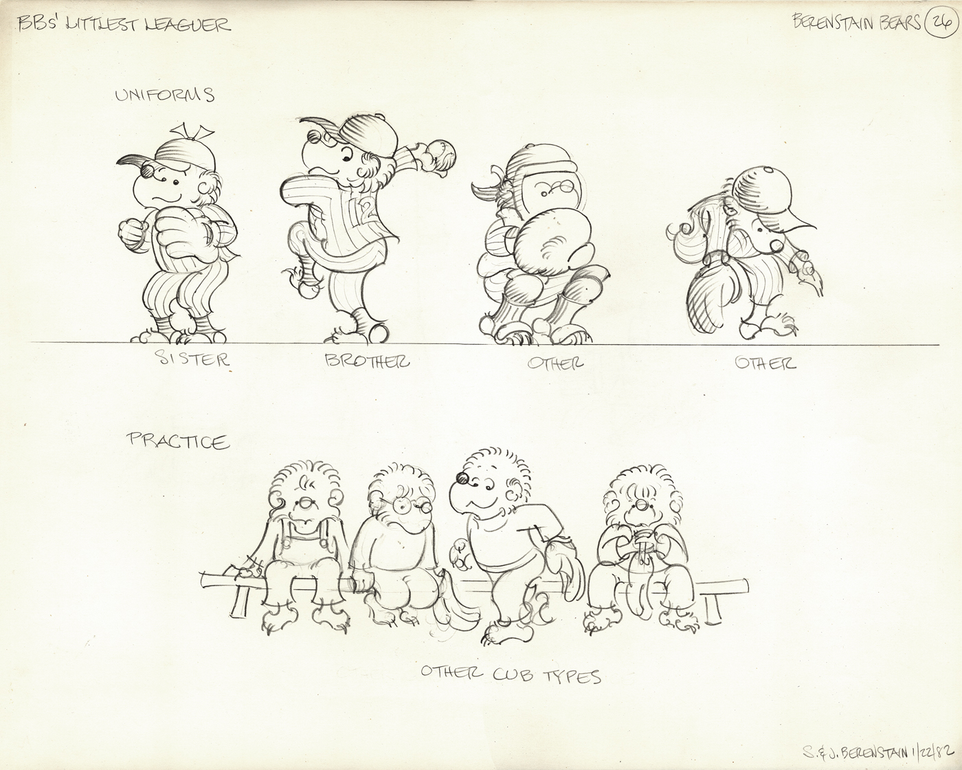
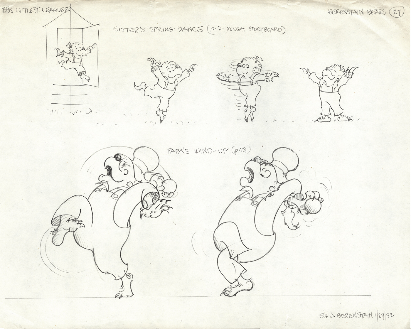
The next four models come from a later show, “The Berenstain Bears’ Littlest Leaguer.”
All are original models signed by the Berenstains.
Articles on Animation &commercial animation 10 Jul 2012 04:33 am
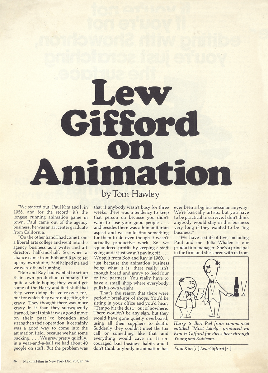
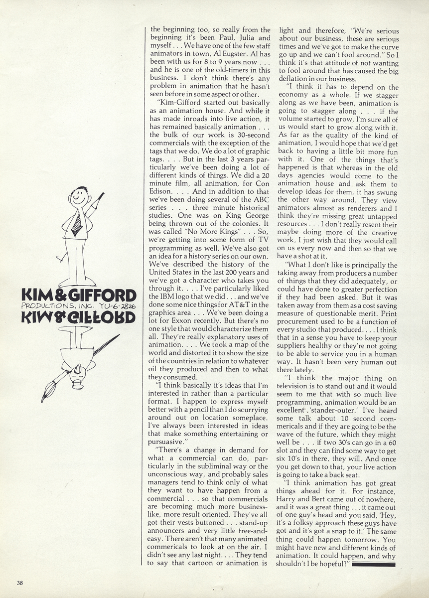
Gifford on Animation
- The Gifford Studio, in NYC, was one of the prime boutique shops for animation from the 50s through the 80s. The studio was formed in 1958 to service Bob and Ray who hoped to dominate the Bert & Harry Piels Brothers account. Eventually, they came to feel as though there were too many bosses, and they separated. Eventually, the studio became Kim-Gifford Studio, and they continued to operate primarily as a commercial producer for many years.
Al Eugster was the permanent/on-staff animator through many of those years. You can see more photos of him at Mark Mayerson’s vital website: Eugster’s Photo Album.
I recently found this article among Vince Cafarelli’s collection of artwork. resumably, though this article was not when Vince worked at Kim-Gifford where he did the Emily Tipp series, he was interested enough to hold onto the piece. The article is from Making Films in NY, Dec.75 issue, and thought it interesting enough to post.
 1
1
 2
2
 3
3
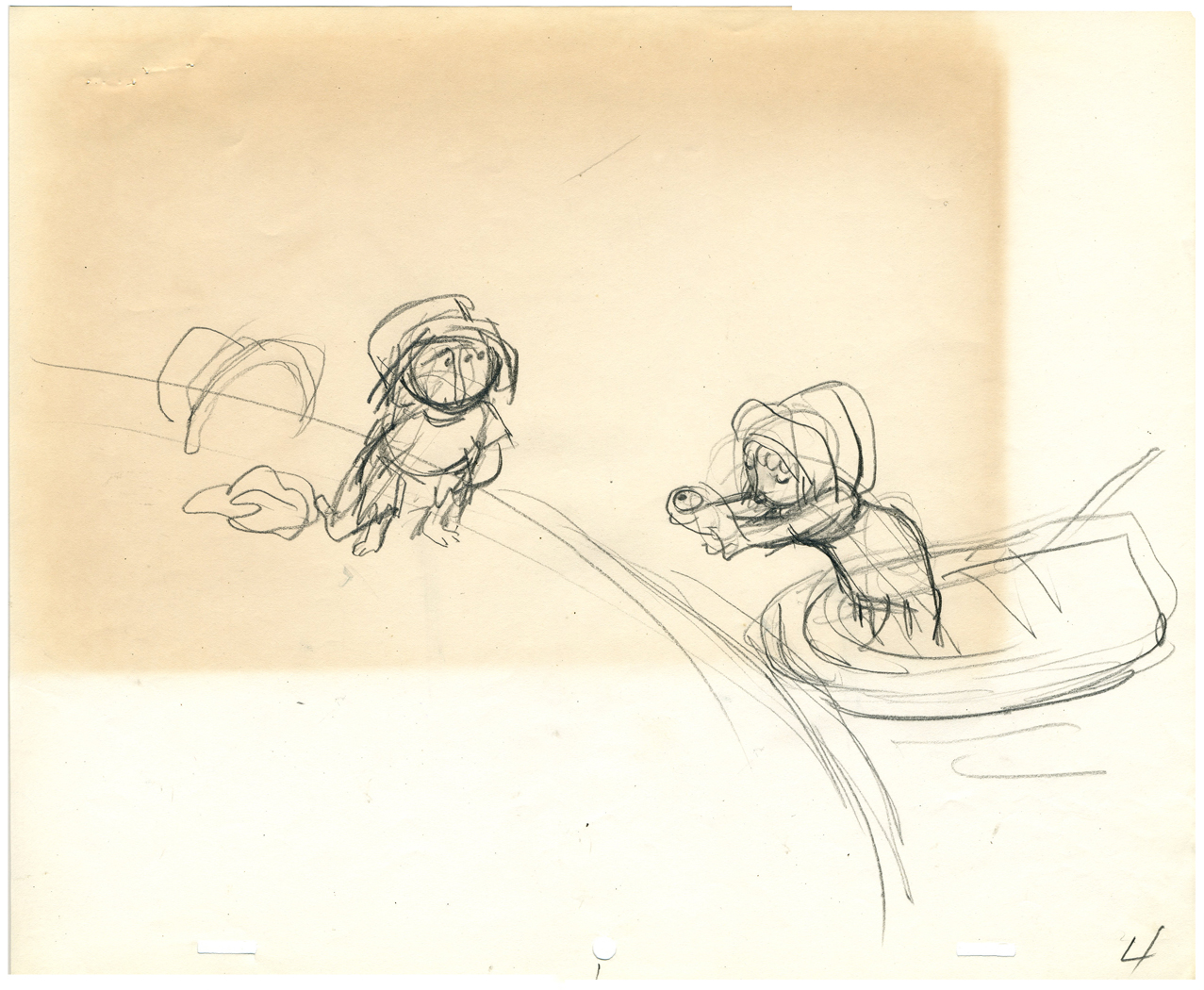
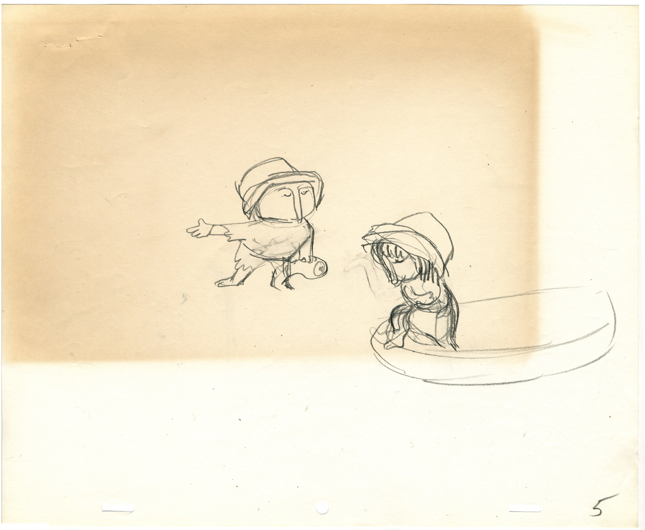
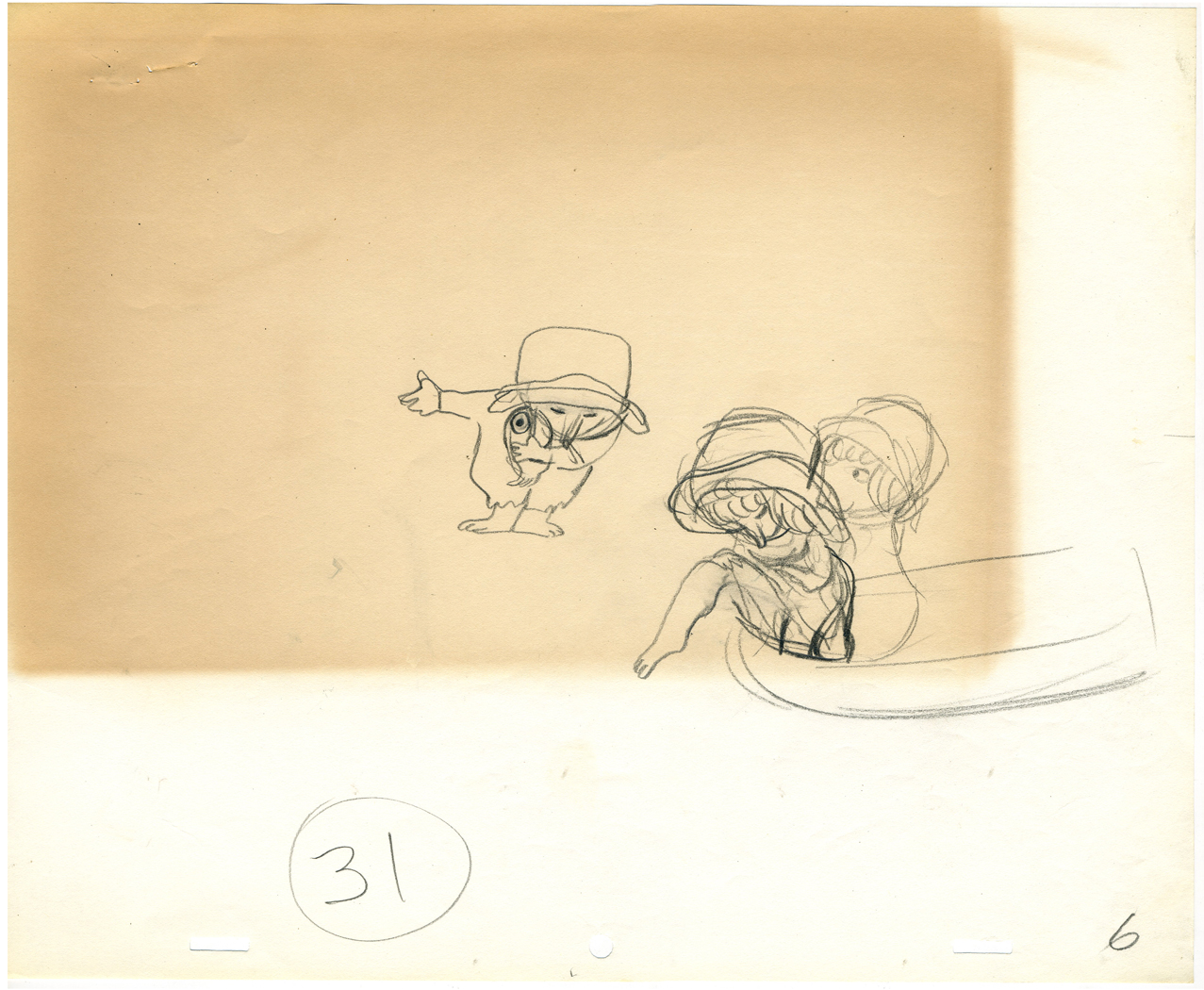
Action Analysis &Animation &Animation Artifacts &Frame Grabs &Hubley &Independent Animation &Layout & Design &Tissa David 09 Jul 2012 05:24 am
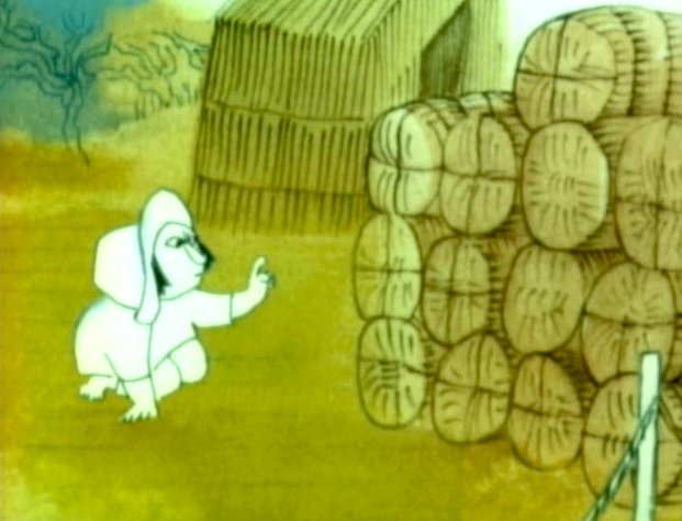
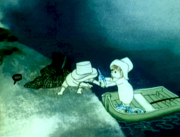
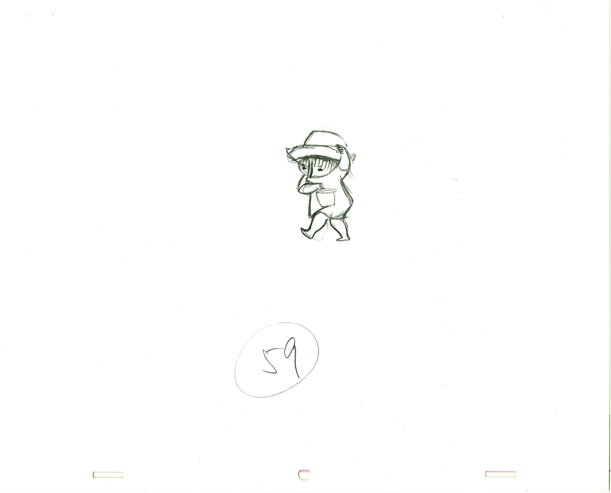
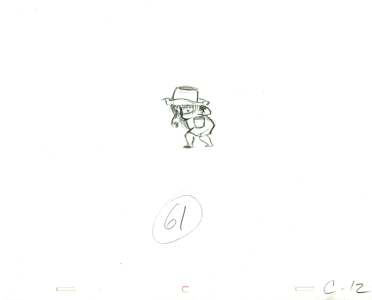
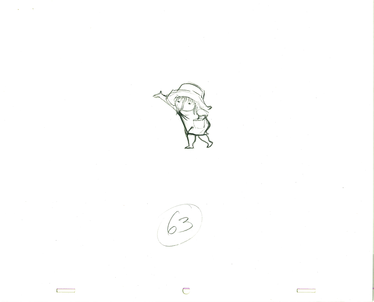
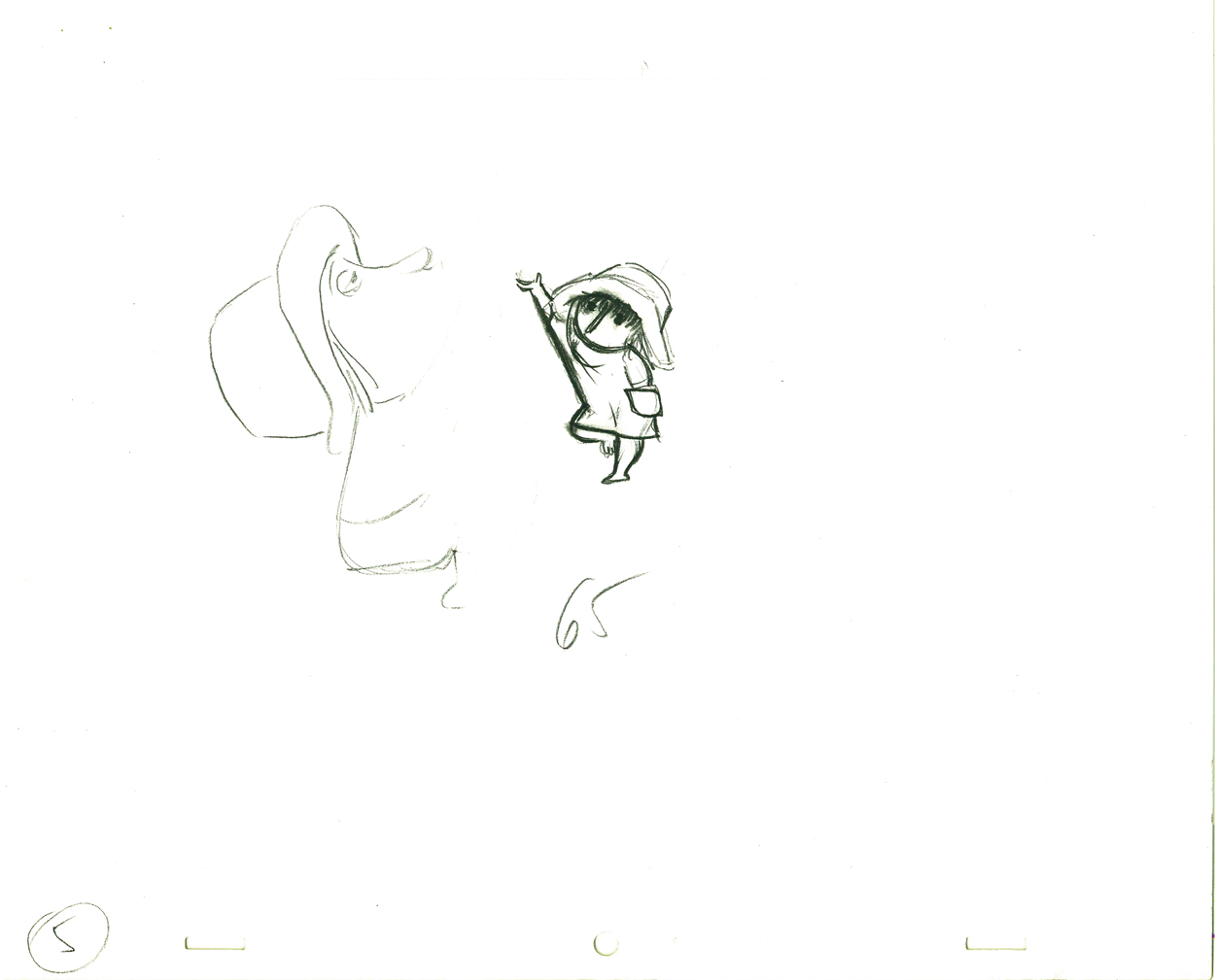
Of Men & Demons – Redux
 – Since first seeing the Hubley short, Of Men & Demons, back in 1967, I’ve been a fan. The artwork was stunningly different and original. It had a rich tone to it and some beautiful Hubley Bgs. The music by Quincy Jones was as original as the film, itself.
The short was actually an industrial film done for IBM to explain the binary code to its employees. The Hubleys, however, built on that story to make something of a personal film that received an Oscar nomination.
(Click any image on the page to enlarge.)
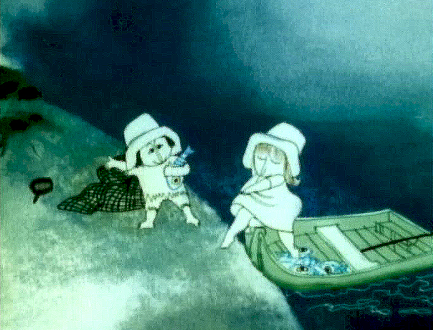
Art Babbitt was one of the first animators hired. At some point, Tissa David was brought on to rework some of Babbitt’s beautiful animation. Unfortunately, it was on about fourteen levels and had to be combined and reconstructed and shortened. (Today, of course, there are no limits to levels, but in the days of the camera you kept things to 4 cel levels, as a rule, and never more than 5.) It was complicated by the fact that John Hubley had decided to shorten the piece, and Quincy Jones’ score was shorter than Babbitt’s animation. This chore took some effort and involved dissolve animation. Tissa then continued on the sequence animating the little protagonist and his female companion through the remainder of the film.
About 25 years ago, Tissa David gave me an envelope full of art from this film, and going through a lot of my old material recently, I came upon that envelope.
 3
3 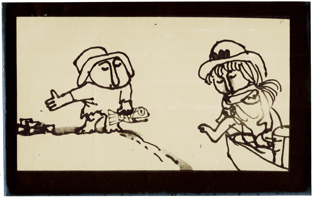 4
4
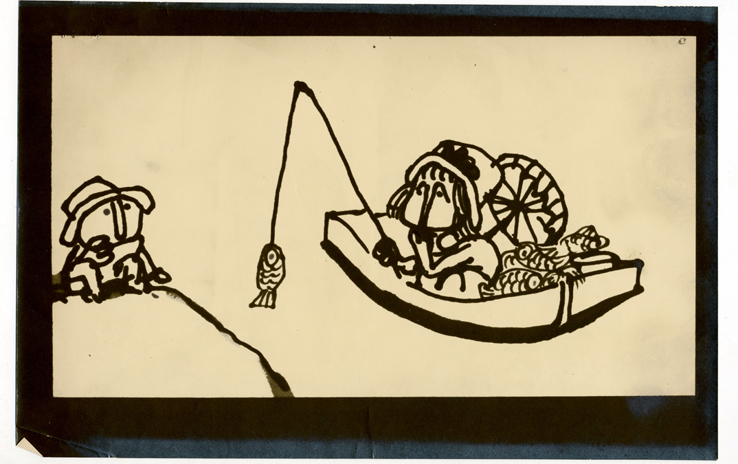
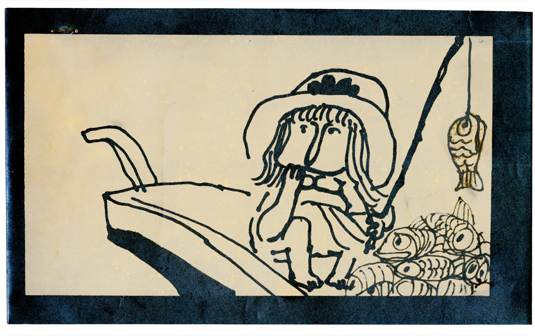
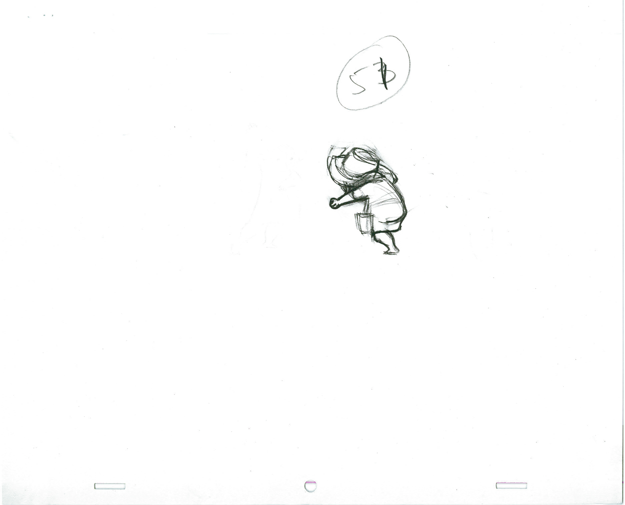
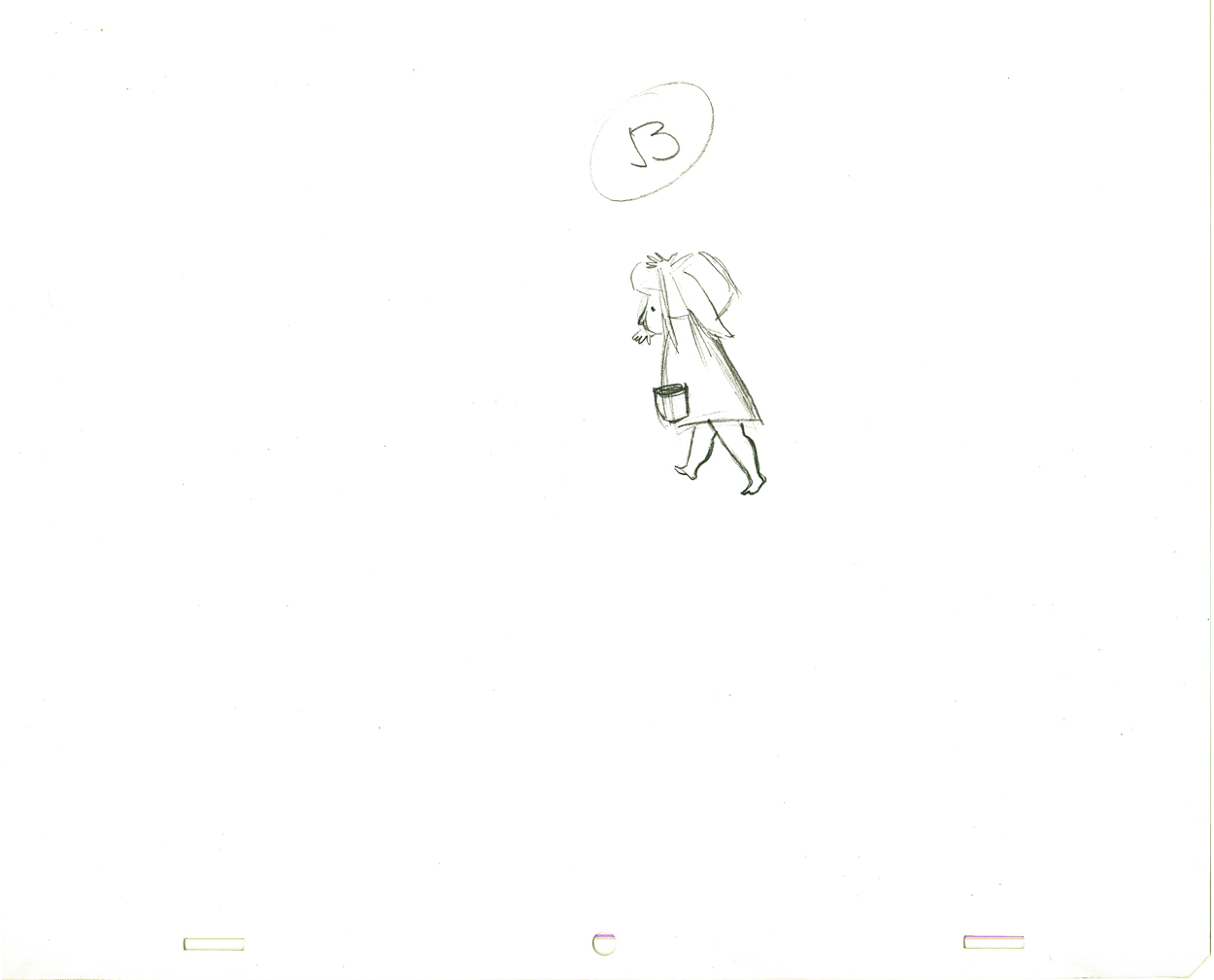
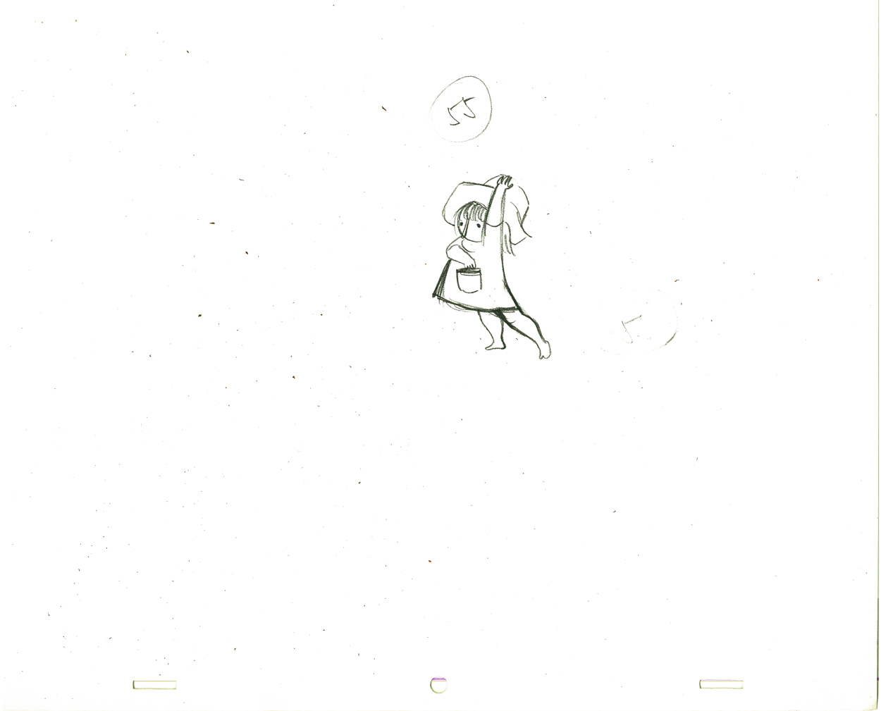
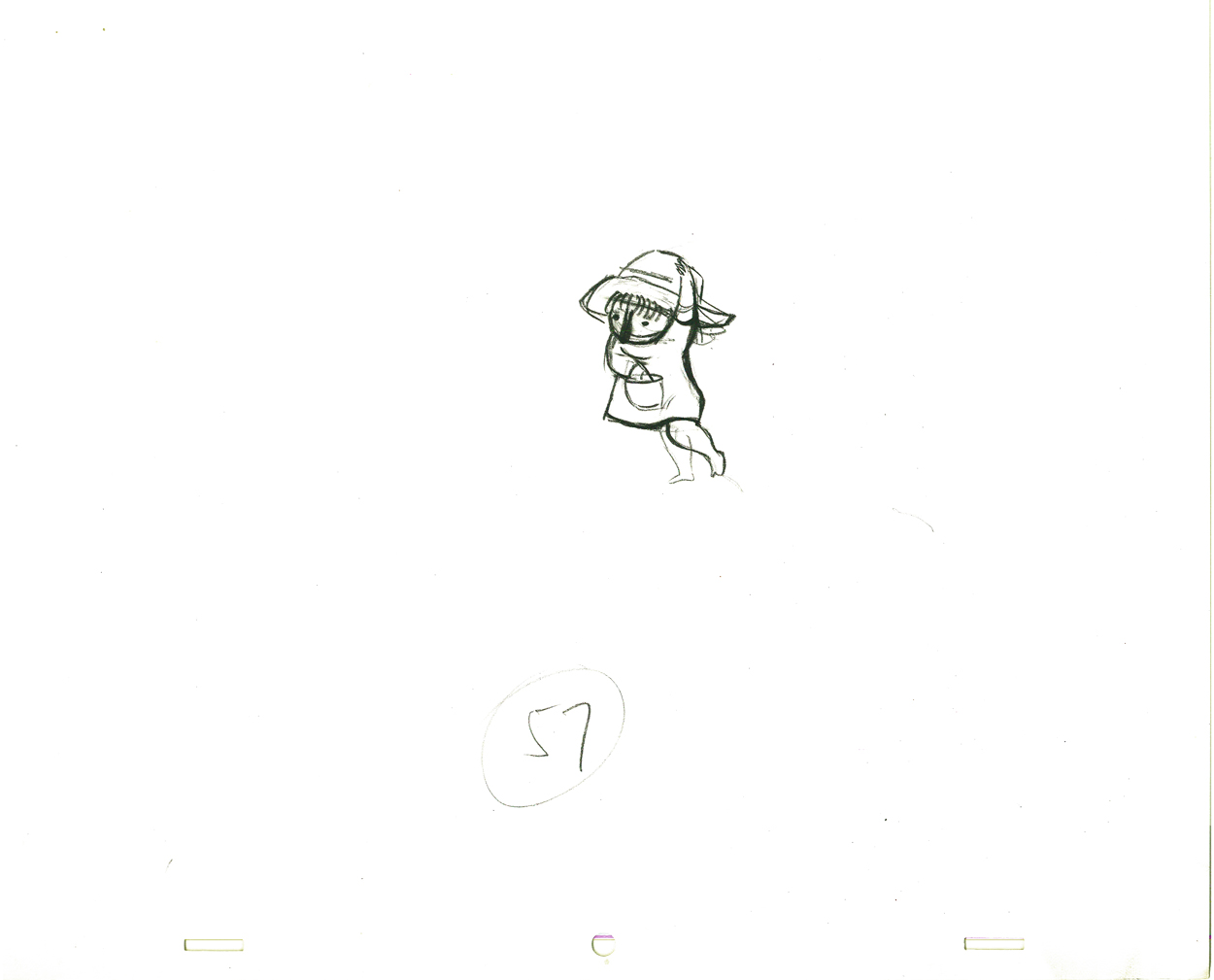
These are storyboard drawings for a short sequence. Tissa got these drawings and prepared Layouts for the sequence. You can see how much is actually in John’s drawings so it’s easy to build on what he’s given you.
 1
1The following are key drawings Tissa prepared for the sequence in laying it out.
.
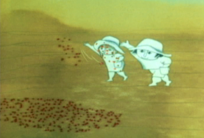
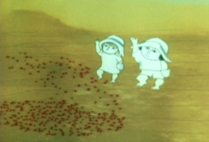
Here is a short piece that Tissa did of the little woman character seeding her front yard. There’s so much grace in every one of these drawings and enormous information in the walk, itself.
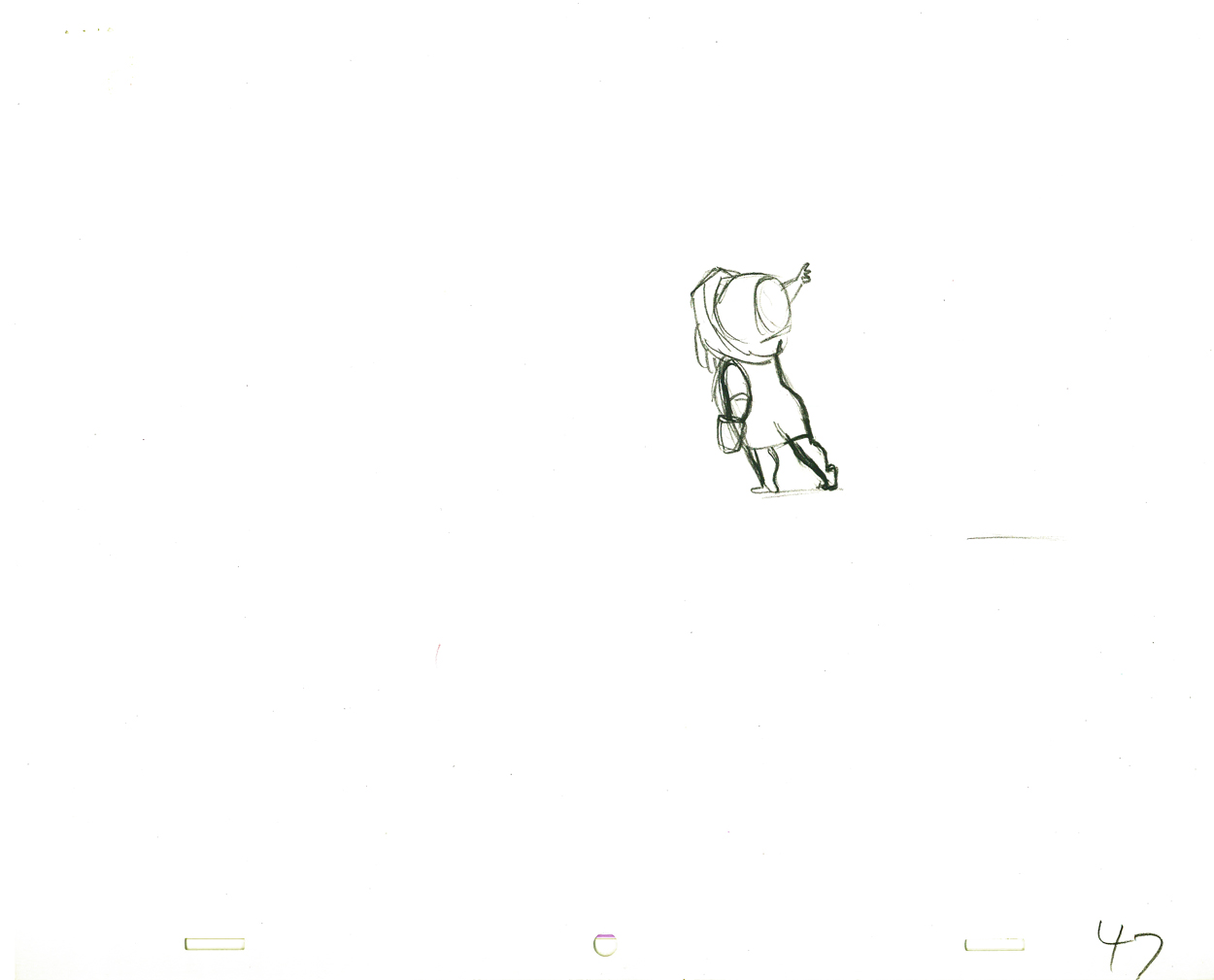 G47
G47(Click any image to enlarge to full animation sheet.)
.
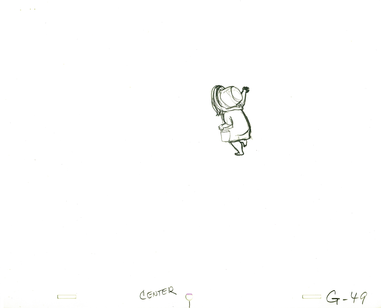 G49
G49.
 G51
G51.
 G53
G53.
 G55
G55.
 G57
G57.
 G59
G59.
 G61
G61.
 G63
G63.
 G65
G65.
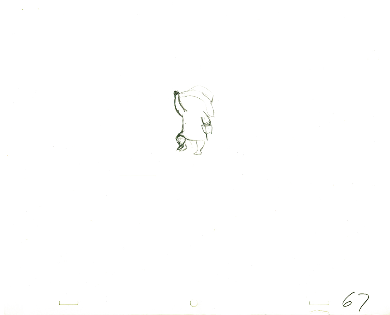 G67
G67.
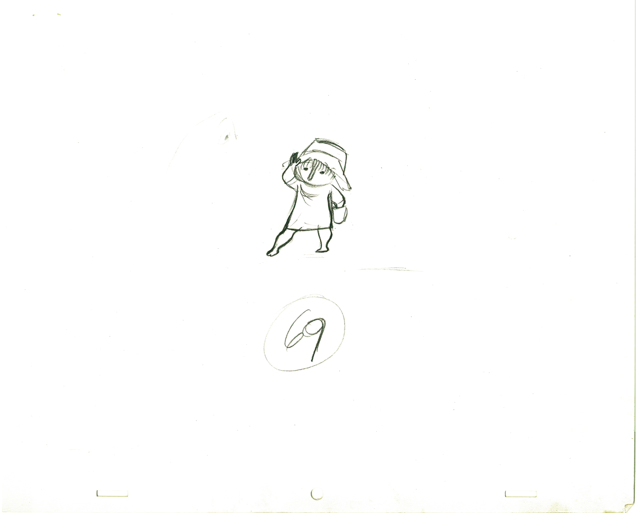 G69
G69
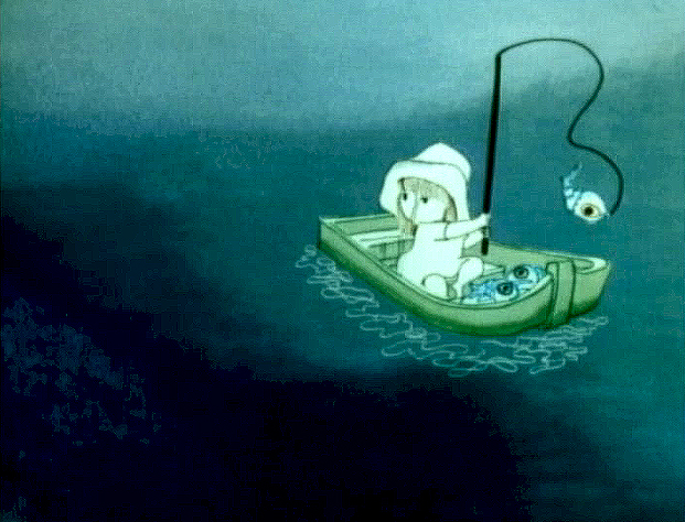
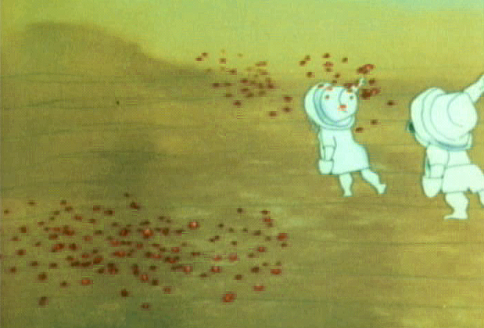
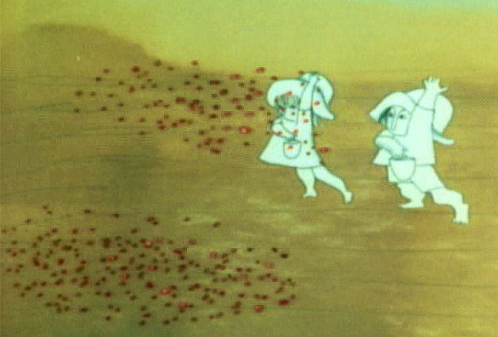
And here are the matching frame grabs from the film.
 47
47 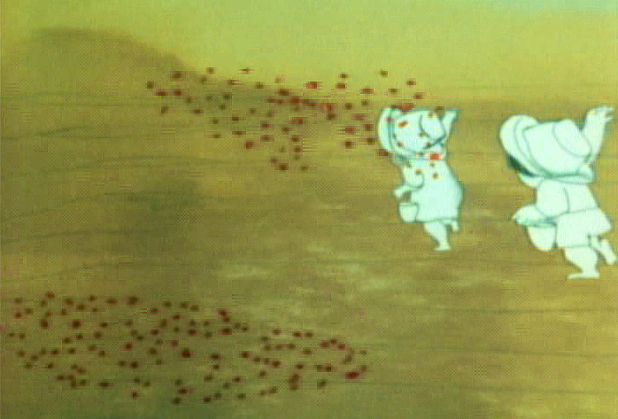 49
49
51 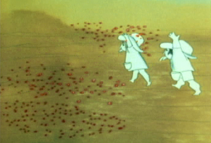 53
53
 55
55 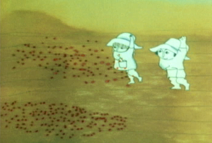 57
57
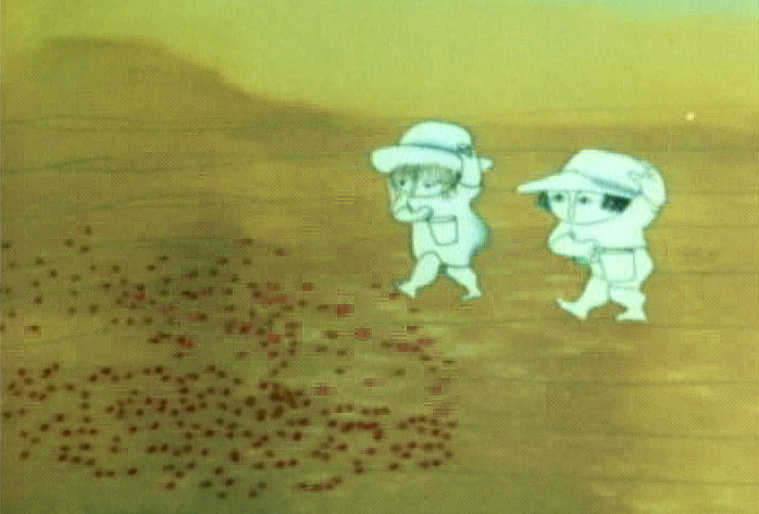 59
59 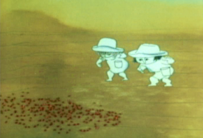 61
61
 63
63 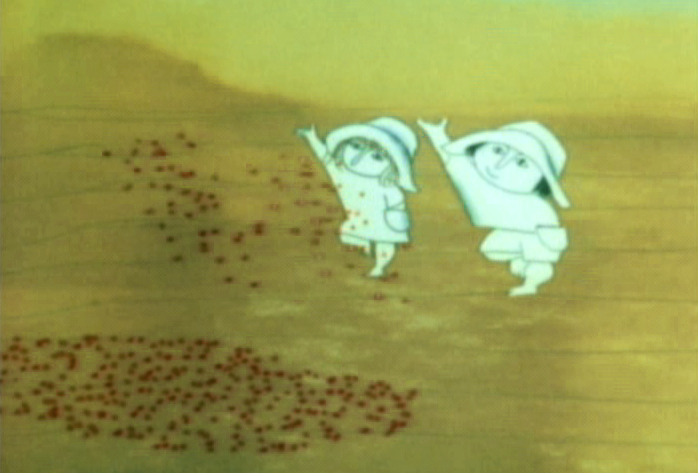 65
65
 67
67 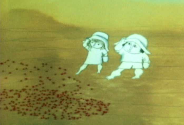 69
69
.
Seeding crops PT & Final Color
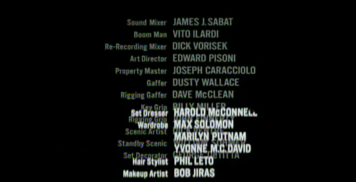
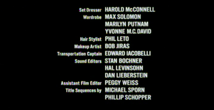
Animation Artifacts &repeated posts &SpornFilms &Title sequences 08 Jul 2012 07:05 am
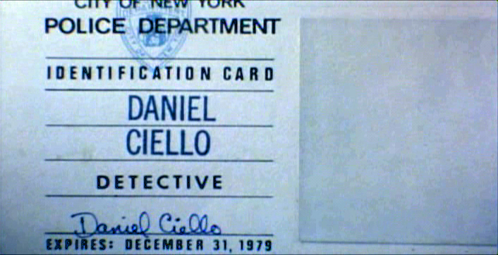
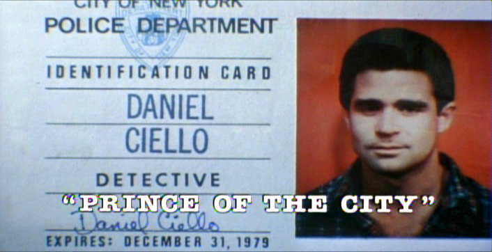
Prince of the City – recap
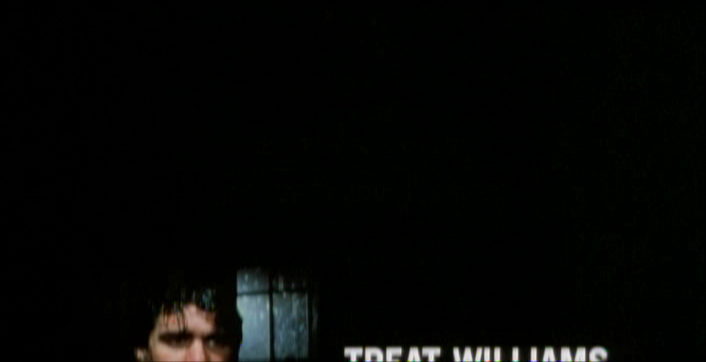
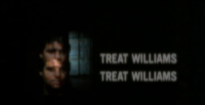
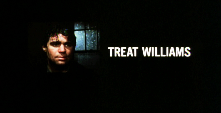
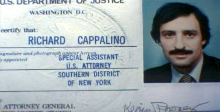
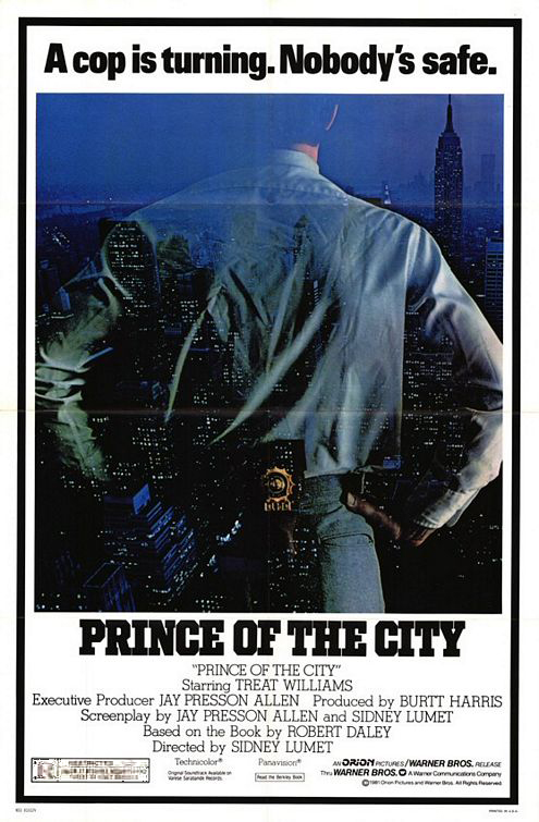 - One of my studio’s very first jobs was to do the titles to a big Sidney Lumet feature film, Prince of the City. (Feb, 1980) The film was a hard-nosed crooked cop drama brilliantly directed by Lumet. The problem it had was that few of the actors in the large cast were known, and the audience was having a recognition problem. Treat Williams was in his break-out role and the only other identifiable actor was Jerry Orbach.
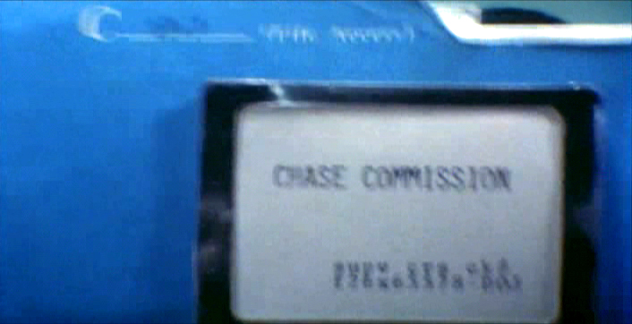
I was hired to ID all of the cops, lawyers, good guys and bad with what-looks-like live action identification cards. I also did title cards throughout the film, breaking it into chapters. Finally there were the end credits (no opening credits.)
I pulled in a friend and film genius, Phillip Schopper. Together we shot the actors with Polaroid film trying to make the photos look a bit cheesy, as the real items would. Phillip took the Polaroids and doctored them to our needs. Treat Williams, for example, had moved onto another film and came back only for these photos. His hair was now jet black for the new movie, so Phillip had to recolor his hair in the doctoring (in those years before computers.) Jerry Orbach had a blemish on his lip that he wanted retouched. There were plenty of little things to deal with on the photos.
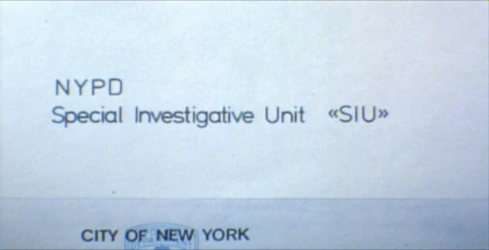
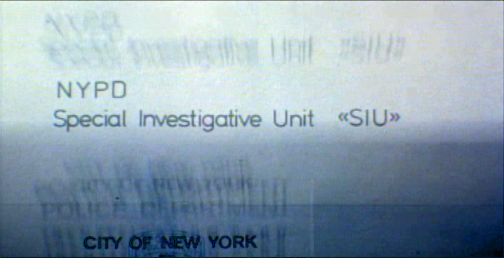
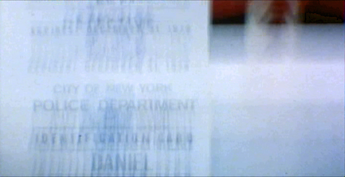
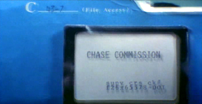
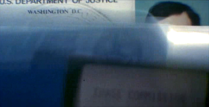
I had to locate the real identification cards (NYC police dept, NYState Supreme Court judges and DA’s, etc.)
Then I had to forge them. I worked with a printing shop in NY that didn’t ask questions. We chose to actually print the cards as if they were done via mass production so that they would look authentic. The cards should have that slightly embossed feel as if the letters were pressed into the card stock. (Printing these days has the type laying on the paper without pressing into it.) I also had to find appropriate paper and laminating machines to get the actual look of these cards. This was all done before the wide use of computer technology.
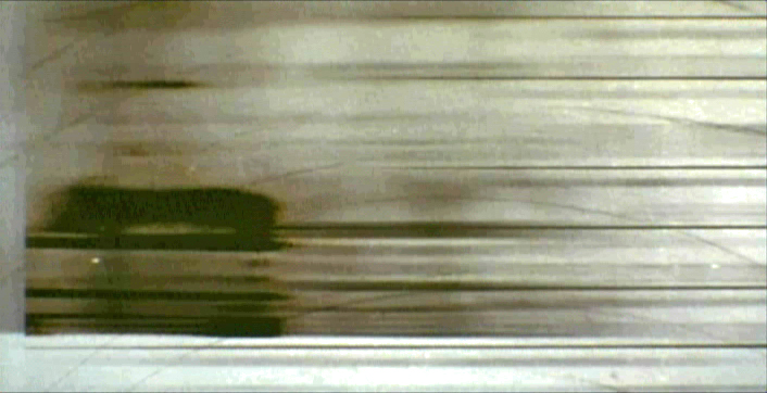
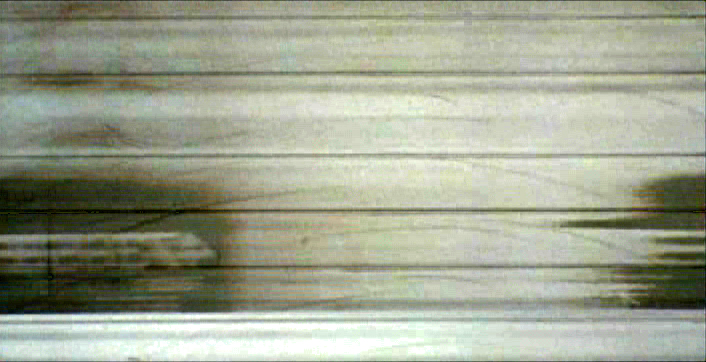
We had to film the sequences.
We worked with animation cameraman, Gary Becker for about a week and took over his Oxberry. We built miniature sets to hold the ID cards at odd angles, and we relit the cards with shadows built in. We wanted these cards to have a gritty reality to them that an animation stand didn’t generally offer.
The cards were animated moving as if a machine were printing them or a folder were being opened or papers were being tossed aside. This involved a lot of work getting out-of-focus images in the animation. When a folder opens, it moves in soft focus. The folder will pick up the top sheet and let that drop back again. We had to manipulate this all in stop motion to get it to work properly.
(Click any image to enlarge.)
 2
2 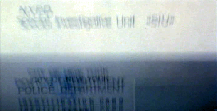 3
3
 4
4 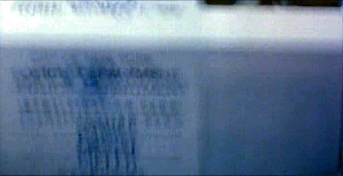 5
5
 6
6 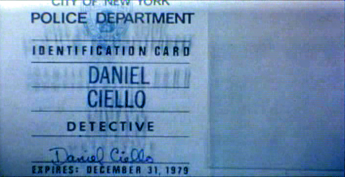 7
7
 8
8 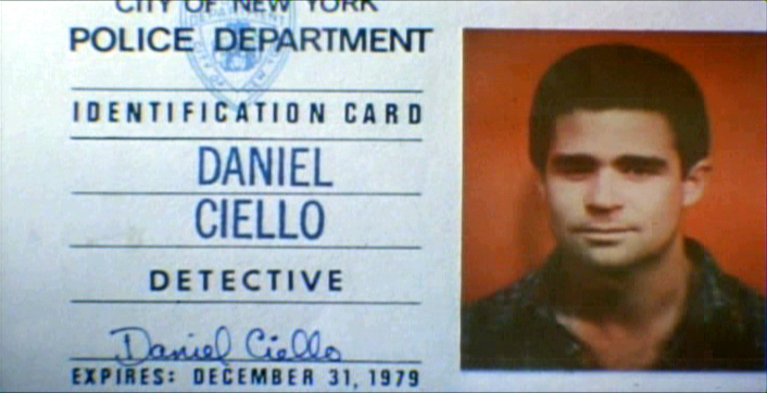 9
9
 10
10
These cop cards (about five of them – one for each
of the five cops) appear twice. Once for the new enthusiastic cops.
Another for the tired and jaded cops.
There were about 8 insert sequences about a minute each.
When it came time for the end credits, we chose to include photos of the actors with their names so that people would be able to recognize them from the film, without having to have had to memorize their characters’ names. We pushed these cards up as if a machine were printing the titles, a card at a time. The cards had to move in out-of-focus, as well. It was long and arduous shoot.
 2
2 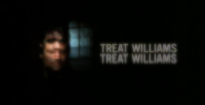 3
3
 4
4
All of the credits came up at varying speeds, timed to the music.
This was helpful in that all titles go through changes after they’re done.
Our system gave us a lot of flexibility to addd or change cards as
necessary without having to reshoot them all.
Sidney Lumet didn’t want me to have a company credit. I couldn’t include the studio name, Michael Sporn Animation, Inc. because he felt that people would try to figure out what was animated. He didn’t want them to know there was any animation in the film. Hmmmm.
I put both my name and Phillip’s as doing the titles and insert shots.
 1
1  2
2
 3
3
There’s actually a four frame fade out of the old credit list
as the new list zips up and in / out-of and into-focus.
I did quite a few other title sequences for Sidney as a result of this job, and I was pretty proud of the film and the job that I had done.
 1
1
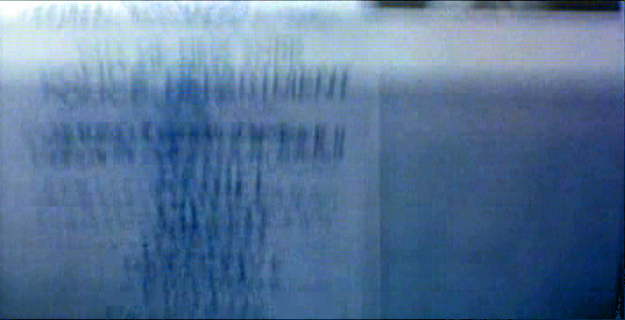
Records in a folder. The embossed stamp was a headache.
We shot the back of a card’s actual stamp in shadow, then we
printed it on a document in reverse on the front of our card.
 2
2 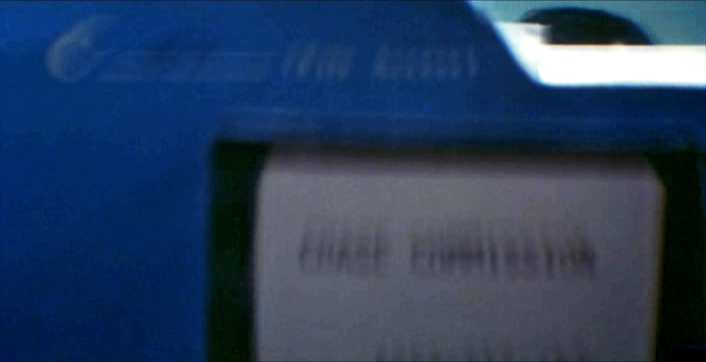 3
3
 4
4 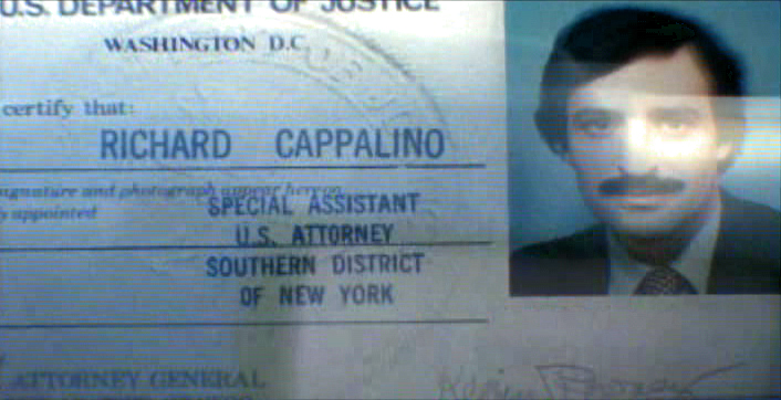 5
5
 6
6
.
 1
1
The microfilm look for mug shot records.
The slightly bad guys in B&W.
 2
2 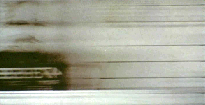 3
3
 4
4
Commentary 07 Jul 2012 05:35 am
Museum Movies and Others on line
Museum Animation Programs
- The museums in New York are offering a number of important animation programs this summer. Now through October 28th the Whitney Museum is showing Oskar Fischinger: Space Light Art—A Film Environment. This was a multiple screen program he had devised in 1926 called Raumlichtkunst. It included 3 35mm films that were projected simultaneously. It has now been transferred to high definition video and is projected in a loop, so that it is constantly running for the museum’s audience. The film was recently restored by the Center for Visual Music in Los Angeles. From the museum’s posting it says: “Radical in format, its display of abstract shapes and colors produces, according to Fischinger, ‘an intoxication by light from a thousand sources.’â€
The Quay Brothers at work
Meanwhile the Museum of Modern Art is having a gallery exhibition of the Quay Brothers‘ work. The brothers, originally from Philadelphia, have settled in London where for the past 30 years they created avant garde stop motion films. They’ve worked as illustrators, stage designers, and filmmakers. The installation showcases all of their work and features a series of “dormitoriums,” miniature décors created for their stop-motion films.There will also be a complete retrospective of their work including their early work, graphic design, calligraphic work, and works on paper. Their films include a complete retrospective of all the puppet films, as well as the student and live action films.
The program will rum from August 11th through January 7, 2013.
I’ll try to keep you posted on the upcoming film programs as they approach.
Also at the MoMA, Tues July 31st at 6PM and Mon August 6th at 8PM, Lou Bunin‘s version of Alice in Wonderland will be screened. The film is rarely screened theatrically and hard to find in DVD. While in production, Disney did everything possible to stop it from going forward, trying to take it to court. Both this Alice and Disney’s ultmately opened within months of each other. When it opened in England in 1950 the British censors objected to a caricature of Queen Victoria, and the film wasn’t released in England until 1985.
Jeff Scher continues to produce rich, abstract animated films. His latest is a music video for his “favorite new band.” I’ve embedded the film, below. Take a look.
Bendito Machine

- I received a note from Jossie Malis about a series he’s been creating called Bendito Machine. In his words:
- Bendito Machine is a show which reflects on the innocence of a small, naive and clumsy species that cannot live without their machines, and which is guided by enlightened greedy bastards, who believe they have the answer to everything.
I was intrigued enough to go to his website and search out the films. There are four of them; they’ve just completed the last of the four. You can watch them all on line (here). They’re quite attractive pieces each about 5 – 10 minutes in length, and they’re all silhouette films. The filmmaking group is, naturally enough, a small one with obvious dedication to the work. It is quite attractive, and I encourage you to take a look.
They’ve recently started a Kickstarter campaign in hopes of raising money to do more of them; I think it’s a worthwhile project. Take a look at the films and consider for yourself whether it’s worth contributing – even as little as $1.
Other Blog postings I like
There are a couple of other nice reads out on the internet this week:
 Traditional Animation features a good interview with Producer, Gary Goldman, on the 30th anniversary of The Secret of Nimh. The interview reviews all the elements that combined to create the studio and pull this first feature film together. This is a good site and worth visiting (and I don’t say that just because it includes an interview with me in its backlog.) There are many parts from news to forums to interviews.
 - Mike Barrier has a fine piece on the Harman-Ising cartoon, The Milky Way (the first non-Disney cartoon to win an Oscar). It features some beautiful preproduction artwork from the film.
Of course, on Mike’s site there’s also the great interview with Warner Bros animator, Phil Monroe. In case you haven’t yet read it, you should. Certainly if you have even the slightest interest in animation history.
- Bill Benzon, in his very detailed and analytical way, takes on the script of Disney’s Dumbo on his blog, New Savannah. Anything Dumbo is worth reading, especially if it’s written by someone as erudite as Mr. Benzon.
- One of those blogs that sits out there forever and has become a valuable piece of real estate for those, like I, who keep coming back to it is the Al Eugster Blog. Mark Mayerson set up this wonderful blog which honors a fine animator. There are many photos of Mr. Eugster in the many positions and studios he animated for. Pictures of the Ub Iwerks studio (Iwerks pitching horseshoes), the Disney Studio in 1935, the Fleischer Studio, or the pictures I sought out this week, the Gifford Studio in NYC. Many thanks to Mark for this hidden treasure as well as for his not-so-hidden treasure, his current blog, Mayerson on Animation. That site is a must-check daily.
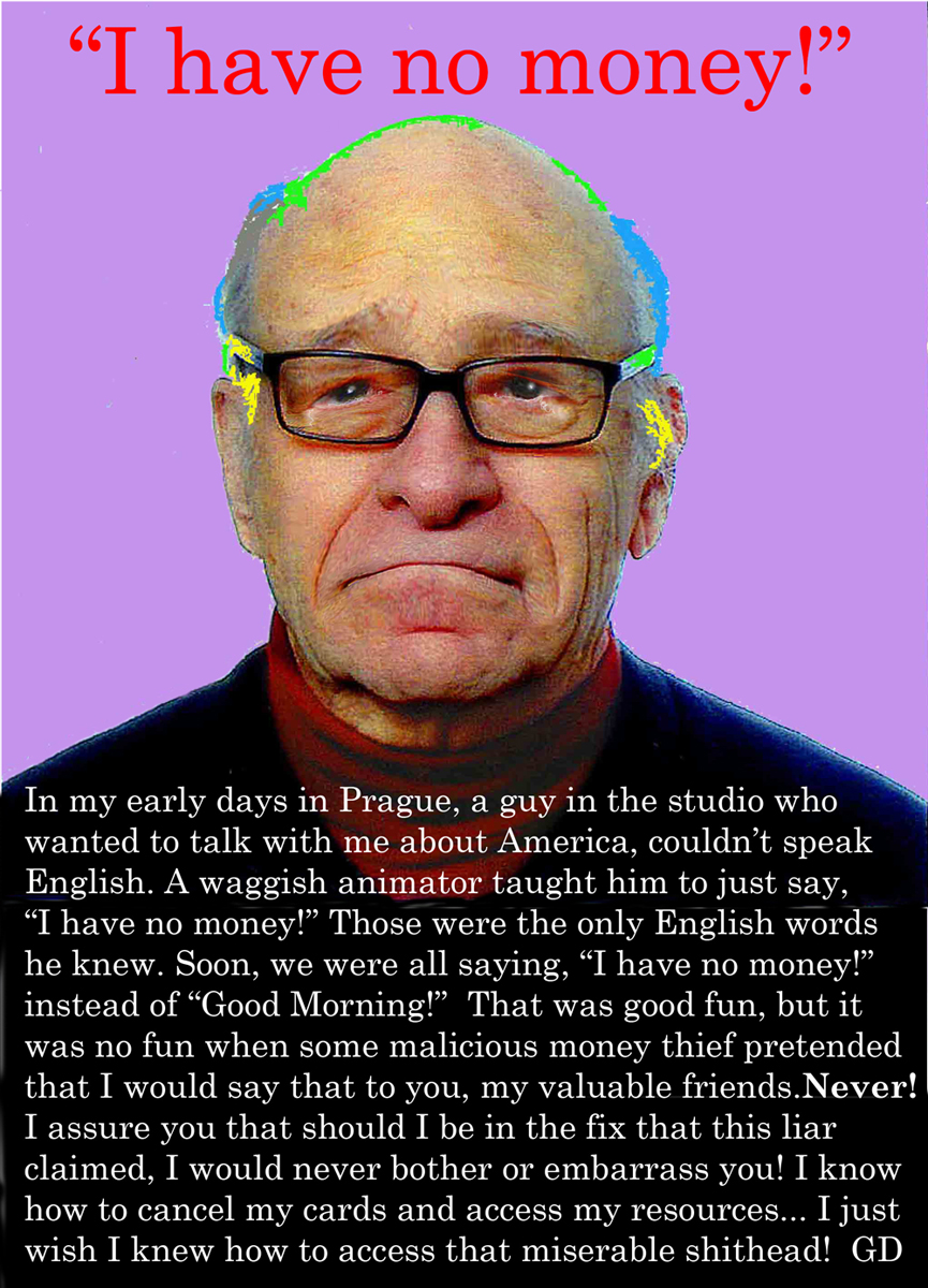
Scam Scum
Finally, what happens when you’re an artist and your email address has been pillaged by some idiot and all your “friends” on your mailing list have been contacted and told that you’ve been robbed in Spain and left penniless, so please send money? Well, if you’re Gene Deitch, you send out the following note to all on your mailing list who may have been approached:
Bill Peckmann &Books &Illustration &Rowland B. Wilson 06 Jul 2012 04:29 am
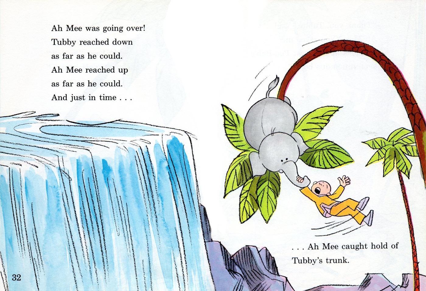
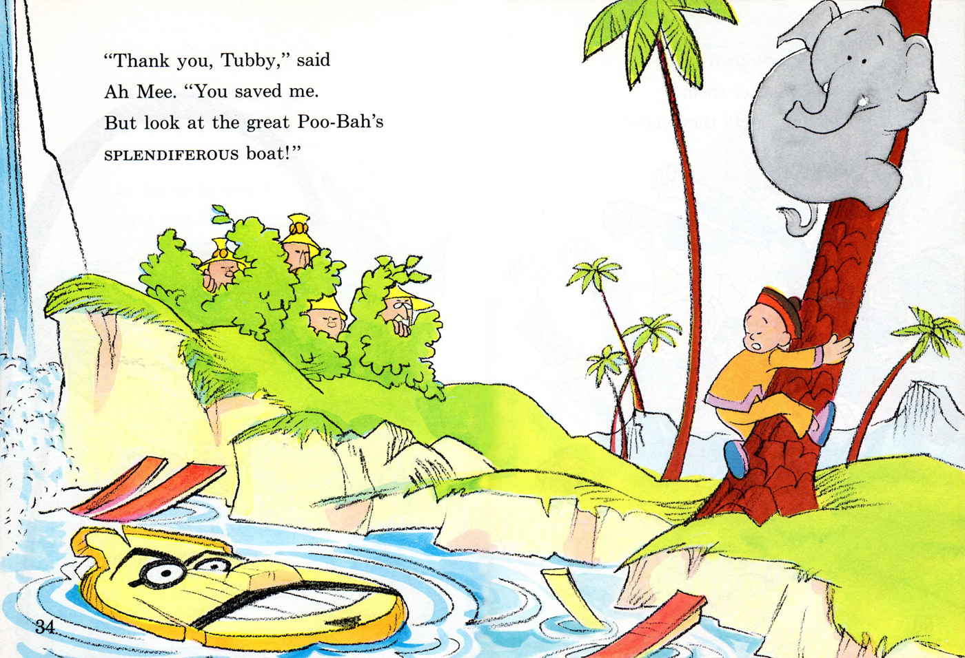
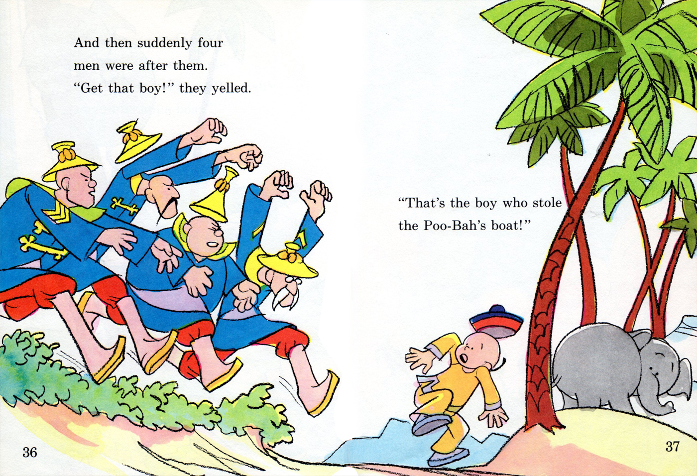
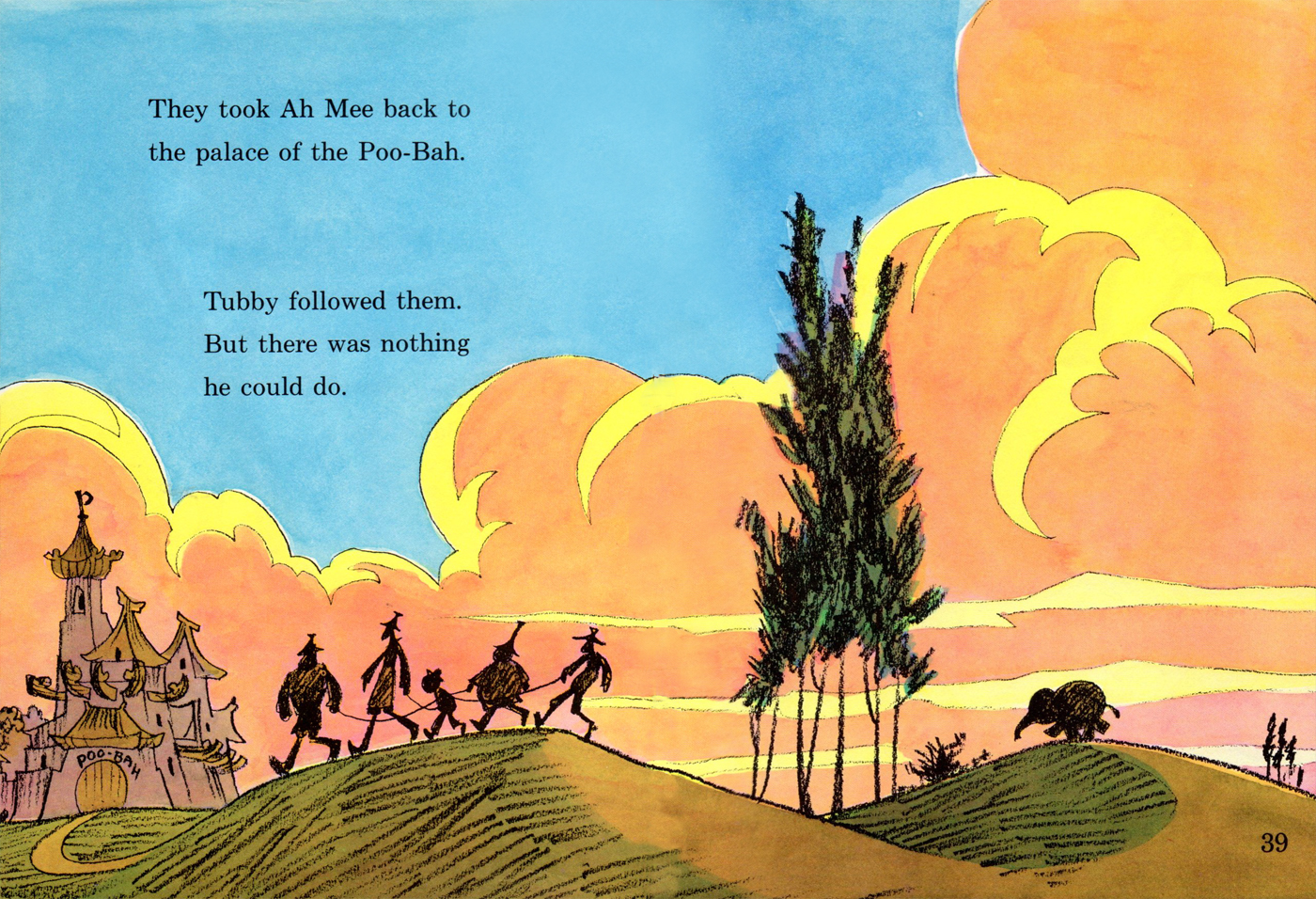
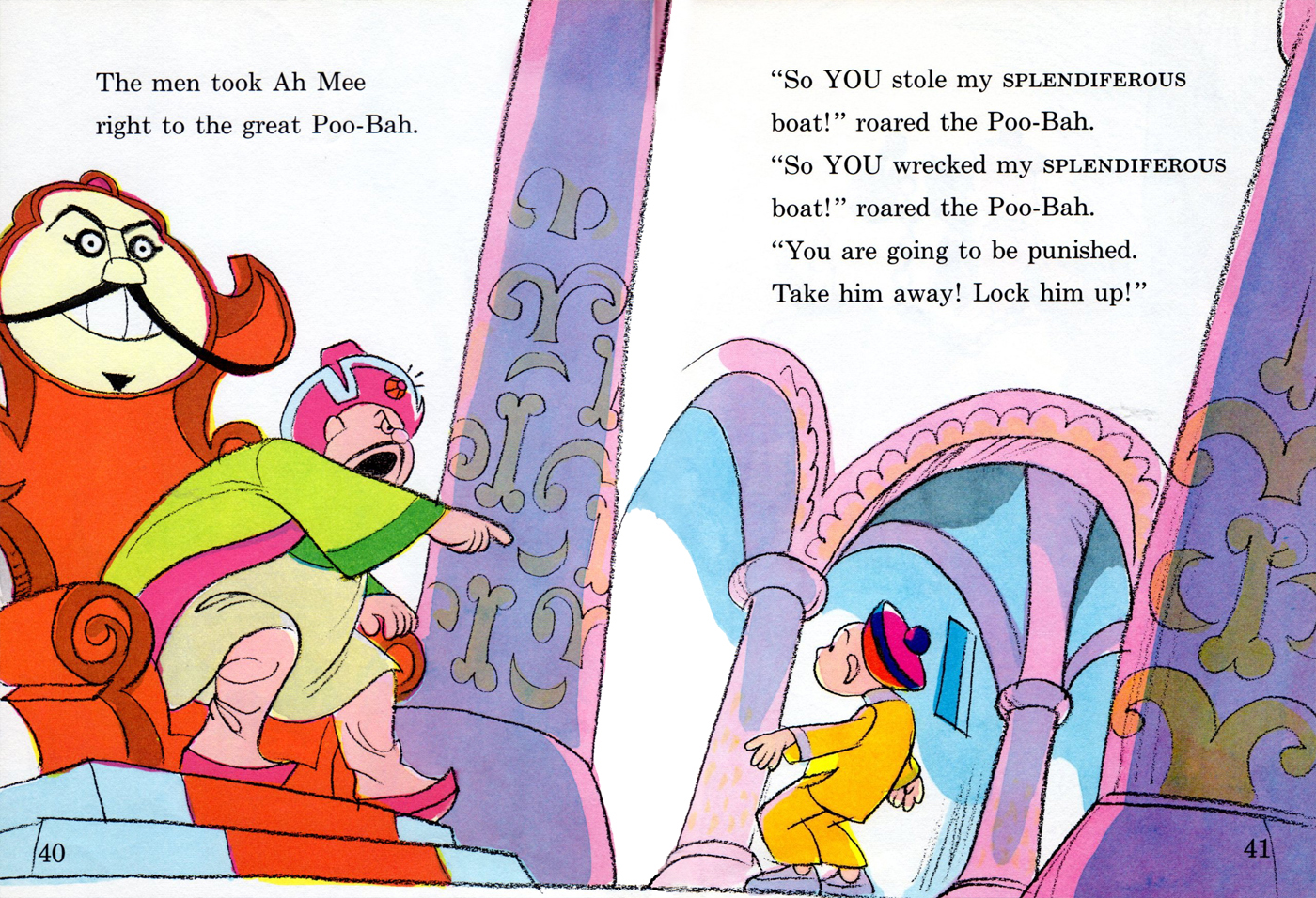
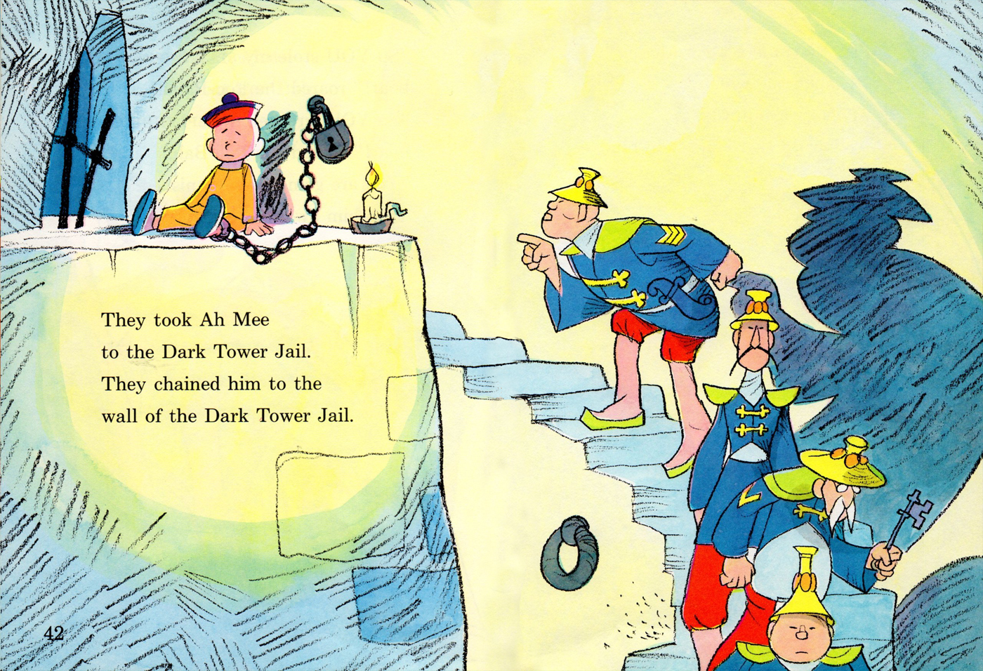
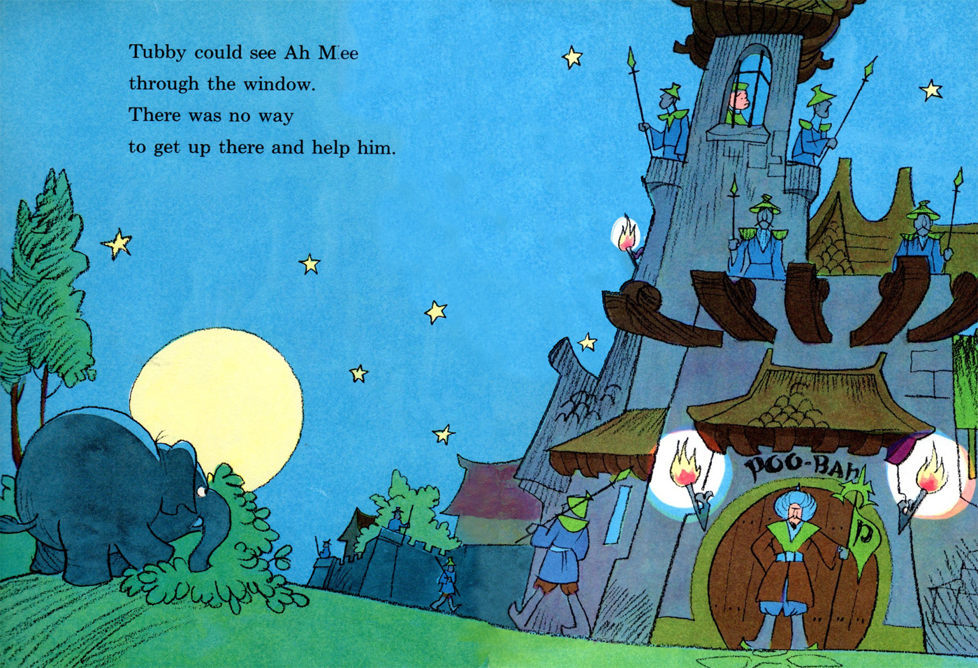
Rowland Wilson’s Tubby & the Poo-Bah 2
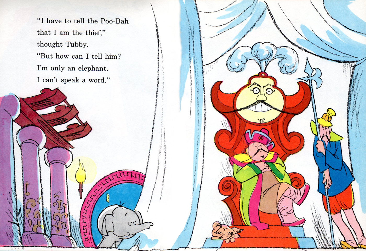
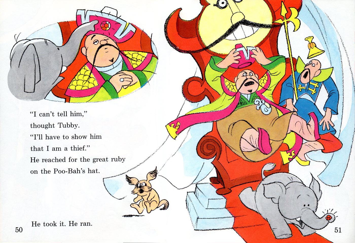
- Last week I started scans of the 1972, Rowland Wilson book which featured his character, Tubby. Bill Peckmann sent me scans from the second in the Tubby series of books called Tubby and the Poo-Bah.
To see Part 1 of this book go here.
Here’s the remainder of that great children’s book
which begins where we left off: pages 32 & 33.
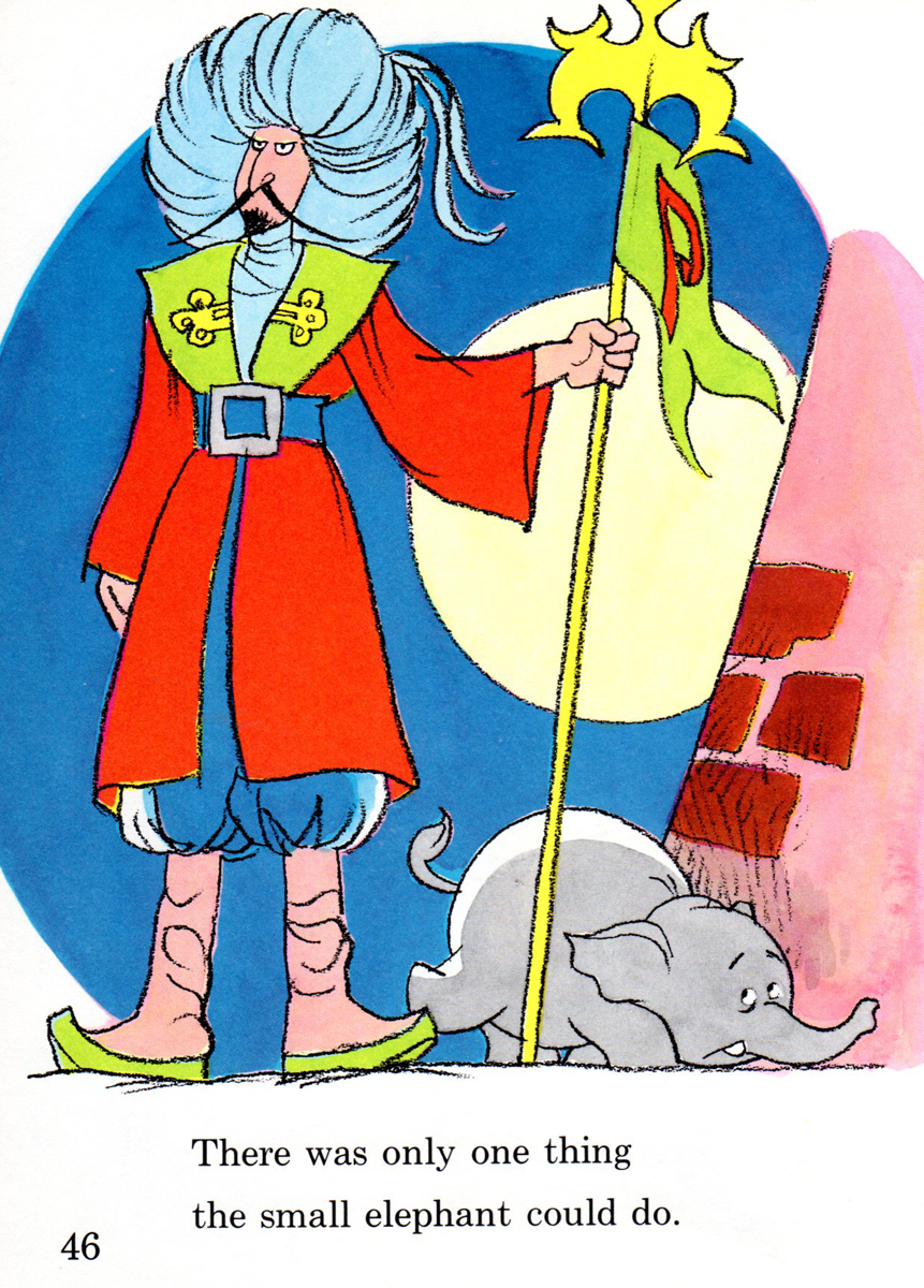 pg.46
pg.46
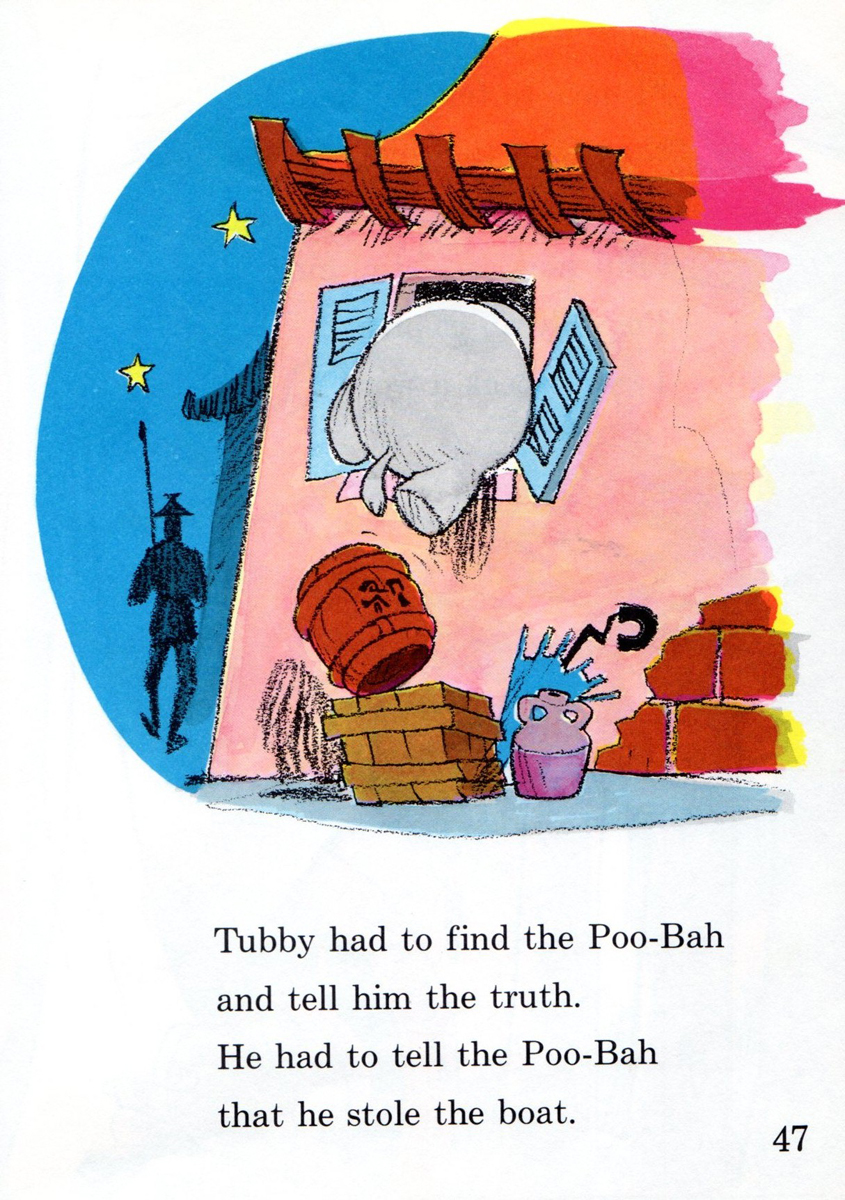 pg.47
pg.47
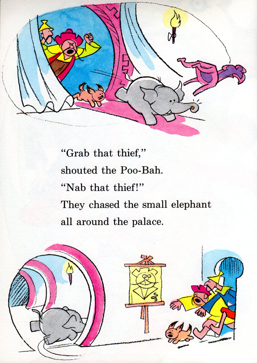 pg.52
pg.52
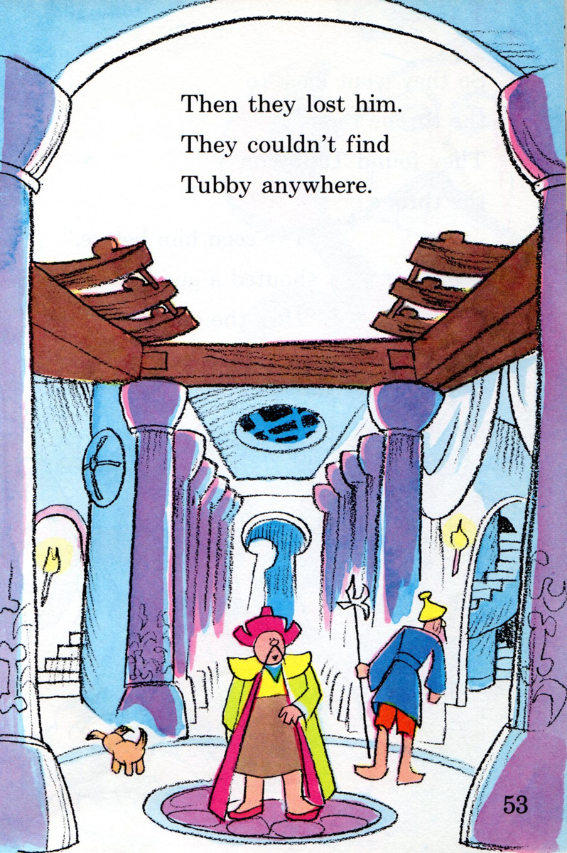 pg.53
pg.53
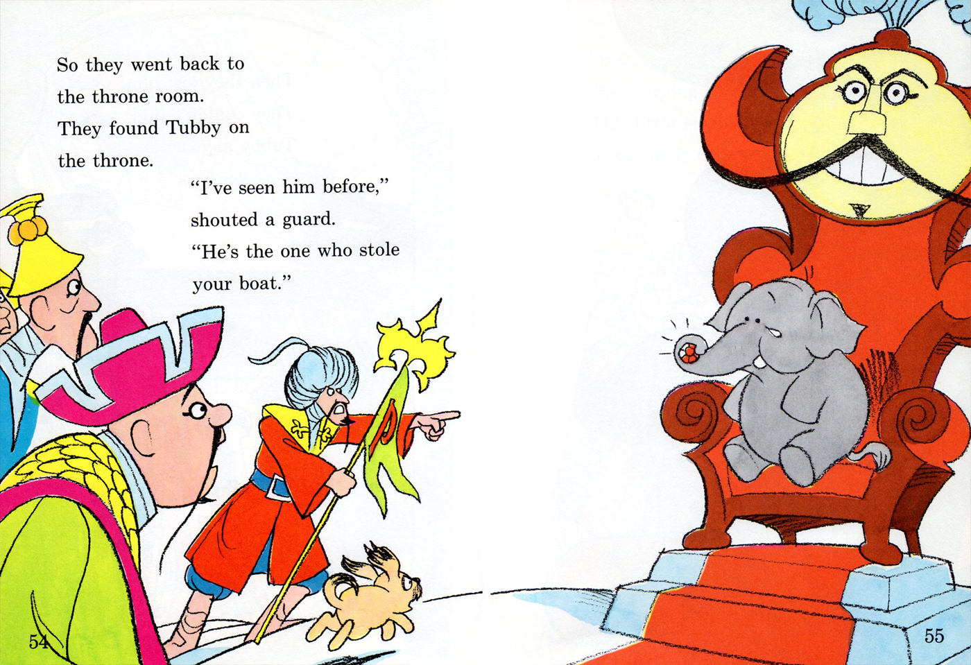
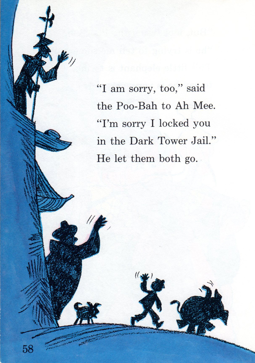 pg.58
pg.58
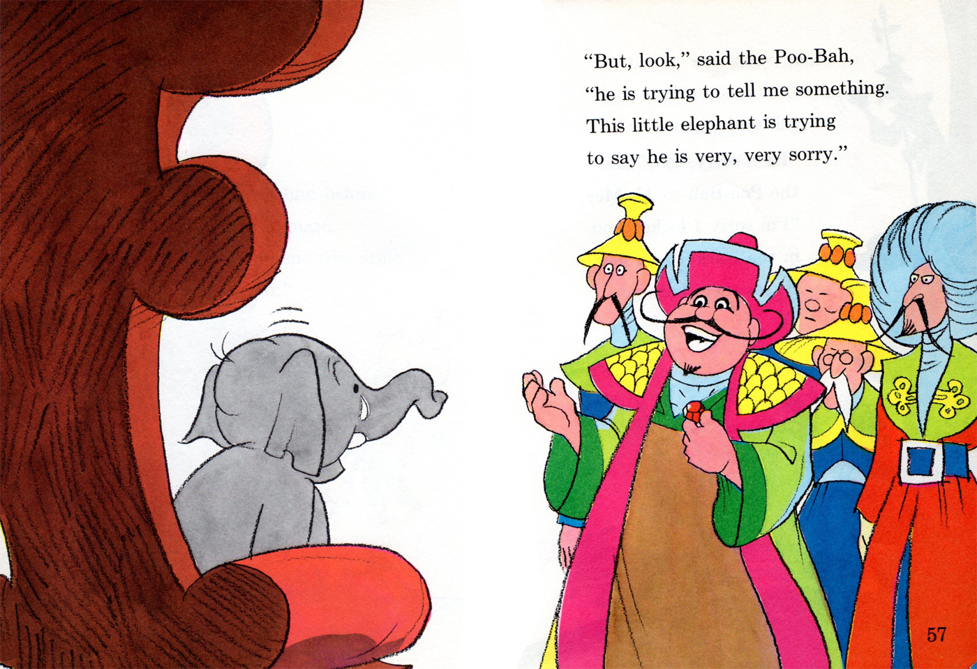
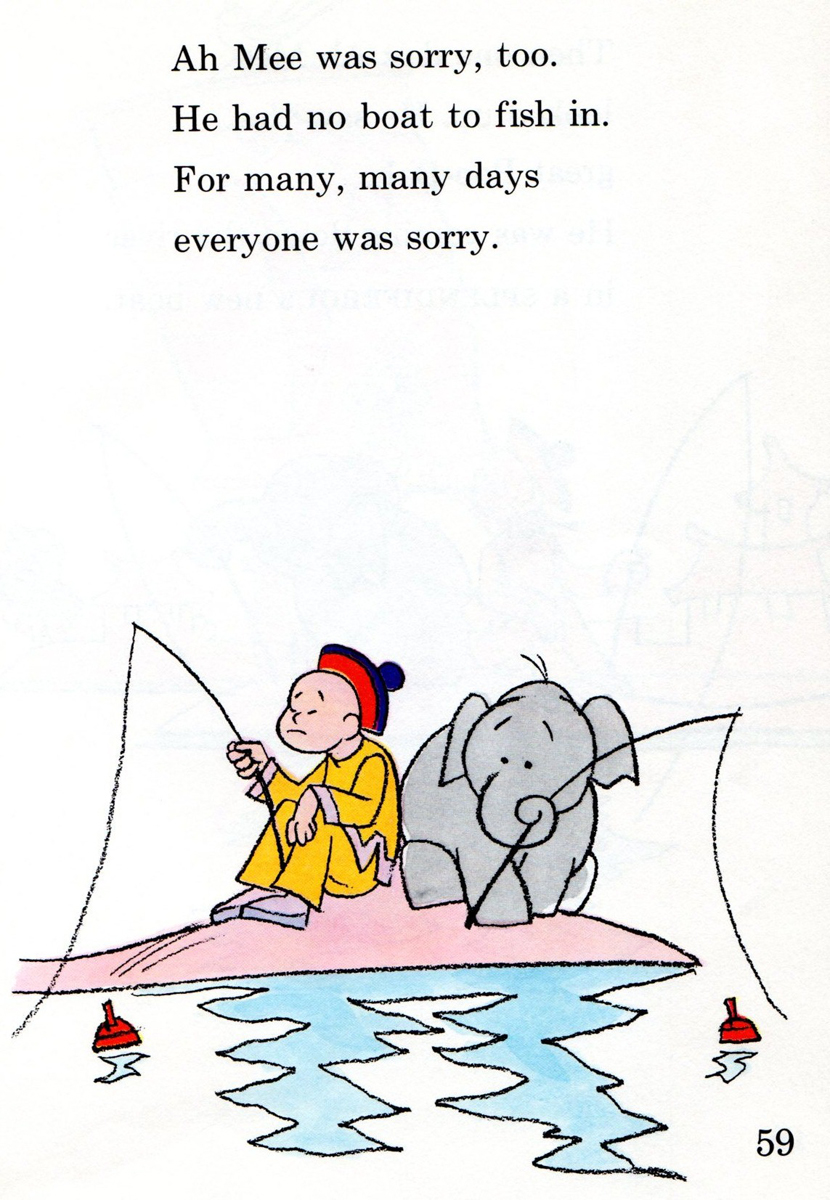 pg.59
pg.59
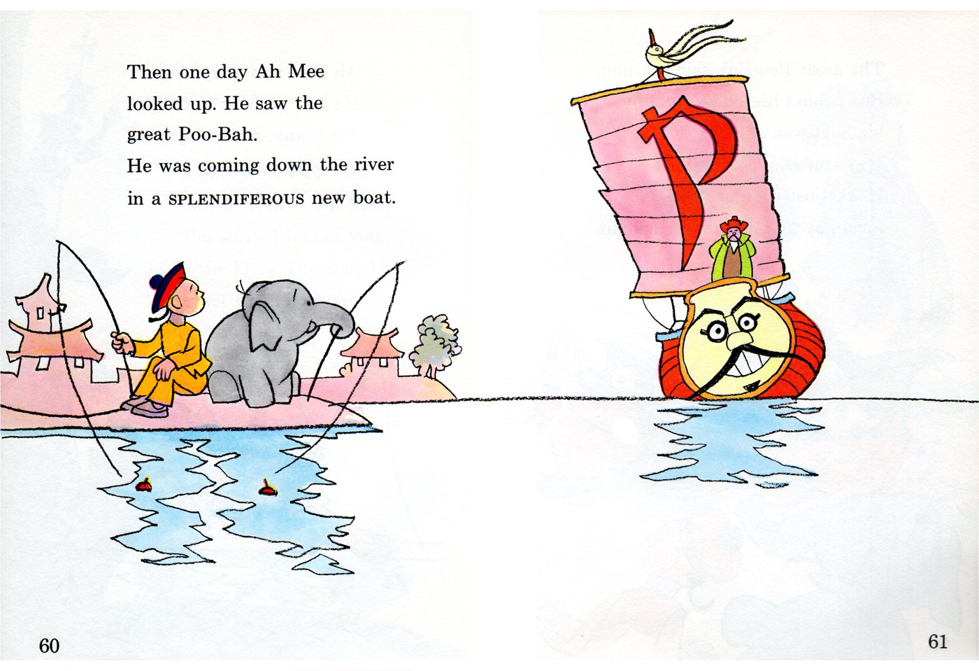
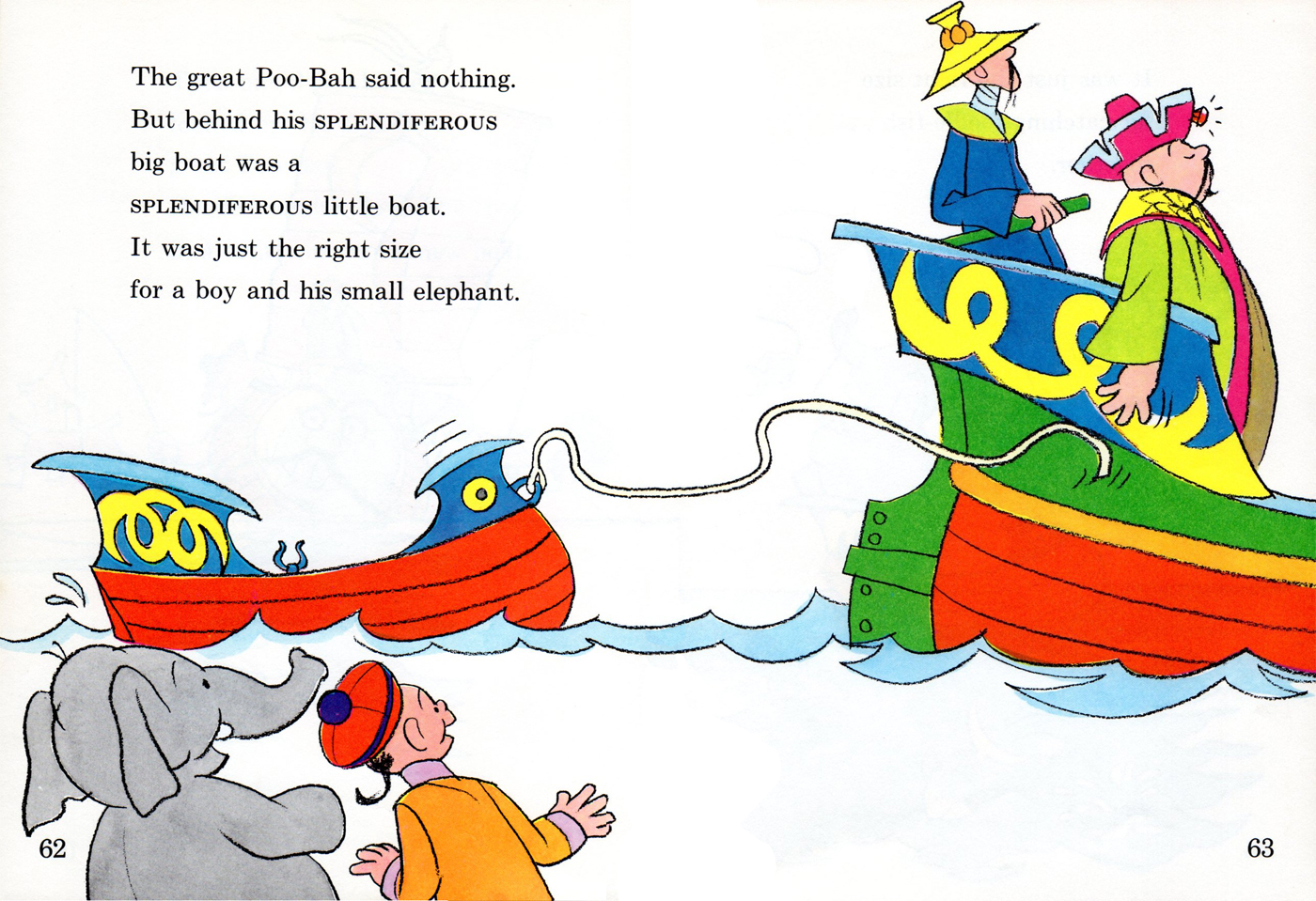
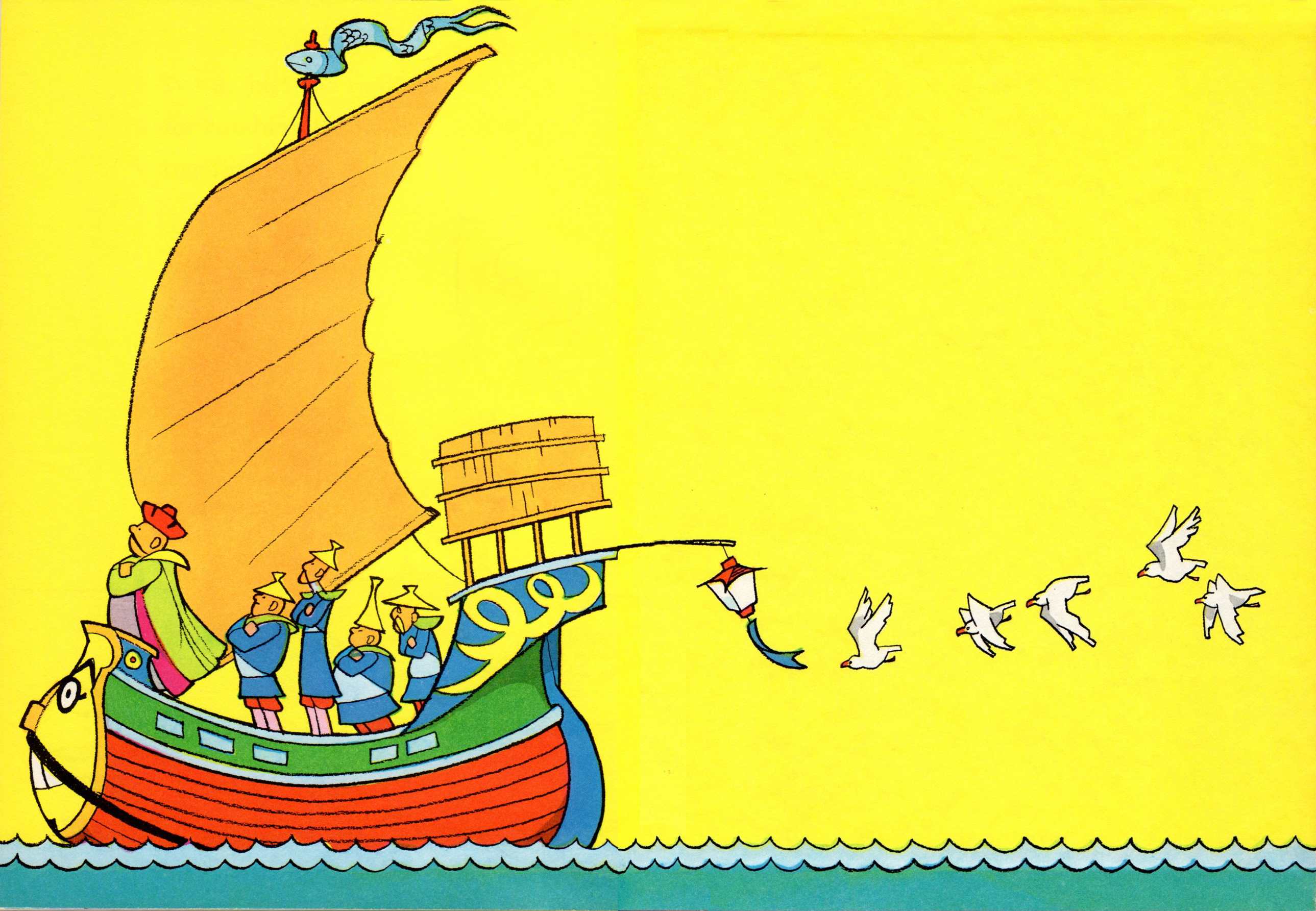
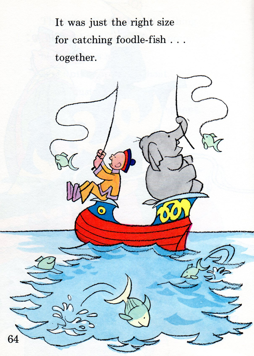 pg.64
pg.64
Inner Back Cover
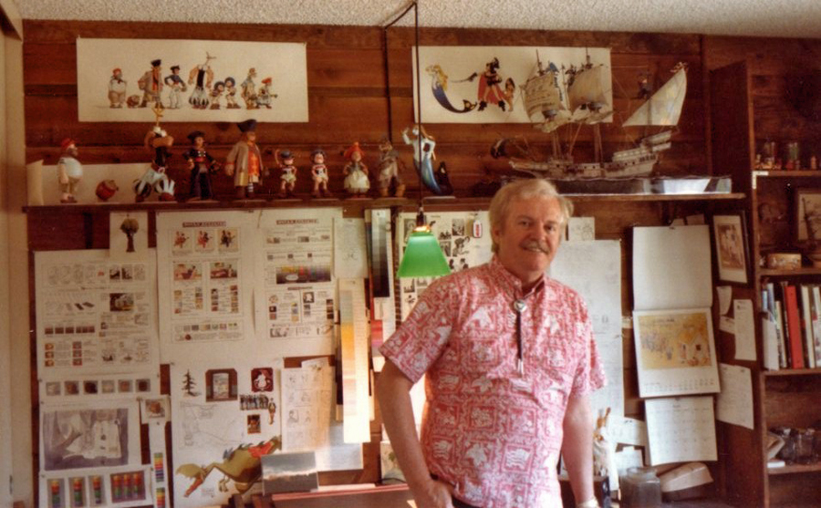
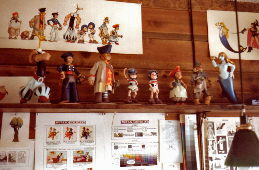
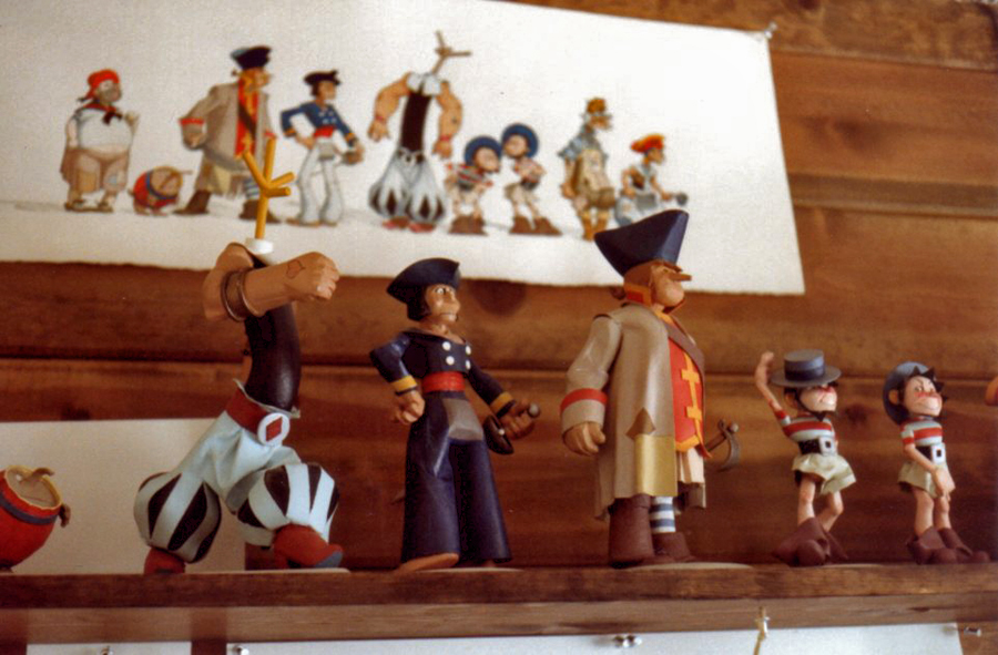
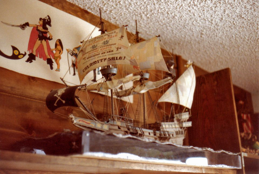
To complete the post, Bill Peckmann sent some photos from Rowland Wilson‘s California studio. He had a series of small figurines which he used to help in the design. Bill writes:
- “Rowland also had a way with an X-Acto blade, he was a master model builder and mixed media sculptor! These are studies he did to help him realize his cartoon characters.”
 1
1
 2
2
 3
3
 4
4
Should you want to see my post of the first Tubby book go here.
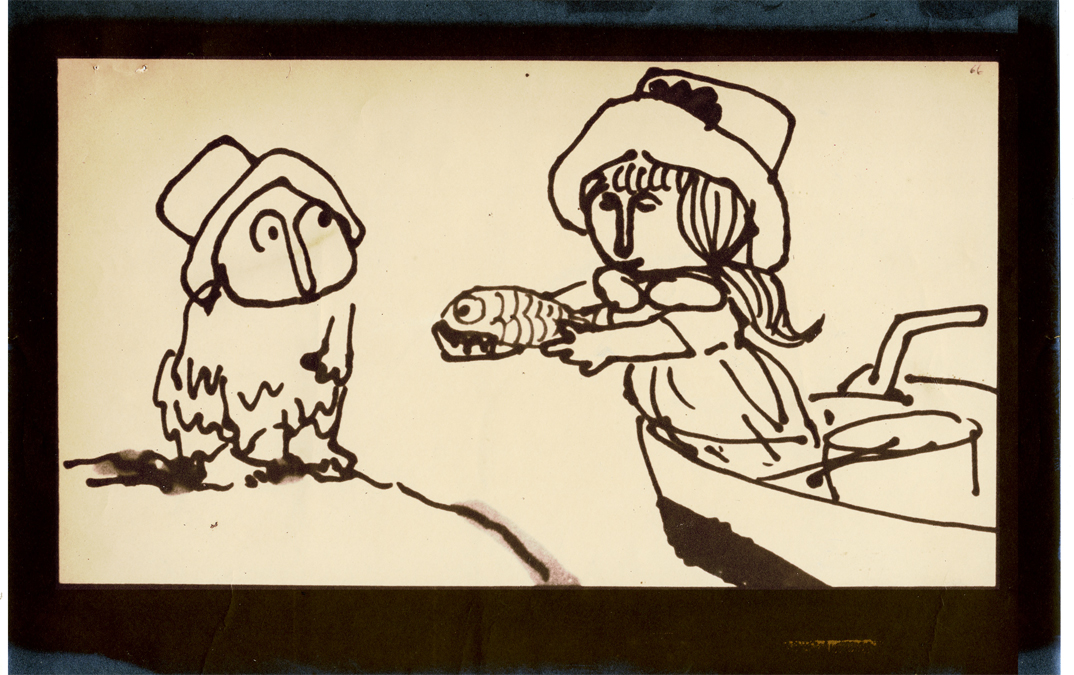
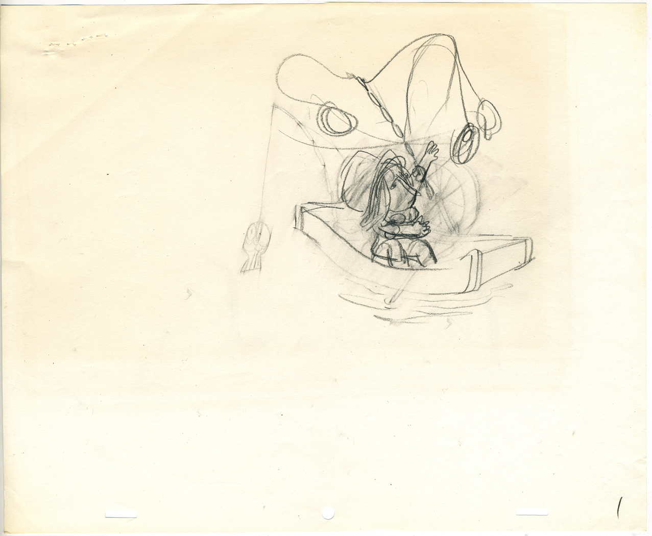
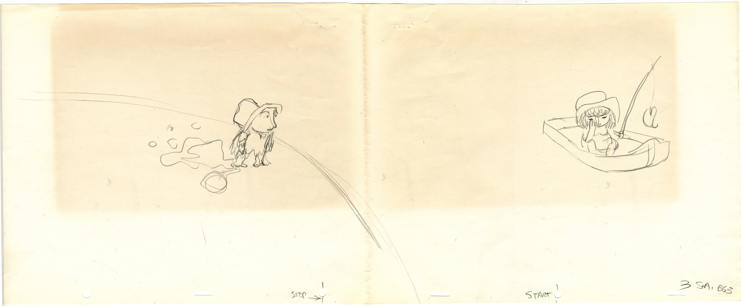
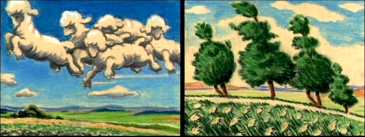
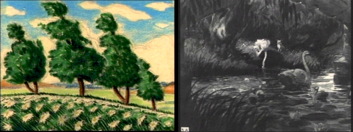
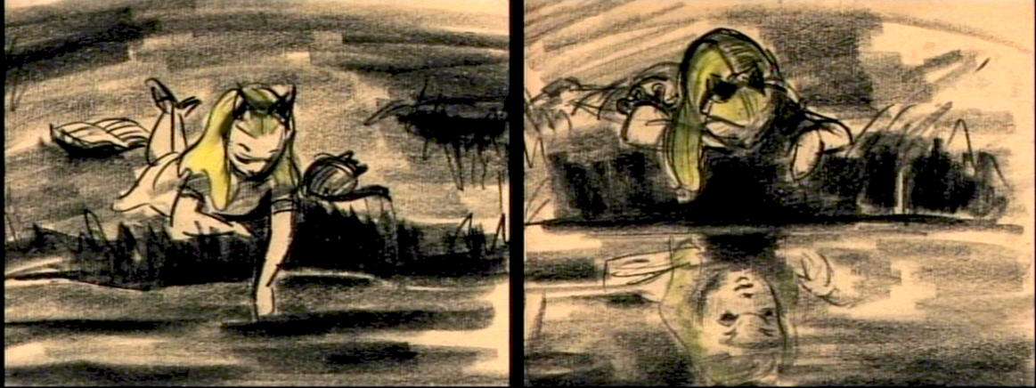
Animation Artifacts &Disney &Layout & Design &Story & Storyboards 05 Jul 2012 06:08 am
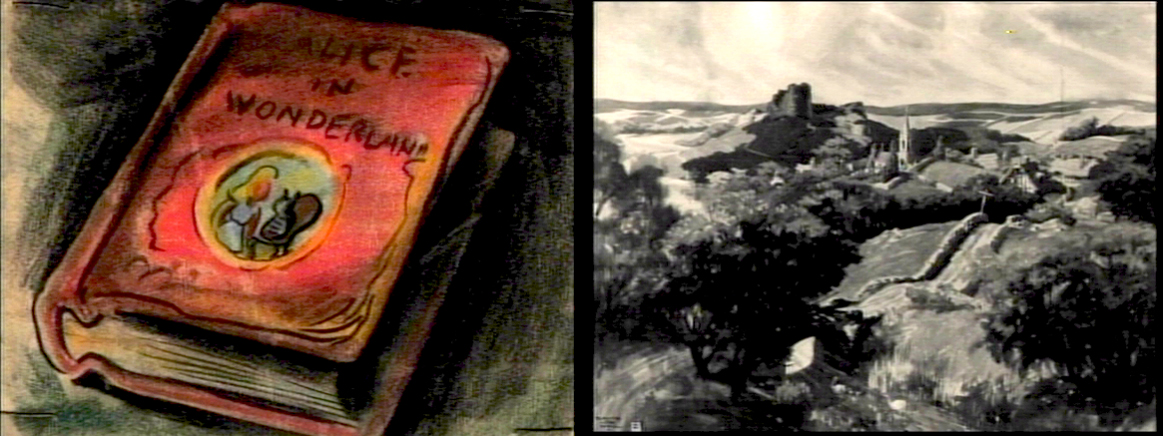
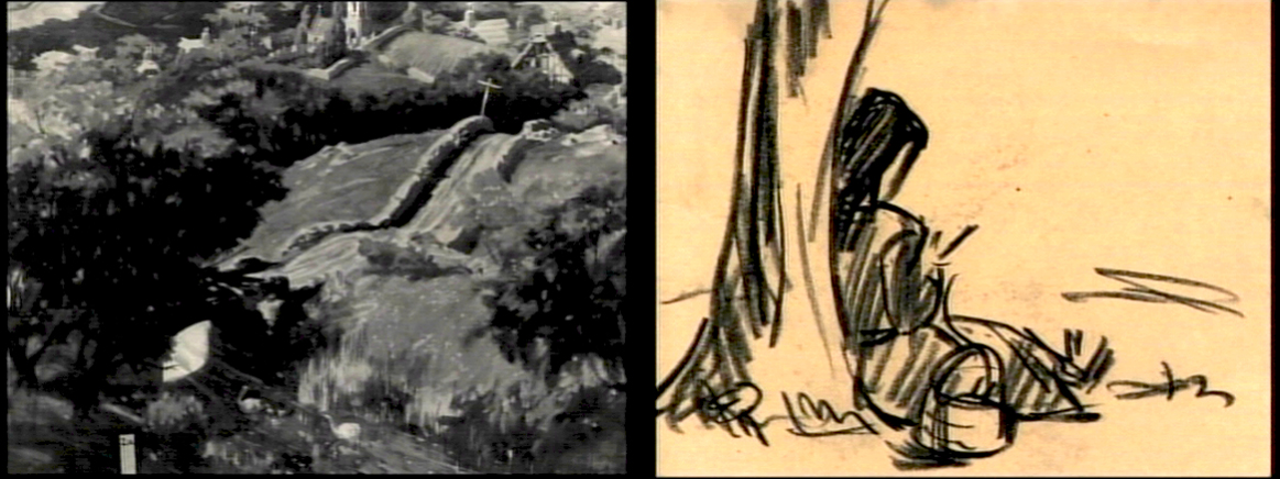
Daydreams – recap
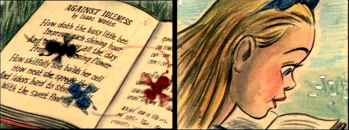
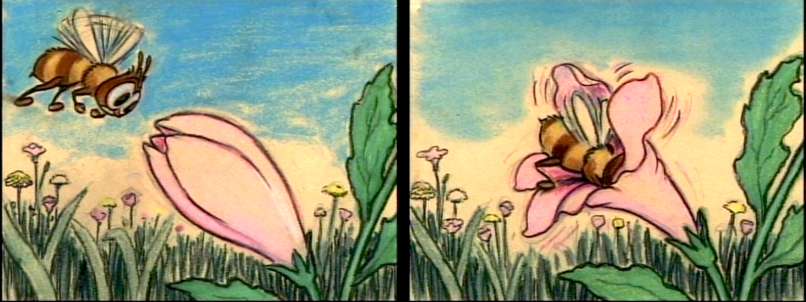
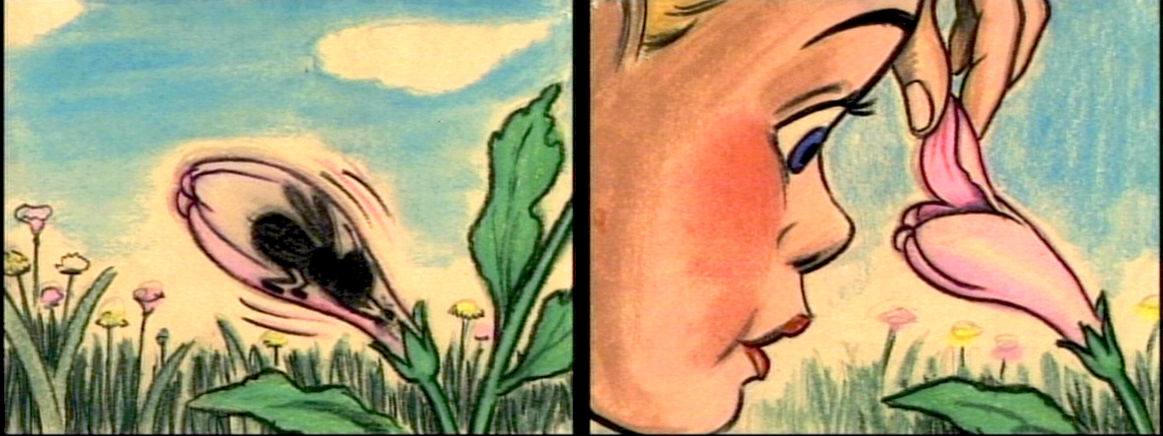
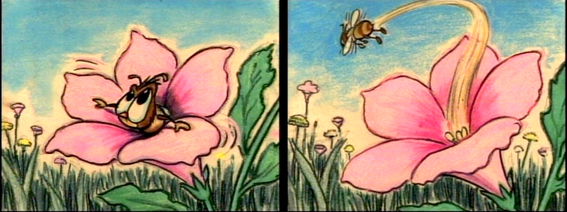
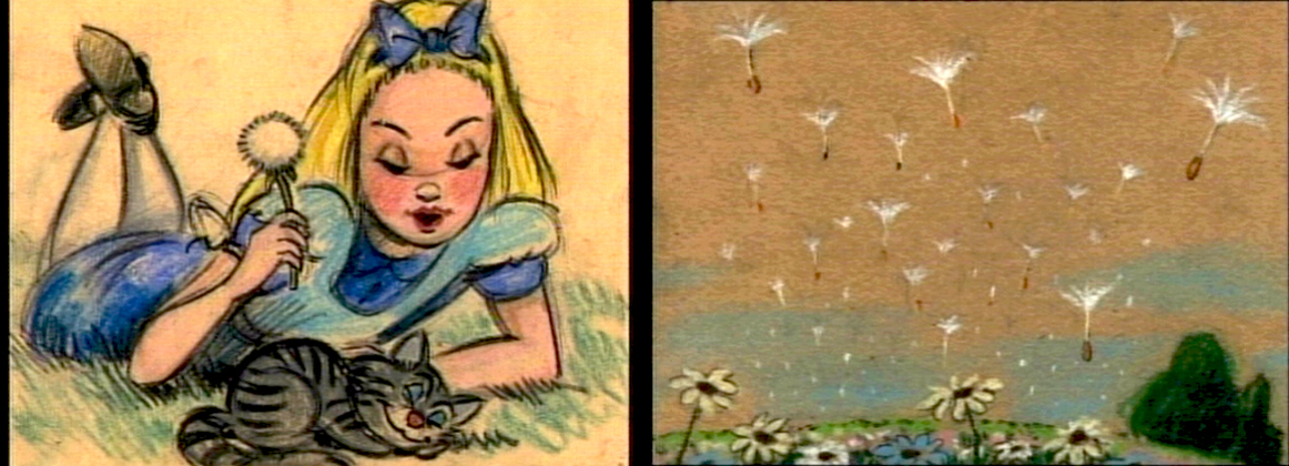
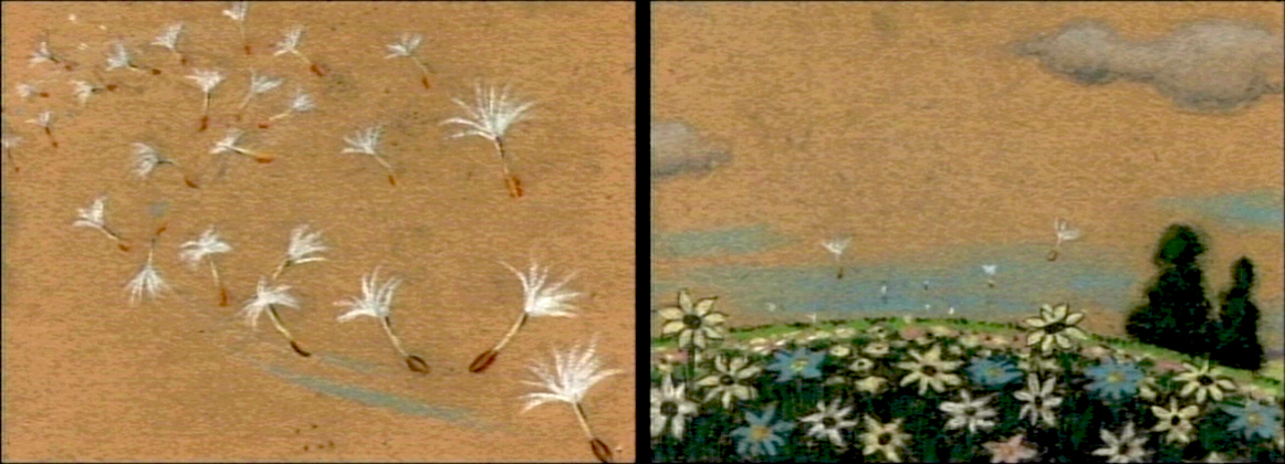
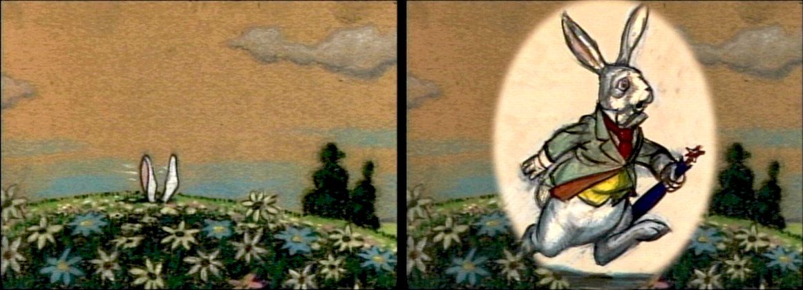
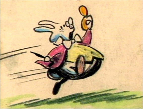
How frequently, lately, they’re running Alice in Wonderland on tv. Unfortunately, nowadays, it’s the Tim Burton version. Horrible. I’m going to have to go back to the DVD to watch the cartoon again. Speaking of which, the MoMA is going to screen the Lou Binin version in late July. I’ll write about it on Saturday, and I’ll re-review it when it does. I’m definitely going. Here’s an oldie but goodie.
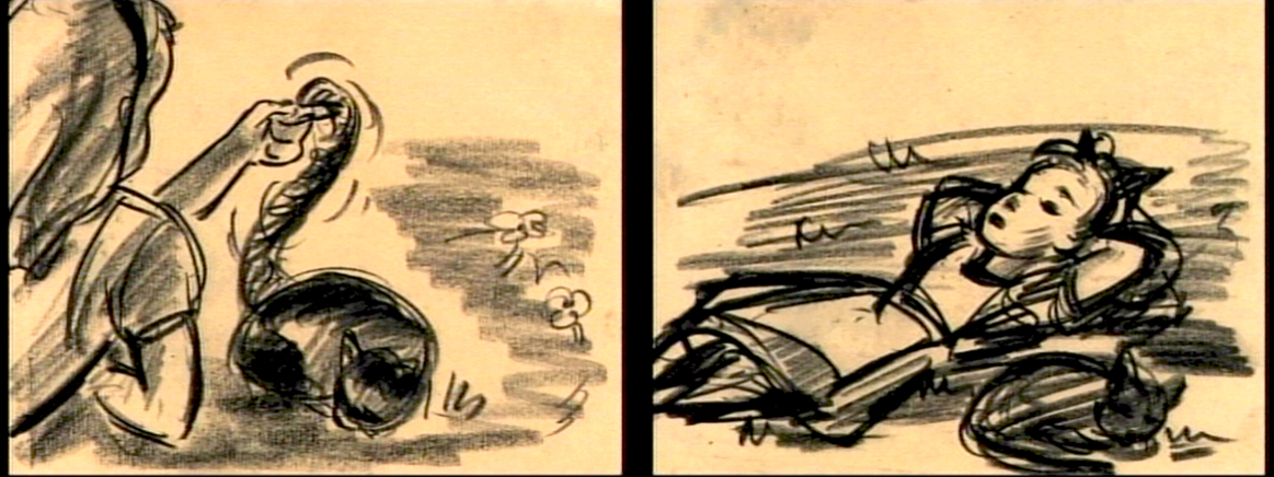
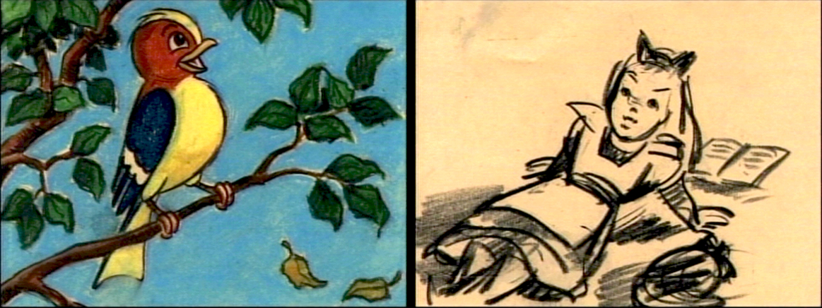
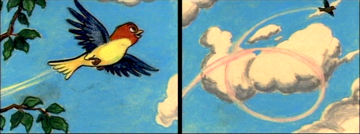
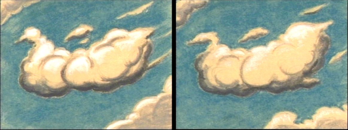
- The Alice In Wonderland dvd contains a storyboard sequence of Alice daydreaming in the park. This sequence didn’t make it to the film (for good reason), but they’ve re-assembled it for the dvd. I’ve taken some frame grabs to show off the drawings. They’re on screen for such a short time.
My favorite’s the last.
(Click any image to enlarge.)__________

Photos &Steve Fisher 04 Jul 2012 06:37 am
July 4th
.

Another beauty of a still by Steve Fisher.
Many thanks to him for all the photos that
he’s contributed to this blog.
Keep scrolling down for the routine Wednesday Animation post.
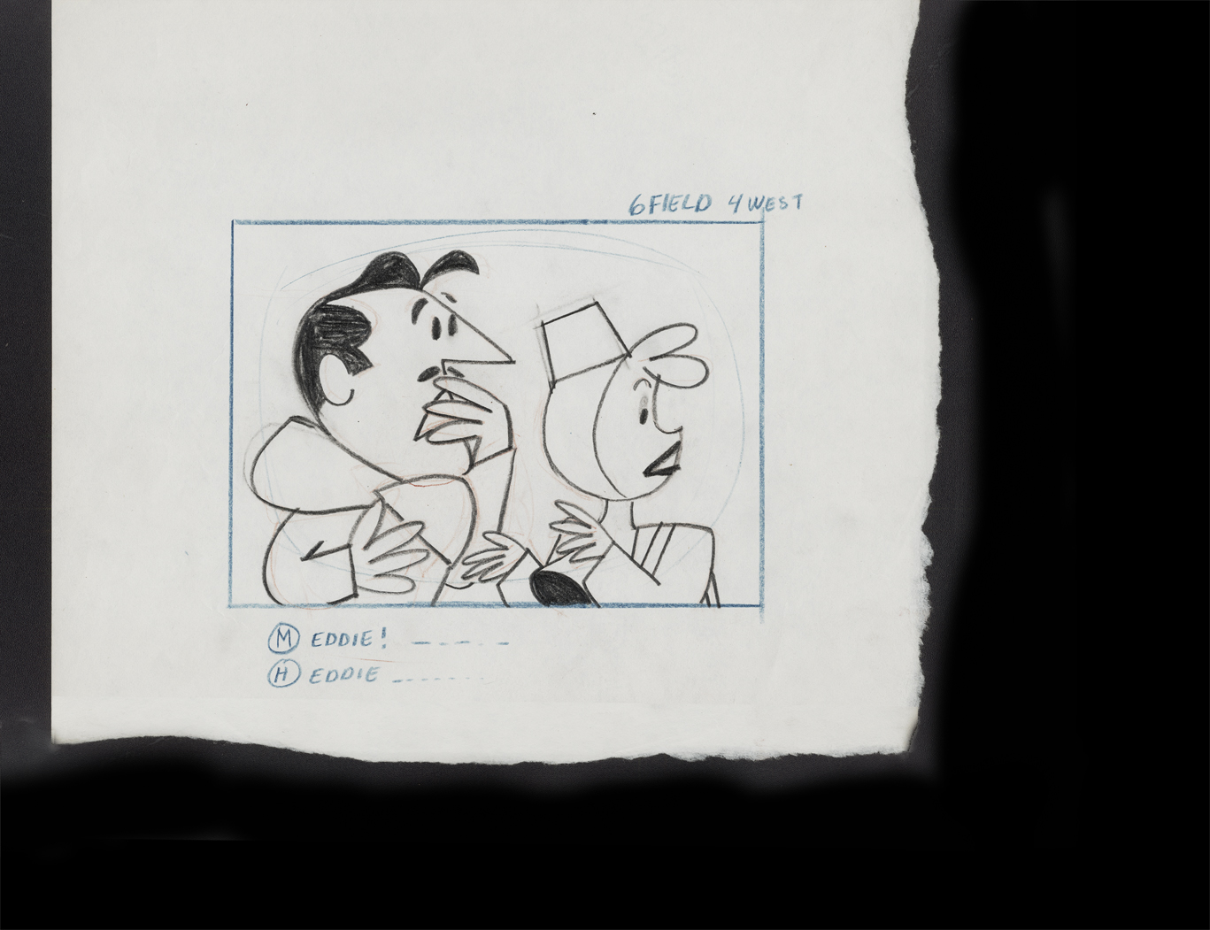
commercial animation &Layout & Design &Models 04 Jul 2012 05:25 am
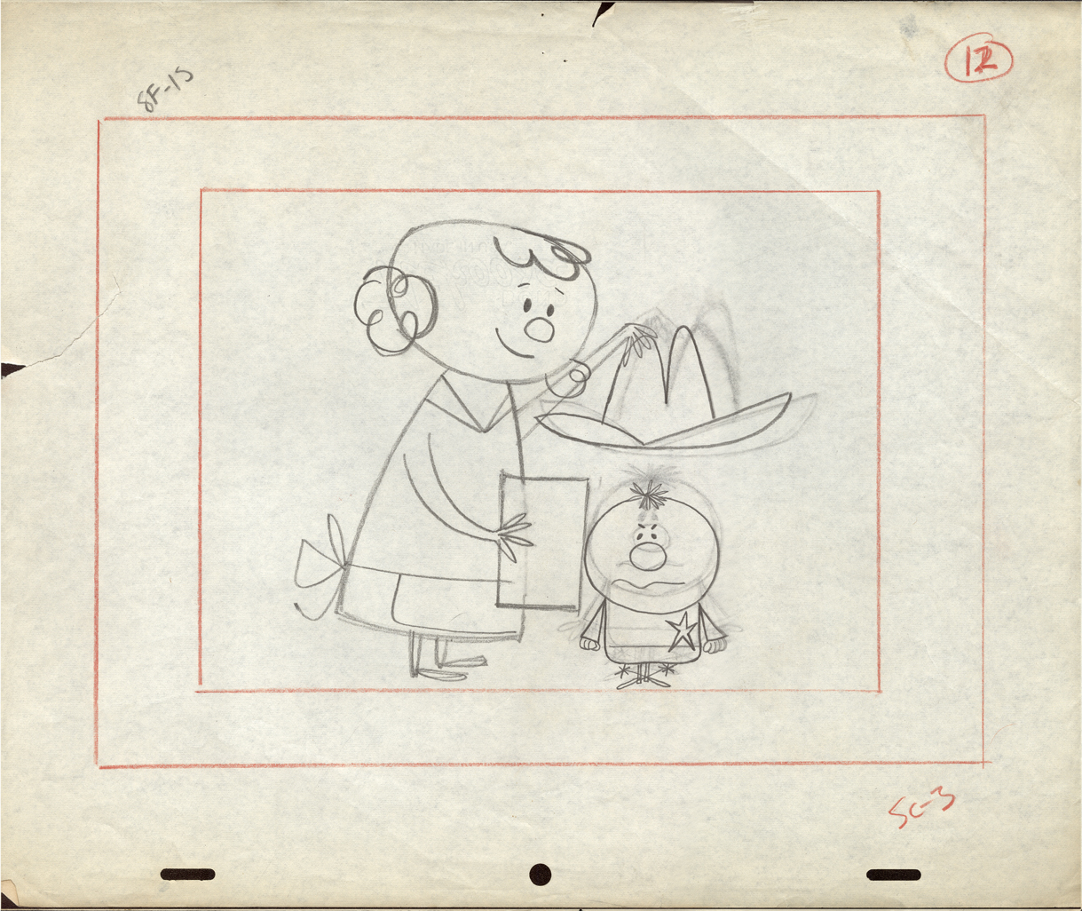
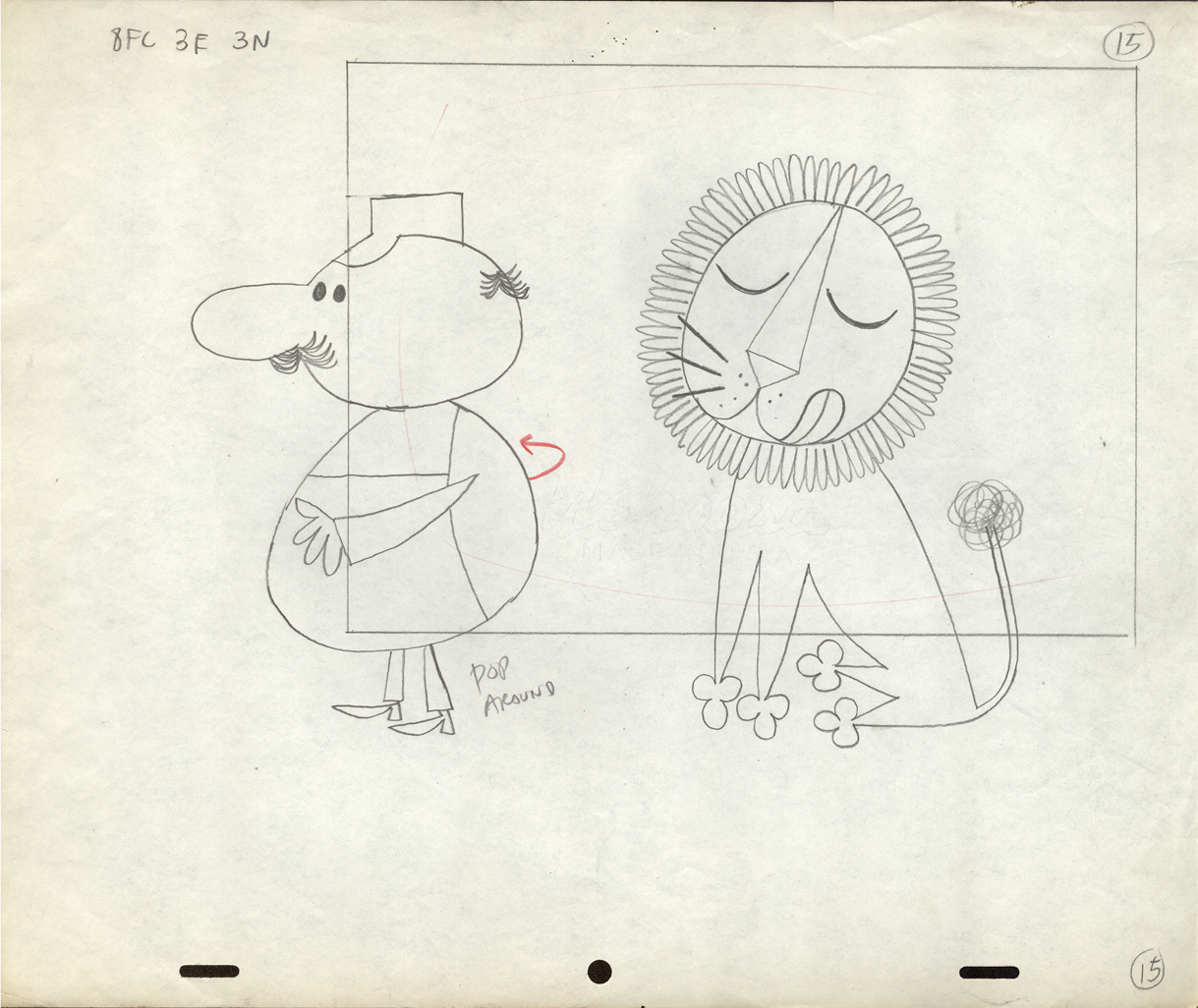
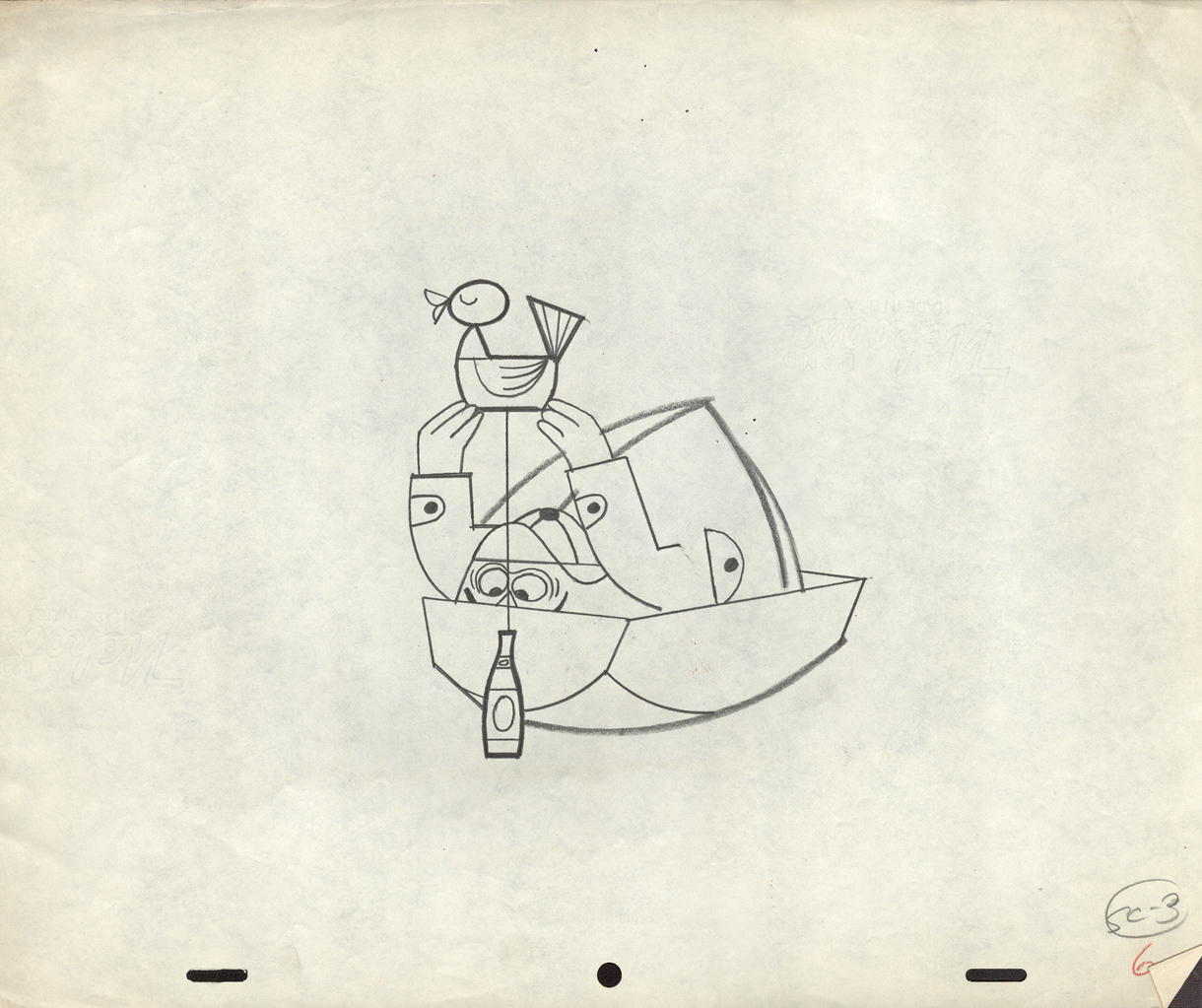
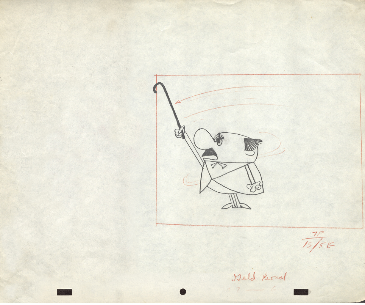
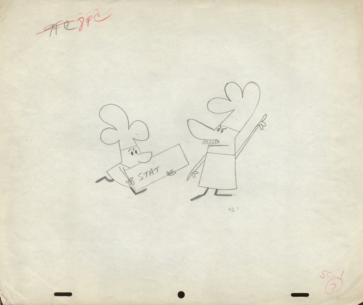
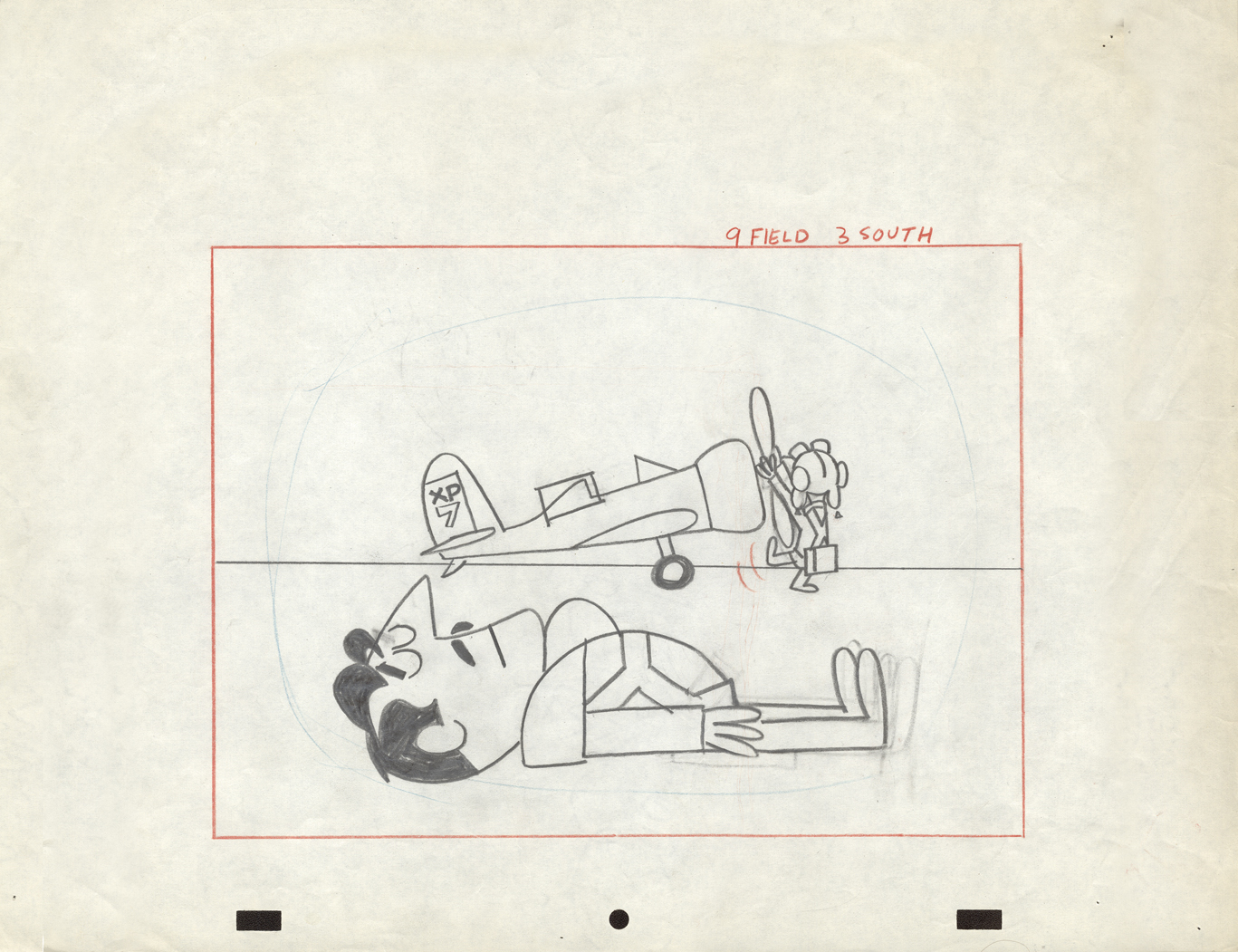
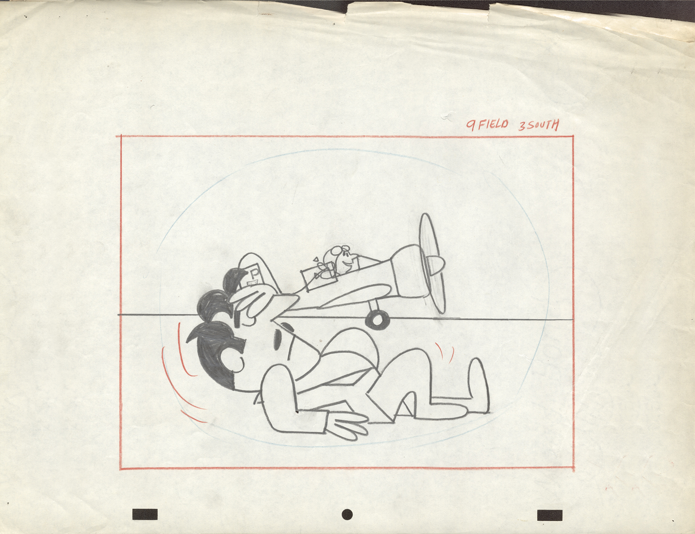
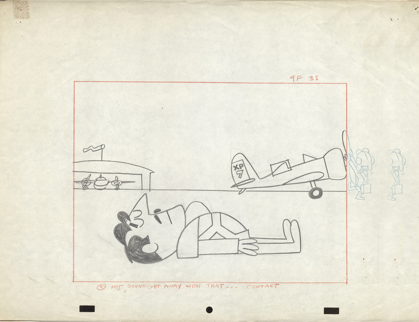
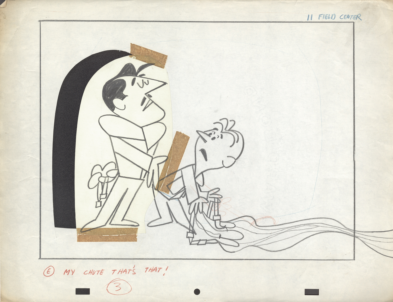
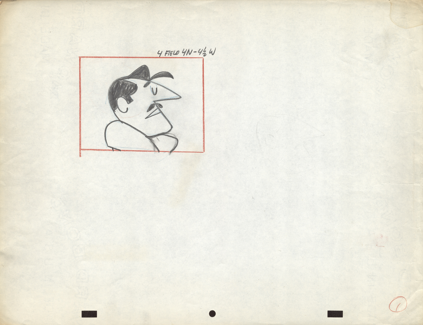
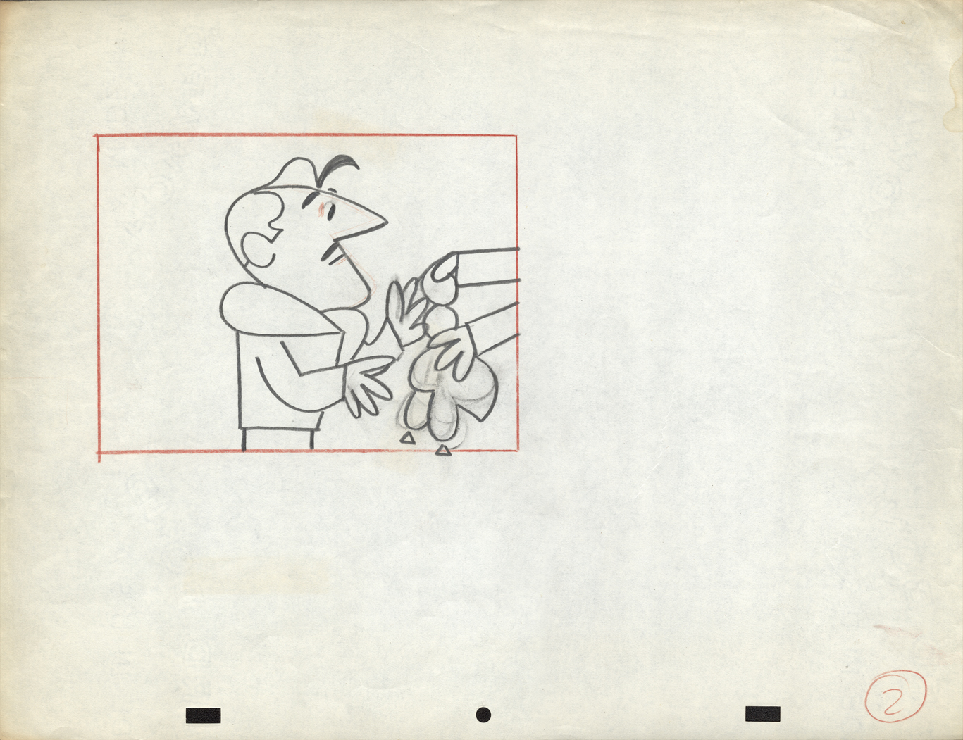
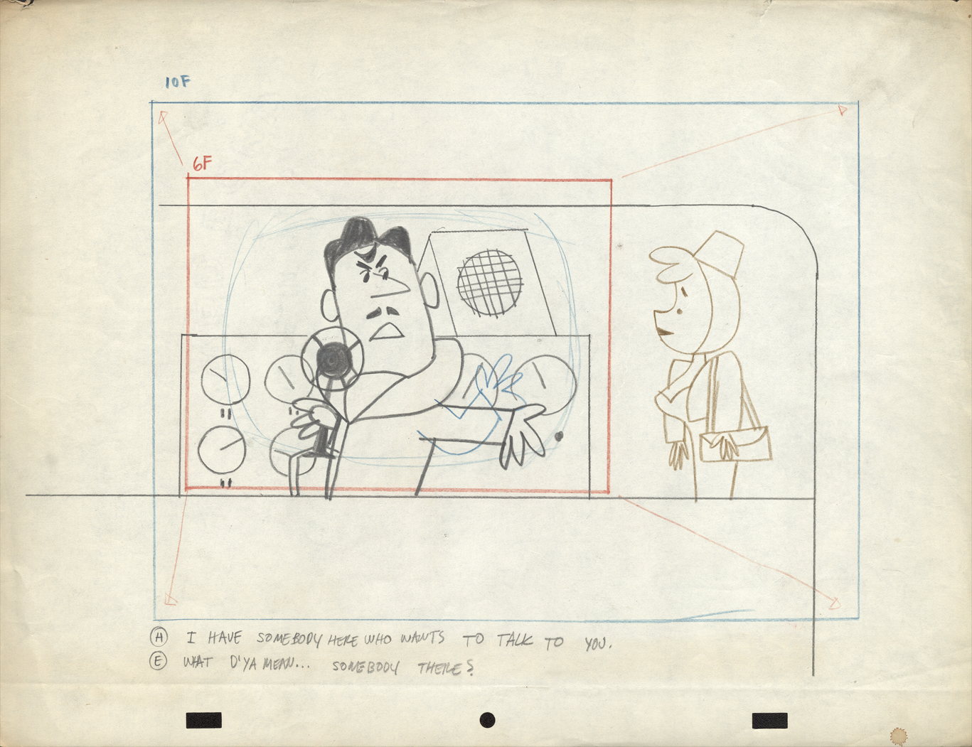
More Commercials from UPA
- Last week I posted a number of drawings from spots which Vince Cafarelli had worked on and saved as a sample of his different projects over the years. Unfortunately, there’s no guide to tell us what studio they were done in or who the sponsor was. I’ve assumed (maybe mistakenly) that the spots using the Signal Corps pegs came from UPA. Those done with Acme pegs (1,2,3,5) may have come from Gifford Animation or TV Cartoons.
I have a large number of other such drawings and will continue the post of these, despite the lack of information behind their history. If anyone can identify any of these, please tell us in the comments section, and I’ll add it to the post.
 1
1Some of these drawings & designs are undeniably brilliant.
 2
2
 3
3
This is just an absolutely great drawing.
 4
4
 5
5
 6
6
This drawing, #6, and the following seven layouts are from the same spot.
Interesting characters, but I have no idea what they’re selling.
 7
7
 8
8
 9
9
The pilot was physically cut out and moved.
Easy in photoshop not so easy in the real world.
 10
10
 11
11
 12
12
 13
13
A torn ending to a short story.
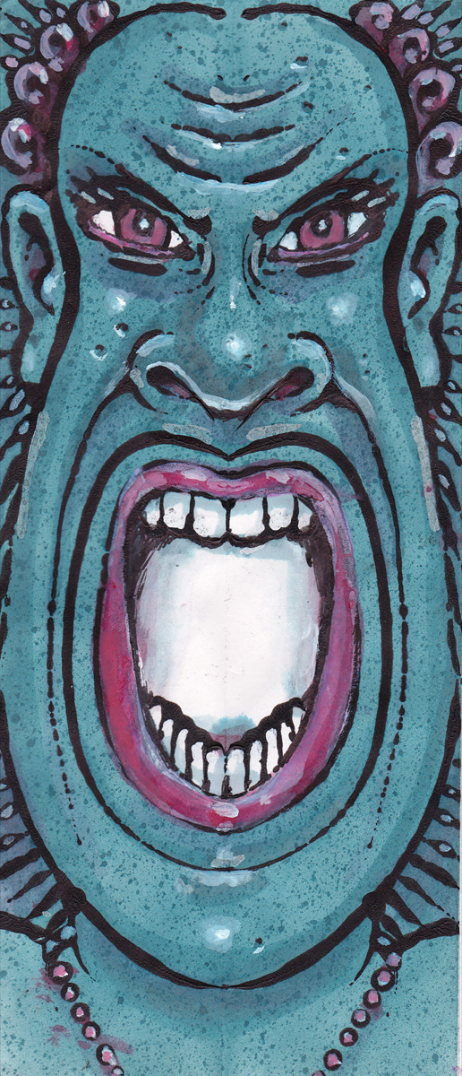
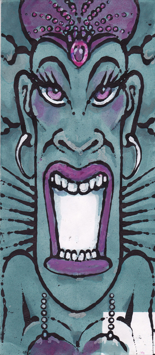
Art Art &T.Hachtman 03 Jul 2012 07:03 am
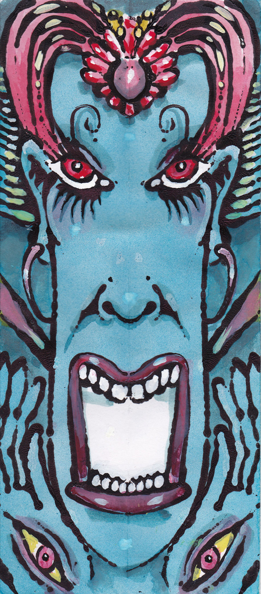
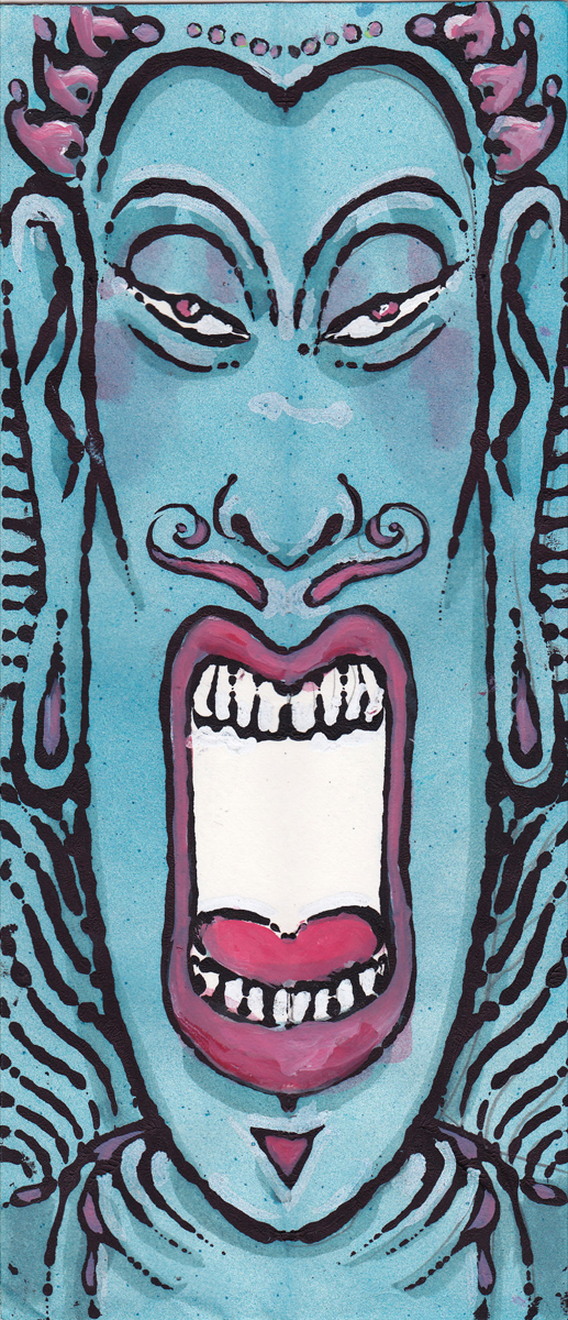
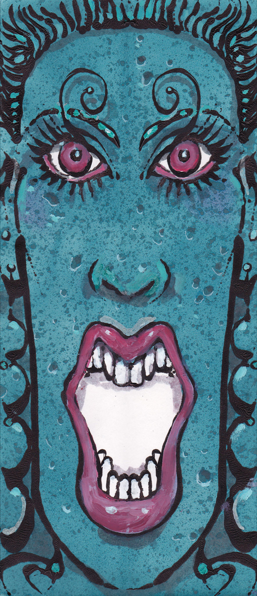
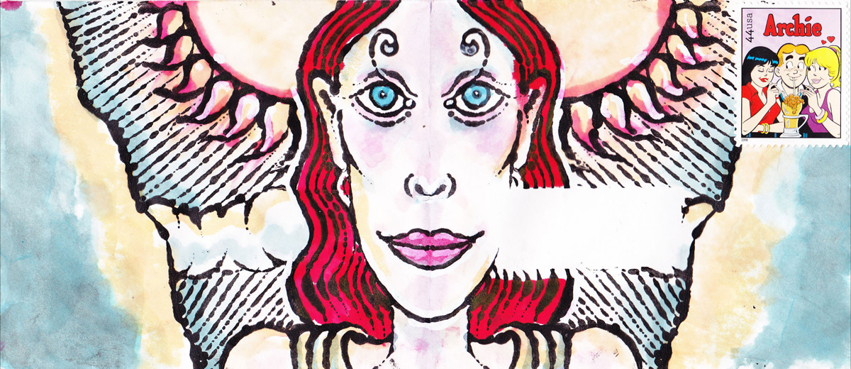
Screaming Envelopes
- I received a full email from friend, Tom Hachtman, this week. He had sent something that got me smiling. I’ve often seen his sketchbooks, and they’re usually some old book that he’s drawn or painted over the type within. This gives him the opportunity of ignoring the type or including it in the picture. This fascinates me, and makes me wonder what an animated film on such pages would look like. (I will try that some time as an exercise.)
Now he’s sent me a series of envelopes which he’s used as his sketchpad. Some were started or inspired by his wife, Joey, or his niece, April. It’s really all self explanatory, though Tom sent this note:
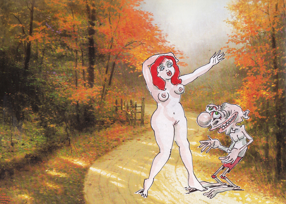
- i did a few new envelopes – or, actually, coloring some old envelopes…thought you might enjoy seeing them…the one that is not an envelope? The cute redheaded nude is out of one of Joey’s sketchbook from thirty years ago. The ugly guy is from one of April’s sketchbooks done I’m not sure when – could be recent or ten years ago…and the background is out of a Thomas Kinkade book. Joey draws the cutest gals and April draws the ugliest guys – I can’t resist putting them together.
Feel free to post any of these – but maybe remove any addresses…thanks.
t
Here are the envelopes.
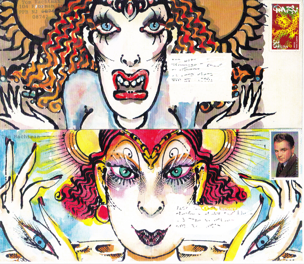
Two Envelopes
“Mail Art”
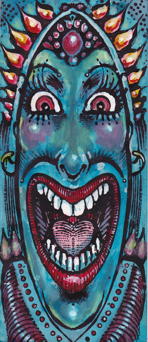
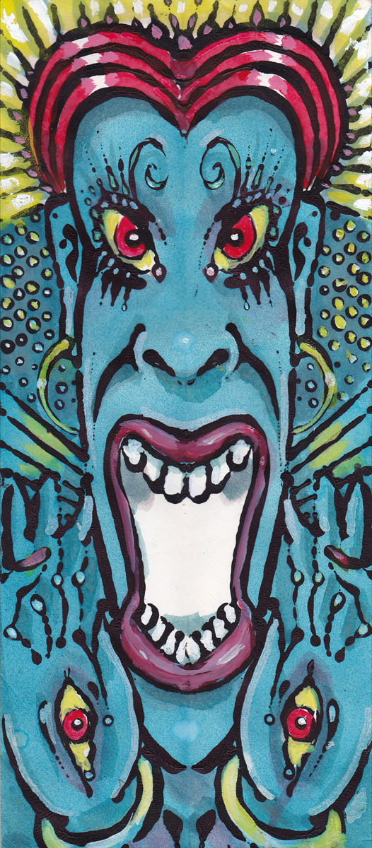
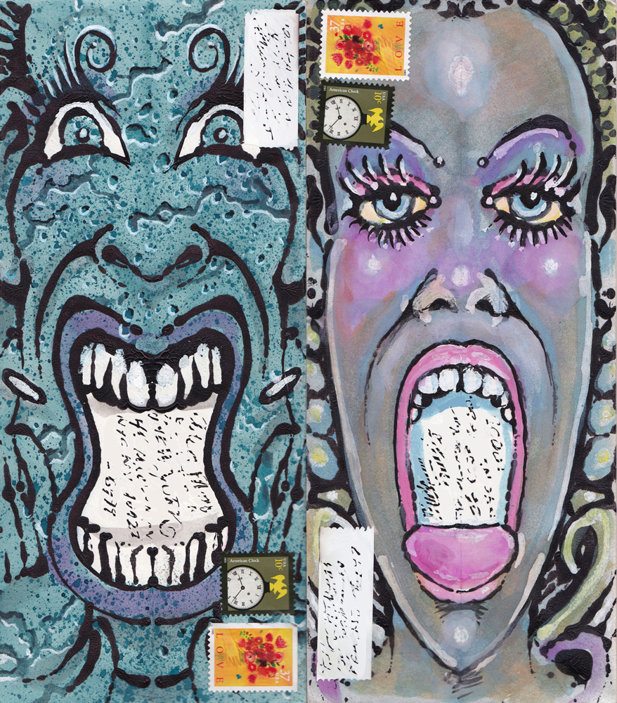
“Blue Scream” | “Blue Scream A”
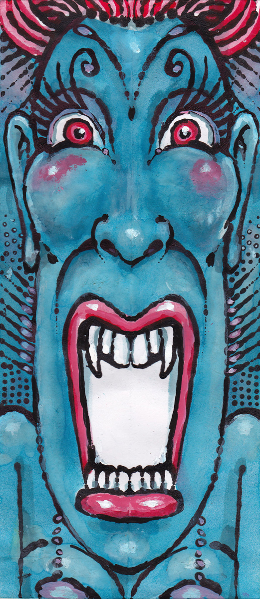
“Blue Scream B” | “Blue Scream C”

“Blue Scream D” | “Blue Scream E”
“Blue Scream F”
“Blue Scream G” | “Blue Scream G-01″
“Not Screamng”
“Ugly and Cute in the Road”
A Picture Postcard
