Monthly ArchiveApril 2013
commercial animation &Errol Le Cain &Illustration &Independent Animation &repeated posts &Richard Williams &Rowland B. Wilson &Tissa David 10 Apr 2013 05:55 am
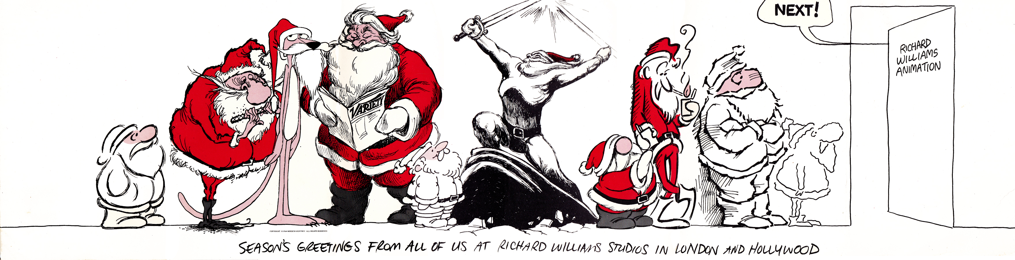
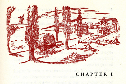
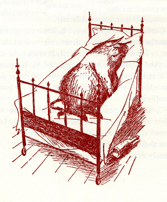
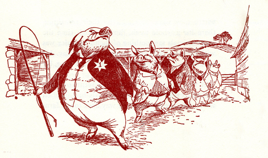
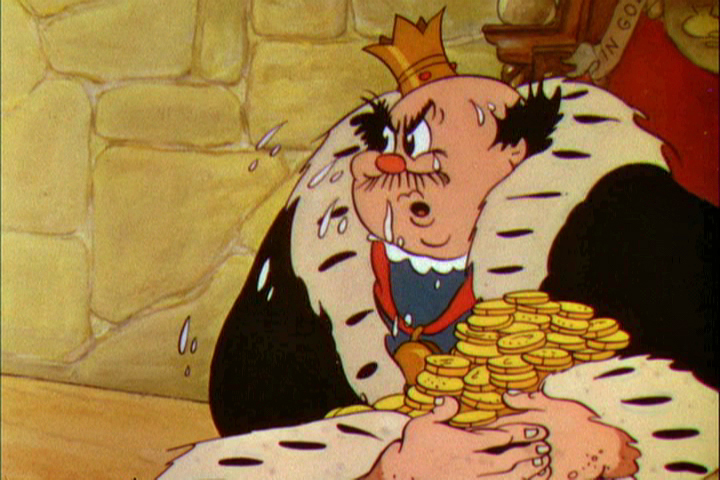
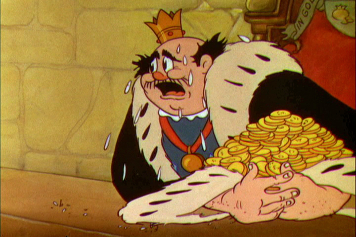
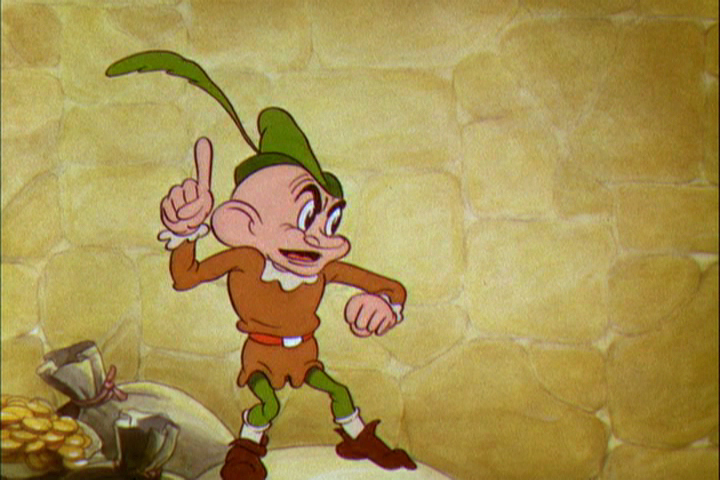
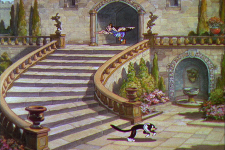
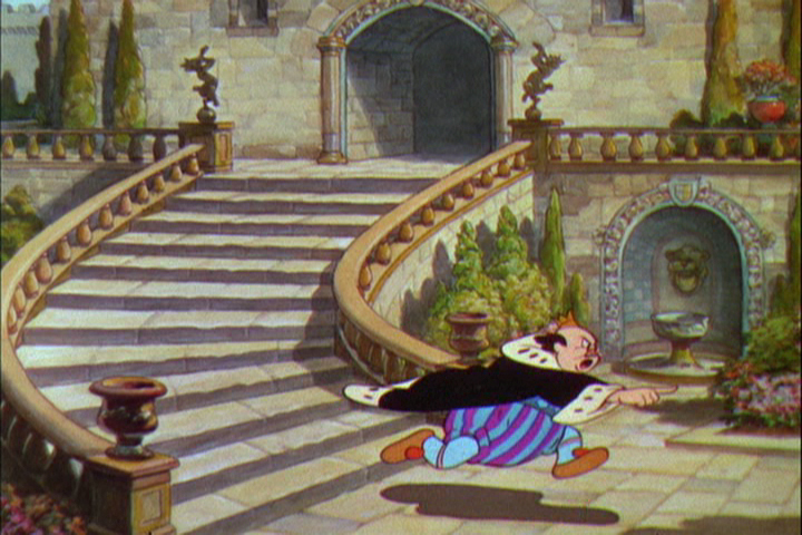
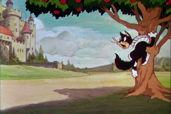
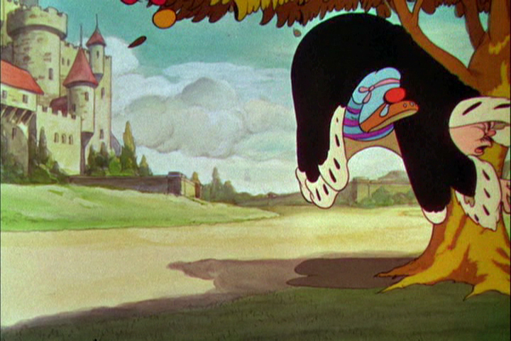
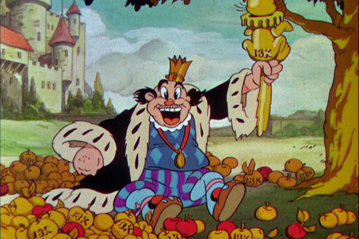
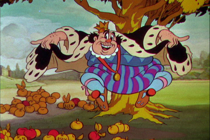
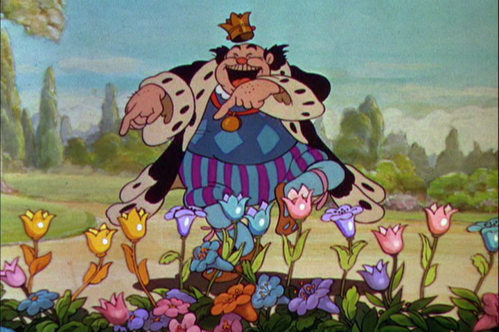
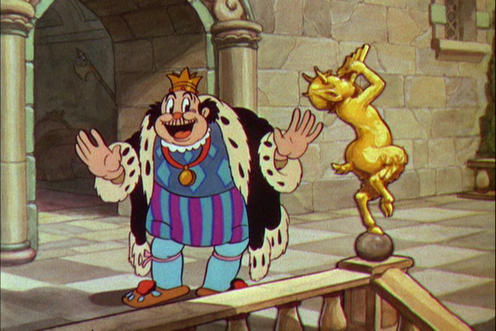
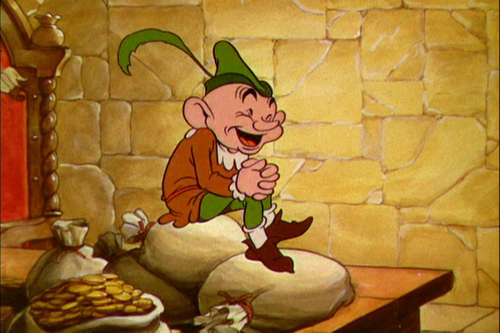
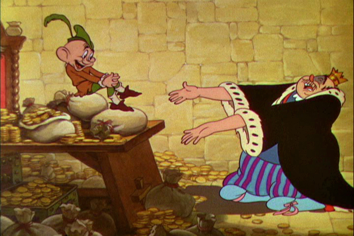
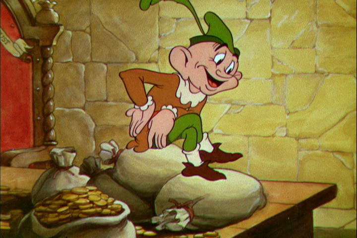
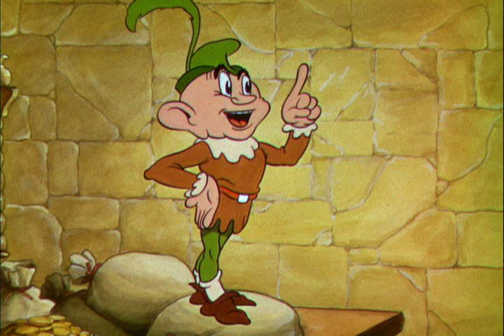
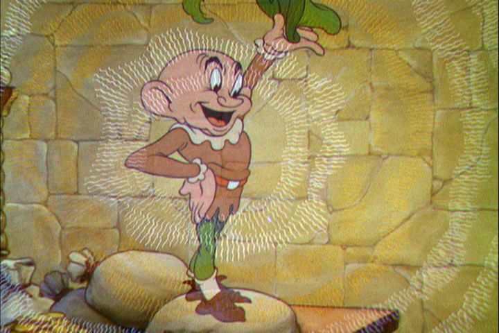
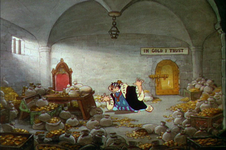
Dick’s Christmas
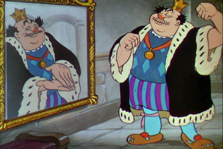
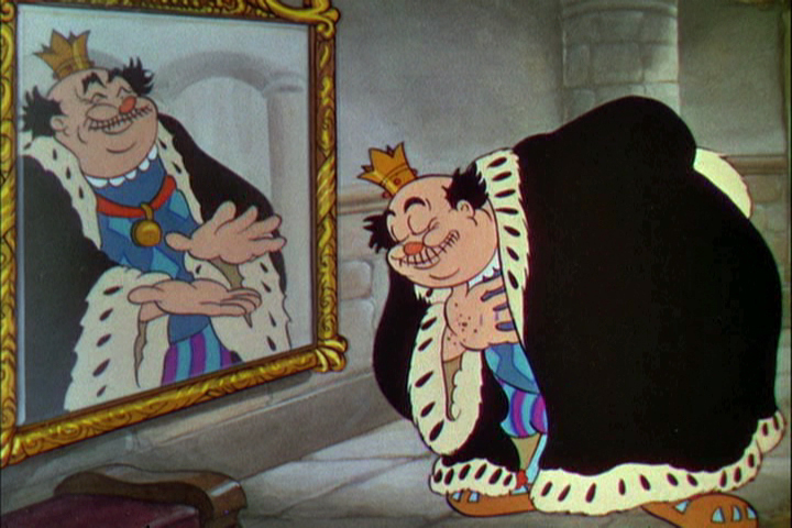
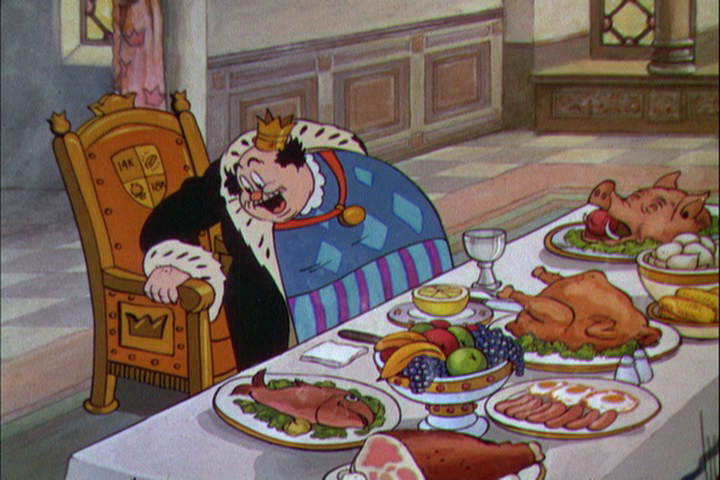
Richard Williams, when he had his own studio, was known for doing everything in a LARGE way. All of the commercials, title sequences, shorts were all done with a large, elaborate vision.
The Charge of the Light Brigade was a collection of 19th century graphics that are completely wrong, stylistically, for animating. All those cross-hatched lines. God bless the artists that pulled that off. The same was true for The Christmas Carol.
If the rendering style wasn’t impossibly difficult, then the animation was complex. Think of any of the scenes from Dick’s dream-feature, The Thief and the Cobbler. The many scenes where backgrounds were animated, with those backgrounds complete with complicated floor patterns or an entire city to be animated. Raggedy Ann was covered in polka dots and Andy was clothed in plaids. Both of the characters had twine for hair with every strand delineated. The commercial for Jovan featured a picture-perfect imitation of a Frank Frazetta illustration. Even the mountain on the background had to be animated and rendered.
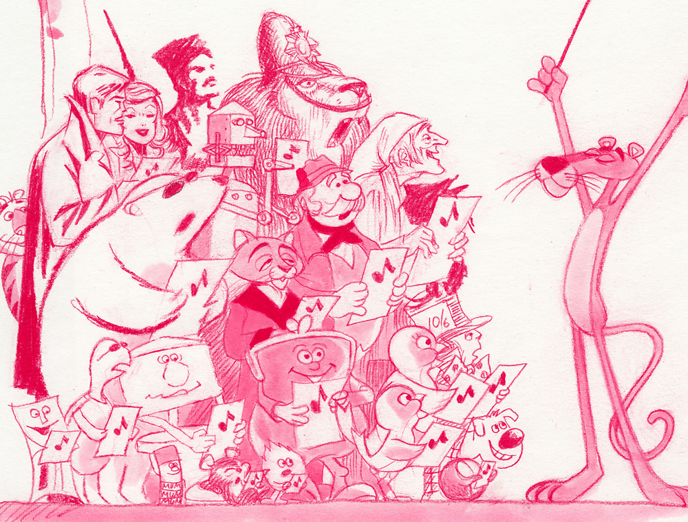
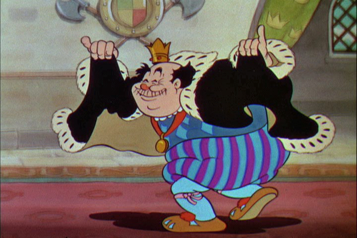
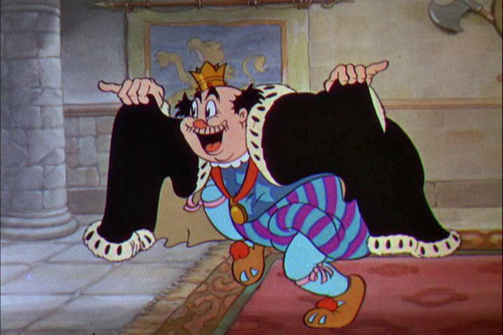
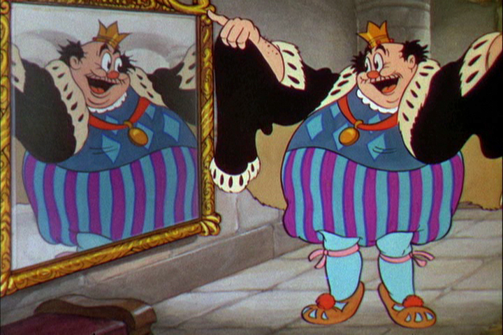
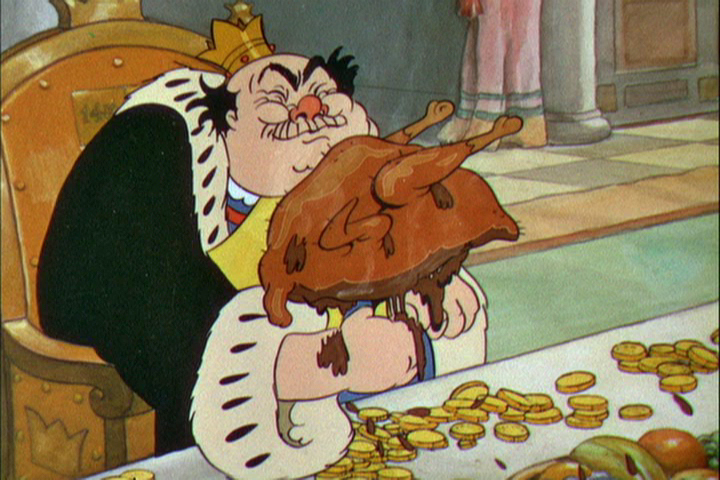
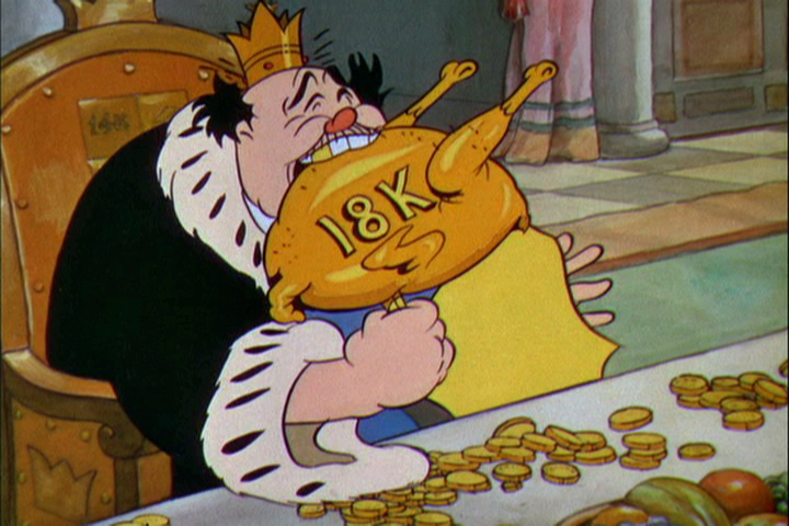
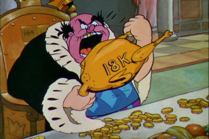
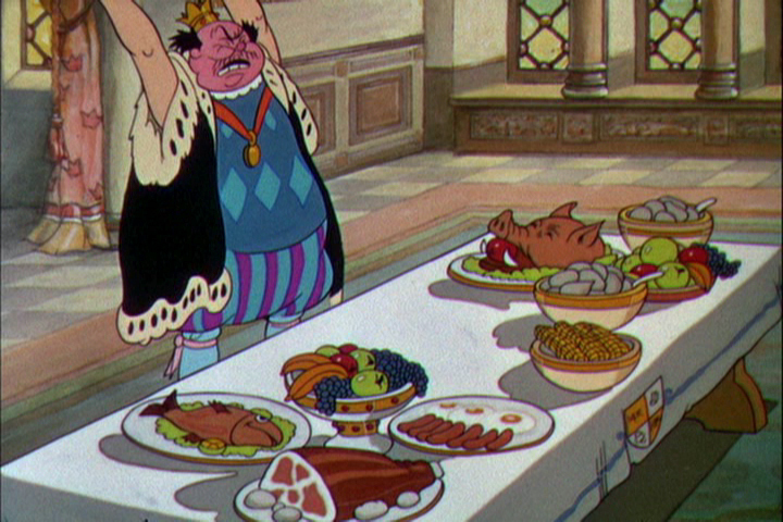
Well, when it came to Christmas cards, Richard Williams was the same. Enormous and beautiful cards were printed and signed by anyone who knew the recipient of the card. You were lucky being on the receiving line for these stunning cards. Tissa David once gave me a number of these cards. I held onto my copies of the cards until my space was flooded and the cards were damaged. I thought I’d post a few.
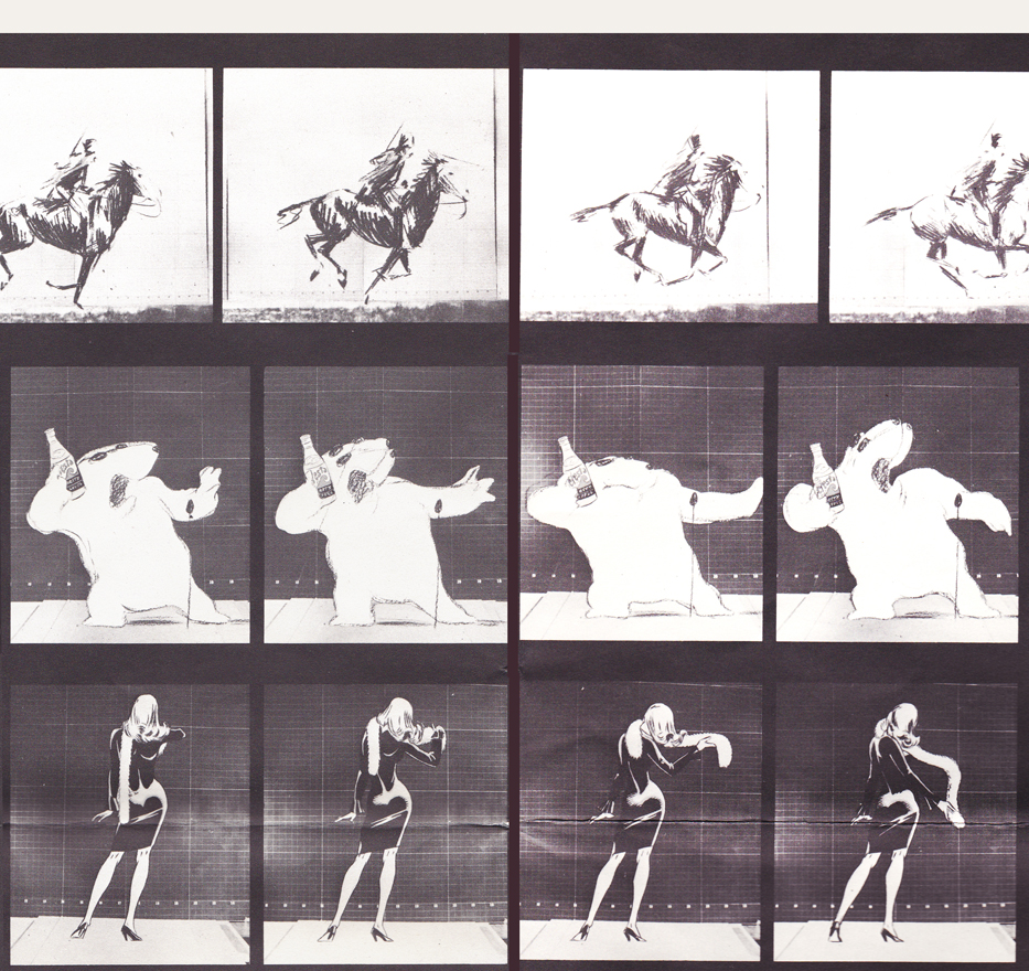
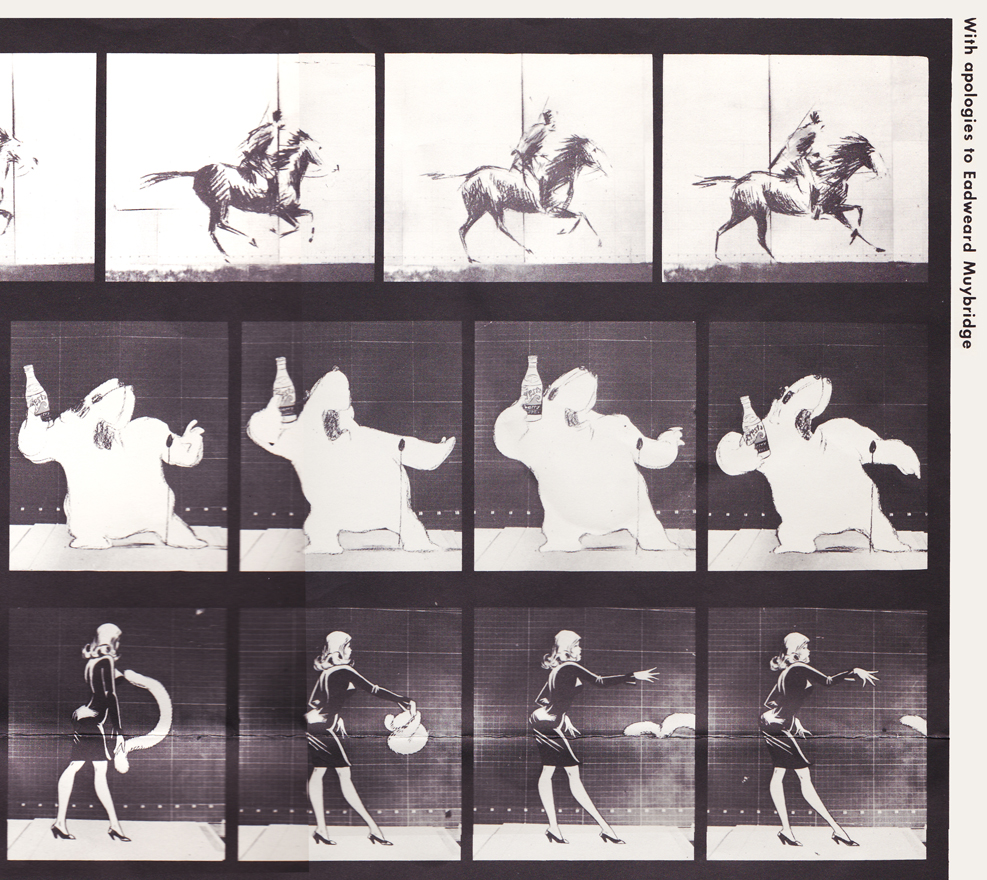
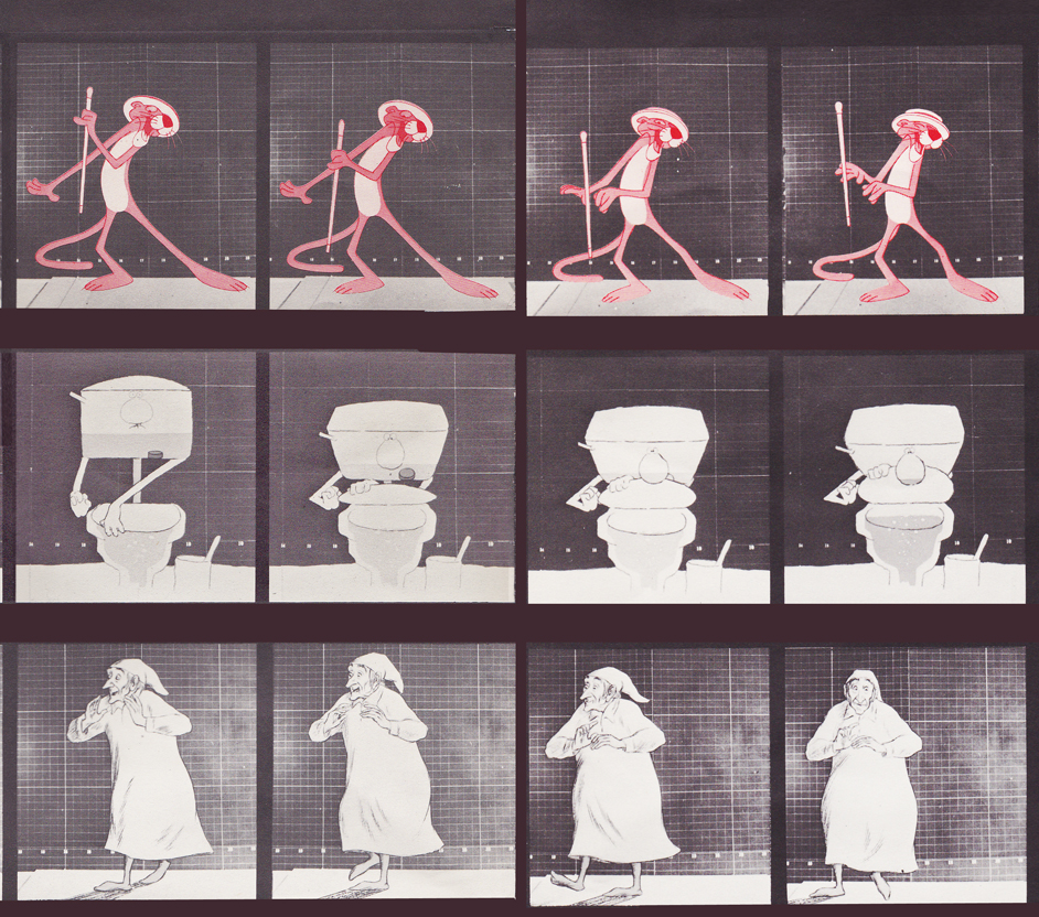
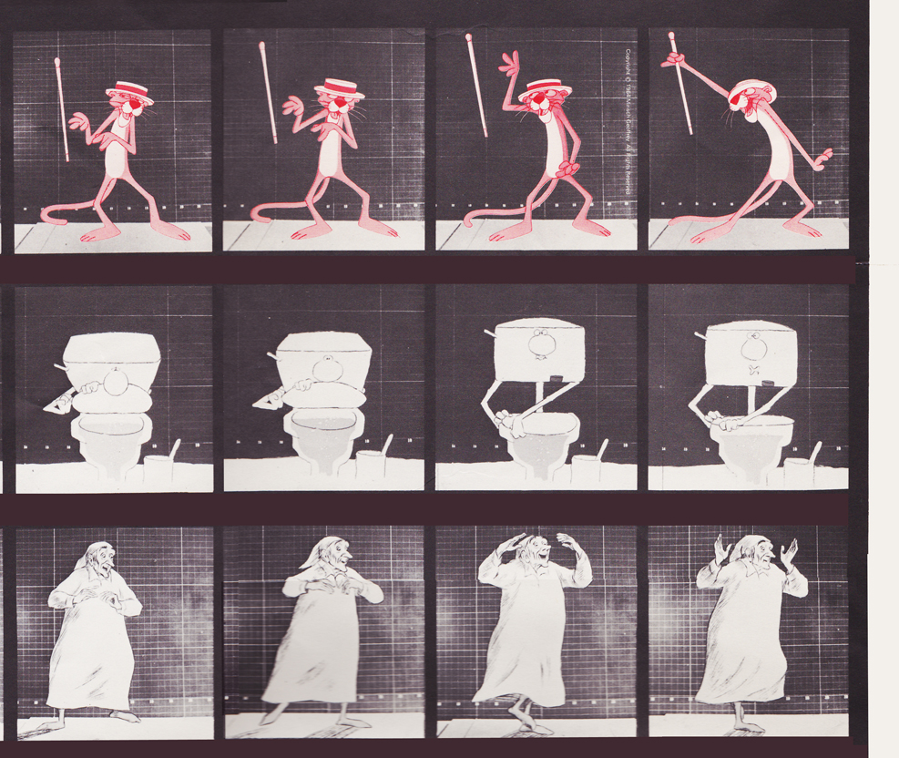
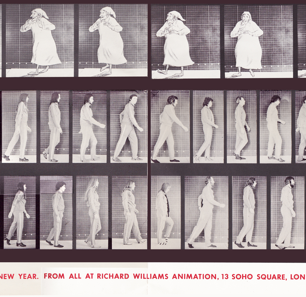
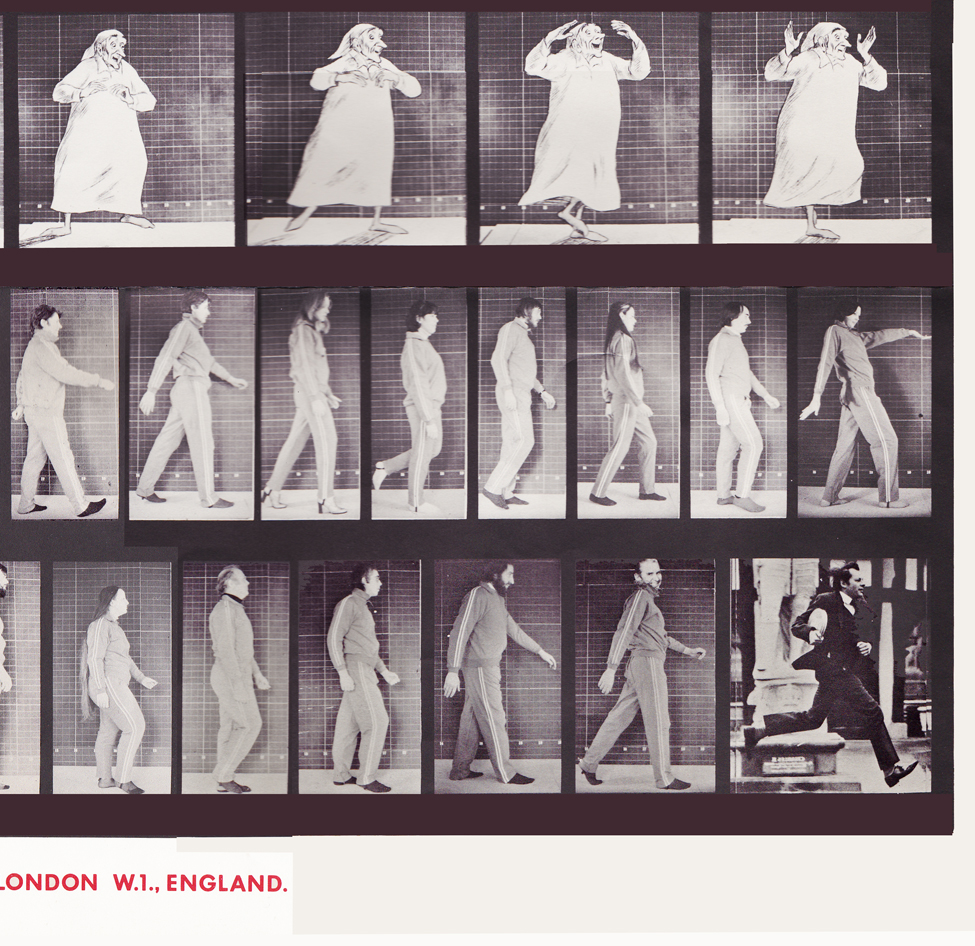
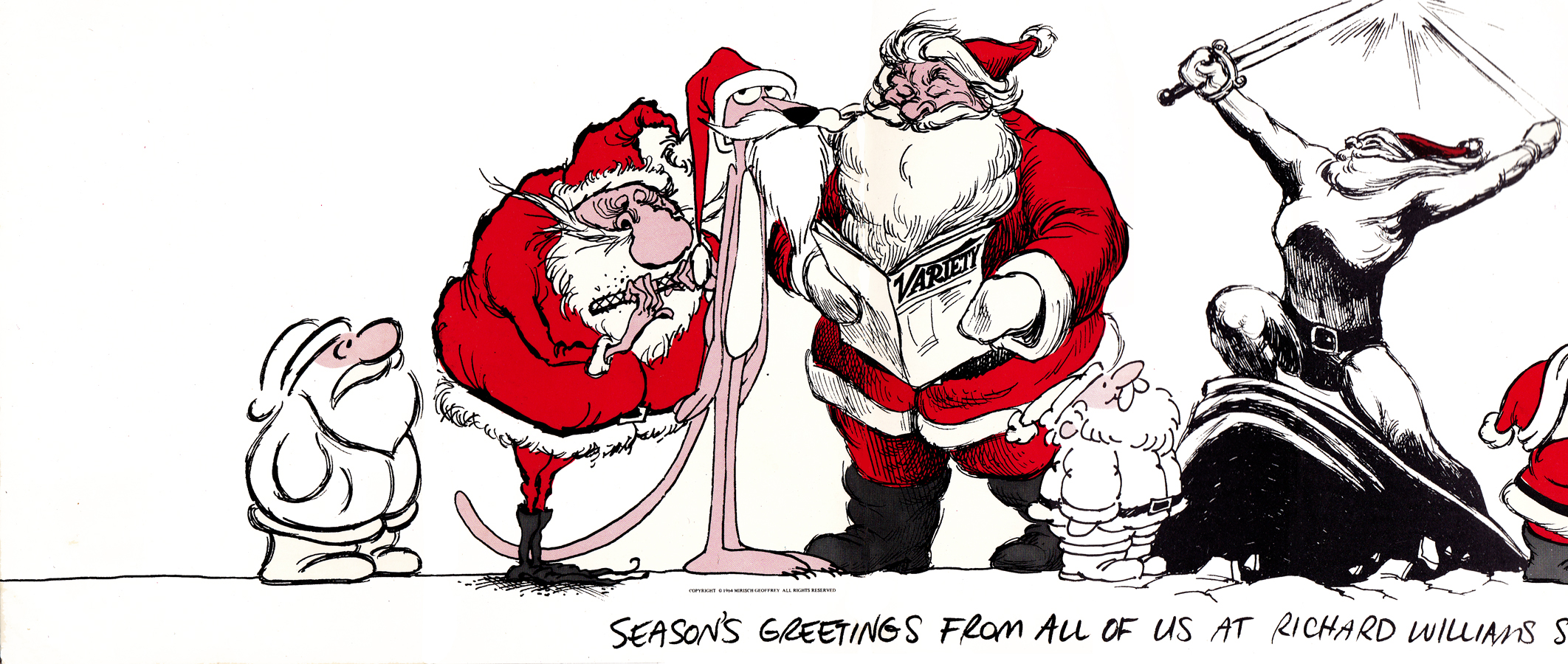
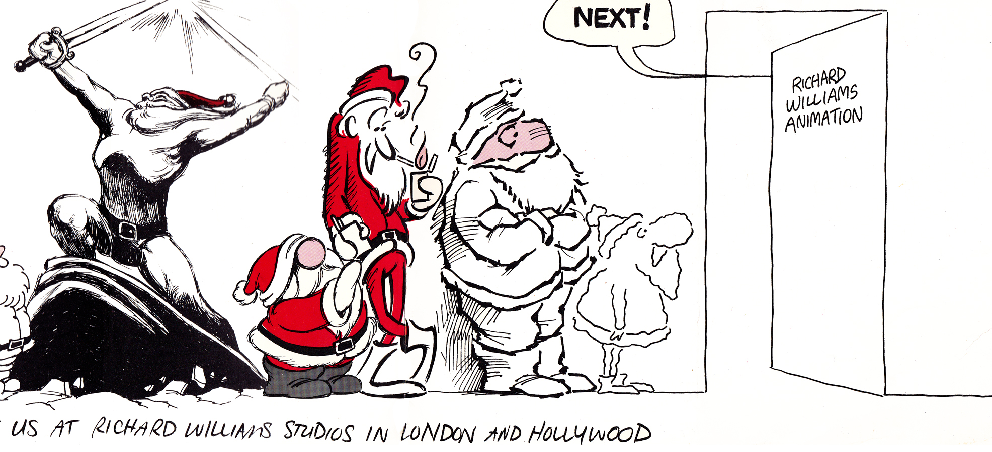
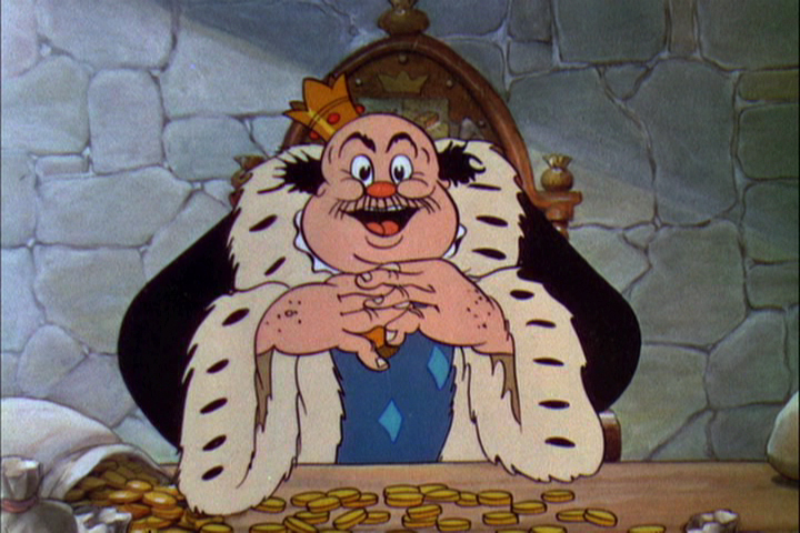
With card #1, a take-off of Muybridge with frame grabs from several of the better Williams commercial spots from that year, capped off by a number of key staff personnel positioned to continue the Muybridge motif.
(Here, I first post the entire card, followed by a break up of the card into sections
so you can more ably see the details.)
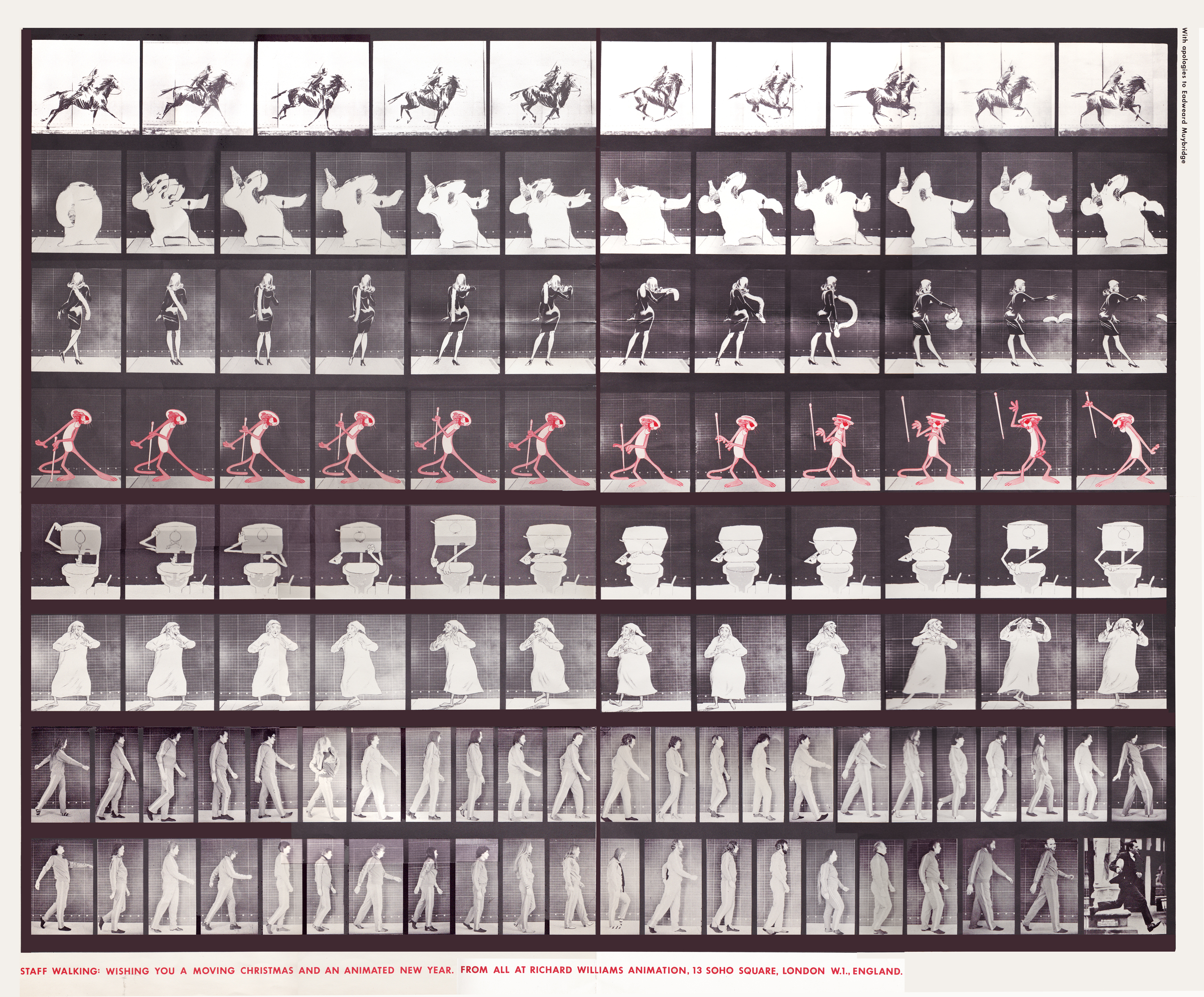
The entire card.
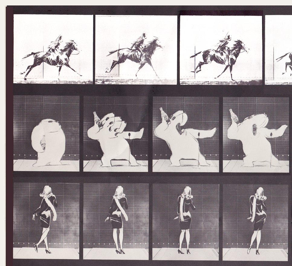
Top rows left side / Row 1: Pushkin Vodka ad
Row 2: Cresta Bear ad / Row 3. Tic Tac ad
Top rows center
top rows right side
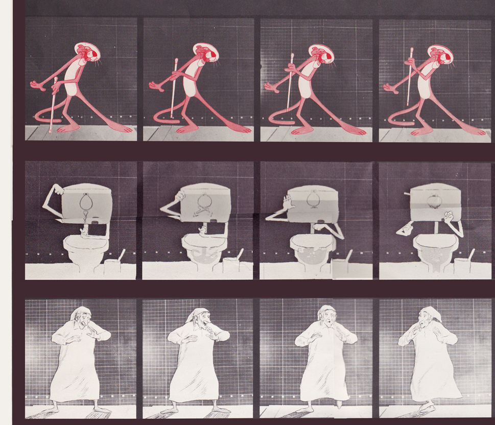
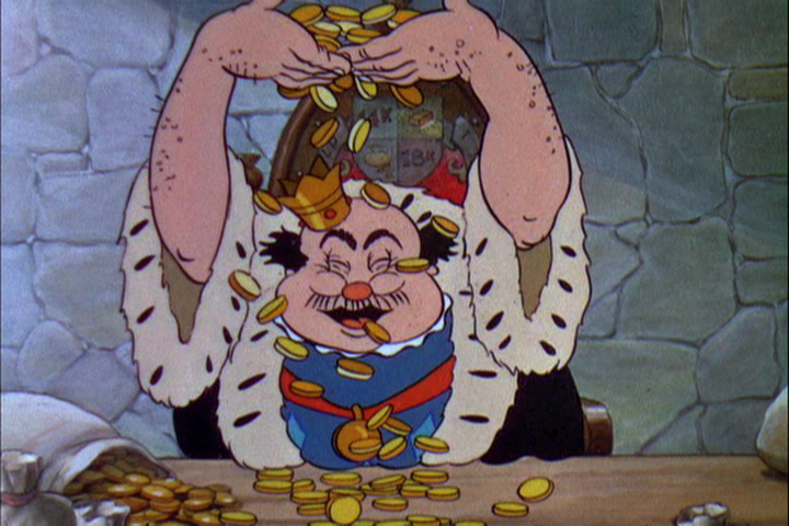
Middle rows left side / top row: Pink Panther titles
Middle row: Bloo toilet cleanser ad / Bot row: The Christmas Carol
Middle rows center
Middle rows right side
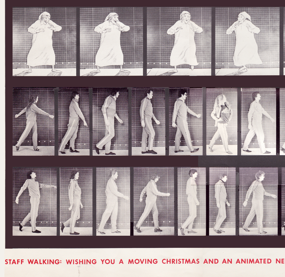
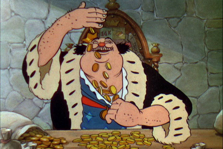
Bottom rows left side / top row: The Christmas Carol (repeated)
Middle row: staff / bottom row: more staff
Bottom rows center
Bottom rows right side
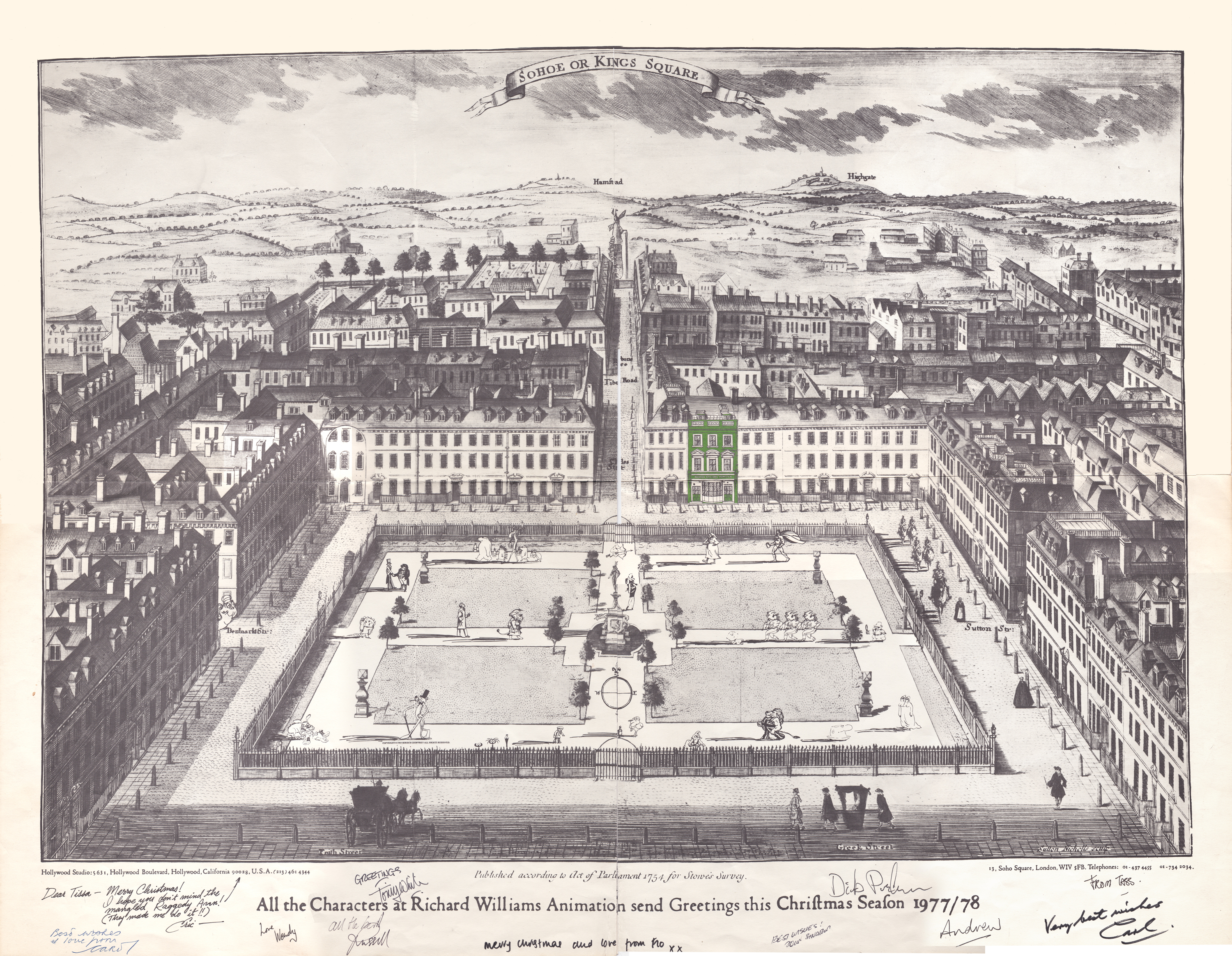
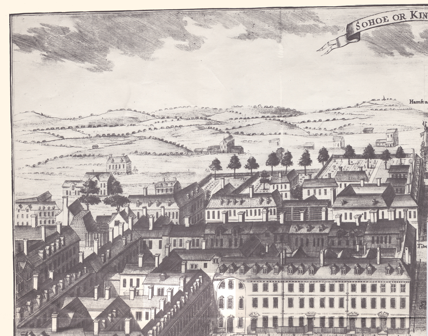
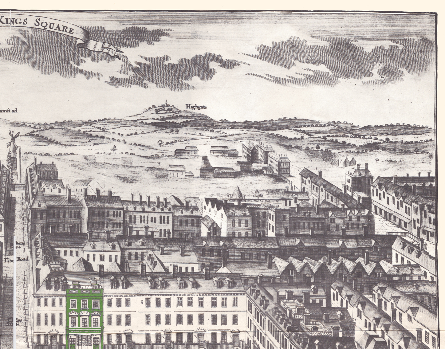
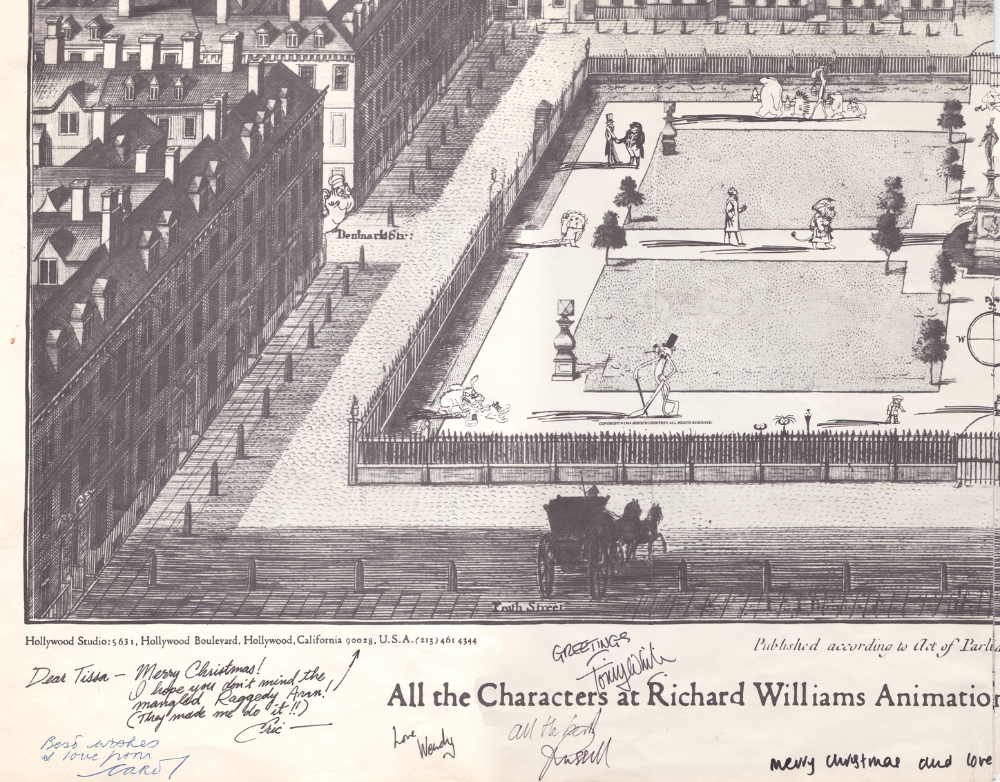
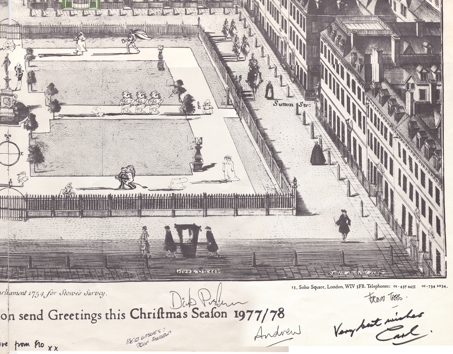
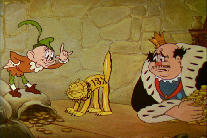
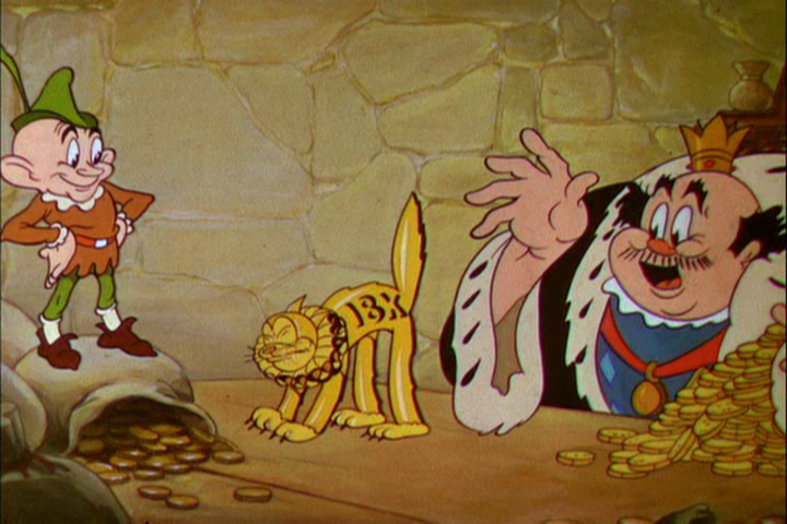
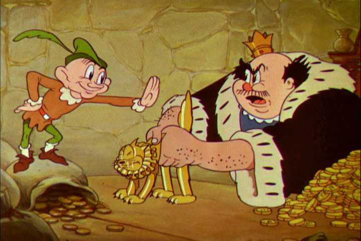
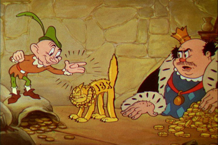
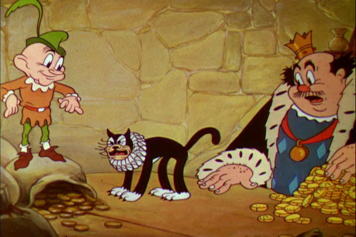
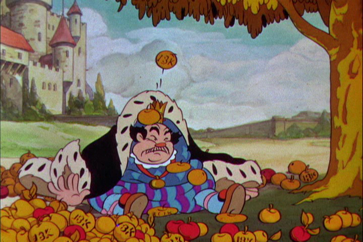
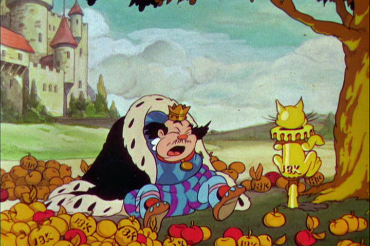
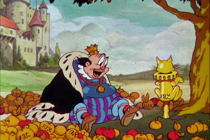
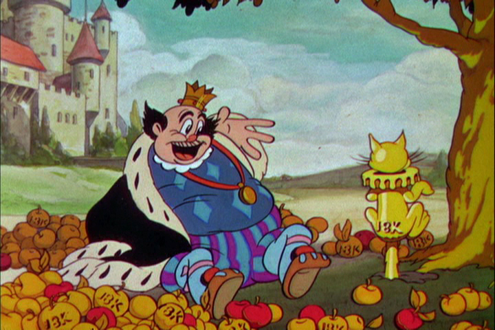
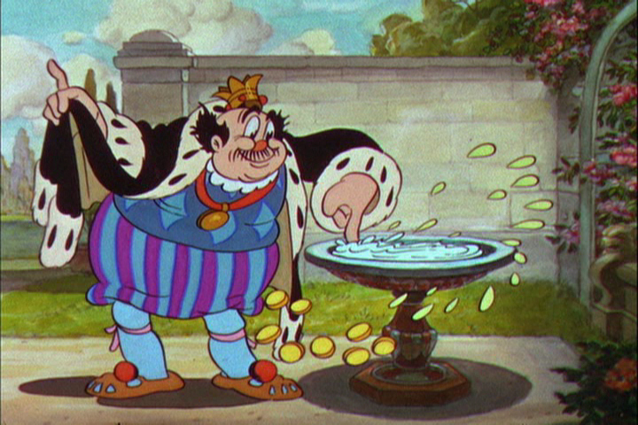
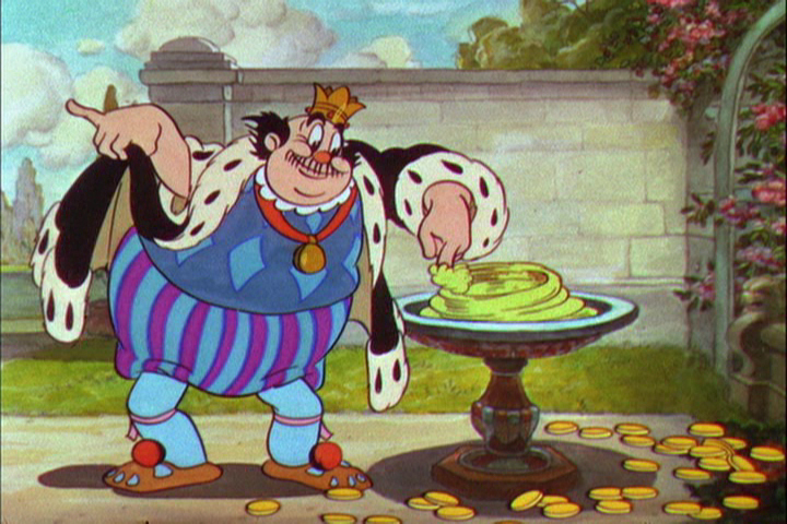
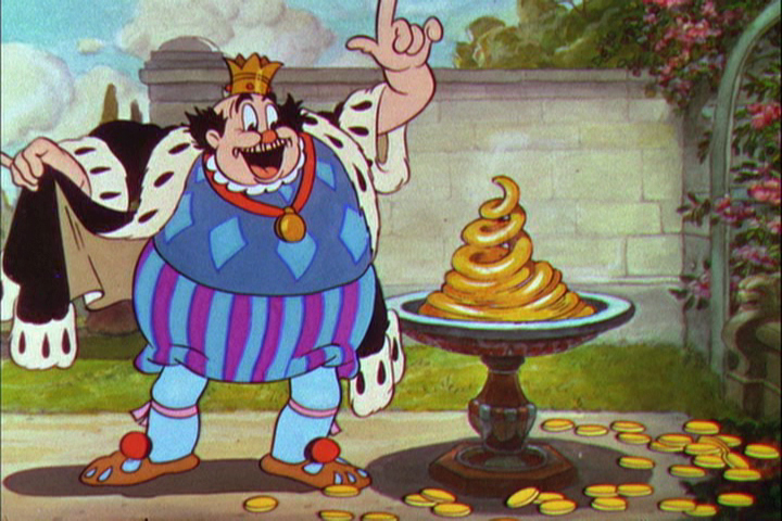
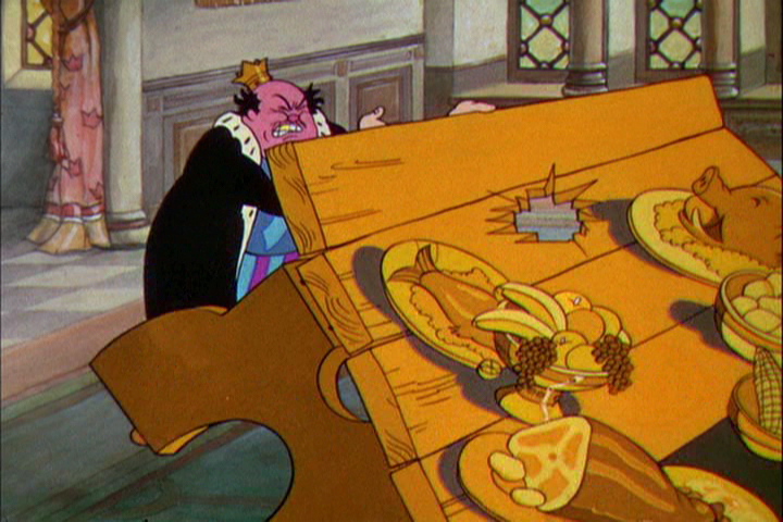
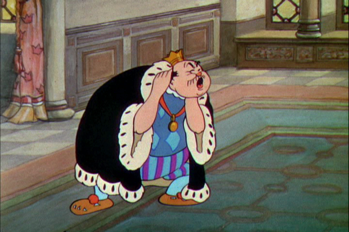
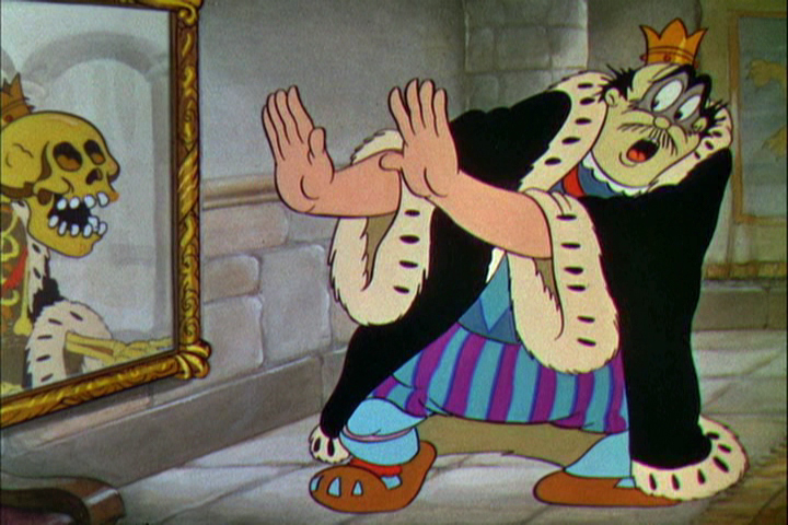
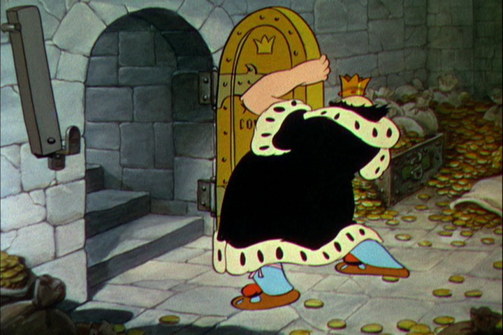
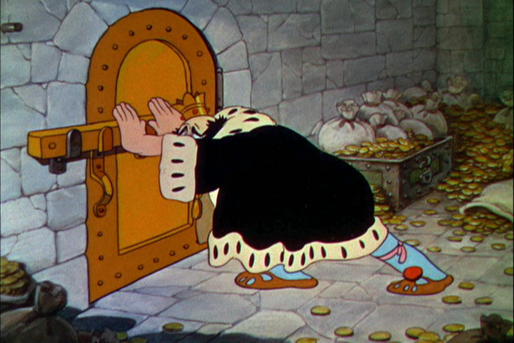
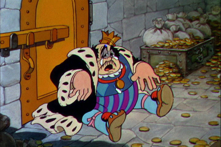
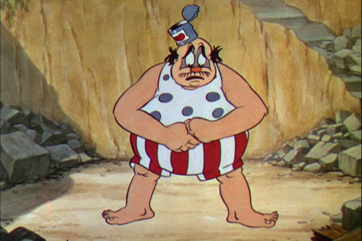
With card #2 we see Soho Square. The green front door
marks the location of Dick’s studio at 13 Soho Square.
(As with the first card, I posted the entire Christmas card,
followed by a sectional divide so you can enjoy the details.)
This is a folding card.
It comes folded so that you see the far left of the card
revealing part of the far right.
The card comes folded like this.
The left side (Santa up to doorway) is on the left side of the card.
The right side, on bottom, reveals the empty office.
It unfolds to reveal this long line of Santas.
Each Santa is in the style of the many illustrators’ styles
of those who designed ads for the studio in the prior year.
This is a closer view of the left side of the card.
This is a closer view of the right side of the card.
Suzanne Wilson sent in a Pink Panther Chistmas card; it was drawn by her late husband Rowland Wilson:
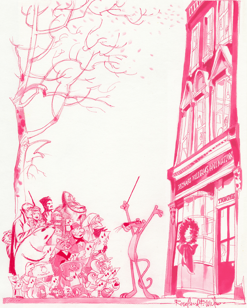
Below is a close up of that same card.
And this is the final card:
Here’s another full card.
This one is designed after the McGuffin of Dick’s feature,
three golden balls over the city.
from The Thief and the Cobbler.
Action Analysis &Animation &Animation Artifacts 09 Apr 2013 07:23 am
Johnny Gent’s Spellbinder – recap
 Johnny (Gentilella) Gent had the hardest time on the Letterman series done for the original Electric Company. He could never get the characters and kept trying to add 3D form to the 2D characters that John Hubley had created.
It was my first job, and I was in awe of every animator that walked through ________A very early John Hubley model of Spellbinder.
the door. We had 2½ months to do
all the artwork on the 20 spots that were 2½ mins each. A total of 50 mins in 10 weeks. (That’s about right these days for a 30 second spot!)
I did all the assisting, inking and inbetweening and had to do it quickly. (I estimated about 18 secs. per drawing. The game I played with myself to keep up was to keep one eye on the drawing and another on the clock.)
As I said, it was my first animation job. What did I know! I had to take Johnny’s drawings and reshape them into Hubley’s characters, and I had to do it in ink. No pencil tests. Just do it. Whatever came out, was the final artwork (and I use that word loosely.) I felt, even while I was doing it, that I was killing Johnny’s work, so it went as it did.
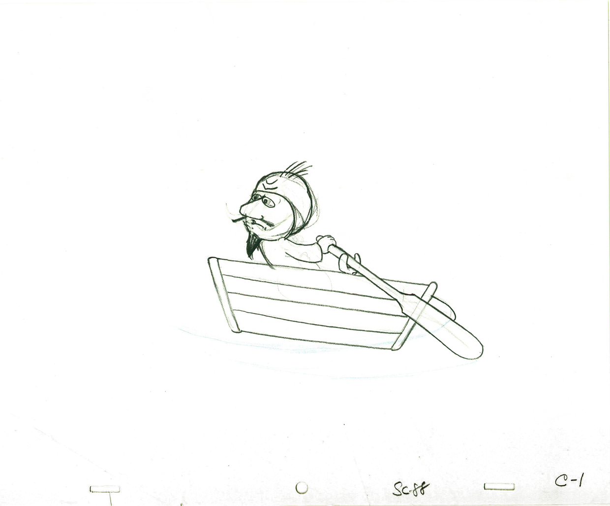
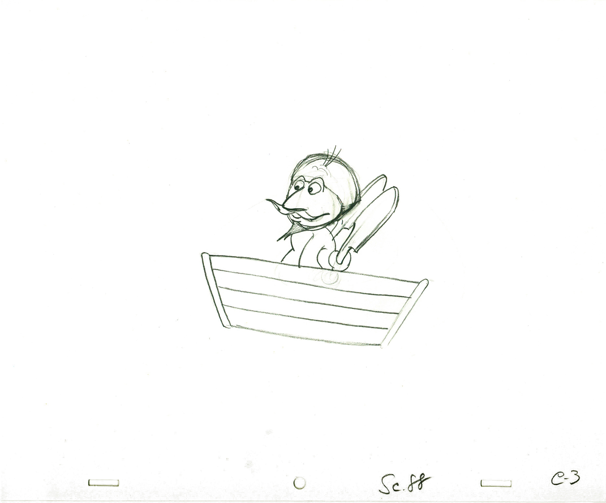
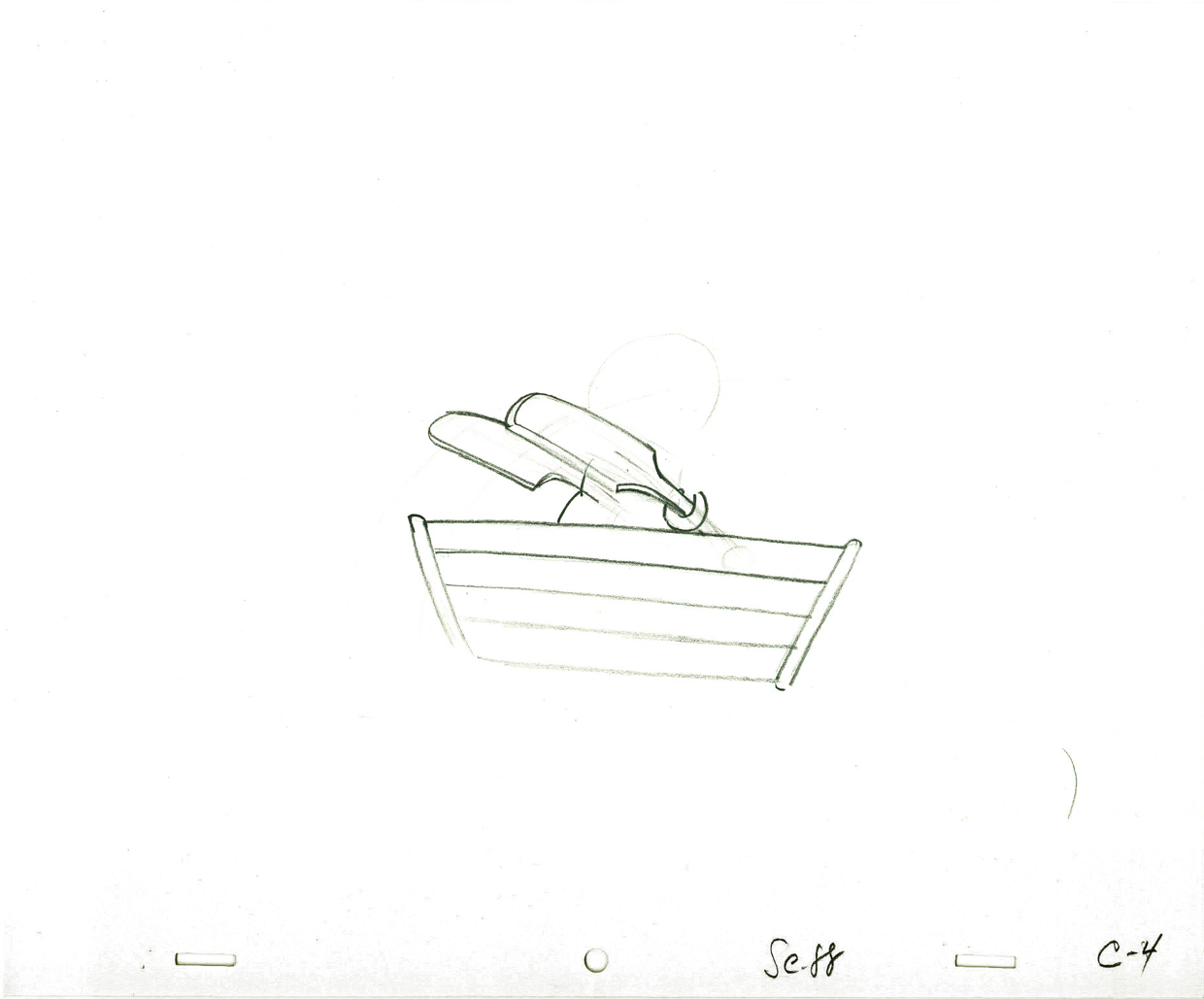
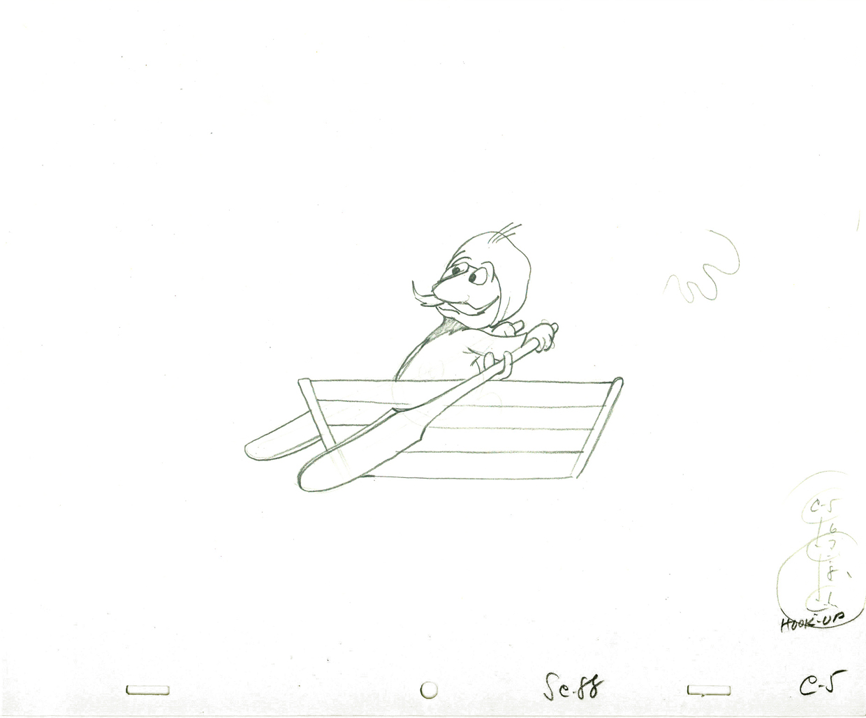
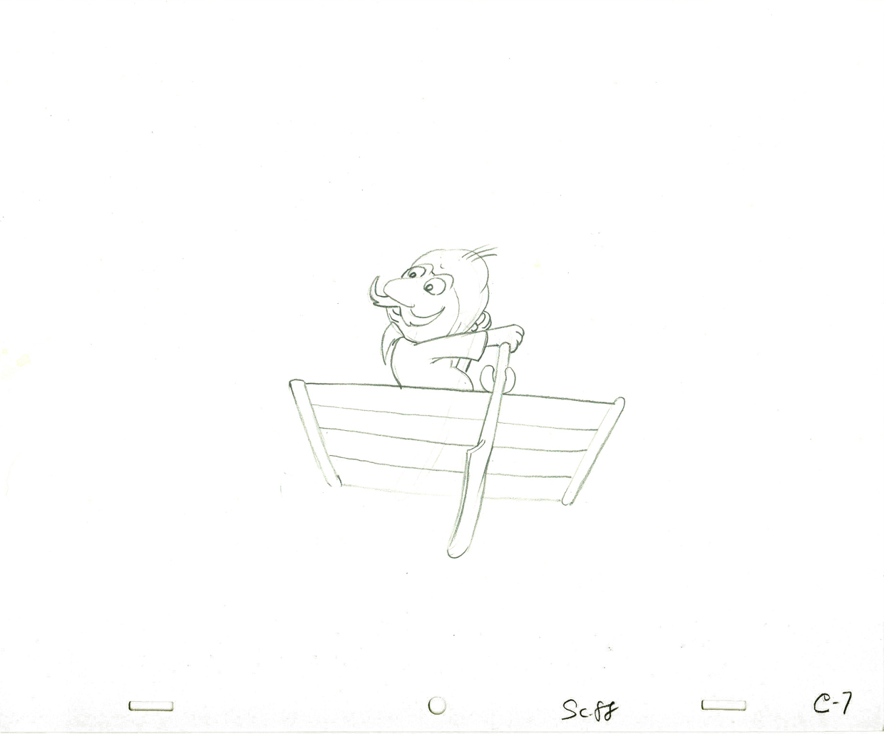
Here’s a cycle of Johnny Gent’s Spellbinder rowing a boat.
 1
1(If you click on any drawing it’ll show you the full animation page.
 3
3
 4
4
 5
5
 7
7
Johnny Gent’s Spellbinder rows a boat
on two’s per drawing indicated
Click left side of the black bar to play.
Right side to watch single frame.
Six months later, I was on a lay-off from the Hubley Studio in need of a job. At NY Institute of Technology, a school in Long Island, they were starting work on a feature animated film that the school’s dean, Alexander Schure, was financing. He had decided to create the world’s largest computer animation department, and they were just barely starting to get a reputation for the incredible people they were employing (Ed Catmull, Alvy Ray Smith and other pioneers among them), but first they were going to do this hand-drawn feature.
 Out of the blue, I got a call from Johnny Gentilella. He was now the head of animation at Tubby the Tuba and was offering me a job as an Asst. Animator. NYIT was my alma mater, so I was curious to see what the place now looked like. Assistant was a promotion with a pay raise. I took the job right quick.
The staff included about ten people in those early days, and we worked in what seemed like a log cabin. I was given a seat directly across from the front door and handed a scene of Tubby the Tuba to clean-up and inbetween. I did it. Then another, then another, then another.
A few weeks later, at lunchtime, Johnny and I were alone in the space eating our sandwiches. I took the opportunity of apologizing to him for what I did at Hubley’s studio. I was taking Johnny’s sculpted drawings and flattening them. To make up time I skipped a step by not working in pencil. I’d clean up with a Sharpie on heavy paper. In the process flattening and taking all of the life out of the drawing. I apologized to John for what I felt was destroig his work. I was also only days into my first job and didn’t really know what I was doing. But I did it anyway.
He said that he hadn’t even noticed. Because of the schedule and the budget on the Letterman series, he knew I was doing what was best for the work. There was nothing I needed to apologize for. He appreciated how I felt but told me not to worry about it.
At the same time, I pointed out that I had just done a scene of Tubby the Tuba giving a speech at a lectern. It was identical, drawing for drawing, of a scene Johnny had done at Hubley’s. There it was Spellbinder, here it was Tubby. How and why did John do that?
He explained that on films like Letterman they were done so fast that there was no time for Pencil Tests. Animators couldn’t do as they did in the old days, animate a scene then see a PT of the scene and correct it if it needed the work. They had to knock out the scenes. If anything went wrong it was the animator’s fault and he’d be out of a job and a future contact for further work. So animators did what they knew would work. Better to be stale and save face, keeping your job, than to be daring and without a job.
 The following Saturday, I told Tissa David this story. She was giving me lessons in animation and inbetweening on Saturday mornings at her apartment. I let Tissa know about Johnny’s cheating to make it work. Tissa’s response – “How lucky Johnny is! I wish I had such luck!” She said she was unlucky to have a memory that couldn’t remember how to do such a scene and to catalogue the work, math and all, in her memory. Obviously John could do that. Tissa, instead, had to approach every scene as wholly new. She had to ____________________Tissa’s Letterman”
animate from scratch whereas John could
pull the scene from his memory.
I got Tissa’s point.
.
.
Note: the drawing of Tubby, above, was done by the
animator, Ed DeMattia, many months later in the production.
Action Analysis &Animation &Animation Artifacts &Commentary &Disney &Peet &Tytla 08 Apr 2013 05:05 am
Stanislavsky, Boleslavsky and Tytla’s Smears & Distortions – 4
Boleslavski was a great admirer of Stanislavsky and his acting techniques. When he, Boleslavsky, came to the United States, he taught the Stanislavsky technique to his students. These included Lee Strasberg, Stella Adler and Harold Clurman; all were among the founding members of the Group Theater (1931–1940). The Group Theater was the first American acting ensemble to utilize Stanislavski’s techniques, and its members all went off to espouse their own versions of the “method.” American acting had taken some real turns into the creation and development of a true system for getting the best performance out of the actor.
In animation, there was animation technique and styles. These rarely had anything to do with acting. However, there were a number of animators at the Disney studio who wanted to put the focus on their acting and actually studied Stanislavsky and Boleslavsky so that their characters would give a great performance. Tytla was certainly a leader among the animators to do this.
Whereas in Pinocchio, while working with such a flamboyant and
eccentric character, Tytla stretched and distorted Stromboli to
get the necessary and sudden emotional mood shifts desired.
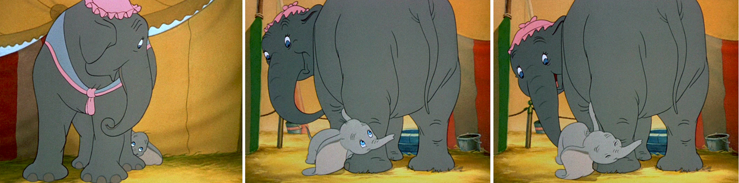
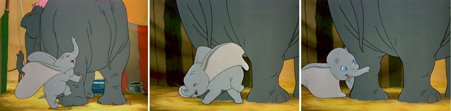
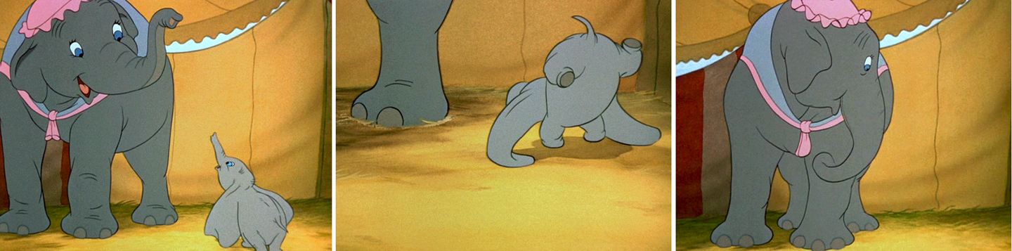
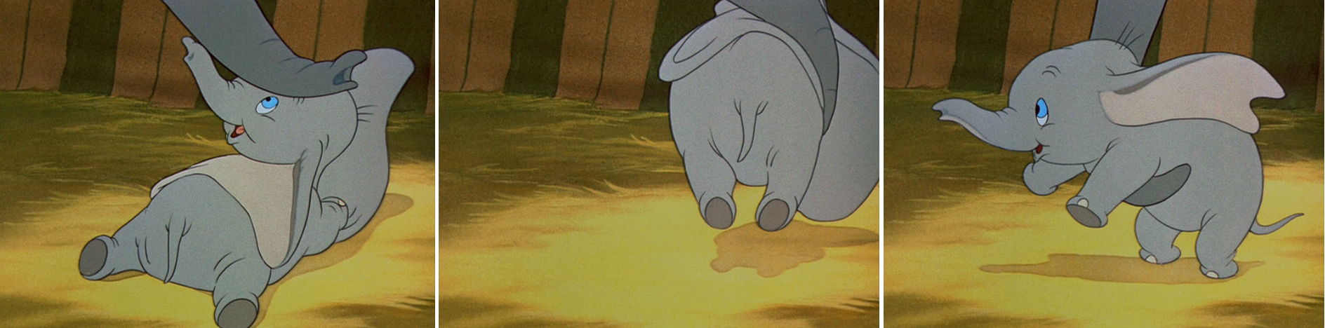
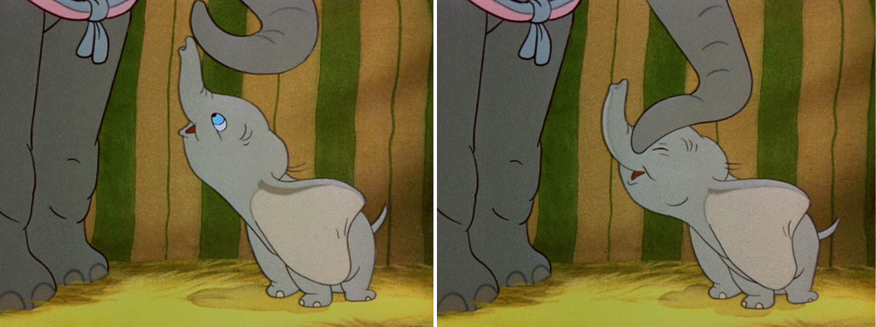
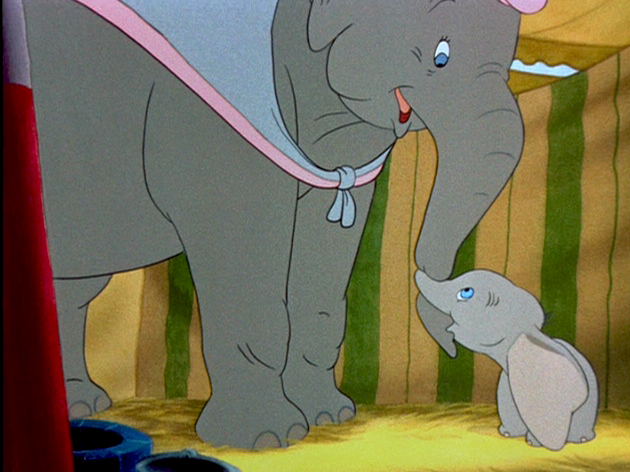
With Dumbo, Tytla modeled the character after his own son,
and he animated this scene wholly on the two characters
given to him on the strong storyboard by Bill Peet.
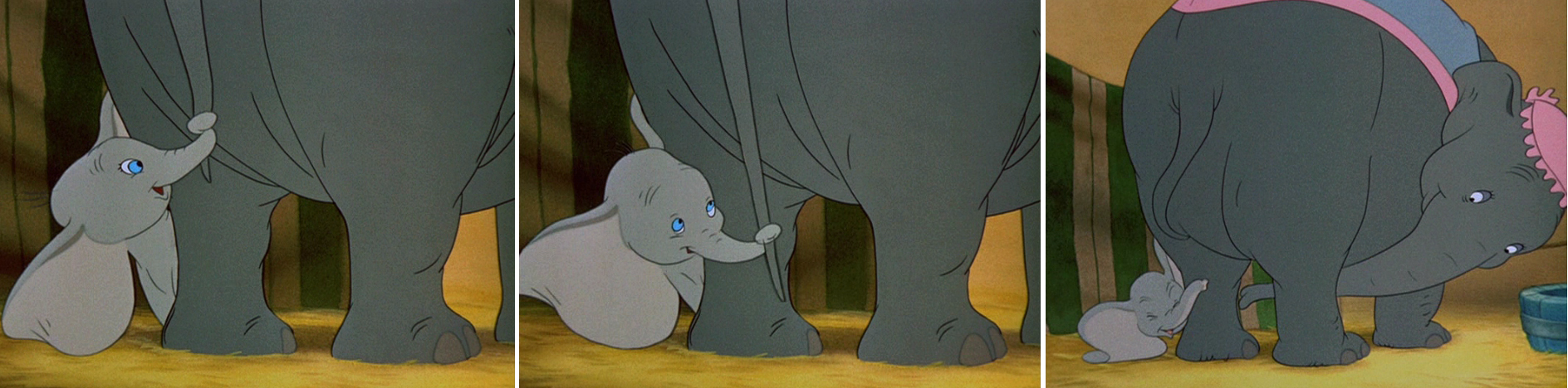
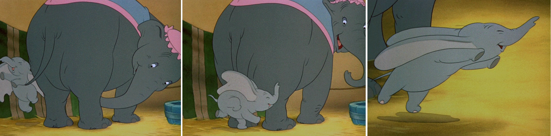
He didn’t use distortion, because it wasn’t the character he was animating.
Dumbo was gentle, all truth. The honest performance meant keeping everything
above board and on the table. That is undoubtedly the performance Tytla drew.
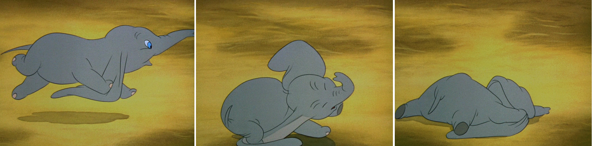
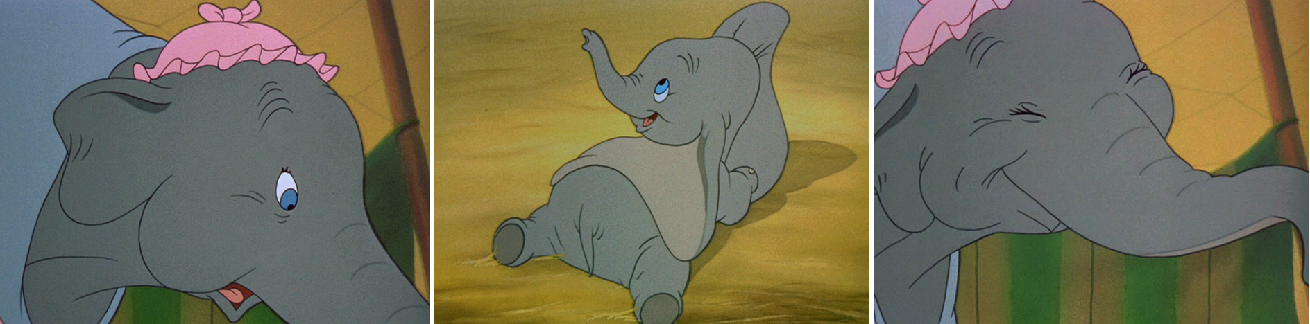
In my opinion, it has to be one of the greatest animation performances
ever drawn for a film. It’s quite extraordinary and cannot be undercut
in any possible way.
(Click any image to enlarge.)
 .
.
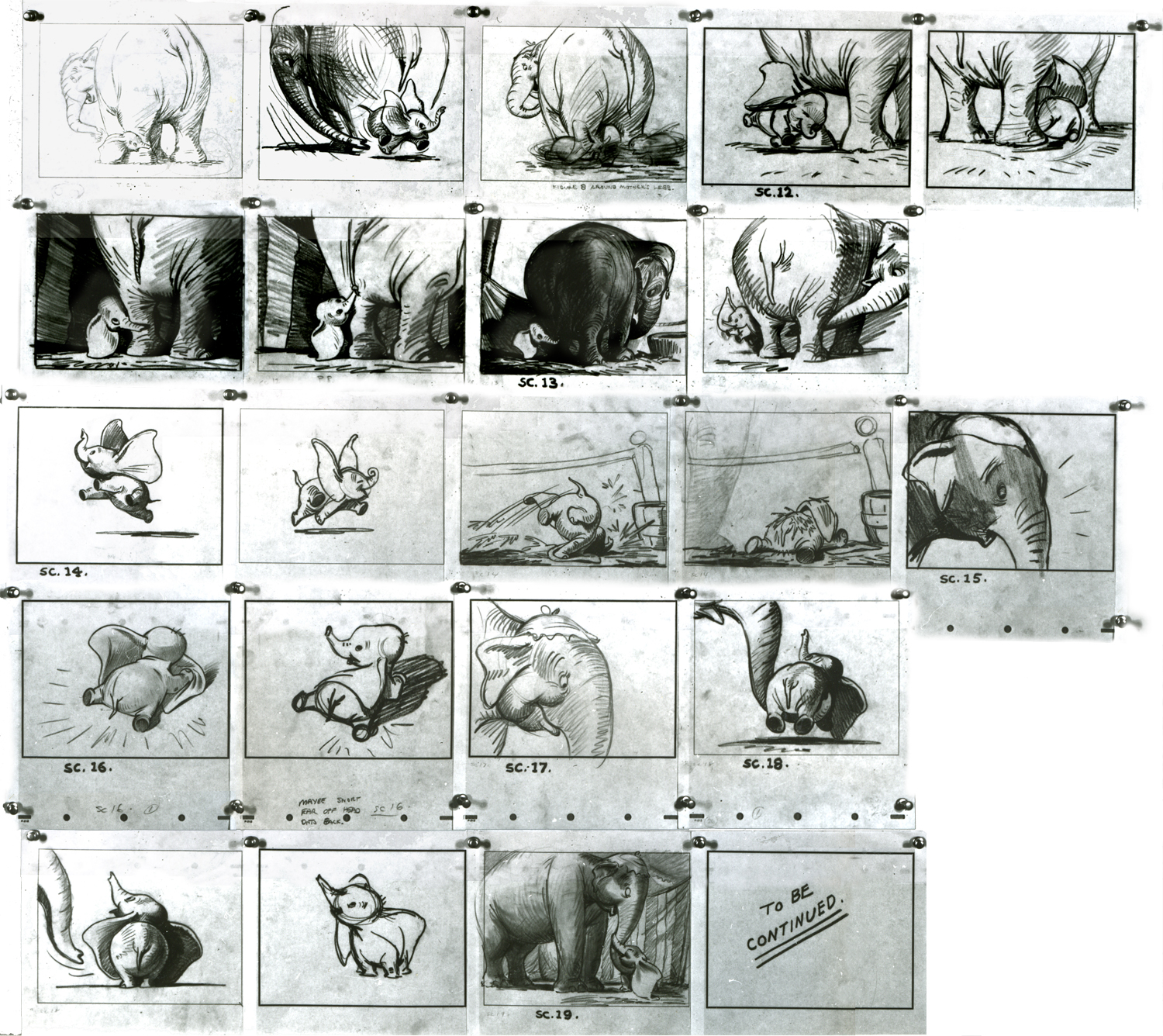
You can see that Bill Peet’s storyboard was certainly an inspiration,
at the least, for Tytla to follow, if not to equal.
Let’s move to another film. Fantasia.
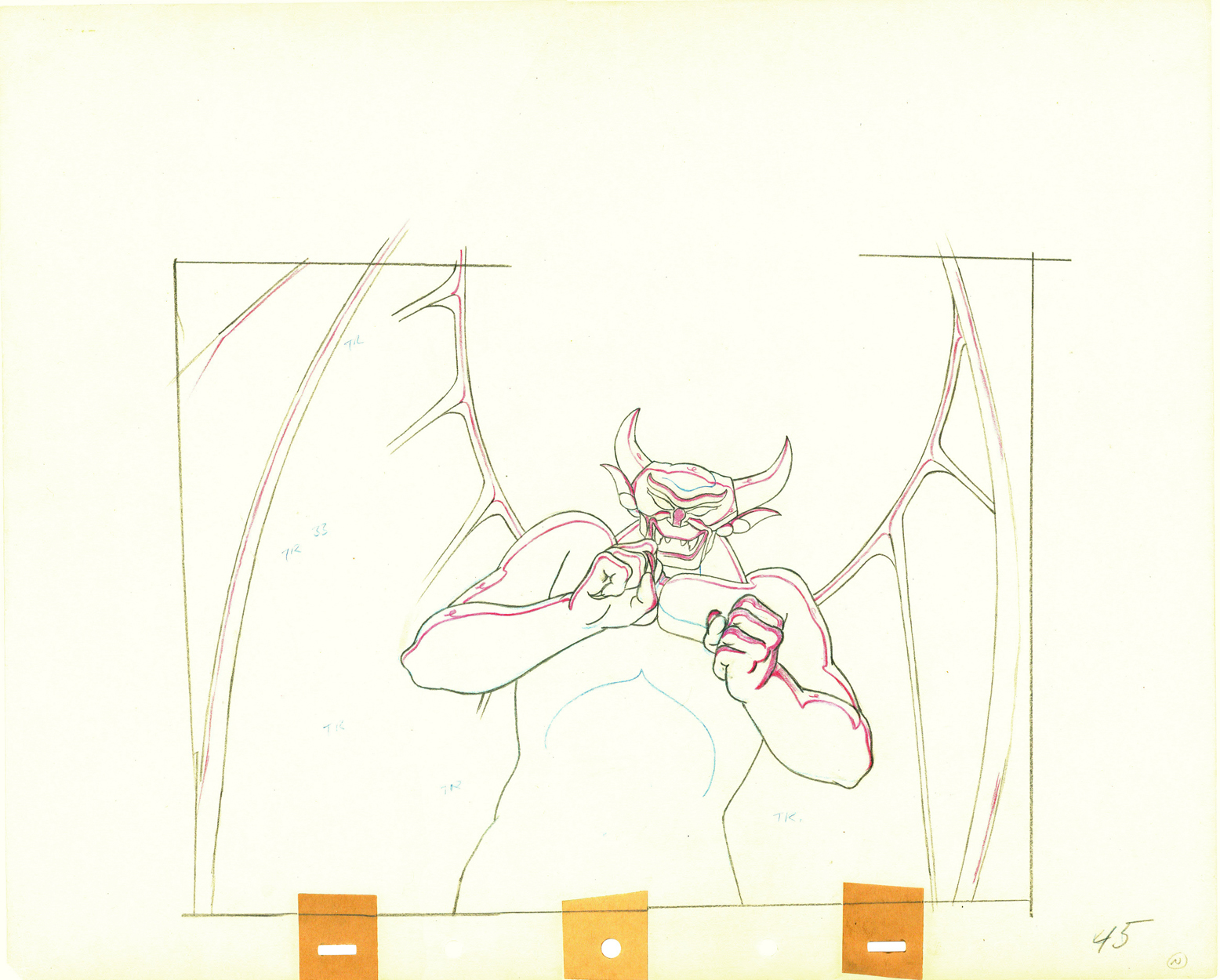
Vladimir Tytla worked on the devil in Mussorgsky’s – Night On Bald Mountain.
Here are some drawings for the scene. They’re part Tytla and part clean up by his assistant.
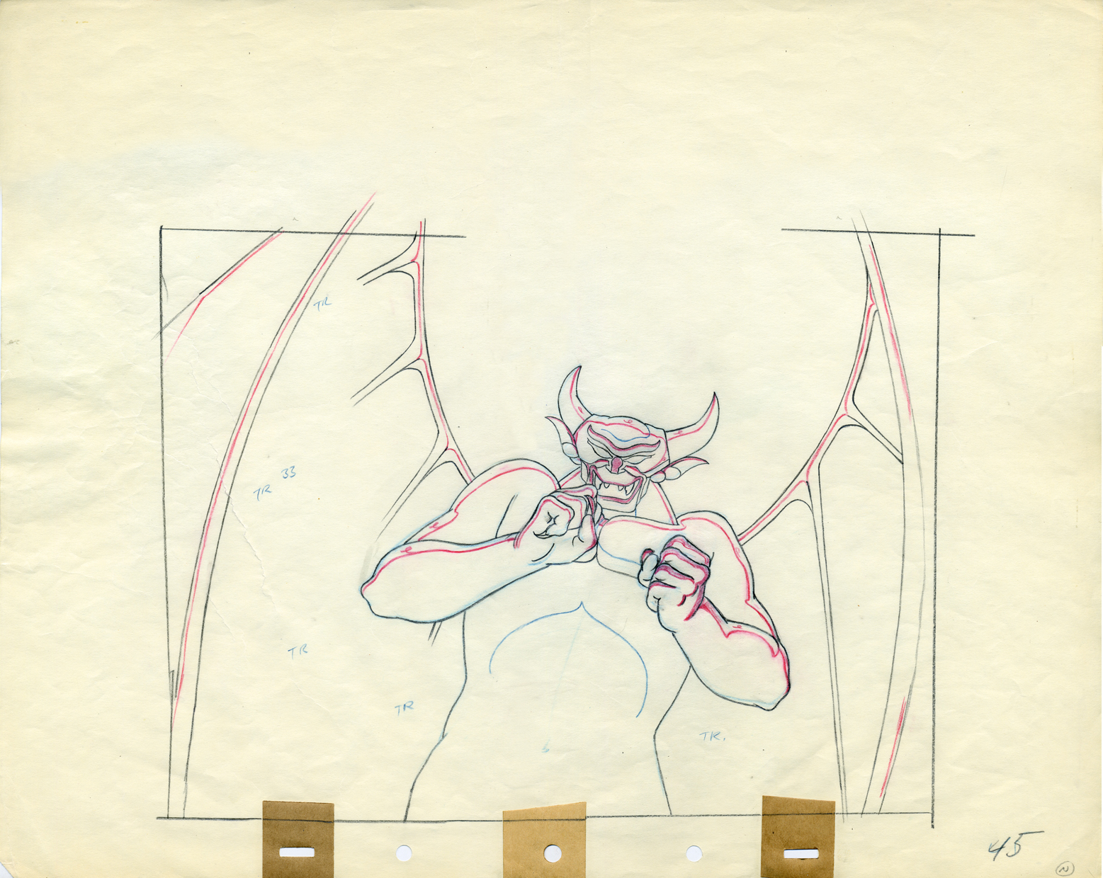
A good example of a Tytla drawing.
Here’s the clean up of the same drawing.
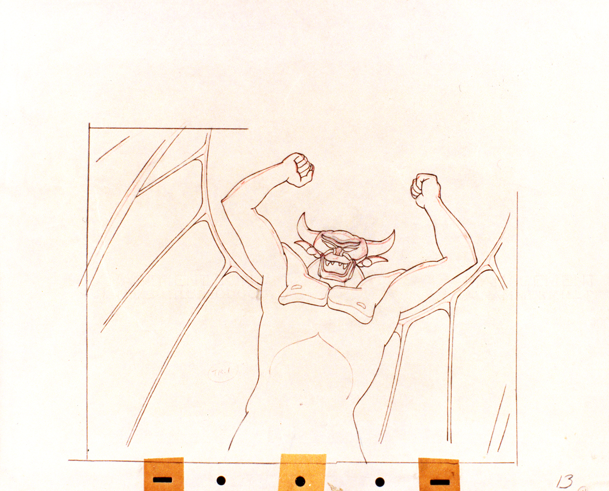
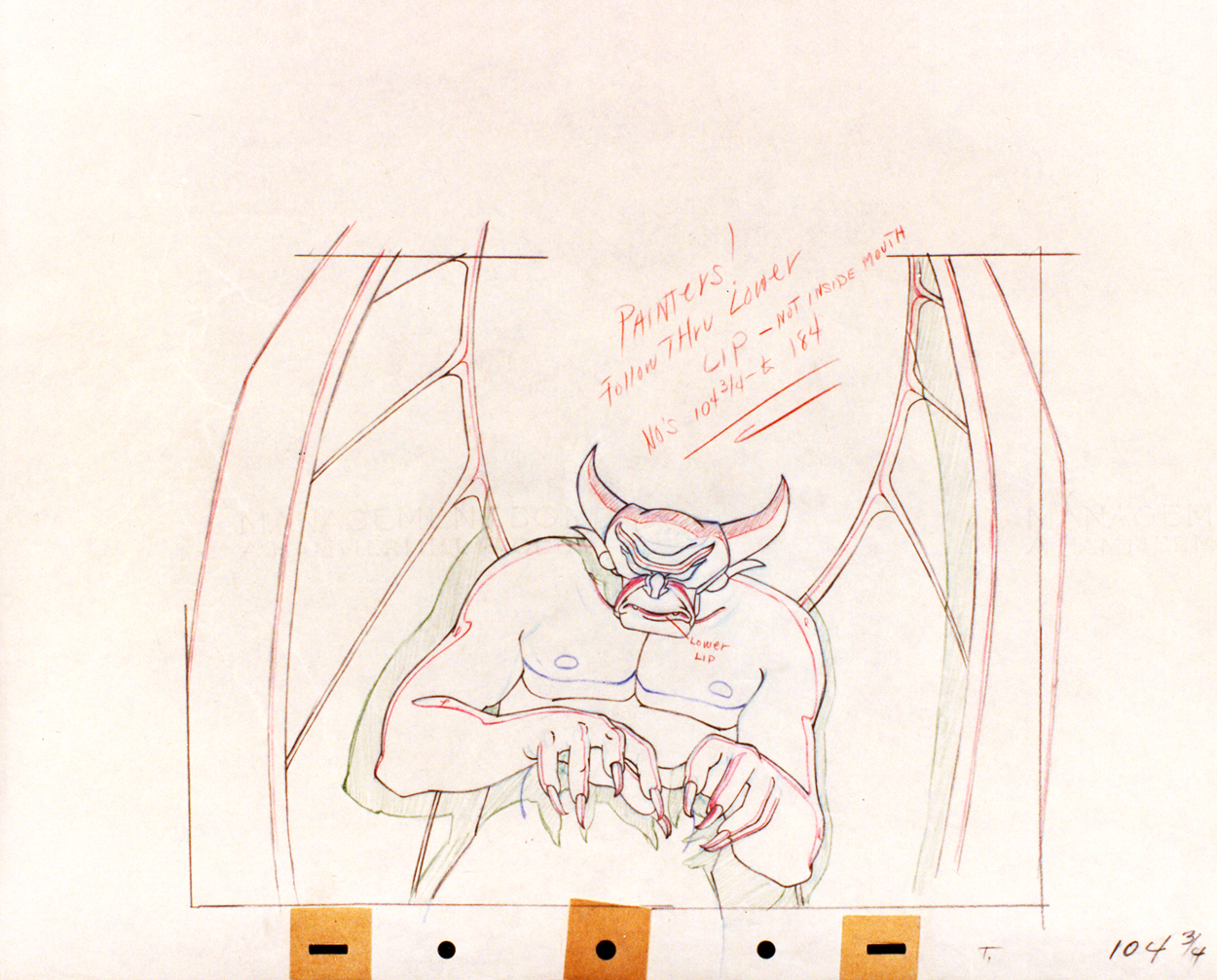
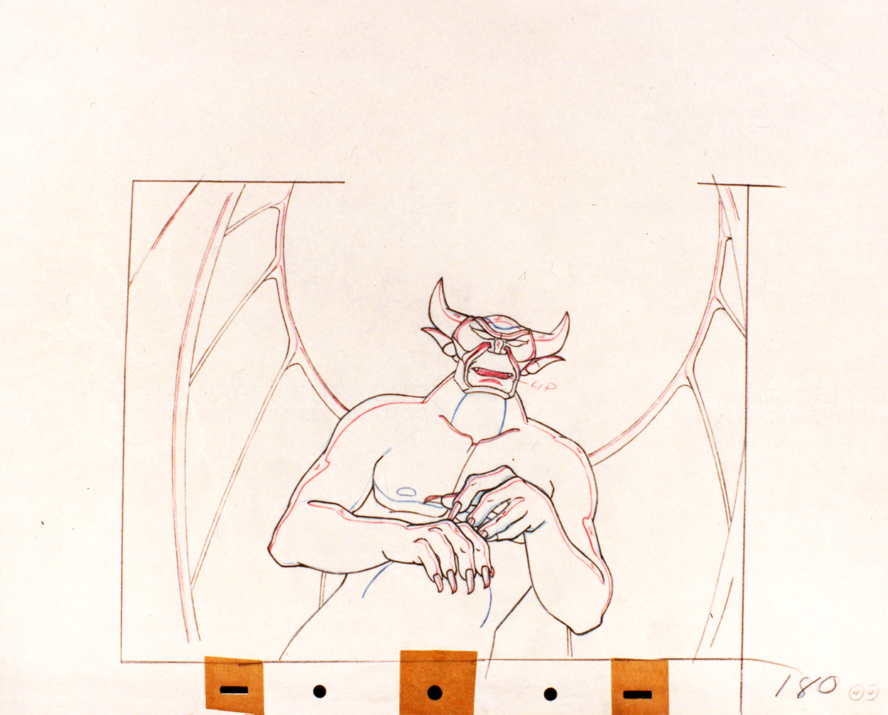
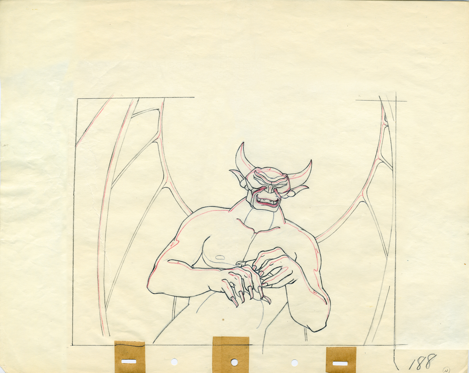
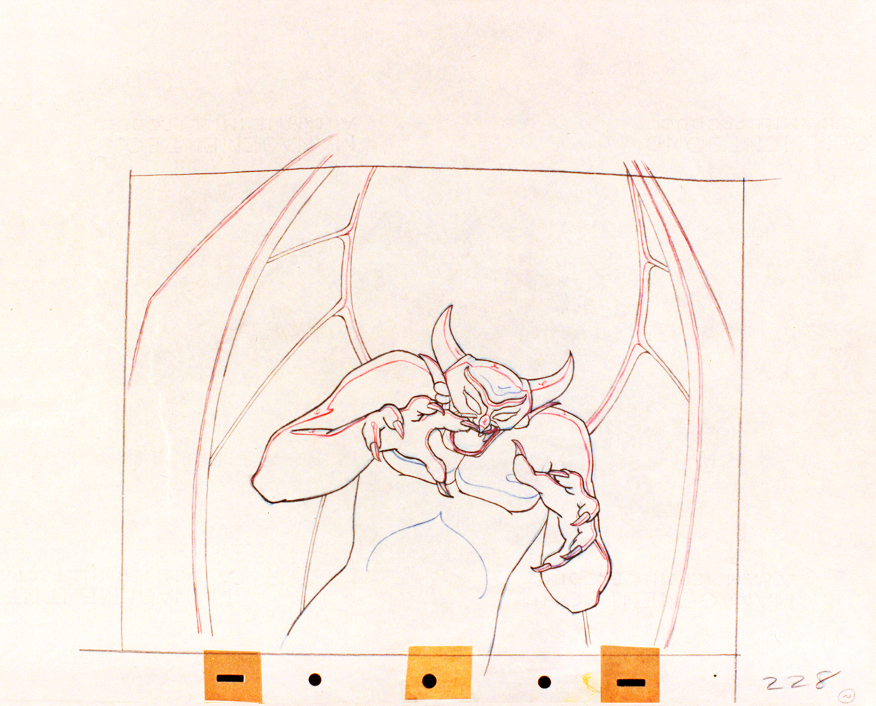
He shrinks after he hears the teal of the church bell.
They’re pretty damned impressive drawings. If there is any distortion,
it comes from making a body builder’s shape stronger. There’s no violent
flexing of those muscles, just the natural thing on display in the middle
of a dance sequence. Strong and forcefully beautiful drawings. The
distortion is done by the other spooks floating out of their graves on
the way up to their leader.
The devil’s motion throughout this piece is very slow, tightly drawn images of the devil lyrically moving through the musical phases. It’s pure dance. Any distortion is done via the tight editing that Tytla has constructed. Very close images of the hands with the flame shaped dancers moving about in tight close up as Chernobog’s large face with searing eyes closely watching the fallen creatures dancing in his hands. It’s distortion enough.
Tytla has constructed the most romantic sequence imaginable, and the emotion of the dance acts as the climax for all of Fantasia, and it succeeds in spades. All hoisted by the animation, itself. No loud crushing peak, just a dance done in a tightly choreographed number completely controlled by Tytla. It’s the ultimate tour de force of animation, and we’ll never see the likes of it again.
So essentially I’m pointing out that Tytla used distortion in the animation drawings to execute his acting theories, but as he grows, he not only uses his animation (and animation drawings) to “Act”, he uses his abilities as an Animation Director. The cutting and the movement of the scenes is used for the Acting, as well.
Books &Illustration &Layout & Design &repeated posts 07 Apr 2013 05:01 am
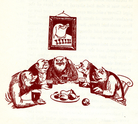
Joy Batchelor’s Animal Farm – recap
- When the film Animal Farm was released, a tie-in book was published which republished George Orwell‘s novel with line drawings from the film by “Joy Batchelor and John Halas.”
It’s probable that Joy Batchelor did illustrate the book. On a recent post, Rudy Agresta remembered Vivien Halas discussing her mother’s illustrating it in the book Halas & Batchelor Cartoons. I haven’t found that passage in Vivien’s book.
The animated film was produced by Louis D. Rochemont Associates in 1955 at a studio they set up in Stroud, Gloustershire in England. The studio was formerly the home of the Anson-Dyer company and GB Animation wherein ex-Disney veteran, David Hand, made his short films for Rank.
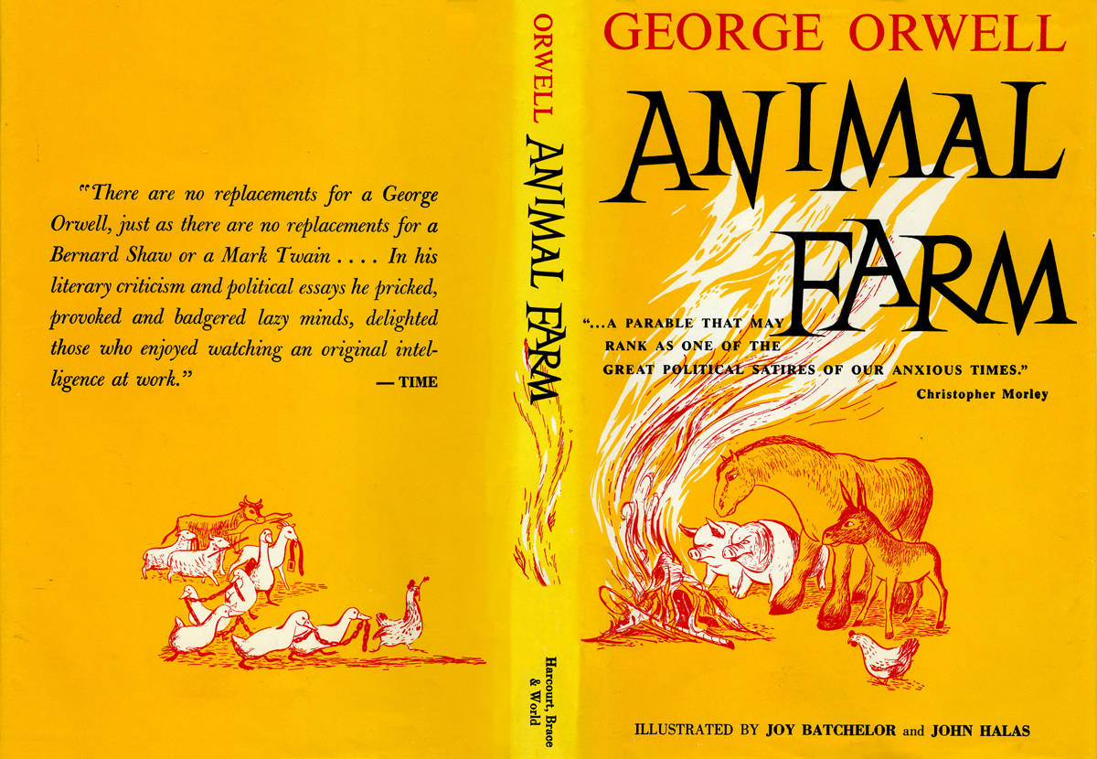
This is the book’s dustcover._________________________ (Click any image to enlarge.)
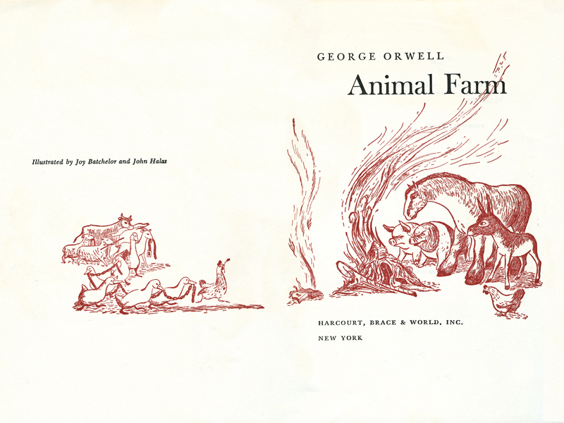
This is the double/title page.
Each chapter has its own heading, and there are usually one to two stills within the body of each chapter.
Some of the illustrations, like this one, spread across two pages under the type.
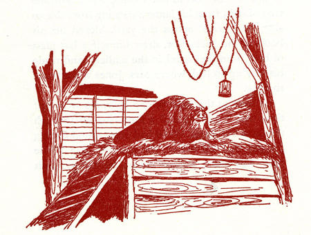
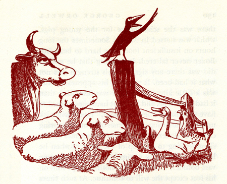
For those of you unfamiliar with this story, it tells the tale of a farm wherein the animals are mistreated.
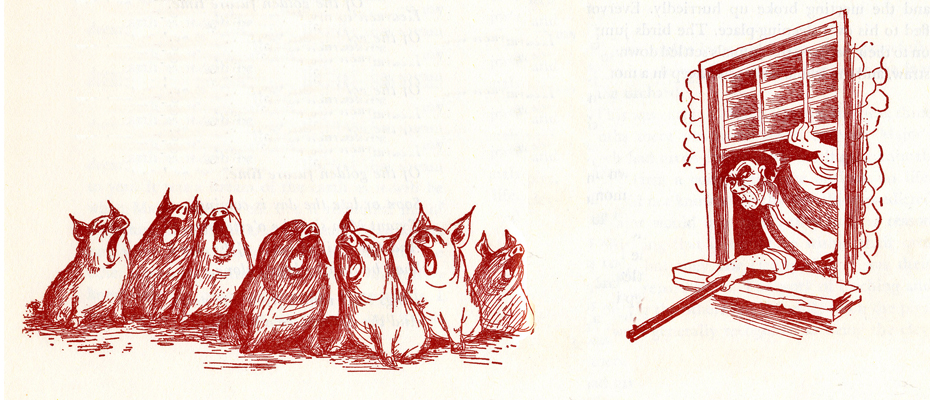
Under the guidance of the pigs, the animals take over the farm and create an animal collective.
However, the pigs grow lazy and do less of the work as they take charge of the others.
They eat more than their share of the food and mistreat the animals who do the greatest amount of work.

As animals begin to die under the guidance of the lazy pigs, there is some grumbling among the masses.
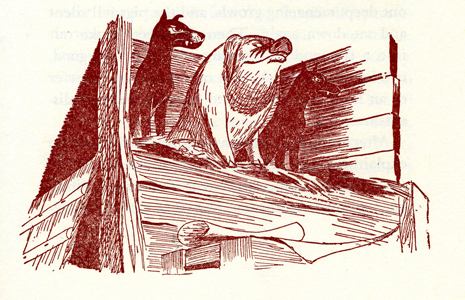
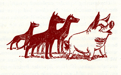
The pigs dominate and rule with a heavy hand.
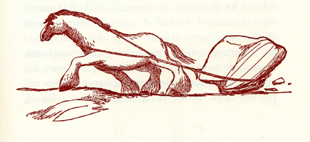
Boxer, the horse, is the figure of strength and symbolically the real leader of the animals.
The pigs move into the farmer’s house and become little more than a replacement for “man”.
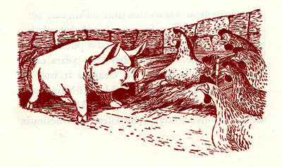
Many animals take the lead of Boxer and try to do their share, while the pigs fight for the lazy leadership.
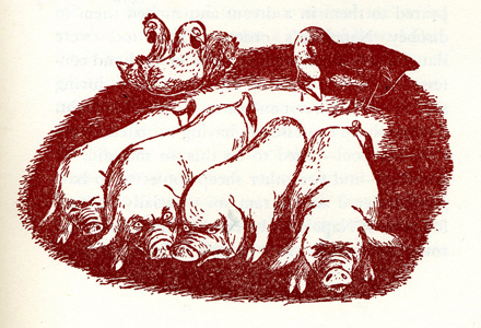
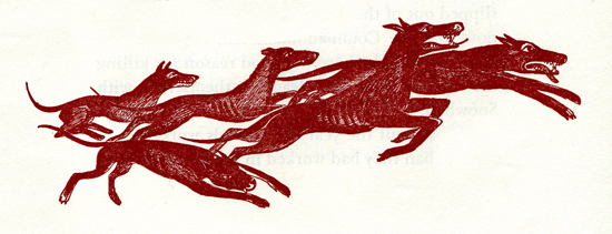
The pigs push Boxer to the limits and use the dogs as their personal guards and force their will on the others.
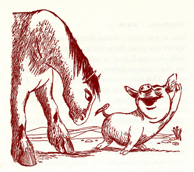
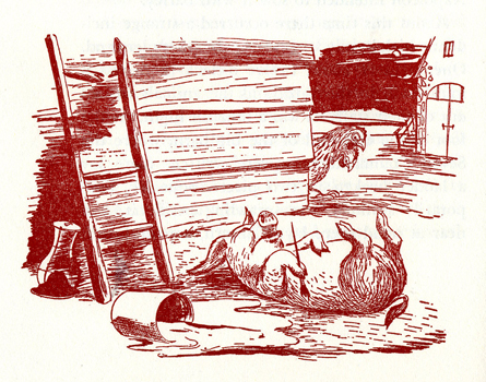
Boxer grows ill as the pigs grow lazier.
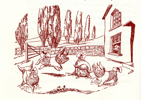
The lazy pigs celebrate their success. Animals hear gossip about the humans planning a charge to take back the farm.
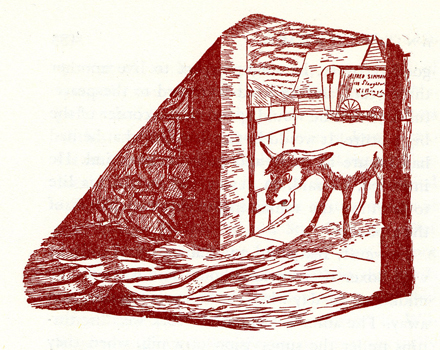
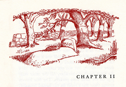
The weakened Boxer, no longer useful to the pigs, is sold for glue.
Eventually the humans return, and in some eyes of the animals they blend with the pigs.
The line illustrations do a nice job of representing the film. They’re also quite consistent.
You can watch Animal Farm on YouTube by going here.
Commentary 06 Apr 2013 04:25 am
Brewsing
 My thoughts keep going back to From Up on Poppy Hill. I really would have liked giving the film a more positive review, and I feel as though I should go back and see the film again. Maybe I didn’t give it enough of a chance; however, I can’t think of any dynamic scene in the movie that is enticing me back.
The entire film is professionally and finely planned and layed-out as would be expected from a Ghibli work. The drawing is excellent, and the backgrounds are quite fine and strongly detailed. But there just isn’t anything that soars.
I think of Ponyo riding those waves of the Tsunami. My heart – my entire body lifted in exuberance with that scene. No matter how many times I’ve seen the film it always does it.
 I think of Spirited Away (so many moments) where Chihiro rides on that ghost train with “No Name” to the dark foreign and silent land of Yubaba, Zeniba’s twin sister. I think of Princess Mononoke when the god of the forest, dressed like a deer stands watching him from across the lake. It’s so glorious a moment. Or one of my all time favorite moments in the movies – standing at the bus stop with Totoro in the rain waiting for the bus to arrive. It doesn’t get better than that in film.
There are so many other Ghibli moments for me, I could keep going. Yet not even a hint of any of these in Poppy Hill. Maybe that’s why I felt I was so negative. I wanted something I shouldn’t have expected from a sophomore director without the proper experience to play out that very complex relationship between him and the girl. It becomes cliché when it should have torn at our hearts.
Who knows. Maybe I’ll go back and see the version of the film in Japanese rather than the English dubbed. Interesting that I have no intentions or plans to see The Croods again. Maybe when the Japanese dubbed version comes out so that I won’t have to hear those Nick Cage Valley Girl accents again.
ITVS Cut Out IDs

The Soup Factory in the UK, the studio owned and supervised by Andy Soup, is rightly taking pride in some IDs they did for ITVS. These pieces are animated cut-outs, models that were designed for 3D table top animation. They are beautiful pieces, and I thought it a good idea to link to them so that you can take them in as well. After all, we in the US don’t get to see the advertisements done for ITVS.
For the 6 IDs, Espen Haslene directed the films. He is the leader of a studio known as Tundra, a partnership of Scandinavian/French/Italian/English filmmakers, animators, graphic and web designers. Tundra worked together with Martin M. Andersen, head of Andersen M. Studio, acting as the stop-motion Animation Director. There’s obviously some computer animation mixed with the stop motion work, and you’ll find a complete list of credits when you go to the Soup Factory‘s page for the films to view the IDs.
Take a look here.
Illusions of Life
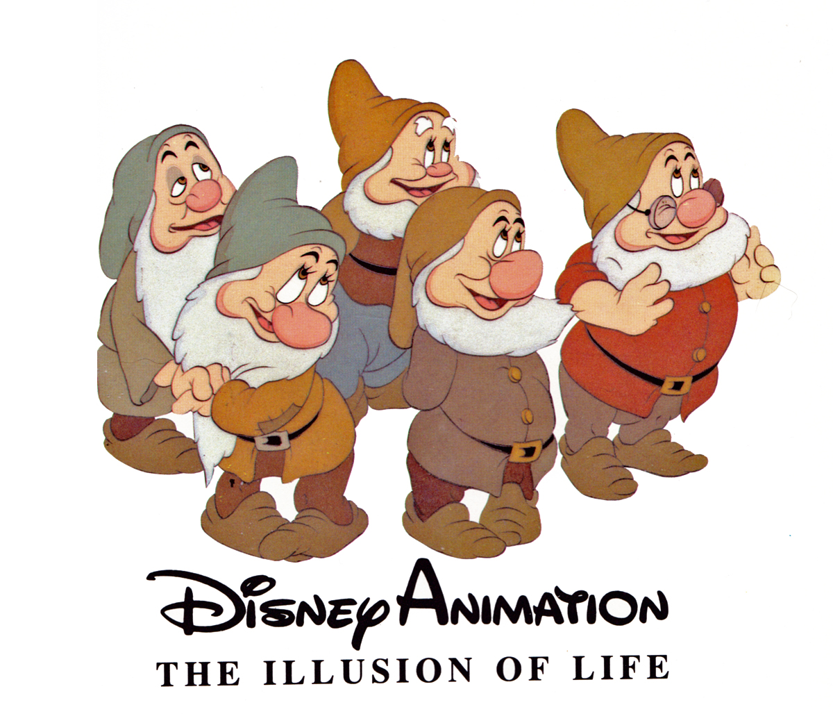
I’ve been going through Frank Thomas and Ollie Johnston‘s first book, Disney Animation: The Illusion of Life. I have to admit that I haven’t been much of a supporter of the book. I remember first getting it and not reading it. I just went through the pictures. Then I read all the captions under the photo/artwork/images. That’s about as far as I got with the book. I don’t really know why; I just wasn’t inclined to really dig my teeth into it, and I never read it. Bt then I’ve often had that problem with large picture books, especially if they’re supposed to be teaching something. The book seems confused. It doesn’t know if it wants to be a glossy art book that teaches you something.
I guess I’ll make up for some lost time and will read it now. But I think in doing it, I’ll take my time with it and will write about it in some detail, trying to get my thoughts out on paper (or on blog). I know that it’s the first of the animation books I can remember where they had some pure gold for illustrations, and they printed it too small to be able to properly get it. The good part about the images on the web is that you can blow them up pretty easily. And I’m going to.
Perhaps I’m inspired by Mike Barrier‘s negative comments about it. His writing, for me, is pretty funny, too. Take a look at this review of Dick Williams‘ book where he necessarily goes to the Thomas-Johnston book.
Time to read it for myself and see what they’re actually saying. I have read others of their books and haven’t been inspired.
Book Reports
 I’ve been reading lately a different sort of book. it’s certainly not a quick read getting through Donald Crafton‘s most recent book, Shadow of a Mouse. I’ve been a fan of Donald Crafton’s work since his first book, Before Mickey: The Animated Film, 1898-1928. It was a study of a little-known part of animation history, and he explored and revealed the difficult period. Certainly, this was a fine feat of research combined with his excellent writing.
Shadow of a Mouse is something else again; it’s a book that employs the author’s extensive knowledge of film history to help consider a number of complex theoretical problems relating to animation, which he poses. The book carefully rethinks animation and all of its properties. Blending 2D, stop-motion, cgi, and more experimental forms, the book challenges the way we think of animated film. It’s a tough and complex read though I’m certainly enjoying it.
 I’ve also been reading Jenny Lerew‘s The Art of Brave. I received apologies from Chronicle books when they’d first published the companion to Pixar’s Brave. They’d gone through their print run quickly and weren’t able to send me a copy. I made myself something of a pest after that and pursued them for a reviewer’s copy. Ultimately, I got my hands on one and am quite enjoying it. The book is something more of a picture-book (and what great pictures), though I am enjoying Jenny’s writing. I hope, also to finish this pretty soon and will write about it – especially now that the film won the Oscar and is available in DVD.
Shadows
Sometimes you have to take the bull by the horns and do something that nobody wants. During the making of Raggedy Ann & Andy I was supervising the Assistant Animators and Inbetweeners for the course of the production. I was made to jump from being an Inbetweener, myself, to suddenly being someone supervising lots of people (it went up to 150 people at one point toward the end of production) and overseeing their work.
In the middle of all this, there was Art Babbitt‘s sequence. I was the one receiving the work in New York when the shipments arrived. But then, that was just the beautifully animated camel and the two rag dolls that looked like the work of no one else. They were wildly off model – Ann & Andy, our two leads. I was told to leave them as is, by Dick. But I did some slight adjusting trying to get them a little looser to match all the other animation in the film. I wasn’t very successful at that. I couldn’t kill the work of Art or his assistant, David Block. Art’s work looked like it was chiseled into the paper, the line was so tight. His arm – and especially David Block’s – had to hurt after drawing that rigidly.
Then we added stars. It was a simple film effect, but there were a lot of problems getting there. Al Schirano, the supervising cameraman, and Al Rezek, who assisted him on this effect, knew what they were doing, but their work was anything but calibrated and planned. I saw a hole and pushed myself into it to make sure that the star fields in the scene worked with the backgrounds and didn’t interfere with the characters’ movement. They were working well after a hard start and Al Schirano was appreciative of my getting Dick off his back.
Finally, there were those damned shadows. They had to be added and animated to make the scenes work. I got that job, and it had to be done within a week. At first I mirrored Art’s animation but it looked horrible. Try after try after try, it all looked like mud. So without telling anyone, I started snapping the shadows. The legs moved very slow and tight, like all the rest of Art’s animation, but the shadows snapped into position. Every time the legs went up or down, it happened in one or two frames. It worked like a gem and no one commented. I expected to hear from Dick, but nothing. At one point he might’ve said, “good job,” or some such thing, but there were no attacks from either him or Art about that violent movement in Art’s sequence. You never know. Sometimes troubles aren’t as bad as you think.
Every scene of this sequence wass shot numerous times. The shadows were painted black, and the entire scene would be shot at 65% exposure. Then it’d be rolled back to “0″ and shot at 35% exposure without the shadows. That meant that the shadows would be transparent – 65%. Then the film would again be rolled back to “0″ and the star field and the animation of the bottom-lit lights would be shot using a star filter. That was done in three passes so that the stars would have different levels of brightness. (I learned all these tricks back at the Hubley studio and was able to suggest things to the Al Schirano who rode with me (and took credit when it worked.)
Bill Peckmann &Books &Comic Art &Illustration 05 Apr 2013 05:57 am
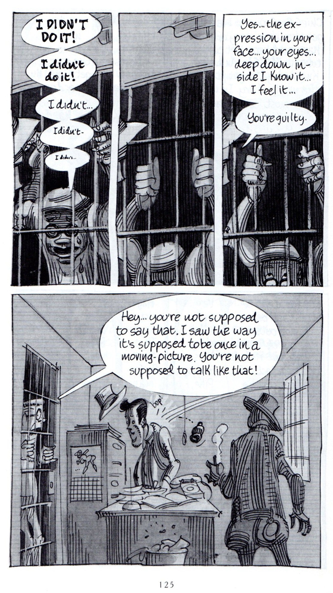
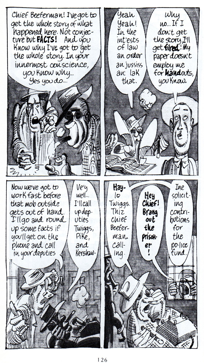
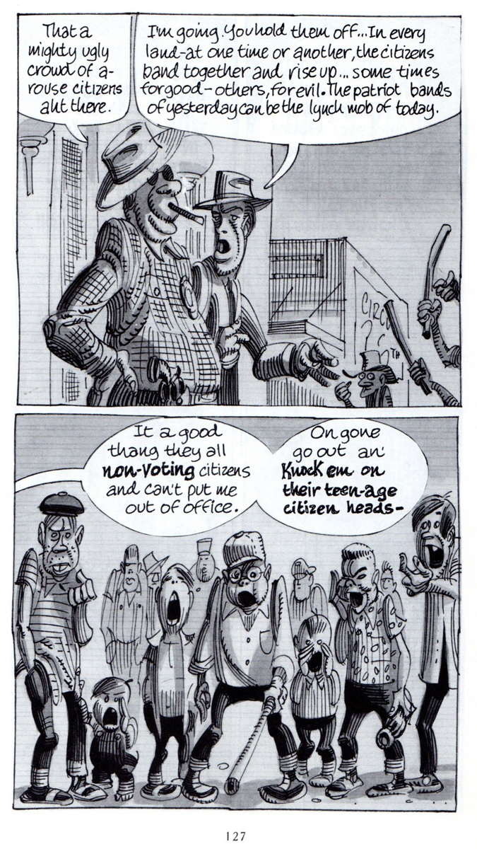
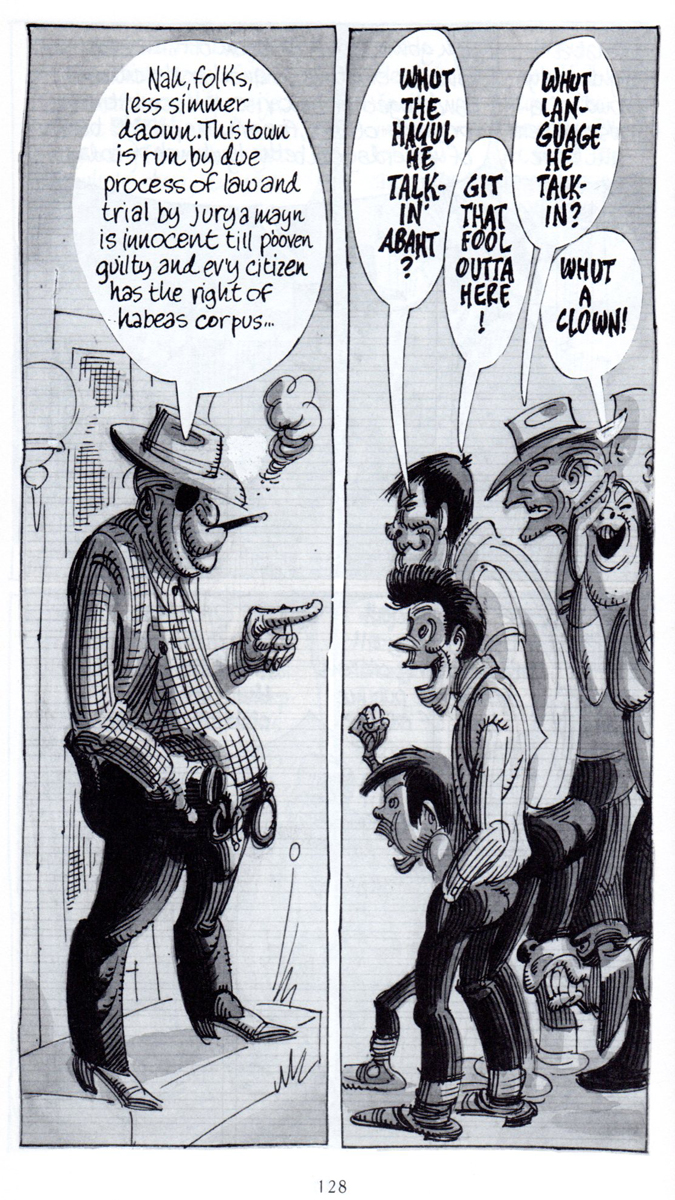
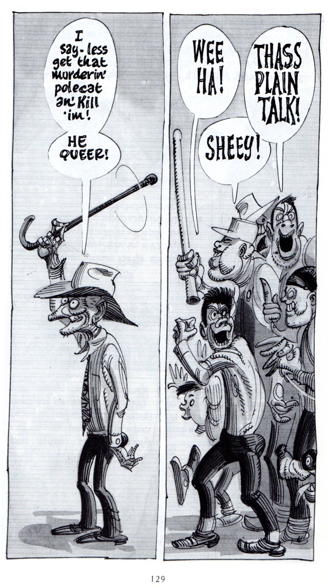
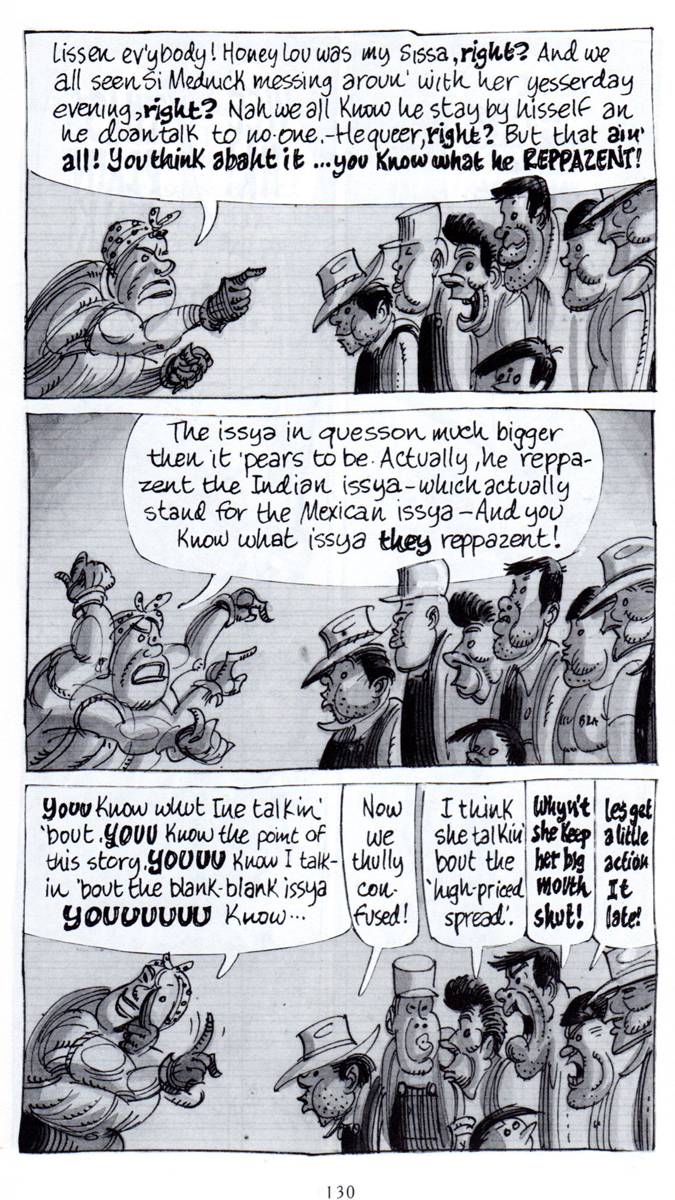
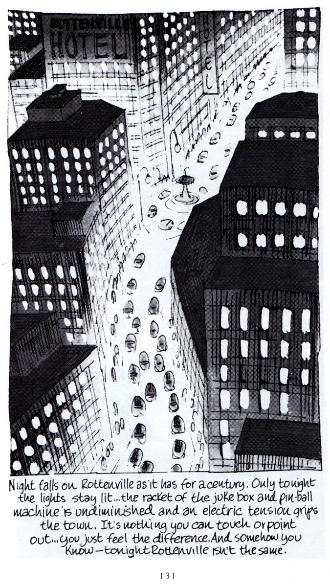
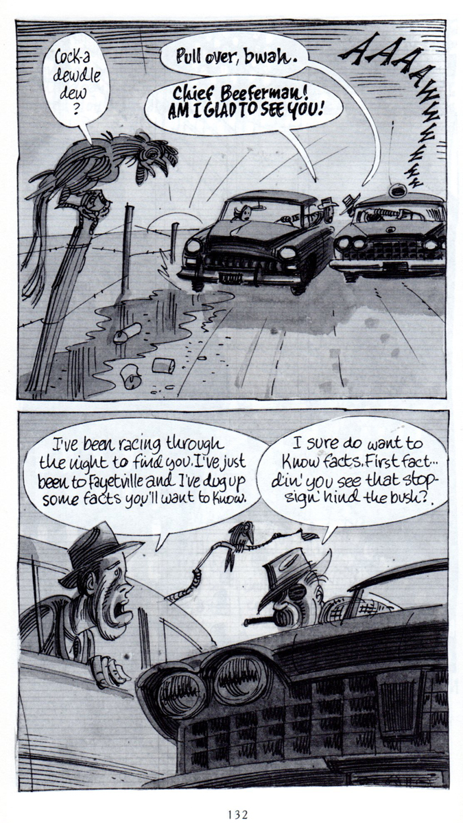
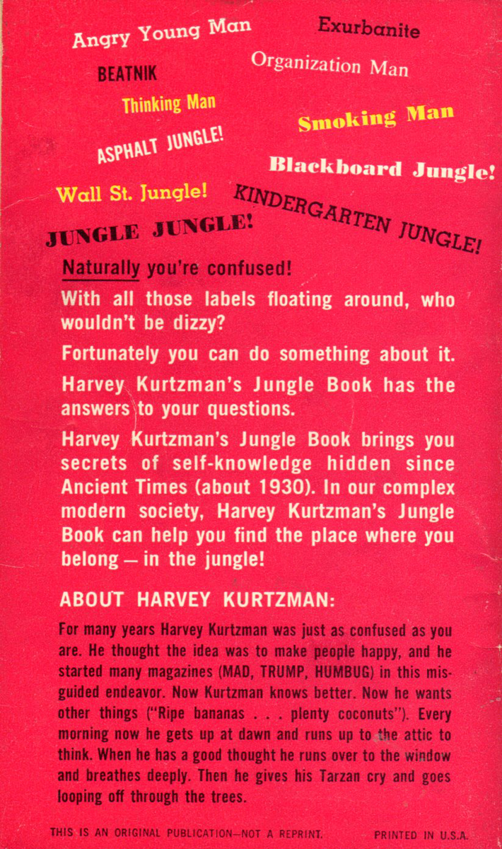
Kurtzman’s Jungle Book – Part 2
 – It’s tough out there in the Jungle.
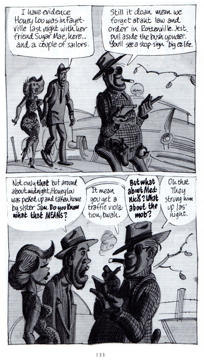
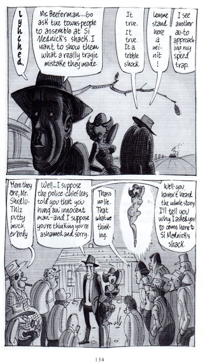
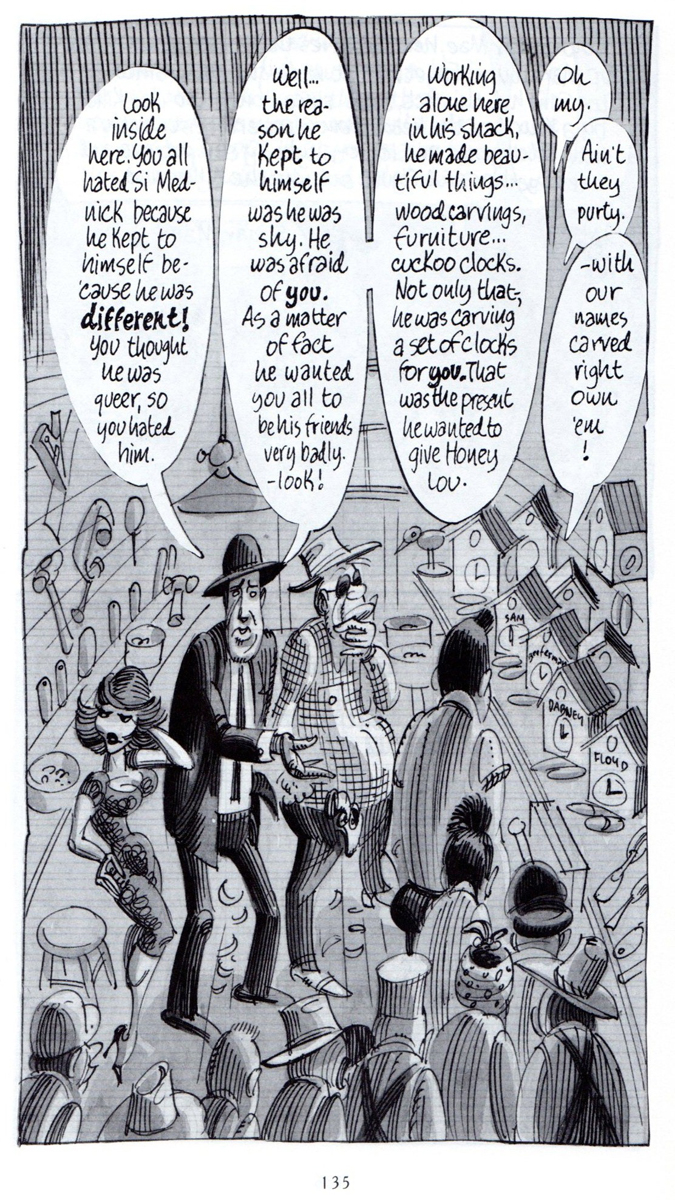
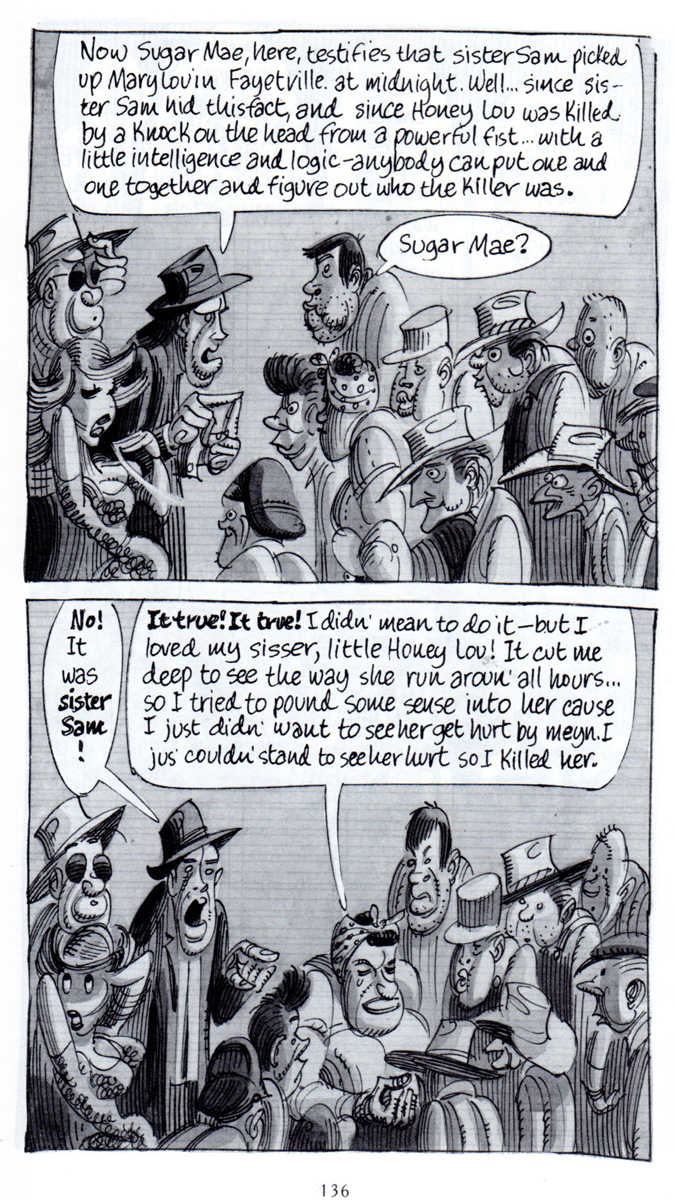
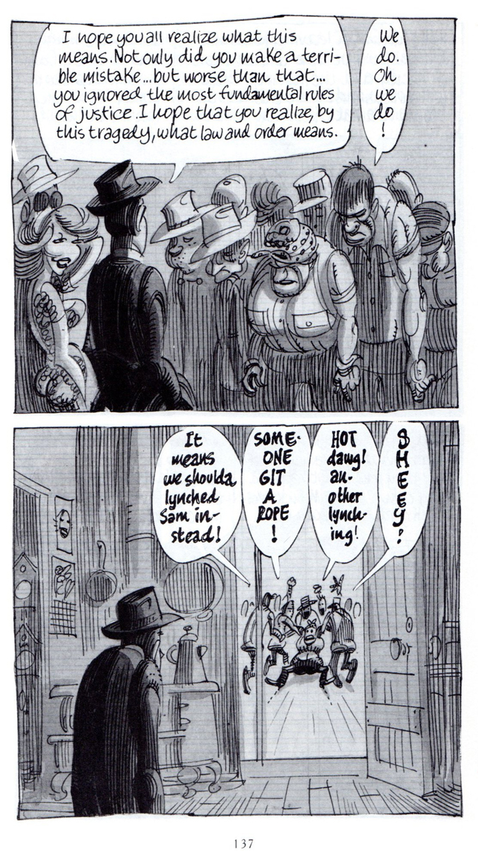
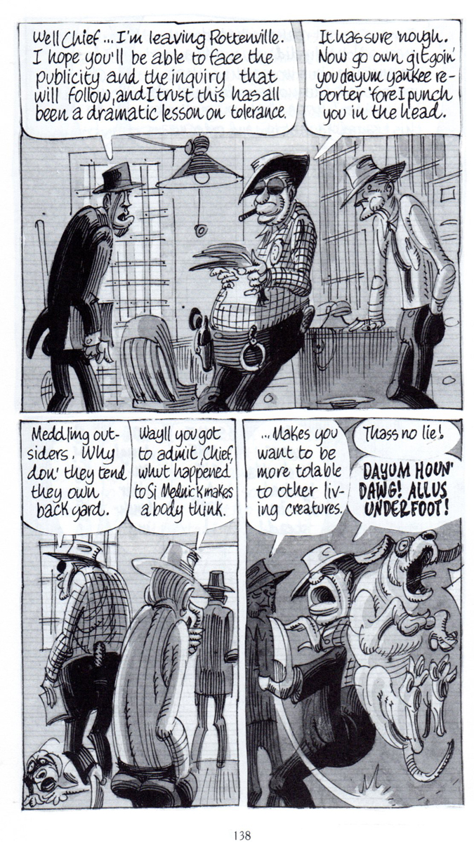
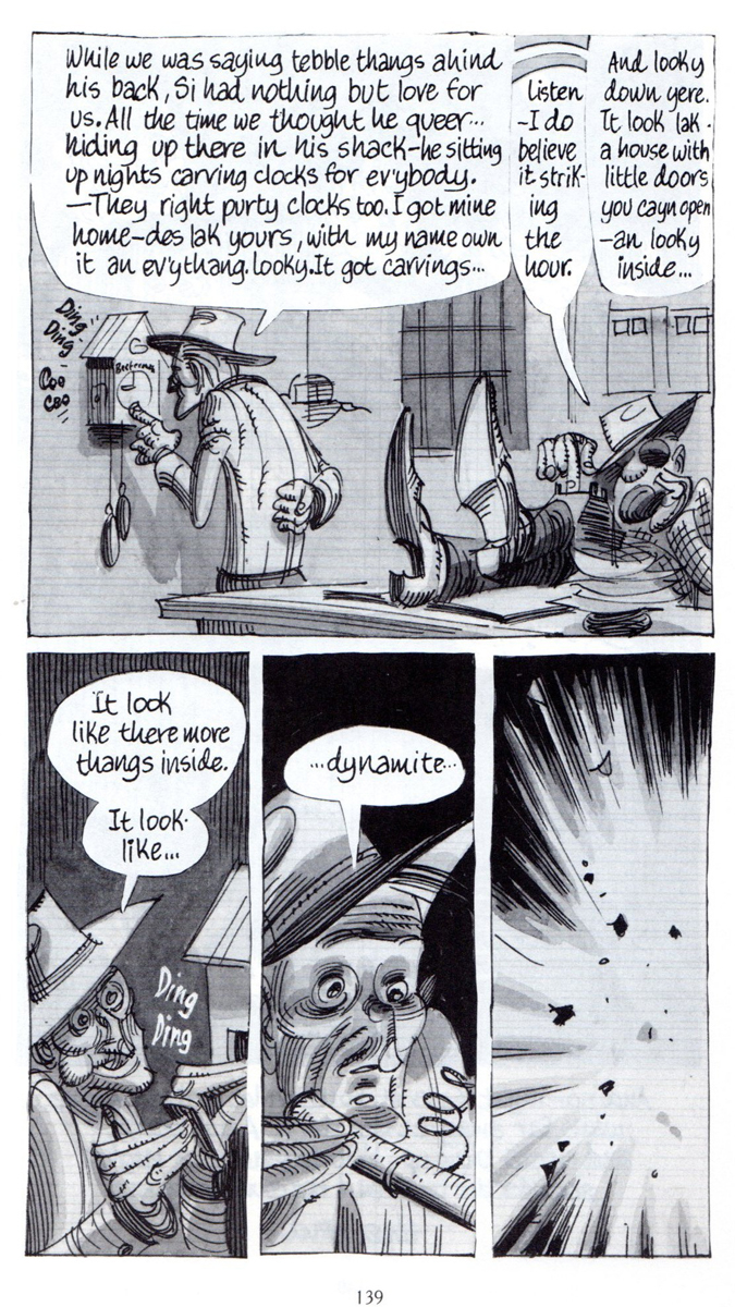
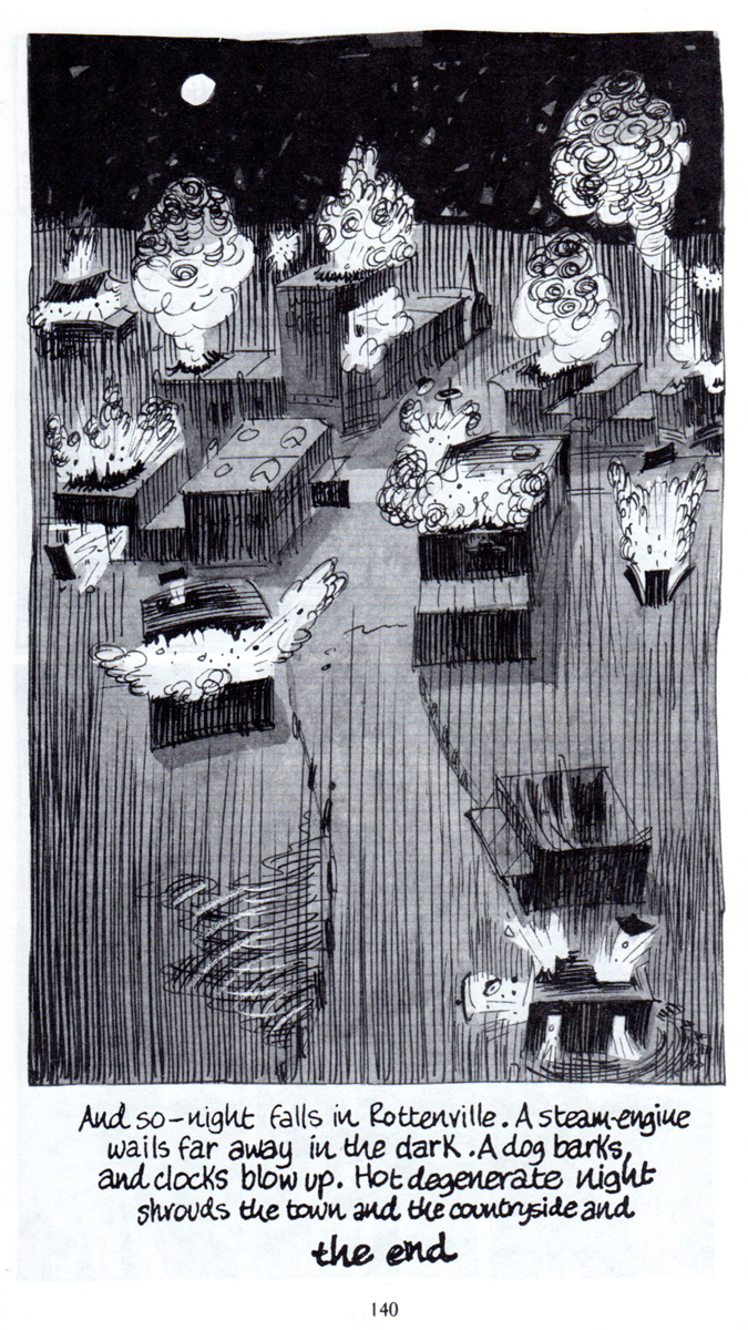
Harvey Kurtzman wrote & illustrated The Jungle Book in 1959. The book is made up of four stories:
“Thelonius Violence, Like Private Eye” is a parody of the typical private-detective story which blends its visual movement with jazz motifs.
“The Organization Man in the Gray Flannel Executive Suit” features the earliest appearance of Kurtzman’s character, Goodman Beaver. The story is a satire of the publishing industry’s capitalist tendencies.
“Compulsion on the Range” is a humorous play on the over-popular westerns of the day. Something like Gunsmoke is mixed with a pop psychology.
“Decadence Degenerated” is a satire the is set in the deep South and plays off the bigoted, lynch-mob mentality of the generic-rural South.
We began the first half of the fourth story last week, and we come to its final pages today. In conjunction with the show currently on view at the Society of Illustrators we’re posting this part of the graphic novel. That show at the art exhibition continues at the museum through May 11.
The cover of the book, pictured on the right, was scanned from the original 1959 book, while the inner B&W illustrations are from the later 1988 edition where the printing of the B&W images was, and is, significantly better.
Many thanks to Bill Peckmann for suggesting the material and then for scanning and sending it forward for us all to enjoy.
We continue:
.
 22
22
 23
23
 24
24
 25
25
 26
26
 27
27
 28
28
 29
29
 30
30
 31
31
 32
32
 33
33
 34
34
 35
35
 36
36
 37
37
 38
38
 39
39
 40
40
 41
41
The back cover of the original 1959 Ballantine Books’ paperback.
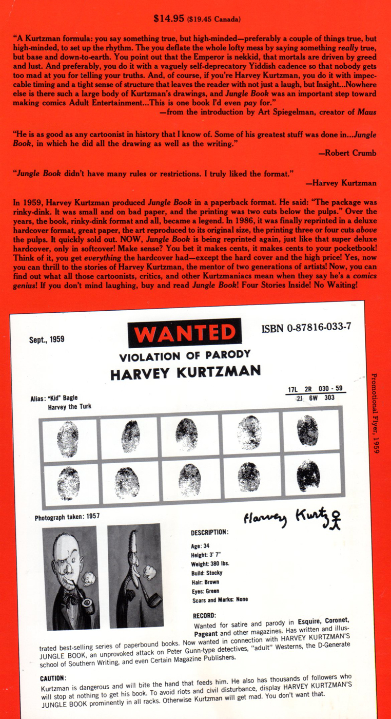
The back cover of the 1988 Kitchen Sink Press reprint edition.
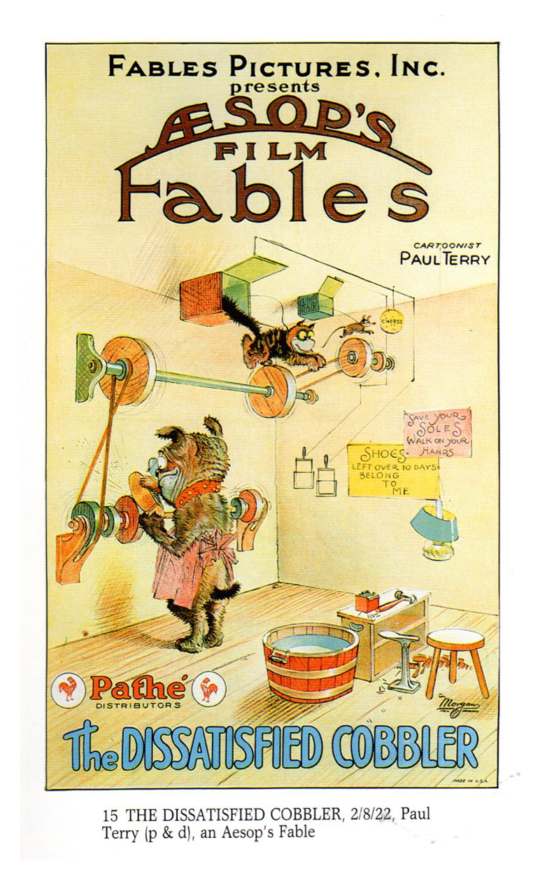
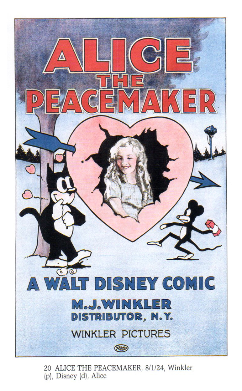
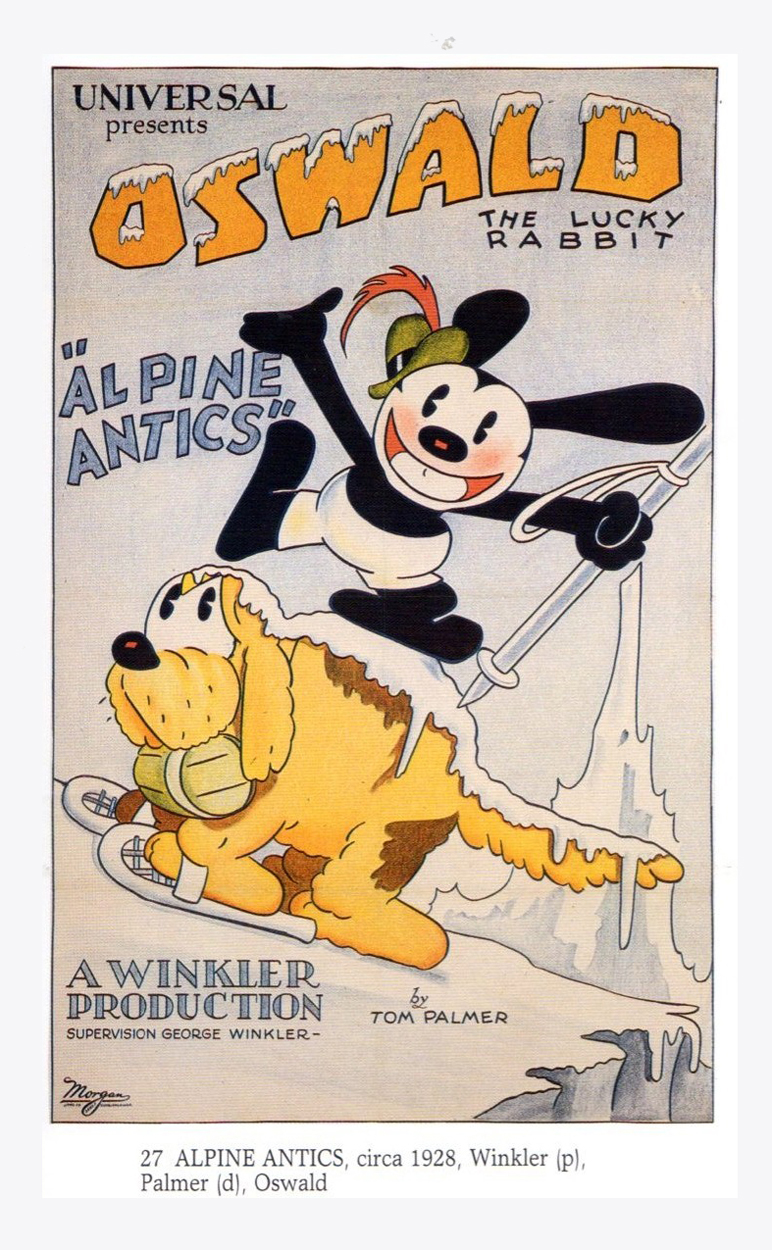
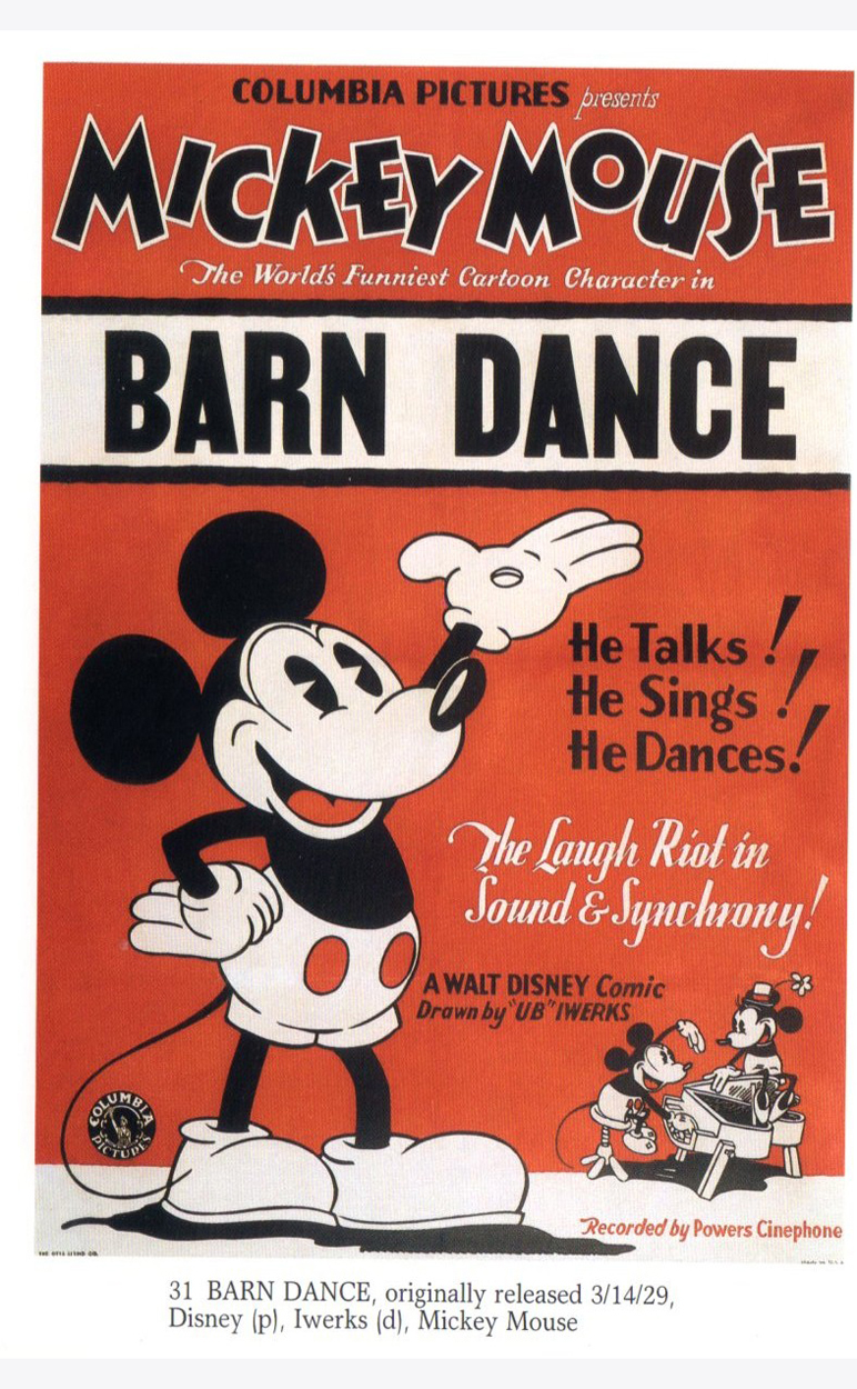
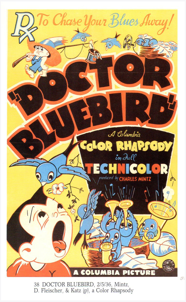
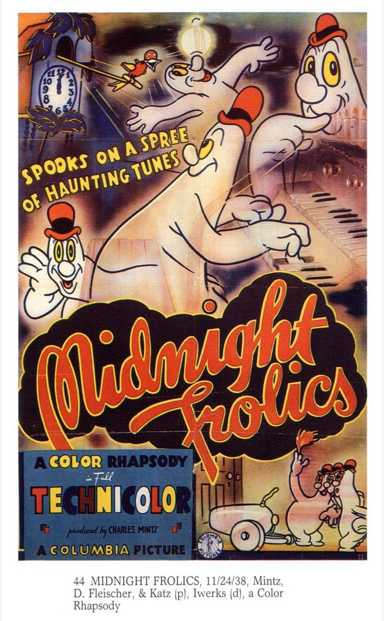
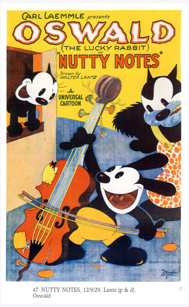
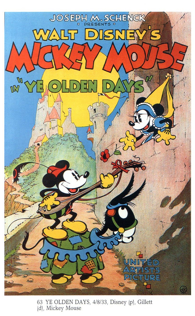
Bill Peckmann &Books 04 Apr 2013 06:51 am
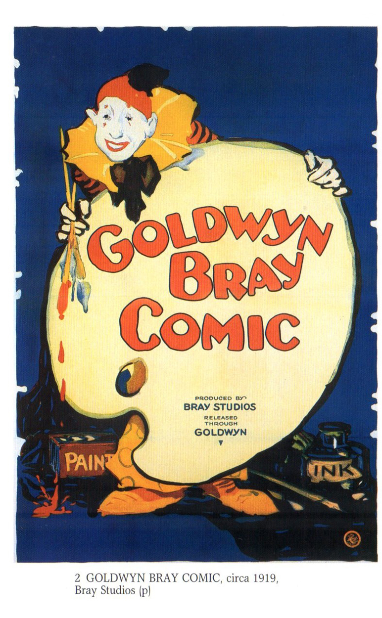
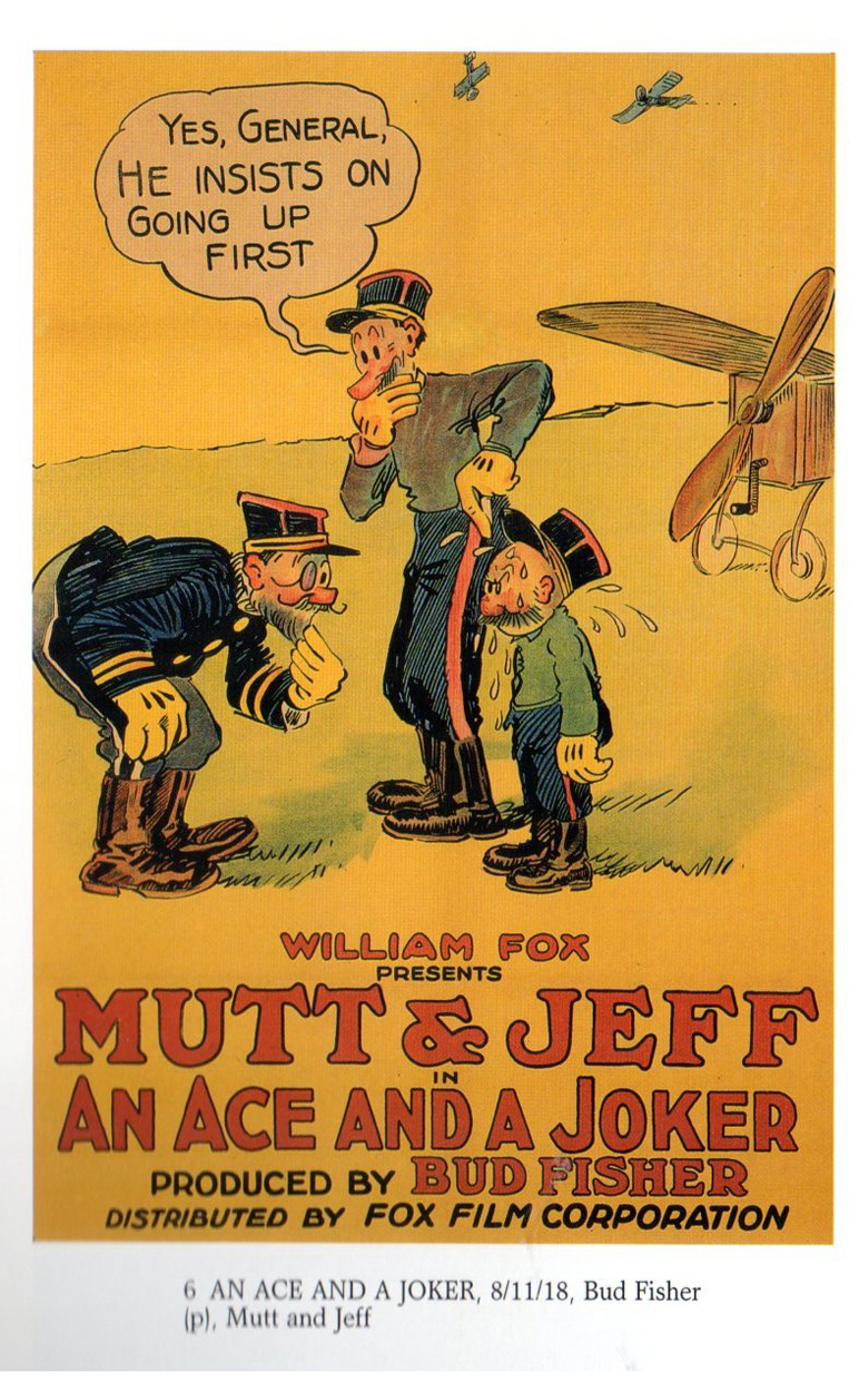
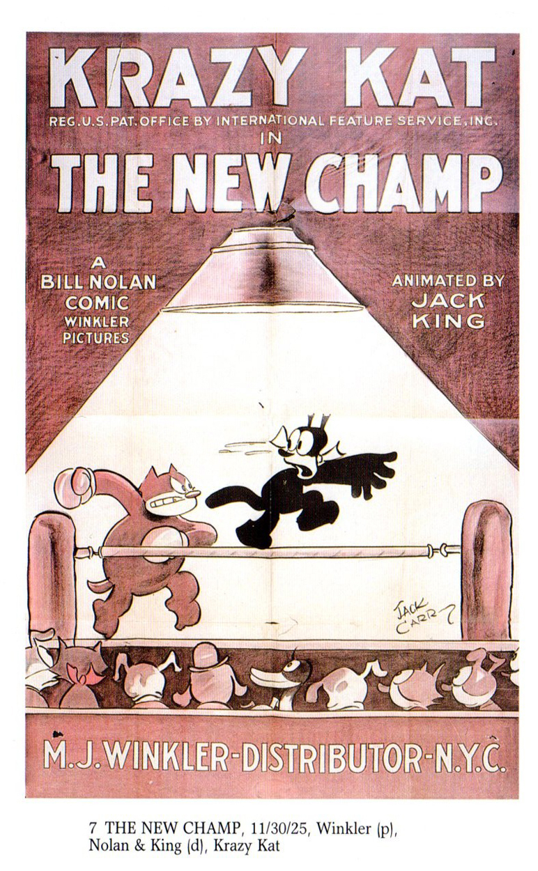
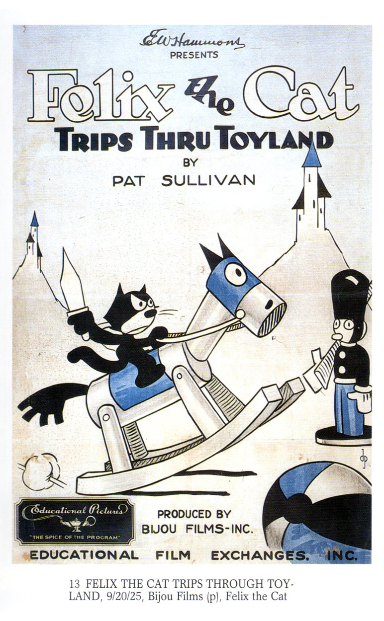
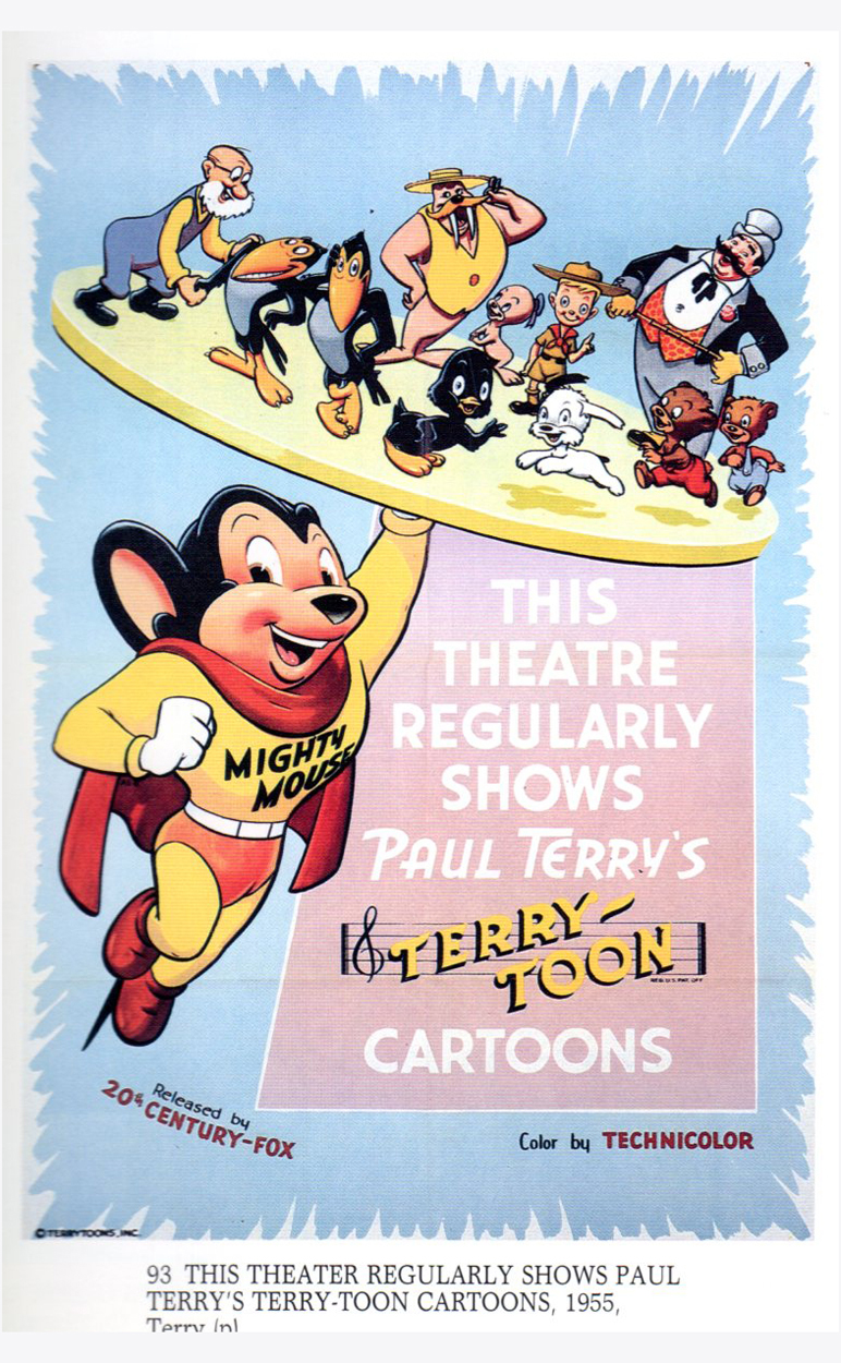
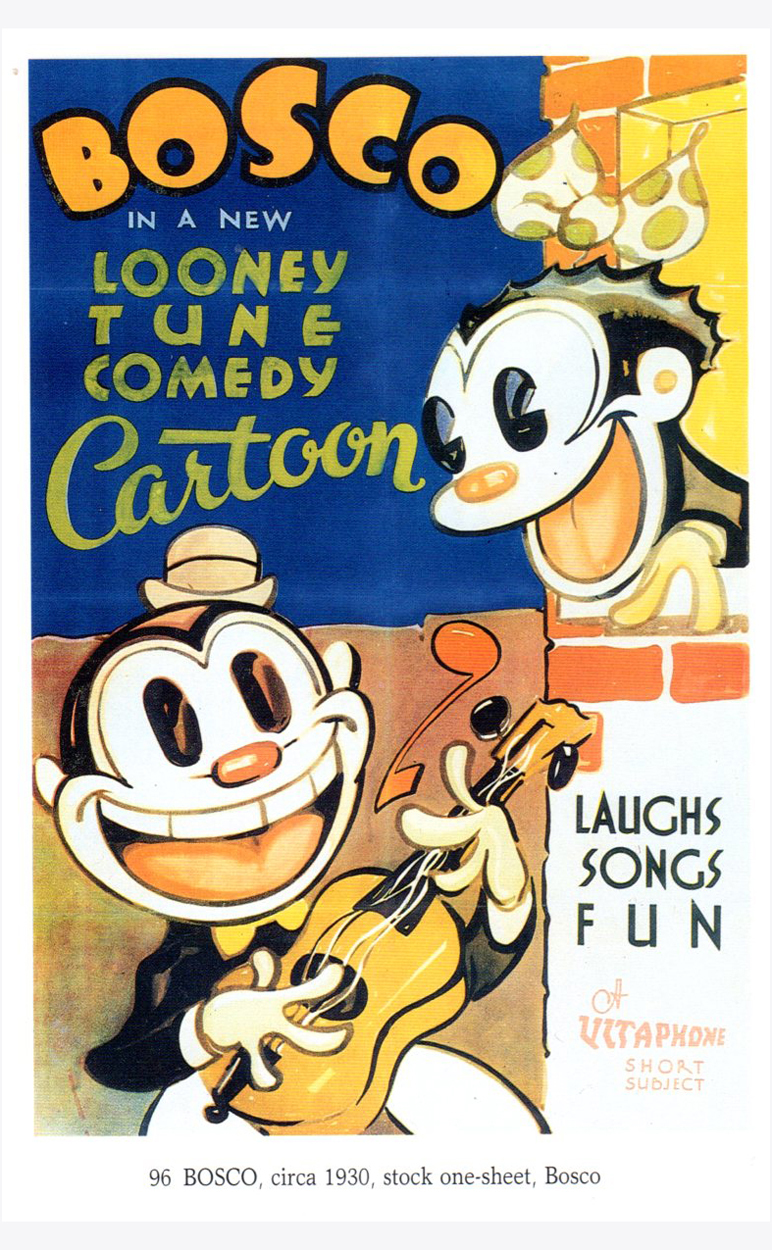
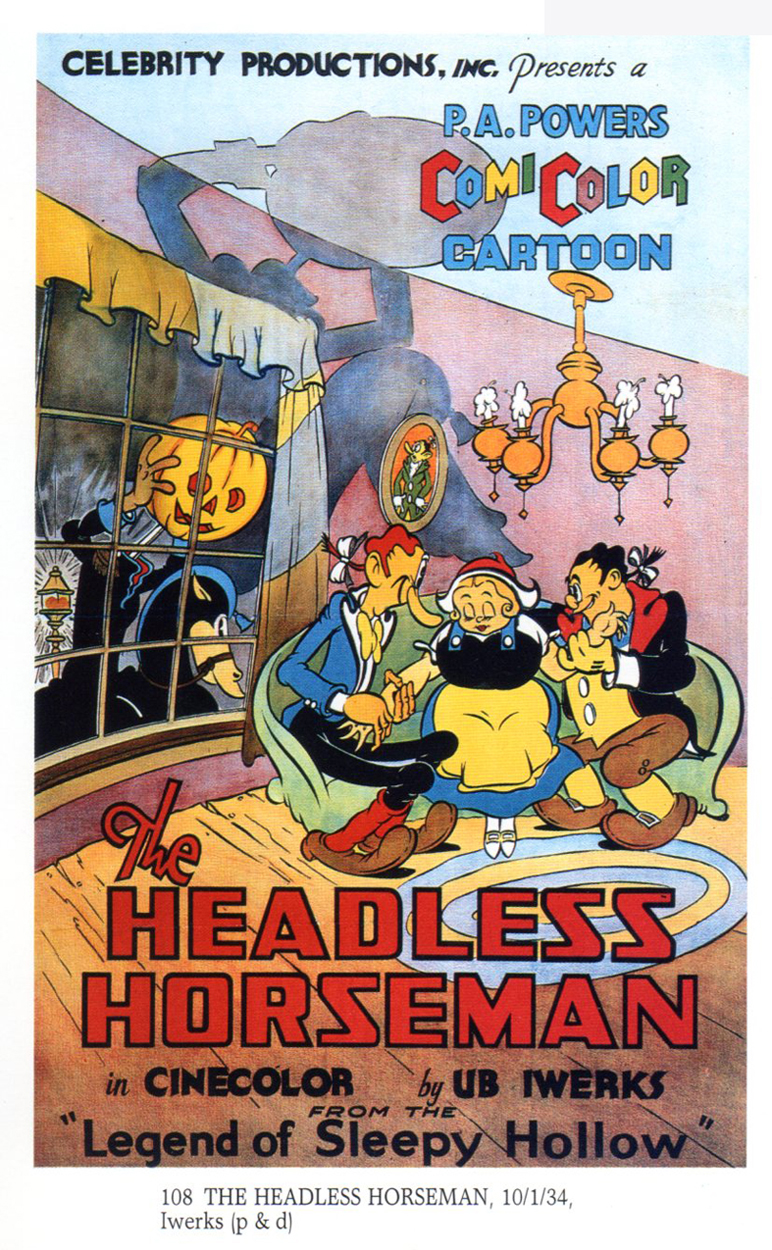
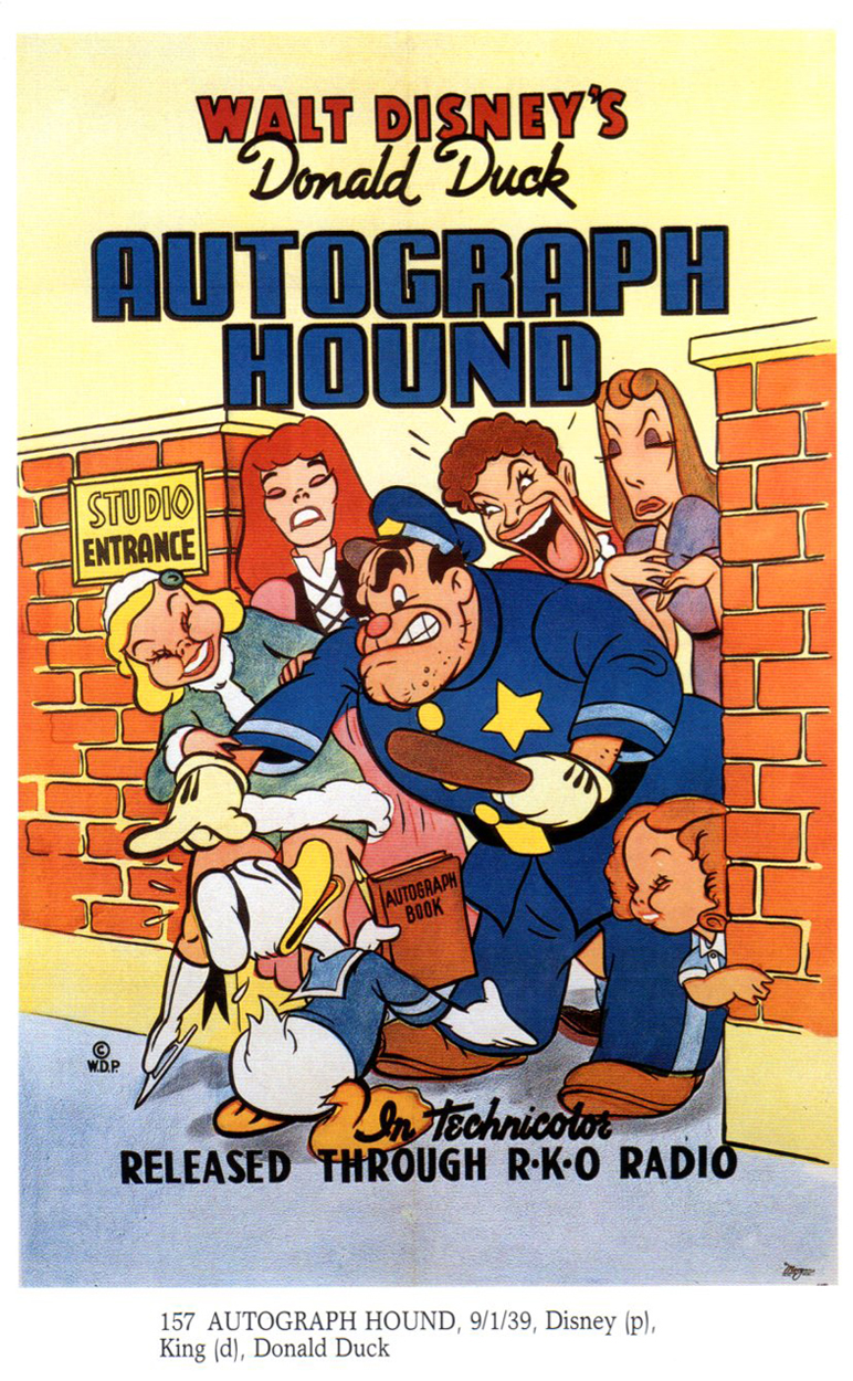
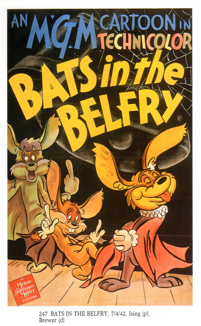
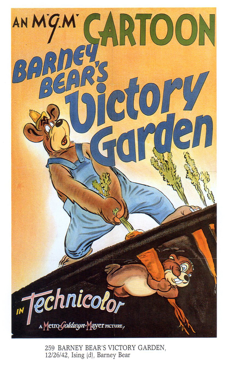
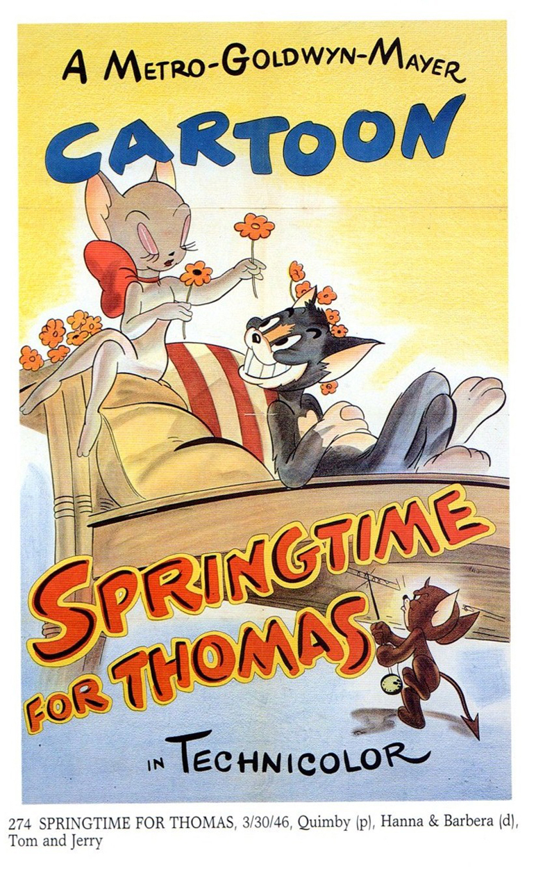
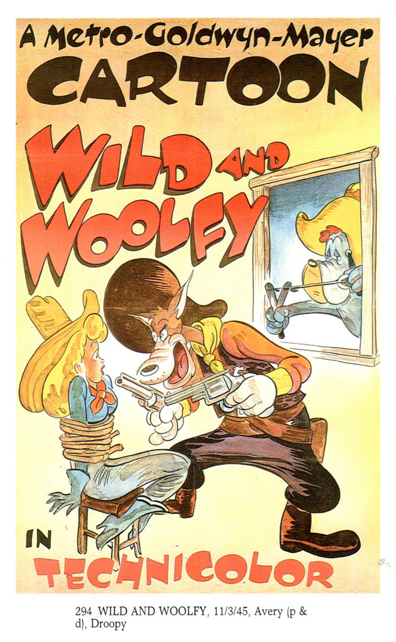
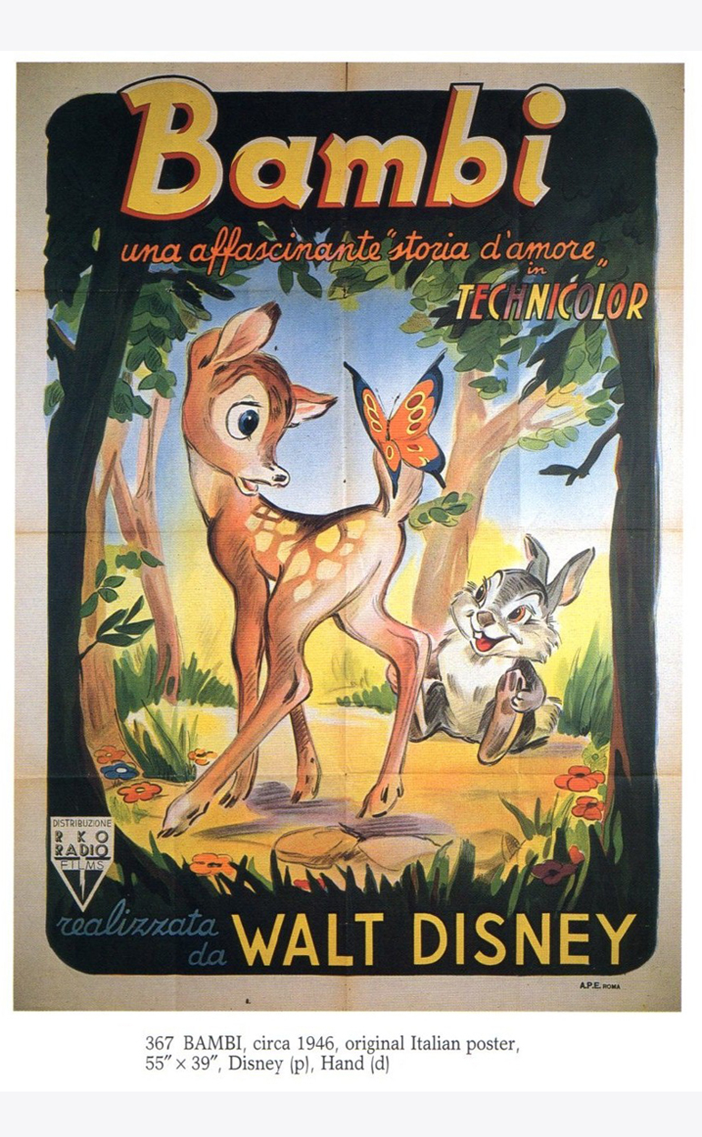
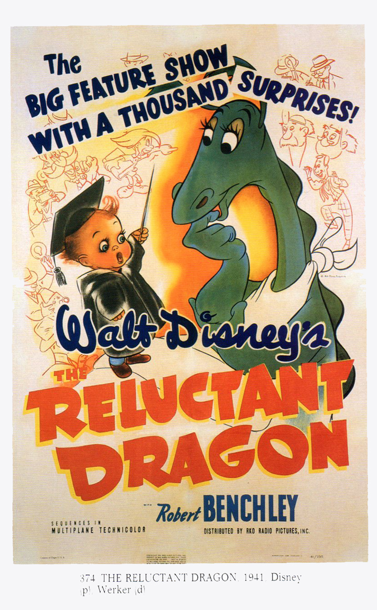
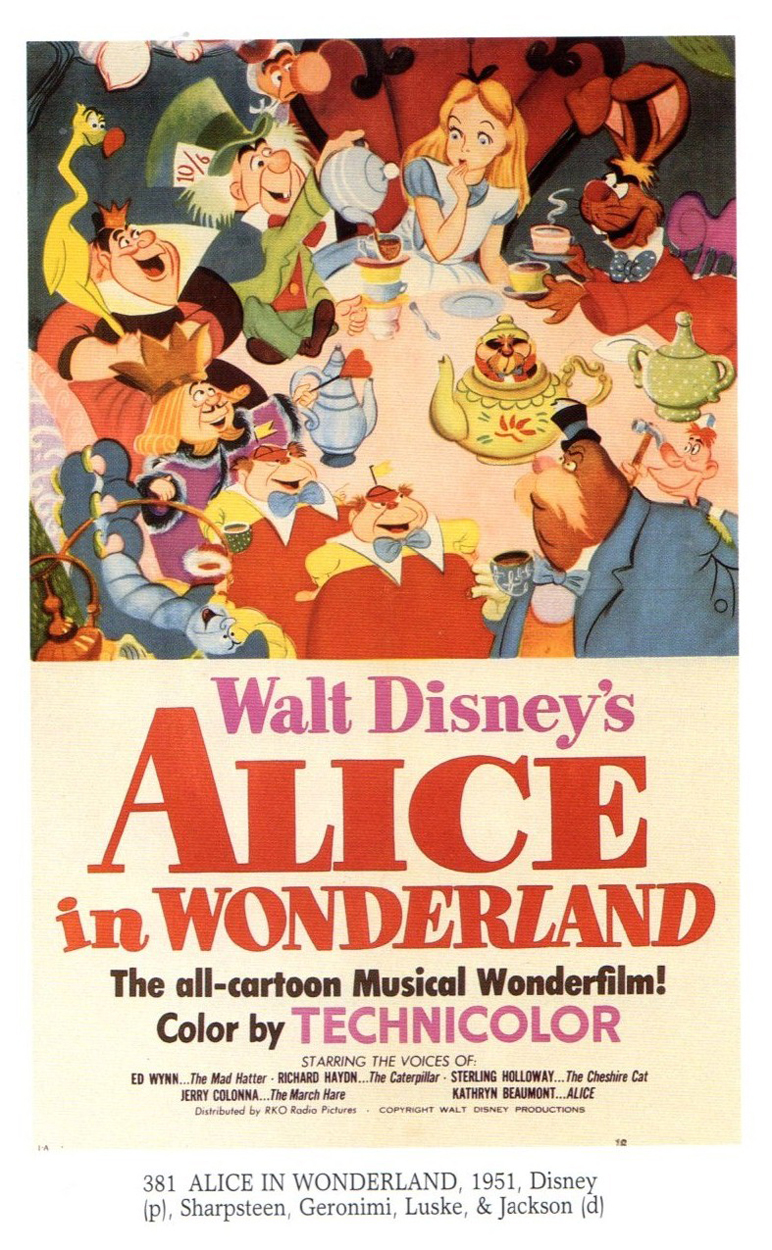
Cartoon Posters
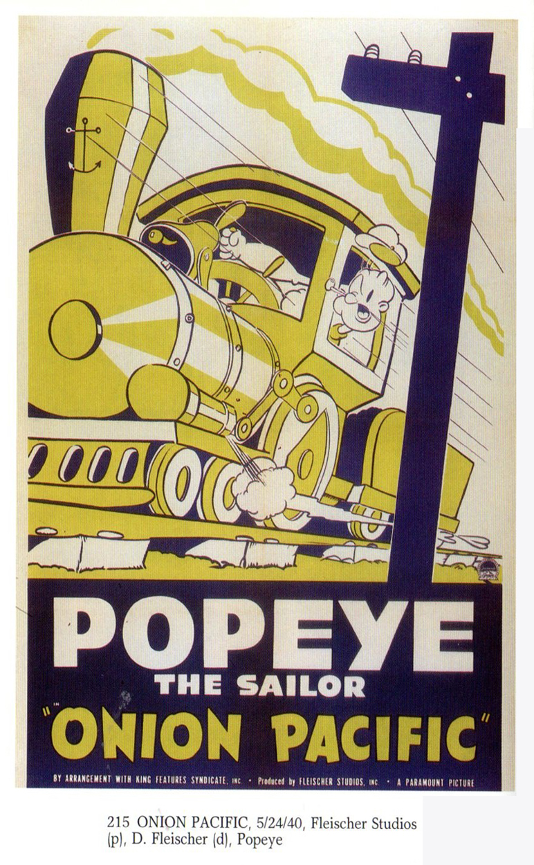
Bill Peckmann sent me scans from a book of his on “Cartoon Movie Posters.” Bill sends pages from some of the early cartoons and begins to get into the Disney animated features. If there’s interest from you, he’ll send more from the book. Here’s Bill’s comments:
- This is the “Cartoon Movie Posters” book published by Bruce Hershenson in the 1990′s, volume 1. He mentions plans for more volumes; I don’t know if they ever came about. This paperback has almost 400 posters in it and offers plenty more to post.
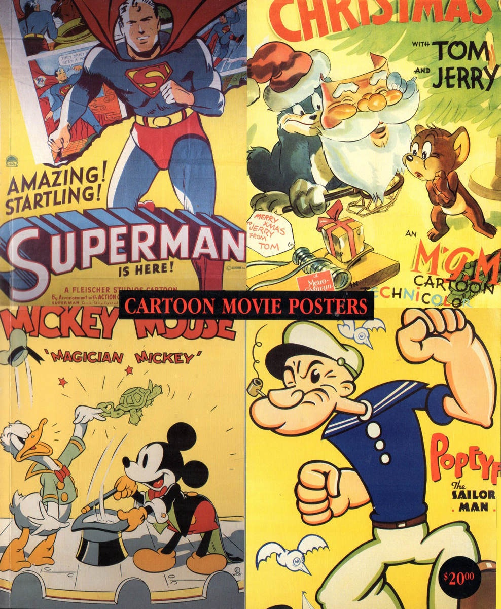
The Book’s Cover
 1
1
 2
2
 3
3
 4
4
 5
5
 6
6
 7
7
 8
8
 9
9
 10
10
 11
11
 12
12
 13
13
 14
14
 15
15
 16
16
 17
17
 18
18
 18
18
 20
20
 21
21
 22
22
 23
23
 24
24
 25
25
 26
26
 27
27
 28
28
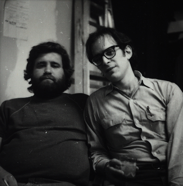
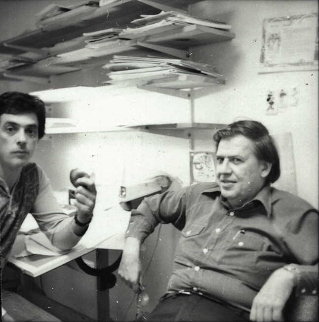
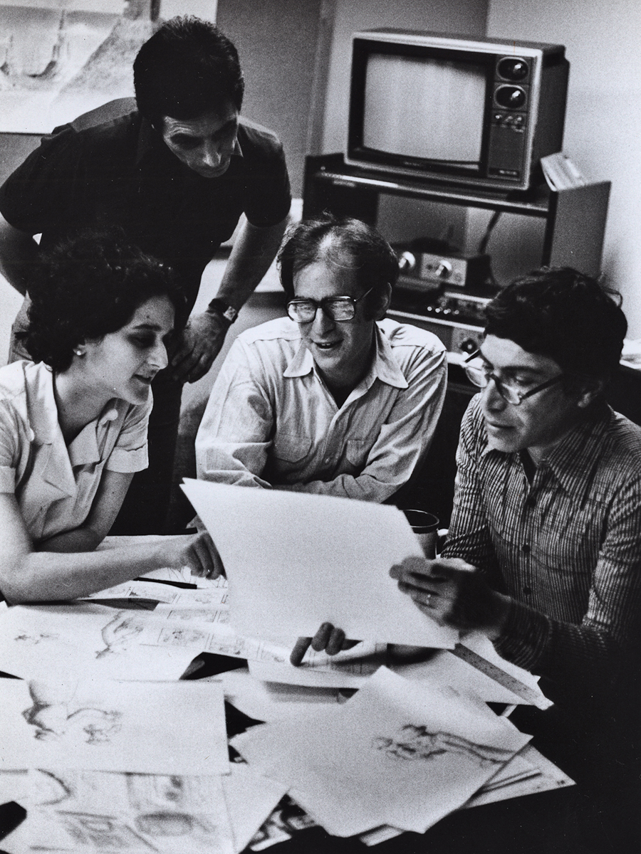
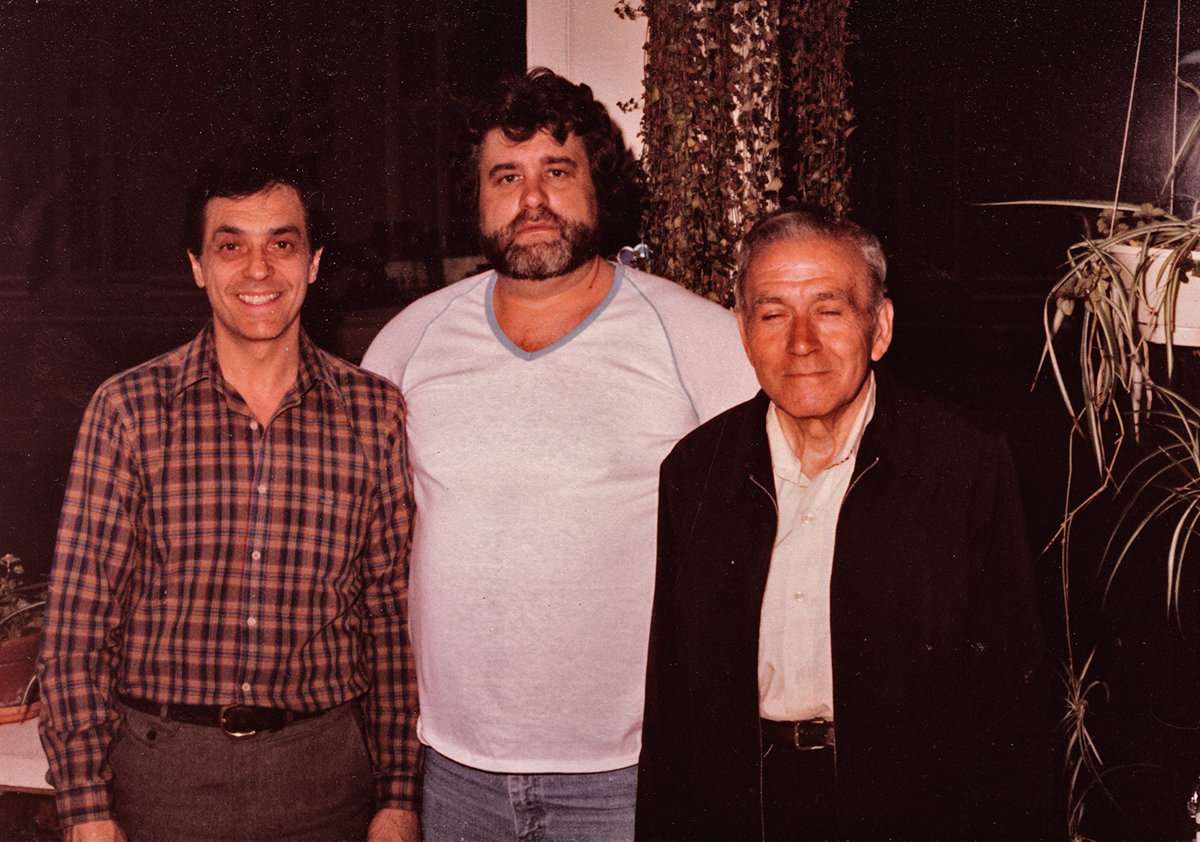
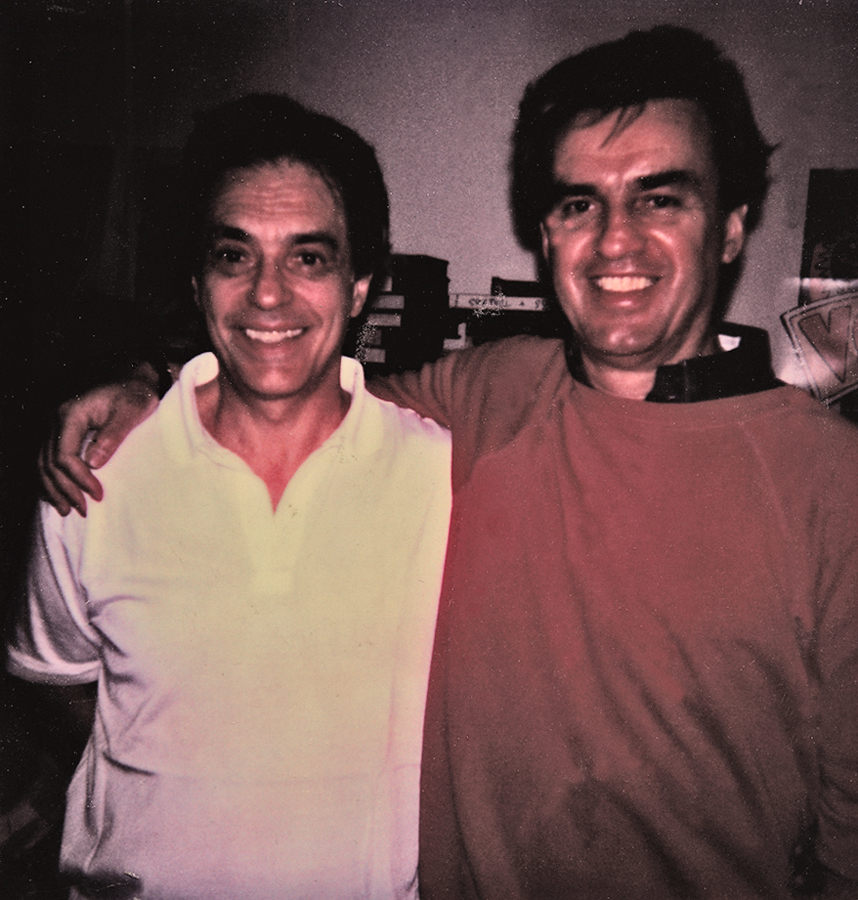
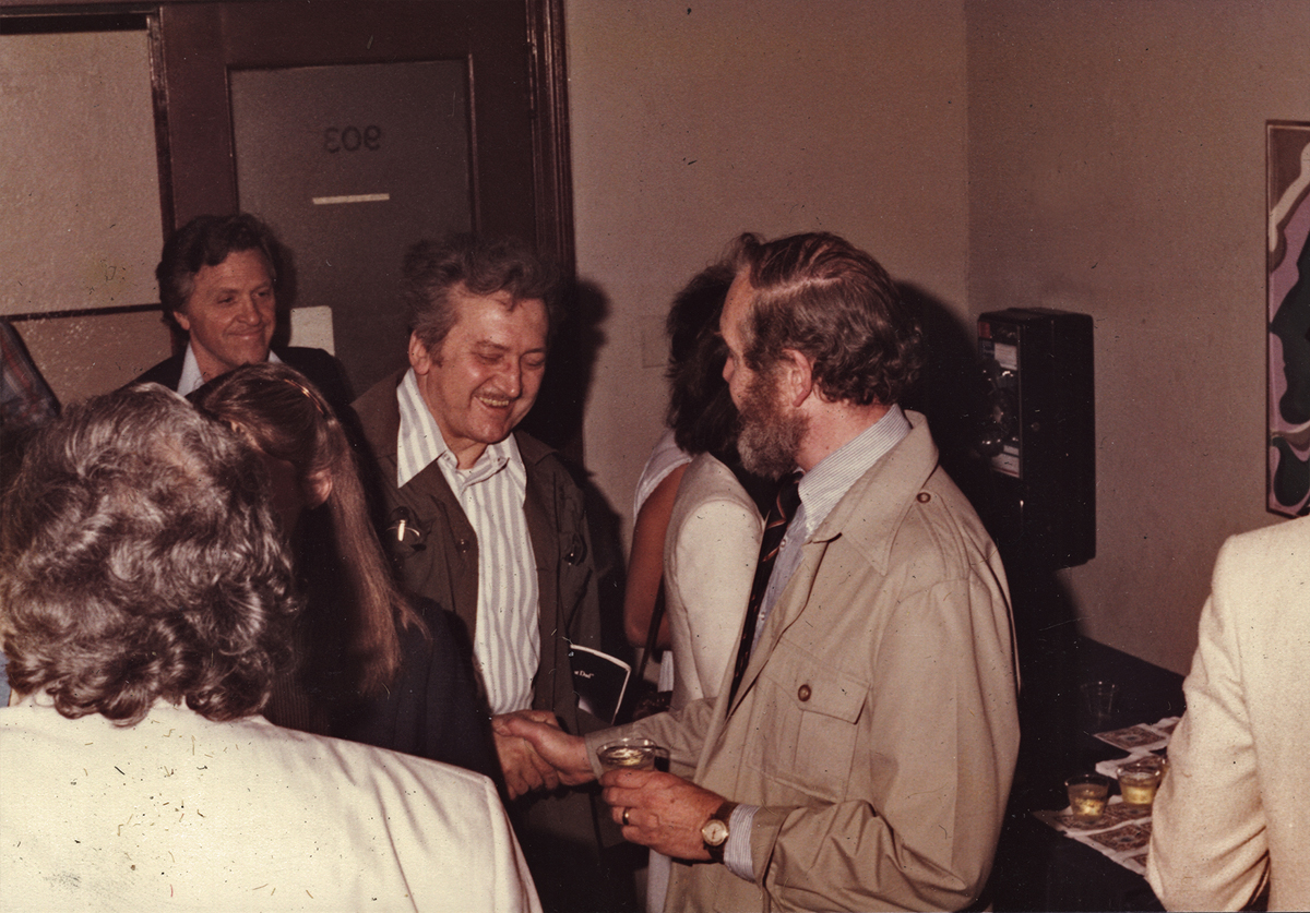
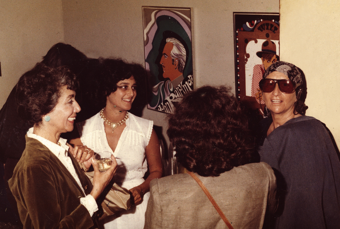
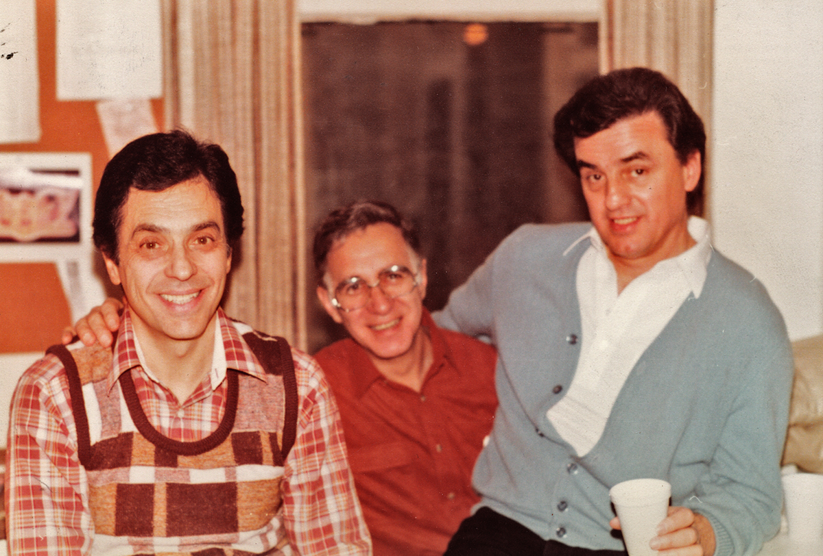
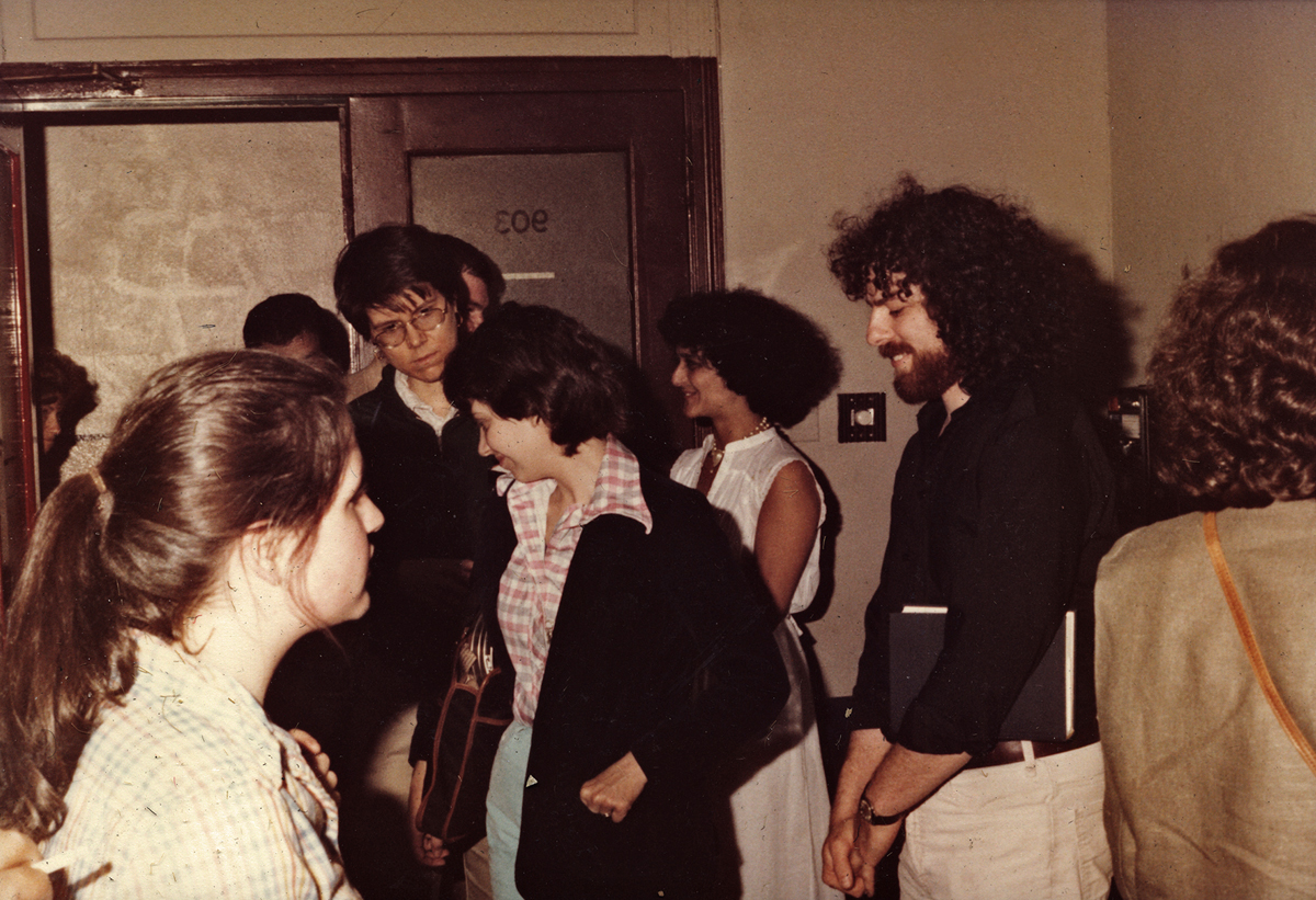
Photos 03 Apr 2013 06:01 am
Audition Screening
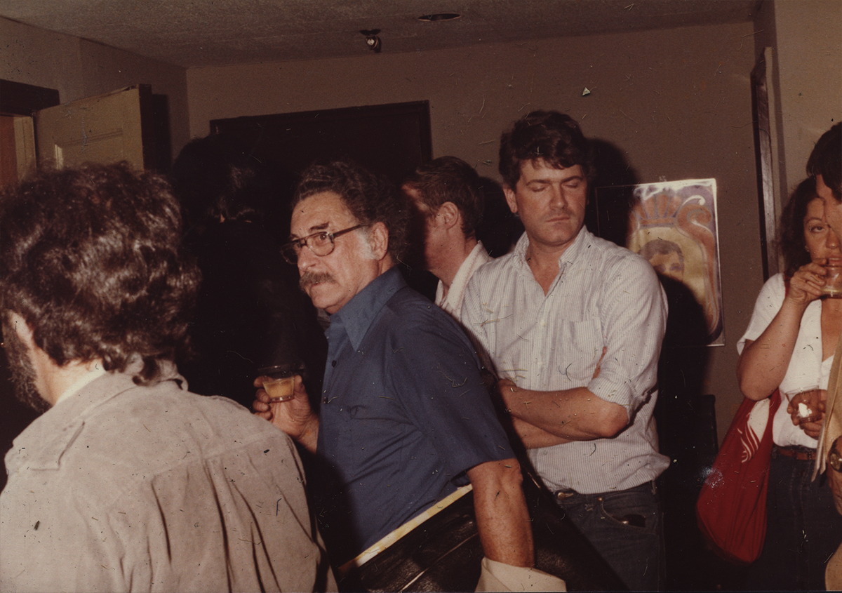
I continue to pore through the remains of work materials after Vince Cafarelli passed away over a year ago. A lot of artwork went to the Museum of Modern Art and a lot has been returned temporarily. Consequently, I’m poring quickly over the boxes searching for anything I’ve missed first time out. And I know there was a lot.
I’ve come upon a stash of photos. Many of them were taken at a screening Candy Kugel had given at Magno Screening room. It was for her personal short, “Audition.” This was a short film done in 1980 which talked about her life as an artist. This is a theme of many of the shorts she and Vince did together. Whether discussing making a commercial or a personal film, the topic has stretched through many of their very personal films.
At any rate, Candy had finished the short and was celebrating with a host of screenings at Magno with a warm reception going on in Magno’s anteroom, next door. I can still remember the event clearly even though it took place over 30 years ago. Others of the photos were obviously taken in the Perpetual Motion studio during the day. A chance to renew acquaintance with some old faces, these are some of the photos taken. I thought it’d be fun to share.
 1
1Animators, Lu Guarnier and Tony Eastman
 2
2
Animators, Lu Guarnier and Ed Smith
 3
3
Editor, Neil Lawrence
 4
4
Young animators, Candy Kugel and Russell Calabrese
 5
5
Stop-motion animator, Jimmy Picker and girlfriend
 6
6
Caeraman, John Rowhalt and Producer, Buzz Potamkin
 7
7
Animators, Vince Cafarelli and Ed Smith
 8
8
Animators, Candy Kugel (sitting) and Vince Cafarelli (standing),
Producer, Buzz Potamkin and Designer/Producer, Hal Silvermintz
 9
9
Animator, Vince Cafarelli, Cameraman, John Rowhalt and Expediter, Marty Weinbaum
 10
10
Anmators, Vince Cafarelli and Vinne Bell
 11
11
Animators, Jan Svochak and Howard Beckerman
 12
12
Chig Kugel (Candy’s mom), Candy, Tina Hirsch (Candy’s sister), and Animator, Tissa David
 13
13
3 Animators, Vinnie Cafarelli, Jack Dazzo & Vinnie Bell
 14
14
(unk), (unk), Maxine Fisher, Candy Kugel (in rear), and hirsuite Me
Commentary &Disney &Frame Grabs 02 Apr 2013 03:29 am
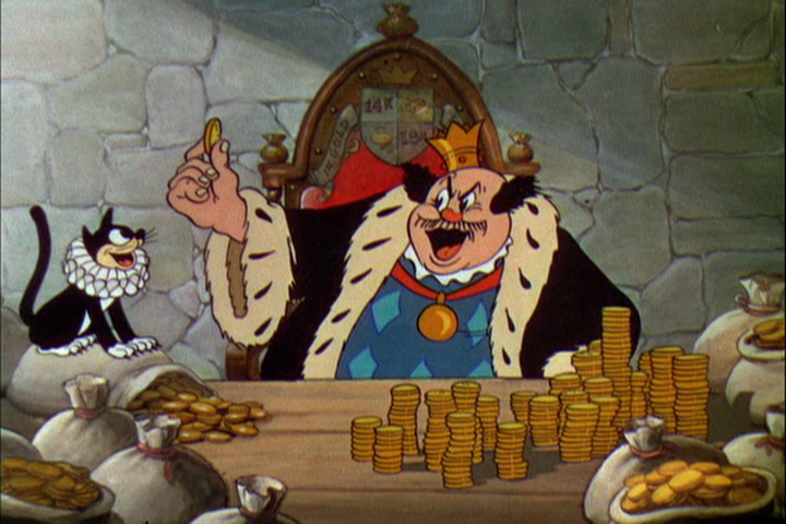
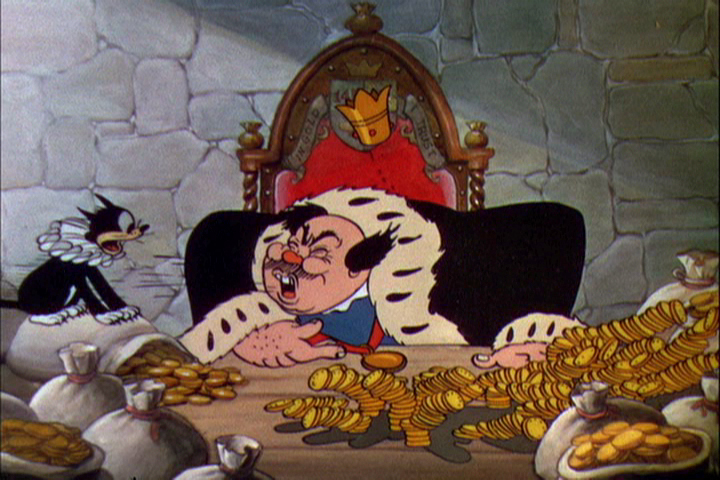
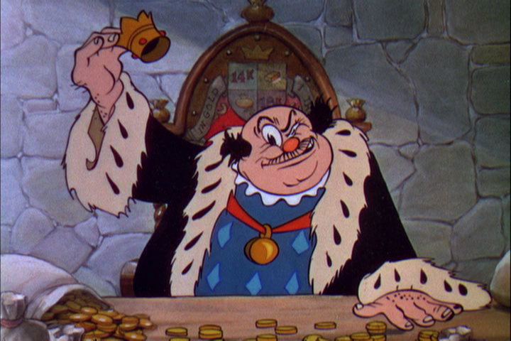
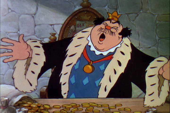
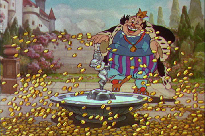
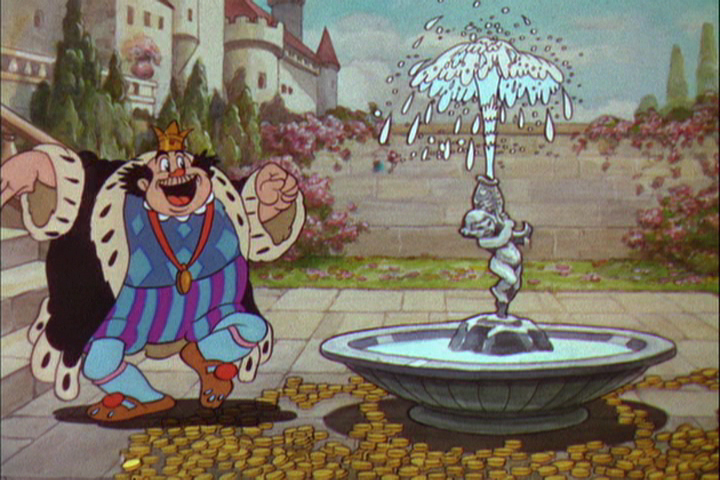
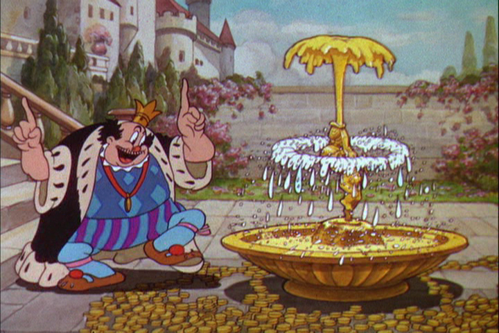
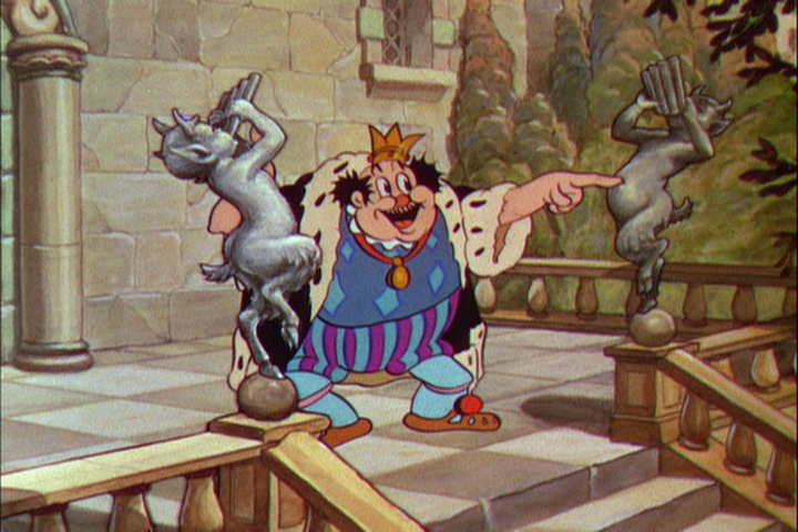
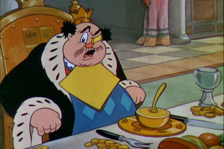
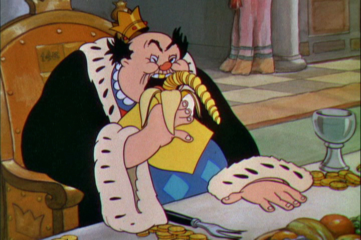
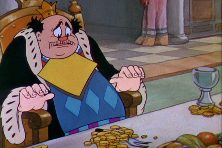
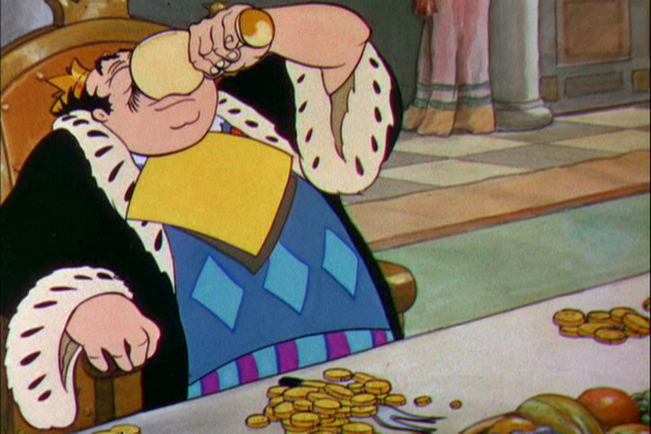
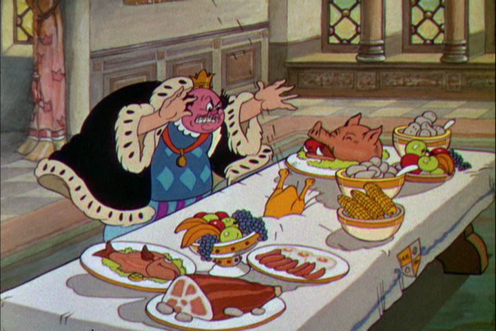
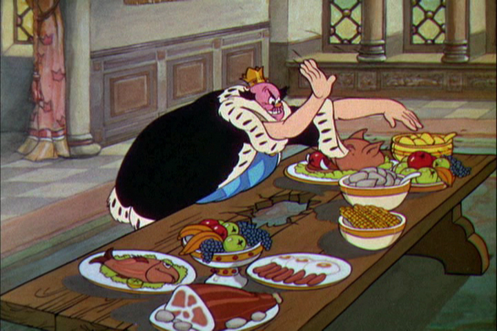
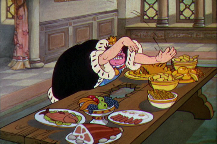
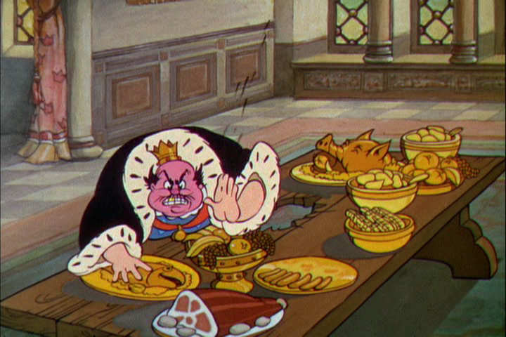
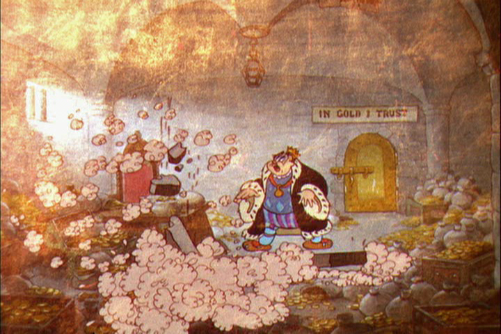
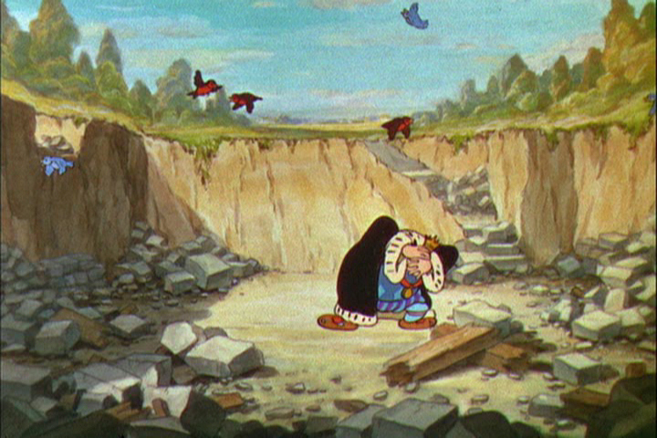
The Golden Touch
 With Snow White in the back of his mind, Walt Disney placed close attention to what was going on at his studio. He had to be completely aware of his artists’ abilities in how they’d be able to handle the task of creating strong emotions in animation, something that wasn’t too risky on a Mickey Mouse cartoon, but might prove difficult when tackling tears for the climactic moments of a feature about a realistic looking princess and her prince.
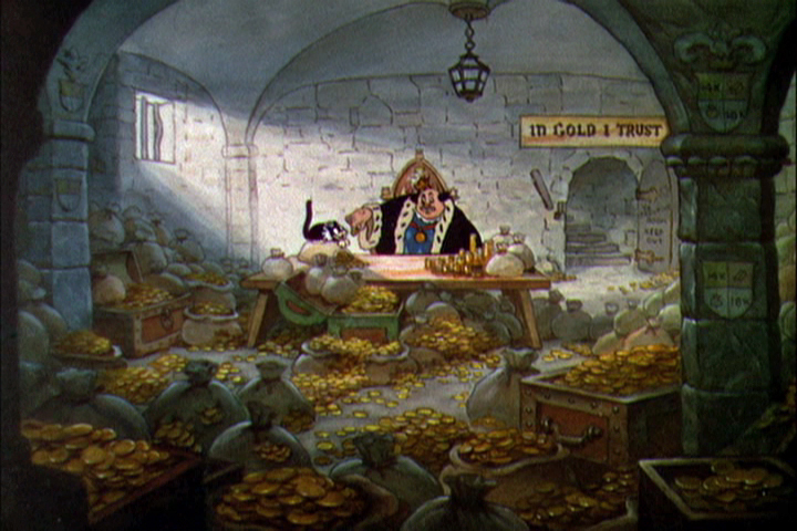
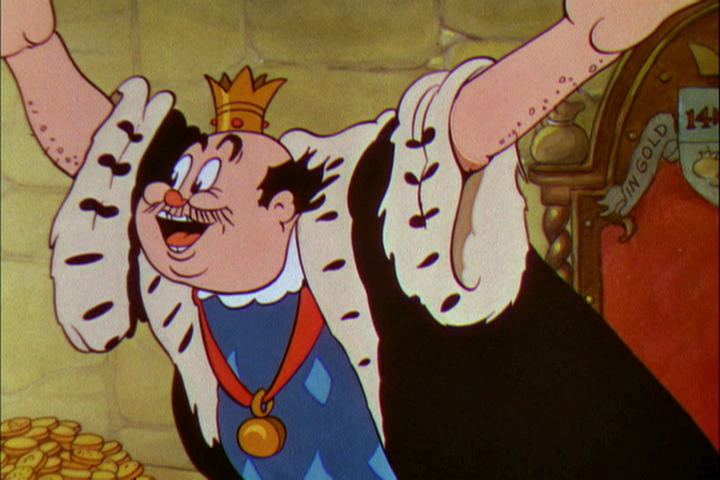
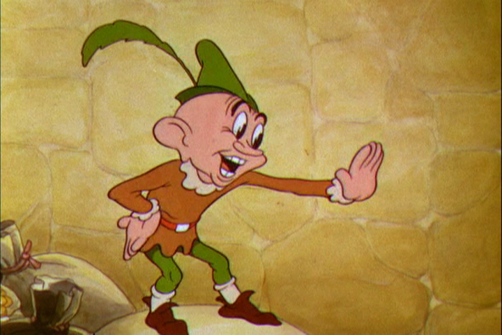
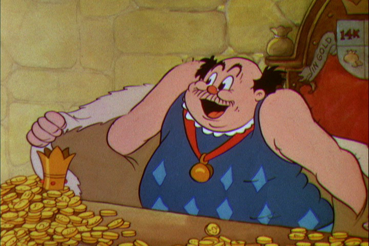
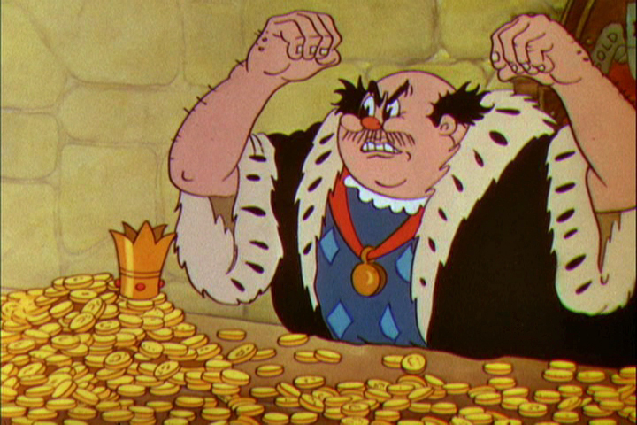
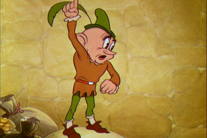
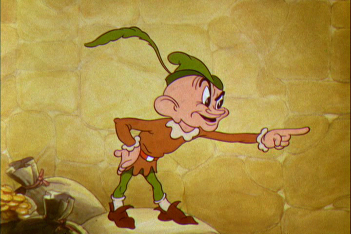
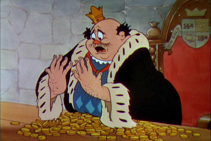
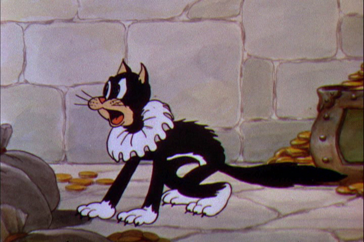
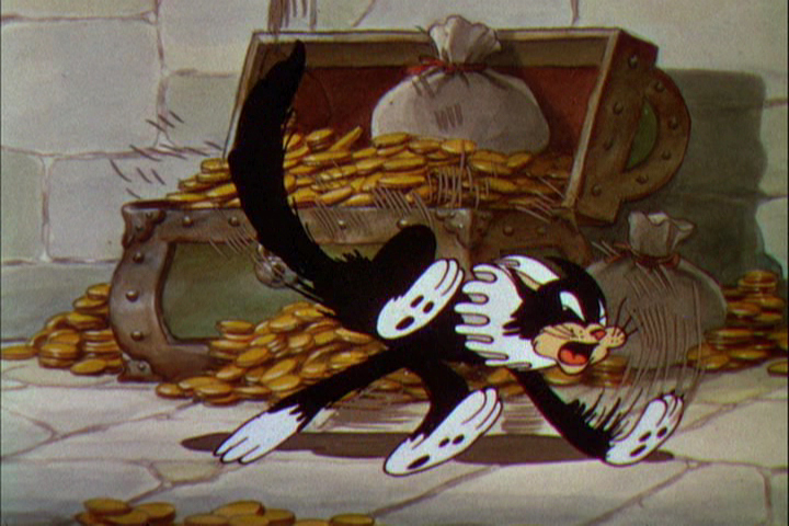
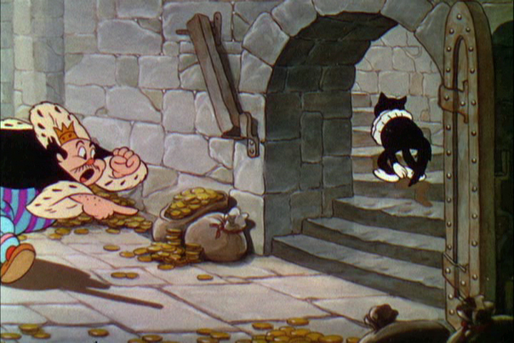
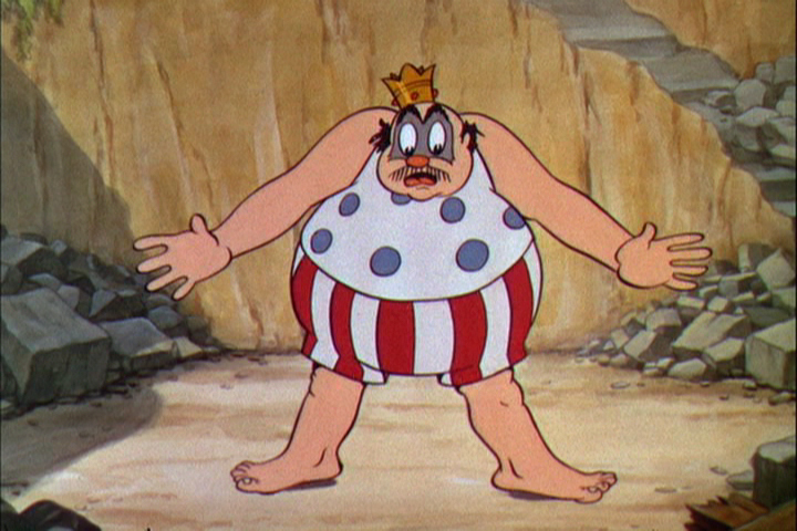
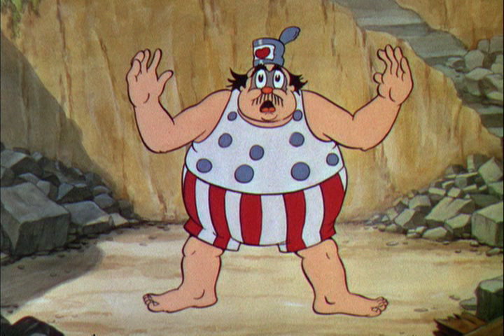
 The Golden Touch was a task given to his two best animators, Fred Moore (who animated all of “Goldy”, the elf who bestowed the magic touch on the king,) and Norm Ferguson (who animated all of the king and his black cat.)
Walt Disney gave himself the task of directing the film. This would be the last screen credit he would ever get for direction. After the film was completed, Walt admitted that the film was “a real stinker.”
This film was the first to use extensive use of dialogue throughout. When Billy Bletcher was recorded as the voice of King Midas they filmed him reading the lines with his lips painted white so that the animator, Ferguson, could easily work with the frame by frame study. The film does get a bit talky.
Other critics have given it as negative a review as Disney gave himself. I actually like a lot of it. The animation throughout is interesting. Neither animator has found a positive character, but both bring a peculiar touch to the two protagonists. “Goldy” is one of the creepier characters ever in a Disney film. Fred Moore gave an indication of how odd the seven dwarfs could have been. The king is very similar to “Old King Cole” done only a year earlier in 1933. He looks and acts similar, although the animation is tighter and more experienced.
I think the backgrounds in “The Golden Touch” are spectacular and well designed, color-wise. The art direction is first rate, as might be expected. The watercolors of the castle and its surroundings are beautifully painted. Even though cross cutting between the king and “Goldy” the variation in backgrounds isn’t jarring but firmly appropriate. “Goldy” has a bright gold color behind him, the king remains has gold behind hi until he returns to reality, now with Gold’s magic touch. Then he gets the blueish-gray of the castle as his Bg color.”
Artistically the film is very rich, as might be expected of any “Silly Symphony” of this period. Handsomely produced, of course.
 3
3
 4
4
 5
5
 6
6
 7
7
 8
8
 9
9
 10
10
 11
11
 12
12
 13
13
 14
14
 15
15
 16
16
 17
17
 18
18
 29
29
 20
20
 21
21
 22
22
 23
23
 24
24
 25
25
 26
26
 27
27
 28
28
 29
29
 30
30
 31
31
 32
32
 33
33
 34
34
 35
35
 36
36
 37
37
 38
38
 39
39
 40
40
 41
41
 42
42
 43
43
 44
44
 45
45
 46
46
 47
47
 48
48
 49
49
 50
50
 51
51
 53
53
 53
53
 54
54
 55
55
 56
56
 57
57
 58
58
 59
59
 60
60
 61
61
 62
62
 63
63
 64
64
 65
65
 66
66
 67
67
 68
68
 69
69
 70
70
 71
71
 72
72
 73
73
 74
74
 75
75
 76
76
 77
77
 78
78
 79
79
 80
80
 81
81
 82
82
 83
83
 84
84
 85
85
 86
86
 87
87
 88
88
 89
89
 90
90
 91
91
 92
92
 93
93
 94
94
 95
95
 96
96
 97
97
 98
98
 99
99
 100
100
 101
101
 102
102
 103
103
 104
104
 105
105
The End
Finally, here is a video representation of the Silly Symphony in motion.
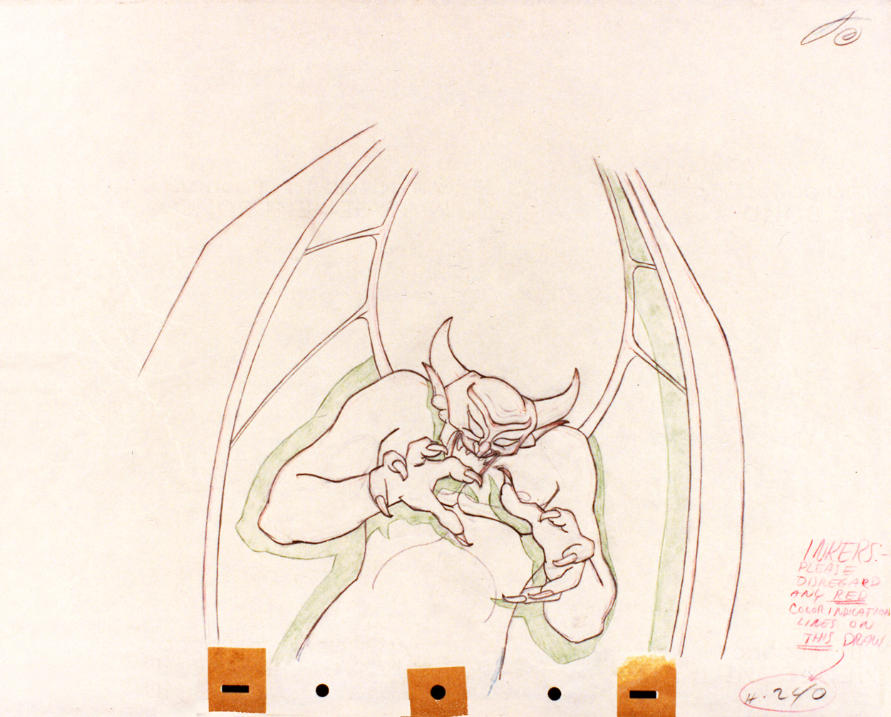
Action Analysis &Animation &Commentary &Tytla 01 Apr 2013 04:55 am
Stanislavsky Boleslavsky and Tytla’s Smears & Distortions – 4
 I would guess an actor, one who was truly devoted to their craft, would try to assume the full personality of the character he or she is playing. For an actor who felt devoted to the craft, they’d veer toward some specific acting school. Stanislavski or Boleslavsky, Actor’s Studio, Meisner, Chekhov or whatever combination thereof, the actor would use these schools of approach trying to fully possess the soul of the character.
Marlon Brando, Julie Harris, Paul Newman, John Garfield, Clifford Odets, Montgomery Clift and Marilyn Monroe all these acting greats had their techniques, and all those methods did start with Stanislavsky.
The question for us is how did this affect animation’s actors – the animators? Or did it? I’ve only seen this discussed in depth in one book, Mike Barrier‘s Hollywood Cartoons. Barrier shows a real understanding of Stanislavsky and Boleslavsky when he discusses the overt course of action taken by one animator, in particular, Bill Tytla.
We know that there were plenty of others that were excited by the newly discovered techniques, though we don’t know how wide spread this influence was. My first realization that it was a strong influence came from a joke John Hubley shared with me. He said that the animators broke into two groups, those that were interested in Stanislavsky and those that couldn’t spell it. Hubley was friends with Tytla. Tytla had been the close roommate to Art Babbitt, and Babbitt was close with Hubley, right to the near end.
But Tytla. Let’s look into what he was doing with his animation. I’m going to make a lot of suppositions to tell you what I think he believed . . . the reasoning and the way he worked.
Now, let me show you something.
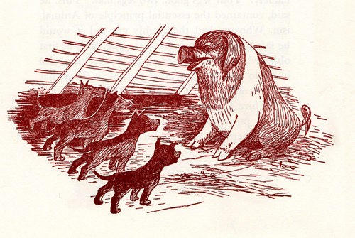
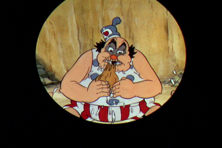
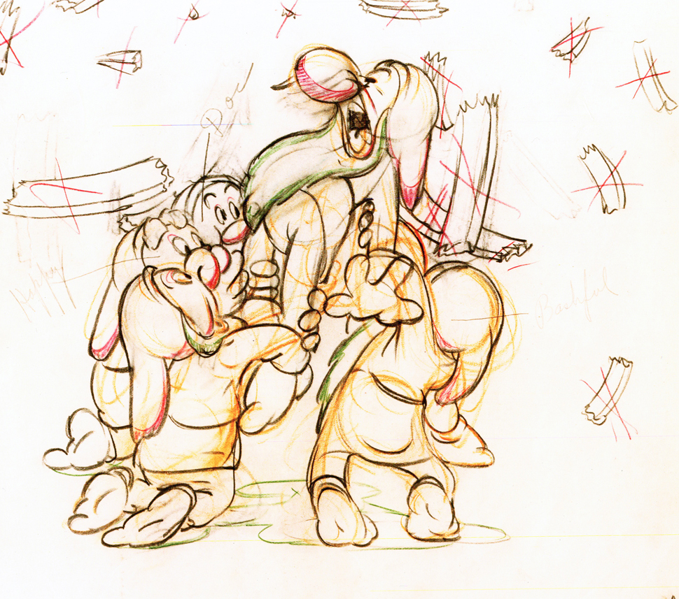
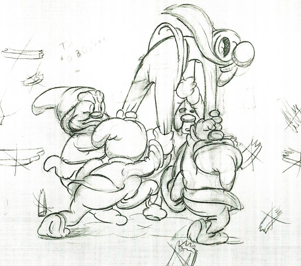
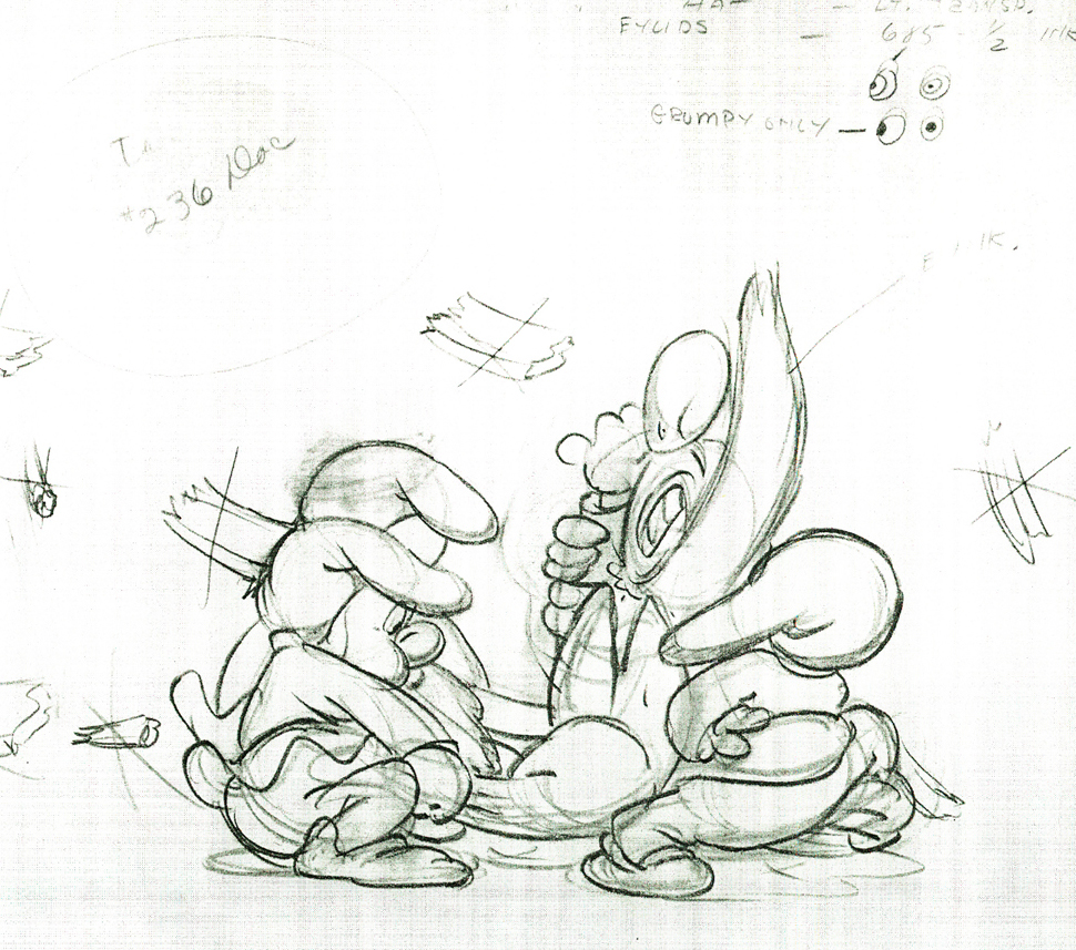
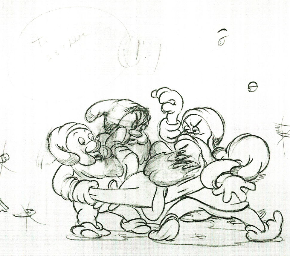
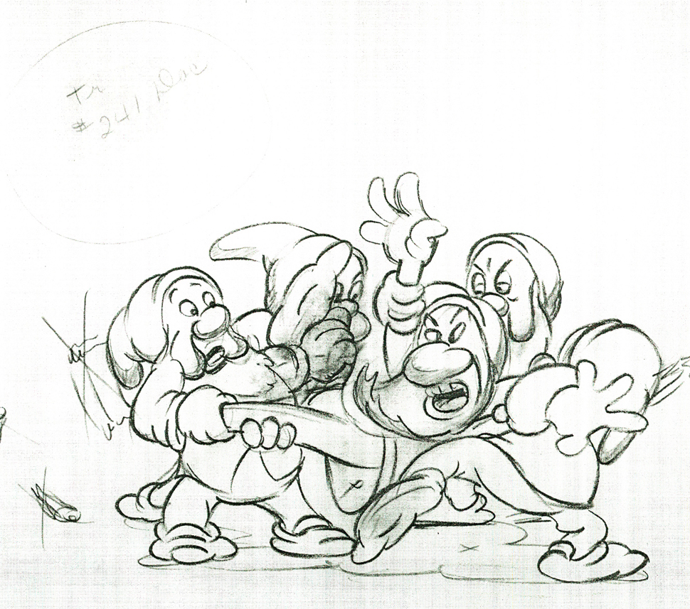
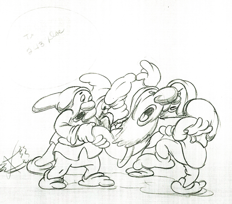
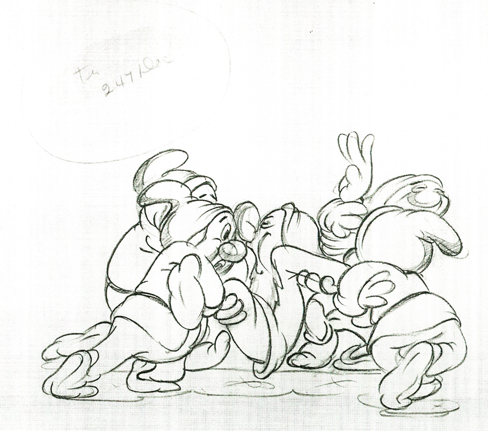
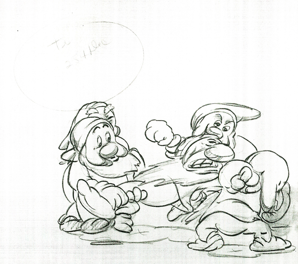
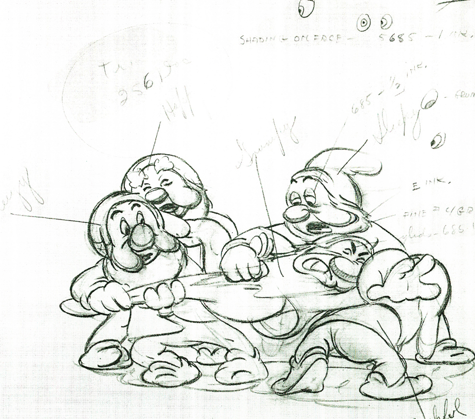
Here are some drawings and a QT movie of the seven dwarfs. Six of them are carrying Grumpy to the wash basin to clean him despite his violent protests.
Note the distortion on many of the drawings. #239 & 241 for example. #254 & 256 as well.
 222
222
 230
230
 236
236
 239
239
 241
241
 243
243
 247
247
 254
254
 256
256
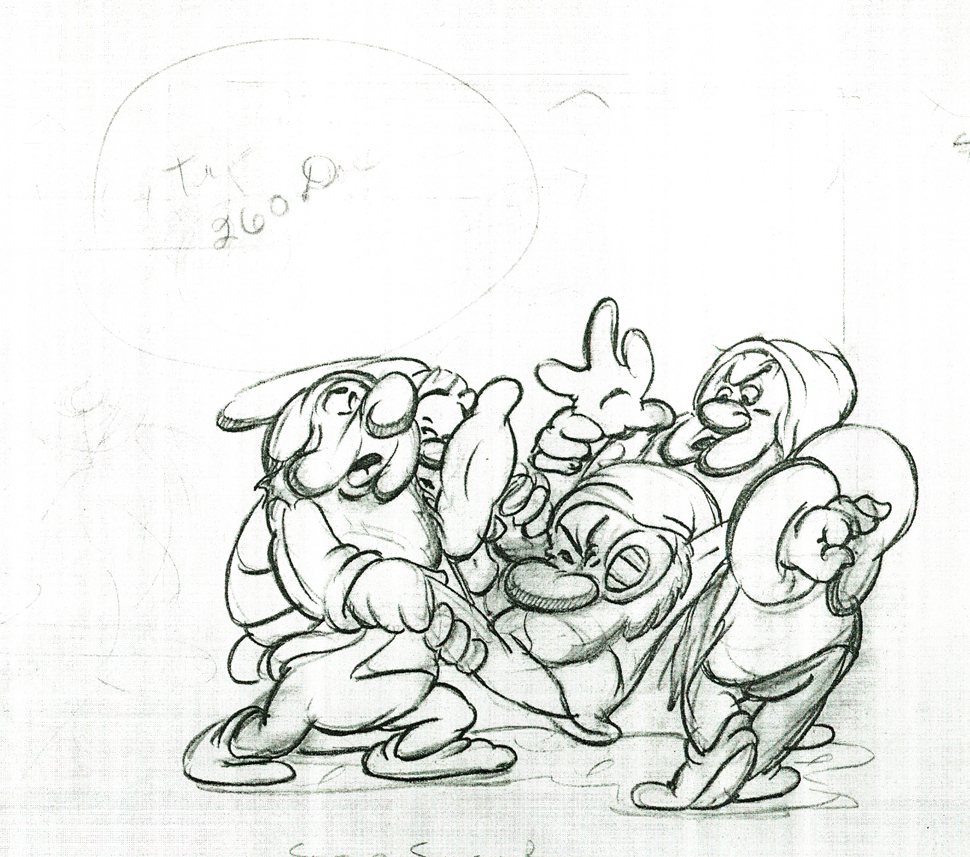 260
260
Here’s the QT movie of the full scene:
The P.T. is exposed on ones at 24FPS.
Note the buttons on the bottom far right will allow you to
advance (and reverse) the action one frame at a time. You
should go through this to see the distortion on the inbetweens
and how it works when the animation is in full motion.
There’s a great deal of distortion and smearing in Tytla’s work. I think he uses it to heighten the acting moments that his characters are performing. This particular scene is more action than acting, so other than to show off his distorting the characters, it isn’t a great example of acting, per se. Bt that drawing #239 is a good example of what he’ll do, even to the face of the principal character in the scene, to get his animation to work.
It’s almost as if he’d studied live action frame by frame and represents all those motion blurs in live action by smearing the face. The dwarfs are probably the first time complicated acting is successfully achieved. They’d done it before with many of the characters in the Silly Symphonies, but these are characters who sustain strong personalities over a long period of film. They also go through strong emotional changes which underline and works off their personalities.
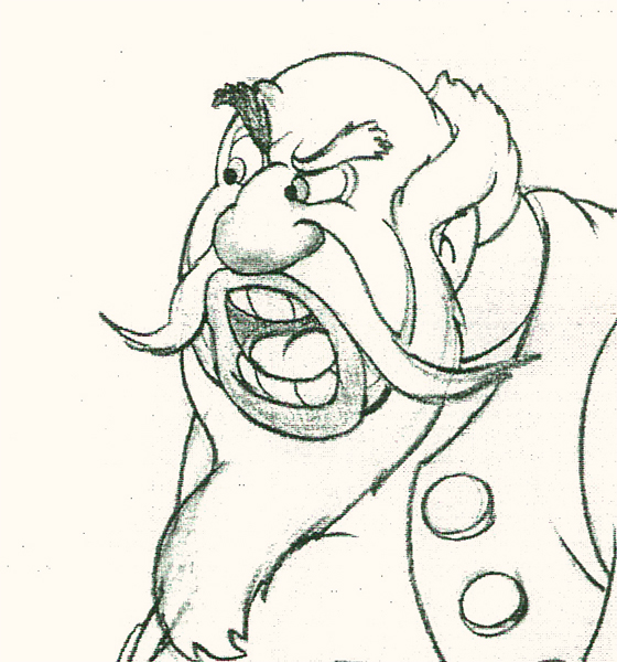
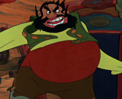
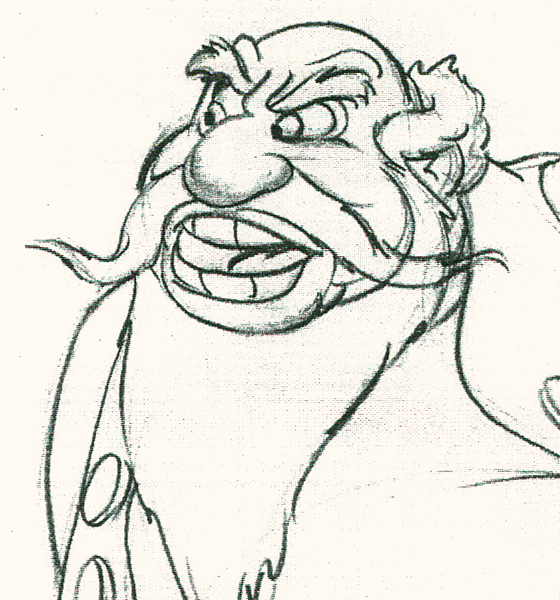
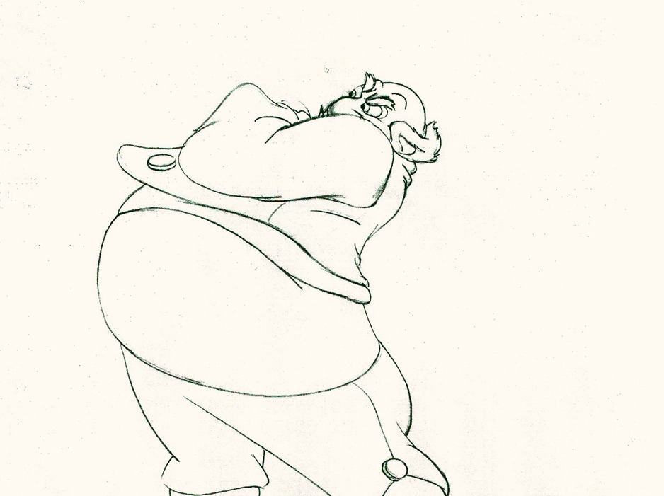
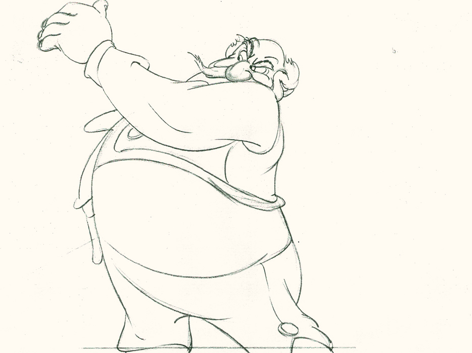
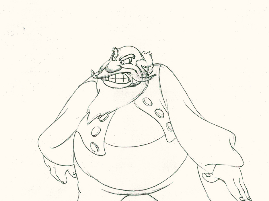
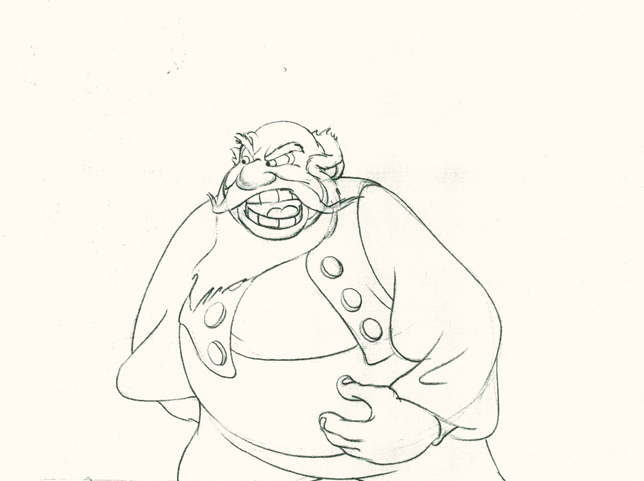
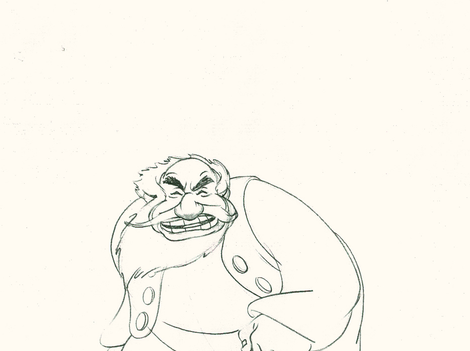
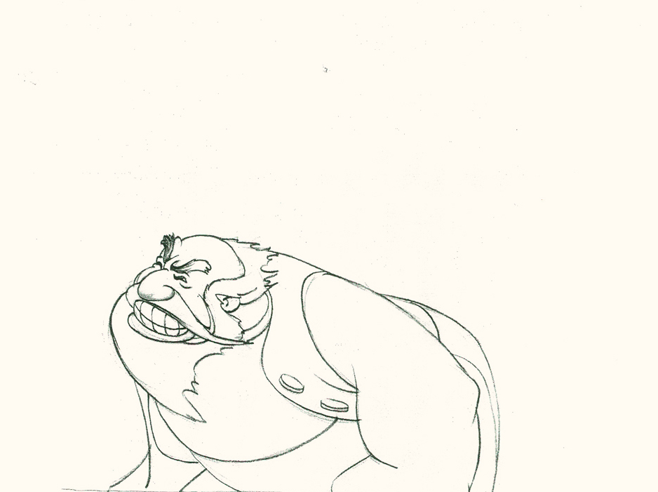
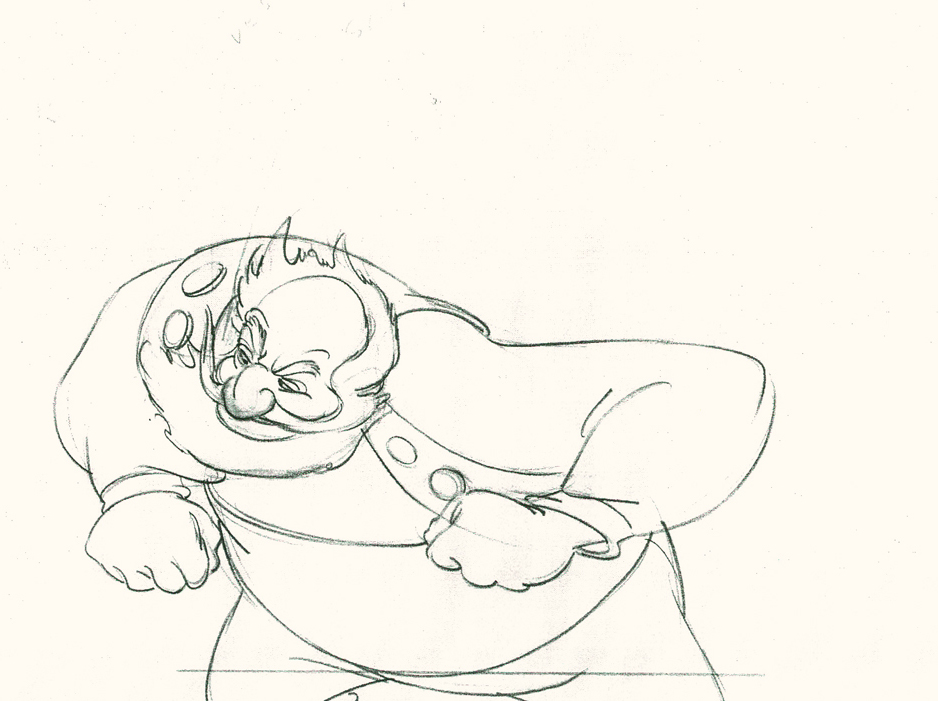
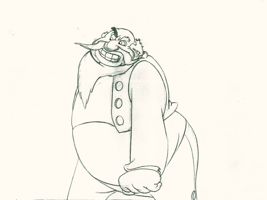
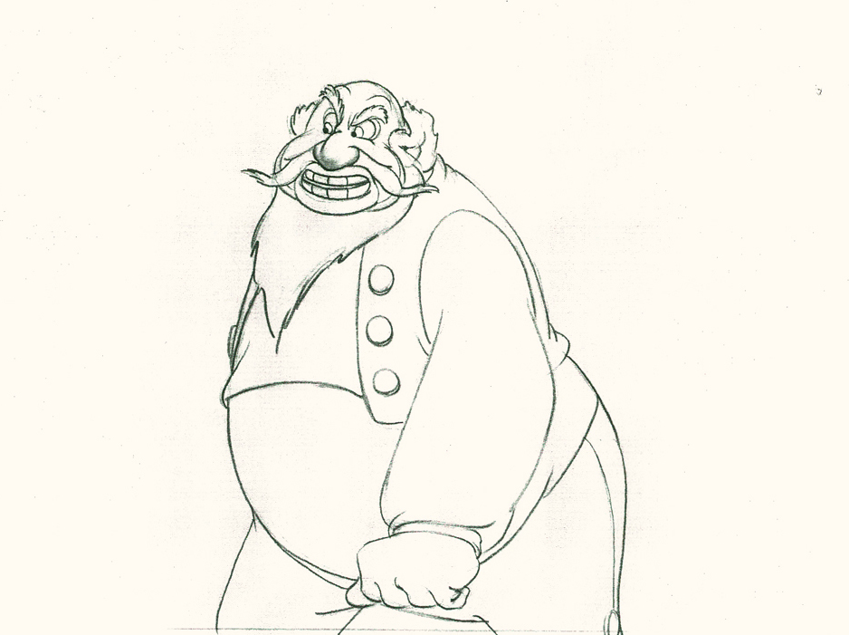
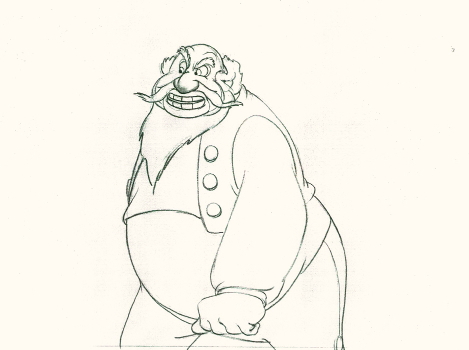
Tytla had a very different character in Stromboli for Pinocchio. He was a theatrical type, very changeable personality with emotions going all over the place – from high to low in the bat of an eye.
Tytla brought beautiful distortion to many of the drawings he did, using it as a way to hammer home some of the emotions in the elasticity he was creating. Yet, the casual observer watching this sequence in motion doesn’t ever notice that distortion yet can feel it in the strength of the motion.
Four drawings (#1, 11, 22, & 48) that shift so enormously but call no attention to itself.
Brilliant draftsmanship and use of the forms.
After I first posted some of these drawings and spoke a bit about the distortion Tytla would use to his advantage – for emotional gestures – I received some comments. I’d written that . . . “It’s part of the “animating forces instead of forms†method that Tytla used. This is found in Stromboli’s face.
This note arrived from Borge Ring after my first post Bill Tytla’s scene featuring Stromboli’s mood swing:
- The Arch devotees of Milt Kahl have tearfull misgivings about Wladimir Tytla’s magnificent language of distortions. ‘”Yes, he IS good. But he has made SO many ugly drawings”
Musicologists will know that Beethoven abhorred the music of Johan Sebastian Bach.
yukyuk
Børge
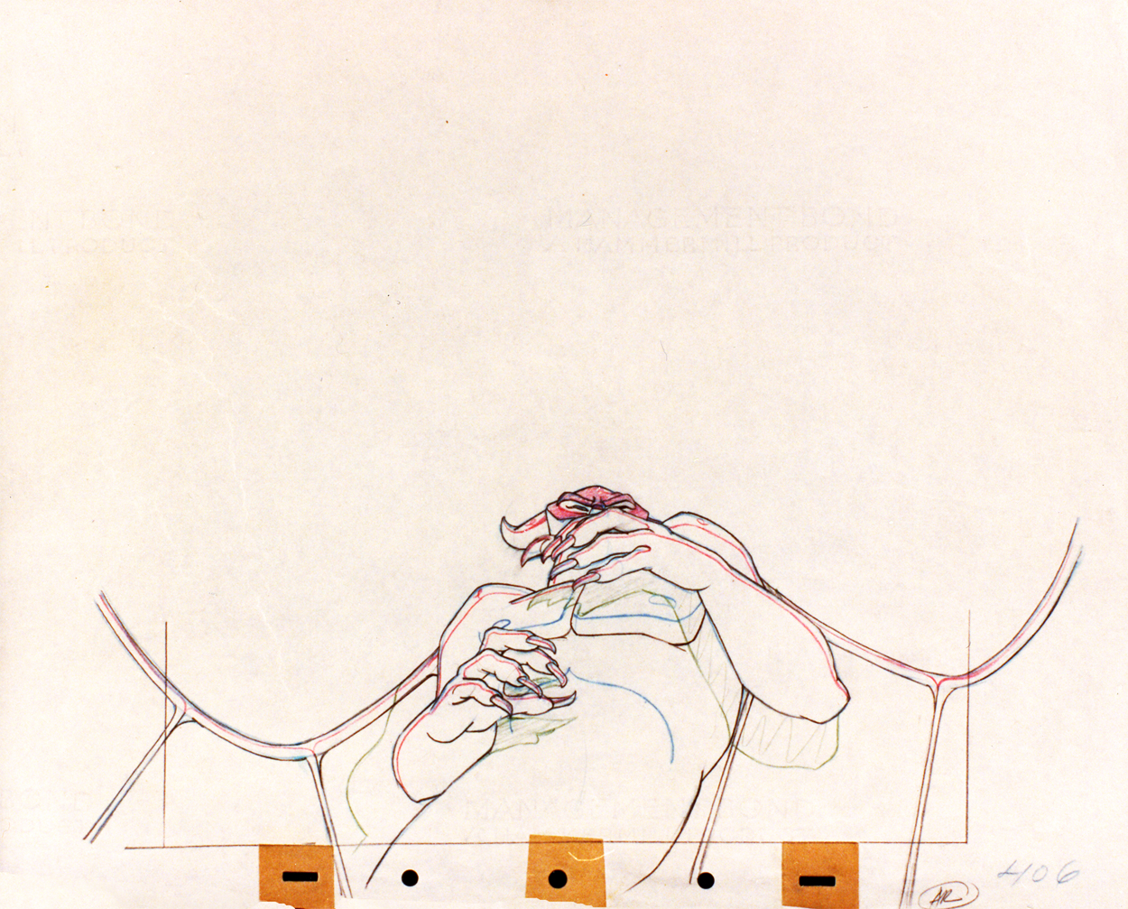
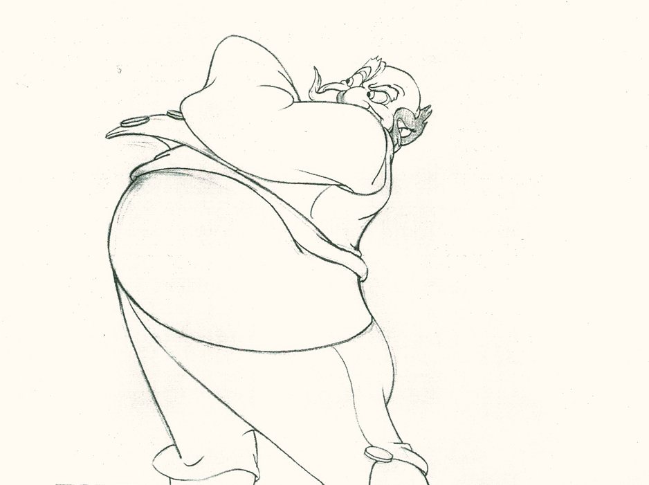
Note in one of these arms (right) Tytla uses Stromboli’s blouse to make it look like there’s distortion. It barely registers but gives strength to the arm move before it as his blouse follows through in extreme.
 There’s also some beautiful and simple drawing throughout this piece. Stromboli is, basically, a cartoon character that caricatures reality beautifully. A predecessor to Cruella de Vil. In drawings 76 to 80 there’s a simple turn of the hand that is nicely done by some assistant. A little thing among so much bravura animation.
Many people don’t like the exaggerated motion of Stromboli. However, I think it’s perfectly right for the character. He’s Italian – prone to big movements. He’s a performer who, like many actors in real life, goes for the big gesture. In short his character is all there – garlic breath and all.
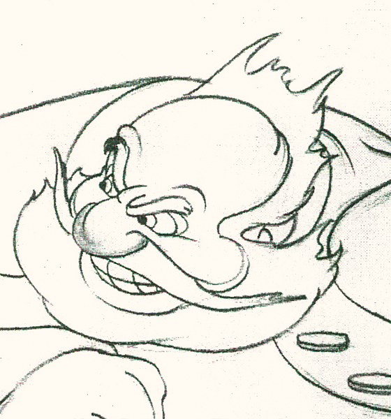
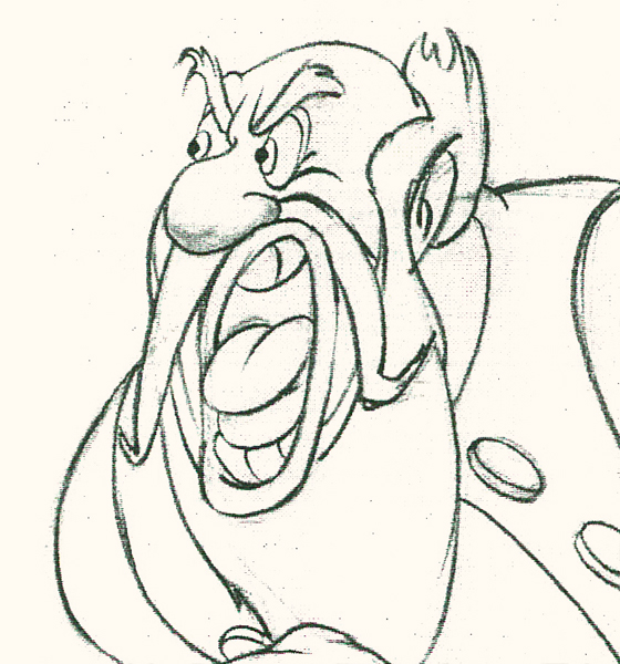
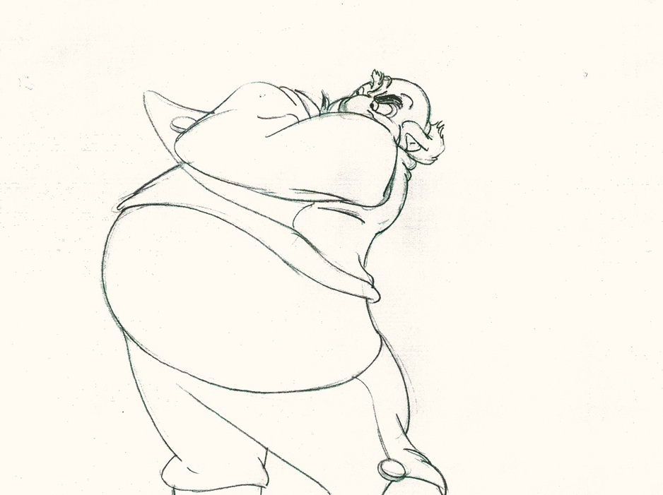
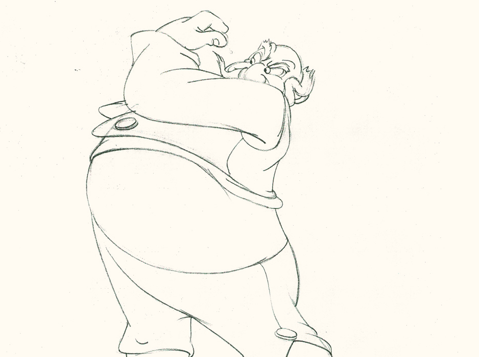
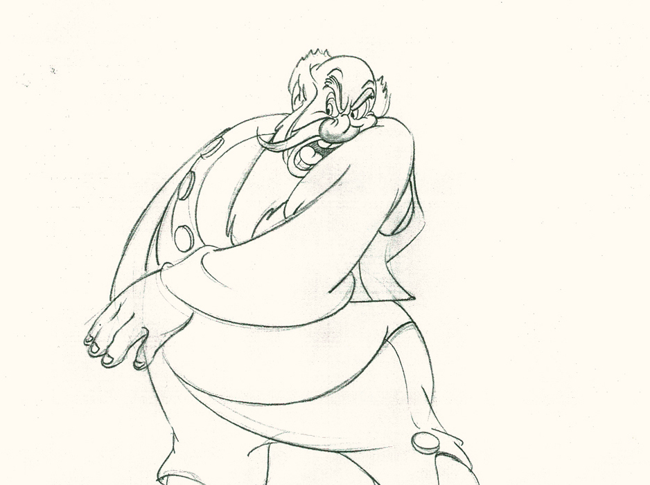
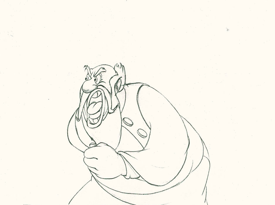
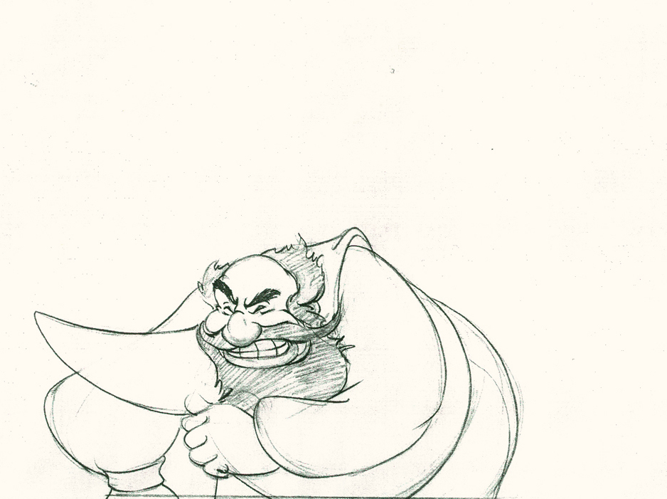
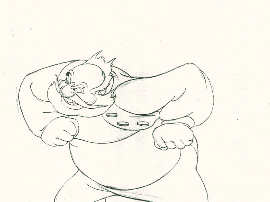
Here’s a short part of another scene. I’ve enlarged the images a little so that the thumbnails are more revealing. Just look at the distortion on the heads and how he stretches the arm to give it a violent emphasis.
 1
1Tytla starts with arm and head all the way back to
the character’s right. It’d be hard for Stromboli to
reach any further back without real distortion.
 3
3
 5
5
He then slowly advances the head inbetweening slowly.
The arm hasn’t moved very much – maybe what they
call today a “moving hold.”
 7
7
 9
9
 11
11
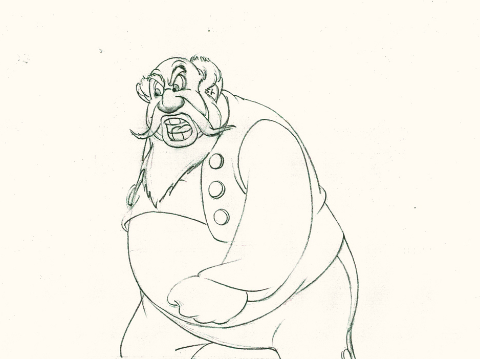
Now the arm comes out swiping violently.
The head’s almost complete in its turn to the left.
 12
12
 13
13
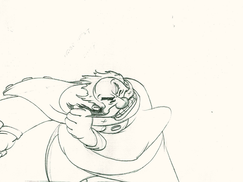
The arm rips across in three drawings.
The head has gone too far.
 14
14
The head goes back to where it should – almost no inbetweens
for Stromboli to get ready for speech. He’s taken 14 drawings
to display his anger.
 16
16
 18
18
 20
20
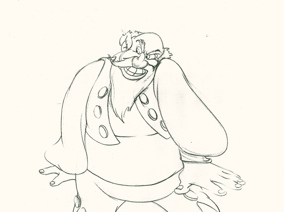
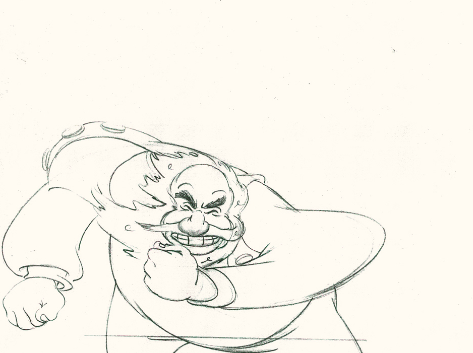
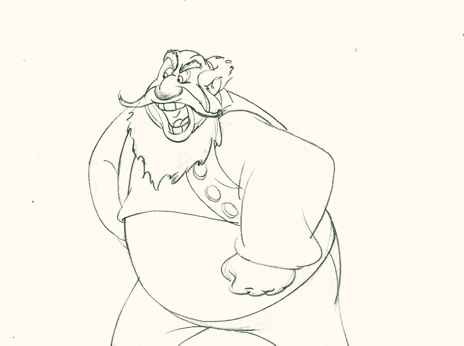
The arm comes back into a near fist; the expression is violent.
 22
22
The head starts shaking in a “no” gesture.
Violent.
 24
24
 25
25
The head and arm are all the way back.
The vest has been set up to make a violent move.
 26
26
 28
28
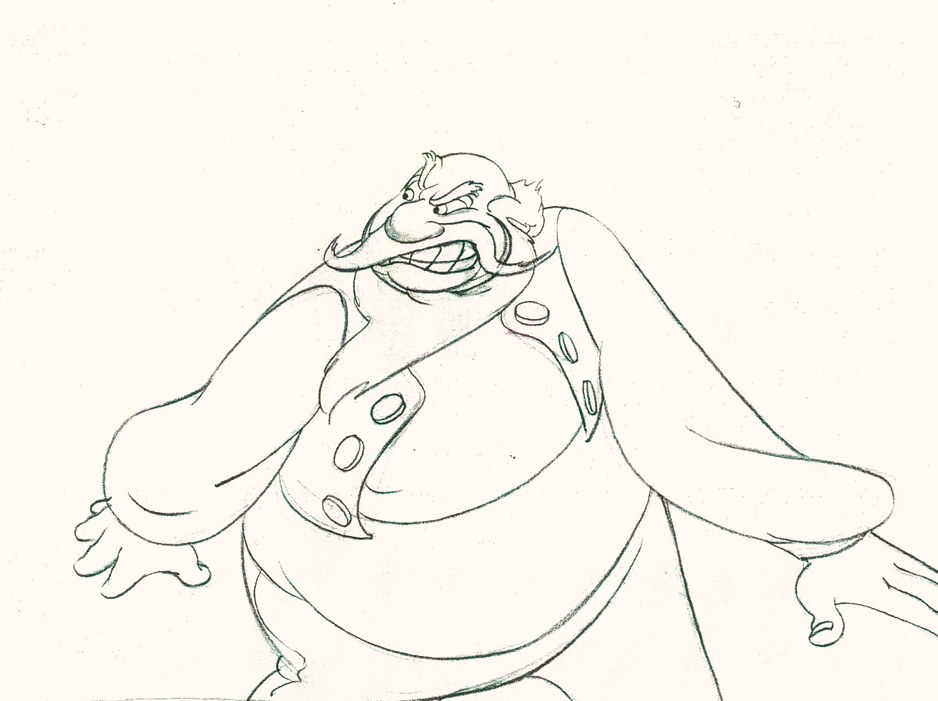
Now the arm and fist swipe across in violence.
 30
30
He’s completely pulled his angry head in to his neck.
 32
32
Both arms, moving violently, are suddenly restrained.
 33
33
 34
34
He hits a full stop with his arm.
 36
36
 37
37
He’s made the realization that he has to change his expression
so that he doesn’t lose the frightened kid – completely.
 38
38
A lot going on in only 38 drawings.
Here’s the final QT of the entire scene.This part comes at the very beginning:
Stromboli
Click left side of the black bar to play.
Right side to watch single frame.
David Nethery had taken my drawings posted and synched them up to the sound track here.
It’s not clichéd, and it’s well felt and thought out. Think of the Devil in “Night on Bald Mountain” that would follow, then the simply wonderful and understated Dumbo who would follow that. Tytla was a versatile master.
We’ll continue next time with Dumbo Fantasia and other Tytla gems.
